Category ArchiveBill Peckmann
Bill Peckmann 28 Oct 2012 04:35 am
Romney’s TV Guide
Bill Peckmann surprised me with a bit of trivia. It really has nothing to do with trivia but will call home to many New York born Baby Boomers. Here’s Bill:
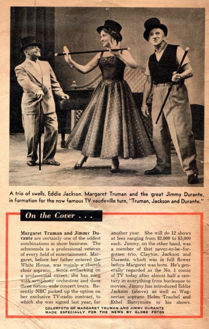
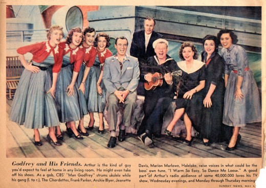
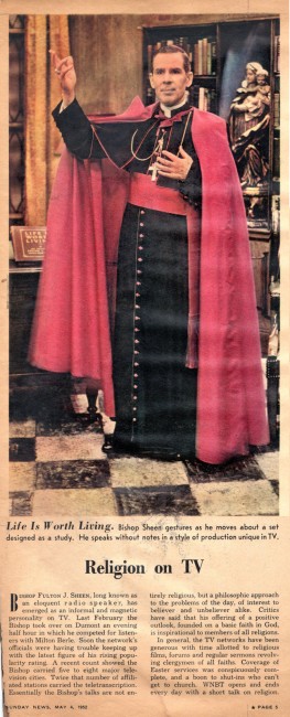
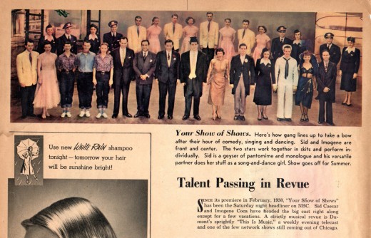
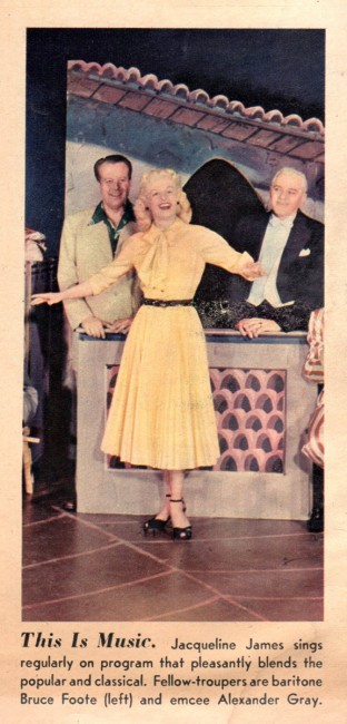
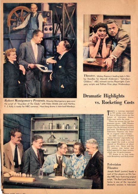
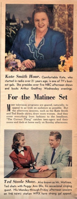
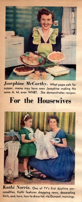
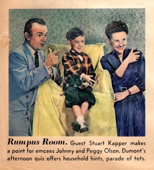
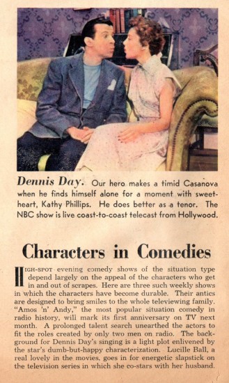
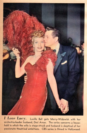
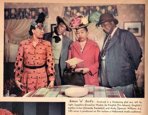
- As a kid, the word “rotogravure” from the lyrics of the song “Easter Parade” always stuck in my head because I never knew what it meant. Only years later did I learn it was a printing process, but I believe in those days of “Easter Parade” it was the nickname for the color supplements of the Sunday newspapers that flooded the newsstands at the time. In those days of black and white newspapers and black and white TV, color Sunday comics and supplements were big doings! Especially as a young TV addict, if that Sunday magazine had color photos of your favorite TV (black and white) characters!
Here are the first few pages of the Daily News’ 1952 Sunday supplement. It’s about time I got it to the scanner, it’s crumbling in my hands as I put it on the platinum! Only 60 years after the fact!
Time to step into the Time Machine…
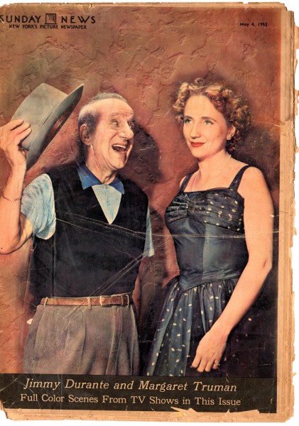
The cover
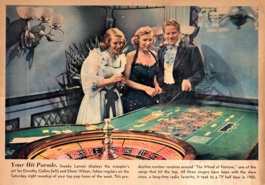 2
2
Photos are in the order as they appear in the newspaper.
The only thing missing are the numerous ads.
Bill Peckmann &Comic Art &Disney 26 Oct 2012 05:53 am
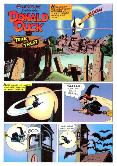
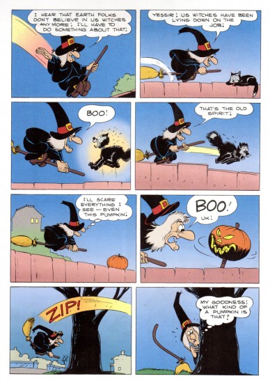
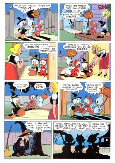
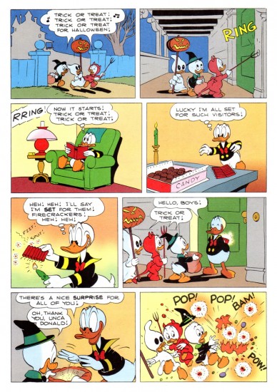
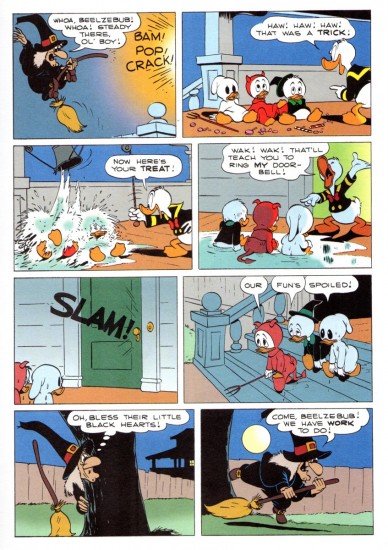
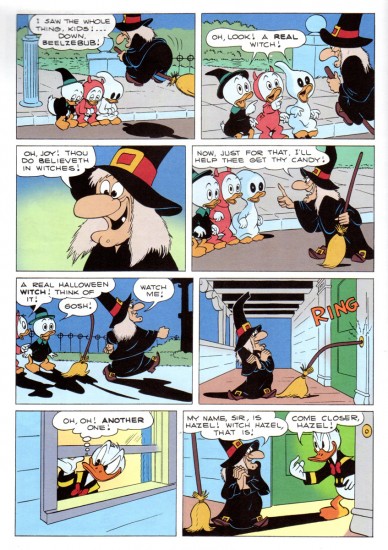
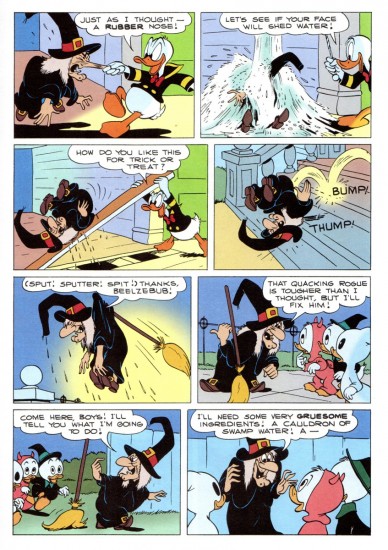
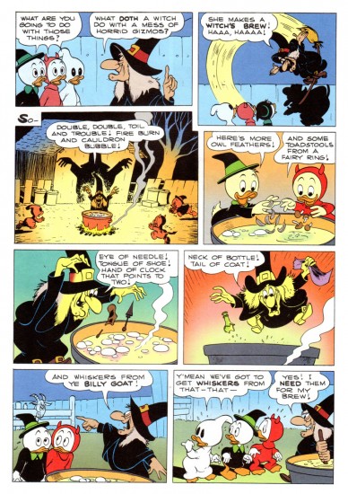
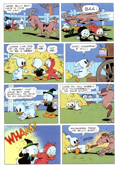
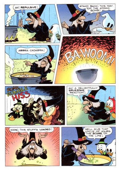
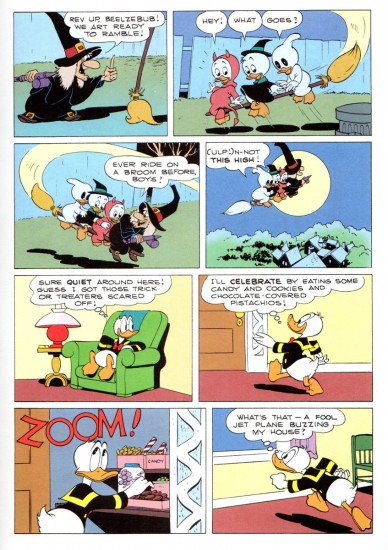
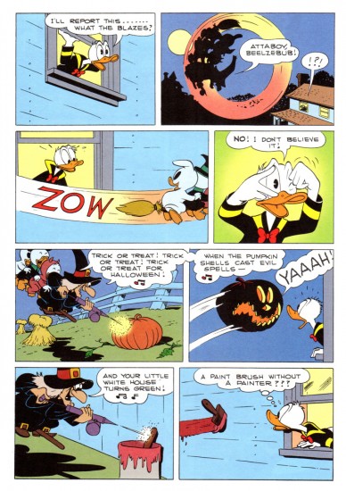
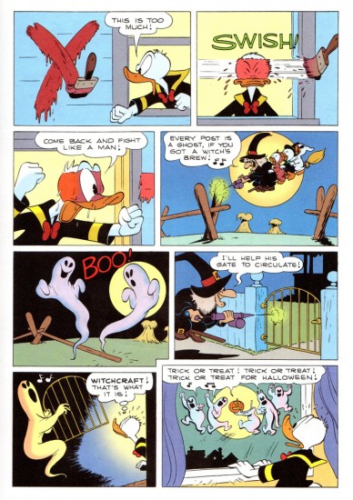
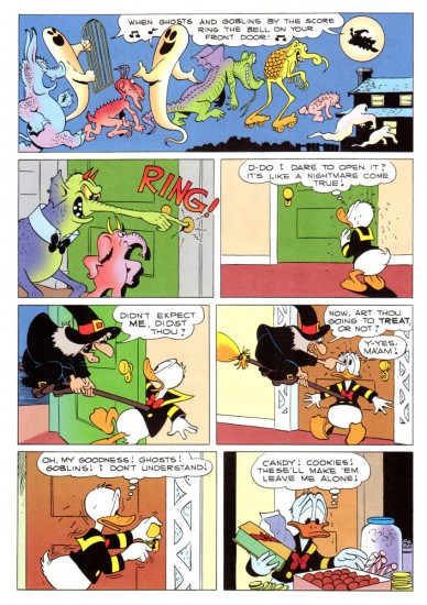
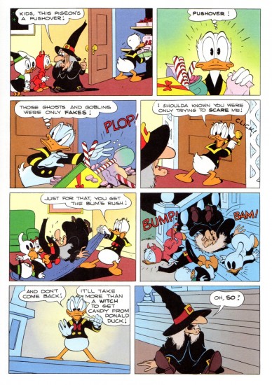
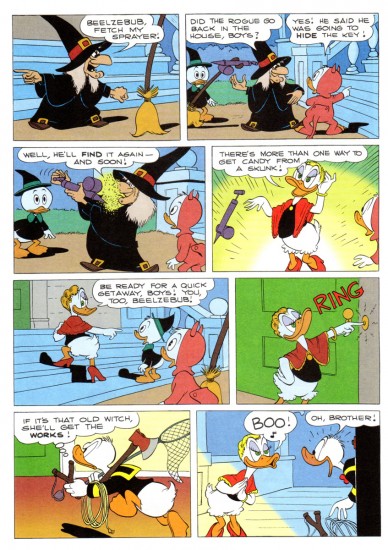
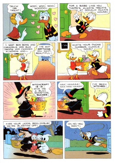
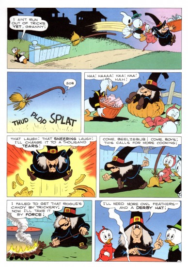
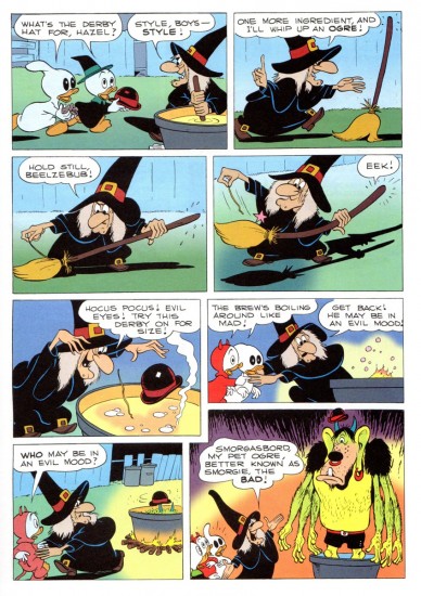
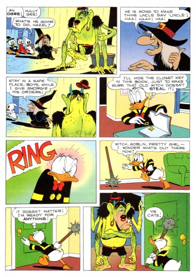
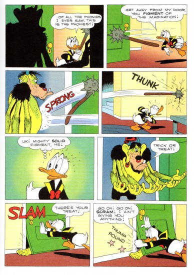
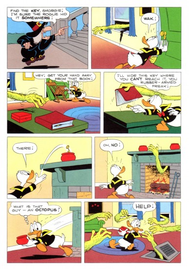
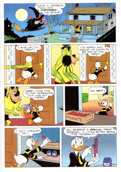
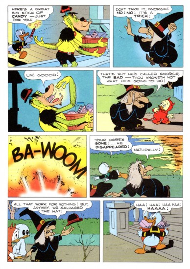
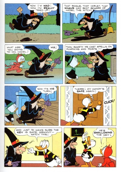
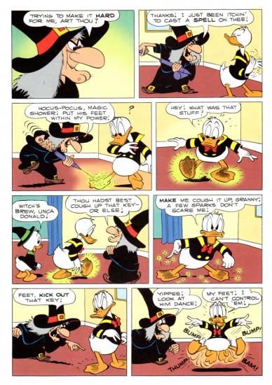
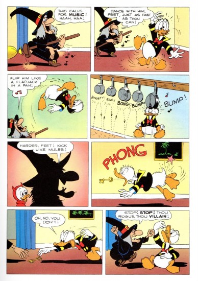
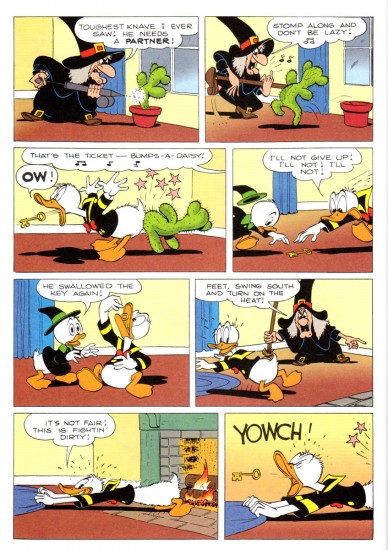
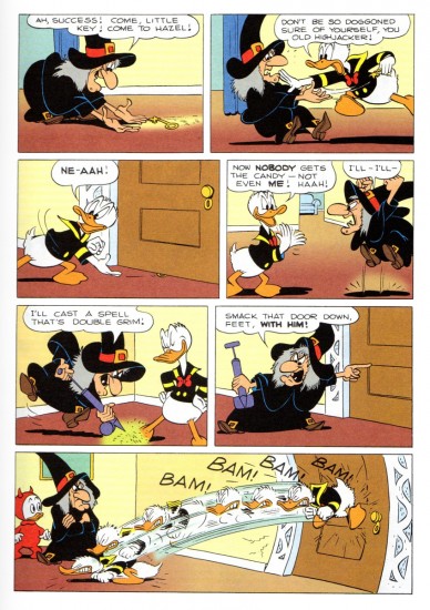
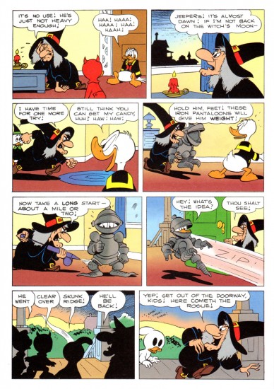
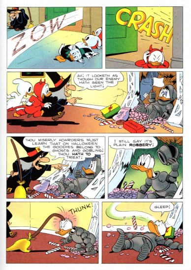
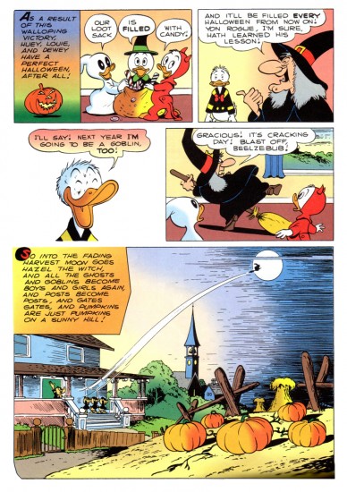
Trick or Treat à la Barks
Note: This is a long post. I was going to post it the day before Halloween, but I thought I’d give you something to do – revisit this classic comic – over the weekend. Happy Halloween.
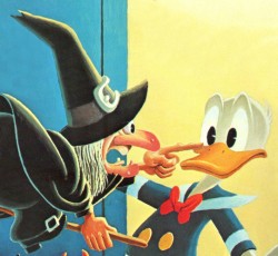 - I remember as a kid seeing the annual Halloween show on the Wonderful World of Color. Featured was the Donald cartoon wherein Hazel the Witch was introduced, Trick or Treat. Carl Barks went wild with this character and the premise, and it was a treat every year to get the new Donald story featuring the great character. (All that was missing was June Foray’s great voice. But I could play that in my head when I read the comic book. t was her first voice for Disney and her big break into animation voices. She started with a homerun; a classic the first time out of the box.)
Bill Peckmann has forwarded scans of the following story. Here’s his introductory words to the piece.
- In 1952 Carl Barks did a ‘Donald Duck’ comic book titled ‘Trick or Treat‘. It was a rare instance where a Barks story had its origins in a Disney Duck short. (Geoff Blum‘s excellent essay/history of the story at the end post will explain how the ‘Trick or Treat’ book came about.)
Here, with no tricks and all treats is Carl being at the top of his game, this is the cover of the original 1952 Dell comic book.
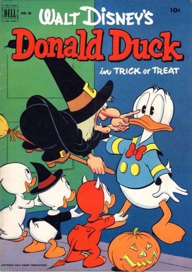
Comic book cover
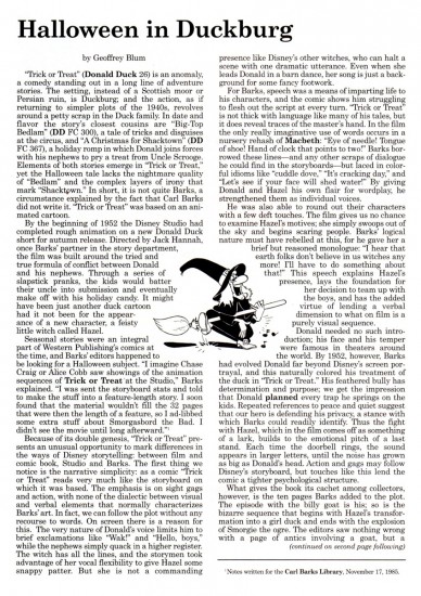
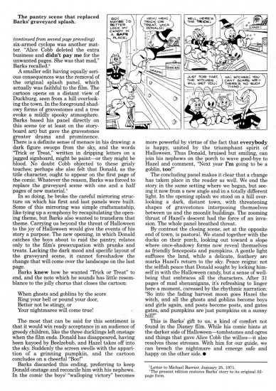
Here’s the article by Geof Blum writing about the genesis of this comic book story adapted from the animated short.
There’s a good post about the color of this strip for the Gladstone publishing version of Trick or Treat. Posted are a number of color guides for that version.
Finally, here’s Carl Barks’ oil painting based on the artwork for his classic comic book.
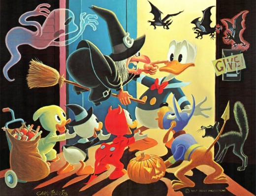
To be honest, I think this is the best of this series of oil paintings that Barks has done. It doesn’t feel like something overworked and trying too hard. It just captures the spirit of the original magazine as well as the spirit of the animated short from which it was adapted. Not only a Barks gem, but a Disney gem as well.
Animation &Bill Peckmann &Books &Comic Art &Disney &Illustration 19 Oct 2012 06:38 am
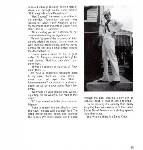
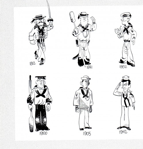
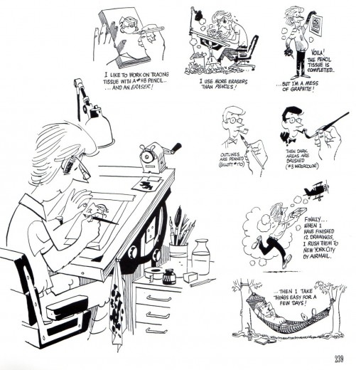
Hank Ketcham @ Disney – 2
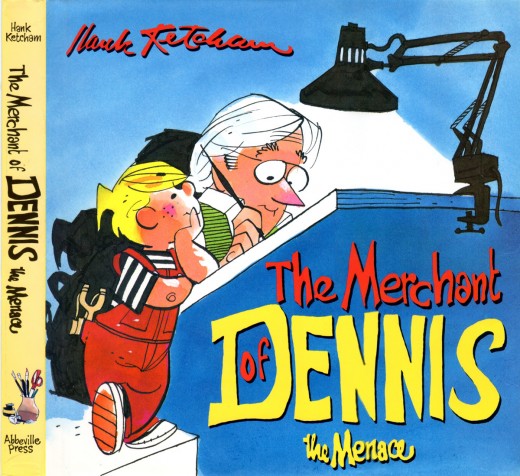
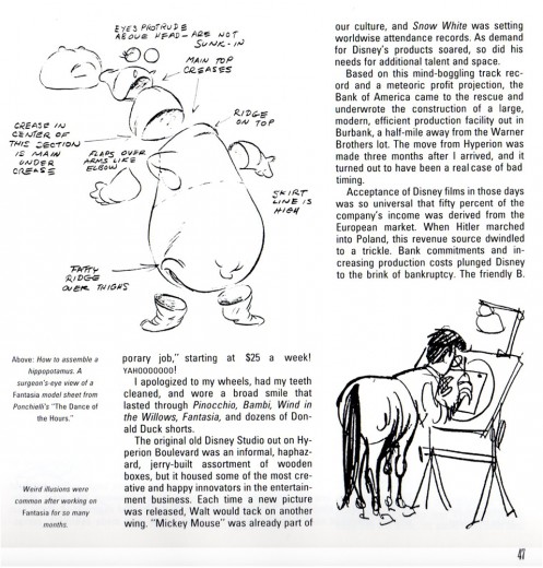
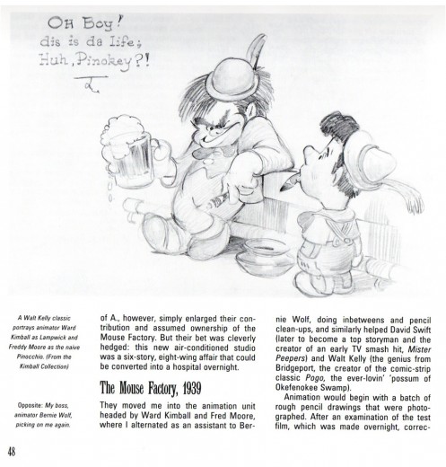
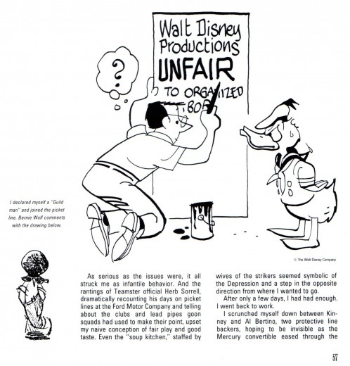
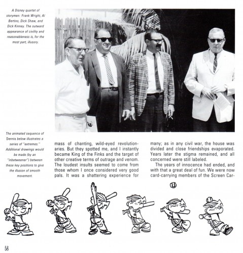
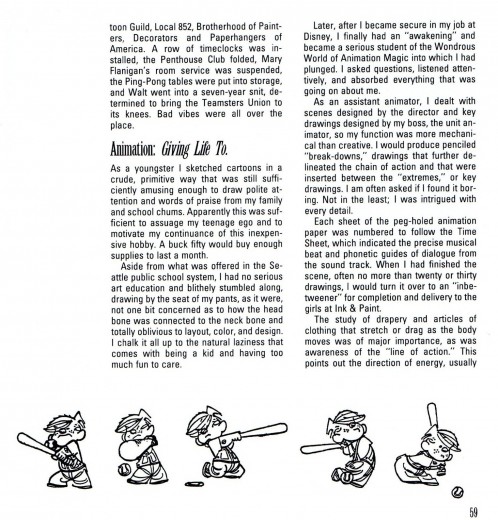
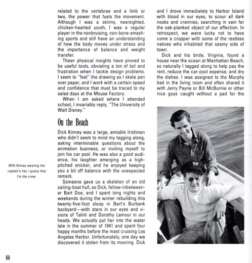
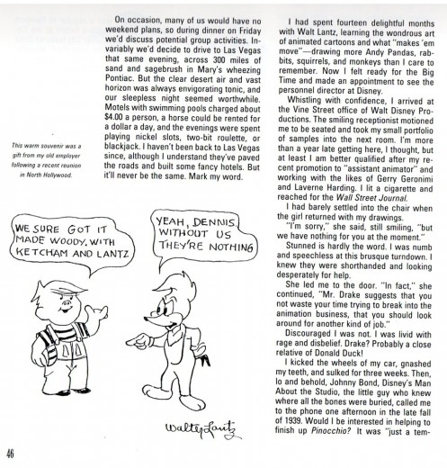
- On Monday I started posting this chapter from Hank Ketcham’s autobiography, The Merchant of Dennis the Menace: The Autobiography of Hank Ketcham. Bill Peckmann introduced me to this book, and the chapter I’m posting here. Many thanks to him for the scans.
This is the second half.
 18
18
Bill Peckmann &Books &Illustration 16 Oct 2012 05:53 am
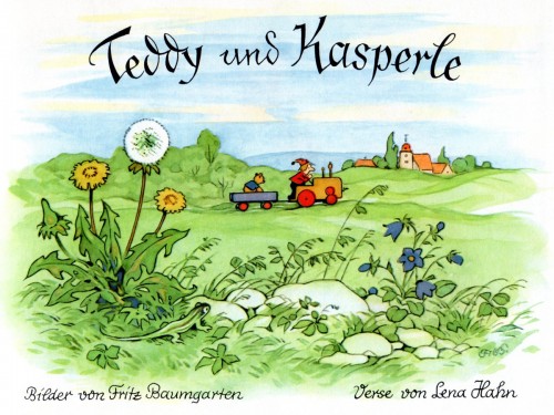
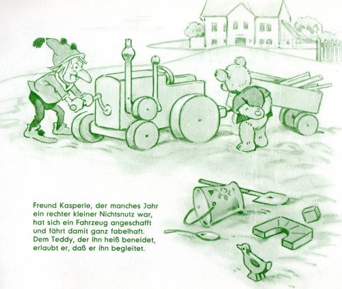
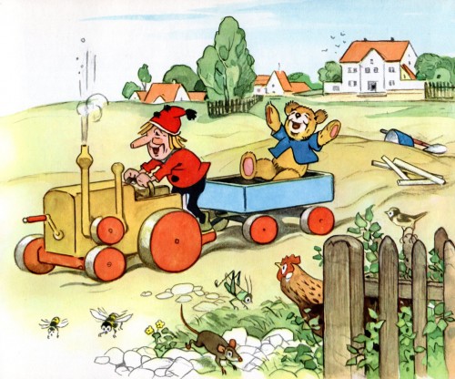
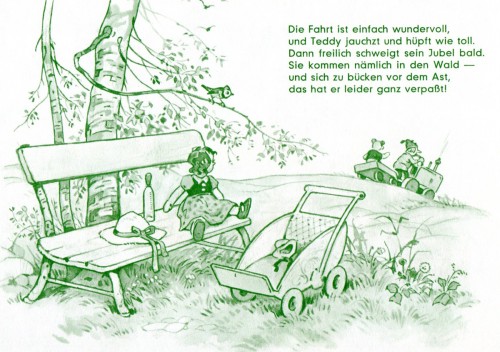
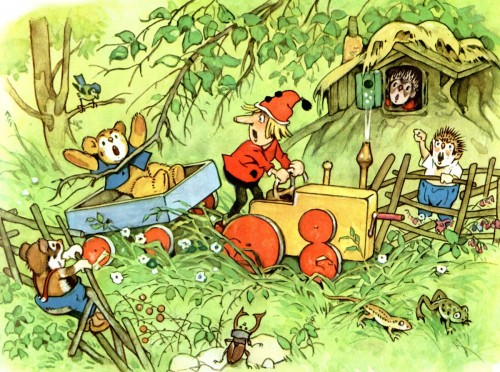
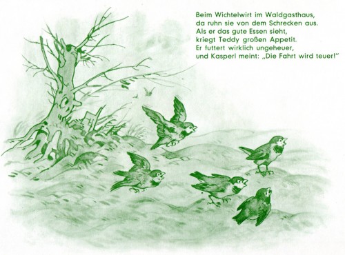
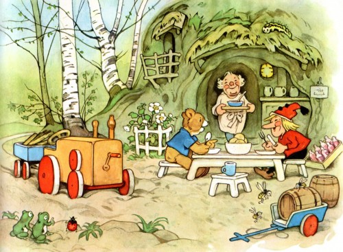
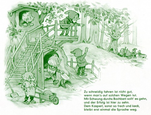
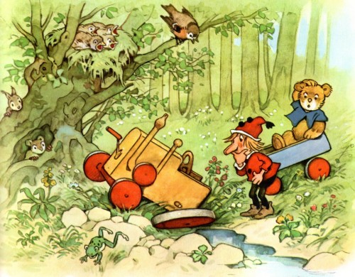
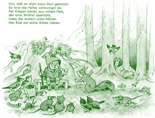
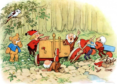
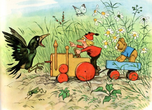
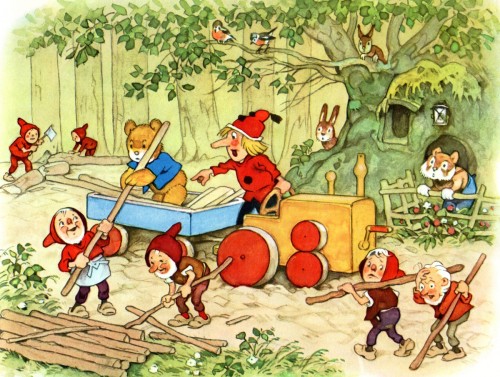
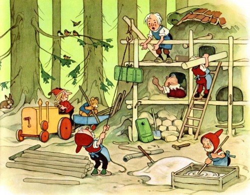
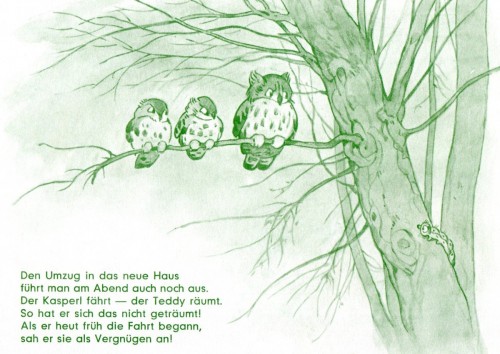
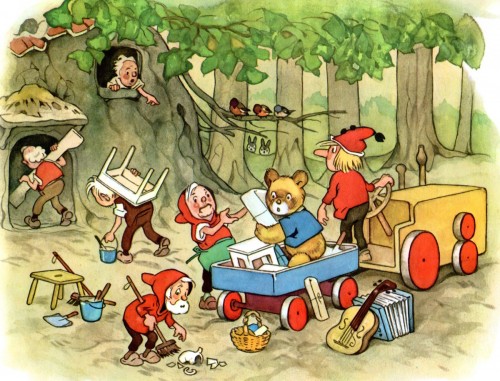
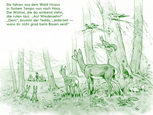
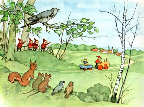
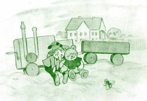
Baumgarten’s “Teddy und Kasperle”
- As you know by now, I am a fan of Fritz Baumgarten‘s illusration work.
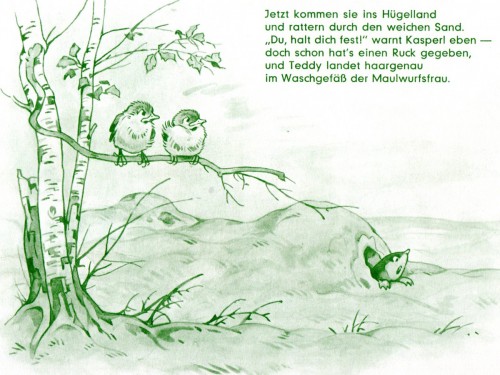
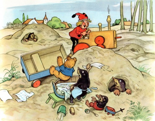
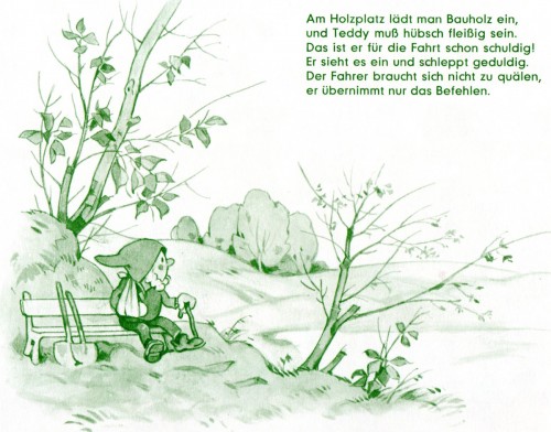
Bill Peckmann couldn’t please me more than by sending more scans of Mr. Baumgarten’s work. And it seems as though Bill has a large collection of his books. Here’s another one, Teddy und Kasperle. Teddy appears in quite a few of Mr. Baumgarten’s books, and he’s an entertaining character.
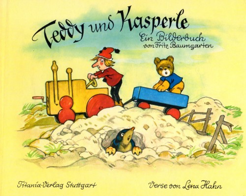
The book’s cover
Art Art &Bill Peckmann &Books &Daily post 12 Oct 2012 05:30 am
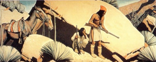
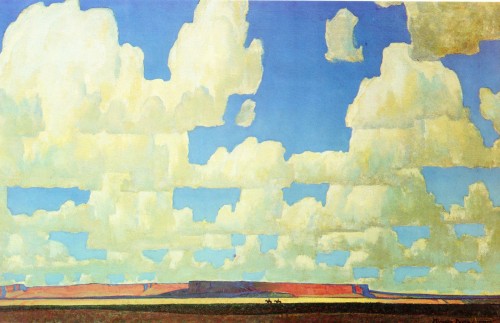
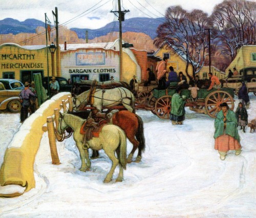
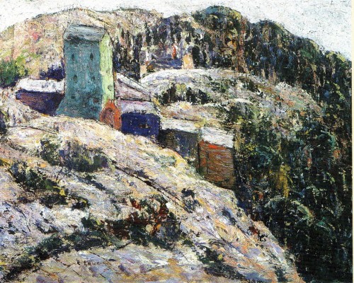
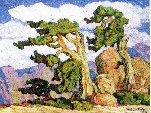
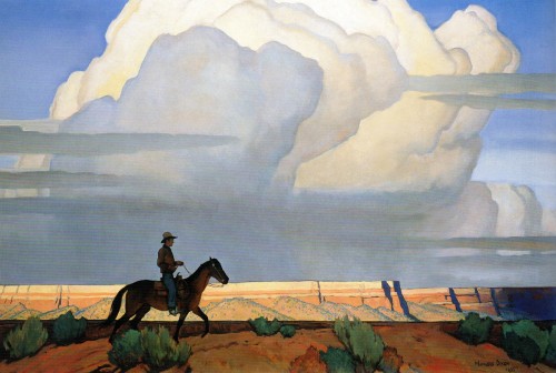
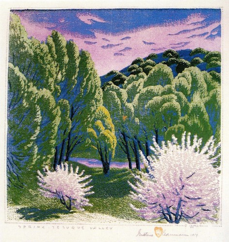
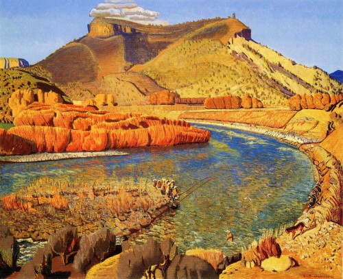
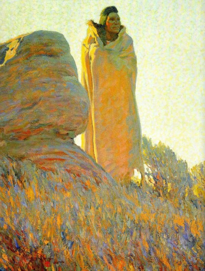
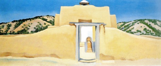
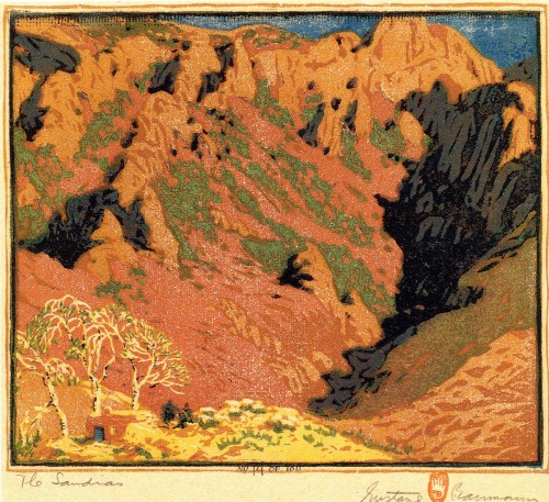
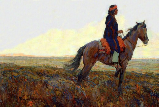
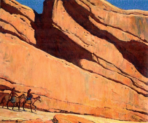
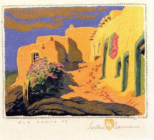
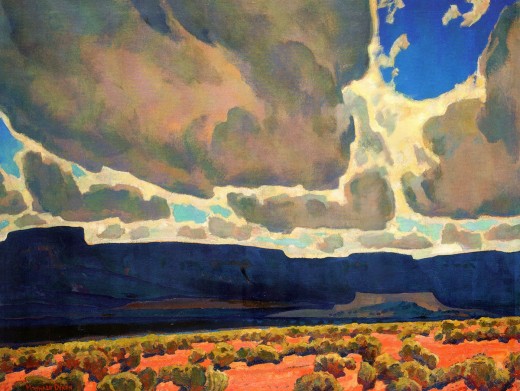
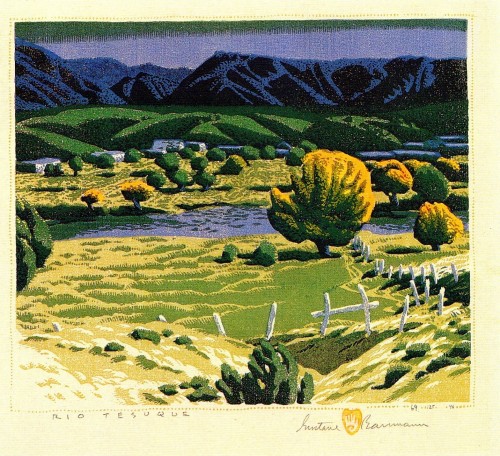
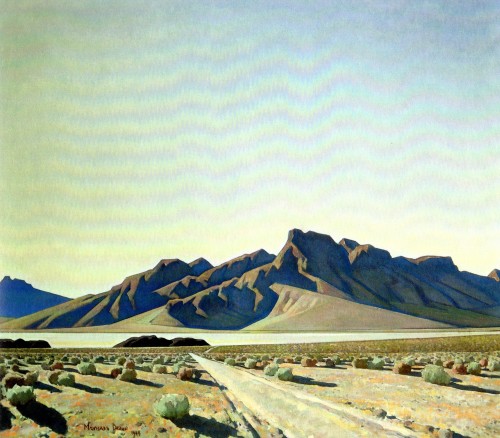
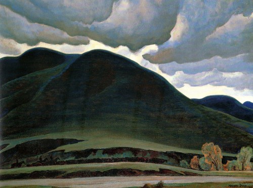
Western Art
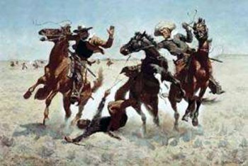 – I have a love/hate relationship with western art. The truly great, such as Remington, give a power and majesty through an extraordinarily honest approach to the world they found, pristine of the footsteps of western man. Many of the later followers are not quite as brilliant to my taste. I appreciate the extraordinary artistry and craftsmanship of many of these painters, but they stand on a plateau much lower than that of the great. Of course, there’s a wide variation among these artists, and they were searching for something very different than a Remington or a Charles M. Russell or Albert Bierstadt.
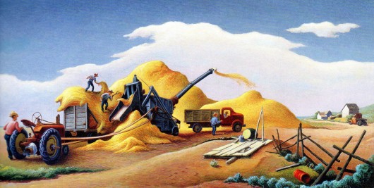
Bill Peckmann has sent some beautiful works of what seem to be predominantly early 20th century art. There’s a nice variation among the artists, some are on the genius level others aren’t quite as great. Some such as Thomas Hart Benton don’t seem to fit properly into the overall scheme as a “Western” artist. He seems more like a Mid-Western painter, a WPA artist, rather than a Western one, but I’ll post anything by him anytime. He’s exceptional, to say the least.
Here are Bill’s comments:
- Growing up in the Bronx with all of that asphalt, bricks and mortar years ago, it was very easy at that time to become enamored with the wide open spaces and succulent sagebrush scenery of comic book, movie and TV westerns. Like all first loves, those images had a way sticking with you through life. (In most of those oaters, I’d say the scenery often got the upper hand with a lot of those gunslinging heroes.) Somewhat older now, (and hopefully with a little better handle on the arts) it’s nice to see that ‘fine art’ western painting still has that same ability to make you want to become an ol’ cowhand.
Here is a sampling from different art books of a few of the artists who captured the best of the West.
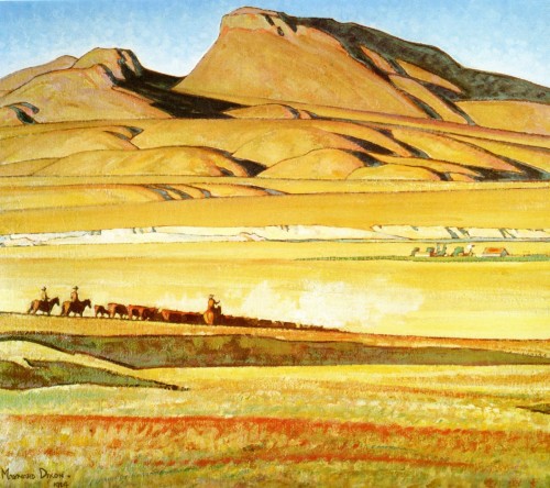 1
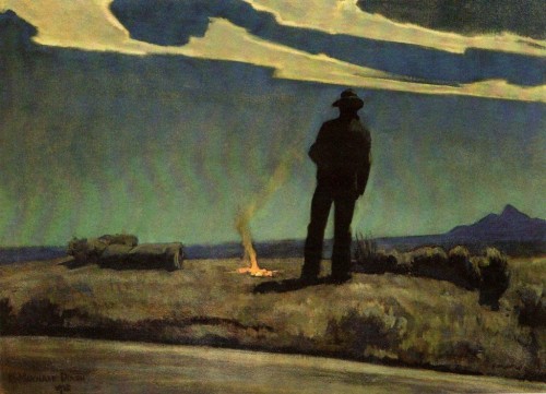
1Here is Maynard Dixon. (IMHO one of the greats, a western Edward Hopper.)
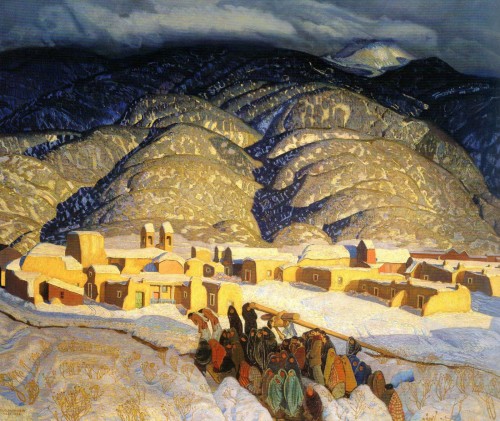 5
5
Ernest Blumenschein.
(This painting still floors me every time I look at it.)
 6
6
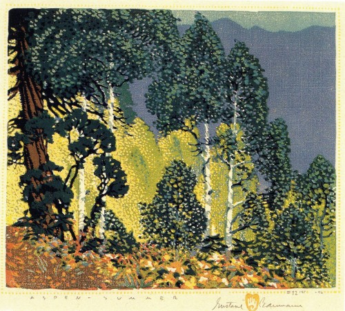
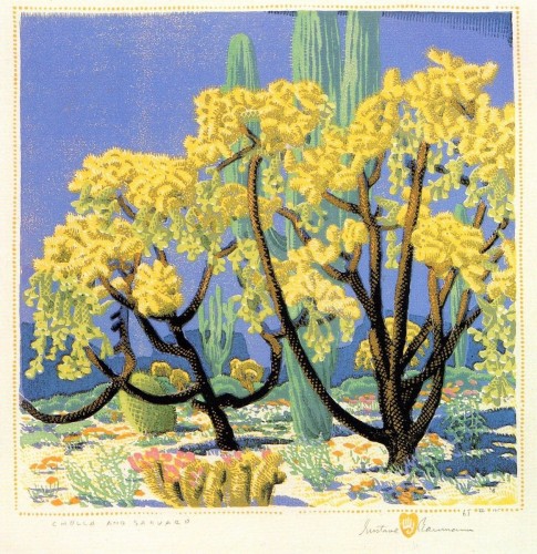
Gustave Baumann.
A western woodcut artist, a niche he made all his own.
Maynard Dixon
Art Art &Bill Peckmann &Illustration 09 Oct 2012 05:43 am
Lorenzo Mattotti
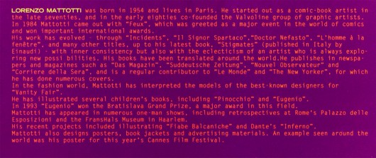
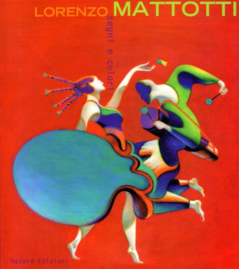
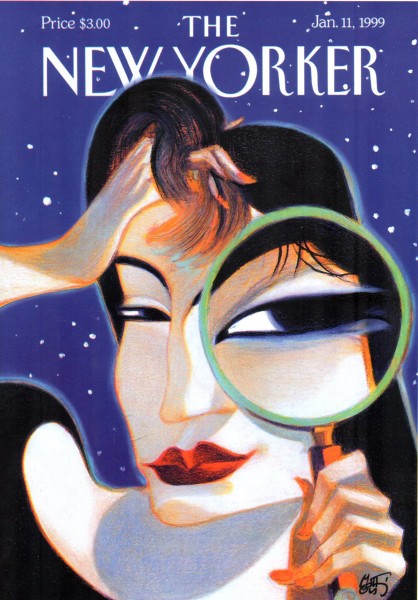
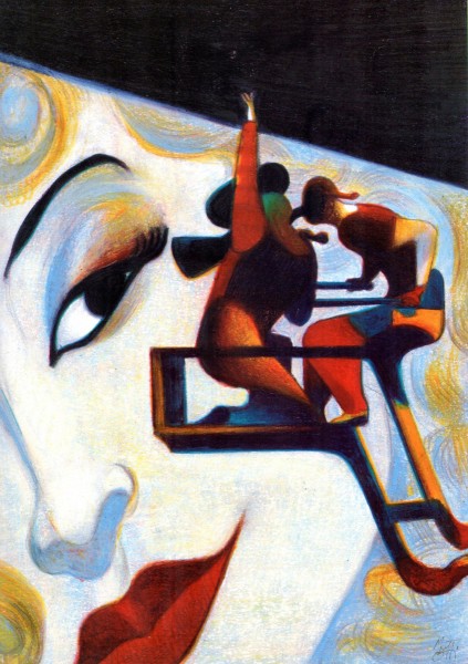
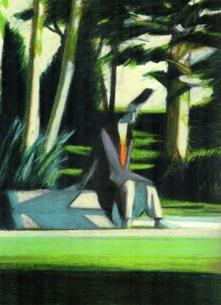
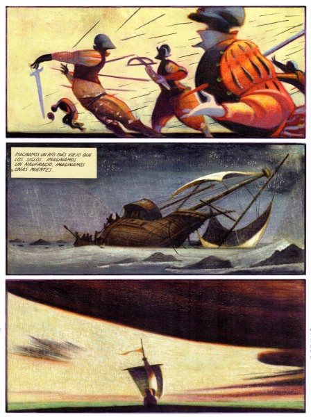
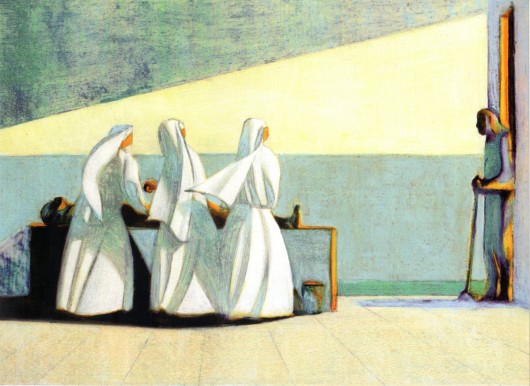
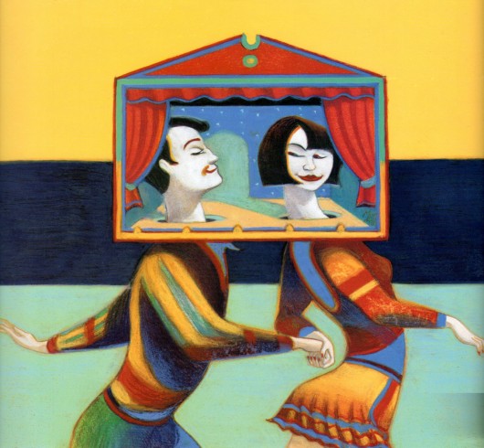
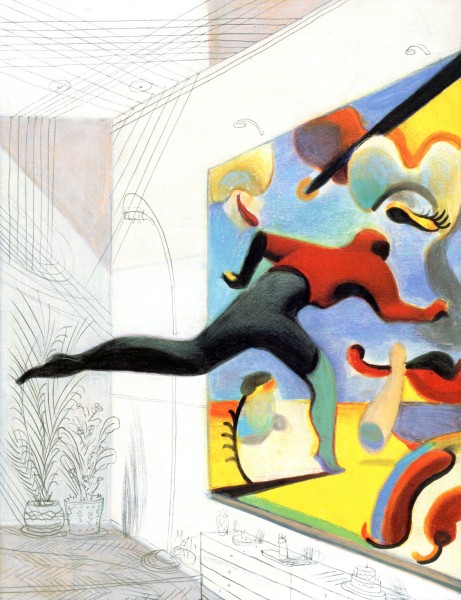
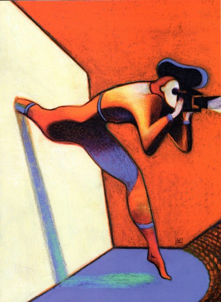
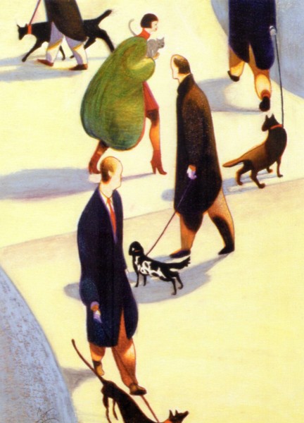
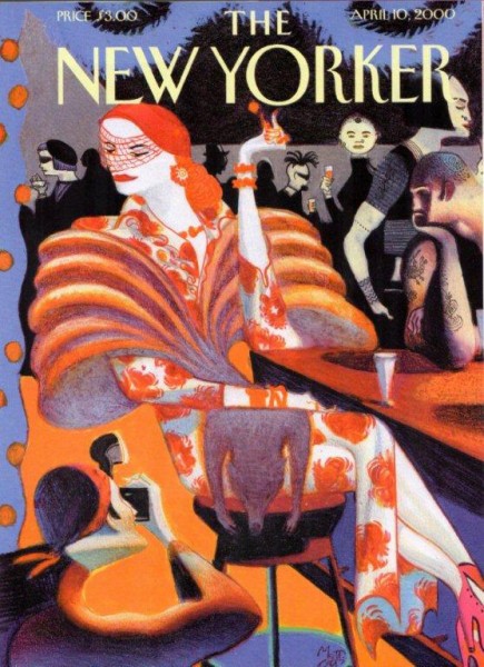
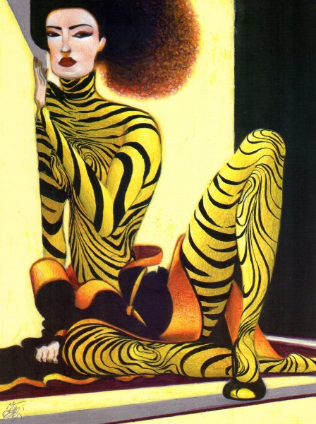
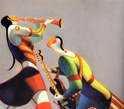
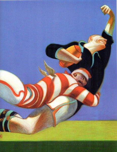
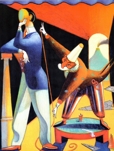
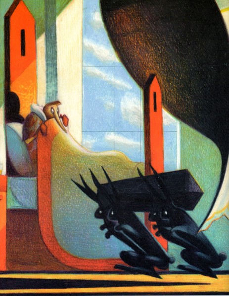
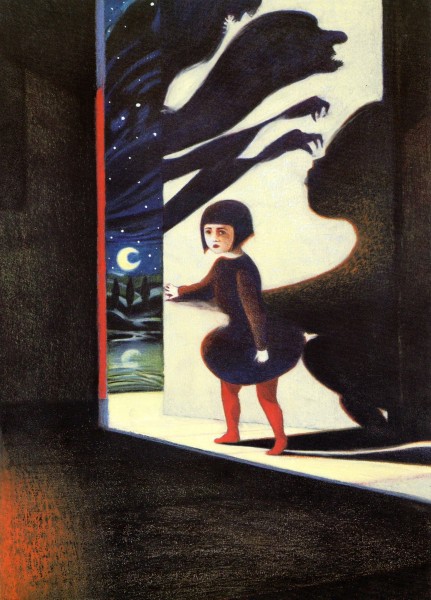
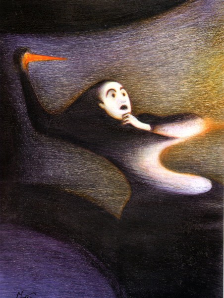
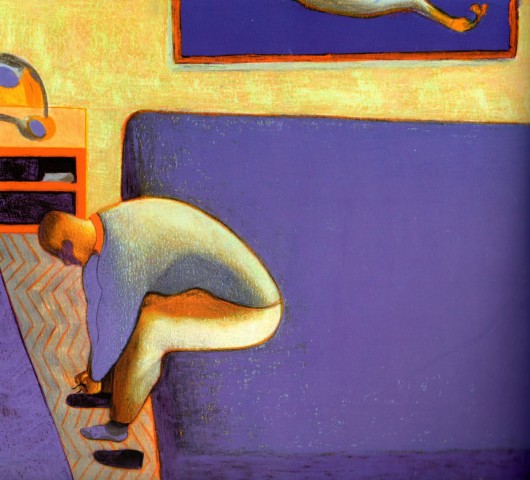
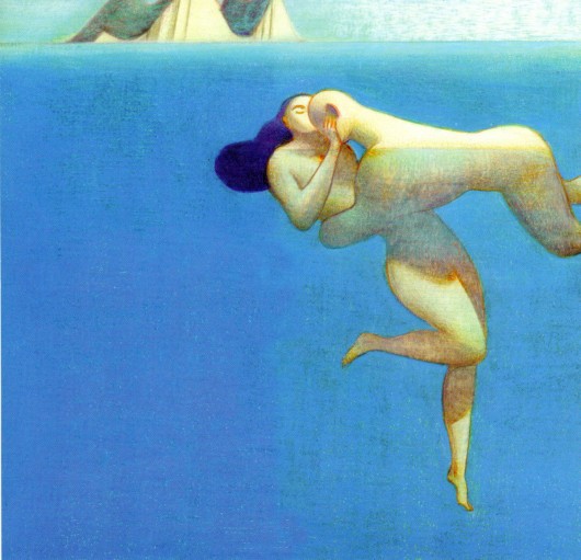
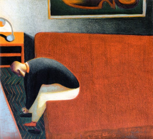
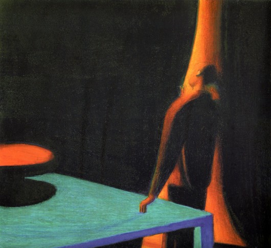
- Bill Peckimann reminded me of a great illustrater/artist who did many New Yorker covers for a short period of time. Lorenzo Mattotti is a sterling artist whose work always inspired. Bill put together quite a few pages from Mattotti’s book of artwork, and the results are exciting. Here are Bill’s comments:
- In the late 1990′s, Lorenzo Mattotti‘s New Yorker covers always had a way of jumping out of the newsstands and right into one’s briefcase! So it was a real delight when this book of his collected works came out in 2000.
If there happens to be a dark and dingy day and you want/need inspiration, this is it!
There are more beautiful drawings, sketches and colored images at:
the Official website (in English)
Mattotti blog (in Italian)
Here are some of his works:

Bill Peckmann &Comic Art &Illustration 05 Oct 2012 05:48 am
The “Z” that stands for “Zorro”
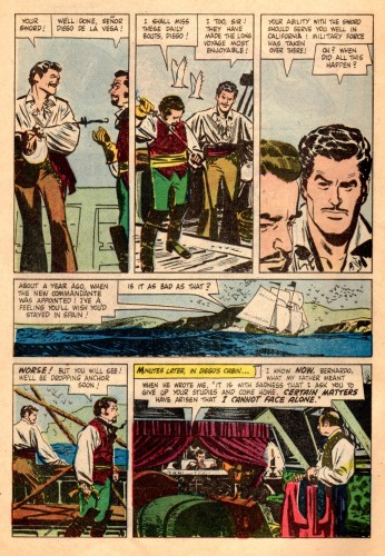
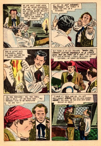
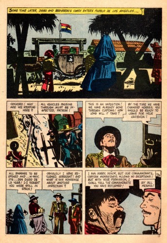
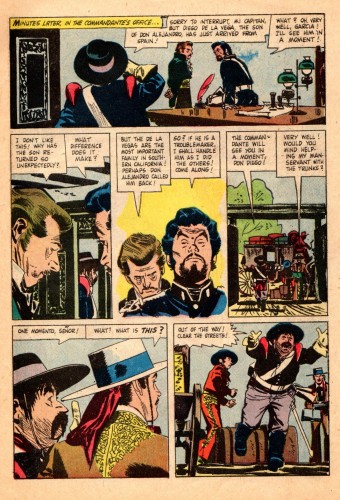
- When I was a kid in 1957, I was all hopped up on the start of a new series coming to TV. Every kid in America was. Zorro was promoted endlessly on the Disneyland Show and on Mickey Mouse Club. When it finally came time for the show to premiere, I was in trouble. I had caught the Asiatic Flu, troublesome in those days, and was violently sick. I wasn’t allowed to leave my bed. I was so upset at the idea of missing Zorro, that I was probably getting myself sicker. My father carried me out of my bed into the living room to watch the premiere, and I was ecstatic. The show was great (but probably not as great as the one that had built n my mind), and all was right with the world.
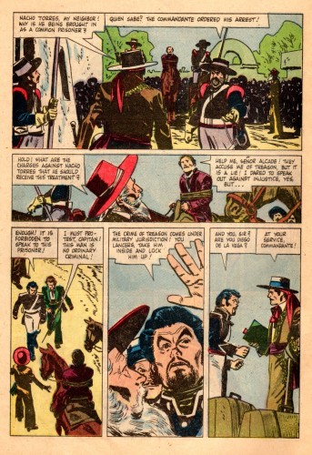
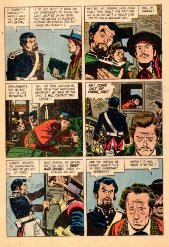
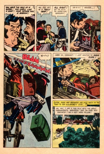
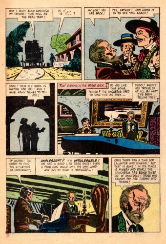
Naturally, I owned the comic book when that came out. Now here comes that very same comic via email. Bill Peckmann sent me scans and added a lot of additional material as well. I hope you enjoy it. Here’s Bill:
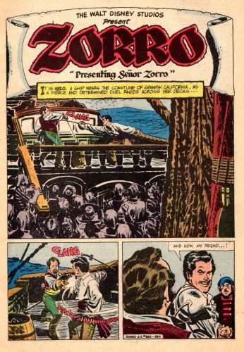
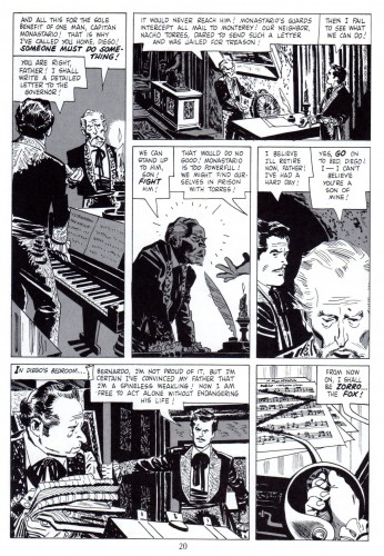
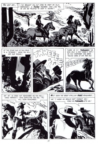
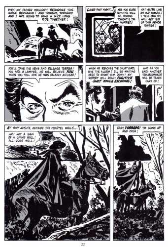
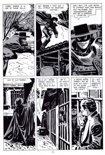
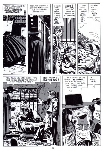
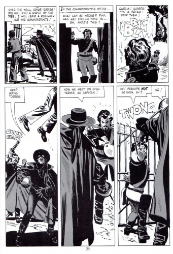
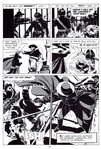
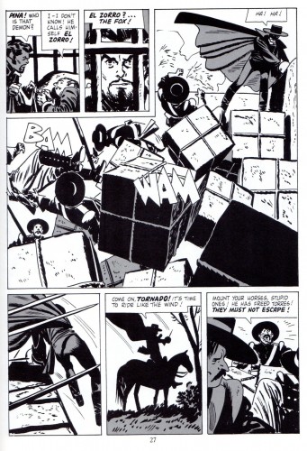
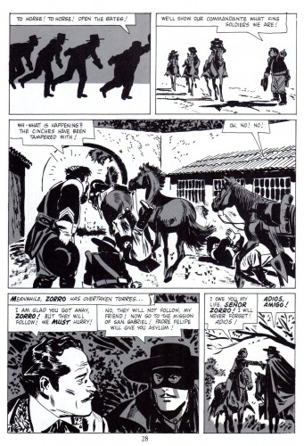
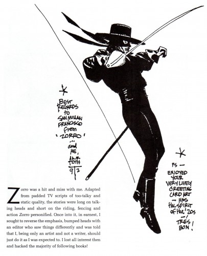
- What happens when you take a cartoonist who excels in designing and staging in black ink and give him the assignment of illustrating a western capped crusader dressed in black, you get the classic comic book series “Walt Disney Presents Zorro”, that’s what!
We lucky fans of Alex Toth always felt it was a match made in heaven, but Alex had a slightly different take on it, which you will read further into the post.
Here is a small scrapbook of “Zorro” art that spans over 40 years.
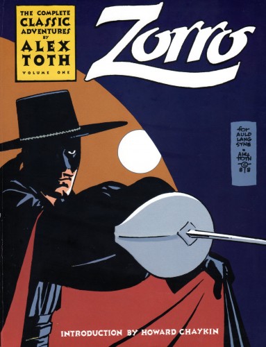
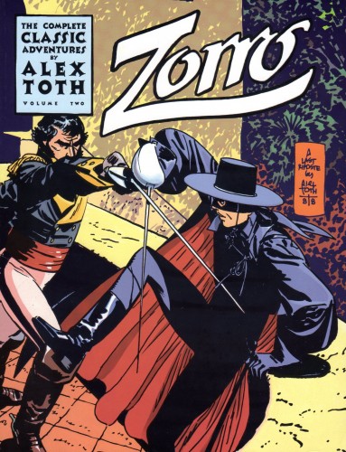
We start with the first Zorro (origin) story from Dell printed in 1957. The first half of the story is the original color comic book, the second half of the story is a black and white reprint version taken from Eclipse Books’ “The Complete Collection of Zorro” printed in 1988. Editor Dean Mullaney was able to get Alex to add new gray toning to the pages and do two new beautiful covers!
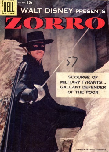
Magazine cover
 20
20
The two new covers done in 1988, Alex at the top of his game.
 21
21
This illustration is from Manuel Auad’s “Alex Toth” book.
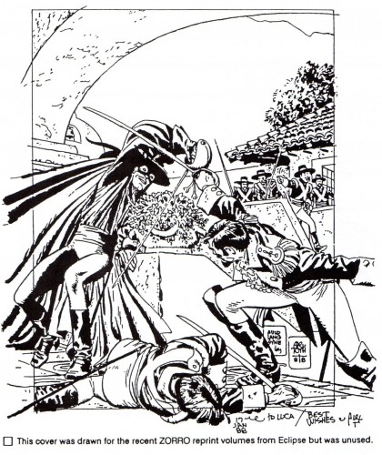 22
22
This is taken from Manuel Auad’s “Alex Toth” book.
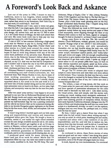 23
23
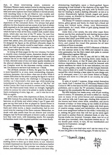
Alex’s thoughts on “Zorro” taken from Dean Mullaney’s Eclipse book.
 25
25
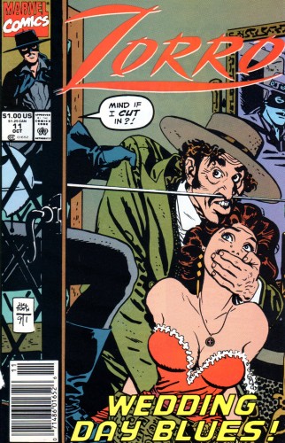
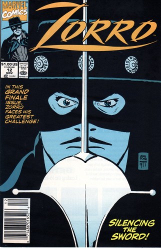
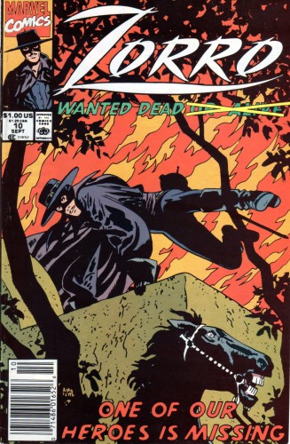
Marvel Comics brought Zorro out of retirement in 1991
and Alex did three covers for that venture.
 28
28
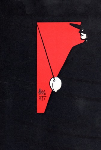
There was always need for a Zorro sketch here and there
and Alex always obliged!
Bill Peckmann &Story & Storyboards 28 Sep 2012 05:54 am
Toth H&B storyboard
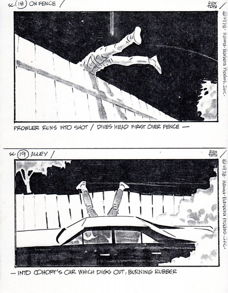
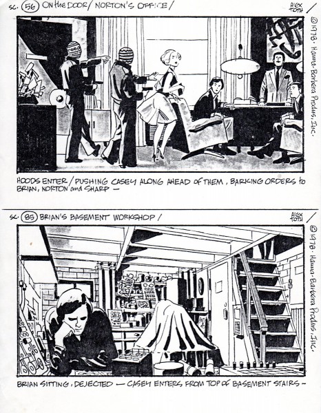
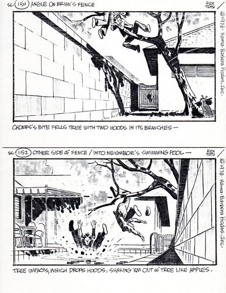
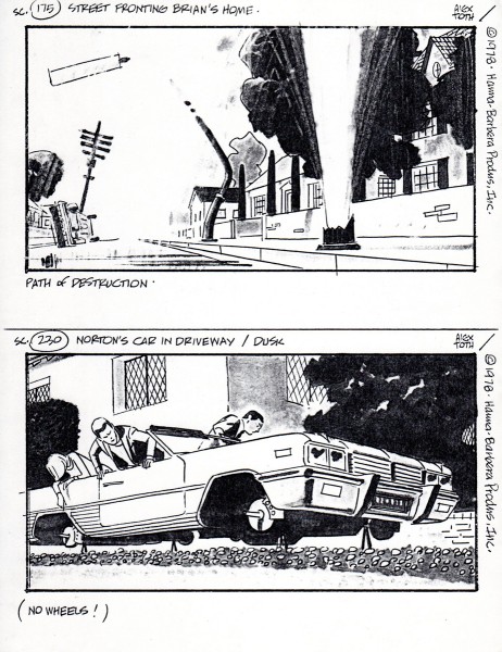
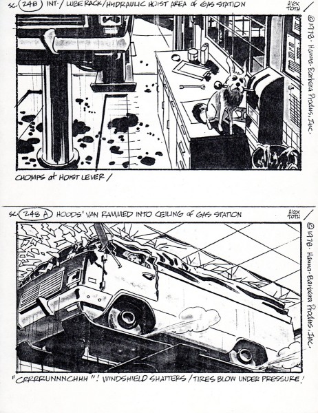
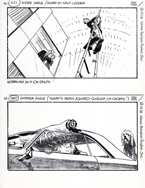
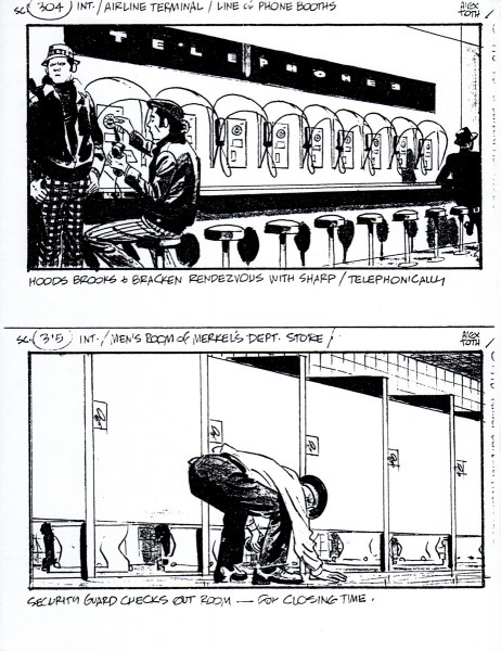
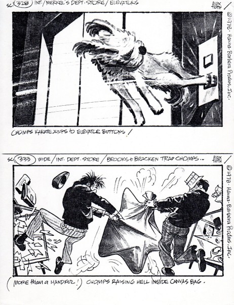
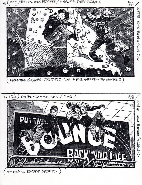
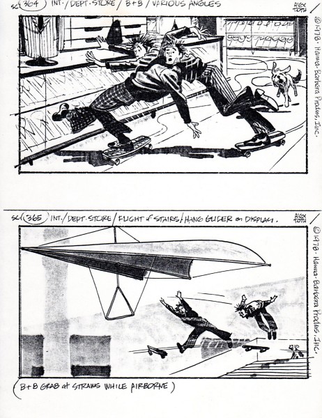
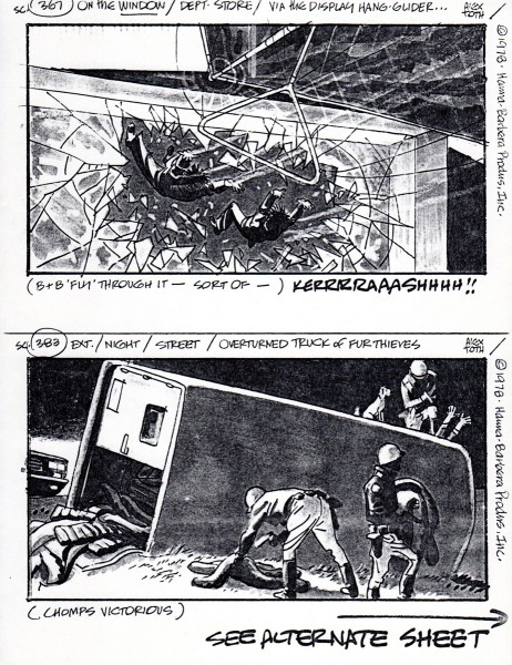
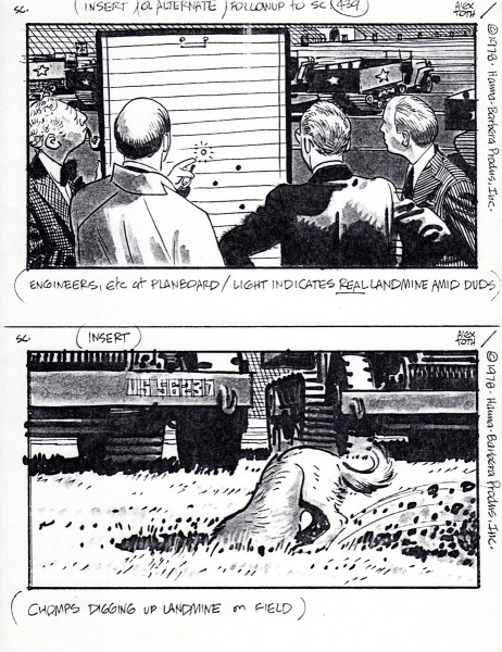
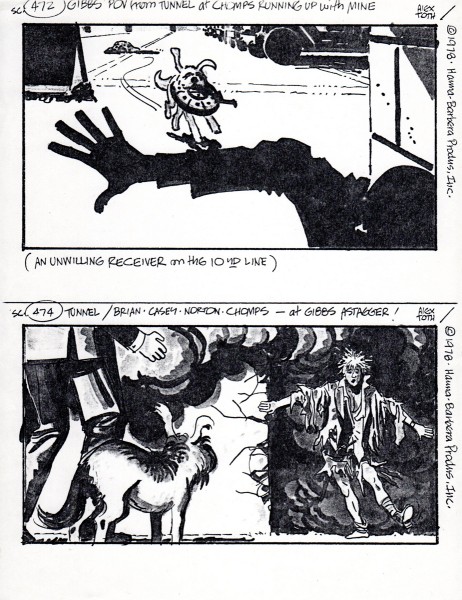
Alex Toth worked at Hanna Barbera in their story department. Bill Peckmann told me he had some boards from Toth’s stay there, and I asked him to send them on. The board presented here is far from complete. It’s missing many pages and whole segments. But the images, as might be expected are terrific. So look for the drawing and forget the storytelling.
Here are some comments from Bill:
- I’ve come across some Toth storyboards (copies) from his Hanna-Barbera days. One incomplete set is really neat. This is a live action board that Alex did for Hanna-Barbera in 1978. Unfortunately all we have are these Xeroxed 28 random panels from the original board. (I wonder if that still exists anywhere?) At least it gives us a rare peek at how Alex handled a live action film assignment instead of his H-B Saturday morning cartoon fare. With this sparse sampling of pages, the continuity will not make much sense but the individual panels are a pleasure to look at.
The title of movie that Alex did this live action storyboard for, it’s a 1979 film called “C.H.O.M.P.S.”
Here is it’s listing in HALLIWELL’S FILM GUIDE.
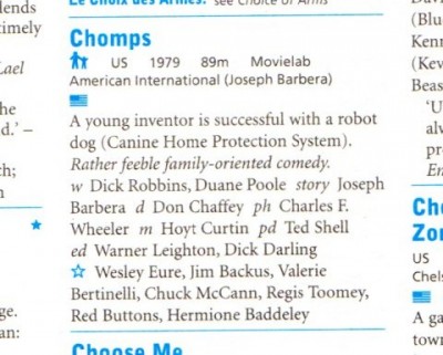
.
And here is the board:
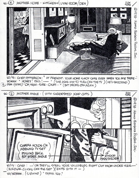 1
1
Bill Peckmann &Photos &Steve Fisher 23 Sep 2012 05:26 am
Gaudi Gaudi Gaudi
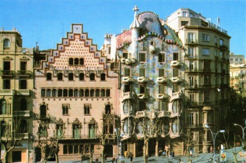
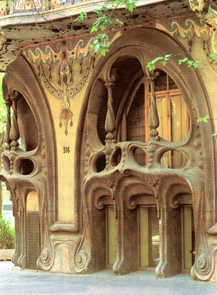
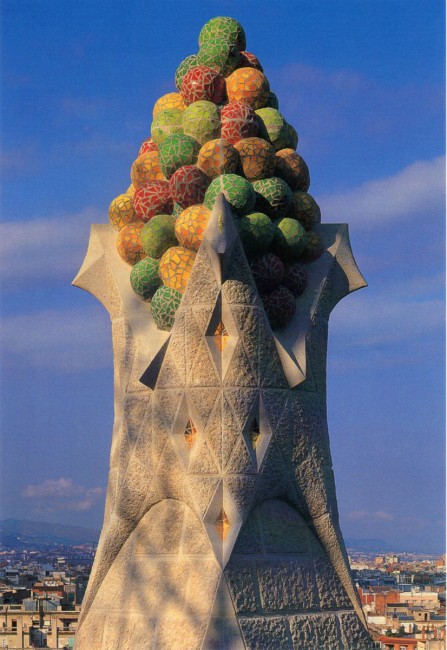
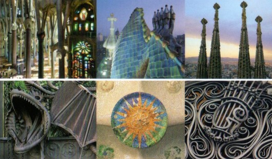
- Yesterday, Bill Peckmann sent me a few scans with this note:
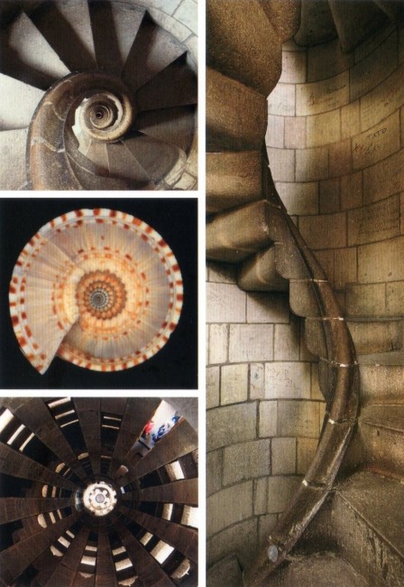
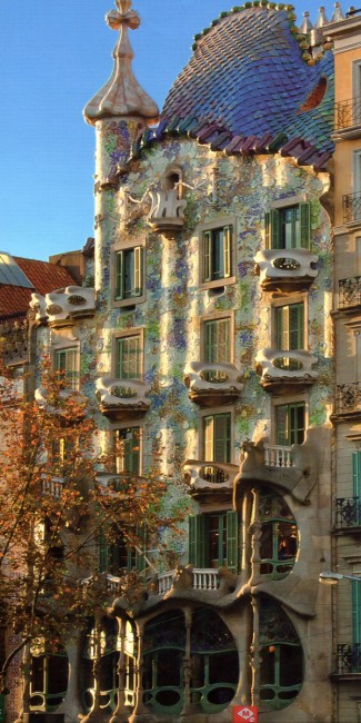
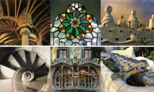
- My stepdaughter Bethany just came back from her trip to Spain and brought back these very pretty gaudy postcards. Gaudy as in the Antoni Gaudi, famous Spanish architect. He would have had fun at Epcot and the Disney parks!
Here are the scans sent:
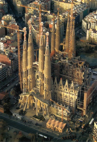 1
________________
1
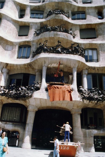
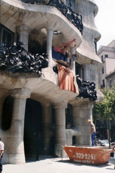
________________These pictures reminded me that my friend, Steve Fisher, who is an architect, went to Spain to photograph the Gaudi buildings. I asked him to send me any pictures he could get together quickly. Of course, he’d shot them before there were digital cameras, so he had to scan the stills he had on hand.
Take a look:
The first three are pictures of Gaudi’s Casa Milá [1905-10]
The next two are of Casa Battlό [1905-07]
The last three photos are of his most iconic work,
the Church of the Sagrada Familia [1903-26].
It was not finished in Gaudi’s lifetime [he died in 1926],
but since his death, others have continued to work on it
based on interpretations of his ideas. They’re still working on it.
Bill Peckmann &Commentary &Daily post &Rowland B. Wilson 21 Sep 2012 05:19 am
RBW at Auction and otherwise
- If you’ve ever wanted to own a Rowland B. Wilson cartoon, now’s your chance. A number of Playboy cartoons by Wilson are up for auction via Heritage Auctions. The auction will end on Oct. 13th, and you can make a bid now, if you like. I’ve posted the cartoons available below with some of the descriptive material from the auction house. Good luck.
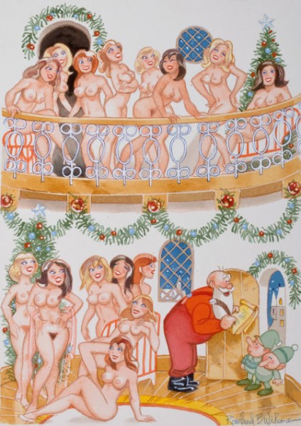 1
1“This Year I’m Putting in a Provision For Good Big Boys Too!”
Playboy page cartoon illustration, January 2002
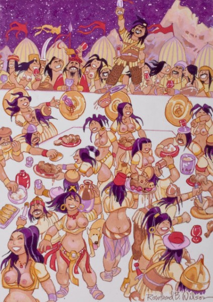 2
2
“A Toast to the New Year!
May It Be Another Prosperous One For Atilla and All Us Huns!”
Playboy cartoon illustration, January 2003
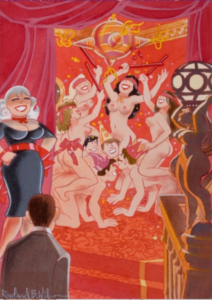 3
3
“We’ve Added a New Kink to the Piñata Tradition!
Playboy cartoon illustration
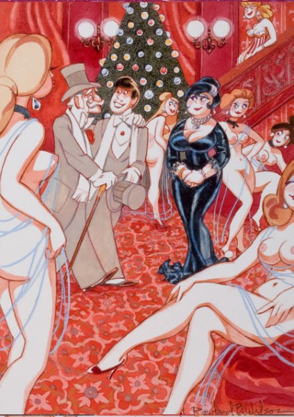 4
4
“At Long Last, Grandfather, You’ve Taken Me to See the Nutcracker”
Playboy cartoon illustration, January 2000
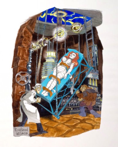 5
5
“If I Can Bring This Lovely Creature to Life,
She Will Bring Me Everlasting Immorality!”
Playboy cartoon illustration, November 1981
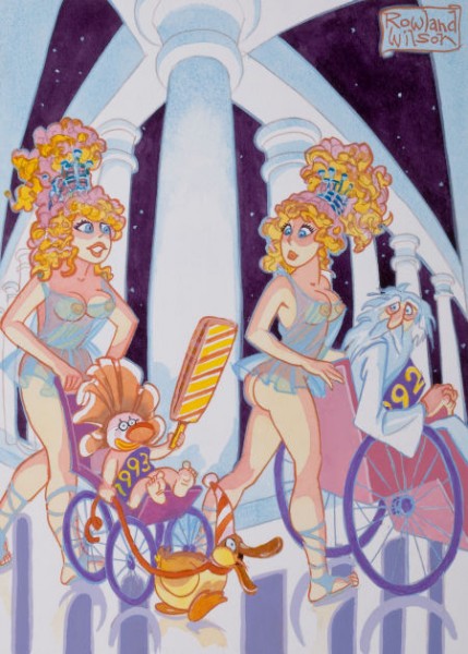 6
6
“I Have a Feeling ’93 is Going to Be a Very Weird Year”
Playboy cartoon illustration, circa 1993
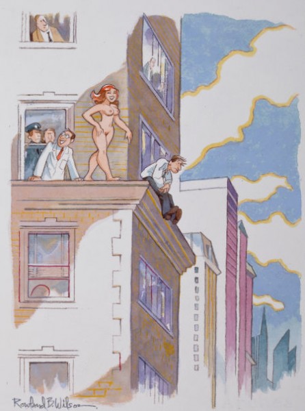 7
7
“Miss Perkins Has a Perfect Record in Dealing with Potential Suicides”
Playboy cartoon illustration, May 2003
______________________
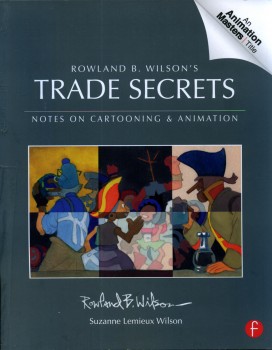 And as long as we’re talking about Rowland Wilson, I can’t pass up the chance to tell you, yet again, how great Trade Secrets is. Subtitled, “Notes on Cartooning and Animation,” the book is so much more than that. It’s a lifetime’s worth of invaluable notes, advice and commentary about illustration, cartooning and (most importantly to me) animation. I’ve read large chunks of this book over and over again. It all seems so basic and simple, when you’re deep into it, but the book is thick with brilliant comments about the art of drawing and painting. You’ve got to get your hands on it just to see how rich the material is. Once you do, though, you’re going to want to own it. I feel not only indebted to Rowland for the material but to Suzanne Lemmieux Wilson for having finished the book and making sure it looks as perfect as it does. It’s a treasure.
To give another view of some other advertising work done by Rowland Wilson, Bill Peckmann forwarded these pieces. Here’s Bill:
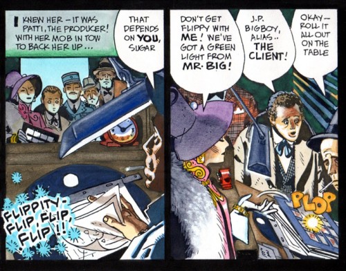
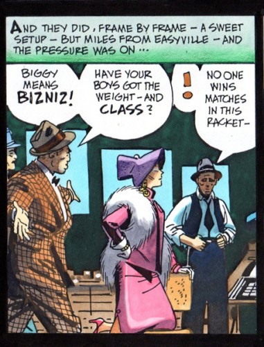
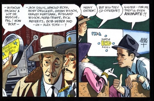
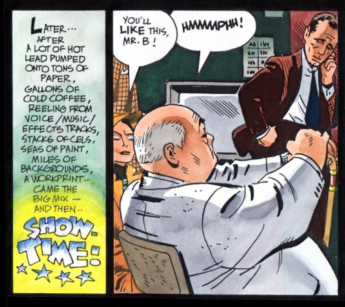
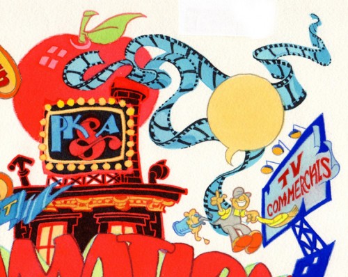
- I thought maybe you would enjoy seeing the original art of two Phil Kimelman & Ass. house ads. The first one is all Rowland Wilson, both concept and finished art, the second one is a collaboration of Rowlie and Alex Toth.
We’ll start with the printed ad as it appeared in Millimeter magazine in 1979, and then do close ups of the original art.
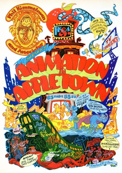
The full sized ad
No lettering in the word balloons, that was done on a separate over lay.
The second PK&A house ad was written by Rowland Wilson, Alex Toth did the finished black and white art and then Rowland colored it with his water colors.
Here’s the black and white.
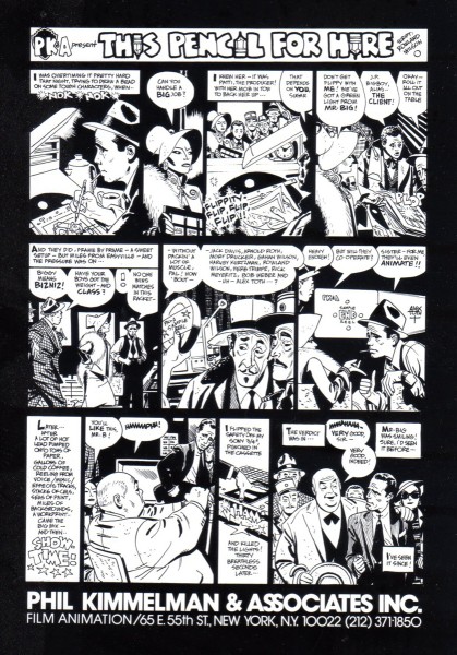
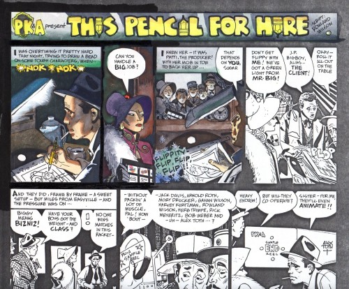
We took Alex’s original art, xeroxed that on to kid finished
Bristol board, the paper Rowland always worked on.
Here is an unfinished, experimental start by Rowland.
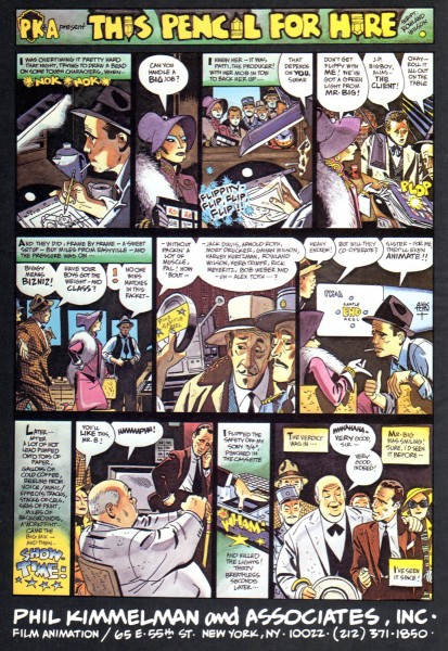
The only time the ad ever ran in color was here
in the 1982 International Film Guide paperback.
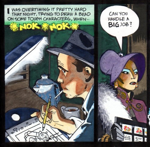
Hopefully all will enjoy these panels in their large format
and be able to see how each one works by itself
in the drawing and the coloring.
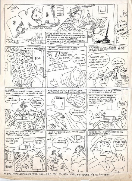
Here is a small footnote to the history of the ‘Pencil for Hire’ ad.
It’s my rough that started the ball rolling. I was hoping to entice
Alex into doing a take off on a Milton Caniff type Sunday comics
page for our house ad. Fortunately, Rowland was looking over
my shoulder and thought it was time for a rewrite!
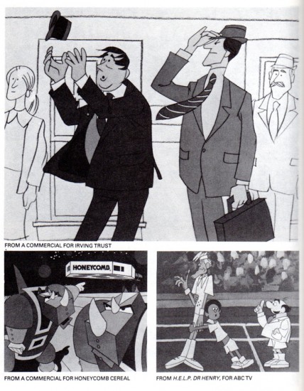
The 1982 Film Guide also contained this page, the “Irving Trust” commercial
and the “Dr. Henry” series were designed by Rowland, the “Honeycomb” spot by me.
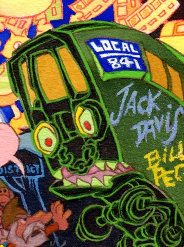
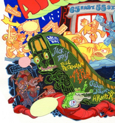
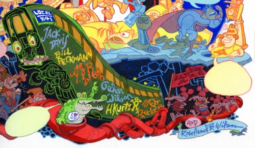
PS: I wanted to end on this button. For all of us who
still remember “Local 841″ and green subway cars!
