Category ArchiveBill Peckmann
Bill Peckmann &Comic Art &Illustration 08 Mar 2013 05:35 am
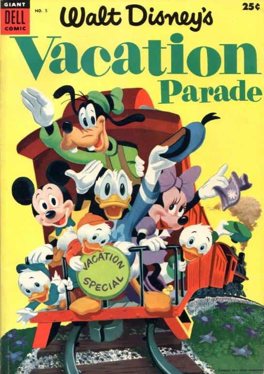
Vacation Parade
I’ve written in the past about how much I enjoy the work of Dick Moores. So I’m always pleased when Bill Peckmann sends comic art by him, and am excited to post it. Here’s the latest. From Bill:
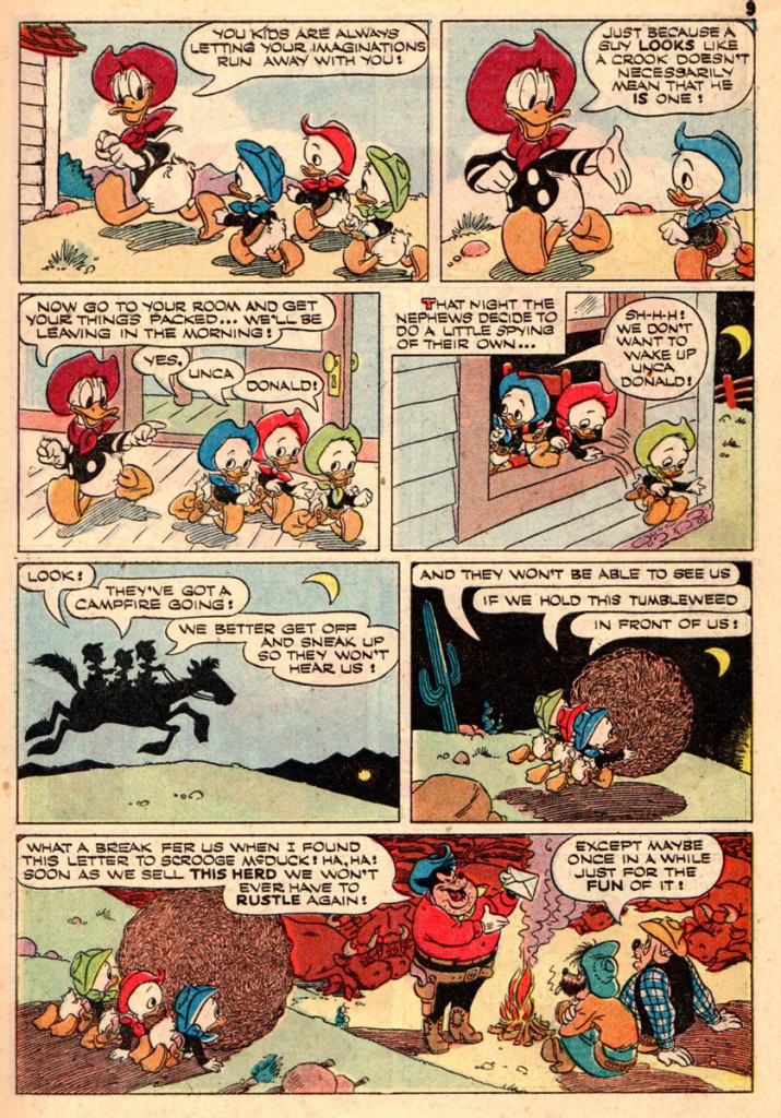
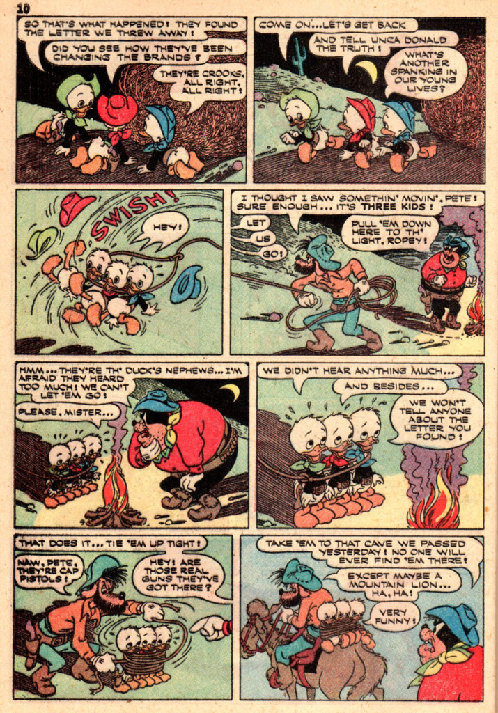
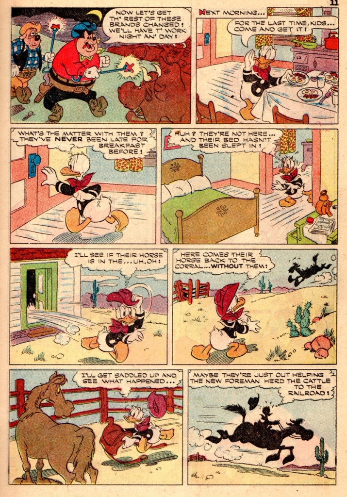
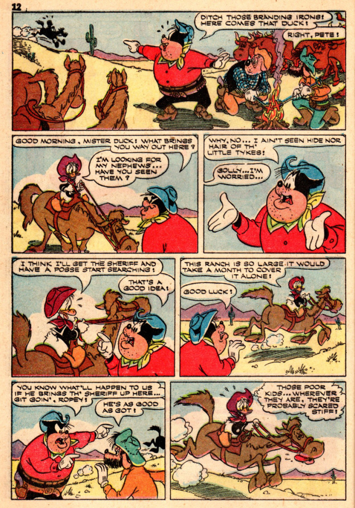
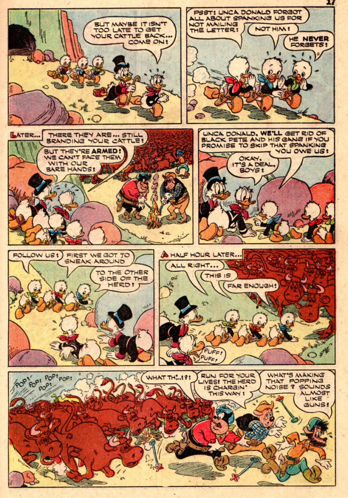
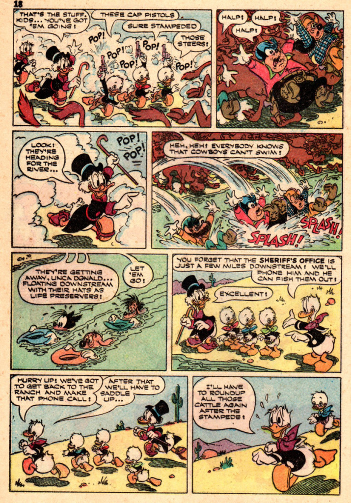
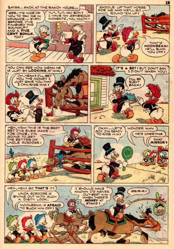
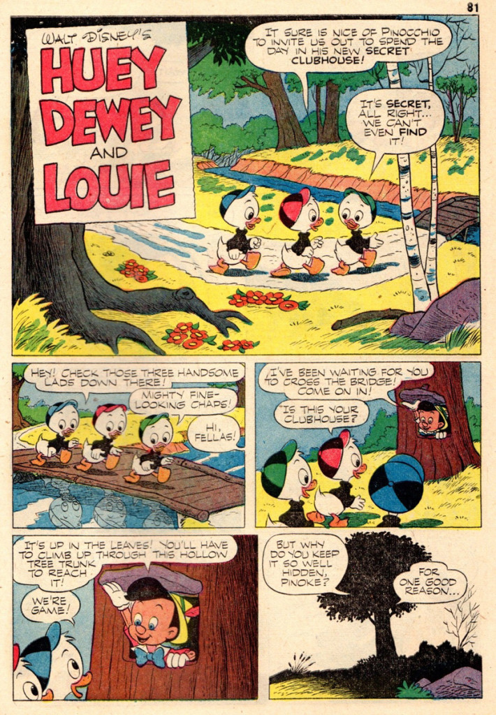
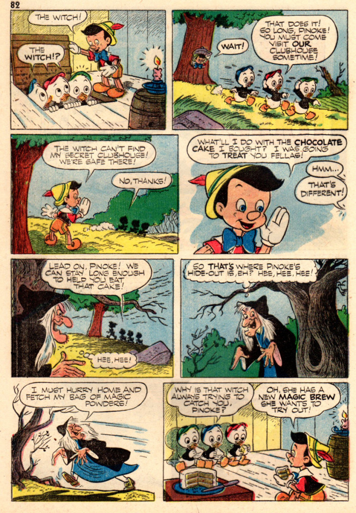
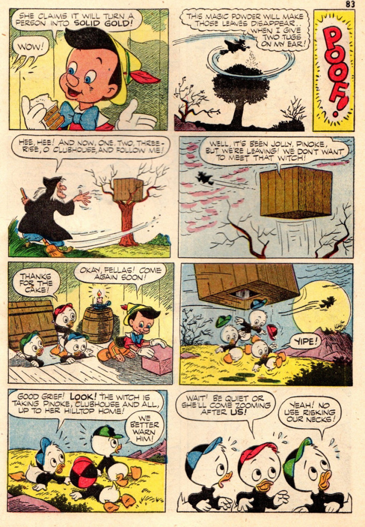
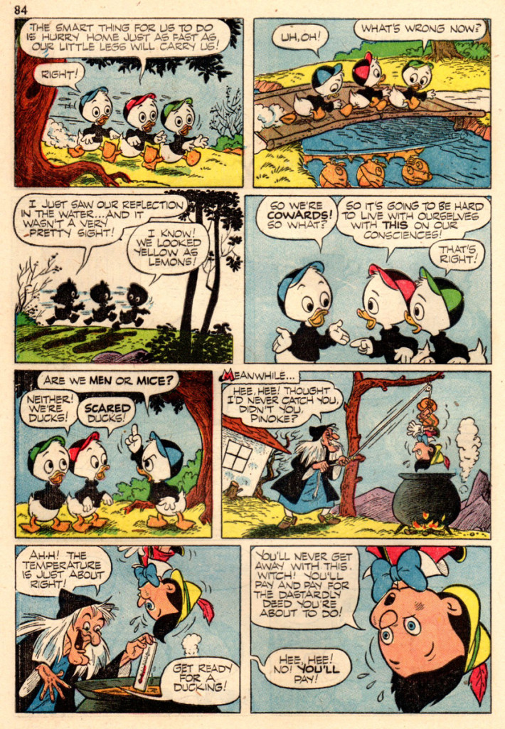
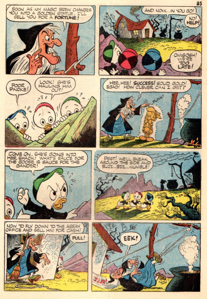
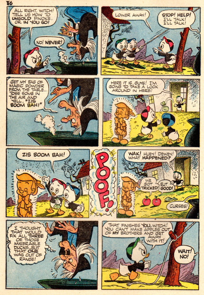
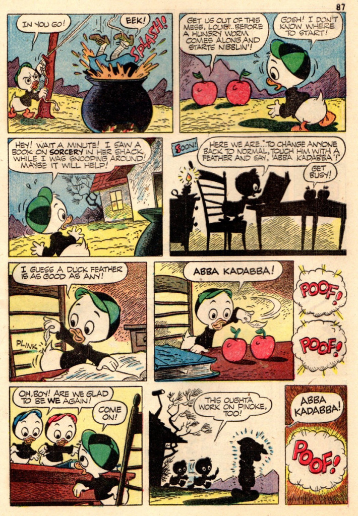
- It may be a tad too early for summer vacation but it’s never too early for “Walt Disney’s Vacation Parade” comic books, especially if they contain two of the best of Uncle Walt’s comics bull pen! Back in those days, the New York Yankees had Mantle and Maris, the M&M Boys, Disney also had his own M&M Boys, Dick Moores and Paul Murry, also grand slammers!
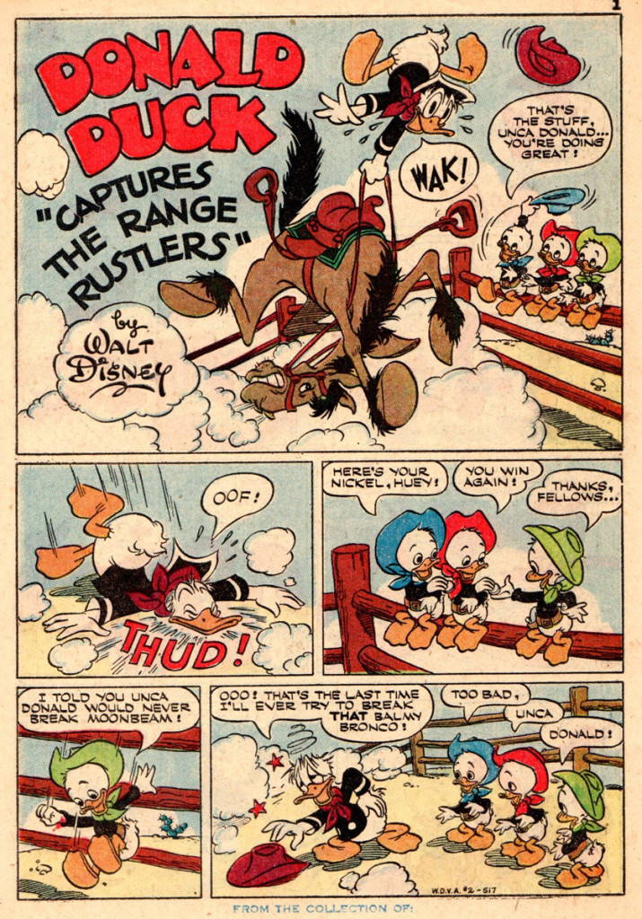
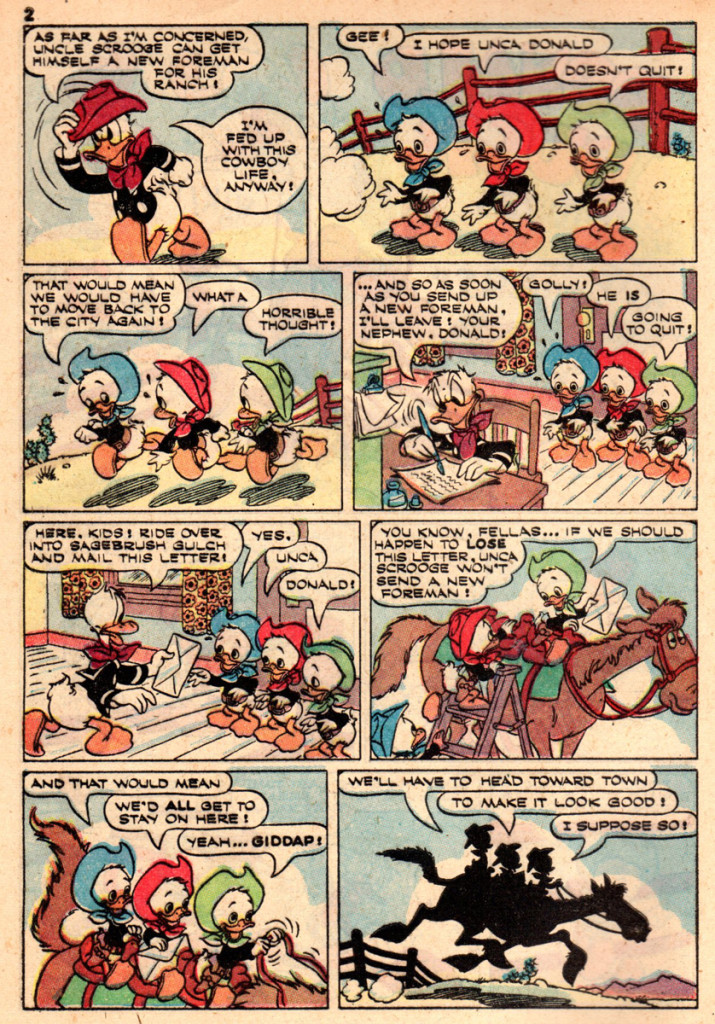
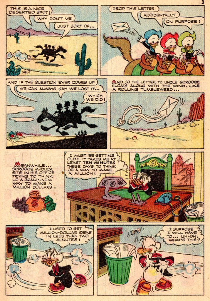
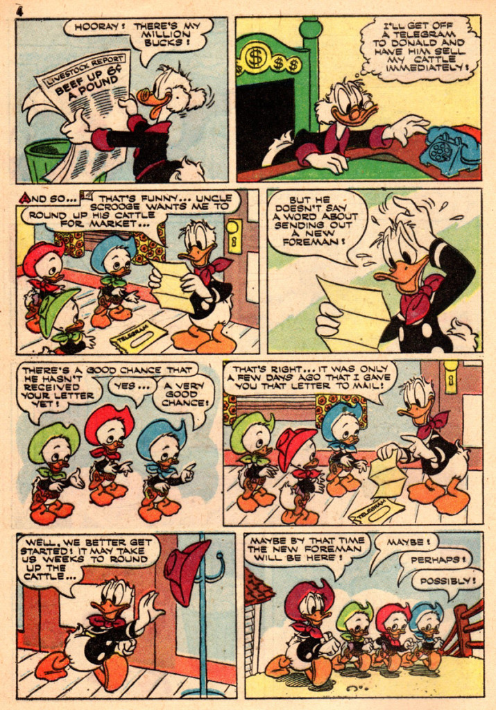
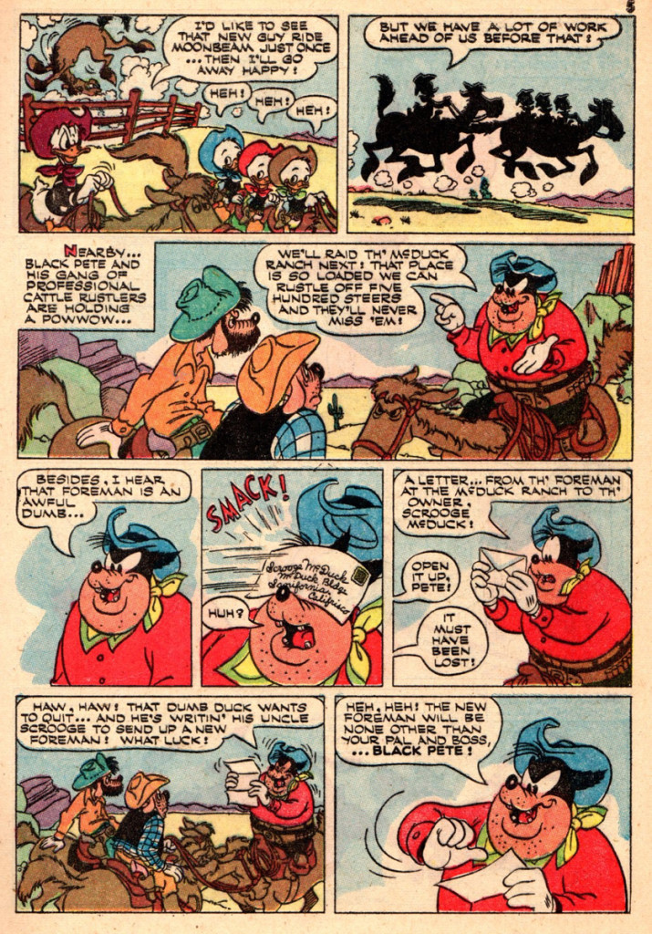
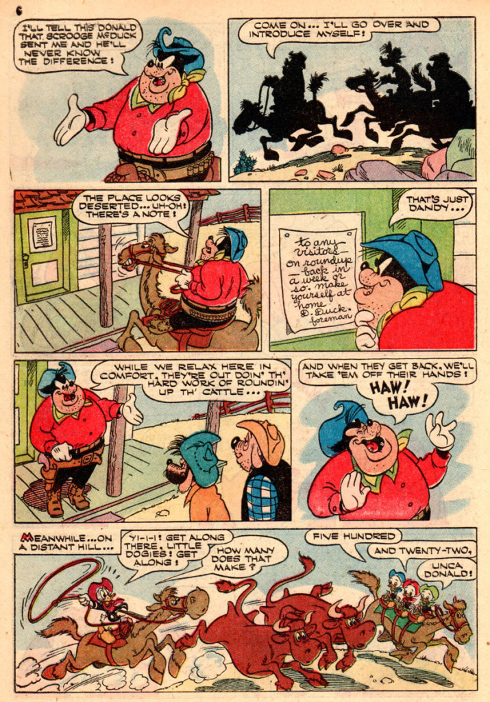
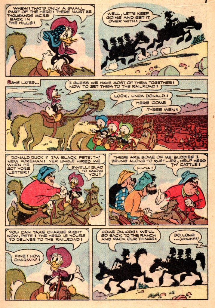
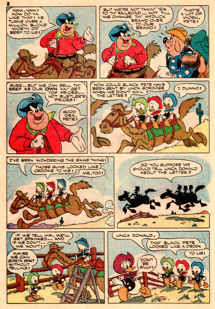
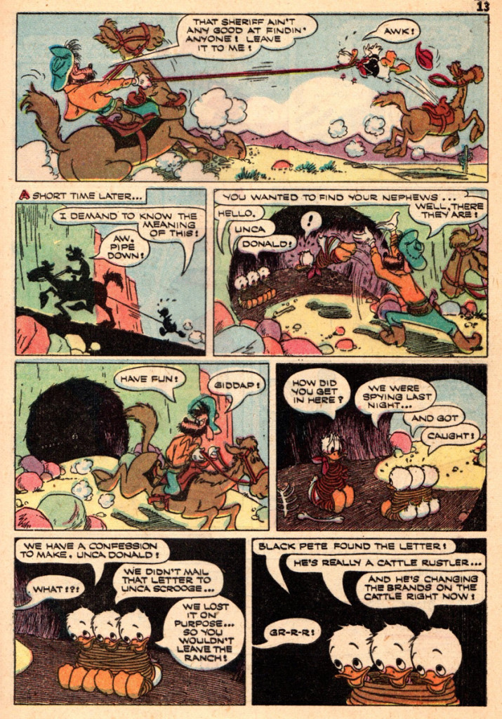
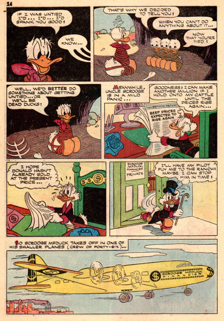
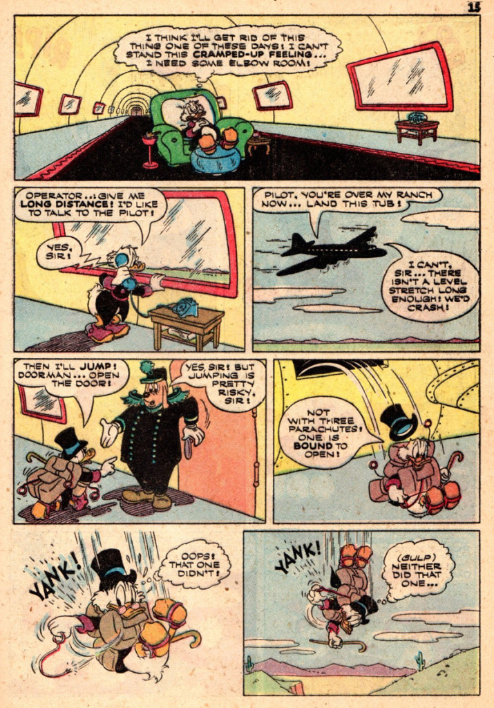
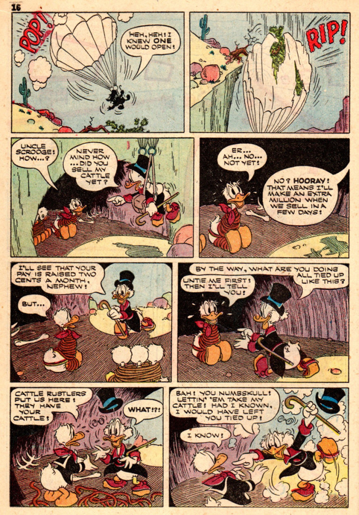
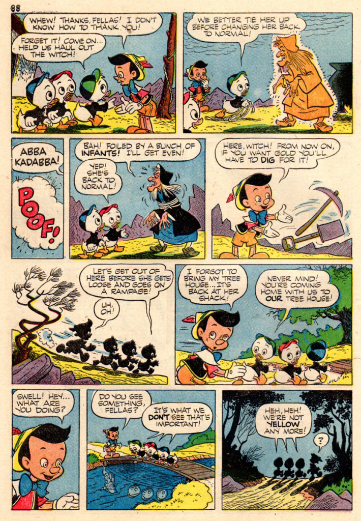
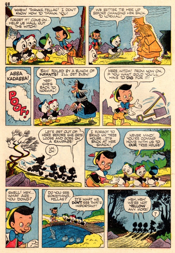
Here from “Vacation Parade” no. 2 is a 19 pager by Paul Murry, Donald heads the cast and we get to see how Murry handles Scrooge McDuck. The comic book is from 1951, just about the same time Paul was doing his daily comic strip “Buck O’Rue“!
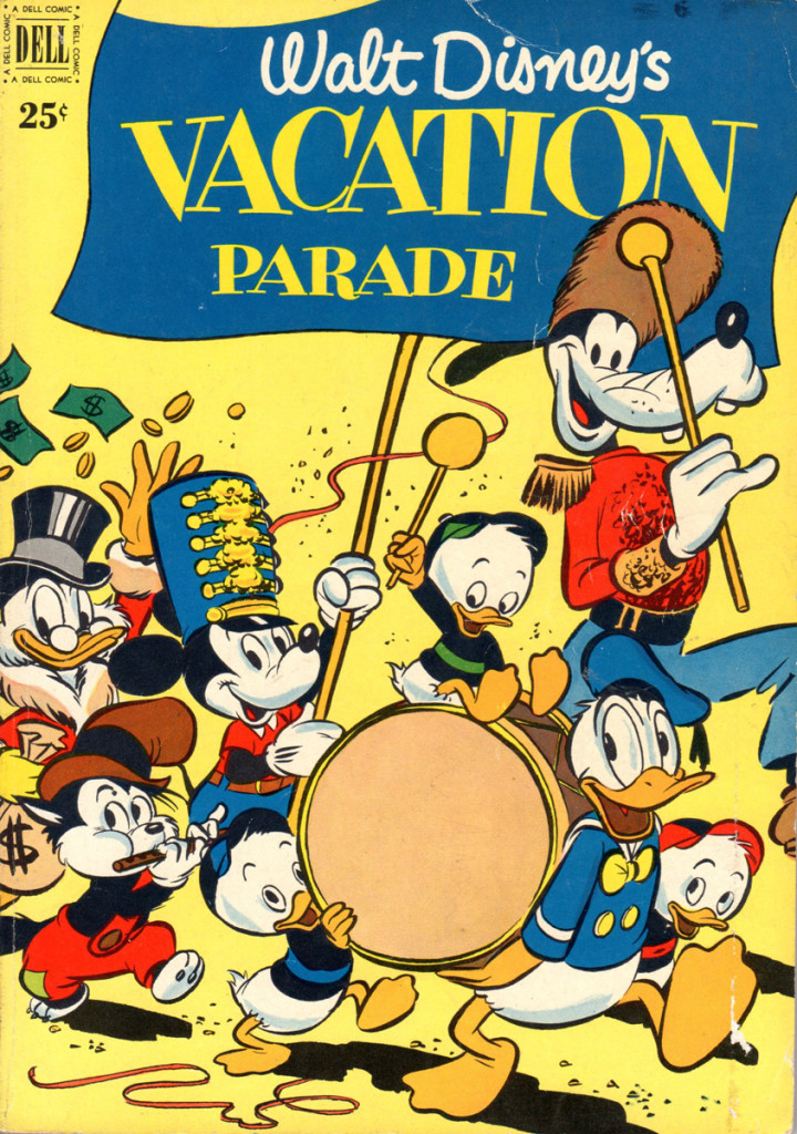
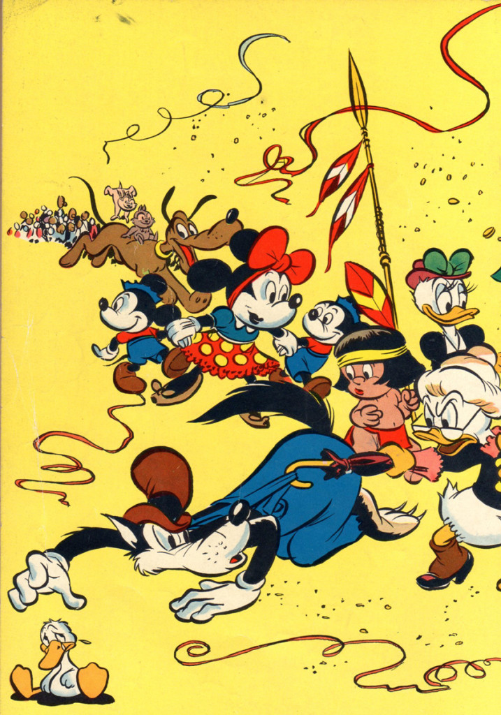
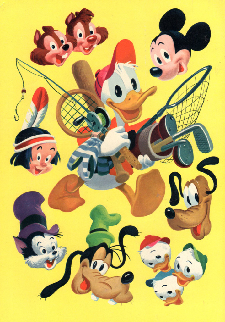
Cover 1
Bill Peckmann &Comic Art 01 Mar 2013 08:31 pm
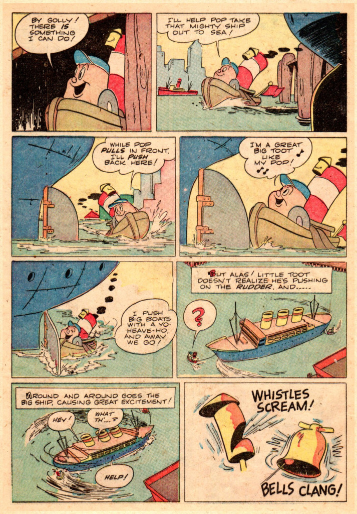
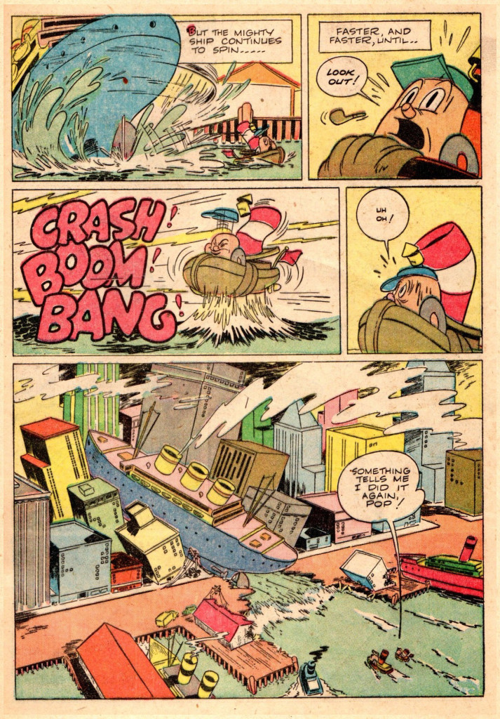
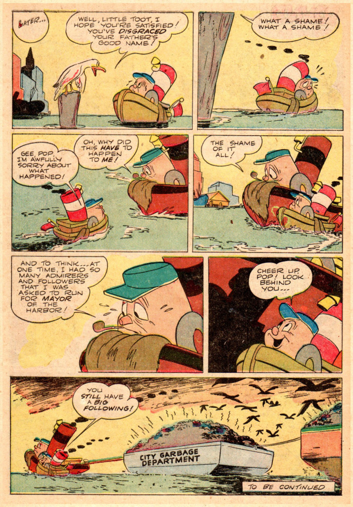
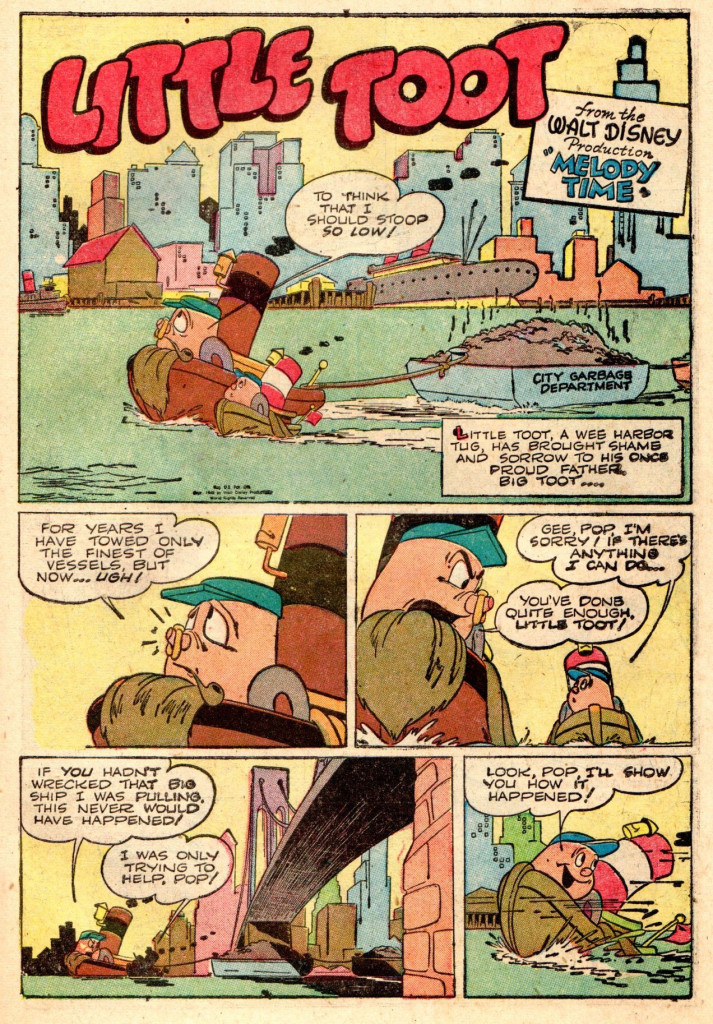
Eisenberg’s Little Toot
Following up on yesterday’s post on Hardie Gramatky‘s Little Toot, Bill Peckmann has sent the comic book version of the story. Here’s Bill:
- Here’s hoping that we have something for old Harvey Eisenberg fans to enjoy and also hoping it might make a few new fans of his art.
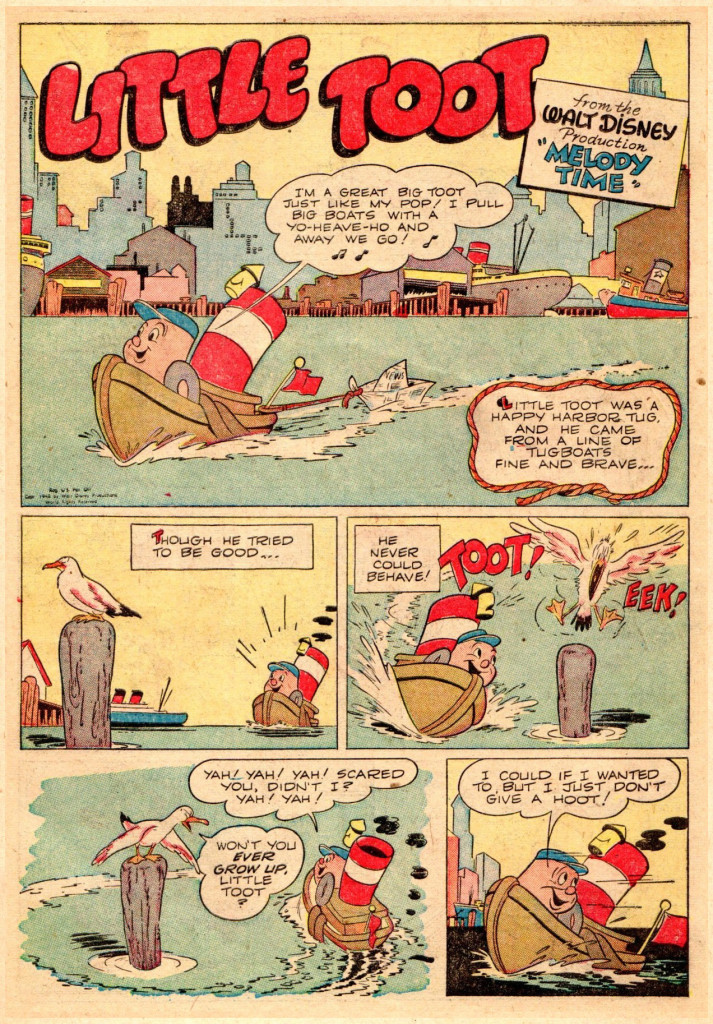
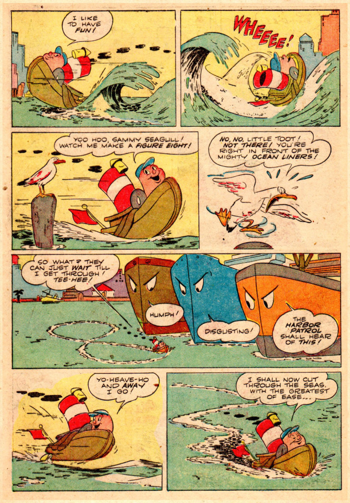
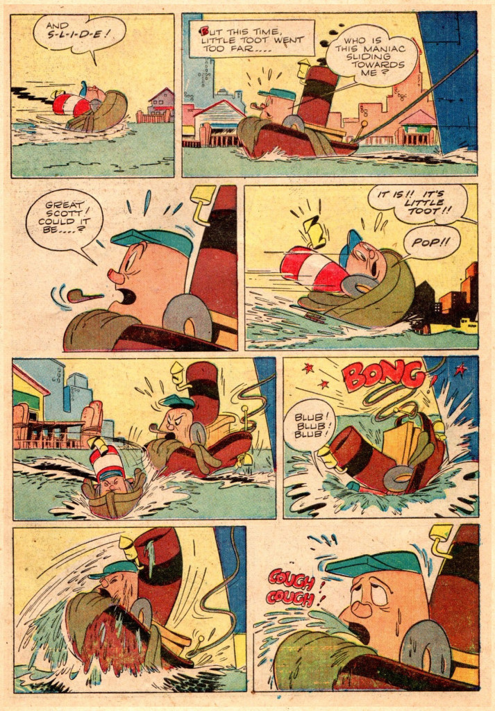
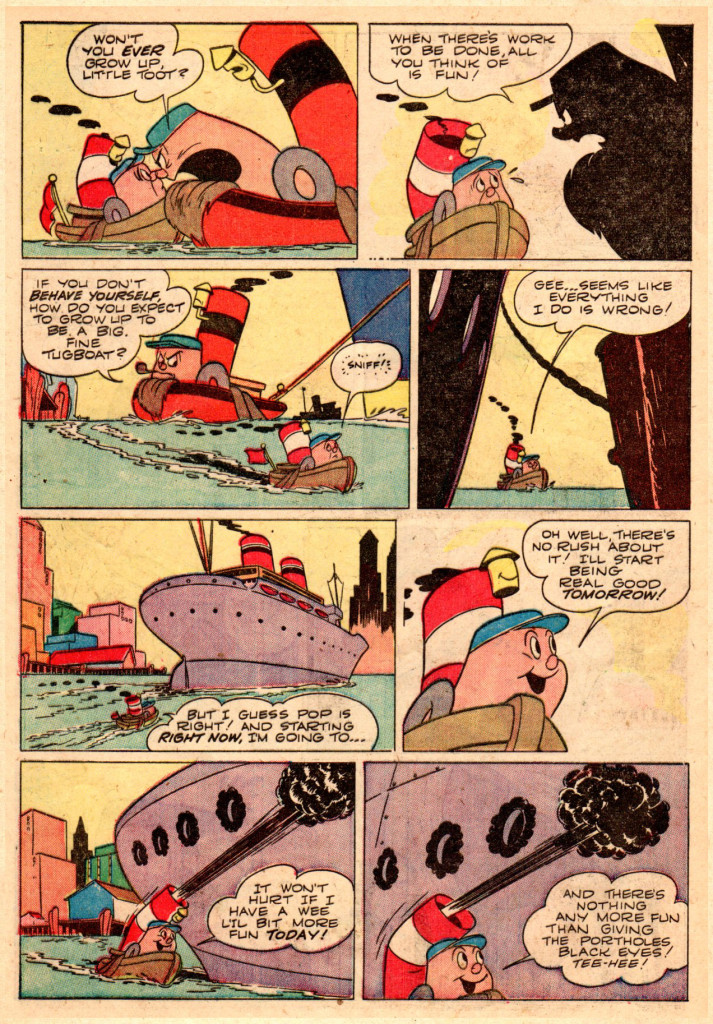
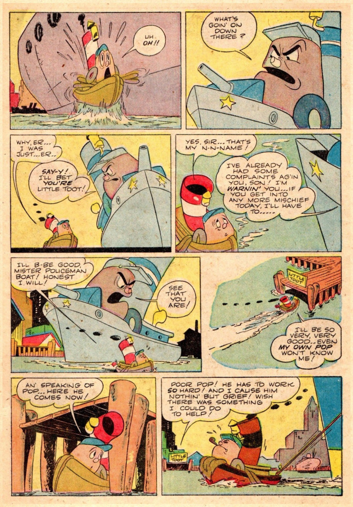
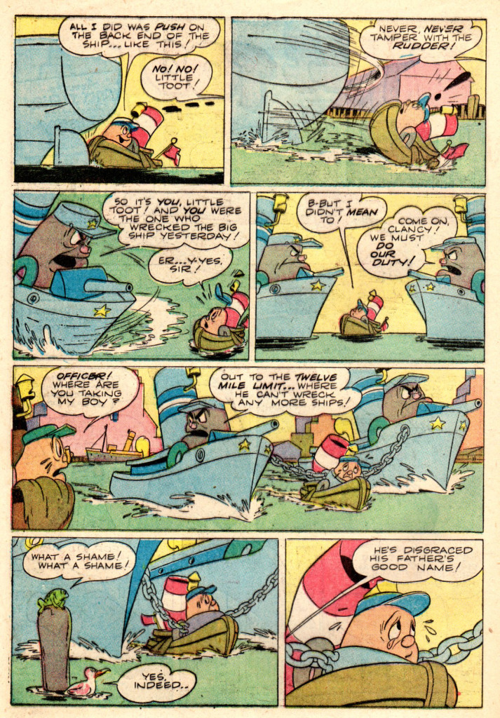
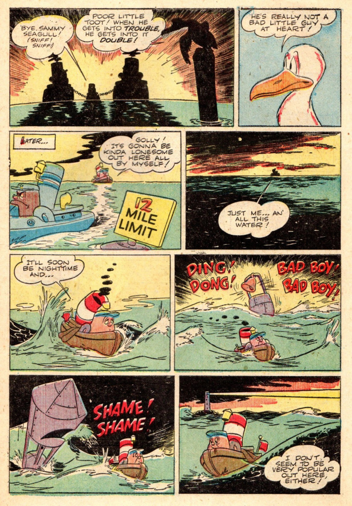
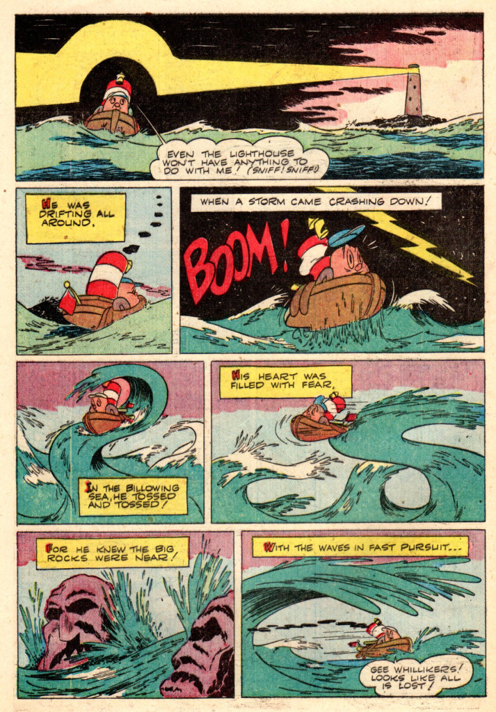
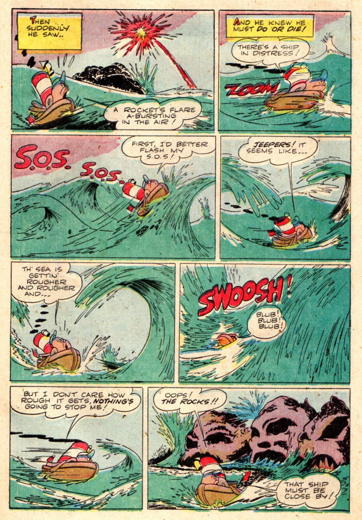
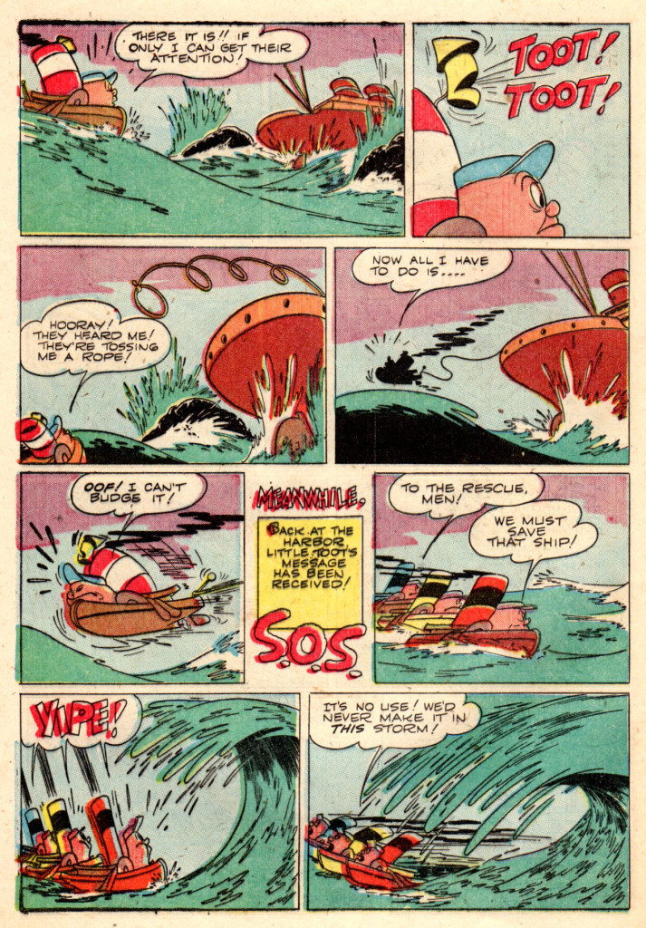
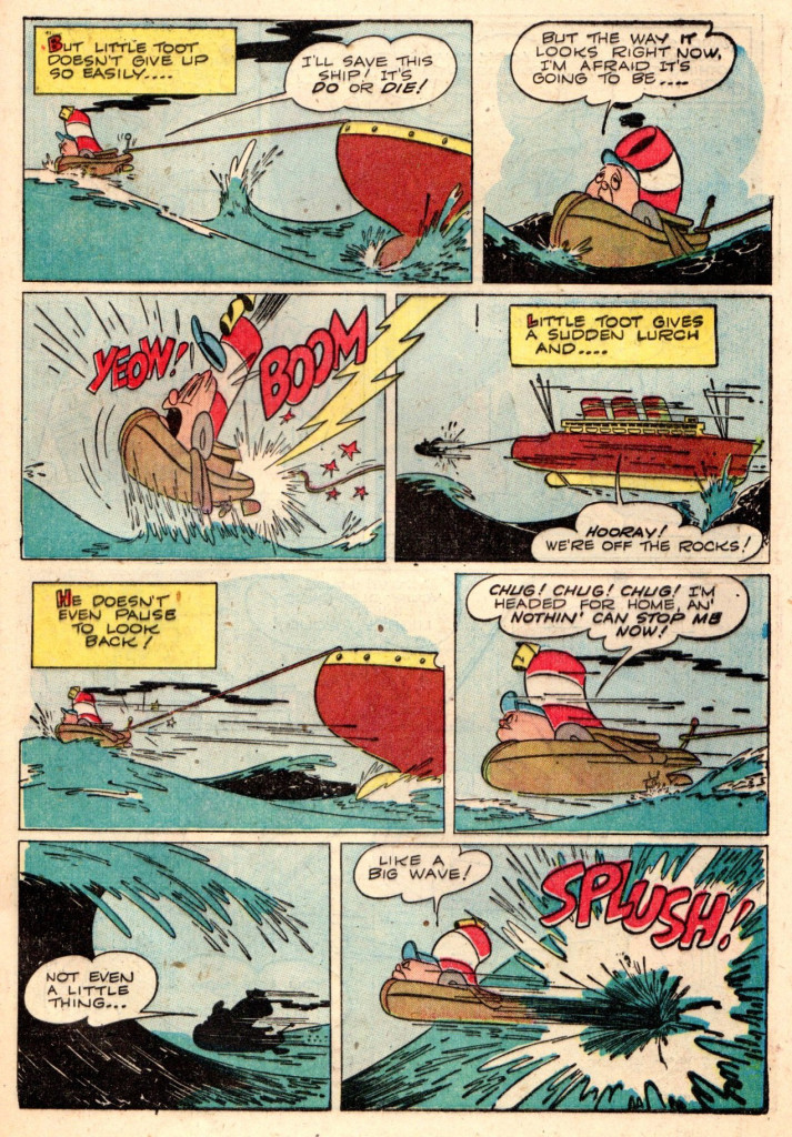
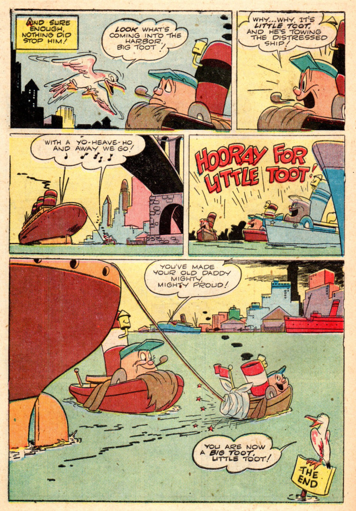
It’s Mr. Eisenberg’s 1948 comic book adaptation of Disney’s “Little Toot” which appeared in the feature “Melody Time”. The comic book story was done in two parts, it appeared in “Walt Disney’s Comics and Stories” numbers 96 and 97. As with his “Mickey and the Beanstalk”, “Little Toot” is a well thought out and wonderful piece of comic book art. One can only wish he could have done many more ‘film to comic book’ stories!
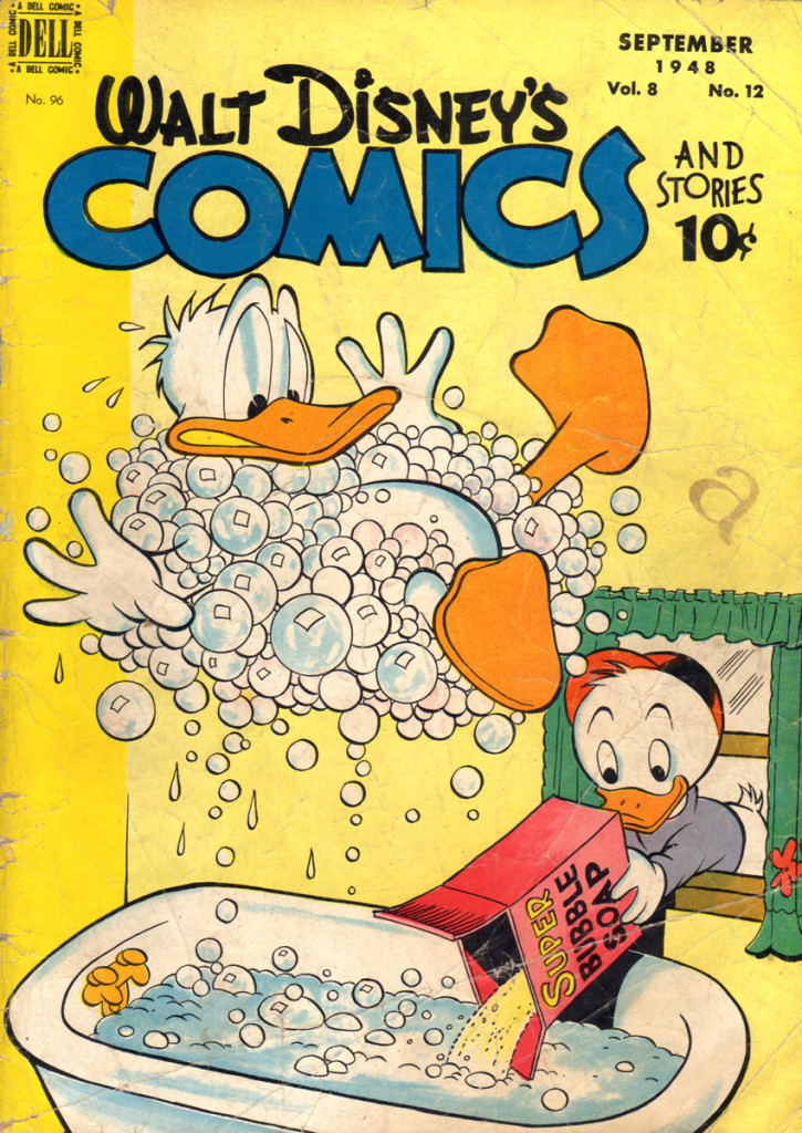
Cover part 1
the cover of issue no. 96 was Carl Barks’ second cover
that he did for “Comics and Stories
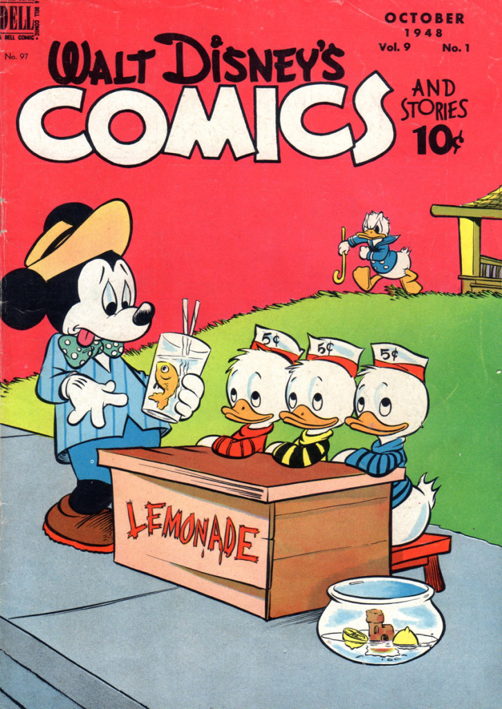
Cover part 2
Walt Kelly’s cover for no. 97, love Mickey’s duds!
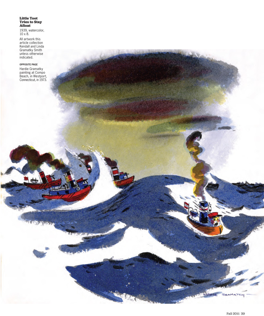
This is a sample of the artwork of Hardie Gramatky’s watercolor art for the book, Little Toot.
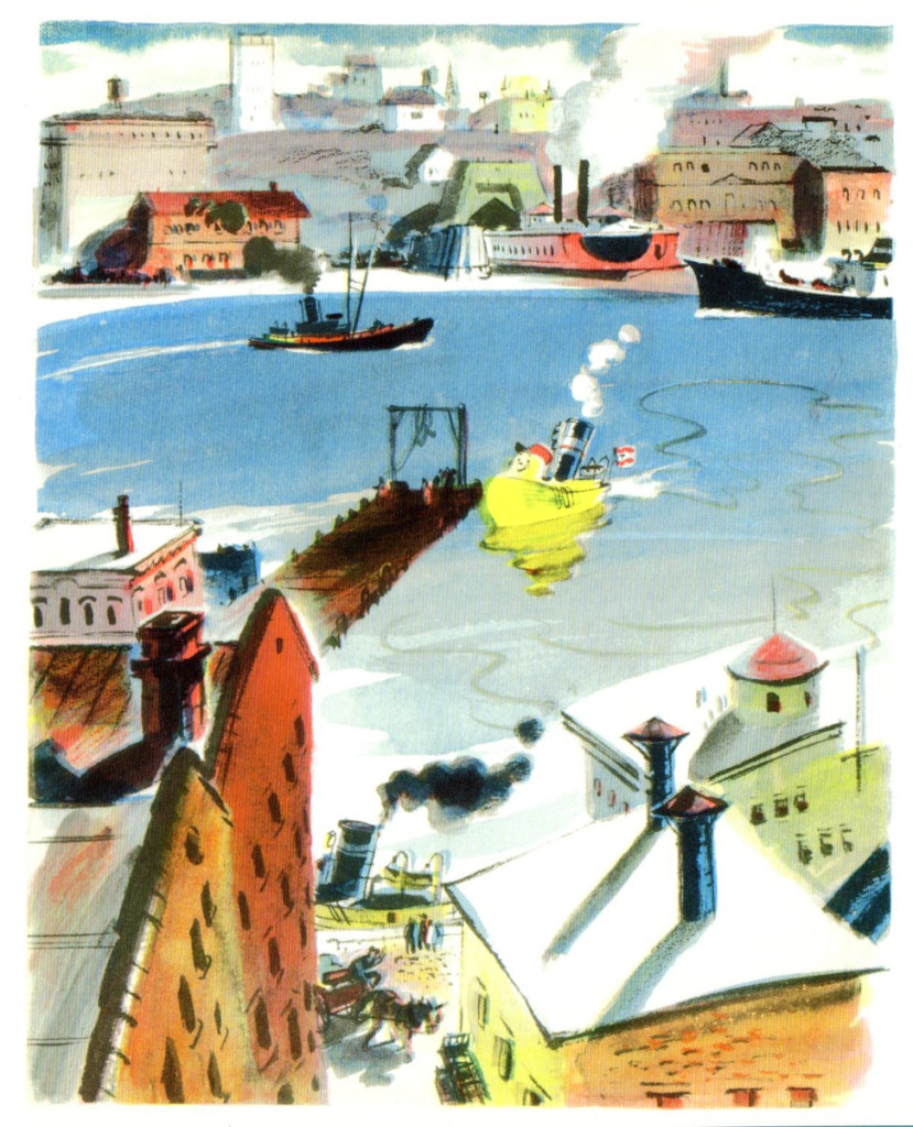
Little Toot
Articles on Animation &Bill Peckmann &Books 28 Feb 2013 04:08 am
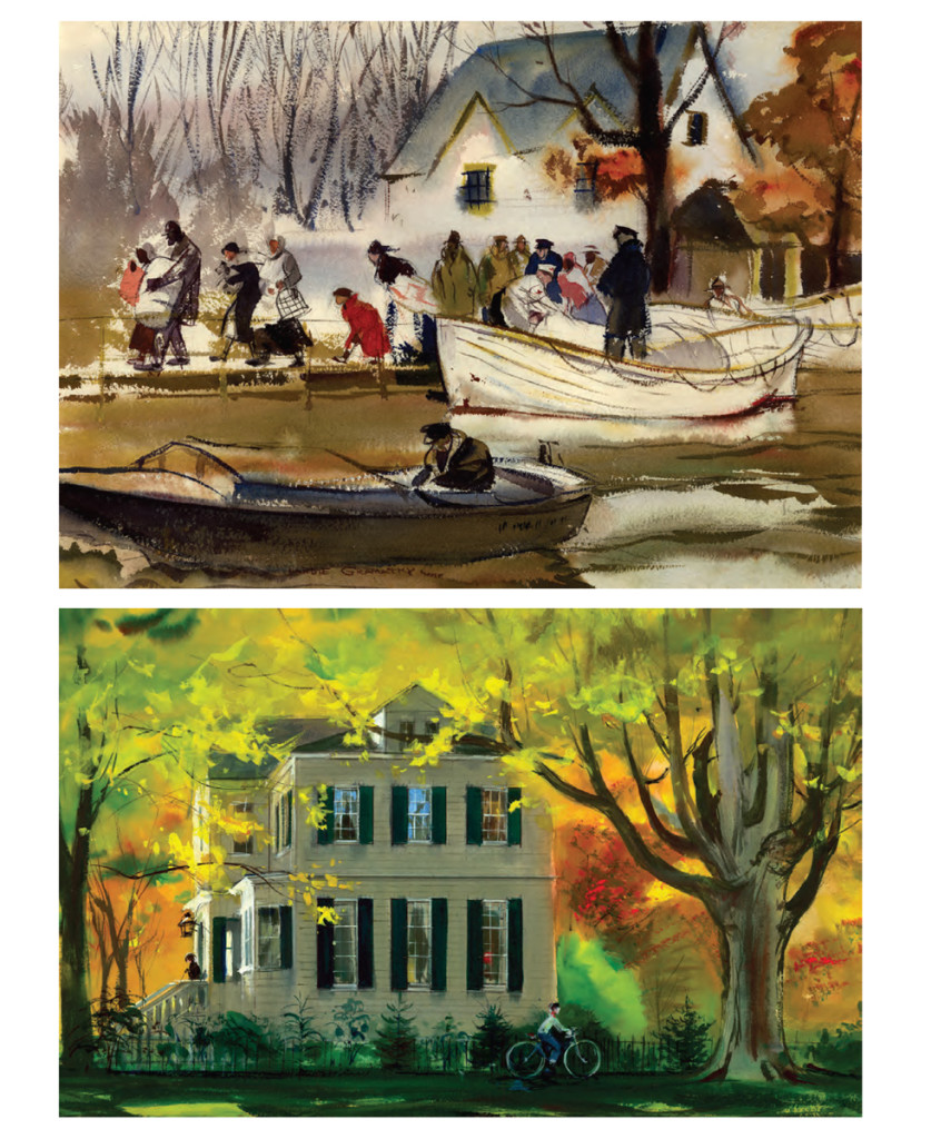
Hardie Gramatky’s Art
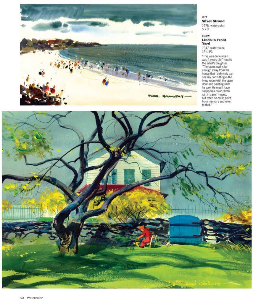
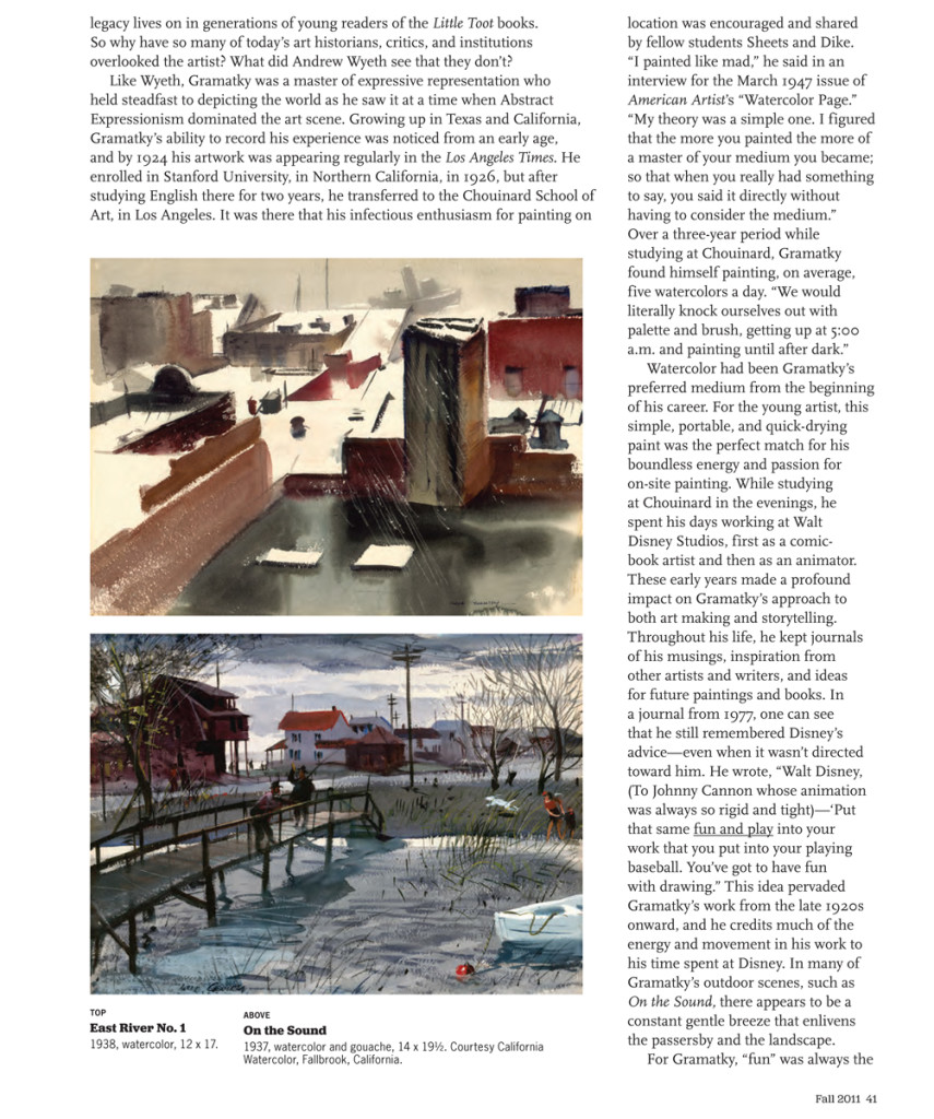
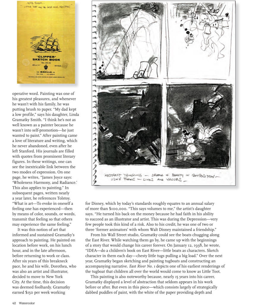
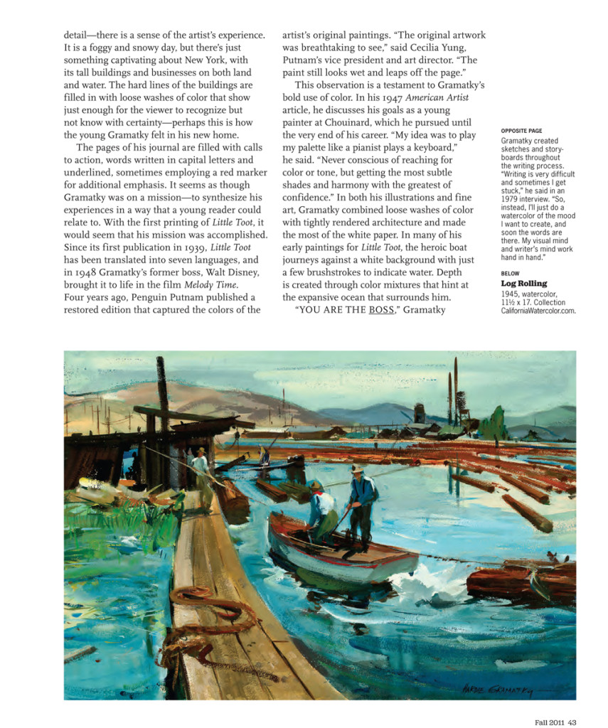
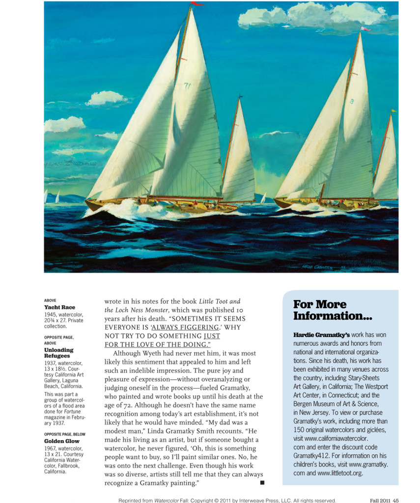
- One of Disney’s early animators who left the studio before it went through its renaissance into the features, was Hardie Gramatky. He came to the studio from Chouinard and had been a brilliant watercolorist even when he entered the studio. While working at Disney by day, he continued to study art at Chouinard by night. After leaving Disney, he focused on his art acting as something of a force in developing the California School of Watercolor, At the same time he did children’s books to earn money. His great claim to fame was the famous children’s book, Little Toot, which, itself, was animated by the studio as part of the feature compilation, Melody Time. The short outlived the feature and has played often developing its own legacy.
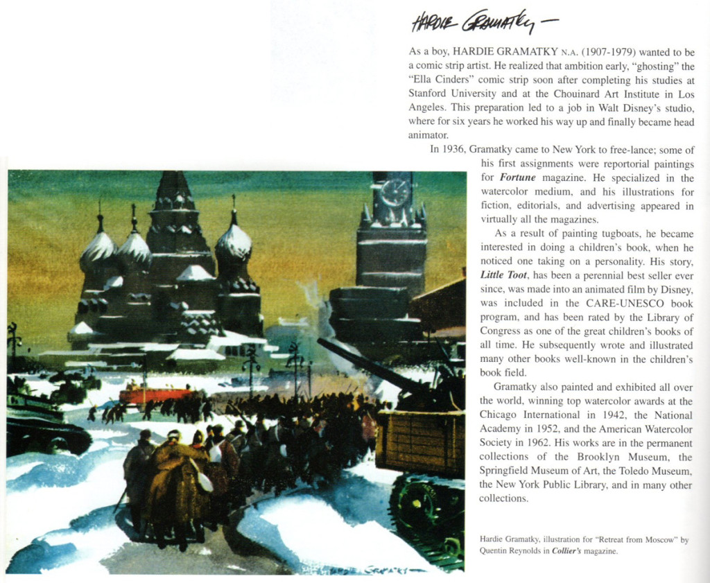
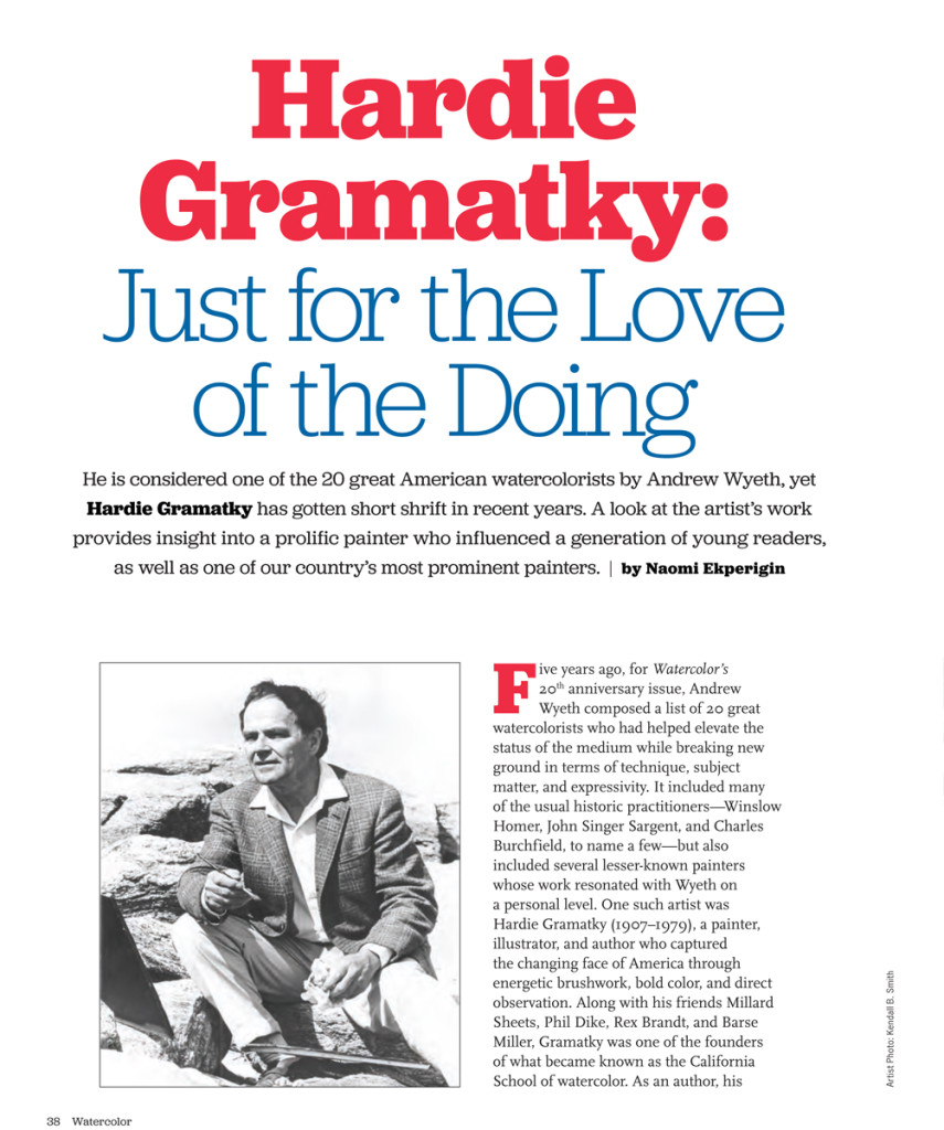
Bill Peckmann had sent me this article from Watercolor Magazine, the Fall/2011 issue.
 1
1
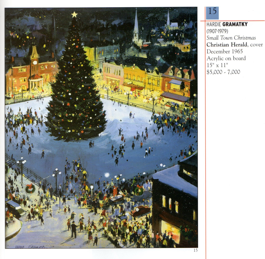
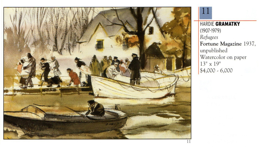
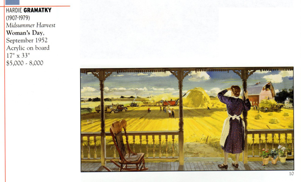
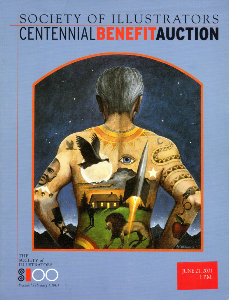
Bill Peckmann also included clips from this Society of Illustrators, Benefit Centennial Auction, which included the following pieces by Gramatky;
Magazine cover
To get an idea of scenes Gramatky animated at Disney’s here are links to some past drafts that I’ve posted:
Dognapper, The Whoopee Party, Mickey’s Good Deed, The Robber Kitten
The children’s book, Little Toot is large enough that it has its own website.
Animation &Bill Peckmann &Disney &Models 26 Feb 2013 05:54 am
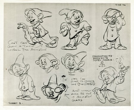
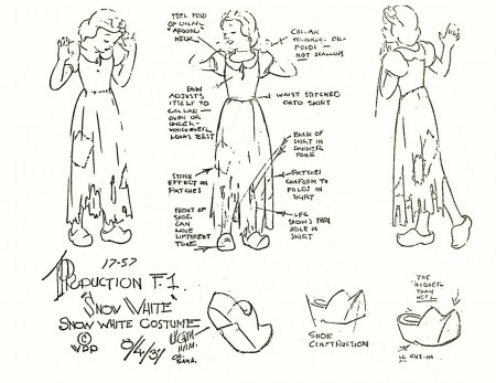
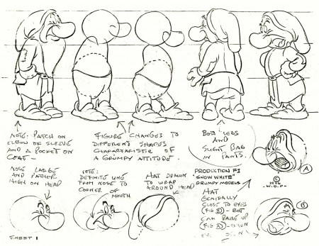
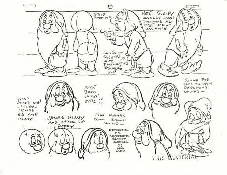
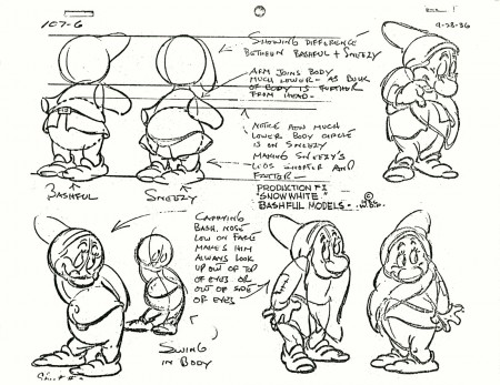
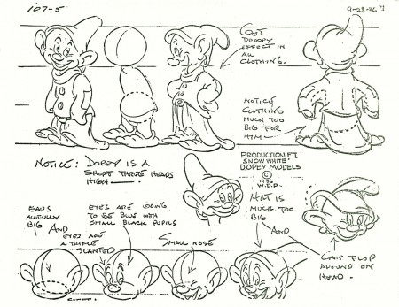
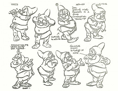
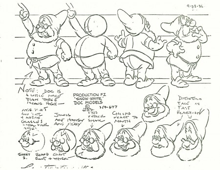
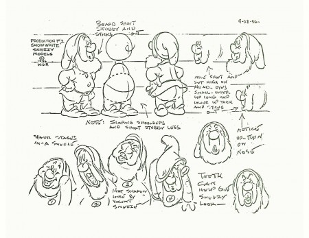
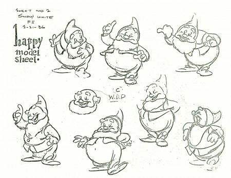
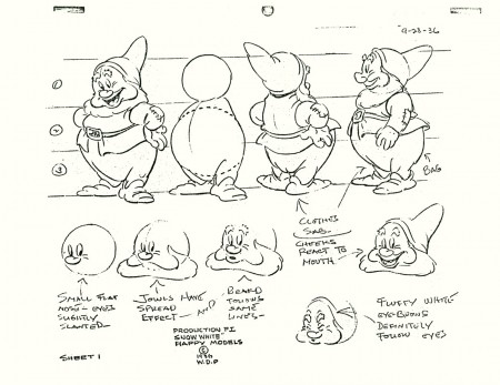
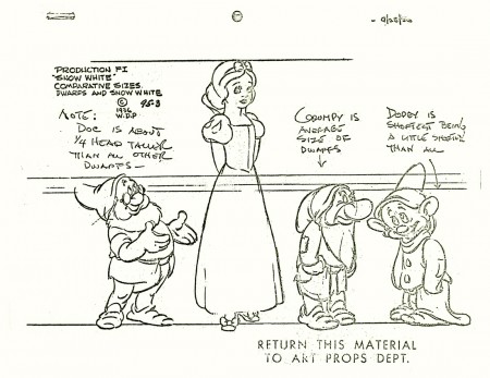
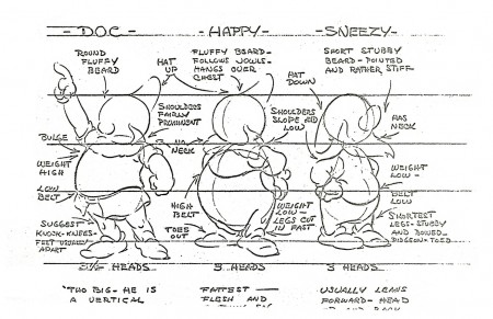
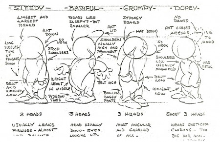
Snow White models – redux
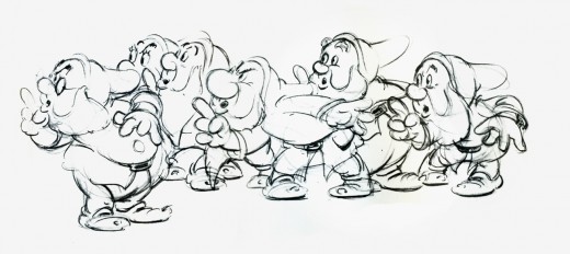
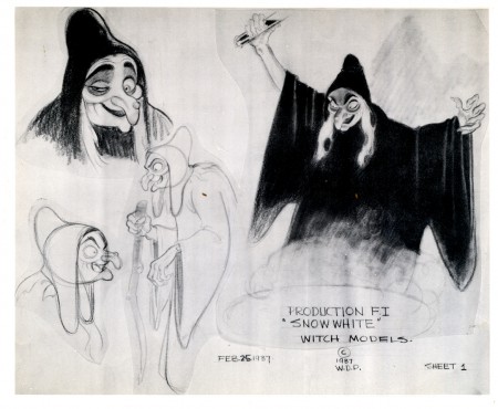
- Here, I continue with the recent outburst of model sheets. The following is a collection of Snow White and all seven dwarfs. I assume some of these can be found in print in one of the many collections of art from the film. I found two of the models in an old, expensive book I have which came via American Express.
The first two beautiful, original models come courtesy of Bill Peckmann‘s collection. The remainder of the group were Xerox copies I made years back. I’ve tried to clean them up a bit (lots of old grit from the ancient copies on glossy paper.)
Bill Peckmann &Comic Art &Illustration 22 Feb 2013 03:59 am
Jack Davis flashback
Bill Peckmann put together a post of Jack Davis illustrations. It was an obviously difficult piece to assemble and I thank Bill for all the work. From here on, these are Bill’s words:
- The year 1963 was a big year for all of us Jack Davis fans, that’s the year our favorite “Mad” cartoonist did the poster art for the movie ‘It’s A Mad, Mad, Mad, Mad World” and established himself as an art force to be reckoned with. It was probably also Jack’s first foray into the world of animation, a trailer for the movie was produced at Elektra Films by doing animation camera moves over Davis’ original movie art. (It was also my first year at the studio as an apprentice, fledgling go-fer, so I was able to sit and stare [and drool] at beautiful original JD art when no one was looking!)
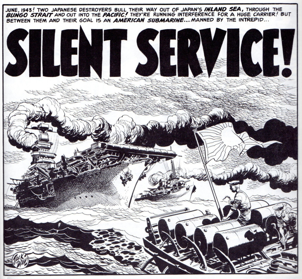
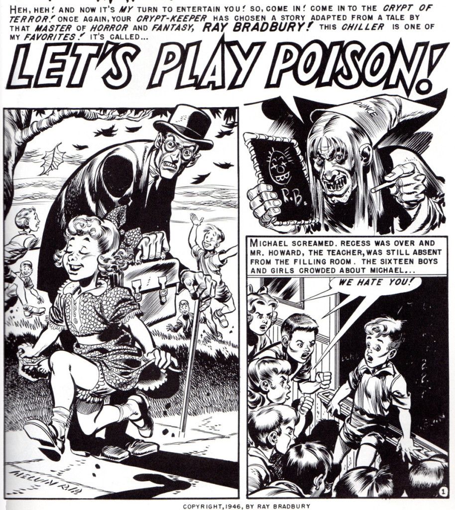
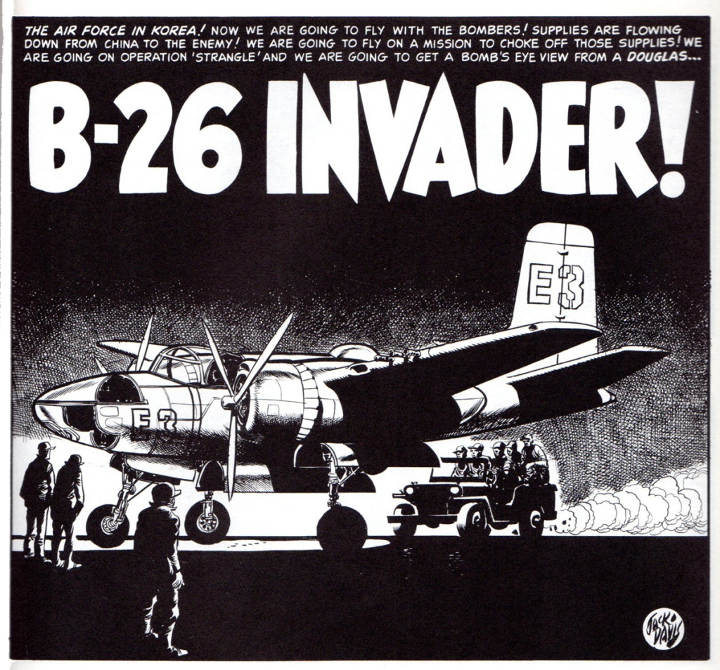
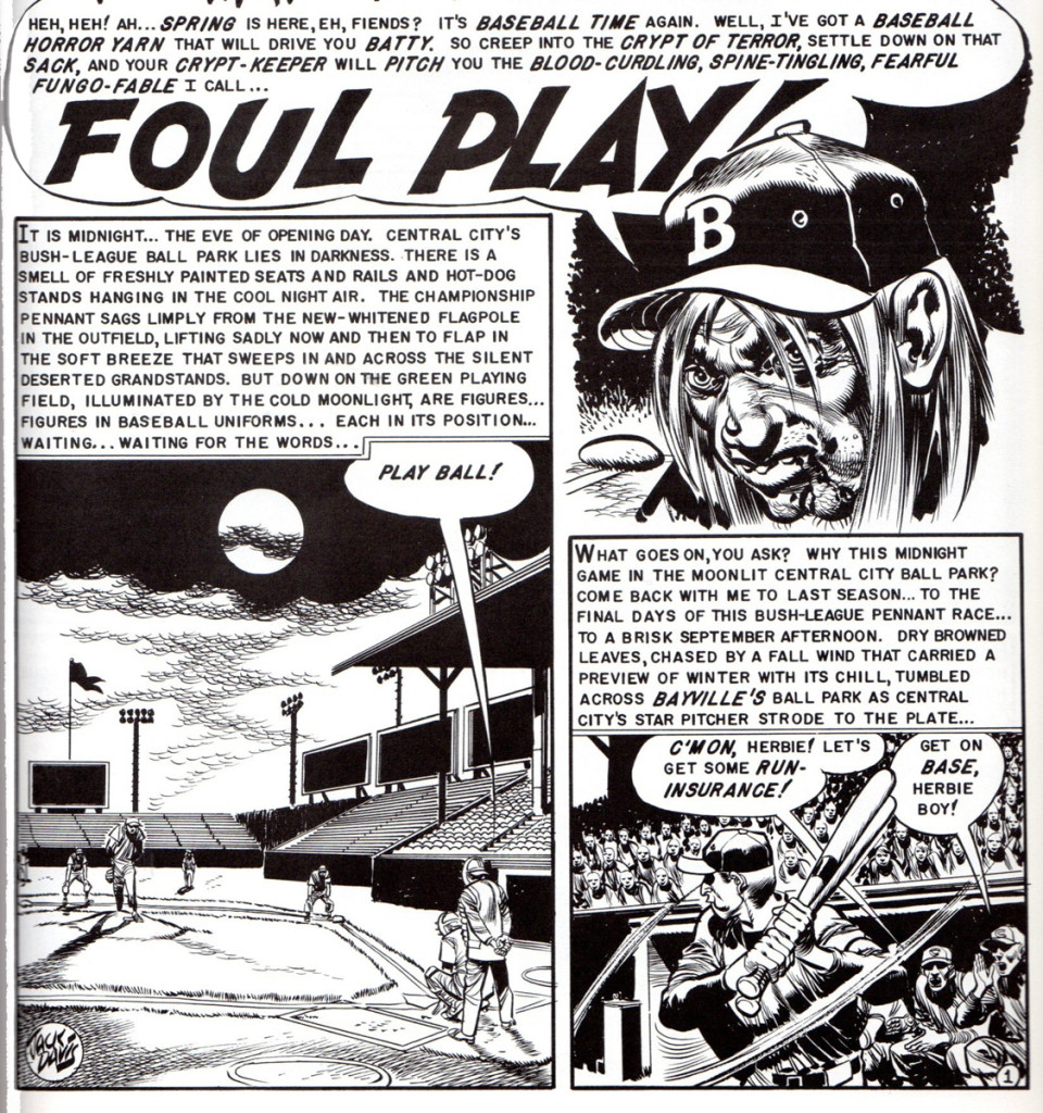
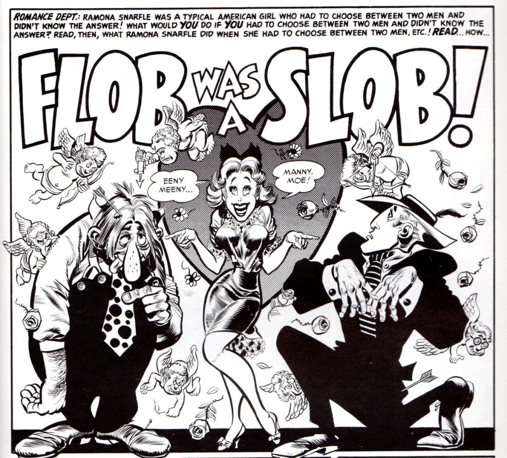
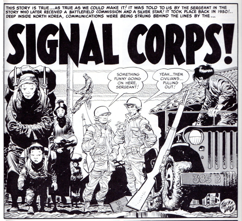
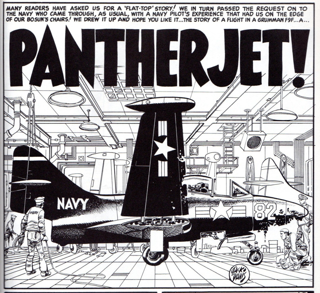
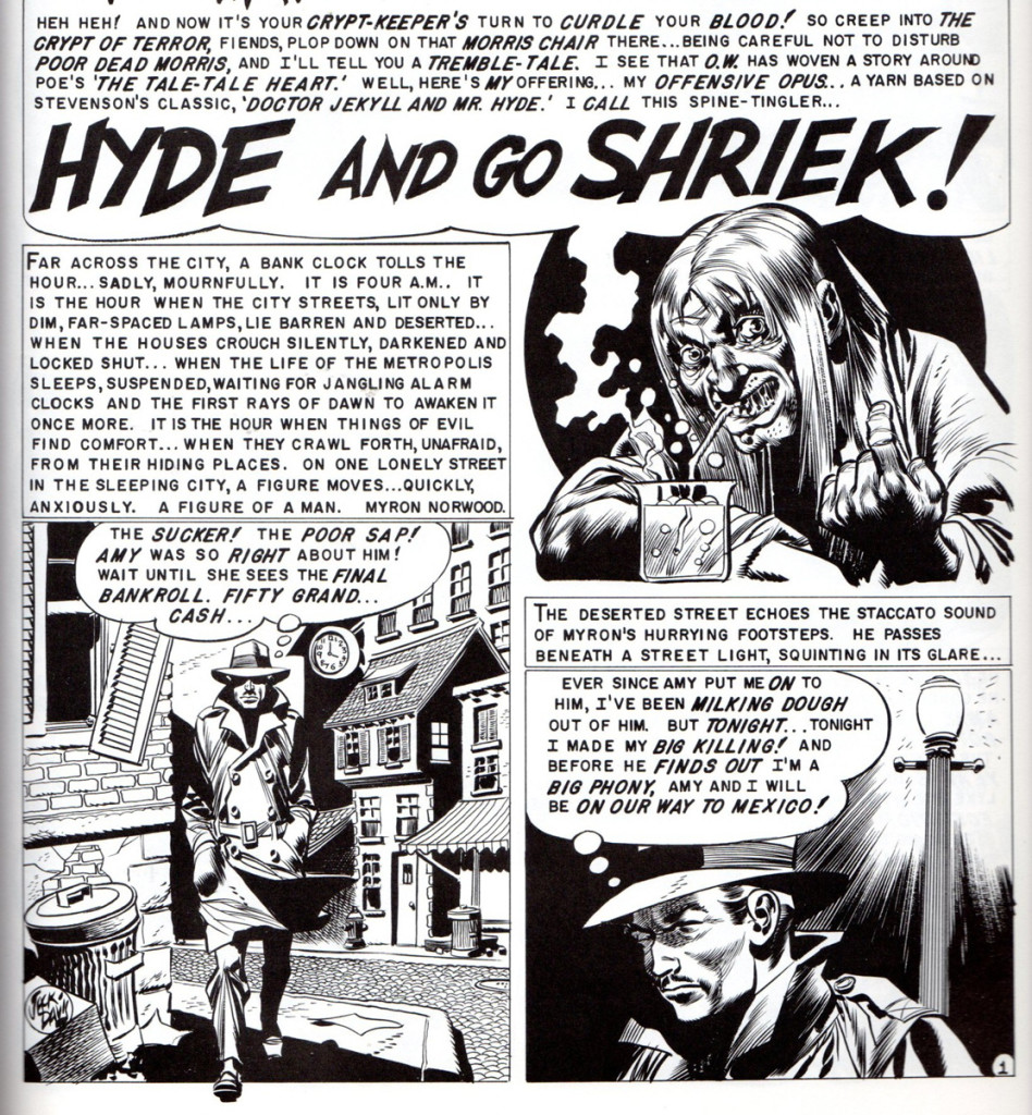
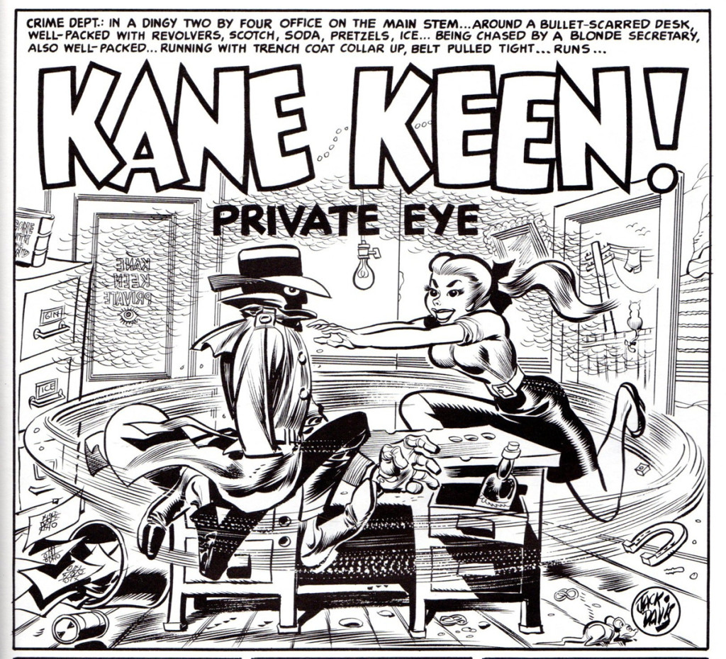
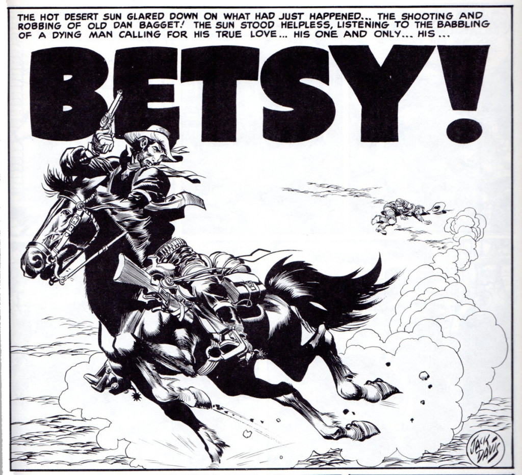
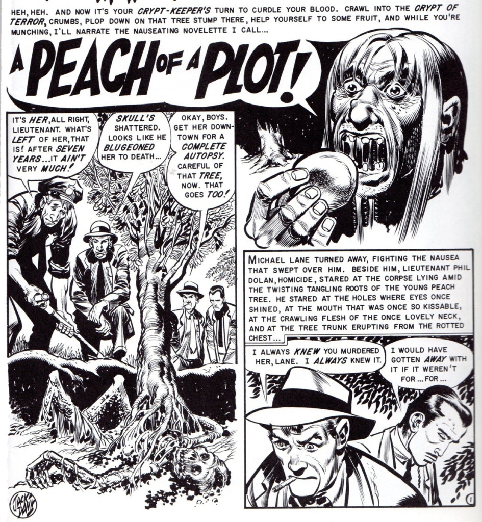
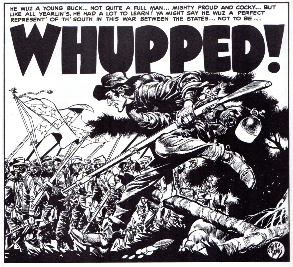
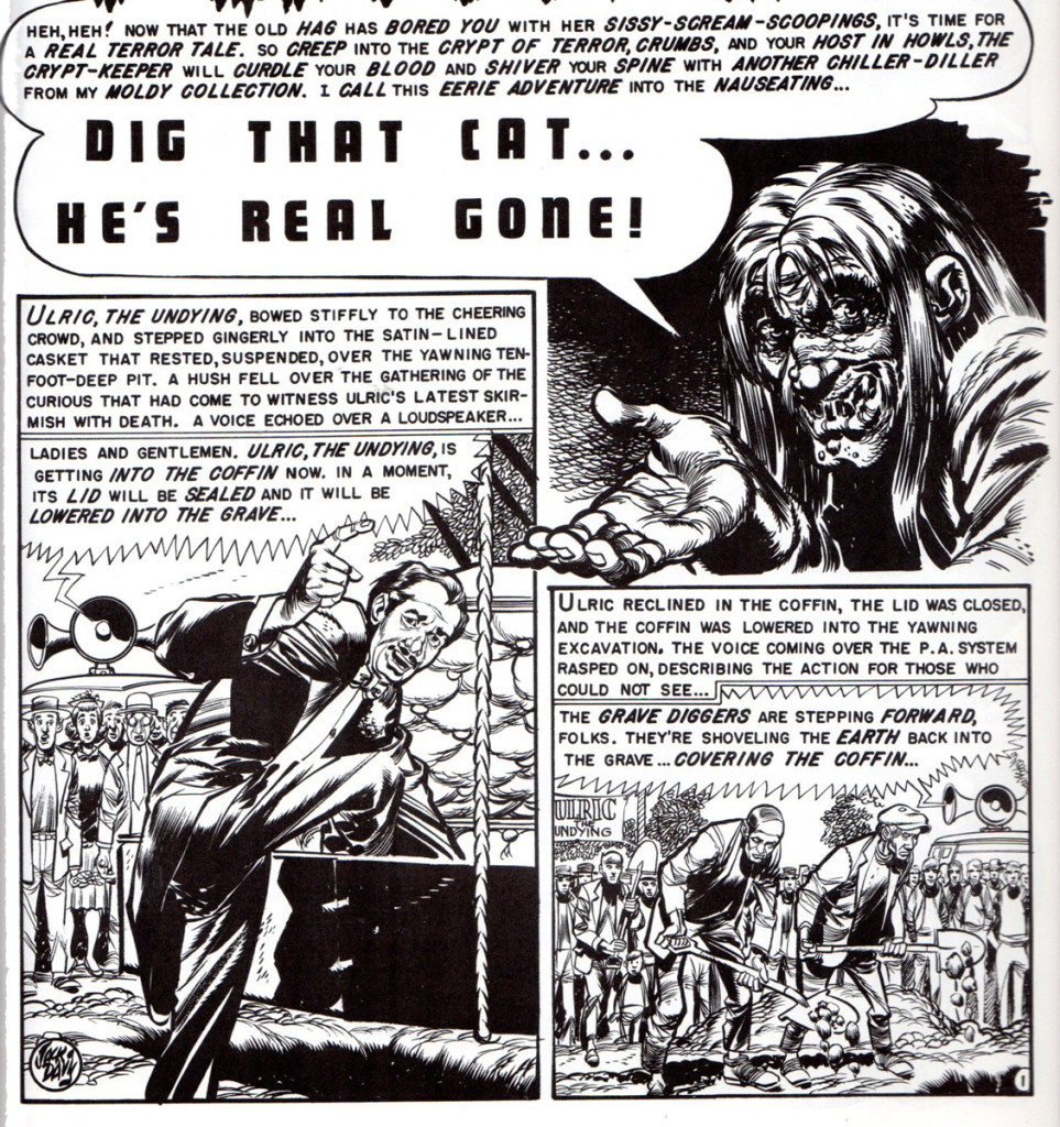
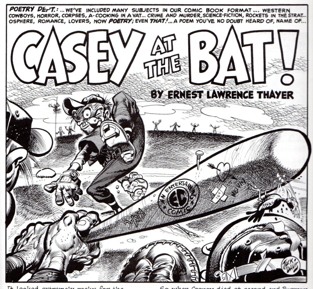
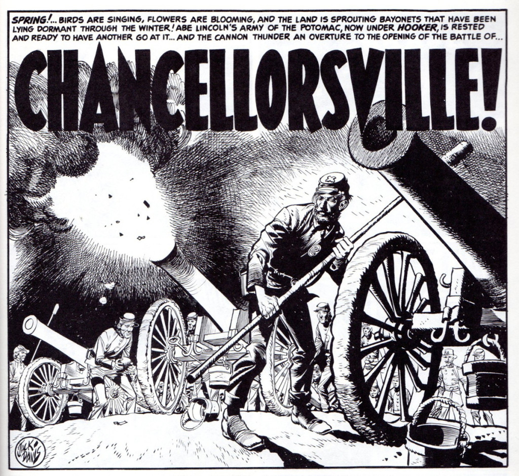
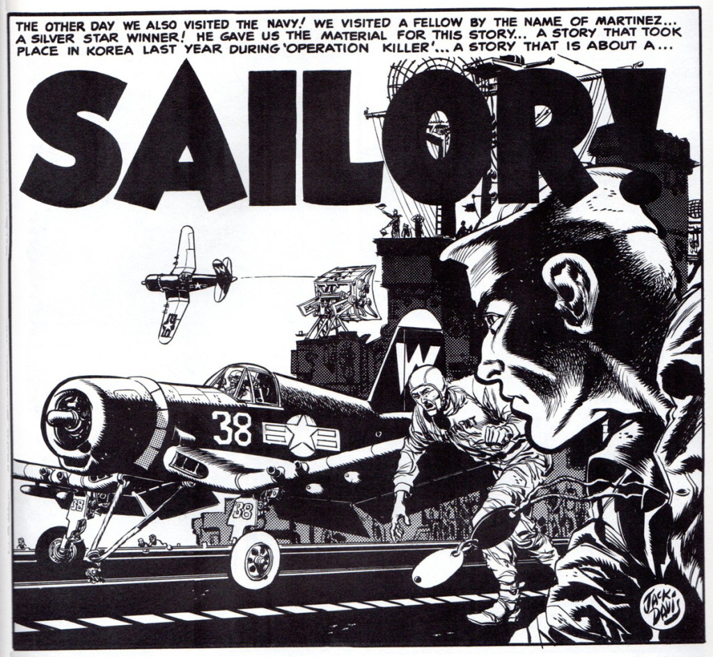
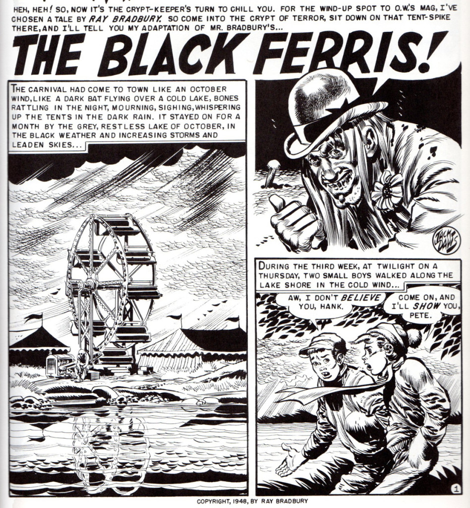
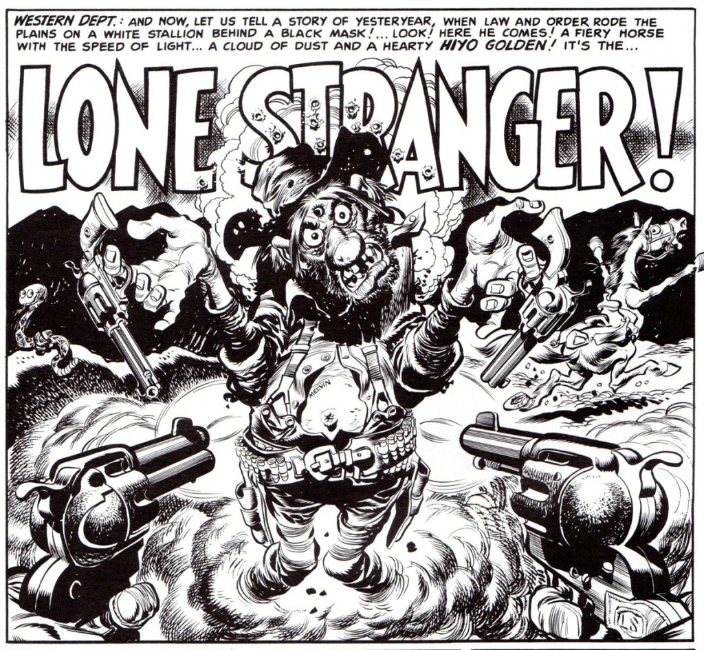
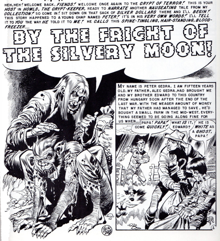
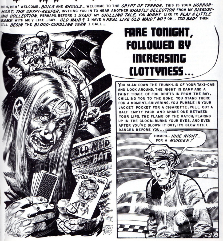
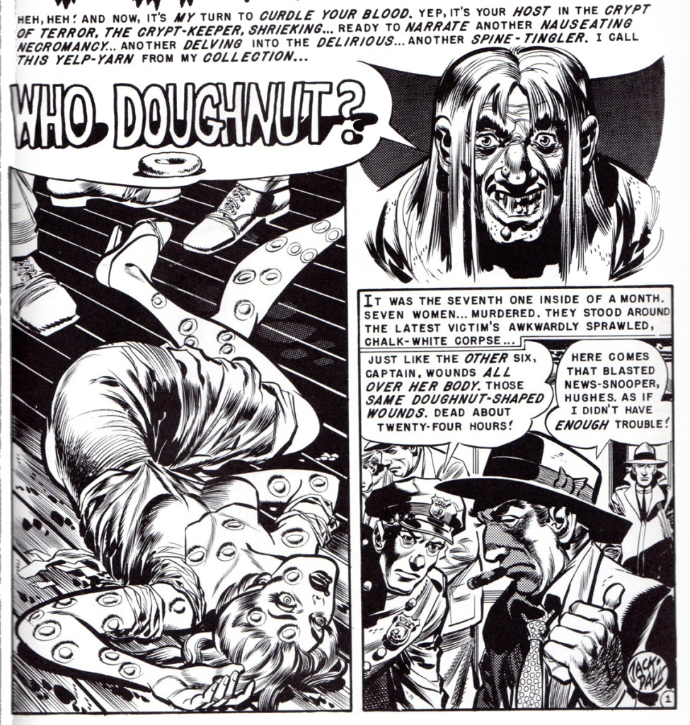
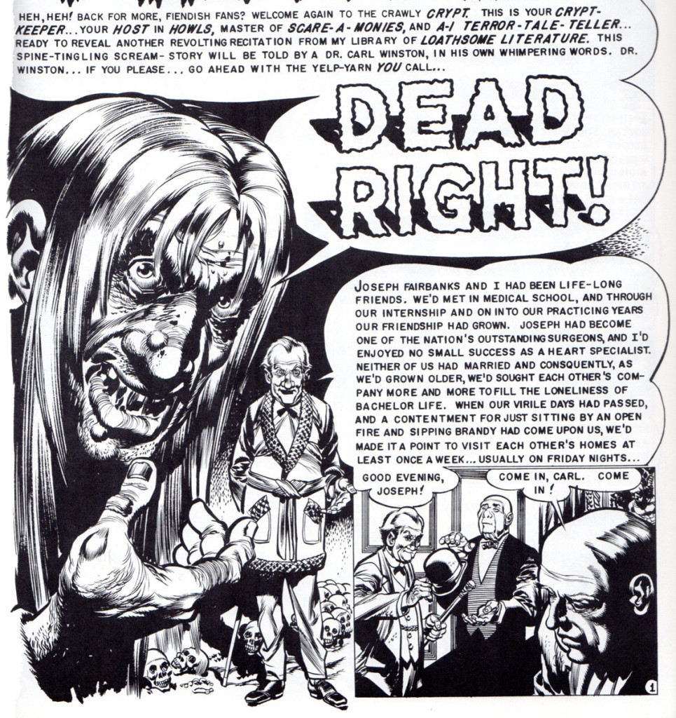
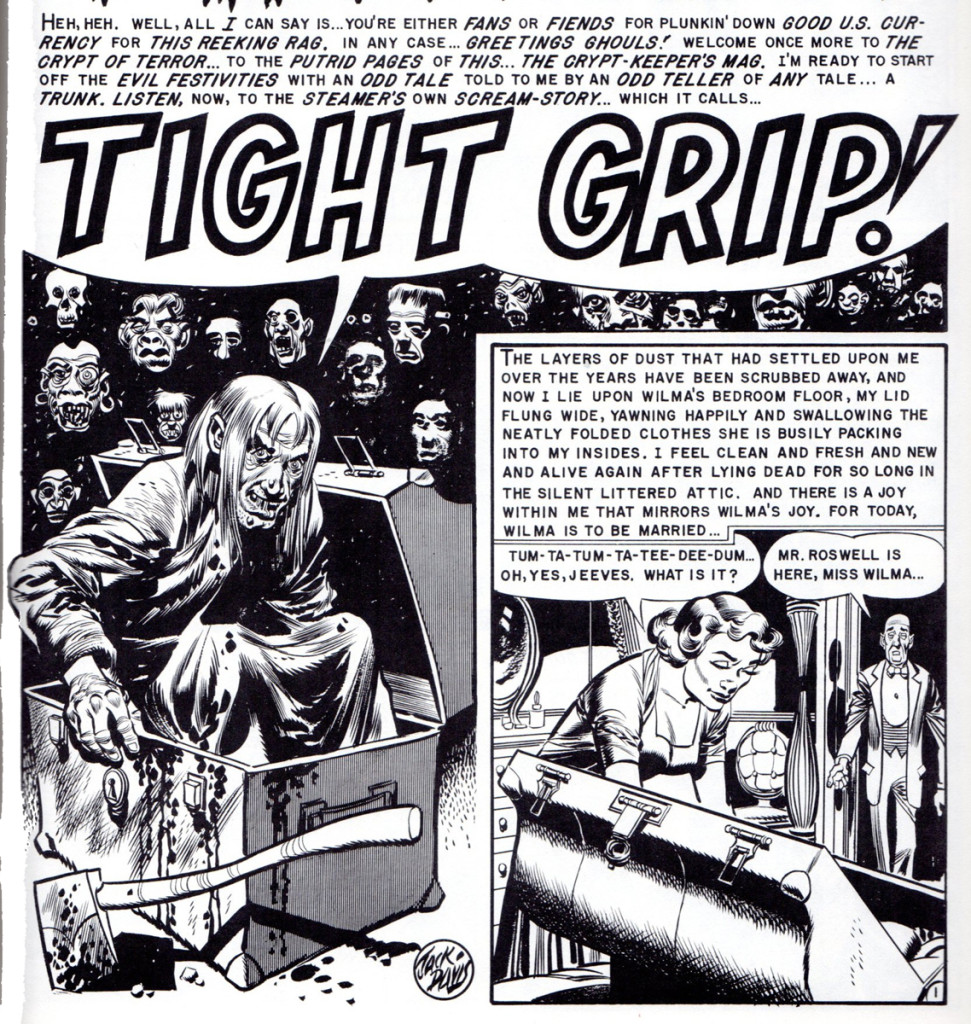
Now, to a quick, short 10 year flashback to 1953, when Jack at age 29, was still cutting his comic art teeth, pen nibs and #3 red sable brushes at the hallowed halls and art tables of EC Comic Books. Even then, known for his speed at getting the job done and his agile ability to cover all of the genre bases, I thought it would be fun to see a sample of Jack’s work from this time period in his life. By showing only the lead, splash panels of the many stories he did, you’ll get a sense of how much work he turned out in an 8 month stretch. March to October 1953. This doesn’t even include his cover art for the different EC titles.
 1
1This story is from “Frontline Combat” no. 11.
 2
2
This panel is from “The Haunt of Fear” no. 18, horror comic.
 3
3
This panel is from “Mad” comic book no. 3.
 4
4
“Tales from the Crypt” no. 35.
 10
10
“Tales from the Crypt” # 36.
 12
12
“The Vault of Horror” no. 30.
 16
16
“Tales from the Crypt” no. 37.
 22
22
“Tales from the Crypt” no. 38.
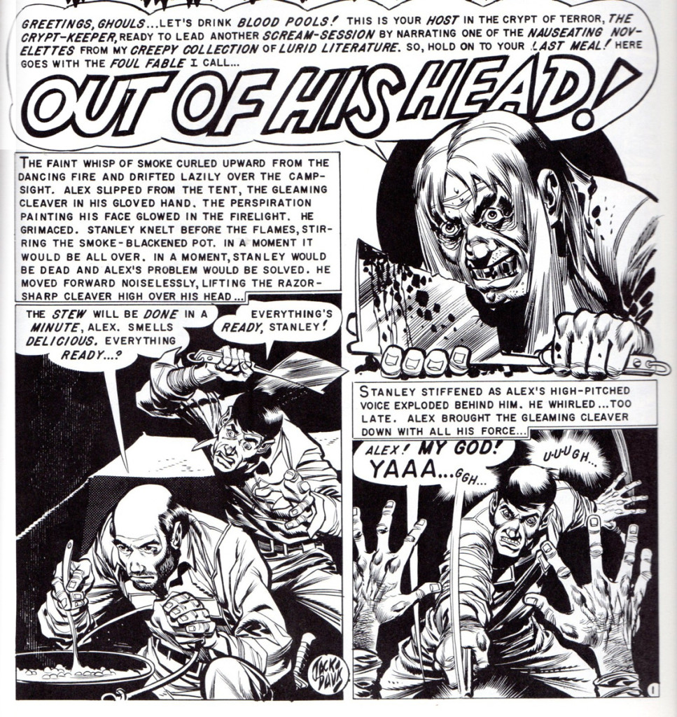 24
24
“The Vault of Horror” no. 32.
 25
25
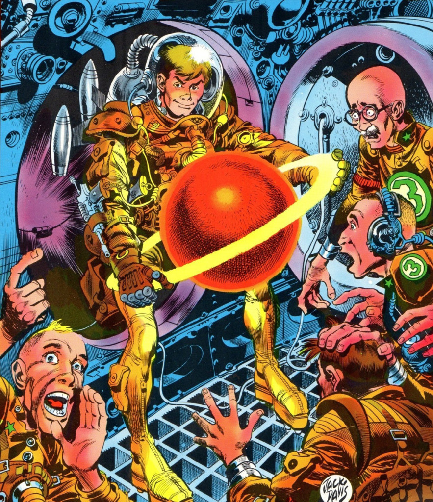
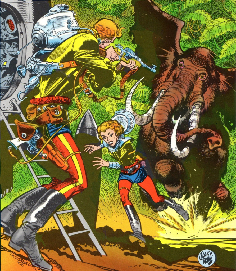
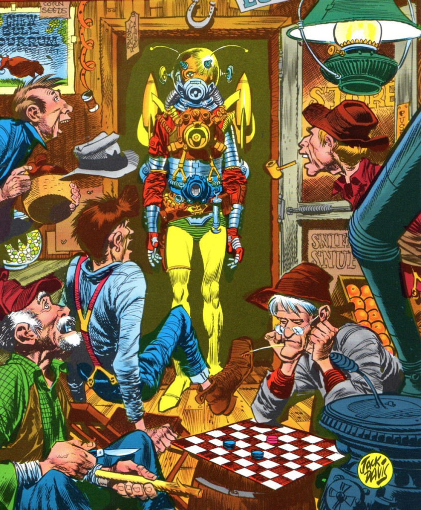
We’ll end with a splash of color. These three covers,
colored by EC colorist Marie Severin, were some of
Jack’s final pieces of art for the end run of EC comics
in 1955. They were done for their “Incredible Science
Fiction” title. With these covers and his stories inside
the books, meant that Jack worked on all of EC’s titles,
crime, horror, humor, science fiction and war. Lucky for
us, he made all these genres his own!
Here is “Incredible Science Fiction” no. 30.
 26
26
“Incredible Science Fiction” no. 31.
 27
27
“Incredible Science Fiction” no. 32.
(One almost gets the sense that Jack had his idol
Albert Dorne egging him on with this cover. A nice
tribute to both those gents!)
Bill Peckmann &Comic Art &Disney &Illustration 15 Feb 2013 05:18 am
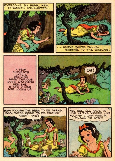
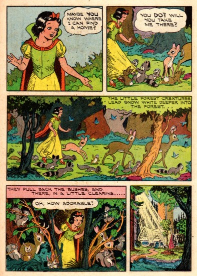
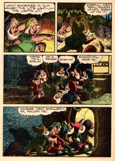
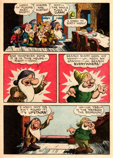
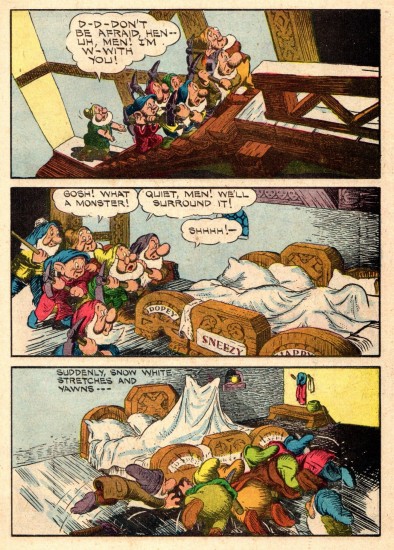
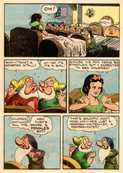
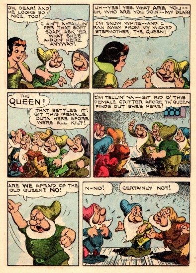
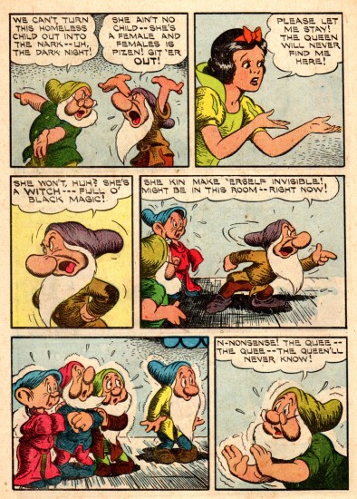
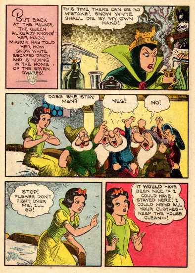
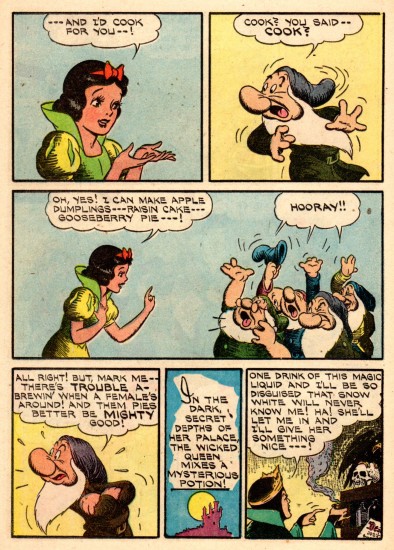
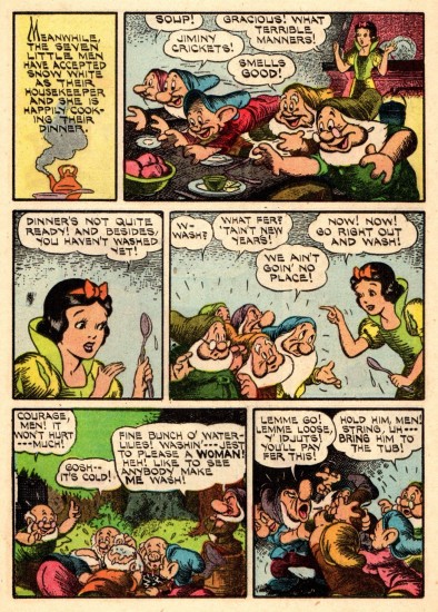
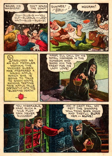
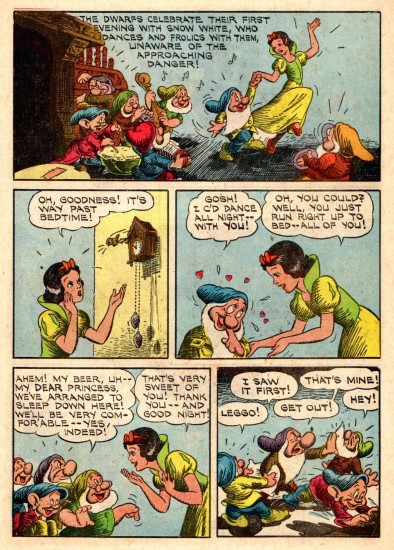
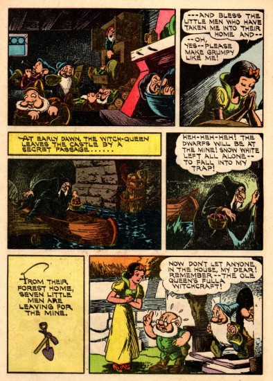
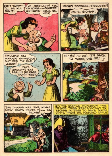
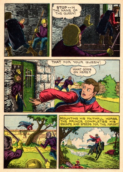
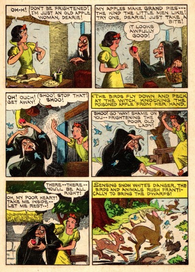
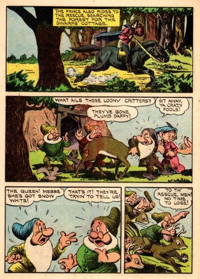
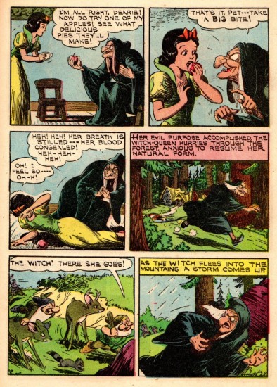
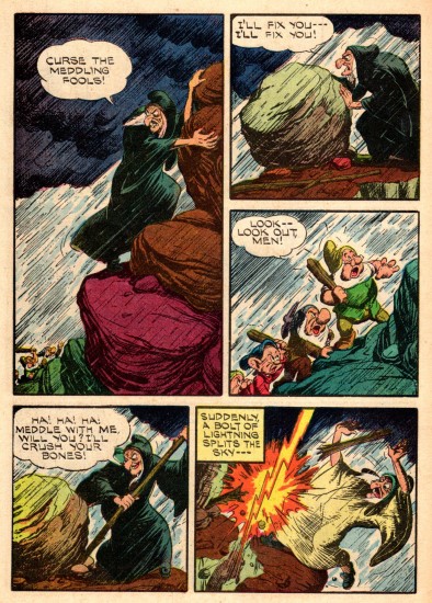
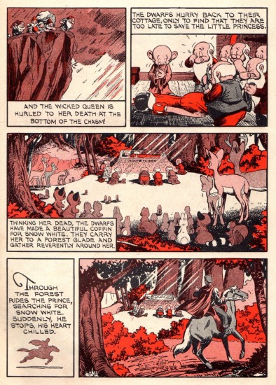
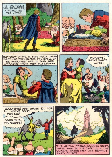
Snow White Comic – 1950
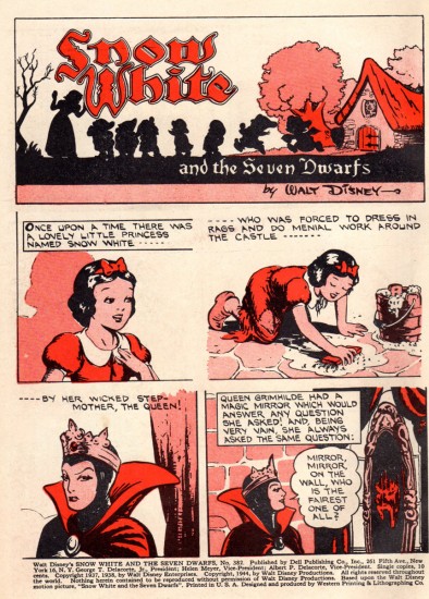
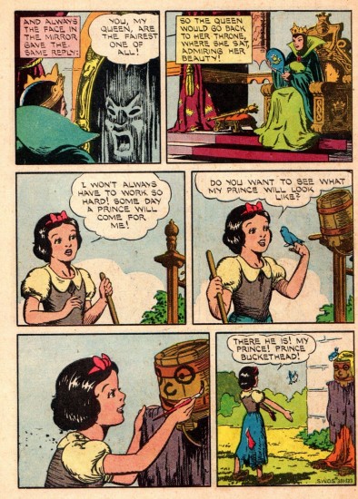
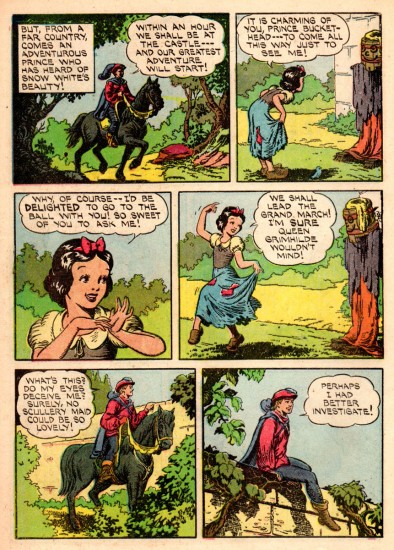
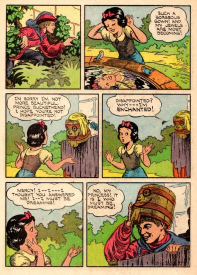
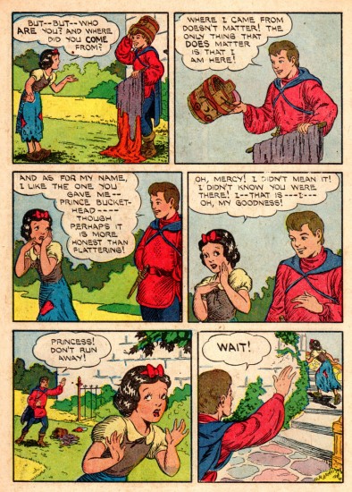
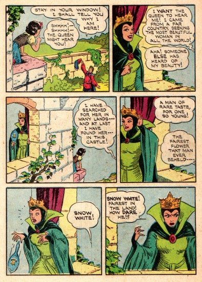
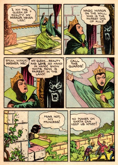
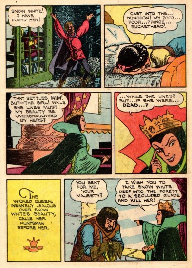
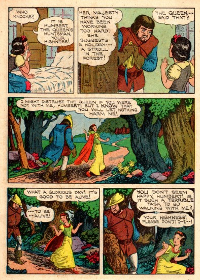
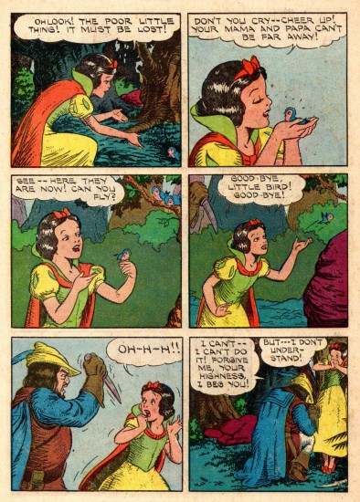
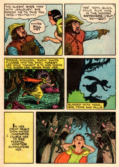
- With the re-release of Snow White, came an overhaul of the comic strip. The strip that had been syndicated in the newspaper in 1937, was now shoe-horned into a comic book version, with some modifications. This is that revised edition. Again many thanks to Mr. Bill Peckmann for having such an amazing archive and for sharing it with us. This is the note he sent along with it:
- Dell Comics’ early 1950′s ‘Snow White’ comic book. They took the original 1937 SW comic strip and cut it up to fit the comic book page format of the day. Seeing the book now only shows how good those original strip layouts were. This adaptation was first done 1944, that comic book had a Walt Kelly cover and was colored differently. I believe since then it’s been used for reprinting many, many times.
I’d posted that original 1937 version last week here.
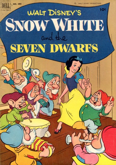
The brand new cover with artwork
by Walt Kelly.
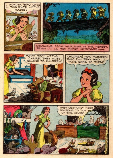 14
14
The cheap printing on the newsprint
adds something to this version.
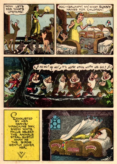 15
15
The cross hatching stands out and brings out
the expressionist feel of the original artwork.
Bill Peckmann &Comic Art 08 Feb 2013 05:14 am
Alex in Hollywood
Alex Toth had a lot of different wonderful sides, and they’re all rich and exciting. Bill Peckmann forwarded this material whcih is just great. Take a look with me; Bill takes over writing from here:
- In anticipation and in celebration of the new, long awaited Alex Toth book, “Genius Illustrated” by Dean Mullaney and Bruce Canwell due to come out in a few weeks, (check out LOAC’s site and Amazon) I thought it’d be appropriate to post three of Alex’s stories from this time period in his career that the new book covers.
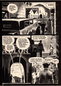
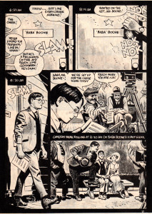
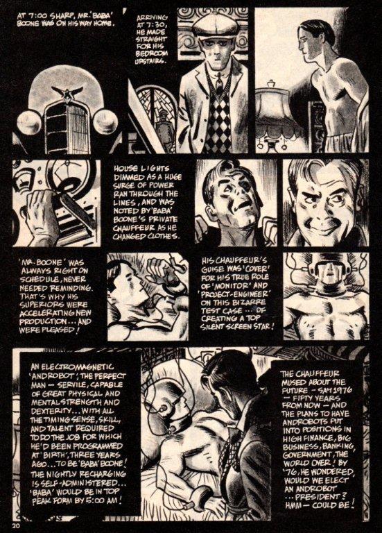
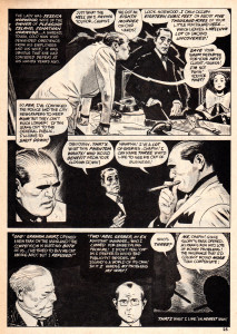
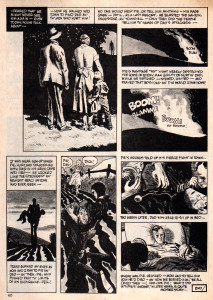
This Toth triptych could be called “Alex in Hollywoodland” because that’s where he lived the bigger chunk of his life, and it also illustrates his love for the “good” things that came out of Hollywood. Ever the west coast movie aficionado, it really shows in these Warren Publications stories.
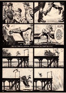
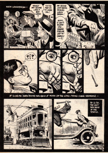
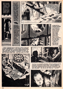
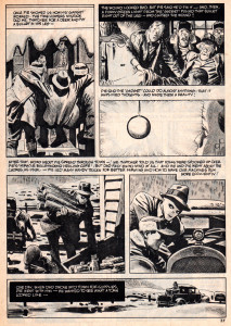
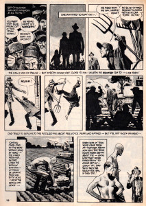
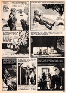
The first story, Alex’s take on the comedies of the silent film era is from the March 1976 issue of Creepy magazine.
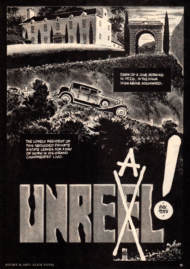 1
1
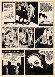
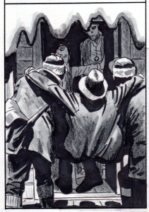
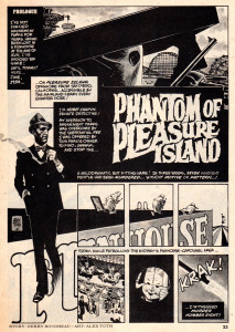
Here is Mr. Toth’s tip of the fedora to Hollywood icons Sam Spade and Humphrey Bogart.
This appeared in the November 1975 issue of Creepy magazine.
 5
5
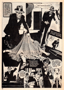
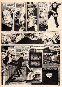
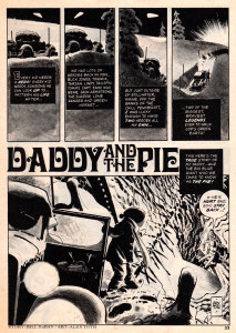
This last story would probably fall into the 1950′s Hollywood Sci-Fi category, and it’s a pretty good fit, but I also believe it’s Toth’s ode to the great Americana illustrators of the Saturday Evening Post magazine of the ’40′s and ’50′s, of which Alex was a great fan. No jazzy panel layouts, just solid art story telling. And, the ol’ curmudgeon really pulls it off, this story of all heart!
 13
13
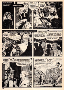
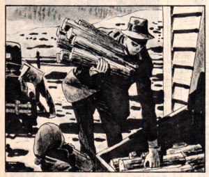
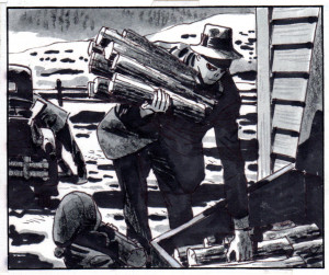
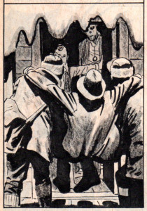
Here are four panels from the ‘Pie’ story, the first version is the printed one, the second version is Alex’s original art. I thought you would like to see what got lost during reproduction. Happily, the new “Genius: Illustrated” book will have quite a bit of original art in it. So, we will get to see a lot more of what Alex’s art looked like when he finally laid down his pens and Pentels!
 21a
21a
Bill Peckmann &Books &Comic Art &Disney 07 Feb 2013 04:56 am
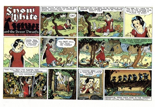
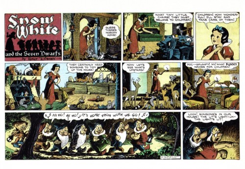
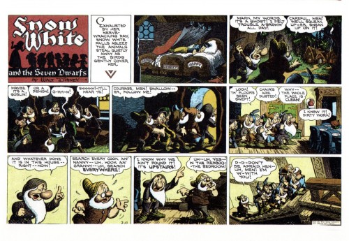
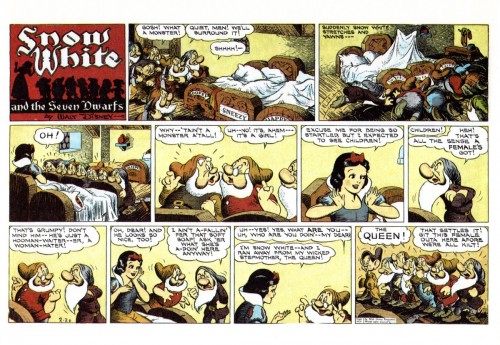
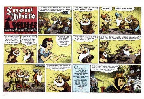
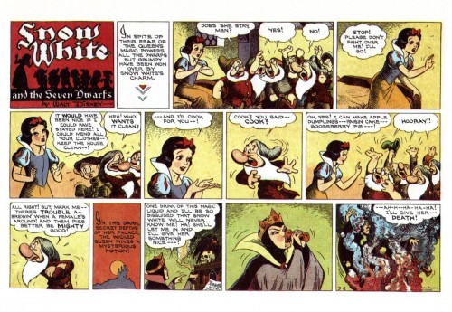
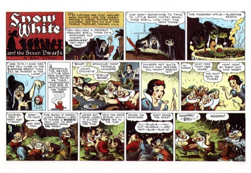
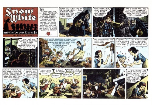
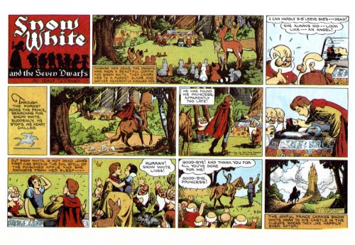
Snow White – the original strip
Well involved with the two J.B. Kaufman books on Snow White, and about to re-read Mike Barrier‘s writing on the making of the feature, per his book, Hollywood Cartoons, you can be sure that a lot of Snow White material is going to comve your way via this blog.
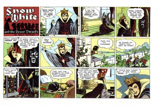
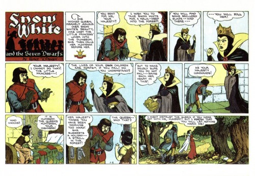
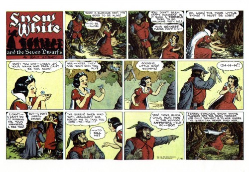
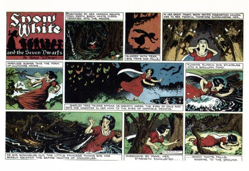
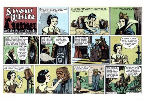
Bill Peckmann offered to send the initial strip done to coincide with the release of the feature, so thank you, Mr. Peckmann, I couldn’t be happier than to offer this.
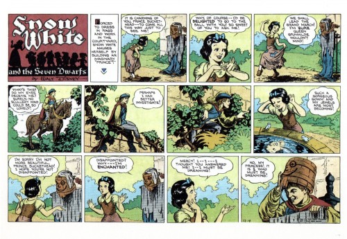
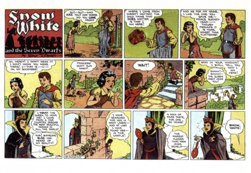
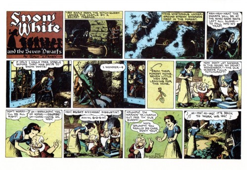
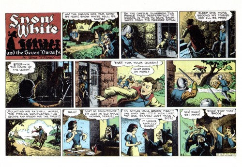
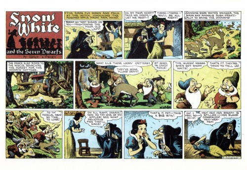
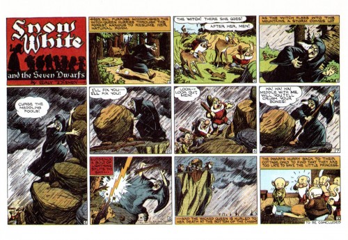
Disney had, since 1932, a Silly Symphony comic strip that ran weekly. With the release of Snow White, the strip’s regular writers were replaced with writer, Merrill De Maris, pencils artist, Hank Porter, and the inker, Bob Grant. The strip continued for a full 20 weeks, beginning on December 12, 1937.
There are noticeable differences between the story in the strip and the released film. The movie’s story, from the start, had a sequence called “Prince Buckethead” which lasted in the original storyline until the last months in making the film. Then the sequence found itself dropped from the film, but, oddly, reappears in this comic strip version. It’s a game the Prince plays was supposed to play with Snow White at the beginning of the movie. The Prince also is imprisoned in the original story in the caverns of the castle; the same is true here. Other things like the huntsman having the name, “Humbert,” return to the story. I’m curious as to who made these decisions to keep the noticeable differences. Many versions of the stirp appeared over the years and in many languages. You can check them out here.
Without wasting more time, here’s the original strip.
 1
1
Thanks, again, to Bill Peckmann for putting this all together.
Bill Peckmann &Comic Art 05 Feb 2013 08:29 am
Jack Davis – Cowboy
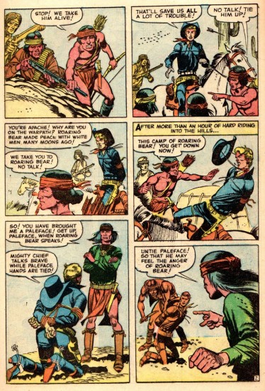
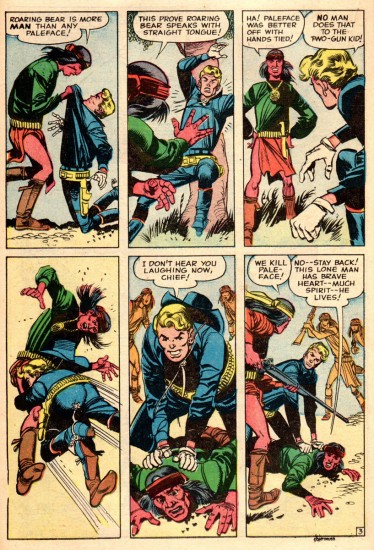
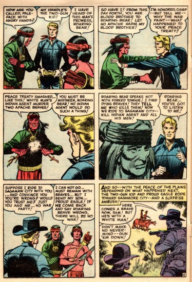
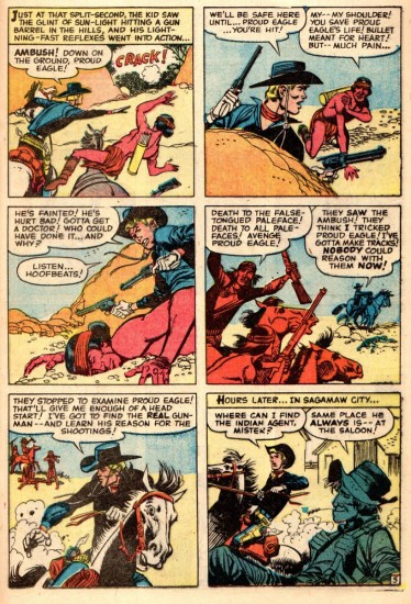
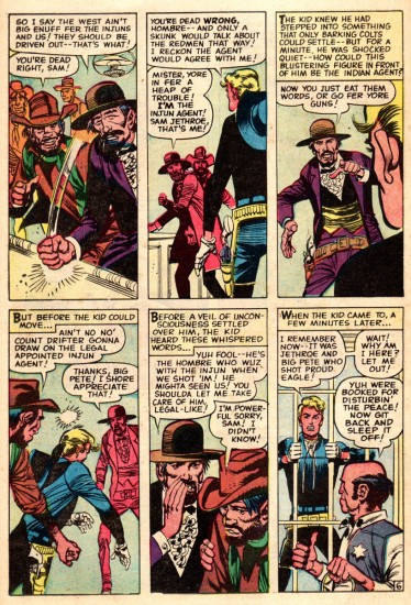
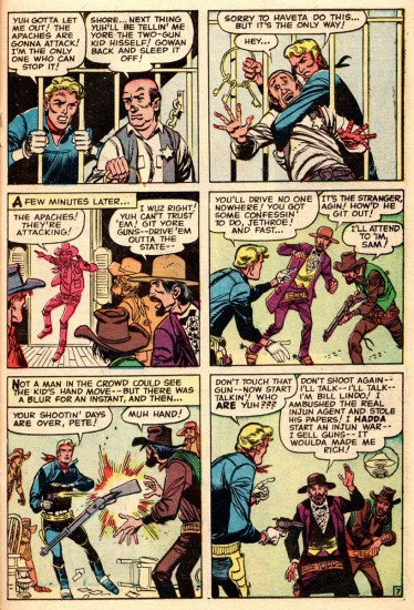
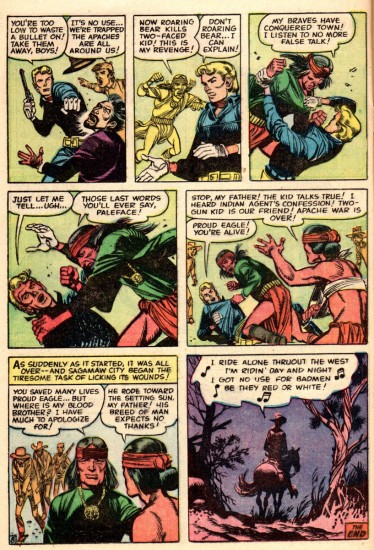
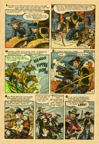
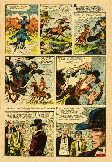
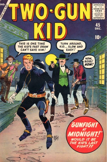
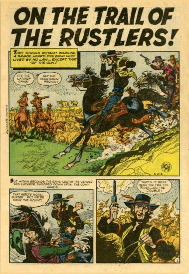
The Two Gun Kid, is illustrated by Jack Davis. It, of course was sent by Bill Peckmann. Here is some of the story behind it:
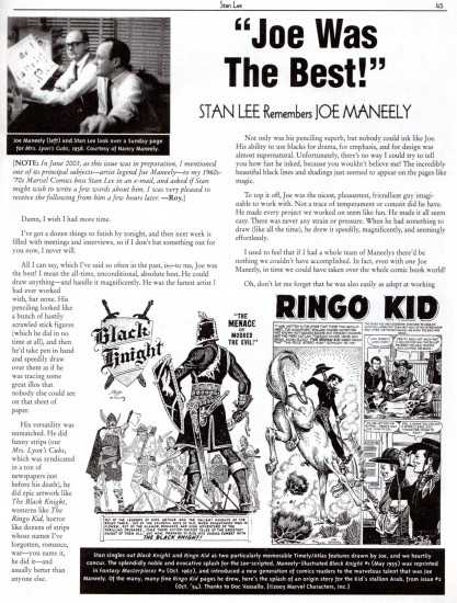
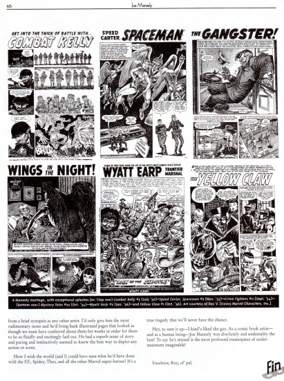
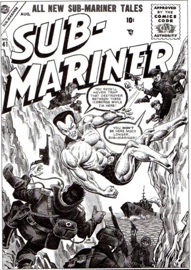
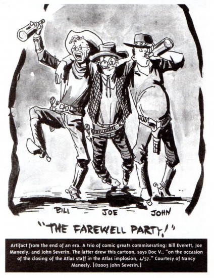
- A famed/named comic book team that is seldom heard of, is that of Stan Lee and Jack Davis. Short lived as it was, they did work together, Stan wrote and Jack did the art back in the late 1950′s. At that time, Stan Lee had quite a roster of western comic book titles, and when one of his most gifted, young cartoonists, Joe Maneely met a tragic and untimely death, he had Jack Davis step in and finish the job.
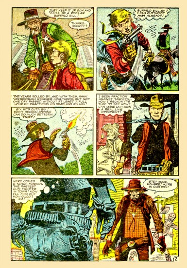
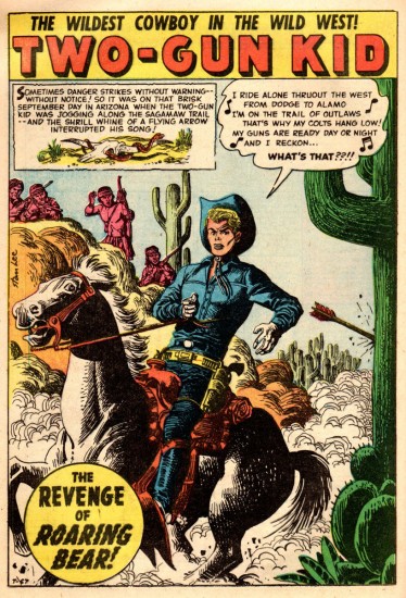
Here is Jack Davis’ first “Two Gun Kid” cover, (he did three) along with the story from that issue that was started (first page splash panel) by the very talented Joe Maneely and completed by Jack.
Because of the difference in page rates from Stan Lee’s company and Jack Davis’ more lucrative alma mater EC Comics, Jack had to be a little quicker on the drawing board, and it shows a wee bit. But, a faster Jack is still better than no Mr. Davis at all!
Magazine cover
 2
2
(Joe Maneely’s opening page.)
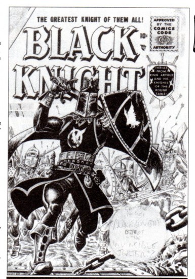
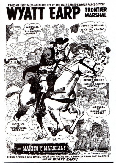
Having featured Joe Maneely, we thought it a good idea to give a few samples and background of his work:
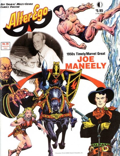
The cover
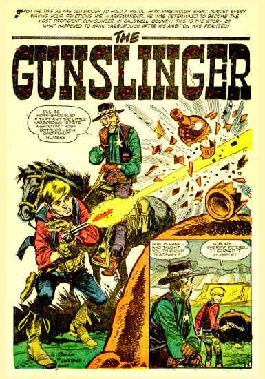
Bill Peckmann writes about the following two stories also from the Stan Lee work:
- Here are two of Jack’s Stan Lee western stories that Manuel sent me. Sorry, I don’t know the name of the comic book it came from.
 1
1
And the followimg is the second story:
 1
1
Animation &Animation Artifacts &Bill Peckmann &commercial animation &Illustration &Models &Story & Storyboards 30 Jan 2013 08:26 am
More Misc Commercial Art
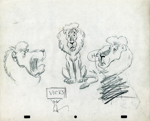
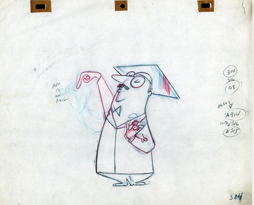
- Still left in the Vince Cafarelli collection of drawings from commercials he did, most probably, at Goulding-Elliott-Graham (for the moa part) are the drawings below. We know through some small bits and pieces of information what a couple of the sponsors were. (The wording of dialogue the professor speaks that the sponsor is Nabisco Shredded Wheat; the lion and the mouse ad is obviously for Vicks – drops or vap-o-rub.) However, too many other bits leave us empty handed. I can recognize cartoonist, Lou Myers‘ work anywhere, but no clue what they’re for. Candy Kugel and I were also able to delineate Lu Guarnier‘s drawing style (Vinnie was his assistant for years), and I know Jack Schnerk‘s great work. I recognize the brilliant and great hand of George Cannata from similar work that Bill Peckmann had recognized (see here) in a past post. So it is great to learn as much as we can, even though there’s a lot of guesswork in it.
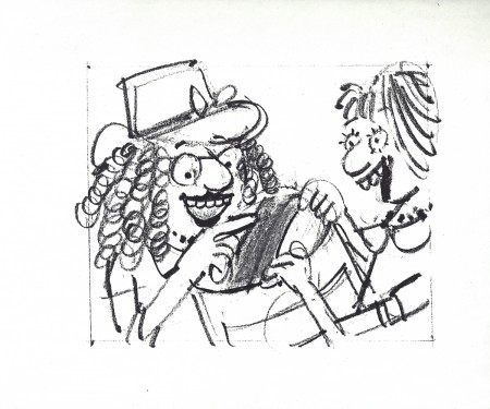
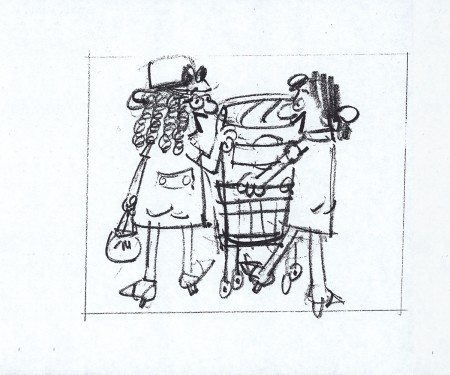
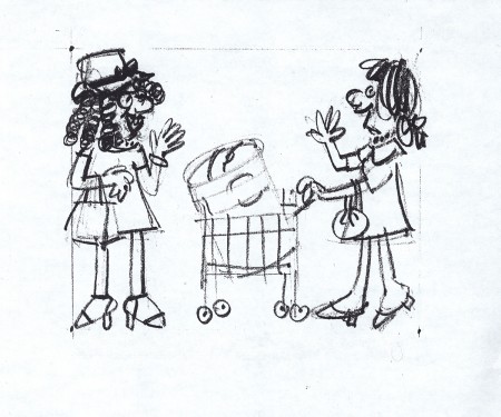
The following are three storyboard drawings by cartoonist Lou Myers for some spot:
 1
1
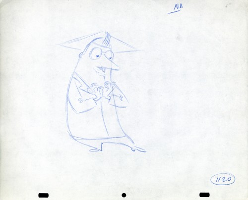
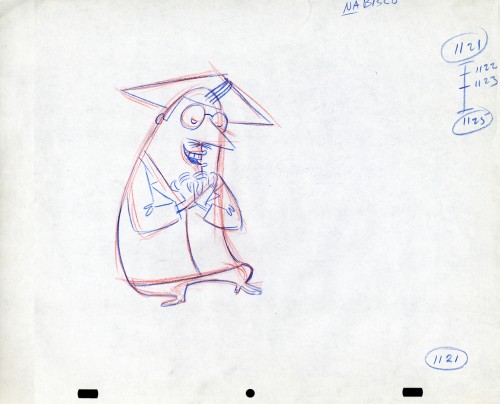
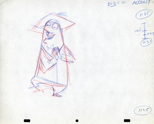
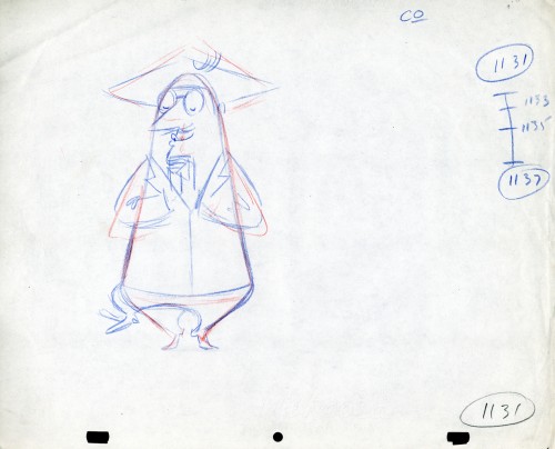
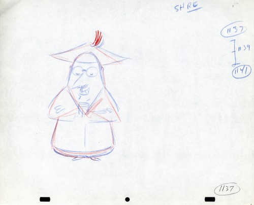
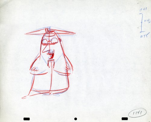
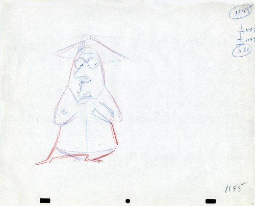
The following drawings are for Nabisco Shredded Wheat. They’re animation drawings/ruffs by Lu Guarnier. The delicate pencil lines of these years turned into dark rougher ones in his later years. The timing charts were always the same right out early wB years. You’ll notice a lot of quarters and thirds in the breakdowns. This is something you’d never see from Disney. There, everything is broken into halves and halves again and again.
 1A
1A
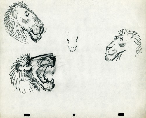
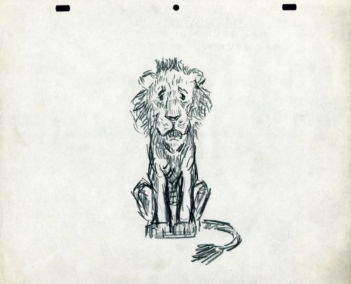
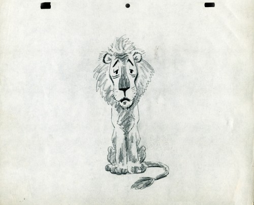
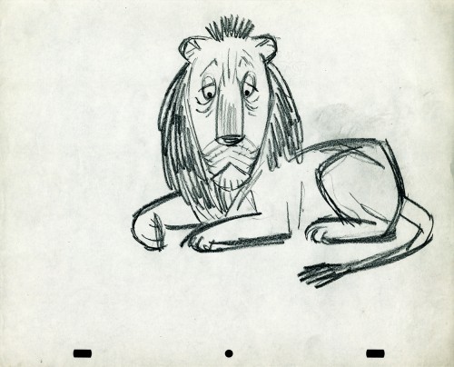
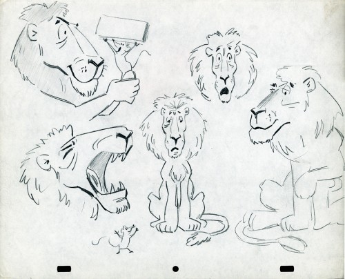
- The following lion is designed and animated for a Vick’s commercial. (Note the second model sheet.) There were quite a few commercials during the period that reworked this great Aesop tale for the sponsor’s use. The lion obviously has a cold. Rather than pulling out the thorn, the mouse introduces him to Vicks’ cough drops and the lion feels a whole lot better.
What has been left behind of this ad includes a couple of model sheets of the lion as well as a couple of animation drawings. I don’t know who the designer is, but the animation drawings are most definitely the work of Jack Schnerk. I suspect all the drawings here are by Jack. He probably kept reworking the model sheet until he got the character in his hand. I can remember him lecturing me on the quality of my drawings. Unless my drawings became roughs, rather than tight clean ups, he was convinced I couldn’t get good animation in my pencil. Jack’s work was rough. and it became much more rough than this, certainly by the time I knew him and was assisting him. He also had a peculiar style of roughness; very choppy angular lines chiseling out the fine drawings. You can get a good example of that with drawing labeled “2D”.
The last four drawings are all animation drawings. “2D” is a rough, “2E” is a clean-up by Jack. The last drawing is a beauty and probably the final look he hit upon.
 2A
2A
Here we have some drawings by a designer. I suspect that it’s the work of George Cannata. I did a couple of posts on a designer at Robert Lawrence Studio a few weeks back. Bill Peckmann identified the primary designer whose work screamed out to me. Since then, I’d recognize that line anywhere, and it’s most definitely below.
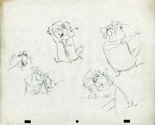
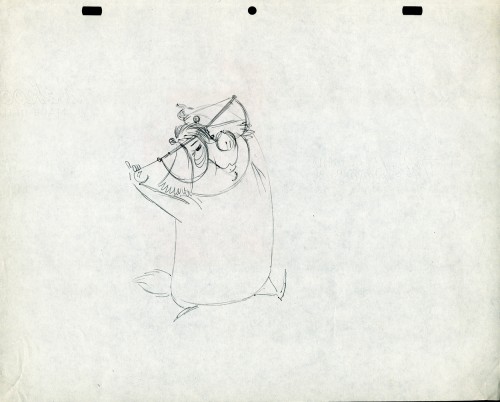
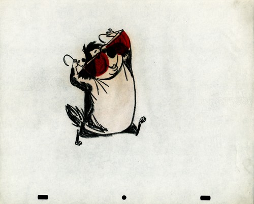
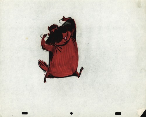
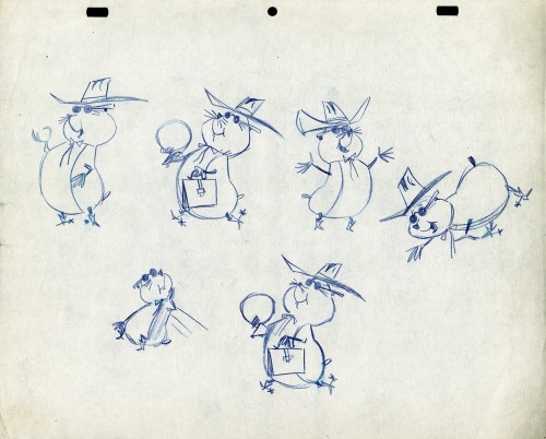
The Groundhog below is obviously a character with a southern drawl. The first step was to try the obvious making him a cowboy (“3A”). But that soon changed. and the character got plenty more sophisticated (“3B & C”). After that the line got juicy and the color got bold. There’s really so much to a character like this who just about animates himself.
 3A
3A
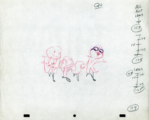
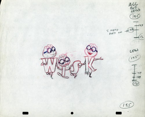
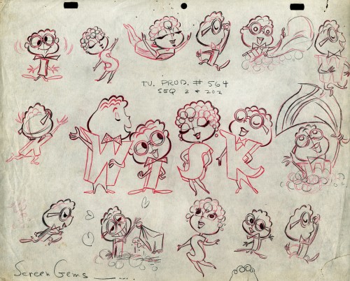
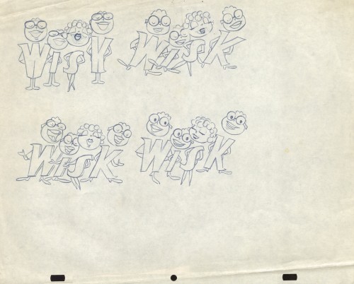
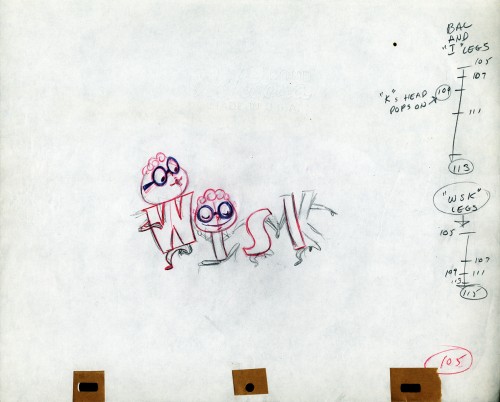
The following five drawings are for a WISK commercial. There are two model drawings and three animation ruffs. The primary model indicates that the spot is done for Screen Gems which was a viable studio in the early 60s and 70s. However, I don’t know who the animator was. Neither Lu Guarnier nor Jack Schnerk fill the bill.I know that Irv Dressler was at Screen gems for many years, but am not sure about this time especially since IMDB has him free lancing for King Features and other entertainment studios. The drawswing style of these animation drawings is right out of the Paramount/Terrytoons mold. Many animators’ work looked like these. People such as Johnny Gentilella, Marty Taras et alworked in a very similar style, though these are a little harder lines than either of those two.
 A
AThis is the primary model for the entire family. It’s a
beautiful drawing, and the characters have a lot of play
in them despite being connected so obviously.
Just look at the father’s hair. Beautifully done
 B
B
Here’s a secondary model. I suspect this is the animator
tracing off the characters and seeing what he can do with them.
 C
C
Animation drawing #105. Those breakdown charts are something.
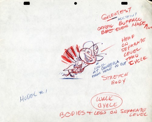
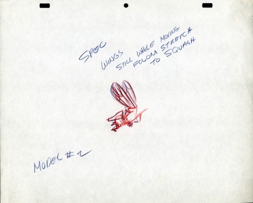
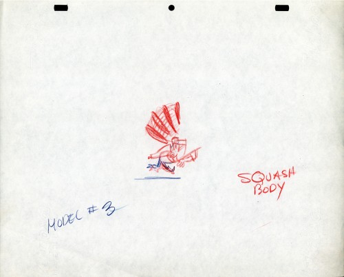
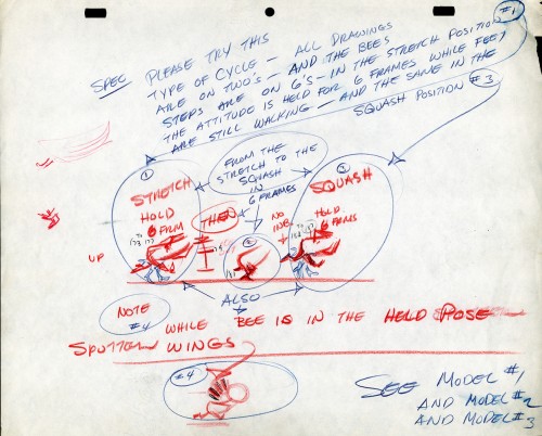
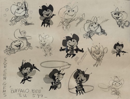
The Buffalo Bee for Honey Nut Oats is also a model sheet from Screen Gems. With it come an animation model sheet for the walk cycle of the character. These drawings look like Lu Guarnier’s to me, but there’s no official way I could confirm that, of course.
Model sheet
