Category ArchiveBill Peckmann
Articles on Animation &Bill Peckmann &Daily post 21 Oct 2009 08:19 am
Print ’74
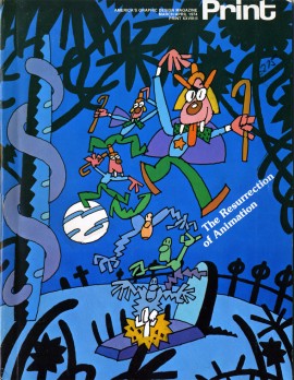 - I seem to remember a lot of industry magazines that would regularly publish articles about the animation industry. Millimeter, Film Comment, On Location, Hollywood Reporter all had their animation issues that I’d search out (long before I entered the business professionally), pore over, memorize and save.
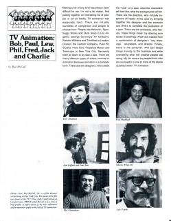
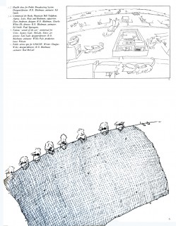
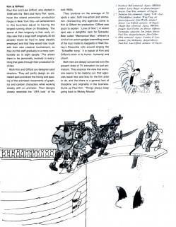
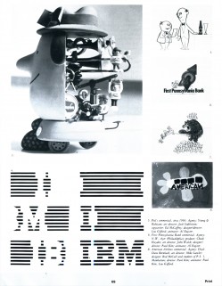
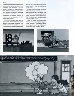
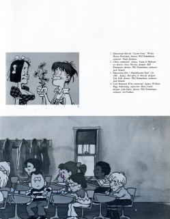
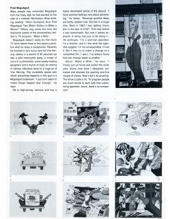
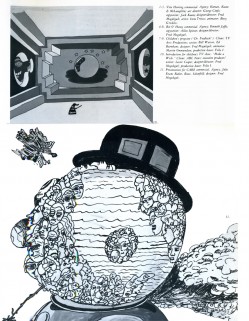
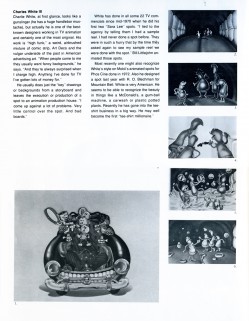
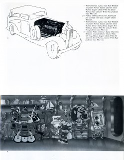
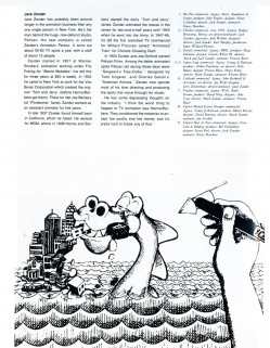
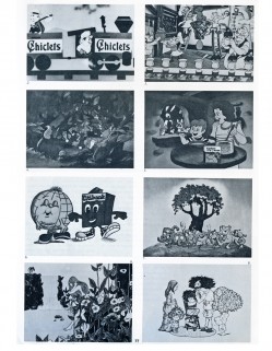
Print Magazine was a glossy magazine that featured lots of articles about design, usually print design, although there was the occasional animtion article. In 1974, there was a big issue about animation. One article, by Rod McCall, who was a designer for print as well as film, wrote an article about the commercial studios in New York with an accent on the design aspect.
Here’s that article, which is picture-centric in jpegs. If there were more text I’d have transcribed it, but this format seems best since the article is so attractively designed within the magazine.
 1
1 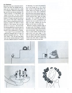 2
2(Click any image to enlarge and read.)
Thanks to Bill Peckmann for the magazine to scan and share.
Animation Artifacts &Bill Peckmann &Models &Rowland B. Wilson 09 Oct 2009 07:42 am
more Troll models
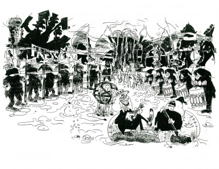
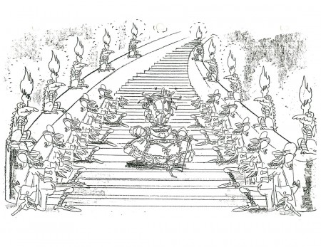
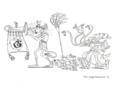
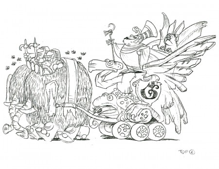
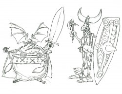
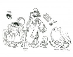
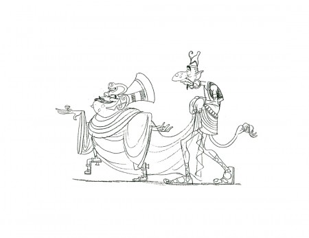
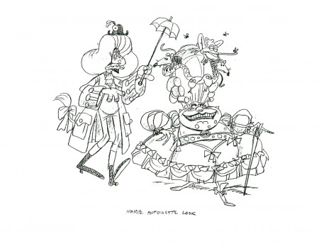
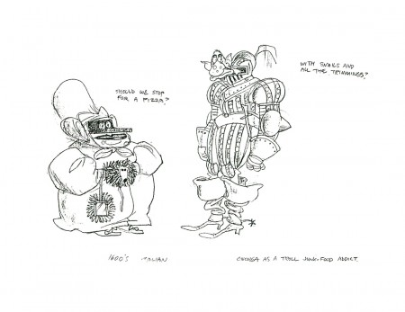
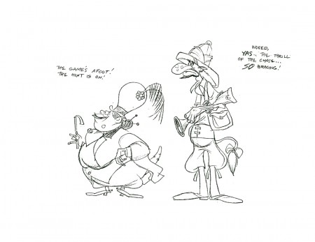
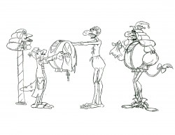
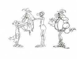
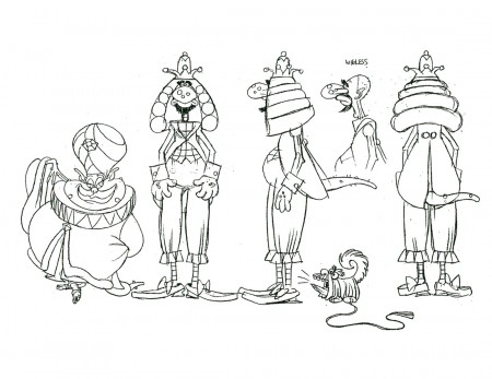
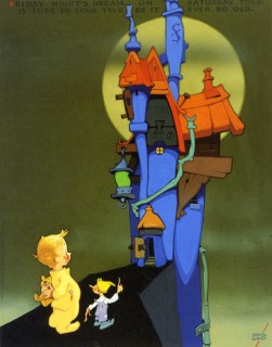
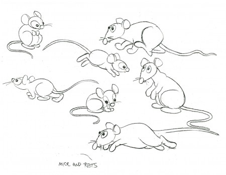
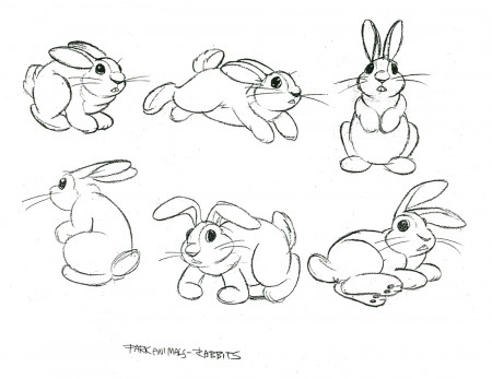
- The Rowland Wilson storyboard sequence from Don Bluth’s A Troll in Central Park, which I posted yesterday, had lots of interesting bits. This is made more evident by the number of great models Rowland did for the sequence. Thanks to Bill Peckmann‘s collection, there are many of these to post, and I think you’ll find them interesting. They’re what you want in a model; they excite interest in animating those characters. At least, that would be the case for me.
 1
1(Click any image to enlarge.)
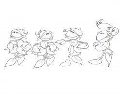
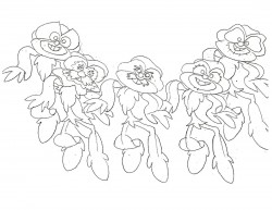
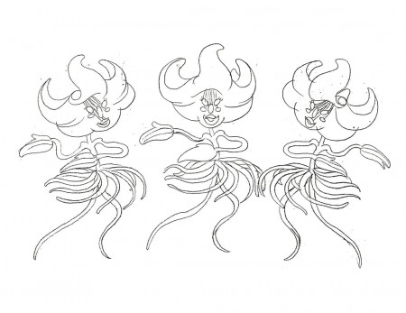
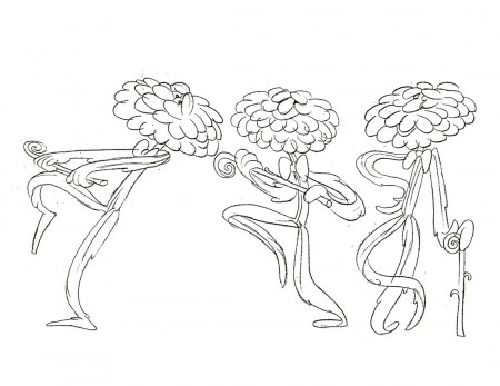
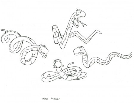
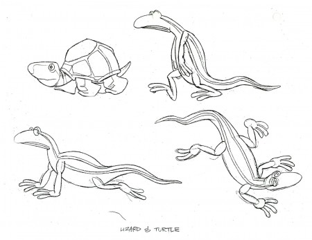
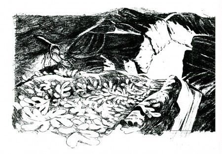
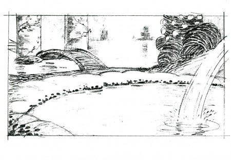
Here, additionally, are more anmial and plant character models for the film.
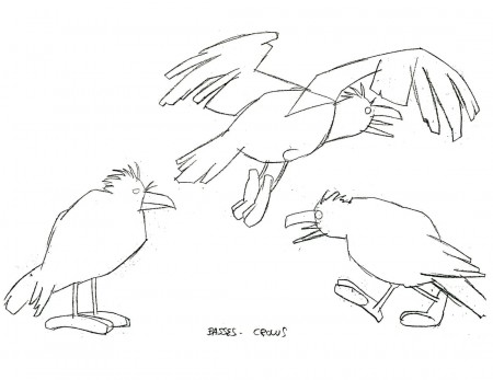 18
18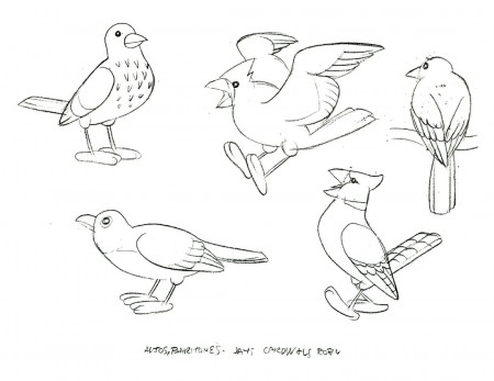 19
19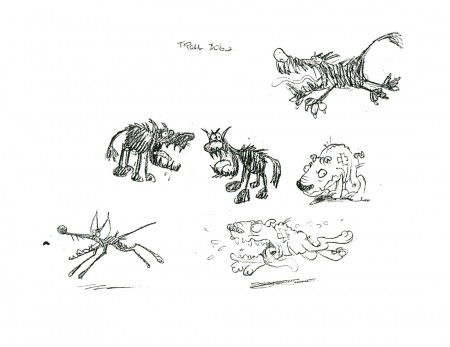 20
20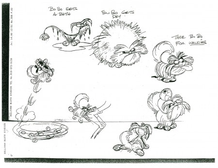 21
21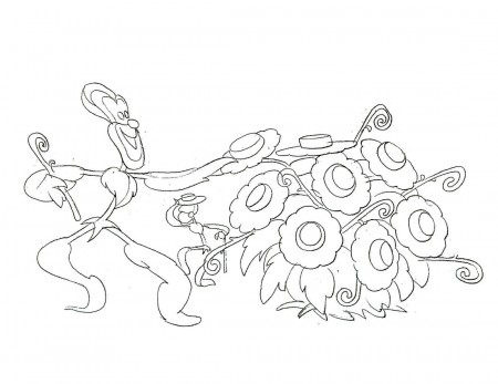 22
22
Once again, many thanks to the gracious Bill Peckmann for the loan of Rowland Wilson‘s work. I’m a big fan, and it’s a pleasure to even veiw these models never mind post them.
Animation Artifacts &Bill Peckmann &Books &Disney &walk cycle 08 Oct 2009 08:28 am
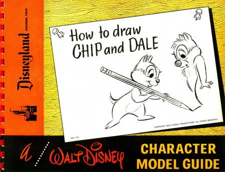
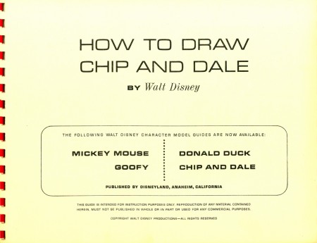
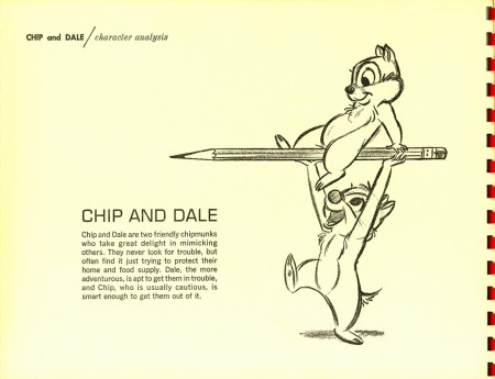
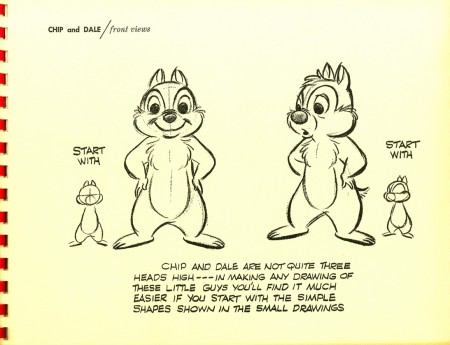
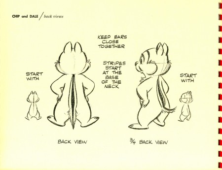
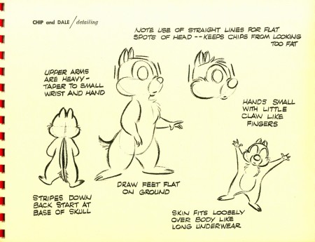
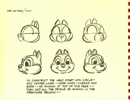
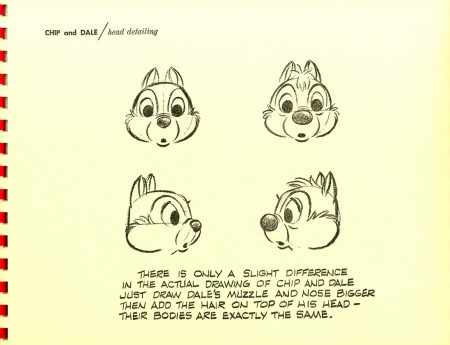
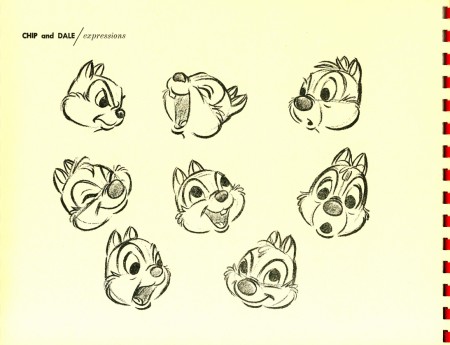
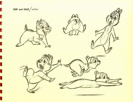
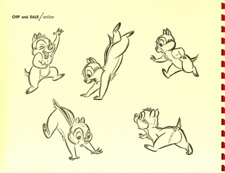
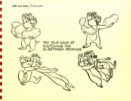
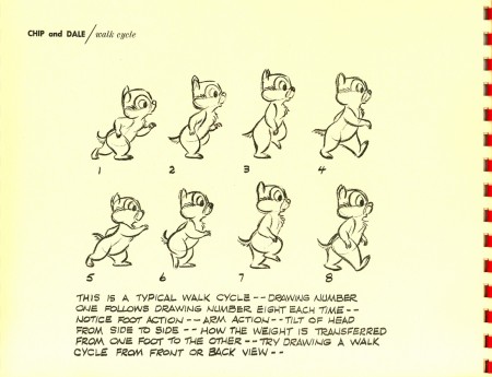
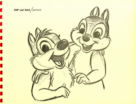
How To Draw Chip & Dale
- In the past I’ve posted the series of booklets that Disney released via the Art Corner at Disneyland. How To Draw Mickey, Donald, Goofy and Pluto have been posted. The only one left is How To Draw Chip & Dale. Thanks to Bill Peckmann, I can post this last booklet.
The past booklets I posted were actually rereleased publications that were stapled together and handed out at the Lincoln Center celebration for all things Disney back in 1973.
This Chip & Dale book, however, is the real thing. It was an original published in 1955.
 1
1(Click any image to enlarge.)
 2
2
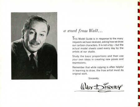
This is the inner cover which iss a thin cardboard.
as opposed to the yellow pages of paper.
 15
15
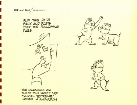
The directions tell you to flip the pages to see the movement.
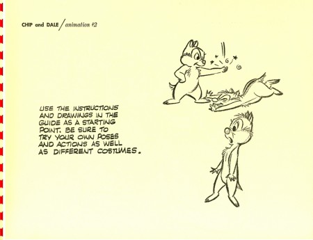 16
16
However this page is printed on the back of page 15,
and it’s impossible to flip. It doesn’t matter since the two drawings
aren’t registered to each other and flipping doesn’t work.
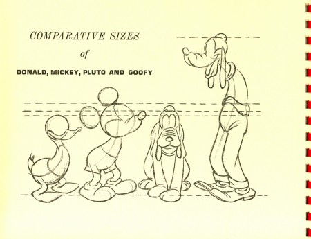 18
18
This page appears in all of the booklets.
Here’s a QT of the walk cycle on pg 12.
Chip cycle on threes.
Click left side of the black bar to play.
Right side to watch single frame.
Go here to see the lecture series posts:
Mickey / Donald / Goofy / Pluto
Here to see How To Draw Mickey.
Here to see How To Draw Donald.
Here to see How To Draw Pluto.
Here to see How To Draw Goofy (Jenny Lerew‘s Blackwing Diaries.)
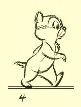
I once pointed out that a good walk should be drawn
with the two feet a distance apart from each other.
This creates a sense of depth in that walk. You might look
for this when you see other walks on line. You’ll be
surprised at how many professionals do it and how many
beginners don’t. Lately the latter is beating the former.
Animation Artifacts &Bill Peckmann &Rowland B. Wilson &Story & Storyboards 02 Oct 2009 07:45 am
Troll bd 2
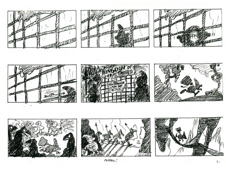
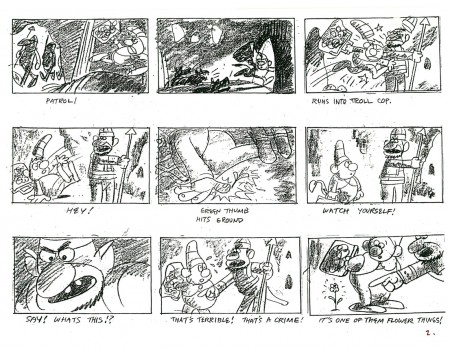
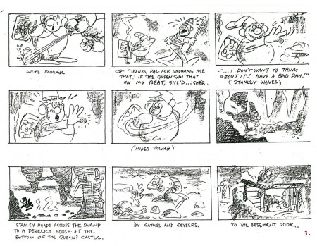
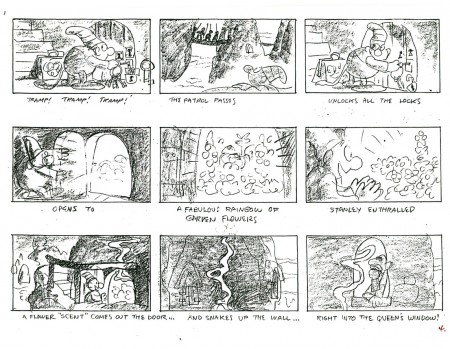
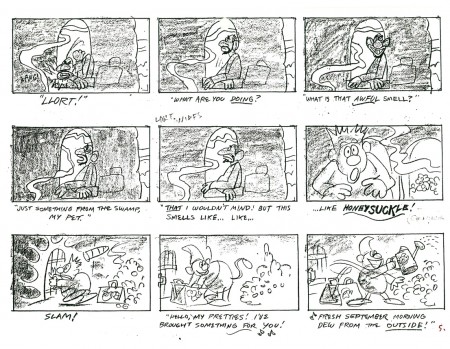
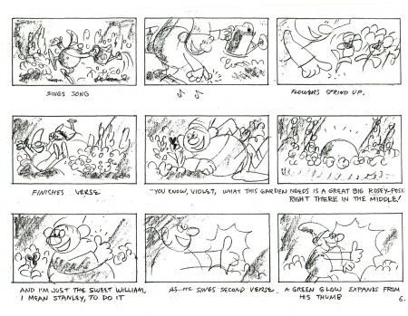
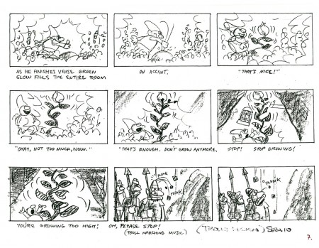
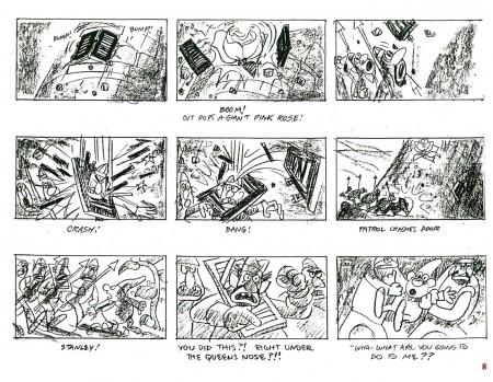
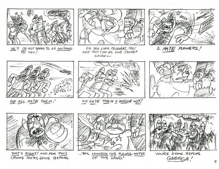
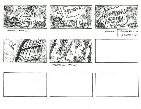
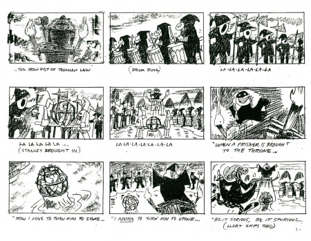
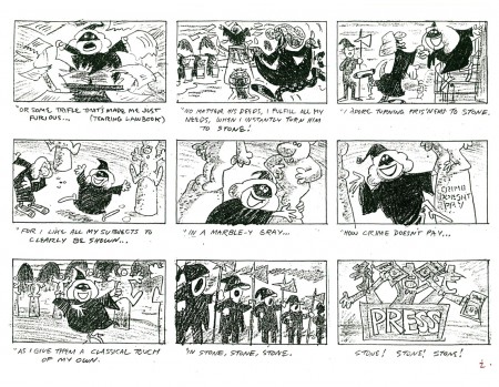
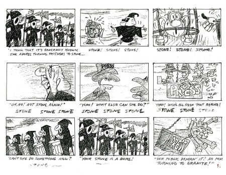
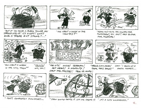
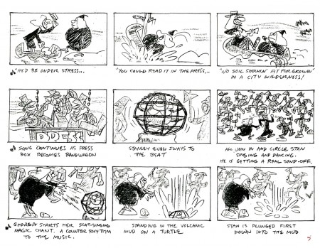
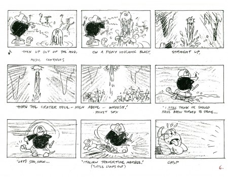
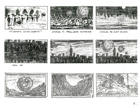
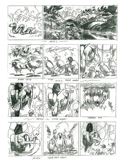
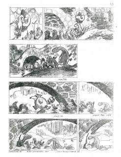
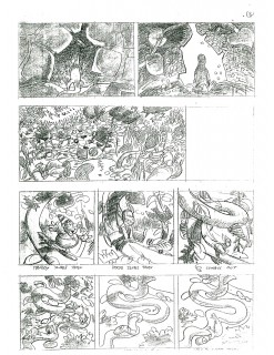
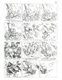
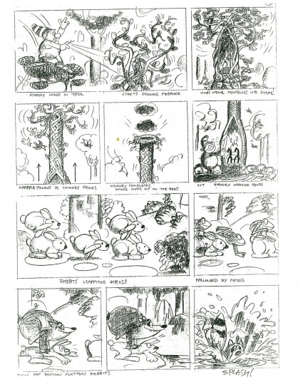
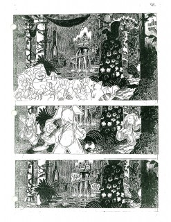
 - As promised last week, I’m here to offer another part of the storyboard for Don Bluth‘s film, A Troll in Central Park. As with the initial post, this board was drawn by the extraordinary artist, Rowland B. WIlson. Also as with part one, the material was graciously loaned to me by designer, Bill Peckmann.
I don’t have a copy of the film or I’d offer some frame grabs for comparison. Though perhaps we’re better off just accepting Rowland’s work for itself. This film was one of the last of the Sullivan-Bluth films out of the Irish studio. They subsequently moved to Arizona to do Anastasia for Fox.
Looking at these boards I began to wonder what Rowland would have done had he directed a film, himself. Perhaps the closest is the Trans-Siberian Express, Pushkin/Vodka commercial done at Richard Williams’ studio in the 1975. I wouldn’t mind owning a copy of that first spot they did.
 1
1(Click any image to enlarge.)
Next up, we’ll post a stash of Rowland’s models for this film.
Here are a couple of short clips from this film on the Bluth site: #1, #2
Sections of the film are also currently on YouTube. Here’s Part 1.
Bill Peckmann &Books &Illustration 01 Oct 2009 07:39 am
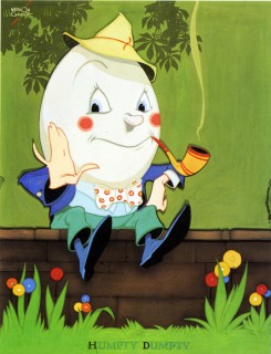
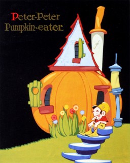
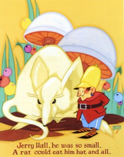
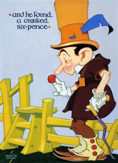
Vernon Grant’s Nursery
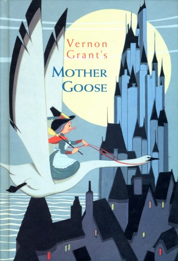 - As posted yesterday, the illustrations of Vernon Grant gave us the cereal icons Snap, Crackle and Pop. After they helped make Rice Krispies an enormous success, Kelloggs employed Grant to illustrate Mother Goose nursery rhymes which graced the back of the packages.
Again, these pictures brought more success for the cereal company, and they ultimately brought them to a publisher to bind all of Grant’s illustrations in one book.
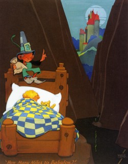
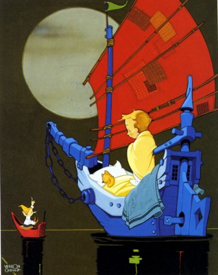
The result was the book that appears to the right. Vernon Grant’s Mother Goose is still available some 70 years later. He also had a second book, Vernon Grant’s Santa Claus.
Grant was a graduate of Chouinard Art Institute. While most of his classmates headed to Disney’s studio to break into animation, Grant went East to New York where he sought advertising work and illustration jobs. He had some modest success with his gnome characters which finally led to the Kellogg’s job where his life’s work was set.
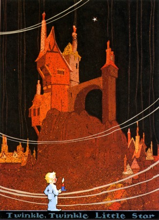
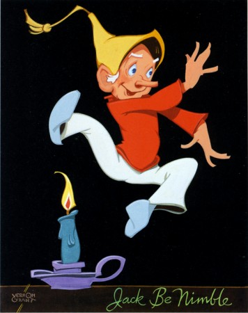
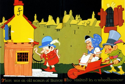
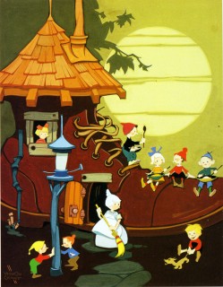
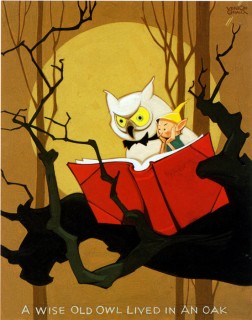
The Mother Goose book contains 25 illustrated pages; each page contains an illustration accompanied by the Mother Goose rhyme. These are the illustrations below:
 1
1(Click any image to enlarge.)
Twinkle Twinkle Little Star
 2
2
Jack be nimble, Jack be quick
 3
3 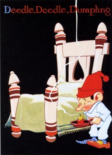 4
4
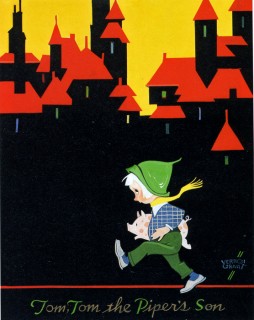
Tom Tom the Piper’s Son / Deedle Deedle Dumpling
 5
5 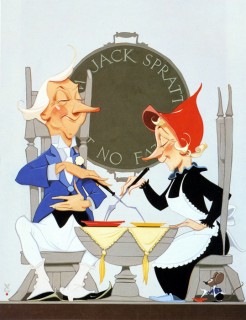 6
6
Little Jack Horner / Jack Sprat could eat no fat
 7
7 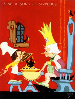 8
8
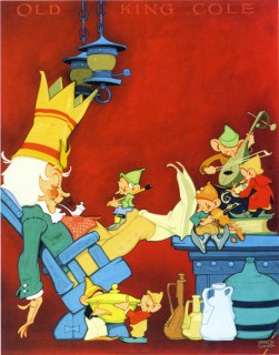
Old King Cole was a merry old soul . Sing a song of sixpence
 9
9
There was an old woman of Harrow
 11
11
Old woman in the shoe / A wise old owl lived in an oak
 13
13
Humpty Dumpty/ Peter Peter Pumpkin eater
 15
15
Jerry Hall / A crooked sixpence
 17
17
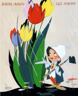
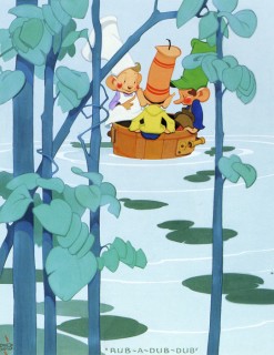
Rain Rain Go Away / Three men in a tub
(Note that the three men in the tub are Grant’s Snap Crackle and Pop.
 19
19
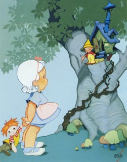
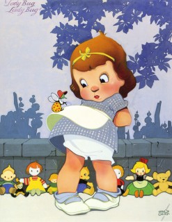
Nose Nose, Jolly red nose / Ladybug Ladybug
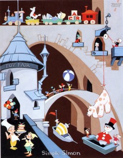
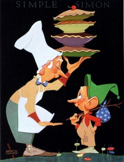 21
21
Simple Simon and the Pieman
Thaks, again, go to Bill Peckmann for the introduction to Vernon Grant as well as the loan of the book.
Bill Peckmann &Books &Commentary 30 Sep 2009 07:47 am
Snap Crackle Pop
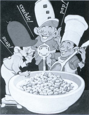
The original Snap, Crackle and Pop
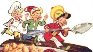 - Vernon Grant was the designer of the three elves who’ve appeared on the Rice Krispies package since 1928.
Snap, Crackle and Pop have gone through many incarnations since their debut. Their ears and noses have been reduced and softened, and their costumes have changed significantly.
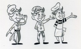
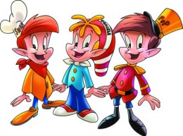
Two other variations found on liine. The left animated at Playhouse Pictures in the Fifties.
A couple of commercials can be found on YouTube. Naturally enough, the quality degenerates chronologically.
#1, #2, #3, #4, #5
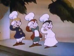 In 1939, Snap, Crackle and Pop starred in a short called Breakfast Pals. In the 1½ minute film, the three elves have to fight another three elves: Soggy, Mushy and Toughy. Ultimately, our heroes roll the bizzaro elves into a syrupy pancake and prepare Rice Krispie cereal for two boys sharing a sleep-over.
The film was made by Cartoon Films Ltd. This was the last incarnation of Ub Iweerks’ own studio. He was, at the time, making some short films for Columbia.
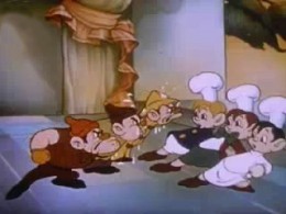
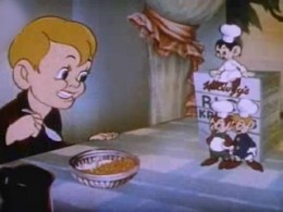
Soggy, Mushy and Toughy fight Snap Crackle & Pop
In 1939, the Kelloggs Corporation sent this letter which talks of other illustrations by Vernon Grant. Mother Goose rhymes were added to the package backs and became very popular. Kellogs sought to publish them.
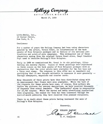
(Click any image to enlarge.)

This is the subsequent book, which became
quite successful and is still available.
I’ll post the illustrations for the book tomorrow.
The letter and book are courtesy of Bill Peckmann to whom many thanks are offered.
Animation &Bill Peckmann &Disney &Models &Story & Storyboards 28 Sep 2009 07:36 am
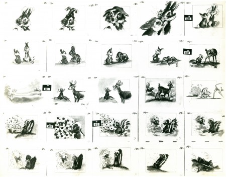
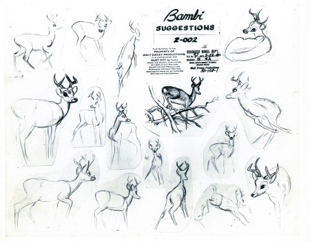
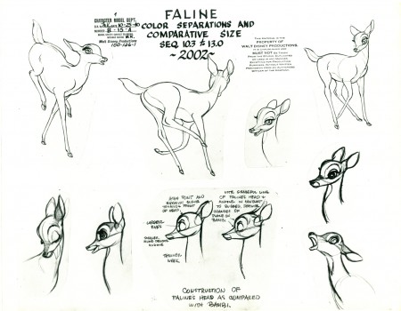
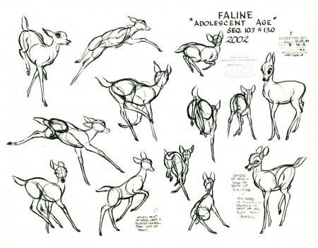
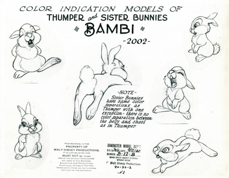
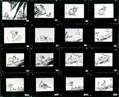
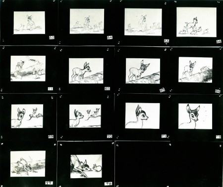
Bambi Board 2
- The cache of stats that Bill Peckmann recently sent me on loan includes several photo pages of storyboard from the Bambi Twitterpated sequence. I’m not much of a fan of this sequence, but looking at these beautiful storyboard drawings makes me realize how charming it is in its original state. The cute/cartoony movements came from the animators and directors. Perhaps the film needed this funny, broad approach, but I have a feeling there are other ways it could have been tackled that might have let it feel more connected to the whole.
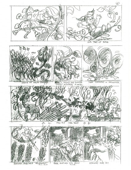
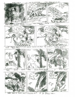
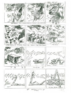
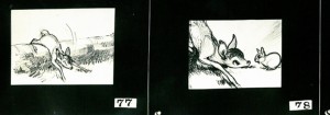
As with past board postings, I’ve cut them up into rows so that I can post them at a higher res for better viewing. First here are the three pages as they stand:
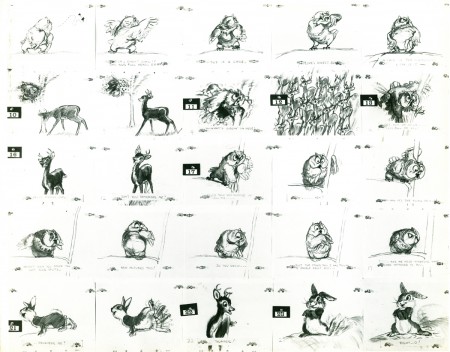 1
1(Click any image to enlarge.)
Now here they are again broken into individual rows:
 1a
1a
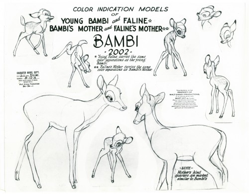
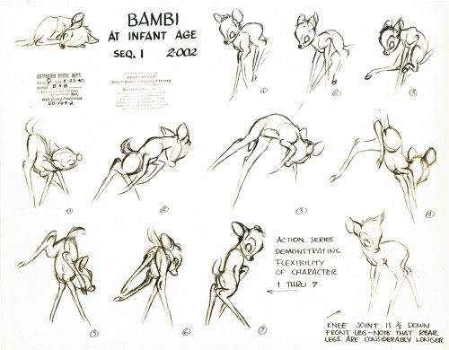
Here are some model sheets which relate to this sequence:
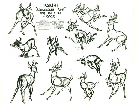 1
1
Once again, many thanks to Bill Peckmann for the loan of this marvelous material. It’s truly appreciated, and it’s fun to share.
It’s amazing to think how Walt Disney pushed all this great art forward. This film actually moved the “Art” side of animation forward with the majestic backgrounds, realistically designed animation and bold storytelling approach. There’s no possibility that something as rich as this film could be done today.
Animation Artifacts &Bill Peckmann &Rowland B. Wilson &Story & Storyboards 23 Sep 2009 07:37 am
Troll Bd 1
- The animated feature is a funny business. So much work goes into them and so few give back the intended spark that the many creators think they’re investing in the labor. Such a film goes through many incarnations and struggles on its way to the public that it’s a wonder that it even makes it. And when it hits the theaters some jerk like me will dismiss it with a few bad words.
Don Bluth produced and directed as many as 11 feature films between 1982 and 2000. That’s a lot of work, and a lot of talented artists worked with him to get those flms to screens. Not all of them, obviously, were successful. I’ve read about The Pebble and the Penguin, but I don’t remember seeing it though I probably did; and if I don’t remember I may as well not have. Yet how much intensive labor by how many people went into making that film? How many years of work?
A Troll in Central Park is another one of those 11. I’ve seen parts of this film many times over. This is one of those films that I always seem to turn on at exactly the same moment and see the mid-section again and again. I admit that I haven’t seen it to the end. It has a very distinctive look, yet it wasn’t compelling enough for me to stay with it.
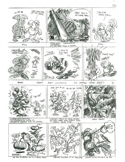
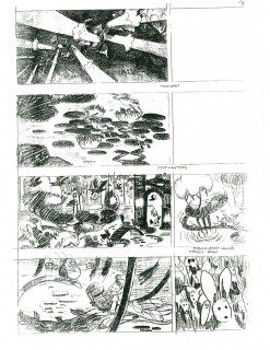
I have some of the storyboard sections done by Rowland Wilson, and I want to post them. There’s something to learn from every film fragment and this board offers much. Rowland was such a brilliant artist that it’s worth rummaging through any of his work, and he put a lot into all of it. This board is no exception.
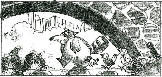
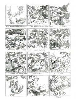
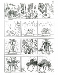
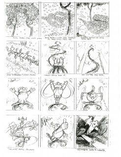
Without further explanation or fanfare, here are 14 pages of board – actually I think they’re thumbnails – which were done by Rowland for A Troll in Central Park. These were given on loan to me by Bill Peckmann. His collection has been a real education for me.
 1
1(Click any image to enlarge to a legible size.)
Here are a few character models for this sequence:
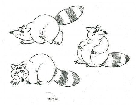
Can an animator have a better design for a racoon?
There’s enormous personality in this character.
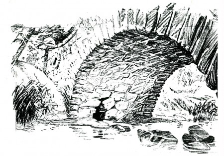
And here are some BG Layouts for this sequence:
 1
1
I’ll put up more of these next week. Many thanks, again, to Bill Peckmann for the loan of this art.
Animation Artifacts &Bill Peckmann &Disney &Models &Story & Storyboards 21 Sep 2009 07:34 am
Bambi Board 1
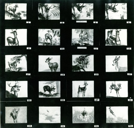
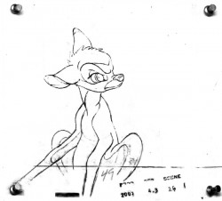 - Straight from the collection and the kindness of Bill Peckmann comes these three photo captures of a presentation board from Bambi.
One of the photos is missing, consequently on the first picture every other group of four panels is gone. If you look at photos #3 & #4, you’ll see that they should be read across. The top 4 images from #3 should be followed by the top 4 images from #4; then onto the second row.
The same should be true of photos #1 & #2, but #2 is missing. What’s here is so good, though, that I’m posting it just the same.
As with past boards, I post the boards/photos as they came to me. Then I break them up (putting them into proper order) a row at a time. This is to be able to offer you the highest res copy of all.
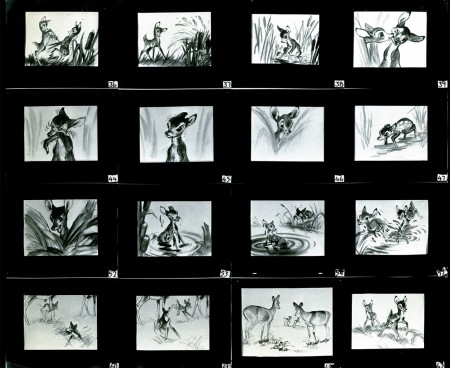 1
1(Click any image to enlarge.)
And now the breakdown of these three boards:
missing four panels
missing four panels
missing four panels
Photo 3 & 4 combined
Here are some model sheets that relate to this material:
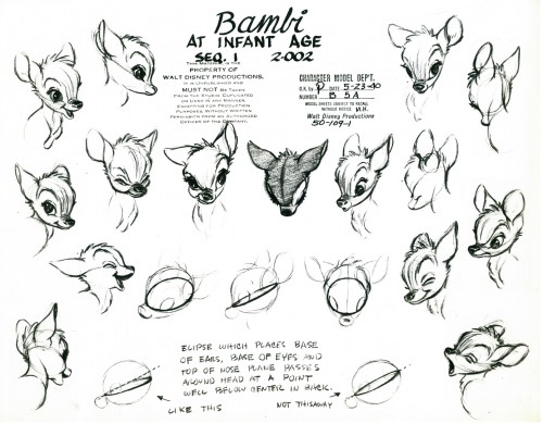 1
1
If you’re interested you should check out past posts on Rico LeBrun’s animal anatomy lessons: Part 1, Part 2, Part 3
There are another three pages of storyboard that I’ll post soon. Again, many thanks to Bill Peckmann.
Bill Peckmann &Books &Illustration 17 Sep 2009 07:39 am
Good Housekeeping 3
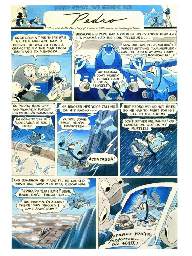
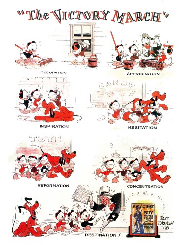
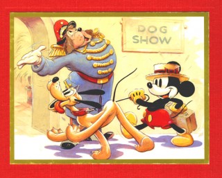 - Bill Peckmann loaned the book of collected Good Housekeeping illustrations that were publishrf bryeen 1938 through 1944. (The illustrations actually began in 1934 and were printed complete in an interesting recent book called Mickey and the Gang which was edited by David Gerstein. That book includes so much more than these illustrations – including the text that went with the illustrations. However, I like the printing, on non-glossy paper, of the 1987 book.)
I’ve done two other posts of these illustrations (part 1, part 2) and finish them up with this piece.
 1
1The Victory March, August 1942
 2
2
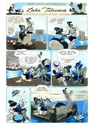
Lake Titicaca, December 1942
 3
3
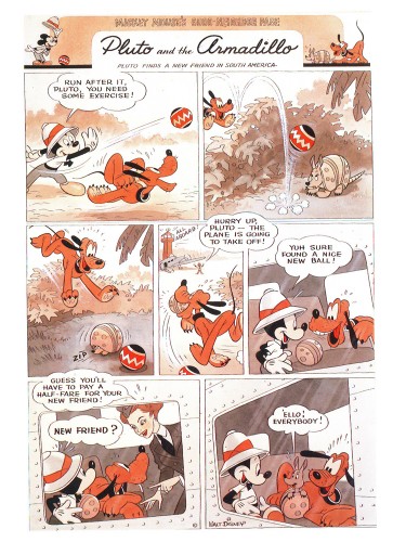
Pluto and the Armadillo, February 1943
 5
5
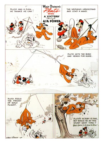
Pluto wins A Victory Through Air Power, April. 1943
 6
6
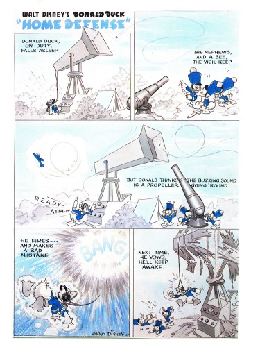
Donald Duck Home Defense, August 1943
 7
7
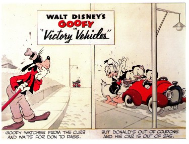
Victory Vehicles, September 1943
This edition, published in trhe Alexander Gallery catalogue
is really just the upper half of the strip.
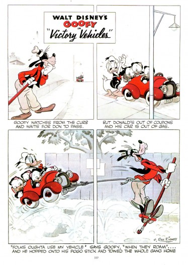
Here’s the whole strip as printed in
Mickey and the Gang.
More white no colored grays.
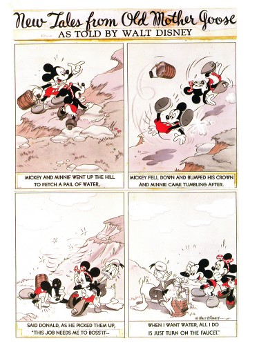 8
8
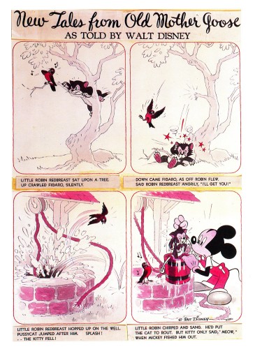
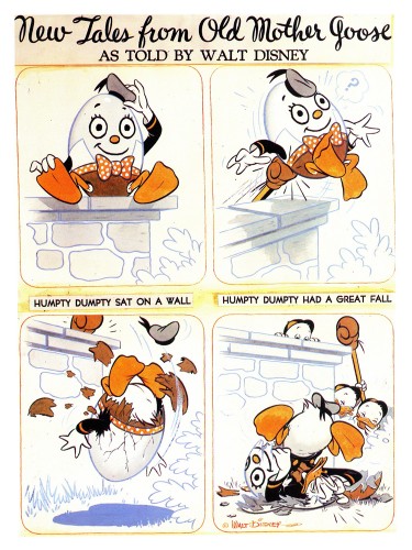
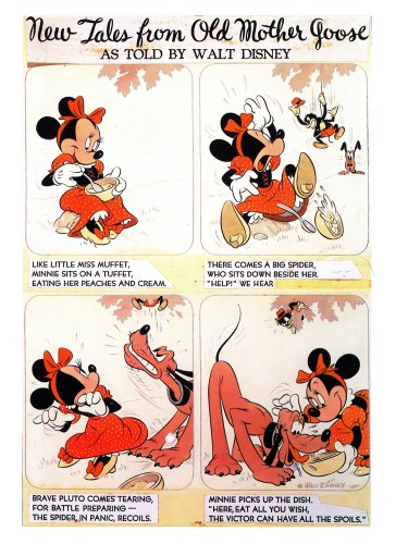
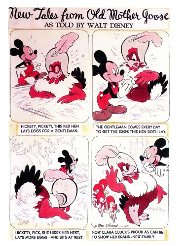
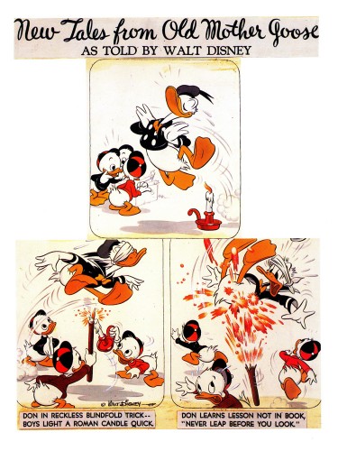
From 1943 on, the illustrations became “New Tales from Old Mother Goose.”
This was a revision from “Donald Duck’s Mother Goose” that had
appeared in Mickey Mouse Magazine, published in the 1930′s.
Hank Porter and his writers dealt with a more limited subject in a
more comic-strip sense and used the two color process during the war.
Mickey an Minnie Went Up the Hill, October 1943
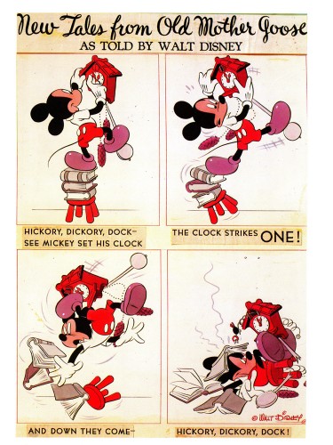 9
9
Hickory Dickory Dock, February 1944
 10
10
Little Miss Muffet, May 1944
 11
11
Hickety, Pickety, June 1944
 12
12
Don be Nimble, Don be Quick, July 1944




 2
2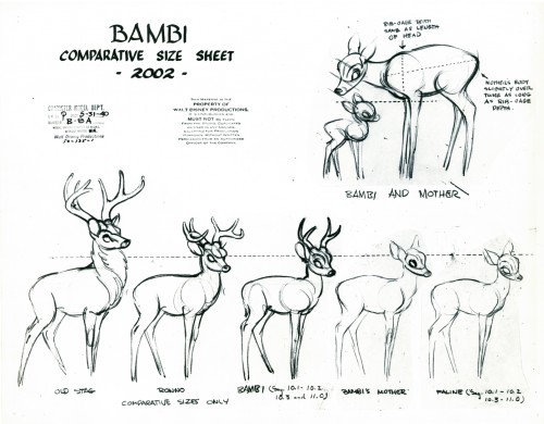 3
3