Category ArchiveBill Peckmann
Bill Peckmann &Books &Illustration &Rowland B. Wilson 02 Apr 2010 08:21 am
Rowland Wilson’s Whites
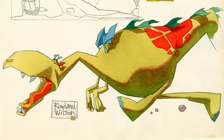
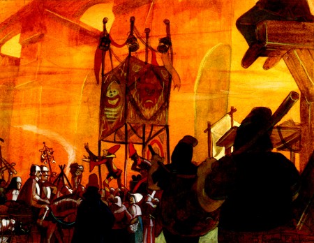
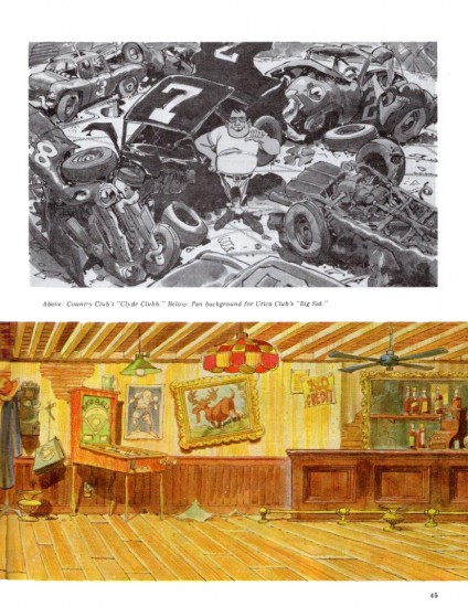
- Last week, I’d posted some dragon models that Rowland B. Wilson did for animation company Phil Kimmelman & Ass. for ‘Utica Club Beer’. Well, it turns out Rowland liked the model enough that he kept this painting on the wall in his studio at home. The color image was sent to Bill Peckmann, who shares it with us, by Suzanne Wilson, Rowland’s wife.
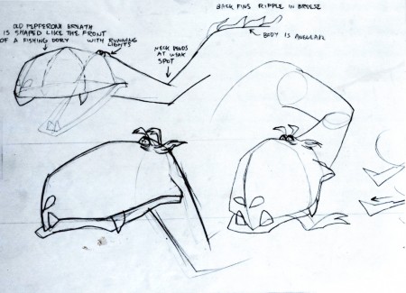
This is the model posted last week.
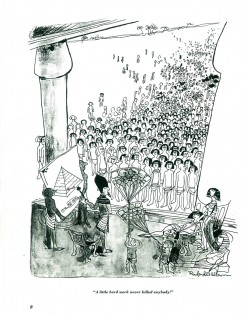
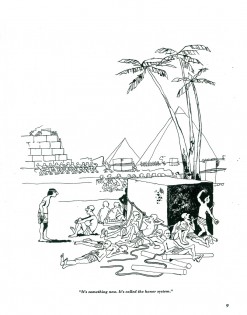
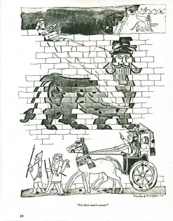
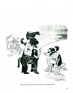
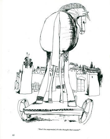
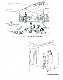
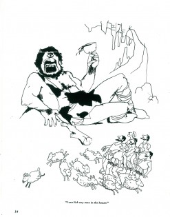
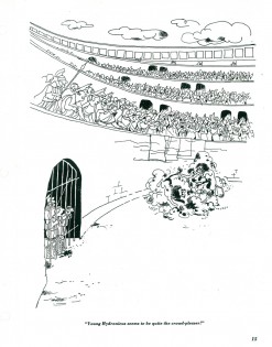
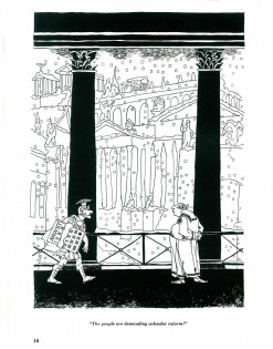
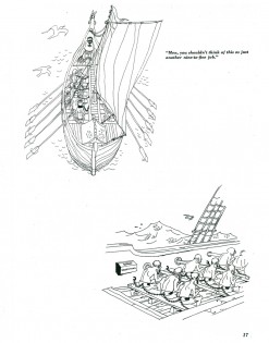
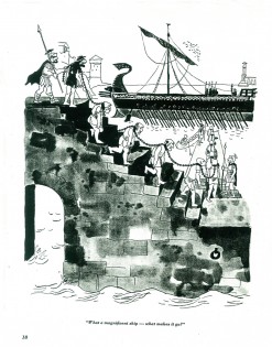
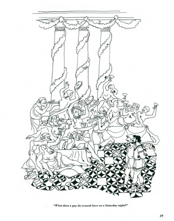
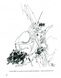
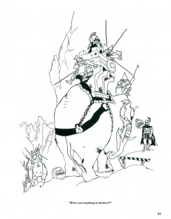
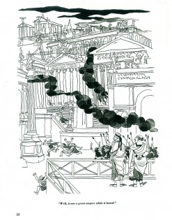
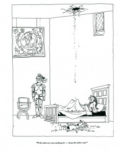
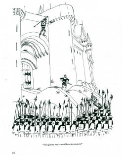
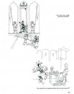
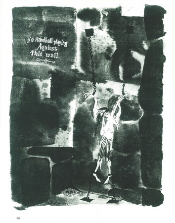
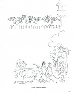
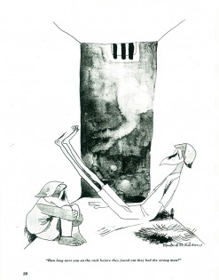
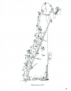
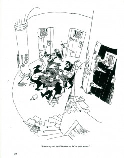
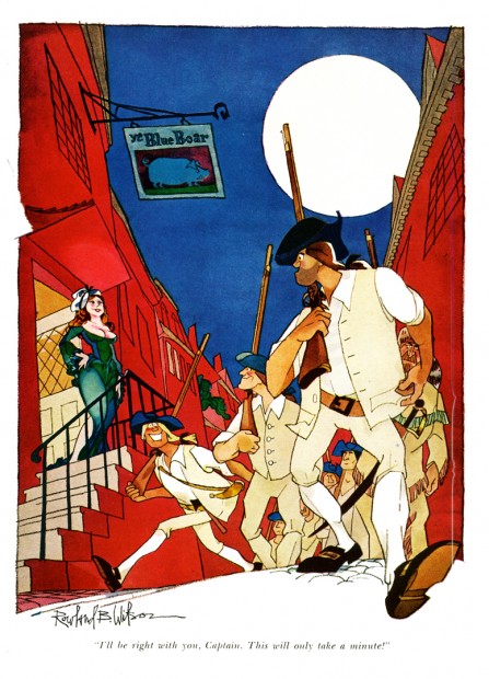
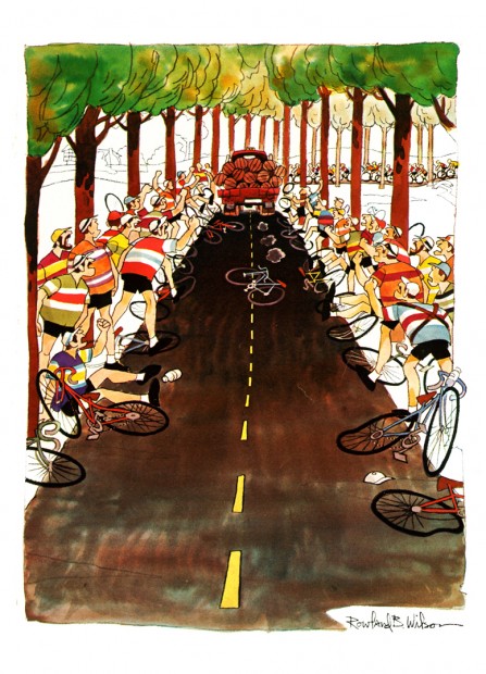
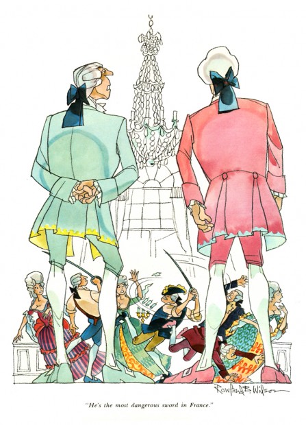
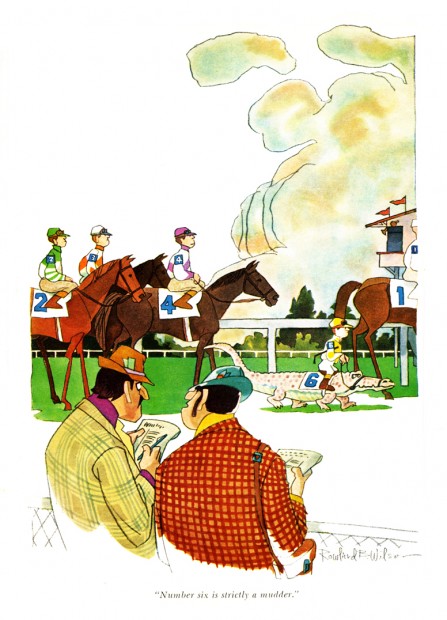
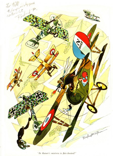
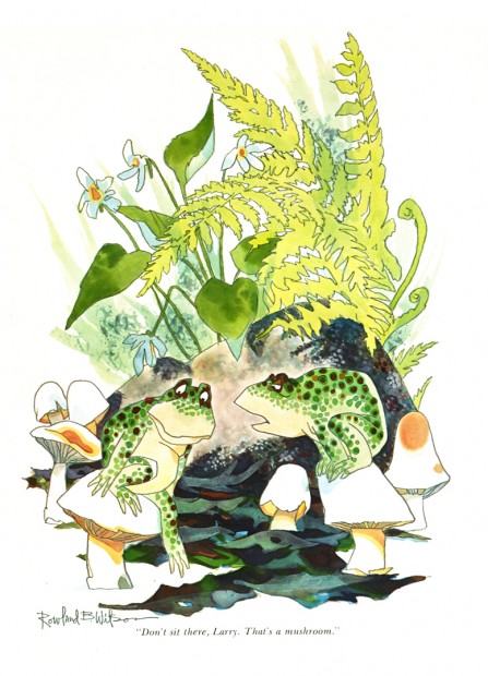
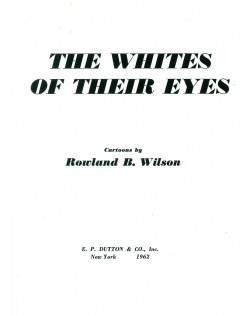
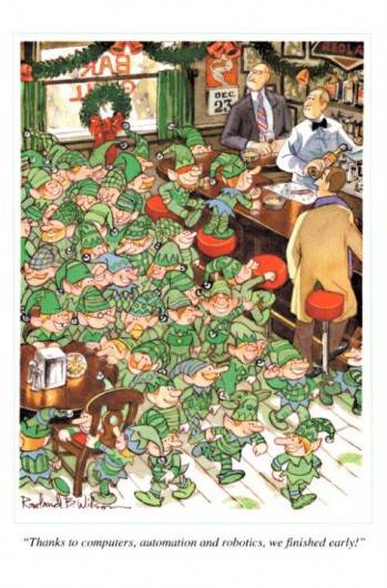
All that I can follow that up with are more Rowland B. Wilson cartoons. Bill Peckmann had sent me a xerox copy of the book The Whites of Their Eyes, a collection of RBW cartoons printed in 1962 by Dutton. The copies are all B&W though it’s obvious some of them were printed in color. Many thanks to Bill for another great post featuring one of my favorite artists.
 1
1 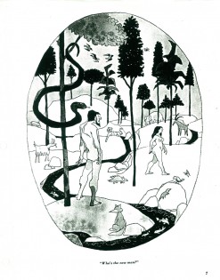 2
2(Click any image to enlarge and read.)
Animation Artifacts &Bill Peckmann &Rowland B. Wilson 26 Mar 2010 07:42 am
Rowland Wilson Grab bag
- I have a few models by Rowland Wilson that I haven’t yet posted. I’m ganging them up, even though they come from several different projects. All of these come courtesy the collection of Bill Peckmann. Many thanks to Bill.
This first series comes from a spot Rowland designed for Phil Kimmelman & Associates. It featured a mountie and his trusty sidekick.
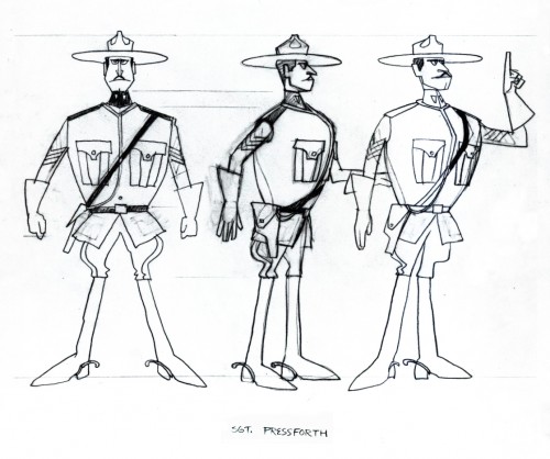 1
1(Click any image to enlarge.)
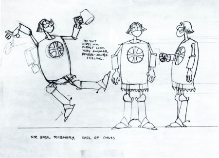
The following two layouts came from the 2nd TV spot Rowland did for ‘Utica Club Beer’, featuring a Knight and a fiery Dragon.
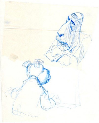
This is a rough that RBW did for a dog food animatic. It was a take off of Bogart’s ‘Casablanca’, hence the ‘play it again Sam’ scene with Bogie Basset.
This is a LO rough for what’s probably a TV Guide illustration:
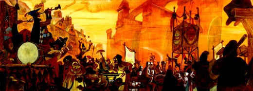
This is a painting by Rowland Wilson for
The Hunchback of Notre Dame “All Fools Day”.
Here is the same thing broken in two for better viewing.
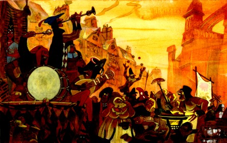 Left
Left
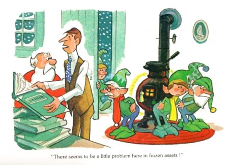
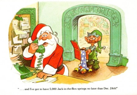
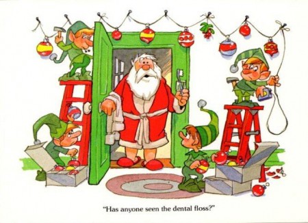
Here’s a group of Christmas Cards Rowland did. This is the note that Bill Peckmann included with the cards: “Years ago Rowland had an old school friend (‘Pete the Greek’, I’ve forgotten his last name) in Dallas (their home town) who owned the ‘Drawing Board’ greeting card company. Rowland did these professional (dentists, doctors, cpa’s etc.) Christmas cards for Pete. He loved doing them because Pete let him run with the ball, none of the usual looking over your shoulder advertising art direction.”
 1
1
And here are two cards that were sent out by Rowland and Suzanne.
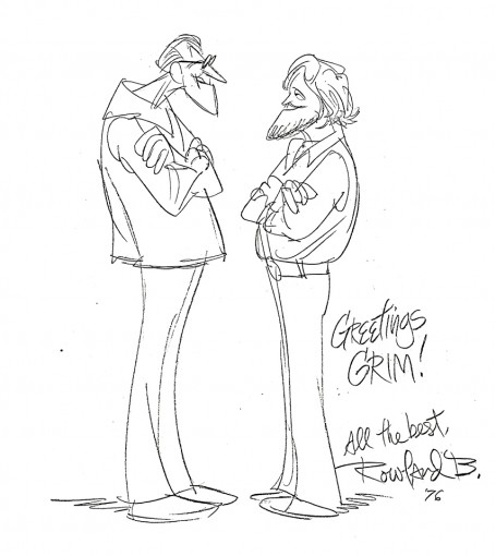
Here’s a caricature Rowland did of Grim Natwick and himself:
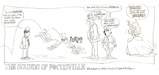
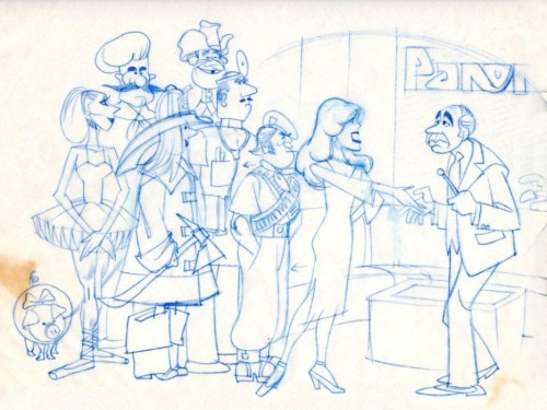
Finally, here’s a cartoon Bill Peckmann did of the staff at Focus, a company in NY just prior to Phil Kimmelman’s forming PK&A. Here’s a note Bill included with the drawing: “This was done by me when we were working on RBW’s second animated spot which was Vote Toothpaste’s “Combs & Plotzen.” His first was a Flying “A” gasoline spot animated by Lu Guarnier. Both circa ’68-’70. Of cours this pre-dated the Utica Club “Mountie”strong> caricatures.”
The caricatures pictured above are from left to right:
asst animator Victor Barbetta, designer Bill Peckmann, animator Jack Schnerk, owner Phil Kimmelman, designer Agnes Cannata.
Animation Artifacts &Bill Peckmann &Comic Art &Illustration 23 Mar 2010 08:31 am
Alex Toth at PK&A
- It’s nice to know that there’s some playing at the top.
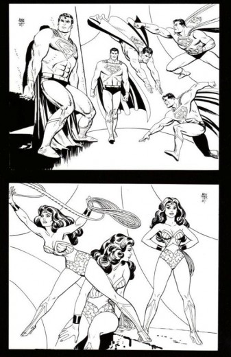
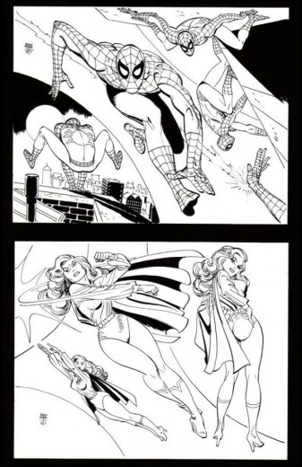
In designing an Underoos commercial for Phil Kimmelman and Associates, Alex Toth sent funny cards to Bill Peckmann, he responded with paintings of his own. Thanks to Bill, I have some of that material, and will post it here.
First this short note from Bill about what follows:
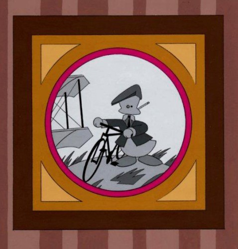
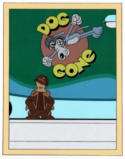
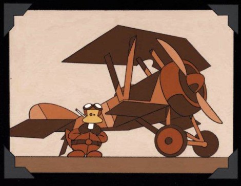
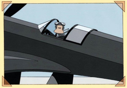
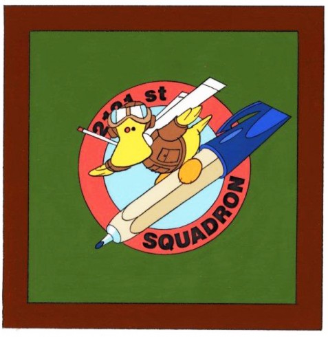
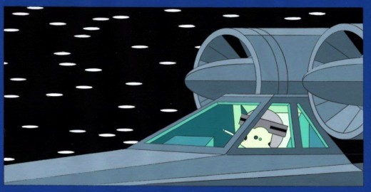
“. . . about 30 years ago PK&A was lucky enough to do a TV “Under-Roos” spot with Alex Toth (since I was and am a HUGH Toth fan, I probably badgered Phil and the Ad agency into using Alex to do the super hero character designs and LO’s of the spot) and with that, I also became the lucky recipient Alex’s many missives. These came in the form of letters and postcards, which were wonderfully illustrated with doodles and sketches. One doodle that he used quite a bit was his cigarette smoking, signature alter ego “Grumpy Duck” (see attached).
And with that, I did some riffs on his Duck character showing the history of aviation (we were both airplane buffs) and photography (we both appreciated good photos). These were done with xerox and cel paint. Happy to say, Alex seemed to get a kick out of these.”
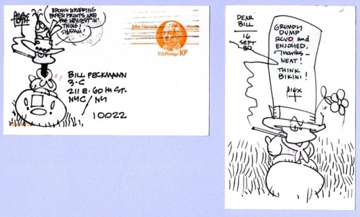
An example of one of Alex Toth’s mailings to Bill.
“Here are some setups that Alex Toth did for the ‘Underoos’ spot for us. Since Superman and Spiderman came from rival companies, very seldom or never did they appear together. You might have a Toth fan or two in your audience, mebbe we’ll make you one. At end of s’heros is a doodle, one of his many.”
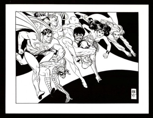 1
1
Finally, a thank you note (the original was in color) that Alex did for Rowland Wilson, they were big mutual fans. The two were friends:
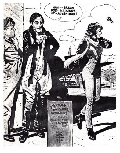 5
5Enlarge to read the panel bottom center.
Bill Peckmann &Illustration 20 Mar 2010 08:13 am
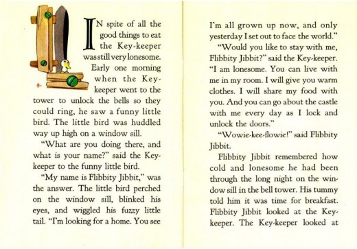
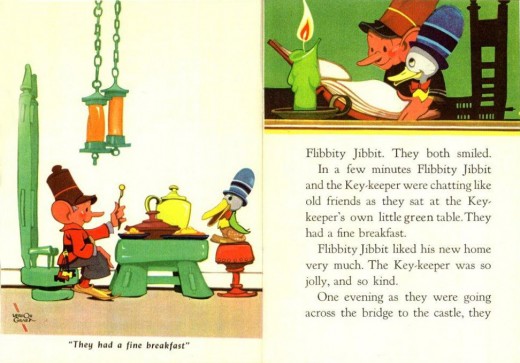
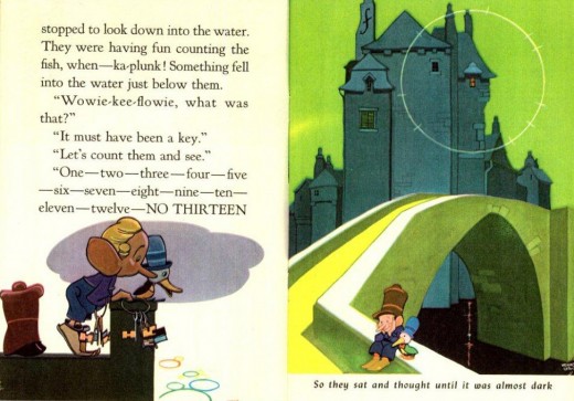
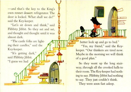
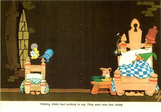
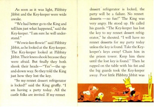
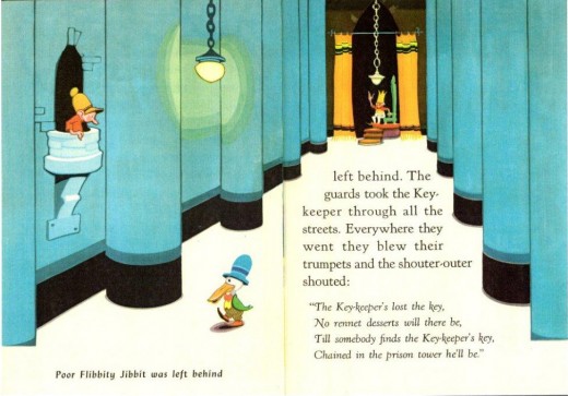
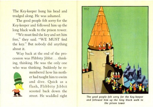
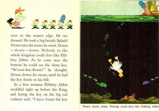
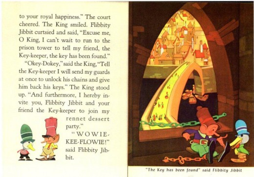
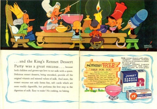
Vernon Grant’s Flibbity Jibbit
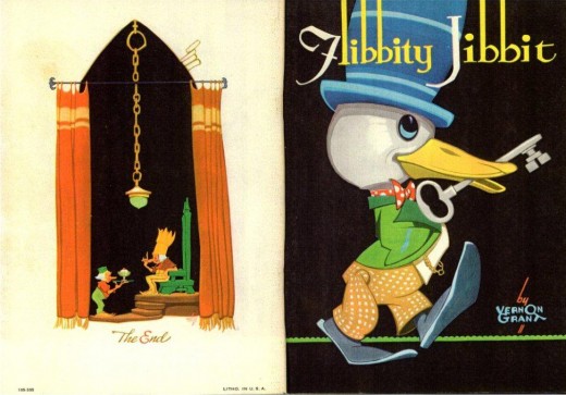
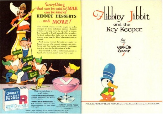
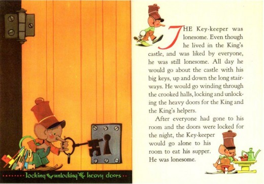
- I’ve posted two pieces by illustrator, Vernon Grant, the designer of Snap, Crackle and Pop. Here’s a booklet out of the hands of the late Rowland B. Wilson. I start with a short note sent to Bill Peckmann (who graciously loaned the material for display. Many thanks.)
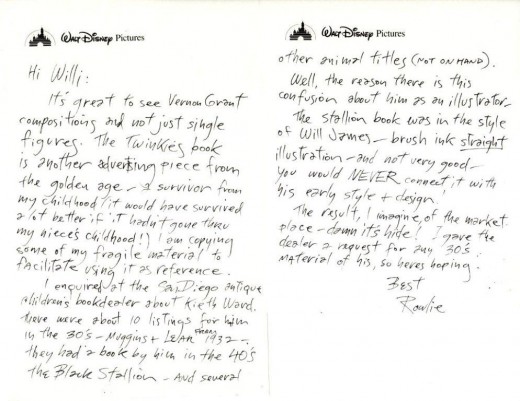
(Click any image to enlarge.)
The other three Vernon Grant posts can be found here:
Snap Crackle Pop
Vernon Grant’s Nursery
Vernon Grant’s Santa Claus
Articles on Animation &Bill Peckmann &Daily post 19 Mar 2010 08:30 am
Animation Overview – 1976
Here’s another survey of the year in animation for the March/April issue of Print Magazine circa 1976. Leonard Maltin did the surveying. Interesting that you don’t see many of this type article anymore.
Overview
by Leonard Maltin
British animator Bob Godfrey has said, “Animation is a medium that deserves masters worthy of it. I’d like to see animation Picassos or Matisses, and we haven’t had any so far.”
Of course, Matisse never had to raise two million dollars in order to create one of his paintings, and Picasso didn’t have to oversee a staff of inkers and painters to make sure his newest canvas would turn out right.
The artist who chooses animation as his medium must endure certain realities: that films cost money, that extensive filmmaking becomes expensive filmmaking, and that except for the most monastic souls filmmaking is a collaborative process. This is not to eliminate the possibility of individual artistic expression in animation, but there are simpler ways known to man.
Once the artist has made his film, another set of realities comes to the fore: trying to find a distributor, or at least an audience, and with any luck, establishing a way of recouping the monetary investment of making the film. Since individual backing is hard to come by, to examine “the state of the art” of animation is to examine “the state of the industry” at the same time; it’s nearly impossible to separate the two.
In this country—as around the world— animation means so many different things that even the most cursory observations can expand to extreme lengths. “Animation” covers a lot of ground, from high-school kids filming paper cutouts with a Super 8mm camera to major Hollywood factories turning out Saturday morning drivel by the carload, but there are some significant outposts along the way.
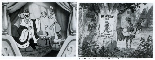
“Robin Hood” full length feature produced by Walt Disney Prods.
Producer/Director Wolfgang Reitherman
Rumors of the Walt Disney Studio’s abandonment of cartoons are greatly premature. There was a time several years ago when the future of animation at the studio was in doubt, but the whopping worldwide success of the animated Robin Hood is just one reason that animated features are an ongoing project in Burbank.
The studio’s current endeavor is The Rescuers, which concerns two detective mice who head a society of do-gooders. Like other recent Disney features, it will comprise some four years of work— anywhere from three to four times as much as most competitors spend on similar projects. Rescuers is being aimed for Christmas of 1977, but there’s no guarantee that it will be completed on time. No one rushes this group of craftsmen.
The two main objectives in any Disney feature are a strong story line, the backbone of the film, and equally strong personality development, which gives the film its heart. Unfortunately, the approaches to these objectives have become increasingly routine in the 1960s and 70s at Disney, with much of the personality emanating from big-name stars doing character voices, and not so much from the animator’s pencil, although character animation is still superbly handled.
Practically everyone working on The Rescuers in a major capacity has been at the studio for 30 to 40 years, and Frank Thomas, a senior member of the team, admitted to John Canemaker, “We are less experimental. [With Walt] every picture was completely different. We were always pushed into things that were exceedingly difficult to do. He was always asking us to rise above ourselves. Well, when he left it up to us, we quit that. We got old. We decided we were going to do the things that were fun to do.”
The quality is still there, and the years of care and precision that go into a Disney feature show up on the screen. But somehow, the magic is missing, and that has nothing to do with time or money.
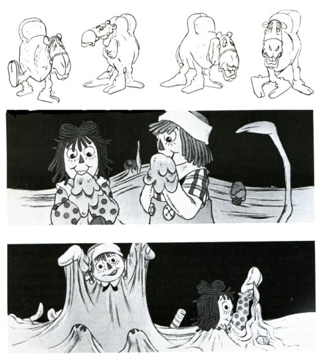
“Raggedy Ann & Andy” upcoming feqture based on Johnny Gruelle’s characters.
Production company: Lester Osterman Prods. Supervisor/director: Richard Williams
Into the breach steps a young man who has been hailed as “the new Disney,” Richard Williams. Canadian-born, British-based, he has impressed the animation world with his main titles for feature films (Charge of the Light Brigade, Return of the Pink Panther), theatrical shorts (“Love Me, Love Me, Love Me”), television specials (A Christmas Carol), and commercials.
The comparison with Disney is apt, because Williams has devoted himself tirelessly to the improvement of his work. Several years ago he began recruiting veteran Hollywood animators to come to London and work with his staff, as artists-in-residence, teachers, and colleagues. These men, in their 60s, 70s, and 80s, have all contributed to Williams’ pet project, an animated feature entitled The Cobbler and the Thief, which has been in progress for the better part of a decade. Williams and his people work on this when there is time, between commercial assignments. Among the distinguished Disney, Fleischer, and
Warner veterans who have pitched in are Art Babbitt, Shamus Culhane, Grim Nat-wick, and Ken Harris. It’s a two-way love affair, a happy collaboration between men of age and experience and younger animators with fresh ideas and outlooks.
Now Williams is hard at work on an ambitious American project, a musical feature version of Raggedy Ann and Andy set for release at Christmastime this year. He has gathered a hand-picked staff in New York and supplemented it with freelancers from places as far off as Arizona.
Oher animated features are also on the way. It took Fritz the Cat to convince distributors and theater-owners that animated films shouldn’t be regarded as kiddie-show fodder and nothing more. Now John Hubley is directing a cartoon version of the bestseller Watership Down, while Fritz’s director, Ralph Bakshi, is working on his fourth feature film (the third, Hey, Good Lookin’, is about to be released). Producer Lee Men-dohlson and director Bill Melendez are working on a third Peanuts feature in California, while a New York operation has completed a feature-length remake of Tubby the Tuba. Other features are in production and planned for the near future.
But feature films tell only part of the story. Many filmmakers, amateur and professional, work in the realm of short subjects, and bringing these to the attention of an audience, not to mention a distributor, can be a long and wearisome process. One splendid showcase is the annual awards competition sponsored by the New York branch of ASIFA, the international animation society. Their recent screenings of this year’s winners revealed much about trends, goals, and styles in current films.
In the Student Film Category were three astoundingly professional products: Eduardo Damino’s “Hello,” a slick, imaginative treatise on the history and impact of telephones, using colorful cutout animation and an abstract soundtrack; Stephen Ciodo’s “Cricket,” a finely crafted stop-motion film for children about a cricket who is ostracized by his peers because he’s unable to jump; and Linda Heller’s “Album,” a most intriguing series of vignettes based on flashbacks and flash-forwards in a photo album of a woman’s life.
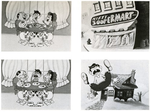
“A Dog’s Life” Due to soaring food prices, a family eats less while their dogs eat more.
Production company: Perpetual Motion Pictures | Producer: Marshall Patinkin
Director/designer: Hal Silvermintz | Animator: Vince Cafarelli
A vital category for prizes at ASIFA East is the Non-Sponsored Professional Film. Chapter president Dick Rauh explains that this category is intended to encourage members to take the time to make personal films, apart from their daily assignments; indeed, the five winners showed a wide range of highly individual styles and goals.
Mary Beams’ “Going Home Sketchbook” has an interesting visual concept, combining sketches, line animation, and what seems to be a rotoscope technique to create an impressionistic view of a trip home; unfortunately, there is no development within the film to give it any real interest beyond that technique. “Deep Sleep” is a feminist-oriented film by Peggy Tonkonogy that details a woman’s long, weird symbolic dream; again, an aimless-ness is somewhat compensated for by excellent visual effects. Both of these films received Honorable Mention.
George Griffin’s “L’Age Door” is an irresistible film that perfectly meshes form and content as a man is confounded and swallowed up by an endless succession of doors. Short, sweet, and quite funny. Griffin’s film won Third Prize in this category.
“Quasi at the Quackadero,” Second Prize-winner, is one of the most bizarre animated films I’ve ever seen. Sally Cruickshank’s visual extravaganza bears repeated viewings, just to absorb everything that’s happening on-screen; the style might be described as freaked-out George Herriman. Significantly, Cruickshank labels her film “a cartoon,” showing strikingly-designed characters attending a futuristic amusement park where the games and rides are based on time- and life-warps.
First Prize was awarded to Kathy Rose for her quiet and enjoyable film “The Doodlers,” the basic premise of which is that drawings beget drawings.
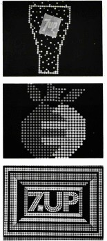
In the general categories, awards were divided according to soundtrack, technique, script/concept, humor, design, animation, and direction. Most of these were commercial and/or sponsored films, including several delightful commercials from Phil Kimmelman and Associates, a funny NBC “Weekend” gag-film by Ovation Films, some dazzling 7-Up graphic spots by Goldsholl Associates, and two fine shorts by the Wantu Studio headed by the talented James Simon.
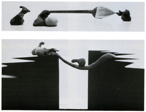
“Whazzat” Clay figure animation based on blind man and the elephant
Sponsor: Encyclopedia Britannica |Production company: Crocus Pictures
Producer: Tel C. Determan | Director: Art Pierson
Awards for Best Animation and Best Direction went to Arthur Pierson and his associates Ron Lasner and Alan Baker for a disarming stop-motion clay film called “Whazzat?” (which had already won Spe-cialJury Prize for Best Film at the New York Animation Festival). The premise of “Whazzat?” has six clay objects assuming vivid personalities, although they have no faces or identifying features; together, they travel and enjoy each other’s companionship, until they come upon a strange being unknown to them. Through sophisticated and knowing animation, camera placement, and ingenious use of soundtrack, “Whazzat?” makes something special out of something elegantly simple.
Best Film in ASIFA’s competition was another repeater from the New York Festival, Stan Phillips’ “Water Follies,” produced as a soft-sell promotional film for the Denver Water Commission. An entertaining series of blackout gags on uses and abuses of water, this straightforward film quietly goes about its business and scores a bull’s-eye with its entertaining point of view and uncluttered animation style.
One may be hesitant to accept the idea of slick, professionally sponsored films competing with more personal, individual works. But the ASIFA screening brings out something very important about animated films. They come from individuals and they come from large companies; they range from utter simplicity to overstuffed detail, from quietude to clutter. But each film stands on its own, with its own set of goals to be met, and if it fails, all other considerations become worthless.
Not every professional film is better than an amateur effort. There are films made by eight- or nine-year-olds which burst with imagination and daring visual ideas; they put some professional filmmakers to shame. Likewise, some one-minute TV commercials are so outstanding in every respect (animation, design, humor) that they overpower more “serious” artistic works shown alongside them.
But does the film succed on its own terms? Be it Disney, Bakshi, commercial or collegiate, that’s the only question that really counts.
 1
1 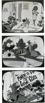 2
2 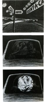 3
3
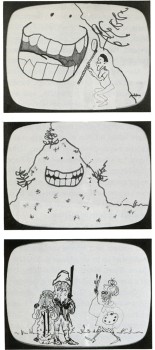
1.”Teeth Care” Sesame Street – Prod/Dir: James Simon Animator: Jack Schnerk
2. “The Strike” Morris Funk Foundation Prod/Dir: James Simon
Animators: Cosmo Anzilotti, Lu Guarnier, Ed Smith, Sal Faillace
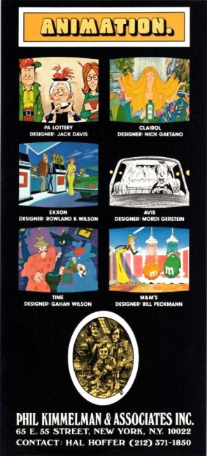
3. “I Want My Avis” Prod Co: PK&A | Prod: Hal Hoffer
Designer: Mordi Gersteion | Animator: Jack Dazzo
 4
4 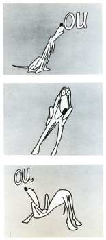 5
5 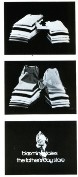 6
6
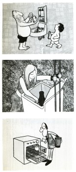
4. “Water Follies” Sponsor: Denver Water Dept | Prod/Designer: Stan Phillips
5. “Ou Hound” CTW | Prod/Dir/Anim: John Strawbridge
6. “French T-Shirts” Bloomingdales | John Gati Film Effects
 7
7 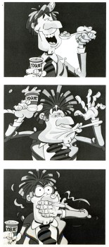 8
8
7. “Carton Graphics” 7-up | Goldscholl Associates
Designer: Morton Goldscholl Dick Greenberg
8. “No More Puckers” Yoplait Yogurt | PK&A producer: Sid Horn
Director: Phil Kimmelman | Designer: Bill Peckmann | Animator: Lu Guarnier
Leonard Maltin teaches the history of animation at the New School for Social Research, New York City, and is author of The Disney Films, among other movie books. He is currently guest programmer for the Museum of Modem Art’s “Salute to Film Comedy.”
Bill Peckmann &Illustration &Rowland B. Wilson 12 Mar 2010 08:46 am
Even more Rowland B. Wilson
- I’ve dedicated a number of posts to the artwork and cartoons of Rowland B. Wilson.
I have been a fan of his work for a very long time. Years before I had the opportunity of inbetweening on his Scholastic Rock designs at Phil Kimmelman & Associates which was back in the early ’70s.
Bill Peckmann and I seem to share a lot in appreciating a number of artists and their artwork. Rowland is high on the list. Bill has loaned many works for posting, and I’m certainly indebted to him for contributing all of these RBWilson pieces.
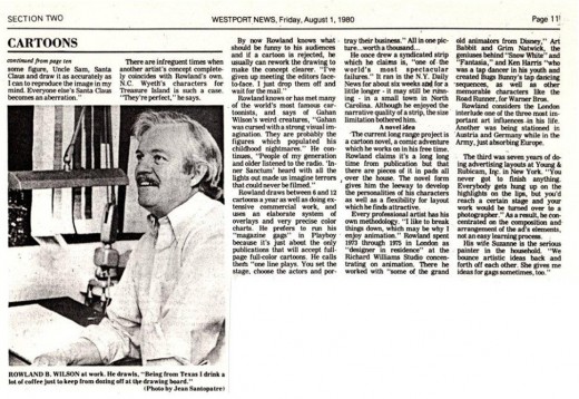
Here are more of the cartoons of Rowland B. Wilson, starting with a news article written about him for the Westport News.
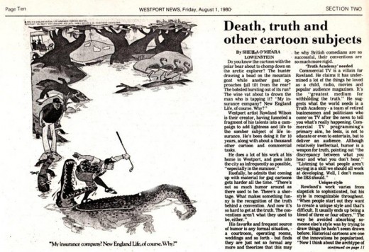
(Click any image to enlarge.)
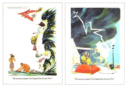
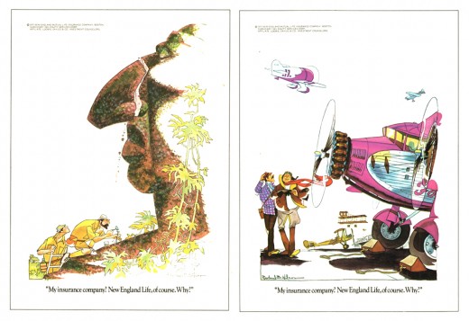
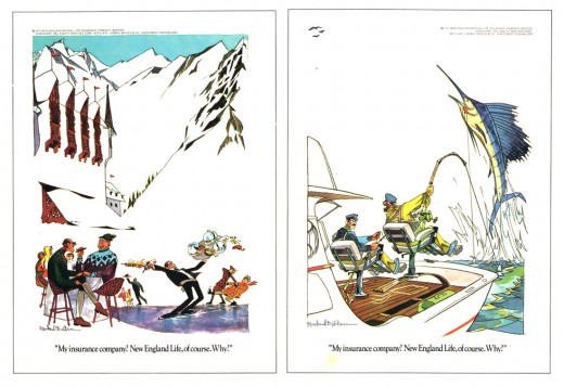
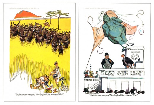
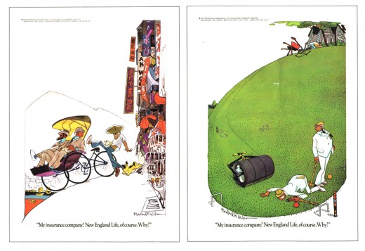
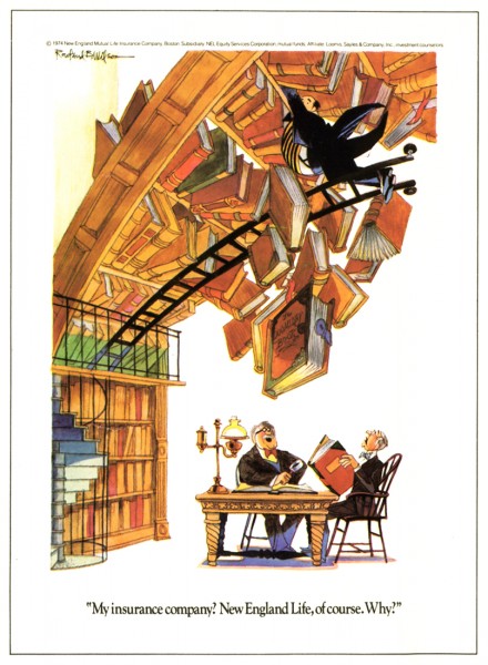
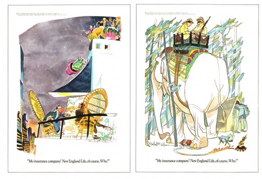
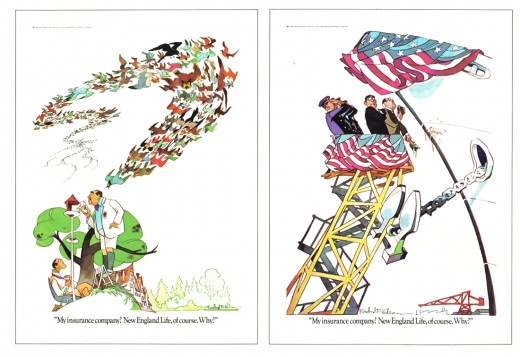
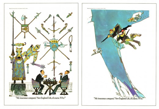
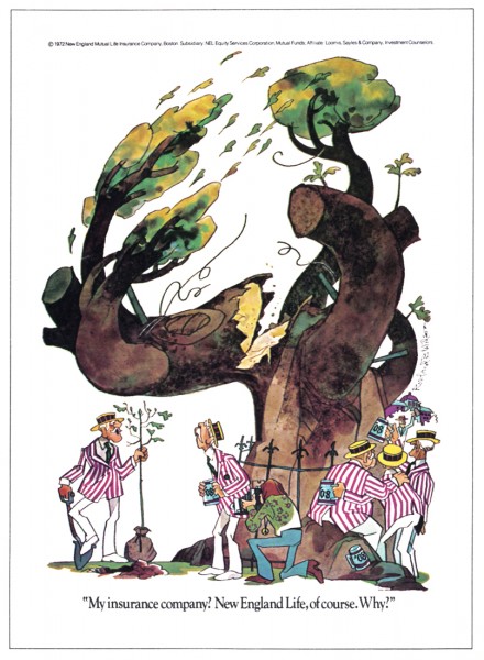
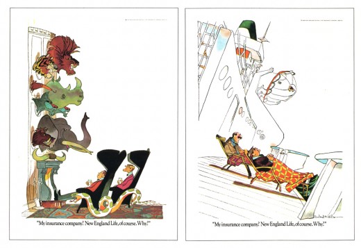
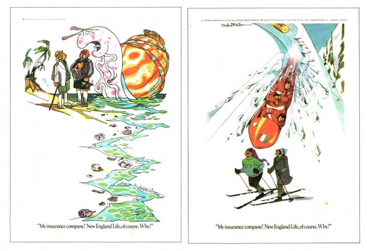
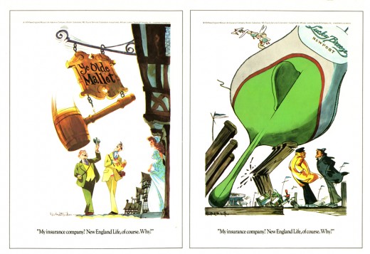
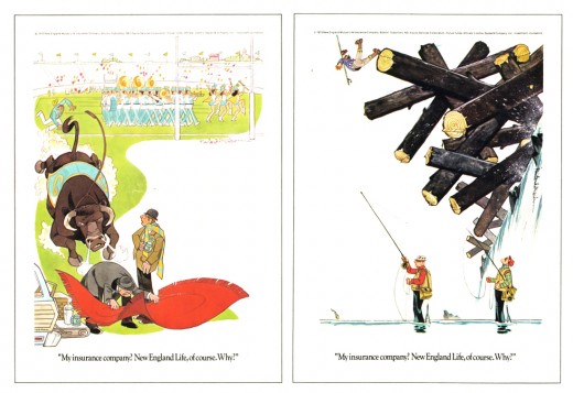
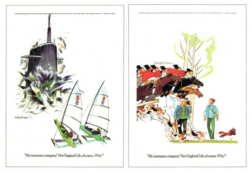
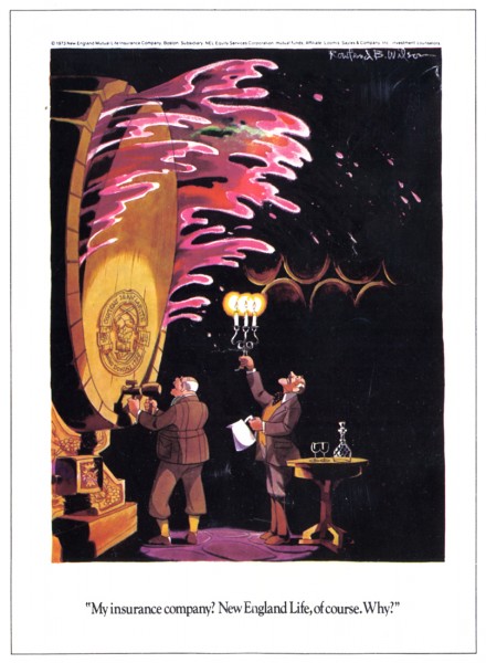
Let’s start with the New England Life advertisements. RBW did quite a few of them:
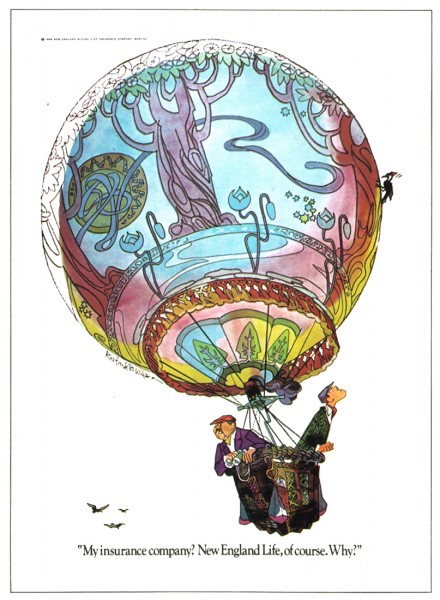 1
1
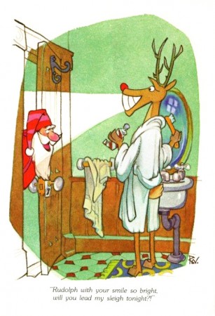
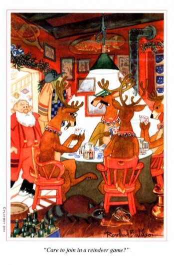
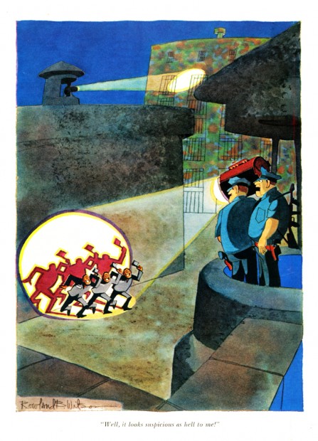
We finish this post with some more Playboy cartoons:
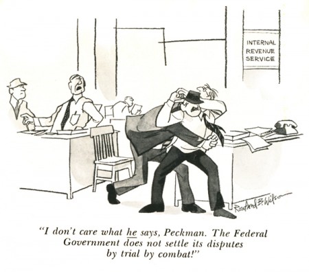
It must have been a treat for Bill to see his name in this cartoon.
Articles on Animation &Bill Peckmann &Illustration &Layout & Design 09 Mar 2010 08:42 am
Jack Davis @ PKA
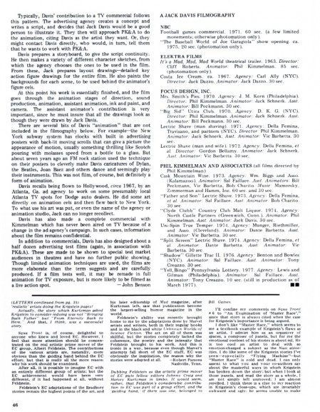
- The esteemed illustrator/cartoonist, Jack Davis, did some brilliant art and design work for animation when working for Phil Kimmelman and Ass. Bill Peckman sent me the following article from Squa Tront magazine, and he added a couple of illustrations Davis did for PK&A.
Here’s the article:
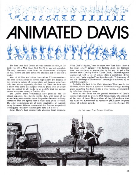 1
1(click any image to enlarge.)
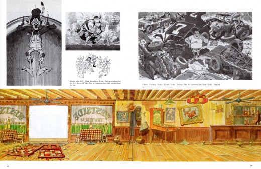
Pages 2 & 3 made a double page spread that looked like this.
I’ve split it apart so the images would be larger in thumbnails.
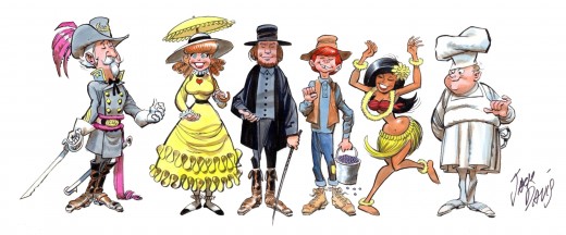
Some characters Davis did for a “Mrs. Smith Pies” ad.
All of the characters should be holding the product in hand.
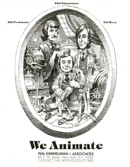
And, of course, the notable caricature by Davis of
Phil Kimmelman and his Associates for their print ad.
(As taken from the Funnyworld issue #18 – PK&A
regularly supported Mike Barrier’s magazine with their ads
Bill Peckmann &Books 06 Mar 2010 08:46 am
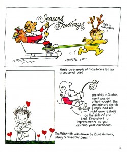
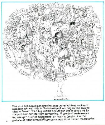
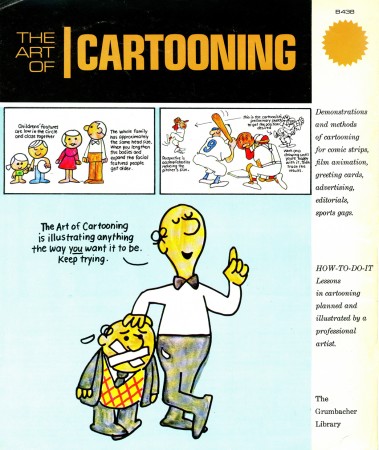
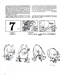
Cartooning – 2
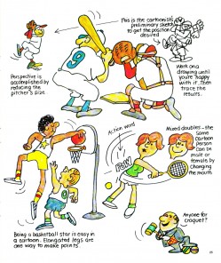
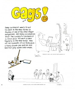
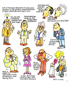
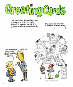
 - It seems like ages ago that I posted the first half of this book. It was written by art director/designer, Jack Sidebotham who had a large presence in the making of the original Piels Bros. campaign done by UPA NY. He also was closely involved with the Scholastic Rock films.
As mentioned in the first post, Sidebotham used the Piels Brothers as characters to waltz through the varied uses of cartooning for this book published by Graumbacher in the 70s.
The book was something I remembered from the period but never purchased for myself. When Bill Peckmann reminded me of its existence, I found a copy on line and bought it to add to my collection and to share with you.
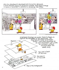
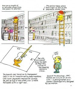
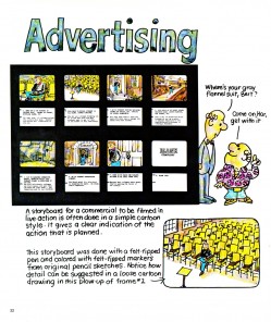
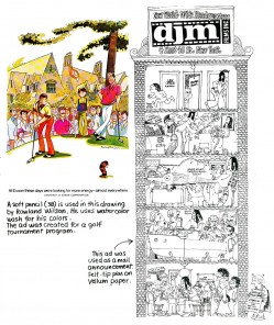
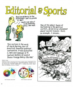
This second half of the book covers the aspects of cartooning that might be more interesting to an audience of animatoin fans. Here it is:
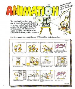 18
18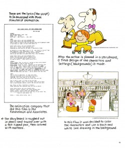 19
19(Click any image to enlarge and read.)
.
Articles on Animation &Bill Peckmann &Layout & Design 04 Mar 2010 09:04 am
Kurtzman on Ses St
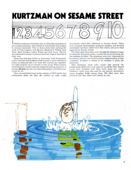
- In the old days, before Sesame Street stooped to working with softward developers to get low to free budget animation for their shows, there was an era of dignity on Sesame Corner. Animators were seen as artists and treated that way. Lots of Independent film makers were employed to create design and execute brilliant little animated pieces for the show. They created the hidden gems that made the show glow and helped support the excellent muppetwork of Jim Henson and gang.
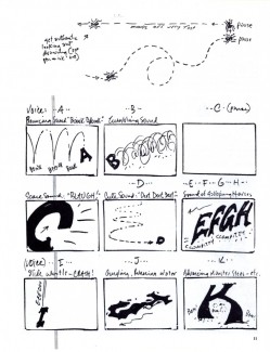
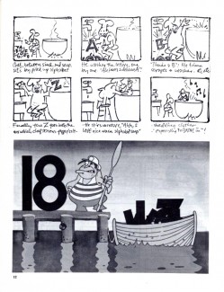
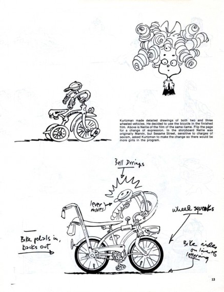
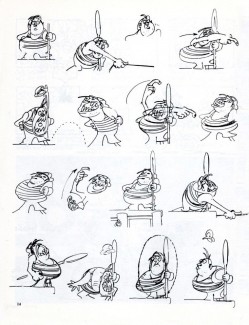
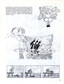
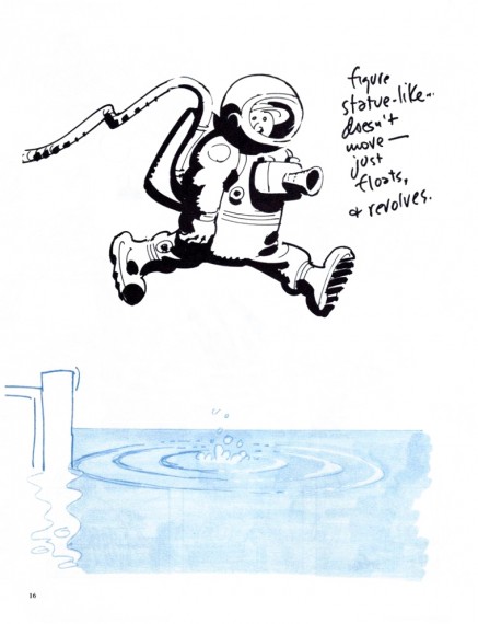
The magazine Squa Tront, issue No. 5, features an article about 8 Sesame Street films that were designed and planned by Harvey Kurtzman for Phil Kimmelman and Associates. Thanks to Bill Peckmann, here’s that article.
 1
1(Click any image to enlarge.)
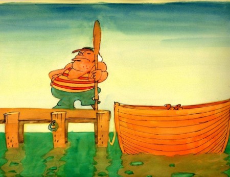
An image Harvey Kurtzman drew for his Sesame Street film, “Boat”.
Animation Artifacts &Bill Peckmann &Disney &Models 03 Mar 2010 09:05 am
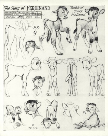
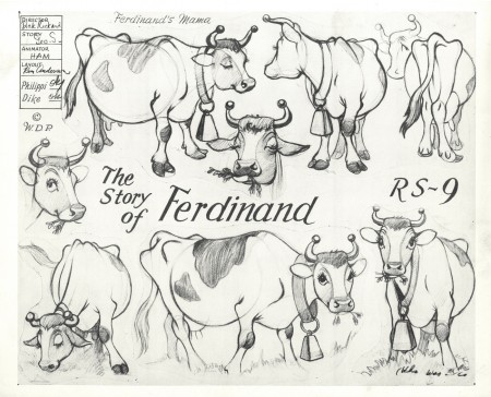
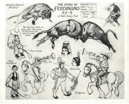
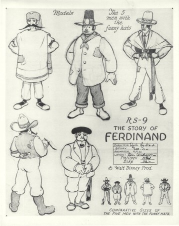
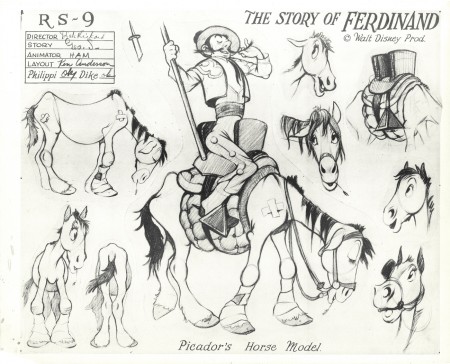
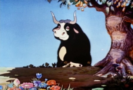
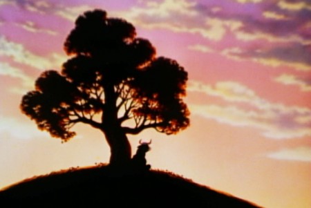
Ferdinand Models
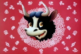 – Ferdinand the Bull was a precious little animated short. It originally started out as a “Silly Symphony”, but then they called it a “Special” film. It was adapted from a classic children’s book by Munro Leaf which was illustrated by his longtime collaborator, Robert Lawson. The book, published in 1936, created a bit of a stir in Europe where the Spanish saw it as a call for pacifism when they were involved in a violent civil war and were getting entrenched in what would become World War II.
In making the film, the animators who worked on it seem to have had a lot of fun. Ward Kimball led the way by caricaturing others (see below) as the bullfighters who parade into the arena. You can get a glimpse of this in the model sheets from the film. Disney, himself, was drawn as the matador leading the charge. (At least Walt thought it was a caricature of him; Kimball said no.)
In their book, Too Funny for Words, Frank Thomas and Ollie Johnston wrote, “The parade of participants for the great bullfight in Ferdinand the Bull (1938) was a series of caricatures of animators and directors, with the animator who conceived the whole idea bringing up the rear and leering knowingly at the camera. It was rumored that Walt thought the matador was a caricature of himself, but the animator quickly denied giving the character any resemblance to his boss.”
The animator, Ward Kimball, took credit for caricaturing the cast, but said that the Matador was not Disney.
The short won the Oscar in 1938 as Best Animated Short.
Again, many thanks to Bill Peckmann for the loan of these models to post.
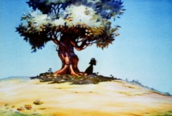
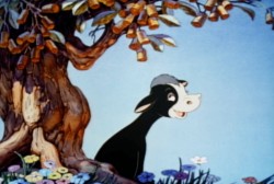
(Click any image to enlarge.)
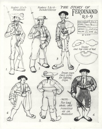
Picadors and Banderilleros (obviously before Kimball got to them.)
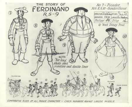
More Picadors and Banderilleros
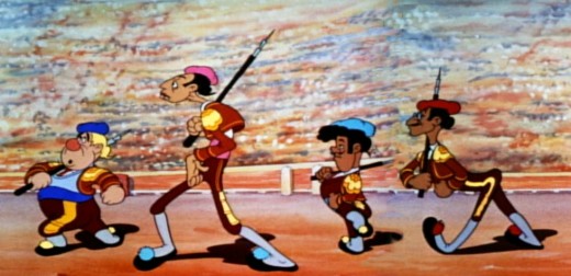
I believe it’s Ham Luske leading, with Bill Tytla, Fred Moore and Art Babbitt following.
Michael Barrier corrected this (see comments) From left: Ham Luske, Jack Campbell, Fred Moore, and Art Babbitt
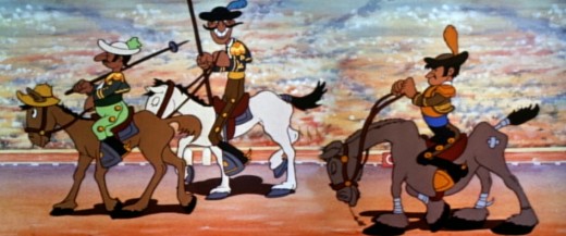
Jack Cambell leads these three, and I’m not sure of the others.
More from Mike Barrier’s comments: Tytla is the horseman at the middle. I believe the horseman to Tytla’s right is a caricature, too, but I can’t remember of whom.
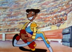
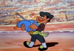
Matador Walt Disney marches in front of Ward Kimball, bringing up the rear.
