Category ArchiveChuck Jones
Chuck Jones &Commentary &Daily post 22 Jan 2010 08:55 am
Snippets
- The BAFTA Award nominations were revealed yesterday. The nominees for
Best Short Animated Film are:
THE GRUFFALO Michael Rose, Martin Pope, Jakob Schuh, Max Lang
a half hour tv special for BBC1. It features the voices of Helena Bonham Carter, John Hurt and Tom Wilkinson. More info here.
THE HAPPY DUCKLING Gili Dolev – View a clip at their website here.
MOTHER OF MANY Sally Arthur, Emma Lazenby A 5 min short. Info here. View a clip here.
The nominees for
Best Animated Feature are:
Coraline
Fantastic Mr. Fox
UP
- Screen Daily magazine has an excellent encapsulation of Eric Rohmer’s life work and accomplishments.
Within the article I was reminded that Rohmer did a film, The Lady and the Duke, which made extensive use of cg work for a period piece. The film’s exteriors were shot on blue-screen backgrounds with 18th-century paintings superimposed during the editing process. I didn’t get to see this film (with a very limited release in the US) but Slant Magazine’s review states:
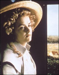 His exteriors recall Zbigniew Rybczynski’s famous Tango and forces the spectator to question that which is most visually important in the frame. Rohmer’s interiors are considerably less evocative though they’re the perfect setting for what plays out like 18th-century Jacobin pornography. The effect is disorienting, mildly humorous, and sometimes taut
And J.Hoberman in his Village Voice review wrote:
- The movie’s look is authentic, but—as suits an epoch that predates photography—in no way naturalistic. Commissioning a series of paintings based on period engravings, Rohmer has contrived a glorious Méliès effect: Once they leave their drawing rooms, his actors are keyed into these virtual locations as though they were moving through 18th-century panoramas and tableaux.
This will be my next Netflix selection, and I’ll undoubtedly post something about it after I see it. I remember being impressed back in 2006 when I’d read about it.
- As I, and probably you, learned this week from Cartoon Brew, Pat Smith and Bill Plympton are now collaborating on a new blog called Scribble Junkies.
Pat, on the site, writes of the blog’s purpose: This is where Bill and I will share our opinions, techniques, photos, drawings, and films.

I’m looking forward to seeing how this will vary from the sites each of them already hosts: Pat Smith Blend Films (Pat states that he is phasing out his personal blog for the new one) and Bill Plympton Plymptoons.
- The publicist, Yana Walton, sent me a link to a new animated piece done by Oxfam America to question the big bucks going into big oil. Oxfam turned to Talking Eyes Media to produce the piece which seems to be a sterling and masterful collage of AfterEffects moves.
I found it interesting enough to share. Their agenda is front and forward, but I have no complaint about that. Perhaps in the future they’ll go a step further and use real animation to get the message across more forcefully. Perusing the Talking Eyes site, I found myself curious about some of the documentaries they’ve made.
(Click any image to enlarge.)
_________________
- The Tempe Center for the Arts in Tempe, Arizona will host an exhibition celebrating the work of Chuck Jones. The show, called “Chuck
Amuck, a Legacy of Laughter,” will open February 26 with a free-to-the-public opening event. The show will run through June 18th. The opening night reception will be held from 7 to 9:30 PM in the TCA Gallery. It will be hosted by Jones’ grandson Craig Kausen and will include a screening of some of his cartoons. Seating is limited.
Their press release states:
 This exhibition of original sketches, paintings and animation production art highlights the life and art of legendary artist, animator and director Chuck Jones who not only helped bring to life famous cartoon characters such as Bugs Bunny and Daffy Duck, but also created the iconic Wile E. Coyote and Road Runner, along with many more. This exhibit will be the largest and most comprehensive exhibit of art by Jones since his retrospective held at the Capitol Children’s Museum, Washington, D.C. in 1988.
The Tempe Center for the Arts is located at 700 W. Rio Salado Parkway, Tempe, Arizona. For more info go here.
By the way, if you’re at all a fan of Mr. Jones’ work you should be regularly visiting the blog established which has been posting many of the letters and illustrations Chuck sent to his daughter, Linda. There’s some spectacular material here.
Chuck Jones &Frame Grabs &Layout & Design 21 Jul 2009 07:13 am
McGrew’s Aristocat
 – John McGrew is certainly one of my favorite LO and Background designers in animation. His Dover Boys work in 1942 set new goals for the remainder of 20th Century animation. He followed it with the daring work of Conrad the Sailor, Inki and the Minah Bird, The Case of the Missing Hare and others all for Chuck Jones, who was no slouch, himself, in encouraging exciting innovation in design and film cutting.
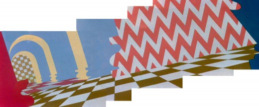
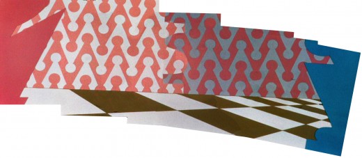
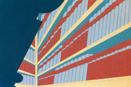
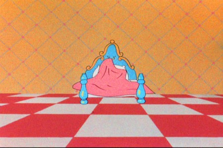
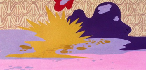
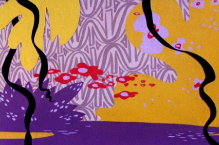
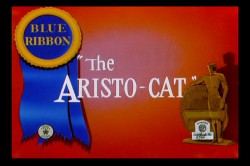 The Aristo-cat was probably the first of McGrew’s works that I saw when I was a kid. It made my eyes pop, even though I watched it originally in B&W. The dynamic design of wallpaper decoration combined with outrageous pans and camera work took me by force. The violently repeating patterns reach to the forefront of this short. All of this exuberant design completely acted to support the character’s state of mind. Anxiety, fear and terror jumped from the backgrounds to the fine character animation of Ken Harris, Rudy Larriva and Bobe Cannon.
Working with Jones and painter Gene Fleury, he surefootedly set the way for UPA and all the others that followed. Toot Whistle Plunk & Boom and Ward Kimball’s other Disney TV work, Maurice Noble and other thinking designers of the Fifties couldn’t have broken through if McGrew hadn’t been there first supporting and pushing Chuck Jones.
Go here for Mike Barrier‘s excellent interview with him.
I’ve done some Bg recreations from the film, which meant assembling some exceptionally long pans that twist and turn. Unfortunately, I don’t think there’s a good quality copy of the film available. All of the grain in the DVD leads me to believe they copied a 16mm print.
As stills, they don’t come across as quite so daring, but they are within the moving short. It took some courage to do such work and enormous talent to be able to pull it off so successfully.
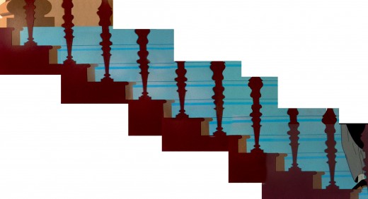
The butler walks upstairs.
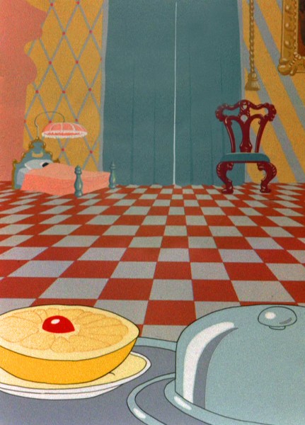
He carries a breakfast tray into the bedroom.
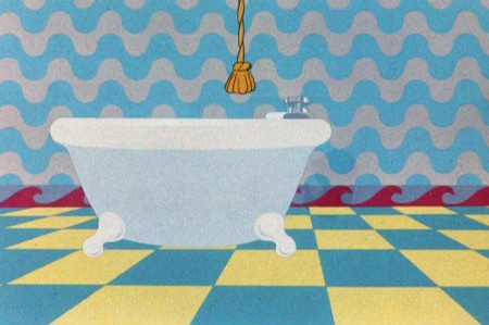
Releasing a bar of soap to trip the butler.
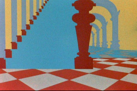
Downstairs to find the butler.
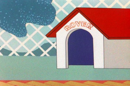
The dog in the doghouse. Repeated diamonds outside.
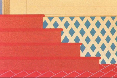
Back indoors. Still more diamonds.
Animation &Animation Artifacts &Chuck Jones &UPA 02 Jul 2009 08:01 am
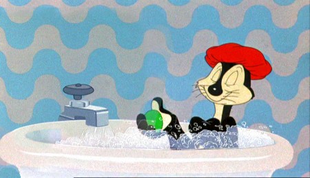
Gay Purr-ee
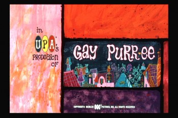 - I remember in 1962 going to the movies to see Gay Purr-ee, the very first showing – a late morning matinee. It was a bus ride away, but I was a fan big fan of UPA at the time. A 15 year old child who knew a bit about the impressionists and had read a lot about the early incarnation of this animation studio. The only shorts I’d seen were on the original Gerald McBoing Boing show, back in the fifties (when I was much younger.)
1001 Arabian Nights with Mr. Magoo had impressed me in some of its parts, but the notion of animating in impressionist art was more exciting to me.
I remember being impressed with the voice cast and soundtrack (which I quickly bought), some of the imagery and some bits of the animation. I loved the thick/thin outlines of the characters. I went back the next day to see the film again at a closer theater. This time I went late afternoon, which was a mistake. The kiddee matinee had brought a glob of ice cream melting down the center of the theater’s screen. It was hard to enjoy the beautiful painting with this dark, moving scar gracing the middle of the screen.
Despite seeing the film another half dozen times, since then, I didn’t really know much about the film’s production other than the credits I was able to view on screen. The Abe Levitow site offers a number of background paintings by the original designer, Victor Haboush, as well as Corny Cole and Bob Inman.
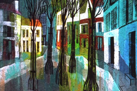
Here are two by bg’s Victor Haboush that are featured on the Levitow site.
I just earned from Tom Sito‘s blog that Mr. Haboush died on May 24th at 85.
He was a gifted designer and artist.
.

.The paragraph written on that site tells about the layoffs at Disney after Sleeping Beauty and how this brought an influx of talent to UPA. Many had worked on the Dick Tracy and Mr. Magoo tv cartoons that were produced but the feature better utilized their talents.
This isn’t much different than the story Jack Kinney tells in his book, Walt Disney and Other Assorted Characters. After he was pushed out of Disney, he ended up directing Magoo’s Arabian Nights. (He talks so little of it that he gives the impression he didn’t enjoy the experience.)
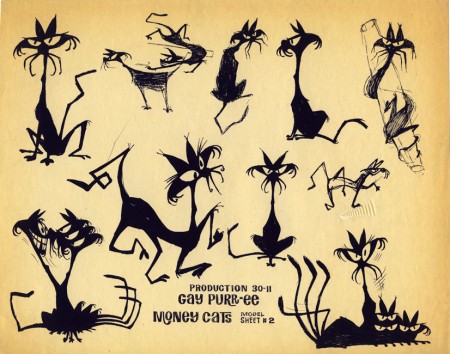
This is a Corny Cole model of the “Money Cats” from the film.
.
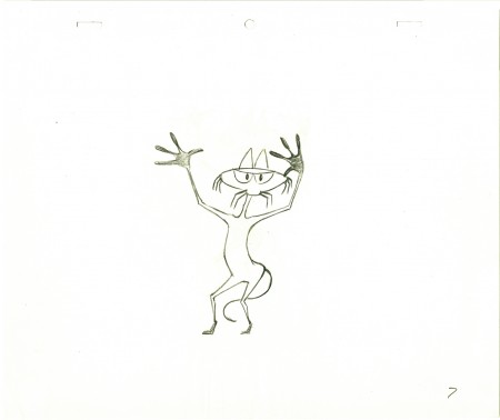
This is an animation drawing I have of one of them.
It’s not as angular or graceful as Corny’s drawing, but I still like it.
.
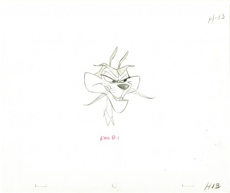
And this is an animation drawing I have of
Meowrice, the film’s villain.
.
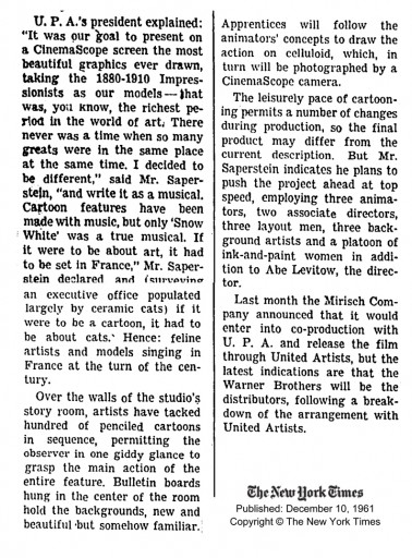
I have lots of the press material from the period stuffed into a scrapbook I have in storage. Not much of this is available on line, but I did find these two pieces in the NYTimes:
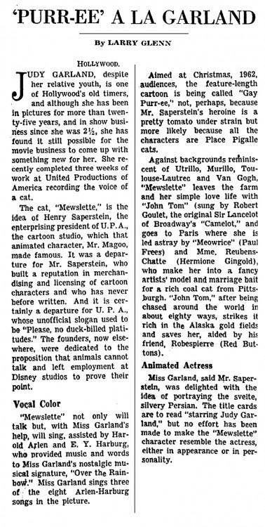
(Click any image to enlarge.)
Here’s the review that was published in the NYTIMES
- GAY PURR-EE
By BOSLEY CROWTHER
December 6, 1962
MOVING (for the second time) into the animated feature domain created by Walt Disney, U.P.A. Productions has contributed a pretty, pleasant, seasonal package for family audiences called “Gay Purr-ee.” The contents of this Warner release, which opened yesterday in neighborhood theaters, should make anybody’s mouth water, including Mr. Disney’s.
Consider: Judy Garland, no less, and Robert Goulet providing the singing and speaking voice tracks for the leading cartoon roles in a cute fable about a little country cat who goes to Paris. Add a battery of technical wizards who create a fetching color canvas that blends some truly lovely pastels with classical works by art masters. Add also eight new tunes by Harold Arlen, including one knockout. But the picture, hélas, is not.
At the risk of sounding like Scrooge, one U.P.A. fan feels that the film has everything but real wit. And what an opportunity, especially with Mewsette, the dainty little fugitive from Provence (Miss Garland), naïvely involved with some purring city slickers before being rescued by hel stalwart country swain, a champion mouser named Juane-Tom (Mr. Goulet).
Now, with all due respect to the film’s good-natured tone and diverting backgrounds, the first half is rather studied and even familiar, as directed by Abe Levitow and written by Dorothy and Chuck Jones. In contrast to the pictorial wizardry—rearranged Von Gogh landscapes and a tilted, spangled City of Light flavored with Toulouse-Lautrec, Modigliani, Matisse, Cézanne and others—the characters almost pale by contrast.
Mewsette, a nice enough little lady cat, is most interesting when Miss Garland is warbling — superbly — such ballads as “Roses Red” and “Take My Hand, Paree.” The same goes for the villainous Meowrice (Paul Frees), a fairly standard menace with a fine, jazzy theme song, “The Money Cat.” Furthermore, the snug, simple plot is needlessly stretched. Even with little Mewsette pining away in Paris, her would-be rescuer and his sassy, furry sidekick Robespierre (Red Buttons) are way off in Alaska.
The nearest thing to spice is the heroine’s jowly, pink “chaperone,” a shady lady named Mme. Rubens-Chatte (drolly spoken by Hermione Gingold). Even with the songs and the brilliantly stylized backgrounds, one can’t help wondering what a Disney crew would have concocted in earthy slyness and spontaneity.
In the final reel, though, things hit high gear in an old-fashioned chase scramble, against a superbly imaginative panorama of Paris, while the cats prowl the quays and the Notre Dame gargoyles toward a final, funny free-for-all. This portion also contains the film’s visual highlight, as Miss Garland sings one of Mr. Arlen’s great blues numbers written for the screen, “Paris Is a Lonely Town.”
So who needs eggnog for Christmas? “Gay Purr-ee” is a nice, soft drink for all the family.
‘Gay Purr-ee’ Cartoon , screenplay by Dorothy and Chuck Jones; directed by Abe Levitow; produced by Henry G. Saperstein for U. P. A. Productions; presented by Warner Brothers.
At neighborhood theaters. Running time: 86 minutes.
Voice of:
Mewsette . . . . . . . . . . . Judy Garland
Juane-Tom . . . . . . . . . . Robert Goulet
Meowrice . . . . . . . . . . . Paul Frees
Robespierre . . . . . . . . . Red Buttons
Mme. Ruben-Chatte . . . . Hermione Gingold
Chuck Jones &Commentary 24 Mar 2009 07:41 am
Chuck’s Memories & Coraline
_ _
_ 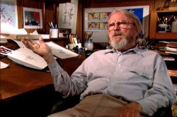
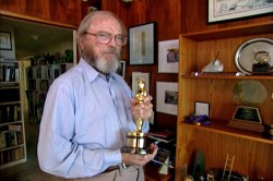
- Tonight on Turner Classic Movies there’s going to be a Chuck Jones jamboree. This is all occasioned by the screening of Peggy Stern & John Canemaker’s fine film,
Chuck Jones: Memories of Childhood at 8:00pm/10:30pm/2:30am EST.
Along with this film a number of Jones’ works will air:
Sniffles and the Bookworm____Elmer’s Candid Camera
Scent-imental Over____You Haredevil Hare
Duck Amuck____One Froggy Evening
What’s Opera Doc____The Dot and the Line
The Bear That Wasn’t
 These shorts will be followed by two features on the late night schedule. (Go here to see a full schedule.)
The Phantom Tollbooth was the less-than-stellar feature Chuck Jones co directed with Abe Levitow and Dave Monahan.
1001 Arabian Nights with Mr. Magoo follows that. I’m not sure why since I don’t remember Jones having any involvement on this film. Nevertheless, I’ll be glad to see it again.
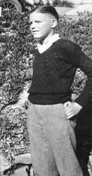
The Stern/Canemaker film is a delicate piece that quite nicely gives Jones the opportunity of relaying many of his memories from his pre-animation days. You get to see what a wonderful draftsman Jones was as he quickly draws from memory on-camera. There’s one quick portrait he does of his uncle that impressed me very much.
John Canemaker has done a lot of good animation here which illustrates well some of the pieces Jones is remembering. The animation nominally attempts Jones’ style, but John’s own style is so pervasive that the animation comes off as much his. I guess this is probably appropriate for such an independent film. Audiences who aren’t sophisticated about animation wouldn’t notice a difference. Why should they?
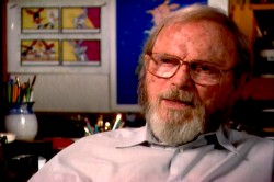 Much has been made about the “abuse” Chuck Jones’ father layed on the son. This amounts to strong beatings. I suspect that this treatment was typical of most families in the 19-teens. “Spare the rod and spoil the child.” One wonders how this may have affected Jones’ art.
Thank heaven for our more “enlightened age.”
The film moves quickly and informs quite gently. It deserves the attention TCM is giving it, and it also deserves the attention of the animation community, as it properly will receive.
Here’s the four star review in today’s NYDaily News.
Here’s The Boston Globe review.
And here’s The Cleveland Plain Dealer.
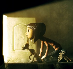 - I finally got to see Coraline over the weekend and have to complete some thoughts I gave prior to actually seeing the film. This is the first of the recent 3D films that I’ve seen in 3D. The effect worked well but, to me, was a complete hind-rance to the filmgoing experience.
When we filmed Raggedy Ann, there was a significant problem with cel flare because of the black backgrounds during the Greedy sequence. It was troubling. I’d recommended using polarized filters. This meant that the lights had to be filtered, and a second filter had to be placed on the lens to offset the lighting. The positive was that the flares were resolved. The negative was that there was a graying of all colors. On film, especially in animation, this problem can be rectified in the timing of the final print at the lab.
With Coraline we’re wearing, essentially, the same polarized filters to interpret the 3D effect. We don’t have built-in laboratories to adjust the colors in our head. We’re viewing grayed-down colors, and I was totally annoyed by it. By lifting the glasses, the screen would often look normal in 2D. But the colors were excellent. This aspect of the design was completely lost in the polarized flters over our eyes.
 The 3D effects weren’t principal or necessary to the whole, and the film would have been just as good in 2D. However, in 3D I was never able to enter the screen. The glasses were in the way and annoyed me. My eyes watered up often during the film, and I spent a lot of time wiping away tears. This is not the best way to watch a film.
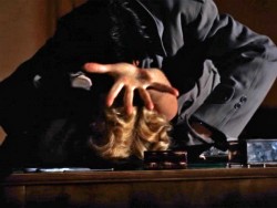
But then, I once saw Hitchcock’s Dial M For Murder in 3D. It’s rarely projected that way, so it was fun to see how the master would
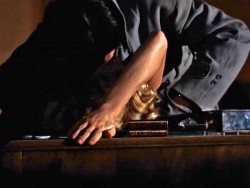 handle the effect. He used it to create a wall between us and the characters. The bar in the apartment, flowers, other furniture often stood between us and the characters in marked 3 dimensional separation.
Only once did he bring us into the film via 3D. A murderer has Grace Kelly bent back over a desk. We’re watching from the back side of the desk as he strangles her. She reaches out of the screen searching for a pair of scissors to defend herself. However, the effect was
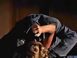 that the hand coming out into the theater seems to be imploring the helpless audience to get up and save her. It was frustrating and exhausting and completely involved us, the audience.
She eventually grabs the scissors and kills the guy. However, despite the red/green glasses we were totally drawn in. Much was added as part of the film’s effect. I’ve seen the film numerous times in 2D and always remember the scene in 3D when I’ve seen it again.
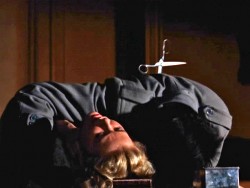
No such scene exists in Coraline nor is there any necessity to see it in 3D. I liked how Henry Selig created 3 dimensional differences between her real home and the “other” home. However, this is too subtle to be a necessity. Consequently, to me the 3D was little more than a gimmick.
The film, itself, seemed quite impressive technically, but I’m not sure the story was well told. I’d have to read the book, but I saw a lot of interesting fairy tale elements that were set up and violated before the film was over. I’m not sure that’s a product of the original.
The story wants to talk about mothers and their black/white role in our lives, yet it ultimately doesn’t work with the telling.
The story goes in and out of dreams, and for much of the film could have been a dream, yet the end gives us no opportunity to interpret the film for ourselves that way. Let’s just say I was disappointed on many levels despite the technical agility on display.
Regardless of all my negative comments, this is an important animated film to see. It will probably be one of, if not THE best of this coming year. See it if you’re at all involved in animation.
Monsters vs Aliens is about to open and a long trailer ran in 3D before Coraline. Obviously, the 3D effect is more dramatic in that film. However, on the basis of the trailer alone, it felt even more of a gimmick in that movie. I have to say that there’s nothing there for me in the new Dreamworks product, and I’ll save a viewing for Oscar time when I won’t have to pay an additional $5 to have my eyes water and be annoyed.
(By the way the great Hitchcock stills come from a brilliant website:
1000 Frames of Hitchcock.
___________Mark Mayerson originally led me to this invaluable site.)
Chuck Jones &Daily post 13 Mar 2009 08:01 am
Jones’ Memories and Manga
- Chuck Jones: Memories of Chldhood is a film by Peggy Stern. John Canemaker also served as producer and director of animation.
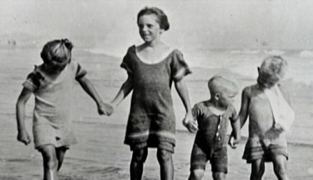
In 1997, John brought Peggy Stern and Chuck Jones together for a series of interviews that became the basis of this film. Jones often sketched his boyhood self as he related his memories. These sketches later inspired the documentary’s animated sequences, which Canemaker directed.
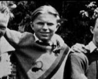 Just prior to his death Jones saw a rough version of the film and was delighted. His family sunsequently provided Ms. stern with additional archival material. The end result is an intimate film about the early years of Chuck Jones’ life.
This film is going to air on Turner Classic Movies Tuesday, March 24th at 8 p.m, and it will be followed by three classic Jones shorts: Duck Amuck, One Froggy Evening and What’s Opera Doc.
- An exhibit celebrating Manga and Anime is opening tomorrow, March 14th, at the Japan Society in New York. has
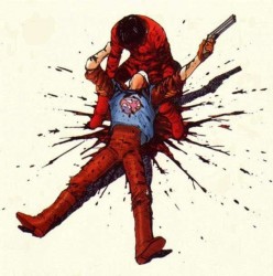 The films that will be shown include:
___ Katsuhiro Otomo’s classic, Akira (1988)
___ Masaaki Yuasa’s Mind Game (2004)
___ Satoshi Kon’s, Paprika (2006)
___ Patlabor 2: The Movie, by Mamoru Oshii _____ (1993)
___ The Place Promised in Our Early Days _____ (2004), by Makoto Shinkai
and
___ Super Dimension Fortress Macross:
_____ Episode 9, 17, 18, and 27 (1982-83),
_____ designed by Ichiro Itano.
Screenings will begin Saturday, March 14 and will continue until June 14, 2009.
The exact Anime screening schedule in the auditorium is here
A listing of Manga on display is here.
The NYTimes has a review of this show in today’s paper.
Articles on Animation &Chuck Jones &Frame Grabs 11 Feb 2009 09:00 am
Wackiki Art
- John McGrew is a principal designer in the history of animation who quite radically changed things for us all. He led the way out of the 19th Century and, with Chuck Jones’ blessing, pulled the art of animation into the 20th. Others followed or were running alongside him, but he left the first mark.
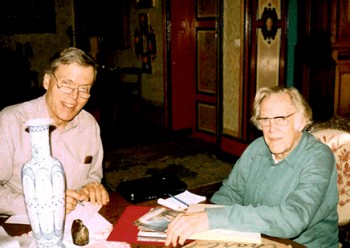 Mike Barrier interviewed McGrew in his studio in France in 1995, (photo right by Phyllis Barrier from Mike’s site) published the interview in Funnyworld Magazine and has it now posted permanently on his website. If you have any interest in design in animation, you should have already read it. I just reread it for about the 15th time, and am amazed at how much history is packed in there. Go here.
McGrew, with his work on The Dover Boys and dozens of other brilliant cartoons, took animation into abstraction and back. His work, I think, is comparable to Scott Bradley’s music at the MGM cartoons. Bradley was the very first film music (live action or animated) to incorporate Schoenberg’s 12 tone serial music. McGrew didn’t imitate Picasso or Steinberg, he created modern art in animation.
McGrew did his layouts in color showing the background artists what he wanted. He worked with strong designers, in their own right, painting backgrounds:Paul Julian, at first, and  Gene Fleury after 1941. When he left the unit, during the War, Bernyce Fleury took his place working with her husband, Gene, on Jones’ films.
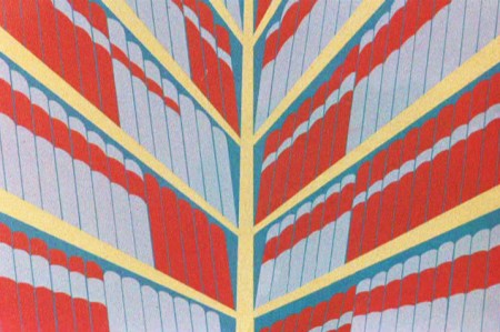
Wackiki Wabbit is one of the most interesting of Chuck Jones cartoons.
Precisely because of the layouts and backgrounds. They’re done in an abstraction that almost dominates the film, but actually serves to represent a world of foliage. The style uses cutouts and a wide range of techniques. Mcgrew probably did not work on this film; it came exactly at time of  change when Bernyce Fleury entered the picture. McGrew, in the Barrier interview, says that he had never worked with her on a film. Her style seems evident throughout. Cut-outs mixed with the wallpaper-like patterns.
The film gives no credit to Layouts or Backgrounds.
I’ve made some frame grabs of the backgrounds (eliminating most of the characters – unless they were stationary) and
___ (Click any image to enlarge.)__________am posting them below.
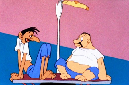
The film opens with tones of blue against a pink sky.
The two solidly drawn cartoon characters float in a sea of color.
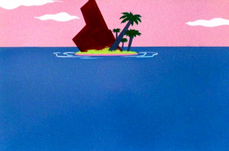
This is about as green as the Island will ever get.
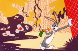
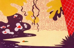
On the island, Bugs Bunny lives in a world of abstract foliage.
The colors are skewed – not verdant but warm.
Large masses of solid colors sit against brush drawn lines.
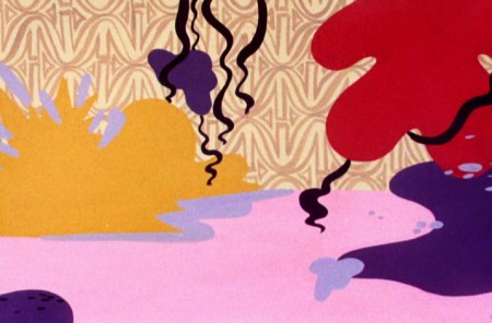
A limited number of colors allows the scenes to cut
without following through with any other consistency.
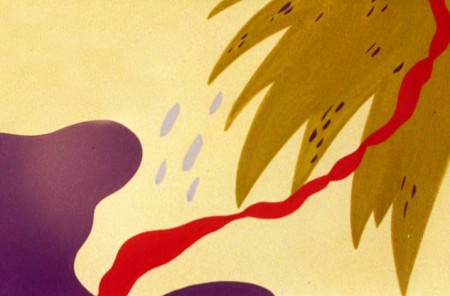
However, if you remove the characters, you’re missing the center.
As it should be.
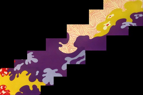
There are numerous large and fast pans,
this one a diagonal from right to left.
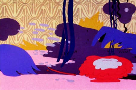
Some areas like the blue, above left, or the red, above right, animate.
The solid colors help them all to combine seamlessly.
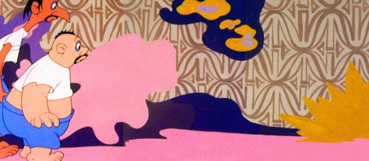
Bugs dances on the right, a pan
to the left reveals the two humans.
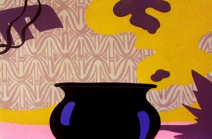

Cut from the pot to a quick pan high up in the trees.
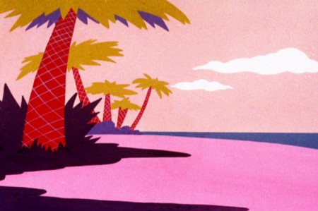
This serves as a sunset with our two humans
chasing each other into the distance and the film’s end.
Chuck Jones &Daily post 12 Mar 2008 08:31 am
Abe Levitow.com
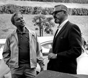 - There’s a brand new site debuting today, and I’m pleased to say that my studio had a small part in seeing it off and running. Abe Levitow was an animator and director whose work I’ve long admired. I met his daughter, Judy Levitow, during the production of Raggedy Ann and Andy, and I really enjoyed her friendship. So many years later, she contacted me to ask about our sites and their design and told me that her family was hoping to put up a site to honor her father. The end result was that Matthew Clinton, a key animator in my studio, worked with Roberta Levitow in putting together the new site www.abelevitow.com, ______________ Chuck Jones and Abe Levitow
for the family, Judy, Roberta and Jon Levitow.
Darrell Van Citters was principal in organizing the archival material. As of today the site’s operational and in full swing.
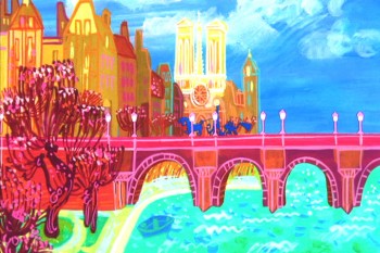 The site includes lots of photos, artwork and information about Abe Levitow’s life and career.
For those of you who are not familiar with his work, Abe Levitow started at Leon Schlesinger’s studio where he worked for years, breaking only for work in the Signal Corps during World War II. He animated key sequences of What’s Opera Doc, Robin Hood Daffy and Broom-stick Bunny. He joined UPA where he was an animation director on 1001 Arabian Nights with Magoo, and he directed Magoo’s Christmas Carol and the feature Gay Purr-ee.
He worked with Chuck Jones at MGM where he directed a number of the Tom & Jerry shorts as well as co directing The Phantom Tollbooth with Jones.
Abe Levitow’s animation for Richard Williams was key to Dick’s films. On The Christmas 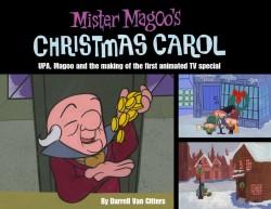 Carol his animation of the ghost of Christmas Present revealing the two waifs “want” and “ignorance” under his robe is the finest scene in that fine film. (I suddenly realize that he is probably the only artist to have worked on both the Magoo Christmas Carol and Williams’ Christmas Carol.)
He died in 1975 at age 53.
This new site also announces the soon-to-be-published book by Darrell Van Citters about the making of Mr. Magoo’s Christmas Carol.
Chuck Jones &Commentary 12 Jul 2007 09:03 am
Geckos, Bears and Harman Ising
- Any reader of this blog knows that I am not a fan of Motion Capture; hell, I’m not much of a fan of cgi animation. I’d prefer to watch animated puppets if I’m looking for 3D animation, and I don’t think cgi has reached the level of some of the 2D animation that’s been done.
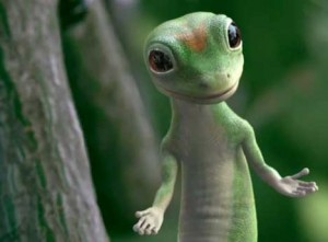 However, if I have to give a good reason for Motion Capture’s existence I would pick the Geico Gecko commercials. I think that little guy transcends animation; I totally buy it as a real creature talking to me in his Cockney accent. I like it and don’t think the same feel could be done any other way.
I started wondering about who did these spots and decided to do a little research. The spots sort of feel like some of Aardman’s work, but I never quite believed Aardman would resort to Motion Capture (but then I never thought they’d use cgi either.)
It turns out the spots are done in New York by a company called Framestore, NY. They’ve done a lot of effects work and commercials in the past. Most notably they’ve been involved with Harry Potter and the Goblet of Fire and Walking With Dinosaurs done for the Discovery Channel. They also have a London based office.
The President of the company is Jon Collins and the lead animator on the spots is Dave Hulin. Sarah Dowland is the producer, and Andy Walker is another animator involved in the commercials.
The original voice of the Gecko was Kelsey Grammar, but only for the first spot. Then Brit actor, Dave Kelly took the part. Those spots were done by Rhythm & Hues.
The current incarnation of the Gecko done by Framestore NY is voiced by British actor, Jake Wood.
Three of these spots can be seen at the Framestore website.
A short break for a little news brief: Sean Penn and Iggy Pop have signed on to do voices for the US version of Persepolis. They join Catherine Deneuve and Gena Rowlands. The French film, which won a jury prize at Cannes, will be released in November.
 – Last night I watched a show on Boomerang. Entertainingly enough, it’s called MGM. These are the non-Avery non-Tom & Jerry cartoons of MGM. That means a lot of Harman-Ising and a few other oddities.
These are for the most part the bulk of shorts that ran on TCM’s Cartoon Alley. All of the prints are Turner-beautiful, and a good way to catch some of these cartoons. The program appears to have only been on a couple of weeks, at most, so I’ve only caught it two or three times. They seem to put up the later films from this unit – they don’t want it to seem too dated. Since the scheduled has shifted half a dozen times already, I’m not sure it’s long for the world. The programs run at 6pm or 8pm or whenever in the evening are apparently repeated early morning (last night at 4:30am) if you want to tape the shows with your timer.
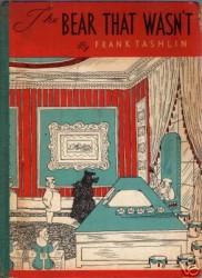 Last night they ran the Chuck Jones short The Bear That Wasn’t(1967). This is an adaptation of Frank Tashlin ‘s children’s book published in 1946. The film was produced by Tashlin and Jones and was directed by Maurice Noble and Jones.
One of Chuck Jones’ most apt and famous quotes was to have called Hanna-Barbera’s (and, indeed, most tv animation) work “illustrated radio.” That is the saying that is most appropriate for this short. Paul Frees does an excellent job of speaking all the voices including the narrator (although it doesn’t sound well recorded). The only female voices are done by a chorus of females that sings all their lines. Dean Elliott didn’t do his best score for this film. The music sounds like a bad-jazzy version of a James Bond/Pink Panther impersonation.
(Click any image to enlarge. )
I’m a big fan of Maurice Noble’s work, but he was working overtime for this short, and the film is overdesigned. Too much gets in the way of the simple animation – trying, in fact, to 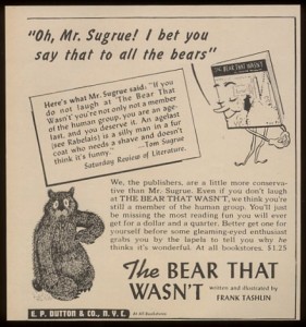 hide the limitations of the animation. Looking at Tashlin’s book, there’s a simplicity that could have been easily relayed by anyone who just adapted the book. There was too much ego at the top of the credits here, and the film suffers for it. The end result is boring.
This was the first time I’d ever seen the short, so I was glad to have caught via the back door of Boomerang. The show today is at 9am, 8pm and 4:30am. This is what’s on today’s schedule:
Hanna & Barbera’sGallopin’ Gals
Hugh Harman’sTom Turkey and His _-_ Harmonica Humdingers
Dick Lundy’s Cobs and Robbers
and Hugh Harman’s Blue Danube.
An odd mix. (An item for sale on ebay.)
