Category ArchiveChuck Jones
Bill Peckmann &Chuck Jones &Comic Art &Commentary &commercial animation 25 Oct 2013 10:39 pm
Ever Rising, the winds of change
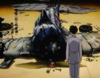 Jumping in to Miyaakii’s most recent feature – to cross the seas, we find a very complex film with an aggressive approach to ward the telling of a love story. The architect of a bomb designed to destroy lives in fighting that war is the precise subject behind this longish film. It is not endearing (though that would be questionable in discussing these masters of violence for their country.
An horrendous look straight down the nose of a blistering work of nature, the Hurricane, as lovers are brought together afterward she gets ill and suffers from the pangs of war without having been near the font lines of the tumult wherever it is.
From therre to the end is a military mission wherein the architect shoots at the world. A scientist who accomplishes his mission while killing more people than the earthquake he met at the film’s start. This is one fine movie from a thinking man. He’s seen enough sorrow to want a peaceful ending for his children. It isn’t coming.
Animation, you wait and beg to do it, but in your heart you want to do brave things with positive things to say. I want so desperately to do the good stuff. At this point I’ll take the mediocre, with some sadness.
I wish . . . I wish . . . I wish . . .
Theree were only good and responsible pieces of animation anymore. But no they just grow Mickey and his private parts larger and larger in Flash until the money doesn’t sow and then they blow them up.
Just like that SCTV show they blowed him up real good.
Noone knows what will happen. It hurts you know. Croods and Monsters and Incredible him. He was incredible; he made a big success and now the second one. Incredible Him. I guess those turkeys should be big too, a holiday out of Thanksgiving. What do you know? Maybe one or two of the shorts will be fun. Not umbrellas making eyes at each other. We need some Prince Valiant to come along and save us all. Maybe that’s me.
Books &Chuck Jones &Commentary &Illustration &Layout & Design &Models 26 Sep 2013 08:22 am
Rhapsody in Working for Suherland
Maurice Nobel worked several years at Warner Bros. under Chuck Jones for the most part, but in 1950 he moved to John Sutherland Productions where he worked on lesser known projects. He had a money war with Eddie Seltzer at WB and accepted the higher price from Sutherland with Selzer telling him that the door would remain open.
WB tried to turn everything to 3D and gave up after one cartoon, Lumberjack Bunny. It’s obvious that some of Maurice’s LOs were prepared for 3D and were switched at the last minute. WB was closed for a year when it was decided to stop production on the 3D films. Noble had taken the right course in working for Sutherland for the few years he was there.
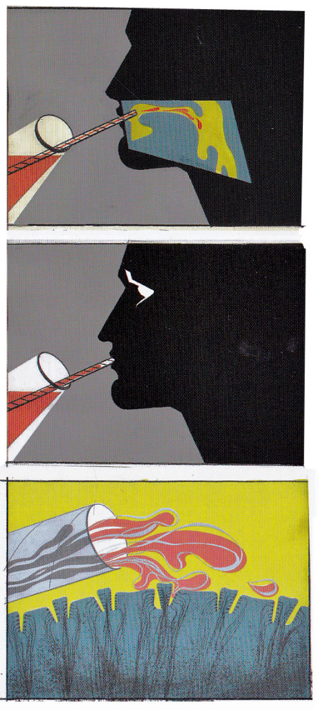
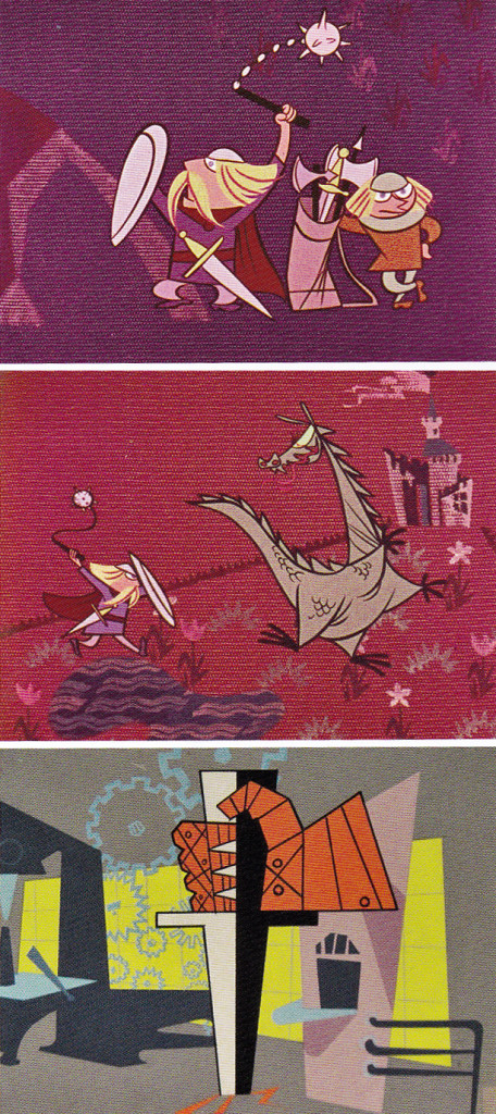
Color keys to the John Sutherland Prod
Gateways to the Mind
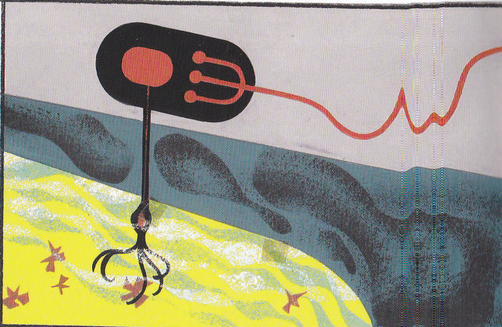
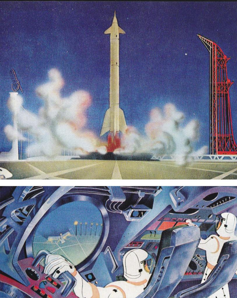
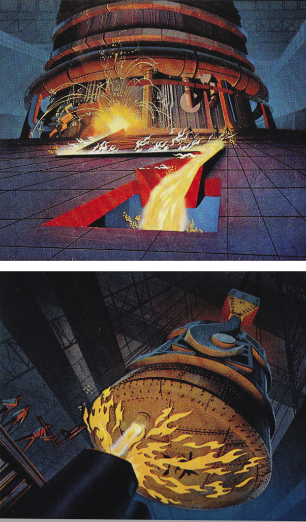
Rhapsody in Steel (below) was a high budget film for Sutherland with Eyvind Earle hired as Art Director. Ultimately he just painted the BGs that were designed by Maurice Noble. This beautiful film can be seen on YouTube, here.
Articles on Animation &Chuck Jones &Commentary 12 Sep 2013 12:31 am
Saturday Notes on Thursday
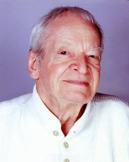 How wonderful and appropriate it is to receive this biography of Maurice Noble in the mail. Such beautiful art that only works within the confines of the films being reviewed.
So often I play foolish rhyming games with myself and allow odd configurations to pop out of the type quickly passing in front of me. When I received this book the subtitle quickly gave me pause, “The Noble Approach. Maurice Noble the art and death of Animation Design.. Of course it took less than a second for the correct title to return to the cover in front of me. “Maurice Noble, the Zen of Animation Design.
Where did I get “death from” in those back recesses of my mind? Maurice Noble was probably the last of the GREAT designers from our masters’ age. Great artists like Rowland Wilson and Hans Bacher shape and form a movie and are responsible for much of the greatness that grows with the films they’re developing. Chuck Jones got a lot of glory; Maurice Noble brought the brilliance.
I’ve already started a series around Noble in honor of the excellent book released by Chronicle. I’m going to continue whole posts around the man’s art. There are at least another 4 das worth of information I have to get across, even if it’s just posting stills. Bear with my slow pace on it.
Botanical Party
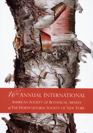
The NY Botanical Garden is ready to have its 16th Annual Internationa American Society of Botanical Artists at the Horticultural Socidty of NY (better known as the Botanical Gardens to you.)
This will take place on Sept 20th and run through November 22nd, 2013.
Dick Rauh, our first ASIFA-East President (and the longest to hold that esteemed position) is represented, as ever, with a beautiful work. His is the beautiful work you’ll be looking for. It’s a good opening night party you’re invited to on Sept 20th from 6 to 8 PM.
Rocky Road of Impatience
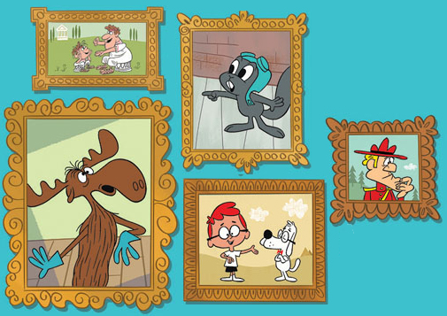
Thanks to Jerry Beck‘s Cartoon Research, we’ve learned that Darrell Van Citters is putting together a book on the films of Jay Ward. Van Citters’ book on Mister Magoo’s Christmas Carol is surely one of the best books about animation to have reached market. The material was not very easy to reach, and there was plenty of factual information that well informed those who were interested.
That most definitely was me. I can remember waiting quite impatiently for the Magoo film to reach television, and I felt fully satisfied when the material played on screen.
Now there’s a promise of the jackpot of material about Jay Ward and the work that small but wacky and very intelligent crew turned out. There’s been nothing like it and I look forward to the book form, impatientl.
I’d feasted on the written material in Keith Scott‘s well written book about Ward and his cohorts (The Moose that Roared) and certainly wanted more. Now we may have found it via the intelligent writing of Mr. Van Citters.
Articles on Animation &Books &Chuck Jones &Illustration 27 Aug 2013 11:11 pm
More Than the Scenery
I am a fan of the work of John Ford. If I’m caught catching a minute of one of his films, you’ll see me stay through to the end. Likewise I have almost as great a respect for the animation design work of Maurice Noble.
It never fails. I get to the point where I’ve just about run out of hope for animation, and I feel like the greatest pessimist in the world. When I say “animation,” I mean 2D. Every frame is controlled by one person. The rest – cgi – is, to me a graphic effect, electronic puppetry. I’m certainly not talking about the overacted cg action you see in most films done today. Most animation to me, these days, is something that’s done in a computer by teams of people, and isn’t wholly designed as “personal.” There are, of course, the exceptions. When something like THE LIFE OF PI shows up, it feels like magic; the magic you expect of great animation.
There’s just too much of everything in most current animation; even the flash Mickey Mouse spots go too fast with their Zips, Pans, Takes; the simplest move seems to go over the edge. Gestures are bigger than they need be, actions are over the top, dialogue is too loud and frenzied unless it wants to be quiet – then, it really is dead. The animator became that big red button they have at “Staples.” You press it and the client can fix what he has to – his way. The poetry has vanished from the art form when this animation begins. Too bad there’s no personality in those big red buttons.
John Ford made some of the most beautiful movies we have on film. Many of these are Westerns, Westerns which notably featured some of the most extraordinary, natural land masses photographed. The incredible buttes and sights appear in the Arizona Desert, called “The Painted Desert”, and whether they were shot in the glorious golds, violets and other colors or even shot in B&W they add extraordinary sights to these films. If they weren’t already there, constructed and painted by some god, Ford would have had to have a mass of people construct these images.
Working to a better advantage is the art director Maurice Noble who created his original version of the “Painted Desert” mostly out of his own imagination. I suspect he and a couple of other artists were all it took to develop these animated scenics: far fewer people and a lot less time.
As I said, Noble’s desert was original, a recreation of the actual “Painted Dessert” but one that developed out of Noble’s imagination. These are almost as beautiful as the real thing, in that “design-y” way Noble’s art had.
So here we have two film plans. Elaborate impersonal scenery that was designed by Mother Nature, vs the personal designs delicately designed by Maurice Noble. Both are very different but have similar effects on the films they inhabited. A personal world Ford shares with us and another that Noble constructs for the backdrops of the Coyote and Road Runner. Both set designs are larger than life and full of that very-same-life. It’s in gloriously wonderful color (even thoughmany of these sets were shot in B&W) it’s just the beginning of the strength of these films. We’ll look further to see what more has been offerred to us in their films.
Animation &Animation Artifacts &Chuck Jones 24 Aug 2013 05:05 am
Heromakers
Heromakers Featurette Released
__________________________
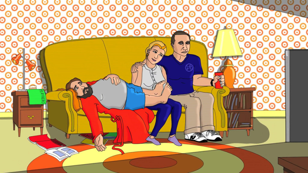 With the help of the Buzzco Associates animation team, Dan Hirshon and Jay Nog, have produced a featurette to help promote their animated sitcom, Heromakers.
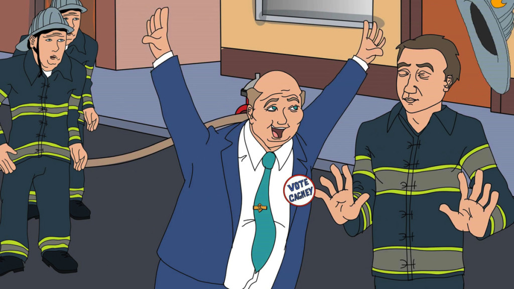
The “Simpsons meets X-Men” comedy series revolves around the dysfunctional Murray Family and
their business that offers human clients the opportunity to experience the life of a superhero.
Hirshon and Nog, both veterans in standup and sketch comedy, decided to take a sketch idea from their group, Grandma’s Favorite, and transform it into a television series. One year and many drafts later they were ready for production. They had no problem securing a talented voice-over cast, character illustrator, and sound designer/re-recording mixer, but finding the right animation team was a much more involved process. “We weren’t just looking for skilled animators. We wanted someone who was also enthusiastic about the project and related to our sense of humor,” says Nog. 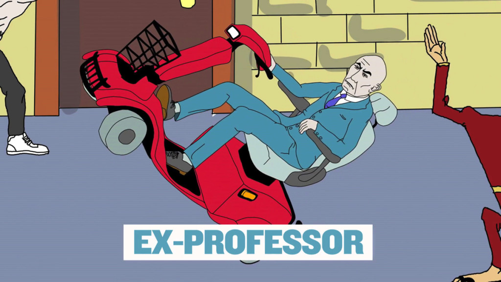
After several weeks of searching they found what they wanted in Candy Kugel, Rick Broas, and Marilyn Kraemer at Buzzco Associates, Inc. “From the first frame of the first animatic we knew we were in good hands. Everything we’d imagined and more was coming to life,” says Hirshon, “and it didn’t hurt that Candy baked us some pretty sweet brownies.” Heromakers takes place in Champion City, where Mayor Cagney’s environmental negligence has led to mutation in some citizens. To avoid public outcry, Cagney dubs the mutants “superheroes” and goes so far as to replace the fire department, with what he labels “The Super Hero Intelligence Team” (THE S.H.I.T.).

Newly unemployed firefighter, Larry Murray, and his family, decide to bring heroic values back to Champion City with their not infallible business, Heromakers. Larry supervises the client “heroes.”
His wife, Denise, acts as head of promotions. Uncle Bill designs the costumes. And their son, Tim, designs everything from rocket packs to body armor to assist in their clients’ missions.
However, what no one realizes is that Tim is powering the inventions via his secret telekinetic powers. If Larry finds out that his son is a mutant, the business may be doomed.
There’s an extended clip giving more about the Heromakers’ story, characters, cast, and crew at www.Heromakers.net.
Bill Peckmann &Books &Chuck Jones &Illustration 07 May 2013 03:39 am
Bears
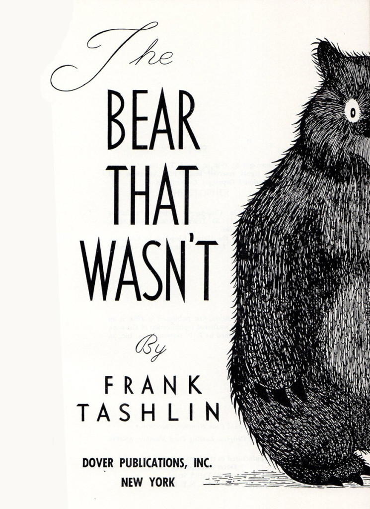
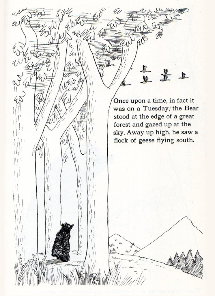
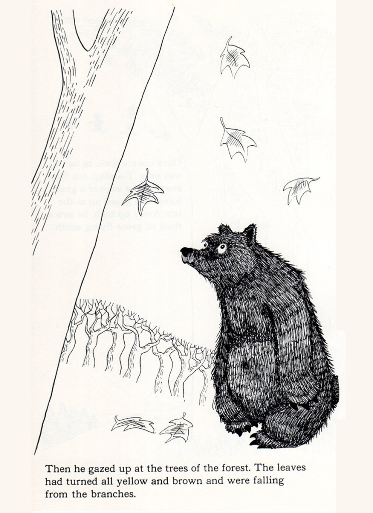
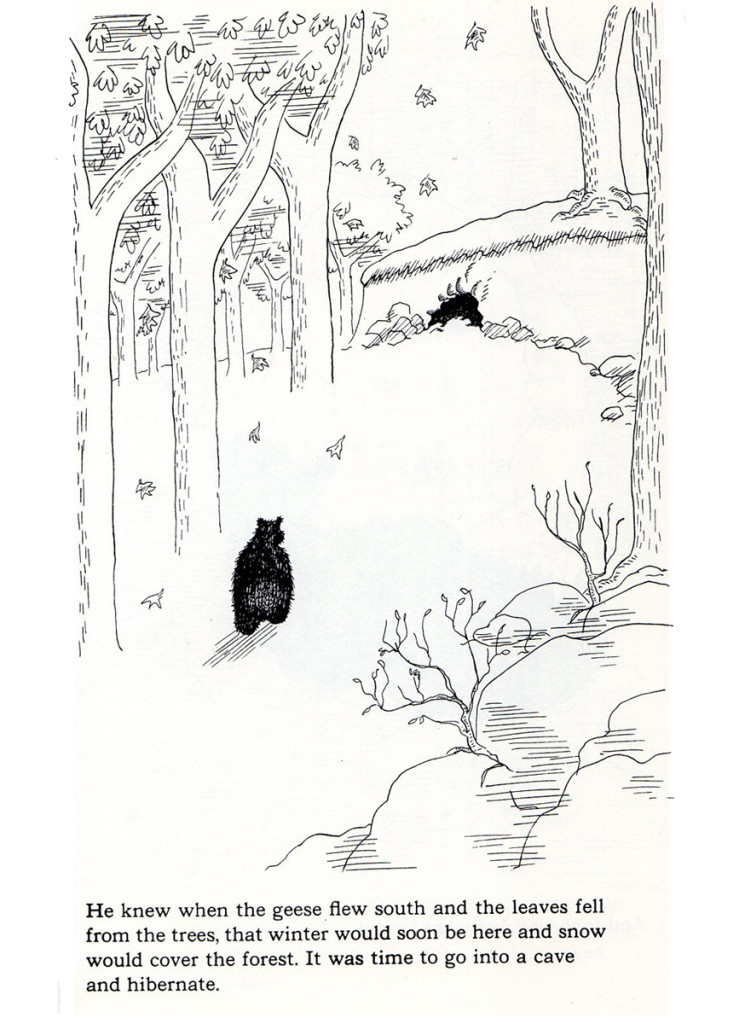
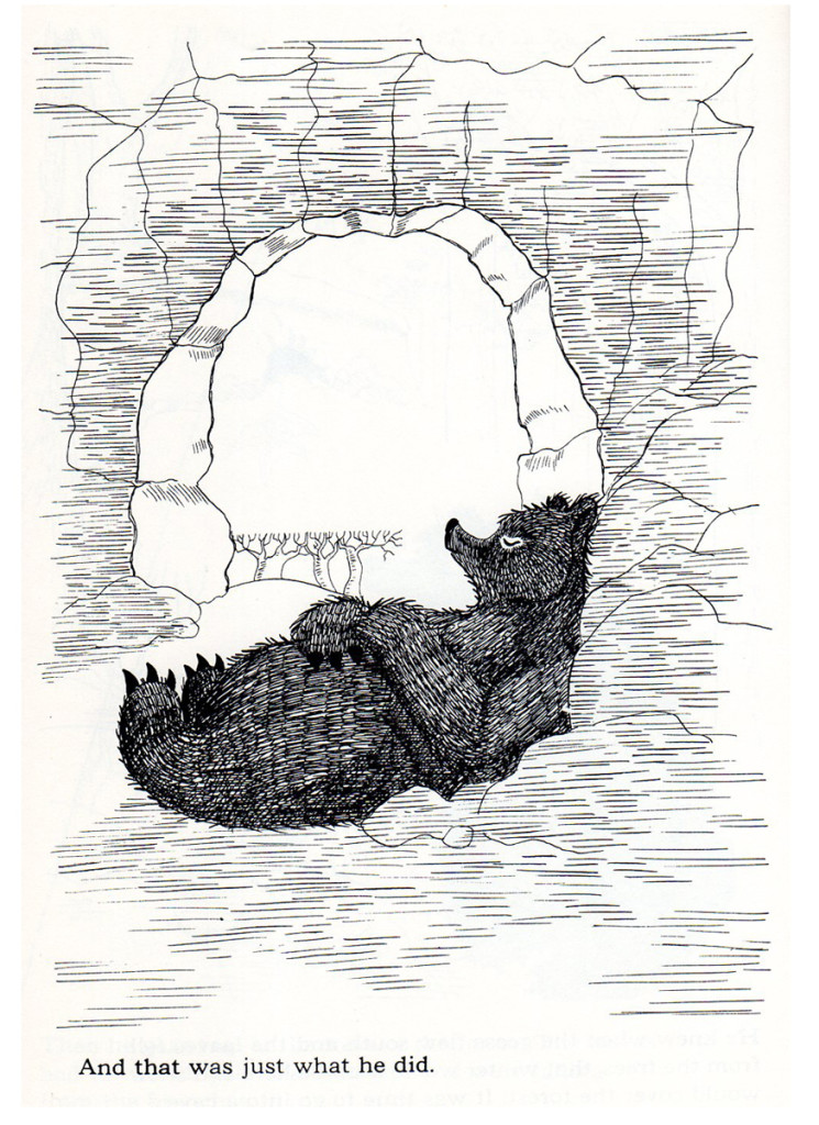
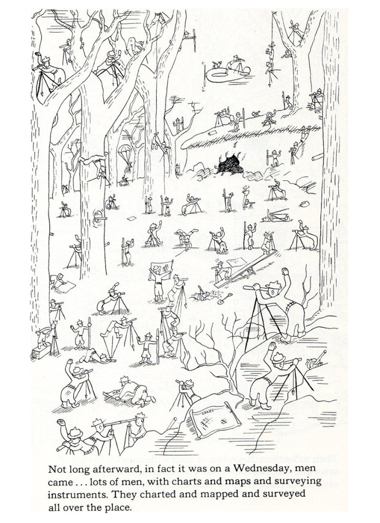
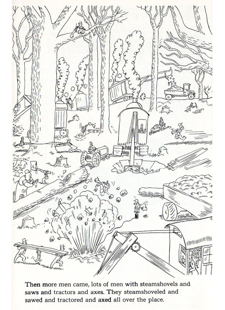
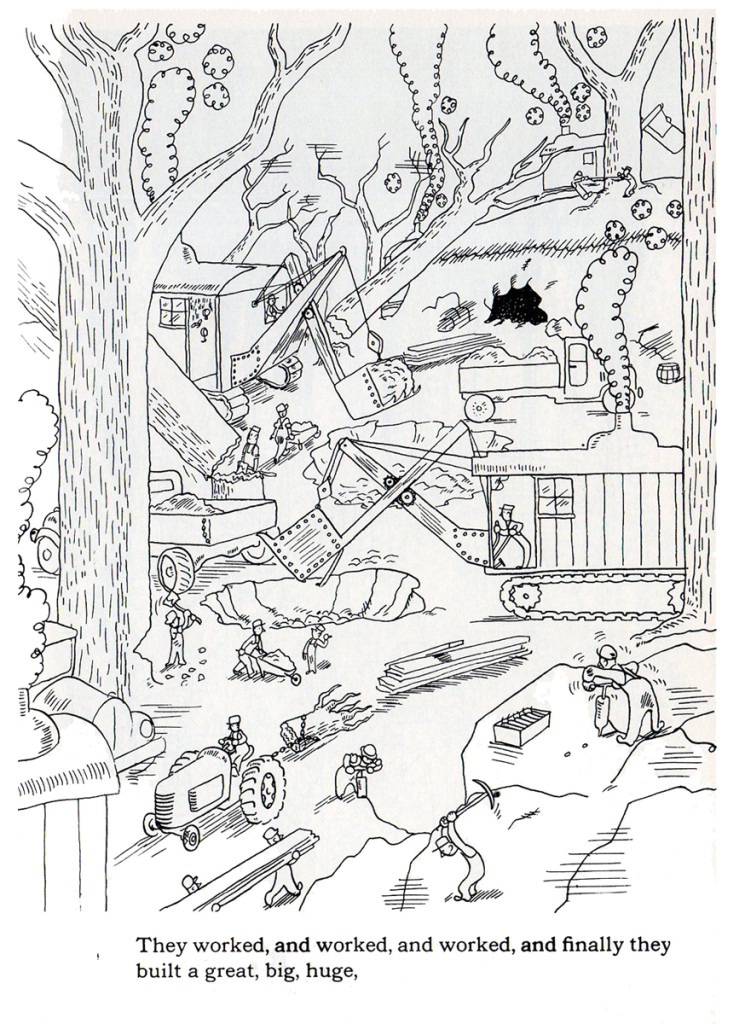
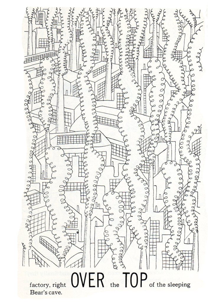
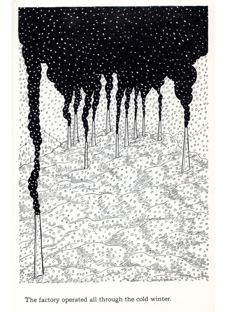
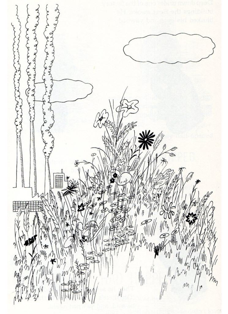
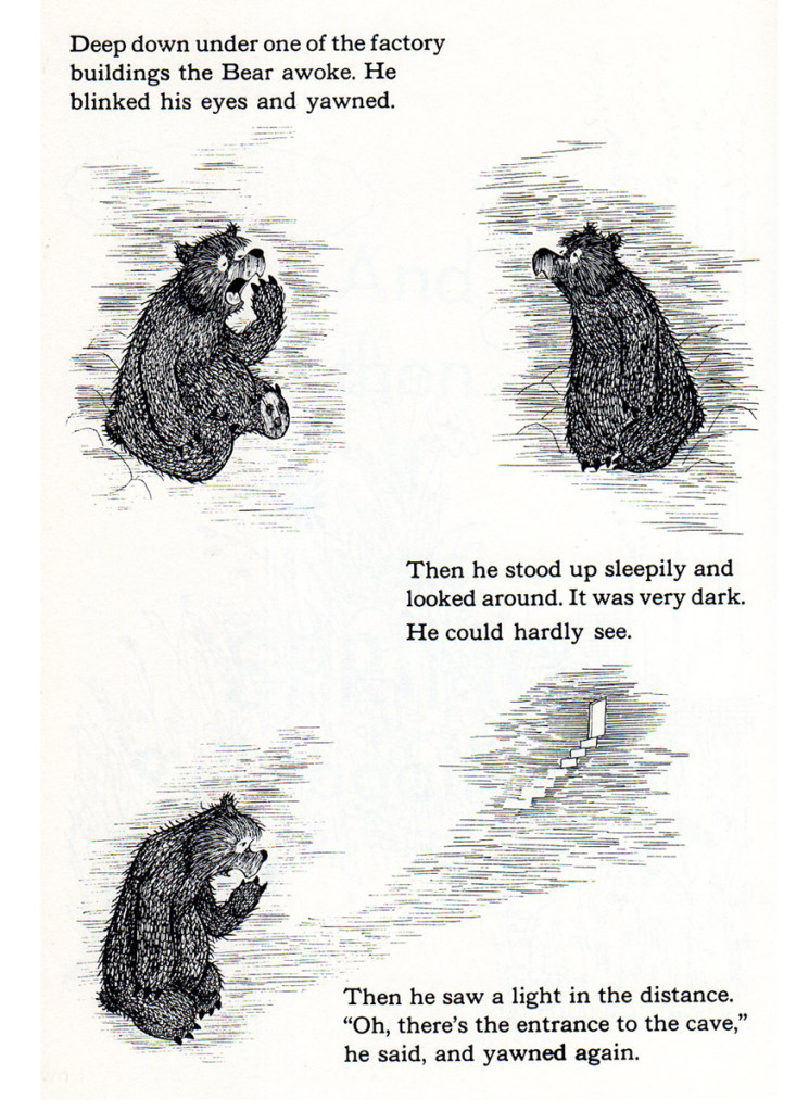
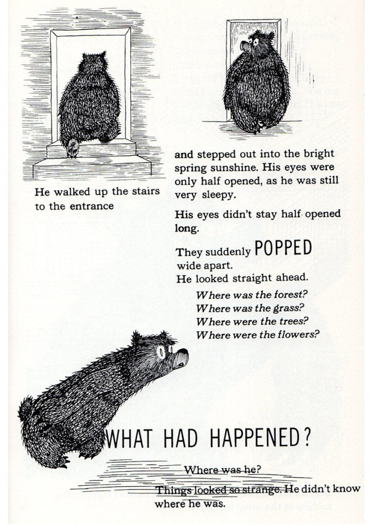
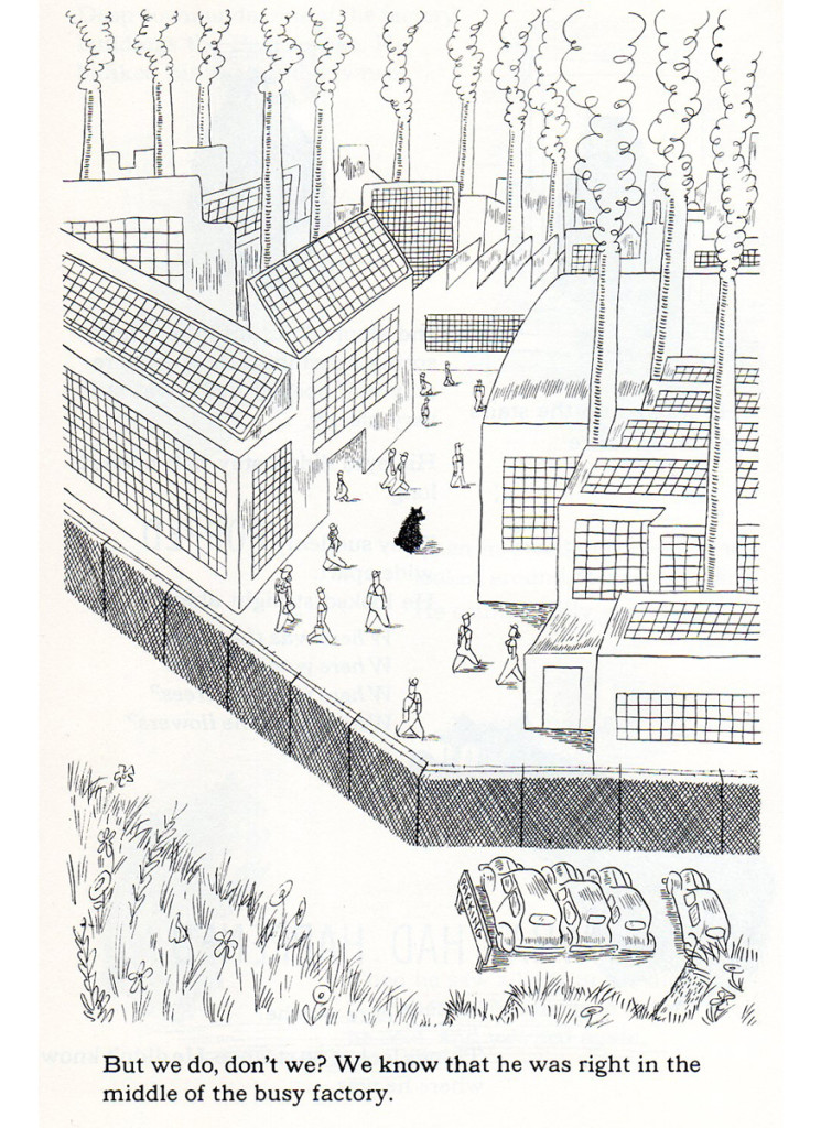
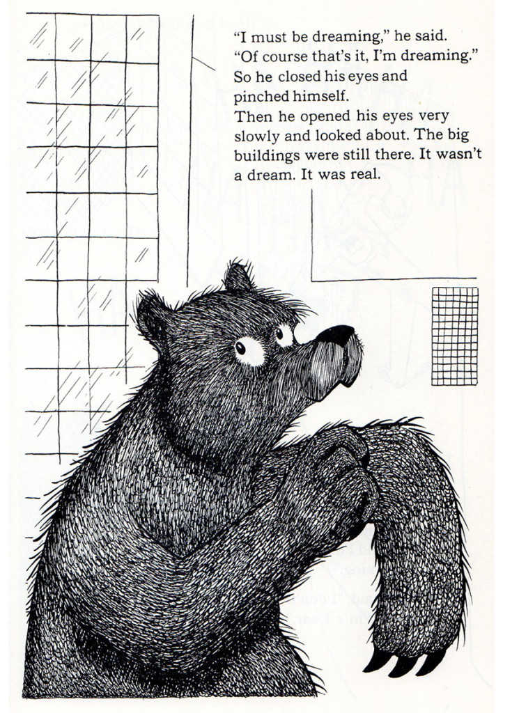
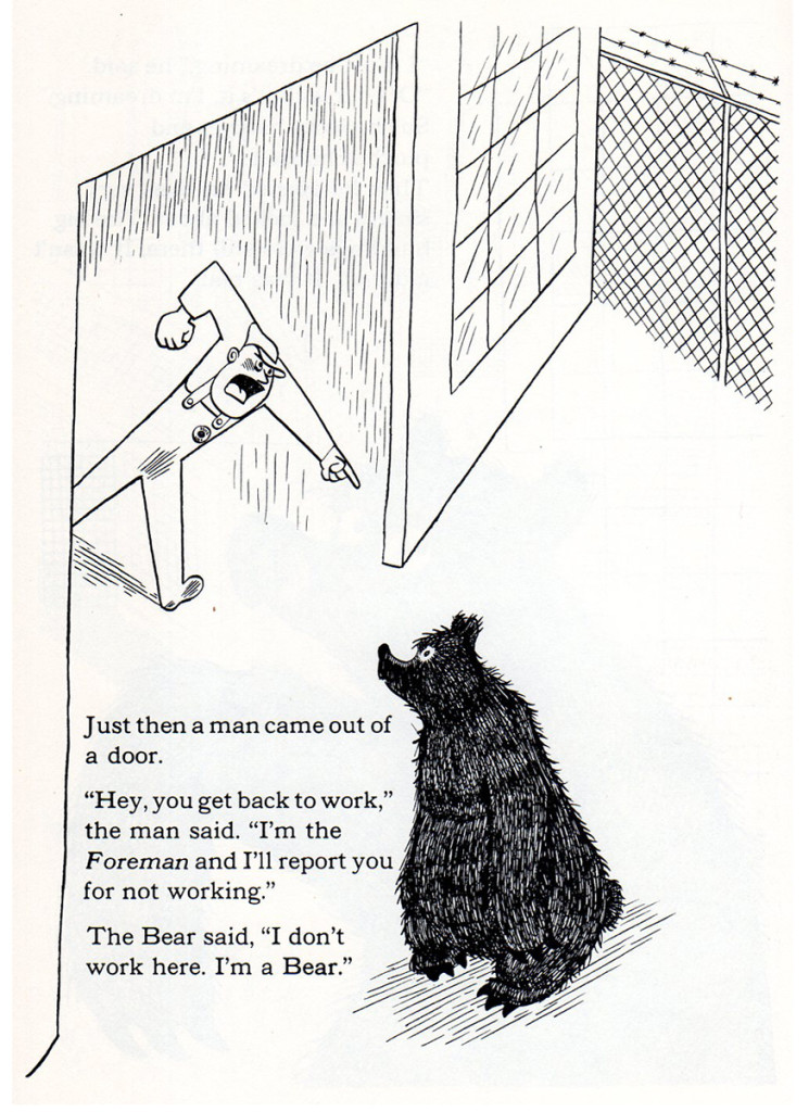
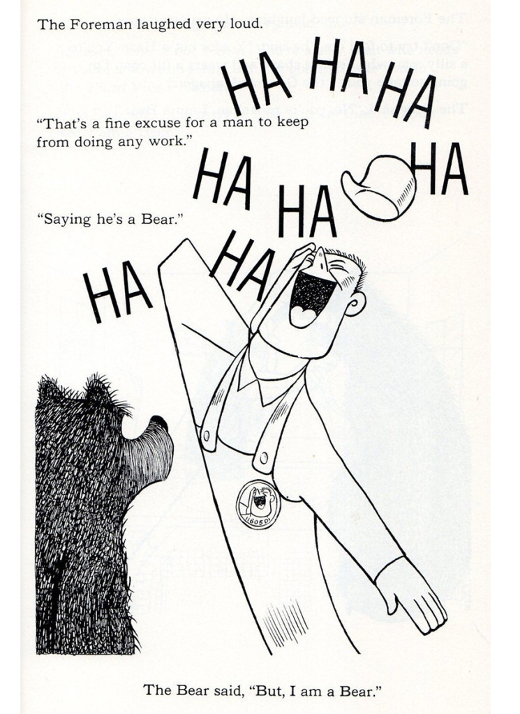
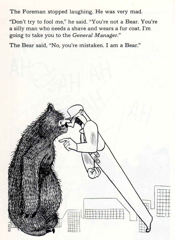
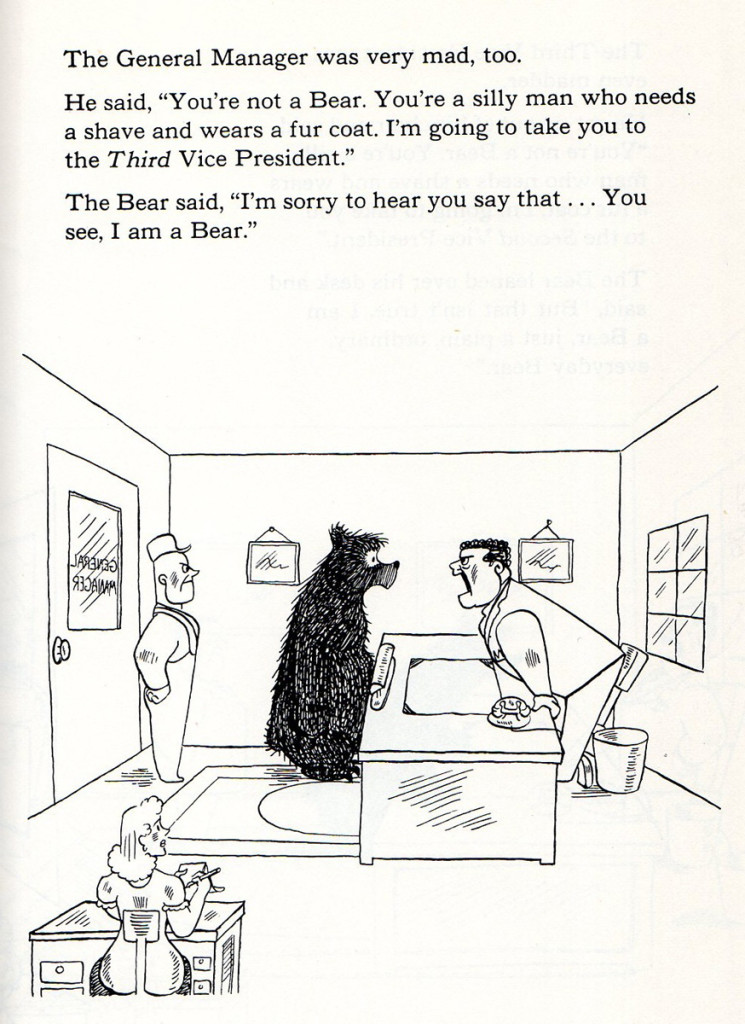
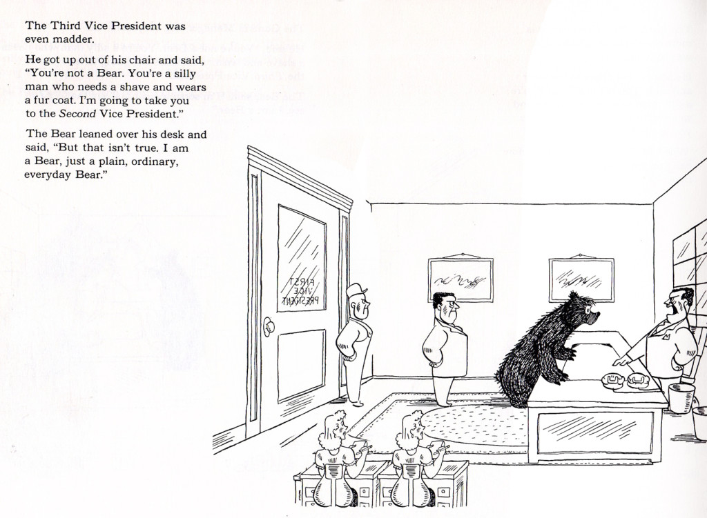
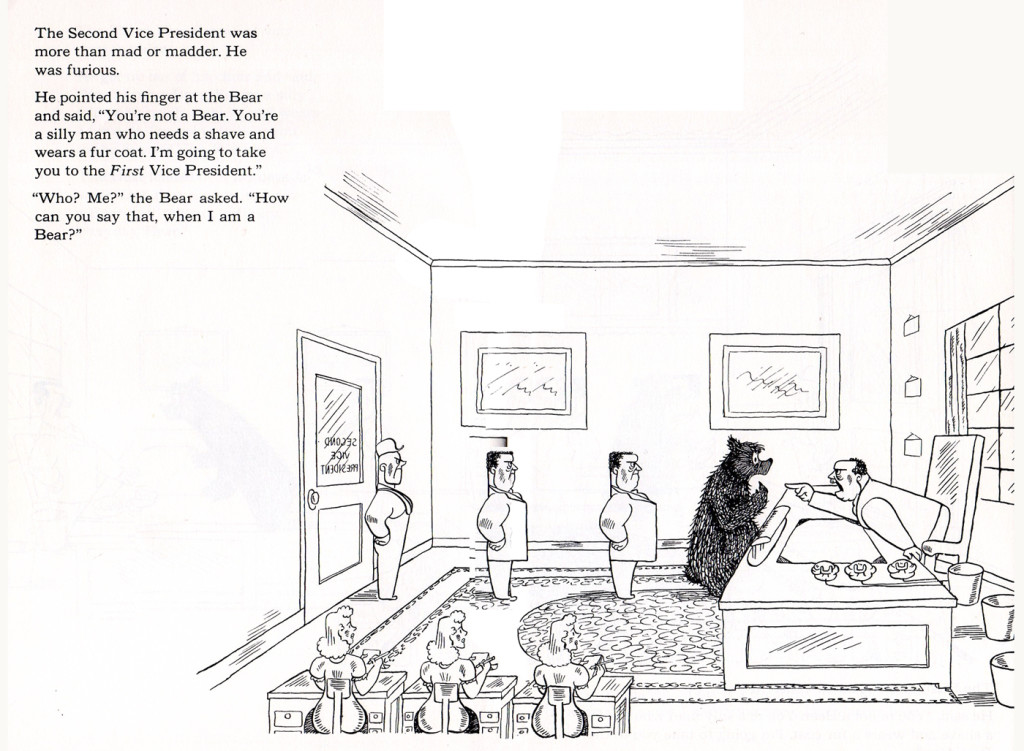
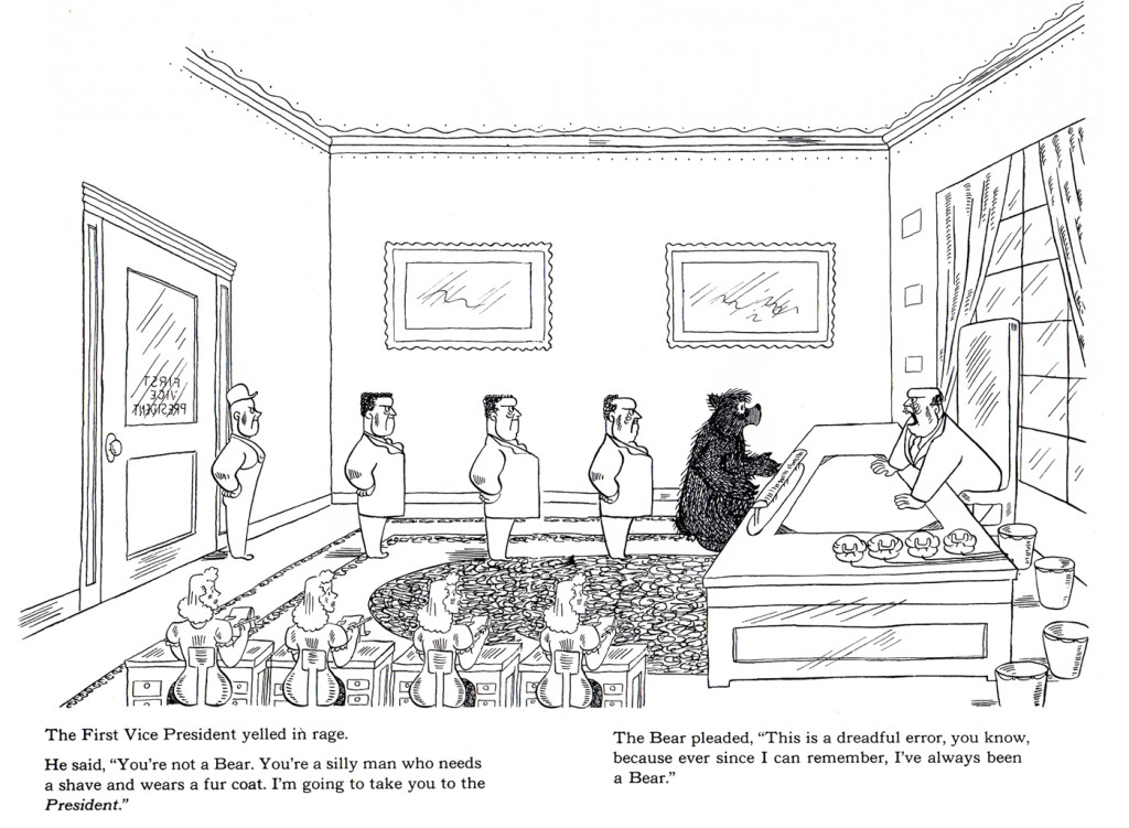
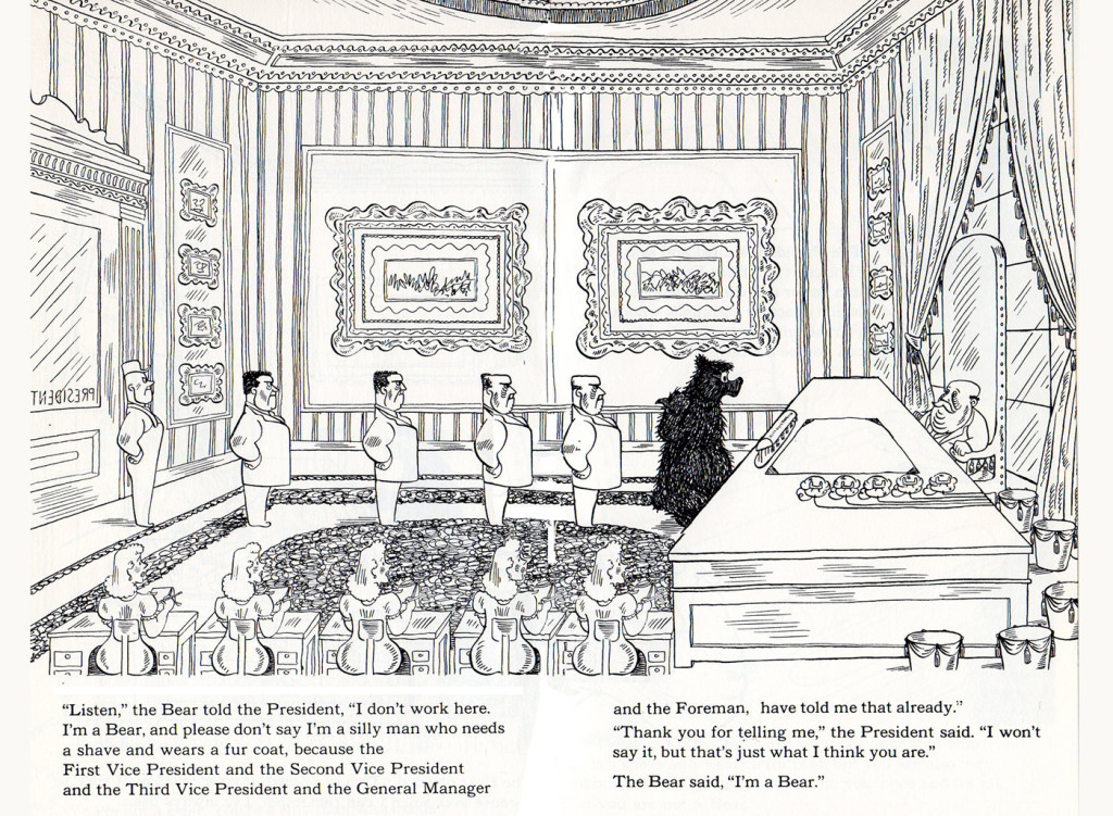
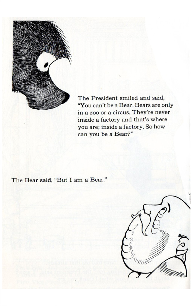
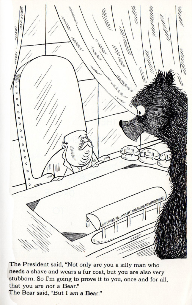
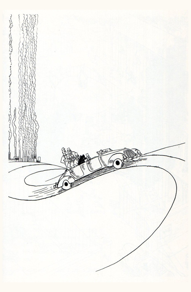
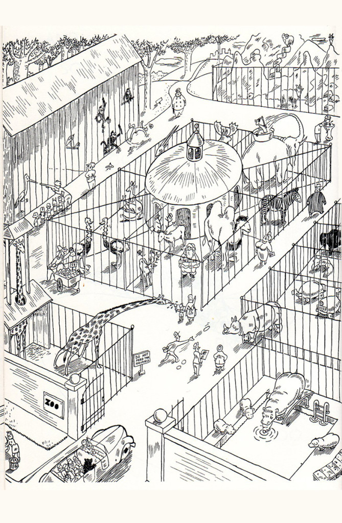
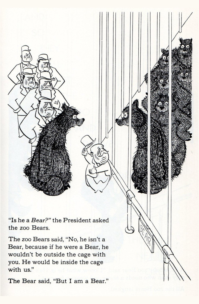
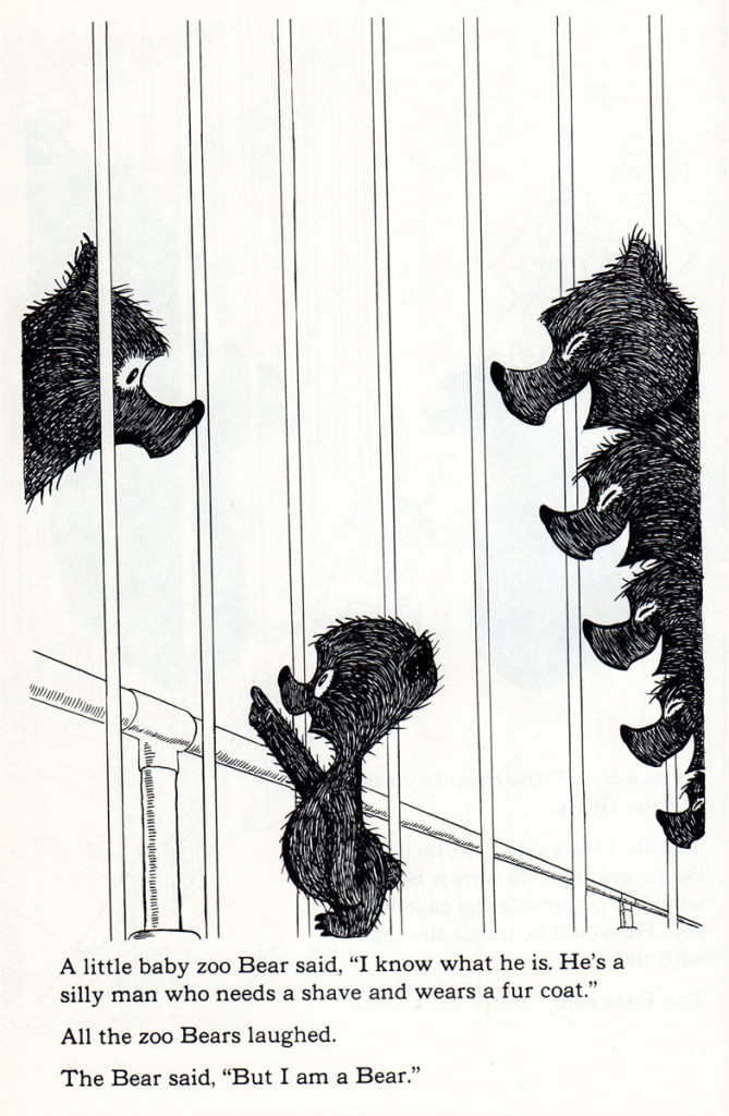
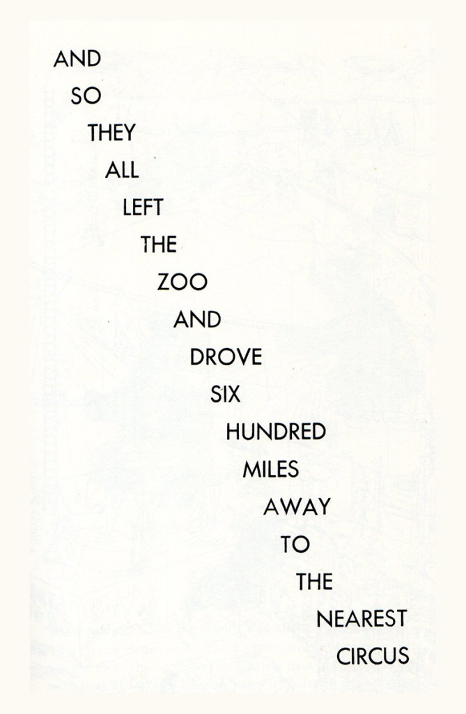
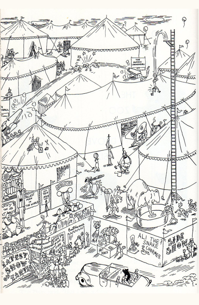
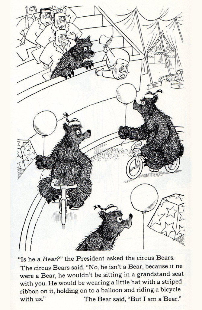
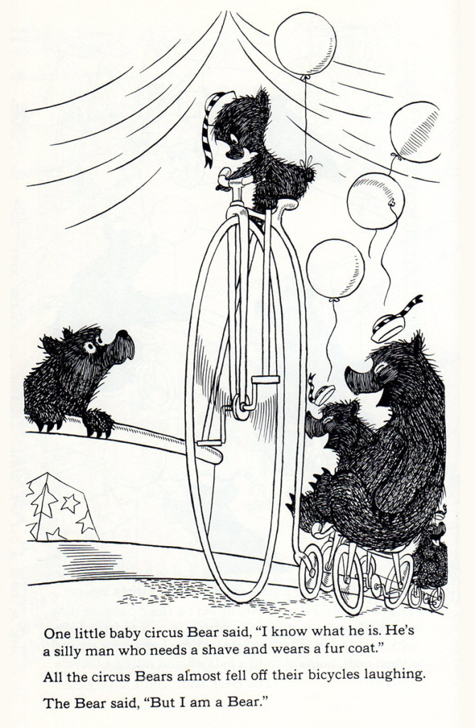
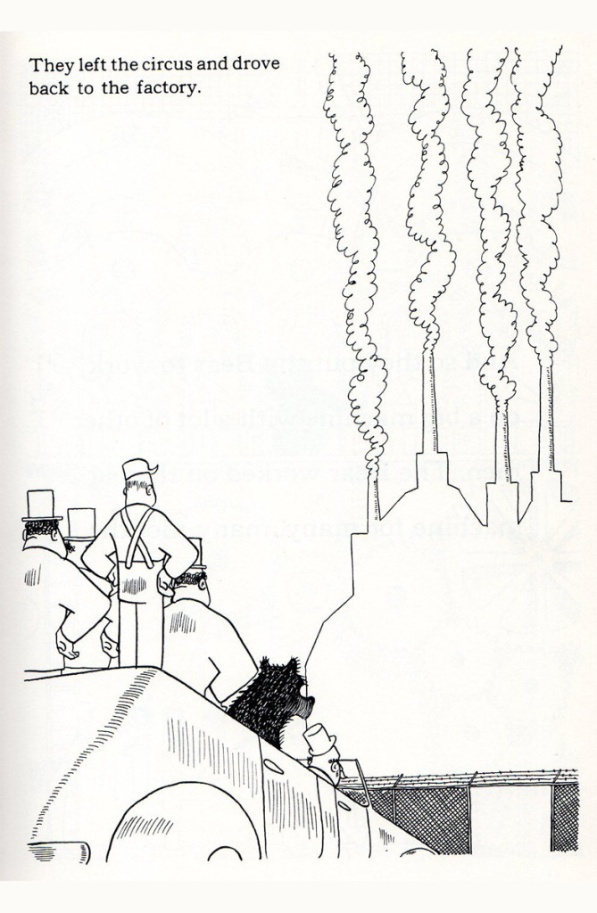
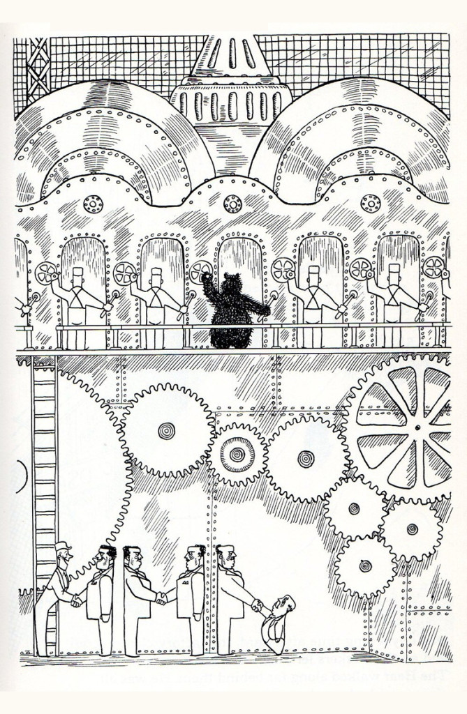
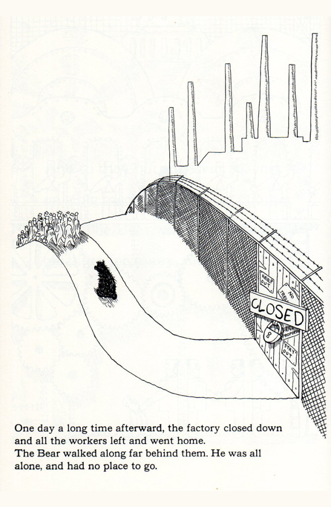
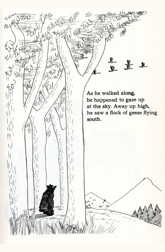
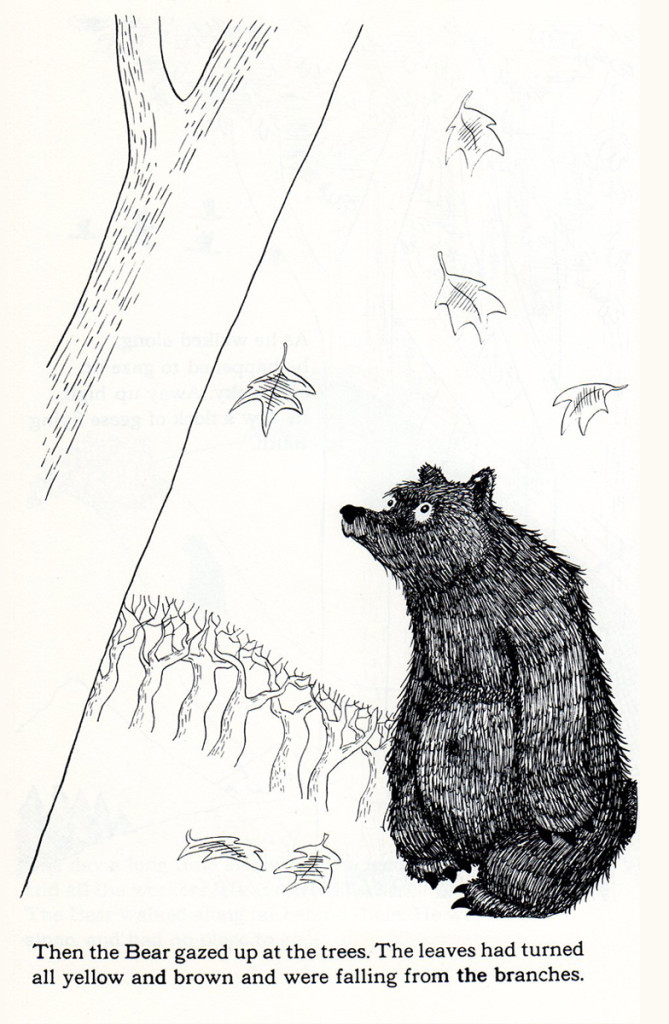
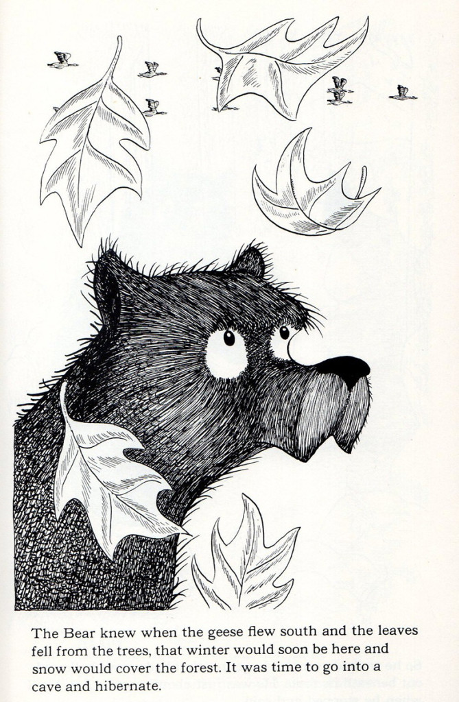
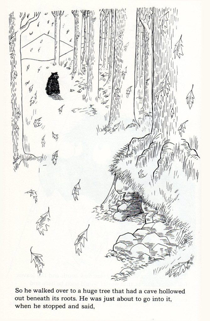
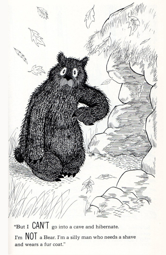
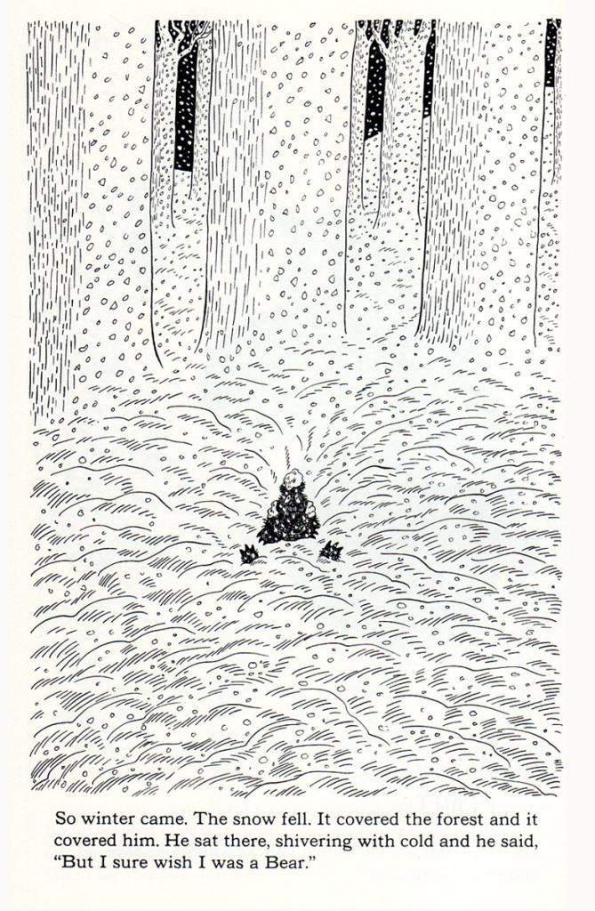
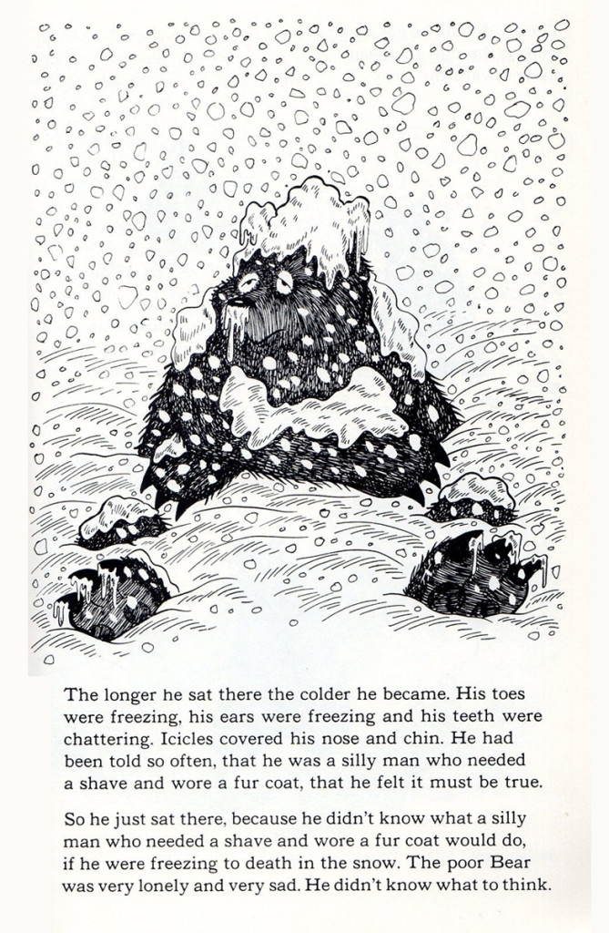
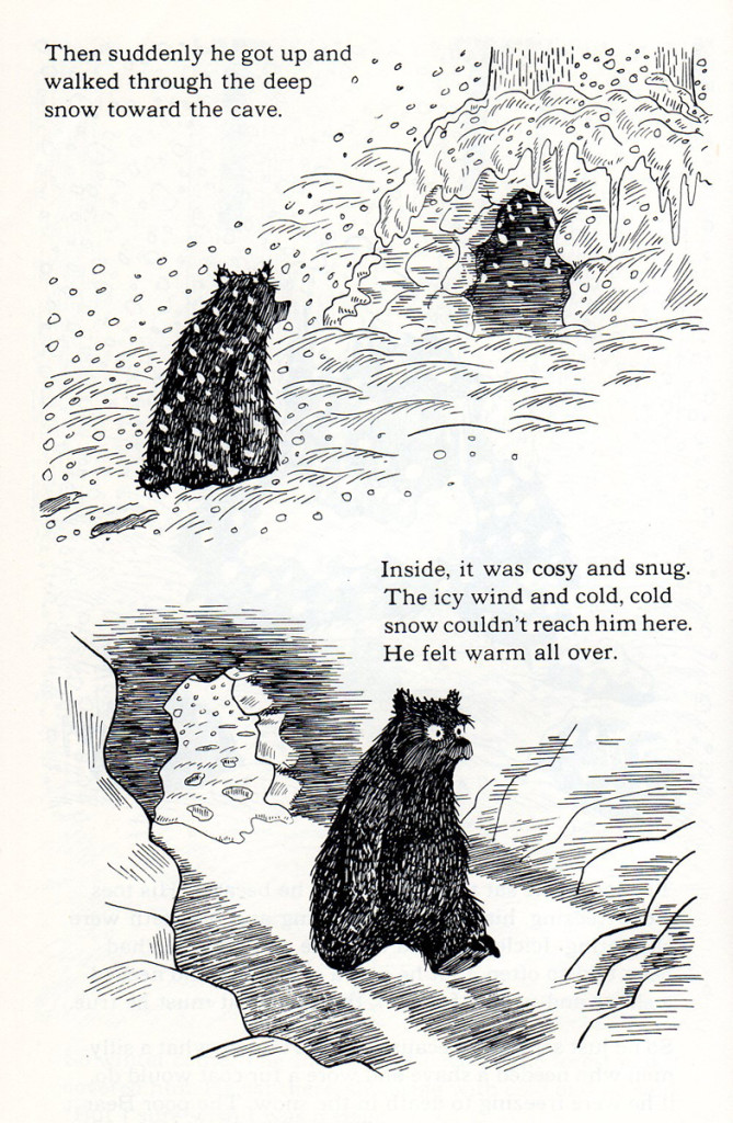
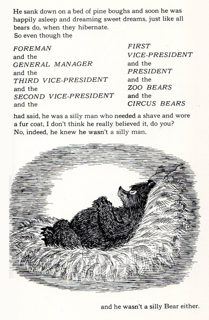
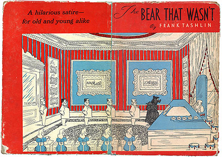
- I have always been aware of Frank Tashlin‘s book, “The Bear That Wasn’t,” and I have never liked it. Well, Bill Peckmann sent me a copy of scans of the book, and I realize that I’ve disliked it because of CHuck Jones’ insipid animated adaptation. When you look at the actual book and the beautiful illustrations, you realize how sensitive the material is and how beautifully handled it is. The illustrations are, in a word, great.
I’m so pleased Bill sent these scns to me, and I almost disgrace the post by ending with the Jones cartoon. It’s no wonder Tashlin disliked Chuck’s work. Take a look. First a lead-in by Bill:
-
Grim Natwick was an admirer of Frank Tashlin, and all I can say to that is… it takes a renaissance man to know a renaissance man.
Here is the 1962 Dover reprint of Frank Tashlin’s 1946 book, “The Bear That Wasn’t”
Enjoy!
 1
1The original cover
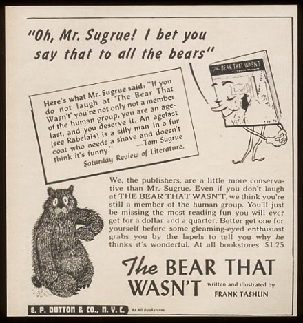
This was a publisher’s ad to booksellers
that came out when the book did.
Here’s the Chuck Jones cartoon as released by MGM.
It’s got problems that weren’t in the book.
They mostly come from Chuck Jones.
Articles on Animation &Books &Chuck Jones &Independent Animation 15 Dec 2012 07:18 am
Moviesmoviesmovies
- Turn around, and it’s the weekend again. I guess that’s a good thing. But Christmas seems to be coming so quickly these days. It was only yesterday that I was complaining that they were pushing Christmas on us so soon after Thanksgiving. Christmas carols when we had hardly finished eating the turkey! Maybe they were right.
As we get closer to Christmas there are fewer and fewer Academy events. Things were mellowing out already this past week. I was so happy to not have had a dinner or a lunch or a screening to attend last Sunday. I stayed home and was quiet while the weather, outside, was pretty lousy. One of those days where the rain is light enough that you feel stupid opening an umbrella, but the wind and the temperature made it so bitter out that it was great to be indoors – anywhere.
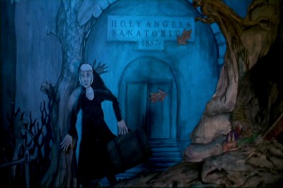 On Monday, I’d picked up a DVD for the animated feature, Consuming Spirits, at the Film Forum theater. The film should be seen on a big screen. It was shot in 16mm and looked pretty darn good in DVD. The story is complex, so I’m sure watching it focused in a theater would be better for the film. However, I loved it, just the same, and my review in the Splog on Tuesday was a foreshadowing of some of the reviews that appeared in the NY papers on Wednesday when it officially opened. This movie will be playing through Christmas Day; treat yourself.
It’s very positive that A.O.Scott in the NYTimes chose his top ten flms of the year. As usual he adds another five or six which he call his “honorable mention” list of films that came close to being in his top ten. Consuming Spirits was one of these “honorable mention” movies that take on a nice prominence.Mind you that I don’t always agree with Mr.Scott (e.g. my favorite movie of the year is not to be found on his list), but I do take pleasure when I see such a deserving, small film get the attention it deserves.
Read A.O. Scott‘s review for the NYTimes here.
Read the 3 star review by Farran Smith Nehme for the NYPOST here.
On Tuesday there was a luncheon at the Four Seasons for Les Mis̩rables. Some of the cast РAnne Hathaway, Hugh Jackman, Eddie Redmayne, Amanda Seyfried and Samantha Barks were all there. We entered a different room this time; this one had a piano bar playing. Uh oh.
During the meal, director Tom Hooper announced that, even though they’d had a late night the night before – there was a lot of drinking, I guess, at the premiere – the cast was itching to sing for us. Samantha Banke, who did a lot of musical theater in England,sang “Summertimne”. This was an odd choice given the temperature outside, but she did a great job. Hugh Jackman then sang a song to his wife which was a love letter to her. Anne Hathaway followed singing a Christmas carol with Eddie Redmayne, Amanda Seyfried and Hugh Jackman doing backup. Coffee was served and the lunch ended quickly. Tom Hooper didn’t even recite a poem, but he did take photos of the crowd with his cel phone.
On Thursday I went to an Academy screening of The Hobbit. If it resembled any of the Lord of the Rings movies (with endless battles going on among millions of computerized creatures) I was prepared to walk out. The film felt as though it had been written by one of those geeks you meet at Comic Con. Completely amateurish dialogue with cliché following cliché while all this good stuff passed on screen visually. The near-three hour length was exhausting. The score is great and Ian McKellan is a blessing.
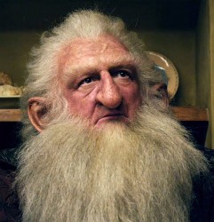 The film was shot at 48 frs per sec (and projected back at the same rate) which created a sharper more defined focus, closer in look to hi def video than film. There was one character, covered in hair, who I found extraordinary to watch without my 3D glasses. The focus on his skin was amazing, and I spent a lot of the first hour searching for shots of him without my glasses on. I later learned the character’s name, Balin. I hate to say it, but that was really the height of the film for me.
I also have to agree that the animation of the gollum was quite amazing. Not as good as the tiger in Pi, but worth the cost of admission for an animator. If Andy Serkis has anything to do with it, I applaud him.
On Friday night I followed up an ad in Variety that indicated a screening in town of the
 Japanese animated feature, The Mystical Laws, was showing for Academy members. In the end, I couldn’t go; work finally got in the way.
I still want to see Goro Myazaki‘s film From Up on Poppy Hill. I know that Bill Plympton hated it, but he and I often disagree on movies. The film won the Japanese equivalent of the Oscar, and it did enormously well in Japan. Somebody liked it; there’s got to be something good there. I’m going to keep my eyes open for it; usually GKids ‘ distributing it means there will be a chance of its eventually playing.
 Today, Saturday, the Academy has its screening of animated and live action shorts. The short-list (ten animated and ten live-action) will screen so we can narrow the selection down to five films for each category. I can select the animated films from my home since I saw them all and remember the ones
I like. However, I haven’t seen the live action shorts and want to vote for them. So we start with animated films at 10am, live-action at noon, and we continue through till about four or five. There’s a lunch at 1pm. A long day of movies. Looking forward to it.
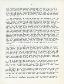
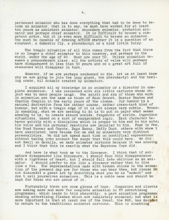
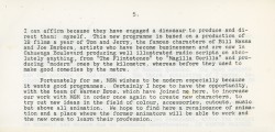
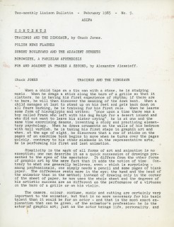
To add a bit of punch to this post, I’m placing an article Chuck Jones wrote in 1965 for an ASIFA International bulletin just prior to one of the early Annecy Animation Festivals.
 1
1 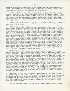 2
2(Click any image to enlarge.)
Animation &Animation Artifacts &Chuck Jones &Frame Grabs &Layout & Design &repeated posts 06 Aug 2012 06:38 am
Conrad – again
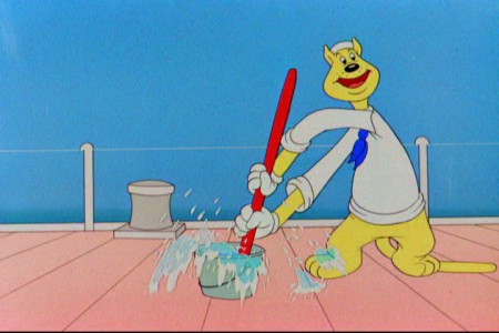
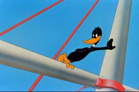
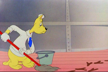
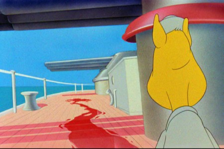
I repeat this post for good reason. This is one of the prime films John McGrew planned for Chuck Jones, and the work is just dazzling. However, to our eyes it hardly looks unusual. Many of the tricks here were done for the first time, and others are so seamlessly done that we hardly notice them. It just looks like another War cartoon from WB. It ain’t.
It’s special.
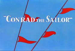 - Regulars to my blog know that I’m a big fan of the work of John McGrew. He was a designer/Layout Artist working in Chuck Jones’ crew at Warner Bros. in the late Thirties/early Forties. His work was daring beyond compare, and, I think, with support from Jones, he changed the look of modern animation backgrounds.
He designed the seminal film The Dover Boys as well as amazing pieces like Aristo-Cat, Inki and the Lion and Conrad the Sailor.
In an interview conducted by Greg Ford and RIchard Thompson, Chuck Jones was asked about McGrew’s style: 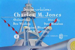
- Q: What about John McGrew’s style and approach, as compared with Noble’s?
A: John McGrew didn’t really have a style; he was experimenting all the time. Maurice does have a style. John McGrew, you might say, was more of an intellectual. You could be intellectual, and get away with it— but if you’re solely intellectual as a director, you weren’t going to get away with it. The result was, however, that he goosed me into thinking that it might be worthwhile to try some different things with backgrounds and so forth. And later on, I would find this kind of thing very useful, in that often it would make your gag work, and sometimes you wouldn’t even know why. Like that little abstract background at the end of Duck Amuck, with the sharply angled lines going off.
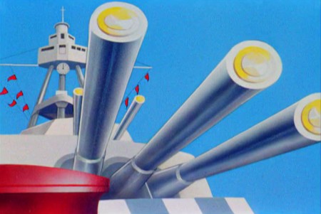
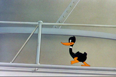
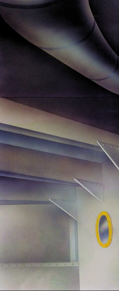
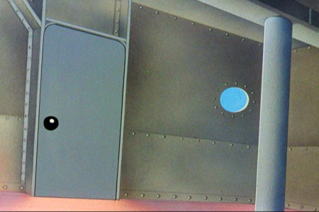
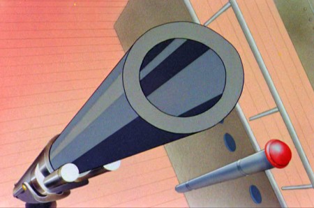
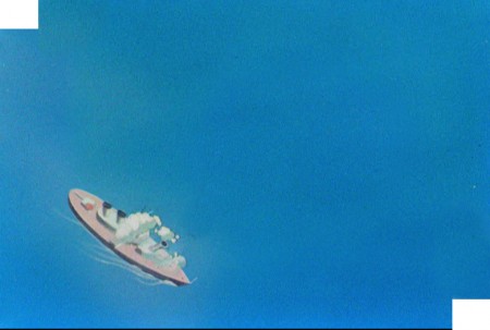
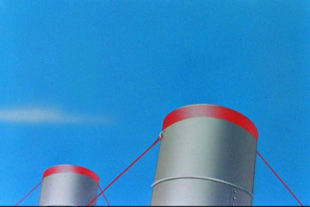
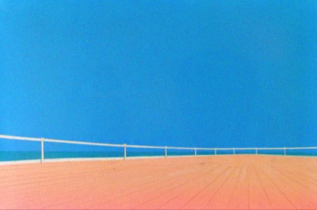
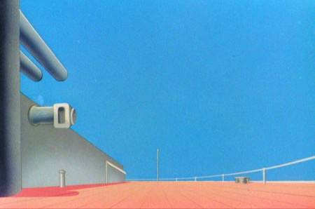
Today I’d like to feature some frame grabs from Conrad the Sailor. Where I could, I separated the characters from the backgrounds to just feature the Bgs. My guess is that the Bgs were painted by Paul Julian, but they were planned by McGrew.
The one scene I don’t illustrate is the most original in the film. Daffy is shot into the air with a bullet. (illus #18) The camera does a 360° turn to head back to the ship. The Bgs don’t hold up on their own. Lots of blue sky and wisps of cloud. It works in motion.
Of this short & McGrew, Jones says:
- . . . we used a lot of overlapping graphics on that particular cartoon so that one scene would have the same graphic shape as an earlier scene, even though it would be a different object: first we’d show a gun pointing up in the air, then in the next shot, there’d be a cloud in exactly the same shape. It gave a certain stability which we used in many of the cartoons after that. John McGrew was the artist responsible for that sort of thing. Conrad was also the one where we used the first complete 360° turn, when the characters went up through the air.
For more information read Mike Barrier’s excellent interview with John McGrew.
 1
1(Click any image to enlarge.)
The following BG pan can be seen in full to the left. I’ve broken it into three parts for a closer look.

 12a
12a .
.
———-(Continue scrolling down.)
.
.
.
.
.
.
.
.
.
.
 13
13
 15
15
A bicycle pan that keeps moving to the left.
 16
16
Continue moving right to left.
And here’s the cartoon.
Pay attention to the Layout in the sky from 6’25″ to the end.
It’s amazing.
Animation &Chuck Jones &Frame Grabs &Layout & Design 19 Aug 2010 07:48 am
Feed the Kitty
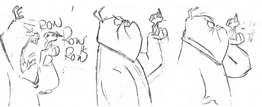
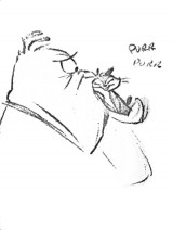
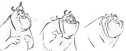
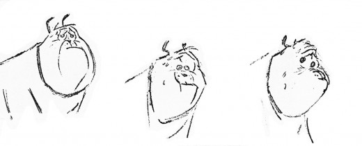
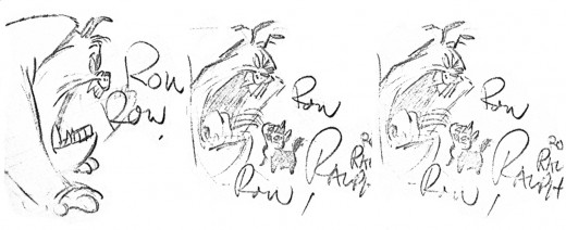
- I’ve always loved this sequence of layout poses Chuck Jones did for his short, Feed the Kitty. This, to me, was when Jones was at his greatest. All those Claude Cat shorts were just spectacular animation/layout/design. Here, Marc Antony falls in love with a kitty.
 1
1
This is how it looked in the final film as animated by the great Ken Harris. They broke it into a couple of scenes.
 1
1
Animation Artifacts &Bill Peckmann &Chuck Jones &Models 27 Jan 2010 09:47 am
Assorted Models
- As I’ve said in the past, I just love model sheets. And here are a stash of them on loan from Bill Peckmann‘s collection. Some good, some not-so-good, and some great.
Let’s start off with something great.
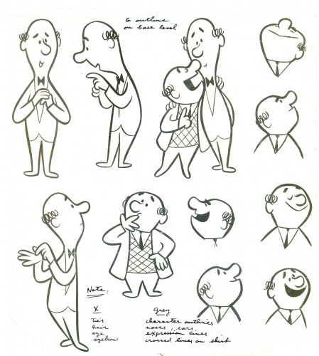
Bert and Harry Piels in a photostat
from the UPA studio.
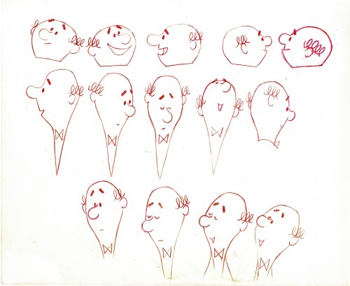
Here’s a head model for the Piels brothers
drawn in red colerase on animation bond.
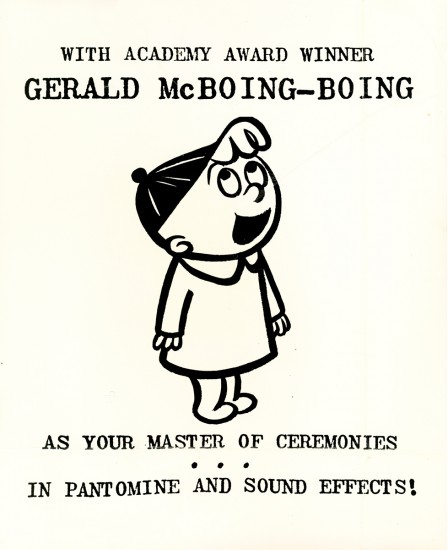
Here’s a B&W fading photostat of an announcement
for the Gerald McBoing Boing Show direct from UPA.
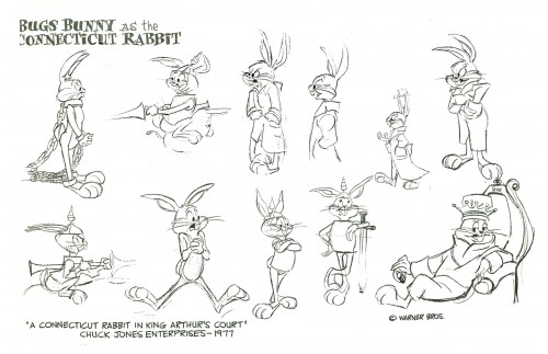
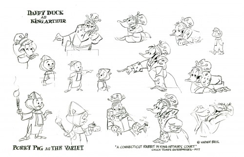
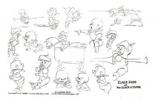
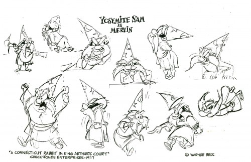
The following are some models from Chuck Jones’ not-so-good tv film
A Connecticut Rabbit in King Arthur’s Court.
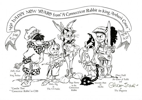
Here’s a HAPPY NEW YEAR card from 1978.
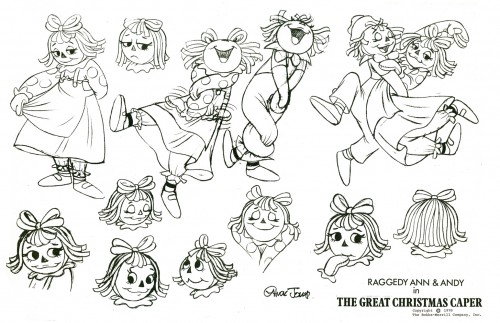
Finally the bottom of the barrel of a couple of models
from Chuck Jones’ RAGGEDY ANN & ANDY in
The Great Christmas Caper.
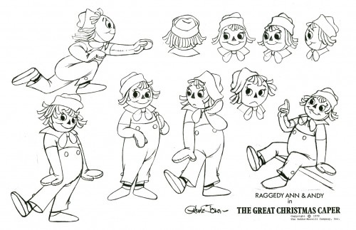
The characters never looked worse.
In his later years, Chuck reworked the WB characters into something
godawful, and here he takes Raggedy Ann and Andy way over that
cute/corny/ugly line. Too bad he didn’t pull Corny Cole into it.
