Category ArchiveSpornFilms
Animation &SpornFilms 29 Apr 2010 08:54 am
Matt Clinton
- The bulk of this piece was written in May 2006. I only feel stronger about anything I’ve said in it and have done some minor additions to the whole.
Matthew Clinton came to my studio in 2003. After a years worth of correspondence between us and my viewing his senior film dozens of times in multiple versions – all of which I found totally enticing and absolutely compelling to watch , I offered Matt a job and did what little I could to support his arrival.
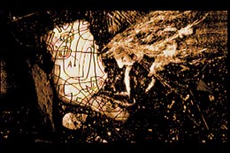
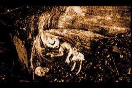
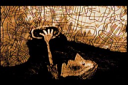
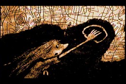
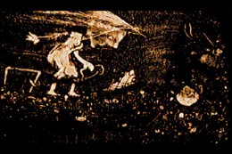
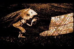
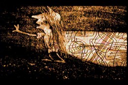
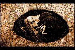
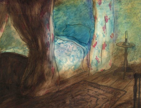
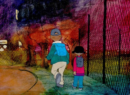
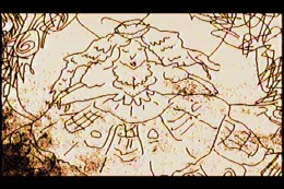
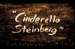 He came quietly into my studio and immediately took hold with his innate gift for masterful animation. What follows are hi-contrast frame grabs from his thesis film, Cinderella Steinberg. I interpret the film as an examination of the overwhelming power of art on the recipient, in this case poor Cinderella. Tomorrow, we’ll look at some of Matt’s work in the past three years. I urge you to enlarge some of the images; each frame of his film is a multimedia construction in itself. Leaves and dirt and straw and a Steingberg painting.
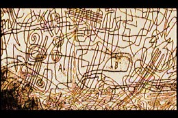
(Click on any image to enlarge.)
 One of the first pieces he worked on was animation for an HBO special entitled HAPPY TO BE NAPPY AND OTHER TALES OF ME. As a new guy, Matt was supposed to be plugging in some animation bits to fill out the show. I gave him lots of pieces that ended up dancing around my less poetic animation. He helped define the art style to match illustrator Chris Raschka‘s beautiful, loose watercolors.
Then, for the same show, I gave him a number of more limited short films to animate, himself. In the end, the two of us did all of the animation for the half-hour show (about 17 mins) in 2½ months.
Things got quiet for a bit, and he helped define the style of my in-progress feature, POE. We wanted it to match the daring graphics Jason McDonald was putting into his storyboard pages. Matt found a solution once I defined the problem.
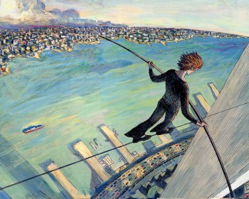 With The Man Who Walked Between The Towers, I dove into the meat & potatoes animation for the 10 min film and gave all the poetic pieces to Matt and Tissa David. By this time, I was aware of the talent I had working for me.
The scenes where Philippe Petit first steps onto the highwire were those done by Matt. Of course, I directed and coaxed elements I wanted from the scenes, but it was magic finding someone who so easily and quietly was able to give me what I sought and do it with such sublime grace and ease and so little fanfare.
 There were three films for PBS’s Between The Lions.
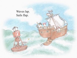
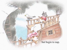
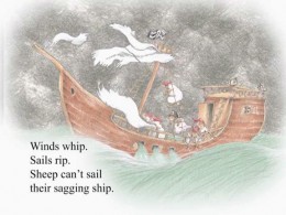
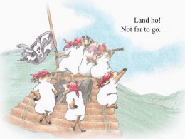
Sheep On A Ship is almost completely Matt’s. It was a delicate watercolor style from a best selling book that we had to match exactly. Needless to say, it did.
Here are stills from the PBS show,
Between the Lions:
Sheep On A Ship
(Click any image on this page to enlarge.)
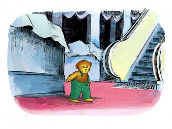 There were also five DVD’s we did for Scholastic & Fisher-Price. Each featured a world class, famous children’s book and included about 60 minutes of animation to illustrate the book and games included. Jumping over five different illustration styles in a few months and animating emotionally and delicately, Matt was able to always rise to the occasion and perform as a first rate actor with delicacy, grace and charm.
Corduroy for Scholastic/Fisher-Price
I obviously love this guy’s work. No doubt he brought a lot of knowledge away from CalArts, but he also brings an inherent world of taste dignity and charm to everything he does; that wasn’t learned in school. Matthew Clinton’s a rare talent.
By now, Matt just about runs the animation end of my studio and he’s earned my full trust and support. It’s gotten to the oint where I wonder how I could operate without him.
Animation &SpornFilms 04 Feb 2010 08:47 am
Moving feet – using it
- The other day I’d written about a pet peeve of mine. This is when animators take the poor layouts they’re given and simply inbetween them. As a result, the feet on two related layouts slide from one position to another. This is not something real people could or would do, yet animators do it out of laziness. It’s a sure sign that the animator isn’t thinking of the character as a living/breathing organism. It’s just a bunch of drawings to that guy.
How to fix the problem; it’s easy.
On an early short film of mine, I worked with an illustrator, Rosemary Wells. It was her first time seeing her characters animated. Consequently, she had a lot of involvement in the process. I ended up having to take drawing lessons from her – how to draw her characters. I travelled upstate at least half a dozen times to watch her at work.
In the end, she gave me a bunch of drawings that she hoped I would follow. In one key scene, she drew her character, Max, with feet facing one direction. Then in the next layout, his feet are facing another direction.
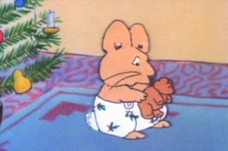 1
1 2
2 I could have just inbetweened his feet, or even let them pop from one position to another (as Elmer does in that GEICO spot). It would have looked horrible. Instead, I chose to treat the positions as animation moving from one foot to the other. I added a stop position in the middle for a reaction – pause.
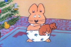
Then I let the scene play out.
Right side to watch single frame.
The end result gave a bit of character to Morris, and worked within the needs of the scene. A few extra drawings paid off. (This, of course, is not something you’d see in Flash – it’d just pop.) The way I handled the move made Rosemary Wells happy, and it made me happy. It took the monkeywrench she’d thrown at me to make something more alive, and I was happy for it.
Note that I’m not patting myself on the back. I’m just saying that this is something that should be second nature to anyone out there that considers themself an animator. If a layout you have to follow indicates feet moving, either change them or make them work.
SpornFilms 19 Jan 2010 09:19 am
Meeting Ray Seti
- I promised back in Dec 2008 that I would tell the story of how I met Ray Seti. He was a very nice, very experienced guy who had his own, small, one-man studio back in 1971 when I entered the world of film.
But first I have to back track to the point where I entered the business. I had a long hard time getting into the Hubley Studio (this is a long-ish story that I’ll tell another time, if I haven’t already.) When I’d gotten out of the Navy in October 1971, I was unemployed, and had just started to receive unemployment checks. I was receiving $72 a week for a couple of weeks when I’d done a mass-mailing of intro letters to every name in the Backstage Annual of studios that listed themselves as doing animation.
Back in those days, there were no computers, and copies were Xeroxes done on a shiny, coated paper. You couldn’t send copies of letters to many people without individually typing them up. So I did. I wrote and typed about a hundred letters to all these different studios, knowing full well that only about a dozen or two really did animation. A lot of small studios credited themselves as doing animation rather than lose a job. After all, how hard was it for them to hire people to do the work, if it actually came their way? But, what the hell, if one of those studios wanted to hire me, I’d prefer the work than the unemployment check.
The day after I dropped those letters into a mailbox, I got a call from Hal Seeger, himself.
Seeger was an ex-Fleischer animator, production manager who’d set up his own studio in the early 60s and did Out of the Inkwell, Milton the Monster and Batfink cartoons. Now he actually had a bunch of studios all under the one umbrella called Channel Films.
My letter to these studios was humble enough. I said I would do anything to work for them including mopping the floors. Seeger introduced himself and then asked, “Did you mean it?”
 I had a job. It paid $10 less than unemployment. I was a runner for the company. This meant I would help out editing as much as I could (they were doing a lot of work for ABC films.) My first job was to cut the commercials out of 120 episodes of The Smokey the Bear cartoon shows that were going to be sent to South America. By the end of that day I knew how to hotsplice, and my wrists were sore.
I spent a lot of time at labs (learning the lingo and the insider view of the labs), mixes (meeting big time sound mixers and seeing how it was all done) and working in Channel Sound helping Roy Valle create sound effects. Roy had worked at Paramount cartoons making S/Effx and had brought the Maurice Manne library with him to Seeger’s studio. I also did a lot of transferring from 1/4″ tape to 16 & 35mm mag tape.
Oh yes, I also swept the floors once a day and mopped once a week.
Lenny Bird was the guy at Seeger’s studio. He pretty much ran it, and he edited all those docs for ABC Sports and edited local trailers for NY’s Monday Night at the Movies. (Then it was Tues, Wed, Thurs etc. Night at the Movies.) I assisted Lenny in the editing, mostly 16mm. He taught endless amounts of film craft and really took me under his wing for the time I was there.
One night, Lenny, knowing I was interested in animation, said he was going to do some freelance work and wanted to know if I wanted to go with him to meet an animator, Ray Seti. I was there. Ray’s studio was literally around the corner. We were on 45th St; he was on 46th St.
It turns out Lenny had taken some freelance work editing a porno feature. Ray was lending his space (and editing equipment) to his friend, Lenny, to help out.
I spent a good hour talking with Ray. He was a brilliant draftsman whose animation business had reduced to his doing animatics for commercials. They would do these test commercials, then test them. If they worked, the films were made; if not, the agency didn’t spend millions. Ray had become the king of the commercial animatic in NY. He did all the work by himself and made a comfortable living.
After the hour’s chat, I said goodbye to Lenny and Ray and went home. Ray’s final advice to me for getting ahead in animation was to move to California.
I got to meet other animation people via the Seeger studio. Hal Seeger, of course, would infrequently tell me stories about the old days. He was a pretty big person in his telling, so I’m not sure how much truth was there.
 Myron Waldman would come in a couple of times a month. He used Seeger’s space as his own NYC office and would work out of there. He and Seeger were close and did a couple of small jobs during the time I was there.
Seymour Mandel operated and serviced the three fully functioning Oxberry cameras that Seeger had in the space. He was an old Paramount cameraman and
I practice inbetweened this ugly scene while at Seeger’s______had worked with Seeger since the early 60′s. He had a lot of free time and would answer my questions if I could get him in a good mood. The trick was that he was usually pretty cranky.
Six months later, I was about to be promoted to a full-time Assistant Editor. I said NO. It was all right to do it in the job I’d had, but actually doing the Titled job meant I was on the wrong career path. I wanted to be an animator and I had to quit.
This meant taking a gamble. It paid off in three months when the Hubley Studio came through. It gave me three day’s work that turned into a career.
Ultimately, Seeger folded his company into a bigger venture, Today Video. It was run by Beverly, his wife, and David, his son. I used their facility often (and never got a discount). Leny was the production coordinator for the tape house, and stayed with them until he retired somewhere in the early ’90s.
Commentary &SpornFilms 16 Jan 2010 09:11 am
Notes
- Every couple of months HBO Family schedules a lot of my shows for a one day marathon. Today’s one of those days. Here’s the schedule for the films on that channel in case you’re channel surfing looking to fill a couple of minutes:
Saturday January 16th
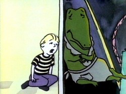 LYLE LYLE CROCODILE
2:00 PM HBO FAMILY – EAST
5:00 PM HBO FAMILY – WEST
THE STORY OF THE DANCING FROG
2:30 PM HBO FAMILY – EAST
5:30 PM HBO FAMILY – WEST
THE RED SHOES
3:00 PM HBO FAMILY – EAST
6:00 PM HBO FAMILY – WEST
EARTHDAY BIRTHDAY
3:30 PM HBO FAMILY – EAST
6:30 PM HBO FAMILY – WEST
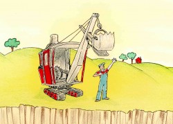 MIKE MULLIGAN & HIS STEAMSHOVEL
4:00 PM HBO FAMILY – EAST
7:00 PM HBO FAMILY – WEST
THE MARZIPAN PIG
5:00 PM HBO FAMILY – EAST
8:00 PM HBO FAMILY – WEST
THE LITTLE MATCH GIRL
5:30 PM HBO FAMILY – EAST
5:30 PM HBO FAMILY – WEST
IRA SLEEPS OVER
6:30 PM HBO FAMILY – EAST
9:30 PM HBO FAMILY – WEST
Each month I update the full monthly schedule of the screening of my work over at my site www.michaelspornanimation.com
- Variety, this week, had a couple of articles about animation that were probably designed to catch the eye of Oscar voters, but gave me a bit of reading about 2D, Hollywood style.
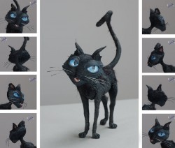 Strong voices toon up was nominally about voices for animation, but in this case, particularly Keith David who did a couple of voices for animated features this year. He was the villain, Dr. Facilier, in The Princess and the Frog and the cat in Coraline.
Retro sequence sings in ‘Princess’ is a short piece about the well-designed “Moderne” song number (“Almost There”) from The Princess and the Frog. I rather liked this sequence and would have hoped for more from Variety on this piece (probably also promoting the song for the Oscar). During Friday Night’s Critics’ Choice Awards, this was the song that was singled out for attention. It might have been nice if Variety had named an animator or designer in the article.
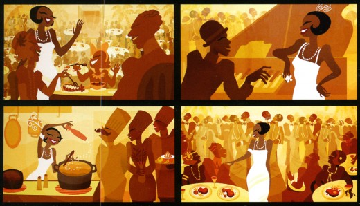
This image was pulled from Chronicle Books’ The Art of The Princess and the Frog by Jeff Kurti. The four images are credited to visual development artist, Sue Nichols. I would have liked to have seen more about this sequence in this book, as well. A total of two pages go to the standout sequence. Short shrift.
There were also quite a few lines about animation in other articles in Variety that perked my ears. This one, for example, had me wondering about the WGA:
“This year’s eligible WGA titles include an animated film — Henry Selick’s adapted script for Coraline from Neil Gaiman’s book. Since the WGA doesn’t usually cover animation, those screenplays are usually ineligible.”
Why are screenplays ineligible? Is it because animation is considered inferior by the WGA relegating animation writers to the Screen Cartoonists’ Guild? Ratatouille received a WGA nomination, though it looks as though Brad Bird was not a WGA member at the time.
Meanwhile the Oscar rules for music contribution have gotten a bit arcane and bizarre. This week it was decided that Randy Newman’s score for The Princess and the Frog was ineligible to compete for an Academy Award for the Best Score. The rule states: “scores diluted by the use of tracked themes or other preexisting music,
diminished in impact by the predominant use of songs, or assembled from the music of more than one composer.”
In English, that means there are songs so they don’t want the musicals to compete for score, too. Apparently this idiotic rule came in when Alan Menken won a number of Best Songs and Best Scores in a row. The board put a stop to that!
Why isn’t there still an award for Best Song Score? This existed for many years and now it’s a no-no. Pretty foolish. Just like the automatic selection of 10 films for Best Picture so that some popular films won’t be left out. The problem is this year there aren’t 10 films that I can name which are worthy of an Oscar.
- There’s an excellent article in the NYTimes (actually one of many) by André Aciman celebrating the work and the intimacy of Eric Rohmer. I still am sad over this week’s enormous loss.
Animation &Animation Artifacts &Articles on Animation &SpornFilms 09 Dec 2009 08:09 am
Interviewing Bridget
- For a short while I produced a quarterly publication, called Sporn-O-Graphics, that promoted the work and the workers at Michael Sporn Animation, Inc. It was mailed free to about 1000 people on a list we’d put together. The idea was to talk about our films and the people who had made them. There were a total of six issues of this paper. I’ve posted a couple of the issues or more interesting bits in them on this blog, (here and here) and today I’d like to post an interview that was in one of the last issues. Bridget Thorne was as important to me as anyone who’s ever worked here. Denise Gonzalez also worked for me – at the time she edited and put together Sporn-O-Graphics.
Behind the Scenes with
Bridget Thorne
Interview by Denise Gonzalez
Bridget Thorne is a background designer who has been an important part of Michael Spom Animation for more than fifteen years. In that time she has enhanced the look of MSA films with beautiful backgrounds that are, in a way, part of the characters rather than just a scenic backdrop.
 DG: How long have you been working with Michael Sporn?
BT: I first started working for Michael in 1979 on Byron Blackbear And The Scientific Method, a fifteen minute short for the Learning Corporation of America. It is actually one of my favorites. I started out as a scenic painter for plays. I worked with a designer and basically dressed the set. We’d paint the exteriors, lay in wallpaper, marbleizing floors, etc. I started at Williamstown and at Playwright’s Variety in New York, I did a lot of off Broadway and off-off Broadway.
DG: Do you see background painting as a complete picture or as a supplement to animated artwork?
BT: It’s a supplement.
 DG: How do you take that into consideration when you start the backgrounds?
BT: Ideally, I take into consideration how the characters are designed. I like the characters to be part of the picture, not stand out like they do in Saturday morning cartoons. It all fits into a stylistic sensibility or pace more than anything else. I’m not a cartoon snob, I’m more of a two dimensional artist than a filmmaker. I design my backgrounds and line style according to the way the characters are designed. What I used to try and do was color the backgrounds, to match the colors of the characters. You work out of your home rather than at the studio. What are the benefits or drawbacks of working this way? I’ve just started doing this and yes, there are benefits. I can get into my own head, and I take off more with ideas because I’m not interrupted as much. But I like being in the studio and staying with the rest of the production as it goes along.
DG: Do you prefer working on original stories or from an existing book?
 BT: It depends on the story. Let’s say IRA SLEEPS OVER, it was great working out here on that because with an existing story you have a style to imitate, and it is easy for a whole bunch of people to follow that when they’re all working in different places. So as far as production goes, that makes it easier. The great thing about original scripts is that they allow for an incredible amount of individual input. What do you take into consideration when designing the look of a film and what preparation is involved? It depends on the story. I tend to have a knee jerk reaction at first or an impulse. I have a Fine Arts background, and I tend to rely on painters. I find fine artists are more in tune stylistically with Michael’s films than the more hard-edged graphic cartoons. (Though I will look at Disney inspirational drawings.)
Then I look at the layouts and the character design, so I sort of work on intuition and impulse. Then I look at the existing elements and put those all together and come up with a design. As far as preparation goes, what I consistently do is make 5×4 sketches of design ideas. For ABEL’S ISLAND I did lots and lots of little paintings of winter and fall and spring.
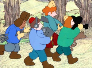
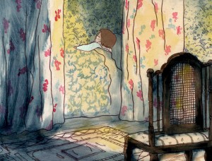
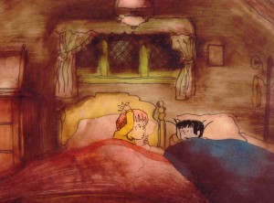
First three illustrations pictured above:
1. BYRON BLACKBEAR AND THE SCIENTIFIC METHOD.
2. A CHILD’S GARDEN OF VERSES.
3. IRA SLEEPS OVER
DG: When designing the film do you take into consideration that this will be seen by a child?
BT: I’m not a cartoony person so I don’t think about that. I tend to think more — sometimes I run into trouble this way — I think of it in a frame and ideally what I really want is a balanced look on the screen. A lot of times that’s hard because what I see in front of me is so different when it is filmed.
DG: What do you consider to be the best example of your work thus far?
BT: I guess ABEL’S ISLAND. I was able to abstract a little. I wasn’t confined to chairs and bureaus. I was able to match the mood of the movie to the backgrounds. If Abel was in trouble, I could put colors that indicated that, or I could abstract it. If something was calm I could paint it calmly. Abstraction, or looseness, is more my personal style. This is true of Michael’s style, as well.
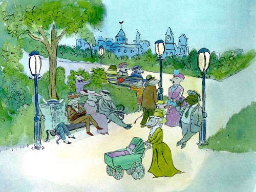
A scene toward the end of ABEL’S ISLAND.
DG: Have you ever worked on a film you couldn’t connect with?
BT: I’d say yes. It’s a hard question to answer off the top of my head. I sort of think of movies like they were kids; they are either noisy or funny or quiet or sad. They all have their own characteristics, and it is really the process of making the movie that attracts me to animation. I tend to have different feelings about each movie. But yes, sometimes a story irritates me or something comes in and it doesn’t suit my style or what I imagined. It can be very difficult. That’s an interesting thing about animation; there is really a sense of compromise; you are compromising all the time.
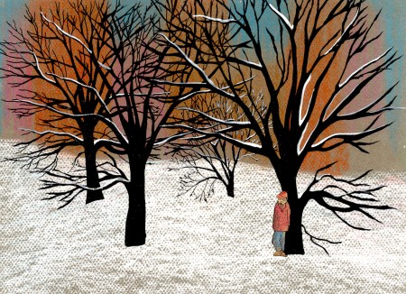
A scene of the narrator at the end of THE TALKING EGGS.
Books &SpornFilms 26 Nov 2009 08:54 am
Thanksgiving Jigsaw
- Here’s a short film I’d like to share, about a minute long. It’s a piece we did back in 1990 for Live Home Video and was part of a two-video project of nonsense poems. One tape contained poems by anonymous authors – Mother Goose and the like. The other tape contained poems by noted writers.
Russell Hoban is one of my favorite writers, so there are four of his poems included in the half-hour show. This was written by him and narrated by a young, non-actor girl who had a great voice. I’d worked with her previously on The Red Shoes.
Jason McDonald brilliantly designed and storyboarded the whole thing. He also did all the backgrounds for the two half hour tapes. This poem was animated by Sue Perrotto, who did some marvelous work for us.
Russell Hoban’s
Jigsaw Puzzle
Click left side of the black bar to play.
Right side to watch single frame.
I’ll put up a couple more bits of this show in the upcoming weeks.
.
SpornFilms &Title sequences 16 Nov 2009 08:39 am
Prince of the City
 - When you have an animation studio, and you have to keep paying the overhead, you end up taking some pretty unusual jobs. I once had a man who thought his poodle would make a great talk-show host. He wanted us to produce a talking poodle trailer which he would release on YouTube. The Royce Report was an entertaining two week job to push through. We shot the dog in live action against a green screen, We animated the dog’s mouth to the voice of the dog’s owner (who’d also written the piece) and pasted him into the photo backgrounds I shot. It paid a couple of bills for the week and is still on YouTube with over (or only) 17,000 hits.
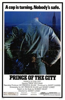 - One of my studio’s very first jobs was to do the titles to a big Sidney Lumet feature film, Prince of the City. The film was a hard-nosed crooked cop drama brilliantly directed by Lumet. The problem it had was that few of the actors in the large cast were known, and the audience was having a recognition problem. Treat Williams was in his break-out role and the only other identifiable actor was Jerry Orbach.
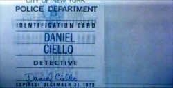
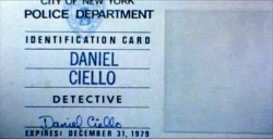
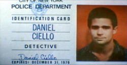
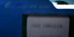
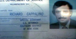
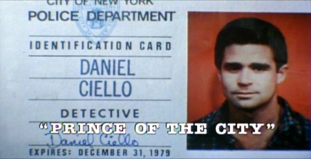
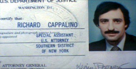
I was hired to ID all of the cops, lawyers, good guys and bad with what-looks-like live action identification cards. I also did title cards throughout the film, breaking it into chapters. Finally there were the end credits (no opening credits.)
I pulled in a friend and film genius, Phillip Schopper. Together we shot the actors with Polaroid film trying to make the photos look a bit cheesy, as the real items would. Phillip took the Polaroids and doctored them to our needs. Treat Williams, for example, had moved onto another film and came back only for these photos. His hair was now jet black for the new movie, so Phillip had to recolor his hair in the doctoring (in those years before computers.) Jerry Orbach had a blemish on his lip that he wanted retouched. There were plenty of little things to deal with on the photos.
I had to locate the real identification cards (NYC police dept, NYState Supreme Court judges and DA’s, etc.)
Then I had to forge them. I worked with a printing shop in NY that didn’t ask questions. We chose to actually print the cards as if they were done via mass production so that they would look authentic. I also had to find appropriate paper and laminating machines to get the actual look of these cards. This was all done before the wide use of computer technology.
We had to film the sequences.
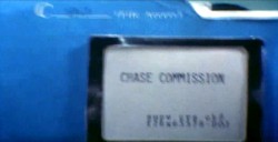
We worked with animation cameraman, Gary Becker for about a week and took over his Oxberry. We built miniature sets to hold the ID cards at odd angles, and we relit the cards with shadows built in. We wanted these cards to have a gritty reality to them that an animation stand didn’t generally offer.
The cards were animated moving as if a machine were printing them or a folder were being opened or papers were being tossed aside. This involved a lot of work getting out-of-focus images in the animation. When a folder opens, it moves in soft focus. The folder will pick up the top sheet and let that drop back again. We had to manipulate this all in stop motion to get it to work properly.
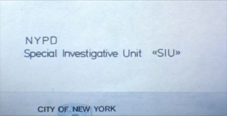
(Click any image to enlarge.)
 10
10
These cop cards (about five of them – one for each
of the five cops) appear twice. Once for the new enthusiastic cops.
Another for the tired and jaded cops.
There were about 8 insert sequences about a minute each.
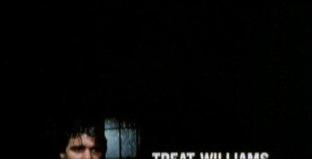
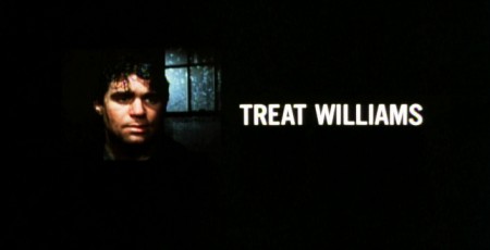
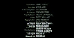
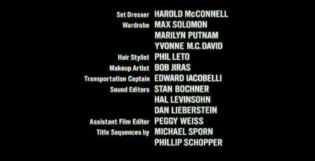
When it came time for the end credits, we chose to include photos of the actors with their names so that people would be able to recognize them from the film, without having to have had to memorize their characters’ names. We pushed these cards up as if a machine were printing the titles, a card at a time. The cards had to move in out-of-focus, as well. It was long and arduous shoot.
 4
4
All of the credits came up at varying speeds, timed to the music.
This was helpful in that all titles go through changes after they’re done.
Our system gave us a lot of flexibility to addd or change cards as
necessary without having to reshoot them all.
Sidney Lumet didn’t want me to have a company credit. I couldn’t include the studio name, Michael Sporn Animation, Inc. because he felt that people would try to figure out what was animated. He didn’t want them to know there was any animation in the film. Hmmmm.
I put both my name and Phillip’s as doing the titles and insert shots.
 1
1  2
2
 3
3
There’s actually a four frame fade out of the old credit list
as the new list zips up and in / out-of and into-focus.
I did quite a few other title sequences for Sidney as a result of this job, and I was pretty proud of the film and the job that I had done.
 1
1
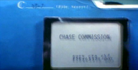
Records in a folder. The embossed stamp was a headache.
We shot the back of a card’s actual stamp in shadow, then we
printed it on a document in reverse on the front of our card.
 6
6
.
 1
1
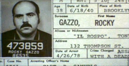
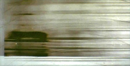
The microfilm look for mug shot records.
The slightly bad guys in B&W.
Commentary &Daily post &SpornFilms 10 Oct 2009 08:12 am
Sendak/Poe
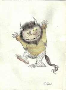 – NYC is currently celebrating Maurice Sendak. This obviously has all to do with the release of the new Spike Jonze feature based on the book, Where the Wild Things Are. The artwork, twelve drawings and two manuscript pages, will be on view in the Morgan Library‘s historic McKim building. The exhibit extends from now through Nov. 1st. (There’s a hefty admission fee – @12 – to the museum, but they also have a William Blake exhibit on display. As their catalogue reads: on display are “Blake’s most spectacular watercolors, prints, and illuminated books of poetry to dramatically underscore his genius and enduring influence.”)
The Animazing Gallery is featuriing another Sendak show. On display will be more than 200 pieces by Mr. Sendak. There will also be etchings, limited editions and posters for sale.
I’m sure you’re all familiar with the site Terrible Yellow Eyes, but I thought I’d mention it in case there are those who are not. It’s a site built to post artwork by invited artists who were inspired by Sendak’s Where the Wild Things Are. There are a lot of good, creative pieces on display at this site.
 – As you all may or may not know, I’m working hard to put together an animated feature length biography of Edgar Allan Poe. I have become somewhat addicted to information about Poe and have continually sought more. Even though the script is complete and some of the voices are recorded, I’ve been planning some significant changes to the scope of the script and story. Naturally enough, I have a site dedicated to this film (Poestory.net) and infrequently update information in the production notes section.
This is the 200th anniversary for Poe, and two interesting events have come to my attention:
. The NYTimes reported that two ceremonial burials will be held for E. A. Poe this coming Sunday to celebrate the author. Poe’s death was so peculiar that he ended up buried in a pauper’s grave, then moved to the current grave. Fewer than 10 people attended the original service. The city of Baltimore is hoping to get it right this time.
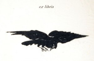
. Secondly, The Baltimore Museum of Art has just opened a show that features artwork that celebrates Poe and his stories. Lots of Manet (who did an illustrated version of The Raven – above right – in 1875), Odilon Redon and even a Robert Motherwell.
I’m seriously thinking about making a trip to Baltimore, soon.
Commentary &SpornFilms &T.Hachtman 06 Oct 2009 08:35 am
McLouvre/3DToys/Myazaki 2011-13
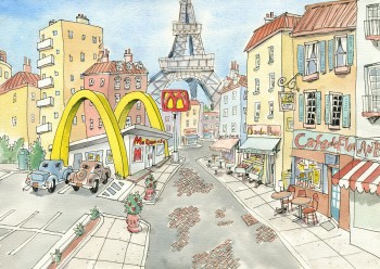 – The news that a McDonalds will be built within the Louvre is something of a shock to the system. For some reason, I would’ve thought this had happened years ago. Doing it now is somhow passé.
Last year we did a little short from the feature storyboard done a million years ago, based on Tom Hachtman’s comic strip Gertrude’s Follies. The segment involves Gertrude and Alice introducing Pabs (Picasso) to his first hamburger. Since our story takes place in Paris, they’re at a MacDonald’s within shooting distance of the Eiffel Tower. Had I known there would be a Mickey Dee in the Louvre, it would have been more appropriate to put it there.
Maybe we should redo the short.
- Last week Amid Amidi started several threads of a conversation about te economics of posting films on line. This was followed up by Mark Mayerson on his blog, going into contracts with some depth.
This all followed some thoughts I’d been having about a short film we did in this studio last year. I entered it into one Festival and was soon rejected. Since then I’ve been sitting on it, debating how to exploit it.
It’s the film, discussed above, the pilot for the Gerturde’s Follies film. It was just a kick making it in the studio in between a couple of paying jobs. I wouldn’t mind doing more of them and might actually go ahead with that idea. But for now, I’m making the rash decision to post the film here and now. I’m only going to keep it up for a week or so, and then I’ll replace it with some stills. But for now I’ll forego Frederator’s $50 or Cartoon Brew’s $200.
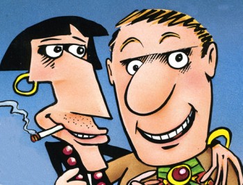
An image from the cover of Tom’s book
collecting some of the Gertrude Strips.
.
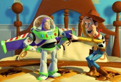 - On the NYTimes website John Lasseter talks about the “digital archeology” behind adapting Toy Story and Toy Story 2 into 3D movies. He doesn’t really say much, but you can hear his voice saying it while looking at stills from both films. (For actual information, read the accompanying article.) Lasseter sounds tired and listless, as if he were in the middle of a junket and had repeated this material a hundred times that day.
This slide-show feature on the NYTimes site often has some interesting bits to show or explain. The slide sow for Shane Acker’s 9 offered some details about the production design for the film. Similarly, for Coraline, Henry Selick takes us on a tour of shooting 3D with puppet animation. He details the differences between the real and the “other” worlds of Coraline. Lots of stills of drawings, puppets, people in process and screen shots illustrate the excellent narrative. For Pixar’s Up, Pete Doctor takes us on a backstage tour of the character development behind the film. There are lots of models and early stills of artwork as they get to the characters. Each character also has its own sound cue. This is a sophisticated talk from Pixar, one wonders why so shoddy for the 3d re-releases.
.
Daniel Thomas MacInnes writes on his The Ghibli Blog that Miyazaki is working on not one but two features: one for 2011, the other for 2013. Daniel doesn’t have titles or news about what the films are about, baut he does investigate the idea that two films would be so closely produced, back-to-back. Interesting if you’re a Miyazaki fan.
 The Shadows Dream is the latest Op Ed animation offered via the NY Times by Jeff Scher.
The intro on the Times site reads:
“Fall’s later sunrises bring longer shadows to the morning rush hour. On any particularly sunny morning, the shadows of people in the city seem to constitute a fleeting parallel universe at our feet.”
Jeff is really on to something with this piece, and I can imagine it going a lot further than it does here. I hope he continues with these experiments. Again, Shay Lynch’s music is exceptional. (I’m curious to hear the score he wrote for Paul Fierlinger’s feature.)
Commentary &Photos &Richard Williams &SpornFilms 09 Aug 2009 08:22 am
My Space – photoSunday recap
- I’ve had a number of different spaces over the years, and I’ve loved them all. Here’s a recap of a post I did back in Feb. 2007 which showcases a couple of those spaces.
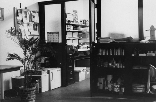
Thes are the only pictures I have of my very first studio. Originally I set up in an apartment leased by Richard Williams. I took care of his apartment while he was out of town (most of the time), and we did Woman of the Year out of that space. (You can see photos of that space here.) Once it became clear that I needed my own space, I found one in a building at One West 30th Street.
It was an historic building and a very interesting site. Every floor was decorated differently, and except for the second floor it was completely housing. The second floor had about half dozen office spaces. Two of them were Persian rug dealers with whom we spent time drinking a lot of Turkish coffee. (This area of NY features quite a few rug sellers.)
My office looked like something out of Sam Spade. All these steel and glass partitions broke the space up into two parts. In the photo above, I’m standing in the larger space (maybe 20 foot squared) which leads into the back area, my space. This was possibly 10×20. I loved it.
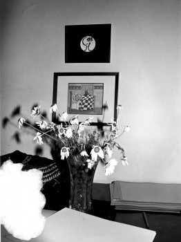
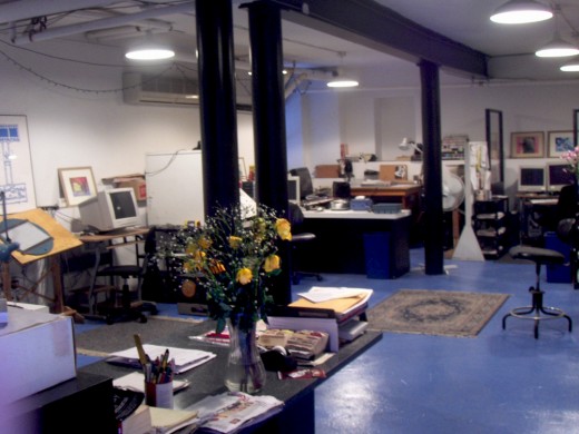
The B&W photo above left is the only other picture I have from that space. The framed cels are from Woman of the Year; it sits above the end title image from Morris’ Disappearing Bag. Both of these were done in 1981-82. Hence this photo dates back to 1982. The color image above was taken this morning from the vantage of our current studio’s front door. The flowers are on the front desk.
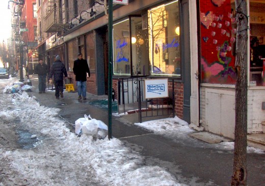
Last week we saw a day of heavy snow/rain/sleet which left the City covered with 3-4 inches of iced snow. A week later it still covers most of the town. Garbage is piling up a bit more than usual and construction has slowed down – just a bit.
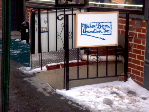
This is the front of my building. A gypsy fortune teller sits just atop the entrace to my space – down a dozen steps. There’s a knitting shop (red for Valentine’s Day) next door. They have a cafe wherein many women seem to gather to knit. (I’ve only been in the store once, but it’s usually filled into the late hours.)
This is the actual entrace down some icy steps.
Once you go down these steps you have to walk down an icy, outdoor corridor. On the left you can see this corridor from the street side. On the right it’s from the studio side.
Finally. from the front door of this studio you see this space. (I’m literally standing in the doorway.) This room has four stations equipped with drawing tables and computers as well as two other computer setups. The editing station is all the way in the back right. Matt Clinton, our principal animator on staff, works to the back left with Katrina Gregorius working just to his front. Christine O’Neill, my assistant, sits behind the flowers, up-front.
My room is in another room to the right.
