Category ArchiveSpornFilms
SpornFilms 07 Apr 2006 07:50 am
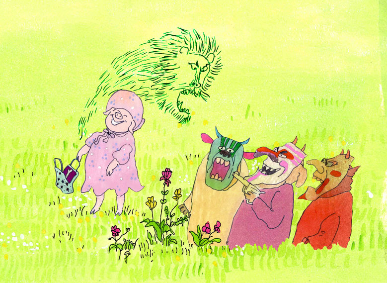
Airing It Out
 – Coming soon to a theater near you . . .
I mean, The Amazing Bone will be screened at the Museum of Modern Art on Saturday, April 15th at noon. It’s part of the Family Film programs run by the museum. I’m glad to be playing on the same program with Steve Segal’s film, Russian Rooster.
- To continue the self promotion . . . the new season of Between The Lions begins this month on PBS. We have three book adapted films in the series. Check your local listings for times.
Airing on April 17th is Knuffle Bunny. An adaptation of Mo Willems’ Caldecott Honor book.
On April 24th, is Sheep On A Ship. It’s adapted From The Book By – Nancy Shaw and Margot Apple
Finally, on May 8th Jamaica Louise James will air. It’d adapted From The Book By – Amy Hest and Sheila White Samton.
All three pieces, in one way or another, have these talented folk involved in the production:
Directed by – Michael Sporn
Animated by – Michael Sporn, Matt Clinton, Diego Turcios
Production Coordinated by – Adrian Urquidez
Edited by – Paul Carrillo
Rendered by – Adrian Urquidez, Matt Clinton, Diego Turcios, Clio Calman, Rachel Coleman
These were fun to animate, and I think they work well within the shows. (I just got final copies from the producers, and I must say the program looks great.)
SpornFilms 06 Apr 2006 07:21 am
Champ
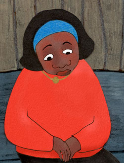 – Our heart goes out to Champagne Saltes Robinson whose mother, Genevieve, passed away Monday afternoon of a heart attack.
Champagne, of course, was the featured character in my film, Champagne. It was her life story – up to age 14 – that we tried to document in animation back in 1997. Champagne was raised in a convent while her mother was imprisoned. She also worked in our studio for a short while as a runner. (She got to do a bit of coloring on the film about herself.)
Champagne has just moved back to New York from Denver with her husband and one year old son, Jaysin. I’m sure it’s a sad return, but we wish her the best.
~
- John Celestri’s comments on my Double Lives page prompted a lot of thought.
Michael Barrier on his site talks about the one film/one character model as perfect for animation. This made me think about the animator that is asked to do more than one character on a film – and possibly sharing all of them with other animators. But for the sake of argument, let’s say that one animator is the only one to do those several characters.
Now let’s talk a little about my world – the one of Independent, short films. In shorts, there are two kinds of films – those with budgets and those without. Even within those two groups there’s play.
The early Disney films tried to break things up by character – there was the Goof specialist, the Mick specialist, the Duck specialist. Warner Brothers had the supervising director who dominated. This certainly had a lot to do with the way the studio was set up and the budgets. Only with a dominant director like Clampett or Jones and animators, who fell well within their way of thinking, would a rich style jump out.
Rooty Toot Toot followed the strong director mold, but it also broke the film up into characters. Masters like Grim Natwick and Art Babbitt took charge of principals – each telling their side of the courtroom drama. Hubley did a variant of that when he went solo. He knew what Bill Littlejohn, Tissa David, Barrie Nelson or Phil Duncan would give him, and he cast them accordingly.
But then the Independent world of today has the director as animator. Bill Plympton not only draws all of his characters but does the backgrounds as well. George Griffin and John Canemaker do the same in their short films.
There are many variants of the model caused by circumstances outside of the film that mold how that film will be done. Even knowing that the best way may be one animator/one character, the Independent film maker still has to try to make it work the best way possible for all those circumstance and still bring a soul to the short.
In the film mentioned above, Champagne, I was pretty much all that I could afford. For a good part of the film, purposefully, I worked without a storyboard. I improvised the scenes as I went (knowing full well what would come next – in my head).
In the middle of the film, when Champagne’s life started to settle down, I brought in someone I worked with frequently, Jason McDonald, to storyboard the last half of the film. He brought a completely different direction to it, and it allowed me to open up and improvise on his methods. I bought myself – and the Champagne character in the film – a security blanket to fall back on. I’d bet no one watching the film can tell where Jason’s work started, but I think the outside alteration gave more depth to the animation I was doing. A change for me and the character.
Animation &SpornFilms 01 Apr 2006 08:33 am
Bunny-itis
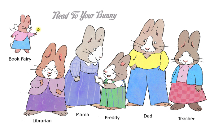 – We’ve finally finished the “artwork” on Reading To Your Bunny (not my idea of a title), and I ‘m pleased – sort of.
The film is based on an idea of Rosemary Wells‘ loosely presented in one of her books, “Read To Your Bunny.” She’s done a script, reworking the material, and we did a film. It uses an amalgam of her style of characters culled from a number of books.
The principal idea behind the story is to teach parents to read to their children. By reading aloud to their children, the kid will then get the impulse to read to themselves. It’s been proven and has been recommended by child psychologists for years. It’s just that people don’t realize the facts behind it. We did a film for UNICEF years ago which revealed the same information in a more straightforward way. It’s even been found that reading to a child in the womb has cognitive effects on the child. There’s quite a bit of research to back it up.
Anyway, this film is done – or at least the artwork is done. We’ll have it edited, locked and ready to go to mix by Tuesday. However, the music won’t come in till Wednesday, so we’re certainly on a schedule – of sorts. Not a moment too soon.
The film is scheduled to appear at the Tribeca Film Festival in a couple of weeks. (See the Mar. 26 posting.) It’s also already being sold to schools and libraries, and they have to be shipped by the end of the month.
When I finish a film like this, there’s some relief that it’s done and out of my hands, but there’s also disappointment that I’m not still in the thick of it. Even though it’s obviously not a career highlight, it’s a project that I’ve put a lot of care into, and got some satisfaction in the work, itself. The characters usually, in an odd way, grow on you.
We don’t have another job backing into it, so I’m going back to the POE film and will work on one of the stories. Perhaps we’ll do that as a short and put it out before the whole film is complete.
SpornFilms 29 Mar 2006 07:47 am
More Bridget BGs
I’d like to call attention to two more films Bridget Thorne designed for me.
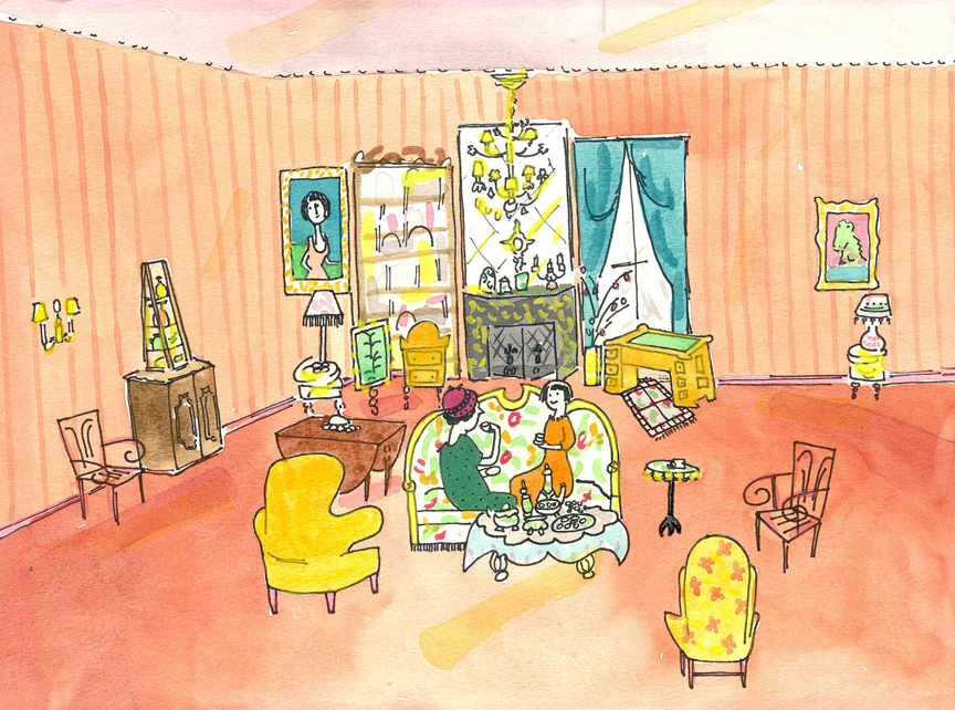
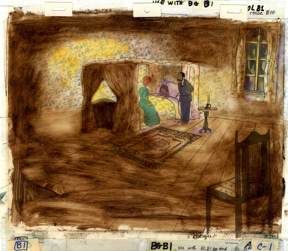 A Child’s Garden of Verses presented new and different problems to explore.
It was a project generated by HBO. Charles Strouse and Thomas Meehan were going to write the book and song score. We met several times trying to discover a way into the book of poems. I’d suggested we use the verses in Robert Louis Stevenson‘s book to illustrate the author’s early childhood.
(Click on any image to enlarge.)
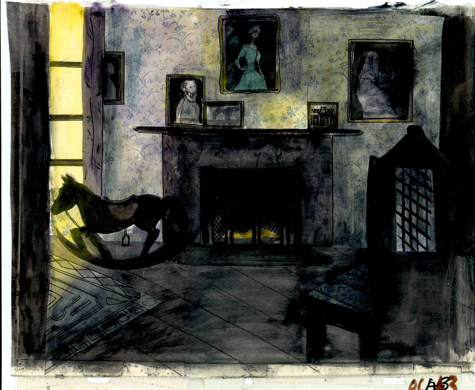 Stevenson was a sickly boy who was always confined to his dark room. He was not expected to live long. The only visitor for days on end was his overprotective mother.
For much of the film, we had only the dark, child’s bedroom to explore. Artistically, I asked Bridget to delve deeper into the photgraphic dyes that she had discovered and used so well in Ira Sleeps Over. These dyes would allow us to keep the style, once again, loose while exploring dark areas and brush strokes to simulate the darkness “Robbie” lived in.
For the wallpaper throughout the house, Bridget used real wallpaper which was photostated; scaled down and reshaped to fit the backgrounds. Then watercolor washes colored these backgrounds and overlays were mixed and matched to get the desired results.
 I was never quite pleased with this film. The elements that worked well worked really well. Bridget’s work was a highlight. The acting was extraordinarily good. Heidi Stallings performed with an enormous amount of emotion yet barely raised her voice above a whisper. Jonathan Pryce was brilliant as Robert Louis Stevenson, the narrator and even sang a song when asked at the last minute. Gregory Grant as the young “Robbie” was vulnerable, sweet and all we could have hoped for.
However, there was too much of a rush given the delicacy of the piece, and the exterior backrounds done by me for the end of the film are poor. The animation is also hit and miss. Oddly enough, my favorite sequence used little actual animation but intense camera work. Ray Kosarin was the animator in charge of it, and it’s an impressive sequence.
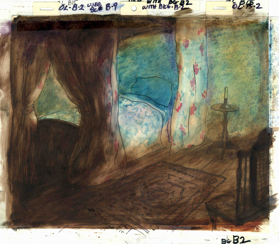
- The Talking Eggs was done for a PBS series called Long Ago & Far Away. It was an adaptation of a Creole Folk Tale which Maxine Fisher updated for me. (Lots of discussion between WGBH, Maxine & me about what distinguishes a Folk Tale from a Fairy Tale. It seriously impacted the story we were telling and I wanted what I wanted and got.)
Bridget chose to use pastels and we searched for a paper that would bring out the most grain. I loved the end result. The characters, to match the look of the Bgs, were xeroxed onto brown kraft paper and colored up from there with prismacolor pencils. This was cut out and pasted to cel.
 Danny Glover was the narrator, and we chose to make him an on-screen character appearing intermitently in the film. His narration was recorded on a rush as he stopped off in LA from SF on his way to direct a film in Africa.
There’s a focus in these backgrounds that matches the content and mood of the piece, and it worked wonderfully for my purposes. I always like it when the medium is front and center; I want audiences to know that they’re watching animated drawings, and texture usually helps to do this. Of course, I also want the films to have a strong enough story that the audience gets past the point of knowing, to enter the film. It works some of the time, and I’m in heaven when it does.
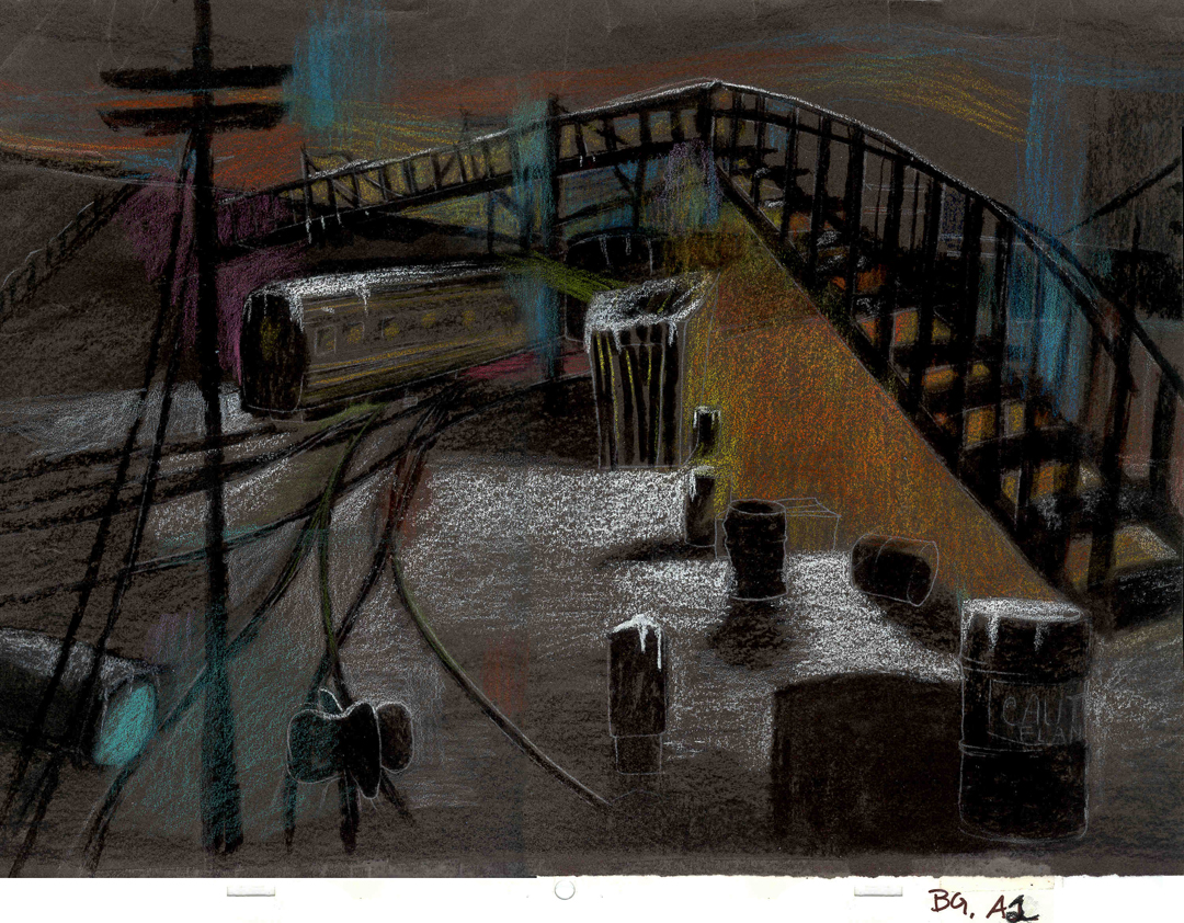 Bridget altered the color of the paper on which she was coloring with the chalks, and the different colored papers represented varied moods from sequence to sequence.
Naturally, there were some problems with the chalks under camera. All the fixative in the world didn’t stop the chalks from bleeding onto the cels or platen on the camera. (Lots more cleaning involved than usual.) We heard constantly from our cameraman, Gary Becker. The extra effort was worth it; the look was unique and successful.
SpornFilms 27 Mar 2006 08:12 am
Bridget’s Art
Lost in my Web Host’s upgrade was my tribute to Bridget Thorne, and I want it there for her. So, with this post I’d like to give some attention to one of the artists who have worked with me over the years.
Bridget Thorne is someone who has been an invaluable part of the history of my films. I hope to feature some of her work in the next week.
She has been an extraordinary Art Director and Background painter on quite a few of my favorite films produced within the studio.
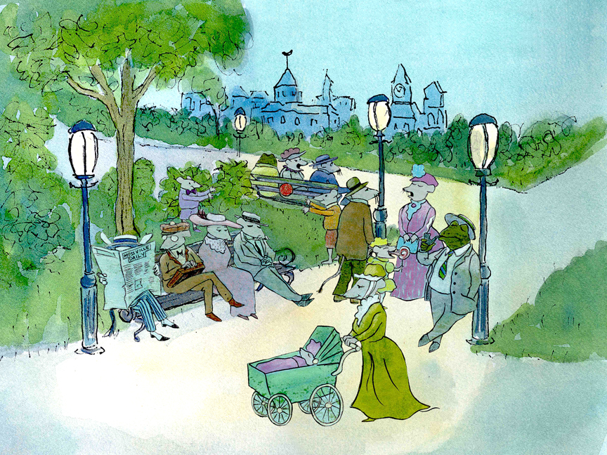
(Click image to enlarge) Lyle, Lyle Crocodile (1987)
This painting is a key transition point in Lyle, Lyle Crocodile. The film had a looseness that Bernard Waber‘s original book art had engendered. I felt very much at home in Waber’s style, and I think Bridget did as well.
She worked out a color scheme for the film, and we both agreed to follow it closely through the film. Liz Seidman lead the character coloring. Bridget, of course, had a strong hand in all those character models, as well.
The scene pictured above follows the introduction of Autumn on “East 88th Street”, and the background brings us full force into it as we get “the girl’s first song” – Mrs. Primm’s report on what it’s like to have a crocodile living in your house.
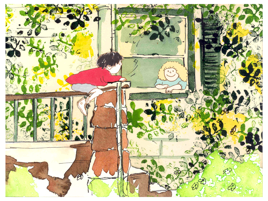
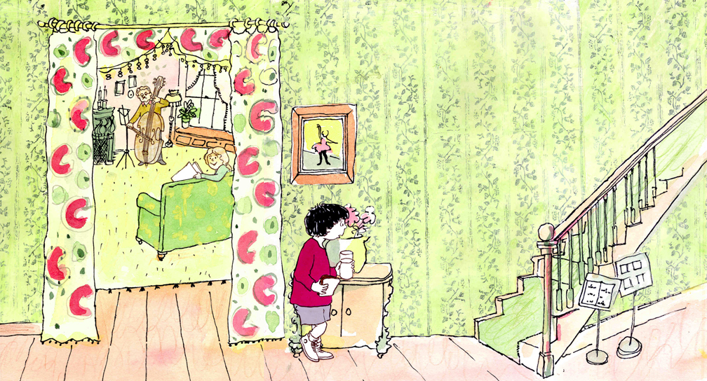 – Ira Sleeps Over was the second children’s book by Bernard Waber that we adapted. This is a very sweet story which involves a sibling rivalry; it focusses on a teddy bear and a sleep-over party. I pulled composer, William Finn, into the film and he wrote some great tunes for it. Prior to doing the script, I gave him the book and asked him to figure out where he would like the songs. In a week he had already written all the songs for the film, and they were brilliant. It turned out he used all the words of the book in his songs, and now I had to find a way of telling the same story using past, present and future tenses, as he did in the songs. It was a good challenge that worked out well and created a fabulous construction for the story.
 The style in this book was, if anything, looser than in Lyle. Waber did a lot of his illustration featuring duplicating printing techniques. Lino cut enabled him to repeat decorations throughout the settings. Bridget played with the lino cuts and was able to succesffully duplicate the technique in the backgrounds. In this one bg, at the beginning of the film, the foliage is a good example of this technique, printed over watercolors. The characters are markered paper drawings cut out and pasted to the cel overlays.
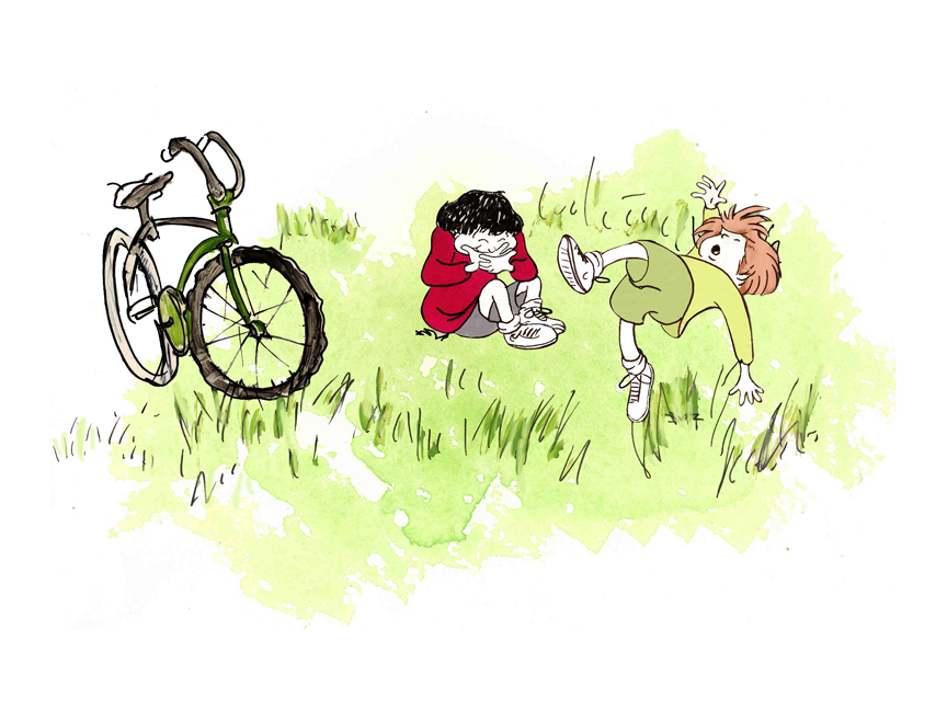
The book, like Lyle, featured a lot of white space, so we followed suit. When a book’s been in circulation for over 25 years, you have to realize there’s been a reason for it; find the reason and the heart, and take advantage of it. This use of white space made the actual backgrounds oftentimes little more than abstract shapes of color with a solid object on the screen. Here, for example, we see Ira and his friend, Reggie, playing against a blast of green and a bicycle.
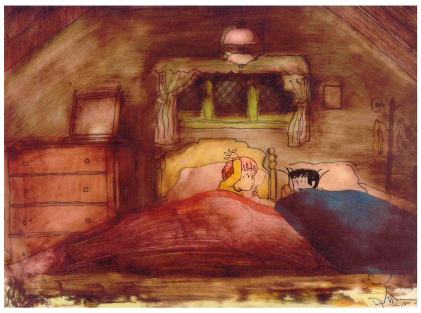 – At the end of the film, Ira and Reggie talk in the dark at the sleep-over. To get the look of the dark Bridget had to come up with something clever. The book resorted to B&W washes of gray and wasn’t very helpful. She came up with some dyes that were used for photo retouching. By quickly painting these lightly onto cel levels with a wide brush, she was able to get translucent cels with the brush strokes imbedded in the color overlays. By placing these overlays over the characters and backgrounds, we got the desired effect that let it feel connected to the very loose style of the film.
 -Abel’s Island is one of the few films we did that I treasure for its artwork. Bridget’s work on the backgrounds was, to me, extraordinary. The looseness I love was developed into enormously lush backgrounds using shades of green that I didn’t know could be captured in the delicate watercolors.
This film was a complicated problem that seemed to resolve itself easily and flow onto the screen without much struggle. The book had won a Newberry Award as best children’s writing of its year. It was not a picture book but a novel. The more than 120 pages featured fewer than 20 B&W spot drawings by author/illustrator, William Steig. We were on our own with the color.
 However, we had adapted Doctor DeSoto and The Amazing Bone as shorter films and could use what we’d learned from Steig on Abel. Bridget topped herself.
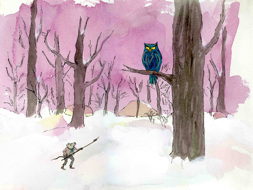
Several of the animators gave us more than I could have expected. Doug Compton‘s animation of Abel sculpting his statuary and living in his log was heart rending; Lisa Craft‘s animation of the big pocket watch, the big book and the leaf flying sequences was nothing short of inspired; and John Dilworth‘s animation of the owl fight was harrowing. This was all set up and completed by Tissa David‘s brilliant animation of Abel in the real world with wife, Amanda. She established our character.
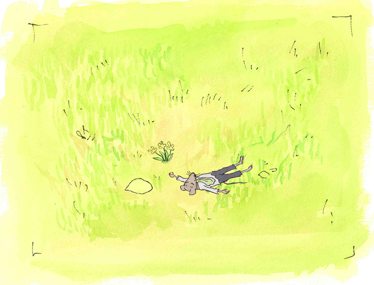
 – At the end of the film, Abel, who has been separated from his new bride, trapped on an island for over a year, finally gets to come home. He sees Amanda in a park at twilight but decides to hold back. He races on ahead of her to greet her, privately, at home. The park sequence has a busyness as an acute counter to the lonliness we’ve watched for the previous 90% of the half-hour program. Setting it at early evening gave an opportunity for rich, royal colors. Bridget took full advantage of the opening, and underscored it all with a regal green not seen earlier. It was stunning and is one of my favorite backgrounds in the film.
Miyazaki &SpornFilms 13 Jan 2006 08:44 am
Poe
This and That:
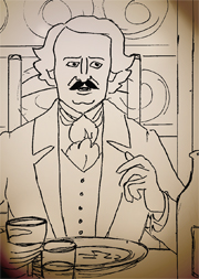 Friday the 13th. As of today we’re introducing a new page to our website. The POE Page will feature material from the long-in-development feature film that we’ve been preparing. We’ve now accumulated enough artwork and other materials that we feel it deserves its own chronicle to record development. Here you’ll find a journal which we’ll update on a weekly basis, storyboard sections from several of the Poe Tales, story reel from Tissa David’s biographical section, preliminary layouts and clips of animated color tests. All of the artwork is preliminary, nothing completed or finished. None of the film’s voice tracks are final. It’s all rough; a chance to see a film in the making.
Go to the Filmography section of our main site; click on the POE link. (Alternatively, click here.)
This page represents more excellent work by Adrian Urquidez who has been maintaining this site since it’s premiere last month. He’s done brilliant work, I think.
Last night I returned from a screening of The Libertine and turned to Miyzaki to cleanse  my palate. I watched about an hour of Laputa, Castles In the Sky and taped the rest for later watching. I have the original language dvd but hadn’t seen it before.
The John Lasseter introduction was a bit over-the-top. He said, several times, that the film had the greatest opening of any film in history. The opening was evocative but one wonders if he’s seen Citizen Kane or even The Lion King.
Lasseter’s comments about Miyzaki’s storyboarding process was revealling, though. Since Miyzaki writes the screenlay and storyboards his film entirely by himself, he doesn’t always know where the film is going when he starts. He draws it out one picture at a time and allows it to develop on its own. I would suspect that’s why some of his films, such as Laputa, are little more than set-pieces building toward an end. One would guess by some of the later titles such a Princess Mononoke and Spirited Away (though that film also does have a lot of episodic adventures, albeit longer ones) that a grander scheme was planned prior to beginning the storyboard.
Again the dubbing voice work was hit and miss, but not quite as bad as Princess Mononoke. Anna Paquin brought a delicacy to the part she played. She’s turning into a very good actress. James Van Der Beek tried to match her but didn’t quite. I always felt he was trying to make his voice sound younger. Cloris Leachman tried her best with the character she had – an old hag (or at least that’s how the English dubbing director saw it). Mark Hamill has been doing some excellent voice-over work for quite some time; I’m surprised no one’s made more of it. Was Wizards his first?
 Hoodwinked opens in NYC today.
Here are links to a couple of reviews (Ouch!) I’ve scanned: NY Times, NY Daily News, NY Post, Newsday. None are enormously positive.
Will it outgross King Kong or Narnia this weekend?
SpornFilms &Story & Storyboards 12 Jan 2006 09:04 am
Boards cont.
Storyboards continued:
Yesterday, I posted some storyboards from my film, The Man Who Walked Between The Towers. This film is an adaptation of a well recognized book by Mordicai Gerstein.
 An adaptation is an animal unto itself. I think most people believe that adaptations are easy to do, but I think that appearance is deceptive. Aside from having to exactly replicate the art of the book, you have to try to capture the essence of the book. A work like Goodnight Moon is a classic; it’s been in the hands of children for more than fifty years. Making an animated version that feels special to all those readers is harder than animating something I’ve developed on my own. Likewise, an award winning book like Mordicai Gerstein’s. If something works in a book, it doesn’t necessarily mean it’ll work in a film.
The key to me is to understand what the author was trying to do. Where is the key point in the book, where is the climax, where is the message being stated. How and why?
The storyboard I used to illustrate yesterday’s post is absolutely the heart and the height of that story. In the book, Mordicai Gerstein includes two fold out pages that extend the illustration beyond the length of the book to the width of four pages.

This is a positioning of the character and birds against the original BG.
In the storyboard I put together (see yesterday’s post below) I merely redrew the images as depicted in the book: Philippe steps out onto the tightrope and walks into perspective. But when we came to actually animating this, it was going to be different. More importance had to be placed on this scene than just regurgitating the book. This was the heart and soul of the film – that first step onto the rope. The animation, itself, became delicate, and Matt Clinton did a great job. Once the character movement was there, we worked and reworked the compositing of the scene together. I was particularly concerned about the depth of field. We both concentrated on how Philippe would feel. Using the multiplane effect of the computer, we kept shifting the focus of the scene. The tightrope, beyond Philippe, slowly comes into focus; the BG goes soft; the second tower comes into focus. Cut to CU of foot; he steps out.
See how the scene plays out in our CLIPS feature on our site. A lot of drawings, some excellent animation timing, tightly focused cutting by Paul Carrillo and excellent sound design make a successful scene seem easily done.
SpornFilms &Story & Storyboards 11 Jan 2006 07:59 am
Man Who Boards
Ramblings three:
The storyboard thoughts keep growing, so I’ll keep going on entertaining myself and boring you.

Essentially, in our studio, I think we have two basic types of storyboard:
- there’s the kind which are done for clients who aren’t quite so familiar with our work and probably don’t really trust us. Everything has to be drawn, indicated, and articulated in the board, and it has to be locked down for the client. Recently, we had a client who judged the drawings at the beginning and end of each scene and judged the animated scene on the basis of the approved storyboard drawings. They also wante a lot of text under the storyboard pictures telling exactly what would happen. It didn’t make for a fun task, nor did it make for the best film in the end, but it did satisfy the client who was paying the bill.
These are also the type of storyboards that are done for overeseas studios who are going to animate from the boards. Basically, animation studios don’t trust the outsource studio and try to control everything, just as my client did of me.

- Then there are the type of storyboards which are more comfortable to me. These are more alive and flexible. The closer they are to what will be the final film, the better it is for the film and the director. But it has to be expected that there will be changes even in the best board. I like to see layouts grow beyond the storyboard; animation grow beyond the layouts, and even the coloring/compositing add to the animation. It’s all about making a successful film you’ll be proud of.

Pictured are boards from The Man Who Walked Between The Towers. The clip for this section can be seen on our main site. The storyboard for this film just fell into place. The client is one I’ve worked with for years, and we trust each other well. I can be as loose or as tight as I want, and it will work. There will minimal changes to the board once it was done, though the film kept growing in ways we couldn’t detail on the storyboard.
Animation &Books &SpornFilms 10 Jan 2006 08:51 am
Kitson Book & Champagne
Ramblings too:
As I started to express in yesterday’s comments, Clare Kitson’s book on Tale of Tales has had me thinking a lot about storyboards. I must say my studio has a unique way in dealing with storyboards in that there is no unique way in dealing with them. All aspects of the film are organic; the film continues to grow and develop until it’s completed. Since mine is a small studio, I can easily oversee any aspect I want. Since I have a large part in the animation, I can even alter things at that phase. I also work with animators I trust, and I like to give those animators a large say in what they want to do.
 When I did the film CHAMPAGNE, I had the chance to play. The film’s soundtrack was an interview with a young girl who had been raised in a convent. Her mother had committed murder, and the girl travelled back and forth to the prison to visit her mother. We recorded more than two hours of interview, cut out the questions and saved the answers. We shaped a track into a 15 minute piece (ultimately adding back some leading questions). There was no script except the finished track.
I decided the next phase should be to start animating. I’d made a lot of decisions – based on the track – in my head, and I had designed a character. There was no storyboard. No storyboard reel/animatic. All there was was a soundtrack (which I had, by this time, mem- orized.) I simply started animating and coloring as I went through the soundtrack. Midway through the film, jobs intervened, and I had to put down my pencils. I asked my background artist, Jason McDonald, to continue what I had done by storyboarding the last half of the film.
The first half of the film – the completed half – focused on the physical aspect of the girl’s life: how she got where she was. The second half would be about the emotional part of Champagne’s life. Once Jason had finished his board, I animated it sticking closely to what he had done. If I changed anything it was to pull out the meaning of the scene more or to play on the action in the soundtrack. Jason dealt with the girl’s emotional life in a more abstract way than I would have, but I made it my own and followed it.
Once the film was finished, it was impossible to tell where the storyboarding had started. Unless I refer back to the board, I couldn’t tell you today. Of course, my experience in all phases of the production allowed me to construct the first half of the film in my head and put it on paper as I animated. I knew whether the scene would work or not, whether the construction of scenes would work.
Of course, this was an experiment for me. It was a way to make a challenging film more exciting. It also shows the nature of the storyboard in my studio: some have a lot of flexibility; some are tightly rigid. I try to make the end product not feel any different, but it often does.
Books &SpornFilms 09 Jan 2006 07:54 am
Claire Kitson
Rambling:
A number of the live-action shorts I saw this past weekend have lingered in my mind and have grown there. That’s usually how I judge any work of art, if I can’t get it out of my thoughts (and I usually don’t want to). Grizzly Man, Brokeback Mountain, A History of Violence and, to a lesser degree, Crash all stayed with me long after I saw them on screen. A couple of images from Princess Mononoke have haunted me since seeing it last  Thursday. As a matter of fact, since viewing it in the dubbed version, and having missed the first third, I think I’ll watch some of it again in its original Japanese – endless are the possibilities dvd affords us.
There’s quite a choice section in Clare Kitson’s book on Tale of Tales discussing Yuri Norstein‘s thoughts on storyboards. I’m reading this as we’re adding a section  to the website on the POE film developing in the studio. As such I’m reviewing a number of the storyboard sequences to post, and it’s revealing to me. Whole sections suddenly don’t work, while other sections work better than I originally thought. This is not a product of Kitson’s book, but a validation of Norstein’s (and her) comments. Any film locked at the storyboard stage becomes like a brick and cannot grow. Woody Allen gives himself a short period during the post-prodcution stages of his films to reshoot and re-edit a small percentage of the film. This phase has supposedly saved a number of his films – including Annie Hall. Shouldn’t animation, at least, be allowed to rework the storyboard?
