Category ArchiveGuest writer
Action Analysis &Animation &Commentary &Disney &Guest writer 21 Oct 2013 06:13 am
Women and Men, Boys and Girls, & Toads and Horses
I can’t believe all this nonsense I’ve been reading about what Joanna Quinn might have said about this Disney film or that. She’s right and anyone who argues with her has to be a real dullard and a total fake. If she says it’s easy or hard to animate women, take her word for it. (Not just because she knows how to animate women better than anyone on the planet, these days, but because what she’s saying is common sense.
Women are people, too, not just insipid cartoon characters the way the Disney people draw them. If a male is easy to animate, it’s because they’ve figured out how to design them as the cartoons they’re making. If women are hard to animate, it’s 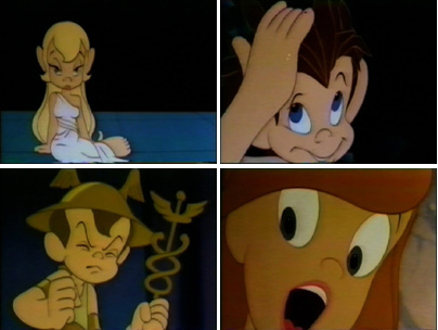 because the lead character in FROZEN looks like every other generic female these guys can draw. Give it up. Hire a few good women who can animate, and we’ll see what we see. (I expect nothing different unless the woman drawing the figure is a good animator (not just great, like Joanna Quinn) and knows how to draw well (not even great, as JQ can do). But the character they’re animating is well designed (unlike the lead in FROZEN).
It reminds me of the in-house joke around the film METAMORPHOSIS. The principals didn’t have names, and the model sheets read: “Lead Boy” and “Lead Girl”. The animators usually read their names as “Led Boy” and “Led Girl” because they looked generic and they could only make them move like “lead.”
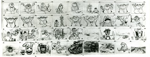
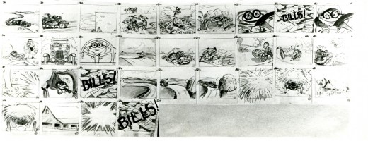
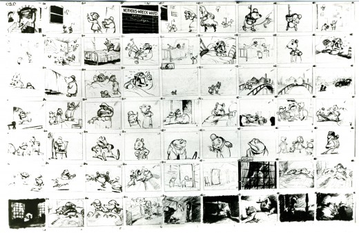
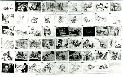
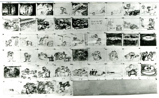
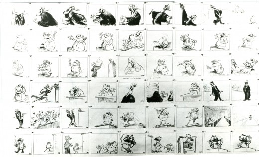
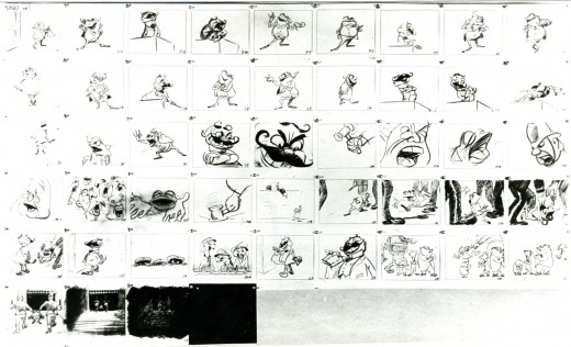
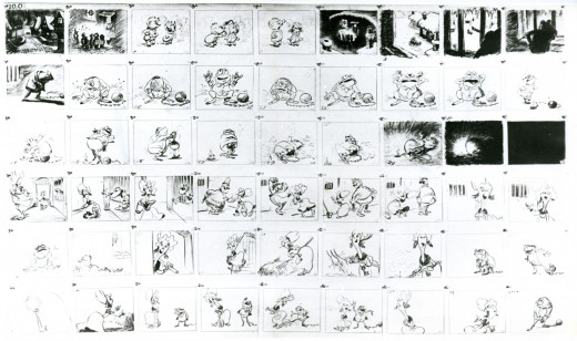
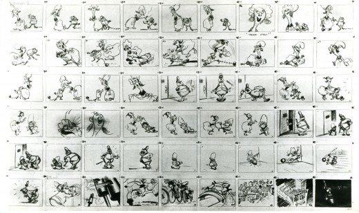
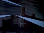
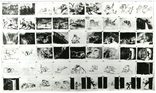
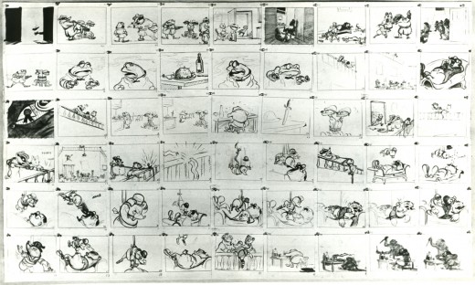
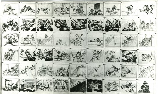
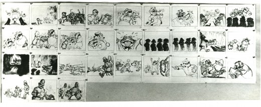
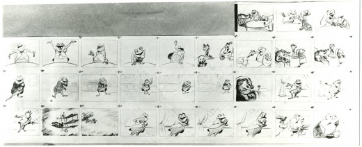
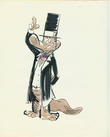
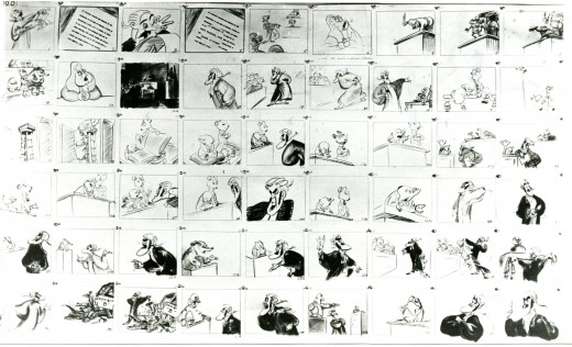
As long as we’re talking about drawing and designing and animating women let me repeat a segment of an older post. It includes storyboard from Disney’s The Adventures of Ichabod and Mr. Toad. Of course, the original of this was The Wind in the Willows by Kenneth Grahame.
My reason for repeating it has more than a touch upon Joanna Quinn’s fine comments. I received a letter from the great Borge Ring who pointed out who the artist was of this storyboard. An excerpt from his letter:
-
hi Michael
Re Give me a Drawing
Daan Jippes who worked on The Prince and the Pauper saw the storyboard of “The Wind in the Willows” and said:
“The story sketches of that opening sequence look exactly like the finished scene. How can they give an animator credit for something that has already been done ?”
The draft said the scenes were animated by Frank Thomas, and I asked Thomas:
“Frank,who drew the storyboard of the sequence?”
“I did – I am not sure I did much else”
greetings
from
Borge 92
PS
You mention Oscar Wilde
He is supposed to have said:
“Sexual gratification is so useful to us humans. Because it enables us to think
of other things too”
So here, then, is a bit of that storyboard – more from the end rather than the beginning.
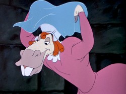
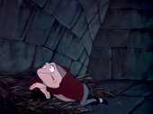
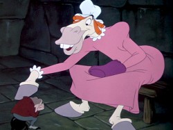
Talented those men were (they could even draw men, a toad and a horse, dressed as women pretending to be women – with very little success.
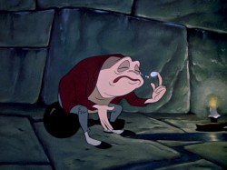
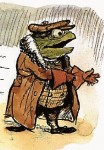 – Probably my favorite children’s book is The Wind In The Willows. There have been many animated adaptations of this book since it became a public domain item, but for years there was only one version, Disney’s Mr Toad half of The Adventures of Ichabod and Mr. Toad. The loudest most raucous parts of Kenneth Grahame’s delicate novel, blared their way onto this animated compilation feature.
We all know that the book was planned as a feature way back when Disney, in the late 30s, was buying up titles of famous children’s books to prevent other competing studios from turning them into animated features. Work began on adapting the book. They never quite broke it as they hoped, and it ultimately became a featurette with its primary focus on the loose cannon, Mr. Toad.
. . . .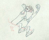 The film, as it exists now, has some positive elements and some fun animation, but the story was always a bit too quiet and British to successfully survive a proper adaptation in the Disney canon.
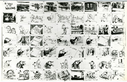
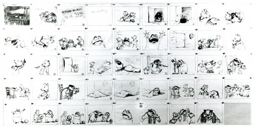
When John Canemaker loaned me his copy of the Pinocchio boards, he also brought The Wind In The Willows (not titled Mr. Toad). There are few captions here, but this obviously is designed for a full-out feature not an abbreviated featurette. The images on his original stats are small, so I’ve blown them up a bit and tried to marginally clean them up.
As suggested by Michael Barrier, this board was probably assembled to produce a preliminary Leika reel. The giveaway is the lack of dialogue and commentary underneath the drawings. The assembly was made to be photographed.
 1
1(Click any image to enlarge.)
Disney’s Mr. Toad first aired on the Disneyland television program on February 2, 1955. You can buy the dvd of Ichabod and Mr. Toad on Amazon among other places.
If you’re interested you can read the entire book of Kenneth Grahame’s work (minus the beautiful Shepherd illustrations) here.
You can buy the book here.
Dave Unwin‘s version is my favorite adaptation in that it retains some of the flavor of the original book and isn’t afraid of being quiet at times.
 7
. .
7
. . 
 . .
. . 
 12
12
Animation &Books &Comic Art &Disney &Guest writer &Illustration 11 Apr 2013 05:09 am
Peter Hale’s Peter Pan
About six weeks ago, I was contacted by Peter Hale in the UK about a “strip book” of Peter Pan that was published in England to tie into the original release of the movie. Peter sent me some beautiful scans of the artwork in the book, and I posted it (here.)
Mr. Hale promised a second book that was also published at the time.
It turns out he has done some extensive research into the subject of the books in conjunction with the Disney film. This week, I received a complete breakdown of all the “Pan” books that were published in the UK, and the scans for another book. I’ve decided that I really have to post what Peter has written; it’s that extensive. I’ll follow up with another post of the books scanned.
Many thanks to Peter Hale for sharing this fine work with the “Splog” and its readers.
The rest of this post is over to Peter Hale who writes:
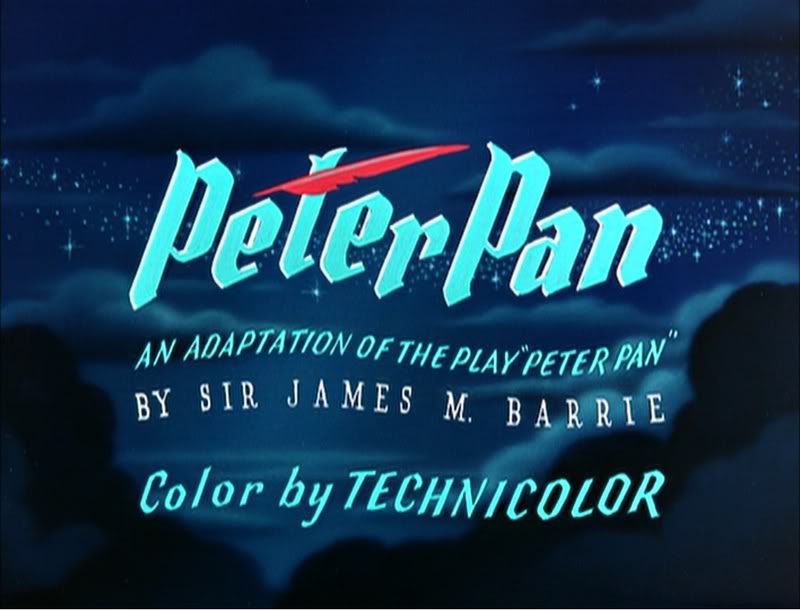 My (superficial) research into the Disney-illustrated books of Peter Pan published
in the UK in 1953 has wandered off on several tangents.
Firstly a rough chronology of the development of the original book, and the Disney
film:
1902 – Barrie’s fantasy novel (for adults) The Little White Bird includes a sequence that
features Peter Pan, a 7-day-old baby who flies away from home so that he will never
grow up, and, after learning that he is not a bird, and therefore can’t fly, is
adopted by the faries in Kensington Gardens.
1904 – Barrie expands the idea of Peter Pan into a play, to great success.
1905 – The chapters from The Little White Bird that feature Peter Pan are republished for
children as Peter Pan in Kensington Gardens by his publishers, Hodder & Stoughton,
to cash in on the play’s popularity.
1911 – Because of the demand for Peter Pan products, Barrie publishes a novel based on the
play. He adds a coda wherein Peter promises to return each spring to take Wendy back
to Neverland to do the Spring Cleaning. But he starts to miss years, until he has
forgotten her altogether. Wendy grows up and has a daughter of her own. One day
Peter returns for her and is distressed to find that she is too old to fly away. But
he soon meets her daughter Jane and so takes her to Neverland, and when she grows
old, her daughter Margaret will take over – because he does need a mother.
1915 – Hodder & Stoughton publish an abridged version of Peter Pan for younger children,
written by May Byron with Barrie’s approval. They title it Peter Pan & Wendy.
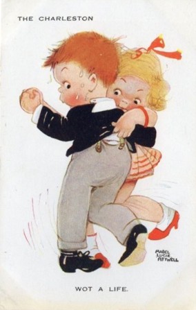
1921 – A version of May Byron’s adaptation “retold for Little People” is published, with
illustrations by Mabel Lucie Attwell at Barrie’s request. Her drawings of babylike
characters presumably matched Barrie’s vision.
1929 – Barrie donates all the rights to ‘Peter Pan’ to the Great Ormond Street Hospital for
Children.
1935 – Walt Disney plans to follow Snow White with Peter Pan, but has difficulty securing
screen rights from Great Ormond St Hospital.
1939 – Having finally secured rights to make an animated film version, the Disney studios
schedule Peter Pan to follow Bambi and Pinocchio.
1941 – The entry of the US into WWII forces Disney to postpone productions.
1947 – The Disney Studios put Peter Pan back into production.
1953 – February 5th: Walt Disney’s Peter Pan premieres at the Roxy Theater, New York.
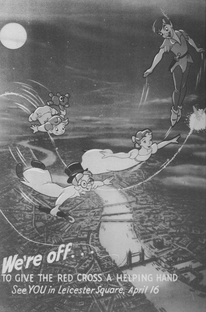
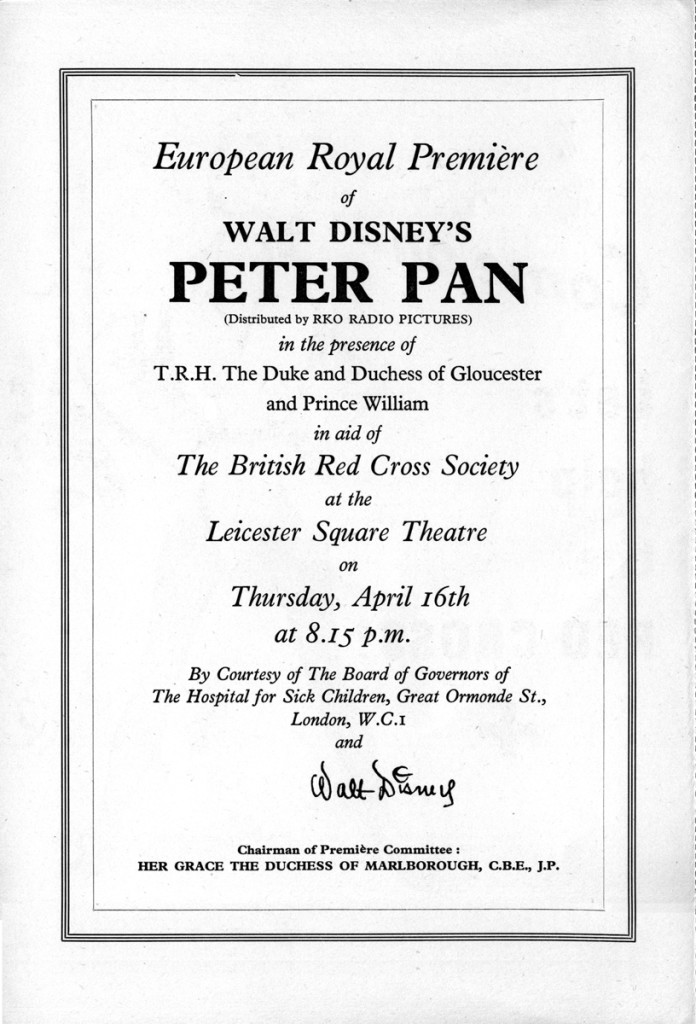
1953 – April 16th: Walt Disney’s Peter Pan has its UK premiere at the Leicester Square
Theatre, London.
1953 – May: Walt Disney’s Peter Pan is shown at the 6th Cannes Festival.
1953 – July 27th: Walt Disney’s Peter Pan goes on general release in the UK.]
Through the 40s her characters became ever more chubby, stunted and stylised, but in 1915 she was still starting out as an illustrator.
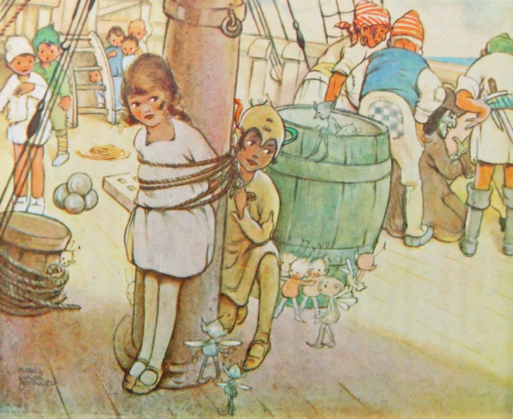
Here is her version of Peter freeing Wendy from the mast.
The illustrations she did then became almost as much part of the May Byron version of “Peter Pan and Wendy” as Tenniel’s were part of “Alice”, and it was still being published in 1980. A reprint of the 1921 edition was published in 2011.
Which brings us to the versions of Peter Pan published in the UK in 1953.
Jacqueline Rose, in her book “The Case of Peter Pan”, lists the following six books published in the UK that year:
- Barrie, J. M. Peter Pan in Kensington Gardens, illustrated by Arthur Rackham, ‘Peter Pan Books’ (from 9 years) (London: Hodder and Stoughton, I953)
- Bedford, Annie N. Disney’s Peter Pan and Wendy, ‘Peter Pan Books’ (London: Hodder and Stoughton, I953)
- Byron, May. Peter Pan in Kensington Gardens, illustrated by Arthur Rackham, ‘Peter Pan Books’ (for 6 to 8 year olds) (London: Hodder and Stoughton, I953)
- Byron, May. The Walt Disney Illustrated Peter Pan and Wendy, ‘Peter Pan Books’ (for 8 to 9 year olds) (Leicester: Brockhampton Press, I953)
- Pearl, Irene. Walt Disney’s Peter Pan, retold from the original story by J. M. Barrie, ‘Peter Pan Books’ (for 3 to 6 year olds) (Leicester: Brockhampton Press, I953)
- Winn, Alison. Walt Disney’s Peter Pan, retold from the original story by J. M. Barrie ‘Peter Pan Books’ (for 6 to 8 year olds) (Leicester: Brockhampton Press, I953)
as opposed to just one in 1952:
- Byron, May. Peter Pan, retold for the nursery, illustrated by Mabel Lucie Attwell, ‘Peter Pan Books’ for 3 to 6 year olds) (Leicester: Brockhampton Press, I952)
Two of these are versions of the Peter Pan in Kensington Gardens ‘origin’ story, which Disney had decided not to include in the film.
The remaining 4 are all “Illustrated by Walt Disney”. The Irene Pearl version is the strip book already posted, and scans of the May Byron book and the Alison Winn “Little Book” will follow. These all follow the Barrie novel rather than the Disney film, although with different simplifications and omissions.
The Annie N. Bedford book is one I have not been able to trace – she is the American author who wrote the Golden Books version of the Disney film, so this could be a UK publication of that book. It is given as published by Hodder & Stoughton, Barrie’s original publisher. The back cover of the Brockhampton ‘Little Book’ lists a different Hodder & Stoughton book.
“J. M. Barrie’s original Peter Pan and Wendy for older Boys and Girls, with illustrations by Walt Disney”. I have not been able to trace a copy of either book. These two books represent the two ends of the spectrum:
Barrie’s original text and the story of the film.
Finally there is the complication of Dean & Son’s Walt Disney’s Peter Pan, from the motion picture, a book of the film. This has no publication date. The illustrations are given as copyright Walt Disney 1953, but this is not a guide to the publication date, as Disney did not own the publishing rights and so the illustrations were always copyrighted to 1953, the year of the film’s release. It is probable that the Dean book was published later than 1953.
It is published ‘by arrangement with Hodder & Stoughton’, which either means it may be a reprint of the Bedford book, or just an acknowledgement that Hodder held the publication rights to Peter Pan.
In contrast I can only find one UK ‘Disney’s Alice in Wonderland‘ book that might have been published in 1951, and certainly no Carroll text with Disney illustrations.
So why so many Peter Pans? The UK’s wartime paper rationing ended in 1950 so that would not be an issue.
Was it because Disney did not have the publishing rights, so this collaboration was necessary to promote the film?
Was it just, as I’d thought previously, that the British might object to tampering with the story? Or was Disney just trying to overcome the sort of criticism that his Alice had suffered in the UK (that it was too Americanised and not sufficiently true to the book) by linking his film to the original text?
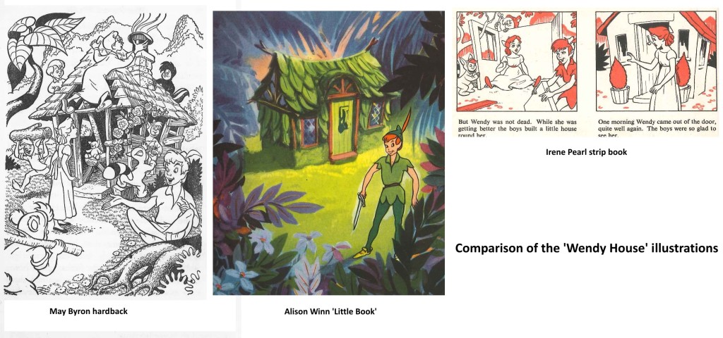
Comparing the 3 Brockhampton books the illustrations are all different, and by different hands it would appear, but all show fidelity to the Disney style. I am assuming that these illustrations were done by British illustrators specially for the books, as where the illustrations differ from the film the artists seem to have consulted the particular text they are working with for details.
Hence the May Byron text describes the adding of a shoe as a knocker, and John’s hat as a chimney, and the illustration shows the hat, although it also shows Wendy watching the building from outside, which is quite wrong!
The marooning of Tiger Lily is done in the book by two pirates, with Hook turning up
later.
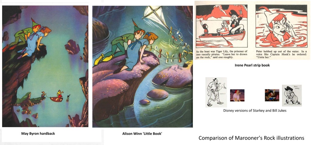
In the May Byron book they are named as Smee and Starkey, and the
illustration has Hook replaced by a likeness of the Disney Starkey (but with a
yellow shirt instead of pink). The strip book doesn’t name the pirates and Hook is
here replaced by Bill Jukes. The Alison Winn version omits the marooning of Tiger Lily entirely and just has Hook turn up to attack Peter.
All three books have Wendy exhausted and Peter injured after the encounter – both
stranded on the rock unable to fly back. John’s kite collects Wendy, while Peter is
rescued by the Never bird, whose floating nest serves as a boat. The Winn ‘Little
Book’ uses a version of the shot of Peter and Wendy watching Hook and Smee from on
high, but without the pirates, truncated to appear a low rock, and with a kite added
in.
This brought me to wonder how much Disney reference they were given, and what it
consisted of. Many of the scenes are close to shots from the film. But a look at the
Dean book, which seems to be taken directly from colour stills, shows that these are
not actually shots from the movie.
Anyone who has ever tried to put together presentation scenes from the cels of an
animated film knows that there are always problems – the best pose is poorly traced,
or one character is in an ungainly inbetween position – whatever, that perfect key
image from the storyboard just isn’t there in the actual film, where, deliberately,
nothing hits a strong extreme at the same time.
Hence it appears that the lobby card stills or coloured transparencies that Disney
circulated in their press packs etc. had been specially recreated – a lead animator
had redrawn the characters from various key frames as they ought to have looked, and
these drawings had been traced and painted on cel with extra care, and combined with
a new version of the background to be photographed by a stills camera. (I presume
the composites then went up on someone’s wall!) The same thing, of course, as the
re-posing of key scenes that is typically done by a stills photographer on the set
of a live action film after it has been shot.
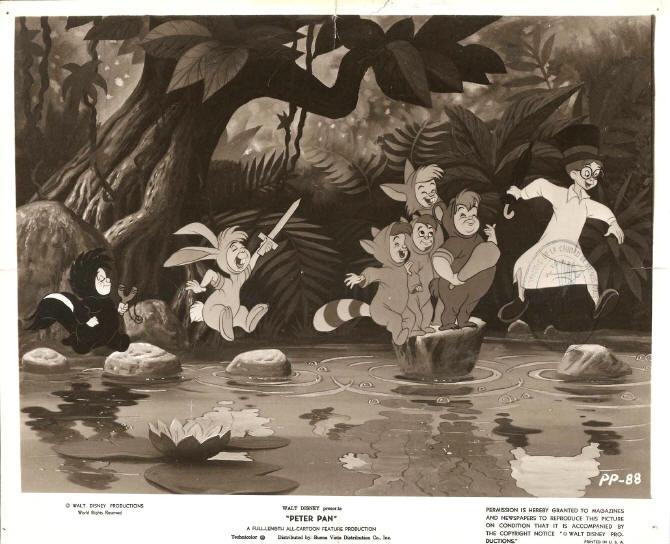
The illustrators appear to have had coloured stills and model sheets to work from.
Does anyone know how much reference was supplied? Walt Disney Studios had an office
in London specifically to deal with promotion, distribution, licensing artwork etc.
Did they do artwork for any of the books – or just supply references?
Lastly, the curator of the Great Ormond St. Children’s Hospital Archives has kindly
sent me these scans relating to the London Premiere of Peter Pan on 16th April 1953
It’s worth taking note that Hans Perk has recently posted the animators’ drafts from the Disney film, Peter Pan. Go here to read and/or collect them.
Animation &Animation Artifacts &Commentary &Guest writer &Tissa David 15 Nov 2012 08:05 am
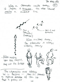
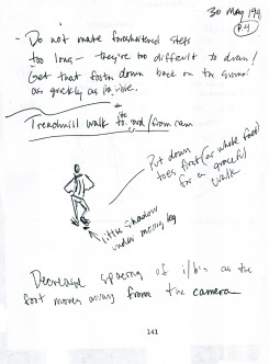
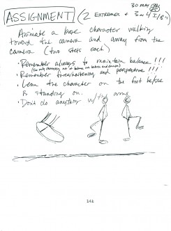
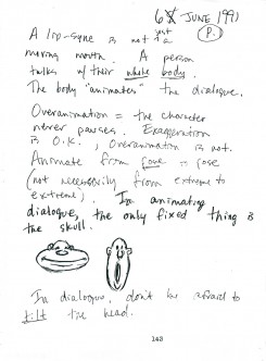
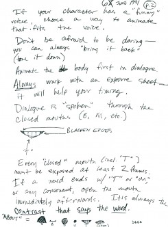
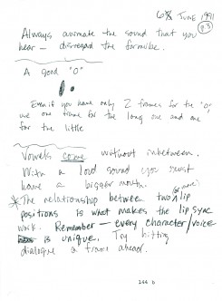
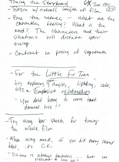
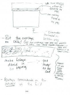
Tissa’s Class – part 6
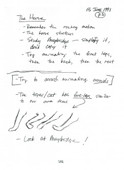
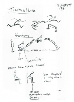
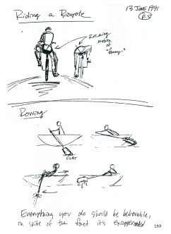
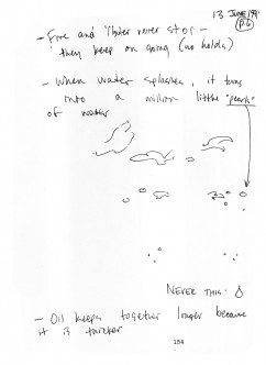
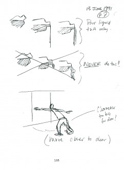
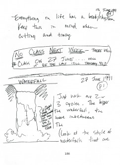
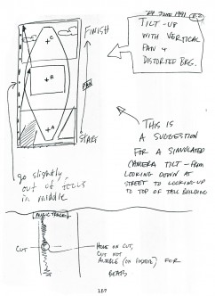
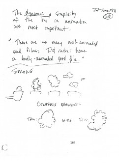
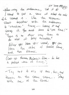
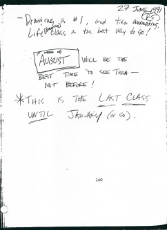
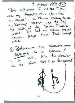
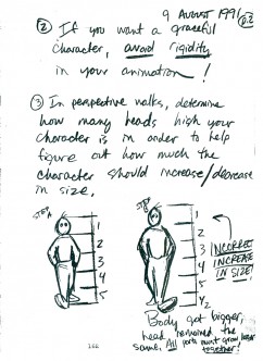
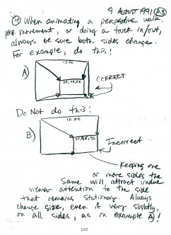
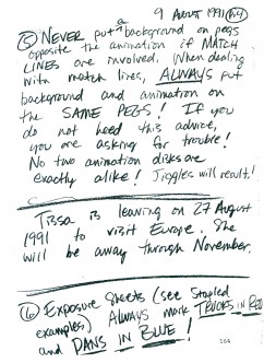
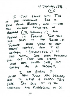
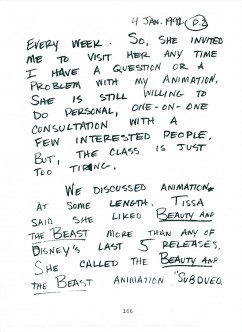
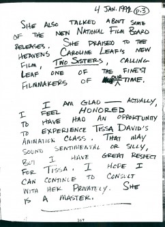
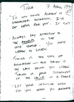
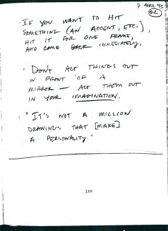
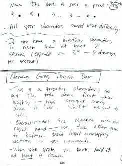
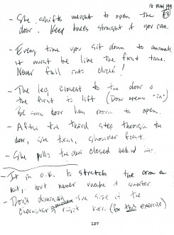
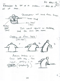
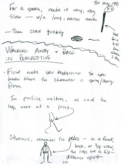
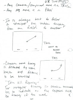
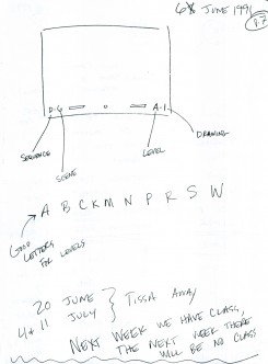
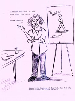
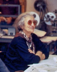 - From 1991-1992, Tissa David, taught a class in animation which was open to anyone who wanted to attend. R.O. Blechman offered his studio, The Ink Tank for a loction where the classes were held after hours. Those who worked in the day could attend the evening sessions..
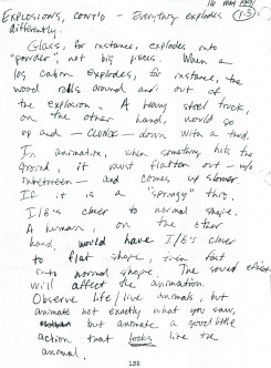
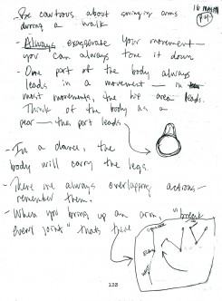
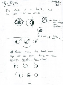
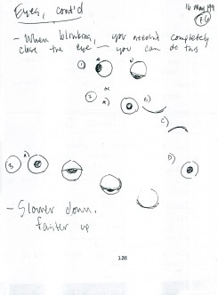
Eugene Salandra, a talented young animator, took notes in the classes, and recently I’ve been posting those notes here, with his permission. Some of the lessons seem a bit dated since they were done for 2D animation which was shot under a camera. However, all of the notes are important since learning the information will help you understand the proper use of the “camera” even if the camera is a computer.
Unfortunately, this is the last of the notes. Eugene also did tighter notes which were more cleaned up, and I may post those as well. I have to read them all before I decide one way or the other.
You can see the earlier parts by going to these links:
____________________________________part 1, part 2, part 3. part 4, and part 5
Here is part 6:
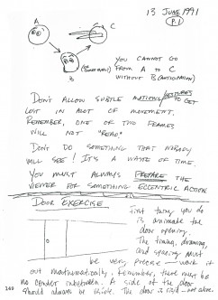 49
49 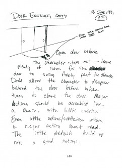 50
50(Click any image to enlarge so as to be legible.)
Bill Peckmann &Books &Guest writer &Illustration &Rowland B. Wilson 12 Nov 2012 07:26 am
The Secrets Behind Trade Secrets
- Suzanne Lemieux Wilson, wife of the late Rowland B. Wilson, just sent me a guide to how she, with information from Rowland, put together their invaluable book of notes called Trade Secrets. Seeing the skeleton come together for this book is quite an informative document, and I couldn’t be happier that she trusted my blog to relay the information..
Some of these illustrations and pictures have passed across this blog before, but they take on a very new meaning here, so I’m glad to post them anew. I have to thank Suzanne for the gift of this post especially given some of the hard work I know it took to scan and send documents that are large enough to work here.
By the way, if you don’t have this book, you should. The book offers an enormous amount of information about his design for animation as well as for the printed cartoon and illustration trade. How ofen does a genius of his craft offer such a guide to the “trade secrets”? Trade Secrets is an invaluable book.
May I suggest that you click any image as you go through to enlarge them and get a better look at the illustrations and the type. It’s great stuff.
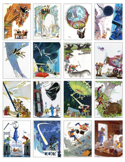
 1
1
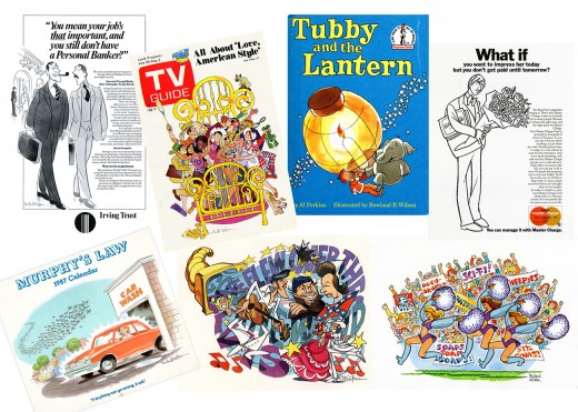
 4
4
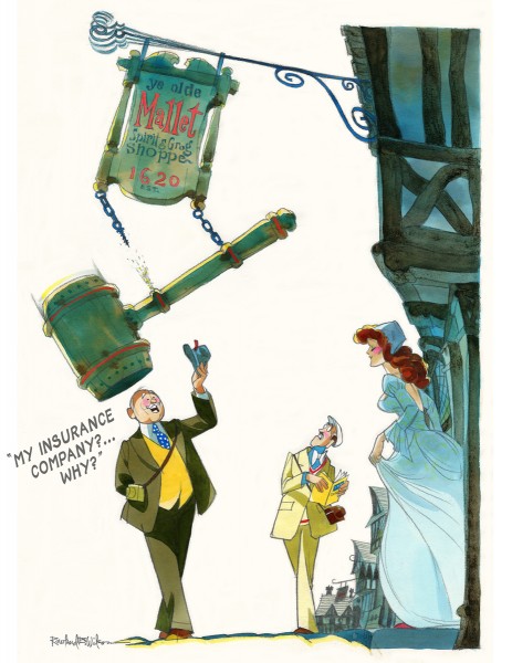
The insurance campaign ran for eighteen years–
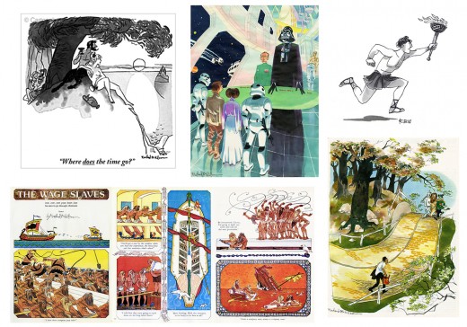 5
5
Rowland also drew cartoons for the New Yorker, Esquire,
The Saturday Evening Post, Playboy and others.
 6
6
As well as illustration and advertising.
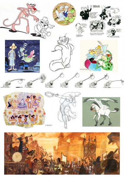 7
7
Rowland’s first and last jobs were in Animation, with many
interspersed throughout his career.
 8
8
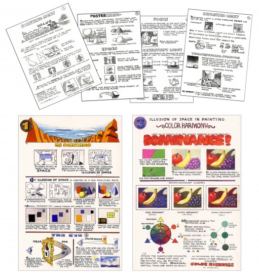
Rowland devised illustrated instruction pages as quick reference
guides for the Layout, Background and Animation staff when he worked
at Don Bluth and Walt Disney Studios.
 9
9
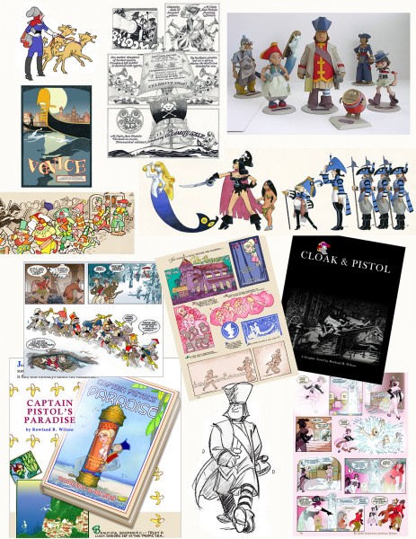
He worked on the Captain Pistol series of cartoon novels
from the 1970′s onward.
Captain Jack Pistol was a Retired Pirate and Rich Man who met with a
series of misadventures as he moved through various literary genres,
from swashbuckler to romantic comedy to spy thriller
to Western to science fiction.
Rowland sculpted three-dimensional models of the characters.
Rowland endeavored to apply the principles of drawing to life.

He created an artful environment to work and live in–
He designed and constructed a sunflower gate for the garden.
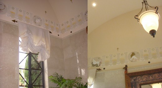
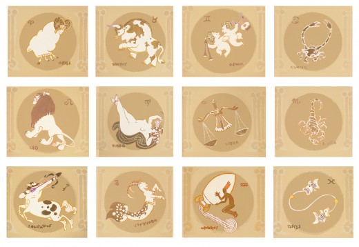
He painted the signs of the Zodiac around the base of a vaulted
ceiling…
He built a workbench for his woodworking projects and decorated it . . .
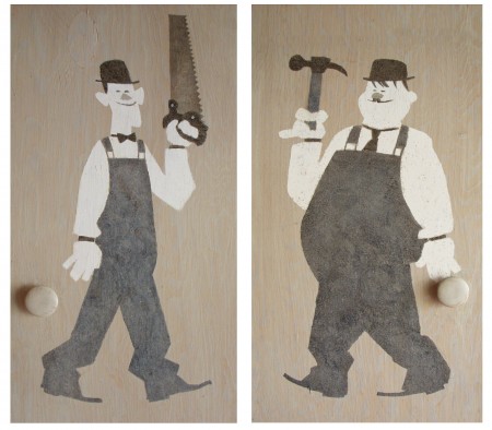 15
15
. . . with caricatures of Laurel and Hardy.
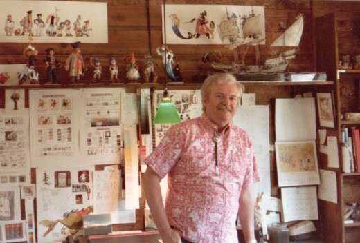
Because he worked in a variety of disciplines, Rowland sought
solutions that would apply to all of them and save him from “solving
the same problem over and over again”.
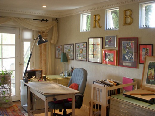
He consolidated the information into charts and hung them in his studio,
whether it was in Connecticut, New York, Ireland or California.

Rowland documented many techniques and observations.
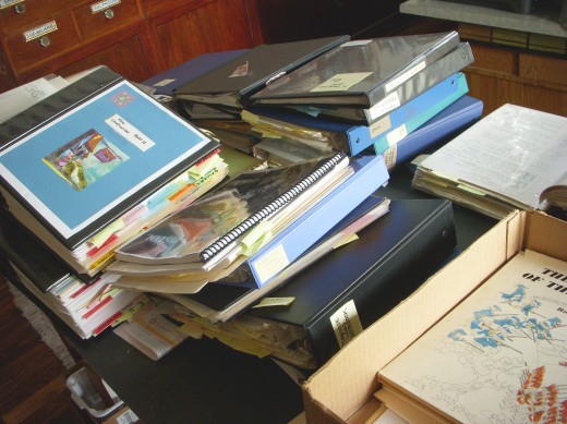
The writings and illustrations filled dozens of
notebooks, binders and sketchbooks.
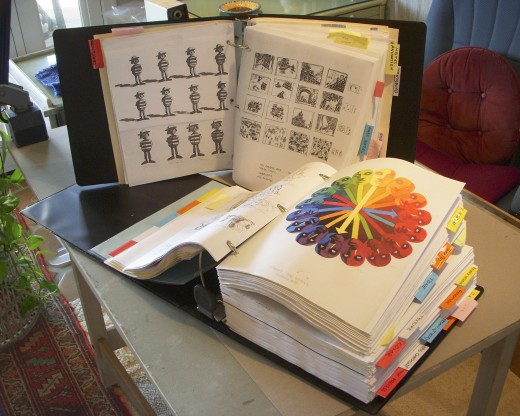
Much of it was xeroxed and consolidated into two giant binders as
resources for the book entitled Rowland B. Wilson’s Trade Secrets.
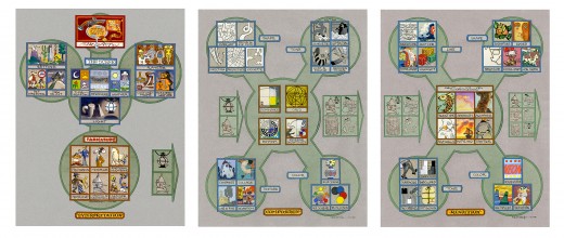
But the genesis for all of the notebooks and for Rowland’s oeuvre
were three flow charts that outlined procedures
that could be applied to any project.
 22
22
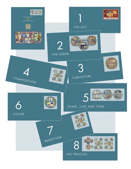
The Introduction of Rowland B. Wilson’s Trade Secrets describes the
Flow Charts in general. Then each chapter is based on an aspect
contained in them. The logo at the top right shows what aspect is
covered in the chapter.
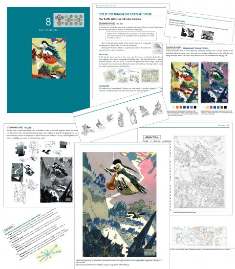 23
23
Chapter 8, the Process, follows a project from idea to finish
as it progresses along the Flow Charts.
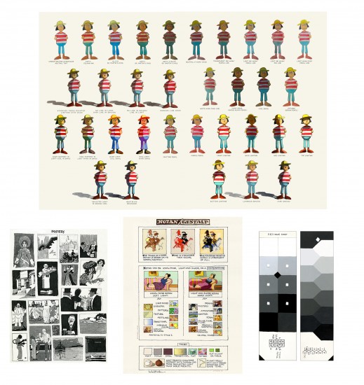
Chapter 9 presents many of the charts and posters
that actually hung on the studio walls.
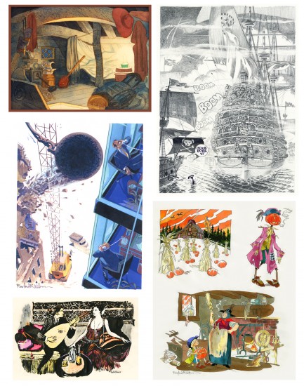 25
25
Chapter 11 shows a gallery of artwork throughout Rowland’s career,
including well-known images and some of his personal art,
never before published.
 26
26
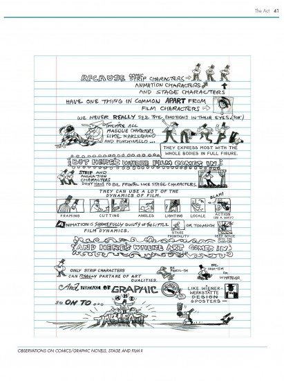
A page of observations on comics, graphic novels, stage and film:
 27
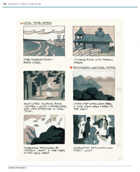
27
One of three pages illustrating Styles of Notan:
 28
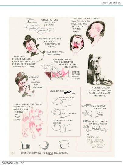
28
A page showing notes on various aspects of Line:
 29
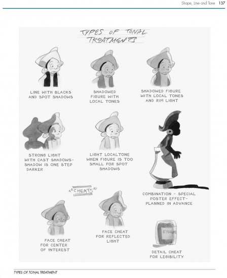
29
A page depicting various types of Tonal Treatments:
 30
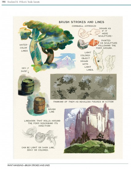
30
Demonstration of watercolor techniques:
 31
31
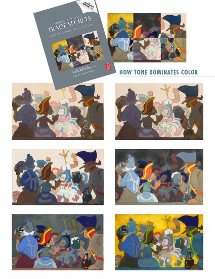
The cover image is a composite of 6 Value Studies showing the
dominance of Tone over Color:
We hope you enjoy Rowland B. Wilson’s Trade Secrets and find
inspiration within.
With Special Thanks to Bill Peckmann for photograph of
Rowland B. Wilson in his studio.
_______________________
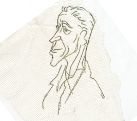
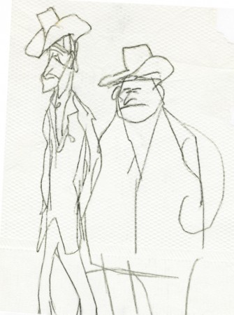
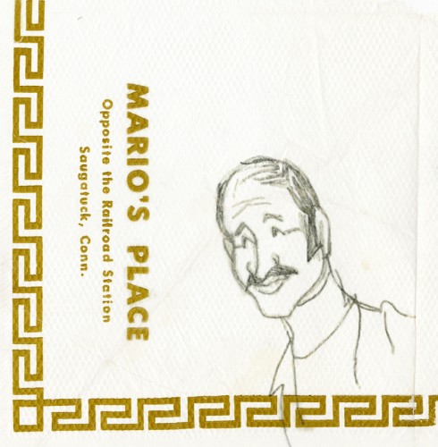
And as a bonus to this post, here are some drawings RBW did on a napkin at a lunch with Dick Williams.
Suzanne wrote:
- I discovered some vintage Rowland B. Wilson “doodles”, sketched on
napkins at Mario’s Restaurant in Westport, Connecticut–thought you
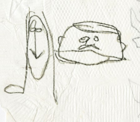
might enjoy them. The caricature of Suzanne and Rowland (image 2)
looks to me like the RBW take on Richard Williams’ drawing of us (image 3).
 1
1Mario
 2
2
Suzanne and Rowland caricatures
Animation &Commentary &Guest writer &Tissa David 08 Nov 2012 07:24 am
Tissa’s Class – Part 5
 - In 1991, Tissa David taught a class in animation for free, open to anyone who wanted to attend. This was sponsored by R.O. Blechman out of his studio, The Ink Tank. It was held after hours, so that those who worked in the business could attend.
The talented animator, Eugene Salandra, kept key notes of the classes, and with his permission, I’ve been posting those notes here. Some of them seem a bit dated these days since they were done for 2D animation that was shot under a camera. However, all of the notes are completely relevant since learning the information will help you understand the proper use of the “camera” even if the camera is a computer.
You can see the earlier parts by going to these links:
_____________
____________________________________part 1, part 2, part 3. and part 4
And, here’s part 5:
 1
1  2
2I repeat these first two pages.
(Click any image to enlarge.)
To be concluded next Thursday
Many thanks to Eugene Salandra
Articles on Animation &Guest writer &Independent Animation 11 Sep 2010 07:56 am
Paul & Sandra & Tulip
MY DOG TULIP opened at New York’s Film Forum and will be followed by a limited national release. The NY reviews were excellent. The film did so well in its opening week that it’s been extended to Sept. 28th. You have even more of an opportunity to see it.
This interview/article was written by Karl Cohen for ASIFA-SF and he has given me his permission to post it.
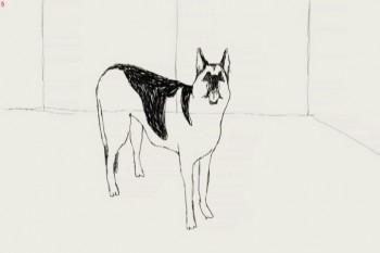 One of the impressive animated features coming out this fall is My Dog Tulip based on the book of the same name by J.R. Ackerley (1956). It’s a delightful comedy that I fell in love with at the SF Film Festival. Its directors, Paul and Sandra Fierlinger, have created over a hundred award winning films including Still Life With Animated Dog (2001) that won a Peabody Award and a Special Jury Award from Zagreb. A Room Nearby (2003) also won a Peabody and their Drawn From Life series (2000) has won a grand prize at the Ottawa
International Animation Festival. In 1980 Paul received an Oscar nomination for It’s So Nice To Have A Wolf Around The House.
Although the couple may not be well known by the public, they are highly respected among their peers, so when asked how Tulip came about as a project Paul explained that the film’s producers Norman Twain and Howard Kaminsky, “Just called us out of the blue. One of those calls you think never happens.†They asked right off if the Fierlingers wanted to make a feature film. They didn’t know the couple and their main concern was that the film had to be based on a famous book.
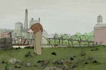 After some discussion about possible books to adapt they decided upon My Dog Tulip. It turned out Howard Kaminsky knew the book and controversy over it when the book was published, as he was president of Random House, the book-publishing firm, for twenty-five years and prior to that was president of Warner Books for seven years. The book and film have scatological references that were quite shocking to polite society in 1956. A contract was eventually agreed upon and it took about three years for Paul and Sandra to complete the project.
Paul says, “It was wonderful work. I could wake up every morning and know exactly what I was going to do and I loved the work. The whole process was very pleasant. There are no horror stories to tell. Nothing bad happened.†The Fierlingers had total artistic control and the budget was $1.3 million, enough for the couple to complete the production with famous voice actors (Christopher Plummer, Lynn Redgrave and Isabella Rossellini) and to be able to provide film festivals with 35mm prints with Dolby sound.
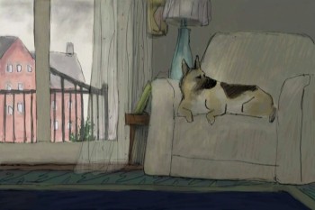
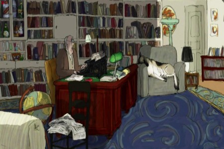 Adapting the book did present problems, as it is basically a series of humorous tales about incidents in the life of J.R. Ackerley as he raises the dog, an Alsatian (German Shepherd) and they become great friends. To flush out the film’s script Fierlinger added true elements not mentioned in the book, including having the author’s sister live with him for about a year. During that period she tried but failed to win over the dog’s affection.
To flush out the story Fierlinger’s producer hired Peter Parker, an excellent British writer who had written a biography of J.R. Ackerley. Paul says, “His prose is equal to Ackerley’s.†If you see the film I think you will assume, as I did, that every word came from the book.
An unusual element in Paul’s long format work (he has also done hundreds of TV commercials, short pieces for Sesame Street, etc.) is his use of different styles and techniques that separate segments of the story. He wasn’t sure what I was referring to when I brought up the subject so I pointed out that in his film And Then I’ll Stop (1989) he had five or six people talking about their lives and each person had a different style of art representing them and their world. Paul then explained that he feels long animated films using the same art styles and rendering techniques throughout the film get boring no matter how well they are done.
He remembers that the first animated feature he saw that he really liked to the very end was Yellow Submarine (1968) because it was done in so many different styles. In his work you know the same artist drew each style, but the variety keeps the work visually interesting.
When working on a story Paul says he gets into a special frame of mind. “In my mind I live the story,†so he draws what he imagines. “If it is a sloppy character then you draw a sloppy line. I did that in And Then I’ll Stop. And if it is the story of a very pristine accountant of a big company I draw him in almost Saul Steinberg type lines.â€
Paul has been around long enough to see sound recording technology change drastically. With new microphones and digital recorders he no longer needs to use a big studio with sound booths. Some of Tulip was recorded around a kitchen table, but to record Christopher Plummer the producers rented studio time.
Paul pointed out why it is important to record most soundtracks before animating characters. The character Plummer created in his reading of the script wasn’t the man that Paul had envisioned so he ended up drawing the main character somewhat differently than he had originally planned.
The film’s composer/sound engineer is John Avarese who has worked with Paul for many years. Paul says, “You can tell him the kind of music you want and he can just pull it out of his hat.†Most of John’s work has been for corporate and industrial clients.
 The animation was done using TVPaint, one of the oldest 2-D animation systems available. It was started in 1991 and was developed by an independent producer as a work of love. Paul became a beta tester in 1992 or ‘93 and helped develop the system’s capabilities.
His wife Sandra is the film’s co-director. Her background is in painting. She studied at the Boston Museum’s school and graduated from the Philadelphia Academy of Fine Arts. They work together quite well as Paul is a skilled draftsman, but he says, “I never learned to paint or work with color. Most of my films have had very little color in them.†She started working with him in 1989 as a painter when animation was hand painted on cels. She enjoyed the work and together they learned the TVPaint system. She also was involved in beta testing the software. As they learned the system they would ask the software developers to make certain adjustments. Thus the system became tailored to their needs. Eventually other accomplished 2D animators from all over the world joined the beta team to create a unique application specifically meeting the needs of independent artists.
One important part of Paul and Sandra’s good working relationship is her helping him to resolve drawing problems whenever he feels stuck trying to make a decision. He says that often happens, that he can “paint myself into a corner and nothing seems to work, so she looks at it with fresh eyes. We figure it out together. We do that all the time, even when I start writing a script, before I start drawing.†Paul feels all their films should simply say “A film by Paul and Sandra Fierlinger.â€
We closed our discussion with Paul’s advice for couples that want to work together on animated films. Based on having lived and worked with Sandra for almost 20 years he says, “The trick is not to have children. If you have children, that gets in the way. You have conflicts. If you don’t have children, you only have your work.†I’m not sure how popular his advice is with parents, but judging from their films that I’ve enjoyed over the years, the advice certainly works for this animating couple.
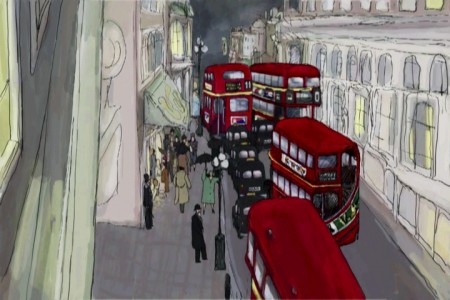 Before I spoke with Paul I asked Norman Twain, one of the film’s producers, about their distribution plans for the film. He said, “The film will open at the prestigious art house, Film Forum, in New York City on September 1 and concurrently in similar calendar art houses in San Francisco,* Los Angeles, Dallas, Philadelphia, Chicago, Boston, and Toronto, as well as in other New York theaters. Hopefully, as the traction grows we will expand to other major calendar houses in the larger markets in the United States. We will promote the film in the best possible manner, directing promotion toward an Academy Award nomination. Pending the reception of the film in America, we will exploit the foreign market to the best extent we can. Cinemavault, a film sales group based in Toronto will handle foreign sales. After the US distribution has run its course, we will look for a VOD (video on demand) release, concurrently with a DVD release and after that, will try our best to get it on television (hopefully PBS or cable TV network – as it is much too nasty for a broadcast network to show).†*Tulip opens in SF and Berkeley Oct. 15 at Landmark’s Embarcadero and Shattuck cinemas.
I also asked if it was difficult financing the project. He replied, “Fortunately, most of the fund-raising took place prior to the crash, or should I say prior to the sudden scarcity of funds. It’s not an expensive film, under $1.3 million. I think, as all entertainment investments go, it’s risky, but will prove profitable. I am happy to have produced it and will be happy to see it in release.â€
I end this discussion with a disclosure. Both Paul and I are extremely fond of dogs. My wonderful yellow Labrador Retriever recently died after being my close friend for 14 years and Paul and Sandra Fierlinger have two rescue dogs at present, a Jack Russell, “probably from a puppy mill,†and a mutt that he says is a cross between a German Shepherd and a Corgi. It had been abandoned. It has a large Shepherd head and a strange body so a friend of Paul’s once remarked, “Oh, a Photoshop dog.†Paul tells me that he sometimes used her as a model when he was drawing Tulip.
Guest writer &Illustration &SpornFilms 09 Sep 2010 09:28 am
Patti Stren
- I got to know Patti Stren well when we worked together making the short film, MONA MON AMOUR. This was something that Patti had developed as a print piece, and we jointly came up with the idea of making a short. We financed it jointly and love the end product. It’s the film that probably got the most laughs when I saw it projected at the Museum of Modern Art. I was quite proud of it then.
I’m going to turn this post over to Patti to showcase some of her past work including a couple of the many books she’s written and illustrated, some of the print ads she’s done, the post Mona artwork she’s done with the characters, and other material.
I hope you enjoy it.
Often my Canadian friends and here, many of my colleagues; but especially my Mama’s mahjong buddies in their 90′s who watch MONA MON AMOUR every day, as if it were a new film -ask me how did this Michael Sporn and I meet? Then collaborate and then become good friends. Well, for sure I immensely respected Michael’s work. And Michael said some lovely things about mine. Coincidentally, my best friend in Paris, Tana Hoban was the sister of one of Michael’s most beloved Children’s Book Writer Russell Hoban. Of which he animated. The Marzipan Pig exquisitely.
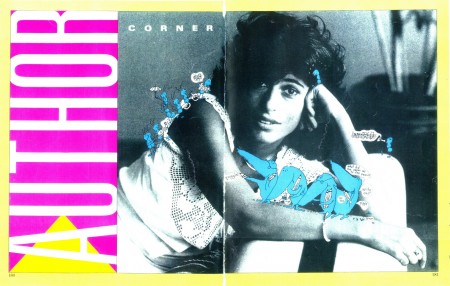
Tana Hoban’s photo of Patti for a flyer.
Actually Michael and I were introduced by the Executive Producer of Babar and Father Christmas to work on a project, that sadly fell through. And then one day Michael invited me into his studio after some wonderfully funny phone calls about work and stuff. I remember telling him,” I’ll bring in my portfolio,” and he said, “don’t.” And I did.
I remember the visit exactly. Michael opened the door to his 632 Broadway studio. He was very tall and I was very small. I was very nervous and said: “I am nervous, and I’m probably going to talk and talk and talk a lot.” And he said: “‘That’s okay. Everything you’ll say will be IMPORTANT.” IT wasn’t that a Large Capital Letter bubble came out of Michael’s head. But when Michael spoke I could tell what he meant in Capital letters! Then Michael led me straight back to the long table at the end of the studio. Where I proceeded talking and talking and talking while showing Michael my Portfolio.
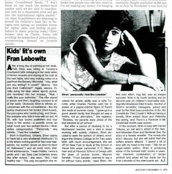
An article from Maclean’s Magazine about Patti.
And, the coincidences in our careers were astounding to me.
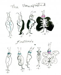
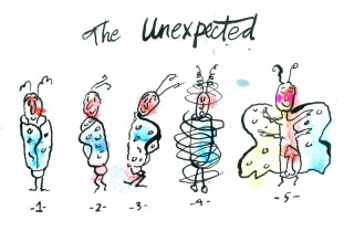
I had abruptly come to New York City on a quest to study with R. O. Blechman in a night class at The School of Visual Arts; taking a leap of faith from my first year at The Toronto College of Art. I don’t remember if I showed Michael or told him about my submission for R.O. Blechman’s class book contest: “DRAW the UNEXPECTED.” But I’m Including the illustration now. I had faxed home roughs to my Mom’s mahjong buddies and they had responded to: “not to forget to draw ‘the dangling participles!’”
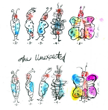
(Click any image to enlarge.)
Suddenly Michael was telling me that when I was studying with Bob Blechman at SVA, he was either working with Bob or had just opened up his studio around the same time. I was so elated, since I had shyly, after the class had ended, shown HUG ME (the moment it came off the presses), to R. O. Blechman, one evening when he was lecturing. And, later, Bob had redesigned the cover for my second book since the publishers design was hideous. And . . .
I was so nervous we knew the same person I kept turning pages of my portfolio and forgetting to breathe as I was talking. Michael offered me a glass of water. Since Michael had seen all my children’s books he was very patient with the work I was showing. I turned the pages to my favorite MS Magazine illustration I did for them. The Subject: MEN – The Case for Remarriage. . . Among Friends by John Leonard.
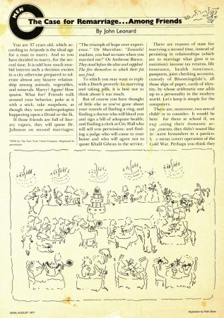
The John Leonard article with illustration.
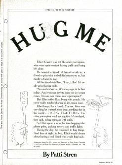
Then In one of the side pockets in my portfolio I pulled out MS MAGAZINE, Sept/1978/, that had the Prestigious Selection for STORIES FOR FREE CHILDREN. And HUG ME was in that section.
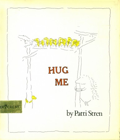
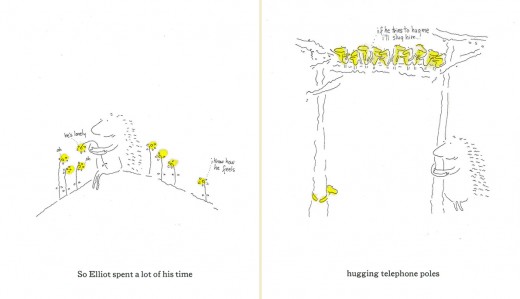
HUG ME book cover and two page spread (below).
Michael and I had already talked about HUG ME, my book published by Harper & Row at the time. And . . .
Producer Nick Bosustow animated HUG ME as part of the CBS LIBRARY SPECIAL called 4 WISHES. Winning 1st Prize at Zagreb Film Festival in Children’s Film Category in 1984.
 a
a 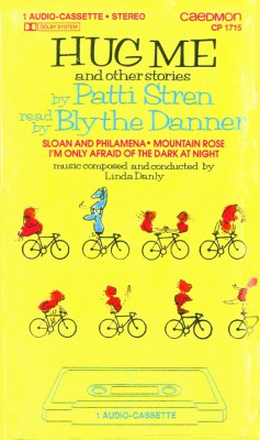 b
ba. The back cover of the video cassette.
b. The front cover of the audio cassette.
Michael seemed to know everyone I talked about in the business of film. HE had this way of making me feel comfortable, and I kept talking and talking and I confided to Michael that when writing for children I never really try to just write for children but for myself. And I never really planned things out. And Michael described how he created spontaneously in his films. Especially describing the broom closet scene in Lyle Lyle crocodile. . The more he spoke the more Michael reminded me of another gentle genius writer I knew. The wonderful and understanding and exceedingly exciting Writer John Gardner. Who always used to tell me to ignore intellectuals snobs that would act superior and to promise to be myself. Then Michael told me, that not only did he know John Gardner but that he illustrated for John Gardner too. And then we both discovered that John had sent us to the same Random House art director to be published by them. And how we’d both been sent away The coincidences kept adding up.
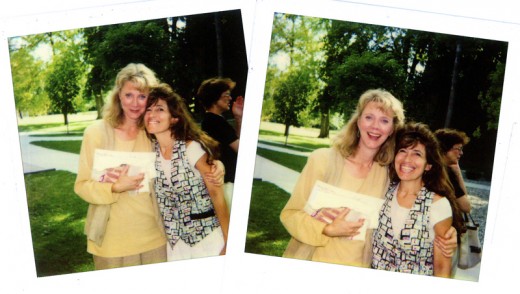
Blythe Danner and Patti Stren
Then Next in my portfolio were the most wonderful photos of Blythe Danner and myself. Always to remind me how happy I am that Blythe Danner Narrated the recordings of HUG ME and Other stories of Patti Stren.
Michael seemed pleased to see Blythe, since he had been really wanting to work with her, but the times had never coincided. Now I have all the rights back for the recording, and I am hoping to get Hug Me animated with the pages turning with Blythe’s narrating. Hopefully with Michael animating. And hopefully with a grant again as with many of my projects.
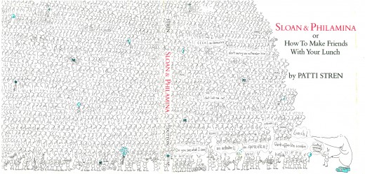
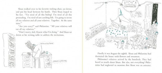
(above) The two page book cover for another of Patti’s books, SLOAN & PHILAMENA
(below) and two sample pages.
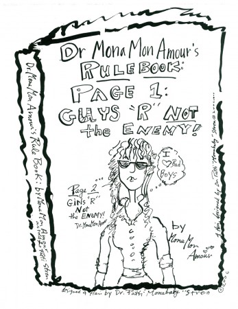
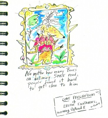
Finally I showed Michael my Secret Book Jacket Cover to my next Book in The Works! Therapy. Sex and Shopping. What Else is There in New York City. ( Except Alternate Side Parking!)
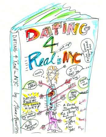
Sample covers.
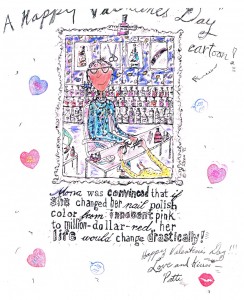
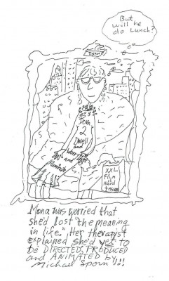
Little did I know showing my main character MONA MON AMOUR with the caption underneath her saying: Mona was convinced that she’d lost the meaning to life. Her therapist told her she’d just misplaced it –Would lead to our collaboration.
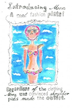
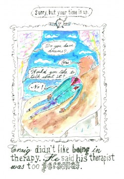
Patti’s creativity with Mona is endless.
And when I stopped talking to Michael Sporn about all these ideas I had; I thought I was going to faint. . . . I’d forgotten to breath. And when Rich my husband picked me and my portfolio up in our car; I had no idea Michael would want to make a film with me. But I knew if he did – I’d say yes!
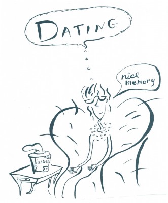
And Now heaps of years in the business, 1′m still having fun designing animated shorts, (the latest animation for Michael again), working on books (both adaptations from the two short animations, MONA MON AMOUR and the little genius Mozart).
A scene from the Mozart film.
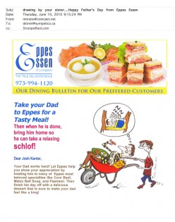
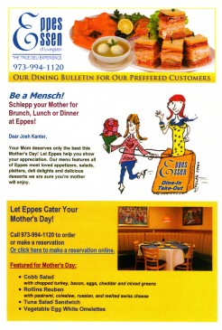
And I’m back to my Commercial Art Career. I’m available 24 hours a day, now designing for Eppes Essen Deli, in N.J. in hopes that Eppes will Fed Ex me Heaps of Chopped liver!

Guest writer &Photos 07 Jun 2009 08:02 am
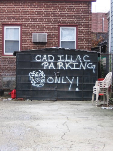
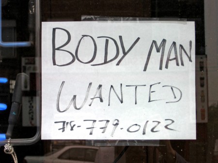
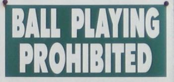
Signage PhotoSunday
Animation Artifacts &Guest writer 05 Sep 2008 08:00 am
Politics
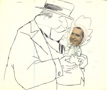
With the Republican convention finishing up yesterday, it seems appropriate to post a few of the politically related cartoons which Irv Spector did. These were sent courtesy of Irv’s son, Paul. The comments from here on are Paul’s:
- All but one — the McCay, natch’ — were done during my father’s time at MGM Tower 12 (The Jones era), and I would imagine — and I assume they were working on the The Pogo Special Birthday Special, and a “real” election year was also forthcoming. I tossed in the McCay which my dad seems to have had! (the answer is: I don’t know, but I do.) The others obviously pale in comparison.
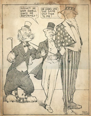
A Winsor McCay political cartoon.
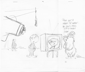
This is the only Pogo I’m sending you, as it has a bit of “truth” to it,
and the others are kind of stock, although nice drawings.
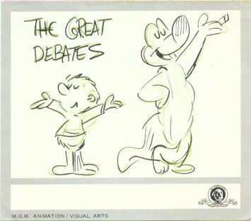
(MS note: After I just about begged for more, Paul sent these three
drawings from the Pogo period. It’s likely they were drawn by Irv Spector.)
These last 3 are kind of my favorite sort of thing, where
the cartoonists were kind of doing them to amuse themselves
or each other. This is my father’s, although I guess I don’t
have to point out his style by this point.
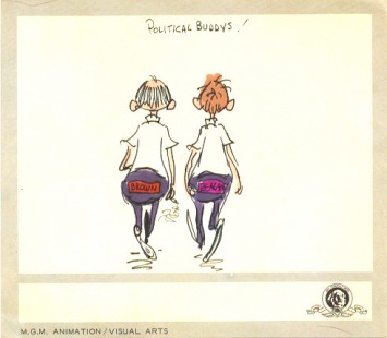
I’m pretty sure this is my dad’s, but not 100%. Not sure if
you are up on the old California political 60′s, but the Brown is
Gov. Pat Brown (actually quite good, as politician’s go) who was
Jerry’s father, and of course Reagan was governor soon after.
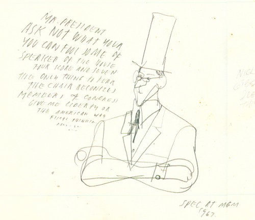
This was done by Nick Gibson, if you can make out my father’s
presence of mind to write that credit halfway between the character
and the right border. Seems my father wasn’t above pontificating a bit
himself. Looks nothing like him, but any profundity is in the text.
Animation Artifacts &Guest writer 15 Aug 2008 07:59 am
Irv Spector – II
- On Wednesday, I’d posted some wonderful drawings and an excellent piece by Paul Spector about his father, Irv Spector, in the Signal Corps. There are many more cartoons and caricatures Paul has to share, so here’s a follow up to that post.
On Cartoon Brew, Amid Amidi had this response to one of those commenting regarding the cartoons, and I think it worth adding here:
Gag drawings done at animation studios are very ephemeral. It’s hard to know fifty years later what the situation was that prompted this drawing by Cobean. Then again, these drawings were never intended to be viewed decades later or seen by people outside of the studio.
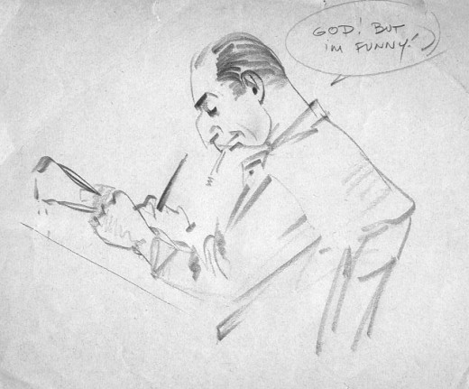
Irv Spector – “God – but”

