Category ArchiveIndependent Animation
Animation &Independent Animation &SpornFilms 03 Oct 2010 08:00 am
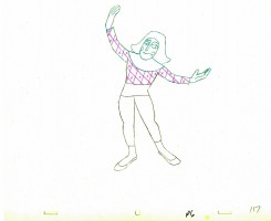
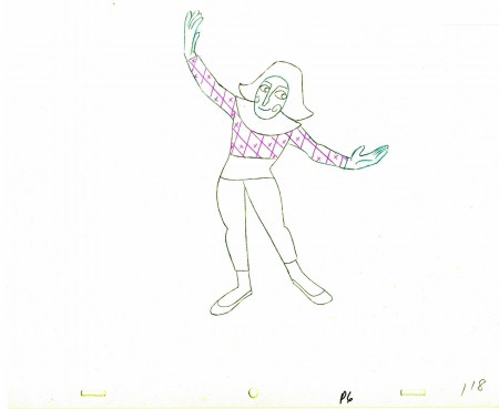
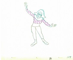
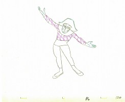
PhotoSunday Recap – Woman of the Year
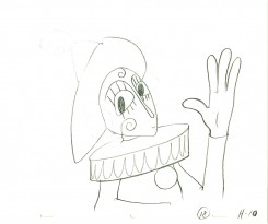
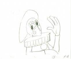
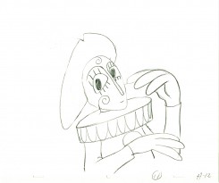
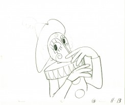
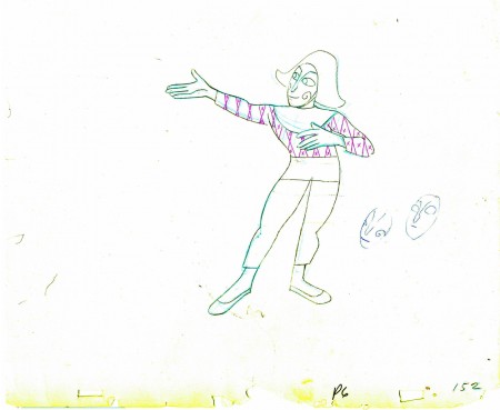
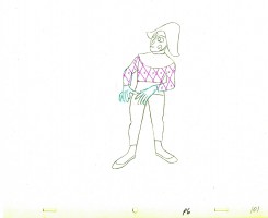
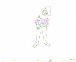
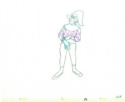
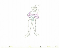
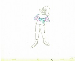
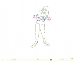
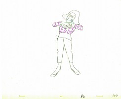
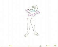
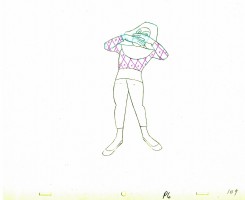
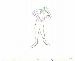
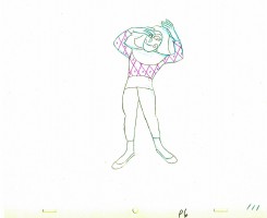
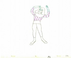
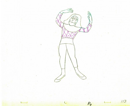
- Back in Jan 2007, I posted these photos from the animation production of Woman of the Year. I think these are interesting enough that they’re worth revisiting. So here, again, is that post:
 – To recap:
Woman of the Year was a project that came to me in the very start of my studio’s life – 1981.
Tony Walton, the enormously talented and fine designer, had gone to Richard Williams in search of a potential animator for WOTY (as we got to call the name of the show.) Dick recommended me. But before doing WOTY, there were some title segments needed for Prince of the City, a Sidney Lumet film. (I’ll discuss that film work some other day.)
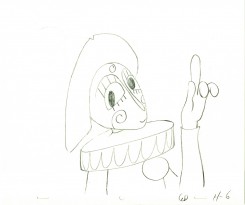
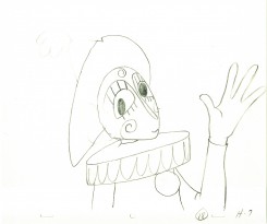
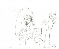
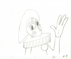
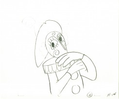
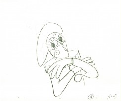
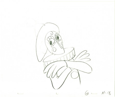
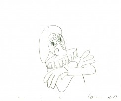
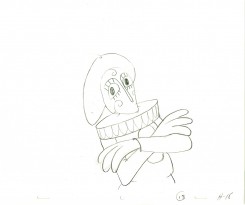
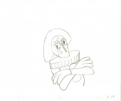
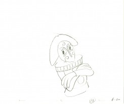
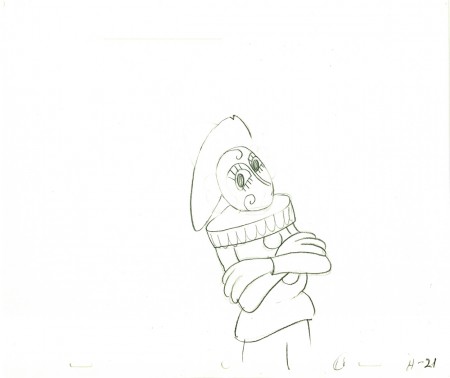
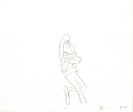
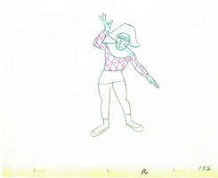
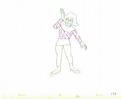
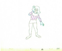
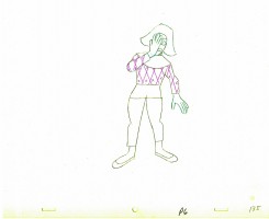
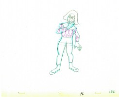
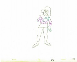
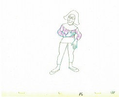
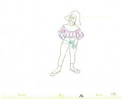
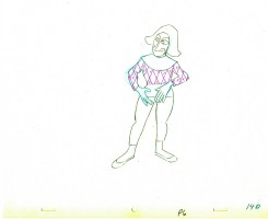
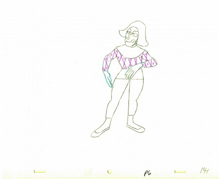
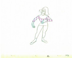
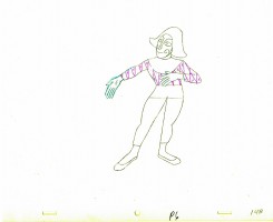
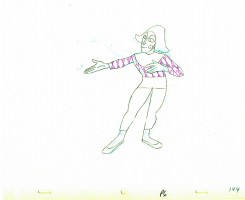
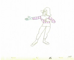
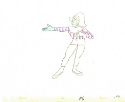
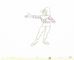
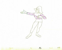
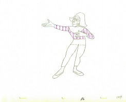
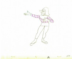
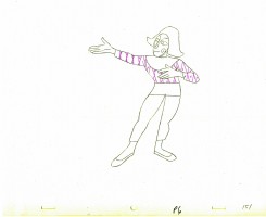
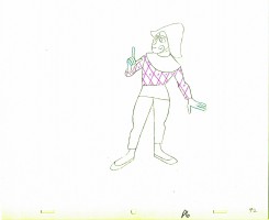
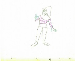
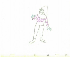
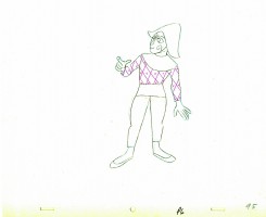
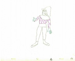
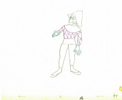
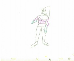
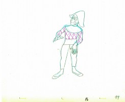
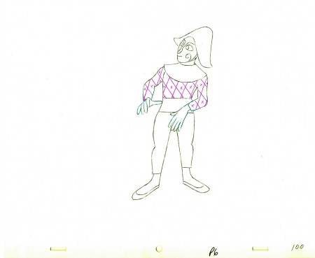
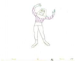
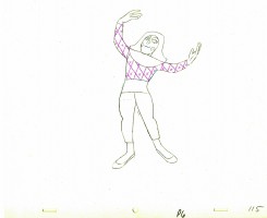
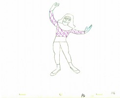
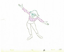
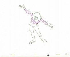
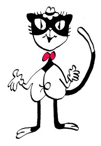
Tony Walton designed the character, Katz, which would be the alter-ego of the show’s cartoonist hero, played by Harry Guardino. Through Katz, we’d learn about the problems of a relationship with a media star, played by Lauren Bacall.
It turned out to be a very intense production. Three minutes of animation turned into twelve as each segment was more successful than the last. ___________(All images enlarge by clicking.)
There was no time for pencil tests. I had to run
to Boston weekly, where the show was in try-outs, to project different segments; 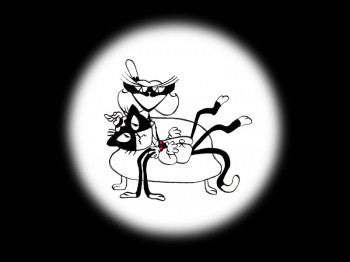 these went into the show that night – usually Wednesdays. I’d rush to the lab to get the dailies, speed to the editor, Sy Fried, to synch them up to a click track that was pre-recorded, then race to the airport to fly to the show for my first screening. Any animation blips would have to be corrected on Thursdays.
There was a small crew working out of a tiny east 32nd Street apartment. This was Dick Williams’ apartment in NY. He was rarely here, and when he did stay in NY, he didn’t stay at the apartment. He asked me to use it as my studio and to make sure the rent was paid on time and the mail was collected. Since we had to work crazy hours, it was a surprise one Saturday morning to find that I’d awakened elderly Jazz great, Max Kaminsky, who Dick had also loaned the apartment. Embarrassed, I ultimately moved to a larger studio – my own – shortly thereafter.
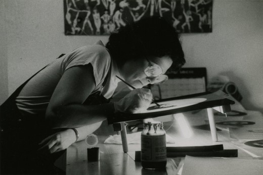
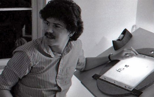
Here are a couple of photos of some of us working:
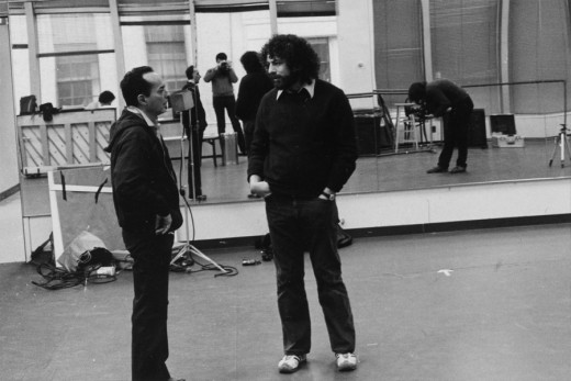
Tony Charmoli was the show’s choreographer. He worked with me in plotting out the big dance number – a duet between Harry Guardino and our cartoon character. I think this is the only time on Broadway that a cartoon character spoke and sang with a live actor on stage. John Canemaker is taking this photograph and Phillip Schopper is setting up the 16mm camera.
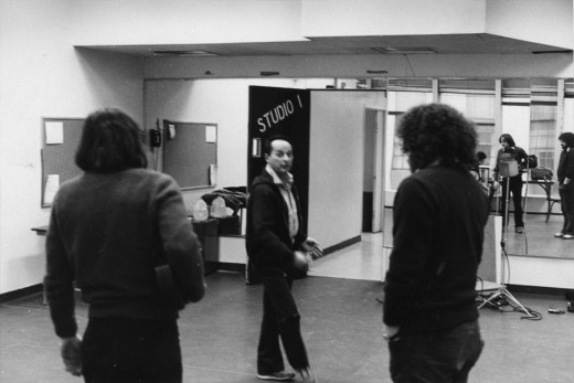
Here Tony Charmoli shows us how to do a dance step. Phillip Schopper, who is filming Tony, figures out how to set up his camera. We used Tony’s dancing as reference, but our animation moves were too broad for anyone to have thought they might have been rotoscoped.
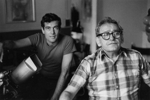
John Canemaker is working with Sy Fried, our editor. John did principal animation with me on the big number. Here they’re working with the click track and the live footage of Tony Charmoli to plot out the moves.
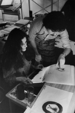
Steve Parton supervised the ink and paint. To get the sharpest lines, we inked on cels and didn’t color the drawings. It was B&W with a bright red bowtie. A spotlight matte over the character, bottom-lit on camera by Gary Becker.
 5
5 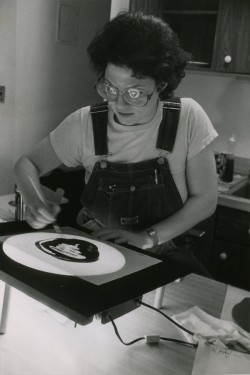 6
6
5. Steve Parton works with painter Barbara Samuels
6. Joey Epstein paints with fire in her eyes.
 8
8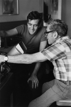 9
9
8. Harry Guardino on stage with the creation of “Tessie Kat” developing on screen behind him. This was Harry’s first big solo.
9. John Canemaker gets to see some of his animation with Sy Fried, editor.
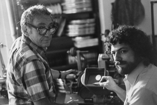
One of my quick stops from the lab on the way to Boston? No, I think this is a posed photo.
The success of the animation (including good reviews) posed a small problem for me. The rest of the show was ripped over the coals. When I started using some quotes about me in industrial ads, the producers came down on me for gloating over the others who’d gotten negative reviews.
All the same, it was a real learning experience in a big Broadway kinda way.
Frame Grabs &Independent Animation 30 Sep 2010 06:16 am
Harman-Ising’s Alice
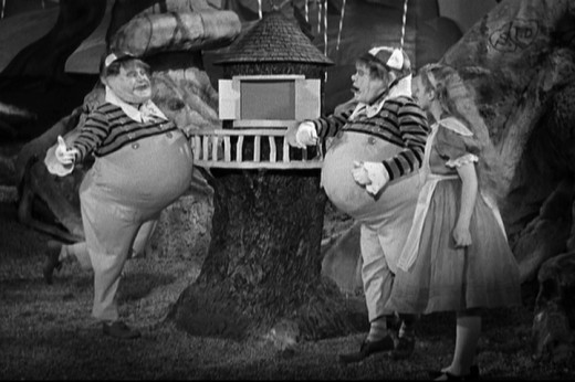
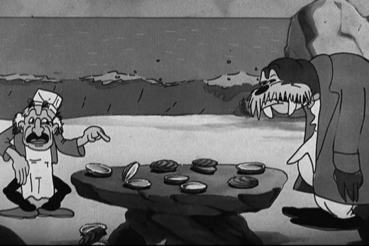
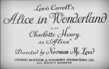 - The 1933 version of Alice In Wonderland, directed by Norman McLeod, is an interesting live action approach to an adaptation of Carroll’s classic. Something rarely discussed in animation circles is the Harman & Ising insert in the film, an animated version of the Walrus and the Carpenter. Tweedle Dee & Tweedle Dum narrate the poem, and there’s constant cutting back and forth of the live storytellers and the animated story.
The animation is right out of the Warner Bros H-I style. Not very advanced, though it’s certainly serviceable (especially given some of the second-rate costumes in this film.) This was done, I would guess, right after Hugh Harman and Rudolph Ising had left WB, and were out on their own – just prior to doing the Cubby cartoons for Van Buren and certainly prior to MGM. Alice In Wonderland is a Paramount release.
Here are some frame grabs – mostly of the animation. I’ve given a couple of shots of the Tweedles to give you the idea.
 2
2(Click any image to enlarge.)
 3
3
The sun was shining on the sea, shining with all his might;
He did his very best to make the billows smooth and bright -
 5
5
And this was very odd, because it was the middle of the night.
 7
7
The Walrus and the Carpenter were walking close at hand;
They wept like anything to to see such quantities of sand.
 9
9
“O Oysters come and walk with us!” The walrus did beseech.
“A pleasant walk, a pleasant talk, along the briny beach.”
 11
11
“We cannot do with more than four, to give a hand to each.”
 13
13
The eldest Oyster looked at him, but never a word he said;
The eldest Oyster winked his eye, and shook his heavy head -
 15
15
Meaning to say he did not choose to leave the oyster-bed.
 17
17
But other Oysters hurried up, all eager for the treat.
Their coats were brushed, their faces washed,
Their shoes were clean and neat -
And this was odd because, you know, they hadn’t any feet.
 19
19
Four other Oysters followed them; and yet another four;
And thick and fast they came at last,
 21
21
And more, and more, and more -
All hopping through the frothy waves, and scrambling to the shore.
 23
23
“The time has come,” the Walrus said, “To talk of many things;
Of shoes – and ships – and sealing wax – of cabbages – and kings -
And why the seas is boiling hot – and whether pigs have wings.”
“A loaf of bread,” the Walrus said, is what we chiefly need;
Pepper and vinegar besides are very good, indeed.”
 25
25
Now if you’re ready, Oysters dear, we can begin to feed.”
“But not on us! the Oysters cried, turning a little blue.
After such kindness that would be a dismal thing to do.”
 31
31
“It seems a shame,” the Walrus said, “To play them such a trick.
 33
33
“After we’ve brought them out so far and made them trot so quick.”
 35
35
The Carpenter said nothing but, “The butter’s spread too thick!”
 37
37
“I weep for you,” the Walrus said. “I deeply sympathize.”
With sobs and tears e sorted out those of the largest siize.
 39
39
“O Oysters,” said the Carpenter, “You’ve had a pleasant run!
Shall we be trotting home again?”
 40
40
But answer there was none – And this was scarcely odd, because
They’d eaten every one.
Animation &Animation Artifacts &Hubley &Independent Animation 29 Sep 2010 07:48 am
Littlejohn’s Snake – 1
- Bill Littlejohn, to me, was one of THE GREAT animators. It took years of my working on his animation for John Hubley before I finally met him. We’d spoken often enough on the phone since I was the production manager, Assistant, Animator and Layout guy for Hubley for about 6 years. I did any assisting needed on Bill’s work – and there was rarely much to do. He and his wife, Fini, were so amiable, affectionate and cordial in person; exactly the people I expected after all the phone conversations.
His animation seemed to be done in a straight-ahead style, and he did everything needed for the scene.
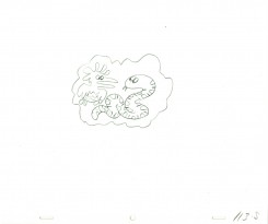
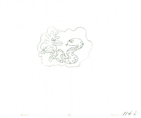
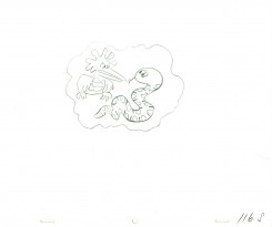
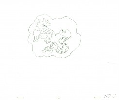
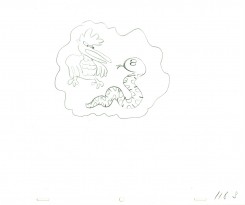
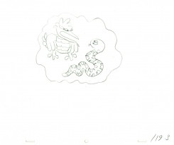
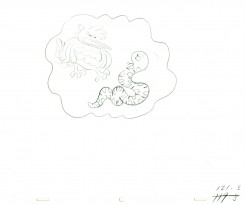
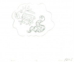
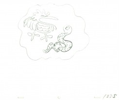
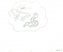
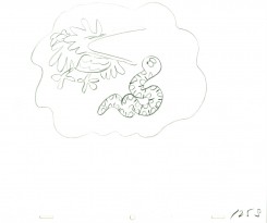
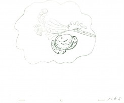
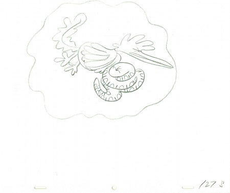
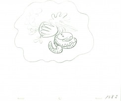
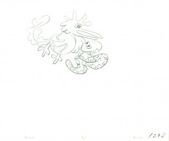
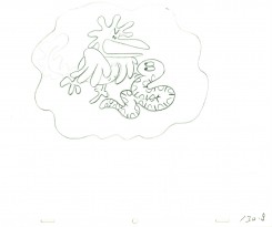
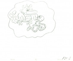
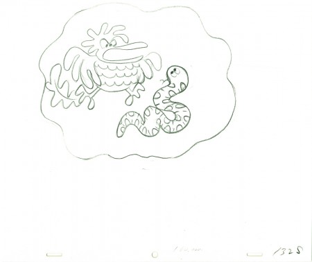
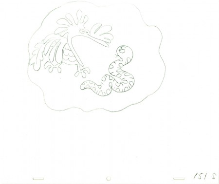
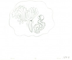
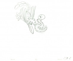
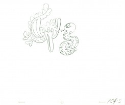
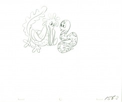
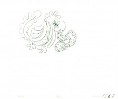
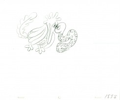
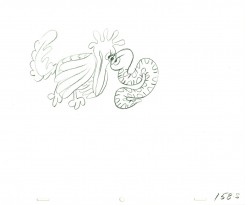
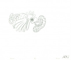
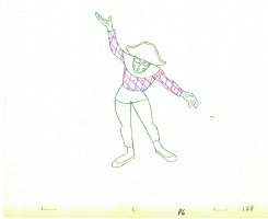
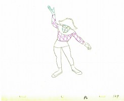
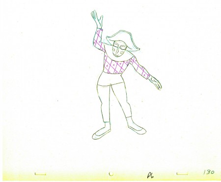
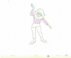
As promised I found a scene animated by him from Hubley’s Everybody Rides the Carousel. It’s not the best scene, but it showcases the almost calligraphic style Bill used for Hubley. The animation drawings just flowed out of his pencil (though he usually animated in pen for Hubley.) The only assisting I did on the following drawings were some of the outer balloons for the characters.
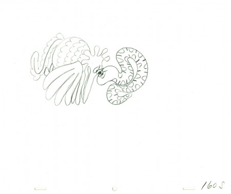
The scene represents the animal figures that constantly fight in the heads of the characters. For this stage there was a snake and a phoenix; one representing positive, the other representing negative.
 101
______________________
The following QT movie represents the drawings above
from Bill Littlejohn.
I don’t have the X-Sheets, so I exposed on two’s
except where there were gaps in the numbers.
There I treated part of it as a cycle – which is what it was.
I suspect the scene actually was exposed to last longer
using three’s and a couple of very short holds.
Right side to watch single frame.
Animation &Animation Artifacts &Hubley &Independent Animation 27 Sep 2010 07:27 am
Barrie Nelson’s Mime
- I’d posted a large scene from Everybody Rides the Carousel which was animated by Art Babbitt. The scene was the first one handed out when the film was scheduled to air as 3 half hour shows on consecutive nights. Babbitt did a stunning job, and John Hubley loved it. (He’d pulled me into the editing room to show it to me. “I want you to see the greatest piece of animation ever done,” were the words he greeted me with.
Hubley did some changes after the film was extended to a 90 minute TV special. It meant we needed an additional 10 mins of animation done within the same 6 month schedule. Hubley extended Babbitt’s scene putting it on four frame dissolves. Babbitt quit the project.
At the very end of production, John Hubley sent the rest of the mime to the brilliant animator, Barrie Nelson. The voice had changed, and the schedule offered little time to do the work. Barrie followed the voice rather than Art Babbitt’s mime. It came back a different character. True to Hubley’s style, schedule and budget, it was used regardless.
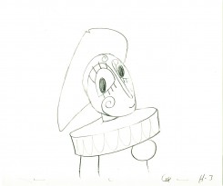
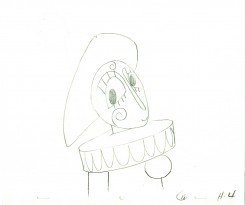
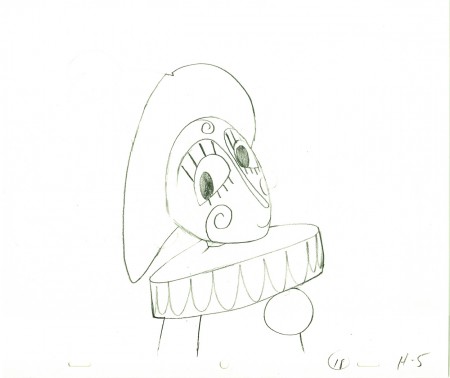
Here’s one of those Barrie Nelson scenes. I don’t have the exposure sheets, so I guessed at it.
 1
1  2
______________________
The following QT movie represents the drawings above
from Barrie Nelson.
I don’t have the X-Sheets, so I exposed straight ahead on two’s.
Right side to watch single frame.
Animation &Animation Artifacts &Hubley &Independent Animation 15 Sep 2010 07:49 am
Babbitt’s Carousel Mime – 5
- The Hubley feature film, Everybody Rides the Carousel, was adapted from Erik Erikson‘s Eight Stages of Man, a Psychosocial Theory of Human Development.
The Hubley conceit was to make the 8 stages of life as a carousel with 8 horses representing those different stages. The narrator was a mime and was animated, at first, by Art Babbitt, with Dave Palmer as his personal assistant. After animating a couple of early scenes, Babbitt left annoyed. Barrie Nelson completed the character in the show.
For the full story behind the rift between Hubley and Babbitt go to this past post.
The scene is 152 drawings long. This is the final section as the mime comes to rest. It’s a very slow moving character with short quick spurts of movement.
We begin with the last drawing from last week, #123.
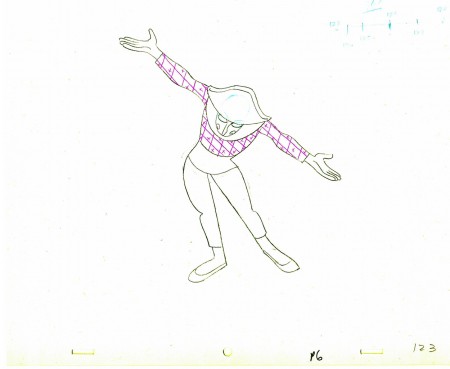 123
123(Click any image to enlarge.) ______________________
The following QT movie represents the drawings above
exposed as Babbitt wanted them, on twos.
Right side to watch single frame.
Commentary &Independent Animation 14 Sep 2010 07:02 am
Tulip Talks/Chabrol/McCarthy/Kelly
If you would like to hear a recording – dare I say “podcast” – MP3 recording of George Griffin interviewing Paul and Sandra Fierlinger, there is a link to the Film Forum website. It’s a good recording with plenty of audience comments and questions peppering the dialogue.
Take a listen if you have any interest in the work of this key animating couple or in Independent animation. They talk about how the film was funded and made within their small home in Pennsylvania.
Yesterday, David Nethery kindly left several clips on my blog which show how TVPaint was used to make My Dog Tulip.
___________________
Chabrol Dies
 - In the last year, we lost the great Eric Rohmer.
Then this Sunday the NY Times reported the death of the brilliant Claude Chabrol. Rohmer was probably one of the greatest influences on my work, but Chabrol brought a grace that I loved watching. He was an inestimably great producer as well as a distinguished director. I recommend you rent a DVD of his work to celebrate his life.
Kevin McCarthy Dies
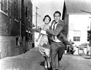 - And then on Monday I learned of the death of Kevin McCarthy. You may remember this actor from his role in the original Invasion of the Body Snatchers. He led the film, and got to perform in the remake as the guy screaming in the street warning of the next invasion.
McCarthy was a client of my lawyer. The lawyer not only represented him in legal matters but also acted as his agent. I always wanted to use his voice for some film, but the occasion never came up. My loss. McCarthy had a great sound and was a solid actor – and icon of the fifties and sixties.
Greg Kelly
Greg Kelly is a young animator who is working hard to learn the craft. He continues to turn out animation and sends his samples to me for criticism. Here’s a most recent piece of his on Vimeo. Short and cute with a good attempt at character animation. Here and There
The Illusionist
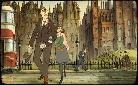
Sylvain Chomet‘s new film, The Illusionist, is scheduled to open in a limited release on Christmas Day, Dec. 25th, this year. It’ll qualify to compete for the Oscar. I’m looking forward to seeing this film, and I’m heading to Ottawa this year, not because I have a film in the race, but because I’m anxious to see Chomet’s movie.
Animation &Frame Grabs &Independent Animation 12 Sep 2010 07:50 am
Bill Plympton talks Idiots & Angels
 - Opening on October 6th at the IFC Film Center is Bill Plympton‘s most recent animated feature, Idiots and Angels. This like Bill’s other animated features is a labor of love; how could it be anything else when a small group works to produce 90 minutes of animation.
Bill’s style for this film has grown a bit darker and the subject is more cohesive for a full-length story. The look is more dark Eastern European than bright-cheery American. This makes it very grraphic and very much in the heart of Bill’s style.
I had the opportunity of interviewing him and asking 10 questions which illuminate a lot behind the process:
Michael Sporn: The story is probably your most complicated for a feature. The lead character is a bitter and nasty person (the “Idiot” of the title) whose wings (the “Angel”) take over his body to reveal his better nature. Where did this idea come from and what encouraged you to develop it?
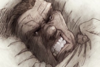 Bill Plympton: The idea for “Idiots and Angels” first came to me when I was in an animation festival in Lille, France and after screening “Hair High”, this French guy asked me what my next film would be—and off the top of my head, (I don’t know where it came from) I said “It’s a story about an asshole guy who wakes up one morning with tiny wings growing out of his back and he doesn’t like it because they make him do good things.”
The kid said he liked the idea, and as I thought about it, so did I. In fact, that night as I lay in my hotel bed, I began to create the character, his environment, and little story sequences.
People say this is my most mature film. It talks about morality, spirituality, and the human soul—they say Bill Plympton is growing up. I hope not, because I will always want to make weird, surreal, offensive comedies.
MS: The draftsmanship in this film is probably your finest. There’s a lot of rendering on the characters using a limited number of colors. It’s perfectly tuned to the film. I wonder how all that line work and rendering is done. You animate the entire film yourself, but surely you must have a lot of help with the rendering? Do you do extremes to set the style and have others follow through?
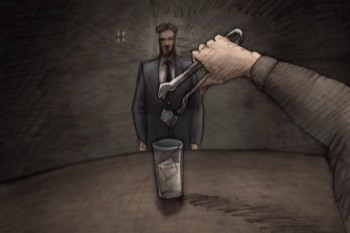 BP: The technique for this film is very new for me. All my other films were shot on a camera stand and now that the cost of digital to film transfer has come down to my pocketbook level, I’m able to scan the drawings and shade/color them digitally.
This is a great breakthrough for me, because all through my life I loved the simple look of pencil on paper. But when I began animation, my copier could never recreate the subtlety and richness of my pencil shaded drawings. So “Idiots and Angels” is the first film to properly recreate the pencil on paper look I love so much.
The process is fairly simple—I do all the animated drawings, erasing the mistakes and redrawing over the original, which gives the art a wonderful layered texure. Then I placed the humongous stack of scenes (30,000 drawings) on my co-producer Biljana Labovic’s desk and she makes sure the artwork is scanned, cleaned, composited, and most importantly colored to the noir-ish style of the concept drawings. We had a staff of about 25 people who off and on would come in to put my drawings together.
MS: – There is a lot of repetitive action in the film. That’s a major part of its style. (The repeated opening of the sunrise, clock and bird singing is obviously done over and over in many different ways.) Yet you don’t seem to use a lot of reuse in doing so. This would have been an easy option given the material. Was it a conscious choice to not do a lot of reuse?
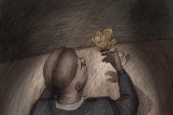 BP: Over the years I’ve had a lot of criticism because my films are not fully animated. In fact, the action is fairly herky-jerky. So in this film, I tried to smooth out the action somewhat. Instead of shooting on 3′s and 4′s I shot on 2′s and 3′s. Also, I wanted to put in the extra effort to try to use different shots for scenes that were repeated, just to give it a more professional look.
However, there’s one shot where Angel attempts suicide, and I held one drawing for approximately 30 seconds and let Greg Sextro, my sound man, tell the story only through sound effects. I always love it when I can take a shortcut like that and it makes the storytelling that much more unique and interesting.
MS: Having a small independent studio involves doing a lot of jobs that don’t pertain to the actual drawing of the film. How do you travel to film festivals, teach classes within your studio, raise money for your employees’ salaries, figure out how to distribute your film and still have time to animate a feature single handedly?
BP: That’s a very good question. I’ll answer the questions in order—The travel to film festivals is fun but also is a very important part of the job. I use film festivals to make sales and spread the message of indie animation. I’ve stopped teaching the classes, because I want to devote more time to my films and teaching wears me out. The money raising is through sales of my films all over the world on TV, theatrical, DVD, and other media.
My distribution is pretty much by formula now since I have a group of buyers that consistently pay me for the rights to my films. And finally, I have time to single handedly animate my films because I don’t have a family, and I just plain love to draw.
MS: Digital production must have affected your films. Do you work with Photoshop and Aftereffects to get your work to screen? And are the drawings colored prior to scanning?
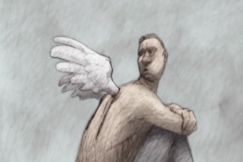 BP: The drawings are colored and shaded after they are scanned. My assistants use Photoshop to color the images, After Effects to composite the frames, and Final Cut Pro for editing and touch-up.
MS: Getting your films distributed has to be the hardest part of the work of feature production. Have you learned how to do it after so many features produced? Or does the business keep changing making it more difficult? Do you have any hope that a major distributor would step in to pick up the film, or do you plan to distribute it yourself?
BP: This is a very important question. There are three parts to filmmaking. 1) Raising the money, and this one is a very large barrier to many filmmakers. 2) Making the film – this is the fun part, and 3) Selling your film and actually making money off of it. This is by far the hardest part—maybe. 0.01% of filmmakers get past this barrier. To answer your question, fortunately, over the years, I’ve been able to create a name for myself and a large fan base.
So if by chance I don’t get a distribution deal I’m usually able to self-distribute, which is what I am doing with I&A. It’s a huge hassle because I have to make the deals with the cinemas, sign the contracts, make posters, make trailers, make multiple prints and do all the press. Then I have to get the money from the cinemas.
But the best part is that I get to retain ownership of the film and often times I make a lot more money than I would with a large distributor.
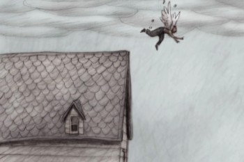 MS: I know that you’re prone to see everything that’s animated. Does the work of big companies, such as Disney, Pixar or Dreamworks affect the way you do your films in any way?
BP: I’m very happy with the success of Blue Sky, Pixar, and Dreamworks. We’re living in an exciting time when we’re seeing 20 or so animated feature films released every year. In the so-called “golden age” of animation 1930-1950, we’d be lucky to see one animated feature every two years.
I believe that the kids who grew up watching “Lion King” or “A Bug’s Life” now want to see animation with adult ideas done in more creative styles, and hopefully these are the people who will line up outside the IFC on October 6th to see “Idiots and Angels”.
MS: Since you’ve started making feature films, others have followed your suit in making their own long films. Does the competition worry you or are you open to it?
BP: In 1991 when I made “The Tune” independent features were a very rare specialty.
Now it seems, thanks to digital technology, that everyone is making their own animated feature and they’re great films: “Sita Sings the Blues”, “My Dog Tulip”, “Queer Duck”. I believe that we need to cultivate this audience for indie animation and show them that there’s some great amazing films being made by small groups of people without major funding!
MS: Do you have another feature in the works?
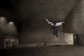 BP: Actually, I have two features I’m working on. One has the working title “Cheatin’” that’s done in a very similar style as “Idiots and Angels” but with a much more exaggerated visual style. I’ve put that on hold while I negotiate financing. In the mean time, I’m working on a flash feature called “Tiffany the Whale”. The script and storyboard are all done and we’re already begun animation. This will be a much lower budget film and may be serialized on the internet.
Finally Michael, I want to thank you for giving me an opportunity to talk about my films and hopefully make people aware of the thriving indie animation scene. You’ve been an inspiration for me my whole career so it means a lot to me that you’ve give me your support.
MS: I’m always open and available to you, Bill. You’re the insiration for most Independent animators, believe me. How could I not support that!
Articles on Animation &Guest writer &Independent Animation 11 Sep 2010 07:56 am
Paul & Sandra & Tulip
MY DOG TULIP opened at New York’s Film Forum and will be followed by a limited national release. The NY reviews were excellent. The film did so well in its opening week that it’s been extended to Sept. 28th. You have even more of an opportunity to see it.
This interview/article was written by Karl Cohen for ASIFA-SF and he has given me his permission to post it.
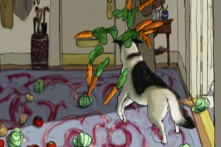
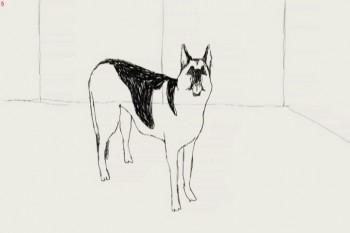 One of the impressive animated features coming out this fall is My Dog Tulip based on the book of the same name by J.R. Ackerley (1956). It’s a delightful comedy that I fell in love with at the SF Film Festival. Its directors, Paul and Sandra Fierlinger, have created over a hundred award winning films including Still Life With Animated Dog (2001) that won a Peabody Award and a Special Jury Award from Zagreb. A Room Nearby (2003) also won a Peabody and their Drawn From Life series (2000) has won a grand prize at the Ottawa
International Animation Festival. In 1980 Paul received an Oscar nomination for It’s So Nice To Have A Wolf Around The House.
Although the couple may not be well known by the public, they are highly respected among their peers, so when asked how Tulip came about as a project Paul explained that the film’s producers Norman Twain and Howard Kaminsky, “Just called us out of the blue. One of those calls you think never happens.†They asked right off if the Fierlingers wanted to make a feature film. They didn’t know the couple and their main concern was that the film had to be based on a famous book.
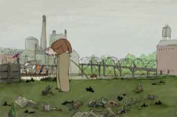 After some discussion about possible books to adapt they decided upon My Dog Tulip. It turned out Howard Kaminsky knew the book and controversy over it when the book was published, as he was president of Random House, the book-publishing firm, for twenty-five years and prior to that was president of Warner Books for seven years. The book and film have scatological references that were quite shocking to polite society in 1956. A contract was eventually agreed upon and it took about three years for Paul and Sandra to complete the project.
Paul says, “It was wonderful work. I could wake up every morning and know exactly what I was going to do and I loved the work. The whole process was very pleasant. There are no horror stories to tell. Nothing bad happened.†The Fierlingers had total artistic control and the budget was $1.3 million, enough for the couple to complete the production with famous voice actors (Christopher Plummer, Lynn Redgrave and Isabella Rossellini) and to be able to provide film festivals with 35mm prints with Dolby sound.
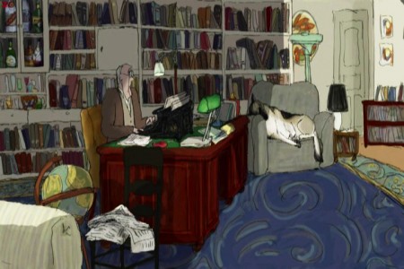 Adapting the book did present problems, as it is basically a series of humorous tales about incidents in the life of J.R. Ackerley as he raises the dog, an Alsatian (German Shepherd) and they become great friends. To flush out the film’s script Fierlinger added true elements not mentioned in the book, including having the author’s sister live with him for about a year. During that period she tried but failed to win over the dog’s affection.
To flush out the story Fierlinger’s producer hired Peter Parker, an excellent British writer who had written a biography of J.R. Ackerley. Paul says, “His prose is equal to Ackerley’s.†If you see the film I think you will assume, as I did, that every word came from the book.
An unusual element in Paul’s long format work (he has also done hundreds of TV commercials, short pieces for Sesame Street, etc.) is his use of different styles and techniques that separate segments of the story. He wasn’t sure what I was referring to when I brought up the subject so I pointed out that in his film And Then I’ll Stop (1989) he had five or six people talking about their lives and each person had a different style of art representing them and their world. Paul then explained that he feels long animated films using the same art styles and rendering techniques throughout the film get boring no matter how well they are done.
He remembers that the first animated feature he saw that he really liked to the very end was Yellow Submarine (1968) because it was done in so many different styles. In his work you know the same artist drew each style, but the variety keeps the work visually interesting.
When working on a story Paul says he gets into a special frame of mind. “In my mind I live the story,†so he draws what he imagines. “If it is a sloppy character then you draw a sloppy line. I did that in And Then I’ll Stop. And if it is the story of a very pristine accountant of a big company I draw him in almost Saul Steinberg type lines.â€
Paul has been around long enough to see sound recording technology change drastically. With new microphones and digital recorders he no longer needs to use a big studio with sound booths. Some of Tulip was recorded around a kitchen table, but to record Christopher Plummer the producers rented studio time.
Paul pointed out why it is important to record most soundtracks before animating characters. The character Plummer created in his reading of the script wasn’t the man that Paul had envisioned so he ended up drawing the main character somewhat differently than he had originally planned.
The film’s composer/sound engineer is John Avarese who has worked with Paul for many years. Paul says, “You can tell him the kind of music you want and he can just pull it out of his hat.†Most of John’s work has been for corporate and industrial clients.
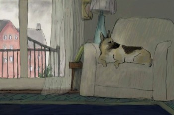 The animation was done using TVPaint, one of the oldest 2-D animation systems available. It was started in 1991 and was developed by an independent producer as a work of love. Paul became a beta tester in 1992 or ‘93 and helped develop the system’s capabilities.
His wife Sandra is the film’s co-director. Her background is in painting. She studied at the Boston Museum’s school and graduated from the Philadelphia Academy of Fine Arts. They work together quite well as Paul is a skilled draftsman, but he says, “I never learned to paint or work with color. Most of my films have had very little color in them.†She started working with him in 1989 as a painter when animation was hand painted on cels. She enjoyed the work and together they learned the TVPaint system. She also was involved in beta testing the software. As they learned the system they would ask the software developers to make certain adjustments. Thus the system became tailored to their needs. Eventually other accomplished 2D animators from all over the world joined the beta team to create a unique application specifically meeting the needs of independent artists.
One important part of Paul and Sandra’s good working relationship is her helping him to resolve drawing problems whenever he feels stuck trying to make a decision. He says that often happens, that he can “paint myself into a corner and nothing seems to work, so she looks at it with fresh eyes. We figure it out together. We do that all the time, even when I start writing a script, before I start drawing.†Paul feels all their films should simply say “A film by Paul and Sandra Fierlinger.â€
We closed our discussion with Paul’s advice for couples that want to work together on animated films. Based on having lived and worked with Sandra for almost 20 years he says, “The trick is not to have children. If you have children, that gets in the way. You have conflicts. If you don’t have children, you only have your work.†I’m not sure how popular his advice is with parents, but judging from their films that I’ve enjoyed over the years, the advice certainly works for this animating couple.
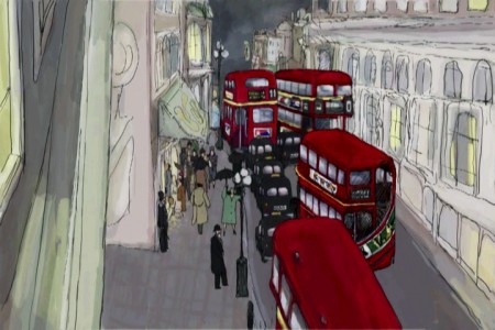 Before I spoke with Paul I asked Norman Twain, one of the film’s producers, about their distribution plans for the film. He said, “The film will open at the prestigious art house, Film Forum, in New York City on September 1 and concurrently in similar calendar art houses in San Francisco,* Los Angeles, Dallas, Philadelphia, Chicago, Boston, and Toronto, as well as in other New York theaters. Hopefully, as the traction grows we will expand to other major calendar houses in the larger markets in the United States. We will promote the film in the best possible manner, directing promotion toward an Academy Award nomination. Pending the reception of the film in America, we will exploit the foreign market to the best extent we can. Cinemavault, a film sales group based in Toronto will handle foreign sales. After the US distribution has run its course, we will look for a VOD (video on demand) release, concurrently with a DVD release and after that, will try our best to get it on television (hopefully PBS or cable TV network – as it is much too nasty for a broadcast network to show).†*Tulip opens in SF and Berkeley Oct. 15 at Landmark’s Embarcadero and Shattuck cinemas.
I also asked if it was difficult financing the project. He replied, “Fortunately, most of the fund-raising took place prior to the crash, or should I say prior to the sudden scarcity of funds. It’s not an expensive film, under $1.3 million. I think, as all entertainment investments go, it’s risky, but will prove profitable. I am happy to have produced it and will be happy to see it in release.â€
I end this discussion with a disclosure. Both Paul and I are extremely fond of dogs. My wonderful yellow Labrador Retriever recently died after being my close friend for 14 years and Paul and Sandra Fierlinger have two rescue dogs at present, a Jack Russell, “probably from a puppy mill,†and a mutt that he says is a cross between a German Shepherd and a Corgi. It had been abandoned. It has a large Shepherd head and a strange body so a friend of Paul’s once remarked, “Oh, a Photoshop dog.†Paul tells me that he sometimes used her as a model when he was drawing Tulip.
Animation &Hubley &Independent Animation 08 Sep 2010 07:43 am
Babbitt’s Carousel Mime – 4
- John Hubley‘s feature film, Everybody Rides the Carousel, was adapted from Erik Erikson‘s Eight Stages of Man, a Psychosocial Theory of Human Development.
There was a carousel with 8 horses representing different stages of life. The narrator, a mime, was animated by Art Babbitt, with Dave Palmer as his personal assistant. After animating a couple of early scenes, Babbitt left annoyed. Barrie Nelson completed the character in the show.
For the full story behind the rift between Hubley and Babbitt go to this past post.
The scene is about 200 drawings long. Here’s the fourth part. It’s a very slow moving character with short quick spurts of movement.
We begin with the last drawing from last week.
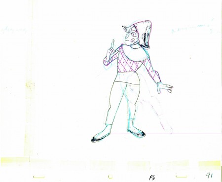 91
______________________
The following QT movie represents the drawings above
exposed as Babbitt wanted them, on twos.
Right side to watch single frame.
Animation &Errol Le Cain &Independent Animation &Richard Williams 04 Sep 2010 07:35 am
The Sailor & the Devil
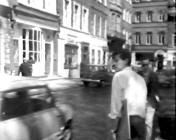 - There was a documentary about Richard Williams that I saw many years ago on PBS. It made me an ardent enthusiast of Williams’ work, and I followed his trajectory over many years. Eventually, I worked with him.
The show was called The Creative Person: Richard Williams and was made in 1966. Within the show was a very small section about one of Williams’ artists, Errol LeCain. He was given the task of making a film 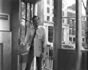 by himself. As Williams explains, this would teach him all the aspects of animation filmmaking and the studio would gain a short film in the end.
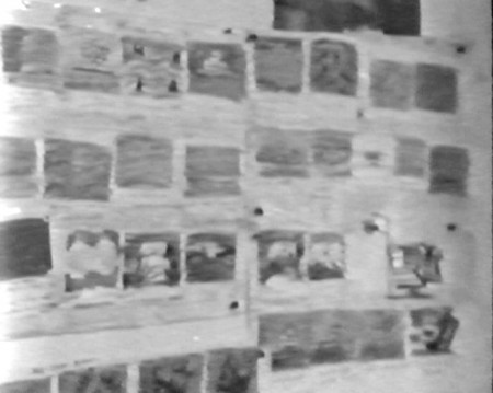
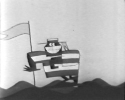
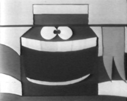
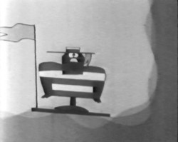
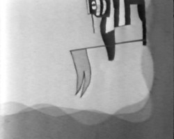
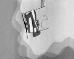
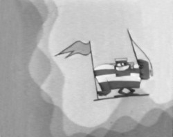
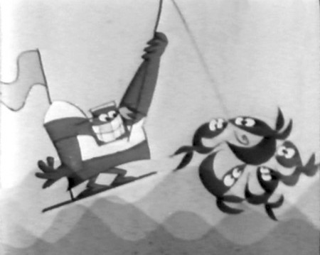
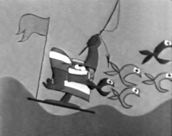
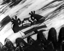
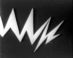
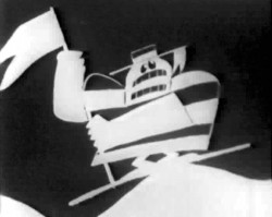
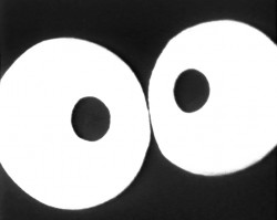
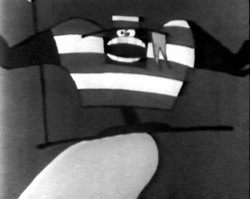
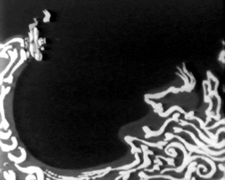
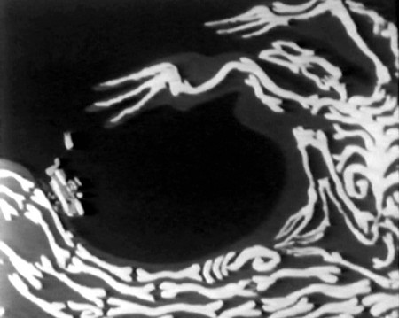
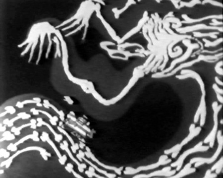
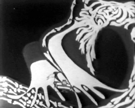
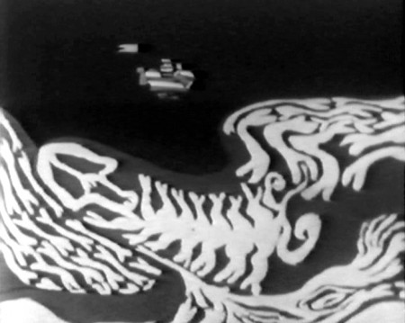
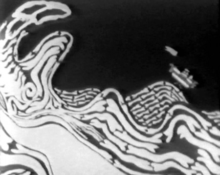
The film was called The Sailor and the Devil. This is probably the only film done by the Williams Studio that I haven’t seen. It’s still not on YouTube. Hans Bacher gave some color images on his site, one1more2time3, a year ago. Wanting more, I went back to the special and made frame grabs of some of the film, and I’m posting them here.
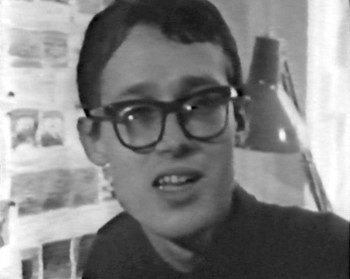
Dick was so young, as was Errol LeCain. He went on, of course, to become a world-class children’s book illustrator and the original designer of the backgrounds for the ill-fated Cobbler and the Thief.
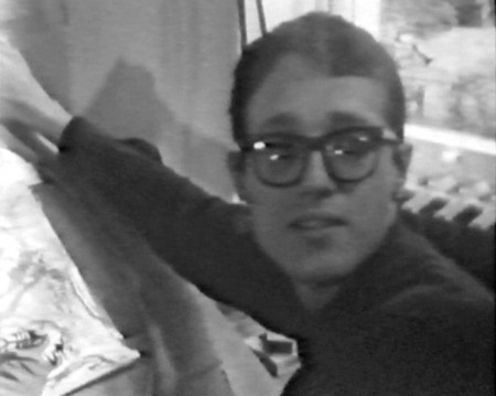
Errol LeCain
