Category ArchiveIndependent Animation
Animation &Animation Artifacts &Independent Animation 02 Jan 2011 09:54 am
Culhane Ajax recap
This post, with some slight variation, originally appeared on May 16, 2006. I was thumbing through one of Shamus Culhane’s books and decided to post it anew.
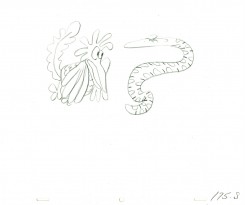
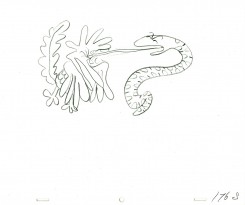
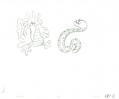
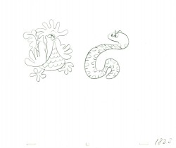
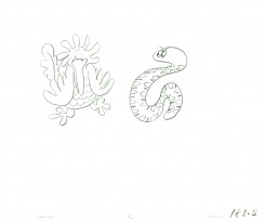
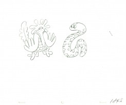
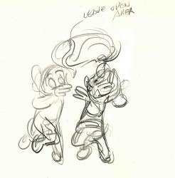 - Acting as a companion piece to Mark Mayerson‘s posts re Shamus Culhane‘s direction on The Pied Piper of Basin Street for Lantz in 1944, I am posting these drawings from the early spots Culhane directed for Ajax Cleanser.
As Culhane reports in his autobiography, the call came out of the blue in 1949 from an advertising agency offering these commercials which became enormously popular. Culhane formed a studio hiring Art Heinemann to design the three elves in the spot, and Art Babbitt teamed with Shamus to animate it. The ad campaign lasted until the late 1950′s. I can remember the spots clearly, though I was never overwhelmed by them, even as a child.
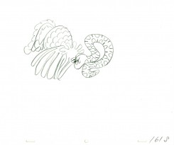
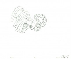
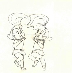 It’s interesting to see how varied the rough and the clean–up are from each other (they both are for the same number.) The clean-up is also obviously designed to be inked not xeroxed (which predates 1959).
I bought these drawings which while marked as animation drawings by Culhane, are probably not. The rough could possibly be his work, but I don’t think so.
It looks more like Emery Hawkins, but that’s not much more than a guess. The clean up looks like the work of Gerry Dvorak, but that’s also an educated guess. If anyone out there has a better idea, let me know.
I’m also sure that this spot ran in the mid 1950′s. I distinctly remember seeing it originally on tv when I was a child. To see one of the Ajax commercials go here to see a number of early tv spots.
If you click on either image you’ll enlarge it to full animation paper size.
Commentary &Independent Animation 24 Dec 2010 08:43 am
Magicians Do Not Exist
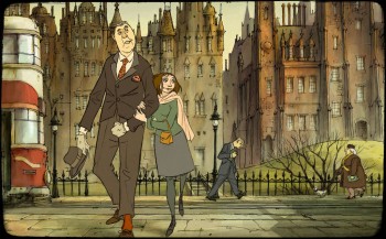
- Magicians Do Not Exist. These words break your heart in The Illusionist and raise the film to real “Art” – with a capital “A”. Basically, that message can be interpreted as “Artists” and, by implication, “Art” is dead, or (because I’m an animator) “Animation” is dead. The lonely guy, without his rabbit, riding off in the train is Sylvain Chomet, the film’s director, disillusioned with the clichéd and limited landscape that animation has become.
Of course, that’s my interpretation of the film’s story. I don’t want to go into it too deeply or I’d be giving too much away to those who haven’t seen it.
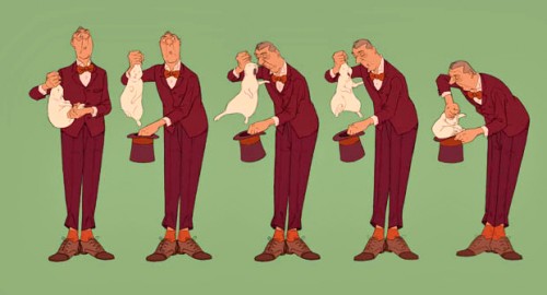
I saw the film again this week, and the experience was even more thrilling than the first viewing. Yes, there’s some mediocre, even poor animation. Some was done in Korea. You can see a few Long Shot walks of the girl that are wanting – she’s not even touching the ground properly. But it doesn’t matter. The film has so much character, such a deep story/screenplay that it’s impossible to ruin it with a few small scenes.
There are all those great ones. Long takes beautifully choreographed of Tatischeff drunkenly trying to ascend some stairs while avoiding a cleaner washing the floor. All the beautiful mists and waters and moving clouds and incidental characters – that all have character – that you couldn’t ask for more. The film captures atmosphere and place better than any animated film I can think of. This is a Scotland more affecting than the one in Local Hero, and that’s saying a lot.
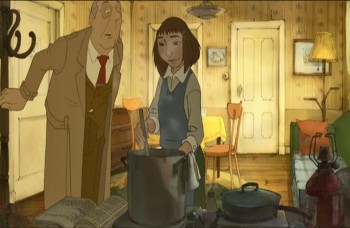 The film tells the story of a travelling magician. He starts out in Paris at big venues and, over the course of the credit sequence, his performances go out to smaller and smaller houses. He eventually ends up in a small town in Scotland performing in a bar. There a young girl adopts him, and he feels compelled to take care of her – first buying her shoes, then more and more
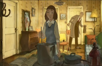 clothes until he has to take on a second job to be able to afford the responsibility he has assumed. Eventually, lacking proper performance gigs, he descends to advertising/promotion in a store window. But he quickly rejects these jobs (“No, no, no, no”). He’s an Artist and he can’t lower himself to use his magic for commercialism. Better to work as a menial laborer in a garage. This all plays out without any dialogue – other than a few choice words that can be deciphered from the French, English or Scottish Gaelic. The characters all speak different languages, yet work to make themselves understood. A similar schema also worked in Chomet’s first film, The Triplettes of Belleville, but there it was purely musical. A song dominated the soundtrack and carried us along throughout the film. Here, we’re given a beautiful score (also written by Sylvain Chomet) that is combined with particular sound effects to help set the Scottish flavor and the world we’re inhabiting for 90 minutes.
The film is quiet and, like Jacques Tati’s live action films, slower moving. It’s told completely in Long Shots. There are no closeups. The nearest we come to that is a scene where the girl is up close to the camera, cooking. Tatischeff, the magician, walks near her to smell the food, but then walks back into the scene leaving the girl, still up front, in a half shot. It’s all wonderful planning and quite complicated to pull off, which Chomet and his animators do, well.
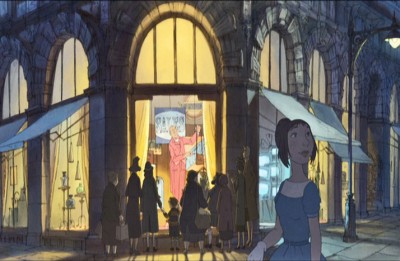 The film opens tomorrow, Christmas Day. I urge you to see it and judge for yourselves. Those of you who like the snappy, popping animation of Tangled, will probably not like The Illusionist. Regardless, this is the craft done stunningly well for less than a fifth of the budget for Tangled. It should be seen by anyone who loves animation and wants to see it stay alive.
I’ve seen most of this year’s films, and I’d rate this as one of the three or four top. Black Swan, True Grit and 127 Hours all are equal. The Illusionist fits somewhere among those four. As for animated films, only My Dog Tulip and How To Train Your Dragon are in the same ballpark – but far below Chomet’s masterpiece.
You can read a very positive NYTimes review by Manohla Dargis here.
A NYTimes feature showing some pencil test and animatic can be seen here. It’s appropriately silent.
Independent Animation 11 Nov 2010 08:53 am
My Thoughts on The Illusionist
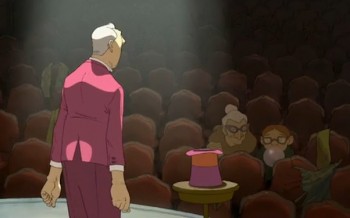 - Last night, I saw Sylvain Chomet‘s film, The Illusionist. I truly thought it was brilliant – acting more as a film than an animated film. At the moment it feels like one of the better films this year. I think I need to see it another time or two for me to write about it properly, but I’ll try here, anyway.
First let me talk about Chomet’s first feature, The Triplettes of Belleville. The promo for that film, online, was the first 3 or 4 minutes of the film. A wild takeoff of some thirties style animation that beat to the rhythm of the Oscar nominated song from the film. In the feature, this promo turned out to be a television image that the two leads watched in their small house. Immediately, you were into the story of a mother (grandmother?) helping her child who’s devoted to bicyce riding. They spend all their efforts on his career with a lifetime of training for the Tour de France. The film has such a wonderful sense of design, you’re spending much of your time ignoring the fine animation in front of you to take in the details on the backgrounds.
For a while, that movie worked wonderfully for me. Characters are fully and wonderfully developed – without dialogue. However, I think it goes wrong at the point where the bike riding boy is kidnapped and taken to Belleville. Even when you get to Belleville, you have to be taken by the scenery.
But the story has gone askew. Some gang types have kidnapped the boy to run a faked indoor race for the sake of gambling. Grandma, with the help of the singing triplettes of Belleville, rescues the boy and kill off the gang’s members. The gang members are a difficult design to swallow: square-backed look-a-like creatures that merge into one another with their modular form. They’re the only characters in the film not based on human form, and they come off as unacceptable, for my taste. I’d already left the story, the design of these characters pushed me out of the film.
It was Chomet’s first feature. It had its shortcomings but was still the best animated feature I’d seen in years.
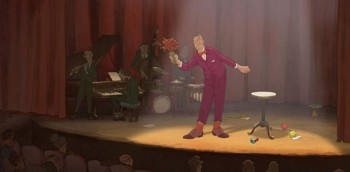 Now Chomet has completed his second feature, and has far eclipsed what he’d done before it. It possibly helps that the film was written by Jacques Tati just prior to his death and sat unmade since 1959. The form, the structure, and indeed the style all came courtesy of Tati. And the results are beautiful and excellent. The animation, the best done in many years, comes courtesy of Chomet, and it is brilliant.
Prior to seeing this film, many evocative clips were placed on line. Like the one longer clip for Belleville, these had my mouth salivating for great 2D animation. Triplettes didn’t quite make it; the clips for this film give us the mood of The Illusionist, but the actual feature goes all the way and more.
Prior to seeing this film, I’d read several very positive reviews from professional critics in papers such as The Guardian, Movieline, and Variety.
There were also the reviews from snarky commentors like the one who talked about wanting to walk out on all three viewings. (Hint: you don’t go to a film three times wanting to walk out on all three! Something is suspect. This review was placed verbatim on several sites.)
But then there is also the on-line review by the astute Mark Mayerson at his website calling the film: “Chomet’s best film yet, one that combines his eccentrics with a melancholy tale of age and youth.”
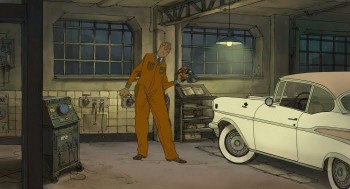 Undeniably, the film moves at a relaxed, comfortable pace. It doesn’t try to be the wham-bam-loud screaming films Pixar and Dreamworks make. It moves slowly and naturally like a Jacques Tati film. The humor isn’t hard-edged and in your face à la How To Train Your Dragon or Toy Story 3. The characters don’t scream their dialogue (the habit of animation films for the past twenty years or so); in fact they don’t have any dialogue.
The action is done mostly in mime. A word is heard every so often, but they’re irrelevant. This was also Chomet’s scheme in Triplettes, and it worked well. Music is at the heart of his animation. However, it doesn’t feel completely natural here – a touch forced. I thought if there were a scene in the beginning where the magician and his ward spoke different languages to each other. If she spoke Hungarian and he French, and there were no interpretation, both the principal characters and the audience would be left out, for the most part.
The young girl follows him to the point where he feels obligated to take care of her, almost adopting her temporarily. This point seemed to bother several people I talked with. Richard O’Connor on his blog Asterisk Pictures takes exception to it and questions its political correctness. I found it completely innocent and had NO problem whatsoever. However, Mark Mayerson nicely compares it to Chaplin’s Limelight. There, an older performer takes care of a young ballet dancer. It’s a smart association to have made. I also saw other films in there. Just this Tuesday I’d watched Local Hero Bill Forsyth’s little gem of a film. The mood was perfect in both films showcasing the Scottish countryside. The backgrounds, the animation, the lighting, the delicacy of the direction (rarely are CloseUps found – it’s all establishing and Long Shots. There’s a grand scheme here. It’s a wonderful film.
An excellent interview with Chomet was printed in The Guardian just prior to the film’s unveiling at the Edinburg Film Festival back in June. I encourage you to read the whole. This is a small quote from it on the Disney/Dreamworks statements about the death of 2D animation: “. . . American reflex to kill off the competition, to say that you can only do it one way and destroy everything else that went before. The whole society is like that. They destroy what they have to build something new. They end up with no roots to draw on, nothing to compare their work with to see if it is good or not. American culture is in real danger of starving itself to dead. You just have to see what Hollywood is producing to see how narrow it is getting.”
Mayerson said:
-
“Some films become touchstones; they remain part of the conversation years after their release. For some part of the animation community, The Illusionist will be a touchstone.”
I can’t put it better, and I can’t say any louder that this is undeniably, to me, the best animated feature I’ve seen in, at least, the last 10 years. It’ll eventually reach you. It opens Christmas Day in NY & LA to qualify for the Oscar. It’ll come to your town in 2011.
See it if you love animation and/or film.
Books &Independent Animation 02 Nov 2010 07:25 am
Just Published
The NYTimes features a longish article about Sylvain Chomet’s film, The Illusionist. It appeared in Sunday’s paper.
Likewise, the NYTimes also has an article about Megamind. It’s essentially a photo essay.
- George Griffin sent me a couple of links: one to an article at ArtForum Magazine about the scupture of animation artist Robert Breer; it’s a good read. Take a look here.
There’s also a spot called “Dot” from Aardman Animation that’s worth viewing at YouTube. Here It reveals what went in to making the world’s smallest character animated film and how it was shot using a Nokia N8.
Book Review
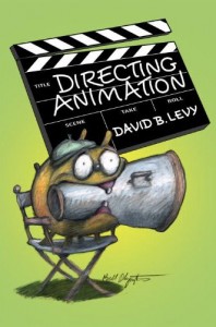 - David Levy has fashioned an exceptional career for himself. He’s been producing animated shorts, teaching at the School of Visual Arts, and writing books. It’s the latter career choice that I’m interested in, today. Dave’s got a new book hitting the market today, and I’d like to talk about it.
Directing Animation is published by Allworth Press, and it’s his third book and a good companion to the other two: the first, Your Career in Animation: How to Survive and Thrive and the follow up, Animation Development: From Pitch to Production.
David is concerned with the nuts and bolts of animation. He wants to reveal how things work. In the first book, Your Career in Animation: How to Survive and Thrive, he focussed on how the individual should work in an animation studio. It was something that hadn’t been touched on before: proper manners and activities within a studio environment; essentially, how to work with others. The second book, Animation Development: From Pitch to Production spoke to those were trying to develop a series for television and how to present it to those in the position of power. It perfectly, again, taught the proper protocol for delivering your message and selling yourself. Neither of these books, really, had any predecessor.
This third book, Directing Animation, is also something original. It talks about the person who controls a film. There are many book on live-action directing, none that I know of – except this one – for animation. David spends much of his time talking to professionals and gives a guide to working within a group, a studio structure. He also spends plenty of space talking about the Independent animation Director.
I’m mentioned quite a bit in the book, as is Bill Plympton (who did the cover art for the book.) We’re the old timers, it would seem, and a lot of other younger directors such as David Palmer, Tatia Rosenthal and Ian Jones-Quartey get plenty of coverage. Even Web Directors, such as Xeth Feinberg, are discussed.
I’m sorry there isn’t time spent discussing the history of animation direction with some of the past geniuses who set the way: Chuck Jones, John Hubley, Bob Clampett, Jiri Trnka and the many others with strong personalities. It would be nice to see what made those people strong directors and how we can learn from their films.
The book gives more of an overview than an actual how-to approach to the subject. Unlike a book on how to direct a live-action film, there’s little talk of the language of film; no mention of such things as: “the inadvisability of cutting from LS to CU or back”, “the complications of shooting a pull back – zoom out” or even “crossing the 180°”. No, this book is more about getting the job and what’s expected of you. However, using a lot of anecdotes and answers to questions from the directors chosen, a lot is revealed. The subject takes us from TV series to animated features to web productions. A lot to cover, and it does it gracefully.
The book is a good companion to those questioning the career choice. However, it takes a lot of experience to do it properly. The knowledge of film structure and live action history has a lot to do with properly directing a film – even an animated film. Hitchcock once said that there’s only ONE possible setup for a scene, and you had to find that setup. In animation we usually jump from one hyper dynamic pose to another; it’s not film language but comic book language. A book can only tell you so much; the experience will reveal much more.
I’d say that if you want to direct, you should make a film – by yourself, if necessary. You’ll learn a lot of mistakes to avoid for the future and get your directing career going.
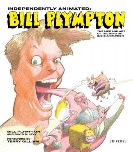
The book’s a great read, as are all of David’s works. I’m looking forward to his upcoming book about Bill Plympton. This is something different for David, and I’m curious to see how he’ll approach it.
_____________________
Animation &Illustration &Independent Animation &Models 21 Oct 2010 07:58 am
Sempé Spot
- Sempé is one of the great living cartoonist/designers. Tissa David recently gave me this poster-sized collection of original drawings that he did for her when designing a commercial which she animated. She kept the piece of artwork over her drawing board until the spot was finished; then she rolled it up and put it away in her closet. It’s my good fortune that she cleaned out that closet.
The spot was done for R.O.Blechman‘s THE INK TANK in New York, when they were still in business.
Here’s the full poster of models:
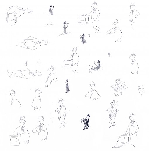
The inks have faded a bit, and I’ve tried to make up for
that in photoshop without damaging the delicacy of his lines.
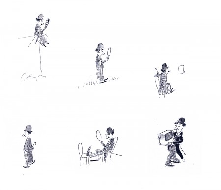
Here are some reconstructions of some of the models so you can have a closer look:
 1
1The Charlie Chaplin character – used as the mascot for the commercial series.
Here are two QT ads done at the studio in Sempe’s style during this
time (1986-87) sent to me courtesy of J.J. Sedelmeir. Many thanks.
TIGHTROPE
MARTIN MARIETTA
Commentary &Independent Animation 16 Oct 2010 07:40 am
Plague Dogs
 - I’ve been watching some older animated features lately. Plague Dogs, I thought, deserved another chance, so I rented the DVD. I was right. The film is a very odd one.
Surprisingly, despite the depressing subject, I found myself unattached to the story’s emotions. I would guess it has to do with the direction of he work.
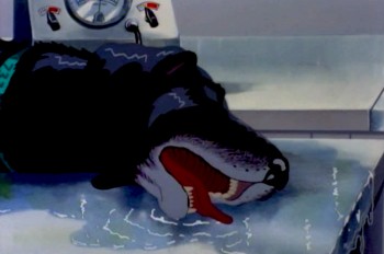
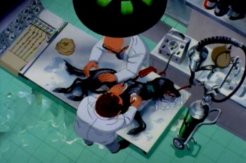
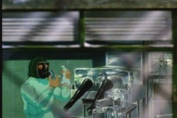
The film starts with one of our two lead characters
in deep trouble in the laboratory.
The story is essentially the story of two dogs who escape a laboratory that experiments on animals, and they make their way across the British countryside while teams of people search for them. One of the dogs has been inflicted with a plague bacteria and could spread the disease outside of the lab.
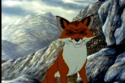
The story is told through a sort-of narration done in a very clever way. Disconnected human voices talking about the situation are used as voice over. We don’t often see who’s talking but we hear their voices. There are times where the voices start and we join the speakers in their conversations. The two dogs communicate with each other and a fox, who helps them in their escape.
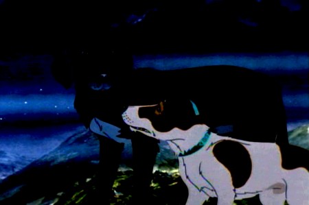
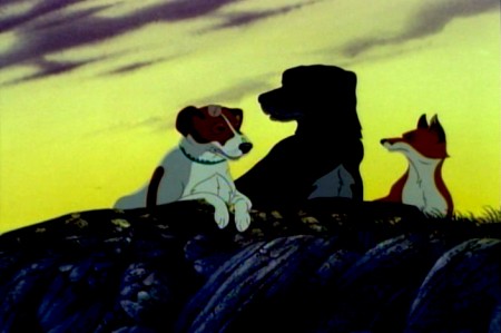
The dogs escape and travel the back roads in the mountains.
The animation throughout is just about serivceable. No scenes really shine even though there are a couple of standout names in the credits – including Brad Bird, Tony Guy and Retta Scott – as animators.
The film was a follow-up project for producer/director, Martin Rosen. He was the original producer of Watership Down, and his ego allowed him to think he could direct that film better than John Hubley, who was fired within the first sixth months.
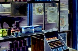
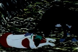
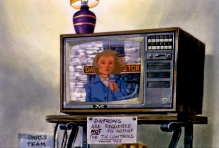
There’s the constant play between the travelling dogs
and the humans who talk about them roaming the countryside.
It’s no surprise that Plague Dogs includes no poetic scenes such as the introduction and the “Bright Eyes” sequences of Watership Down. It’s all down and heavy, done with a lack of grace. Yet, despite this there are several very clever devices for keeping the story moving forward. It would have been nice to see what better animation and a better director might have brought to it.
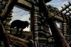
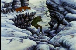
However, the film’s tough subject matter was sure to bring back poor business, and there’s no surprise in its low grosses at the box office. However, as I’ve said, the film deserves another look.
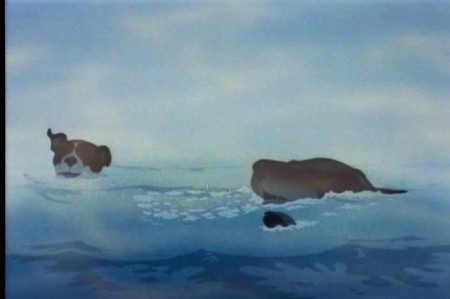
The film gasps for air with the heavy approach, though it deserves
praise for trying to be different and take animation seriously.
Animation &Animation Artifacts &Independent Animation 12 Oct 2010 07:37 am
Animal Farm cast
I had some communication with Chris Rushworthy, an enormous fan of Halas and Batchelor’s Animal Farm. I had just watched the DVD again and wondered if Chris, who has an large collection of art from the film and has a website to showcase it – AnimalFarmWorld, had ever seen a set of drafts for the film. Which animator animated which scenes?
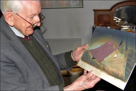
He didn’t have one, but that didn’t stop him from contacting Harold Whitaker, who was a key animator – not only on Animal Farm but for Halas & Batchelor – to ask if he had one. Whitaker responded with a signed card of people who had worked on the film. Interestingly enough, only three people who signed the card actually got screen credit, so I guess that many of the signers were from the Ink & Paint department. Whitaker is the only animator I recognize, to have signed the document.
Here’s the card, and alongside it I tried to identify the names – however, it isn’t easy reading all the signatures. Those that I’m sure I’ve got wrong, I’ve added question marks (????) to the names. If you’re confident of any of the names, please feel free to let me know.

.
Bunnie Harvey
Wynn F. Stewart
Eve Lewis
P. Knowles
Jay Pope
M. O. Smith
Pat Neal
W. M. Smith
J.E.Grundy ???
Ty F. Young (Mrs. Muir)
Kay Coroline
Pat Williams
David A. Hancock
Mike Western
Helena F. Evans
Anthony M. Gray
B.D.Salway ???
Harold Whitaker - animator
D.F.Kniley ???
Sid Griffiths - camera
Mary G. Bennett
John M. Gurr – Camera
Doris Reis
Pam Shipway
Jay Graves
Jo May
Dorothy S. Jones
Hazel Box – (Mrs. Gray)
Beryl Wall
Elizabeth N. Syed
C. L. Newman
D. Coombes
J. Davis
Joan Rissik
Elizabeth Taylor
Mollie Shipway
Ceinwen Fowler
.
The film’s credits don’t offer a hell of a lot more. The names are few and they’re written in script. No first names – just a letter. H. Whittaker – yes, two “t”s even though the card above has just the one “t”. IMDB offers a few additional credits.
One not on IMDB is Gerald Potterton; he told me it was his first position as an inbetweener.
Chris Rushworthy also gave me a preview of a beautiful new setup he recently bought to add to the collection. This is it.
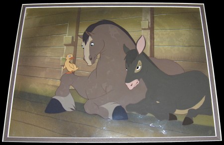
Boxer, Benjamin and duckling
Check out his site to see plenty of other cel setups and drawings.
Art Art &Comic Art &Illustration &Independent Animation &Layout & Design 11 Oct 2010 07:18 am
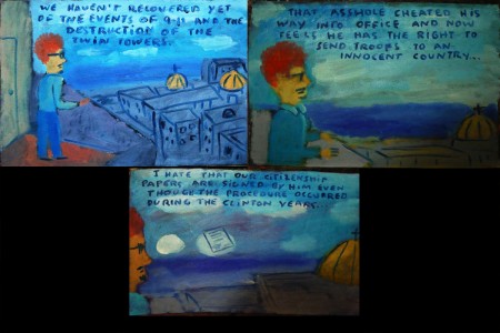
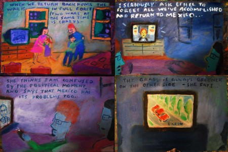
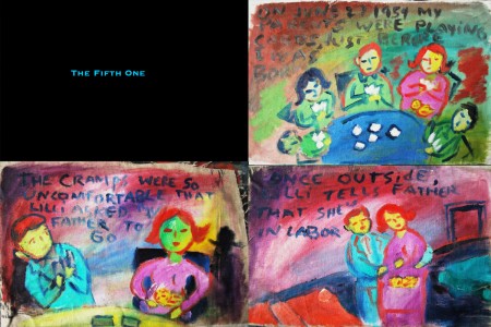
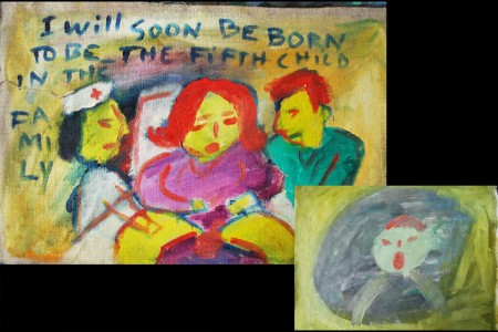
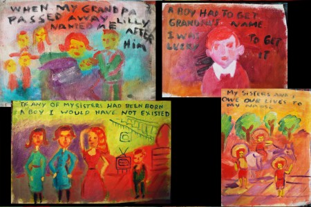
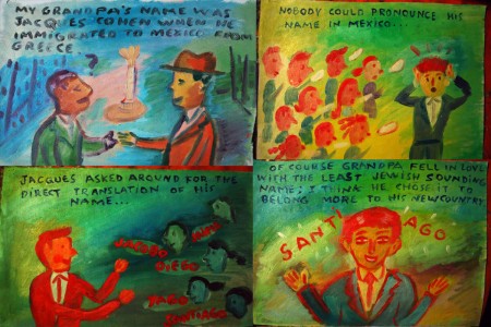
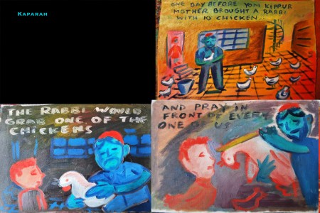
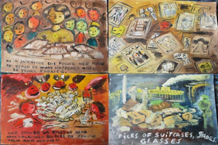
“Ex Vida” from Santiago Cohen – 1
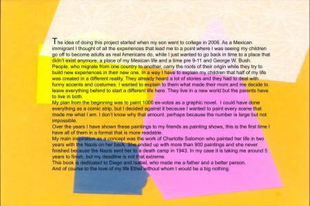
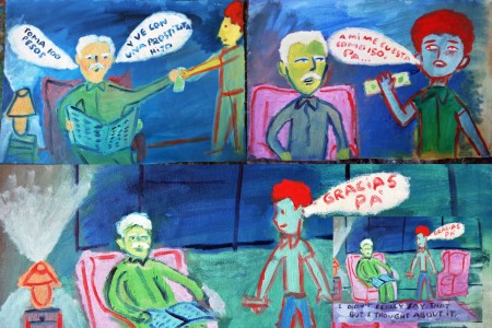
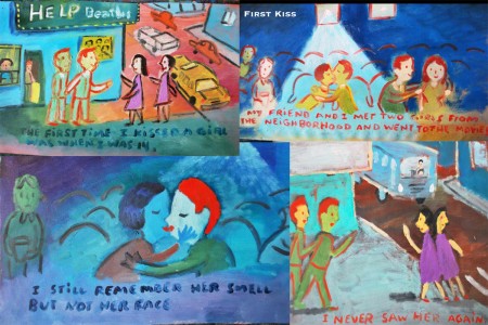
- At a recent event, I was sitting with a couple of other artists and we bagan talking about Santiago Cohen. Here’s one of the greats on the New York scene, and it seems as though he went from super success to silence. We all were hoping something would happen, if only so that we could see more art.
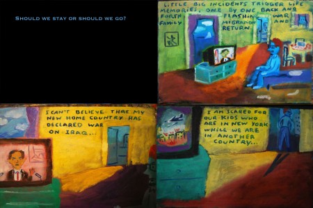
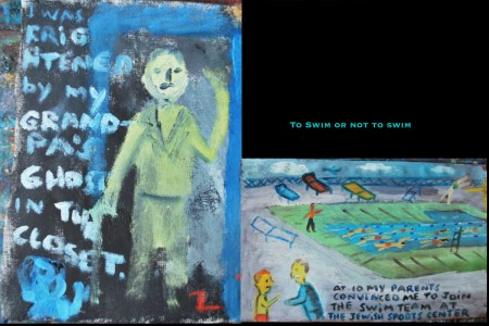
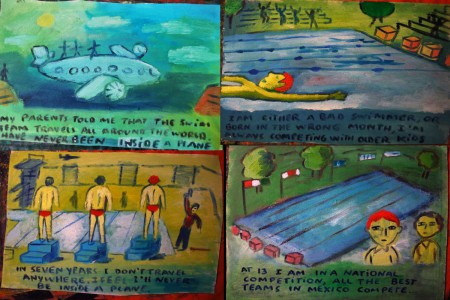
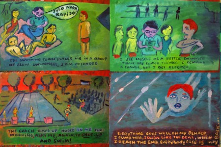
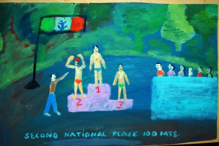
When I returned from my short vacation, I was surprised to find an email from Santiago. He offered to send me part of a piece he was working on to get my thoughts. It’s an illustrated biographical notebook. And, as expected it’s stunning. I received the first couple hundred pages, and I asked Santiago if I could post it. He said yes, so here we go.
It’s appropriate that this piece should start today, Columbus Day. It’ll continue for a while. I’ll break it into parts, all about 40 pages, where it seems unobtrusive. This is “Art” with a capital “A” in the making, from Santiago. It’d make an incredible film.
Let us know what you think.
 1
1(Click any image to enlarge.)
More next Monday.
.
Animation &Animation Artifacts &Hubley &Independent Animation 06 Oct 2010 07:45 am
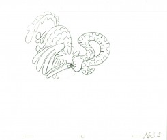
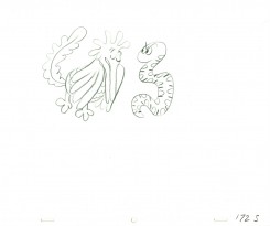
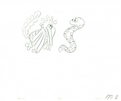
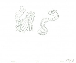
Littlejohn’s Snake – 2
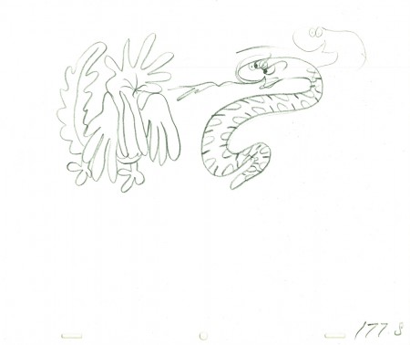
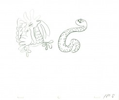
- As I wrote last week, I feel that Bill Littlejohn, was one of THE GREAT animators. I worked on many of the scenes that he animated for John Hubley. At first, I was inking his work (and I always did it with the exposure sheets right in front of me so I could see how he was animating.) Then I had to assist some small bits of his animation.
After learning of Bill’s death, last week, I immediately went searching for a scene I could post. This one, from Hubley’s Everybody Rides the Carousel, is not a great scene, but it’s typical of Bill’s work. A beautiful free-flowing style, the scene showcases the almost calligraphic style Bill used for Hubley. The animation drawings just flowed out of his pencil.
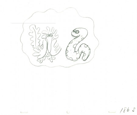
The scene represents the animal figures that constantly fight in the heads of the characters. For this stage there was a snake and a phoenix; one representing positive, the other representing negative.
We start with the last drawing from last week’s blog post.
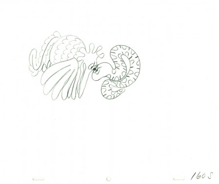 160
160
______________________
The following QT movie represents the drawings above
from Bill Littlejohn.
I don’t have the X-Sheets, so I exposed on two’s
except where there were gaps in the numbers.
There I treated part of it as a cycle – which is what it was.
I suspect the scene actually was exposed to last longer
using three’s and a couple of very short holds.
Right side to watch single frame.
Animation &Commentary &Independent Animation 05 Oct 2010 07:28 am
Idiots & Angels – 3 reviews
- Tomorrow, Oct. 6th, Bill Plympton’s most recent feature, Idiots and Angels opens officially in New York. The IFC Center will screen the film for a limited run. However, if people turn out that could be extended. Bill needs your support; take the family and see the film.
As we did with Paul & Sandra Fierlinger‘s film, My Dog Tulip, we’re posting three short reviews of Idiots and Angels. These are by the three animators in my studio, Matthew Clinton, Katrina Gregorius, and me. In doing that, the hope is that we’d have a wider scope in the review and one that would focus on the craft of the animation. We all agreed that we had problems with the film, yet I’m not sure whether we got that point across in the reviews. You’ll have to decide.
Katrina Gregorius
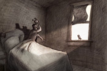 Bill Plympton’s latest feature Idiots & Angels has taken me through a journey within myself in the same way the main character is transformed within the film.
Idiots & Angels is about a guy who is inherently angry and is a jerk to everyone around him. One day, he mysteriously starts to grow wings that eventually try to prevent him from doing any harmful deeds. The rest of the film explore his reaction as well as other character’s reaction to these wings.
Initially I am left without a lot of positive feelings about the film regarding character and story development, but a closer look reveals a film that is an in-depth study of human nature. What I originally thought of as a lack in character development is actually a disturbingly accurate and genuine portrayal of human nature.
Bill Plympton uses color to create the perfect mood for the film. He also creates some playful transitions that are really fun to watch.
Matthew Clinton
Idiots & Angels is mysterious right from the start. It’s almost like you’ve landed on one of the dark planets in “A Wrinkle in Time“, where you don’t know who is controlling things or what the truth is. You can feel that things are off, and it’s unsettling. Angel, a devious man who kind of just blends in, wakes up and heads off to his favorite bar. The city is busy with cars and Angel’s awful ways become clear when he blows up a similar suit-wearer who has taken his parking space. He lights the car’s gas tank on fire. Strangely, the city seems totally empty of people – nobody is there to notice the horrific crime, and it is daylight. Maybe nobody is allowed to see? Angel walks into the bar and doesn’t give the murder a second thought.
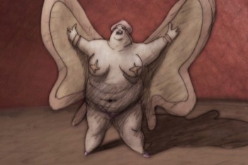 The bar is the center of this decrepit planet. It gives power to the few poor souls who haunt the place: a suit-wearing barkeeper, his barmaid wife, a large card-playing lady, and Angel himself. It’s a motley group. The barmaid shines among the rest of the creepy cast and even manages to penetrate all the septic cigarette smoke and noir shadows. The animation of this character is very nice too. She loves to dance with her broom, and those light scenes are quite necessary to relieve the stifling atmosphere. Of course Angel has to attack her.
The next morning Angel wakes up to discover that small, feathery wings have grown out of his back. He cuts them off with a razor blade, spraying blood everywhere. However, with boney remnants still lodged in his back, I wonder why he didn’t see a doctor at this point – the very first time it happens. (Eventually he does see a doctor…) But he heads back to the bar. Soon he is consumed by hallucinations of birds and wings, a motif that is used cleverly throughout the film.
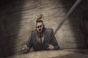 The wings grow back, and will not be stopped. Soon the film becomes a battle to control the wings. The wings want to be an angel, and Angel want to be an idiot. This idea is very full of possibilities, and it’s a good one. There are some stylish scenes that explore that. It becomes increasingly outlandish, though, as the barkeeper and the insane doctor lust after the power of the wings. It gets very crazy now – is it really happening or is it a metaphor? The drastic motives are hard to understand. I guess anything goes in their world, where being a monster is normal. It all makes you want to turn the light on.
Michael Sporn
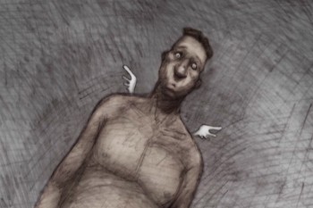 Idiots and Angels is Bill Plympton‘s sixth animated feature. Fifth if you don’t count the one that’s made up of a shorts collection. Still, it’s amazing that an individual can so doggedly, and singlehandedly turn out so much work with with so little. Of course, he doesn’t do it alone – ask all the interns -, but still the animation is his. And we’re talking about films longer than 90 minutes apiece!
At first these features were done by hand on cel with an animation camera, yet none of the features cost more than $500,000. Today computer assistance makes it a mite easier, but not much. There are some secrets here that would be valuable to learn. There’s also a lot of respect that we have to give someone who pulls this feat off.
I’ve seen all of the films, and Idiots and Angels is, by far, my favorite. The story attempts something intelligent, and the graphics are far-and-away my favorite of all the films. It’s still not 100% for me, but it’s getting closer.
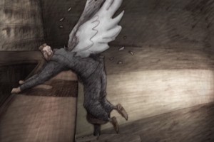 The film, for the first 2/3 of the way, follows a character who is unlikable. (This seems to be something Bill likes to do, have an insufferable protagonist.) Somehow he is gifted with a pair of wings. Every time the character does something nasty, the wings force him to correct the situation and be courteous to his neighbor. Needless to say, there’s an inner-struggle going on. Our hero does everything he can to remove the wings – cutting them off, going to a doctor to have them removed, having others pluck them from his back. The wings don’t go away very easily. Our hero dies at the 2/3 point in the film, and a bartender and dermatologist take center screen – each trying to exploit the wings for themselves.
This is the part of the film where I faded out. The story went off course, and I had a hard time following things. I would have preferred a more developed story about the hero – with a possible character development for him. But instead, he was killed-off and two other greedy folks took center stage.
The graphics, as I said, are, to my mind, the best we’ve seen from the Plymptoon factory. There’s an Eastern European feel to the limited colors and the use of dark grays and umbers employed in most of the coloring. The graphite feel is part and parcel of the Plympton style, and it’s used strongly in Idiots and Angels. In this film. there’s strong control of the textures, and I was pleased to see that. It took some hard work and loving care to pull off.
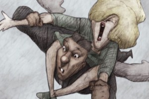 Anyone who makes a feature film with such a small crew and with his own finances, deserves my attention. I think he also deserves your attention. Bill is what I consider a natural animator. He hasn’t studiously studied the work of the masters, yet he seems to have absorbed all of the rules just by watching. Right from his first film, he had it down. I wish that he’d use a few more inbetweens at times, but I can’t argue with the extremes. I also wish so much of it weren’t on Fours – but then this is what passes for full animation these days. Budgets are the excuse, but sometimes I wonder if it doesn’t go deeper.
Saying all that, Bill’s a self-made master of the medium. I doubt he had to study Preston Blair or Frank Thomas; he just got it. See the film at the IFC Center (starting tomorrow, Oct. 6th in New York) and support it.
Idiots and Angels opens at the Laemmle Sunset 5 Theater in LA on October 29. Bill will make appearances at the opening night screenings.
While in LA ASIFA-Hollywood will present “Tom Sito’s Evening with Bill Plympton” on Oct. 27 at Woodbury College. He will also do a signings at Amoeba in Hollywood on Oct. 28, 8 pm, and at Dark Delicacies Bookstore in Burbank on October 31, 2-4 pm.
