Category ArchiveIndependent Animation
Animation &Books &Independent Animation 25 Apr 2011 06:57 am
Plympton Book: Independently Animated
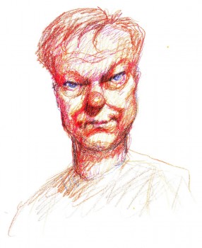 - Back in 1983, I received a call out of the blue from a cartoonist whose strip in the Soho Weekly News was one that I enjoyed. Bill Plympton was interested in making an animated short and asked to meet with me to get some advice. As it turns out, we met several times, always at a pub/bar in NY that I love, The Cedar Tavern (this was the hangout of the Abstract Expressionists back in the 40s/50s). Bill was about to make his first animated short, and I suggested he contact a woman I thought could help him put it together, Connie D’Antuono. Connie was working out of R.O.Blechman’s Ink Tank, and she worked with Bill outside of her 9-5 job.
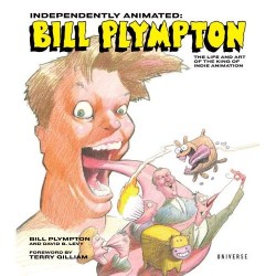
Here it is some 28 years later, and I’ve received a copy of Bill’s golden artbook, Independently Animated: Bill Plympton, The Life and Art of the King of Indie Animation, for review.
I don’t know why, but this book has taken me by surprise. It’s so much more than the expected bio of an animator. It really smacks of a genuine amalgam of the guy who made all these films and the cartoonist who did the strip in the Soho Weekly News. The book boils over with artwork, not only from the films but from many many cartoons and illustrations done previous to the animation career. It all suipports a strong graphic sense found after the animation has begun. It also becomes obvious that there is a direct connection between those early strips and the animated films. This is a real gem of a book, and I’d encourage everyone to buy a copy to see how it’s done. It’s the best “Art of …..” book of the year, and it’s much more.
The text is quite informative, and despite the fact that it’s written both by Bill Plympton, himself, and David Levy, it has a casual and friendly tone that comes across as genuinely first person singular. It feels as though Bill, himself, were telling the story. We learn where the ideas for some of the films come from (the one for Guard Dog is difficult reading if you’re a dog lover), and this text is matched with plenty of drawn material, both art from the films as well as pre-production material.
It’s a fine book, and I suggest you look into it. It’s an original – a truly Independent animation Art book!
 1
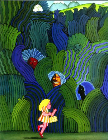
1Bill’s early illustration influences are obvious.
He hoped to study under Milton Glaser in attending
the School of Visual Arts. It didn’t happen.
 2
2
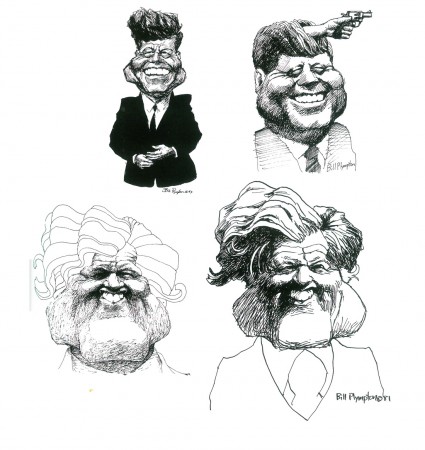
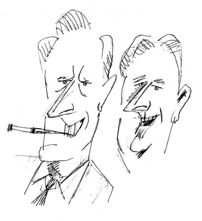
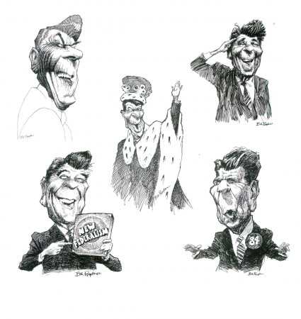
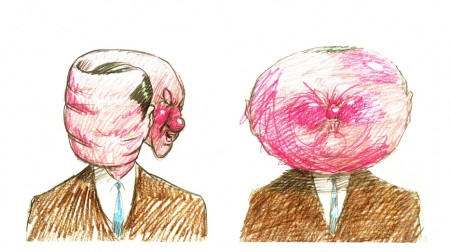
By the time he was doing his strip for the Soho Weekly News
it was obvious that Bill was a brilliant caricaturist.
(Reagan above / some Kennedys below)
 4
4
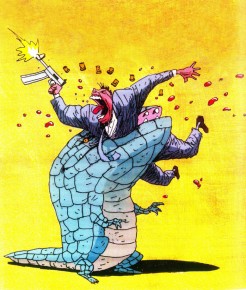
The art of caricature influenced the animation
as evident in these frames from Your Face.
 6
6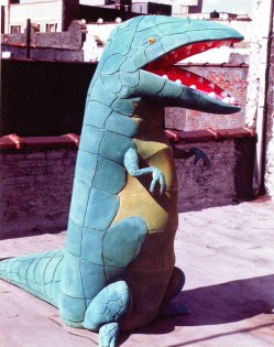 7
7
At one point, trying to generate publicity for Mutant Aliens,
Bill constructed a costume someone wore parading in front of the
Cinema Village, in NYC, where the film was playing.
 8
8
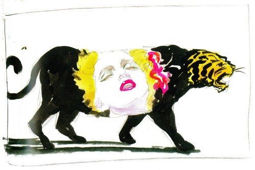
A music video proposal for Madonna’s Who’s That Girl?
 9
9
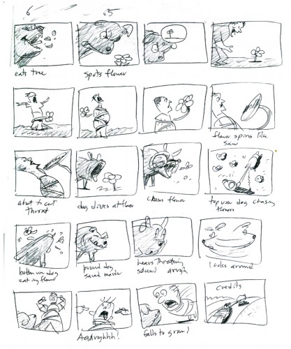
The complete storyboard for Guard Dog is in the book.
Commentary &Independent Animation 13 Apr 2011 03:37 am
Sidney and Emily
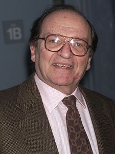 - I was a bit distraught at hearing of the death of director, Sidney Lumet. His film style is so evidently personal that you can tell his direction within the first few minutes of watching any scenes. There have been so many wonderful obituaries for the man, that I won’t attempt one. (Here‘s a good one. This is the NYTimes obit.)
I did work with him several times and felt honored to have done so.
Prince of the City was the first shot at movie titles I got to do. Art Director, Tony Walton, brought me onto the film. They not only needed an opening title and credits but they wanted some inner film ID’s for the characters. It became a large job and one that still stands out as exciting. My friend Phillip Schopper became a strong second helping to get this film done. Together, we did it all ourselves. Everything from putting makeup on the actors’ faces to forging real ID cards to photographing it with unusual lighting under an Oxberry.
Deathtrap was a very different model. For the opening credits he asked for very large type filling the screen. He also wanted an old fashioned typewriter type. Nothing really existed that worked for those demands, so I had to develop my own typeface for it. I’m not particularly happy with the end results.
I had to rush some end credits for a preview screening. Sidney asked me to just make a scroll over a blood red color. Unfortunately, he got to like that and wouldn’t allow me to try something more inventive. However, with only three days before the film was to go to the neg cutter, I did something wild. I dripped blobs and splashes of the blood red color behind the white credits until the screen had turned red. It took a full 36 hours of work and a rush at the lab to get them back. I rushed to the editor to cut them in the film and we screened it for Sidney. Those are the end titles, and I love them.
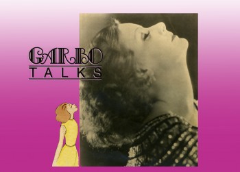 Garbo Talks was a wonderful animation job telling the principal characters back story (in music only) up to the start of the film. It was fun researching Garbo’s life and films and photos.
Running On Empty was a wonderful film. I animated a sequence of animated roads for a test title. We decided to do it live action just focusing on the dashed lines of some local roads upstate NY. The movement wa very quick so a dashed line might just take one frame of film. The editor was bothered by the fact that every third dash was painted over black. I suggested he just cut out those frames, just as we might do in animation. He did and it worked beautifully. I loved this film. If you have the chance to see it, please do. River Phoenix and Martha Plimpton were exceptional as the adolescent heroes of the story. I sat in on several days of the mix of this film and had a lot of time to chat with Sidney and mixer Tom Fleischman.
On Family Business, Sidney introduced me to Sean Connery. Sean was wearing some ostentacious jacket and for some reason, right off the bat, he apologized to me for it. He said it had been given to him by the King of Arabia. Then he immediately qualified that so that I knew there was nothing sexual in the gift. Needless, to say it was a strange conversation.
The Family Business titles were designed by me and executed by R. Greenberg’s studio. It was a major problem for the opening credits. The camera does a 360° pan on a rooftop. All the colors of the twilight sky, all the buildings, all the city acted as the backdrop or these credits. Sidney wanted only type above this backdrop (I couldn’t put the credits within boxes). The white letters would be washed out against the white of the sky; the black credits were not there when we hit black. As a matter of fact, the credits seemed to wash into almost every color we tried. It took about six go-arounds before we hit on something that worked. I’m glad I had the large team at Greenberg’s to pull it through.
I loved working with Sidney, and I’m sad that he’s not there anymore. I don’t need to talk of work with him. I just liked knowing he was there.
.
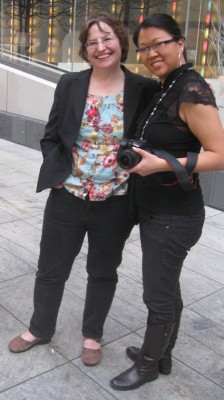 - I’m sure you’re curious as to what connection there is between Emily Hubley and Sidney Lumet. Actually, I first met Sidney at a party given by John & Faith Hubley. It was a “hello” and a “I’m your biggest fan” kind of embarrasing meeting, that I’m sure Sidney quickly forgot.
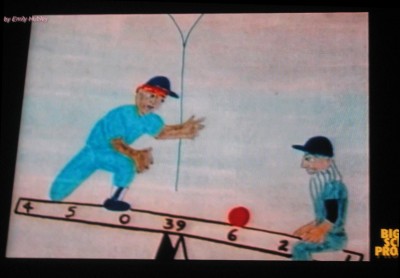
On Monday evening I went to the Big Screen Project event in midtown Manhattan. There was a show of Emily Hubley‘s work. It was good to see some of her classics again. “The Tower” (1986) was an early one; I can remember Emily and Georgia working on it. Two of my favorites are “Blake Ball” (1989) and “Delivery Man” (1982). The story in both films is exciting and even inspirational. I’m sorry “Delivery Man” wasn’t screened.
The weather was wonderful, so it was nice sitting outdoors in the early evening. It gave me the chance to catch up with some old friends. Emily and Will Rosenthal are always great to talk to. Debbie Solomon, Biljana Labovic, Meryl Rosner, Adrian Urquidez, Maria Scavullo, and Janet Benn were all there. There were plenty of others, but those were the above: Emily with Jaime Ekkenspeople I was able to chat with.
There was a technical problem with the sound. They’d normally hand out small radio receivers with earphones, which allow you to hear the tracks in excellent stereo. Unfortunately, something technical happened and the didn’t hand out the receivers. No sound. It was a curious way to watch Emily’s films. The imagery is so evocative. However, we really only got half the films.
Hopefully, they’ll have corrected this problem before screening any more of the animation shorts.
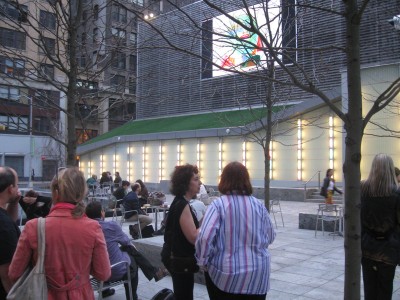
The three closest, with backs to us are: (in red) Biljana Labovic,
(in black) Meryl Rosner, (in pinstripes) Janet Benn.
Tonight Jeff Scher will have his films screened. It’d be tragic if the wonderful Shay Lynch scores weren’t heard. I hope they’ll have the sound system worked out.
Jaime Ekkens organized and hosted the event for Big Screen Project.
Big Screen Project Sixth Ave. between 29th & 30th St.
Enter through the Food Parc, and go all the way back to the courtyard.
7-8pm
.
More of Milt Kahl‘s Llama drawings will return tomorrow.
Animation Artifacts &Independent Animation 09 Apr 2011 07:17 am
Ends and Odds
- Here’s a little tidbit I thought I’d share. It’s the top of a film can for a 16mm print of a William Tytla Productions studio commercial: Hostess Twinkies: Knight
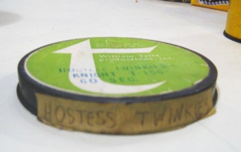
side view of the can top.
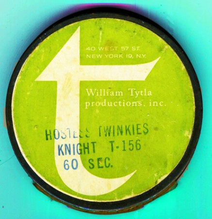
Overhead view, including the studio address:
40 West 57th Street, NYC 19, NY
Back in the day (before video) 16mm prints of commercials were sent out to the tv stations to air the commercials. All studios had hundreds of these film cans in storage.
This artifact was given to me by John Canemaker.
- Bill Plympton will have a book signing/party in New York for his book Independently Animated: Bill Plympton the Life and Art of the King of Independent Animation. The event will take place on April 27th at the NY Society of Illustrators, 128 East 63rd Street. There will be live music by Nicole Renaud, world premiere short films, and an illustrated talk by Bill Plympton.
TICKETS
$15 non-members, $10 members, $7 students
RSVP@societyillustrators.org or
call Katie Blocher 212 838 2560
.
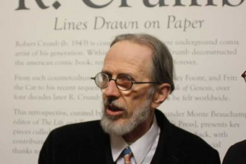
- And speaking of the Society of Illustrators, they’re currently hosting an exhibit retrospective of the art of R. Crumb. Entitled Lines Drawn on Paper, the show can be seen for free at 128 East 63rd Street and will run through April 30th.
.
- John Schnall (Quality Schnallity) has another wonderful video on his site. I Trust You. Take a short trip via click and watch it; the man has a unique sense of humor.
.
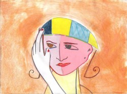 - Emily Hubley will host a showing of some of her films this coming Monday eventing, April 11th, at the Big Screen Project, 6th Avenue between 29th and 30th. (Look for the “Food Parc” on the west side of the street. Enter and keep going back until you hit the bar/with seats. Look up and outside.)
Admission is free.
The films to be screened include:
One Self: Fish/Girl
Enough
The Tower (made w Georgia Hubley)
Set Set Spike
Delivery Man
Octave
Blake Ball
The films of Jeff Scher will follow at the same venue, same location on Wednesday, April 13th.
.
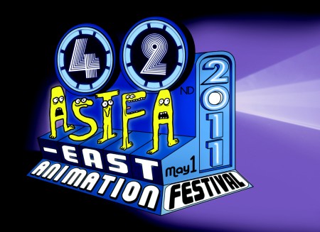
The ASIFA East Animation Festival will be held on Sunday, May 1st.
Tishman Auditorium, The New School. 66 West 12th Street.
As always, admission is free. So is the party after the show.
Animation &Art Art &Commentary &Independent Animation 19 Mar 2011 07:21 am
Jeff Scher
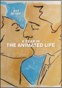 - I’ve known Jeff Scher for quite some time. In the NY animation front, he’s come to represent what I think of as the truly Independent animator. His work touches abstration, live action filmaking and an absolute love for film animation. Essentially, he’s creating Art in film.
The outlet for his work had grown enormously when he started appearning in the NYTimes. There, for a year, he did a monthly video editorial for their internet site. After the year, they reduced it to a less frequent schedule. Now his videos appear more arbitrarily. (The Times is looking to make money, which means cutting back, yet charging the readers.)
These videos are short, lyrical, animated essays all made with a strong purpose of design in Jeff’s studio in Chelsea. Most of them have music by Shay Lynch. The two artists couldn’t be a better matched pair; their work together seems inseperable.
In a recent conversation with Jeff, I learned that he is self-distributing his DVDs, which collect the many films he has done. These sales are done through his own website, Fezfilms.net.
His enthusiasm for his art has always been an inspiration for me. Jeff seems to find new and adventurous ways of doing animation, and that, no doubt, keeps him alive.
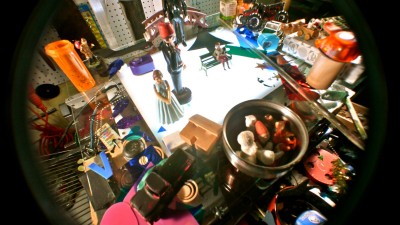
.
He also has a blog which talks about the making of his current films. The blog has the wonderful title, Reasons to be Glad. The image above comes from a Paul Simon video he did called “Getting Ready For Christmas Day”. You can find that video on the blog here.
.
The website also features a gallery where you can watch some video and see art from many of the films (all of which is for sale.) I take pleasure in the beautiful piece of artwork Jeff gave me from his film “L’ Eau Life”.
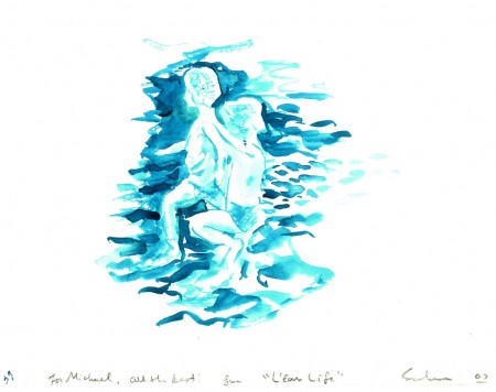
It’s painted with watercolor on bristol, like all the other frames of this film.
.
Jeff teaches in New York at the School of Visual Arts and at N.Y.U. Tisch School of the Arts.
There’s an excellent interview with him, discussing process, here.
Animation &Frame Grabs &Hubley &Independent Animation 14 Mar 2011 07:22 am
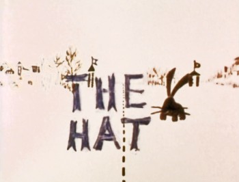
The Hat – bigger
- The recently posted interview Mike Barrier conducted with John Hubley has me thinking about Hubley and my years back there and then. You might say, I’m in a Hubley frame of mind these past few days, so I’m into reminiscing. I posted part of this back in March, 2008; here, I’ve extended the article a bit.
 New York’s local PBS station, WNDT – that’s what it was called in the old days – used to have a talk show hosted by film critic, Stanley Kaufman.
(It turns out that this show was produced by the late Edith Zornow, who I once considered my guardian angel at CTW.)
This talk show was quite interesting to me, a young art student. I remember one show featured Elmer Bernstein talking about music for film. He gave as his example the score for The Magnificent Seven. He demonstrated that the primary purpose of the score, he felt, was to keep the action moving, make the audience feel that things were driving forward relentlessly. I still think of that show whenver I see a rerun of the film on tv.
The surprise and exciting program for me came when John and Faith Hubley turned up on the show to demonstrate how animation was done. They were using as an example a film they had currently in production, The Hat. This film was about the siliness of border lines. One of two guards, protecting their individual borders, loses his hat on the other side of the line. Of course, all he needs do is to step over and pick up the hat, but he can’t. The other guard won’t allow him to cross the border illegally – even to pick up his hat.
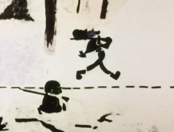
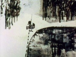
The voices were improvised by Dudley Moore and Dizzy Gillespie (much as the earlier Hubley film, The Hole, had been done.) The two actor/musicians also improvised a brilliant jazz score.
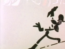
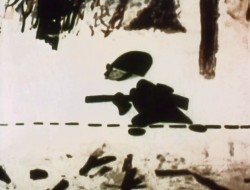
John’s design was quite original. The characters were a mass of shapes that were held to-gether by negative space on the white on white backgrounds.
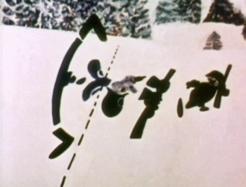 The animation of the two soldiers was beautifully done by Shamus Culhane, Bill Littlejohn, Gary Mooney and “the Tower 12 Group“.
Culhane animated on a number of Hubley films during this period, most notably Eggs and a couple of commercials.
Bill Littlejohn animated on many of the Hubley films from Of Stars and Men up to Faith’s last film.
Gary Mooney animated on The Hole and Of Stars and Men. He was an Asst. Animator at Disney, animated for Hubley then moved on to some of the Jay Ward shows before moving to Canada where he continues to animate.
Tower 12 was the company formed by Les Goldman and Chuck Jones at MGM. Apparently they were between jobs when Hubley was finishing this film, and Chuck offered help.
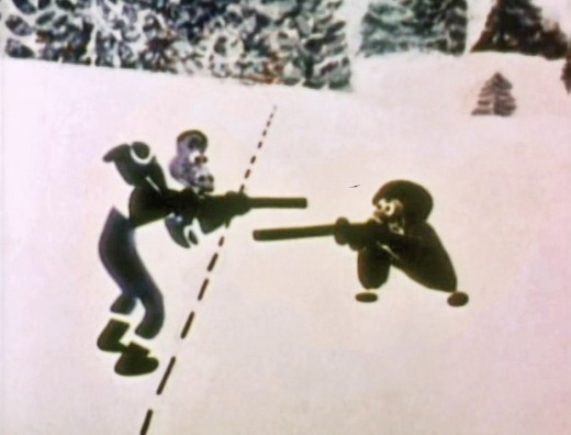
Of course, the colors of the film as represented by the dvd are pathetically poor. It’s hard
to even imagine what the actual film looks like, and it’d be great to see a new transfer of
all the Hubley films.
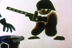 The design style of the film was an original one for 1963. It’s one that would often be copied by other animators afterwards. The characters were searated at their joints. No reel ankles, just open space. They were also broken at the wrists and belts. The taller man seems to have a collection of ribs and shoulders for his torso. Like the dotted line they walked but could not cross, these people were also a gathering of parts.
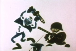 This was one step removed from the earlier film, The Hole, which had just won the Oscar and went on to enormous success for the Hubleys. That film used what they called the “resistance” technique. They first colored the characters with a clear crayon. Ten painted watercolors on top of that. The crayon would resist the watercolor and a splotchy painterly style developed. The Hat literally broke those splotches into parts of the characters and put some of the control in the animators’ hands.
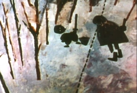
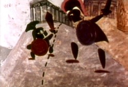 The film was obviously political. Anti-nuclear politics played strongly in the story. This was a step just beyond The Hole. In that film, two sewer workers converse on what violent things might be happening above ground. The film ends with an accident, or possibly a nuclear crash.
In The Hat, the two partisan soldiers discuss a history of man’s aggression all within their reach. At one point, it would seem, each of
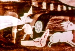 them is ready to press the red button calling for nuclear assistance – or, at the very least, a buildup of military force.
While walking up and down that line, they comment on how we reached the point of no return. All the while, bugs and small animals cross the line, indeed, walk on or over the “hat” lying on the ground.
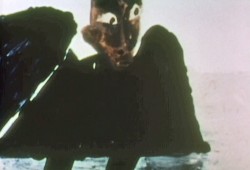
The backgrounds for this history of War grow more violent, more expressionist. John’s painterly style comes to the fore, and the brush strokes take on a force we haven’t seen to this point.
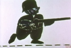
When we return to the two leads, we find that they’ve changed. They’re darker, and they both have lines scratched into the paint of their bodies. Not as much emphasis is placed on their disjointed body parts.
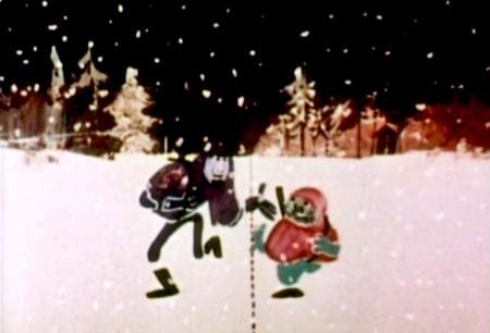
We leave them as we found them, walking that line. At this point, both of their hats lay on the ground and they’re deep into conversation. They don’t seem to notice anymore.
It has started to snow.
Animation &Independent Animation &Richard Williams 13 Mar 2011 07:32 am
Dick’s World – recapped
Here’s a piece originally posted back in March, 2007.
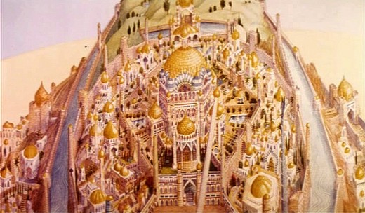
- Let me share an image with you.
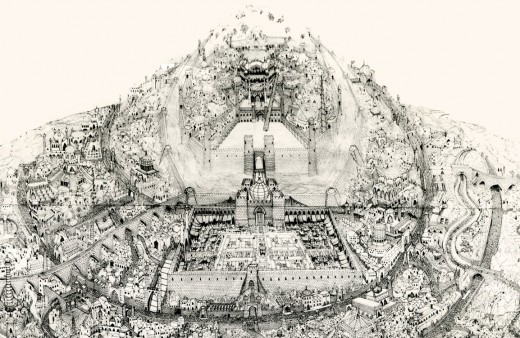
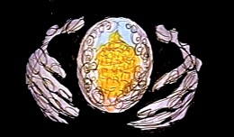
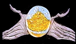
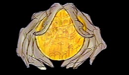
When Raggedy Ann & Andy was winding down, in 1977, Richard Williams asked me, over dinner, whether I would be interested in working in London on his feature, The Cobbler and the Thief. He had in mind one sequence which he said would be all mine. This was the film’s opening – a slow truck into the island where all the action of the film would take place.
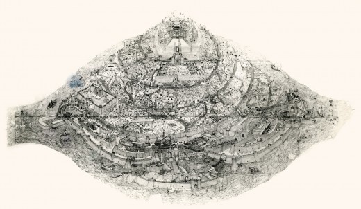 (Click on any image to enlarge.)
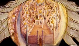
This was a photostat of this island. The original drawing, Dick had said, was enormous. It was composed of many smaller segments that were pinned together on a wall in his studio. If you look closely you can see those dividers in this photostat. To give a better indication of the detail in this drawing, I’m posting, below, a second image of a small portion of it.
The idea of it exhilarated me. The conceit of the scene was that the entire city would be animated. Hundreds of moving elements. The piece would be done in parts and optically pasted together. (This was the age berfore computers.)
I believe Dick had said that Roy Naisbitt was involved with it, and that was something to get me going. I’d read about many of Dick’s staff and had already placed them on pedestals – including Roy’s work. I would not only get to meet them but work with them as well.
I decided not to take the job. I thought it would be better to remain friends with Dick than to continue working with him. That decision is something I don’t regret. It would have been fun to have been involved with that film, but so much has happened in my life by staying put, that I have no regrets.
The storyboard for the original cut of Dick’s film included these panels which led into the image of the animated city. A still of the city remained in the Miramax/Fred Calvert version, but that’s all.
Animation &Illustration &Independent Animation &SpornFilms 26 Feb 2011 08:34 am
Nuts to Notes
- Xeth Feinberg has recently been doing comic strip panels. He and his witty strip can be found on The Huffington Post – some pretty wide exposure. Quite a coup for Xeth. The only other animator involved with The HuffPost is Bob Blechman who did some animation for their original masthead and has had several commentaries posted there.
Xeth, of course, is famous for his early Flash animated pieces that flew across the internet in the early days of such things. Bulbo In The 20th Century is a brilliant piece of filmmaking that came out of this period.
Queer Duck, his biggest character, grew out of this work. The Queer Duck shorts poayed on Showtime with the Queer As Folk show; Xeth went on to make a DVD feature (called Queer Duck).
.
 - Another animator who has his own blog is Doug Vitarelli. Doug has created a character named Olifant, a dinosaur who lives in New York City’s Central Park. The site is dedicated to Olifant. As Doug points out, “It’s a website for kids, 2-6, with stories, games and activities.” This is a good place for animators to turn when they have children.
Doug worked for me years ago. In 1987, he interned on a film I did called Santa Bear’s High Flyin’ Adventure. It was a monster of a picture that struggled throughout its entire lifespan. One of those.
At the same time, we were doing Lyle Lyle Crocodile with another staff in another space. That one was the dream that just was fun to work on and flew out easily as a great film.
One of these days I’ll write more at length about those two films. We had 86 people working on Santa Bear and only about 15 on Lyle.
.
- And speaking of other blogs, I thought I’d take a moment to promote another blog that I have that doesn’t change much but has a lot on it. Poestory.net features a lot of art bits from the preproduction of my Poe feature. The Production Updates page is about all that’s been changing lately. I write infrequent notes about Edgar Allan Poe and the film several times a month. When the film actually does get into production I’ll do it more regularly and frequently. (We’re expecting the funds to come through soon, as expected, and we can get our hands into the work.)
.
Commentary &Independent Animation &SpornFilms &T.Hachtman 21 Feb 2011 08:08 am
President’s Day
- Happy President’s Day. This gives me the chance to talk about a show I’ve been doing for HBO. It feels like I’ve been working the last ten years on it, but it’s really only 2½. The show is scheduled to air next year on President’s Day, and we’re in the throes of completing it now.
This is basically a program where we’ve asked some kids to tell us what they would do if they were President. The kids gave us some funny ideas and brought a lot to the table.
However, the show took a wrong turn somewhere in the beginning, and we went down a path that wasn’t what Sheila Nevins, the head of Family Programming, was looking for. We’d done a half hour of finished-looking animatic to sell our work, and a lot of it went out the window.
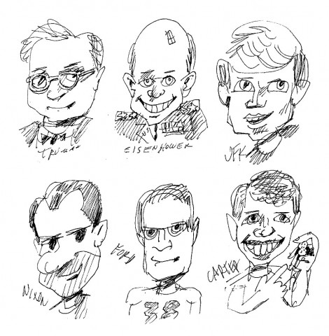
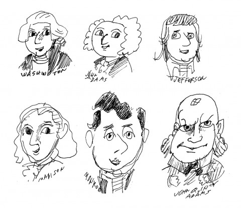
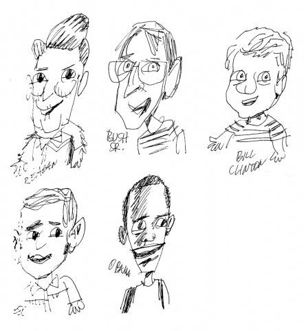
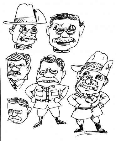
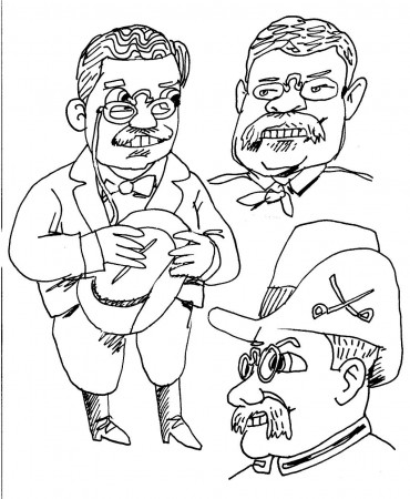
I tried to make some small QT movies of a couple of the outtakes, but I couldn’t get the files down far enough, and they took forever to load. So forget that. Instead, let me show off some of the great caricatures Tom Hachtman did for me.
We were going to tell some quirky stories about some of the Presidents, when they were kids. And we’d assembled some interesting ones. So Tom had to give me drawings of the Presidents as adults AND as kids.
Here’s some of the art that went out the window:
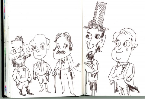 1
1At first, Tom did a lot of scketches in his notebook to see
what I was looking for. He hit it on the mark first time out.
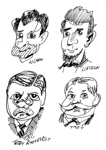 2
2
Then he produced a bunch of portraits of
random Presidents that might inspire something.
 6
6
Teddy Roosevelt was heating up for us,
so Tom did quite a few sketches.
 8
8
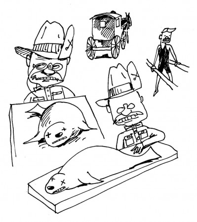
We had this story about Teddy, as a kid, finding
a dead seal. He took it home and performed an
autopsy, bisecting it to analyze its contents.
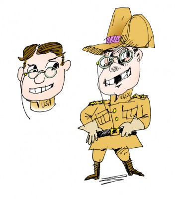 9
9
I colored one for presentation.
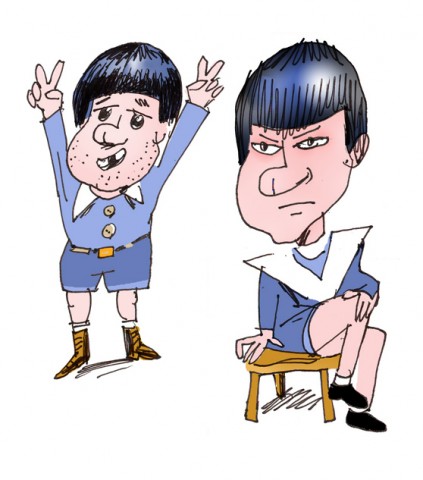 10
10
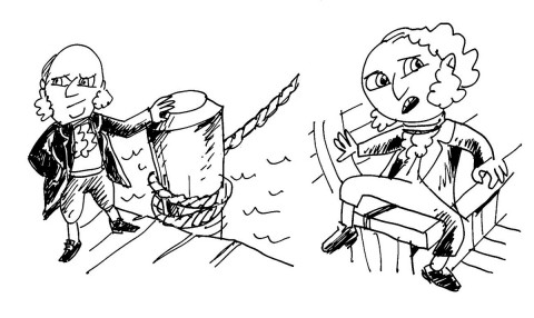
I also liked the idea of doing a story about Nixon,
especially after Tom came in with a funny drawing
that I colored strictly for presentation.
 11
11
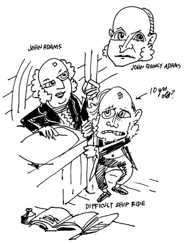
We did do an animatic on John Adams and his son, John Quicy Adams,
crossing the Atlantic to go to France – where they stayed for more than a year.
 12
12
It was a tough voyage. Storms,
invading British ships and seasickness.
 13
13
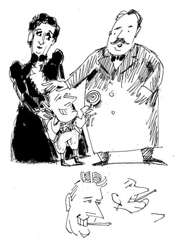
We also did a piece on FDR going to White House
as a child where he met Grover Cleveland and
was advised never to run for President.
But all this work was for naught. It was removed from the show. We didn’t talk about past Presidents (with few small exceptions to comment on the conversations the kids have.)
 15
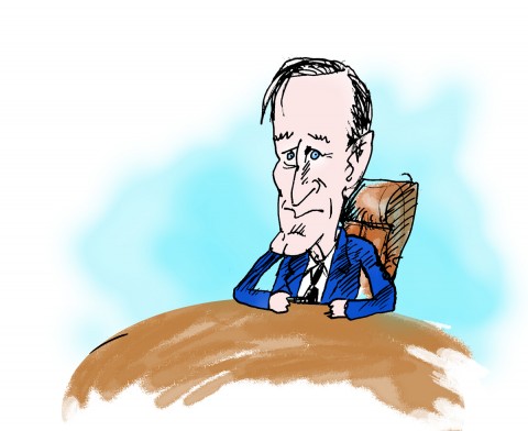
15The one full piece that did make the show was
George H.W. Bush angry about eating broccoli.
The show’s taken its own shape and I’m really proud of it. Matt Clinton and Katrina Gregorius did a magnificent job in handling a lot of the animation. It’s really funny and poignant, too.
Look for it next year.
Commentary &Independent Animation 29 Jan 2011 09:05 am
Plympton, MOMA & Pigs
- Steve Heller‘s current article in Print Magazine is a promotion of three books dedicated to cartooning. Top of this list is the new Bill Plympton book, written by David Levy. Heller has a review copy even though the book won’t hit the stands until April.
With a bona fide publisher, I’d assume the book has a better marketing budget than Bill had for his feature, Idiots and Angels. One wonders if there were five nominations for the animated feature this year is Bill’s film might have been in the mix. Unfortunately, we’ll never know. For now, I’m pleased that The Illusionist is there. I know it doesn’t have a chance against the two dynamos against it, but it deserves to win.
MOMA in New York is currently hosting a Drawing on Film exhibit in which many animated films are being shown. Most of them are abstract films that should be seen.
Today’s schedule includes:
Technological Lines: Computer-Generated Drawing and Abstraction
(Dance Film: Computer Generated Ballet). ca.1965. USA. Directed by A. Michael Noll. Silent. Approx. 3 min.
Man and His World. ca. 1965. USA. Directed by Stan Vanderbeek, Ken Knowlton. 1 min.
Pixilation. 1969. USA. Directed by Ken Knowlton, Lillian Schwartz. 4 min.
Circles I. 1971. USA. Directed by Doris Chase. 6 min.
Arabesque. 1975. USA. Directed by John Whitney. 7 min.
Woody Anderson. 1971. USA. Directed by Stan Vanderbeek. Silent. 3 min.
Toronto-Computer. 1973. USA. Directed by Stan Vanderbeek. 9 min.
Euclidean Illusions. 1979. USA. Directed by Stan Vanderbeek. 9 min.
Linia. 1981. Poland. Directed by Grzegorz Rogala. 8 min.
Saturday, January 29, 2011, 6:30 p.m., Theater 3, mezzanine, Education and Research Building
Next Saturday:
Gestural Lines: Dance and Motion
Serpentine Dance by Annabelle. 1895. USA. Produced by the Edison Company. Silent. Approx. 1 min.
Serpentine Dance. 1896. USA. Produced by C. Francis Jenkins. Silent. Approx. 1 min.
Tarantella. 1940. USA. Directed by Mary Ellen Bute. 4 min.
Trio A. 1978. USA. Directed by Sally Banes. Silent. 10 min.
Pas de Deux. 1967. Canada. Directed by Norman McLaren. 14 min.
Skating. 1978. USA. Directed by Stuart Sherman. Silent. 3 min.
Elevator Dance. 1980. USA. Directed by Stuart Sherman. Silent. 3 min.
Priya. 2007–08. Great Britain. Directed by Alia Syed. Silent. 11 min.
Saturday, February 5, 2011, 6:30 p.m., Theater 3, mezzanine, Education and Research Building
Sunday:
Life Lines: Drawing Intersections
Blinkety Blank. 1985. Canada. Directed by Norman McLaren. 5 min.
The Toe Tactic. 2008. USA. Directed by Emily Hubley. 84 min.
Sunday, February 6, 2011, 5:00 p.m., Theater 3, mezzanine, Education and Research Building
This program has been on-going for the past month and quite a few classic films have been screened.
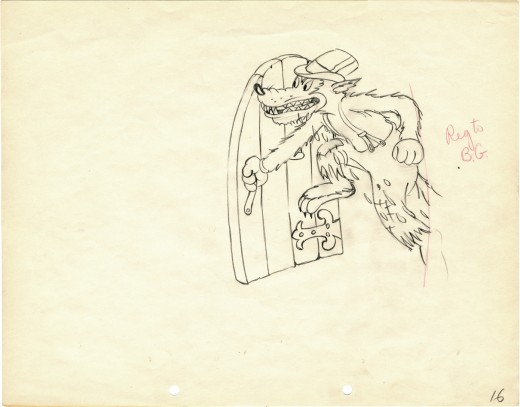
Just to fill out the post, I’m reprising one of my favorite drawings owned. It comes from The Big Bad Wolf (1934) a follow-up to The Three Little Pigs.
Animation &Animation Artifacts &Independent Animation 26 Jan 2011 08:18 am
Lu Guarnier’s Really Rosie
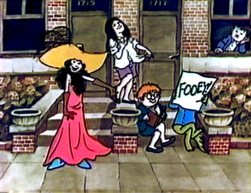
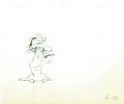
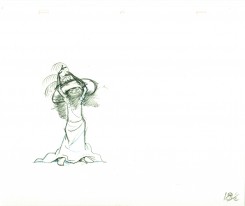
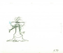
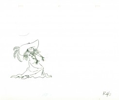
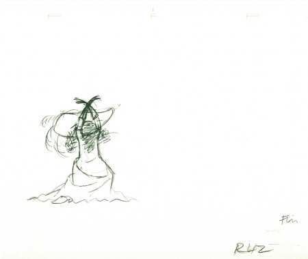
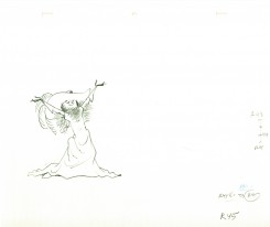
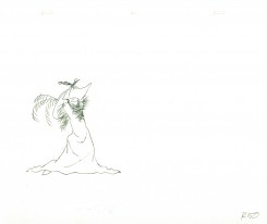
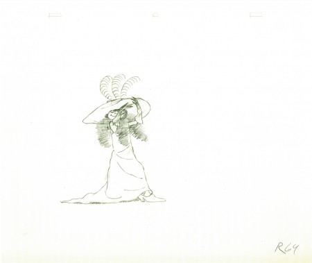
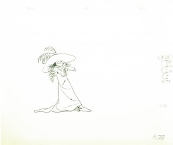
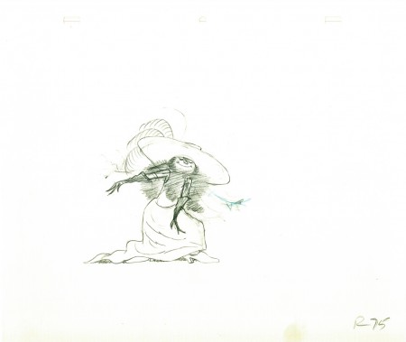
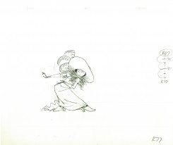
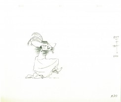
- Really Rosie was a special “directed by” Maurice Sendak from his miniature-sized children’s books, The Nutshell Kids. The show in reality was overseen by Ron Fritz and Dan Hunn who received the credit of “Animation Director.†It was done out of their studio, D&R Productions, for CBS television.
In 2007, I wrote: “The animation was good, but the composition always seemed off, to me. I remember back in 1975 (I was still in college at the time) thinking that the show looked like it was done in one long shot on 12 fld artwork. Then they seemed to move the camera in tight for all the poorly executed camera moves. The line work got unpleasantly large in close ups and the detail wasn’t good. The film just isn’t smooth.”
Animation for the show is credited to:
Lu Guarnier, Marty Taras, Willis Pyle, Doug Crane, Jack Schnerk, Cosmo Anzilotti, and John Svochak.
Asst animators included:
Jim Logan, Gerry Dvorak, Helen Komar, and Joe Gray
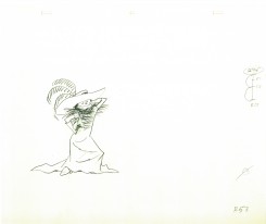
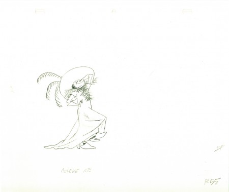
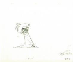
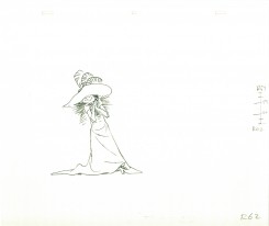
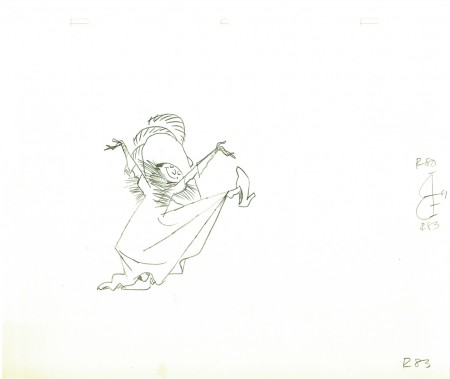
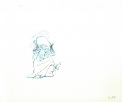
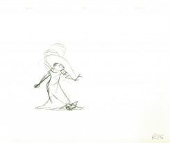
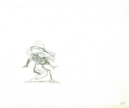
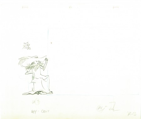
Here’s a scene animated by Lu Guarnier from the sequence pictured above. The pegholes atthe top are Oxberry. (You can see the 2007 post about this sequence, here.
 02
02
________________________
Here’s a QT of the scene with drawings exposed to whata I think are
their appropriate frames. I don’t have exposure sheets so I may be
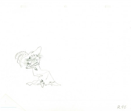
missing a hold or two. Purely guesswork on my part.
