Category ArchiveIndependent Animation
Commentary &Hubley &Independent Animation &John Canemaker 12 Oct 2011 06:51 am
A Hubley Affair
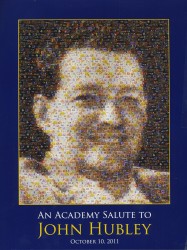
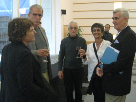
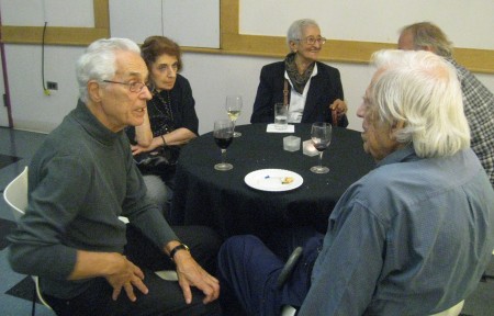
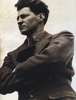 – The AMPAS program celebrating the early work of John Hubley went off wonderfully on Monday evening. The show started at 7pm, but prior to it there was a cocktail party for about 50 people. I have no idea who was invited to this, but it seemed to be Academy members who might have know the Hubleys as well as friends of the Hubley family. All four of the Hubley children were there including: Emily, her husband, Will Rosenthal, and their son, Max; Georgia and husband, Ira Kaplan (both part of the group Yo Lo Tengo); Ray Hubley, and Mark Hubley.
Also there, were Tissa David, Ed Smith, Candy Kugel, George Griffin, Vinnie Cafarelli, Lee Corey, Ruth Mane, John Canemaker (of course) with Joe Kennedy and others I probably have forgotten. Patrick Harrison and John Fahr ran and hosted the event for the Academy.
At the program I saw: Ray Kosarin, Linda Beck, Stephen MacQuignon, Richard O’Connor, Bill Plympton, and a hundred others that I recognized. The house was full.
As we entered the theater, prior to the start of the show, the soundtrack to Finian’s Rainbow was playing. Frank Sinatra, Ella Fitzgerald, Louis Armstrong, Ella Logan and Barry Fitzgerald.
The actual program began as all Academy events do, exactly on time. Patrick Harrison spoke for two minutes promising that next month the event would be a retrospective of the work of Saul Bass done in conjunction with MOMA. He then introduced John Canemaker, and we were off and running.
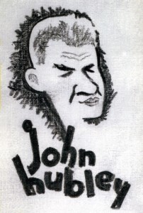 John started with a PowerPoint presentation that showed the child, John Hubley, his surly uncle who became the model for Mr. Magoo; we saw some childhood drawings as well as a number of strong influences including classmate, Alvin Lustig, who designed the UPA logo. These were followed by some of the artwork Hubley did for Disney, which included a lot of Layouts and preliminary Background sketches. We saw art done during the War as well as preliminary art for many of the UPA films. John Canemaker featured a lot of Hubley in-house cartoon drawings peppered throughout the presentation.
This talk ultimately led to screening the movies.
Unfortunately, it started with the only 16mm print, a soft-focus soft color print of Brotherhood of Man. Somewhere a good print of this film exists, and I don’t know when it’ll be found – hopefully in my lifetime. It’s such an enormously powerful film, designed in a style which was borrowed from Saul Steinberg‘s work at the time.
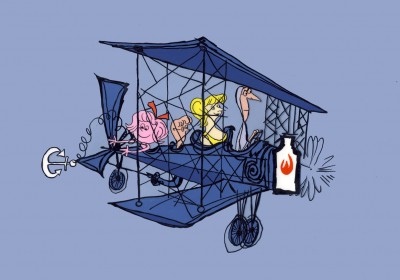
Flat Hatting followed with a beautiful 35mm print. This is a brilliantly directed film showing how much good can be done with limited animation. It never felt limited, nor does it feel like an educational film for pilots. It’s very entertaining and drew a lot of laughs. Hubley had spent years directing mediocre films under Frank Tashlin at Columbia and a number of films for the military. This film shows how much he had learned as a director in such a short time.
The Magic Fluke is probably the best of the Fox and Crow series. This film has a great sense of design featuring that famous background by Jules Engel of the concert hall. I’m not sure Hubley was best cast as the director of a lightning quick comedy cartoon, but, for the most part, it works well. The print, again, was sterling.
Following this was a beautiful print of Ragtime Bear, the first Magoo cartoon. I hadn’t remembered how fluid the animation was; there was some beautiful distortion on Magoo later in the film. My guess is that it was a Pat Mathews scene. The film offers all of Magoo’s traits, but the character design is far away from what Pete Burness ended up directing.
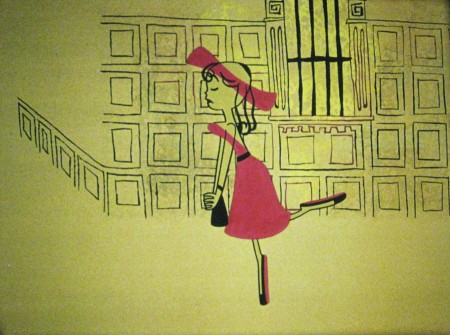
The cr̬me de la creme of the evening: Rooty Toot Toot followed. What a beautiful, big 35mm print. What a stunner of a scene Рthat great Grim Natwick animation of Nelly Bly Рall blue Рcorkscrewing her hands and arms in the witness chair. Beautiful and funny. This is certainly one of the great films ever created.
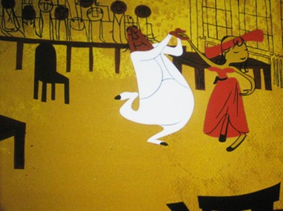
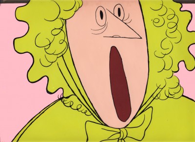
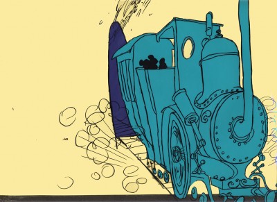
An image photographed off the screen
There were a stash of commercials – both West and East coast – from the original Storyboard Prods. I own prints of all screened except for my favorite: a spot for Mennen aftershave. A rectangle of wrinkles around a pair of eyes. Mennen helps the lines smooth out, and the commercial uses abstraction for a very funny commercial. It was the first time I’d seen this commercial. They certainly were creative back then. Hubley repeated the use of abstraction in a number of other, later spots. I’m thinking particularly of one done in the early 70s for AT&T; Tissa David animated.
Beautiful reconstructed prints from MOMA included Adventures of an * and Tender Game. One was more beautiful than the other. Both are great films.
Voyage to Next was represented with a beautiful print, though I have to say, I never really liked this film. I had a lot to do with the making of it, and it really was a challenge and a great learning experience. About a third of the way through the production money ran out, and we had a film to get out with a small but great staff. There was a lot of stylistic improvisation done to try tokeep on a vbery tight budget, while being artful. It was a tough time for the Hubleys, and they stayed true to the film at hand.
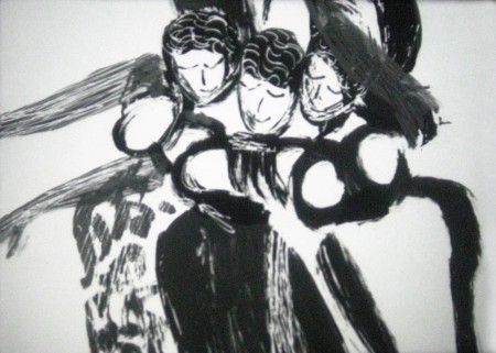
Finally, the evening ended with a beautiful animatic called Facade. These were storyboards filmed (with slates) for a William Walton and Edith Sitwell score. John Canemaker actually located and got the rights to a version with Edith Sitwell, herself, actually doing the narration. Miraculously, it all seemed well in sync. This piece was done in 1964 as a sample for PBS., though the film was never completed. A real find for Canemaker straight from the Hubley collection. A film not seen by the public (and it hasn’t made its way into animation history books, either.)
All in all the show was so invigorating that the Academy had a hard time getting rid of us. People stayed and chatted in the lobby. It was a great event.
John and Joe, Heidi and I went out for dinner so we could chat about the program. I had a blast all night; it was one of the finest animation events I’d attended in many years.
Here are pictures I took during the evening.
.
 1
1
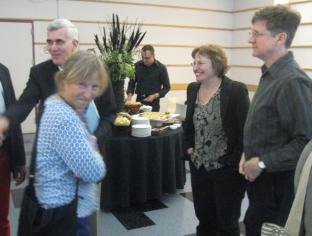
The cocktail party
 1
1
LtoR: John Canemaker, Georgia Hubley, Emily Hubley, Will Rosenthal
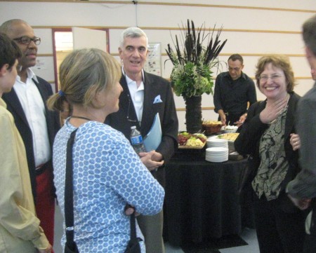 2
2
LtoR: unknown, Patrick Harrison, Georgia Hubley, John Canemaker,
unknown in rear, Emily Hubley, Will Rosenthal
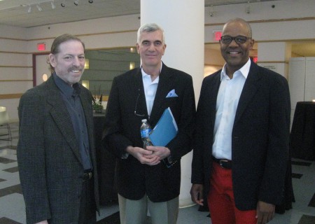 3
3
LtoR: me, John Canemaker, Patrick Harrison
 4
4
LtoR: Emily Hubley, George Griffin, Vinnie Cafarelli,
Candy Kugel, John Canemaker
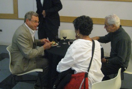 5
5
LtoR: Mark Hubley, Candy Kugel, Vinnie Cafarelli
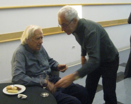 6
6
LtoR: Ed Smith, Vinnie Cafarelli
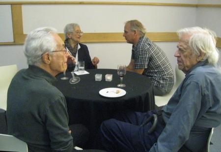 7
7
LtoR: Vinnie Cafarelli, Tissa David, Lee Corey, Ed Smith
 8
8
LtoR: Vinnie Cafarelli, Ruth Mane, Tissa David
Lee Corey (partially hidden), Ed Smith
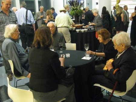 9
9
at table LtoR: Ed Smith, Heidi Stallings, Vinnie Cafarelli,
Ruth Manne, Tissa David
in rear, standing with winde glass: George Griffin w/Jeff Scher and wife, Bonnie.
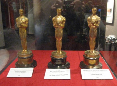 10
10
The three Hubley Oscars for (LtoR): Moonbird,
The Hole, The Tijuana Brass Double Feature.
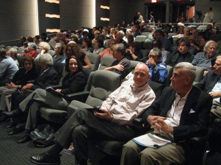 11
11
Audience front row (RtoL):
John Canemaker, Joe Kennedy, my empty seat,
Heidi Stallings, Tissa David, Ruth Mane
2nd Row, over empty seat: Stephen MacQuignon
3rd row (RtoL): Ed Smith, Richard O’Connor
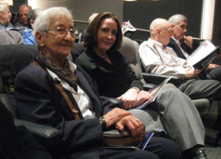 12
12
LtoR:Tissa David, Heidi Stallings, Joe Kennedy, John Canemaker
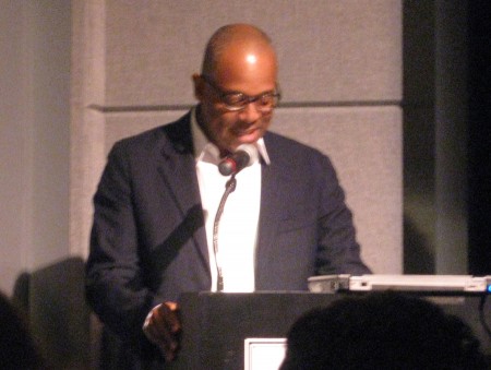 13
13
Patrick Harrison giving thanks and introducing John Canemaker.
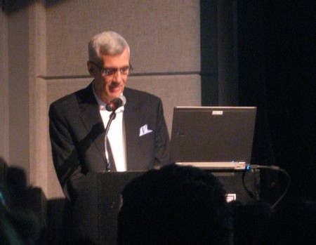 14
14
John Canemaker giving PowerPoint presentation
The following images were photograped during the PowerPoint
presentation or during the films. Consequently, they often soft focus.
With apologies.
.
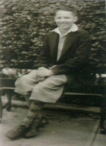 15
15A very young John Hubley
 16
16
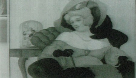
An early John Hubley painting
 17
17
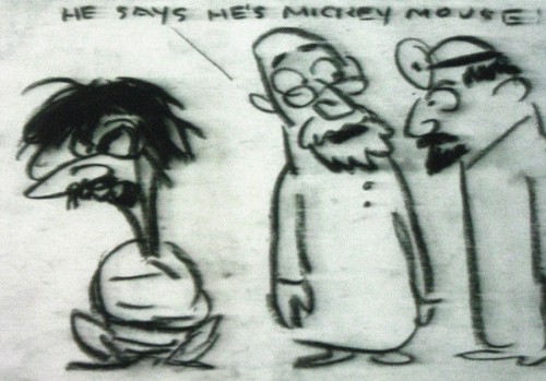
A gag cartoon from Hubley. Self portrait in straight-jacket.
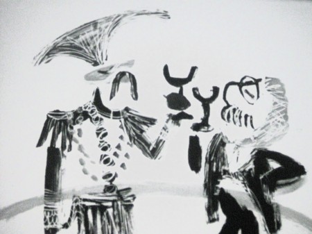
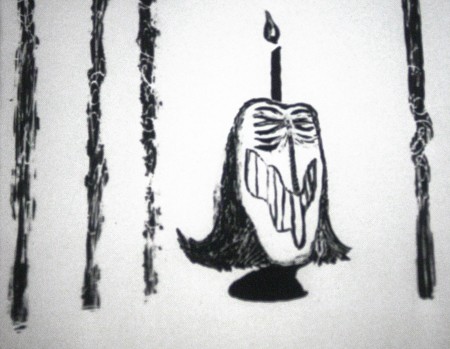
Images from Facade follow:
 1
1
The animatic was done in 1964.
 2
2
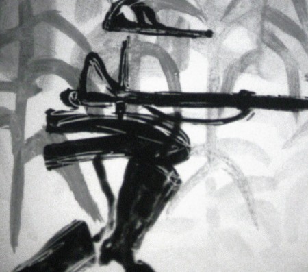
Stylistically it feels like:
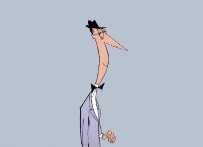
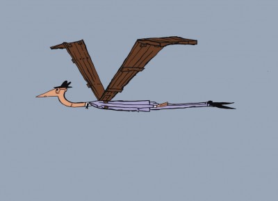
Moonbird, The Hole and The Hat crushed into one.
 5
5
The Hat for this animated duck-like character
Toward the end of the film there was one extremely long vertical pan.
It was an oil painting done by John, beautiful in its simplicity, perfectly
planned to fill a good 45 secs to a minute of screen time and yet it
was so compositionally correct and glosiously layed out.
All I can say is that I am so pleased to have had the opportunity to have
worked with John & Faith Hubley; it was all that it could have been and more.
One of the high spots of my life.
Animation &Animation Artifacts &Hubley &Independent Animation 21 Sep 2011 06:48 am
Marky’s walk – recap
After posting a large piece about Moonbird last Monday, I felt inclined to recap this Bobe Cannon walk from the film. I love it. Originally posted March, 2009
 - If I had to choose who was my favorite animator, I’d have a tough time. Equal credit would probably have to go to three different people: Bobe Cannon, Tissa David and Bill Tytla. Ed Smith and Jim Tyer would fall just a smidgen below these three, for me. But there are none like them all, as far as I’m concerned.
I’ve posted a lot of drawings from Tissa and Bill Tytla, but have very few drawings by Bobe Cannon (nor have I seen many published anywhere.)
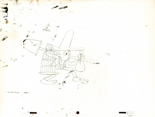
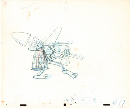
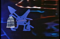 Here is a walk cycle from the beginning of Hubley’s monumental short, Moonbird. The odd numbers are extremes by Cannon, and the inbetweens (even numbers) were done by Ed Smith. Three different sized papers were used for this, and you can view them full sized if you click the thumbnails.
You’ll notice there’s paint all over the drawings. The ink & paint involved tracing the drawing, then using oil paints to cover all of the clear area in black. Some of that paint seeped onto the originals. In one drawing even to coloring the hat accidentally.
 37
37(Click any image to enlarge.) “Marky” walk cycle from Moonbird
On twos at 24FPS
Click left side of the black bar to play.
Right side to watch single frame.
There’s a lot more to this scene including several variants on the walk.
At some future time, I’ll add the other drawings to show off the entire scene.
Animation &Independent Animation 25 Aug 2011 07:26 am
Note from Borge
- Mike Barrier had posted a great letter from Borge Ring about David Hand and animation timing. I responded with a short note. I thought I’d written that I wish Hand, who had an enormous knowledge of animation, had said more about the subject in his autobiography. Instead, the book was about his life not about the work he did for his life. Borge Ring misunderstood my badly worded comment on the site, and wrote a letter to me about it. A couple of letters later, things were straightened out, and Borge had written even more wonderful stuff about David Hand’s knowledge. I asked to print that note, and Borge gave permission.
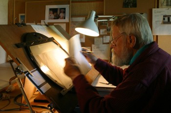 Dave (Hand) was good at rages. They say -When Walt toppled Dave’s well planned day schedule in midmorning, Dave stood at Walt’s office gripping the table with white knuckled hands.blasting Walt.
Disney later reminisced, “He didn’t know that I never loved him more than at those moments because he cared”
John Canemaker is bound to have Dave’s Cookham lectures – One of them deals specifically with exposure lengths.
I remember a remark:
“6 frames is a hold – 4 frames is neither hay nor grass.”
He never mentions 3 frames.
Preston Blair puts in 3s in the endscene of “Dance of the Hour ” – Croc twirling Hippo, but you don’t notice they are threes.
On request Dave talked about timing to a beat. (the old Jaxon gambit):
“Disney uses many beats but mostly 12 and 8 – because they are easy to break down into inbtws -”
An 8 beat (metronome on 180) with keys 1 – 9 – gets inbtw 5 in the middle and later 2 and 4 -
A 12 beat (metronome on 120) has 1 – 13 -with 7 in the middle
But Duncan and Littlejohn knew all of this and could have told you if you did not already know.
Dave was not very conversant with music and his musician told him to think in (numbered) bars of four beats each, and gave the following rule of thumb, “Place all strong accents on 1 and on 3 in the bar and you will never get me into trouble”
Dave added “You can place your strong accents wherever you choose as long as it makes sense musically.”
“When lengthening or shortening a passage on your barsheet, never add or subtract less than one beat.”
When adding a foot to the timing he did not rewrite the barsheet.
He cut out one line of a virginal barsheet wrote on it and stuck it on to the rim of the sheet. Therefore you got barsheets with “whimpers” sticking out or empty lanes if you had deleted some beats to shorten a passage.
When the barsheet was final he rewrote the numbers of all bars.
Dave animated a little film one afternoon – working to an 8-beat. He drew 1-9-17 -25-etc in very thin grey lines then added all inbtws thinly, flipped and went over the whole scene straight ahead with a fat black line.
He was fast like lightning though he had not animated since 1934
“How do you choose a director?” I asked
“You take a very good animator who is known for getting along with people.”
The new director doesn’t animate, and after awhile they begin to miss his good footage. “Animation developed by leaps and bounds and
after a year the other animators have passed him in quality.”
“Have any of you any experience in story?”
“Oh yes – Jensen and I storyboarded this guy’s script for a feature.”
“But that isn’t story. That is only continuity And that is easy – that is eh if.
Hand and Geronimi stuck to their pleasant style of timing when shorts directors like Jack Hannah sharpened theirs under influence from certain other studios.
Michael,
All this is memory debris that YOU no longer need – But I know It is a warm feeling to hear the “sound” of Old Gold from someone who was in Walt Disney’s studio when “the things” happened.
Kaj Pindal and Kimball were railway pals
“Ward give me the magic feather on animation.”
“Timing is everything,” was the answer.
greetz
Botge
A three stagger 123 -234 – 345 – when shot on twos makes the character look VERY heavy There is one such in “Robin Hood”
By the way, there’s also a wealth of information in Mike Barrier’s interview with David Hand on Mike’s site.
Independent Animation 16 Aug 2011 07:37 am
Joanna Priestley
Joanna Priestley is one of the most consistent of the Independent animator/filmmakers. Her work has gotten stronger as she goes on, and the number of films seems to grow more and greater with every year. Starting with THE RUBBER STAMP FILM in 1983, she hit the ground running. Her film VOICES (1985) won International acclaim and made her something of a star on the Festival circuit. To date she’s made some 24 animated shorts.
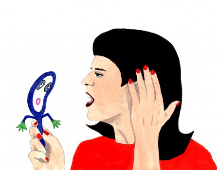
VOICES (1985)
This interview excited me and made me want to work. Her investment in animation should be an inspiration to anyone wanting to make a career of it, and I hope young animators will take note of the direction she followed. She always seems to have fun in the films she made, which all seem to successfully hide hard work of filmmaking. Her love of the work is obvious.
- Q. Can you tell us what brought you to animation.
A. When I was seven years old, my parents gave me a tiny zoetrope on a beige, plastic turntable for Christmas. I loved that toy! I read mountains of comic books and watched Warner Brothers cartoons on television every day. In high school, I saw several films by Norman McLaren from our city library and fell in love with his personal style and his experimentation with various media and animation techniques.
But I think the main factor was seeing La Jettée by Chris Marker at U.C. Berkeley. After I saw it in class, the professor let me borrow the projector and the16mm print, so I could look at it over and over. La Jettée led me to producing multi-image shows and that led to animation.
Q. What was your initial training?
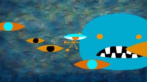 A. After living in Paris, I moved to central Oregon and settled in Sisters, a tiny, lovely cowboy town. In Paris I went to the Cinématheque Française everyday, so I was horrified that there were no movie theaters near Sisters, in an area half the size of Nova Scotia. Martha Kelley and I started Strictly Cinema and showed 16mm movies at the local high schools. Then we put on film ______________EYELINER (2011)
festivals and I was able to see lots
of independent animation. At one point, I went to Safeway and bought a pack of index card and started experimenting.
That led to a job at the Northwest Film Center (in Portland, Oregon) where I took an animation class from Roger Kukes. My index card experiments resolved into The Rubber Stamp Film, which led to the Experimental Animation MFA program at Cal Arts.
Q. Who and/or what films were early influences?
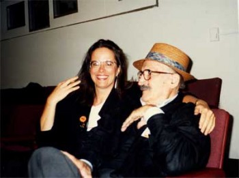 A. I am very lucky and have had wonderful mentors. That’s why I run an internship program. My teacher at Cal Arts, Jules Engel, was a brilliant abstract artist. He was always pushing the envelope into unknown territory and I got to know the Head of the Cal Arts Film School, Ed Emshwiller, who was an inspiring, lovely man and extraordinary artist who experimented in a variety of media. ______________________________Joanna and Jules Engel
Faith Hubley was a tremendous influence. When she married John Hubley, they agreed to make an independent film every year, and they did. When her husband died, Faith continued to make a film every year for the rest of her life. I find that truly amazing. I attempt to make a film every two to three years and when I get discouraged, I think about Faith and John.
Other influences: Andrei Tarkovsky (especially Stalker), Werner Herzog, Hidao Miyazaki and Chris Marker. Remains to be Seen and Traveling Light by Jane Aaron, The Man who Planted Trees by Frederic Back, Lineage and Viewmaster by George Griffin and Blade Runner.
Blab! Magazine was a huge influence (especially work by Tom Biskup, Esther Pearl Watson, Gary Baseman, the Clayton Brothers, Ryan Heshka and Mats!?) as were the Pictoplasma books, Linda Barry’s What It Is and The Woman’s Encyclopedia of Myths and Secrets by Barbara G. Walker.
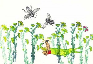 Q. You started with films that animated non-traditional media. THE RUBBER STAMP FILM, as its title indicates, uses rubber stamps to create the art, and THE DANCING BULRUSHES utilizes back-lit sand animation. What drew you to these forms as opposed to the traditional drawing?
A. I was deeply influenced by Norman McLaren’s deep exploration of multiple techniques. At the very beginning of my career, ___________THE RUBBER STAMP FILM (1983)
I began experimenting with new techniques,
new subject matter, new color palettes and new genres with each film. I want to learn as much as possible with each new project and it is very important to me that my work evolves and pushes into unknown territory. With each film, I challenge myself to learn something new. That’s what keeps it interesting.
Q. You tried your hand at computer animation working on some hi-tech computers at CalArts making JADE LEAF (1985) and TIMES SQUARE (1986) on this system. Did you find the computer all that you’d hoped for back in those early days?
A. I had no hopes or dreams about computer animation because it was such a complete novelty. Only a handful of people had access to the big, beige Cubicomp that Cal arts bought. We turned it on and there was a blank screen. We had to find a programmer to make it possible to create and save the digital animation we made with the keyboard. He also set up a program that would shoot single frames on a 16mm Bolex set in front of the Cubicomp’s monitor.
That is how I made two computer films at Cal Arts, Jade Leaf (1985) and Times Square (1986) co-directed with Jules Engel. Collaborating with Jules was so much fun. We were always trying something new and every day that we worked together he would say to me: “Honey!! How can we do this differently?!†Jules always said he made another film from the footage that we shot, but I’ve never seen it.
Q. You went completely in the opposite direction with CANDYJAM (1988) with the very low tech object animation of candy. It must have felt very different working on this film?
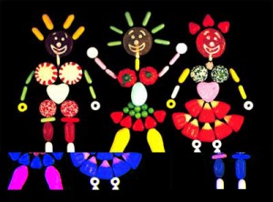 A. Candyjam was born when Joan Gratz and I met for the first time at the Hiroshima Animation Festival in 1985 and traveled together afterwards. I was collecting gorgeous Japanese candies with delicate spirals, autumn leaves, dots and colored grids. Joan and I talked about animating with candy and we thought “Wouldn’t it be amazing to ask different people from all around the world to do something with the candy from their area?â€
_____________________________________________CANDYJAM (1988)
So we asked filmmakers from several
countries if they might be interested in contributing sequences and were stunned when everyone we asked said yes (David Anderson, Karen Aqua, Craig Bartlett, Elizabeth Buttler, Paul Driessen, Tom Gasek, Christine Panushka and Marv Newland).
That’s one of the amazing things about the international animation community. People will share their talents and their time and they are willing to work together. Candyjam was a joy to make and also a bit of a nightmare because it mixed multiple techniques and two formats (35mm and 16mm).
Q. SHE-BOP (1988) is a stunningly beautiful film combining 3D puppets with drawn animation. It mixes mythology with cartoon on its way to telling this story of controlling your own destiny. Again it’s very different from CANDYJAM and a strong, stylized design. Any comments?
A. She-Bop (1988) is based on a wonderful poem by Carolyn Myers about the Great Goddess. I heard her perform it at a women’s gathering in the Oregon forest. I decided to experiment with puppet animation, even thought it was a bit intimidating to have the best puppet animators in the world a few blocks away at the Vinton Studio. I made a simple puppet with copper plates and lead wire and a set made with foam core board and duct tape. All of my films use very simple, inexpensive materials. Jazz composer Dave Storrs did a lovely soundtrack.
Q. PRO AND CON (1993) combines drawing and clay painting. It’s a teaming between you and Joan Gratz. She obviously did the clay painting to work off your drawings. The film investigates life within a prison, featuring monologues by two people within that prison: an inmate and a corrections officer. You used drawings by the inmates and object animation of some of the weapons and crafts from that same prison. It’s a daring and informative film. How did it come about and what more can you tell us about it?
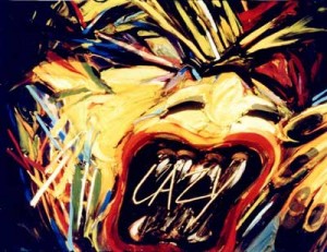 A. Pro and Con came about when Joan Gratz and I applied for a Percent for Art funding that accompanied the construction of a new prison. We sent out several hundred questionnaires to inmates in Oregon and Joan selected a response which became the basis for her half of the film, which she animated with clay painting.
We also toured many prisons, where we met a very interesting African American corrections officer. I based my half of the film on interviews with her. In the McLaren _____________PRO & CON (1993)
tradition, I used a variety of techniques,
including object animation, puppets, drawings on paper and cel animation. I selected media, like animating freshly ground hamburger, that could be seen as a metaphor for incarceration. The hamburger was a pain to animate because it gradually turned brown and stinky over the course of the two day shoot.
I contacted the teacher of the art class at Oregon State Penitentiary and he asked his students to draw these wonderful self-portraits for the film. I also animated with contraband weapons and crafts that were confiscated from inmates.
Q. You worked on some of the earliest computer animation done at Cal Arts, working with older systems and programs. Obviously, you’ve adapted to the digital world in drawing your films. What programs do you like working?
A. I started working with Flash in 2002 and fell in love with it. Thank you, Macromedia! I find it easy to navigate and I never forget how it works. I also use Photoshop. I spent four months doing After Effects tutorials and trying to create work with it. Sadly, after a hiatus of six months, I’d forgotten everything.
Q. You originally used multi-media in making the films. Cutouts, cels, 3D puppets, even candy were all used to do your animation. Do you miss these different forms in making the more digital films?
A. I miss the elegant wheels and knobs and the clickety clack of my beautiful cameras. I still have a 16mm Bolex that I found under a table at a flea market. It came with several lenses, fabulous little metal accessories and a leather case. I also have a beautiful, stout, white, 35mm Mitchell camera. But it was expensive and exhausting to send cans of film by Greyhound bus to the lab in Seattle and then wait for weeks for them to process the film and send it back. They would always bump my little jobs for bigger commercial work.
I miss working with watercolor and felt pens on paper and I miss moving around and using more muscles than just my right hand, wrist and arm. But the immediacy and ease of use of Flash makes up for all of that!
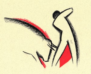 Q. In ANDALUZ you teamed with Karen Aqua in making this valentine to Andalucia. The film was done on paper in 2004, which means it was more traditional in style. This is rather late for a hand-made film. Was this intentional? How did the teaming of you and Karen come about and how did you break the workload?
A. Andaluz began when filmmaker Karen Aqua, her composer/musician husband Ken Fields and I were all chosen to be artists-in-residence at the Fundaçion Valparaiso in the village of Mojacar _________ANDALUZ (2004)
in southern Spain. To honor that synchronicity, the three of us collaborated on a film.
We began with a ritual and decided to do a film about the area. That gave us license to hike around outside and draw the architecture, animals and plants, study the sky, go swimming and study the water. We sat side by side and did about 1200 drawings together, sometimes drawing on each other’s drawings. After the residency, the three of us traveled together and lugged those drawings everywhere. We didn’t want to take a chance on losing them.
Karen was in Boston and I was in Portland, Oregon and we found that shipping drawings back and forth made us both nervous. So we had two additional residencies, at the Millay Colony and the MacDowell Colony where we finished the artwork together. Then we turned Andaluz over to Ken Field who produced amazing music with Juanito Pascual and Lance Limbocker who did the sound design.
Andaluz took about four years to make. During the process, Karen was diagnosed with cancer and underwent chemo several times, so there were a lot of challenges to face. Karen died on May 30, 2011 and I miss her terribly. She was a wonderful woman and a brilliant filmmaker/artist. I feel so lucky to have had this collaboration with her and Ken Field.
Q. OUT OF SHAPE uses iconic graphic imagery that playfully moves about the screen. You’ve moved to complete abstraction, yet you give it such a personal lively, light sense of humor. The abstraction gains a personality and becomes funny. You seem to do this so naturally.
A. Thank you. I made Out of Shape (http://www.youtube.com/user/JoannaPriestley) in two months. I was lucky to have a friend, Marc Rose, who had the time to do the soundtrack. I had just spent two years completing another soundtrack and was demoralized with how long the process took, although I love how it turned out. To refresh my enthusiasm, I made Out of Shape very quickly and joyfully and immediately posted it on YouTube.
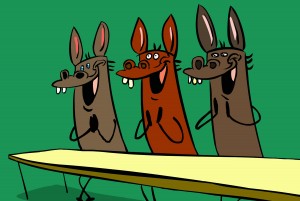 Q. In some ways MISSED ACHES seems a bit different from your other films. It’s a play on wordplay, but you treat it almost like a Warner Bros cartoon with bright, bubbly, cartoon music. In some ways it feels more like a Chuck Jones cartoon. It’s the obvious way to do the adapted story, but I wonder how you felt about it while doing it?
A. Missed Aches is based on a poem by Taylor Mali who led teams ______________MISSED ACHES (2009)
to four championships in the National
Poetry Slam. He was absolutely wonderful to work with. His words are so inspiring that the images just seemed to fall into place. I think it also helped to work at the onset with a friend who is a great storyboard artist (Dan Schaeffer). The challenge for me was to make a funny film with character animation. I am not funny. My husband, director Paul Harrod, is hilarious. Humor is extremely important to me and I think it’s the best way to cope with life.
I had a group of collaborators who made the process a great joy. I worked with a former student, Don Flores, a great character designer and animator, and with the famous Canadian sound designer, Normand Roger, Pierre Yves Drapeau and Denis Chartrand, who made the soundtrack. Major treat! While making Missed Aches, I saw Brian Kinkley’s graduation announcement on Facebook. He did this extraordinary animation of text, which is now constantly imitated. His text animation became the perfect background for the film.

Q. Anything you want to add?
A. I love what I do. I love coming to work everyday. I try to stay open, curious, follow my intuition and always try new things.
Animation &Commentary &Independent Animation 14 Aug 2011 03:08 am
Robert Breer (1926-2011)
- This note came from George Griiffin today:
- Some of you may already know Bob died yesterday. The beautiful film by his youngest daughter Sally, posted on Vimeo, made it clear but I don’t know if there has been an official announcement yet.
Unfortunately, I did not receive a link to the video
but Janet Benn located it. Thanks, Janet – M.S.
He had an enormous influence on 2 generations of animation artists, constantly pushing and pulling his practice with wit and ingenuity. It was a privilege to have known him, and to have learned so much from him. A huge force in our field has left.
There is this excellent bio on AWN.
See some of his films Here.
The only obituary I’ve found thus far is an Italian one, in Italian. Here. It says that he died peacefully on August 12th.
Articles on Animation &Independent Animation &John Canemaker 07 Jul 2011 07:15 am
Caroline Leaf meets John Canemaker
The following is from the book, Storytelling in Animation, The Art of the Animated Image Vol 2. This is an anthology that was edited by John Canemaker which was published in conjunction with the Second Annual Walter Lantz Conference on Animation.
A Conversation with Caroline Leaf
This transcript has been abridged from the “Tribute to Caroline Leaf” that took place on June 11,1988 during The Second Annual Walter Lantz Conference on Animation.
JOHN CANEMAKER: When Caroline Leaf was beginning work on her masterful short film THE STREET, she told an interviewer, “I wanted to tell stories with my films, and I used animal legends and myths. Now I am working more on dramatic representation: dialogue, character and human problems. Perhaps dramatic expression is not ultimately the best form for animation, but still, I do not try to do what live-action can do better. The strongest influence on me is from literature rather than film. Kafka, Genet, lonesco, Beckett, have affected me most with the depths of their visions and world views and ways of breaking up time to tell a story.”
Caroline Leaf’s work is a wonderful synthesis of many of the storytelling techniques and animation methods discussed at this conference. She represents to me both the old and the new—the traditional and the experimental. Her use of direct, under the camera techniques and brilliant metamorphoses recall the pioneering works of James Stuart Blackton and Emile Cohl. Her perfect sense of timing and implementation of personality to individuate her characters echoes the balletic movements and emotional impact of the best of Disney. Within her films the imagery can be, at one moment, representational, and, in the transitions, non-objective abstraction. Caroline tells ancient folk tales as well as modern short stories. And she uses tools as primal as her hands to position paint on a smooth surface, or push sand grains into impressionistic symbols. She records her art with a modern invention, the movie camera, which allows her to bring inert designs and stories to life, a miracle never realized by artists until our century.
Caroline Leaf created her finest films at the National Film Board of Canada, a sympathetic but nonetheless corporate structure, in which she has managed to retain her individuality and personal signature. She is also a vital link in the list of women animators, designers and storytellers past and present who have made their way in a male-dominated field. From the simplest means she conjures a complex world of emotions, which is a talent found only in the work of the greatest artists. The transformation and alienation of a man turned into a loathsome cockroach; the variety of feelings triggered in family members by the imminent death of a loved one; the pathetic, ultimately self-destructive attempts of a lovesick owl to assimilate into a different culture; a small boy and assorted animals facing death in the form of an eerily omniscient wolf are some of the stories told with consummate skill in the films of Caroline Leaf. I’m so glad you’re here.
CAROLINE LEAF: I’m glad to be here.
CANEMAKER: I think that what’s extraordinary about seeing all your work together like this is to view your first film and to realize that it was all there—right at the very beginning. The good design, the sense of timing, and your whole bold approach to the medium is already there—your ideas about how to tell the story. That was your first film, wasn’t it?
LEAF: PETER AND THE WOLF (1969) is my first film. And I must say, I agree. I haven’t changed very much.
CANEMAKER: Grim Natwick always said that timing is the last thing an animator learns. It seems as if it was the first thing that you learned. Where did that come from? Were you trained in theatrics in any way?
LEAF: I’m not sure where it comes from. I think I make shapes and then try to keep them in balance. That’s my idea of how they move. I don’t know how to say where the timing comes from.
CANEMAKER: But you also know when to not make them move—you have a good sense about “holds.” When the cockroach was looking in the mirror, it went on and on, and you had the guts to keep it there without having it move at all.
LEAF: I’ve heard people talk about feeling the movement, and I know that I feel it. Sometimes I have to get up and act something out, or look in the mirror to see what it looks like when something happens. Working directly under the camera the way I do, there’s nothing between me and drawing the motion, and that helps with that. Intuitive expression of the movement, the timing. CANEMAKER: Let’s talk about story. In PETER AND THE WOLF, it’s very experimental. In many ways it is a first film because you get a feeling you’re trying to do a lot of different things. How did you approach the story in PETER AND THE WOLF? There’s just barely a theme of Prokofiev in the beginning —it’s all there, yet it isn’t.
LEAF: I’ve read a lot, and I’ve been most influenced by stories that I have some good gut feeling about. But then I like to go off and do my own thing with them. And on that film in particular—you’re right, I was trying to experiment; and the way I was working, I just had to divide things into segments. The ideas would evolve out of a little pile of sand and then go into wh’ite, and then a few days later I’d start a new sequence. So, it was pretty much the situation of wanting to use a story while not following it precisely.
CANEMAKER: And you use touches of personality, too: the little goose steps down but has a very particular way of doing it and it got a couple of laughs each time because it was so goose-like. Your characters have a lot of personality. Do you feel that personality guides story?
LEAF: Can they be equal?
CANEMAKER: Whatever you want! Anything you want, Caroline!
LEAF: I would say the story is important to me because it sets the limits and anything I do I don’t want to deviate from the feeling I want to generate from the story. The characters are the vehicles that express the stories, so they have to be right for each other. And I don’t indulge the characters, I don’t think, because I would get off track with my story, so I think I always sustain a line to keep the story moving along.
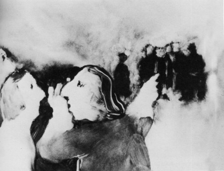
THE STREET (1976), adapted from Mordecai Richler’s story
CANEMAKER: Let’s talk about THE STREET (1976). How detailed was the original short story? Why did you approach it?
LEAF: I just liked the story, but there I had Mordecai Richler, a living person, a writer who lived not too far away from me, and I wanted to respect his writing. His story was maybe twenty pages, and at first I thought that to be respectful to the writer I should put everything onto film. And I found as I was working, the more I could pare away the words and just work with the imagery and be true to the feeling I was getting in the story, the better it worked on film. So there I was really trying to follow his story, but because film is a different medium, it came out in a different form.
CANEMAKER: Did you ever show it to him or did you confer with him during the making of it at all?
LEAF: No, he was strangely disinterested. He didn’t like the story too much, and didn’t care what I did with it, and never got in contact with me about it. I didn’t discuss it with him.
CANEMAKER: Did he ever see the finished film?
LEAF: I sent him a print and he never answered. I don’t know what he thinks of it.
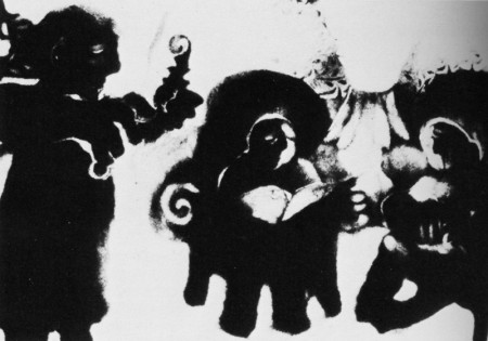
A family beset in THE METAMORPHOSIS OF MR. SAMSA (1977)
CANEMAKER: What about Kafka? Was your approach to pare away and get the imagery first in THE METAMORPHOSIS OF MR. SAMSA (1977)?
LEAF: The Kafka story is so complicated and wonderful. There I took just the element of what I was thinking about most—how horrible it would be to have a body, or the external part of one’s self that’s seen by the world be different from what’s inside one’s self, and not be able to communicate that. Since I’m a storyteller, I just worked with that one aspect of Kafka, so it’s quite different from his original story.
CANEMAKER: You really get into your characters; the emotion is there, it’s really extraordinary, I think. It’s just great. (Audience applauds.) Caroline doesn’t like to be interviewed, but she’s consented to this, and I appreciate it. I’d like to talk about the animated projects you’re working on now. One of them is a scratch-on-film technique.
LEAF: I’m just in the midst of starting two projects, and because I’ve been involved with live-action filming for a few years, and writing for live-action, now I’ve got a story that has all the characteristics and psychology and emotion of a live-action film, but I’m doing the images scratching on film. It is quite a restricted and crude image that I can make, but I find it exciting to find what I can tell of the story in imagery and how much I’ll have to rely on words.
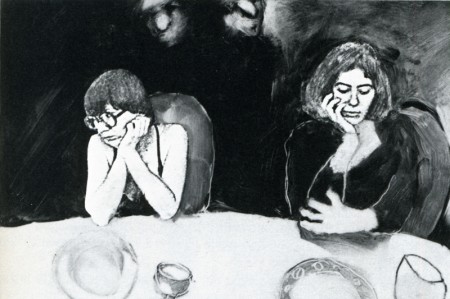
Autobiographical insight in INTERVIEW (1979), co-directed with Veronica Soul
And the other project is a test of a computer animation program. It’s a small project, a program called Pastel, that was developed by the Film Board. They wanted to see how an animator would work with it, and what modifications it still needs.
CANEMAKER: Exciting. So you haven’t abandoned animation.
LEAF: No. Not at all. I just have had a hard time sitting still and doing it.
AUDIENCE MEMBER: I noticed in INTERVIEW (1979) that you had all those little thumbnails to the left [of the work under the camera]. Is that how you work, really planning it out in little sketches like that?
LEAF: Yes, that would be my detailed storyboard as I go along. I don’t storyboard too closely; to have done all the fun work, and to animate it, there are no surprises left. But I also need to know where I’m going since I work under the camera. If I take a wrong turn I can’fgo back. So, as I come to each scene, I do some little sketches, particularly to know what the characters look like in different positions, so I don’t get lost.
AUDIENCE MEMBER: Your soundtracks have a powerful impact on the film. How much do you get involved? Do you sound-mix, or do you direct the actors and the dialogue?
LEAF: I am very involved with my soundtracks, and I enjoy working on them very much. The soundtrack for THE OWL WHO MARRIED A GOOSE (1974) was the first one I really conceived and executed. But when I’m working at the Film Board, I’m not the mixer, and I’m not the recorder, usually. There’s a crew of people that do that for me.
AUDIENCE MEMBER: You’re able to tell a story mostly through images, yet in THE METAMORPHOSIS OF MR. SAMSA and THE OWL WHO MARRIED A GOOSE you alter the language. Why did you make those choices?
LEAF: The Kafka story wasn’t in the public domain and I didn’t have the rights to the translation, so I made up a kind of gobbledy-gook language for that. And the Eskimo film was not a language you understood, either. They were speaking the Eskimo language.
CANEMAKER: THE OWL WHO MARRIED A GOOSE is exquisite. Sometimes in animation there are images you want to continue on and on and on. That scene of the birds flying, and the sound of wings getting as big and close as they are, and then they’re flapping for a while in front of you. I could watch it for a long time.
AUDIENCE MEMBER: In that vein, I’d like to know how long you studied the animals to get their movements so perfect.
LEAF: I don’t study animals. I don’t go to the zoo. And in fact my movement isn’t very realistic. I think you can make it convincing. It fits the shapes, I think. I’ve never really looked to see how birds fly, and it’s kind of awkward in fact how they do, but it somehow works.
CANEMAKER: In several films you have a character who will take a step and then the legs would switch in some unnatural way—but somehow it works. In THE OWL WHO MARRIED A GOOSE I think there’s a section where that happens.
LEAF: I know it happens in THE STREET once — arms change . . .
AUDIENCE MEMBER: Why are you working in Canada? Economics?
LEAF: Yes, the Film Board is quite a special place. It’s allowed me to do the films that I’ve done, which I don’t think I could have done down here.
AUDIENCE MEMBER: Because no one’s going to buy them? Or distribute them?
LEAF: It’s because of the problem with the distribution of short films. Ask any of the independent animators who’ve spoken here. Most of them are teaching, and it’s hard to have films seen. I found it is also hard at the Film Board. It’s difficult to have short films seen, and I’m not happy with the distribution, but I’m paid a salary there, and I’m quite free. Not totally free, because it’s a government film agency, and there are restrictions.
AUDIENCE MEMBER: What kind of restrictions?
LEAF: I find there’s a rather insidious way of thinking that grows on one working in a place like that. The most obvious thing is that it’s not possible to experiment; or it’s not easy to do an abstract film, because they’re always concerned about their market, which is an educational market. And besides that they’re very sensitive to not provoke any public outrage, or outcry, so they take a middle road. Nothing should be too controversial. I can read stories and know right away, this is something that could be done at the Film Board or not. One isn’t free to do exactly what one would like to do but one can mold it to be close enough to be satisfying.
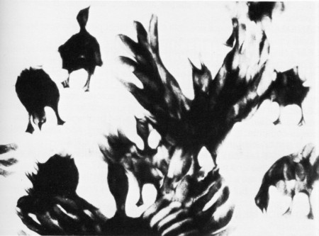
Exquisite images of geese in flight in THE OWL WHO MARRIED A GOOSE (1974)
AUDIENCE MEMBER: Does the Film Board expect to make their money back on films?
LEAF: No. The income they receive from the films goes back into production, but the Board receives government money each year. They have an annual amount given to them from Parliament. It’s voted each year.
AUDIENCE MEMBER: Has it been growing?
LEAF: It’s been shrinking in recent years. So the place has shrunk a lot. Just last year they were voted an increase, which might just bring them equal with inflation for the first time in a few years. But everyone takes it as a vote of confidence.
AUDIENCE MEMBER: Who owns the films you made while you were on salary?
LEAF: The Film Board owns them. I don’t have any rights to them at all.
AUDIENCE MEMBER: Do you think that your technique would be used in any major projects, for instance in a Disney feature?
LEAF: Well, I’ve seen my way of transforming used in eel animation. But actually the way I work, under the camera, I don’t think I can work as a team in that way. So it would be hard to make a long film using my technique, and get everyone working in a way that looks the same, This winter I did a commercial in New York, arid that was the first time I’d really found that my under the camera technique could work commercially. Because normally I would do some designs and then I would start, and I’d go to the end. And here I didn’t have any way to fit into the system of checks and balances that are used commercially. The client couldn’t see beforehand what I was going to do. But I evolved enough different systems of storyboarding that they felt reasonably secure, when I started animating, what they’d get when I’d
finished.
CANEMAKER: If it were possible to direct other people in your technique, would you be interested in doing a feature?
LEAF: No, I wouldn’t. I can’t imagine directing other people, and also I have a lot of fun when my fingers are doing it and I discover for myself little things. That’s what keeps me going. And I don’t know what it would be like, if it would be enjoyable to direct other people.
AUDIENCE MEMBER: Have you ever used colored sand?
LEAF: I got tangled in knots one time trying to use colored sand. When you use colored sand—colored anything—you put a lot of time into keeping your colors separate, so they don’t all become like mud. And keeping colored sand grains separate was very difficult! I gave it up quickly.
AUDIENCE MEMBER: Have you had students or apprentices pick up on your technique and pursue it in their own pictures?
LEAF: There are a few people that have worked in the same materials that I’ve worked in, but not as many as I’d like. And I haven’t had students. I haven’t taught.
AUDIENCE MEMBER: Will you be working on a team for the computer animation?
LEAF: This is just a small project, and I’m alone with the guy that developed the program. We’re working together. He listens to my complaints and makes alterations. I’m amazed sometimes by what he’s done, but it’s not really a team.
CANEMAKER: I would like to thank Caroline Leaf for being here.
LEAF: Thank you for being here!
Animation &Independent Animation 21 Jun 2011 07:04 am
Kathy Rose – Filmmaker/Performance Artist
- Kathy Rose has had a long and esteemed career doing personal animation. She made her name, at first, with the animation style she began at CalArts and continued on into the 70′s with her gem of a film, PENCIL BOOKLINGS. She took a 90° turn combining her animation with her dance and performance art via her 1983 piece, PRIMITIVE MOVERS. Since then she has developed this very personal and individual art form with many more theatrical pieces and video pieces.
I had a close eye on Kathy’s original animated films, but have lost track of the performance works. It was with some excitement and interest that I contacted her to ask several questions about her more current work and have been pleased for the chance to catch up – a little bit.
Q. To begin with, can you tell us about your beginnings; why you gravitated toward animation in the first place, and what steps you took?
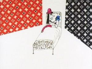 I was a film major at the Philadelphia College of Art, and while there, I saw the animation of Yoji Kuri, specifically – his film Ai (pictured right). I was totally enchanted with his work. That and an interest in photography and collage led me to animation. My thesis project was a live action film, called Portraits, but included pixilation and some cut out animation which I projected onto a live face in the film. The project was a series of portraits of friends, the
last – a self portrait – included excerpts of the other pieces, and finally this projection, all signifying our projection of others into our self image.
I also was training in dance and performing with a multi-media group in Philadelphia called Group Motion, started by former students of the great German expressionist dancer Mary Wigman. This experience would have an enormous impact on me in the coming years.”
When I left PCA, in 1971 I started to teach myself animation. My father – who was a photographer – gave me $1000 as a graduation gift to make an animated film. I did several explorations, using drawing pads to create the animation. Movers (on my site) was the last piece I made in that series before going to Cal Arts.
Q. You graduated from CalArts in 1974 with a class that produced a number of important non-linear filmmakers, such as Adam Beckett, Dennis Pies, Joyce Borenstein and yourself, who turned Independent animation on its ear. Can you tell us a bit about those years; was there a particular influence on you all?
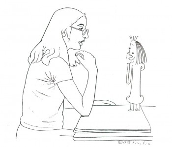 My time at Cal Arts was absolutely magical. Especially because prior to going I had been sequestered, working in an office in N.Y. while I taught myself animation. I saw that Cal Arts had a graduate program in animation, and thought that would be a great way to follow this star. The whole atmosphere at Cal Arts was very exciting – I think it probably still is. Jules Engel was an amazing teacher. He said very little, but when he did, it turned your life around – I am still inspired by his zen style of teaching. The department was small – only around 8 people at the most worked in the animation room, and some worked at home. Adam Beckett worked during the night – at home or in the optical printer room. He and I were in a relationship from 1972-74, and shared a lot about the animation we were working on. Dennis Pies (now Sky David) also worked in his dorm, as did Joyce. But we were all drawn together not just in our department, but with the rest of the Cal Arts community. For awhile I took some dance at the school along with another animator Lisa Rose. (no relation). An animator who was very influential on our group of artists was Jim Gore, who was not a student at Cal Arts. Adam had connected with him and his films. Dream of the Sphinx, and The Letter had a powerful effect on us. It was Jim’s very free, metamorphisizing style – which at the time was a revelation and led to a new way.
Q. We came to know you through your early animation work which was all very non-linear. filmically but linear graphically. MIRROR PEOPLE, MOVERS, THE DOODLERS and particularly PENCIL BOOKLINGS all had a large impact on the Independent movement of the late 70s early 80s. Can you speak a bit of this period in your work?
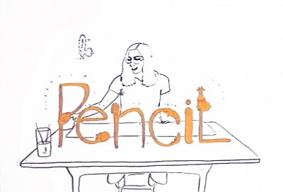 The wonderful input of Jules led me to MIRROR PEOPLE, THE MYSTERIANS, THE ARTS CIRCUS, THE MOON SHOW. I had graduated and was working at Cal Arts while I made The Doodlers, where I used the Cal Arts facilities. PENCIL BOOKLIGS was made in N.Y. with an AFI grant. All these films were the result of my exposure to the fertile atmosphere at Cal Arts, and also my fascination with Yoji Kuri, While I was at Cal Arts, I had started to correspond with Mr. Kuri, and he visited with my family in N.Y. at Thanksgiving. He then came to Cal Arts, and I finally met him. (I even saw him later in 1994 when I was a judge at the Hiroshima Animation Festival, and visited his studio, was taken to dinner (with a translator – Yoji spoke no English).
Initially, when I first entered Cal Arts, I was sure I did not want to work with narrative, and I said so to Jules, who was very amenable. I also missed the experience of dancing, and the music associated with it, especially rhythms. (I am currently studying Japanese Taiko drumming).
I think both the dance and rhythmical influences are strongly apparent in these Cal Arts pieces.
With PENCIL BOOKLINGS, I was moving in the circle of New York animators and I think although the storyboard was designed pretty early on, I was influenced somewhat by these associations, especially George Griffin‘s TRICKFILM.
Q. PENCIL BOOKLINGS was voted one of the 10 Best Films in the world by the Hiroshima Intl Animation Festival in 1976. You seemed to have reached the top with this animated form and you moved on to the dance/movement videos. Your 1983 film, PRIMITIVE MOVERS, included your dancing with a group of animated dancers, very much in your linear style. Can you speak about what caused your big change – incorporating yourself into the videos.
PENCIL BOOKLINGS was definitely an apex for me, and also left me at a decisive point. After I completed it, my father had passed away, and I had taught as a Visiting Lecturer at Harvard for a year, and I was working for R.O. Blechman on his Soldier’s Tale. I knew only that I didn’t want to return to what I had done, and I was feeling a strong pull to be performing again. But I had never performed solo, and was somewhat lost at what direction to take.
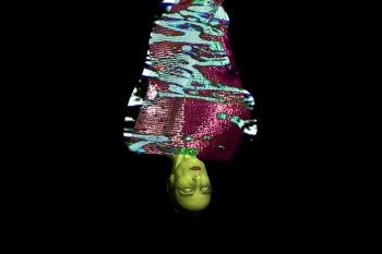 At that point, two things happened. I was living in Tribeca, and one weekend I decided I would just wander in Soho and see where it led me. I ended up at the Bleecker St. Cinema where there was a Marilyn Monroe double bill. This told me I wanted to perform again. (Ironically the first film I remember being taken to as a child was â€Some Like it Hotâ€)
At the same time I received an NEA grant to make an animated film. I decided to mix the two, make an animated film I would dance with. Jules had actually told me almost 10 years before that he could see me dancing with my films. At the time I thought he was crazy, but it demonstrates his intuition. R.O. Blechman also was very encouraging about the idea of combining these. I began taking dance classes again, and ended up studying African dance (for 5 years actually). I was very interested in the Diaghilev productions and his work with set designers for ballet, and in particular the costume designs of Sonia Delauney. In addition, Bob Blechman took the whole studio to see Abel Gance’s Napolean, which was being shown at Radio City Music Hall with a live orchestra – the score by Carmine Coppola. This production was absolutely amazing to me, the effect of the live music on the film made it a dimensional experience, and this was a pivotal moment for me.
I also found seeing Barbara Morgan’s photos of Martha Graham’s PRIMITIVE MYSTERIES clicked for me. Until then I hadn’t really connected with what choreography meant to me. But seeing the stunning, visual, and symbolic group formations in this piece, showed me that dance could be graphic, and this was something I could connect with.
I took a year to produce the animation, and mapped out choregraphy as I drew. Originally I thought I was making a 10-15 minute piece, but it turned out to be 30 minutes. I had a wonderful animation student as an intern – Monica Kendall from Chicago – who worked with me every day. At this time I was also introduced to Mary Bright who I interviewed to design the costume. I knew as soon as I met her at the door, that she was the one. She wore a very big circle earring on only one ear, and that told me everything I needed to know about her dramatic graphic sensibility.
The first performance of PRIMITIVE MOVERS was for a private audience, and it was the most frightening thing I’d ever done. After many performances, I developed my self-confidence and it totally altered me over time.
Q. In PENCIL BOOKLINGS your interplay with your characters came by animating yourself as a character in the film. In PRIMITIVE MOVERS the animated characters and shapes move into your live performance with you as the prime character. Was this part of the goal of the change in direction, or was it part of the result of the change in direction?
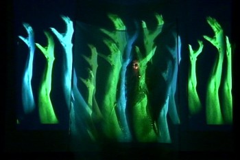 I think in both pieces I am the central character (if you don’t count the pencil). The big difference is that working with projection on something live forces you to work with a very different reality, where everything is not in your control. So many decisions and scenes are the result of the challenges that you meet in integrating the live with the two-dimensional. In PRIMITIVE MOVERS, I basically had to learn to take command, and be the leader, director in my performance itself – it is related to the central role I play in PENCIL BOOKLINGS, but has to be acted out in a much more dramatic way. I often had friends come to rehearsal, and also used a mirror. The input of certain people was key to my development of this genre.
Q. You started projecting shapes onto yourself, essentially acting as the screen for the animation. You make it seem as though the garment, itself, is alive and animated. This with other animated incarnations of yourself moving floating about you.
Unfortunately, I haven’t seen any of your live performances but have watched every video clip I can find. I’m sure I’m missing a lot. I wonder if you can talk about the difference between the live and the video.
It has always been a tremendous challenge to communicate the live event through a basically documentative video. It has actually taken me years to come to terms with it. Some of my early best video recordings were done by Swiss television, of PRIMITIVE MOVERS, and SYNCOPATIONS. I also found when I worked on my 1999 live piece KLEOPAT’RA, I was creating scenes to be used as film clips to run during the performance while I was changing costume off-stage, or to emphasize a stage action, and it allowed me to refine my approach.
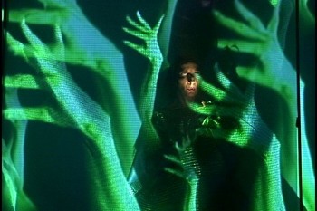 Basically, the live performance of any artist, has an entirely different sense of time from a film or video. In the live event, we are more prepared to wait for what happens because we are there, and there is a suspense, an excitement in the reality of the performer being there, live on the spot. And anything that happens integrating two-dimensional imagery seems impossible, hallucinogenic, and is therefore riveting. In my work it also becomes very sculptural. Often things I thought would be rather ordinary when I shot them as elements, like the floating hair for KLEOPAT’RA (and also QUEEN OF THE FLUIDS – which is a video re-working of the latter piece). When I projected this imagery onto a dancer, I was astounded at the architectural event that ensued. I definitely believe in being open, even waiting like a fisherman, for accidents.
With a video documentation, we tend to assume, in almost a lazy way, that what we are watching is possible, because it is like any other film. But I have found that I can still communicate the design, the theatrical sense in a video document, and of course its wonderful to be able to put these things on the web.
Q. The music throughout your pieces is strong. Do you collaborate with your composers or is it found music (or both)?
I have collaborated with several musicians – C.P. Roth had created rhythms for a piece he was doing for another artist. I heard it when I lived in Tribeca – which was next door to the Franklin Furnace where thie music was playing. I approached him about using the rhythms for SYNCOPATIONS. He also composed wonderful music for my performance piece SHE, which I also used for the later video of the same name.
Walther Giger in Zurich composed some really great music for me – I used one piece for my performance KABUKIMENKO, and a scene from it for a later video of the same name. I was studying flamenco and he has worked with Spanish guitar so it was a great fit.
Toshi Makaihara created sound for KLEOPAT’RA, and I was permanently affected by that creative experience. It drew me into the idea of pure sound, and since then I have made most of my tracks using sound from objects, instruments I recorded myself.
Toshi has come to my classes at The University of the Arts, where I have taught a number of courses, most lengthily Image and Performance, an interdisciplinary workshop. He completed charmed the class by playing every object in the roon.
Q. The lively and strong video SYNCOPATIONS has you dancing about projected mirror images of yourself. All the while images are projected onto yourself. The costumes are so vivid that it leads one to believe that the video is making a statement about fashion. I watch the very dark shadow of the live you falling onto the screen images of yourself and noticing the strong blacks against the strong luminescent white of your live gown. It’s a stirring video. Any comments about this piece?
The integration of the costume with the film projections (it was film then) was very carefully planned. The use of white and black (which is even more important in earlier scenes of this 50 minute piece) were absolutely key to the designing.. I worked with several dancers, having them come to my loft every week, and prepared choreography for them based on a rough storyboard I had made. Sometimes I shot a film test of their movements. There were seven scenes of which only two are seen on line currently. When I felt the choreography for a section was working, I shot Polaroids (this was 1985-7) and created a storyboard from those, which I was able to use for the dancers, and cameraman at the final shoot. We had several shoots, over a year or two.
My assistant cameraman, Roger Grange was extremely helpful and competent and I worked with him in subsequent years, especially on KLEOPAT’RA.
When the film was completed of the dancers, I rehearsed, using a mirror, and choreographed my movements for the live on stage component. The piece was meant to convey the whole idea of syncopations, rhythms, both our generic idea of speed in rhythms, but also of the hidden and inner rhythmical universal pulse beyond the obvious. It was about visual rhythm in the form of patterns too, in addition to the aural interpretation.
I was very influenced by some early modern dance, espedially in Germany – a number of those dancers had used scarves for interpretative dancing.
The premiere was in Santa Fe, at the Contemporary Art Center. I traveled with a simple costume case into which all the costumes went, including the hoop. People were amazed after the shows when I would return this entire magical illusion into a simple 3’’x3’ case.
And I should also mention that all during the time I was doing these performances, from 1983, no-one had really seen anything like this before. Later, when I was teaching I discovered a wonderful piece by Robert Whitman called Prune Flat (1965), which was closest to what I had done.
But my use of animation, and then live action in this very precise way with the live performer, explored so thoroughly was a very exotic bird, and I had a lot of press with this work.
Q. In QUEEN OF THE FLUIDS it would seem that an Oriental goddess gives birth to liquid/smoky characters that float about you. At one point you make yourself the screen as black tears run down your face while liquid characters dance around your head. The imagery is beautiful and the non-linear story (though I’ve only seen the short excerpts on our site) is deep. Can you speak of this film and the impetus behind it.
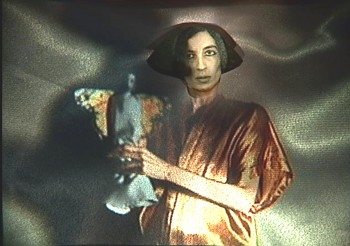 QUEEN OF THE FLUIDS (2003) , which was done with a Guggenheim Fellowship in Performance Art, was a chance to create a video using elements and scenes from my live performance – KLEOPAT’RA,(1999) which I had worked on for 5 years. The narrative differed. In KLEOPAT’RA, it opened with the formation of a statue In film clips (shown while I lay on the ground hidden in a gold pleated fabric), gold dripped into the body, the eyes dripped on, etc. Then a series of scenes followed with an imaginary landscape of the queen. I was integrating Egyptology and Japanese aesthetic.
At the end, the gold dripped out, the eyes emptied, and the figure was left vacant, empty, ready for transport to the other side. There was then a large pyramid, projected onto a veil, into which she entered signifying her passage from the real world. This piece was generated by my witnessing at her bedside, of my mother’s passing. It was an experience that changed me forever, and which I can never forget. In fact the piece She (the original theatrical work) was also a result of this.
My description of QUEEN OF THE FLUIDS says:
“Through rain falling backwards a golden queenly being rises up. In a poetic introductory scene, the gold drips out of her body, and her eyes are shed. Entering through the eerily empty orbs into her brain, we discover a metaphysical kingdom – a world of liquidity, and are led through the mind into an “under-realityâ€,arriving in the pure abstraction of consciousness. Finally, in “The Recovery of the Bodyâ€, her physical self is re-constructed, leading to “The Other Side of The Tapestryâ€, in which we arrive at a kind of “uber-surrealist†view of the artist and the symbolic mirror of herself.â€
This video represents a culiminating point in my performance generated imagery, and my first single channel video.
This piece is also influenced by such sources as the Futurist painter Boccioni’s “states of mind†drawings, bunjin-ga – the symbolic landscapes of Japanese art, and a fascination with puppetry and dolls.
I should also mention re your observation about cgi, that there is something about the reality of the actual projection (it was film) on the face, with the dripping eye scenes that makes it more magical. We were not doing it digitally, but in reality – the body was collaborating with the projection, and this makes it more “unbelievableâ€. One shot actually took 2 years because everytime we tried it, the two would not work together.
Q. Once again, in THE CATHEDRAL OF EMPTINESS, you turn to the oriental art playing off Bunraku puppets with the hand itself acting as a host of puppets moving around the screen. You perform wearing the beautiful white mask. It’s a strong film that clearly shows your love of the medium. Could you give us a few details about the creation of this piece?
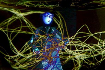 I do love this piece, and feel good performing it because it is really quite natural and organic in its structure. It does not require a lot of precise manipulation of props, costumes, etc. like the other performance works. The actual live performance uses the gold mask from QUEEN OF THE FLUIDS, because it turned out to be very easy to use, and is quite beautiful. I started out thinking I would
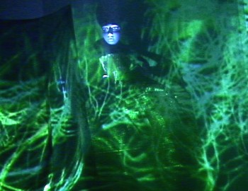 be making a performance version of my video THE INN OF FLOATING IMAGERY. This transformed a great deal, and I shot new scenes, including the trees (branches from our backyard), and the falling “petals†(paper strips that I cut in a form to extend their flight), etc.
I also used a koto that my father had bought many years ago at Bloomingdales I think. The sound was constructed by me from this and other elements.
The title comes from an article I read in the NY Times by a reporter – who wrote that the bombing in Bosnia had left a church as an empty shell, like a “cathedral of emptinessâ€. I am very afraid of thunder, but enjoy having lightneing flashes and thunderous sounds in my work.
Q. You’ve obviously moved away from the characters in your films and have shifted to shapes, effects, textures and lighting. This is an interesting evolution and wonder if you’d care to comment?
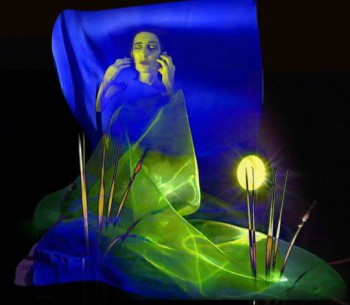 This is a very natural progression really. I feel that if you are not frightened occasionally by something you are making, then you are not advancing. I think there is definitely a big change from the early animation, to Pencil Booklings, Then in Primitive Movers I noticed the characters/figures seemed to become older, less childlike, which I took as a psychological and artistic advancement.
Each piece led me further and further along, and I find that abstraction I made in some of the performance pieces interests me by itself as well. More and more, I am influenced by the Japanese aesthetic, and my current project THE METAPHYSICAL PAINTINGS (a video) features mostly asian faces – quite often students of mine.
I also spent some time away from animation in the early 1990’s, working with only choregraphy and lighting design. The daunting precision of working with projections got to me and I needed a rest. I returned from this by doing Oriental Interplay.
Q. Where do you hope to go with future pieces?
I expect to continue to make videos, and performances. It is not really possible to predict what they will be, as the work changes by itself, and I follow it.
However I am also finding I am interested in creating projection design for other directors for theatrical, and dance productions, as well as for architect/designers.
I have also created some really beautiful installation pieces, and carrying out work like this, or projection design for architecture would make me very happy, because then I can see the work myself and enjoy the dimensionality.
Q. I know your website offers dates of your upcoming performances. Do you have any specific performances upcoming that you’d like to note? Do you find that booking performances is easier/harder/just different to navigate than the early days of sending out films to festivals?
Booking performances was always a lot of work – I had an agent in Europe for a while who got me a lot of work there, and I moved to Zurich for a while. I do find it is much more difficult now, largely because the economy is so bad. I performed for museums, film and dance festivals, universities, etc. (Performed for the Hiroshima Aniimation Festival, Cardiff Animation Festival, etc.)
I have kept up performances, and have exhibited my videos extensively in dance video festivals – which seem to be very open to a liberal interpretation of movement in media.
Of course the wonderful thing now is you can promote what you do easily. I used to cart around giant film cans for performances, and vhs tapes, even dvds would pile up as demo samples. Now we can send flyers in a paperless environment, and with one click, send people to websites with video clips.
Q. Do you have any thoughts about the current state of animation you’d like to share?
The web is really amazing because you can see all kinds of really unusual work. This is very good for animation, and really any kind of expressive video-making. I find when I teach, more and more, I show my classes things from the web, and they show me work also.
I think the whole thing has resulted in a very creative, positive exchange. It is probably very healthy and nourishing for artists of all genres. And probably there is less of a categorization – on sites like vimeo you can see any kind of really progressive interesting work, some animation, or film graphics, or installation related projection. It is a challenge to us all, but is a positive environment.
Early animation
“Syncopations” excerpt
Go here to see more samples of Kathy Rose‘s performance/animation samples.
Independent Animation 14 Jun 2011 06:36 am
George Griffin – Filmmaker
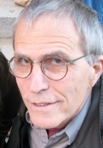 - George Griffin has been something of an inspiration to me. His films have colored my view of what an independent artist can do with animation, and made me feel that it was possible for me to go forward with some of the films I’ve done.
His earlier films had the process of animation and filmmaking technique as a sub-theme and, in many ways, glued them all together as coming from the same personality. This sub-theme was very close to my heart, and I bought 16mm prints of several of George’s films a number of years ago. Consequently, I’ve seen Head and Viewmaster many dozens of time. I’ve certainly never tired of watching them.
When approaching the idea of highlighting the work of some of the Independent animators around the world, it was natural for me to approach George first. He’s a concerned artist whose work has helped drive me forward.
I’d sent George a few questions which he so graciously answered, and I’m posting his response here as the substance of this article. I found inspiration even in reading the response and have spent some time this morning, as a result, looking over some of my more personal projects. I hope it does much the same for you.
Q. Can you give us an idea of your beginnings? Where you went to school and why you went into animation.
Drawing came first, as with every child, before writing, and with encouragement from my parents (father was an architect) and pals. I drew and absorbed cartoons as a truant, instead of studying at school or at home. My parents forbade comic books because they thought they were limiting and vulgar, so I had to sneak off to read them. Ditto TV. There was little help from schools, either; I couldn’t deal with criticism from authority figures, especially art teachers. I was also captivated by photography and what was called hi-fi (building electronic components from a kit), machines that involved sound and image. I learned darkroom photography skills in the Army (drafted pre-Vietnam, after dropping out of college); designed posters, then learned silkscreen and type setting in order to print them; finally graduated college in political science and came to NYC to “find myself.†So, basically, false starts, no real art schooling, learn-as-you-go.
When I came to NYC I first worked in government for Head Start but the city had a way of fracturing all the walls and boxes I had constructed throughout my life. I went to films constantly, hung around NYU film school where my friends were enrolled. When I showed my drawings to anyone, I simply splayed them out on a table where people could just dig in and choose what they wanted to see. This made me a little impatient. I wanted to control HOW they looked at the drawings. That was the epiphany. I had already seen Breer, Brakhage and Vanderbeek, (also Godard) so I bought a used Bolex and tried to teach myself how to animate. Stop-motion, was easy but cartoons were another matter. I had to go to school.
,
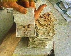
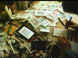
Two stills from “Head” (1975)
Q. I know that some of your first work with animation was studio driven. What moved you to get away from that commercially driven form and more toward the art form?
The work-flow at Focus Design, typical for the period, involved many specialists. It was well known for its use of designers like Rowland Wilson and Tomi Ungerer, but the real storyman was our director, Phil Kimmelman, who created pitch-perfect boards in a generic style that expertly framed the 30 second narrative. Bill Peckmann, a virtuoso stylist, did layout and design, no matter how precise or loose the style. (of course it is Bill who now supplies much of the wonderful, vintage graphics for Michael’s blog).
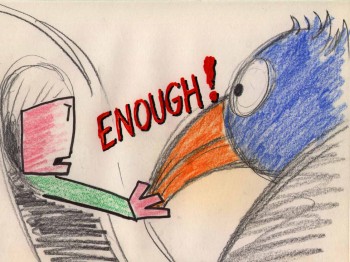 Yellow Submarine had just come out (I had particularly loved “Lucy in Sky”). Most of the older artists at the studio were grouchy because it was a “designer’s†film, not an “animator’s†film. Then I was laid off when business slowed. I had already become frustrated by the division of labor and had lost interest in drafting and timing skills and continued to experiment at night.
_______________
Being in the u-nion helped to ____________________“Flying Fur” (1981)
get free-lance jobs as an assistant,
most memorably a one month stint as an assistant on Fritz the Cat working under legendary animators Jim Tyer, Marty Taras, and Johnny Gentillela. I was fired by Ralph for not knowing how to clean Tyer’s amazing, scribbly extremes. Maybe it was the authority issue again. My wife now speculates that my “cats per hour†speed was too slow.
Concurrently I was able to produce small graphic jobs on my home-made stand. Then I got a 15 second Sesame Street spot based on one of five boards I had submitted. By 1969, I had begun to make my own films. So by the early 70s I had developed a bifurcated view of the art: professional, slick, commercial, studio-produced work for hire on the one hand and experimental, personal work done independently, without a budget, as an amateur (i.e. for love). This almost dialectical split seemed to demand an existential choice and I became a kind of evangelist for fusing design and animation in one stroke, but in fact I kept a foot in both camps. So, in the end, the lessons learned at Focus helped me later to earn a living.
,
Q. Your earlier films (HEAD, VIEWMASTER, even in a way FLYING FUR) seem to have a goal of exploring as well as exploiting the history and medium of animation & film as well as telling each surface story within the film. Yet, at some point, this theme appears to have left the more recent films (A LITTLE ROUTINE, KO KO, NEW FANGLED) wherein the narrative element comes more to the surface. Was there something that caused that change?
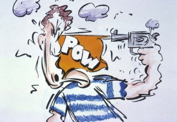 One way to consider the films is to mark a transition from self-conscious, reflexive experiments to work that’s narrative-driven, more accessible, more thematic, in a way more personal. You could say “New Fangled†is about advertising jargon, even though the linkage is obtuse, with double meanings and mysterious references. I was doing a lot of commercials at the time so it was a bit like biting the hand _________________ “New Fangled” (1992)
that fed me. Also, “A Little Routineâ€,
with my daughter and I as characters (a homage to the Hubleys), clearly embodies a big change in my personal life, dealing with emotional issues and sentiments in ways that would have been impossible during the “anti-cartoon†period of the 70s when I was quite focused on process and animation as a kind of language. Both “Flying Fur†(based on Scott Bradley’s brilliant score for a Tom and Jerry) and “Ko-Ko†(Charlie Parker’s famous tune) are driven by the music track, the former being an unscripted, spontaneous cartoon drawn in one month, the later an improvised abstraction performed with bits of torn paper and dried beans; both are two sides of the same coin. But I’m not so sure I understand the shifts underlying these changes. Even now they appear fluid, with reflexive elements popping up in the later work, documentary elements and stylistic discontinuities throughout. I try to understand the deeper implications of individual films, but not the overall arc of the work.
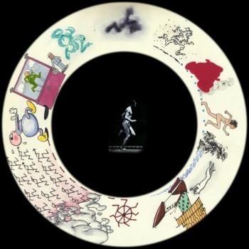
“Viewmaster” 1976″
Q. Does working with computer technology as opposed to the camera have any effect on the themes of your films? What programs do your prefer working in to create your animation? Any thoughts about 3d/cgi?
Changing from cameras and film to digital has affected the content of my work, but not profoundly. I don’t try to poke behind the scenes for an anti-illusionist tropes, like the “hand of the artist.†Process concepts aren’t nearly so compelling now that everything has been reduced to code. But there are still plenty of windows to let in all kinds of rough, angular, mysterious stuff through Dragon captures, compositing/manipulating live action, etc. I use Photoshop and After Effects. I started AE (v.2) while doing a package of Honda spots (it took Thessia Machado and me all night to render the file sequence for layoff to video) and have never missed sprockets. I gave my beautiful little Forox to Frank Mouris and do not for a minute miss the obsessive tedium of shooting. Also important are the opportunities for presentation: digital projection, installation, the internet, etc. And, in a contrary take on progress, I think the so-called inevitable hegemony of digital animation has also created a growing creative backlash among young artists working in 16mm, making “bad animation†(Hertzfeldt?), making pro-cinematic machines and performances, combining animation with sculpture, even doing flipbooks and other kinds of physical/concrete animation.
Neither 3D nor CGI does much for me: too much hoopla, not enough substance, same old studio specialization. I never liked puppet animation (except in the hands of surrealists), so Pixar’s hyper-realism, texture, lighting and acting strike me as superficial, value-added cargo, while the content tends to channel the Disney formula. Call me a curmudgeon, but I thought the love story-in-a-nutshell in “Up†was a perfectly executed jewel using every cheap, manipulative, maudlin cliché in the book.
,
Q.Your films have always had an affiliation with jazz. KO KO, YOU’RE OUTA HERE and others have been more direct about it than others, yet the attachment is there. How do you see the relation of jazz to animation?
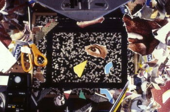 Did animated film and jazz emerge contemporaneously from popular American forms, vaudeville entertainment and dance bands? Did they embody the driving energy of modernism, both sophisticated and a little raunchy? Were both “animated†above all by the infectious pulse of the city, teeming with a heterogeneous, mobile, immigrant culture. OK, I get carried away. I just happen to ____________________“KoKo” (1988)
love most jazz because it is based
on improvisation and rhythm. The former is the gesture of drawing: rough, immediate and perhaps not too perfect. The latter is the heartbeat, handclap, call and response, but also a natural force like the ocean and unnatural force like a machine. Most animation is created by an achingly methodical process, almost deadening it its technical demands. To transcend that, to give it life, you have to make it appear to be improvised, and if you get to that ecstatic point of creativity where nothing else matters, then it WILL be improvised, only not in clock-time, but your own time, animators’ time. The most obvious examples are the direct animation of McLaren, Len Lye, Barbel Neubauer, but ideally it can extend to any decision made in sequence drawing—or any other technique—from instance to privileged instance.
Most of my films have been accompanied by some kind of printed object. The “Ko-Ko†counterpart was the flipbook, “Barrelhouse Bopâ€, which was a deliberate attempt to do a cartoon interpretation of the history of jazz with shifting styles and cadences.
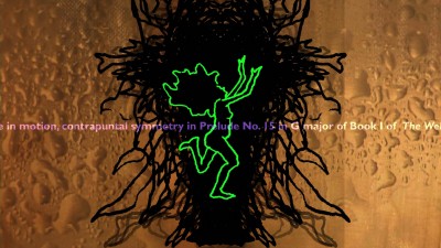
“Bather” (2009)
There’s an interview with George Griffin about “Bather” here.
There’s another extensive interview with George Griffin on AWN by Ann C. Philippon here.
You can purchase a DVD of George Griffin’s work here.
Commentary &Independent Animation 31 May 2011 06:47 am
Karen Aqua 1954-2011
- I woke up to a very sad email from Lisa Crafts, this morning. She sent the news that the brilliant and Independent animator, Karen Aqua, had passed away. Here’s Lisa’s note:
 I am sorry to write this in an email, but thought you would want to know.
Karen died peacefully today after a 10 year battle with cancer.
In her last month, Karen managed to finish her film Taxonomy, premiere it at the Boston Institute of Contemporary Art, and was named a 2011 Fellow in Film & Video by the Massachusetts Cultural Council.
Her warm and ebullient spirit, dedication to animation, (and wild clothes) will be missed by all.
with love,
Lisa
And with that she attached a letter from Karen’s husband, Ken Field.
 It is with great great sadness that I must report that our dearest Karen died peacefully at Brigham & Women’s Hospital late this afternoon.
She had extreme difficultly breathing Saturday morning at the Cape, and we came back a day early and brought her directly to the emergency room. She had a rapid decline since then, and was on a morphine drip and other pain medications when she died.
She was so happy that we made it to the Cape for a few days, her final wish, and that she got to wiggle her toes in the water on the beach, among a long long list of other accomplishments since her initial cancer diagnosis in 2001.
Karen will be cremated. She has asked that her ashes be distributed to a number of places that were meaningful and dear to us, including New Orleans, Hawaii, Roswell, Italy, and of course Cambridge.
A memorial tribute will be held on Sunday, July 10 at 2pm at Arts at the Armory, 191 Highland Avenue in Somerville, MA.
With all best wishes, and with continued gratitude for your wishes and support, and with lots of love,
-Ken
I don’t have much more to say. Karen was a bright spot shining out of Cambridge. I saw her infrequently, but somehow I felt close to her. Whenever we met up it was all smiles. At the very least, I felt close to her films. This is sad for me.
Animation Artifacts &Independent Animation &UPA 02 May 2011 07:40 am
Hilberman’s Energetically Yours
- Energetically Yours was a film produced for the Standard Oil Company and directed by UPA co-founder Dave Hilberman. Animation production was supervised at both Playhouse Pictures (suprvised by Bill Melendez) and Quartet Films (supervised by Art Babbitt).
The film was designed by Ronald Searle and is, as expected, quite creative. Unfortunately, the copies of the film floating about today are all color deteriorated – everything has turned to a muddy reddish hue. In fact, the artwork for the film was very colorful. Matt Jones’
 blog Perpetua (a tribute blog to Ronald Searle) has an excellent piece about Searle and this film. It includes numerous still photos of Searle and Hilberman and gives an idea of the full production.
I’d recently been contacted by David Hilberman’s son, Dan Hilberman. He had a collection of about 50 cells from the film that had been preserved by Mary Cain in a scrapbook. She’s backed each cell with a flat colored piece of paper. _______________Mary Cain’s scrapbook
Dan has sent me scans of these cells, and
I’m going to post them here.
I did some slight adjustments in photoshop. The BG colors often had some cel flash on them or reflections. Some parts of the BG papers also had color deterioration. I replaced all with a flat color and in a couple of cases made a tighter composition. My whole purpose was to focus in on the cel colors. (I made no adjustments to any of the characters or outlines.)
I’d urge you to take a quick look at the cells, read Matt Jones’ blog and watch the pinkish film on YouTube. Then return to see what the colors actually looked like.
 1
1
Many thanks to Mary Cain for preserving these cells, and to Dan Hilberman for sharing them.
