Category ArchiveIndependent Animation
Animation &Animation Artifacts &Independent Animation 16 Jan 2012 06:17 am
John Wilson/Fine Art Films – part 2
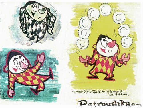
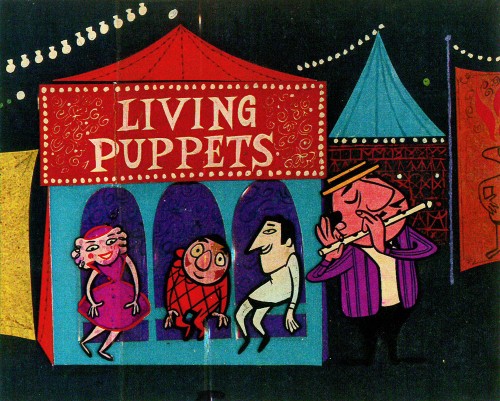
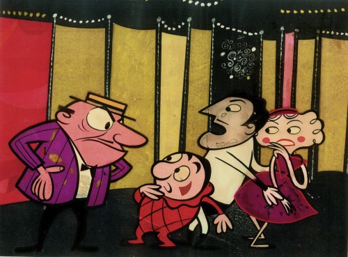
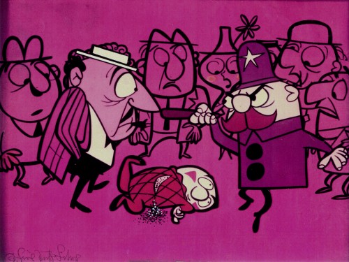
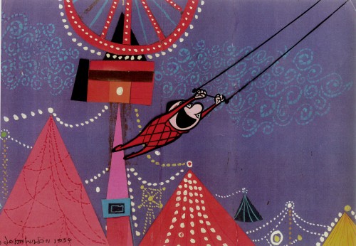
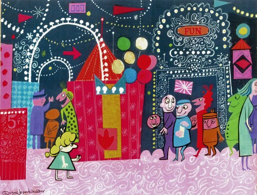
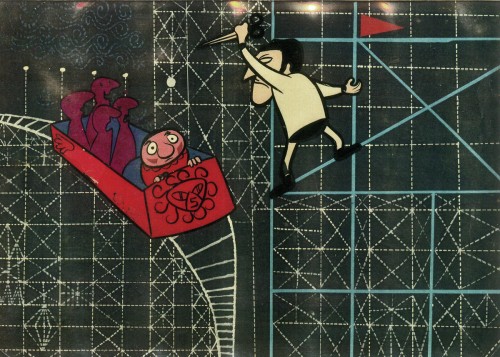
- After completing the film, Tara the Stone Cutter in 1955, John Wilson and his newly formed company,Fine Arts Films, was able to sell the idea of an animated version of Stravinsky’s Petroushka to NBC. They aired the 16 min. film in 1956 as part of The Sol Hurok Music Hour. Stravinsky, himself, arranged and conducted the shortened version of the score using the LA Philharmonic Orchestra.
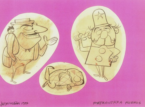
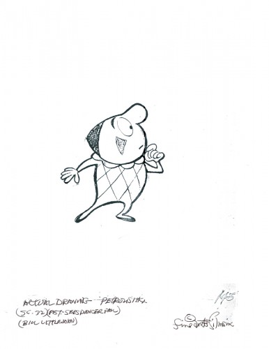
The film was designed by John Wilson and Dean Spille; animation was done by Bill Littlejohn, Art Davis, and Phil Monroe. Chris Jenkyns, Dean Spille and Ed DeMattia designed the show from Wilson’s storyboard. This is considered the first animated Special ever to air on TV.
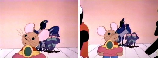
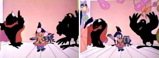
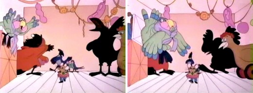
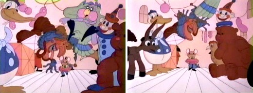
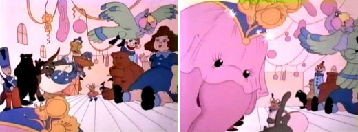
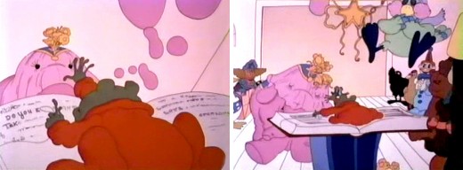
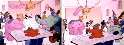
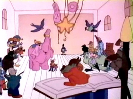
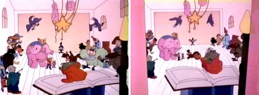
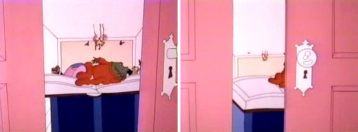
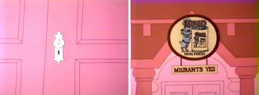
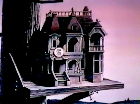
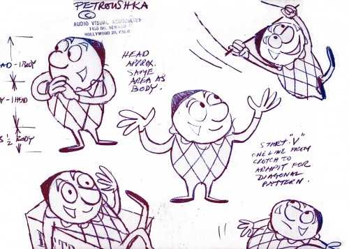
Here are some stills from that film and its artwork.
 1
1Petroushka – model 1
 11
11
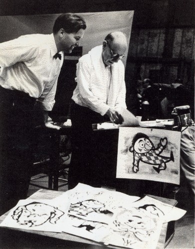
John Wilson and Igor Stravinsky preparing for recording of Petroushka
with the Los Angeles Philharmonic Orchestra (1955).
Here are copies of two reviews:
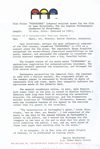
Los Angeles Time review (1956)
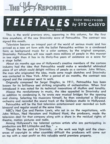
Hollywood Reporter review )1956)
(Click any image to enlarge.)
Petroushka was released on VHS tape combined with a number of the song pieces he did for the Sonny and Cher program. This tape, John Wilson’s Fantastic All Electric Music Movie, can still be found on Amazon but is pricey.
Thanks to Amid Amidi for the material.
Independent Animation &John Canemaker &repeated posts &Richard Williams &SpornFilms &Theater 15 Jan 2012 06:02 am
Photo recap – Woman of the Year
Recently, I found myself talking about my work on this show. It made me go back in search of this post from January 2007, and I thought I’d recap today. Hope you don’t mind.
Woman of the Year was a project that came to me in the second year of my studio’s life – 1981. Tony Walton, the enormously talented and fine designer, had gone to Richard Williams in search of a potential animator for WOTY (as we got to call the name of the show.) Dick recommended me. But before doing WOTY, there were some title segments needed for Prince of the City, a Sidney Lumet film. (I’ll discuss that film work some other day.)
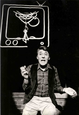
Tony Walton designed the character, Katz, which would be the alter-ego of the show’s cartoonist hero, played by Harry Guardino. Through Katz, we’d learn about the problems of a relationship with a media star, played by Lauren Bacall.
.
It turned out to be a very intense production. Three minutes of animation turned into twelve as each segment was more successful than the last. There was no time for pencil tests. I had to run to Boston, where the show was in try-outs, to project different segments weekly; 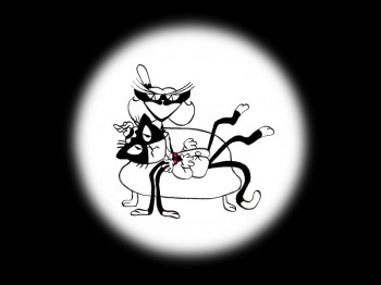 these went into the show that night – usually Wednesdays. I’d rush to the lab to get the dailies, speed to the editor, Sy Fried, to synch them up to a click track that was pre-recorded, then race to the airport to fly to the show for my first screening. Any animation blips would have to be corrected on Thursdays.
There was a small crew working out of a tiny east 32nd Street apartment. This was Dick Williams’
apartment in NY. He was rarely here, _______(All images enlarge by clicking.)
and when he did stay in NY, he didn’t
stay at the apartment. He asked me to use it as my studio and to make sure the rent was paid on time and the mail was collected. Since we had to work crazy hours, it was a surprise one Saturday morning to find that I’d awakened elderly Jazz great, Max Kaminsky, who Dick had also loaned the apartment. Embarrassed, I ultimately moved to a larger studio – my own – shortly thereafter.
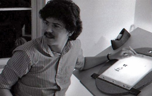
Here are a couple of photos of some of us working:
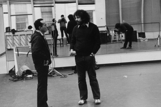
Tony Charmoli was the show’s choreographer. He worked with me in plotting out the big dance number – a duet between Harry Guardino and our cartoon character. I think this is the only time on Broadway that a cartoon character spoke and sang with a live actor on stage. John Canemaker is taking this photograph and Phillip Schopper is setting up the 16mm camera.
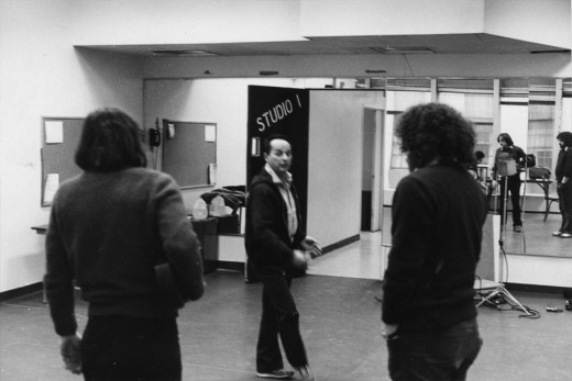
Here Tony Charmoli shows us how to do a dance step. Phillip Schopper, who is filming Tony, figures out how to set up his camera. We used Tony’s dancing as reference, but our animation moves were too broad for anyone to have thought they might have been rotoscoped.
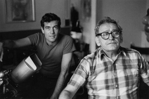
John Canemaker is working with Sy Fried, our editor. John did principal animation with me on the big number. Here they’re working with the click track and the live footage of Tony Charmoli to plot out the moves.
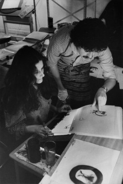
Steve Parton supervised the ink and paint. To get the sharpest lines, we inked on cels and didn’t color the drawings. It was B&W with a bright red bowtie. A spotlight matte over the character, bottom-lit on camera by Gary Becker.
 5
5 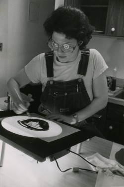 6
6
5. Steve Parton works with painter Barbara Samuels
6. Joey Epstein paints with fire in her eyes.
 8
8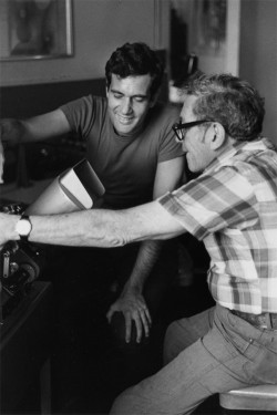 9
9
8. Harry Guardino on stage with the creation of “Tessie Kat” developing on screen behind him. This was Harry’s first big solo.
9. John Canemaker gets to see some of his animation with Sy Fried, editor.
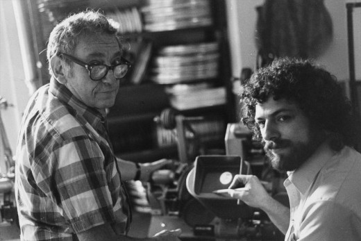
One of my quick stops from the lab on the way to Boston? No, I think this is a posed photo.
Animation Artifacts &commercial animation &Independent Animation 09 Jan 2012 06:18 am
John Wilson/Fine Art Films – part 1
- For the next three weeks, I’m going to focus on director/designer/animator, John Wilson.
Amid Amidi presented me with some art that he thought might be a good match for this blog, and it is. So I’ll take advantage of the material and share it with you. With each week’s post I’ll hone in on one specific film and go from there. We’ll start with Wilson’s first solo film, Tara the Stone Cutter completed in 1955.
But first, let me share some bio information about John Wilson and his company Fine Arts Films.
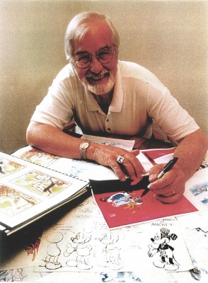 - John Wilson was born in Wimbledon in 1920. He attended the Royal College of Art and was working by age 18 as a commercial artist with Willings Press Service. In WWII he served with the London Rifle Brigade in African where he was seriously wounded. Recuperating in hospital, he drew many cartoons of which several were printed. Eventually he would recover and get work at Pinewood Studios in the art department where he worked on GREAT EXPECTATIONS and THE THIEF OF BAGHDAD, among other films.
- By the time he was 25, he was working in animation at Gaumont-British Animation, a newly formed division of J. Arthur Rank’s studio, working under the direction of David Hand on the “Animaland” series starring “Ginger Nut.”
- In 1950 he moved to the United States working in layout and animation at UPA. He found himself working with Bobe Cannon, Pete Burness, Jules Engel, and Paul Julian. Eventually he left for the Disney studio working in Les Clark’s ‘Tinkerbell’ unit on PETER PAN and with Ward Kimball on TOOT WHISTLE PLUNK & BOOM.
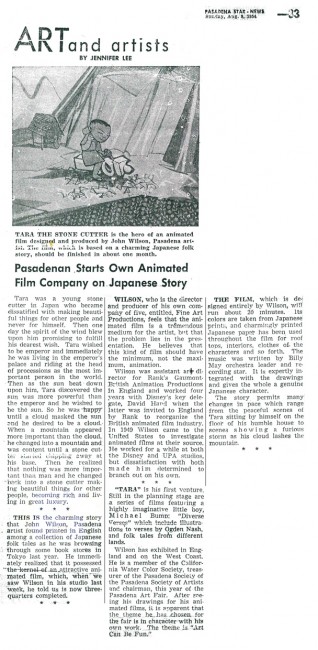
- He tried to sell Disney on the film Tara, the Stonecutter, but they weren’t interested. He completed it himself in 1955 using a Japanese style to tell the story. Wilson was impressed with the UPA style of modern art in animation, and that’s the route he took for his personal film. Thus his studio was born, called Fine Arts Films, in 1955. Tara had some success playing theatrically with the successful Japanese feature film, GATE OF HELL by Kinugasa (which had won the Oscar for Best Foreign Film.)
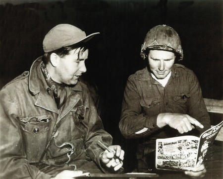
Wilson in Korea with the Bob Hope Tour to entertain the troops.
- This film led to his producing a verion of Stravinsky’s Petroushka for NBC which aired in 1956 as part of The Sol Hurok Music Hour. Notably, Stravinsky, himself, arranged and conducted the shortened version of the score suing the LA Philharmonic Orchestra. The film was designed by John Wilson and Dean Spille with anmation by Bill Littlejohn, Art Davis, and Phil Monroe. Chris Jenkyns, Dean Spille and Ed DeMattia designed the 16 minute show from Wilson’s storyboard.
- Fine Arts Films had produced ‘Journey to the Stars’, a project for the 1961 World’s Fair, an animated voyage through space for NASA, which was seen in 70 mm Cinerama by ten million visitors to Seattle.
- Billy Wilder employed Wilson to do the titles for Irma La Douce after which they did a six-minute trailer for this Jack Lemmon, Shirley McLaine feature. It was all about Parisian prostitutes romping about in Montmartre, and animation could apparently make it acceptable. Artists Ron Maidenberg, Sam Weiss, Sam Cornell and Bob Curtis caught the vivid nightlife of Paris in a sexually charged animated short. It was a huge success in promoting the feature.
- In 1970 Wilson flew to Chicago to see Carol Channing and Eddie Bracken appearing in “archy and mehitabel in Shinbone Alleyâ€. On the basis of this theatrical musical, Wilson bought the screen rights to the book “archy and mehitabel” by George Herriman and began work on an animated feature which was released by Allied Artists in 1971.
- Fine Arts Films was also responsible for many animated commercials as well as weekly music video segments for the weekly CBS-TV series “The Sonny and Cher Show.†The songs included Joni Mitchell’s “Big Yellow Taxi†and Jim Croce’s “Leroy Brown.â€
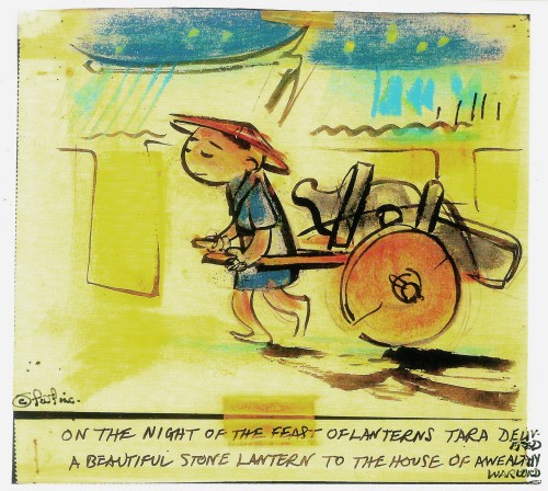
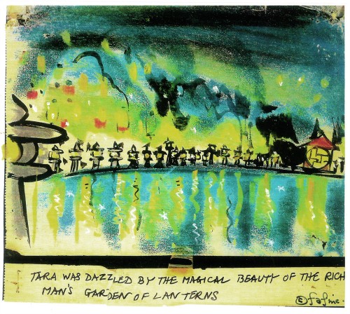
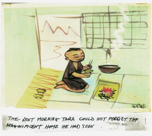
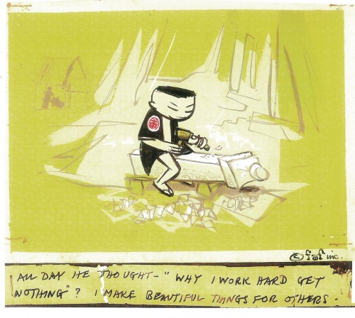
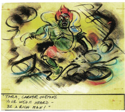
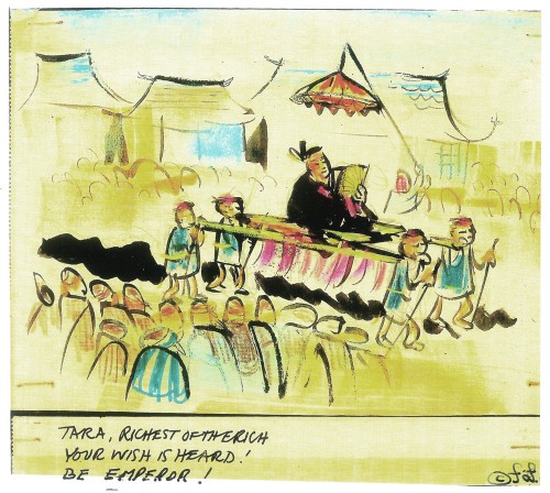
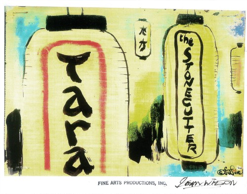
Here are some storyboard sketches by John Wilson for his initial short film, Tara, the Stonecutter. This film started it all for Wilson.
 1
1
I haven’t seen the finished film, but I understand that Japanese decorative papers were used in the backgrounds and costumes of the characters.
Here are two press clippings for this film from California papers.
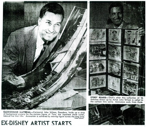
(Click any image to enlarge.)
Commentary &Illustration &Independent Animation &repeated posts &SpornFilms 29 Dec 2011 06:49 am
Blank Maps – repeat
 - One of my favorites of my films is The Hunting of the Snark. I adapted this from Lewis Carroll’s poem. It was an enigma to the audience when it was first published – Carroll refused to explain its meaning, and it’s an enigma now.
I remember screening it with an audience of fifth graders – about 200 of them along with a number of their parents. The program, in Chicago, was part of a retrospective of some of the children’s films I’d done at the time. I made the decision to show the Snark, even though I wasn’t sure the audience would sit still for it.
The response was amazing. The adults, during the Q&A period, had a lot of questions. The kids had no problems. When, finally, one parent asked me what it was supposed to mean, I decided to turn it around. I asked if one of the kids could answer the question. A lot of kids raised their hands, and the first one gave me the appropriate answer.
A bunch of guys go hunting for a monster________This is how the map was illustrated by
that’ll make them disappear, and one of_________the original illustrator, Henry Holiday.
them catches it. For all intent and purposes
that IS what it’s about.
I love showing this film as part of my programs. It’s easy for me to discuss, and I’m proud of it. I don’t think most animators like it, but that doesn’t bother me.
During the story there’s one key part that all illustrators love to illustrate.
But we’ve got our brave Captain to thank:
(So the crew would protest) “that he’s bought us the best–
A perfect and absolute blank!”
_
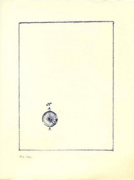
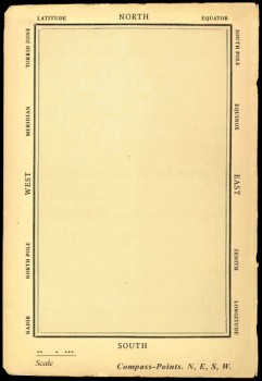
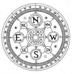
A blank page! What could be easier to illustrate? A couple of illustrators have cheated such as this map found on line:

Figure One: Bellman’s Blank Ocean Chart
Barry Smith at the University of Buffalo dept of Philosophy uses this map – a blank slate – to treat it as a map of heaven. Carroll was an Evangelical minister, but I’m confident this is not what he had in mind when he conjured up the lines in the poem.
____________________________________________
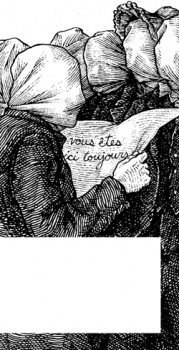 Mehendra Singh has a website which is slowly illustrating the entire poem. His illustration for this passage appears to the right. This is part of his comment accompanying the illustration.
- Yet another shameless Magritte pastiche, and not the last one to grace these pages, I’ll wager. Shameless — the 10th Muse of Protosurrealism!
Even more shameless — this insistence that the crew of the HMS Snark use the French language for navigational purposes when it is clearly evident to anyone who has ever been lost at sea that English is the natural language of confusion. This is easily verified. Stand on a streetcorner in any francophone city and ask a stranger: where am I? If necessary, pull at shirtsleeves and wave your arms, speak very slowly while pronouncing every phoneme at the utmost decibel level.
Singh has a curious and interesting site in its own right.
Let me encourage you to check it out for all the original illustration on it.
____________________________________________
_
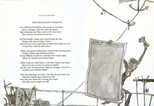
This is how Quentin Blake chose to illustrate it in his version. Since he obviously was nervous about just showing the blank map, he illustrated the Bellman holding it.
______________
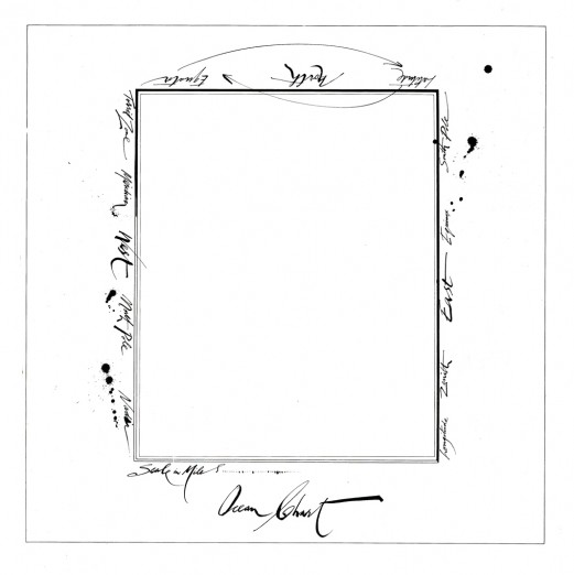
This is Ralph Steadman’s version. He went for the gold and just showed the map.
Yet, it’s still, obviously, a Steadman.
______________
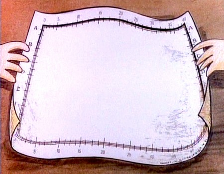
This is how I chose to depict it in my film. Showing hands and table behind it,
gave me the opportunity of trucking in to white to transition to the next scene –
an image of the sea, itself.
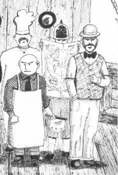
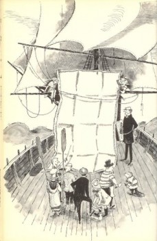
Doug H. in Australia responded to the material, above, with an e-mail full of other wonderful illustrations of the same part of the poem. I’d like to post some of these illustrations with many thanks to Doug. With respect to all of the illustrators, about half of whom
are unfamiliar names to me. They merit a good look.
___ Just scroll down. Click any image to enlarge a bit.)
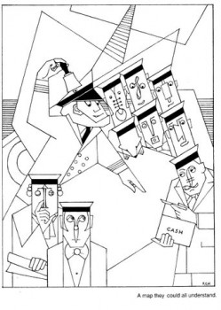 1
1 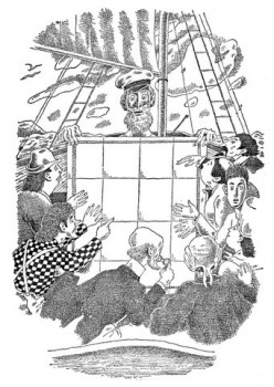 2
2
______1. Frank Hinder (1989)_______________________2. Harold Jones (1975)
______
__ 3.__
3.__ 4.
4.
______3. Michael Capozzola (2005)_________________4. Kelly Oechsli (1966)
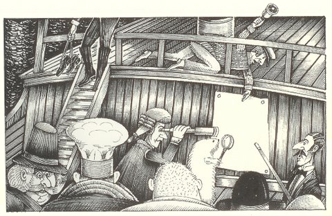 5.
5.5. John Lord (2006)
______
______
6._________________________________7.
______
______6. Max Ernst ((1950) _______________________7. Jonathan Dixon (1992)
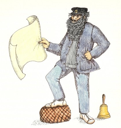 8.
8.8. Helen Oxenbury (1970)
Commentary &Independent Animation 19 Dec 2011 06:07 am
The Mouse and His Child Go On
- As I wrote yesterday, the author, Russell Hoban died on Dec. 13th at the age of 86. He was a favorite author of mine. I was lucky to have met him after we completed an animated version of his book, The Marzipan Pig. Prior to that, a feature had been done of his children’s novel, The Mouse and His Child. Here’s a couple of pieces I did about that feature in the past few years.
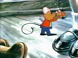
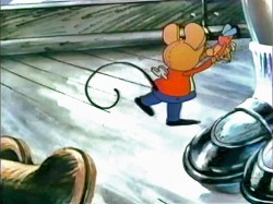
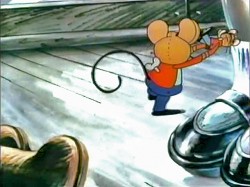
Sanrio, a Japanese company that made all their money on Hello Kitty products, produced two animated features in the US. Metamorphosis and The Mouse and His Child. Both films failed at the box office. However, The Mouse and His Child, directed by Fred Wolf and Chuck Swenson, has some small glimmers of fine animation throughout the film.
I don’t really know who did any of the animation. Corny Cole, certainly, did the big closing animated zoom of the film. I sought out the work of one animator I liked, and it turned out to be Vincent Davis. It was the first work I saw by him, and I’m still charmed by it.
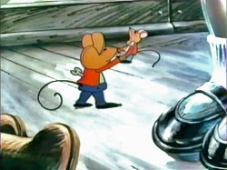
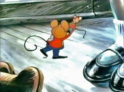
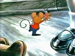
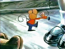
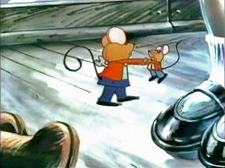
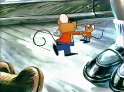
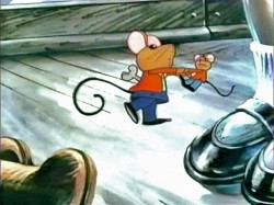
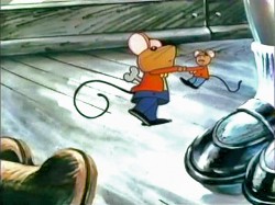
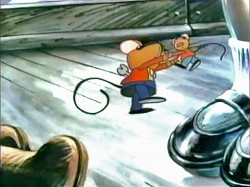
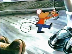
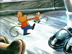
Here’s a small walk at the beginning of the film. Lots of shape shifting in the assisting, but there’s something nice about it, too. I don’t know who animated it.
 1
1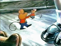 2
2
______(Click any image to enlarge.)
The Mouse and His Child has some real charm. However, it created a small problem for me.
When I’d begun work on The Marzipan Pig, I had to guarantee the brilliant writer, Russell Hoban, who authored both books – The Marzipan Pig and The Mouse and His Child – that no spoken dialogue would be created by me or Maxine Fisher, who was writing the script. Hoban was annoyed by the script for The Mouse and His Child. He felt they had butchered his story.
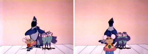
In fact, the film ends 3/4 of the way into the story. Elements of the last quarter of the book are rushed through the film in one last scene before the end titles. (I have to admit it’s a bit confusing.) This is a scene Corny animated. It’s all one scene; no cuts; an animated BG.
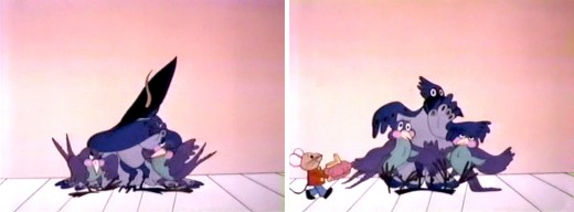
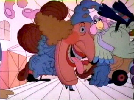
The Jack In The Box looks very different from the guy in Raggedy Ann.
You can watch this film on YouTube.
Independent Animation 15 Nov 2011 06:55 am
Lisa Crafts – Independent Animator
- Lisa Crafts is a brilliant animator, designer, film maker and artist. She’s also an excellent friend. We worked together on a number of films I made in the ’80s, and her scenes still sparkle unlike many others in those films. The humanity she brought to the character of Abel in ABEL’S ISLAND just knocked my socks off. When he found a time piece on the island and brought it back to his camp, he said the ticking reminded him of his wife’s heart; he felt it brought him closer to the partner he’d been separated from. Lisa went a step beyond the layout by having Abel physically embrace the watch. There was just so much warmth in that gesture; it solidifyed the scene and said so much about the character.
Of course, I brought her into the projects because her Independently made films reflected every bit of that warmth, and I knew she would offer so much to the films. She did.
I am proud to host this Q&A and to give a small showcase to her great work
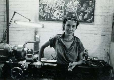
Lisa at the lathe
Michael: Can you tell us a bit about your start? What brought you to animation? Did you go to school for it?
Lisa: I grew up in New England, and was a kid who created imaginary worlds in my backyard, my closet, or in any nearby fallen tree or sandpit. I started shooting photos at age 8, when my dad gave me a camera he got from his friend who owned a pawnshop. In high school, I drew, painted, made pottery, and joined a darkroom class the high school art teacher offered. An experimental filmmaker, Ken Brown, visited our class. He was then making lightshow films for the Boston Tea Party, the premier Boston rock club. He showed us how to make flipbooks and pixilation, my first exposure to animation techniques.
The summer I turned 17, I developed and ran an art school for kids and was commissioned to paint a psychedelic mural on a garage door. As soon as I finished and got a check, I bought a plane ticket to London. I hitchhiked around England and Wales, and had an odd variety of coming-of-age experiences. Returning to the States, I worked an eclectic array of day jobs, and painted or drew at night. One day, while returning some Gregorian chant records to the library, Ken Brown drove by. He beeped, and backed up. He was again teaching in my hometown, had met my sister, and discovered that we both had been to the Isle of Wight music festival in England that summer. He said he had made a movie there. Curious, I got into his 1940 Chevy, and we’ve been together ever since.
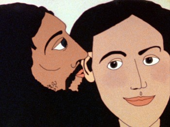
“Desire Pie”
After an extended road trip around Mexico, we moved to Cambridge, and I started making lots of super-8 flipbook and cutout animations. My flipbook films grew in length, and I wanted to learn how to put sound on them. I snuck into the animation class at Harvard with the gracious cooperation of the faculty, and an administration that looked the other way. It was there that I made my first 16mm cel animation with sound, Desire Pie, and met Suzan Pitt, George Griffin, Kathy Rose, and many other animators.
Michael: Your early work seems to have been aggressively sexual (UNGLOVED HAND, PITUITARY, DESIRE PIE) yet you started to move away from this theme with GLASS GARDENS and become more subtly political
Lisa: Perhaps at the time, just being a woman making a film on any aspect of sexuality could be seen as an aggressive or political act. But I prefer the word exuberant. DESIRE PIE is a fun loving explicit sex film, and PITUITARY, a hand colored found – footage film, is a wry and paranoid tale of the myths and misconceptions surrounding body changes in adolescence. UNGLOVED HAND, a cel animation, is a comment on sex role stereotyping.
Michael: This film also varied from the others in the cutout style of artwork and the high rendering involved. What prompted this change? Your pre-computer film work varies from more traditional and flat ink & paint style of DESIRE PIE to the very rendered hand-drawn animation of GLASS GARDENS (using cutouts). What determined the style you would aim for in each of the films?
Lisa: After two cel animations, I stopped enjoying drawing hard black lines with flat colors. I returned to cutout animation so I could have the joy of creating obsessively detailed and textured images. I discovered that what excites me in artmaking is going hunting with my camera, constructing evocative environments, and creating emotionally resonant experiences, often laced with social or political issues. My process also involves improvising, inventing, and making stuff with my hands.
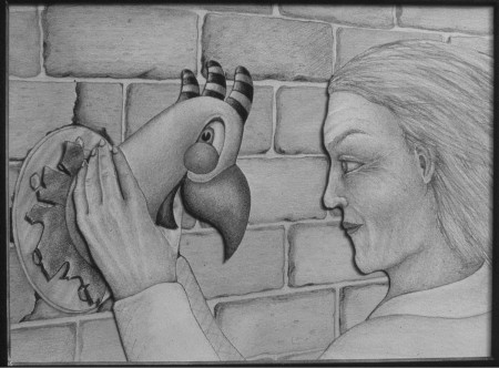
GLASS GARDENS
So I started working on GLASS GARDENS, an allegory about the role creativity plays in the survival of the human spirit. After I wrote the piece, I storyboarded it loosely so I could keep as much spontaneity in the work as was possible, and have creative invention every day. I rode my bike and photographed various background elements, and asked friends to give me objects that I could incorporate into scenes. I drew with graphite on paper, referencing elements from my photos and the objects friends had given me. The landscapes played a large role in this film, as they have in all of my work since then. Just like the play I engaged in as a child, creating worlds that tell a story is an important part of my work.
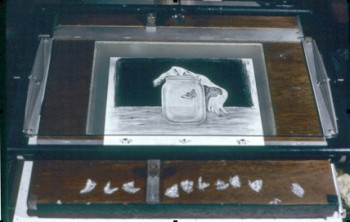 After nine months, the artwork was finished, but I no longer had access to the Oxberry animation stand at Harvard, and to rent one was prohibitive. I was introduced to Peter Lindenmuth, an amazing Einstein-like inventor, and he looked at the Oxberry, drew up blueprints, and told me that if I worked with him, he would charge me $9 an hour to build one. I spent six months working at Nexus Machine Shop-Gallery with Peter. We also worked with my dad, a carpenter, and together we built the stand that I shot Glass Gardens on. Having my own stand was liberating, I was no longer dependant on stealing in during school breaks or weekends, and had a place to experiment. It also allowed me to help other animators, like Karen Aqua, who lived down the street.

Caleb Sampson performing OCTOPUS’ EXULTATION
After Glass Gardens, I collaborated with composer Caleb Sampson on an hour-long, 3 act music/animation performance called The Octopus’s Exultation. The piece was fairly abstract, with a theme of security and chaos. It was a mixture of cel and marker animation, done on tiny 5 field cels or cards, and drawn in a loose, expressionistic style. The animation was projected with hundreds of hand drawn slides and various lighting effects. We performed it a bunch of times in Boston, and Caleb‘s music became a hit on the local radio stations.
In 1984, I curated a program of American Independent animation and brought it to three cities in Japan. Sayoko and Renzo Kinoshita were the directors of ASIFA in Tokyo, and they asked me to make a film for the first Hiroshima International Animation Festival of peace and love the following year. Reagan was actively rattling swords at that time, and many artists were making work in reaction to the nuclear threat. I wanted to make a film that could reach a wide audience, not just preach to the converted. So I decided to make a commercial for nuclear disarmament, Shout! It was a somewhat subversive project in that I didn’t put my name on, but found an anti-nuclear organization to call it their own, and using their letterhead, got it shown on over 400 television stations worldwide. It premiered at the Hiroshima Animation Festival in 1985.
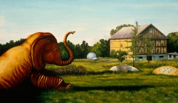 During the years when I first moved to NY, despite working in the industry, I felt I couldn’t afford the time to make another independent animation, so I painted instead. I created quietly disturbing psychological landscapes, which reflect the dreamlike dissonance of the American roadside. As with Glass Gardens, this body of work was referenced from photographs I took when Ken and I travelled America’s blue highways in search of roadside attractions, visionary environments, and vanishing Americana.
Michael: Your post-computer animation is certainly more highly rendered. THE FLOODED PLAYGROUND and OVERGROWTH are almost moving into an interpretation of live-action via the animated cutout. Do you feel most content with this work you’ve been doing using computer programs?
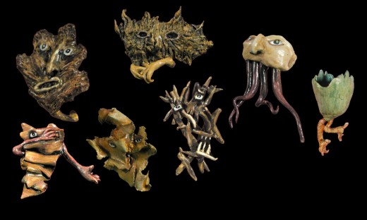
Lisa: I’ve always liked dancing on the precipice between the real and the imagined, so yes, the results of working digitally is very satisfying. I can create worlds from a blending of all of my artforms: photography, sculpture, drawing, stop-motion, video and painting. It gives me enormous room for experimentation and discovery.
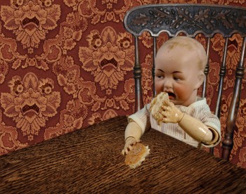
THE FLOODED PLAYGROUND
THE FLOODED PLAYGROUND is about the comforts, terror, and magical thinking of childhood that reside in us throughout our lives. Due to time/money restraints, I could only work on it a few weeks a year at the beginning, but with the aid of some grants, I was finally able to put in the hours it took to complete. During the years I was thinking and writing about it, I carried a scavenger-hunt list of elements I wanted to include, and carried my camera to collect them. I also built some of the sets, caves and creatures. The resulting environments were hybrid, often including elements from different continents, which created the somewhat familiar but indefinable places and times that exist in fairy tales.
Michael: What computer programs are you most likely to use?
Lisa: After Effects, Photoshop, Dragon
Michael: Is the next step cgi? or live action?
Lisa: Not CGI, I’d be 100 years old before that could become a natural and elegant tool for me. Since I’ve used a camera my whole life, tilting into live action is not a big stretch for me. I’m animating live action now, cutting it out from its rectangular shape and/or treating it as individual frames and reworking it.
Michael: You’ve also done a bit of commercial work in animation. A number of Sesame Street films, VH1, MTV and The Electric Company. You worked on staff for me for a while animating traditionally. What do you think of this work as compared to the more personal film work?
Lisa: Working at your studio was an illuminating experience for me. You hired me despite the fact that I was not a trained character animator. But that trial by fire worked. You treated each animator as a director, and gave us a lot of latitude, and the films reflected that generosity. I got up to speed by the time we worked on Abel’s Island, and felt each scene you handed me was my personal work, and put that kind of spirit into it.
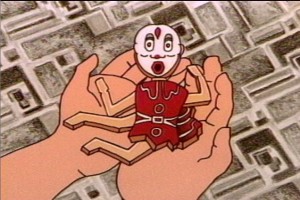 When our projects were over, I finally knew enough people in New York to freelance again. I worked on my own, then partnered with Ken, who was best known as an illustrator at that time. We did some work for music television, and then started working with Sesame Street. It was perfect timing, as our daughter was about 2 years old, and she was able to grow up watching herself, her friends, and our work on Sesame Street. We were so fortunate to have
 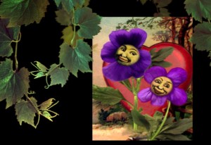 the gifted Arlene Sherman as our producer. She allowed us to flourish as artists and to write our own stories and songs, and use our own composers, voice actors, and musicians. Near the end of our time there, I told her that I was transitioning to working digitally, and hoped I could make a new piece in that style. She came to the studio to see what I was working on and gave me the go-ahead to make my first digital piece. I sometimes wonder how it would have impacted my explorations in that direction if she had wanted me to keep drawing.
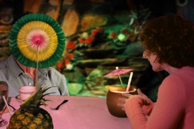
Cindy Kleine’s PHYLLIS AND HAROLD
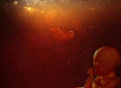
When I built my animation stand, filmmakers started to come to me to shoot their archival still photographs, and make titles and graphics for their films. I have been working on feature documentaries ever since. In the last dozen years, some of the people I work with have become more adventurous in their use of animation. I am most regularly called on to depict interior life: dreams, memories and hallucinations. I really enjoy the research aspect of the process and being part of a creative team. Recent projects include Cindy Kleine’s film Phyllis and Harold, and Michel Negroponte’s film, I’m Dangerous with Love. I’m currently creating animated scenes for Cindy Kleine’s new doc, The Man in Question, a film about the theater director, André Gregory. While working on I’m Dangerous with Love, I started experimenting with using live action video for some of the hallucination scenes, and so enjoyed adding that spice into the mix, that it triggered my new direction.
OVERGROWTH is a very slow motion, almost live action play of the wind in the trees and shrubbery depicted in the very realistic montage art. It’s beautiful in its approach and feels like a new direction for you. Do you see it as such? I also notice that this is labeled on your website as “a sketch for a larger work-in progress.” Can you tell us a bit about the direction it’s heading toward?
OVERGROWTH was an early sketch. The new work has some of the same ideas and feeling, but it goes to a different place. It is about coming to terms with the Anthropocene era, a new geologic era that is the result of the actions of humans. I’ve been doing a lot of reading about natural history artist-explorers like Maria Sybella Merian, who in 1699, traveled to Surinam to study, draw and describe the metamorphosis of the incredible insects there. Like Merian, I am engaging with a new world, one reshaped by environmental changes.
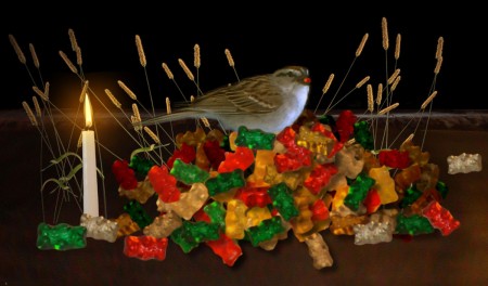
Gummibird” from OVERGROWTH
For this project, I go on frequent photographic hunting trips, often urban explorations on bicycle to fringe ecosystems in New York. I now gather video and audio as well as stills. I work in the studio for the stop-motion parts, and sometimes set up outdoor greenscreens as well. I then return to the computer to blend all the elements together. This piece is more poetry than narrative. My work is metamorphosing, and this piece is letting me know that it may not want a sit-down audience, and it may have to be installed, but that is still a question. Although my films utilize different techniques, they have the commonality of exploration, both inner and outer.
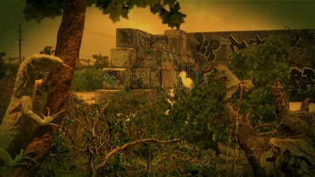
OVERGROWTH
Michael: You’ve also worked closely with your husband, the artist Ken Brown. No doubt you are an inspiration for each other, but I also wondered if you’d like to speak about your other collaborations?
Lisa: Our first collaboration was a quixotic attempt at a Felliniesque travelling show called “A Streetside Sensoriumâ€. Well, it never travelled, but we made and sold something for every sense. We built two barnboard movie boxes to show our films, filled and sewed small block-printed muslin bags with sweet balsam needles, made carrot cake, and also sold Ken’s early hand developed photo-postcards and cartoon books. We went to the cobblestone lot in front of a friend’s store in Cambridge on Saturdays, and sold our stuff and came home with enough to live on for the week.
Although we have primarily worked independently, providing each other with critique, assistance and encouragement, we have also collaborated on many projects, both for art and for jobs. We made station id’s for MTV and VH1. We also worked together on Sesame Street, Electric Company, AMC, and a couple of random commercials. Sometimes we closely collaborated, literally passing work back and forth. Other times we broke it down in various configurations, one of us producing, animating and shooting, the other one designing and inking. We determined that whoever wrote a given piece would be the director, in an attempt to avoid the situation of two independent people steering the same car.
Michael: Any other thoughts about the future for your animation?
Lisa: My plan is to keep evolving, it’s all quite a mystery.
Independent Animation &repeated posts 14 Nov 2011 08:20 am
Pups of Liberty – a recap
- In October 2009 I was impressed with the work of Jennifer & Bert Klein‘s Pups of Liberty, a short film they had completed. It was a fully animated short, and a lot of work went into it. I decided to pose some questions and interview them via email.
I was reminded of this in the past week when they dropped in at my studio just to say hello. They had business in NY and were there for a packed two days. We spent a really pleasant couple of hours and talked about our divers careers in animation. Having just met them for the first time I was surprised at how much we had in common.
After our meeting, I took another look at the two pieces I’d posted and thought I’d like to show them again. So here they are. We start with the first post in which I interviewed them for the site, and then we move onto the second post where I try to showcase some of the artwork.
 - The fortune of having a modestly successful blog is that some filmmakers actually approach me in order to get the word out about their films. Such was the case with Jennifer & Bert Klein‘s Pups of Liberty. They sent me a link to their site which offered a trailer for their short film, and they offered to send me a DVD of the entire film.
When I looked at their site and trailer, it was obvious this wasn’t your average short. I saw the very full animation, beautiful backgrounds, and I looked deeper.
I saw the credit list and the names of James Lopez (Animator on Hercules, Emperor’s New Groove, Flushed Away and Princess and the Frog), Eric Goldberg (Animator on Aladdin, Fantasia 2000, and Princess and the Frog), Barry Atkinson (BG artist on Prince of Egypt, American Tail and The Lion King), and Mark Henn (Animator Ariel, Belle, Jasmine, Mulan and Tiana) among others. I had to see this film.
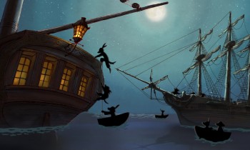
I wasn’t disappointed. The animation is sterling in the richest of full animation; the Bg’s are beautifully styled to feel like the period (the Revolutionary War) they’re meant to suggest, and the Direction couldn’t be cleaner or clearer or more focused. The film doesn’t waste a shot, but drives itself through the story in a very economical approach. Yet not a dollar seems to have been spared in making this the extraordinarily lush film it is.
I had to respond to Jennifer and Bert Klein to ask for a short interview and they responded with answers to any question I posed and plenty of supportive material. Hence, I’ll post that Q&A today with some stills from the film, and tomorrow some amazingly attractive pre-production artwork. This film deserves a book of its own.
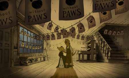
All images copyright © 2009 Picnic Productions
The Interview
Michael – What prompted you to develop this story? It reminds me a bit of Disney’s Johnny Tremaine in the way that it focuses on a particular craftsman and his daughter, just as the live action film focused on a silversmith and his apprentice. Was there any inspiration from that film/book? Animation wise, it feels a bit like Ben & Me. Perhaps that’s because of the subject.
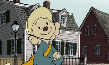 Jennifer – I have always loved this era of history (Colonial/Revolutionary America) so when I first began developing an idea for a new short it was the first setting that came to my mind. I wanted to make a story that was quality and that a viewer would feel good about watching; I was also very interested in how to teach people concepts (like taxation and representative government) with a media like animation.
The story of the Boston Tea Party seemed like an iconic event to start with, since most American school kids learn about it pretty early on. The more I researched the more I was drawn to the story of the printer who started the Sons of Liberty. I love the idea of a group of ordinary people getting together to motivate change in their world, and I liked that that is something that translates internationally, to everyone.
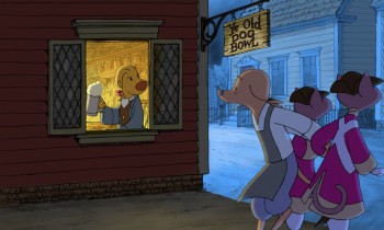 I grew up watching Robin Hood because it was the only Disney movie we had. At some point I saw Ben and Me and I have always liked that one a lot too. I like allegorical story telling, fables… so it seemed natural to tell the story with animals. In a way it lightens up the mood of it having a political bent- because really, they are talking dogs and cats.
Bert – We initially considered making a film about the first Thanksgiving with cats as pilgrims and birds as the native Americans. We moved ahead in time a bit and did the Boston Tea Party instead.
I’m sure you don’t want to discuss your budget, but you must have gotten a lot of incredibly talented people to volunteer to help you make the film. (Eric Goldberg, Mark Henn et al). The expense easily looks quite high.
Michael - Was the budget completely out of pocket?
- How did you create such enthusiasm for the project to do so?
- Now that you’ve finished what is your hope for distribution or future development?
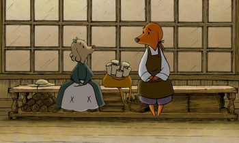 Jennifer – Our budget was all out of our own pocket. We might be a little crazy I guess, but this is what we do. It’s our hobby. Bert and I are very passionate about making shorts, and when we began the project we were also very interested in keeping ourselves in practice for 2d animation at a time when there weren’t any other 2d features being made at any of the studios. Our friends who worked traditionally started to hear about the film and we would have evenings with everyone over and do pencil tests and see them cut into the storyreel – and we’d always have pie, I would bake every night for the crew. The nights started to take on a family atmosphere, and I think everyone felt very comfortable to come and practice their art that they had been trained to do. Everyone was working at their highest skill level– Mark Henn was doing 20 feet a week, James Lopez stretched himself and all of our layouts, we had cleanup people doing the most beautiful work I had ever seen from them. I can’t say how we “created” enthusiasm because you can’t consciously create something like this. You’re just darned lucky that it happens.
We are submitting the Pups to film festivals, so we will have about 2 years worth of that, and then we’ll see what happens. My biggest hope would be for a series. I would also love to see it in the classroom one day.
Michael – It must have taken quite some time since I doubt you were able to work steadily on the film and had to fit it in between other jobs. (I’ve seen your resume and know you’ve been busy outside of this film.)
- How long did it take to make, given your work schedule?
- How were you able to maintain such a consistent (and consistently high level) look while working on it on a long, piecemeal schedule? (Assuming that was the case?)
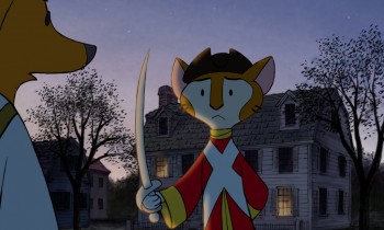 Bert – Most of the production took place during spare time over a two year period. The births of our two kids stretched out the last bits almost another two years.
One way we ensured consistency was having Jennifer do clean up keys over the different animators’ drawings to maintain the style. Mark Henn did a lot of animation on the film and helped raise the bar for everyone else. One person (James Lopez who was a supervising animator at Disney for a decade) did all of the layouts. I animated a lot of it myself and just kept working on it until it was done. Our assistant director Hyun-Min Lee was invaluable to us in getting this done, tackling technical problems, organizing scenes and x-sheets, and trackreading amongst many other jobs.
Jennifer – I took some time off to work on the film, so I was able to dedicate all of my time to it. I did the boards, designed the characters, did reds for the cleanup keys. I think that the simplicity of the characters saved us a lot of line mileage and made it possible for the artists to get through the footage quickly. They also look best against the backgrounds, which are done in a hand drawn pen-and-ink style and required something simple to contrast with them. We looked at the printwork from the time for inspiration- Paul Revere’s engravings especially really had a ‘homemade’ colonial feel, and you can see his personality in them and in the brush strokes of color used that we tried to invoke.
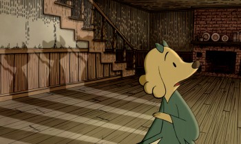 It is hard to sit down and work after you have worked a full day, but I always remembered something Bert would say- “Even if you just get one drawing done you are one drawing ahead.” So I’d try and get one scene’s worth of layouts done a night, or read a track, or just something, and we’d inch forward until we were done.
Michael – Just as American Tail was compared to MAUS, your film has already received a comment on Cartoon Brew comparing it. There are very obvious differences, but I wonder if you thought about this possibility?
- Or worried about it?
- Did you ever question the idea of doing it with humans?
- Or would that have made you focus even more on historical accuracy?
Bert – I heard of MAUS, but I’ve never read it. Our main reason to make this was purely a labor of love. I watched Jennifer do great work as a story artist on lots of feature projects for studios that never got made or changed radically from the first inception. She was one of the original story artists on Where the Wild Things Are when it was a fully animated feature back in 2001. I wanted to produce a film that was a showcase for her story sensibilities because I felt that it might be the only way to get that pure vision to the screen. We also hope that people and their kids can enjoy it.
 Jennifer – Honestly I never heard of Maus. Whatever subject matter you make a film about though, there will always be something to compare it to — how many films are there about aliens? Or zoo animals? A setting is just a setting- it’s how you hook the audience in, how you make them really feel for and believe in your characters, and the experience that you give them that matters.
Doing a historical film with humans instantly makes it more serious- doing it with animals, you can’t take it as seriously and you can have more fun with it. Why animate humans when you can animate talking dogs? It made us laugh. We did it this way so that we could have some fun, and do what we love to do.
Having interviewed Bert and Jennifer Klein, I found myself with a lot of beautiful artwork and test footage to show. In posting it, I’ve kept the text descriptions, below, written by their Production Designer, James Lopez.
You can view a trailer from their film here.
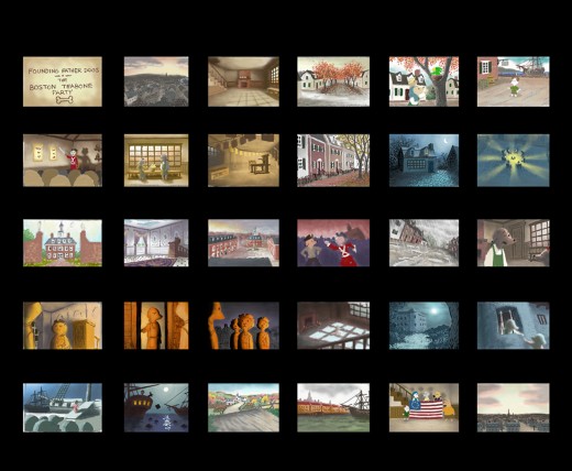
Pups of Liberty Color Script by James Lopez
For the colors, warm colors were chosen to represent the dogs’
surroundings and, in contrast, cool colors to represent the cats.
To start the film, the colors were to portray a pretty town but not
a vibrant one. Only as hope comes alive and tensions run high (The
Boston Tea Party & The Riot) are the more vibrant colors introduced.
Color influences came from some classic Disney films and a desire to
use natural lighting (direct & indirect) as opposed to “staged†lighting.
The story of the movie is left somewhat unconcluded so at the finale,
rather than going full-blown with color, there is a hint at what would be
to come (as the story’s narration suggests).
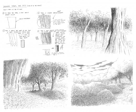
Pups of Liberty - Drawing Trees
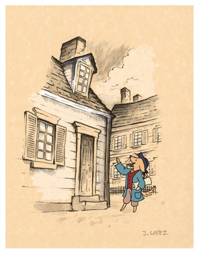
Pups of Liberty - In the style of Anton Pieck
Initally, the backgrounds were going to be influenced by the stylings
of Dutch artist Anton Pieck. Studies were made to see what the style
would look like with a Colonial theme.
A composite was made with the paint study and the character over
a parchment texture. We we were happy with the result of how the
drawn character married into the drawn environment.
It was a nice style but it involved a unique application that was a labor
to produce and proved to be impoprobable so we explored other, more
traditional styles.
We later settled for a pen and ink application on vellum paper in the
rough drawing style of the late Ken Anderson. It allowed us to stay
loose and if there were any mistakes or changes to be made, they
could still be done on paper.
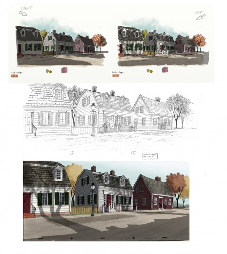
The top two illustrations are visual development for the color and
lighting treatment on the houses. The desired effect was trying to
capture the drama of the shadows cast from the trees by the sun
set low on the horizon.
The middle illustration is a clean-up layout by James Lopez
The bottom illustration is a Production Background painted by James Lopez
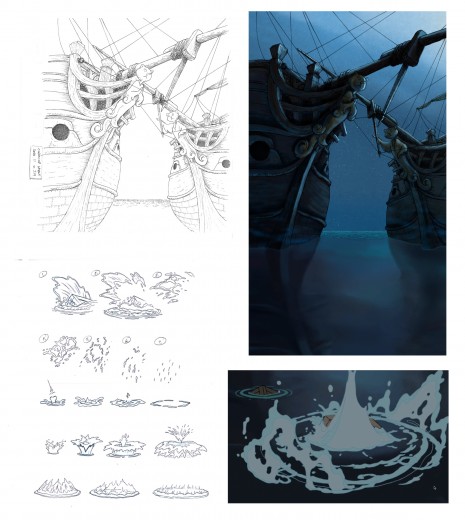
Pups of Liberty - Water Effects
Illustration (upper left) Clean-Up Layout by James Lopez
(upper right) Production Background by Barry Atkinson
(below left) water studies by James Lopez
(below right) Production still
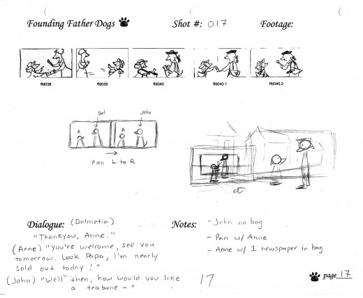
The above images represent a page from the Director’s workbook
for Sc. 17. Storyboard drawings are by Jennifer Klein.
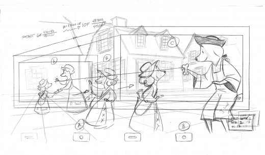
This is the Layout for Scene 17
done by James Lopez.
The QT movies below are Pencil Tests of scenes by
Mark Henn.
Right side to watch single frame.
Frame Grabs &Independent Animation 07 Nov 2011 07:46 am
The Hill Farm – 2
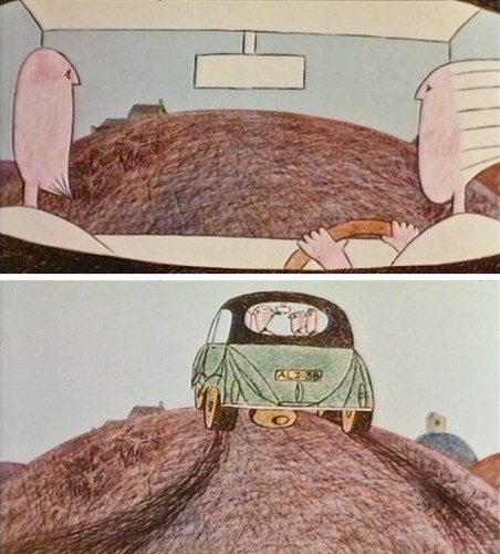
- Last week I began posting frame grabs from one of my favorite short films, The Hill Farm; it was released in 1989. The film was the first significant work of a new film maker, Mark Baker. Baker went on to form a commercial production studio in London, Astley Baker Davies, Ltd. This company produced several recent television series: Peppa Pig, Ben & Holly’s Little Kingdom, The Big Knights.
Baker did two other significant short films: The Village and Jolly Roger. All three of his shorts, including The Hill Farm were nominated for Oscars. All three of them should have won the award, except that they were up against Aardman.
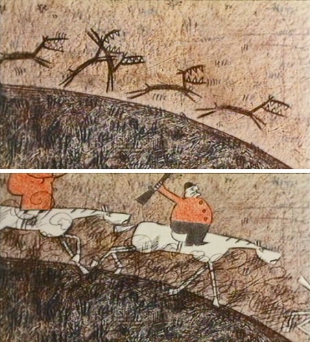
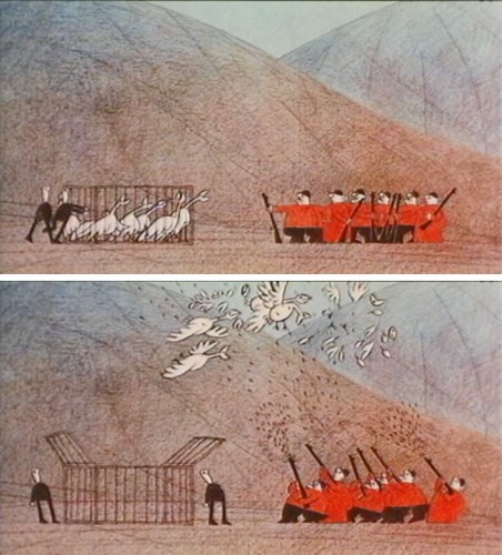
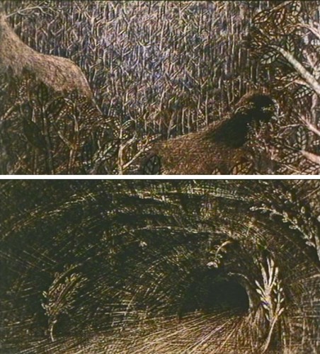
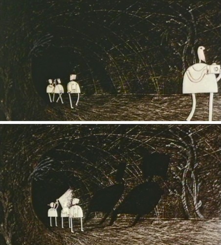
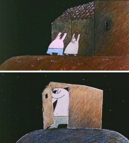
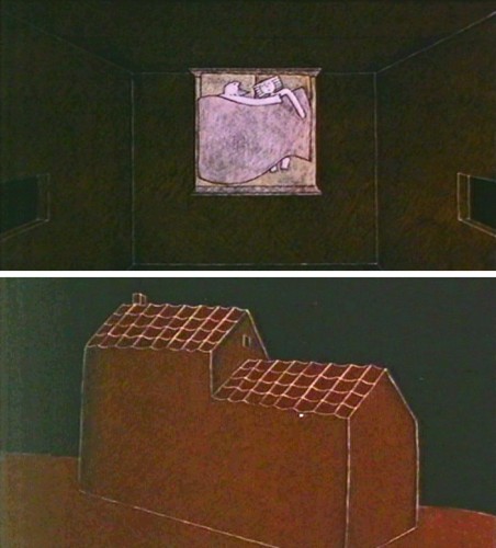
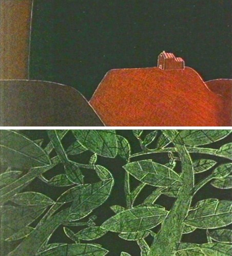
Here is the conclusion of the frame grab selection from The Hill Farm:
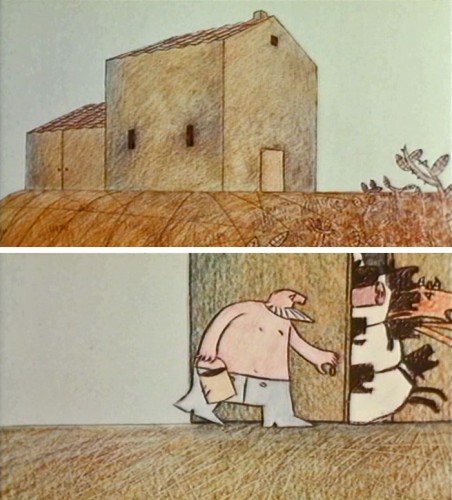 2
2
Frame Grabs &Independent Animation 31 Oct 2011 06:59 am
The Hill Farm – 1
- The Hill Farm is one of my favorite films. It was a school project for Mark Baker who burst on the animation scene with this first film. It ended up being the first of three Oscar nominations he’d receive. His second (The Village) and third (Jolly Roger) shorts were also nominated.
He has since formed his own commercial animation studio with Neville Astley, and they were ultimately joined by Phil Davies to form Astley, Baker, Davies. They are jointly responsible for three television series: Peppa Pig, The Big Knights and Ben and Holly’s Little Kingdom.
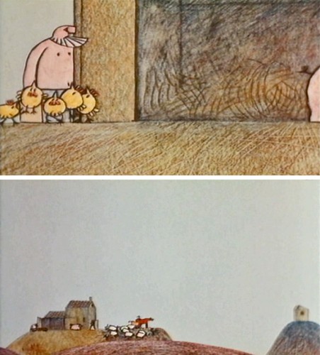
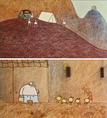
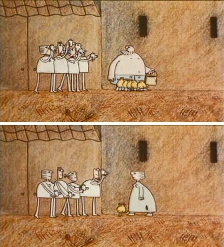
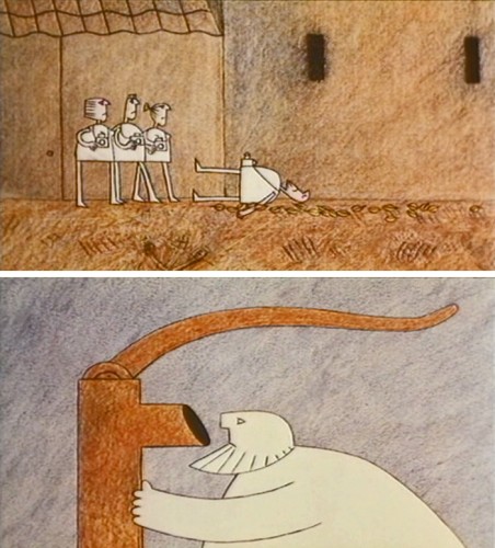
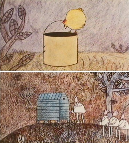
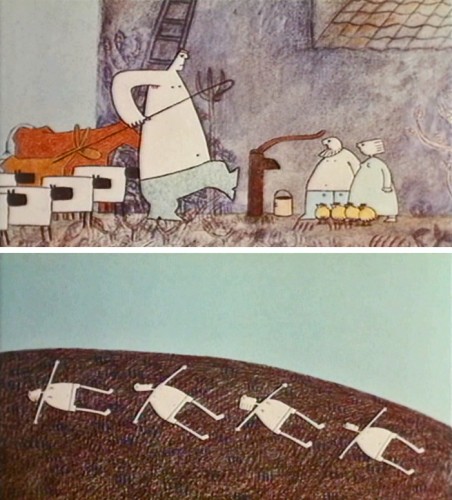
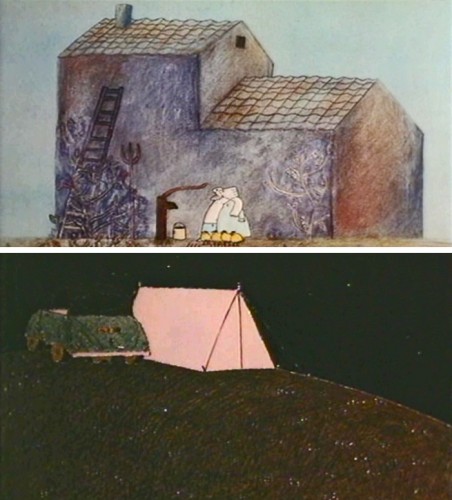
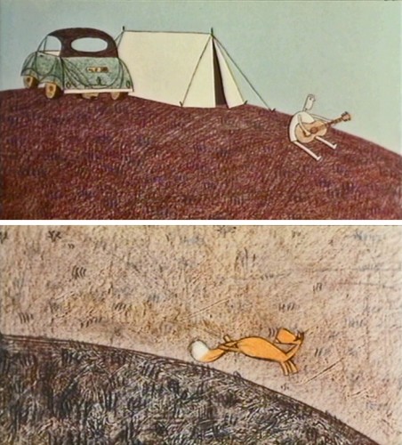
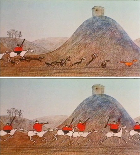
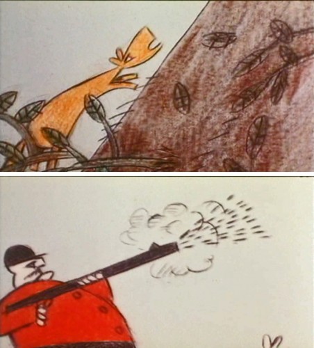
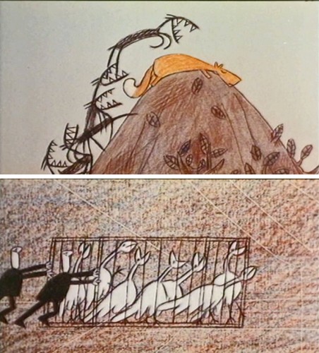
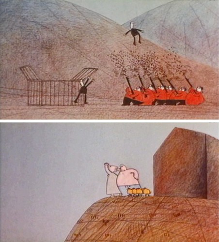
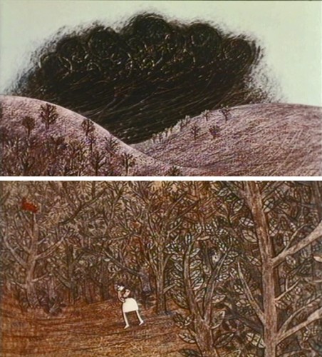
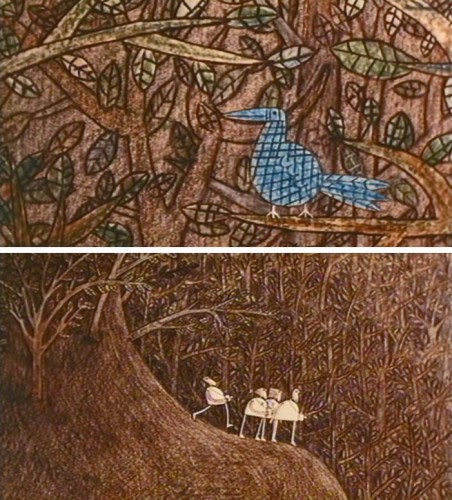
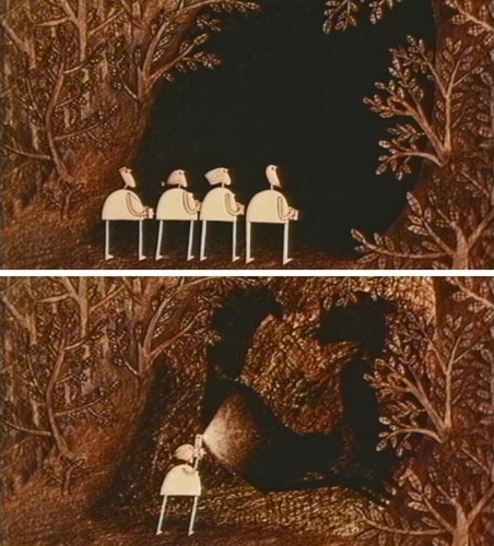
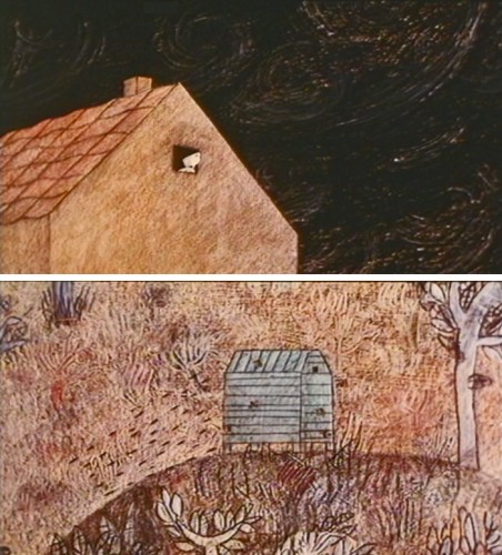
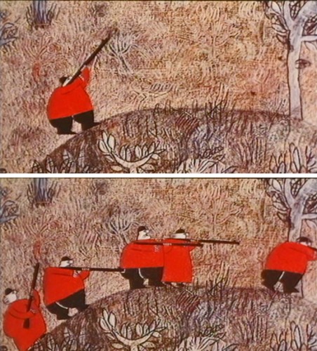
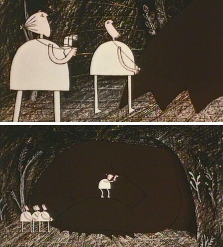
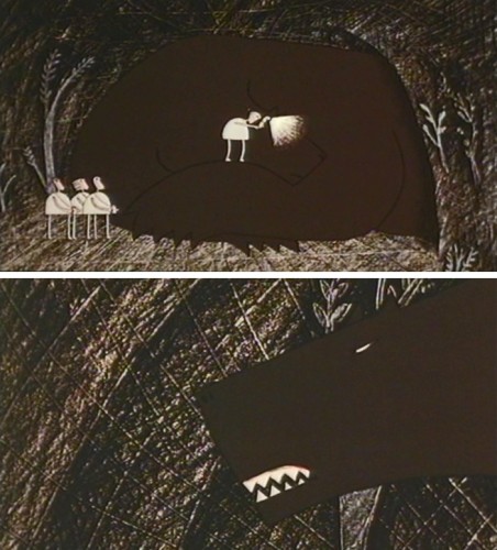
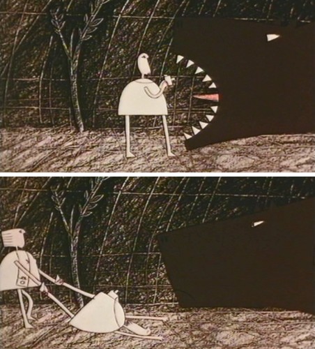
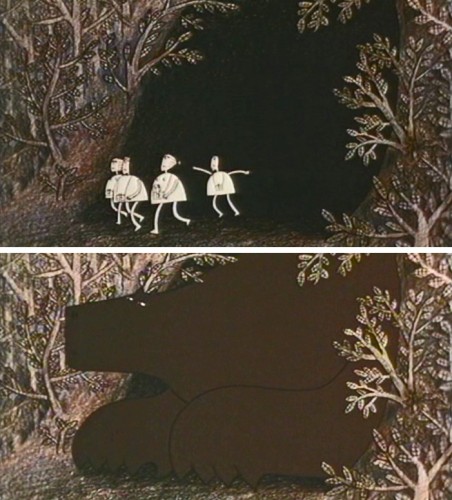
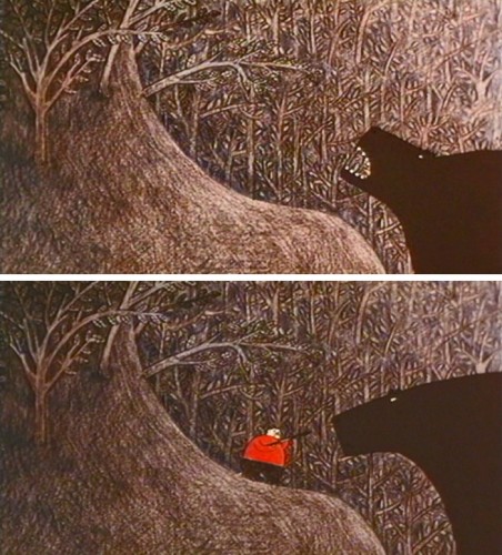
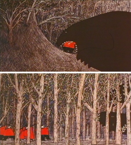
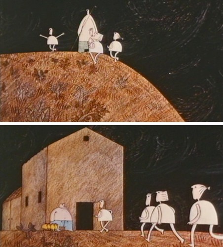
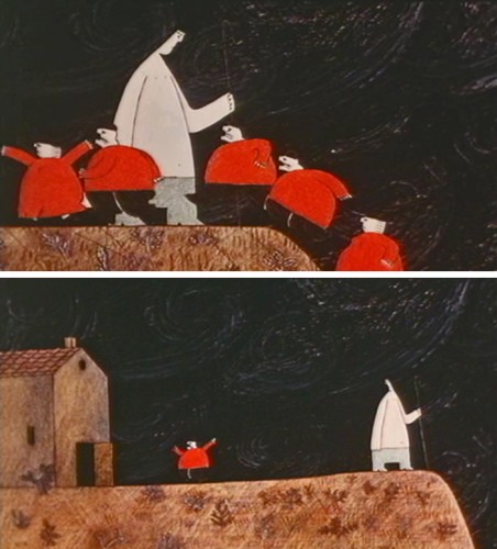
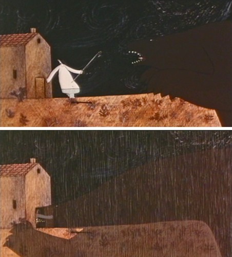
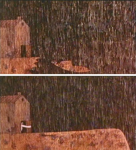
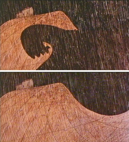
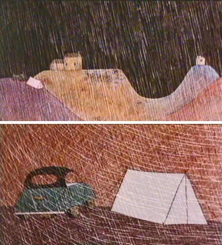
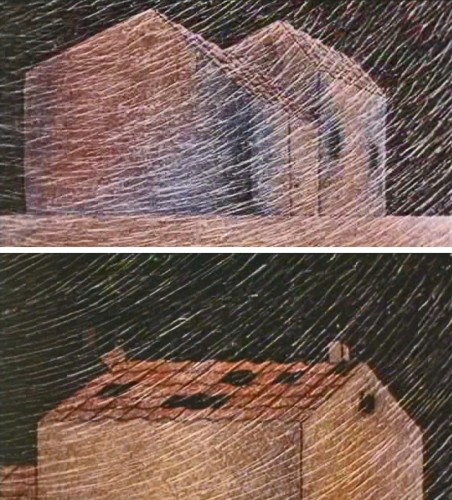
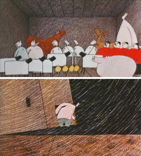
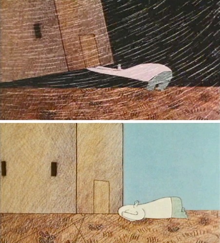
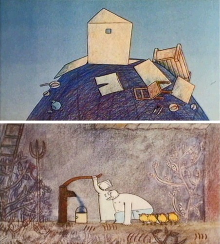
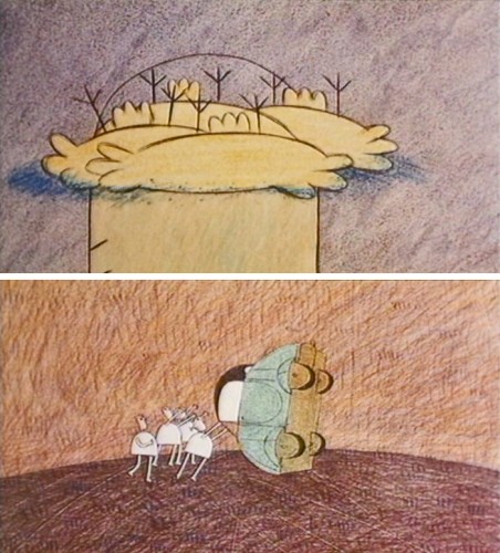
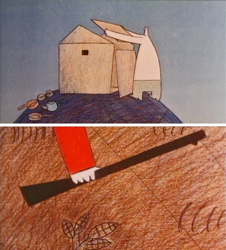
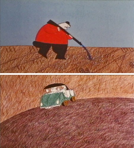
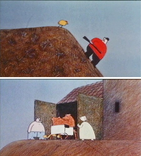
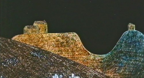
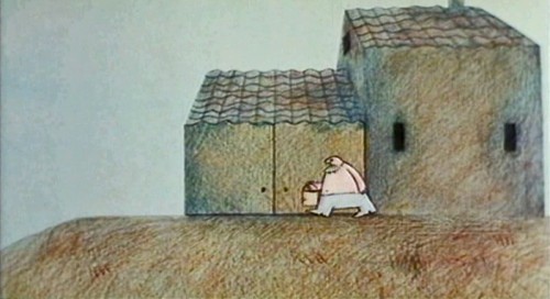
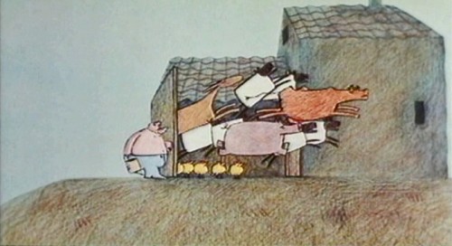
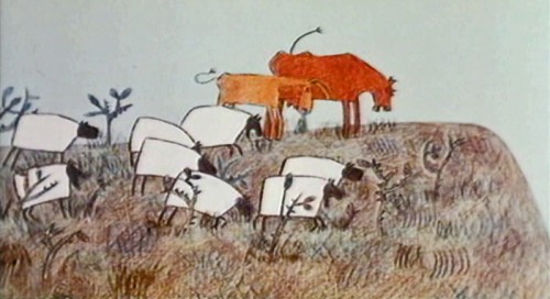
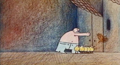
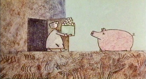
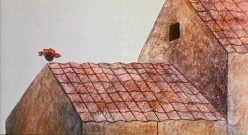
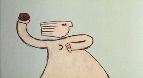
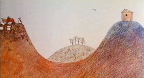
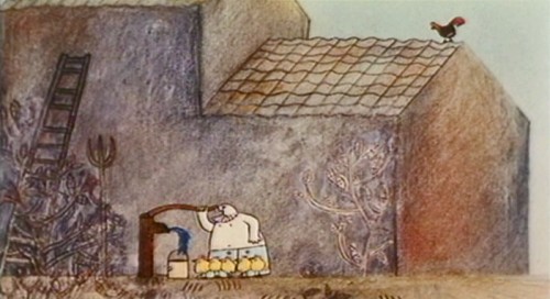
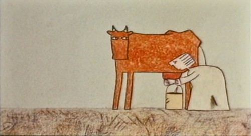
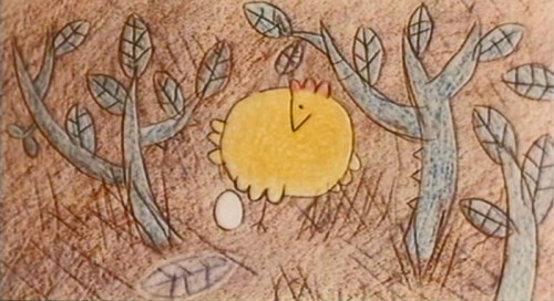
The story of The Hill Farm takes place over three days and shows how the same landscape affects three different sets of people: farmers, campers and hunters. The graphics are beautifully designed and are obviously inspired by a period of Paul Klee’s art. Julian Nott’s score this film, and for all of Baker’s shorts, is just excellent; it couldn’t be better.
The DVD for The Hill Farm can be bought from AWN; it’s packaged with “Gopher Broke” and Plympton’s “Fan and the Flower”.
Here are frame grabs from the first half of the film.
The Farmers:
 1
1.
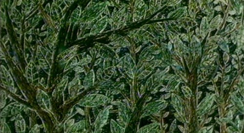 2
2.
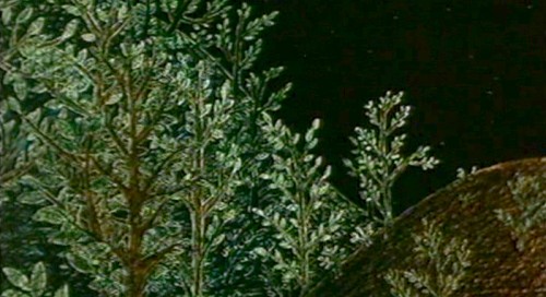 3
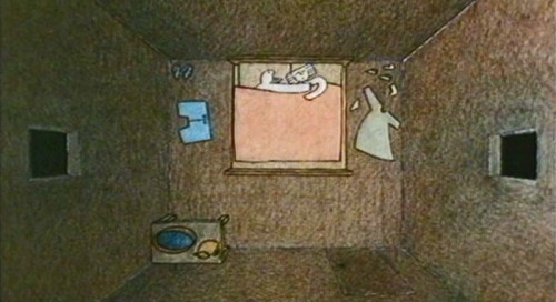
3The film shows a remarkable sense of professionalism
and knowledge given that it was a student film.
.
 4
4.
 5
5.
 6
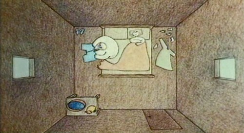
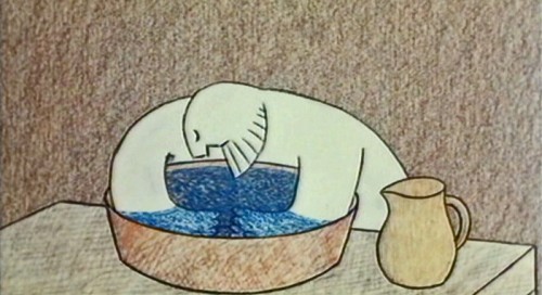
6Time was taken to develop each character in the film.
.
 7
7.
 8
8.
 9
9.
 10
10The animals also take on a character.
.
 11
11.
 12
12.
 13
13.
 14
14.
 15
15Mom wakes up Junior – or is it a farm hand?
.
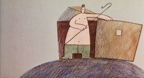 16
16.
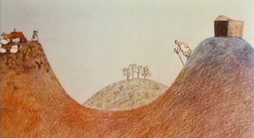 17
17.
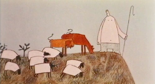 18
18.
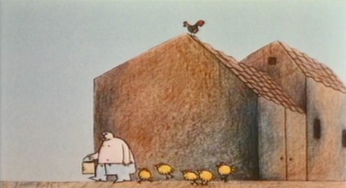 19
19.
 20
20.
 21
21.
 22
22.
 23
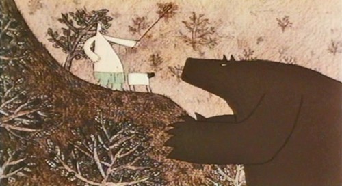
23Junior seems to have some recurring relationship with the bear
who has threatened to eat the sheep.
.
 24
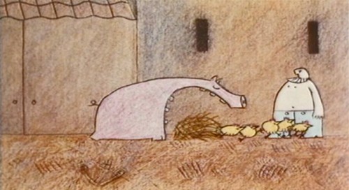
24The pig has his character . . .
.
 25
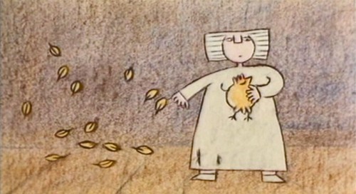
25. . . while the funny and cute chickens are obviously meant for killing.
This gives meaning to all the animals on the farm – as is natural.
.
 26
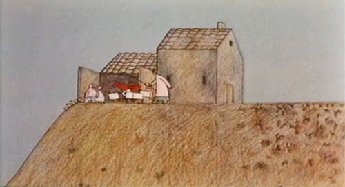
26And they are the prime concern of the farmer.
.
 27
27.
 28
28.
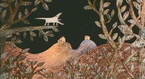 29
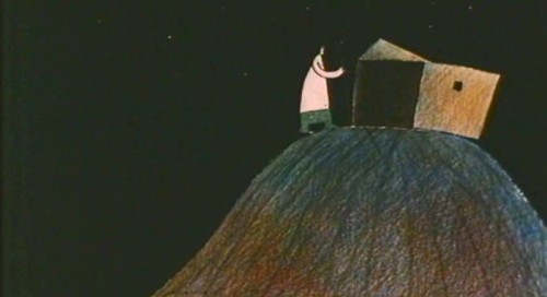
29We are reminded that there are also animals in the wild
other than the threatening bear.
.
Here is a contrasty version on YouTube with some distortion in parts. Part1, Part 2
Animation &Independent Animation &SpornFilms &T.Hachtman 16 Oct 2011 06:29 am
Pabs’ First Burger
With the opening of the Gertrude show in Washington D.C. at the National Portrait Gallery, I thought it worth celebrating our relationship with Tom Hachtman, the cartoonist who has developed the strip Gertrude and Alice and who has some pieces in this D.C. exhibit. Hence, I’m re-posting the tale of our animated journey.
- Back in the late ’70s, there was a local newspaper that competed with the Village Voice for the alternative audience. The Soho News was smaller and thinner, but had its own treasures. Some good writing and listings, and many excellent alternative comic strips. (Bill Plympton had a weekly strip in this paper before he started animating.)
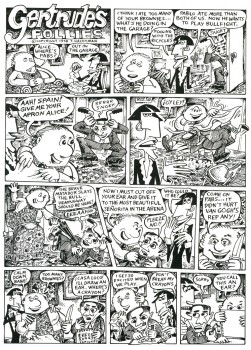
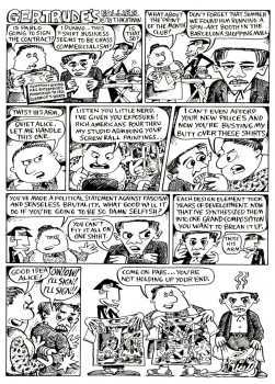
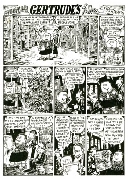
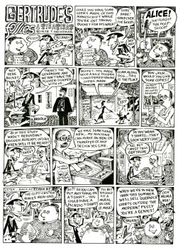
I fell in love with one comic strip called Gertrude’s Follies to the point where I waited 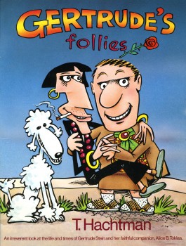 each week for the new issue and the new strip to hit to market. It was about Gertrude Stein and Alice B. Toklas and all the crazies that came into their lives – particularly Picasso, Hemingway and other iconic art types. It didn’t matter that Matisse and Capote didn’t meet; they were both available for the strip – as was everyone else.
Finally, after enjoying it for so long, I decided to locate the cartoonist behind it, and see whether he was interested in developing a storyboard and script for a feature. Maybe we could get some low-budget financing.
Tom Hachtman was the cartoonist, and he was a brilliant artist. His wife, Joey Epstein, was another fine artist. The two entered my life at this point, and some interesting things developed.
Gertrude’s Follies was an ongoing project. Tom worked with Maxine Fisher, who has been my writing partner through all the years of my studio. The two of them developed a couple of themes from the mass of strips that had been done and started to weave a storyboard. Tom left 4 or 5 panels of each 6 panel page empty, and I constructed and reconstructed story around them. Sometimes I would draw more material, sometimes I would take some away. It was real fun.
The Soho News folded, and no one really picked up the strip. It ran for a short time in The Advocate. Tom was able to publish a collected book (see the cover above.) You can still locate a rare copy on line.
Some newer, color copies of the strip can be found on line here.
Tom also does some political cartoons for the site here.
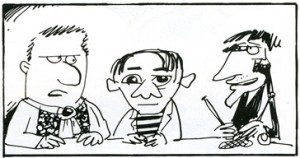 The movie never went into production. I couldn’t raise the funds – my inexperience. We did make one short segment – a two minute piece that was the most hilarious strip. Sheldon Cohen, an animator I met at the Ottawa 76 festival, came to NY when I offered him a job on Raggedy Ann. Sheldon, ultimately, did a number of films for the National Film Board which you can watch on-line if you click on his name.
Sheldon animated this particularly funny strip. It took a while for him to animate it, and by the time he was finished, the feature had died and I had lost some interest. Years later I inked and painted it and had it shot. The short piece was never finished, though I still think about doing that.
Tom also recently gave me a funny strip about Pablo Picasso sculpture for which I’ve finished a storyboard and animatic. Hopefully, I’ll get the energy to animate it.
Aside from Gertrude, both Tom & Joey worked on a number of my films and still infrequently do. The two have painted many murals on the Jersey Coast, where they currently live. Tom has been a political cartoonist for the NY Daily News, has done lots of airbrush work for Bob Blechman when the Ink Tank was in operation. He also has done quite a few cartoons for The New Yorker magazine.
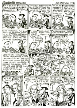
Here are a few of the strips to give you the flavor. Perhaps next week I’ll give a sample of our storyboard, comparing it with some of the actual strips. Enjoy.
 1
1 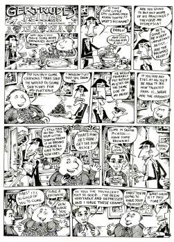 2
2
(Click on any image to enlarge so that you can read the strips.)
.
We did ultimately complete the short film, called “Pabs’ First Burger.”
Tom Hachtman did the backgrounds and Matthew Clinton did the animation.
Here’s a small QT view of that short:
