Category ArchiveIndependent Animation
commercial animation &Disney &Illustration &Independent Animation 25 Sep 2012 05:29 am
Eyvind Earle – recap
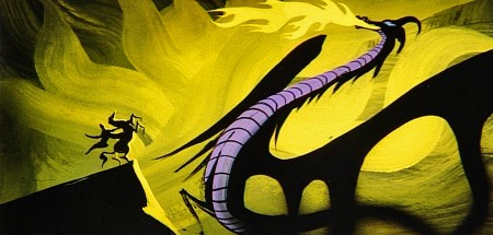
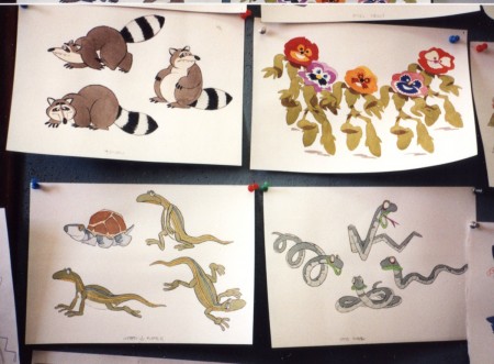
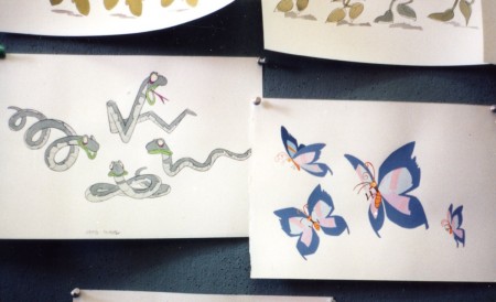
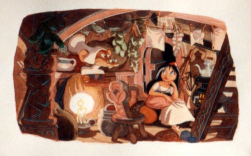
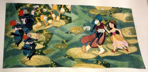
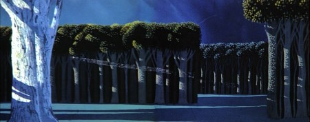
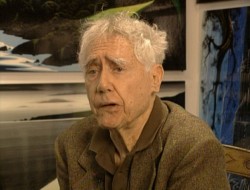 – Let’s talk a little about Eyvind Earle. This is the artist who rose to fame when he was selected by Walt Disney to set the style for the long-in-production feature, Sleeping Beauty. The animators disliked his art direction and openly protested it. Walt remained true in his stance and supported Earle to the end; though it could be said that Walt was more involved in Disneyland’s construction and gave too little attention to the in-fighting at the animation studio.
I remember Frank Thomas, specifically, stating that he had done everything possible to supercede Earle’s style after he, Thomas, had animated the Merryweather scene as she creates Aurora’s dress and cake in honor of her birthday. He felt that the black bodice that Earle had designed took all the lightness out of his character’s delicate dance.
(Click on any image to enlarge.)_________________________________
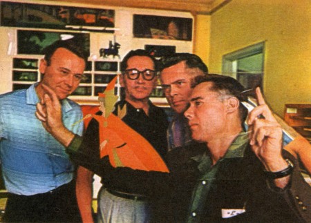
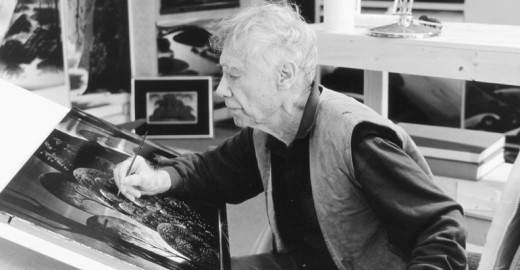
L to R: Al Dempster, Dick Anthony, Ralph Hulett and Eyvind Earle
Thomas publicly attacked Earle at the Lincoln Center celebration of Disney animation back in 1973. I’d already read something similar, and heard it privately. None of the others on stage at Lincoln Center – Woolie Reitherman, Ken Anderson or Ollie Johnston – countered in support of Earle.
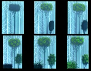 Sleeping Beauty was such a drastic change in look from the other Disney features, that I think it took deep hold in the minds of a lot of Baby Boomers growing up around this feature. Earle became a strong target of interest, and I think his reputation has grown annually.
I have to admit it was odd seeing the backgrounds of Pocohontas trying to emulate Earle’s Sleeping Beauty style, but in some ways it seemed fitting. The studio had been ripping off the films of the past for so long that it was only appropriate that they’d focus on someone who was such a dynamic force.
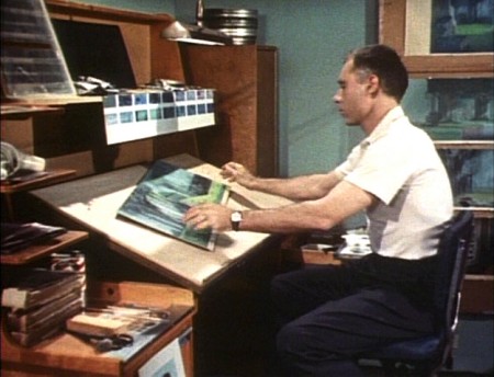
For a short period after he was released by Disney, in the post-Sleeping Beauty layoffs, he worked with John Sutherland Productions where he designed the short, Rhapsody of Steel. Then he formed his own studio, Eyvind Earle Productions, Inc. He did an animated trailer for the film, West Side Story, under the supervision of Saul Bass. He did an animated title for the Kraft Suspense Theater, and he did a Christmas Special for Tennessee Ernie Ford.
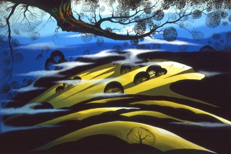
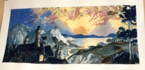
Ultimately, Earle made a success of his own art after leaving animation. He’s been represented by a number of very large galleries and has sold a lot of popular art in a style all his own. Here are a couple of examples found on line:
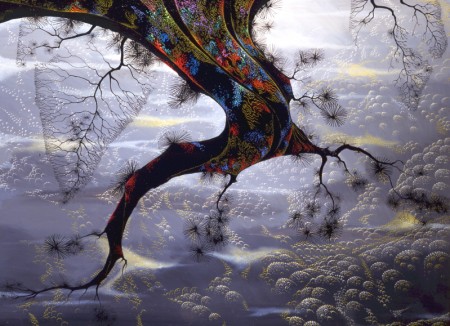
I’m not always a big fan of the color schemes in his graphics, though he always makes them work, but I have to give credit to Earle for his originality and the dynamic approach in his art.
His autobiography, Horizon Bound on a Bicycle, is a must for all real fans.
This is his animation resume:
- 1951 Started with the Walt Disney Studios as background painter on: FOR WHOM THE
__ BULLS TOIL, MELODY, and the Academy Award winner for “Best Short of the Year”
__TOOT, WHISTLE, PLUNK and BOOM which also received a Cannes Film Festival Award.
__Production Designer, Color Stylist and Background Painter for the DIsney animated __classic SLEEPING BEAUTY, as well as, PIGS IS PIGS, GRAND CANYONSCOPE,
__PAUL BUNYAN, LADY AND THE TRAMP, LONDON BRIDGE, and WORKING FOR PEANUTS.
__He designed 5 murals for Disneyland.
1958 Joined John Sutherland Motion Picture Company in Los Angeles.
1960-1966 Created 24 sheet poster for Hamm’s Beer.
__Started motion picture animation company, Eyvind Earle Productions, Inc.
__Created animated commercials for Chevrolet Motors, Chrysler Corporation, Marlboro
__igarettes, Motorola Television and the Kellogg Cereal Company.
__Created animated trailer for WEST SIDE STORY for United Artists.
1961 Created animated television special THE STORY OF CHRISTMAS starring
__Tennessee Ernie Ford and the Roger Wagner Choral.
1962 Created animated television special THE EASTER SPECIAL.
__Created title for the KRAFT SUSPENSE THEATER.
__Created the logo trademark trailer for Universal Pictures.
__Produced and created the theatrical short DEATH AND SUNRISE
You’ll find a lot of merchandise including all the books listed here, on the Eyvind Earle website.
Action Analysis &Animation &Animation Artifacts &Hubley &Independent Animation &Tissa David 24 Sep 2012 05:41 am
Viva à la Tissa
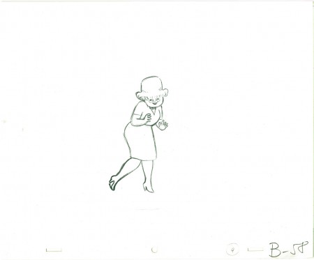
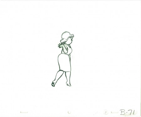
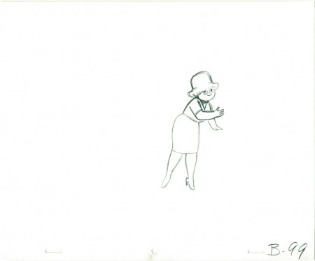
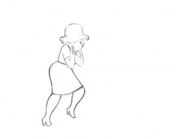
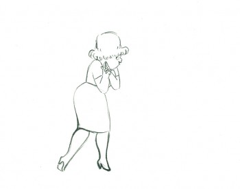
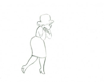
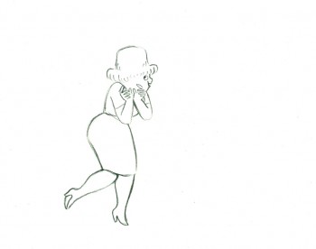
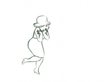
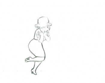
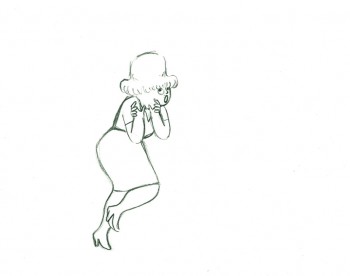
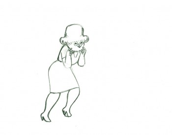
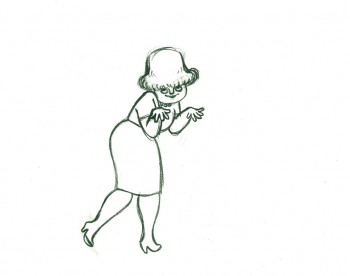
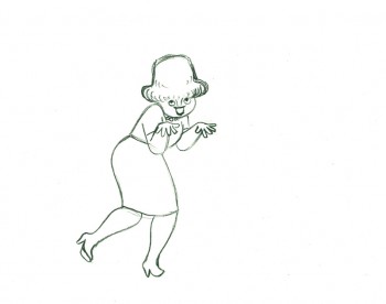
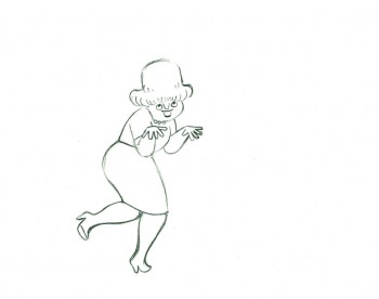
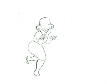
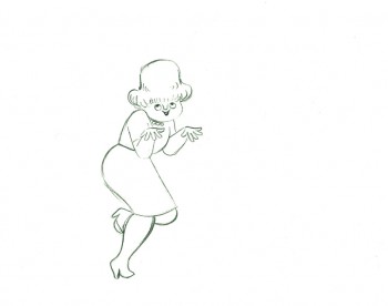
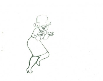
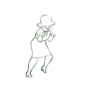
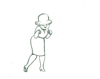
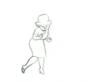
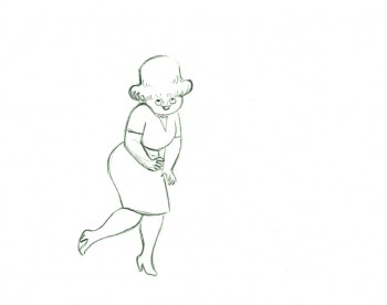
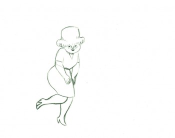
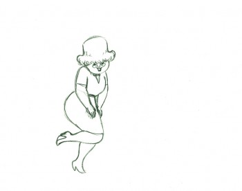
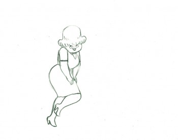
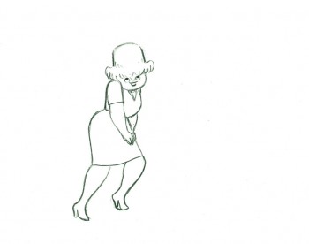
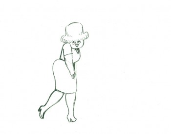
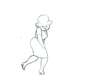
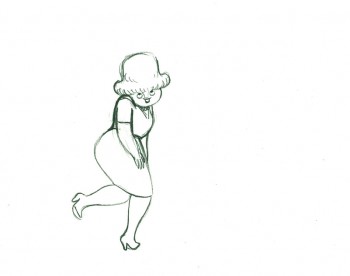
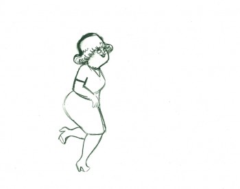
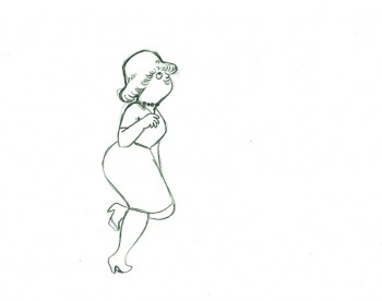
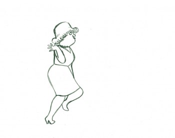
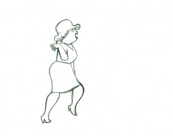
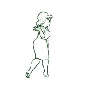
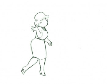
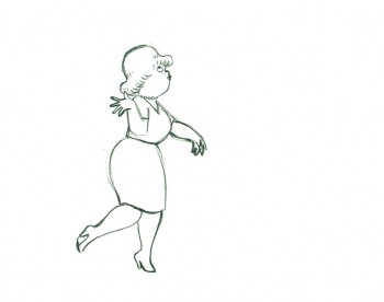
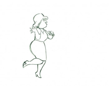
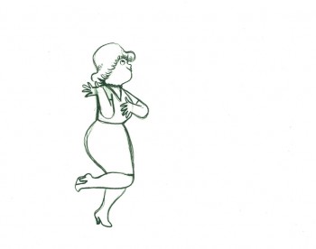
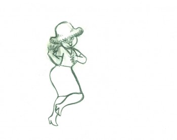
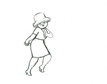
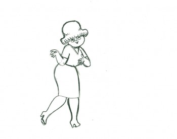
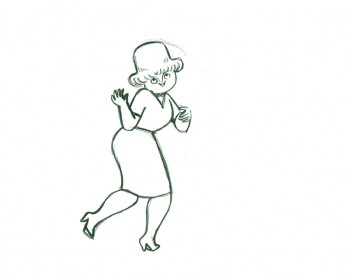
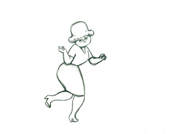
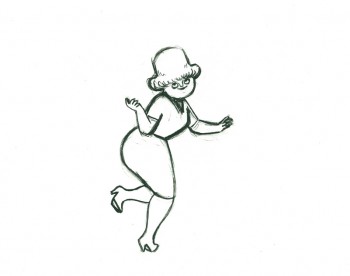
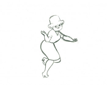
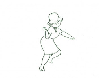
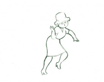
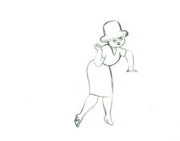
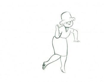
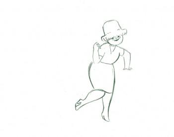
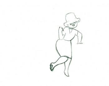
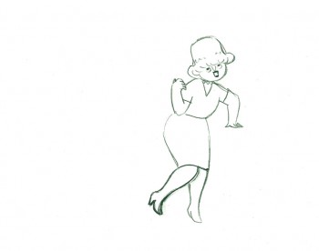
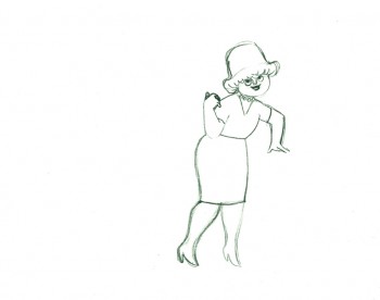
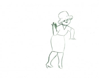
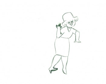
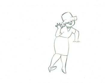
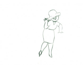
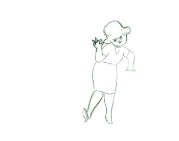
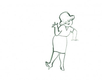
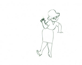
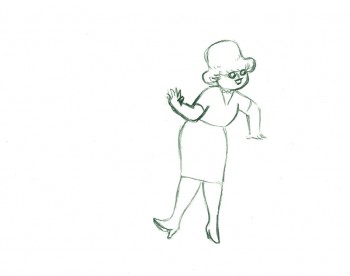
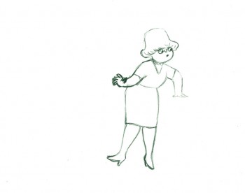
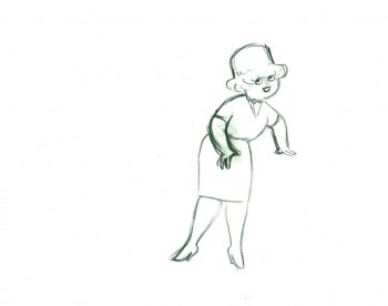
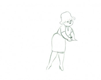
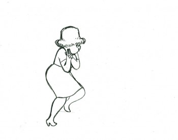
- Tissa David animated a VIVA paper towel spot for John Hubley. Here’s a scene wherein the lead, a woman, walks through (Bg pans behind her at .25 per drawing) toward the kitchen, where she stops.
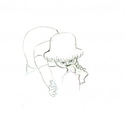
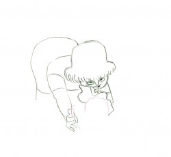
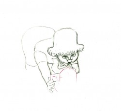
Instead of giving you the entire page of animation paper, I’ve trimmed it down to just include the character and her walk. Here are four examples of what the entire drawing looks like, untrimmed.
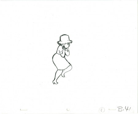 B41
B41
And here are all the drawings for the scene cropped:
 41
41
________________________
.
The following is a QT of the entire scene with all the drawings included.
Since I didn’t have exposure sheets, I put everything on two’s straight ahead.
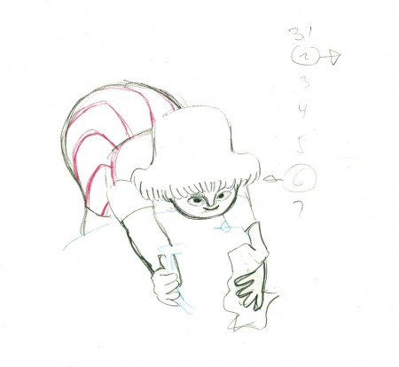
- Here’s what looks like a simple move done by Tissa David when she animated this Viva, paper towel commercial.
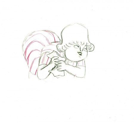
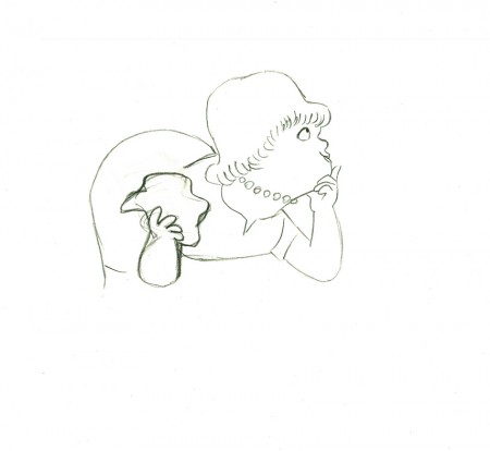
The character’s move in this scene is a complicated one done simply. She has been bent over, cleaning with her paper towel, and she moves up. You can follow the overlapping action as her eyes pull her up, head turn, and body follows.
The stripes will come and go. Tissa depends on someone else to concentrate on this material when she’s working on a commercial.
 e37
e37(Click any image to enlarge.)
 e44
e44
Her eyes point in the direction she wants to go,
and the rest of the scene moves her up and into profile.
This key move is hidden under the exchange of the
paper towel from one hand to the other.
 e51
e51
She stops to think (accenting her monologue.)
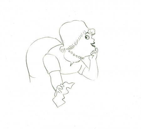 e58
e58
And she slyly looks back to camera to respond with her thought.
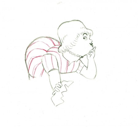 e59
e59
She continues, all through this move, talking.
She’s pitching the product.
Here’s a QT of the piece:
Cleaning for VivaClick left side of the black bar to play.
Right side to watch single frame.
Animation Artifacts &Art Art &Independent Animation &Layout & Design &Photos &Puppet Animation 15 Jul 2012 05:43 am
Quay Dormitorium – repost
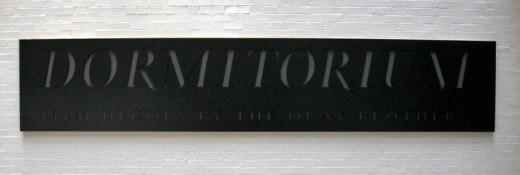
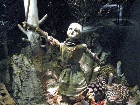
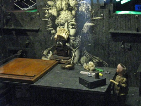
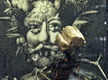
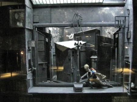
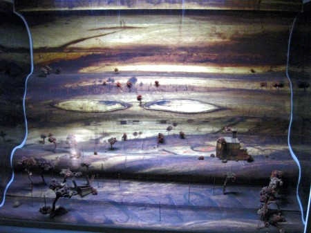
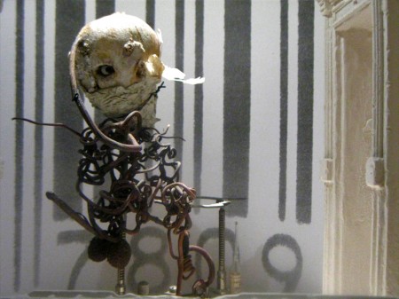
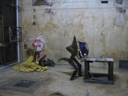
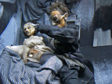
August 11th a big show and retrospective of the work of the Quay Brothers will open at the Museum of Modern Art. Part of the exhibit will be a small puppet world within glass casings that they created called “Dormitorium.” This was actually exhibited in New York several years ago, and I photographed that presentation. I thought this might be a good time to repost it, getting us all in the mood for the world of Quay.
The Brothers Quay have an exhibition on display at Parsons School of Design, 2 West 13th Street on the ground level. It’s on exhibit from now through October 4, 2009.
Stephen and Timothy Quay claim writers Franz Kafka and Robert Walser, animators Walerian Borowczyk and Jan Lenica, puppeteers Wladyslaw Starewicz and Richard Teschner, and composers Leoš Janácek, Zdenek Liška, and Leszek Jankowski among their influences. All of these artists can be felt with each of the constructions on display.
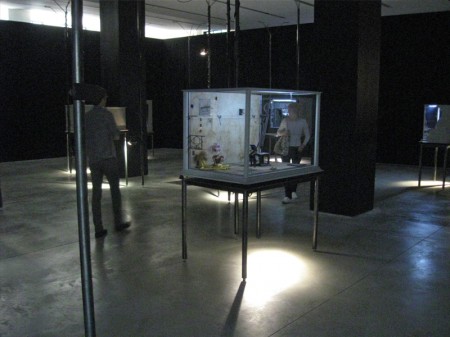 1
1On entering you see a darkened room with boxes about
the size of your torso – maybe 3′ x 4′ – on display.
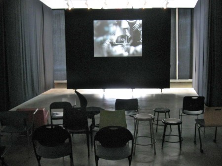
Of to the side there’s a theater with constantly running films
showing Quay brother works. One of every kind of chair.
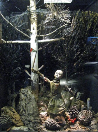
Within the boxes there are whole worlds.
Magnificent detail upon detail.
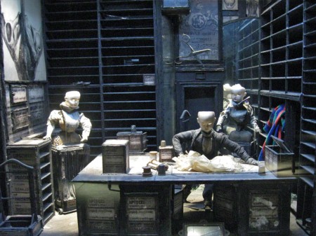
To the next box for a wholly different world.
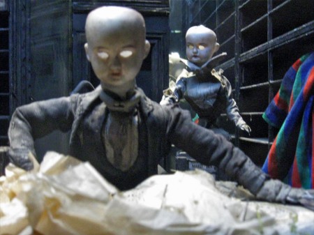
Again the amazing detail is brought to the enclosure.
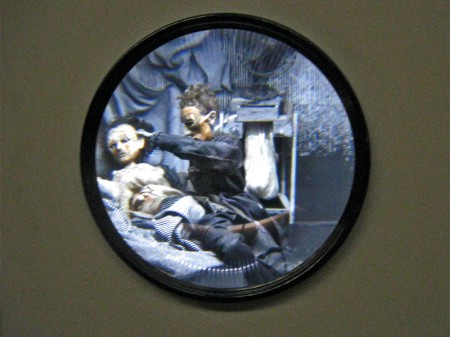
A couple of the boxes are seen through a prism.
The interior is magnified.
You have to get close to it to get real clarity.
You virtually enter these little rooms.
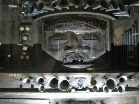
Some of these worlds seem enormous.
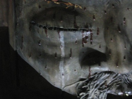
There are many closeups one could take given all there is to see.
This little scene is in the upper left box of the full view above.
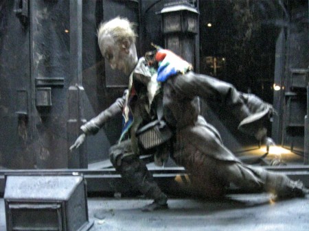
The central character on the main stage.
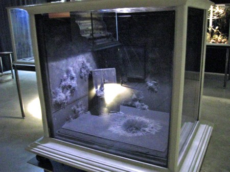
You can get an idea of the cases and the display.
All contain their own little worlds.
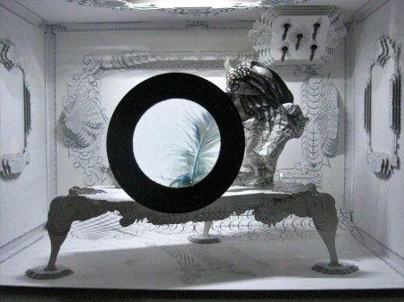
Another magnifying glass focuses on a feather.
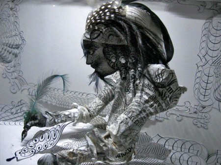
Just beyond the feathered quill there’s the writer.
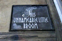
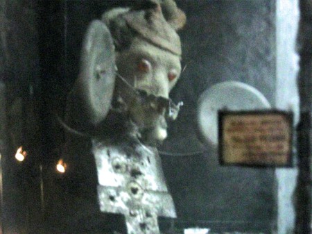
The last box near the exit has a label within.
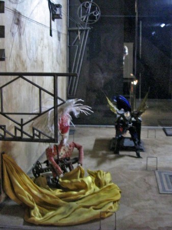
Many of the cases can be viewed
from three different perspectives.
Action Analysis &Animation &Animation Artifacts &Frame Grabs &Hubley &Independent Animation &Layout & Design &Tissa David 09 Jul 2012 05:24 am
Of Men & Demons – Redux
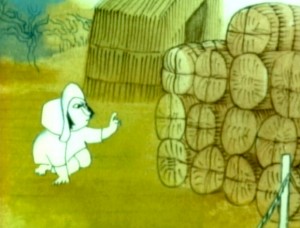 – Since first seeing the Hubley short, Of Men & Demons, back in 1967, I’ve been a fan. The artwork was stunningly different and original. It had a rich tone to it and some beautiful Hubley Bgs. The music by Quincy Jones was as original as the film, itself.
The short was actually an industrial film done for IBM to explain the binary code to its employees. The Hubleys, however, built on that story to make something of a personal film that received an Oscar nomination.
(Click any image on the page to enlarge.)
Art Babbitt was one of the first animators hired. At some point, Tissa David was brought on to rework some of Babbitt’s beautiful animation. Unfortunately, it was on about fourteen levels and had to be combined and reconstructed and shortened. (Today, of course, there are no limits to levels, but in the days of the camera you kept things to 4 cel levels, as a rule, and never more than 5.) It was complicated by the fact that John Hubley had decided to shorten the piece, and Quincy Jones’ score was shorter than Babbitt’s animation. This chore took some effort and involved dissolve animation. Tissa then continued on the sequence animating the little protagonist and his female companion through the remainder of the film.
About 25 years ago, Tissa David gave me an envelope full of art from this film, and going through a lot of my old material recently, I came upon that envelope.
 3
3 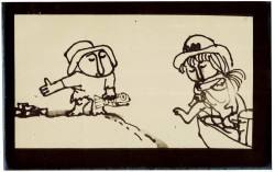 4
4
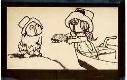
These are storyboard drawings for a short sequence. Tissa got these drawings and prepared Layouts for the sequence. You can see how much is actually in John’s drawings so it’s easy to build on what he’s given you.
 1
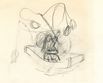
1The following are key drawings Tissa prepared for the sequence in laying it out.
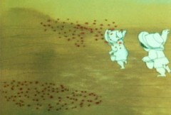
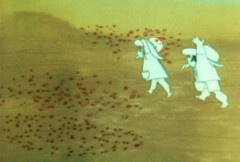
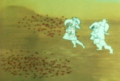
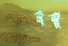
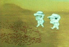
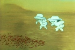
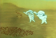
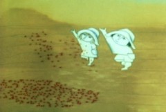
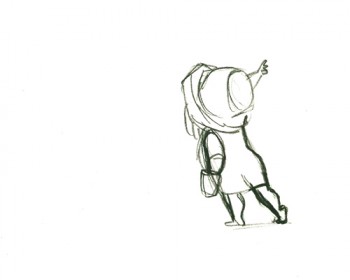
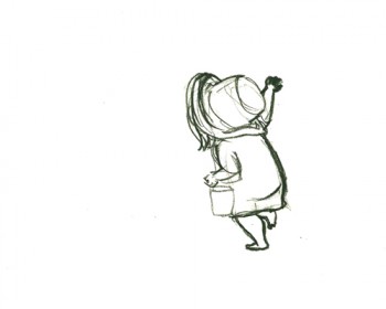
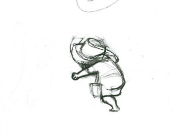
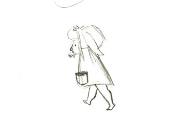
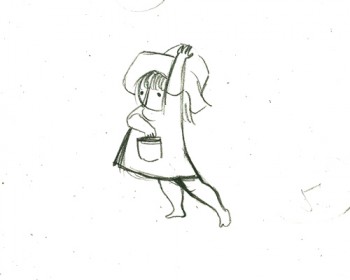
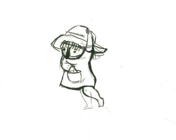
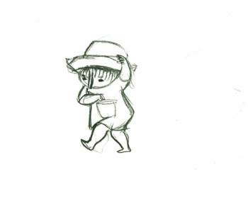
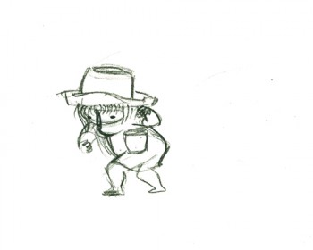
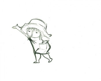
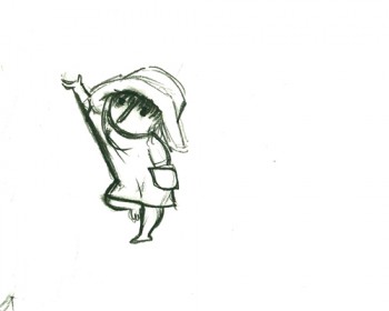
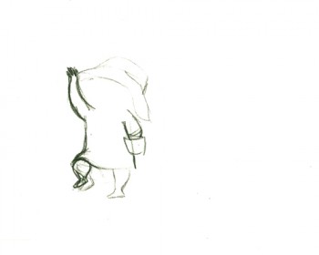
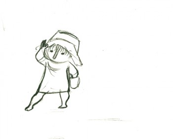
Here is a short piece that Tissa did of the little woman character seeding her front yard. There’s so much grace in every one of these drawings and enormous information in the walk, itself.
 G47
G47(Click any image to enlarge to full animation sheet.)
.
 G49
G49.
 G51
G51.
 G53
G53.
 G55
G55.
 G57
G57.
 G59
G59.
 G61
G61.
 G63
G63.
 G65
G65.
 G67
G67.
 G69
G69
And here are the matching frame grabs from the film.
Seeding crops PT & Final Color
Animation &Commentary &Hubley &Independent Animation &Layout & Design &repeated posts 25 Jun 2012 06:29 am
Everybody Rides – repost
I posted this in the summer of 2008. I’ve ganged two parts together to make one read.
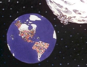 - Back in 1976, I was working on John Hubley‘s Bicentennial flm, PEOPLE PEOPLE PEOPLE. This was a short film, four minutes long, that had about a million scenes. It told the history of the US (from the standpoint of populating and overpopulating) beginning 17760 BC and ending in 1976 AD.
It started with some lengthy scenes. As the film moved on, the cuts came faster, until they hit about 6 frames apiece toward the film’s end. The final scene, from space, was the longest in the film.
There were no characters that appeared in any more than one scene. That meant that with each scene, there were new setups, new characters, new colors, new everything. As a result, it took much longer than other films and was a difficult one to pull off. But like all other Hubley efforts, it was fun. Tissa David, Jack Schnerk, Lu Guarnier, Phil Duncan and Bill Littlejohn animated it. I colored about 2/3 of the film and animated at least a dozen or two scenes (some really were only 6 frames – like that auto shot posted). I also assisted/inbetweened all of the animators.
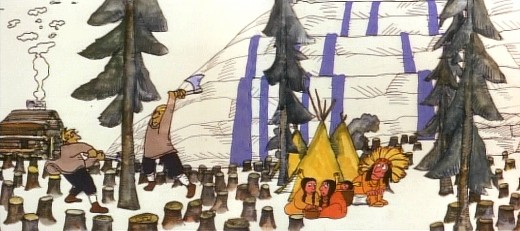
Swedes cut down all the trees in PEOPLE PEOPLE PEOPLE.
The studio, at the time, was buzzing because John and Faith had just sold a dream project to CBS. EVERYBODY RIDES THE CCAROUSEL was an adaptation of Erik Erikson‘ 1956 book, Eight Stages of Development. Erikson was a psychologist who theorized that man goes through eight stages of development from birth to death, and he proceeds to break them down. The Hubleys took this book and broke these eight stages into horses on a carousel.
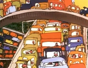 The three half hour Special shows for CBS would be about these carousel horses and the ride.
Each of the stages would be broken into two different subsets, and these would be depicted through stories which were roughly developed visually by John and Faith. Once the funding started to tricle in (about $450,000 for all three shows) they would cast their many actors and have them improvise in the recording studios to the storyboarded set pieces.
While those recordings progressed, the small studio staff was busied in completing animation, artwork and rendering of PEOPLE PEOPLE PEOPLE.
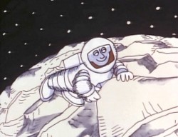
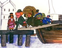
The man on the moon and the Irish immigrants.
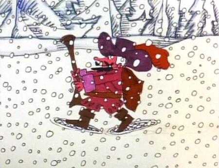
Jack Schnerk animated the French trapper sequence. There was such a rush
on the scene that I remember Jack bringing it in saying he hoped it would work.
He’d done two drawings of snow for the blizzard. Both wildly different from each other.
He asked me to ink them, then flop the drawings and ink them again.
He’d exposed the four drawings on fours. He also had the trapper with
snowshoes walking on fours. He felt it would help us feel a struggle in his
walking through the snowstorm. He felt the fours might add weight.
The scene worked beautifully, and was excellent the first time out.
Not quite the way they’d have done it at Disney. Tricks of the trade.
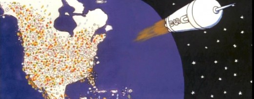
Tissa animated a majority of the film. The ending, the man going to the moon to escape
the overpopulated earth was hers. I have the drawings somewhere and will post some of them soon.
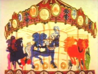 – We started slowly on Everybody Rides the Carousel. There was a six month schedule for about 72 mins of animation. Three half-hour original tv shows for CBS about 24 mins each. They’d air in the late summer of 1975 just prior to the start of the new tv season. Each show would air a day apart from the others – three nights in a row.
John and Faith spent a lot of time – a lot of time – at RCA studios on 45th Street. (It’s
____ The carousel was bottom lit & became soft focus.____-_ now an IRS office.) They recorded many of the voices playing the numerous parts in their show. I tried to time meeting them there a couple of times hoping to meet some of the actors (I particularly wanted to see Jack Gilford in action. He was doing an hilarious part with his wife, playing a couple of cranky old people in a diner.) It didn’t work out that way, but I did see the facility and heard parts in process.
 The key staff working IN the studio (not counting animators who would, for the most part, work freelance) included Ida Greenberg. Ida was a brilliant checker / coordinator who’d started back in the Florida days of the Fleischer studio. (She told me a few great stories about Gulliver’s Travels.) Ida was a great woman, with the thickest New Yowk accent, who never seemed to buckle under pressure. I grew very close to her. I tried after that to have Ida everywhere I worked. She led Raggedy Ann’s I&Pt and R.O.Blechman’s special.
Kate Wodell was a student of the Hubleys at Yale. She was a talented artist who’d moved into production during the making of Cockaboody and continued on staff there. Sometimes she colored, sometimes she animated, sometimes she did whatever was necessary. This was exactly how I moved into the studio and loved the experience. She worked with Faith for many years after John died.
Earl James was an animator who’d worked in the backroom of many NY studios from Paramount to Terrytoons to NY Institute of Technology. He also had done some comic strip work.
Earl was given the carousel to animate. This came from a couple of elaborate drawings John did. Earl worked 16 fld. using a 96 drawing cycle. It gave us a lot of opportunity to move in tight or stay wide. However, it was a nightmare that took forever. Joe Gray was hired to assist Earl. (Joe started during the Terrytoons strike and never left. Many of those who knew him as a “scab” never forgave him and had only horrid things to say about him to me some thirty years later. He was a lifetime assistant like a handful of other noted names in NY.)
This scene moved so slowly through production that I kept jumping in to assist as well. I was a fast assistant, but that carousel slowed even me down. 8 horses moved in perspective in a circle; there were 96 different rotating views of all the horses. I’d guess the scene took about 10 weeks to complete.
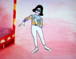
I was also doing layout and animation of a lot of connecting scenes throughout the production. These were scenes that would have to blend from one animator to another, or John had decided to go in tight for a closeup. In one case with Art Babbitt’s mime character, I was asked to change it from two’s to four’s with a dissolve technique John taught me (he said they’d used it on Fantasia.)
There were four people in my room, Earl, Joe, me and Mark Hubley. He worked alongside me for most of the film. He colored artwork given him by Ida, who was working in the larger room next door. Mark and I had a good releationship going back the many years I worked there. He joined the studio once he completed college. Emily Hubley worked alongside Kate and Ida.
Two younger, more experimental animators were brought in by John. Adam Beckett had made a name for himself with the films he was doing at CalArts.
Fred Burns was doing some incredible work at UCLA. They both were very different and added their unique touch.
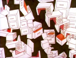
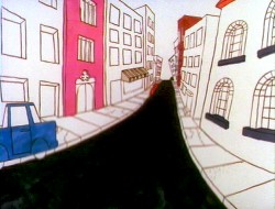
___________ Adam Beckett’s scenes included these two surreal images.
Adam did a scene a couple of scenes wherein office furniture floated about in a very complicated surreal cycle. Fred did this amazing scene of a roller coaster from the POV of the rider. He and I worked together a number of times after that, and we’ve stayed friends.
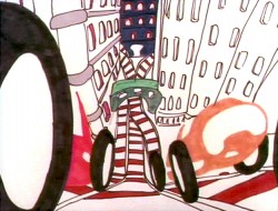
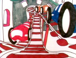
______________ Fred did this very elaborate sexual roller coaster.
I hope to have more to say about some of these films I worked on.
Art Art &Books &Illustration &Independent Animation &Layout & Design &repeated posts 19 Jun 2012 06:23 am
Norman McLaren Drawings – repost
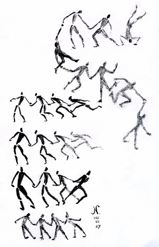
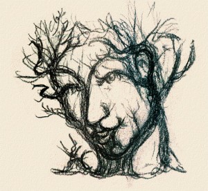 - I don’t intend to give an introduction to Norman McLaren or his work here, but he obviously was one of the solidly great film makers on the “Art” side of animation. His films are worth studying for their timing, if not for their sheer genius. As a matter of fact, his exercise films on timing are incredible (though I have no idea how you’d get to see them today.)
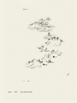
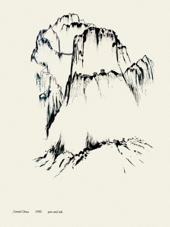
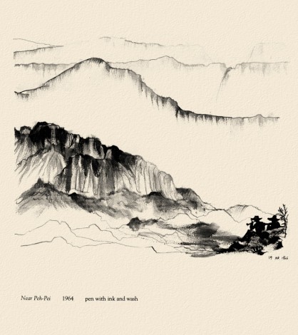
I do have a book of some drawings by him, and given the stories about China in the news today, I thought I’d post some of his drawings done in China. The book isn’t printed on the best of papers, so the quality of these drawings isn’t all it could be. However, I thought it might be worth showing this other side to his art.
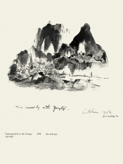 _
_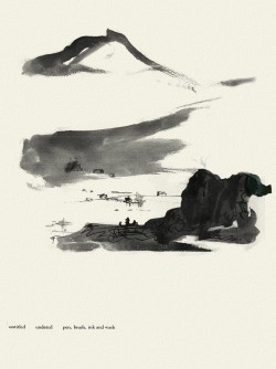
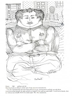
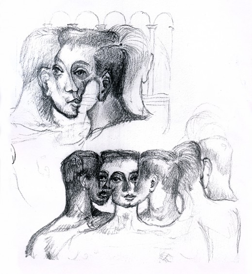
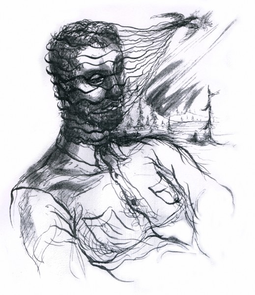
Moving away from China, there are two other drawings I thought compelling and
would like to share here.
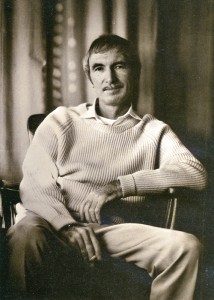

McClaren was certainly a brilliant artist, and his experimentation and developments brought about a real maturation of the art form. I wonder how he would have dealt with the technology we’re using today. Remember, he realized that the soundtrack could be drawn and did his own exploration of this part of the process.
The book was published in 1975 by Tundra Books.
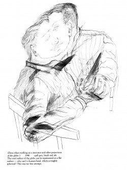
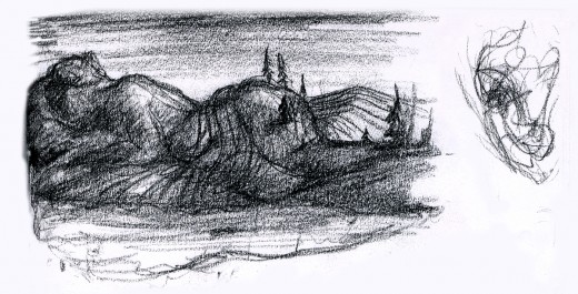
Because the one illustration which graces the book’s cover, was of such interest to those reading my piece, I’ll start with the rest of that page. It’s a series of sketches done for the film, “LÃ -haut sur ces montagnes” and was drawn in 1945.
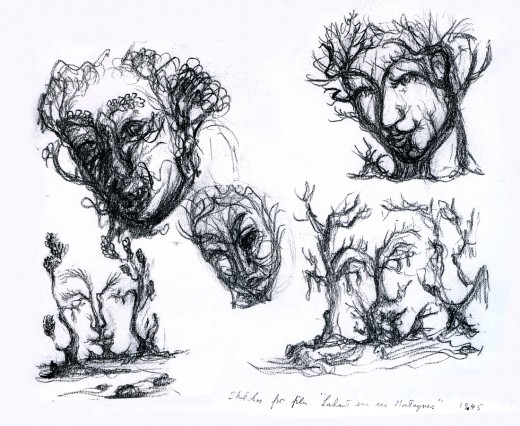
The two illustrations above are connected on the same page. I separated them .
The entire page is labelled: Sketches for the film, “LÃ -haut sur ces montagnes.”
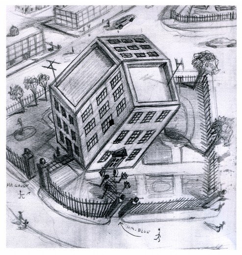
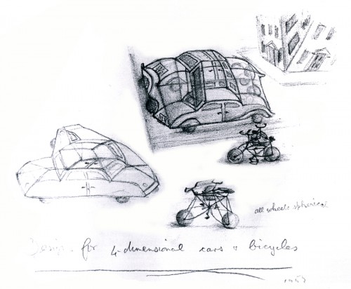
“Tesseractine House”
I’m fascinated that a number of his illustrations look not too unlike Steinberg’s work. It’s obvious he was an influence for a lot of animators in the late ’40′s.
Animation &Animation Artifacts &Bill Peckmann &Independent Animation &Models &repeated posts &Rowland B. Wilson 02 Apr 2012 07:03 am
Rowland Wilson’s The Little Mermaid
- The brilliantly talented Rowland B Wilson, certainly paid his dues at a number of animation studios. We’ve seen his work with Richard Williams’ Soho Square studio and with Disney and Don Bluth’s Ireland studio.
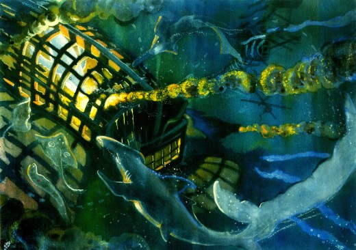
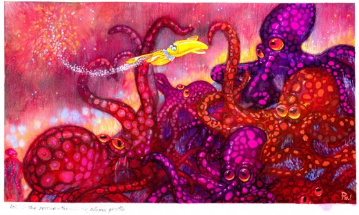
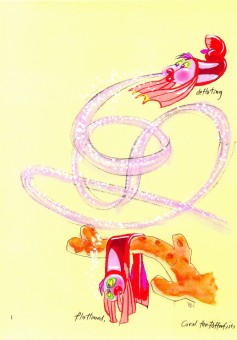
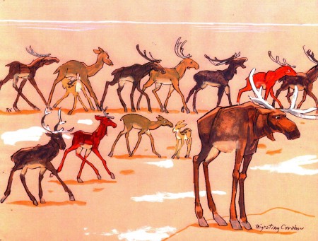
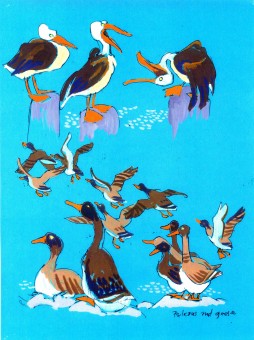
Today, I have some sketches and designs he did for Disney while working on The Little Mermaid.
Not all of this material made it to the film, but the incredible wealth it brought the directors had to have affected the overall production. This invaluable material comes courtesy of Bill Peckmann.
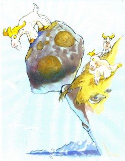
The first group to view are Production Designs that he did for various sequences throughout the film.
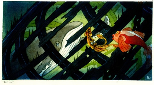
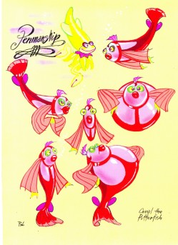
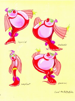
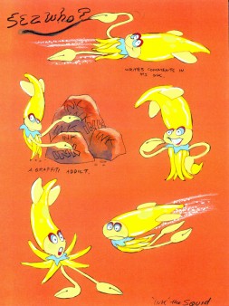
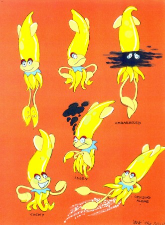
The following are character designs Wilson did for The Little Mermaid for a character that never made it into the movie. Though, I think “Ink the Squid” may have developed into “Sebastian the Crab”.
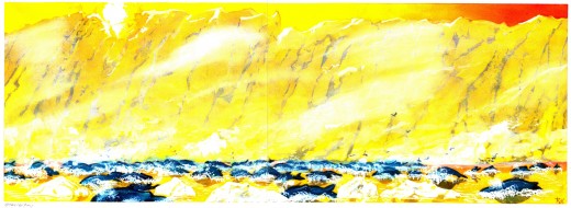
Then there are some of the creatures seen above land at the Glaciar Tray which apparently was designed to be part of the film.
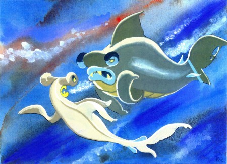
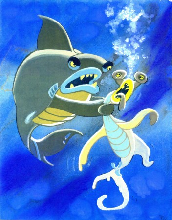
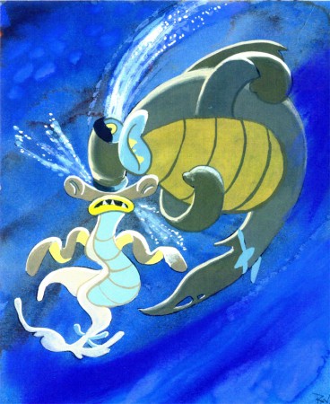
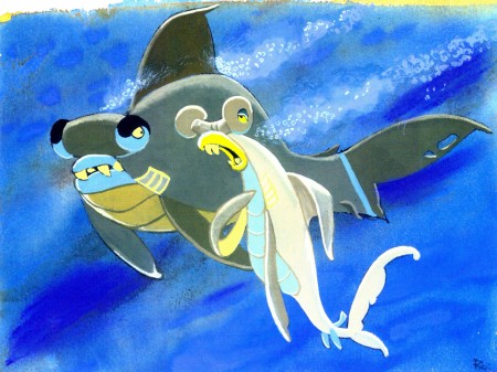
Then there is this short seqeunce of interaction between two fish:
All art displayed © Walt Disney Prods.
 This material is a treasure. I want to thank Bill Peckmann for sharing it with us.
Rowland B. Wilson was an artist of the highest standard, and I can’t get enough of his work. True inspiration.
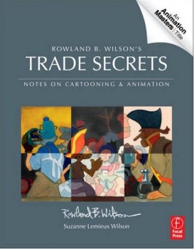
- Don’t forget that there’s a wonderful new book on the market. I’d like to keep it in your attention, hence I’m trying to give a lot of attention to the great work of Rowland B. Wilson.
Rowland B. Wilson’s Trade Secrets: Notes for Cartooning and Animation seems to offer quite a bit of attention to Mr. Wilson’s animation art as it does his brilliant illustration and cartooning. The book looks unique, and to have someone like Rowland as the guide to this world has to be a gem.
Bill Peckmann &commercial animation &Independent Animation &Layout & Design 27 Mar 2012 07:10 am
Thumbelina Photos
 - There’s a wonderful new book on the market, and I want to keep it in your attention. So I’m trying to give as much attention to the great work of Rowland B. Wilson.
Rowland B. Wilson’s Trade Secrets: Notes for Cartooning and Animation seems to offer quite a bit of attention to Mr. wilson’s animatoin art as it does his brilliant illustration and cartooning.
Keep it in mind.
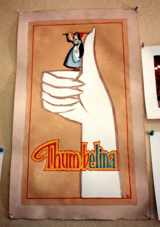
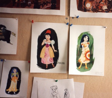
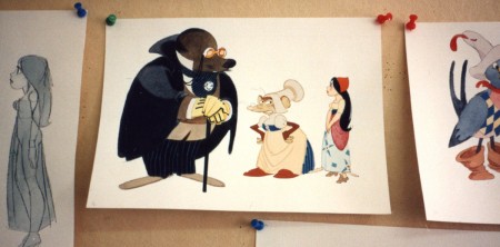
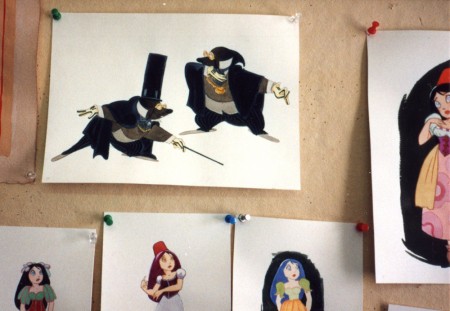
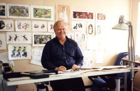
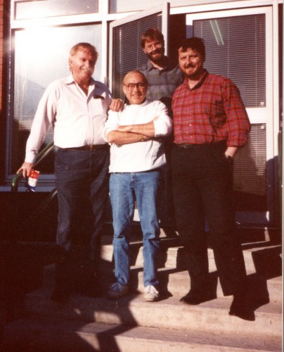
- Yesterday, we saw a lot of B&W models by Rowland B. Wilson done for Don Bluth‘s feature, Thumbelina. Today, I have a cache of photos taken by animation producer, Phil Kimmelman, when he visited Rowland in Ireland. Many of the models overlap, except that these are in color.
These all come by way of Bill Peckmann‘s great collection, thank you very much.
 1
1Rowland at his desk.
 18
18
Rowland (L), Phil Kimmelman (Ctr)
Bill Frake (R), unknown in rear
Animation &Books &Independent Animation 13 Mar 2012 07:59 am
This Sweater Is For You!
- Back in 1976, we were full of spunk and excitement. I attended the first Ottawa Animation Festival, that Summer, and watched Caroline Leaf become a superstar with her two brilliant films, The Street and How The Owl That Married the Goose.
At the time, I had fallen into the position of supervisor of Assistant Animators and Inbetweeners on the newly begun, Richard Williams feature, Raggedy Ann and Andy. While up in Ottawa, I never forgot that we needed help in NY.

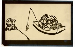
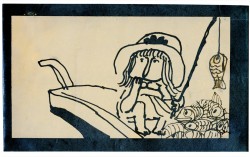
Drawings from an animated piece by Sheldon Cohen that impressed me.
It so happens that I found two great artists at that Festival, offered them work and made two new friends, John Gaug (who was very commercially trained in an Ottawa studio) and Sheldon Cohen (a new artist working at NFB who had a lot of talent and “Art” to offer.)
After Raggedy Ann, John went his commercial way, and Sheldon went back to work at the Film Board, and immediately created a brilliant short film called, The Sweater. In subsequent festivals, I got to see The Sweater about a dozen times, and always enjoyed the experience. It was a rich film about the cultural hero’s effect on the young fan; it was about a society at large. It had an innocence and a hidden and charming sophistication of its own. The film was clearly a success.
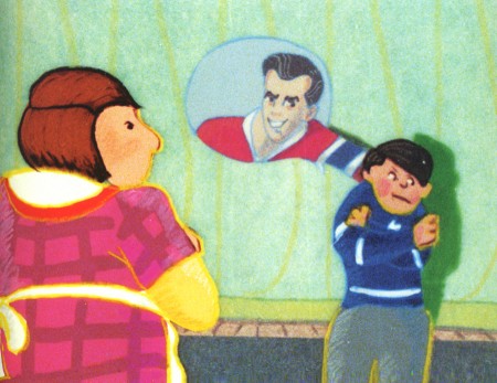
Roch Carrier’s story creates a delightful short that
crosses all cultural boundaries for Canadians.
Of course, from the regions of the US, it’s hard to quantify how popular a film about Hockey would be in Canada. Believe me this film was much larger than I could ever realize. In short, it seems to have been almost a national treasure. (I’m not even sure the same story about a football or baseball star would do in the US.)
Sheldon had hit his high water mark, and the crosses all aligned. He had made a beautiful and artful film, and it had touched a nerve of the Canadian populace. This film had crossed over to the big side.
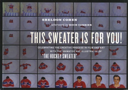
This Sweater Is For You! is a beautiful memoir of a book with the film, The Sweater, at the heart of the book, followed by other wonderful pieces about follow-up films, the illustration of the book, The Hockey Sweater, and Sheldon’s art in general. It’s
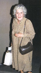 This memoir contains many personable and great stories. There’s a delightful recounting of Sheldon’s direction of Maureen Stapleton for the voice track of his film, Snow Cat. The star who doesn’t act like a star performs at the top of her game for Sheldon’s film. Having worked with Ms. Stapleton on Voyage to Next with the Hubleys, I understood everything that Sheldon had written. And then I met her over a dozen times on a cross-town bus, she with her shopping bags, me with my awe.
This book is a delightful and eccentric piece, and you’d be well advised to keep it close to hand on your animation book shelf. Wonderful to see such material in print.
You can see a number of Sheldon’s films on the NFB site. I’ve linked to some of those films below.
The Sweater is an adaptation of a Roch Carrier story of childhood remembrance.
I Want a Dog is based on the book by Dayal Kaur Khalsa.
Snow Cat starts out with the feel of the book Goodnight Moon
but soon turns to a very graphic and textured look.
It’s a 23 minute film with wonderful narration by Maureen Stapleton.
Pies, a film about blind prejudice, is based
on a short story by Canadian author Wilma Riley.
Independent Animation 11 Mar 2012 05:50 am
Kickstarting the Can
- I have to say I like the name Kickstarter. There were a number of programs, and I chose to go with that one trying to get some life in POE. The others allowed you to fail in reaching the total goal and enable you to collect what had been pledged. Something about Kickstarter made it all more reliable and above board to me.
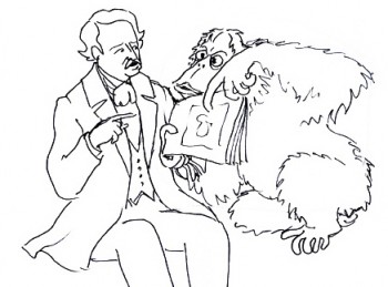 POE was a film that I pushed to start almost five years ago. Now it’s in the loghy period and really needs that “Kickstart”.
So let me tell you what’s happened so far with only a couple of days since it all started.
First and foremost there was an overwhelming show of support from so many people. Even if I don’t reach the goal, I’m so pleased to have seen the results that have already come. In just four days, we’ve reached a quarter of the total moneys requested. I’m a bit of realist, so I have no grand expectations of getting there. Yet I’m ready for whatever comes.
I’ve also been trying to contact any possible backer who expressed interest to see if they’d be interested in putting in some high numbers for this campaign. I haven’t had a “no” yet, but the money’s still not there. There’s still a week or so to go on it.
Originally, POE, once the script and boards were done, went looking for money.
There was one principal guy we were trying for, and he came back with an offer. Unfortunately, the offer was relatively low (which wasn’t the problem for me), but they ended up wanting to own everything. Not a good idea. If I was going to bust my butt doing the work and assembling something I was proud of, I wanted to share in any tiny profits such a film could generate.
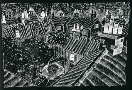
A Rue Morgue Courtyard
Well, we went for bank financing so that we would control the final product to the best of our ability. And the money was coming – it was coming.
But then do you remember “Too big to fail”?
AIG.
They were the ones giving us the money and they failed.
The money disappeared; the company that was supporting POE put the project in “Turnaround,” and it’s taken us years to get it back to where we are.
I suggested to my producer, last week that we go back to the original guy who was interested in the project and had offered too little. Many his position is changed. That very same guy is now willing to talk about co-production deals. They wouldn’t own it all , and we’d have a chance to raise more money for a theatrical run prior to the US TV airing. Maybe.
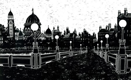
A bit of Paris n 1840
This Kickstarter push on my part has regenerated some interest, and I’m counting on using all the marbles to get it going. If I have to see it a bit more limited than I planned, I don’t care. I want a movie, and I know how to do stylized, limited animation. POE is going to get done come hell or high water.
Besides, I have too great a project to do for the second feature. Once POE‘s underway, the second script will be started. The rights shouldn’t be too expensive, and I’m going to give animation a grown up push while I can.
You can see more POE material from the pre-production at our website for POE, Poestory.net. That’s been up for quite a while and could use a good overhaul. It’ll get one soon.
