Category ArchiveIndependent Animation
commercial animation &Errol Le Cain &Illustration &Independent Animation &repeated posts &Richard Williams &Rowland B. Wilson &Tissa David 10 Apr 2013 05:55 am
Dick’s Christmas
Richard Williams, when he had his own studio, was known for doing everything in a LARGE way. All of the commercials, title sequences, shorts were all done with a large, elaborate vision.
The Charge of the Light Brigade was a collection of 19th century graphics that are completely wrong, stylistically, for animating. All those cross-hatched lines. God bless the artists that pulled that off. The same was true for The Christmas Carol.
If the rendering style wasn’t impossibly difficult, then the animation was complex. Think of any of the scenes from Dick’s dream-feature, The Thief and the Cobbler. The many scenes where backgrounds were animated, with those backgrounds complete with complicated floor patterns or an entire city to be animated. Raggedy Ann was covered in polka dots and Andy was clothed in plaids. Both of the characters had twine for hair with every strand delineated. The commercial for Jovan featured a picture-perfect imitation of a Frank Frazetta illustration. Even the mountain on the background had to be animated and rendered.
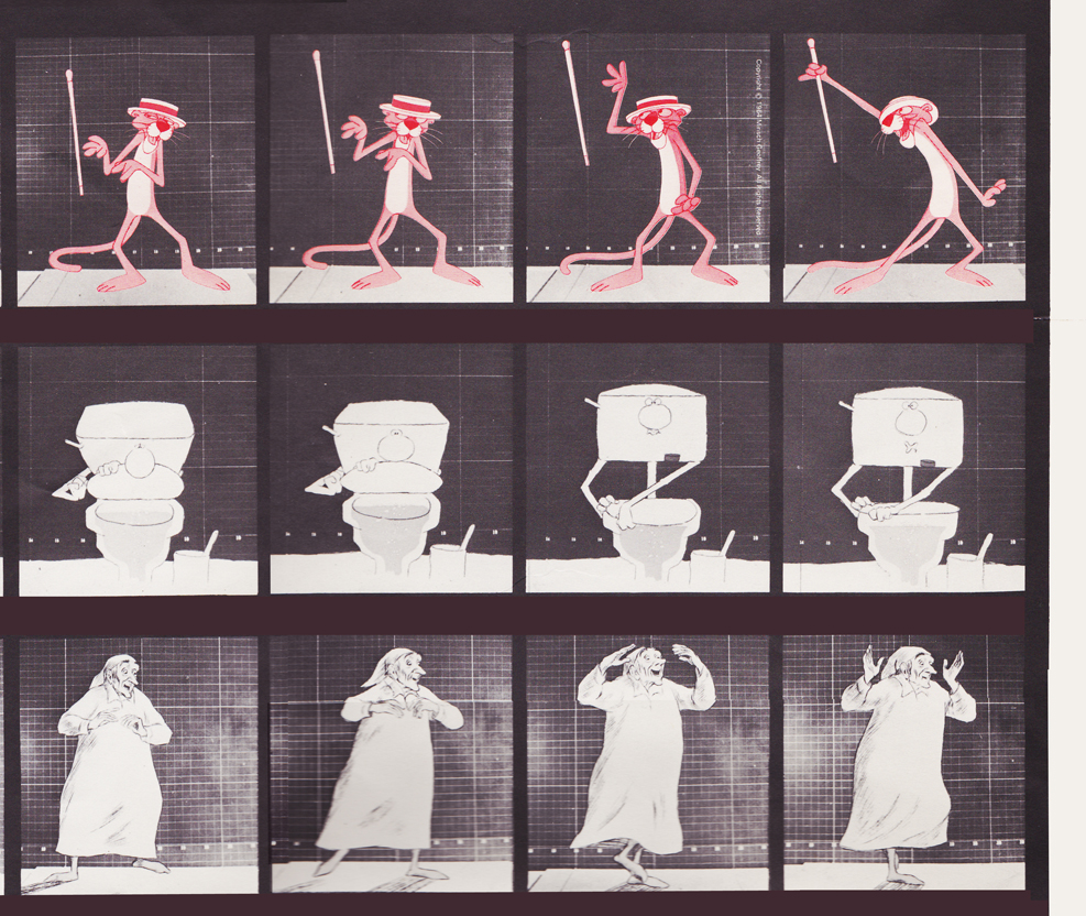
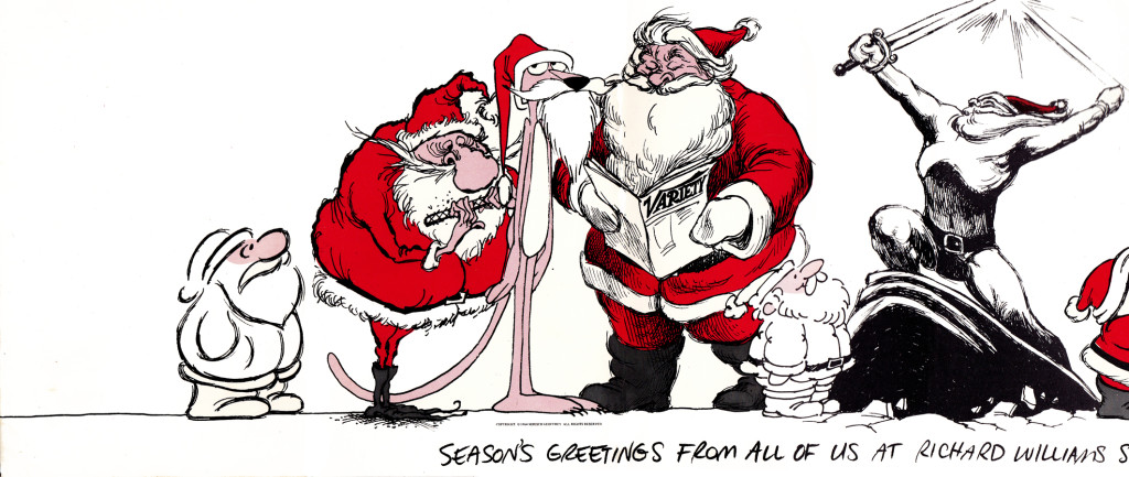
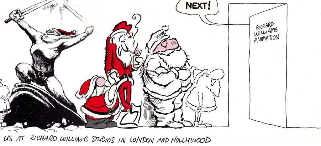
Well, when it came to Christmas cards, Richard Williams was the same. Enormous and beautiful cards were printed and signed by anyone who knew the recipient of the card. You were lucky being on the receiving line for these stunning cards. Tissa David once gave me a number of these cards. I held onto my copies of the cards until my space was flooded and the cards were damaged. I thought I’d post a few.
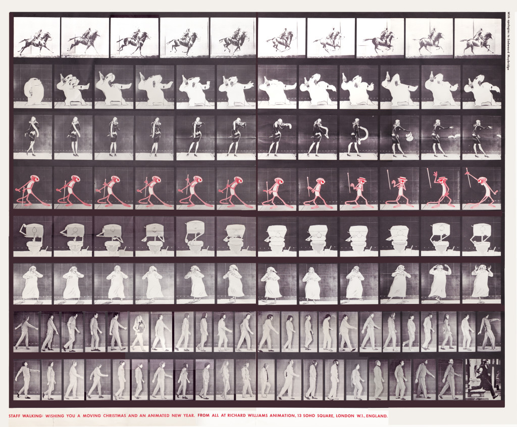
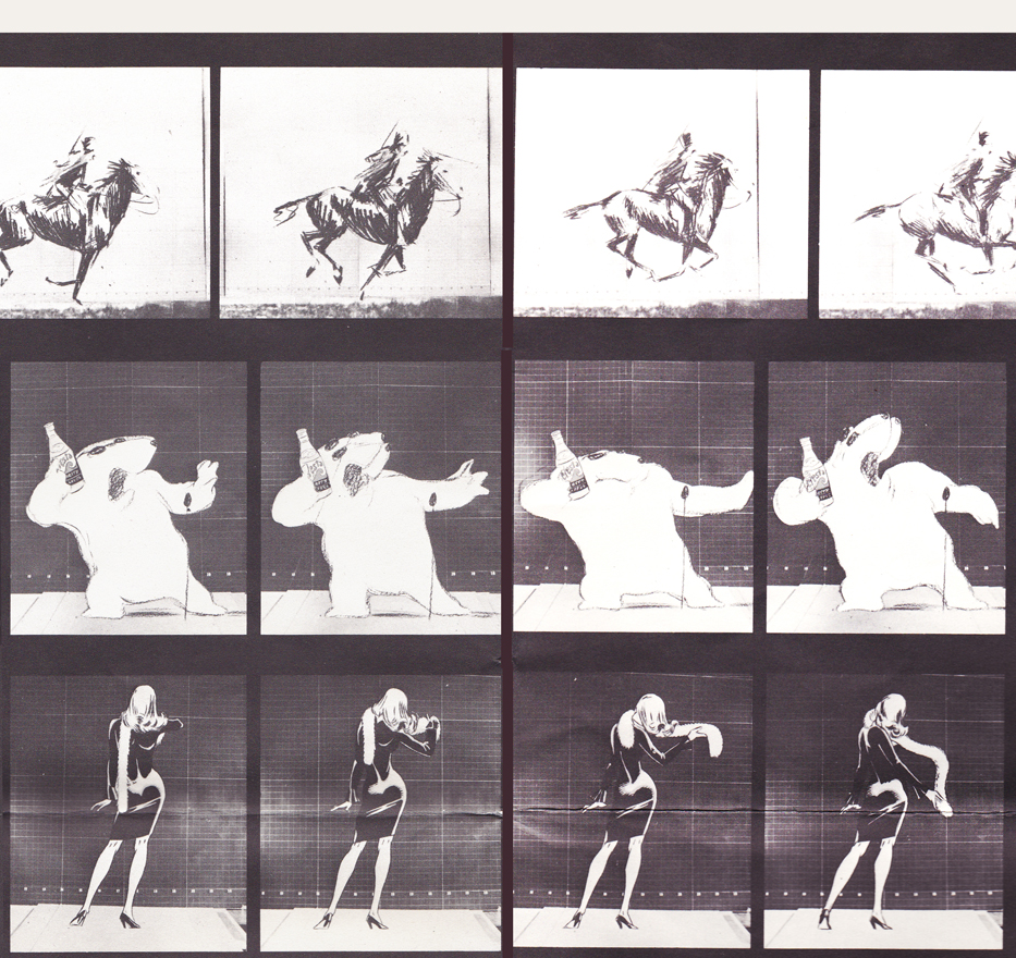
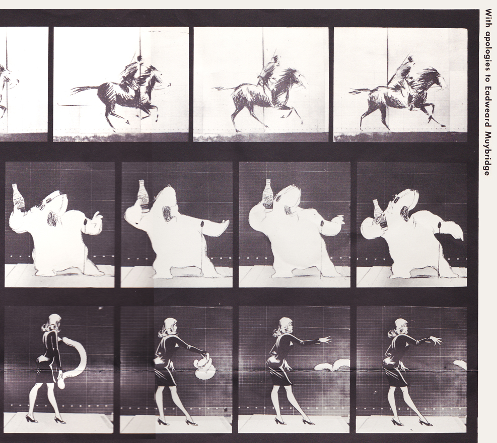
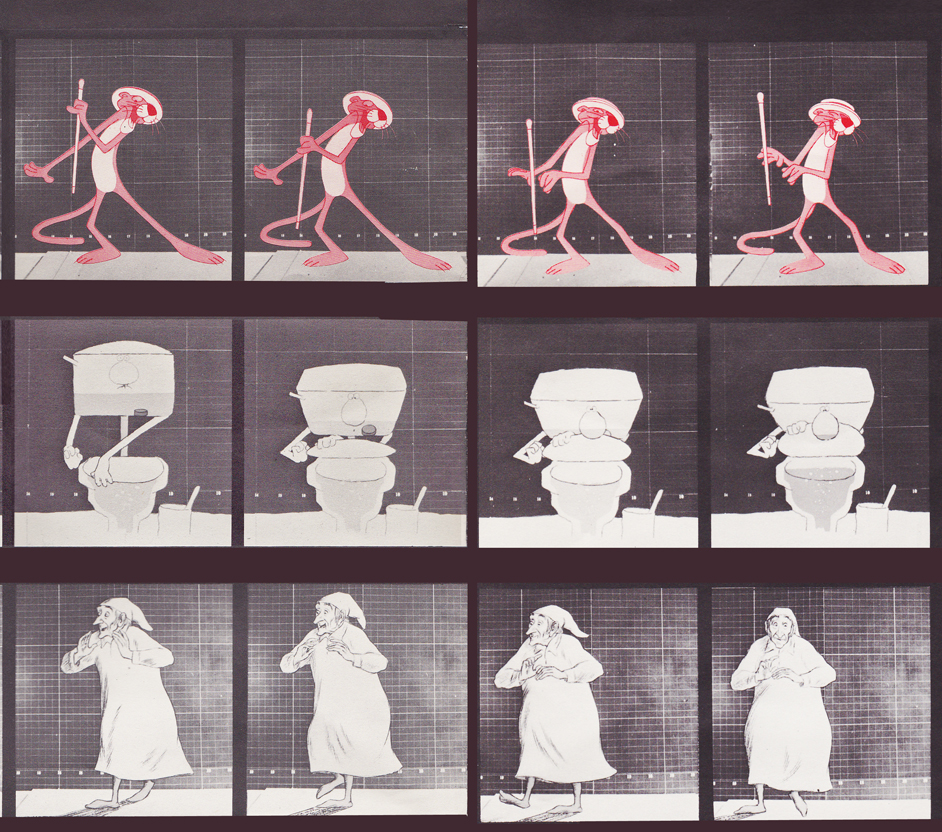
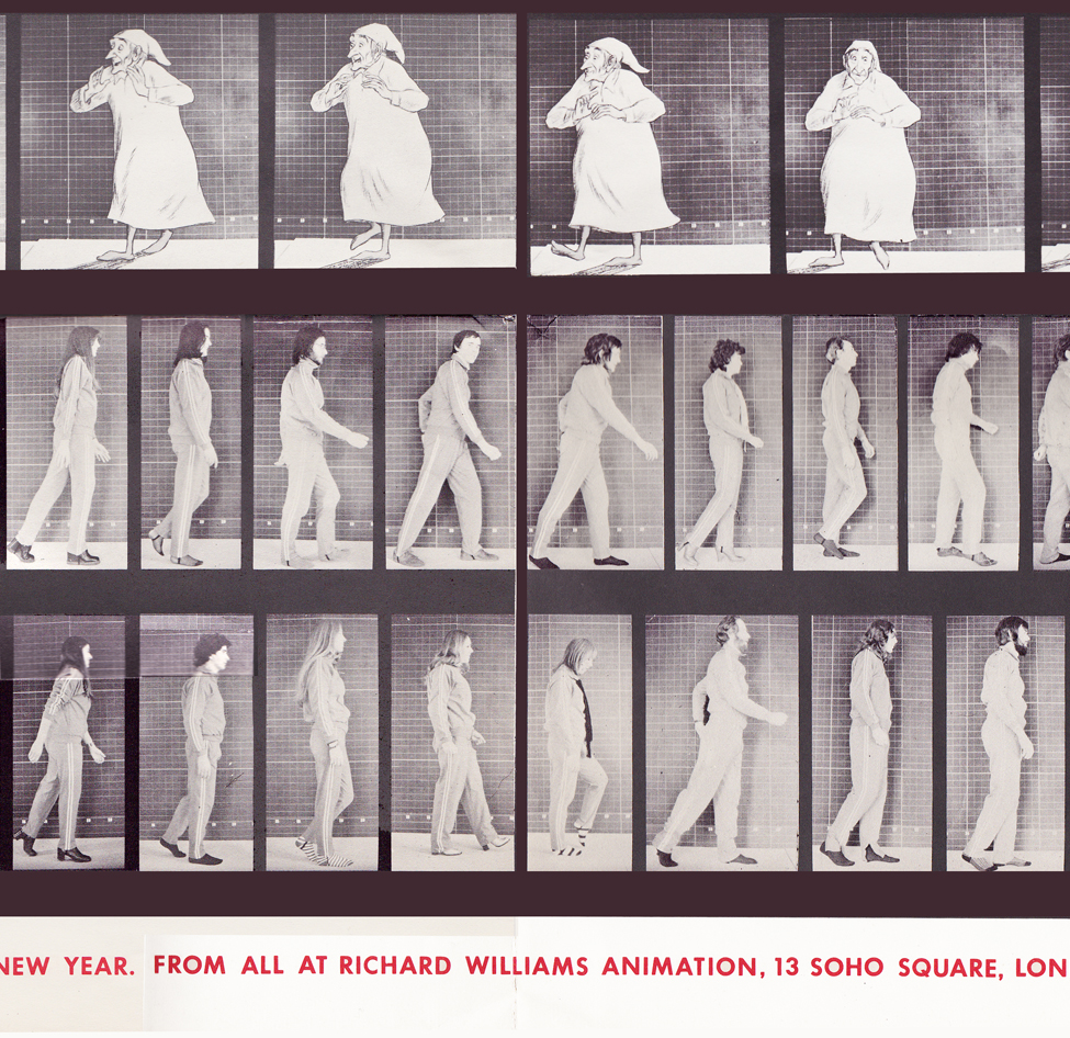
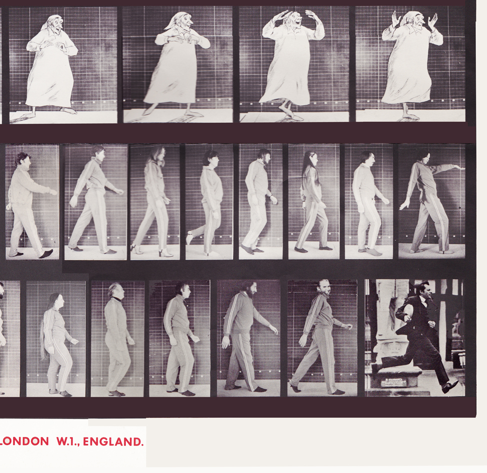
With card #1, a take-off of Muybridge with frame grabs from several of the better Williams commercial spots from that year, capped off by a number of key staff personnel positioned to continue the Muybridge motif.
(Here, I first post the entire card, followed by a break up of the card into sections
so you can more ably see the details.)
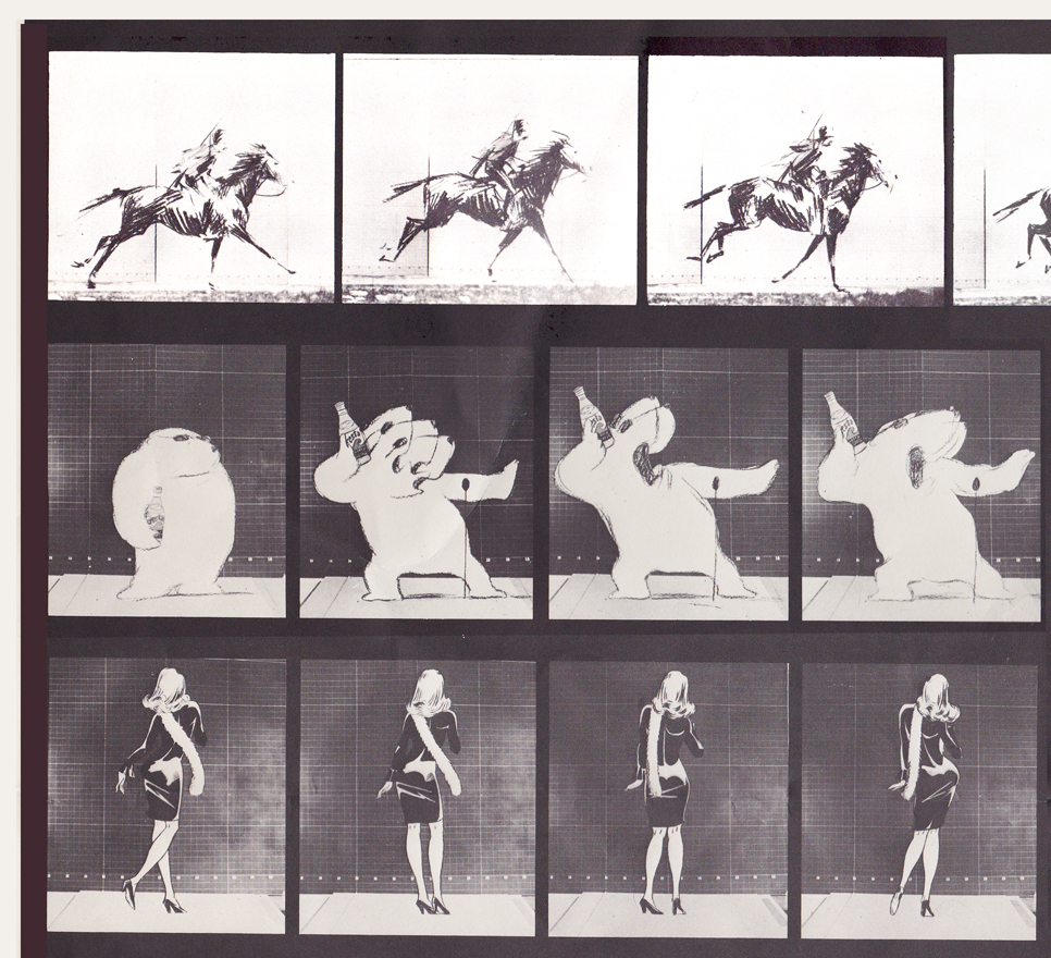
Top rows left side / Row 1: Pushkin Vodka ad
Row 2: Cresta Bear ad / Row 3. Tic Tac ad
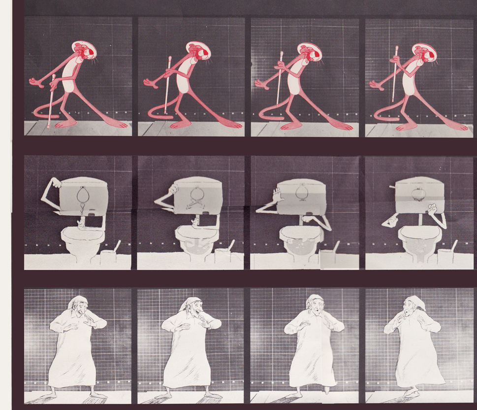
Middle rows left side / top row: Pink Panther titles
Middle row: Bloo toilet cleanser ad / Bot row: The Christmas Carol
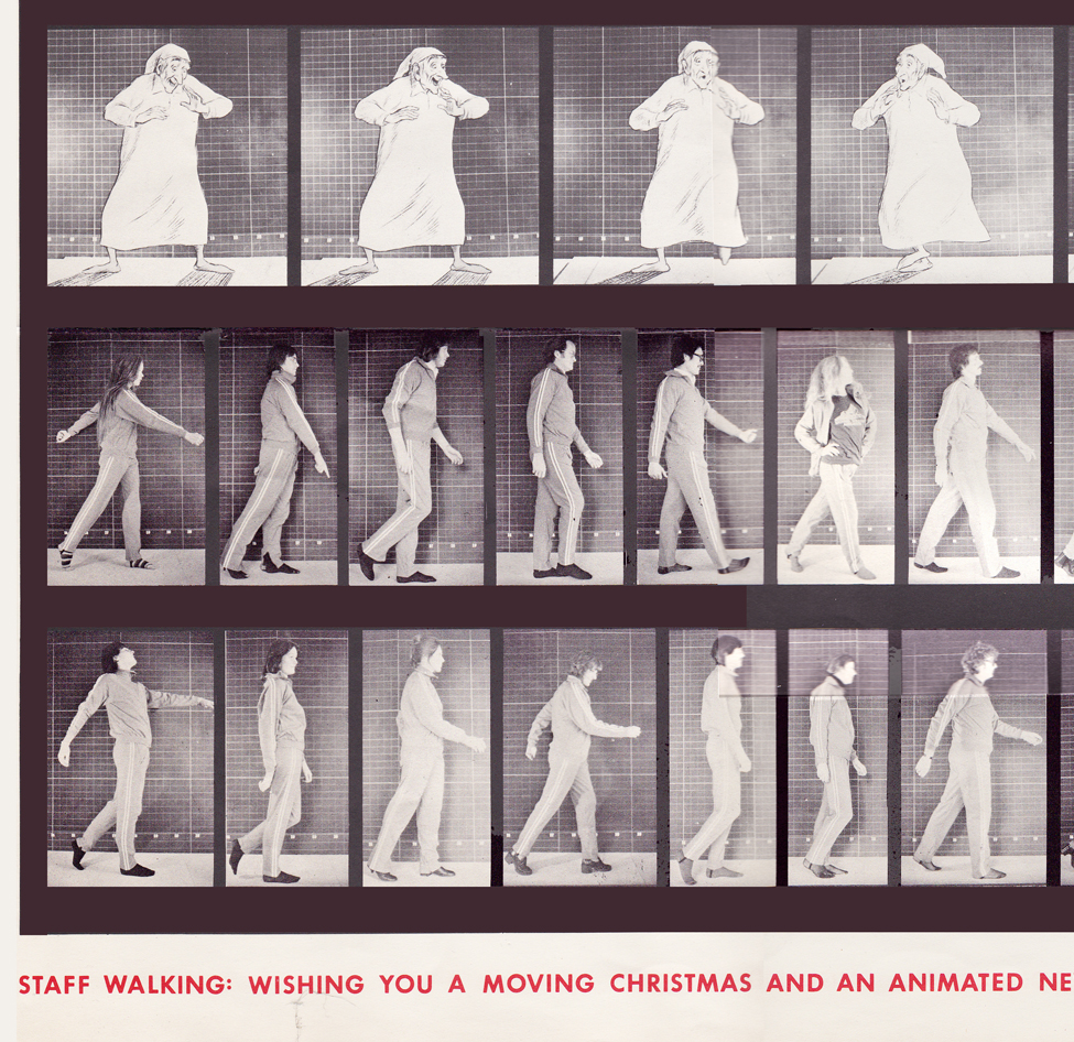
Bottom rows left side / top row: The Christmas Carol (repeated)
Middle row: staff / bottom row: more staff
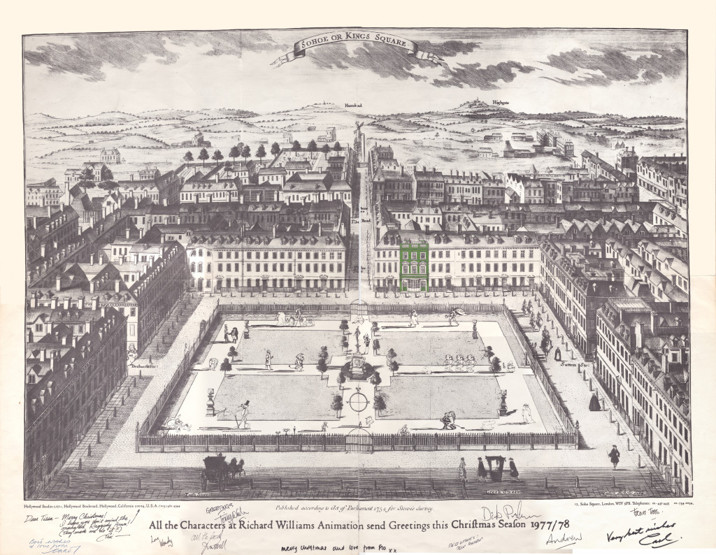
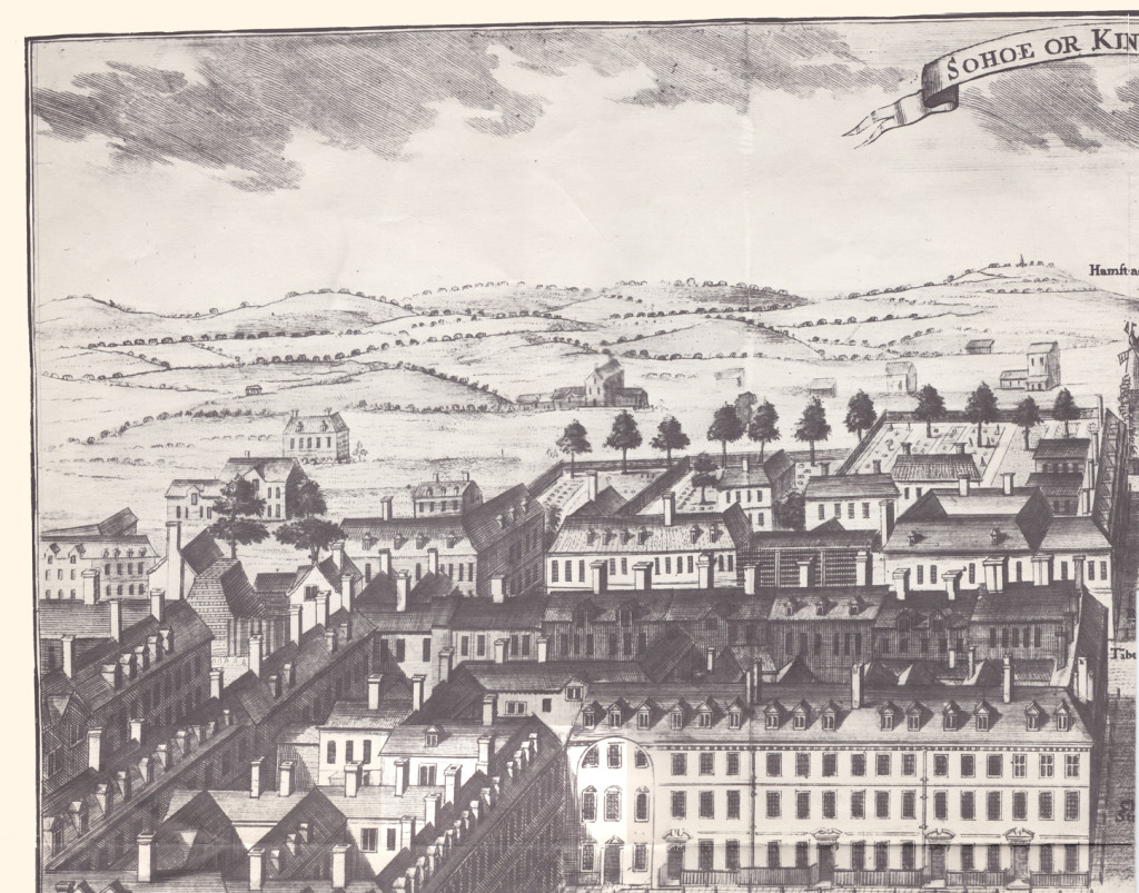
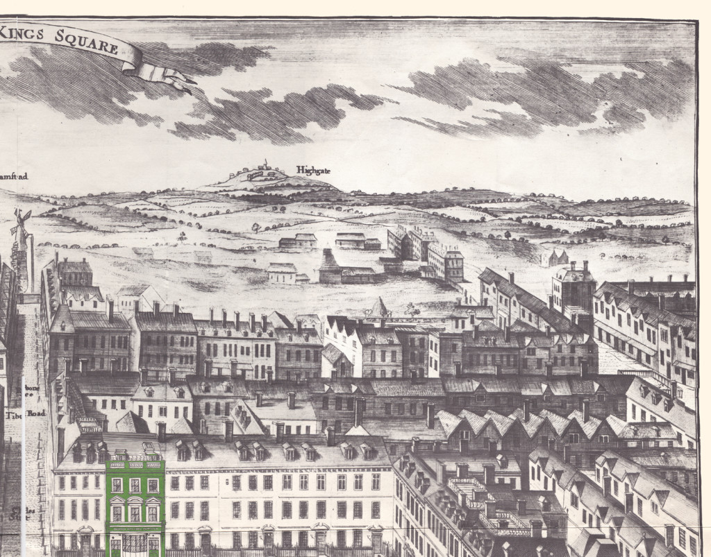
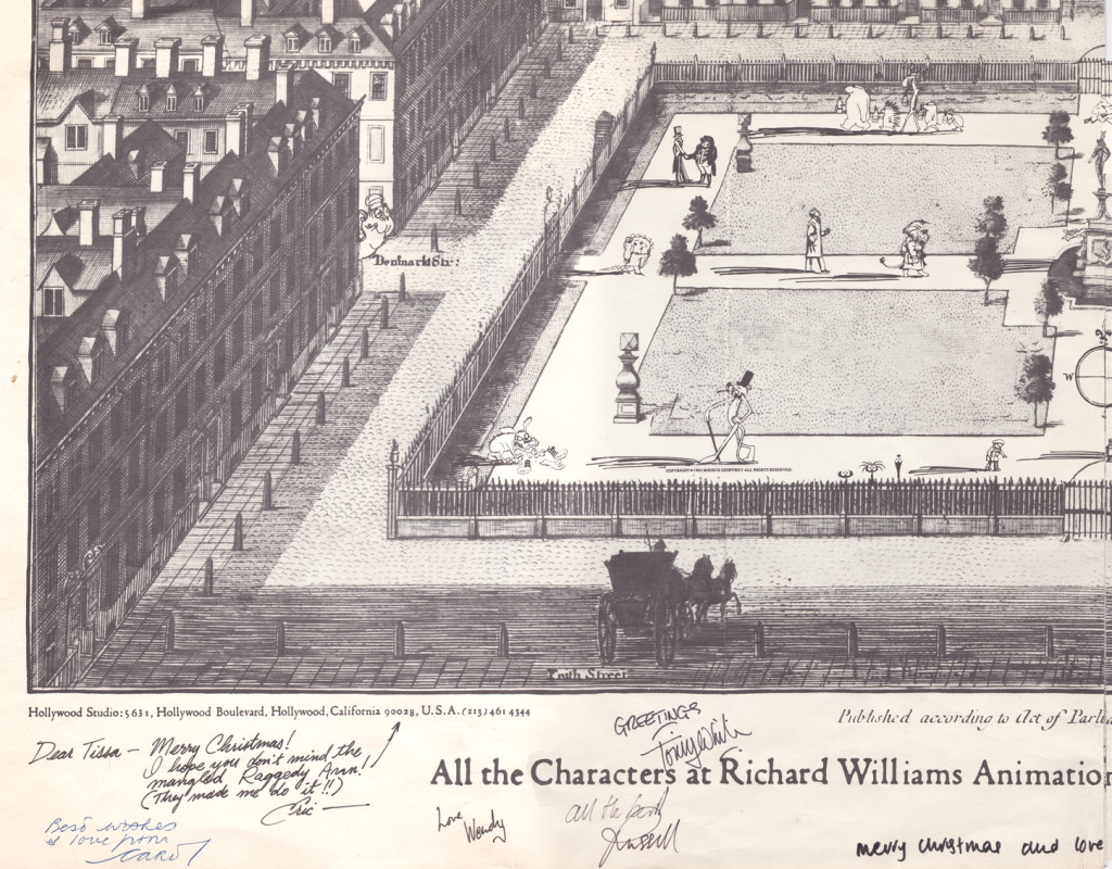
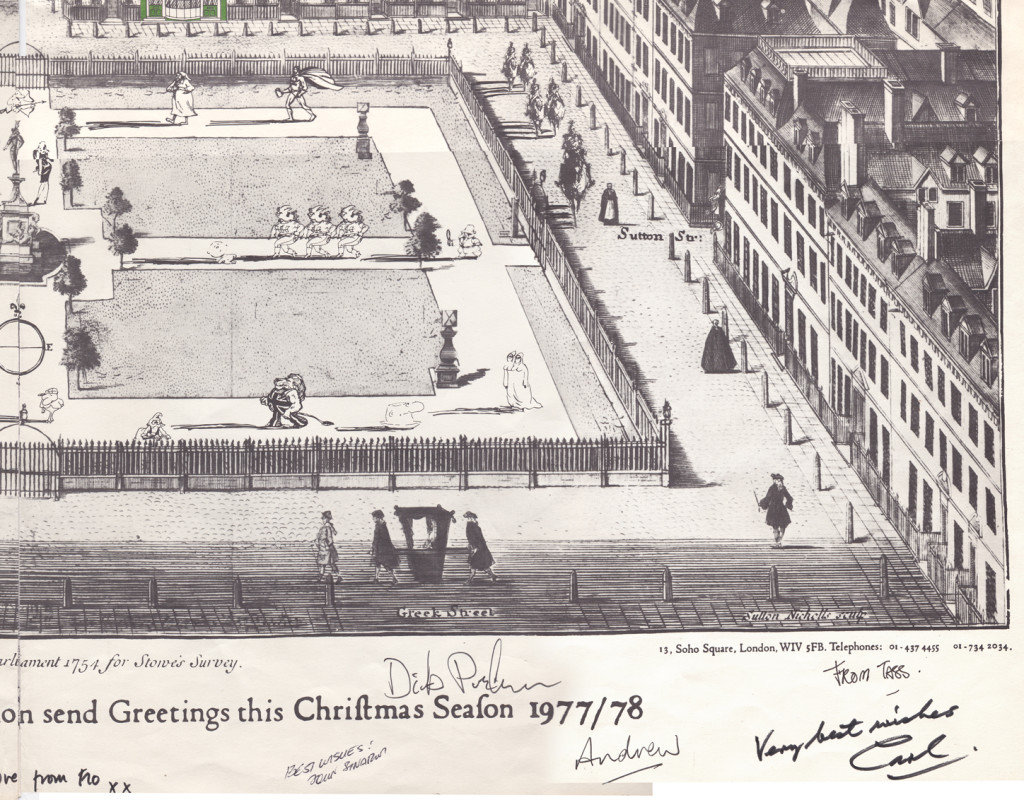
With card #2 we see Soho Square. The green front door
marks the location of Dick’s studio at 13 Soho Square.
(As with the first card, I posted the entire Christmas card,
followed by a sectional divide so you can enjoy the details.)
This is a folding card.
It comes folded so that you see the far left of the card
revealing part of the far right.
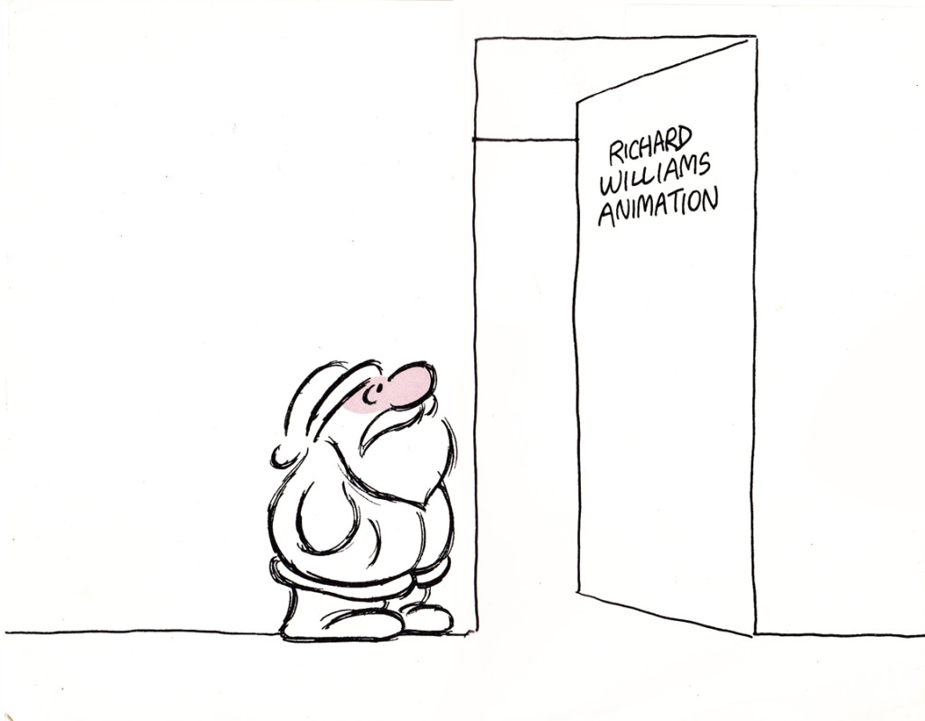
The card comes folded like this.
The left side (Santa up to doorway) is on the left side of the card.
The right side, on bottom, reveals the empty office.

It unfolds to reveal this long line of Santas.
Each Santa is in the style of the many illustrators’ styles
of those who designed ads for the studio in the prior year.
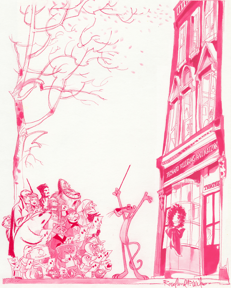
Suzanne Wilson sent in a Pink Panther Chistmas card; it was drawn by her late husband Rowland Wilson:
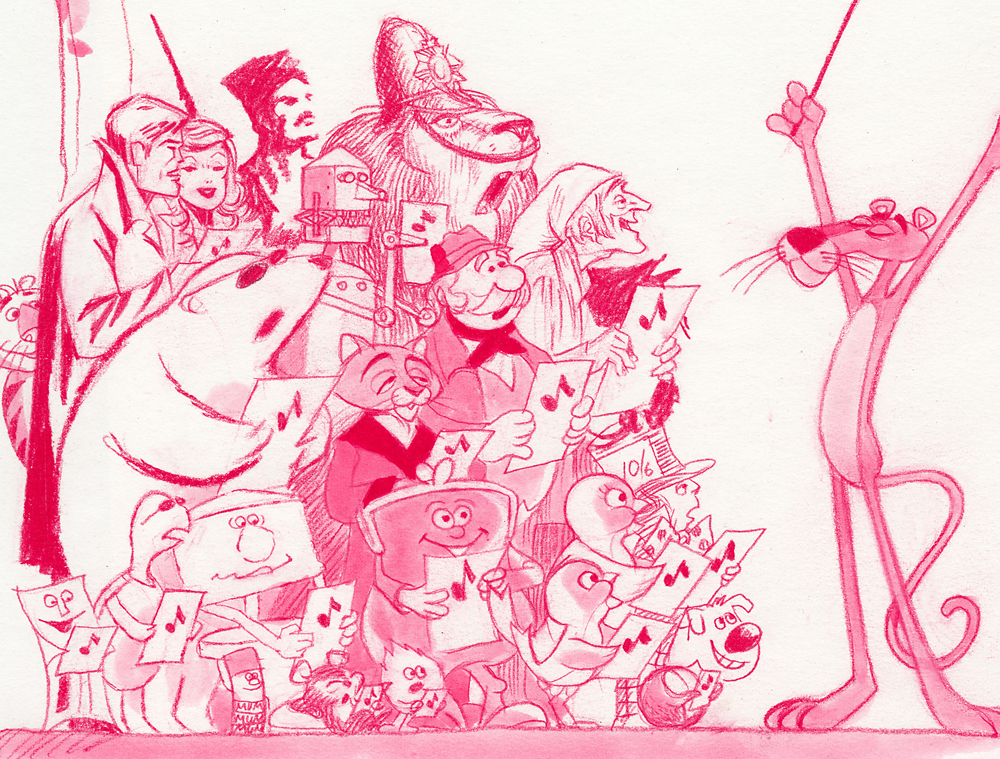
Below is a close up of that same card.
Here’s another full card.
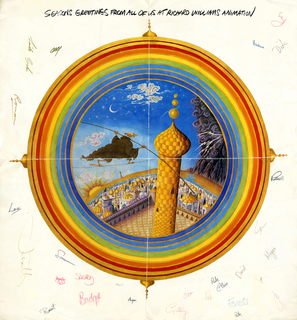
This one is designed after the McGuffin of Dick’s feature,
three golden balls over the city.
from The Thief and the Cobbler.
Articles on Animation &Hubley &Independent Animation 07 Mar 2013 05:24 am
Animation Learns a New Language
This is an article that was published in the July, 1946 issue of The Hollywood Quarterly. I thought some might be interested
by John Hubley & Zachary Schwartz
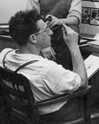
John Hubley is a director of cartoons at United Productions. He has worked as art director and director of Disney Studios, at Columbia, and in the First Motion Picture Unit of the Army Air Forces.
.
.
.
Zachary Schwartz was one of three organizers of United Productions, where he is now a director. He has worked on Disney productions and on wartime training films. He is now preparing a training film for State Department personnel.
.
.
Select any two animals, grind together, and stir into a plot. Add pratfalls, head and body blows, and slide whistle effects to taste. Garnish with Brooklyn accents. Slice into 600-foot lengths and release.
This was the standard recipe for the animated cartoon. That is, it was standard until Hollywood’s fantasy makers were presented the task of teaching people how to fight.
Six months before America entered World War II, the animated motion picture industry of Hollywood was engaged in the production of the following films:
- 1 Feature-length cartoon about a deer
16 Short subjects about a duck
12 Short subjects about rabbits
7 Short subjects of a cat chasing a mouse
5 Short subjects with pigs
3 Short subjects with a demented woodpecker
10 Short subjects with assorted animals
1 Short technical subject on the process of flush riveting.
Since that time, the lone educational short, dubbed by the industry a “nuts and bolts” film, has been augmented by hundreds of thousands of feet of animated educational film. Because of wartime necessity, pigs and bunnies have collided with nuts and bolts.
Sudden change from peace to war presented to government agencies, the military services, and industrial organizations a fundamental problem. This was the necessity of teaching millions of people an understanding of objective information with which they were essentially unfamiliar. The thinking and mechanical skills of millions had either to be changed or developed. And fast. Thinking, that is, and understanding regarding international policies, the nature of the enemy, coöperative safety measures, the fight against disease, price control, taxes, motor skills involving the thousands of tactical details of warfare for fighting men, and the hundreds of new methods for unskilled workers.
Thus it also became necessary for the craftsman-animators of the motion picture industry to analyze and reëvaluate their medium; for visual education, or more specifically the motion picture, bore the burden of this tremendous orientation program. Previously, animation usage in the educational film had been singularly undeveloped. While the theatrical cartoon developed an ability to emphasize and exaggerate for comedy purposes, and perfected the techniques of dramatization, “nuts and bolts” animation remained static. It consisted of rigid charts, diagrams, mechanical operations, maps, and labels. Unlike its Hollywood counterpart, it contained no humor, no personalized or intensified image, no emotional impact, no imaginative association of ideas to enable one to retain its content.
It presented cold facts, and left its audiences in the same state. But because of the urgency of the war situation; because of the varied specialized groups to be taught; because of the attitudes to be formed or converted, new and more effective means were necessary. The collision of these two animation methods occurred because of the need to present objective information in human terms.
Film units in the Armed Forces, and many professional studios producing educational films of infinitely varied subjects, soon discovered that, within the medium of film, animation provided the only means of portraying many complex aspects of a complex society. Through animated drawings artists were able to visualize areas of life and thought which photography was incapable of showing.
Psychological tests and reaction studies conducted by the military indicate an exceptional popularity and response to animated technical and orientation films. The Signal Corps found that the reaction to the animated “Snafu series” was greater than the reaction to any of the live-action films. The Air Forces Psychological Test Film Unit undertook a study of how much was learned through use of an animated training film as compared with how much through oral and written instruction on the same subject matter. The superiority of the film, both for learning and retention, was particularly clear when full use was made of the unique possibilities inherent in the medium.[1]
What are these unique factors? To understand them we must examine the basic difference between animation and photographed action. Now a single drawing, especially the cartoon, has always been capable of expressing a great many ideas. A drawing of a man, for instance, can glorify him or ridicule him. Further, it can emphasize aspects of his physical form and subdue or eliminate others. It can combine ideas, such as a human face on a locomotive, an animal in a tuxedo, a skeleton with a cloak and scythe, etc. It can represent a specific object (a portrait, a landscape, a still life). Or it can represent a symbol of all men, all trees; the drawing of Uncle Sam representing America; the eye representing sight; the skull representing death: the single image can represent the general idea. The part can be interpreted as a symbol for the whole.
Thus a drawing’s range of expression, its area of vision, is wider than that of the photograph, since the camera records but a particular aspect of reality in a single perspective from a fixed position. In short, while the film records what we see, the drawing can record also what we know. The photograph records a specific object; the drawing represents an object, specific or general.
Animated drawings are a series of single images drawn in the progressive stages of a motion, which, when photographed on film and projected, create a visual symbol of that motion. In this lies the significant element that creates the possibility of a new visual language.
Our general idea, our broadest observations of reality, can be visualized in terms of the personal emotional appeal of the specific idea. What does this mean in terms of the communication of ideas? It means that the mental process which the individual scientist has undergone to achieve a greater understanding of nature can now be visualized for millions of people.
For example, a scientist deduces that by grafting two plants a seed is produced that will bring forth a new type of plant. He then proves his deduction by experimentation and comparison. We can see the result. We can see the original plants; we can see the seed. But we only understand the process by means of a language whereby the scientist explains the development to us. He may use words, and is thereby limited to audio images. Or he may photograph the specific parts of his experiment in motion pictures and, by assembling the parts in conjunction with words, produce a segmentary progression of the process. Or, by using stop action or other camera devices, he may photograph the growing plant itself.
But were he to translate the process into animation, he could represent, by means of the dynamic graphic symbol, the entire process, each stage or degree of development; the entire growth, from the grafting, through the semination of the seed, to the resultant plant. This quality of compression, of continuous change in terms of visual images, supplies the scientist with a simple language and a means of representing his own process of observation to millions.
Since the artist controls the image of a drawing, he also has the ability to change its shape or form. He is able to change a tree to a stone, an egg to a chicken, in one continuous movement. And he can compress a process that would by nature take centuries, or days, into minutes, or seconds. Or he may extend a rapid movement, such as the release of atomic energy, from split seconds to minutes, that it may be more carefully observed. These aspects of natural movement, and simultaneous confiicts of opposite movements, such as physical action and reaction, positive and negative electricity, processes we know, we can now see.
We must be clear that the effectiveness of live-action photography is by no means reduced by animation. It is only necessary to understand photography’s functions and capabilities in relation to animation. This may be stated as an ability to represent a specific aspect of reality in very real terms. We can photograph reality. Or we can create a synthesis of reality, and record it.
For instance, we may see the subtle shades of expression on the face of a resistance leader before a fascist firing squad. This may be actual (documentary) or enacted. We see his bodily aspect, his clothes, his hands, the barren wall behind him, the distance between the man and the guns, the sky, the trembling, the blood. Dramatically, we are made to feel the relationship between the victim and the firing squad, the emotional conflict, the tension, the fear, the hatred. We can understand these emotions because we have experienced similar emotions. The specific situation is the focal point that gives us the clue to the general situation. We see this victim of fascism shot, and we gain a better understanding of the general nature of fascism.
With animation, this process is reversed. Instead of an implied understanding resulting from the vicarious experience of a specific situation, animation represents the general idea directly. The audience experiences an understanding of the whole situation.
Dynamic symbols, images representing whole ideas, the flags, the skulls, the cartoon characters, can explain the nature of fascism in terms of its economic roots, the forces behind it, the necessity for its policies of aggression, its historical roots, its political structure. The dynamics of changing symbols—ballots turning into guns, books to poison, plowshares to swords, children changing to soldiers, soldiers to graves—can carry a visual potency as clear as the growth of a seed into a plant. Our understanding of the process as a whole is experienced directly and immediately.
The significance of the animated film as a means of communication is best realized in terms of its flexibility and scope of expression. It places no limitations upon ideas; the graphic representation grows out of the idea. The broadest abstract theory may be treated in a factual manner and made interesting, clear, and memorable through the use of movement and sound. All degrees of the general and particular are within its normal scope because anything that the brain can conceive can be expressed through the symbol. For instance, the subject might demand an extremely impressive statement of reality. It might then be advisable to use a combination of photography and animation, the photography to state the facts of outward appearance and the animation to illustrate the inner construction, or comments upon the subject, or to suggest emotional reactions of the subject. This kind of treatment creates a super-reality in which we are conscious of many aspects simultaneously.
In animation, the artist and writer have at their command all the traditional means of graphic expression and the new means which grew out of moving symbols and sound. One of these is the concept of explanation through change from an object as it is to the thing it signifies. For instance, in explaining the function of the liver the picture changes from a liver to a recognizable sugar bowl filled with cubes of sugar. The cubes hop out into the blood stream and bob away into the circulatory system. Or, we might wish to give graphic expression to an emotional reaction. One person is being protected by another, and for a moment the protector animates up into a proud knight and charger. We hear the clank of metal and stamp of horse’s hoofs for just an instant, and then the whole image animates down again into its original form. Another example of this is the picturization of certain words in dialogue to stress a particular idea. A person is being taught a difficult mechanical technique involving rapid manipulation of buttons and levers, etc. He protests, “What do you think I am—an octopus?” At the moment the word is spoken the character changes to an octopus and then back again so quickly that the observer has just gotten a fleeting impression of the picture of the word. These examples indicate the kind of picture solution that can be evolved from an idea no matter how abstract.
We have found that the medium of animation has become a new language. It is no longer the vaudeville world of pigs and bunnies. Nor is it the mechanical diagram, the photographed charts of the old “training film.” It has encompassed the whole field of visual images, including the photograph. We have found that line, shape, color, and symbols in movement can represent the essence of an idea, can express it humorously, with force, with clarity. The method is only dependent upon the idea to be expressed. And a suitable form can be found for any idea.
Commentary &Independent Animation 04 Jan 2013 08:35 am
Combustible Shorts
 - Having seen most of the films in the Oscar race, I have a lot of thoughts about many of them, most particularly some of the animated films. Not the features, I don’t really have much to say about cgi films except that I wasn’t crazy about any of those I saw. There was a lot I really enjoyed about Brave, but that wore away over time, and I now find it hard to watch again on DVD. I will before the final vote.
A couple of the animated shorts have really dug into my mind, and I’ll try to comment on them before the nominations come out. The film that was entered that haunted me most was a puppet film called Oh, Willy!, but that didn’t end up on the short list, so I’ll wait to see it again at some Festival screening.
Of those on the short list, only one seems to be by a genuine Master of the medium. Otomo Katsuhiro deserves more than a little respect in that he’s made several giants in the Japanese Anime medium. AKIRA (1988) was considered a classic when I was told about it in the early 90s. I made many attempts to get through it, but had problems following the film’s story and gave up at least five times. There was no doubt that enormous work and craftsmanship went into the making of the film, with its unusual angles and forceful drive. Every scene seemed to be overwhelmed with activity, and so much came at me that I pulled away.
Otomo was a writer on the film, MEMORIES (1995), which I was quite taken with. It didn’t have the heart of Myazaki, undoubtely my favorite Japanese director today, but there was quite a bit to enjoy there. I’d like to see it again and look closer at Otomo’s sections. In 2004 he wrote and directed the enormously respected STEAMBOY. This film, like others he has directed, is stunningly produced with enormously gifted graphics, but I tend to find myself unable to emotionally connect with its characters and story. There was much less of a problem than I’d had with AKIRA, but it didn’t wholly connect to my taste.
This year we have the extravagantly attractive and completely alarming 12 minute short, COMBUSTIBLE. I don’t for the life of me see how this film could be left off the nominee list, so I want to write about it before those nominations come out. I haven’t met an animator, yet, who hasn’t praised the craft of this film to the hilt. Yet. again, it seems to be an emotional thing that affects many I’ve spoken with. This film does speak to me with its pent up feelings and hidden emotions ready to combust at any moment.
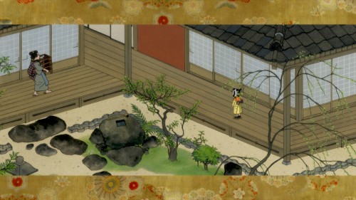
The courtyard leads from the unravelled scroll into
the claustrophobic home with pent up emotions.
The movie starts out with a slowly moving scroll that unravels for us and we begin to pan down the very long image until bits of it start animating. Then the first big sequence grows out of the scroll. We see two children, neighbors, as they play with and around each other. It’s all played out in long shot on that scroll – an extension of that first image, above, and it isn’t always certain what their game is. We do realize that both the boy and girl are close with each other and grow up that way.
We learn that the two are separated by their parents, especially the girl’s father. The boy is all but disowned by his family as he has developed a passion for a career as a fireman. We see this when a nearby fire breaks out, and the perishable buildings immediately ignite.
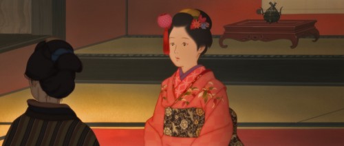
The girl is made to behave as her middle class society demands of her.
The girl’s father has no kindness for the boy, and often throws nasty comments and remarks his way, at one point degrading him for getting a large tattoo. The boy has marked himself with a fireman’s imagery, and he runs away to become one. The girl’s father plans to marry off his daughter to a suitor, though there is no doubt she is in love with her childhood friend, who has left her.
To me the key scene in the film shows the girl, alone in a room, bored, throwing paper fans to fly in circles about a room. One accidentally falls on a lantern, and slowly ignites. The girl, at first, races to get help, but ultimately stares with a thrill as the lantern burns and other objects in the room catch fire.
This fire, I’ve learned is ased on historic incidents. The Great Fire of Meireiki which was also known as the Long-Sleeved Kimono Fire and the Great Fire of Greengrocer Oshici were similar fires of the time. The secret love affair ends in flames, but the film glows with strength of this love and other hidden emotions. Something I have no doubt which is close to the author, Otomo.

The girl, from her POV, throws fans circling about the room.
Her ennui takes form in these fans, searching for that flame.
As I said the film’s life burns with a fury during the sequence in which the heroine accidentally lights the great fire, and her emotional games wreak havoc in many homes, hers included. Although her love tries to save her, she ultimately dies among the flames. The tedium on her face as she throws the paper fans shows all the hidden and pent up emotions within her. The fire she starts brings out an excitement as she realizes her one love will return to try to save her. He does and comes close to achieving the happy ending for her.
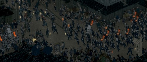
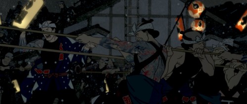
Crowds of firefighters descend upon the city as the flames
immediately burst into a violent and dangerous fire.

They work out of the darkness of the night with
the light of the fire burning against them.
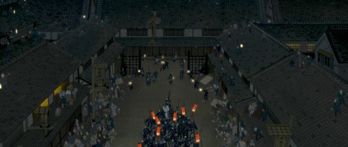
I’m not sure of the exact order of these scene, these images were
sent to me and Ive assembled them in the numerical order they came.
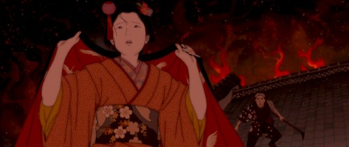
Finally, the girl hears her love come to save her.
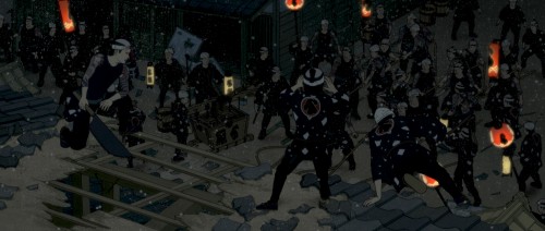
He has been placed in charge of separating and destroying the
building that is the fire’s center. The girl’s house and his own family’s.
He goes at his task methodically and swiftly.
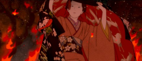
Unfortunately, the girl does not know his plan and she moves directly into the fire.
This is a complex story told in a very complicated way, and the techniques of animation must employ every beat to pull it off. Otomo has the craft in hand and works hard to relay the story. He adds many aspects of his own culture to wash into the sory driving home the realism of the story.
His normal difficulties in having characters who properly emote, at least for Western audiences, seems to be employed to add to the emotional thrust of the story. It’s a very well executed short film and firmly acts like a great short story bringing so much to a short slice of a tale. The tale of a culture and the people who not only make up that culture but act out in history.
It’s one of several excellent films on that short list this year, and I look forward toward seeing the nominees that will be chosen.
Animation &Animation Artifacts &Independent Animation &walk cycle 03 Jan 2013 07:58 am
Picasso
- When you run a studio in New York, and you’re an animator, there’s a good likelihood that at the quiet moments when work is slow, you’ll be working on your own bit of animation. Whether it’s a short film or a test of something you’ve always imagined animating, it’s hard not to keep pencil to paper (or stylus from the Cintiq.) Vinnie Cafarelli was just such a creature. After seeing a show of Picasso’s works he took the flier and started animating the image Picasso had done. It never got to completion; those were the days of the expensive cameraman and laborious cel process. But I can take Vinnie’s work and finish it in AfterEffects and Photoshop. Here’s my exosure of his basic animation. No X-Sheets were left behind. Here’s the art; here’s the QT movie.
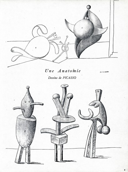
This is the original flyer that got Vinnie going.
He built all his animation up from this printed piece.
The “character” drawings follow:
The following QT movie was made of the
drawings above. Since there were no X-Sheets
For better or worse, I came up with the timing, myself.
Animation &Animation Artifacts &commercial animation &Independent Animation 26 Dec 2012 07:57 am
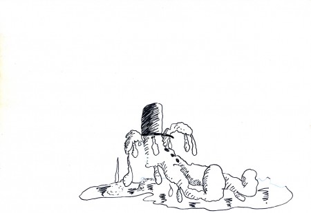
Len Glasser’s – “Snowman”
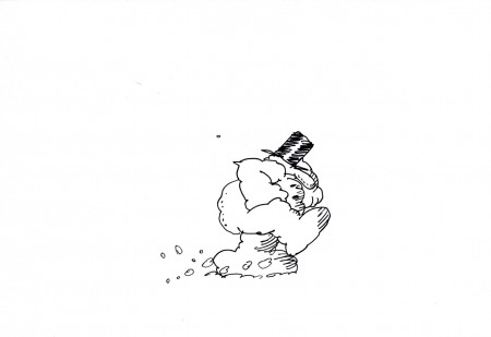
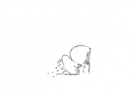
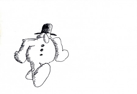
- Len Glasser had designed a number of pieces for Perpetual Motion Pictures. I wrote last week about two pieces that were designed and work was done on a job for CBS and their weather division. Ed Smith animated the originals which were killed and never aired. At some point a couple of years back, Vince Cafarelli built a miini-film out of what they had done. He animated anything they needed to complete this one flm. It’s built on a snowman that comes to life; the film was taken to its conclusion, but nothing was done with it beyond that. (I’ve suggested that they make an animated Christmas card out of it and send it out to everyone. It’s certainly entertaining enough.)
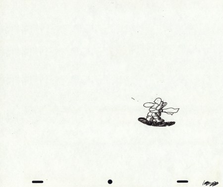
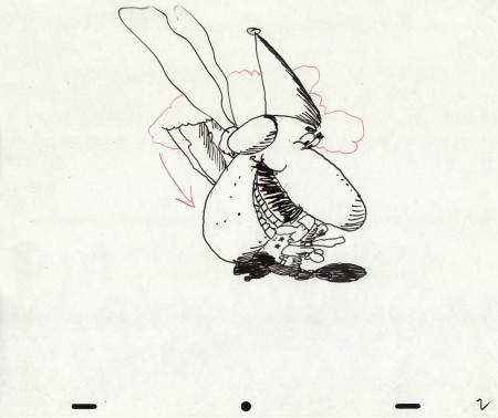
I’ll post every other one of the animated drawings here so you can see the animation and accompany them with the final QT movie of the piece. It should make a nice little post.
Here are the drawings predominantly animated by Ed Smith directly in pen onto paper. The drawings were xeroxed and/or inked onto cel, colored and shot traditionally. Here are the paper drawings with one or two odd comments added. Rick Broas helped Vince complete it.
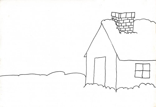
The Background to scene 1
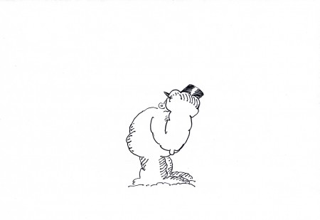 19
19
This is part of a cycle of the snowman banging
on the door of the house. (see the QT movie)
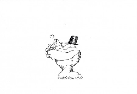 29
29
This is the best look we get (on this animation level)
of the character the Snowman terrorizes.
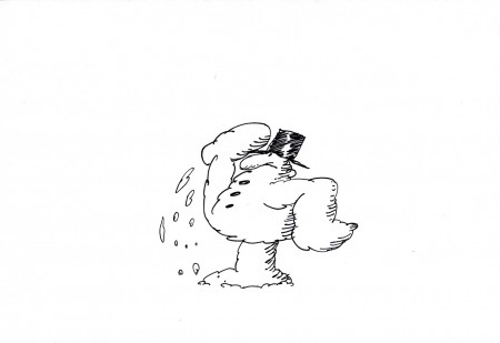 37
37
Wth this drawing the kicked guy moves
to another level as he fles into the distance.
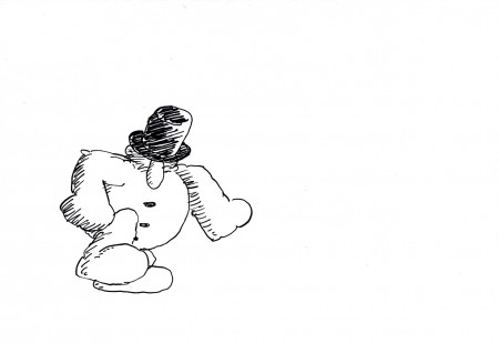 44
44
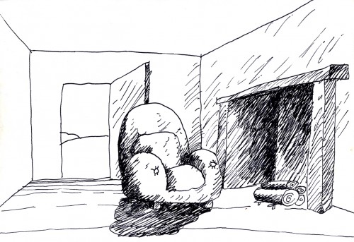
This even-numbered drawing is where the second scene,
the interior, begins. So I included it to the group.
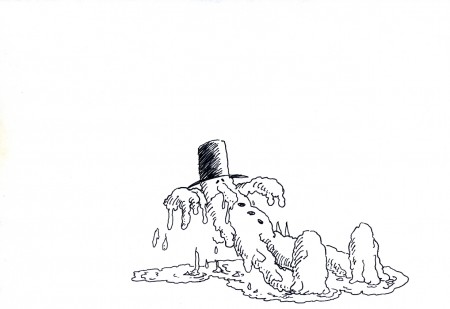 69
69
I like how the snowman, having fallen in front of
the fireplace begins to melt on the floor.
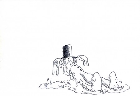 71
71
He falls back, naturally, and then comes up toward us as he
starts to melt. This little accent by Vince, in animating him . . .
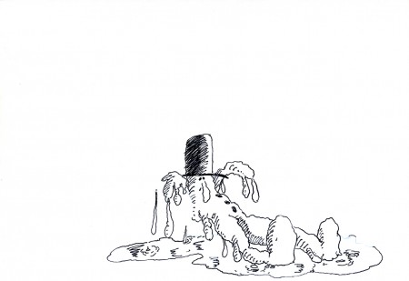 73
73
. . . seems to signal that, for the first time, the snowman
has found a release and can now be happy.
The End
_________________________
The final mini-movie
(I looped it. It could have used a hold at the end before starting over.)
Articles on Animation &Books &Chuck Jones &Independent Animation 15 Dec 2012 07:18 am
Moviesmoviesmovies
- Turn around, and it’s the weekend again. I guess that’s a good thing. But Christmas seems to be coming so quickly these days. It was only yesterday that I was complaining that they were pushing Christmas on us so soon after Thanksgiving. Christmas carols when we had hardly finished eating the turkey! Maybe they were right.
As we get closer to Christmas there are fewer and fewer Academy events. Things were mellowing out already this past week. I was so happy to not have had a dinner or a lunch or a screening to attend last Sunday. I stayed home and was quiet while the weather, outside, was pretty lousy. One of those days where the rain is light enough that you feel stupid opening an umbrella, but the wind and the temperature made it so bitter out that it was great to be indoors – anywhere.
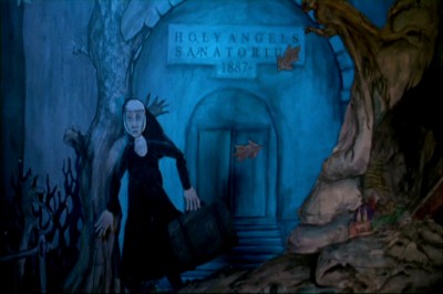 On Monday, I’d picked up a DVD for the animated feature, Consuming Spirits, at the Film Forum theater. The film should be seen on a big screen. It was shot in 16mm and looked pretty darn good in DVD. The story is complex, so I’m sure watching it focused in a theater would be better for the film. However, I loved it, just the same, and my review in the Splog on Tuesday was a foreshadowing of some of the reviews that appeared in the NY papers on Wednesday when it officially opened. This movie will be playing through Christmas Day; treat yourself.
It’s very positive that A.O.Scott in the NYTimes chose his top ten flms of the year. As usual he adds another five or six which he call his “honorable mention” list of films that came close to being in his top ten. Consuming Spirits was one of these “honorable mention” movies that take on a nice prominence.Mind you that I don’t always agree with Mr.Scott (e.g. my favorite movie of the year is not to be found on his list), but I do take pleasure when I see such a deserving, small film get the attention it deserves.
Read A.O. Scott‘s review for the NYTimes here.
Read the 3 star review by Farran Smith Nehme for the NYPOST here.
On Tuesday there was a luncheon at the Four Seasons for Les Mis̩rables. Some of the cast РAnne Hathaway, Hugh Jackman, Eddie Redmayne, Amanda Seyfried and Samantha Barks were all there. We entered a different room this time; this one had a piano bar playing. Uh oh.
During the meal, director Tom Hooper announced that, even though they’d had a late night the night before – there was a lot of drinking, I guess, at the premiere – the cast was itching to sing for us. Samantha Banke, who did a lot of musical theater in England,sang “Summertimne”. This was an odd choice given the temperature outside, but she did a great job. Hugh Jackman then sang a song to his wife which was a love letter to her. Anne Hathaway followed singing a Christmas carol with Eddie Redmayne, Amanda Seyfried and Hugh Jackman doing backup. Coffee was served and the lunch ended quickly. Tom Hooper didn’t even recite a poem, but he did take photos of the crowd with his cel phone.
On Thursday I went to an Academy screening of The Hobbit. If it resembled any of the Lord of the Rings movies (with endless battles going on among millions of computerized creatures) I was prepared to walk out. The film felt as though it had been written by one of those geeks you meet at Comic Con. Completely amateurish dialogue with cliché following cliché while all this good stuff passed on screen visually. The near-three hour length was exhausting. The score is great and Ian McKellan is a blessing.
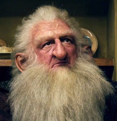 The film was shot at 48 frs per sec (and projected back at the same rate) which created a sharper more defined focus, closer in look to hi def video than film. There was one character, covered in hair, who I found extraordinary to watch without my 3D glasses. The focus on his skin was amazing, and I spent a lot of the first hour searching for shots of him without my glasses on. I later learned the character’s name, Balin. I hate to say it, but that was really the height of the film for me.
I also have to agree that the animation of the gollum was quite amazing. Not as good as the tiger in Pi, but worth the cost of admission for an animator. If Andy Serkis has anything to do with it, I applaud him.
On Friday night I followed up an ad in Variety that indicated a screening in town of the
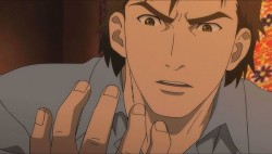 Japanese animated feature, The Mystical Laws, was showing for Academy members. In the end, I couldn’t go; work finally got in the way.
I still want to see Goro Myazaki‘s film From Up on Poppy Hill. I know that Bill Plympton hated it, but he and I often disagree on movies. The film won the Japanese equivalent of the Oscar, and it did enormously well in Japan. Somebody liked it; there’s got to be something good there. I’m going to keep my eyes open for it; usually GKids ‘ distributing it means there will be a chance of its eventually playing.
 Today, Saturday, the Academy has its screening of animated and live action shorts. The short-list (ten animated and ten live-action) will screen so we can narrow the selection down to five films for each category. I can select the animated films from my home since I saw them all and remember the ones
I like. However, I haven’t seen the live action shorts and want to vote for them. So we start with animated films at 10am, live-action at noon, and we continue through till about four or five. There’s a lunch at 1pm. A long day of movies. Looking forward to it.
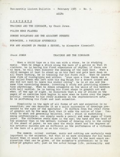
To add a bit of punch to this post, I’m placing an article Chuck Jones wrote in 1965 for an ASIFA International bulletin just prior to one of the early Annecy Animation Festivals.
 1
1 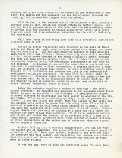 2
2(Click any image to enlarge.)
commercial animation &Independent Animation &Layout & Design &Models 12 Dec 2012 06:14 am
Len Glasser Bits & Pieces
- At Buzzco, they are preparing to send a lot of archival art to the MoMA. I’ve been trying to race through a bunch of it to scan it so that I can present it on this Splog. A folder of drawings by Len Glasser had to be organized so that I could send it out. There are certainly some odd bits in there.
Let’s start with a potpourri of pictures.
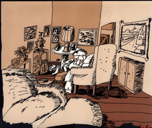 1
1This Background stands alone. It’s painted on a cel.
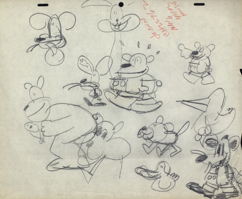 2
2
Then here’s the cast of characters.
A model sheet for the Wacko.
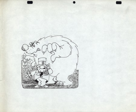 3
3
This W.C.Fields character belongs to Frito-Lay.
Doritos Corn chips; this character was the
spokesman for quite some time.
 4
4
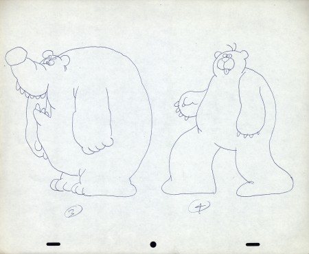
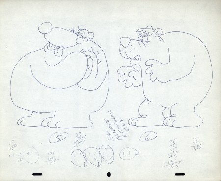
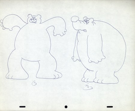
There are three model sheets for the bear.
 7
7
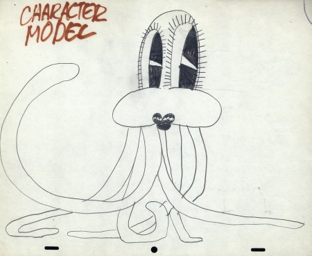
Let’s get back to some character models.
Len Glasser had a unique style – perfect in its time.
 8
8
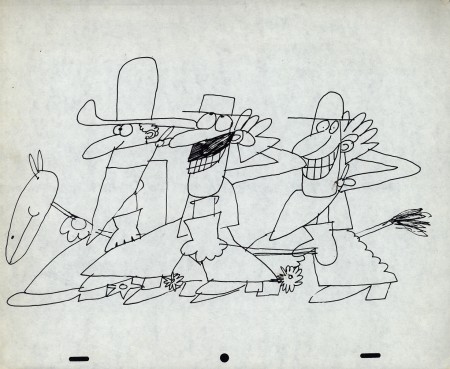
Cowboys always fill the bill.
 9
9
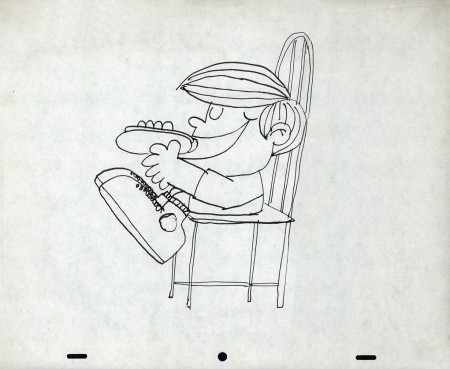
A kid who likes his hot dogs.
Here are a group of drawings that work together. They’re some layouts Len Glasser did for a spot for NBC; it has something to do with the weather. The floating guy makes it look like it may be part of the story of the sun, the wind and the man with a coat. The sun and wind compete to see who can get the guy to remove his coat first. (Spoiler alert: the sun wins.)
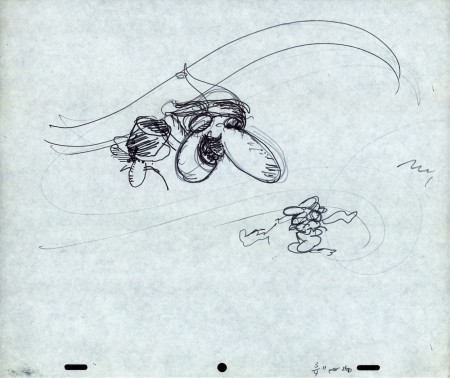 LO 1
LO 1This seems to be the layout for the whole piece.
 LO 2
LO 2
But then, there’s another near-identical one with the addition of a snowman.
I’m not sure where the snowman appears in the spot. Is he the floating head?
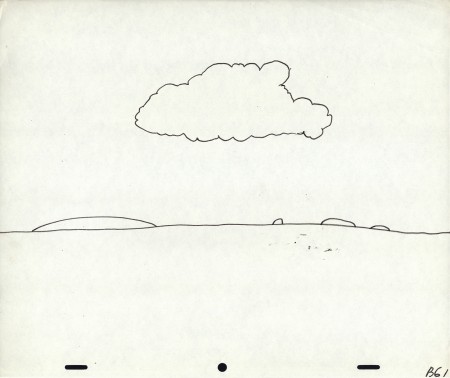
This is the Background for the spot.
What follows are the layouts for the animation, though I’m not sure what’s going on.
They’re drawings, at this point, for the sake of drawings.
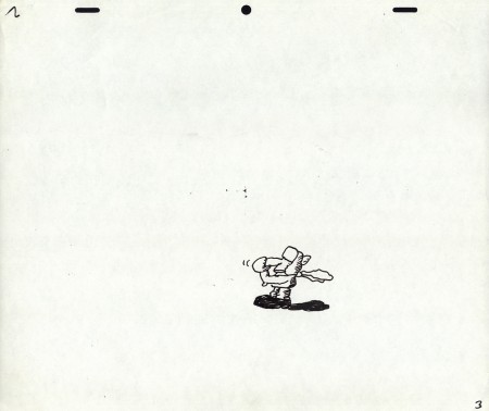 3
3
It goes to Top Pegs for one drawing.
I don’t know why.
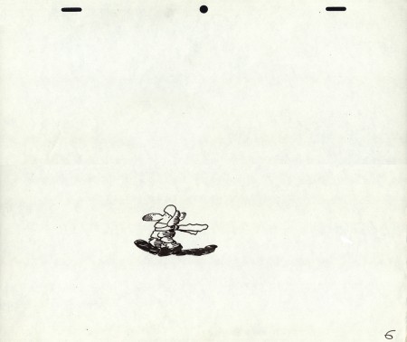 6
6
Another lone drawing with Top Pegs.
Let’s end on a picture of Santa. . .
. . . an original picture of Santa that only Len Glasser could draw.
Commentary &Independent Animation 11 Dec 2012 07:20 am
Consuming Spirits
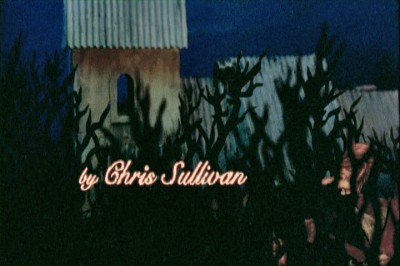
 - Consuming Spirits has to be the most original animated feature done to date. It’s a project that obviously consumed and developed in the mind of Chris Sullivan these past fifteen years, He undoubtedly allowed the story to grow in all the time that it took him to make the movie and then had to work the jigsaw puzzle of an edit to pull all the pieces together. The story is probably the most unique aspect in the film, an existentialist development with the characters growing in and out of each other, developing because of freak accidents other characters have had and moving the story along because of the odd relationships they have one to the other. It’s an epic piece ____________ChrisSullivan
of writing told in the most personal way imaginable. There’s been
nothing like it in animation before, at least not in anything I’ve seen.
 And the style is allowed to build off of the story as well. Characters move from pencil test to cut-out animation to full color to 3D stop motion backgrounds. Whatever helps the scene is what the look of the film becomes. It’s all done in sort of a primitive drawing technique with watercolors replacing clay backgrounds as complicated cut out characters move through multiplane settings.
As I said, this is an original, a truly Independent animated film. And it’s premiering now at the Film Forum in New York on its first leg of distribution in the US.
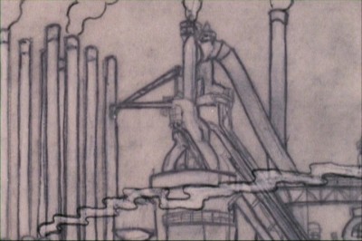
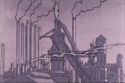
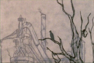
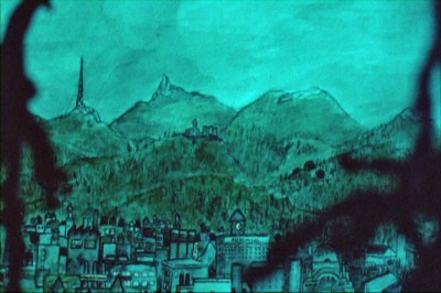
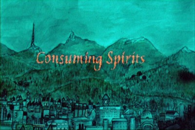
Here we see frame grabs from the first several scenes. You can see how easily the style moves from one technique to another, and it feels completely natural to the film.
 1
1We move in on a pencil test of a factory.
 3
3
A harbinger of darkness, a crow perches on an upper level
of the multiplane setting watches that factory.
 4
4
A long distance shot of the community reveals . . .
 5
5
. . . the animated title of the film, Consuming Spirits.
 6
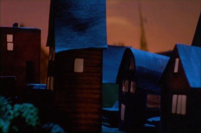
6
A 3D pan over the model of the town leads us to . . .
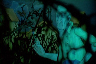 7
7
. . . the multiplane pencil test as our lead moves
with his rifle through a dark, wooded area.
Through all this the camera, always active, continues to move in and around the settings. A nun is accidentally hit in an automobile accident and the film begins.
It moves slowly and purposefully with characters always, seemingly, in realistic settings, but the settings take on a rarefied air as the complicated story takes on the level of a soap opera and quickly develops into a reality that feels unusual for animation. Finally, there’s a flashback of an ending that completely overturns the cart and makes the story grow wildly.
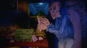 It’s a peculiar film and a great one, and it’s in the total control of Chris Sullivan who not only wrote, produced, directed and animated it, he also performs the music. This film is a one man band – or maybe I should say a one man orchestra. It has to be seen to be experienced. This is not a film that can be encapsulated in one sentence, nor can it be easily described in twenty.
I suggest you get to the Film Forum to see it where it will be playing for the next two weeks. It opens tomorrow, Dec. 12th and continues through Tuesday Dec. 5th, Christmas Day. It’s about as adult as a film can get, and it lifts feature animation into a new realm.
This is the trailer (thanks to the Gee, in the comments, for the link)
CONSUMING SPIRITS (trailer) by Chris Sullivan from chris sullivan animation on Vimeo.
Here is A.O.Scott‘s very positive review from the NYTimes.
Boyd van Hoeij‘s less positive review in Variety.
Ian Buckwalter‘s positive review on the NPR site.
Animation Artifacts &Commentary &Independent Animation &John Canemaker &Layout & Design 08 Dec 2012 06:23 am
Elements, Chemistry and Odd Bits
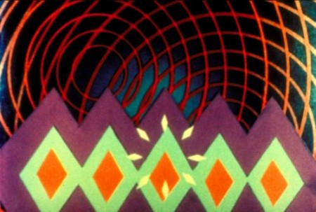
Oskar Fischinger, still from Allegretto, 1936-1943 © Center for Visual Music
- On Dec 16 in Amsterdam there will be a major exhibition of the work of Oskar Fischinger, a pioneer of animation film and abstract cinema. This opening will be an exhibition featuring various items including the films, the animation drawings, process material, the documents, correspondence, clippings, color charts, sketches, diagrams, patent drawings, and some of the sketches done (but not used) for Fantasia. Also exhibited will be notated graphic scores, material from the making of An Optical Poem, unshot animation drawings, and various other materials.
John Canemaker wrote about Fishinger for the New York Times, “Decades before computer graphics, before music videos, even before Fantasia (the 1940 version), there were the abstract animated films of Oskar Fischinger (1900-1967), master of “absolute” or nonobjective filmmaking. He was cinema’s Kandinsky, an animator who, beginning in the 1920′s in Germany, created exquisite “visual music” using geometric patterns and shapes choreographed tightly to classical music and jazz.’
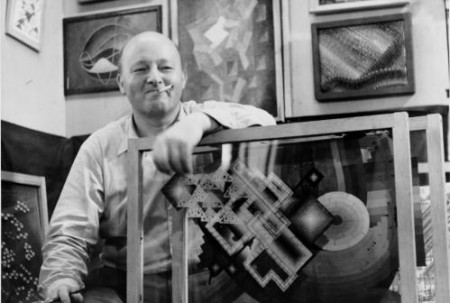
Oskar Fishinger in his Hollywood studio with panels from “Motion Painting”.
Consuming Sprits
This coming week, Wednesday Dec. 12th, Christopher Sullivan’s independent, animated feature will make its New York premiere with a week-long run at the Film Forum.
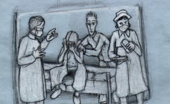 Described in the Film Forum’s press material: “The animation took 15 years of work… The characters were hand-drawn onto layers of glass which were then moved with needles and pins. The film seamlessly combines cutout animation, pencil drawing, collage, and stop-motion animation to create the haunting atmosphere of a self-contained world… (most of whose) characters walk shakily between self-medication and a bad trip… ugly characters (who) make up the most beautiful spectacle you’ve ever seen.â€
I’ve been looking forward to seeing this film for quite some time. Finally, I’ve been able to confirm arrangements to see it, and I will review it. I’m ready, given all the mediocre work I’ve seen lately.
Meet the film maker
Christopher Sullivan will be there IN PERSON! at the following screenings:
December 14 | 6:30pm
December 15 | 6:30pm
MoMA in Europe
This week, upcoming, the Museum of Modern Art will present a program of older European animation, and quite a few great classics will be screened in one very powerful program that will be shown three times. Trust me, if you don’t know these shorts, they are brilliant – all of them – and there is not one you should miss. Here’s a list of the films in the program:
Animation Abroad, 1946–59
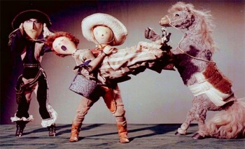 Arie Prerie (Song of the Prairie)
1948. Czechoslovakia. Directed by Jiri Trnka. 21 min.
A Litte Phantasy on a 19th Century Painting
1946. Canada. Directed by Norman McLaren. 3 min.
Fiddle-de-dee
1947. Canada. Directed by Norman McLaren. 4 min.
Charley’s March of Time
1948. Great Britain. 1948. Directed by John Halas and Joy Batchelor. 9 min.
A Phantasy
1952. Canada. Directed by Norman McLaren. 8 min.
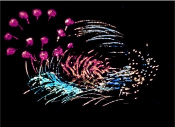 Blinkity Blank
1955. Canada. Directed by Norman McLaren. 5 min.
Thumbelina
1955. Great Britain. Directed by Lotte Reiniger. 11 min.
Concerto for a Submachine Gun
1958. Yugoslavia. Directed by Dusan Vukotic. 13 min.
Les Astronautes
1959. France. Directed by Walerian Borowczyk with Chris Marker. 13 min.
Program 87 min.
Wednesday, December 12, 2012, 1:30 p.m., Theater 2, T2
Thursday, December 13, 2012, 1:30 p.m., Theater 2, T2
Friday, December 14, 2012, 1:30 p.m., Theater 2, T2
Nest week, and I’ll post the list next Saturday, there will be a number of Hollywood Cartoons that will be screened. Chuck Jones, Robert McKimson, Hanna & Barbera, Jack Hannah and Ward Kimball. They’re all represented.
Pups for Sale
 – As of yesterday, Friday, the Pups of Liberty became available for sale to teachers as well as the public, If you go to izzit.org or Amazon.com, you’ll see the assets that are available; indeed, they both link to an educational video, entitled The Pups of Liberty.
Perhaps you’ll remember the posts I published a while back on this short film produced by Bert and Jennifer Klein. I put those several articles together into one here to best showcase the story of this video. With the help of an all-star animation team (artists including: James Lopez (Hercules, Emperor’s New Groove, Flushed Away and Princess and the Frog), Eric Goldberg (Aladdin, Fantasia 2000, and Princess and the Frog), Barry Atkinson (Prince of Egypt, American Tail and The Lion King), and Mark Henn (The Little Mermaid, Beauty and the Beast, Aladdin, Muland and Princess and the Frog) Jennifer and Bert created this Revolutionary War-based film. It offered history as entertainment and allowed audiences to learn from a very entertaining series.
Now, the Kleins are not only making the video available for sale but have a new activities website which expands on that video.
This is a smart idea as Bert and Jennifer Klein seek to develop a new market and a new way to sell a creative product. If you’d like to learn more, take a look at these few clips of the animation. Here or here or here.
This Week’s Films
The schedule continues with our watching a lot of films on the run up to the Oscar nominations. By “us” I mean the people of the Academy, those who elect to see the films on a big screen before they vote. I’m sure a lot of members take the easy way out and watch DVDs of the current movies. I won’t hear this way out. As a matter of fact, they’ve asked us to accept the films via download. We’d watch the movies – the movies we’re voting for as Oscar contenders – via download over the internet. Sort of like NETFLIX. I still want to think of them as “movies”, I want the burden of going to a theater to watch them in a public place with other differing viewers, all inconvenienced at the same time. That is part of the experience, isn’t it?
 So, anyway, this week started off with Zero Dark Thirty. (I guess that’s supposed to mean 12:30 am – or half past midnight, in the dark.) On Tuesday the movie got the NYFilm Critic’s award for Best Film of the Year. I was hot to see the movie.
Turns out, to me, it was just one step above a TV movie version of the raid on Osama Bin Laden campsite to capture the guy. This film had no poetry in it and wasn’t about much other than the raid we watched. I didn’t like it. Dull. I did like Kateryn Bigelow’s last film, The Hurt Locker. But this film wasn’t that. I thought Jessica Chastain was miscast even though I am a big fan of hers. In fact there’s a Thursday luncheon where I’ll meet Ms. Bigelow and Ms. Chastain. I’m looking forward to that but have to lie if they ask what I thought of the film.
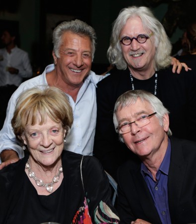
top – Dustin Hoffman, Bill Connolly
bot – Maggie Smith, Tom Courtney
On Wednesday, there was the fllm directed by Dustin Hoffman, The Quartet. This one was great. No miscasting here. Maggie Smith and Tom Courtney were brilliant. Billy Connolly couldn’t have been better, and it was easy to love Pauline Collins. She’s always great. The script by Ron Harwood from his own play was sparkling and always alive. The film was funny, warm, about people and always alive. Just great and human. Top drawer work. After the screening there was a penthouse cocktail party with a nice view, good free vodka or wine, and a chance to tell Dustin Hoffman and Billy Connolly about how good they were. Heidi told Mr. connolly how much she hliked his voice work in Brave, I just told him he was great, great, great. If I didn’t realize how stupid I sounded, I probably would have said a couple more “greats”. See this film for all the brilliant talent on display and the fun you’ll have watching it.
UPA
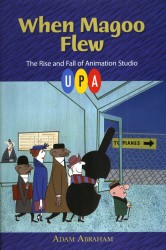 – Thursday night, I skipped the screening of Hyde Park to attend the lecture across town. Adam Abraham was speaking on the back of his book, When Magoo Flew: The Rise and Fall of Animation Studio UPA . The book was remarkable to me, and I was looking forward to meeting the author. At first there were very few people in attendance, but it soon filled up. I was happy to see friends, John Canemaker and Amid Amidi there.
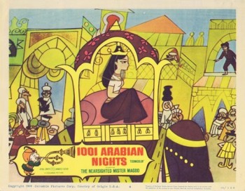
Adam’s talk was well done and ended with the screening of five films: Gerald McBoing Boing, Magoo Express, The Tell Tale Heart, Rooty Toot Toot and a rarely seen live action promotion for Magoo’s 1001 Arabian Nights, called: A Princess for Magoo.
I enjoyed the program and was pleased to meet Adam after the talk. Amid Amidi and I walked the few blocks to the subway and went home. A nice evening.
Back to the Routine
 – On Friday, I attended a luncheon for the film Argo. Ben Affleck, and several key people from the film attended and answered our questions about the movie while we ate at the Four Seasons Restaurant.
The movie is promoted as some kind of recreation of actual events, and I’m sure it is. However, the film we see on the screen works just too well as a typical action-adventure sort of film, that it’s hard to accept its believability, regardless of how much is true. The climactic scene as the hostages are flying away from the Iranian police is just too Hollywood to be a reality, and Mr. Affleck admitted as much, making a joke of the idea. As an action film it works, but I wished for it to dig a little deeper.
A quick steak lunch and a return home. There was a screening of a documentary called West of Memphis which I was scheduled to attend last night, but I just didn’t feel up to it. So I stayed home. Enough movies for one week.
Animation Artifacts &Articles on Animation &Independent Animation &Tissa David 22 Nov 2012 07:15 am
Tissa’s Notes – recap
_____________________________
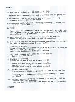
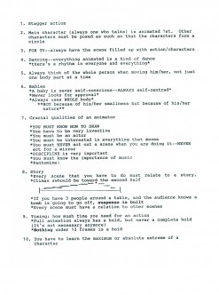
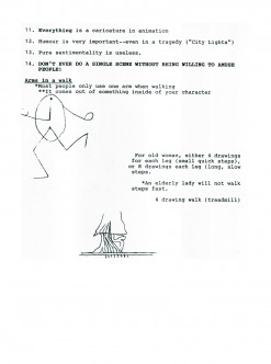
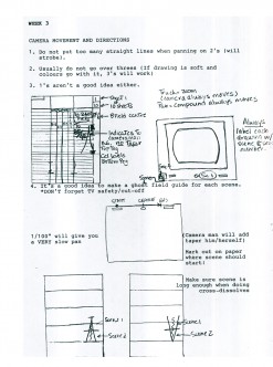
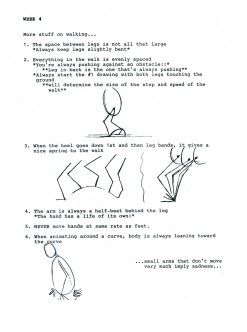
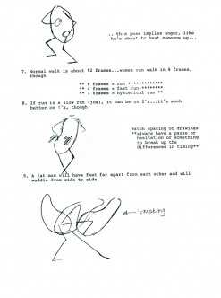
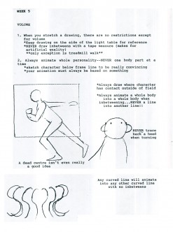
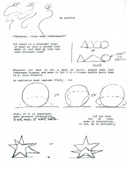
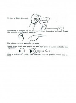
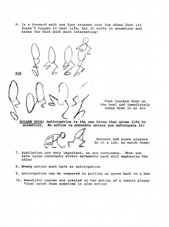
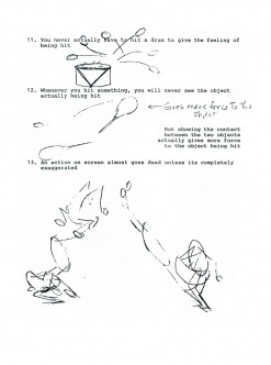
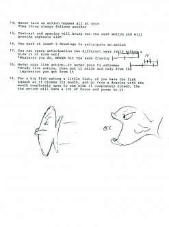
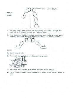
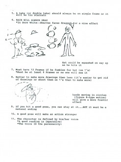
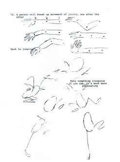
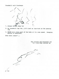
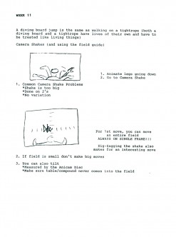
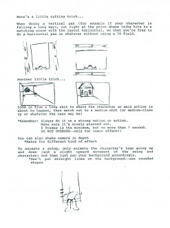
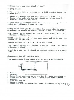
- For the past few Thursdays, I’ve been posting a notebook that animator, Eugene Salandra compiled. These were notes he’d taken of classes taught by Tissa David in New York during the late 1990s. These notes and the notebook, itself, were completed with last Thursday’s post.
However, Eugene did one better. He reviewed the notes, typed them into a presentable form and revised them for the sake of clarity. Looking at these encapsulated and abbrieviated version of the noteboo, I feel it’d be remiss not to post them as well as the rough version that we’d already posted. So, thanks to Eugene’s generosity, here is a labor of love he put together. We’ll all benefit from them.
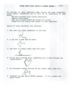 1
1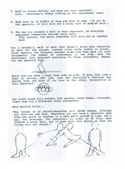 2
2
You can see the earlier parts by going to these links:
_______________part 1, part 2, part 3. part 4, and part 5, and finally, part 6.
