Category ArchiveIndependent Animation
Animation &Animation Artifacts &Hubley &Independent Animation 02 Sep 2010 07:32 am
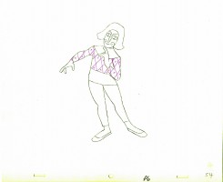
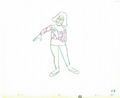
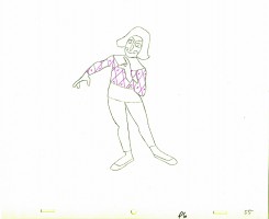
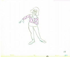
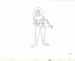
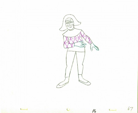
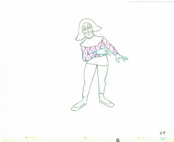
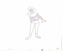
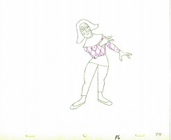
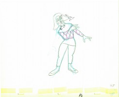
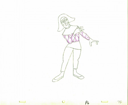
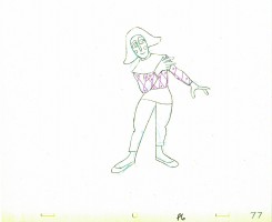
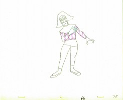
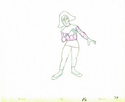
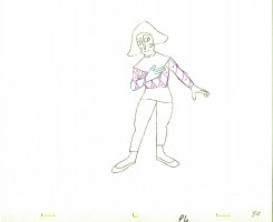
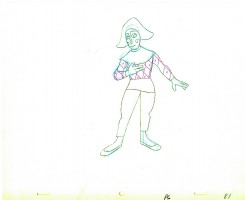
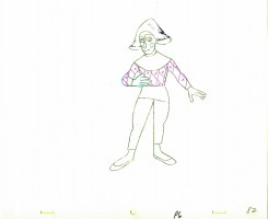
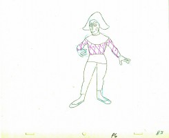
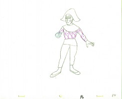
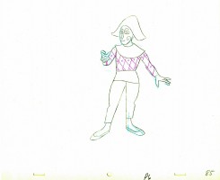
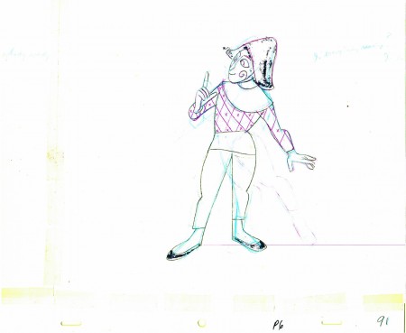
Babbitt’s Carousel Mime – 3
- John Hubley‘s feature film, Everybody Rides the Carousel, was adapted from Erik Erikson’s Eight Stages of Man, a Psychosocial Theory of Human Development.
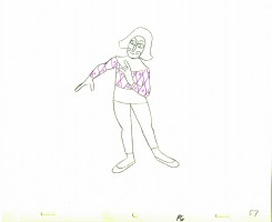
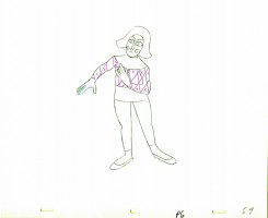
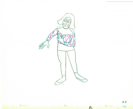
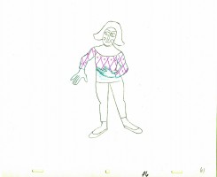
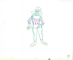
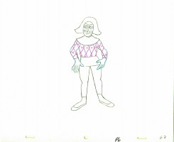
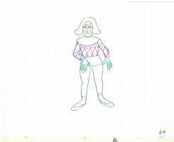
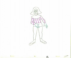
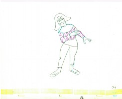
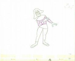
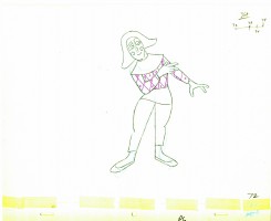
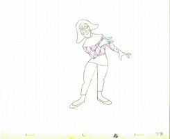
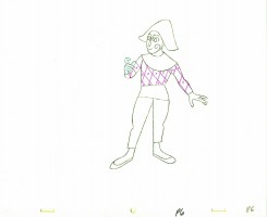
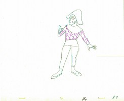
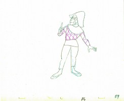
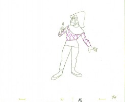
The feature was built around a carousel. 8 horses represented different stages of life. The narrator, a mime, was animated by Art Babbitt, with Dave Palmer as his personal assistant. He left after animating a couple of early scenes. Barrie Nelson completed the character in the show.
For the full story behind the rift between Hubley and Babbitt go to this past post.
The scene is about 200 drawings long. Here’s the third part. It’s a very slow moving character with short quick spurts of movement.
We begin with the last drawing from last week.
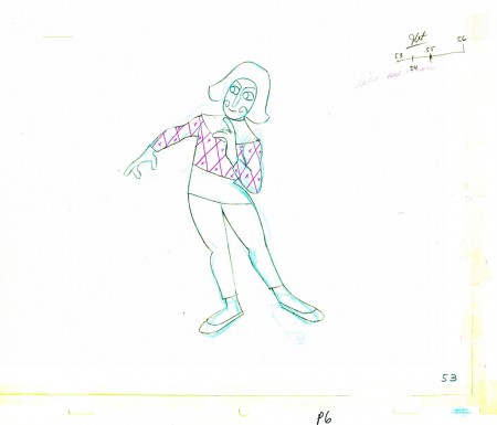 53
53(Click any image to enlarge.) ______________________
The following QT movie represents the drawings above
exposed as Babbitt wanted them, on twos.
Right side to watch single frame.
Commentary &Independent Animation 31 Aug 2010 07:43 am
My Dog Tulip – 3 Reviews
- Rather than have a single review of Paul and Sandra Fierlinger‘s feature film MY DOG TULIP – which opens at the Film Forum on September 1st – I decided to get the two animators in my studio, Matt Clinton and Katrina Gregorius, to see the film and give their reviews as well. Hoping this would give a non-biased view of the film and a chance for you to see it through the eyes of pencil animators who happen to be working digitally. I hope this exercise is illuminating. I think it is.
Matt Clinton
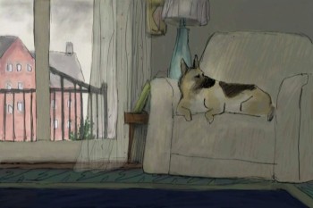
My Dog Tulip is a wonderful new animated film from Paul and Sandra Fierlinger. I’ve enjoyed their particular style of animation ever since I saw Still Life With Animated Dogs on TV years ago. The drawings were so sincerely animated that it surprised me, and the film stayed in my memory. The locomotion and behavior of dogs is something that seems to flow effortlessly from Paul Fierlinger’s pen. I love seeing that sort of thing in animation – where it feels natural, and nothing is worked over too much.
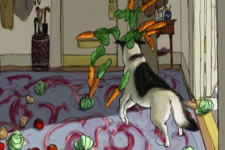
It’s all there in My Dog Tulip. I was very impressed with the animation, which is loose and full of life. It was animated paperlessly using TVPaint. (This film is quite a showcase for that software, and I hope it becomes more widely known.) There are a few different visual styles that pop up in the film. Much of it is drawn in a realistic style. It takes a lot of skill to be able to animate so much footage of a realistic dog who is moving around spatially. Fierlinger excels at this, keeping the animation spontaneous and giving a lot of character to the dog. Tulip doesn’t just show up and bark, like some other ruddy dog actors. She’s a pro. Fierlinger also animates some parts in a simpler style, made to look like doodles in a journal. These scenes were often very funny, and fun to watch. I laughed at Tulip prancing around in a skirt urinating on everything in sight. She is like a young child.
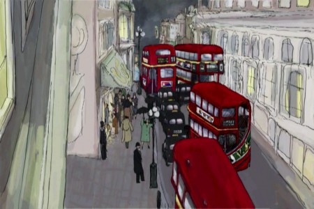
 Fierlinger allows time in the film for things to happen, which is rare in animated features. I really get annoyed at the spastic actions and pacing in some animated films; I don’t like leaving the theater with a headache and feeling exhausted. My Dog Tulip is not like that. For example, in one sequence, Ackerley and Tulip are being driven in a sidecar motorcycle to the country home of Captain Pugh. Instead of just showing them departing and arriving, we get to see their silent journey for quite a long time. This lets the audience get a feel for the world that Tulip lives in. Moments like that combine to give you a thorough understanding of the place.
The background paintings are stunning. They were painted by Sandra Fierlinger directly in TVPaint. That software comes with many natural media brushes that you can customize. She used her expertise in painting and color styling to create, in this software, backgrounds that are very classy and sophisticated. I noticed that she created well-placed shadows throughout the film. In his study, Ackerley walks in and out of shadows cast on his rows of books. In another scene the shadows from unseen clouds move across a field where Ackerley is standing. These details add some depth and atmosphere. It’s nice to see such a focus on this. The paintings themselves are not overly detailed but they give you all you need. The film looked great up on the big screen.
It’s clear that these two artists compliment each other very well. It’s a huge achievement that just two people can make a feature film in their home studio, one animating, the other painting. In the press notes, it says that the producers had contacted the Fierlingers and asked them to choose a classic book to adapt as a feature film. I like the thought of that; picking a book and going for it. It would be fun to try. I believe that the Fierlingers are now at work on a film about Joshua Slocum’s book Sailing Around the World Alone. I’m looking forward to seeing how he handles animating all that water. Rough seas are probably haunting his dreams by now.
Christopher Plummer’s narration of My Dog Tulip is notable. There is a large amount of narration and he gives it a bold flourish! J.R. Ackerley’s sense of humor comes bursting out of Plummer’s performance. The rest of the cast is top notch as well.
I think that most dog owners will see a lot that they can relate to in My Dog Tulip. I’ve had a lot of American Eskimo experience. Great dogs! Our first one loved to be wild in public. She loved to make a scene. At home she behaved pretty well and we didn’t mind her nipping at all. You really do learn to love all the unique things about your own dog – their personality and certain tendencies. My Dog Tulip is all about this. Tulip comes into J.R. Ackerley’s life and changes it in unexpected ways. There’s a big impact that Tulip makes. Near the start of the film, Ackerley is racing, racing, racing home to be with his dog, who is waiting. She knows what time it is. The door swings open and the day can finally begin in earnest! The film is an account of their friendship. That’s something anyone can relate too.
Katrina Gregorius
Humorous and full of tender moments Paul and Sandra Fierlinger’s new feature, My Dog Tulip, is an honest account of the relationship between J.R. Ackerley and his dog, Tulip. The film pulls you in as you share the experiences Ackerely goes through in trying to understand his new dog and eventual companion.
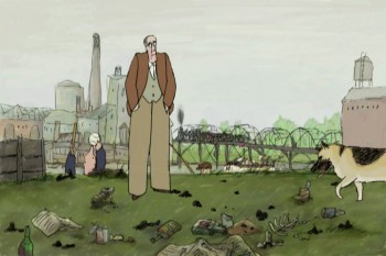 My Dog Tulip begins by showing us the loving relationship between Ackerely and Tulip. Ackerely is rushing to get home and Tulip is excitedly waiting by the door for him. The story then takes us on a journey through the “couple’s†life. Mr. Fierlinger has captured the essence of owning a dog and he isn’t afraid to show it like it is. The feature is filled with scenes of Tulip defecating and urinating all over the place. While some scenes may have been too much for me, I can’t say that they were entirely unnecessary. I’m sure anyone who’s ever owned a dog, cat or any pet can relate.
The film takes on a few different styles throughout, but I especially enjoyed the “yellow pad scribblesâ€-style. These sequences were meant to be from Ackerley’s perspective and in them Tulip was depicted walking on two legs and wearing a dress, almost human. For me this emphasized the closeness that these two had. Tulip wasn’t only Ackerley’s dog but she was also his friend and companion.
Overall My Dog Tulip is a very touching and heart-warming story of finding love and friendship from the most unexpected places.
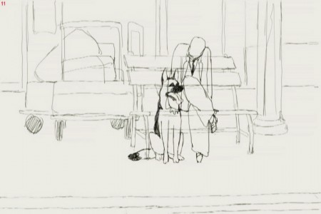
From the pencil test of the film
Michael Sporn
Paul Fierlinger has been making animated films independently for more than 50 years. Recently, his work has turned to the long form. He’s done a number of half-hour shows for ITV which have been aired on PBS local stations. Drawn from Memory, Still Life With Animated Dogs and A Room Nearby were strong programs that brought some decided interest to Fierlinger’s work.
My Dog Tulip, a theatrical feature, came via a couple of producers willing to invest a million dollars in a well-known book adaptation. The book by J.R. Ackerley was more famous in England, but Paul and Sandra Fierlinger sought out the title. The film started with fists and stops, then finally got going after the animators produced a short piece of beautiful animation. The producers were sold, and the film went forward.
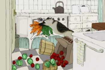 With a strong cast of voice actors, including Christopher Plummer, Isabella Rosselini and, the late, Lynn Redgrave the film sparkles. The backgrounds are a treat, particularly at the start of the film looking at some of the beautiful shots of London.
The film moves into its story about the tight relationship between a man and his German Shepard. At first, there’s a lot of anxiety between the two, but soon they warm up to each other and become almost too close. Plummer’s narration is just excellently delivered and totally conveys the conflict in the relationship.
The film seems to take a strange turn in that it becomes almost too concerned with the scatalogical elements of dog-ownership. We’re treated to the dog’s constant urination, pooping and many attempts at mating. This gets a bit off-putting for some, but the film uses it to detail the tight marriage of man with dog.
Ultimately, the film is a peculiar one. It’s beautiful in its graphics; the animation is often stellar – as expected from Paul, and Sandra shows that she can paint glorious backgrounds with the best. The artwork just glistens. However, the story is unlike anything that’s been seen on screen before; it’s adult. This is surely no 101 Dalmatians – purposefully.
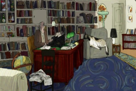
Anytime an individual takes on the task of producing, directing, animating, and coloring an animated feature, it’s a big deal. We’re getting to see this more and more now that digital technology has made it a tad easier for those folk. Something that has to be said is that they are determined to get a film finished. That kind of energy has always produced inspiration in me. I’ve gone to see any such film, just because I feel obligated. Obligated to the art of animation.
There is definitely an obligation, in my mind, for everyone reading this blog to get out and see this film. Support your own.
There was an excellent article in the NYTimes about the methods of TVPaint used for producing the artwork of this film.
The NYTimes critic Stephen Holden reviews the film and makes it a “critics pick” as one of the best movies in the market.
Books &Commentary &Festivals &Independent Animation 21 Aug 2010 07:30 am
Idiots/Eastman/and Chicken Fat
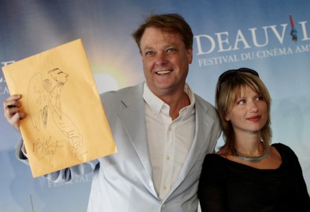
Bill Plympton and Biljana Labovic during the Deauville, Film Festival in France.
- Bill Plympton called to say that he finally has a NY theater date for his feature Angels and Idiots. This film has played the Festival circuit and is now about to make its theatrical presence felt.
The IFC theater in NY will screen the film beginning the week of October 6th. We have to turn out for the film to make sure that the IFC will extend the run. (They usually do that if they sense there’s an audience. We know there’s an audience – we just have to turn out.)
The film will also open in LA at the Laemmle Sunset 5 – Opening October 26th, 2010.
I hope to have an extended interview with Bill, soon, about the making of this feature. Keep watch. Meanwhile AWN features Idiots’ Diary. This is a diary Bill is keeping about the distribution of the film.
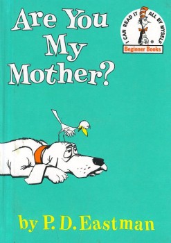 - I received a nice note from Tony Eastman the other day:
- Sue and I have put together a website for my father’s books: pdeastmanbooks.com
Its purpose is to entertain/inform, and at the same time sell books. There really wasn’t a place where you could see all of his books together, plus we thought a short biography (appropriate for children) and a way to get in touch with his family would be useful. I put together the P. D. caricature on the home page from two self portraits he had done.
In case you don’t know who P.D. Eastman was, I suggest you take a look at his film resume at IMDB. After working at Warners cartoons, he became integral in the start of UPA and the story writing of many of their best films. Oh, and he competed mightily with Dr. Seuss in writing MANY best selling children’s books.
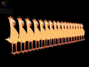 - Katrina Gregorius, an animator and artist in my studio, helped out her friend, Theresa Loong, a member of the Film Shop in Brooklyn, in making a music video. The video is mostly live action with animated bits to spark it up – and believe me it does. The song is Robert Preston singing Chicken Fat “The Youth Fitness Song” by Meredith Willson of “The Music Man” fame. The song was commissioned by President John F. Kennedy for the newly formed President’s Council On Physical Fitness in 1962. A copy was sent to every school in the United States to be played over the intercom so students could do calisthenics to it.
You can see the video here.
Animation &Bill Peckmann &Commentary &Independent Animation &Layout & Design 07 Aug 2010 08:00 am
Leftover Bits & Pieces
- Here are some bits and pieces left over from the week.
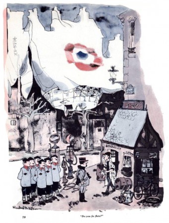
Bill Peckmann sent me some beautiful art this week, and though the pieces have nothing in common, I still thought it’s worth showing the quality of the great art done in the 60s & 70s whether for spot cartoons or animated spots.
These are Bill’s comments from his email:
- “I thought you’d get a kick out of this, here’s RBW’s gag in the Dec. ’61 issue of Esguire and the next will be the same gag as it appeared in 2 colors in his book. You can see how much was lost.”
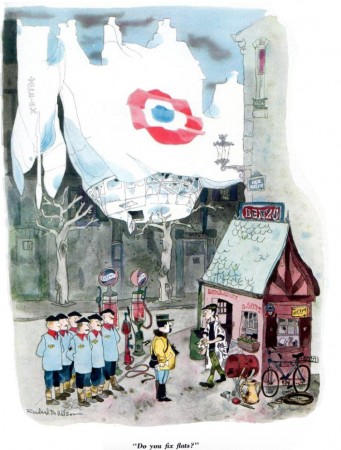
(Click any image to enlarge.)
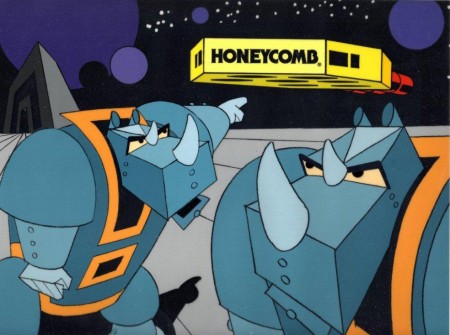
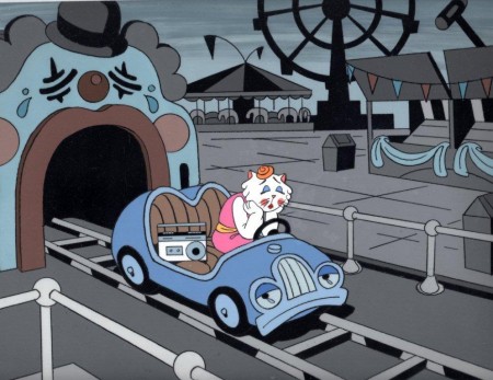
Then on another post Bill sent me these treasures from Phil Kimmelman & Associates (PK&A).
Again, Bill’s words:
- “Thought you might have an interest in seeing these. They are 3 cel set ups from the days at PK&A in the ’70′s. Two I designed for Honeycomb Cereal, the third a Mexican spot for Eveready Batteries. The BG’s were also done with Cel Paint. Sadly the color reproduction never looked so good as it does now with scanning, remember those 16mm Answer Prints of yore, made for TV viewing, the original colors never came close to what we had in mind.
These set ups were made for “Studio” ads.”
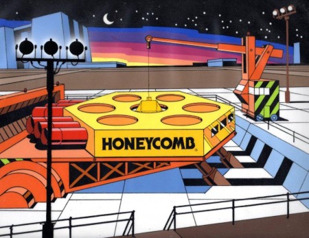 1
1
_________________
Greg Kelly and I have been exchanging emails for quite some time now. He’s done many short films and sends them for comment. His latest film is now posted on Vimeo, and I thought I’d like to commend you to take a look. He’s working hard at his animation, and I can only encourage him wholeheartedly. It isn’t easy to make a film, and he keeps doing it.
He wrote of this piece:
- “It is frame-by-frame, hand drawn in Flash and on twos with a lot of hand adjustments. It isn’t typical for what I do though it is another cartoon in an 8 year long series of shorts featuring one or both of these characters.”
- John Canemaker has another post up at the Print Magazine site. This month it’s a good piece about Chuck Jones at the MacDowell Colony. It tells of Jones winning the MacDowell Medal in 1997.
Canemaker, who led the advisory panel in selecting Jones, prints his introductory speech to Jones and includes links to several WB shorts by the Master. It’s worth checking out if you have any allegiance to Jones’ work.
I’m sure anyone who is interested has already read this, but Michael Barrier has his review of Toy Story 3 up at his site. Since I’m in total agreement with what he has to say, I can only direct you to the link.
Commentary &Independent Animation 27 Jul 2010 08:27 am
Prayers and Tulips
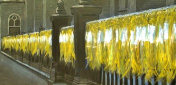 - Dustin Grella is a young film maker whose independent short, Prayers for Peace is now available on Vimeo, here. It’s a beautiful animated short that should be seen by any visitors to my blog. It’s currently on the Festival circuit, having been screened at Annecy, Stuttgart, Anima Mundi, and Mostra Lisboa, among others.
Mr. Grella takes his inspiration from William Kentridge rather than Walt Disney, and he makes a solidly strong debut with this film which was his Masters thesis at SVA. If you go to his site you can see other film samples he’s created.
The message of this film is in the title, Prayers for Peace. And we’re still praying. After seeing the docfeature, Restrepo, I could only come out of it depressed, wondering what the hell we’re doing there.
This guy has to be ecouraged and pushed to go on. I look forward to Mr. Grella’s next film. The man uses his brain and tries to animate from life not other cartoons. A rarity in today’s community.
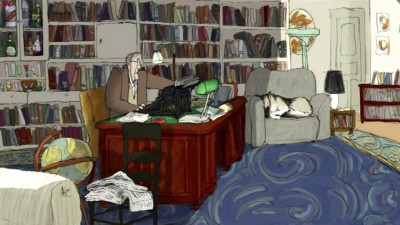 - Speaking of drawing from life, Paul and Sandra Fierllinger‘s feature, MY DOG TULIP, is the first acquisition of the newly reopened New Yorker Films and will open at New York’s Film Forum on Wed, September 1st through Tues, September 14th.
MY DOG TULIP was written, directed and animated by award-winning Philadelphia filmmakers Paul and Sandra Fierlinger. As we all know, they did all of the artwork themselves. The film has been seeking a distributor for the past year, and they’ve found a good one that’ll give it special concern. Getting the New York reviews in early September will be helpful. Hopefully, this one will be eligible for Oscar consideration.
I’ll give the film more attention and review it when it opens.
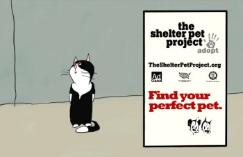 If you’d like to see some other recent work by the Fierlingers, go here to see some 6 short pieces, called “Shelter Stories”. These pieces were done in collaboration with MUTTS‘ cartoonist Patrick McDonnell. Here’s what Paul wrote about these pieces:
- “This is something new for us because it is the first time I had to draw someone else’s cartoons. In this case it is the art of Patrick McDonnell, of the “Mutts” cartoon strip and books. These are six Shelter Stories, PSA’s (Public Service Announcements) urging people to adopt their pets rather than buy them from breeders. Our specific assignment was to communicate that shelter animals are normal, healthy pets that have ended up in shelters due to unhappy circumstances of their owners, rather than coming from cruel treatment, and that they often make the best pets.
All the stories are lifted off of Patrick’s strips, which heavily relied on written word, sometimes comprising of three panels of the same talking head. It was up to us to give the theme a background story. Patrick was a very generous collaborator, not insisting that we stay 100% on model, which would have been often difficult anyway because his cartoons often don’t even have legs. He also wanted me to employ close to real animal locomotion so we agreed that in some instances my drawings might drop out of model completely, only to return to model whenever the action would stop.
The music and sfx is by Shay Lynch, the stories are written by Patrick and Sandra and me (mostly Patrick & Sandra, actually). Sandra also did the kitten’s voices and the other two voices are read by two people in our neighborhood. The Agency is the Advertising Council and the client the Humane Society of the United States (HSUS). The spots haven’t been aired yet; actually I haven’t even quite delivered them because I’m waiting for the address where to send them.
By the way, these spots hold a record for me; this is the very first time in my long career that a client has accepted delivery of my work without requesting a single change!”ul>
Articles on Animation &Books &Commentary &Independent Animation 20 Jul 2010 07:50 am
Women Animators
- Back in the enlightened Eighties, Independent animation actually took note of gender in the making of animated films. In The Art of the Animated Image, An Anthology edited by Charles Solormon included an article about Women Animators in the medium. The article by Lauren Rabinovitz was part of a series published in conjunction with the Walter Lantz Conferences on Animation held June 12th thru 14th, 1987 at the American Film Institute in LA.
I reprint the article here, and I consider that, to my knowledge, it’s nice to know that all but one of these women mentioned are still making Independent films. I wonder if the record is as strong for the “Independent” male animators of the same period.
and
Women’s Experiences
BY LAUREN RABINOVITZ
Histories of American animation have most often located the form within the confines of the Hollywood cinema and television system. Over the seventy-five years or so of its existence, that system has seldom proven hospitable to women filmmakers, or animators, whether they were working in film or, later, in television.
Outside Hollywood, the medium of animation has flourished in the work-a-day world of education, industrial and advertising films, and in those arenas women animators have found opportunities not available in Hollywood (especially over the past twenty years). Of even greater significance, the growth of avant-garde film after World War II nurtured female, as well as male, animators, filmmakers dedicated to individual artistic expression and to the creation of new film syntaxes within an alternative economic support system.
As independent cinema became increasingly tied to college and museum institutional frameworks in the late 1960s, so too did the individual filmmakers. In that period and thereafter, they typically became identified with academic training and teaching positions, the aesthetic vocabularies of vanguard art movements, and the apparatus of an American avant-garde cinema. In the 1970s and 1980s, rising from those antecedents, feminist filmmakers and animators have participated in independent cinema networks.
However much independent cinema may be viewed as a “marginal” practice within the Hollywood hegemony, women filmmakers—and animation as a cinematic form—lie at the outskirts of those heterogeneous cinematic margins. As neither women filmmakers nor animators have extensive showcases, distribution outlets, and production monies available to them, their short works are known largely through a variety of exhibition practices: film festivals; distributors’ animation packages (often collected for and exhibited at schools and film societies); cable TV “fillers”; and individual (and often visiting) artist screenings at museums, colleges and media centers.
Within this somewhat limited and restricted production, distribution and exhibition network, women animators have created a broad spectrum of work, utilizing a range of animation techniques, styles, and subjects. Line animation, cut-outs, xerography, photos, computer-generated imagery, sand-on-glass, have all been used by woman animators. Some have chosen to explore formal and spatial relationships; others delve into the “serious” art of highly abstracted, non-representational animation. Some have relayed children’s stories and folktales, personal experiences and feelings; others have created humorous narratives and political satires. Many have chosen to construct animated tales that comment on the artistic process itself. There is no “women’s animation” any more than there is one unique form of women’s film or video.
Nonetheless, just as male filmmakers have frequently exposed intimate, often sexual experiences from a subjective point-of-view, women animators tend to explore women’s experiences from an equally subjective perspective. Such subject matter takes on a dual political dimension—in the increased visibility and expression of gender identities and experiences, and in the recognition of the systematic repression of women’s subjective experiences within the Hollywood cinema. A significant number of contemporary women animators rely on cartoon animation— figuration in short narratives—as a means of recasting their relationship to the ideology of representational cartoons.
There is a long list of recent films by women animators that address women’s experiences in this fashion. They run the gamut, from Tanya Weinberger‘s tiny naked woman who carouses on and then arouses a sleeping giant in Gulliver Comes to Lilliput (1983) to Suzan Pitt‘s Asparagus (1978), an elaborate eel-animated psychodrama that intertwines a woman artist’s creative process with metaphors of sexual activity.
Christine Panushka‘s The Sum of Them (1983), line portraits set against a familiar collage of sounds, depicts many women as an absorbing poem of humanity. In Another Great Day (1980), Jo Bonney and Rugh Peyser dramatize the important inter-relationships among popular cultural forms, fantasies, and women’s labor through a housewife who moves freely between the cartoonesque world of her chaotic household and the photographic world of television soap opera and romance photo-novels. Women have also collaborated to celebrate collectively their experiences as’ women who are not always “solitary” animators. Lisze Bechtold, Lesley Keen, and Candy Kugel, My Film, My Film, My Film (1983); Caroline Leaf and Veronica Soul, Interview (1979).
Some artists portray an autobiographical female subject notable for her physical metamorphoses, which approaches self-induced schizophrenia. In turn, this state of fluid change can often provide a positive catharsis. For example, Karen Aqua‘s Vis-a-Vis (1983) turns the artist/character into two connected halves of one person—the animator at her storyboard and the woman gazing out the window. When the halves split, the artist animates kaleidoscopic images while the woman passes through richly colored sea and mountains. When the woman returns to the artist, she empties radiant color into the drawings.
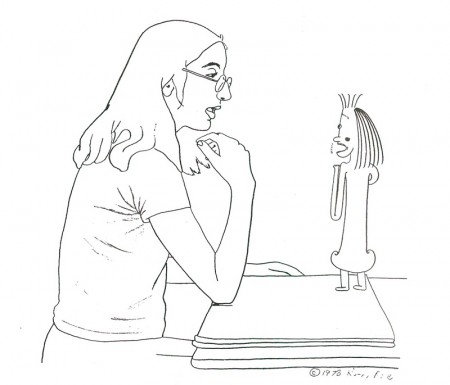
Kathy Rose’s Pencil Booklings (1978)
Kathy Rose also plays with the magical transformations of an animator character. Mirror People (1974) and The Doodlers (1975) both rely upon the protagonist’s constantly evolving physical shapes in an eerie, surrealistic world. In Pencil Booklings (1978), the artist/character (who resembles Rose) is represented more naturalistically through rotoscoping. Within the narrative she is pulled into the world of her imaginative creation and eventually back out of it, her identity assured by her exploration of the creative process itself.
Joanna Priestley‘s Voices (1985:) also relies upon the artist’s physical presence as well as her v ice to comment on her self-image. As a likeness of the filmmaker addresses an anthropomorphic (and smart-alecky) mirror, she describes first her bodily-related fears of aging, gaining weight, and wrinkles. As she succumbs to her preoccupation with fear itself, she gives vent to increasingly cataclysmic horrors that are visually portrayed— things that go bump in the night, monsters of the id, nuclear holocaust. The background prattle provides a counterpoint to the character’s self-absorbed fears creating a tongue-in-cheek commentary that suggests women’s fears about themselves are a culturally induced neurotic obsessiveness.
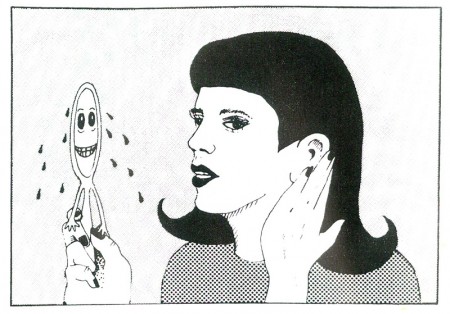
Joanna Priestly’s Voices (1985)
It is important to note that these artists depart from the traditional Hollywood use of sound, the acoustical enhancement of nature. Although the cartoon world may always be seen as inherently fantastic, the animation studio’s use of sound helped reinforce the notion of a spatial and physical world. These animators employ layers of sound effects and music to destabilize the spectator and to stress the fantastic itself.
Emily Hubley, the daughter of animators John and Faith Hubley, carries the metamo-phosing, autobiographic subject to new intensities. In Delivery Man (1982), she presents a simply drawn, ever-changing abstract self in an equally volatile, abstracted world. Less the object of whimsical artistic introspection than the subject of her fearful dreams relived, the constant visual metamorphosis supports a remembered vision of personal traumas. The woman’s personal narrative of five key dreams involving her birth, her mother’s surgery, and her father’s death during surgery visualize the crisis of familial relationships, development and sexual identity that comprise the subjects of many patients’ transactional analysis.
Kathy Rose has extended the woman animator’s autobiographic involvement to a redefinition of the medium itself. Her Primitive Movers (1982) is a 30-minute piece that combines animation and Rose’s dance performance in front of the moving images. The animation is a constantly moving, colorful backdrop of lifesized dancers who evoke series of art styles—from Egyptian to Cubist to Art Deco. Their relentlessly rhythmic, angular movements provide not so much a chorus line for Rose’s sharply expressive movements but a fluid commentary on changing spatial relations, perspective, and Rose’s intertwining of 2 and 3 dimensions, as well as her bodily interaction with them.
In this regard, several women animators connect their work to the history of art in ways that allow them to reconstitute woman’s place—no longer the object of male desire, but as the controlling subject. Maureen Selwood‘s Odalisque (1981) is, perhaps, the best example. In a humorous inversion of the history of western painting, Selwood portrays her odalisque as the subject who imagines and controls the flow of images. This female is no longer the prisoner of other artists.
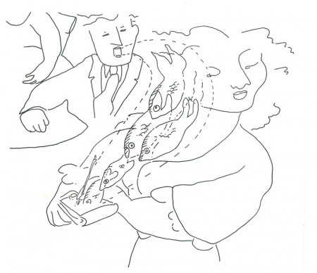
Maureen Selwood’s Odalisque (1981)
Selwood calls attention to a more naturalistic figuration as the basis for a realism regarding women in Western art. By juxtaposing two styles in a jarring fashion, she poises fluid, graceful motion associated with the feminine against the disintegration and evaporation of form associated with the cartoon world. Made with the aid of romance and adventure—as a cafe artist and an opera singer—in these dreams, she deflates as male fantasies the romantic conventions usually associated with these constructs. In each sequence, she escapes the conventional confines of the fantasy that would relegate Woman to passivity or death and flows back to her living room, her visually nurturant world.
Whether there is an inherently feminine language in these works as well as in women’s writing, visual arts, and other expressive arts has been a topic of much feminist discussion in the 1970s and 1980s. Some critics maintain that even acknowledging the existence of feminine language does not insure that such “inscriptions of women’s voices” will be necessarily heard by all audiences. Female filmmakers frequently rely upon existing codes and conventions no matter how much they are filtered through their own vocabulary. In addition, their audiences may choose to interpret the films within the confines of already established canons, an act sometimes amplified by the films’ marketing and critical reviews.
What is at stake here is not the discovery of a feminine or feminist aesthetic running through women’s animated films, but the ways in which contemporary animators collectively construct feminist experience. They rely upon devices usually associated with expressive animation—physical metamorphosis, strongly-defined character personalities, and dream-like fantasy logic. But they represent these processes by defining women as their subjects, presenting specifically female sexual and non-sexual fantasies, and imagining self-identity and fears through one’s physical changes and fluidity as well as through controlling the environment outside oneself.
Articles on Animation &Hubley &Independent Animation 29 Jun 2010 07:46 am
Traditional Animation Transformed
- Mike Barrier wrote an excellent article on the Hubleys for the 1977 Millimeter Magazine animation issue. Short and concise, it really put their careers and their work into fine focus. The magazine was released in February 1977, just prior to John’s death, February 27th of that year.
With Mike’s consent, and my grateful thanks, I’m posting it here. (I haven’t given enough attention to John and Faith lately.)
Traditional Animation
Transformed
by Mike Barrier
For more than 20 years, John and Faith Hubley have been hacking an idiosyncratic path through the jungle of post-war animation. Temperamentally — one might almost say ideologically — they are avant-garde, but they have little in common with the frauds and bores who have appropriated that label for themselves; you will not find their names in the index for the new book Experimental Animation. They have firmly and frequently turned their backs on the animation tradition rooted in Walt Disney’s cartoons — yet their films are linked to that tradition in various and subtle ways. The Hubleys have made films for television, but of all the people who have worked in that medium, they would seem the least likely to work on an animated special that was in any way conventional. However, they have now turned their hands to a TV special based on a comic strip.
Neither the comic strip nor the Hubley’s method of transferring it to the small screen are conventional, however. The comic strip is “Doonesbury,” and the Hubleys are making the special in close collaboration with Garry Trudeau, the strip’s artist-author. The storyboards are a mixture of Hubley and Trudeau drawings, and Hubley says that he, Faith and Trudeau cast votes of equal weight when decisions are made on the story. The special will be on NBC, probably in either the spring or early summer of 1977.
Trudeau and the Hubleys are not strangers; they met in 1968, when Trudeau was a student at Yale and the Hubleys were teaching their first classes in a course called “The Visualization of Abstract Concepts.” Animation courses are common now on U.S. campuses, but the Hubleys’ course is markedly different from most others. The students are not taught how to animate; instead, they are taught to think in certain ways. In effect, they are encouraged to devise animatable symbols for abstract ideas. The ideas generated in the course are converted into animated films later by the students as well as the Hubleys and their staff. Voyage to Next — in which nationalism is represented by boxes filled with people, floating aimlessly on the stream of history – went through the Yales class process as did Cockaboody and EVERYBODY RIDES THE CAROUSEL, a feature-length film, based on the writings of Erik Erikson, that was shown last fall on CBS.
Despite its origins in Yale’s rarefied atmosphere, the “Doonesbury” special will be aimed at a larger audience than the Hubleys have ever sought before (except in the TV commercials they used to make). It is, unavoidably, a highly commercial project, and so, filled with pitfalls for two filmmakers who have steadfastly turned their backs on mass taste.
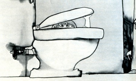
Cockaboody, a tender and sensitive commentary on childhood.
John Hubley ventured into the world of big money and high-powered entertainment in August 1975, when he became the director of an animated version of WATERSHIP DOWN. He was discharged from that job a year later, after sharp disagreements with the producer, Martin Rosen, over creative and production control of the film. Hubley had spent half of the 12 months he worked on the film in England, and half in the U.S., working with both American and British crews. (Bill Littlejohn and Phil Duncan were among his American animators.) Hubley’s comments about the break with Rosen are guarded, because he has filed a suit against Rosen for breach of contract; but it seems plain that Rosen wanted a more violent and emotional film than Hubley was prepared to give him.
Throughout their long collaboration, the Hubleys seem to have been happiest when they could work in an atmosphere entirely free of commercial considerations. Since they began working as a team in 1956, their work has fallen, roughly, in three categories: purely commercial films, like TV spots; sponsored films, which come equipped with fixed budgets but considerable creative leeway; and their purely personal work — Moonbird, Tender Game — which they financed with their earnings from the other kinds of films.
In all three types of films, the Hubleys have employed a dazzling variety of techniques, ranging from traditional line animation to the animation of blocks of color to the animation of cutouts. Two elements have been constant. All of their films reflect the influence of modern art — or, to be frank about it, modern art as it has been adapted and domesticated by commercial artists and designers. More important than the graphic style itself is the use to which the Hubleys have put it (and this is the second constant in their work): abolishing the traditional distinction between characters and backgrounds.
In a typical Hollywood cartoon of the ’30s or ’40s, the characters move against the backgrounds like actors working in front stage settings. The characters are composed of lines and flat, bright colors, against settings that are realistically modeled and painted in muted colors. The characters are treated as color accents; they “read” against settings that are designed to set them off.
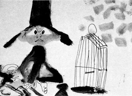
A still from Moonbird.
In most of the Hubleys’ films, no such boundary exists; characters and settings are cut from the same bolt. Movement alone sets them apart. This integration of characters and backgrounds — not any simple enthusiasm for modern art — was at the heart of the UPA studio’s rebellion against the Disney style in the middle ’40s. It was a layout man’s rebellion. The ultimate effect was to elevate design — the overall “look” of a film — at the expense of animation. Layout men, who had been subordinate to the animators at Disney’s, were now in the driver’s seat.
Two of UPA’s three original partners — Zack Schwartz and Dave Hilberman — had been Disney layout men, as John Hubley was. When Hilberman and Schwartz broke with Steve Bosustow (the third partner) in 1947, Hubley became a vice president of the studio, and its creative head. Hubley supervised the work of directors like Robert Cannon and Pete Burness, and directed a number of films himself, most notably Rooty Toot Toot (1952). The most distinctive UPA films thus bear Hubley’s stamp, more than that of any other man.
Hubley left UPA in the early ’50s; he was a victim, like many other UPA staffers, of the witch hunts by the House Committee on Un-American Activities. He formed his own TV-commercial studio, Storyboard, and then he married Faith Elliott, who had been hired as his assistant for an aborted production of Finian’s Rainbow. Faith — who had worked in live-action films before marrying John — has been his collaborator ever since; but their films are, in some ways, extensions of the work that John Hubley did at UPA, but reflect a less commercial, more personal approach. (Faith Hubley has completed two films of her own in the last two years: W.O.W. and Second Chance.)
UPA sold itself not only as an alternative to the Disney style, but as a repudiation of it. John Hubley still talks that way on occasion, and the Hubley films sometimes become pretentious and didactic. Films like The Hole (1963) and The Hat (1964) while nice to look at, suffer from windy, enervating dialogue tracks; the lessons they offer — about international boundaries and nuclear war — are too simple to bear repetition for even a few minutes. Of Men and Demons (1970), is also a “lesson” film — this time the Hubleys are concerned about the environment — but it is much better because the villains of the piece (demons representing fire, wind and rain), are ingratiating scoundrels; the characters are stronger than the ideas they are supposed to serve.
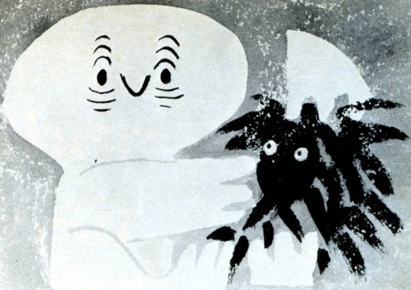
Adventures of an *.
Here we come to a paradox in the Hubley films. The best ones — the ones in which the Hubleys’ own feelings and experiences are to the fore — have a great deal in common with the Finest cartoons in the despised Disney tradition. Some of the very best Hubley films, such as Moonbird, Windy Day, Cockaboody and the opening sections of Everybody Rides the Carousel, are tender and sensitive commentaries on childhood. The graphic devices, the quicksilver metamorphoses — as children become what they imagine themselves to be, and beasts lunge from the mouths of howling babies — all serve, in the end, not to explicate ideas but to delineate character. In other words, these films are as much concerned with personality as are the best Disney films; they are very different from the Disney films to be sure, but they have sprung from the same seed, the urge to create new life.
The best Hubley films do not spit in the face of animation’s greatest tradition. Instead, they show how that tradition could be transformed and enriched, if it were still in the hands of people who cared as much about their work as the Hubleys care about theirs.
© 1977 Mike Barrier
Articles on Animation &Independent Animation 18 Jun 2010 07:42 am
Norman McLaren – WHO ?
- I was recently in a conversation with a young animation student. In the course of our chat, the student commented on a DVD on my desk; he didn’t recognize the filmmaker’s name. Norman McClaren. I gave him a small lecture about the master’s work and suggested the student start doing some research (even if only on YouTube.)
I came across this article by Gerald Buddner in “The Art of the Animated Image”, and anthology edited by Charles Solormon and published by AFI in 1987. I have to post it.
at Work
First Impressions of Norman McLaren
BY GERALD BUDNER
ver 40 years ago—the summer of 1946—while visiting a school friend who had a summer job at The National Film Board of Canada, I was invited to Miss Evelyn Lambart’s dinner party for Norman McLaren. Conversation was marvelous, dinner was delicious and helpings very ample. I remember it included the perfect fruit dessert—this was followed by another, a “shape.” This Victorian Triumph about 14″ high of molded Creme de Menthe was, sad to say, more than any of the guests could manage, which caused but a moment of disappointment. Suddenly Norman lifted Miss Lambart’s beautiful Georgian dessert trowel, and in about a minute flat, with a few deft strokes, was able to convert the quivering delight into a sculpted Jade Chinoiserie in a Brighton pavilion style—complete with grottoes and waterfall, bridge with fisherman catching giant carp, a pagoda above a lily pool complete with wading storks. The whole exercise was super speedy and enchanted the assembled company. From that moment, I knew I was privileged to be in the presence of a Genius.
The following morning at the Animation Department in the abandoned sawmill, I was invited to see the artists – at work.
Thinking I would witness leaping figures, etc. I was instead spellbound to hear a few absolutely clear and fresh phrases of Bach, drawn—that’s rightdrawn on the sound track. This was the beginning of a 40-year-long enchantment. The magic of the shy McLaren was at work.
From the beginning, the professional life of Norman McLaren was characterized by a creative spirit toward art and music, a finely honed perception for the importance of technical brilliance, a unique sense of humor and a deeply developed sympathy for the whole of mankind. Frugal by nature, he was accustomed to working with the scantiest of means. Inspired by movement, he was able to use characters and even props as puppets. He scratched sprightly images with needles and razors onto raw film stock with delightful and unexpected effects. One of the first animators to experiment with drawing, scratching and engraving both the picture and sound directly onto film, he is also acknowledged as being one of the pioneers of 3-D animation. The effects of his innovation grow more impressive with each successive viewing of the films. Meanwhile he drew and painted continually, offering his works to his admiring friends.
Born in Stirling, Scotland in 1914 to an artistic and cultivated family, he was encouraged to pursue music and art from a very early age. He began a five year course at the Glasgow School of Art, headed by John Rennie Macintosh, specializing in interior design which related to the family business. He was already intrigued with film, and at twenty years of age, he entered two films in a Scottish amateur film festival, where they won awards and attracted the attention of the adjudicator, John Grierson.
Impressed by the obvious talent of the young artist, he offered McLaren a position in London with the prestigious General Post Office film unit where he was taught the craft of film-making. After leaving the G.P.O., he worked as a cameraman during the civil war in Spain. Haunted by his nightmarish experiences, he came to New York in 1939 where he was encouraged by the founders of The Guggenheim Museum and other New York film people.
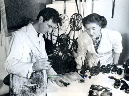
Begone Dull Care, 1949, McLaren at work with Evelyn Lambert.
At that time, the Canadian government created The National Film Board with John Grierson as the first Government Film Commissioner. The “Board” had a very significant mandate to fulfill, not the least part of which was to help, through the film medium, to unify a diverse, thinly populated and vast country. Grierson was quite up to this task, but was soon aware of the danger posed by the very serious and worthy, but nonetheless somewhat heavy-handed zeal of the young filmmakers. This heaviness, although well intentioned, could have been disastrous for a new and untried governmental film organization. By 1941, Grierson was able to convince McLaren to bring his inventive genius, his wacky humor and his artistic conscience to Ottawa, to add some leaven to the earnest mass of vital information being produced for a country at war.
The wisdom of this action was soon evident: the meteoric power of the amazing McLaren was launched. The National Film Board would never be the same! Canada would never be the same! The results would bring delight to Canadian filmgoers and to people around the world, fame to McLaren, and honor and prestige to his chosen country.
In the first years at the “Board,” McLaren was encouraged to establish an animation studio, which attracted other young talents who would contribute richly to the art of animated film in Canada. Evelyn Lambart, George Dunning, Jim McKay, Rene Jodoin, Colin Low, Grant Munro and many others soon joined him. The technical excellence and the level of artistic accomplishment achieved by McLaren’s studio soon attracted the attention of film people across Canada and in other countries. They scorned cheap commercial effects, which were a dangerous trap in this very exploitable medium. Their films were recognized as having something very special to say in a very special way. In Britain, France and The United States this plateau of achievement and artistic integrity was a cause for wonder; the choice of subjects, the graphic styles and the technical skills combined to lift animation to the plane of ART. McLaren produced many wonderful films in this early period.
In 1949, UNESCO invited McLaren to visit China and teach Chinese artists and educators audio-visual techniques. He found the experience was very rewarding on the humanitarian side, as the impoverished Chinese were at war and desperately anxious to use the simplest resources to educate their gigantic population.
This profound experience of war and revolution left an indelible mark on his sensitive and impressionable nature, as well as on his physical health.
On his return to Canada in 1950, he was invited to create films in 3 dimensions for the Festival of Britain. Around is Around and Now is the Time are the result, considered by many to be classics of this technique both for the impact of their fabulous imagery and their unprecedented and powerful sound tracks. Although rarely seen today, the films are regarded as precursors of most 3-D animated films.
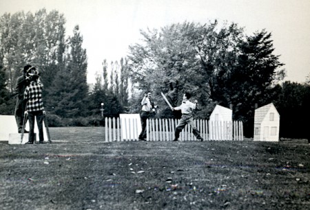
Neighbors, 1952.
It was not surprising that an anti-war film soon occupied him, and in 1952 Neighbors captured the imagination of the film world. The next year it won the Academy Award for best documentary short, as well as numerous other prestigious awards in Canada, the United States and Italy. The technique he employed animated both figures and props, which he christened PIXILLATION. The picture of escalating violent battles for possession of a single flower still sings out his sentiments on the subject of war.
Rhythmetic is a very engaging game-like film made with Evelyn Lambart. Quite surprisingly it enjoys an unexpected revival today, since young people equate it with the computer a surprising example of deja vu in a film made in 1956. Lines Vertical was also made with Evelyn Lambart, in I960. The lines were engraved on black film stock with a stylus. McLaren later told me that he was inspired to make his next film Lines Horizontal having observed the telegraph wires “animate” through the train window while travelling between Ottawa and Montreal. He used his earlier Lines Vertical to create a new film by turning the images 90 degrees! Very frugal indeed.
Mosaic (1965) combined the two Lines films by printing them together and featured a sound track he engraved himself. Pas de Deux. (1967) uses ballet dancers. The stroboscopic effect of slowed movement and controlled back lighting offers sculptral dimensions of magical proportions and depth. The sensual visual effect celebrate his passion for movement in a most elegant way—to me reminiscent of classical bas reliefs brought to life with amazing refinement. These themes were expanded in 1972 where the movement was further slowed down and the emotional impact expanded in Ballet Adagio.
All McLaren’s experiments in animated sound came together in Synchromy made in 1971. The visuals are actually identical with the sound, which was accomplished by photographing the sound cards he had made years earlier. These patterns comprise both the optically colored visuals and the sound track.
To celebrate the accomplishments of his two Parisian animator friends, American Claire Parker and Russian-born Alexandre Alexieff, McLaren made an erudite film Pin Screen in 1973. The velvety light and dark effects made with their sophisticated invention offer the effect of metamorphosing chiaroscuro, resembling stipple engravings of incredible softness and tenderness.
Following this, McLaren and his long-time associate Grant Munro created a series of films for educational use, which elucidate the basic principles of movement in a clear and easily comprehensible way. Animated Motion numbers one, two, three, four and five are very useful for students of animation, and should serve as a springboard for young artists.
Narcissus represents the peak of films that exploit optical effects. In his own words “During the first part of the film Narcissus no special effects were employed, but from the moment Narcissus sees his own image in the pool until the end of the film a whole variety of optical effects were used. Narcissus’ image when flipped left to right and upside down, was made to go in and out of step with itself by freeze-framing, double framing and skip framing. At times in the original shooting Narcissus had to perform two opposing roles which were later optically combined in the same frame. In one such sequence, various flicker effects were introduced, in another more extended sequence the movements (motives or actions) of each ‘Narcissus’ by a very complex optical technique are turned into flowing blurs.” Norman ’81.
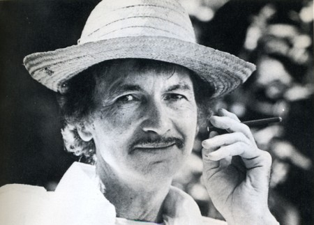
McLaren in retirement.
In the last film made with and about him in 1983 for a festival of animation films in Holland, he underlined how grateful he was for forty-two years of artistic freedom enjoyed at The National Film Board of Canada. All share gratitude for freedom, for we enjoy it too. I am confident that millions will continue to be grateful for a very long time to come. The number of his films long and short totals sixty. From the words of his life-long campanion Guy Glover, written as a foreword for a monograph published by The National Film Board “McLaren – 1980,” let me long and short totals sixty. From the words of his life-long campanion Guy Glover, written as a foreword for a monograph published by The National Film Board “McLaren – 1980,” let me quote:
“Far from the Talking Picture -That vast province of the Cinema that borders,
indeed overlaps, on the Realm of language -
There exists yet another province of the Cinema
where talk is limited and which touches on the frontiers
of Music and Dance. In a corner of that province is to be found
the little garden of Norman McLaren whose films talk only through image and movement.
A birds-eye view of McLaren his life and film work has been attempted,
without forgetting, of course,
that it is in the films themselves
that his creative character is most clearly expressed.”
Books &Independent Animation 28 May 2010 08:10 am
More Zagreb
- Last week I posted a short bit from the excellent book by Ronald Holloway, Z is for Zagreb. We saw the bio of one of the principal leaders of this studio/school. I wanted to jump a couple of years and give the bios of two others in Zagreb whose work I particularly like. One, Zlatko Grgic, did one of my favorite Zagreb shorts, Tup Tup.
I precede those bios with another short piece from Holloway’s book.
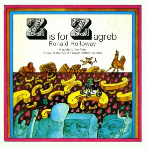 Was it really a “school”? Or a group of people who liked working together? Perhaps there’s no distinction, but the Zagreb cartoonists are proud of their individuality and even today work as free agents. Most of their films bear an individual mark, and despite tempting offers from abroad they prefer the climate of a free atmosphere to exchange ideas and seek help when they need it. The Zagreb studio is not a “school” but a “family.” No other loose climate of friendship and trust exists in animation—and the Zagreb artists had to fight to keep it that way.
Soon after the balmy days of the Cannes Festival and an awakening among their own critics to the importance of their work, the management of Zagreb Film changed and instead of increased support they were greeted with open envy and distrust. Suppose the animation department became strong enough to take over the entire company? As preposterous as that sounds, it makes sense in light of the fact that animation was the first international breakthrough for the Yugoslav fiirn industry. The cartoonists were celebrated in every national newspaper. And so to forestall any possible insurrection, the management brought in “artistic directors” to keep a tight rein on the real artists in the studio.
A further argument could be made for the “artistic director” by pointing out the directorial posts of non-designers Mimica and Kostelac. Mimica was to distinguish himself in the future through Marks, and Kostelac was to do the same through Kostanjsek. Who were actually responsible for these films: the director or the designer, or possibly the team together? And in the Vukotic-Kolar team it was even more difficult to decide, because they both were designers. In any case, the management overlooked the fact that each of these individuals gave as much as they took, and decided that all an “artistic director” had to do was find an idea and pull the work out of a designer. Animation was as simple as that.
It was an unfortunate phase, and one that even today appears confused and knotty. Vukotic and Mimica remained essentially unaffected and both worked in complete harmony with the units under them. Two other directors, Dragutin Vunak and Ivo Vrbanic, were not exactly new to the ranks and for the most part were successful in forming new units. The Neugebauer Brothers had left for Germany, and some new blood was needed to replace them. The designers were not confident to start out on their own, and didn’t always mind if someone else took all the risks. The trouble arose when two young graduates of the theatrical academy. Mladen Feman and Bohslav Mrksic, were brought in by the management to run their own show without any previous experience at ail. It is worthwhile to compare the careers of Vunak, Vrbanic, Feman and Mrksic.
Vunak came from Interpublic and fitted in well with Zagreb Film’s advertising department. He had previously worked with Dovnikovic and they collaborated on the picture-book A Small Train. Later he brought in an artist friend, Aleksandar Srnec. to help create the experiment film The Man and His Shadow. He gave young Ante Zaninovic his first start with Cow on ihe Frontier, appearing at a crucial time in Zagreb’s history and saving the studio from total eclipse. He fitted a superb idea to the offbeat talents of painter-sculptor Zvonimir Loncaric and made the credible Between Lips and Glass. In between he made a few bad films. The interesting factor is that each of Vunak’s successful films is in a completely different style, which leads to the conclusion that Vunak is only as good as his designer. But he nearly always picked the right designer lor the right idea, and they got along well together. Th^films could not have been completed without him.
Ivo Vrbanic is not quite in the same category. He made too many films too quickly, and most of them turned out badly. His name first appears as a co-writer of Vukotic’s satire on the horror film, The Great Fear, and he surprisingly enough has the same credit on Mimica’s Alone. He formed a brief partnership with Dovnikovic on Romeo and Juliet, and then seemed to hit the right combination with painter-designer ivo Kaiina on children’s films; A Ballad. All the Drawings of the Town, and Dance on the Hoof. He was the perfect answer for the departing Neugebauers, but he was never able to reach the heights of A Ballad and All the Drawings of the Town again. The team of Vrbanic-Grgic—Adam and Eve, Love and Film, The White Mouse, and The Rivals—shows a general discomfort with satire, although there are many nice touches throughout. The biggest mistake of Vrbanic’s career was coming into contact with the volcanic Vlado Kristl. They are billed as co-directors of La Peau de Crfagrin. but Vrbanic has very little to do with the cartoon as a whole and they were in constant disagreement from beginning to end. Vrbamfi as an artist always seems to be out of his depth in the adult cartoon but he probably would have been successful in the old Duga days.
Mladen Feman was also assigned to satire—and was the first to run headlong into the temper of Kristl. Kristl, one of the country’s leading abstract artists, had just returned from a trip through Europe and South America, and was not about to be suppressed by young graduates from the theatrical academy. They battled throughout The Great Jewel Robbery, a follow-up parody on Vukotic’s successful Concerto for Sub-Machine Gun that turned out to be better artistically and commercially than the first one. He next tried to supervise the formidable Marks in a follow-up to Vukotic’s Cowboy Jimmie, and again it was clear who was really in control of the film. He made one last attempt to prove his own worth on the doomed Inspector Mask series by directing, designing and animating independently, then left the feature cartoon for good. It can be argued in his favour that Feman never really had a chance to prove his worth under the prevailing system.
The worst case of artistic suicide was the strange career of Borislav Mrksic. He was matched with veteran designer Ismet Voljevica on the ill-fated The Kite, which is in the running for the ugliest film ever made and should be shown at the Annual Congress of Artistic Directors. After this disaster Mrksic disappeared from the studio, and Feman and Vrbanic were eventually to follow him.
Toward the end of the Fifties articles began to appear in the newspaper condemning the policy of suppressing the studio’s leading talent. Fadil Hadzic led the crusade, and he even went so far as to include Vukotic and Mimica among the guilty parties. All the credit for animation should go to the designer, he contended—an equally fallacious argument- But after a while the management went through another change and the integrity of the artists was restored. An axiom was adopted at the studio: an animated film is an author’s film. The ideal situation was for an author to be responsible for everything, from first conception through design and animation. Direction and animation need not necessarily be separated. It is an axiom that has lasted until today.
Only it’s too bad it had to cost the talents of the studio’s best artist.
Zlatko Grgic
(Born 1931 in Zagreb).
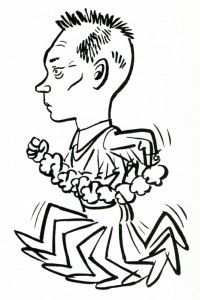 Studied journalism and law before turning to cartoons in 1951. He contributed some cartoons to Kerempuh and assisted as animator on Kostelac’s Opening Night (1957) and Encounter in a Dream (1957). He was the chief animator on Norbert Neugebauer’s The False Canary (1958), and Vukotic’s The Great Fear (1958) and Revenger (1958). He was Vukotic’s designer and animator for Cow on the Moon (1959), and later directed under Vukotic’s supervision A Visit from Space (1964) and The Devil’s Work (1965). He formed a team with Vrbanic in 1 960 and designed and animated for him Adam and Eve (1960). Love and Film (1961), and The White Mouse (1961), and animated his Rivals (1962). He was the animator on Vrbanic-Kristl’s La Peau de Chagrin (1960). He began as an independent director on an advertising film in 1960. designed and animated Branko Ranitovic’s children’s film Nisu Znaii jer su Mali (1960) for Zora Film, and directed in the Case (1961) and Inspector Mask (1962) series. Forming a team with Stalter they co-directed The Fifth (1964) and Scabies (1969). Staiter was Grgic’s background painter on The Musical Pig (1965) and Grgic was Stalter’s animator on Boxes (1967). Grgic also helped Dovnikovic on his script for Krek (1967), after Dovnikovic assisted him on the script for The Musical Pig.
 After The Musical Pig Grgic has directed independently Little and Big (1966), Inventor of Shoes (1967). and Twiddle-Twaddle (1968), and co-directed with Branko Ranitovic Tolerance (1967) and The Suitcase (1969) (for Viba Film). Inventor of Shoes prompted the Professor Balthasar series (1969), the studio’s first successful adventure into a series and the combined work of Grgic. Kolar and Zaninovic. His mini mini creation is Maxi Cat. A master of free, dynamic animation with numerous twists, witty gags and unexpected turns. Grgic is one of the subtlest poets in the animation business.
Nedeljko Dragic
(Born 1936 in Paklenica).
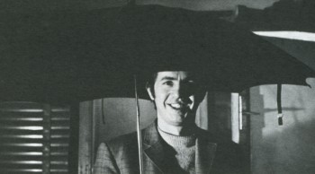 Studied law in Zagreb and worked from 1953 for a number of newspapers and journals as cartoonist. He published in 1964 a book of his cartoons, Alphabet for Illiterates, and has won awards for his “anti-” comic strips. His first contribution to the Zagreb studio was as designer for Ranitovic’s The Dreamer (1961), Kostelac’s Cupid (1961), and Vrbanic’s Rivals (1962). He designed and animated in the Inspector Mask series (1962), and returned to the studio again in 1 964 to design Pejakovic’s Once upon a Time There Was a Dot. His first independent cartoon was Elegy (1965), taken out of a page of his cartoon book, and from a Mimica script he created
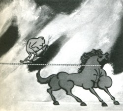 the impressive Tamer of Wild Horses (1966). But the pure Dragic is to be found in Diogenes Perhaps (1967) and Passing Days (1969), winners of numerous international awards. He scripted Blazekovic’s The Man Who Had to Sing (1970) and did the backgrounds for Dovnikovic’s The Flower Lovers (1970). He did the first mini mini films. Per Aspera ad Astra and Striptease (both in 1969), to introduce the studio’s annual production and started the creative one-minute fad. Dragi6′s satirical slams are unmatched in animation, stemming from his rich newspaper experience. He balances his sharp criticism of the world’s inhumanity with poetic touches of melancholy and nostalgia for a saner life.
The unfortunate part of the book is that it was written in 1972 and doesn’t detail, as a result, the most important part of both of these artists’ careers.
Images:
1. Book cover – Z is for Zagreb
2. Zlatko Grgic
3. The Inventor of Shoes
4. Nedeljko Dragic
5. Tamer of Wild Horses
Animation &Animation Artifacts &Commentary &Independent Animation &Puppet Animation 22 May 2010 09:05 am
Bits
- I recently received this comment from Amy Bunin, the daughter of Lou Bunin, and was afraid it might have been missed. So I’m posting it here.
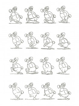 Just a note to say that my sisters and I have put our family collection of Lou Bunin’s puppets and artwork from Alice in Wonderland up for auction at Profiles in History.
Lou’s stuff is on “Day 2″ of the auction. The sketches by Art Babbitt of the Dodo walking that are featured in Shamus Culhane’s Animation book (see above) –along with 10 or so other characters– are included: Lot 634. Wish us luck!
I have also started a blog on my father’s life and work – www.loubunin.com
Amy Bunin
This is an excellent blog with lots of information and stories about Lou Bunin and his work. I encourage you to go take a look.
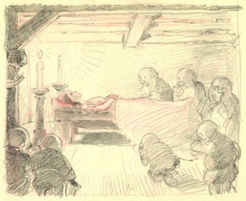 - John Canemaker ‘s most recent blog entry for Print Magazine is now posted and can be found here.
John writes a clear and full comparative study between the work of Albert Hurter, one of the principal designers of Snow White, and some of Giotto’s Renaissance painting.
He shows how Hurter may have been influenced. It’s a good read for any enthusiasts of Snow White, Hurter or Giotto.
Frank and Caroline Mouris have been making innovative, Independent animation forever. Their initial film, Frank’s Film, swept the world quickly and won the Oscar making a Frank a household name among animators in the 1970′s.
ASIFA-East is presenting an evening of their films on Tuesday, June 15. It’s sure to be an entertaining and enlightening event. Keep the date open to join the couple as they present their films.
