Category Archiverepeated posts
Animation &Hubley &repeated posts &walk cycle 09 Jul 2009 08:12 am
Recap – Georgia walk
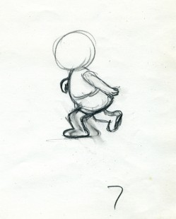
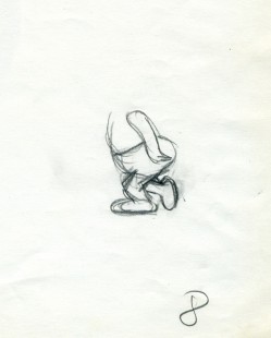
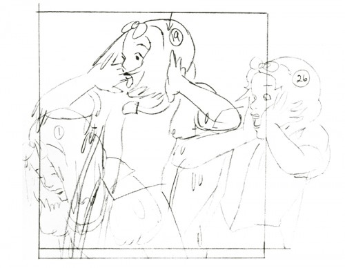
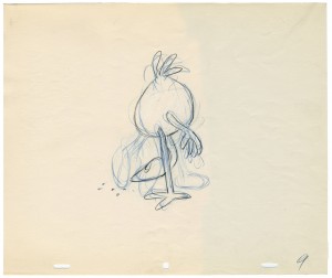
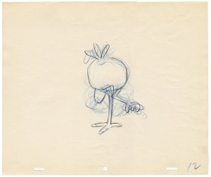
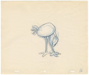
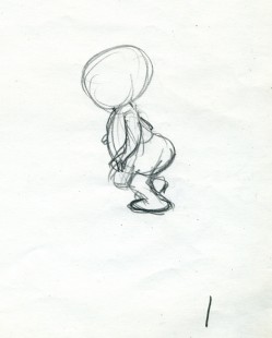
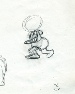
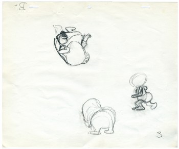 – Having posted a piece about John and Faith Hubley‘s Cockaboody yesterday, I thought I’d take the opportunity of showing off another older piece from Aug ’07. This walk cycle was animated by Tissa David. The drawings are partic-ularly rough – her first shot at the walk designed for her eyes only.
Tissa is careful not to use too much paper. Hence she reuses old paper for her very rough preliminaries as she figures out her animation.
It’s frequent, when visiting her work space, to see lots of pages featuring characters on both sides of the paper upside down as well as sideways. She doesn’t often let these rough roughs out of her hands before she throws them out. I guess I was there at the right time and talked her into giving me these drawings.
She animates the walk, here, on top pegs bacause that’s all she has left of space. Tissa nomally works on bottom pegs. Actually, since this is going to be a sliding cel, it would have been done top pegs anyway.
Georgia, the younger girl, leaves the bathroom and moves to the floor to play with a doll (whose head she accidentally pulls off).
 1
1 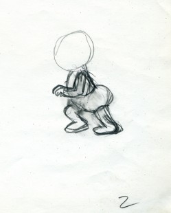 2
2
(click any image to enlarge.)
 3
3 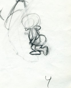 4
4
The walk is heavy and a bit flatfooted. She doesn’t come down on her toes but plants the entire foot.
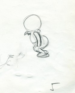 5
5 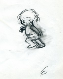 6
6
Her arms are high because, a baby, she’s still a bit off balance.
Click the very lower left to put the QT into motion.
Click the lower right to watch it a frame at a time.
Photos &repeated posts 28 Jun 2009 08:31 am
Recap – PhotoSunday Gypsies
Last year, I offered a showcase of some of the local color, the Fortune Tellers, Crystal Readers and “Gypsies” in the area. I’m planning to have a follow-up post to this (so many more have opened in town), so I thought it’d be enterprising to recap the original. Here that post from April 2008:
 - The thing about New York is that there are an awfully large number of Gypsy fortune tellers. They seem to be nicely hidden, part of the fabric of their street front locations. Oftentimes, they occupy store front locations, but sometimes they take up space on the second floor of buildings.
It’s hard to tell how they make enough cash to pay the somewhat high rents they have to cover. I’d always assumed that it had something to do with illegitimate betting or drugs or something. Then I read a New Yorker article several years ago which revealed the answer – crystals.
I decided to photograph all that I saw on my walk from home to the studio. The first thing I came upon, on Park Avenue and 29th Street, was this posterboard for an out-of-sight store. I looked, somewhat cursorily but couldn’t immediately locate it.
_______(Click any image to enlarge.)
_____________________________.__________They turned out to be hidden behind
some construction. The shop was on the second floor of a small building undergoing a face lift. No wonder they felt the need for a _street placard, half a block away.
_ __
__
_They were forced to use the construction work to advertise their business. This has to be _hard for them.
_
_ __
__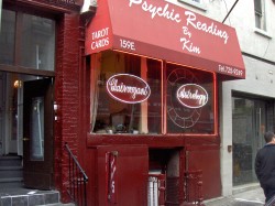
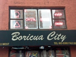
_This space is located between Lexington & Third Avenues on 29th Street. It sits adjacent _to an excellent Thai restaurant.
_
_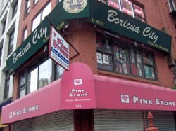 __
__
_Farther west, on the corner of 29th Street and Sixth Avenue, there’s one on the third floor.
_A business with plenty of neon advertising; you could mistake it for a nail salon if you
_weren’t looking for it.
_
_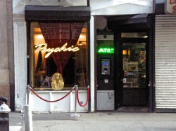 __
__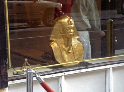
_This space was on 21st Street between 5th and 6th Avenues. The pharoah head seems
_to be a familiar that appears in seveal of the windows. It obviously means something I _don’t understand. “Mummies welcome.”
_
_ __
__
On Sixth Avenue just off 14th Street there’s this second floor shop. They’re closed this morning, consequently it’s hard to tell if they have neon lighting as well. The windows, this morning seem to be closed off; they’re probably still asleep. (Of course, the “fortune tellers” usually live in these spaces.)
_
_ __
__
_A block away from the studio, on Houston and Bedford Streets, there’s this
_space just above the “Quick Deli.” The awnings are the only announcement of their _location. It’s a one-floor walkup.
_
_____
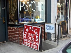
____This storefront sits just above my studio. It helps me identify where the studio is.
____I just tell people to walk down the stairs just beneath the “Psychic.”
_
_ __
__
_These are the artifacts to be found in the window of the “Psychic” storefront above me.
_As I said, the New Yorker article suggested that they sold crstals. If they found two or
_three customers a year who would come back regularly for new and more helpful crystals,
_it would cover the year’s rent. It’s an alien world to me. I can’t imagine even walking
_into the stores.
_
_ __
__
_I’ve also noticed three or four used cars irregularly parked on the street. They all have the
_“For Sale” signed painted on the rear windows. The seller is this store’s operator.
_When I moved in, four years ago, my landlord told me that he was paid every month, on
_time, in cash. Those crystals must be selling.
_
_____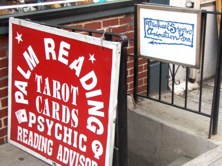
_____This, of course, is the entrance to the walkway to my studio. Très discrete.
_____I’m supposed to have exclusive use of the wrought iron fence for signage, but
_____as soon as I put something up, their placard arrived. Why argue? For some
_____reason everyone notices my sign, and some curious visitors have turned into
_____clients. Usually it’s someone wanting to know what an animation studio does
_____ or they’re looking to buy a cel. (Maybe I should sell them.)
These were the shops most obvious to me. I’m sure I walked past others without noticing. There are many, many more of these store front places. I don’t think they wander much beyond the second floor, since they have to be there for the curious person looking to have their fortune told, tarot done, or buy those crystals.
Animation Artifacts &Commentary &Luzzati & Gianini &repeated posts 18 May 2009 07:36 am
Giulio Gianini 1927-2009
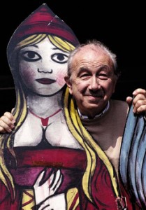 – I’ve been something of a fan of the films of Luzzati and Gianini. I’d met Emanuelle Luzzati at a function thrown at the Italian Embassy in New York, years ago. I bought a book by him, and the artist drew a beautiful pen and ink drawing in the frontispiece of the book.
In 1988, I met Giulio Gianini in Italy during a stay of a couple of pleasant days with an assistant of his at the festival in Treviso, Italy.
Mr. Gianini died this past Saturday, and I wanted to offer a bit of a memorial. Emanuelle Luzzati died January, 2007 and to memorialize that I posted some illustrations and information about the duo with a lot of frame grabs from a number of the Luzzati/Gianini films. It took a few posts, and I left off without wanting to overplay all of the art at my availability.
Luzzati & friend
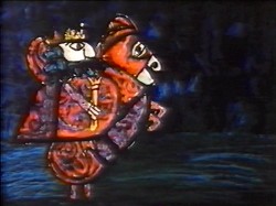
The Thieving Magpie was the first of their films to receive an Oscar nomination, and it was the first of the frame-grab posts I showcased. I’d like to post it again in honor of Mr. Gianini. He was sick for several years and in particularly bad condition. His death wasn’t a surprise, but it is still an enormous loss.
 1
1 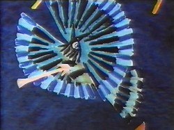 2
2(Click any image to enlarge.)
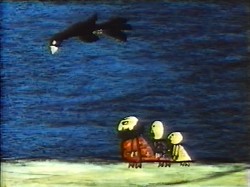
La Gazza Ladra (The Thieving Magpie) is a Rossini opera about a young maidservant who, accused of stealing a silver spoon, is sentenced to death for her crime.
At the eleventh hour, the real culprit is found to be a magpie.
A cartoon, if ever there was one. With great music!
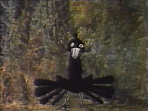
The film tells a tale wherein a king and his hunters, on a bird hunt, are beaten
by a magpie who steals their gems and ultimately destroys their village.
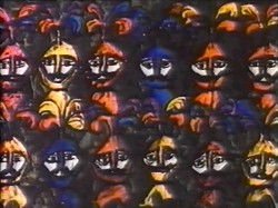 4
4 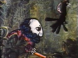 5
5
Luzzati who spent many years designing operas and ballets,
brought his knowledge to animation as the pair adapted several operas often utilizing the overtures of the operas they were adapting.
 6
6 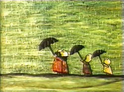 7 The film was nominated in 1964 along with
Clay, and the Origin of the Species by Eliot Noyes
and the winner, Chuck Jones’ Dot and the Line.
The Sound of Music won the Best Picture Oscar, that year.
 8
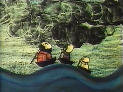
8 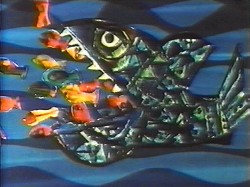 9 The use of cut-out animation wasn’t mainstream at the time.
This is years before Terry Gilliam made it somewhat fashionable. All of the
Luzzati-Gianini films were totally inventive and creative within the form they established.
Gianini’s animation was as dreamlike as Luzzati’s exciting designs. The films
look to be designed somewhere between Chagall, Kirchner and
stained-glass windows; the sensibilities are all Luzzati and Gianini.
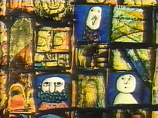 Today we have Flash animation which does just about the same thing as cut-out animation, but the form used today is flat and vulgar and cartoony. It might be useful for practitioners of Flash to take a good look at what these two brilliant designer/animators did with a similar form under more complex and arduous methods. Ulltimately, it’s all related.
You can get a bit more information about Gianini and Luzzati from the website of the Luzzati Museum in Genova.
Animation Artifacts &Disney &Peet &repeated posts &Story & Storyboards 26 Nov 2008 09:35 am
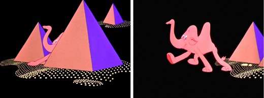
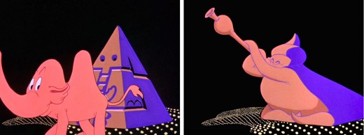
Recap – Pink Elephants
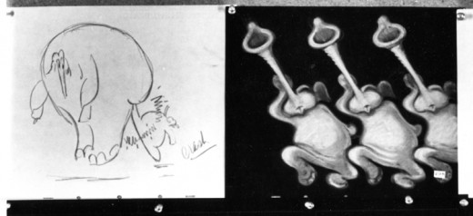
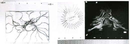
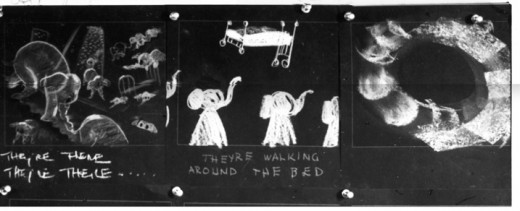
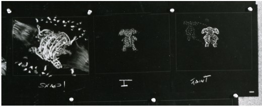
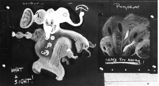
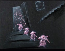
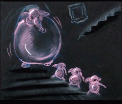
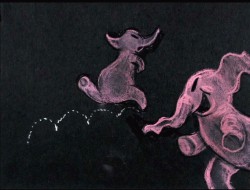
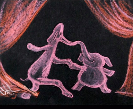
- Recently, I saw a small part of Aladdin on television. A large part of the Genie’s song reminded me of Pink Elephants from Dumbo. I thought then, that I should post anew the models/sketches and drawings from that sequence. It originally was broken in two parts when it saw daylight here in 2007. I’ve combined there into one.
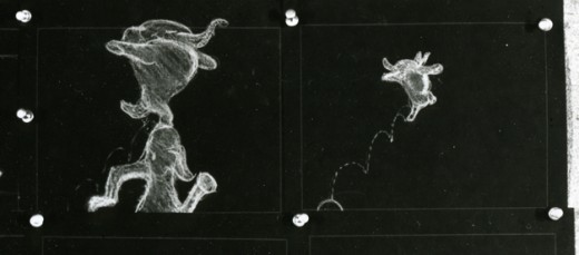
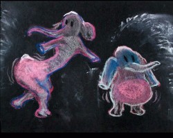
Once again, thanks to John Canemaker, I have several photo images to display. Some frame grabs accompany the piece.
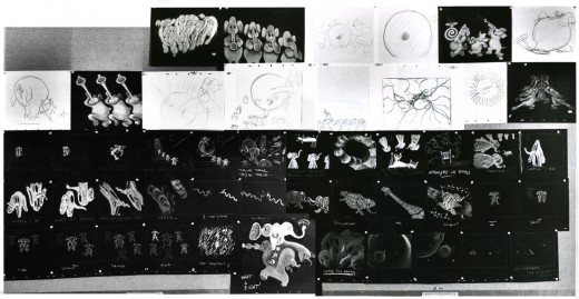
These are rather small images, so by cutting up the large boards and reassembling them I can post them at a higher resolution, making them better seen when clicking each image. It’ll take two days to post them all, so this will be continued later this week.
I’ve interspersed some frame grabs fromt the sequence to give an idea of the coloring.
The following images were in the gallery part of the dvd. These are the color versions of some of the images above.
Animation &Disney &repeated posts 04 Oct 2008 09:12 am
Rotocapture revisited
Rotoscoping got some attention back in January 2007 after a number of Motion Capture films were released. Here’s a post I did back then.
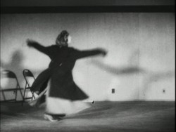 – A lot has been discussed in the past week about the validity of Motion Capture as a form of “Animation.” This conversation was instigated by the Oscar nominations. Two of the three nominations for the Best Animated Feature were created using MoCap.
Mark Mayerson questioned if we shouldn’t be deciding whether we’re officially going to call Motion Capture animation. And if we shouldn’t, then is Cars the only officially nominated animated feature?
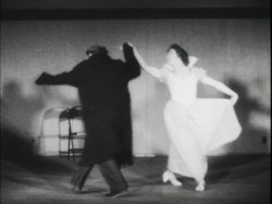 Now, of course, Motion Capture animators feel slighted. But they would have to agree that the soul, the impetus behind the movement does not come from them, but rather from the live action actor that was originally “captured”?
The comparison has been made that
traditional animation has often used Roto- scoping in creating animation. In fact, Disney’s Cinderella became the first feature that was wholly filmed in live action prior to 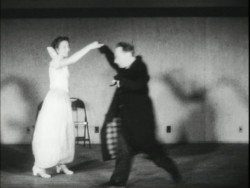
animation.
However, I’d like to make the point that the two methods are unrelated except in that live actors are involved. The difference to me, is that one is inspiration and the other is the heart of the animation.
When an animator is given live action reference material – the rotoscoped/traced drawings from the live action acting – he/she refers to it but animates to what is necessary for the scene. the animator is the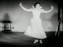 actor using the prerecorded voice, the physical rotoscoped reference, and anything available to help give the character a “soul.”
Even in Bakshi’s use of Rotoscoping in Lord of the Rings, the animators were allowed to push the drawings beyond the live action, alter the drawings to get them on character, and essentially produce the action.
When an “animator” gets the MoCap filmed live action, the actions are set. The actors have done the movement. What remains is 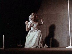 the proper positioning of the characters within the created scene, cleaning up the characters and constructing the scene. There’s no real animation, as we’ve come to know it.
For years now, I’ve called this electronic puppetry, but that’s not really accurate. The site Digital Puppetry seems to have labelled it correctly.
Younger animators seem to have less a problem with all of this labelling and irritation accrued by older veterans. In fact, the 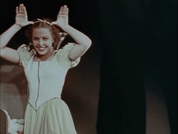 problem really is a threat to the “animator.” Last week, I hyperbolically suggested that the days of the animator were a dead as the dodo. You see, animation has turned into a computer effect. Live Action directors are now directing “animated films” in greater numbers. Peter Jackson had his “Gollum,” Robert Zemeckis had his “Polar Express” (and produced “Monster House”), Ang Lee had (and in fact acted) The Hulk. The “animators” have become interchangeable and almost irrelevant.
You aren’t able to define anyone’s animation style behind any of Tom Hanks’ characters in Polar Express. You can only see Tom Hanks or Savion Glover in Happy Feet.
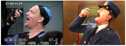
(All images except this one enlarge by clicking them.)
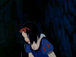
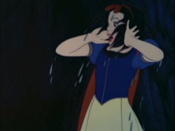
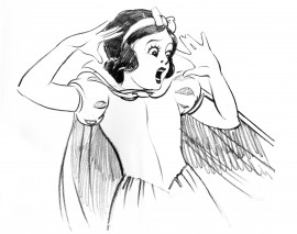
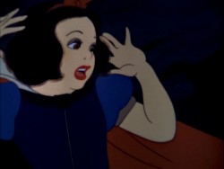
In Snow White, you can tell which scenes Grim Natwick animated; his style of animation comes across. It doesn’t matter how many rotoscoped drawings were given to him as reference. Grim animated the scenes.
In the big picture what really does all this quibbling matter? I enjoyed Happy Feet more than I did Cars. Cars was a better constructed film, both were riddled with cliches. I was entertained by all that dance. I like Savion Glover (though I would have preferred watching Savion Glover.) The film also seemed to have some sort of misguided representation of a message. I appreciated that. Cars, to me, had only a lot of loud noisy reverberation. From the first frame, the film came screaming. The artistry behind the imagery was astounding, as expected from Lasseter, but the film was boring.
Of course, this is only my opinion based on my biases. You have your opinions based on your biases. However, as an Academy voter, I’ll probably vote for Cars because I think technically it was a better “Animated” film. Isn’t that the category?
If you haven’t read Mark Mayerson on this subject, you should.
Ward Jenkins reminded me that he had two interesting posts about Polar Express on his site. It gives an interesting look at how to correct the “Zombie Eyes” on the characters. #1 and #2. Check them out, if you haven’t seen them.
Festivals &repeated posts 01 Oct 2008 08:04 am
Montreal revisited
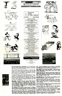
- Having been to the Ottawa Animation Festival last week, I thought back to the great grandparent of this Festival. Back in 1967 there was a world gathering of animators at the Montreal World Fair which set the stage for all other North American Festivals. Here’s a repeat of the program I posted back in 2006.
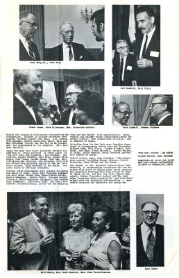
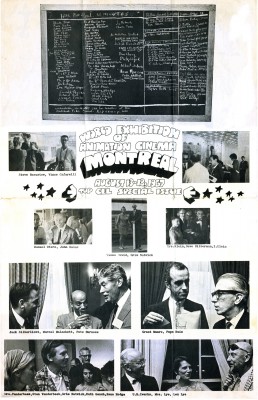
This was a special issue of Top Cel, the NY animation guild’s newspaper. Dated August 1967, it celebrates the Montreal Expo animation conference and exhibition held that summer. Obviously, this was the place to be that year if you were an animation lover.
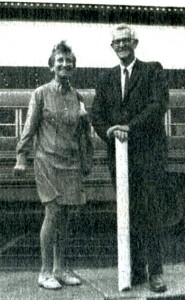 Just take a look at that list of signatures of attendees. Some of them are:
Chuck Jones, Peter Foldes, Manuel Otero, Edith Vernick, Abe Levitow, Don Bajus, Bill & Fini Littlejohn, John Halas, Ward Kimball, Ken Peterson, Shamus Culhane, Carl Bell, Pete Burness, Ub Iwerks, Gerald Baldwin, I. Klein, Gene Plotnick, Ian Popesco-Gopo, Carmen d’Avino, Bill Mathews, Len Lye, June Foray, Bill Hurtz, Spence Peel, Paul Frees, Steve Bosustow, Dave Hilberman, Stan Van der Beek, Les Goldman, Jimmy Murakami, Mike Lah, Robert Breer, Tom Roth, Art Babbitt, Feodor Khitruk, Fred Wolf, Ivan Ivanov-Vano, Paul Terry, J.R. Bray, Walter Lantz, Otto Messmer, Dave Fleischer, Ruth Kneitel, Bruno Bozzetto, Bob Clampett, Karel Zeman, Dusn Vukotic, Bretislav Pojar, Jean Image, Grim Natwick, Tissa David, Barrie Nelson, Andre Martin, Ed Smith, Dick Rauh, and John Whitney.
I guess they don’t make Festivals like they used to. There doesn’t seem to be much written about this event, and I wish some of those in attendance would write about it.
From the Wikepedia entry for Bill Tytla, there’s the John Culhane quote: On August 13, 1967, the opening night of the Montreal Expo’s World Exhibition of Animation Cinema, featured a screening of Dumbo as part of an Hommage Aux Pionniers. Tytla was invited, but worried if anyone would remember him. When the film finished, they announced the presence of “The Great Animator.” When the spotlight finally found him, the audience erupted in “a huge outpouring of love. It may have been one of the great moments of his life,” recalled John Culhane. I’m sure there were many such moments.
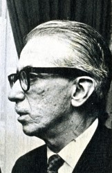 Just to make it all personal, let me tell you a story, although this has nothing to do with Montreal’s Exhibit.
Pepe Ruiz was the union’s business manager. In 1966 – the year prior to this expo – I was a junior in college, determined to break into the animation industry. Of course, I knew the military was coming as soon as I graduated, but I called the union to have a meeting with Pepe. I wanted to see what the likelihood of a “part time job” would be in animation. This took a lot of courage on my part to see what the union was about. I pretty well knew part time jobs didn’t exist. There was no such thing as interns back then.
Pepe was an odd guy who kept calling me “sweetheart” and “darling” and he told me that it was unlikely that I could get something part time in an animation studio.
However he did send me to Terrytoons to check it out.
I met with the production manager, at the time, Nick Alberti. It was obvious I was holding up Mr. Alberti’s exit for a game of golf, but he was kind and said that part time work wasn’t something they did. (He moved on to Technicolor film lab as an expediter after Terry‘s closed. I had contact with him frequently for years later, though I never brought up our meeting and doubt he would have remembered it.) Ultimately, I was pleased to have been inside Terrytoons‘ studio before it shut down shortly thereafter. A little adventure that let me feel as though I was getting closer to the world of animation.
The photos of the Expo are worth a good look. I’ve singled out those above to place around my text. The picture of Tissa and Grim is a nice one of the two of them together.
Ed Smith was the Top Cel editor at the time, and he put together a creative publication.
 1
1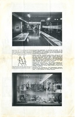 2
2(Click on any image to enlarge.)
Animation &Hubley &repeated posts 18 Sep 2008 08:20 am
Moonbird revisited
In September 2006 I posted a couple of Bobe Cannon drawings from Hubley’s Moonbird. Let’s take another look:
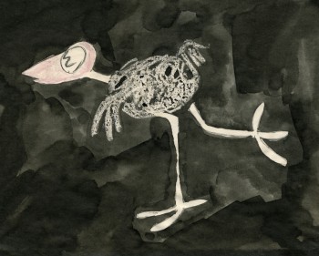 – Moonbird is one of the seminal films of 20th Century animation.
After John Hubley left UPA, where he helped explore the use of 20th Century graphics in animation, he formed a commercial animation company in Los Angeles. Apparently, with this new entity, John did less drawing and more producing. Trying to correct this problem, he closed the LA office and set up in NYC with Faith.
The studio in New York did commercials on a smaller scale. With a Guggenheim Fellowship of $8000, the couple produced a short film, Adventures of an * in 1957 and committed to doing one film a year for themselves. With this film, Hubley picked up where he’d left off at UPA. Exploration of modern art now took on the wildly successful Abstract Expressionists and told a non-verbal story using expressionist art.
The film Tender Game, done in 1958, told another non-verbal story using the song “Tenderly” to illustrate a romance, again, in expressionist art. This film, in some ways, feels like an outgrowth of Hubley’s work on the feature, Finian’s Rainbow.
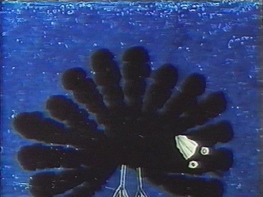
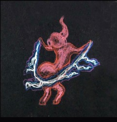
In 1959, Moonbird took a giant leap forward. The art style borrowed from the expressionists, but used a method of double exposures to layer the characters into the backgrounds. Each animation drawing was painted black outside the border of its lines. Moonbird, the character, was colored with clear wax crayon and painted with black ink. The black resisted where the wax stood and gave a loose scribbled coloring. All of these painted drawings were photographed as double exposures, shot at less than 100%, to combine characters with Bgs.
The soundtrack involved an improvised track of two children, Mark and Ray Hubley, playing. These were recorded in sessions within a recording studio and massively edited down to create the final tracks.
Bobe Cannon animated the film with Ed Smith assisting. Ed inbetweened Bobe’s scenes and animated many others.
A variation of this became the Hubley method. There was usually someone working in the studio who did all inbetweens and animated some lesser scenes. A great way to break into the medium in a big way.
Some extremes by Bobe Cannon are posted below.
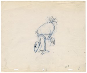
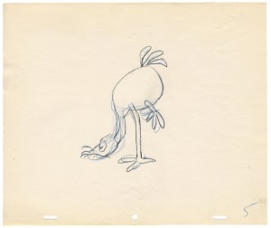
(Click on any image to enlarge.)
Here’s a link to a YouTube version of the film.
Articles on Animation &Puppet Animation &repeated posts &Trnka 17 Sep 2008 07:31 am
Trnka Graphis revisited
I love Jiri Trnka’s work, and in June 2006 I posted this. It’s worth revisiting.
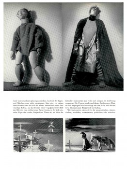
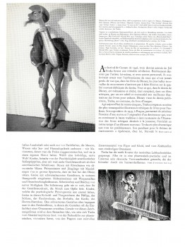
- To continue with my interest in animators that leave fingerprints, I return to the father of all puppet animators, Jiri Trnka. I have this Graphis Magazine article from 1947. This was published before any of the great Trnka films: The Hand, Archangel Gabriel and Mother Goose, Midsummer’s Night Dream.
Regardless, there are still some beautiful images in his earlier work.
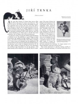
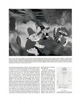
(Click on any image to enlarge.)
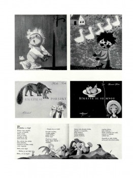
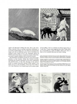
(Note: Graphis printed in three languages; all of the English is included.)
Photos &repeated posts 17 Aug 2008 08:29 am
PhotoSunday – Rerun Raggedy Sunday
This is a recap of some photos that are worth viewing again. This was originally posted November 12, 2006.
- Having recently pored over some of the artwork from Raggedy Ann & Andy (the NY contingent of the 1977 feature film), I wondered if I had any photos that I could post. There weren’t many that I could find quickly, but the few I did find are here.
The first two stills were taken for the John Canemaker book, “The Animated Raggedy Ann & Andy.” I think only one of the two appears in the book.
(Click any image to enlarge.)
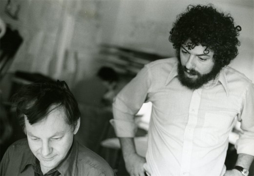
Obviously, that’s Dick Williams with me looking over his shoulder. Oddly I remember being in this position often during the film. It’s probably the first image I have of the production when I look back on it. Dick and I had a lot of conversations (about the film) with him “going” and me listening.
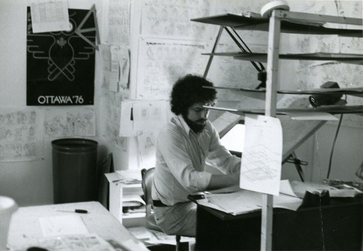
When I did actually grab time to do some drawing, this is my desk. It sat in a corner of a room – across from Jim Logan and Judy Levitow. There were about ten other assistants in my room, and there were about seven rooms filled with assistants on the floor. I had to spend time going through all of them making sure everybody was happy.
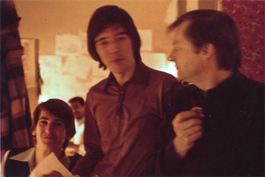
This slightly out of focus picture shows Dick Williams (R) talking with Kevin Petrilak (L) and Tom Sito. That’s Lester Pegues Jr. in the background. Boy were we young then!
These guys were in the “taffy pit,” meaning they spent most of their time assisting Emery Hawkins who animated the bulk of the sequence. Toward the end of the film, lots of other animators got thrown into the nightmarish sequence to try to help finish it. Once Emery’s art finished, I think the heart swoops out of that section of the film.
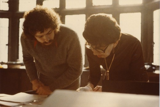
This photo isn’t from Raggedy Ann & Andy, but it just might have been. That’s the brilliant checker, Judy Price showing me the mechanics that don’t work on a scene on R.O.Blechman‘s Simple Gifts. This is the one-hour PBS special that I supervised after my Raggedy years. However, Judy was a principal on Raggedy Ann, and we spent a lot of time together.
Ida Greenberg was the Supervisor of all of Raggedy Ann’s Ink & Paint and Checking. She and I worked together on quite a few productions. I pulled her onto any films I worked on after Raggedy Ann. She was a dynamo and a good person to have backing you up.
I’m sorry I don’t have a photo of her from that period.
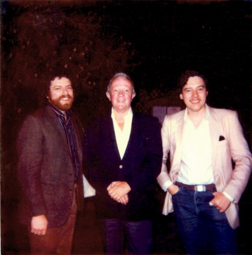
This is one of my favorite photos. Me (L), Jim Logan, Tom Sito (R). Jim was the first assistant hired after me – I’m not sure I was an assistant animator when they hired me, but I was being geared for something. The two of us built the studio up from scratch. We figured out how to get the desks, build the dividers, set up the rooms and order the equipment.
To top it all, Jim kept me laughing for the entire time I was there. I can’t think of too many others I clicked with on an animation production as I did with him. He made me look forward to going into work every day.
We frequently had lunch out, he and I, and I think this is at one of those lunches when Tom joined us. It looks to me like the chinese restaurant next door to the building on 45th Street. Often enough, Jim and I would just go there for a happy hour cocktail before leaving for the night.
I should have realized how important that period was for me and have taken more pictures. Oh well.
Comic Art &repeated posts 14 Jun 2008 08:25 am
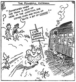
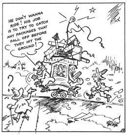
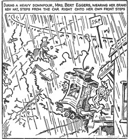
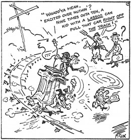
RecapSat: The Toonerville Trolley
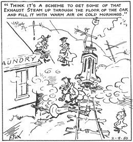
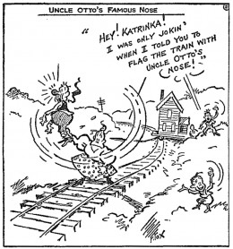
_____This is a recap of a post I did in June 2006 though I added more strips
_______________to the end of the piece.
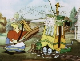
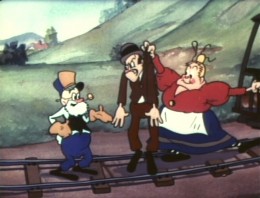
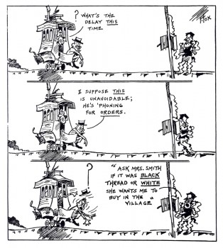 - I’ve been a big fan of the “Toonerville Folks” for a long time. I didn’t find the strip for a while. When I was young, a local TV channel, an ABC subsidiary, ran a lot of old silent Aesop’s Fables. They had classical music backing them up; usually Bizet filled the bill.
One year they upgraded by throwing a number of the Van Buren shorts in betwen the Terry silent films.
These Van Buren films, many of them directed by Burt Gillette or Tom Palmer, were odd. There were a number of films with Greek gods as their stars. Then came the shorts with Molly Moo Cow and those with the Toonerville Trolley characters.
I liked these and learned from the credits that they were adapted from a comic strip by Fontaine Fox. So, I sought out the comic. Of course, in those days, prior to computers, all you had was the library to research things. My local branch had only one or two examples of the comic strip which ran from 1915 through 1955.
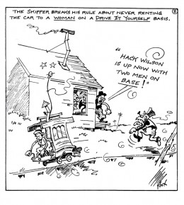
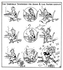
The animated shorts were made in the mid-thirties when Van Buren tried a run to improve their films. Neither sound and color nor the acquisition of the rights to this strip didn’t help; even the “terrible tempered Mr. Bang couldn’t help.” The studio closed before the decade had ended.
In 1978 I worked with R.O. Blechman as his Assistant Director to put together the PBS show, Simple Gifts. This was a packaged of six segments adapted around Christmas with a number of different illustrators designing the segments. One of them, the one I was most attracted to was The Toonerville Trolley. Blechman bought the rights from King Features (at an enormous price) for a four minute film in the middle of the program. I’d worked hard to get the piece to animate. I even did a one minute sample of the film in my off time at night, and I thought it was pretty good. However, Blechman was afraid of losing me in the operation of his studio. (We were doing more commercials than show, and I hated it.) Bill Littlejohn did a nice job of animating the entire piece which was completely subcontracted out to him. That was probably appropriate since Bill worked at Van Buren when they produced these shorts.
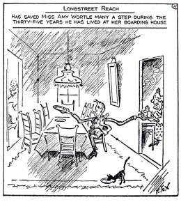
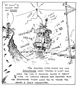
__________(Click any image to enlarge.)

