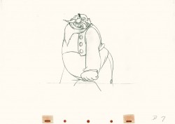
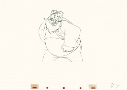
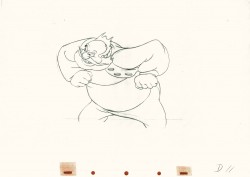
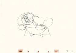
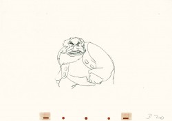
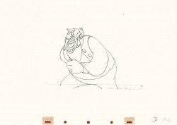
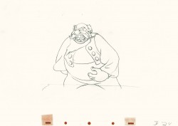
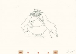
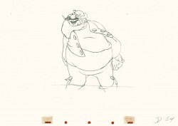
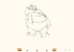
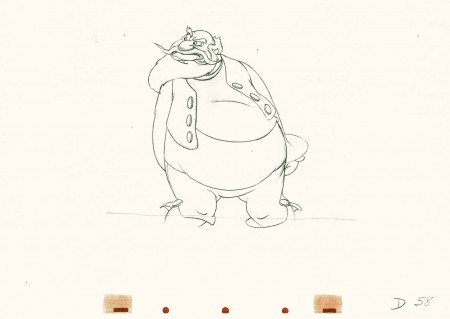
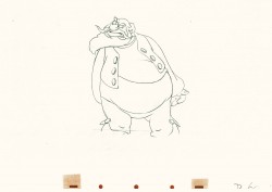
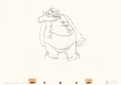
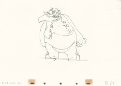
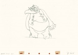
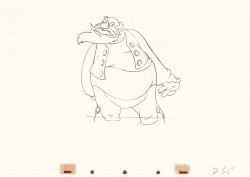
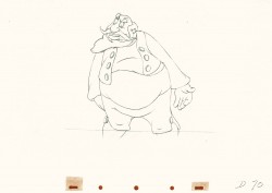
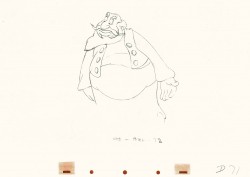
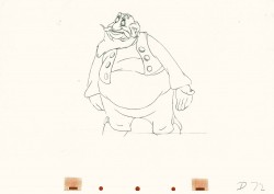
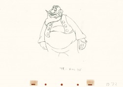
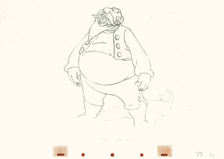
Category Archiverepeated posts
Animation &Animation Artifacts &Disney &repeated posts &Tytla 24 Aug 2011 07:09 am
Baby Mine recap
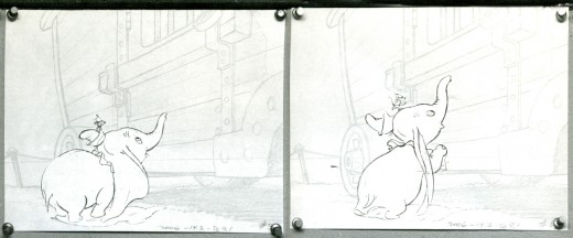
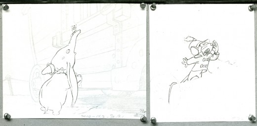
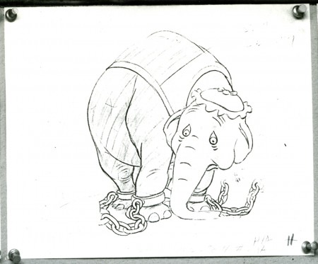
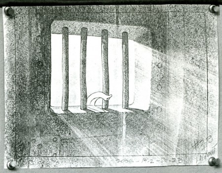
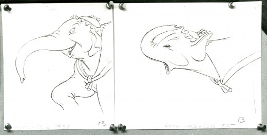
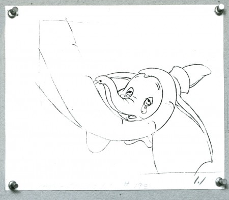
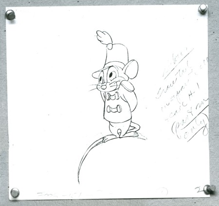
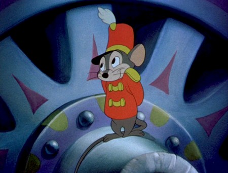
To continue with all things Tytla, here’s a representation of the “Baby Mine” sequence from Dumbo. This is one of my very favorite sequences in one of my favorite animated films. The newish Blue Ray version of this film is excellent except for one thing. The commentary on this disc pales in comparison to the 60th Anniversary DVD. The original was done solely by John Canemaker and is enormously informative. I wish John would just turn that track into a book.
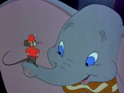 - Dumbo is certainly one of my favorite Disney features if not THE favorite. Naturally, the “Baby Mine” sequence is a highlight. The sequence is so tender and fine-tuned to appear straightforward and simple. This, of course, is the heart of excellence. It seems simple and doesn’t call attention to itself.
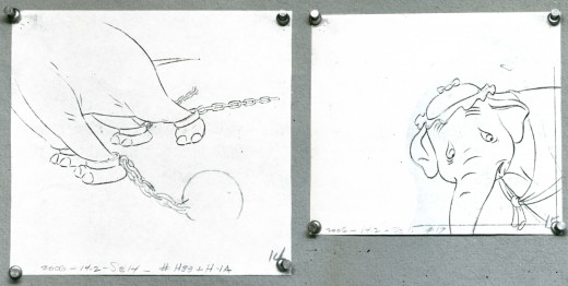
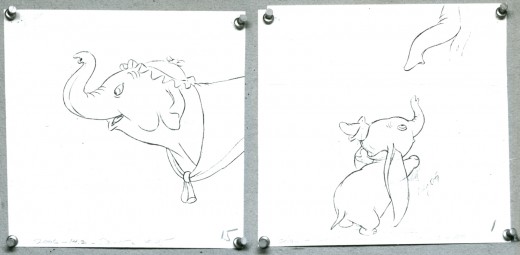
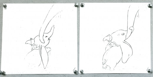
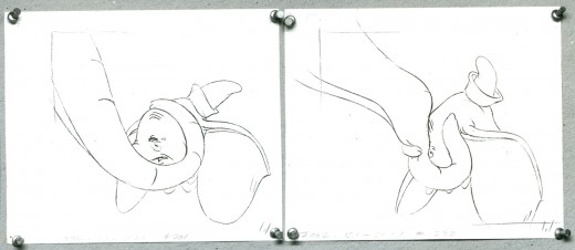
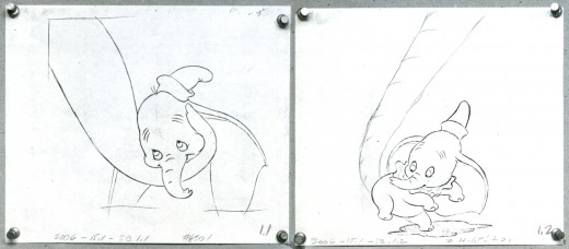
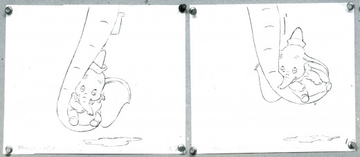
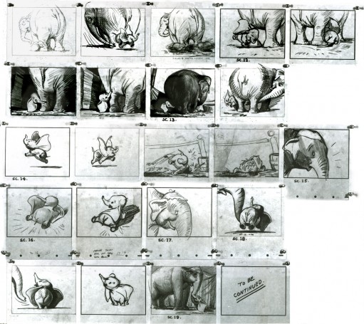
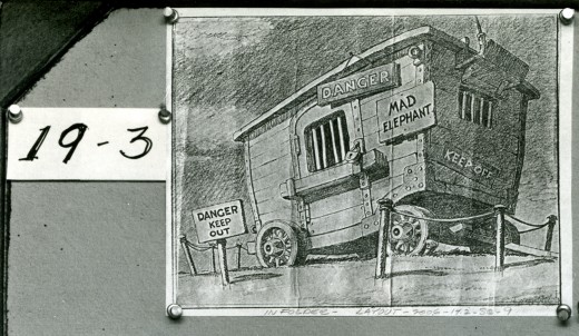
This is a storyboard composed of LO drawings from the opening of that sequence. They appear to be BG layouts with drawings of the characters cut out and pasted in place.
It’s not really a storyboard, and I’ve always wondered what purpose such boards served to the Disney machine back in the Golden Age.
Below is the board as it stands in the photograph.

_____________(Click any image to enlarge.)
Here is the same photographed board, split up so that I can post it in larger size. I’ve also interspersed frame grabs from the actual sequence for comparison.
Thanks to Steve MacQuignon for locating this video.
Info from Hans Perk at A Film LA:
Directed by Bill Roberts and John/Jack Elliotte, assistant director Earl Bench, layout Al Zinnen.
Animation by Bill Tytla (Dumbo & Mrs. Jumbo’s trunk), Fred Moore (Timothy) and assorted animals by Bob Youngquist, Harvey Toombs, Ed Aardal and John Sewell.
Hans Perk has posted the drafts for Dumbo, and this has led Mark Mayerson to post the brilliant Mosaics he’s created for the film.
Commentary &repeated posts 20 Aug 2011 07:11 am
Iwerks Recap
This is a piece I originally wrote in October 2006 for this blog. I wanted to reprise it given the amount of attention I’d given Iwerks lately re Tim Susanin‘s book, Walt Before Mickey, and the Iwerks multiplane camera.
- From my earliest days, as soon as I’d learned who he was, I was a fan of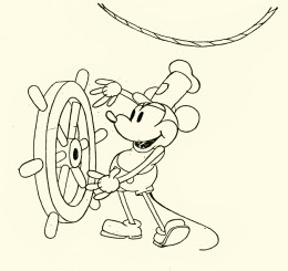 Ub Iwerks.
I began to wonder if it was just the publicity and myth of Iwerks which had followed with him all these years. We read about all those 1930′s East coast animators moving to the West, not to work for Disney but to seek out Iwerks – it was well known that he was the “true artist” behind those Disney shorts.
With Bob Thomas’ 1958 book, The Art of Animation, I read, for the first time, about Iwerks and his importance. Only recently did I begin to wonder how responsible Iwerks actually was to Disney’s success. Was this just that myth being carried over the years? Or was he brilliant?
 A quick look at the animation done at the time and we see some basics not yet developed.
There weren’t many stories written before Disney, so animators divided up their pictures. For example: They’d decide to do a film where Mutt & Jeff would go to Hawaii. One animator would start on the beach and end with them on surfboards. The animator would make it up as he went along until he turned out the required footage – maybe 2 minutes of work. The next animator would pick up Mutt & Jeff on surfboards and take them to being washed up on the beach, etc.
 Obviously, the lead animator doled out rudimentary plot points, but a lot was left to the individual animator. Look at the book, Walt In Wonderland by Russell Merritt & J.B. Kaufman to see how Disney started developing stories during this period.
The same was true for animation techniques and methods. Animation burst out of its seams with the creation of Mickey Mouse. Disney had initiated a lot of ground work, but the medium really started growing with the enormous success of Steamboat Willie. Iwerks led the way, not only by the amount of work he did but the quality.
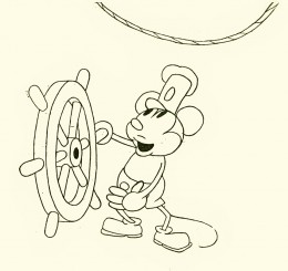
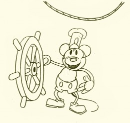
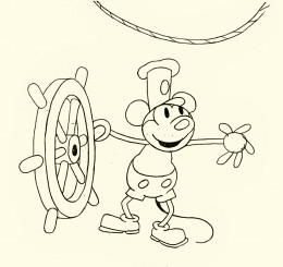 Take a look at these five Iwerks drawings from that short.
One of the first lessons an inbetweener learns is that a face turn shouldn’t have a direct middle in it. The middle drawing (#3 here) shouldn’t be straight on; it should favor, slightly, one side or the other.
Despite the simple drawings of Mickey, Ub Iwerks seemed to understand this instinctively. He didn’t really get lessons from anyone. As a matter of fact, he was creating the rules. This comes close to being straight on, but the mouth gives it away. The face is facing screen left.
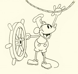 Another simple inbetween lesson is to offset the inbetween (usually an animator or good assistant will set this up for the inbetweener.)
Here Mickey is standing upright on #1 and he’s upright on #5. Drawing #3 has him with knees bent, beating in tempo to the sound. Even though this is from the first sound cartoon, done in 1928, the offset rule is in effect.
I think it’s pretty clear that some sophistication has entered the animation that Iwerks was drawing. This same sophistication isn’t in other animator’s work.
(Click any image to enlarge.)
Add to this the fact that Iwerks was probably the fastest producing animator, and you probably have good reason for knowing he was the genius behind Disney.
This, of course, didn’t remain that way. After Iwerks left, leaving behind enough animators trained by him, their work developed exponentially. Better artists were entering the studio and bringing their talents to the work, and they started making a serious attempt to improve the work.
Iwerks stopped animating and stopped trying to improve the character animation. Instead, he tried to improve the camera – actually developing the mulitplane camera in his own studio. Animation, under Iwerks, didn’t develop.
The book by Leslie Iwerks & John Kenworthy, The Hand Behind The Mouse, gives some solid information that wasn’t previously published and puts a lot of material into perspective.
Now we have Walt Before Mickey: Disney’s Early Years 1919-1928. by Tim Susanin. This is a thoroughly researched and reliably accurate book which gives a good account of Iwerks’ contribution up to and including Plane Crazy.
Animation &Animation Artifacts &Disney &repeated posts 17 Aug 2011 06:38 am
Dumbo’s Bath – recap
Continuing the celebration of Bill Tytla’s magnificent artrwork, I’m reposting this piece on Dumbo’s bath.
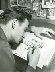 - Thanks to a loan from John Canemaker, I can continue posting some of the brilliant storyboard work of Bill Peet. The guy was a masterful artist. Every panel gives so much inspiration and information to the animators, directors and artists who’ll follow up on his work.
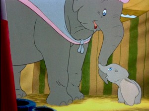
This is the sequence from Dumbo wherein baby Dumbo plays around the feet of his mother. Brilliantly animated by Bill Tytla, this sequence is one of the greatest ever animated. No rotoscoping, no MoCap. Just brilliant artists collaborating with perfect timing, perfect structure, perfect everything. Tytla said he watched his young son at home to learn how to animate Dumbo. Bill Peet told Mike Barrier that he was a big fan of circuses, so he was delighted to be working on this piece. Both used their excitement and enthusiasm to bring something brilliant to the screen, and it stands as a masterpiece of the medium.
Of this sequence and Tytla’s animation, Mike Barrier says in Hollywood Cartoons, “What might otherwise be mere cuteness acquires poignance because it is always shaded by a parent’s knowledge of pain and risk. If Dumbo “acted” more, he would almost certainly be a less successful character—’cuter,’ probably, in the cookie-cutter manner of so many other animated characters, but far more superficial.”
I had to take the one very long photstat and reconfigure it in photoshop so that you could enlarge these frames to see them well. I tried to keep the feel of these drawings pinned to that board in tact.
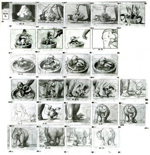
(Click any image to enlarge.)
Here are frame grabs from the very same sequence of the film showing how closely the cuts were followed. Even in stills the sequence is stunning.

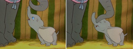
(Click any image to enlarge.)
 .
.This film is a gem.
The dvd also has one of my favorite commentary tracks throughout.
John Canemaker, by himself, talking about the film. It’s great!
From Hans Perk’s A Film LA:
Seq. 06.0 “Menagerie – Mrs. Jumbo Goes Berserk”
Directed by Wilfred Jackson, assistant director Jacques [Roberts?], layout Terrell Stapp.
Dumbo being washed by Mrs. Jumbo, animated by Bill Tytla, with effects by Art Palmer, Cornett Wood and Sandy Strother.
Action Analysis &Animation &Books &Disney &repeated posts 10 Aug 2011 07:07 am
Tytla’s Willie – recap
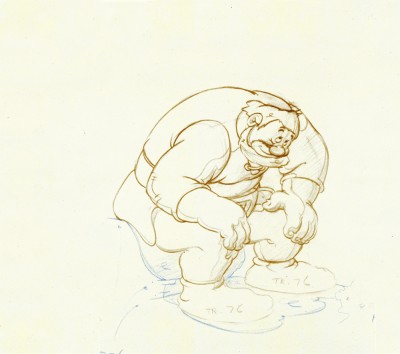
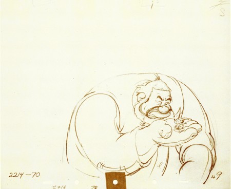
Continuing with my recap of all things Tytla, here’s a post I did on Tytla’s work on The Brave Little Tailor.
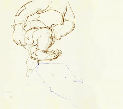
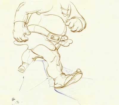
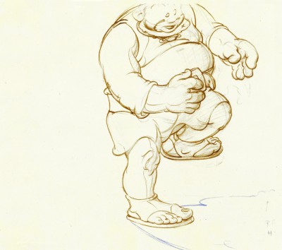
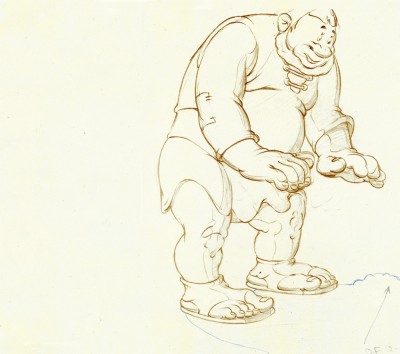
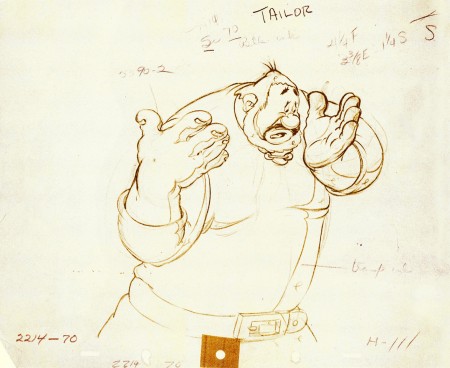
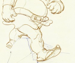
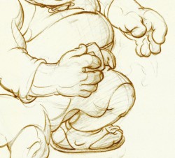
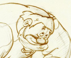
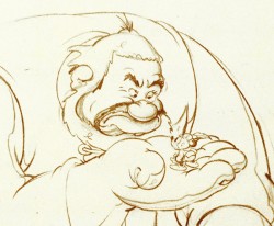
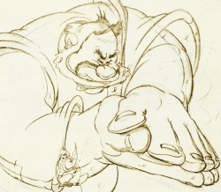
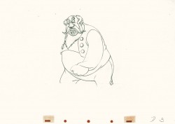
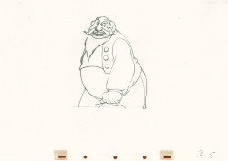
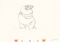
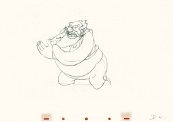
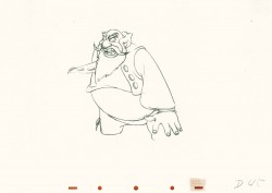
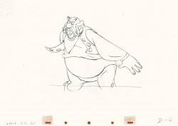
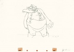
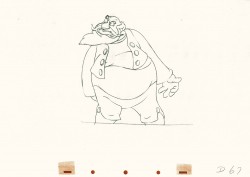
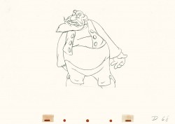
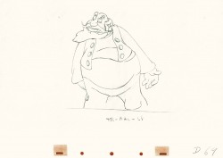
- When I was a kid, I was never a big fan of the “Willie” character, the giant in Mickey & the Beanstalk. It seemed that every fourth or fifth Disneyland tv show would have this character in it (or else Donald and Chip & Dale). As I got older and grew a more educated eye for animation, I came to realize how well the character was drawn and animated.
Willie first appeared in the classic Mickey short, The Brave Little Tailor, and he appeared fully formed. Bill Tytla was the animator, and he appeared to have fun doing it.
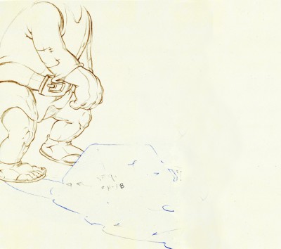
In John Canemaker‘s excellent book, Treasury of Disney Animation Art, there are some beautiful drawings worth looking at. Here they are:
 1
1(Click any image to enlarge.)
So let’s take a closer look at some of these drawings.
.
Drawing #3 features this weight shift. As the right foot hits the ground it pronates – twists ever so slightly inward. The hands do just the opposite. The left hand reaches in while the right hand holds back, completely at rest.
It’s a great drawing.
.
.
.
Drawing #4 shows Willie landing on that right foot, and his entire body tilts to the right. The hands twist completely to the left trying to maintain balance. The left foot up in the air is also twisting to the left before it lands twisting to the right.
.
.
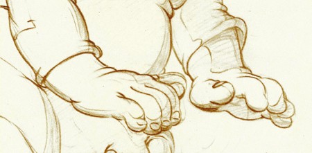
I love how drawing #5 features the two hands flattened out to
make his final stand before sitting down. It’s all about gaining balance.
.
.
.
.
Just take a look at this beautiful head in drawing #6. He’s seated, his head has come forward and tilted forward. The distortion is so beautiful it almost doesn’t look distorted.
What a fabulous artist! This guy just did this naturally.
.
.
.
This scene begins with the seated giant eyeing the tiny Mickey Mouse in his hand. The characters are drawn beautifully almost at a rest waiting to get into the scene. The intensity of Willie’s glare is strong, and it’s obvous Mickey is in trouble.
.
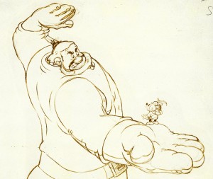 Here’s the drawing of the sequence.
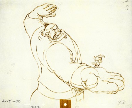
The major problem with drawing a giant is his proportion to all the other characters. The screen is more oblong and horizontalal than it is square. (Fortunately, when this film was done it was closer to a square but still not one.) Throughout the film, Tytla had to deal with a BIG Giant and little Mickey. The landscape is also small.
An obvious way of handling it – and one that would be done today, no doubt – would be to force perspective showing it from the ground up – most of the time. In the 30′s and 40′s they stuck to the traditional rule of film and editing, and they would NOT have done this.
Tytla plays with scale as the giant steps over a house and ultimately sits on it.
In this drawing, he does a brilliant drawing forcing the perspective with Mickey in the foreground and Willie’s left hand in the distance. The giant draws into this forceful perspective without calling attention to itself. Today it would be more exaggerated, but Tytla doesn’t want it to be noticed – just felt.
A real bit of art!
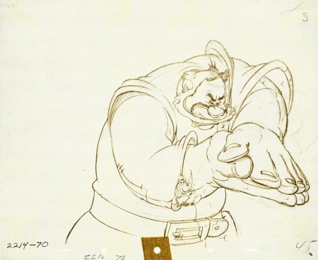
Here, Willie moves through that perspective of the last extreme, and he gets larger as he slams his hands to flatten Mickey. To exaggerate that flattening, Willie’s hands flatten for this key drawing. His head flattens as well in grimace.
The giant’s head will move in toward the hands to see the results, and the audience has a front row seat seeing Mickey escape up the giant’s sleeve. There’s a lot going on in this drawing.
.
.
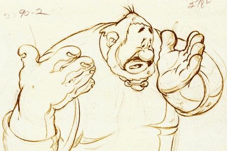
Finally, Willie tries to figure out what’s happened.
The drawing loses most of its distortion and comes to rest.
(Note that there’s still perspective distancing between the two hands.)
Mark Mayerson has done a mosaic breakdown of this cartoon and adds his excellent commentary.
Hans Perk on his site, A Film LA, has just posted the drafts to the earlier Disney short, Giantland. The draft for The Brave Little Tailor was posted a while back on this great site.
Photos &repeated posts &SpornFilms 07 Aug 2011 06:44 am
Studio Photo Retreads
Remember when. Here are some baby pictures I first posted back in January 2007. I love this post so much, I ejoy showing again.
- Here are some of the grouped staff-shots we used to do a lot. For some reason we haven’t done any in the past ten years; maybe it’s because the numbers of people working here are quite a bit fewer. I guess it’s still worth while for posterity’s sake. We’ll do it soon.
I love these.
The Lyle crew, back in 1987:
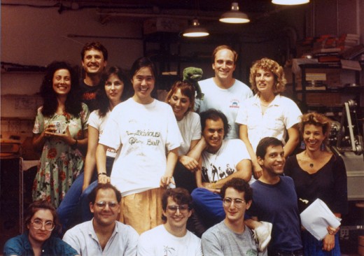
These are, Back row L to R : Lisa Crafts – animator, Tom Repasky – coloring, Susan Tremblay – coloring, Madeline Fan (full pic w/T-shirt) coloring, Caroline Skaife (leaning on Madeline) – coloring, Mark Baldo (w/puppet Lyle) coloring, Doug Vitarelli (leaning on Caroline) runner, Theresa Smythe – asst. animator.
Front row, sitting, L to R: Caroline Zegart – coloring, Steven Dovas – animator, John Schnall – Prod. Coordinator/Animator, Ray Kosarin – Asst. Animator/coloring, Michael Zodorozny – Layout, Bridget Thorne – Art Director/Bgs.
The Abel’s Island group, 1988:
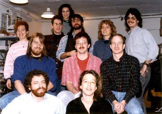
Back row (L to R): Betsy Bauer (colorist), Ray Kosarin (asst animator/colorist), Laura Bryson (behind Ray) (colorist), Robert Marianetti (Prod Mgr), Theresa Smythe (colorist), Mike Wisniewski (asst animator/colorist)
Center row (L to R): Steve MacQuignon (colorist), George McClements (asst animator/ colorist), Greg Perler (editor)
Bot Row (L to R): me, Bridget Thorne (Bg’s)
Not pictured in the photos is Kit Hawkins, my assistant, who took them.
After the move to 632 Broadway a small group working on Baby’s Storytime:
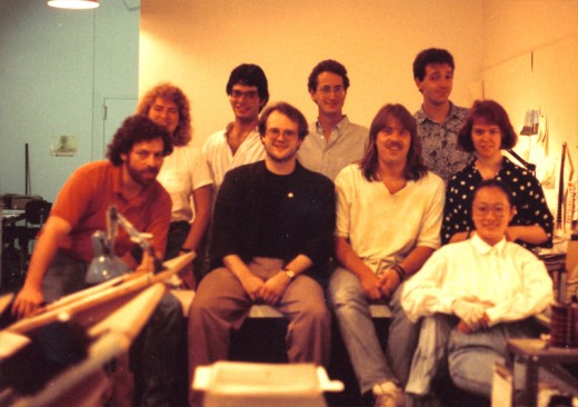
Back row L to R: Theresa Smythe, Mike Winiewski, Ray Kosarin, George McClements.
Sitting L to R: me, Jason McDonald, Steve MacQuignon, Mary Thorne, Masako Kanayama
Here’s a birthday party in 1992:
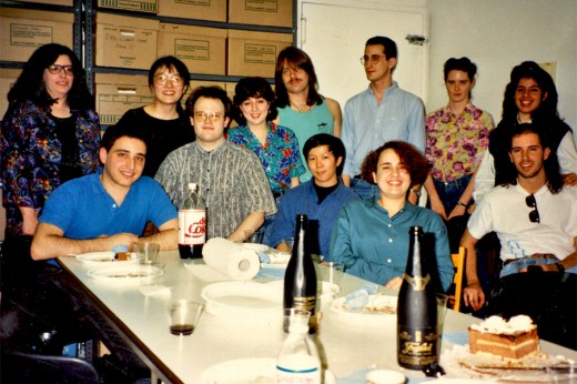
The whole staff and party:
(Back row L to R) colorist – Christine O’Neill, Masako Kanayama, Sue Perrotto, Steve MacQuignon, Ray Kosarin, Liz Seidman, Marilyn Rosado
(Fron row L to R) Ed Askinazi, Jason McDonald, Xiaogang He, Denise Gonzalez, Rodolfo Damaggio. I’m probably off camera still looking at the picture, or else I’m taking the picture.
A Christmas party back in 1996:
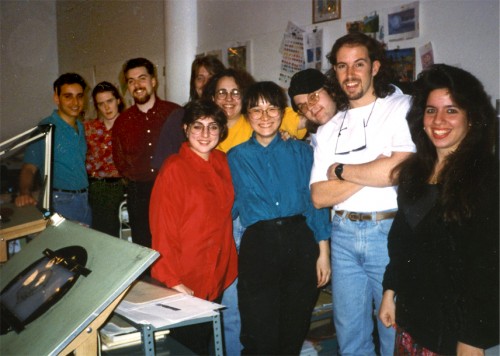
This is the crew just after the Secret Santa and just before the party.
Back L to R: Ed Askinazi – editor, Liz Seidman – prod coord, Matthew Sheridan – asst, Stephen MacQuignon (hidden) – colorist, Denise Gonzalez (in yellow) – publicity/asst, Sue Perotto (in red) – animator, Jason McDonald’s head – colorist, Masako Kanayama – production supervisor, Rodolfo Damaggio – animator, Marilyn Rosado – office manager.
This is the staff during the making of a pilot for Blackside Entertainment, The Land of the Four Winds. It’s another birthday picture. Lots of color deterioration in the photo. The exposure isn’t great – you can barely make out Champagne’s face.
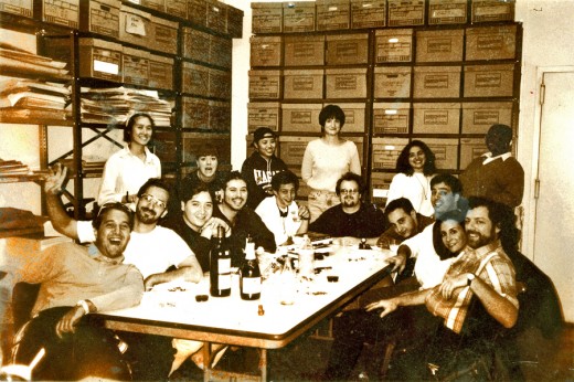
Sitting around the table L to R: Farid Zacariah (runner), Greg Duva (Asst Anim), Adrian Urquidez(I&Pt), David Levy (Asst Anim), John "Quack" Leard (Asst Anim), Jason McDonald (design, I&Pt), Ed Askinazi (Editor), Robert Marianetti (Prod Coord), Heidi Stallings (casting), me.
Here’s one a couple of months later (a better photo by Kit Hawkins – who was also on staff then.) It celebrated Farid’s last day – our all around guy.
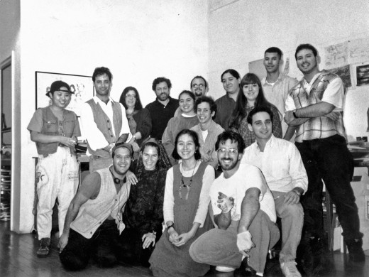
Back row standing L to R: Miho Moyer (I&Pt), Robert Marianetti (Prod Coord), Christine O’Neill (I&Pt), me, Jason McDonald (design, I&Pt), Tara Dolgopol (I&Pt)(in front of Jason), John “Quack” Leard (Asst Anim), Adrian Urquidez(I&Pt), Laura Kurucz(I&Pt), Francisco “Cisco” Sanchez(runner), David Levy (Asst Anim).
Front row kneeling L to R: Farid Zacariah (runner), Laura Bryson (Bg’s), Madeline Fan (Asst Coord), Greg Duva (Asst Anim), Ed Askinazi (Editor)
I’m sure this is boring for a lot of you, but I had fun.
By the way, you can enlarge all images by clicking them.
Animation &Animation Artifacts &Disney &John Canemaker &repeated posts &Tytla 20 Jul 2011 07:31 am
Tytla’s Stromboli – the First half
As stated last week, I’m recapping some of my Tytla posts from the past. This very long scene was originally in five parts. Today and tomorrow all five parts will be posted.
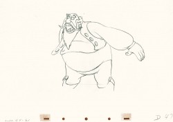
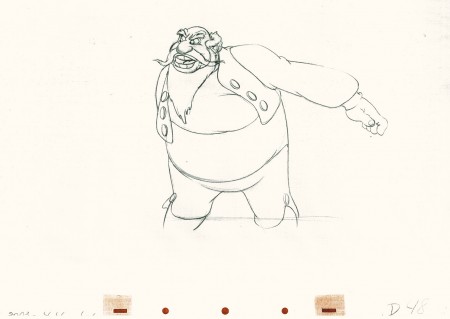
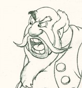 - Bill Tytla‘s work has to be studied and studied and studied for any student of animation. He was the best, and it’s pretty doubtful his work will be superceded. He brought beautiful distortion to many of the drawings he did, using it as a way to hammer home some of the emotions in the elasticity he was creating. Yet, the casual observer watching this sequence in motion doesn’t ever notice that distortion yet can feel it in the strength of the motion.
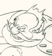
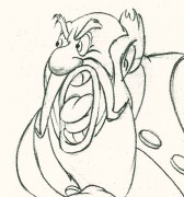
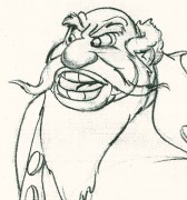
Four drawings (#1, 11, 22, & 48) that shift so enormously but call no attention to itself.
Brilliant draftsmanship and use of the forms.
Here we have the beginning: drawings 1-48. More will come in the future.
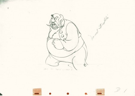 1
1(Click any image to enlarge.)
This note arrived from Borge Ring after my first post Bill Tytla’s scene featuring Stromboli’s mood swing:
- The Arch devotees of Milt Kahl have tearfull misgivings about Wladimir Tytla’s magnificent language of distortions. ‘”Yes, he IS good. But he has made SO many ugly drawings”
Musicologists will know that Beethoven abhorred the music of Johan Sebastian Bach.
yukyuk
Børge
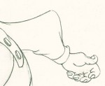
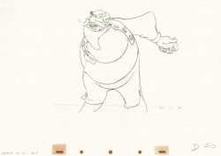
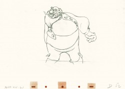
My first post spoke a bit about the distortion Tytla would use to his advantage to get an emotional gesture across. It’s part of the “animating forces instead of forms†method that Tytla used. This is found in Stromboli’s face in the first post. In this one look for this arm in drawing #50. It barely registers but gives strength to the arm move before it as his blouse follows through in extreme.
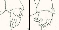 There’s also some beautiful and simple drawing throughout this piece. Stromboli is, basically, a cartoon character that caricatures reality beautifully. A predecessor to Cruella de Vil. In drawings 76 to 80 there’s a simple turn of the hand that is nicely done by some assistant. A little thing among so much bravura animation.
Many people don’t like the exaggerated motion of Stromboli. However, I think it’s perfectly right for the character. He’s Italian – prone to big movements. He’s a performer who, like many actors in real life, goes for the big gesture. In short his character is all there – garlic breath and all. It’s not cliched and it’s well felt and thought out. Think of the Devil in “Night on Bald Mountain” that would follow, then the simply wonderful and understated Dumbo who would follow that. Tytla was a versatile master.
Here’s part 2 of the scene:
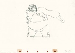 48
48 49
49(Click any image to enlarge.) The full scene with all drawings.
Click left side of the black bar to play.
Right side to watch single frame.
David Nethery had taken my drawings posted and synched them up to the sound track here.
Photos &repeated posts 17 Jul 2011 07:27 am
recap Sunday – Hitching Posts
This post was produced back in July of 2008. I was looking at these bicycle posts again this week thinking of doing a follow-up. The images seemed identical, except that there was more loose garbage strewn on the street. I decided to just recap this original.
.
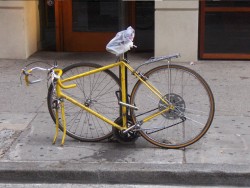
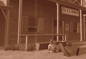 - Back in the wild, wild west, they used to have hitching posts so cowboys could tie their horses outside the local tavern to keep them from running wild. If there was no hitching post, cowboys in movies used the stanchions in front of the saloon or store.
We don’t have horses in the big city, but we do have bicycles. Hitching these with chains and locks and anything to try to prevent theft has
________(Click any image to enlarge.)_____________been a primary difficulty for
_______________________________________-_____messengers and other bike riders.
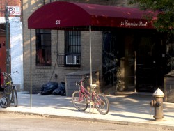
My studio has two entrances (or exits depending on how you view the situation.) At both, there are wrought iron fences which sort of act as bannisters going up/down the steps. Leaving work the other day, I noticed that the back entrance was used as a “hitching post” for a couple of bike riders. Presumably they were working out in the gym just next door.

Good thing we rarely use this exit.
This made me start looking at other hitching posts I could find on my way home, and I took some snaps.


Sign posts and trees seem to be likely candidates.
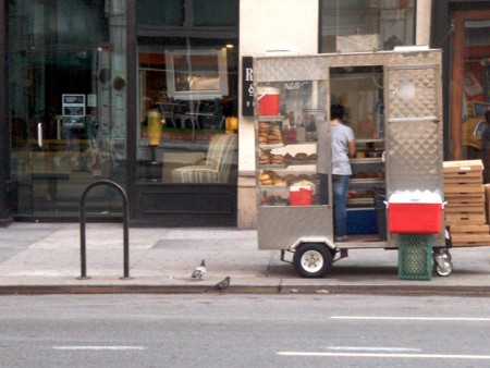
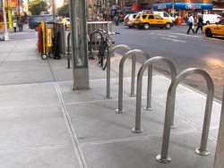
The upside-down “U” seems to be designed for smaller businesses
that want something curbside.
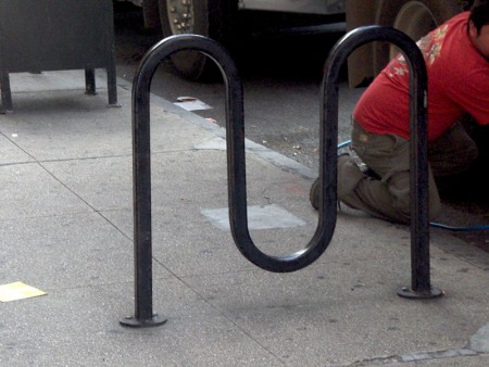
There’s also the “M” shape for a couple of bikes.
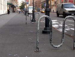

I’m not sure if these are supplied by the City or the storeowner.
There’s a uniformity around town that makes me wonder.

In places there are a number of these for the high bike traffic.

Sometimes this isn’t enough and a subway entrance serves as a backup.

Even though many “M”s have been placed in the same area.
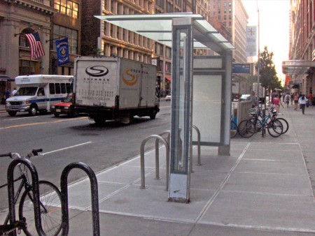
I did like noting this one unit outside a “Circuit City” store that offered
an overhead to protect the bikes outdoors.
Photos &repeated posts 12 Jun 2011 07:00 am
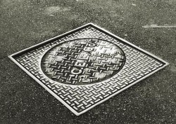
Recap – Manhole Sunday Photos
Back in August 2007 I put this photo essay together. I was thinking of it this morning and decided to post it again for those who missed it or don’t remember it.
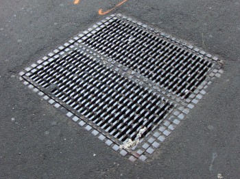 When I was in the sixth grade, I had an extra-ordinary teacher who left me with a lot of memories. One of them was his reading of Edgar Allan Poe’s short story “The Casque of Amontillado,” which chilled us all to the bone as we sat in those little student desks absorbed and thrilled and forevermore fans of Poe.
Another memory was his asking us all if we knew why manhole covers were round. After a number of stupid guesses, we were told the reason – any other shape would allow the covers to fall into the hole. If they were squared or triangular, they could be maneuvered onto their side until they fell in. Round objects wouldn’t fall.
He also told us that manhole covers in NYC were like snowflakes – no two were alike. This I found hard to believe until I started looking. He was right; they were all different in design. Markedly different in design. I looked for years and thumbed my way through many books admiring the designs I found.
Times have changed. Now they come in only a couple of designs.
 _
_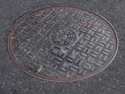
Con Edison is now the primary user for manhole covers, and they seem, these days, to have boiled down to four basic designs. See the two above and the two below.
 _
_
(Click any image to enlarge.)
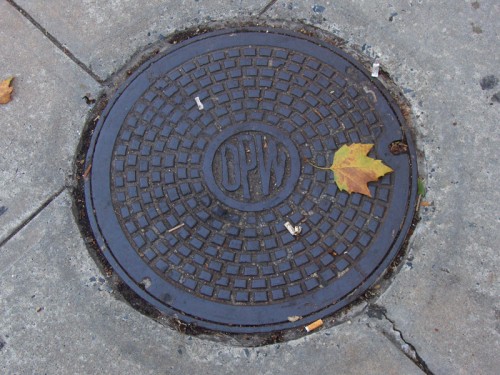
The Department of Public Works features this handy little design. I like its simplicity very much. the color also makes it unique.
 _
_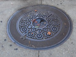
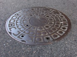
Above left you can see an older model that is wearing down. Parts of the design are blending into other parts almost making a new shape. Above right you see an interesting model. There’s a cover within a cover. The smaller model seems to fit within the larger model, and both can be pulled out. Very interesting. There were three or four of these in the same area around 23rd Street.
 _
_
These manhole covers have been fitted into what were obviously larger spaces.
The concrete circle, above left, fills in for an earlier, larger model manhole cover.
Above right, you see a round cover in what was once a square hole.

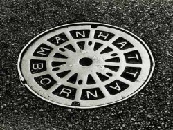
The busy minimalism of this design works very well with the cracked asphalt around it.
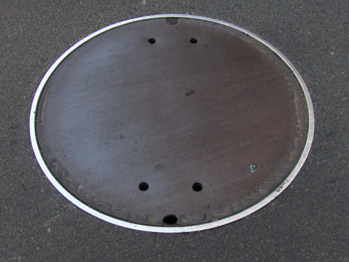
Here we have an interesting model. No design. I guess some would say that that’s
a design in its own right.
If you look on line, you’ll find a lot of information and photos of manhole covers. It’s amazing how big an industry is manhole cover watching. There are many books on the subject, many websites and lots of photographers who specialize in it. I have to direct you to one Roland Muhler. His work is stunning. I’ve posted three of his NYC photos just below. He has many international manhole covers on his site.
Another site which gives a lot of attention to manhole covers is Manhole Covers etc. The site is subtitled: “I’ve been looking down so long, I don’t know which way looks up.” Here you’ll find some history, links and photos from across the US as well as around the world.
Through this site I found a Russian site called Sewers of the World, Unite. There’s plenty of information and links here as well as some excellent photos. The images below are Russian designs from this site.
On the site, the history of sanitary sewers, I found this document (pictured to the right) 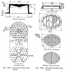 which gives a good view of a plan for some manhole covers. One cover is designed for Syracuse and another for Brooklyn.
I also learned in my small amount of research that most of the covers done for NY’s manholes are made in India. I imagine the shipping charges would be enormous.
I presume that the manhole covers are now made of steel whereas they originally must have been molded of iron (and which would have broken when dropped.) I also learned that the sewers once had a hard glass built into the sidewalk openings so that light could enter. Pre electricity must have made working below ground difficult.
I should say more difficult. It’s not a job I’d like.
Today, I received this note from Steve Fisher:
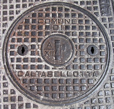
- Michael: As I just stated on your splog, I thought your essay was terrific. I, too, did not know the subject had such a following. Coincidentally, in the same year as your original posting, I was working on a photo book of snaps that I had taken while in India in 2005. I came across a manhole cover around the block from where I live on which was written, much to my surprise, “MADE IN INDIA.†That was the first time I ever really took notice of manhole covers and then learned, too, that many were made there, an early example of out-sourcing. It became a natural for the cover photo and title for my little book. Since then, I am always on the lookout for them. While in Italy in 2008, I took one in Ron’s hometown. Currently, I am working on a photo book of a children’s story, “The Adventures of Tomaso, the Rollaway Sicilian Tomato,†and I am using the image there. Thought you might like to see them. Steve.

Photos &repeated posts 23 Jan 2011 08:39 am
Recap – Brick Patterns
Here’s a recap of a photo spread I did back in January 2009. I like the way it turned out, and would like to post it anew.
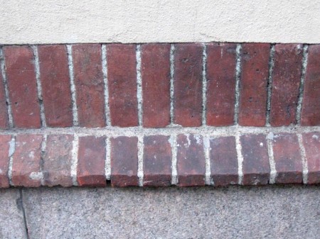
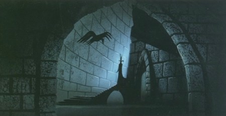
- For some reason I have always loved the simple structure of a brick wall. I’ve often included them in the paintings I’ve done, and I’ve been fascinated by the many and varied differences you see in every structure made of brick. It was wonderful to hear Eyvind Earle discuss the architect’s tricks he used in Sleeping Beauty to detail all the brickwork in the castle backgrounds. Just another reason I enjoyed his artwork in that film.



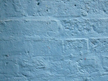


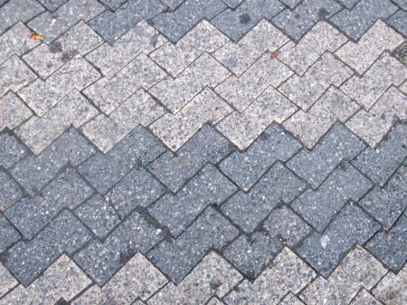
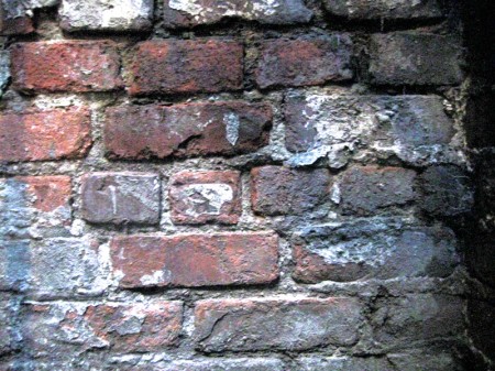
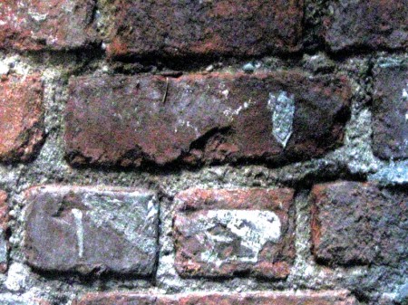

Animation &Animation Artifacts &Disney &repeated posts 20 Jan 2011 09:23 am
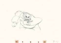
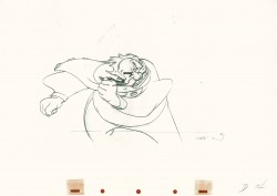
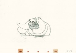
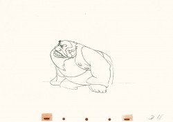
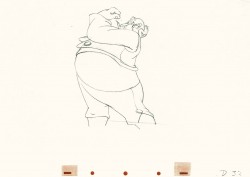
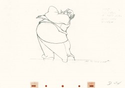
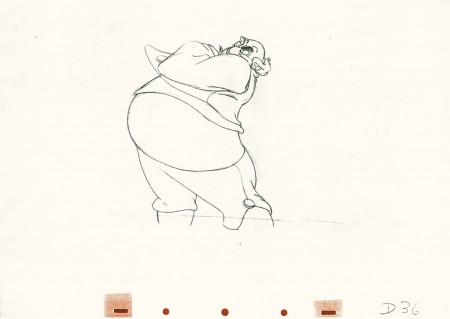
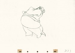
Recap – Tytla’s Dwarf Fight
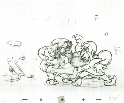
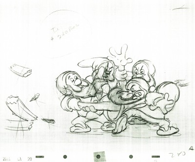
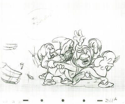
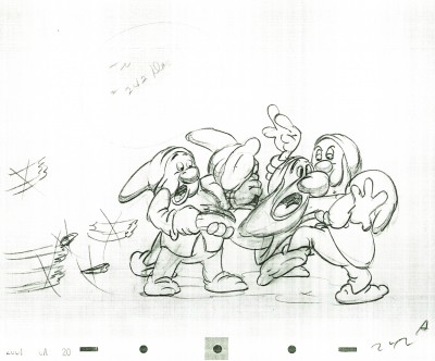
- I had planned a different post today, but at the last minute decided to post this one again. It’s from March 2009 and has material in it brilliant beyond words. Tytla’s brilliance, of course. Jim Tyer and Rod Scribner might have taken something from this.
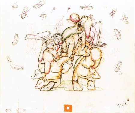
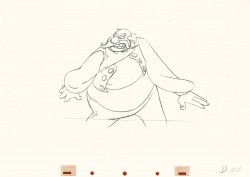
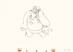
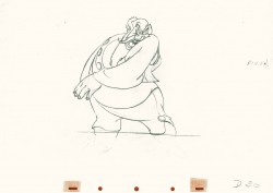
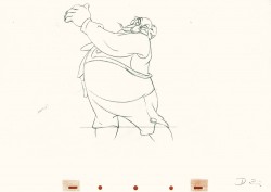
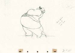
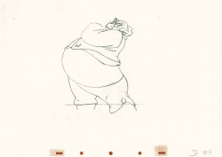
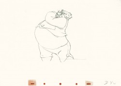
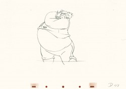
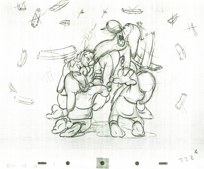
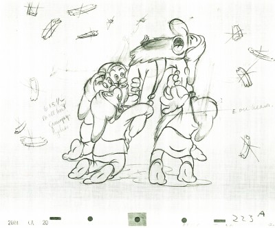
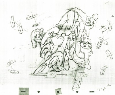
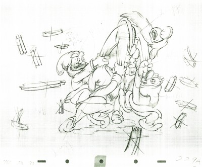
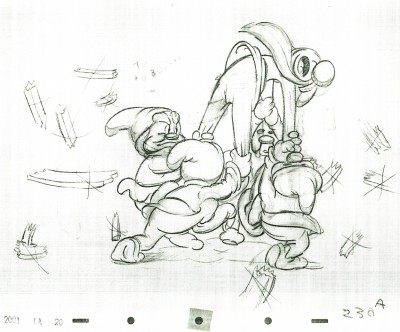
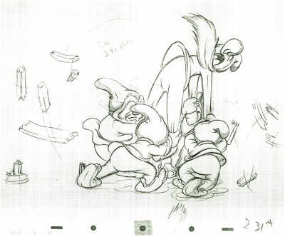
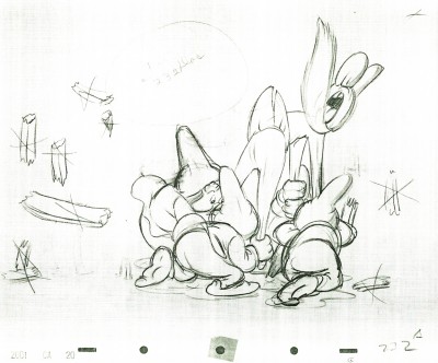
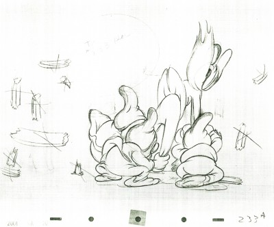
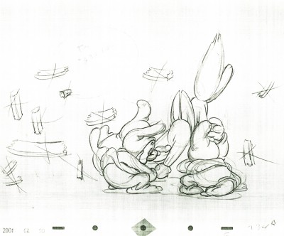
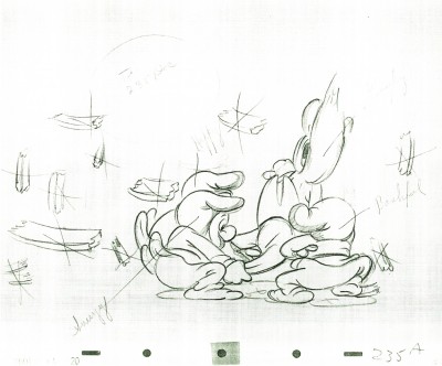
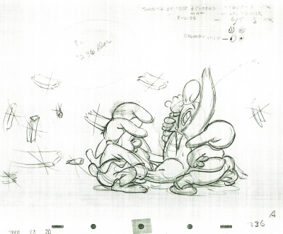
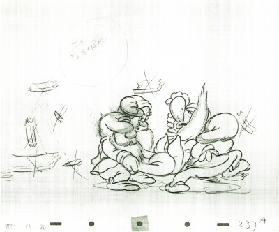
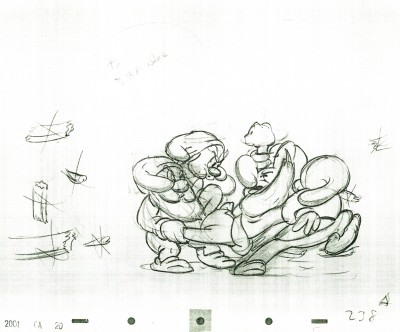
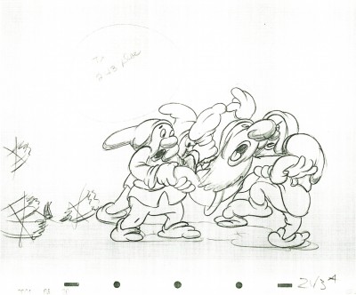
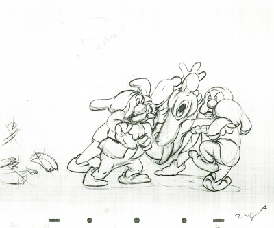
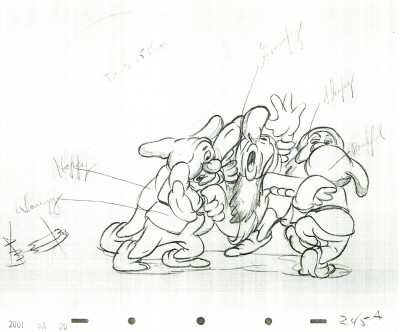
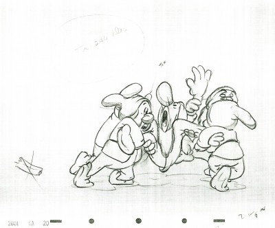
Here is a scene from Snow White, animated by Bill Tytla, in which four of the dwarfs fight Grumpy. The drawing above is the first of these drawings and it shows what it looked like in color – lots of red pencil notes, yellow pencil for rough structural lines. The rest of the drawings I have are B&W copies.
By the way, if you like this material check out Hans Perk ‘s site today. It deals with forces vs. forms in animation. This is what Tytla was all about in animating.
 222
222(Click any image to enlarge.)
 223
223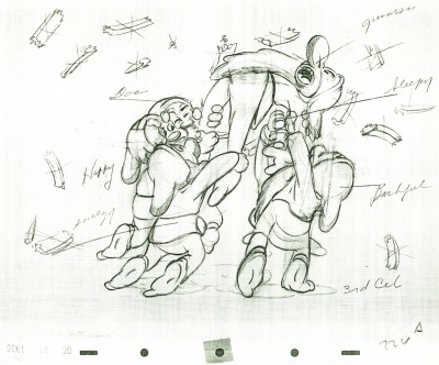 224
224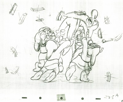 225
225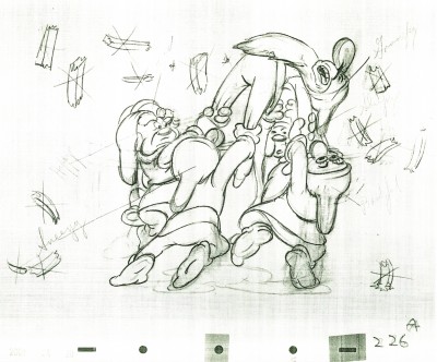 226
226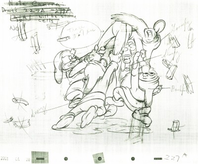 227
227Check out Happy’s face on this inbetween.
Then check out Tytla’s drawing (the next one) of Happy.
 228
228
Tytla marked his own drawings with an “X” in the upper right corner.
The other drawings are the work of inbetweeners. The writing looks
to be all the work of Tytla.
 229
229
 230
230
 231
231
 232
232
 233
233
 234
234
 235
235
 236
236
 237
237
 238
238
 239
239
 240
240
 241
241
 242
242
Some of these drawings are just hilarious in their own right.
 243
243
 244
244
 245
245
 246
246
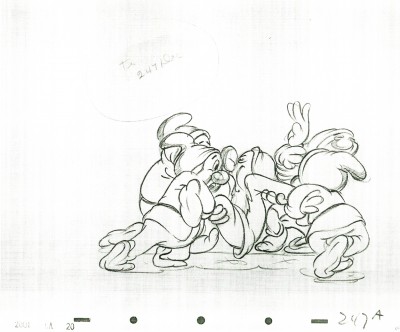 247
247
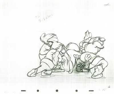 248
248
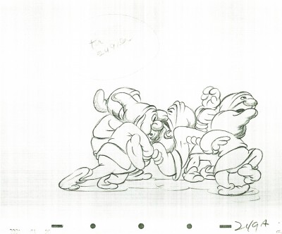 249
249
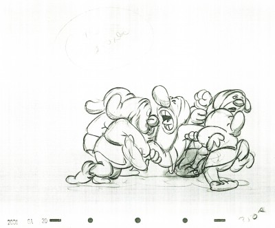 250
250
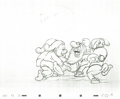 251
251
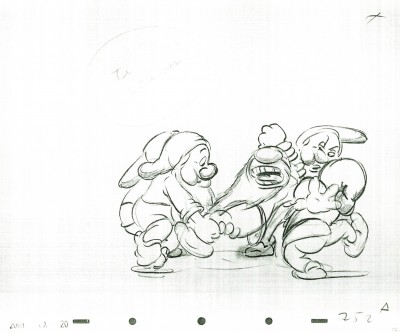 252
252
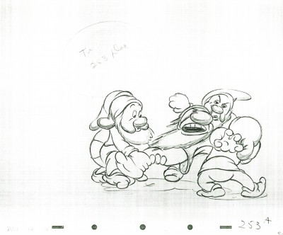 253
253
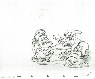 254
254
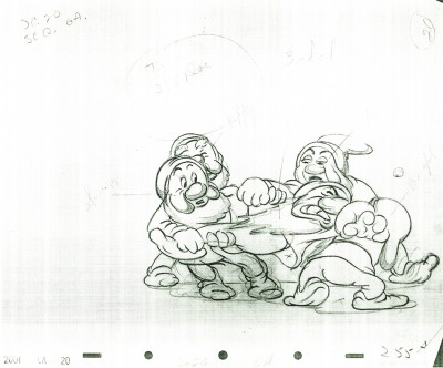 255
255
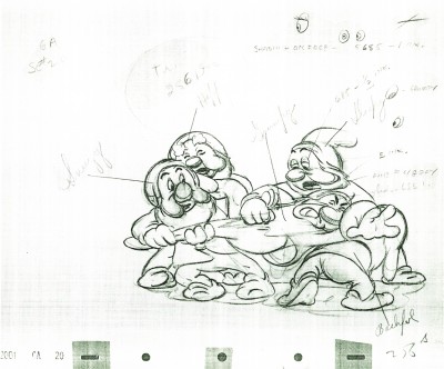 256
256
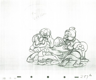 257
257
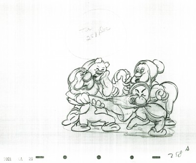 258
258
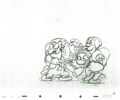 259
259
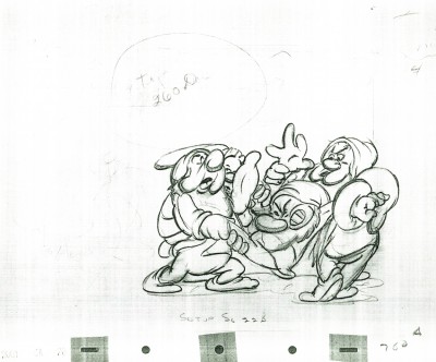 260
260
Click the black bar on the left to play.
Click on the right to single frame it.
