Category Archiverepeated posts
Animation &Animation Artifacts &repeated posts &Tissa David 11 Jan 2012 06:03 am
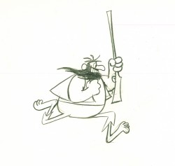
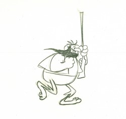
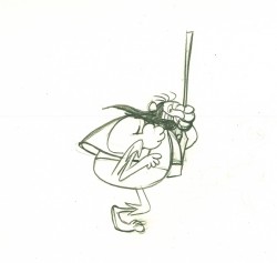
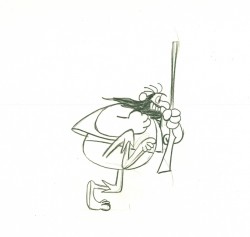
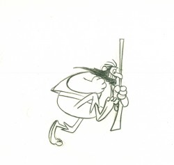
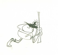
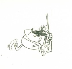
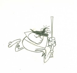
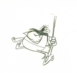
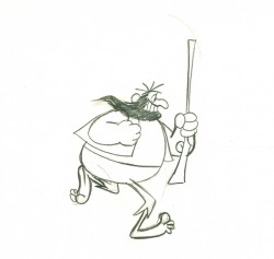
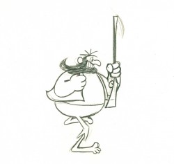
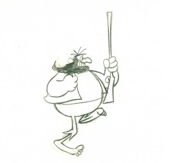
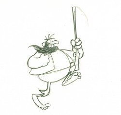
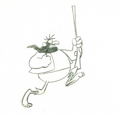
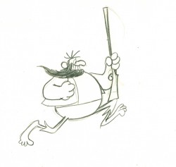
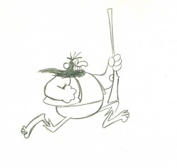
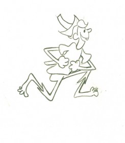
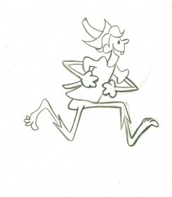
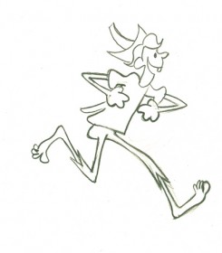
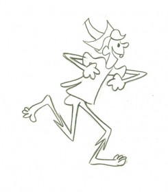
Hillbilly Run Cycles – Grim Natwick/Tissa David
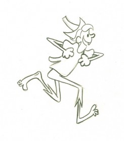
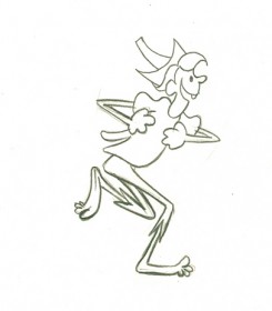
- When I first started in animation at the Hubley Studio, I met Tissa David. She recognized how poor my inbetweens were and took me under her wing to try to correct the situation. She gave me private lessons for years. Often she would give me scenes animated by her mentor, Grim Natwick, and she would ask me to remove every other drawing and do new inbetweens for what was left. When I finally got them close to being correct, she’d have me do clean-ups of Grim’s work.
These two run cycles were among the first drawings she gave me to rework. Back then, the only way to see the drawings in motion was to flip them or film them. There were no computers to see them instantaneously moving. You can just go to the bottom of each cycle, and I’ve added a QT pencil test,
I might suggest that if you’re just starting out, you should print out the drawings and then do new versions of the inbetweens for the even numbered drawings. Go back to Tissa’s versions to compare with what you did.
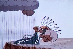
Grim Natwick animated this spot for Mountain Dew when he worked for Robert Lawrence Productions. Here are two run cycles from that spot. It was assisted by Tissa David. All of the drawings, here, are Tissa’s clean-ups.
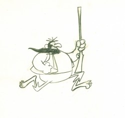 1
1 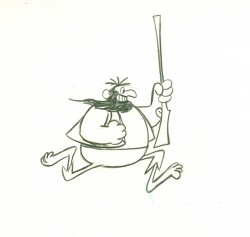 2
2
(Click any image to enlarge to full size.)
On ones at 24FPS
Click left side of bar to play.
Right side to watch single frame.
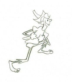
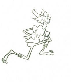
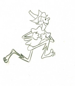
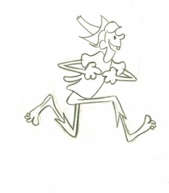
This is another run cycle from that same film. Again, all of the drawings, here, are Tissa’s clean-ups.
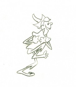 1
1 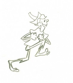 2
2
 3
3 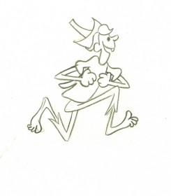 4
4
You’ll note that the character leaves the ground for 1/3 of the spot.
 5
5 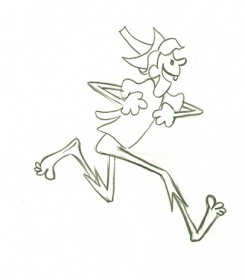 6
6
I love the chicken movement this guy is doing with his arms.
A laugh riot of a run cycle.
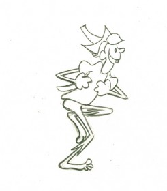 9
9 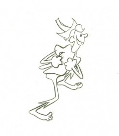 10
10
He actually comes down in the crossing position rather than the
classically designed walk where the head moves up.
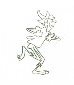 17
17 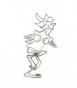 18
18
Tissa’s tendency is to have the crossing position the lowest in the cycle.
The character bears the weight of his walk with feet solidly on ground.
On ones at 24FPS
Click left side of black bar to play.
Right side to watch single frame.
This was originally posted in May 2009.
Commentary &Illustration &Independent Animation &repeated posts &SpornFilms 29 Dec 2011 06:49 am
Blank Maps – repeat
 - One of my favorites of my films is The Hunting of the Snark. I adapted this from Lewis Carroll’s poem. It was an enigma to the audience when it was first published – Carroll refused to explain its meaning, and it’s an enigma now.
I remember screening it with an audience of fifth graders – about 200 of them along with a number of their parents. The program, in Chicago, was part of a retrospective of some of the children’s films I’d done at the time. I made the decision to show the Snark, even though I wasn’t sure the audience would sit still for it.
The response was amazing. The adults, during the Q&A period, had a lot of questions. The kids had no problems. When, finally, one parent asked me what it was supposed to mean, I decided to turn it around. I asked if one of the kids could answer the question. A lot of kids raised their hands, and the first one gave me the appropriate answer.
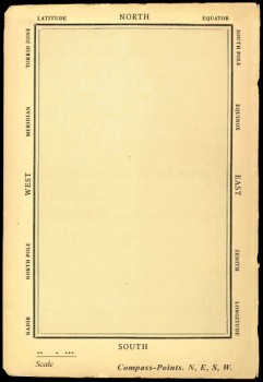
A bunch of guys go hunting for a monster________This is how the map was illustrated by
that’ll make them disappear, and one of_________the original illustrator, Henry Holiday.
them catches it. For all intent and purposes
that IS what it’s about.
I love showing this film as part of my programs. It’s easy for me to discuss, and I’m proud of it. I don’t think most animators like it, but that doesn’t bother me.
During the story there’s one key part that all illustrators love to illustrate.
But we’ve got our brave Captain to thank:
(So the crew would protest) “that he’s bought us the best–
A perfect and absolute blank!”
_
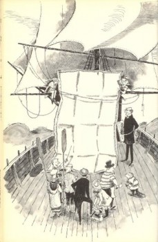
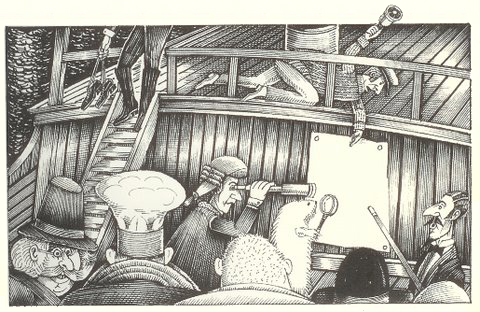
A blank page! What could be easier to illustrate? A couple of illustrators have cheated such as this map found on line:

Figure One: Bellman’s Blank Ocean Chart
Barry Smith at the University of Buffalo dept of Philosophy uses this map – a blank slate – to treat it as a map of heaven. Carroll was an Evangelical minister, but I’m confident this is not what he had in mind when he conjured up the lines in the poem.
____________________________________________
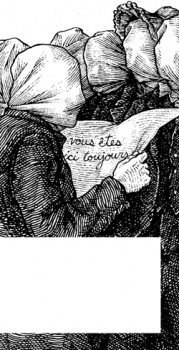 Mehendra Singh has a website which is slowly illustrating the entire poem. His illustration for this passage appears to the right. This is part of his comment accompanying the illustration.
- Yet another shameless Magritte pastiche, and not the last one to grace these pages, I’ll wager. Shameless — the 10th Muse of Protosurrealism!
Even more shameless — this insistence that the crew of the HMS Snark use the French language for navigational purposes when it is clearly evident to anyone who has ever been lost at sea that English is the natural language of confusion. This is easily verified. Stand on a streetcorner in any francophone city and ask a stranger: where am I? If necessary, pull at shirtsleeves and wave your arms, speak very slowly while pronouncing every phoneme at the utmost decibel level.
Singh has a curious and interesting site in its own right.
Let me encourage you to check it out for all the original illustration on it.
____________________________________________
_
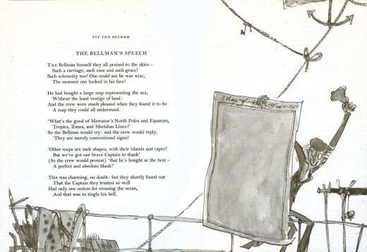
This is how Quentin Blake chose to illustrate it in his version. Since he obviously was nervous about just showing the blank map, he illustrated the Bellman holding it.
______________
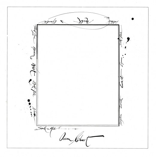
This is Ralph Steadman’s version. He went for the gold and just showed the map.
Yet, it’s still, obviously, a Steadman.
______________
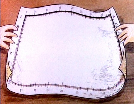
This is how I chose to depict it in my film. Showing hands and table behind it,
gave me the opportunity of trucking in to white to transition to the next scene –
an image of the sea, itself.
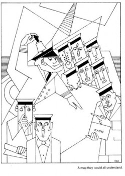
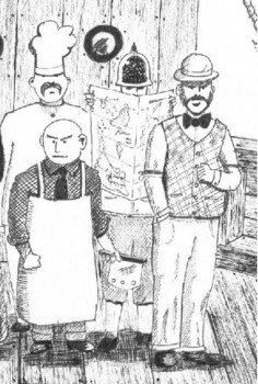
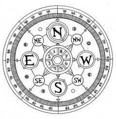
Doug H. in Australia responded to the material, above, with an e-mail full of other wonderful illustrations of the same part of the poem. I’d like to post some of these illustrations with many thanks to Doug. With respect to all of the illustrators, about half of whom
are unfamiliar names to me. They merit a good look.
___ Just scroll down. Click any image to enlarge a bit.)
 1
1 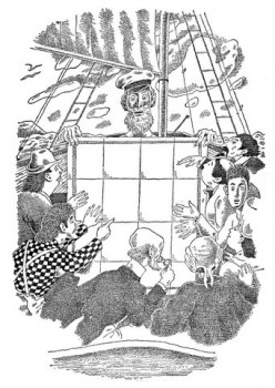 2
2
______1. Frank Hinder (1989)_______________________2. Harold Jones (1975)
______
__ 3.__
3.__ 4.
4.
______3. Michael Capozzola (2005)_________________4. Kelly Oechsli (1966)
 5.
5.5. John Lord (2006)
______
______
6._________________________________7.
______
______6. Max Ernst ((1950) _______________________7. Jonathan Dixon (1992)
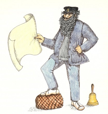 8.
8.8. Helen Oxenbury (1970)
Daily post &Frame Grabs &repeated posts 26 Dec 2011 06:37 am
Making Snow White
- On the Snow White dvd, there’s a documentary about the history and making of the film. Some of the images on the disc are just too precious for me to allow them to slip by without my singling them out and writing about them.
.
Here are frame grabs from this documentary.
.
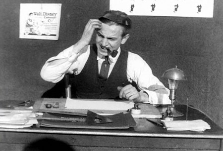
Walt is presented as a bumpkin in the early days.
I suppose he was directing if not filming this material,
so that’s the image he sought to create as well.
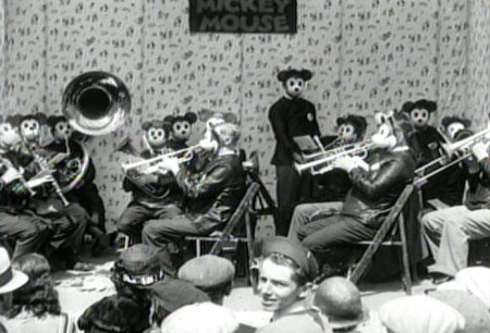
This has got to be one of the wackiest pictures in their archives.
The popularity of Mickey Mouse in the early 30′s.
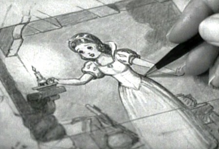
Snow White brings a change to the studio,
which you can well understand.
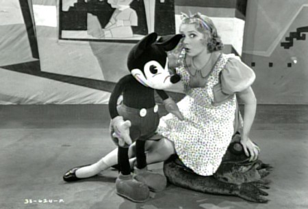
Though there’s still the problem about what to do with Mickey.
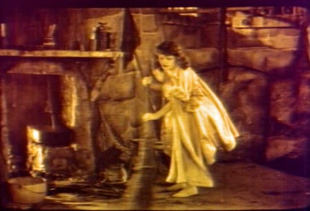
Disney was supposedly inspired by a silent filmed version
of Snow White he saw in his younger days.
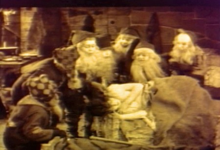
One wonders if there was also an eerie creepiness to the performance
that Walt gave to all of his animators one night as he acted out the film.
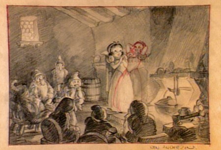
I’m curious about the pose of Snow White with her head back
and her hands behind the head.
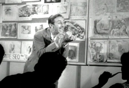
Here, Walt tries to get his animators to bite into an invisible apple -
the future of animation – as they thoughtfully smoke their pipes.
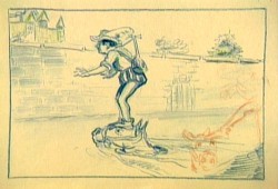
The bed building and the soup eating scenes weren’t the only ones that were
excised from the finished film. It seems the prince, initially had a larger role.
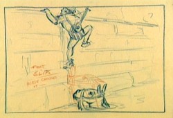
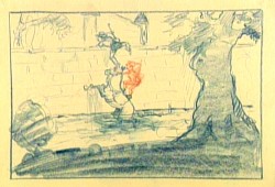
The path into the castle was a bit more difficult. First you had to
get past the moat with the help of your horse. Here the prince looks
a bit like Robert Benchley.
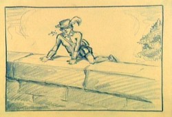
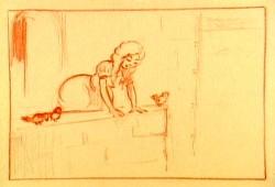
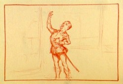
“Romeo, Romeo, Wherefore art thou, Romeo?”
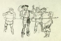
Getting caught. Obviously, the Queen and Snow White didn’t live in that
castle by themselves. There were henchmen we didn’t know about.
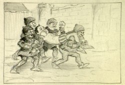
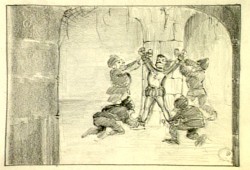
This almost looks like an early version of the seven dwarfs
carried the prince to prison.
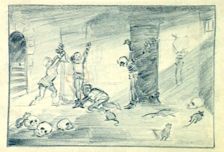
They had big rats in that prison. Scary.
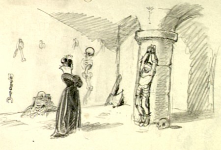
This is an obvious precursor of Malificent going to visit Prince Phillip some
20 years later in Sleeping Beauty. Both wicked Queens got more attractive.
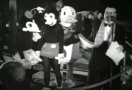
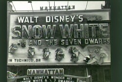
Lots of stars showed up to the grand premiere.
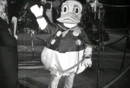
These actors in costume were there, too.
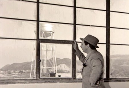
In all seriousness, the film was a masterpiece. I’m still studying it some
74 years later. Walt had reason to be proud and happy. He also had enough
money to move onto other challenging films, and he took the challenge as
opposed to making Snow White 2 or 3 (as they probably would do today.)
Animation Artifacts &Disney &John Canemaker &Peet &repeated posts &Story & Storyboards 28 Nov 2011 07:45 am
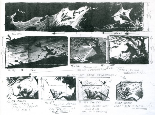
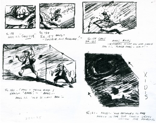
Ben and Me Board – repost
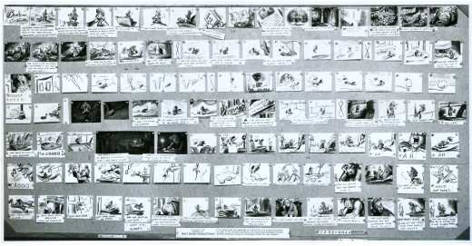
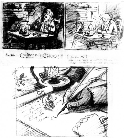
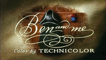 - Bill Peet was one of the prime artists who shaped many of the Disney features. He has been an enormous influence on me and thanks to John Canemaker, who has loaned me the following storyboard, I’m pleased to post some of Mr. Peet’s excellent artwork.
Ben and Me was a 20 min short produced in 1953. It’s an oddity in the Disney canon. The story of a mouse who influences Benjamin Franklin through many of his most famous moments was originally a book by Robert Lawson and was adapted by Bill Peet for the studio.
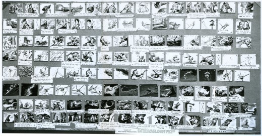
The photostats of the storyboard, like others I’ve posted, is extremely long. Hence, I’m posting them as large as I possibly can so that you’ll be able to read them once you’ve enlarged the images.
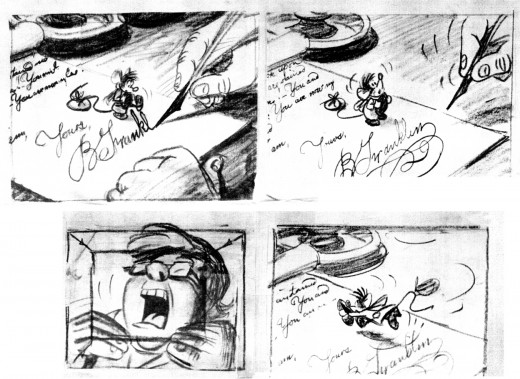
These three panels are followed by a couple more revisions. The revisions I only have as xeroxes – lesser quality.

This image is a recreation of the extraordinary pan as seen in the first row of the storyboard posted above. It’ll enlarge to a size where you can properly see it. A couple of the objects were on secondary overlays creating a minimal multiplane effect.
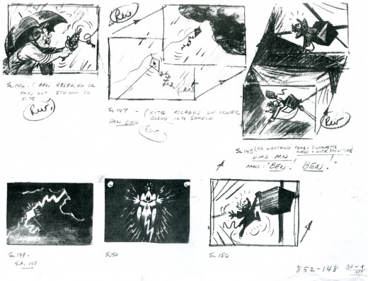
Bill Peet offered great drawings in his storyboards, and I’m sure he brought a lot of inspiration to the animators.

This is an excedingly long pan (30 inches), and is almost invisible in this minimal thumbnail. Rather than break it up into shorter bits, I’m posting it as is and hope it won’t be too much of a problem for you to follow in its enlarged state. You have to click on it to see it.
The image below is a recreation of this pan from the final film done using multiple frame grabs.
There’s an excellent article about the making of Ben and Me by Wade Sampson at Jim Hill Media. It gives quite a bit of information about this odd short and is well worth reading as a companion to these boards.
repeated posts &Trnka 21 Nov 2011 07:42 am
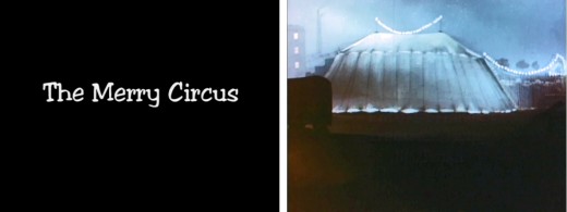
Trnka’s Merry Circus – repost
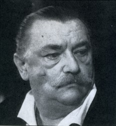 – I’ve been a fan of Jirà Trnka‘s work since I first saw it back in the 60′s. I’ve bought every publication I’ve ever found which discusses or displays his films or illustration. These days I can also own a number of his films.
His puppet films were always the gold standard of that medium. However, since I’ve studied his illustrations for many years, I’m always interested in the 2D work he’s done.
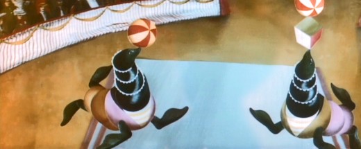
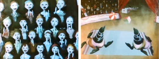
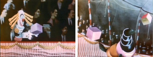
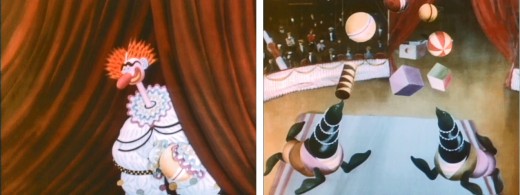
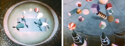
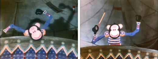
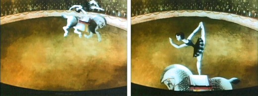
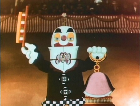
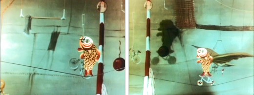
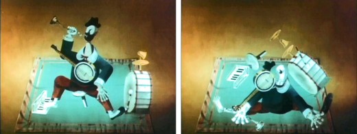
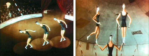
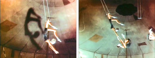
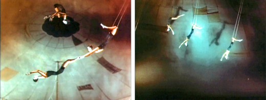
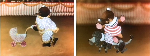
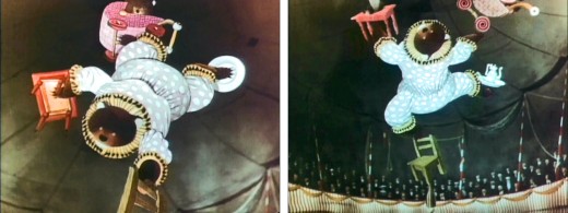
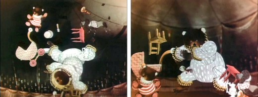
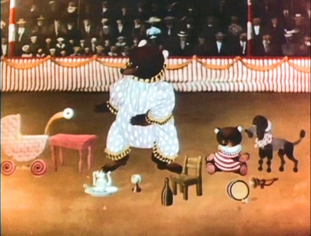
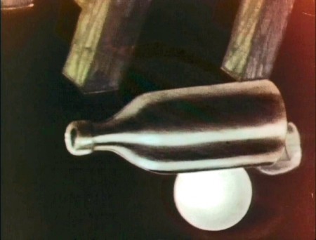
The dvd titled The Puppet Films of Jirà Trnka includes one of these 2D films. It’s cut-out animation, so it really borders the world between 2D and 3D. Trnka exploits the shadows on his constructed cardboard backgrounds to great effect. The style purposefully hides the three dimensions of the constructions, but it uses it when it needs to. The film is a delicate piece which just shows a number of acts in a local circus setting.
It’s a sweet film with a quiet pace. I’m not sure it could be done in today’s world of snap and speed. No one seems to want to take time to enjoy quiet works of art.
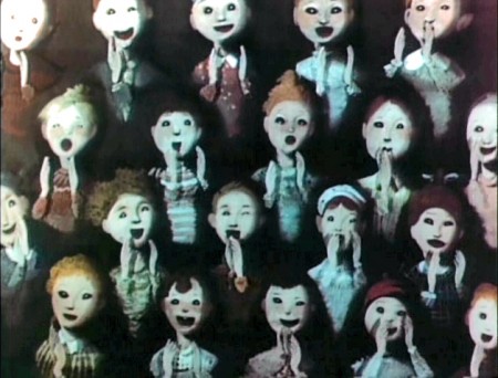
I’m posting a number of frame grabs from this short so as to highlight the piece.
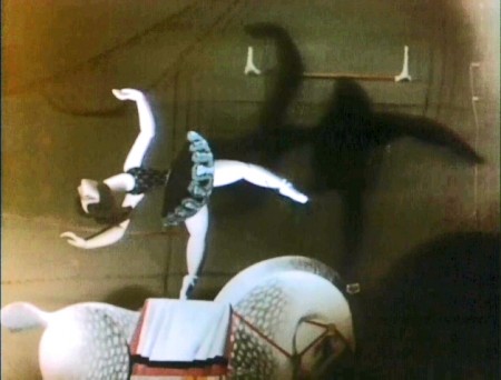
Note the real shadows on the background.
These were obviously animated on glass levels in a multiplane setup.
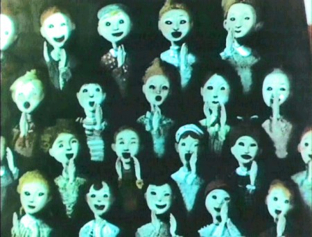
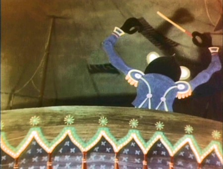
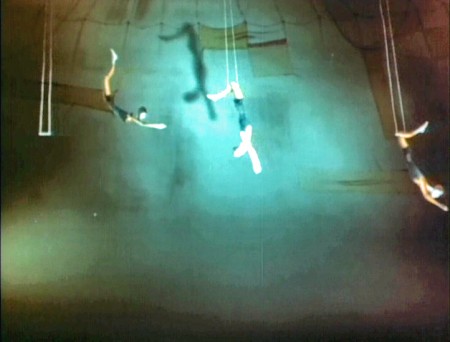
Again, note the excellent use of shadows. It’s very
effective in these long shots of the trapeze artists.
Animation Artifacts &Photos &repeated posts &Richard Williams 20 Nov 2011 08:29 am
Raggedy Photo Sunday – a repeat
 - Yesterday, with a couple dozen other hearty souls, I sat through the screening of the animated shorts to narrow them down to a short list of about ten. The 44 films took ten hours to screen (including a 45 min. lunch break and three other 15 min. breaks.)
The first 1/2 to 1/3 of the program was brutal, and it looked like it was going to be the worst screening of films we’d ever attended. But then things got much better, and a lot of excellent films showed up in the mid third group. Then the end portion of the program turned up even a greater number of brilliant films. The end result was that it was one of the best screenings I’d seen (quality wise.) You can see the full list with some links on Cartoon Brew. The top ten should be a good group (given that a few of the choices usually turn out to be clunkers – there’s no accounting for taste.) I’m looking forward to hearing what will be on the short list.
I originally ran this piece in November 2006. I’ve made some slight adjustments to bring it up to date.
- Today is photo Sunday.
Having recently pored over some of the artwork from Raggedy Ann & Andy (the NY contingent of the 1977 feature film), I wondered if I had any photos that I could post. There weren’t many that I could find quickly, but the few I did find are here.
The first two stills were taken for the John Canemaker book, “The Animated Raggedy Ann & Andy.” I think only one of the two appears in the book.
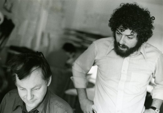
(Click any image to enlarge.)
Obviously, that’s Dick Williams with me looking over his shoulder. Oddly I remember being in this position often during the film. It’s probably the first image I have of the production when I look back on it. Dick and I had a lot of conversations (about the film) with him “going” and me listening.
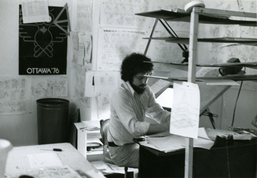
When I did actually grab time to do some drawing, this is my desk. It sat in a corner of a room – across from Jim Logan and Judy Levitow. There were about ten other assistants in my room, and there were about seven rooms filled with assistants on the floor. I had to spend time going through all of them making sure everybody was happy.
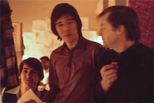
This slightly out of focus picture shows Dick Williams (R) talking with Kevin Petrilak (L) and Tom Sito. That’s Lester Pegues Jr. in the background. Boy were we young then!
These guys were in the “taffy pit,” meaning they spent most of their time assisting Emery Hawkins who animated the bulk of the sequence. Toward the end of the film, lots of other animators got thrown into the nightmarish sequence to try to help finish it. Once Emery’s art finished, I think the heart swoops out of that section of the film.
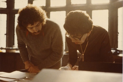
This photo isn’t from Raggedy Ann & Andy, but it just might have been. That’s the brilliant checker, Judy Price showing me the mechanics that don’t work on a scene on R.O.Blechman‘s Simple Gifts. This is the one-hour PBS special that I supervised after my Raggedy years. However, Judy was a principal on Raggedy Ann, and we spent a lot of time together.
Ida Greenberg was the Supervisor of all of Raggedy Ann’s Ink & Paint and Checking. She and I worked together on quite a few productions. I pulled her onto any films I worked on after Raggedy Ann. She was a dynamo and a good person to have backing you up.
I’m sorry I don’t have a photo of her from that period.
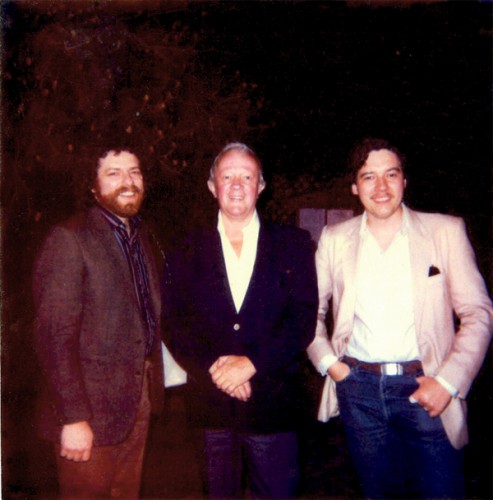
This is one of my favorite photos. Me (L), Jim Logan, Tom Sito (R). Jim was the first assistant hired after me – I’m not sure I was an assistant animator when they hired me, but I was being geared for something. The two of us built the studio up from scratch. We figured out how to get the desks, build the dividers, set up the rooms and order the equipment.
To top it all, Jim kept me laughing for the entire time I was there. I can’t think of too many others I clicked with on an animation production as I did with him. He made me look forward to going into work every day.
We frequently had lunch out, he and I, and I think this is at one of those lunches when Tom joined us. It looks to me like the chinese restaurant next door to the building on 45th Street. Often enough, Jim and I would just go there for a happy hour cocktail before leaving for the night.
I should have realized how important that period was for me and have taken more pictures. Oh well.
Independent Animation &repeated posts 14 Nov 2011 08:20 am
Pups of Liberty – a recap
- In October 2009 I was impressed with the work of Jennifer & Bert Klein‘s Pups of Liberty, a short film they had completed. It was a fully animated short, and a lot of work went into it. I decided to pose some questions and interview them via email.
I was reminded of this in the past week when they dropped in at my studio just to say hello. They had business in NY and were there for a packed two days. We spent a really pleasant couple of hours and talked about our divers careers in animation. Having just met them for the first time I was surprised at how much we had in common.
After our meeting, I took another look at the two pieces I’d posted and thought I’d like to show them again. So here they are. We start with the first post in which I interviewed them for the site, and then we move onto the second post where I try to showcase some of the artwork.
 - The fortune of having a modestly successful blog is that some filmmakers actually approach me in order to get the word out about their films. Such was the case with Jennifer & Bert Klein‘s Pups of Liberty. They sent me a link to their site which offered a trailer for their short film, and they offered to send me a DVD of the entire film.
When I looked at their site and trailer, it was obvious this wasn’t your average short. I saw the very full animation, beautiful backgrounds, and I looked deeper.
I saw the credit list and the names of James Lopez (Animator on Hercules, Emperor’s New Groove, Flushed Away and Princess and the Frog), Eric Goldberg (Animator on Aladdin, Fantasia 2000, and Princess and the Frog), Barry Atkinson (BG artist on Prince of Egypt, American Tail and The Lion King), and Mark Henn (Animator Ariel, Belle, Jasmine, Mulan and Tiana) among others. I had to see this film.
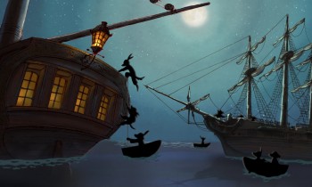
I wasn’t disappointed. The animation is sterling in the richest of full animation; the Bg’s are beautifully styled to feel like the period (the Revolutionary War) they’re meant to suggest, and the Direction couldn’t be cleaner or clearer or more focused. The film doesn’t waste a shot, but drives itself through the story in a very economical approach. Yet not a dollar seems to have been spared in making this the extraordinarily lush film it is.
I had to respond to Jennifer and Bert Klein to ask for a short interview and they responded with answers to any question I posed and plenty of supportive material. Hence, I’ll post that Q&A today with some stills from the film, and tomorrow some amazingly attractive pre-production artwork. This film deserves a book of its own.
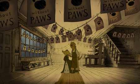
All images copyright © 2009 Picnic Productions
The Interview
Michael – What prompted you to develop this story? It reminds me a bit of Disney’s Johnny Tremaine in the way that it focuses on a particular craftsman and his daughter, just as the live action film focused on a silversmith and his apprentice. Was there any inspiration from that film/book? Animation wise, it feels a bit like Ben & Me. Perhaps that’s because of the subject.
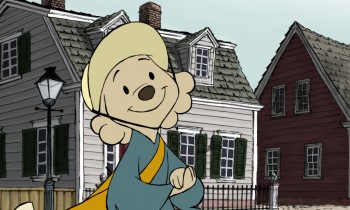 Jennifer – I have always loved this era of history (Colonial/Revolutionary America) so when I first began developing an idea for a new short it was the first setting that came to my mind. I wanted to make a story that was quality and that a viewer would feel good about watching; I was also very interested in how to teach people concepts (like taxation and representative government) with a media like animation.
The story of the Boston Tea Party seemed like an iconic event to start with, since most American school kids learn about it pretty early on. The more I researched the more I was drawn to the story of the printer who started the Sons of Liberty. I love the idea of a group of ordinary people getting together to motivate change in their world, and I liked that that is something that translates internationally, to everyone.
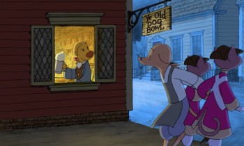 I grew up watching Robin Hood because it was the only Disney movie we had. At some point I saw Ben and Me and I have always liked that one a lot too. I like allegorical story telling, fables… so it seemed natural to tell the story with animals. In a way it lightens up the mood of it having a political bent- because really, they are talking dogs and cats.
Bert – We initially considered making a film about the first Thanksgiving with cats as pilgrims and birds as the native Americans. We moved ahead in time a bit and did the Boston Tea Party instead.
I’m sure you don’t want to discuss your budget, but you must have gotten a lot of incredibly talented people to volunteer to help you make the film. (Eric Goldberg, Mark Henn et al). The expense easily looks quite high.
Michael - Was the budget completely out of pocket?
- How did you create such enthusiasm for the project to do so?
- Now that you’ve finished what is your hope for distribution or future development?
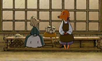 Jennifer – Our budget was all out of our own pocket. We might be a little crazy I guess, but this is what we do. It’s our hobby. Bert and I are very passionate about making shorts, and when we began the project we were also very interested in keeping ourselves in practice for 2d animation at a time when there weren’t any other 2d features being made at any of the studios. Our friends who worked traditionally started to hear about the film and we would have evenings with everyone over and do pencil tests and see them cut into the storyreel – and we’d always have pie, I would bake every night for the crew. The nights started to take on a family atmosphere, and I think everyone felt very comfortable to come and practice their art that they had been trained to do. Everyone was working at their highest skill level– Mark Henn was doing 20 feet a week, James Lopez stretched himself and all of our layouts, we had cleanup people doing the most beautiful work I had ever seen from them. I can’t say how we “created” enthusiasm because you can’t consciously create something like this. You’re just darned lucky that it happens.
We are submitting the Pups to film festivals, so we will have about 2 years worth of that, and then we’ll see what happens. My biggest hope would be for a series. I would also love to see it in the classroom one day.
Michael – It must have taken quite some time since I doubt you were able to work steadily on the film and had to fit it in between other jobs. (I’ve seen your resume and know you’ve been busy outside of this film.)
- How long did it take to make, given your work schedule?
- How were you able to maintain such a consistent (and consistently high level) look while working on it on a long, piecemeal schedule? (Assuming that was the case?)
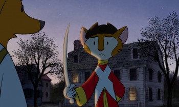 Bert – Most of the production took place during spare time over a two year period. The births of our two kids stretched out the last bits almost another two years.
One way we ensured consistency was having Jennifer do clean up keys over the different animators’ drawings to maintain the style. Mark Henn did a lot of animation on the film and helped raise the bar for everyone else. One person (James Lopez who was a supervising animator at Disney for a decade) did all of the layouts. I animated a lot of it myself and just kept working on it until it was done. Our assistant director Hyun-Min Lee was invaluable to us in getting this done, tackling technical problems, organizing scenes and x-sheets, and trackreading amongst many other jobs.
Jennifer – I took some time off to work on the film, so I was able to dedicate all of my time to it. I did the boards, designed the characters, did reds for the cleanup keys. I think that the simplicity of the characters saved us a lot of line mileage and made it possible for the artists to get through the footage quickly. They also look best against the backgrounds, which are done in a hand drawn pen-and-ink style and required something simple to contrast with them. We looked at the printwork from the time for inspiration- Paul Revere’s engravings especially really had a ‘homemade’ colonial feel, and you can see his personality in them and in the brush strokes of color used that we tried to invoke.
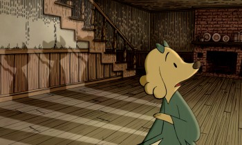 It is hard to sit down and work after you have worked a full day, but I always remembered something Bert would say- “Even if you just get one drawing done you are one drawing ahead.” So I’d try and get one scene’s worth of layouts done a night, or read a track, or just something, and we’d inch forward until we were done.
Michael – Just as American Tail was compared to MAUS, your film has already received a comment on Cartoon Brew comparing it. There are very obvious differences, but I wonder if you thought about this possibility?
- Or worried about it?
- Did you ever question the idea of doing it with humans?
- Or would that have made you focus even more on historical accuracy?
Bert – I heard of MAUS, but I’ve never read it. Our main reason to make this was purely a labor of love. I watched Jennifer do great work as a story artist on lots of feature projects for studios that never got made or changed radically from the first inception. She was one of the original story artists on Where the Wild Things Are when it was a fully animated feature back in 2001. I wanted to produce a film that was a showcase for her story sensibilities because I felt that it might be the only way to get that pure vision to the screen. We also hope that people and their kids can enjoy it.
 Jennifer – Honestly I never heard of Maus. Whatever subject matter you make a film about though, there will always be something to compare it to — how many films are there about aliens? Or zoo animals? A setting is just a setting- it’s how you hook the audience in, how you make them really feel for and believe in your characters, and the experience that you give them that matters.
Doing a historical film with humans instantly makes it more serious- doing it with animals, you can’t take it as seriously and you can have more fun with it. Why animate humans when you can animate talking dogs? It made us laugh. We did it this way so that we could have some fun, and do what we love to do.
Having interviewed Bert and Jennifer Klein, I found myself with a lot of beautiful artwork and test footage to show. In posting it, I’ve kept the text descriptions, below, written by their Production Designer, James Lopez.
You can view a trailer from their film here.
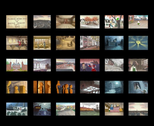
Pups of Liberty Color Script by James Lopez
For the colors, warm colors were chosen to represent the dogs’
surroundings and, in contrast, cool colors to represent the cats.
To start the film, the colors were to portray a pretty town but not
a vibrant one. Only as hope comes alive and tensions run high (The
Boston Tea Party & The Riot) are the more vibrant colors introduced.
Color influences came from some classic Disney films and a desire to
use natural lighting (direct & indirect) as opposed to “staged†lighting.
The story of the movie is left somewhat unconcluded so at the finale,
rather than going full-blown with color, there is a hint at what would be
to come (as the story’s narration suggests).
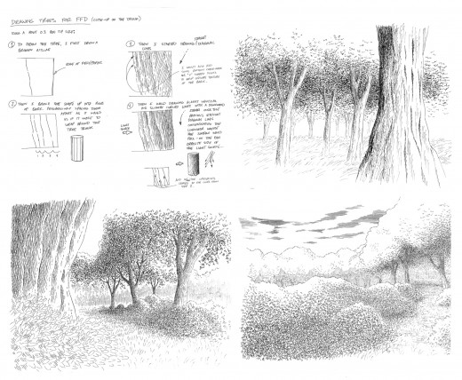
Pups of Liberty - Drawing Trees
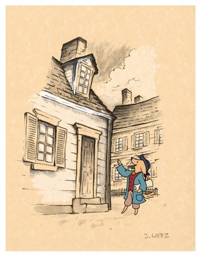
Pups of Liberty - In the style of Anton Pieck
Initally, the backgrounds were going to be influenced by the stylings
of Dutch artist Anton Pieck. Studies were made to see what the style
would look like with a Colonial theme.
A composite was made with the paint study and the character over
a parchment texture. We we were happy with the result of how the
drawn character married into the drawn environment.
It was a nice style but it involved a unique application that was a labor
to produce and proved to be impoprobable so we explored other, more
traditional styles.
We later settled for a pen and ink application on vellum paper in the
rough drawing style of the late Ken Anderson. It allowed us to stay
loose and if there were any mistakes or changes to be made, they
could still be done on paper.
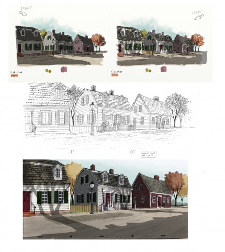
The top two illustrations are visual development for the color and
lighting treatment on the houses. The desired effect was trying to
capture the drama of the shadows cast from the trees by the sun
set low on the horizon.
The middle illustration is a clean-up layout by James Lopez
The bottom illustration is a Production Background painted by James Lopez
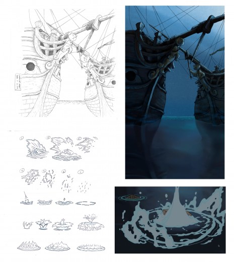
Pups of Liberty - Water Effects
Illustration (upper left) Clean-Up Layout by James Lopez
(upper right) Production Background by Barry Atkinson
(below left) water studies by James Lopez
(below right) Production still
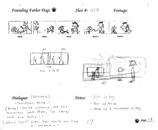
The above images represent a page from the Director’s workbook
for Sc. 17. Storyboard drawings are by Jennifer Klein.
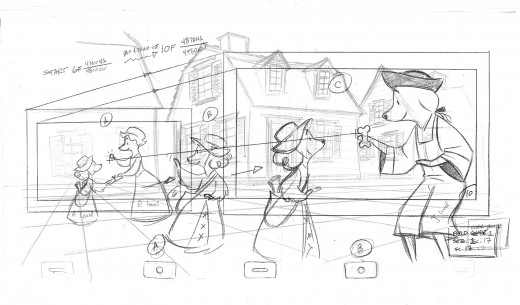
This is the Layout for Scene 17
done by James Lopez.
The QT movies below are Pencil Tests of scenes by
Mark Henn.
Right side to watch single frame.
Animation Artifacts &John Canemaker &repeated posts 24 Oct 2011 06:51 am
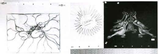
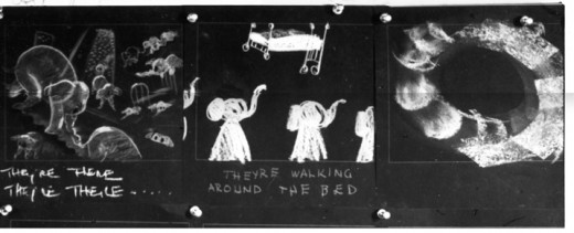
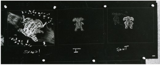
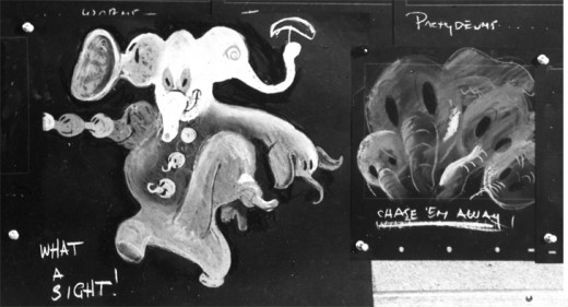
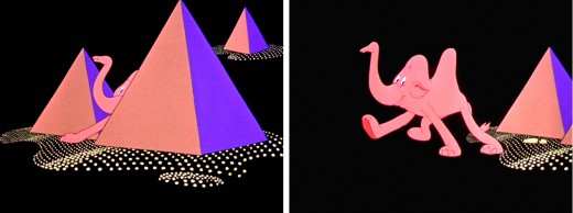
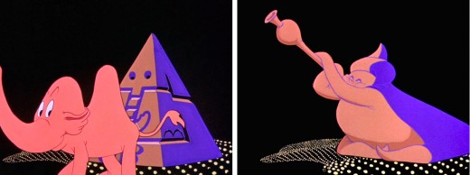
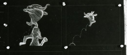
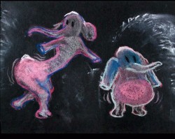
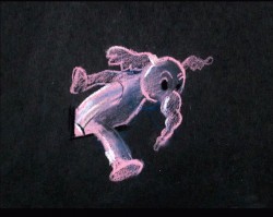
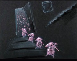
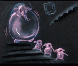
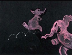
Pink Elephant Recap
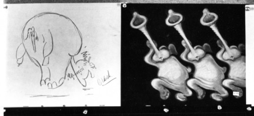
- Recently, I saw a small part of Aladdin on television. A large part of the Genie’s song reminded me of Pink Elephants from Dumbo. I thought, then, that I should post anew the models/sketches and drawings from that sequence. It originally was broken in two parts when it saw daylight here in 2007. I’ve combined the two posts into one.
Once again, thanks to John Canemaker, I have several photo images to display. Some frame grabs accompany the piece.
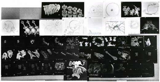
These are rather small images, so by cutting up the large boards and reassembling them I can post them at a higher resolution, making them better seen when clicking each image.
I’ve interspersed some frame grabs from the sequence to give an idea of the coloring.
The following images were in the gallery part of the dvd. These are the color versions of some of the images above.
Frame Grabs &Hubley &repeated posts 11 Oct 2011 06:54 am
Hubley and the Telephone
- The Hubley show last night was brilliant. A first rate job by John Canemaker. Most of the prints were spotless and beuatiful (something you rarely see with Hubley films – the DVD copies are soft focus and poorly transferred.) I’ll write about it later in the week. I have a lot of photos to add to that post.
I’ve been posting some pieces about the Hubley work. Given the start I had concentrating on it, I can’t come down so quickly. There’ll be a couple more posts on his work this week. This piece is something you won’t see projected any time soon. It’s an industrial done for AT&T originally posted back in July, 2009.
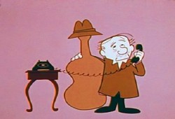
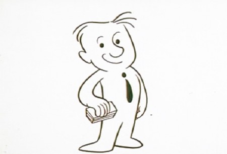
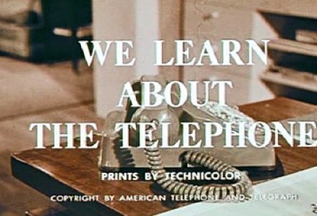 – In 1965, John Hubley directed animation inserts for an educational film for Jerry Fairbanks Productions and AT&T. It’s the story of the history of the telephone and how it works. The story, such that it is, tells about two kids visiting their uncle, an animator (actually, an actor playing an animator). He gives them an animated lecture on the story of the phone.
The film reminds me very much of another film done by the Hubley studio. UPKEEP was the history of the IBM repairman. We travel through history to see how the repairman has worked over the years. It’s a successful device that works in John’s hands.
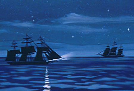
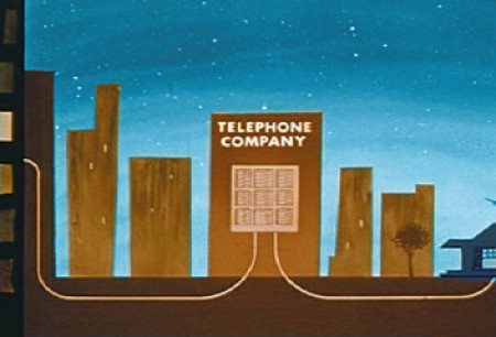
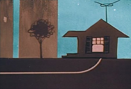
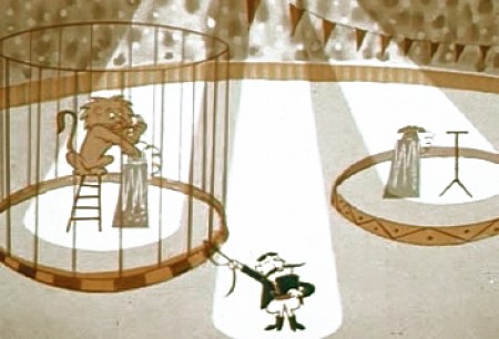
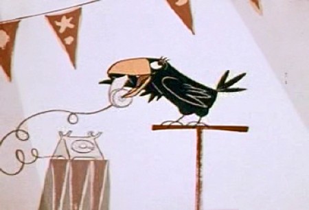
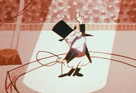
The film is available to view on the Prelinger Film Archives. I’ve made some frame grabs to post to give an idea of the style. The characters seem to shift a bit stylistically from the humans at the beginning to those later at the circus. From Hubley to Jay Ward. This was a period where John Hubley was beginning to experiment with more expeditious styles for the jobs that came in. The more artful Maypo style was a bit complicated to pull off. The cels, here, are cel-painted traditionally. (I actually have a hard time believing the date on this film – 1965. It feels more like late 50′s.)
The backgrounds are all by John Hubley, and they remind me of those he would do for UPKEEP and PEOPLE PEOPLE PEOPLE. Lots of white space and soft images. The animation looks like it was done by several people. I recognize Emery Hawkins‘ style, and I also can see Bill Littlejohn in there.
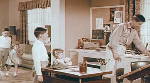 1
1The animator’s studio.
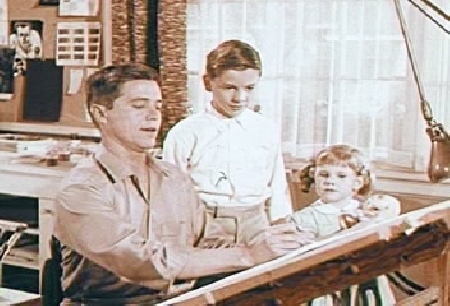 2
2
Kids are always fascinated when an animator draws.
 3
3
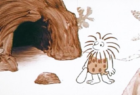
The character goes from this . . .
 5
5
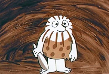
The caveman has to deliver a message.
![]()
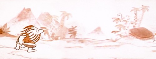
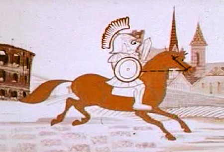
This is the full length of his run, the pan wherein the character
runs from being a caveman to an Egyptian to a Roman.
Here’s the same BG broken into four parts:
 6
6
Once on horseback, man travels through
the middle ages to the pony express.
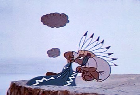 7
7
Man turns to smoke signals to communicate.
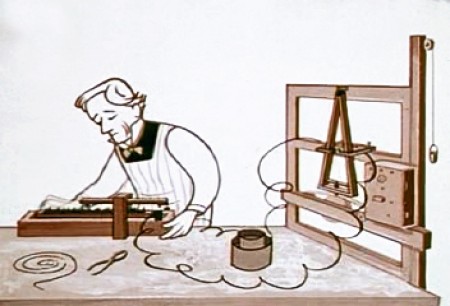 11
11
Morse invents the telegraph.
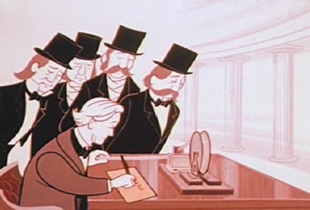 12
12
Alexander Graham Bell invents the telephone.
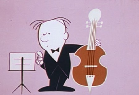 13
13
Now the animator explains how the telephone works
to two very interested children. .
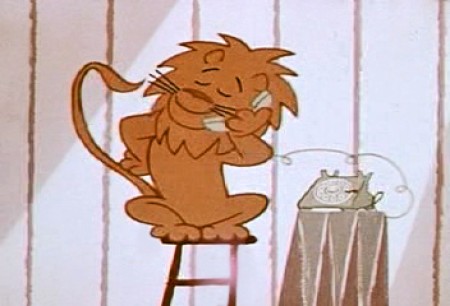 19
19
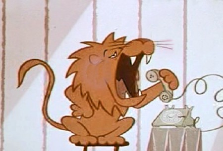
We get the fable about the lion who calls . . .
 21
21
Though he shouts too loudly into the phone.
 24
24
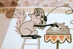
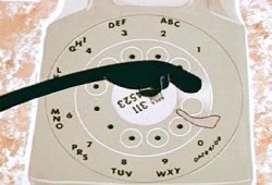
Then there’s the squirrel who can dial the phone . . .
 25
25
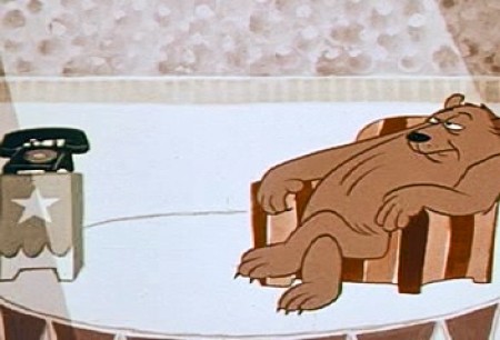
. . . and the bear who answers the phone too late.

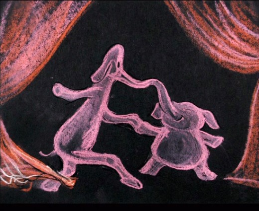
Then there’s the elephant who dials the wrong number.
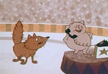 28
28
Finally there’s the pig who won’t get off the phone
so the fox can make an important call.
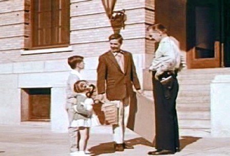 29
29
Next the animator takes the kids to the police station.
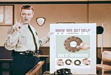 30
30
This way the cop can tell the kids how to make emergency calls.
Animation &Animation Artifacts &Hubley &repeated posts 05 Oct 2011 06:55 am
Seeding revisited
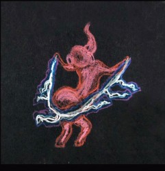
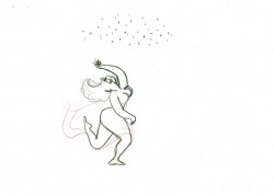
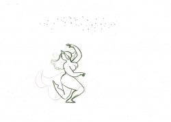
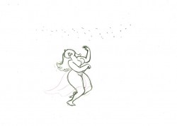
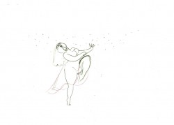
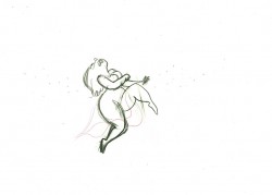
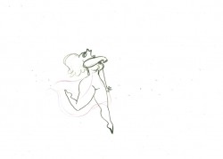
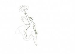
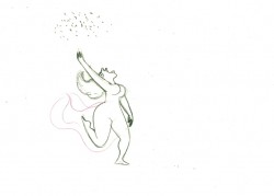
- Tissa David did a lot of animation for the Hubleys from about 1958 through 1977. She did whole films on her own and EGGS is one of them. I posted this cycle a few years back and to tie it in with my piece on Monday and leading up to the Hubley retrospective, I’m posting it again, today. I think it’s wonderful.
-Tissa David animated the entire film for John & Faith Hubley. This short, as I said in previous posts, was done for PBS’ Great American Dream Machine for producer, Elinor Bunin. As Bob Blechman verified, they were given very little money and time to do an 8 min. short. The Hubleys gave life to the short by putting it on the theatrical and festival circuit.
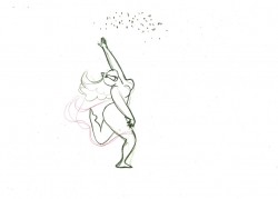
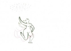
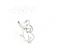
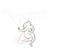
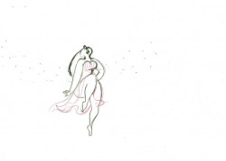
Here’s a rough run cycle Tissa did for the Goddess of Fertility, who goes about inseminating the world with her seed. Tissa adds to its eccentricity with having the low point in the cycle the passing drawing. She comes up as each leg hits the ground.
 1
1 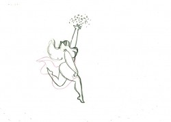 2
a “Goddess” run cycle from Eggs
2
a “Goddess” run cycle from EggsOn threes at 24FPS
Click left side of the black bar to play.
Right side to watch single frame.
