Category Archiverepeated posts
Disney &Fleischer &Illustration &repeated posts 24 May 2012 05:16 am
Sheet Music Graphics – repost
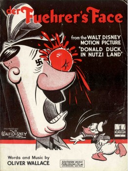 – I’ve long been a fan of old sheet music and have a tiny collection of songs from animated pictures.
This is a song by Oliver Wallace in the Donald Duck cartoon, Der Fuerher’s Face. The sheet music is a bit rare in that it has the original title of the Donald film, Donald Duck In Nutzi Land.
They soon changed the title on the sheet music, especially after the music became a #1 hit in a version by Spike Jones & His City Slickers.
You can see the film on the Walt Disney Treasure DVD – On The Front Lines: Disney Goes To War.
The film deservedly won the Oscar for Best Short Subject in 1942. Its opposition were all propaganda war films.
.

.
- Here’s part of the back page, for those who want to see the Disney logo for sheet music back then.
Sheet music in the 30s, 40s and 50s was Big Business. There were no DVDs,videos or LP records. No walkman, I Tunes or cel phones. Selling sheet music for all those kids learning to play an instrument was the natural tie-in to the film, and gave the Nation another inroad to marketing the film.
If the audience hummed the song, more tickets could be sold to the film.
.
The graphics for the music to Song of The South wasn’t quite as dynamic as the one on the cover of Der Fuehrer’s Face.
This cover tries to capture the lyrical, romantic feel of the film. Here surrounding the live-action plantation, with all the different song titles available from the film in the sky, is a border consisting of the animated characters from the film. The colors are limited to the green-etched homestead and the brown-linear characters.
The back cover of the sheet music contains a shot of the live-action characters, James Baskett, Bobby Driscoll, and Luana Patten. All are colored in the same brown ink as the cover’s line art.
That year “Zip-A-Dee-Doo-Dah“, also from this film, won the Oscar, while the film’s music, itself, was nominated for Best Scoring of a Musical Picture.
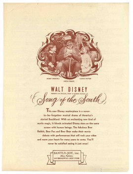 This film made quite an impression on me when I was a kid. And this song was one of the two I played over and over from the record. I also loved “Laughing Place”.
It’s something of a shame that the film has been kept out of circulation in the US. I can’t imagine that the film affected me as a child in any negative way. Uncle Remus was clearly the hero of the film and the only truly positive adult character in the film.
The last time I saw the film projected was back in the 70′s when Disney set themselves up at Lincoln Center to show a complete retrospective of ALL their films. At the library auditorium behind Lincoln Center there were a number of seminars in which Frank Thomas, Ollie Johnston, Ken Andersen and Woolie Reitherman talked about their work.
I remember Frank Thomas talking about this feature, saying that Disney only did the best for the film hiring the greatest cinematographer, Gregg Toland, to shoot it. He’d shot everything from Citizen Kane to The Grapes of Wrath. (Both are unbelievably stunning works of cinematographic art.) What Thomas didn’t say, or didn’t realize, however, was that this was Toland’s first COLOR feature. And it showed. Garish, cartoon colors flooded the screen, with actors wearing much too much makeup. A big step for Toland but not the best photography.
Still, I remember those colors vividly, and I would love to see it again – on screen. A dvd would probably do.
– I have a non-Disney cover. It’s the 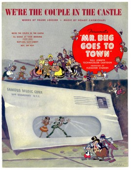 sheet music for the 2nd feature film from the Fleischer’s, Mr. Bug Goes To Town.
This was a feature that really got me going when I was young. I think it was the first original story done in animation; not an adapted fairy tale or novel. The story still works for me, though it comes off as a bit episodic. (Actually, I think most animated features are too episodic.) They’ve created a complete world for these insects, and it works.
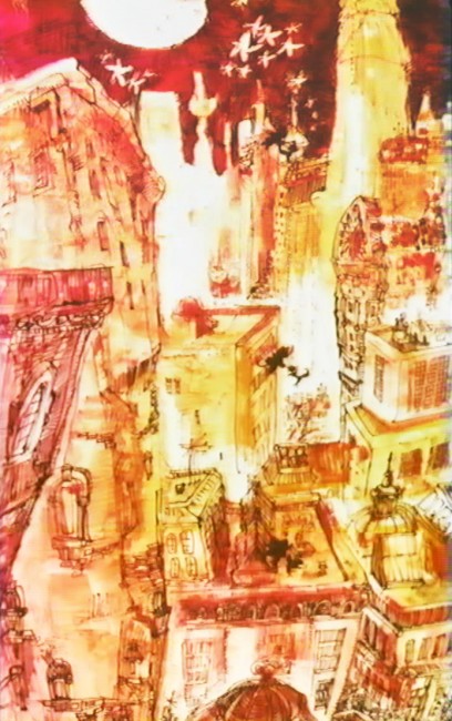
Technically the film is a bit limited. The opening title shot is a stunning shot panning down the Empire State Building and across NYC ending on the vacant lot where the bugs live. The animation is adequate for the period; it has a charm that I find delightful and sometimes exciting. The voices are good, and the music is excellent.
This was the hit song, written by the brilliant Hoagy Carmichael (who wrote Stardust, Heart and Soul, and Skylark) and the just-as-brilliant Frank Loesser (who wrote Guys and Dolls, Hans Christian Andersen, and How To Succeed In Business). The score for the film was co-written by Leigh Harline (who scored Pinocchio, a lot of Disney shorts, and The 7 Faces of Dr. Lao, among others).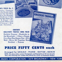
As we can see, most sheet music was printed with one or two colors) red for Der Fuehrer’s Face, brown & green for Song of the South) as opposed to full color. However, this Fleischer song has a full color cover (although they use one color on the rear cover). It shows that Paramount felt they had a hit song here, and they did have a modest hit. Glenn Miller’s recording of it didn’t hurt.
The rear cover is little more than an ad for other Paramount songs. However, in among the group is Gulliver’s Travels. I’m posting just this small section of the back cover, printed in blue.
.
.
Animation &Commentary &Hubley &Models &repeated posts 17 May 2012 07:17 am
Hub Eyes – repost
Here’s a post I wrote in 2009 that I still think is valuable, so I’m going to put it up again.
 - It was 1973, and I was happily – I can’t tell you how happily – ensconced in the Hubley Studio working on Letterman, a new series for an upcoming CTW show, The Electric Company.
It was my first animation job. I inked it all (directly from animator roughs), I assisted & inbetweened it all, and I animated odd scenes including all the title sequences. I was a novice, and I was doing it all. Excited and happy is all I can remember.
I was alone one morning in the small room wherein I worked. I made a habit of getting into work before anyone and leaving after everyone. I wanted to make sure I was indispensible.
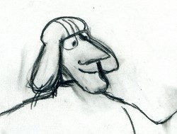 A month into the gig, and I think I’d only spoken with my hero, John, about a half dozen times. I was rushing through one of the Johnny Gent “Spellbinder” sequences. I inked all of his scenes, then inbetweened the drawings in ink. No time to work in pencil for this schedule. Johnny was completely off character, in a very old fashioned way, and I had to rework them all closer to the models – in ink. The schedule just gave me no time to be proud of what was happening. (A year or so later I apologized to Johnny for what I did to his artwork. I was so inexperienced and had such a dominant role in how the final art looked in that series.)
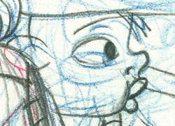
John Hubley ran in to give me something and made a quick comment about the character I’d been drawing. He said it was a “Paramount eye.” I looked at the drawing, then at him. Then John drew on a small piece of paper a “Disney eye,” then a “Terrytoon eye.” He laughed aloud and told me to try to “square off” the eyes a bit. Then he ran out.
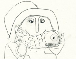 I learned a lot in a very short time. I watched eyes that day and probably all that week. I ran Hubley films at lunchtime (I’d made it a habit to project their films in the kitchen during many of the lunch breaks. The entire group working there enjoyed these sessions) and watched the eyes. I talked with Tissa David about eyes in one of our evening tutorials – she was trying to teach me how to inbetween properly.
I was reminded of this moment when Chuck Rekow commented on the Moonbird Walk posted weeks ago. “The shape of the eyes on the boys is a real departure from almost anything in the cartoon world —even 50′s era. It’s closer to real life, and reminds me of the graphic style of Ben Shahn. It lends the film an aura of “seriousness”, even though it’s a cute film about two boys and an imaginary bird. Obviously, the pre-recorded sound is a major deal, but this gem is loaded with touches of inventive detail.”
How right he is, and I love being reminded of it.
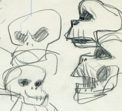 The eyes are the direct route to the soul of a person and, consequently, an animated character as well.
After working for the Hubley studio, for a short bit, I worked for Phil Kimmelman and Associates. This was a hardy commercial studio doing tight designer-based animation. Rowland Wilson was doing a lot of their design work, and the animation clean-up was tight. Animators Jack Schnerk, Sal Faillace and Dante Barbetta did a lot of the work the few months I was there. Jack Schnerk was also animating for Hubley, so I knew his very complicated-to-clean-up style. I worked primarily as an inbetweener and learned some hard and tight lessons while there.
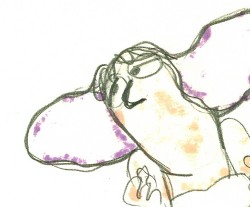 After the very loose work I’d been doing for the Hubley films, it was not only difficult for me, but good to keep me towing the proper line. I wanted to learn animation, and all of it was important.
Here, too, an empahsis was on the eyes. No Disney eyes, no Hubley eyes, either. But now I was just concerned with keeping those lines tight tight tight. No shimmer on the eyeballs. After all, I was told, people stared into the characters’ eyes, and any flaws in the animation would show up first in those eyes.
I worked for PK&A for about three or four months. I’d also worked for Tubby the Tuba at NY Institute of Technology under Johnny Gentilella, where we got somewhat close and I was able to discuss all sorts of animation problems with him. That was the only redeeming element, everything else about that studio was wretched. My displeasure ultimately led to my leaving as soon as I could.
Eventually, I was back at the Hubley studio helping to finish up the short Cockaboody.
The tightening of my inbetwees only brought positives to what I could now do for John Hubley’s studio’s animation.
 To this day, I still watch eyes closely. For some reason, the tighter the linework, the closer I watch the assistant’s work. The looser the line, the more I watch the design. I prefer watching the design. Often it means eyes that can be easily labelled: Disney, Paramount, or Terrytoons. I suppose today, you’d say: Pixar, Dreamworks or Blue Sky. (And believe me, you can see those differences even in cg.)
The images above are from the following films:
Animation Artifacts &Disney &Frame Grabs &Models &repeated posts &Story & Storyboards 12 Apr 2012 06:22 am
Some Lady Drawings – recap
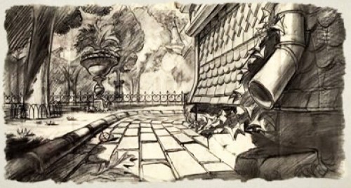
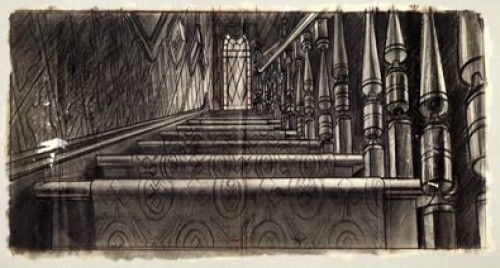
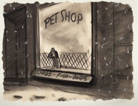
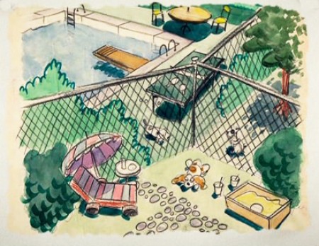
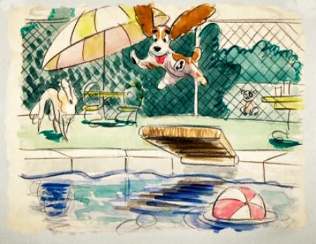
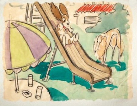
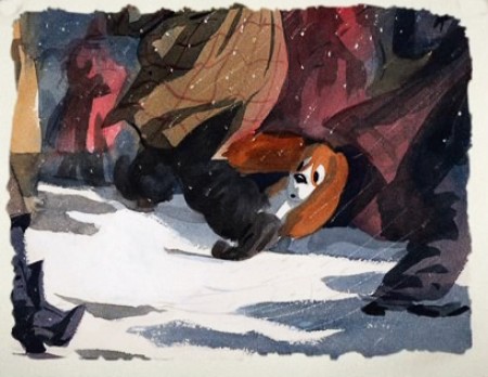
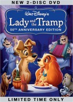 - The DVD of Lady and the Tramp includes some preliminary artwork for the film. I collected a bunch of it and am breaking it into a couple of posts. It’s easier to read off a blog than a tv screen, especially when the DVD tries hard to reduce them to the smallest size they can muster within an overworked border that is virtually pointless.
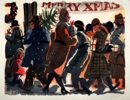
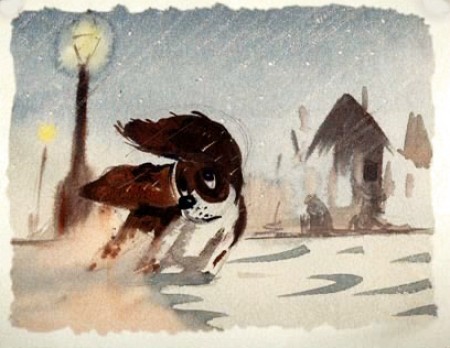
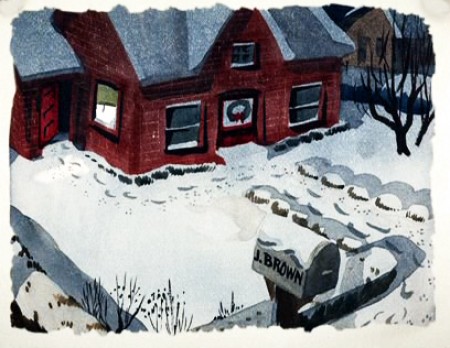
The illustrations – some are obviously BG layouts, others storyboard drawings – have a light and jaunty feel. They’re very cartoon in nature, and belie the actual feature they produced which, at times, is quite beautiful. Disney truly got the feel of “Main Street, USA” in this film.
I’m interested that most of the images don’t take in Cinemascope (since they were probably done before the decision to go Scope.) Most of them are also fast drawings that don’t feature the Tramp as we know him, and even Lady takes on a different form.
You get the feeling this film was pushed out relatively quickly. The results are excellent, regardless. Sonny Burke and Peggy Lee wrote an excellent pop-song score that doesn’t quite capture the turn-of-the-century, but it does capture the atmosphere of early 50s USA.
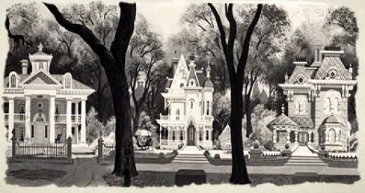
This drawing is in B&W on the DVD, but it appears in
Bob Thomas’ 1958 book, “The Art of Animation.”

Bg for The Princess and the Frog.
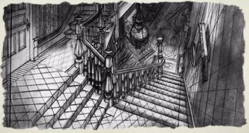
This looks not too different from a shot in Hitchcock’s Psycho.
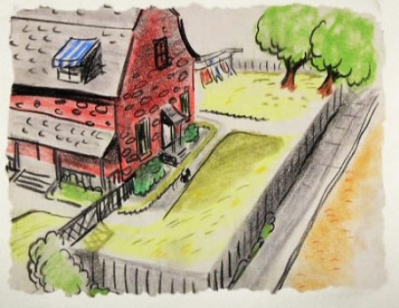
We seem to be in the Little Golden Book territory
with some of these images.
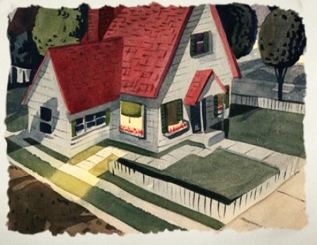
An earlier and different view.
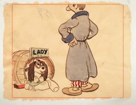
Or did I mean the New Yorker circa 1948?
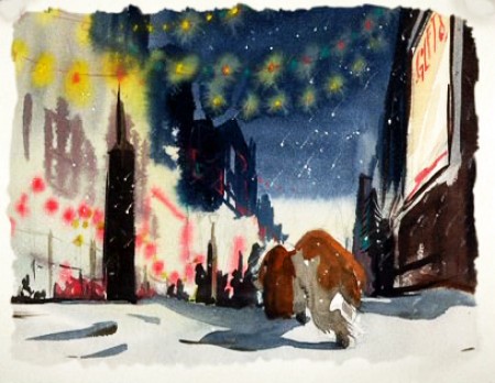
I love weather and would have applauded more of it in the film.
To be continued.
Animation &Animation Artifacts &Bill Peckmann &Independent Animation &Models &repeated posts &Rowland B. Wilson 02 Apr 2012 07:03 am
Rowland Wilson’s The Little Mermaid
- The brilliantly talented Rowland B Wilson, certainly paid his dues at a number of animation studios. We’ve seen his work with Richard Williams’ Soho Square studio and with Disney and Don Bluth’s Ireland studio.
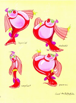
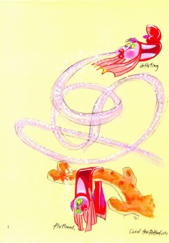
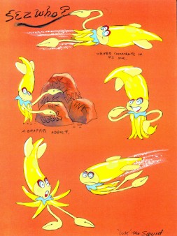
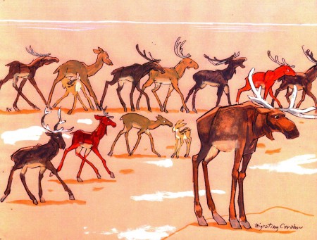
Today, I have some sketches and designs he did for Disney while working on The Little Mermaid.
Not all of this material made it to the film, but the incredible wealth it brought the directors had to have affected the overall production. This invaluable material comes courtesy of Bill Peckmann.
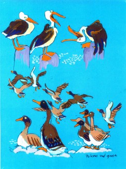
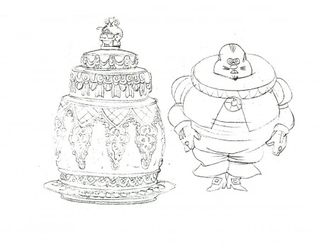
The first group to view are Production Designs that he did for various sequences throughout the film.
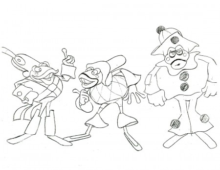
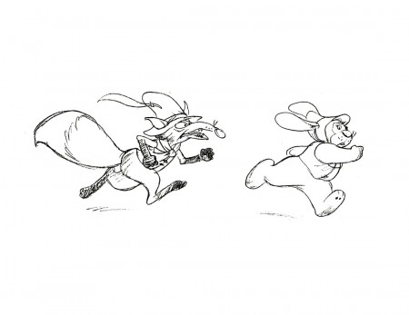
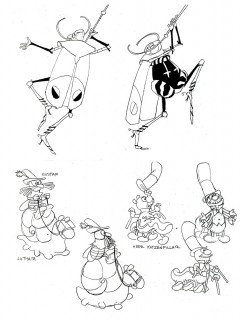
The following are character designs Wilson did for The Little Mermaid for a character that never made it into the movie. Though, I think “Ink the Squid” may have developed into “Sebastian the Crab”.
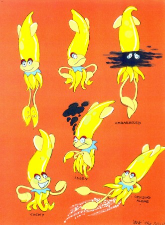
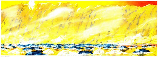
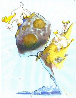
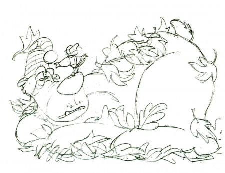
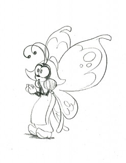
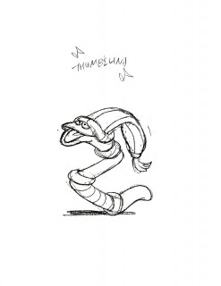
Then there are some of the creatures seen above land at the Glaciar Tray which apparently was designed to be part of the film.
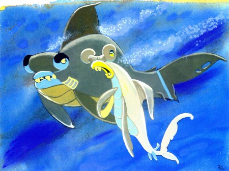
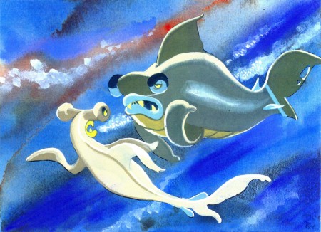
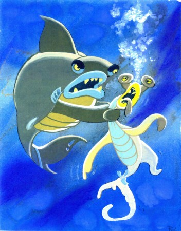
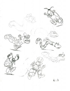
Then there is this short seqeunce of interaction between two fish:
All art displayed © Walt Disney Prods.
 This material is a treasure. I want to thank Bill Peckmann for sharing it with us.
Rowland B. Wilson was an artist of the highest standard, and I can’t get enough of his work. True inspiration.
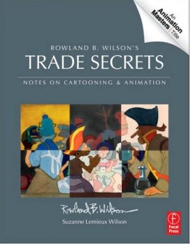
- Don’t forget that there’s a wonderful new book on the market. I’d like to keep it in your attention, hence I’m trying to give a lot of attention to the great work of Rowland B. Wilson.
Rowland B. Wilson’s Trade Secrets: Notes for Cartooning and Animation seems to offer quite a bit of attention to Mr. Wilson’s animation art as it does his brilliant illustration and cartooning. The book looks unique, and to have someone like Rowland as the guide to this world has to be a gem.
Animation Artifacts &Bill Peckmann &Illustration &Layout & Design &Models &repeated posts &Rowland B. Wilson 26 Mar 2012 07:23 am
Thumbelina from Rowland B. Wilson
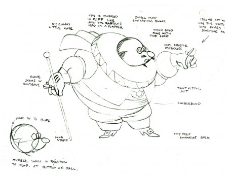
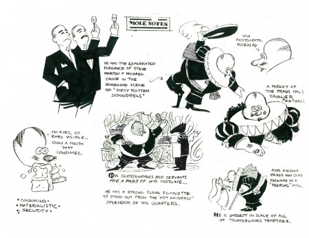
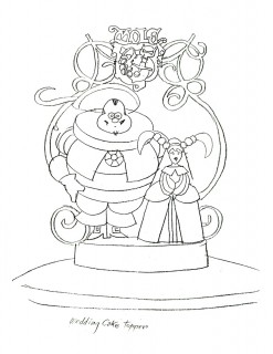
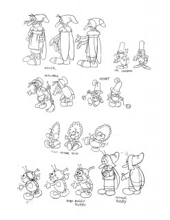
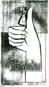 - Thanks to Bill Peckmann‘s extraordinary collection of design material, I have access to quite a few model sheets by Rowland B. Wilson.
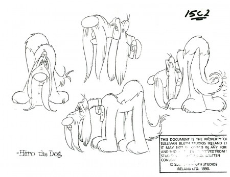
His models for Don Bluth‘s feature, Thumbelina, fill a binder. I’m gong to have to break it up into two posts.
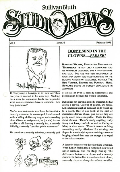
Here, I’ll reproduce the article Rowland had written for the in-house organ “Studio News.” This follows with models for some of the lead character models.
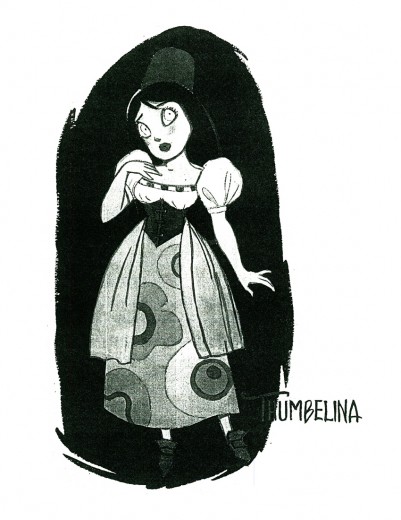
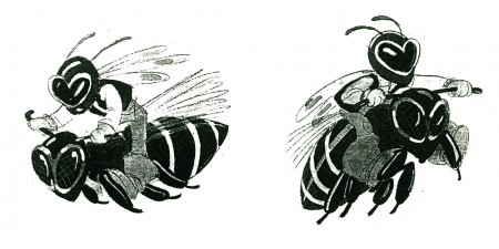
These models were done in pencil and ink, sometimes in color. Unfortunately, all of these are 8½ x 11 xerox copies. Blacks wash out and washes blacken. Regardless, they all come across fine enough to get the idea.
Any feature takes a lot of work. You can understand that just in the large number of model sheets that grace the production. When you have a talented artist such as Rowland Wilson doing that modelling for you, your art is off to a good start.
 1
1(Click any image to enlarge.)
 1
1
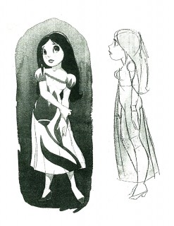
Here we have the model that Rowland drew for Thumbelina.
This is definitely not the rotoscoped princess that we saw in the film.
 2
2 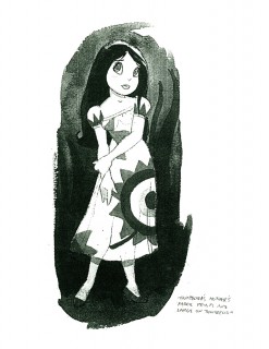 3
3
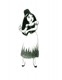
Here we have a lot of different costumes Thumbelina
will wear as she travels on her expeditions.
 4
4 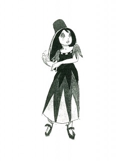 5
5
An original idea – a character who wears
more than one costume in a film!
This film is far from the best of Don Bluth, but it goes to show how much solid work is done for any feature film. There’s also quite a bit to be learned from any feature. Many of these models didn’t end up in the film (take a look at Thumbelina herself in yesterday’s post) but the drive was a forward one.
Off to the modelshow:
 1
1
(Click any image to enlarge.)
 3
3
Another color one copied in B&W
 30
30
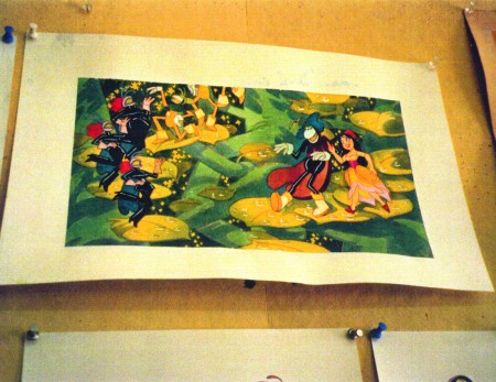
Finally, here are two color photos Rowland took of his presentation art.
Animation &Commentary &commercial animation &Independent Animation &repeated posts 06 Feb 2012 06:49 am
John Wilson – part 5
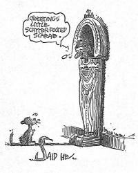
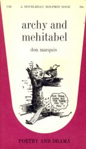 - Don Marquis‘ book, Archy and Mehitabel, garnered fame quickly and not least because of the extraordinary illustrations of George Herriman, the creator of Krazy Kat.
The first book was published in 1927 and others followed in 1933 and 1935. It wasn’t until the third book that Herriman took over the characters created by Marquis in his book of short stories, developed mostly, in poetry. An on-again off-again love affair, the story had two principal characters: a cat, Mehitabel, and Archy, cockroach. (You can read these poems on line here.)
In 1953, writer Joe Darion along with composer George Kleinsinger (the creator of Tubby the Tuba) wrote a musical theater piece. Tenor Jonathan Anderson played Archy and soprano Mignon Dunn was Mehitabel. At about the same time a recording of the showtunes was recorded with Carol Channing as Mehitabel and Eddie Bracken as Archy. The record was a success.
With the help of the young writer, Mel Brooks, they were able to get their show to Broadway in 1957, but it was now named Shinbone Alley. After 49 performances, the show closed, but the original cast album was recorded that same year. The songs stayed in the permanent repetoire of Carol Channing and Eartha Kitt.
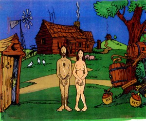
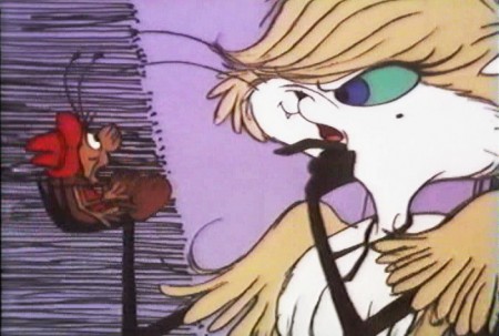
 In 1971, John Wilson directed an animated feature starring the voices of Channing and Brackett and using the songs from the musical. The love affair between Archy and Mehitabel was penned by Archy, the cockroach; his poems tell their story.
The film suffers from its music. The songs are simple and sound as if they’re written for children, but the lyrics pull from the poems which are definitely designed for adults. It gets a bit confusing, as a result, and is a bit picaresque; the poems are short and illustrating them in animation would take more adaptation than seen here.
 John Wilson had developed his studio, Fine Arts Films, on the back of the weekly, animated, music videos he did for The Sonny and Cher Show, an enormous hit in the early 70s.
These music videos were loose designs animated quickly and lively around the songs Sonny & Cher would schedule each week. There would always be one or two of these pieces, and they were highlights in the weekly one-hour musical/variety program.
 The graphics of Shinbone Alley aren’t too far from these Sonny & Cher videos. Loose design and animation with a design style not too far from the Fred Wolf’s made-for-ABC feature, The Point. This was the first feature made for television and featured the songs and story of Harry Nilsson, although Shinbone Alley featured a wilder color pallette.
Jules Engel, Corny Cole and Sam Cornell all worked in design on the film. The long list of  animators included Barrie Nelson, John Sparey, Spencer Peel, Eddie Rehberg and Jim Hiltz. Mark Kausler was an assistant on the show.
The film wasn’t an enormous success, but that was probably explained much by the limited distribution and the poor marketing of the film. I saw the film when it came out; I was living in Washington DC at the time (in the Navy). I was very disappointed. The animation is very limited and the style was a real let-down having known the George Herriman illustrations from the Don Marquis book. We’d already seen those limited animation Krazy Kat cartoons from King Features, so I knew the style could be done adequately – even on a budget. The style in this film just seemed a little too Hollywood cute, at the time, and it felt dated when it came out. I don’t feel too differently about it watching the VHS copy I own.
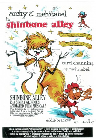
the film’s poster
Here are some frame grabs from the first 1/4 of the film:
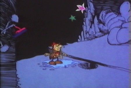
We’re introduced to Archy right off the bat as he
flies out of the river onto the dock. He realizes that he,
the poet, tried to kill himself and was sent back as a cockroach.
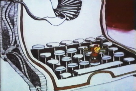
He soon finds a typewriter and goes straight back to work.
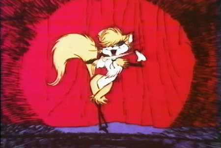
Mehitabel is a performer – with Carol Channing’s voice.
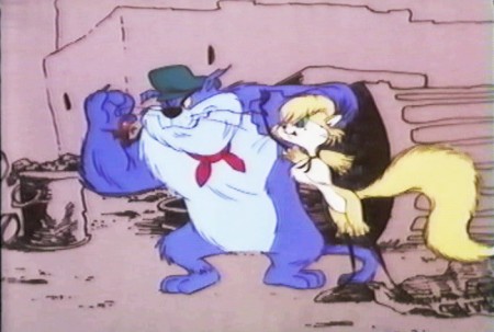
She has another boyfriend, voiced by Alan Reed,
who is also the voice of Fred Flintstone.
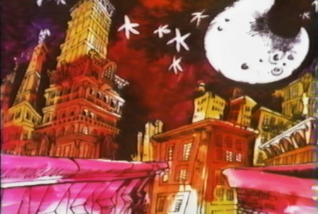
A song video takes us outside.
Part of this post was originally on this Blog in February 2010.
Photos &repeated posts 05 Feb 2012 04:43 am
Foodcarts – Recap
Here’s a favorite post from 2009. A repost, if you will. All of these food carts are still in the same places, and the piece could have been photographed yesterday.
- Paddy Doyle’s novel, “The Van,” made me realize that we had a lot in common with our British and Irish friends. The travelling food sellers are a common dressing though the cuisine sold, I’m sure, is different.
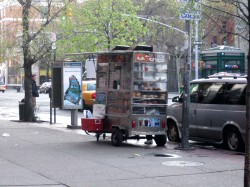 A major part of the look and feel of New York is in the food carts that are standing everywhere. In the past, my childhood, the carts were basically hot dog vendors. Then they added the salted pretzel, and things started to develop.
With the new immigrant class in the city, lots of new foods entered the picture, and in fact, I believe, they’ve taken over. Today it’s almost impossible to find a hot dog vendor. I’ve searched for one in the last week and was coming up empty-handed until I saw one late last night. A vendor was wheeling his cart home after what was, obviously, a long and tiring day. Unfortunately, I didn’t have my camera.
They still sell the hot dog and the pretzel, but you can add “Halal” foods to that menu. Shish-ke-bob, sausages, and so much more have been added.

This is what carts look like today. They come in larger sizes and smaller
sizes. They sell everything from shish-ke-bob to hot dogs to pretzels.
Their prices are usually a good deal, if you trust the sanitation.

Many of these carts sell sandwiches, bagels and breakfast pastries in
the morning. Sandwiches in the afternoon. They usually are established
locations and the same people occupy a space for many years.
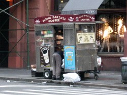

Here’s that very same cart as the vendor sets up in the morning –
I shot this at 6am. This same cart has been here for at least 12 years.

In the wee hours of the morning, carts are delivered to the requisite areas.
Oftentimes, if the cart is small, you’ll see the vendor pushing it himself.
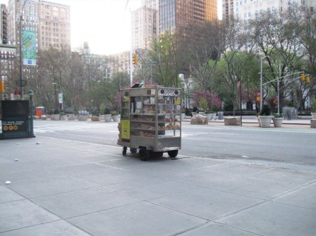
This one is setting up early morning across from
Madison Square Park on 23rd Street and Broadway.

Stocking the shelves with pastries, preparing coffee and icing juices.
Getting ready for the morning rush about to start.
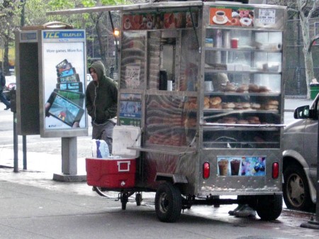
Another similar cart, in the Village, all ready for the crowds. This one has an
overhang, to protect patrons from the rain, and a external cooler with drinks.

This guy is parked outside the IFC center downtown.
As you can see his menu is quite varied and ethnic.
Quite tempting.

You can also find fruit vendors around town. The prices of various fruits is about
half what the local supermarkets charge, and the quality is generally good.
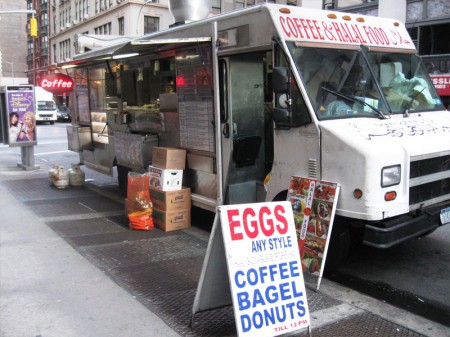
Here’s a virtual travelling store. This truck is set up daily on 28th Street
off Madison Avenue to serve breakfast. They’ll cook the eggs for you.
Later in the day they move around the corner to Madison off 28th St. to serve dinner.
They’re open all night with lines of taxi drivers waiting to buy food from them.
I have to admit, I’m always tempted but haven’t tried it yet. After all,
can all those taxi drivers be wrong? The vendor must be doing
something right.

I also caught this truck downtown and wondered if they were
establishing a spot on Bleecker Street. But they never set up.
On the move.
Animation &Disney &repeated posts &walk cycle 18 Jan 2012 05:23 am
101 Dalmatians Walk Cycles
.
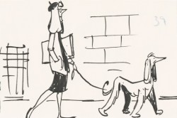 - When I was young, as I’ve pointed out many times, there were few books available about animation and as few illustrations and photos which ellicited the art of animation. Hence, it was always a treat when a Disney feature was released. The adjoining publicity would provide a trove of material, some worth saving. An encyclopedia my parents bought at about the time of release of 101 Dalmatians included several key images of Pongo running. One of those photos of many cels overlayed to detail the cycle. I loved that picture and frequently looked at that encyclopedia under “Cartoons, Animated” to study the photo of the cels.
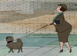
At the very beginning of 101 Dalmatians, Pongo looks out onto the street to search for a good mate for both himself and Roger, his owner. At this point we’re treated to a number of walk cycles that I think are brilliant. A number of women are perfectly matched to the dogs that they walk.
Now with DVDs available to us, we can see that the characters originated in the storyboard drawings, and we can study these walk cycles. I’m determined to take these animated bits apart to watch them a bit closer.
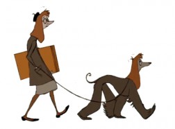
The first of these is the “girl art student” as described in the drafts (which can be found on Hans Perks’ excellent site A Film LA.) Oddly, from my very first viewing of this film back in 1961, I identified her as a “beatnik,” which was the fashionable joke back then. Now I find out she was an “art student.” I guess that makes sense.
Here’s the pan BG that this scene employs.
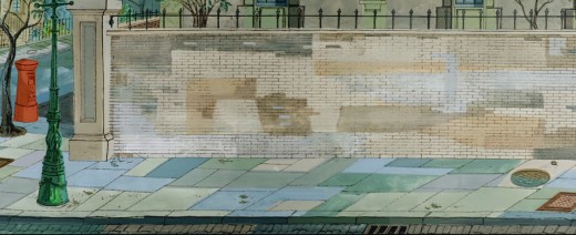
(Click any image to enlarge.)
And here is the walk cycle animated by Frank Thomas and Blaine Gibson.
Gibson handled the following scene which pans across the bodies of the pair as they walk.
Animation note: The two separate feet are divided by a short space. The left foot is on one plane, and the right foot is on another. This is a BASIC precept for animators to follow, and it’s something that is not appearing in a lot of the recent walk cycles I’ve been seeing. It’s annoying.
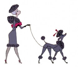
Here’s scene 21 “French girl walks French poodle” animated by Blaine Gibson. It employs the same BG as scene 14, the art student (posted Apr 3), but it extends, beyond what we’ve seen before, to include a telephone booth.

______________(Click any image to enlarge.)
This is a slightly faster walk than others, and I’ve been able to grab all of the drawings. It’s animated on “ones.”
This walk is an absolute gem !
Once again, check out Hans Perk‘s excellent site A Film LA to get the drafts for this film to be able to identify who was behind what. Then go to see Mark Mayerson‘s arduously constructed and informative mosaics as well as his detailed commentary about the film and its animators.
Check out Floyd Norman‘s story about Blaine Gibson on Jim Hill Media.
Here’s the young child with her puppy. She not only walks, but she licks her lollipop. The pup is just an absolute innocent. It’s another great walk by Blaine Gibson.
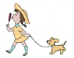 1
1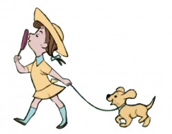 2
2
_______(Click any image to enlarge.)
The piece, in the film, includes a zoom into the cycle. I’ve tried to adjust for it but don’t think I was wholly successful. There’s a marginal enlargement of the drawings as it goes on – noticeable only in motion. It’s actually interesting in the walk.
Here’s Blaine Gibson’s animation for what is labelled in the drafts “Buxom Girl and Bulldog”. I left the backgrounds in this one for you to get an idea of the BG movement.
Independent Animation &John Canemaker &repeated posts &Richard Williams &SpornFilms &Theater 15 Jan 2012 06:02 am
Photo recap – Woman of the Year
Recently, I found myself talking about my work on this show. It made me go back in search of this post from January 2007, and I thought I’d recap today. Hope you don’t mind.
Woman of the Year was a project that came to me in the second year of my studio’s life – 1981. Tony Walton, the enormously talented and fine designer, had gone to Richard Williams in search of a potential animator for WOTY (as we got to call the name of the show.) Dick recommended me. But before doing WOTY, there were some title segments needed for Prince of the City, a Sidney Lumet film. (I’ll discuss that film work some other day.)
Tony Walton designed the character, Katz, which would be the alter-ego of the show’s cartoonist hero, played by Harry Guardino. Through Katz, we’d learn about the problems of a relationship with a media star, played by Lauren Bacall.
.
It turned out to be a very intense production. Three minutes of animation turned into twelve as each segment was more successful than the last. There was no time for pencil tests. I had to run to Boston, where the show was in try-outs, to project different segments weekly; 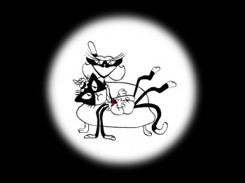 these went into the show that night – usually Wednesdays. I’d rush to the lab to get the dailies, speed to the editor, Sy Fried, to synch them up to a click track that was pre-recorded, then race to the airport to fly to the show for my first screening. Any animation blips would have to be corrected on Thursdays.
There was a small crew working out of a tiny east 32nd Street apartment. This was Dick Williams’
apartment in NY. He was rarely here, _______(All images enlarge by clicking.)
and when he did stay in NY, he didn’t
stay at the apartment. He asked me to use it as my studio and to make sure the rent was paid on time and the mail was collected. Since we had to work crazy hours, it was a surprise one Saturday morning to find that I’d awakened elderly Jazz great, Max Kaminsky, who Dick had also loaned the apartment. Embarrassed, I ultimately moved to a larger studio – my own – shortly thereafter.
Here are a couple of photos of some of us working:
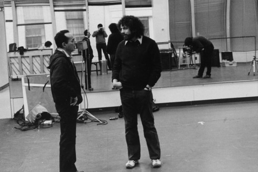
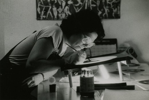
Tony Charmoli was the show’s choreographer. He worked with me in plotting out the big dance number – a duet between Harry Guardino and our cartoon character. I think this is the only time on Broadway that a cartoon character spoke and sang with a live actor on stage. John Canemaker is taking this photograph and Phillip Schopper is setting up the 16mm camera.
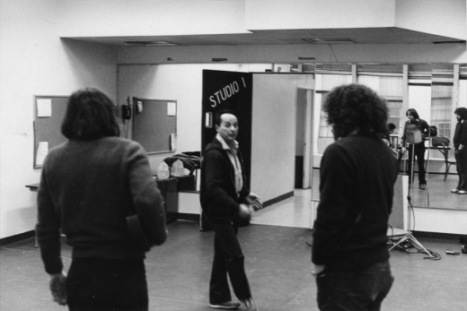
Here Tony Charmoli shows us how to do a dance step. Phillip Schopper, who is filming Tony, figures out how to set up his camera. We used Tony’s dancing as reference, but our animation moves were too broad for anyone to have thought they might have been rotoscoped.
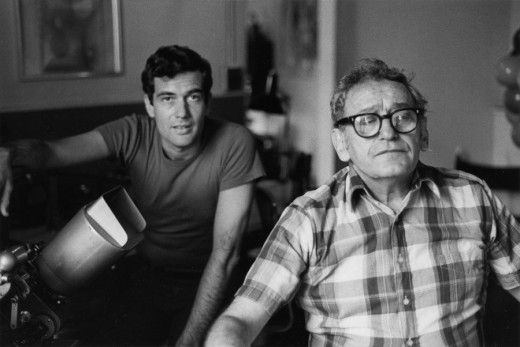
John Canemaker is working with Sy Fried, our editor. John did principal animation with me on the big number. Here they’re working with the click track and the live footage of Tony Charmoli to plot out the moves.
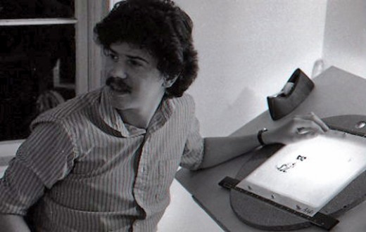
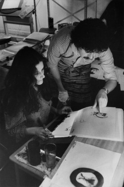
Steve Parton supervised the ink and paint. To get the sharpest lines, we inked on cels and didn’t color the drawings. It was B&W with a bright red bowtie. A spotlight matte over the character, bottom-lit on camera by Gary Becker.
 5
5 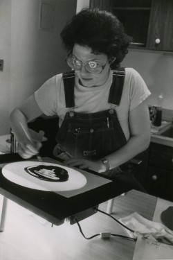 6
6
5. Steve Parton works with painter Barbara Samuels
6. Joey Epstein paints with fire in her eyes.
 8
8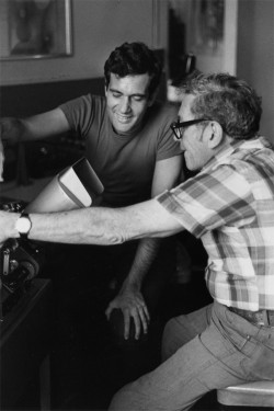 9
9
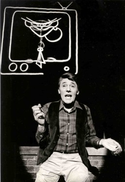
8. Harry Guardino on stage with the creation of “Tessie Kat” developing on screen behind him. This was Harry’s first big solo.
9. John Canemaker gets to see some of his animation with Sy Fried, editor.
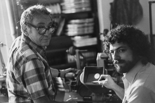
One of my quick stops from the lab on the way to Boston? No, I think this is a posed photo.
Books &Disney &Illustration &repeated posts 12 Jan 2012 06:45 am
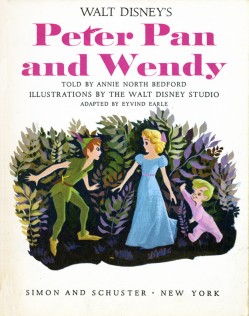
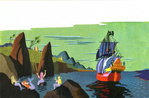
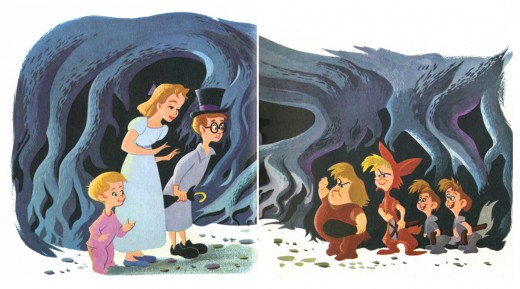
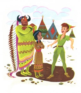
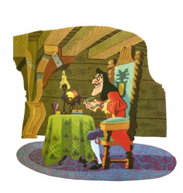
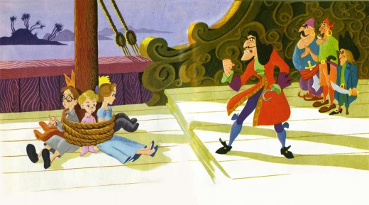
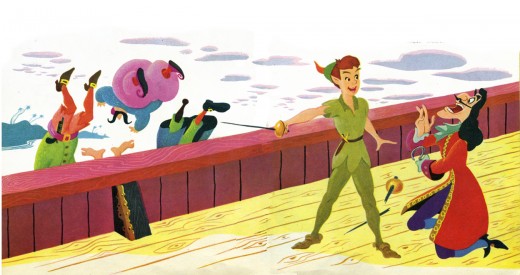
Eyvind Earle – Peter and Wendy
Back in 2007, I posted this piece on Eyvind Earle’s Peter Pan illustrations. I’ve combined the two parts and repost it here.
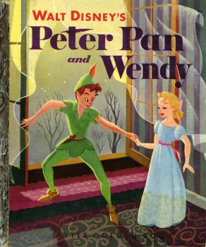 – I’m an Eyvind Earle fan. I have been ever since getting my hands on Bob Thomas‘ original version of The Art of Animation (1959), which promoted Sleeping Beauty and its artwork, and then going up to Radio City Music Hall to see the first theatrical run of the film.
After the Disney film, I saw Earle’s Nativity film on the Tennessee Ernie Ford show and Paul Bunyan and other Disney shorts of the period made me more of a fan.
I got to meet the man thanks to Michael Barrier. We had one of the craziest interviews ever when we drove upstate to his house and sat in a somewhat darkening room as the afternoon dimmed and Earle continued to quietly answer the questions.
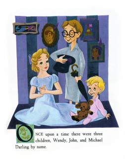
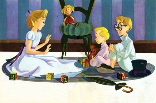
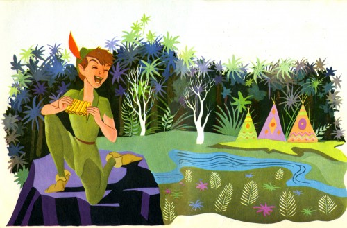
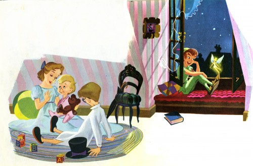
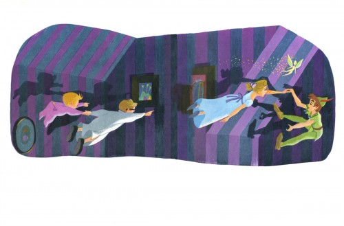
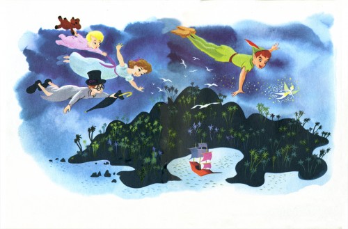
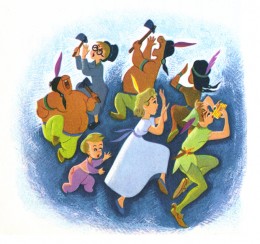
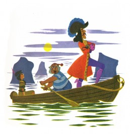
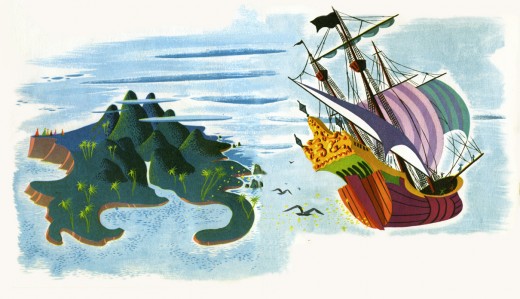
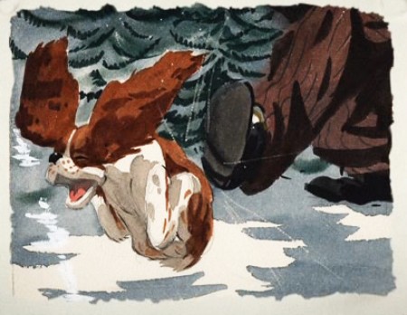
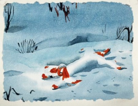
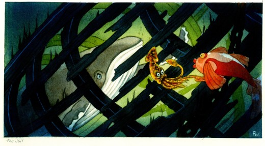
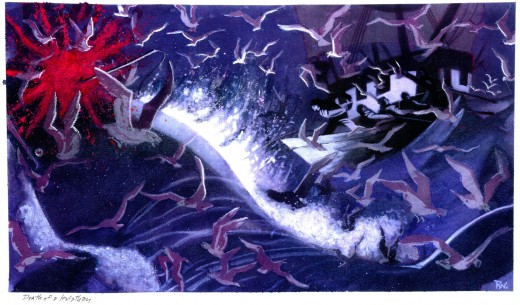
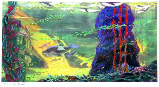
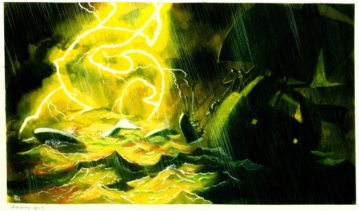
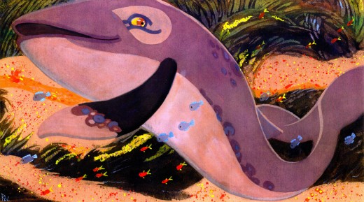
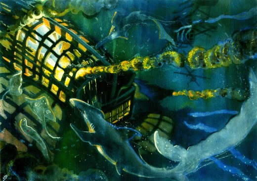
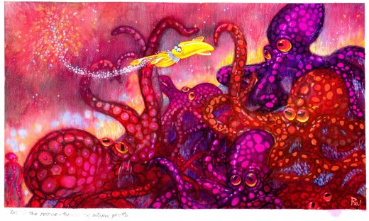
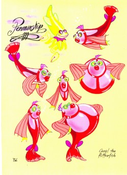
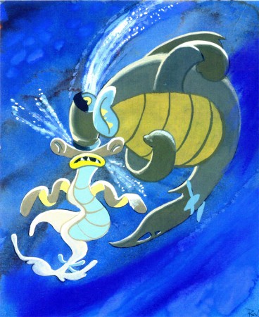
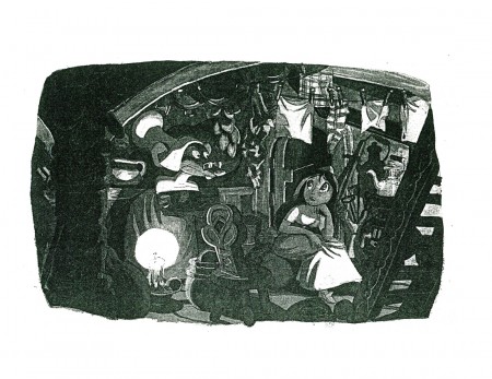
I loved that day, but I loved Earle’s work even more. After posting Retta Scott‘s Golden Book of Cinderella, I realized that I had this book, Peter and Wendy, which is Earle’s odd adaptation of Peter Pan. He’s obviously in love with Cinemascope in that most of the book’s illustrations are two-page spreads. Sort of wide screen proportions. This is unusual for a Little Golden Book.
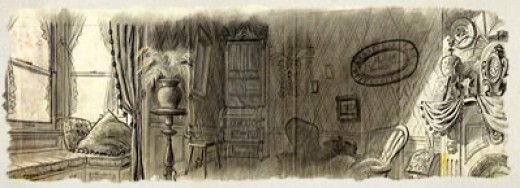
The images look a bit like the backgrounds in Paul Bunyan, and the characters are not quite on model with the film. The printing, as with most of these books, is pretty dull. You know a lot has been lost in the transfer.
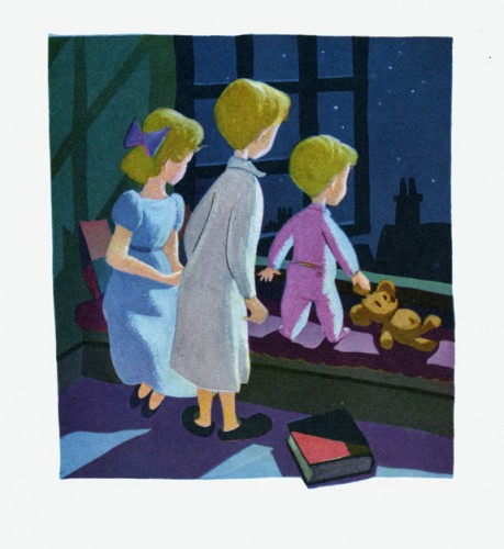
This last illustration is my favorite.



 1
1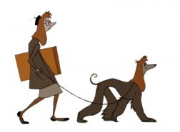 2
2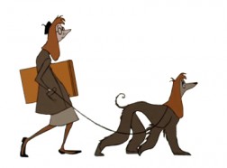 3
3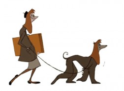 4
4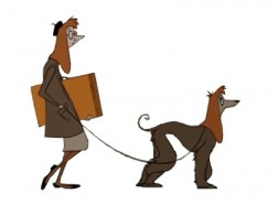 5
5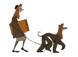 6
6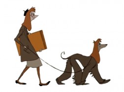 7
7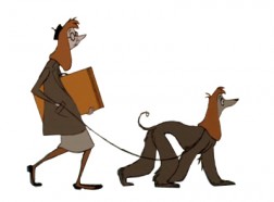 8
8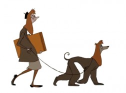 9
9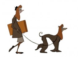 10
10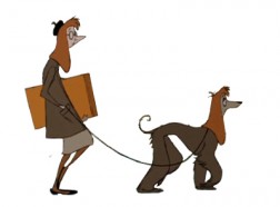 11
11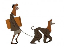 12
12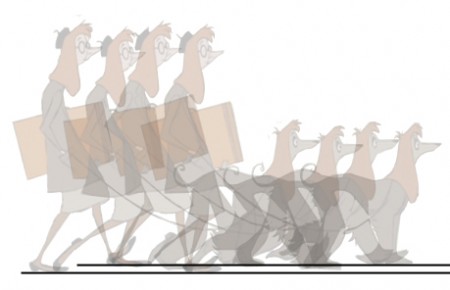
 1
1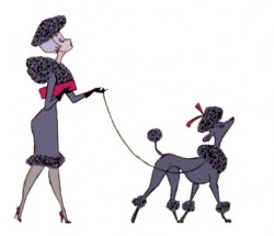 2
2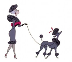 3
3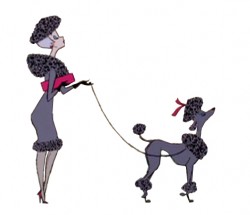 4
4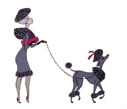 5
5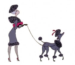 6
6 7
7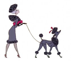 8
8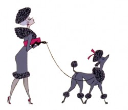 9
9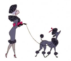 10
10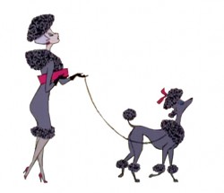 11
11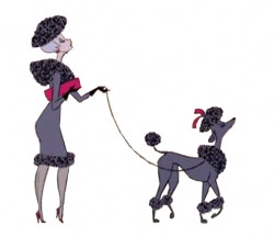 12
12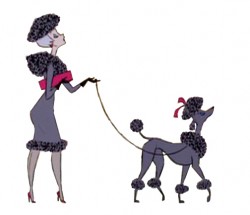 13
13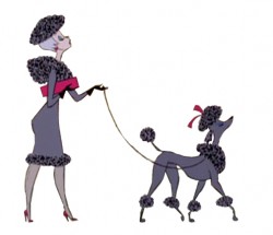 14
14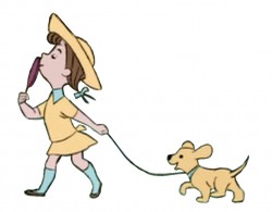 3
3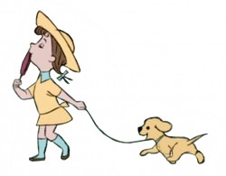 4
4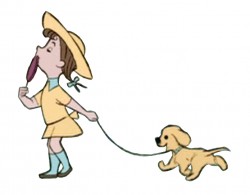 5
5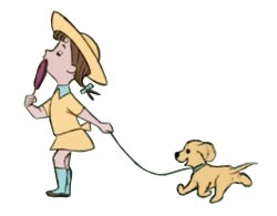 6
6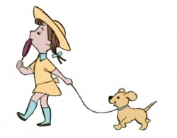 7
7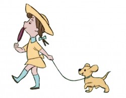 8
8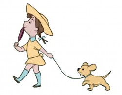 9
9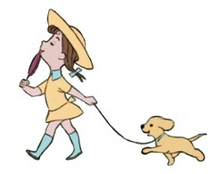 10
10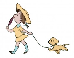 11
11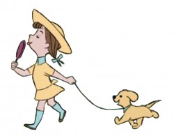 12
12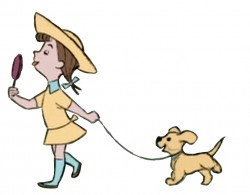 13
13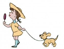 14
14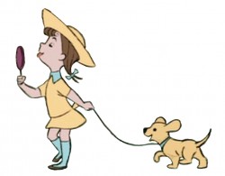 15
15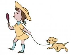 16
16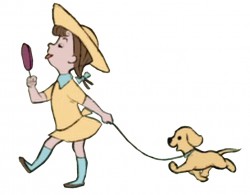 17
17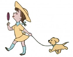 18
18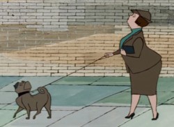 1
1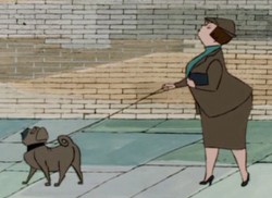 2
2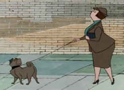
 4
4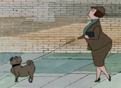 5
5 6
6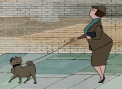 7
7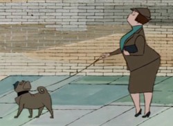 8
8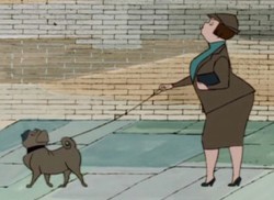 9
9 10
10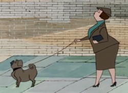 11
11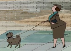 12
12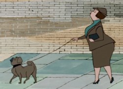 13
13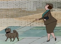 14
14 15
15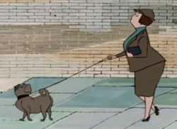 16
16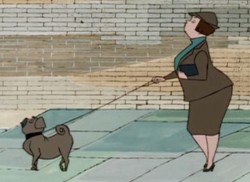 17
17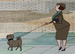 18
18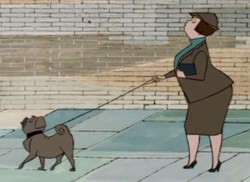 19
19 20
20