Category Archiverepeated posts
Animation &Animation Artifacts &Disney &Layout & Design &repeated posts 05 Jun 2013 03:29 am
The Story of the Dogs – repost
To keep in accord with Hans Perk‘s recent posting of the drafts to Lady and the Tramp, I am reposting a couple of these valuable past posts. Here’s one I like a lot.
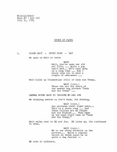
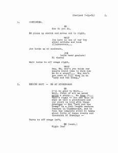
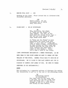
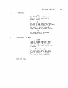
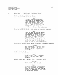
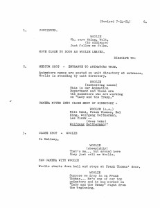
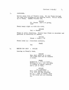
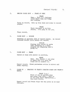
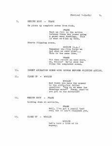
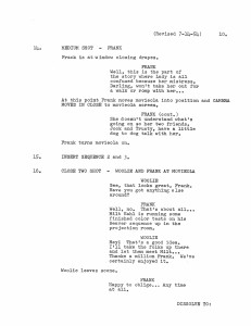
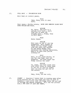
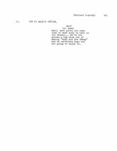
- A friend (who asked to remain anonymous) sent a copy of this script of “The Story of Pluto,” an early episode of the Disneyland TV show. This document obviously follows the show very closely, but I think a lot of the on screen dialogue is actually missing. Regardless, I thought it a good opportunity to go back to the show (which when it hit TV was called “The Story of Dogs.” (At least, the video on the Lady and the Tramp DVD, which has the same date listed is longer.)
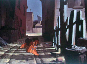
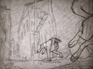
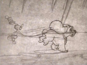
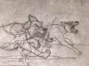
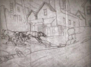
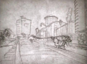
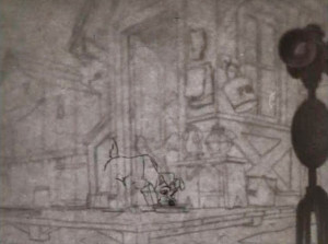
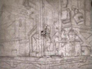
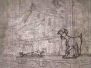
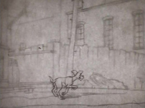
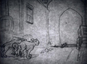
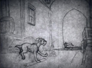
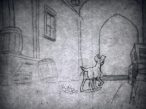
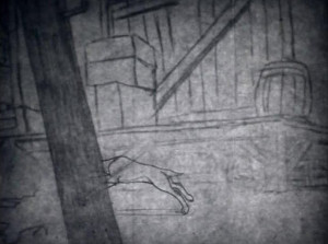
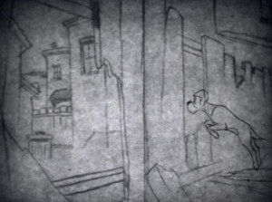
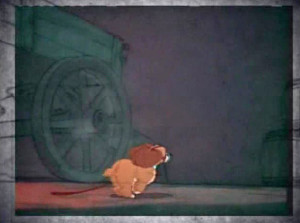
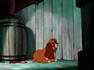
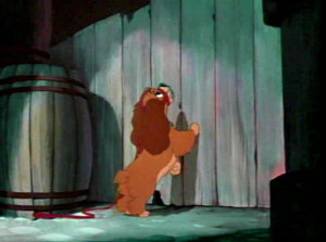
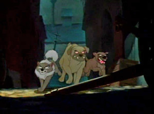
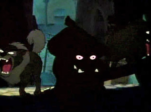
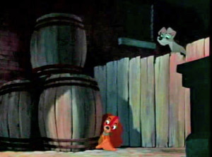
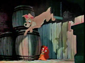
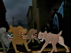
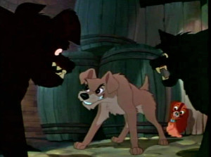
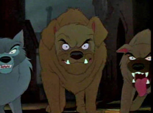
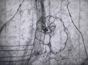
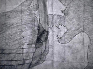
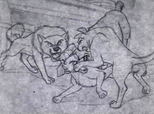
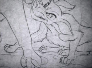
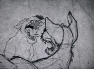
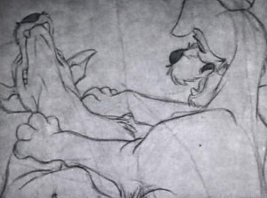
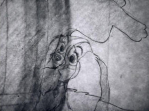
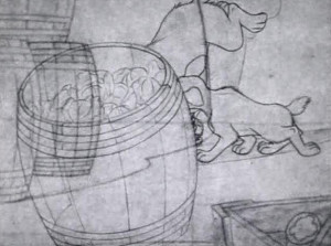
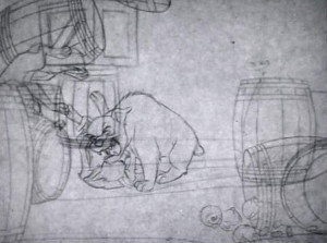
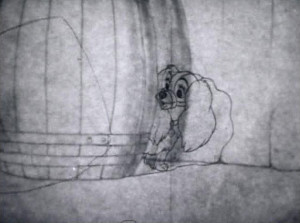
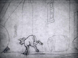
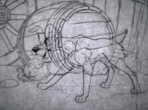
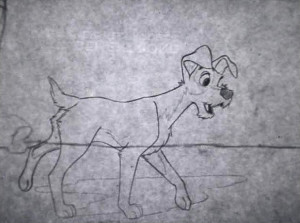
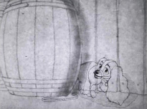
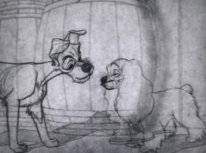
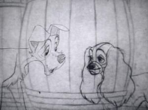
I’ll first post the “script” and then will follow with frame grabs from the TV program wherein Lady runs from some rough dogs who are chasing her, and Tramp comes to her rescue. The original show aired in B&W, but this version mixes B&W PT to color ruff-cut. It’s one of my favorite sections of the film with a lot of animation by Woolie Reitherman. (It comes on page 11 of the script.)
Here are the script pages:
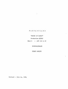
Script Cover
This sequence is followed immediately by Milt Kahl‘s sequence where Lady and the Tramp go to the zoo. They seek the help of the beaver to remove her muzzle.
Animation Artifacts &Disney &Frame Grabs &Layout & Design &repeated posts &Story & Storyboards 03 Jun 2013 04:17 am
Lady Drawings – repost
 - The recent posts by Hans Perk on his blog A Film LA of the animation drafts to Lady and the Tramp have led me to add to the mix by posting some of these older posts.
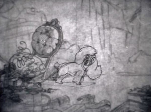
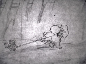
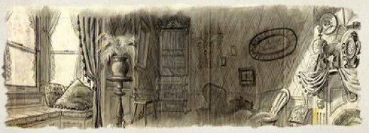
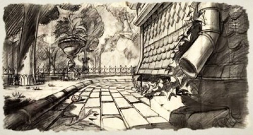
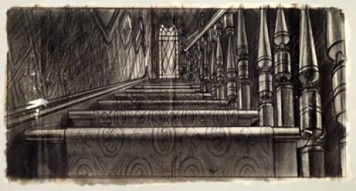
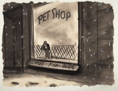
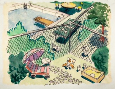
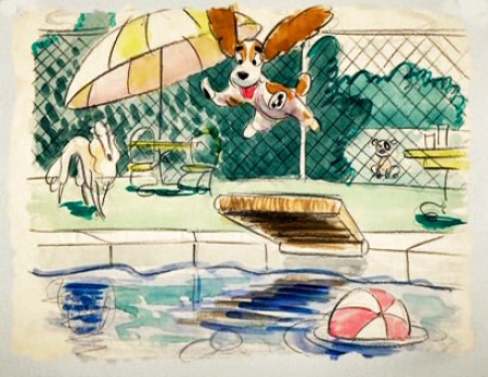
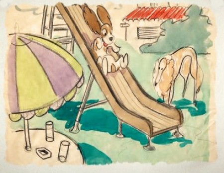
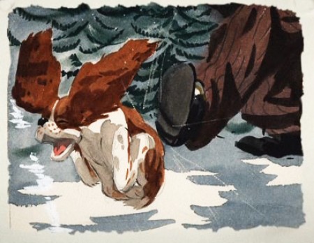
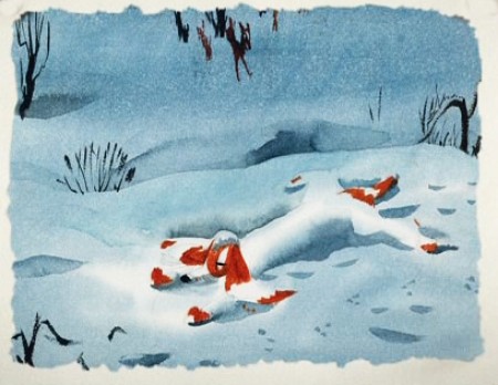
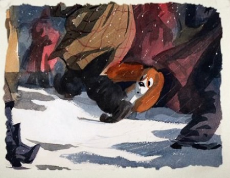
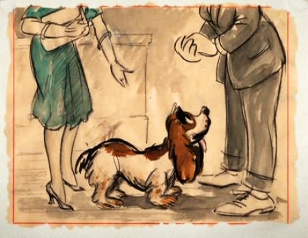
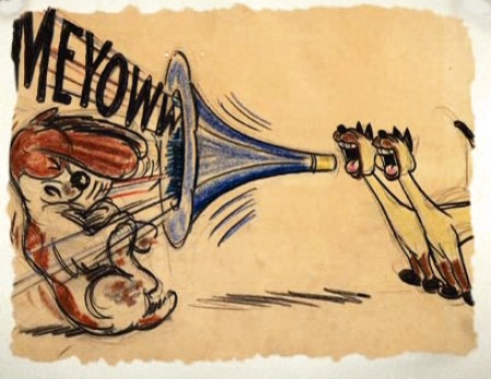
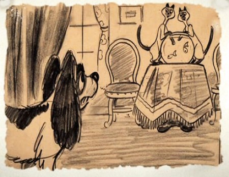
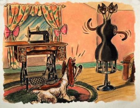
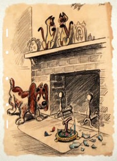
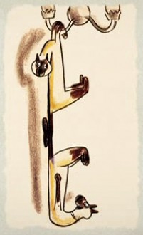
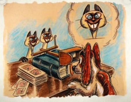
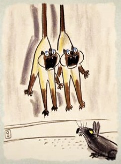
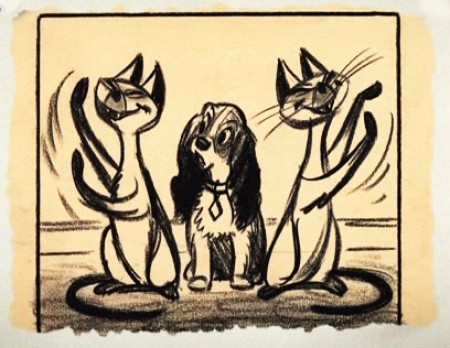
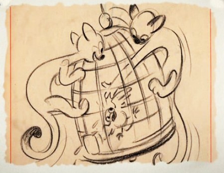
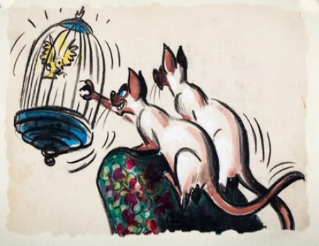
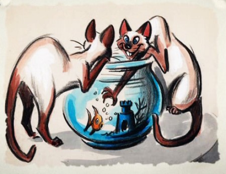
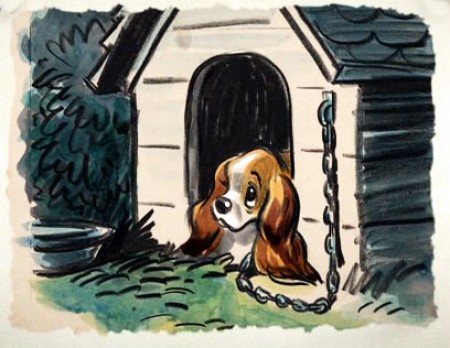
Here are a lot of drawings done predominantly by Joe Grant in the early forties in preparation for the movie.
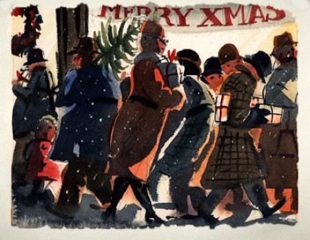
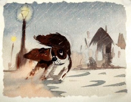
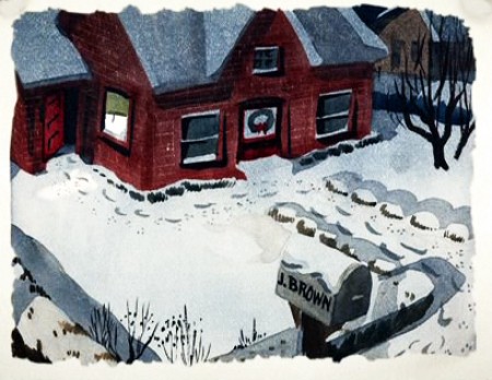
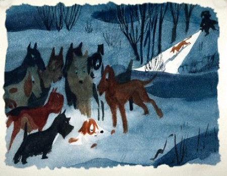
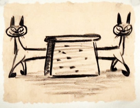
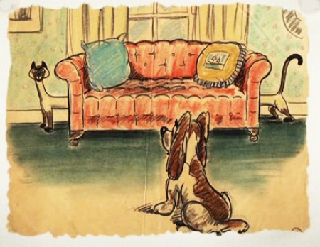
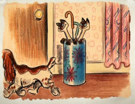
The illustrations – some are obviously BG layouts, others storyboard drawings – have a light and jaunty feel. They’re very cartoon in nature, and belie the actual feature they produced which, at times, is quite beautiful. Disney truly got the feel of “Main Street, USA” in this film.
I’m interested that most of the images don’t take in Cinemascope (since they were obviously done before the decision to go Scope.Cnemascope didn’t come into being until 1953) Most of them are also fast drawings that don’t feature the Tramp as we know him, and even Lady takes on a different form.
You get the feeling this film was pushed out relatively quickly. The results are excellent, regardless. Sonny Burke and Peggy Lee wrote an excellent pop-song score that doesn’t quite capture the turn-of-the-century, but it does capture the atmosphere of early 50s USA.
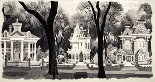
This drawing is in B&W on the DVD, but it appears in
Bob Thomas’ 1958 book, “The Art of Animation.”

Bg for The Princess and the Frog.
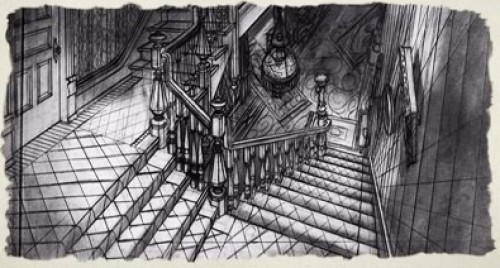
This looks not too different from a shot in Hitchcock’s Psycho.
You can find more Bgs from Lady and the Tramp on Hans Bacher‘s site, one1more2time3.
The following are Joe Grant development drawings.
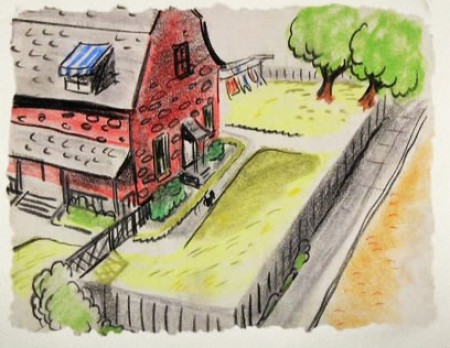
We seem to be in the Little Golden Book territory
with some of these images.
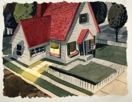
An earlier and different view.
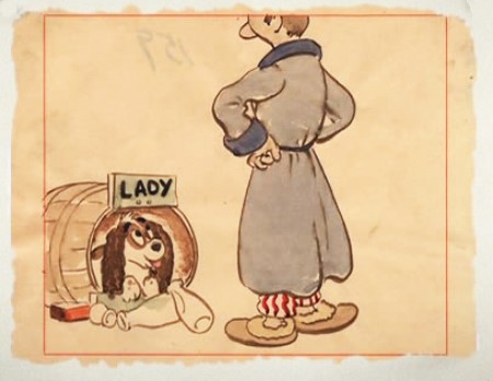
Or did I mean the New Yorker circa 1948?
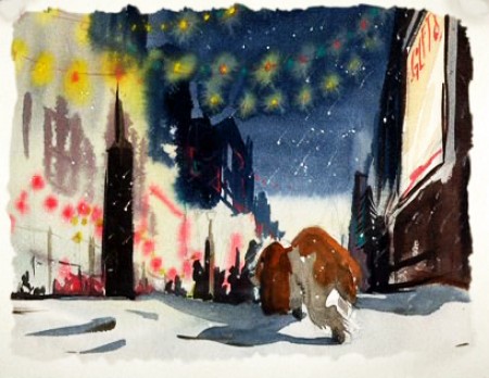
I love weather and would have applauded more of it in the film.
—-
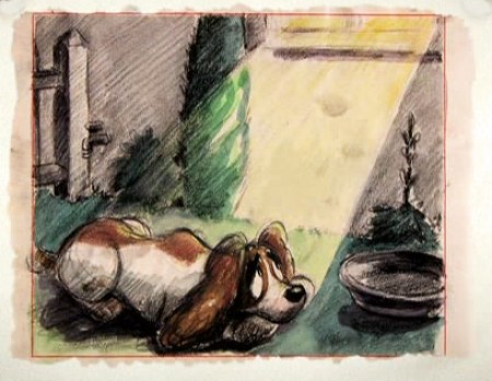
(Click any image to enlarge.)
One more post of these to go. On Friday.
.
Animation &Disney &Frame Grabs &repeated posts 28 May 2013 05:38 am
Whoopee
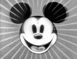 - Before there was video tape (which means before there were dvds), there was only 16mm film that you could project in your own home. I had (and still have) a nice collection of decaying movies and used to show these often. One of the regulars to show and watch and laugh at was the great Mickey short, The Whoopee Party. Everyone loved this short, no matter how many times we watched it. It’s a great film!
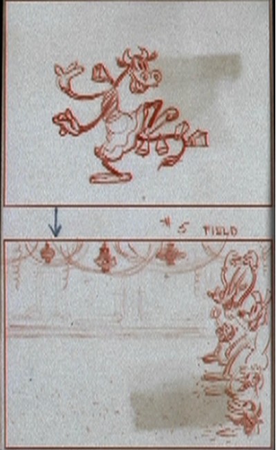
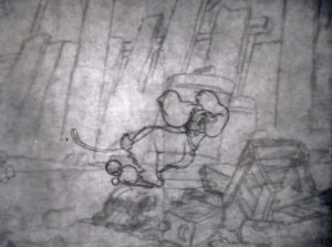
This encouraged me to watch it again on the B&W Mickey dvd I have. So I couldn’t help but jump for joy over the story sketches they include in the extras. Why not post them? So here they are – sketches from the limited storyboard they produced. I’ve also interspersed frame grabs from the film so you can compare images.
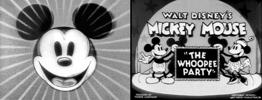
________________________(Click any image to enlarge.)

____________(Click any image to enlarge.)
 13
13
Animation Artifacts &Articles on Animation &Commentary &Puppet Animation &repeated posts 08 May 2013 12:49 am
Ray Harryhausen (6/29/1920 – 5/7/2013)
- Greg Kelly, a good friend of this blog, wrote to tell me that Ray Harryhausen has died. You can read about it here, in Time Out or here in the NY Times or here at Jerry Beck‘s Animation Scoop.
Thanks, Greg, for the alert.
In honor of Mr. Harryhausen’s brilliant career, I’m re-posting this article about Jason and the Argonauts which I once posted. The piece features Jason and the Argonauts. There was a chapter from Mr. Harryhausen’s 1972 book, Film Fantasy Scrapbook, about that film. I’d like to show it again. The book is written in the first person singular and collects B&W images like a scrapbook.
Here it is:
Of the 13 fantasy features I have been connected with I think Jason and the Argonauts pleases me the most. It had certain faults, but they are not worth detailing.
Its subject matter formed a natural storyline for the Dynamation medium and like The Seventh Voyage of Sinbad strayed far from the conventional path of the “dinosaur exploitation film” with which this medium seemed to be identified.
Taking about two years to make, it unfortunately came out on the American market near the end of a cycle of Italian-made dubbed epics based loosely on the Greek-Roman legends, which seldom visualized mythology from the purely fantasy point of view. But the exhibitors and the public seem to form a premature judgment based on the title and on the vogue. Again, like Sinbad, the subject brewed in the back of my rnind for years before it reached the light of day through producer Charles Schneer. It turned out to be one of our most expensive productions to date and probably the most lavish. In Great Britain it was among the top ten big money makers of the year.
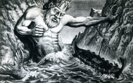
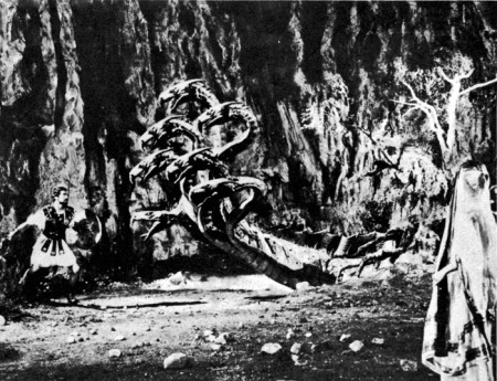
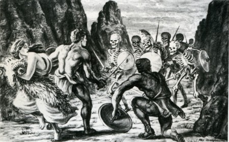
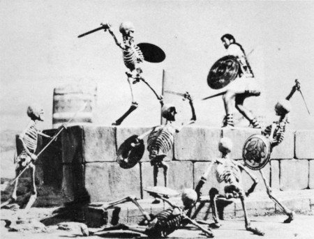
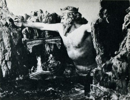
A preproduction drawing (above) compares favorably with a film still (below.)
The drawing is quite a bit more dynamic. (After all, it is Dynamation!)
(Click any image to enlarge a bit.)
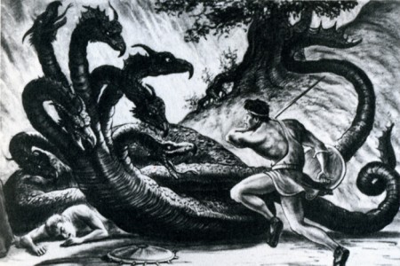
Likewise, a drawing of the hydra (above) film still (below.)
Some of the difference in basic composition between the pre-production sketches I made for Jason and the counterparts frames of the production is the direct result of compromising with available locations.
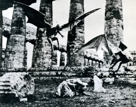
For example, the ancient temples in Paestum, southern Italy, finally served as the background for the “Harpy” sequence. Originally we were going to build the set when the production was scheduled for Yugoslavia. Wherever possible we try to use an actual location to add to the visual realism. To my mind, most overly designed sets one sees in some fantasy subjects can detract from, rather than add to the final presentation.
Again, it depends on the period in which it is made as well as on the basic subject matter. Korda’s The Thief of Bagdad was the most tastefully produced and designed production of any film of this nature but unfortunately the budget that was required would be prohibitive with today’s costs.
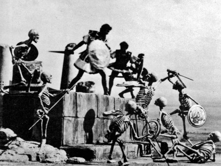
The Skeleton Sequence was the most talked-ahout part of Jason. Technically, it was unprecedented in the sphere of fantasy filming. When one pauses to think that there were seven skeletons fighting three men, with each skeleton having five appendages to move each frame of film, and keeping them all in synchronization with the three actors’ movements, one can readily see why it took four and a half months to record the sequence for the screen.
My one regret is that this section of the picture did not take place at night.
Its effect would have been doubled.
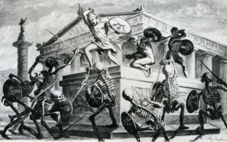
Certain other time-consuming technical “hocus-pocus” adjustments had to be done during shooting to create the illusion of the animated figures in actual contact with the live actors. Bernard Herrmann’s original and suitably fantastic music score wrapped the scenes in an aura of almost nightmarish imagination.
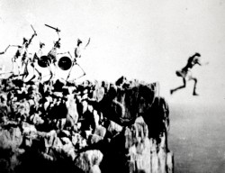
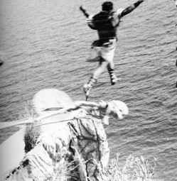
In the story, Jason’s only way of escaping the wild battling sword wielding “children of Hydra’s teeth” is to leap from a cliff into the sea. (Above left) A stuntman, portraying Jason for this shot, leaps from a 90-foot-high platform into the sea closely followed by seven plaster skeletons. It was a dangerous dive and required careful planning and great skill. It becomes an interesting speculation when dealing with skeletons in a film script. How many ways are there of killing off death?
(Above right) Another angle with the real Jason jumping off a wooden platform into a mattress a few feet below. The skeletons and the rocky cliff were put in afterwards while the mattress was blotted out by an overlay of sea.
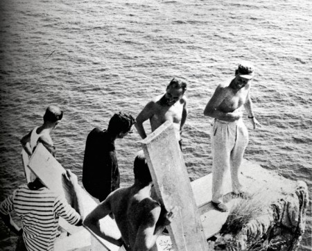
Director Don Chaffey and Ray Harryhausen discuss the leap
with Italian stunt director Fernando Poggi.
When transferring published material to the screen it is almost always necessary to take certain liberties in the work in order to present it in the most effective visual terms. Talos, the man of bronze, did exist in Jason legend, although not in the gigantic proportions that we portrayed him in the film. My pattern of thing in designing him on a very large scale stemmed from research on the Colossus of Rhodes.
The actor: his blocking the only entrance to the harbor stimulated many exciting possibilities. Then too, the idea of a gigantic metal statue coming to life has haunted me for years, but without story or situation to bring it to life. It was somewhat ironic when most of my career was spent in trying to perfect smooth and life-like action and in the Talos sequence, the longest animated sequence in the picture, it was necessary to make his movements deliberately stiff and mechanical.
Most of Jason and the Argonauts was shot in and around the little seaside village of Palinuro, just south Naples. The unusual rock formations, the wonderful white sandy beaches, and the natural harbor were within a few miles of each other, making the complete operation convenient and economical. Paestum, w its fine Greek temples, was just a short distance north. All interiors and special sets were photographed in a sm studio in Rome.
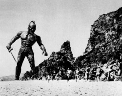
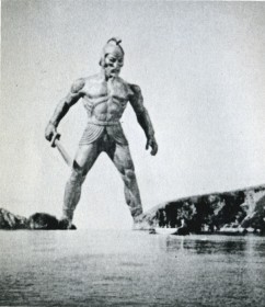 (Above left) Talos, the statue of bronze, pursues Jason’s men.
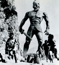
(Above right) Talos blocks the Argo
from the only exit of the bay.
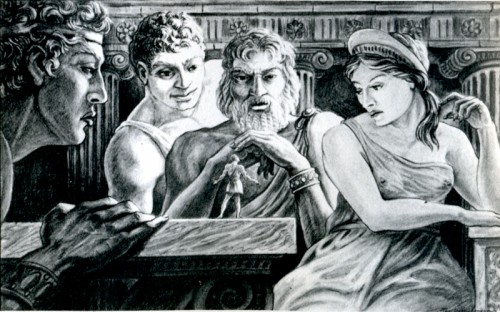
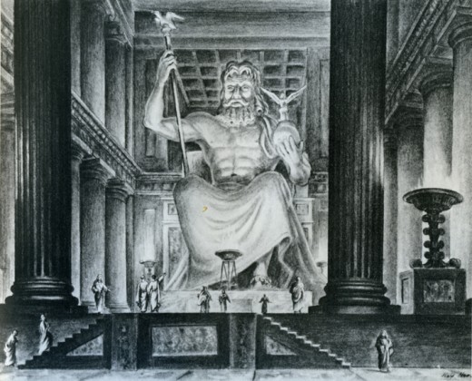
Pre-production drawing of Jason speaking to the Gods of Greece.
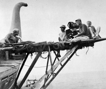
For the second unit operation a special platform had to be fitted to the Argo in order to achieve certain camera angles. Although it looks precarious it was far more convenient than using another boat for the shots.
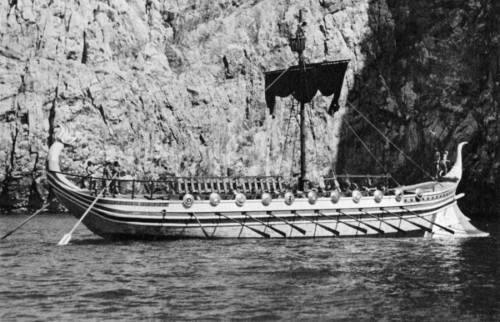
The Argo had to be, above all, practical in the sense that it must be seaworthy as well as impressive. It was specially constructed for the film over the existing framework of a fishing barge. There were twin engines for speed in maneuvering, which also made the ship easily manipulated into proper sunlight for each new set-up.
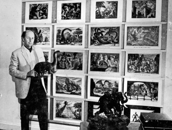
Harryhausen off the book’s back cover
to give an idea of scale of drawing sizes.
Models &Puppet Animation &repeated posts 02 May 2013 04:26 am
The Hand and Fingerprints
As you can tell, from some of my recent postings, I have always had a love affair with puppet animation. There’s something extraordinary about that medium that has drawn me in. I’ve always demanded a tactile approach to animation, including all of the 2D work I’ve done.
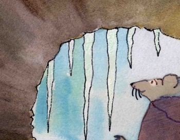 I remember seeing Lady & The Tramp in 1955, on its first release (I was nine.) It was then that I consciously noted that one of the backgrounds in the “Bella Notte” sequence (I can now see that it was an Eyvind Earle BG) had texture in its paper. The board it was painted on came through the animation photography and reached out to me. The human hand became evident in the film.
Perhaps, this was what I loved so much about animation in the first place. Humans did it, and it was self-evident. Being reminded of it, in the subtlest ways – usually unintentional, added to my joy.
Perhaps this is what brought me to John Hubley’s films. Those films were so obviously painted: characters and BG were both used by the photographer to combine for us, and the unintentional was often caught on screen. (I immediately loved those highlighted rings double-exposed around the characters in Moonbird, the brush strokes of The Hole, the transparency of the characters’ paper in Of Stars and Men.) It added to the experience.
In a sense, I was brought out of the film but held in it and given the opportunity to love it even more.
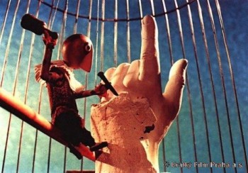 I’ve had this same sense with the best 3D animation. Though I was always there viewing it, I was also caught up in the emotions of the film. Trnka’s masterful film, The Hand, had my understanding those tears and sweat on the little potter were moistened ink that had been his painted eyes. But the anguish I felt the first time I saw the film and that effect has never left me. The perfections of the Human Hand in that film forced the imperfections of the puppet potter to be revealed until it destroyed him.
Perhaps this is also what keeps me from embracing cgi animation. Despite the faked textures of the computer, it’s so obvious that it is not real. At least not when the characters are cartoons.
A very small example of what I’m trying to communicate stands out for me in Cars. The paint job of newer cars has a flecking/speckling of glitter within the paint. In the right light, the main character, Lightning McQueen, had this paint job. Everytime I saw it, I was distracted and pulled out of the film. Like the real paint on a real car, that flecking was embedded within the paint, itself. It didn’t feel like the byproduct of a human hand; it felt like a computer trick.
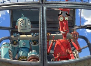 I am no more capable of coloring the computer skin of that computer hand than I am of painting a real car. It isn’t tactile for me, it’s just distracting.
It’s just something I never feel I can reach out and touch. This is something that has been overcome, for me, in a couple of films. The Incredibles gets very close often. Moments of Robots, such excellent design for the medium. Some of Toy Story.
(Click on any image to enlarge and enjoy the textures.)
Of course, I recognize that this is my problem. However, I recognize it’s a problem that other people probably have and wonder if there isn’t a solution. In The Iron Giant, the Giant is animated by a computer. I was told that the animation had to be rigged to be animated on “two’s” so that it wouldn’t separate from the rest of the hand-drawn animation. Oddly, it felt totally acceptable to me; I saw no problem and accepted that robot. There has to be, in there, a way to resolve it – I’m just thinking here and don’t expect anyone to try to follow what I’m saying. Perhaps if “human” problems, technical problems, were added to the animation. . . No this is even too stupid for me.
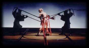 Barry Purves has made a number of absolutely beautiful films and has created in his own studio some masterfully realized pieces. His work has a discriminating taste, graceful and controlled movement with superb acting, and an intelligence that is rarely found in animation today.
He was nominated for the Academy Award for his film Screenplay, a virtuoso work which follows the rules of Kabuki theater and presents a double-layered story of a man watching and revealing a story from his past which eventually rips through the past and tears at the present. It’s a work of animated puppetry, displayed as theater and a stunning film that should have won its Oscar.
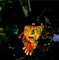 Rigoletto presents the opera in a condensed version that has been reduced for television. It’s a packed half-hour which places you into the full opera and allows you to follow it without any confusion. It has a majesty in its sweeping and dynamic camera moves which whisk you along in the luscious music; they carry you along through the depths of the complex story. It’s a wonderful film that certainly grows richer with each viewing.
Other works he’s done include a wonderful film about Gilbert & Sullivan: The Very Models gives us the pair as seen through the eyes of D’Oyle Carte. A rich and entertaining diary into the making of this film can be found on AWN and a short clip of the film is available there as well.
As a matter of fact, I found his diary there so entertaining, I’ve also followed the diary he keeps on his own website.
You can get a small glimpse of Barry Purves‘ craft by viewing the clip reel at Acme Filmworks. But you’re left without the full heft of his work until you’ve seen the complete storytelling ability he presents in the whole films.
Animation &repeated posts &Story & Storyboards 30 Apr 2013 06:38 am
Dragon Fight – Seq 19 the end.
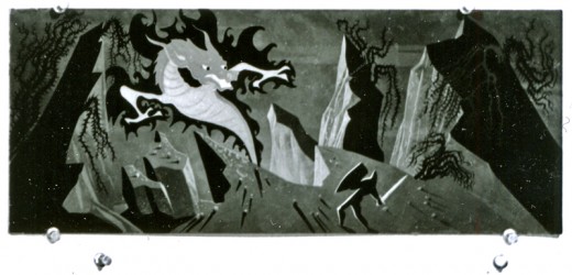
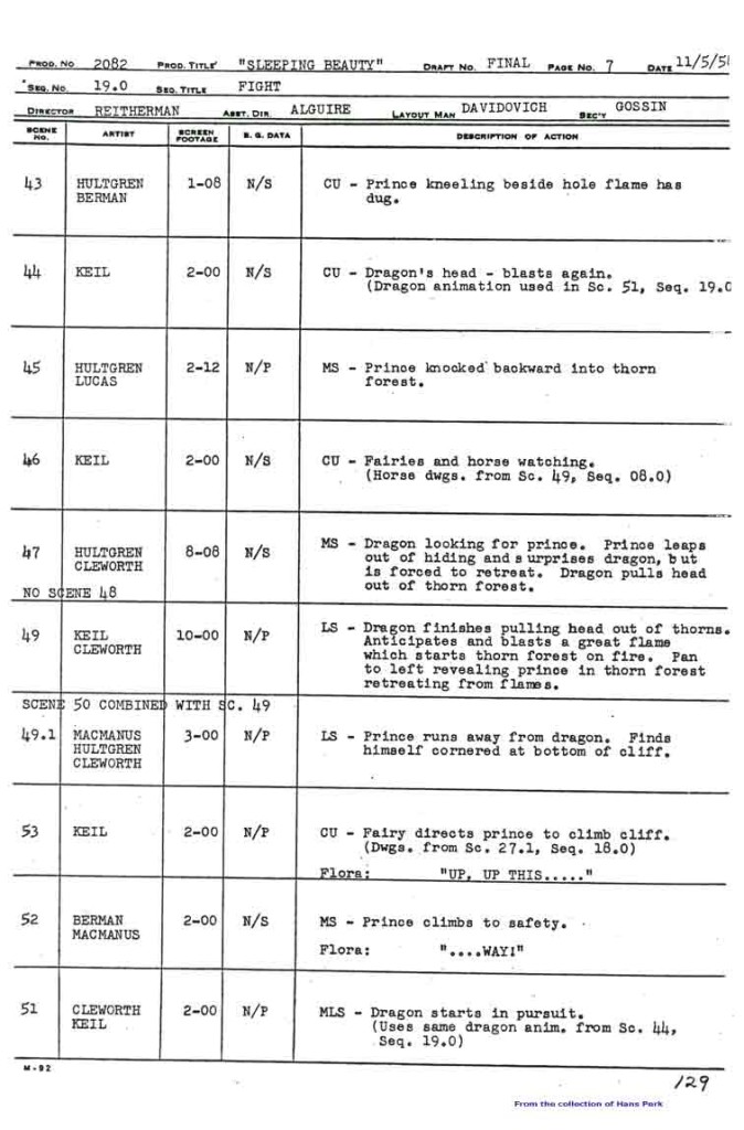
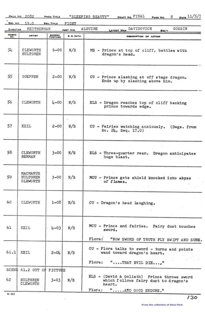
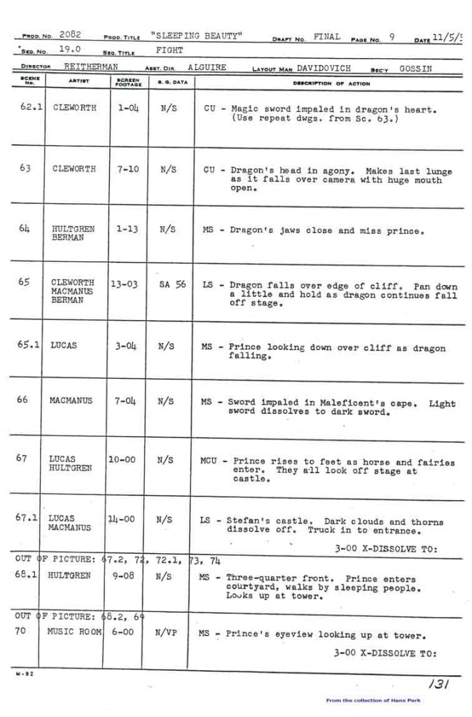
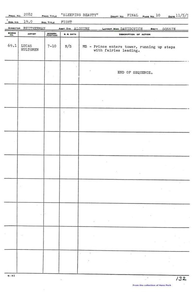
My apologies, I should have included this page among those from the Sleeping Beauty battle which I’d posted yesterday. This concludes the dragon fight.
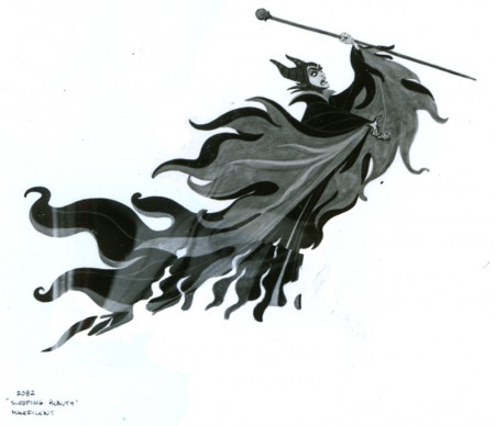
- This is the final photo/page of the Ken Anderson board for Sleeping Beauty. John Canemaker loaned me the series (which I’d posted in June of 2006) that includes Sequences 18 & 19 of the film. They’re the climax of the film – Prince Phillip’s battle with the thorns and the dragon, ultimately killing off Maleficent.
This is the whole photo as is:
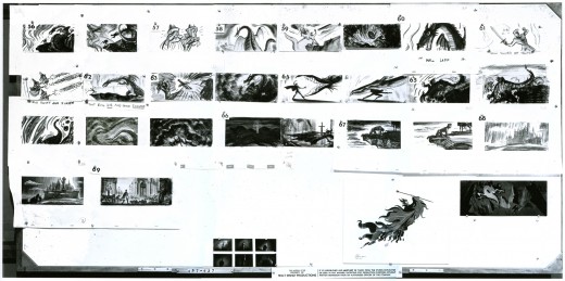
(Click any image to enlarge.
Here, I’ve broken the photo into rows cutting the rows in half. This way I can post them as large as possible for viewing.
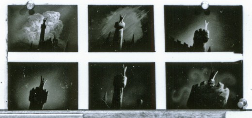
These last are tiny thumbnails at the base of the photo.
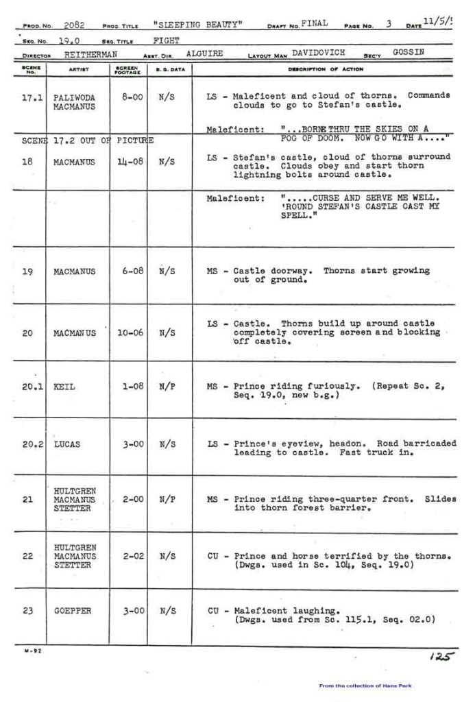
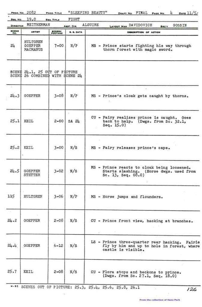
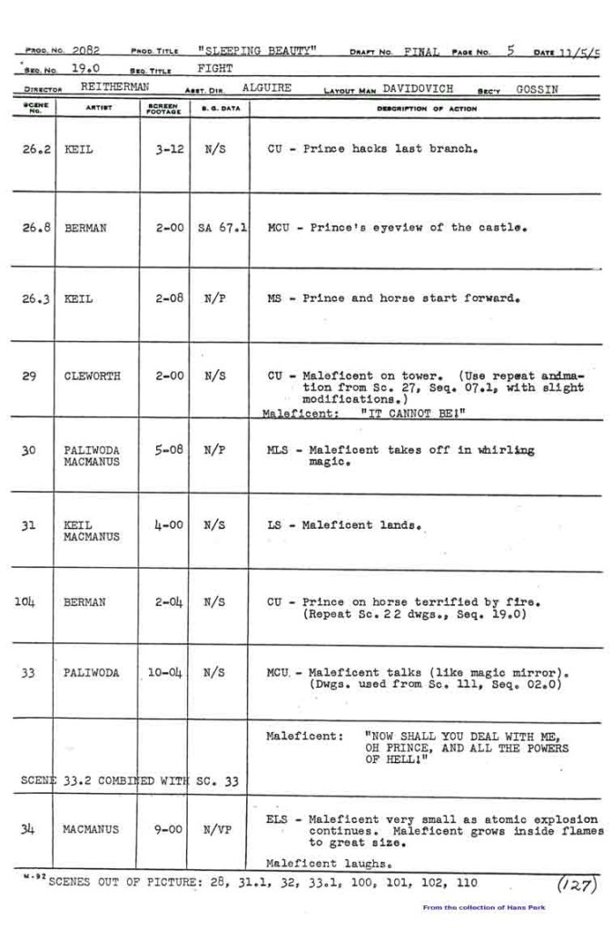
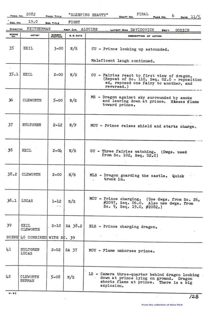
Here are the pages of the animator’s draft to inform you as to who animated the scenes of sequence 19:
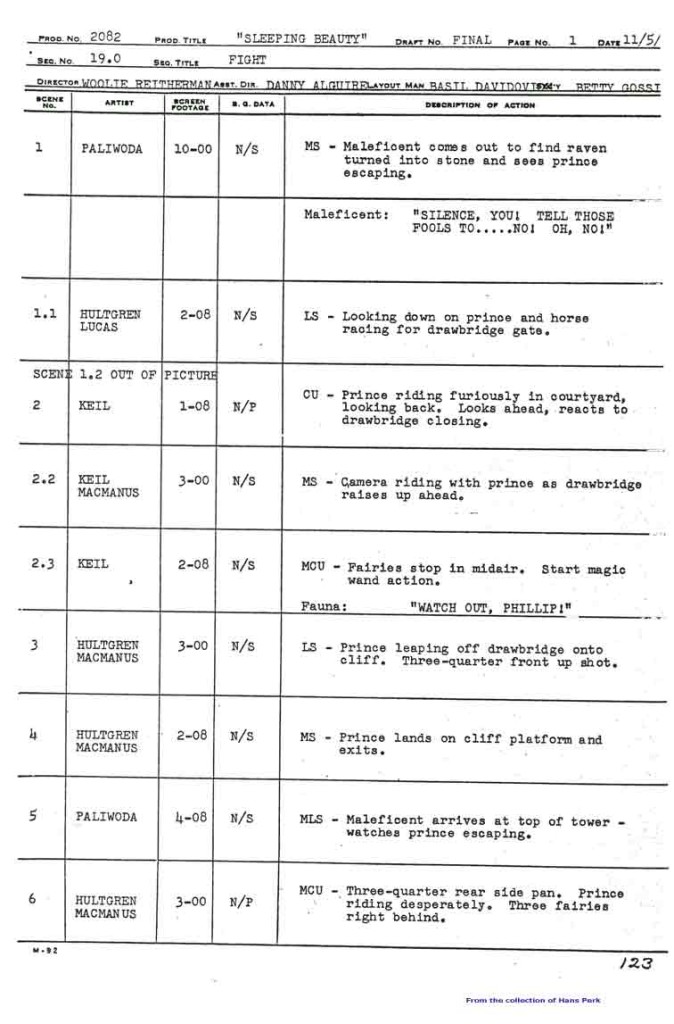 1
1 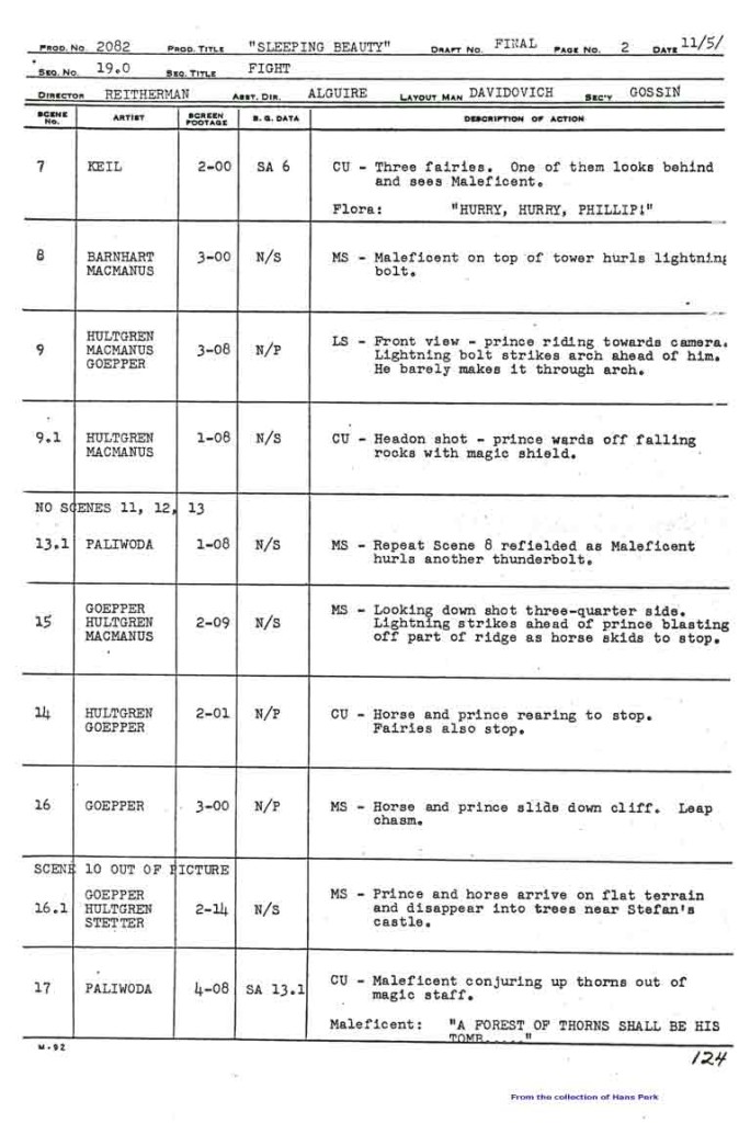 2
2
Many thanks also to Hans Perk who, on his blog A Film LA, has posted the animator drafts of this film (like so many others he’s shared with his readers). None of this work could have been done without that reference.
Animation Artifacts &Disney &repeated posts &Story & Storyboards 22 Apr 2013 05:04 am
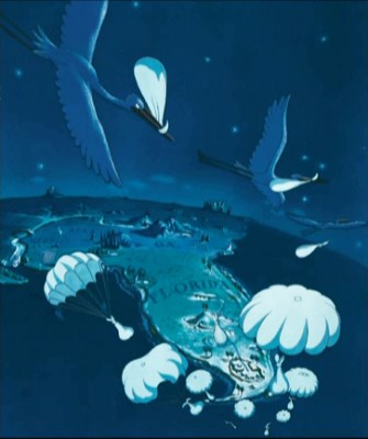
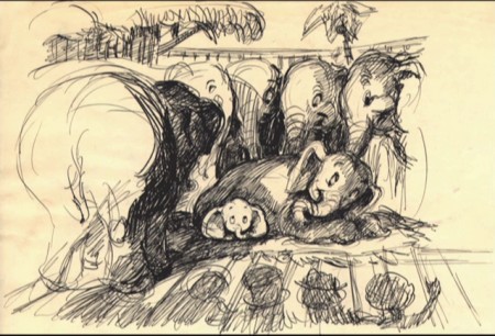
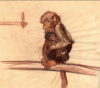
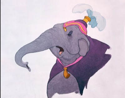
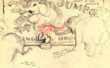
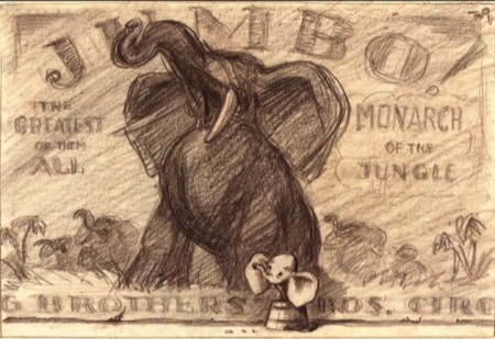
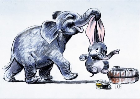
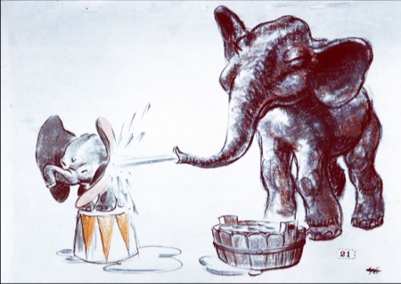
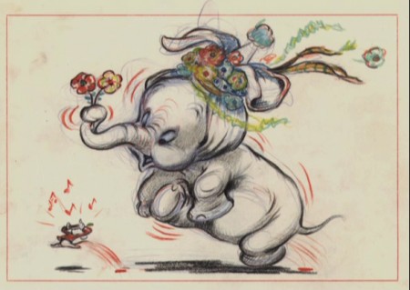
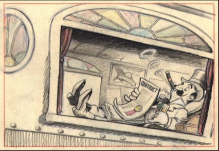
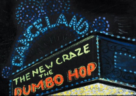
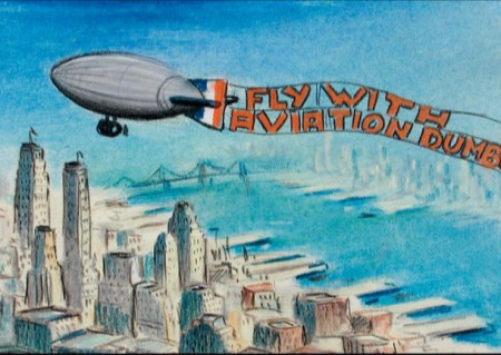
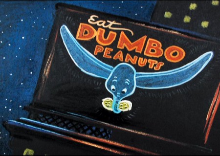
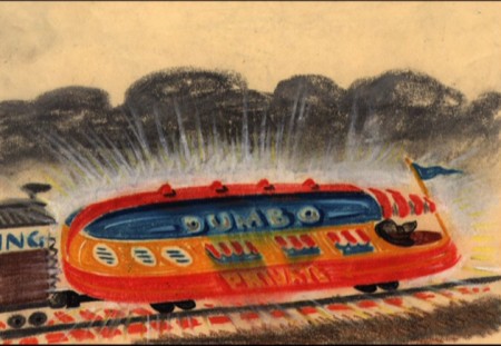
Dumbo Storyboard Sketches – recap
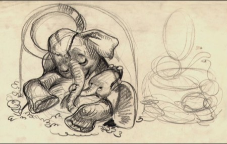
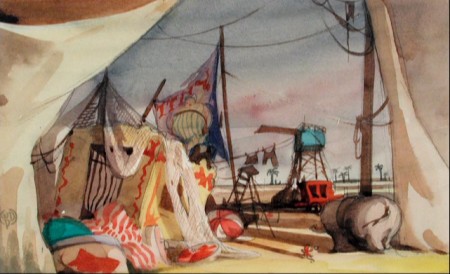
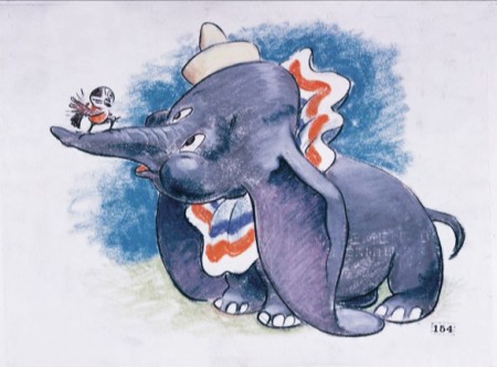
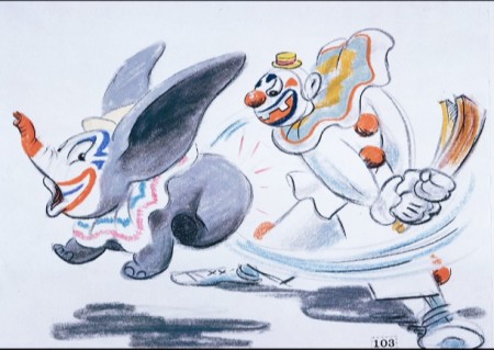
I’ve spent a lot of recent posts writing about the animation of some of the earlier features. I thought I’d give a little focus on the storyboard of Dumbo. The variety and styles of the images is impressive. I’ve culled a lot of storyboard drawings from various sources and present in somewhat chronological order.
This was the first feature Bill Peet worked on. You can see his entire “Dumbo washing” sequence storyboard here.
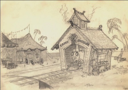 1
1
Events &Festivals &repeated posts 14 Apr 2013 05:21 am
Montreal Expo 1967 – recap
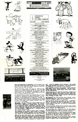
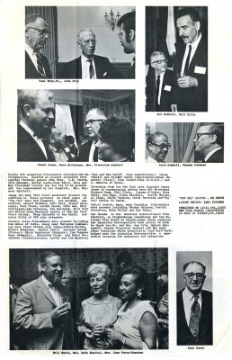
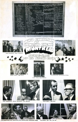
- Today I’m posting a special issue of Top Cel, the NY animation guild’s newspaper. Dated August 1967, it celebrates the Montreal Expo animation conference and exhibition held that summer. Obviously, this was the place to be that year if you were an animation lover.
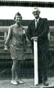 Just take a look at that list of signatures of attendees. Some of them are:
Chuck Jones, Peter Foldes, Manuel Otero, Edith Vernick, Abe Levitow, Don Bajus, Bill & Fini Littlejohn, John Halas, Ward Kimball, Ken Peterson, Shamus Culhane, Carl Bell, Pete Burness, Ub Iwerks, Gerald Baldwin, I. Klein, Gene Plotnick, Ian Popesco-Gopo, Carmen d’Avino, Bill Mathews, Len Lye, June Foray, Bill Hurtz, Spence Peel, Paul Frees, Steve Bosustow, Dave Hilberman, Stan Van der Beek, Les Goldman, Jimmy Murakami, Mike Lah, Robert Breer, Tom Roth, Art Babbitt, Feodor Khitruk, Fred Wolf, Ivan Ivanov-Vano, Paul Terry, J.R. Bray, Walter Lantz, Otto Messmer, Dave Fleischer, Ruth Kneitel, Bruno Bozzetto, Bob Clampett, Karel Zeman, Dusn Vukotic, Bretislav Pojar, Jean Image, Grim Natwick, Tissa David, Barrie Nelson, Andre Martin, Ed Smith, Dick Rauh, and John Whitney.
I guess they don’t make Festivals like they used to. There doesn’t seem to be much written about this event, and I wish some of those in attendance would write about it.
From the Wikepedia entry for Bill Tytla, there’s the John Culhane quote: On August 13, 1967, the opening night of the Montreal Expo’s World Exhibition of Animation Cinema, featured a screening of Dumbo as part of an Hommage Aux Pionniers. Tytla was invited, but worried if anyone would remember him. When the film finished, they announced the presence of “The Great Animator.” When the spotlight finally found him, the audience erupted in “a huge outpouring of love. It may have been one of the great moments of his life,” recalled John Culhane. I’m sure there were many such moments.
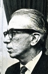 Just to make it all personal, let me tell you a story, although this has nothing to do with Montreal’s Exhibit.
Pepe Ruiz was the u-nion’s business manager. In 1966 – the year prior to this expo – I was a junior in college, determined to break into the animation industry. Of course, I knew the military was coming as soon as I graduated, but I called the u-nion to have a meeting with Pepe. I wanted to see what the likelihood of a “part time job” would be in animation. This took a lot of courage on my part to see what the u-nion was about. I pretty well knew part time jobs didn’t exist. There was no such thing as interns back then.
Pepe was an odd guy who kept calling me “sweetheart” and “darling” and he told me that it was unlikely that I could get something part time in an animation studio.
However he did send me to Terrytoons to check it out.
I met with the production manager, at the time, Nick Alberti. It was obvious I was holding up Mr. Alberti’s exit for a game of golf, but he was kind and said that part time work wasn’t something they did. (He moved on to Technicolor film lab as an expediter after Terry‘s closed. I had contact with him frequently for years later, though I never brought up our meeting and doubt he would have remembered it.) Ultimately, I was pleased to have been inside Terrytoons‘ studio before it shut down shortly thereafter. A little adventure that let me feel as though I was getting closer to the world of animation.
The photos of the Expo are worth a good look. I’ve singled out those above to place around my text. The picture of Tissa and Grim is a nice one of the two of them together.
Ed Smith was the Top Cel editor at the time, and he put together a creative publication.
 1
1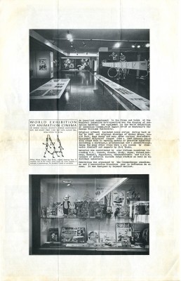 2
2
(Click on any image to enlarge.)
commercial animation &Errol Le Cain &Illustration &Independent Animation &repeated posts &Richard Williams &Rowland B. Wilson &Tissa David 10 Apr 2013 05:55 am
Dick’s Christmas
Richard Williams, when he had his own studio, was known for doing everything in a LARGE way. All of the commercials, title sequences, shorts were all done with a large, elaborate vision.
The Charge of the Light Brigade was a collection of 19th century graphics that are completely wrong, stylistically, for animating. All those cross-hatched lines. God bless the artists that pulled that off. The same was true for The Christmas Carol.
If the rendering style wasn’t impossibly difficult, then the animation was complex. Think of any of the scenes from Dick’s dream-feature, The Thief and the Cobbler. The many scenes where backgrounds were animated, with those backgrounds complete with complicated floor patterns or an entire city to be animated. Raggedy Ann was covered in polka dots and Andy was clothed in plaids. Both of the characters had twine for hair with every strand delineated. The commercial for Jovan featured a picture-perfect imitation of a Frank Frazetta illustration. Even the mountain on the background had to be animated and rendered.
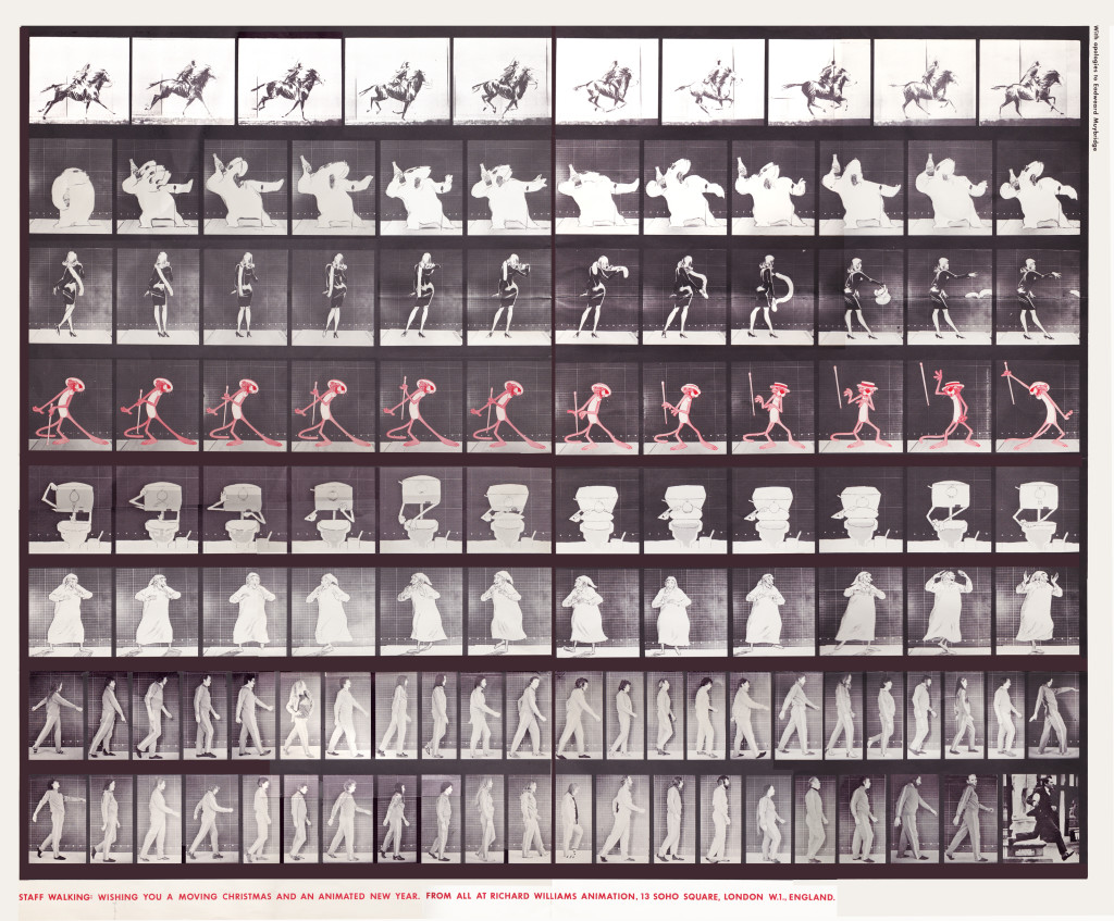
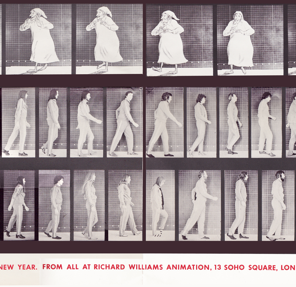
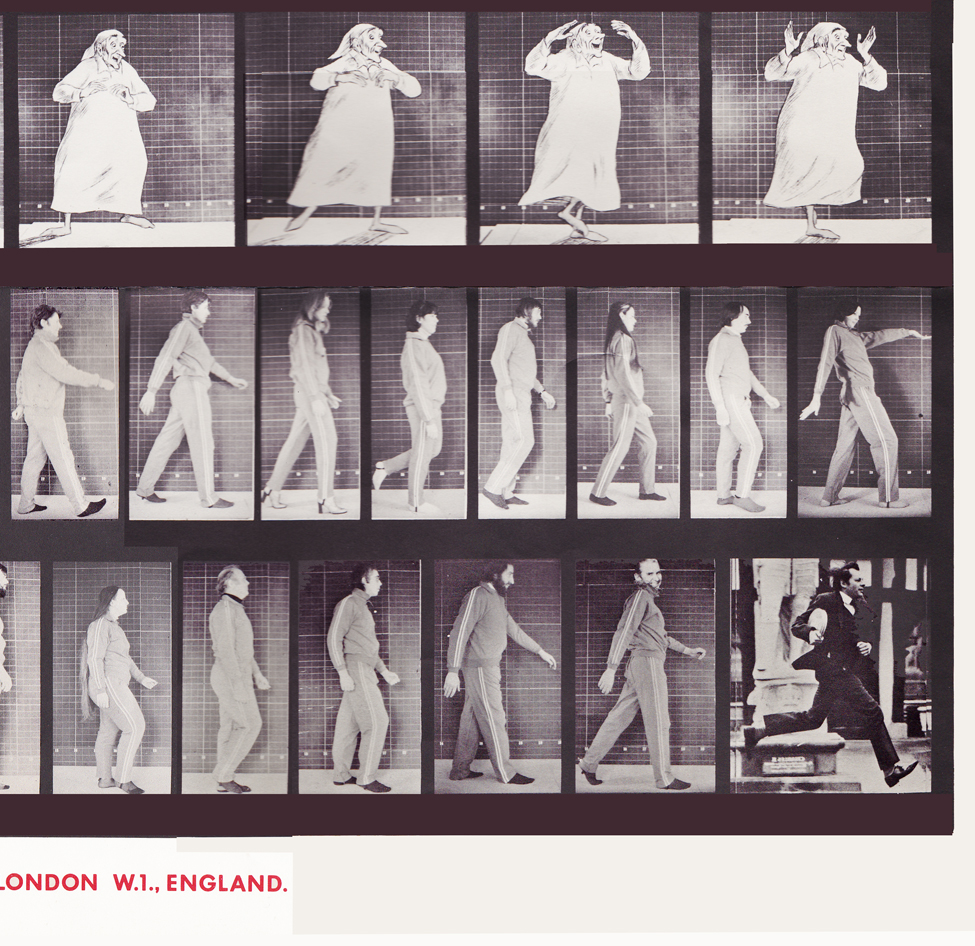
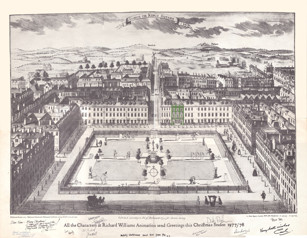
Well, when it came to Christmas cards, Richard Williams was the same. Enormous and beautiful cards were printed and signed by anyone who knew the recipient of the card. You were lucky being on the receiving line for these stunning cards. Tissa David once gave me a number of these cards. I held onto my copies of the cards until my space was flooded and the cards were damaged. I thought I’d post a few.
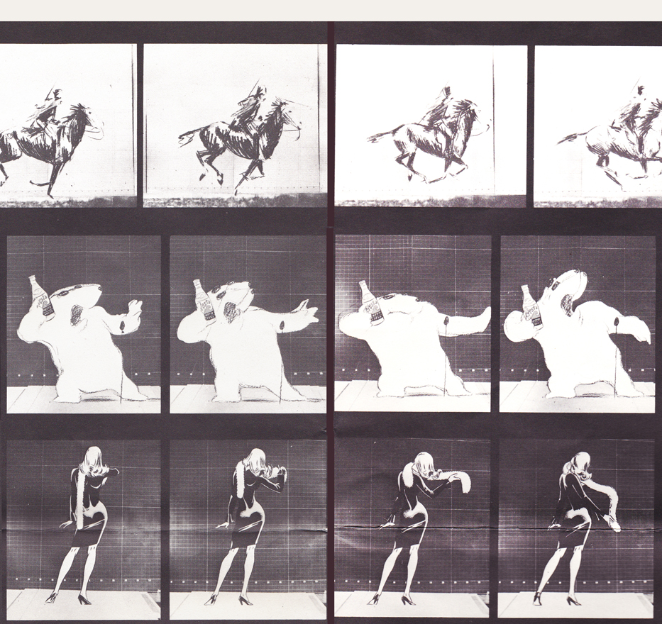
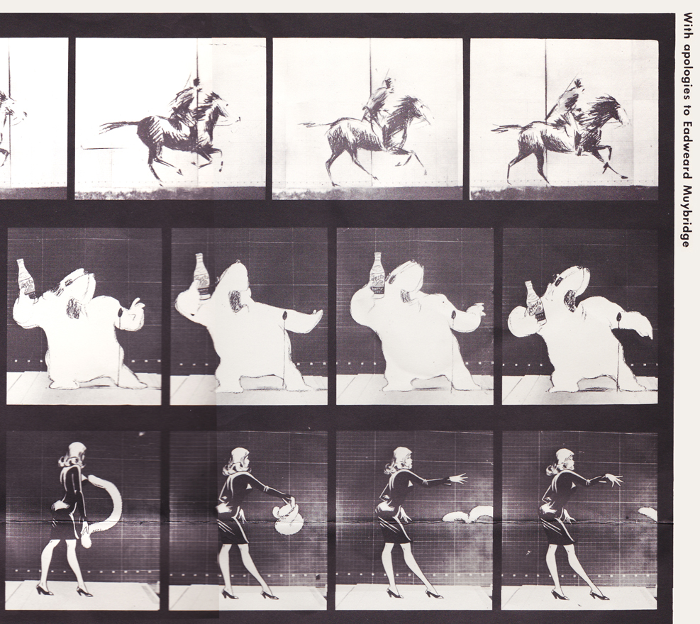
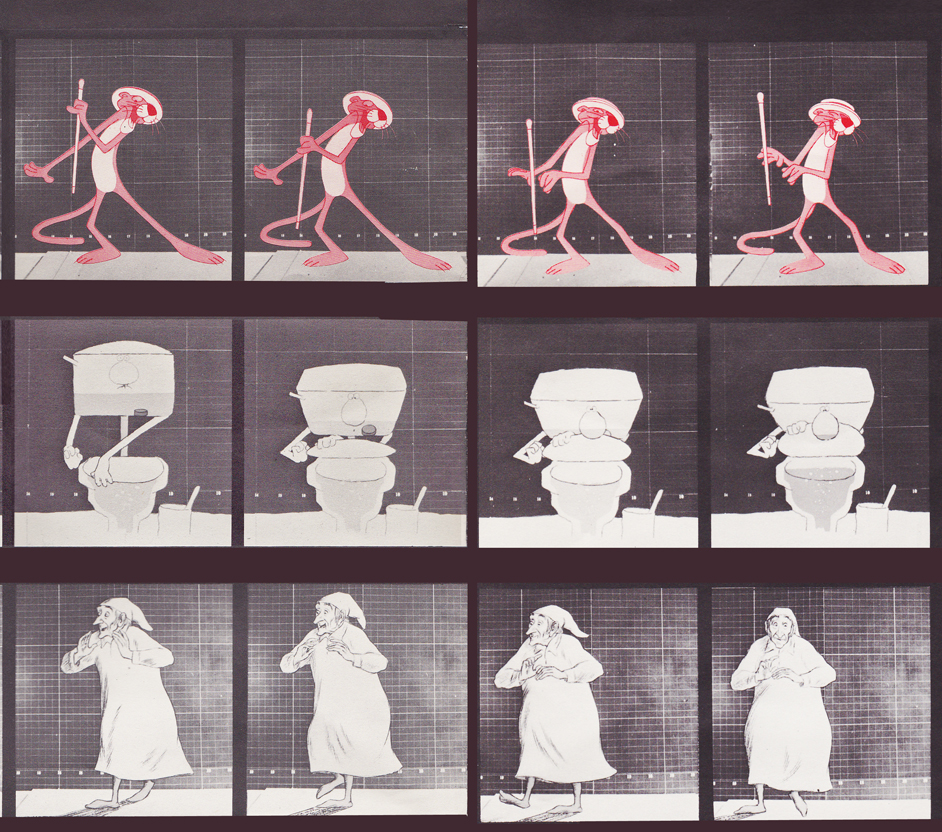
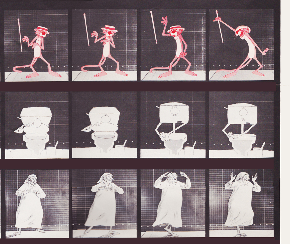
With card #1, a take-off of Muybridge with frame grabs from several of the better Williams commercial spots from that year, capped off by a number of key staff personnel positioned to continue the Muybridge motif.
(Here, I first post the entire card, followed by a break up of the card into sections
so you can more ably see the details.)
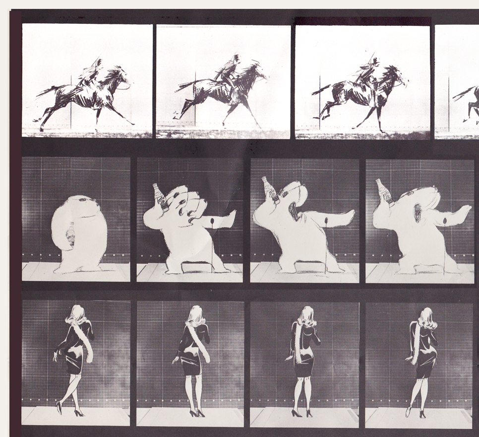
Top rows left side / Row 1: Pushkin Vodka ad
Row 2: Cresta Bear ad / Row 3. Tic Tac ad
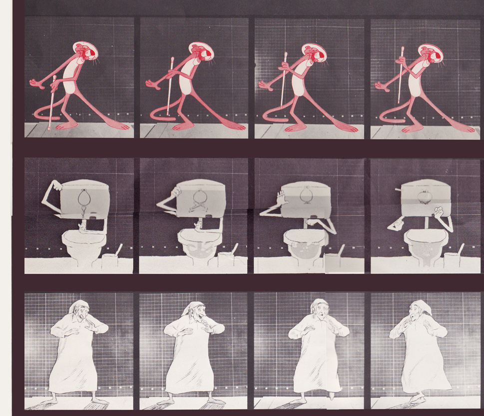
Middle rows left side / top row: Pink Panther titles
Middle row: Bloo toilet cleanser ad / Bot row: The Christmas Carol
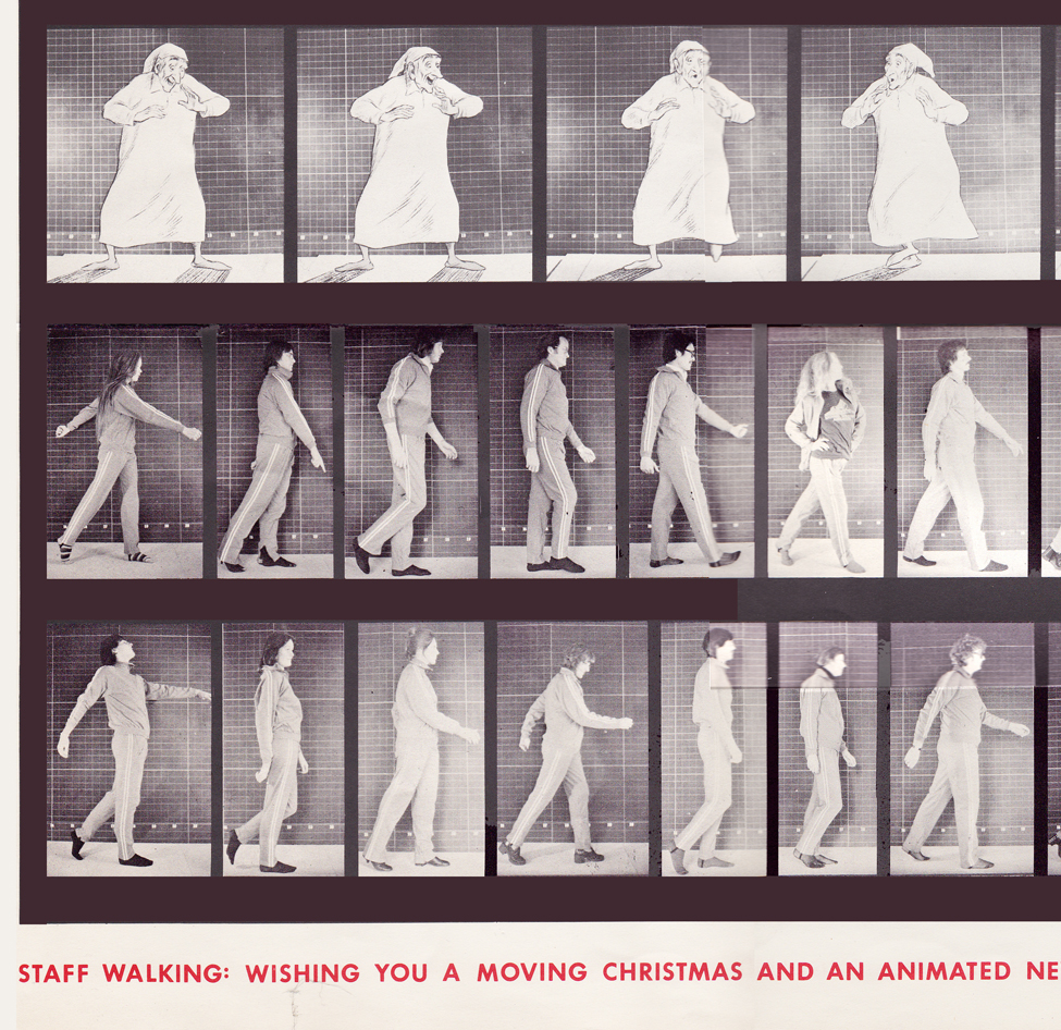
Bottom rows left side / top row: The Christmas Carol (repeated)
Middle row: staff / bottom row: more staff
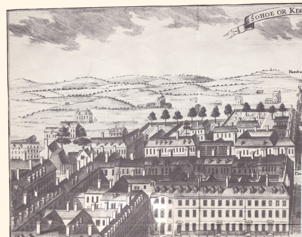
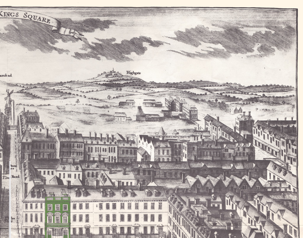
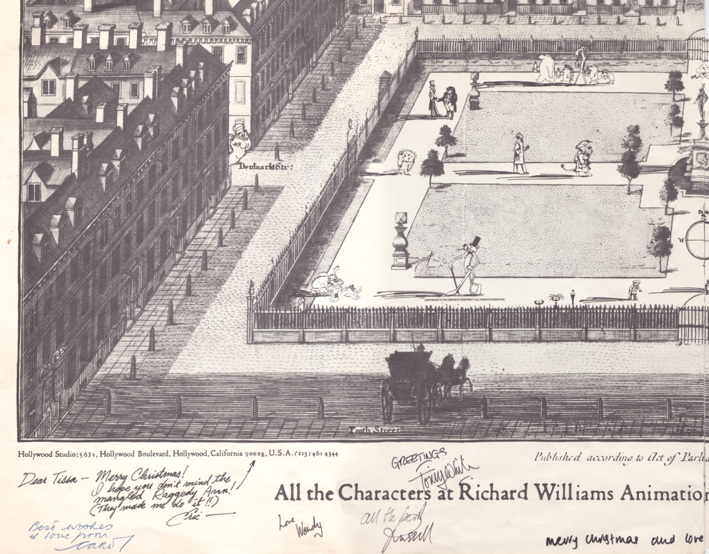
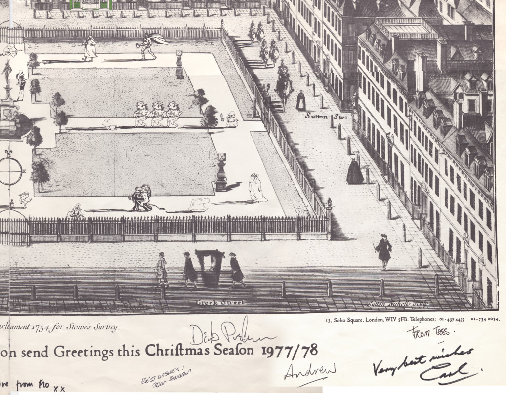
With card #2 we see Soho Square. The green front door
marks the location of Dick’s studio at 13 Soho Square.
(As with the first card, I posted the entire Christmas card,
followed by a sectional divide so you can enjoy the details.)
This is a folding card.
It comes folded so that you see the far left of the card
revealing part of the far right.
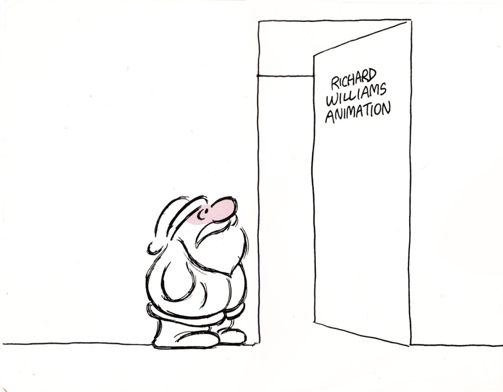
The card comes folded like this.
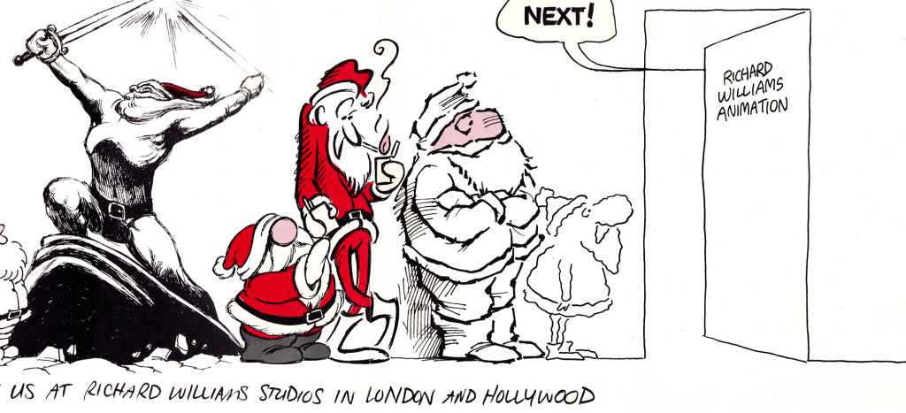
The left side (Santa up to doorway) is on the left side of the card.
The right side, on bottom, reveals the empty office.

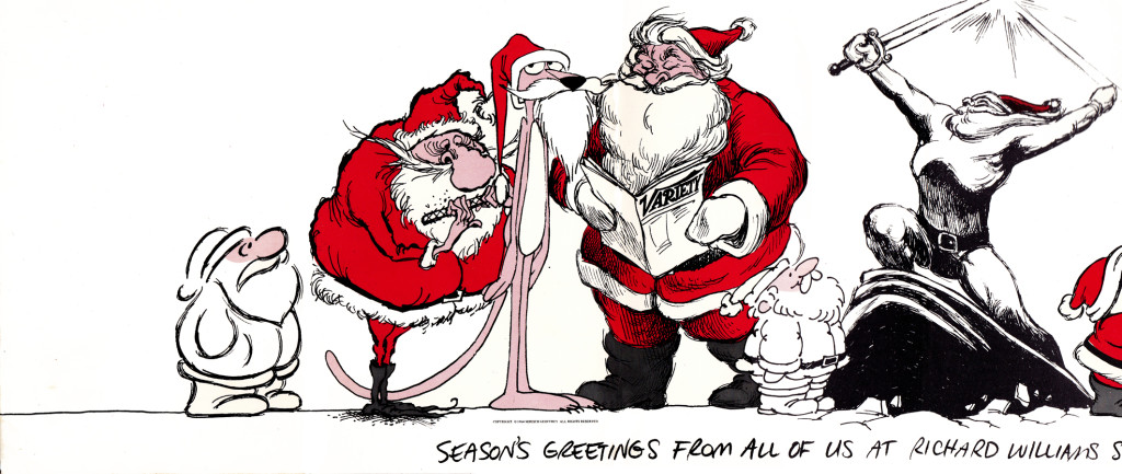
It unfolds to reveal this long line of Santas.
Each Santa is in the style of the many illustrators’ styles
of those who designed ads for the studio in the prior year.
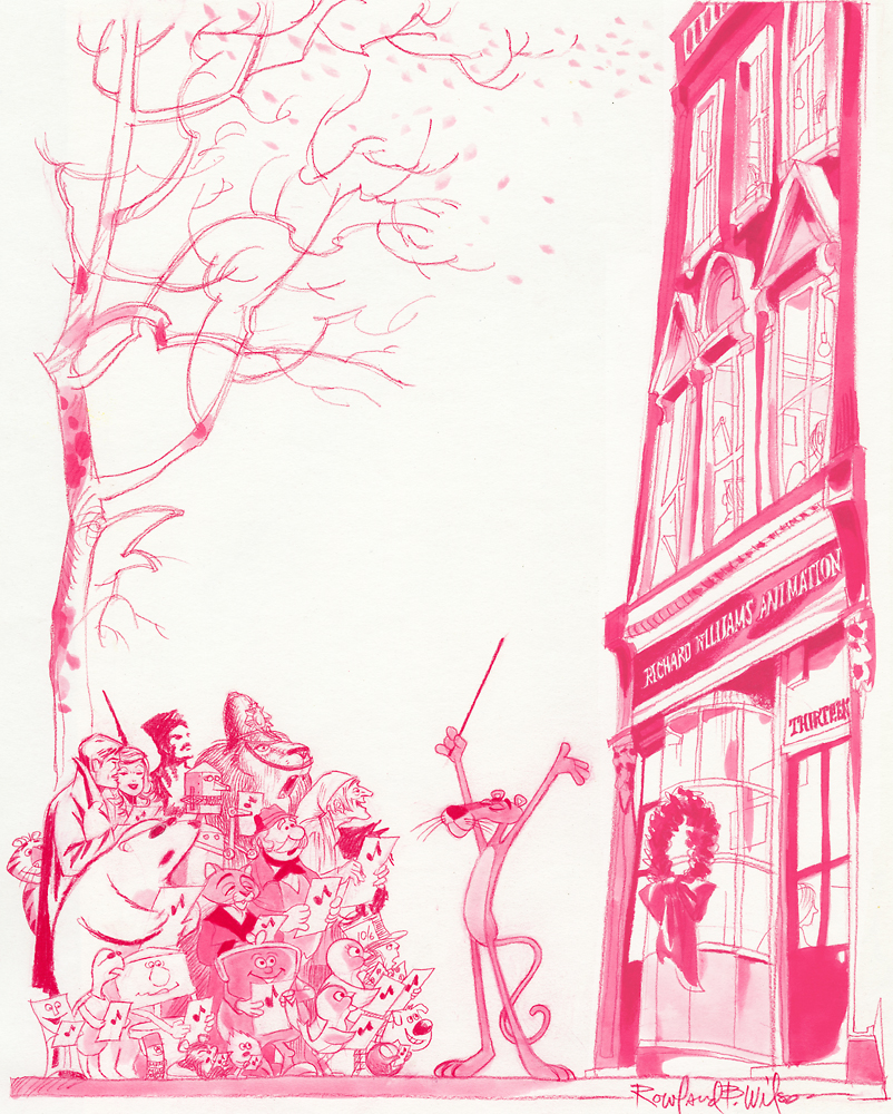
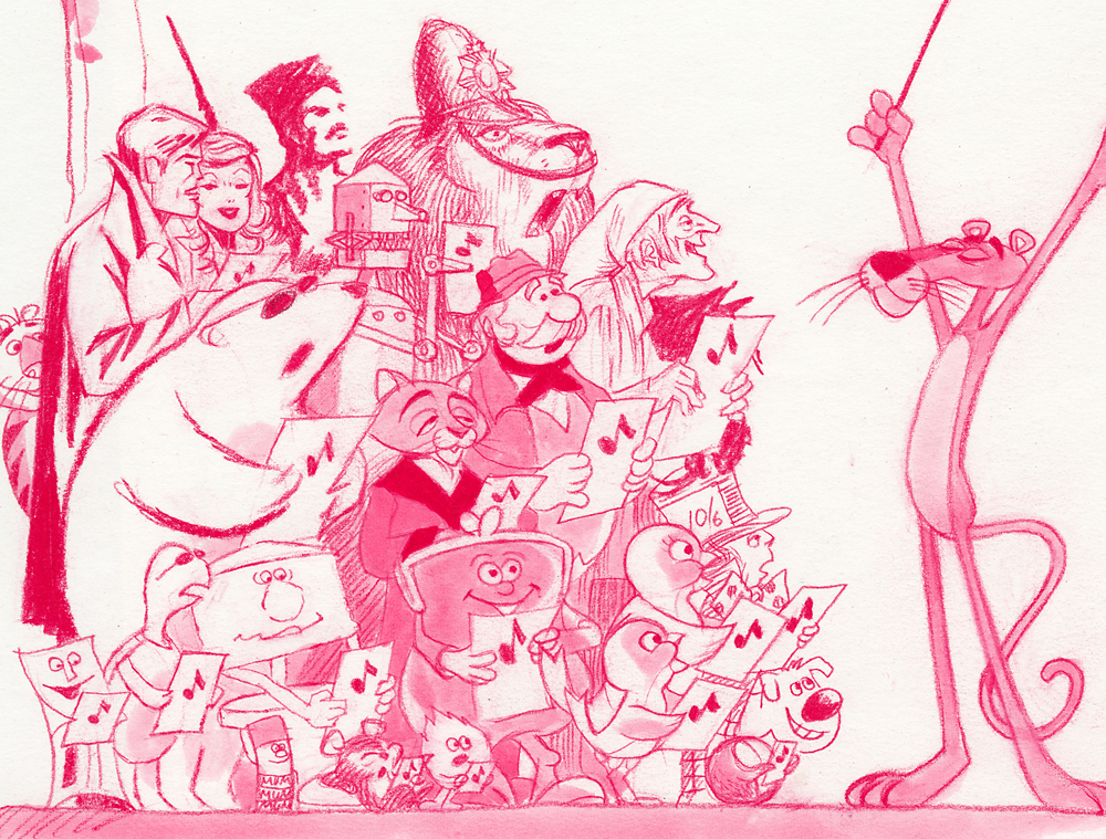
Suzanne Wilson sent in a Pink Panther Chistmas card; it was drawn by her late husband Rowland Wilson:
Below is a close up of that same card.
Here’s another full card.
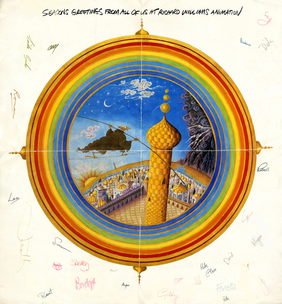
This one is designed after the McGuffin of Dick’s feature,
three golden balls over the city.
from The Thief and the Cobbler.
Books &Illustration &Layout & Design &repeated posts 07 Apr 2013 05:01 am
Joy Batchelor’s Animal Farm – recap
- When the film Animal Farm was released, a tie-in book was published which republished George Orwell‘s novel with line drawings from the film by “Joy Batchelor and John Halas.”
It’s probable that Joy Batchelor did illustrate the book. On a recent post, Rudy Agresta remembered Vivien Halas discussing her mother’s illustrating it in the book Halas & Batchelor Cartoons. I haven’t found that passage in Vivien’s book.
The animated film was produced by Louis D. Rochemont Associates in 1955 at a studio they set up in Stroud, Gloustershire in England. The studio was formerly the home of the Anson-Dyer company and GB Animation wherein ex-Disney veteran, David Hand, made his short films for Rank.
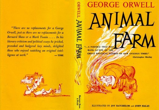
This is the book’s dustcover._________________________ (Click any image to enlarge.)
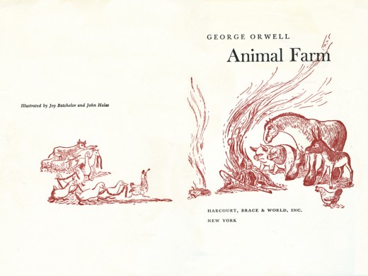
This is the double/title page.
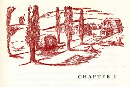
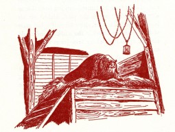
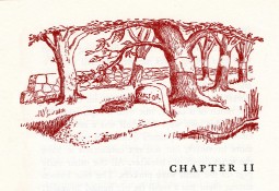
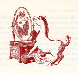
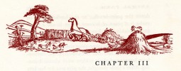
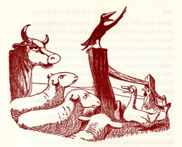
Each chapter has its own heading, and there are usually one to two stills within the body of each chapter.
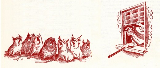
Some of the illustrations, like this one, spread across two pages under the type.
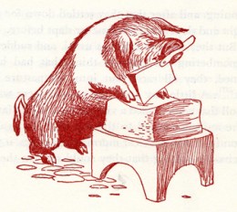
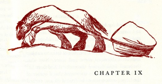
For those of you unfamiliar with this story, it tells the tale of a farm wherein the animals are mistreated.
Under the guidance of the pigs, the animals take over the farm and create an animal collective.
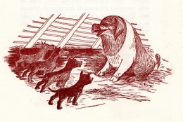
However, the pigs grow lazy and do less of the work as they take charge of the others.
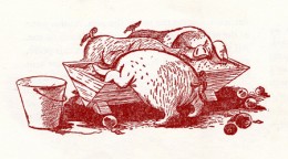
They eat more than their share of the food and mistreat the animals who do the greatest amount of work.
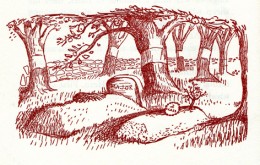
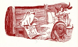
As animals begin to die under the guidance of the lazy pigs, there is some grumbling among the masses.
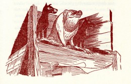
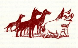
The pigs dominate and rule with a heavy hand.
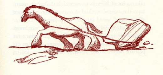
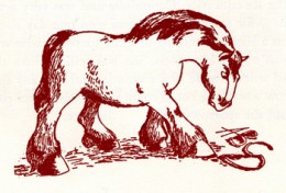
Boxer, the horse, is the figure of strength and symbolically the real leader of the animals.
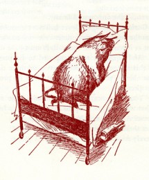
The pigs move into the farmer’s house and become little more than a replacement for “man”.
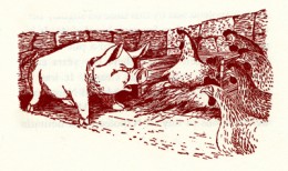
Many animals take the lead of Boxer and try to do their share, while the pigs fight for the lazy leadership.
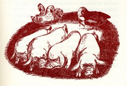

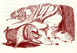
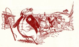
The pigs push Boxer to the limits and use the dogs as their personal guards and force their will on the others.
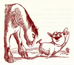
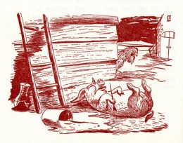
Boxer grows ill as the pigs grow lazier.
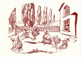
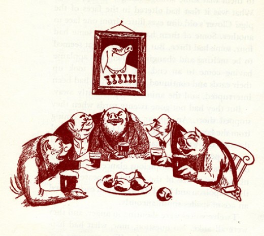
The lazy pigs celebrate their success. Animals hear gossip about the humans planning a charge to take back the farm.
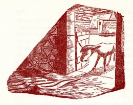
The weakened Boxer, no longer useful to the pigs, is sold for glue.
Eventually the humans return, and in some eyes of the animals they blend with the pigs.
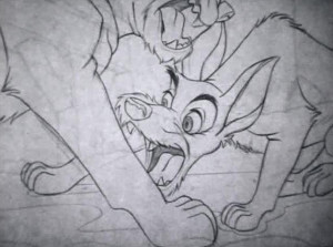
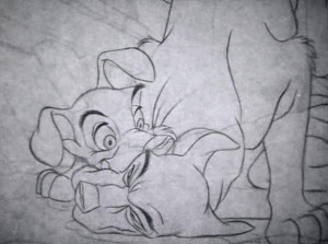
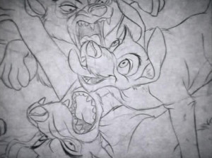
The line illustrations do a nice job of representing the film. They’re also quite consistent.
You can watch Animal Farm on YouTube by going here.


 1
1

 2
2
 3
3
 4
4
 5
5

 6
6
 7
7
 8
8 9
9
 10
10
 11
11
 12
12

 14
14
 15
15
 16
16
 17
17

