Category Archiverepeated posts
Animation Artifacts &Disney &Peet &repeated posts 30 May 2008 08:15 am
FridayRecap: Wizard’s Inspiration
- John Canemaker has loaned me so many excellent pieces that I’m almost embarrassed at how quickly they’ve been eaten up by this blog. Many of them deserve as much attention as I can give.
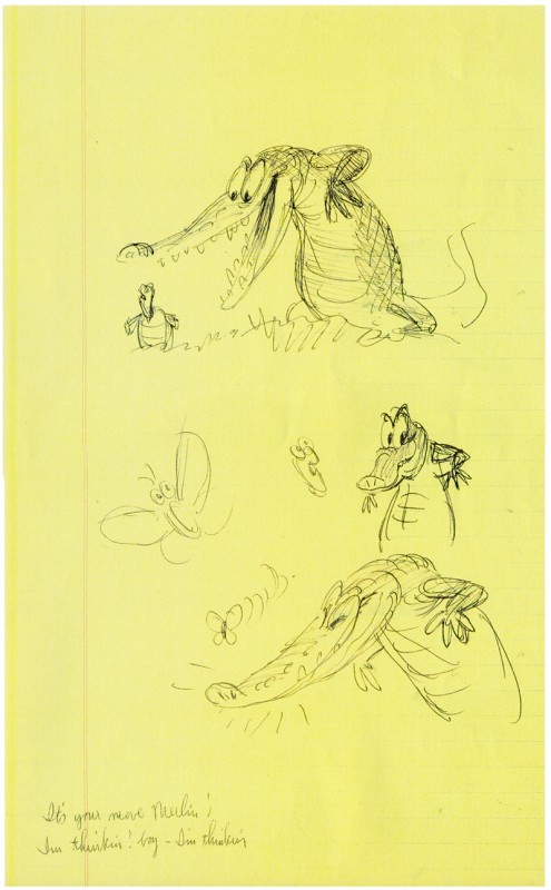
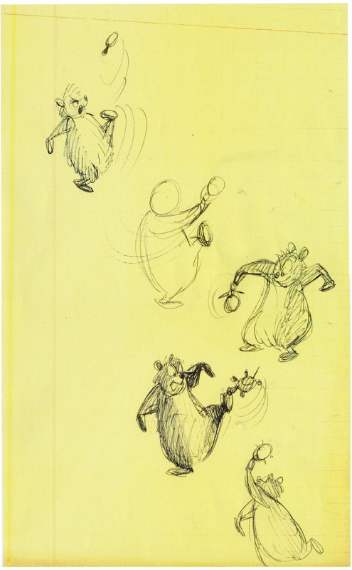
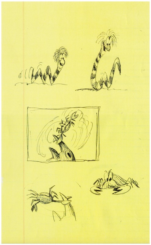
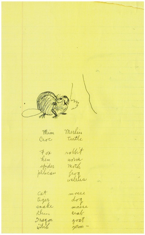
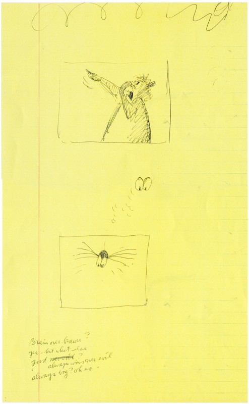
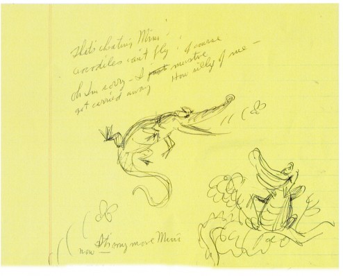
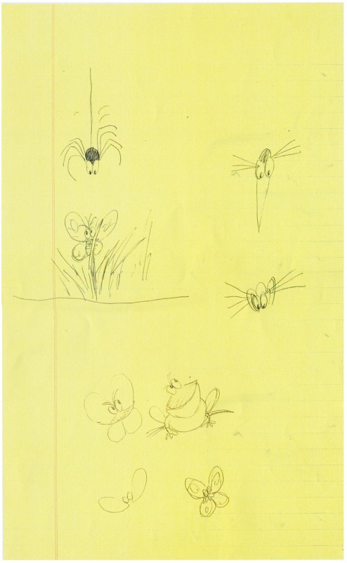
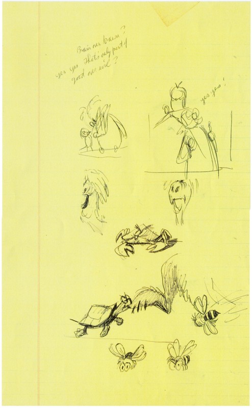
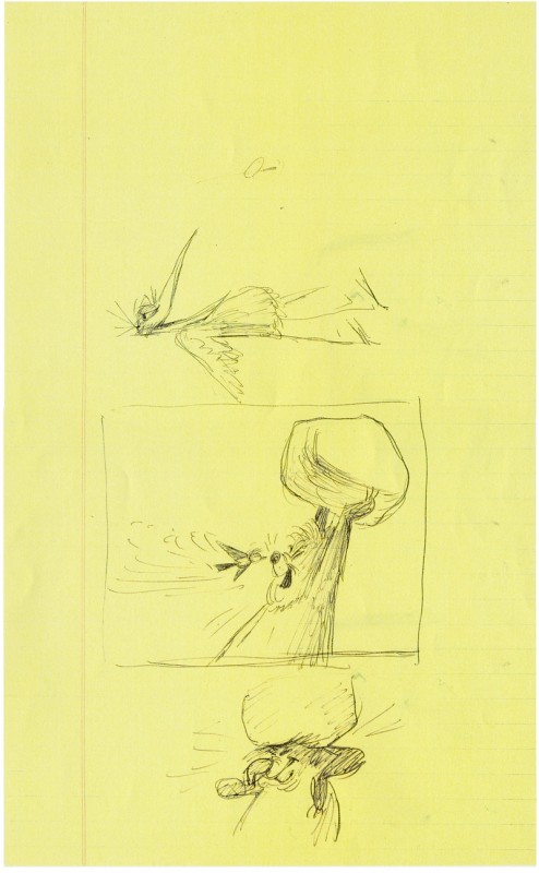
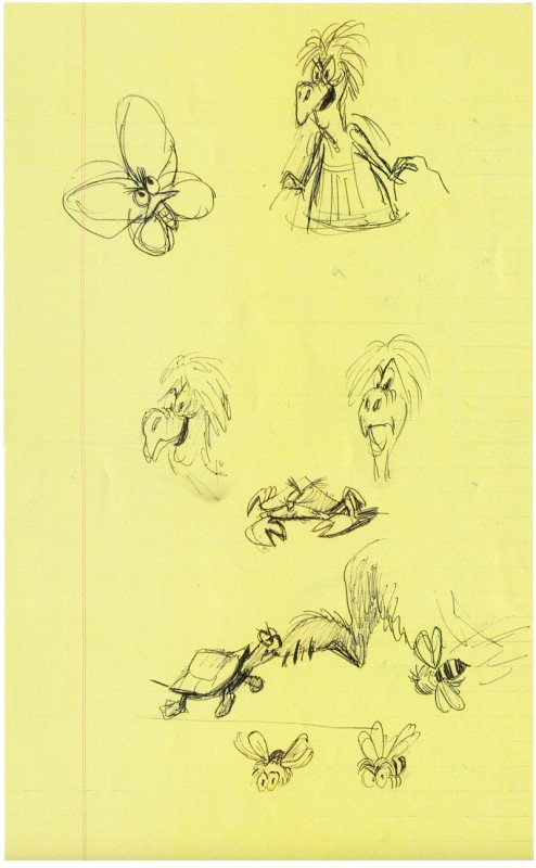
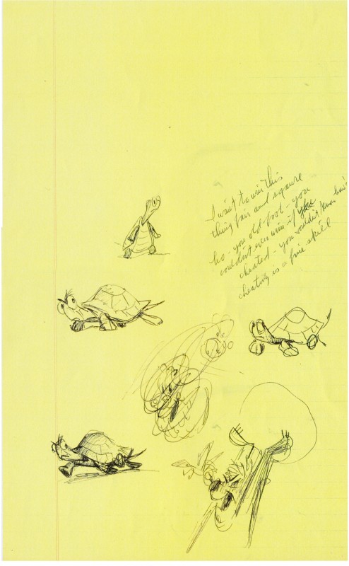
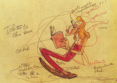
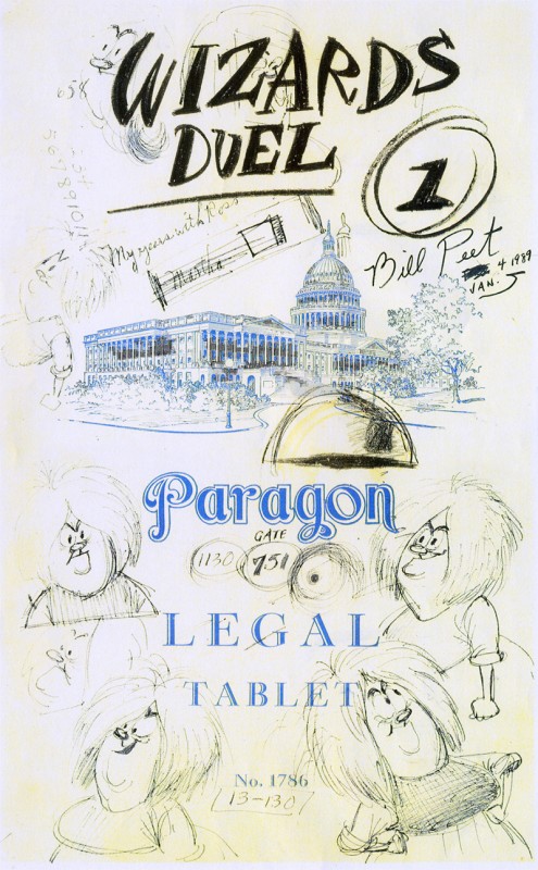
Consequently, over the next few Fridays I’m going to re-post some of these gems. Let’s start with the wizard’s duel from Sword In The Stone. Here are some sketches Bill Peet did on yellow foolscap. I originally posted them in two days’ worth of blogging, since it took a while to scan them all.
Here they are condensed into one:
(Click on any image to enlarge.)
I love how Peet drew all over the cover (to the left) making his notes and sketches,
finally labelling the cover page. I think this is something we can all associate with, and
it helps to make the art less “Art” and more working drawings
to give the final film the life it has.
_____________________________
Animation Artifacts &Books &Disney &Models &repeated posts 11 Apr 2008 08:07 am
Recap Friday – Celebrity Caricature
- Back in July 2006 I wrote about the art exhibit of celebrity caricature which came from the Library of Congress and was seen in the NY Public Library at 42nd Street. This show still stands out in my mind.
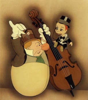 -I’m currently researching the art of Covarrubias. An exhibit at New York’s Public Library at 42nd Street in 1998 was one of the best I’ve ever seen. It was a program of “Celebrity Caricature” mostly from the 20′s & 30′s. Covarrubias, the developing Hirschfield, and a number of other brilliant artists were all represented well. In among the art was a small section on animated caricature. Drawings by Tee Hee and Joe Grant were on display with a couple of cel set-ups. There were also a couple of WB model sheets (without artist names.)
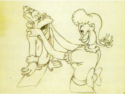
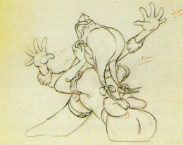
From the book of that exhibit I’m posting some of the animation art represented. Again no animators’ names are given. I remember well
_____(cel – Charlie McCarthy & W.C. Fields in________some beautiful caricatures by Joe
_____“Mother Goose Goes Hollywood”)_____________Grant who came to Disney’s studio to _____________________________________________work on this film.
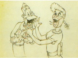
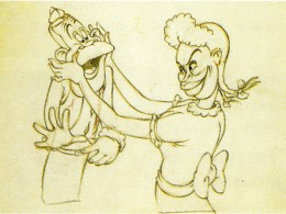
_______________Joe E. Brown and Martha Raye from “Autograph Hound”
____(Click on any image to enlarge)
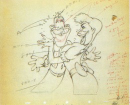
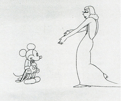
Garbo & Mickey – animation drawing for Mickey’s Gala Premiere
A small sampling of this show can be found on the National Portrait Gallery website. Non-animation caricatures are on view there, and the beautiful book/catalogue can be purchased there.
Credits for the above stills goes to:
1. “Mother Goose Goes Hollywood” from the collection of Jeff & Therese Lotman
2-5. “Autograph Hound” National Portrait Gallery, Wash.D.C.
6. “Mickey’s Gala Premiere” WDFeature Animation Research Library
7. The Steve Schneider Collection
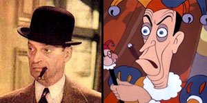
Larry T. on his blog, Random Semiconscious Musings, has a great post on Mother Goose Goes Hollywood wherein he identifies all of the caricatures with matching photographs. It’s great to see the likes of Ned Sparks (pictured), George Arliss and Joe Penner.
repeated posts &SpornFilms 04 Apr 2008 07:55 am
Recap Friday – Bridget Thorne
- The key to my studio in the first dozen or so years was the brilliant artist, Bridget Thorne. She was every bit my partner in creating some of the greatest of my films, and I can’t attribute more to her work. With this post, back in March 2006, I gave some small attention to some of the excellent art she’d done for my films. Time to show it off again.
Bridget Thorne has been an extraordinary Art Director and Background painter on quite a few of my favorite films produced within the studio. Here is some of that art.
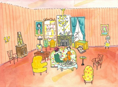 This painting is a key transition point in Lyle, Lyle Crocodile. The film had a looseness that Bernard Waber‘s original book art had featured. I felt very much at home in Waber’s style, and I think Bridget did as well.
She worked out a color scheme for the film, and we both agreed to
______ (Click image to enlarge) Lyle, Lyle Crocodile (1987) _____.__follow it closely
___________________________________________________________throughout the half hour film for HBO. Liz Seidman lead the character coloring. Bridget, of course, had a strong hand in all those character models, as well.
The scene pictured above follows the introduction of Autumn on “East 88th Street”, and the background brings us full force into it as we get “the girl’s first song” – Mrs. Primm’s report on what it’s like to have a crocodile living in your house.
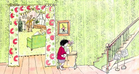 – Ira Sleeps Over was the second children’s book by Bernard Waber that we adapted. This is a very sweet story which involves a sibling rivalry; it focusses on a teddy bear and a sleep-over party. I pulled composer, William Finn, into the film and he wrote some great tunes for it. Prior to doing the script, I gave him the book and asked him to figure out where he would like the songs. In a week he had already written all the songs for the film, and they were brilliant. It turned out he used all the words of the book in his songs, and now I had to find a way of telling the same story using past, present and future tenses, as he did in the songs. It was a good challenge that worked out well and created a fabulous construction for the story.
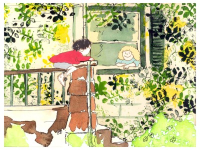 The style in this book was, if anything, looser than in Lyle. Waber did a lot of his illustration featuring duplicating printing techniques. Lino cut enabled him to repeat decorations throughout the settings. Bridget played with the lino cuts and was able to succesffully duplicate the technique in the backgrounds. In this one bg, at the beginning of the film, the foliage is a good example of this technique, printed over watercolors. The characters are markered paper drawings cut out and pasted to the cel overlays.
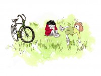
The book, like Lyle, featured a lot of white space, so we followed suit. When a book’s been in circulation for over 25 years, you have to realize there’s been a reason for it; find the reason and the heart, and take advantage of it. This use of white space made the actual backgrounds oftentimes little more than abstract shapes of color with a solid object on the screen. Here, for example, we see Ira and his friend, Reggie, playing against a blast of green and a bicycle.
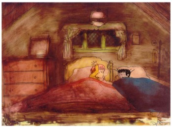 – At the end of the film, Ira and Reggie talk in the dark at the sleep-over. To get the look of the dark Bridget had to come up with something clever. The book resorted to B&W washes of gray and wasn’t very helpful. She came up with some dyes that were used for photo retouching. By quickly painting these lightly onto cel levels with a wide brush, she was able to get translucent cels with the brush strokes imbedded in the color overlays. By placing these overlays over the characters and backgrounds, we got the desired effect that let it feel connected to the very loose style of the film.
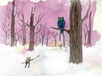 -Abel’s Island is one of the few films we did that I treasure for its artwork. Bridget’s work on the backgrounds was, to me, extraordinary. The looseness I love was developed into enormously lush backgrounds using shades of green that I didn’t know could be captured in the delicate watercolors.
This film was a complicated problem that seemed to resolve itself easily and flow onto the screen without much struggle. The book had won a Newberry Award as best children’s writing of its year. It was not a picture book but a novel. The more than 120 pages
(Click image to enlarge) Lyle, Lyle Crocodile (1987) featured fewer than 20 B&W spot drawings by author/illustrator, William Steig. We were on our own with the color.
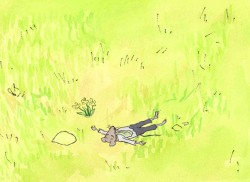 However, we had adapted Doctor DeSoto and The Amazing Bone as shorter films and could use what we’d learned from Steig on Abel. Bridget topped herself.
Several of the animators gave us more than I could have expected. Doug Compton‘s animation of Abel sculpting his statuary and living in his log was heart rending; Lisa Craft‘s animation of the big pocket watch, the big book and the leaf flying sequences was nothing short of inspired; and John Dilworth‘s animation of the owl fight was harrowing. This was all set up and completed by Tissa David‘s brilliant animation of Abel in the real world with wife, Amanda. She established our character.
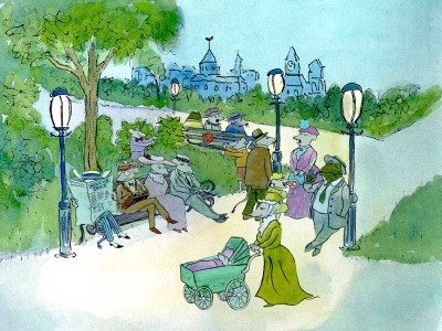 – At the end of the film, Abel, who has been separated from his new bride, trapped on an island for over a year, finally gets to come home. He sees Amanda in a park at twilight but decides to hold back. He races on ahead of her to greet her, privately, at home. The park sequence has a busyness as an acute counter to the lonliness we’ve watched for the previous 90% of the half-hour program. Setting it at early evening gave an opportunity for rich, royal colors. Bridget took full advantage of the opening, and underscored it all with a regal green not seen earlier. It was stunning and is one of my favorite backgrounds in the film.
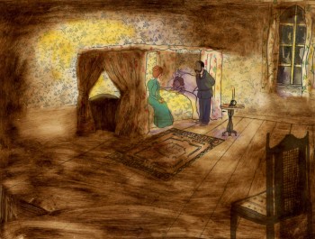 A Child’s Garden of Verses presented new and different problems to explore.
It was a project generated by HBO. Charles Strouse and Thomas Meehan were going to write the book and song score. We met several times trying to discover a way into the book of poems. I’d suggested we use the verses in Robert Louis Stevenson‘s book to illustrate the author’s early childhood.
Stevenson was a sickly boy who was always confined to his dark room. He was not
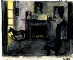 expected to live long. The only visitor for days on end was his overprotective mother.
For much of the film, we had only the dark, child’s bedroom to explore. Artistically, I asked Bridget to delve deeper into the photgraphic dyes that she had discovered and used so well in Ira Sleeps Over. These dyes would allow us to keep the style, once again, loose while exploring dark areas and brush strokes to simulate the darkness “Robbie” lived in.
For the wallpaper throughout the house, Bridget used real wallpaper which was photostated; scaled down and reshaped to fit the backgrounds. Then watercolor washes colored these backgrounds and overlays were mixed and matched to get the desired results.
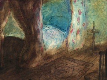 I was never quite pleased with this film. The elements that worked well worked really well. Bridget’s work was a highlight. The acting was extraordinarily good. Heidi Stallings performed with an enormous amount of emotion yet barely raised her voice above a whisper. Jonathan Pryce was brilliant as Robert Louis Stevenson, the narrator and even sang a song when asked at the last minute. Gregory Grant as the young “Robbie” was vulnerable, sweet and all we could have hoped for.
However, there was too much of a rush given the delicacy of the piece, and the exterior backrounds done by me for the end of the film are poor. The animation is also hit and miss. Oddly enough, my favorite sequence used little actual animation but intense camera work. Ray Kosarin was the animator in charge of it, and it’s an impressive sequence.
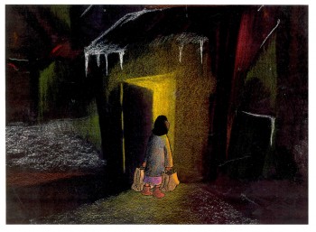
- The Talking Eggs was done for a PBS series called Long Ago & Far Away. It was an adaptation of a Creole Folk Tale which Maxine Fisher updated for me. (Lots of discussion between WGBH, Maxine & me about what distinguishes a Folk Tale from a Fairy Tale. It seriously impacted the story we were telling and I wanted what I wanted and got.)
Bridget chose to use pastels and we searched for a paper that would bring out the most grain. I loved the end result. The characters, to match the look of the Bgs, were xeroxed onto brown kraft paper and colored up from there with prismacolor pencils. This was cut out and pasted to cel.
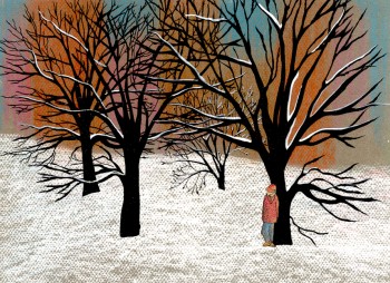 Danny Glover was the narrator, and we chose to make him an on-screen character appearing intermitently in the film. His narration was recorded on a rush as he stopped off in LA from SF on his way to direct a film in Africa.
There’s a focus in these backgrounds that matches the content and mood of the piece, and it worked wonderfully for my purposes. I always like it when the medium is front and center; I want audiences to know that they’re watching animated drawings, and texture usually helps to do this. Of course, I also want the films to have a strong enough story that the audience gets past the point of knowing, to enter the film. It works some of the time, and I’m in heaven when it does.
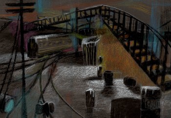 Bridget altered the color of the paper on which she was coloring with the chalks, and the different colored papers represented varied moods from sequence to sequence.
Naturally, there were some problems with the chalks under camera. All the fixative in the world didn’t stop the chalks from bleeding onto the cels or platen on the camera. (Lots more cleaning involved than usual.) We heard constantly from our cameraman, Gary Becker. The extra effort was worth it; the look was unique and successful.
Animation Artifacts &Models &repeated posts 28 Mar 2008 08:21 am
Recap Friday: Larry Riley
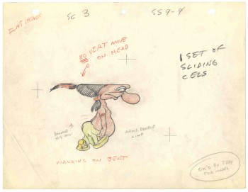 In celebration of the new season of baseball I have a couple of model sheets from a Paramount cartoon.
A story writer, Larry Riley, gave me these drawings back in 1972, but he never told me the film’s title.
Thanks to Thad Komorowski and Bob Jaques, who left comments on the original post, we know the drawings come from Heap Hep Injuns (1950).
___________(Click images to enlarge.)
Larry Riley was a wild guy. On my first commercial job at Phil Kimmelman & Ass. he and I were the inbetweeners working side-by-side on some of the Multiplication Rock series. Larry had had a long and busy career in animation.
He had been an asst. animator at Fleischer‘s, a story writer at Paramount, an animator at many studios. Like many other older animators, he ended up doing anything – including inbetweening at Kimmelman’s for the salary and the union benefits.
The stories Larry told me kept me laughing from start to finish. There was no doubt he had been a writer for years. In a not very exciting job, it made it a pure pleasure for me to go to work every day to hear those hilarious stories. I can’t see Lucky 7 without thinking of laughing. It wasn’t the stories per se that were funny, it was his take on it.
Larry told me of his years at Fleischer’s in Florida where he was an assistant. He and Ellsworth Barthen shared a room, and, according to Larry, had lined one of the walls of their room with empty vodka bottles. Now, I’ve heard of frats doing this with beer cans, but doing it with vodka bottles requires some serious drinking. One of the many times I got to work with Ellsworth, I asked him about the story, and he reluctantly backed it up telling me what a wild guy Larry was.

________Forgive the racist pictures, but I guess they’re a product of their times.
Larry also told of a 3D process he’d developed for Paramount in the 50′s when the movies were all going 3D. I believe there were two Paramount shorts done in this process: Popeye: The Ace of Space and Casper: Boo Man. Larry offered to give me the camera on which he shot these films – he had it stored in his basement. He was afraid it would get thrown out when he died. I didn’t have room for it.
My regret; I still hear the sadness in Larry’s voice.
(When I originally posted this in 2006, Larry’s grandson, John, wrote to tell me that another collector took possession of the camera and kept it from destruction.)
The animator who drew these is Tom Johnson (he signs the second one), and they were approved by the director Isadore (Izzy) Sparber per the first one.
The drawings are deteriorating, obviously. The pan above uses a lot of glue to hold it together, and that’s eating away at the paper.)
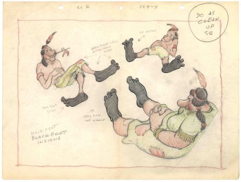 – This is the final model I have from Heap Hep Injuns a 1950 Paramount cartoon. Tom Johnson drew this image, prior to animating it, and Izzy Sparber directed the film. I’d heard some stories about I. Klein regarding this film, though he’s not credited, so I suspect he may have had something to do with model approvals, as well. Actually, he may have been the “Izzy” referred to on the pan posted yesterday.
(click on image to enlarge.)
I was never a big fan of the Paramount cartoons. Growing up in New York, we’d always get Paramount or Terrytoons shorts playing with features in the theaters. Only rarely did a Warners cartoon or a Disney short show up. (I don’t think I saw a Tom & Jerry cartoon until I was 17 when they started jamming the local TV kidshows with them.)
Saturdays there was always the placard outside the theater advertising “Ten Color Cartoons”. A haughty child, I naturally wanted to know why they didn’t show B&W cartoons – that’s what we saw on television, and I usually liked them more. I must have been insufferable for my siblings to put up with me.
The starburst at the beginning of the Mighty Mouse cartoons always got an enormous cheer in the local theaters. I don’t remember ever hearing that for Popeye or Harveytoons.
Animation Artifacts &Layout & Design &repeated posts &Story & Storyboards 21 Mar 2008 08:03 am
Recap Friday – Jax Beer commercial
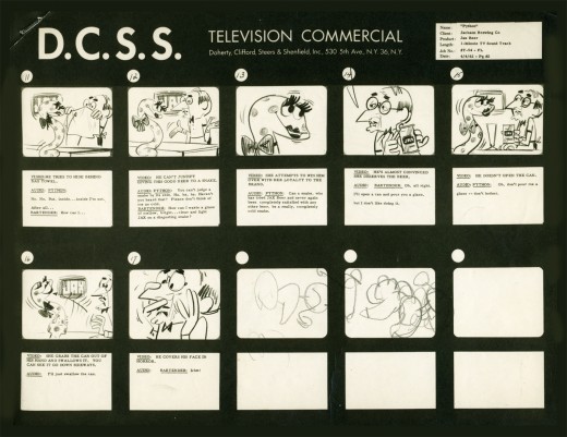
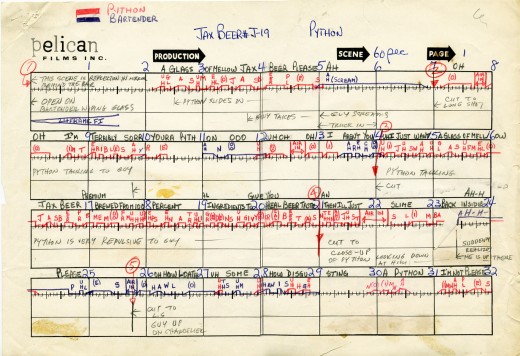
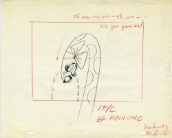
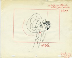
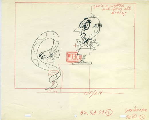
- In November 2006 I posted the storyboard, workbook and final layouts for a Jax Beer spot which was directed by Mordicai Gerstein. I thought it interesting enough to recap the two posts, so here they are.
- This is the material for a Jax Beer commercial. It was done by a NY studio named Pelican in 1962. There were about 75 people on staff at Pelican back then.
This spot was directed by Mordi (Mordicai) Gerstein. He left animation in th 70′s to write & illustrate children’s books. (He won the Caldecott Medal for his book, The Man Who Walked Between The Towers. This was the book I adapted to animation in 2005.)
What follows is the storyboard and the director’s workbook. (It appears to be an agency board, though it’s drawn in a style that looks to be Mordi Gerstein’s. Perhaps boards from the agency were drawn by the studios back in 1964; I’m not sure. The layouts were drawn by the same artist.)
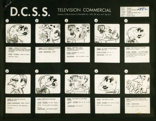
_____(Click any image to enlarge.)
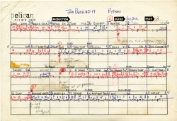
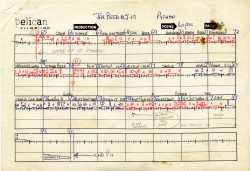
The workbook has several flaps on it that indicate changes in timings. There are also glue stains where I assume other flaps fell off. (See page one, last row, first column.) Each column represents 16 frames/one foot of film. Odd numbers are marked off.
Each row contains 8 feet of film/128 frames. Each page represents 32 feet/512 frames. It would have been smarter to keep to even numbers.
More modern exposure sheets generally have 80 frames/five feet per page. This also divides into two feet of 16mm film. (Handy.) The numbers add and divide smartly and easily. But then most people don’t use exposure sheets anymore.
 - Continuing with the above post, a Jax Beer commercial, I present some of the film’s layouts. This represents about 2/3 of them.
The art was done by Mordi (Mordicai) Gerstein, who also directed the spot. Grim Natwick animated the spot and Tissa David assisted him. Of course, this was in the days before auido tapes could be handed out, so the animator would get a phonograph of the soundtrack. They could mark it with a white pencil to indicate key spots.
I thought that this in conjunction with yesterday’s prep material gave a good indication of the preproduction that went into making a commercial back in 1962.
That said, here are the layouts:
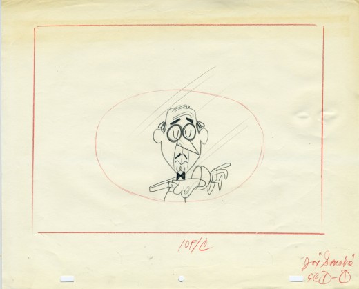
(Click on any image to enlarge.)
Animation &Hubley &repeated posts &walk cycle 14 Mar 2008 08:33 am
Recap Friday – Upkeep Cycles
- Back in October 2006, I posted this piece about John & Faith Hubley‘s short film Upkeep which includes an excellent walk cycle by Tissa David. I’ll try to post the storyboard for this film next week, if I can locate it.
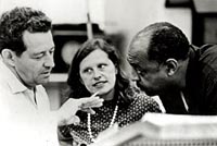 – Back in 1973, the Hubleys produced Upkeep, a short film for IBM. It chronicled the history of the service repairman in a light hearted way. Actually an industrial, it was treated like a personal film. (There’s a thin line between some of their industrials and their personal films.) Of Men and Demons was done for IBM though they considered it a personal film; it instructed in the positive aspects of the binary code and was nominated for an Oscar.
___ (John & Faith Hubley with
___composer, Benny Carter)
Tissa David did the lion’s share of the animation for Upkeep. Phil Duncan, Lu Guarnier and Jack Schnerk were the other key animators on it. Helen Komar and I assisted all of them, and I inked the whole film. Gen Hirsch and I colored it. John did all the Bg’s.
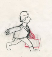
The initial animation on the service man was done by Phil Duncan. Tissa had to pick up the character, and she found the walk Phil had done so funny that she kept it throughout the film adding shades and tones to it as she thought appropriate.
The art was inked with a sharpie, bled with thinner, then colored with magic markers. Each drawing was then cut out and pasted to cels. Hubley’s Bg’s followed the same style: sharpie on board, washed & bled with thinner, added watercolor washes.
Posted below are the drawings for that 18 drawing walk cycle.
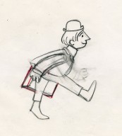
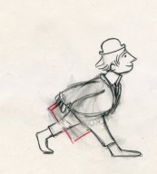
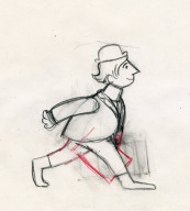
___(Click any image to enlarge them.)
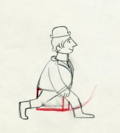
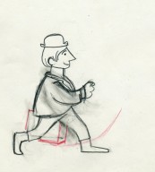
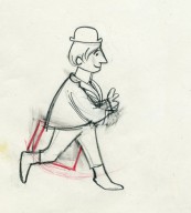
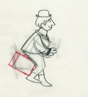
Walk cycle on twos.
Animation Artifacts &Hubley &repeated posts &Tissa David 29 Feb 2008 08:46 am
Recap Friday: Letterman I, II & III
The following was a post that first appeared March 25, 2006.
I’ve added slightly to it:
- One of the first jobs I had in animation was working for John Hubley in 1972 on Letterman series for The Electric Company. I enjoyed writing the several posts that I’ve combined for this recap:
- There were three seasons of Letterman episodes we did at the Hubley Studio. All 60 episodes were 2 1/2 mins. apiece including the reused wrap-around: “It’s a bird! It’s a plan! It’s Letterman!” They were all directed by John Hubley. The first 40 episodes were all done in-house. The last 20 episodes were split with 10 done in the NY studio and 10 farmed out to Fred Wolf‘s studio in LA. The boards and layouts in NY for those sent out. Fred and Chuck Swenson animated all 10. (These are also the only episodes to use cel vinyl. All the others had the characters colored with marker on paper and cut & pasted onto cels.) The audio was done in NY, and editing was done in the studio by Faith Hubley.
In the first season of the show the primary voices were: Gene Wilder as Letterman, Zero Mostel as Spellbinder, Joan Rivers as the Narrator, and Jack Gilford doing incidental voices. Billy Taylor did the music.
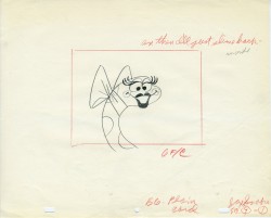
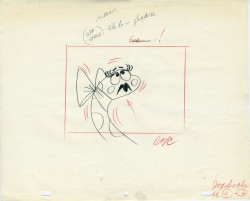
animated by Tissa David for the first season of the show. Letterman runs on two’s.
II
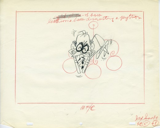
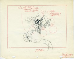
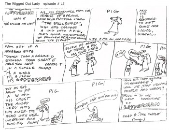 Christopher Cerf wrote all 60 episodes of Letterman, probably in collaboration with John Hubley. The storyboard posted here for episode #5 was by Chris Cerf; that’s pretty much how he did the scripts.
It’s undeniable that the wacky “naive” drawings undoubtedly inspired the models for the characters in the films.
(Click on any image to enlarge to a readable size.)
No doubt also affecting the models was an acccident that John Hubley had had at the start of production on this first series. At a dinner party, John tried to stop a falling 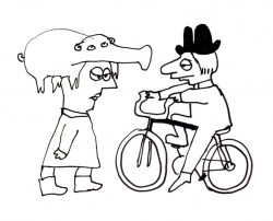 fondue pot filled with melted cheese. Horrible burns over both hands somewhat hampered his artwork. I would make several visits a day to his nearby apartment to have art approved. To have John draw, we’d prop a felt-tip pen into the mass of gauze and cotton and bandages wrapped around both hands. He’d move his wrapped fist around a sheet of paper and end up with a model like the one posted here. This went on for about three weeks (roughly half of the production time.) When he returned, backgrounds were done at a super speed.
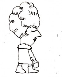
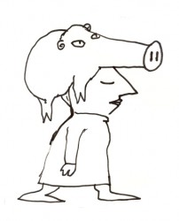 Everything was modeled on Krazy Kat. Lots of white space with sparkling color sprinkled about. The lines were dressed up with a ragged cross-hatching. The characters were colored with magic marker. (John’s favorite color was Eberhard Faber’s “Shock Pink”. Letterman’s skin color took this tone. It showed up in almost everything John did with markers.) The backgrounds were inked with a pentel felt-tip. John would throw a light wash of water over some of these lines to get them to bleed.
We’d race daily to get at least half a dozen scenes ink, painted and colored on paper. Then it’d be packaged and sent out via Fed Ex. (Celine Miles in LA cut & pasted the colored drawwings to cels; the art was shot at Animcam by Jack Buehre.) The FedEx guy arrived daily at 5:30pm, so that was my deadline. I found myself coming in at 7am to add more time to the day. I’d watch the clock which ticked furiously; I averaged 30secs to ink a drawing – any more, and I wouldn’t make Faith’s deadline.
III
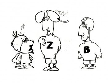 – These scrappy examples are not the best to give an indication of Letterman. But they were the ones I saved, so they’ll have to do. John Hubley drew these very early in the production, and they undoubtedly owe something to Chris Cerf‘s hilarious storyboards.
The animators involved in season one included: Tissa David, Johnny Gentilella, Vinnie Bell, Lu Guarnier and Jack Schnerk.
Helen Komar, a veteran Asst. Animator in NY, was the coordinator of the production and Gen Hirsch also colored. Gen and I got really close over the couple of years we worked together. She was the wife of Joseph Hirsch, the brilliant artist and mother of Paul Hirsch (editor of Star Wars and other incredible films) .
It was my first real job in an animation studio. Probably for this reason, I remember a lot of what happened – it was indelibly etched in my memory. I was the inker, colorist (we used markers, remember), animator of miscellaneous scenes (I think I animated some 40 scenes that first season), hole puncher, and Assistant Animator.
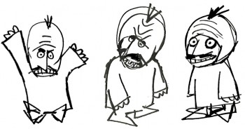 It was in the capacity as Assistant Animator that I found trouble. I hadn’t done it before, except for myself, so was horribly untrained. Because the schedule was so ridiculously tight, I had to assist in ink (Sharpie pens – the fat ones that dribbled ink and bled through multiple sheets of paper) and correctly put some of the animation – I won’t say on model, but closer to model.
Johnny Gentilella, an absolutely wonderful guy, was the farthest astream. He was THE Popeye animator at Paramount. His characters looked like Paramount characters, and I had to get them closer to John’s style. This meant assisting (in ink), inbetweening and basically redrawing everything he’d done – in a rush – without proper training. The guilt of what I was doing to Johnny’s drawings weighed heavily on me, and I eventually apologized to him for what I’d done. He laughed and told me that he had no problem with it. This was standard for NY production in those days and he was used to it. (As a matter of fact, he hired me for another job he directed months later. So I guess he wasn’t too upset. I was.)
The race against the clock was always on; my career had started, and it couldn’t have been more fun. And I was working for John Hubley.
repeated posts 15 Feb 2008 08:43 am
Recap Friday: Moonbird
- I had a recent complaint that I’d actually already thought about, so it was one I took seriously. There was a question as to why I feel compelled to post daily, thus rushing away from some of the more important pieces I post. As an example, I give the numerous Bill Peet storyboards that have been loaned to me by John Canemaker. They’re so rich, shouldn’t I keep them up longer? Let me tell you, I’ve considered it.
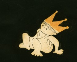 I guess my feeling is that the nature of the “Blog” is that it works more like a diary rather than a website. I do have a site for my own studio’s artwork, and the art stays fairly permanent there.
The more important pieces I’ve generally split into parts so that it continues for several days so that one is always reminded that it’s there. Of course, there is the “Search” just to the right, so that if you type in “Bill Peet”‘s name, for example, all of those storyboards will pop up.
__________________________________________A drawing from Of Stars and Men
In response to this, I’ve decided, also, to bring
back some of the posts from the past. On Fridays, I’ll pull a rerun to remind you that some gem was posted a year or two ago, and I like it enough to showcase it again.
I hope you don’t mind (let me know if you have any thoughts about this via the comment column). Here, then, is my first repeat. Some drawings – treasures – I love and cherish.
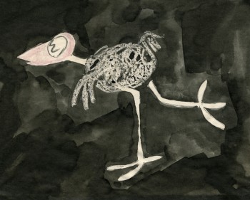 – Moonbird is one of the seminal films of 20th Century animation.
After John Hubley left UPA, where he helped explore the use of 20th Century graphics in animation, he formed a commercial animation company in Los Angeles. Apparently, with this new entity, John did less drawing and more producing. Trying to correct this problem, he closed the LA office and set up in NYC with Faith.
The studio in New York did commercials on a smaller scale. With a Guggenheim Fellowship of $8000, the couple produced a short film, Adventures of an * in 1957 and committed to doing one film a year for themselves. With this film, Hubley picked up where he’d left off at UPA. Exploration of modern art now took on the wildly successful Abstract Expressionists and told a non-verbal story using expressionist art.
The film Tender Game, done in 1958, told another non-verbal story using the song “Tenderly” to illustrate a romance, again, in expressionist art. This film, in some ways, feels like an outgrowth of Hubley’s work on the feature, Finian’s Rainbow.
In 1959, Moonbird took a giant leap forward. The art style borrowed from the expressionists, but used a method of double exposures to layer the characters into the backgrounds. Each animation drawing was painted black outside the border of its lines. Moonbird, the character, was colored with clear wax crayon and painted with black ink. The black resisted where the wax stood and gave a loose scribbled coloring. All of these painted drawings were photographed as double exposures, shot at less than 100%, to combine characters with Bgs.
The soundtrack involved an improvised track of two children, Mark and Ray Hubley, playing. These were recorded in sessions within a recording studio and massively edited down to create the final tracks.
Bobe Cannon animated the film with Ed Smith assisting. Ed inbetweened Bobe’s scenes and animated many others.
A variation of this became the Hubley method. There was usually someone working in the studio who did all inbetweens and animated some lesser scenes. A great way to break into the medium in a big way.
Some extremes by Bobe Cannon are posted below.
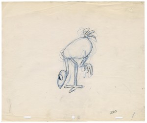
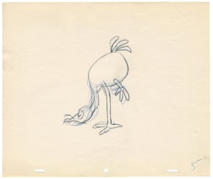
____(Click on any image to enlarge.)
____
____
____
A link to a YouTube version of the movie is available. Not as good as film in a theater, but it’s a way to watch the film.
____
____
Animation Artifacts &Events &Festivals &repeated posts 28 Nov 2006 07:43 am
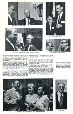
Montreal Expo 1967 – recap
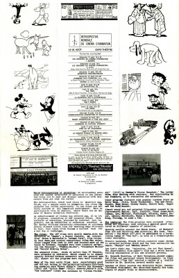
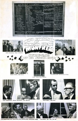
- Today I’m posting a special issue of Top Cel, the NY animation guild’s newspaper. Dated August 1967, it celebrates the Montreal Expo animation conference and exhibition held that summer. Obviously, this was the place to be that year if you were an animation lover.
 Just take a look at that list of signatures of attendees. Some of them are:
Chuck Jones, Peter Foldes, Manuel Otero, Edith Vernick, Abe Levitow, Don Bajus, Bill & Fini Littlejohn, John Halas, Ward Kimball, Ken Peterson, Shamus Culhane, Carl Bell, Pete Burness, Ub Iwerks, Gerald Baldwin, I. Klein, Gene Plotnick, Ian Popesco-Gopo, Carmen d’Avino, Bill Mathews, Len Lye, June Foray, Bill Hurtz, Spence Peel, Paul Frees, Steve Bosustow, Dave Hilberman, Stan Van der Beek, Les Goldman, Jimmy Murakami, Mike Lah, Robert Breer, Tom Roth, Art Babbitt, Feodor Khitruk, Fred Wolf, Ivan Ivanov-Vano, Paul Terry, J.R. Bray, Walter Lantz, Otto Messmer, Dave Fleischer, Ruth Kneitel, Bruno Bozzetto, Bob Clampett, Karel Zeman, Dusn Vukotic, Bretislav Pojar, Jean Image, Grim Natwick, Tissa David, Barrie Nelson, Andre Martin, Ed Smith, Dick Rauh, and John Whitney.
I guess they don’t make Festivals like they used to. There doesn’t seem to be much written about this event, and I wish some of those in attendance would write about it.
From the Wikepedia entry for Bill Tytla, there’s the John Culhane quote: On August 13, 1967, the opening night of the Montreal Expo’s World Exhibition of Animation Cinema, featured a screening of Dumbo as part of an Hommage Aux Pionniers. Tytla was invited, but worried if anyone would remember him. When the film finished, they announced the presence of “The Great Animator.” When the spotlight finally found him, the audience erupted in “a huge outpouring of love. It may have been one of the great moments of his life,” recalled John Culhane. I’m sure there were many such moments.
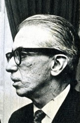 Just to make it all personal, let me tell you a story, although this has nothing to do with Montreal’s Exhibit.
Pepe Ruiz was the u-nion’s business manager. In 1966 – the year prior to this expo – I was a junior in college, determined to break into the animation industry. Of course, I knew the military was coming as soon as I graduated, but I called the u-nion to have a meeting with Pepe. I wanted to see what the likelihood of a “part time job” would be in animation. This took a lot of courage on my part to see what the u-nion was about. I pretty well knew part time jobs didn’t exist. There was no such thing as interns back then.
Pepe was an odd guy who kept calling me “sweetheart” and “darling” and he told me that it was unlikely that I could get something part time in an animation studio.
However he did send me to Terrytoons to check it out.
I met with the production manager, at the time, Nick Alberti. It was obvious I was holding up Mr. Alberti’s exit for a game of golf, but he was kind and said that part time work wasn’t something they did. (He moved on to Technicolor film lab as an expediter after Terry‘s closed. I had contact with him frequently for years later, though I never brought up our meeting and doubt he would have remembered it.) Ultimately, I was pleased to have been inside Terrytoons‘ studio before it shut down shortly thereafter. A little adventure that let me feel as though I was getting closer to the world of animation.
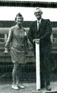
The photos of the Expo are worth a good look. I’ve singled out those above to place around my text. The picture of Tissa and Grim is a nice one of the two of them together.
Ed Smith was the Top Cel editor at the time, and he put together a creative publication.
 1
1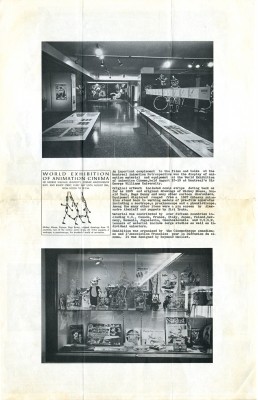 2
2
(Click on any image to enlarge.)
