Category Archiverepeated posts
Illustration &repeated posts 07 Sep 2013 11:50 pm
Emergency Mouse – repost
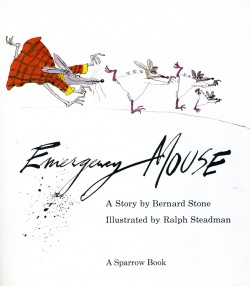
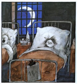
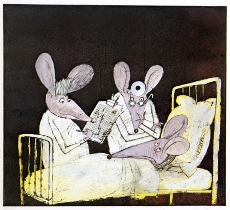
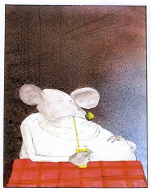
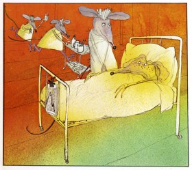
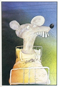
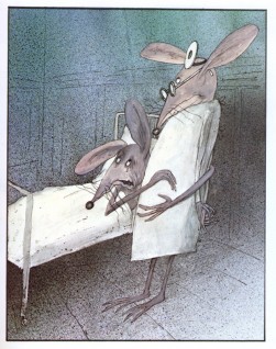
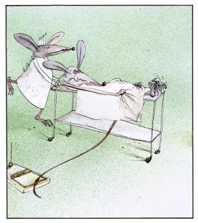
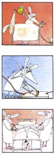
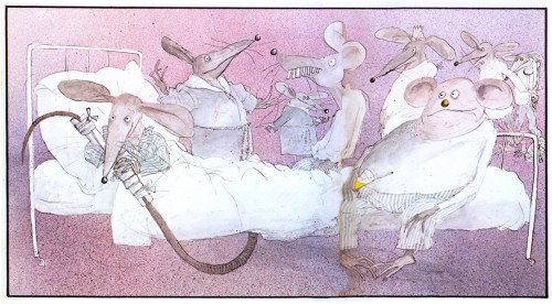
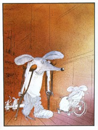
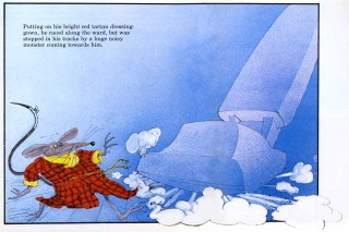
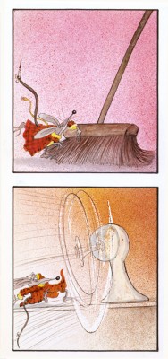
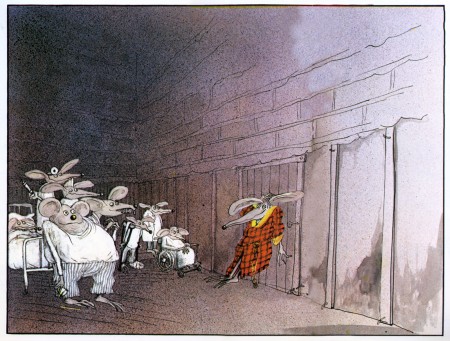
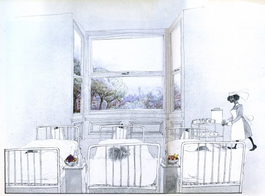
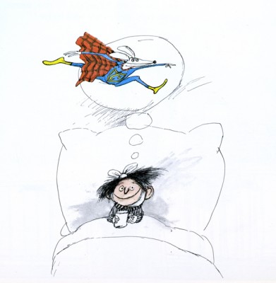
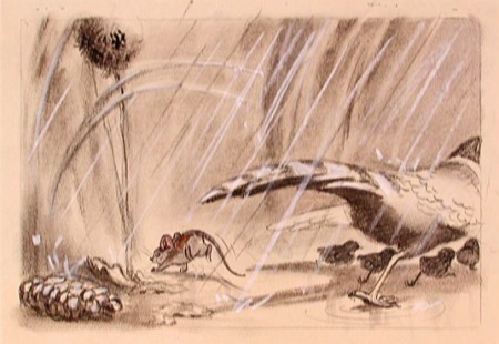
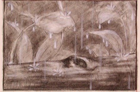
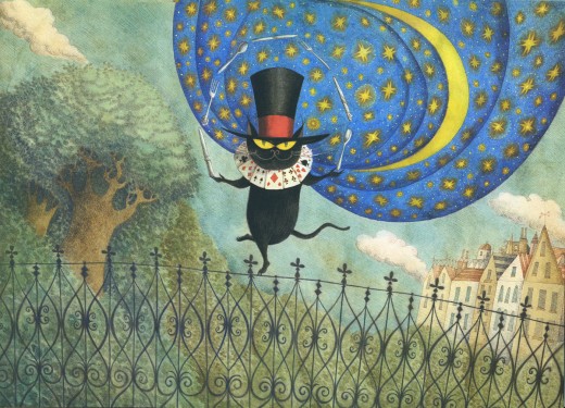
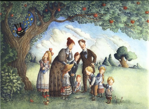
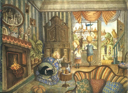
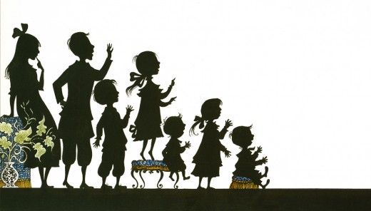
- Have I mentioned more that a dozen times in the last few weeks, that I’m a fan of Ralph Steadman’s artwork. Here we take a short break from Ralph Steadman‘s Alice in Wonderland to post something original from him, Emergency Mouse. The guy’s a real artist. Here’s a few pages from the book:
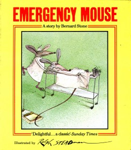 – I’ve been a Ralph Steadman fan/collector for most of my life. I love the guy’s work and would give anything to be able to do anything remotely as well as he does.
His versatility with pen and ink, dyes and watercolors doesn’t quite hide the magnificent draftsmanship behind his illustrations. Many try to copy his style and none have come close – though Gerald Scarfe has made a nice living off of a similar style – though a bit sweeter. Others, more academically inclined, those who swear by the Bauhaus rules, tend to turn their noses up at his work. I like to think of Steadman as the Jim Tyer of illustration.
Regardless, the work is brilliant. His art always has an amazing intelligence carrying it to the highest pinnacle. It breaks the rules and makes new ones. Illustration comes damn close to Art.
Not too many people have focused on his children’s books, and there are many. Not least is the series of “Mouse” books he’s done with Bernard Stone. Here is Emergency Mouse, a good example. I’ve not lifted the script but am merely showcasing the illustrations. Unfortunately, this also takes a bit away from the book design which is unique on its own. The type is well placed to balance off the different sized illustration.
If you want to read the story, you’ll have to get the book from the library – or buy it.
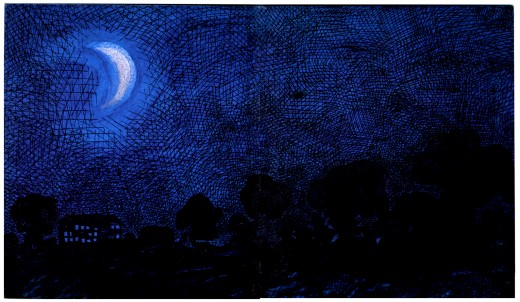
(Click any image to enlarge.) This is the inner cover. ____
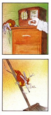 14
14
Articles on Animation &Commentary &repeated posts 02 Sep 2013 01:12 am
Labor Day Reader
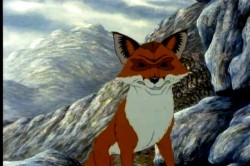
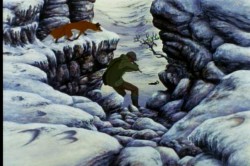
 - I’ve been watching some older animated features lately. Plague Dogs, I thought, deserved another chance, so I rented the DVD. I was right. The film is a very odd one.
Surprisingly, despite the depressing subject, I found myself unattached to the story’s emotions. I would guess it has to do with the direction of he work.
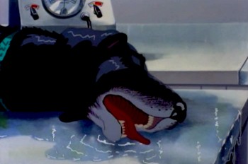
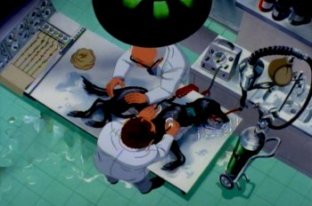
The film starts with one of our two lead characters
in deep trouble in the laboratory.
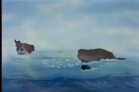
The story is essentially the story of two dogs who escape a laboratory that experiments on animals, and they make their way across the British countryside while teams of people search for them. One of the dogs has been inflicted with a plague bacteria and could spread the disease outside of the lab.
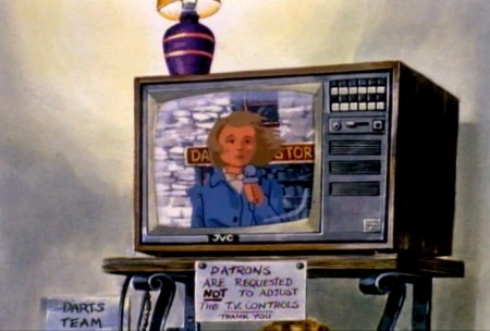
The story is told through a sort-of narration done in a very clever way. Disconnected human voices talking about the situation are used as voice over. We don’t often see who’s talking but we hear their voices. There are times where the voices start and we join the speakers in their conversations. The two dogs communicate with each other and a fox, who helps them in their escape.
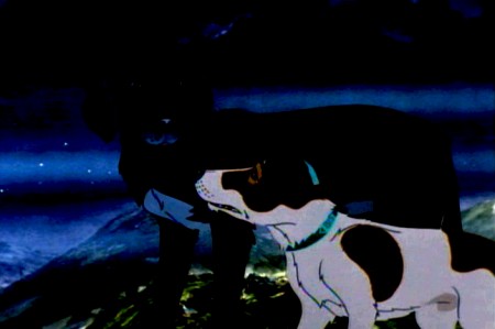
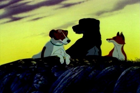
The dogs escape and travel the back roads in the mountains.
The animation throughout is just about serviceable. No scenes really shine even though there are a couple of standout names in the credits – including Brad Bird, Tony Guy and Retta Scott – as animators.
The film was a follow-up project for producer/director, Martin Rosen. He was the original producer of Watership Down, and his ego allowed him to think he could direct that film better than John Hubley, who was fired within the first six months.
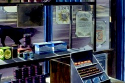
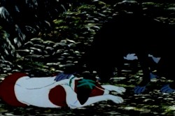
There’s the constant play between the traveling dogs
and the humans who talk about their roaming the countryside.
It’s no surprise that Plague Dogs includes no poetic scenes such as the introduction and the “Bright Eyes” sequences of Watership Down. It’s all down and heavy, done with a lack of grace. Yet, despite this there are several very clever devices for keeping the story moving forward. It would have been nice to see what better animation and a better director might have brought to it.
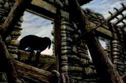
However, the film’s tough subject matter was sure to bring back poor business, and there’s no surprise in its low grosses at the box office. However, as I’ve said, the film deserves another look.
The film gasps for air with the heavy approach, though it deserves
praise for trying to be different and take animation seriously.
I can remember being in England, mixing the voice track of Tim Curry for that film. The recording engineer talked about having to sit through Plague Dogs so many times while mixing it, and explaining how the film had to fail at the box office. He talked in similar terms about When the Wind Blows which, at the least, had Raymond Briggs and David Bowie behind it. Not quite such a miserable failure as Plague Dogs, it still didn’t do well.
I’d always thought that “Doctor Rat” by William Kotzwinkle would have made a better animals-escape-lab story. It’s certainly a better read.
Action Analysis &Animation &Animation Artifacts &Commentary &Hubley &repeated posts &walk cycle 02 Aug 2013 04:29 am
Marky’s Walk, cycled
 - If I had to choose who was my favorite animator, I’d have a tough time. Equal credit would probably have to go to three different people: Bobe Cannon, Tissa David and Bill Tytla. Jim Tyer and Ed Smith would fall just a smidgen below these three, for me. But there are none like them all, as far as I’m concerned.
I’ve posted a lot of drawings from Tissa and Bill Tytla, but have very few drawings by Bobe Cannon (nor have I seen many published anywhere.)
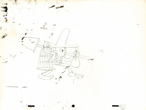
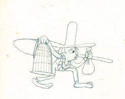
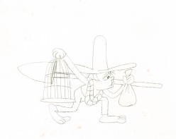
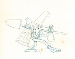
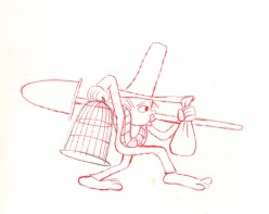
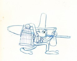
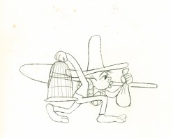
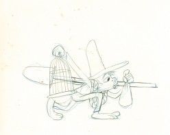
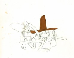
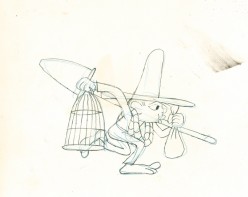
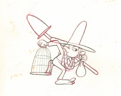
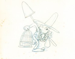
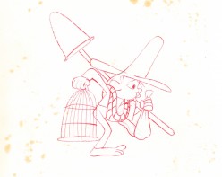
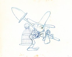
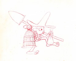
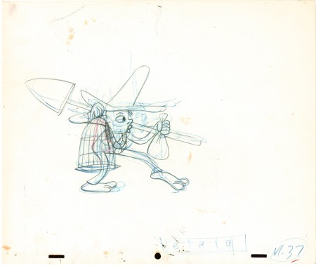
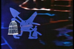 Here is a walk cycle from the beginning of Hubley’s monumental short, Moonbird. The odd numbers are extremes by Cannon, and the inbetweens (even numbers) were done by Ed Smith. Three different sized papers were used for this, and you can view them full sized if you click the thumbnails.
You’ll notice there’s paint all over the drawings. The ink & paint involved tracing the drawing, then using oil paints to cover all of the clear area in black. Some of that paint seeped onto the originals. In one drawing even to coloring the hat accidentally.
 37
37(Click any image to enlarge.) “Marky” walk cycle from Moonbird
On twos at 24FPS
Click left side of the black bar to play.
Right side to watch single frame.
There’s a lot more to this scene including several variants on the walk.
At some future time, I’ll add the other drawings to show off the entire scene.
Books &repeated posts &Story & Storyboards 24 Jul 2013 08:54 am
N by NW – rerouted
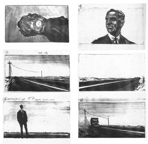
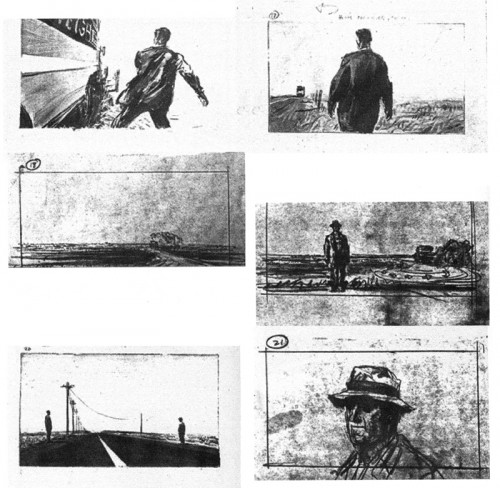
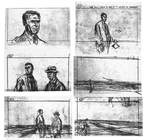
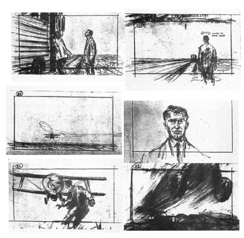
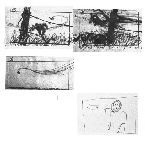
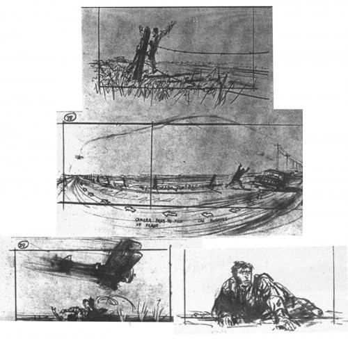
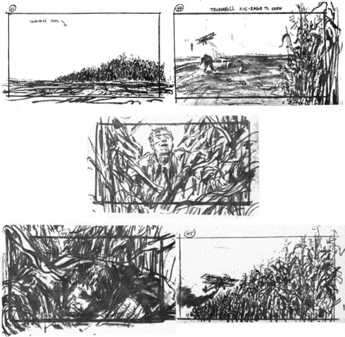
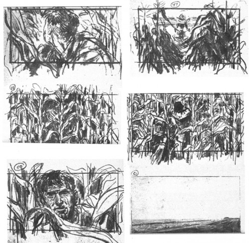
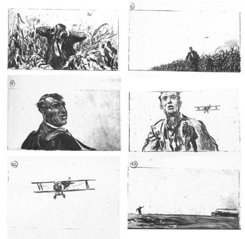
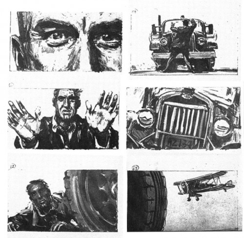
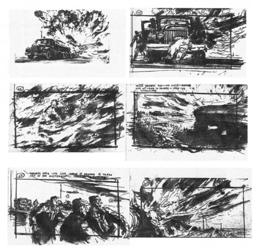
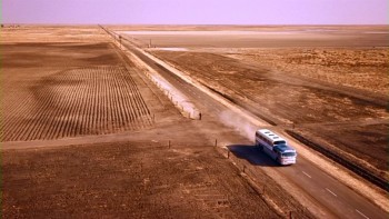 - Thanks to the site 1000 Frames of Hitchcock (and thanks to Mark Mayerson for leading us there) we can view a frame by frame analysis of Hitchcock’s works. This is essential for any film lover or storyboard designer. These films are the masterworks and our foundation.
North By Northwest features one of the most studied film sequences of all time. By going to the photo-site, you can truly look at how the scenes break down into their montage.
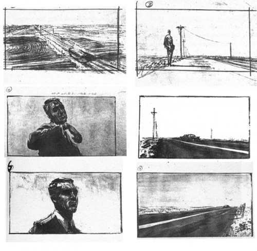
This encouraged me to put up the boards I have from a book entitled Hitchcock’s Notebooks by Dan Auiler. Auiler says that once Alfred Hitchcock completed the script with Ernest Lehman, they handed this sequence to storyboard artist Mentor Huebner and gave him free reign to do as he thought fit. If you study the photos from the film, on the new site, you’ll see that one doesn’t exactly duplicate the other. I caught a mispublication in that some of the drawings were printed out of order in the book. Regardless, certainly the mood of the sequence is here, and the cutting style is established.
This is Huebner’s board:
 1
1
____(Click any image to enlarge.)
Animation &Animation Artifacts &Articles on Animation &Disney &Illustration &Models &repeated posts 29 Jun 2013 03:51 am
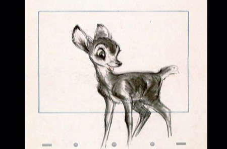
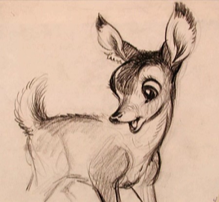
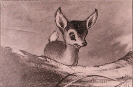
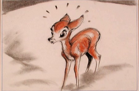
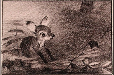
Young Bambi – repost
- It all starts with a drawing.
The brilliant host of cartoonists that came before us were an amazing group. To think of the complicated set of characters that the created. Characters with complex personalities and sophisticated drawing techniques.
Those characters went trough the mill in my own life time. Seeing the horrendous things that have happened not only to Mickey, Donald and Goofy but to Bugs, and Daffy and other Warner’s Bros characters. It’s been shameful.
I was going to post illustrations of some of those bastardizations, but I think it’s enough just to mention some of them.
Think of the Mickey Mouse Clubhouse running now on the Disney Channel. If ever there was proof positive that cgi weren’t cartooning, that would be it. Those are very unsophisticated digital puppetry shows where every move is obvious and preplanned, the voices are hideous, and the stories nowhere sophisticated enough to call trite.
Take a quick jump from those to the flash animated whirls that are being released with a lot of fanfare, and you’ll see what can go wrong with animation of stars. They may as well have dug Marilyn Monroe and Clark Gable out of the ground to allow the computers to move them as well. Like all new animation that’s being called good, these beasts-of-films are moved at the speed of light where no move gets to have any personality. Think of that naked Mickey in the most recent release. A thin slime of a creature, all black, that looks like a clam being animated by a Jim Tyer. There isn’t a pose in the film that could compare with what Terrytoons did – Terrytoons, the bottom of the barrel. They had personality all over these poorly drawn efforts.
There were the old Greg Ford versions of the WB characters for theatrical release, compilations of old with new. They were all mediocre but had the honor of the past directors in mind. The Bakshi Mighty Mouse cartoons were a take on their group of characters, but you had someone with a personality, Bakshi, trying to do wonders with a library of “B” stars. Even with the TV budgets, they were trying hard to do something, and often they were successful.
Today it’s all for poor exploitation, and no one is trying to do wonders with their characters. It’s all too sad.
The WB characters have had even greater attempts at poor art. You don’t have to think back too far to remember the sitcom version of the characters now running on Cartoon Network, also done in Flash. Think back to the poorly designed wretches that WB issued to their local network of stations, the WB. Those poor animated creatures were redesigned versions with scales and all. It’s just about time to scream, “Enough!” Is there not one executive who can offer some honor to these golden characters of our past? How much do we have to watch?
Why did these studios create their archives? Was it just to resell the goodies or was anything preserved so that the future animators could do right by these characters?
- It all starts with a drawing.
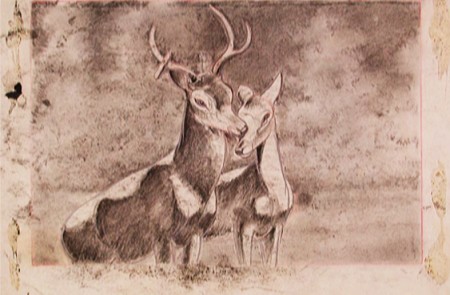
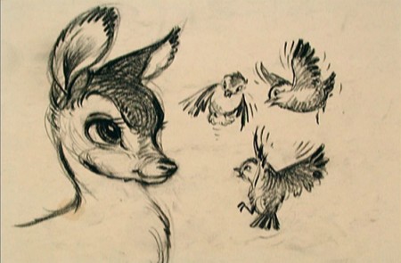
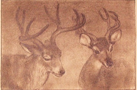
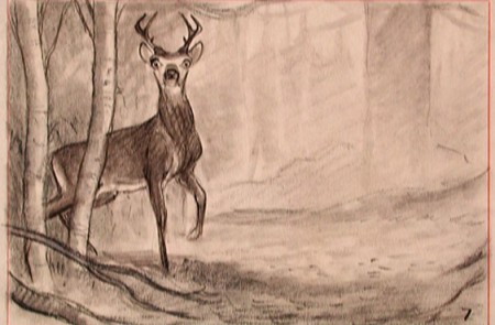
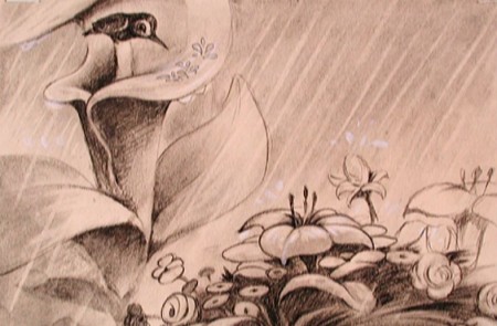
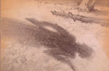
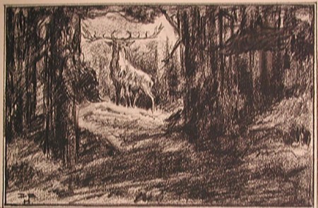
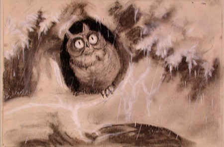
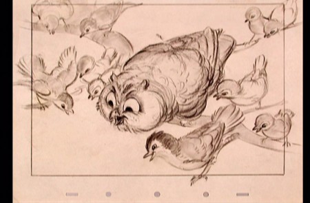
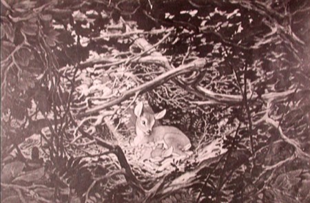
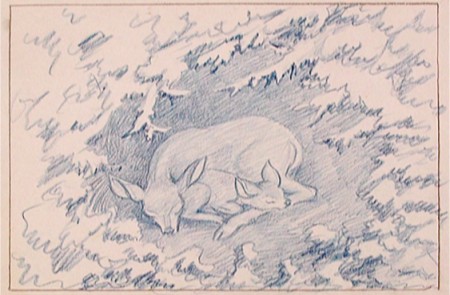
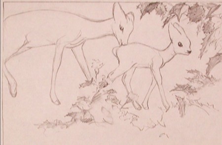
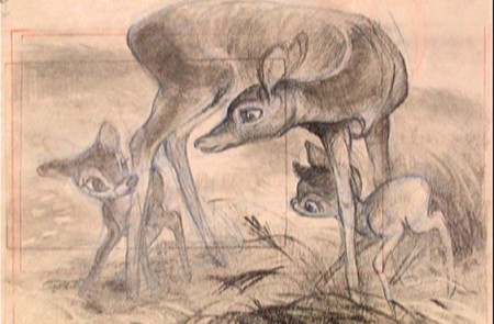
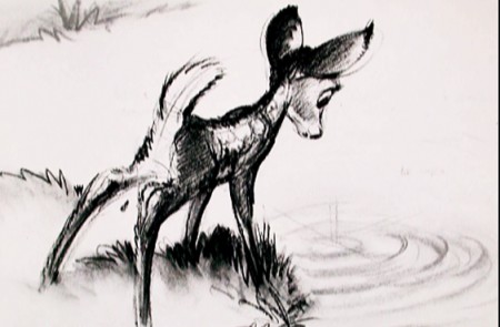
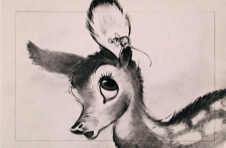
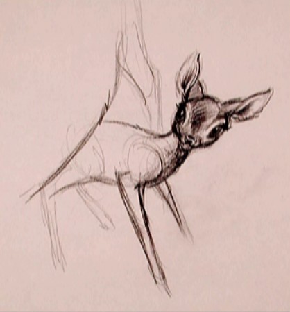
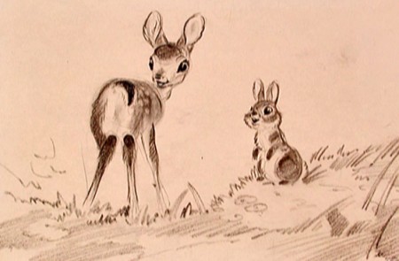
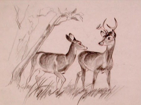
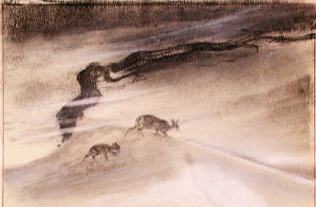
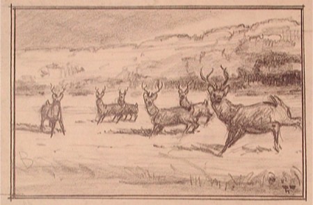
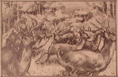
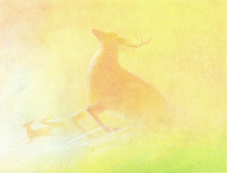
That’s all I can think. With that I’m just going to post a number of gems from Bambi. These had to have had some purpose greater than feeding Bambi !!. Or maybe I’m wrong.
Bambi is, to me, one of the most beautiful of animated features. Collectively, the artists at the Disney studio pulled together to create some wonderful artwork which produced a wonderful film.
The initial work went through many phases, as would be a natural state for animation. However, all of the artists seem to be trying for a higher plane, and oftentime they reached it.
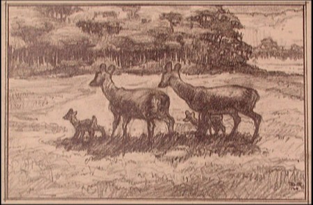
To celebrate the latest release of this film, the Blu-Ray/DVD version, I’ve pulled a lot of the drawings from the film and post them here. It’s amazing how much influence Marc Davis had early on. I can only ID the artists of some of the sketches. If you know, let me know. We have to continue to ID these artists. Without their names we just have these flash animatedMickes that don’t even include one credit. And maybe they shouldn’t be credited; the work is so embarrassing.
 1
1David Hall
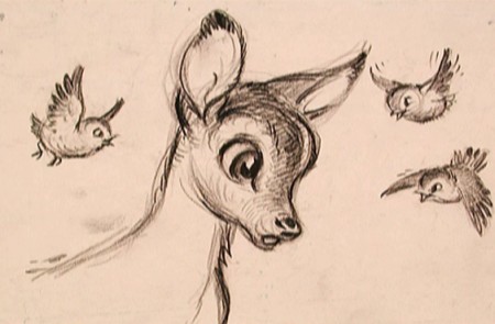 3
3
(above and below) Marc Davis
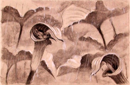 7
7
(above and below) Ken Peterson
Bill Peckmann &Books &Comic Art &Disney &Illustration &repeated posts 26 Jun 2013 06:29 am
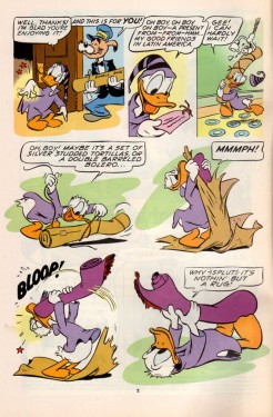
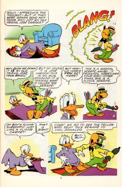
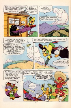
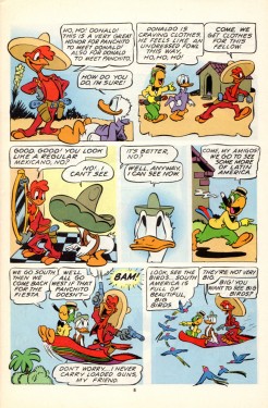
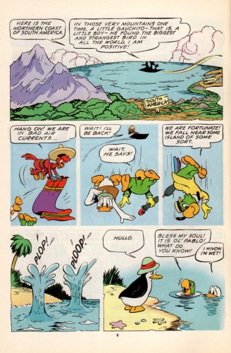
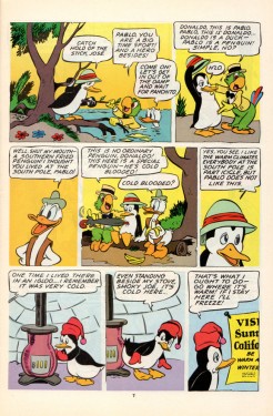
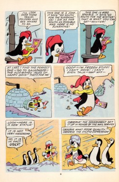
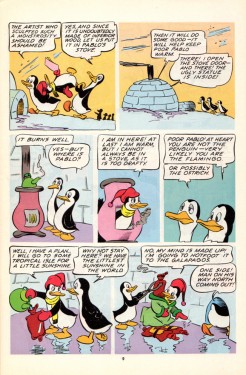
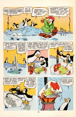
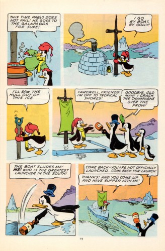
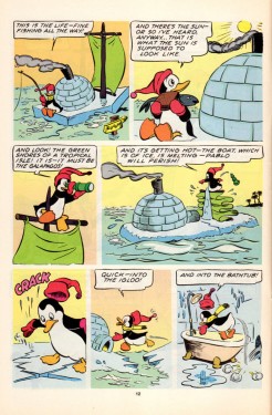
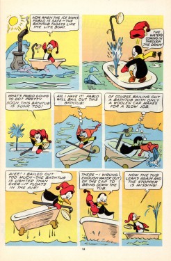
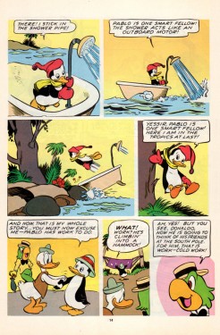
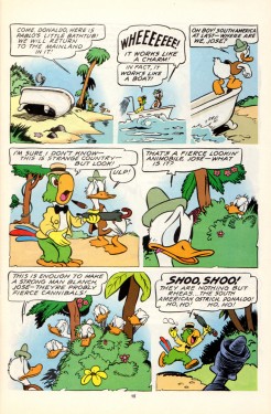
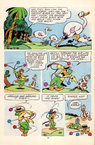
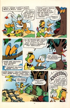
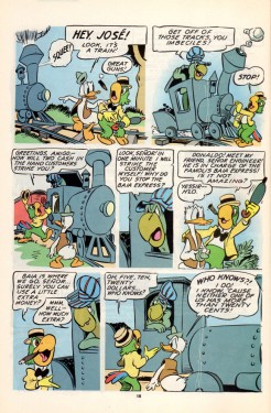
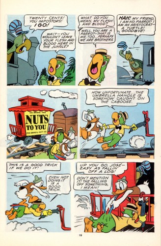
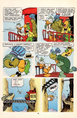
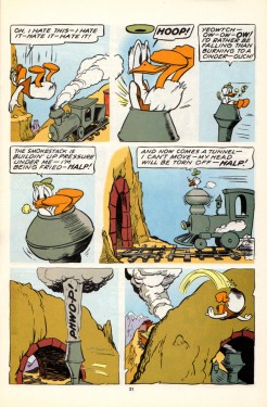
Kelly’s 3 Caballeros, again
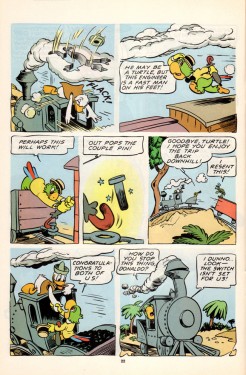
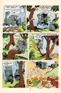
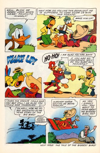
- Suppose we had a comic book version of The 3 Caballeros; wouldn’t that be fun to see? What if the artwork were done completely by Walt Kelly; would that make it a treasure? I think it does. Bill Peckmann made my week when he sent me the scans to the following comic book. As Bill wrote to me: “Beautiful stuff, like Barks’ art, it’s timeless, looks like it was done yesterday.”
However there’s some residue floating about. Sorry about that, but it is Kelly’s residue.
Not only is the artwork out of this world, but the quality of the printing is brilliant. And the quality of the book, itself, is wonderfully well preserved. You only have to look below to read it. Take your time; this is great.
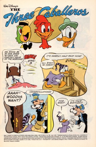 1
1
Many thanks to Bill Peckmann for sharing this gorgeous material with us.
Action Analysis &Animation &Animation Artifacts &Commentary &Fleischer &repeated posts 18 Jun 2013 07:41 am
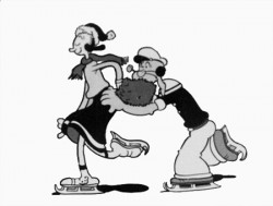
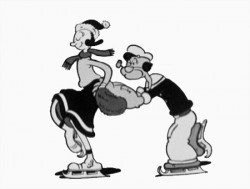
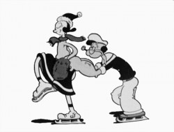
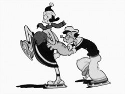
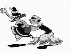
Popeye and Olive Cycle – repost
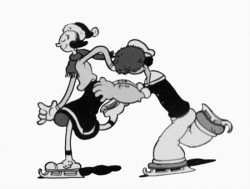
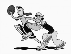
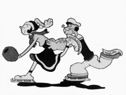
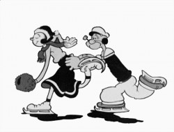
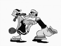
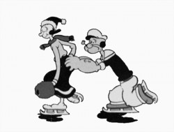
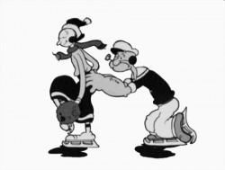
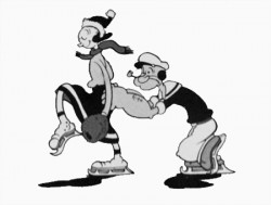
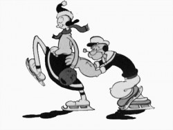
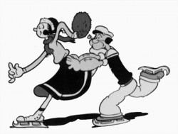
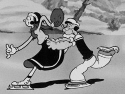 – Here’s a good example of something you won’t see animated in cgi. This is an ice skating cycle out of a Popeye cartoon, Seasin’s Greetinks!. It’s, of course, on the Popeye dvd, and is animated by Roland Crandall and Seymour Kneitel.
These Fleischer cartoons are so original in their jokes that there’s always a surprise or ten in every scene. The twists and turns are designed only to get laughs; I can give you a dozen examples from this short alone, but I’ll just recommend you watch the film.
It’s not just the stories that take odd spins, it’s the animation as well. There are bits that move in their own idiosyncratic way that are designed purely for laughs. Eccentric movements that would rarely show up in a Disney film dominate these Fleischer shorts.
Check out this cycle. Every eighth drawing is completely off the book. It gives the cycle a hilarious turn and completely dominates the move. It’s probably not the best way to build 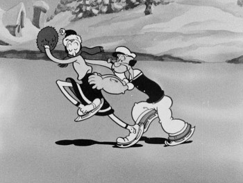 character (unless, perhaps, only one character moves like this), but it sure makes for some funny animation.
The thing about these Fleischer films is that it moves this way all the time. There’s always something about to take you for an odd turn, and while you’re looking for the big move, you’re just buying these small ones. The effect is cumulative, and the animation in these Fleischer films is just plain wacky.
A cgi animator doesn’t look for the odd twist in every frame. They can, but it wouldn’t make sense to be doing it that way, especially when the goal is to make the animation fluid in the final. The animation is too based on real life, as the computer sees it, and the individual frames don’t exist in the same way they do in 2D paper animation. There’s more risk in the 2D mode, but the reward can also be more ingenious and gratifying.
But what do I know? I don’t animate with cgi, and I’m just making a supposition based on what I’ve seen so far. Everything’s possible, but it sure doesn’t seem probable from my seat.
Having said that, let me also say that there aren’t too many animators doing 2D animation like this anymore. Maybe that’s the complaint I really have. Invention and daring in our medium seems to be a thing of the past.
 1
1 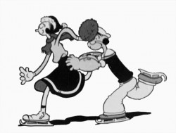 2
2
(Click any image to enlarge.)
Books &Errol Le Cain &Events &Festivals &Illustration &repeated posts 17 Jun 2013 04:52 am
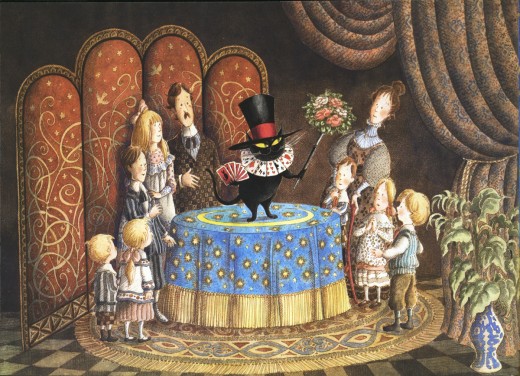
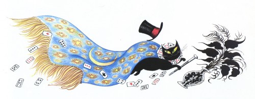
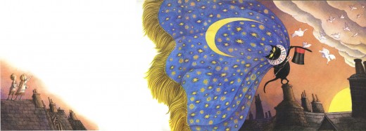
Mr. Mistoffelees – repost
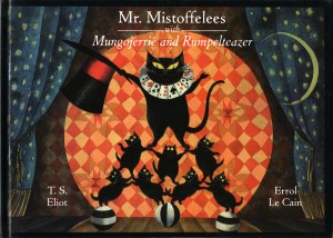 – I’ve posted many of Errol Le Cain‘s illustrations for his children’s books. Ever since coming across that very first paper-bound book, about Briar Rose, (meaning it was the very first I’d seen for sale) I’ve been an avid collector searching out any of the many books he created.
Le Cain was my hero for quite some time. He was a student of Dick Williams’ studio, had learned to animate there and was doing the backgrounds for Dick’s feature The Thief and the Cobbler. Dick pushed him, at one time, to do a film on his own, The Sailor and the Devil, with, of course, Dick’s harsh scrutiny.
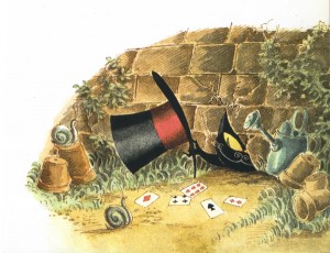
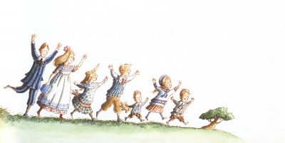
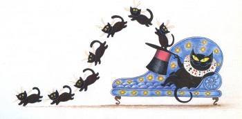
I present here his illustrations for the first half of the book, Mr. Mistoffelees with Mungojerrie and Rumpelteazer. The latter half of the book included the Mungojerrie and Rumpelteazer part which we’ll save for another time.
This story is part of the Old Possum’s Book of Practical Cats by T.S. Eliot.
That was, of course, the source material on which Webber and Nunn based their show CATS. These images are so attractive and stylish, I was quite curious to know whether Andrew Lloyd Webber had seen the books. Especially when he was about to put CATS onto the screen as an animated film.
Here are the illustrations by Le Cain:
________ (Click any image you’d like to enlarge.)
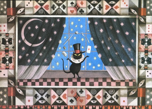
_____________Mr. Mistoffelees
___________You ought to know Mr. Mistoffelees !
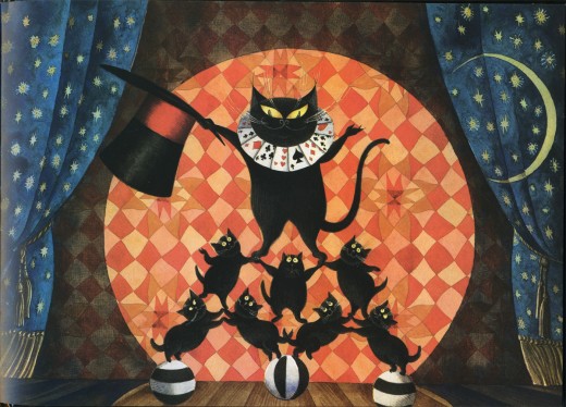
___________The Original Conjuring Cat -
___________(There can be no doubt about that).
___________Please listen to me and don’t scoff All his
___________Inventions are off his own bat.
Animation &Animation Artifacts &Commentary &commercial animation &Models &repeated posts 13 Jun 2013 09:07 am
Jax Beer – recap
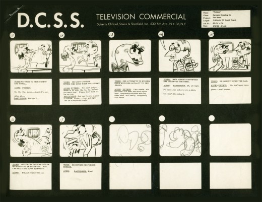
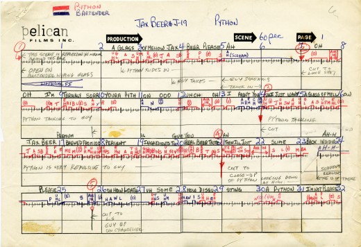
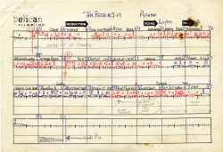
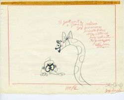
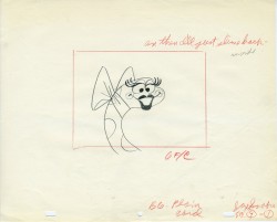
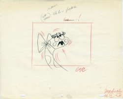
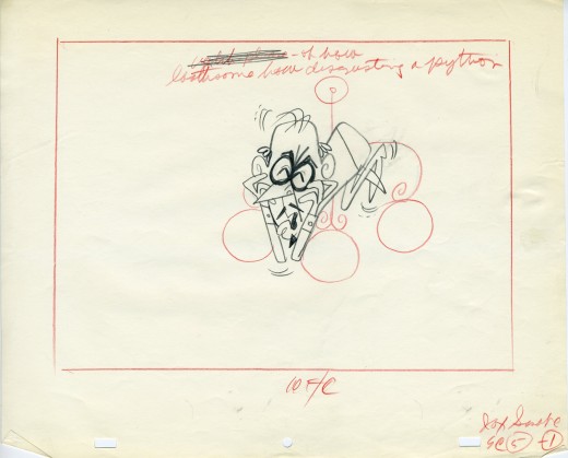
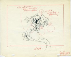
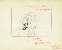
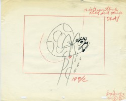
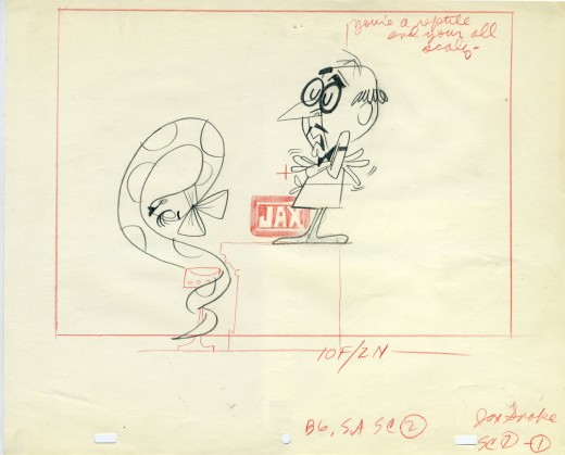
- In November 2006 I posted the storyboard, workbook and final layouts for a Jax Beer spot which was directed by Mordicai Gerstein. I thought it interesting enough to recap the two posts, so here they are.
- This is the material for a Jax Beer commercial. It was done by a NY studio named Pelican in 1962. There were about 75 people on staff at Pelican back then.
This spot was directed by Mordi (Mordicai) Gerstein. He left animation in th 70′s to write & illustrate children’s books. (He won the Caldecott Medal for his book, The Man Who Walked Between The Towers. This was the book I adapted to animation in 2005.)
What follows is the storyboard and the director’s workbook. (It appears to be an agency board, though it’s drawn in a style that looks to be Mordi Gerstein‘s. Perhaps boards from the agency were drawn by the studios back in 1964; I’m not sure. The layouts were drawn by the same artist.)
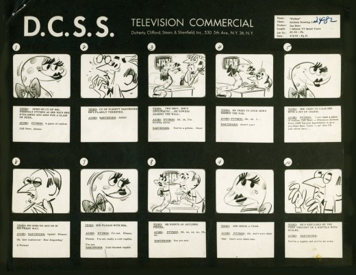
_____(Click any image to enlarge.)
The workbook has several flaps on it that indicate changes in timings. There are also glue stains where I assume other flaps fell off. (See page one, last row, first column.) Each column represents 16 frames/one foot of film. Odd numbers are marked off.
Each row contains 8 feet of film/128 frames. Each page represents 32 feet/512 frames. It would have been smarter to keep to even numbers.
More modern exposure sheets generally have 80 frames/five feet per page. This also divides into two feet of 16mm film. (Handy.) The numbers add and divide smartly and easily. But then most people don’t use exposure sheets anymore.
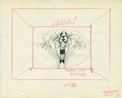
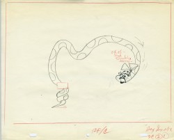
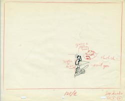
 - Continuing with the above post, a Jax Beer commercial, I present some of the film’s layouts. This represents about 2/3 of them.
The art was done by Mordi (Mordicai) Gerstein, who also directed the spot. Grim Natwick animated the spot and Tissa David assisted him. Of course, this was in the days before auido tapes could be handed out, so the animator would get a phonograph of the soundtrack. They could mark it with a white pencil to indicate key spots.
I thought that this in conjunction with yesterday’s prep material gave a good indication of the preproduction that went into making a commercial back in 1962.
That said, here are the layouts:
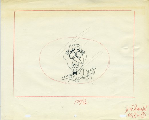
(Click on any image to enlarge.)
Animation &Books &Disney &repeated posts 11 Jun 2013 03:42 am
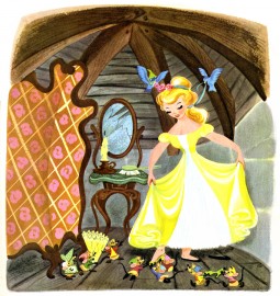
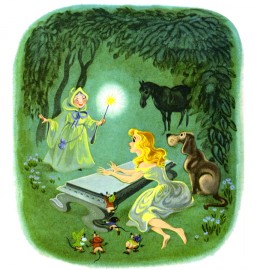
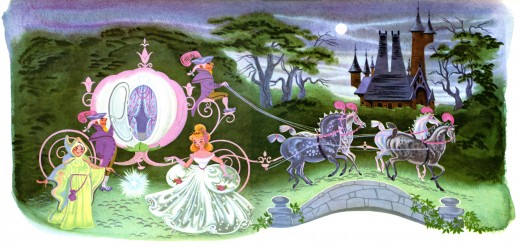
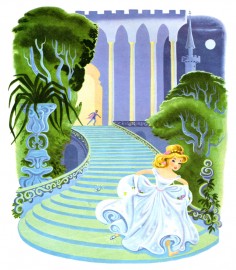
Retta Scott and Cinderella – repost
– Retta Scott‘s name was always an intriguing one for me.
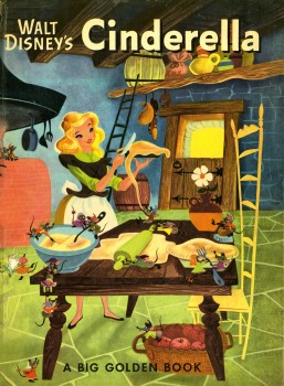
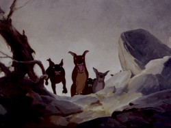 She was an animator on Bambi, Dumbo and Plague Dogs. She was layed off at Disney’s when they hit a slump in 1941 but came back to do a number of Little Golden Books for Disney. The most famous of her books was her version of Cinderella, one which was so successful that it remains in print today as a big Little Golden Book.
When asked why females weren’t animators at the studio, the Nine Old Men who traveled the circuit, back in the 1970′s, often mentioned her. They usually also said that she was one of the
.
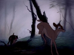
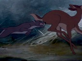
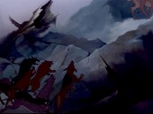
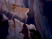
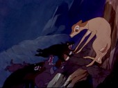
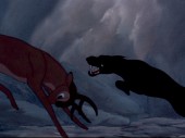
most forceful artists at the studio, but her timing always needed some help (meaning from a man.) Ms. Scott was known predominantly for her animation in Bambi. Specifically, she’s credited with the sequence where the hunter’s dogs chase Faline to the cliff wall and Bambi is forced to fight them off.
The scene is beautifully staged and, indeed, is forceful in its violent, yet smooth, movement. I was a young student of animation, so this sequence had a long and lasting impression on me.
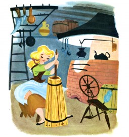
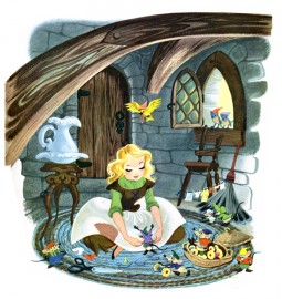
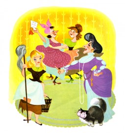
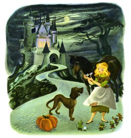
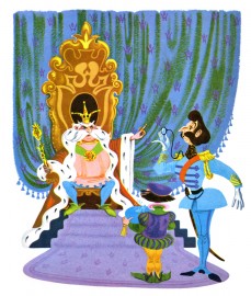
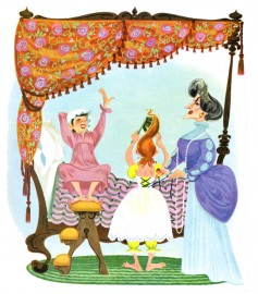
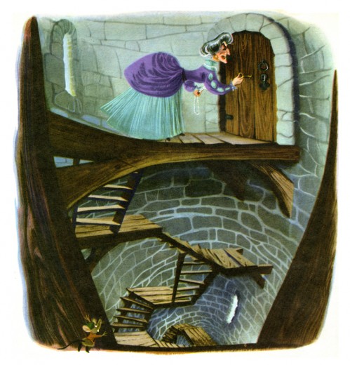
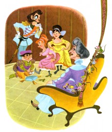
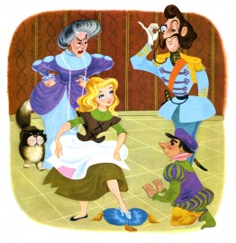
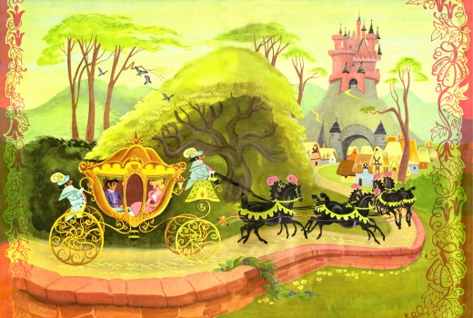
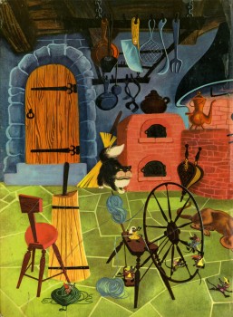
Here are some of her illustrations for Cinderella published in 1950 to tie in with the Disney film. Oddly, the illustrations don’t completely look like the film’s characters. The cat and mice are close, but Cinderella, herself, is very different, less realistic. She looks more like a Mary Blair creation. When I was young, I was convinced that these were preproduction illustrations done for the film. If only.
I won’t post all the illustrations of the book; I want to give an indication of her work, and I think this should be enough to do that.
(Click any image to enlarge.)
