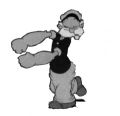
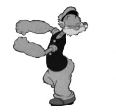
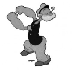
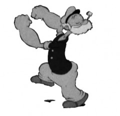
Category ArchiveFleischer
Animation Artifacts &Fleischer &Story & Storyboards 09 May 2012 06:00 am
Popeye Storyboard – part 1
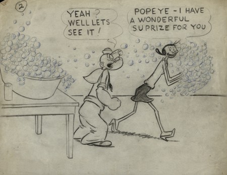
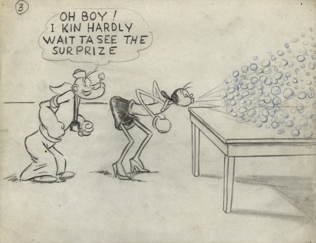
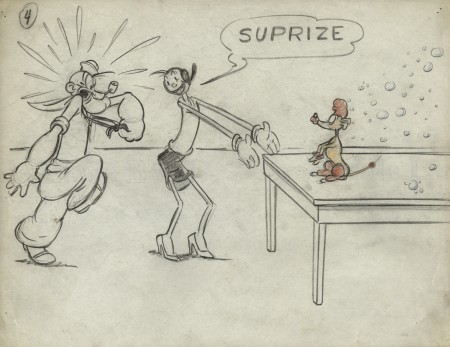
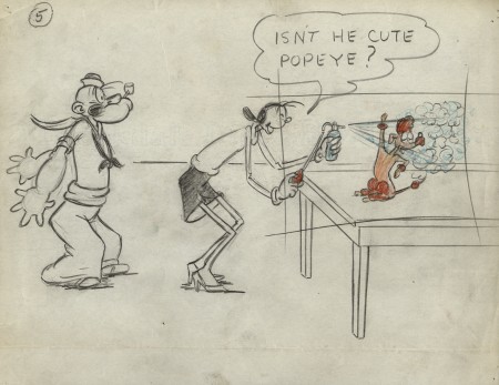
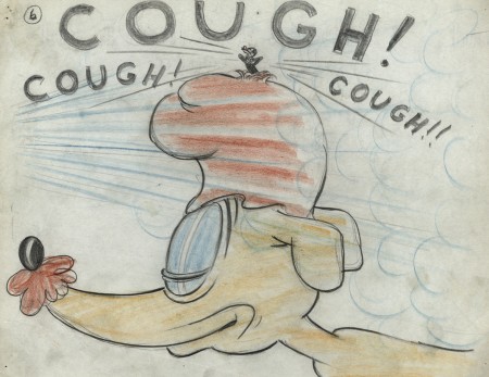
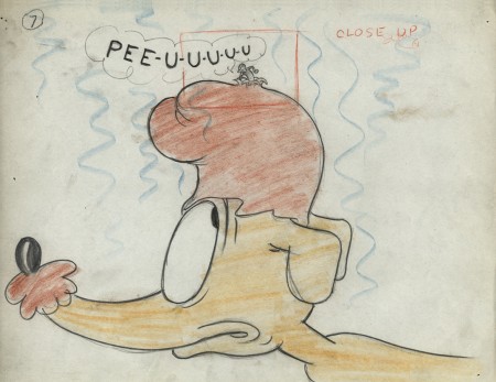
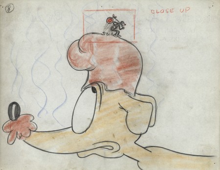
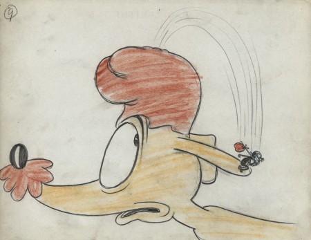
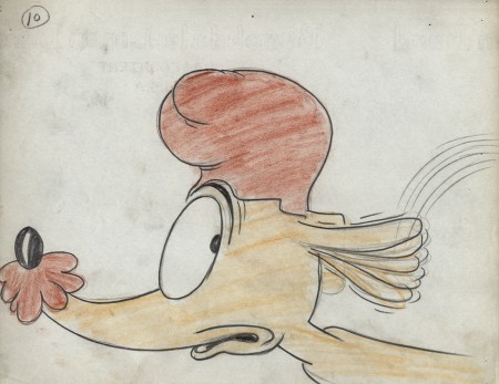
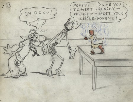
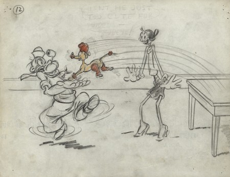
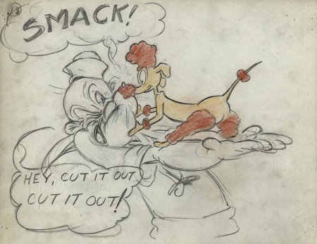
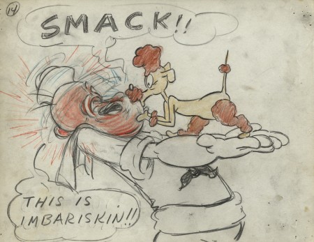
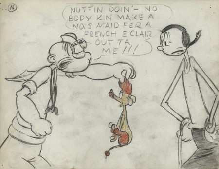
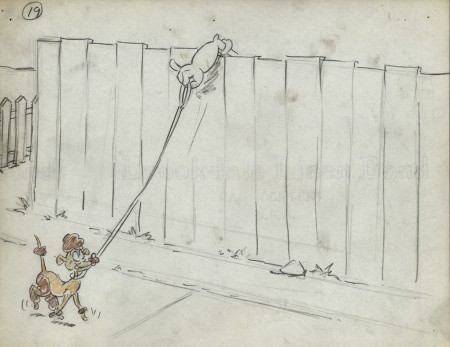
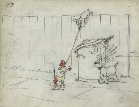
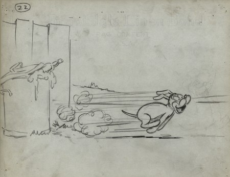
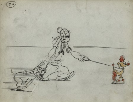
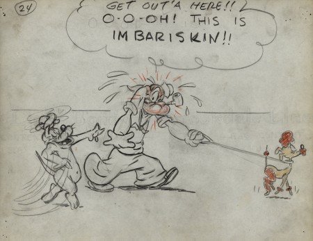
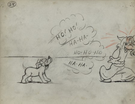
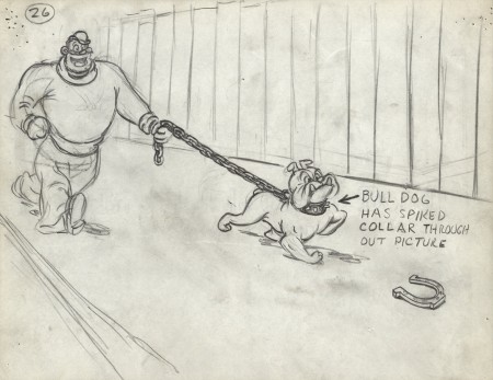
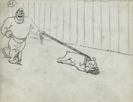
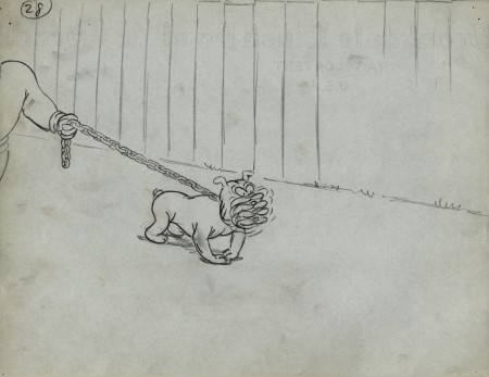
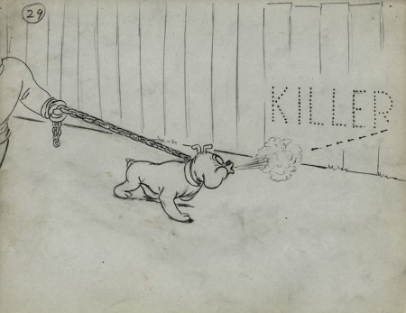
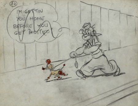
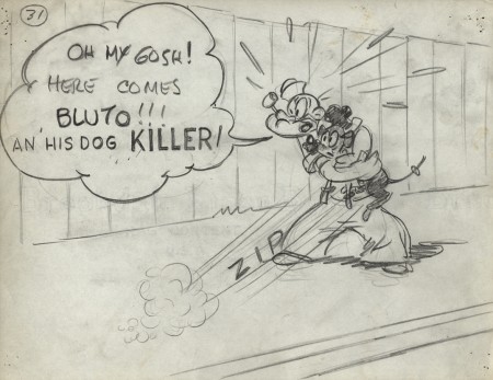
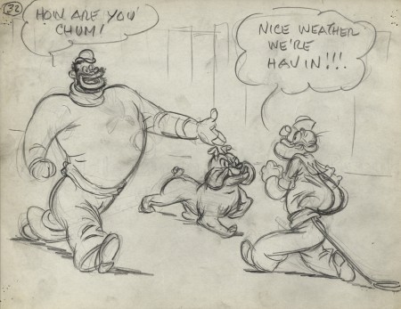
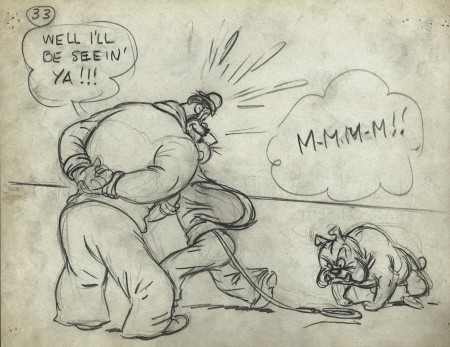
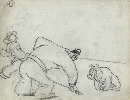
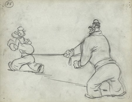
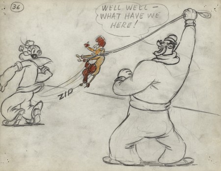
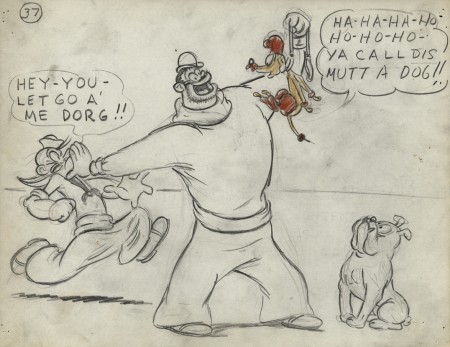
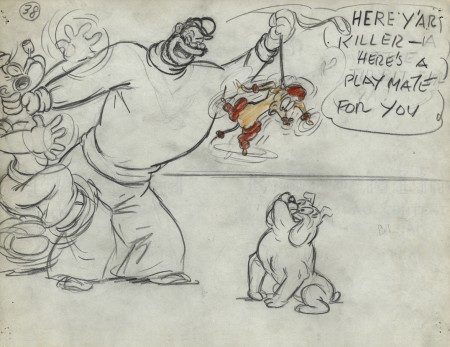
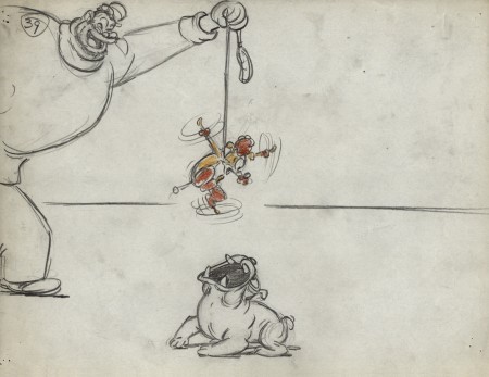
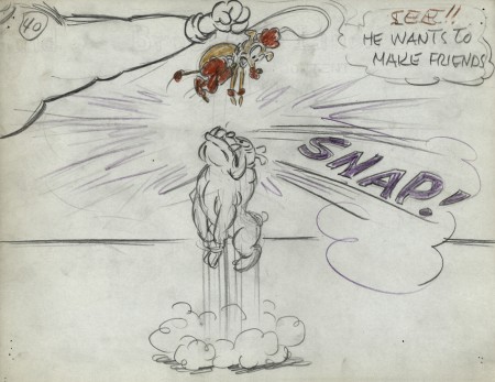
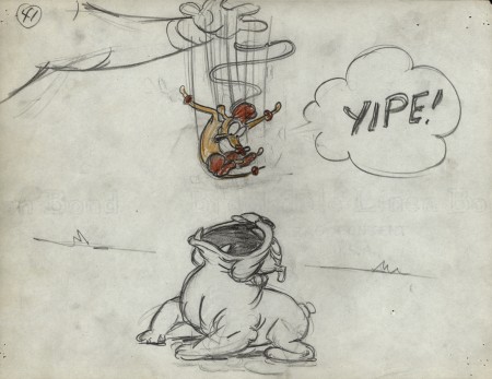
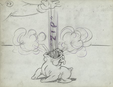
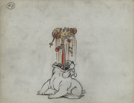
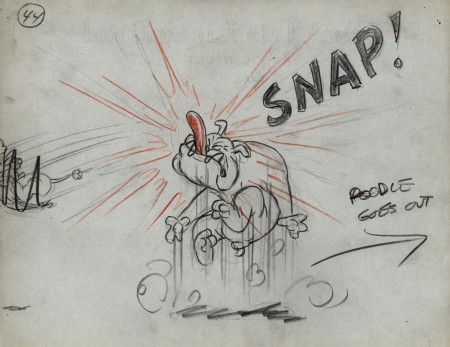
- Last week I introduced you to the late Vince Cafarelli‘s collection of animation artwork. This is a collection of artwork he had saved from the different studios he worked at. A solid part of the collection is this storyboard from the 1949 Popeye cartoon, “Barking Dogs Don’t Fite.”
The story and storyboard was done by Jack Mercer and Carl Meyer. I’m sure you recognize Jack Mercer’s name as the voice of Popeye, but he was also the voice of Swat the Fly in Hoppity Goes To Town. Carl Meyer voiced his partner, Smack the Mosquito. I love the drawing style of one of them (I don’t know who did which); it’s reminiscent of some early twenties comic strip art. The two artists draw Olive very differently. One draws a circle for a head; the other gives her a bubble cheek, and this is the one I favor. I also love his Popeye. It’s too bad the film looks so mediocre in its final incarnation. For some reason, they’ve given Popeye a powder blue uniform. I don’t think the Navy actually had such a uniform.
There are a lot of drawings to this, so I’m forced to break it into three parts.
I’ve also posted the YouTube version of the short at the end of this post.
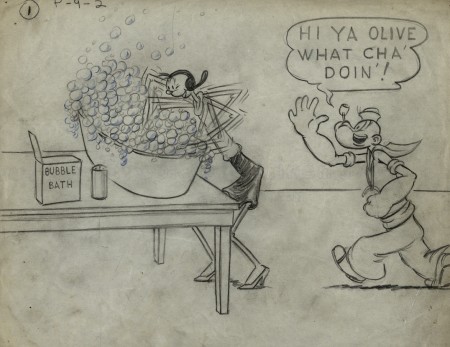 1
1
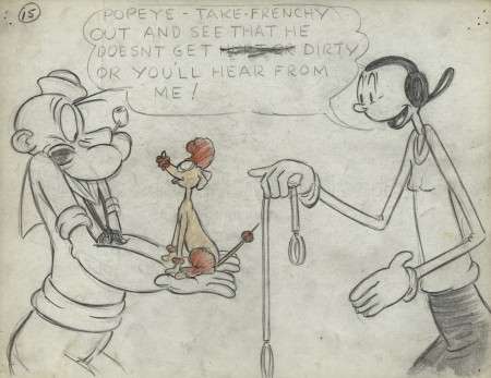 15
15
Olive gets breasts, at least, for one drawing.
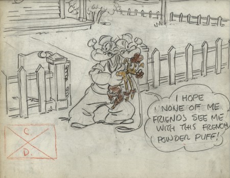 17
17
There is no number 18. 17 dissolves to 19.
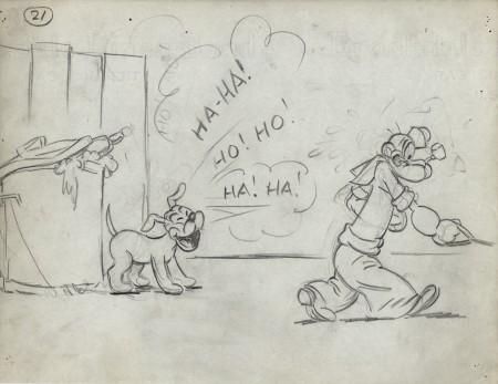 21
21
What an hilarious Popeye!
Right out of the Toonerville Trolley.
.
___________________________
.
Animation Artifacts &Fleischer &Models 02 May 2012 05:43 am
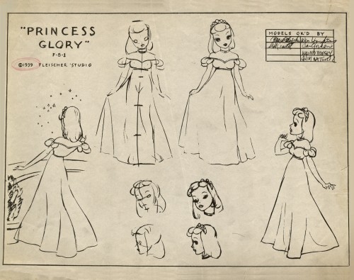
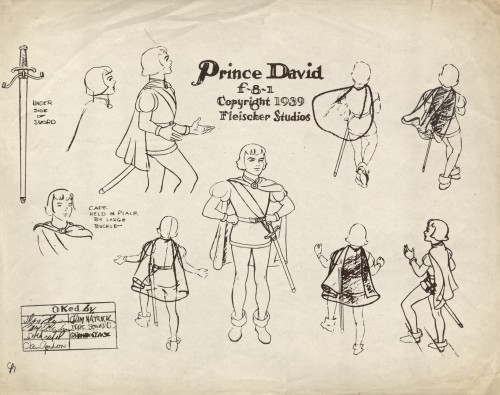
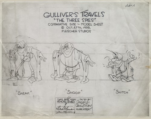
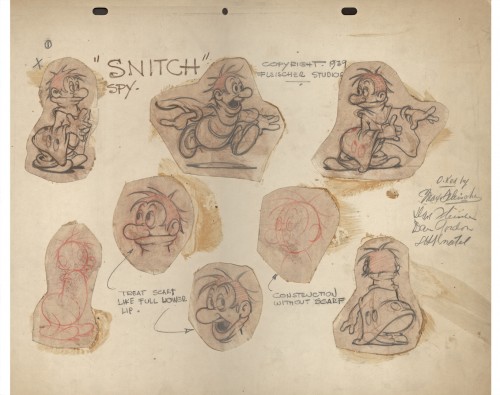
Vince Cafarelli’s Gulliver Models
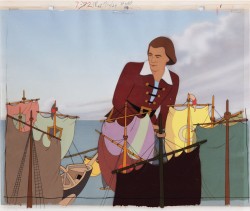 - The last few times I’d met with Vince Cafarelli, before he died, he’d told me that he had some things he wanted to have me put on my blog. Candy Kugel has, recently, shown me the material he’d been offering. There’s a treasure of artifacts there, and it’s going to take a lot of time to display them all.
It turns out that when Vince started as a runner at Famous Studios in 1948, at one point, he found that the studio was dumping a lot of old material, and rather than let it be discarded, he took what he wanted. Fabulous gems. There’s an almost complete storyboard for a 1949 Popeye cartoon by Jack Mercer and Carl Meyer, and there are a lot of model sheets. There’s plenty of beautiful and rare work to post in the coming weeks.
I’ve decided to devote Wednesdays to the Vince Cafarelli Collection, and will start this week with all the models that came from Gulliver’s Travels.
 1
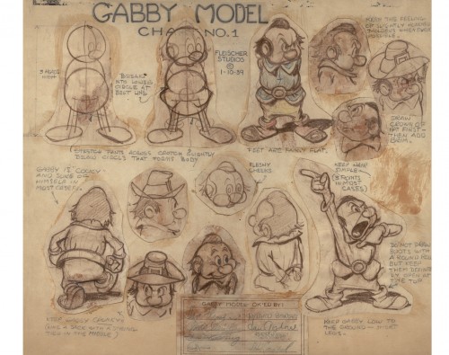
1Several of the models, including this one, are the actual thing.
Pencil drawn originals including even the signatures approving the model.
Models approved by: Seymour Kneitel, Eddie “Hurray” Seward,
Max Fleischer, Dave Fleischer, Dan Gordon, Willard Bowsky and
Frank Kelling.
 2
2
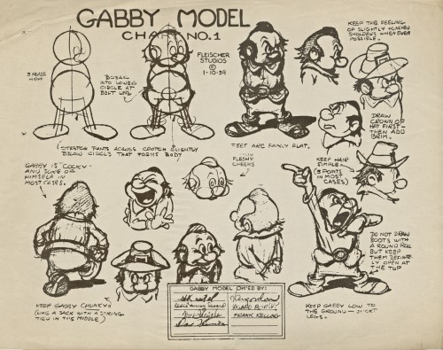
Most of them, including this one, are lithos done for the animators.
Model sheet approved by: Dave Fleischer, Max Fleischer, Frank Kelling,
Grim Natwick, Willard Bowsky, Dan Gordon, (Eddie) Seward, and
Seymour Kneitel
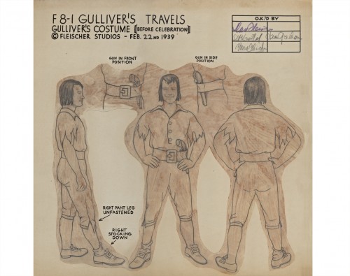 3
3
An original pencil drawn model.
Approved by: Dave, Fleischer, Seymour Kneitel,
Max Fleischer, and Dan Gordon
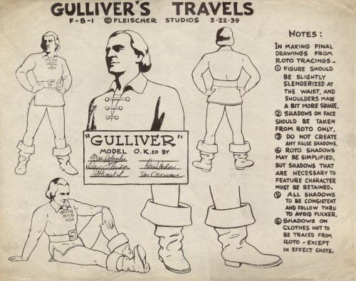 4
4
Approved by: Max Fleischer, Dave Fleischer,
Seymour Kneitel, Dan Gordon, and Doc Crandall
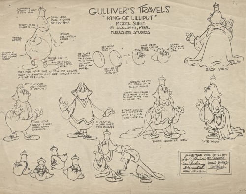 5
5
Approved by: Dave Fleischer, Dan Girdon, Seymour Kneitel,
Frank Kelling, Eddie Seward, Willard Bowsky and Max Fleischer
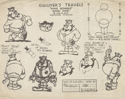 6
6
Approved by: Dave Fleischer, Max Fleischer,
Eddie Seward, and Hig. E. Gibson
 7
7
Approved by: Max Fleischer, William Hoskins, Dan Gordon,
Willard Bowsky and Grim Natwick
 8
8
Approved by: Max Fleischer, Seymour Kneitel, Dan Gordon,
Grim Natwick, Eddie Seward, and Graham Place.
 9
9
Approved by: Edmond Seward, Dave Fleischer, Frank Kelling,
Max Fleischer, Dan Gordon and Willard Bowsky
 10
10
An original pencil drawn model.
Approved by: Max Fleischer, Dave Fleischer,
Dan Gordon and Seymour Kneitel
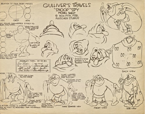 11
11
Approved by: Dave Fleischer, Willard Bowsky, Seymour Kneitel,
Shane Miller, Eddie Seward, Max Fleischer, Izzie Sparber, and
Frank Kelling
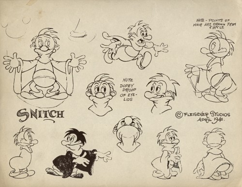 12
12
This model is a smaller size in the collection.
No approval names listed.
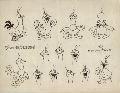 13
13
This is also a smaller sized model sheet.
No approval names listed.
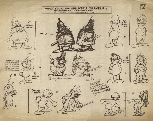 14
14
Approved by: Max Fleischer, Dan Gordon,
Eddie Seward, Willard Bowsky, and Seymour Kneitel
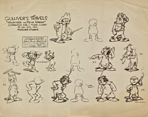 15
15
Approved by: Dave Fleischer, Eddie Seward, Willard Bowsky,
Max Fleischer, Dan Gordon and Seymour Kneitel
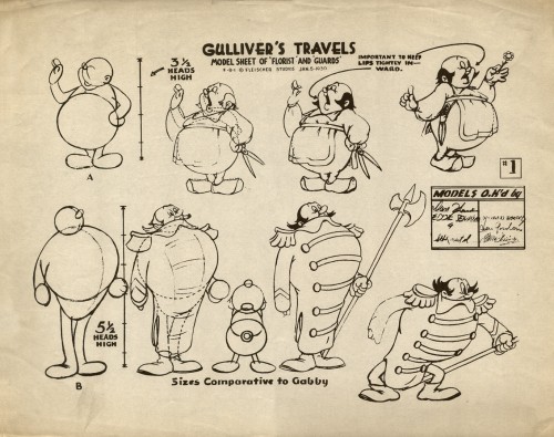 16
16
Approved by: Dan Gordon, Eddie Seward, “G”,
Seymour Kneitel, Willard Bowsky, Dan Gordon,
and Max Fleischer
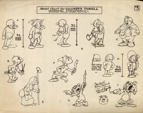 17
17
Approved by: Max Fleischer, Eddie Seward, Dan Gordon,
Willard Bowsky and Seymour Kneitel
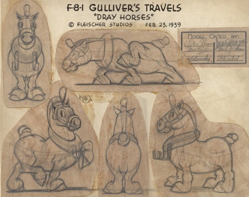 18
18
An original pencil drawn model.
Approved by” Dave Fleischer, Max Fleischer, Nic. E. Gibson,
Dan Gordon and Seymour Kneitel
Fleischer &Frame Grabs 08 Aug 2011 06:44 am
Fleischer Hoppity Multiplane
- Last week we looked at the Fleischer multiplane camera. It’s a horizontal device that shot flat animation art (cels) standing in front of 3D background constructions. Little sets that were able to add a unique look to their cartoons.
In the two Fleischer animated features, there’s only one scene that uses this multiplane camera, and that’s in the opening titles of Hoppity Goes To Town. I felt we couldn’t leave the Fleischers without a focus on that scene. So that will be the subject of today’s post.
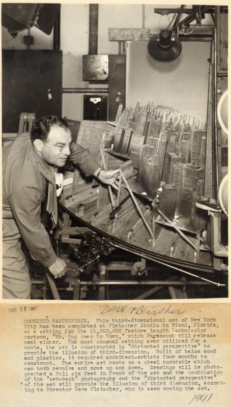
Dave Fleischer in front of the multiplane 3D camera on Hoppity Goes to Town
Picture borrowed from: Ryan & Stephanie’s Fleischer Gallery
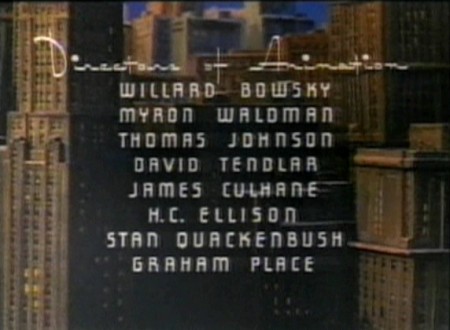
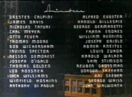
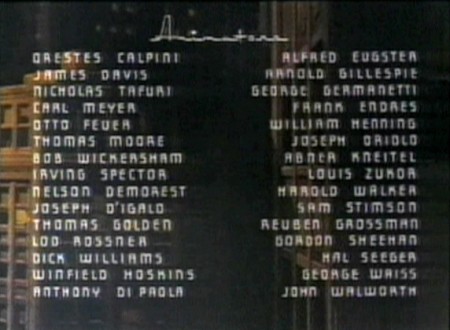
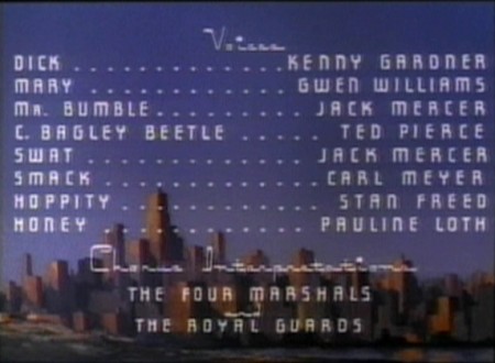
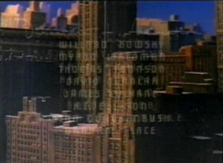
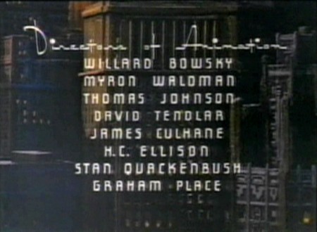
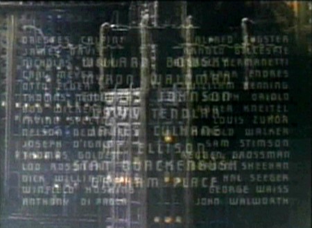
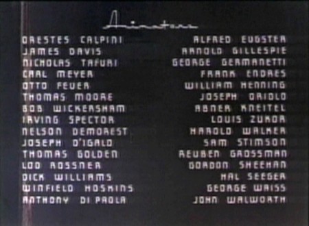
The entire multiplane pan is blocked out, in part, by the film’s credits.
I’ve taken frame grabs trying to indicate the move
while trying to accomodate the credits.
 1
1
The opening starts over flat art coming from a star
in outer space, down to earth to this LS cityscape.
 2
2
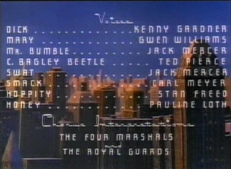
The multiplane scene dissolves in here . . .
 3
3
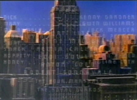
. . . and pans down toward the street level as
it moves toward screen right.
 5
5
That’s the Brill Building in the screen’s center
nopt far from the studio of the Fleischers.
 7
7
As we go down, the color mix gets less golden . . .
 8
8
. . . and sits more in shadow.
 11
11
Here is a transition point.
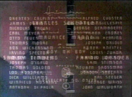 12
12
The background darkens to accomodate the
dissolve to a flat-art pan during a credit dissolve.
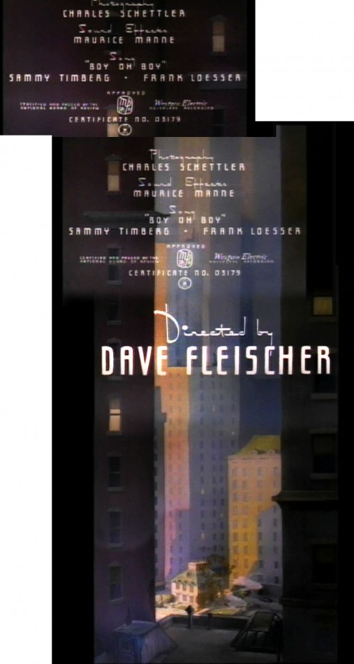
The pan of the 3D setup dissolves to this flat art
which pans down to the start of the film.
There are so many good examples of the Fleischer multiplane. I just chose two in the past couple two weeks, and I hope you’ll review some that you like. There are many on YouTube.
Fleischer &Frame Grabs 01 Aug 2011 06:30 am
Fleischer’s 3D Multiplane – Little Dutch Mill
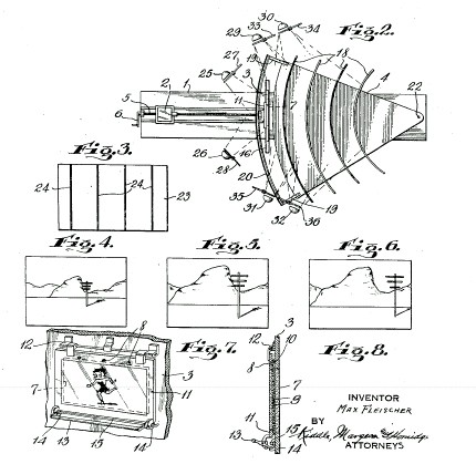
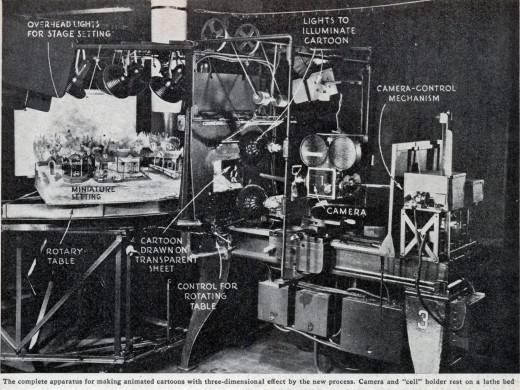
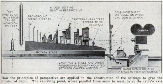
- We’ve been looking at the Disney multiplane camera, but let’s keep going back in time. The Fleischer studio had its own 3D setup, and it was very different from the Disney version. Little cartoon sets were constructed on a horizontal setup with the cels being placed in the foreground of the set. These sets could move east and west or in a circular motion. The 2D animated cels stood in front of the moving set and it gave the effect of a 3D world behind them. The end result was to show the 2D cels moving in front of a 3D set.
Here are some stills and artwork showing how the contraption worked.
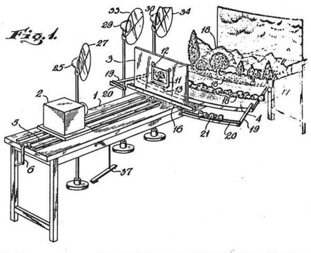
Images from the patent application for the Fleischer 3D multiplane camera.
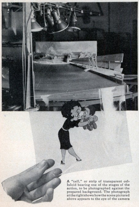
Images above from Modern Mechanix/November 1936
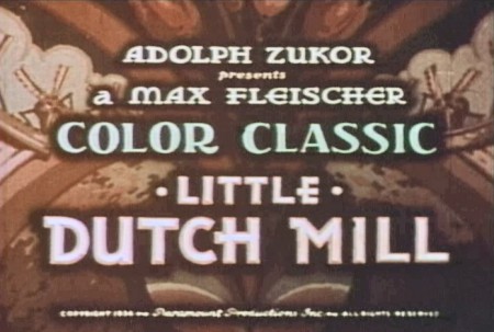
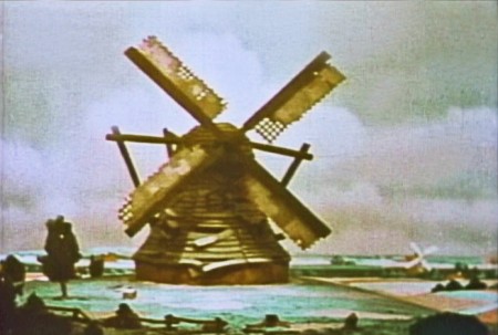
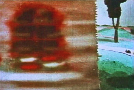
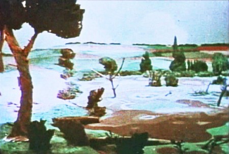
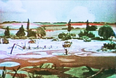
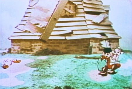
One of my favorite cartoons that really showed off this process, was a color cartoon called, The Little Dutch Mill. There was a lot of rotation of the characters running and skipping around the mill, which, of course, had the blades turning. It felt like the rotation was 360°, but that certainly couldn’t have been the case. But it was well planned to make it feel as though that were happening. Here are some grabs of scenes that employed the specialised camera.
 1
1Disney still had the rights to Technicolor, so the
Fleiscers used the 2-strip Cinecolor – orange & green.
 3
3
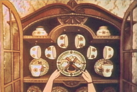
Here’s the first scene done as flat art.
 5
5
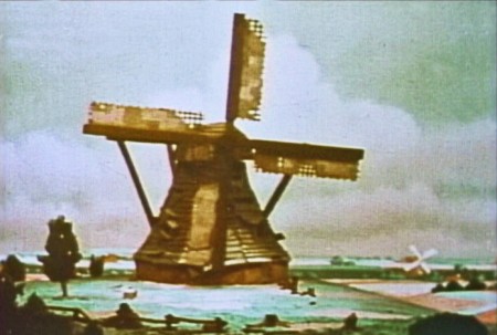
. . . which revolves as the kids enter the scene.
 6
6
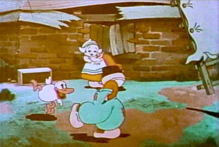
The closer shot of the kids looks flat, especially with that animated windmill blade.
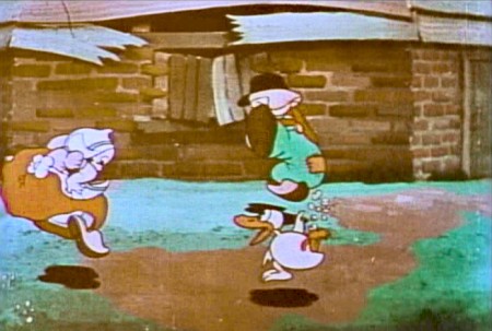 7
7
The mill isn’t revolving here.
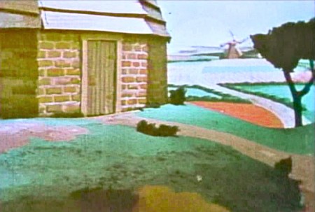 8
8
But the camera zip pans across to some 3D scenics.
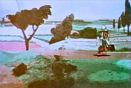 9
9
We follow a woman carrying water as she walks . . .
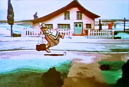 10
10
. . . into town. 3D movement on the BG.
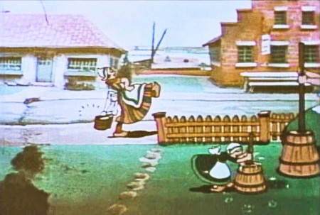 11
11
The woman, the picket fence level, and the
churning family have to match the BG movement.
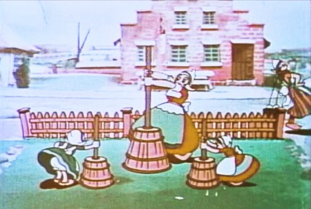 12
12
We stop on some kids & a woman churning butter.
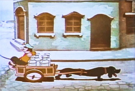 13
13
A dachsund leads a cart with a lazy guy.
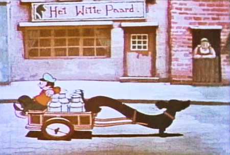 14
14
The town moves in 3D perspective.
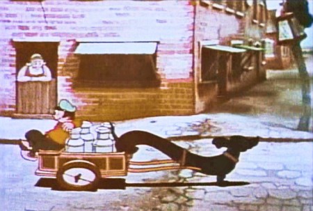 15
15
The dog & cart cycle is repetitive.
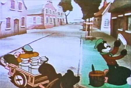 16
16
The cart turns toward the camera leading us toward . . .
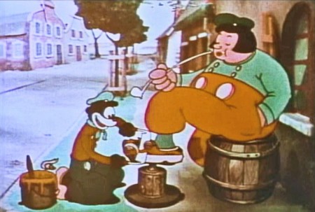 17
17
. . . a shoeshine boy carving away at the wooden shoe.
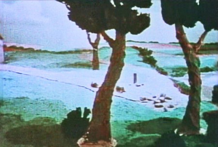 19
19
. . . to countryside that we seem to have seen before.
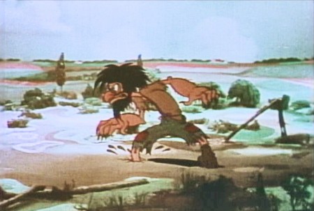 22
22
. . . the old miser/villain of the short.
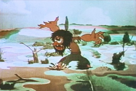 23
23
He rattles his nasty complaint.
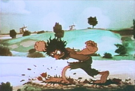 24
24
He steps on three tulip plants.
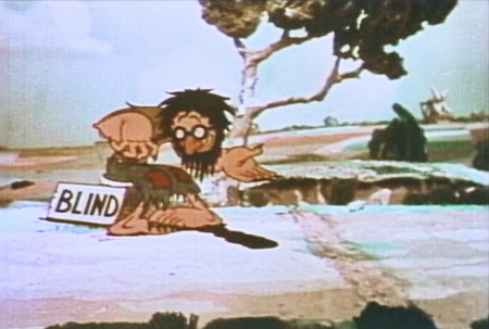 25
25
He stops to beg a coin from a fat guy with a pipe.
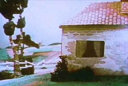 26
26
Another Zip pan to screen left.
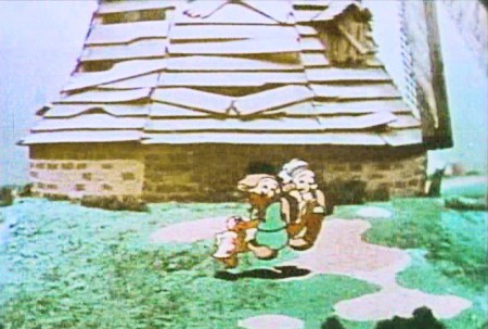 27
27
Back to the revolving mill. The kids are dancing with their duck.
There are a lot of other scenes that reuse the master BGs of the mill.
There’s only one other scene I want to feature which isn’t repeated frequently. Within the miser’s home, the town saves the day by cleaning things up. We get a pan across the place once the town has wiped everything down.
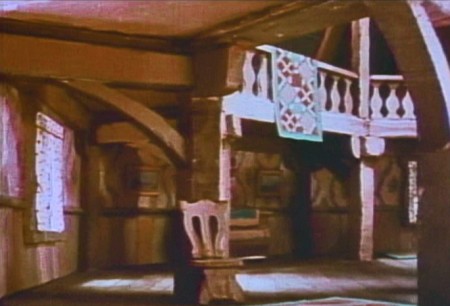 1
1We get a simple pan across the mill interior.
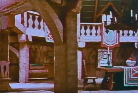 2
2
The pan shows off the 3D camera well. Everything is modeled and well constructed.
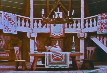 3
3
There’s no animation in the scene, so the BG looks great.
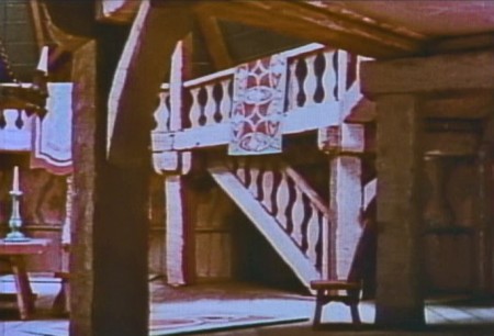 4
4
Most of the other interior shots of the mill are flat art,
so this scene is a stand-out.
Basically, other than a sweet story creatively told, there’s little more than the wonderful scenery moving. Oftentimes there’s not even animation or there are animated cycles moving in front of the panning BGs. The one regret is that the film hadn’t been done in
3-strip Technicolor.
Articles on Animation &Disney &Fleischer 07 Dec 2010 09:19 am
Life after Pearl Harbor
- Today marks the anniversary of the bombing of Pearl Harbor. This was not only a disastrous day for our country, and whatever affects our country affects the animation studios equally.

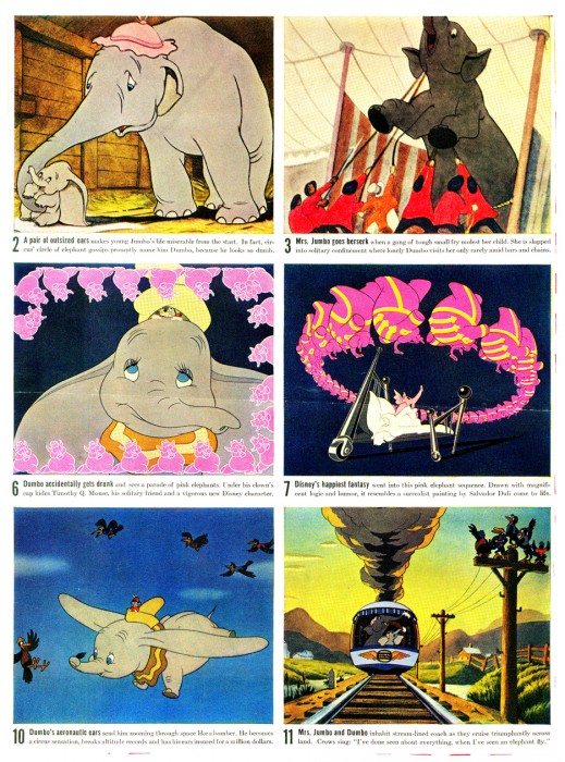
The December 8, 1941 issue of LIFE Magazine included this display of DUMBO stills. A day after the bombing, I kind of suspect no one was into noticing the stills. George MacArthur was on the magazine’s cover – not intentionally bringing War into the issue, but accidentally doing it.
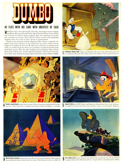
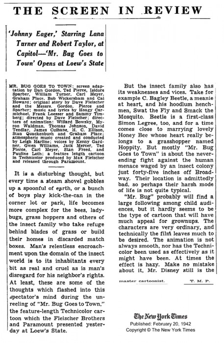
Fleischer’s Hoppity Goes To Town had the same sad problem. It opened the week after Pearl Harbor and sank as quickly as the Hawaiian Fleet. The film was finally reviewed in the NY Times in February 1942 (as can be read below) but there wasn’t much to save it at the box office.
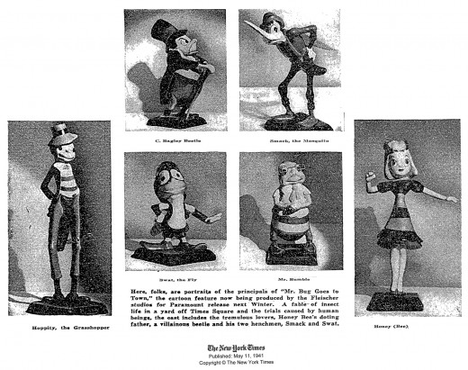
Here’s a promotion that ran in the NYTimes in May of 1941,
six months before the film would be released to a deadened market.
Animation Artifacts &Fleischer &Illustration &Tissa David 28 Sep 2010 07:10 am
Betty Poster
- Recently, Tissa David gave me a bunch of posters that she’d stored for many years. I’ll post them all, but it takes forever to scan them and reconstruct them in photoshop. So they’ll probably come one at a time.
Here’s one Grim Natwick gave her. She was the 3rd that Grim signed it to.
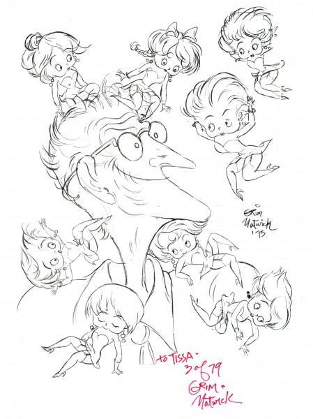
(Click the image to enlarge it.)
Animation &Fleischer &Frame Grabs &walk cycle 04 Nov 2009 08:27 am
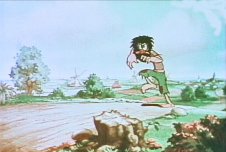
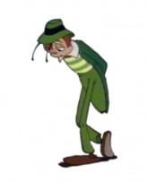
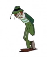
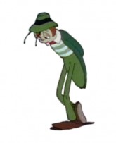
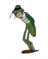
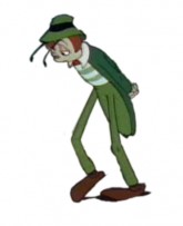
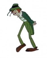
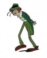
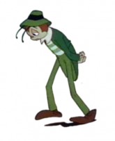
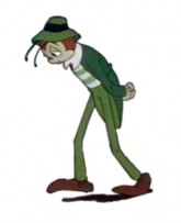
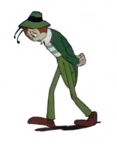
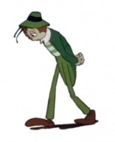
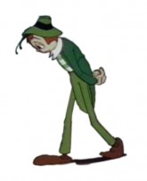
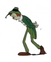
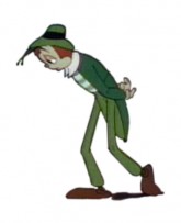
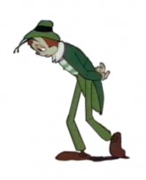
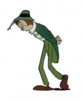
Hoppity walk
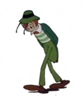
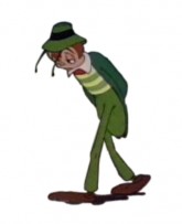
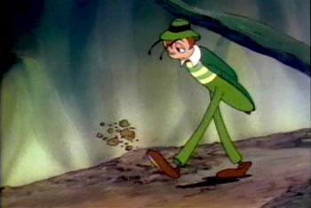 - Hoppity Goes To Town is a feature I’ll always love. The second and last feature from the Fleischer brothers’ studio is a bit limited in its animation, but I like the story and the way it’s told. Admittedly, this film is something of a personal favorite because I first saw the film in my formative years, age around 10. Today, I recognize some of the problems it has, yet I find it a completely charming and entertaining animated film.
The Fleischer studio had figured out how to make a cartoon, and this one was arguably ahead of its time. It’s the first animated feature based on an original story. The character of Hoppity, obviously built on the personality of Gary Cooper, is endearing to me, and I think the movement of this character not bad. There’s some distortion and bad drawing throughout the film, I don’t really mind.
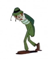
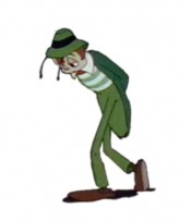
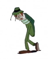
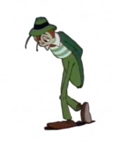
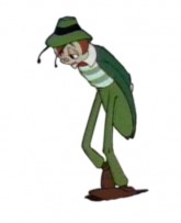
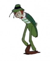
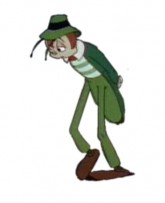
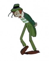
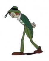
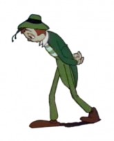
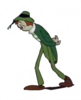
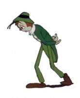
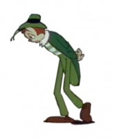
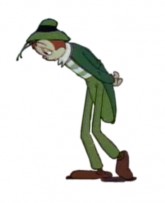
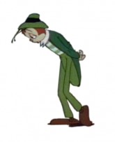
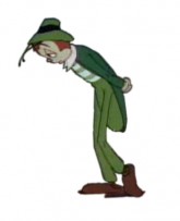
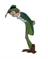
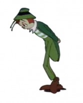
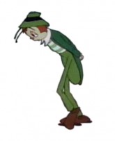
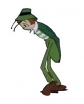
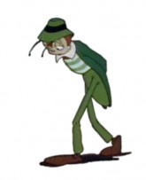
I’ve chosen a walk that was not quite a cycle, and I’ve made it one. It starts with a kick of dirt – Hoppity is disappointed and frustrated – and quickly moves into this section. It’s a slow walk – 52 frames, on ones – and is a complex one. He pulls both legs in a subtle and circular arc as they move forward, lumbering from left to right to left. His legs almost look like matchsticks split at the knees. It makes for an interesting walk (though they do change size a bit as they move.)
Here’s Hoppity:
 1
1 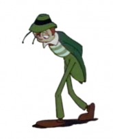 2
2 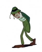 3
3(Click any image to enlarge.)
Hoppity’s sad walk on ones
Click left side of the black bar to play.
Right side to watch single frame.
Animation &Fleischer &Frame Grabs &walk cycle 08 Jun 2009 08:12 am
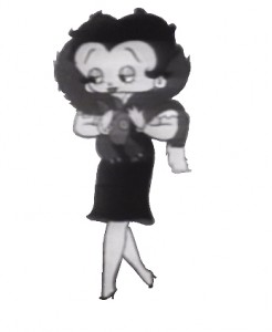
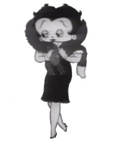
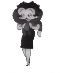
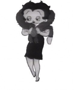
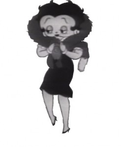
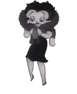
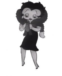
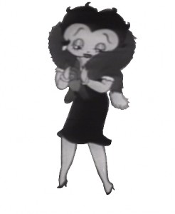
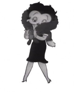
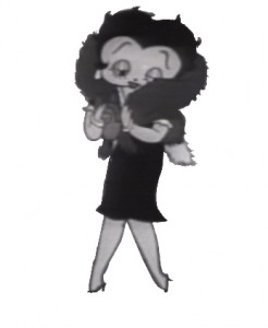
Betty with Fur walk
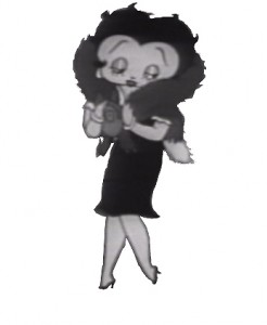
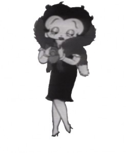
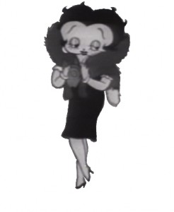
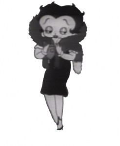
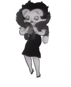
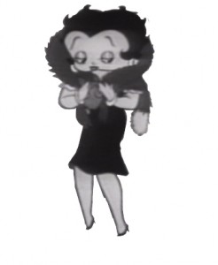
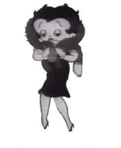
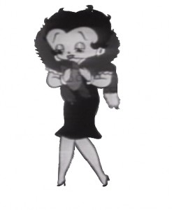
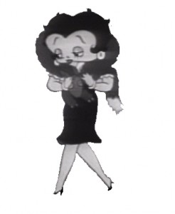
- I haven’t posted a Betty Boop walk cycle in some time, so I thought I’d pick on this one. Betty’s walking with a new fur stole, caressing it as she walks. Sweetly animated by Myron Waldman for the film Pudgy Picks a Fight in 1937.
 1
1 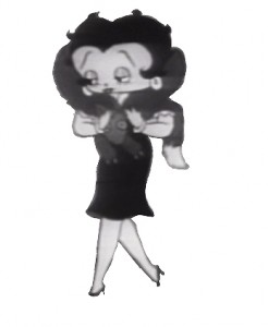 2
2(Click any image to enlarge.)
Betty wears her new fur.
on ones
Click left side of the black bar to play.
Right side to watch single frame.
Fleischer &Frame Grabs 10 Apr 2009 08:04 am
Poopdeck Pappy Breakdown
- Following up yesterday’s post, here’s a scene breakdown of the Popeye film With Poopdeck Pappy. This short’s a delight. Done in 1940, it has that textural beauty the Fleischer shorts seemed to inhabit during this short period from about 1937 – 1942.
Bill Nolan was the key animator (animation director) of the short with Winfield Hoskins (I’m not sure who he was) receiving the only other credit. Nolan was known for his incredible speed, so it’s quite possible he animated the lion’s share of this short.

(Click any image to enlarge.)

Pappy walks up in perspective then across the screen
from left to right until he reaches the club.
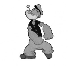
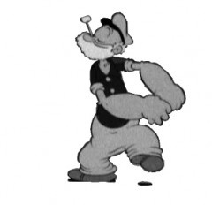
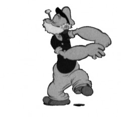
Animation &Fleischer &Frame Grabs &walk cycle 09 Apr 2009 08:00 am
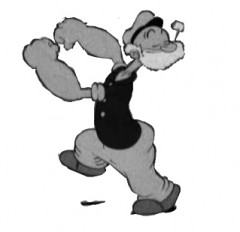
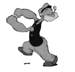
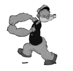
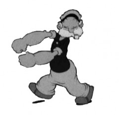
Poopdeck Pappy’s walk
I received this delightful note from Borge Ring:
dear michael ♫♫
You sometimes bring stuff on Popeye
There is a Popeye I like very much. It was animated by Bill Nolan in 1940 and the title is Poopdeck Pappy.
I stumbled on this short on internet and realised why Preston Blair had such a high opinion of Nolan.
Blair is quoted by – if I remember right – Charles Solomon in his book.
writes
Børge
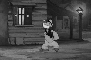 So I ran back to the film (which I know very well.) I’ve made a lot of frame grabs and was going to do a sort of mosaic (without the information that a draft might give me), but it’s taking a lot of time.
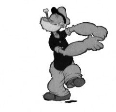
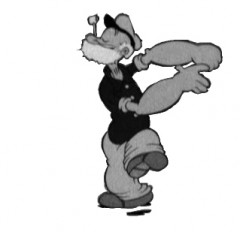
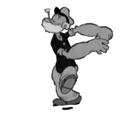
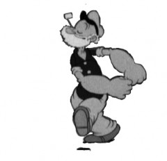
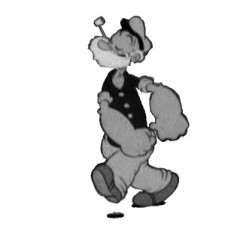
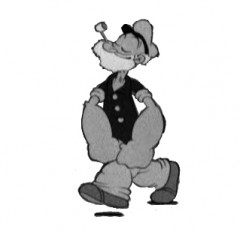
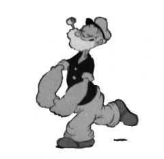
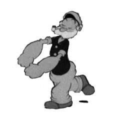
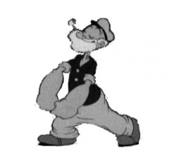
Consequently, let me make a post of this brilliant walk. There are many of them in this film and lots of hilarious dances. It’s all so balletic and rhythmic. I urge you to listen to Børge, watch the film again. It’s an absolute beauty; this is my favorite period of Fleischer’s work.
Here’s Poopdeck Pappy’s jaunty walk:
 1
1 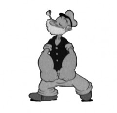 2
Poopdeck Pappy’s walk cycle
2
Poopdeck Pappy’s walk cycleOn ones at 24FPS
Click left side of the black bar to play.
Right side to watch single frame.
