Category ArchiveFleischer
Action Analysis &Animation &Animation Artifacts &Commentary &Fleischer &repeated posts 18 Jun 2013 07:41 am
Popeye and Olive Cycle – repost
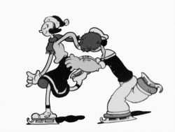
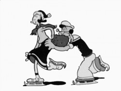
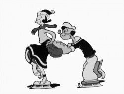
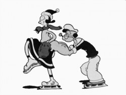
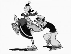
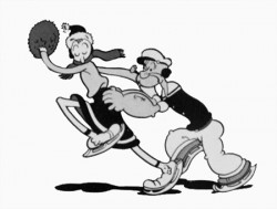
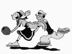
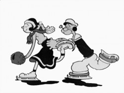
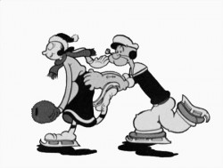
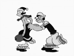
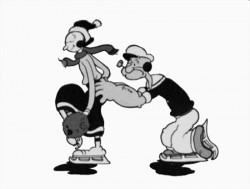
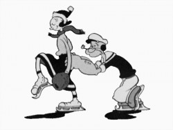
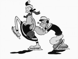
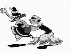
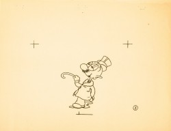
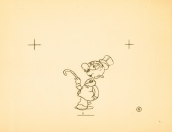
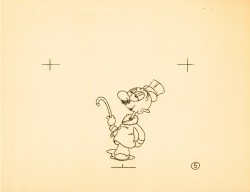
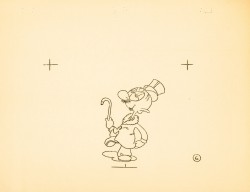
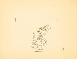
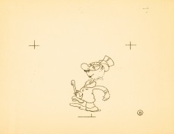
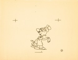
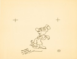
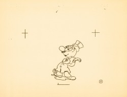
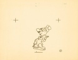
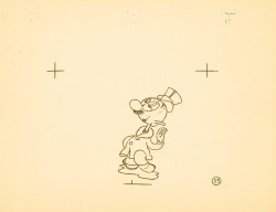
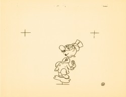
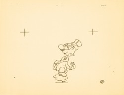
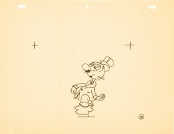
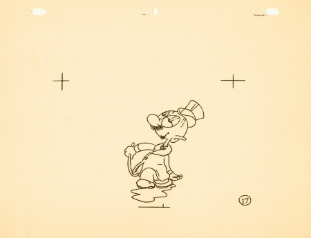
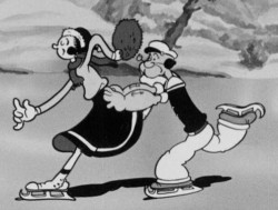 – Here’s a good example of something you won’t see animated in cgi. This is an ice skating cycle out of a Popeye cartoon, Seasin’s Greetinks!. It’s, of course, on the Popeye dvd, and is animated by Roland Crandall and Seymour Kneitel.
These Fleischer cartoons are so original in their jokes that there’s always a surprise or ten in every scene. The twists and turns are designed only to get laughs; I can give you a dozen examples from this short alone, but I’ll just recommend you watch the film.
It’s not just the stories that take odd spins, it’s the animation as well. There are bits that move in their own idiosyncratic way that are designed purely for laughs. Eccentric movements that would rarely show up in a Disney film dominate these Fleischer shorts.
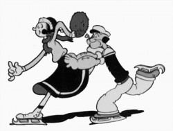
Check out this cycle. Every eighth drawing is completely off the book. It gives the cycle a hilarious turn and completely dominates the move. It’s probably not the best way to build 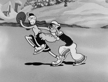 character (unless, perhaps, only one character moves like this), but it sure makes for some funny animation.
The thing about these Fleischer films is that it moves this way all the time. There’s always something about to take you for an odd turn, and while you’re looking for the big move, you’re just buying these small ones. The effect is cumulative, and the animation in these Fleischer films is just plain wacky.
A cgi animator doesn’t look for the odd twist in every frame. They can, but it wouldn’t make sense to be doing it that way, especially when the goal is to make the animation fluid in the final. The animation is too based on real life, as the computer sees it, and the individual frames don’t exist in the same way they do in 2D paper animation. There’s more risk in the 2D mode, but the reward can also be more ingenious and gratifying.
But what do I know? I don’t animate with cgi, and I’m just making a supposition based on what I’ve seen so far. Everything’s possible, but it sure doesn’t seem probable from my seat.
Having said that, let me also say that there aren’t too many animators doing 2D animation like this anymore. Maybe that’s the complaint I really have. Invention and daring in our medium seems to be a thing of the past.
 1
1 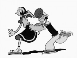 2
2
(Click any image to enlarge.)
Action Analysis &Animation &Fleischer &Frame Grabs 26 Mar 2013 05:45 am
Grim – Distortions Smears, Abstractions & Emotions – 3
- In 1930, the animation in the Fleischer studio (as evidenced by Michael Barrier in his great book, Hollywood Cartoons) was pretty much controlled by the timing department. They supported a very even sense of timing and would expose everyone’s animation in the house meter. This virtually destroyed the timing within the studio. Their idea was that every drawing had to overlap the drawing before and after. It was done to such an extreme that it caused the even timing throughout their films.
There was at least one animator free of the timing department. Grim Natwick was the key guy in the studio, at the time. His animation was built, back then, on a distortion, a freedom of expression, that very much resembled what Bill Nolan was doing in Hollywood. The difference was that Natwick could draw, so his artwork was planned, designed to look that way. It wasn’t just a matter of straight ahead animation causing distortion. It allowed distortion with scenes going back to square one every so often to hold off the appearance of distortion. The inbetweens distorted and, in a way, smeared always to come back to a nice, tight pose of an extreme.
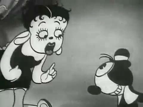
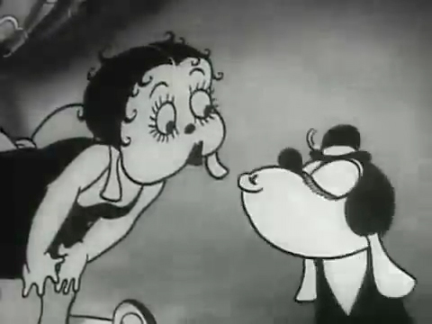
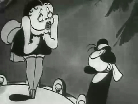
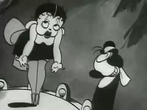
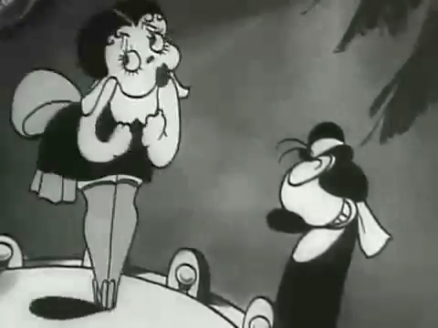
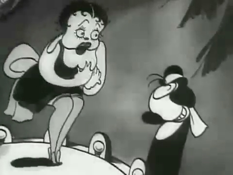
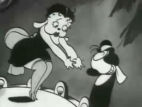
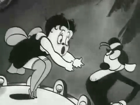
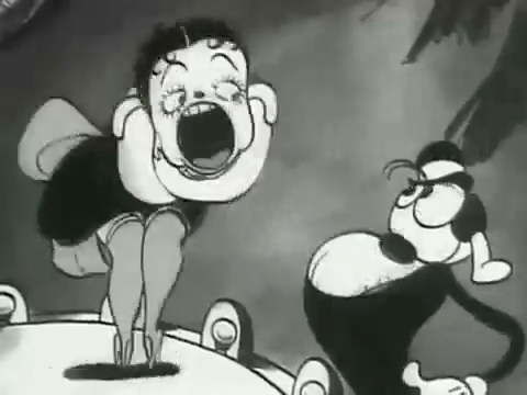
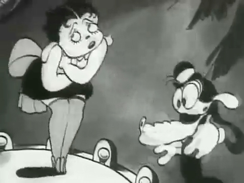
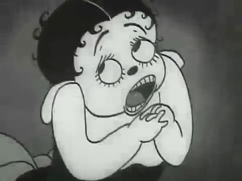
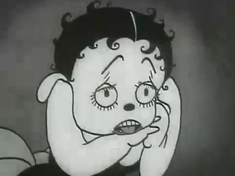
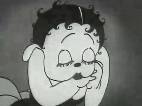
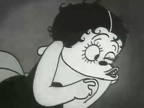
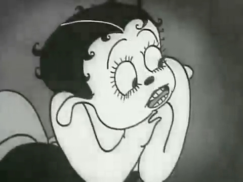
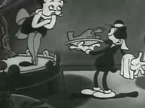
The film “Dizzy Dishes” is the perfect example of this style. This was actually the first Betty Boop cartoon, and Betty, a plump dog sings broadly. She really goes wild as she sings a song on top of a table à la Marlene Dietrich!. Here are some frame grabs from a couple of connected scenes to give you an idea of what was going on.
 1
1
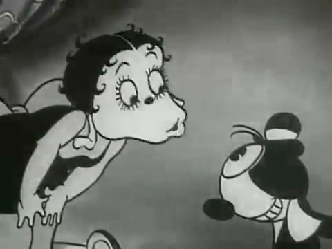
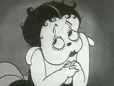
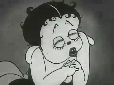
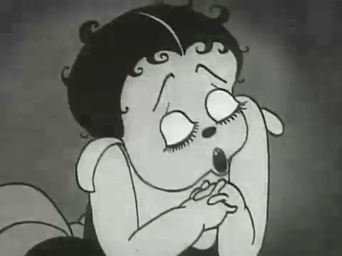
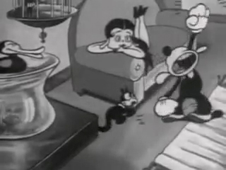
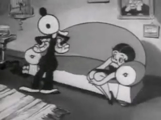
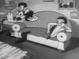
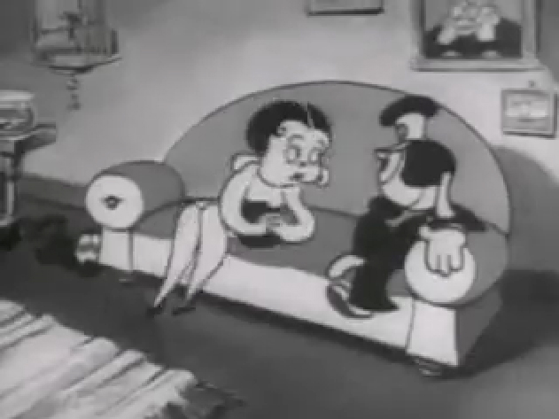
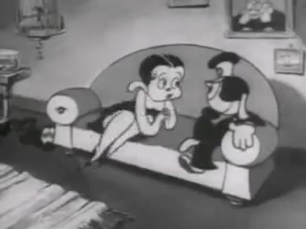
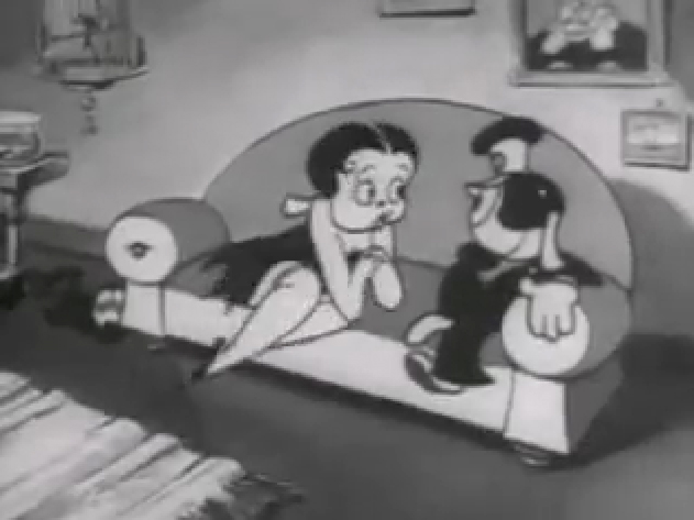
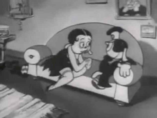
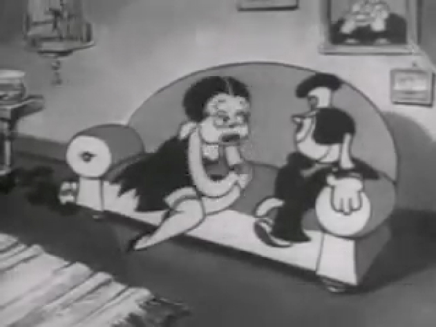
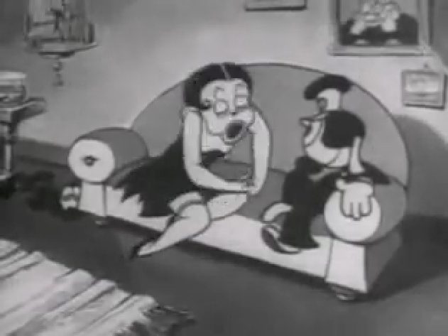
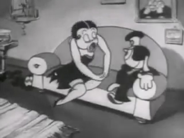
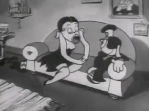
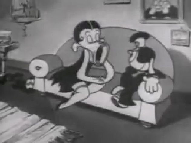
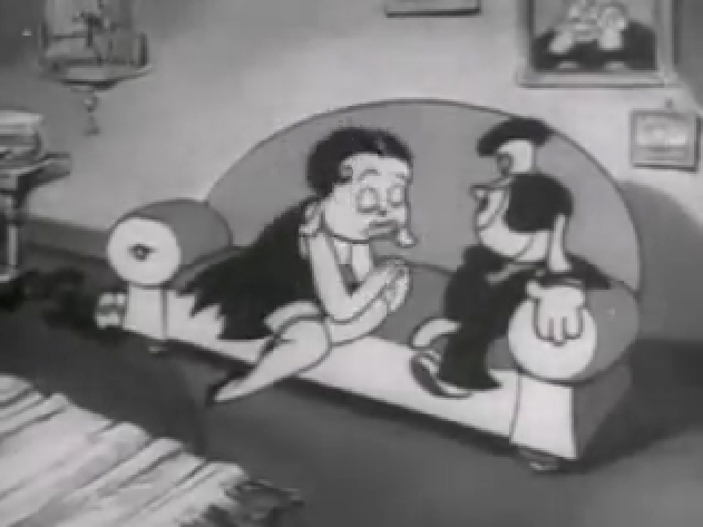
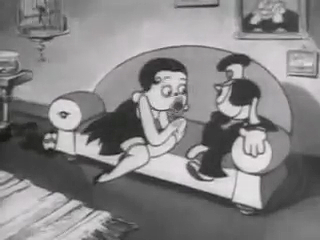
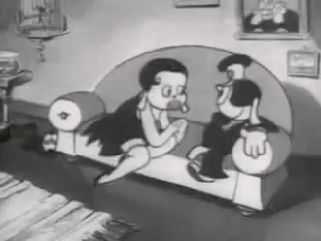
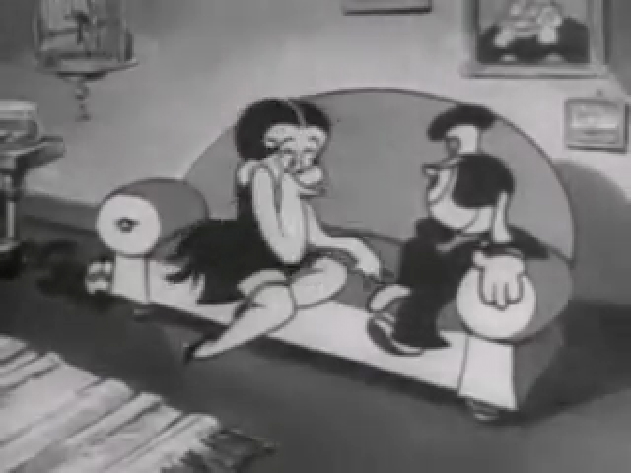
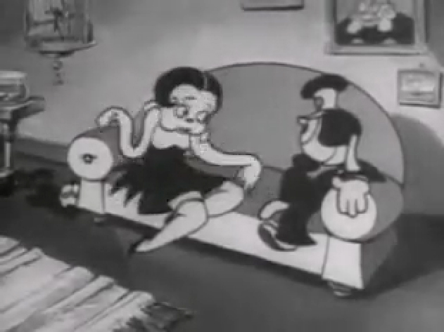
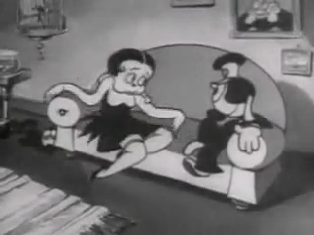
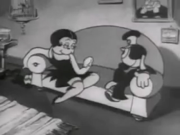
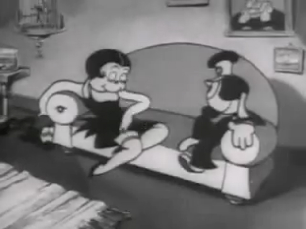
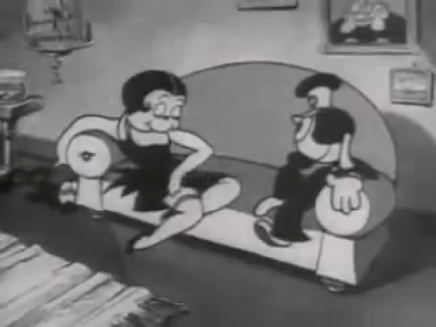
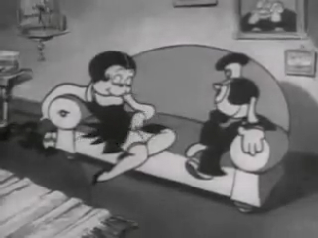
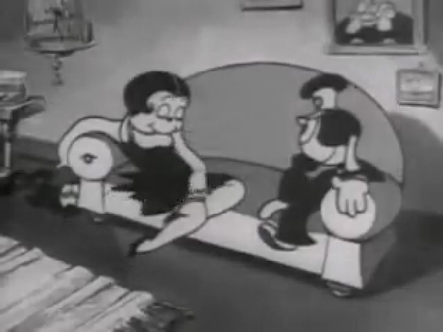
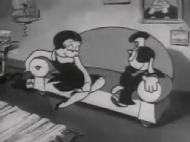
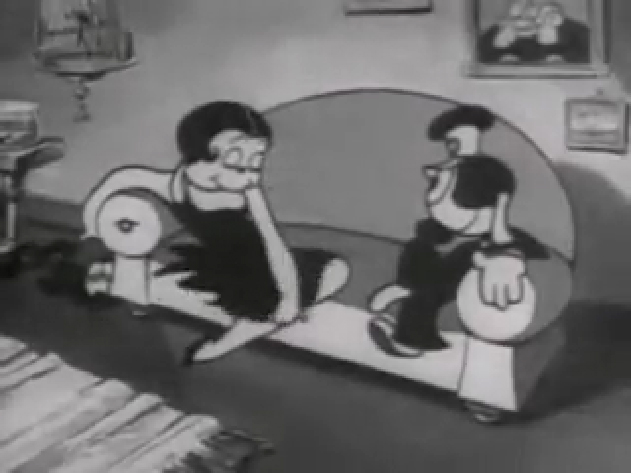
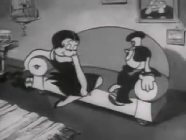
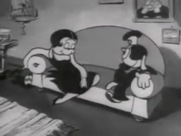
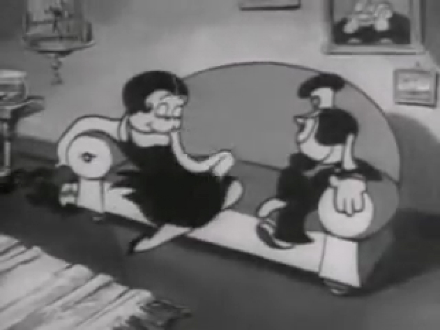
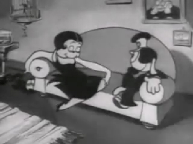
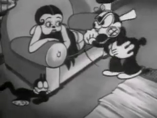
If you jump ahead to Fleischer’s “Barnacle Bill”, also from 1930, you’ll find this wild scene where Betty is seducing Bill, you’ll see all sorts of distortion in the inbetweens which Grim has maneuvered for Betty’s movements on the couch. Note how well posed his extreme positions are drawn despite the distorted inbetweens, when she is moving.
 1
1
Look at the beautiful drawings (above) of this character in some of these extremes from this film. The character of Betty isn’t moving whereas Bimbo – I mean Barnacle Bill is all over the place. Yet your eyes are on Betty in that held position.
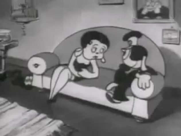
Now, let’s look at what the inbetweens are doing as Betty gets from one pose to the next. It’s really funny. Grim has found a way to create a sympathetic, adult and female character, yet he keeps her funny with the surface of the animation.
 1
1
At times in the animation, Betty’s hand may turn into a claw, but that might be that Grim delivered a rough which was poorly cleaned up by an assistant. Or perhaps the inker just inked from a rougher drawing, perhaps a Grim “clean up” if there ever were such a thing. He worked ROUGH. In fact, that distorted claw of a hand doesn’t matter. It’s the extremes that counted for Grim, and he was experimenting with this animation to see if that really were true.
I’ve remembered over many years an interview with Dick Huemer,* who worked alongside Grim on some of these films. Huemer gets credit for inventing the inbetweener to use in the animation process. It allowed him to turn out more animation and not worry about the many drawings that would paste the scenes together. In that interview, Huemer said that it didn’t really matter what the inbetweens looked like. You could draw a “brick” and it would still work. They actually may have believed this, at that time. Grim is using the inbetweens to get somewhere else in putting the scenes together.
(Tomorrow, I’ll post, again, a scene Grim did for Raggedy Ann with Dick Williams’ clean ups alongside so you can see the variance.)
* In Recollections of Richard Huemer interviewed by Joe Adamson, [1968 and 1969] Huemer said:
- And i decided that I would save all that work of inbetweening by just having a bunch of lines or smudges, just scrabble, from, position to position, When something moved fast. To prove it, I had an alarm clock flying through the air, and right in the middle of the action I put a brick. And vhen they ran the finished
film you didn’t see the brickl It proved that you didn’t really see what was in the middle. But I overdid it.
Animation &Animation Artifacts &Fleischer &Layout & Design &Models 10 Oct 2012 05:54 am
More Fleischer Models & Things
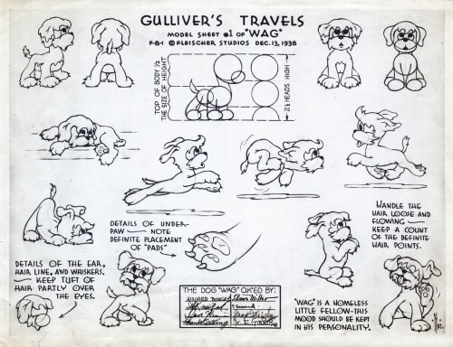
- Continuing on with the Vincent Cafarelli collection of artwork, I ran across some more Fleischer/Paramount models. One piece among them, I think, is something of a rarity. Here they are:
 1
1
 10
10
This seems to be a rarely seen model. “Wags” the dog from Gulliver’s Travels.
I think this was cut from the film, at least I’ve never noticed him.
 11
11
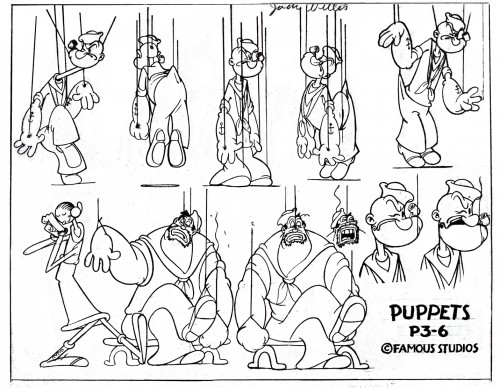
This, of course, is not Fleischer but a later Famous short.
 12
12
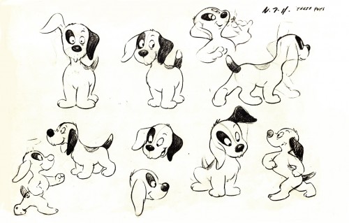
This appears to be from a later Paramount cartoon.
(Thad Komorowski identifies this as Bill Tytla’s
HECTOR’S HECTIC LIFE in the comment section of this post.)
________________________
- Here is something even rarer than that Gulliver “Wags” model sheet.
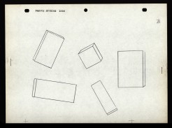
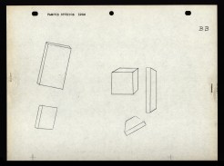
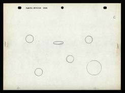
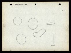
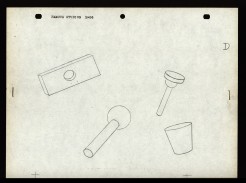
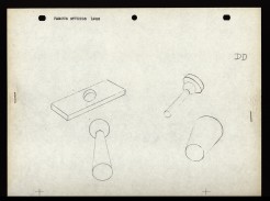
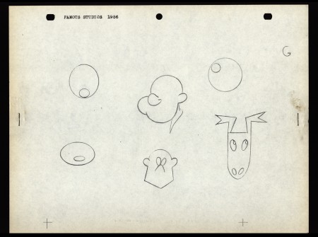
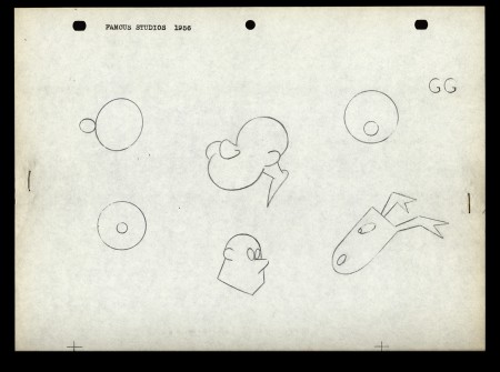
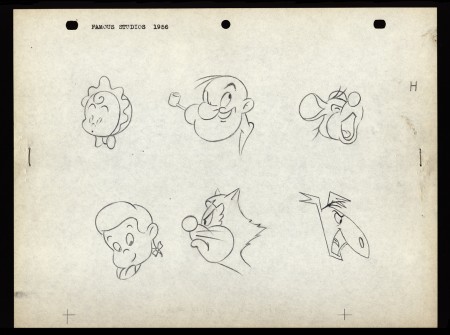
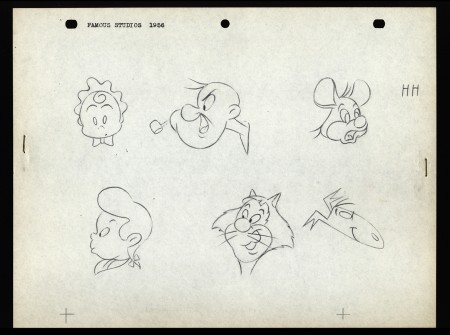
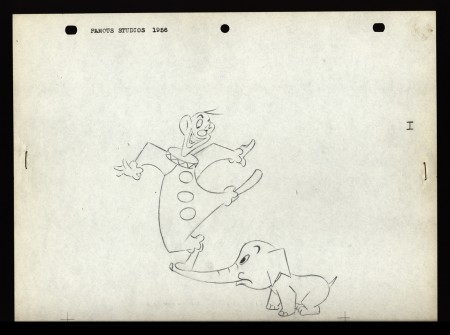
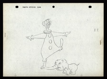
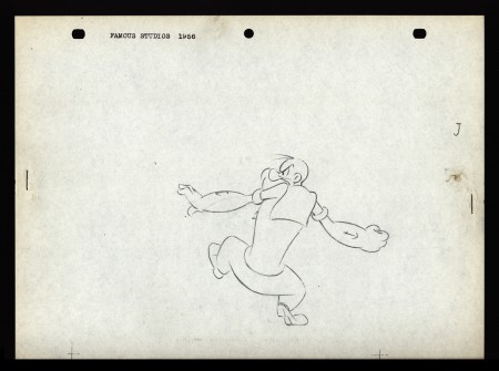
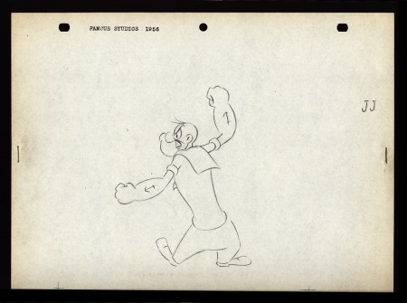
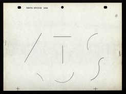
Apparently, new hirees at Famous Studios (at least in 1956) would go to an art school, of sorts. The following drawings are on reduced animation paper (although they’re the actual pencil drawings, not copies) and stapled – with two staples, one on either side – to black illustration board. Each has additional registration marks drawn at the bottom. Each is one of two drawings that are slightly different from one another. Presumably, they were designed to teach inbetweening. The pencil drawing line work is particularly thin, so I suspect these were projected with an overhead projector. I’d guess that the art student, new employee, would copy the projected drawings and then have to inbetween the pair of drawings.
The drawings start with simple lines and get progressively more difficult until it’s a full sized image of Popeye ready to throw a punch. For the sake of space, and since the first drawings aren’t very interesting, I’ve enlarged only the last half of them. The thumbnails for the first group are small, so you can see them and enlarge them, if you like. If you’re new to the field, try copying and inbetweening at least the last five pairs. It’s amazing that Vincent Cafarelli saved these, and fortuitous for us to be able to see them. Have a look:
 A
A 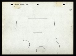 AA
AA
Animation &Animation Artifacts &Fleischer &Models 24 Jun 2012 05:33 am
Wiffle Piffle – repost
This character is really every thing you need to know about Fleischer animation. Animated by Tom Johnson the guy’s alive, and he’s nothing more than a wacky cartoon character. He couldn’t be anywhere else. Where’s the cgi equivalent? Oh that’s right; it couldn’t exist.
Time to post it anew.
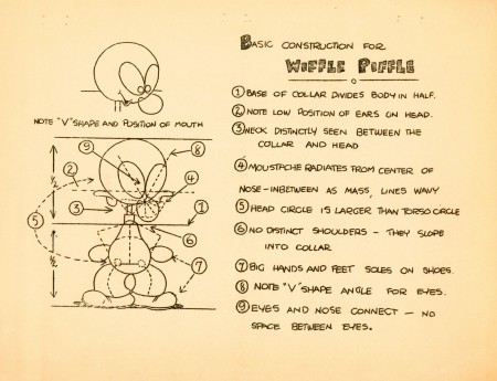
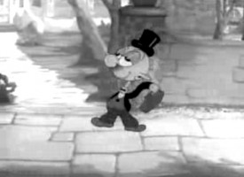 - Wiffle Piffle was a character that the Fleischer studio tried to develop out of the Betty Boop series. The first appearance was in a Screen Song: I Feel Like A Feather In The Breeze released in 1936. He appears as a waiter in the opening. The animation of the character was by Tom Johnson (as was this model sheet.)
Two follow-up films were made with this side character in Betty Boop shorts.
The first, released in February 1937, was Whoops! I’m A Cowboy, and the second, in March 1937, The Hot Air Salesman. The opening scene features an expensive multiplane shot behind him.
He seems to have been an Egghead type character whose sole character trait was a silly walk. Needless to say, they couldn’t find a job for him.
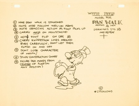
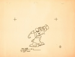
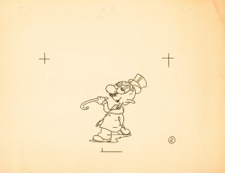
The model sheet for the character was an 18 drawing walk cycle with a bit of a turnaround. Cross-hairs keep the character in registration; only a couple of the pages were punched.
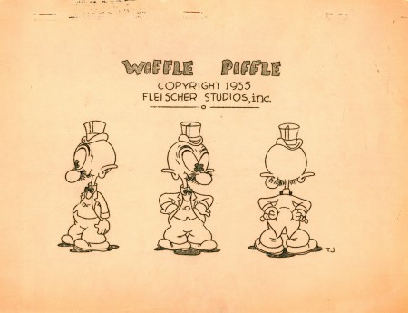 Wiffle Piffle walk cycle
On ones at 24FPS
Click left side of black bar to play.
Right side to watch single frame.
Animation Artifacts &Fleischer &Layout & Design 20 Jun 2012 05:36 am
Paramount Bgs & Gulliver Teaching Aid
- For the past few weeks, I’ve been posting artwork from Vince Cafarelli‘s collection of animation artifacts. We’re coming down to the remainders in this box, and I’ll post most of it. There are a few color Background originals.
At first viewing, I thought these were possibly from Terrytoons, (here is a past post I did of Terry Backgrounds I own from the late Thirties) but they have a slickness that Terry Backgrounds wouldn’t have had. They also lack any sign of the glorious whimsy the Fleischer Backgrounds had. These, no doubt, come from Late 40s Paramount cartoons when Bob Little was the principal artist. There’s ample use of airbrush over the bright tempera colors. (I don’t remember seeing airbrush in any Terry cartoons of this period.) Physically, they were all done on bristol board and separated from the card back. This is also true of all the Terrytoons Backgrounds I’ve seen.
I’m sorry to say that I can’t ID any of these Backgrounds or tell you what films they’re from. Were I able to do that we might have been able to figure out who did them. If you know anything about them, anything at all, your comments would sure be appreciated, and I’ll keep updating the post to make sure they’re noted.
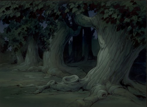 1
1This first one does a nice job of setting the mood for the scene.
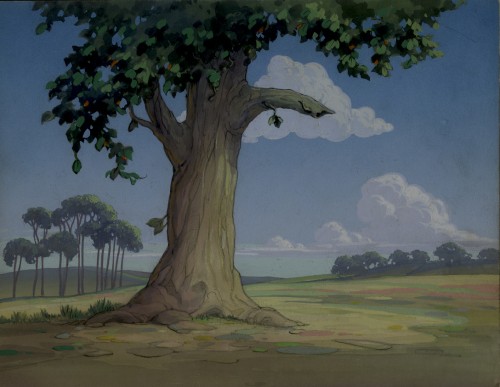 2
2
from Song of the Birds
This one doesn’t really do much other than be a background.
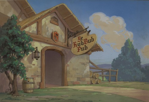 3
3
from Robin Hood-Winked
This tavern really does set up the scene. As a matter of fact,
it’s so specific it should be one of the easiest to identify.
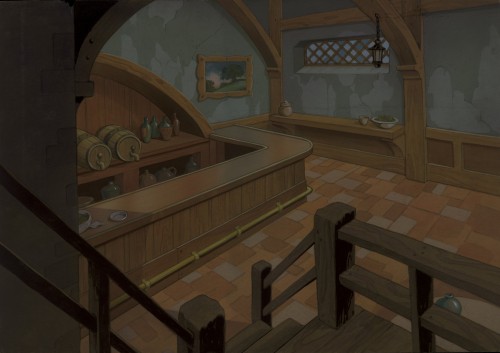 4
4
from Robin Hood-Winked
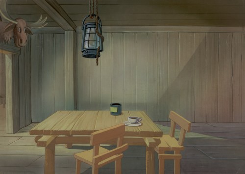
This interior is also more specific than most of the
Paramount Bgs of the period and feels as though
it may have come from the same film as the tavern, above.
 5
5
from Lumberjack and Jill
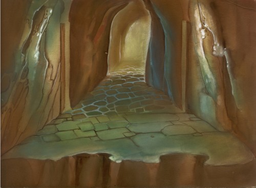
This one is so generic it may have come from any of a hundred
films of the period. It’s the Bg that felt like a Terrytoon to me.
 6
6
This Bg feels closer, stylistically, to #4, above,
than to #5. There’s a lot of airbrush in it.
 7
7
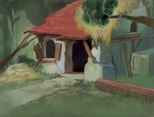
This Bg seems to have some chalk used on the white stone
of the building’s exterior. It reminds me of several other
Disney Bgs – not as good as Disney, but similar in feel.
 8
8
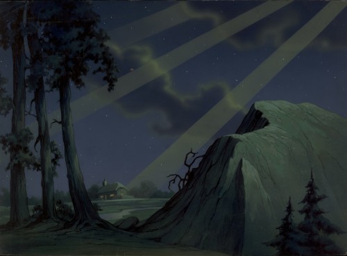
from Leprechaun’s Gold
Who knows what this Bg is. I guess god’s
looking down on the inhabitants of the hutch.
__________________________
- As a bonus to add to these Backgrounds, here’s something completely unrelated.
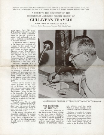
Today, when children’s films are distributed non-theatrically (meaning to schools and libraries) a teaching aid accompanies the film. This is usually a two or three page piece which gives information on how the film can be used to teach whatever subject to the students. This form has developed in quite a sophisticated way so that it is often very helpful to the teacher or librarian.
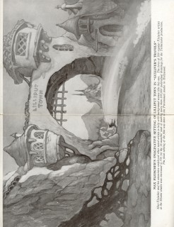
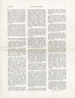
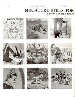
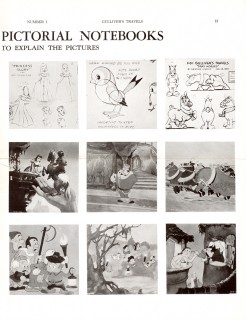
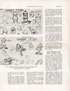
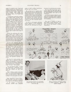
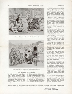
Within Vince Cafarelli’s collection of art and artifacts, there was a teaching aid – which seems half designed to be a give-away to students. It’s a primitive form of what is standardized today. The printing of the piece is quite rich on semi-gloss paper with nice B&W photo reproductions of stills from the film. I thought this would be of interest to some of you out there.
 1
1(Click any image to enlarge.)
Animation Artifacts &Fleischer &Models 13 Jun 2012 05:30 am
Fleischer Model Sheets – Hoppity & friends
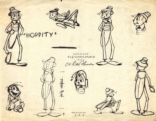
- I have always been a sucker for Hoppity Goes to Town. For some reason, from my first viewing in the early 60s, to tofsy, I have loved this film and everything about it. The score is magnificent, with those great Hoagy Carmichael / Frank Loesser songs, and the score by Leigh Harline is quite sophisticated; the character styling is absolutely the height of charm for Fleischer – so beautifully round -, and the animation is just bright enough to pull off the original Fleischer story. It also takes place in a recognizable New York City – something that will always win me over.
At one time I’d posted a copy of a children’s book I’d found which bounced off the film.
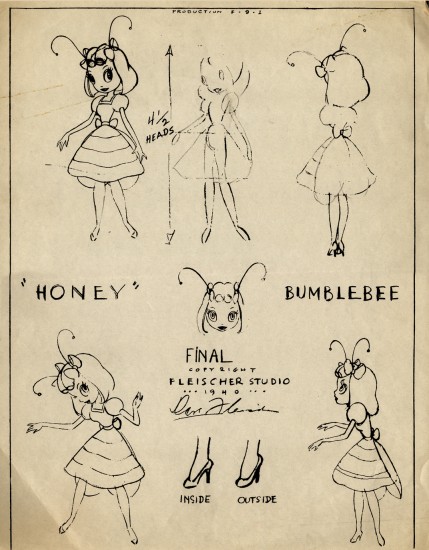
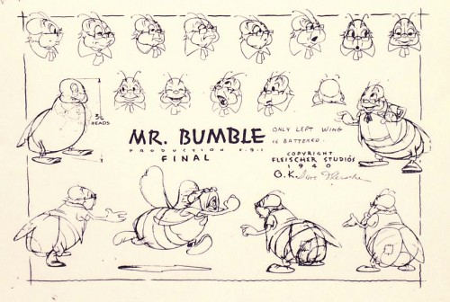
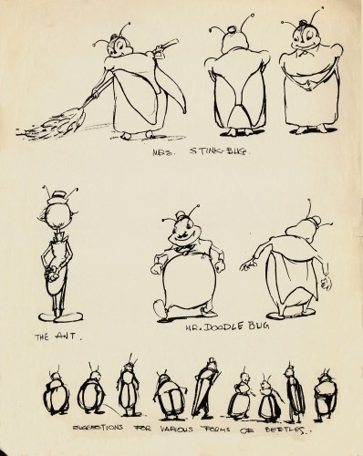
These are the model sheets the late Vince Cafarelli had in his collection. I would have liked seeing a Mr. Beetle or two and possibly a work sheet for how they were going to treat the rotoscoped humans. (The handling of the rotoscoped animation goes far beyond what they did in Gulliver’s Travels. There’s a nice little frame grab post featuring one of these scenes at Classic Cartoon Reviews. ) But I’m pleased to have what model sheets I do have to post. Here they are.
 1
1Hoppity
 3b
3b
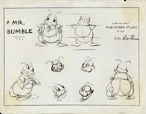
(I found this model of Mr. Bumble on line and thought it worth including.)
 7
7
Miscellaneous Characters – 1
Animation Artifacts &Fleischer &Models 06 Jun 2012 06:06 am
Miscellaneous Models from Fleischer
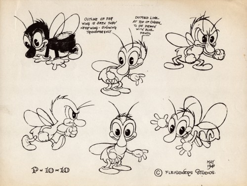
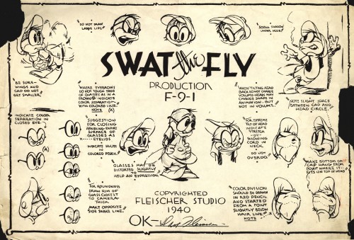
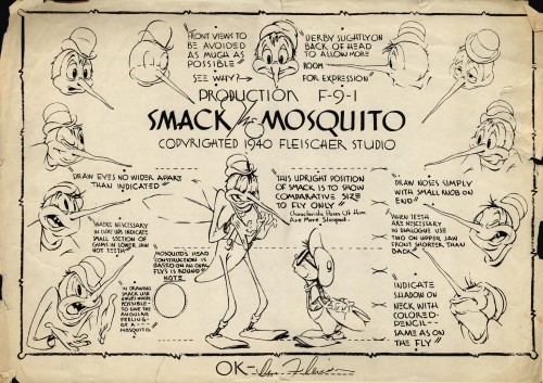
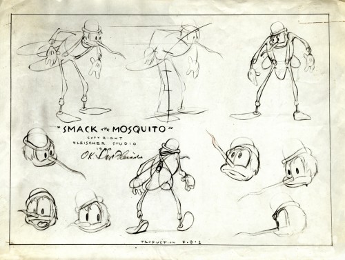
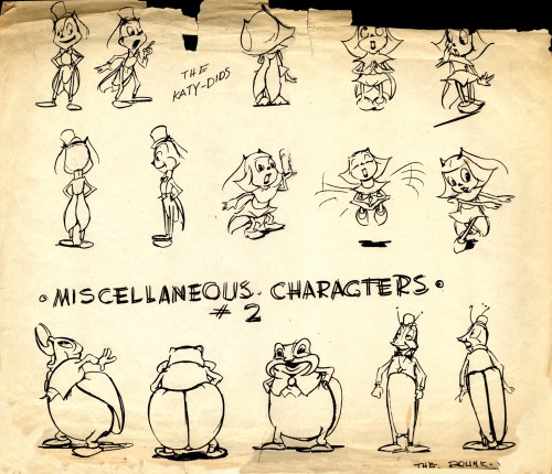
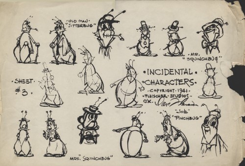
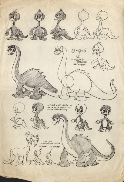
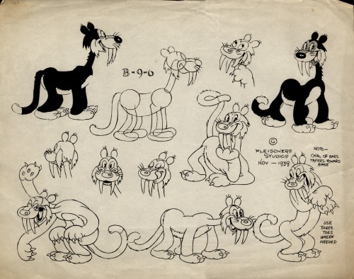
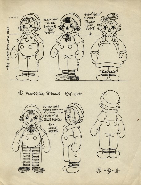
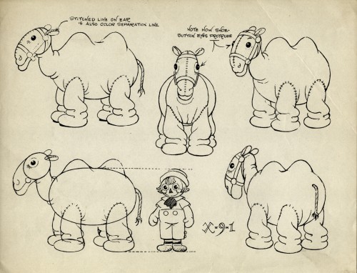
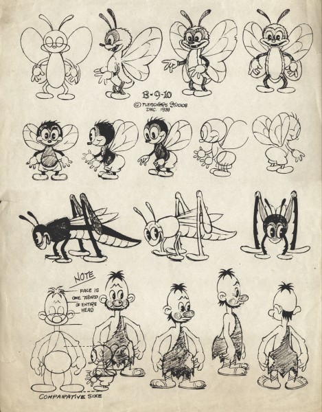
- Continuing with artifacts from the late Vince Cafarelli‘s collection, here are a bunch of model sheets from a number of different Fleischer Studio productions. I’ve mixed some from the Raggedy Ann shorts, the Stone Age films, the Superman films and one ersatz model from a solo cartoon.
We begin with The Stone Age films. Long before the Fllintstones, there were these inventive shorts about the very same subject, a caveman family living
as though it were the modern day world though they’re still in caveman attire. (Not too different from the Jack Benny caveman in Chuck Jones’ Daffy Duck and the Dinosaur.)
 1
1
 4
4
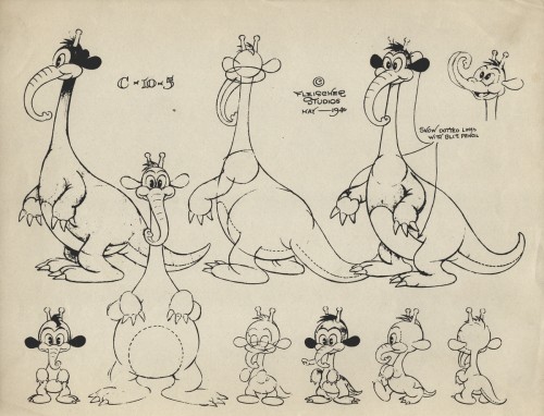
(Actually, with this model I’m guessing it’s from a Stone Age cartoon.
For all I know, the Fleischers may have tried their hand at Dr. Suess.
There are a couple of models from the Raggedy Ann films. Quite different from the Dick Williams version.
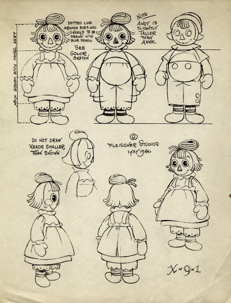 1
1
The Superman cartoons are key to the world of the Fleischer studio and their ultimate attempt at a high quality.
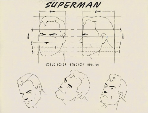 1
1
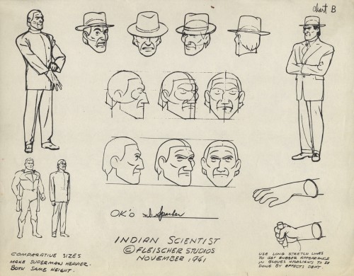 2
2
But of course, it wouldn’t be Fleischer without a hint of racism . . .
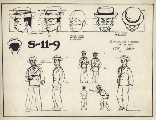
. . . or more than a hint. They should have tried Dick Tracy.
Finally, for today, there’s this left over baby. It isn’t labelled, but it looks to be the baby from the “Gabby” cartoon, All’s Well. If anyone out there knows otherwise, please don’t hesitate to leave a note in the comments section. This model sheet is dated 1942, and the cartoon has a 1941 copyright date on it.
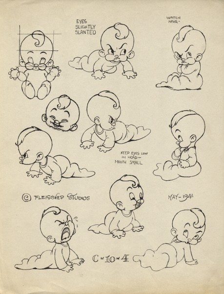
There’s an excellent article in AWN about Charles Thorson who designed the characters for the Raggedy Ann cartoon as well as the Stone Age films. He most probably did the model charts. He’d worked at every known studio in the late thirties, early forties and had settled in to Fleischer’s Florida location whn=enthe brothers were let go, and Paramount took over. It was at this point that Thorson decided to move on to comic book illustration.
The article is by Gene Walz who also wrote a biography of Thorson which was publlished as: Cartoon Charlie: The Life and Art of Animation Pioneer Charles Thorson.
Fleischer &Models 30 May 2012 06:05 am
Fleischer Model Sheets – Popeye and Betty
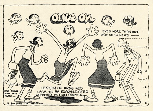
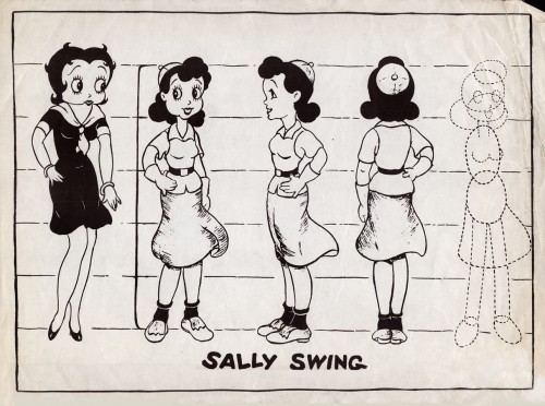
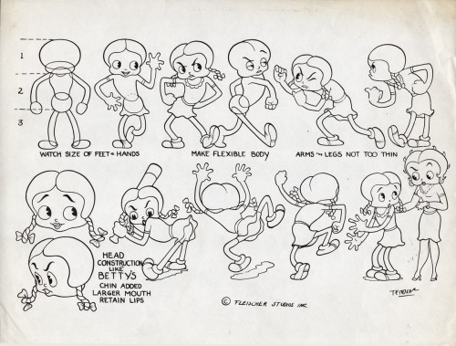
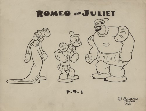
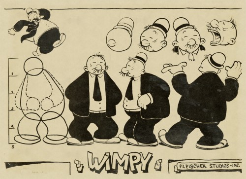
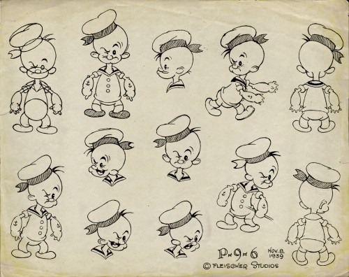
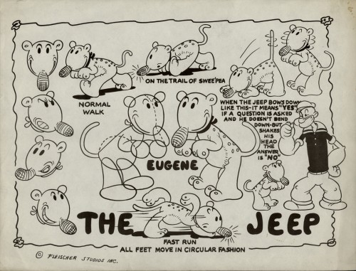
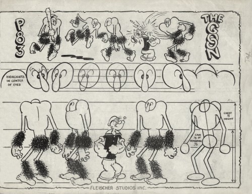
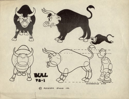
- In Vince Cafarelli‘s collection of model sheets, there are a number from Popeye cartoons of the Fleischer era. These, for the most part, seem to be designed for the one-off cartoons. These are the more eccentric model sheets, and it’s no wonder that they don’t go into a lot of detail They didn’t expect to need them again once the individual shorts were finished.
As such, there are very few images of Popeye here, except where he’s wearing an unusual outfit – as in the third model, Romeo & Juliet.
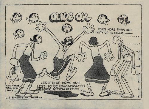 1
1Olive Oyl
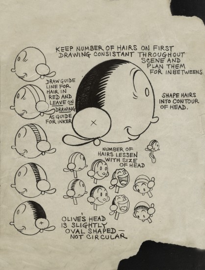 2
2
An assistant’s guide to Olive’s head
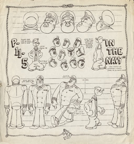 9
9
A new uniform for Popeye and
an early non-Fleischer film.
(As Thad Komorowski writes below, this model sheet
is from THE MIGHTY NAVY, a Fleischer film. I was wrong.)
___________________________________
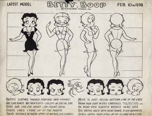
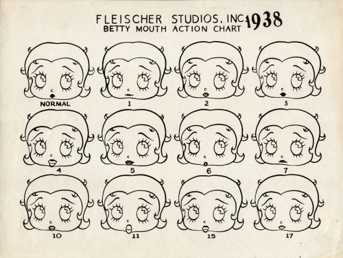
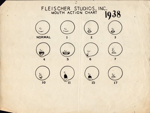
And to add to the models here are two from the late Betty Boop.
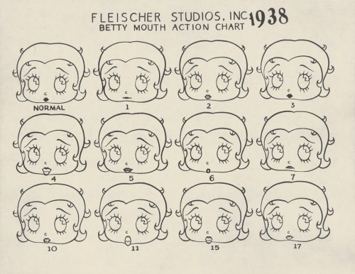
This first shows the normal Betty Boop mouth actions for a
simple bit of dialogue. Expect this to be on the test tomorrow.
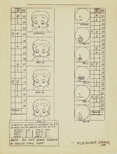
And here’s a Betty mouth chart for the improvised dialogue.
Interesting that they had that all worked out.
They obviously animated in sections where they’d ask
the actors to provide the gags. With Popeye,
they’d just keep the mouths shut.
Disney &Fleischer &Illustration &repeated posts 24 May 2012 05:16 am
Sheet Music Graphics – repost
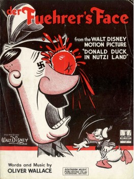 – I’ve long been a fan of old sheet music and have a tiny collection of songs from animated pictures.
This is a song by Oliver Wallace in the Donald Duck cartoon, Der Fuerher’s Face. The sheet music is a bit rare in that it has the original title of the Donald film, Donald Duck In Nutzi Land.
They soon changed the title on the sheet music, especially after the music became a #1 hit in a version by Spike Jones & His City Slickers.
You can see the film on the Walt Disney Treasure DVD – On The Front Lines: Disney Goes To War.
The film deservedly won the Oscar for Best Short Subject in 1942. Its opposition were all propaganda war films.
.

.
- Here’s part of the back page, for those who want to see the Disney logo for sheet music back then.
Sheet music in the 30s, 40s and 50s was Big Business. There were no DVDs,videos or LP records. No walkman, I Tunes or cel phones. Selling sheet music for all those kids learning to play an instrument was the natural tie-in to the film, and gave the Nation another inroad to marketing the film.
If the audience hummed the song, more tickets could be sold to the film.
.
The graphics for the music to Song of The South wasn’t quite as dynamic as the one on the cover of Der Fuehrer’s Face.
This cover tries to capture the lyrical, romantic feel of the film. Here surrounding the live-action plantation, with all the different song titles available from the film in the sky, is a border consisting of the animated characters from the film. The colors are limited to the green-etched homestead and the brown-linear characters.
The back cover of the sheet music contains a shot of the live-action characters, James Baskett, Bobby Driscoll, and Luana Patten. All are colored in the same brown ink as the cover’s line art.
That year “Zip-A-Dee-Doo-Dah“, also from this film, won the Oscar, while the film’s music, itself, was nominated for Best Scoring of a Musical Picture.
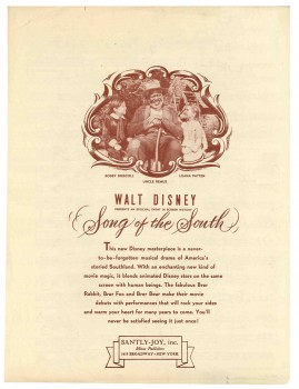 This film made quite an impression on me when I was a kid. And this song was one of the two I played over and over from the record. I also loved “Laughing Place”.
It’s something of a shame that the film has been kept out of circulation in the US. I can’t imagine that the film affected me as a child in any negative way. Uncle Remus was clearly the hero of the film and the only truly positive adult character in the film.
The last time I saw the film projected was back in the 70′s when Disney set themselves up at Lincoln Center to show a complete retrospective of ALL their films. At the library auditorium behind Lincoln Center there were a number of seminars in which Frank Thomas, Ollie Johnston, Ken Andersen and Woolie Reitherman talked about their work.
I remember Frank Thomas talking about this feature, saying that Disney only did the best for the film hiring the greatest cinematographer, Gregg Toland, to shoot it. He’d shot everything from Citizen Kane to The Grapes of Wrath. (Both are unbelievably stunning works of cinematographic art.) What Thomas didn’t say, or didn’t realize, however, was that this was Toland’s first COLOR feature. And it showed. Garish, cartoon colors flooded the screen, with actors wearing much too much makeup. A big step for Toland but not the best photography.
Still, I remember those colors vividly, and I would love to see it again – on screen. A dvd would probably do.
– I have a non-Disney cover. It’s the 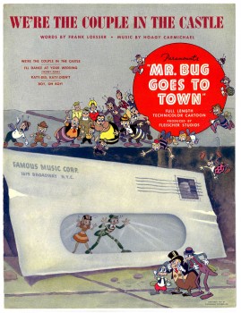 sheet music for the 2nd feature film from the Fleischer’s, Mr. Bug Goes To Town.
This was a feature that really got me going when I was young. I think it was the first original story done in animation; not an adapted fairy tale or novel. The story still works for me, though it comes off as a bit episodic. (Actually, I think most animated features are too episodic.) They’ve created a complete world for these insects, and it works.
Technically the film is a bit limited. The opening title shot is a stunning shot panning down the Empire State Building and across NYC ending on the vacant lot where the bugs live. The animation is adequate for the period; it has a charm that I find delightful and sometimes exciting. The voices are good, and the music is excellent.
This was the hit song, written by the brilliant Hoagy Carmichael (who wrote Stardust, Heart and Soul, and Skylark) and the just-as-brilliant Frank Loesser (who wrote Guys and Dolls, Hans Christian Andersen, and How To Succeed In Business). The score for the film was co-written by Leigh Harline (who scored Pinocchio, a lot of Disney shorts, and The 7 Faces of Dr. Lao, among others).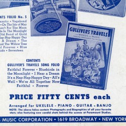
As we can see, most sheet music was printed with one or two colors) red for Der Fuehrer’s Face, brown & green for Song of the South) as opposed to full color. However, this Fleischer song has a full color cover (although they use one color on the rear cover). It shows that Paramount felt they had a hit song here, and they did have a modest hit. Glenn Miller’s recording of it didn’t hurt.
The rear cover is little more than an ad for other Paramount songs. However, in among the group is Gulliver’s Travels. I’m posting just this small section of the back cover, printed in blue.
.
.
Animation Artifacts &Fleischer &Story & Storyboards 23 May 2012 05:32 am
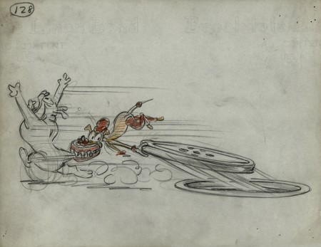
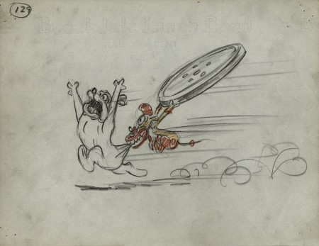
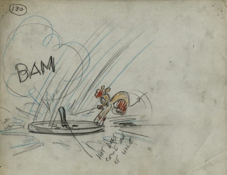
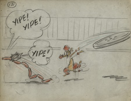
Popeye Storyboard – part 3
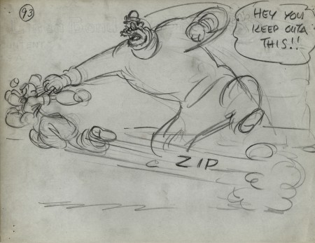
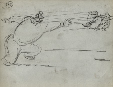
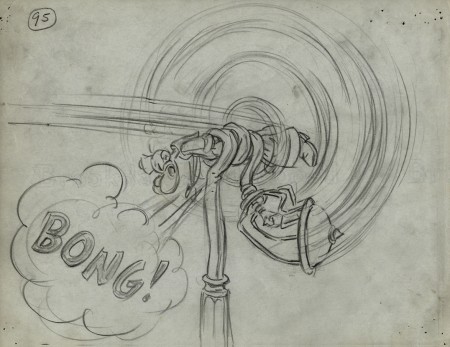
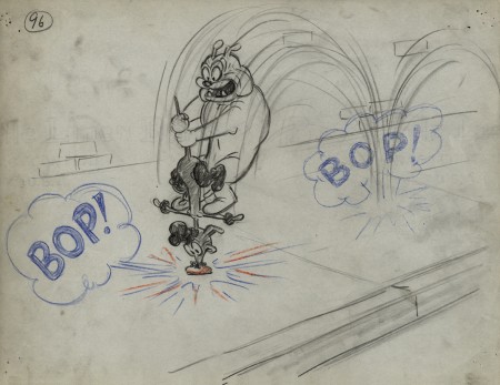
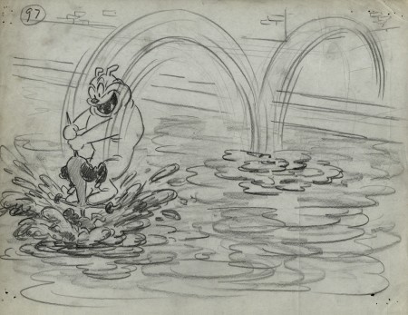
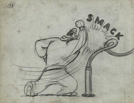
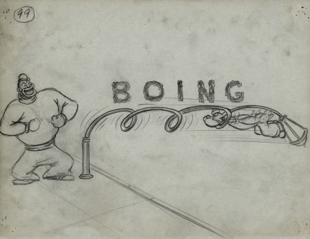
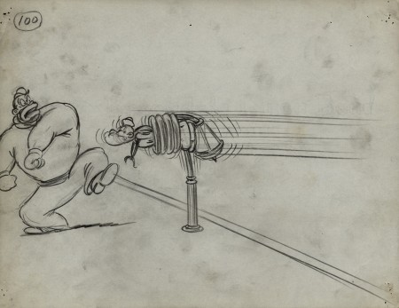
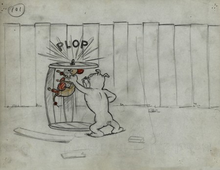
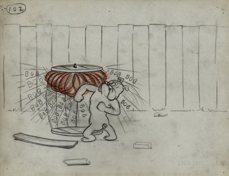
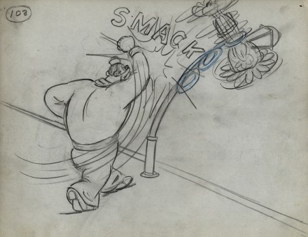
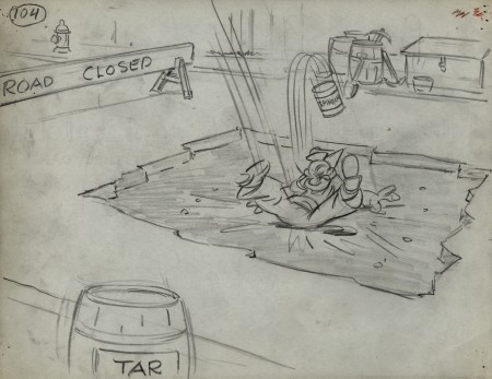
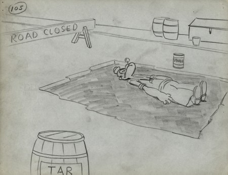
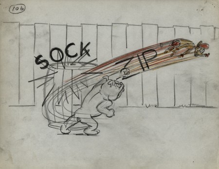
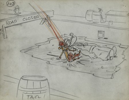
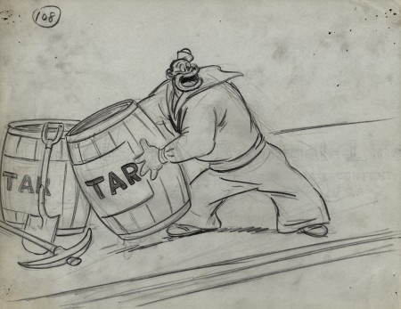
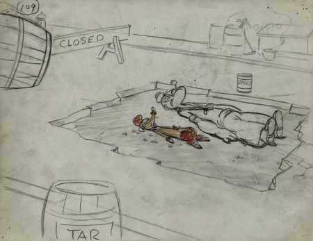
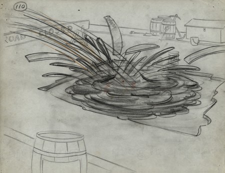
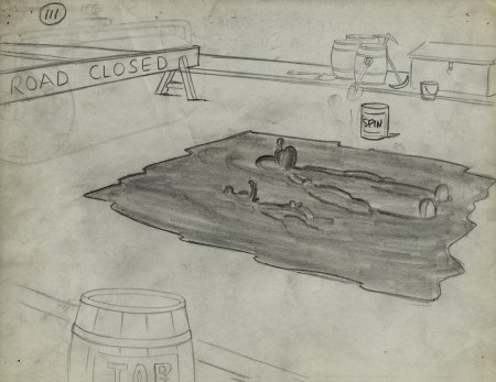
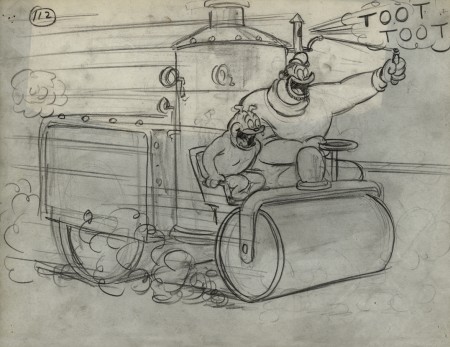
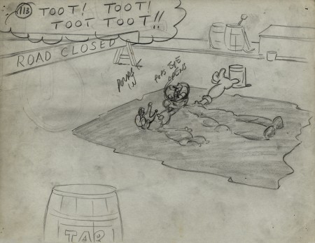
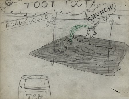
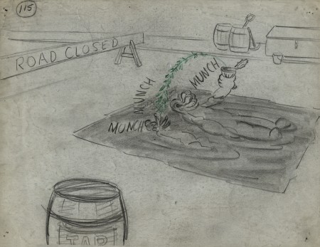
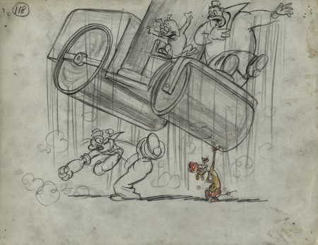
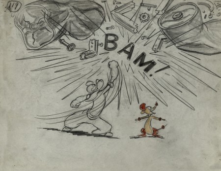
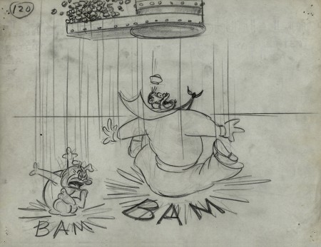
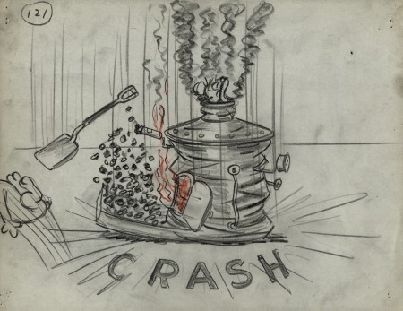
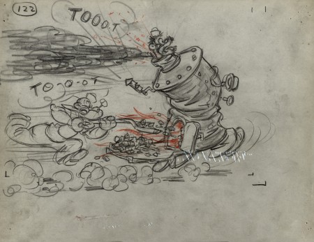
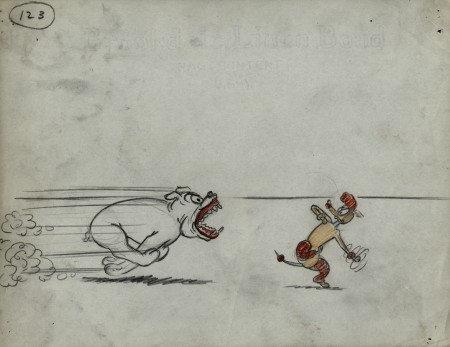
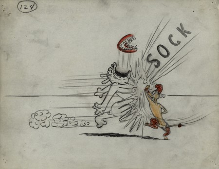
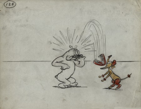
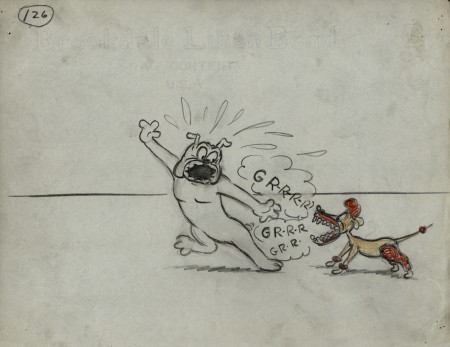
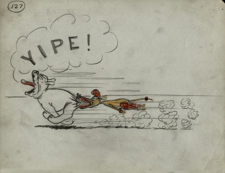
- We’ve come to the third and final part of the storyboard for the 1949 Paramount Popeye cartoon, “Barking Dogs Don’t Fite.” These storyboard drawings come from the late Vincent Cafarelli‘s collection of artwork he’d saved from the divers studios in which he worked.
The storyboard was done by Jack Mercer and Carl Meyer. Their drawing styles are both expressive and markedly different. I suspect that one drew the human characters and the other the animals. The drawings of Bluto are just out of this world, ripped right out of the early 20th century comic book pages. I also suspect these were done by Jack Mercer, but I have nothing but a hunch to give me that guess. I believe he was working at the studio longer and might have had more of the early Fleischer grit in his drawings as opposed to the cartoon slickness that would’ve come from later employees’ work. Each drawing is done on inexpensive 8½ x 11 paper. As usual with these continuing posts, we pick up with the last drawing from last week’s entry.
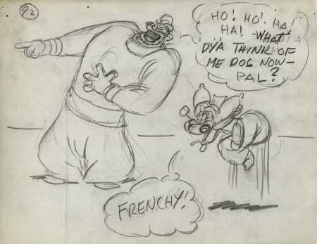 92
92
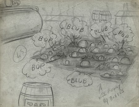 116
116
Note that drawing #117 is missing.
.
___________________________
Here’s the full short as seen on YouTube.
I wish the look was a bit closer to the board, however
some of the layouts in the final film are significant
improvements over the planning in the storyboard.
.
