Category ArchiveModels
Animation &Bill Peckmann &Books &Disney &Models 15 Oct 2010 07:27 am
Hovarth – 4
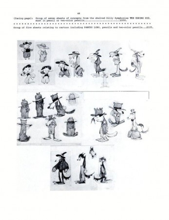
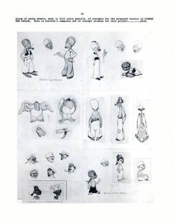
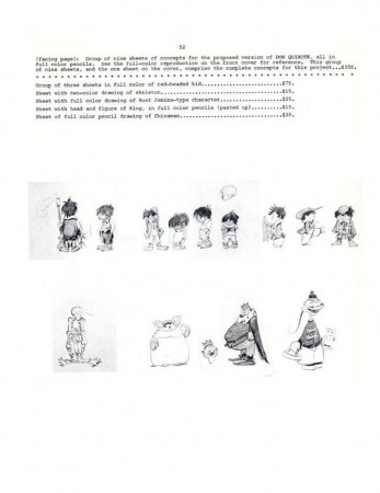
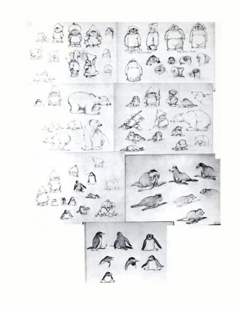
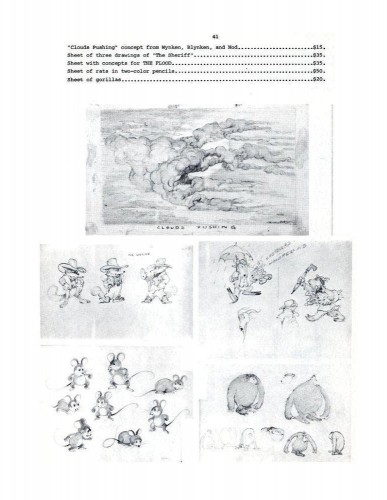
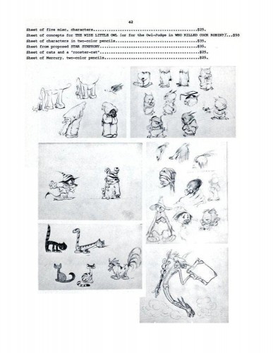
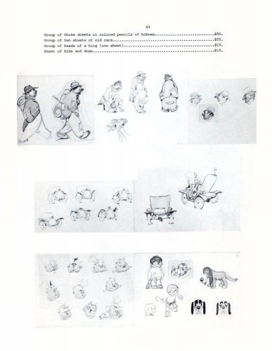
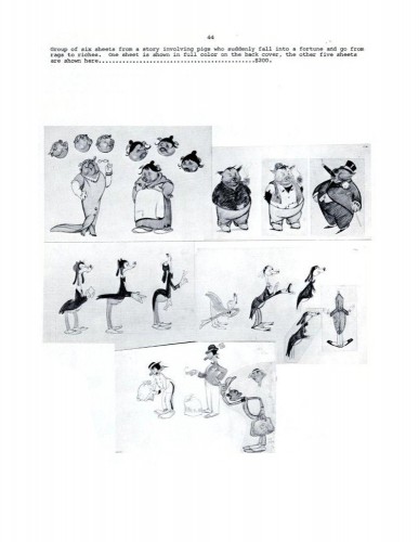
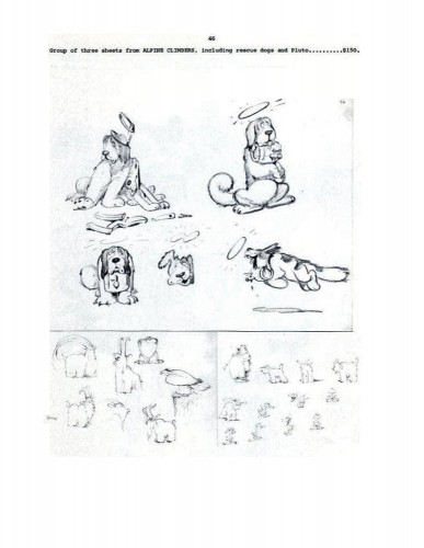
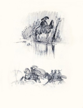
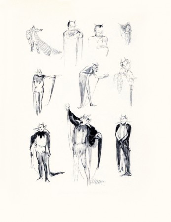
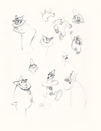
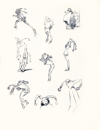
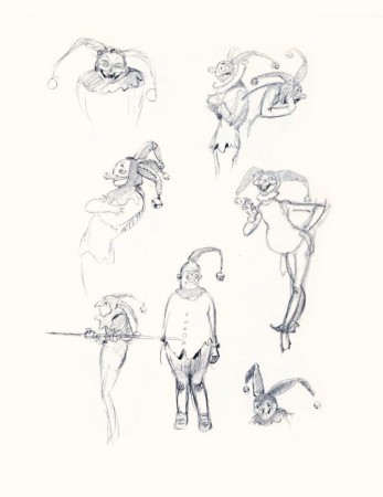
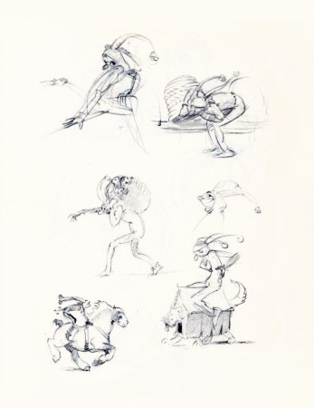
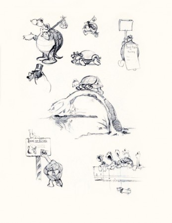
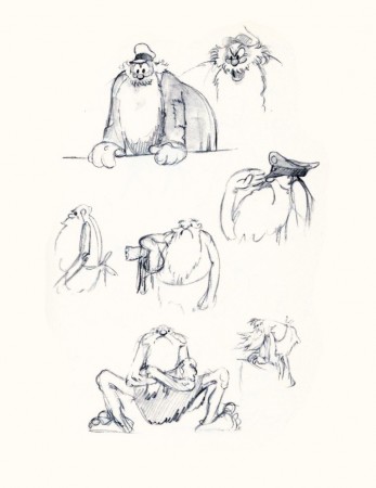
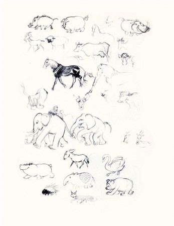
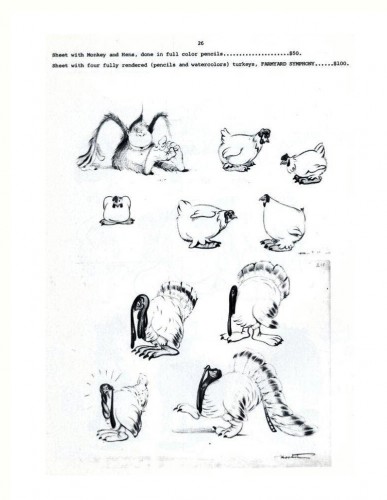
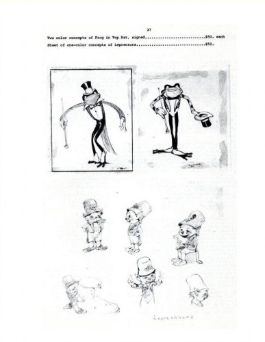
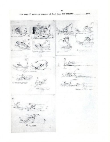
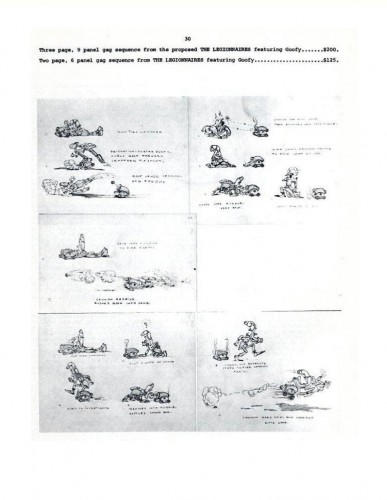
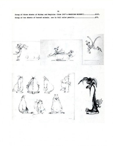
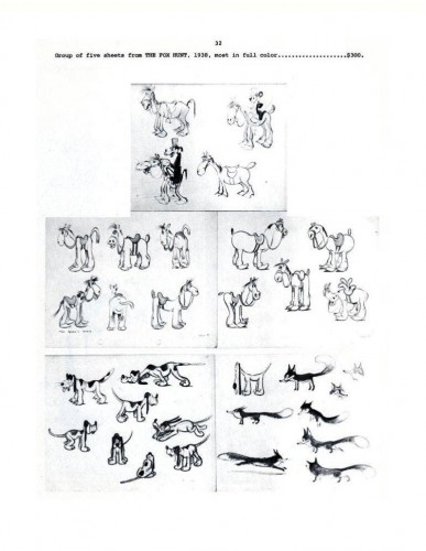
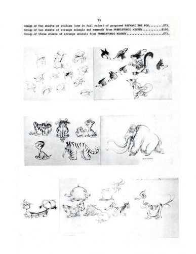
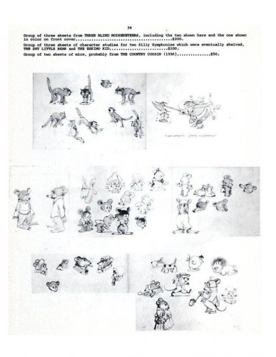
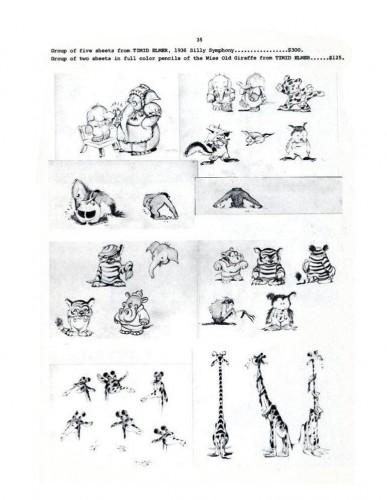
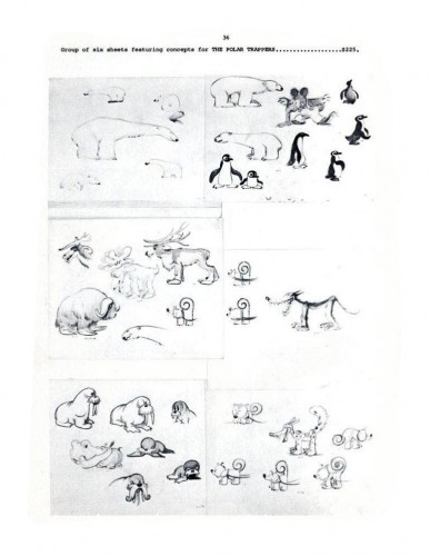
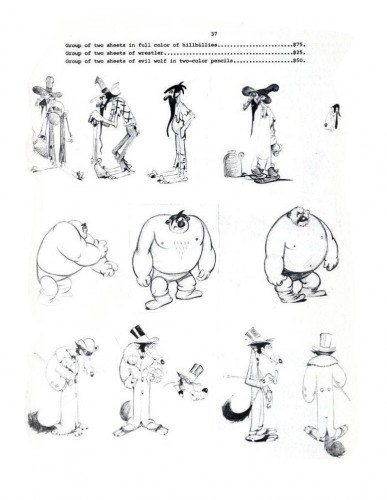
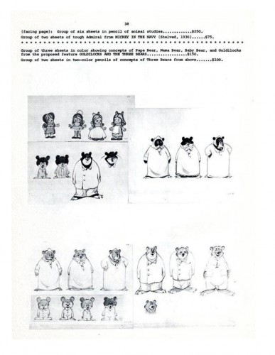
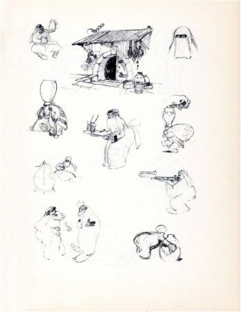
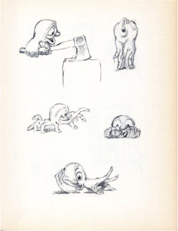
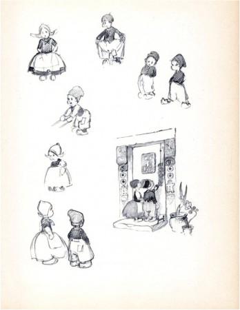
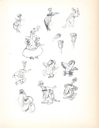
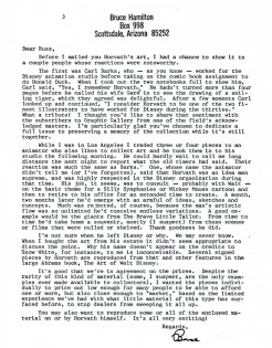
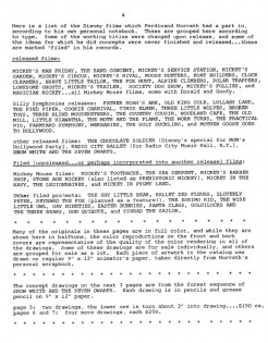
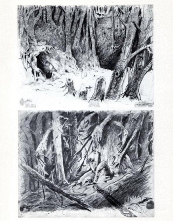
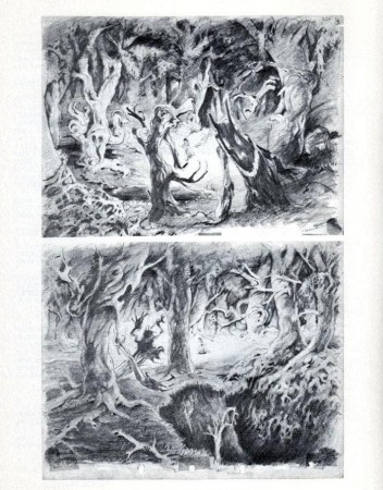
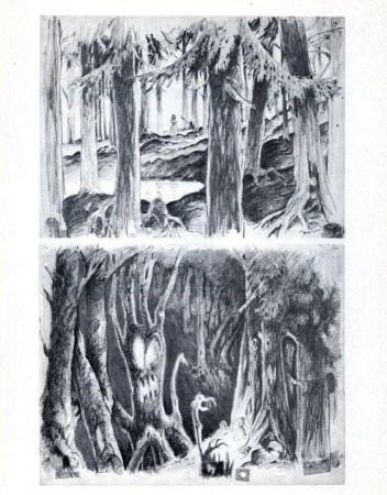
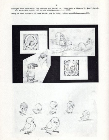
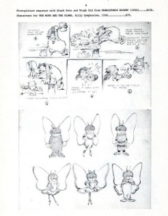
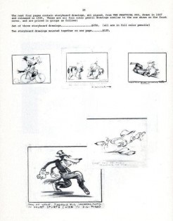
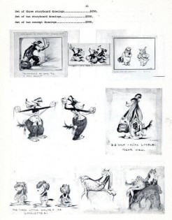
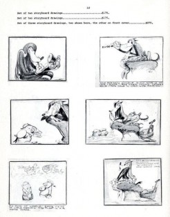
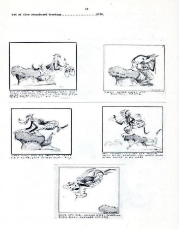
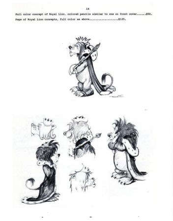
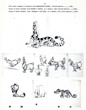
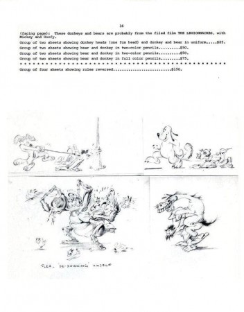
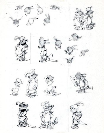
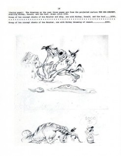
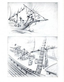
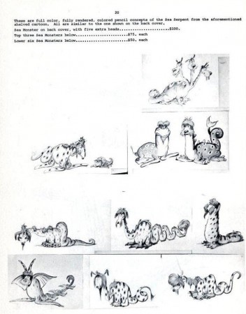
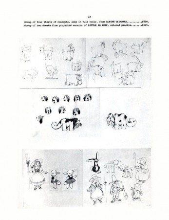
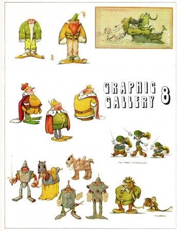 - Here is the final post of the Ferdinand Horvath catalogue of drawings. From 1934-1937, Horvath worked at the Disney Studios painting backgrounds, creating layouts, constructing three dimensional models, and designing characters and gags for over fifty Silly Symphonies and Mickey Mouse shorts.
He was one of those European illustrators, including Albert Hurter or Gustaf Tenggren and himself that Disney found in Europe and brought to America to inspire his staff artists.
Horvath also worked at Paul Terry’s studio on the “Aesop’s Fables” series. Leaving Disney, he designed models and layouts for Columbia/Screen Gems’ shorts. In 1940, he sculpted puppets for George Pal’s Puppetoons.
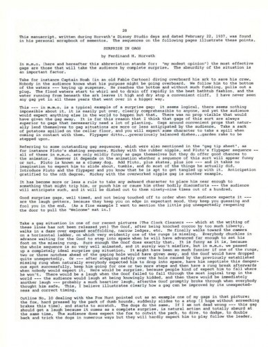
He was a versatile artist whose work was an inspiration for many Disney artists. The following booklet was published by Graphis Gallery and put together by Bruce Hamilton. The opening material explains itself.
Bill Peckmann sent me the pages of this booklet, and I thank him for keeping Horvath alive.
 48
48(Click any image to enlarge.)
Animation Artifacts &Bill Peckmann &Books &Disney &Illustration &Models 08 Oct 2010 08:26 am
Hovarth – 3
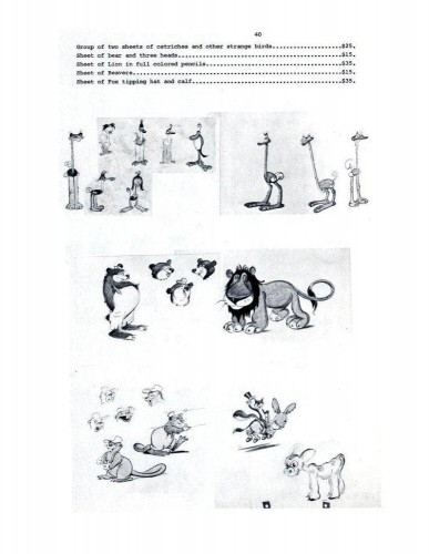
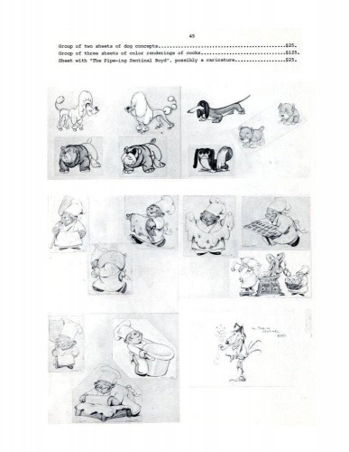
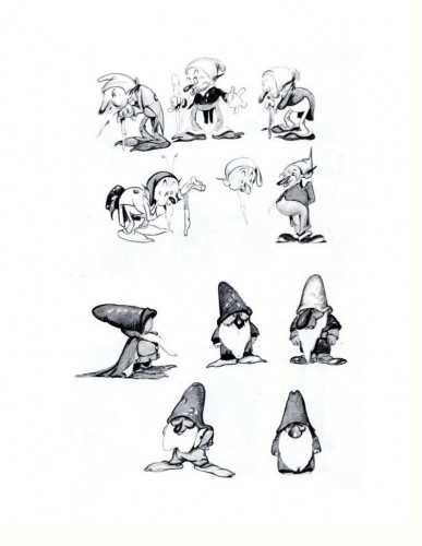
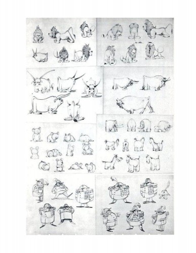
 Ferdinand Hovarth was a versatile artist whose work was an inspiration for many Disney artists. He was a mainstay at the Disney studio from 1934-37. He was one of those artists brought in from Europe to draw inspirational art for the other designers and animators. Gustaf Tenggren and Albert Hurter also fell into this category. All three contributed mightily to the product the studio produced – particularly Snow White and Pinocchio. I can only think of Joe Grant as being the modern equivalent, for a short period.
This is the final installment of a catalogue published by Graphis Gallery and put together by Bruce Hamilton. The opening material explains itself.
The following booklet was
Bill Peckmann sent me scans of these pages, and I thank him for keeping Hovarth alive.
 40
40
Books &Models &Story & Storyboards 07 Oct 2010 07:41 am
Backing Forward
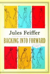 - I’m currently reading an excellent book; it’s Jules Feiffer‘s autobiography, Backing Into Forward. The book not only serves as Feiffer’s life story, it’s also a treatise on art, cartooning and illustration. The man’s led an extraordinary, artistic life from drawing his weekly strip in the Village Voice to writing plays and movies with the likes of Mike Nichols, Stephen Sondheim and other notables and actors.
I’ve had the pleasure of working with Mr. Feiffer on several occasions, and I can attest that he’s as distinguished and constant an artist as I’ve met. I’ve also had the chance to interview him publicly about the Oscar for Munro (which he didn’t receive – William Snyder did) as well as his long working relationship with Gene Deitch. Mr. Feiffer is an erudite man, and it comes across in this autobiography.
The post that appeared yesterday on the ASIFA Hollywood Archive blog made me think about this short section of the Feiffer book, three pages which call to mind his short history at Terrytoons. The story is interesting, one which I closely relate to. Here is that story in Feiffer’s own words:
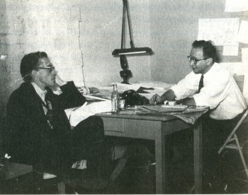
Eli Bauer (R) and Jules Feiffer (L) at Terrytoons.
- (R.O.) Blechman drew like no one else, in captivating minimalist squiggles that Deitch presented stunningly on a panoramic movie screen. A couple of days a week, Blechman and I found ourselves sitting next to each other on a wrong-way rush hour commute to New Rochelle. We would sound each other out on the business, whom we liked, whom we didn’t like, what we were going to be when we grew up. A modest man of considerable sweetness, it was surprising to find that Blechman was as dismissive as I was of the outdated but amiable hacks we had been shipped in to replace, a company of aging boys, midfifty to seventy, who were unembarrassed by and even took pleasure in their mediocrity. They could pushpin seventy-five to a hundred layouts on wall-length corkboard that showed cats and mice and ducks and pigs and elephants wreaking cartoon havoc on one another. Then, following the age-old tradition of storyboard conferences, they would mortifyingly act out in funny voices before sponsors, network honchos, and account executives what was plainly visible to anyone who could read.
A man of fifty had to bark like a dog, a man of sixty had to flap his hands and quack like a duck, a man on the verge of retirement had to jump up and down in mock excitement. All this to convey to clients what was assumed they couldn’t understand without the assistance of stand-up interpreters.
And as it must to all men with an attitude, one day it came to be my turn to humiliate myself. Gene Deitch had brought me into Terrytoons in part to design a three-minute animated story to run several mornings a week on Captain Kangaroo, CBS’s star morning children’s program. Deitch’s own creation for Captain Kangaroo, a popular series called Tom Terrific, was about to run its course. On the basis of my early Voice strips and Clifford, which Deitch remembered from the back page of the Spirit section, he thought I could design a sophisticated cartoon for lads in a UFA mode.
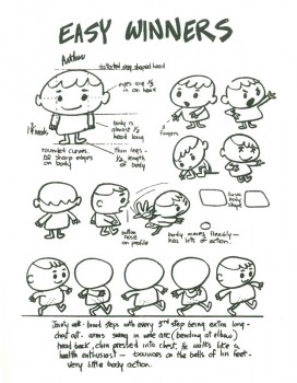
I went back to my Clifford roots and created a cartoon about a gang of street kids that I called Easy Winners. The title was derived from a Scott Joplin rag I happened to hear late one night on the radio. I put together a model sheet of characters and wrote and laid out a couple of episodes, one of which I pushpinned to the wall. The reaction was more than I could have hoped for. Everyone at Terrytoons loved it. The new guard loved it; the old guard claimed to love it, but it was hard to tell what they really thought, other than that they wished we would all go away.
Deitch was more enthusiastic than anyone, which was not a surprise. He was happiest working at fever pitch, his energy hyped into overdrive to convince the client, through sheer exuberance, that whatever doubts he might have about the work on the wall, it was potentially a classic. Gene loved my storyboard and he anticipated the excitement of the CBS executive (on his way at this very moment) who would shortly look at and decide the fate of Easy Winners. My role was to do no more than thousands of hacks before me: stand and perform the storyboard before Gene and a claque of animators and layout men, along with Bill Weiss, the president of Terrytoons.
The man from CBS arrived and my heart sank. He was a tall, silver-haired, mustachioed gentleman dressed in a three-piece pinstripe who, in dress and manner, made the rest of us in the room look inconsequential His name was Williamson, as English-sounding as his look. He outclassed us all, but Gene failed to notice. “You’re going to love this!” he squealed in his high-pitched salesman’s voice. One look at our distinguished visitor told me he was unlikely to love anything pushpinned to a wall in New Rochelle.
 I had been through many of these storyboard sessions. I was upon the routine, but that didn’t mean I was up for the job. I was years away from public speaking, deep into shyness and self-effacement. Still, I did my best to sound like the quacking, barking, oinking animators I’d seen do this many times, pumping myself up to imitate a gang of five-year-olds from the Bronx. A minute and a half in, my humiliation was intense, and what was worse, it wasn’t getting me anywhere.
Behind me, Deitch and my claque had been laughing hystericalh until it became clear that the unsmiling Mr. Williamson was perhaps having himself a snooze. My approach shifted from manic to wistful. The claque’s laughter dwindled and died, leaving only my own strangled half laugh, half gasp.
Each time I turned from my storyboard, I noticed the room was a little emptier. My claque had decided that Mr. Williamson’s side was a better one to be on than mine. They had made the only sensible choice: I didn’t want to know me either.
By the time I limped to the end, only Bill Weiss, the president, and Gene, the head of the studio, remained, plus a goofily grinning threesome of loyal friends.
It was time for me to shut up and wait for Mr. Williamson’s decision on Easy Winners. His way of presenting it stays fresh in my mind fifty years later. After an uncomfortably long pause, he said, “Well, it’s a little New Yorker-ish.” Dead!
He had one final comment: “I mean, it’s closer to Dostoyevsky than it is to Peter Pan.”
As I headed home from New Rochelle that night, rage alternated with my sense of reawakened abandonment. Where had Deitch been when the time came to fight for me? I knew I had no call to be angry. Easy Winners was a loser. I gave them exactly what they wanted, but the they I gave it to was the wrong they.
I knew I was finished at Terrytoons, this studio where I had actually enjoyed a nine-to-five job for my one and only time since leaving the army. But it was no longer a place where my pride would allow me to work, a place where I could do quality work that also had commercial value. Seemingly, such a place did not exist.
In all the years I’ve presented storyboards, I’ve never done the song and dance required in animation studios. I’ve always trusted the material to out itself. This, perhaps, is a lesson I got while watching John Hubley pitch a storyboard, early on in my career. No quacking ducks, barking dogs or anything resembling the pitch meeting described here.
Thank you, Jules Feiffer, for leading the way and allowing me to feel less embarrassed about it.
Animation &Bill Peckmann &Books &Disney &Illustration &Layout & Design &Models 24 Sep 2010 10:14 am
He Drew As He Pleased – 2
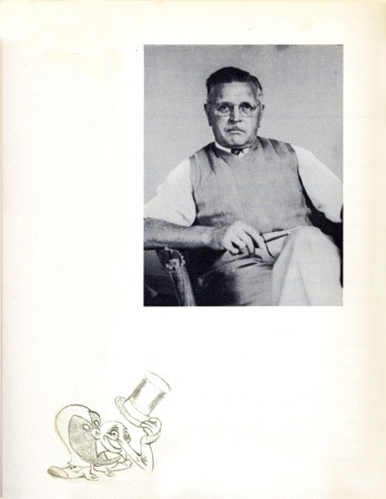
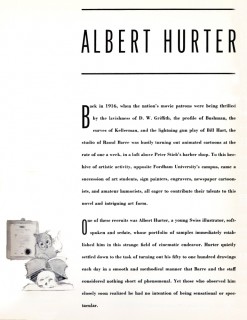
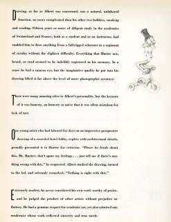
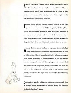
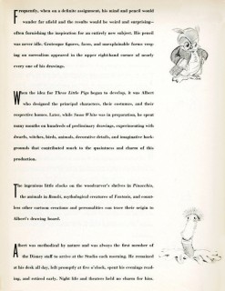
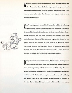
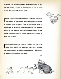
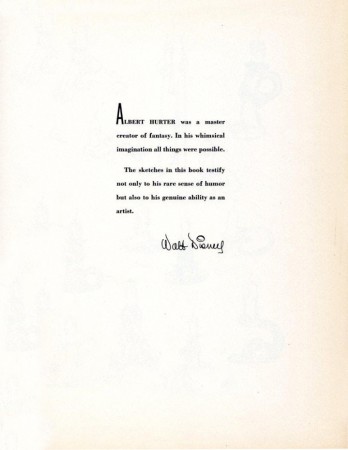
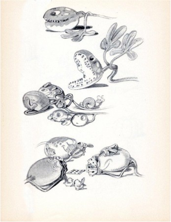
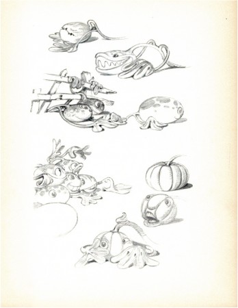
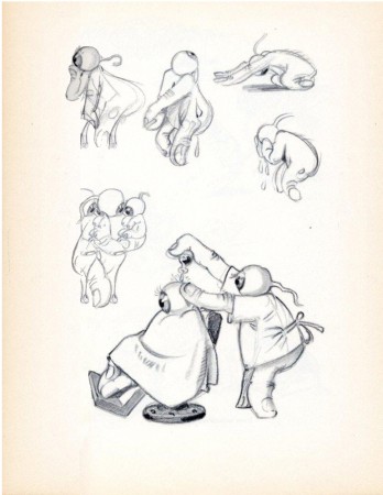
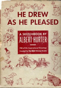 - Last week I posted the first of the displays from this beautiful book, He Drew As He Pleased. This, of course, is the work of Albert Hurter who was a key designer for the Disney studio during the mid thirties, particularly in the making of Snow White.
Interesting that this film showed up with commercials on ABC Family Channel last Saturday evening. It was a happenstance that got me to watch the film again, and then I watched it uncut and uninterrupted the next day in my studio.
For all the shaking lines and animation problems the earliest feature had, it’s still a gorgeous testament to brilliant animation. There are no cliches floating in the eyes of the characters. No hard edges right out of Cartoon Network or CalArts. It has its cliches of the period – which existed in live action as well – but the acting is brilliant, particularly in the dwarfs. I was also very impressed, this time, with the old hag. The witch is overplayed by Norm Ferguson, yet it’s done with imagination and resourcefulness. She comes right out of an opera – or do I mean a melodrama – and she’s loveable in her grotesque way.
The film has an innocence we’ll never see again, and it’s too bad.
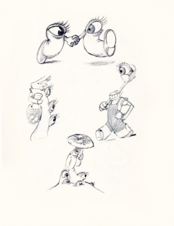
Hurter had his part in that innocence, and the drawings are a fine display of all that’s good in the film.
Many thanks to Bill Peckmann for scanning his copy of the book for me to post. This is the first time I get to see the entire thing.
 20
20“Optics . . .”
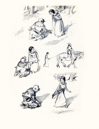 22
22
“Preliminary Sketch of Snow White.”
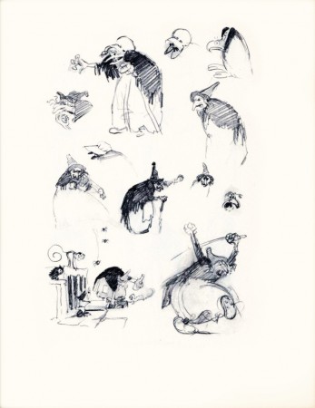 24
24
“The Witch . . . Hansel and Gretel.”
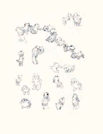 26
26
“And Some Demons in the Making.”
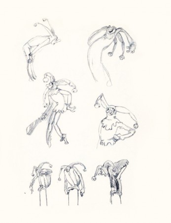 27
27
“Tyll the Jester and . . . ”
Bill Peckmann &Books &Disney &Illustration &Layout & Design &Models 17 Sep 2010 07:59 am
Horvath – 2
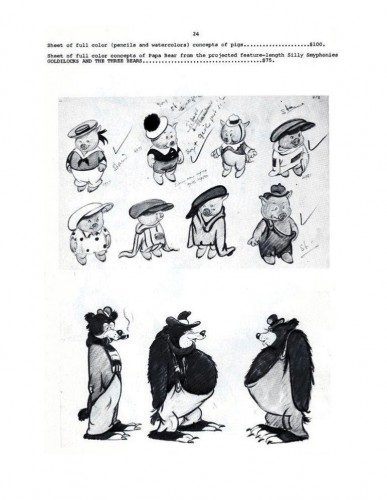
From 1934-1937, Ferdinand Horvath worked at the Disney Studios in numerous jobs doing everything from painting backgrounds and doing layouts to constructing three dimensional models to designing characters and gags for over fifty Silly Symphonies and Mickey Mouse shorts.
He was one of the famed illustrators, such as Albert Hurter or Gustaf Tenggren that Disney found in Europe and brought to America to inspire his staff artists.
Prior to working at Disney, Horvath worked at Paul Terry’s studio on the “Aesop’s Fables” series. Once he left Disney, he designed models and layouts for “Scrappy,” “Krazy Kat” on shorts for Columbia/Screen Gems. In 1940, he sculpted puppets for George Pal’s Puppetoons.
He was a versatile artist whose work was an inspiration for many Disney artists. The following booklet was published by Graphis Gallery and put together by Bruce Hamilton. The opening material explains itself.
Bill Peckmann sent me scans of these pages, and I thank him for keeping Horvath alive.
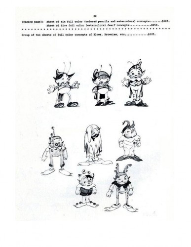 22
22(Click any image to enlarge.)
One more post to come from this book. Next week will be Part 2 of Albert Hurter – He Drew As He Pleased, and Horvath will follow that.
Mixing them up.
Animation Artifacts &Bill Peckmann &Layout & Design &Models 13 Sep 2010 07:34 am
Dolores Cannata
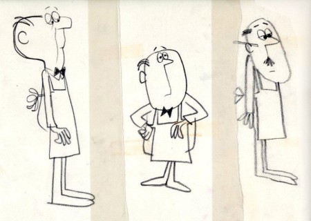
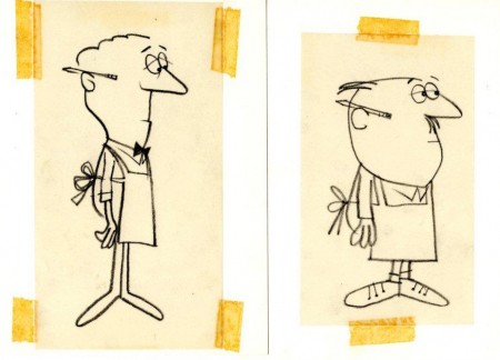
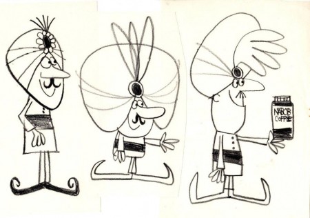
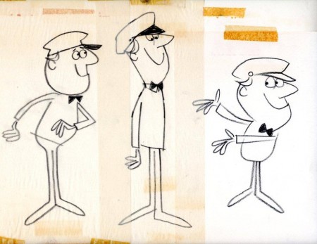
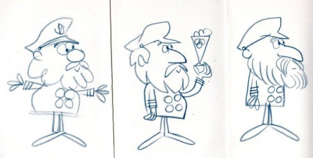
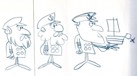
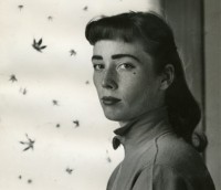 - Dolores Cannata was one of a group of art students that was pulled in to The Boing Boing show to help design the seventy five new shorts, all differently designed, for the series that CBS had just signed on to. She designed The Trial of Zelda Belle and Just Believe in Make Believe for the show.
When The Boing Boing Show was cancelled she moved to work for Abe Liss’ commercial company, Elektra, where she worked with other designers like Cliff Roberts, Pablo Ferro, Hal Silvermintz, Fred Mogubgub and her brother, George Cannata Jr.
Photo from Amid Amidi’s Cartoon Modern
___
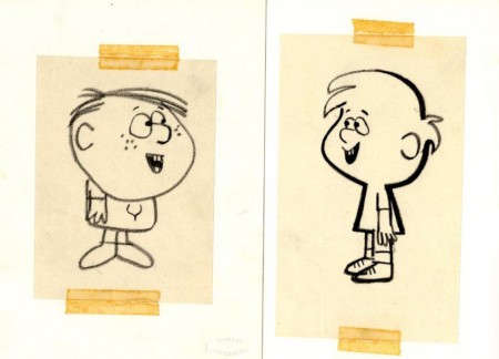
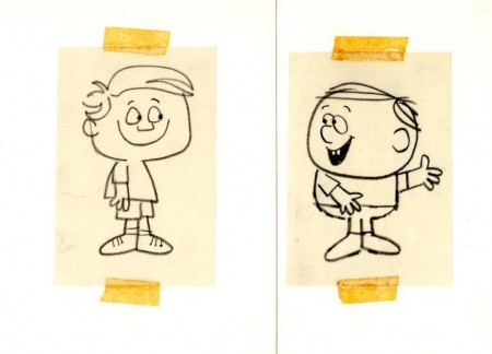
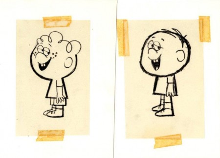
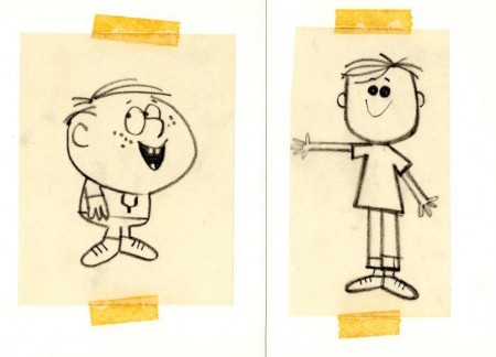
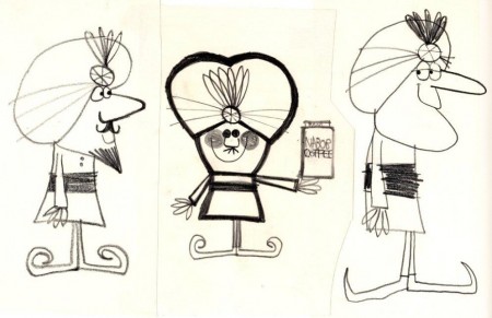
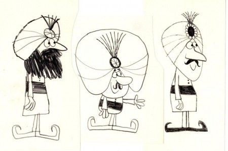
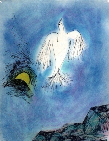
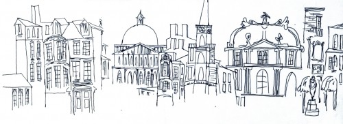
What follows are a number of sketches for characters that Dolores did for Elektra. These were all saved by Bill Peckmann who has allowed me to post this small tribute to the fine work of Dolores Cannata.
 1
1The first two color sketches are personal and not production related.
 4
4
. . . which looks like this when cleaned up and reversed.
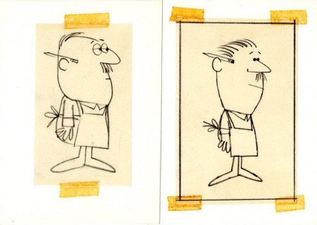 5
5
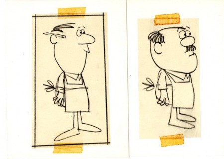
A few shopkeepers for a commercial in the 60s.
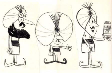 13
13
Some Arabian Nights themed coffee spot.
Bill Peckmann &Books &Disney &Illustration &Layout & Design &Models 10 Sep 2010 07:49 am
He Drew As He Pleased – 1
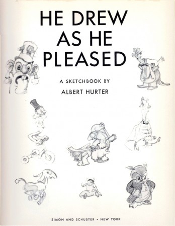
 – We all know that Albert Hurter was the brilliant artist behind a lot of Snow White’s gingerbread architecture. Hurter was a Swiss illustrator that Disney brought into the studio and let him go. He could draw whatever he wanted to help inspire the studio to pull Snow White together.
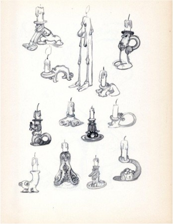
After leaving the studio, Hurter had a book published called, “He Drew As He Pleased.” It’s a beauty of a book and a rare item. Bill Peckmann sent me scans from the book, and I’ll post them here. It’ll take a few installments. The pages are in delicate condition, but photoshop is allowing me to clean them up a bit – but not too much.
Some of the pages are devoted to characters in the Silly Symphonies. I had hoped to pull some frame grabs from the films, but I didn’t have time. It’s a project for the future.
This book will interplay with the post I started last week on Frederick Horvath‘s designs for the studio – at the same time. That booklet will continue soon.
 1
1(Click any image to enlarge.)
 10
10
“For Albert There Were No Inanimate Objects”
Books &Disney &Layout & Design &Mary Blair &Models 07 Sep 2010 05:58 am
Mary Blair – 9
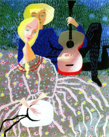
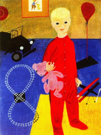
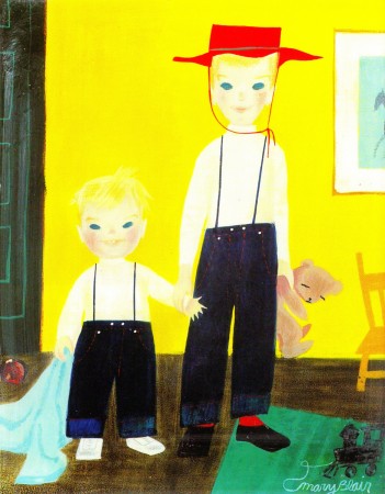
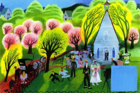
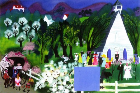
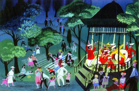
- This will be the last of my Mary Blair posts. Today, I’m going to concentrate on her more personal and private work. Some of these are paintings, some greeting cards, others theatrical designs.
I’ve taken artwork exclusively from the Japanese book, The Colors of Mary Blair. John Canemaker writes an introduction to the Japanese book and that’s also a fine piece of writing.
However, I’ve consistently gone back to Canemaker’s excellent US book, The Art and Flair of Mary Blair.
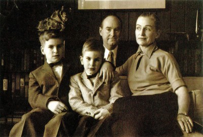
The Blair Family
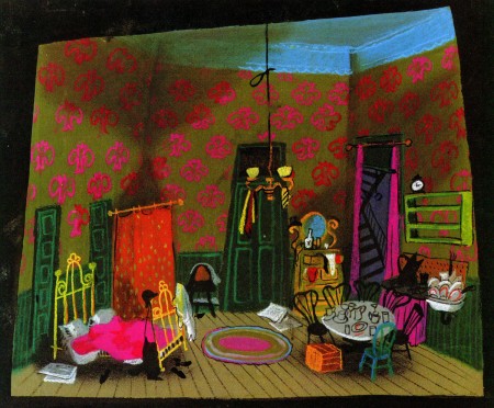
Set design for Cole Black and the Seven Dwarfs
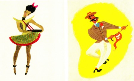
Costume designs for the same show.
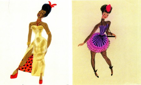
This was a musical that featured the music of Duke Ellington.
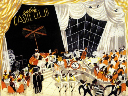
The show never opened on Broadway, and it’s too bad that
Mary Blair never had a theatrical show that she designed.
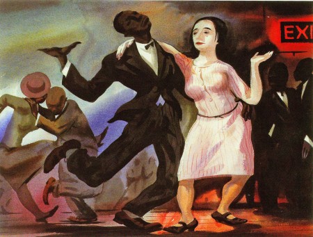
An oil painting that’s reminiscent of the work
of the brilliant black artist, Archibald Motley.
Animation &Bill Peckmann &Books &Disney &Illustration &Layout & Design &Models 01 Sep 2010 07:38 am
Horvath – 1
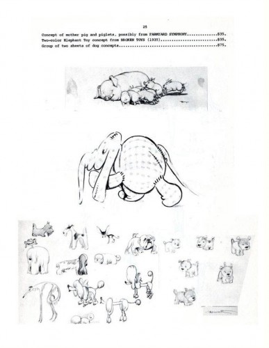
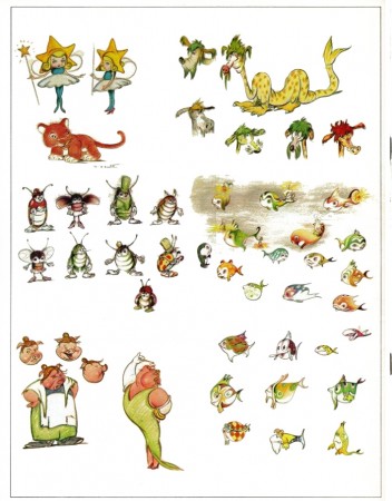
Ferdinand Horvath was a Hungarian book illustrator, who was born in 1891 and died of a stroke in 1973. From 1934-1937, he worked at the Disney Studios in multifarious positions doing everything from painting backgrounds and doing layouts to constructing three dimensional models to designing characters and gags for over fifty Silly Symphonies and Mickey Mouse shorts.
Prior to working at Disney, he labored at Paul Terry’s studio on the “Aesop’s Fables” series. Once he left Disney, he designed models and layouts for “Scrappy,” “Krazy Kat” on shorts for Columbia/Screen Gems. In 1940, he sculpted puppets for George Pal’s Puppetoons.
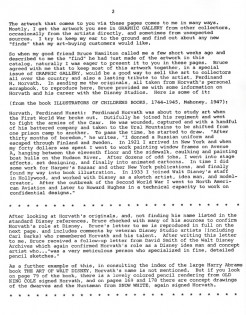
He was a versatile artist whose work was an inspiration for many Disney artists. The following booklet was published by Graphis Gallery and put together by Bruce Hamilton. The opening material explains itself.
Bill Peckmann sent me scans of these pages, and I thank him for keeping Horvath alive.

Front cover of the catalogue.
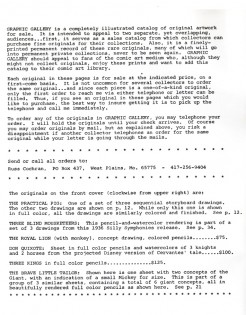 1
1 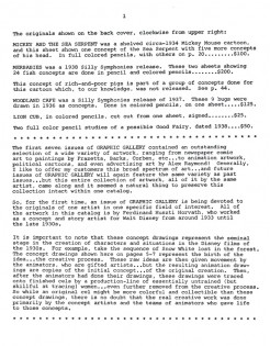 2
2
This gives information on what appears on the two covers.
.
John Canemaker writes in depth about Horvath in his book, Before the Animation Begins: The Art and Lives of Disney’s Inspirational Sketch Artists.
Disney &Illustration &Layout & Design &Mary Blair &Models 30 Aug 2010 07:44 am
Mary Blair – 8
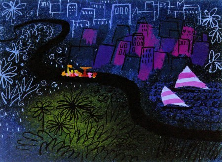
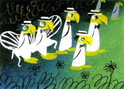
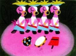
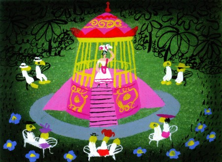
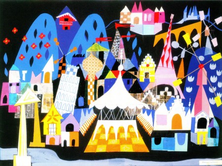
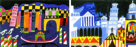
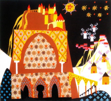
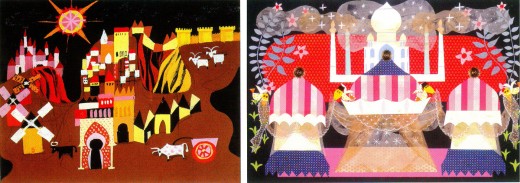
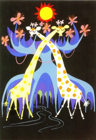
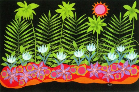
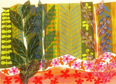
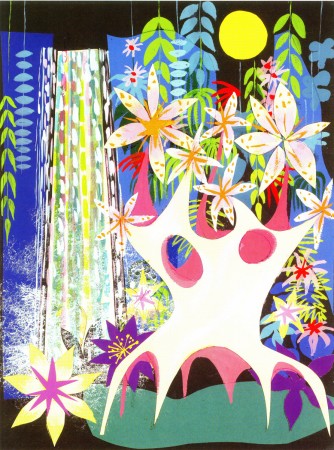
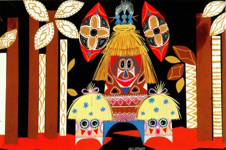
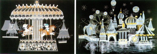
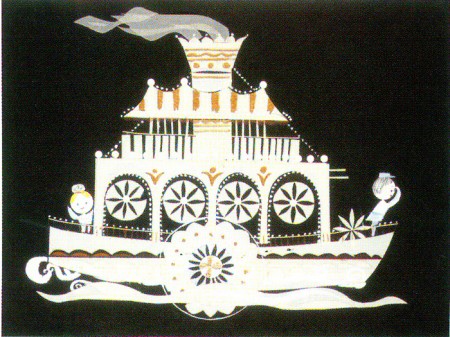
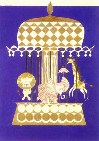
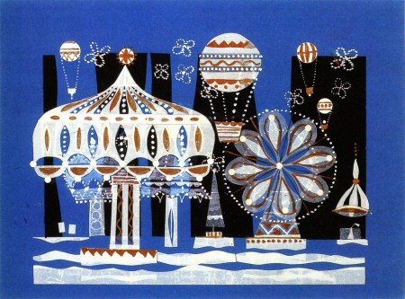
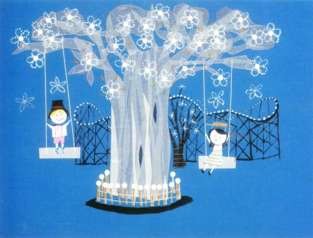
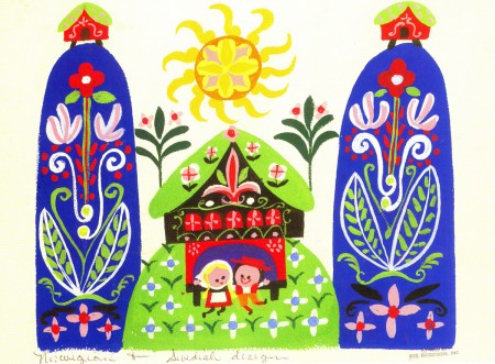
- For It’s A Small World for the Pepsi pavilion at the 1964 NY World’s Fair, Mary Blair produced a lot of preliminary designs. All of them glisten like little gems. Last week I posted art for the larger part of the pavilion; this week we go into the smaller interior parts. All of it is beautiful
These scans were all taken from the featured book, The Colors of Mary Blair.
Of course, there’s also John Canemaker‘s excellent book, The Art and Flair of Mary Blair.
 1
1(Click any image to enlarge.)
