Category ArchiveModels
Fleischer &Models 30 May 2012 06:05 am
Fleischer Model Sheets – Popeye and Betty
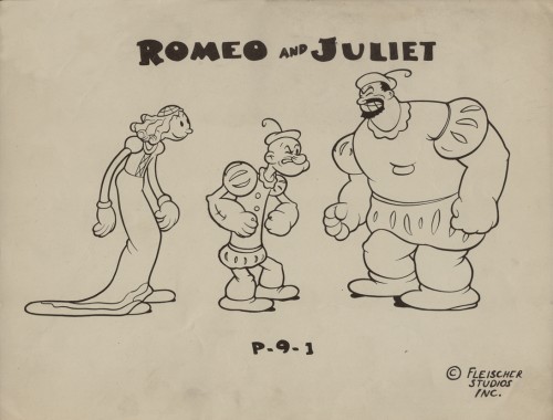
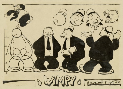
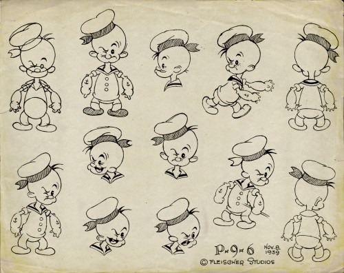
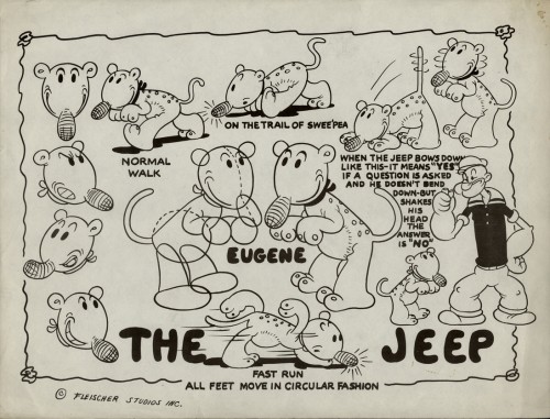
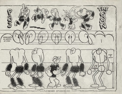
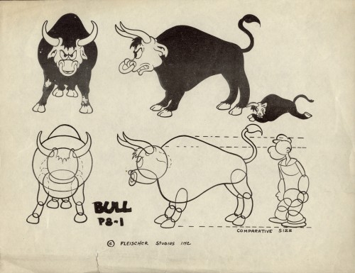
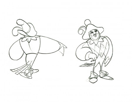
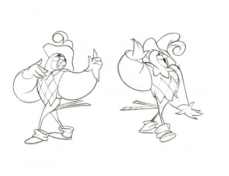
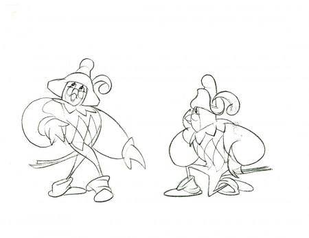
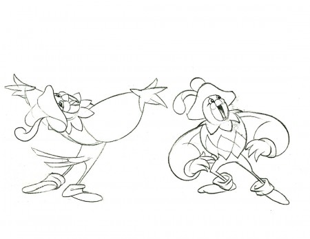
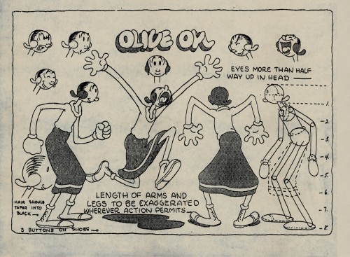
- In Vince Cafarelli‘s collection of model sheets, there are a number from Popeye cartoons of the Fleischer era. These, for the most part, seem to be designed for the one-off cartoons. These are the more eccentric model sheets, and it’s no wonder that they don’t go into a lot of detail They didn’t expect to need them again once the individual shorts were finished.
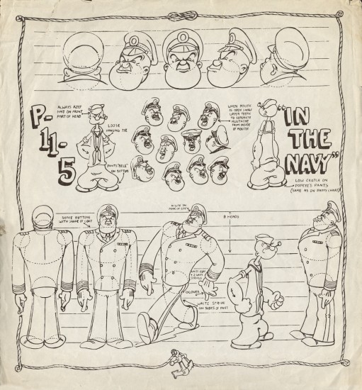
As such, there are very few images of Popeye here, except where he’s wearing an unusual outfit – as in the third model, Romeo & Juliet.
 1
1Olive Oyl
 2
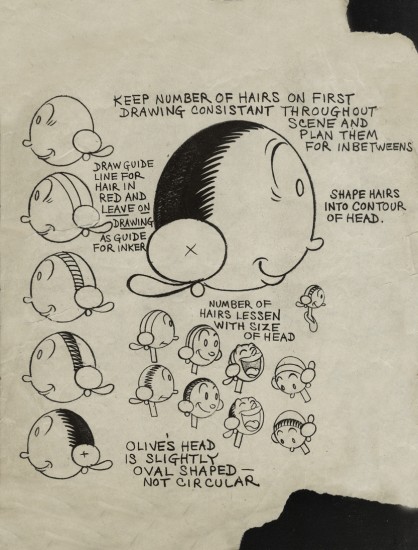
2
An assistant’s guide to Olive’s head
 9
9
A new uniform for Popeye and
an early non-Fleischer film.
(As Thad Komorowski writes below, this model sheet
is from THE MIGHTY NAVY, a Fleischer film. I was wrong.)
And to add to the models here are two from the late Betty Boop.
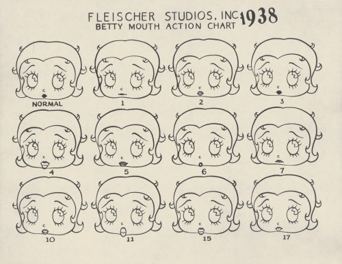
This first shows the normal Betty Boop mouth actions for a
simple bit of dialogue. Expect this to be on the test tomorrow.
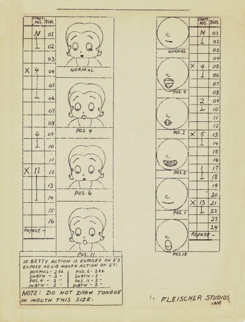
And here’s a Betty mouth chart for the improvised dialogue.
Interesting that they had that all worked out.
They obviously animated in sections where they’d ask
the actors to provide the gags. With Popeye,
they’d just keep the mouths shut.
Animation &Commentary &Hubley &Models &repeated posts 17 May 2012 07:17 am
Hub Eyes – repost
Here’s a post I wrote in 2009 that I still think is valuable, so I’m going to put it up again.
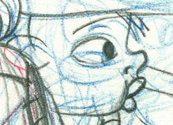 - It was 1973, and I was happily – I can’t tell you how happily – ensconced in the Hubley Studio working on Letterman, a new series for an upcoming CTW show, The Electric Company.
It was my first animation job. I inked it all (directly from animator roughs), I assisted & inbetweened it all, and I animated odd scenes including all the title sequences. I was a novice, and I was doing it all. Excited and happy is all I can remember.
I was alone one morning in the small room wherein I worked. I made a habit of getting into work before anyone and leaving after everyone. I wanted to make sure I was indispensible.
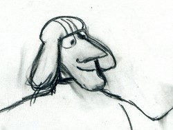 A month into the gig, and I think I’d only spoken with my hero, John, about a half dozen times. I was rushing through one of the Johnny Gent “Spellbinder” sequences. I inked all of his scenes, then inbetweened the drawings in ink. No time to work in pencil for this schedule. Johnny was completely off character, in a very old fashioned way, and I had to rework them all closer to the models – in ink. The schedule just gave me no time to be proud of what was happening. (A year or so later I apologized to Johnny for what I did to his artwork. I was so inexperienced and had such a dominant role in how the final art looked in that series.)
John Hubley ran in to give me something and made a quick comment about the character I’d been drawing. He said it was a “Paramount eye.” I looked at the drawing, then at him. Then John drew on a small piece of paper a “Disney eye,” then a “Terrytoon eye.” He laughed aloud and told me to try to “square off” the eyes a bit. Then he ran out.
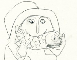 I learned a lot in a very short time. I watched eyes that day and probably all that week. I ran Hubley films at lunchtime (I’d made it a habit to project their films in the kitchen during many of the lunch breaks. The entire group working there enjoyed these sessions) and watched the eyes. I talked with Tissa David about eyes in one of our evening tutorials – she was trying to teach me how to inbetween properly.
I was reminded of this moment when Chuck Rekow commented on the Moonbird Walk posted weeks ago. “The shape of the eyes on the boys is a real departure from almost anything in the cartoon world —even 50′s era. It’s closer to real life, and reminds me of the graphic style of Ben Shahn. It lends the film an aura of “seriousness”, even though it’s a cute film about two boys and an imaginary bird. Obviously, the pre-recorded sound is a major deal, but this gem is loaded with touches of inventive detail.”
How right he is, and I love being reminded of it.
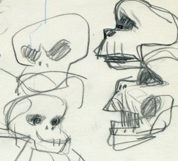 The eyes are the direct route to the soul of a person and, consequently, an animated character as well.
After working for the Hubley studio, for a short bit, I worked for Phil Kimmelman and Associates. This was a hardy commercial studio doing tight designer-based animation. Rowland Wilson was doing a lot of their design work, and the animation clean-up was tight. Animators Jack Schnerk, Sal Faillace and Dante Barbetta did a lot of the work the few months I was there. Jack Schnerk was also animating for Hubley, so I knew his very complicated-to-clean-up style. I worked primarily as an inbetweener and learned some hard and tight lessons while there.
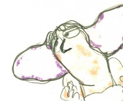 After the very loose work I’d been doing for the Hubley films, it was not only difficult for me, but good to keep me towing the proper line. I wanted to learn animation, and all of it was important.
Here, too, an empahsis was on the eyes. No Disney eyes, no Hubley eyes, either. But now I was just concerned with keeping those lines tight tight tight. No shimmer on the eyeballs. After all, I was told, people stared into the characters’ eyes, and any flaws in the animation would show up first in those eyes.
I worked for PK&A for about three or four months. I’d also worked for Tubby the Tuba at NY Institute of Technology under Johnny Gentilella, where we got somewhat close and I was able to discuss all sorts of animation problems with him. That was the only redeeming element, everything else about that studio was wretched. My displeasure ultimately led to my leaving as soon as I could.
Eventually, I was back at the Hubley studio helping to finish up the short Cockaboody.
The tightening of my inbetwees only brought positives to what I could now do for John Hubley’s studio’s animation.
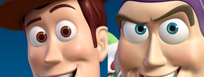 To this day, I still watch eyes closely. For some reason, the tighter the linework, the closer I watch the assistant’s work. The looser the line, the more I watch the design. I prefer watching the design. Often it means eyes that can be easily labelled: Disney, Paramount, or Terrytoons. I suppose today, you’d say: Pixar, Dreamworks or Blue Sky. (And believe me, you can see those differences even in cg.)
The images above are from the following films:
Animation Artifacts &Models &Story & Storyboards 16 May 2012 05:53 am
Popeye Storyboard – part 2
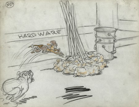
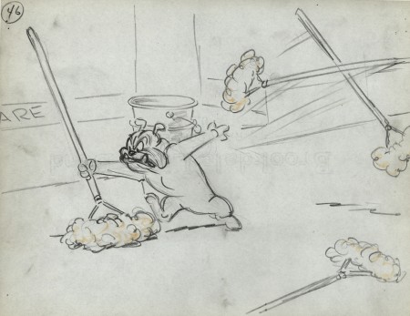
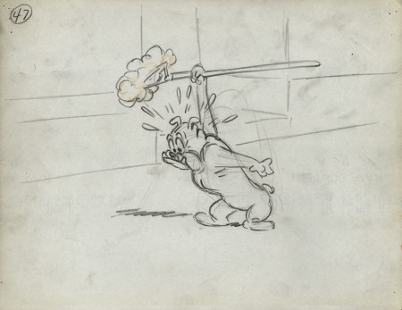
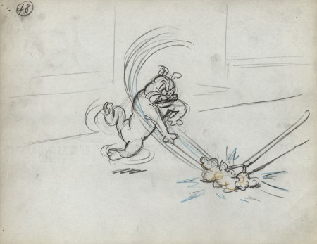
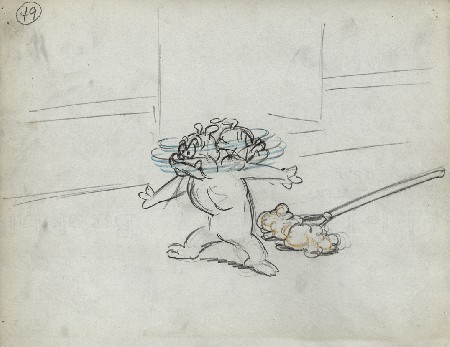
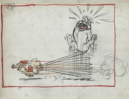
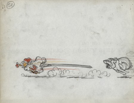
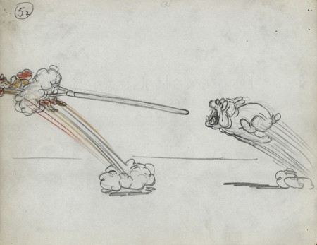
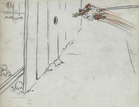
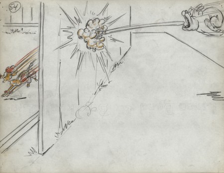
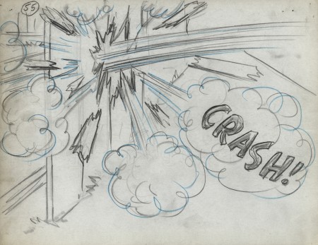
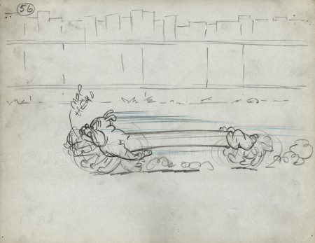
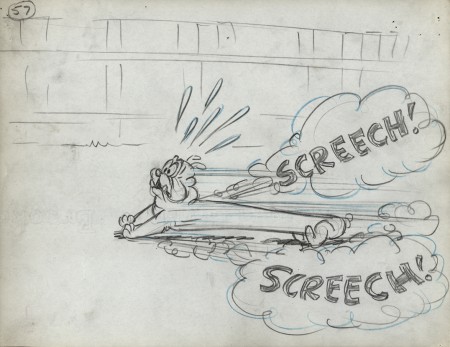
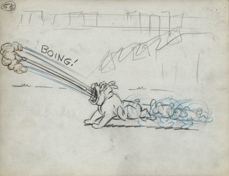
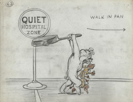
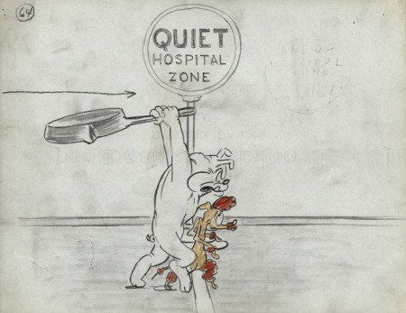
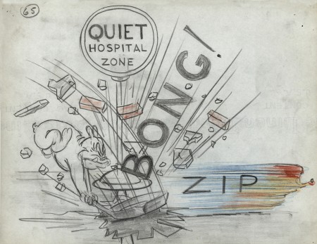
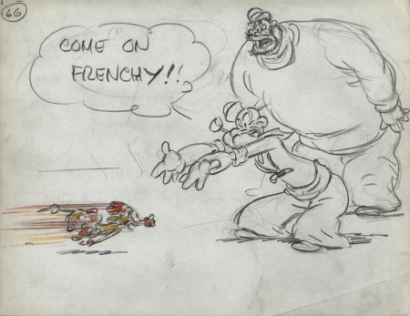
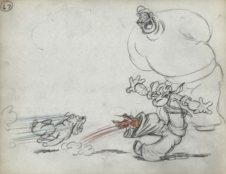
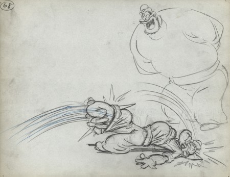
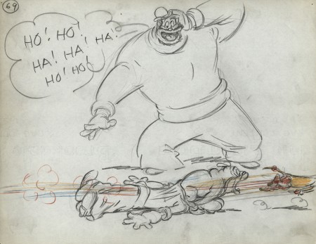
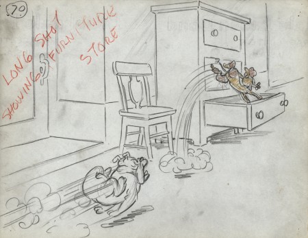
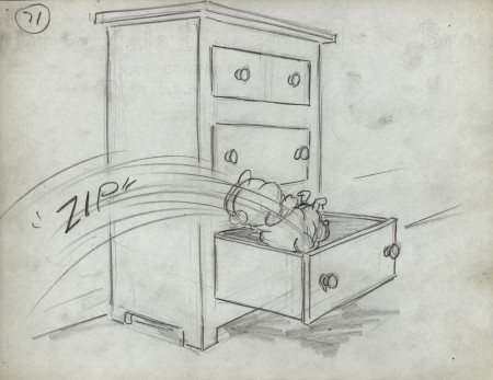
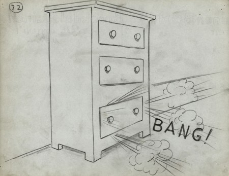
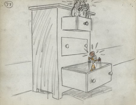
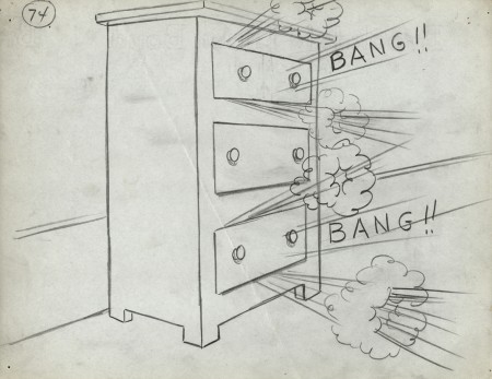
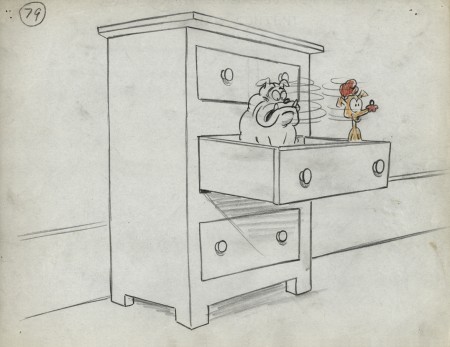
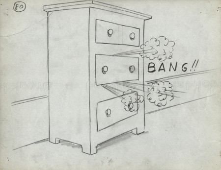
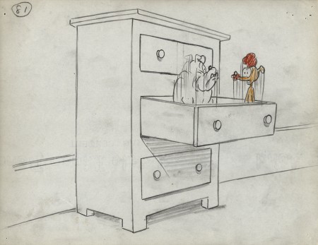
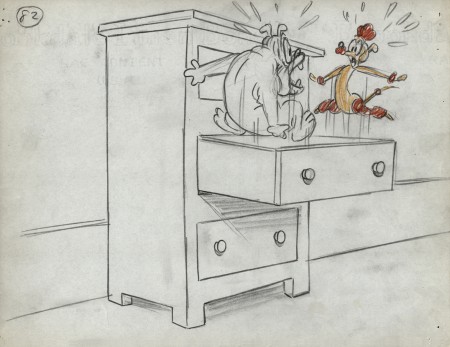
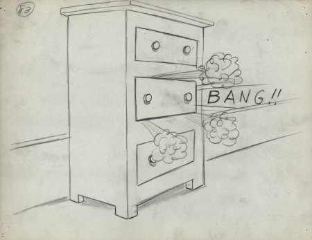
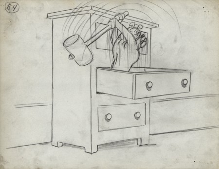
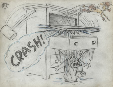
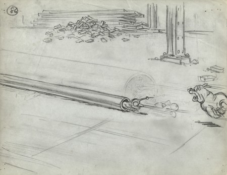
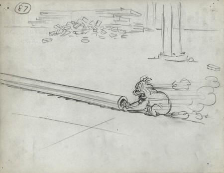
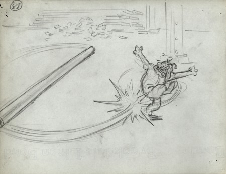
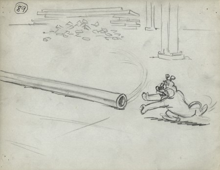
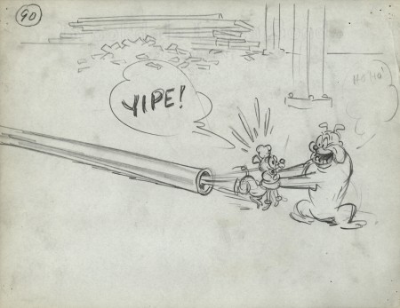
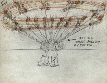
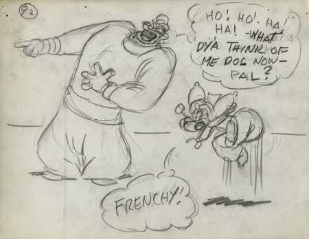
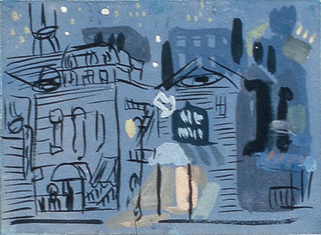
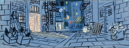
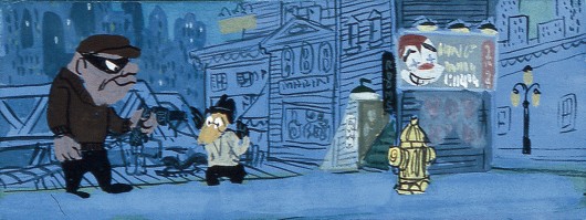
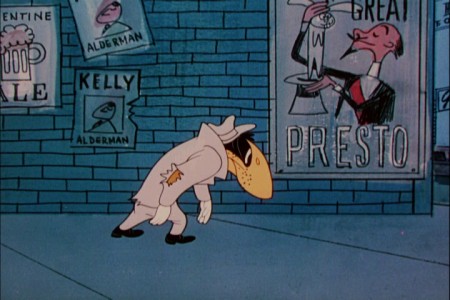
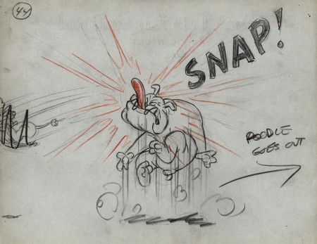
- I continue posting this storyboard from the 1949 Popeye cartoon, “Barking Dogs Don’t Fite.” This is part of the late Vince Cafarelli‘s collection of animation artwork. He’d saved it from the different studios he worked at.
The storyboard was by Jack Mercer and Carl Meyer, and I’m not sure as to who drew what. There are definitely two different styles in there especially in the way Popeye and Olive are drawn. Bluto also has an original look here, but he seems to stay constant.
Each drawing is done on inexpensive 8½ x 11 paper. One wonders if they even made an animatic of the film. None of the board has any registration.
We pick up with the last drawing from last week’s post.
 44
44
.
___________________________
Here’s the full short as seen on YouTube.
I still can’t get used to Popeye’s powder blue uniform.
I wish the look was a bit closer to the board, however some of
the layouts are improvements over the planning in the storyboard.
.
Frame Grabs &Models &UPA 14 May 2012 05:16 am
Magic Fluke Color Continuity
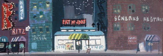
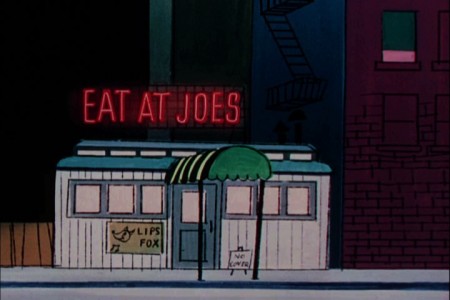
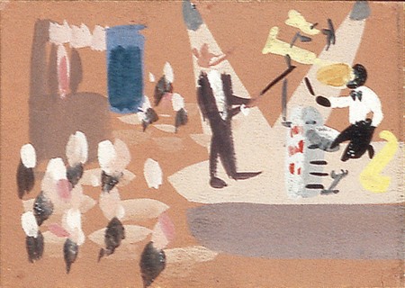
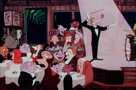
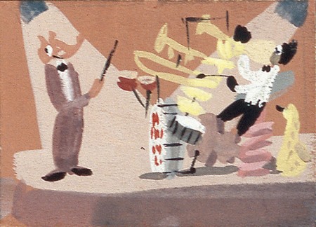
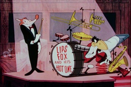
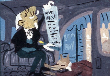
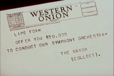
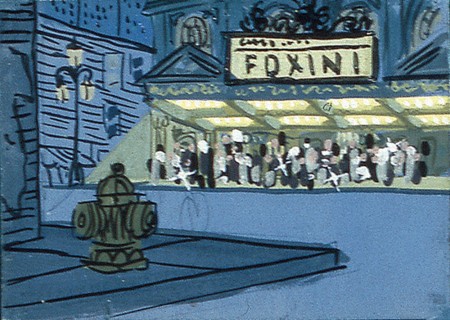
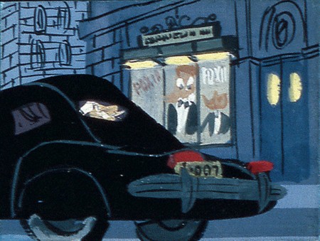
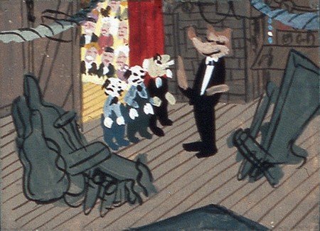
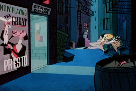
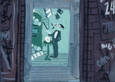
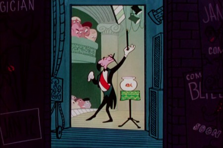
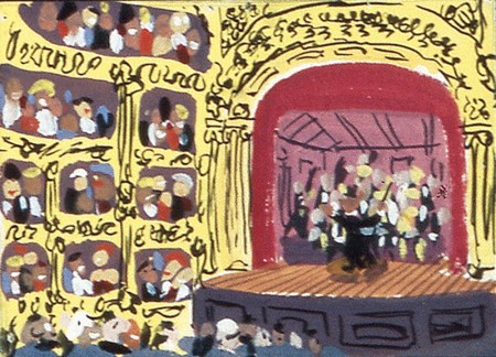
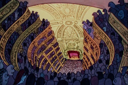
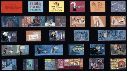
- The UPA Jolly Frolics DVD set includes a set of extras which showcases a good deal of artwork from the films. For the Fox & the Crow film, The Magic Fluke, there is a color continuity board by Herb Klynn which indicated how the art should be painted for the individual scenes.
This gave me the opportunity of putting the finished film side-by-side with the color continuity boad and find out where they diverge. (The numbered images with a letter attached {e.g. “2a”} are frame grabs from the movie.)
 2
2
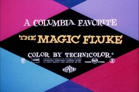
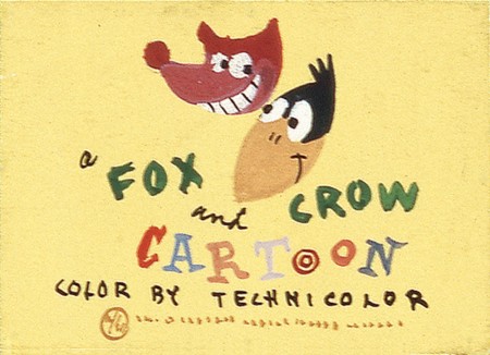
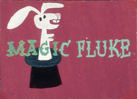
The differences start with the titles, right from the get go.
 3
3
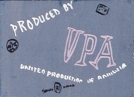
The color continuity board is much more creative.
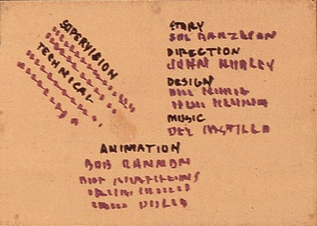 4
4
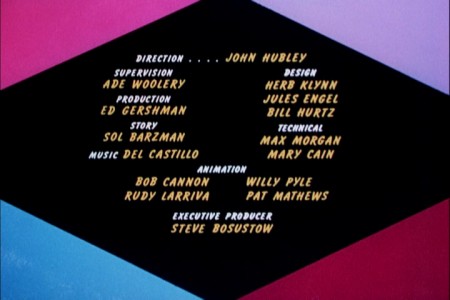
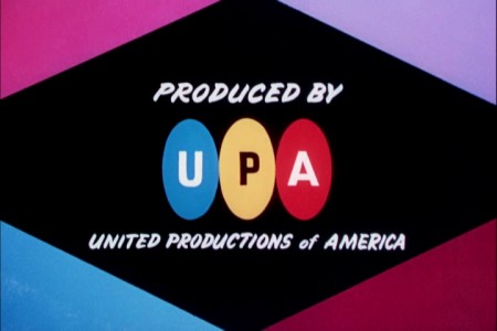
The final titles are a little dull. Fortunately, UPA’s films got
more creative with their titles once they really got going.

The final BG has the same move and ends with a truck in . . .
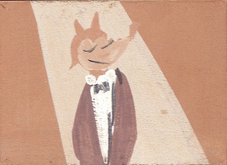 9
9
There’s no close up in there now.
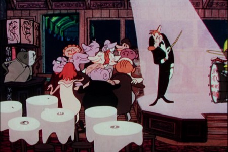 9a
9a
The audience pops from listeners to jazz dancers.
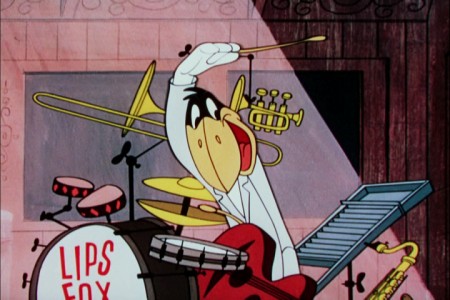 10b
10b
There is a close up of the crow playing wildly.
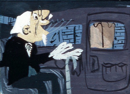 11
11
The impresario is no longer in the film.
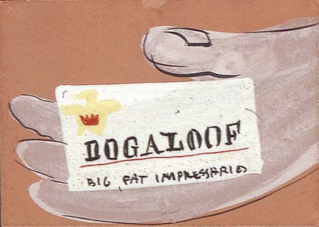 12
12
And he message comes from a taxicab, not a limo.
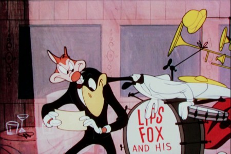 13b
13b
The fox reads the telegram from the stage and hides it from the crow.
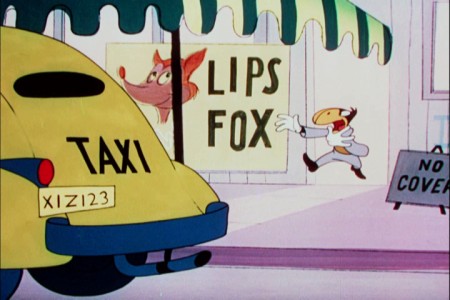 13c
13c
The crow chases the fox out the door as he leaves in a cab.
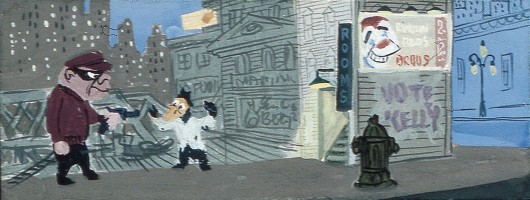
there’s no robbery in the film now. It just rains on a blue street.
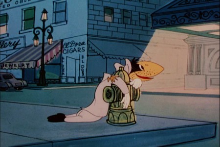 18a
18a
The crow ends up at the spark plug down and out.
He sees . . .
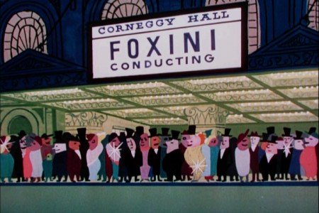 18b
18b
. . . the Foxini ppremiere.
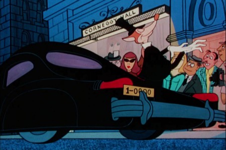 19a
19a
The Fox gets out of the limo.
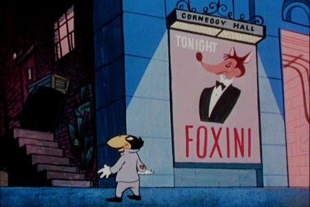 19b
19b
The crow looks up at the backdoor alley.
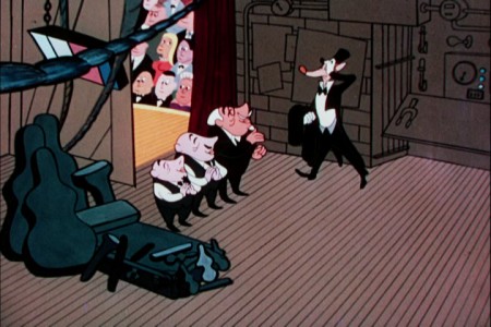 20a
20a
Foxini is greeted by his entourage, and he takes advantage of them.
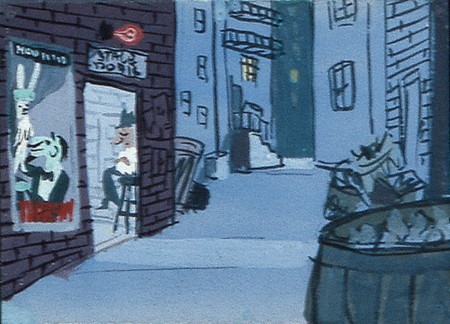 21
21
The back alley is about the same.

We no longer see a pan of the inside of the theater.
 23a
23a
There is a pan up the concert hall.
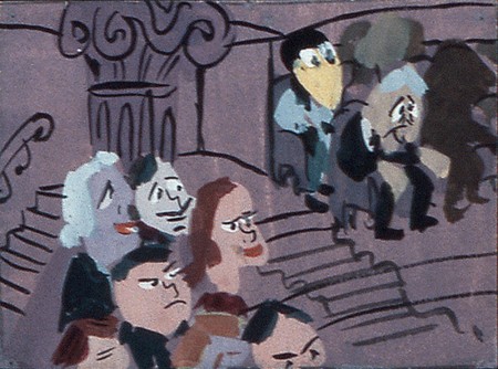 24
24
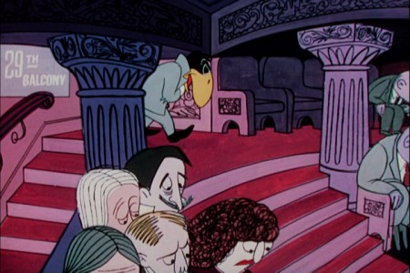
Crow arrives at the upper upper balcony . . .
 24a
24a
. . . and gets a last row seat.
Unfortunately, they only offered the color continuity board for the first half of the film,
and that’s as far as we could go.
Animation Artifacts &Disney &Models &Story & Storyboards 03 May 2012 06:45 am
More Lady Drawings
- Before we get to the subject at hand, I just wanted to place a reminder that we’re racing toward raising money for my animated feature, POE, which has been in preproduction for some time. Now with the help of INDIEGOGO, and your contributions, we’re looking to complete a film of completed animated footage which will properly showcase our film. You can find out more about it at Indiegogo or at Poestory.net or the Poe Project Facebook page. Whether you can contribute funds or not, I thank you, i advance, for any support you can give. Even telling a friend of a friend about it may help.
Thank you.
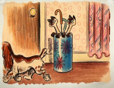
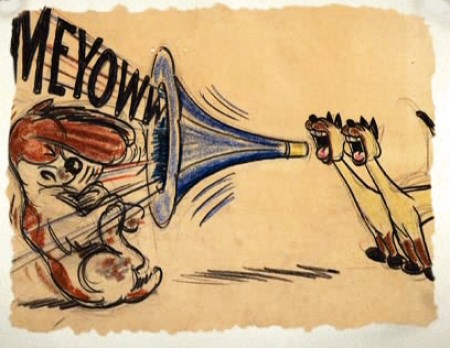
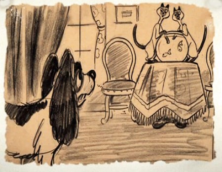
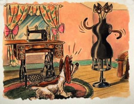
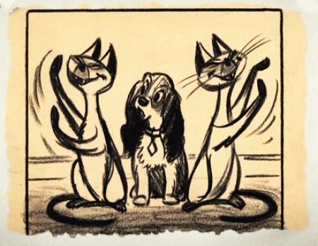
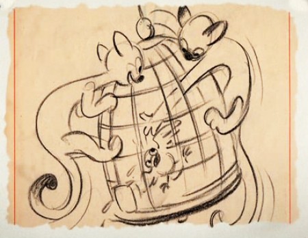
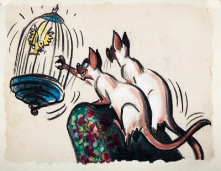
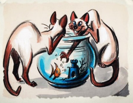
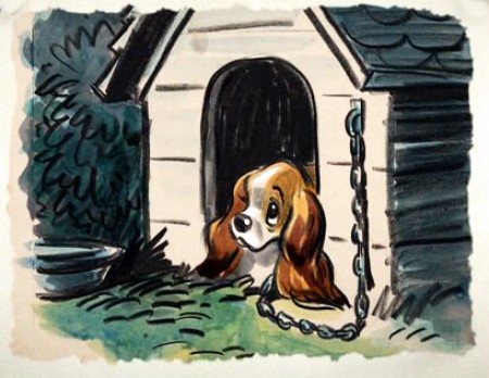
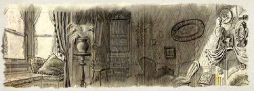
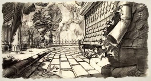
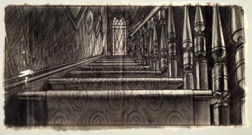
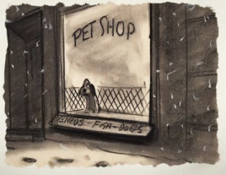
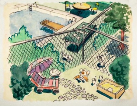
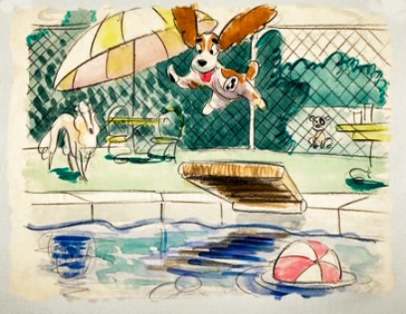
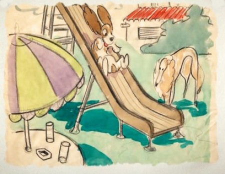
Lady Pictures
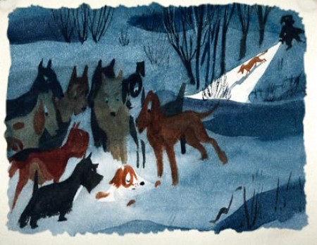
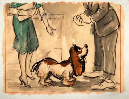
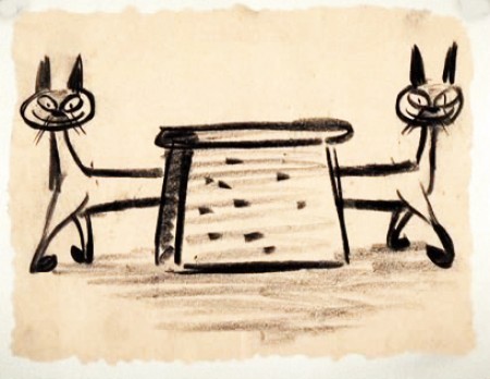
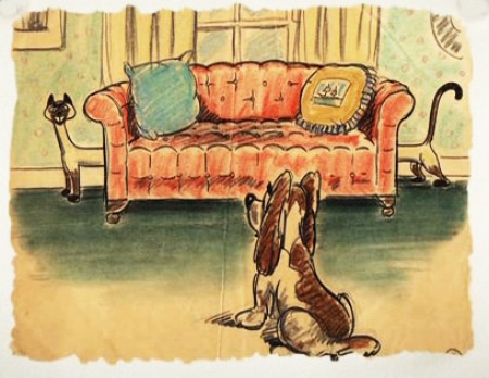
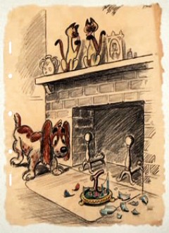
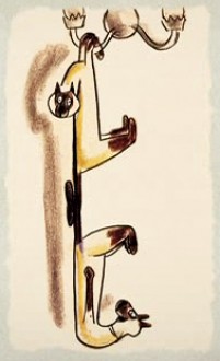
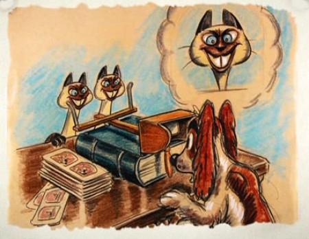
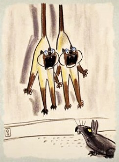
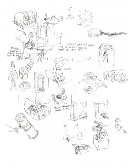
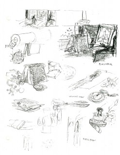
- Lately we’ve been looking at models and preproduction drawings. Here are more of the sketches done for Lady and the Tramp found on the DVD extras gallery (in a somewhat tiny screen size). These are preproduction pieces by a number of different artists over a number of different years. They all exhibit a life of their own that’s pleasant to visit. Very cartoon compared to the film they made.
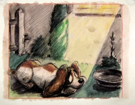
(Click any image to enlarge.)
One more post of these to go. On Friday.
.
Animation Artifacts &Fleischer &Models 02 May 2012 05:43 am
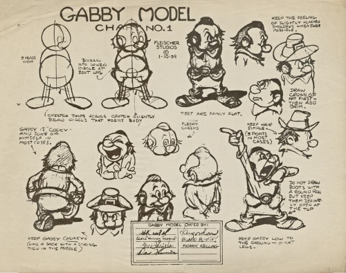
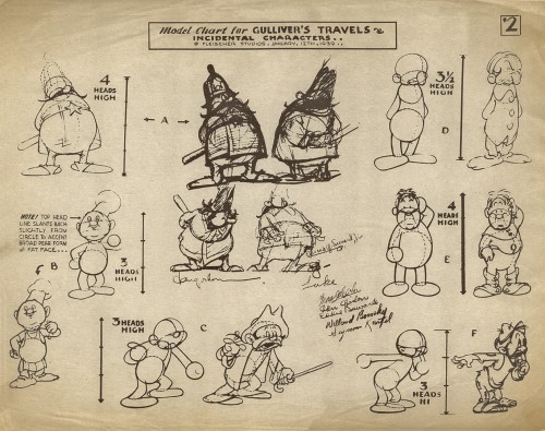
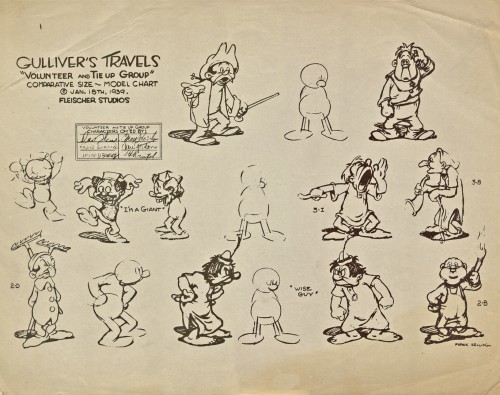
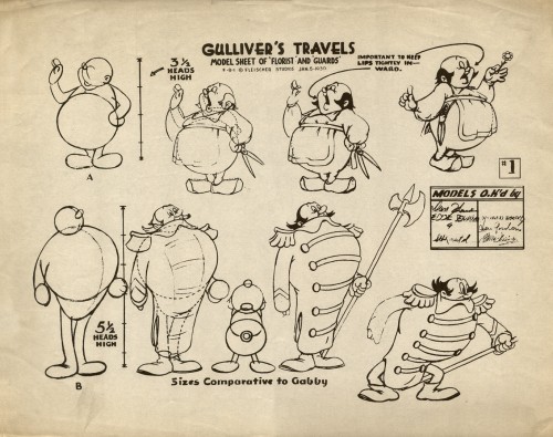
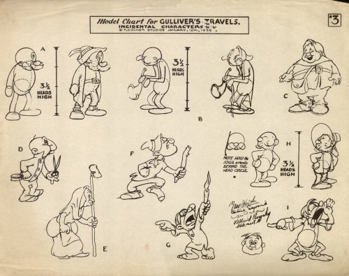
Vince Cafarelli’s Gulliver Models
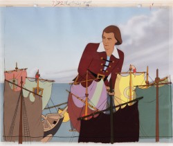 - The last few times I’d met with Vince Cafarelli, before he died, he’d told me that he had some things he wanted to have me put on my blog. Candy Kugel has, recently, shown me the material he’d been offering. There’s a treasure of artifacts there, and it’s going to take a lot of time to display them all.
It turns out that when Vince started as a runner at Famous Studios in 1948, at one point, he found that the studio was dumping a lot of old material, and rather than let it be discarded, he took what he wanted. Fabulous gems. There’s an almost complete storyboard for a 1949 Popeye cartoon by Jack Mercer and Carl Meyer, and there are a lot of model sheets. There’s plenty of beautiful and rare work to post in the coming weeks.
I’ve decided to devote Wednesdays to the Vince Cafarelli Collection, and will start this week with all the models that came from Gulliver’s Travels.
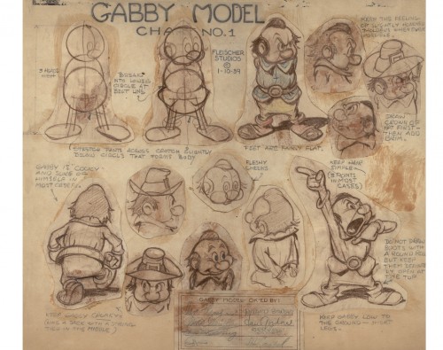 1
1Several of the models, including this one, are the actual thing.
Pencil drawn originals including even the signatures approving the model.
Models approved by: Seymour Kneitel, Eddie “Hurray” Seward,
Max Fleischer, Dave Fleischer, Dan Gordon, Willard Bowsky and
Frank Kelling.
 2
2
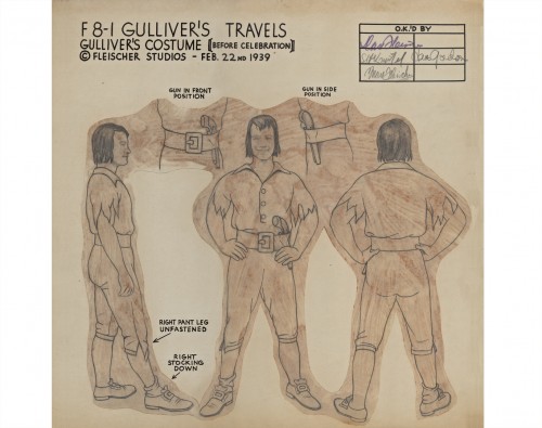
Most of them, including this one, are lithos done for the animators.
Model sheet approved by: Dave Fleischer, Max Fleischer, Frank Kelling,
Grim Natwick, Willard Bowsky, Dan Gordon, (Eddie) Seward, and
Seymour Kneitel
 3
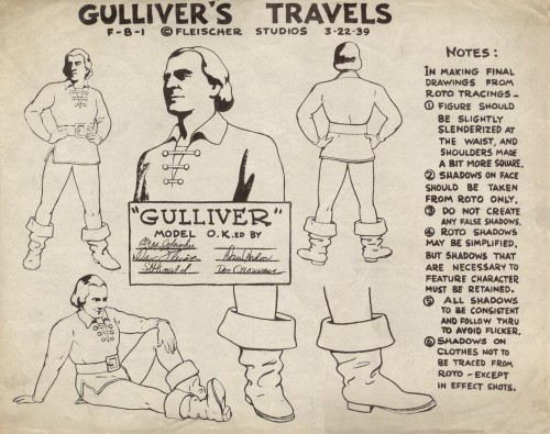
3
An original pencil drawn model.
Approved by: Dave, Fleischer, Seymour Kneitel,
Max Fleischer, and Dan Gordon
 4
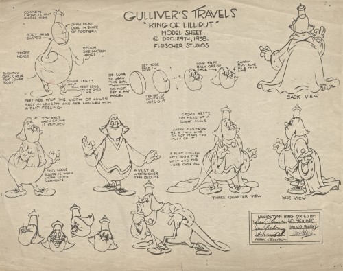
4
Approved by: Max Fleischer, Dave Fleischer,
Seymour Kneitel, Dan Gordon, and Doc Crandall
 5
5
Approved by: Dave Fleischer, Dan Girdon, Seymour Kneitel,
Frank Kelling, Eddie Seward, Willard Bowsky and Max Fleischer
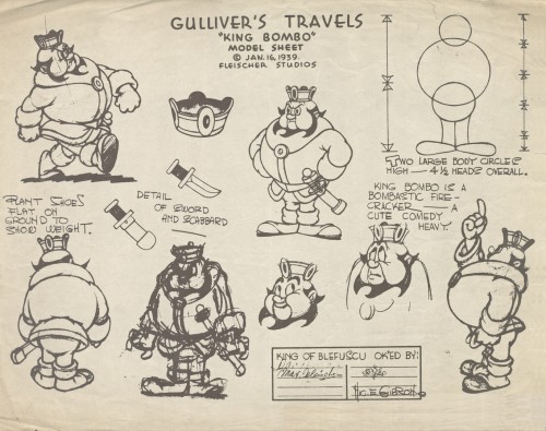 6
6
Approved by: Dave Fleischer, Max Fleischer,
Eddie Seward, and Hig. E. Gibson
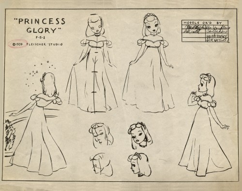 7
7
Approved by: Max Fleischer, William Hoskins, Dan Gordon,
Willard Bowsky and Grim Natwick
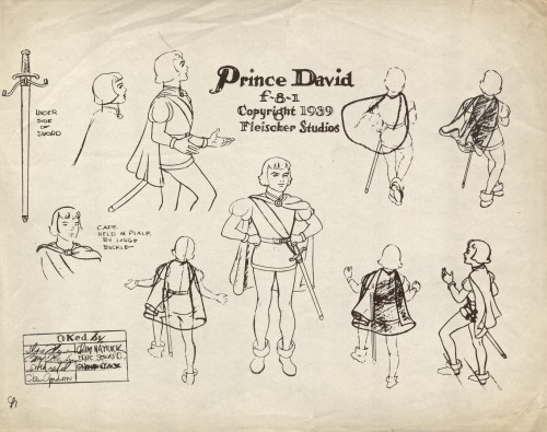 8
8
Approved by: Max Fleischer, Seymour Kneitel, Dan Gordon,
Grim Natwick, Eddie Seward, and Graham Place.
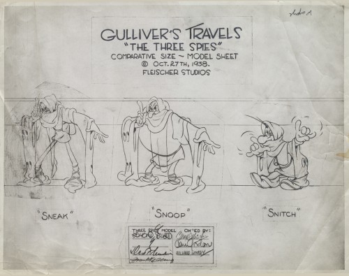 9
9
Approved by: Edmond Seward, Dave Fleischer, Frank Kelling,
Max Fleischer, Dan Gordon and Willard Bowsky
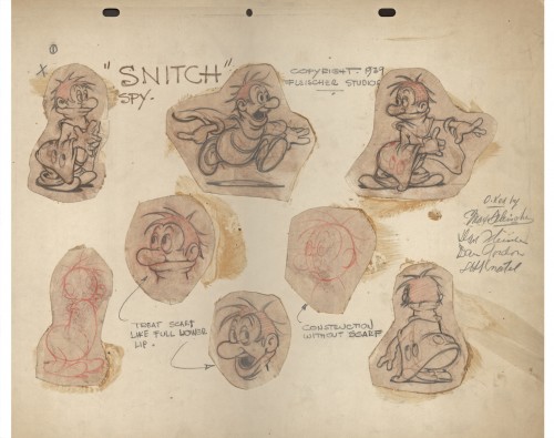 10
10
An original pencil drawn model.
Approved by: Max Fleischer, Dave Fleischer,
Dan Gordon and Seymour Kneitel
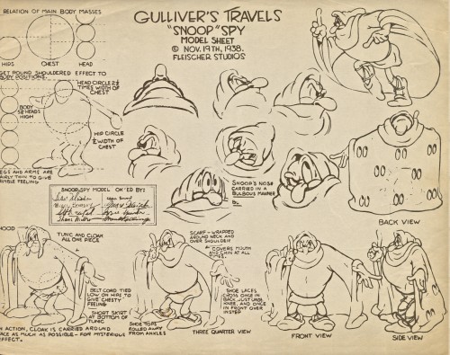 11
11
Approved by: Dave Fleischer, Willard Bowsky, Seymour Kneitel,
Shane Miller, Eddie Seward, Max Fleischer, Izzie Sparber, and
Frank Kelling
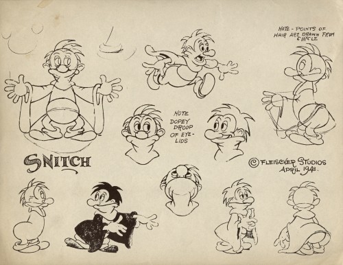 12
12
This model is a smaller size in the collection.
No approval names listed.
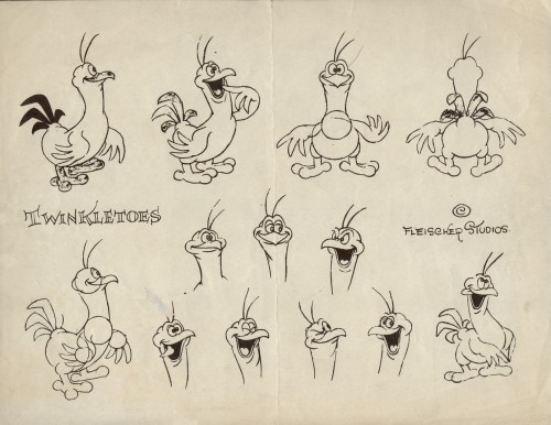 13
13
This is also a smaller sized model sheet.
No approval names listed.
 14
14
Approved by: Max Fleischer, Dan Gordon,
Eddie Seward, Willard Bowsky, and Seymour Kneitel
 15
15
Approved by: Dave Fleischer, Eddie Seward, Willard Bowsky,
Max Fleischer, Dan Gordon and Seymour Kneitel
 16
16
Approved by: Dan Gordon, Eddie Seward, “G”,
Seymour Kneitel, Willard Bowsky, Dan Gordon,
and Max Fleischer
 17
17
Approved by: Max Fleischer, Eddie Seward, Dan Gordon,
Willard Bowsky and Seymour Kneitel
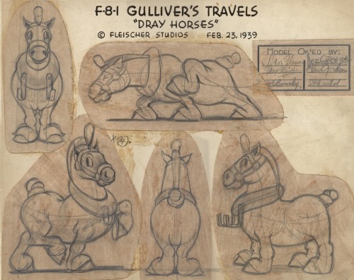 18
18
An original pencil drawn model.
Approved by” Dave Fleischer, Max Fleischer, Nic. E. Gibson,
Dan Gordon and Seymour Kneitel
Animation Artifacts &Disney &Frame Grabs &Models &repeated posts &Story & Storyboards 12 Apr 2012 06:22 am
Some Lady Drawings – recap
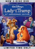 - The DVD of Lady and the Tramp includes some preliminary artwork for the film. I collected a bunch of it and am breaking it into a couple of posts. It’s easier to read off a blog than a tv screen, especially when the DVD tries hard to reduce them to the smallest size they can muster within an overworked border that is virtually pointless.
The illustrations – some are obviously BG layouts, others storyboard drawings – have a light and jaunty feel. They’re very cartoon in nature, and belie the actual feature they produced which, at times, is quite beautiful. Disney truly got the feel of “Main Street, USA” in this film.
I’m interested that most of the images don’t take in Cinemascope (since they were probably done before the decision to go Scope.) Most of them are also fast drawings that don’t feature the Tramp as we know him, and even Lady takes on a different form.
You get the feeling this film was pushed out relatively quickly. The results are excellent, regardless. Sonny Burke and Peggy Lee wrote an excellent pop-song score that doesn’t quite capture the turn-of-the-century, but it does capture the atmosphere of early 50s USA.
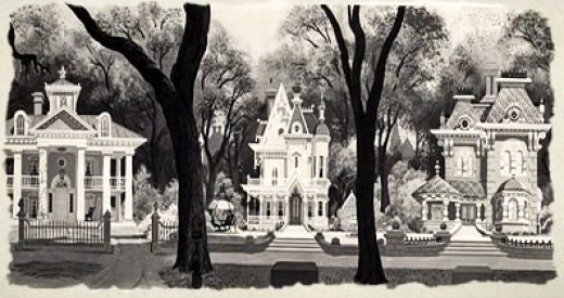
This drawing is in B&W on the DVD, but it appears in
Bob Thomas’ 1958 book, “The Art of Animation.”

Bg for The Princess and the Frog.
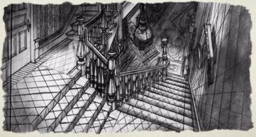
This looks not too different from a shot in Hitchcock’s Psycho.
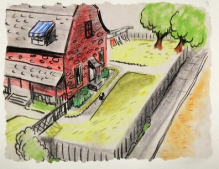
We seem to be in the Little Golden Book territory
with some of these images.
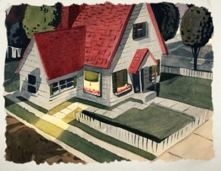
An earlier and different view.
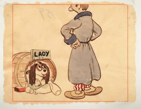
Or did I mean the New Yorker circa 1948?
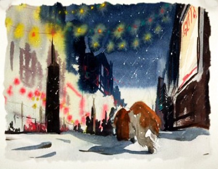
I love weather and would have applauded more of it in the film.
To be continued.
Animation &Animation Artifacts &Bill Peckmann &Independent Animation &Models &repeated posts &Rowland B. Wilson 02 Apr 2012 07:03 am
Rowland Wilson’s The Little Mermaid
- The brilliantly talented Rowland B Wilson, certainly paid his dues at a number of animation studios. We’ve seen his work with Richard Williams’ Soho Square studio and with Disney and Don Bluth’s Ireland studio.
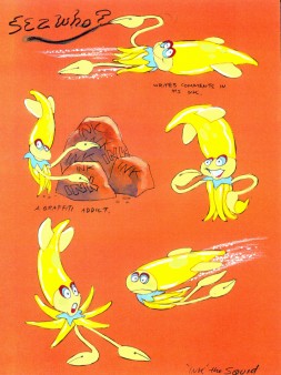
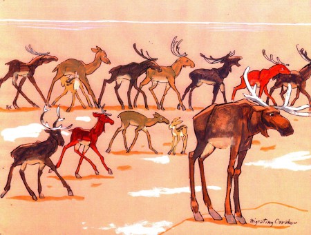
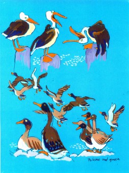
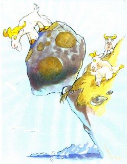
Today, I have some sketches and designs he did for Disney while working on The Little Mermaid.
Not all of this material made it to the film, but the incredible wealth it brought the directors had to have affected the overall production. This invaluable material comes courtesy of Bill Peckmann.
The first group to view are Production Designs that he did for various sequences throughout the film.
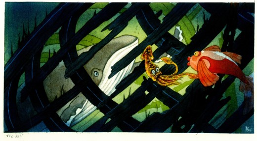
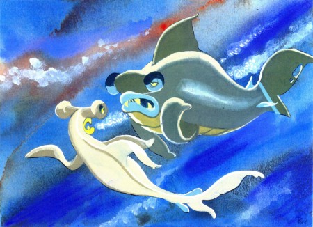
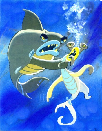
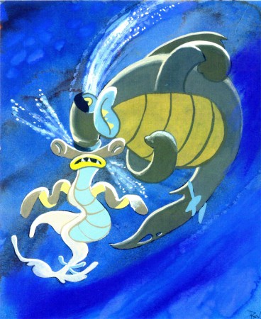
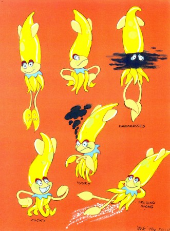
The following are character designs Wilson did for The Little Mermaid for a character that never made it into the movie. Though, I think “Ink the Squid” may have developed into “Sebastian the Crab”.
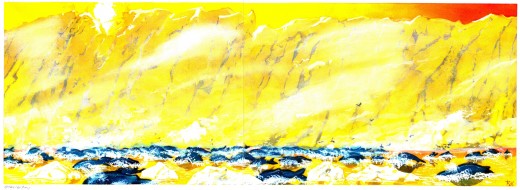
Then there are some of the creatures seen above land at the Glaciar Tray which apparently was designed to be part of the film.
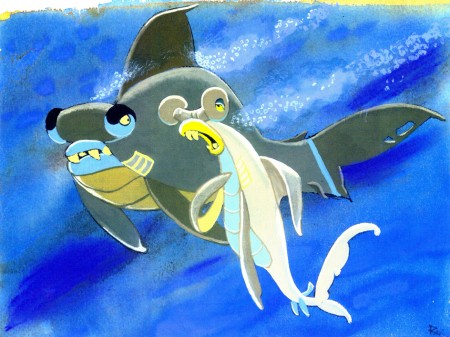
Then there is this short seqeunce of interaction between two fish:
All art displayed © Walt Disney Prods.
 This material is a treasure. I want to thank Bill Peckmann for sharing it with us.
Rowland B. Wilson was an artist of the highest standard, and I can’t get enough of his work. True inspiration.
- Don’t forget that there’s a wonderful new book on the market. I’d like to keep it in your attention, hence I’m trying to give a lot of attention to the great work of Rowland B. Wilson.
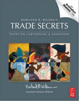
Rowland B. Wilson’s Trade Secrets: Notes for Cartooning and Animation seems to offer quite a bit of attention to Mr. Wilson’s animation art as it does his brilliant illustration and cartooning. The book looks unique, and to have someone like Rowland as the guide to this world has to be a gem.
Animation Artifacts &Bill Peckmann &Illustration &Layout & Design &Models &repeated posts &Rowland B. Wilson 26 Mar 2012 07:23 am
Thumbelina from Rowland B. Wilson
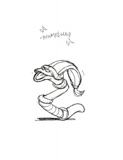
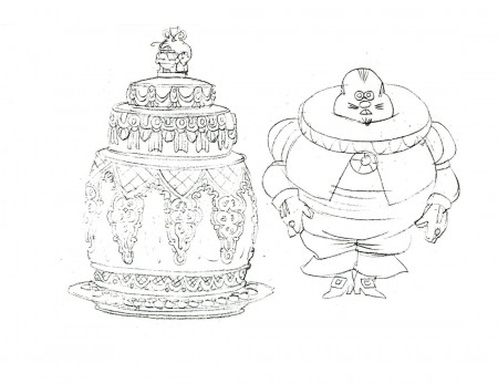
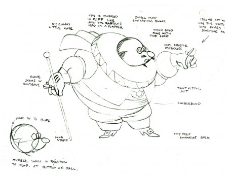
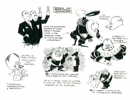
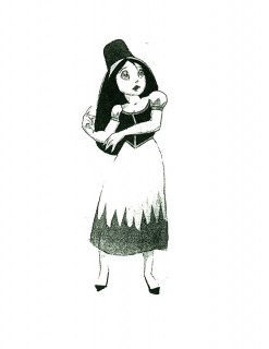
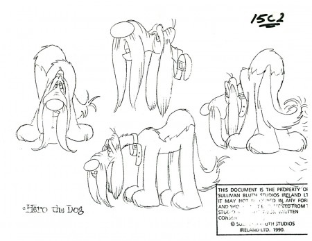
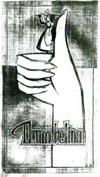 - Thanks to Bill Peckmann‘s extraordinary collection of design material, I have access to quite a few model sheets by Rowland B. Wilson.
His models for Don Bluth‘s feature, Thumbelina, fill a binder. I’m gong to have to break it up into two posts.
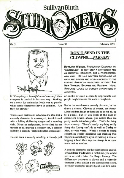
Here, I’ll reproduce the article Rowland had written for the in-house organ “Studio News.” This follows with models for some of the lead character models.
These models were done in pencil and ink, sometimes in color. Unfortunately, all of these are 8½ x 11 xerox copies. Blacks wash out and washes blacken. Regardless, they all come across fine enough to get the idea.
Any feature takes a lot of work. You can understand that just in the large number of model sheets that grace the production. When you have a talented artist such as Rowland Wilson doing that modelling for you, your art is off to a good start.
 1
1(Click any image to enlarge.)
 1
1
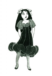
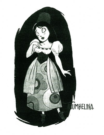
Here we have the model that Rowland drew for Thumbelina.
This is definitely not the rotoscoped princess that we saw in the film.
 2
2 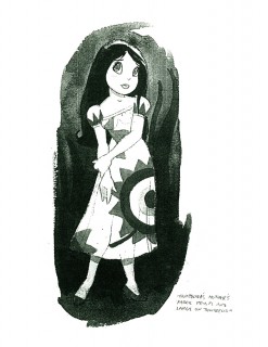 3
3
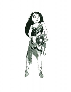
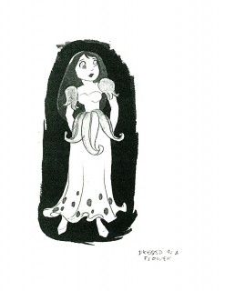
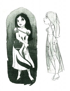
Here we have a lot of different costumes Thumbelina
will wear as she travels on her expeditions.
 4
4 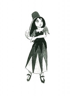 5
5
An original idea – a character who wears
more than one costume in a film!
This film is far from the best of Don Bluth, but it goes to show how much solid work is done for any feature film. There’s also quite a bit to be learned from any feature. Many of these models didn’t end up in the film (take a look at Thumbelina herself in yesterday’s post) but the drive was a forward one.
Off to the modelshow:
 1
1
(Click any image to enlarge.)
 3
3
Another color one copied in B&W
 30
30
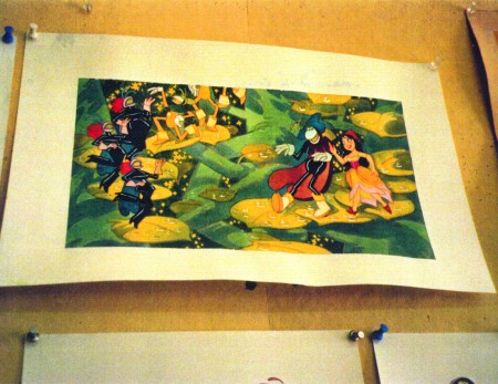
Finally, here are two color photos Rowland took of his presentation art.
Disney &Frame Grabs &Layout & Design &Models 25 Jul 2011 06:53 am
The Old Mill Multiplane
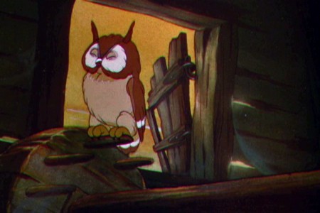
 - Having visited the multiplane camera scenes of SNOW WHITE, I can only see the usefulness of going to the keystone of the camera, “The Old Mill.” It’s on this lyrical and beautifully produced short that they admittedly devised the idea of testing the multiplane camera in action. However, in an interview I’ve read with director, Wilfred Jackson, we find that the camera wasn’t available for much of this film. It was being tied up with a number of shots from
  SNOW WHITE. The interview is by David Johnson posted on American Artist‘s site. Here’s the passage I’d read:
- DJ: Since you worked on The Old Mill, you were involved with the multiplane camera. Can you tell me about Garity [the co-inventor] and the invention of this thing and some of the problems and miracles that it did.
WJ: What I can tell you about my experiences with it was the The Old Mill was supposed to be a test of the mutiplane, to see if it worked. Somehow, we were so held up in working on The Old Mill by assignments of animators because Snow White was in work at that time and animators that I should have had were pulled away just before I got to them and other animators were substituted because Snow White got preference on everything. And we got our scenes planned and worked out for the multiplane effects and by that time some of the sequences on Snow White were being photographed. The multiplane camera itself had all kinds of bugs in it that had to be worked out. We were held up until so late that I actually did work on another short – I don’t remember which short. I don’t even remember if I finished it up – did work on some other picture to keep myself busy while we could get facilities to go ahead on The Old Mill. By the time they had got the bugs out of the multiplane camera, they had multiplane scenes for Snow White to shoot and they got it busy on those first. Finally in order to get The Old Mill out the scenes that had been planned for multiplane had to be converted to the flat camera to do the best they could. You won’t find more than a very few multiplane scenes in The Old Mill.
DJ: I wasn’t aware of that.
WJ: I’ve had messed up schedules on pictures but I’ve never had a more messed up one than I can remember for The Old Mill.
So, of course, I’ve searched for scenes that I believe are definitely part of the shoot done on Garity’s vertical Multiplane Camera.
The film is little more than a tone poem of an animated short. It’s about as abstract a film as you’d find coming out the Disney studio in the 30s.
Let’s take a look at some frame grabs from the film, itself:
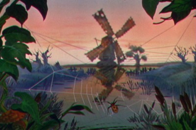 1
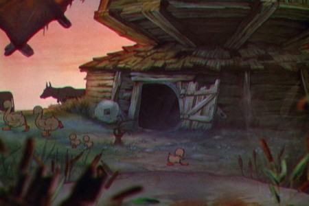
1We open on a slightly-out-of-focus mill with a spider’s web
filling the screen, glistening in focus, in the foreground.
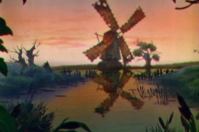 2
2
The camera moves in on the mill and the
spider’s web goes out of focus and fades off.
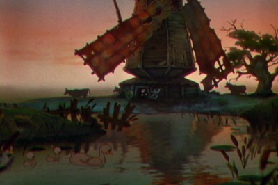 3
3
Dissolve through to a closer shot as we move in.
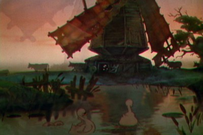 4
4
Dissolve through to an even closer shot.
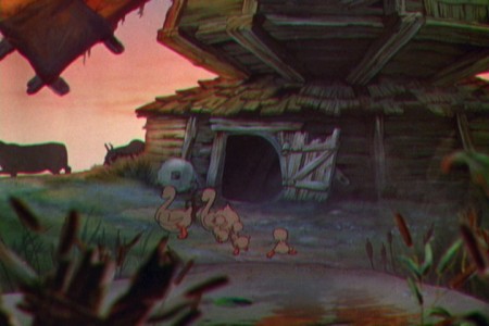 5
5
Foreground objects go out of focus as we move in on the mill.
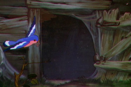 7
7
Cut to a bird flying in the foreground carrying a worm.
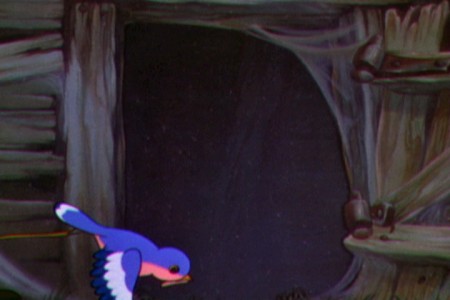 8
8
The interior of the mill, viewed through the window, is dark grey.
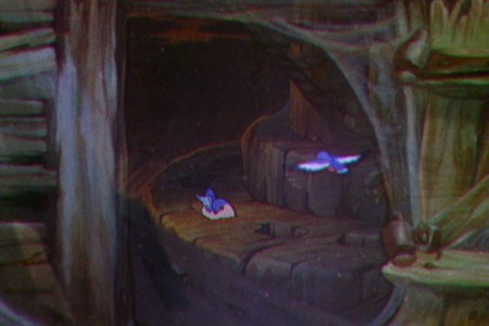 9
9
Dissolve into the next shot which looks as though it appears in the framed window.
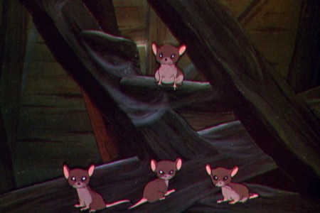
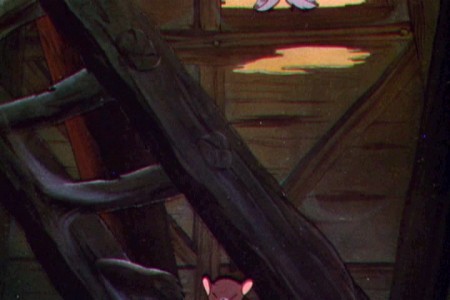
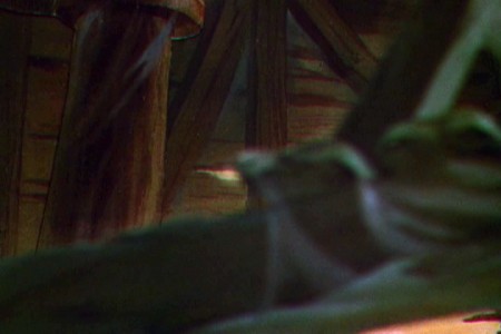
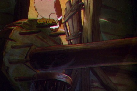
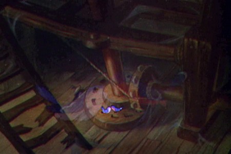
Here, we cut to a long pan up the mill using the multiplane. The lighting in this scene is inconsistent. There are flares and glares and some minor jerks to the artwork. No doubt this was done on the multiplane camera, and it would have been reshot if there were time and money.
I couldn’t hook up the artwork to simulate the pan since overlays from one frame didn’t match the next. It was all moving with multiple levels (maybe five?) and they didn’t match from one frame to the next.
 1
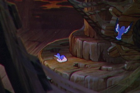
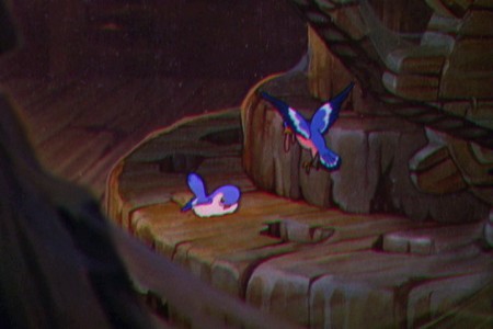
1The shot starts from the top of the mill looking down on the birds.
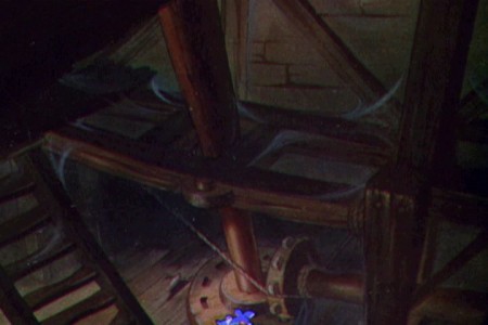 2
2
It starts moving up the central column.
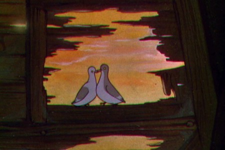 6
6
Stopping on a pair of lovebirds.
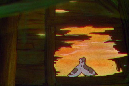 7
7
The camera continues upward.
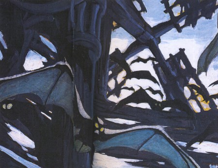
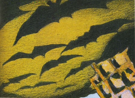
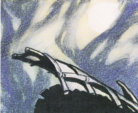
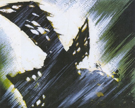
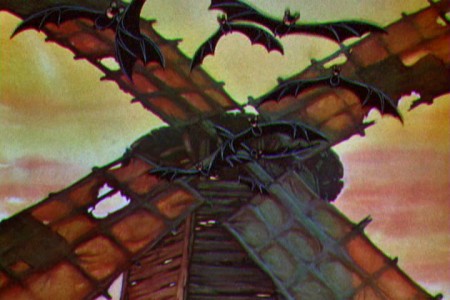
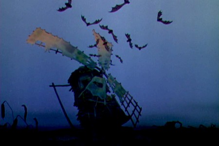
At this point there is a cut outside to bats fleeing the Old Mill for the night.
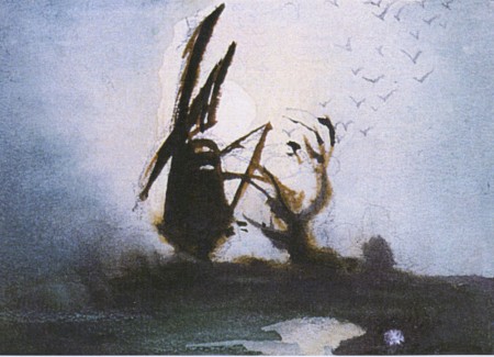
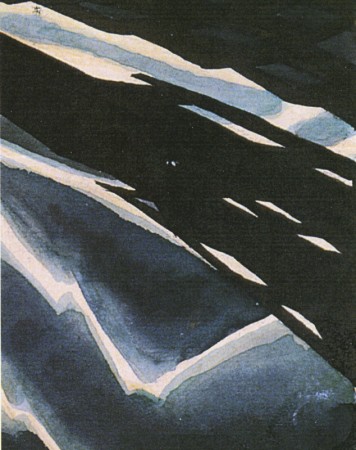
Gustaf Tenggren made some preproduction drawings of this scene which can be found in John Canemaker‘s book, Before the Animation Begins which in itself is something of a tone poem of a book devoted to many of the designers at the Disney studio.
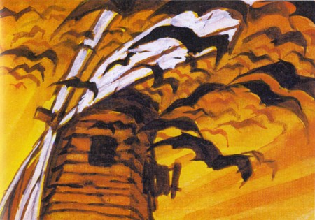 1
1
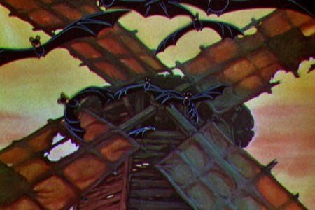
Now here are frame grabs from the film, itself.
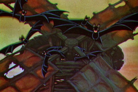 1
1
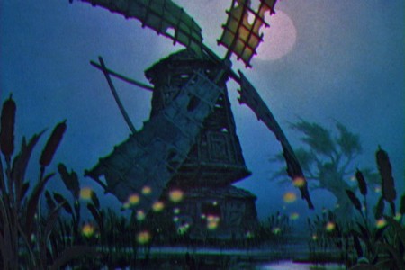 4
4
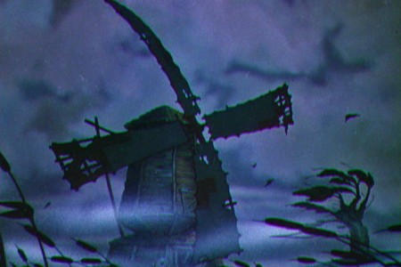
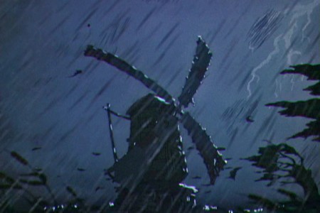
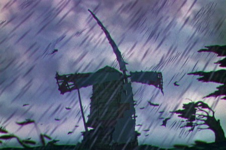
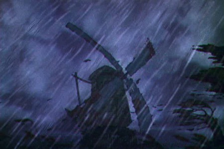
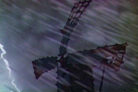
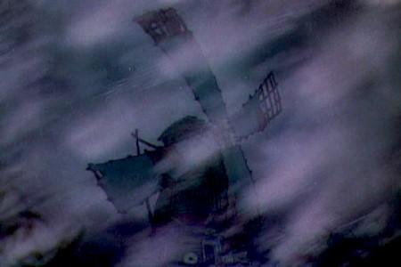
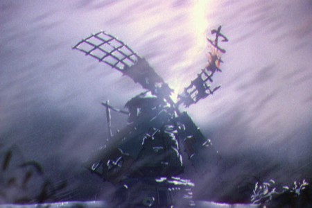
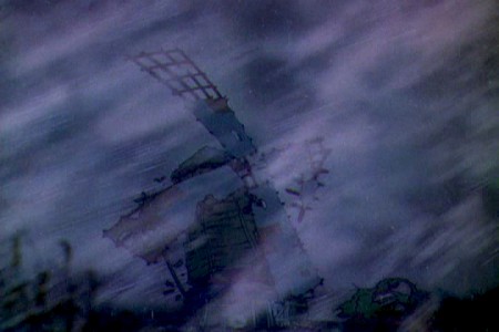
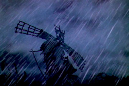
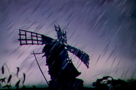
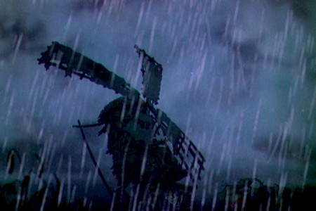
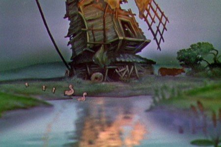
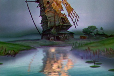
The multiplane camera is used only for the exterior shots of the mill
shown over the course of a number of scenes.
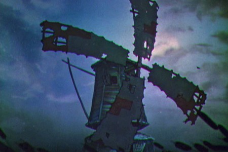 5
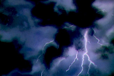
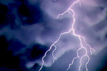
5
Placed as I’ve done with them, they look as though
they’re one continuous scene over the length of the storm.
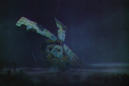
 21
21
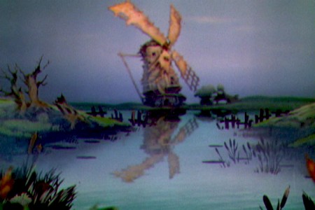
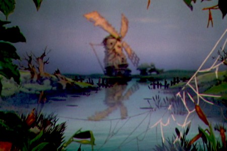
Finally, things settle down and the camera comes to
the Old Mill at rest in the morning.
