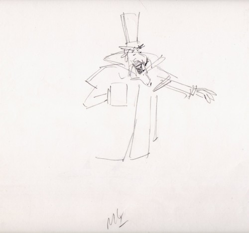
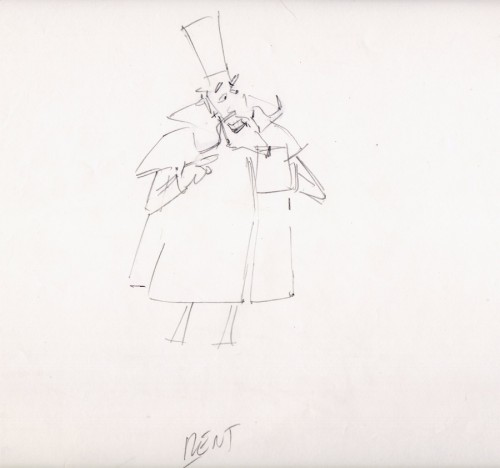
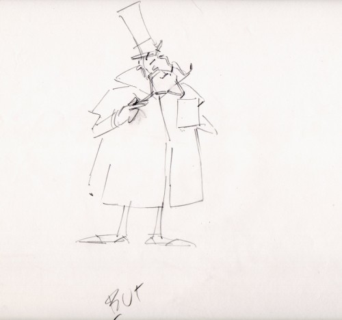
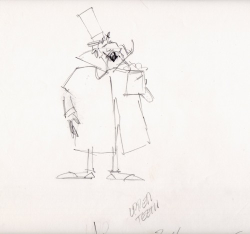
Category ArchiveModels
Animation &Commentary &Models &Story & Storyboards &Tissa David 22 Oct 2012 05:19 am
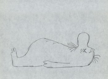
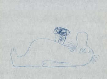
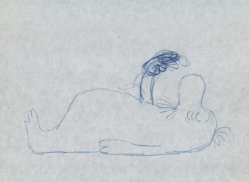
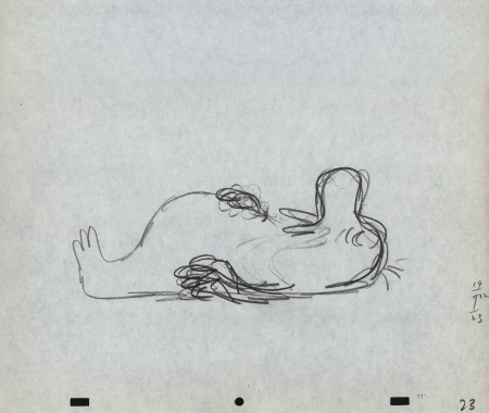
The Marzipan Pig Extras
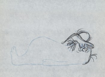
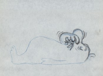
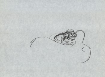
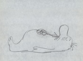
When we completed The Marzipan Pig, the author of the origianl book, Russell Hoban, came to NY from his home in London. He had originally come from Philadelphia to be an art director at an agency in NYC. He eventually moved to England where he became one of our most famous children’s book authors. We arranged a theatrical screening for him of The Marzipan Pig after which Tissa David, he and I went to lunch. In his very dry way, he told me that he was pleased with the film. As I do with all authors, I asked for criticism not compliments, and he told me there was only one complaint. We didn’t get the bridge quite right at the end of the film. Of course he was right, and it’s hard for me to watch those final scenes, now, without thinking about that damned bridge. But he did say he loved the movie, so I held onto that memory as well.
I’ve read every book of Hoban’s I could, including at least 60 of the children’s books and all of his adult novels. In film, I know only of the work we’ve done and The Mouse and His Child. Unfortunately, that feature film stopped midway through the book’s story. It’s a brilliant book and what they did of the story carries whatever is happening on the screen.
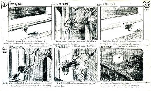
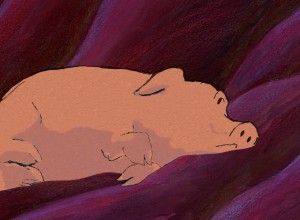 For The Marzipan Pig DVD we included a copy of a section of the animatic. This includes the actual film superimposed over the stills so you can make a comparison as the film runs. Film in film. I like this format; you can really take in the animation and layout of the piece when both are on the split screen.
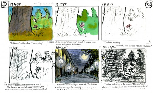
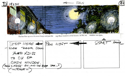
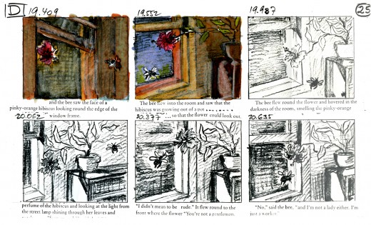
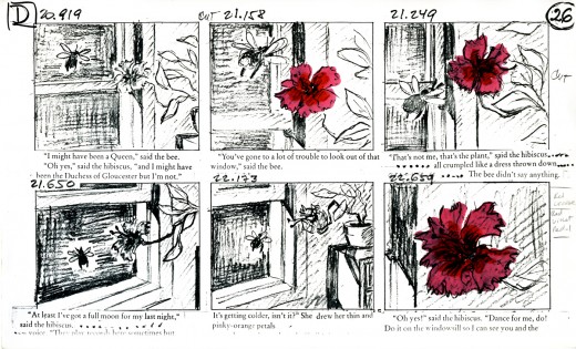
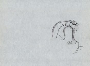
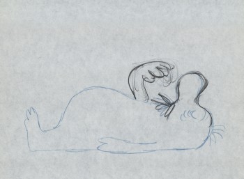
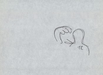
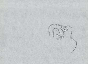
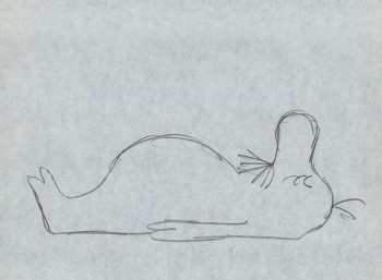
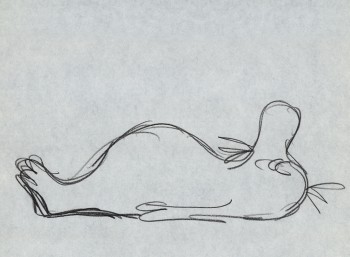
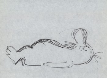
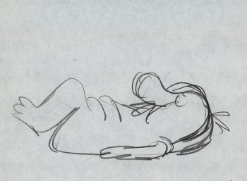
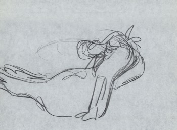
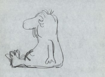
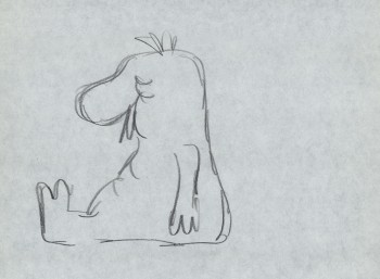
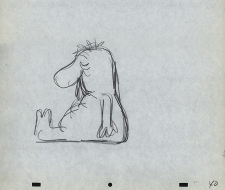
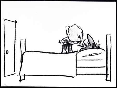
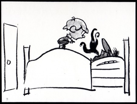
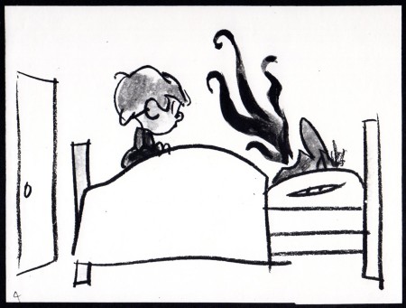
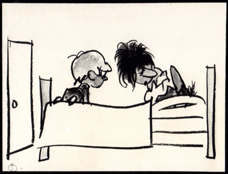
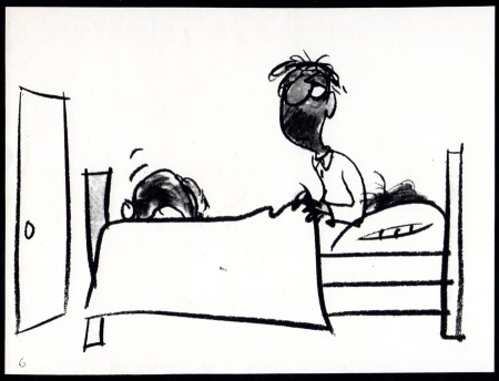
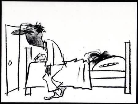
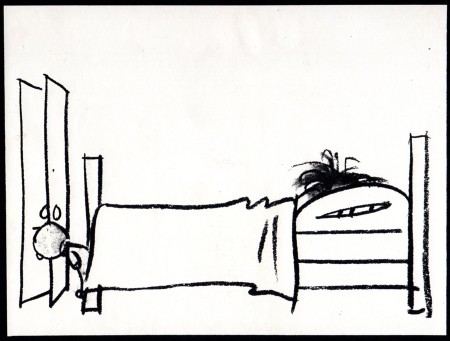
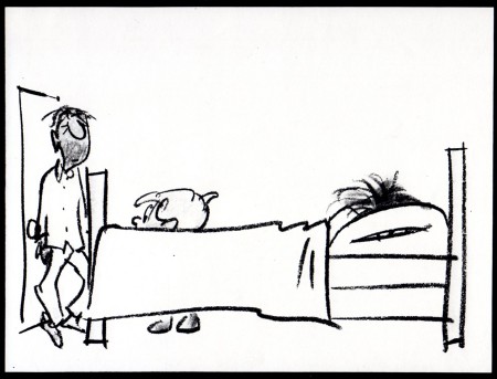
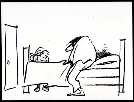
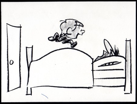
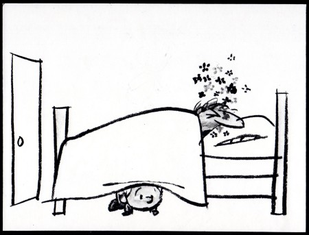
I thought I’d post here some of the storyboards and the animatic for that section. Of course, this is in a low res version; more can be discovered in the dvd version.
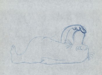
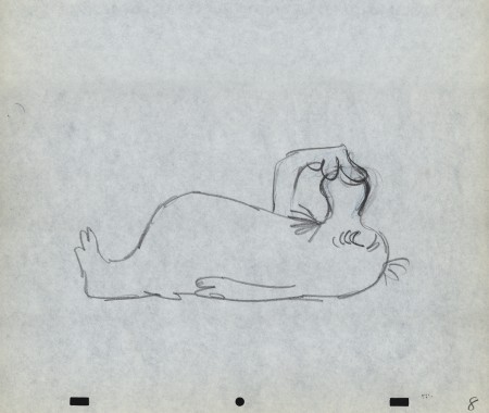
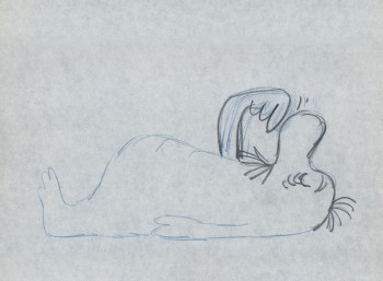
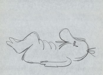
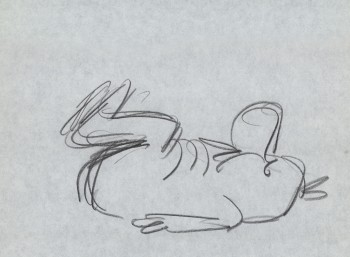
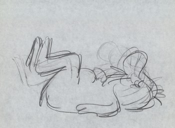
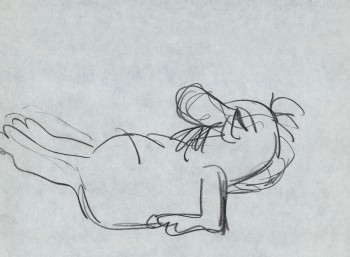
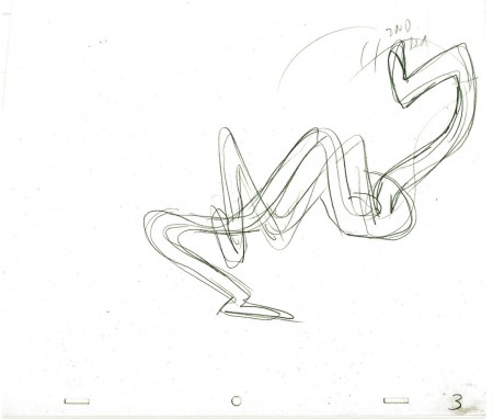
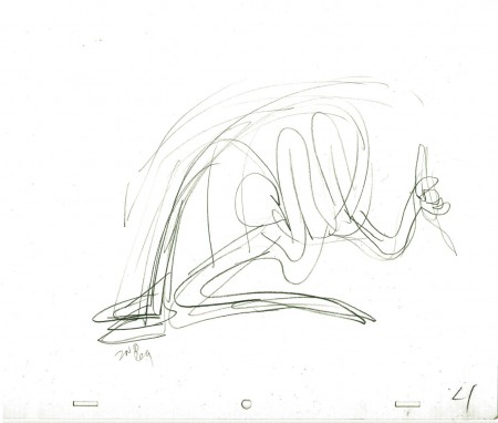
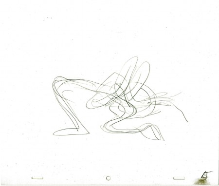
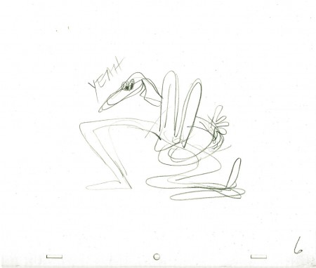
Tissa David did the storyboard and animated the entire film by herself. This film is a beauty, if I do say so myself. It’s a truly adult film, though it was sold as a family film. It deals with love in all its forms, albeit, obviously, through metaphor. It was adapted from a brilliant children’s book; one of Russell Hoban‘s finest.
Quentin Blake illustrated the original book, and we didn’t purchase the illustrations. Hoban told us that it wasn’t how he’d imagined the pig to look, so he drew it for us. He was once an art director in an ad agency, so he was able to draw. This is the pig we used.
Hoban had hated what was done with his book, The Mouse and His Child, so demanded that all the spoken dialogue in the film be found among his words. We wrote a script; Maxine Fisher went to London to work with him in revising it. Finally, when it came to recording the actor Tim Curry, I threw out the script and had him read the book – with the exception of one line. It was a good decision, and it made for a great performance from a great actor.
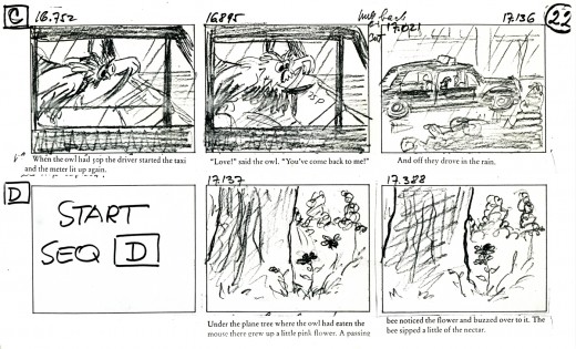
_____________(Click any image to enlarge.)
You’ll notice that some changes were made
in scenes and scene cuts as the animation progressed.
This is typical.
Here are two films we did for a home video of children’s poems. The first is a poem by Russell Hoban. The animation is by Mark Mayerson, and the design is by Jason McDonald. The music is by Caleb Sampson. I think all of these artists did brilliant work, but then Hoban’s thoughts and words always pull out the best.
Russell Hoban’s The Tin Frog
This second poem of Hoban’s also brought out the best in the artists, Jason McDonald who designed and storyboarded the whole piece. The excellent animation was by Sue Perrotto..
Russell Hoban’s Jigsaw Puzzle
Click left side of the black bar to play.
Right side to watch single frame.
Animation Artifacts &Art Art &commercial animation &Layout & Design &Models 17 Oct 2012 06:21 am
Mogubgub 2
- Fred Mogubgub was a rare bird in animation. He was truly out there. Maybe today we’d say he was ahead of his time.
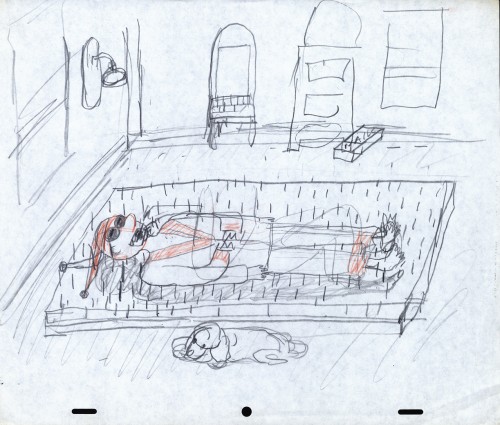
He was a close friend of Vincent Cafarelli’s and did some creative work with their studio. He also left a residue of artwork behind him. I located a folder of layouts and such artwork.
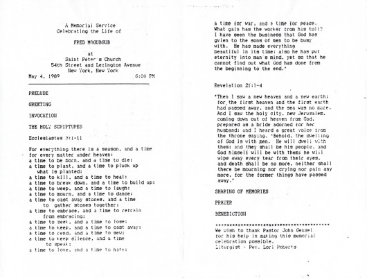
There’s also the program for his Memorial service. I’ve decided to include that here in this post.
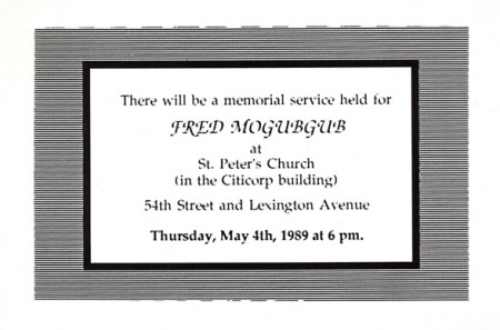
Invitation to the Memorial Service.
Here are a series of drawings Fred did for a Yakov Smirnoff “Funfacts” piece for ABC tv. These were 20 second spots for the network.
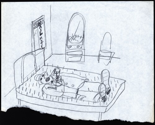 1
1
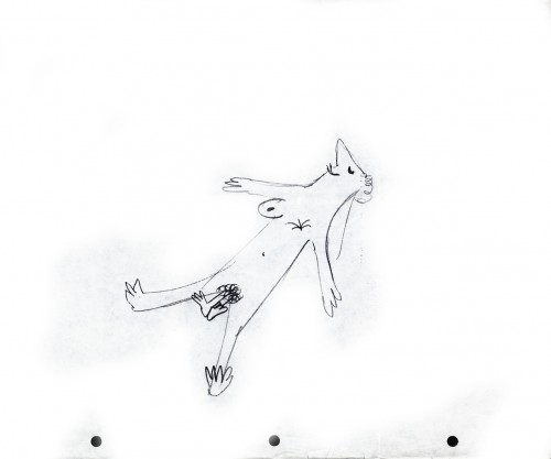
Here are some randy gags Fred drew – studio gags.
 1
1
Fred had to balance the commercialism with the art.
Animation &Animation Artifacts &Fleischer &Layout & Design &Models 10 Oct 2012 05:54 am
More Fleischer Models & Things
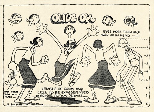
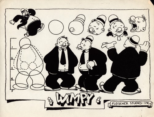
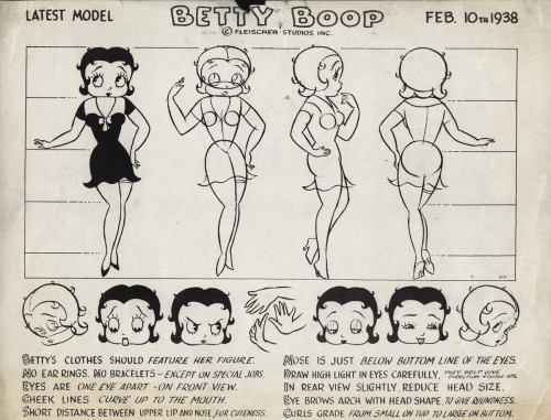
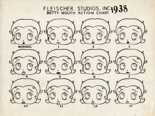
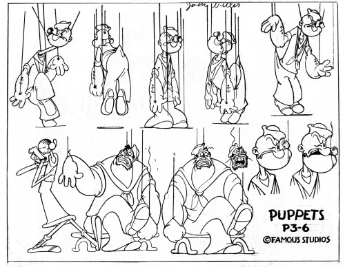
- Continuing on with the Vincent Cafarelli collection of artwork, I ran across some more Fleischer/Paramount models. One piece among them, I think, is something of a rarity. Here they are:
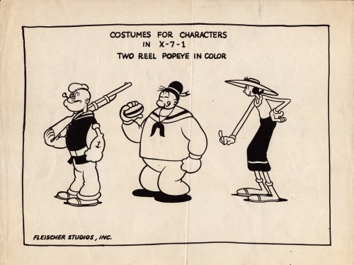 1
1
 10
10
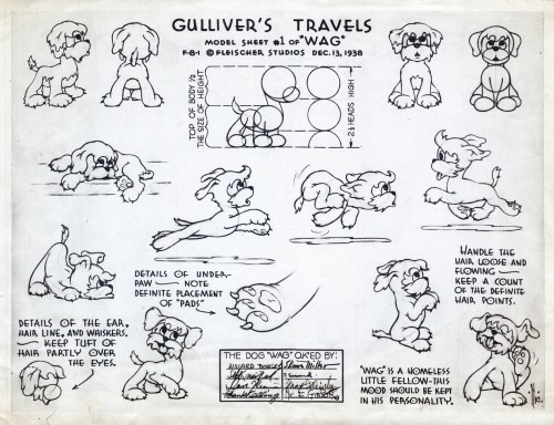
This seems to be a rarely seen model. “Wags” the dog from Gulliver’s Travels.
I think this was cut from the film, at least I’ve never noticed him.
 11
11
This, of course, is not Fleischer but a later Famous short.
 12
12
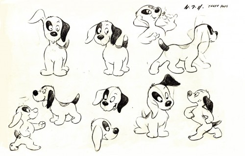
This appears to be from a later Paramount cartoon.
(Thad Komorowski identifies this as Bill Tytla’s
HECTOR’S HECTIC LIFE in the comment section of this post.)
________________________
- Here is something even rarer than that Gulliver “Wags” model sheet.
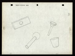
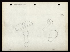
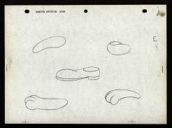
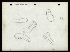
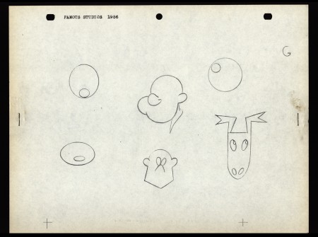
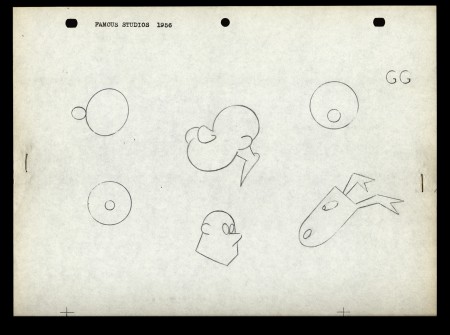
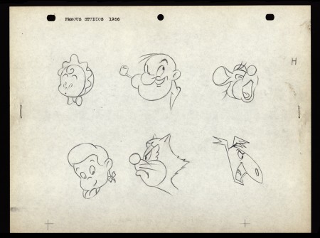
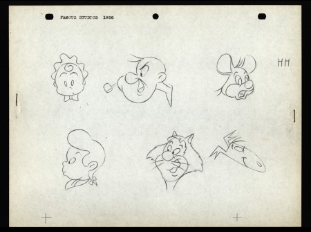
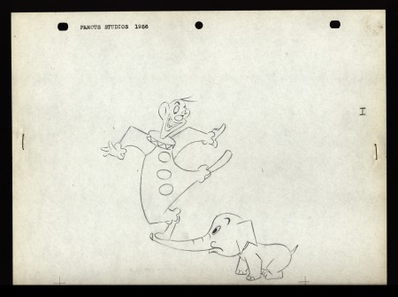
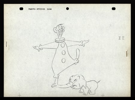
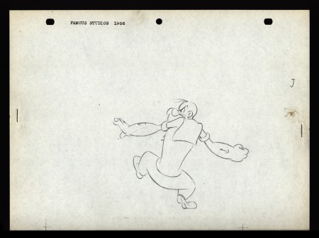
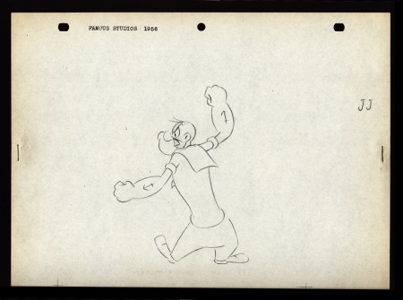
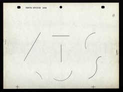
Apparently, new hirees at Famous Studios (at least in 1956) would go to an art school, of sorts. The following drawings are on reduced animation paper (although they’re the actual pencil drawings, not copies) and stapled – with two staples, one on either side – to black illustration board. Each has additional registration marks drawn at the bottom. Each is one of two drawings that are slightly different from one another. Presumably, they were designed to teach inbetweening. The pencil drawing line work is particularly thin, so I suspect these were projected with an overhead projector. I’d guess that the art student, new employee, would copy the projected drawings and then have to inbetween the pair of drawings.
The drawings start with simple lines and get progressively more difficult until it’s a full sized image of Popeye ready to throw a punch. For the sake of space, and since the first drawings aren’t very interesting, I’ve enlarged only the last half of them. The thumbnails for the first group are small, so you can see them and enlarge them, if you like. If you’re new to the field, try copying and inbetweening at least the last five pairs. It’s amazing that Vincent Cafarelli saved these, and fortuitous for us to be able to see them. Have a look:
 A
A 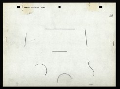 AA
AA
Animation &Animation Artifacts &commercial animation &Models &Story & Storyboards 12 Sep 2012 07:00 am
Sleeper – Vince Cafarelli collection
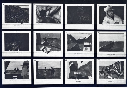
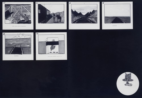
- Today I stumbled upon an odd spot in the collection of artwork saved by Vince Cafarelli. This is the storyboard and rough animation for a piece that Vince animated to a storyboard by Hal Silvermintz. The two worked on this when they were employed at Stars & Stripes Productions Forever, Inc.. It was something that the two were obviously doing for themselves – (an Independent film?). In any case it never seemed to have gone farther than this animation. . . at least, not in this form.
“Weekend” was a weekly news show that included a short animated piece. Perpetual Motion Studio did these weekly animation pieces for the NBC show airing on late night Saturday night. (This was before Saturday Night Live aired.) The budget was almost nil, so the material had to be not too expensive and the work had to be fun.
During the run of this series of shorts, Hal Silvermintz pulled out the storyboard, and it moved ahead in a new version. Candy Kugel animated the “Weekend” version and finished it for Ink & Pt. The final color spot aired in 1973-74.
Here’s the storyboard and a model sheet:
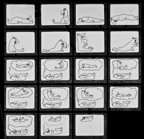
The original storyboard.
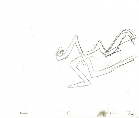
Here are drawings from about half of the first scene. For four key positions, I’m posting the entire page, pegs and all. For the remainder of the drawings, I just have the character for you.
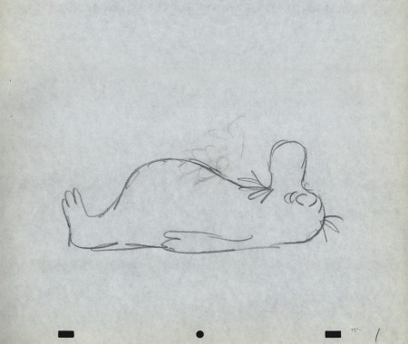 1
1
Here’s a QT movie of the drawings posted above.
There were no X-sheets to offer timings, so I had to
guess at the timings that might have been used.
Animation Artifacts &commercial animation &Illustration &Models 05 Sep 2012 05:40 am
Odds & Ends from the Cafarelli collection
- Going through a stack of boxes searching for genuine animation, one tends to find a number of gems that represent animation past but don’t nicely link to other pieces. The end result is that you hold a lot of odds and ends in your hands and you seek a way to post them. That’s certainly the case with Vinnie Cafarelli’s collected works.
I’ve located a lot of pieces that interest me, but I don’t necessarily know where they come from or why they were saved. So today I’m posting a number of these bits of art.
Here we have Layouts, cel setups, photos, models and more than a small share of invitations and Christ cards. Here they are:
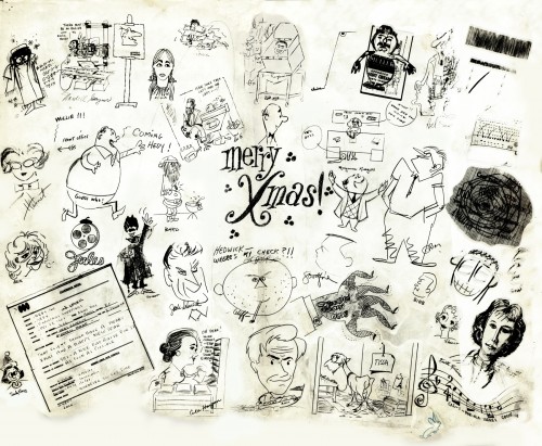 1
1A Christmas Card from the NY-UPA Studio.
Many of the employees signed it.
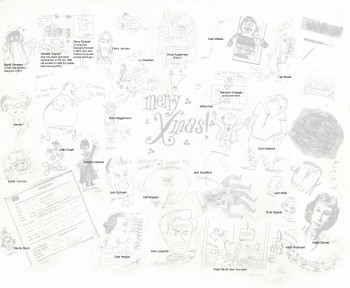 1a
1a
A guide to many of the names
of those who signed the card.
(Click to enlarge)
I had a scanning problem on the upper
right and will try to correct that.
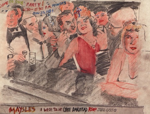
An invitation to a Christmas party at the Maysles Bros
studio. Certainly only for a member of the elite.
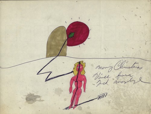
A Christmas Card from Fred Mogubgub.
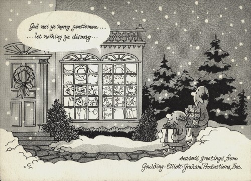
A Christmas Card from the Goulding-Elliott-Graham Prods.
Ray Goulding and Bob Elliott, together with Ed Graham formed
this studio to do Piels commercials. (Bob Goulding & Ray Elliott were the
voices and held onto ownership of the characters. work dried up soon
since one commercial product & client couldn’t maintain the studio.)
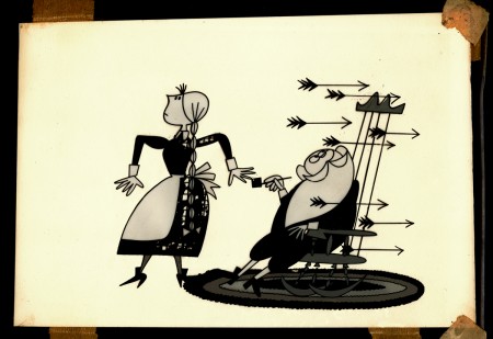
A finished setup from a Yellow Pages commercial.
This was done at Gifford Productions.
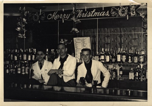
Vince Cafarelli (far left) while in the military at
Fort Benning, Ala. made extra money as a
bartender. These are the days just prior to his
workng at UPA.
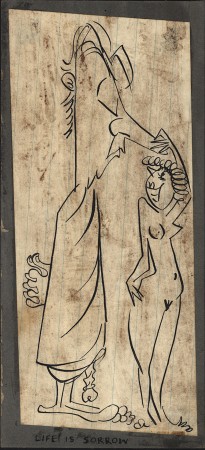
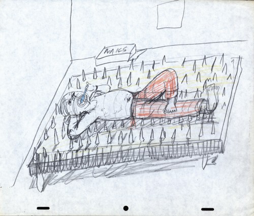
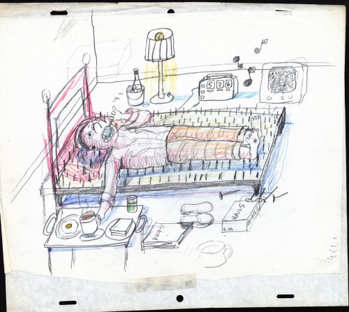
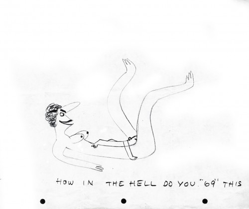
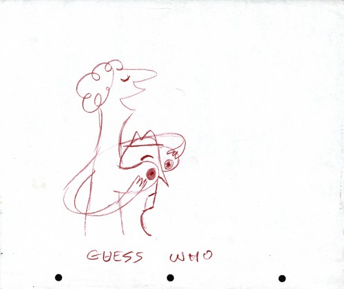
A small racy sketch among the art.
We’re not sure who drew it but guess
it might be Vince Cafarelli’s work.
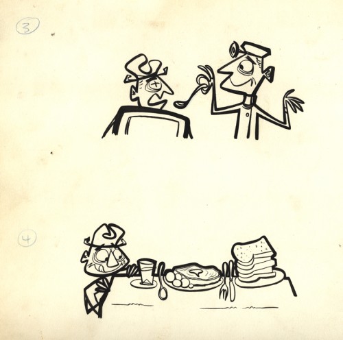
All that remains of a pitch for an antacid spot.
Obviously drawings 1 & 2 are missing, but
these two were interesting enough for me to post.
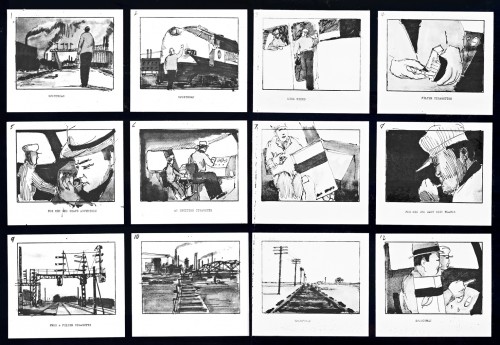 1
1
A storyboard (3 pages) for a cigarette company
(Sportsman Cigarettes?). Obviously a sample board.
Is it a live action spot? Probably for Gifford Studio
which also did live action spots.
Animation &Animation Artifacts &commercial animation &Hubley &Models &repeated posts 03 Sep 2012 05:11 am
Vlasic Business at the Hubleys
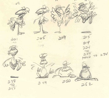 – Years ago I worked at the Hubley studio on a pair of commercials for Vlasic pickles. One of the two spots made it to the air.
This is from the spot that never made it.
Vlasic had a commercial they wanted, and because of the agency’s long time relationship with the Hubleys, they came to him to try to develop the character. (The agency was W.B. Doner, the agency that had done so well with Hubley’s Maypo commercials.)
The agency came with two already-recorded voices: one was a Groucho Marx impersonator (Pat Harrington was the Groucho impersonator ultimately used for the stork’s voice.*) The other voice was character actor, Edgar Buchanan, a man with a gruff voice who appeared in a million westerns. John Hubley wanted Edgar Buchanan – it was a much richer voice, lots of cowboy appeal.
John designed the character to look like one of those stationmasters in cowboy films. The guy who gives out tickets and does morse code when he has to. The stork had a vest and a blue, boxy, stationmaster-type cap cocked off to the side. It was a great character.
Phil Duncan was the animator. A brilliant character guy who had done everything from Thumper to George of the Jungle. I loved cleaning up and inbetweening his work. It was all fun and vibrating with life.
The rough thumbnail drawing (above) fell out of one of Phil’s packages. It was a thumbnail plan of the action. Phil would do these things which usually stretched around the edges of his final drawings. In a nutshell, you could see the scene and how he worked it out. Lovely stuff.
I felt this drawing was as beautiful as the original animation drawings.
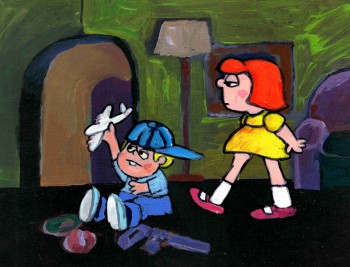 The agency approved the stork, Edgar Buchanan and the plan of action.
We’d already finished the first commercial which was on the air. (Represented by the two set-ups posted here.) The style was done with acrylic paints – out of a tube – on top of the cel. Ink with Sharpie on cel; paint dark colors – ON TOP of cel
- up to and over ink line; after drying we painted it again with lighter tones, and we pained it again after it dried using even lighter tones with a translucent color. Imagine kids & a gun in a spot today!)
Phil Duncan did a great job of animating it. I inbetweened, and the Agency loved it and approved it to color.
All this time, John and Faith were busy preparing the start of Everybody Rides the Carousel. It was to be three half-hour shows (Eventually CBS changed their mind and asked the shows, still in production, to be reconfigured to make a 90 min film) and was in preproduction. I did the spots on my own with John checking in. Faith wanted nothing to do with a commercial and was somewhat furious that a commercial was ongoing. She daily spoke out against this spot with many shouting matches. I never quite understood the problem. The spots didn’t hold up any other studio work; I was making it as easy as possible for John to not have to do much work on the spots, and they were getting necessary money to help finance some of the preliminary work for the Carousel. (Of course, the Hubley name was involved, but even Michelangelo did commercial work – like the Sistine Chapel to pay for the art. Not that Vlasic was the Sisine Chapel, of course.)
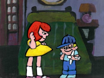 Within weeks the spot was in color and two junior exec. agency guys, John and I stood around the Hubley moviola. (It was a great machine with four sound heads and a picture head that was the size of a sheet of animation paper. Pegs were actually attached to enable rotoscoping!)
The two agency guys were buttoned up with good suits and briefcases. They stood behind John and me, and I operated the moviola.
We screened the spot the first time. I turned around and these two guys had come undone. Their ties were loose and astray; they were visibly sweating. I swear this all happened within the course of 30 secs.
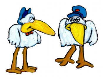 John smiled and optimistically asked how they liked it. They looked at each other, and couldn’t answer. I don’t think they were able to form a decision or say what they actually thought. Eventually, they left with the spot in their briefcase and would get back. It wasn’t good.
They did get back. I was asked to pack up all the elements and ship them back to W.B. Doner. The spot was thrown out of the studio by John who refused to change it. (Hubley’s stork.)
He liked what was done, and apparently had
a rider in his contract which covered him – somehow.
The spot showed up at Jack Zander‘s studio, Zander’s Animation Parlour. They used the Groucho impersonation and slicked it up a lot. Vlasic is still using that stork, and that was John’s last commercial endeavor. The character is still showing up in a cg version, just as bad as the 2D version.
* Thanks to Mark Mayerson for this information.
Hubley &Layout & Design &Models &Tissa David 30 Aug 2012 05:15 am
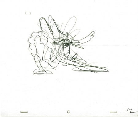
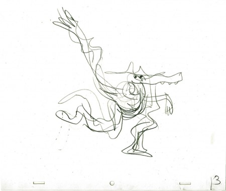
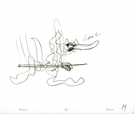
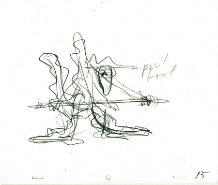
Layouts Cool Pool Fool – recap
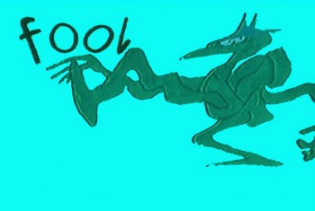
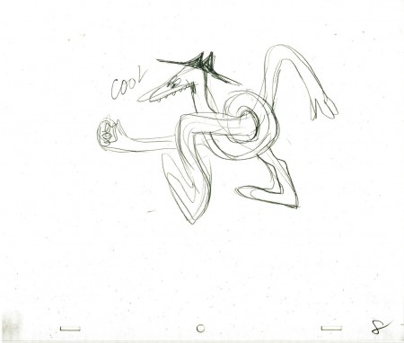
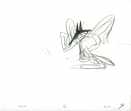
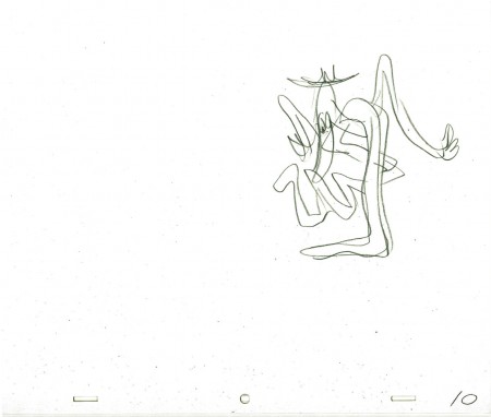
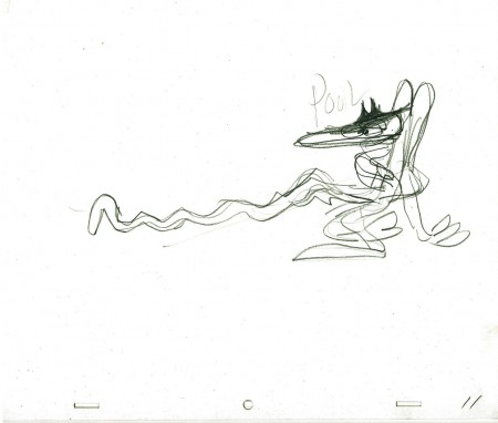
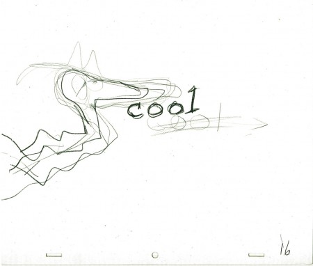
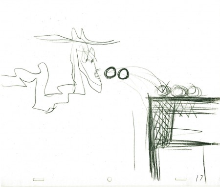
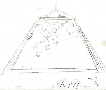
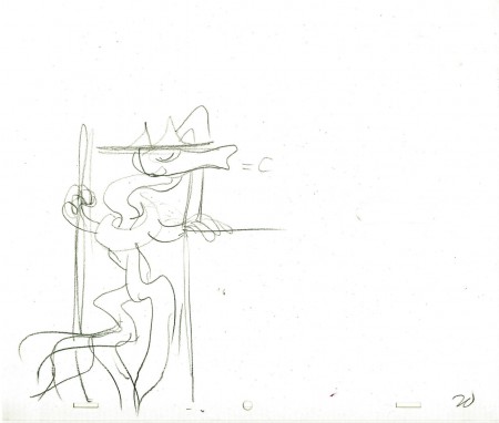
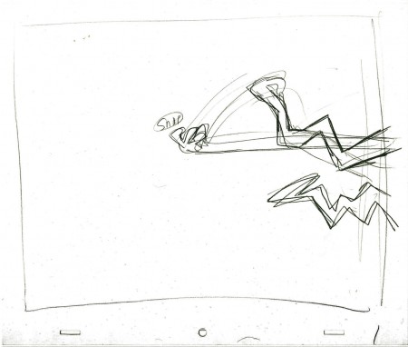
- Here are the Layout drawings by John Hubley for the Electric Company piece, Cool Pool Fool. Tissa David animated from these layouts and the verbal instructions from John.
A couple of drawings are missing #7 and #18
 1
1
Here are some frame grabs from the spot. They’ve been severely touched up in photoshop since the video has lost all color and is almost unwatchable except as a silhouette film. I’ve reconstructed the colors as near as I can remember them. At any rate, the purpose of these grabs is for you to see what Tissa has done with John’s layouts.
 1
1
Thanks to RIchard O’Connor, here is the
poor YouTube version.
The indomitable Billy Taylor wrote and performed the music.
What a great piano! I had the treat of spending a couple of
hours talking with him about his music for the Hubley films.
We talked for about a half hour about this music.
Animation Artifacts &commercial animation &Layout & Design &Models 29 Aug 2012 07:45 am
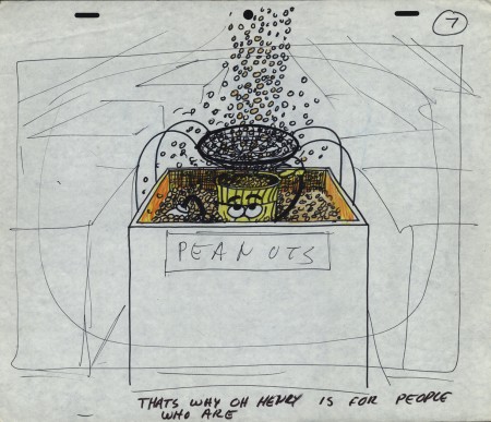
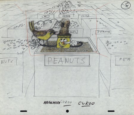
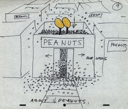
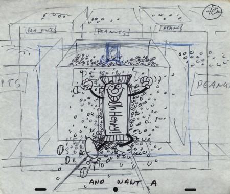
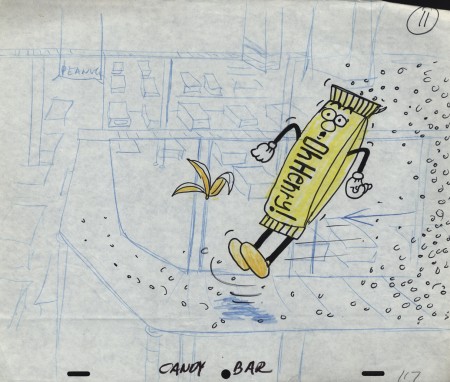
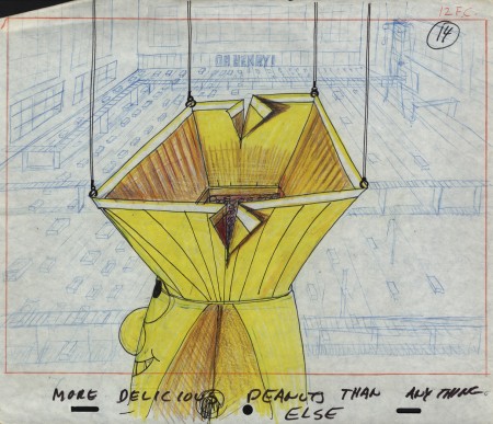
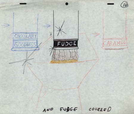
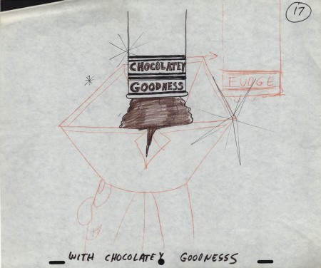
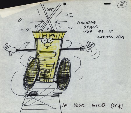
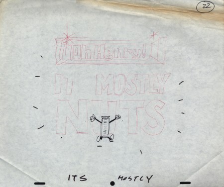
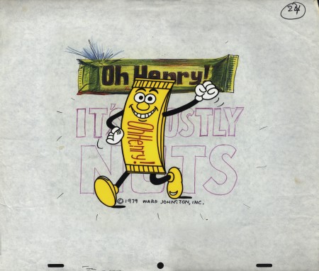
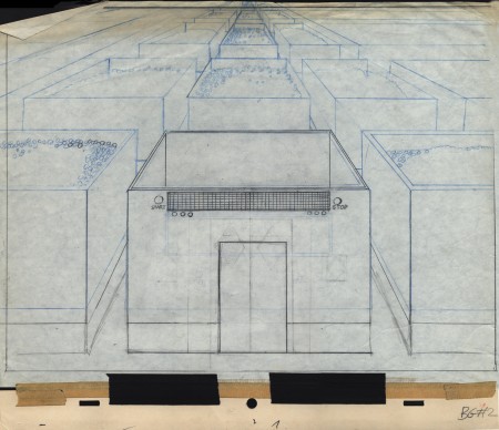
Mogubgub’s O’Henry Bar
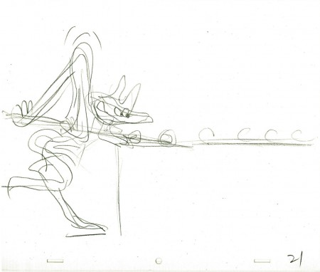
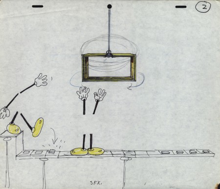
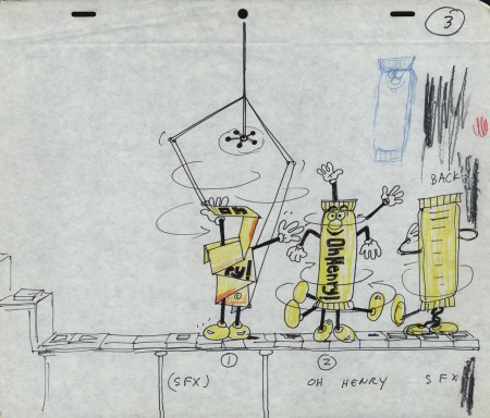
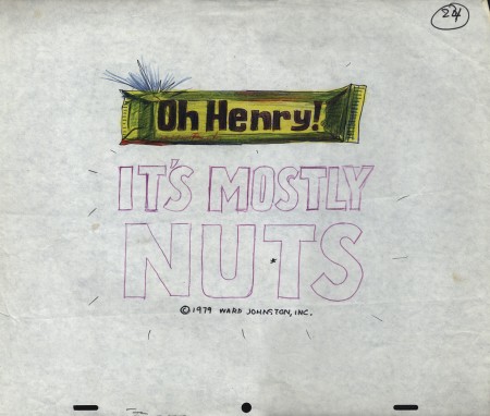
- Sifting through the boxed archives of Vince Cafarelli‘s saved material, there are quite a few pieces of art from a number of commercials. One that stands out includes the LayOut drawings of Fred Mogubgub for an O’Henry Bar animated commercial. The spot comes from the early days of Buzzco, 1982 or 1983 when Buzz Potamkin was still the principal in the company.
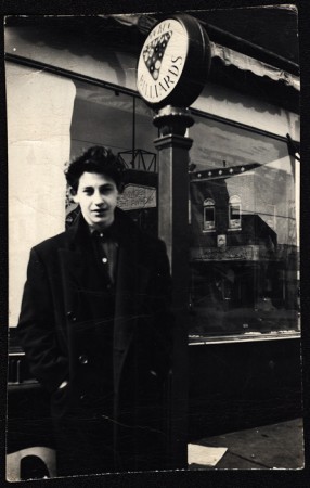
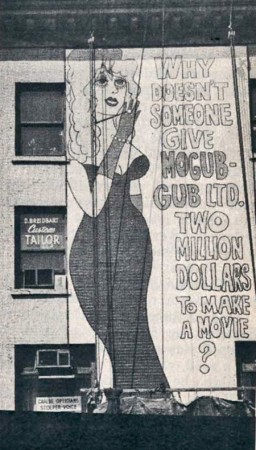 Fred Mogubgub was enough of an eccentric that I would be attracted to his artwork. (In case you’re unfamiliar with Mogubgub‘s work, here’s a four part series including his bio and some films.) I remember – as an art student in NY and desperately wanting to get into animation – the sign on 46th St and Sixth Ave: “Why Doesn’t Someone Give Mogubgub Ltd. Two Million Bucks to Make A Movie?” I asked Fred if he’d had any response. He said that ABC contacted him, and he gave them a script that was about a thousand pages big. It was about the contents of an ashtray. The characters were cigarette stubs, ashes and matches. To illustrate the script, he’d attached some used butts and matches within. They didn’t give him the money; you might have guessed.
On Blechman’s The Soldier’s Tale, there was a PT section of the animatic that Fred had done. We had to prepare this for a big screening for PBS trying to sell it for Bob. To get it into color, Fred and I would literally color the film, itself. He started at the head of the scene and I started at the end. We met in the middle. That piece of film had a life that was just too great. It couldn’t retain what we had done when it went to completion. Very exciting work and a fun afternoon coloring some footage with Fred.
Here are the Lay Outs Vinnie had saved for the past 30 or so years:
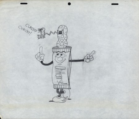
Our Lead Character – a model
 1
1
There seems to be no rhyme or reason
as to when things are top or bottom pegged.
Animation &Animation Artifacts &Bill Peckmann &commercial animation &Layout & Design &Models 17 Aug 2012 06:23 am
Peckmann & Schnerk’s Utica Club
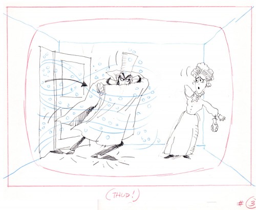
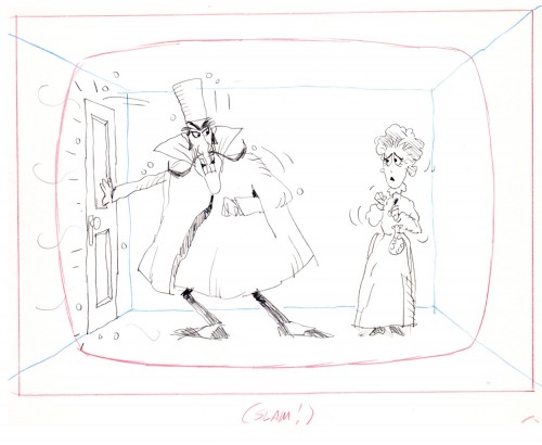
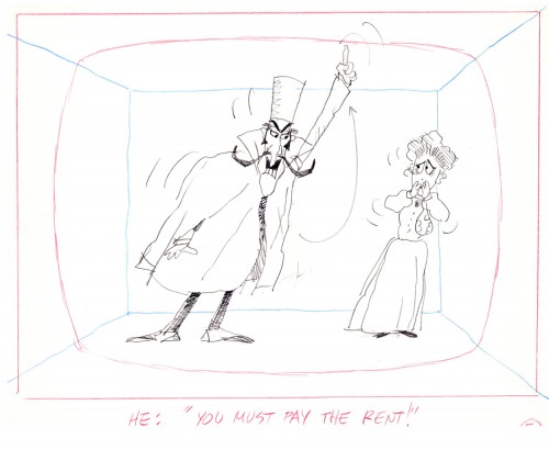
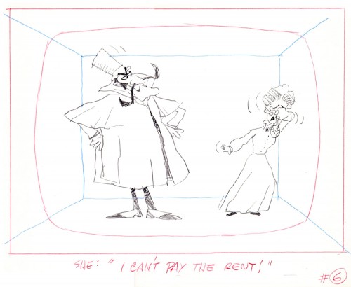
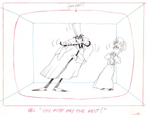
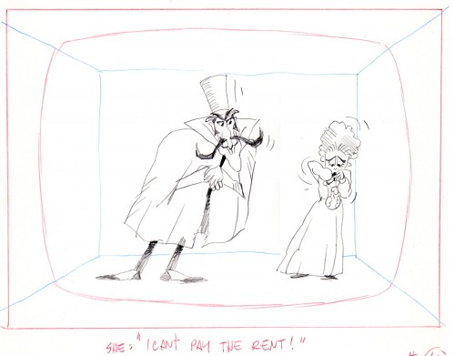
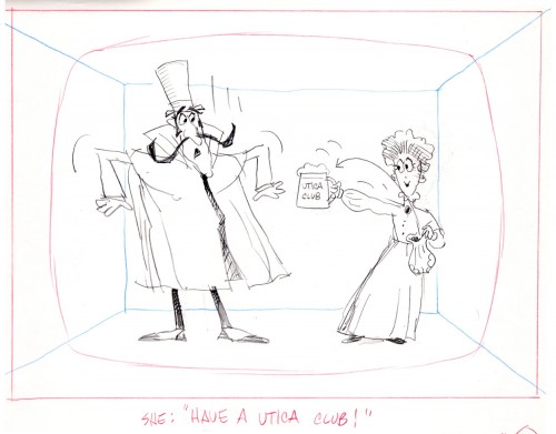
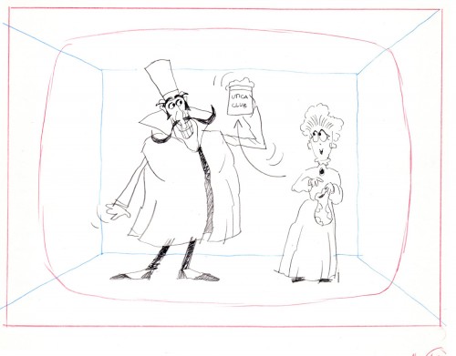
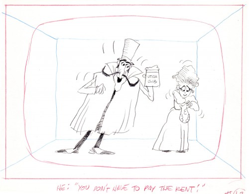
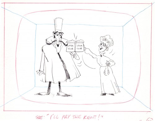
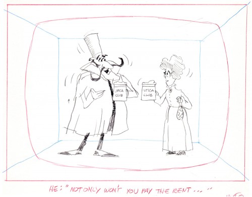
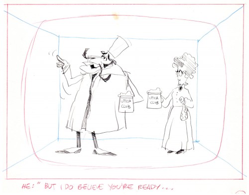
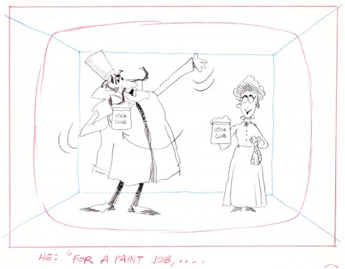
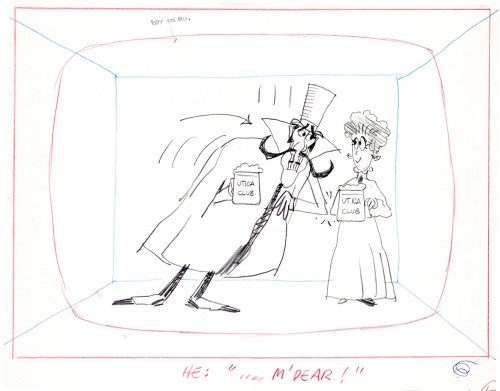
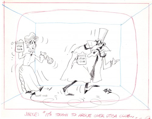
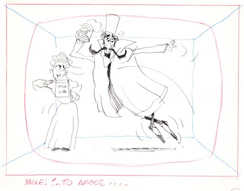
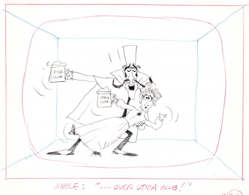
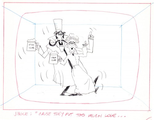
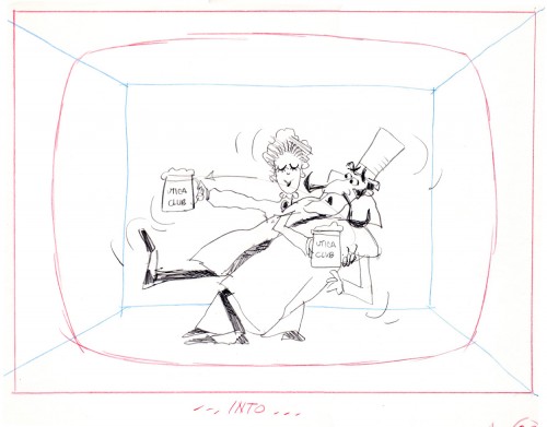
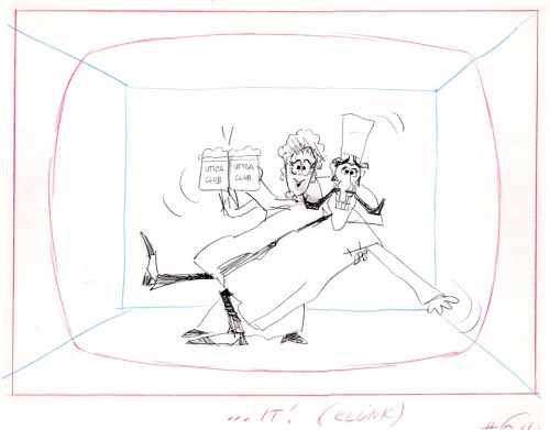
Another spot on Jack Schnerk‘s reel was Utica Club’s ‘Landlord’. Here with the little bit of art that I have from that commercial, I will try to illustrate some of the steps that went into making the film.
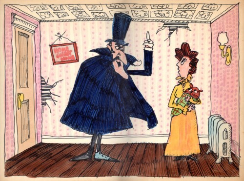
Here is the ad agency’s concept art.
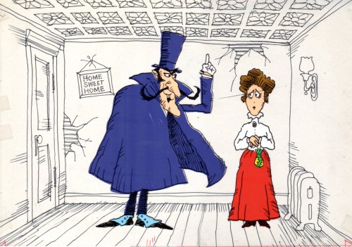
Here’s my tweaking of the agency art design.
This is a cel color model against a line version of the bg.
Next will be my first six rough layout drawings of the spot.
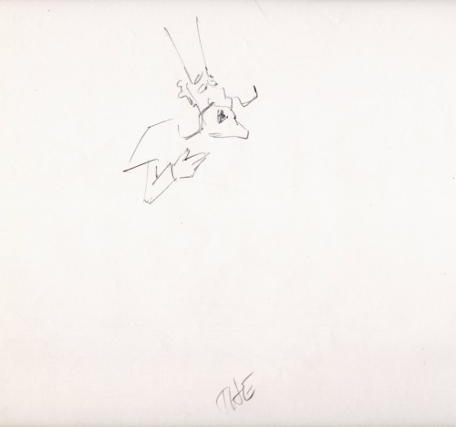
The following are animation key drawings by Jack Schnerk.
 1
1
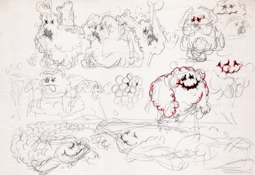
Once when we were doing designs for a soap bubble character, Jack took a break from animating to do these quick sketches. They are full of life, like all of Jack’s work.
 1
1
I hope for those who were fortunate enough to work with Jack, his drawings will bring back some good and happy memories, they do for me!
You can watch this spot on Jack Schnerk Sample Reel 2 starting at 3’01″.
Bill Peckmann &commercial animation &Layout & Design &Models 16 Aug 2012 04:43 am
Weber & Schnerk Vote Toothpaste
Bill Peckmann shared these great LO sketches for one of Jack Schnerk‘s animation samples:
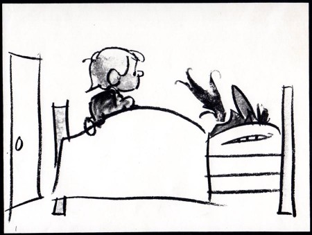
- Since one of the first spots on Jack Schnerk‘s reel was his ‘Dragon’s Mouth‘ Vote Toothpaste commercial, I thought you’d enjoy seeing New Yorker cartoonist Bob Weber‘s key LayOut drawings for the spot. Unfortunately they are not the full color original illustrations but black and white stats that were made to fit in a comfortable field size. These are for the first half of the spot.
These were the only keys that Jack had to guide him on this spot to work his animation magic. It was always a super treat to clean up Jack’s roughs, especially when he animated ‘named’ print cartoonists. The essence of the pose was always there in those terrific sketchy lines and the body proportions were also always bang on!
 1
1
Bob Weber had a great sense of what to do in animation, his poses are beautiful. You only wish he would have been given more spots to design.
You can also go here and just watch the first spot to see a larger version.
