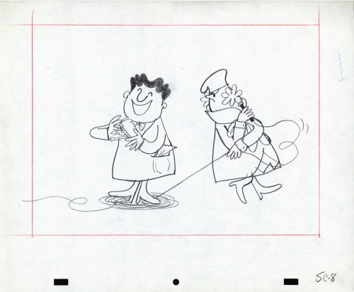
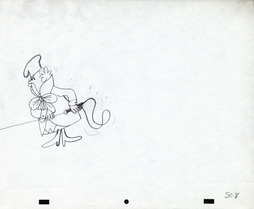
Category ArchiveModels
Commentary &Disney &Layout & Design &Models 14 Feb 2013 05:47 am
Witch – redux
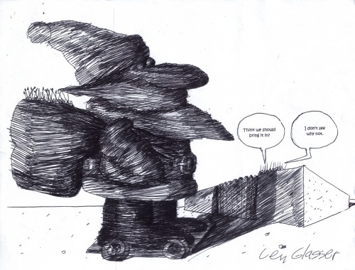
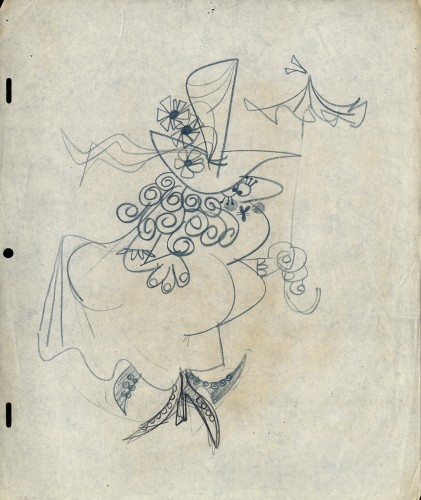
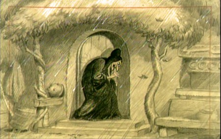
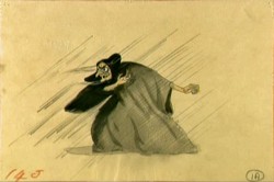
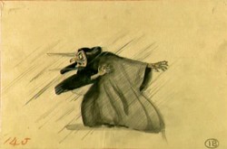
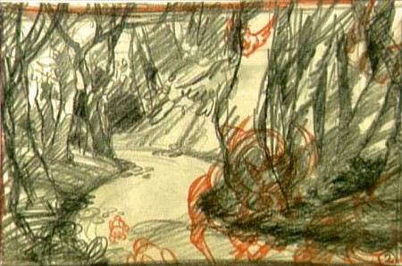
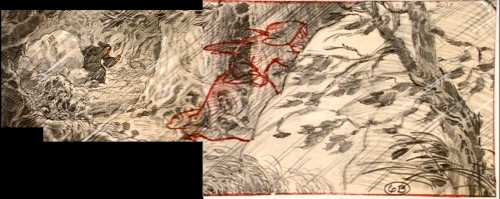
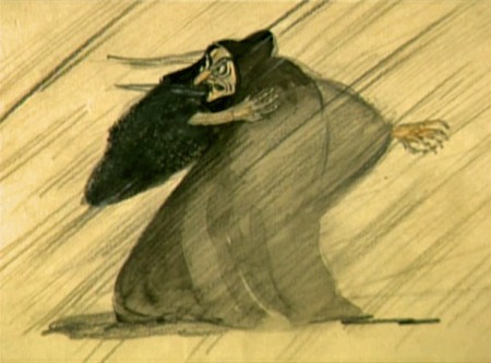
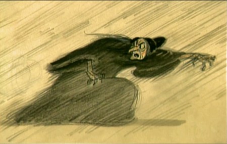
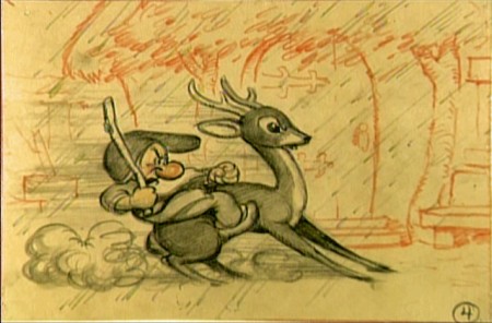
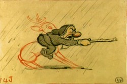
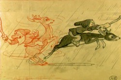
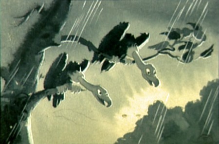
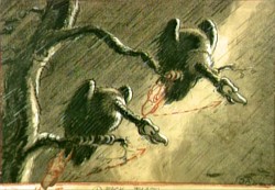
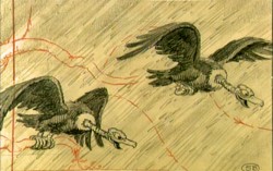
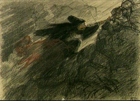
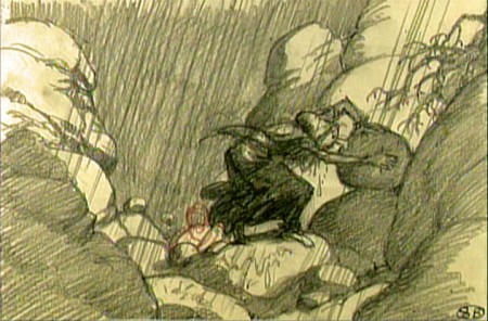
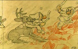
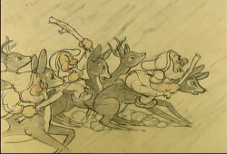
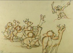
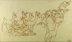
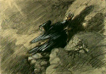
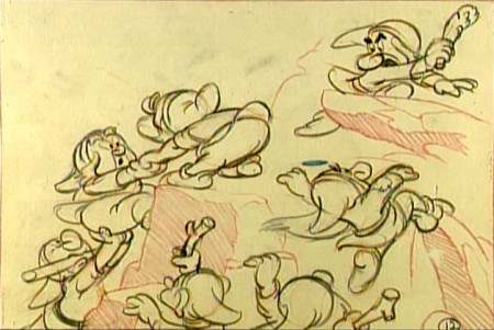
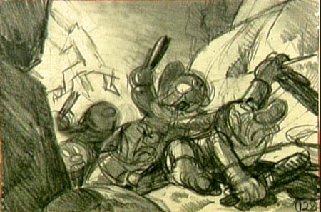
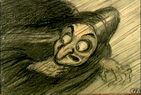
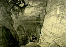
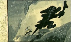
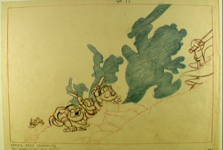
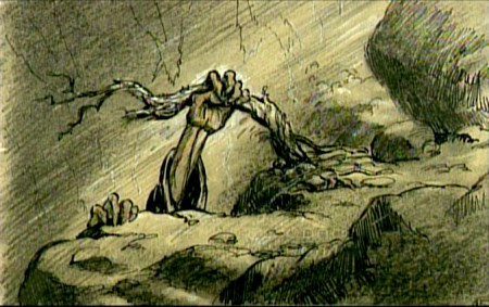
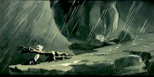
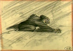
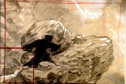
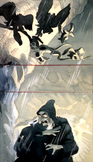
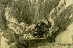
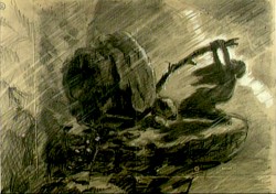
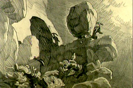
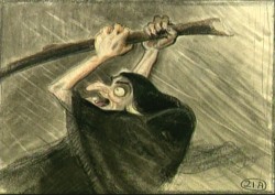
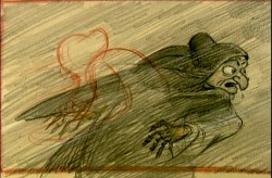
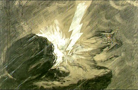
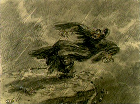
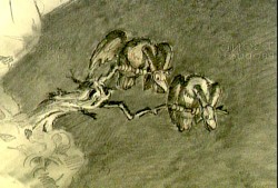
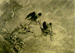
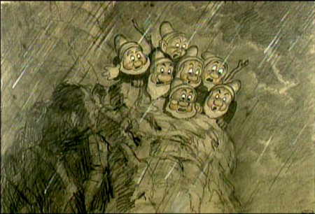
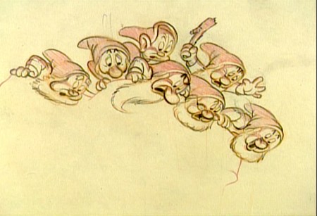
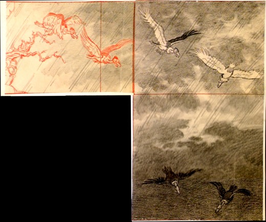
- It’s not always easy to kill a witch. This sequence from Snow White couldn’t be designed better. It’s short, it’s tense, it’s a tight sequence that handily does its job. The witch is killed in record time. Today, the sequence would be dragged out for half the length of the film.
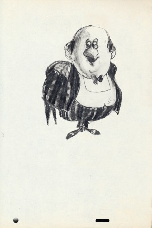
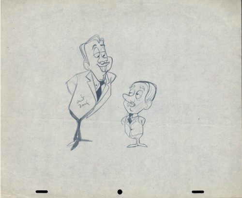
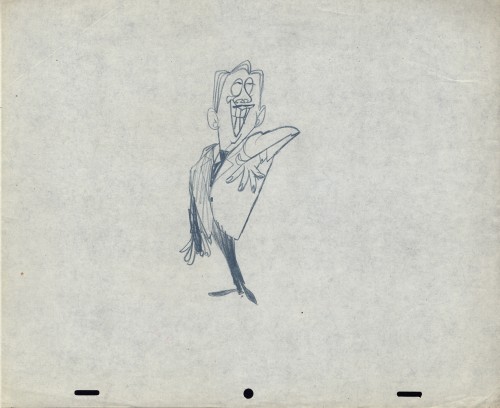
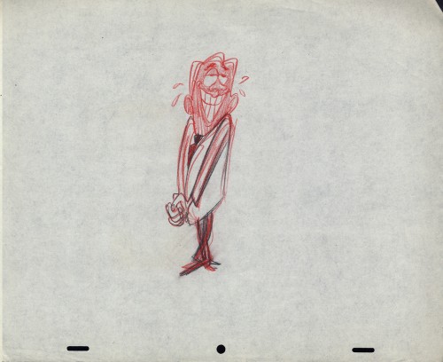
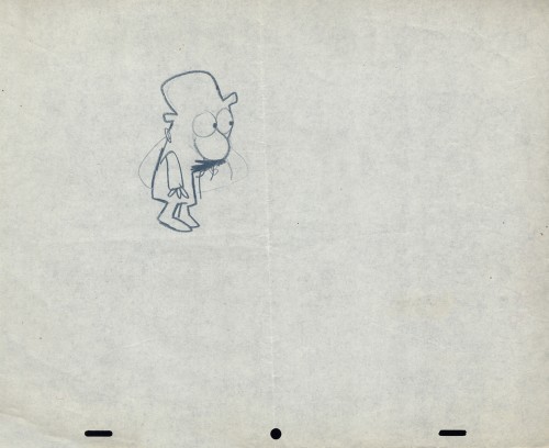
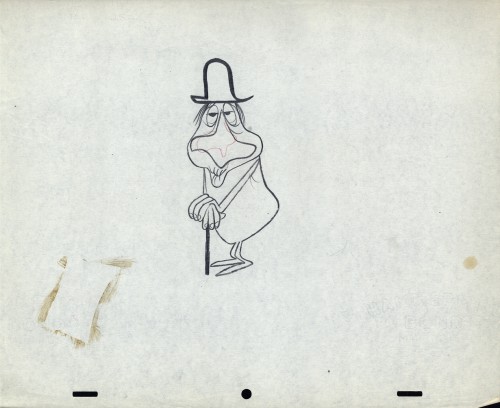
Some of these drawings are great.
 1
1(Click any image to enlarge.)
Animation &Animation Artifacts &Bill Peckmann &commercial animation &Illustration &Models &Story & Storyboards 30 Jan 2013 08:26 am
More Misc Commercial Art
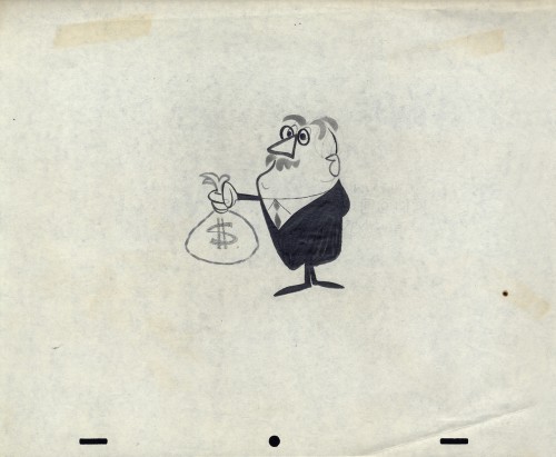
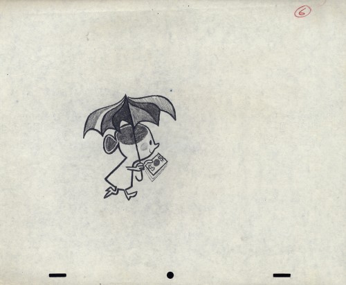
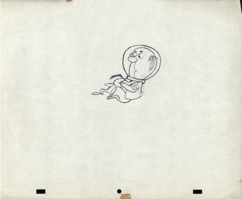
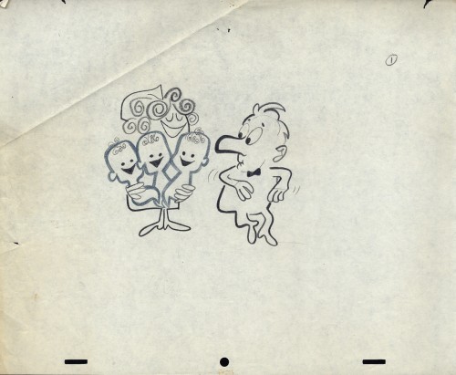
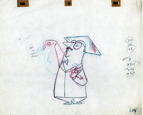
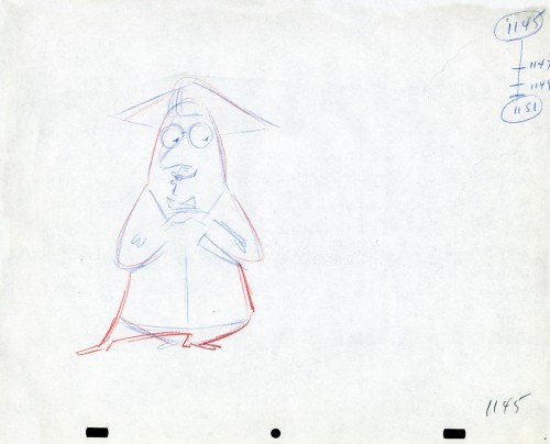
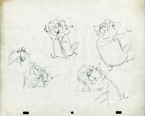
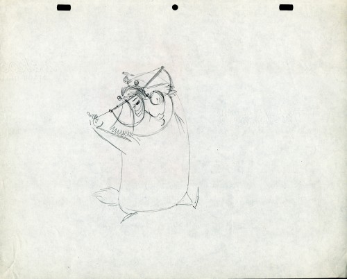
- Still left in the Vince Cafarelli collection of drawings from commercials he did, most probably, at Goulding-Elliott-Graham (for the moa part) are the drawings below. We know through some small bits and pieces of information what a couple of the sponsors were. (The wording of dialogue the professor speaks that the sponsor is Nabisco Shredded Wheat; the lion and the mouse ad is obviously for Vicks – drops or vap-o-rub.) However, too many other bits leave us empty handed. I can recognize cartoonist, Lou Myers‘ work anywhere, but no clue what they’re for. Candy Kugel and I were also able to delineate Lu Guarnier‘s drawing style (Vinnie was his assistant for years), and I know Jack Schnerk‘s great work. I recognize the brilliant and great hand of George Cannata from similar work that Bill Peckmann had recognized (see here) in a past post. So it is great to learn as much as we can, even though there’s a lot of guesswork in it.
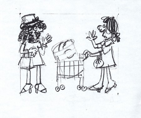
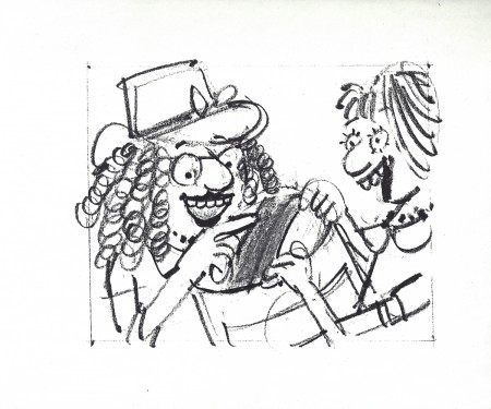
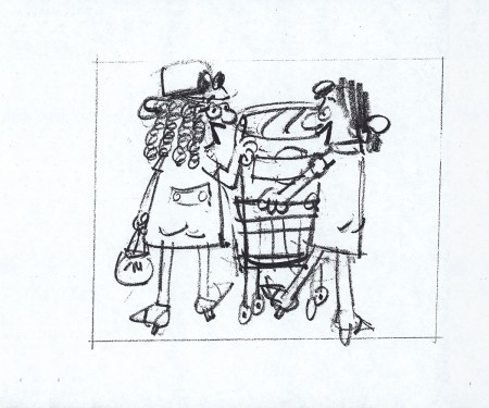
The following are three storyboard drawings by cartoonist Lou Myers for some spot:
 1
1
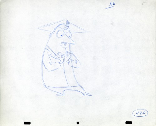
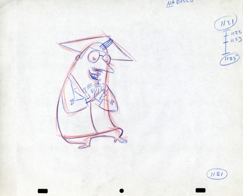
The following drawings are for Nabisco Shredded Wheat. They’re animation drawings/ruffs by Lu Guarnier. The delicate pencil lines of these years turned into dark rougher ones in his later years. The timing charts were always the same right out early wB years. You’ll notice a lot of quarters and thirds in the breakdowns. This is something you’d never see from Disney. There, everything is broken into halves and halves again and again.
 1A
1A
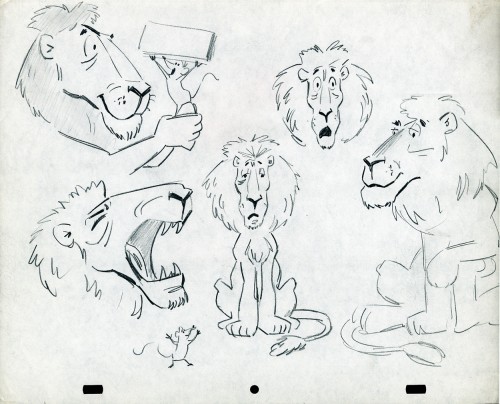
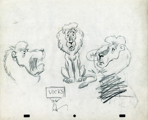
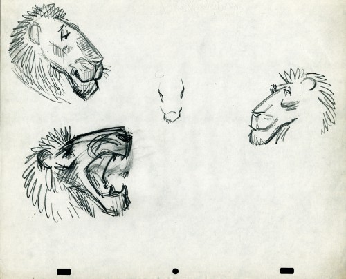
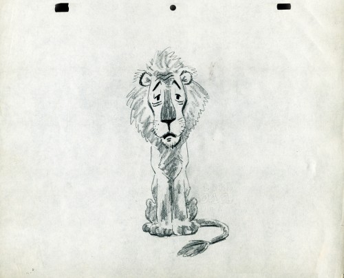
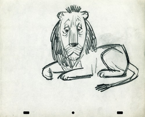
- The following lion is designed and animated for a Vick’s commercial. (Note the second model sheet.) There were quite a few commercials during the period that reworked this great Aesop tale for the sponsor’s use. The lion obviously has a cold. Rather than pulling out the thorn, the mouse introduces him to Vicks’ cough drops and the lion feels a whole lot better.
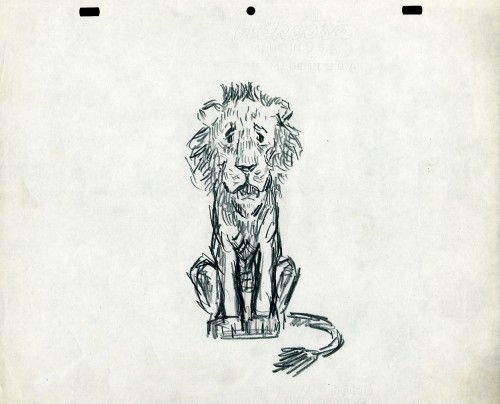
What has been left behind of this ad includes a couple of model sheets of the lion as well as a couple of animation drawings. I don’t know who the designer is, but the animation drawings are most definitely the work of Jack Schnerk. I suspect all the drawings here are by Jack. He probably kept reworking the model sheet until he got the character in his hand. I can remember him lecturing me on the quality of my drawings. Unless my drawings became roughs, rather than tight clean ups, he was convinced I couldn’t get good animation in my pencil. Jack’s work was rough. and it became much more rough than this, certainly by the time I knew him and was assisting him. He also had a peculiar style of roughness; very choppy angular lines chiseling out the fine drawings. You can get a good example of that with drawing labeled “2D”.
The last four drawings are all animation drawings. “2D” is a rough, “2E” is a clean-up by Jack. The last drawing is a beauty and probably the final look he hit upon.
 2A
2A
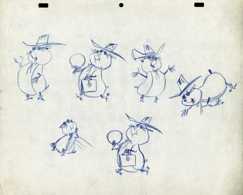
Here we have some drawings by a designer. I suspect that it’s the work of George Cannata. I did a couple of posts on a designer at Robert Lawrence Studio a few weeks back. Bill Peckmann identified the primary designer whose work screamed out to me. Since then, I’d recognize that line anywhere, and it’s most definitely below.
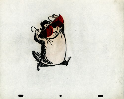
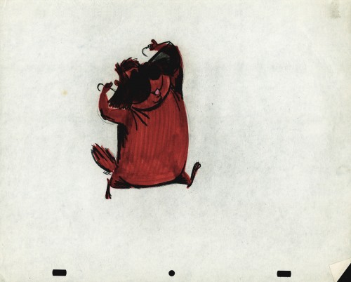
The Groundhog below is obviously a character with a southern drawl. The first step was to try the obvious making him a cowboy (“3A”). But that soon changed. and the character got plenty more sophisticated (“3B & C”). After that the line got juicy and the color got bold. There’s really so much to a character like this who just about animates himself.
 3A
3A
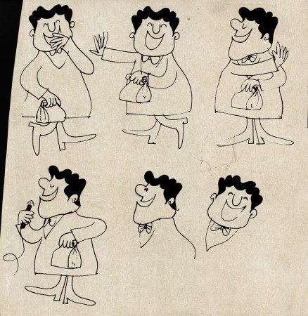
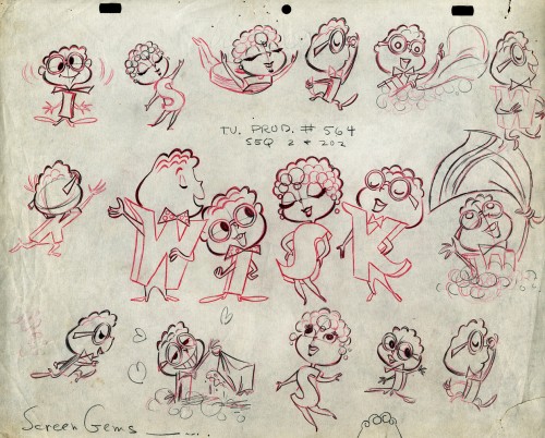
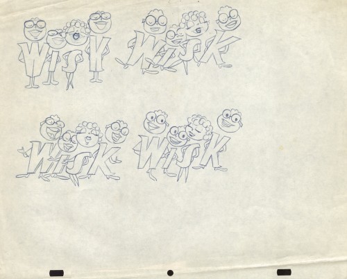
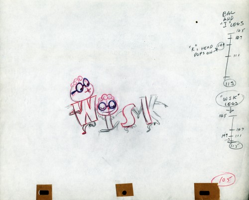
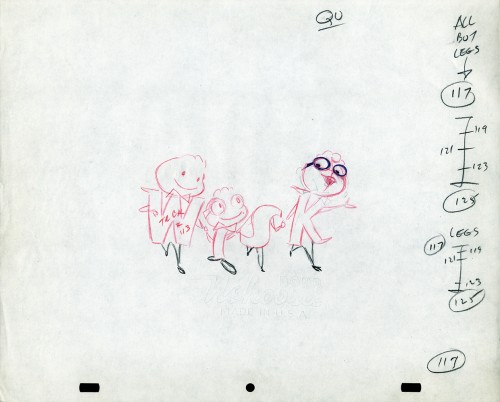
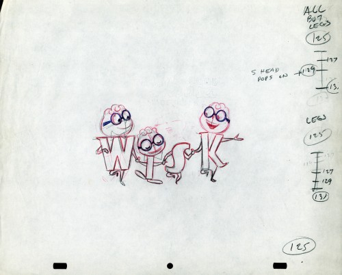
The following five drawings are for a WISK commercial. There are two model drawings and three animation ruffs. The primary model indicates that the spot is done for Screen Gems which was a viable studio in the early 60s and 70s. However, I don’t know who the animator was. Neither Lu Guarnier nor Jack Schnerk fill the bill.I know that Irv Dressler was at Screen gems for many years, but am not sure about this time especially since IMDB has him free lancing for King Features and other entertainment studios. The drawswing style of these animation drawings is right out of the Paramount/Terrytoons mold. Many animators’ work looked like these. People such as Johnny Gentilella, Marty Taras et alworked in a very similar style, though these are a little harder lines than either of those two.
 A
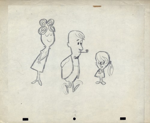
AThis is the primary model for the entire family. It’s a
beautiful drawing, and the characters have a lot of play
in them despite being connected so obviously.
Just look at the father’s hair. Beautifully done
 B
B
Here’s a secondary model. I suspect this is the animator
tracing off the characters and seeing what he can do with them.
 C
C
Animation drawing #105. Those breakdown charts are something.
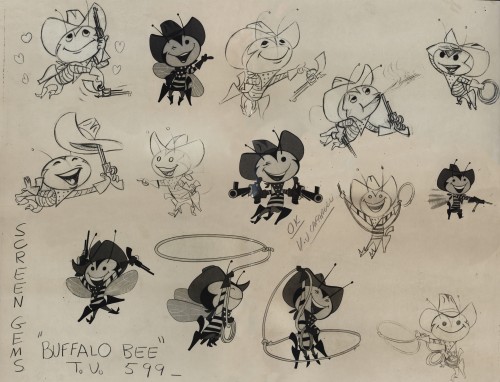
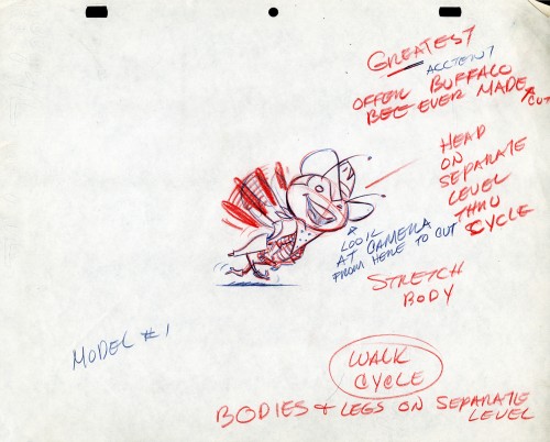
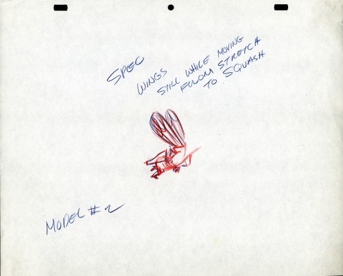
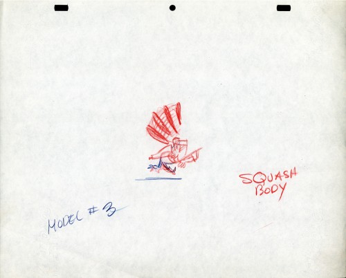
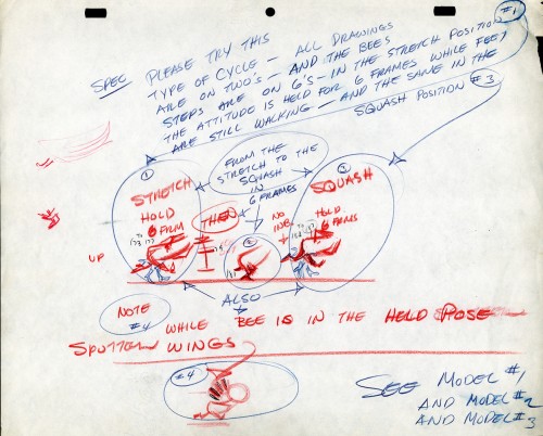
The Buffalo Bee for Honey Nut Oats is also a model sheet from Screen Gems. With it come an animation model sheet for the walk cycle of the character. These drawings look like Lu Guarnier’s to me, but there’s no official way I could confirm that, of course.
Model sheet
Animation &Animation Artifacts &Disney &Layout & Design &Models 20 Jan 2013 08:58 am
Whopee – recap
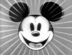
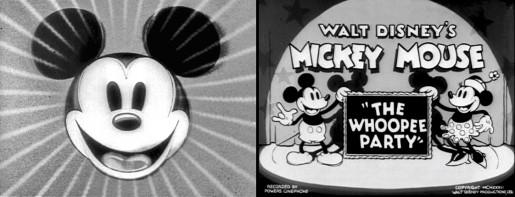
- Before there was video tape (which means before there were dvds), there was only 16mm film that you could project in your own home. I had (and still have) a nice collection of decaying movies and used to show these often. One of the regulars to show and watch and laugh at was the great Mickey short, The Whoopee Party. Everyone loved this short, no matter how many times we watched it. It’s a great film!
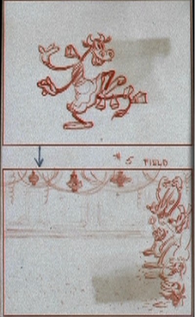
This encouraged me to watch it again on the B&W Mickey dvd I have. So I couldn’t help but jump for joy over the story sketches they include in the extras. Why not post them? So here they are – sketches from the limited storyboard they produced. I’ve also interspersed frame grabs from the film so you can compare images.
________________________(Click any image to enlarge.)
 13
13
Animation &Animation Artifacts &commercial animation &Layout & Design &Models 19 Dec 2012 07:48 am
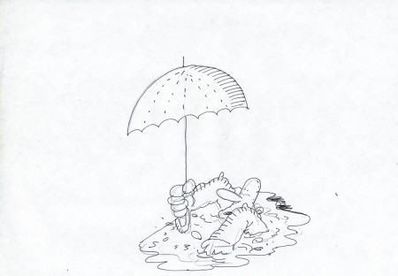
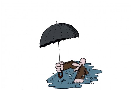
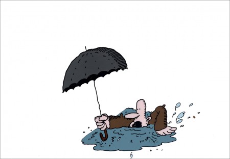
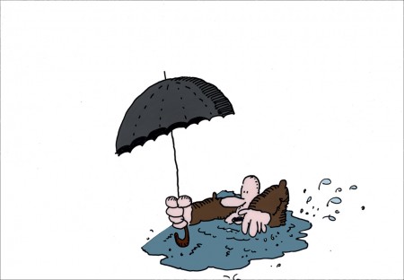
Len Glasser’s “Rainman”
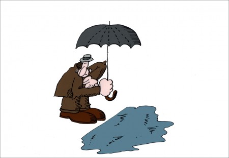
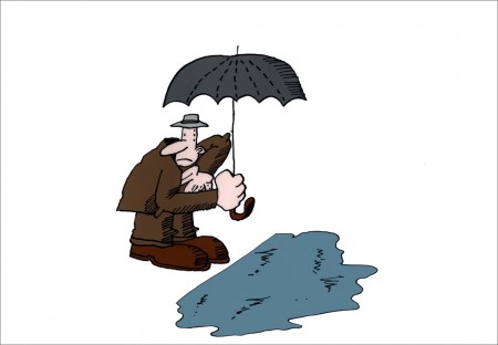
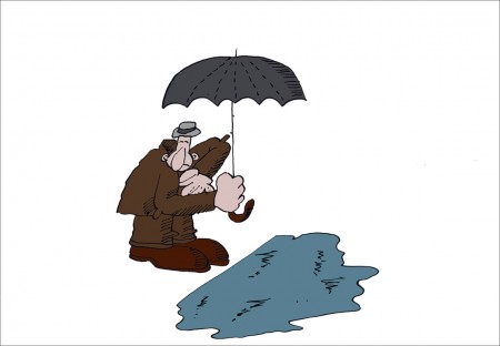
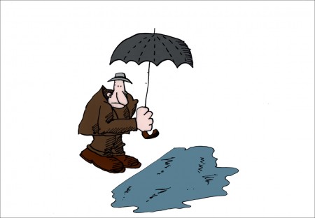
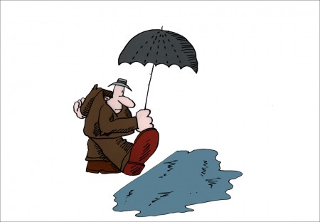
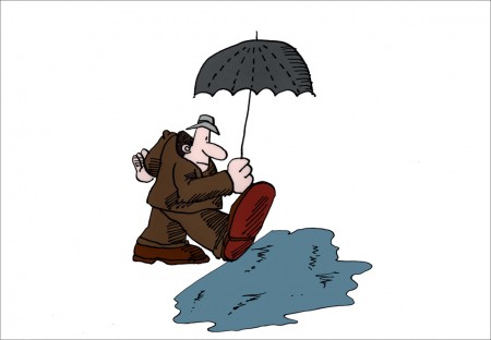
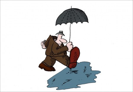
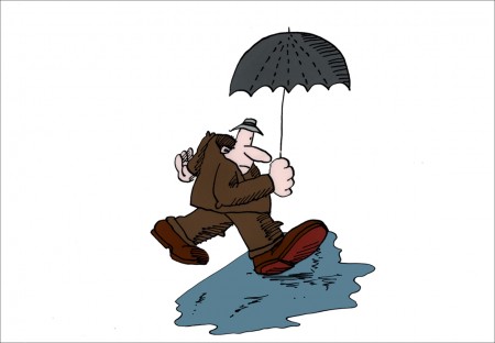
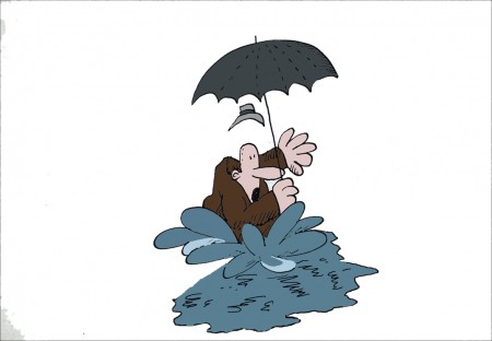
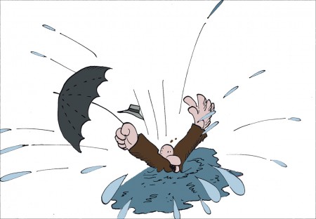
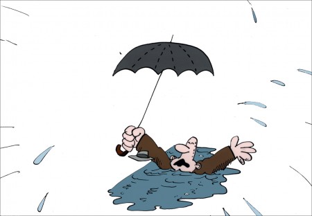
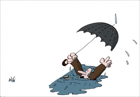
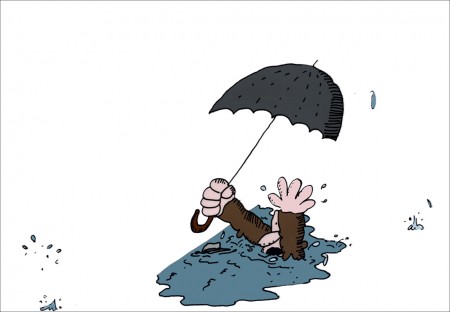
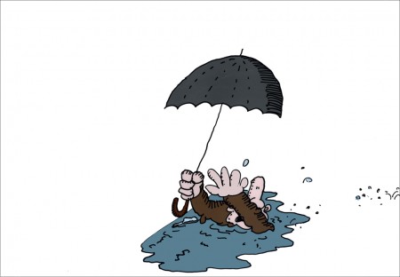
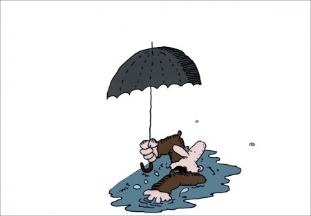
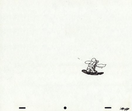
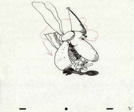
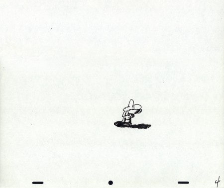
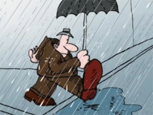 - In 1976 at Perpetual Motion Pictures, Len Glasser designed a series of spots for CBS and their weather service. Models and animation was done (Ed Smith did the original animation.) These short spots were obviously funny, but they were killed, just the same. Never completed and never aired. Two segments of these have remained. One, the “Snowman” spot was picked up by Vince Cafarelli a couple of years back and, reworked with Rick Broas assisting him. They extended the piece a bit and made a short short film. The film was colored on cels and a quick soundtrack was put together. There was also another film which didn’t make it quite as far; it dealt with rain. I’ve finished up the art that exists for that one as best I could and have run it through the AfterEffects mill.
This week features that second spot, the one I’ve been calling “Rainman” – really it’s just a short gag that was never completed. Most of it is on cel, though I had to force a Bg out of a layout that I discovered, and I colored it. I’m sure this is not how Mr. Glasser would have seen the color, but I just wanted to highlight the limited bit of animation that is there. The same is true of the rain which he probably would have left black line with black, inked drops. I put some white into the rain to give a bit less of a focus on it.
Two of the animation cels weren’t painted, so I took the drawings that were there, they look like Ed Smith’s drawings, done in ink on animation bond. I painted them for the final QT I produced. As I say this is just an animation fragment with barely a beginning and no end. It’s all middle. However, I thought it interesting.
Even more interesting and very much more complete, is the “Snowman” spot which I will feature next week.
Here are the “Rainman” cels & drawings:
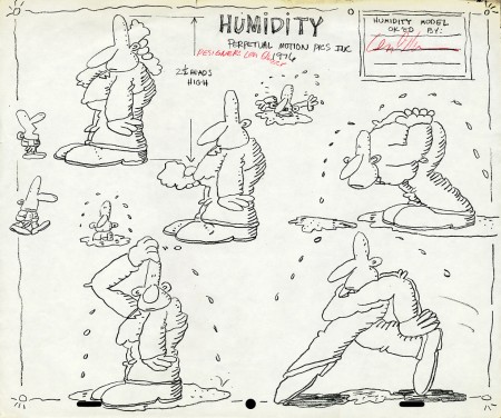
Early model sheet by Len Glasser ____________________
The following QT movie was made reworking the art a bit,
coloring some of the artwork that wasn’t completed and
exposing it as I saw fit. There was nothing to go by.
This is just a fragment of a scene.
The rain colors and the BG colors are my choices.
I can’t say Len Glasser would approve. My only
concern was getting all the animation to read – rain & guy.
Next week’s spot is better. It has a laugh to it.
commercial animation &Independent Animation &Layout & Design &Models 12 Dec 2012 06:14 am
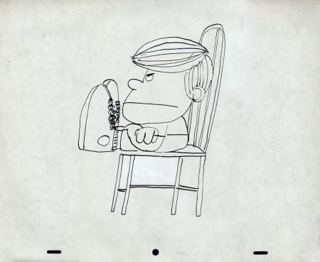
Len Glasser Bits & Pieces
- At Buzzco, they are preparing to send a lot of archival art to the MoMA. I’ve been trying to race through a bunch of it to scan it so that I can present it on this Splog. A folder of drawings by Len Glasser had to be organized so that I could send it out. There are certainly some odd bits in there.
Let’s start with a potpourri of pictures.
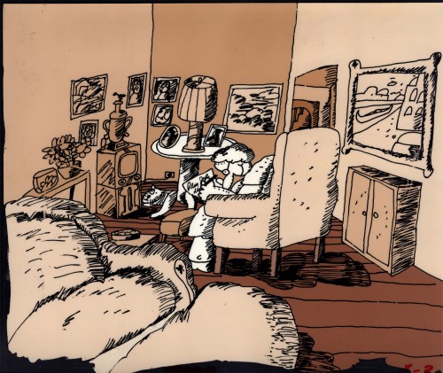 1
1This Background stands alone. It’s painted on a cel.
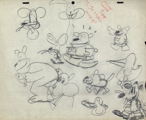 2
2
Then here’s the cast of characters.
A model sheet for the Wacko.
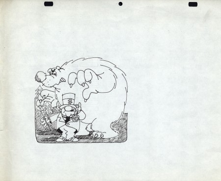 3
3
This W.C.Fields character belongs to Frito-Lay.
Doritos Corn chips; this character was the
spokesman for quite some time.
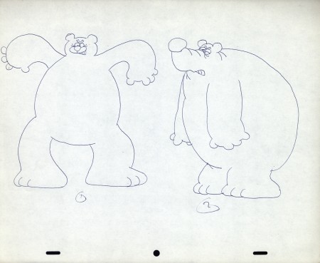 4
4
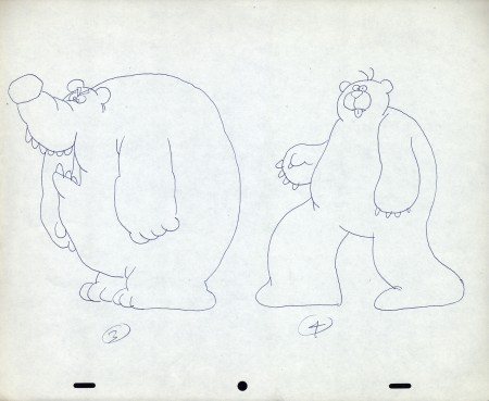
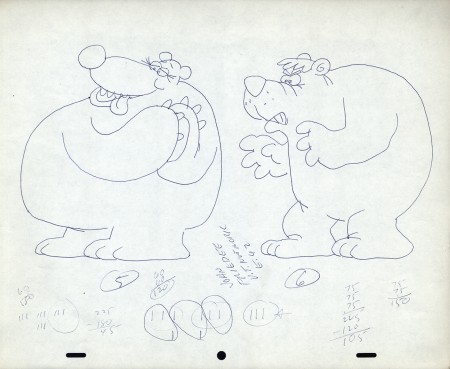
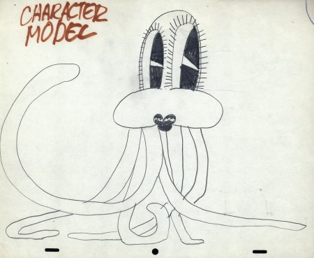
There are three model sheets for the bear.
 7
7
Let’s get back to some character models.
Len Glasser had a unique style – perfect in its time.
 8
8
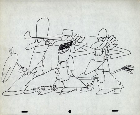
Cowboys always fill the bill.
 9
9
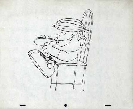
A kid who likes his hot dogs.
Here are a group of drawings that work together. They’re some layouts Len Glasser did for a spot for NBC; it has something to do with the weather. The floating guy makes it look like it may be part of the story of the sun, the wind and the man with a coat. The sun and wind compete to see who can get the guy to remove his coat first. (Spoiler alert: the sun wins.)
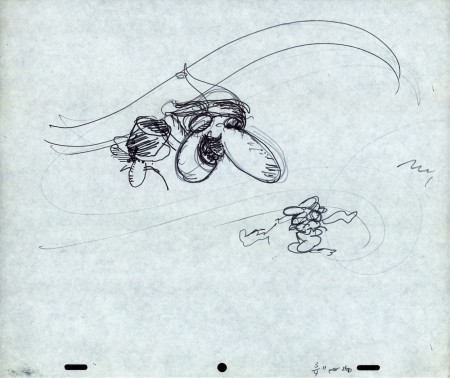 LO 1
LO 1This seems to be the layout for the whole piece.
 LO 2
LO 2
But then, there’s another near-identical one with the addition of a snowman.
I’m not sure where the snowman appears in the spot. Is he the floating head?
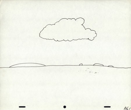
This is the Background for the spot.
What follows are the layouts for the animation, though I’m not sure what’s going on.
They’re drawings, at this point, for the sake of drawings.
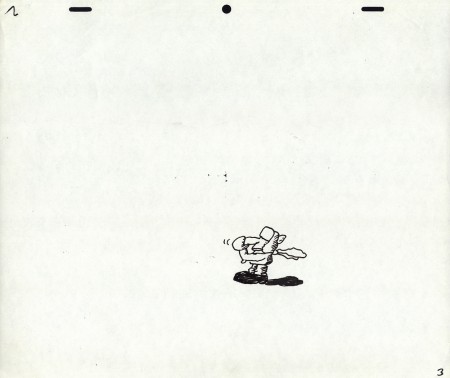 3
3
It goes to Top Pegs for one drawing.
I don’t know why.
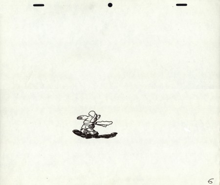 6
6
Another lone drawing with Top Pegs.
Let’s end on a picture of Santa. . .
. . . an original picture of Santa that only Len Glasser could draw.
Animation Artifacts &commercial animation &Layout & Design &Models 28 Nov 2012 06:42 am
Robert Lawrence Prods. – part 2
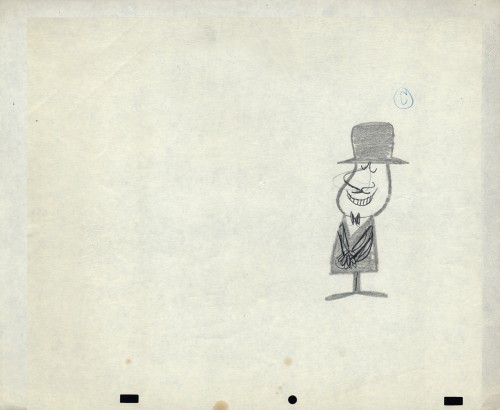
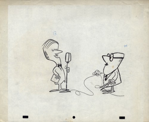
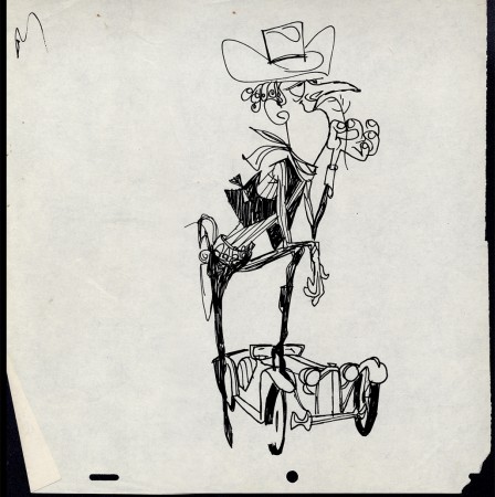
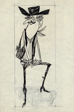
- Last Wednesday, I posted a number of models and LOs from this small commercial studio, the Robert Lawrence Studio. The art is quite extraordinary and, in my opinion, is stronger than the work I’d seen from UPA-NY. i’ve been told that George Cannata was the principal designer/layout artist for the studio. Hence, I believe that many of these, certainly the more daring, are his work.
Bill Peckmann told a story of having him as an instructor. One week he took them on a class trip to the Robert Lawrence Studio. This was the first time Bill said he was able to see the inside of an animation studio a life-changing event for a number of them. Wane Becker also talked of this trip. Bill said that George was on a trip to be an artist, and he worked in animation to make a living. Animation profited – commercial animation. It seemed the entire family were artists George Cannata Sr. & Jr. as well as Dolores Cannata.
I’m just going to pick up where I left off last time with more models and pre-production sketches for many commercial spots.
 1
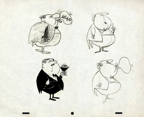
1Jell-o is served, Madame.
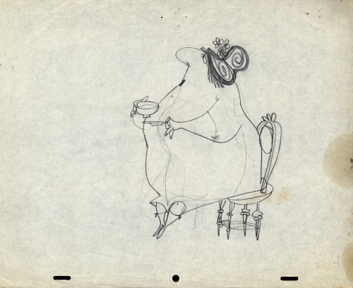 8
8
This is my favorite of all the pieces collected here.
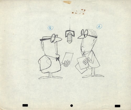 9
9
Another variation of these guys first seen in part 1 of this post.
 11
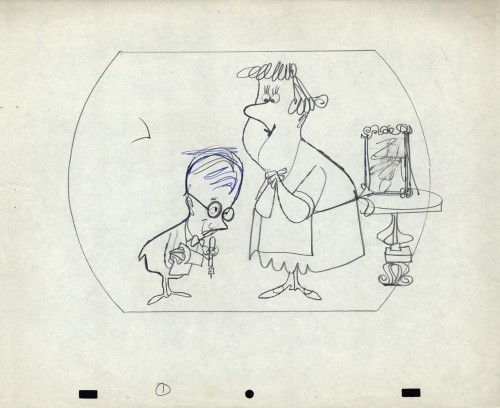
11
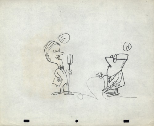
Same interviewer, different interviewee.
 18
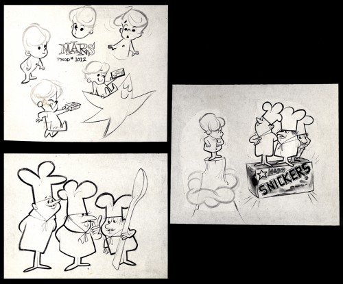
18
Here are three models for this Mars Bar spot.
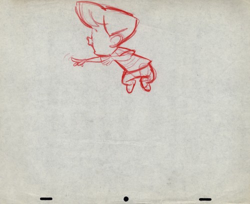 19
19
And here are a couple of layouts.
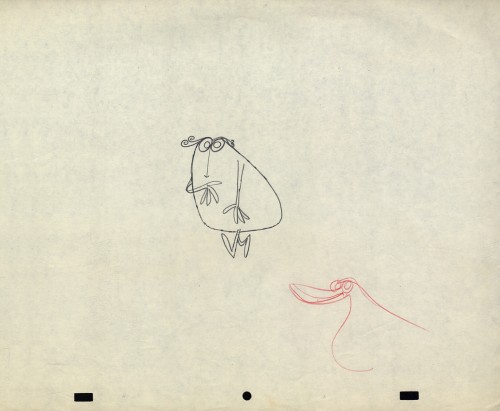 23
23
Two layouts for a character that could only
have escaped from the 60s.
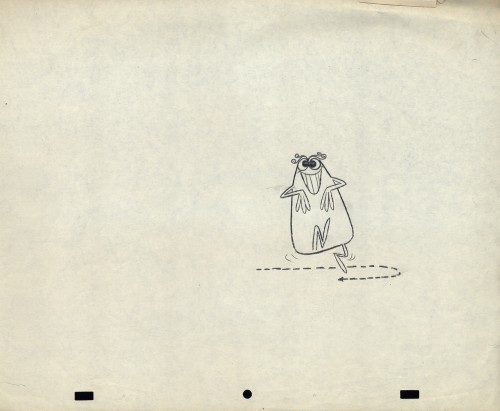 24
24
Zagreb grew out of UPA.
Styles grew out of Zagreb in the 60s.
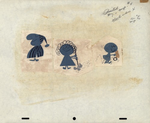 26
26
Three mothers with a lot of style.
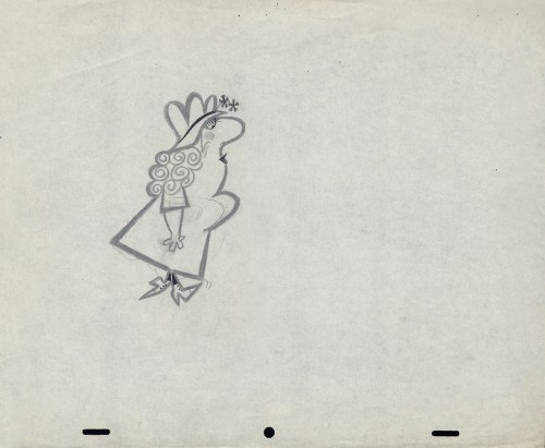 27
27
Here are another group of interesting layouts with style to spare.
Animation Artifacts &Commentary &commercial animation &Layout & Design &Models 27 Nov 2012 06:18 am
The News’ TV Guide – part 2
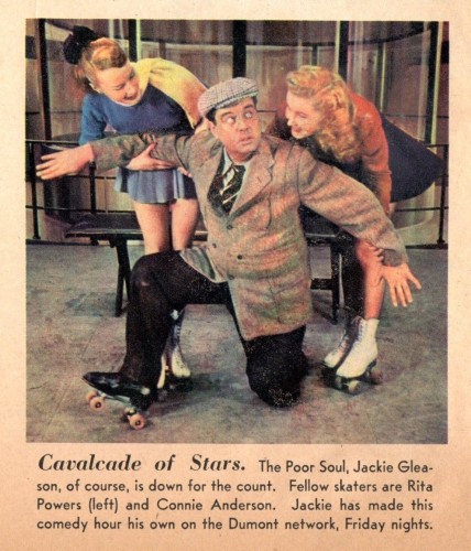
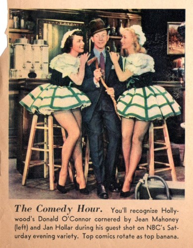
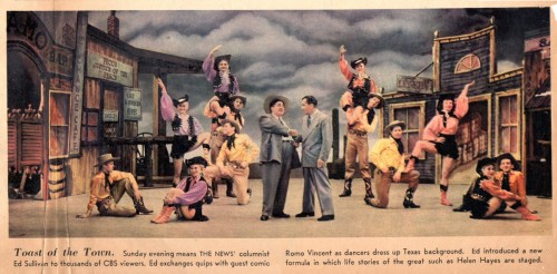
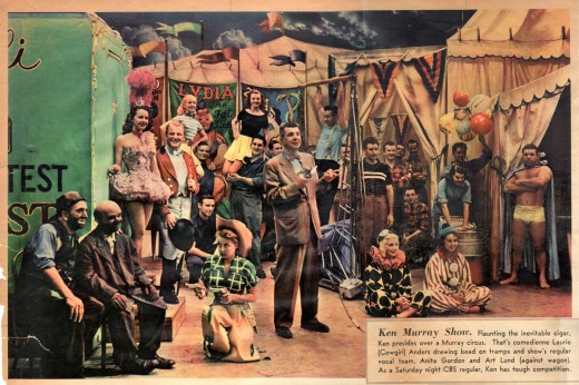
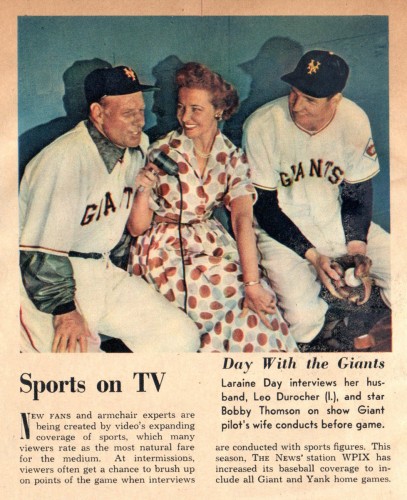
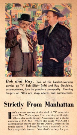
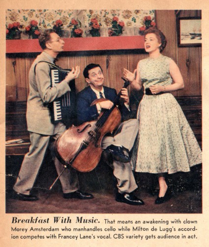
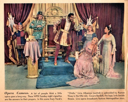
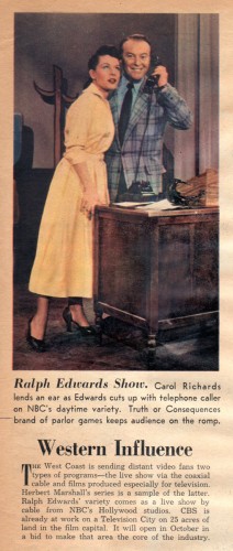
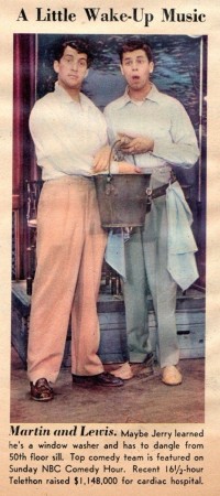
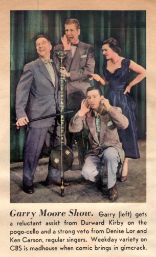
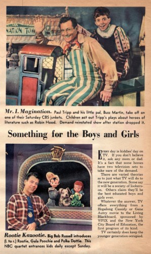
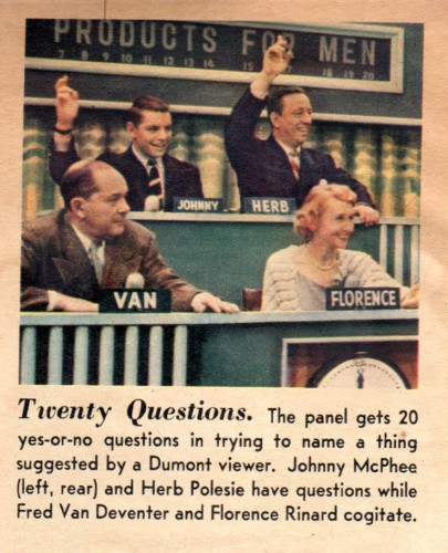
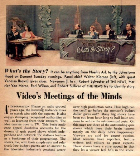
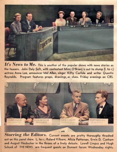
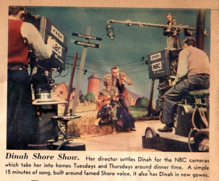
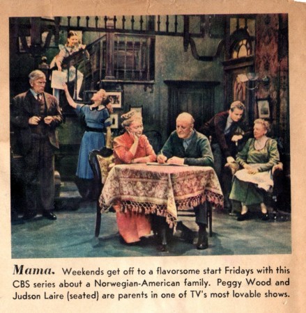
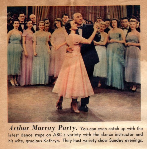
- A week or so back, Bill Peckmann treated us to an issue of the NYDaily News‘ television guide from a typical Sunday issue. Here, Bill completes the issue with some images of Entertainment figures of interest to most older Boomers out there. If only Romney had won, this is the world we’d have seen more of. I still find it interesting that the magazine pictures are in color though color TV hadn’t been introduced as yet. From the “A little memorabilia never hurt anyone” department:
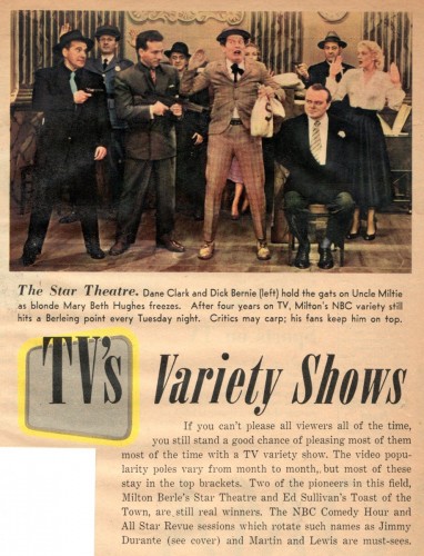 1
1
Bill Peckmann &Comic Art &Disney &Miyazaki &Models 23 Nov 2012 08:28 am
More Moores
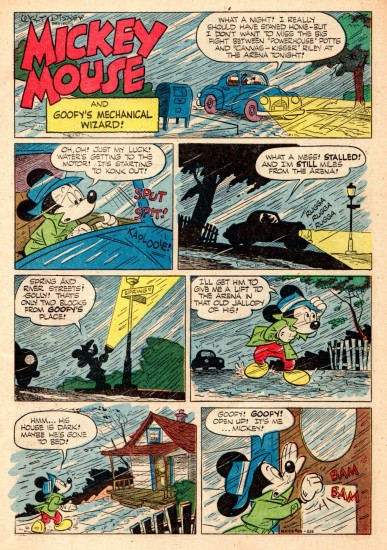
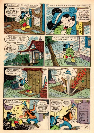
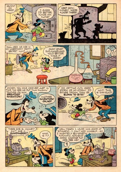
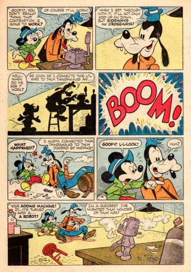
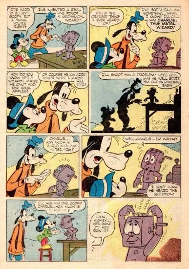
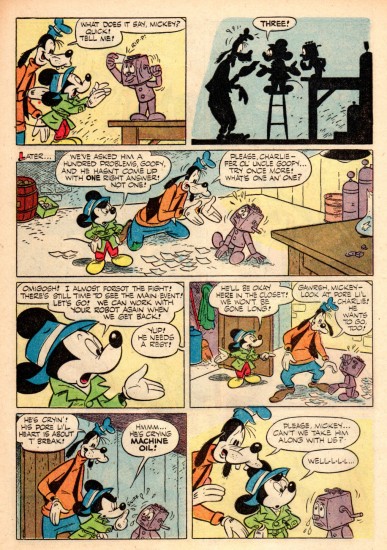
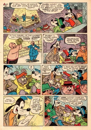
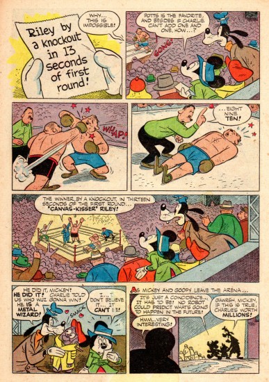
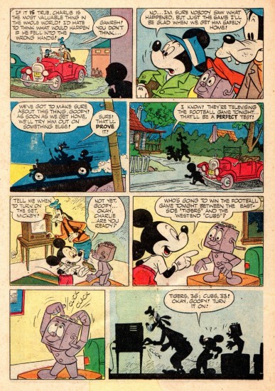
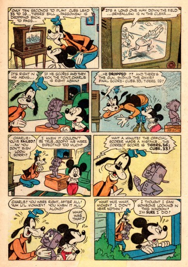
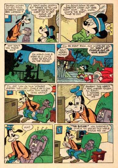
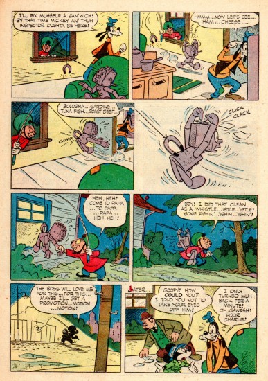
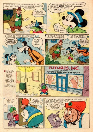
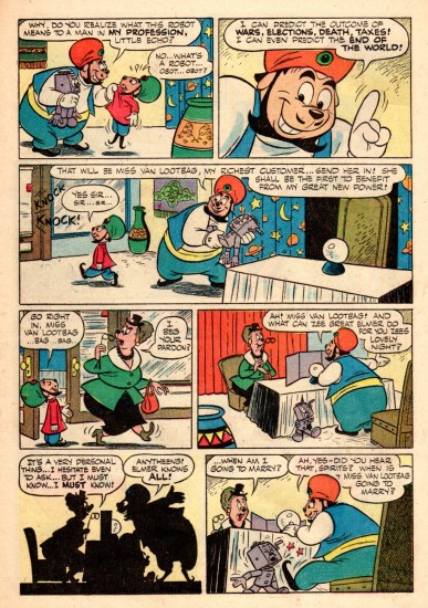
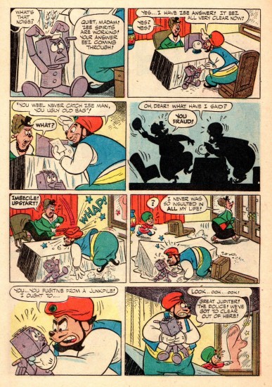
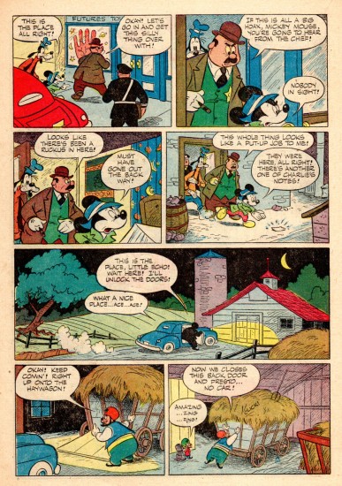
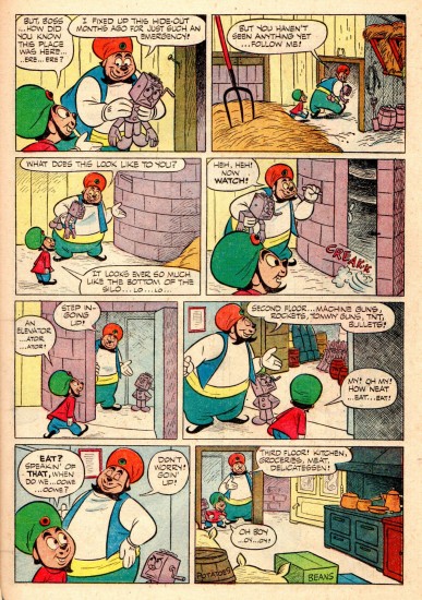
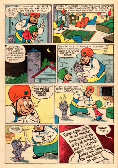
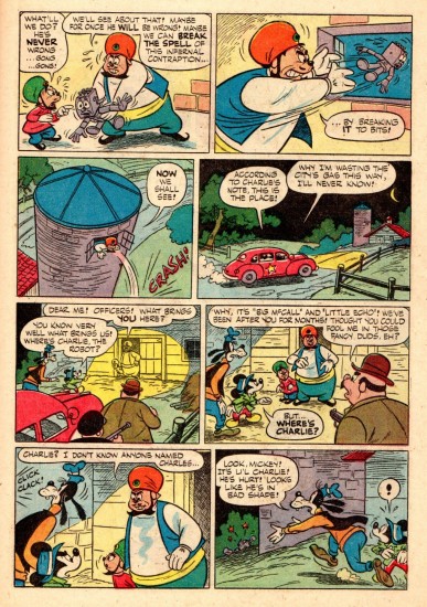
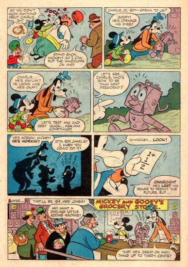
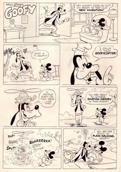
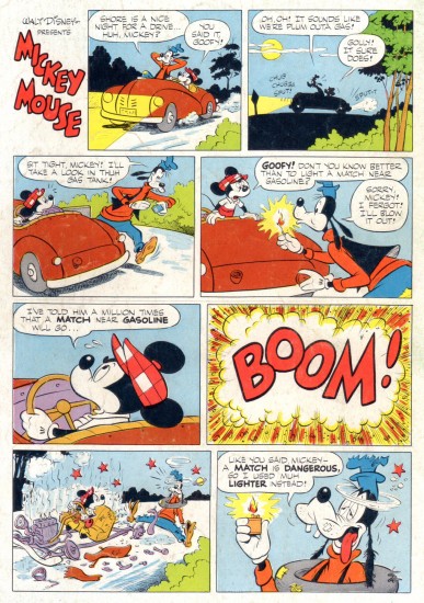
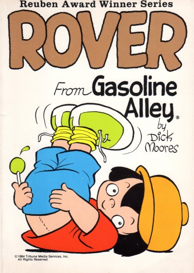
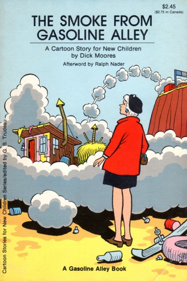
Years before Dick Moores got near the smell of Gasoline Alley, he had a bulging career at Disney’s doing books. Long before he ever thought of drawing Walt or Skeezix, he was a master of the Mouse. Bill Peckmann has sent me Goofy as the “Mechanical Wizard”, and I’ve rushed to put it together so I could read it. Here’s Bill’s opening salvo:
- Continuing with the posting of Dick Moores ‘Disney’ career, we have here one of the classic Mickey Mouse comic book stories of the early 1950′s. It’s ‘Goofy’s Mechanical Wizard’, written and drawn by Dick, the story gives us a little glimpse of what will be in store for us once he was to take over the complete reins of the ‘Gasoline Alley’ comic strip, approximately a decade and half in the future. Surprisingly, here in his Mickey Mouse stories, there are no famous, rickety, ‘Gasoline Alley’ type bridges or catwalks. They would come later, but they would have been perfect for the hi-jinks of Mickey and especially, Goofy, with that in mind, Moores’ two MM stories would have made very enjoyable animated shorts.
Here then, is the cover and story of ‘Goofy’s Mechanical Wizard’.
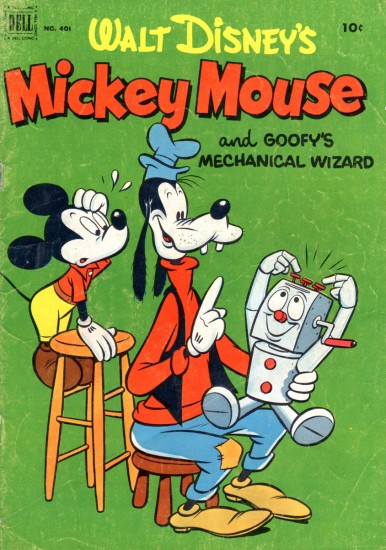
The book’s Cover
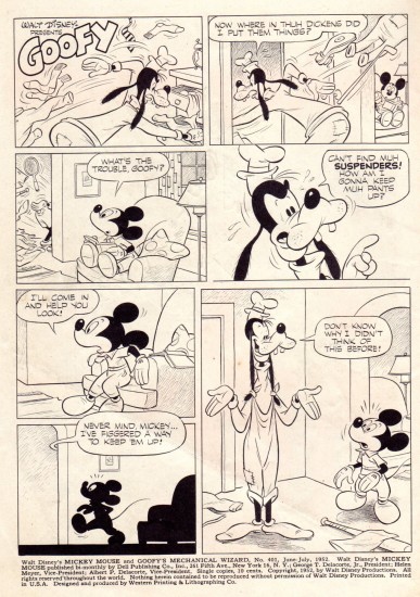 21
21
Inner covers of the magazine
And coming to a future Splog from Dick Moores:
 25
25
Animation Artifacts &commercial animation &Layout & Design &Models &UPA 21 Nov 2012 06:56 am
Robert Lawrence Prods. – part 1
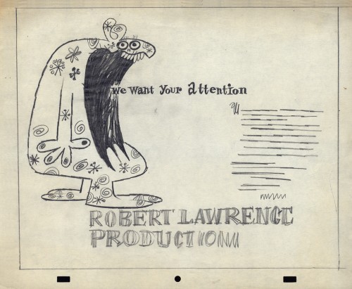
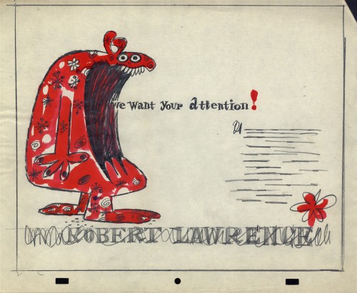
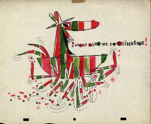
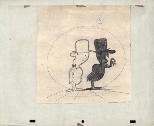
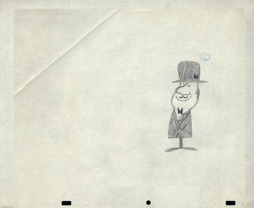
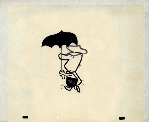
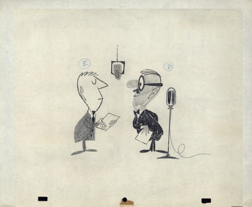
- Robert Lawrence Productions was a thriving studio in New York in the days post-UPA. Many of the animators moved from UPA, once they closed, to Robert Lawrence. Grim Natwick/Tissa David worked there (freelance), Lu Guarnier/Vince Cafarelli worked there, and consequently, Vince collected a lot of artwork from the spots he did. This post features a lot of that artwork. You’ll see how great the design and styling was at the studio, even though I don’t know what clients or sonsors they were done for. The designers certainly took off where UPA left off.
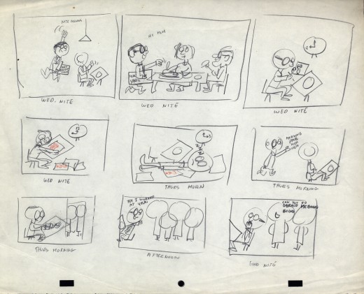
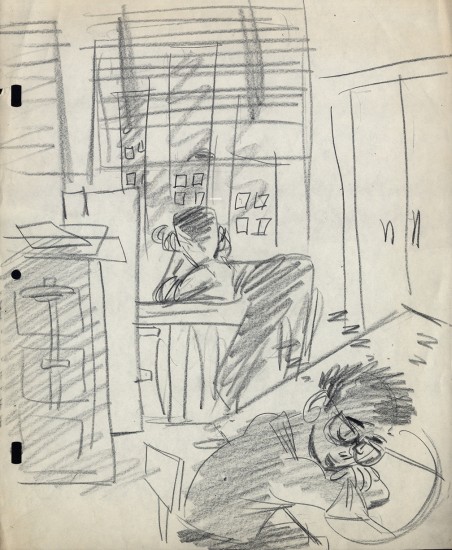
But first, let me share two in-house studio gags done at UPA.
 1
1
 2
2
At UPA – NY, Lu Guarnier was the only animator
who had a window. Vince Cafarelli and Pablo Ferro
were Lu’s Assistants/Inbetweeners, so they also
had the luxury of a window.
- OK, now onto Robert Lawrence. The more I look into this company’s work the more impressed I am. The quality of designers and animators on board was extraordinarily high. I have a lot of Layouts for films that are completely lost. I’m not sure what most of the images are for or what the stories of the spots was. I just have drawings, and most of them are impressive, even more so in some ways than much of the UPA work I’ve seen.
So let’s take a look.
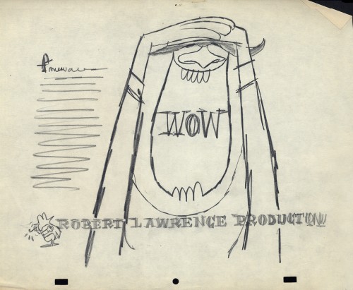
First there is the promo art. As an introduction to the company, here are four self-promo pieces that were used as trade ads for the company.
I’ve assumed that these images were created for a print ad in some magazine or another. There are three of them; one comes in a 2-color version.
 1
____________________________
1
____________________________Now we get into some of the fun stuff. Here are the layouts done in a million styles, all beautifully drawn and designed. I feel like I want to say thank you to some of the artists involved. If only I knew who the artists were. The drawings and cels were all done on paper with a “Signal Corps” hole-punch. (Looks like Oxberry, but the center hole is the same diameter thickness as the square pegs.)
 1
1This is a beautiful gag told a million times,
but done perfectly in this drawing.
 3
3
The inked arms in #1 are the variant. (Possibly a correction?)
 4
4
A cel not opaqued but beautifully inked.
 5
5
Obviously #5, 6, & 7 are the same characters in development.
It looks like #5 is probably the finished model.
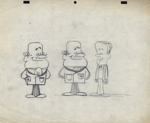 10
10
This looks a bit like Howard Beckerman’s style, but I’d
probably bet against that. The characters aren’t cute enough
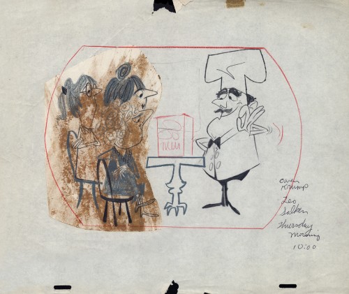 12
12
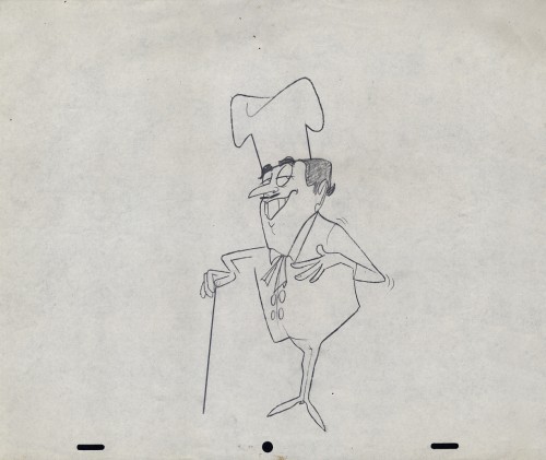
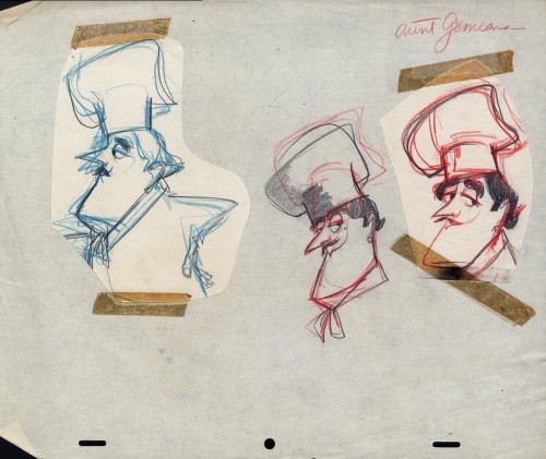
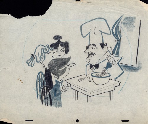
There’s a whole series of chef models
Then there’s a series of Cowboys.
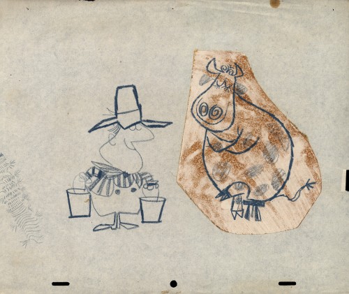 24
24
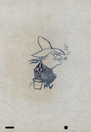
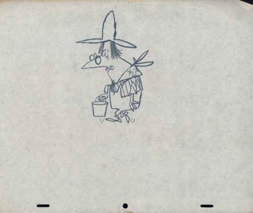
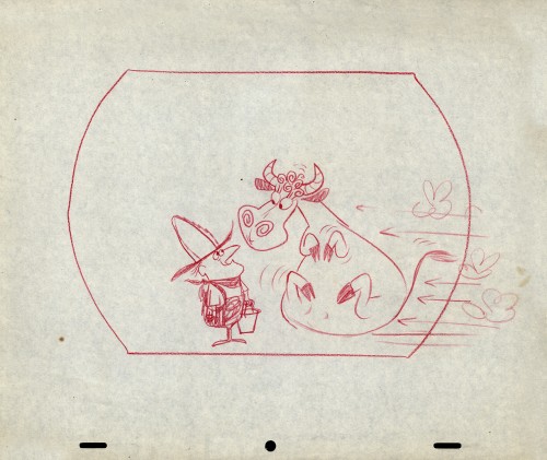
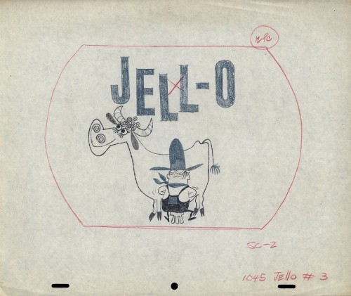
Then there’s the farmer milking the cow. Casting problems.
Animation Artifacts &commercial animation &Layout & Design &Models 31 Oct 2012 09:27 am
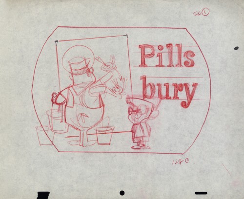
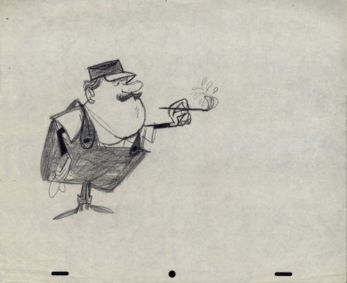
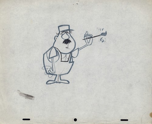
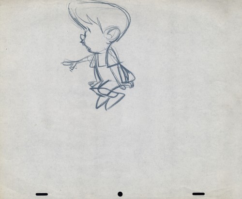
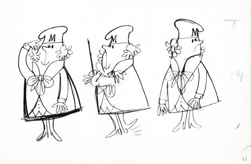
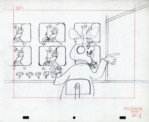
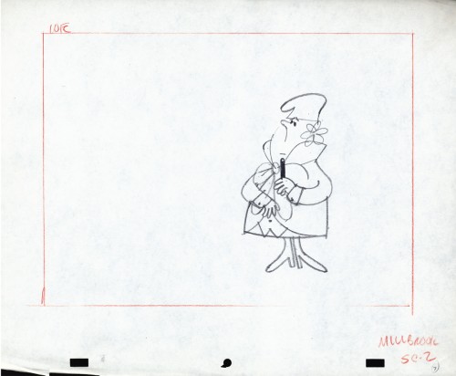
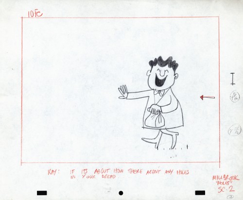
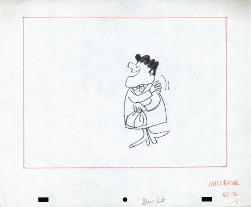
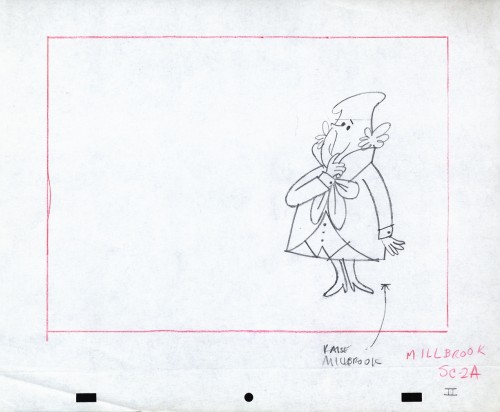
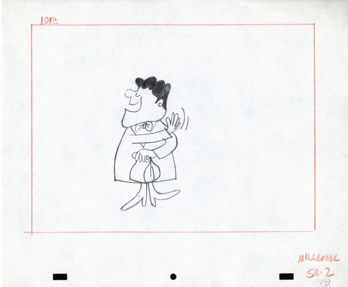
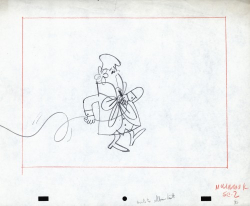
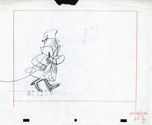
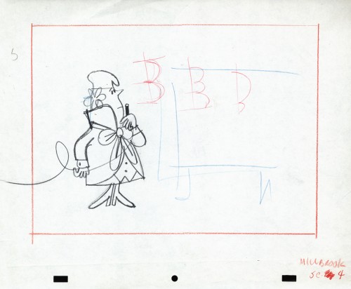
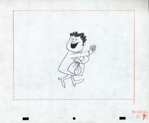
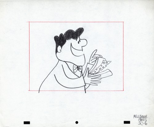
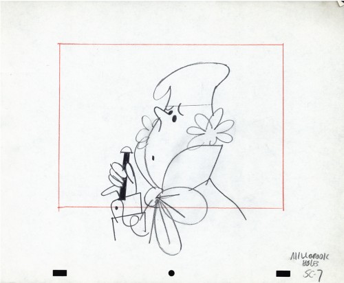
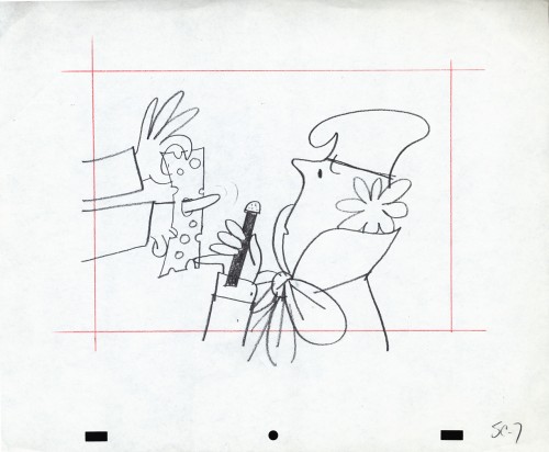
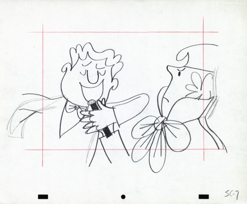
Vince Cafarelli’s Millbrook Bread – 3
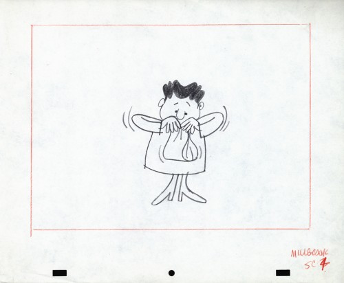
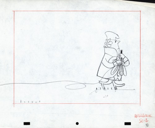
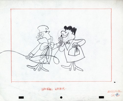
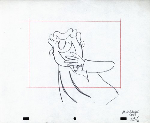
- As I’ve shown in a couple of past posts, Millbrook Bread was a profitable series for the young animation studio, Goulding-Elliott-Graham. See posts 1 and 2.
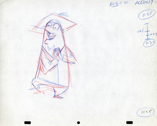
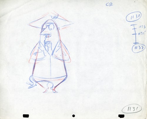
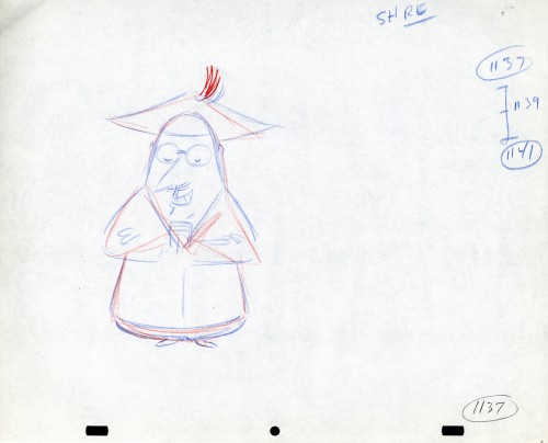
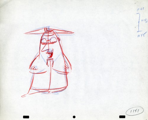
Vince Cafarelli collected a lot of drawings from various commercials that he worked on over the years, and there’s an abundance of art from this small studio. All of it good to great. Unfortunately, very little of this art is well labelled, and a lot of the ordering of the artwork is pure conjecture to get it to fall into place. I’ve grown quite attached to some of the material from this series and its characters. The design, to me, is just very attractive. Consequently I can’t hesitate to add more to view. Here’s models and art from two more spots.
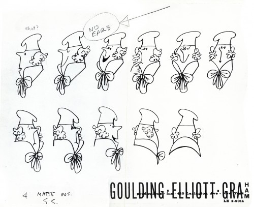
“Minny” the Baker Model 1
 1
1

 2
2
 3
3
 4
4
 5
5

 6
6
 7
7
 8
8
 9
9
 10
10
 11
11
 12
12

 14
14
 15
15
 16
16
 17
17

