Category ArchiveModels
Animation Artifacts &Disney &Models 26 Jan 2008 09:24 am
Mickey Models
- Today, I’m heading north to attend a memorial for Jack Zander. Presumably, I’ll be filled with something to tell about tomorrow.
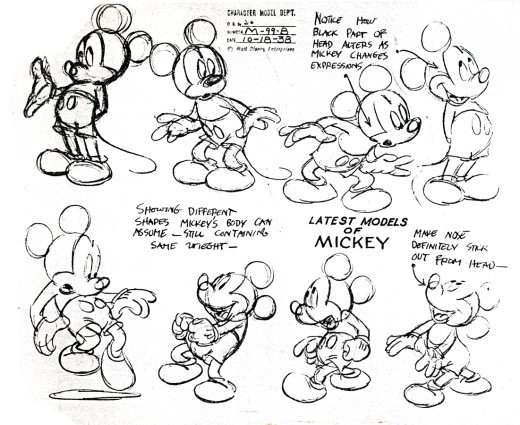
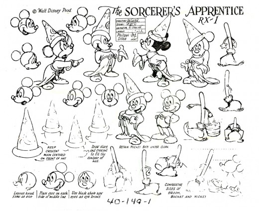
For today’s post, I was asked yesterday if I had any other Mickey models. So I thought I’d post a few. I also have a couple of the Kimball models, but they’re faded xeroxes, and it’d take a bit of time to pull out the images. I’ll save that chore for some future time. As for those below, my favorite is the first. I think it must have been some kind of lobby card. It’s a Hi glossy image.
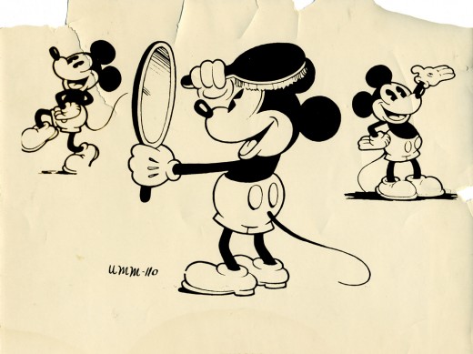
__________(Click any image to enlarge.)
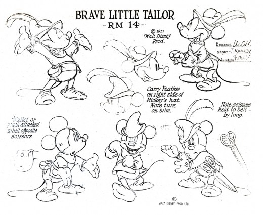
This is my favorite color Mickey. It’s probably also my favorite animation of him. Need I say the film is a gem?
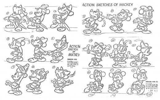
This model was xeroxed in two parts, and I reassembled them. The lines of the 30 year old copies were fading, so I had to pump them up a bit in photoshop.
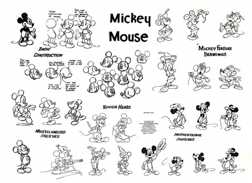
I don’t know what this model was for; I assume publicity. It includes parts of many other models.
Animation Artifacts &Books &Disney &Models &Story & Storyboards 15 Oct 2007 07:59 am
Rite of Spring Pics
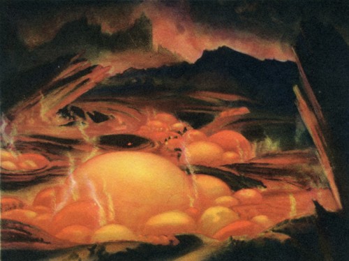
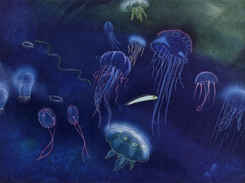
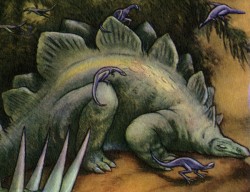
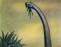
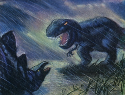
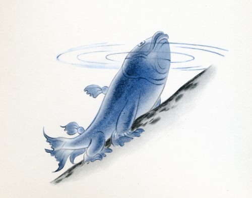
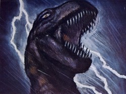
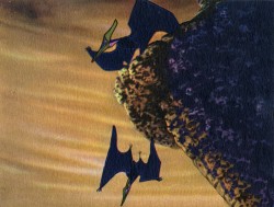
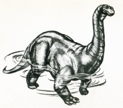
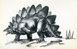
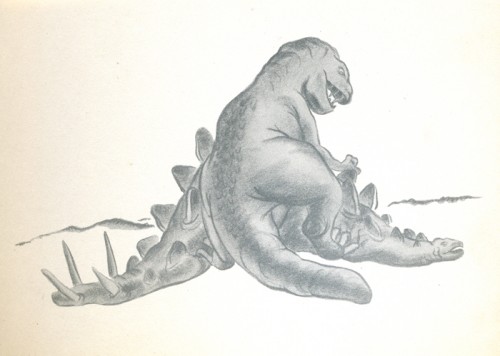
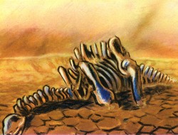
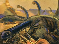
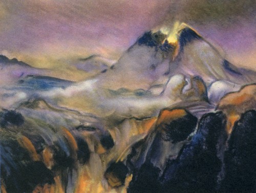
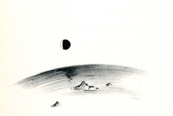
- Continuing my posting of the art in the 1940 book, published by Simon & Schuster, Deems Taylor’s Fantasia, I focus on the Rite of Spring segment from the film. There are some fine images here, and I’m pleased to post them.
If anyone has any idea of who drew any of these stills, I’ll be glad to give appropriate credit to the artists. I know that
_______ William Martin,
_______ Leo Thiele,
_______ Robert Sterner and
_______ John Fraser McLeish were credited for Story Development Research,
and
_______ McLaren Stewart,
_______ Dick Kelsey and
_______ John Hubley were the segment’s Art Directors.
Here, then, are the stills. A number of them are beauties.
Animation &Animation Artifacts &Disney &Models 08 Oct 2007 07:46 am
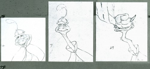
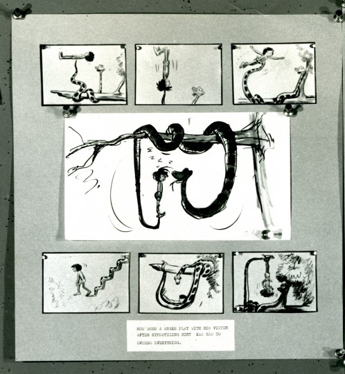
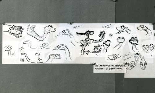
Jungle Book Stats
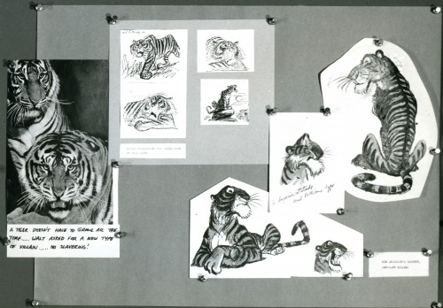
- With the release of The Jungle Book dvd, I thought I’d post something for it.
To me this film represents the first in the big decline of Disney Animation. The reliance on star voices started here, and the result was not good. They got good voices, but they relied on the voices for the animated character, and too few characters had original animated styling to overcome the actors that did them.
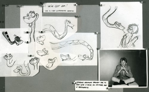
The singers killed it. By that I mean, the character of Baloo became more Phil Harris and less Baloo the bear. Louie Prima‘s King Louie was more Louis Prima than anything you’d find in the African setting. George Sanders was more of an actor than a personality, and he offered Shere Khan a character that Milt Kahl was able to build on. Sterling Holloway as Kaa was also more an actor than a personality, and he played what was asked of him. Ollie Johston was able to develop on it.

(click any image you’d like to enlarge.)
Animated features try to continue in the same vein. Voices like Robin Williams or David Spade or Eva Gabor are not going to make the animated character better. It’d be more interesting to have unknown voices that are well cast. Peter Pan, Snow White, Bambi and Cinderella. Lady & The Tramp, Alice, Pinocchio are all brilliantly cast features.
The Jungle Book, to me, gets incredibly dull. I’ve sat through projections of it at least a dozen times, and each and every time was exhausting. Lots of set pieces, but I don’t think it really adds up to a whole. Except for the Shere Khan scenes, there’s virtually no conflict and even less tension. Sorry to say anything bad, but it’s hard for me not to.
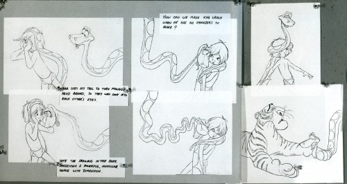
The material I have here came from stats that were prepared to make Thomas & Johnston’s The Illusion of Life. The little attachments became the captions for that book where the images were printed small.
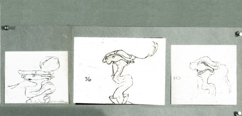
These images are pretty light, so I had to soup them up a bit so that you can read the lines.
Animation Artifacts &Books &Disney &Models 25 Sep 2007 08:08 am
Pastoral Pics
![]() – The Pastoral sequence from Fantasia is definitely not a favorite of mine. I have a lot of problems with it that it’s best not to start a critique. However, these days – there being so much bad art-in-animation – it’s like saying it’s my least favorite Rembrandt.
– The Pastoral sequence from Fantasia is definitely not a favorite of mine. I have a lot of problems with it that it’s best not to start a critique. However, these days – there being so much bad art-in-animation – it’s like saying it’s my least favorite Rembrandt.
Just the same, I’ll still say the sensibility offers everything I dislike about Disney.
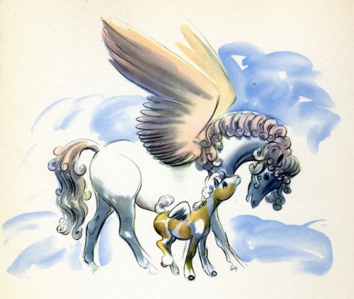
In the past couple of weeks, I’ve been posting artwork from the Deems Taylor book, Fantasia. This is pretty much a storybook for all the sequences from Fantasia. It was published in 1940 by Simon & Schuster.
Here are the illustrations for the sequence featuring the Pastoral by Beethoven.
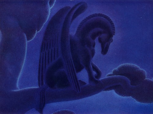
This is probably my favorite drawing in the sequence. There’s a lot of power in it.
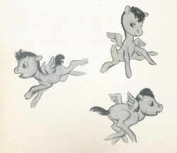
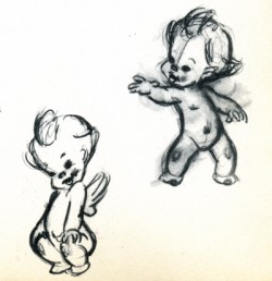
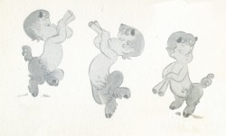
There’s not much to say about drawings like these. They’re very skillful but very sweet.
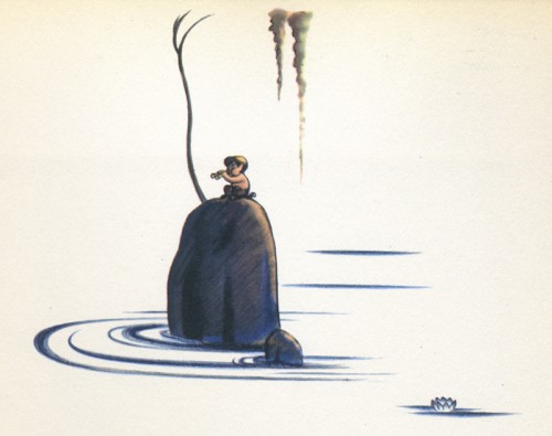
I like this image. There’s a lot of atmosphere in it, and it seems to fit well into the book’s design overall.
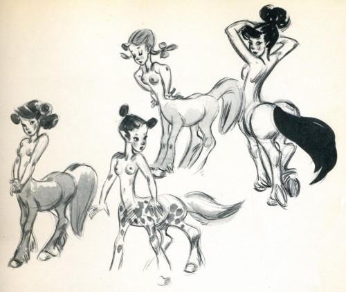
I’m not convinced that these drawings are by Fred Moore, though they’re obviously trying
to emulate what Moore has done.
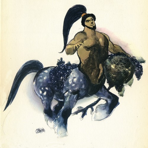
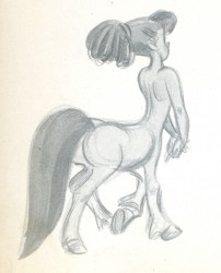
I don’t know how this image made the book. I suppose they needed one of these centaur types. Surely, there must have been a better drawing done for the sequence.
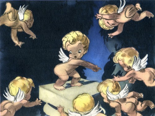
Another drawing of these very cute characters, but I think this one is really
well done, trading in a lot of the cuteness for artistry.
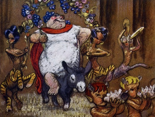
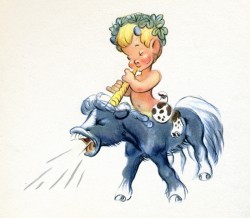
__Bacchus. Ward Kimball animated a lot of this character and did a good job of it.
__I think it’s probably the best animation in the sequence.
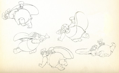
__These look like Kimball’s drawings from the sequence.
__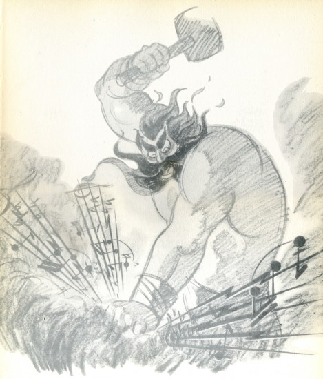
_____Thor. I’m glad the final didn’t look like this.
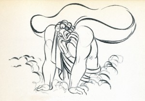
__The animation drawing of Zeus is attractive. The character was nicely done.
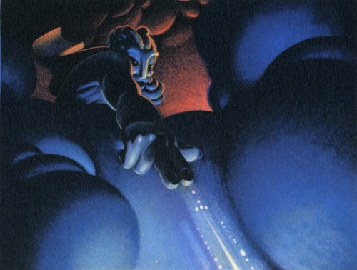
This color sketch of Zeus is quite different though it gives a good sense of what they were looking for in the sequence.
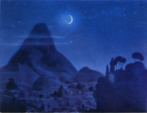
__This image appears in quite a few places representing the sequence.
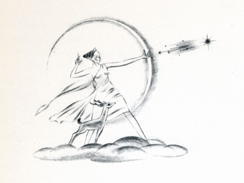
__This, I think, is a nice, rough drawing.
Books &Illustration &Models 13 Sep 2007 07:51 am
Eyvind Earle
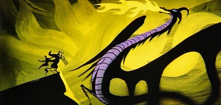
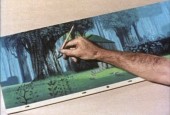
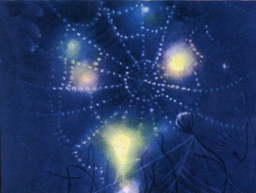
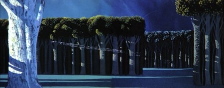
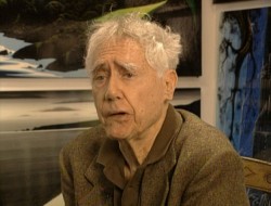 – Let’s talk a little about Eyvind Earle. This is the artist who rose to fame when he was selected by Walt Disney to set the style for the long-in-production feature, Sleeping Beauty. The animators disliked his art direction and openly protested it. Walt remained true in his stance and supported Earle to the end; though it could be said that Walt was more involved in Disneyland’s construction and gave too little attention to the in-fighting at the animation studio.
I remember Frank Thomas, specifically, stating that he had done everything possible to supercede Earle’s style after he, Thomas, had animated the Merryweather scene as she creates Aurora’s dress and cake in honor of her birthday. He felt that the black bodice that Earle had designed took all the lightness out of his character’s delicate dance.
(Click on any image to enlarge.)_________________________________
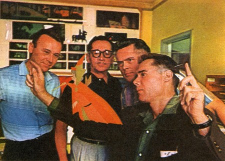
L to R: Al Dempster, Dick Anthony, Ralph Hulett and Eyvind Earle
Thomas publicly attacked Earle at the Lincoln Center celebration of Disney animation back in 1973. I’d already read something similar, and heard it privately. None of the others on stage at Lincoln Center – Woolie Reitherman, Ken Anderson or Ollie Johnston – countered in support of Earle.
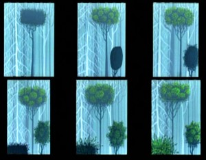 Sleeping Beauty was such a drastic change in look from the other Disney features, that I think it took deep hold in the minds of a lot of Baby Boomers growing up around this feature. Earle became a strong target of interest, and I think his reputation has grown annually.
I have to admit it was odd seeing the backgrounds of Pocohontas trying to emulate Earle’s Sleeping Beauty style, but in some ways it seemed fitting. The studio had been ripping off the films of the past for so long that it was only approopriate that they’d focus on someone who was such a dynamic force.
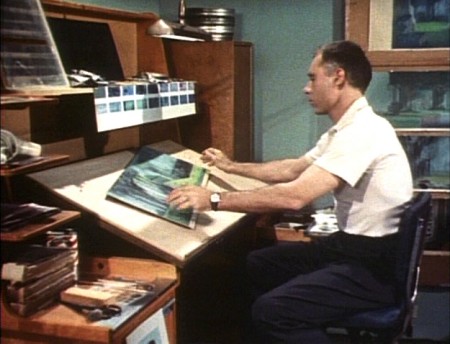
For a short period after he was released by Disney, in the post-Sleeping Beauty layoffs, he worked with John Sutherland Productions where he designed the short, Rhapsody of Steel. Then he formed his own studio, Eyvind Earle Productions, Inc. He did an animated trailer for the film, West Side Story, under the supervision of Saul Bass. He did an animated title for the Kraft Suspense Theater, and he did a Christmas Special for Tennessee Ernie Ford.
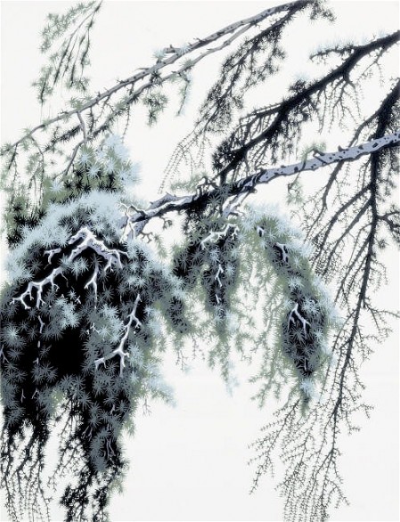
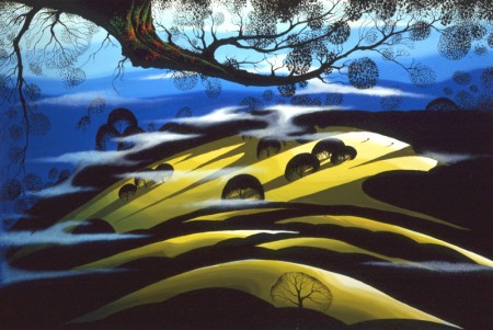
Ultimately, Earle made a success of his own art after leaving animation. He’s been represented by a number of very large galleries and has sold a lot of popular art in a style all his own. Here are a couple of examples found on line:
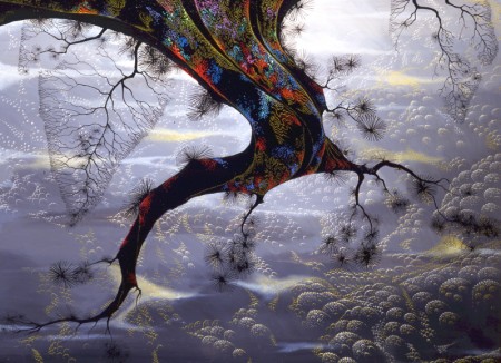
I’m not always a big fan of the color schemes in his graphics, though he always makes them work, but I have to give credit to Earle for his originality and the dynamic approach in his art.
His autobiography, Horizon Bound on a Bicycle, is a must for all real fans.
This is his animation resume:
- 1951 Started with the Walt Disney Studios as background painter on: FOR WHOM THE
__ BULLS TOIL, MELODY, and the Academy Award winner for “Best Short of the Year”
__TOOT, WHISTLE, PLUNK and BOOM which also received a Cannes Film Festival Award.
__Production Designer, Color Stylist and Background Painter for the DIsney animated __classic SLEEPING BEAUTY, as well as, PIGS IS PIGS, GRAND CANYONSCOPE,
__PAUL BUNYAN, LADY AND THE TRAMP, LONDON BRIDGE, and WORKING FOR PEANUTS.
__He designed 5 murals for Disneyland.
1958 Joined John Sutherland Motion Picture Company in Los Angeles.
1960-1966 Created 24 sheet poster for Hamm’s Beer.
__Started motion picture animation company, Eyvind Earle Productions, Inc.
__Created animated commercials for Chevrolet Motors, Chrysler Corporation, Marlboro
__igarettes, Motorola Television and the Kellogg Cereal Company.
__Created animated trailer for WEST SIDE STORY for United Artists.
1961 Created animated television special THE STORY OF CHRISTMAS starring
__Tennessee Ernie Ford and the Roger Wagner Choral.
1962 Created animated television special THE EASTER SPECIAL.
__Created title for the KRAFT SUSPENSE THEATER.
__Created the logo trademark trailer for Universal Pictures.
__Produced and created the theatrical short DEATH AND SUNRISE
Animation Artifacts &Books &Models 07 Sep 2007 08:35 am
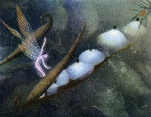
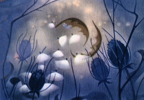
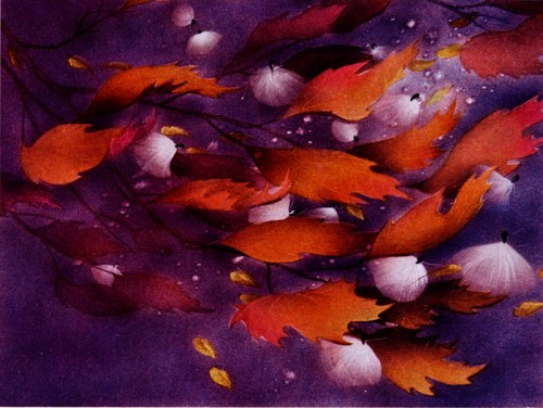
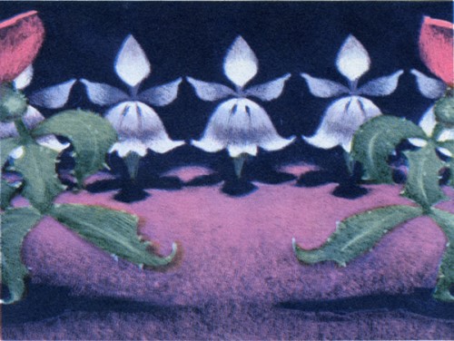
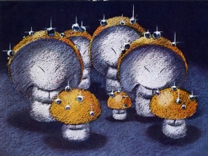
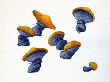
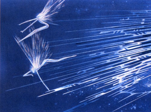
Nutcracker Inspiration
- Fantasia continues. Or at least my posts of art cribbed from the Simon & Schuster 1940 book by Deems Taylor, “Fantasia.”
Though I’m not the biggest Fantasia fan, I have to admit that I like looking at these pictures on my site.
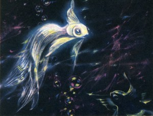
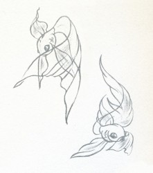
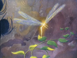
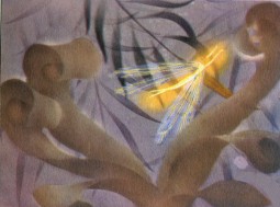
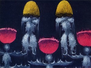
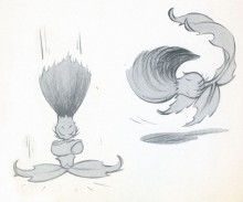
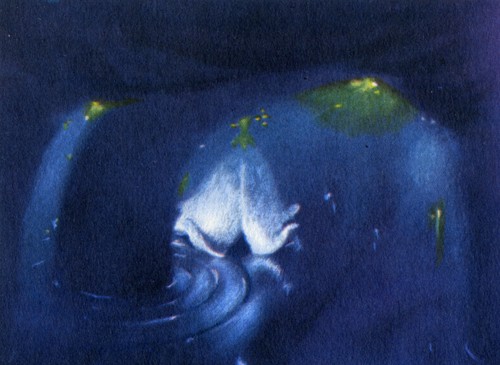
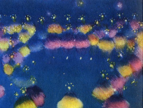
Today I’m putting up the images in the book from The Nutcracker Suite. Not all of them are inspired, but they’re all worth it for the one of the milkweeds falling among the autumn colored leaves.
Animation Artifacts &Books &Models 31 Aug 2007 08:11 am
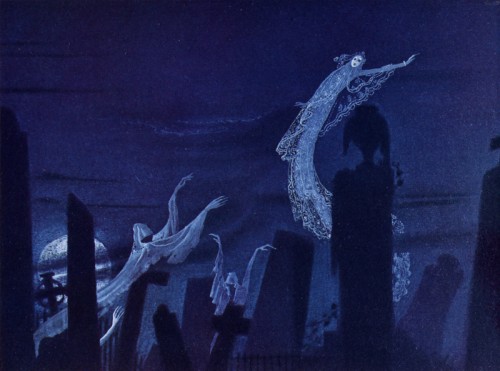
Nielsen Sketches
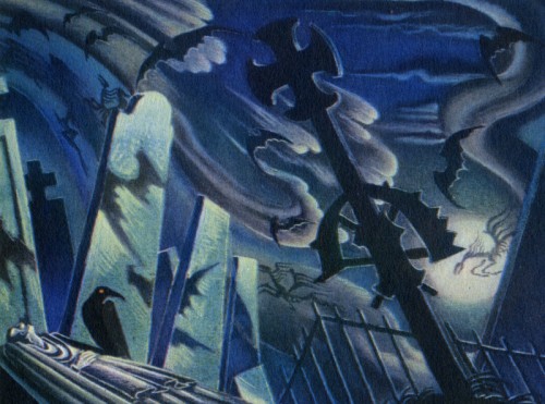
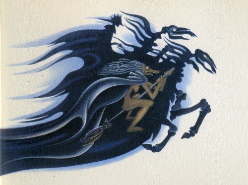
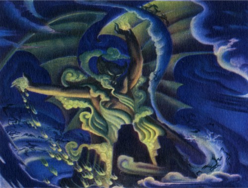
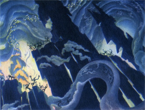
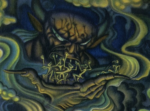
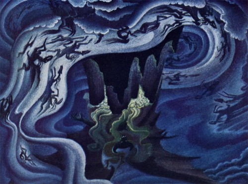
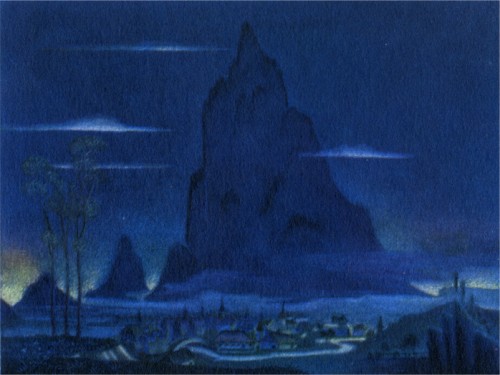
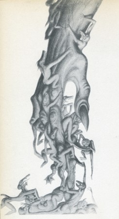 – Continuing to post some of the sketches from the Deems Taylor Fantasia book published by Simon & Schuster in 1940, I want to put the focus on the sketches from Night On Bald Mountain. It’s obvious that these are all paintings by Kay Nielsen. His style is uniquely distinctive.
The artwork is beautiful and powerful in its own oddly delicate way. The style became a bit more circular in the hands of Bill Tytla, but it never lost the power of its origins. It just became more emotional.
Hans Perk at A Film LA descibes the exhibit at the GL. Holtegaard museum near Copenhagen. Some of the Nielsen art for this sequence was displayed.
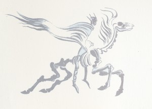
Here, then, are some of these images:
Animation Artifacts &Books &Models 29 Aug 2007 07:40 am
Fantasia sketches
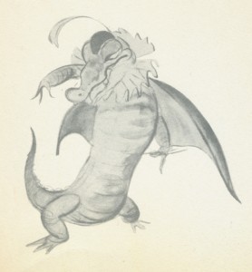 – I thought I’d scan some of the drawings from the Deems Taylor Fantasia book published in 1940.
This is basically a storybook of the film with a lot of beautiful illustrations from the artwork done for the film. The only other Disney feature that I can think of which has a similar type book, richly and beautifully produced, is a limited edition American Express edition of Snow White produced for the fiftieth anniversary.
I assume many of these illustrations were on the dvds as part of the extras, but I haven’t attempted to find out.
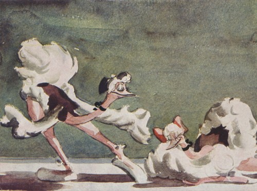
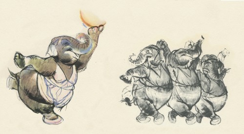
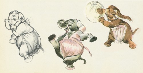
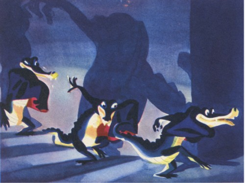
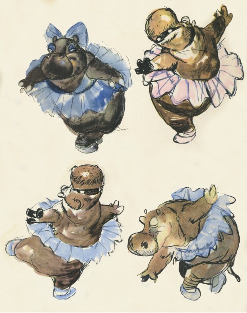
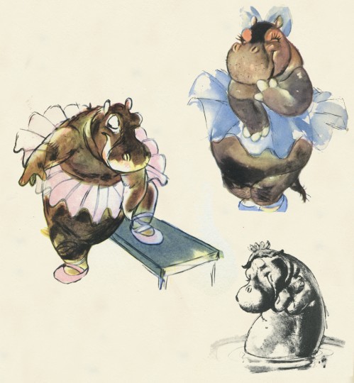
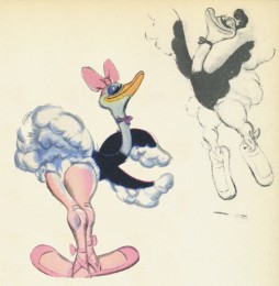
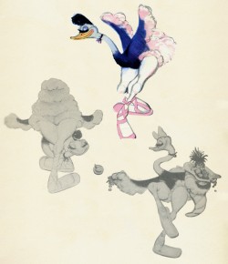
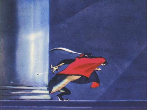
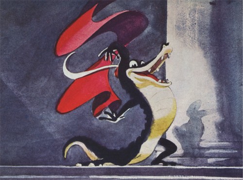
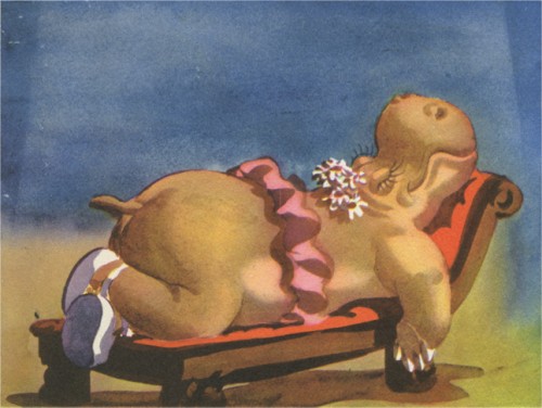
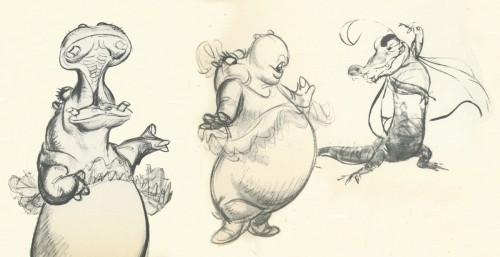
I’ve scanned the images illustrating The Dance of the Hours segment and have eliminated the text and illustrative borders to put a complete focus on the sketches. If anyone knows who did the art, please don’t hesitate to share the information.
Animation Artifacts &Models 24 Aug 2007 08:26 am
Miceniks
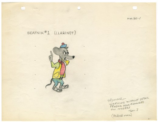
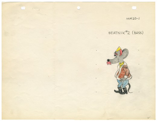
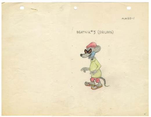
- Here are some basic character models by Tom Johnson for Miceniks (1960), a Harvey “Modern Madcap” cartoon. It was directed by Seymour Kneitel and animated by Johnson and Bill Henning.
These drawings were folded in three and were probably mailed by Johnson from his home. He does ask Kneitel to mail the changes back to him. Obviously, the days of the free lance animator had started by 1959.
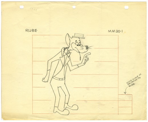
(Click on any image you’d like to enlarge.)
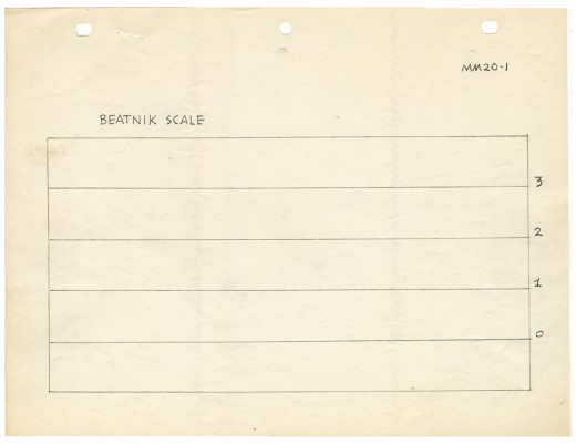
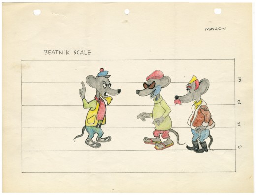
This scale chart overlaps the models “Beatnik 1,2 & 3″ for size comparison. The end result would look something like this:
In Feb 2006 I posted a 1939 bio of Tom Johnson from the Fleischer Animated News. This gives an indication of his importance to that studio. Since I’m posting some of his artwork, I thought it’d be appropriate to rerun this piece about the artist.
Animation &Animation Artifacts &Models &Richard Williams 21 Aug 2007 07:22 am
Raggedy Models
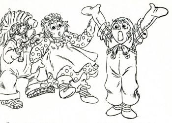 – As I posted last Friday, to celebrate the 30th Anniversary of Raggedy Ann & Andy: the Musical, I’m going to post a bunch of artwork from this film. I’m not even sure much of this material is of interest to anyone but those who worked on the movie, but since I worked on it, I’m interested.
Here are a bunch of model sheets of the secondary characters. The film opens in a playroom, and lots of toys inhabit these first few minutes. They all suffer from the same problem – too much. There are too many lines, there were too many colors, there was too much flailing-about animation. It would have been better to keep it a bit quieter, but that was never the Dick Williams way.
Here they are, right off Xeroxed copies:
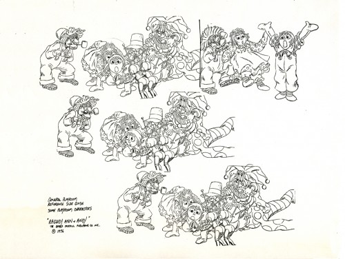
Most of these model sheets were pulled from completed animation. In the case of this
group shot, Dick Williams did these drawings in reworking Fred Helmich’s animation in
the “No Girl’s Toy” musical number.
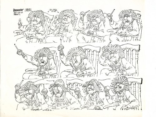
I really have to encourage you to click these images to enlarge. Gramps is the
perfect example of the brilliant detail that Dick Williams put into his animation.
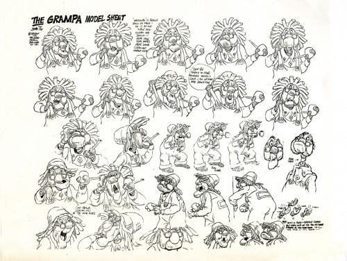
Both these Gramps model sheets represent separate scenes. Most of the key drawings
from the scenes were placed on these models.
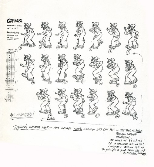
Here’s the walk cycle of Gramps done by Spencer Peel and approved by Dick Williams.
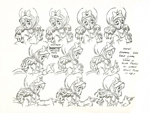
Hal Ambro did the animation on the Babette character, at least in the opening of the film where it was good. Dick Williams did the clean-up and inbetweens, himself.
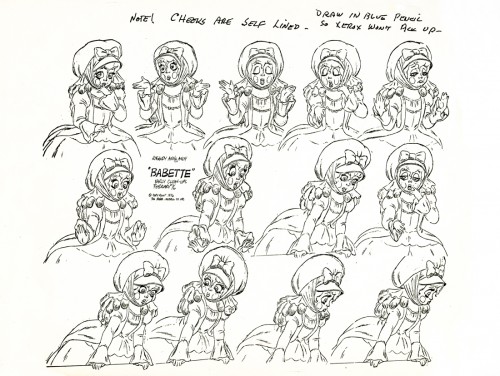
Dick’s clean-up did a stunningly brilliant job of locking in this character. I’m not quite sure we had anyone else on staff who could have done this character as well. Dick Williams is
an enormous talent, but it was too bad he was limited to inbetweening.
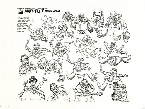
Maxi Fix-it was a nothing of a character, yet he involved endless energy in animation and clean-up. No wonder the film’s budget quadrupled during production, and it wasn’t enough.
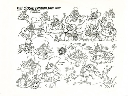
Susie Pincushion was just another character who had 22 colors on her.
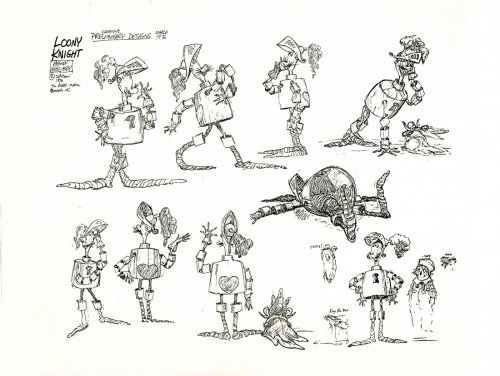
The drawings that were used for this preliminary model sheet were by designer, Corny Cole. What a talent! The character looks as though it could have fallen out of the oriiginal books by Johnny Gruelle. The life in each and every one of these drawings was solid gold. Too bad it ended up such a lifeless and annoying character when it finally hit the screen.
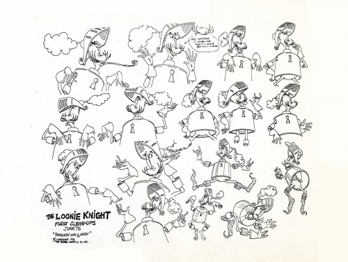
The clean up guide for the knight shows you what’s been lost.
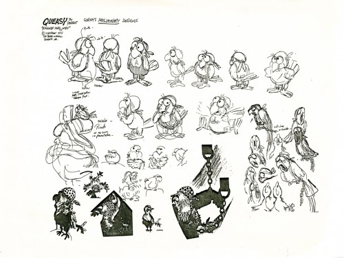
Queasy was the parrot that sat on the Pirate’s shoulder. Arnold Stang did his voice.
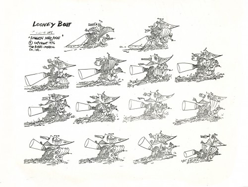
The animation of the pirate ship was split between Corny Cole and Doug Crane. I have
a couple of scenes done by Corny with his Bic pen animation. Someday I’ll post some of these drawings, but it’ll be a big chore to do it. Each drawing is so large that it’ll take three scans for each one and will require photoshop reconsrtuction. Lotsa work.
But they’re beautiful drawings, so it’ll probably be worth it if I can find the time.
