Category ArchiveModels
Books &Chuck Jones &Commentary &Illustration &Layout & Design &Models 26 Sep 2013 08:22 am
Rhapsody in Working for Suherland
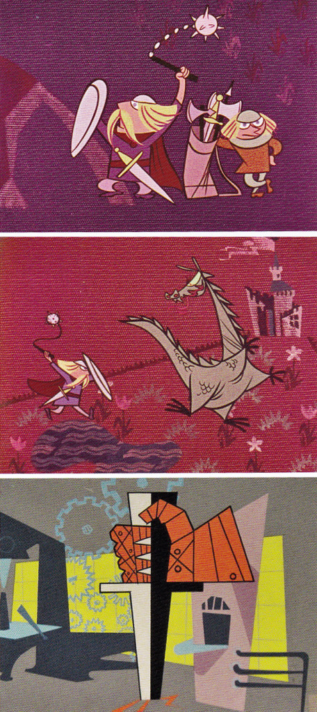
Maurice Nobel worked several years at Warner Bros. under Chuck Jones for the most part, but in 1950 he moved to John Sutherland Productions where he worked on lesser known projects. He had a money war with Eddie Seltzer at WB and accepted the higher price from Sutherland with Selzer telling him that the door would remain open.
WB tried to turn everything to 3D and gave up after one cartoon, Lumberjack Bunny. It’s obvious that some of Maurice’s LOs were prepared for 3D and were switched at the last minute. WB was closed for a year when it was decided to stop production on the 3D films. Noble had taken the right course in working for Sutherland for the few years he was there.
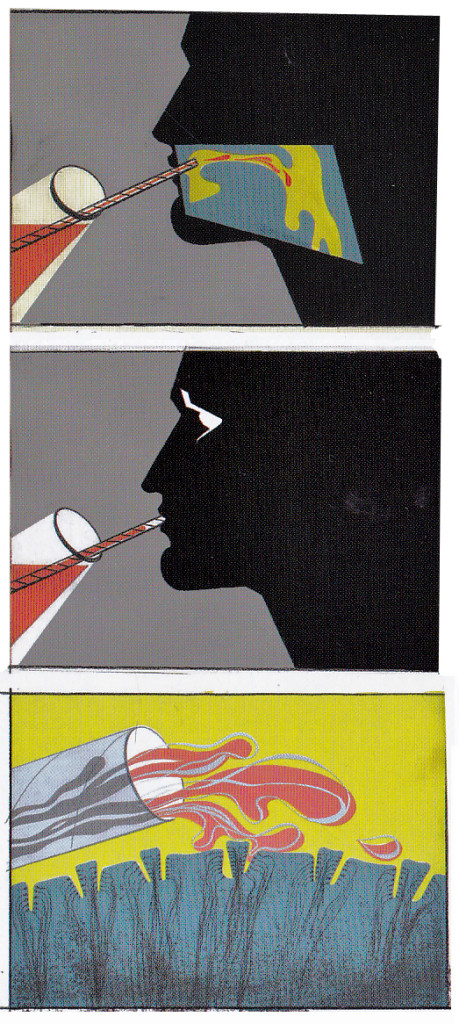
Color keys to the John Sutherland Prod
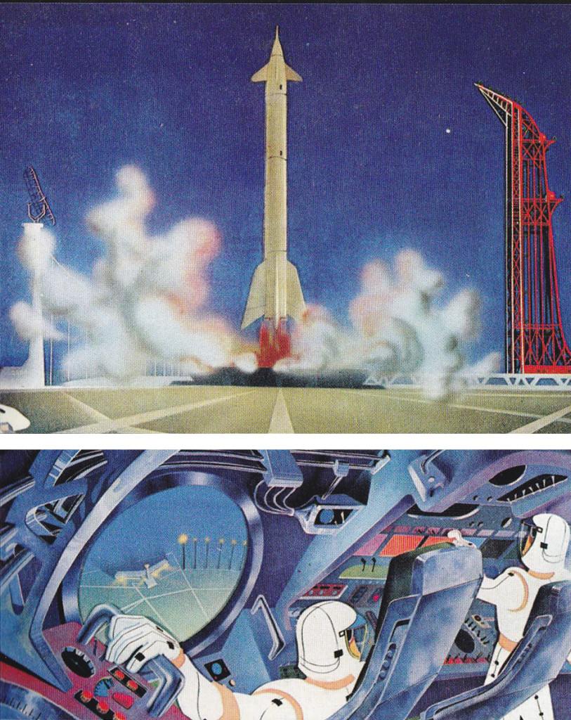
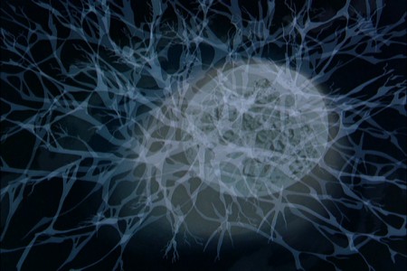
Gateways to the Mind
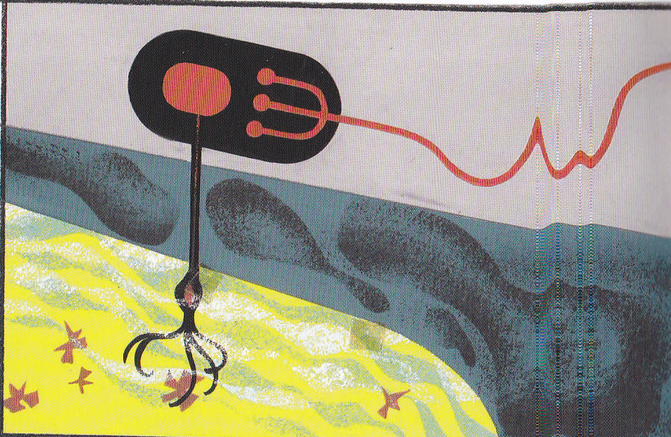
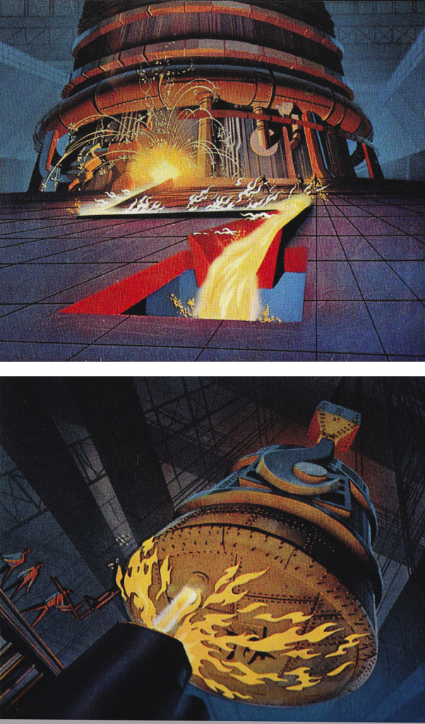
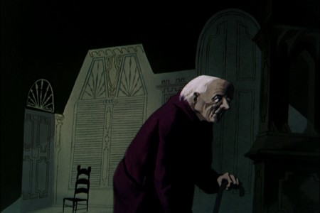
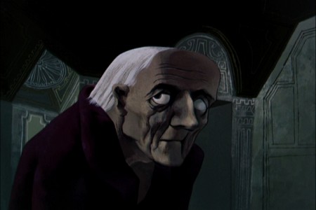
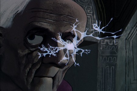
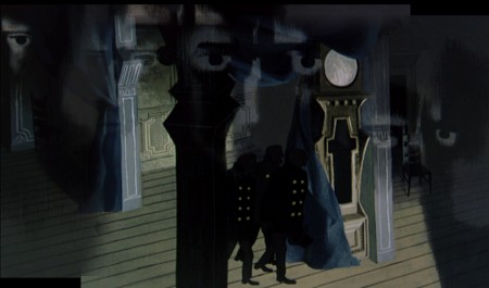
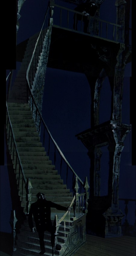
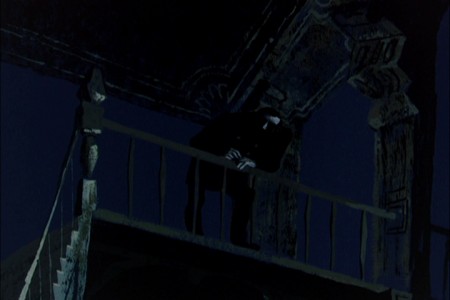
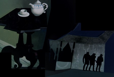
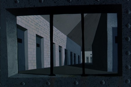
Rhapsody in Steel (below) was a high budget film for Sutherland with Eyvind Earle hired as Art Director. Ultimately he just painted the BGs that were designed by Maurice Noble. This beautiful film can be seen on YouTube, here.
Commentary &Hubley &Illustration &Models &Story & Storyboards 26 Jul 2013 05:06 am
Telltale Hearts Anew
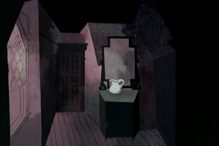
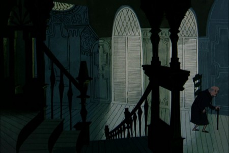
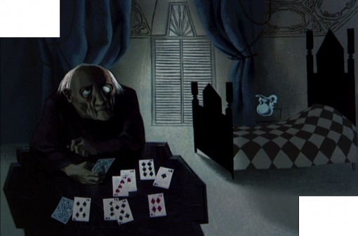
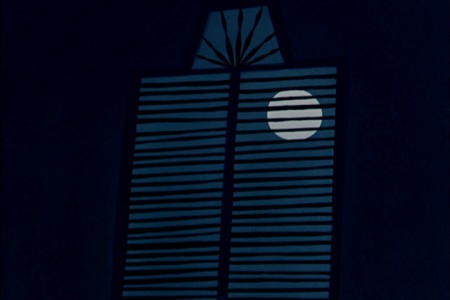
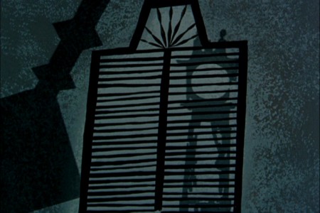
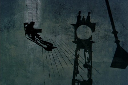
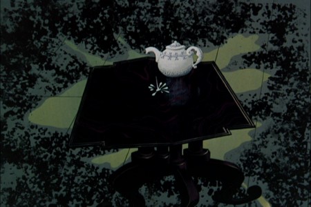
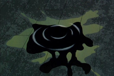
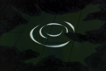
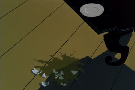
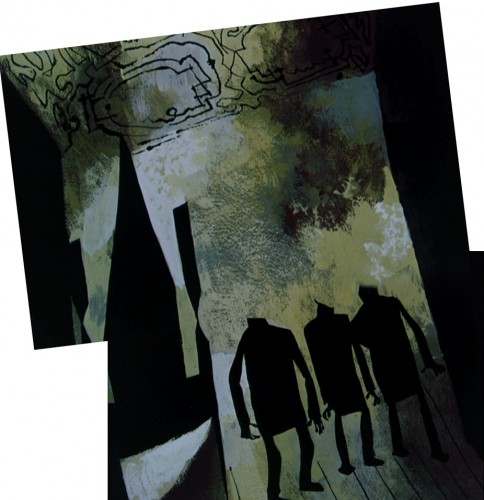
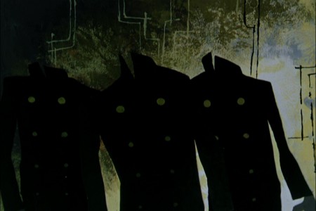
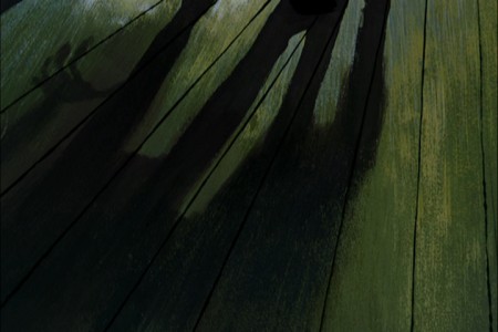
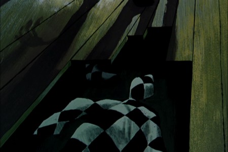
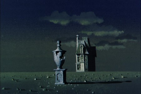
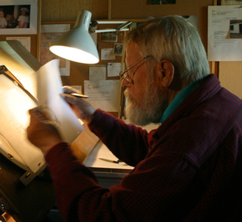 - In at least a half dozen posts I’ve written about Paul Julian‘s magnificent work. Of all of it, The Telltale Heart is probably the richest and most sophisticated of all of this artwork. Such a magnificent artist he was, bordering the realist with the surrealist. I love the man’s work and will continue to feature many of the pleasures he’s given me.
When the Jolly Frolics UPA DVDs were released, there were several films by Mr. Julian that I took great pleasure in analyzing, taking apart and studying anew. How appropriate that John Hubley, my all time favorite, brought the sophisticated Paul Julian into the studio to get him to paint with such elan.
This week, a surrealist one for me if ever there were one, between Verizon’s ample attacks on my phone and blog and the amazingly disturbing hernia operations thrown at me – just for the heck of it – by a brilliant surgeon from India who has worked well in New York City.
It was added b a delightful letter from Borge Ring, by way of his wife, Joanika. The letter prompts a good reason for my posting again the magnificent Julian artwork. I hope you enjoy it, but it’s posted more for my own amusement than yours. Don’t get me wrong, I really hope you enjoy it as much as I do.
Here, then, is the great anecdote b way of Borg:
- hi MICHAEL
Paul Julian’s “Telltale Heart” was shown at Annecy in the sixties. Some0ne asked
producer Les Goldman:
“How long did it take to make the film”?
“It took a year. A year for Paul to paint the film and a year for me to beg the
money together”
cheers
Borge
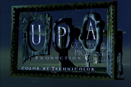
- Of all the pleasures I’ve gotten from the recently released UPA dvd Jolly Frolics the Backgrounds of Paul Julian are a particular enjoyment. His most famous and greatest achievement is, of course, the work he did on The Tell Tale Heart. This is his film. Ted Parmelee directed it, but I’m certain that he pretty much set the camera moves and timing, leaving all the design work for Julian.
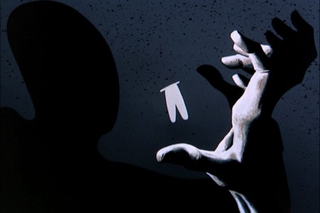
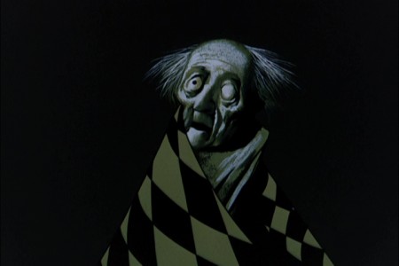
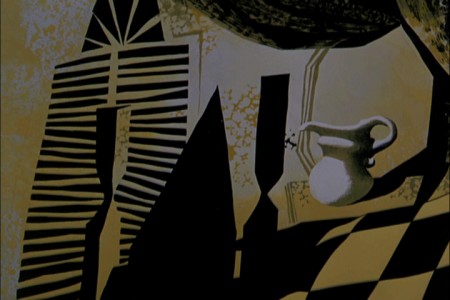
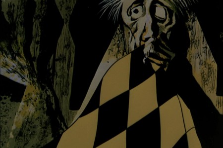
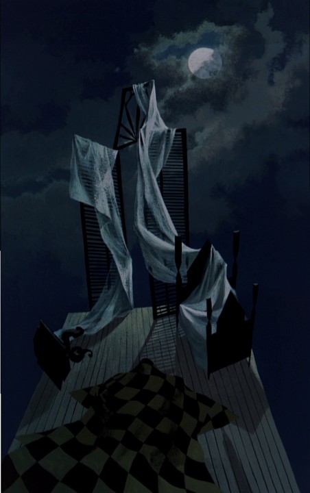
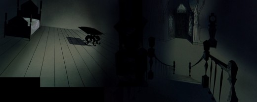
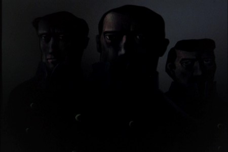
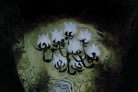
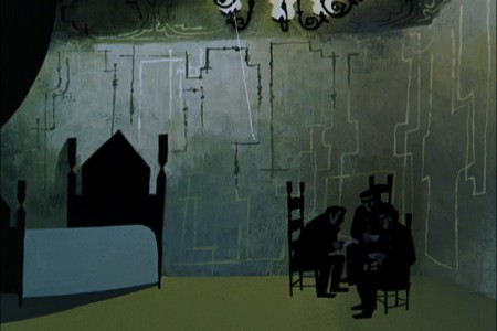
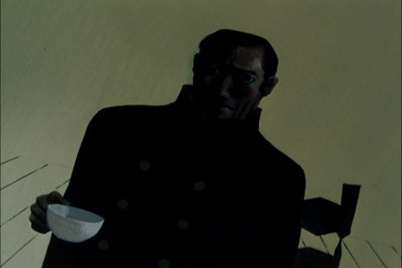
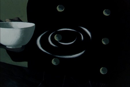
The Tell Tale Heart is a tour de force of production design. It is probably one of the first non-war/propaganda animated films, since Baby Weems, to so feature this element of production over everything else – except story. Paul Julian‘s brilliant artwork oozes from the pores of every frame of this film. Together with James Mason‘s narration and Boris Kremenliev‘s strong musical score, the film evocatively tells the strong Edgar Allan Poe story. This tale has not been told on film any better since it was made in 1953. Ted Parmalee directed the film with authority.
 1
1
Books &Illustration &Models 16 Jul 2013 05:15 am
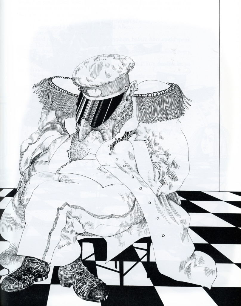
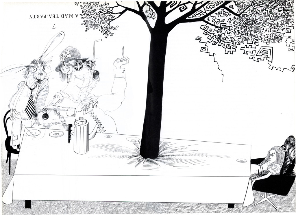
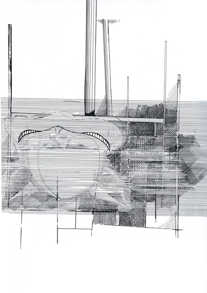
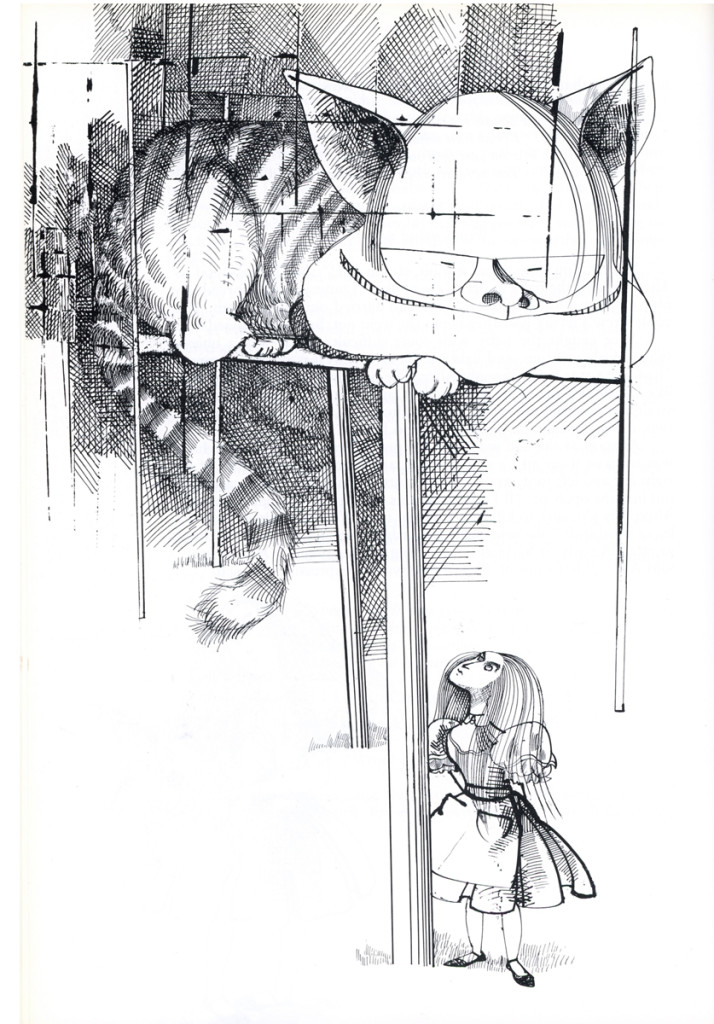
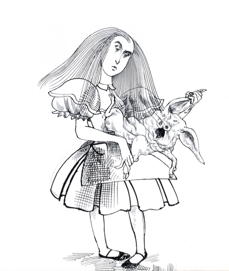
Alice Via Steadman – 2
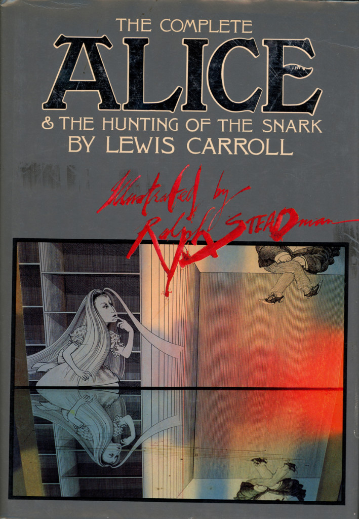
The book’s cover
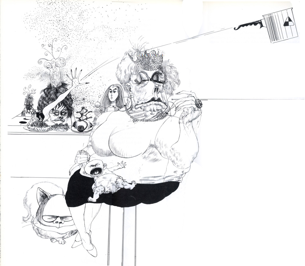
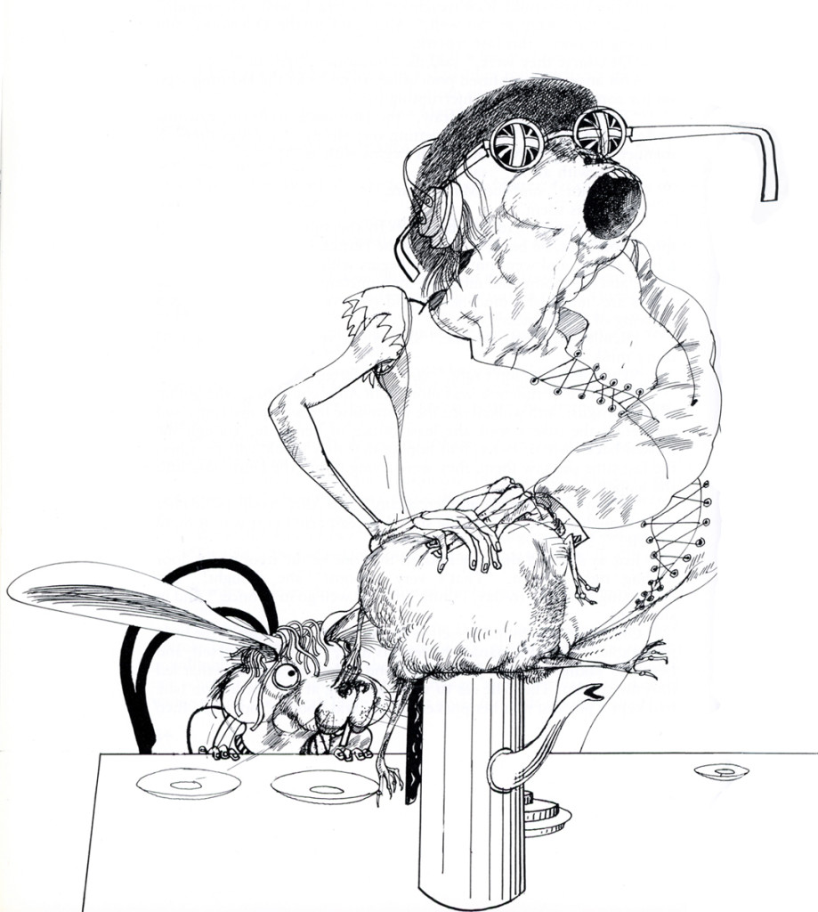
As I’ve pointed out in this series, Alice in Wonderland is my favorite children’s book. and Ralph Steadman one of my favorite illustrators. His work is so intelligent; his art so British and sophisticated, these two were the perfect pair. I think Charles Dodgson would have selected Steadman, himself, had his art been discovered back then.
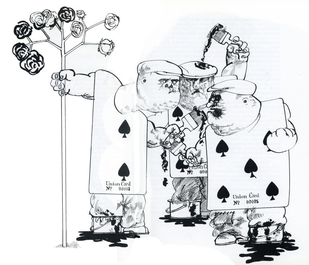
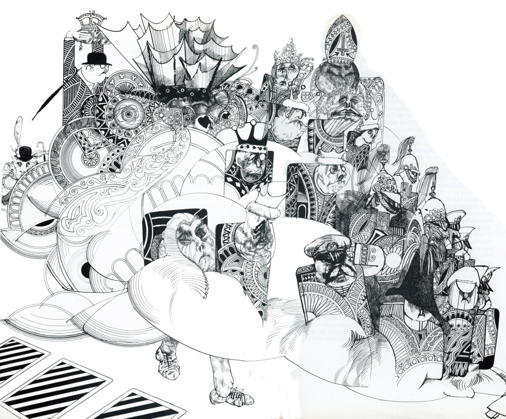
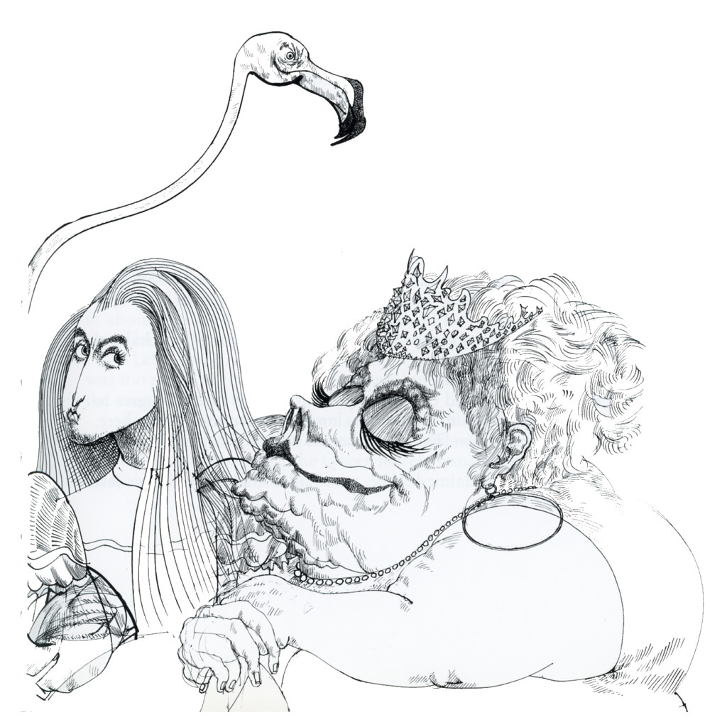
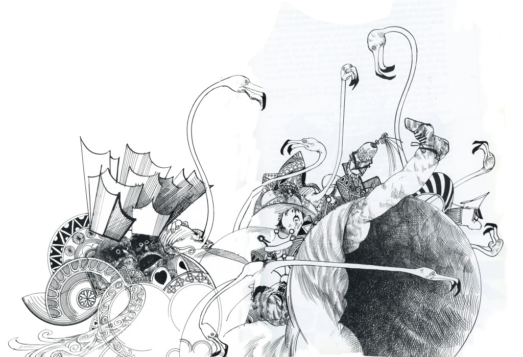
Here then is part 2 of some illustrations taken from Steadman’s book:
 1
___________
 2
___________
 3
___________
 4
___________
 5
___________
 6
___________
 7
7
Commentary &Frame Grabs &Illustration &Models &Title sequences 08 Jul 2013 02:27 am
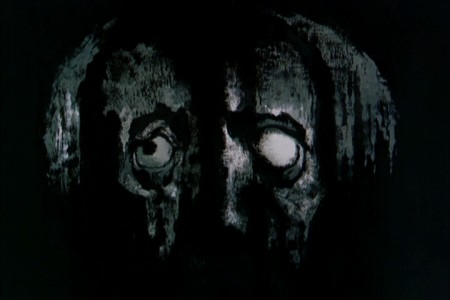
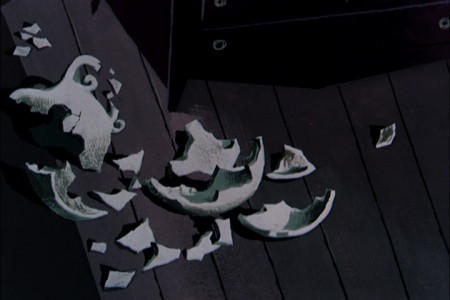
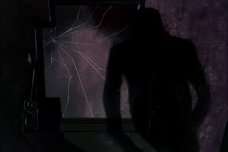
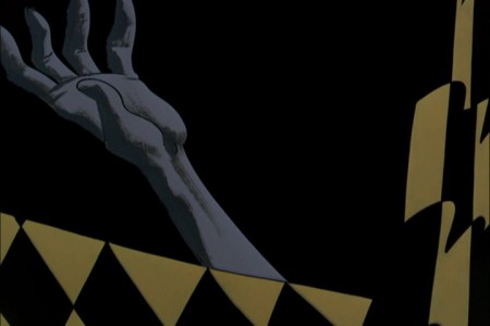
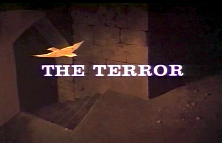
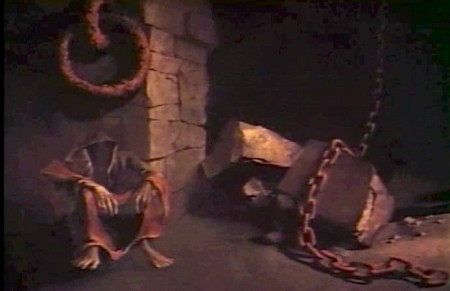
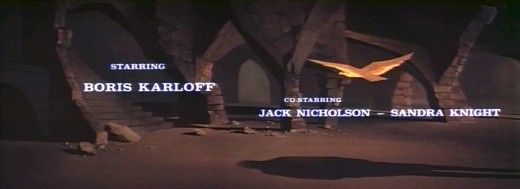
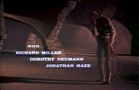
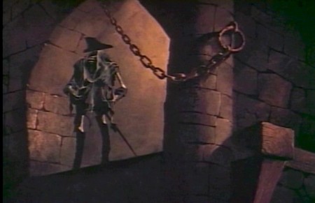
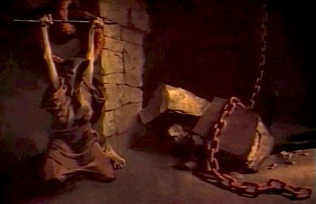
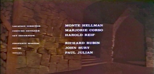
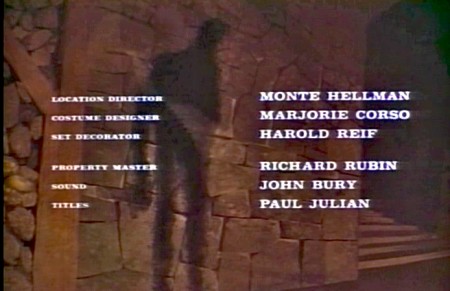
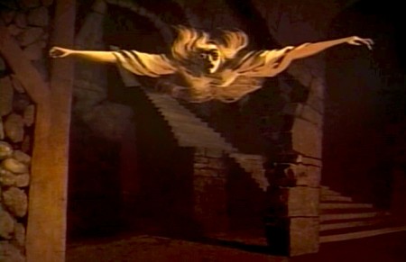
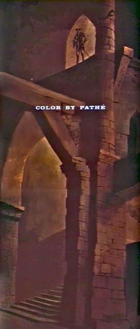
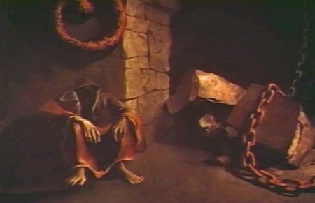
Paul Julian’s The Terror titles
After posting the book, Piccoli, a week or so ago, I’ve grown more interest in Paul Julian‘s work. He’s known predominantly for the Bgs he did at Warner Bros and the art direction he did on The Tell Tale Heart. However, there’s more film work he did independently.
The Hangman was a short film he did with co-director Les Goldman. Maurice Ogden’s poem is read by Herschel Bernardi in a very earnest tone. The artwork by Julian absolutely saves this film which was nominated for the Oscar.
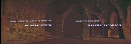
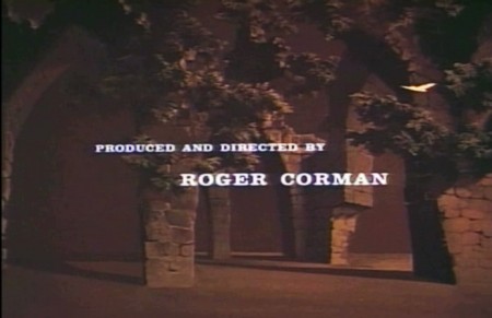
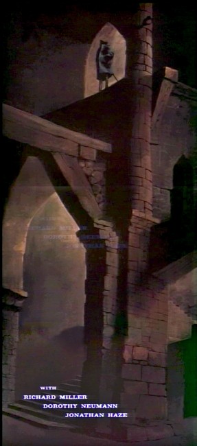
Roger Corman also used Paul Julian for a number of opening title sequences for the low budget films he did in the 60s. I’m going to try pulling some frame grabs from a number of these title sequences so that I can place some focus on Julian’s work in these forgotten films.
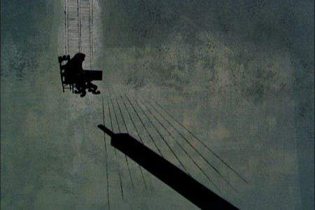
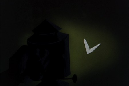
I start here with The Terror a film Starring Boris Karloff and Jack Nicholson. Julian uses a couple of pieces of artwork that he works over the course of the sequence with lots of lateral camera moves. Quite expressive work, though certainly not on a par with Tell Tale Heart.
 1
1(Click any image to enlarge.)
 6
6
Starts at the bottom and pans up.
You can watch a grayed-out version of this video on YouTube. The credits come on about a minute into it.
Swamp Women’s title sequence will follow soon.
Animation &Animation Artifacts &Articles on Animation &Disney &Illustration &Models &repeated posts 29 Jun 2013 03:51 am
Young Bambi – repost
- It all starts with a drawing.
The brilliant host of cartoonists that came before us were an amazing group. To think of the complicated set of characters that the created. Characters with complex personalities and sophisticated drawing techniques.
Those characters went trough the mill in my own life time. Seeing the horrendous things that have happened not only to Mickey, Donald and Goofy but to Bugs, and Daffy and other Warner’s Bros characters. It’s been shameful.
I was going to post illustrations of some of those bastardizations, but I think it’s enough just to mention some of them.
Think of the Mickey Mouse Clubhouse running now on the Disney Channel. If ever there was proof positive that cgi weren’t cartooning, that would be it. Those are very unsophisticated digital puppetry shows where every move is obvious and preplanned, the voices are hideous, and the stories nowhere sophisticated enough to call trite.
Take a quick jump from those to the flash animated whirls that are being released with a lot of fanfare, and you’ll see what can go wrong with animation of stars. They may as well have dug Marilyn Monroe and Clark Gable out of the ground to allow the computers to move them as well. Like all new animation that’s being called good, these beasts-of-films are moved at the speed of light where no move gets to have any personality. Think of that naked Mickey in the most recent release. A thin slime of a creature, all black, that looks like a clam being animated by a Jim Tyer. There isn’t a pose in the film that could compare with what Terrytoons did – Terrytoons, the bottom of the barrel. They had personality all over these poorly drawn efforts.
There were the old Greg Ford versions of the WB characters for theatrical release, compilations of old with new. They were all mediocre but had the honor of the past directors in mind. The Bakshi Mighty Mouse cartoons were a take on their group of characters, but you had someone with a personality, Bakshi, trying to do wonders with a library of “B” stars. Even with the TV budgets, they were trying hard to do something, and often they were successful.
Today it’s all for poor exploitation, and no one is trying to do wonders with their characters. It’s all too sad.
The WB characters have had even greater attempts at poor art. You don’t have to think back too far to remember the sitcom version of the characters now running on Cartoon Network, also done in Flash. Think back to the poorly designed wretches that WB issued to their local network of stations, the WB. Those poor animated creatures were redesigned versions with scales and all. It’s just about time to scream, “Enough!” Is there not one executive who can offer some honor to these golden characters of our past? How much do we have to watch?
Why did these studios create their archives? Was it just to resell the goodies or was anything preserved so that the future animators could do right by these characters?
- It all starts with a drawing.
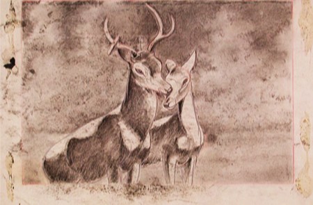
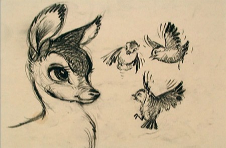
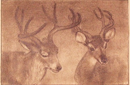
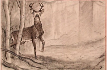
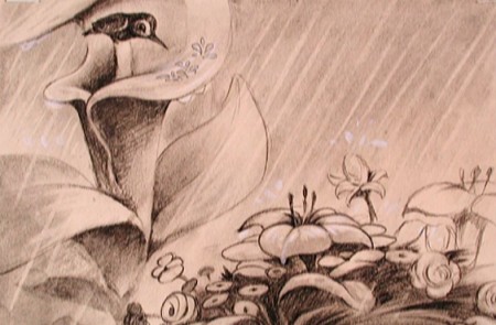
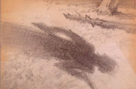
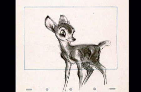
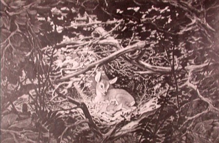
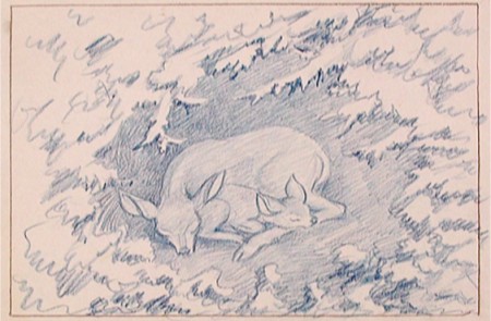
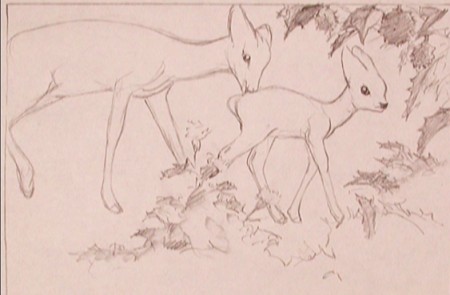
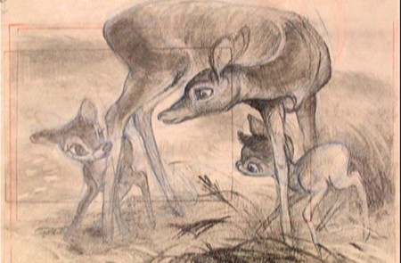
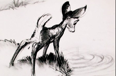
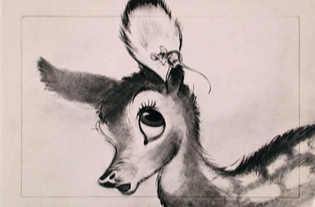
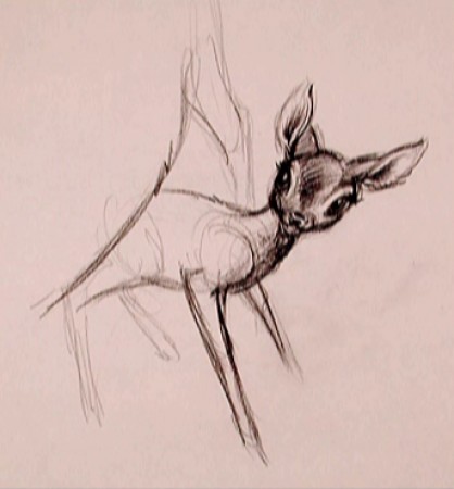
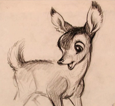
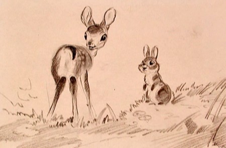
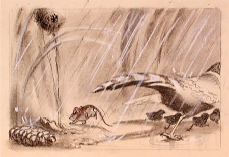
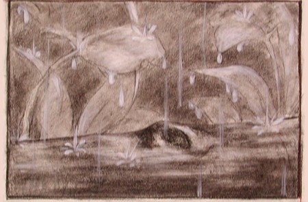
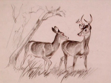
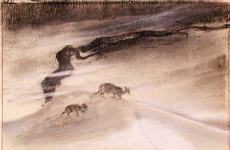
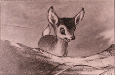
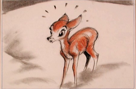
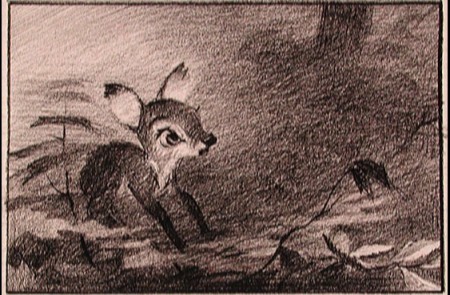
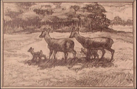
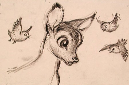
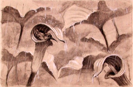
That’s all I can think. With that I’m just going to post a number of gems from Bambi. These had to have had some purpose greater than feeding Bambi !!. Or maybe I’m wrong.
Bambi is, to me, one of the most beautiful of animated features. Collectively, the artists at the Disney studio pulled together to create some wonderful artwork which produced a wonderful film.
The initial work went through many phases, as would be a natural state for animation. However, all of the artists seem to be trying for a higher plane, and oftentime they reached it.
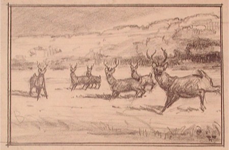
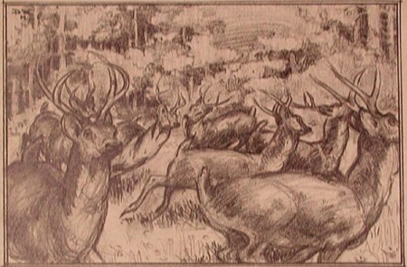
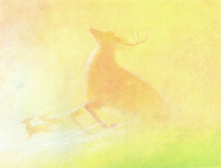
To celebrate the latest release of this film, the Blu-Ray/DVD version, I’ve pulled a lot of the drawings from the film and post them here. It’s amazing how much influence Marc Davis had early on. I can only ID the artists of some of the sketches. If you know, let me know. We have to continue to ID these artists. Without their names we just have these flash animatedMickes that don’t even include one credit. And maybe they shouldn’t be credited; the work is so embarrassing.
 1
1David Hall
 3
3
(above and below) Marc Davis
 7
7
(above and below) Ken Peterson
Animation &Animation Artifacts &Commentary &commercial animation &Models &repeated posts 13 Jun 2013 09:07 am
Jax Beer – recap
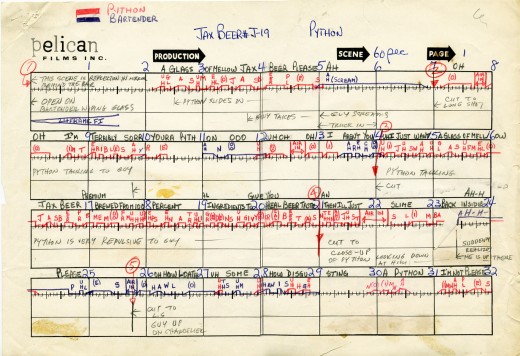
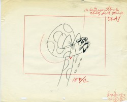
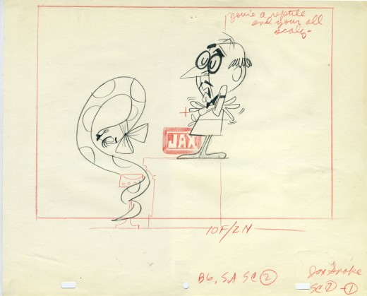
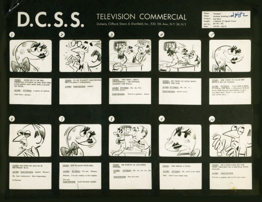
- In November 2006 I posted the storyboard, workbook and final layouts for a Jax Beer spot which was directed by Mordicai Gerstein. I thought it interesting enough to recap the two posts, so here they are.
- This is the material for a Jax Beer commercial. It was done by a NY studio named Pelican in 1962. There were about 75 people on staff at Pelican back then.
This spot was directed by Mordi (Mordicai) Gerstein. He left animation in th 70′s to write & illustrate children’s books. (He won the Caldecott Medal for his book, The Man Who Walked Between The Towers. This was the book I adapted to animation in 2005.)
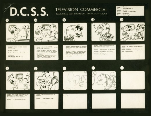
What follows is the storyboard and the director’s workbook. (It appears to be an agency board, though it’s drawn in a style that looks to be Mordi Gerstein‘s. Perhaps boards from the agency were drawn by the studios back in 1964; I’m not sure. The layouts were drawn by the same artist.)
_____(Click any image to enlarge.)
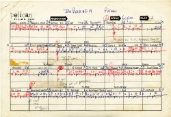
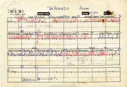
The workbook has several flaps on it that indicate changes in timings. There are also glue stains where I assume other flaps fell off. (See page one, last row, first column.) Each column represents 16 frames/one foot of film. Odd numbers are marked off.
Each row contains 8 feet of film/128 frames. Each page represents 32 feet/512 frames. It would have been smarter to keep to even numbers.
More modern exposure sheets generally have 80 frames/five feet per page. This also divides into two feet of 16mm film. (Handy.) The numbers add and divide smartly and easily. But then most people don’t use exposure sheets anymore.
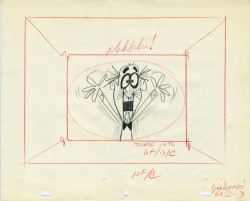
 - Continuing with the above post, a Jax Beer commercial, I present some of the film’s layouts. This represents about 2/3 of them.
The art was done by Mordi (Mordicai) Gerstein, who also directed the spot. Grim Natwick animated the spot and Tissa David assisted him. Of course, this was in the days before auido tapes could be handed out, so the animator would get a phonograph of the soundtrack. They could mark it with a white pencil to indicate key spots.
I thought that this in conjunction with yesterday’s prep material gave a good indication of the preproduction that went into making a commercial back in 1962.
That said, here are the layouts:
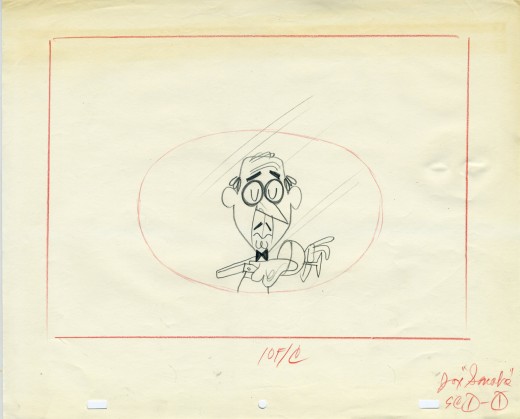
(Click on any image to enlarge.)
John Canemaker &Layout & Design &Models &Photos &Rowland B. Wilson 05 May 2013 05:55 am
More Raggedy Ann Photos – 2
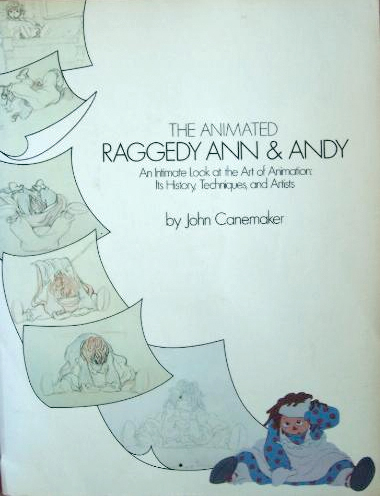 - Last week, I posted a stash of photos taken by John Canemaker for the book he wrote called, “The Animated Raggedy Ann and Andy.”
John Canemaker took all the photos, himself, which led to a more intimate look at an animated film. There were no photo decisions by committee; it was decided to use a photo if it told the story John was trying to relay. For that reason, the book really is one of the best “Art of . . .” type books on the market. (I’m not just saying that because there were photos of me in there – though that would be a good reason, too.)
The book was as exciting – in the making – as was the film. Too bad at the last minute the train of a film ran wildly off the tracks. In a way, I wish the book were written after the film was completed so that we could read the true story of what happened in those last six months of chaos.
The decision was slow in growing and fast when it finally fell, that the movie was enormously over budget. I was in on all the morning production meetings where managers and supervisors and directors would all meet. Those had started off nicely, at the beginning of the film, and went insanely wrong before long. There was the time when I was ordered to fire – that day – two inbetweeners. I was told that we had to give the staff a lesson that they had to work harder. (That might have been hard to do since everyone was giving it their all.) It so happened that one new inbetweener, on her first scene, ignored my instructions (and her immediate supervisor’s) by erasing all of Jack Schnerk‘s drawings. She felt she could animate the scene better, and she set out to prove that.
One down. The second person to fire was someone I was told (by Dick Williams, himself,) that I had to fire. It was obvious that there was a personality conflict since the guy was a great artist and definitely someone who should have stayed on. I was able to arrange for him to be switched to the BG department, thus fired by me from doing inbetweens and hired by them, in the same day, to do watercolors. He continues on, even today, working at a top position in design at Blue Sky. I don’t know about the woman, but I hope she gained a little humility that day 30-something years ago. That story didn’t make it into the book.
What there was in the production was a great first year of production where the art of animation was treated in its highest form. We were all out to make the greatest film of all time and bring it to the big screen. We had some of animation’s finest animators gathered to work on it. Assistants and Inbetweeners in New York were offered classes, after hours, which tried to teach animation to the new. With teachers like Tissa David and Art Babbitt and more experienced Assistants; a lot was conveyed. I was usually too busy to make it to many of these classes, but I always kept a close eye on what was taught. It really was fun and incredibly valuable to many of us.
At some point along the way, the LA studio was closed and key people from there came here. All of our space was overcrowded and uncomfortable. The Xeroxing in NY, a sweet grey line that took a while to construct, was replaced by a thick back line, when management sent work to Hanna-Barbera to outsource the xerography and some of the painting. Shadows were eliminated. Color copiers were rented. Scenes that had been animated in a non-photo blue pencil on 16 fld paper were being copied and reduced, at the same time, in B&W so that they could use 12 fld cels to color the art. A penny saved is a penny gained; I guess. This meant that a number of my inbetweeners were used to put 4 sets of crosses on the animation drawings so that there’d be some form of registration on the reduced artwork. Certainly the registration went all to hell in the process, thus allowing the latter half of the film to have a lot of slippage on the big screen. Lots of weaving animation in scenes that were rushed.
Emery Hawkins‘ amazing taffy pit took a big hit when it was animated more like a limited animation movie. All that beautiful rolling motion Emery had created on the cinemascope screen suddenly hits the wall and stasis sets in. The film was never going to be a classic of he silver screen, but it should have been a hell of a lot better.
 1
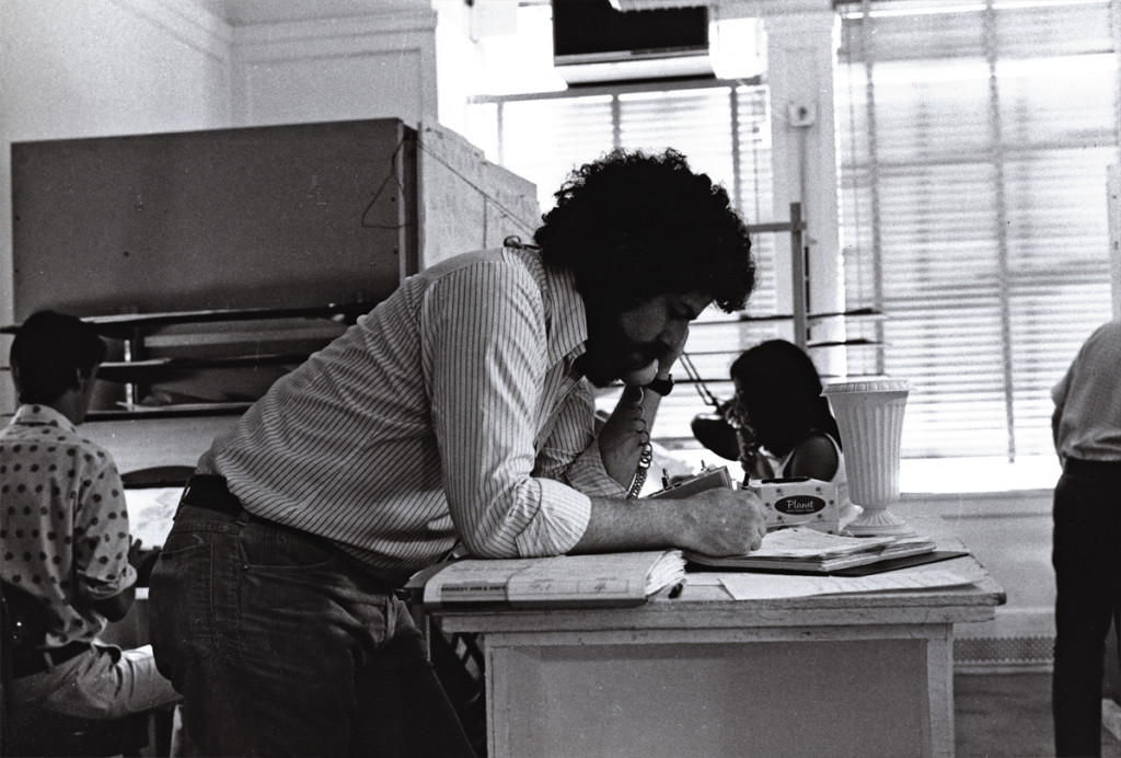
1Here I am doing what I did most of the day.
I talked on the phone. Ennervating stuff.
A young Kevin Petrilak is in the rear left. He was an inbetweener
in the Taffy Pit. Dan Haskett ran that group of people.
 2
2
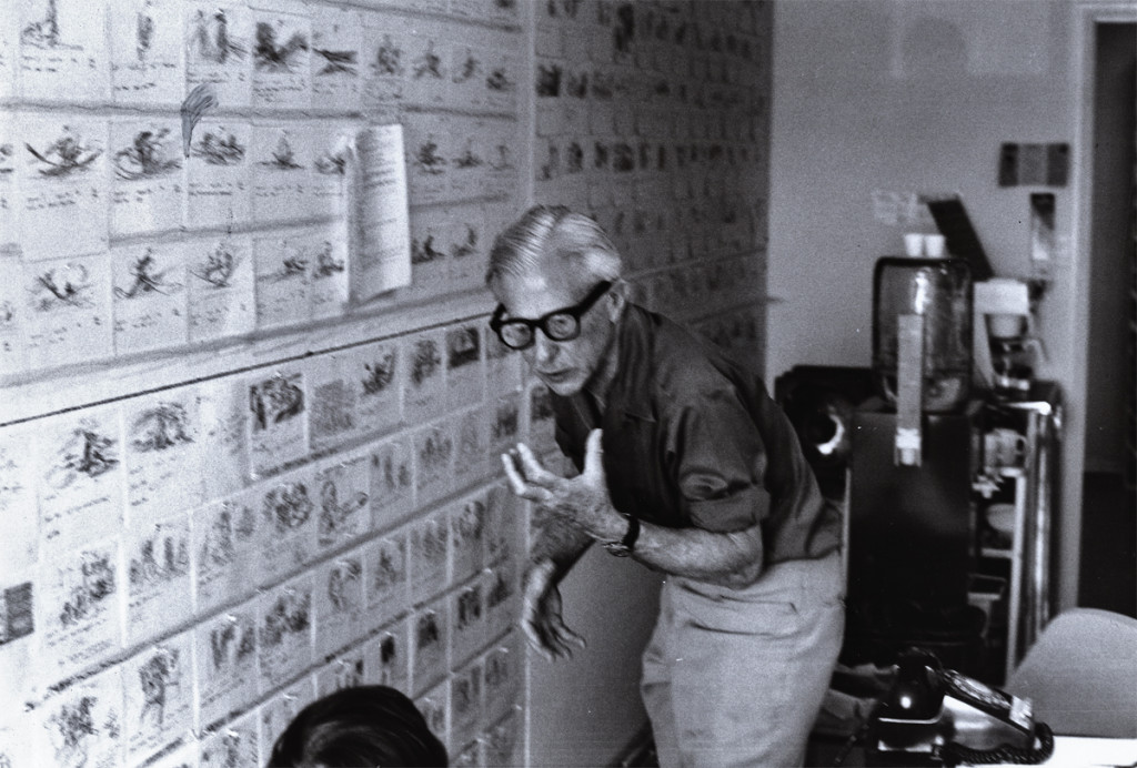
Here’s Art Babbitt teaching. He loved doing that. Dick tried to
recreate the classes he’d had in London a couple of years earlier. We – all New York -
sure appreciated the two weeks of lessons. I have Dick’s notes from these sessions.
 3
3
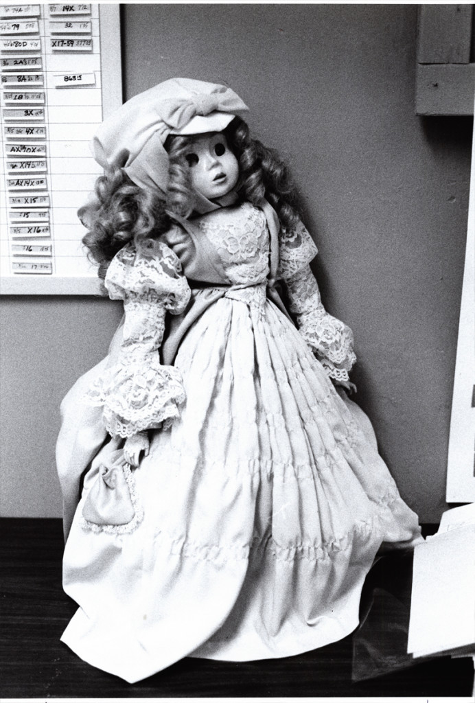
This is a beautiful doll. Babette. She was at the film’s center.
The Pirate kidnaps her and takes her to sea. Raggedy Ann & Andy
take off in pursuit of her to bring her back to the playroom.
 4
4
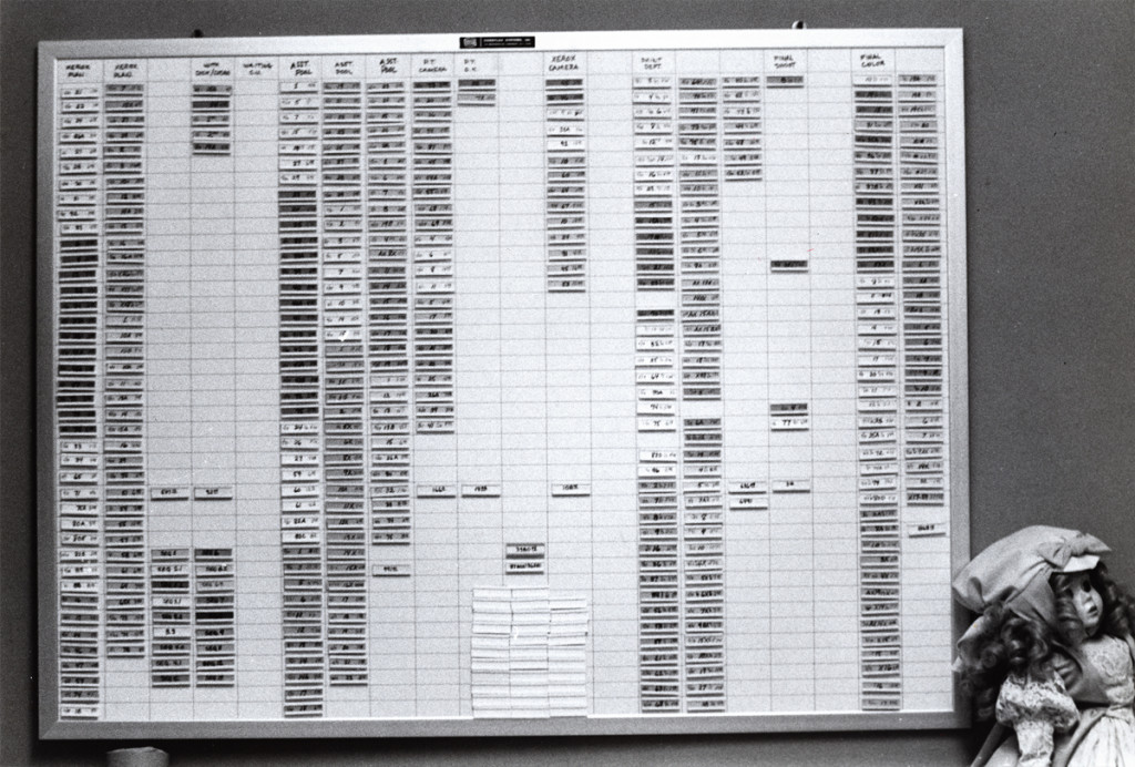
This is a wall of stats. It represents footage counts produced in
every department working on the film. This hung in Mike Sisson’s office.
He was the production manager who tried to usurp the entire production.
A couple of weeks before everything changed, managerially, on Raggedy, Sissons
approached Cosmo Anzilotti and me at lunch. He saw us at the restaurant and came
over to us. He wanted to lead a take over cutting Dick out of the film and
putting Cosmo in to finish directing the film. I’d be made Cosmo’s assistant.
I had no intentions of being another Iago, and said as much.
 5
5
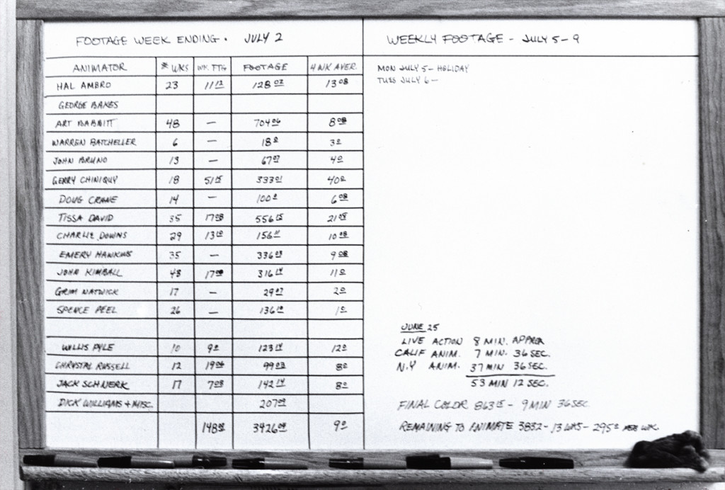
This chart covered the animators footage counts. A running record.
I told Cosmo that Dick had brought me onto the film, and I’d do anything for
him. If it meant leading a large group to quit the show, I’d do that. Cosmo
seemed relieved. He wanted to do the same and we both told Sissons how we
felt. He greeted our news with an ass’ smile and thanked us. We were no
longer on the winners’ side, and I watched closely to know when to exit.
 6
6
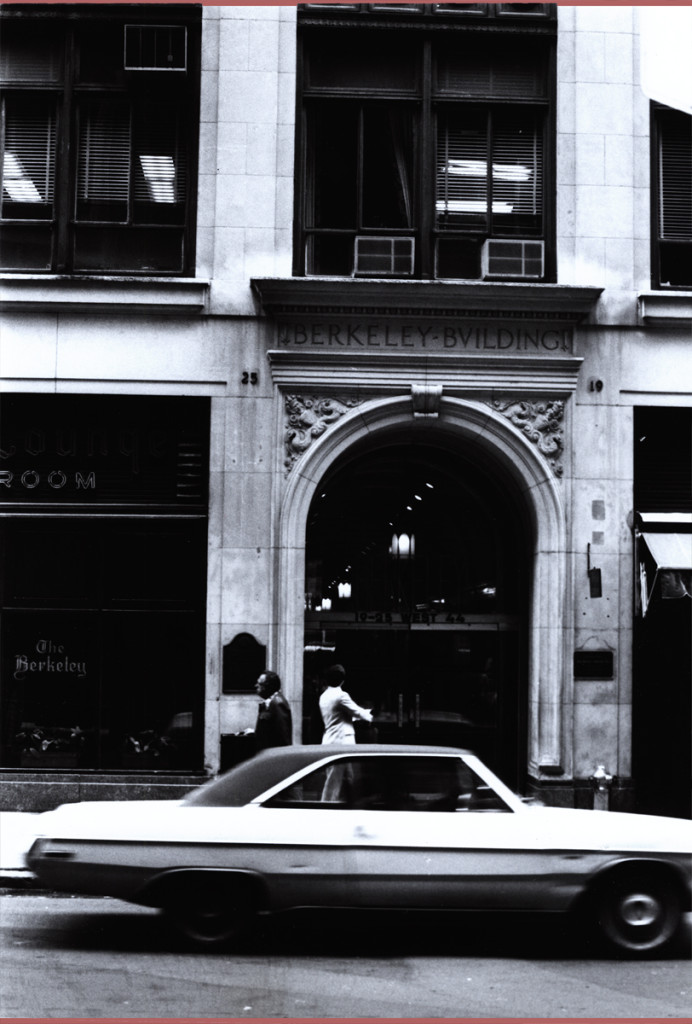
This was where the NY headquarters were planted. In the middle of 45th Street.
Most studios in the forties and fifties had places on 45th Street. Paramount,
Hal Seeger’s studio, lots of other smaller studios such as Pablo Ferro or Ray Seti’s.
![]() 7
7
Didi Conn was the actress who voice Raggedy Ann. When the VOs were coming
to an end, Didi worked late and her mother was with her. They needed help
getting home (Long Island.) The mother was afraid to drive. I volunteered
and drove them home. I took the Long Island Rail Road back to the City.
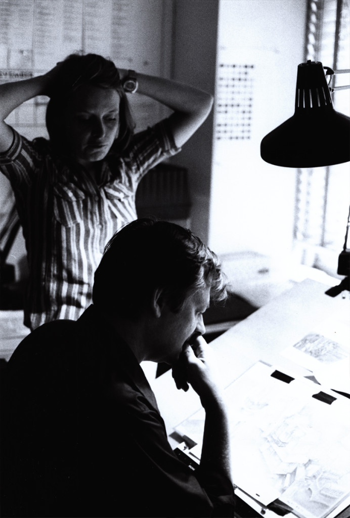 8
8
This is Sue Butterworth with Dick Williams. She was the watercolorist who
led the BG department and designed the wc style of the film. I thought her
work a bit inconsistent and often lacked the dynamic look good BGs require.
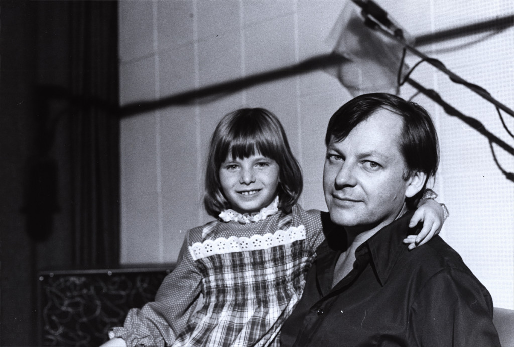 9
9
Here’s a picture of Dick Williams with his daughter,Claire.
Claire played the part of Marcella, the little girl at the film’s start.
They shot the live action in Boonton, NJ during the first days of the
production. All those hours they were out filming, I watched the shop.
Alone in an enormous darkened most of the time in the enormous office,
I could only spend time reading and rereading the script and sketching
my idea of some of the characters.Infrequently, the financial manager
of Lester Osterman Prods., the production company, would pass through.
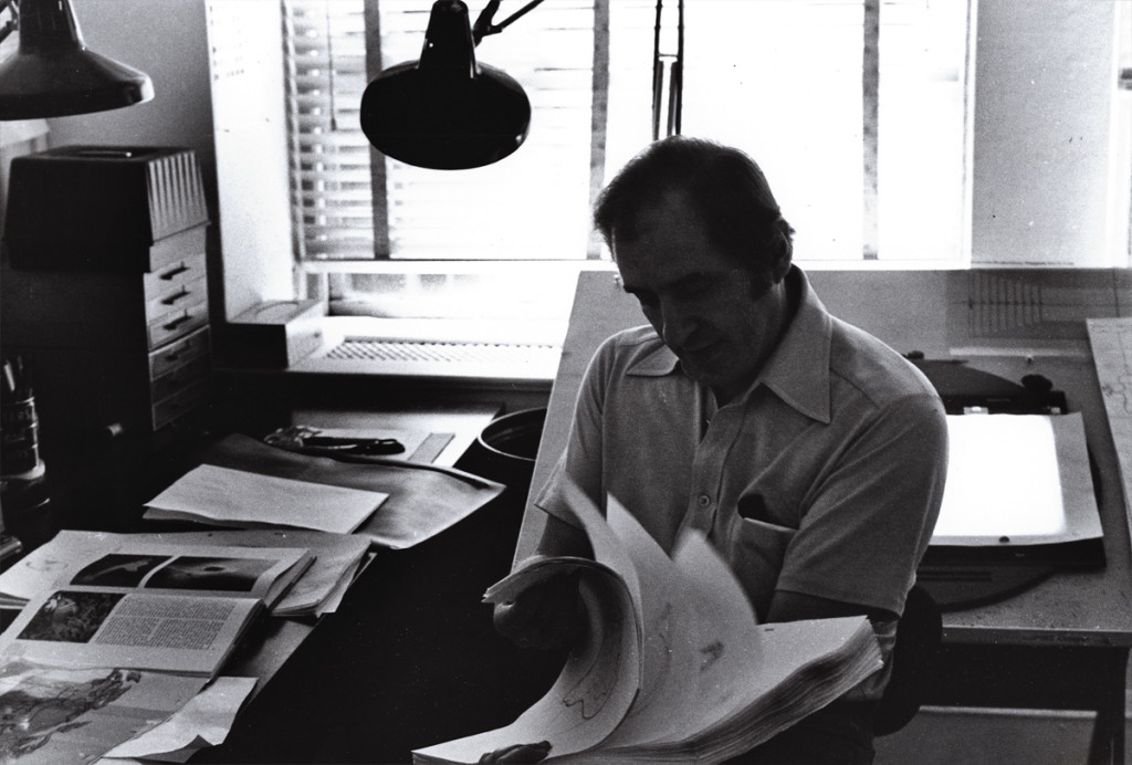 10
10
George Bakes was a fiercely independent animator who worked a short
while on the film. He must have started at Disney on Sleeping Beauty. He’d often
show a lot of Milt Kahl drawings he’d had from that film.
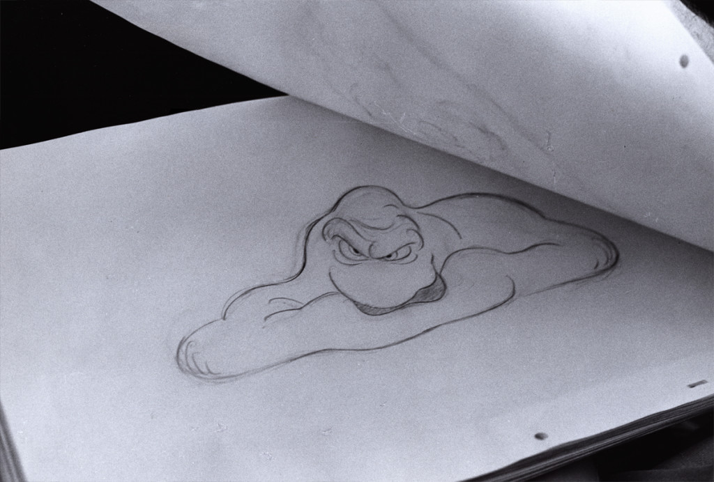 11
11
Baskes animated many of the cereal commercials of the day -
Trix, Honey Bee, Sugar Crisp bear, etc. For Raggedy he did the “gazooks.”
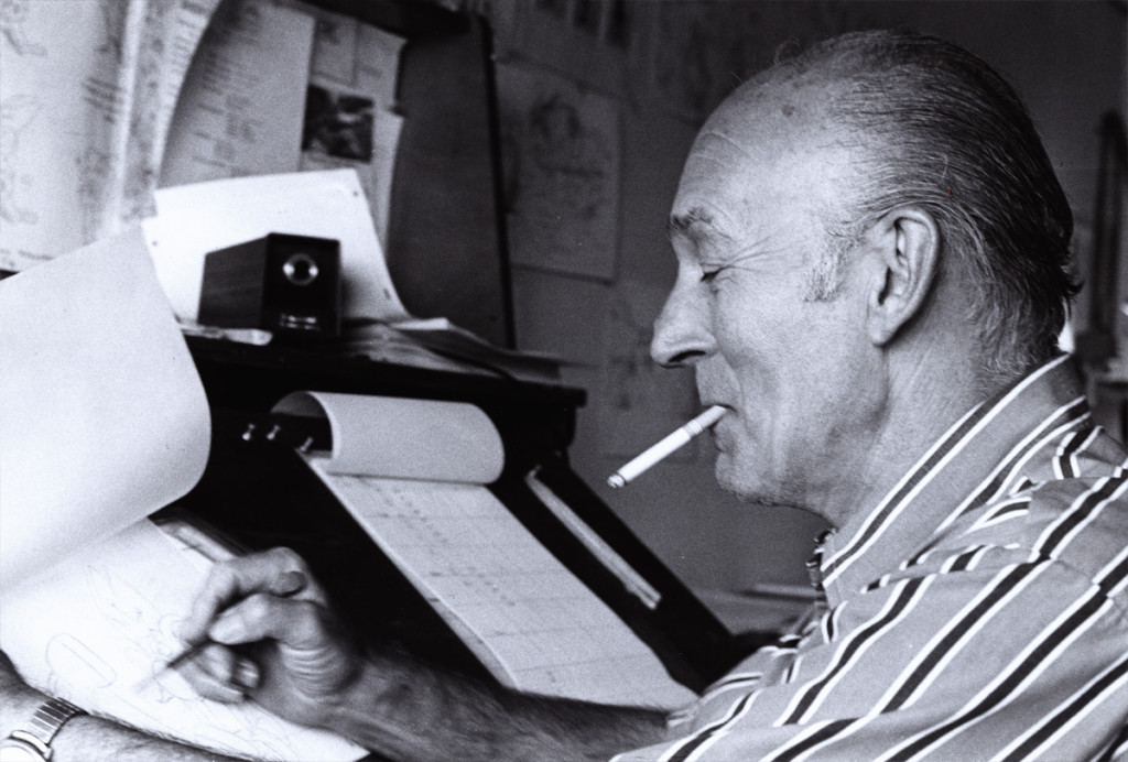 12
12
Gerry Chniquy was a brilliant animator straight out of WB.
He’d done a lot of Yosemite Sam animation for Friz Freleng.
It wasn’t far to go to cast him as the blowhard of a King, King Coo Coo.
Marty Brill voiced the character. Gerry Chiniquy,of course, did a fine job,
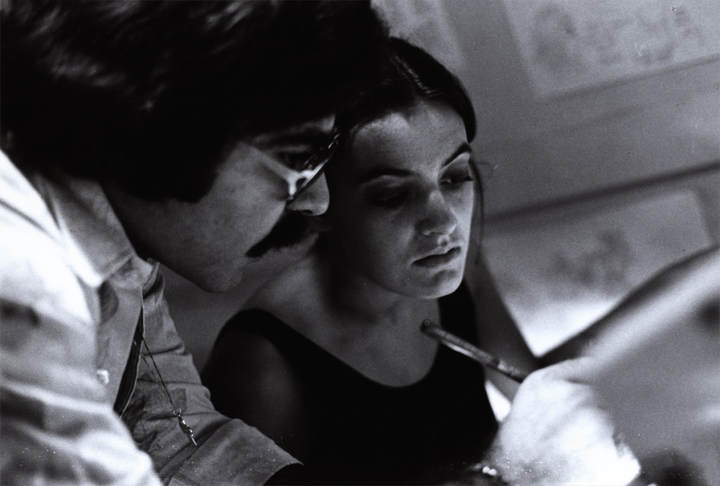 13
13
John Celestri had a style all his own although he idolized Bill Tytla.
Not a bad person to pick for a role model. John was an Assistant on
the film. Here he’s working with inbetweener, Amanda Wilson. Amanda was
the daughter of the great cartoonist and animation designer, Rowland Wilson.
The last of these photos will come next week. Many thanks to John Canemaker for the loan of the images. Any opinions tossed about here, are all mine and John is not to blame for them.
Models &Puppet Animation &repeated posts 02 May 2013 04:26 am
The Hand and Fingerprints
As you can tell, from some of my recent postings, I have always had a love affair with puppet animation. There’s something extraordinary about that medium that has drawn me in. I’ve always demanded a tactile approach to animation, including all of the 2D work I’ve done.
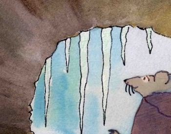 I remember seeing Lady & The Tramp in 1955, on its first release (I was nine.) It was then that I consciously noted that one of the backgrounds in the “Bella Notte” sequence (I can now see that it was an Eyvind Earle BG) had texture in its paper. The board it was painted on came through the animation photography and reached out to me. The human hand became evident in the film.
Perhaps, this was what I loved so much about animation in the first place. Humans did it, and it was self-evident. Being reminded of it, in the subtlest ways – usually unintentional, added to my joy.
Perhaps this is what brought me to John Hubley’s films. Those films were so obviously painted: characters and BG were both used by the photographer to combine for us, and the unintentional was often caught on screen. (I immediately loved those highlighted rings double-exposed around the characters in Moonbird, the brush strokes of The Hole, the transparency of the characters’ paper in Of Stars and Men.) It added to the experience.
In a sense, I was brought out of the film but held in it and given the opportunity to love it even more.
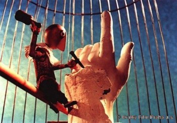 I’ve had this same sense with the best 3D animation. Though I was always there viewing it, I was also caught up in the emotions of the film. Trnka’s masterful film, The Hand, had my understanding those tears and sweat on the little potter were moistened ink that had been his painted eyes. But the anguish I felt the first time I saw the film and that effect has never left me. The perfections of the Human Hand in that film forced the imperfections of the puppet potter to be revealed until it destroyed him.
Perhaps this is also what keeps me from embracing cgi animation. Despite the faked textures of the computer, it’s so obvious that it is not real. At least not when the characters are cartoons.
A very small example of what I’m trying to communicate stands out for me in Cars. The paint job of newer cars has a flecking/speckling of glitter within the paint. In the right light, the main character, Lightning McQueen, had this paint job. Everytime I saw it, I was distracted and pulled out of the film. Like the real paint on a real car, that flecking was embedded within the paint, itself. It didn’t feel like the byproduct of a human hand; it felt like a computer trick.
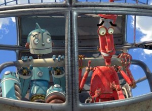 I am no more capable of coloring the computer skin of that computer hand than I am of painting a real car. It isn’t tactile for me, it’s just distracting.
It’s just something I never feel I can reach out and touch. This is something that has been overcome, for me, in a couple of films. The Incredibles gets very close often. Moments of Robots, such excellent design for the medium. Some of Toy Story.
(Click on any image to enlarge and enjoy the textures.)
Of course, I recognize that this is my problem. However, I recognize it’s a problem that other people probably have and wonder if there isn’t a solution. In The Iron Giant, the Giant is animated by a computer. I was told that the animation had to be rigged to be animated on “two’s” so that it wouldn’t separate from the rest of the hand-drawn animation. Oddly, it felt totally acceptable to me; I saw no problem and accepted that robot. There has to be, in there, a way to resolve it – I’m just thinking here and don’t expect anyone to try to follow what I’m saying. Perhaps if “human” problems, technical problems, were added to the animation. . . No this is even too stupid for me.
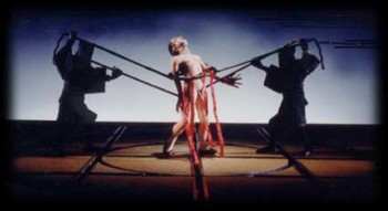 Barry Purves has made a number of absolutely beautiful films and has created in his own studio some masterfully realized pieces. His work has a discriminating taste, graceful and controlled movement with superb acting, and an intelligence that is rarely found in animation today.
He was nominated for the Academy Award for his film Screenplay, a virtuoso work which follows the rules of Kabuki theater and presents a double-layered story of a man watching and revealing a story from his past which eventually rips through the past and tears at the present. It’s a work of animated puppetry, displayed as theater and a stunning film that should have won its Oscar.
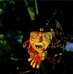 Rigoletto presents the opera in a condensed version that has been reduced for television. It’s a packed half-hour which places you into the full opera and allows you to follow it without any confusion. It has a majesty in its sweeping and dynamic camera moves which whisk you along in the luscious music; they carry you along through the depths of the complex story. It’s a wonderful film that certainly grows richer with each viewing.
Other works he’s done include a wonderful film about Gilbert & Sullivan: The Very Models gives us the pair as seen through the eyes of D’Oyle Carte. A rich and entertaining diary into the making of this film can be found on AWN and a short clip of the film is available there as well.
As a matter of fact, I found his diary there so entertaining, I’ve also followed the diary he keeps on his own website.
You can get a small glimpse of Barry Purves‘ craft by viewing the clip reel at Acme Filmworks. But you’re left without the full heft of his work until you’ve seen the complete storytelling ability he presents in the whole films.
Animation Artifacts &Commentary &commercial animation &Layout & Design &Models 12 Mar 2013 03:43 am
Larry Riley Recap Plus
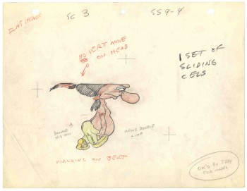 In celebration of the new season of baseball I have a couple of model sheets from a Paramount cartoon.
Larry Riley, a story writer, gave me these drawings back in 1972, but he never told me the film’s title. Thanks to Thad Komorowski and Bob Jaques – both left comments when I originally posted hese in 2007 – we know the drawings come from Heap Hep Injuns (1950).
______________(Click images to enlarge.)
Larry Riley was a wild guy. On my first commercial job at Phil Kimmelman & Ass. he and I were the inbetweeners working side-by-side on some of the Multiplication Rock series. Larry had had a long and busy career in animation.
He had been an asst. animator at Fleischer‘s, a story writer at Paramount, an animator at many studios. Like many other older animators, he ended up doing anything – including inbetweening at Kimmelman’s for the salary and the u-nion benefits.
The stories Larry told me kept me laughing from start to finish. There was no doubt he had been a writer for years. In a not very exciting job, it made it a pure pleasure for me to go to work every day to hear those hilarious stories. I can’t see Lucky 7 without thinking of laughing. It wasn’t the stories per se that were funny, it was his take on it.
Larry told me of his years at Fleischer’s in Florida where he was an assistant. He and Ellsworth Barthen shared a room, and, according to Larry, had lined one of the walls of their room with empty vodka bottles. Now, I’ve heard of frats doing this with beer cans, but doing it with vodka bottles requires some serious drinking. One of the many times I got to work with Ellsworth, I asked him about the story, and he reluctantly backed it up telling me what a wild guy Larry was.
Ellsworth was an interesting character in his own right. There were a group of lifetime Assistant Animators in New York when I started out. This is what they did and all that they aspired to do. They liked the steady work and didn’t want heavy pressure. Those I can name, off the top of my head, were: Helen Komar, Jim Logan, Gerry Dvorak, Tony Creazzo, Eddie Cerullo, Joe Gray, and Vincent Barbetta. They all have interestng stories I could tell. Maybe another time.
Ellsworth Barthen was one of these permanent Asst. Animators. He had his work life and he had his play life. Ellsworth lived in New Jersey with his brother and spent much of the time in his garden growing orchids. He had specialty breeds of orchids that he’d grow and enter in flower shows. Ellsworth loved it.
The other thing he loved was performing as Franklin D. Roosevelt. Just about everywhere he went, he took his pince-nez and would pop it on his eyes and go into character. Now I was born after Roosevelt had already died, so I couldn’t tell you if Ellsworth had been doing an accurate impersonation, but I saw him do it pretty often.
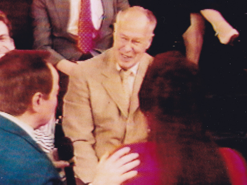
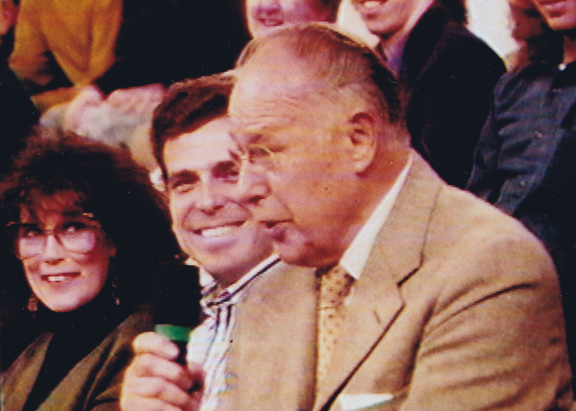
Ellsworth appearing on the Joe Franklin Show in NY
as Franklin D. Roosevelt. Joe Franklin is bottom left.
At Grim Natwick’s 100th Birthday Party in LA, Ellsworth came in character and stayed there all night. He was basically a big and shy guy, but this Roosevelt impersonation would bring him out and loud. Very curious character.
Back to Larry Riley:

________Forgive the racist pictures, but I guess they’re a product of their times.
Larry also told of a 3D process he’d developed for Paramount in the 50′s when the movies were all going 3D. I believe there were two Paramount shorts done in this process: Popeye: The Ace of Space and Casper: Boo Man. Larry offered to give me the camera on which he shot these films – he had it stored in his basement. He was afraid it would get thrown out when he died. I didn’t have room for it.
My regret; I still hear the sadness in Larry’s voice.
(When I originally posted this in 2006, Larry’s grandson, John, wrote to tell me that another collector took possession of the camera and kept it from destruction.)
The animator who drew these is Tom Johnson (he signs the second one), and they were approved by the director Isadore (Izzy) Sparber per the first one.
The drawings are deteriorating, obviously. The pan above uses a lot of glue to hold it together, and that’s eating away at the paper.)
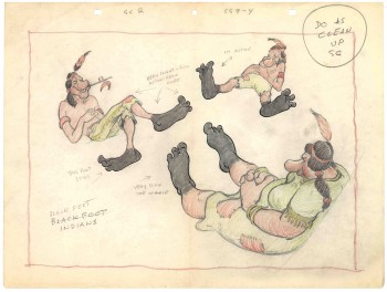 – This is the final model I have from Heap Hep Injuns a 1950 Paramount cartoon. Tom Johnson drew this image, prior to animating it, and Izzy Sparber directed the film. I’d heard some stories about I. Klein regarding this film, though he’s not credited, so I suspect he may have had something to do with model approvals, as well. Actually, he may have been the “Izzy” referred to on the pan posted yesterday.
______________(Click images to enlarge.)
I was never a big fan of the Paramount cartoons. Growing up in New York, we’d always get Paramount or Terrytoons shorts playing with features in the theaters. Only rarely did a Warners cartoon or a Disney short show up. (I don’t think I saw a Tom & Jerry cartoon until I was 17 when they started jamming the local TV kidshows with them.)
Saturdays there was always the placard outside the theater advertising “Ten Color Cartoons”. A haughty child, I naturally wanted to know why they didn’t show B&W cartoons – that’s what we saw on television, and I usually liked them more. I must have been insufferable for my siblings to put up with me.
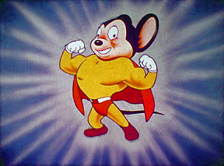
The starburst at the beginning of the Mighty Mouse cartoons always got an enormous cheer in the local theaters. I don’t remember ever hearing that for the Popeye or Harveytoons.
(I love that if you go on a “Google search” for images of Larry Riley, you get dozens of title cards from Paramount cartoons. Go, Larry.)
Animation &Bill Peckmann &Disney &Models 26 Feb 2013 05:54 am
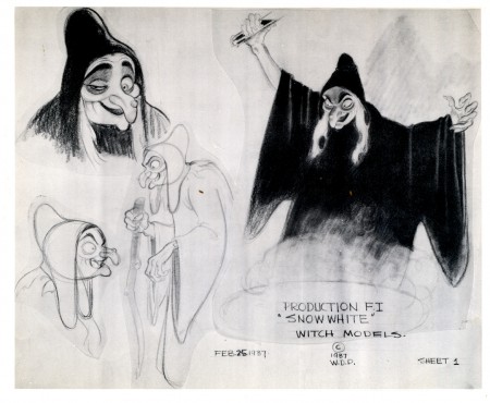
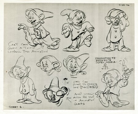
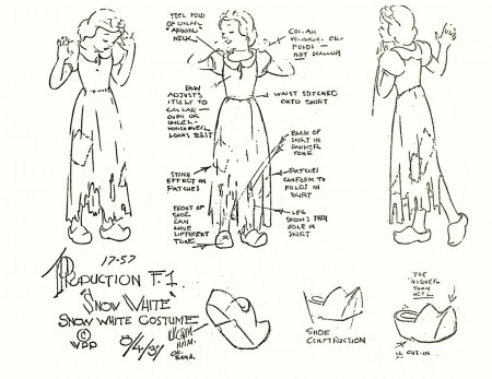
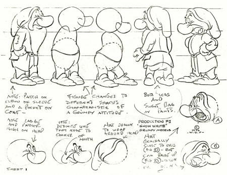
Snow White models – redux
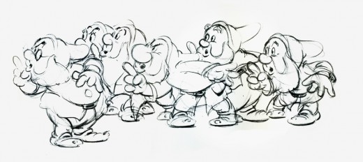
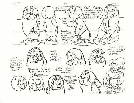
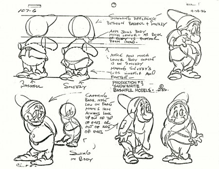
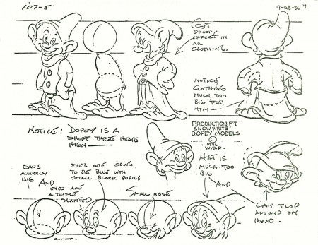
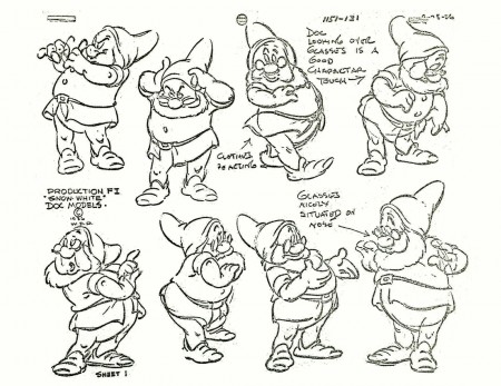
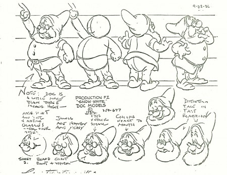
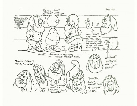
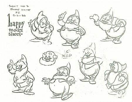
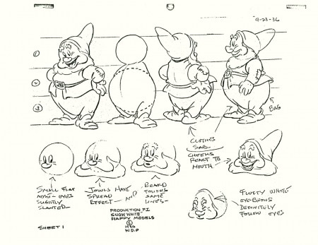
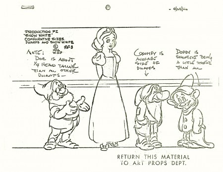
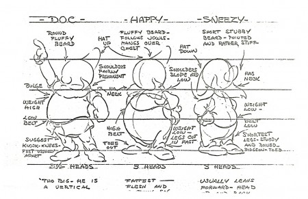
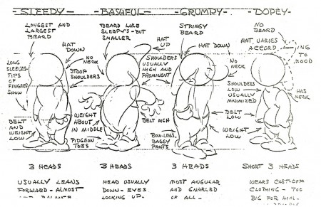
- Here, I continue with the recent outburst of model sheets. The following is a collection of Snow White and all seven dwarfs. I assume some of these can be found in print in one of the many collections of art from the film. I found two of the models in an old, expensive book I have which came via American Express.
The first two beautiful, original models come courtesy of Bill Peckmann‘s collection. The remainder of the group were Xerox copies I made years back. I’ve tried to clean them up a bit (lots of old grit from the ancient copies on glossy paper.)
