Category ArchiveDisney
Bill Peckmann &Comic Art &Disney 06 Nov 2012 06:42 am
Dick Moores anew
- I’ve written about Dick Moores several times on this blog. He is one of my favorite comic strip artists. I knew him growing up with Gasoline Alley, which was about my favorite newspaper comic strip. Moores had taken over for Frank King, and the strip became something different and unique in his hands. There’s a roundness and a beautiful open quality to his character drawings. I find the style very appealing, and I also liked the stories. It took a while to learn that he’d also done a number of the Mickey Mouse comic books, which I also loved – (but not as much as those Gasoline Alley strips despite how great I think the Mickey comics are.)
- Here’s the 2010 post on Gasoline Alley: Dick Moores – 1
Here’s the post on the Mickey comic books: Dick Moores – 2
Bill Peckmann sent some scans to make up a good post about Moores and his work. Here’s Bill, writing about the post:
- Here’s a little triptych tribute we could give to master cartoonist Dick Moores. With tongue planted firmly in cheek, I would like to call it “The good, the bad and the ugly.”
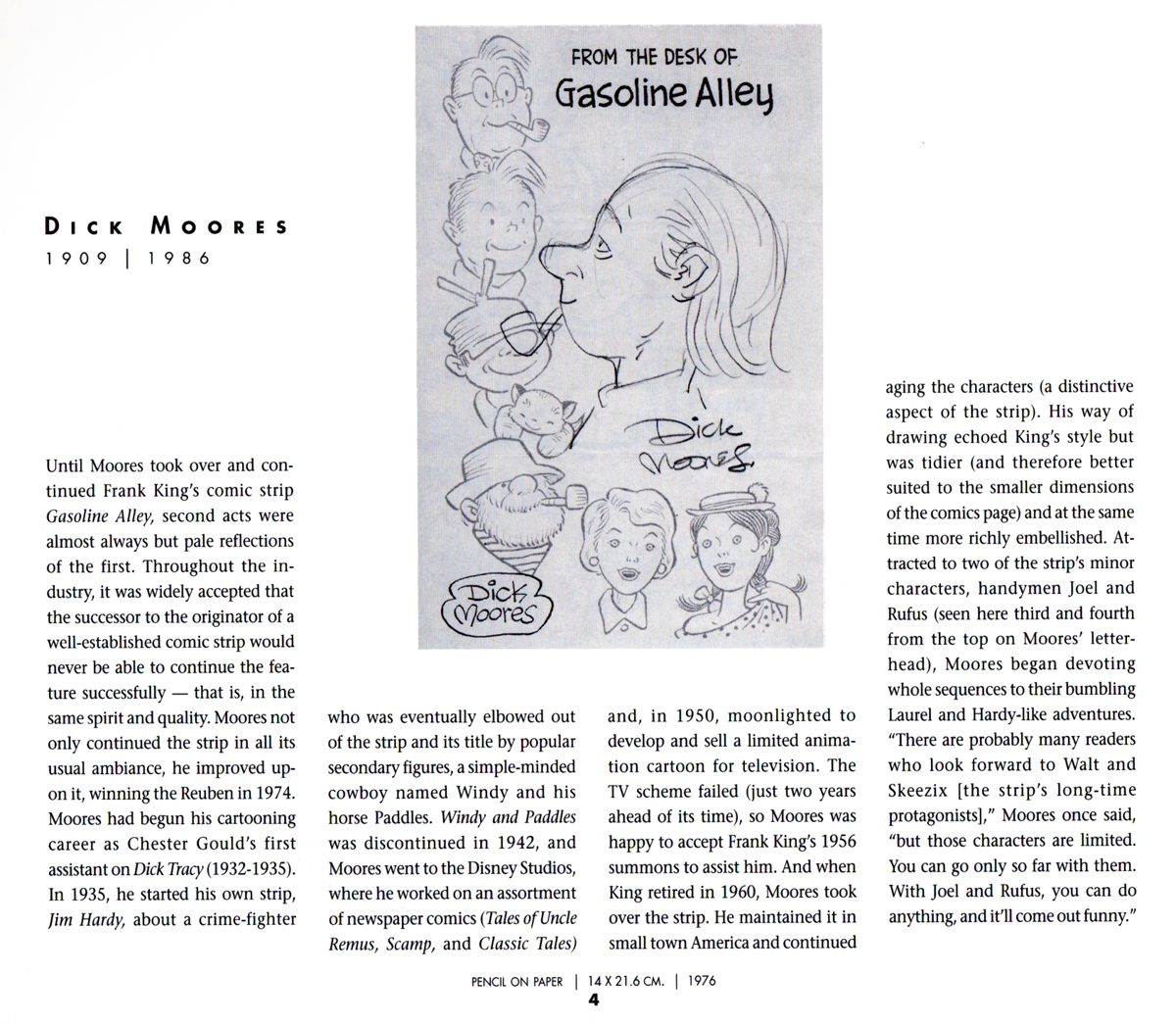
Here’s the good: Dick Moores’ self caricature and capsule bio from R.C.Harvey’s terrific 1998 book, “A Gallery of Rouges: Cartoonists’ Self Caricatures”.
-
Here’s the bad: As in really bad, which in “today’s jargon” means exceptional, out of sight good!
It’s the new release of Library of American Comics’ “Gasoline Alley, by Frank King and Dick Moores, it’s the collected daily strips from 1964 to 1966. This vol. 1 is a dream come true for all Dick Moores fans. Done with the same scholarly quality as all of their long list of great books, LOAC’s “Gasoline Alley” does not disappoint in any way. Their front of the book bio of Moores, is illustrated with a lot of his, not easy to find, pre GA art!
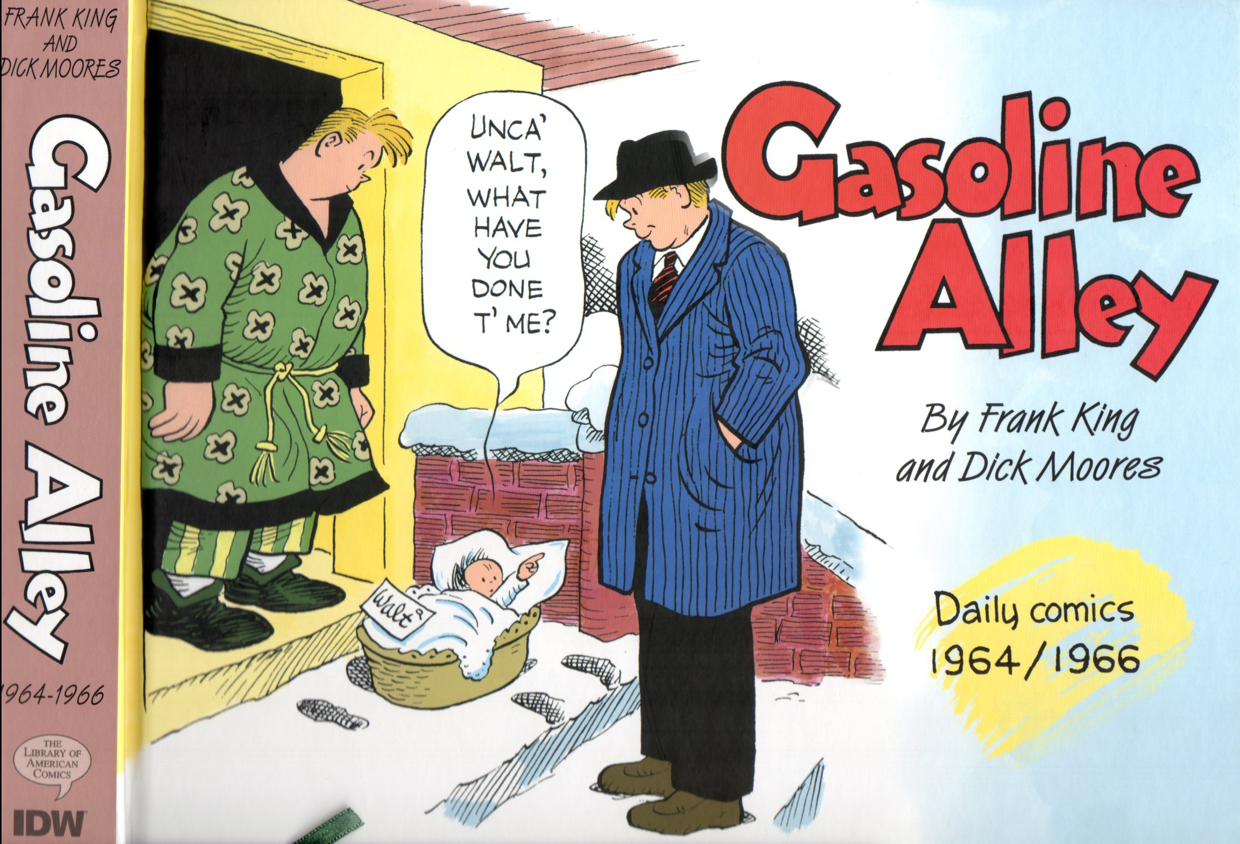
The front cover
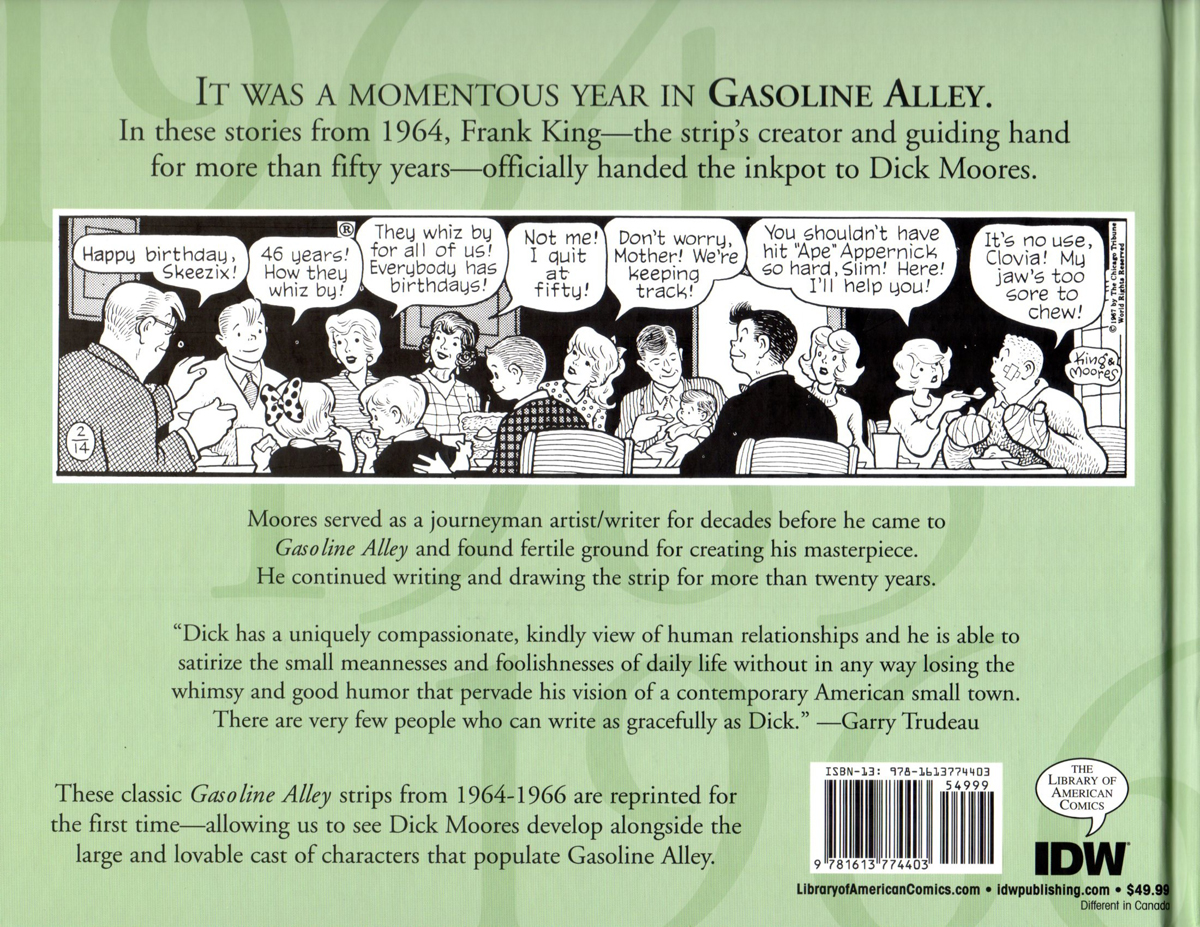
The back cover
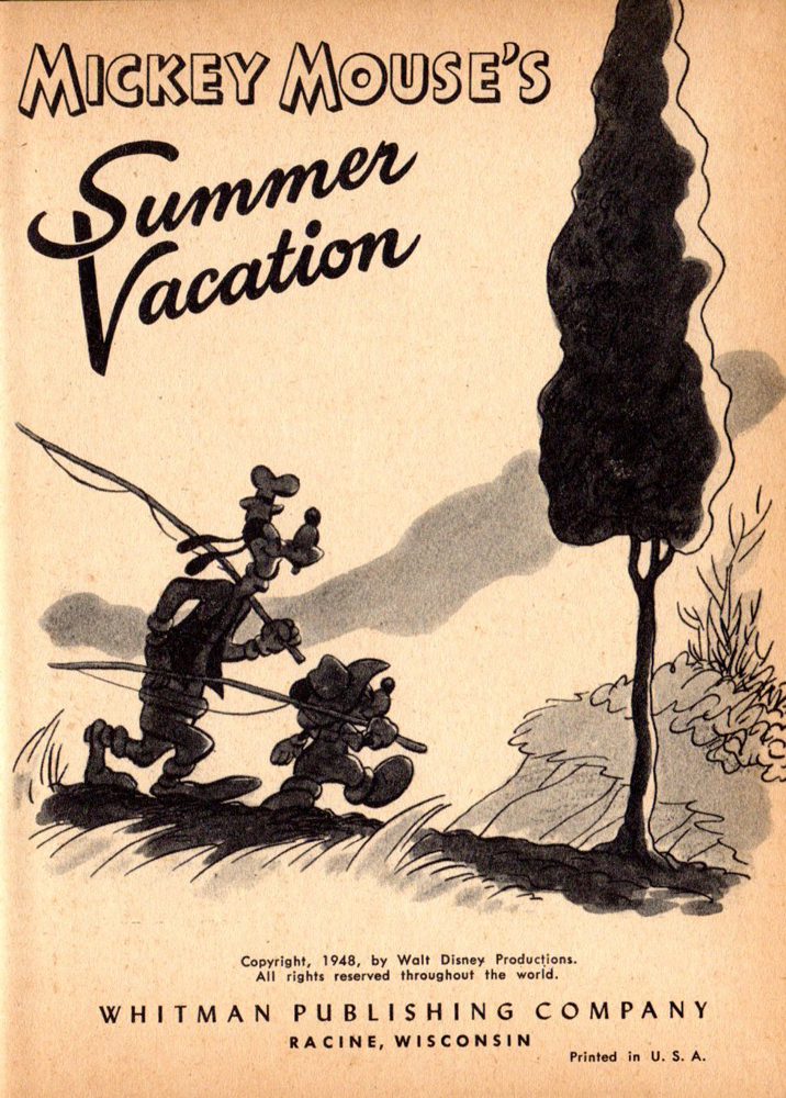
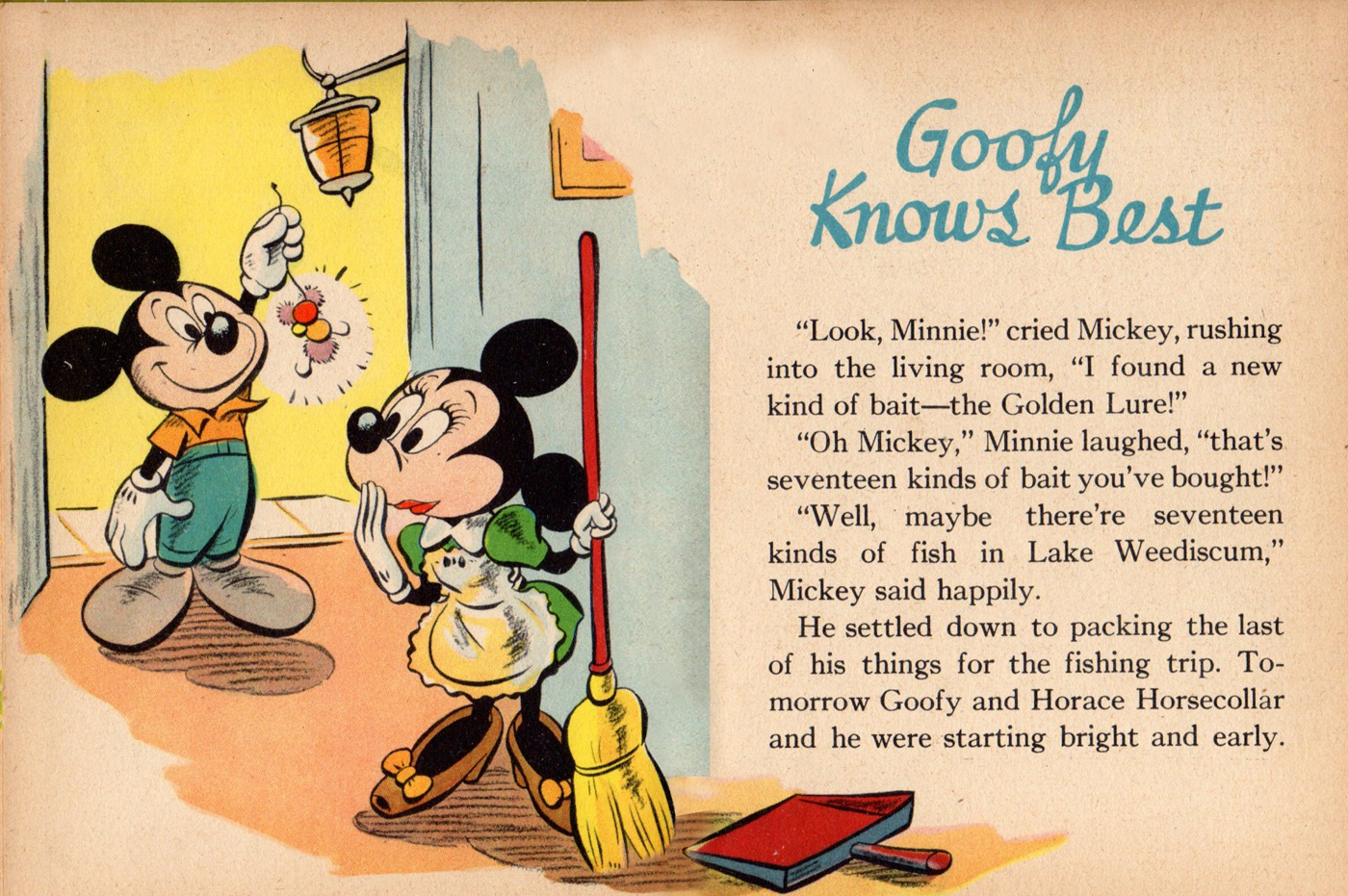
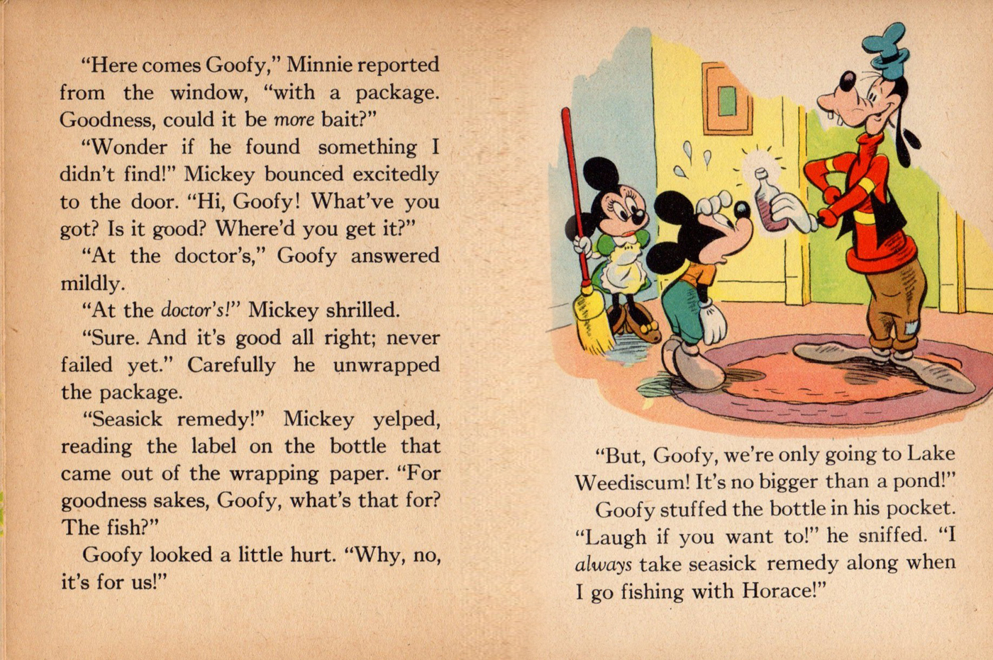
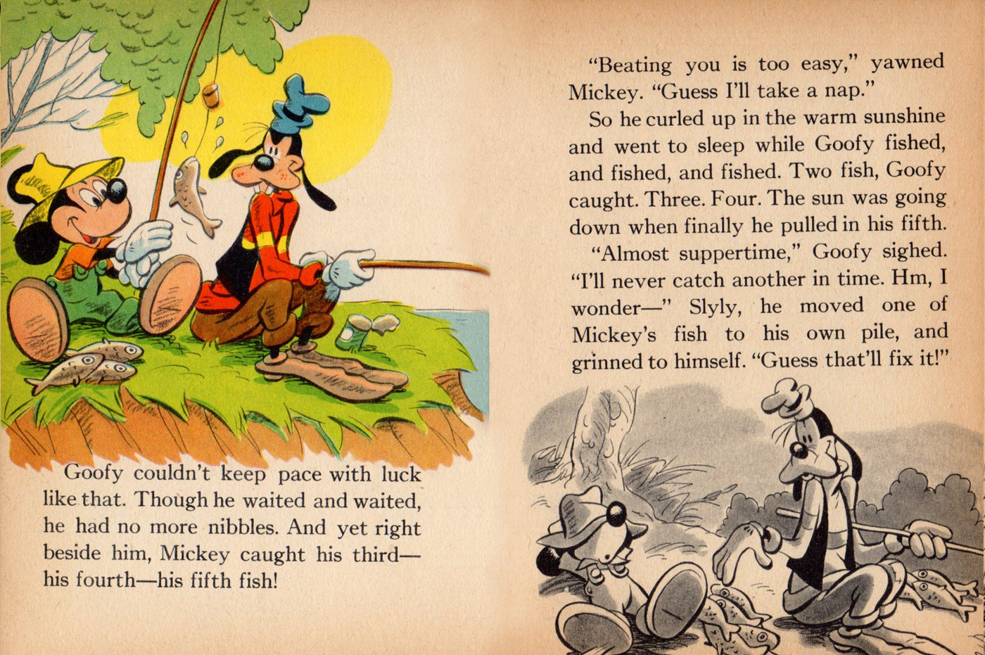
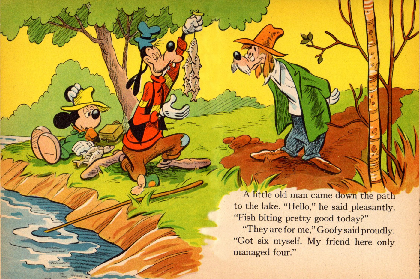
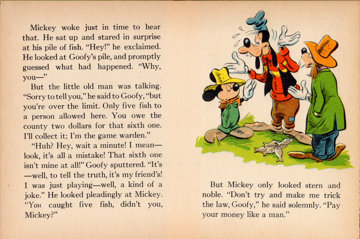
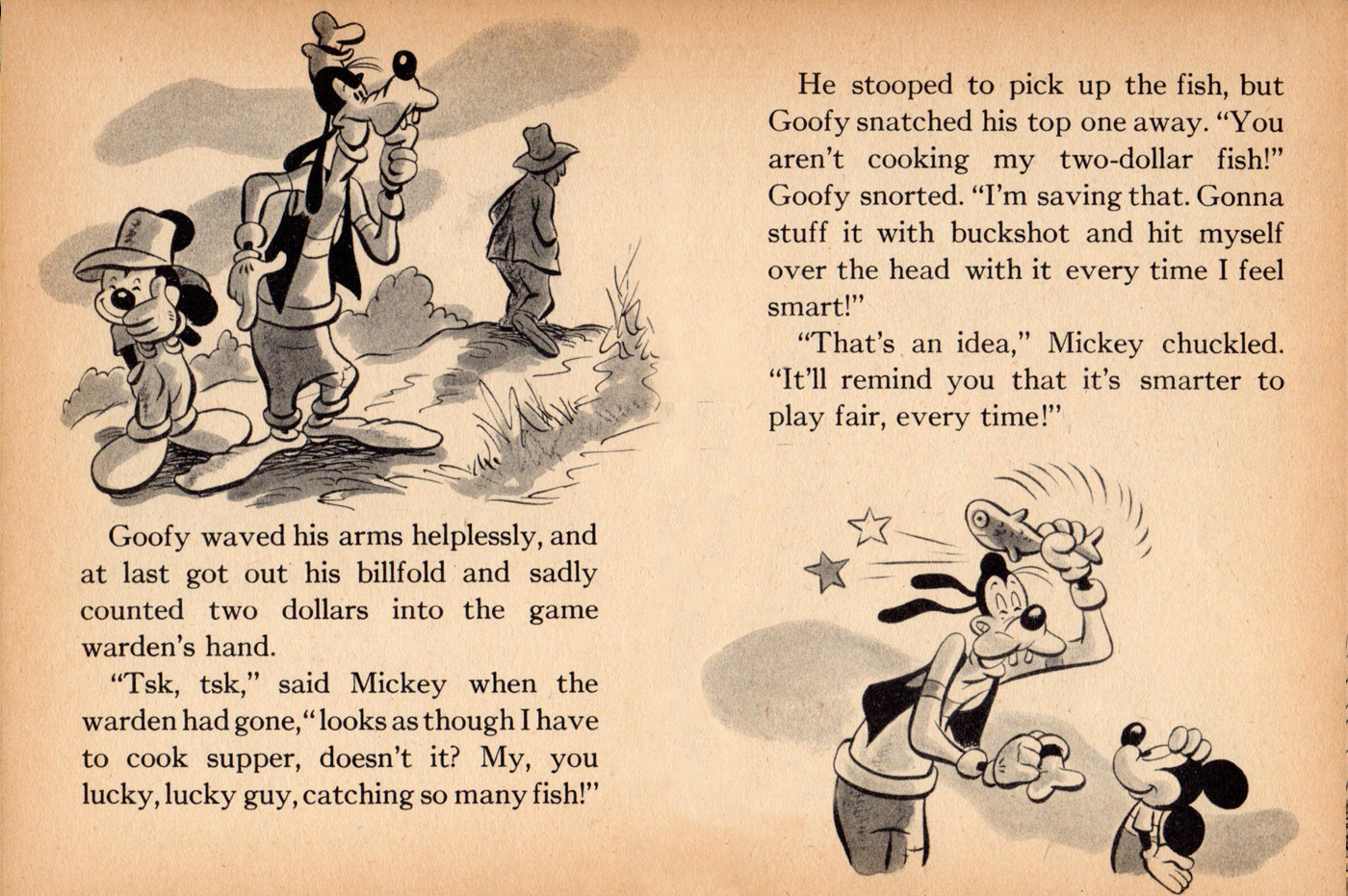
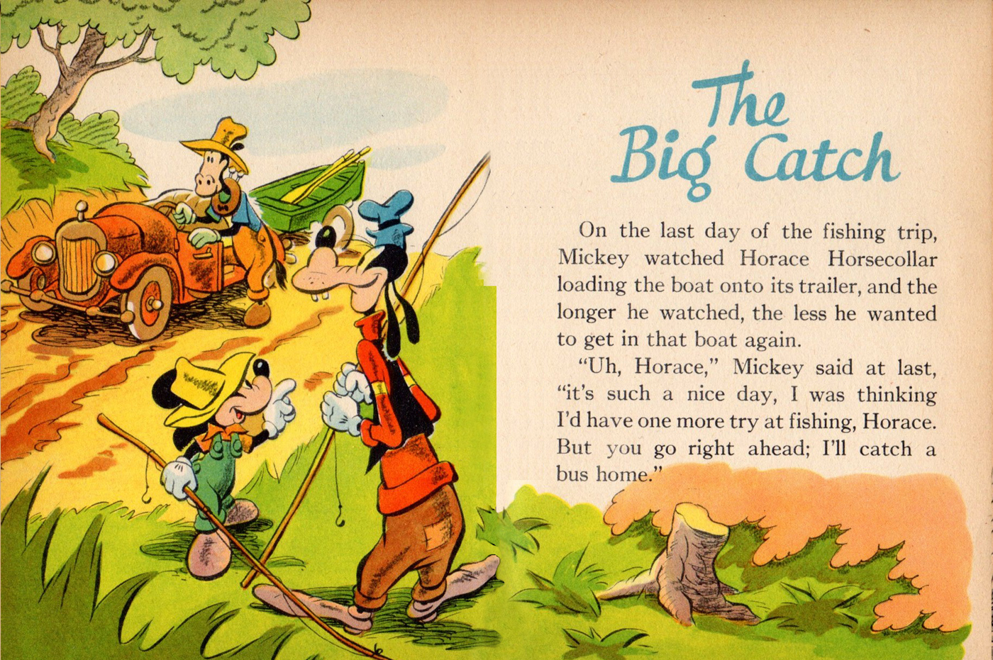
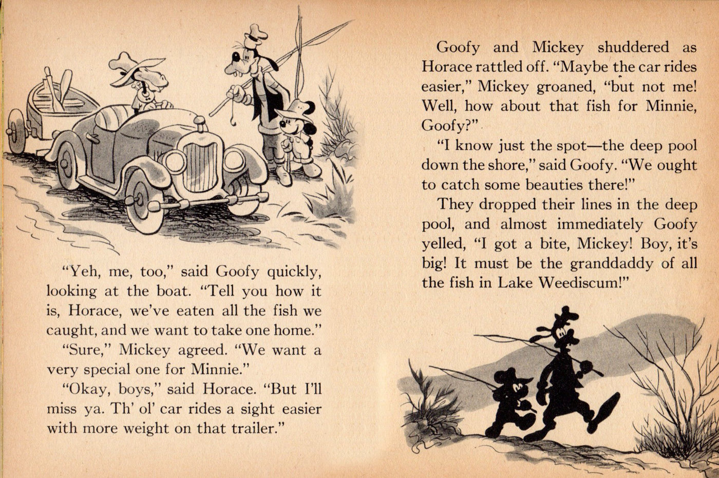
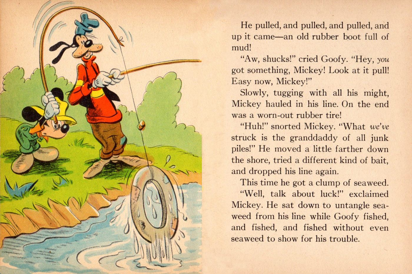
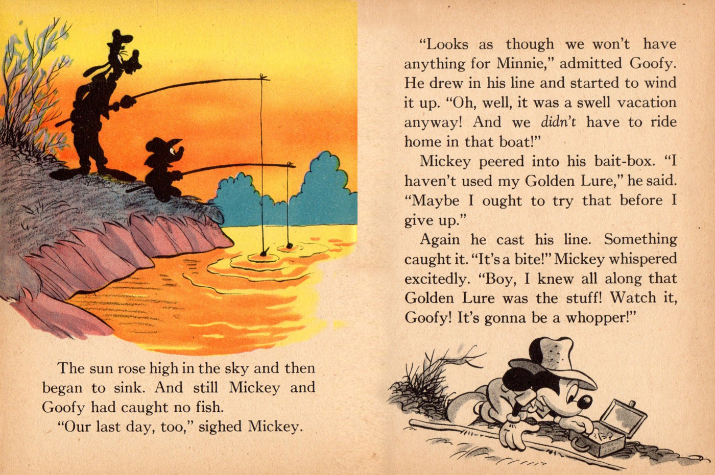
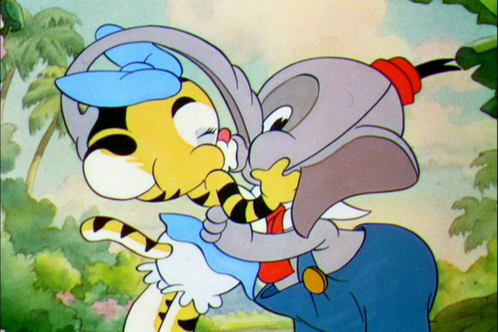
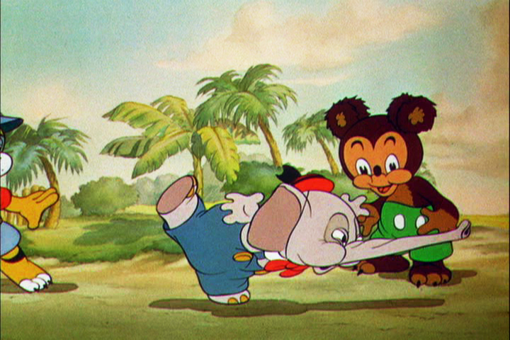
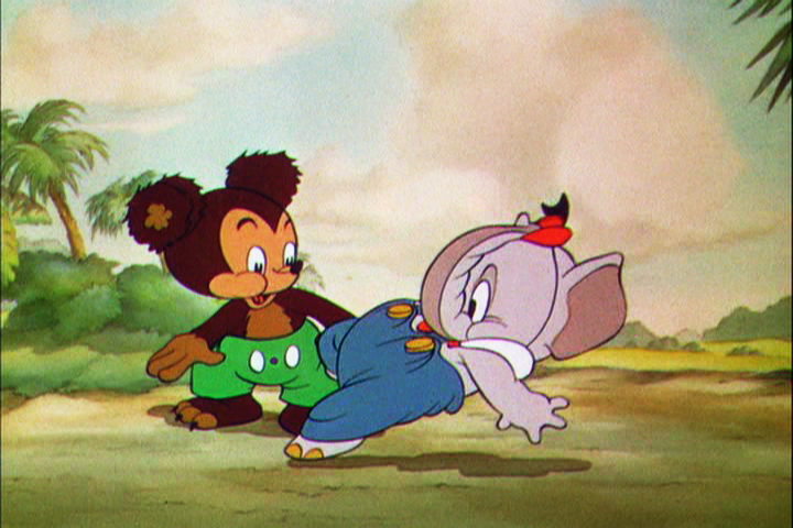
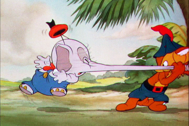
- The ugly: This is meant and said in only the most positive way. Here we have a 1948 Mickey Mouse children’s book that was illustrated by Dick Moores during his sixteen year tenure at Disney’s comic book and comic strip department. His style in the book might not be as “slick” as the great Disney print guys of the day, but Moores brought a wonderful, heartfelt “folk artist” quality to this book that he always gave to all of his endevours.
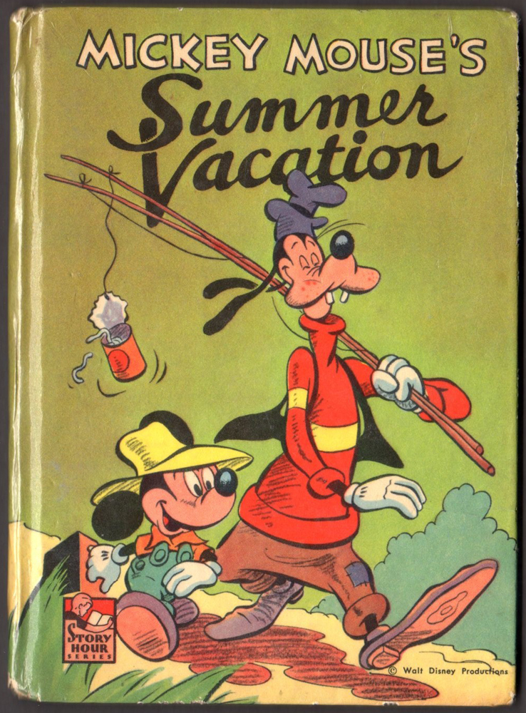
The front cover
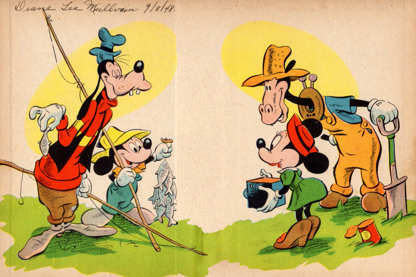
The end papers
Title page
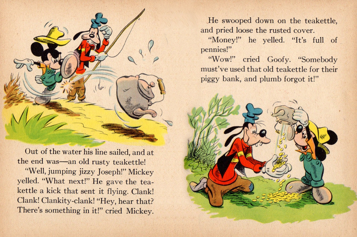
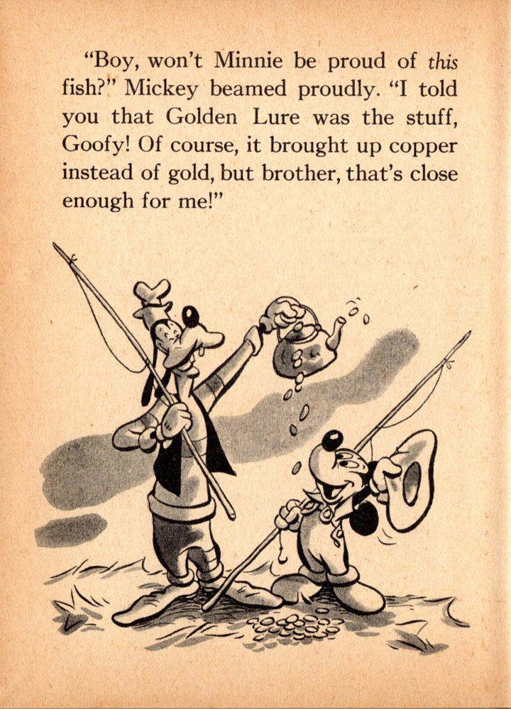
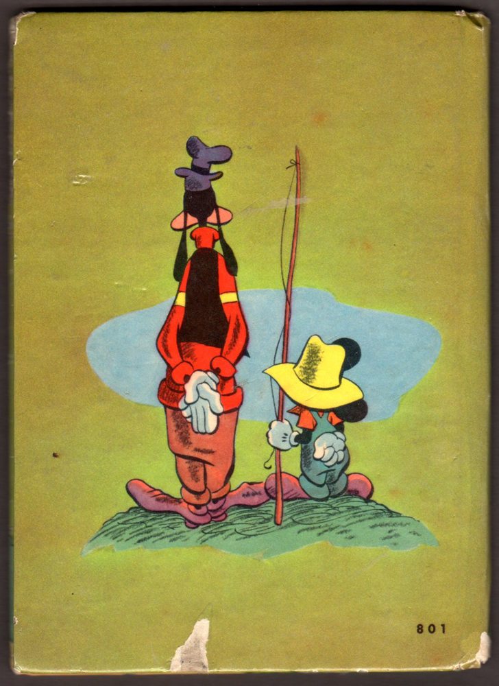
The back cover
Bill Peckmann &Comic Art &Disney 26 Oct 2012 05:53 am
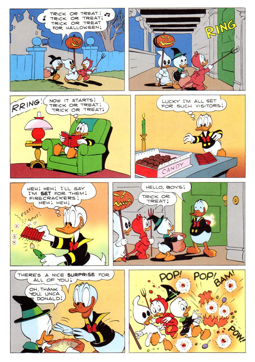
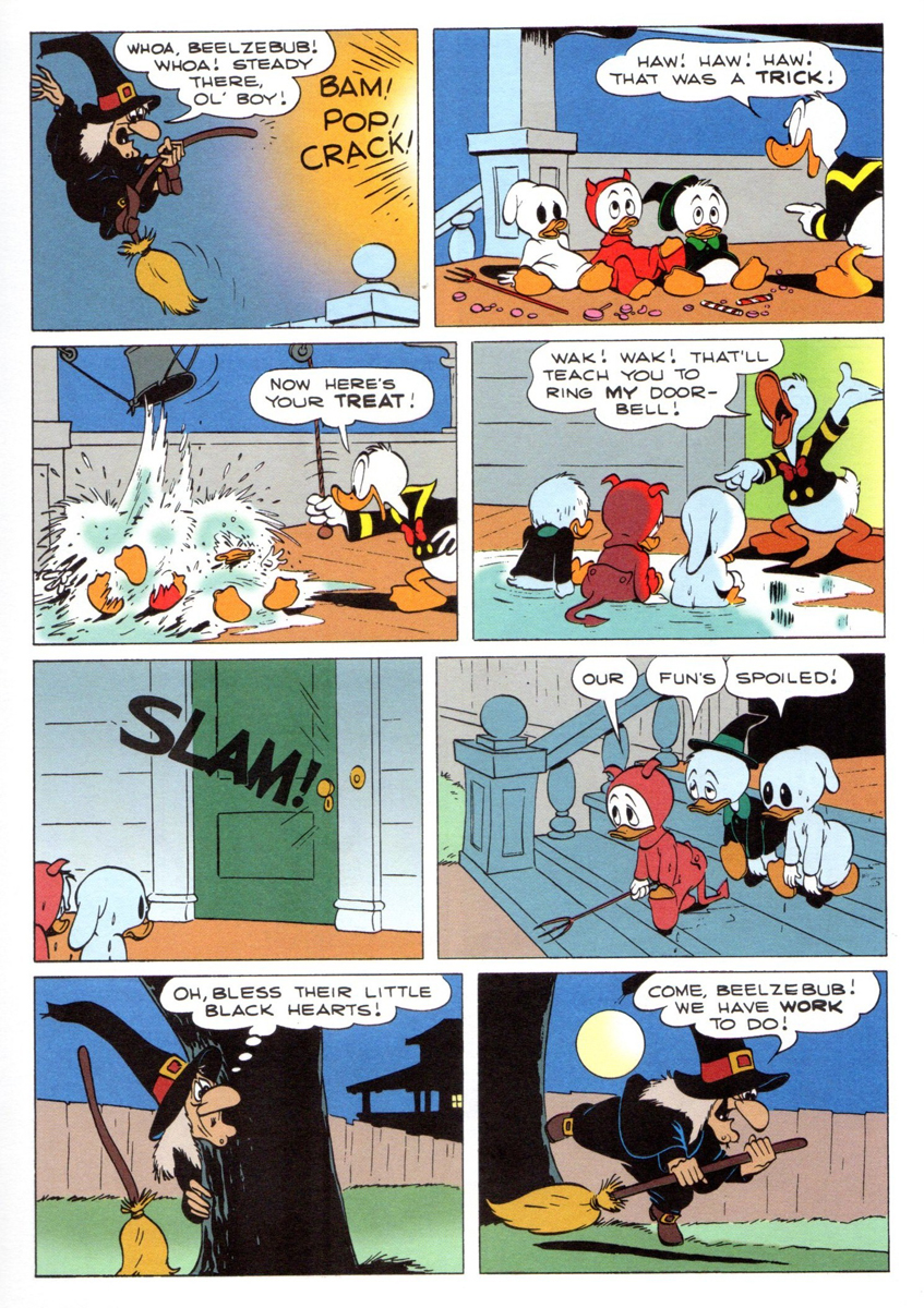
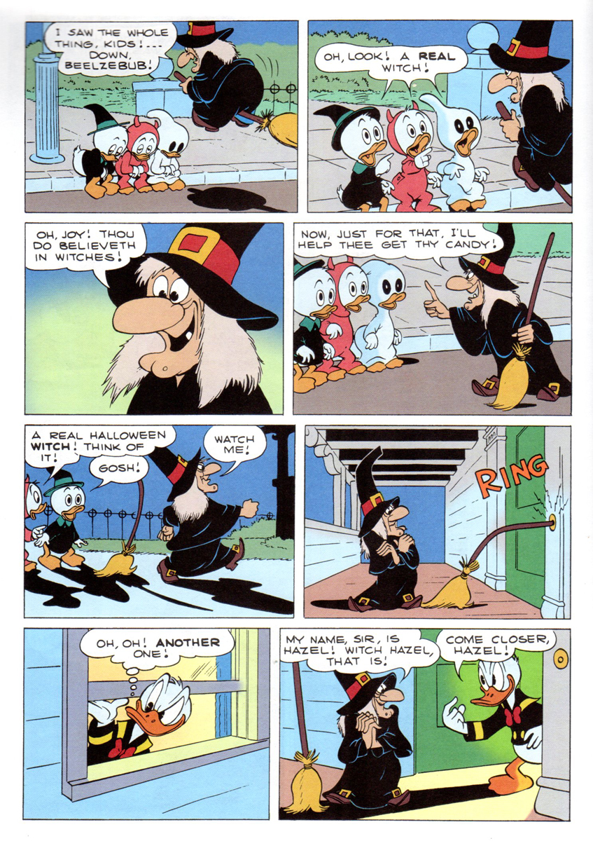
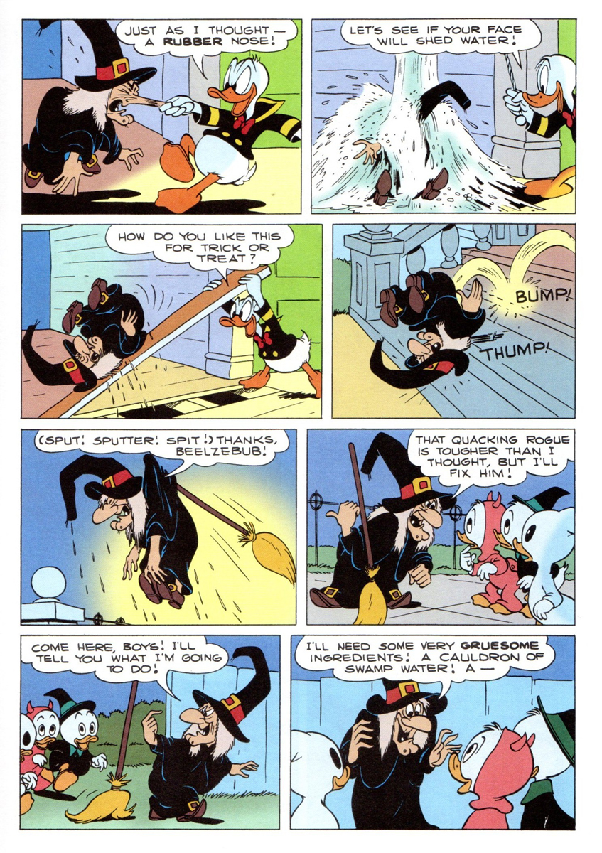
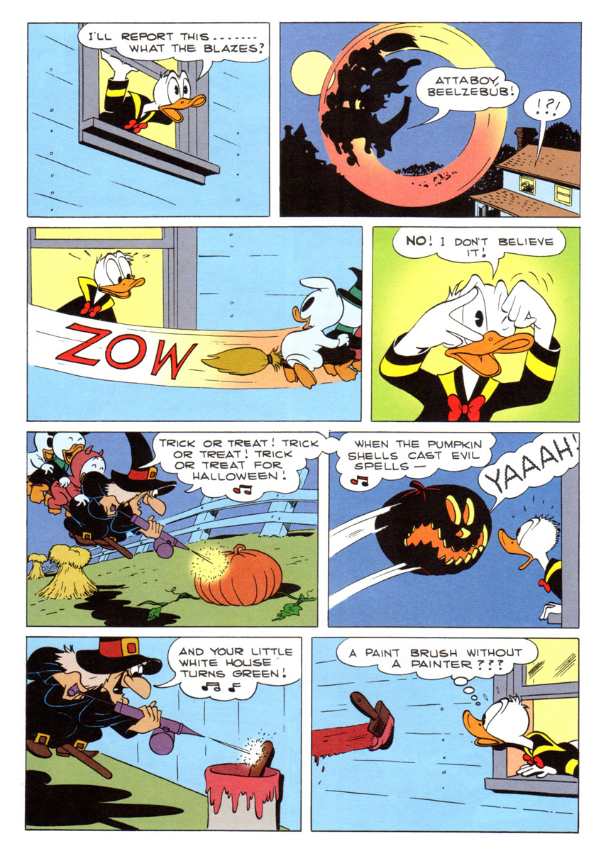
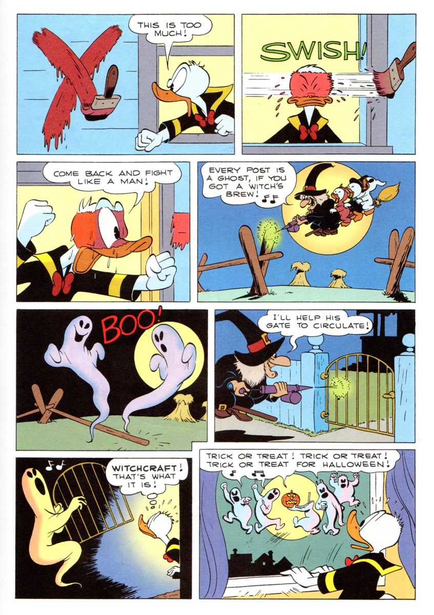
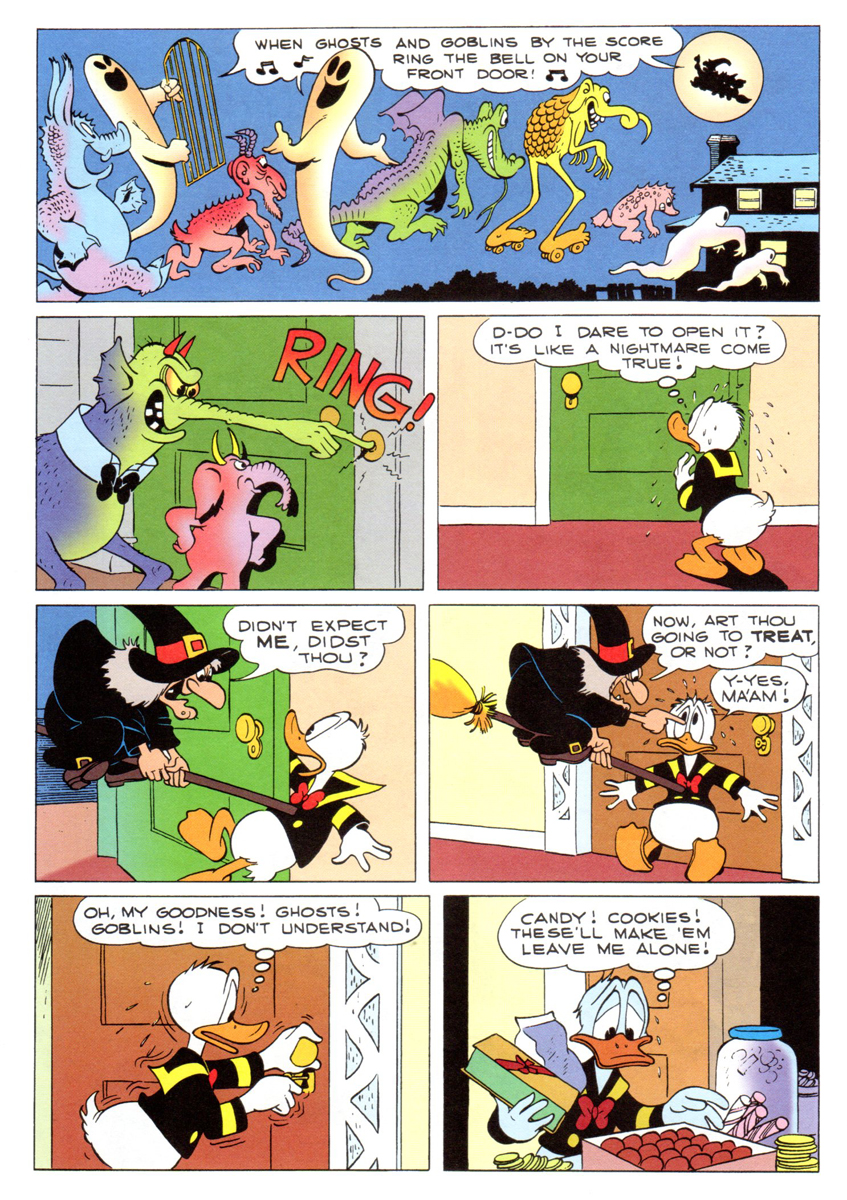
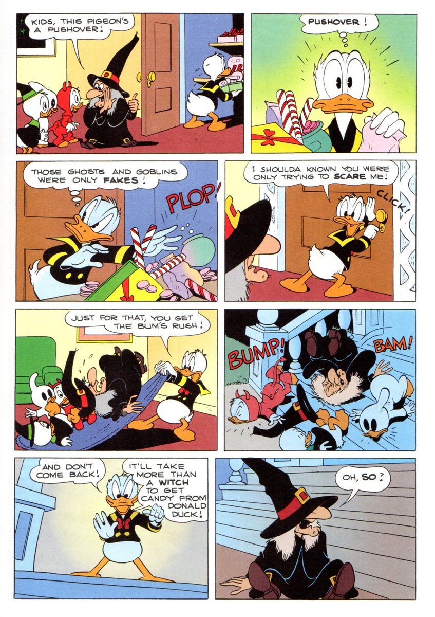
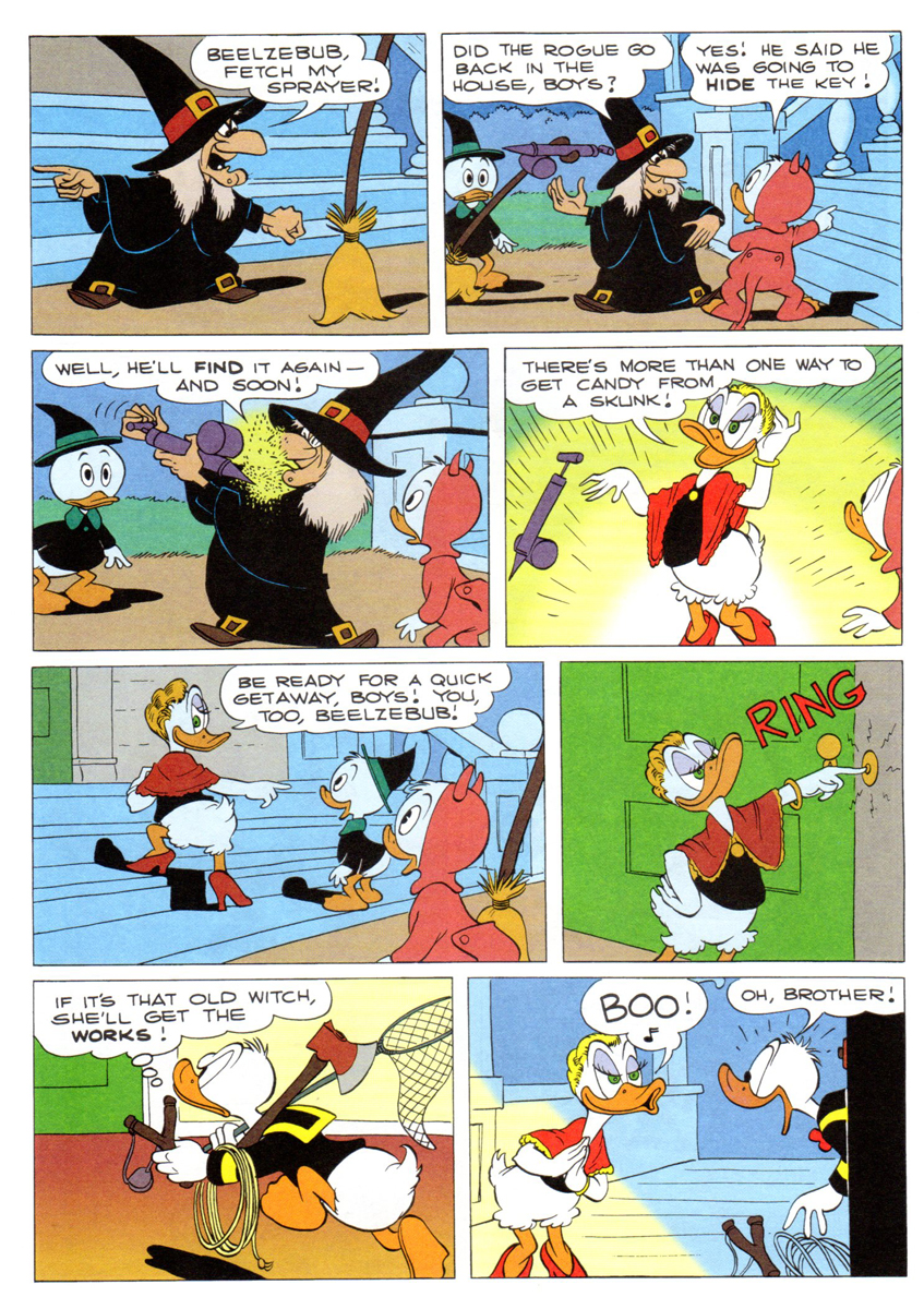
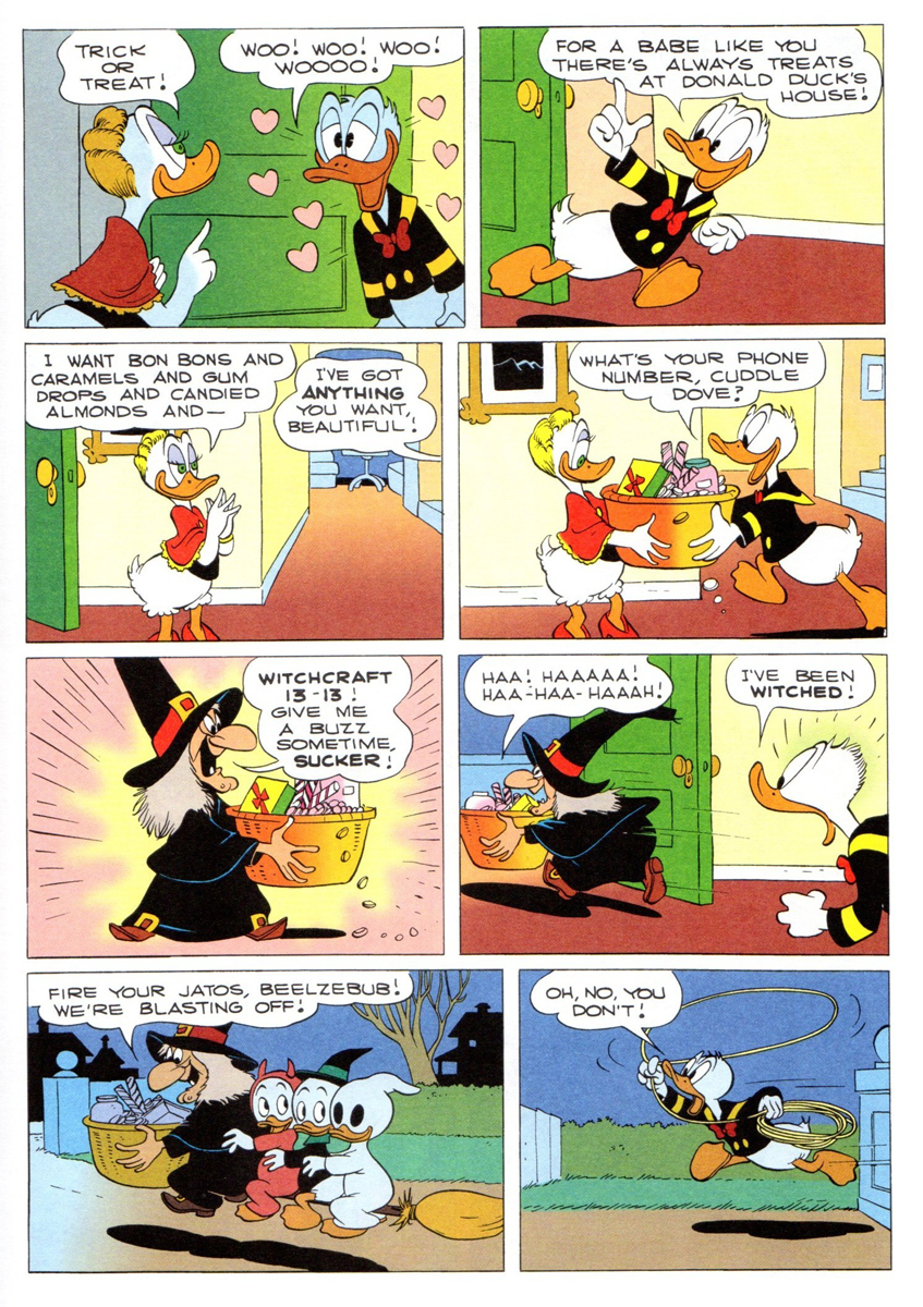
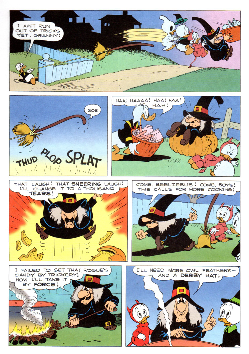
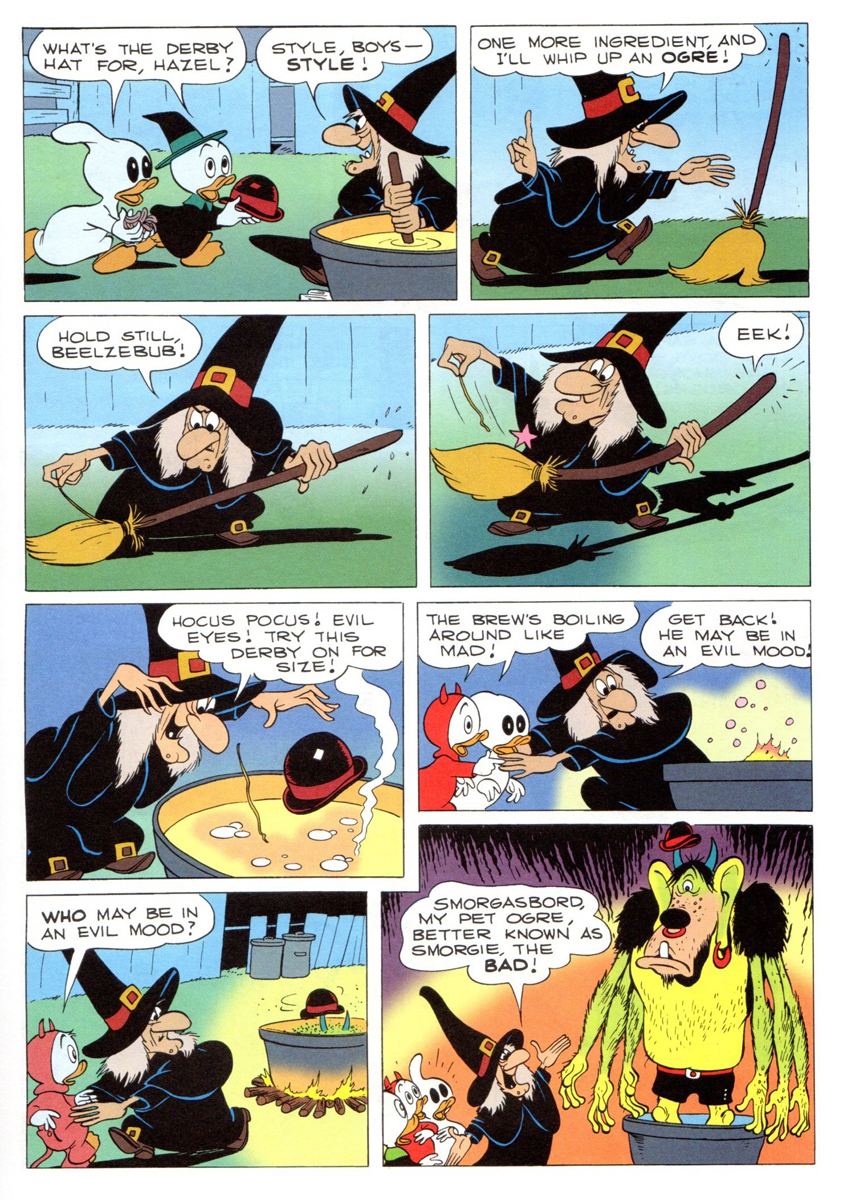
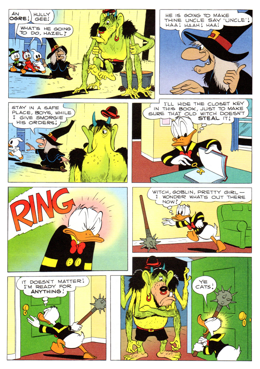
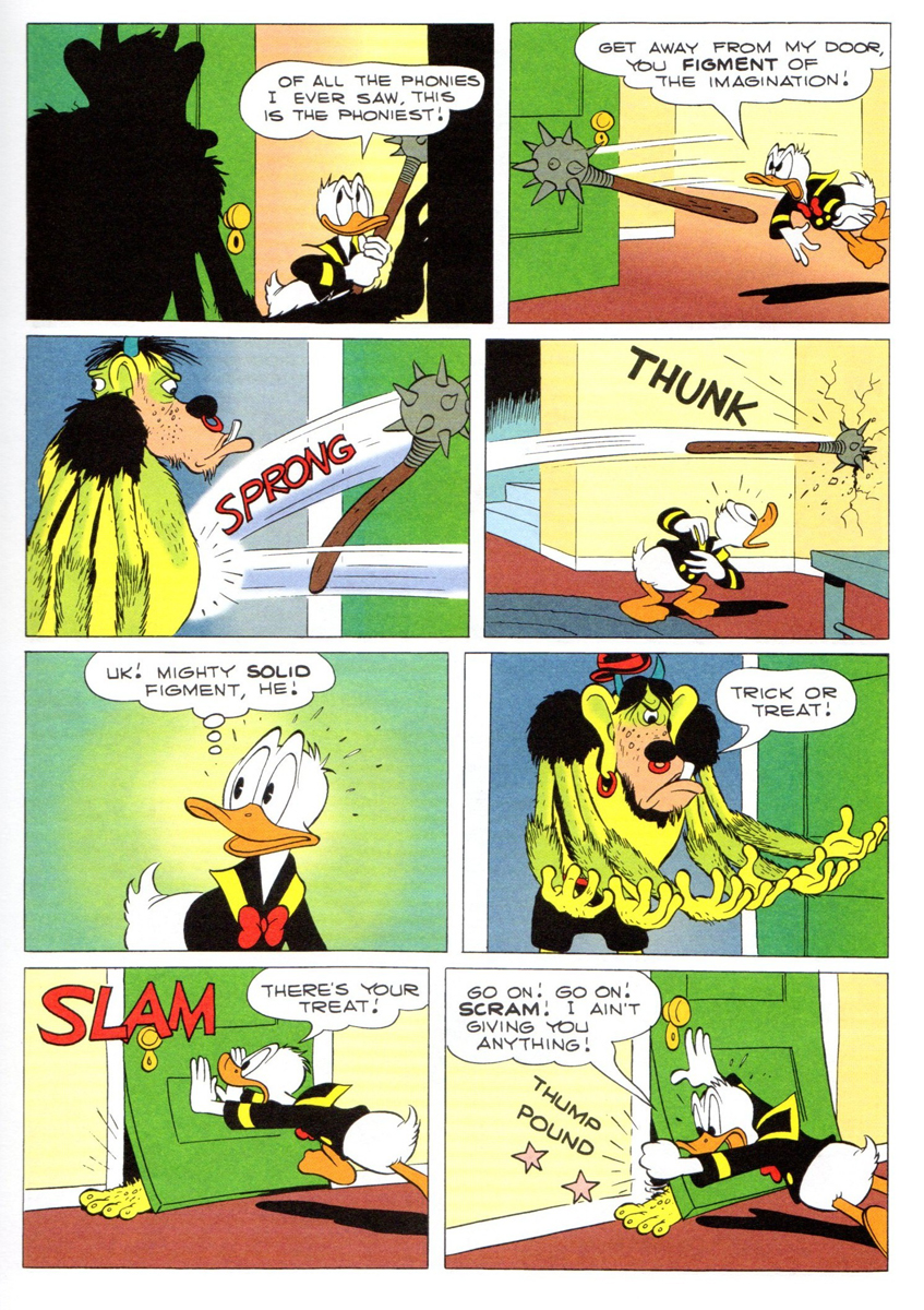
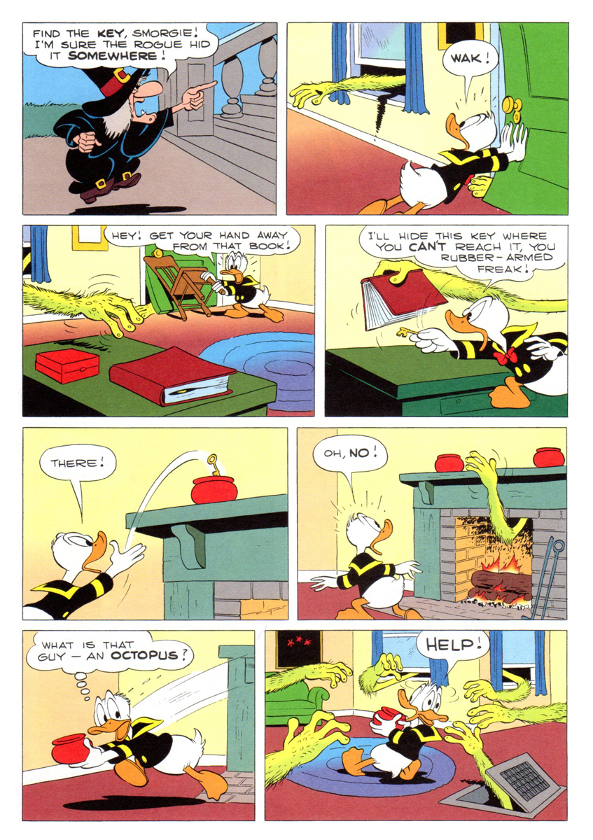
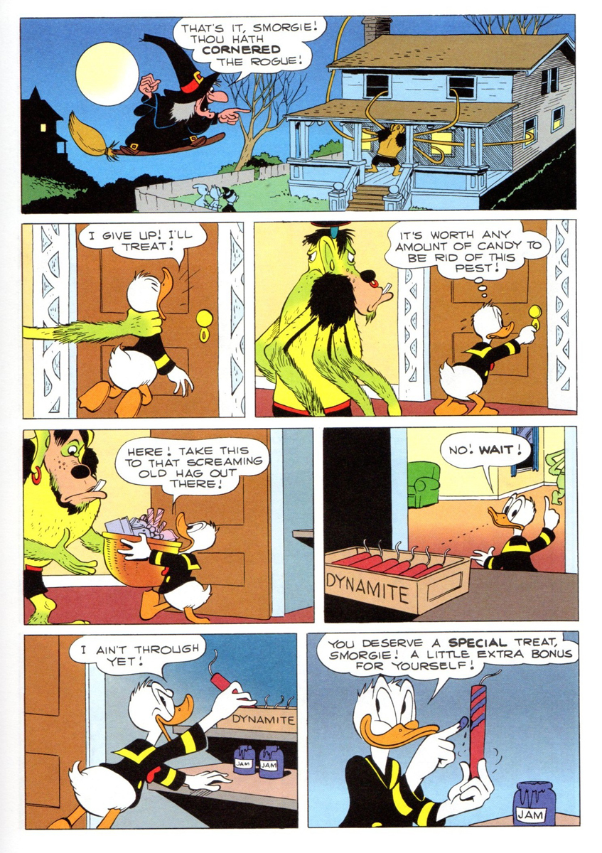
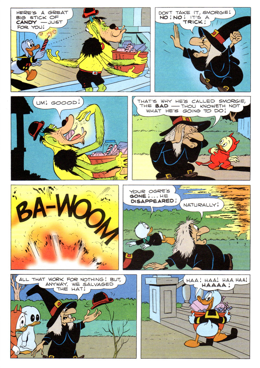
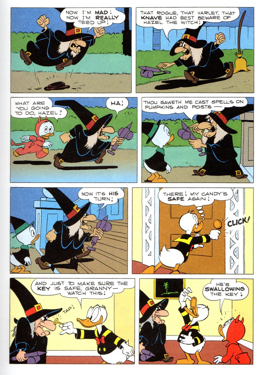
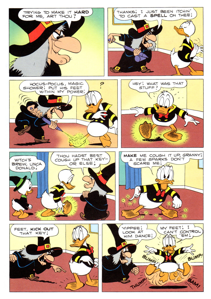
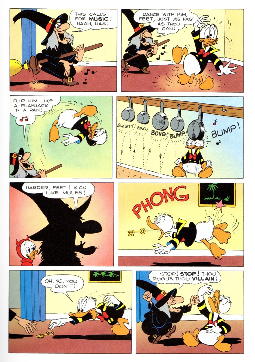
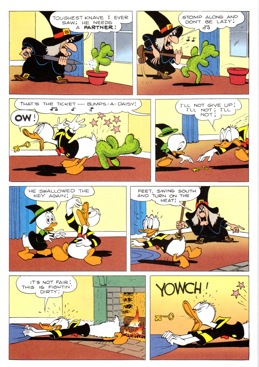
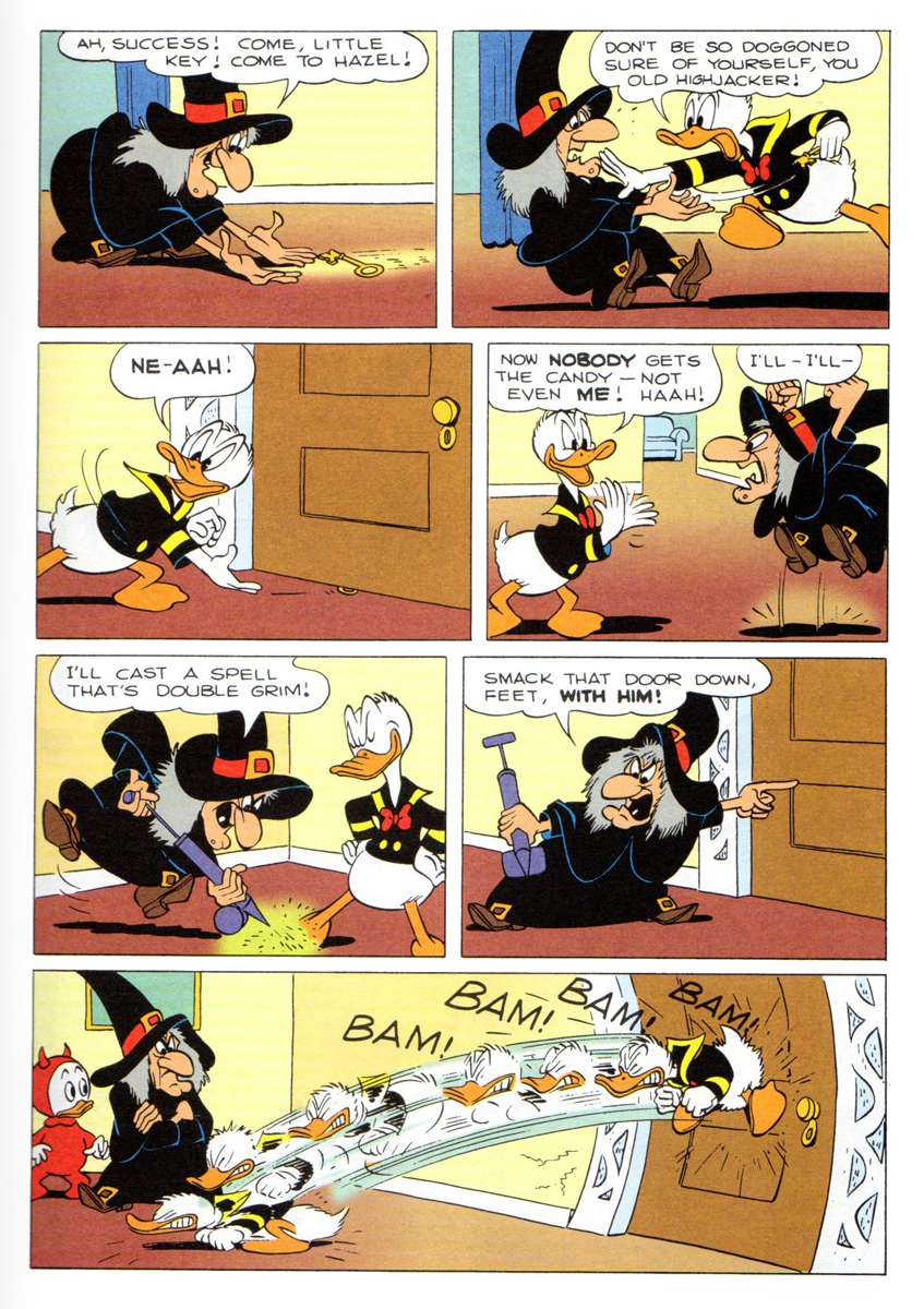
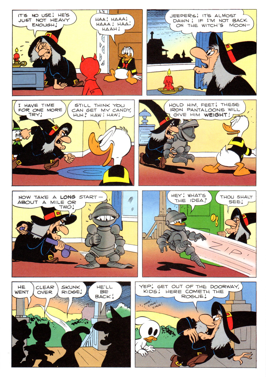
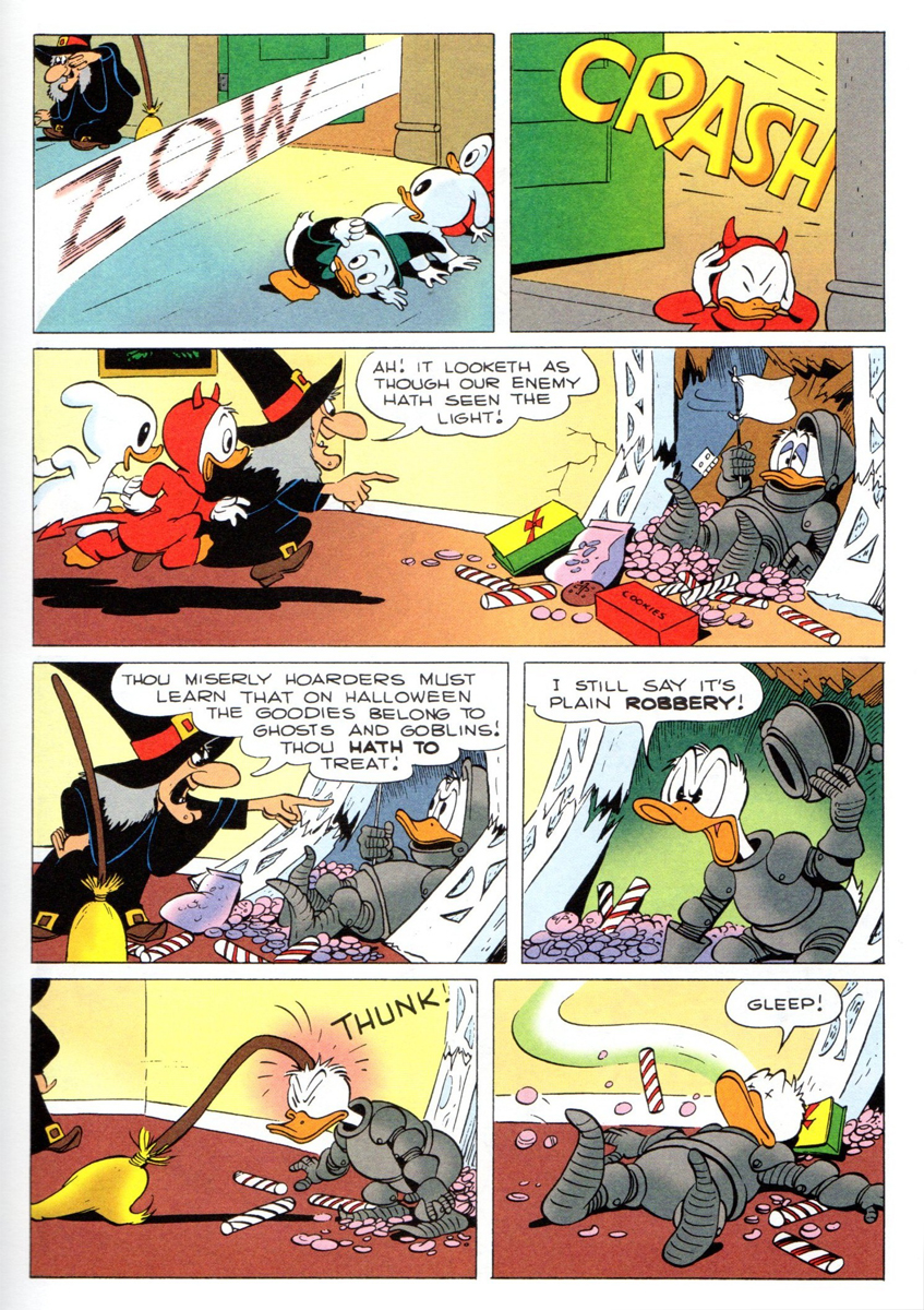
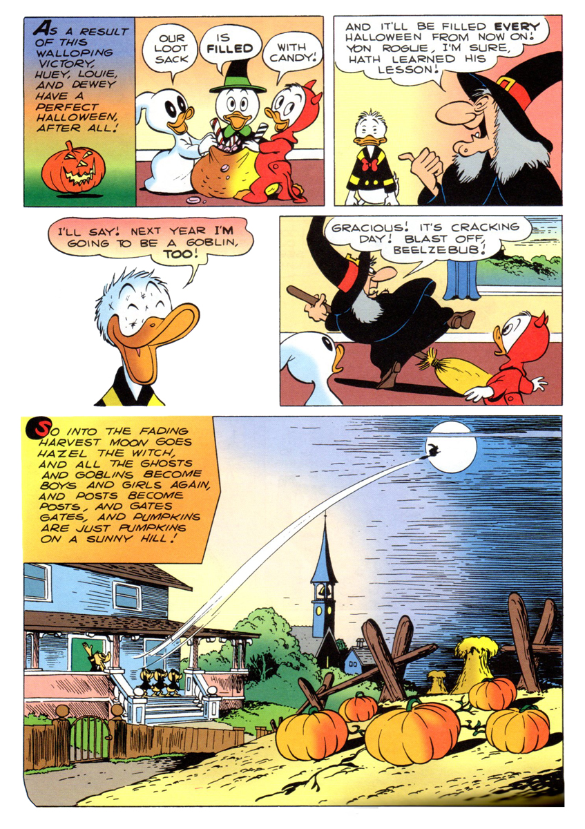
Trick or Treat à la Barks
Note: This is a long post. I was going to post it the day before Halloween, but I thought I’d give you something to do – revisit this classic comic – over the weekend. Happy Halloween.
 - I remember as a kid seeing the annual Halloween show on the Wonderful World of Color. Featured was the Donald cartoon wherein Hazel the Witch was introduced, Trick or Treat. Carl Barks went wild with this character and the premise, and it was a treat every year to get the new Donald story featuring the great character. (All that was missing was June Foray’s great voice. But I could play that in my head when I read the comic book. t was her first voice for Disney and her big break into animation voices. She started with a homerun; a classic the first time out of the box.)
Bill Peckmann has forwarded scans of the following story. Here’s his introductory words to the piece.
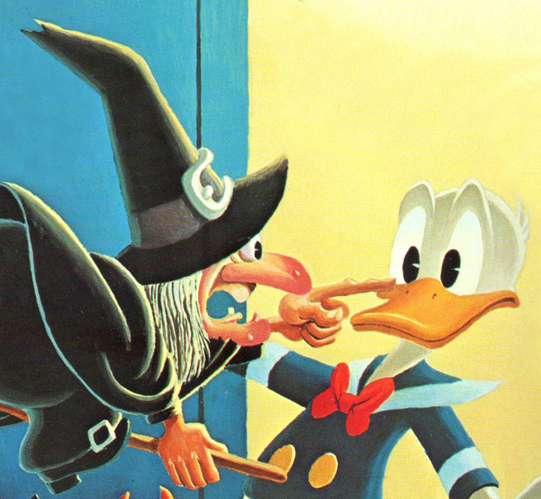
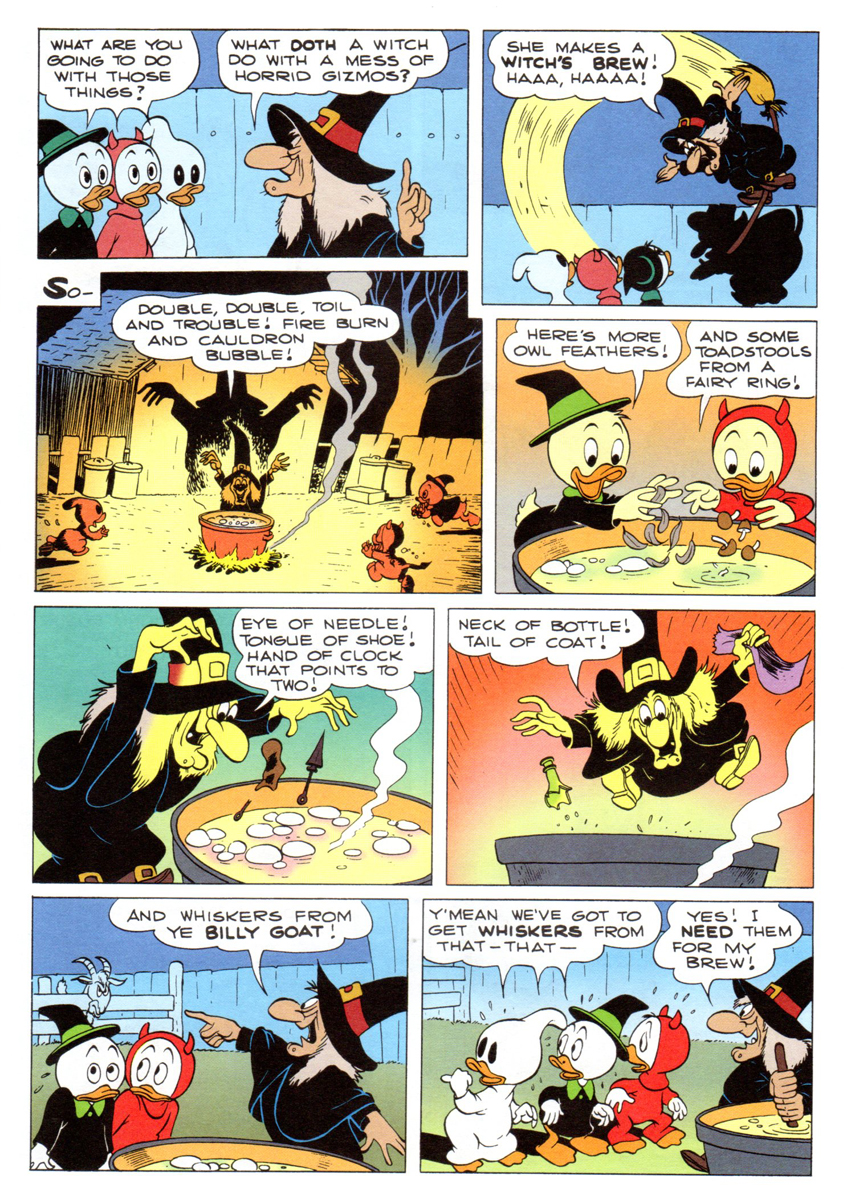
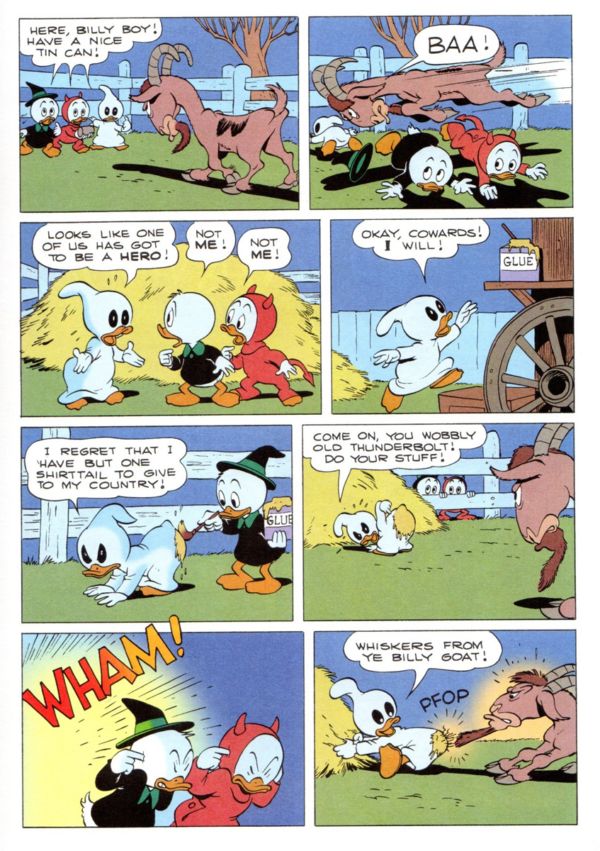
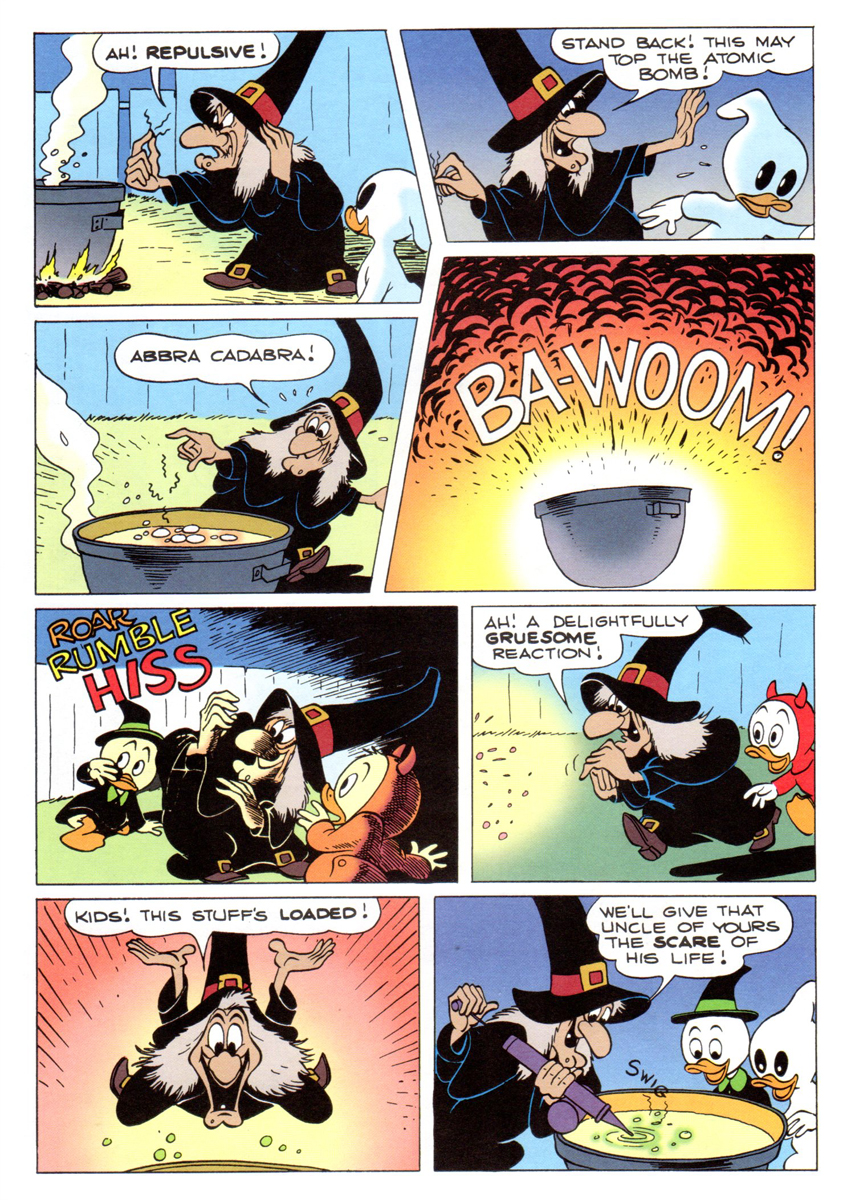
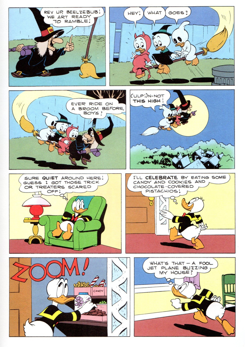
- In 1952 Carl Barks did a ‘Donald Duck’ comic book titled ‘Trick or Treat‘. It was a rare instance where a Barks story had its origins in a Disney Duck short. (Geoff Blum‘s excellent essay/history of the story at the end post will explain how the ‘Trick or Treat’ book came about.)
Here, with no tricks and all treats is Carl being at the top of his game, this is the cover of the original 1952 Dell comic book.
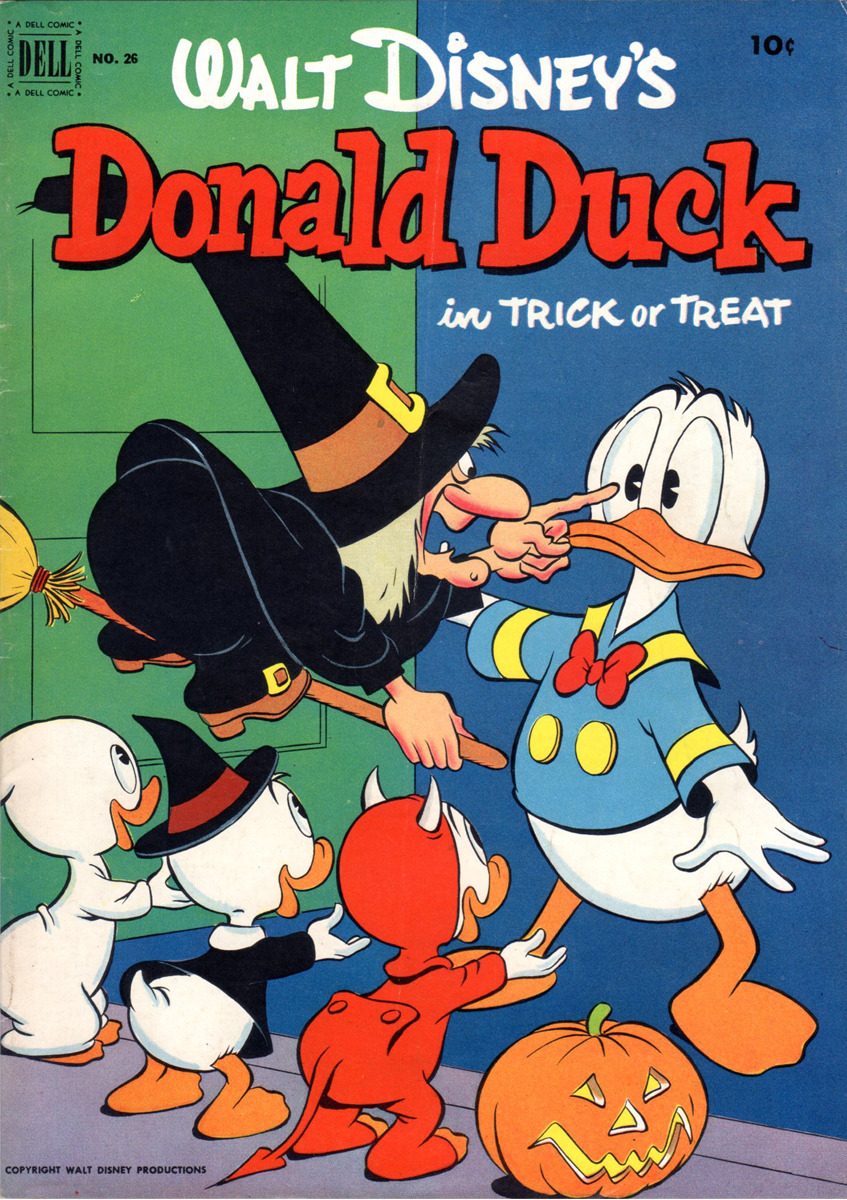
Comic book cover
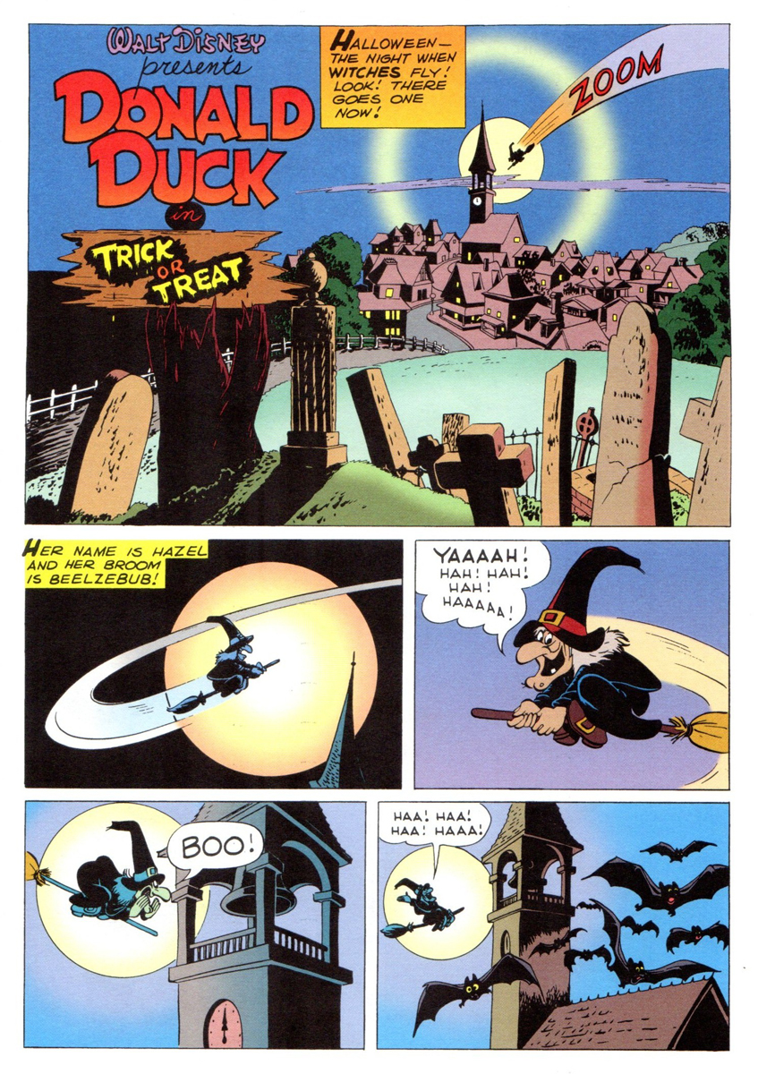 1
1
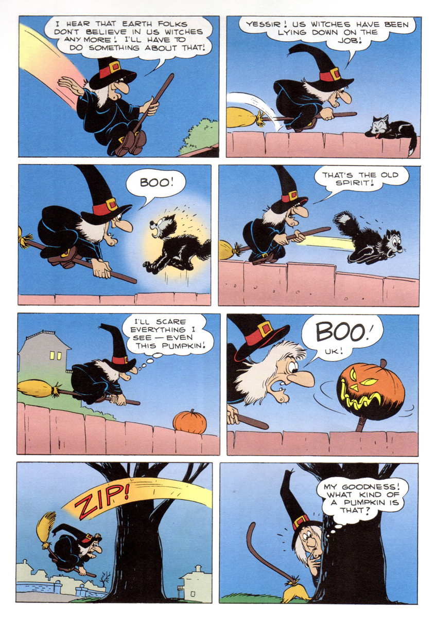 2
2
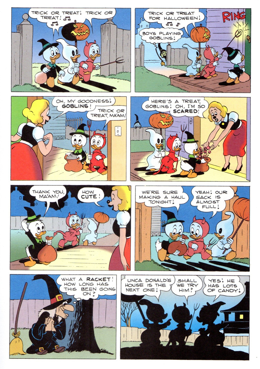 3
3
 4
4
 5
5
 6
6
 7
7
 8
8
 9
9
 10
10
 11
11
 12
12
 13
13
 14
14
 15
15
 16
16
 17
17
 18
18
 19
19
 20
20
 21
21
 22
22
 23
23
 24
24
 25
25
 26
26
 27
27
 28
28
 29
29
 30
30
 31
31
 32
32
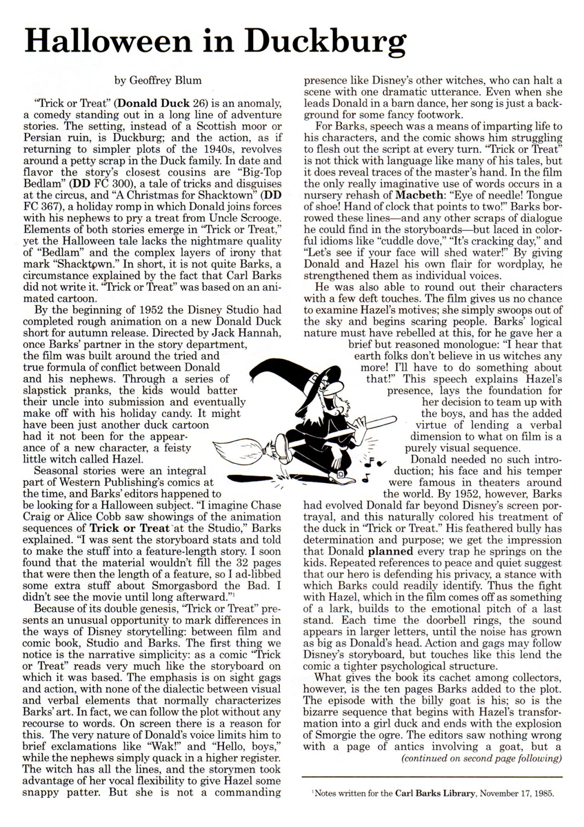
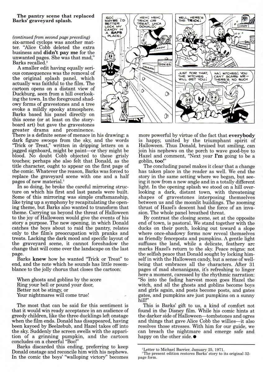
Here’s the article by Geof Blum writing about the genesis of this comic book story adapted from the animated short.
 33
33
(Click any image to enlarge to make it legible.)
 34
34
There’s a good post about the color of this strip for the Gladstone publishing version of Trick or Treat. Posted are a number of color guides for that version.
Finally, here’s Carl Barks’ oil painting based on the artwork for his classic comic book.
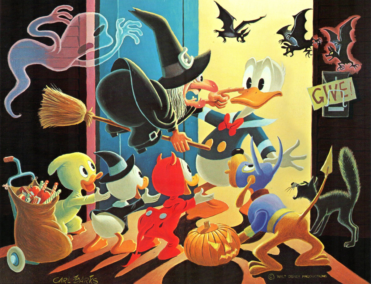
To be honest, I think this is the best of this series of oil paintings that Barks has done. It doesn’t feel like something overworked and trying too hard. It just captures the spirit of the original magazine as well as the spirit of the animated short from which it was adapted. Not only a Barks gem, but a Disney gem as well.
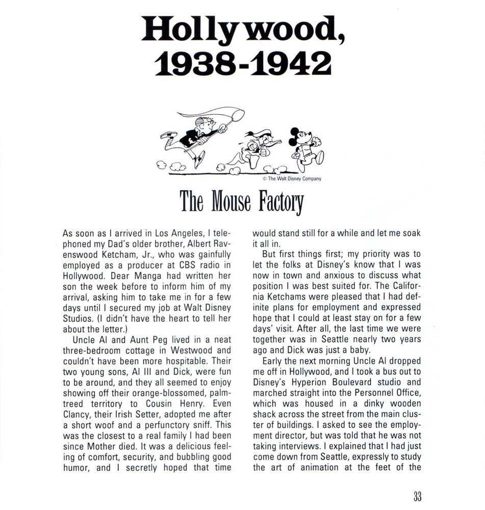
Animation &Bill Peckmann &Books &Comic Art &Disney &Illustration 19 Oct 2012 06:38 am
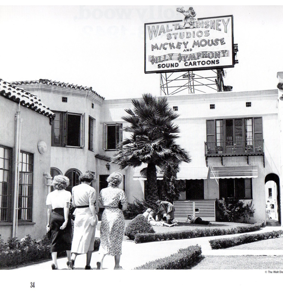
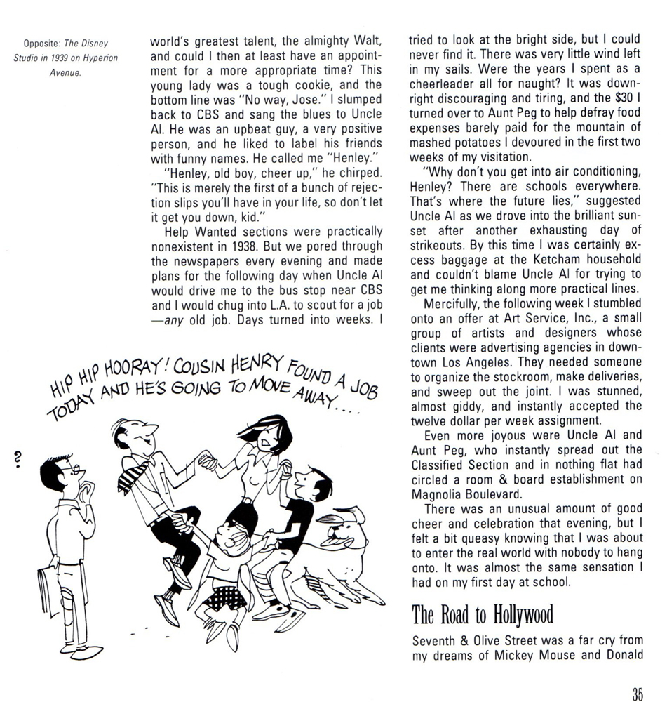
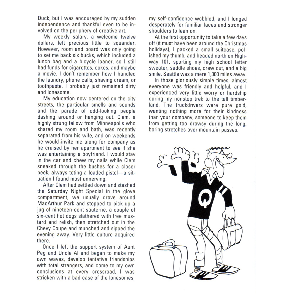
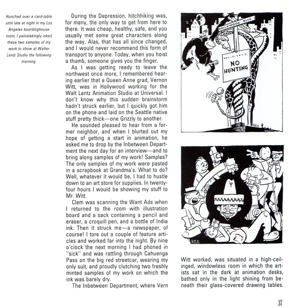
Hank Ketcham @ Disney – 2
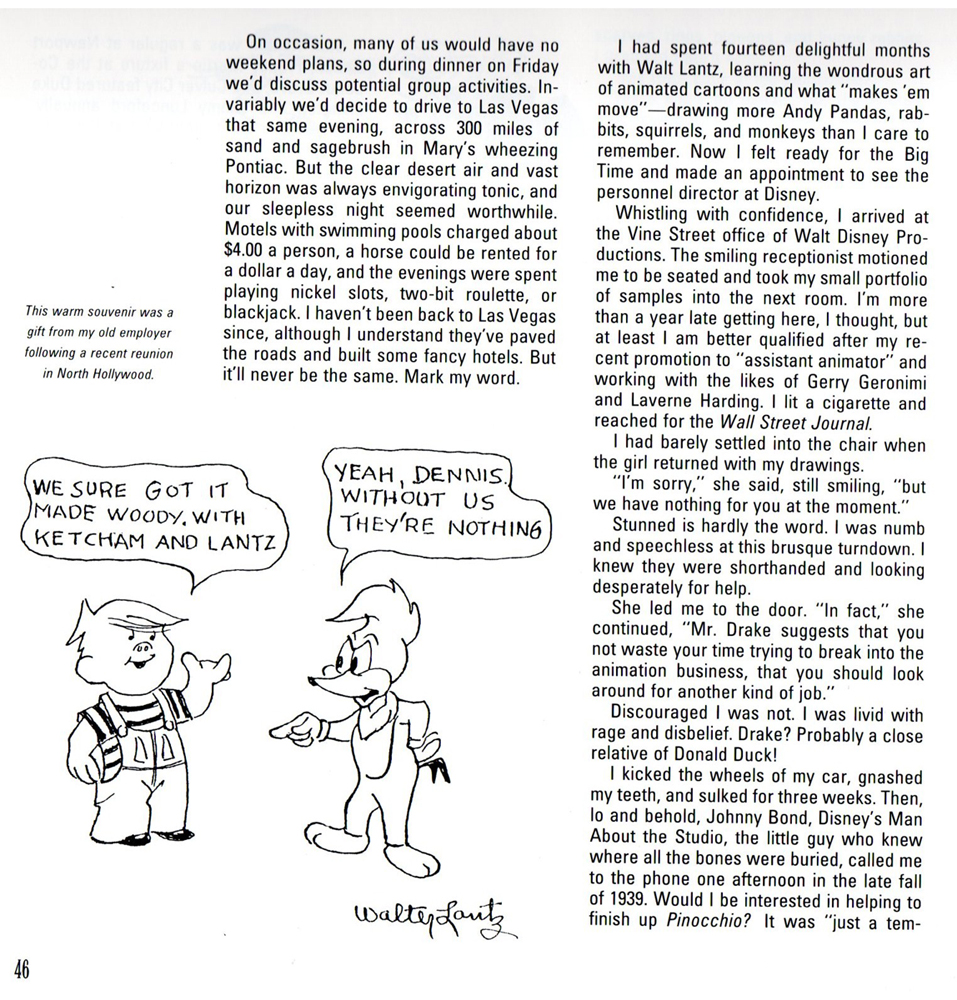
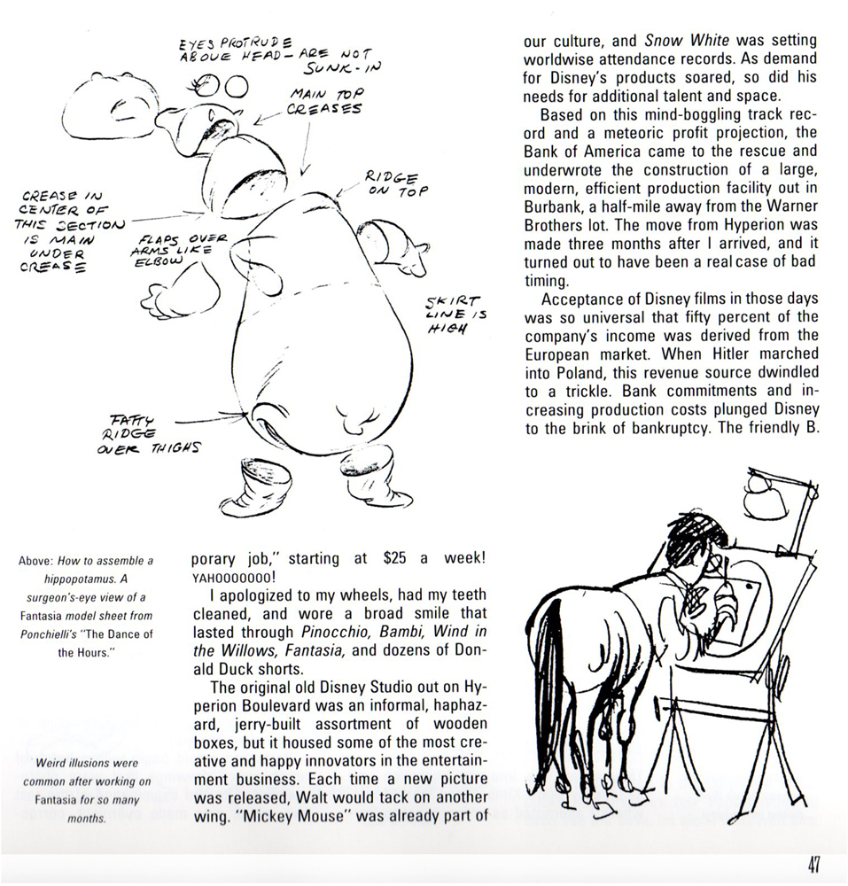
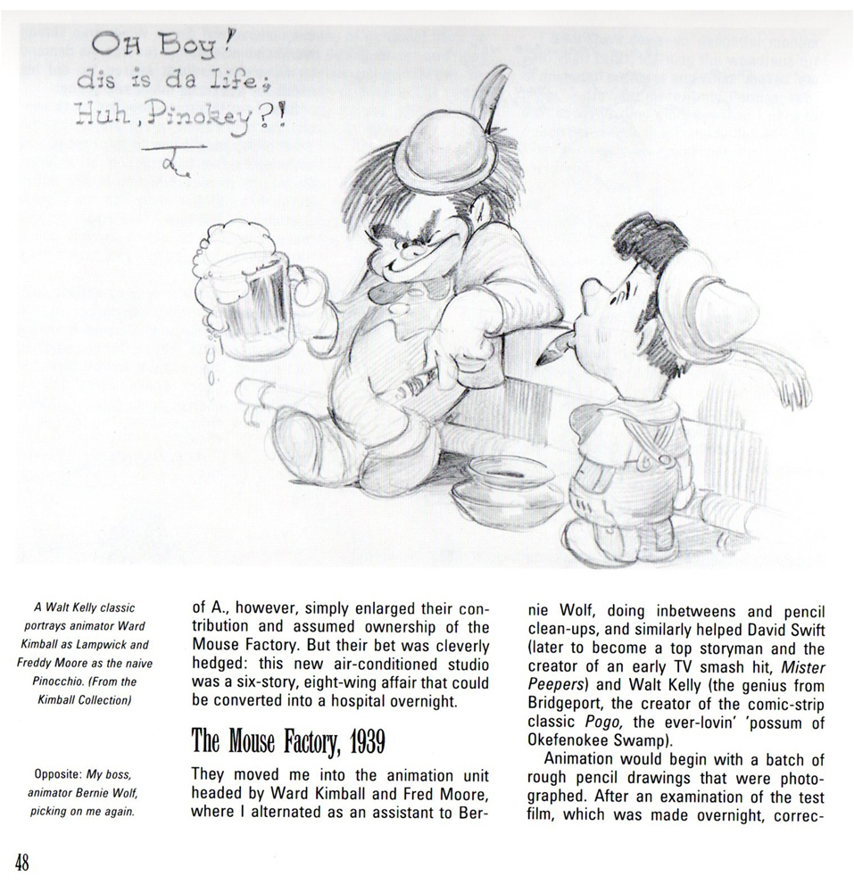
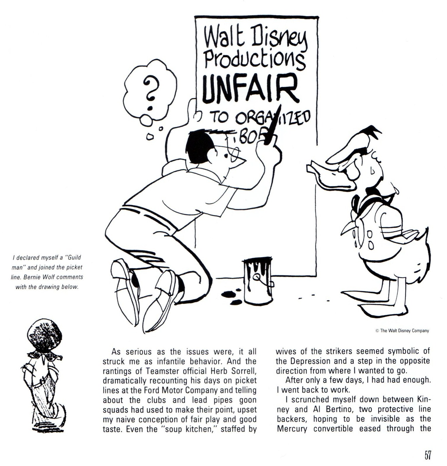
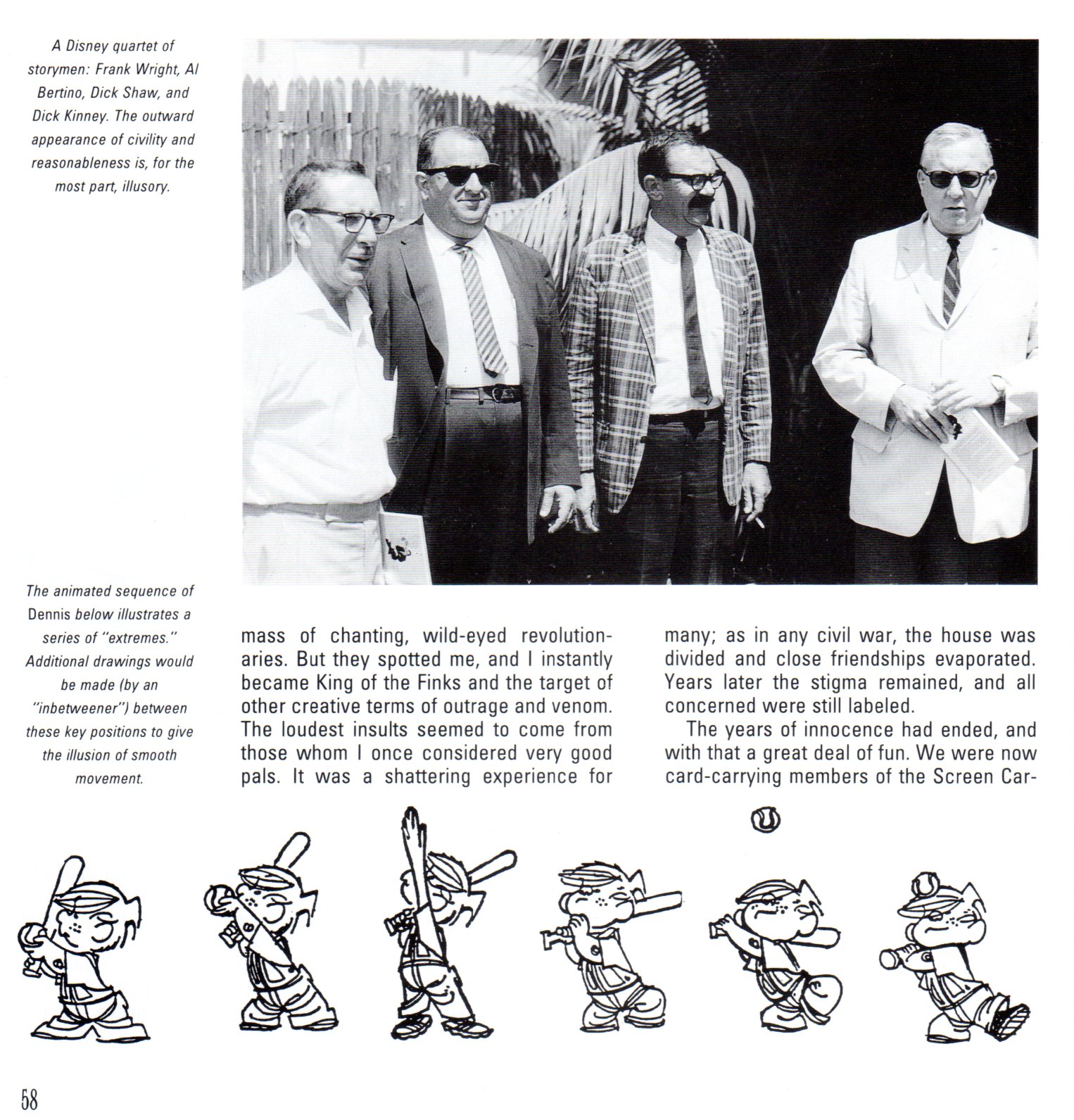
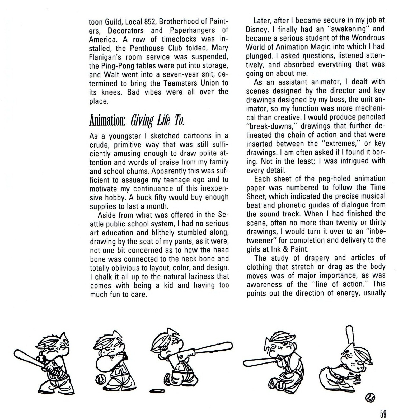
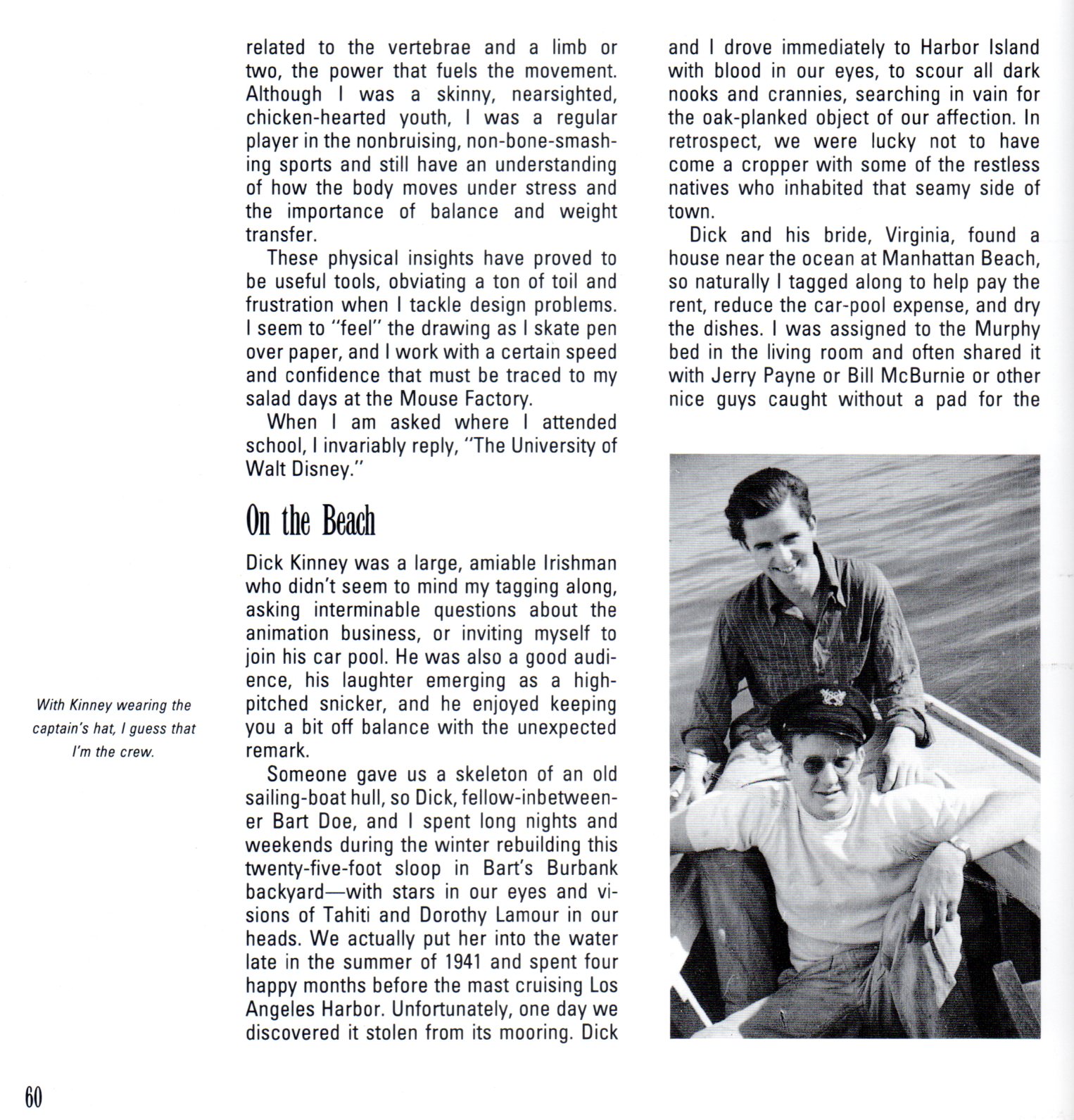
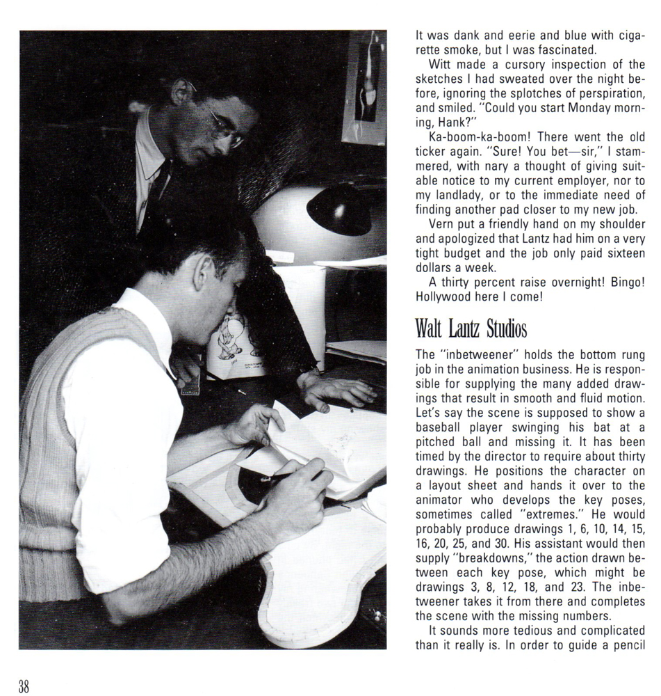
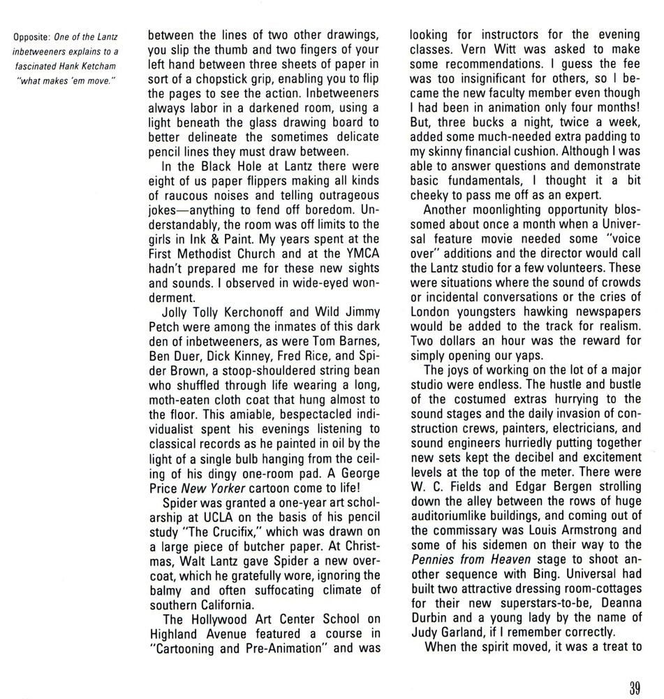
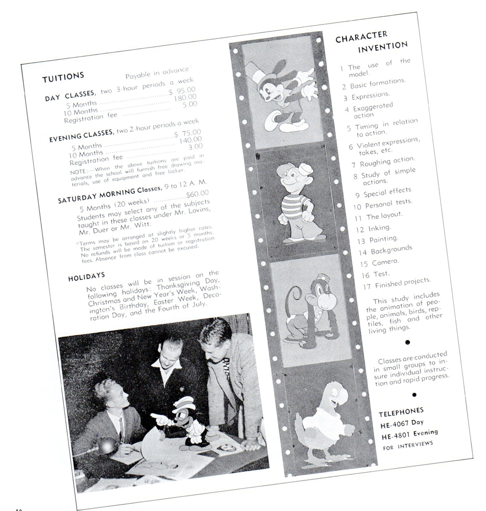
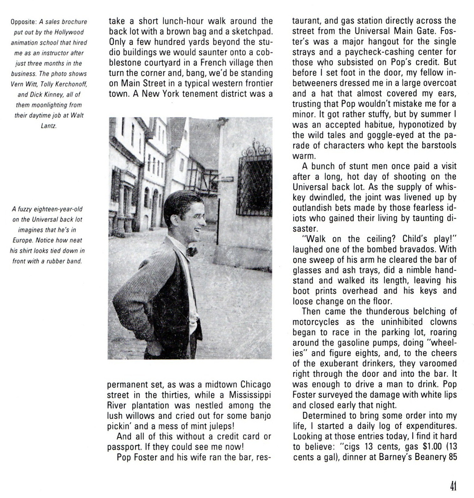
- On Monday I started posting this chapter from Hank Ketcham’s autobiography, The Merchant of Dennis the Menace: The Autobiography of Hank Ketcham. Bill Peckmann introduced me to this book, and the chapter I’m posting here. Many thanks to him for the scans.
This is the second half.
 18
18
 19
19
 20
20
 21
21
 22
22
 23
23
 24
24
 25
25
 26
26
 27
27
 28
28
 29
29
 30
30
 31
31
 32
32
 33
33
 34
34
 35
35
 36
36
 37
37
 38
38
 39
39
 40
40
 41
41
Articles on Animation &Books &Comic Art &Disney 15 Oct 2012 06:35 am
Hank Ketcham @ Disney – 1
- Bill Peckmann told me about Hank Ketcham’s autobiography, The Merchant of Dennis the Menace: The Autobiography of Hank Ketcham. I wasn’t aware of it. I learned that there was a chapter on his work at the Disney studio, and Bill said he’d scan it for me. So, I was pleased and excited and knew it’d be a great piece to post here. And it is.
So this is the first part of the book’s chapter, well worth the read. If you’re interested in the book, it’s still available on Amazon.
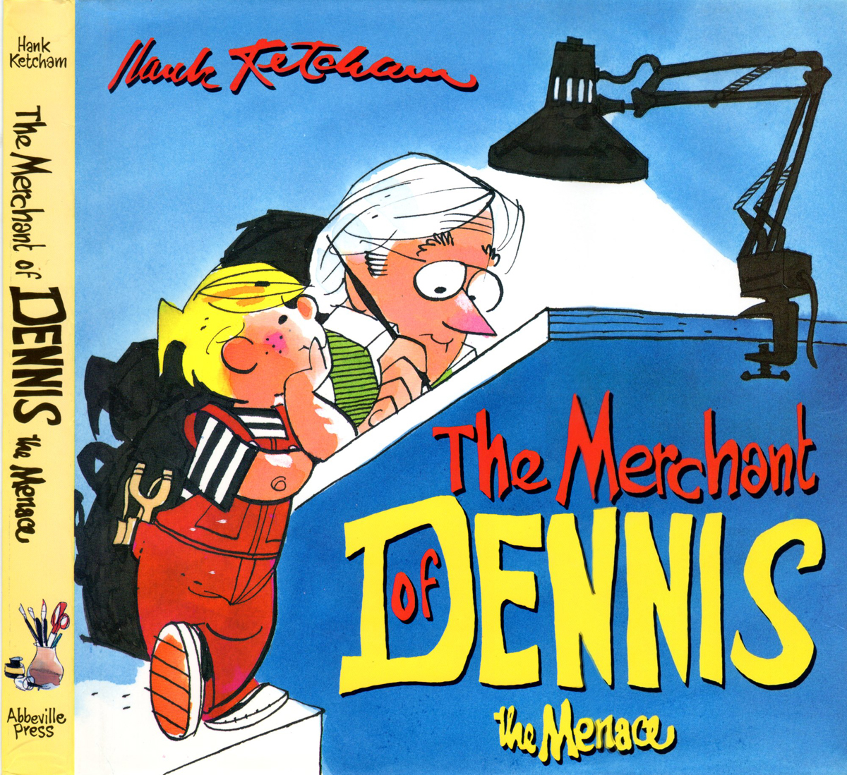
The book’s cover
 2
2
 3
3
 4
4
 5
5
 6
6
 7
7
 8
8
 9
9
 10
10
 11
11
 12
12
 13
13
 14
14
 15
15
 16
16
 17
17
The second half of this chapter will come on Friday.
Disney 30 Sep 2012 10:48 pm
Jeanette Thomas
John Canemaker sent me some information, worth getting out there
- Jeanette Thomas, the wife of Frank Thomas, passed away in California on Saturday evening, September 29. The couple were married for 58 years and the parents of four children. Mrs. Thomas, the former Jeanette Armentrout of Greeley, Colorado, appears in two films directed by her son Theodore Thomas, Frank and Ollie (1995) and Walt & El Grupo (2008).
Excerpted from Walt Disney’s Nine Old Men and the Art of Animation (Disney Editions, 2001):
- Just before the war, at a party thrown by his brother Larry on the Stanford campus, [Frank] Thomas met a young woman named Jeanette Armentrout. Tall and elegant, with beautiful, intelligent blue eyes, Ms. Armentrout was visiting from Greeley, Colorado, taking summer classes at Stanford. She and Frank later went on a picnic, but, said Jeanette recently, “before I could get very interested, school was out for the summer and I returned to Colorado.†She held a teaching certificate and began teaching at Colorado State. Strong and independent, Jeanette was always grateful for the “experience in earning my own living.â€
In 1945, after the war, she took a job teaching in a high school in Redwood City, California, near Palo Alto. “She started writing to me at that point,†said Thomas, who was smitten after their initial meeting and had “written letters to her all along.†Now that Ms. Armentrout was suddenly “in the back yard†(that is, in California) their letters became mutually more specific. “It took me three and a half years, and a war, and teaching, to realize that he was pretty special,†said Jeanette.
She invited him to visit her in Redwood City; he sent her a musical piece he wrote titled “Concerto by Me.†When he played it for friends, they said it sounded like a proposal. “I said it’s okay with me if she takes it like that,†said Thomas. “Oooooh!’†said the friends. “Good things happened pretty fast after that,†he recalled. On a three-day pass, master sergeant Thomas stretched the fifty-mile limit allowed soldiers to 200 miles to see Jeanette. “So we proposed to each other and decided what we were going to do.†Thomas was discharged from the service on January 23, 1946 and the couple were married in Colorado on February 16.
. . . Jeanette Thomas recognized how “terrifically stimulating and restoring†the [Firehouse Five Plus Two] band was for her husband. “He loves an audience,†she said. “He’s a ham, that’s why he’s a good animator.†She saw his professional piano playing as “an ego booster†that gave him a release from “the frustration that he had to keep bottled up during the week.†He did not bring home the stresses of the studio; at dinner each evening with his family, his constant sense of humor came to the fore putting a funny spin on the day’s events. In general, according to his wife, Thomas is “one of the least mercurial artists that I’ve ever known.â€
commercial animation &Disney &Illustration &Independent Animation 25 Sep 2012 05:29 am
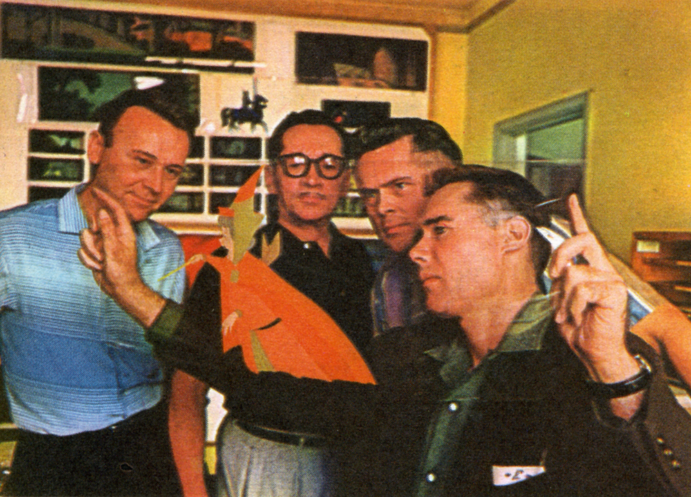
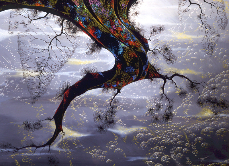
Eyvind Earle – recap
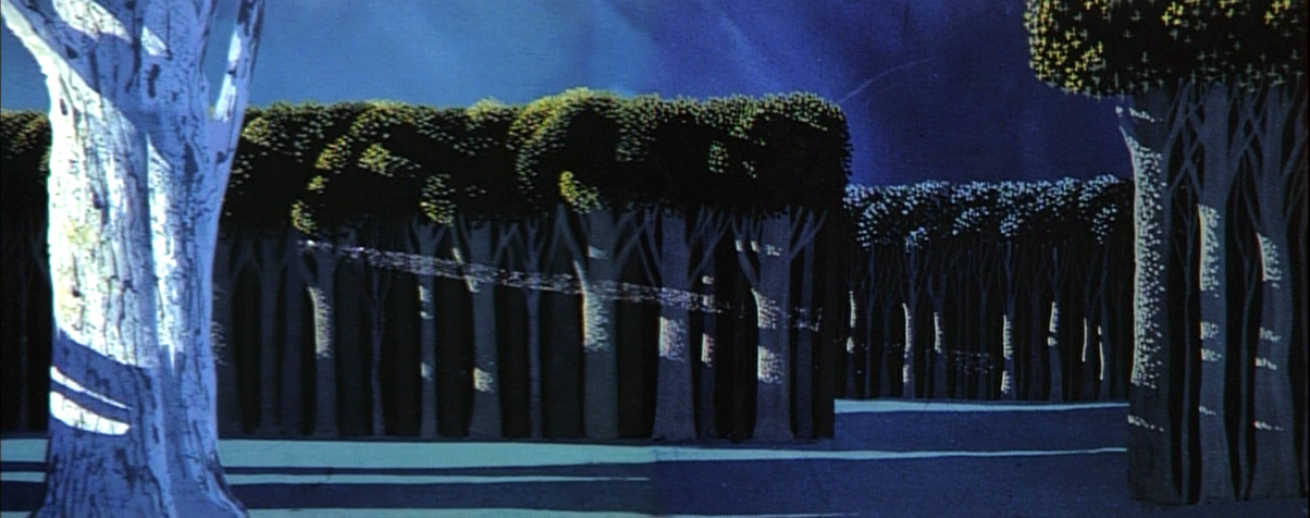
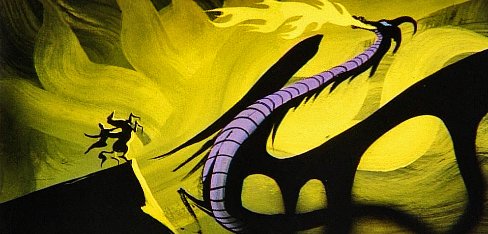
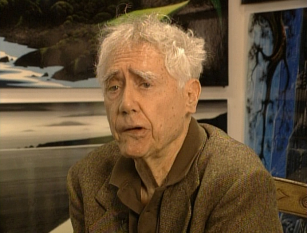 – Let’s talk a little about Eyvind Earle. This is the artist who rose to fame when he was selected by Walt Disney to set the style for the long-in-production feature, Sleeping Beauty. The animators disliked his art direction and openly protested it. Walt remained true in his stance and supported Earle to the end; though it could be said that Walt was more involved in Disneyland’s construction and gave too little attention to the in-fighting at the animation studio.
I remember Frank Thomas, specifically, stating that he had done everything possible to supercede Earle’s style after he, Thomas, had animated the Merryweather scene as she creates Aurora’s dress and cake in honor of her birthday. He felt that the black bodice that Earle had designed took all the lightness out of his character’s delicate dance.
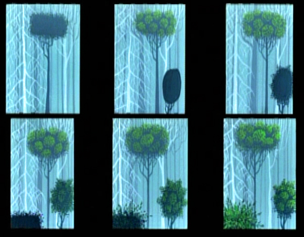
(Click on any image to enlarge.)_________________________________
L to R: Al Dempster, Dick Anthony, Ralph Hulett and Eyvind Earle
Thomas publicly attacked Earle at the Lincoln Center celebration of Disney animation back in 1973. I’d already read something similar, and heard it privately. None of the others on stage at Lincoln Center – Woolie Reitherman, Ken Anderson or Ollie Johnston – countered in support of Earle.
 Sleeping Beauty was such a drastic change in look from the other Disney features, that I think it took deep hold in the minds of a lot of Baby Boomers growing up around this feature. Earle became a strong target of interest, and I think his reputation has grown annually.
I have to admit it was odd seeing the backgrounds of Pocohontas trying to emulate Earle’s Sleeping Beauty style, but in some ways it seemed fitting. The studio had been ripping off the films of the past for so long that it was only appropriate that they’d focus on someone who was such a dynamic force.
For a short period after he was released by Disney, in the post-Sleeping Beauty layoffs, he worked with John Sutherland Productions where he designed the short, Rhapsody of Steel. Then he formed his own studio, Eyvind Earle Productions, Inc. He did an animated trailer for the film, West Side Story, under the supervision of Saul Bass. He did an animated title for the Kraft Suspense Theater, and he did a Christmas Special for Tennessee Ernie Ford.
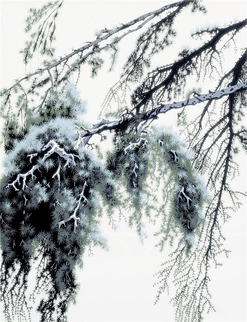
Ultimately, Earle made a success of his own art after leaving animation. He’s been represented by a number of very large galleries and has sold a lot of popular art in a style all his own. Here are a couple of examples found on line:
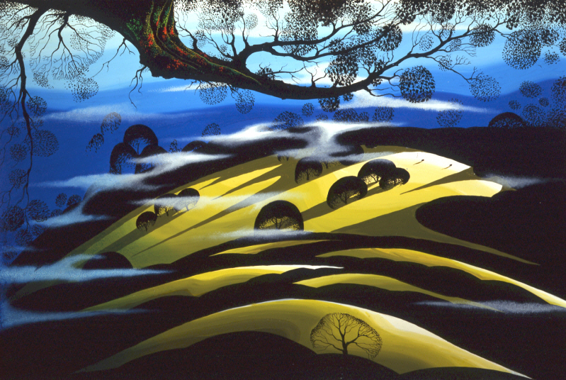
I’m not always a big fan of the color schemes in his graphics, though he always makes them work, but I have to give credit to Earle for his originality and the dynamic approach in his art.
His autobiography, Horizon Bound on a Bicycle, is a must for all real fans.
This is his animation resume:
- 1951 Started with the Walt Disney Studios as background painter on: FOR WHOM THE
__ BULLS TOIL, MELODY, and the Academy Award winner for “Best Short of the Year”
__TOOT, WHISTLE, PLUNK and BOOM which also received a Cannes Film Festival Award.
__Production Designer, Color Stylist and Background Painter for the DIsney animated __classic SLEEPING BEAUTY, as well as, PIGS IS PIGS, GRAND CANYONSCOPE,
__PAUL BUNYAN, LADY AND THE TRAMP, LONDON BRIDGE, and WORKING FOR PEANUTS.
__He designed 5 murals for Disneyland.
1958 Joined John Sutherland Motion Picture Company in Los Angeles.
1960-1966 Created 24 sheet poster for Hamm’s Beer.
__Started motion picture animation company, Eyvind Earle Productions, Inc.
__Created animated commercials for Chevrolet Motors, Chrysler Corporation, Marlboro
__igarettes, Motorola Television and the Kellogg Cereal Company.
__Created animated trailer for WEST SIDE STORY for United Artists.
1961 Created animated television special THE STORY OF CHRISTMAS starring
__Tennessee Ernie Ford and the Roger Wagner Choral.
1962 Created animated television special THE EASTER SPECIAL.
__Created title for the KRAFT SUSPENSE THEATER.
__Created the logo trademark trailer for Universal Pictures.
__Produced and created the theatrical short DEATH AND SUNRISE
You’ll find a lot of merchandise including all the books listed here, on the Eyvind Earle website.
Action Analysis &Animation &Animation Artifacts &Disney &Tytla 13 Sep 2012 05:48 am
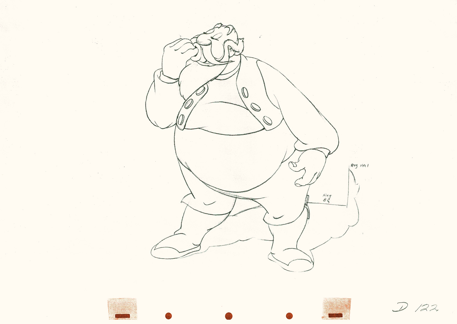
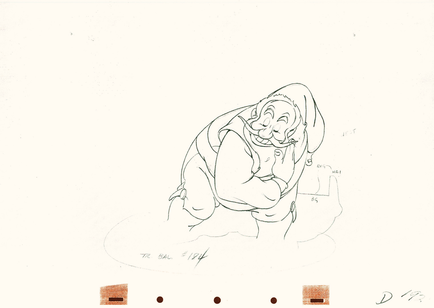
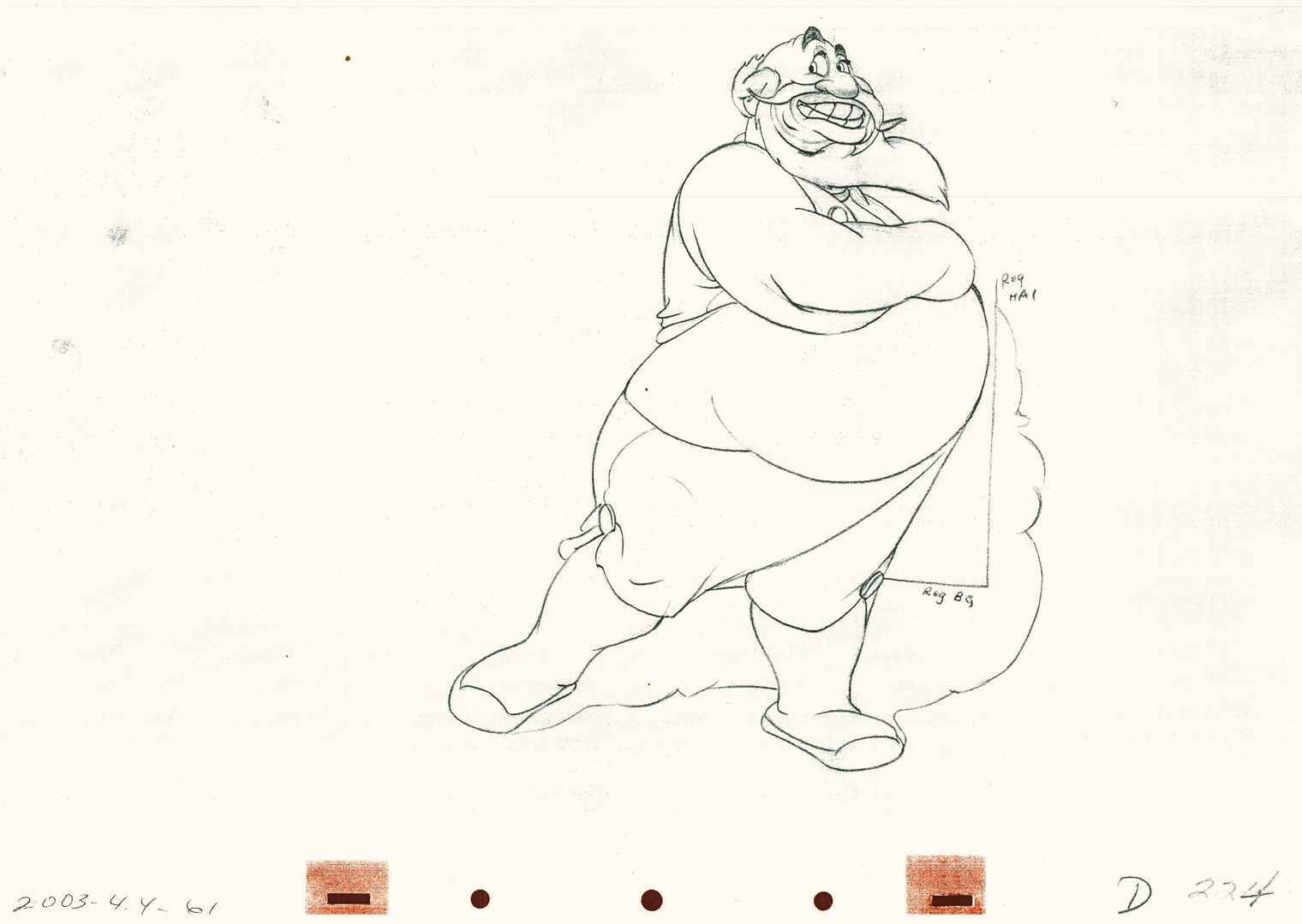
Tytla’s Terry-Disney Style
- Bill Tytla is probably the finest animator who has graced the history of the medium. He was a brilliant actor who dominates most of the classic early films of Disney work. Snow White, Pinocchio, Dumbo, and Fantasia are all appreciably greater films because of his work. In studying this master’s work frame by frame you can see a real elasticity to the character, one that is not apparent in the motion of those same characters. There’s true emotion in the acting of these characters, and it’s apparent that he uses that elasticity to get the performances he seeks.
There’s something else there: Tytla’s roots were in Terrytoons: I have no doubt you can take the guy out of Terrytoons, but it seems you can’t take the Terrytoons out of the guy.
Let’s look at some of the drawings from some of the scenes I posted here in the past.
Where better to start than with those gorgeous dwarfs from Snow White. Here’s a scene I posted where all seven are animated on the same level as they carry Grumpy to the wash basin. If he won’t clean himself, then the other six will do the job for him. Take a look at some of the distorted characters in this scene, then run the QT movie. Look for the distortion in the motion.
As for the drawing, like all other Tytla’s scenes it’s beautiful. But tell me you can’t find the Terrytoons hidden behind that beautiful Connie Rasinski-like line.
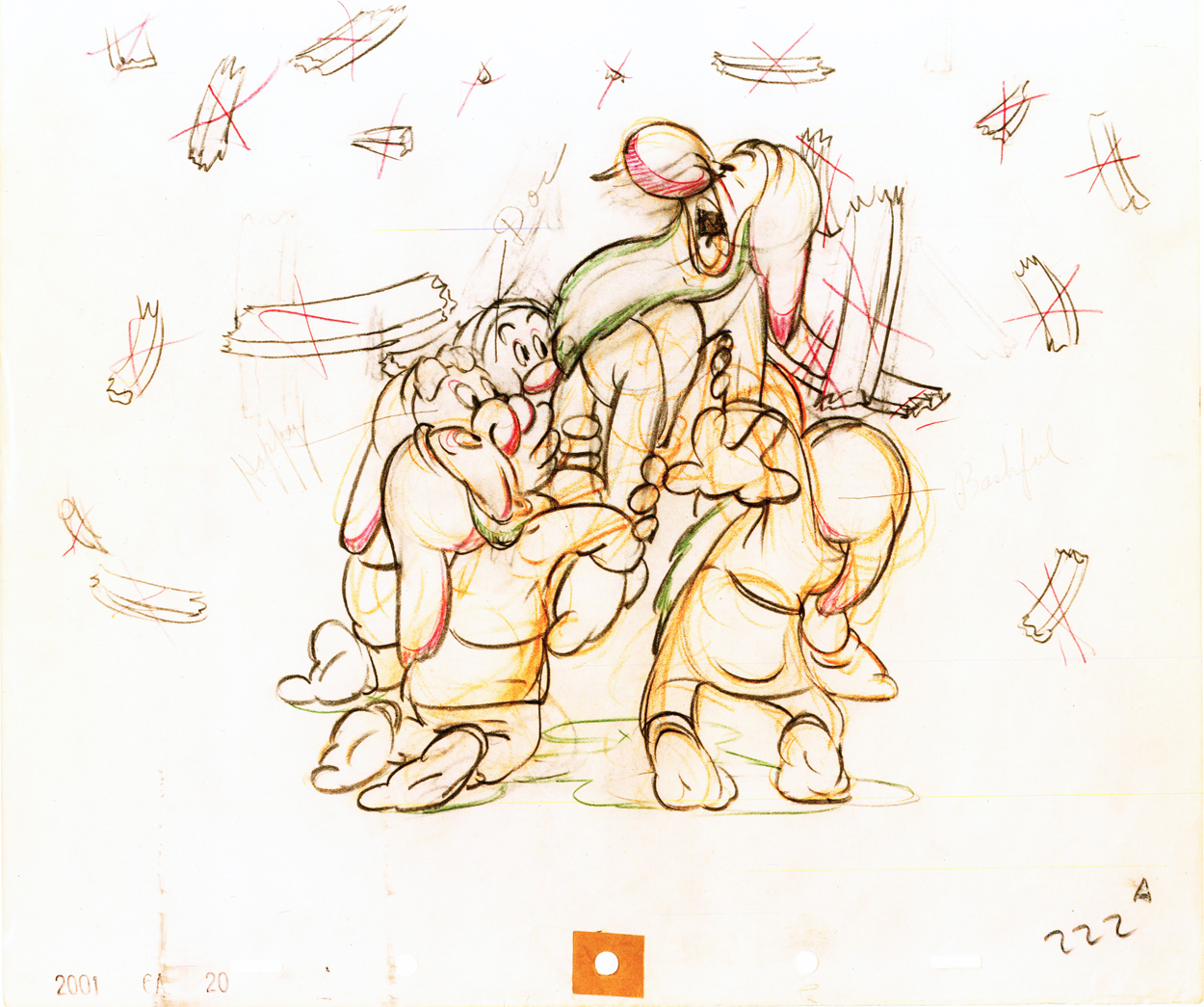
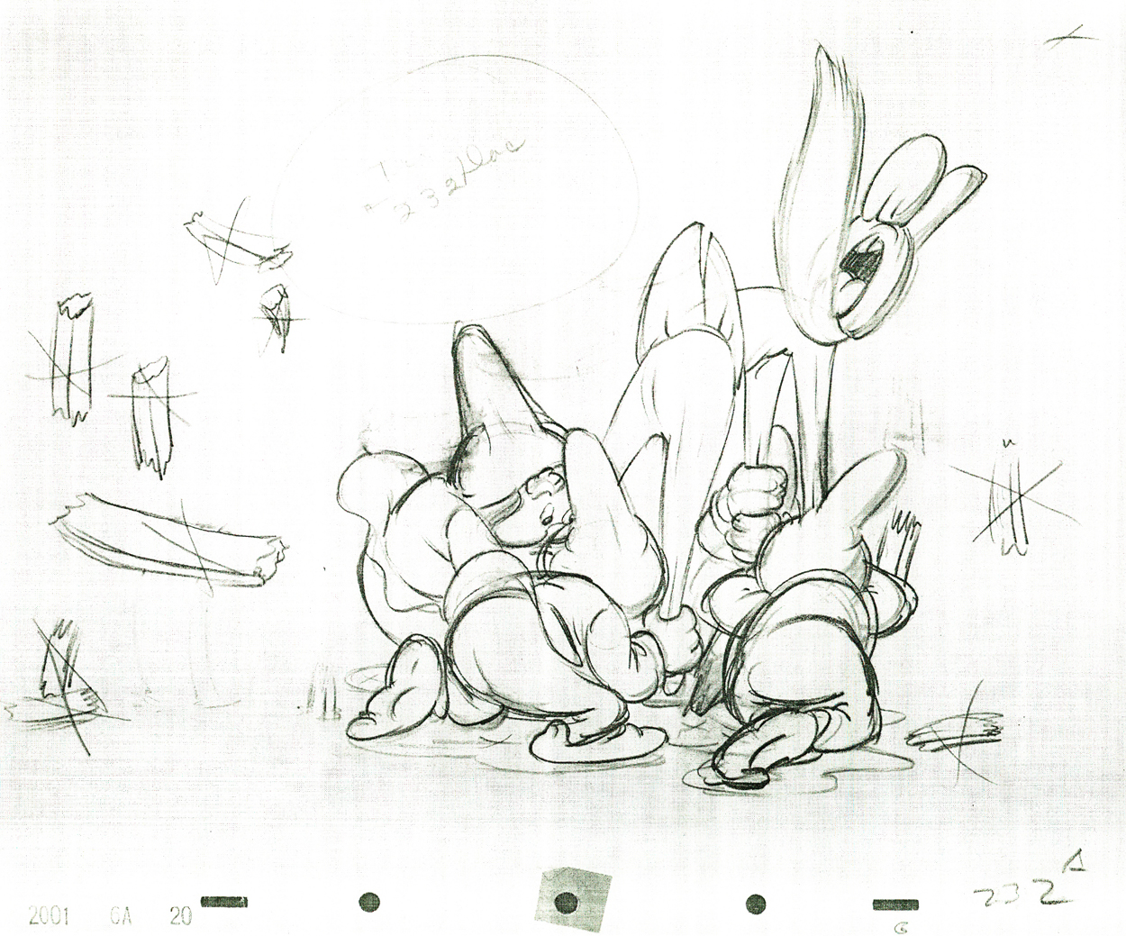 232
232
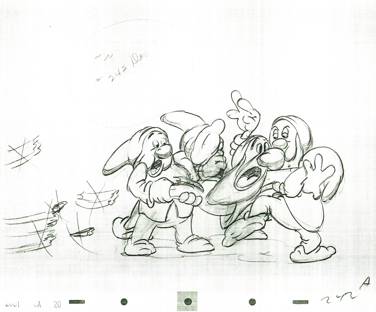 242
242
Flipping over to Stromboli, from Pinocchio, we find animation almost as broad as many Terrytoons, the difference is that Tytla’s drawing that roundness and those enormous gestures on purpose. He knows what he’s doing and is looking to capture the broad immigrant gestures of those Southern European countries. Stromboli goes in and out of distorted drawings, as I made clear in a past post.
 75
75
 122
122
 192
192
 224
224
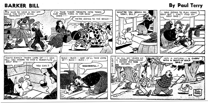
A strip by “Paul Terry”as starring his 1930s character, Barker Bill.
Borrowed from Mark Kausler’s blog It’s the Cat.
from the Terry short, The Tempermental Lion
The Laughing Gauchito was a short that was, no doubt, going to be part of The Three Caballeros. Tytla, Frank Thomas and Ollie Johnston had all animated for the short before Disney, himself, cancelled the production.
Here are three drawings from the film, and they are all beautiful extremes from the scene. (Tytla marked his extremes with an “A” to the right of the number, or at other times with an “X” in the upper right.) The beautiful roundness does not come at the expense of his drawings. Below the Laughing Gauchito we see a cartoon drawing by Carlo Vinci from a 1930′s Terrytoons short.
 9
9
 13
13
 21
21
A Terrytoons drawing by Terry artist Carlo Vinci from a mid ’30s short.
borrowed from Animation Resources
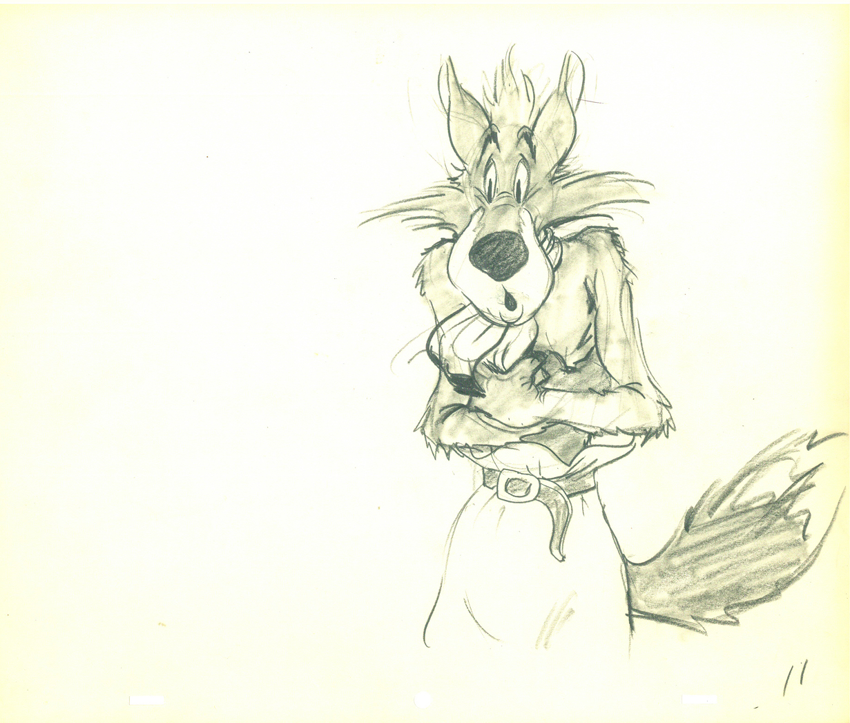
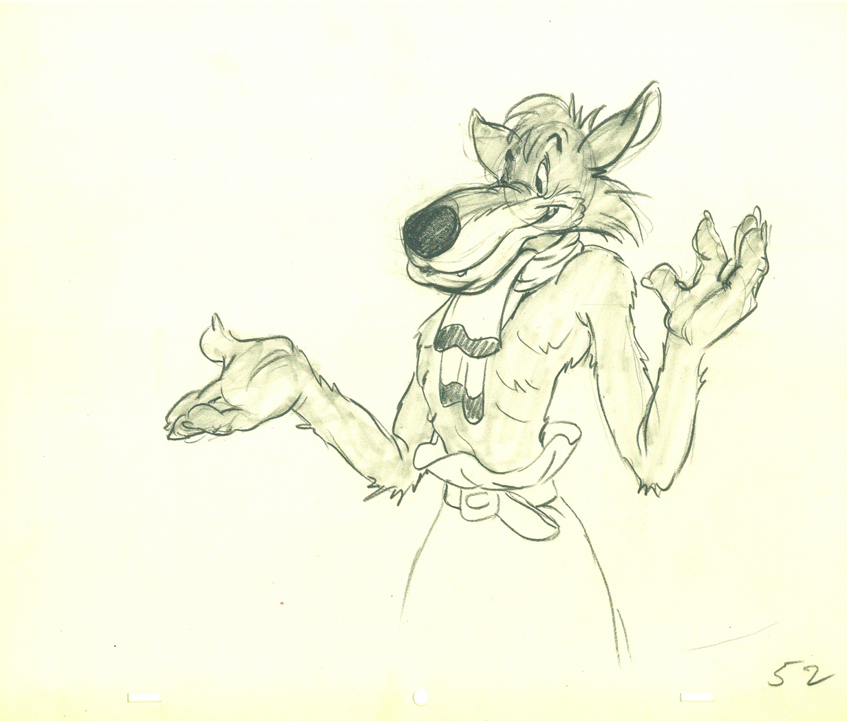
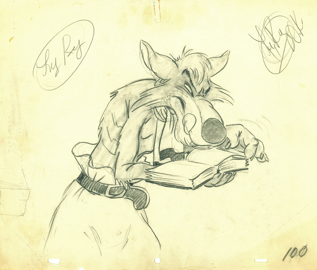
Here’s a scene Bill Tytla did for a Harman-Ising cartoon. He was the supervising animator, and the lack of Disney becomes evident in the drawings. The animation is closer to a Terry short than what he did at Disney’s. The movement feels muddy in that actual cartoon. I’m sure it was his own animation trying to blend with the style of Harman’s work.
 11
11
 52
52
 100
100
Another beautiful Carlo Vinci drawing from a 30′s Terry short.
borrowed from Animation Resources
And here’s a drawing out of a Little Lulu cartoon. I’s not a film directed by Tytla, and is not a good drawing. But Tytla’s influence on all the Lulu shorts at Paramount at the time can’t be denied. It certainly looks more Terrytoon than Paramount. This is not even a good Terry drawing – though its for a Paramount cartoon.
Back at Disney, Tytla animated Willie the Giant from the Mickey short, The Brave Little Tailor. This character, like Stromboli, owes a lot to Terrytoons. I felt this when I first saw the short as a child, and I still think it true. The same, I think, is also true of the same Giant character when he appears in Mickey and the Beanstalk, which Tytla obviously didn’t animate but would have handled if he’d stayed at the studio.
 3
3
 6
6
 8
8
Another Carlo Vinci sketch.
borrowed from Animation Resources
This following, last drawing is a Tytla drawing I own. I know Tytla did it. He gave it to Grim Natwick who gave it to Tissa David who gave it to me. It’s a gem.
Animation &Disney &Peet &Tytla 10 Sep 2012 05:10 am
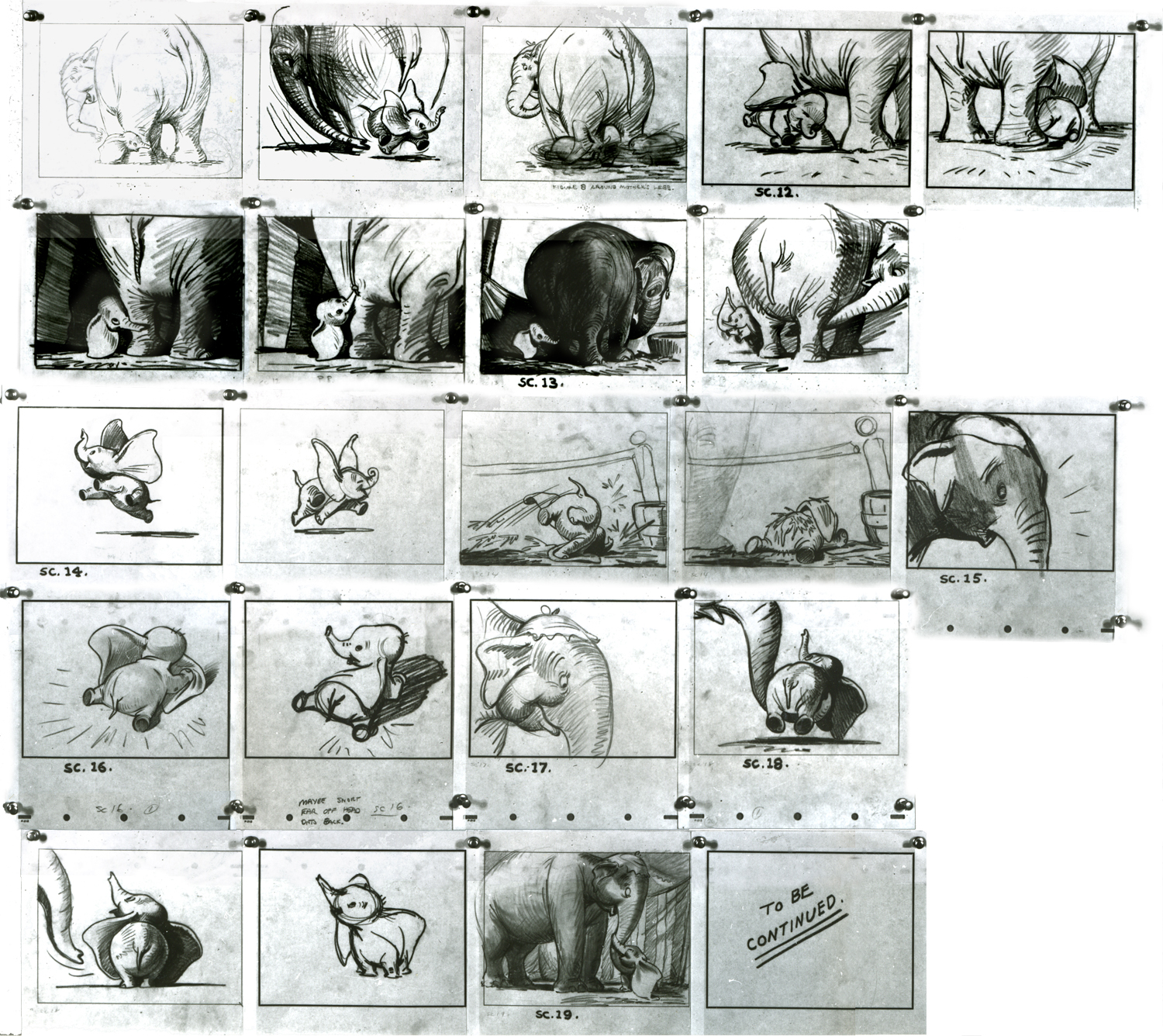
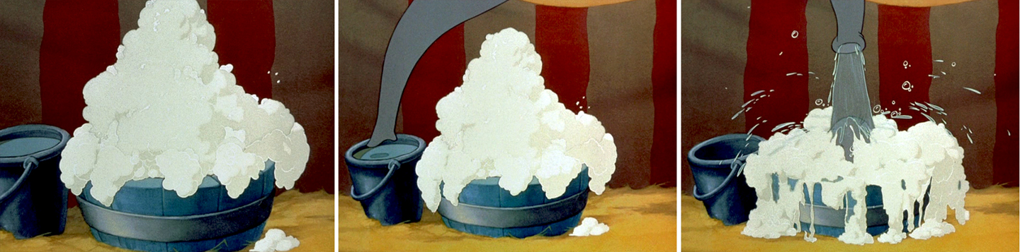
Dumbo Takes a Bath
 - Bill Peet was a masterful and brilliant storyboard artist. Every panel he drew gave so much inspiration and information to the animators, directors and artists who’ll follow up on his work.
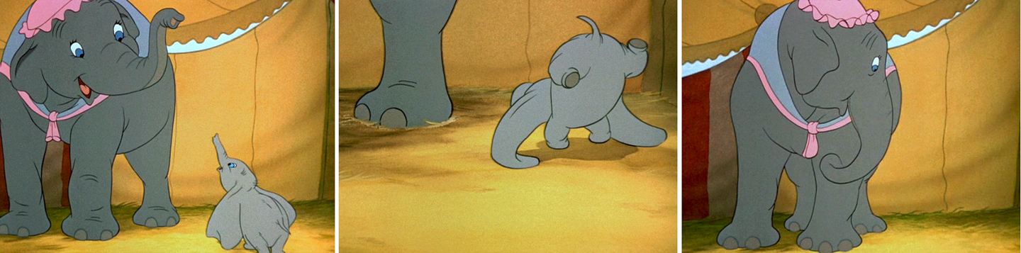
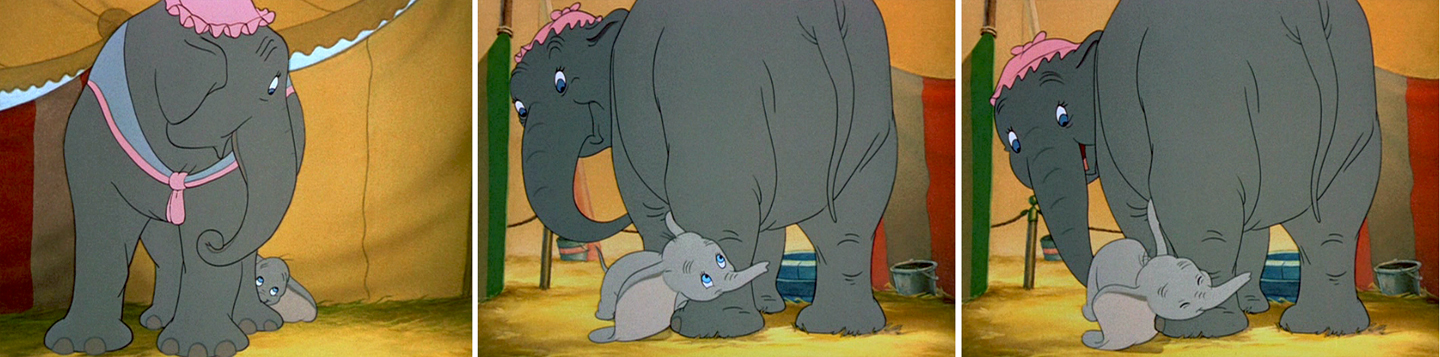
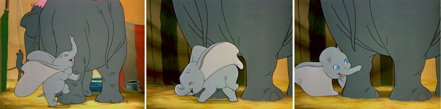
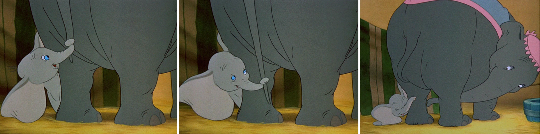
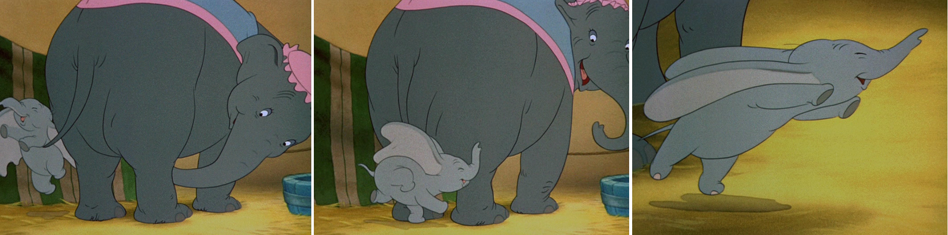
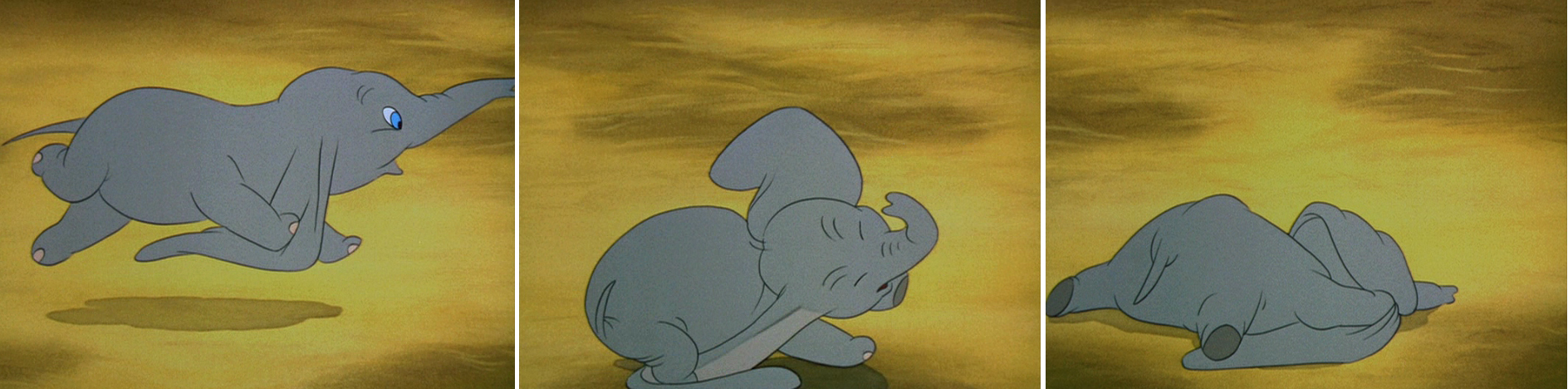
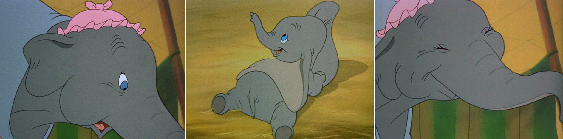
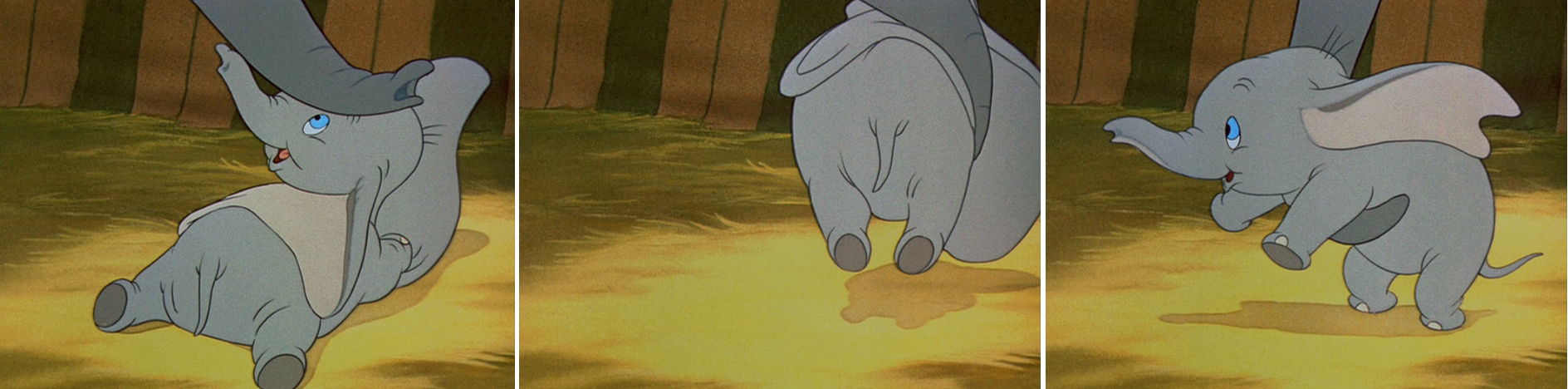
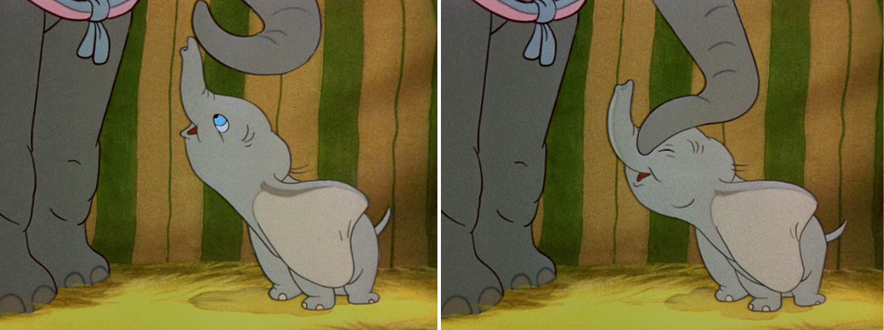
This is the sequence from Dumbo wherein baby Dumbo plays around the feet of his mother. Brilliantly animated by Bill Tytla, this sequence is one of the greatest ever animated. No rotoscoping, no MoCap. Just brilliant artists collaborating with perfect timing, perfect structure, perfect everything.
Tytla said he watched his young son at home to learn how to animate Dumbo. Bill Peet told Mike Barrier that he was a big fan of circuses, so he was delighted to be working on this piece. Both used their excitement and enthusiasm to bring something brilliant to the screen, and it stands as a masterpiece of the medium.
Of this sequence and Tytla’s animation, Mike Barrier says in Hollywood Cartoons: What might otherwise be mere cuteness acquires poignance because it is always shaded by a parent’s knowledge of pain and risk. If Dumbo “acted” more, he would almost certainly be a less successful character—”cuter,” probably, in the cookie-cutter manner of so many other animated characters, but far more superficial.
I had to take the one very long photstat, on loan from John Canemaker, and reconfigure it in photoshop so that you could enlarge these frames to see them well. I tried to keep the feel of these drawings pinned to that board in tact.
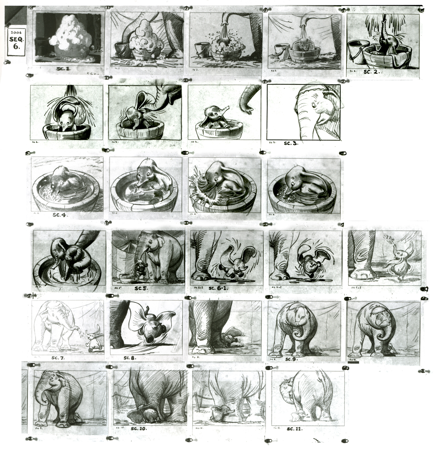
(Click any image to enlarge.)
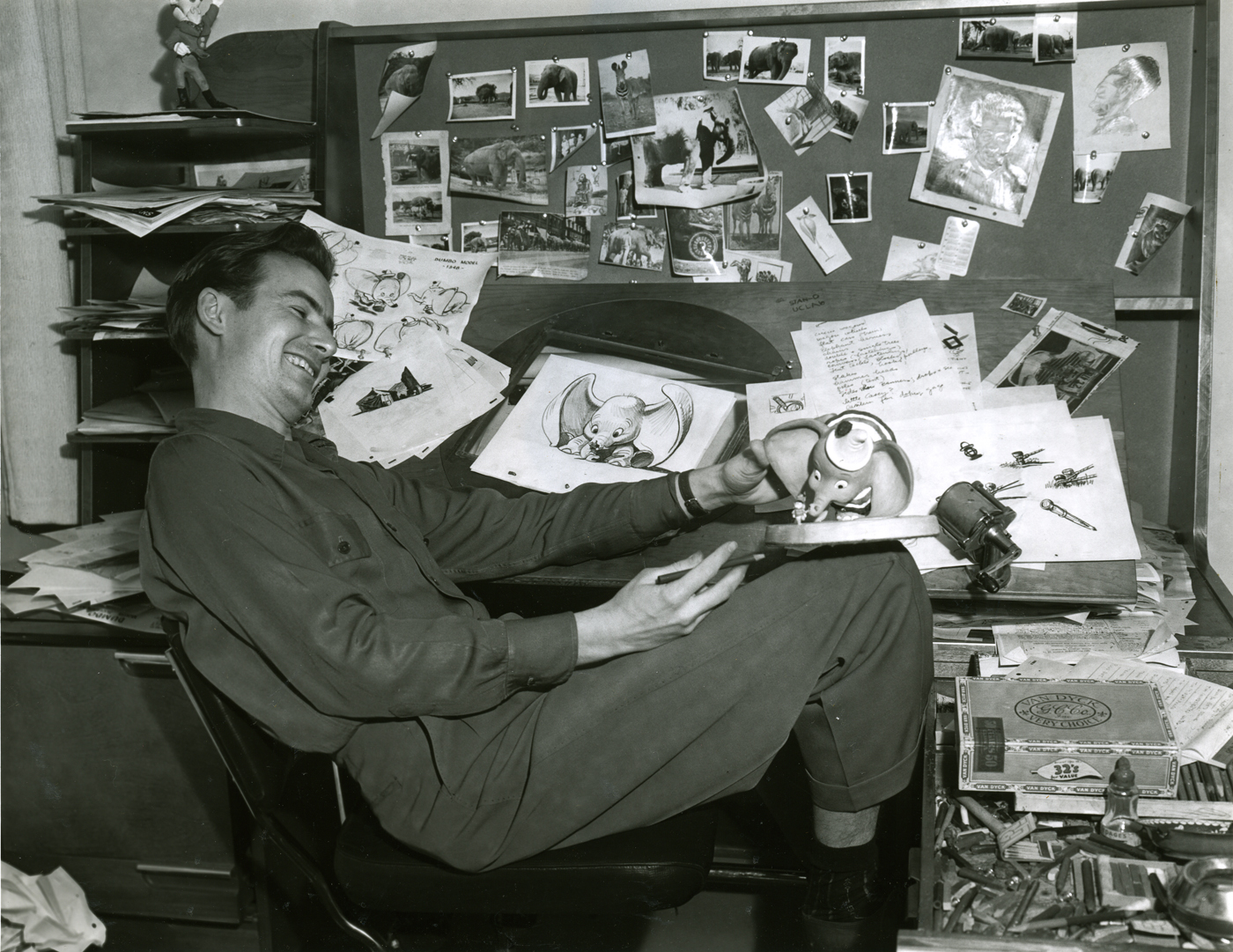
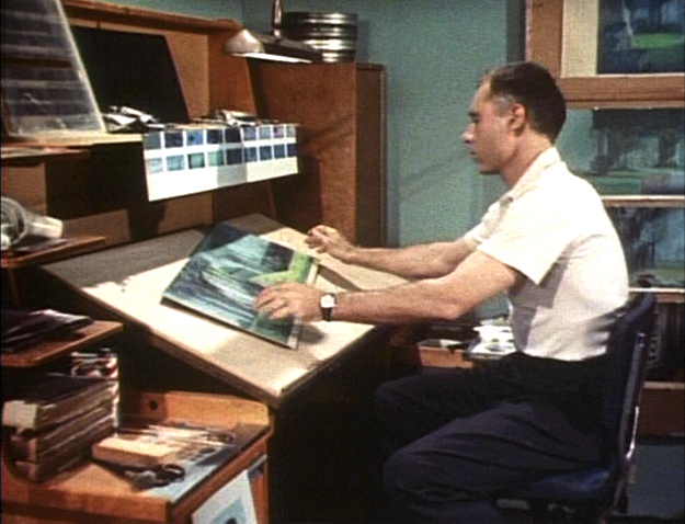
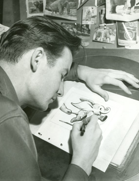
Bill Peet at his desk on Dumbo.
_______________________________________________
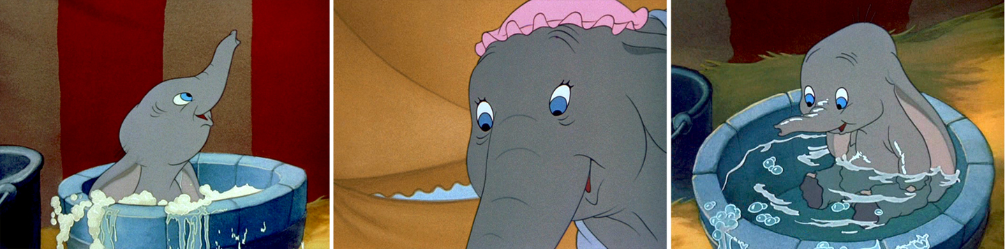
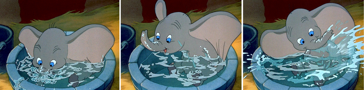
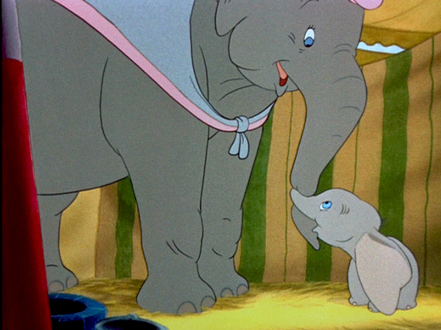 I think this sequence where Dumbo gets washed by his mother and plays around her legs is one of the greatest ever animated. There’s a sweet tenderness and an obviously close relationship between baby Dumbo and his mother which is built on the back of this sequence. It not only establishes both characters solidly, without words, but it sets up the mood of everything that will soon happen to the pair during the remaining 45 minutes of the film. Without that established bond, the audience wouldn’t feel so deeply for the pair during the “Baby Mine” song or care so much about Dumbo’s predicament.
Tytla has said that he based the animation of the baby elephant on his young son who he could study at home. Peet has said that Tytla had difficulty drawing the elephants and asked for some help via his assistant. There’s no doubt that both were proud of the sequence and tried to take full credit for it. No doubt both deserve enormous credit for a wonderful sequence. Regardless of how it got to the screen, everyone involved deserves kudos.
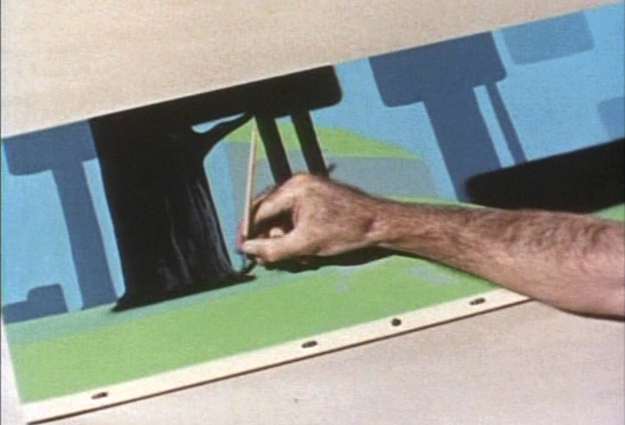
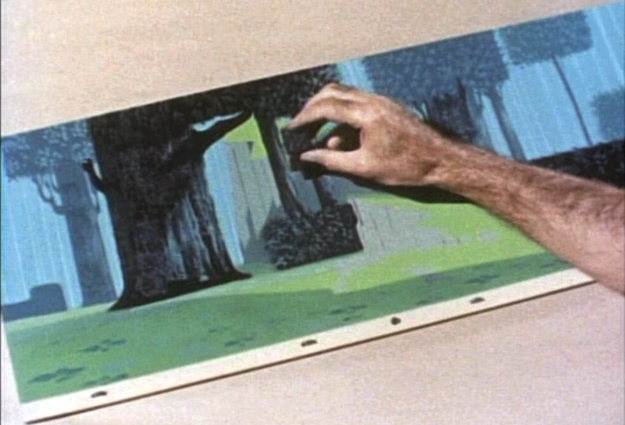
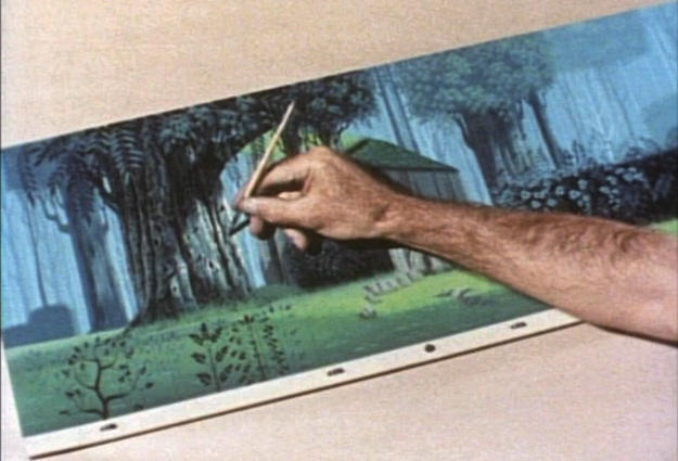
Here are a lot of frame grabs of the sequence. I put them up just so that they can be compared to the extraordinary board posted yesterday. Both match each other closely. Whereas the board has all the meat, the timing of the animation gives it the delicacy that would have been lost in a lesser animator’s hands, or, for that matter, in a less-caring animator’s hands. The scene is an emotional one.
(Click any image to enlarge.)
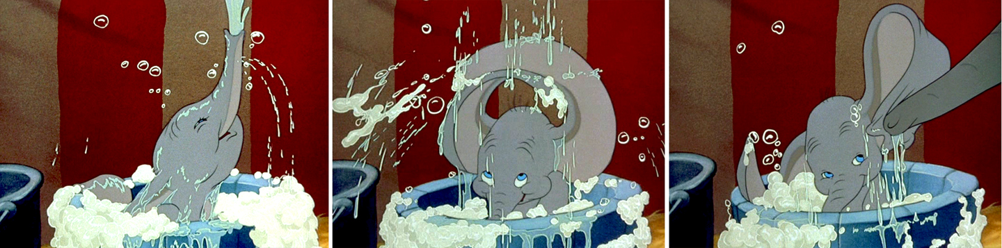
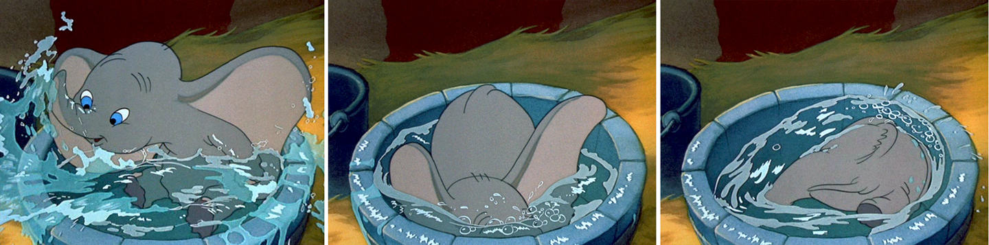
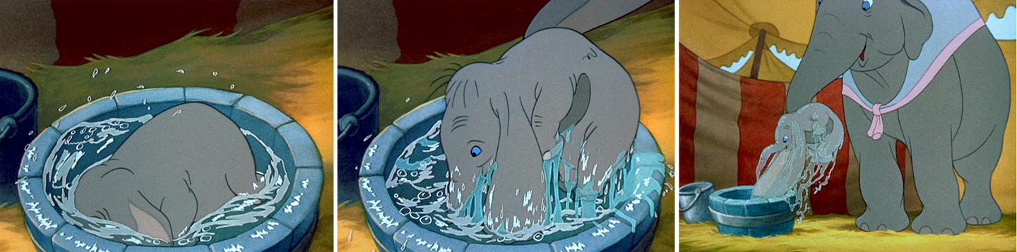
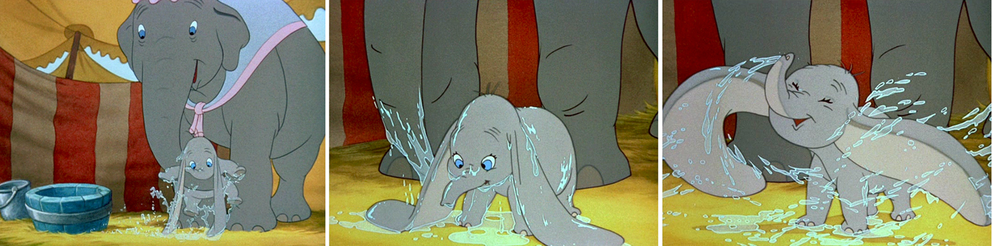
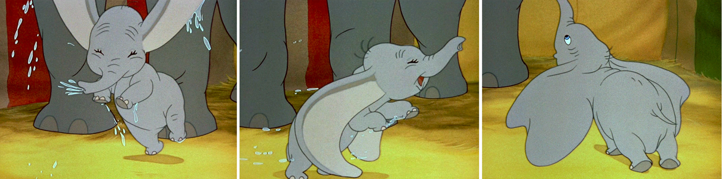
(Click any image to enlarge.)
Animation &Animation Artifacts &Disney &Hubley &John Canemaker &repeated posts 20 Aug 2012 05:53 am
Fantasia FX – Schultheis – recap
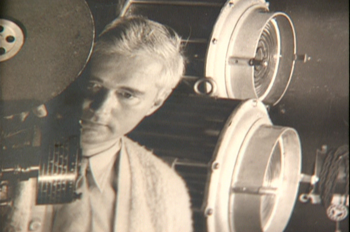
John Canemaker recently completed his latest book about Herman Schultheis and the effects department at Disney’s during the early 40s. It, hopefully, will be published in late 2014. This encouraged me to pull up this piece I posted in Sept/2009. It’s amazing how much information I was able to cull from the photos I found on the DVD.
I’m pleased with this post and am glad to repeat it for those who might not have seen it. John’s book, by the way, is one I’m looking forward to reading. He’s written a bit about it on his website.
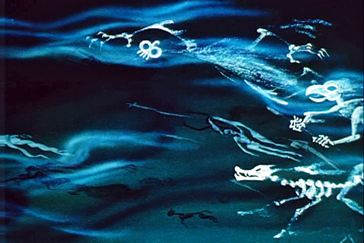
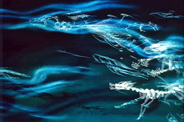
- Herman Schultheis was an effects animator who worked on Fantasia. He kept a tight record of the effects they were creating from 1938-1941 and a photo display of how they were done. Schultheis disappeared in 1954 while trekking through Central America, and the notebook was forgotten until his wife’s death in the early 1990s, after which it was discovered by Howard Lowery behind the couple’s bedroom wall.
(Click any image to enlarge.)
Herman Schultheis created the book of charts and photos
which gives us a link to the many creative effects in the film.
The book is on display at the The Walt Disney Family Museum. It’s also been digitized so that visitors are able to go through the book, enlarge photos and view it page by page. An interactive display.
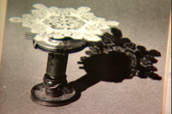
Prior to the discovery of the book we were able to figure out a few of the effects. One Disneyland show, in fact, recreated the bubbling lava scene from the Rite of Spring sequence.
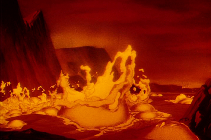
Josh Meador recreated the slow motion shoot of the
boiling concoction used to develop the bubbling lava.
However, the book revealed so much more than we’d understood
about how the superb effects had been crafted.
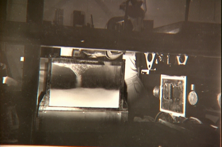
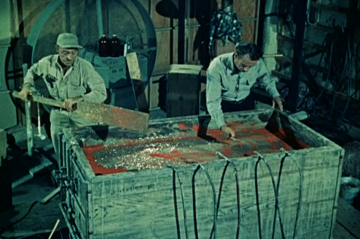
Using a vat of water, they were able to
drop ink into the liquid and film it in slow motion.
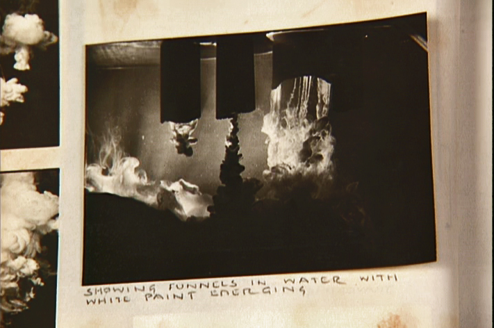
A photo of the ink spilling into the water behind built-in mattes.
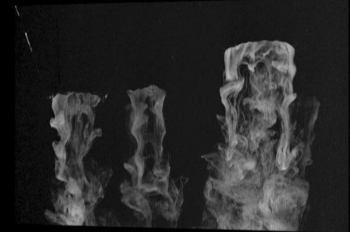
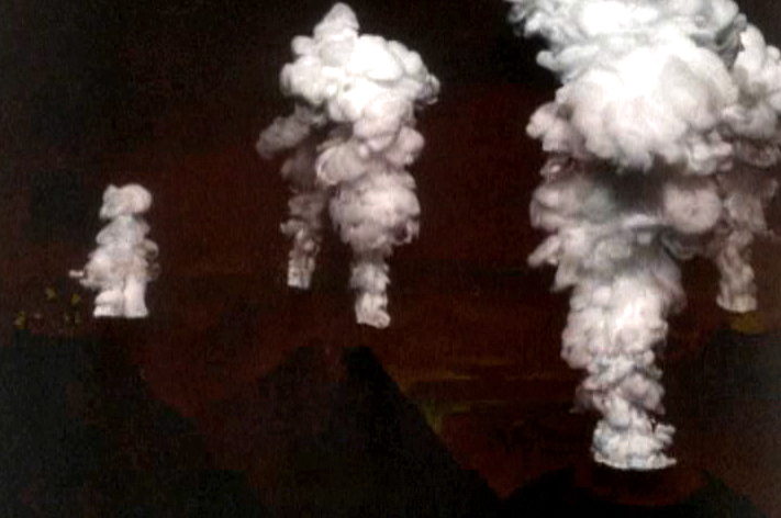
Taking the shot of the ink, they then turned it upside-down.
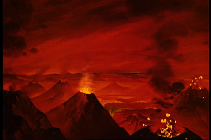
They then superimpose the “smoke” (or ink) over the volcanoes.
This same effect was used in Close Encounters of the Third Kind
to create clouds when the alien ships were moving in on the
farmhouse where the boy and mother lived.
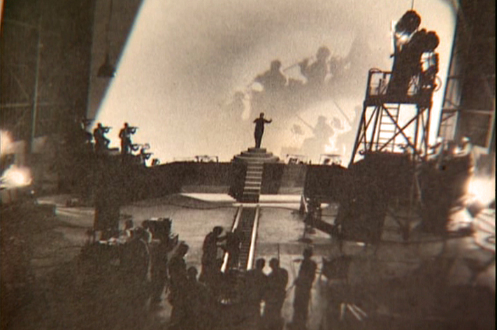
The orchestra was shot on a set with strong, planned shadows.
All these shots were orchestrated and planned for color effects.
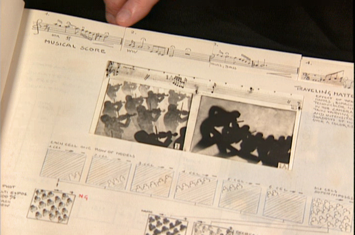
They were also catalogued by Schultheis who kept close
track of the music, as well, in his book. You can see a
page by page breakdown of the score at the top of the page.
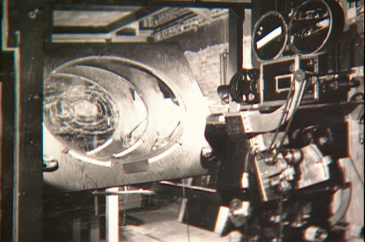
You can see the highly polished sheet of metal (middle left) which reflected
and distorted the animation drawings. This is what the camera photographed
in some of the scenes during the Night on Bald Mountain sequence.
It was also used for the fire in Bambi.
 1
1 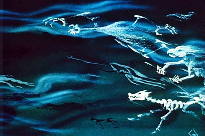 2
2
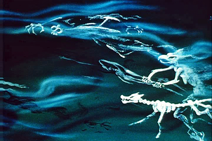
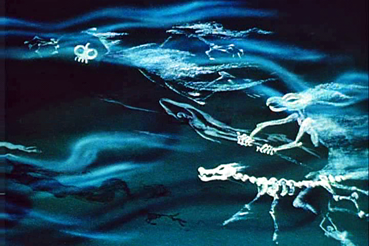
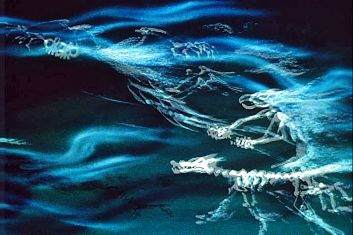
This scene’s ghosts were shot using that distorted metal reflection.
 2a
2a 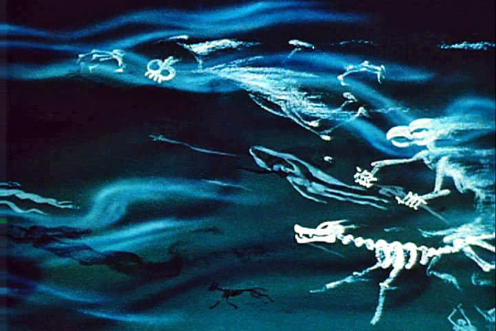 3
3
The ghosts also used a form of cross dissolve.
John Hubley explained to me how that was done, and
we used the technique in Everybody Rides the Carousel.
 4
4 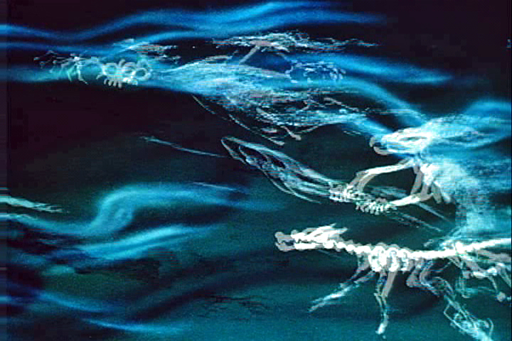 4a
4a
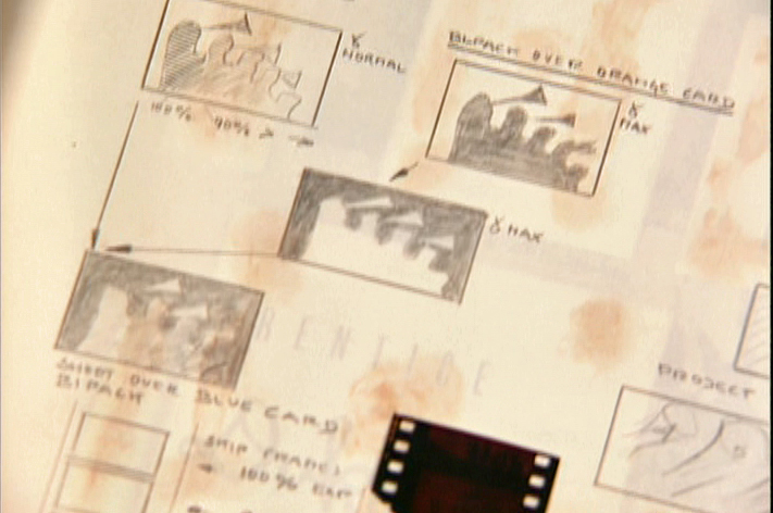
They shot the entire scene at 50% exposure. Then they went back
to the beginning and reshot the entire scene again at 50% exposure.
 5
5 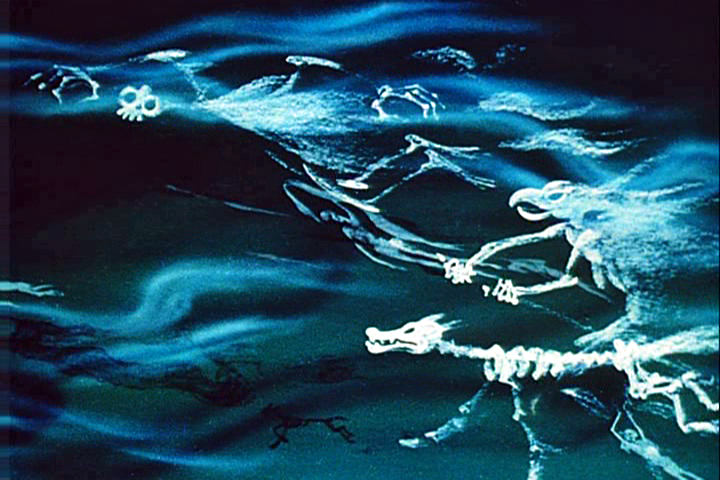 6
6
However on the second shoot, they started by shooting a black frame.
This made #1 fall where #2 should have been, #2 for #3 etc.
This creates a ghostly dissolve effect.
 6a
6a 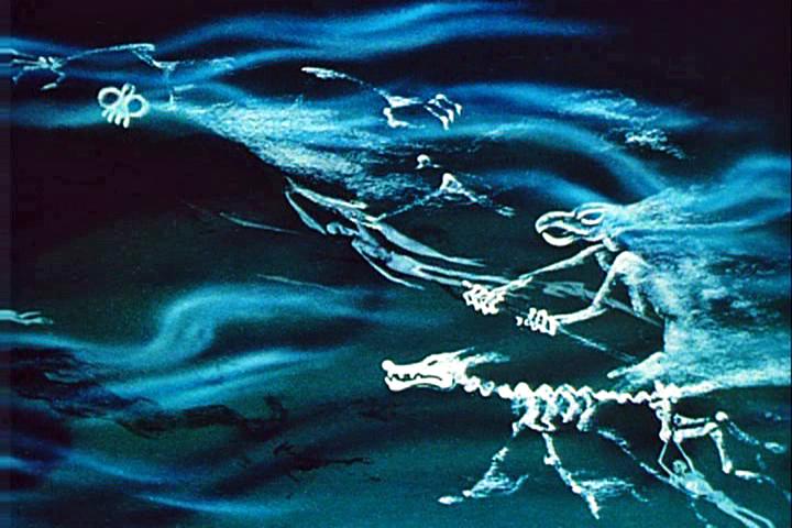 7
7
All of the drawings labelled with an “a” are the double exposures:
2a, 4a, 6a
A make-shift circular multiplane camera was built.
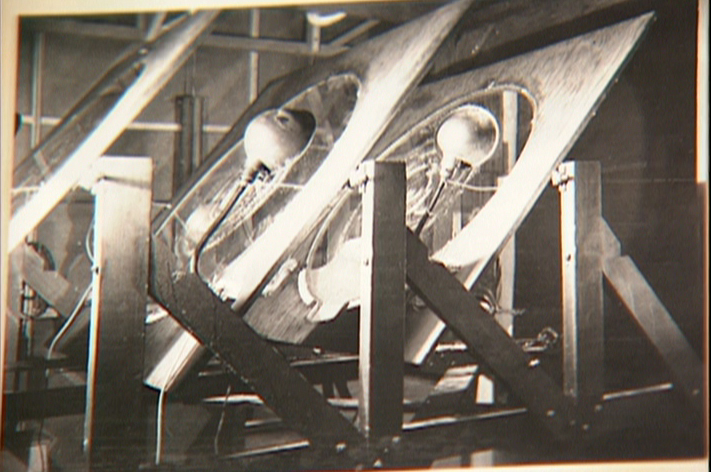
Created out of wooden sheets with holes cut out,
placed so they could shift angles, they were designed to
allow revolving artwork in the circular cut outs.
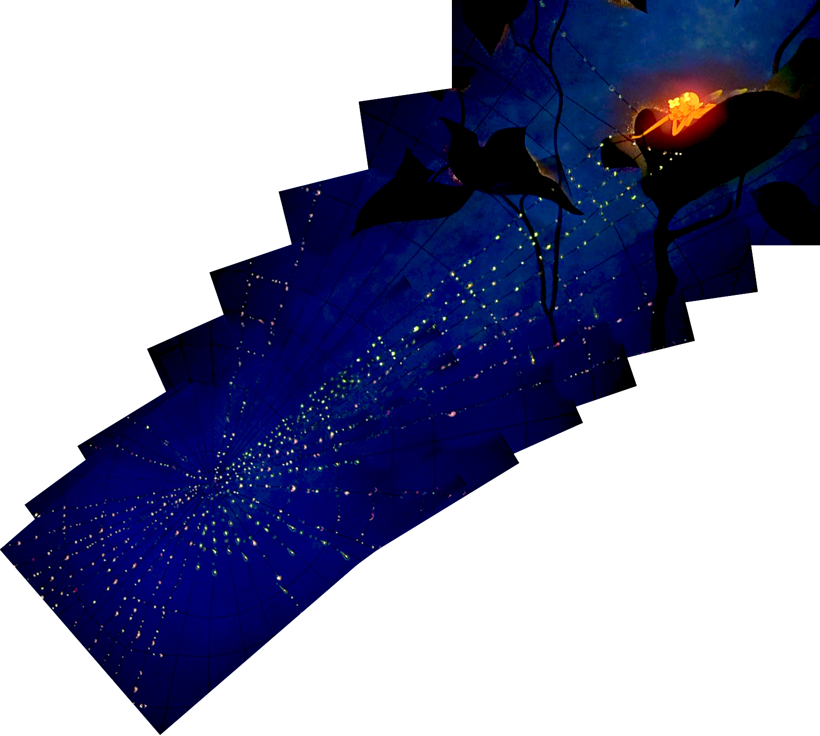
This allowed shooting scenes such as this shot of
a spider web as the camera moved around it
while dew glistened off of it.
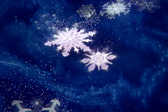
The spinning snowflakes are well explained in Schultheis’ book.
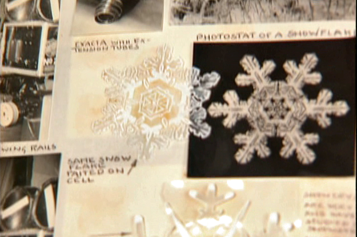
The snowflakes had a detailed construction.
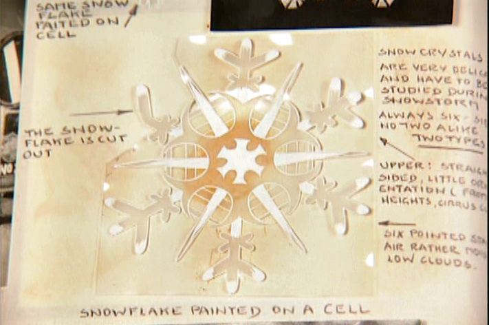
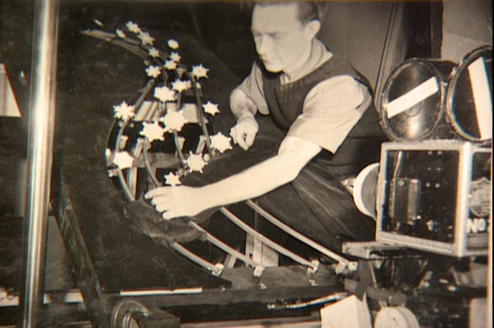
The path of action was intricately defined.
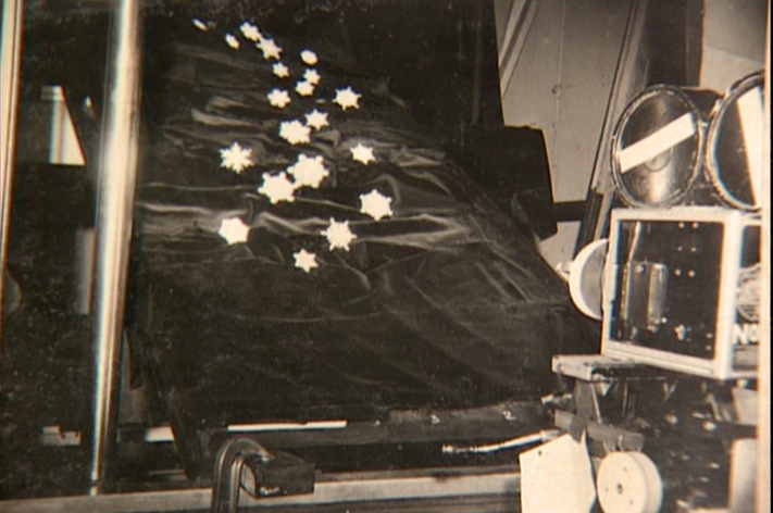
The snowflakes were shot against a sheet of
black velvet hiding the wire guides.
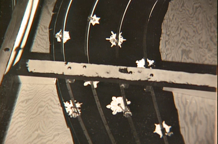
They were shot in tight closeup. From below you can
see the turning gears they were constructed on.
Each snowflake was built on a turning gear
so that they could revolve in their path of action.
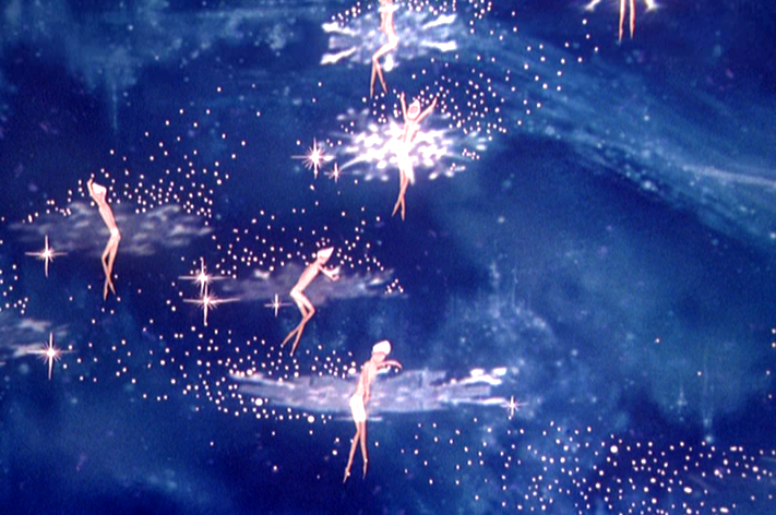
Burn these snowflakes over the multiplane background
and add matching 2D animated fairies within each snowflake,
and you have the finished scene.
Action Analysis &Animation Artifacts &Disney &Frame Grabs &repeated posts 31 Jul 2012 05:12 am
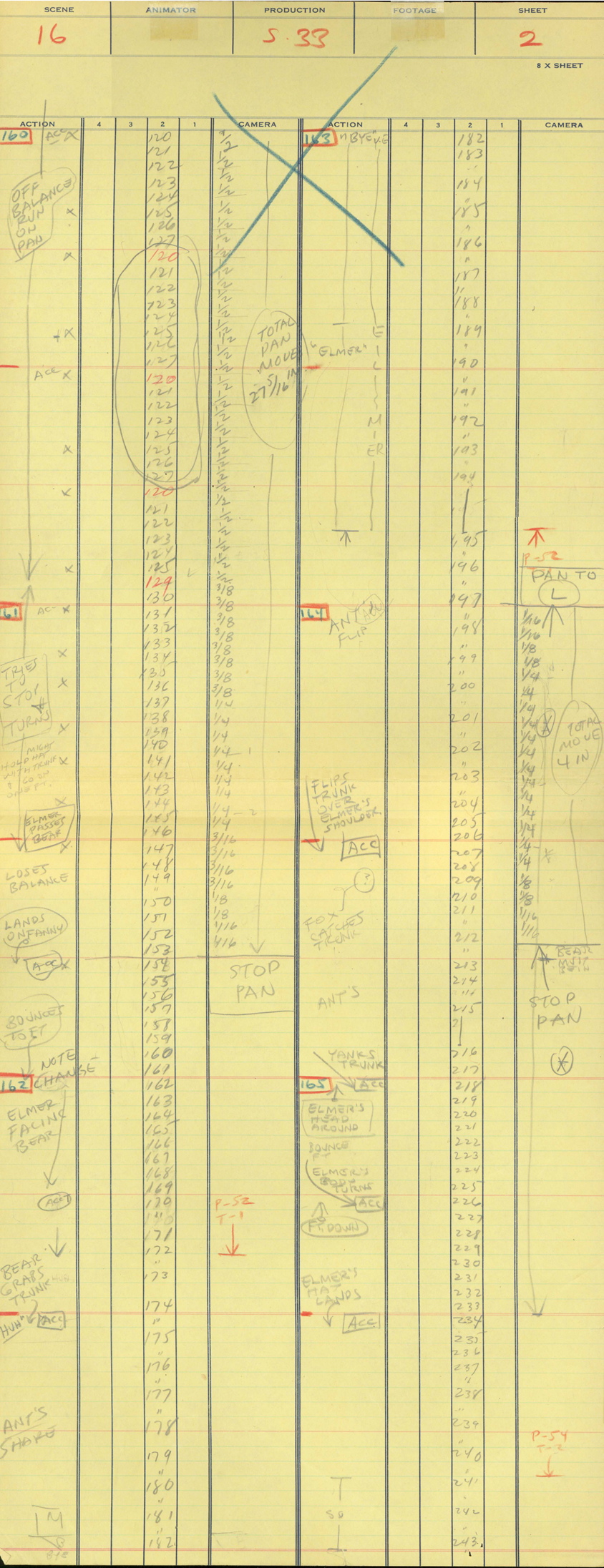
Elmer Elephant X-Sheets – recap
- This old post on Exposure Sheets was a popular one back in March, 2009. Today most animators work with the track and no track reading or record of the moves they’ve done. It’d be a nightmare to try to reconstruct what they’ve done in a scene. All we now have to go on is the completed scene. A lot is lost in the history of animation being done today. For that reason, I thought it’d be nice to take a look at all we can learn from one simple X-Sheet.

Robert Cowan sent me an exposure sheet that was tucked into an envelope in the Ingeborg Willy Scrapbook, which he owns. (Ingeborg Willy was an inker working at Disney’s during the 30′s and made a photographic scrapbook of her stay.)
The sheet is from the Silly Symphony, Elmer Elephant (1935).
(Click any image to enlarge.)
The film’s about a bunch of baby animals.
Elmer is the shy kid who gets laughed at by the other kids.
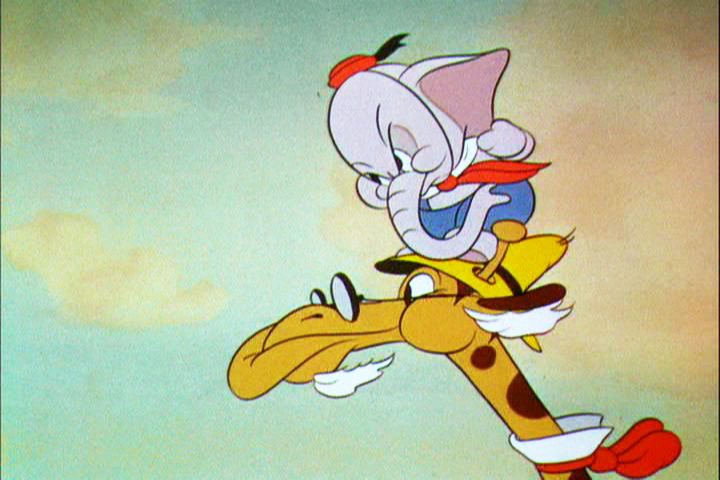
Eventually with the help of an old giraffe he saves the day by putting out a fire …
… and winning the girl.
This exposure sheet is about a sequence wherein Elmer is pushed across a row of animals and is poked and prodded in absolute humiliation.
Let’s review what’s on the sheet for the completely unitiated viewer:
There are several columns: Action, 4,3,2,1 and camera.
These are basic to all X-sheets. Sometimes you get 5 numerals, oftentimes you get a column for Bg. Uusaly there’s also a Track column.
Below these descriptives you have lines. Each light blue line represents one frame of film. If the drawing’s on twos or threes or more it’s indicated as in #149. Other numbers are on ones – one frame per drawing.
In the “Action” column, the director writes notes telling where he wants some action to happen. For example: the director has noted that he wants Elmer to try to stop his turn from frames 32 through 49. The animator will follow this as best as possible.
The numbered columns represent cel levels. #1 is the bottom cel and #4 is the top cel. Most sheets also have a column for the Background so you know what number Bg is called for.
The “Camera” column indicates any special camera movements or effects. There we see a pan. The Bg is moving from screen right to left. The actual amount of the physical movement is indicated on every frame. 1/2 is a half inch, 1/4 is a quarter inch etc. Pans usually slow down as they come to a stop and gear up when they start out. This is why it goes from 1/2 to 3/8 to 1/4 to 3/16 to 1/8 to 1/16 before you reach STOP PAN.
You’ll see the sound track indicated at red marked 163 top line middle of the sheet. A character is saying, “Bye Elmer.” The actual number of frames it takes is broken down for you. The animator would animate the mouth accordingly.
Here are frame grabs for the part exposed.
 1
1 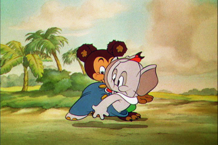 2
2
 3
3  4
4
 5
5  6
6
 7
7 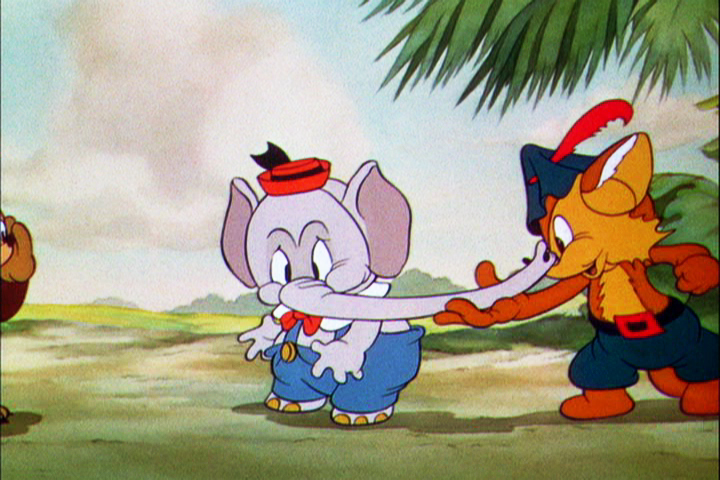 8
8
 9
9 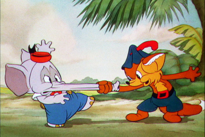 10
10
Let’s analyze the exposure sheet a bit. (For those not familiar with X-sheets, I have more of a breakdown below.)
First off, for me it’s an oddity. There seem to be two sheets combined onto the one. It’s split down the middle into two full sheets – all using only one cel level.
Secondly, there are some highlighted numbers – 160 through 165.
These fall at every 32nd frame. I’m not sure why. It’s not a foot (16 frames) or a second (24 frames). Is it a beat? I notice that the action calls for “ACC” at each of these markings. I assume it stands for “Accent” which would make that part of a musical tempo. Every 16th frame is also marked in red. This would be the only indication that this is what it is.
The pan moves are indicate in FRACTIONS ! I’m not sure why since it created a difficult transposition to decimals for the camera operator. I mean 3/8 of an inch equals what? Quickly now. Time is money. How about 1/16th? I have only met fractions which divided into 20ths. When did the change come in? John Oxberry, anyone?
Of course, some master checker would probably do the math before the scene got to camera.
Some of the drawings are exposed on twos, even for a short bit during the pan. This would be anathema in modern day animation, yet it hasn’t gotten better.
The track reading isn’t the most detailed I’ve seen, yet it does the job, doesn’t it?
The film is directed by Wilfred Jackson. I assume the “Action” column was filled out by him. I think the animation was by Paul Hopkins.
There’s a lot of information that can be pulled out from this one exposure sheet of a film done 73 years ago. Is that enough reason to advocate for continued use of the Exposure Seet?
