Category ArchiveLayout & Design
Art Art &Comic Art &Illustration &Independent Animation &Layout & Design 11 Oct 2010 07:18 am
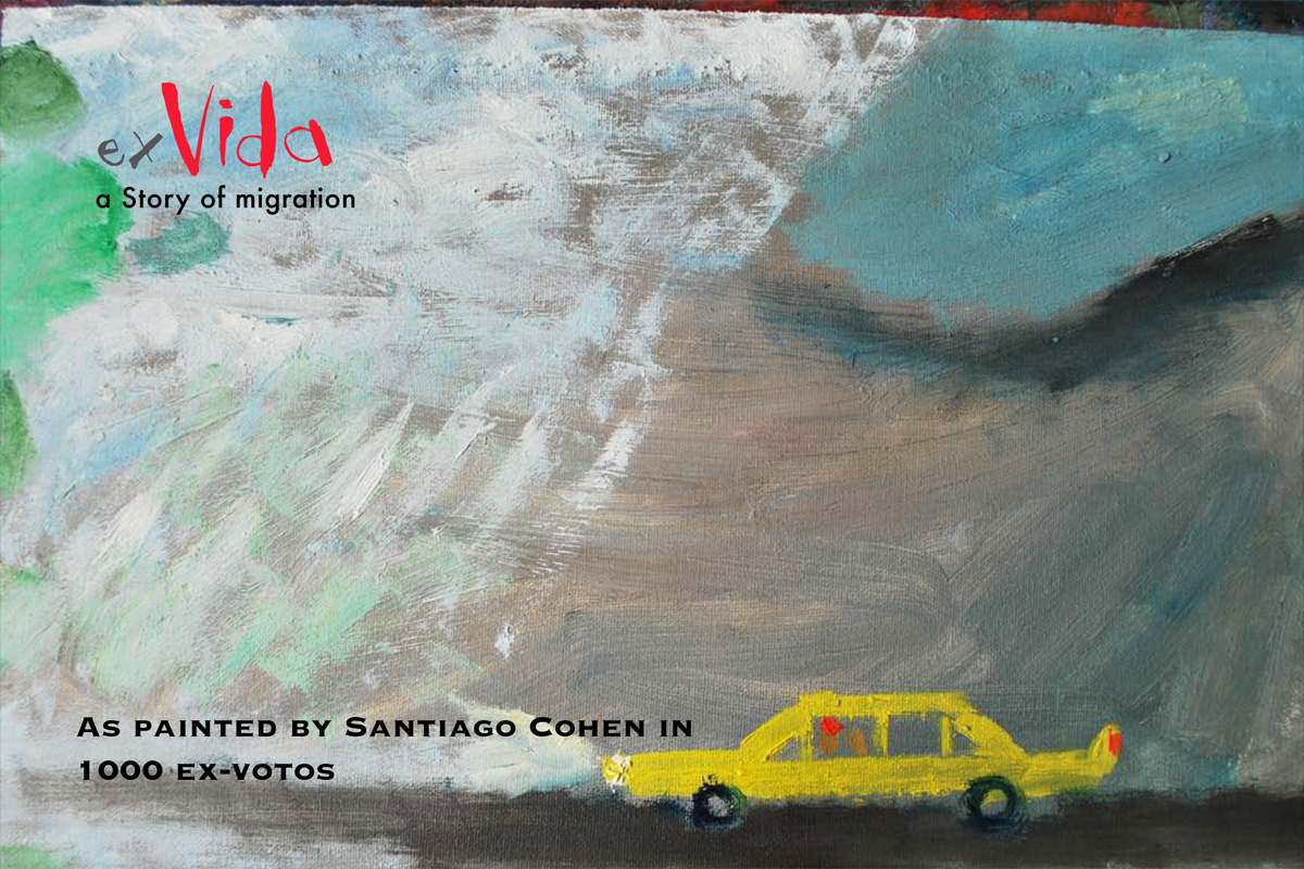
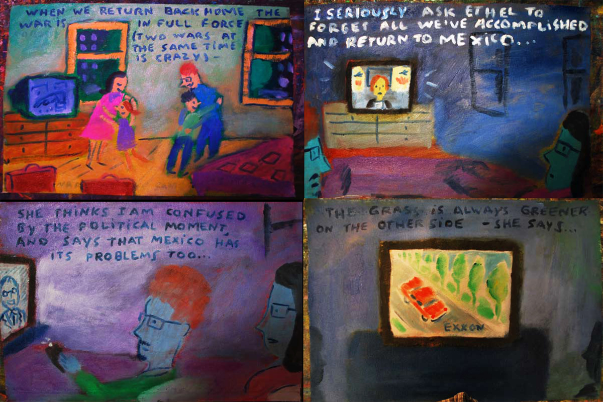
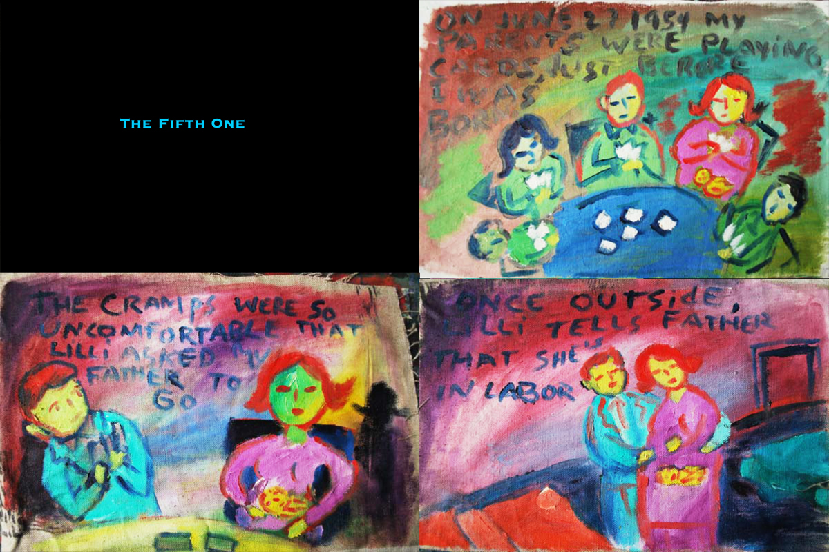
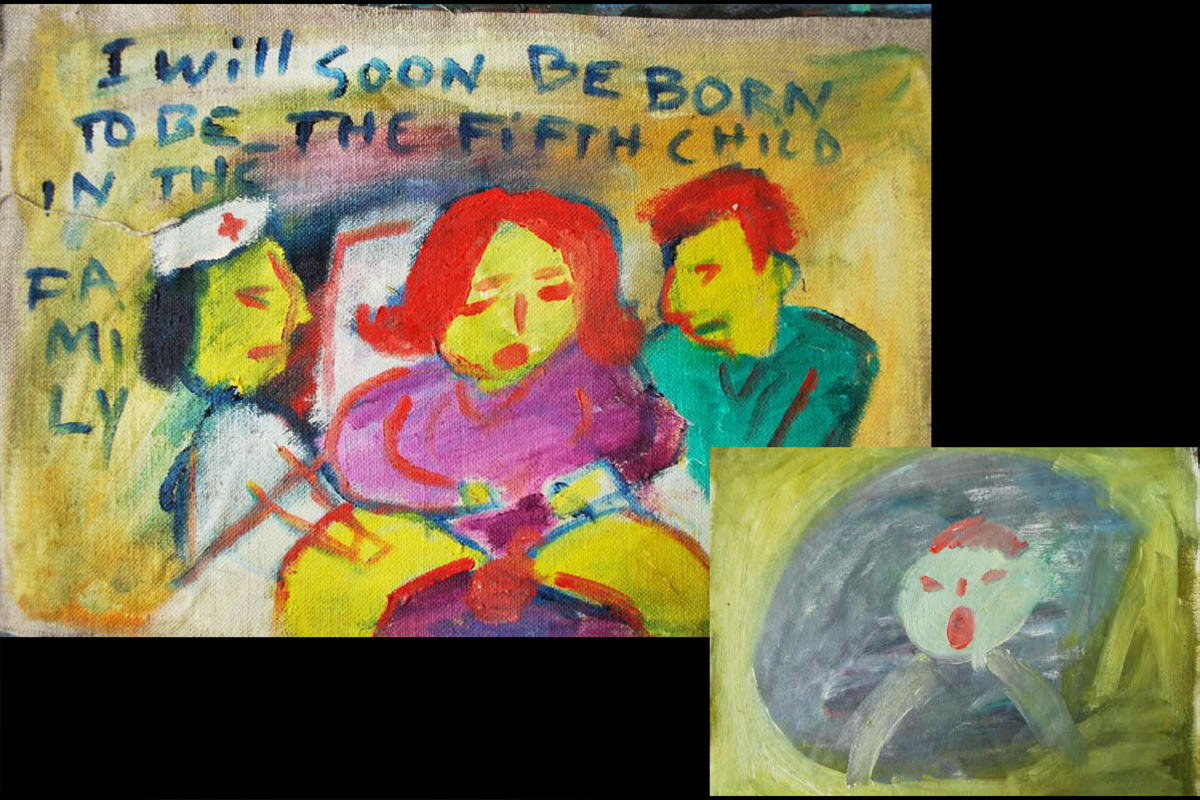
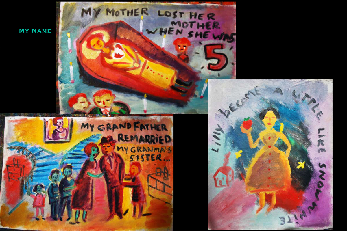
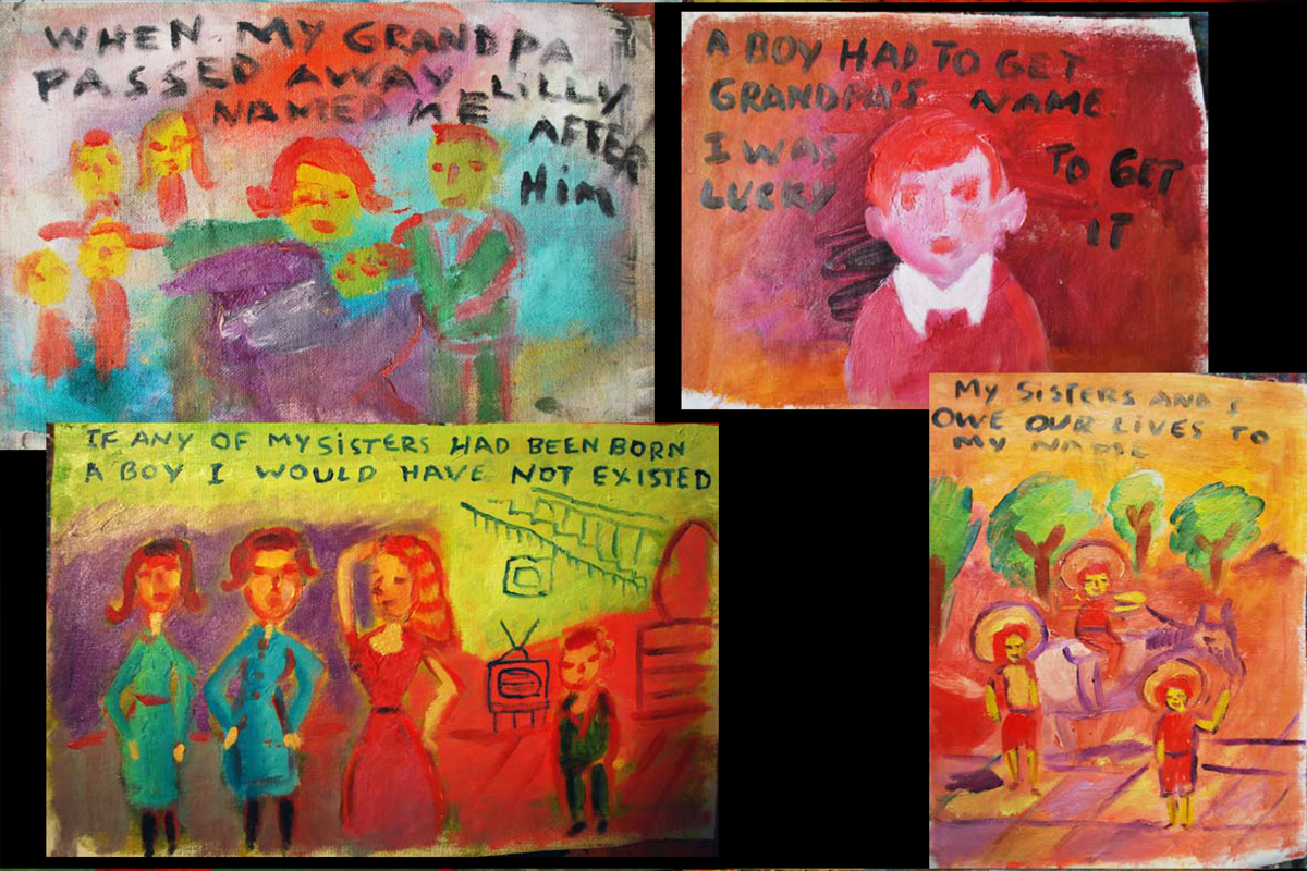
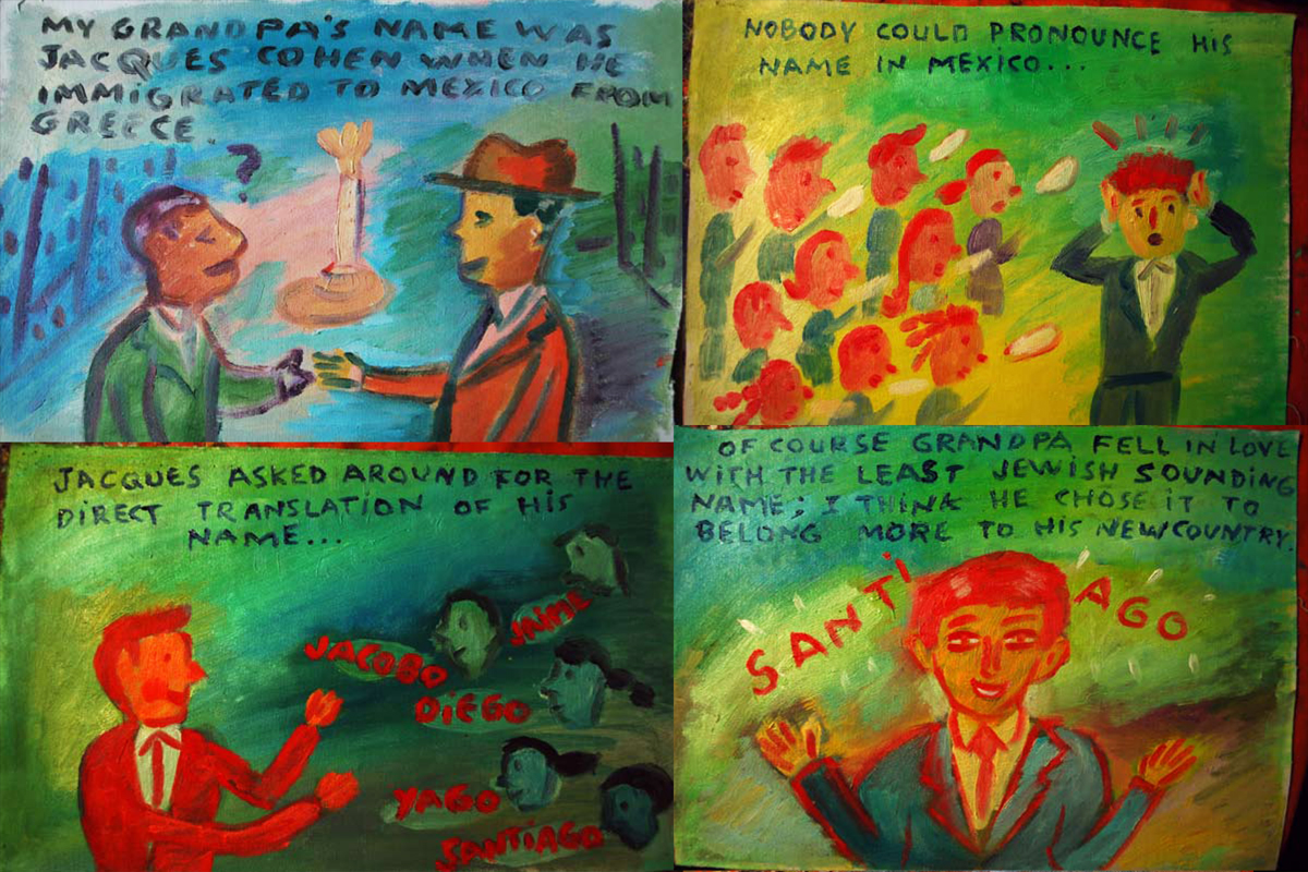
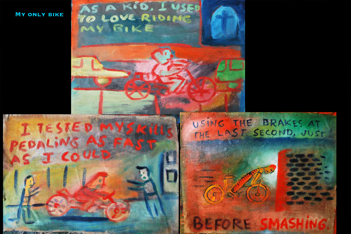
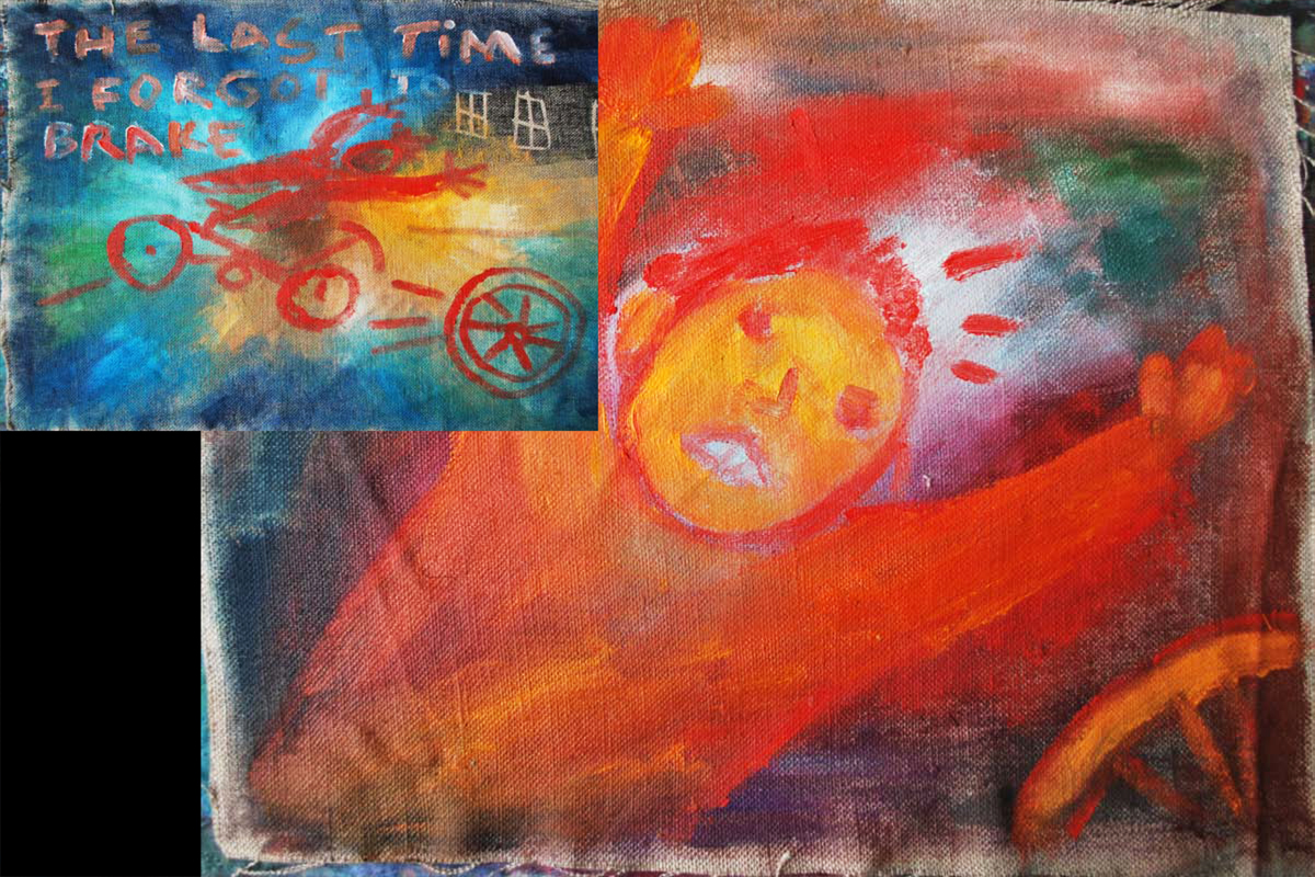
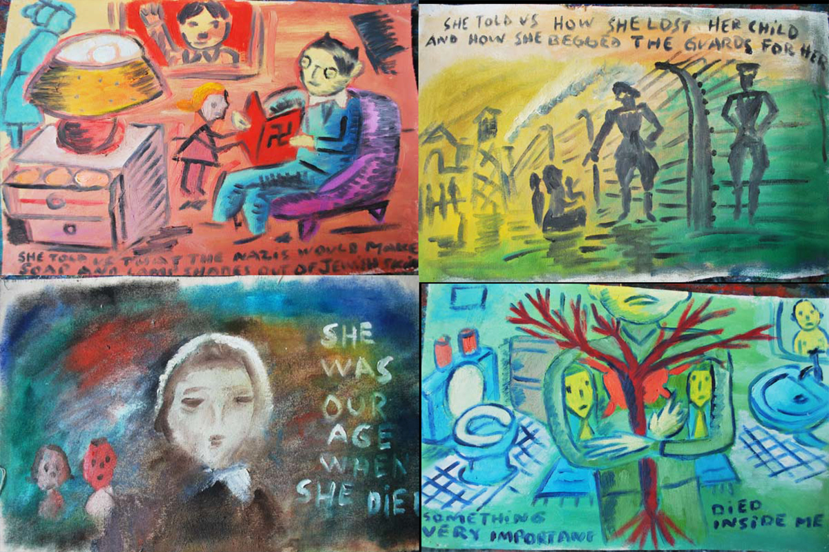
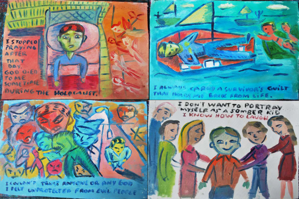
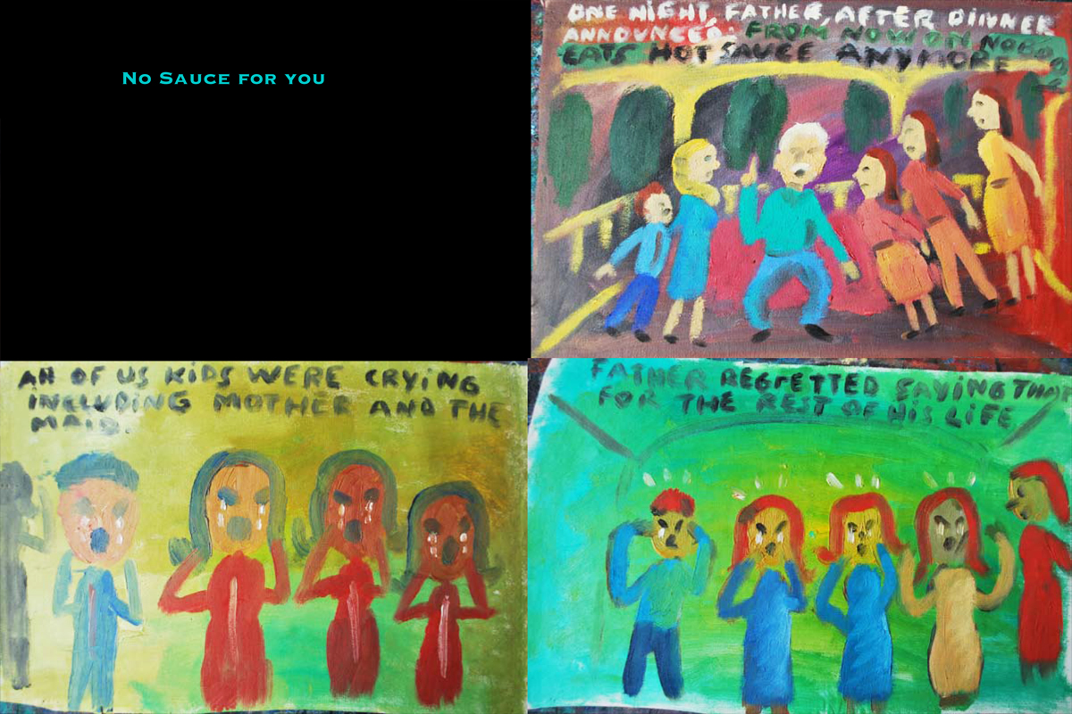
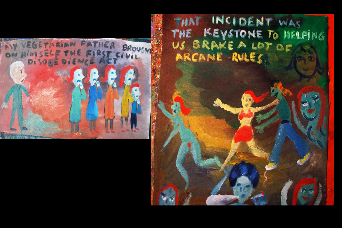
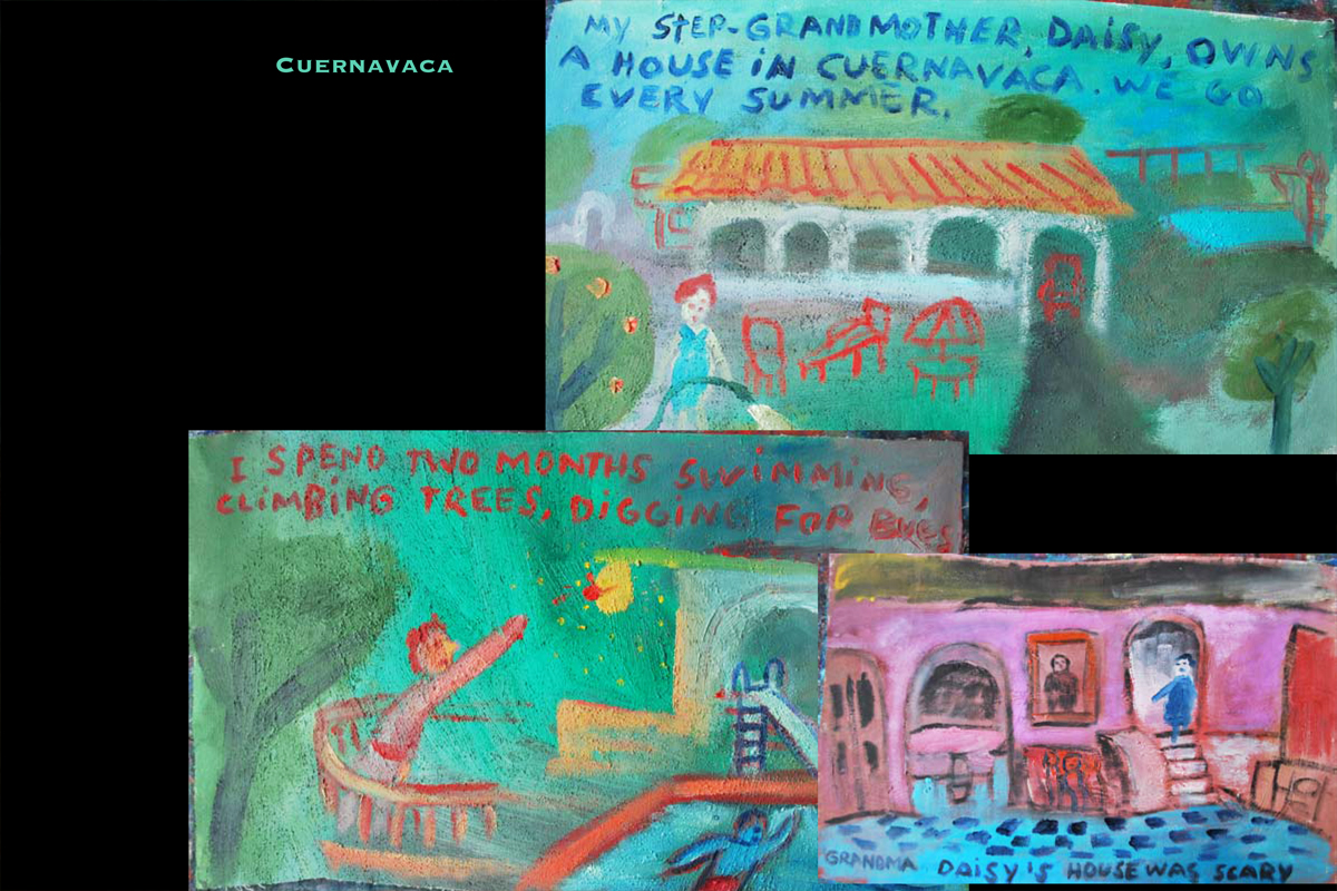
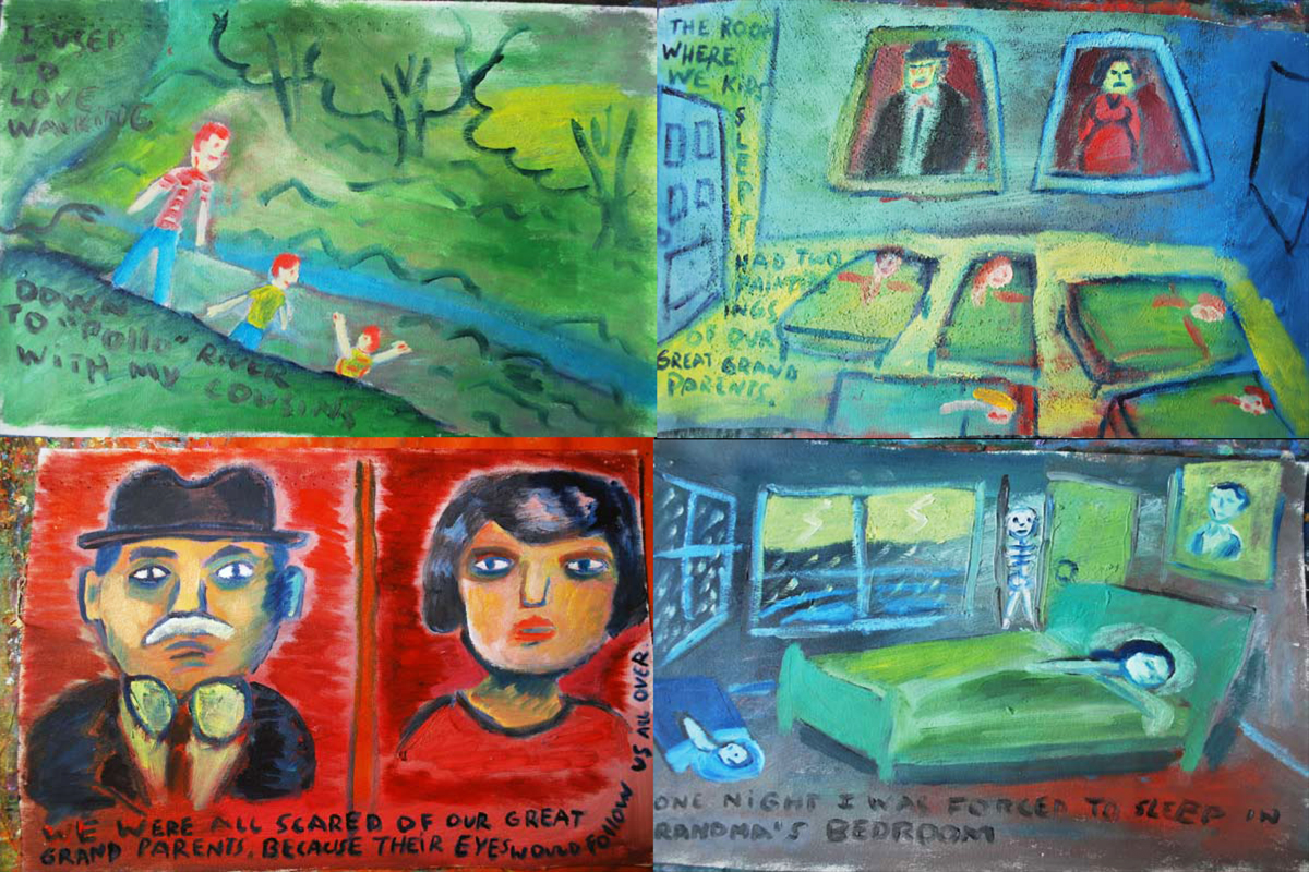
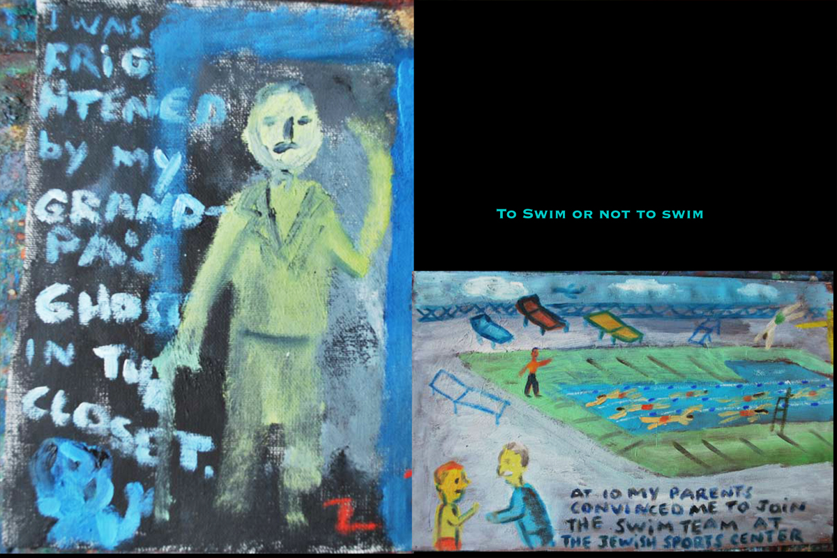
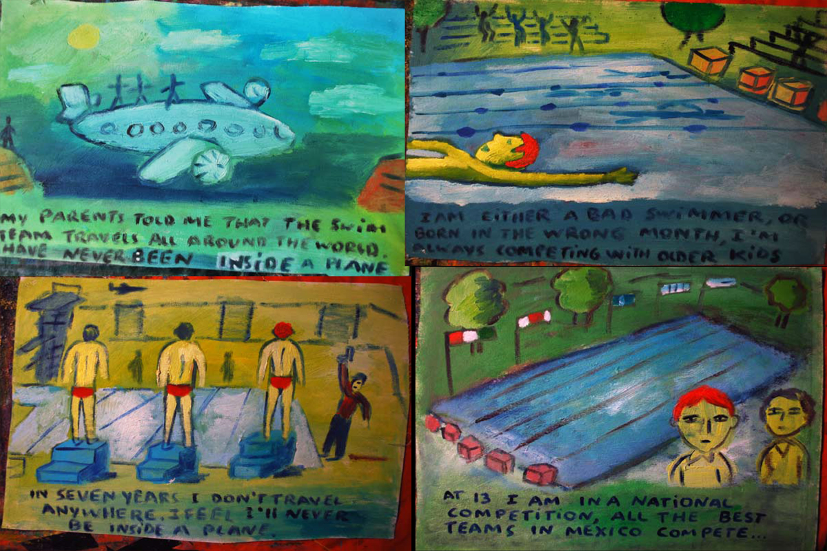
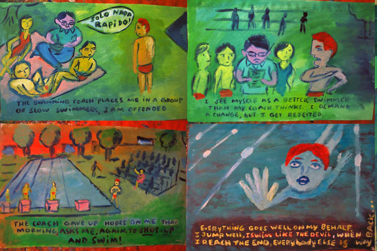
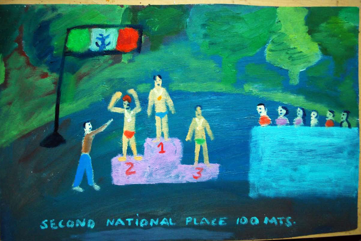
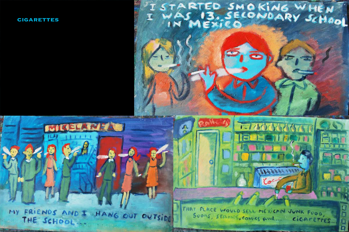
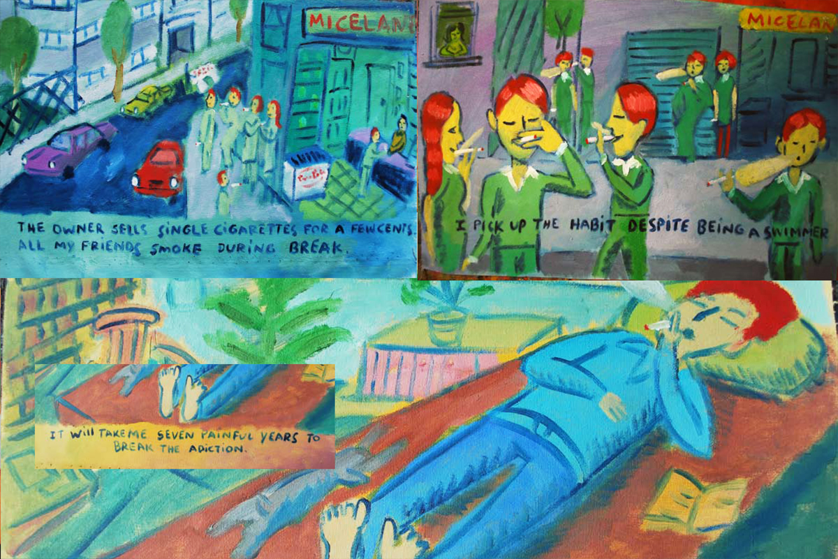
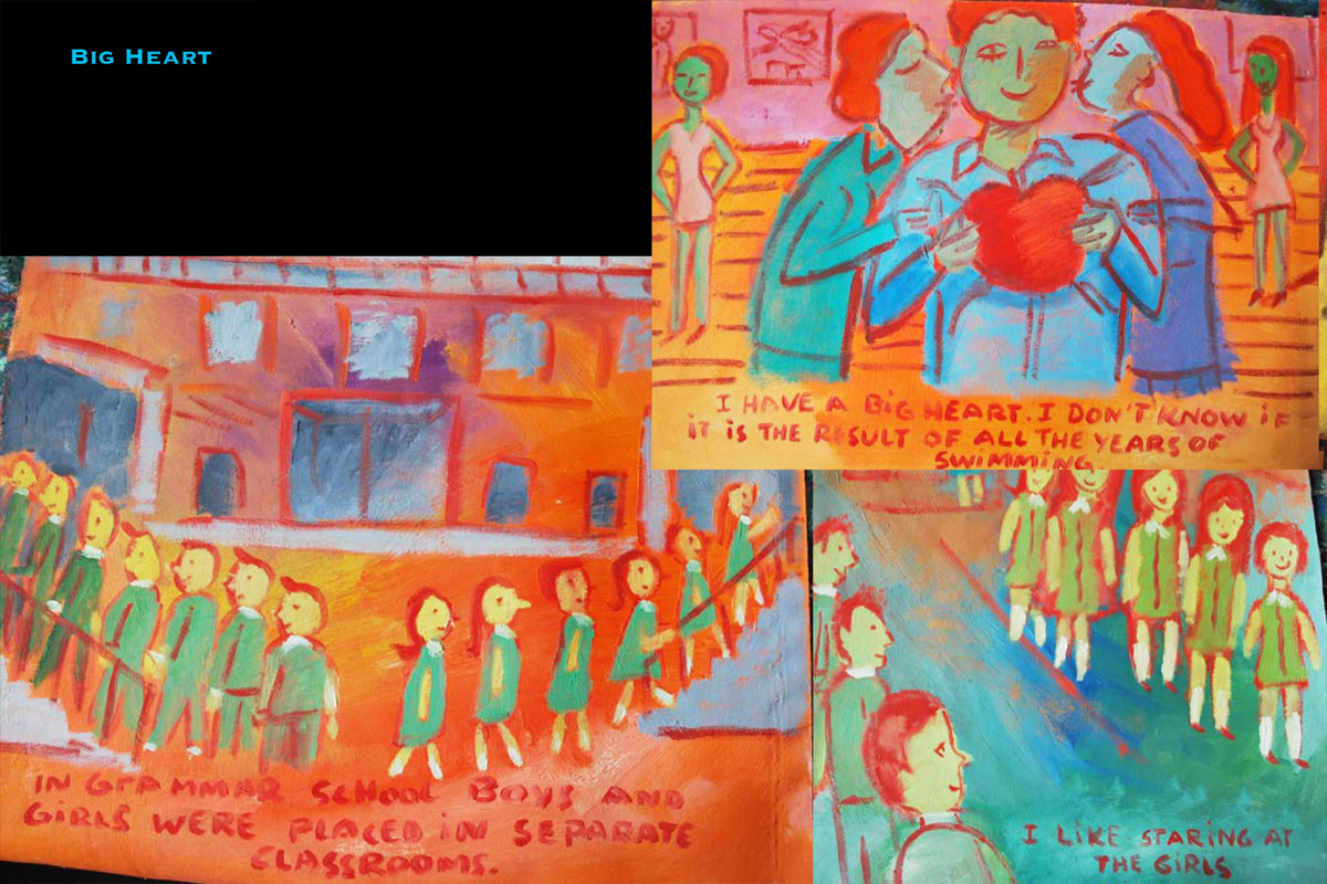
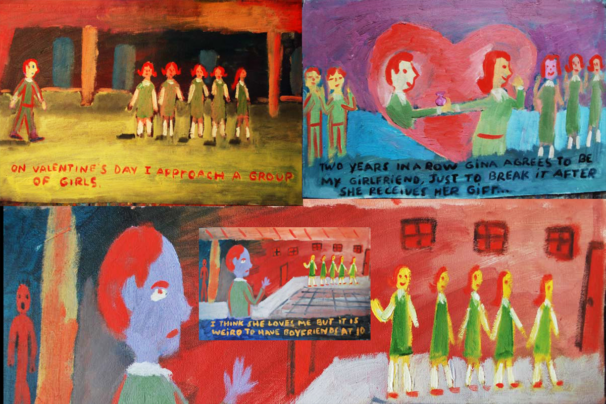
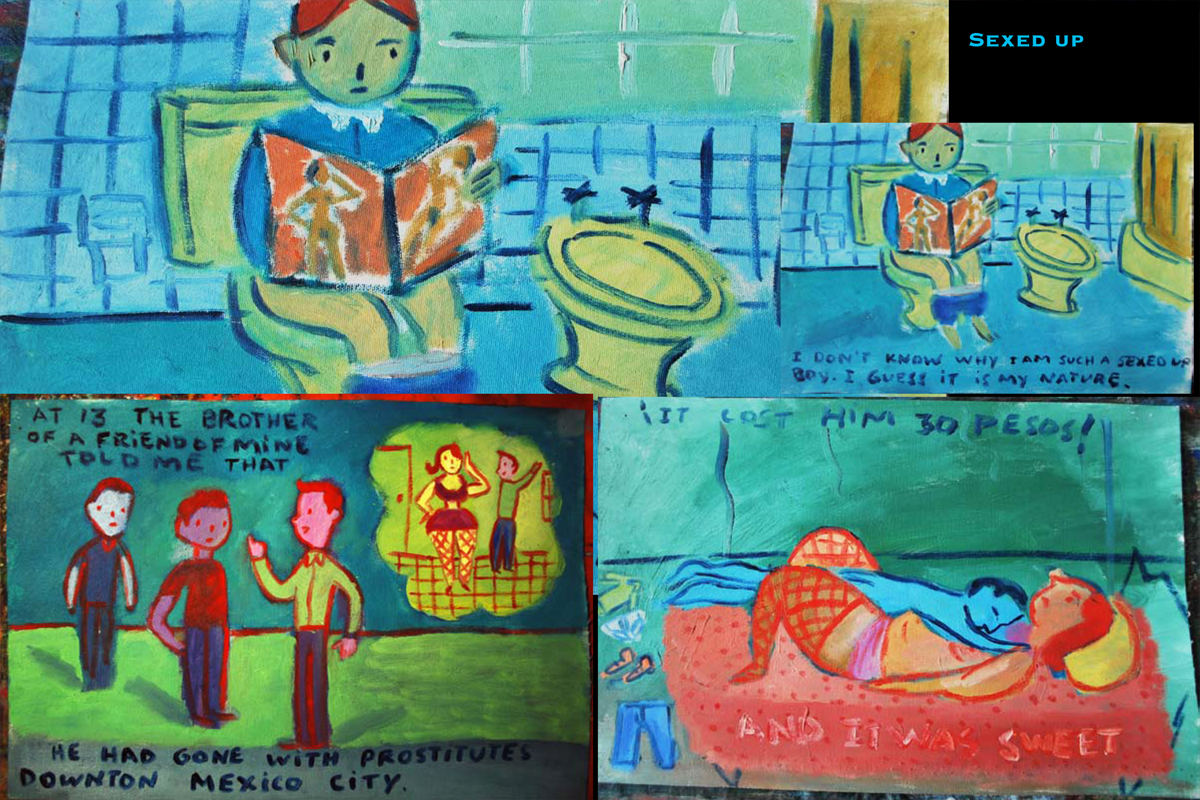
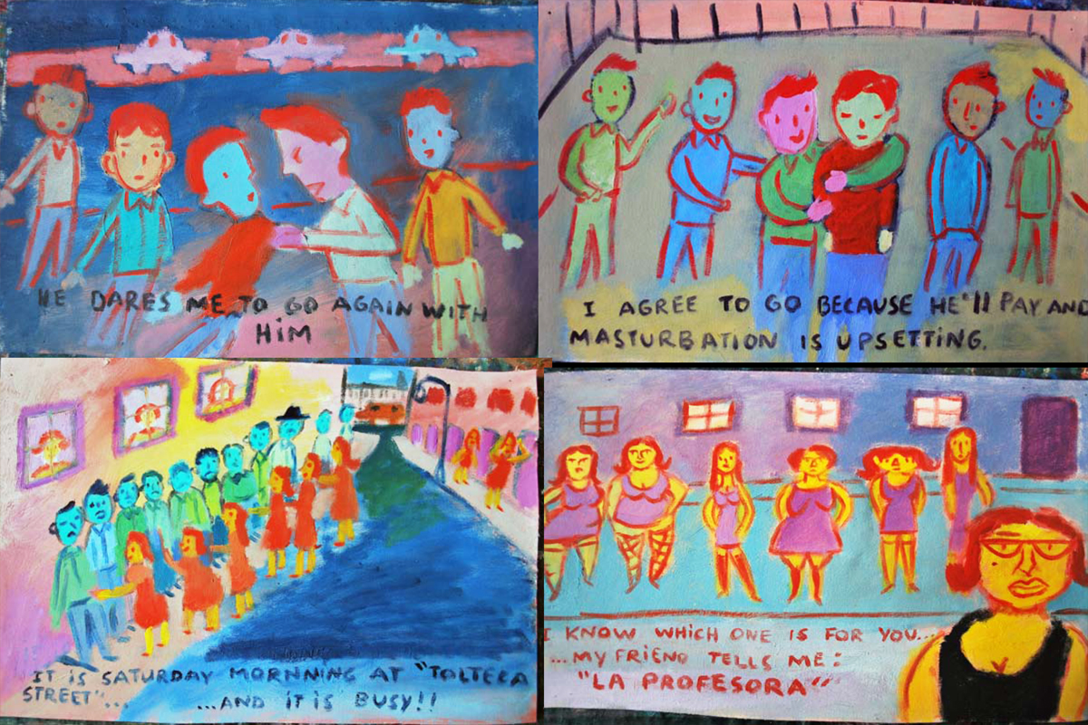
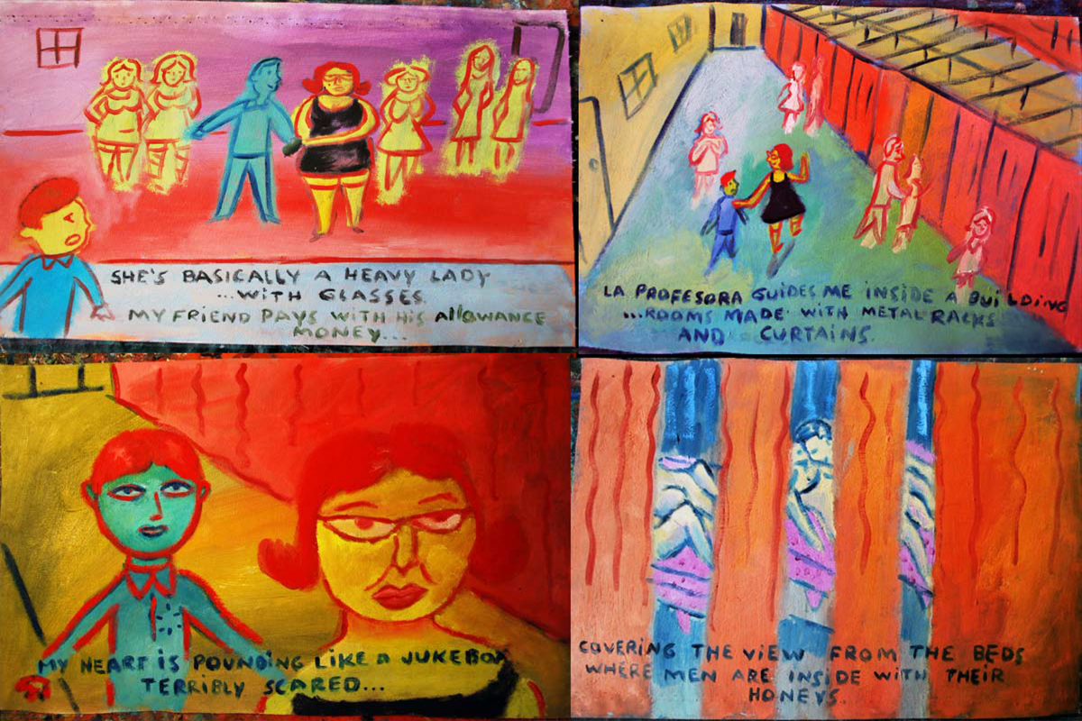
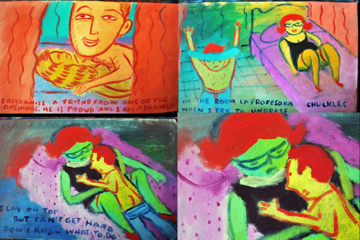
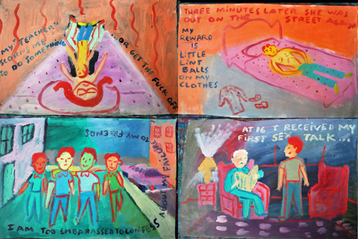
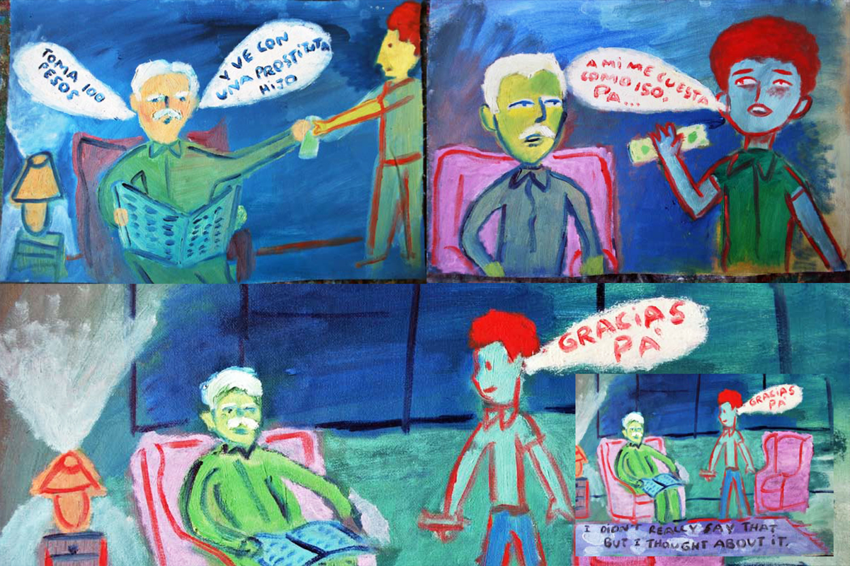
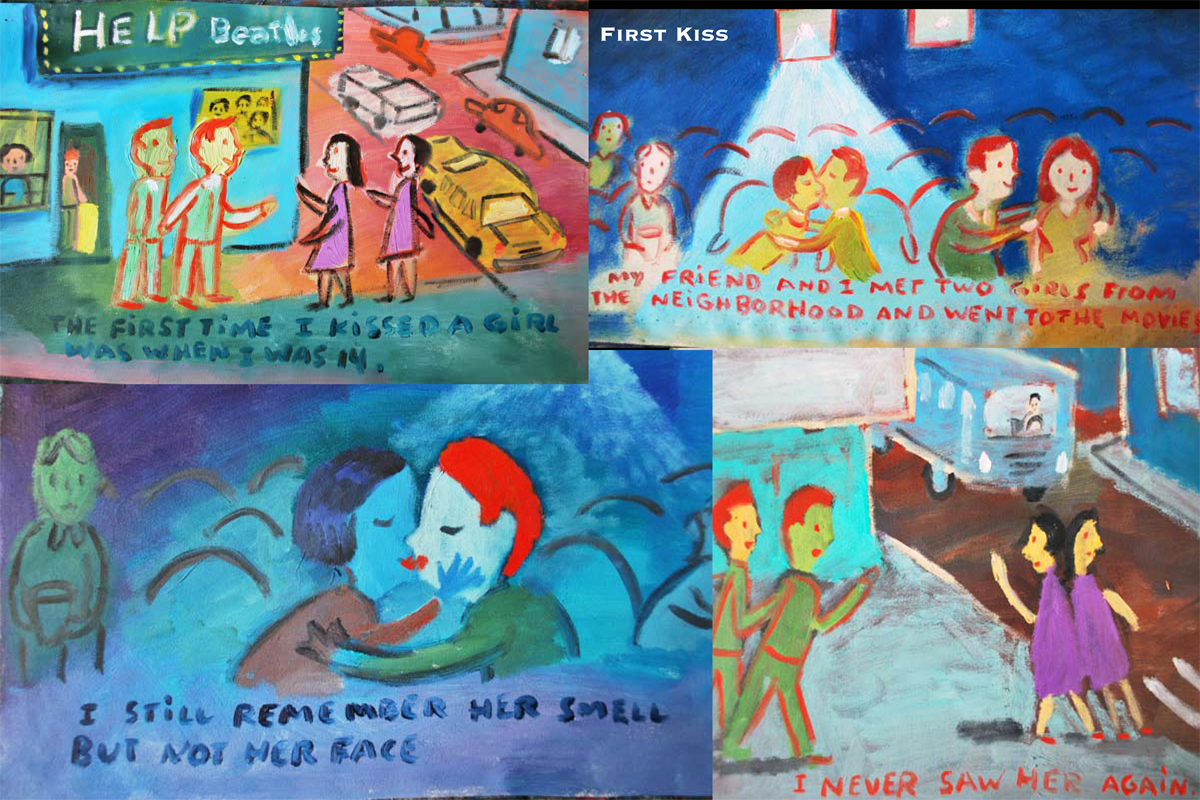
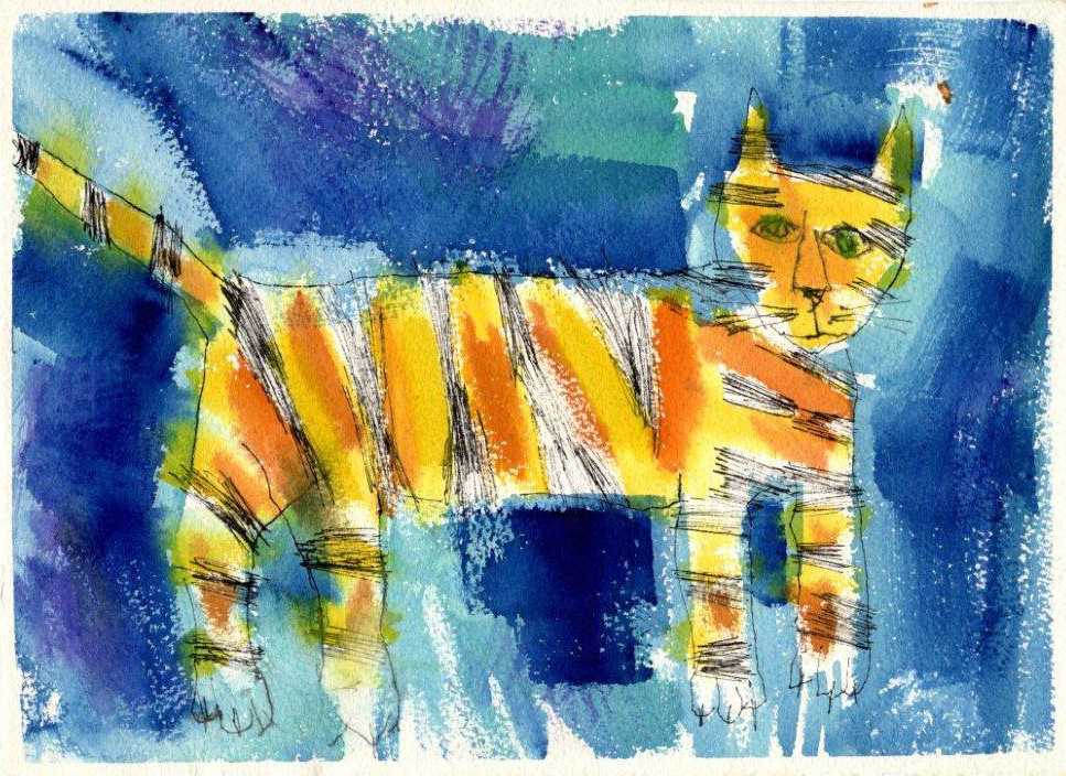
“Ex Vida” from Santiago Cohen – 1
- At a recent event, I was sitting with a couple of other artists and we bagan talking about Santiago Cohen. Here’s one of the greats on the New York scene, and it seems as though he went from super success to silence. We all were hoping something would happen, if only so that we could see more art.
When I returned from my short vacation, I was surprised to find an email from Santiago. He offered to send me part of a piece he was working on to get my thoughts. It’s an illustrated biographical notebook. And, as expected it’s stunning. I received the first couple hundred pages, and I asked Santiago if I could post it. He said yes, so here we go.
It’s appropriate that this piece should start today, Columbus Day. It’ll continue for a while. I’ll break it into parts, all about 40 pages, where it seems unobtrusive. This is “Art” with a capital “A” in the making, from Santiago. It’d make an incredible film.
Let us know what you think.
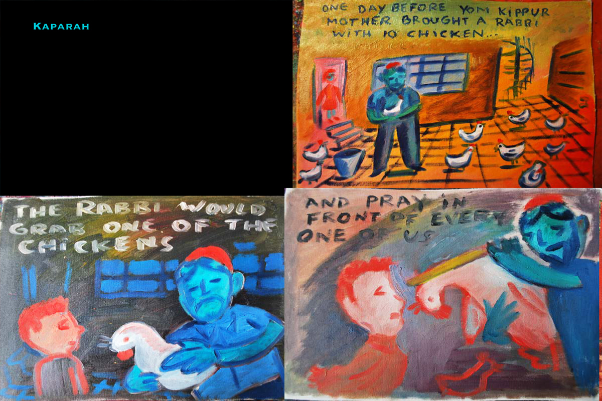
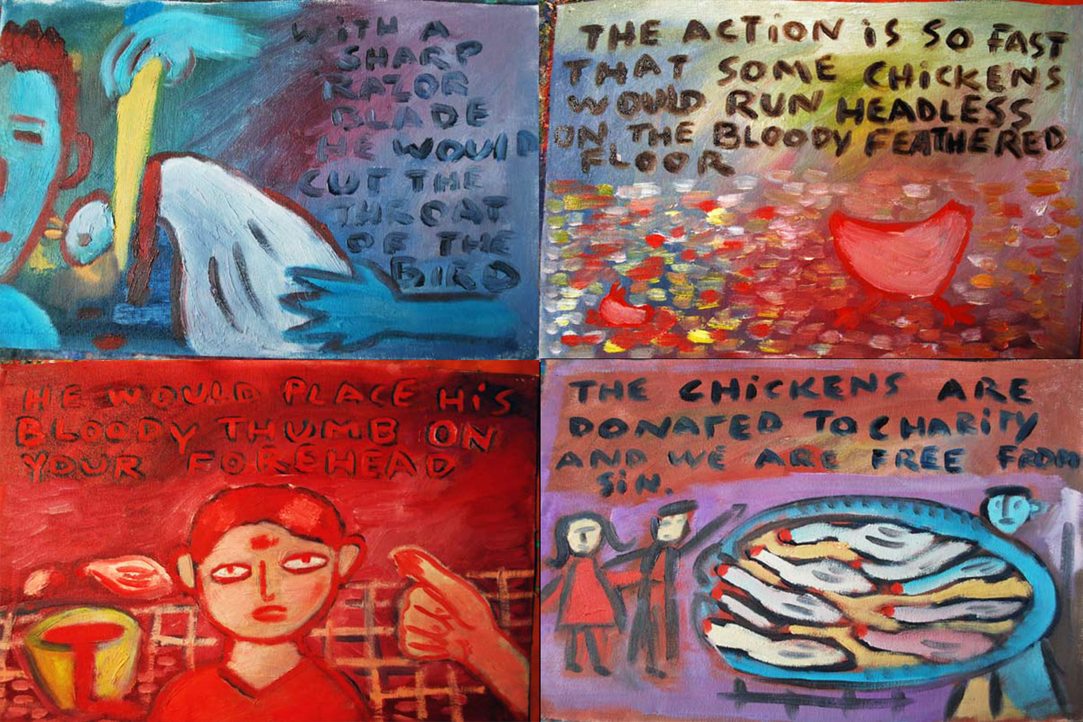
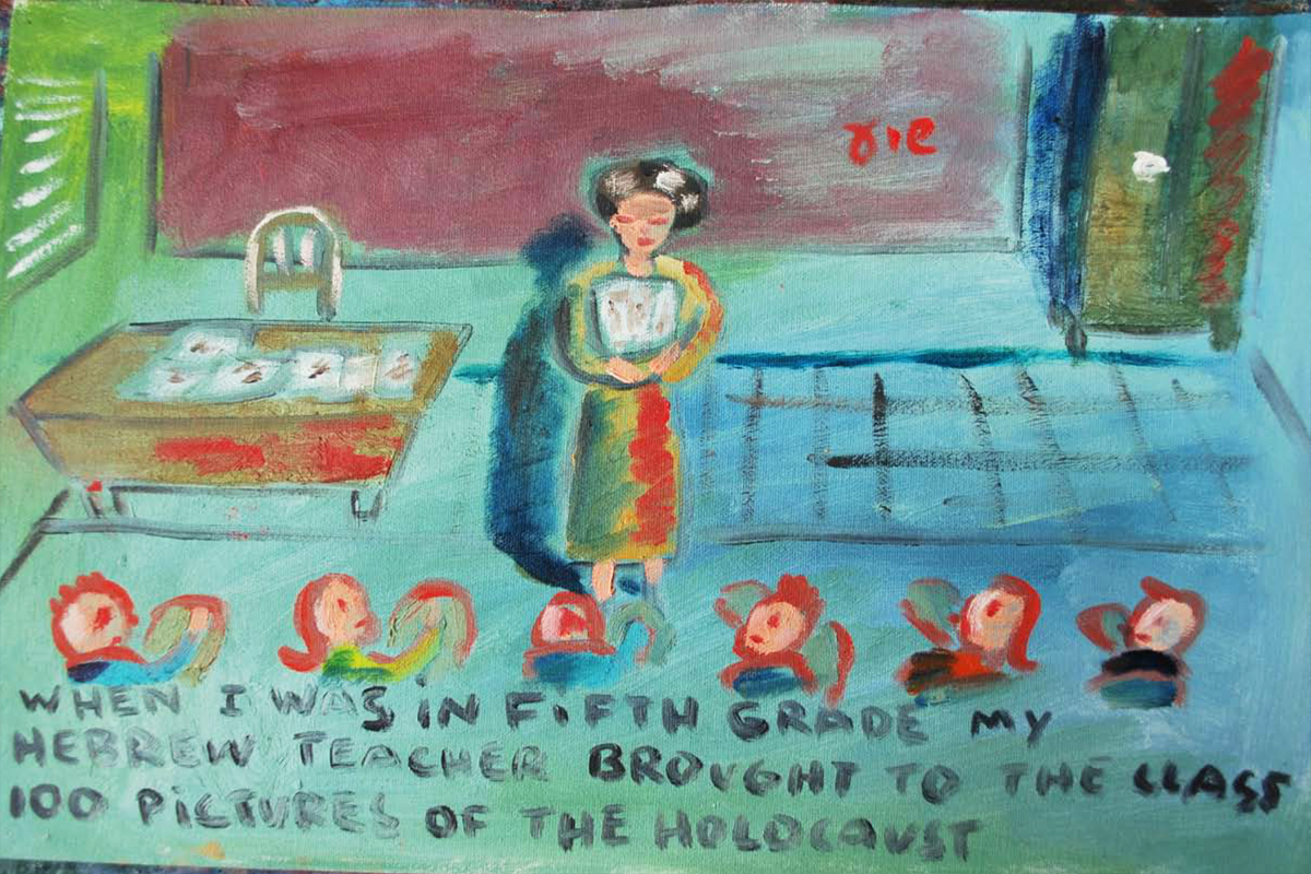
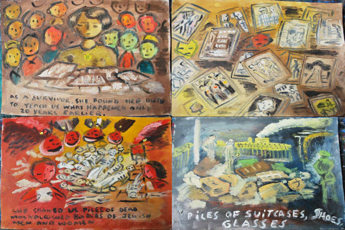
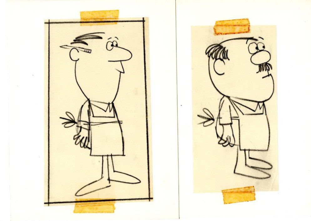
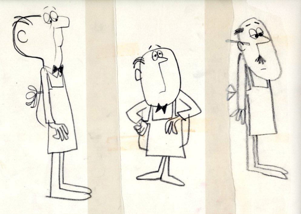
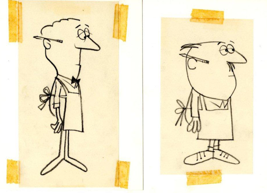
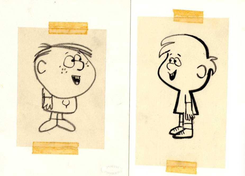
 1
1(Click any image to enlarge.)
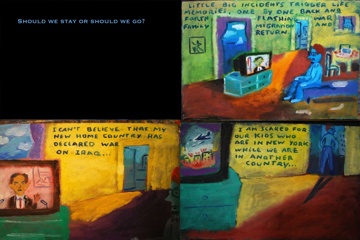
 2
2
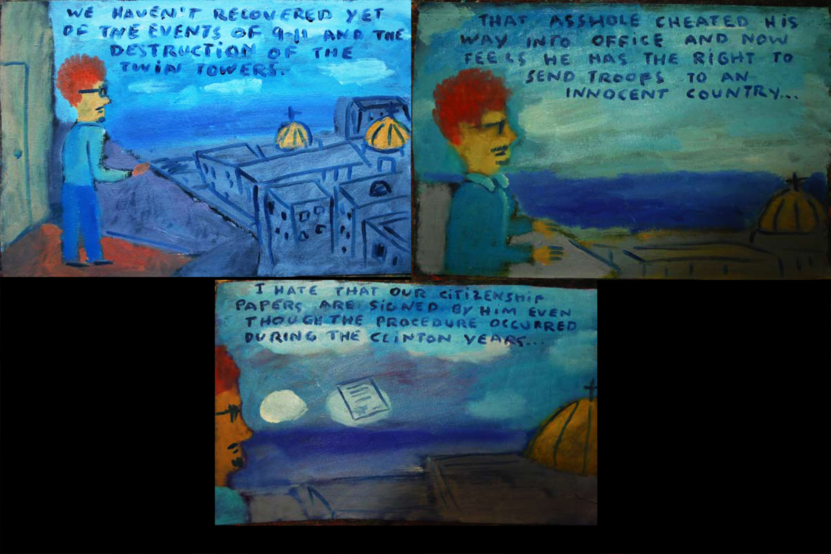
 3
3
 4
4
 5
5
 6
6
 7
7
 8
8
 9
9
 10
10
 11
11
 12
12
 13
13
 14
14
 15
15
 16
16
 17
17
 18
18
 19
19
 20
20
 21
21
 22
22
 23
23
 24
24
 25
25
 26
26
 27
27
 28
28
 29
29
 30
30
 31
31
 32
32
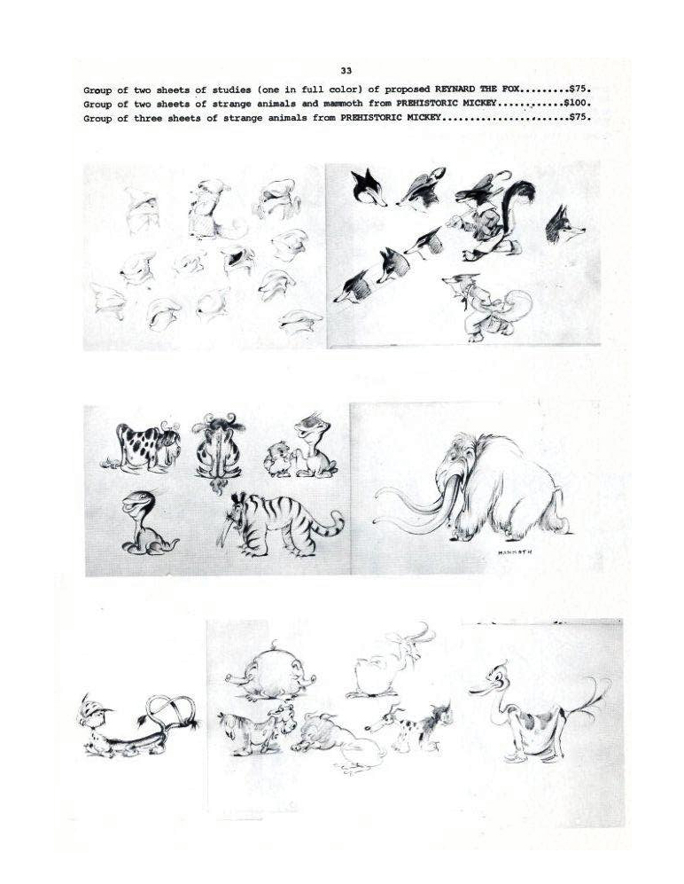
 33
33
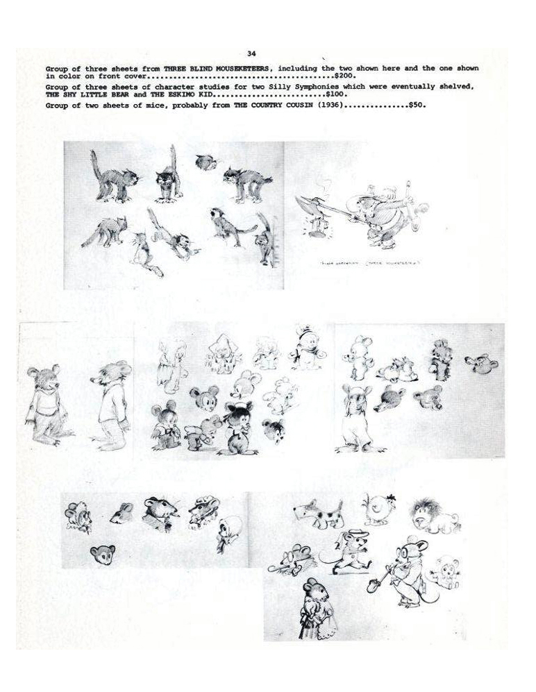
 34
34
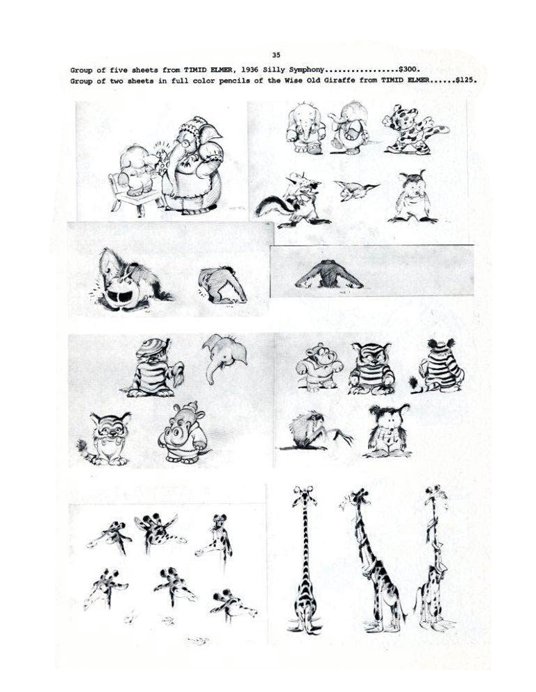
 35
35
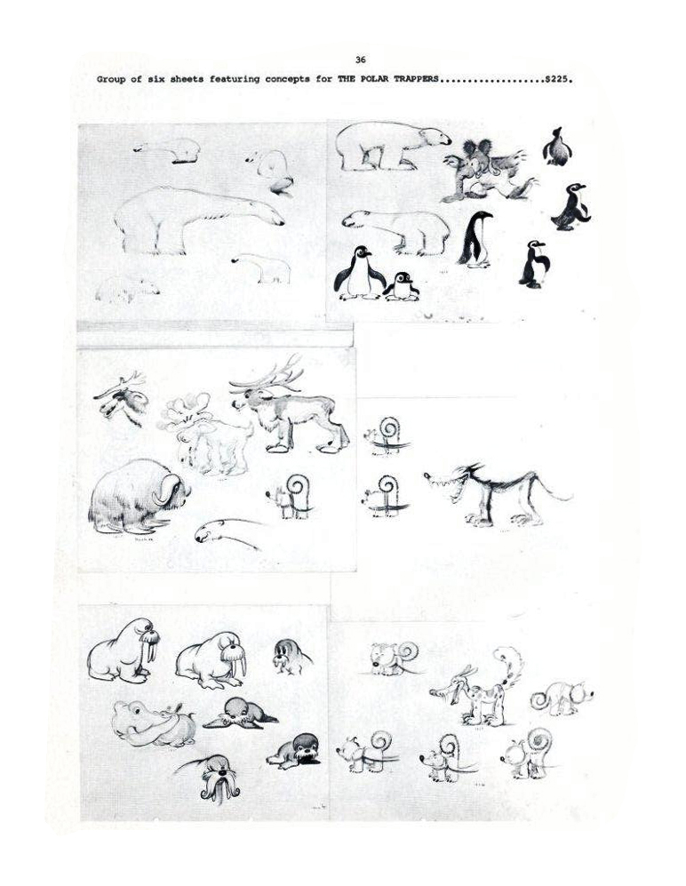
 36
36
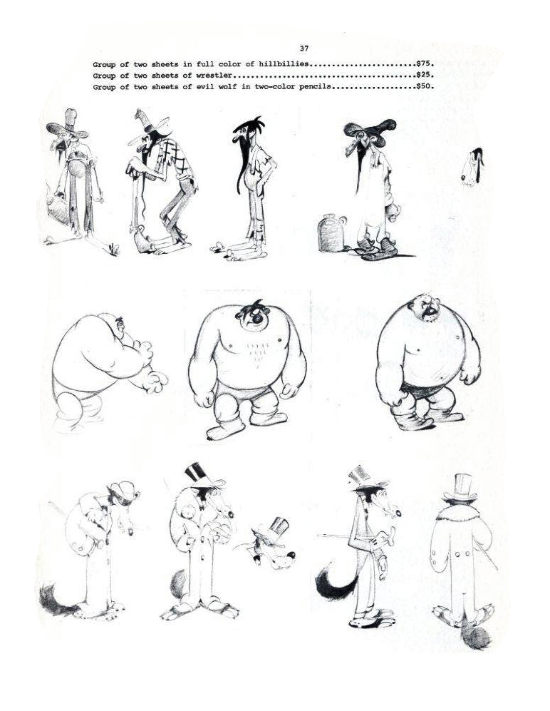
 37
37
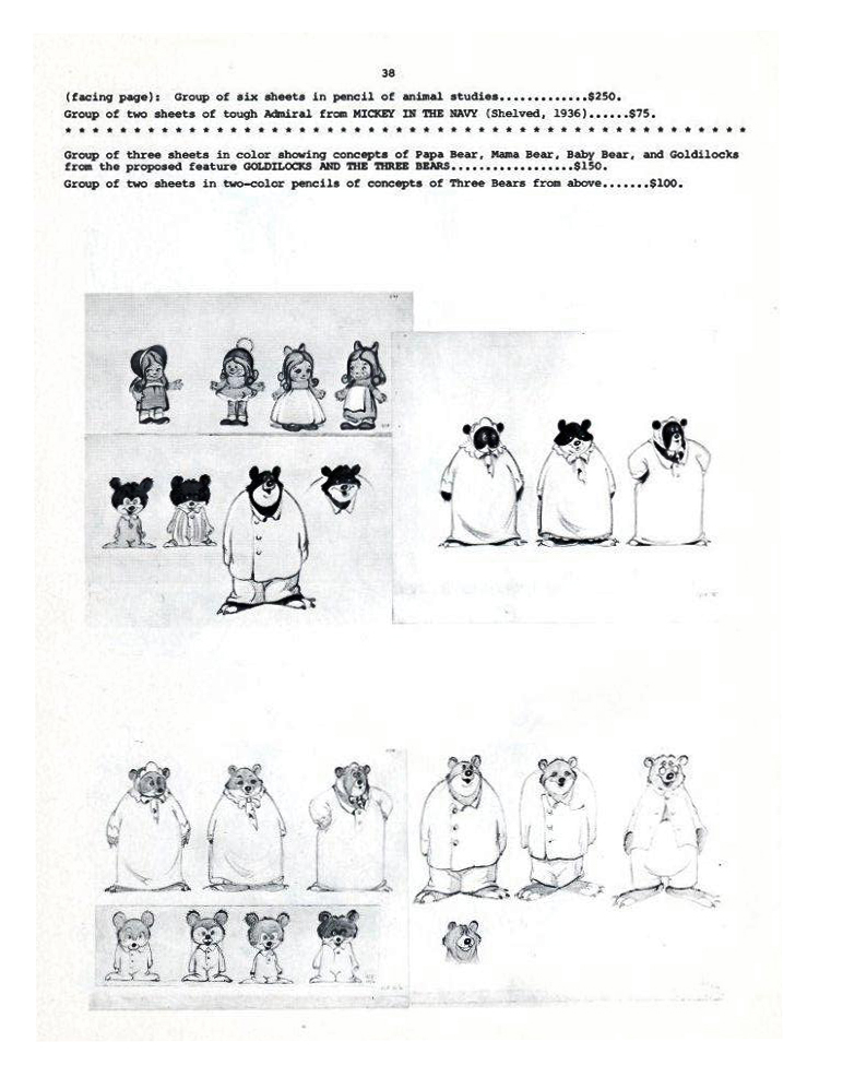
 38
38
More next Monday.
.
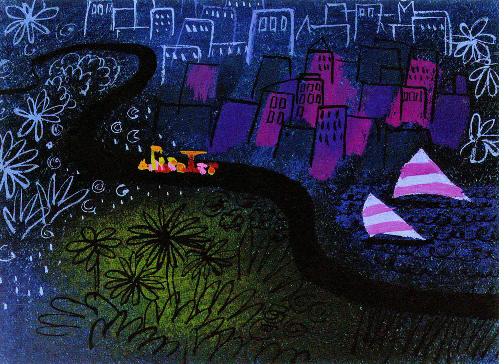
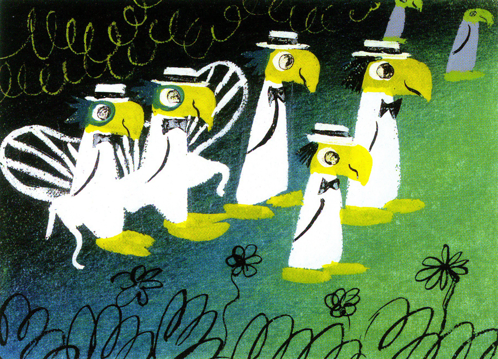
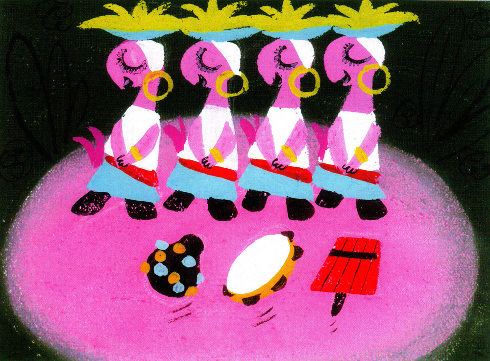
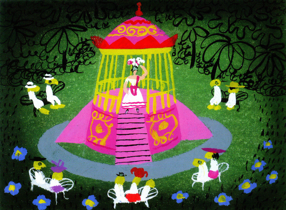
Books &Disney &Illustration &Layout & Design 04 Oct 2010 07:11 am
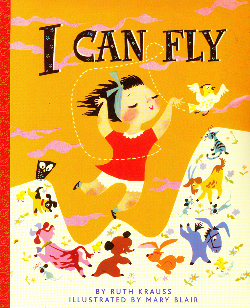
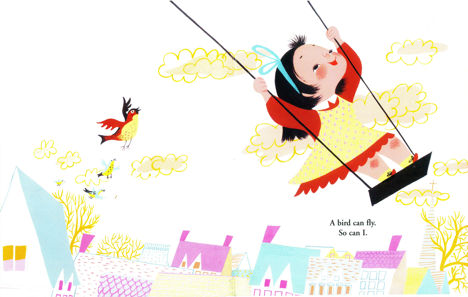
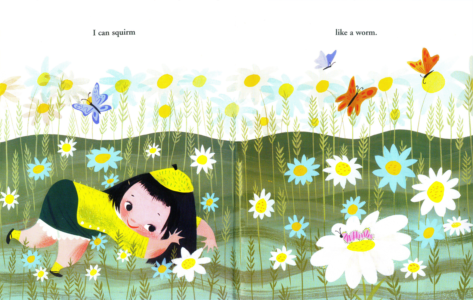
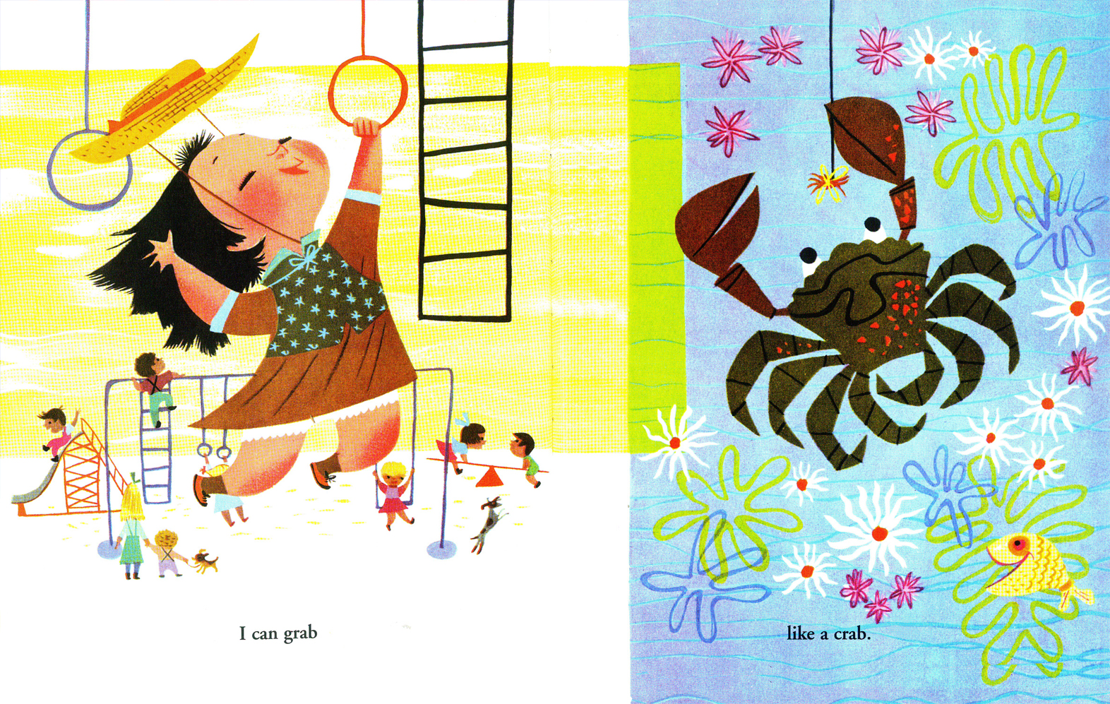
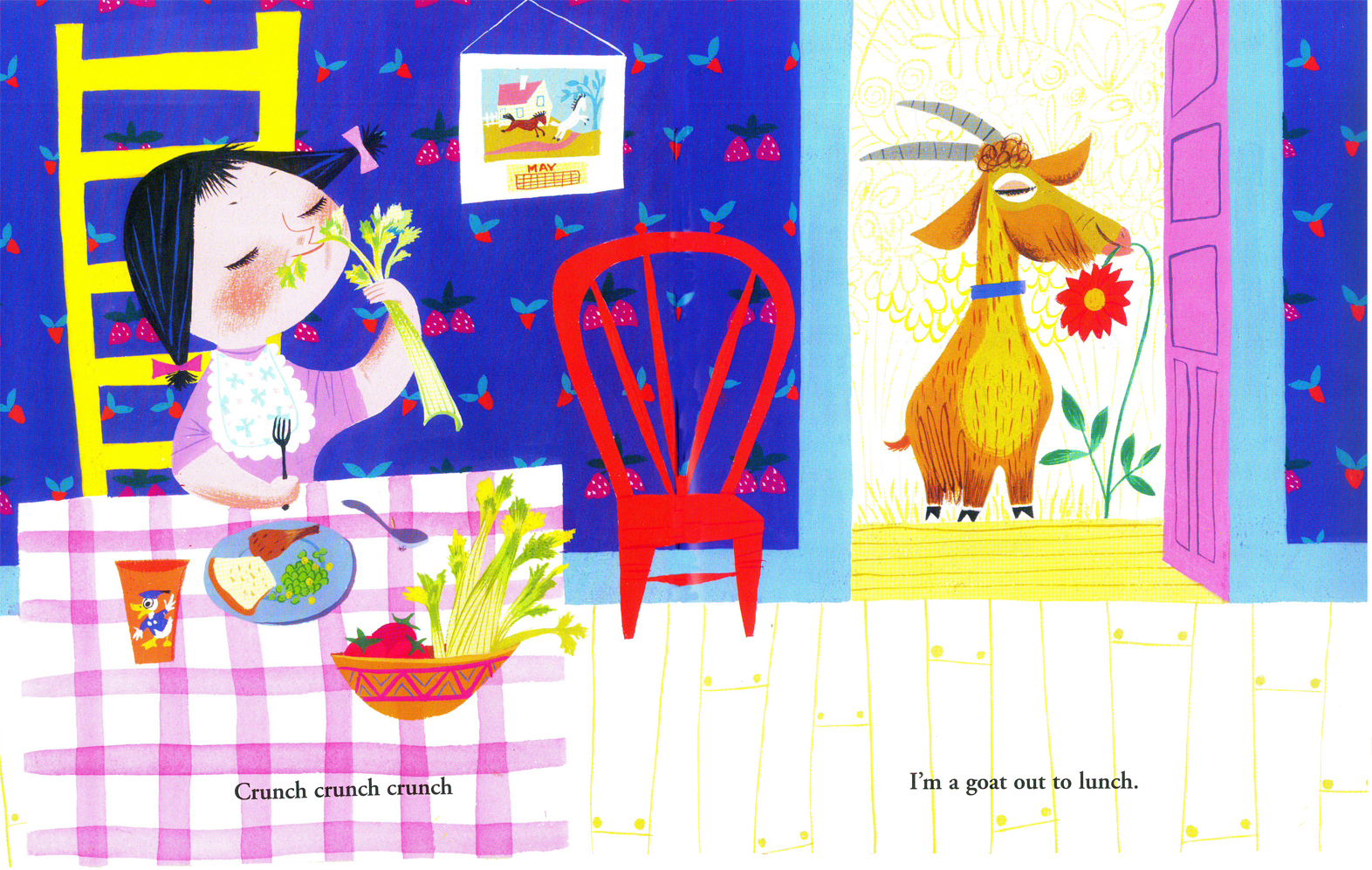
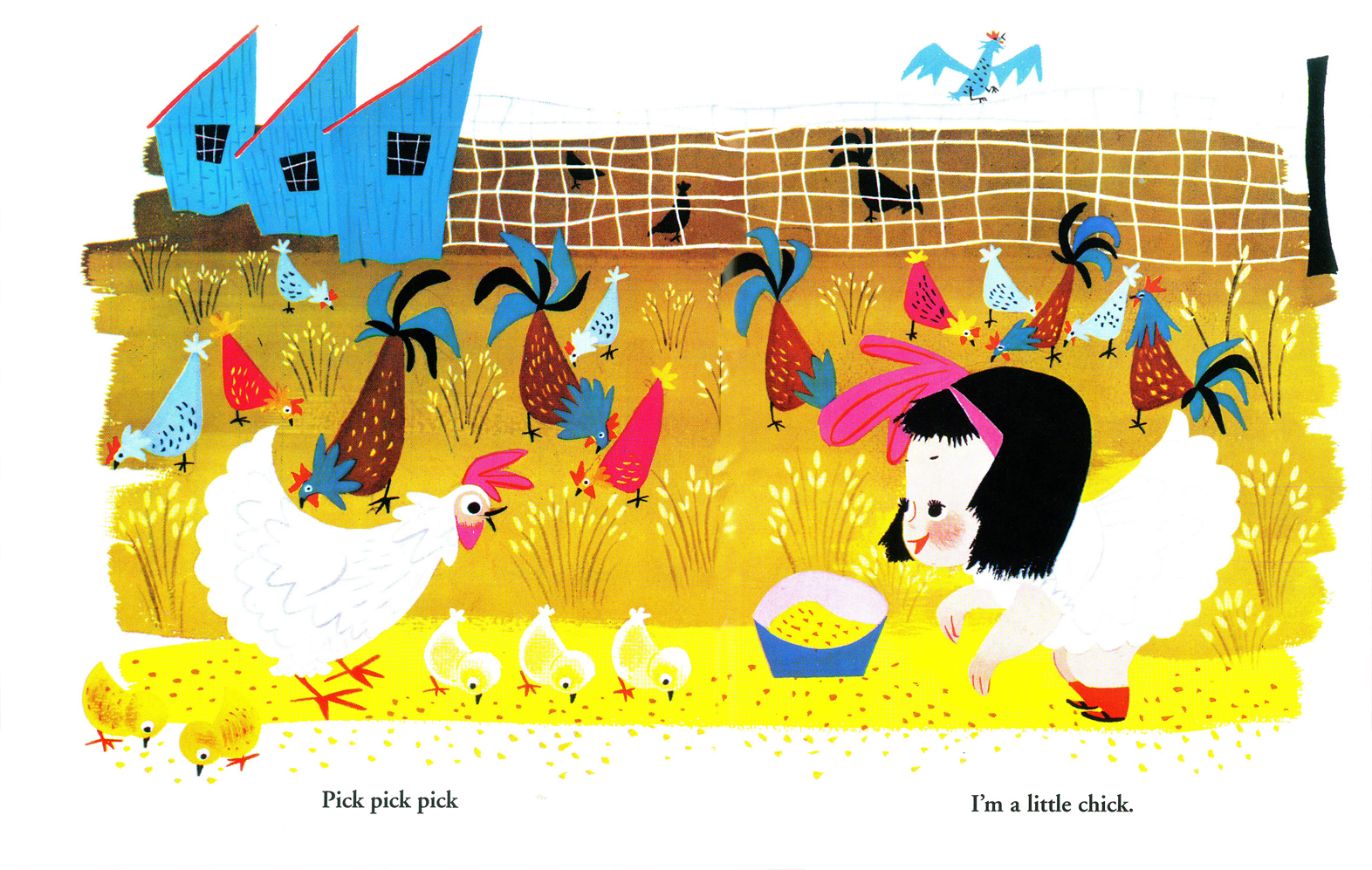
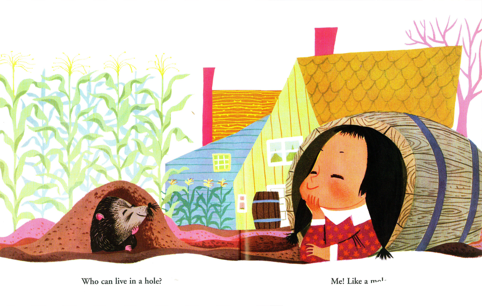
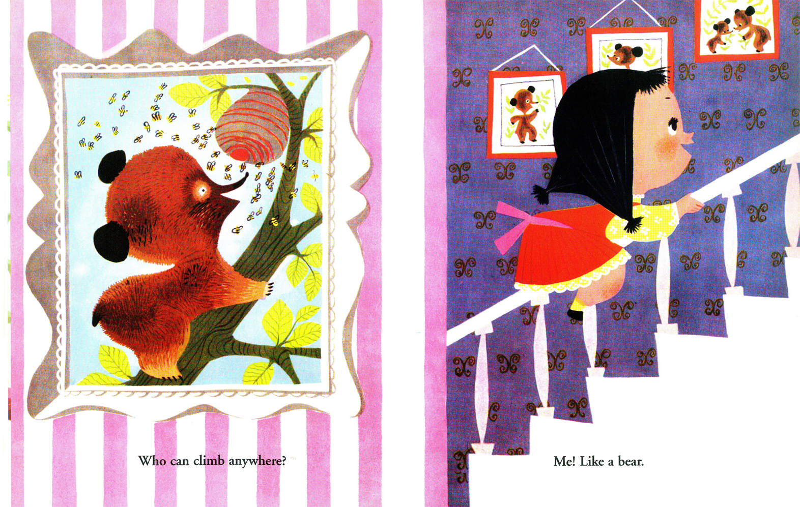
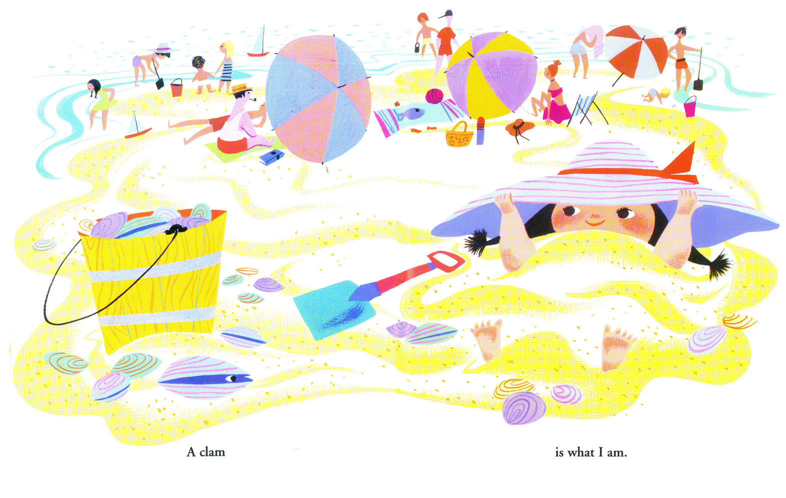
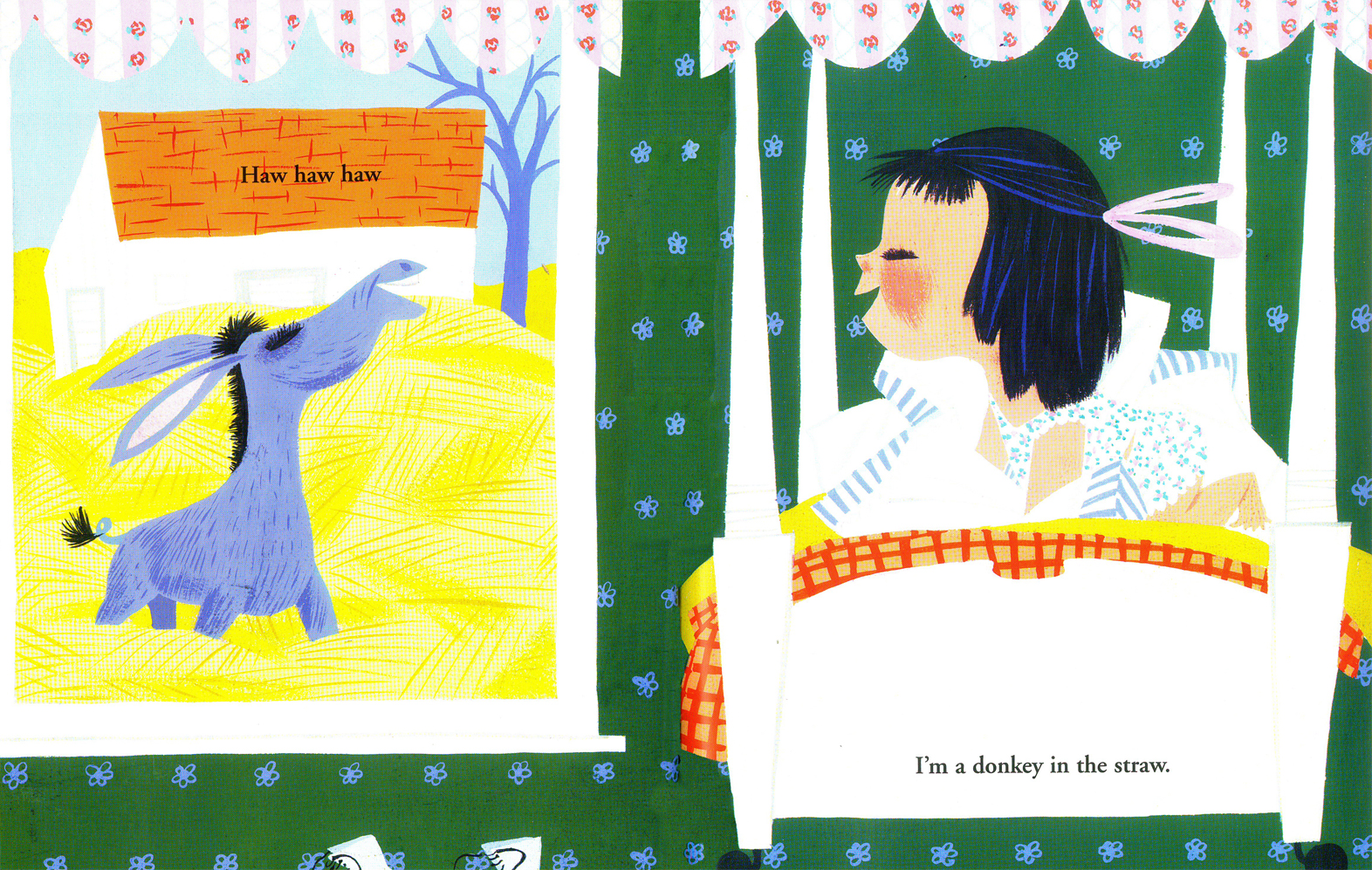
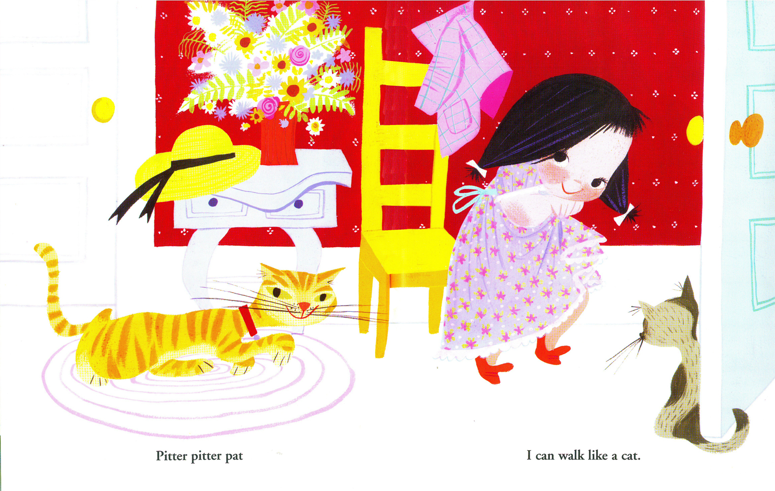
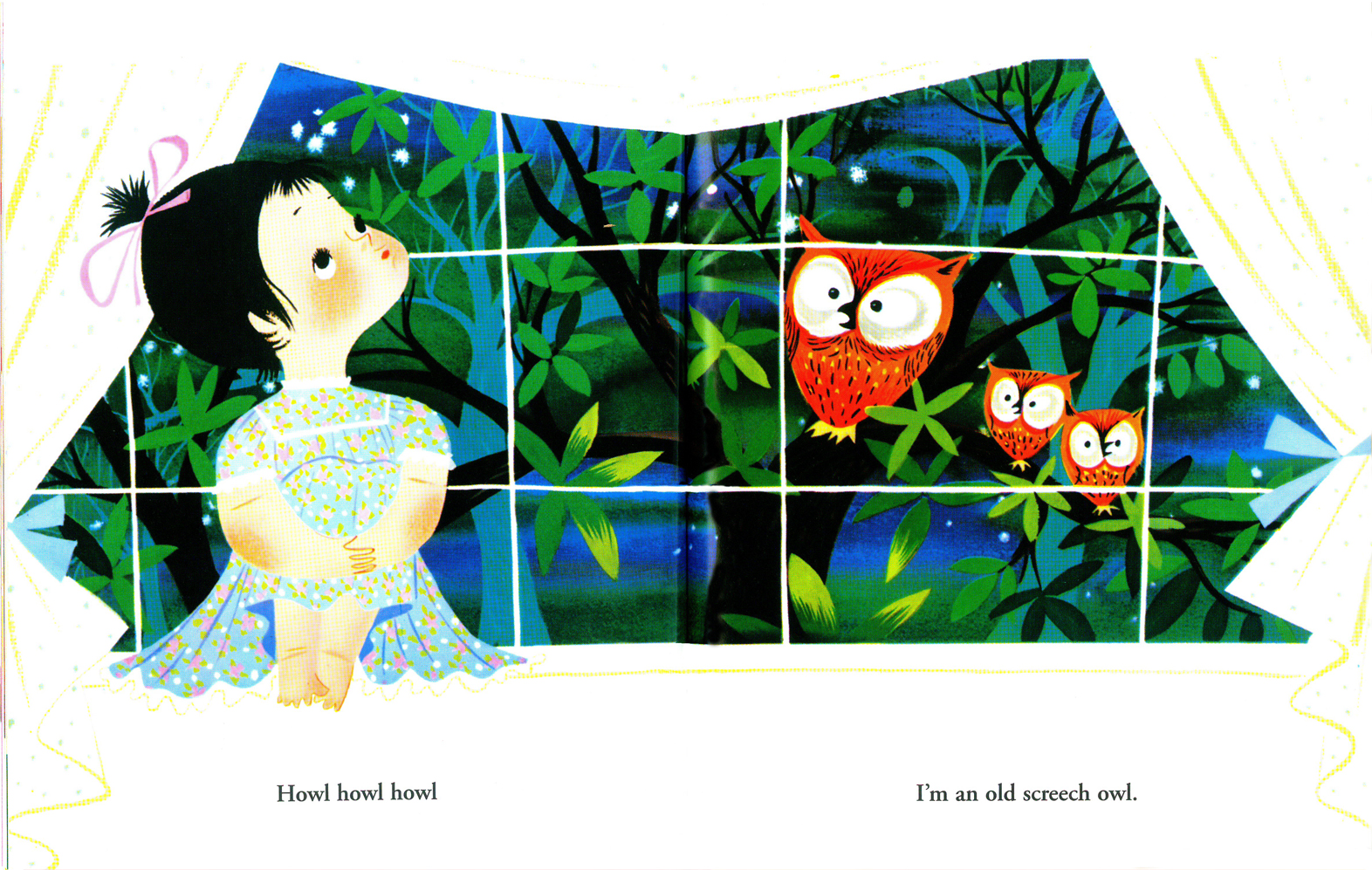
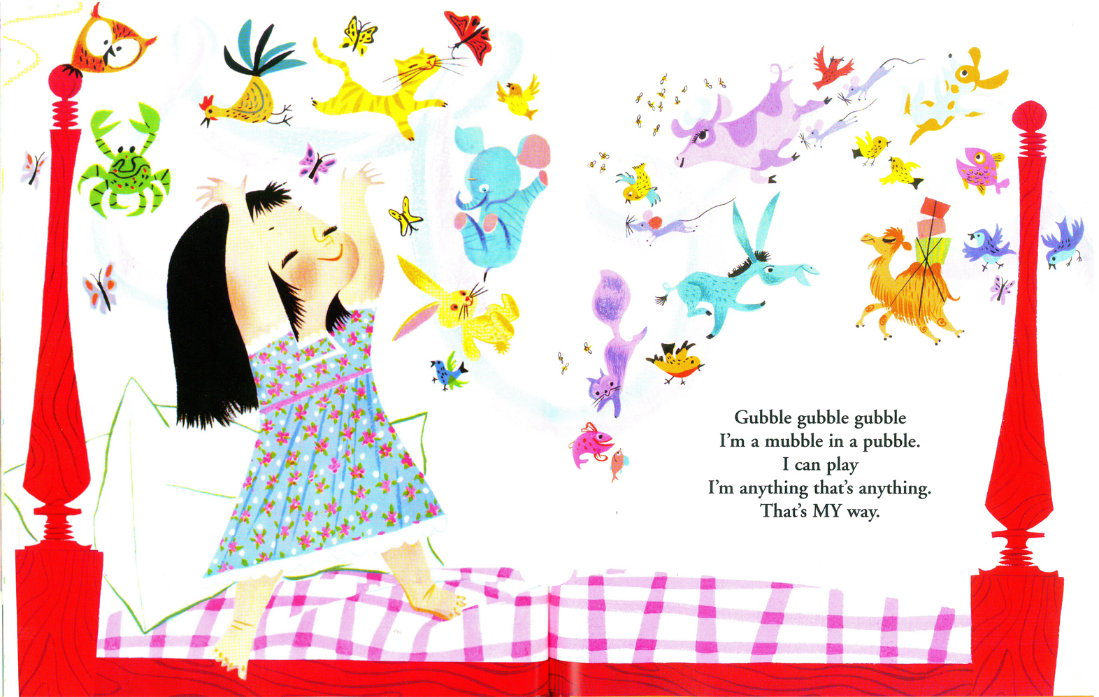
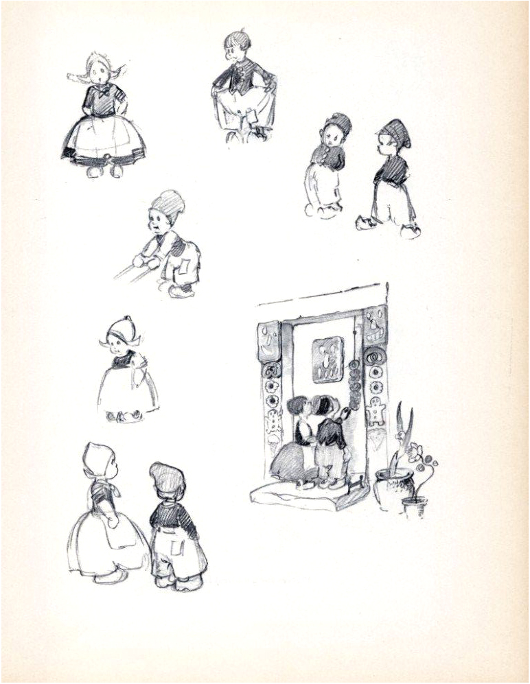
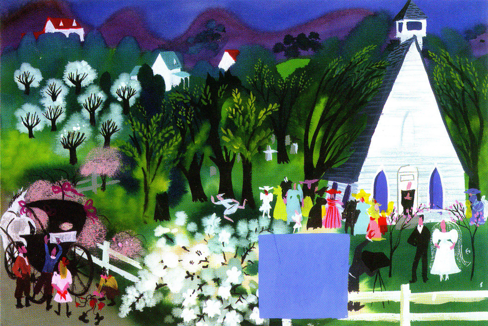
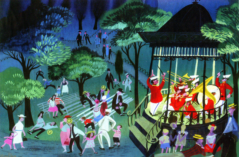
I Can Fly
- I had intended to give a rest to Mary Blair‘s incredible work after having posted so many recent pieces by her. However, I just bought a copy of her first children’s book, after separating from the Disney studio.
I Can Fly is extraordinary. After getting a copy in my hands, I realized I had to share it – even though it’s out there in numerous ways. So that’s what today’s post is about. This is Mary Blair’s book, I Can Fly. Words are by Ruth Kraus.
(Click any image to enlarge.)
The inner covers.
 1
1
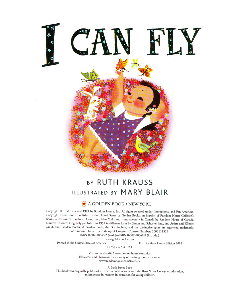
The title page.
 2
2
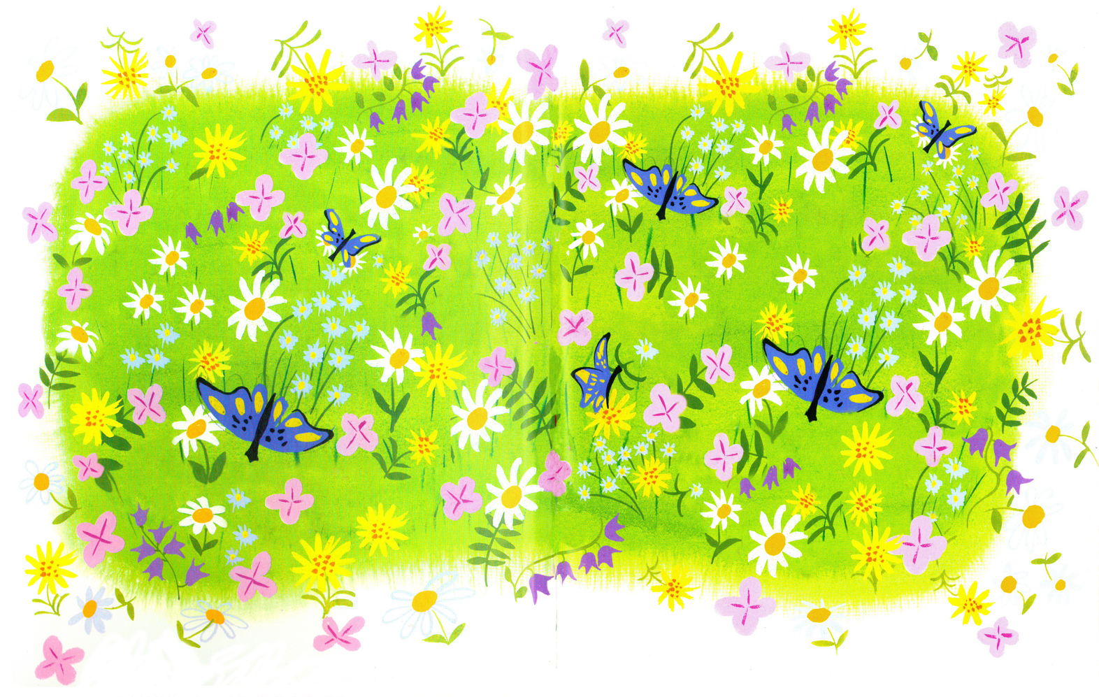
All of these are double page spreads.
 3
3
 4
4
 5
5
 6
6
 7
7
 8
8
Note that this is identical to the inner covers (above)
with the addition of the child and puppy overlay.
 9
9
 10
10
 11
11
 12
12
 13
13
 14
14
 15
15
 16
16
 17
17
 18
18
 19
19
 20
20
 21
21
The back cover
Animation &Bill Peckmann &Books &Disney &Illustration &Layout & Design &Models 24 Sep 2010 10:14 am
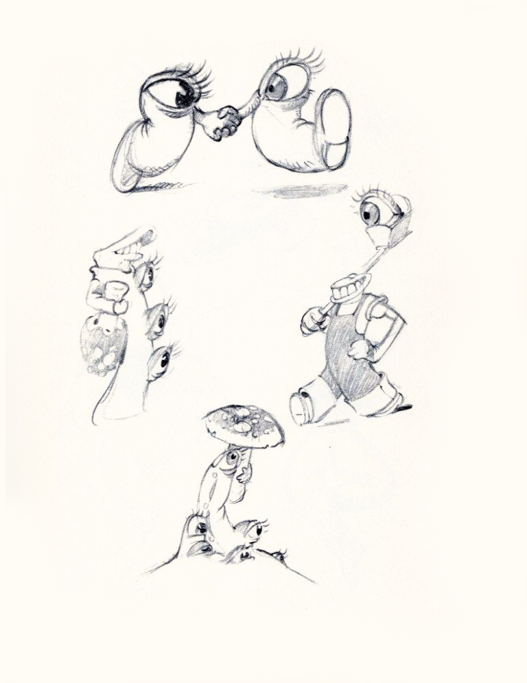
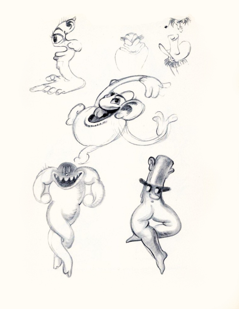
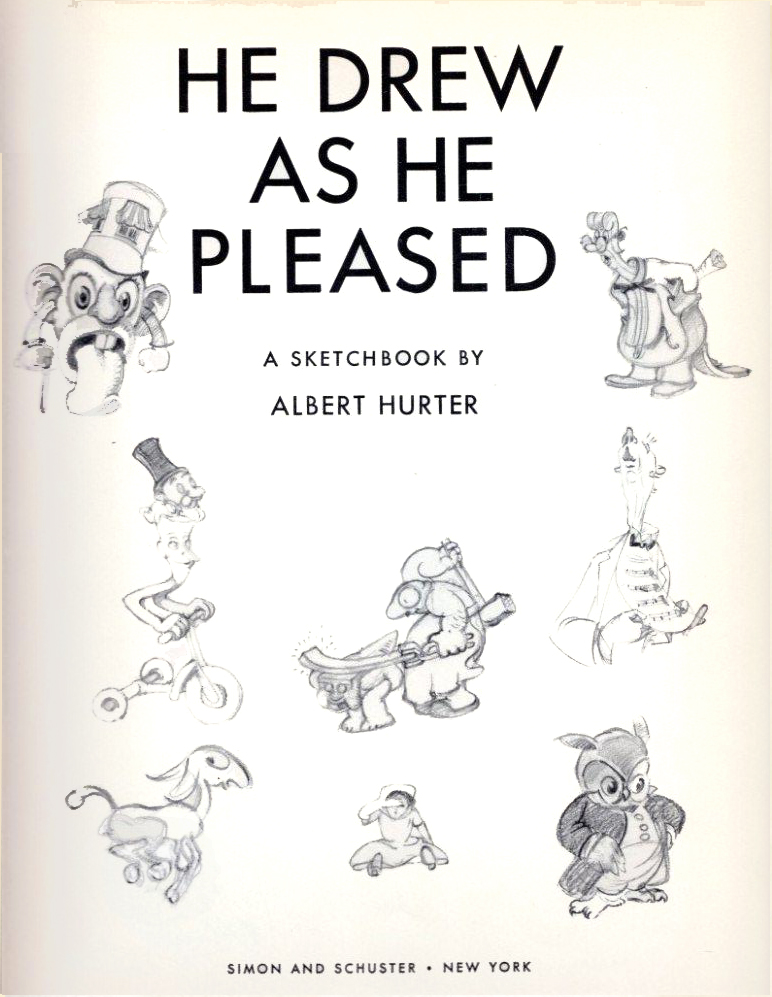
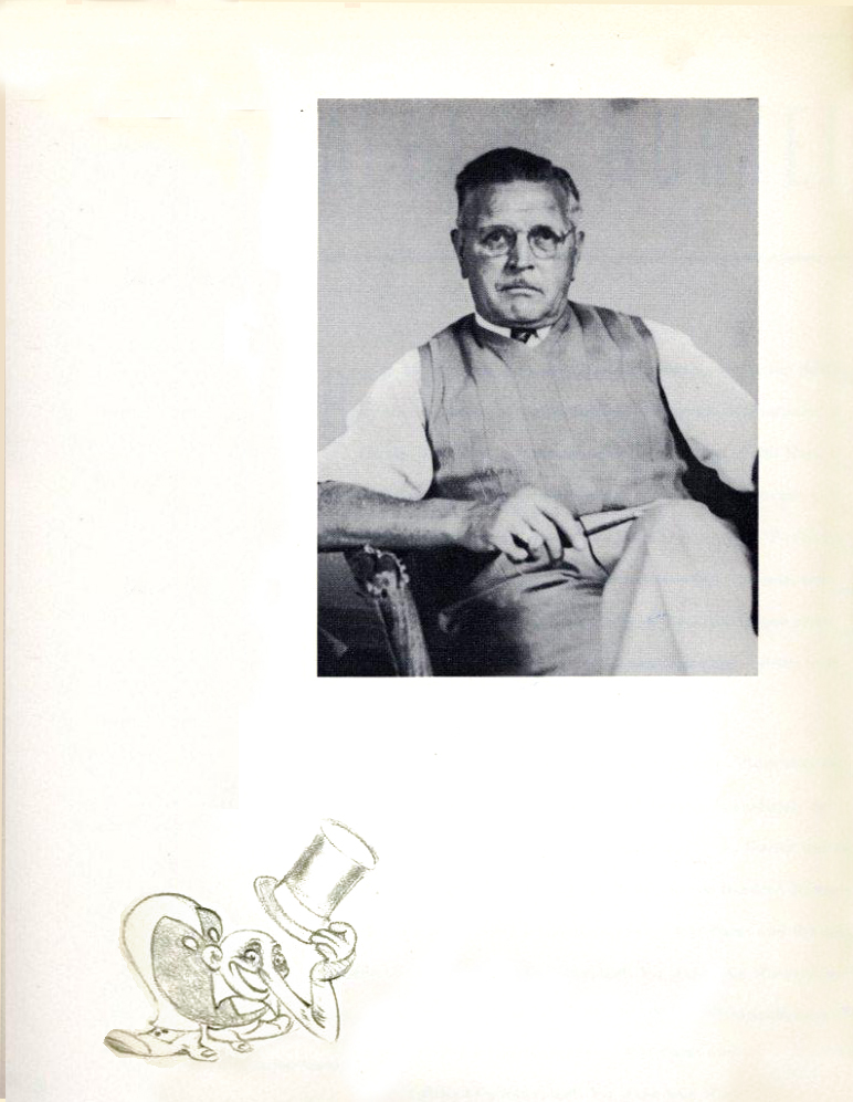
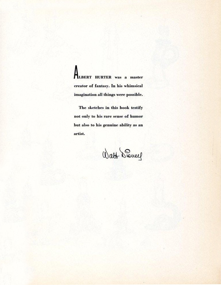
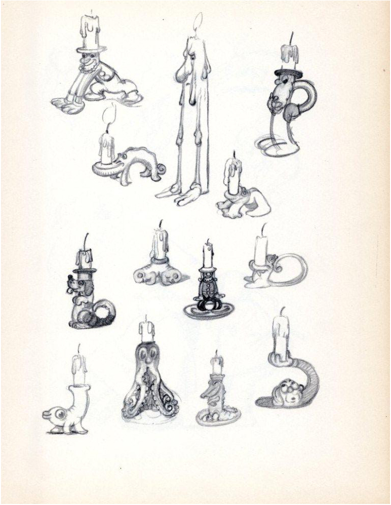
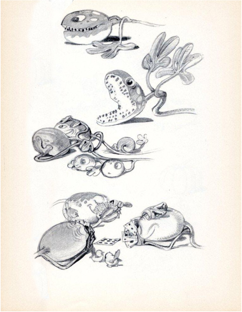
He Drew As He Pleased – 2
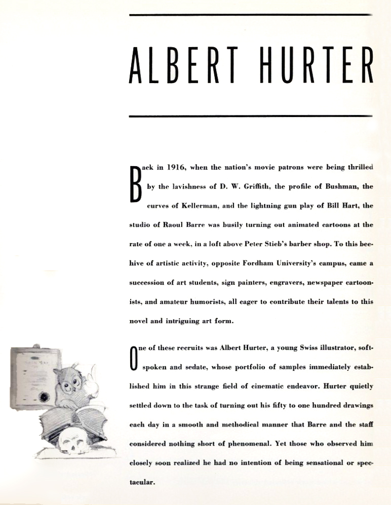
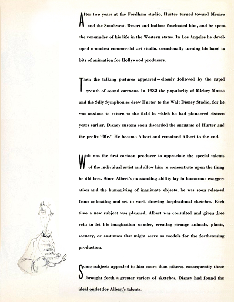
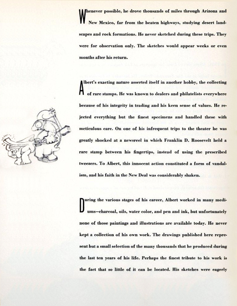
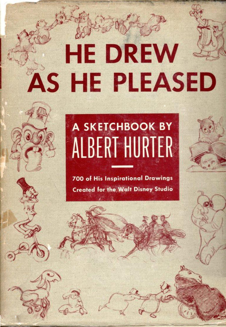 - Last week I posted the first of the displays from this beautiful book, He Drew As He Pleased. This, of course, is the work of Albert Hurter who was a key designer for the Disney studio during the mid thirties, particularly in the making of Snow White.
Interesting that this film showed up with commercials on ABC Family Channel last Saturday evening. It was a happenstance that got me to watch the film again, and then I watched it uncut and uninterrupted the next day in my studio.
For all the shaking lines and animation problems the earliest feature had, it’s still a gorgeous testament to brilliant animation. There are no cliches floating in the eyes of the characters. No hard edges right out of Cartoon Network or CalArts. It has its cliches of the period – which existed in live action as well – but the acting is brilliant, particularly in the dwarfs. I was also very impressed, this time, with the old hag. The witch is overplayed by Norm Ferguson, yet it’s done with imagination and resourcefulness. She comes right out of an opera – or do I mean a melodrama – and she’s loveable in her grotesque way.
The film has an innocence we’ll never see again, and it’s too bad.
Hurter had his part in that innocence, and the drawings are a fine display of all that’s good in the film.
Many thanks to Bill Peckmann for scanning his copy of the book for me to post. This is the first time I get to see the entire thing.
 20
20“Optics . . .”
 21
21
“. . . And More Optics.”
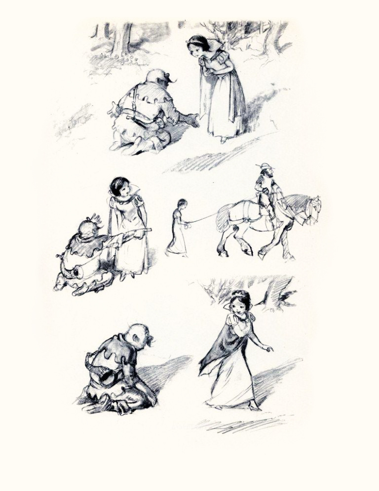 22
22
“Preliminary Sketch of Snow White.”
 23
23
“The Prince.”
 24
24
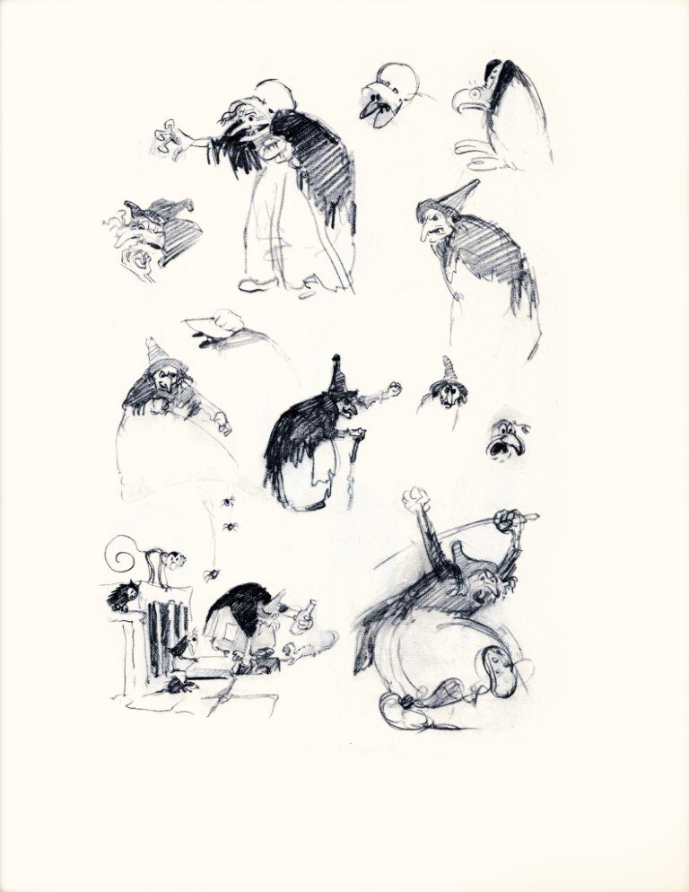
“The Witch . . . Hansel and Gretel.”
 25
25
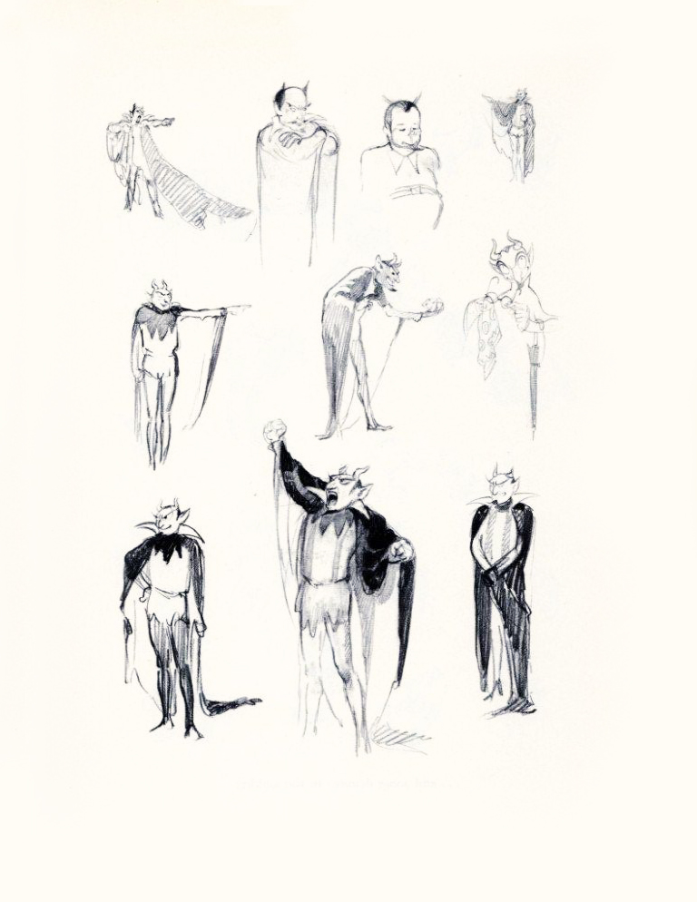
“A Page of Devils.”
 26
26
“And Some Demons in the Making.”
 27
27
“Tyll the Jester and . . . ”
 28
28
“And Other Clowns . . . ”
 29
29
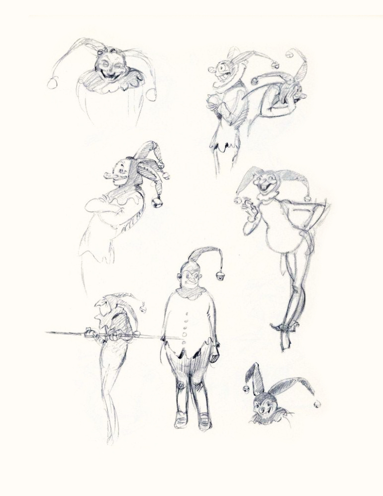 30
30
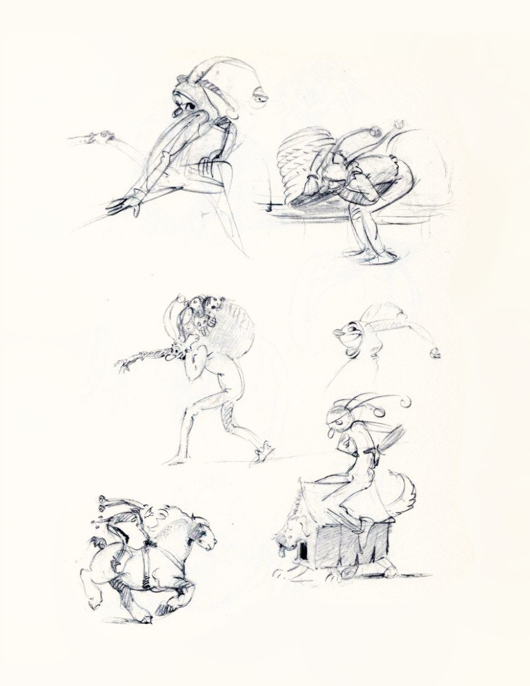 31
31
 32
32
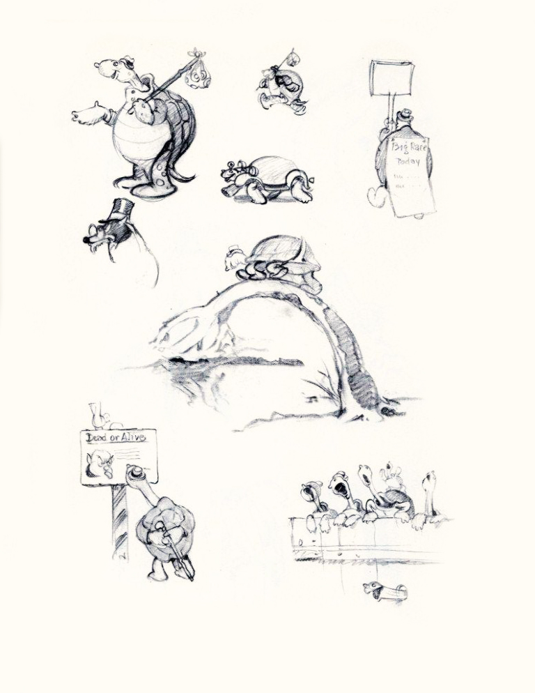
“Toby Tortoise Wins the Race.”
 33
33
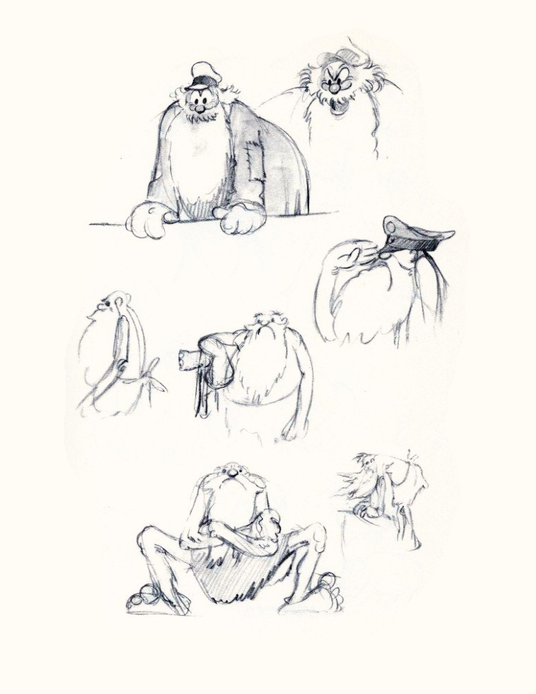
“Captain Noah.”
 34
34
“And Other Passengers.”
Bill Peckmann &Books &Disney &Illustration &Layout & Design &Models 17 Sep 2010 07:59 am
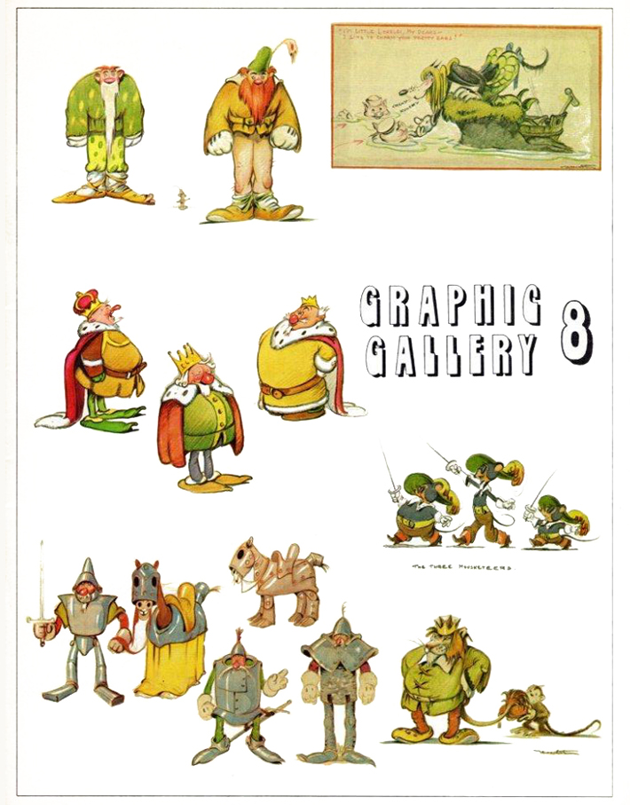
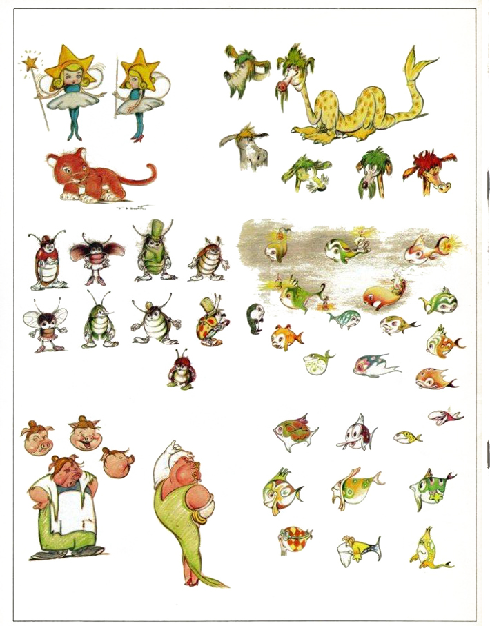
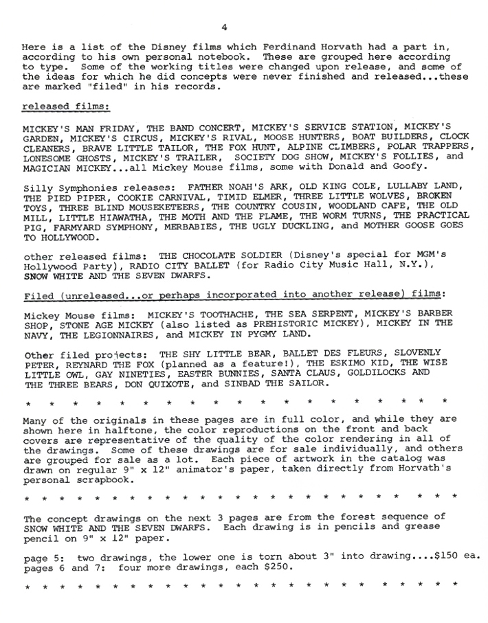
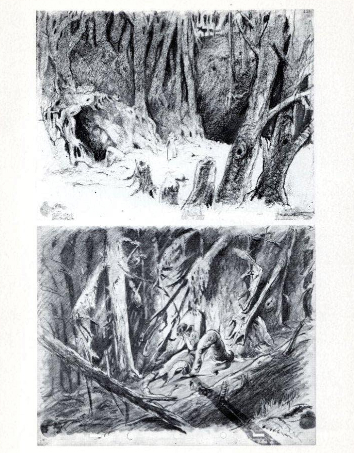
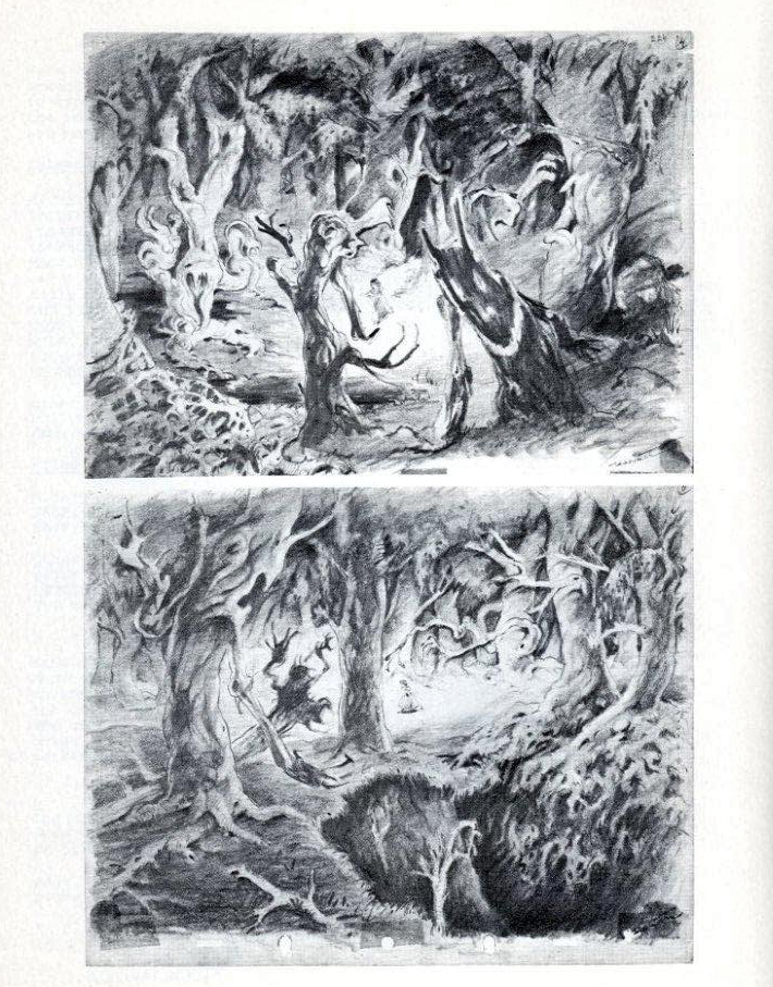
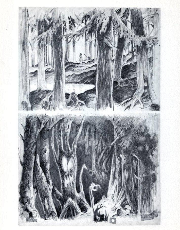
Horvath – 2
From 1934-1937, Ferdinand Horvath worked at the Disney Studios in numerous jobs doing everything from painting backgrounds and doing layouts to constructing three dimensional models to designing characters and gags for over fifty Silly Symphonies and Mickey Mouse shorts.
He was one of the famed illustrators, such as Albert Hurter or Gustaf Tenggren that Disney found in Europe and brought to America to inspire his staff artists.
Prior to working at Disney, Horvath worked at Paul Terry’s studio on the “Aesop’s Fables” series. Once he left Disney, he designed models and layouts for “Scrappy,” “Krazy Kat” on shorts for Columbia/Screen Gems. In 1940, he sculpted puppets for George Pal’s Puppetoons.
He was a versatile artist whose work was an inspiration for many Disney artists. The following booklet was published by Graphis Gallery and put together by Bruce Hamilton. The opening material explains itself.
Bill Peckmann sent me scans of these pages, and I thank him for keeping Horvath alive.
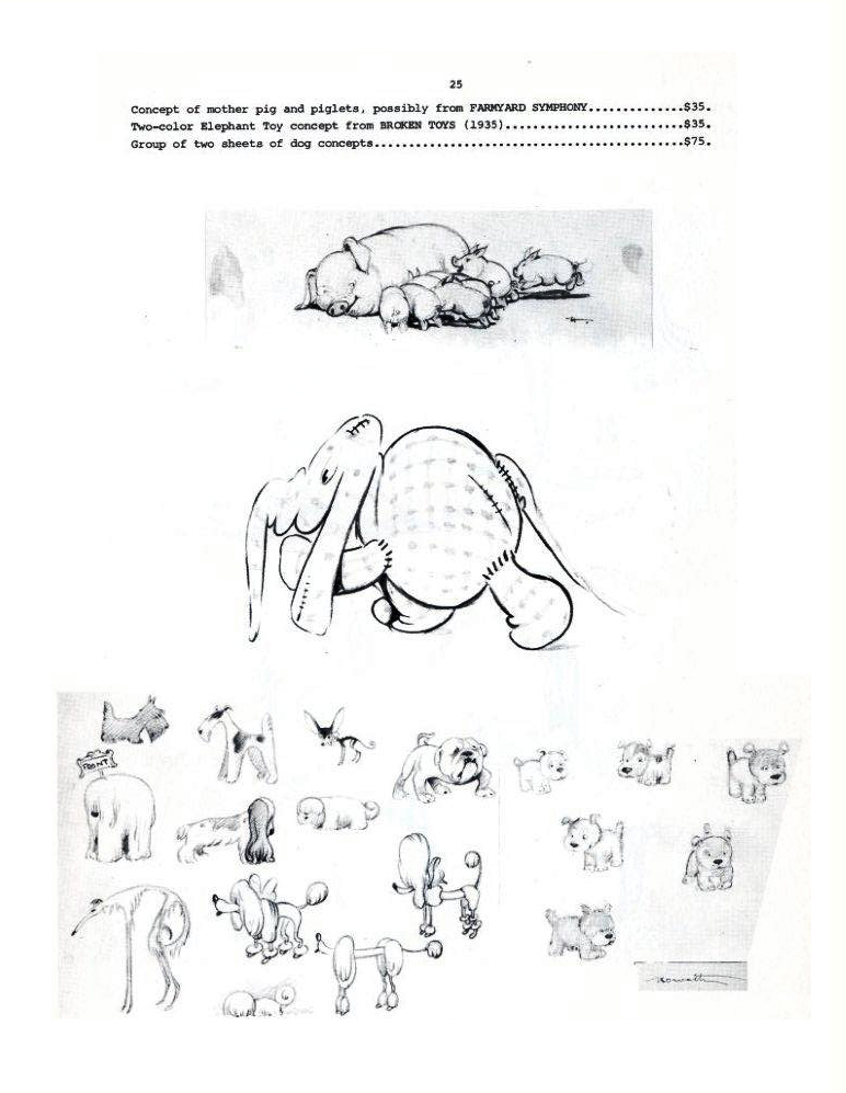
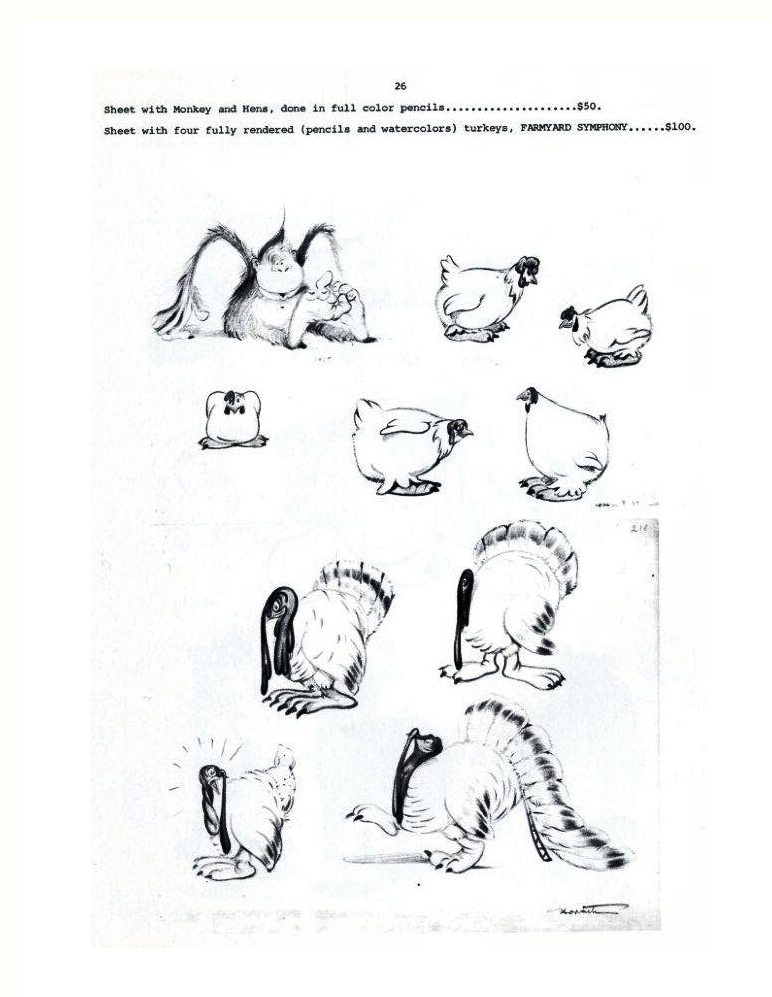
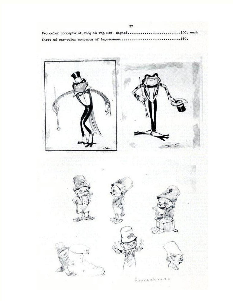
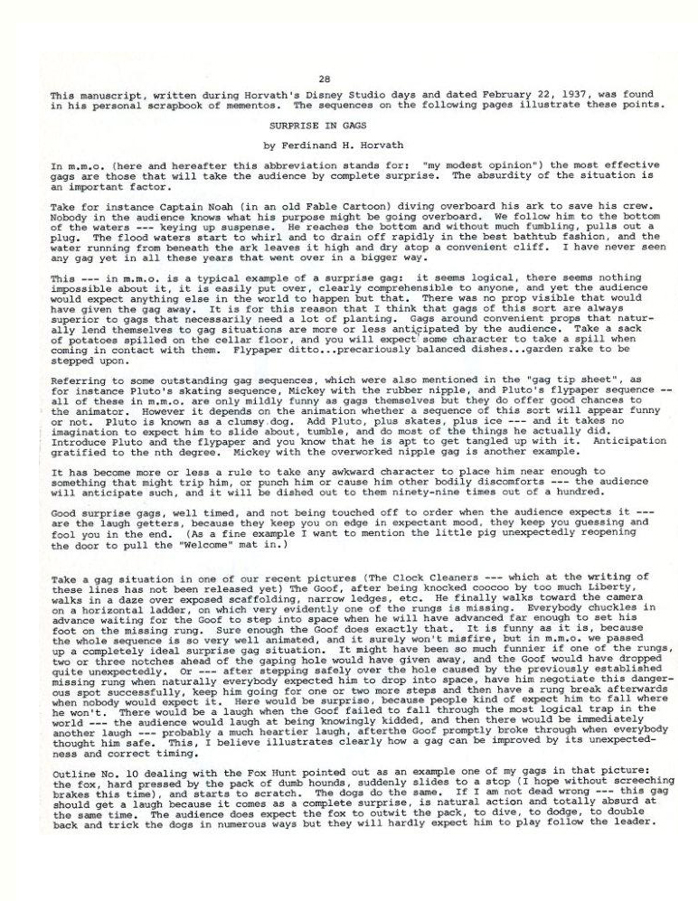
 22
22(Click any image to enlarge.)
 23
23
 24
24
 25
25
 26
26
 27
27
 28
28
 29
29
 30
30
 31
31
 32
32
 33
33
 34
34
 35
35
 36
36
 37
37
 38
38
One more post to come from this book. Next week will be Part 2 of Albert Hurter – He Drew As He Pleased, and Horvath will follow that.
Mixing them up.
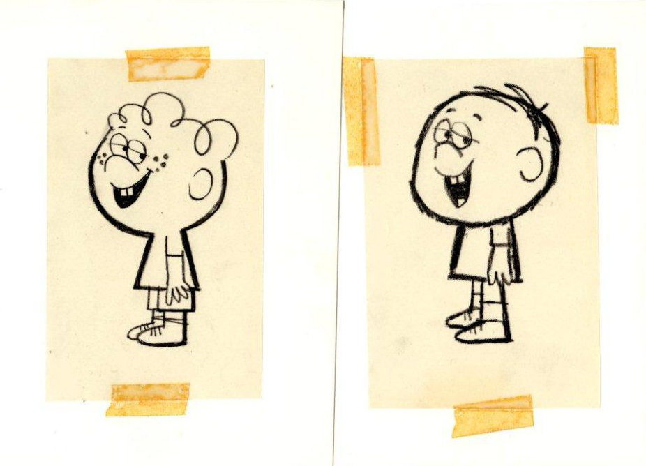
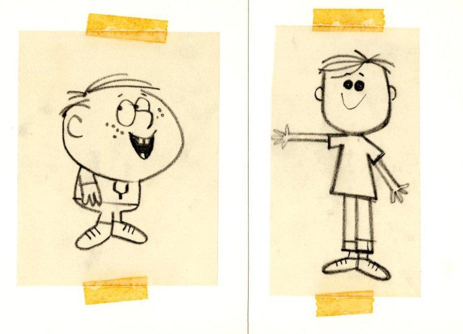
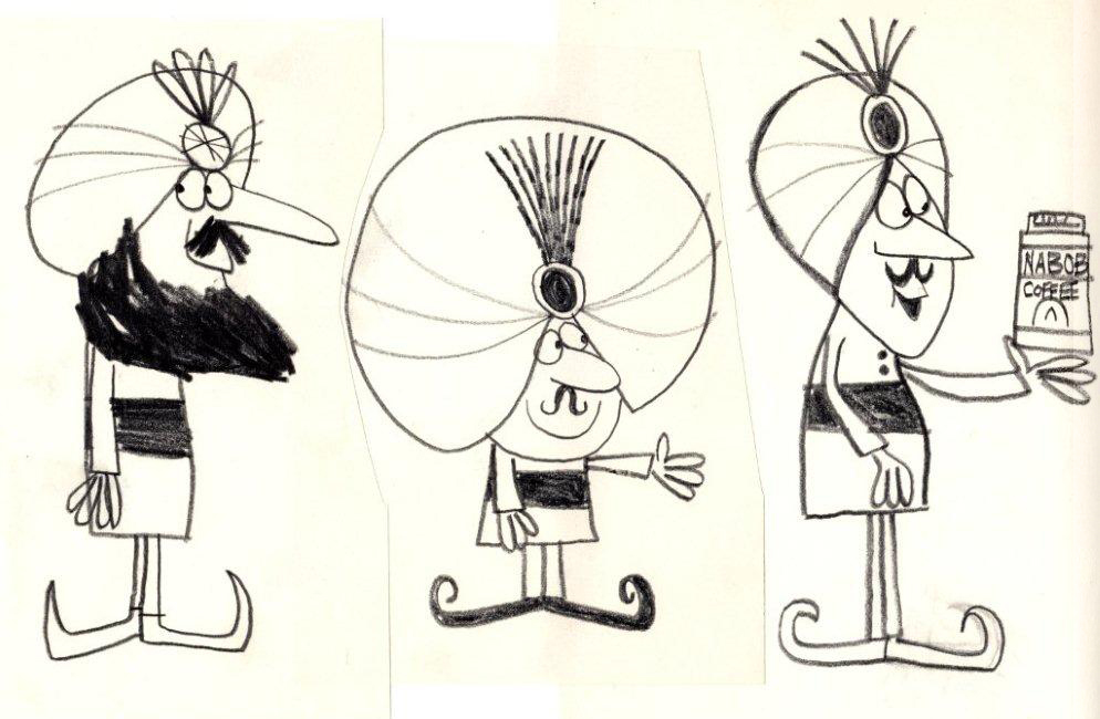
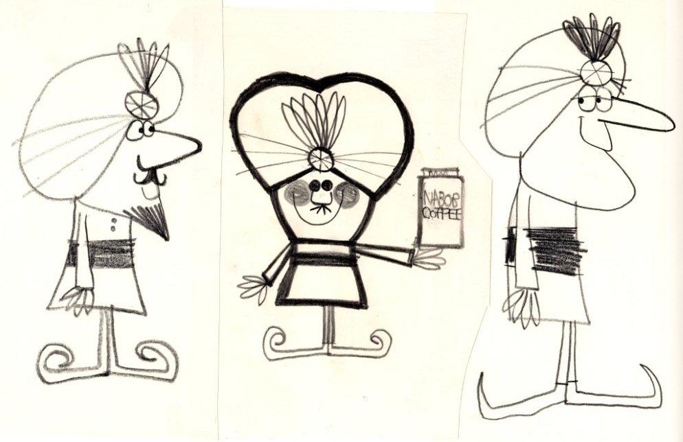
Animation Artifacts &Bill Peckmann &Layout & Design &Models 13 Sep 2010 07:34 am
Dolores Cannata
 - Dolores Cannata was one of a group of art students that was pulled in to The Boing Boing show to help design the seventy five new shorts, all differently designed, for the series that CBS had just signed on to. She designed The Trial of Zelda Belle and Just Believe in Make Believe for the show.
When The Boing Boing Show was cancelled she moved to work for Abe Liss’ commercial company, Elektra, where she worked with other designers like Cliff Roberts, Pablo Ferro, Hal Silvermintz, Fred Mogubgub and her brother, George Cannata Jr.
Photo from Amid Amidi’s Cartoon Modern
___
What follows are a number of sketches for characters that Dolores did for Elektra. These were all saved by Bill Peckmann who has allowed me to post this small tribute to the fine work of Dolores Cannata.
 1
1The first two color sketches are personal and not production related.
 2
2
 3
3
A negative stat . . .
 4
4
. . . which looks like this when cleaned up and reversed.
 5
5
A few shopkeepers for a commercial in the 60s.
 6
6
 7
7
 8
8
 9
9
Followed by some kids.
 10
10
 11
11
 12
12
 13
13
Some Arabian Nights themed coffee spot.
 14
14
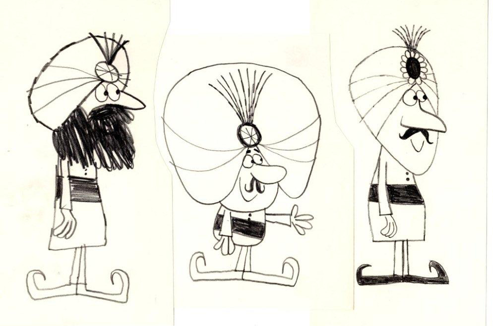 15
15
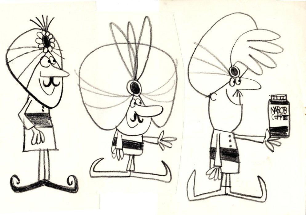 16
16
 17
17
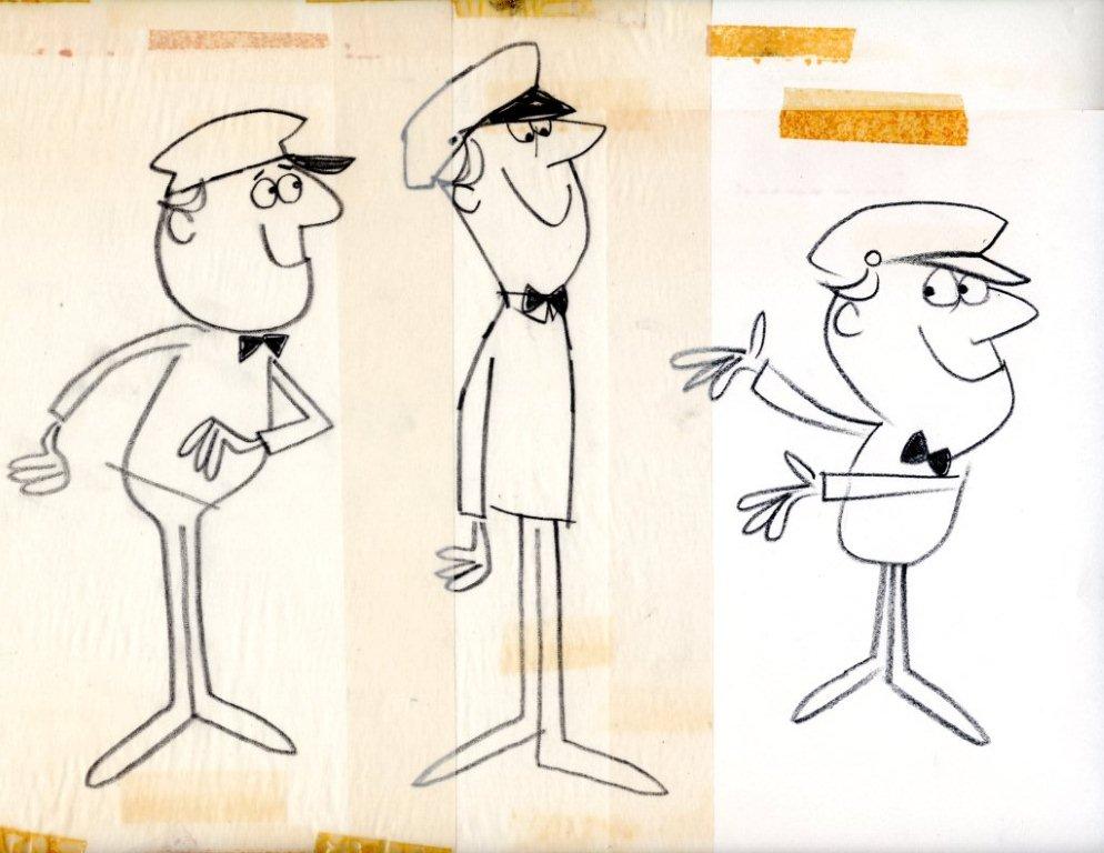
A couple of gas attendants.
 18
18
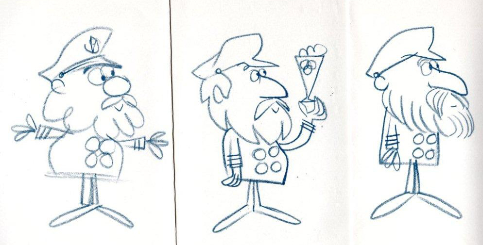
Some sea captains.
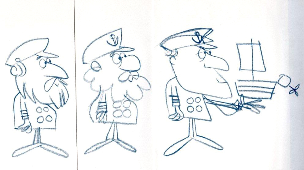 19
19
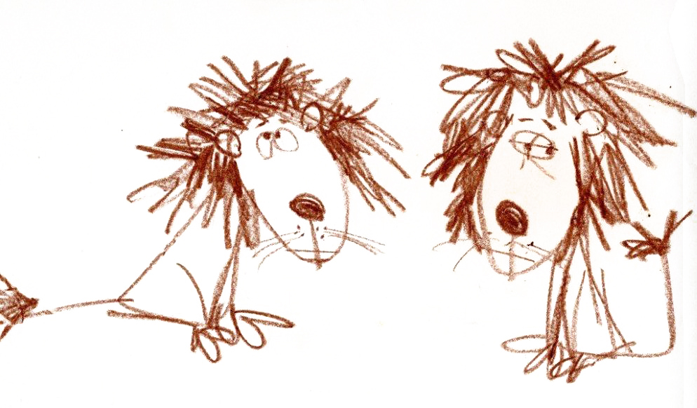 20
20
. . . and a lion.
Bill Peckmann &Books &Disney &Illustration &Layout & Design &Models 10 Sep 2010 07:49 am
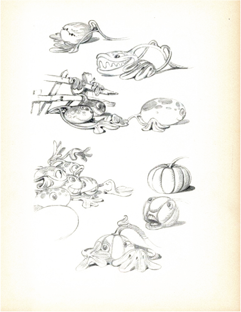
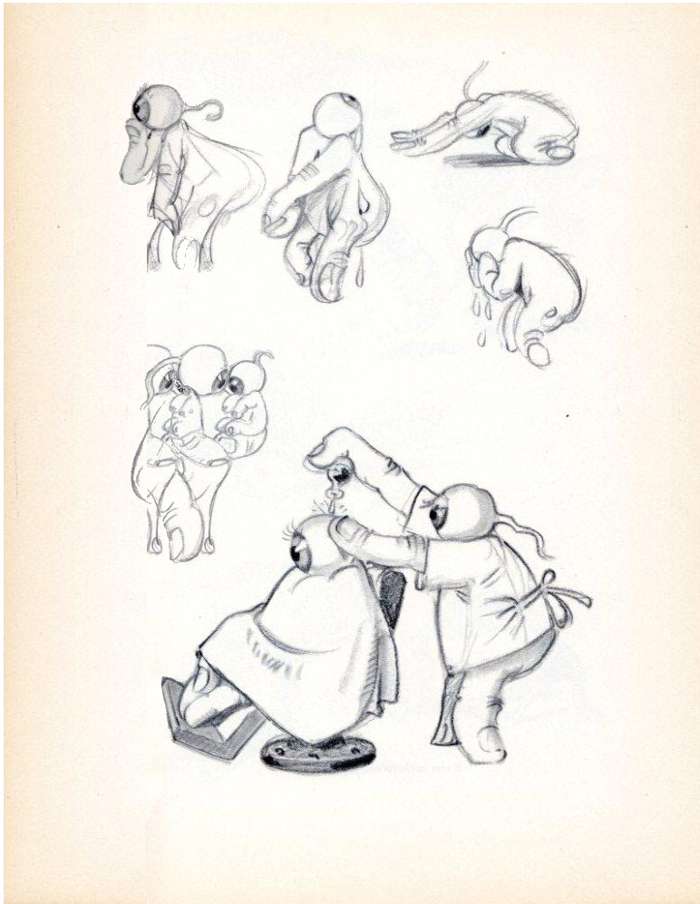
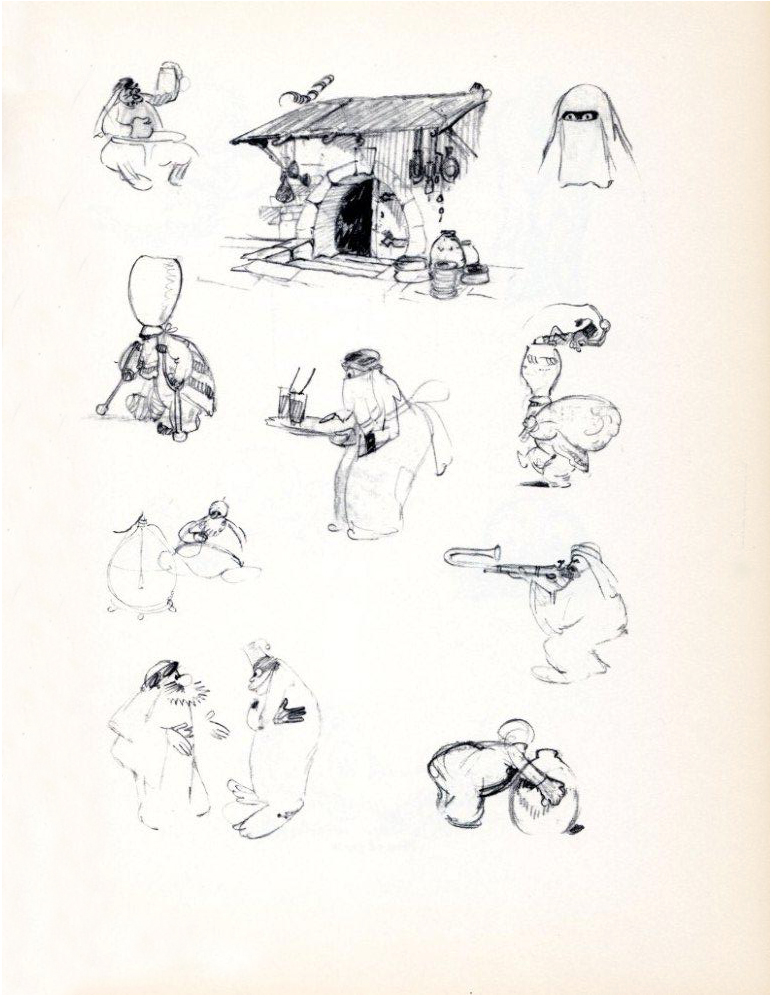
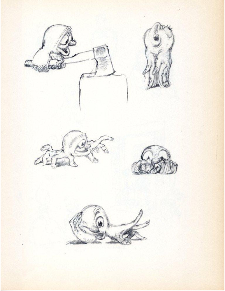
He Drew As He Pleased – 1
– We all know that Albert Hurter was the brilliant artist behind a lot of Snow White’s gingerbread architecture. Hurter was a Swiss illustrator that Disney brought into the studio and let him go. He could draw whatever he wanted to help inspire the studio to pull Snow White together.
After leaving the studio, Hurter had a book published called, “He Drew As He Pleased.” It’s a beauty of a book and a rare item. Bill Peckmann sent me scans from the book, and I’ll post them here. It’ll take a few installments. The pages are in delicate condition, but photoshop is allowing me to clean them up a bit – but not too much.
Some of the pages are devoted to characters in the Silly Symphonies. I had hoped to pull some frame grabs from the films, but I didn’t have time. It’s a project for the future.
This book will interplay with the post I started last week on Frederick Horvath‘s designs for the studio – at the same time. That booklet will continue soon.
 1
1(Click any image to enlarge.)
 2
2
 3
3 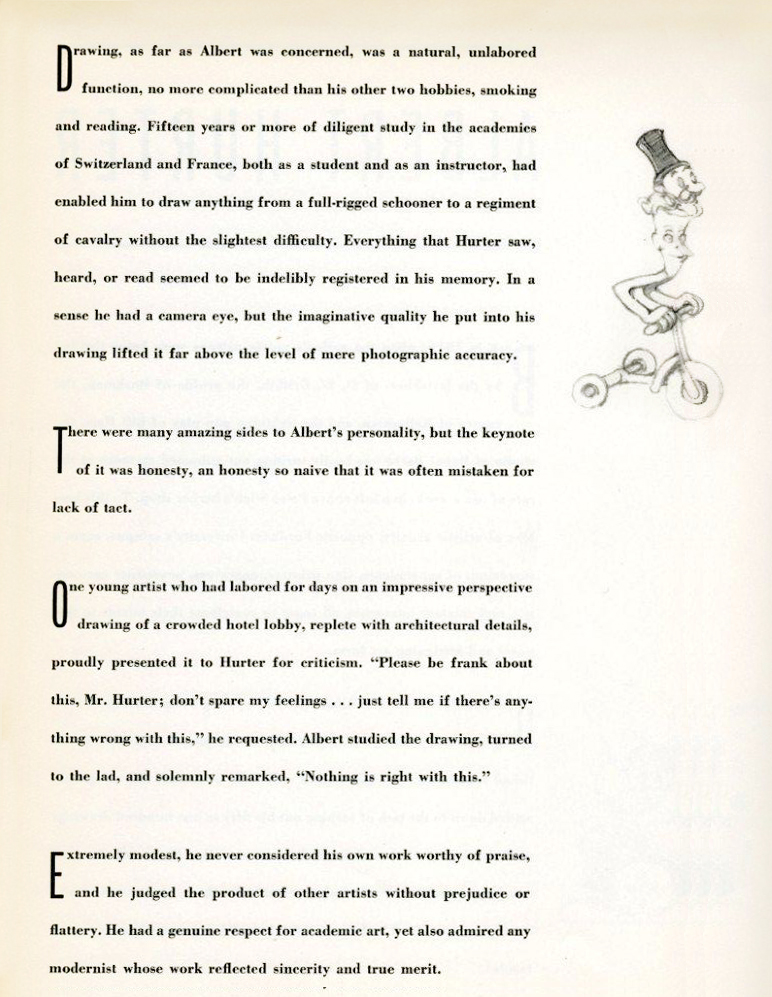 4
4
 5
5  6
6
 7
7 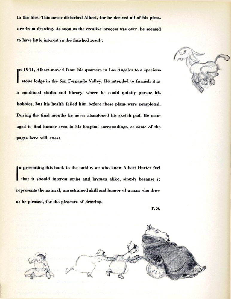 8
8
 9
9
 10
10
“For Albert There Were No Inanimate Objects”
 11
11
“Even Melons Came To Life”
 12
12
“More Melons”
 13
13
“Eyeball Folk”
 14
14
“Atmosphere: Mickey In Arabia”
 15
15
“Men of Parts”
 16
16
“Hansel and Gretel”
 17
17
“Players of a Musical Fantasy”
Books &Disney &Layout & Design &Mary Blair &Models 07 Sep 2010 05:58 am
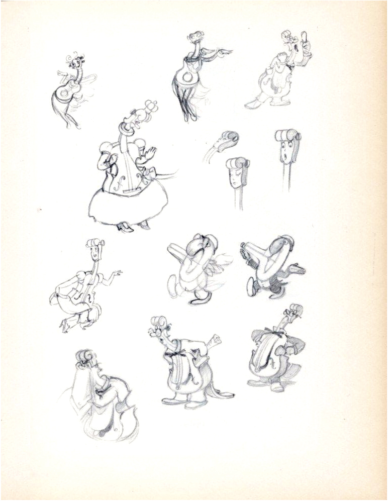
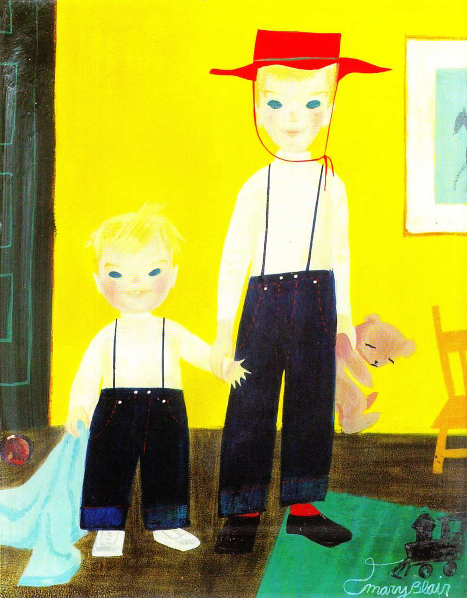
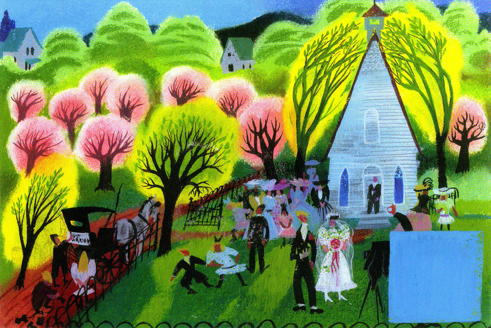
Mary Blair – 9
- This will be the last of my Mary Blair posts. Today, I’m going to concentrate on her more personal and private work. Some of these are paintings, some greeting cards, others theatrical designs.
I’ve taken artwork exclusively from the Japanese book, The Colors of Mary Blair. John Canemaker writes an introduction to the Japanese book and that’s also a fine piece of writing.
However, I’ve consistently gone back to Canemaker’s excellent US book, The Art and Flair of Mary Blair.
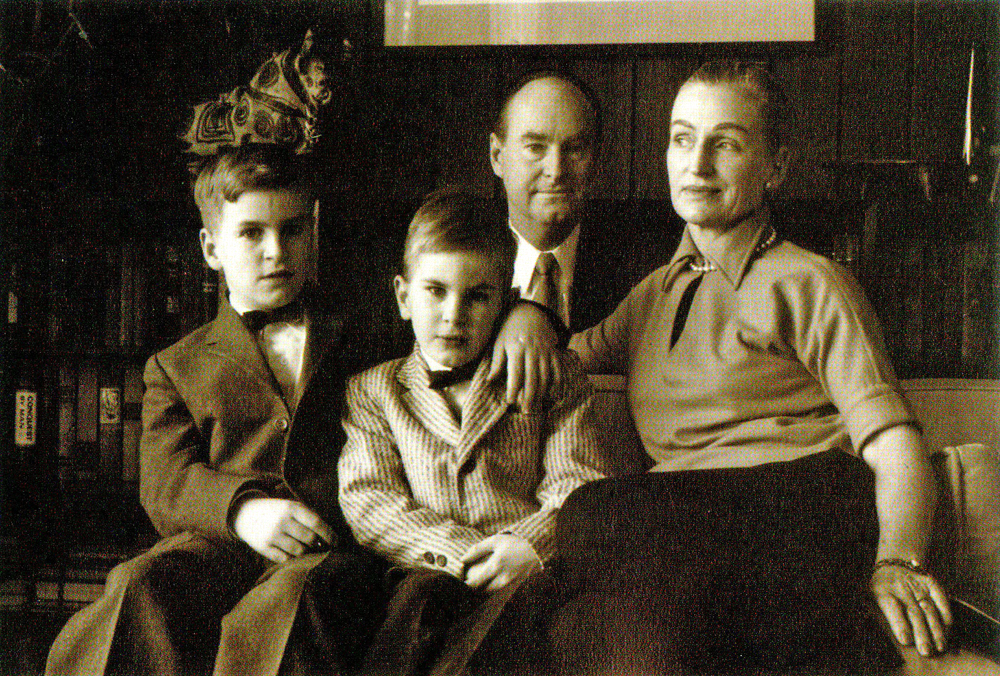
The Blair Family
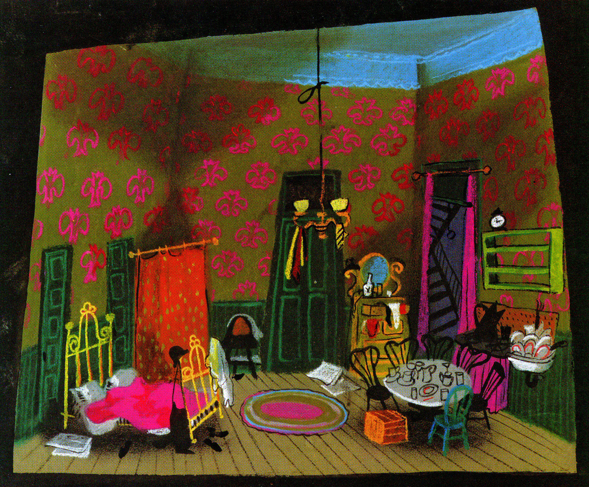
Set design for Cole Black and the Seven Dwarfs
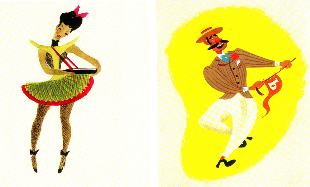
Costume designs for the same show.
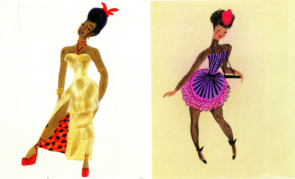
This was a musical that featured the music of Duke Ellington.
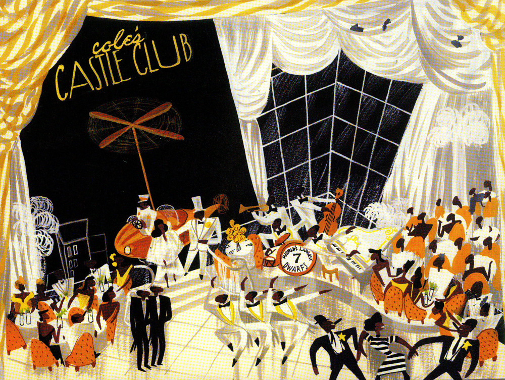
The show never opened on Broadway, and it’s too bad that
Mary Blair never had a theatrical show that she designed.
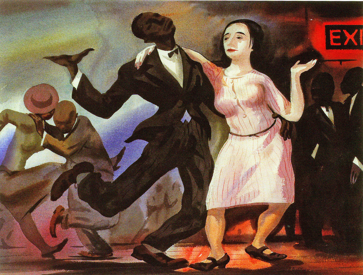
An oil painting that’s reminiscent of the work
of the brilliant black artist, Archibald Motley.
Some greeting cards.
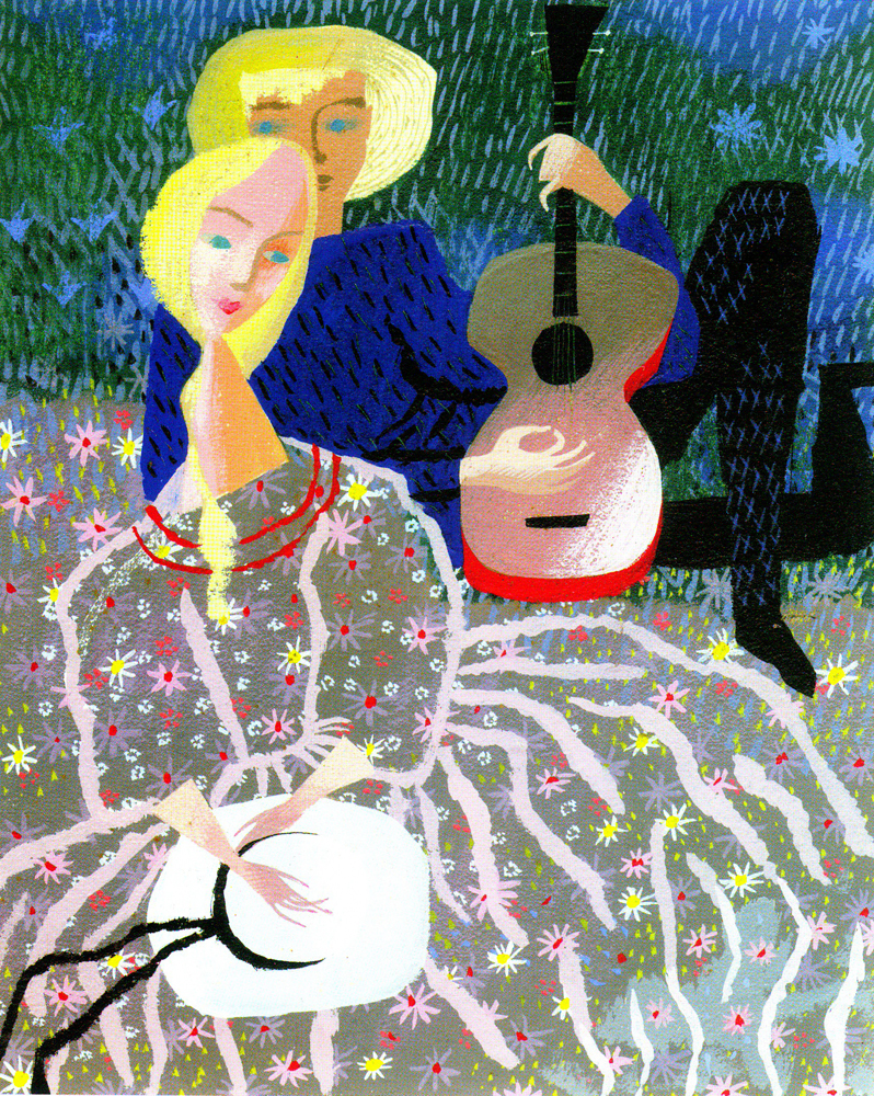
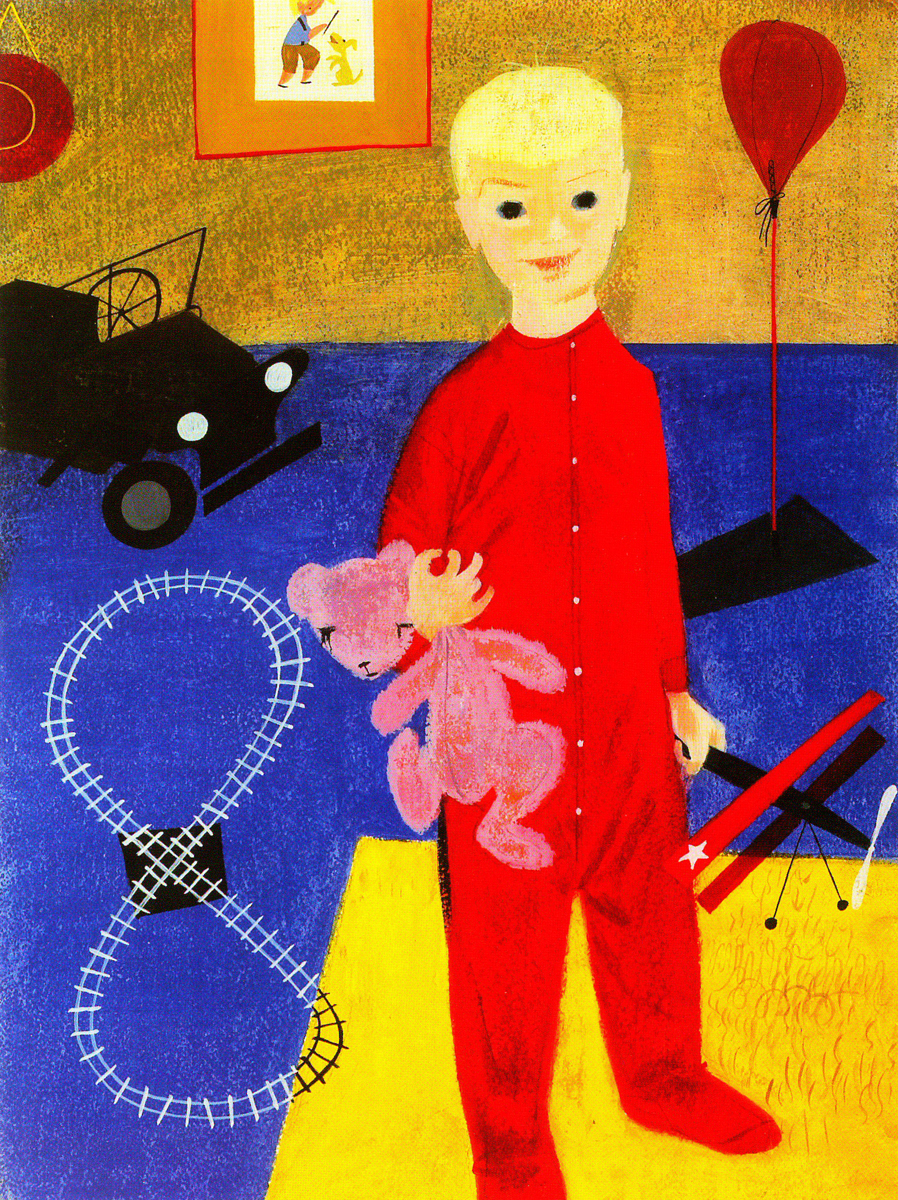
Some paintings of her children.
Animation &Bill Peckmann &Books &Disney &Illustration &Layout & Design &Models 01 Sep 2010 07:38 am
Horvath – 1
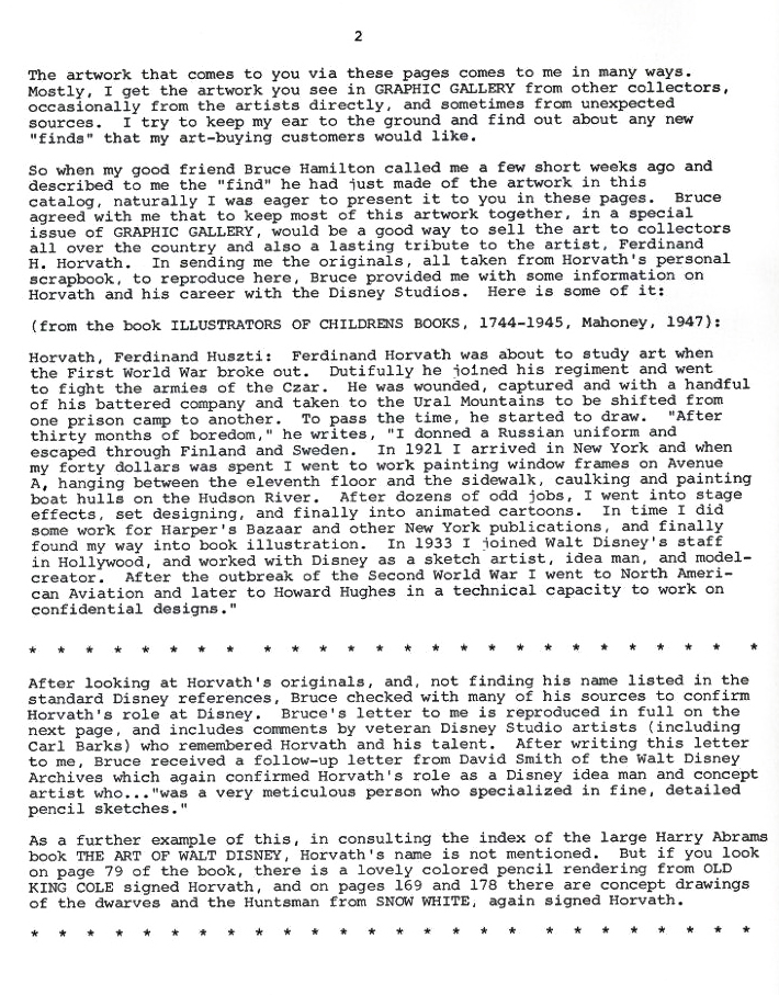
Ferdinand Horvath was a Hungarian book illustrator, who was born in 1891 and died of a stroke in 1973. From 1934-1937, he worked at the Disney Studios in multifarious positions doing everything from painting backgrounds and doing layouts to constructing three dimensional models to designing characters and gags for over fifty Silly Symphonies and Mickey Mouse shorts.
Prior to working at Disney, he labored at Paul Terry’s studio on the “Aesop’s Fables” series. Once he left Disney, he designed models and layouts for “Scrappy,” “Krazy Kat” on shorts for Columbia/Screen Gems. In 1940, he sculpted puppets for George Pal’s Puppetoons.
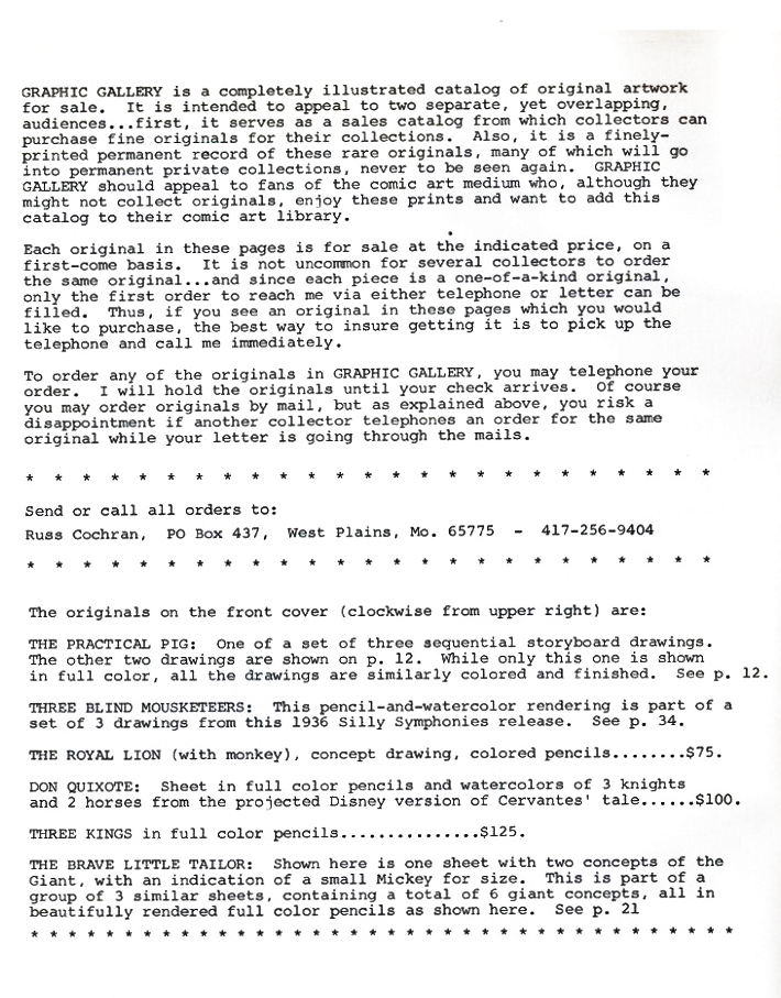
He was a versatile artist whose work was an inspiration for many Disney artists. The following booklet was published by Graphis Gallery and put together by Bruce Hamilton. The opening material explains itself.
Bill Peckmann sent me scans of these pages, and I thank him for keeping Horvath alive.
Front cover of the catalogue.
The back cover.
 1
1 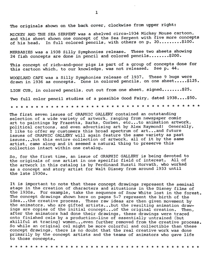 2
2
This gives information on what appears on the two covers.
 3
3 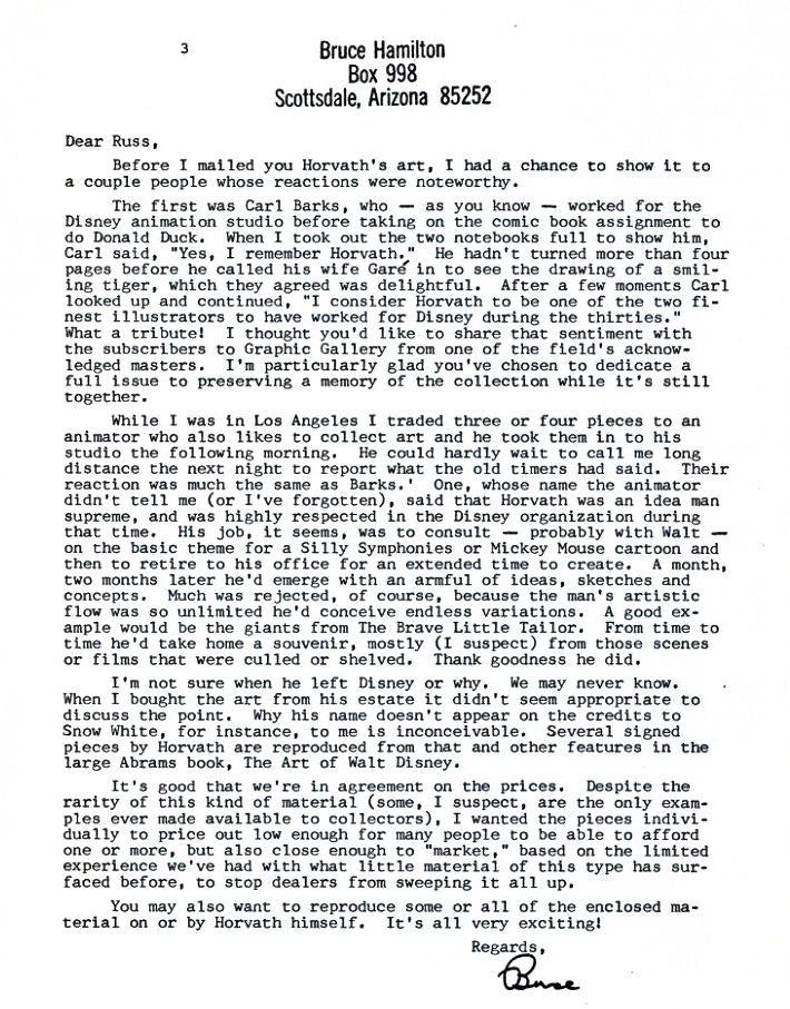 4
4
 5
5
 6
6
 7
7
 8
8
 9
9
 10
10  11
11
 12
12  13
13
 14
14
 15
15
 16
16
 17
17
 18
18
 19
19  20
20
 21
21
.
John Canemaker writes in depth about Horvath in his book, Before the Animation Begins: The Art and Lives of Disney’s Inspirational Sketch Artists.
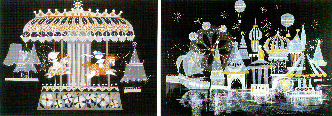
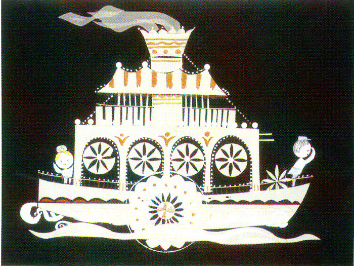
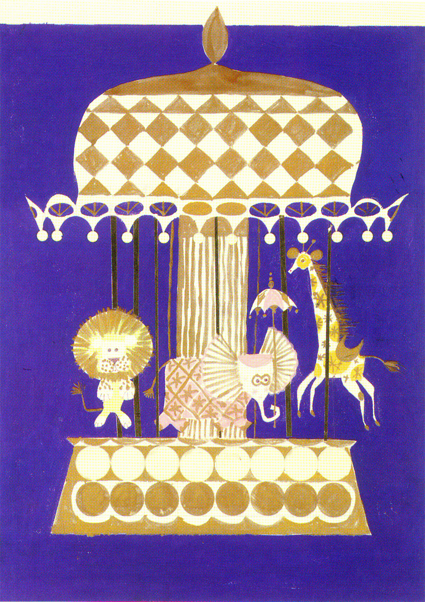
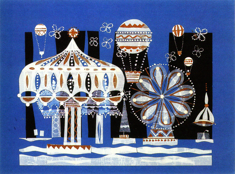
Disney &Illustration &Layout & Design &Mary Blair &Models 30 Aug 2010 07:44 am
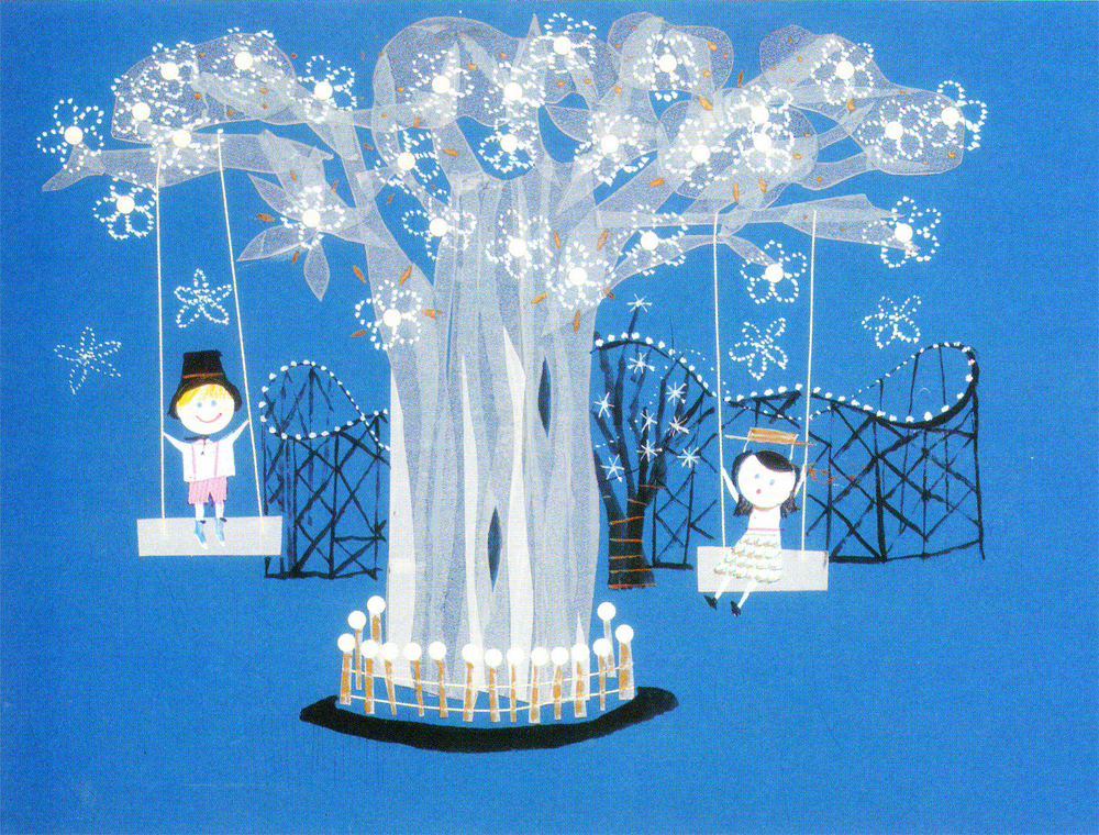
Mary Blair – 8
- For It’s A Small World for the Pepsi pavilion at the 1964 NY World’s Fair, Mary Blair produced a lot of preliminary designs. All of them glisten like little gems. Last week I posted art for the larger part of the pavilion; this week we go into the smaller interior parts. All of it is beautiful
These scans were all taken from the featured book, The Colors of Mary Blair.
Of course, there’s also John Canemaker‘s excellent book, The Art and Flair of Mary Blair.
 1
1(Click any image to enlarge.)
 2
2
 3
3
 4
4
 5
5
 6
6
 7
7
 8
8
 9
9
 10
10
 11
11
 12
12
 13
13
 14
14
 15
15
 16
16
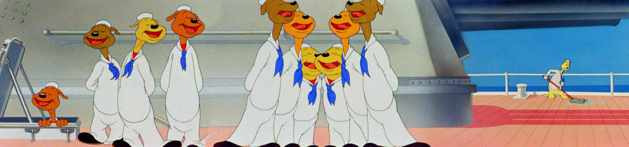
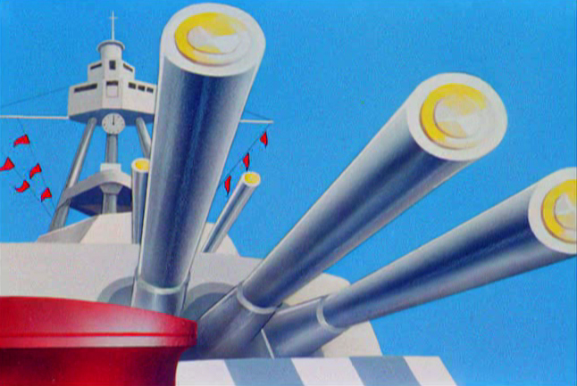
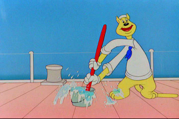
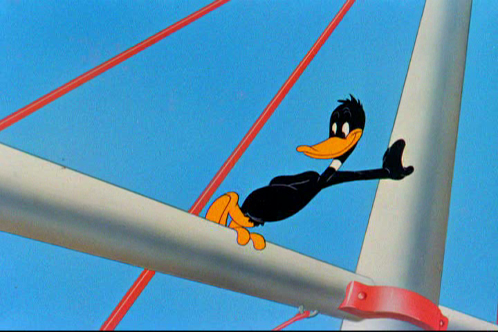
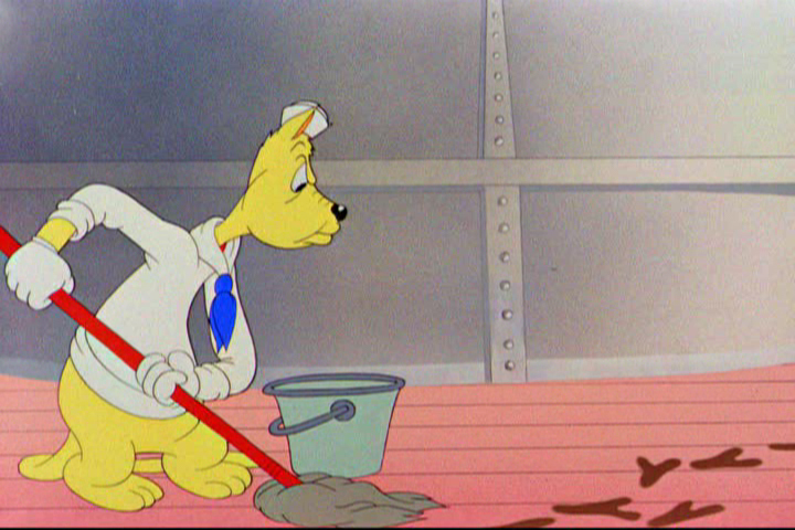
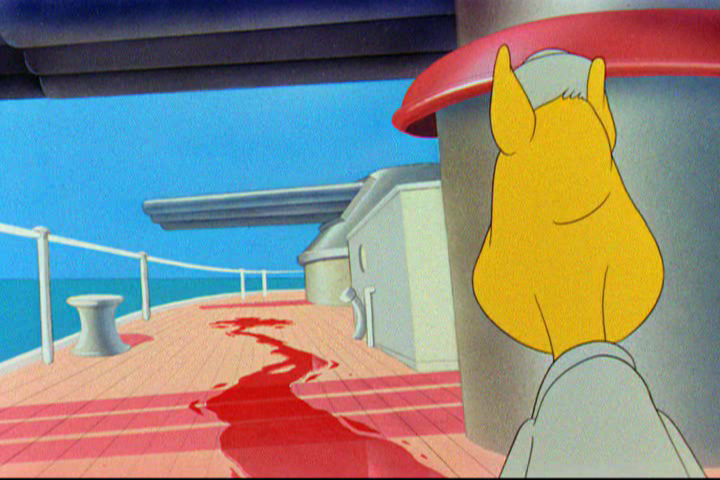
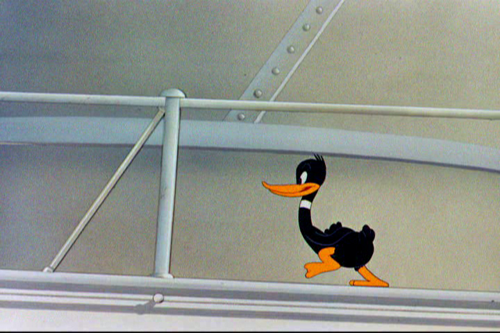
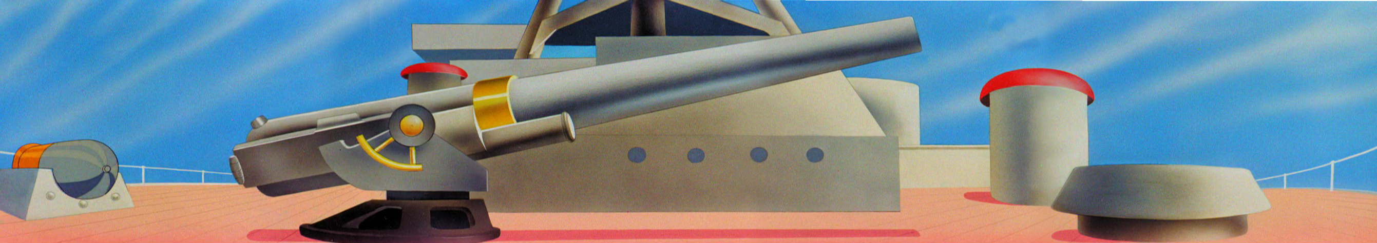
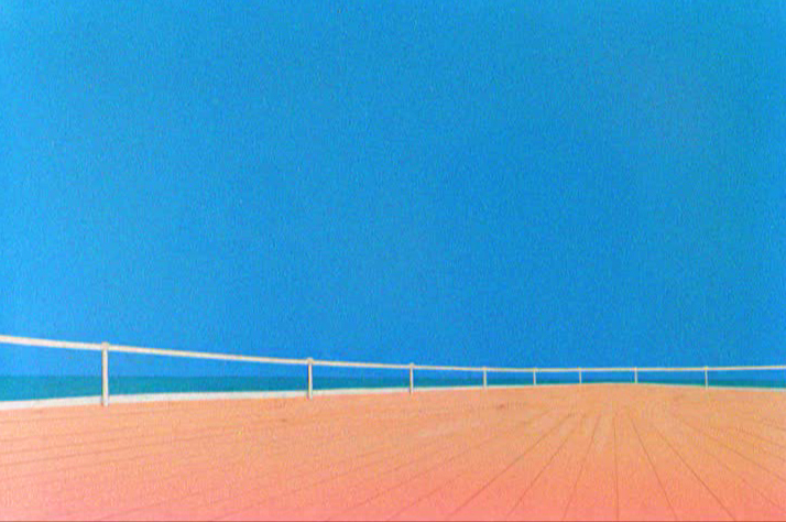
Animation &Frame Grabs &Layout & Design 24 Aug 2010 08:04 am
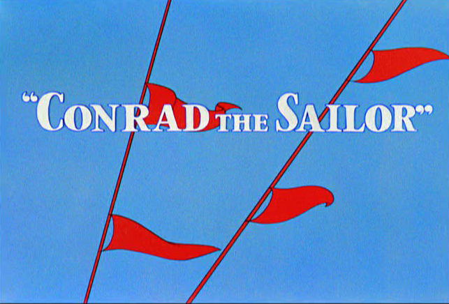
Conrad
 - Regulars to my blog know that I’m a big fan of the work of John McGrew. He was a designer/Layout Artist working in Chuck Jones’ crew at Warner Bros. in the late Thirties/early Forties. His work was daring beyond compare, and, I think, with support from Jones, he changed the look of modern animation backgrounds.
He designed the seminal film The Dover Boys as well as amazing pieces like Aristo-Cat, Inki and the Lion and Conrad the Sailor.
In an interview conducted by Greg Ford and RIchard Thompson, Chuck Jones was asked about McGrew’s style: 
- Q: What about John McGrew’s style and approach, as compared with Noble’s?
A: John McGrew didn’t really have a style; he was experimenting all the time. Maurice does have a style. John McGrew, you might say, was more of an intellectual. You could be intellectual, and get away with it— but if you’re solely intellectual as a director, you weren’t going to get away with it. The result was, however, that he goosed me into thinking that it might be worthwhile to try some different things with backgrounds and so forth. And later on, I would find this kind of thing very useful, in that often it would make your gag work, and sometimes you wouldn’t even know why. Like that little abstract background at the end of Duck Amuck, with the sharply angled lines going off.
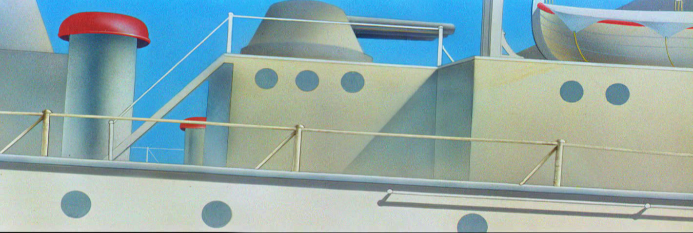
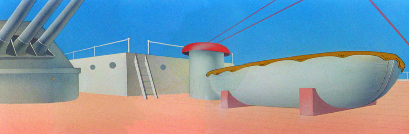
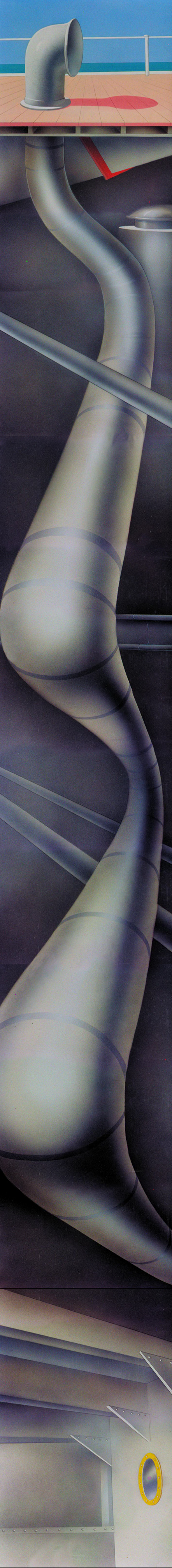
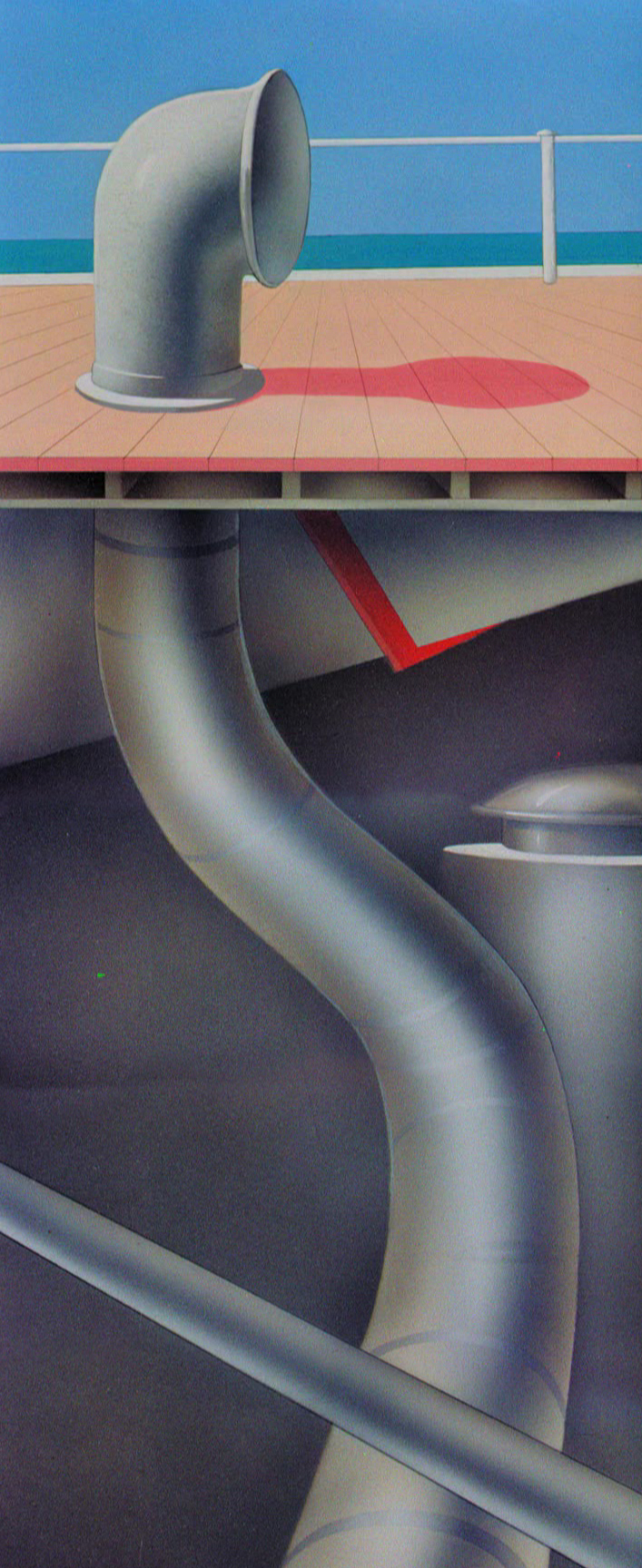
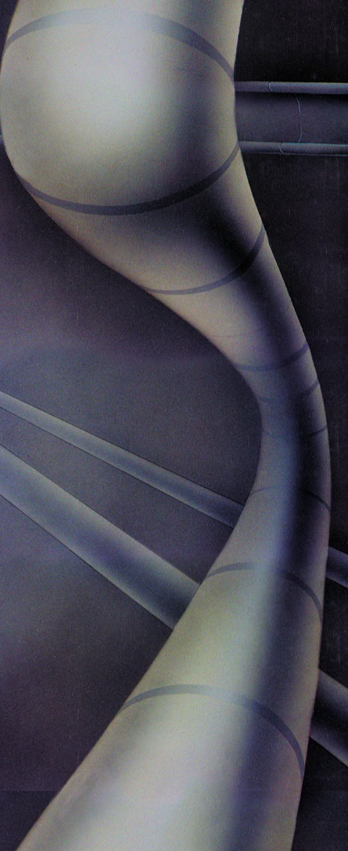
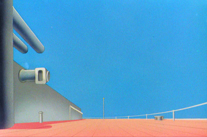
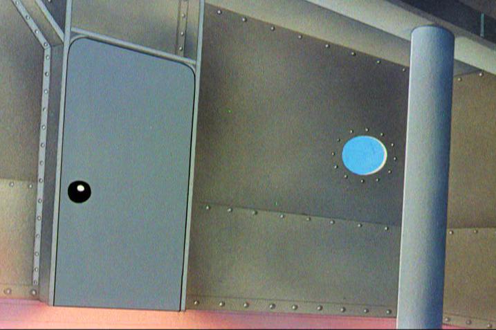
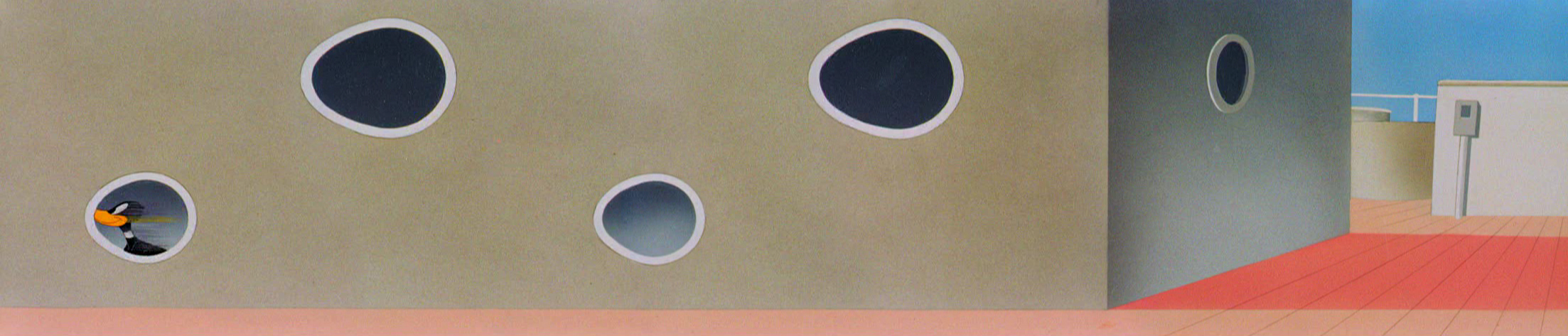
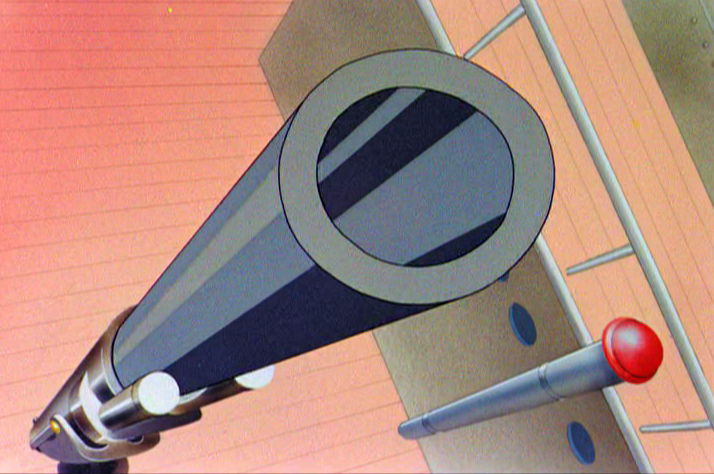
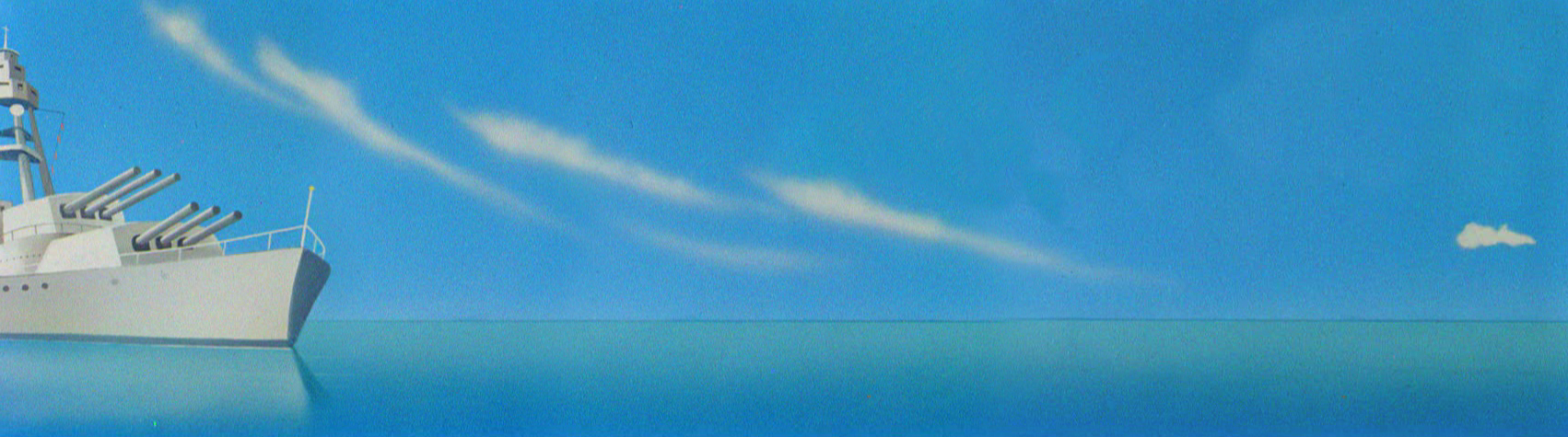
Today I’d like to feature some frame grabs from Conrad the Sailor. Where I could, I separated the characters from the backgrounds to just feature the Bgs. My guess is that the Bgs were painted by Paul Julian, but they were planned by McGrew.
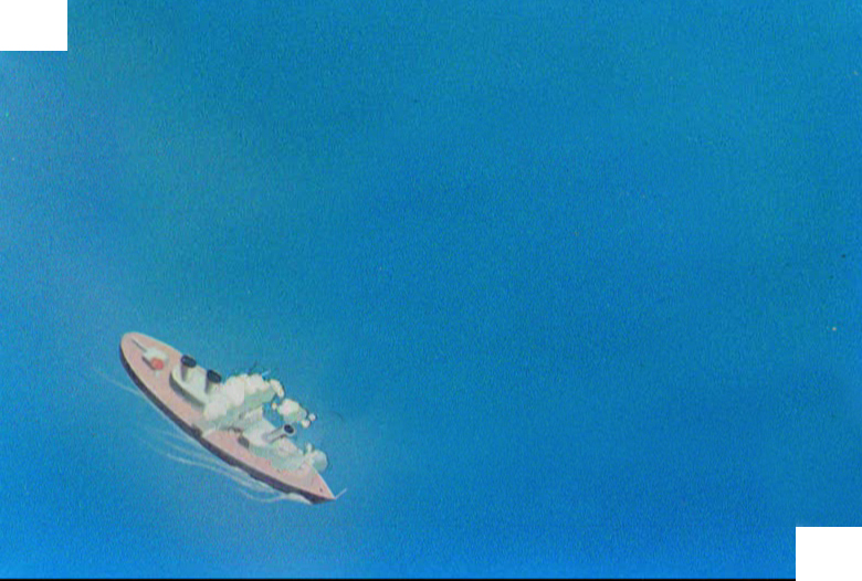
The one scene I don’t illustrate is the most original in the film. Daffy is shot into the air with a bullet. (illus #18) The camera does a 360° turn to head back to the ship. The Bgs don’t hold up on their own. Lots of blue sky and wisps of cloud. It works in motion.
Of this short & McGrew, Jones says:
- . . . we used a lot of overlapping graphics on that particular cartoon so that one scene would have the same graphic shape as an earlier scene, even though it would be a different object: first we’d show a gun pointing up in the air, then in the next shot, there’d be a cloud in exactly the same shape. It gave a certain stability which we used in many of the cartoons after that. John McGrew was the artist responsible for that sort of thing. Conrad was also the one where we used the first complete 360° turn, when the characters went up through the air.
For more information read Mike Barrier’s excellent interview with John McGrew.
 1
1(Click any image to enlarge.)
 4
4
 5
5
 6
6
 7
7
 8
8
 9
9
 10
10
 11
11
 12
12
The following BG pan can be seen in full to the left. I’ve broken it into three parts for a closer look.
 12a
12a .
.
———-(Continue scrolling down.)
.
.
.
.
.
.
.
.
.
.
 12b .
12b .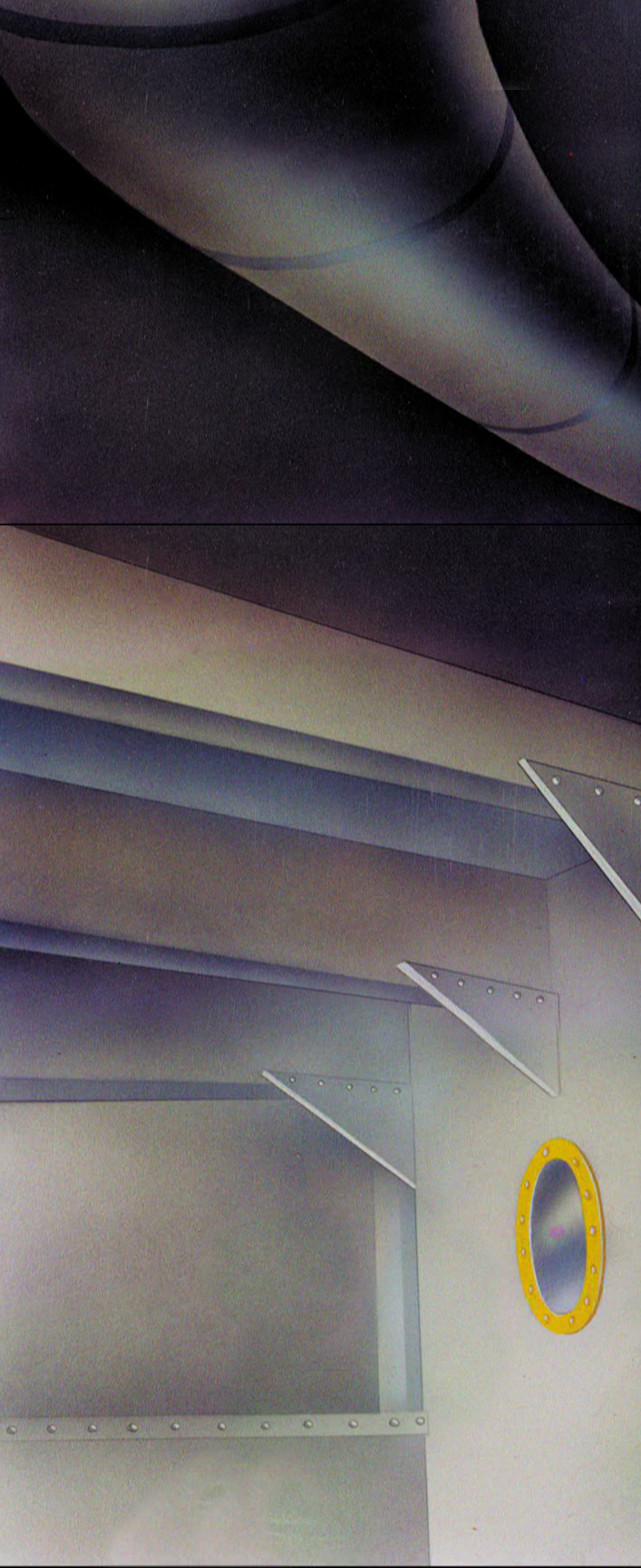 12c
12c
 13
13
 14
14
 15
15
A bicycle pan that keeps moving to the left.
 16
16
Continue moving right to left.
 17
17
 18
18
 19
19
 20
20
 21
21
 22
22
