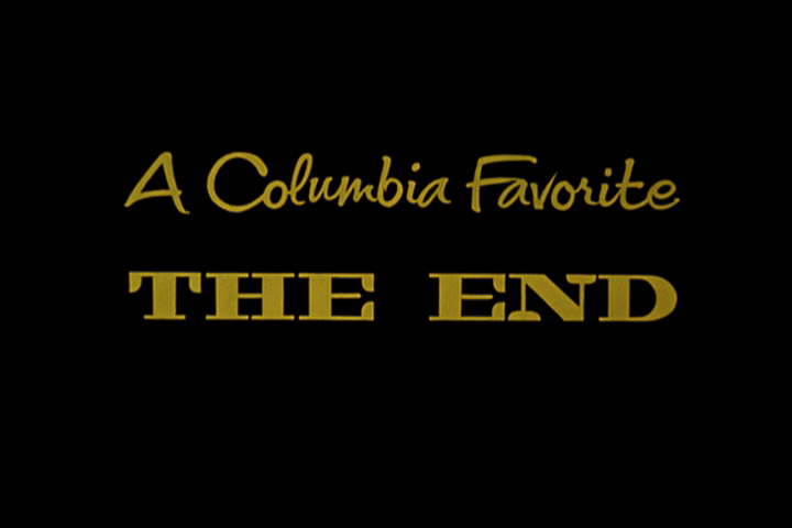
Category ArchiveLayout & Design
Action Analysis &Animation &Animation Artifacts &Frame Grabs &Hubley &Independent Animation &Layout & Design &Tissa David 09 Jul 2012 05:24 am
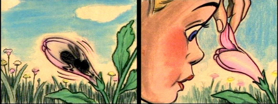
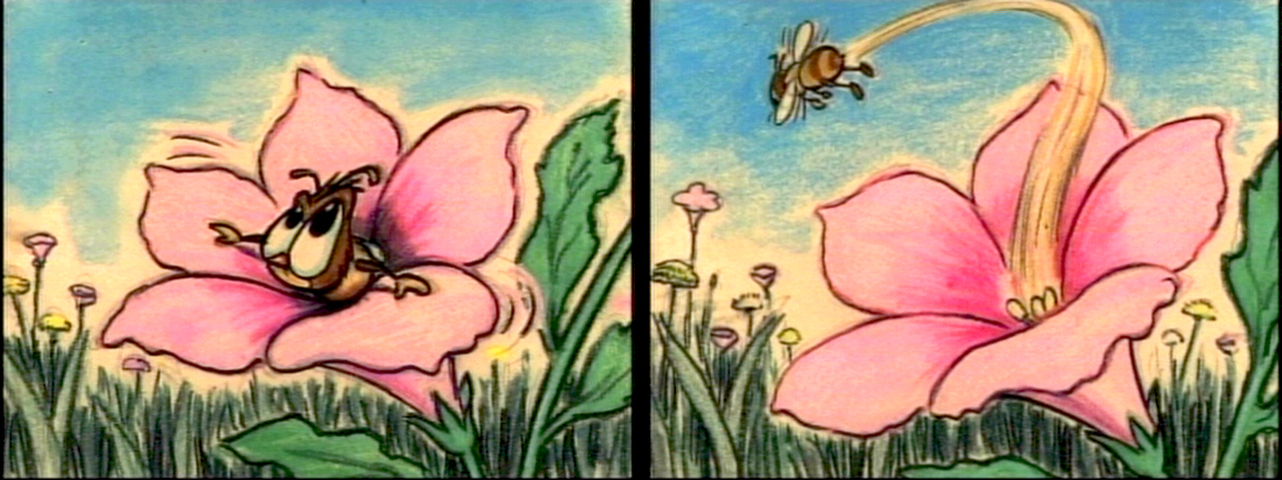
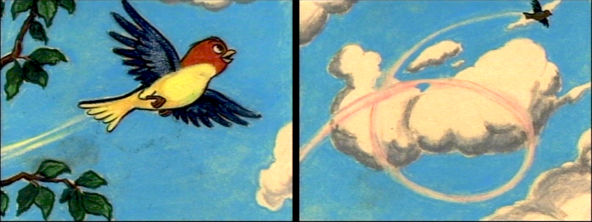
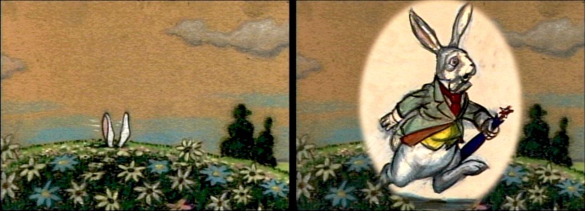
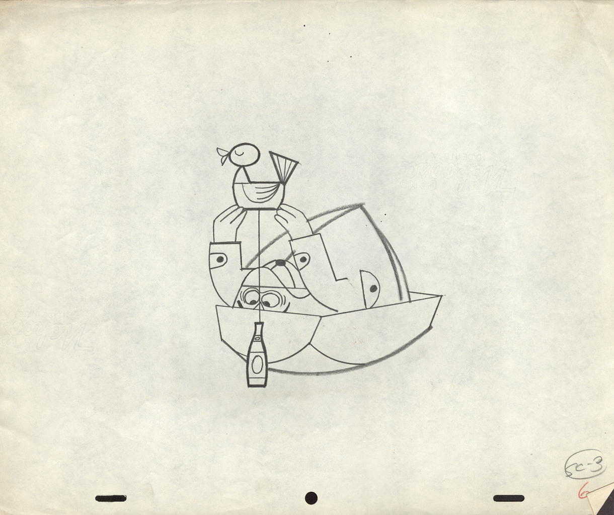
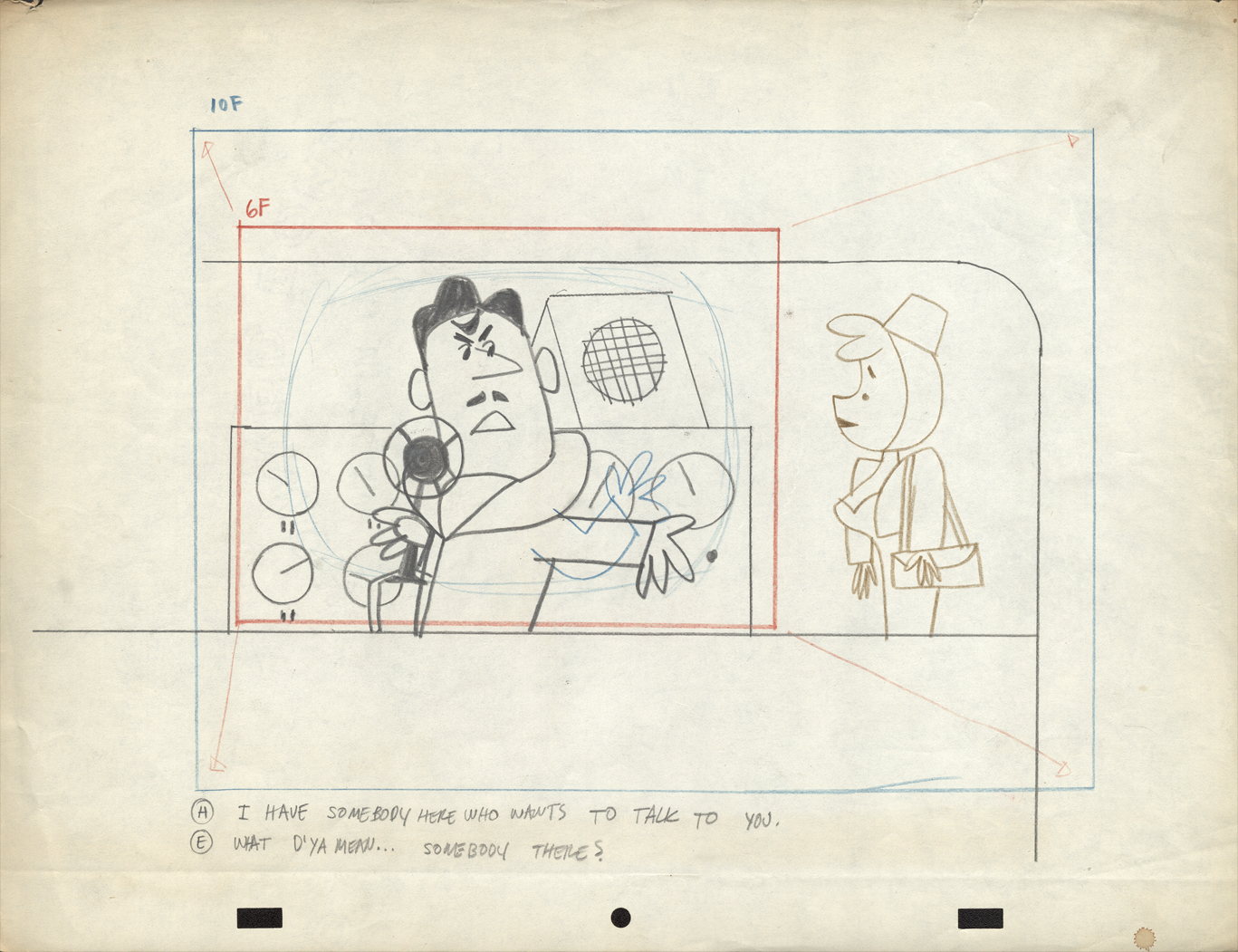
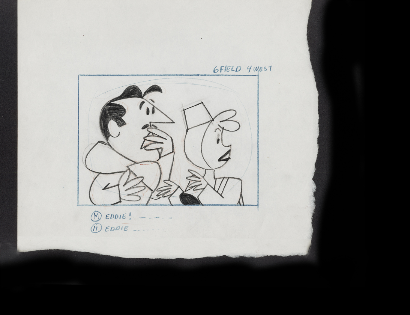
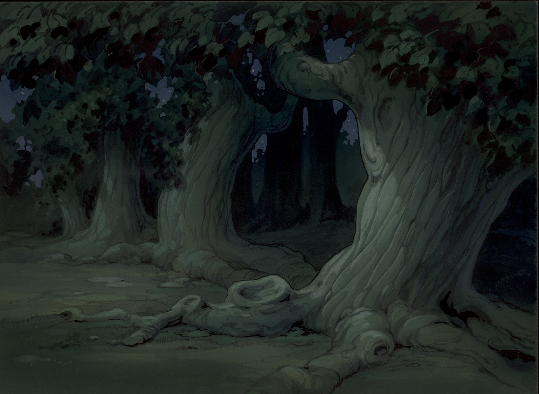
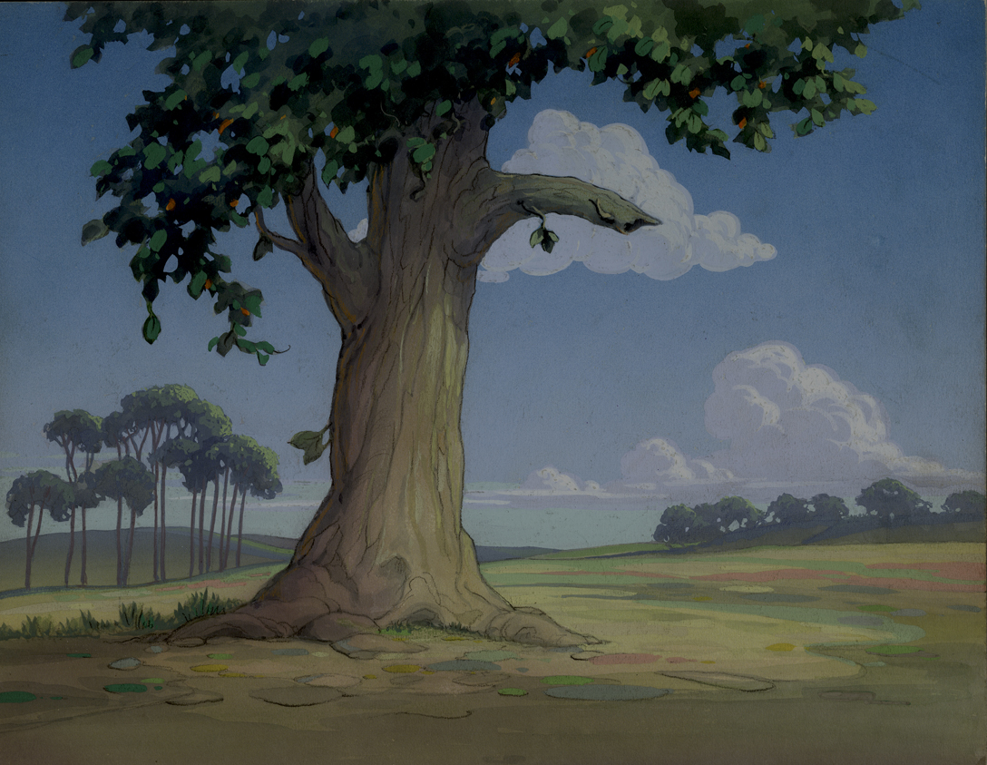
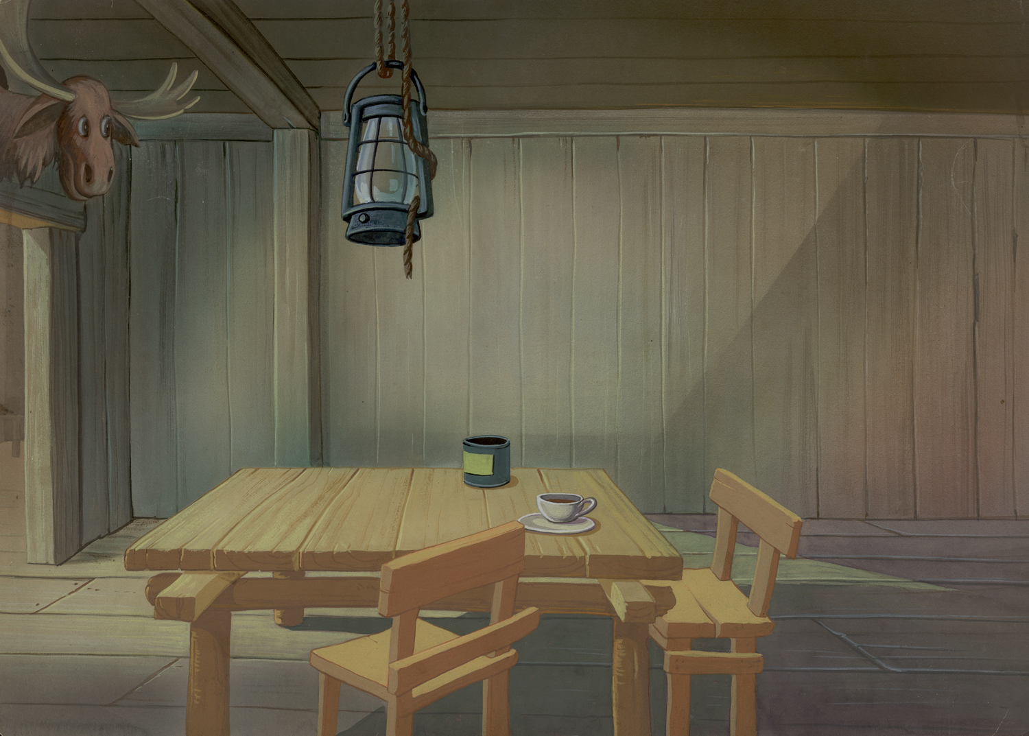
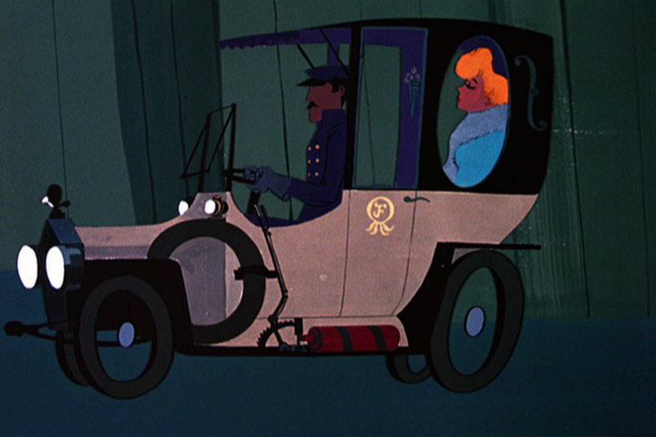
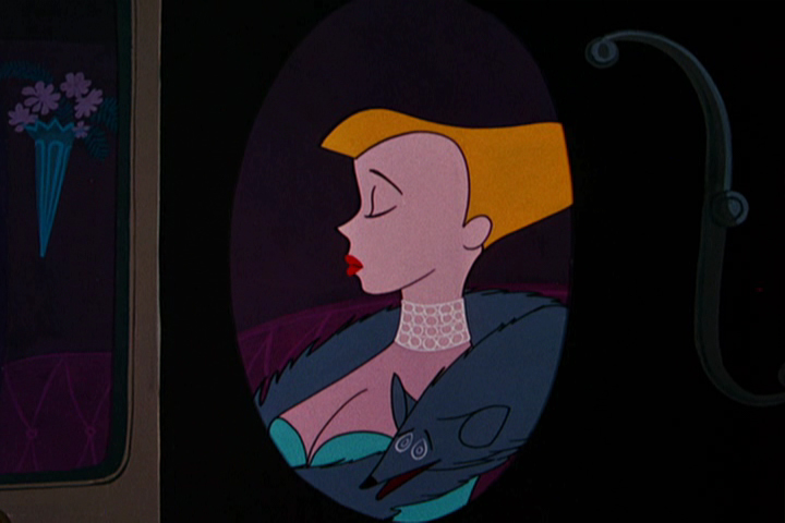
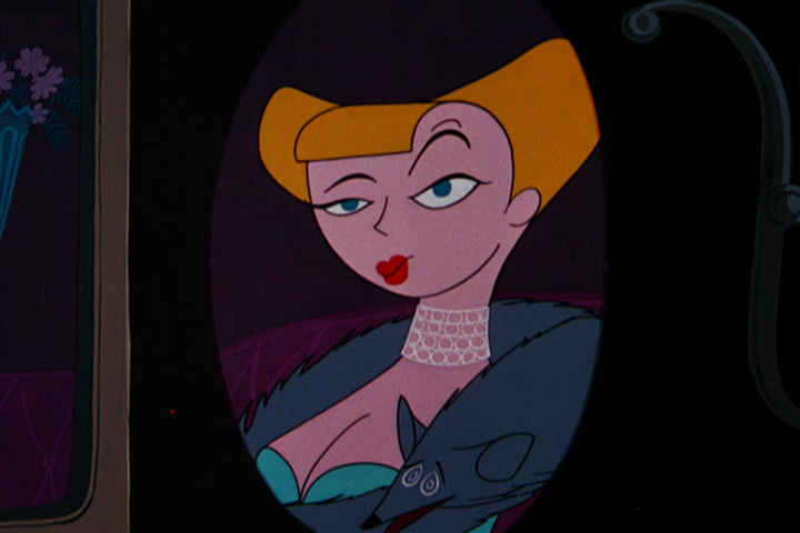
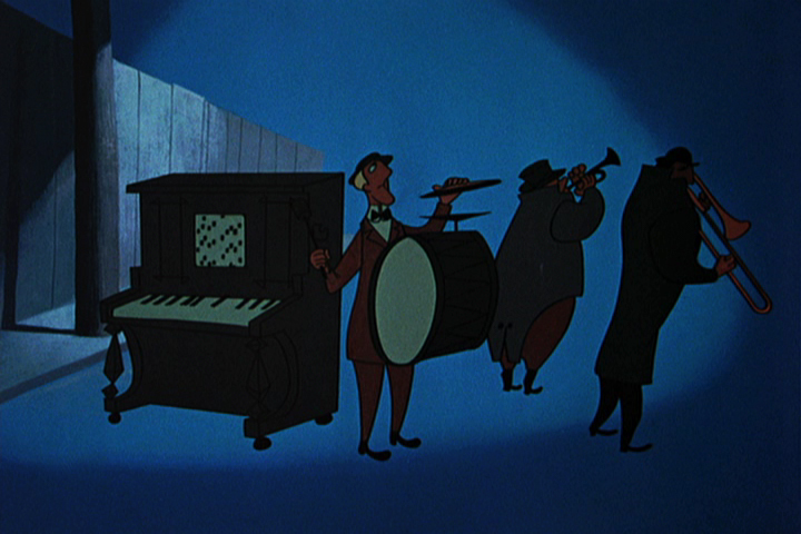
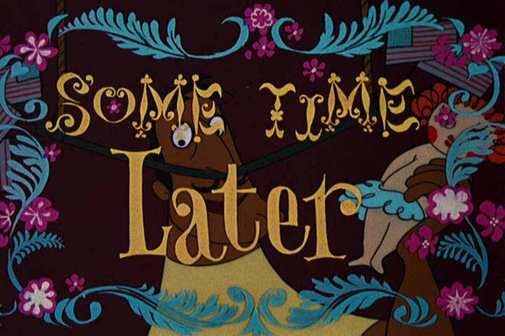
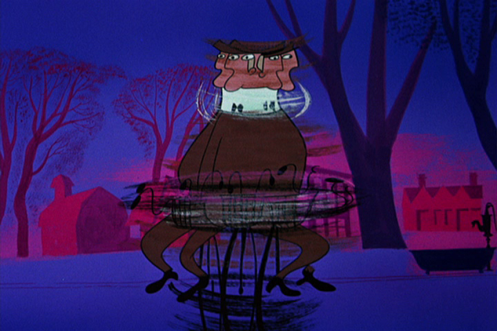
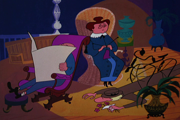
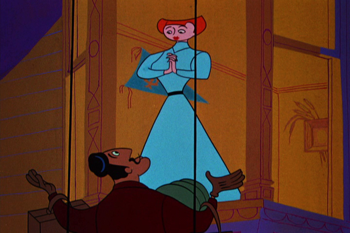
Of Men & Demons – Redux
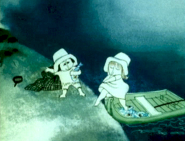
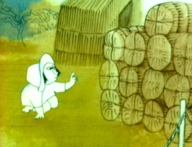 – Since first seeing the Hubley short, Of Men & Demons, back in 1967, I’ve been a fan. The artwork was stunningly different and original. It had a rich tone to it and some beautiful Hubley Bgs. The music by Quincy Jones was as original as the film, itself.
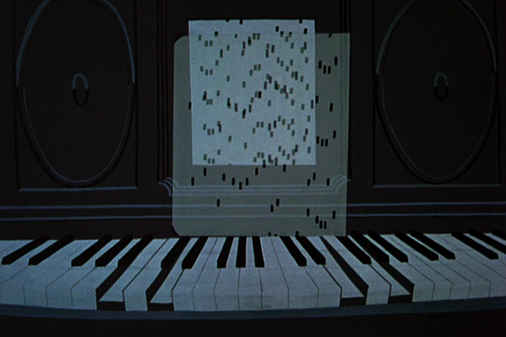
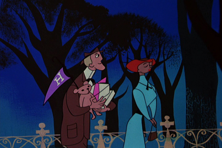
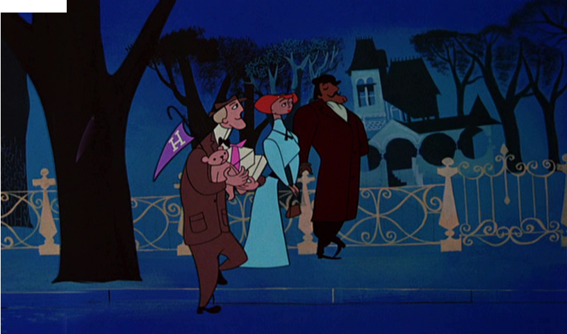
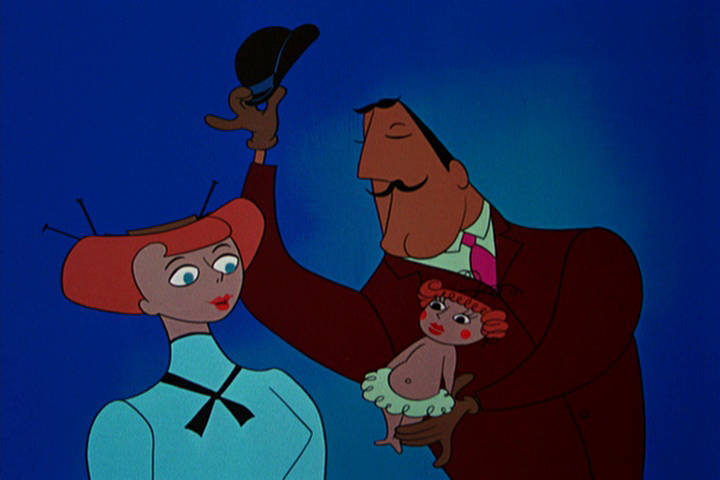
The short was actually an industrial film done for IBM to explain the binary code to its employees. The Hubleys, however, built on that story to make something of a personal film that received an Oscar nomination.
(Click any image on the page to enlarge.)
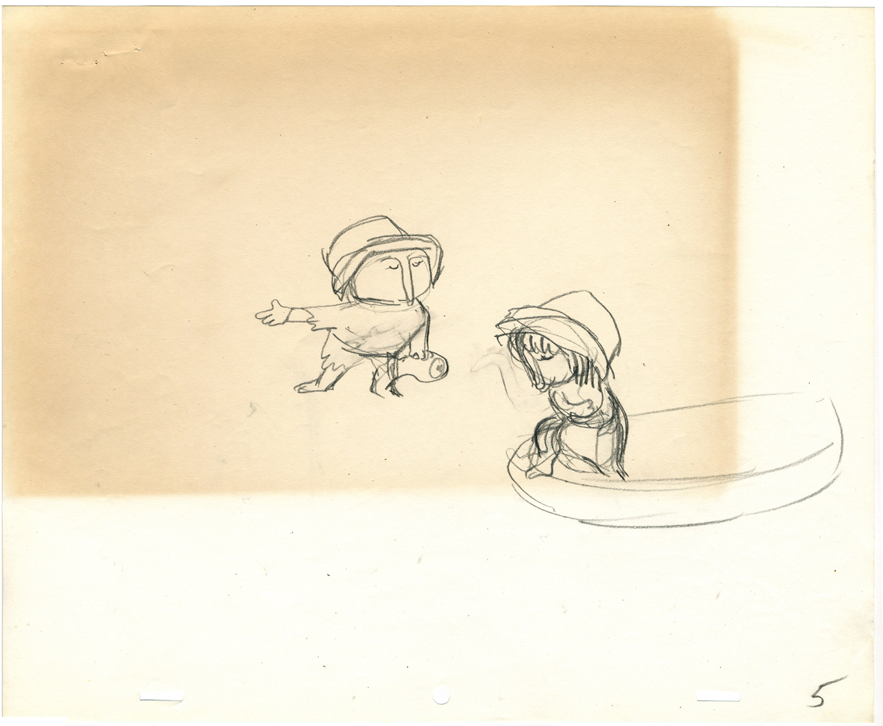
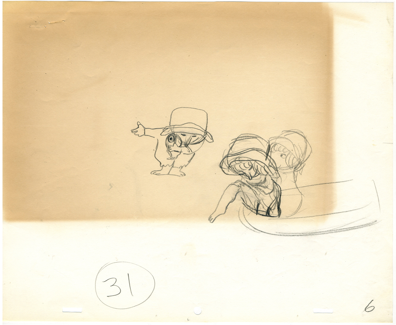
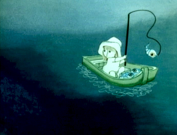
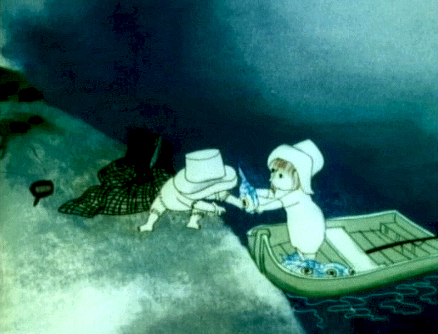
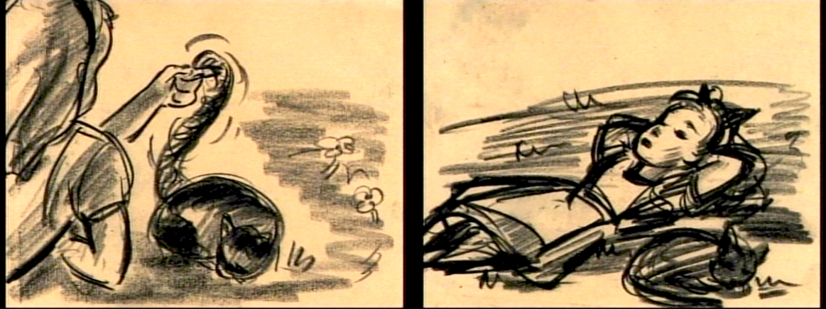
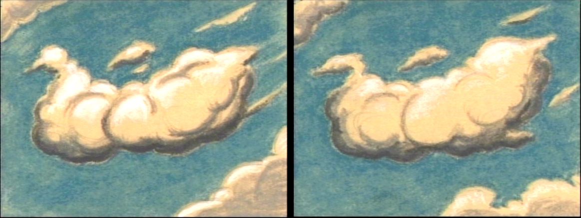
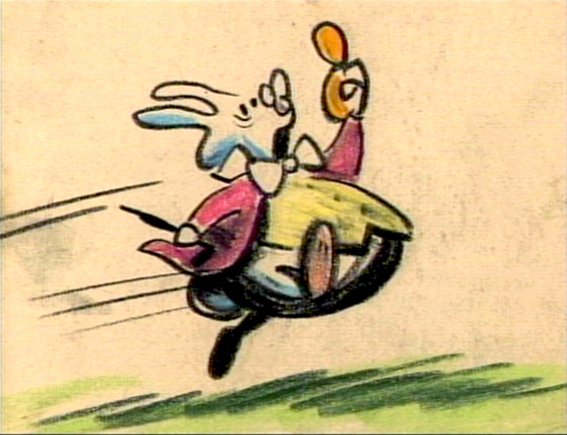
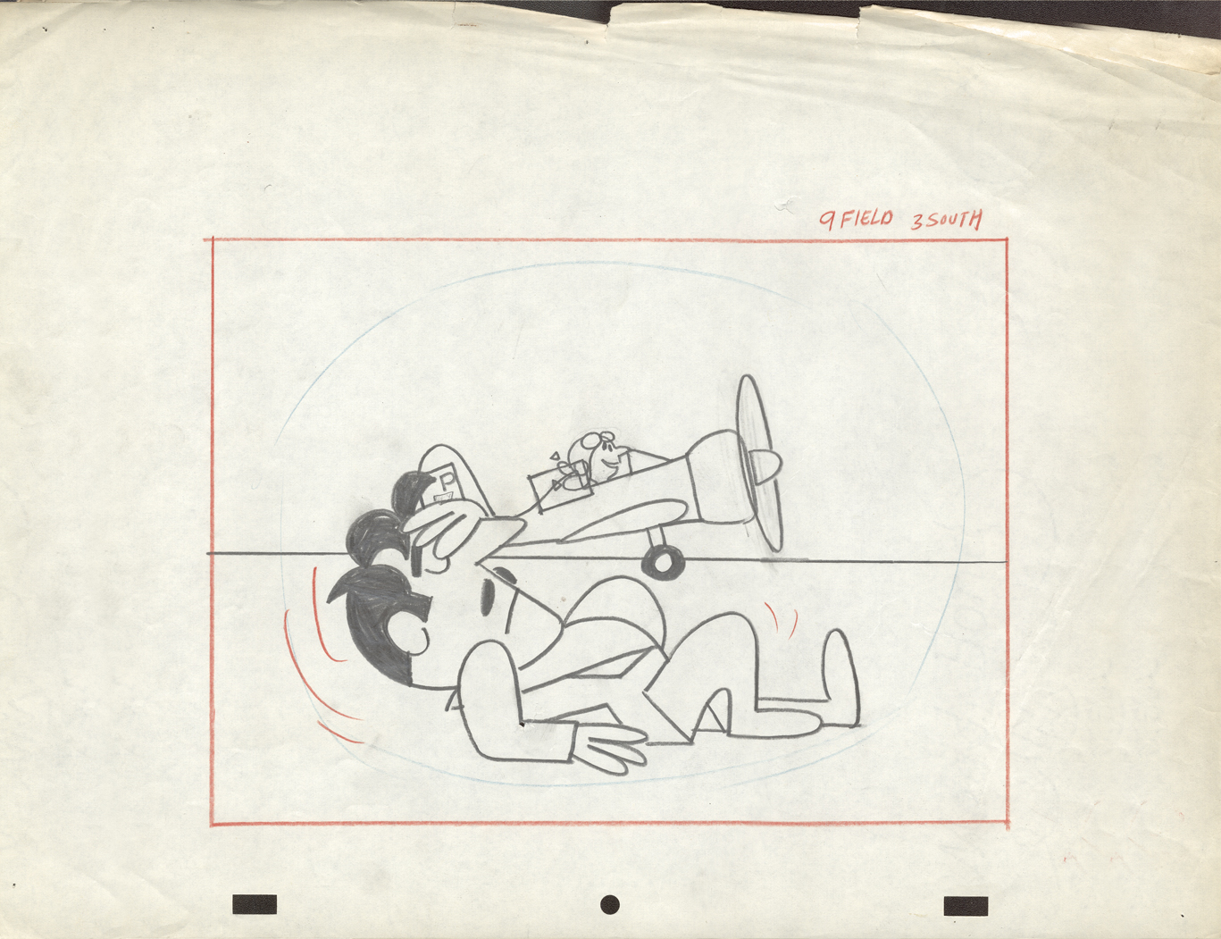
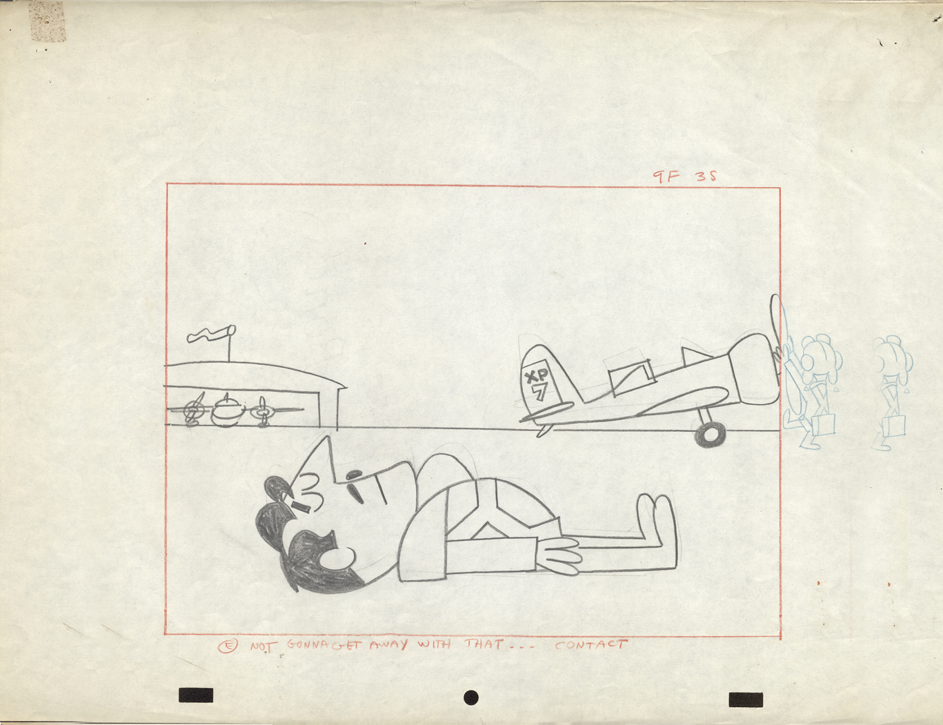
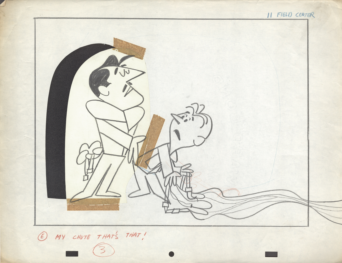
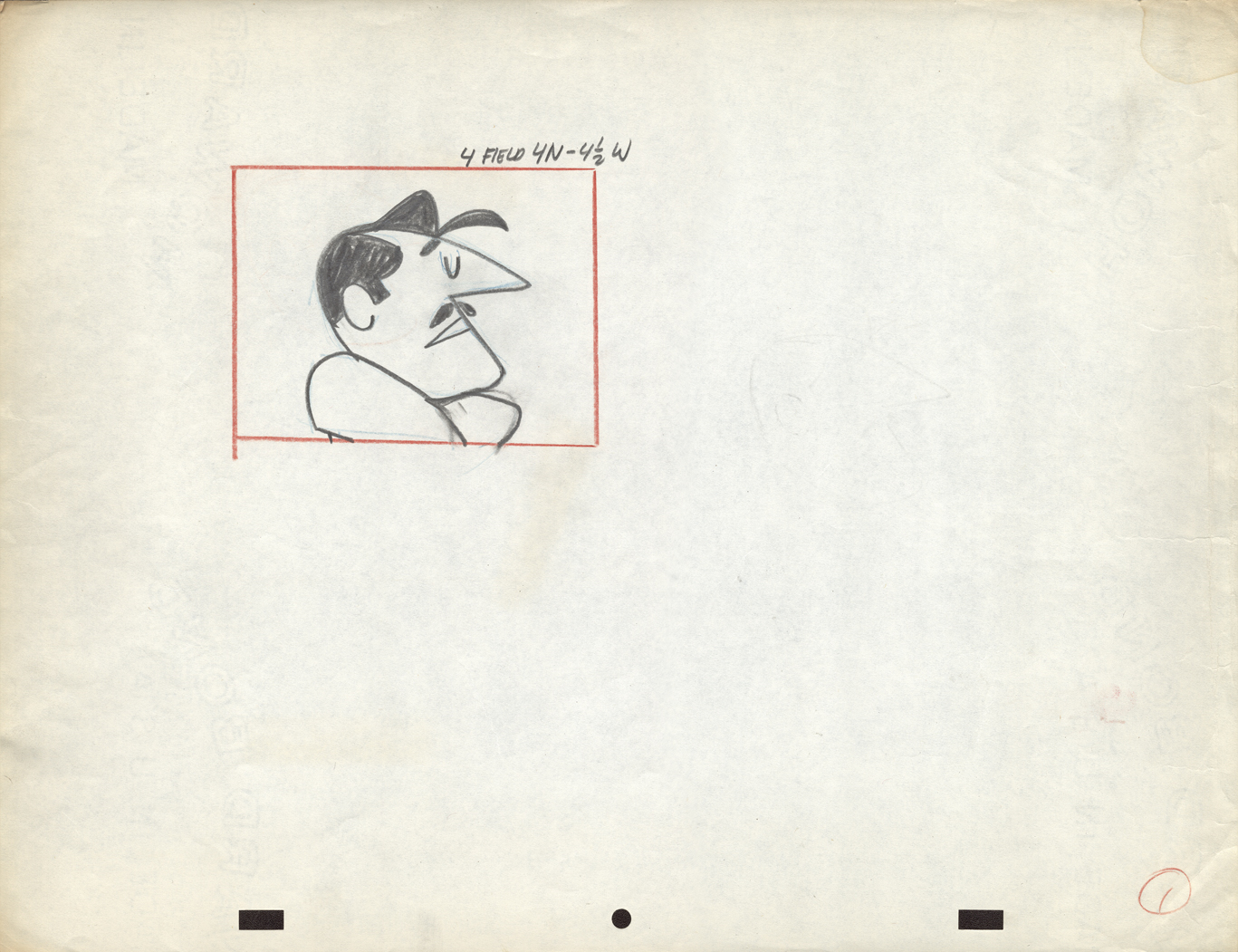
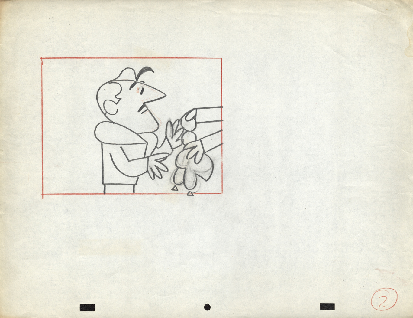
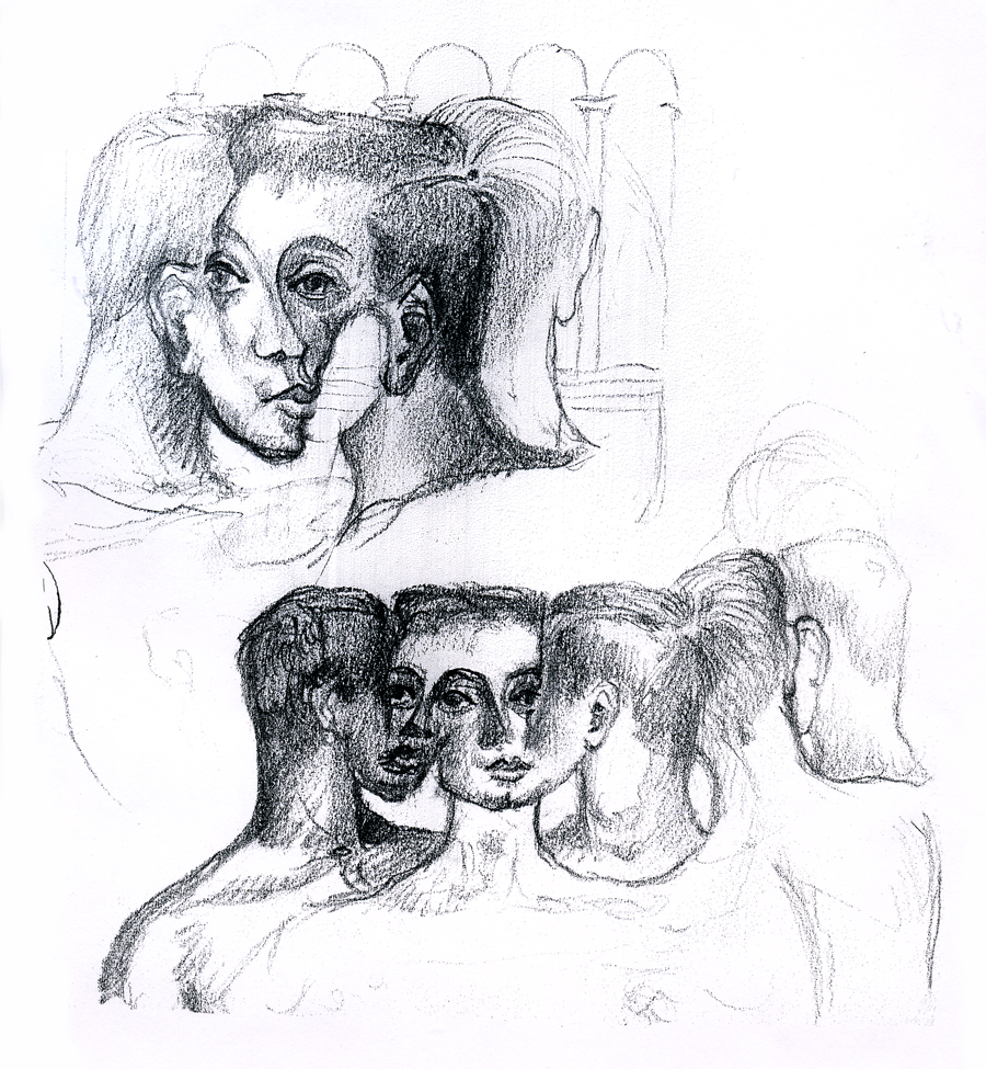
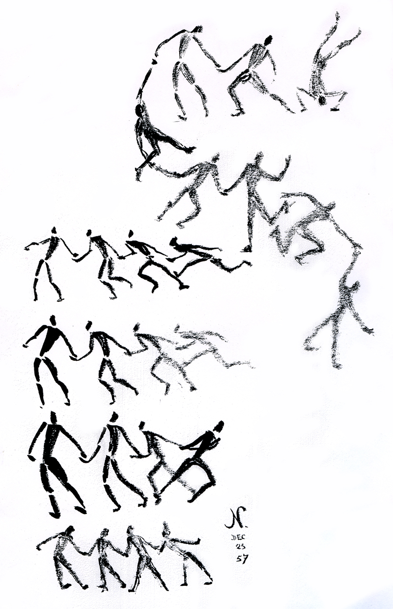
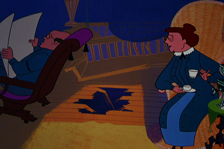
Art Babbitt was one of the first animators hired. At some point, Tissa David was brought on to rework some of Babbitt’s beautiful animation. Unfortunately, it was on about fourteen levels and had to be combined and reconstructed and shortened. (Today, of course, there are no limits to levels, but in the days of the camera you kept things to 4 cel levels, as a rule, and never more than 5.) It was complicated by the fact that John Hubley had decided to shorten the piece, and Quincy Jones’ score was shorter than Babbitt’s animation. This chore took some effort and involved dissolve animation. Tissa then continued on the sequence animating the little protagonist and his female companion through the remainder of the film.
About 25 years ago, Tissa David gave me an envelope full of art from this film, and going through a lot of my old material recently, I came upon that envelope.
 3
3 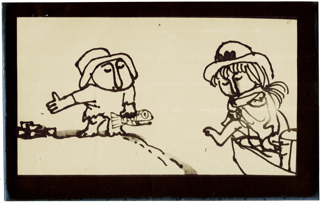 4
4
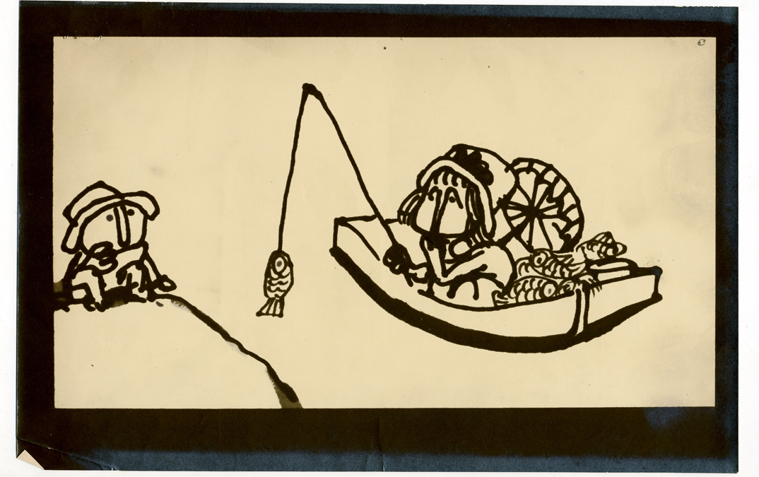
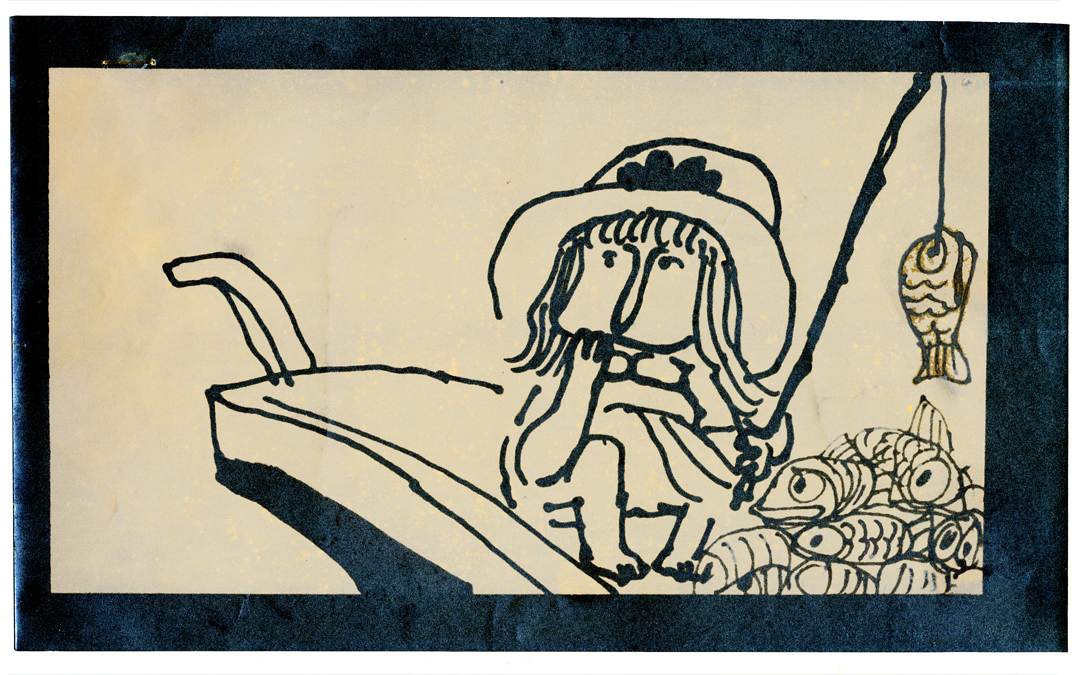
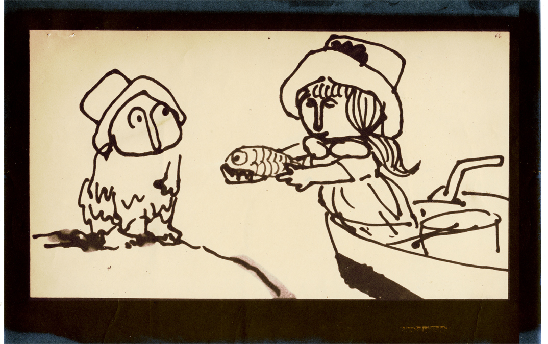
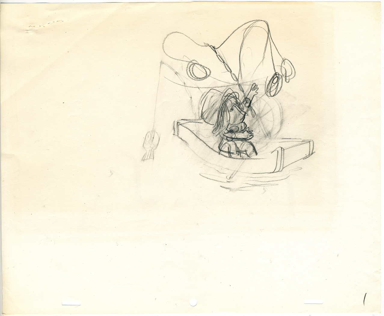
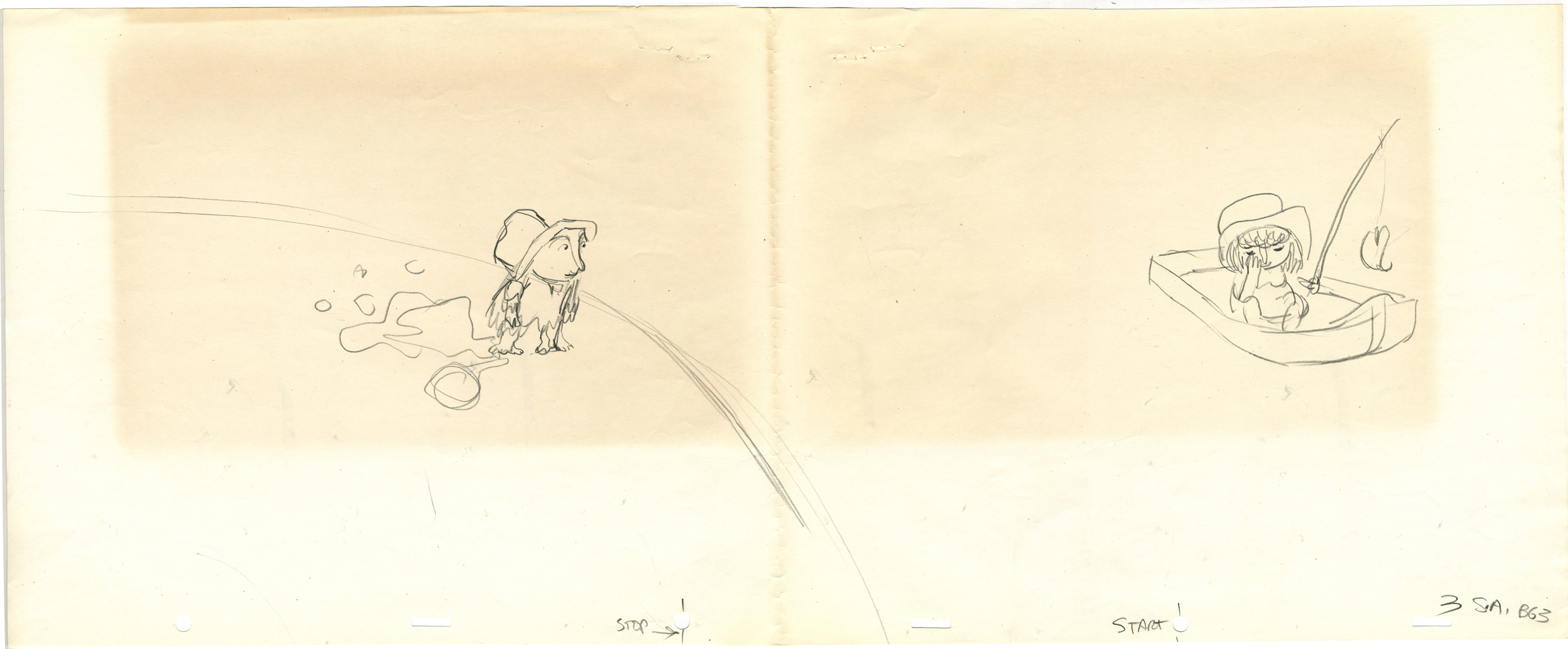
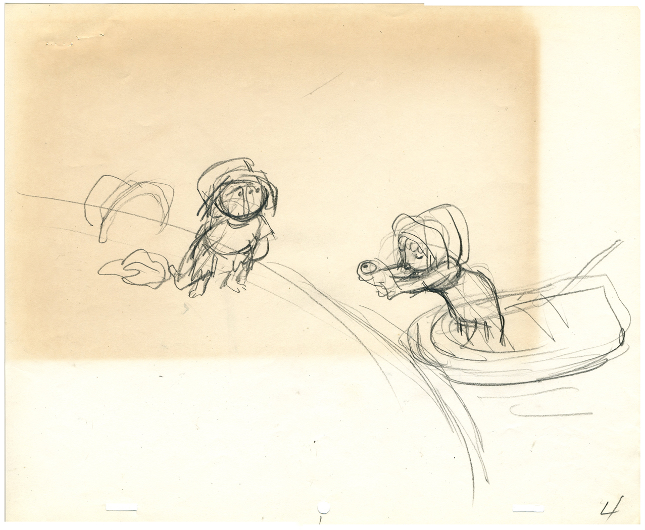
These are storyboard drawings for a short sequence. Tissa got these drawings and prepared Layouts for the sequence. You can see how much is actually in John’s drawings so it’s easy to build on what he’s given you.
 1
1The following are key drawings Tissa prepared for the sequence in laying it out.
.
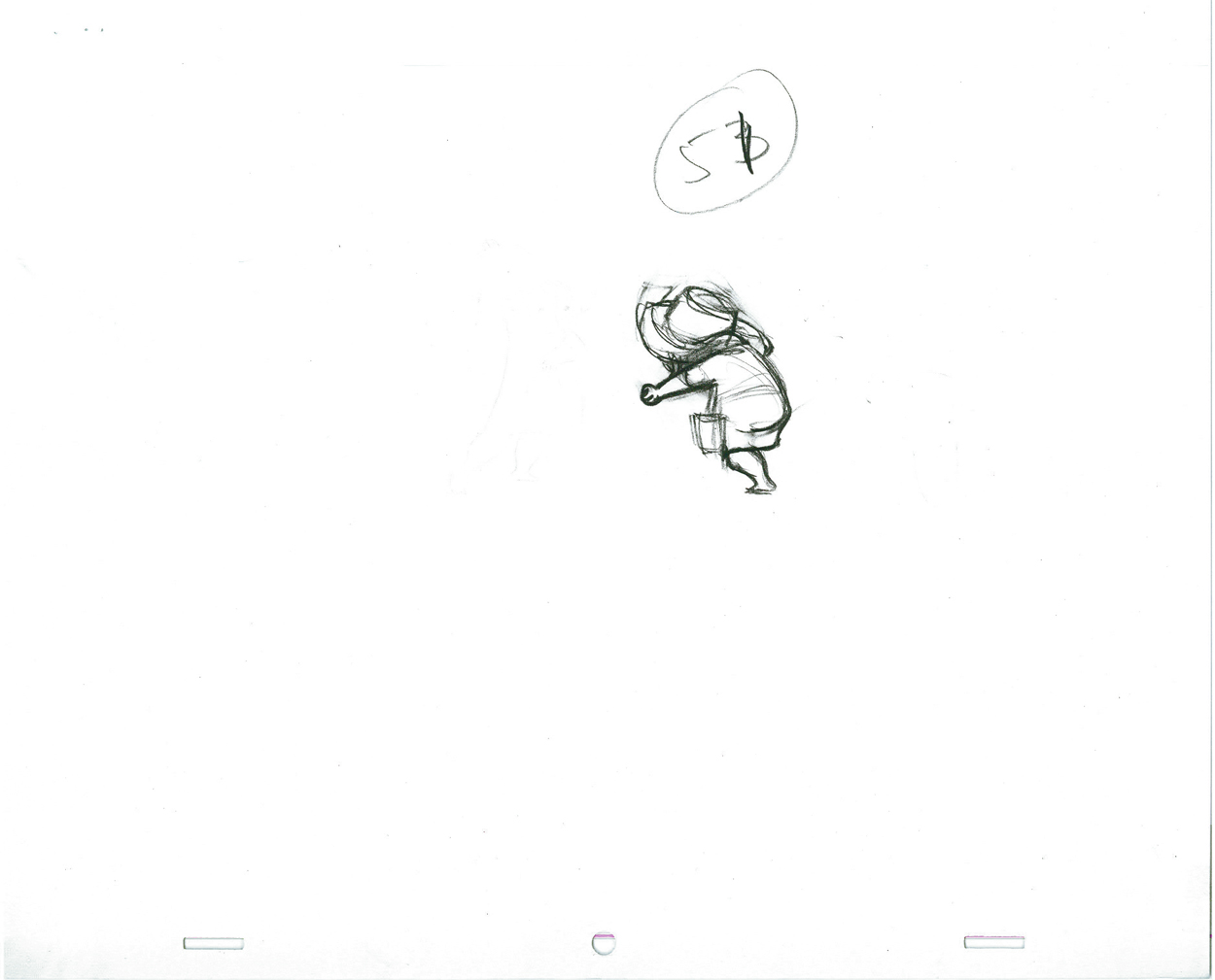
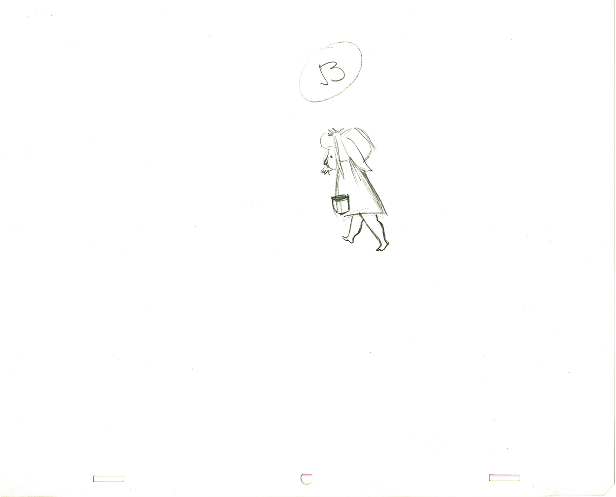
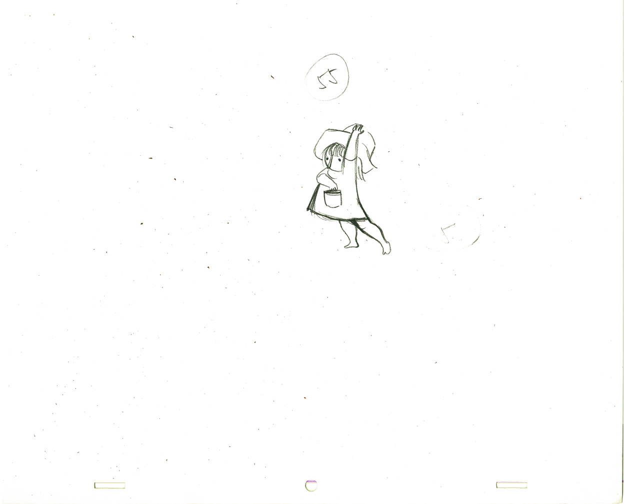
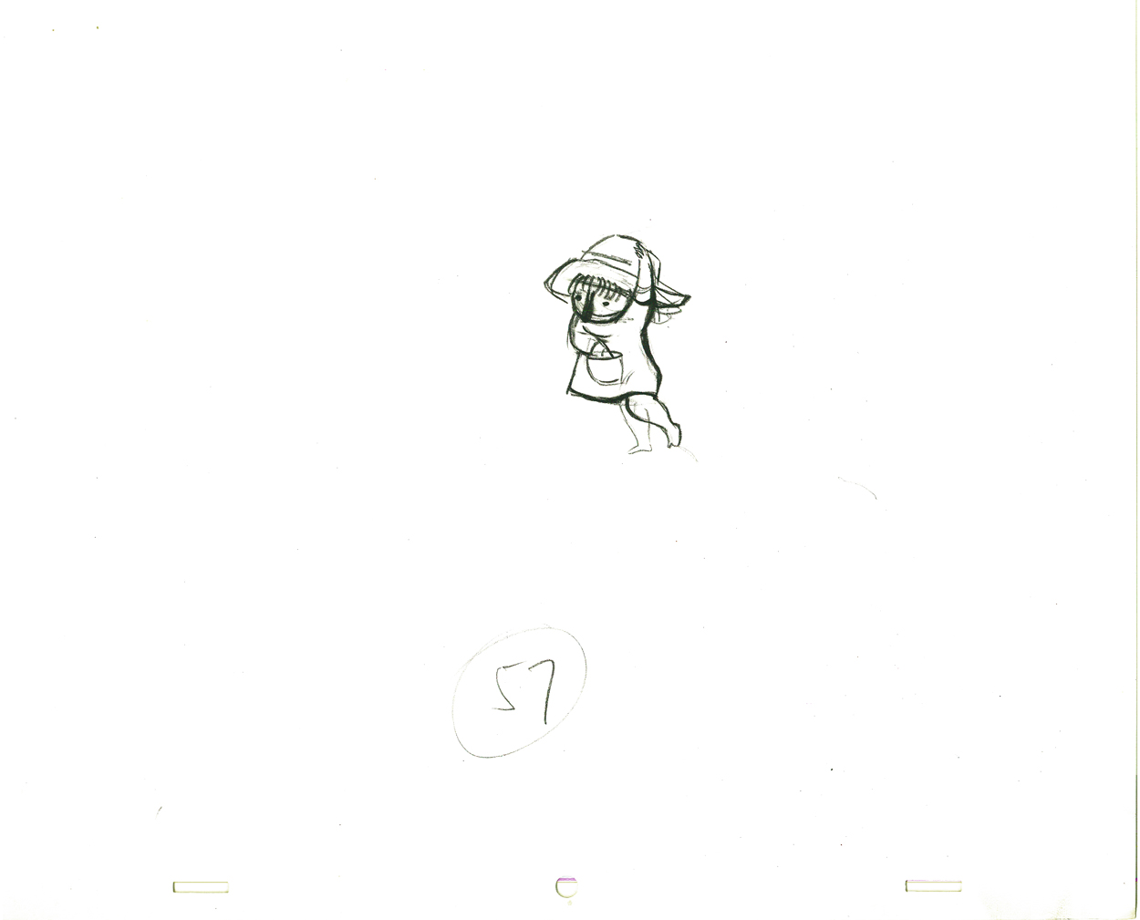
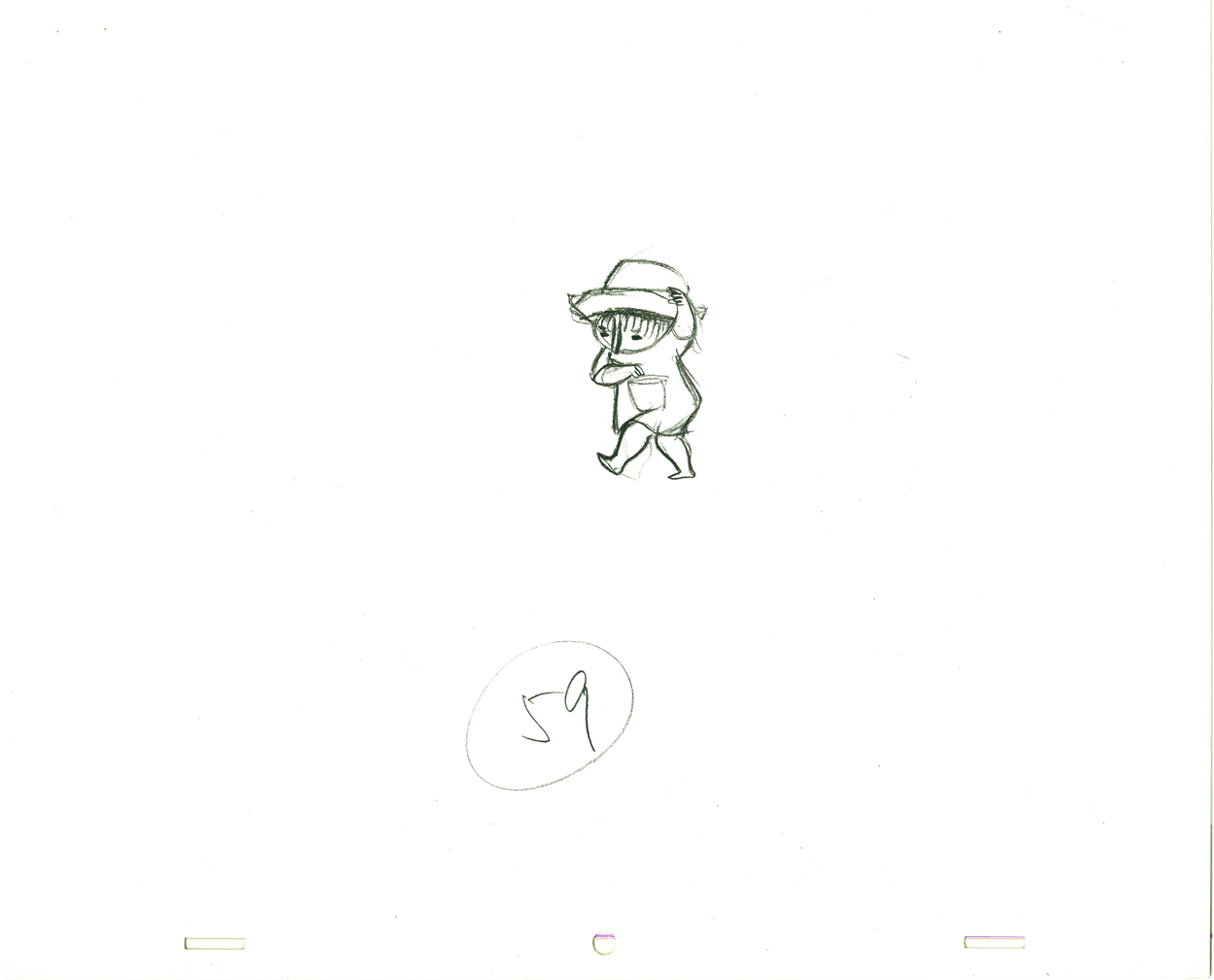
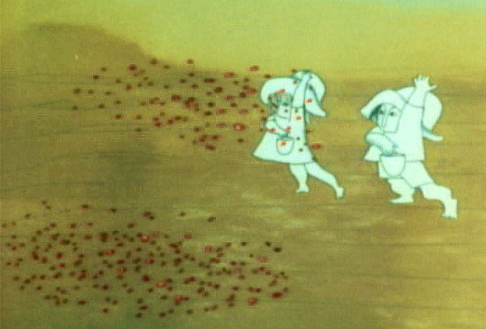
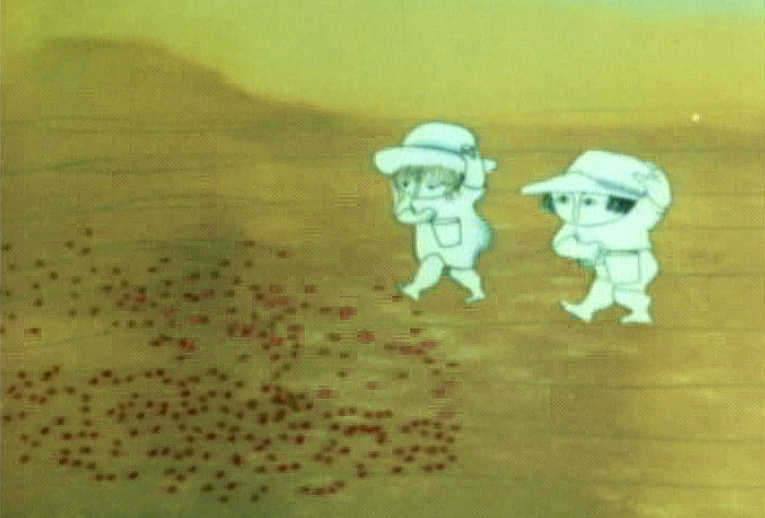
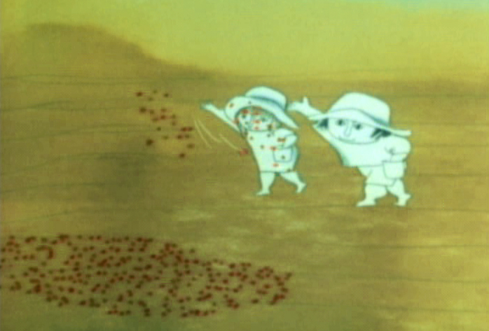
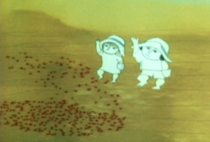
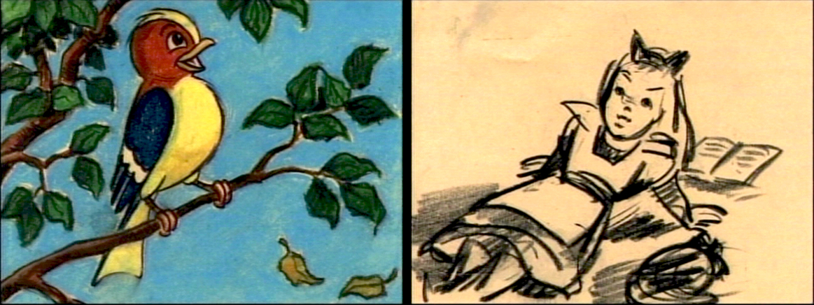
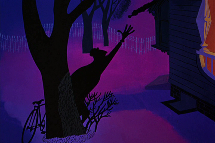
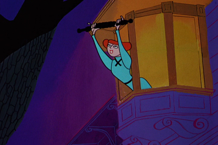
Here is a short piece that Tissa did of the little woman character seeding her front yard. There’s so much grace in every one of these drawings and enormous information in the walk, itself.
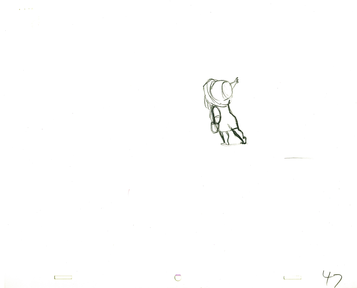 G47
G47(Click any image to enlarge to full animation sheet.)
.
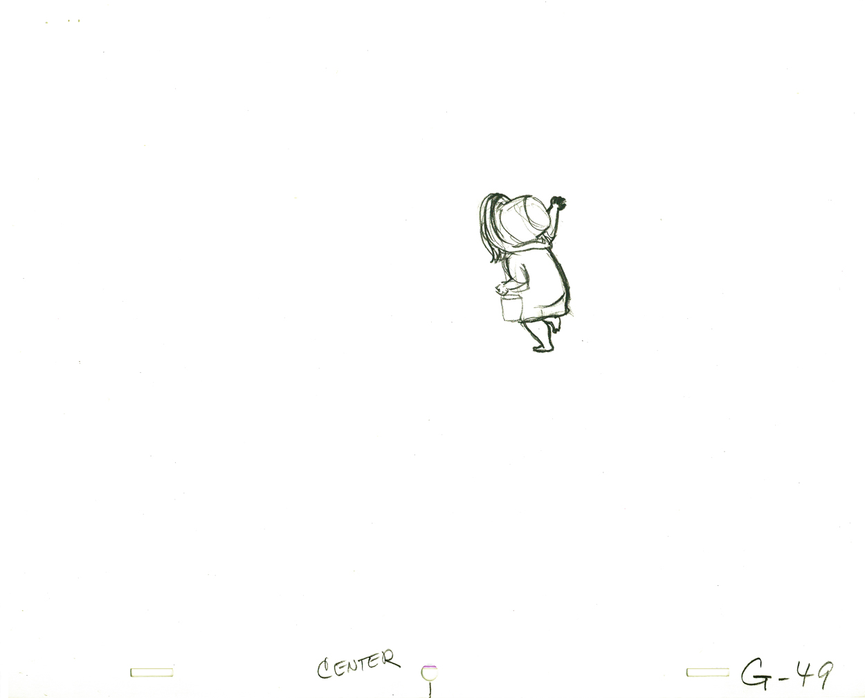 G49
G49.
 G51
G51.
 G53
G53.
 G55
G55.
 G57
G57.
 G59
G59.
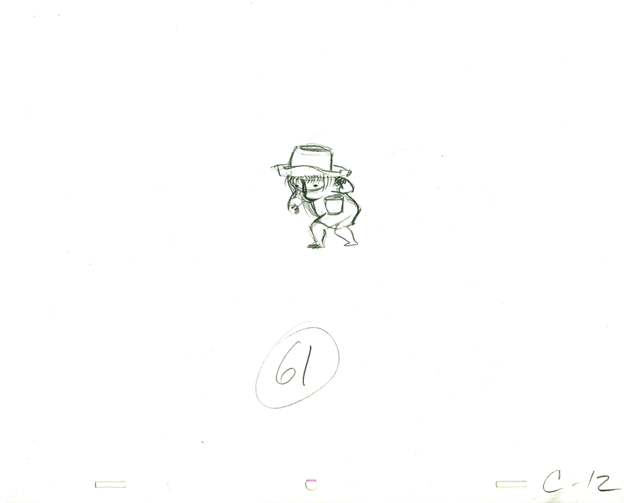 G61
G61.
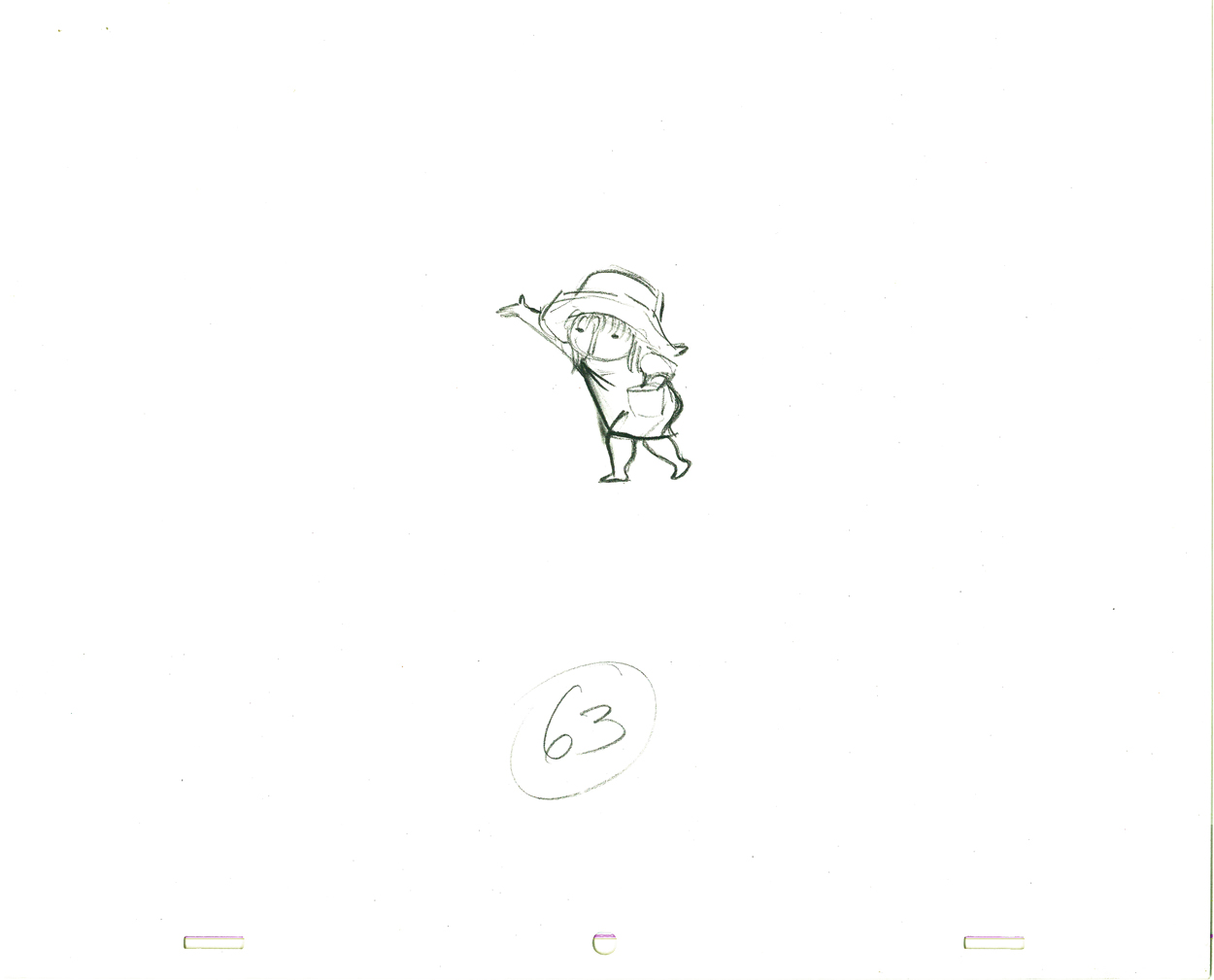 G63
G63.
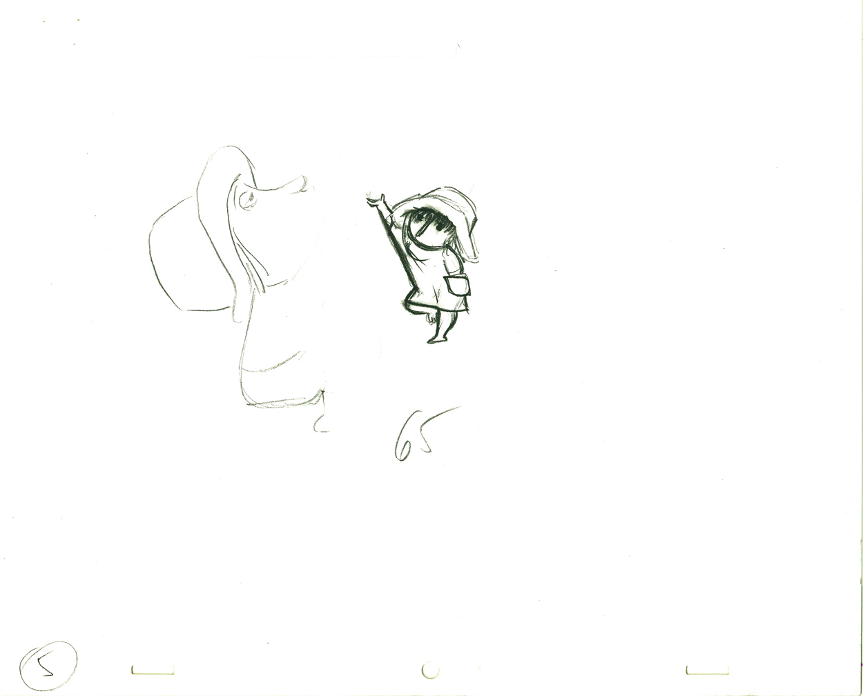 G65
G65.
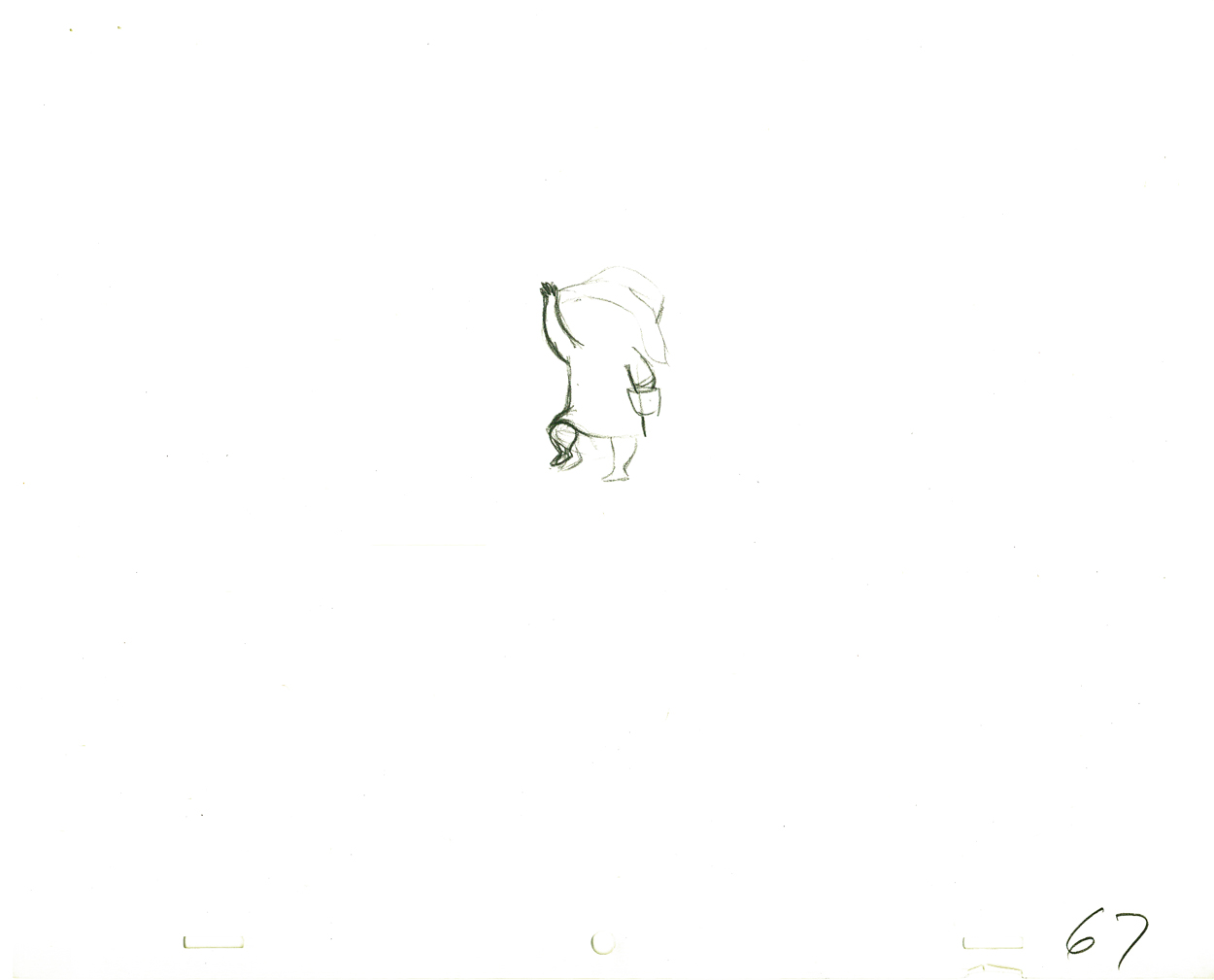 G67
G67.
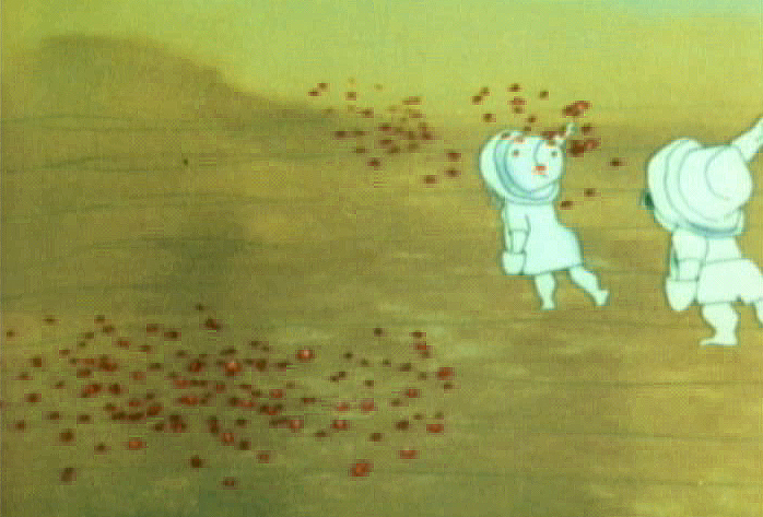
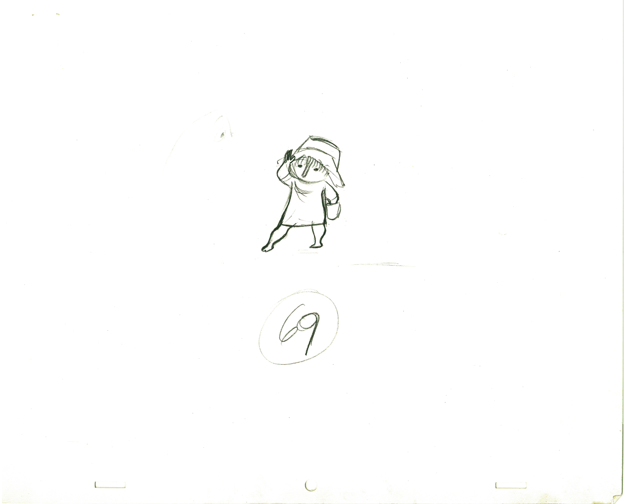 G69
G69
And here are the matching frame grabs from the film.
 47
47 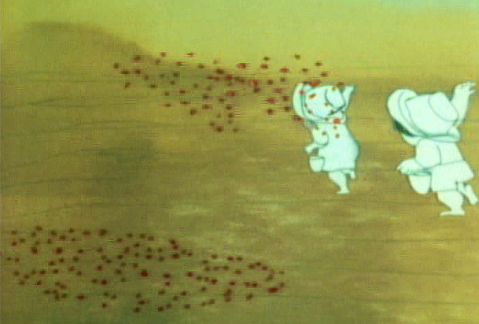 49
49
51 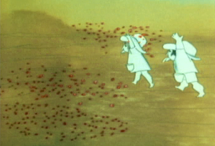 53
53
 55
55 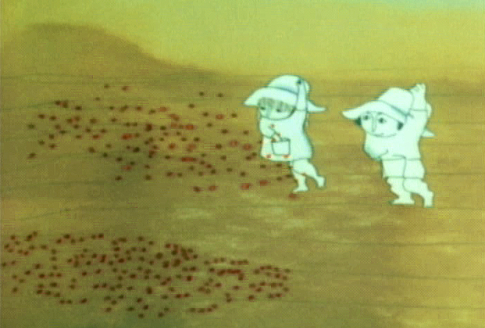 57
57
 59
59 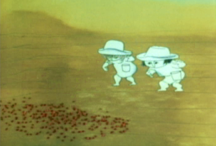 61
61
 63
63 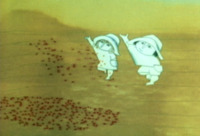 65
65
 67
67 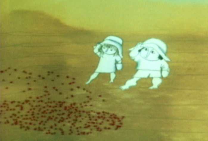 69
69
.
Seeding crops PT & Final Color
Animation Artifacts &Disney &Layout & Design &Story & Storyboards 05 Jul 2012 06:08 am
Daydreams – recap
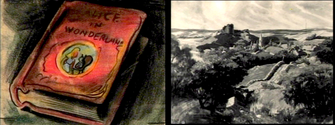
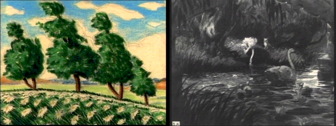
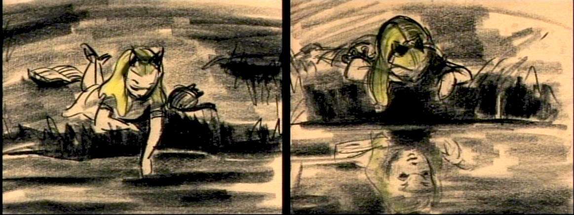
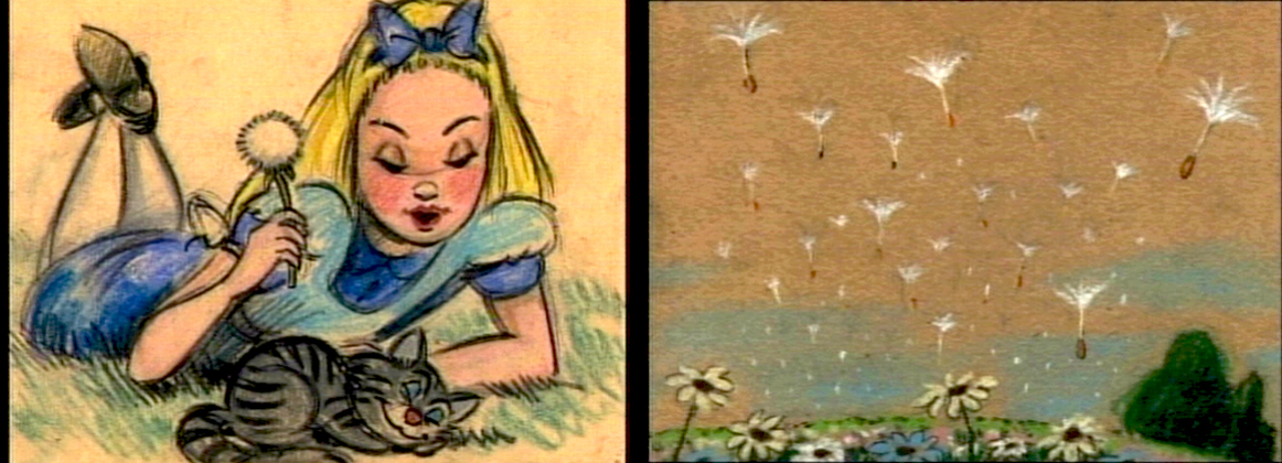
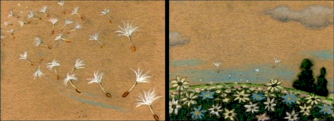
How frequently, lately, they’re running Alice in Wonderland on tv. Unfortunately, nowadays, it’s the Tim Burton version. Horrible. I’m going to have to go back to the DVD to watch the cartoon again. Speaking of which, the MoMA is going to screen the Lou Binin version in late July. I’ll write about it on Saturday, and I’ll re-review it when it does. I’m definitely going. Here’s an oldie but goodie.
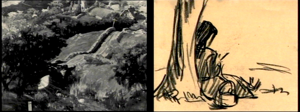
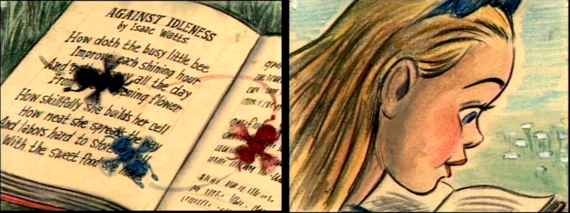
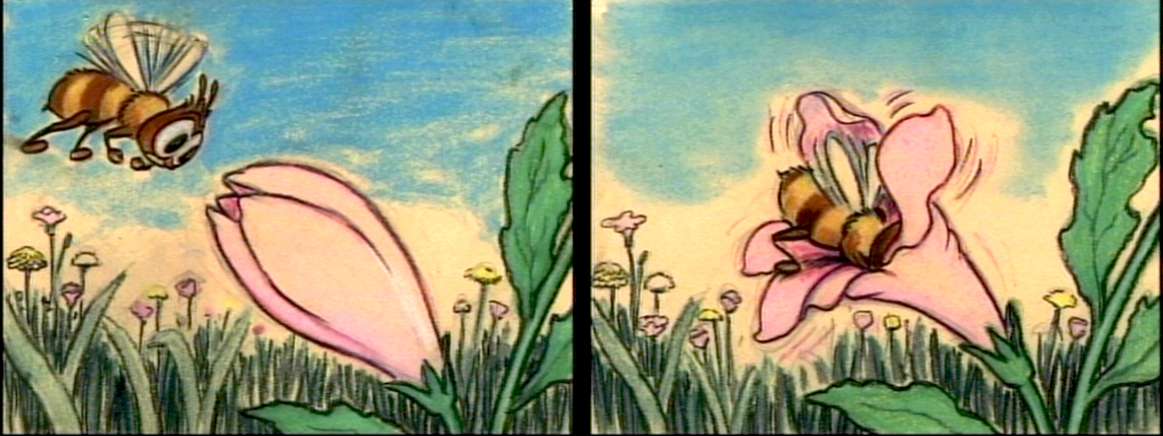
- The Alice In Wonderland dvd contains a storyboard sequence of Alice daydreaming in the park. This sequence didn’t make it to the film (for good reason), but they’ve re-assembled it for the dvd. I’ve taken some frame grabs to show off the drawings. They’re on screen for such a short time.
My favorite’s the last.
(Click any image to enlarge.)__________

commercial animation &Layout & Design &Models 04 Jul 2012 05:25 am
More Commercials from UPA
- Last week I posted a number of drawings from spots which Vince Cafarelli had worked on and saved as a sample of his different projects over the years. Unfortunately, there’s no guide to tell us what studio they were done in or who the sponsor was. I’ve assumed (maybe mistakenly) that the spots using the Signal Corps pegs came from UPA. Those done with Acme pegs (1,2,3,5) may have come from Gifford Animation or TV Cartoons.
I have a large number of other such drawings and will continue the post of these, despite the lack of information behind their history. If anyone can identify any of these, please tell us in the comments section, and I’ll add it to the post.
 1
1Some of these drawings & designs are undeniably brilliant.
 2
2
 3
3
This is just an absolutely great drawing.
 4
4
 5
5
 6
6
This drawing, #6, and the following seven layouts are from the same spot.
Interesting characters, but I have no idea what they’re selling.
 7
7
 8
8
 9
9
The pilot was physically cut out and moved.
Easy in photoshop not so easy in the real world.
 10
10
 11
11
 12
12
 13
13
A torn ending to a short story.
Animation &commercial animation &Layout & Design &UPA 27 Jun 2012 05:44 am
UPA Commercial Layouts
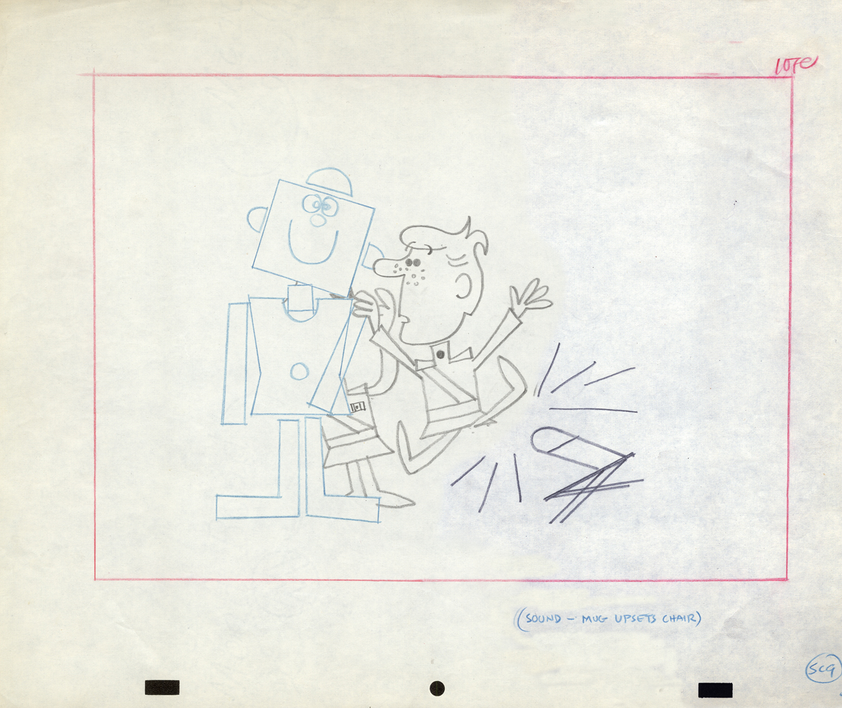
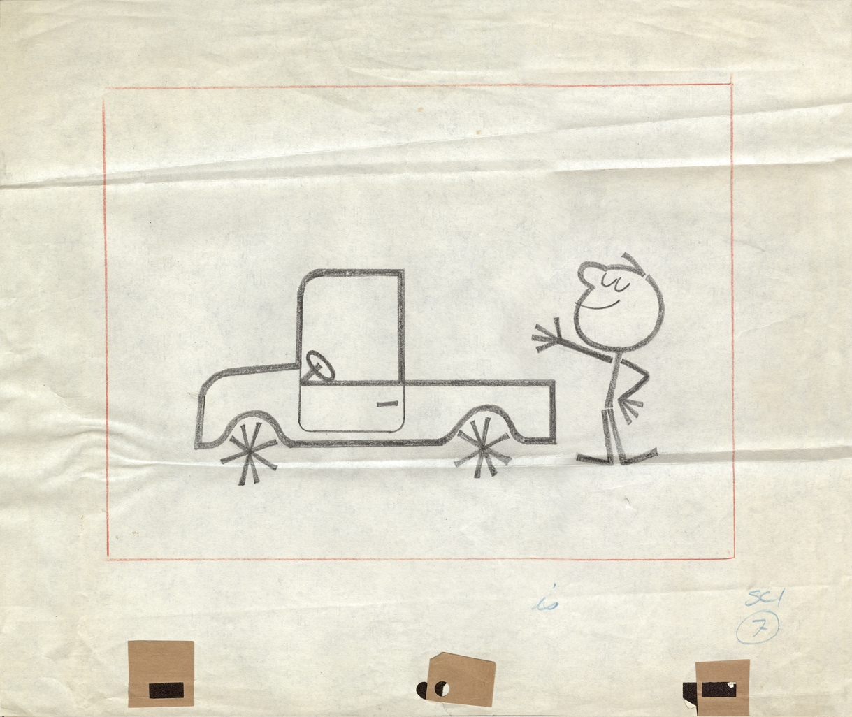
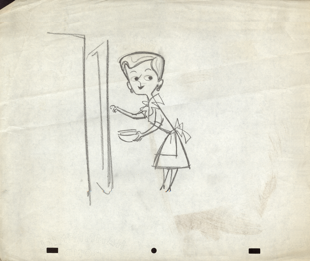
- Having swept through Vince Cafarelli‘s collection of Fleischer/Paramount artwork, We move onto the next box which is his commercial work. Vince was an Assistant Animator at UPA New York. He saved a group of layout drawings for some of the commercials. Unfortunately, only a few are marked as to what the sponsor was. so it amounts to a number of drawings which often have no relation to each other.
However, the drawings included all are good representation of the beautiful and diverse design employed at the studio. Here are a first group; when I can identify the spot, I will. If you recognize any of them, please let me know.
The peg system used throughout is called “Signal Corps.” This is where the size of pegs was first used. By this time, New York animators had three different sized pegs to use: Acme, imported from California;
Signal Corps, a hold-over from the Army, and
Oxberry, invented just after the War by John Oxberry.
They all had their different advantages, and they all remained in use through the 80s, when Acme finally took over.
 1
1Mark Kausler commented: “… the first two are “Buffalo Bee†from
the Nabisco Wheat Honeys commercials. Mae Questel was the voice,
they appeared on the early Mickey Mouse Club shows, 1955-56.”
 2
2
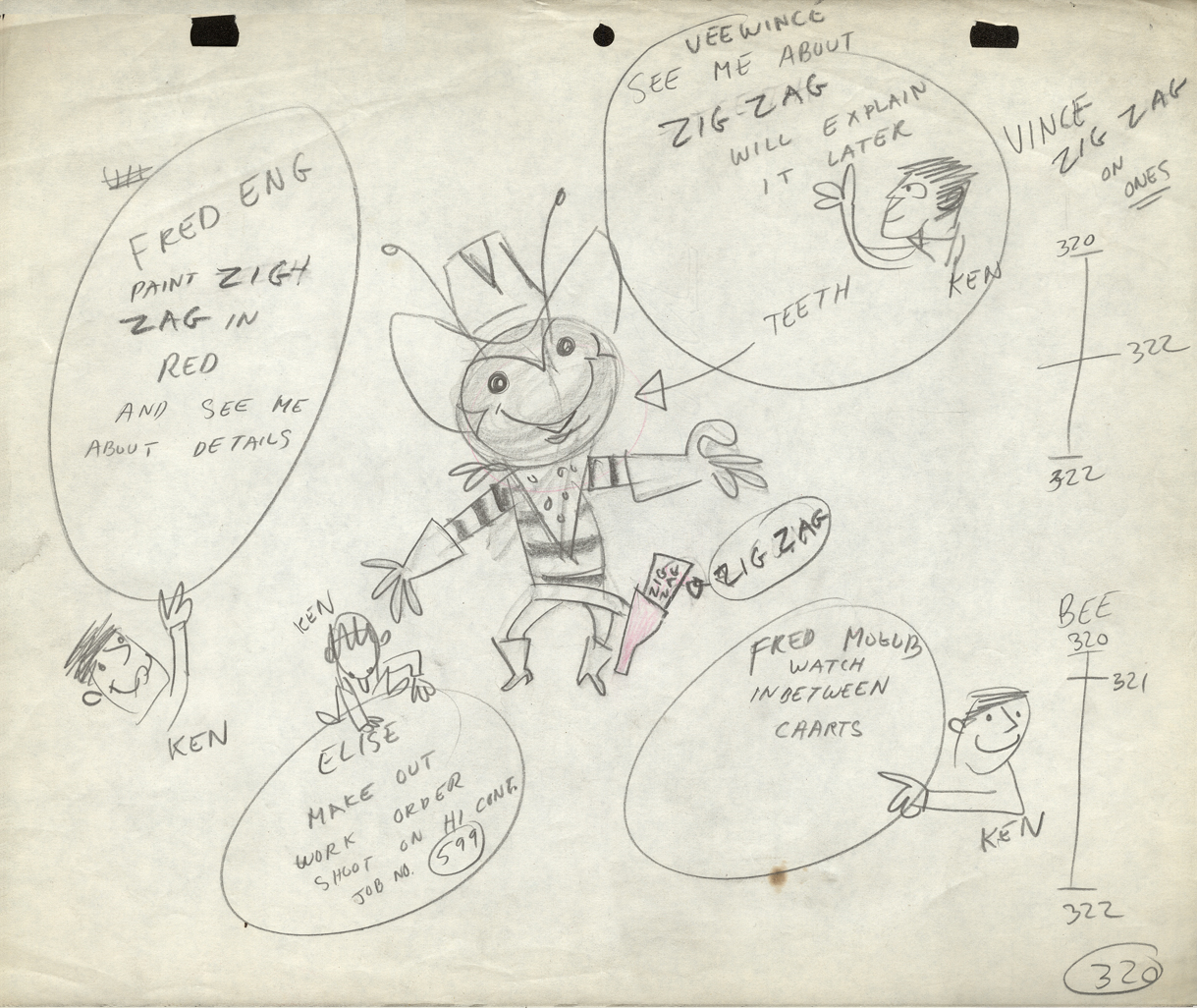
Note how the animator leaves notes for the crew who will work on the spot.
“Vince” was the Assistant Animator. “Fred Mogubgub” was the inbetweener.
“Elise” was the checker/Prod. Coordinator, and “Fred Eng” the talented inker.
 3
3
 4
4
 5
5
 6
6
 7
7
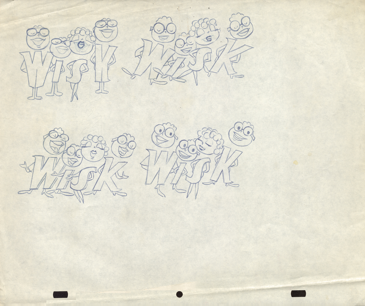
This is obviously for a Wisk commercial.
 8
8
 9
9
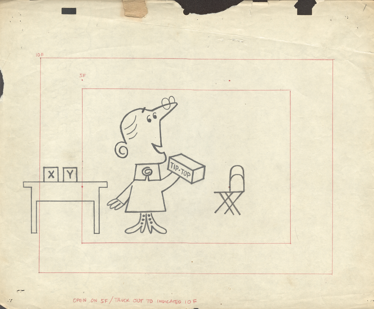
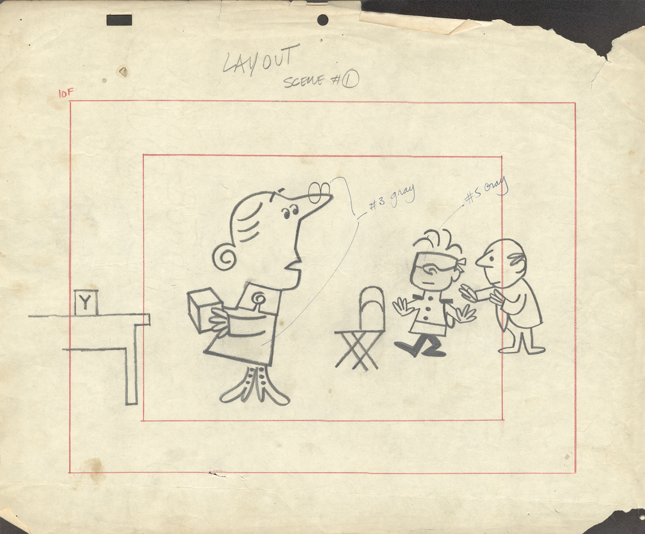
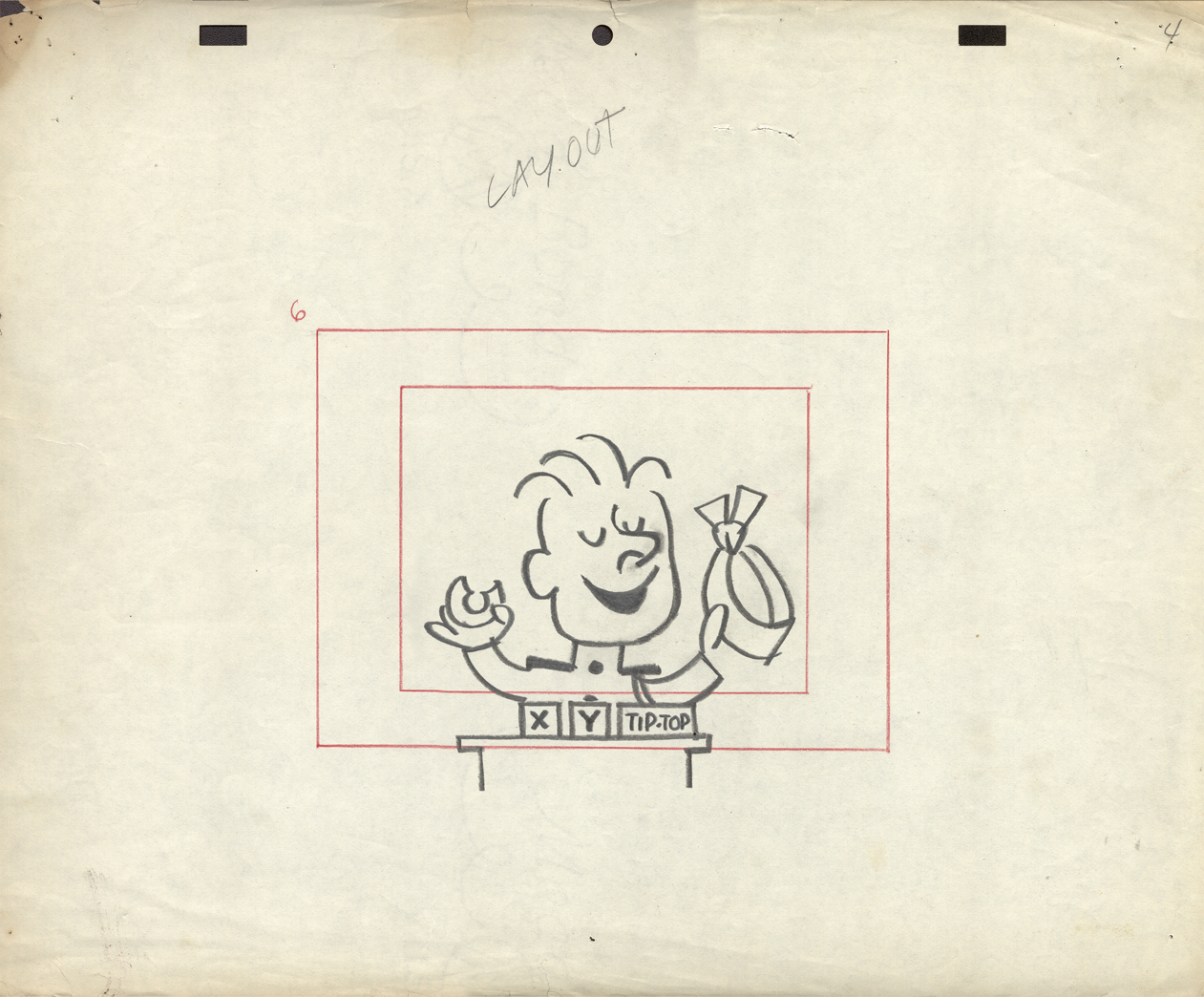
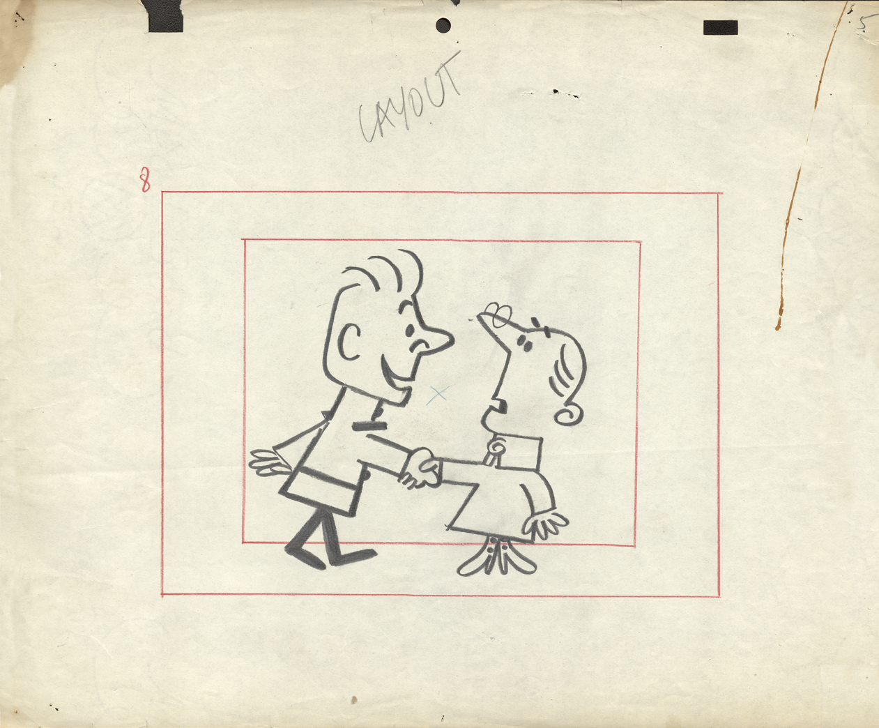
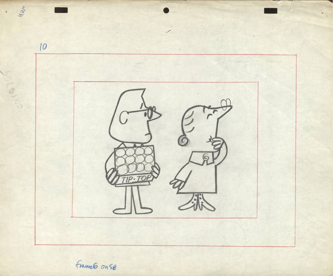
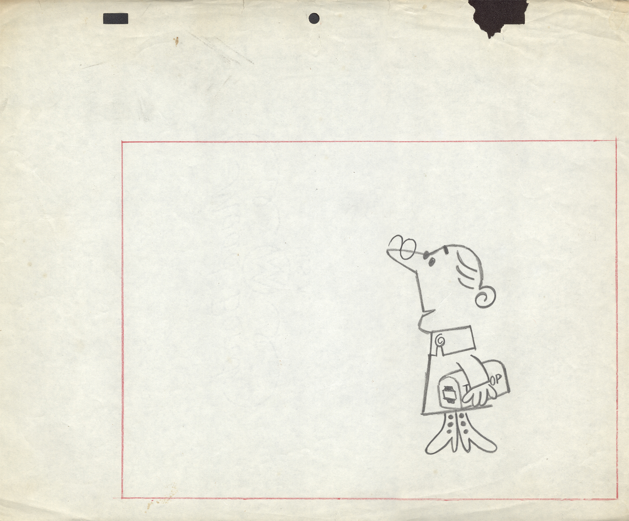
The final six LO drawings are Emily Tipp for Tip Top bread.
She was a very successful spokesperson for the bread company.
These may have been done at Kim-Gifford Studios rather than UPA.
I kept them with UPA because the peg system is consistent
with other UPA commercials.
 10
10
To see some of the Emily Tipp spots go here
at the Buzzco website.
 11
11
 12
12
 13
13
 14
14
 15
15
Animation &Commentary &Hubley &Independent Animation &Layout & Design &repeated posts 25 Jun 2012 06:29 am
Everybody Rides – repost
I posted this in the summer of 2008. I’ve ganged two parts together to make one read.
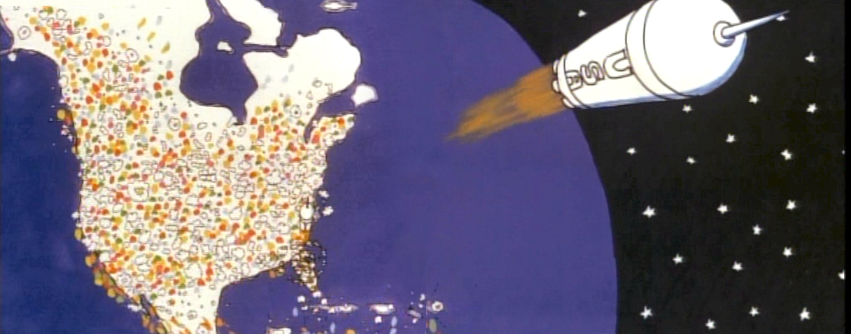
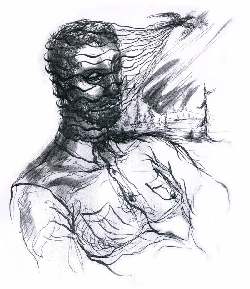
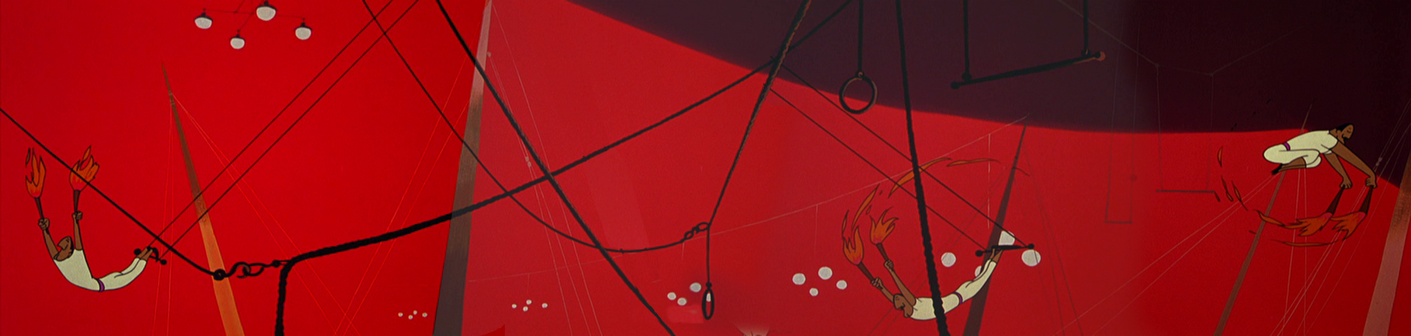
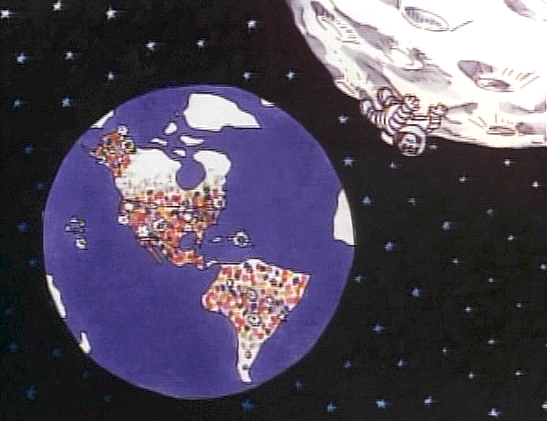 - Back in 1976, I was working on John Hubley‘s Bicentennial flm, PEOPLE PEOPLE PEOPLE. This was a short film, four minutes long, that had about a million scenes. It told the history of the US (from the standpoint of populating and overpopulating) beginning 17760 BC and ending in 1976 AD.
It started with some lengthy scenes. As the film moved on, the cuts came faster, until they hit about 6 frames apiece toward the film’s end. The final scene, from space, was the longest in the film.
There were no characters that appeared in any more than one scene. That meant that with each scene, there were new setups, new characters, new colors, new everything. As a result, it took much longer than other films and was a difficult one to pull off. But like all other Hubley efforts, it was fun. Tissa David, Jack Schnerk, Lu Guarnier, Phil Duncan and Bill Littlejohn animated it. I colored about 2/3 of the film and animated at least a dozen or two scenes (some really were only 6 frames – like that auto shot posted). I also assisted/inbetweened all of the animators.
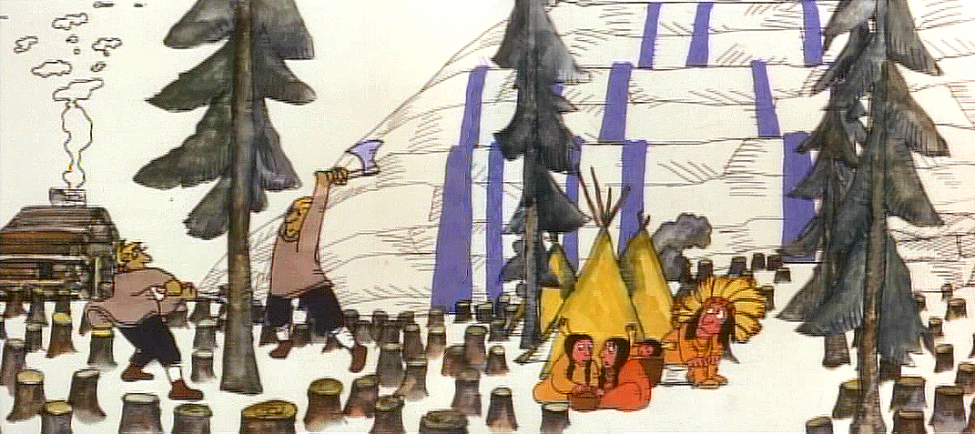
Swedes cut down all the trees in PEOPLE PEOPLE PEOPLE.
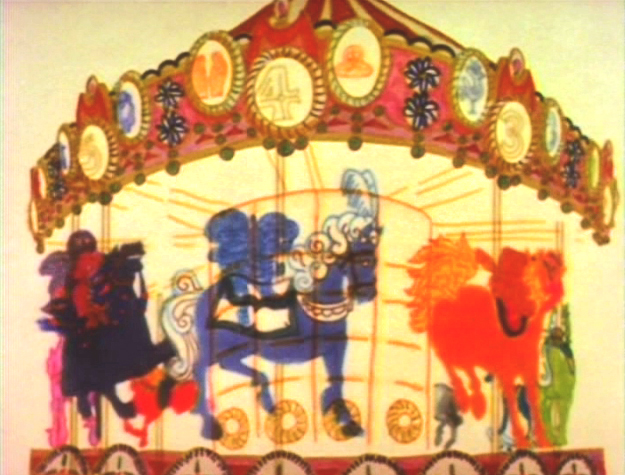
The studio, at the time, was buzzing because John and Faith had just sold a dream project to CBS. EVERYBODY RIDES THE CCAROUSEL was an adaptation of Erik Erikson‘ 1956 book, Eight Stages of Development. Erikson was a psychologist who theorized that man goes through eight stages of development from birth to death, and he proceeds to break them down. The Hubleys took this book and broke these eight stages into horses on a carousel.
 The three half hour Special shows for CBS would be about these carousel horses and the ride.
Each of the stages would be broken into two different subsets, and these would be depicted through stories which were roughly developed visually by John and Faith. Once the funding started to tricle in (about $450,000 for all three shows) they would cast their many actors and have them improvise in the recording studios to the storyboarded set pieces.
While those recordings progressed, the small studio staff was busied in completing animation, artwork and rendering of PEOPLE PEOPLE PEOPLE.
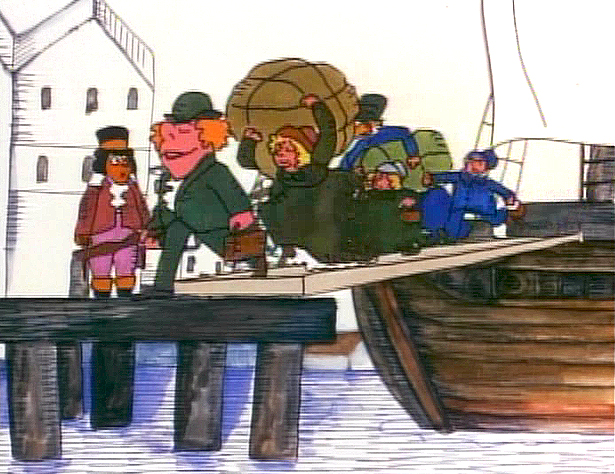
The man on the moon and the Irish immigrants.
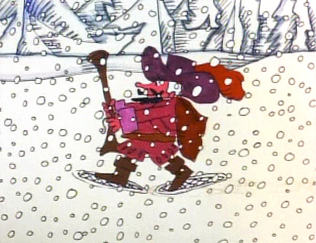
Jack Schnerk animated the French trapper sequence. There was such a rush
on the scene that I remember Jack bringing it in saying he hoped it would work.
He’d done two drawings of snow for the blizzard. Both wildly different from each other.
He asked me to ink them, then flop the drawings and ink them again.
He’d exposed the four drawings on fours. He also had the trapper with
snowshoes walking on fours. He felt it would help us feel a struggle in his
walking through the snowstorm. He felt the fours might add weight.
The scene worked beautifully, and was excellent the first time out.
Not quite the way they’d have done it at Disney. Tricks of the trade.
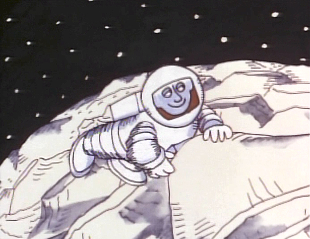
Tissa animated a majority of the film. The ending, the man going to the moon to escape
the overpopulated earth was hers. I have the drawings somewhere and will post some of them soon.
 – We started slowly on Everybody Rides the Carousel. There was a six month schedule for about 72 mins of animation. Three half-hour original tv shows for CBS about 24 mins each. They’d air in the late summer of 1975 just prior to the start of the new tv season. Each show would air a day apart from the others – three nights in a row.
John and Faith spent a lot of time – a lot of time – at RCA studios on 45th Street. (It’s
____ The carousel was bottom lit & became soft focus.____-_ now an IRS office.) They recorded many of the voices playing the numerous parts in their show. I tried to time meeting them there a couple of times hoping to meet some of the actors (I particularly wanted to see Jack Gilford in action. He was doing an hilarious part with his wife, playing a couple of cranky old people in a diner.) It didn’t work out that way, but I did see the facility and heard parts in process.
 The key staff working IN the studio (not counting animators who would, for the most part, work freelance) included Ida Greenberg. Ida was a brilliant checker / coordinator who’d started back in the Florida days of the Fleischer studio. (She told me a few great stories about Gulliver’s Travels.) Ida was a great woman, with the thickest New Yowk accent, who never seemed to buckle under pressure. I grew very close to her. I tried after that to have Ida everywhere I worked. She led Raggedy Ann’s I&Pt and R.O.Blechman’s special.
Kate Wodell was a student of the Hubleys at Yale. She was a talented artist who’d moved into production during the making of Cockaboody and continued on staff there. Sometimes she colored, sometimes she animated, sometimes she did whatever was necessary. This was exactly how I moved into the studio and loved the experience. She worked with Faith for many years after John died.
Earl James was an animator who’d worked in the backroom of many NY studios from Paramount to Terrytoons to NY Institute of Technology. He also had done some comic strip work.
Earl was given the carousel to animate. This came from a couple of elaborate drawings John did. Earl worked 16 fld. using a 96 drawing cycle. It gave us a lot of opportunity to move in tight or stay wide. However, it was a nightmare that took forever. Joe Gray was hired to assist Earl. (Joe started during the Terrytoons strike and never left. Many of those who knew him as a “scab” never forgave him and had only horrid things to say about him to me some thirty years later. He was a lifetime assistant like a handful of other noted names in NY.)
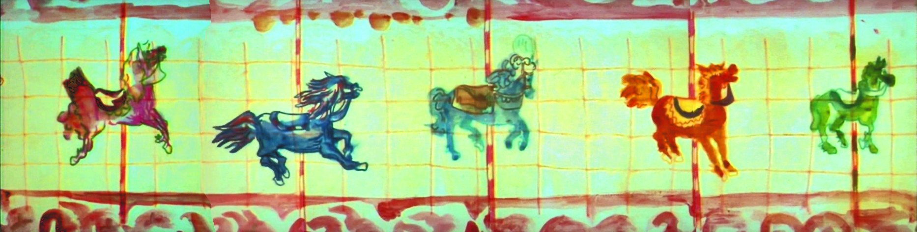
This scene moved so slowly through production that I kept jumping in to assist as well. I was a fast assistant, but that carousel slowed even me down. 8 horses moved in perspective in a circle; there were 96 different rotating views of all the horses. I’d guess the scene took about 10 weeks to complete.
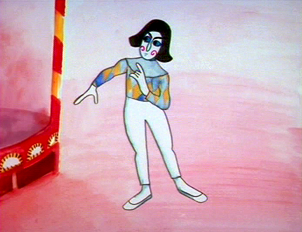
I was also doing layout and animation of a lot of connecting scenes throughout the production. These were scenes that would have to blend from one animator to another, or John had decided to go in tight for a closeup. In one case with Art Babbitt’s mime character, I was asked to change it from two’s to four’s with a dissolve technique John taught me (he said they’d used it on Fantasia.)
There were four people in my room, Earl, Joe, me and Mark Hubley. He worked alongside me for most of the film. He colored artwork given him by Ida, who was working in the larger room next door. Mark and I had a good releationship going back the many years I worked there. He joined the studio once he completed college. Emily Hubley worked alongside Kate and Ida.
Two younger, more experimental animators were brought in by John. Adam Beckett had made a name for himself with the films he was doing at CalArts.
Fred Burns was doing some incredible work at UCLA. They both were very different and added their unique touch.
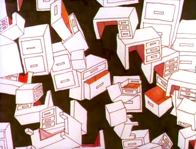
___________ Adam Beckett’s scenes included these two surreal images.
Adam did a scene a couple of scenes wherein office furniture floated about in a very complicated surreal cycle. Fred did this amazing scene of a roller coaster from the POV of the rider. He and I worked together a number of times after that, and we’ve stayed friends.
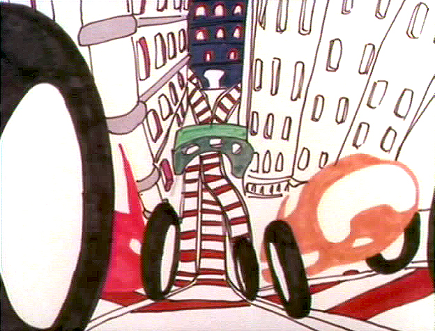
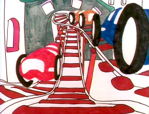
______________ Fred did this very elaborate sexual roller coaster.
I hope to have more to say about some of these films I worked on.
Animation Artifacts &Fleischer &Layout & Design 20 Jun 2012 05:36 am
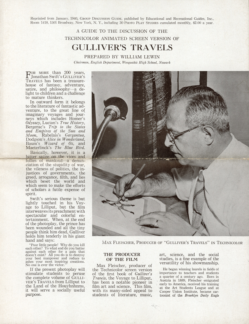
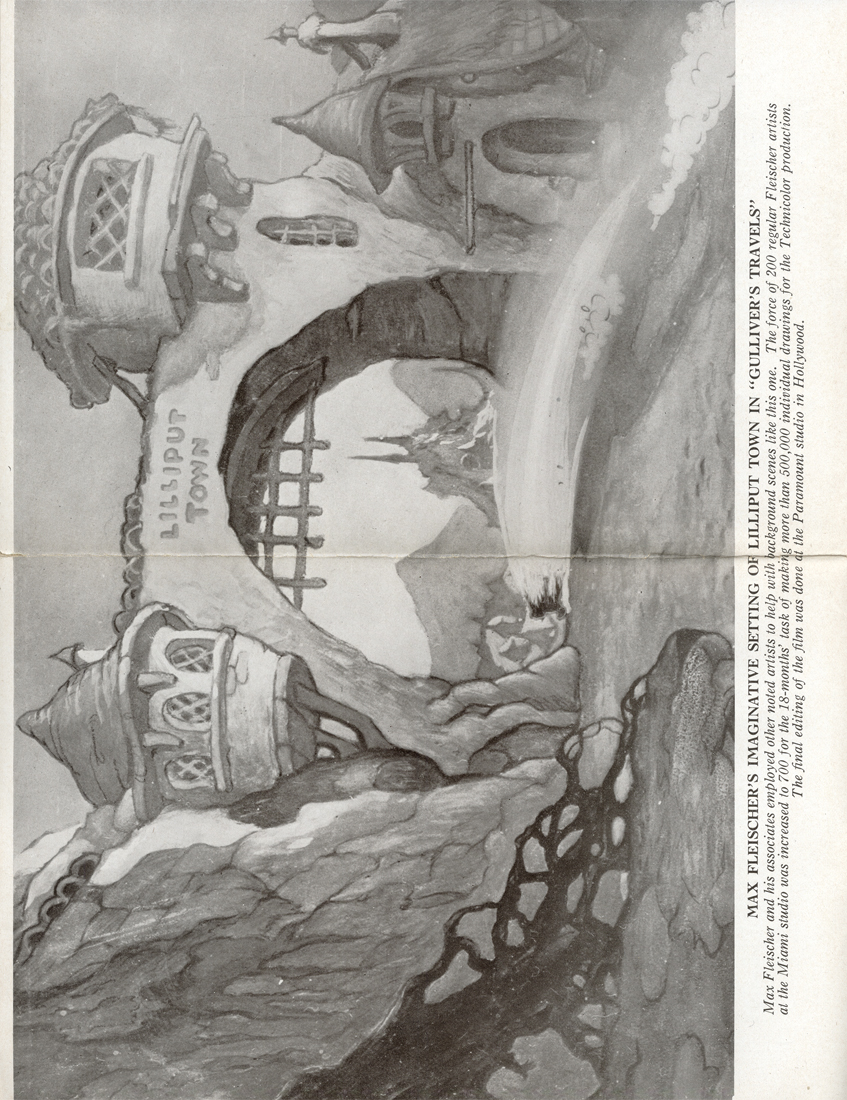
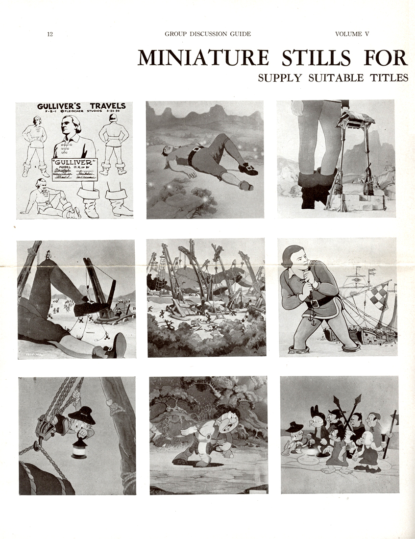
Paramount Bgs & Gulliver Teaching Aid
- For the past few weeks, I’ve been posting artwork from Vince Cafarelli‘s collection of animation artifacts. We’re coming down to the remainders in this box, and I’ll post most of it. There are a few color Background originals.
At first viewing, I thought these were possibly from Terrytoons, (here is a past post I did of Terry Backgrounds I own from the late Thirties) but they have a slickness that Terry Backgrounds wouldn’t have had. They also lack any sign of the glorious whimsy the Fleischer Backgrounds had. These, no doubt, come from Late 40s Paramount cartoons when Bob Little was the principal artist. There’s ample use of airbrush over the bright tempera colors. (I don’t remember seeing airbrush in any Terry cartoons of this period.) Physically, they were all done on bristol board and separated from the card back. This is also true of all the Terrytoons Backgrounds I’ve seen.
I’m sorry to say that I can’t ID any of these Backgrounds or tell you what films they’re from. Were I able to do that we might have been able to figure out who did them. If you know anything about them, anything at all, your comments would sure be appreciated, and I’ll keep updating the post to make sure they’re noted.
 1
1This first one does a nice job of setting the mood for the scene.
 2
2
from Song of the Birds
This one doesn’t really do much other than be a background.
 3
3
from Robin Hood-Winked
This tavern really does set up the scene. As a matter of fact,
it’s so specific it should be one of the easiest to identify.
 4
4
from Robin Hood-Winked
This interior is also more specific than most of the
Paramount Bgs of the period and feels as though
it may have come from the same film as the tavern, above.
 5
5
from Lumberjack and Jill
This one is so generic it may have come from any of a hundred
films of the period. It’s the Bg that felt like a Terrytoon to me.
 6
6
This Bg feels closer, stylistically, to #4, above,
than to #5. There’s a lot of airbrush in it.
 7
7
This Bg seems to have some chalk used on the white stone
of the building’s exterior. It reminds me of several other
Disney Bgs – not as good as Disney, but similar in feel.
 8
8
from Leprechaun’s Gold
Who knows what this Bg is. I guess god’s
looking down on the inhabitants of the hutch.
- As a bonus to add to these Backgrounds, here’s something completely unrelated.
Today, when children’s films are distributed non-theatrically (meaning to schools and libraries) a teaching aid accompanies the film. This is usually a two or three page piece which gives information on how the film can be used to teach whatever subject to the students. This form has developed in quite a sophisticated way so that it is often very helpful to the teacher or librarian.
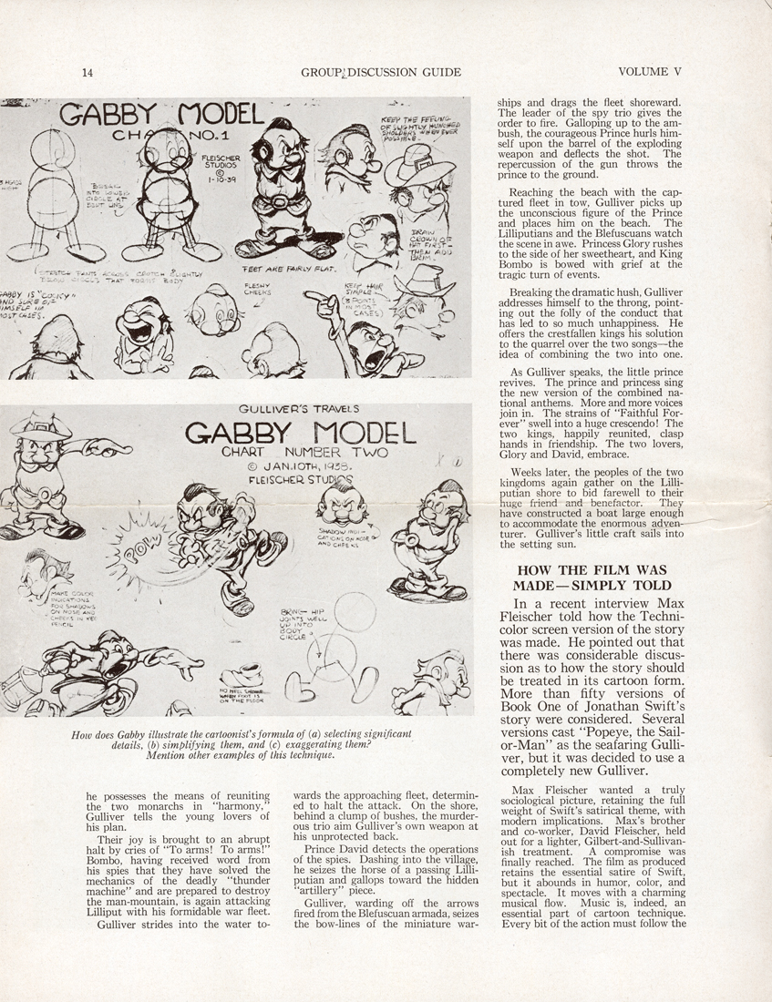
Within Vince Cafarelli’s collection of art and artifacts, there was a teaching aid – which seems half designed to be a give-away to students. It’s a primitive form of what is standardized today. The printing of the piece is quite rich on semi-gloss paper with nice B&W photo reproductions of stills from the film. I thought this would be of interest to some of you out there.
 1
1(Click any image to enlarge.)
 2
2 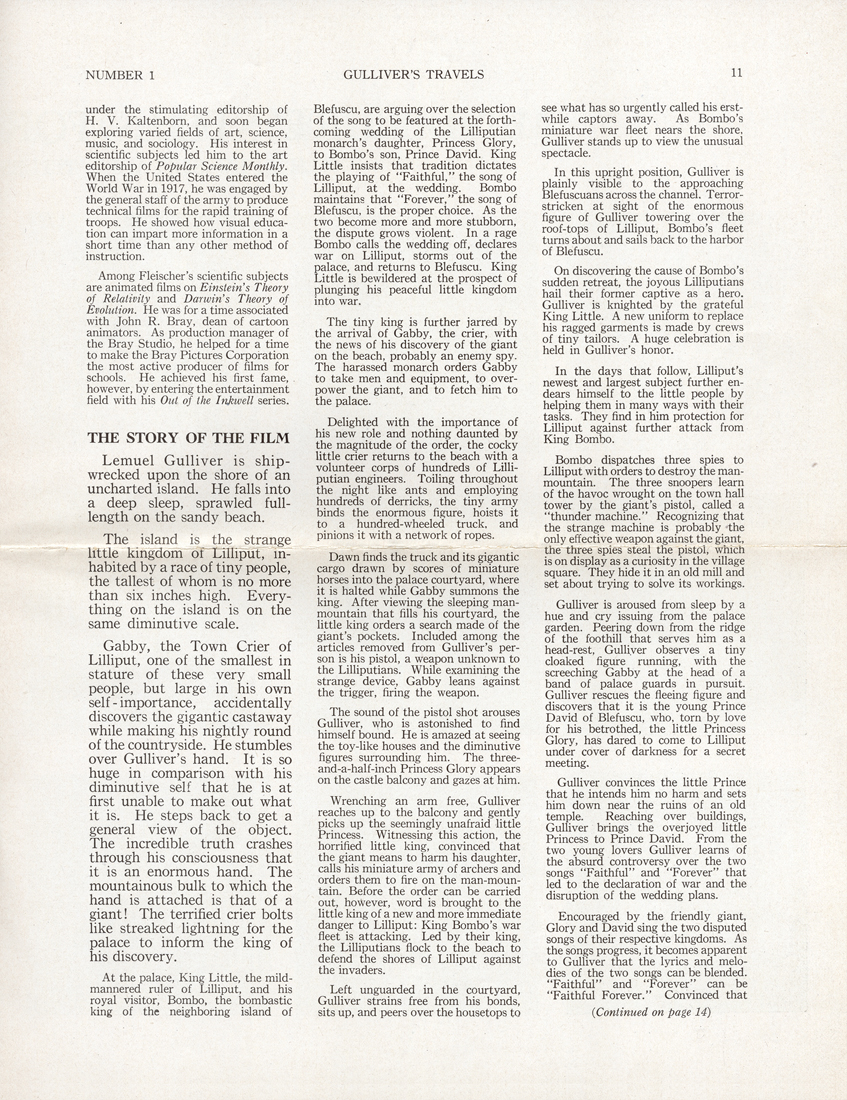 3
3
 4
4 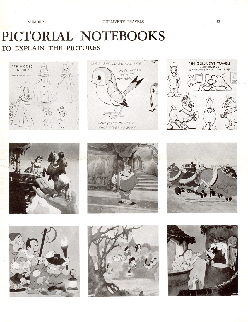 5
5
 6
6 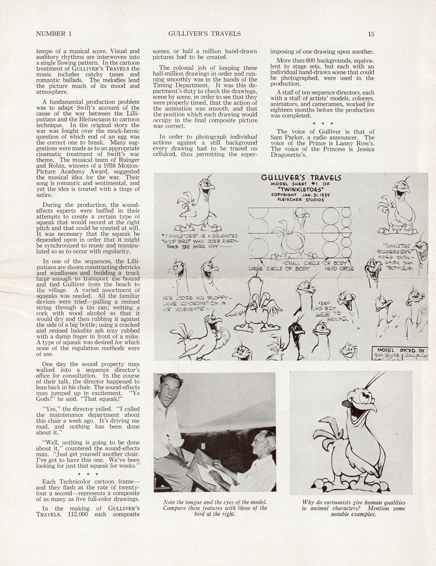 7
7
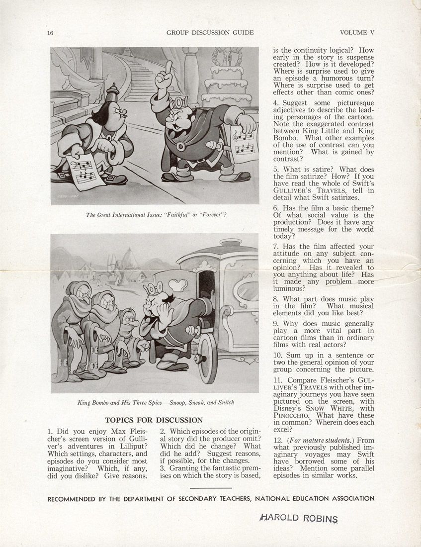 8
8
Art Art &Books &Illustration &Independent Animation &Layout & Design &repeated posts 19 Jun 2012 06:23 am
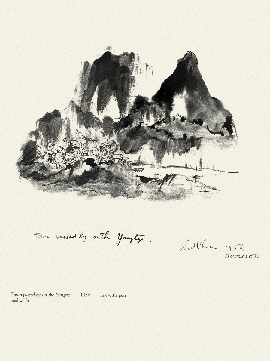
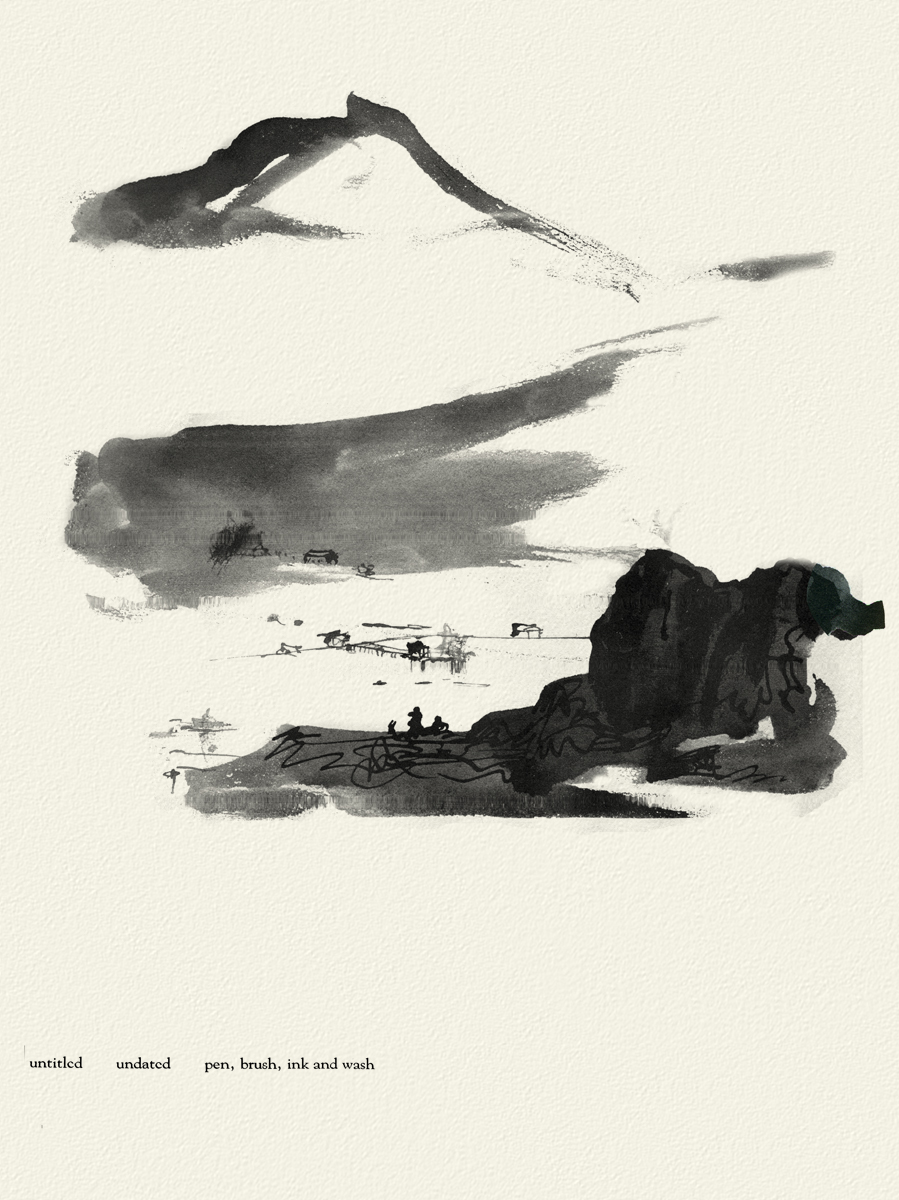
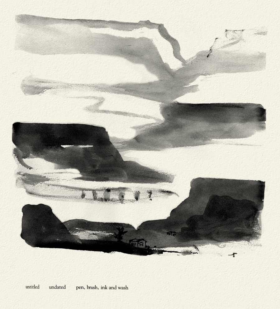
Norman McLaren Drawings – repost
 - I don’t intend to give an introduction to Norman McLaren or his work here, but he obviously was one of the solidly great film makers on the “Art” side of animation. His films are worth studying for their timing, if not for their sheer genius. As a matter of fact, his exercise films on timing are incredible (though I have no idea how you’d get to see them today.)
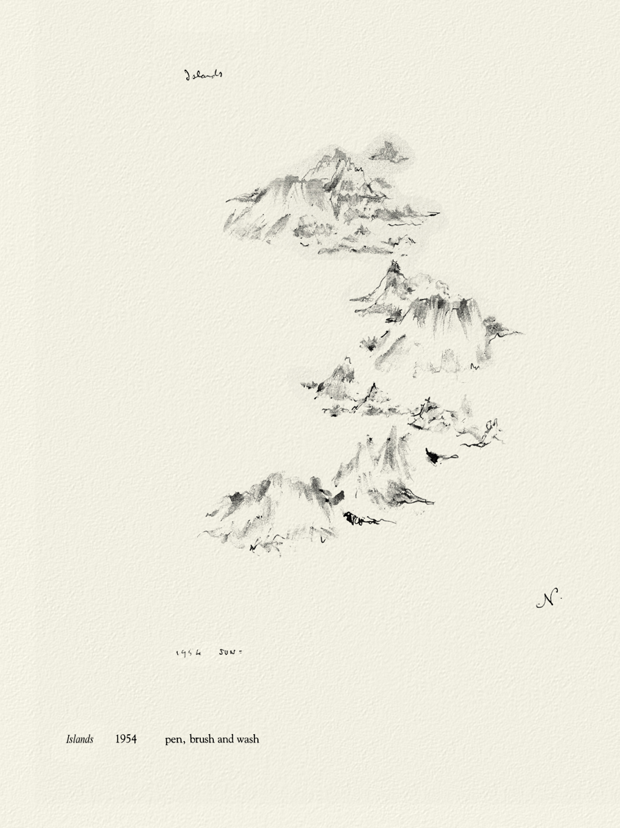
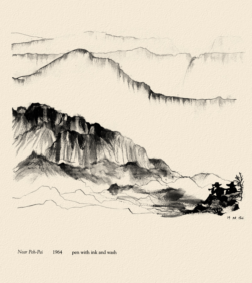
I do have a book of some drawings by him, and given the stories about China in the news today, I thought I’d post some of his drawings done in China. The book isn’t printed on the best of papers, so the quality of these drawings isn’t all it could be. However, I thought it might be worth showing this other side to his art.
 _
_

 _
_
Moving away from China, there are two other drawings I thought compelling and
would like to share here.
 _
_

McClaren was certainly a brilliant artist, and his experimentation and developments brought about a real maturation of the art form. I wonder how he would have dealt with the technology we’re using today. Remember, he realized that the soundtrack could be drawn and did his own exploration of this part of the process.
The book was published in 1975 by Tundra Books.
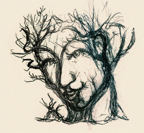
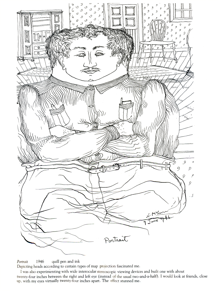
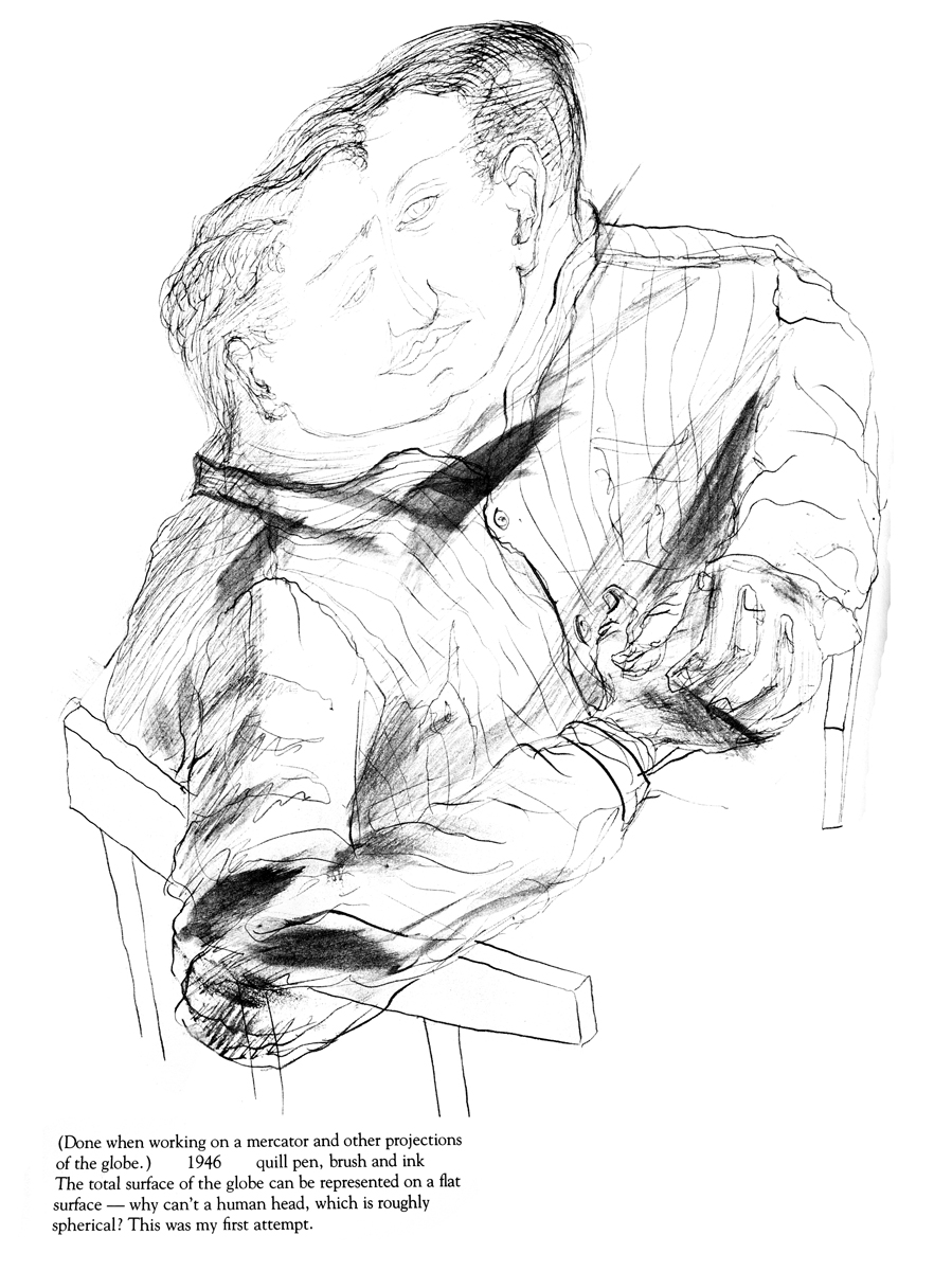
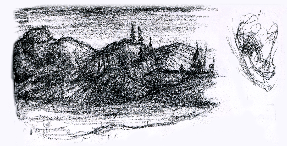
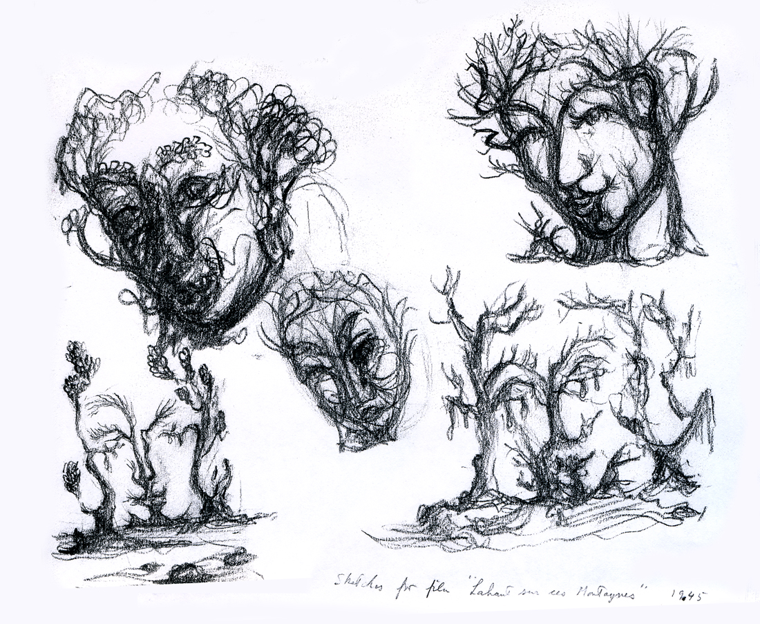
Because the one illustration which graces the book’s cover, was of such interest to those reading my piece, I’ll start with the rest of that page. It’s a series of sketches done for the film, “LÃ -haut sur ces montagnes” and was drawn in 1945.
__________________
The two illustrations above are connected on the same page. I separated them .
The entire page is labelled: Sketches for the film, “LÃ -haut sur ces montagnes.”
“Interlocking faces”
“Untitled”
“Tesseractine House”
I’m fascinated that a number of his illustrations look not too unlike Steinberg’s work. It’s obvious he was an influence for a lot of animators in the late ’40′s.
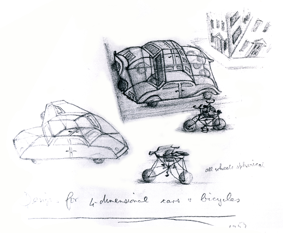
“Four Dimensional Cars and Bicycles”
“Memory of A Mexican Beach”
“St. George and the Porcupine”
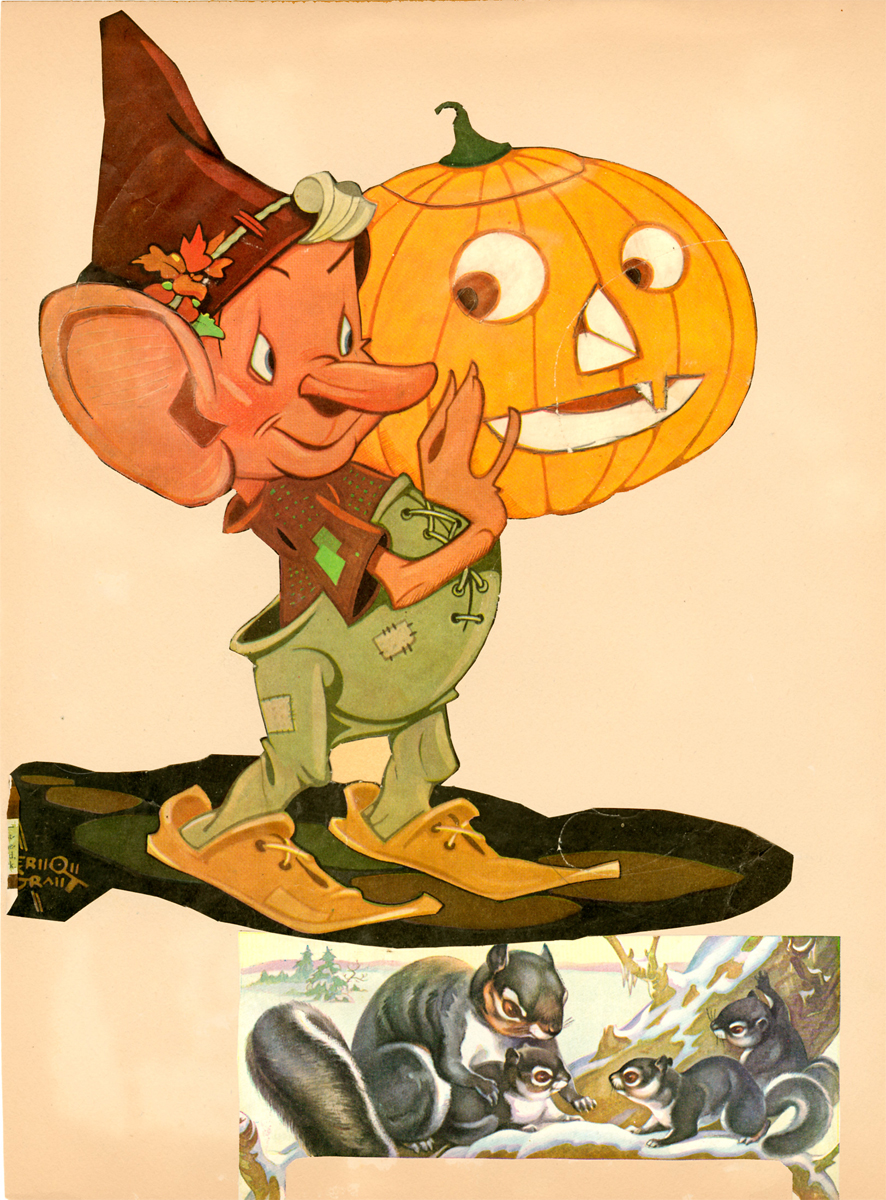
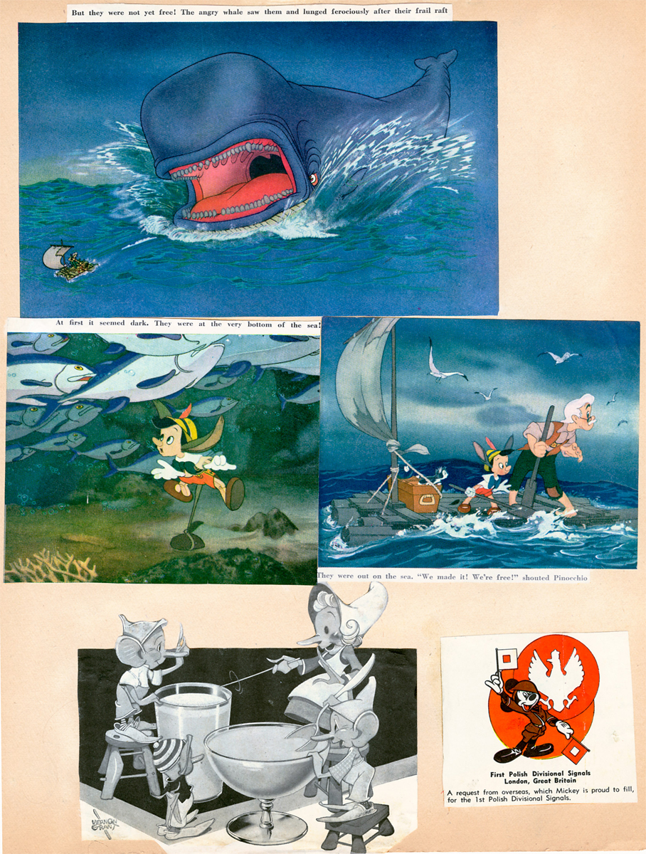
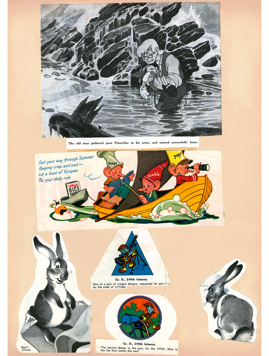
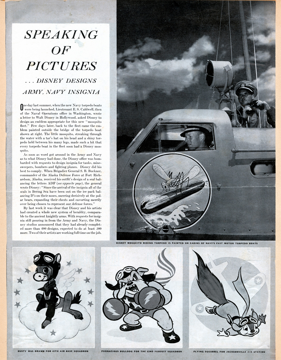
Animation Artifacts &Bill Peckmann &Illustration &Layout & Design &Rowland B. Wilson 26 Apr 2012 05:49 am
Rowland Wilson Scrapbooks – pt.2
- Last week, we offered some pages from the scrapbook of Rowland B. Wilson. This was graciously loaned to the Splog by Suzanne Wilson, and we have a treat this week. A second installment. these pages were a source of inspiration for Rowland, and the clippings, for us, are also a remarkable view of the animation and illustration product of the time.
Many thanks to Bill Peckmann for initiating this and to Suzanne for sending it.
 21
21
 22
22
 23
23
 24
24
 25
25
 26
26
 27
27
 28
28
 29
29
 30
30
 31
31
 34
34
 35
35
 36
36
 37
37
 38
38
 39
39
 42
42
 43
43
 44
44
 45
45
 46
46
 47
47
 48
48
 49
49
 50
50
 51
51
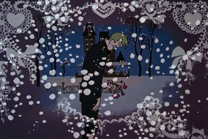
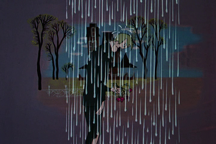
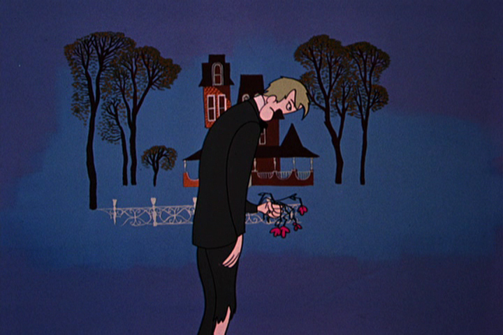
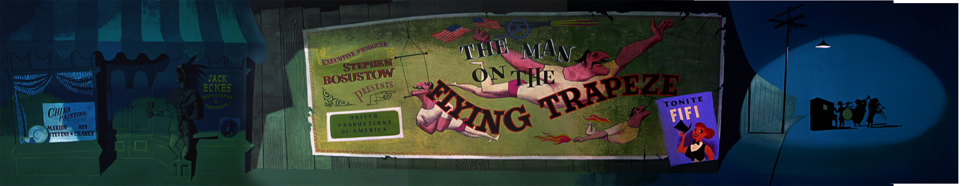
commercial animation &Layout & Design &UPA 23 Apr 2012 05:15 am
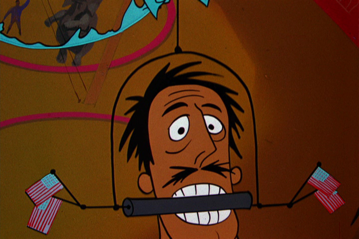
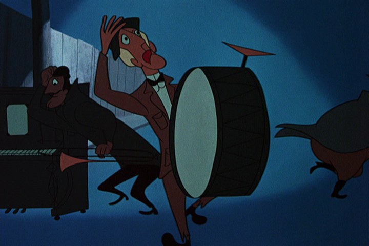
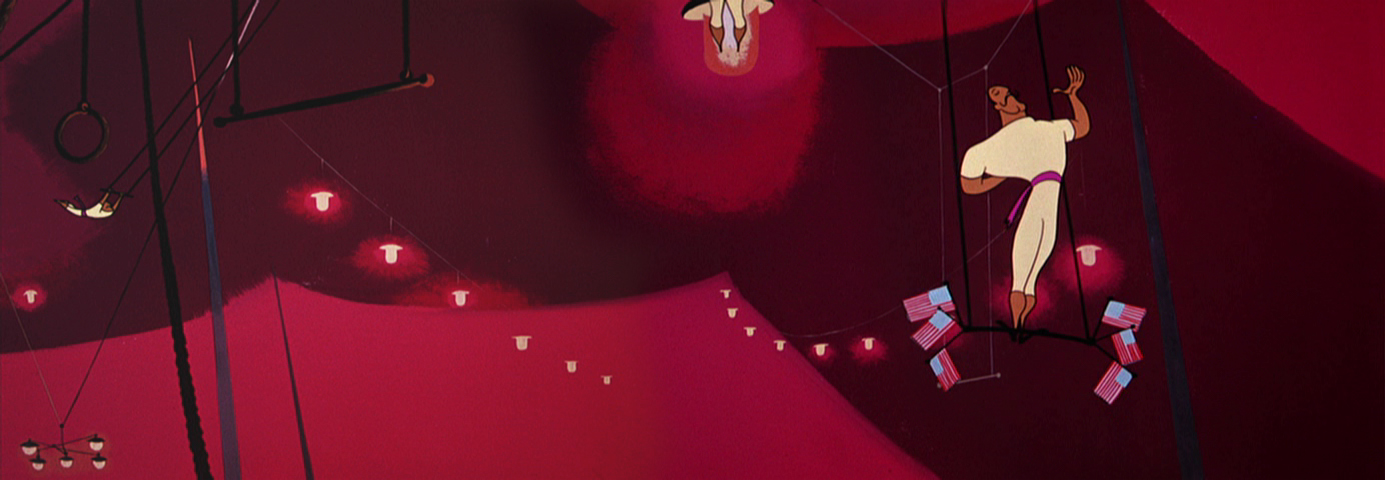
The Man on the Flying Trapeze – pt.2
- Here is the 2nd half of the frame grabs of the UPA film, The Man on the Flying Trapeze. As I said, last week, the film is not the best of UPA. However, Paul Julian’s work, to me, is always sterling, and that’s my reason for putting some focus on the film. Julian did the design and backgrounds.
 34
34
 35
35
 36
36
36-39 is an interesting transition.
The guy walks through all types of weather
as the fleur du lis framing device falls away.
 37
37
 38
38
 39
39
 40
40
39 dissolves to 40 and moves in.
 41
41
 42
42
 44
44
 45
45
 46
46
 47
47
A beautiful layout and setup.
 48
48
47-49 pans down while revoving while pulling out.
It was impossible to try to hook up the artwork,
so I left it apart.
 49
49
 50
50
 51
51
Start at the bottom and quickly pan up.
 52
52
 53
53
 54
54
 55
55
 56
56
 57
57
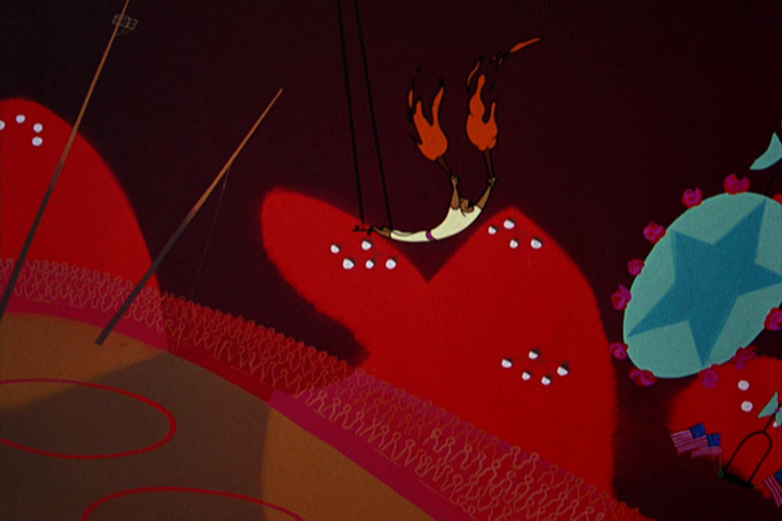
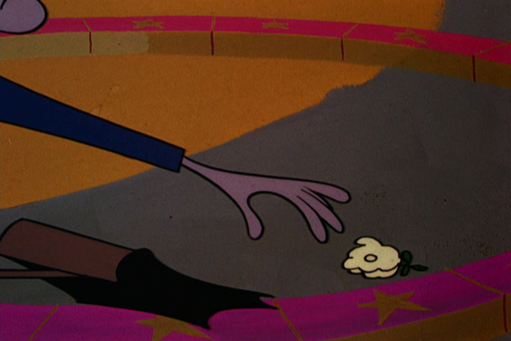
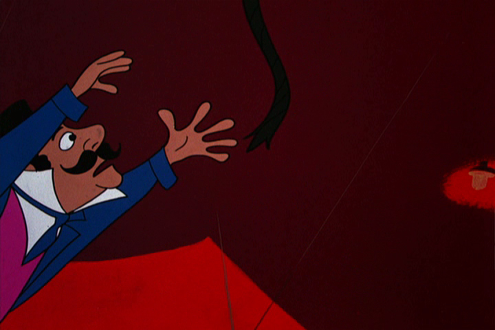
He reaches for the flower -
 58
58
– just out of reach.
 59
59
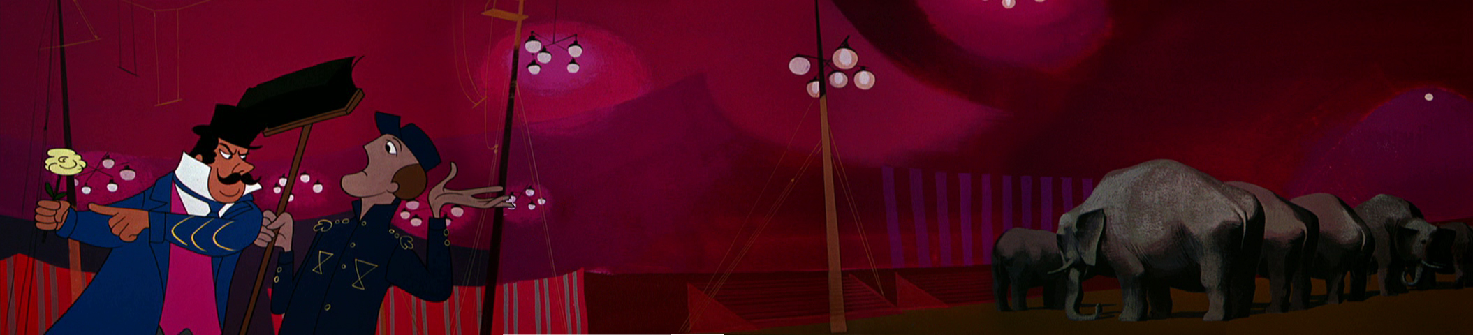
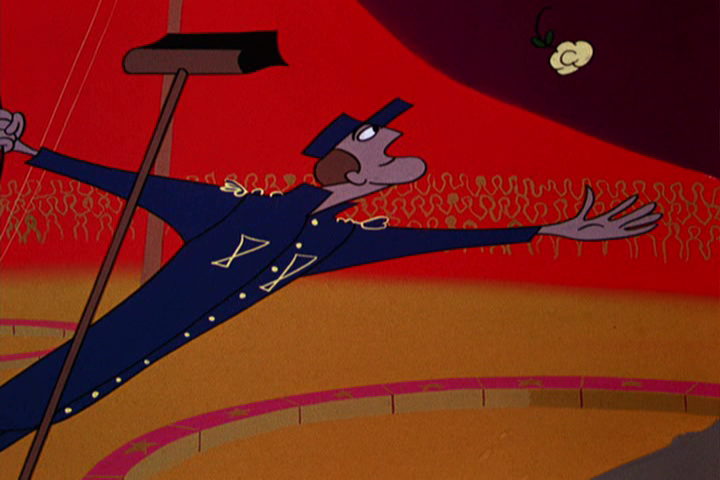
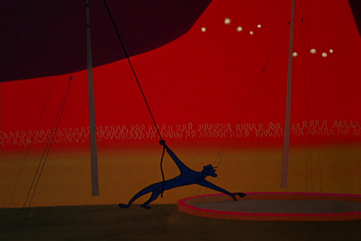
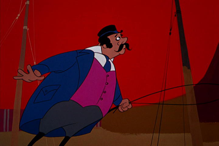
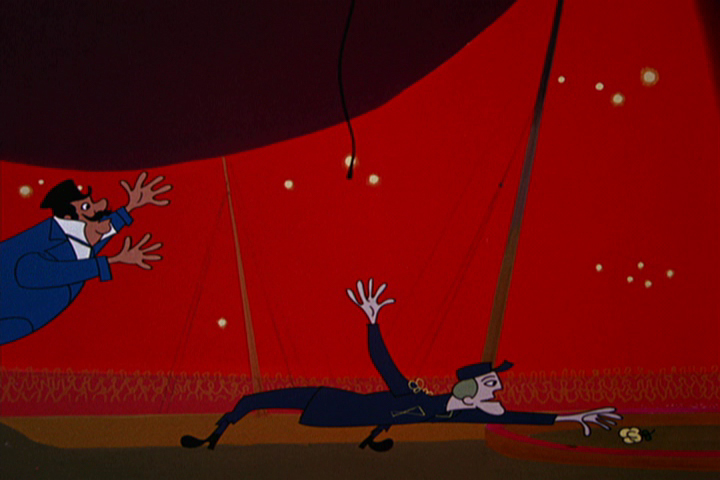
The ringmaster sees what is happening.
The Trapeze Artist tumbles and twirls and flies to the end of the routine.
 61
61
 62
62
 63
63
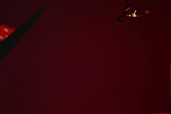
Crash !
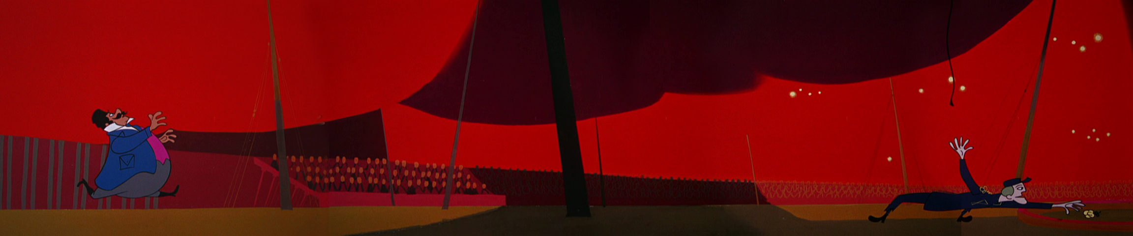
He lets go og the cord at the end of the pan.
 65
65
The ringmaster jumps to get it.
 66
66
 67
67
 68
68
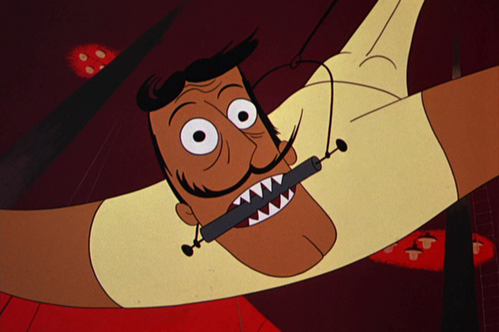
The end of the Trapeze Artist.
 69
69
 70
70
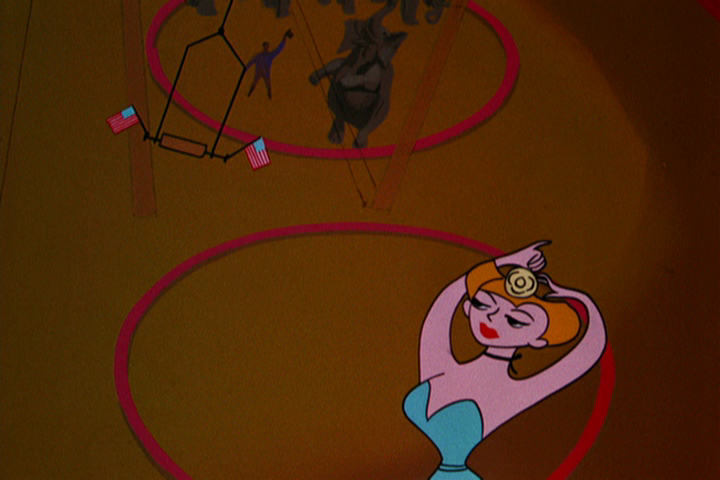
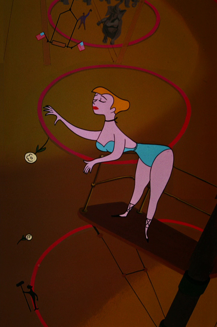
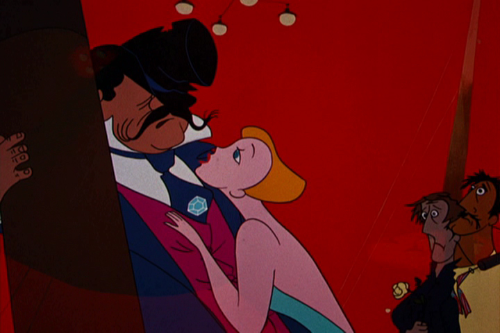
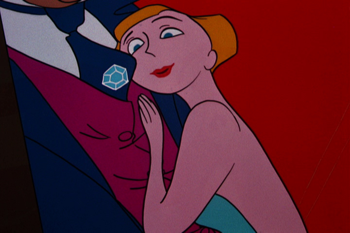
Diamonds are a girl’s best friend.
 71
71
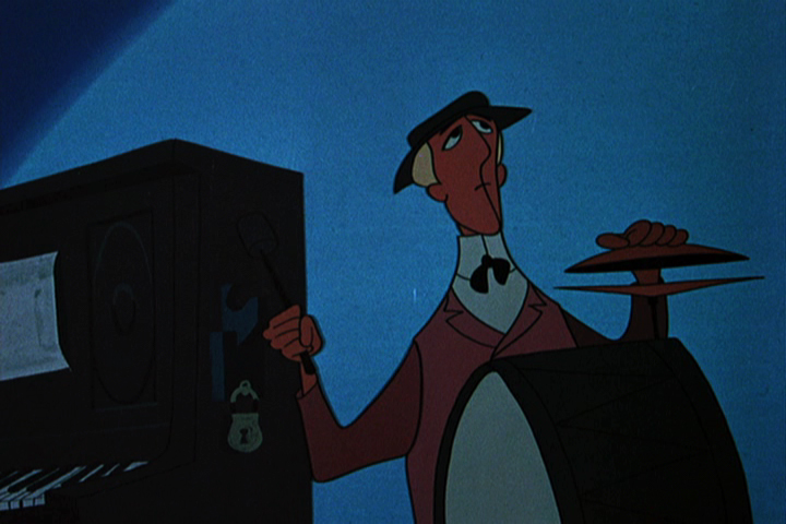
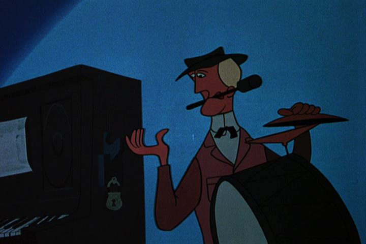 72
72
No more coins to put in the player piano.
 73
73
 74
74
 75
75
A car chauffering the girl comes crashing through the piano.
 76
76
It passes across the main title card.
 77
77
 78
78
 79
79
A knowing wink.
 80
80
The last scene should start at the feet and move up
to the full band, beaten. (There’s a hint of a move on
the DVD.) But it cuts off here to the End card.
 81
81
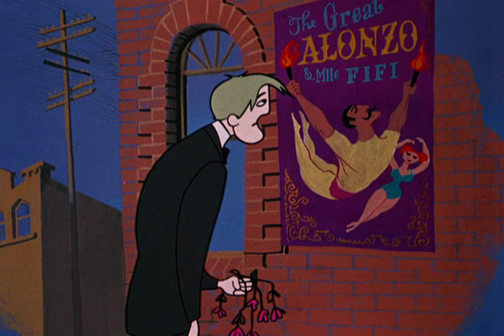
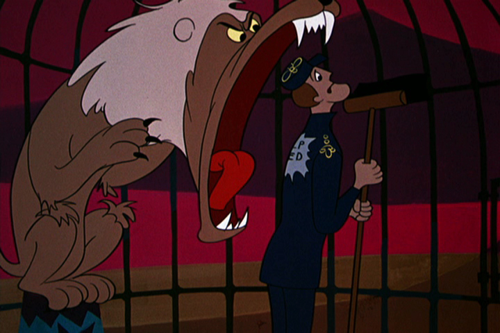
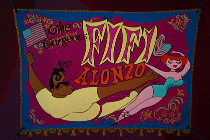
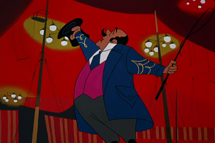
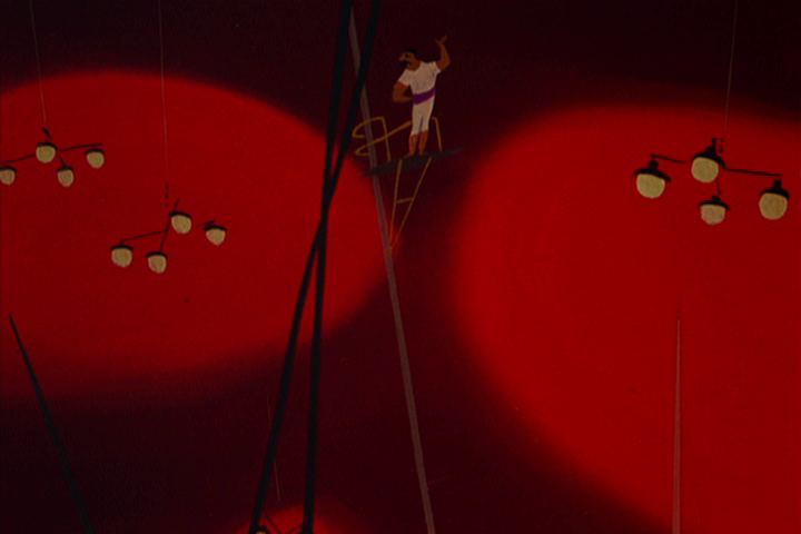
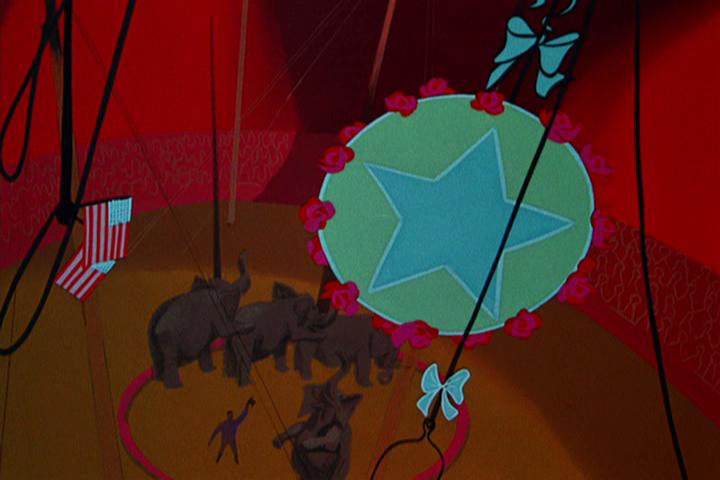
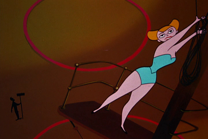
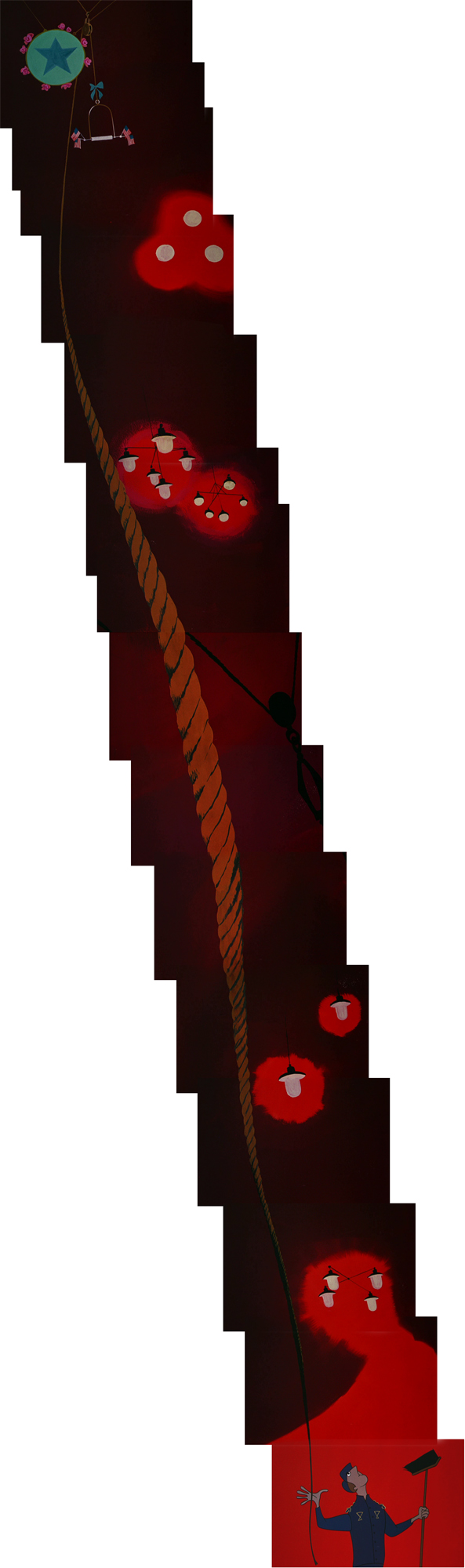
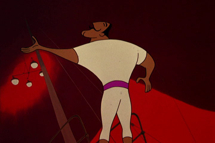
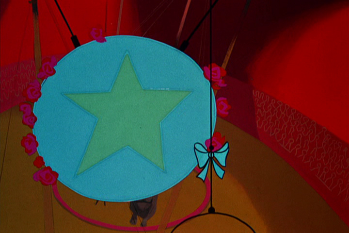
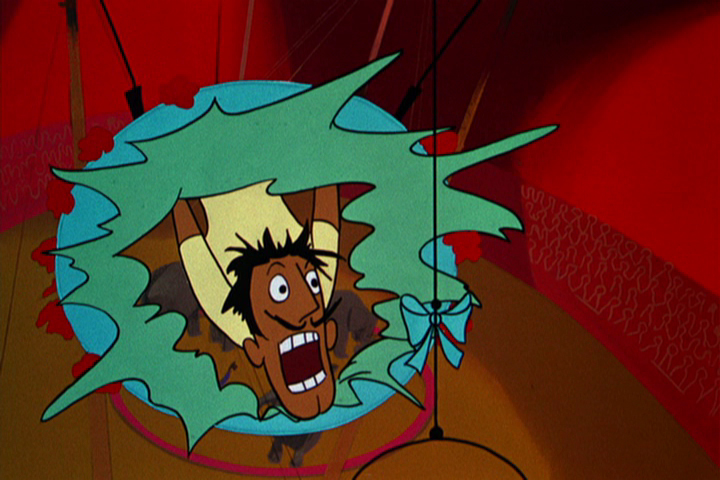
commercial animation &Layout & Design &UPA 16 Apr 2012 04:59 am
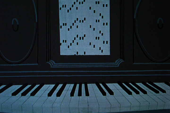
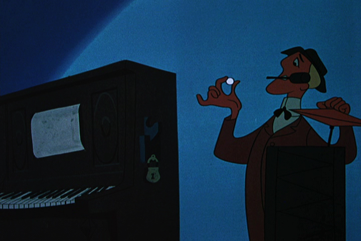
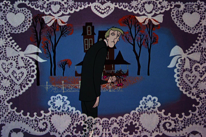
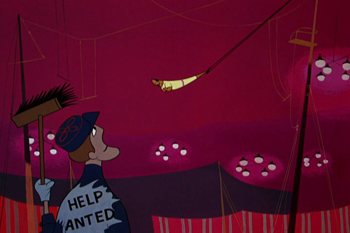
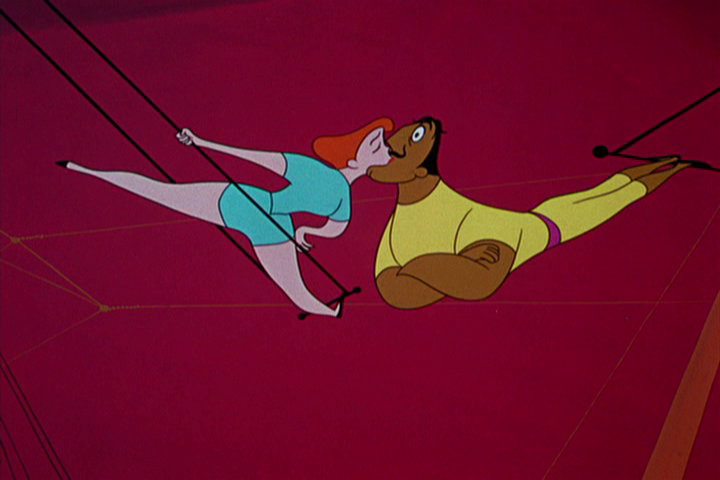
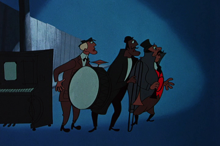
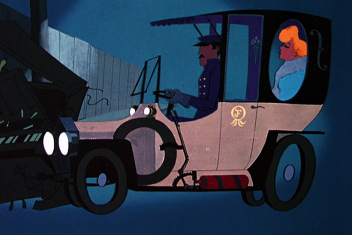
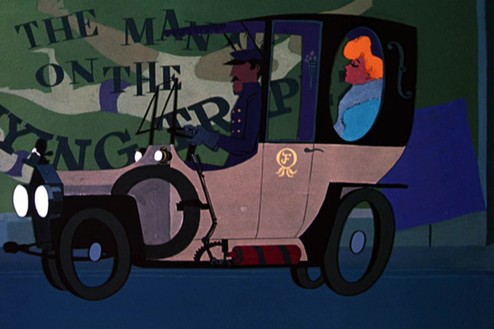
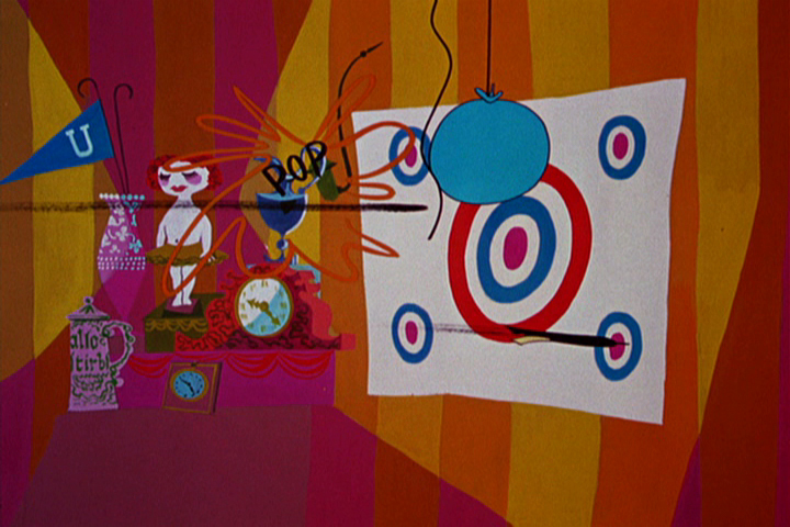
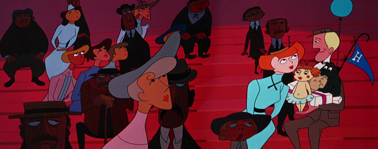
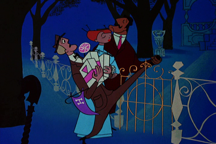
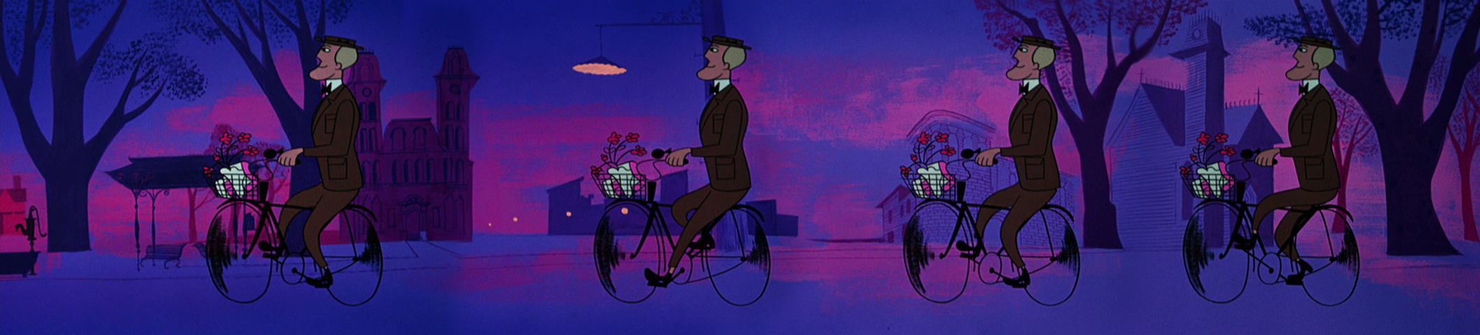
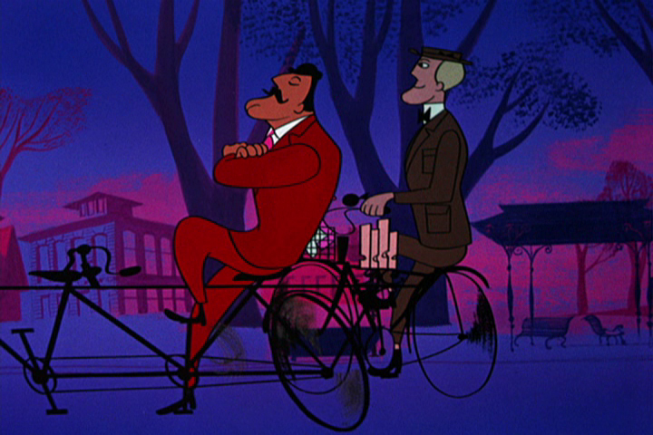
The Man on the Flying Trapeze – pt.1
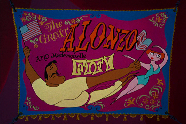
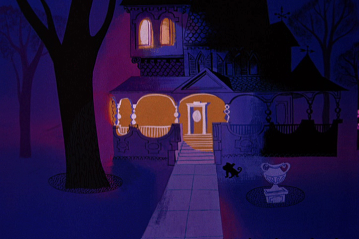
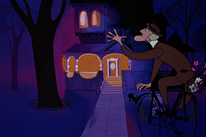
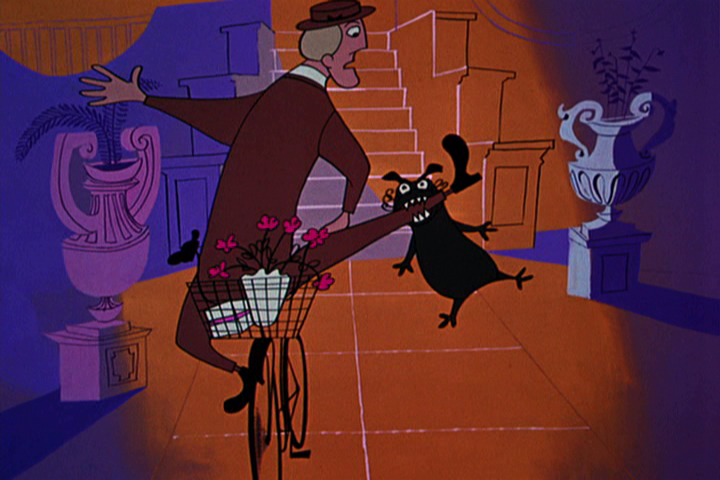
- The new UPA dvd 3-set comes in three separate categories: there are the Great films, the Good films, and the Bad films. Definitely, one of the Bad films is The Man on the Flying Trapeze. It seems to want to be either The Dover Boys or Rooty Toot Toot, and it’s most certainly neither. The film is just poorly plotted. There are some interesting transitions and some interesting set pieces. I give credit for that to the designer.
The designer is Paul Julian who also did the backgrounds, and his work, as far as I’m concerned, is brilliant. I decided to pull frame grabs of this film to highlight the beautiful design and background work of Julian. It’s taken a very long time, and I’ll have to break this post into two. I just can’t get it all done in one day. But I hope you can see the excellence of Julian’s work.
 1
1Just a brlliant title card.
 2
2
A slow pan down over the credits.
Left to right stoppng on the main title.
Then continuing into the scene.
 4
4
 5
5
The player piano sets the mood for the entire film.
A ragtime score, piano leading, with little consequential dialogue.
 6
6
 7
7
The guy just fades on, in place, ready to throw the dart.
 8
8
 9
9
 10
10
Pan left to right with the Trapeze Artist.
Slow pan left to right with the audience.
Again pan left to right with the Trapeze Artist.
 14
14
 15
15
 16
16
 17
17
Beautiful trees remind me of the scene in The Dover Boys
where the villain pulls the heroine away from the tree.
 18
18
 19
19
 20
20
 21
21
We pan with the bicyclist.
 23
23
The man from the trapeze passes our hero . . .
 24
24
. . . who spins out of control.
 25
25
A beautiful Julian house and a great new color scheme
for this section of the film.
 26
26
 27
27
 28
28
Taking advantage of the new colors to . . .
 29
29
. . . separate the interiors from the exteriors.
 30
30
 31
31
 32
32
 33
33
34
35
to be concluded next week.
