Category ArchiveLayout & Design
Animation &Animation Artifacts &Bill Peckmann &commercial animation &Layout & Design &Models 17 Aug 2012 06:23 am
Peckmann & Schnerk’s Utica Club
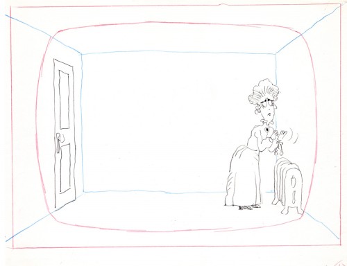
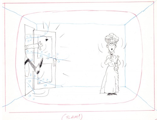
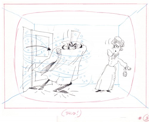
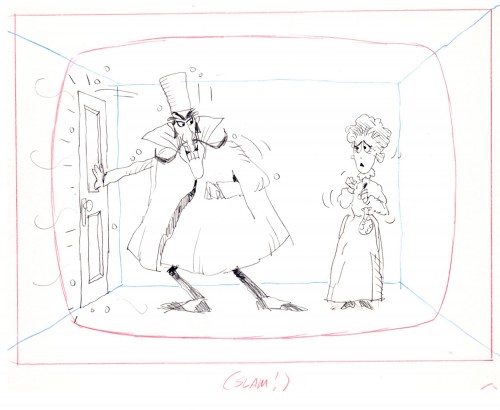
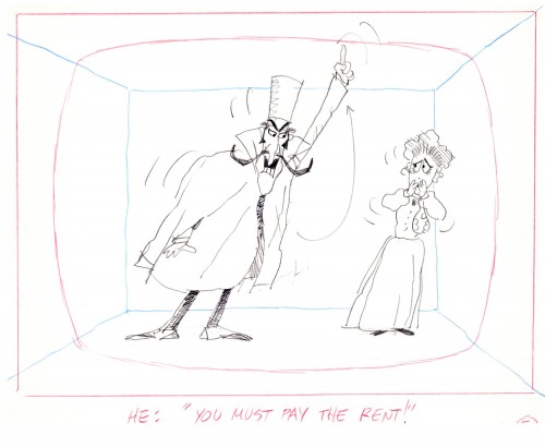
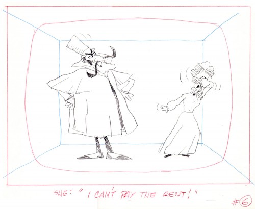
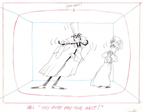
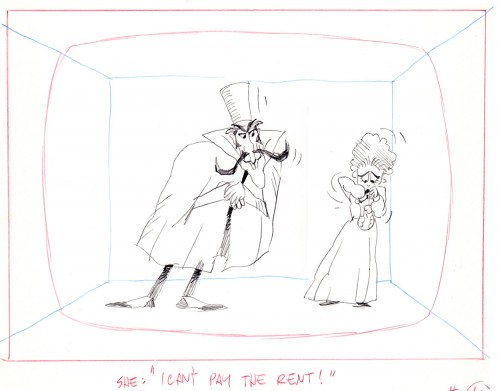
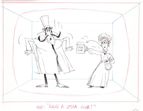
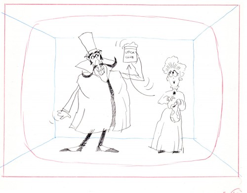
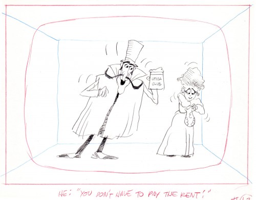
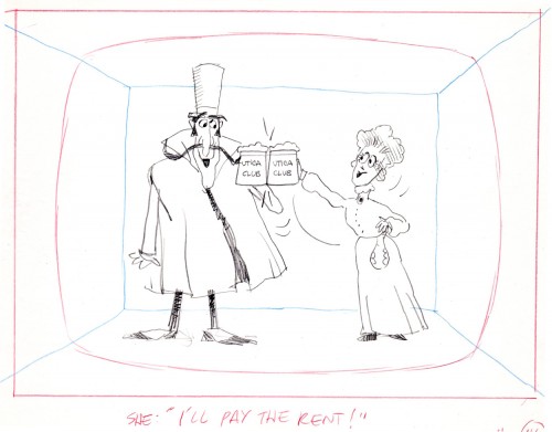
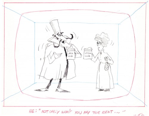
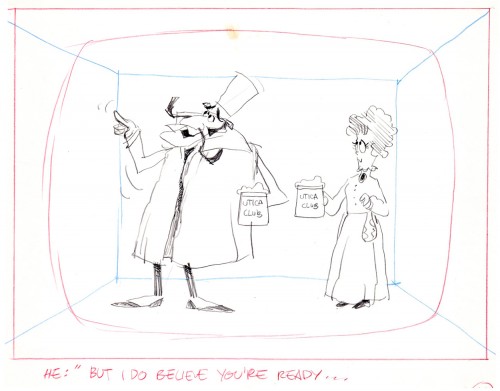
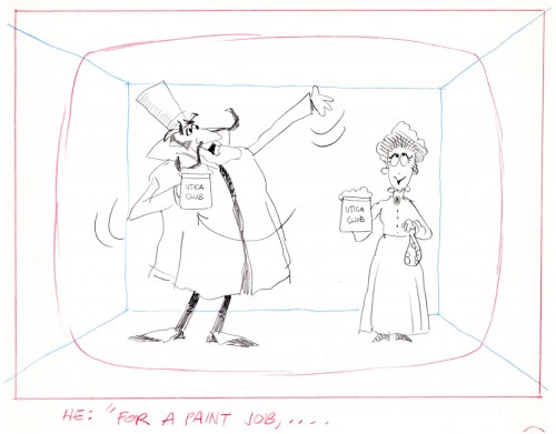
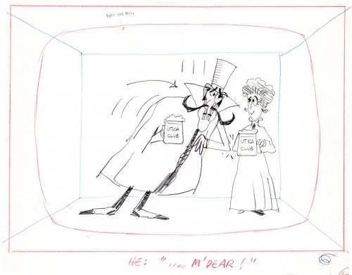
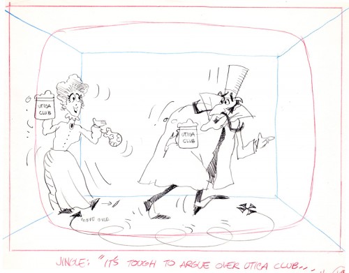
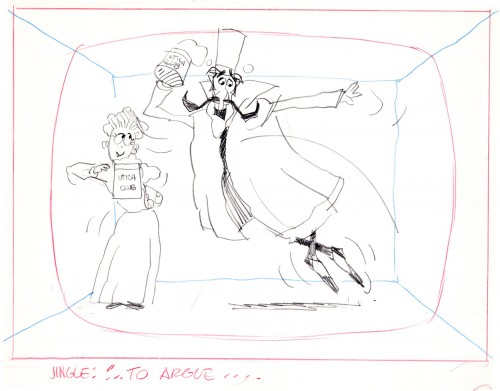
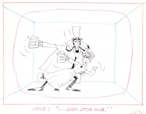
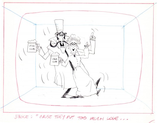
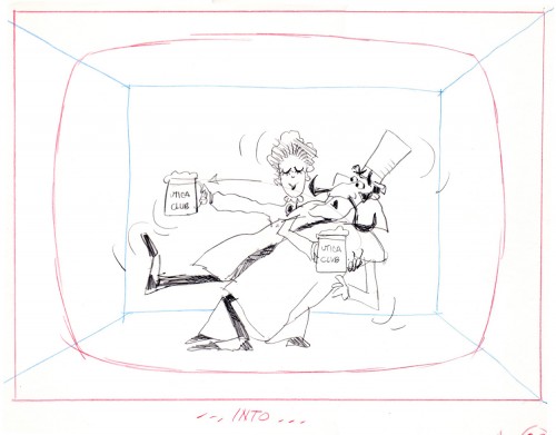
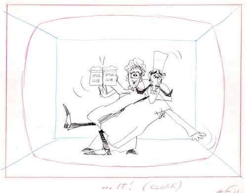
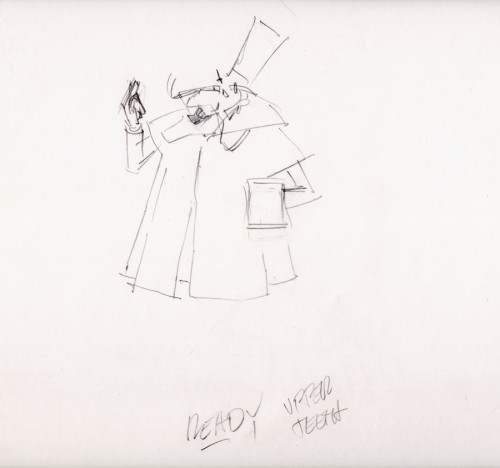
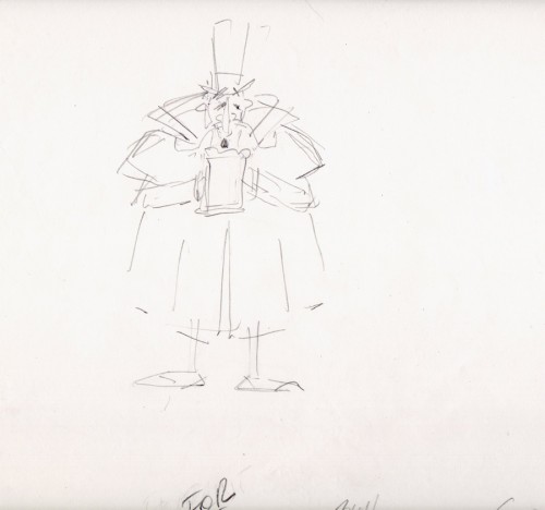
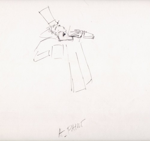
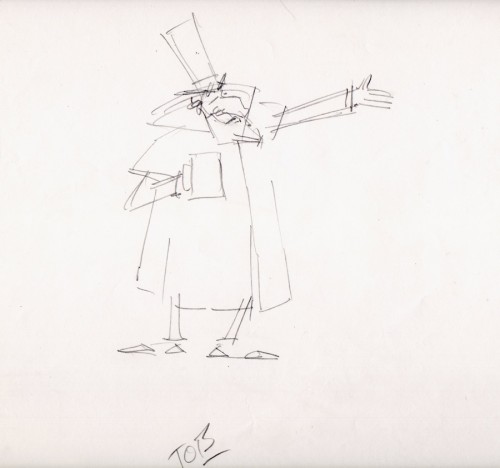
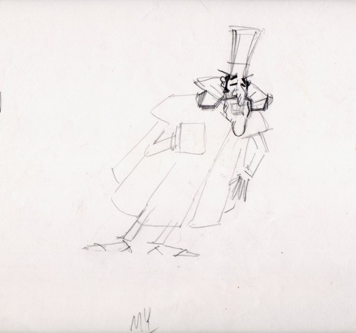
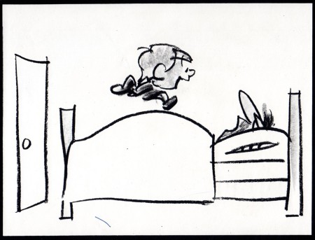
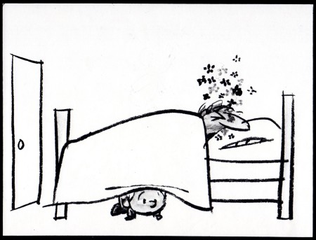
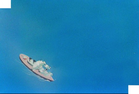
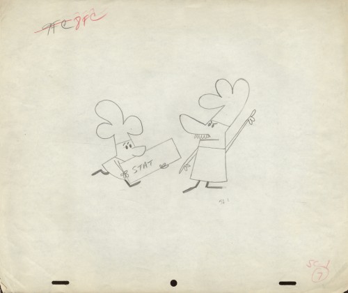
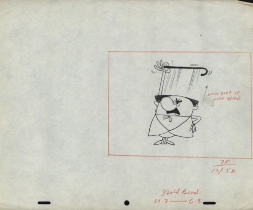
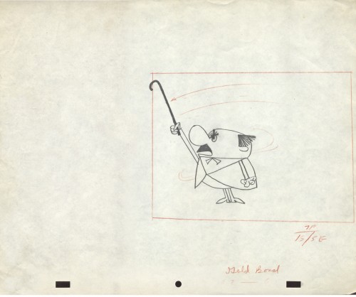
Another spot on Jack Schnerk‘s reel was Utica Club’s ‘Landlord’. Here with the little bit of art that I have from that commercial, I will try to illustrate some of the steps that went into making the film.
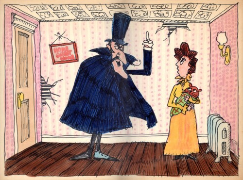
Here is the ad agency’s concept art.
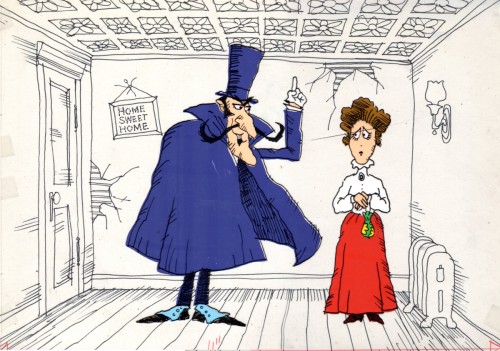
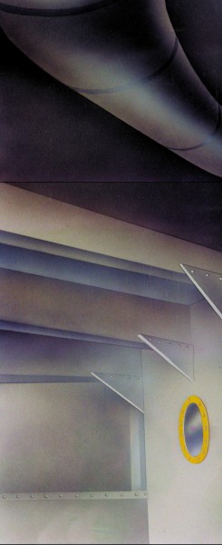
Here’s my tweaking of the agency art design.
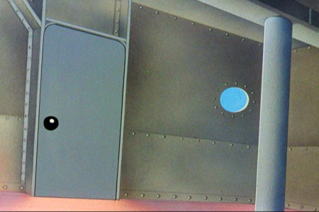
This is a cel color model against a line version of the bg.
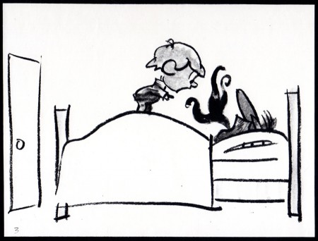
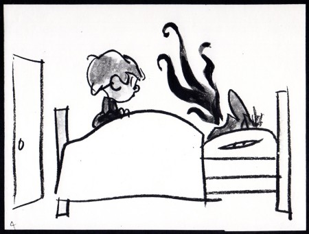
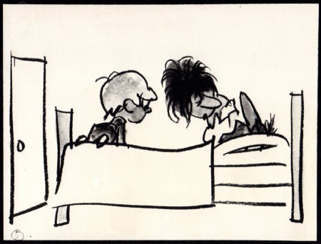
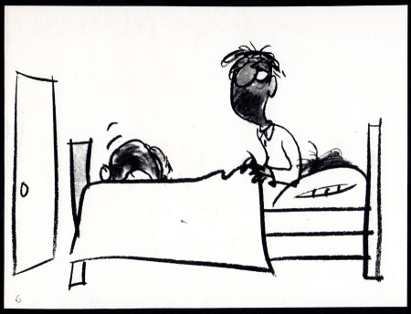
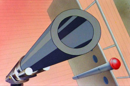
Next will be my first six rough layout drawings of the spot.
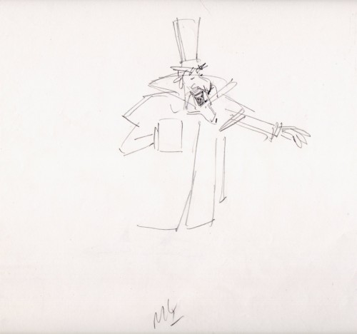
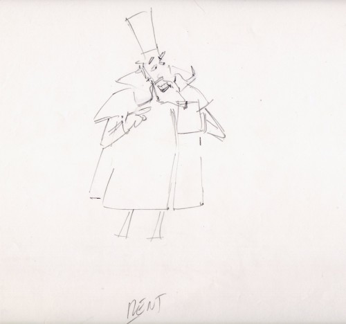
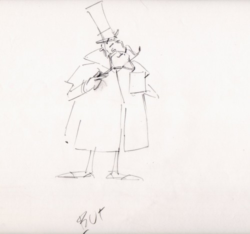
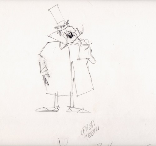
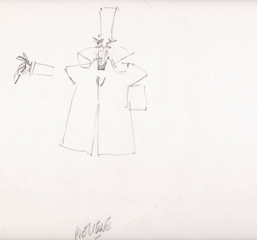
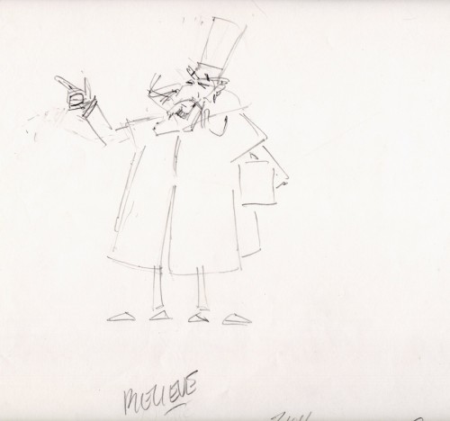
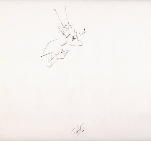
The following are animation key drawings by Jack Schnerk.
 1
1
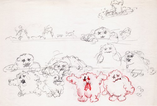
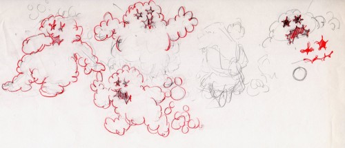
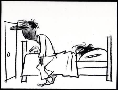
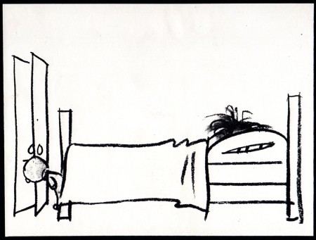
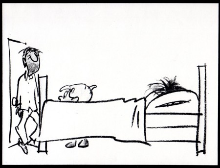
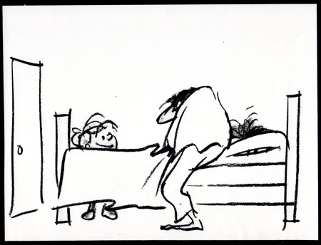
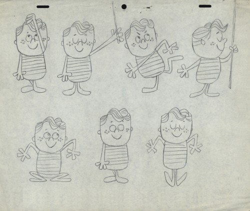
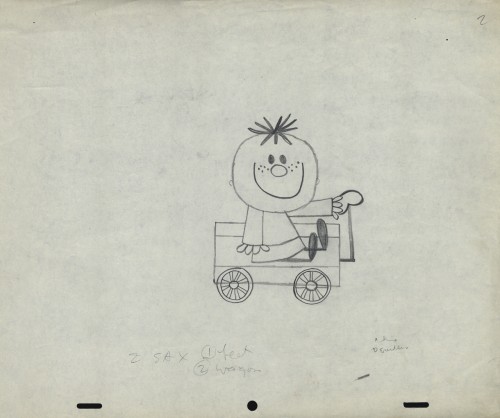
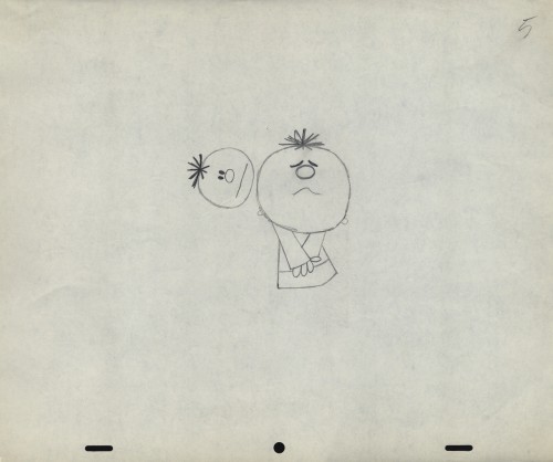
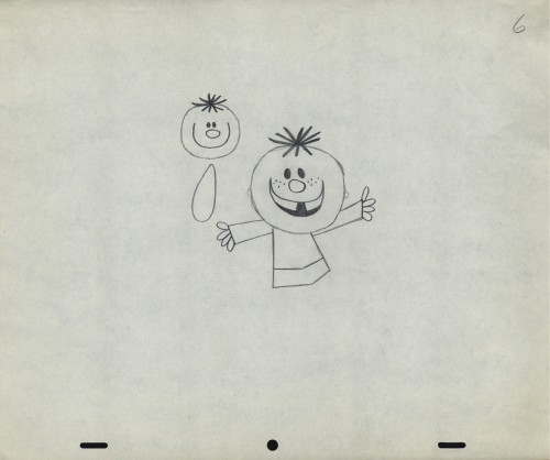
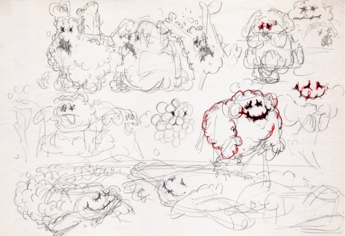
Once when we were doing designs for a soap bubble character, Jack took a break from animating to do these quick sketches. They are full of life, like all of Jack’s work.
 1
1
I hope for those who were fortunate enough to work with Jack, his drawings will bring back some good and happy memories, they do for me!
You can watch this spot on Jack Schnerk Sample Reel 2 starting at 3’01″.
Bill Peckmann &commercial animation &Layout & Design &Models 16 Aug 2012 04:43 am
Weber & Schnerk Vote Toothpaste
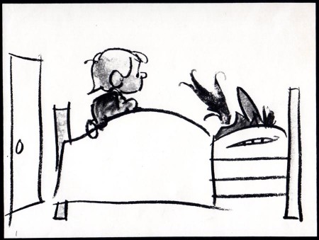
Bill Peckmann shared these great LO sketches for one of Jack Schnerk‘s animation samples:
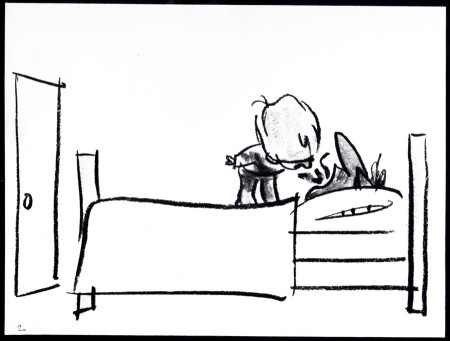
- Since one of the first spots on Jack Schnerk‘s reel was his ‘Dragon’s Mouth‘ Vote Toothpaste commercial, I thought you’d enjoy seeing New Yorker cartoonist Bob Weber‘s key LayOut drawings for the spot. Unfortunately they are not the full color original illustrations but black and white stats that were made to fit in a comfortable field size. These are for the first half of the spot.
These were the only keys that Jack had to guide him on this spot to work his animation magic. It was always a super treat to clean up Jack’s roughs, especially when he animated ‘named’ print cartoonists. The essence of the pose was always there in those terrific sketchy lines and the body proportions were also always bang on!
 1
1
Bob Weber had a great sense of what to do in animation, his poses are beautiful. You only wish he would have been given more spots to design.
You can also go here and just watch the first spot to see a larger version.
Art Art &Illustration &Layout & Design &Puppet Animation 09 Aug 2012 06:04 am
the brothers Quay
- This week marks the opening of the large show of art and films of the twin brothers, Stephen and Timothy Quay, at the Museum of Modern Art.
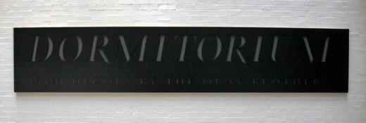
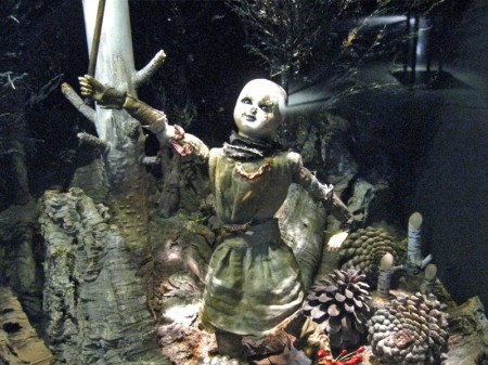
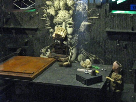
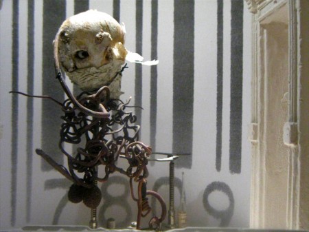
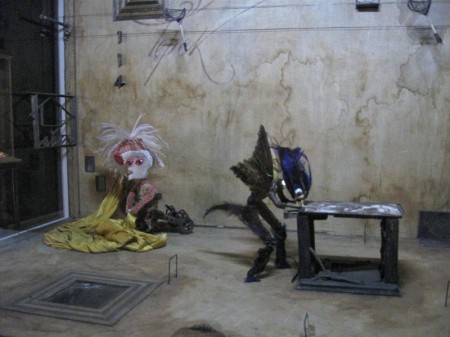
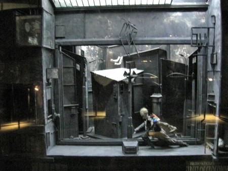 Part of the show is the display of the glass and reflective casings they’ve constructed called Dormitorium.
This was previously displayed in New York at the Parson’s School of Design in 2009, and it was well covered on this blog. Here.
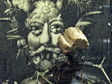
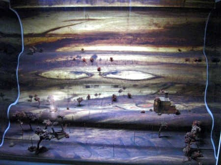
This part of the show is still exciting and interesting. Magnifying and distorted glasses 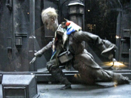 reveal portholes within boxes wherein struggling puppets exist within very tactile worlds. Harsh strokes of bark mix with feathers, muslin and strong textile designs. I’m not sure if anything is being stated within these boxes except a display of the world of isolation and dissonance Kafka has already introduced to us. However, it’s certainly hypnotic peering through these cracked glasses at the prepared tableau.
The displayed art fills the vestibule leading to the Titus 1 theater on the lowest level of the museum. It might take a good half hour to properly view all of these constructions. Yet, one is always in awe of the detailed work that has gone into construction of the enclosed world and the many hours of intense labor it took to produce. Patterns and studied period costumes meticulously constructed; props of foliage and raw wood blend with iron and other mixed metals. Then, light calligraphic type blends softly with all these course grains. There’s a lot to absorb in the tiny claustrophobic boxes. This world relates well with the similar animated stop-motion films of the brothers.
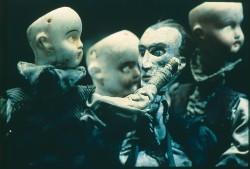 The principal part of the show sits upstairs on the second floor just around the corner from the main cafe. Small rooms have walls covered with delicate photographs, etchings, and drawings. Puppets encased in glass enclosures sit within these walls of flat art. It’s assembled chronologically, and at the very beginning we see separate pieces of art signed by the two brothers. Two landscapes, one by Stephen, one by Tim – both 8 years old. This is the only piece of art not attributed to the Quay Brothers – the pair of them. Very delicate drawings with the signature of both brothers. There are no exceptions within this show other than those two tiny landscape paintings. One easily understands the dual signature on films or even etchings where different responsibilities can be joined. This is difficult to understand two names attributed to an extremely delicate and detailed pencil drawing. However, this is the universe they’ve established, and it’s an original distinction. It fits into the world of the Quays, where everything feels man-made, done at the turn of the Century (19th to 20th Century). It’s a world wrought by the Industrial Revolution, an art that has nothing to do with digital anything. You can feel the hands that have molded these artworks.
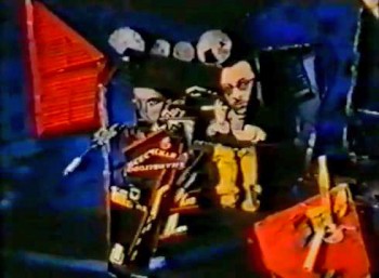 There are many rooms wherein films, the principal part of their art, play out on warm gray walls. A few black folding chairs sit in front of these screens in the tight spaces. Visitors can sit and watch for a minute or for the entire film. I stopped for all of the films but sat through only one, Igor, a film about Igor Stravinsky, Jean Cocteau and Vladimir Mayakovsky. This was the first of the animated biographies they did for Channel 4 out of their own studio in London, Atelier Koninck. It works through Constructivist art to move the three through Paris and their art world. The studio was founded in conjunction with Keith Griffiths, another student they met at the Royal College of Art who became a lifelong partner in producing their works of art.
The first film that the brothers made that grabbed my attention played at the 1980 Ottawa Animation Festival. Nocturna Artificialia confused half the audience of cartoon lovers and excited the other half. Art was alive at that Festival and it felt a small disappointment that the brothers (very new to the animation world – in fact, no one had heard of them back then) had not come to the Festival with their film. This is a case, though, where the film certainly did all the talking that it had to. Tale of Tales deservedly won the Grand award that year, but the Quay brothers were well introduced to American animators.
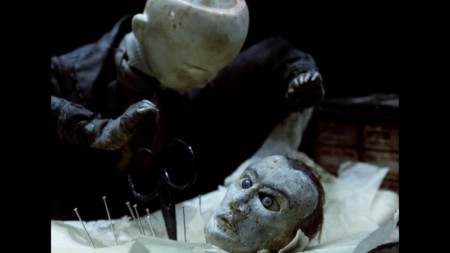
Street of Crocodiles
It was only a few short years later, 1986, that the film, Street of Crocodiles, would make its debut and make the brothers famous. This still remains one of their best known films, although the music video for Peter Gabriel’s Sledgehammer would be their best known work.
The MoMA exhibit continues through to the end of its space, packed to overflowing. Many works stand out from the rest though they all display a singular vision – that of the Quay Brothers.
I attended a Q&A with the brothers Quay led by Ron Magliozzi who organized the show as the Associate Curator of the Dept. of Film. At first, there was a brief conversation with the four, including Peter Reed, the Senior Deputy Director of Curatorial Affairsfor MoMA. This was eventually opened to the audience, which meant some not very interesting questions were asked. I’d recorded it with the idea of transcribing the session for this blog, but the questions were so mundane that the brothers were almost astonished, and I dismissed the notion of transcribing as pointless. One person asked if they’d had nightmares as children to be able to create such dreamworlds. The answer was no, they didn’t dream and the art is not a dream world. Another questioner asked if they felt they’d had a nutritional shortage as children which might have created such ideas as adults. Tim immediately answered, “Yes,” to that, and Stephen quickly responded, “Too much white bread and peanut butter.”
I went to the Press Preview in the morning to be able to view the show at length. The only two I saw there that I knew were Candy Kugel (of Buzzco) and Richard O’Connor (of Ace and Son.) I came back in the evening for the official opening party. Drinks and hors d’ oeuvres with a moderately crowded audience that covered the first floor of the museum and swelled out to the MoMA sculpture garden. It was a warm and humid evening, so it was nice outside, but air conditioned inside. Groups traveled upstairs and down to see the art, but to drink, eat and socialize many just stayed on the main floor. I met up with plenty of people I knew including Emily Hubley, John Canemaker, Candy Kugel, Jeremiah Dickey, Josh Siegel (of MoMA), George Griffin and Karen Cooper, among others. Though I’d only seen Stephen Quay at the opening, I was told that Tim was outside in the garden. It was an eventful day that felt filled with art and animation.
Animation &Animation Artifacts &commercial animation &Layout & Design &Models &Story & Storyboards 08 Aug 2012 07:00 am
Vince Cafarelli Grabbag
- Today we have a mix of odds and ends from Vince Cafarelli’s collection of animation artwork. We start with some artwork from the commercial studio in NY in the 1950s-60s.
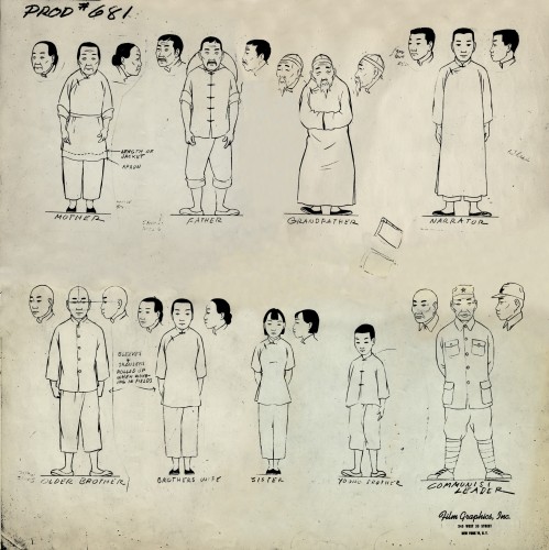 1
1This is a model sheet for something done
at Film Graphics. No doubt it’s not a commercial
but probably some kind of Educational film.
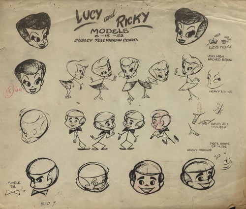 2
2
This is a model sheet for the opening titles to
the “I Love Lucy” show. My guess is that
this also comes from Film Graphics.
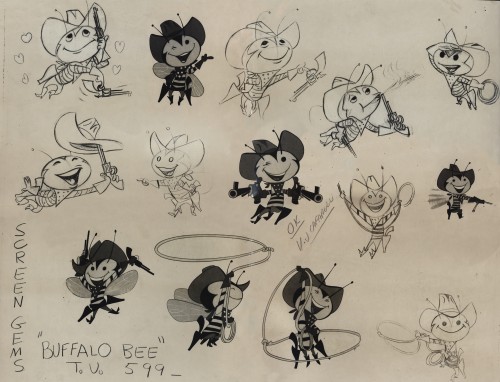 3
3
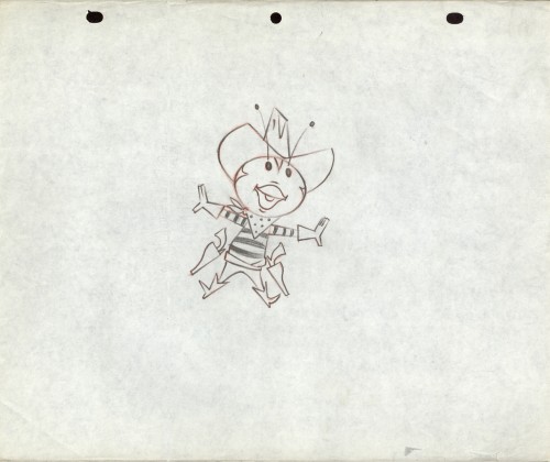
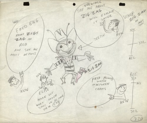
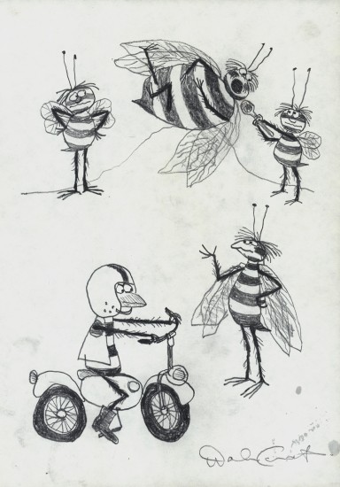
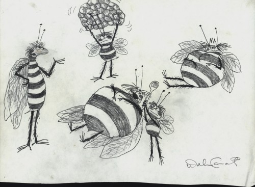
The Buffalo Bee model sheet for the Nabisco
Wheat Honeys commercials. Mae Questel was the voice.
This was probably done for the Gifford Studio.
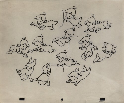 6
6
A model for a little angel. I assume this is for a
paper product commercial. Again, I think it’s the Gifford Studio
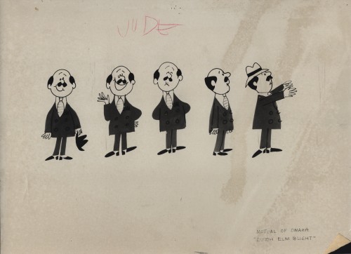 7
7
A turn-around model for a Mutual of Omaha commercial.
Again, since it’s with other Gifford Studio material I’d guess the same.
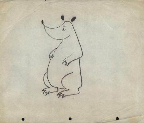 8
8
Here are two bear drawings from some commercial.
It looks like Dick Williams’ Cresta Bear (only this was
done years before that.)
 9
9
The three round peg holes is certainly unique.
Fleischer used a similar system for a wile as did
Krantz Studio on Fritz the Cat.
I don’t know where these are from.
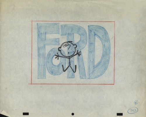 10
10
I’m sure this comes from the Gifford Studio.
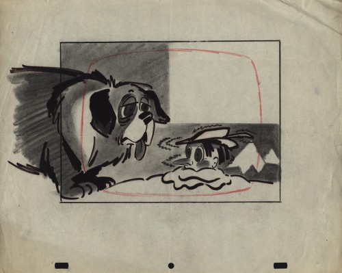 11
11
An interesting design. I assume it’s from a spot.
Peg holes look like the Gifford Studio.
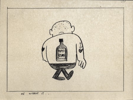 12
12
A storyboard drawing for a Pepto Bismol commercial.
UPA had this account for a long time.
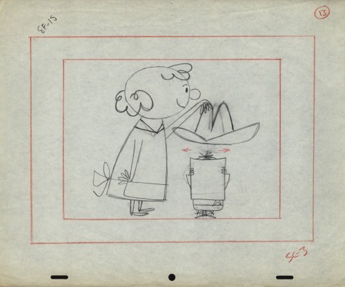
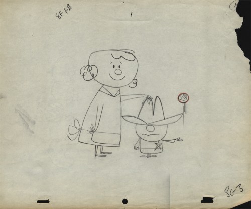
The following three drawings are two animator’s drawings (#106 & 108) and one Inbetween (#107). I believe the animator is Frank Endres; the inbetweener is Vince Cafarelli. For some reason I think this is from a Little Lulu cartoon directed by Bill Tytla, but I can’t vouch for that. I’m sure one of you visitors will let me know how wrong I am, and I welcome it.
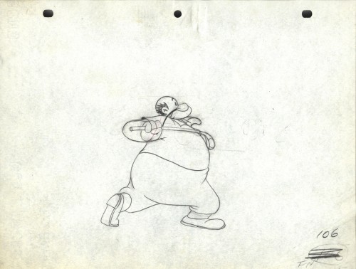
Drawing # 106 – animator’s drawing
I’m surprised at how small the paper is; not quite 8½ x 11.
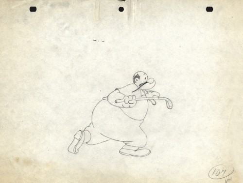
Drawing # 107 – inbetweener’s drawing
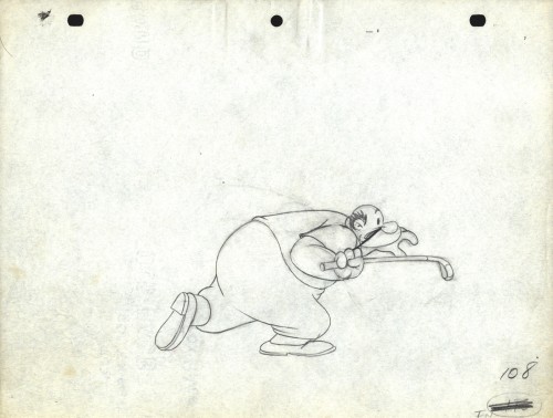
Drawing # 108 – animator’s drawing
The peg holes are Signal Corps.
Animation &Animation Artifacts &Chuck Jones &Frame Grabs &Layout & Design &repeated posts 06 Aug 2012 06:38 am
Conrad – again
I repeat this post for good reason. This is one of the prime films John McGrew planned for Chuck Jones, and the work is just dazzling. However, to our eyes it hardly looks unusual. Many of the tricks here were done for the first time, and others are so seamlessly done that we hardly notice them. It just looks like another War cartoon from WB. It ain’t.
It’s special.
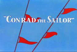 - Regulars to my blog know that I’m a big fan of the work of John McGrew. He was a designer/Layout Artist working in Chuck Jones’ crew at Warner Bros. in the late Thirties/early Forties. His work was daring beyond compare, and, I think, with support from Jones, he changed the look of modern animation backgrounds.
He designed the seminal film The Dover Boys as well as amazing pieces like Aristo-Cat, Inki and the Lion and Conrad the Sailor.
In an interview conducted by Greg Ford and RIchard Thompson, Chuck Jones was asked about McGrew’s style: 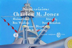
- Q: What about John McGrew’s style and approach, as compared with Noble’s?
A: John McGrew didn’t really have a style; he was experimenting all the time. Maurice does have a style. John McGrew, you might say, was more of an intellectual. You could be intellectual, and get away with it— but if you’re solely intellectual as a director, you weren’t going to get away with it. The result was, however, that he goosed me into thinking that it might be worthwhile to try some different things with backgrounds and so forth. And later on, I would find this kind of thing very useful, in that often it would make your gag work, and sometimes you wouldn’t even know why. Like that little abstract background at the end of Duck Amuck, with the sharply angled lines going off.
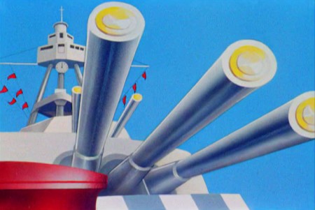
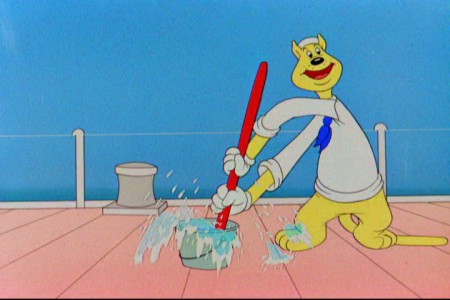
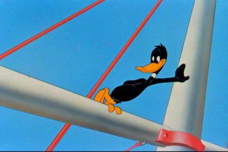
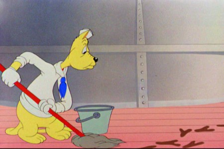
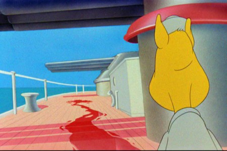
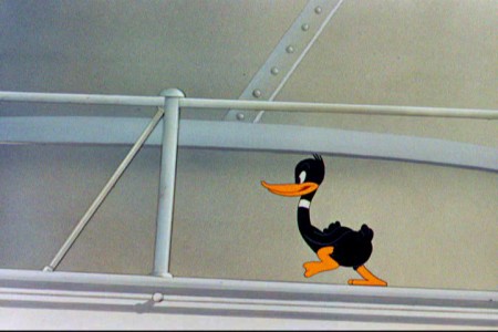
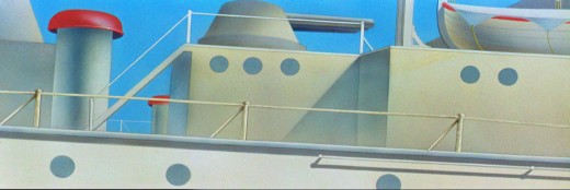
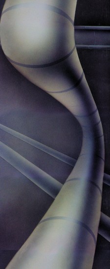
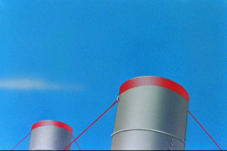
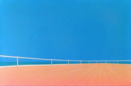
Today I’d like to feature some frame grabs from Conrad the Sailor. Where I could, I separated the characters from the backgrounds to just feature the Bgs. My guess is that the Bgs were painted by Paul Julian, but they were planned by McGrew.
The one scene I don’t illustrate is the most original in the film. Daffy is shot into the air with a bullet. (illus #18) The camera does a 360° turn to head back to the ship. The Bgs don’t hold up on their own. Lots of blue sky and wisps of cloud. It works in motion.
Of this short & McGrew, Jones says:
- . . . we used a lot of overlapping graphics on that particular cartoon so that one scene would have the same graphic shape as an earlier scene, even though it would be a different object: first we’d show a gun pointing up in the air, then in the next shot, there’d be a cloud in exactly the same shape. It gave a certain stability which we used in many of the cartoons after that. John McGrew was the artist responsible for that sort of thing. Conrad was also the one where we used the first complete 360° turn, when the characters went up through the air.
For more information read Mike Barrier’s excellent interview with John McGrew.
 1
1(Click any image to enlarge.)
The following BG pan can be seen in full to the left. I’ve broken it into three parts for a closer look.

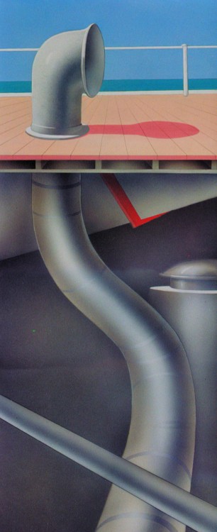 12a
12a .
.
———-(Continue scrolling down.)
.
.
.
.
.
.
.
.
.
.
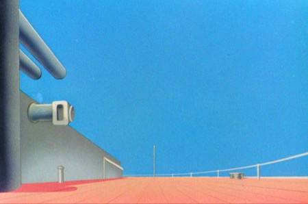 13
13
 15
15
A bicycle pan that keeps moving to the left.
 16
16
Continue moving right to left.
And here’s the cartoon.
Pay attention to the Layout in the sky from 6’25″ to the end.
It’s amazing.
Animation Artifacts &commercial animation &Layout & Design 01 Aug 2012 05:23 am
Cafarelli Spot Stuff
- I’ve been posting a number of drawings from commercials that Vince Caffarelli worked on. He saved many of the drawings, which are mostly Models and Layouts from these spots. Many of the older ones can’t be identified as to which studio they came from. The more recent drawings (1970 up) can be.
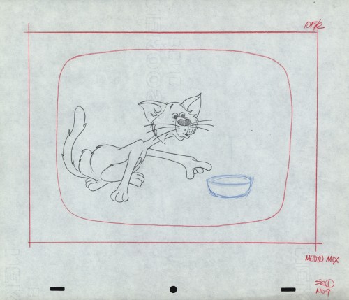
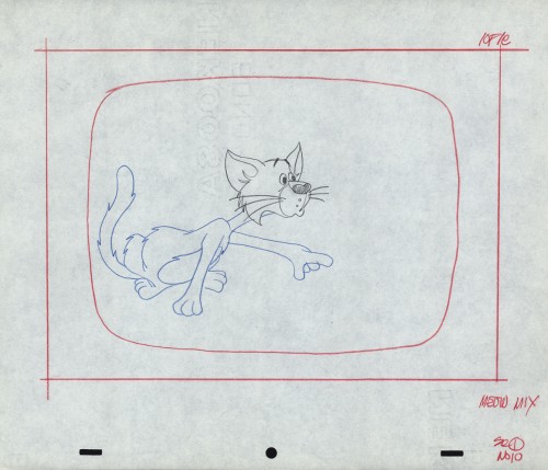
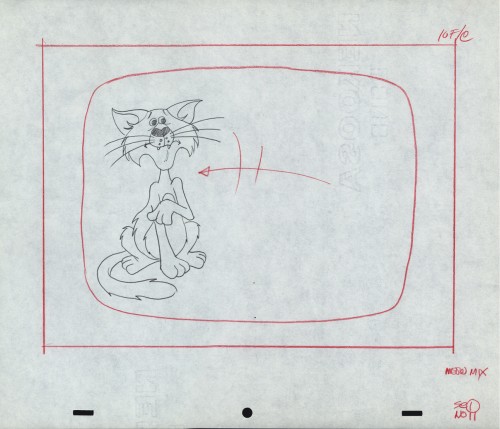
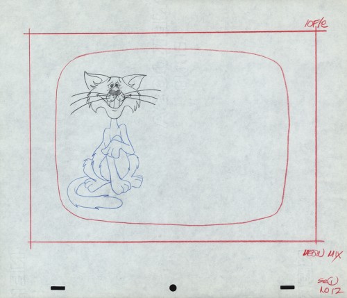
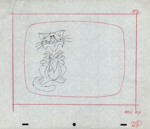
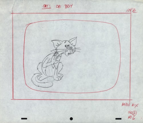
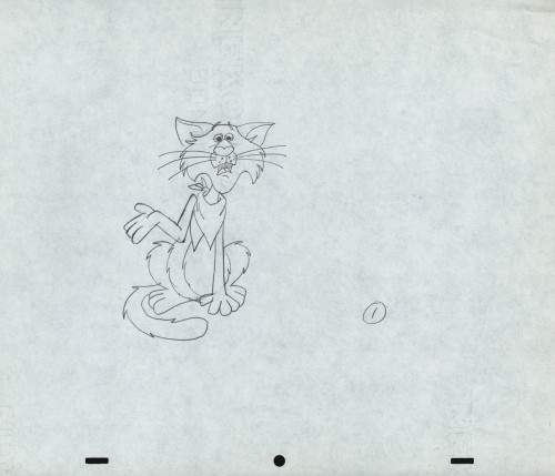
This first lare group of drawings can be classified as work from Perpetual Motion. They were drawn by Wayne Becker as Layouts and models for a Meow Mix commercial. Wayne worked in New York for many years predominantly doing Layout for many of the studios. His style, as you can see, is very tight.
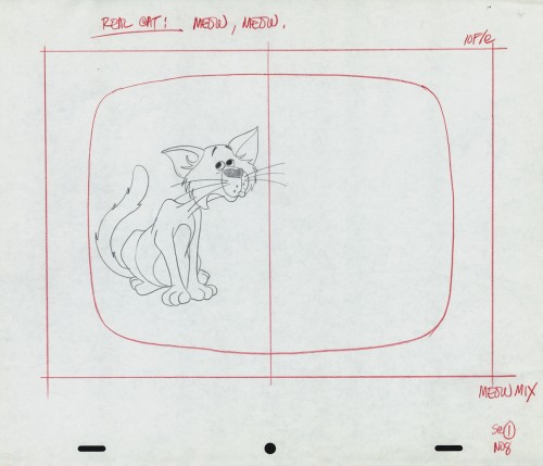
The first drawings from Scene 1 are missing. This is #08.
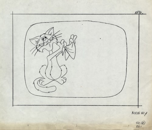
This starts Scene 02. Oddly this is a photostatic copy of drawing #01.
All the other drawings are pencil on animation paper.
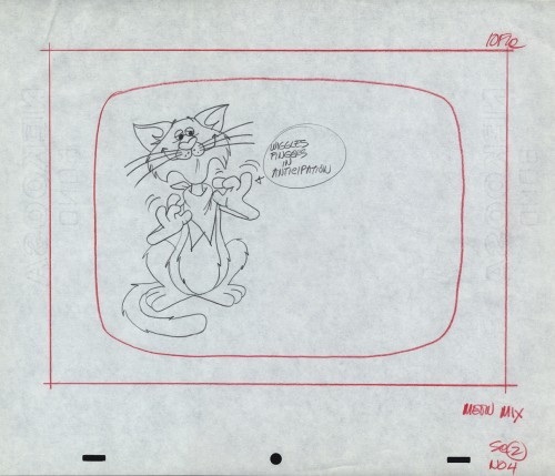
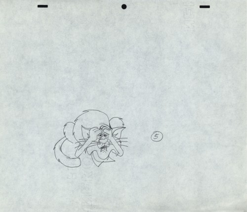
This is an alternate version of Sc 2 – #06
 1
1
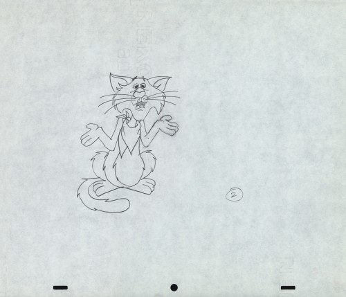
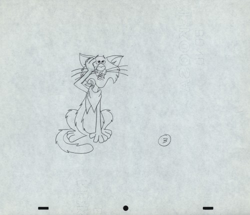
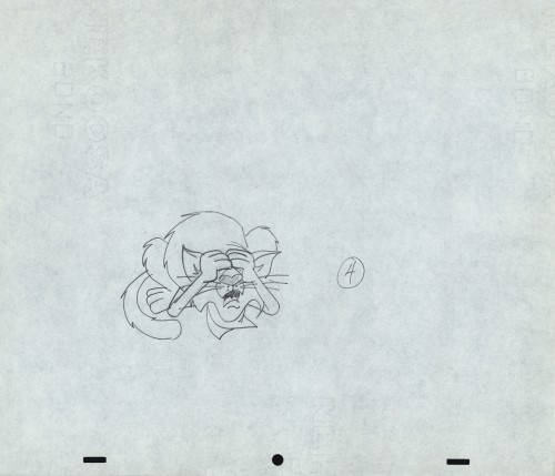
These drawings are not labelled as part of Sc. 02, but they
seem to be just an extension of the scene – additional poses.
Perhaps they changed the ending.
Here’s a QT movie of the spot when finished.
__________________________
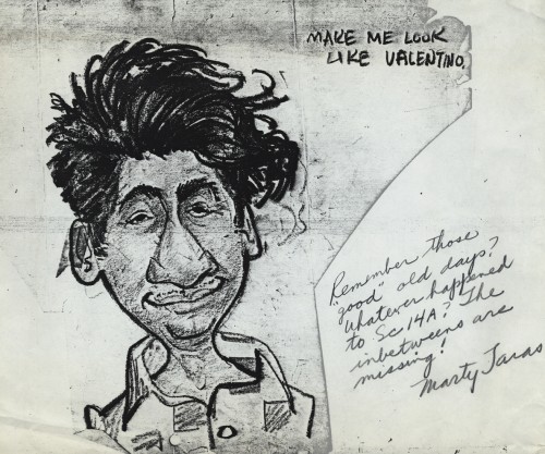
For a lively change of pace, here are two caricatures drawn by Marty Taras of Vince Cafarelli and Pablo Ferro. The two were inseparably close friends at Paramount where these drawings were probably made. Marty, of course, was one of the mainstays in New York, workinig at Terrytoons and Paramount, where he was the man behind Baby Huey.
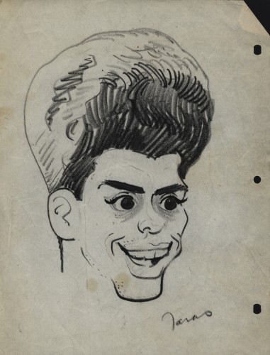
Vincent Cafarelli
__________________________
Finally, here are some drawings done by Dolores Cannata when “Buzzco.” was formed after “Perpetual Animation” had folded. Dolores was the daughter of George Cannata Sr. and the sister of George Cannata Jr. I met her very briefly when I was first starting out and making the rounds of the studios. My appointment was with George Jr. who liked my drawings and advised me not to be an animator but a designer.
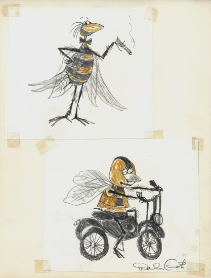
She was a gifted designer; that’s for sure.
Animation Artifacts &commercial animation &Layout & Design &UPA 25 Jul 2012 05:21 am
Even More UPA Spots
- Here are more Layouts and character poses for the commercial work done at UPA. They are all pulled from Vince Cafarelli‘s collection of artwork. I assume these all come from UPA since Magoo models were in the same folder. The design styles are consistent with what we’ve seen from UPA at the time.
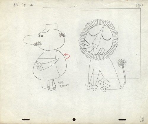 1
1
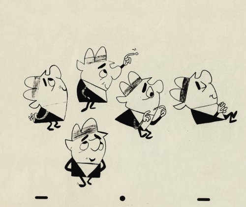 3
3
A photostat of a character model sheet
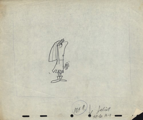 4
4
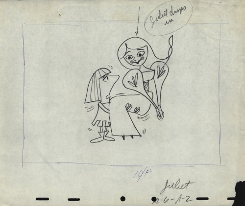
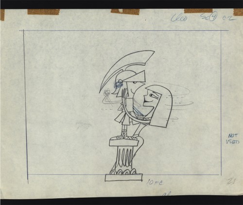
An ad that features Romeo and . . .
 6
6
Cleopatra was obviously cut out of the spot.
Note that the pegs were cut off the NG drawing.
 7
7
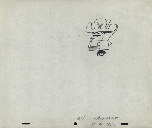
Napoleon, but it looks like it comes from a different spot.
 8
8
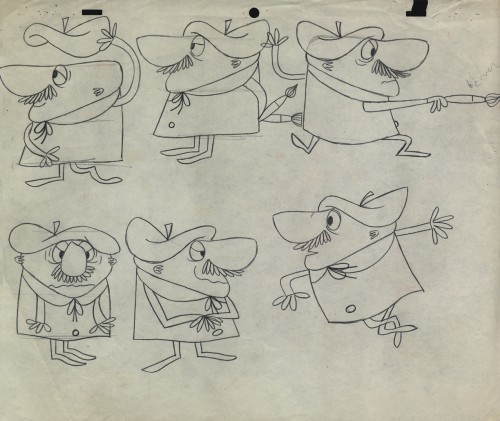
Was this something that stuck in Gene Deitch’s mind before he left
UPA to go on to run Terrytoons? Shades of Gaston le Crayon.
 11
11
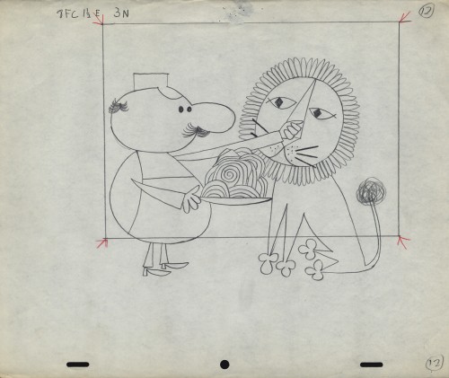
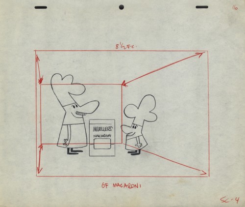
Obviously, an ad for Mueller pasta
 12
12
An interesting series of Layouts. I’m not sure if they’re for an ad . . .
Animation &Animation Artifacts &commercial animation &Layout & Design &Models &UPA 18 Jul 2012 07:05 am
More UPA Spots
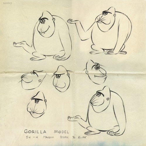
- Out of the Vincent Cafarelli collection, we’ve found another burst of UPA drawings. We know they’re UPA because there are models and animation drawings from a Mr. magoo short: “People to People.” The accompanying drawings from commercial spots and segments of the Gerald McBoing Boing Show all come on the same paper stock. The peg system is Acme not Signal Corps (which leads me to believe that some of those I called UPA in a past post are really from the Gifford Studio.)
 1
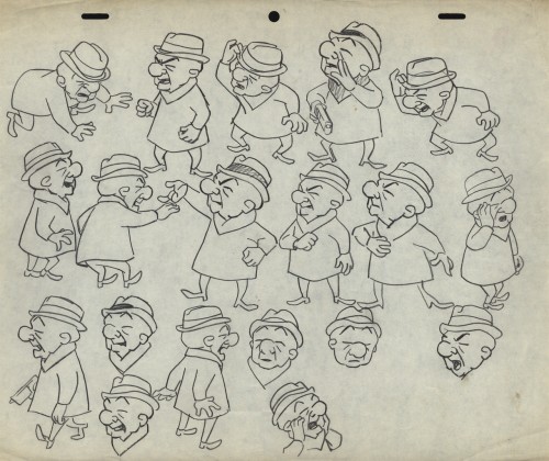
1This model and the other Magoo pieces here are from
the short “People to People” which features a gorilla.
 2
2
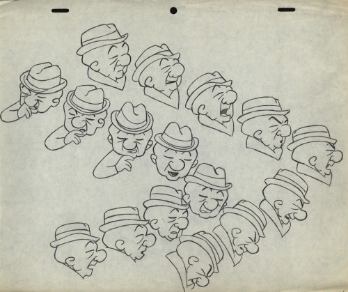
Per Mark Mayerson, in the comments section, the film was retitled
Terror Faces Magoo and was directed by Chris Ishii and Jack Goodford.
 3
3
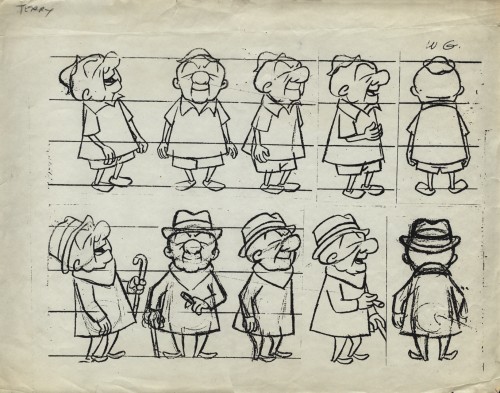
See the film here.
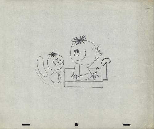
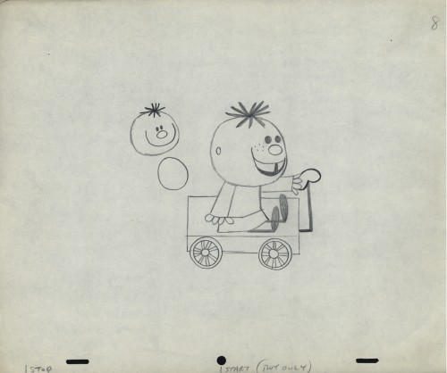
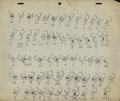
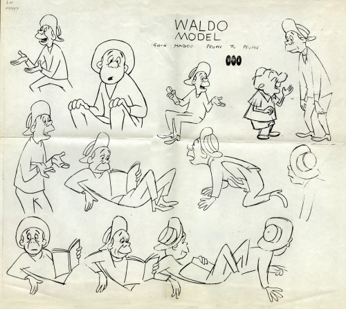 5
5
This model comes with the names “Lu” and “Vinny” indicated.
Obviously Vinny Cafarelli was Lu Guarnier’s assistant.
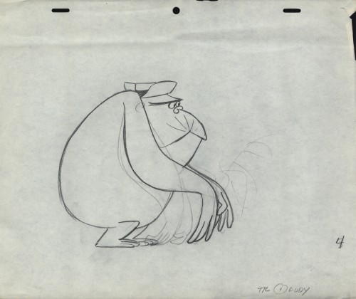
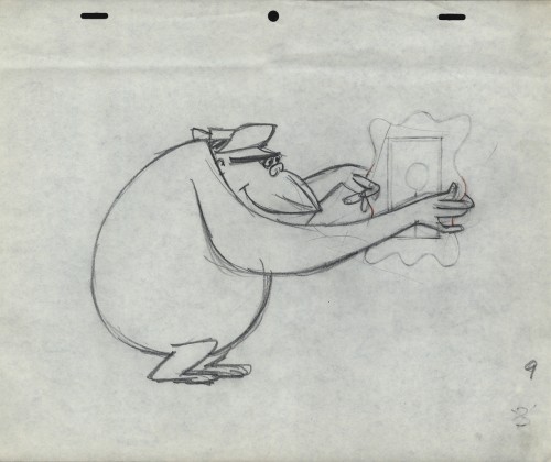
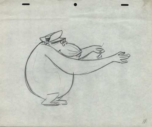
The following three drawings are key animation poses of the Gorilla.
 16
16
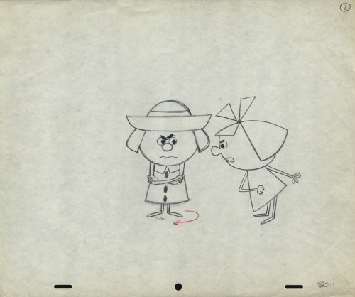
This is obviously a drawing of the Tworlinger Twins, a
series done for the McBoing Boing show. The NY office
seems to have done a number of pieces for the show.
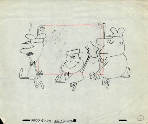 17
17
These guys look similar to the three who open
the McBoing Boing Show carrying their logo.
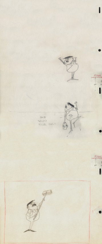 18
18
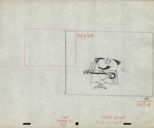
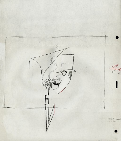
A vertical pan for a Savarin Coffee spot. A sign painter
pastes a placard of the product on a billboard.
Animation Artifacts &Art Art &Independent Animation &Layout & Design &Photos &Puppet Animation 15 Jul 2012 05:43 am
Quay Dormitorium – repost
August 11th a big show and retrospective of the work of the Quay Brothers will open at the Museum of Modern Art. Part of the exhibit will be a small puppet world within glass casings that they created called “Dormitorium.” This was actually exhibited in New York several years ago, and I photographed that presentation. I thought this might be a good time to repost it, getting us all in the mood for the world of Quay.
The Brothers Quay have an exhibition on display at Parsons School of Design, 2 West 13th Street on the ground level. It’s on exhibit from now through October 4, 2009.
Stephen and Timothy Quay claim writers Franz Kafka and Robert Walser, animators Walerian Borowczyk and Jan Lenica, puppeteers Wladyslaw Starewicz and Richard Teschner, and composers Leoš Janácek, Zdenek Liška, and Leszek Jankowski among their influences. All of these artists can be felt with each of the constructions on display.
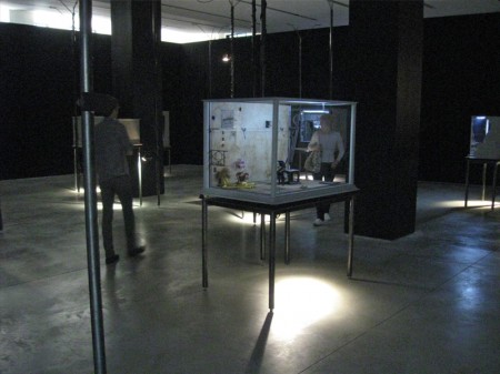 1
1On entering you see a darkened room with boxes about
the size of your torso – maybe 3′ x 4′ – on display.
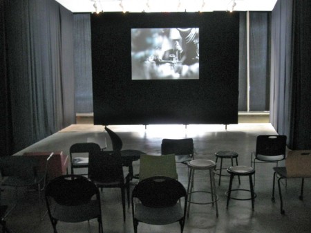
Of to the side there’s a theater with constantly running films
showing Quay brother works. One of every kind of chair.
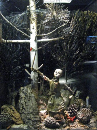
Within the boxes there are whole worlds.
Magnificent detail upon detail.
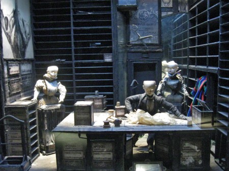
To the next box for a wholly different world.
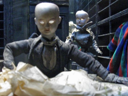
Again the amazing detail is brought to the enclosure.
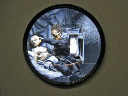
A couple of the boxes are seen through a prism.
The interior is magnified.
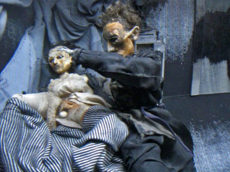
You have to get close to it to get real clarity.
You virtually enter these little rooms.
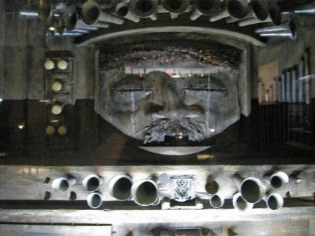
Some of these worlds seem enormous.
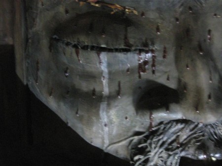
There are many closeups one could take given all there is to see.
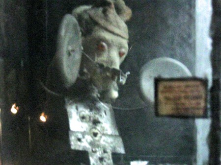
This little scene is in the upper left box of the full view above.

The central character on the main stage.
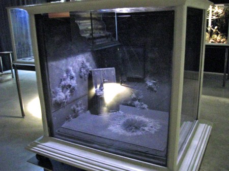
You can get an idea of the cases and the display.
All contain their own little worlds.
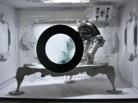
Another magnifying glass focuses on a feather.
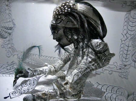
Just beyond the feathered quill there’s the writer.
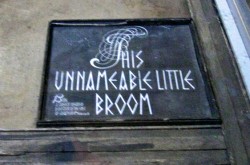
The last box near the exit has a label within.
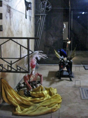
Many of the cases can be viewed
from three different perspectives.
Disney &Frame Grabs &Layout & Design 12 Jul 2012 05:34 am
Neilsen’s Mermaids – recap
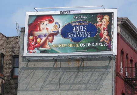
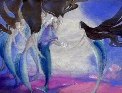
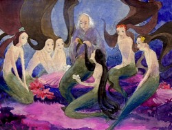
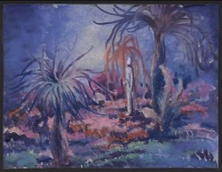
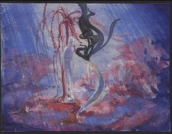
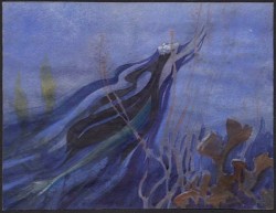
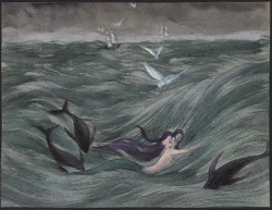
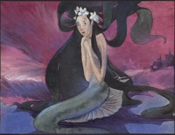
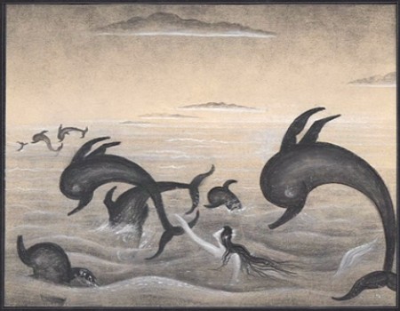
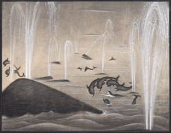
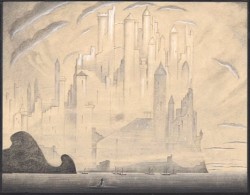
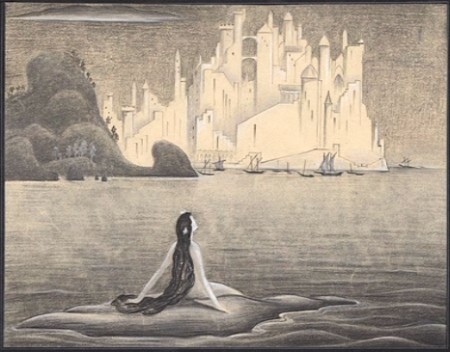
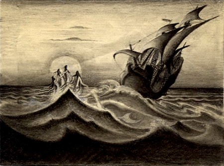
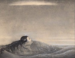
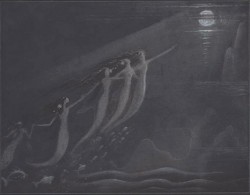
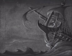
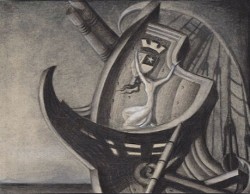
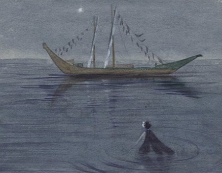
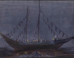
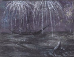
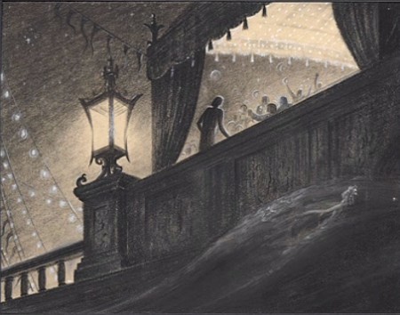
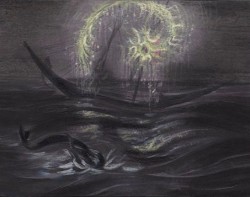
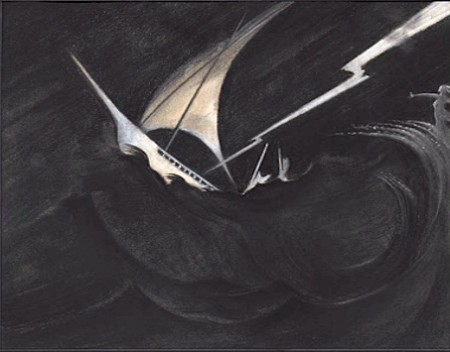
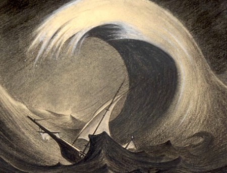
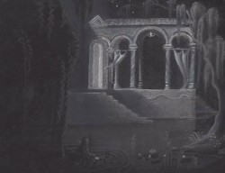
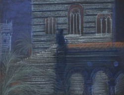
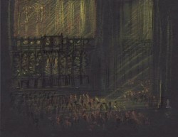
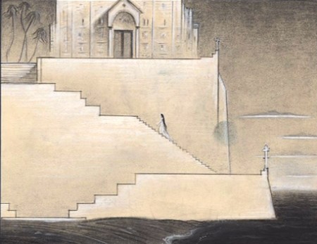
- Since the Little Mermaid sequel – no wait, it’s a prequel – just aired on Disney Jr. a few days ago, I thought this a good time to post some of Kay Neilsen ‘s illustrations done for Disney back in the 30′s when they were initially thinking of doing the Andersen tale as a film. These frame grabs come from the extras on the Platinum Edition of the dvd.
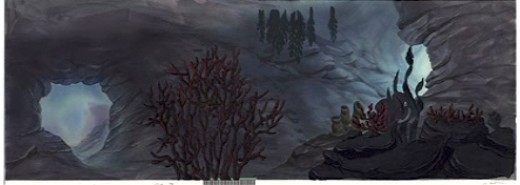
(Click any image to enlarge)
