Category ArchiveLayout & Design
Animation &Independent Animation &Layout & Design 23 Oct 2009 07:47 am
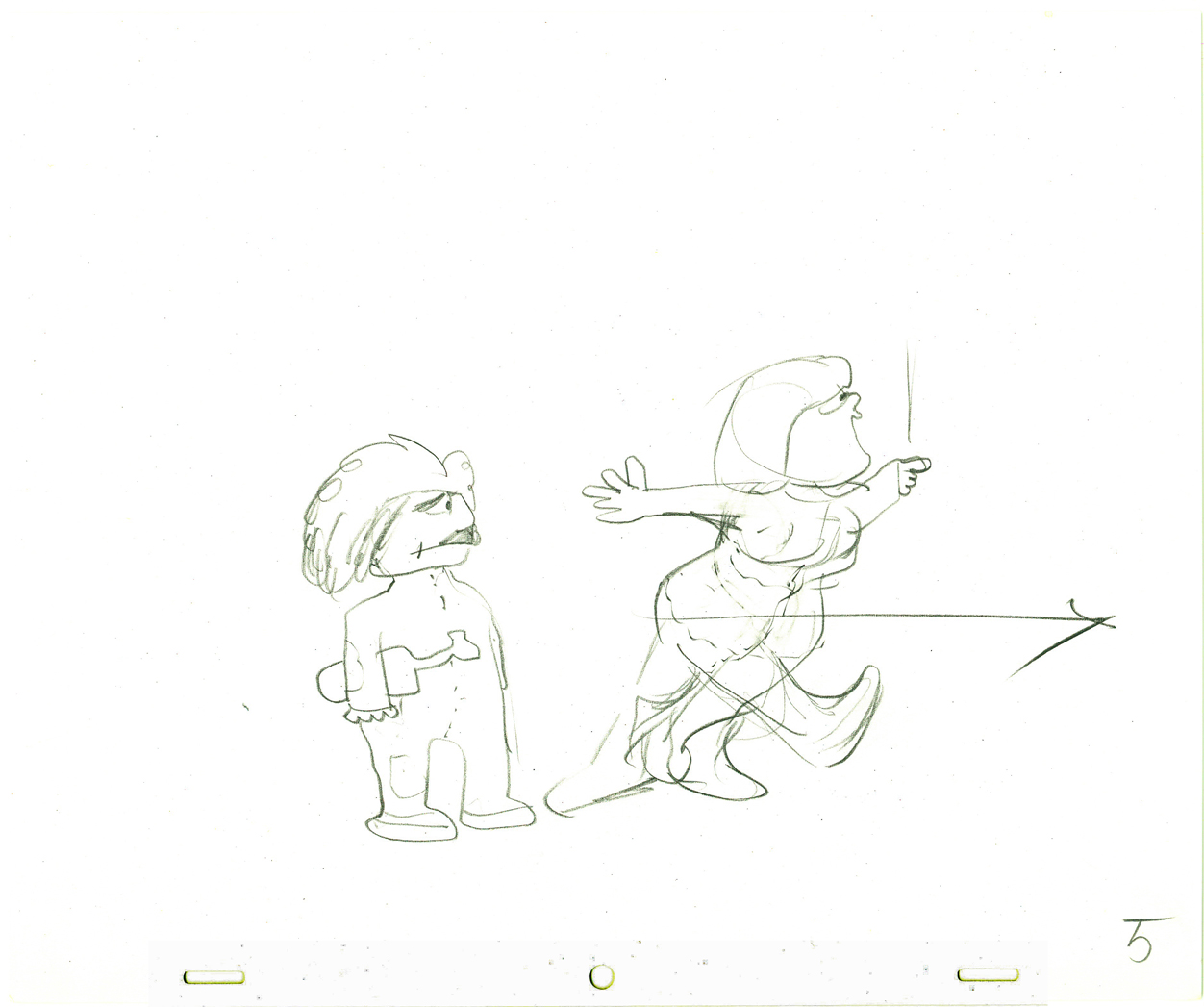
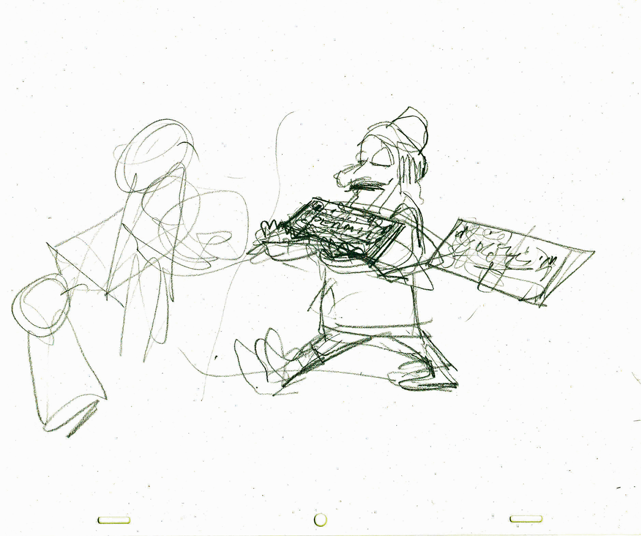
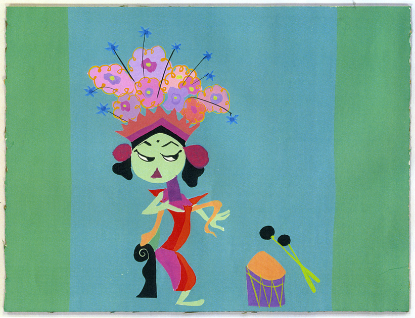
Pups of Liberty – Production Art
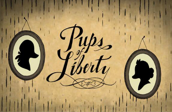 - Yesterday, I posted the first part of a look at a short film, Pups of Liberty. It included an interview with Bert & Jennifer Klein the Producer/Directors (and so much more).
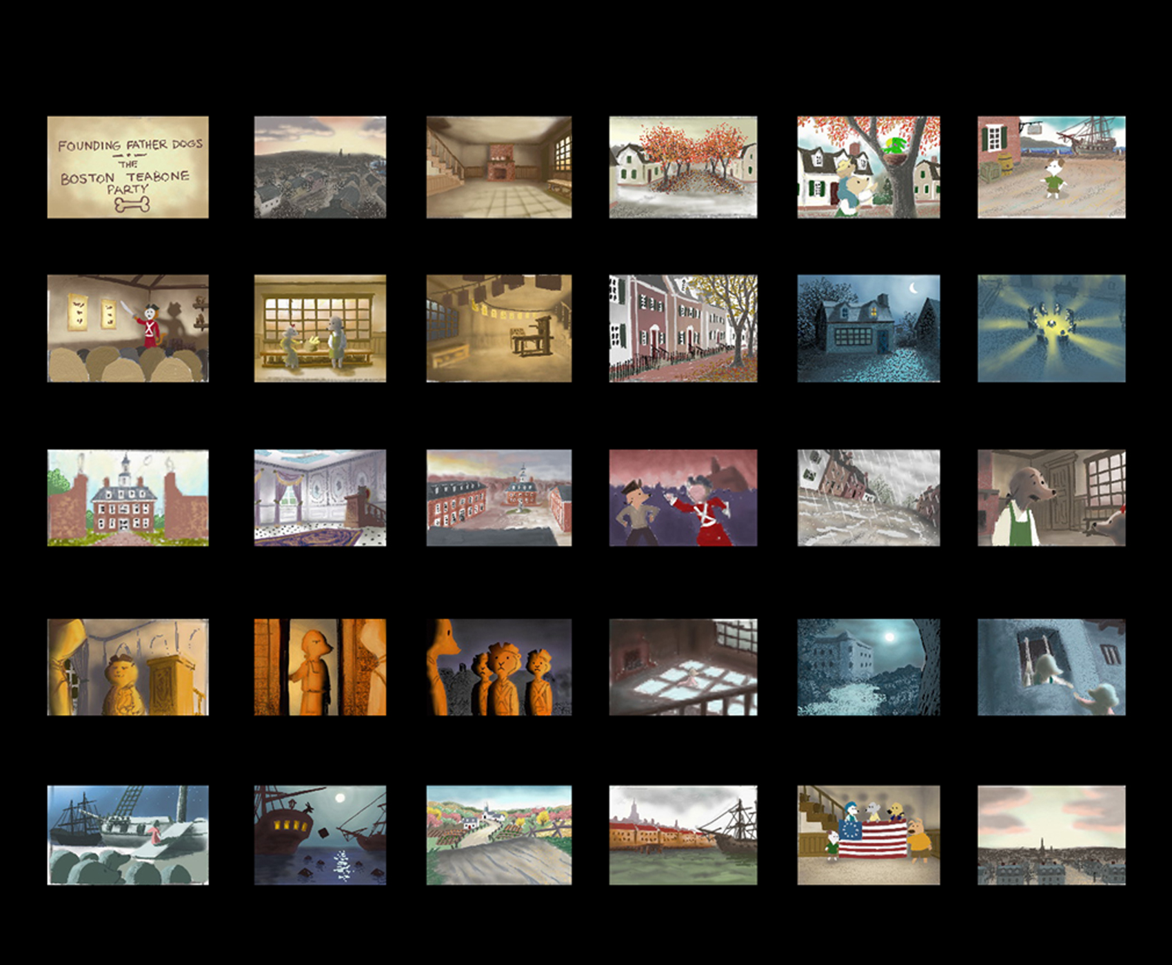
Along with the interview response, they sent me a wealth of gorgeous artwork from various phases of the production, and I’ll try to get most of it in today. The text descriptions, below, are written by their Production Designer, James Lopez.
You can view a trailer from their film here.
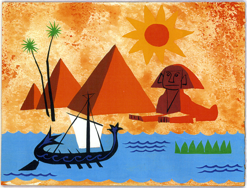
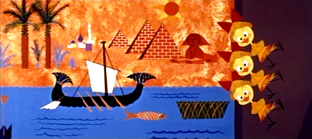
Pups of Liberty Color Script by James Lopez
For the colors, warm colors were chosen to represent the dogs’
surroundings and, in contrast, cool colors to represent the cats.
To start the film, the colors were to portray a pretty town but not
a vibrant one. Only as hope comes alive and tensions run high (The
Boston Tea Party & The Riot) are the more vibrant colors introduced.
Color influences came from some classic Disney films and a desire to
use natural lighting (direct & indirect) as opposed to “staged†lighting.
The story of the movie is left somewhat unconcluded so at the finale,
rather than going full-blown with color, there is a hint at what would be
to come (as the story’s narration suggests).

Pups of Liberty - Drawing Trees
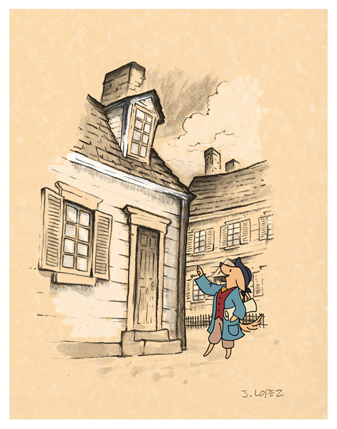
Pups of Liberty - In the style of Anton Pieck
Initally, the backgrounds were going to be influenced by the stylings
of Dutch artist Anton Pieck. Studies were made to see what the style
would look like with a Colonial theme.
A composite was made with the paint study and the character over
a parchment texture. We we were happy with the result of how the
drawn character married into the drawn environment.
It was a nice style but it involved a unique application that was a labor
to produce and proved to be impoprobable so we explored other, more
traditional styles.
We later settled for a pen and ink application on vellum paper in the
rough drawing style of the late Ken Anderson. It allowed us to stay
loose and if there were any mistakes or changes to be made, they
could still be done on paper.
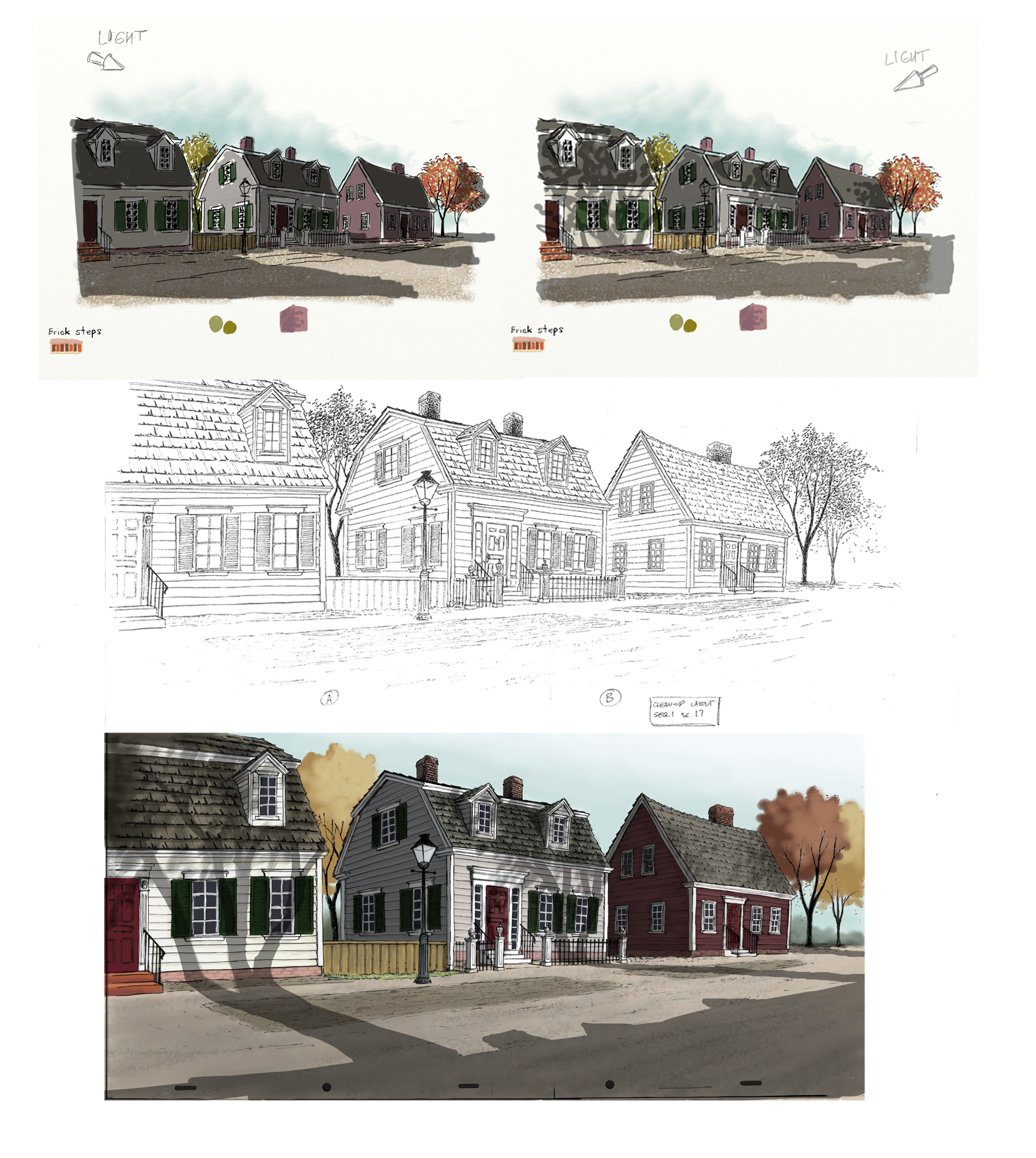
The top two illustrations are visual development for the color and
lighting treatment on the houses. The desired effect was trying to
capture the drama of the shadows cast from the trees by the sun
set low on the horizon.
The middle illustration is a clean-up layout by James Lopez
The bottom illustration is a Production Background painted by James Lopez
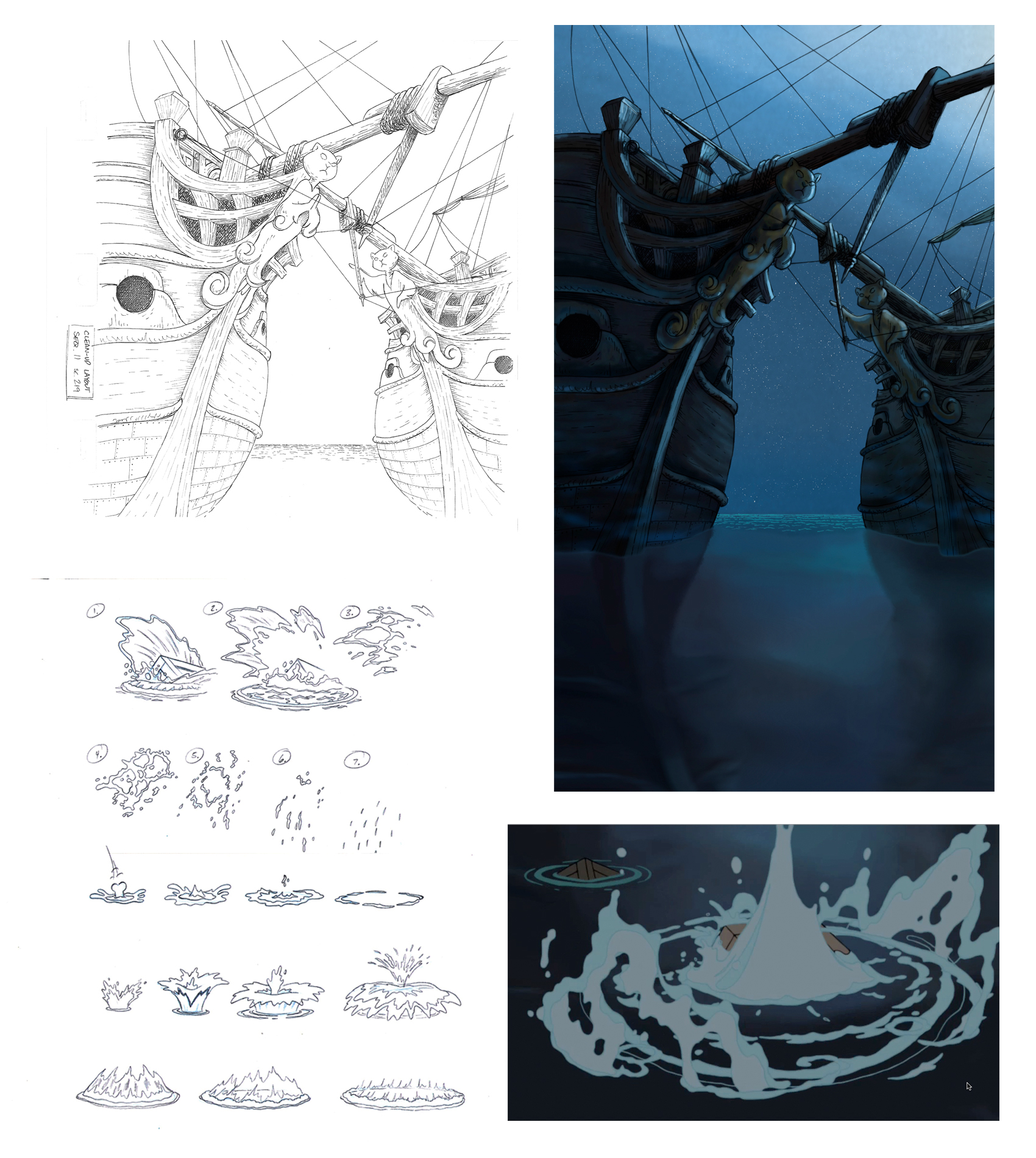
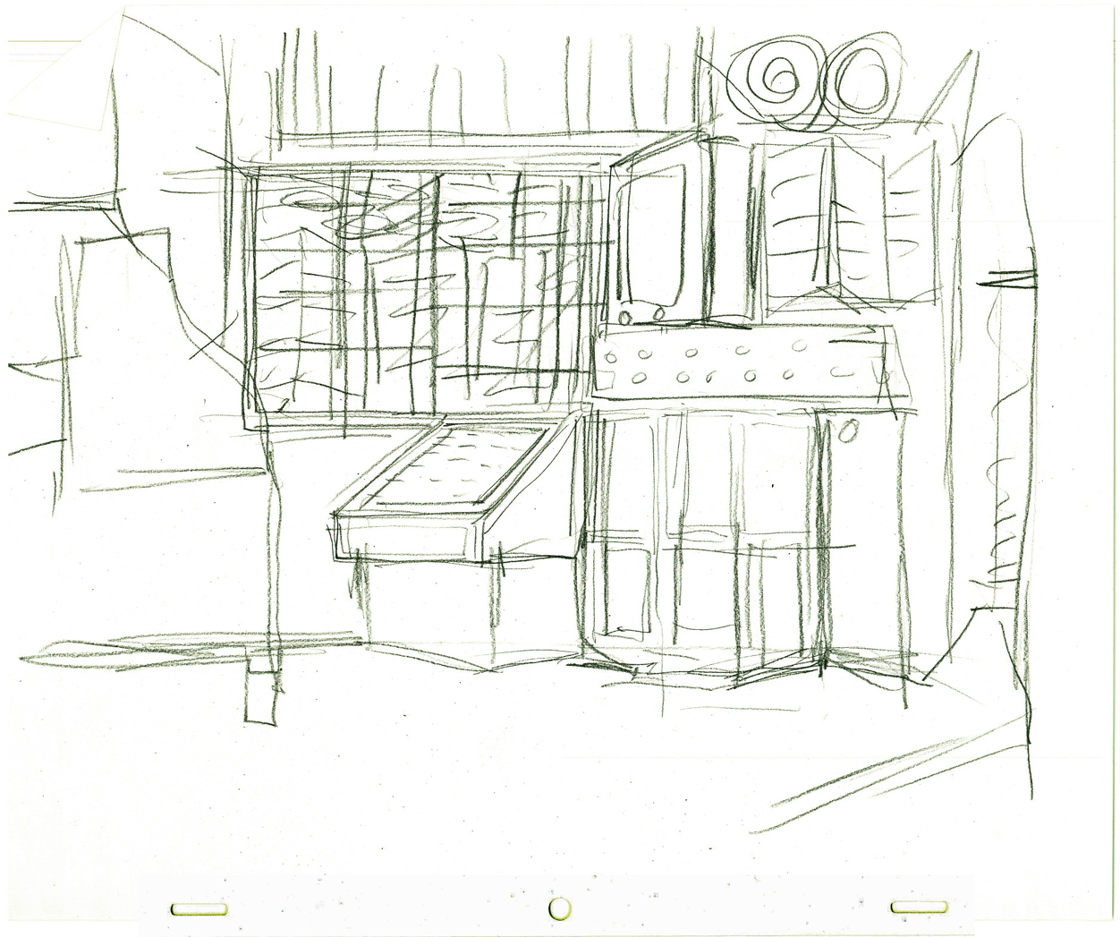
Pups of Liberty - Water Effects
Illustration (upper left) Clean-Up Layout by James Lopez
(upper right) Production Background by Barry Atkinson
(below left) water studies by James Lopez
(below right) Production still
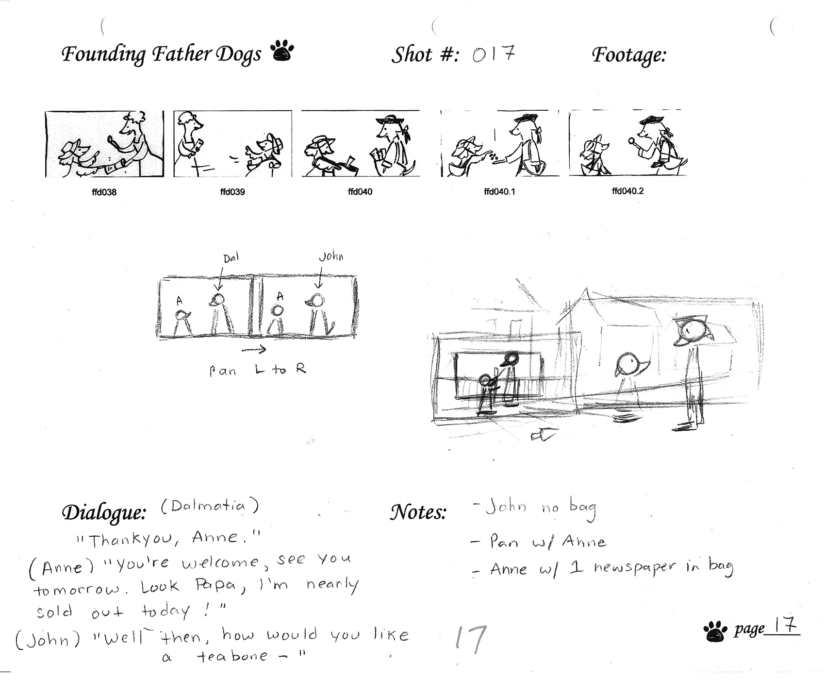
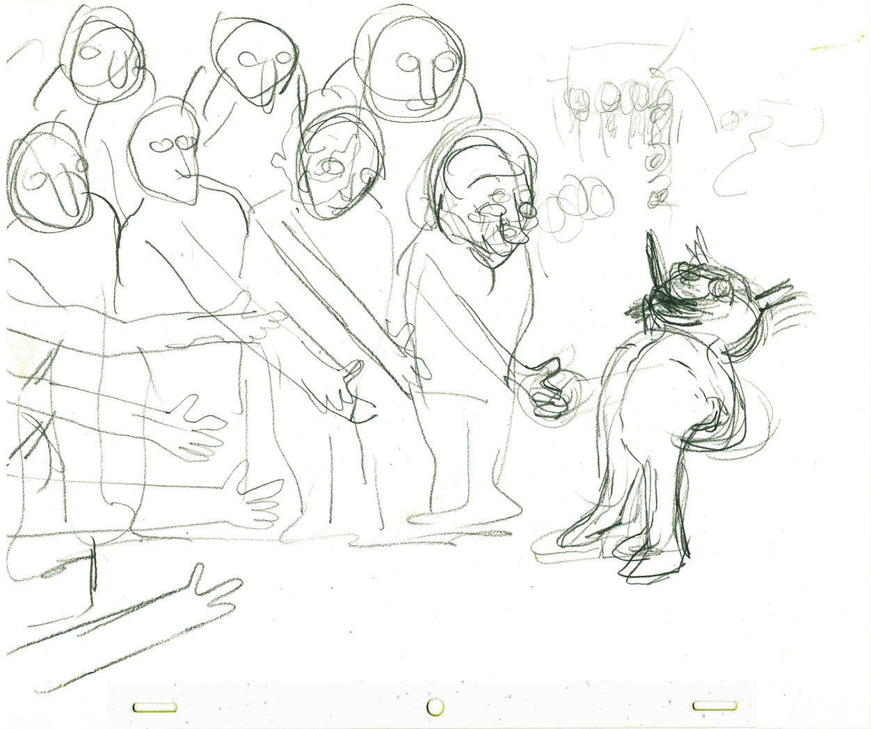
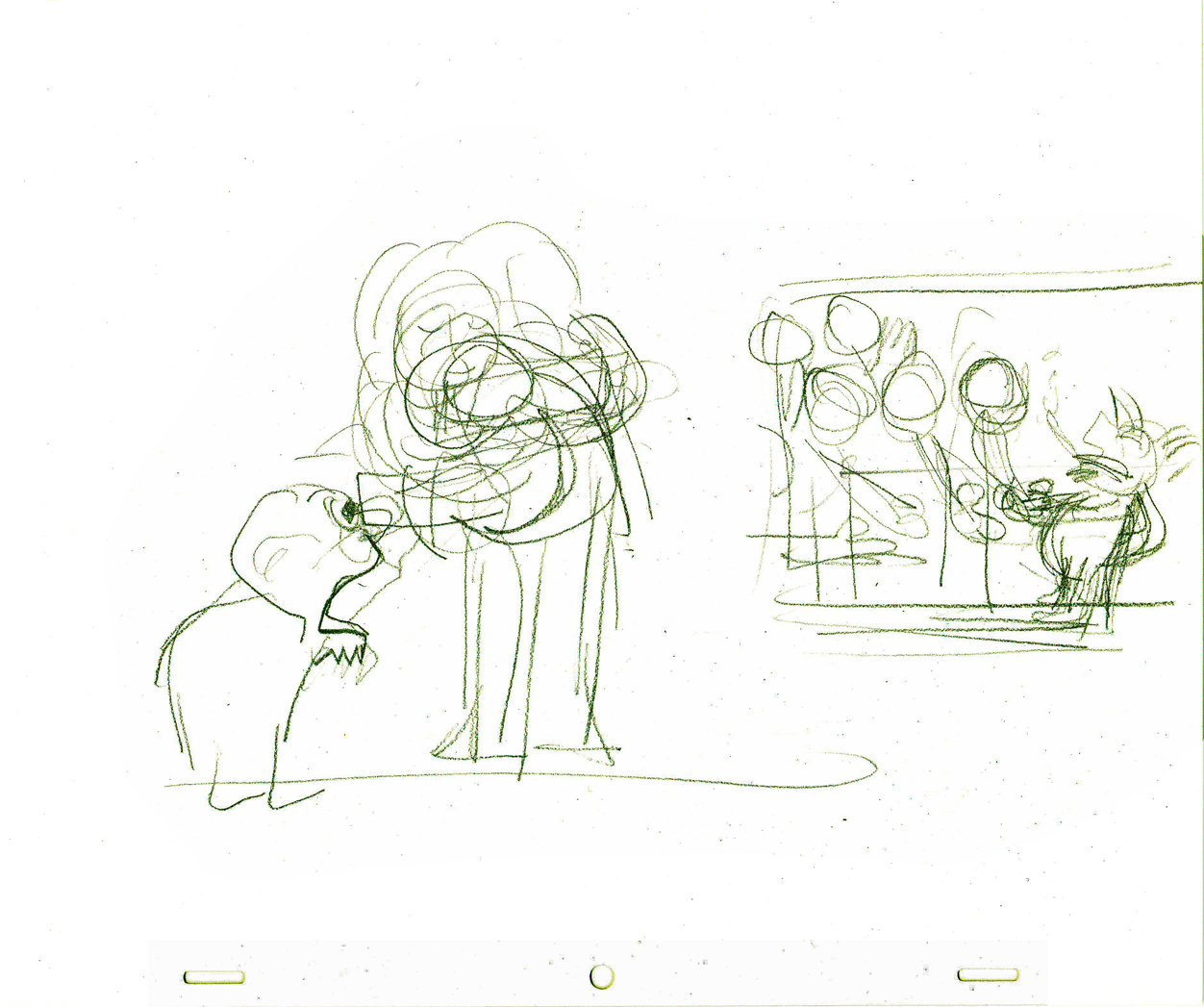
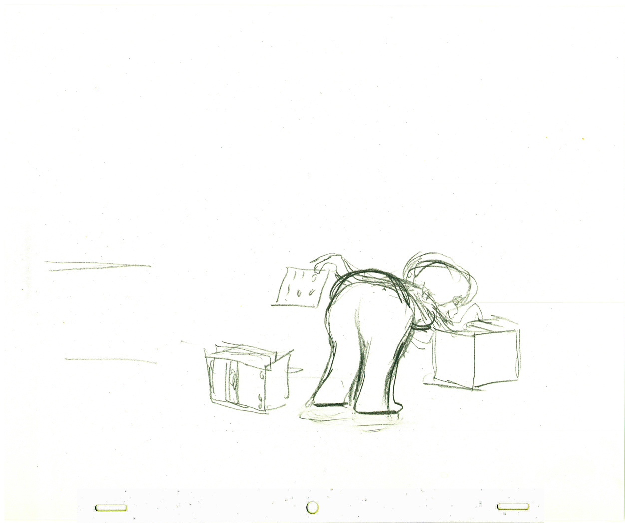
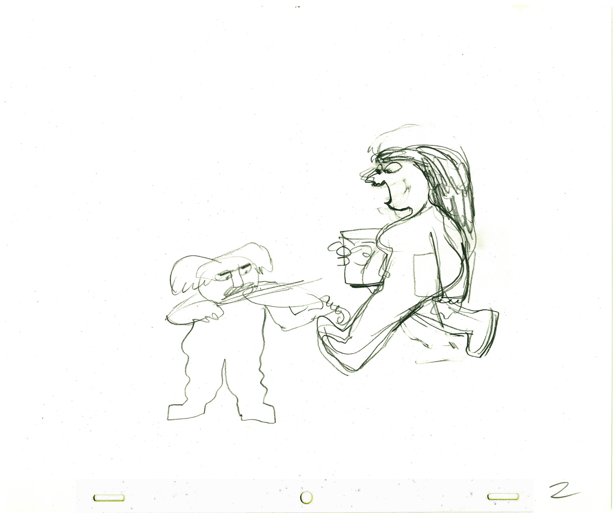
The above images represent a page from the Director’s workbook
for Sc. 17. Storyboard drawings are by Jennifer Klein.
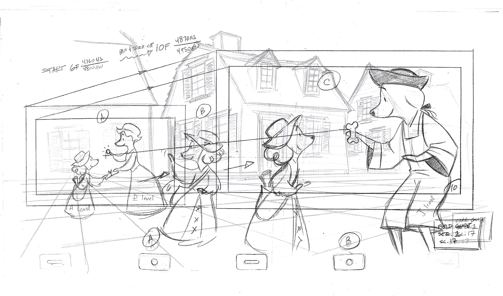
This is the Layout for Scene 17
done by James Lopez.
The QT movies below are Pencil Tests of scenes by
Mark Henn.
Right side to watch single frame.
Frame Grabs &Layout & Design 07 Oct 2009 07:40 am
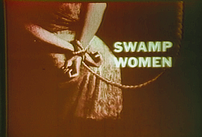
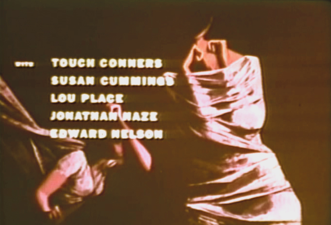
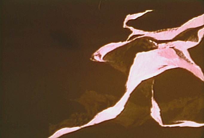
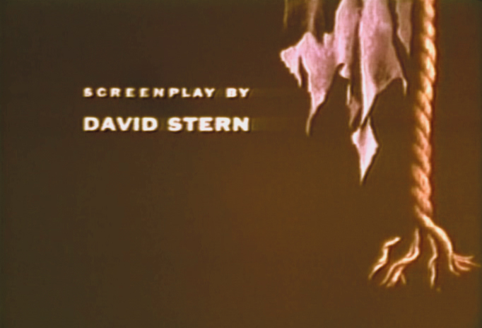
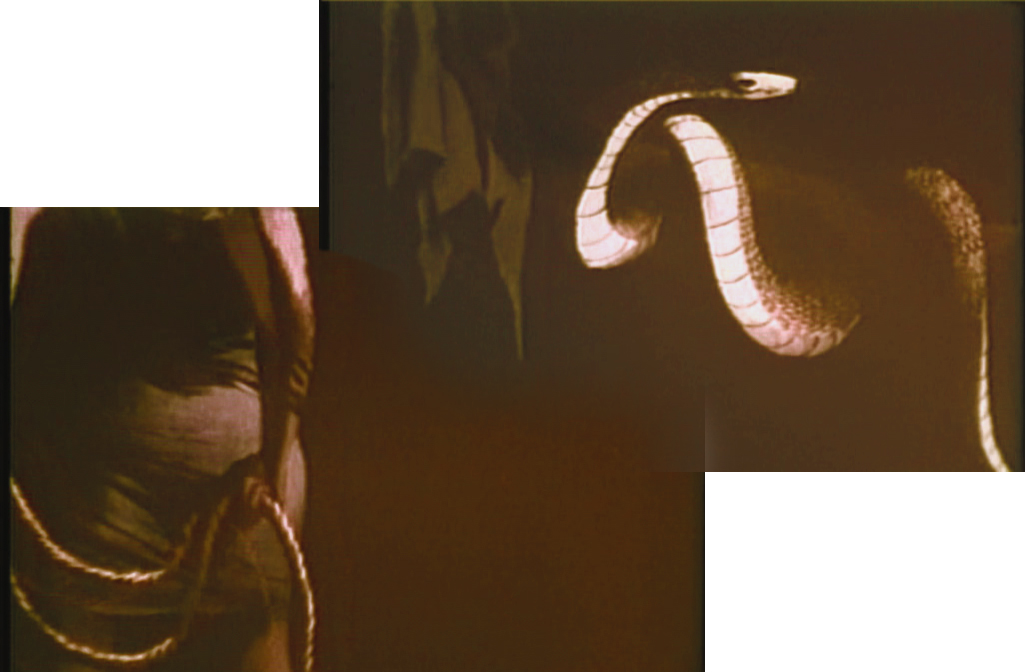
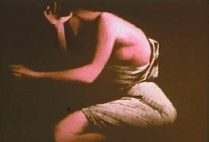
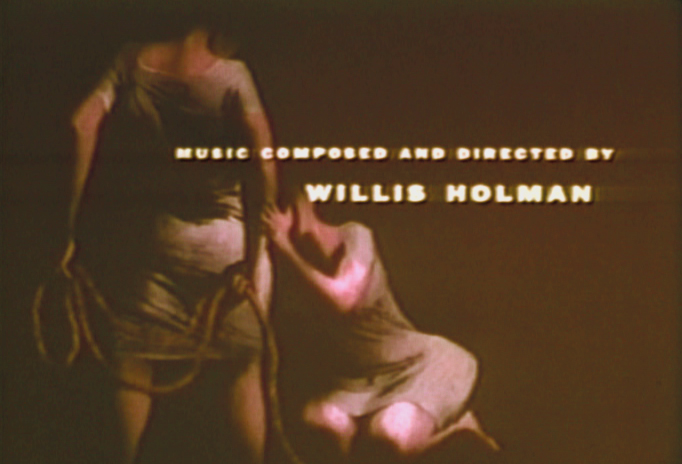
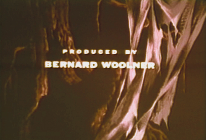
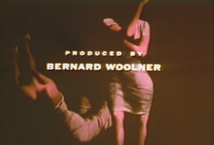
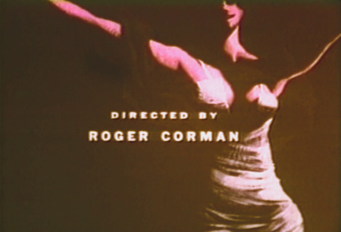
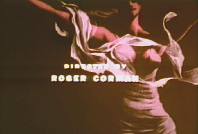
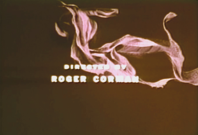
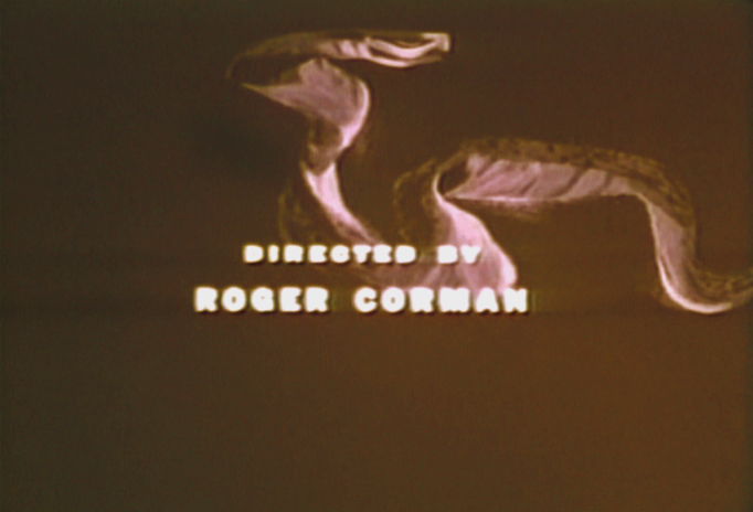
Paul Julian’s Swamp Women titles
- The last post to focus on Paul Julian’s work, pulled images from the credit sequence to Roger Corman‘s film, The Terror. Corman used Julian for a number of title sequences, and I hope to showcase several of them here.
However, the print selection is not the best. In this post taking frame grabs from Swamp Women, the print includes an obviously added on title card using B&W footage. The color film that follows is so deteriorated and choppy, in this print, that it’s hard to discern what color the original art was. So I’ve tempered it a bit to get rid of the magenta look. I suspect I’m getting close.
The imagery is definitely Julian’s. He had an obvious Ben Shahn influence to some of the work although he gets a bit more surreal in his compositions and designs.
There are fewer camera moves in this title. I’m sure the budget was low. I wouldn’t be surprised if it were in the hundreds (not thousands) of dollars.
(Click any image to enlarge.)
This first title on the rented DVD looks like it was pulled from a B&W print.
 2
2
 3a
3a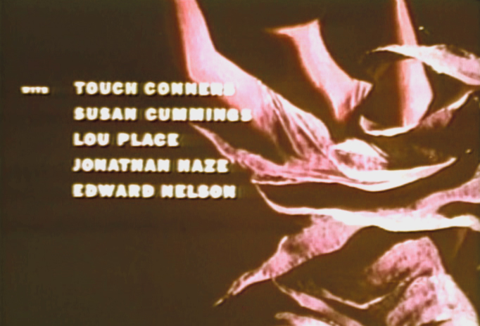 3b
3b
 4
4
 5
5
 6
6
 7a
7a
 7b
7b
 7c
7c
 8a8b
8a8b
 9
9
 10
10
 11
11
 12
12
 13
13
 14
14
 15
15
 16
16
 17
17
 18
18
 19
19
 20
20
 21
21
 22
22
 23
23
 24
24
Animation &Layout & Design 27 Jul 2009 07:26 am
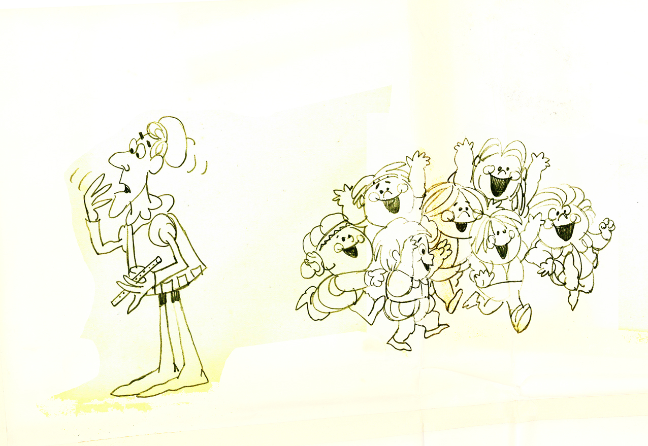
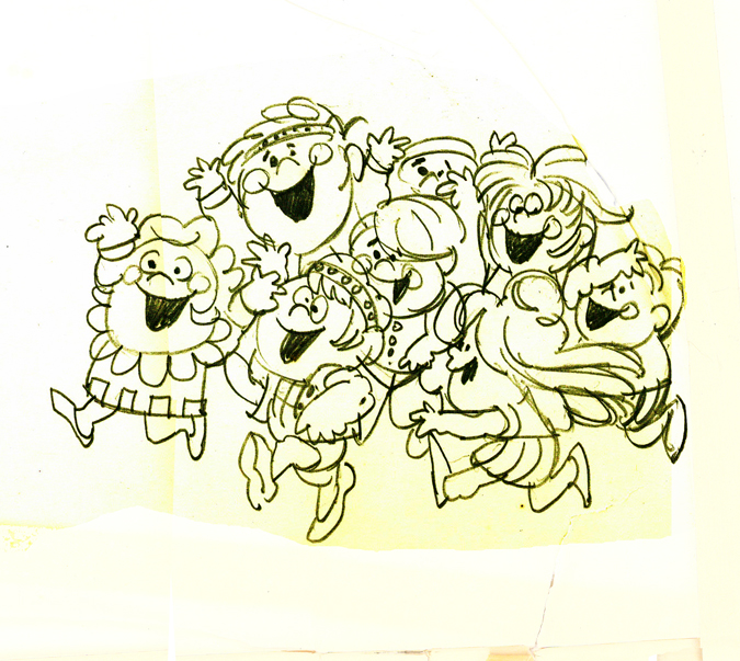
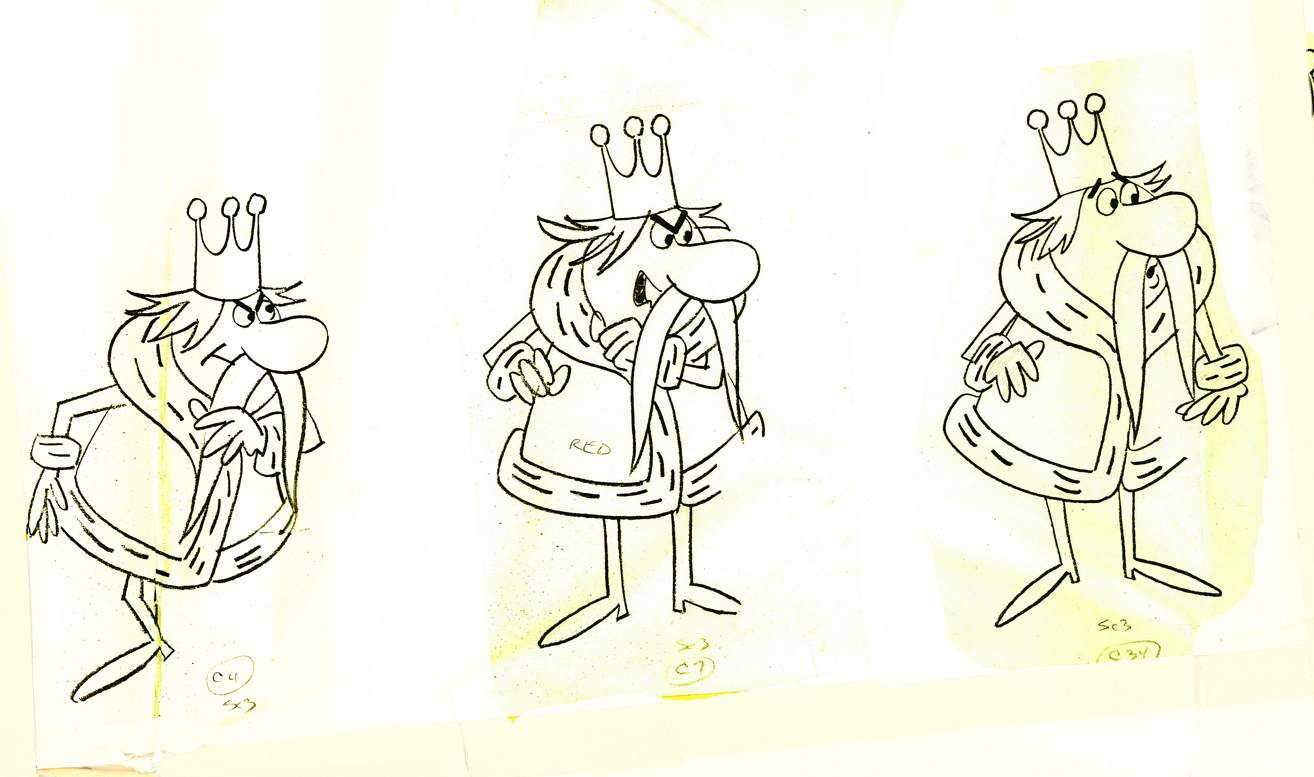
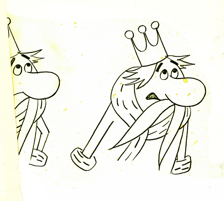
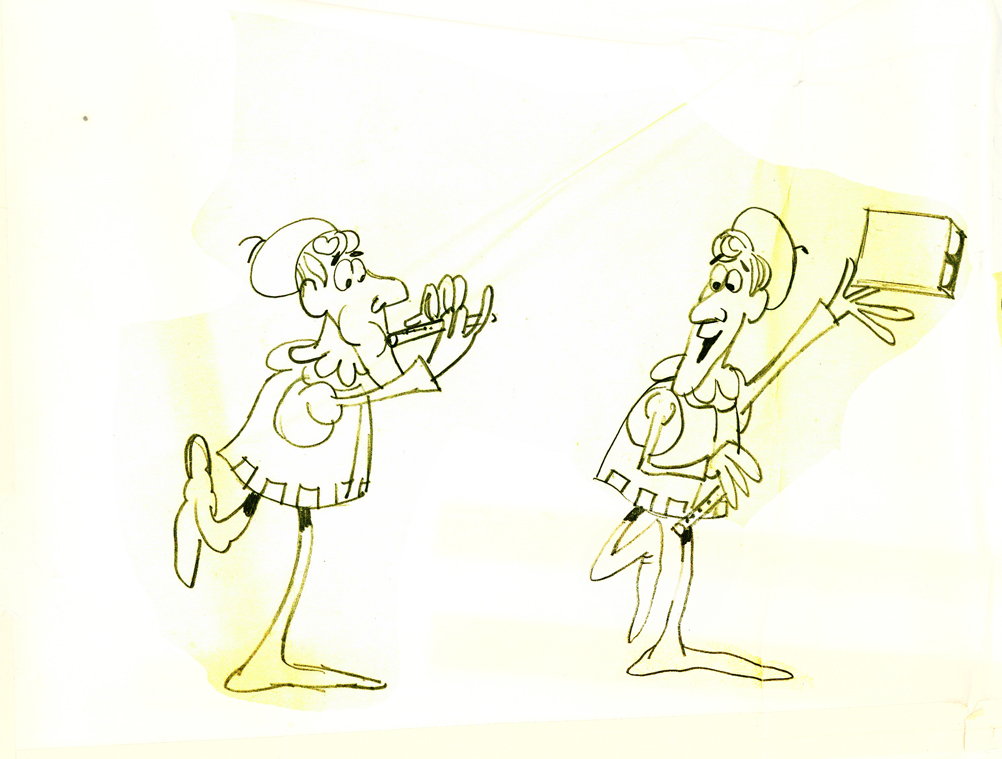
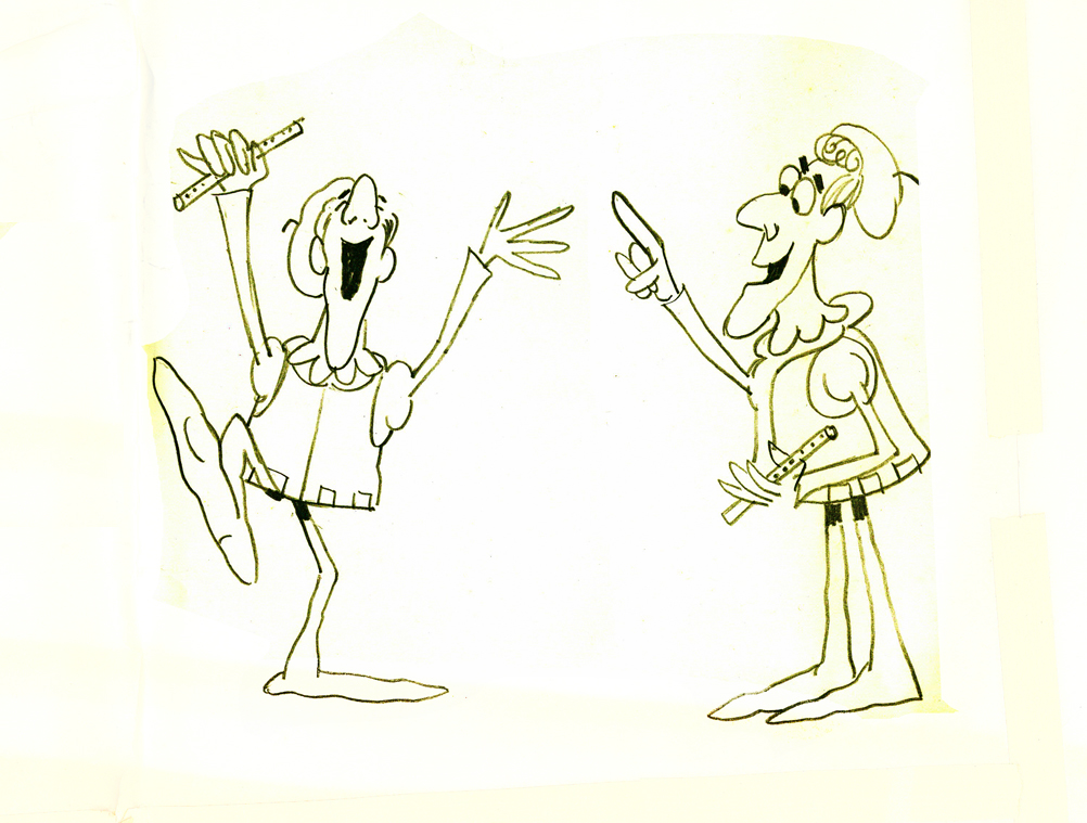
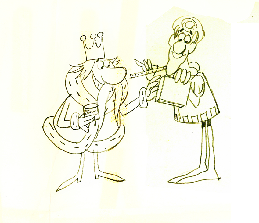
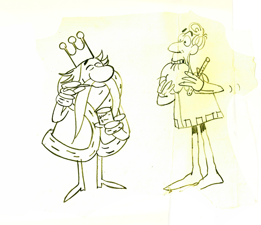
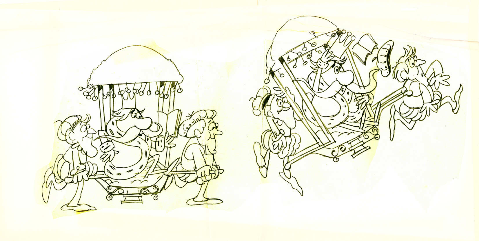
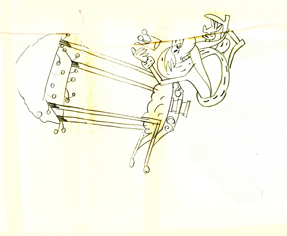
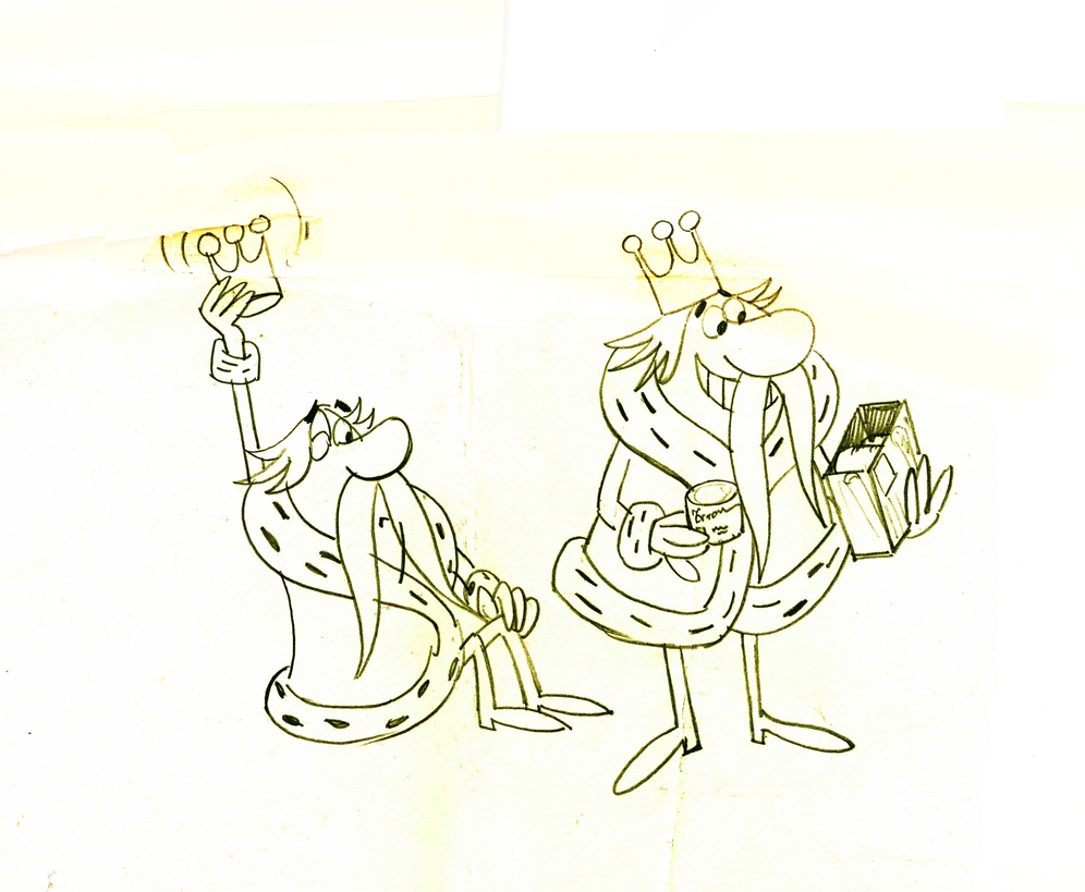
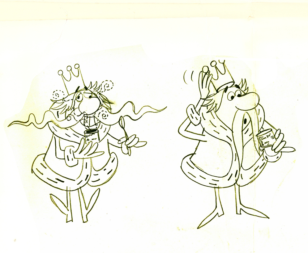
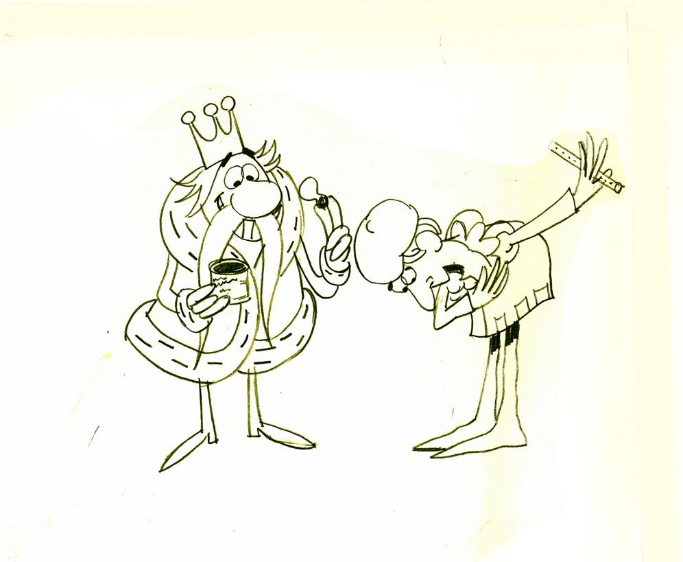
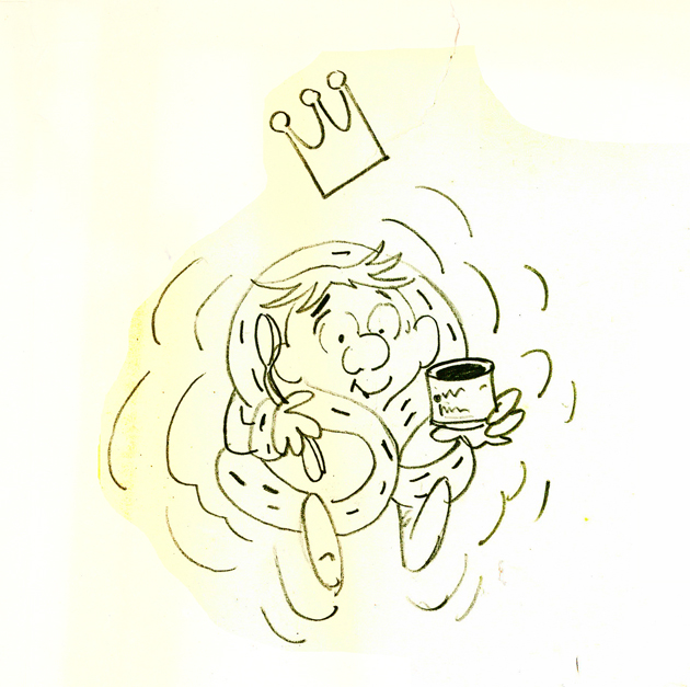
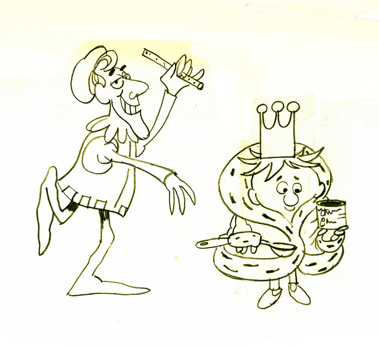
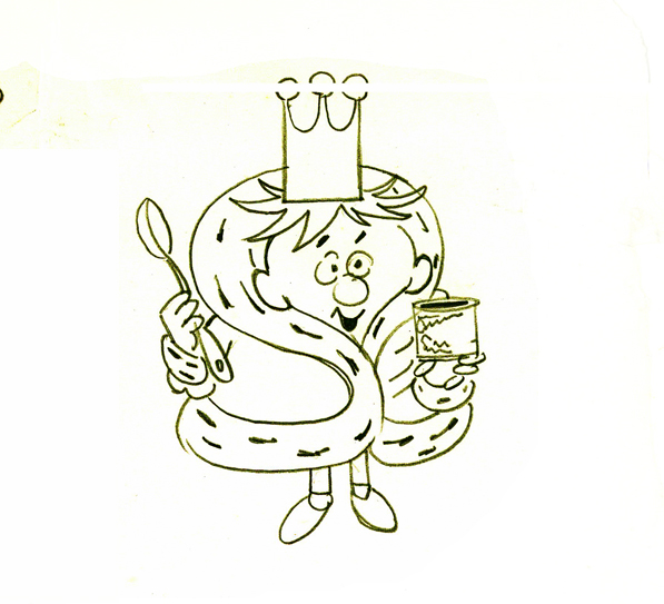
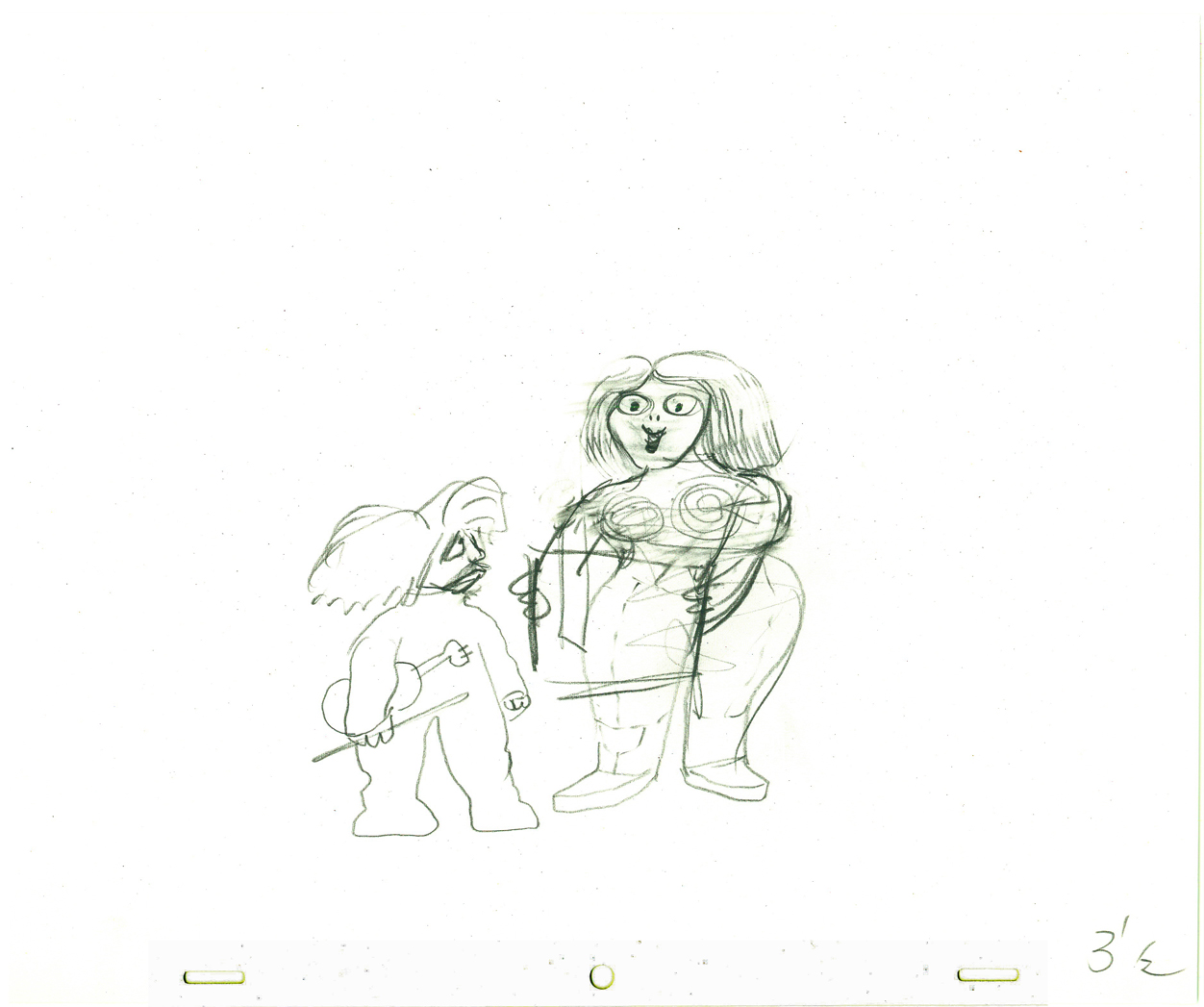
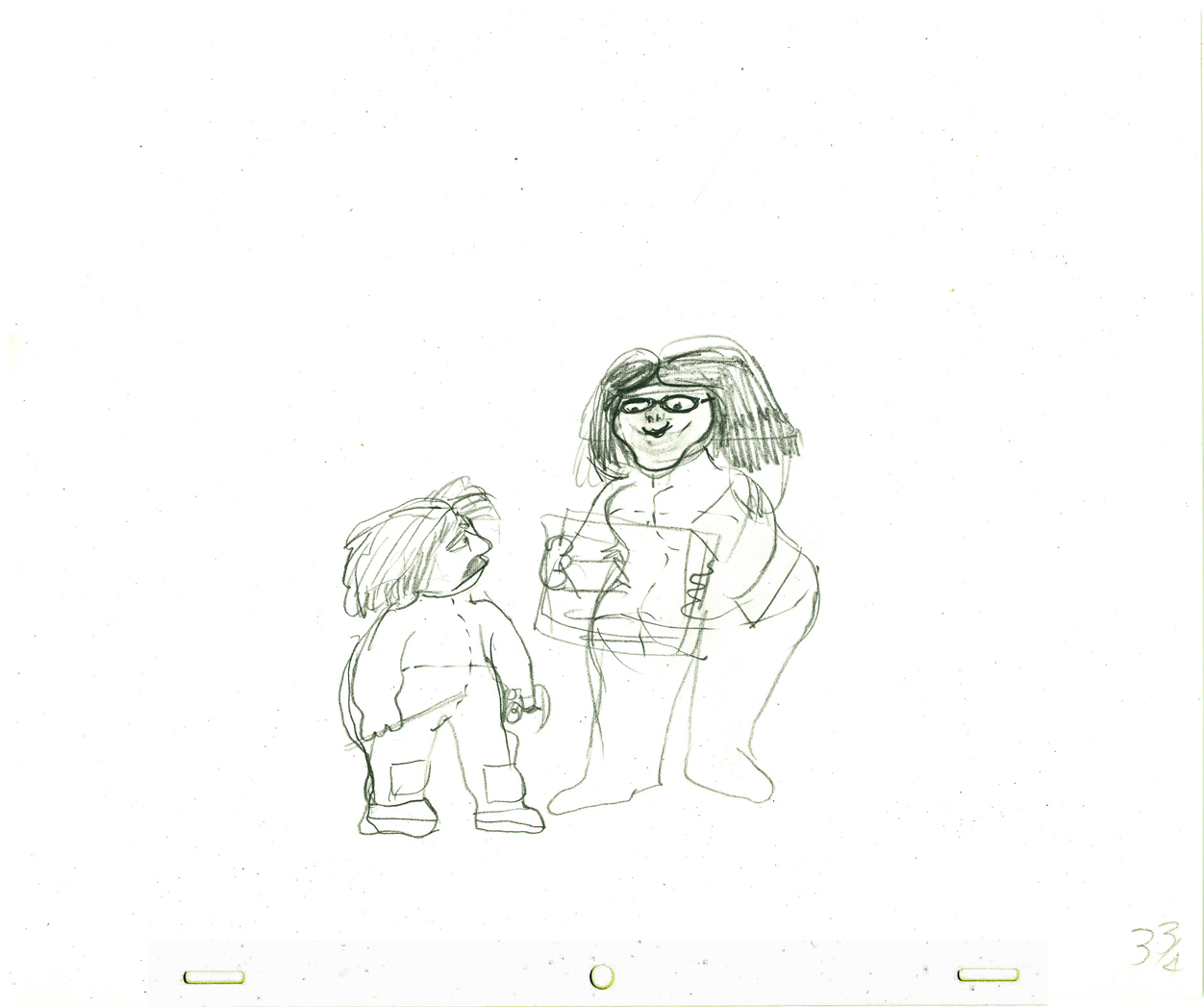
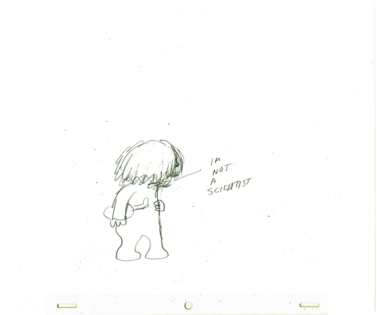
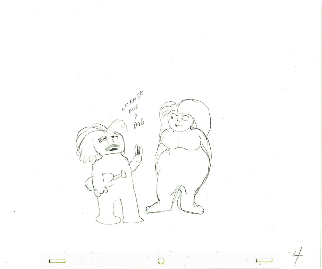
Piper spot
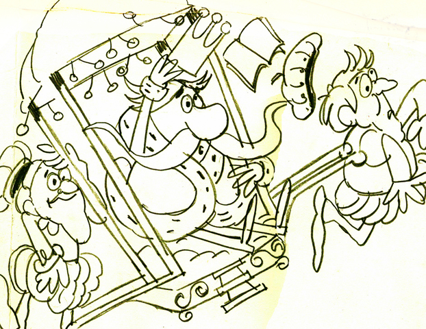 - Here’s some LO drawings for a commercial. It’s a riff on the Pied Piper. The Piper talks with a King character, who in the end gets young, after using the product.
The art was obviously taped together and kept over the desk of the animator. The LOs were cut to fit into a large square and some of the drawing was done atop the tape.
This is a standard commercial done in New York during the 60′s. It has the look of almost any studio in town. I think this one was done at Pelican. I don’t know who the animator was nor what the product was that they were selling. Still, I thought the images worth sharing. It’s not a style that I particularly love, but it was sure a mainstay around NY back then. It looks like an offshoot of the work Paul Cloker was doing for Rankin Bass at about the same time.
As I said, it comes in a large taped-together mass. I give you the whole sheet, and then I’ve broken the drawings apart.
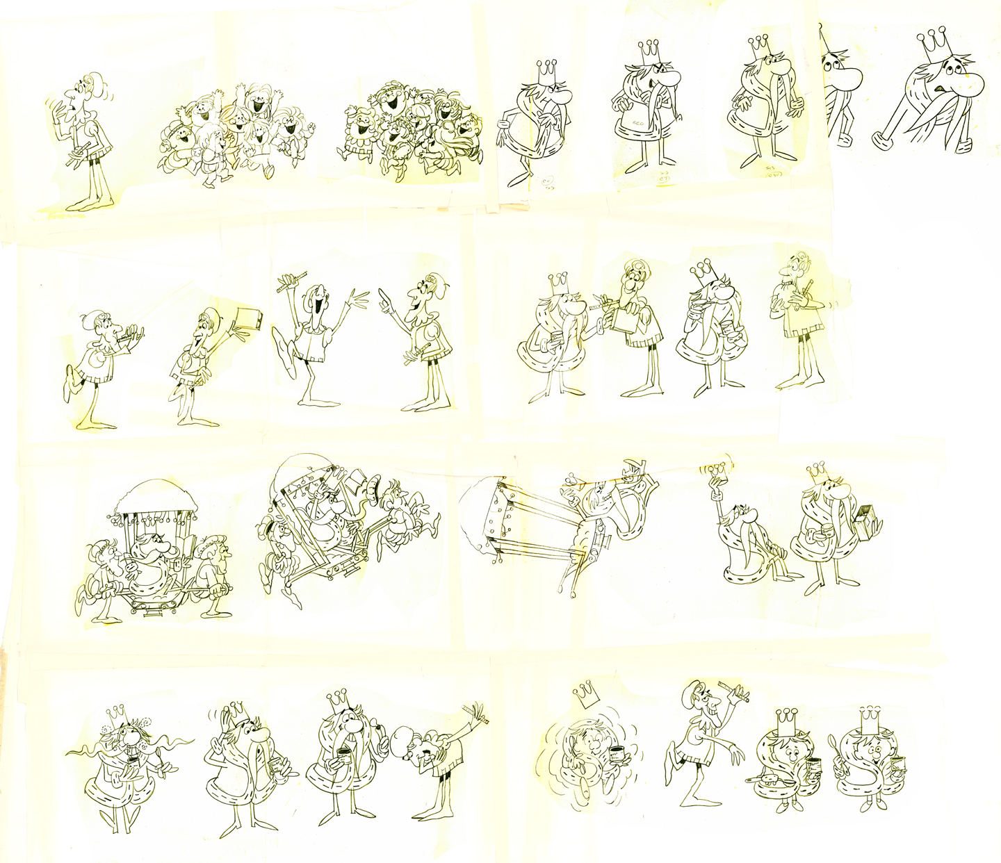
(Click any image to enlarge.)
Chuck Jones &Frame Grabs &Layout & Design 21 Jul 2009 07:13 am
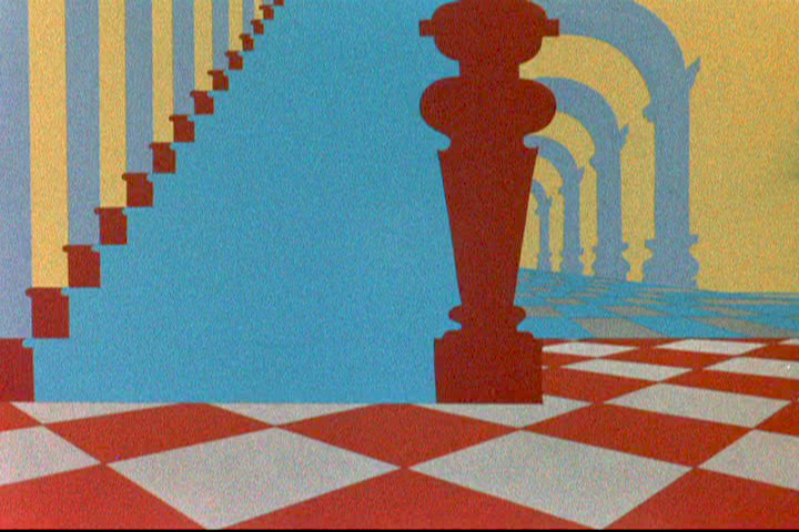
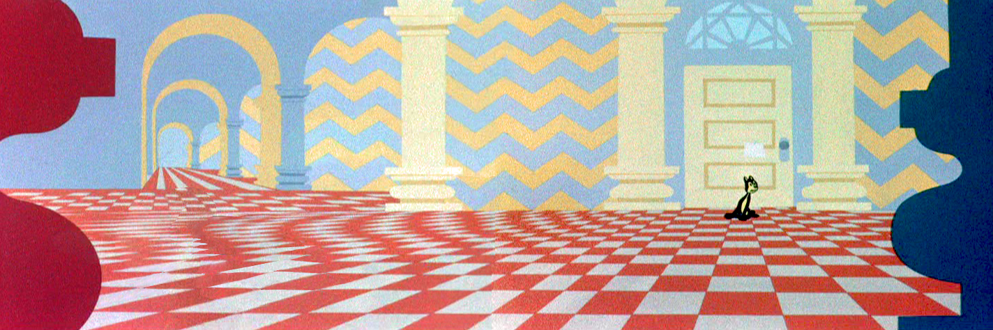
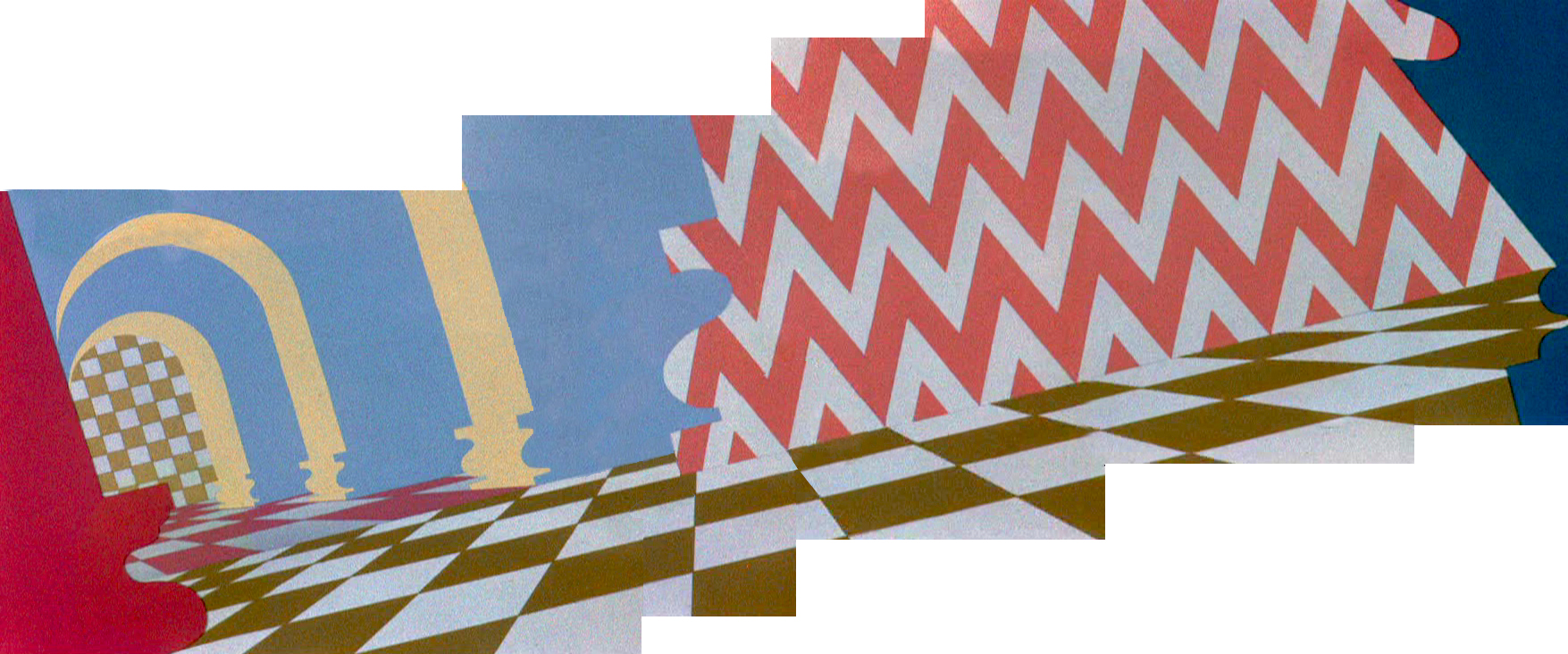
McGrew’s Aristocat
 – John McGrew is certainly one of my favorite LO and Background designers in animation. His Dover Boys work in 1942 set new goals for the remainder of 20th Century animation. He followed it with the daring work of Conrad the Sailor, Inki and the Minah Bird, The Case of the Missing Hare and others all for Chuck Jones, who was no slouch, himself, in encouraging exciting innovation in design and film cutting.
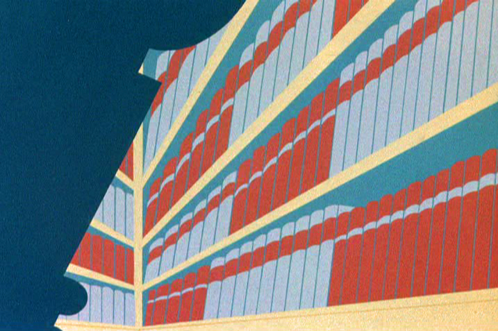
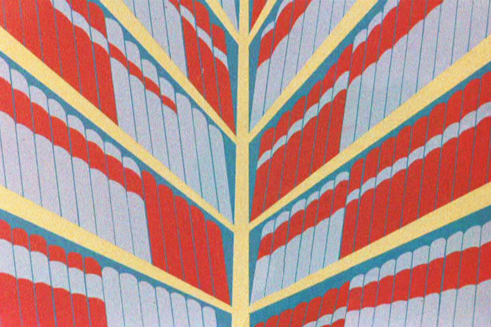
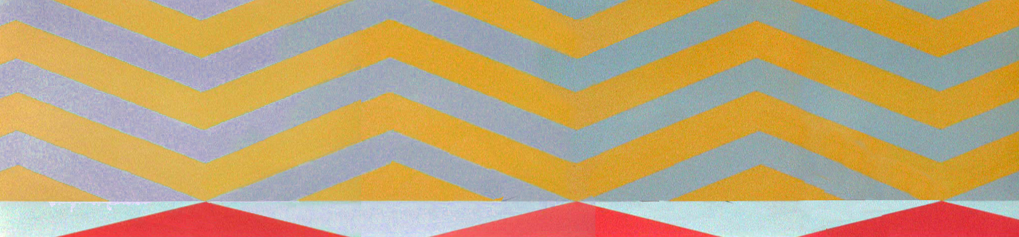
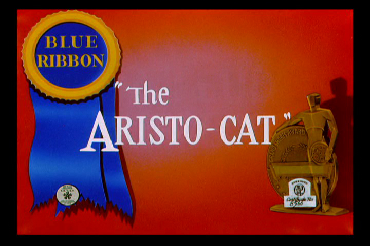 The Aristo-cat was probably the first of McGrew’s works that I saw when I was a kid. It made my eyes pop, even though I watched it originally in B&W. The dynamic design of wallpaper decoration combined with outrageous pans and camera work took me by force. The violently repeating patterns reach to the forefront of this short. All of this exuberant design completely acted to support the character’s state of mind. Anxiety, fear and terror jumped from the backgrounds to the fine character animation of Ken Harris, Rudy Larriva and Bobe Cannon.
Working with Jones and painter Gene Fleury, he surefootedly set the way for UPA and all the others that followed. Toot Whistle Plunk & Boom and Ward Kimball’s other Disney TV work, Maurice Noble and other thinking designers of the Fifties couldn’t have broken through if McGrew hadn’t been there first supporting and pushing Chuck Jones.
Go here for Mike Barrier‘s excellent interview with him.
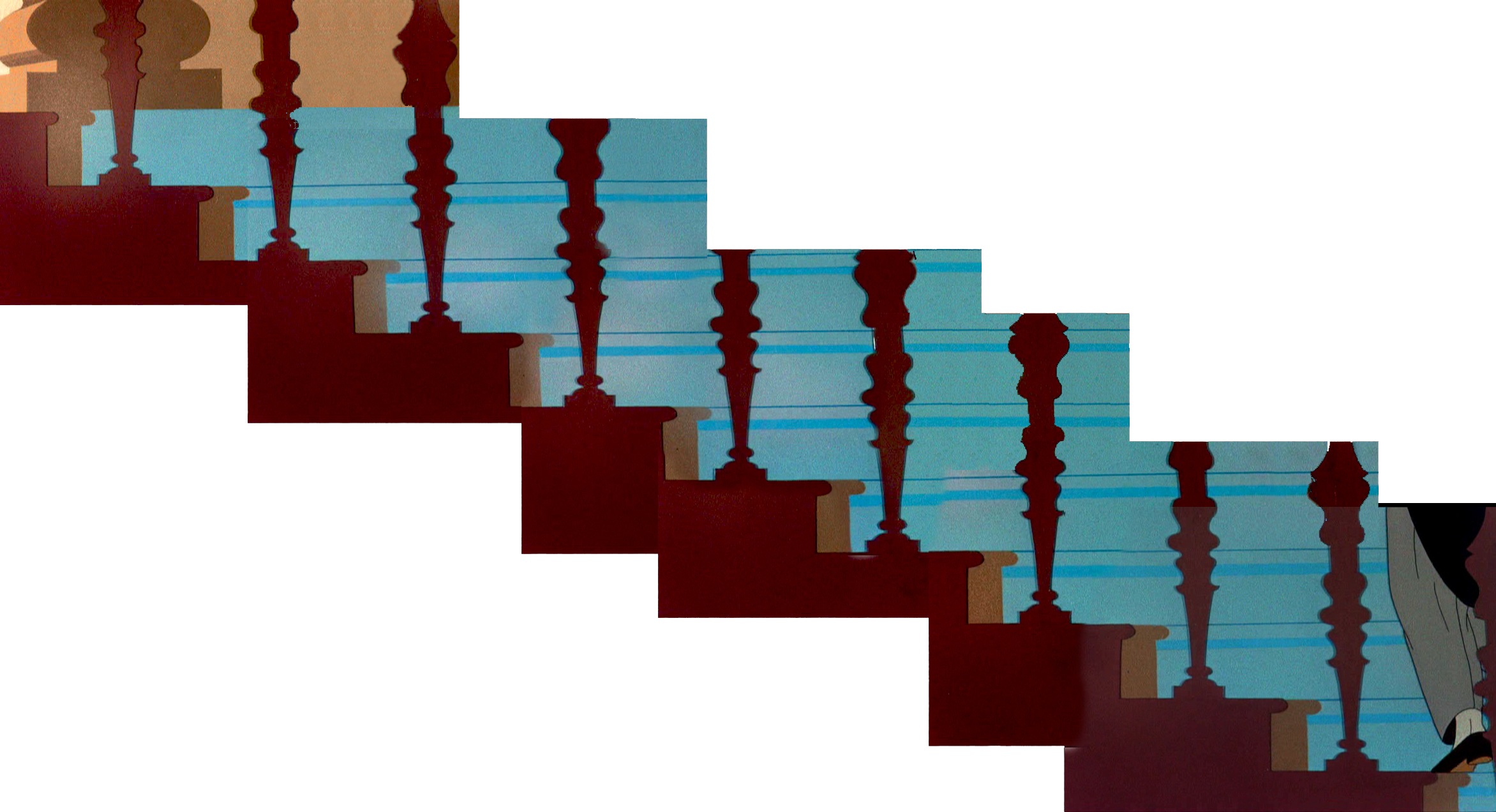
I’ve done some Bg recreations from the film, which meant assembling some exceptionally long pans that twist and turn. Unfortunately, I don’t think there’s a good quality copy of the film available. All of the grain in the DVD leads me to believe they copied a 16mm print.
As stills, they don’t come across as quite so daring, but they are within the moving short. It took some courage to do such work and enormous talent to be able to pull it off so successfully.
The butler walks upstairs.
He carries a breakfast tray into the bedroom.
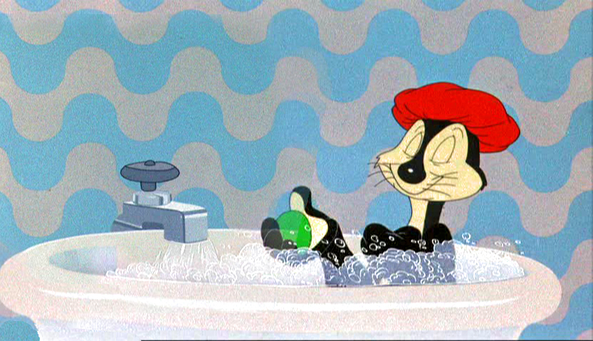
Taking a bath
Releasing a bar of soap to trip the butler.
Downstairs to find the butler.
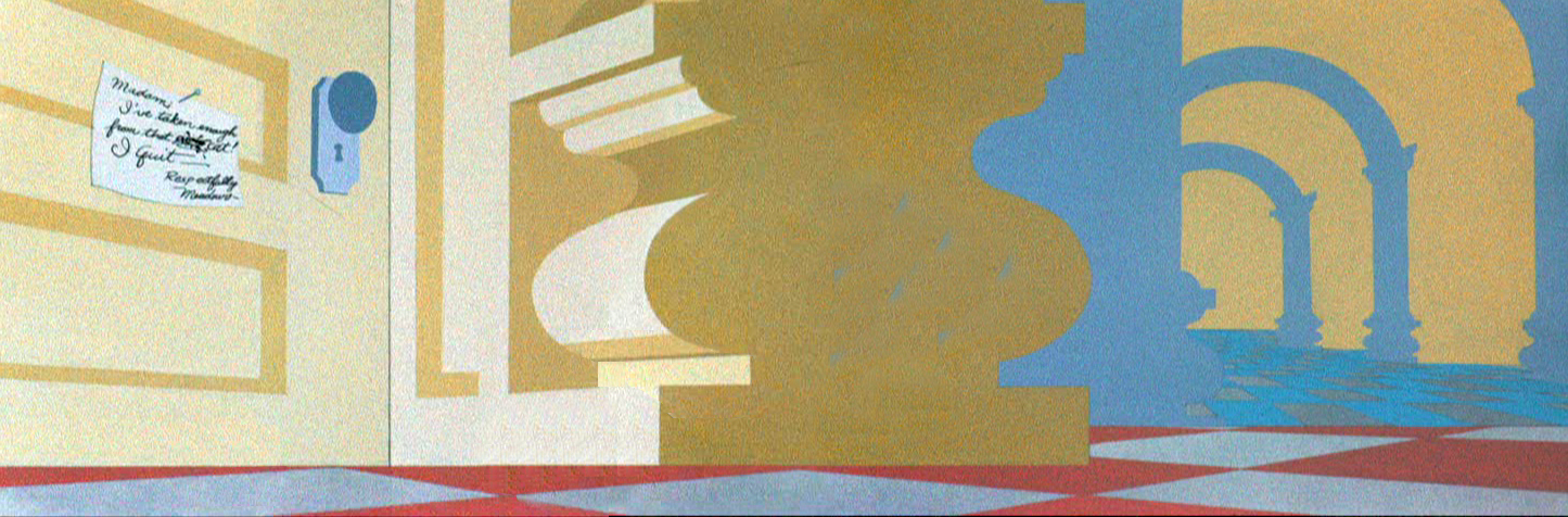
A note on the door.
Alone in the house.
Fear.
Danger.
Panic in the library.
A book hits him on the head.
Running away from a mouse.
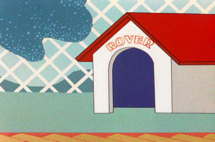
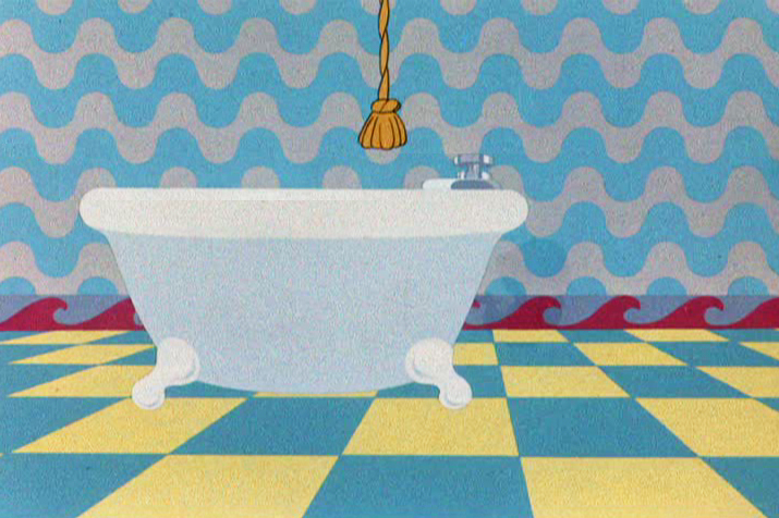
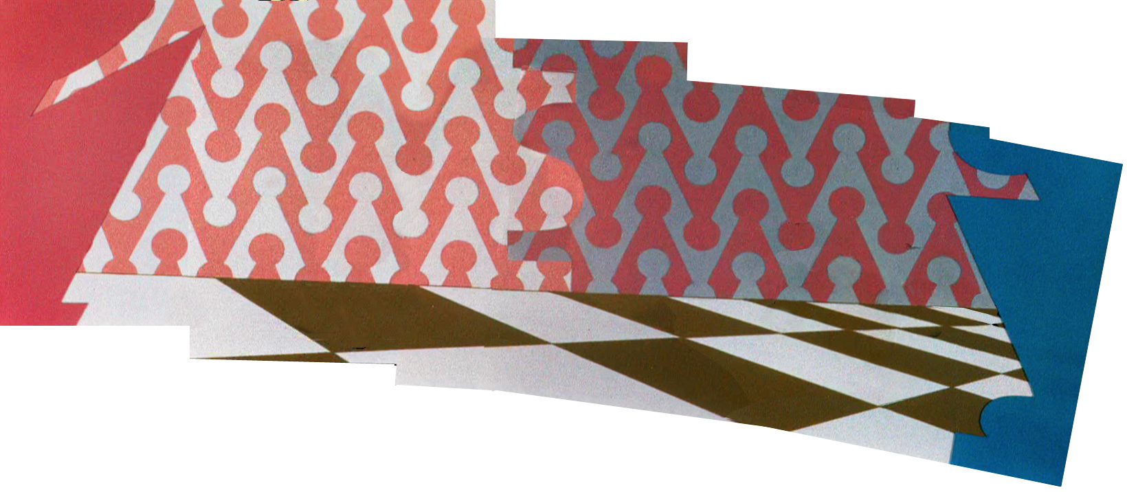
The dog in the doghouse. Repeated diamonds outside.
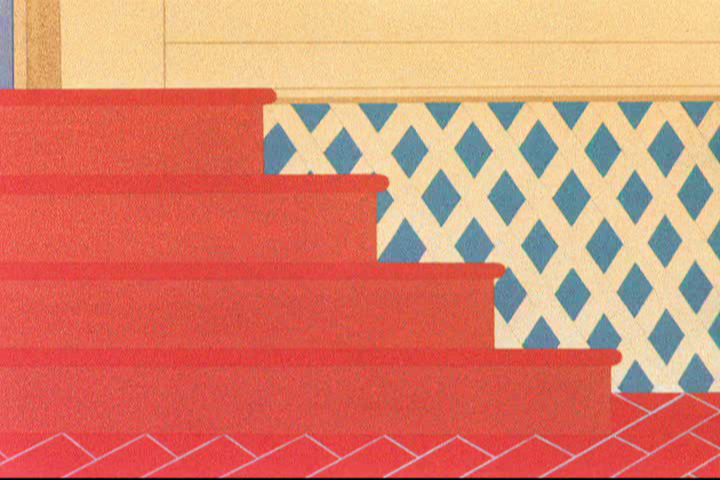
Back indoors. Still more diamonds.
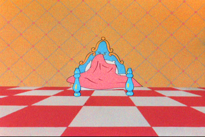
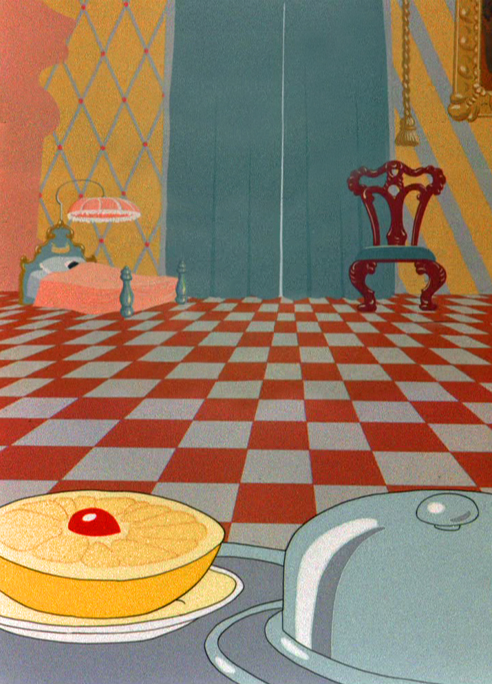
Safe in bed with diamonds and a checkered floor.
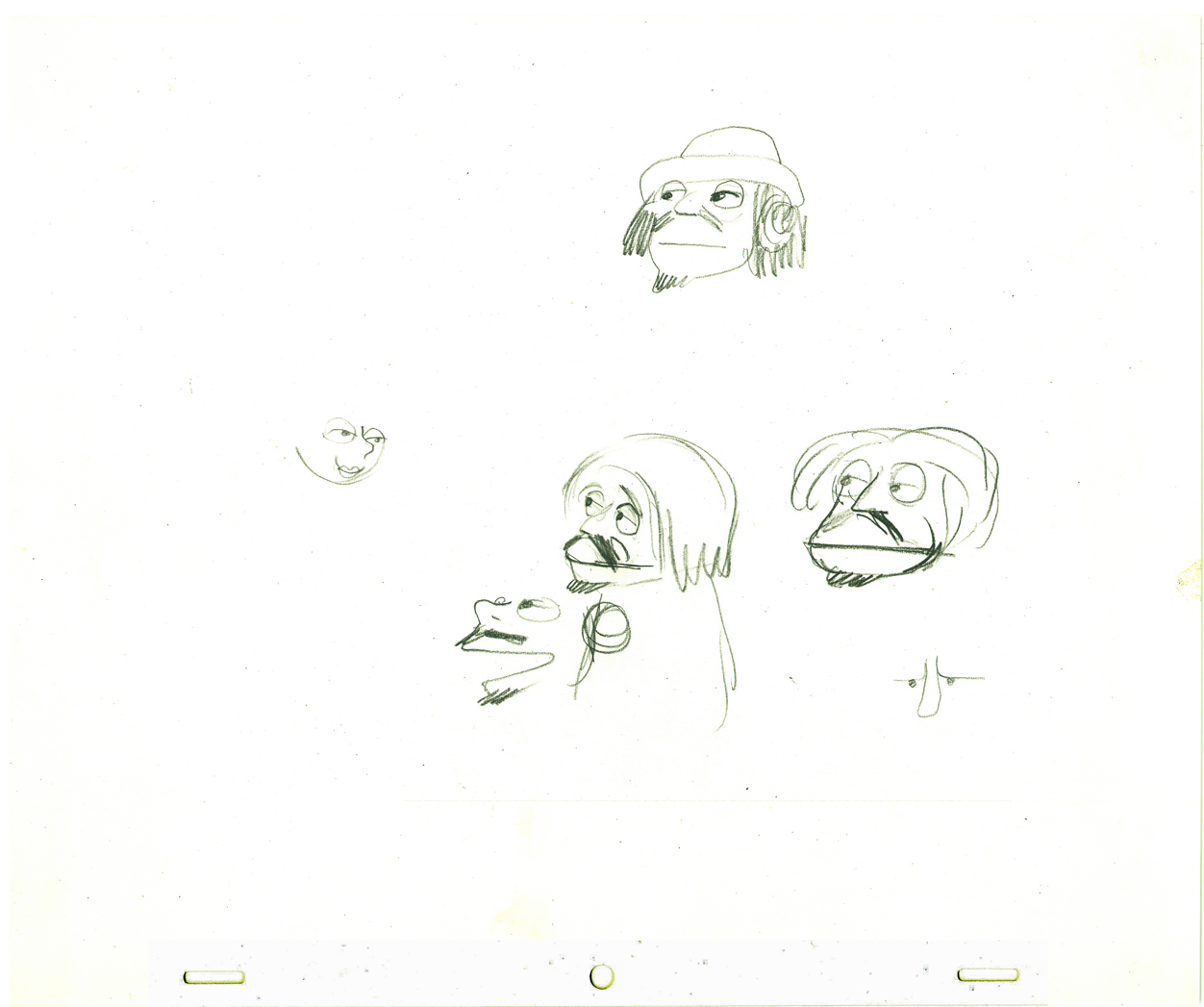
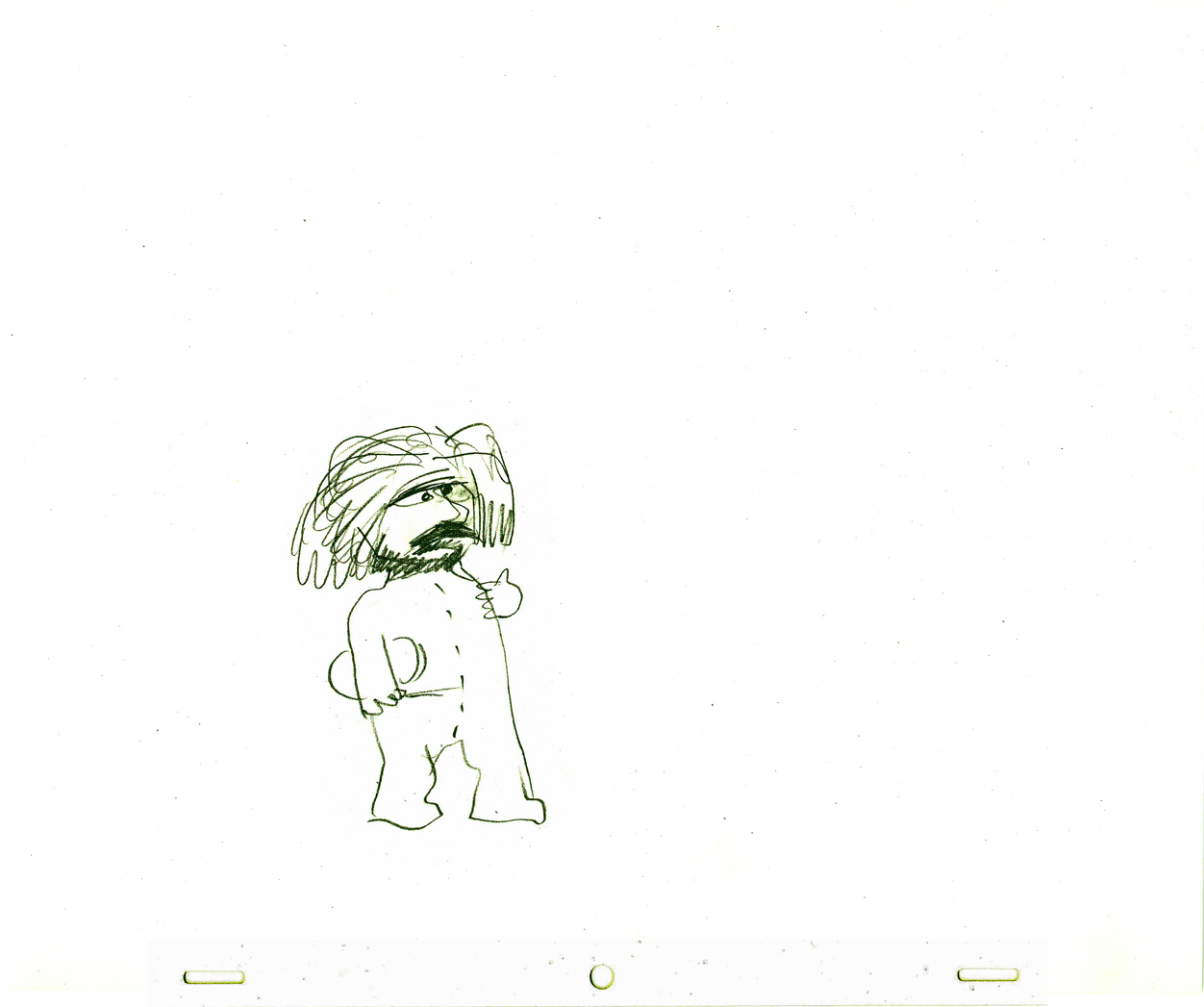
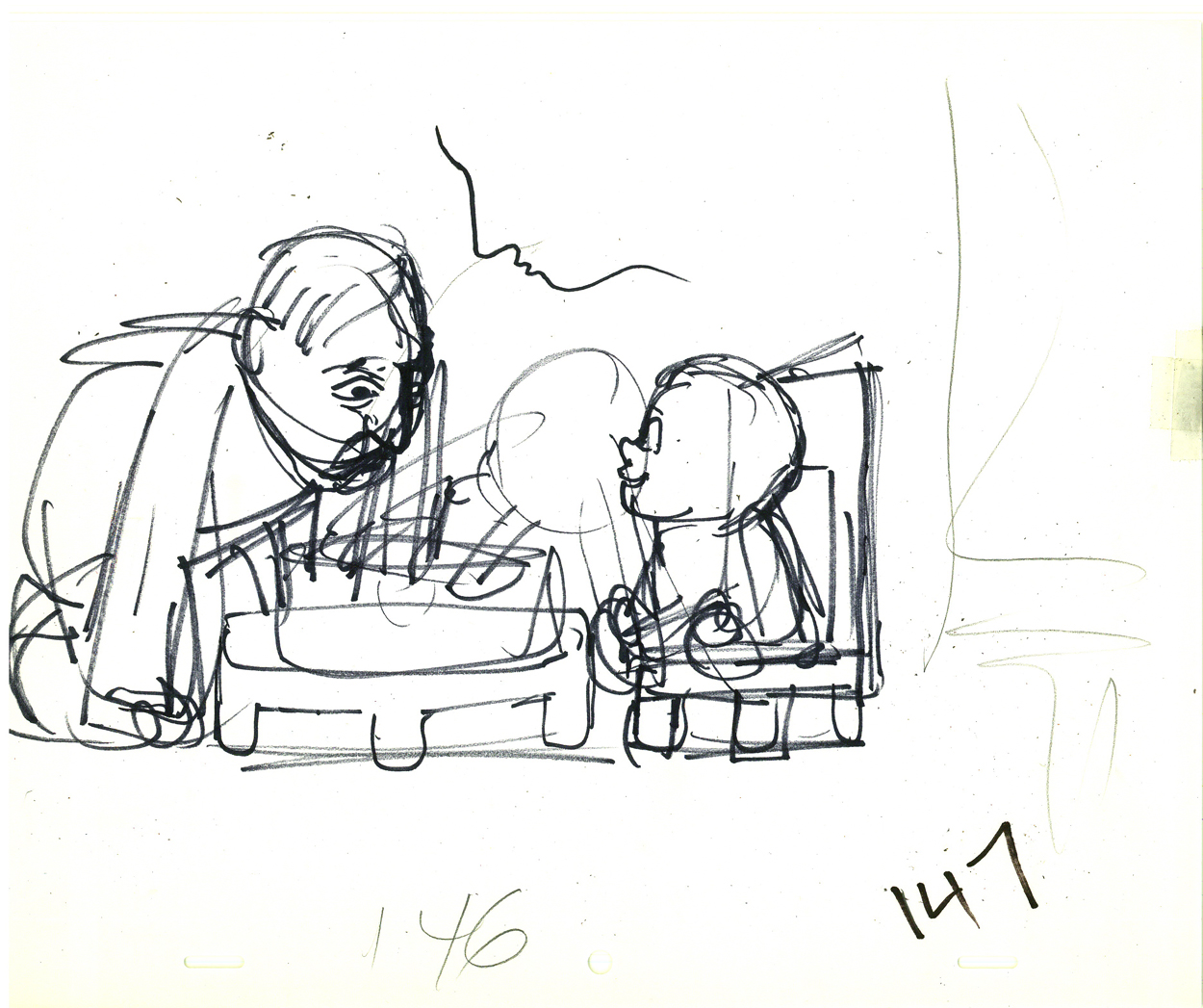
Animation &Animation Artifacts &Hubley &Layout & Design &Models 05 May 2009 07:36 am
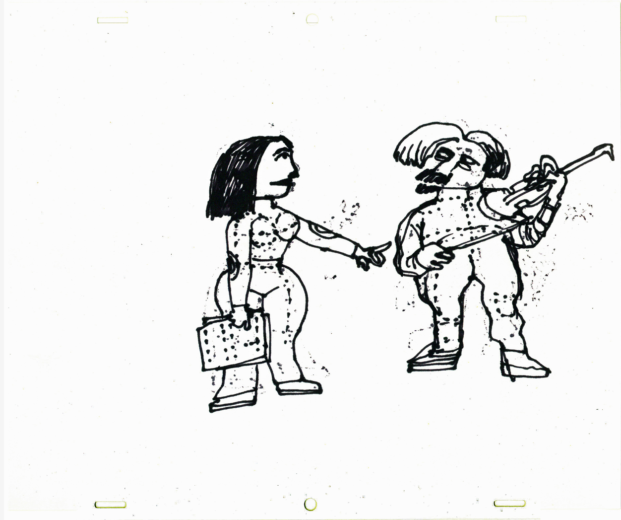
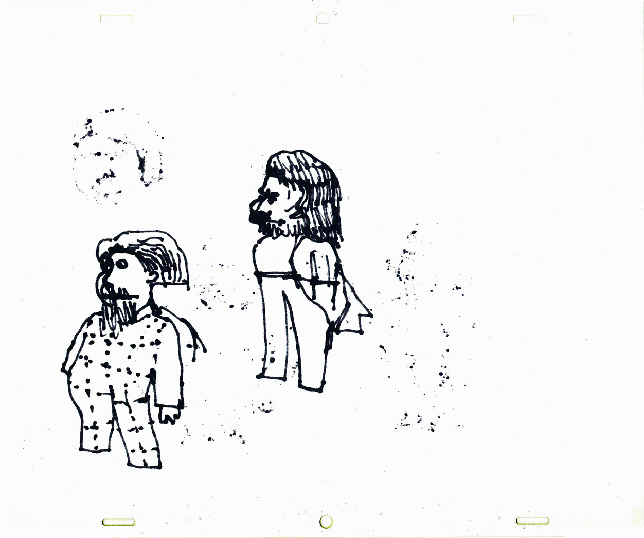
More EGGS
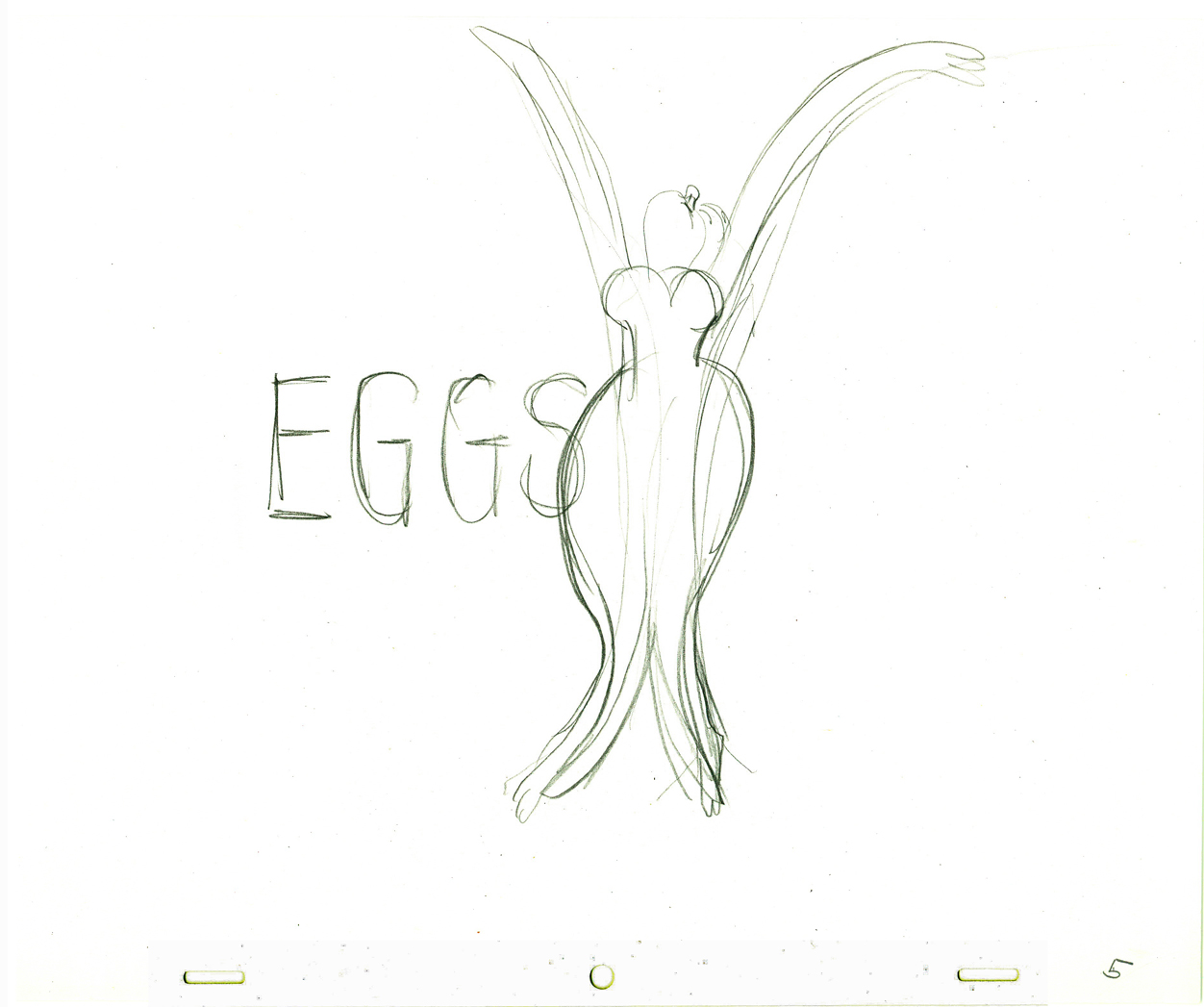 - In the past, I’ve posted some of John Hubley and Tissa David‘s preliminary drawings for the picture, Eggs. I’ve got plenty of this artwork and I love it, so here’s some more.
Eggs was a short film which was rushed out at a low budget for a PBS show called The Great American Dream Machine, which was produced by designer, Elinor Bunin.
The film follows the political thoughts of John and Faith; they were concerned about overpopulation (there are at least four shorts they made about the subject) and were able to blatantly make a political short for this TV series.
Past posts of my can be seen here, and here.
There’s currently a copy of this short on YouTube.
These three drawings are character Layouts by John Hubley.
(Click any image to enlarge to animation-sized artwork.
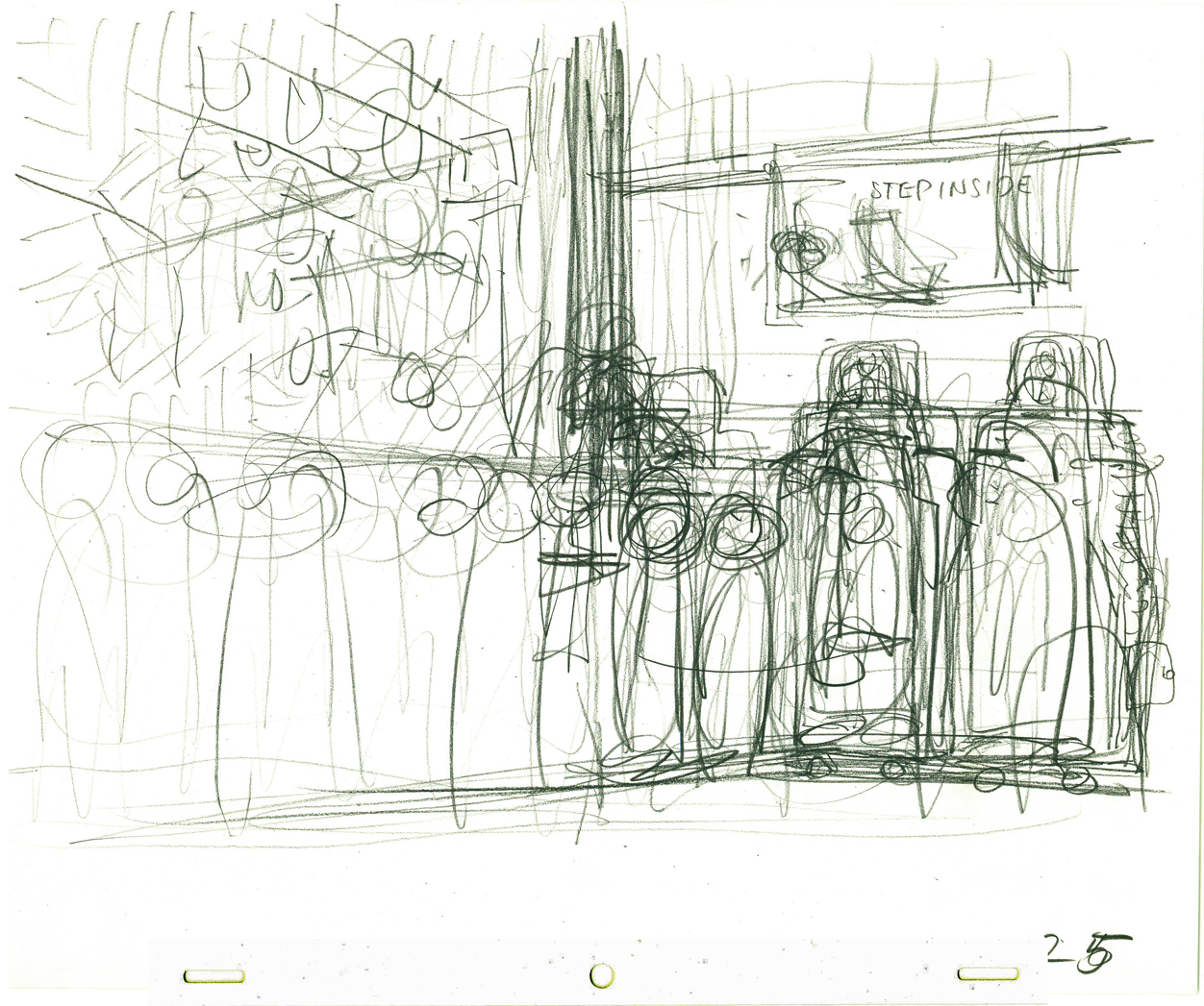
This is a BG Layout John gave Tissa.
This drawing and all the remaining are Tissa David’s drawings.
She would block out her own rough Layout
before jumping in in to animate.
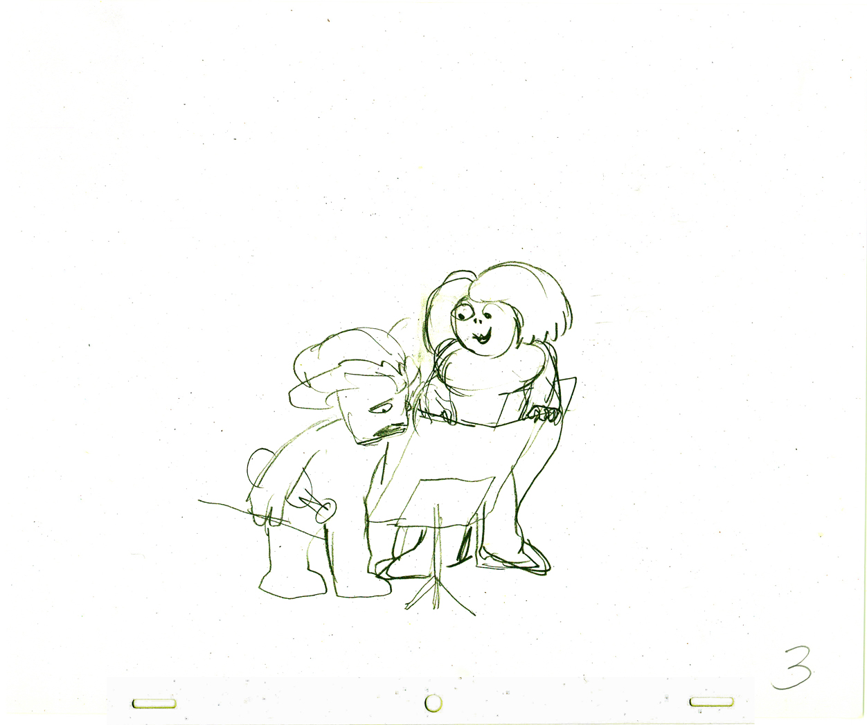
It gave her the chance to thoroughly think out what
little information John had given her. Usually just a
conversation with some very rough sketches.
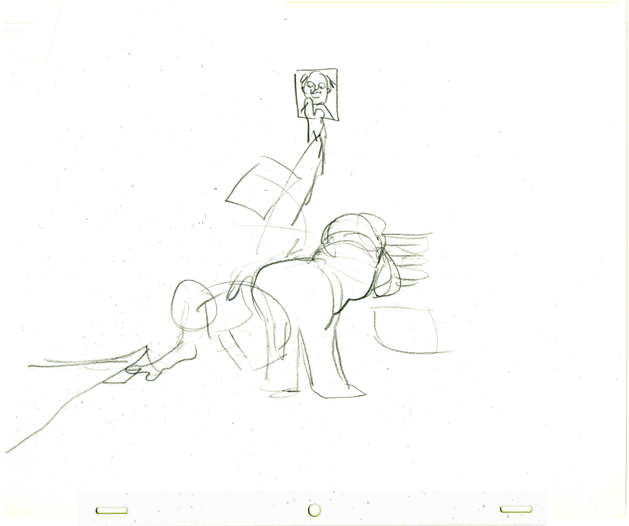
This is Tissa’s Bg Layout for this scene.

Animation Artifacts &Disney &Layout & Design 26 Jan 2009 09:01 am
Fantasia Flowers
- Here’s a floral fantasy worth viewing.
What follows are three variations of Background art done early on for Fantasia.
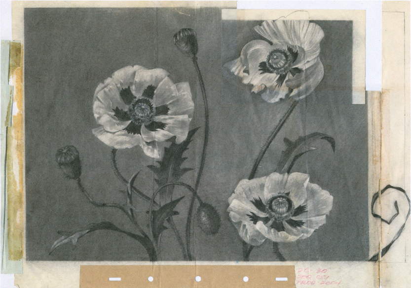
This is a pastel layout, possibly done by Al Zinnen, the Art Director of the sequence.
It looks almost identical to the final.
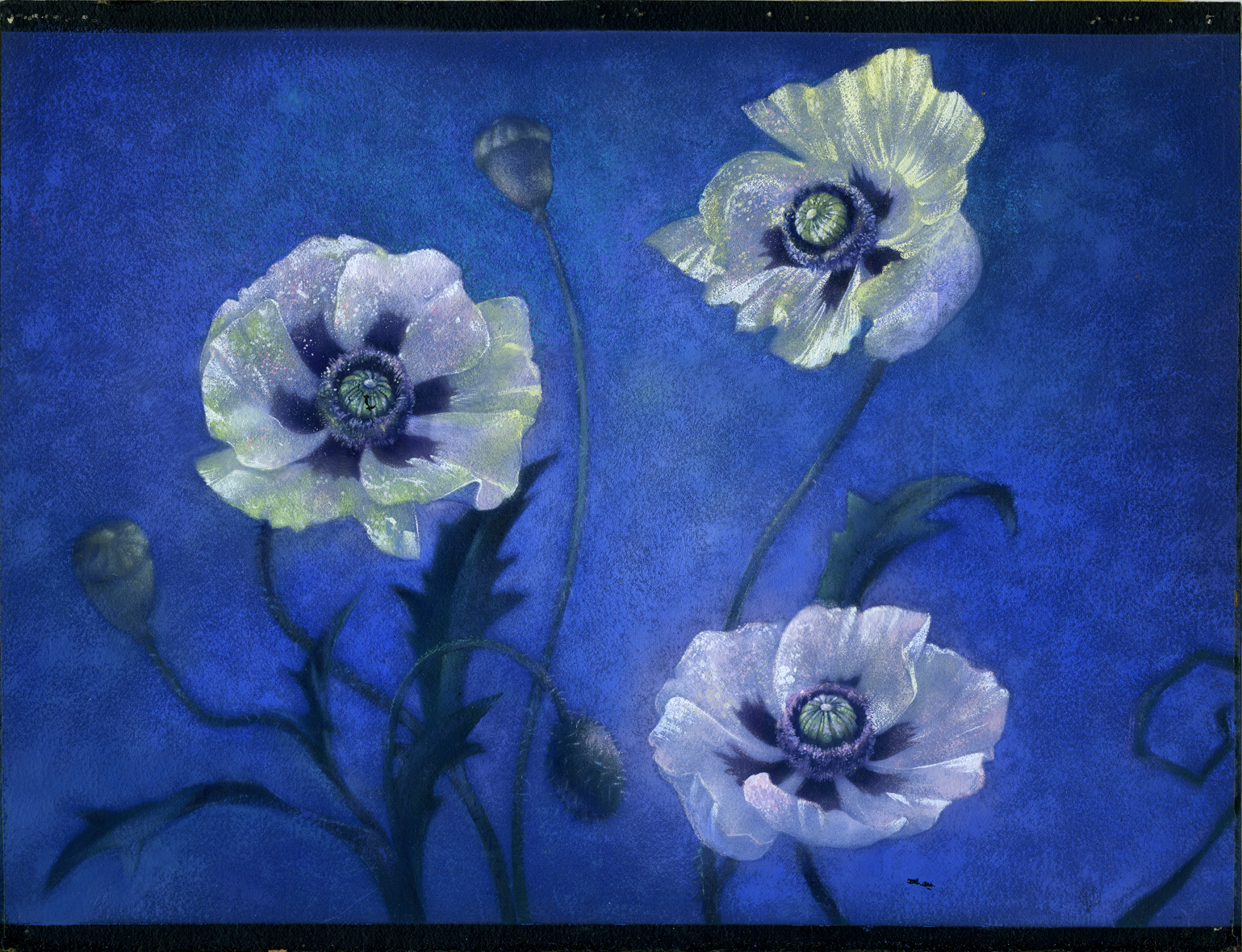
Here is a stunning final work of art. This background is by Sam Armstrong who headed the department on the sequence. It is, at least partially, pastel – still soft and glowing some 68 years later. I love how the addition on the lower right (see the B&W layout above) beautifully finishes the composition.
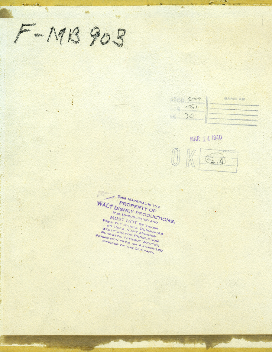
Here, you can see the back of the background – OK’d by SA, who did it.
F-MB 903 (Fantasia – Master Background 903)
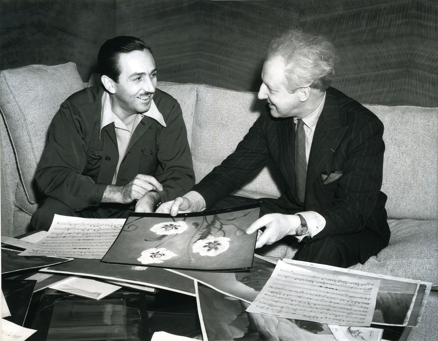
Finally, see Disney with Stokowski in a publicity shot holding Armstrong’s background.
Apparently, the pegholes have been cut off since 1940.
This comment from Alexander Rannie was interesting enough that I thought I should add it to this post:
- Dear Michael,
During a recent trip to the Disney Photo Library I ran across a publicity photo of Stokowski seated at the piano in Walt’s office with Walt standing just behind him. There was some music propped up on the music stand of the piano and my curiosity got the better of me.
So, loupe in hand, I peered intently to see if I could determine what music from Fantasia had been set before the great maestro so that he could bring the classics to life on Walt’s piano.
Well, imagine my surprise at seeing a production number that didn’t match that of Fantasia. And the music wasn’t for piano, but for Woodwind I. And one of the pages was upside-down to boot!
And then there was that familiar melody, the notes of which I could just make out.
Paula Sigman Lowery was seated across from me and, knowing she’s not only a historian but a musician, I said, “Do you recognize this theme: La, la, la-la-la-la, La?”
“Isn’t that Pluto’s theme?”, she said.
Of course it was.
So the music that the great Stokowski is playing from is actually a Woodwind I part from Bone Trouble. And this music gets around: it’s the same music in the photo of Walt and Stoki that you posted with the Sam Armstrong background and can even be found lurking in a publicity photo of Norm Ferguson and Deems Taylor looking at material from “Dance of the Hours.”
I love Hollywood.
Best regards,
-Alex
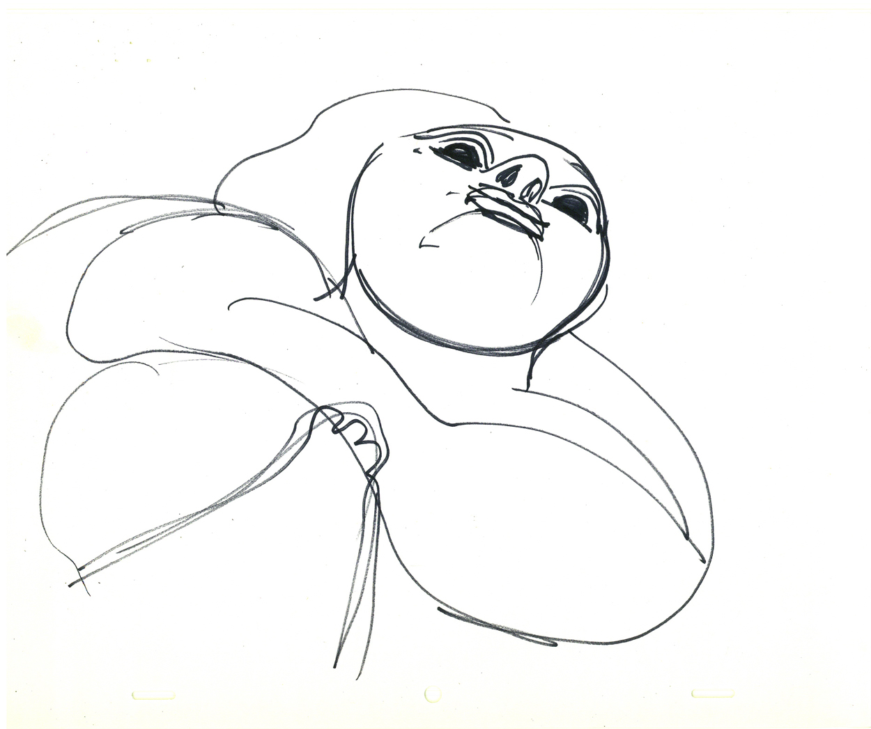
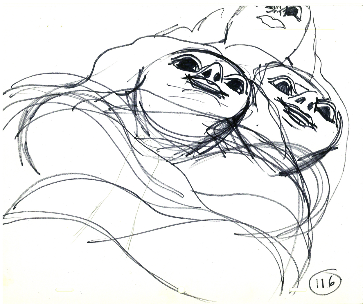
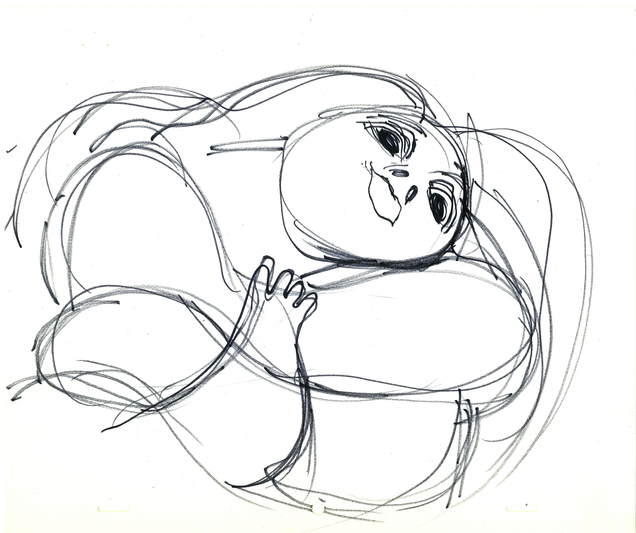
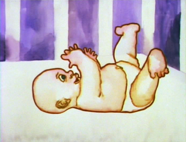
Animation Artifacts &Hubley &Layout & Design &Tissa David 24 Dec 2008 08:59 am
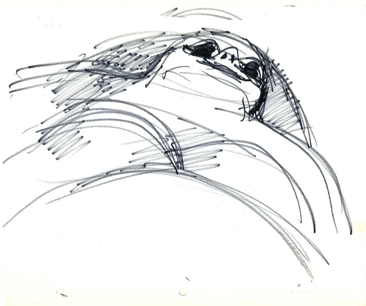
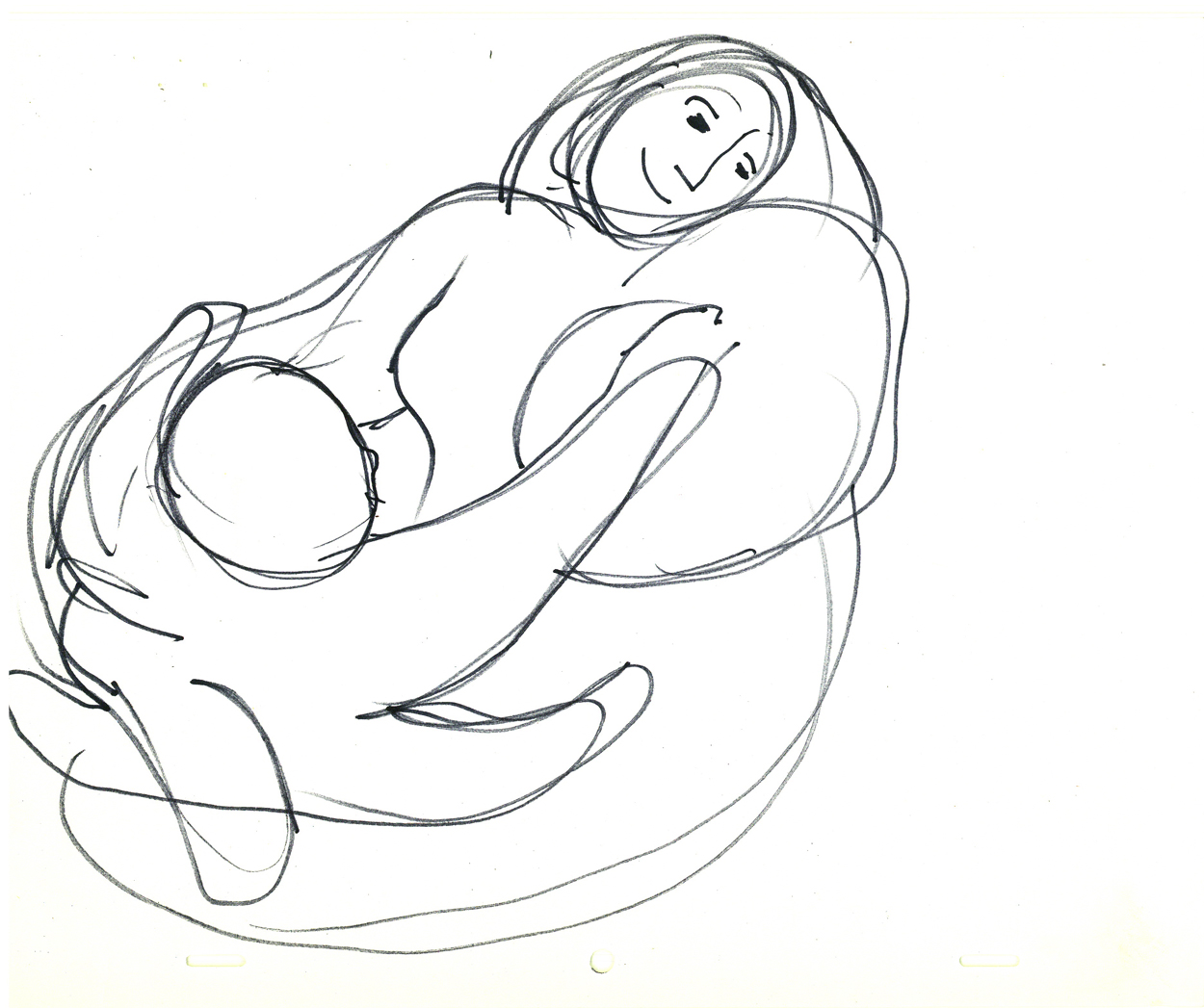
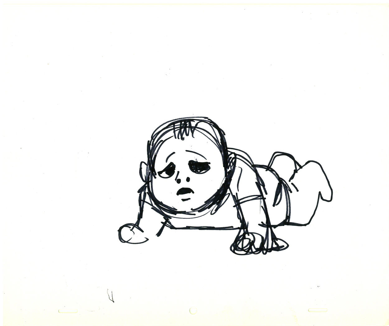
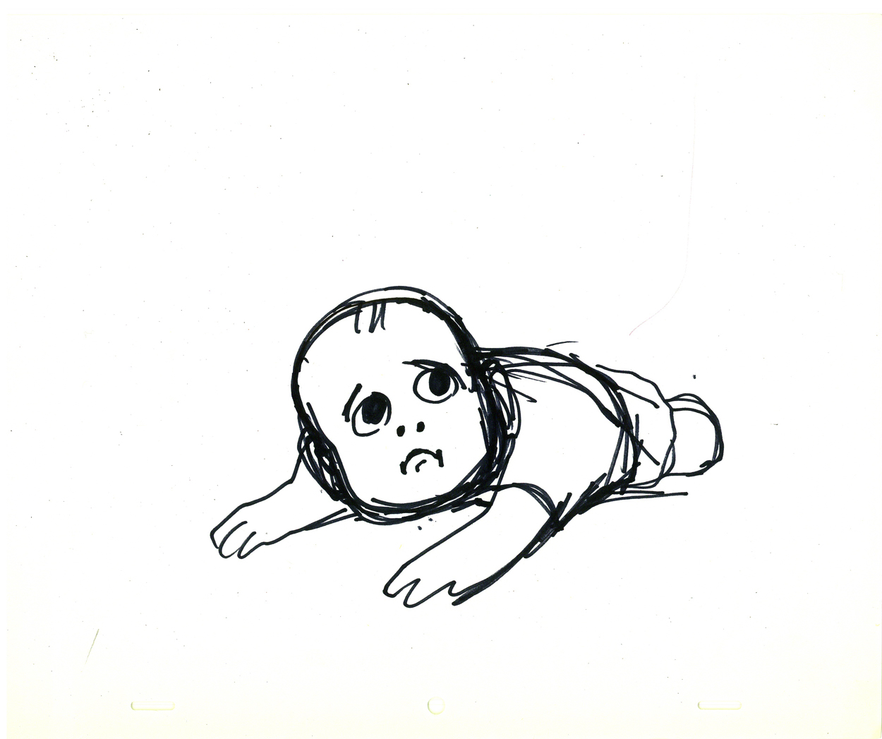
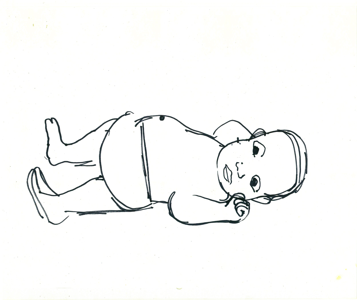
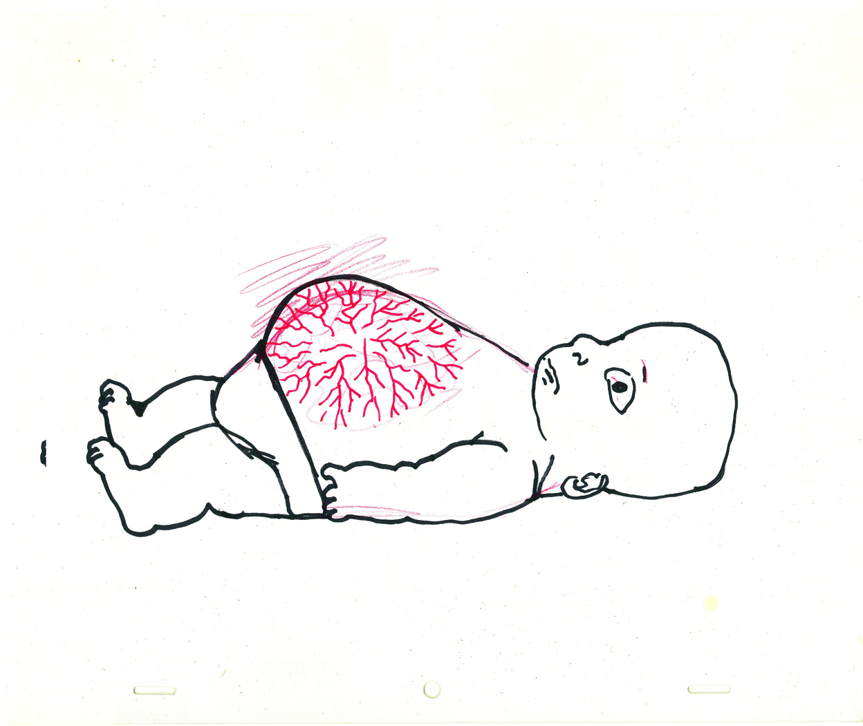
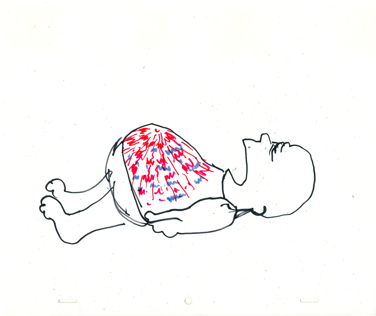
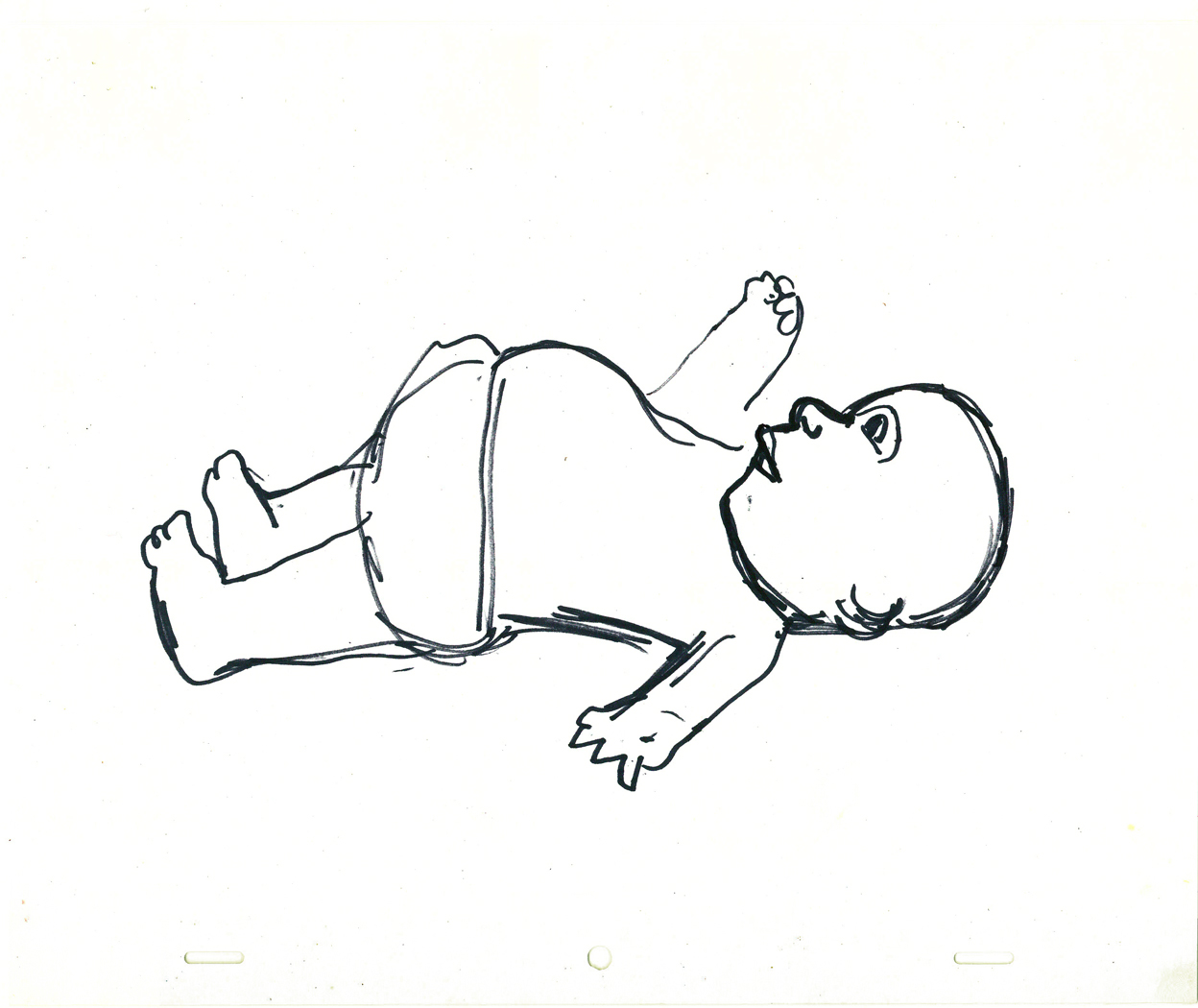
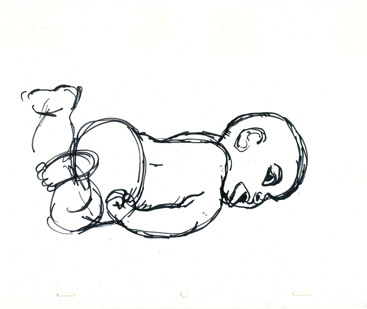
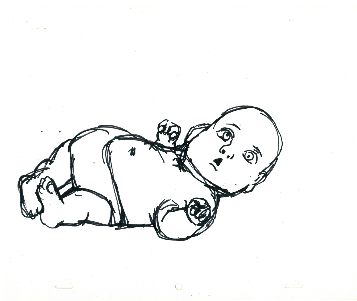
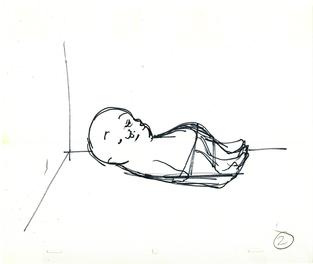
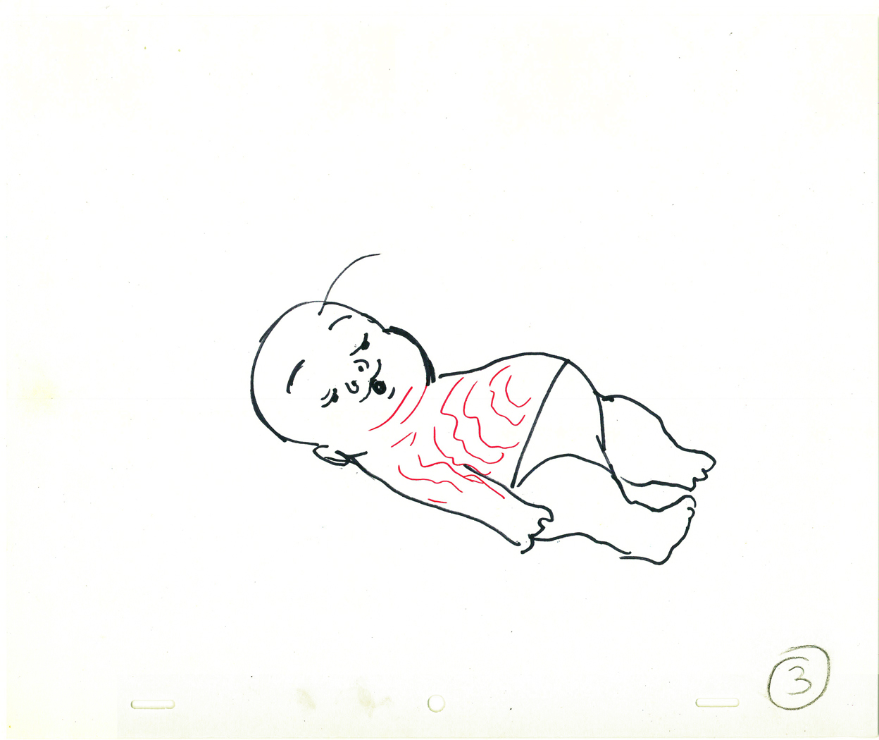
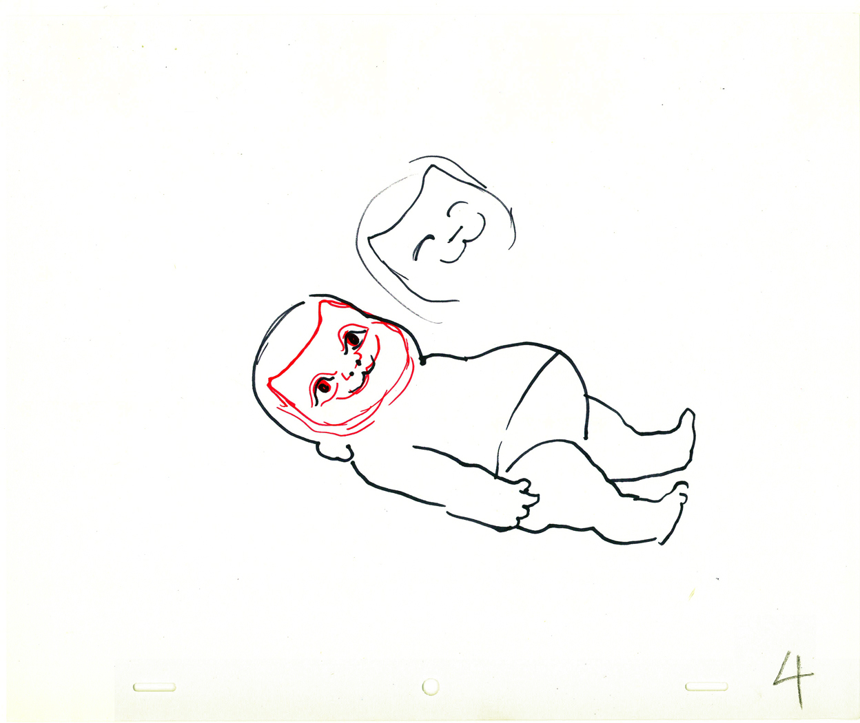
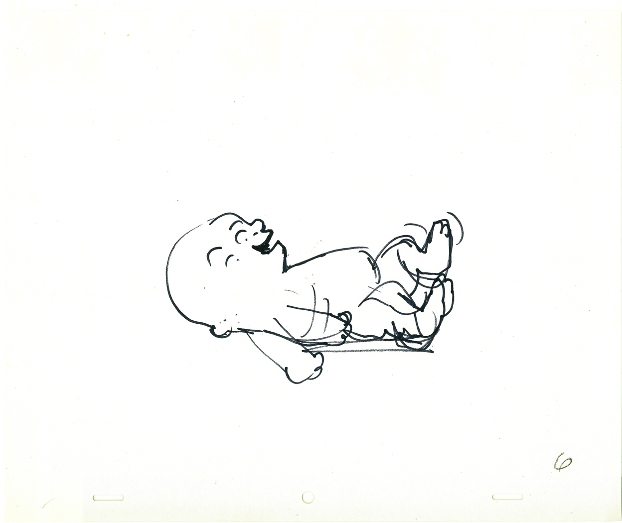
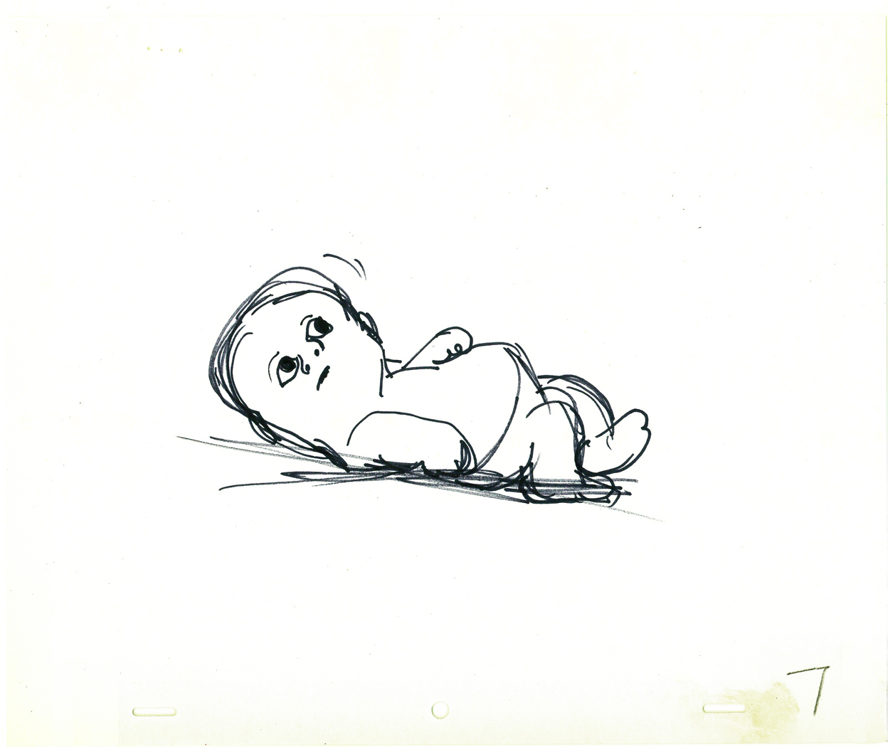
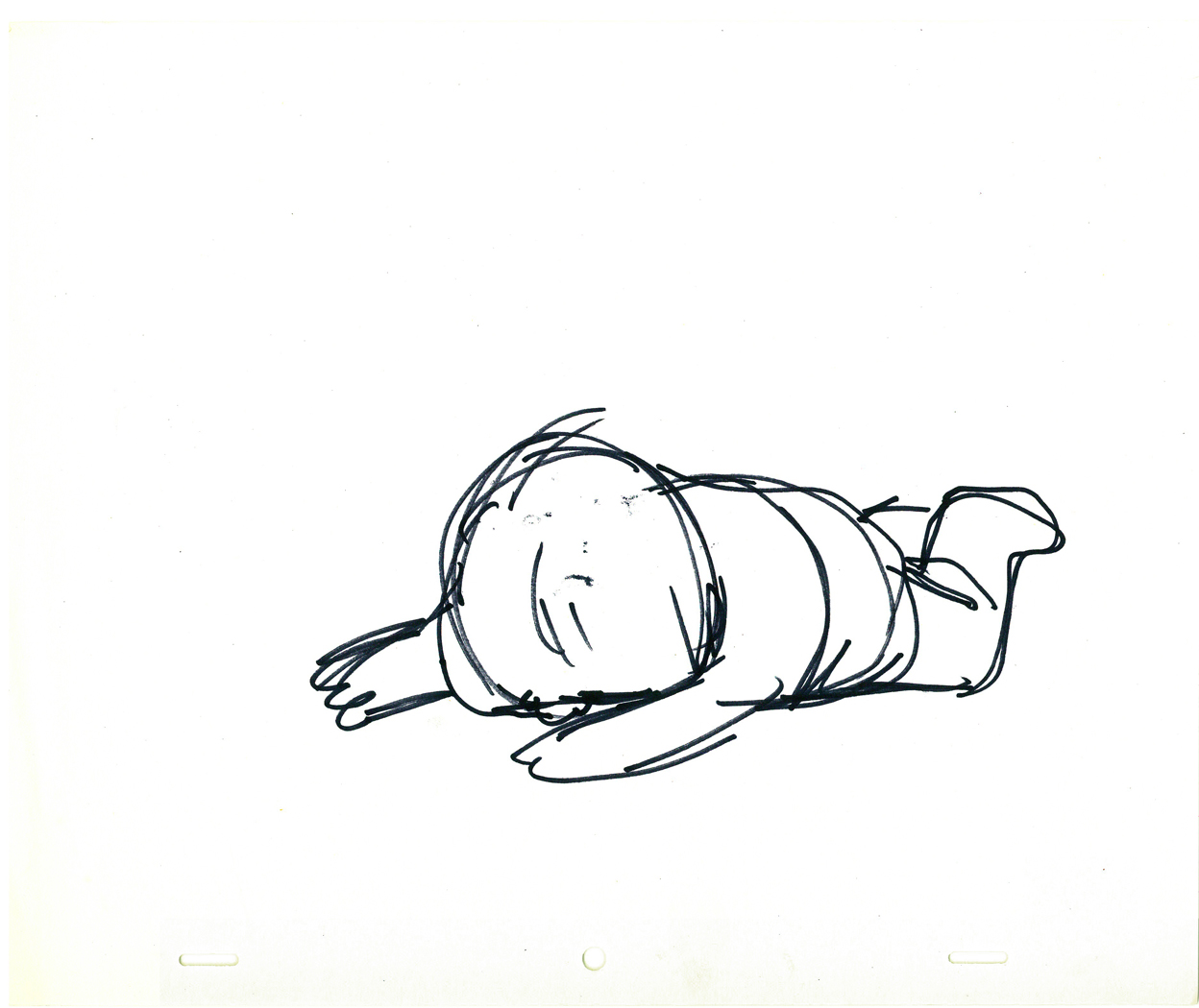
More Hubley Babies
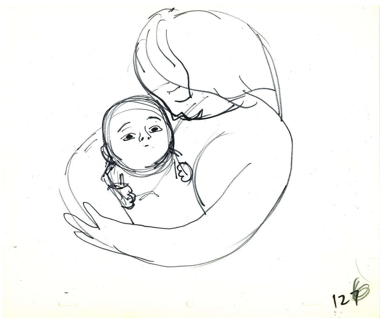
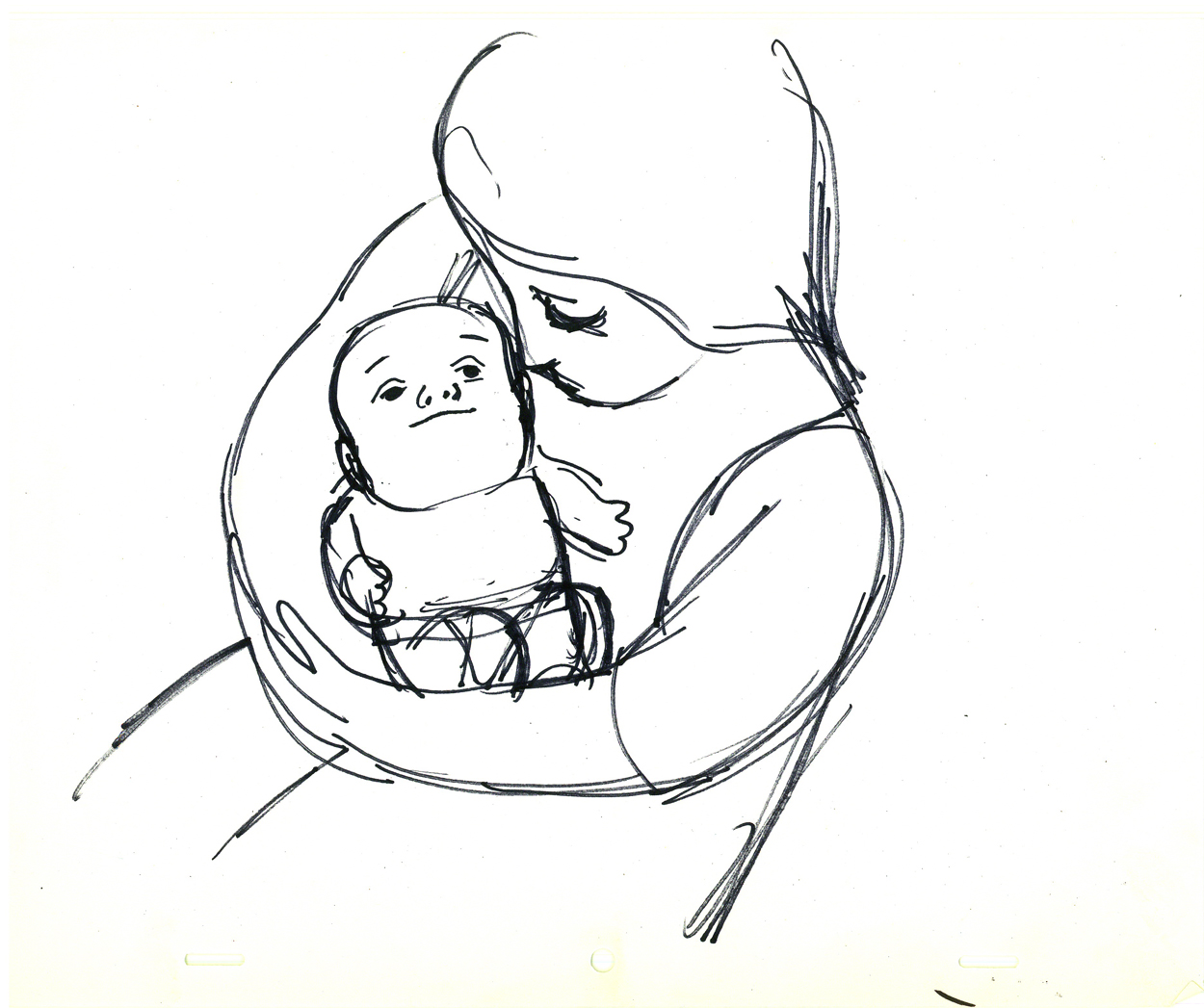
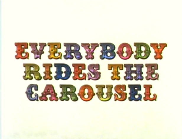 - Continuing last week’s posts of the babies of The Carousel (Everybody Rides the Carousel), I have more drawings by John Hubley to offer. The baby is getting older, and visitors want to pick him up. The sequence is shown from the baby’s POV.
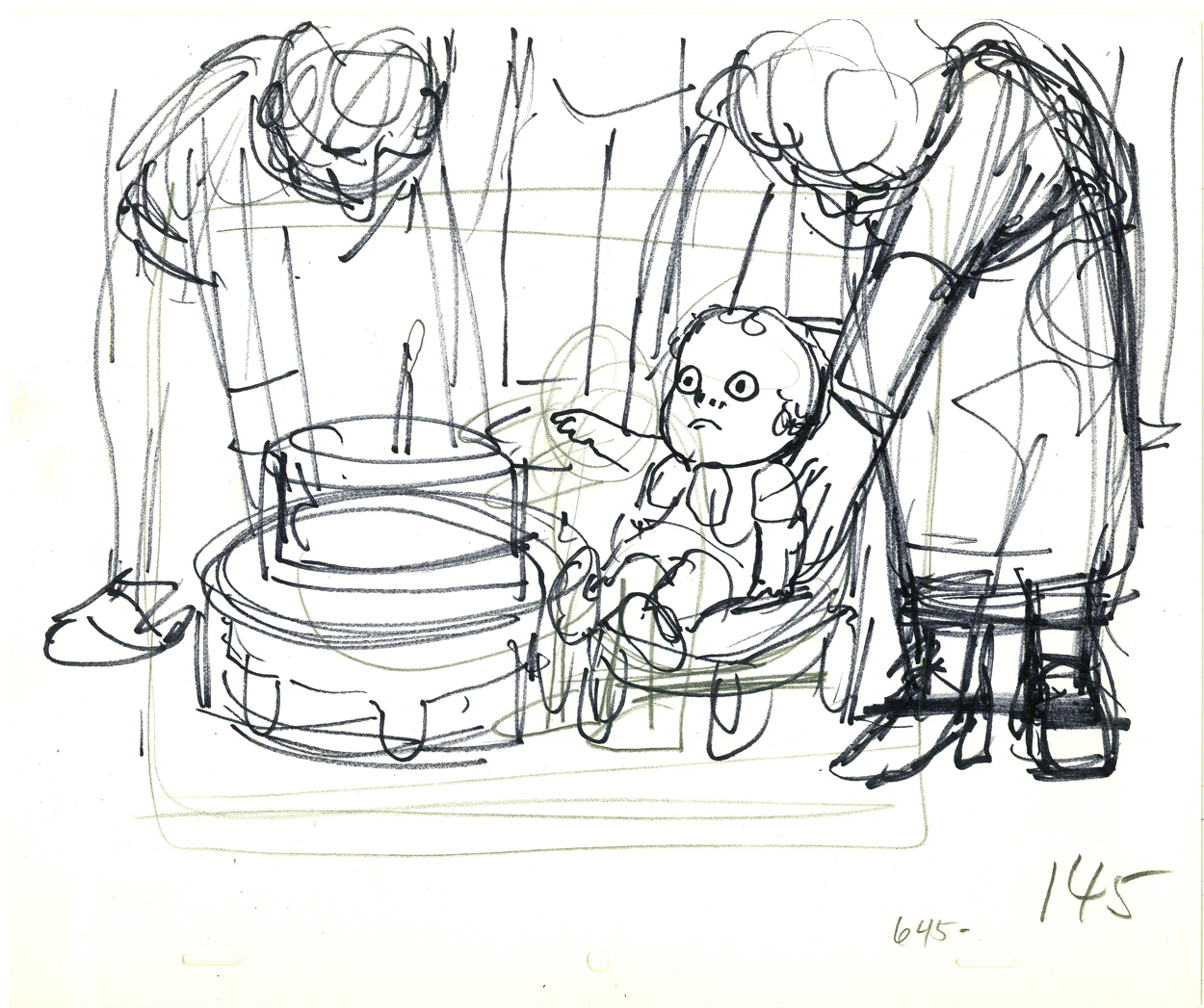
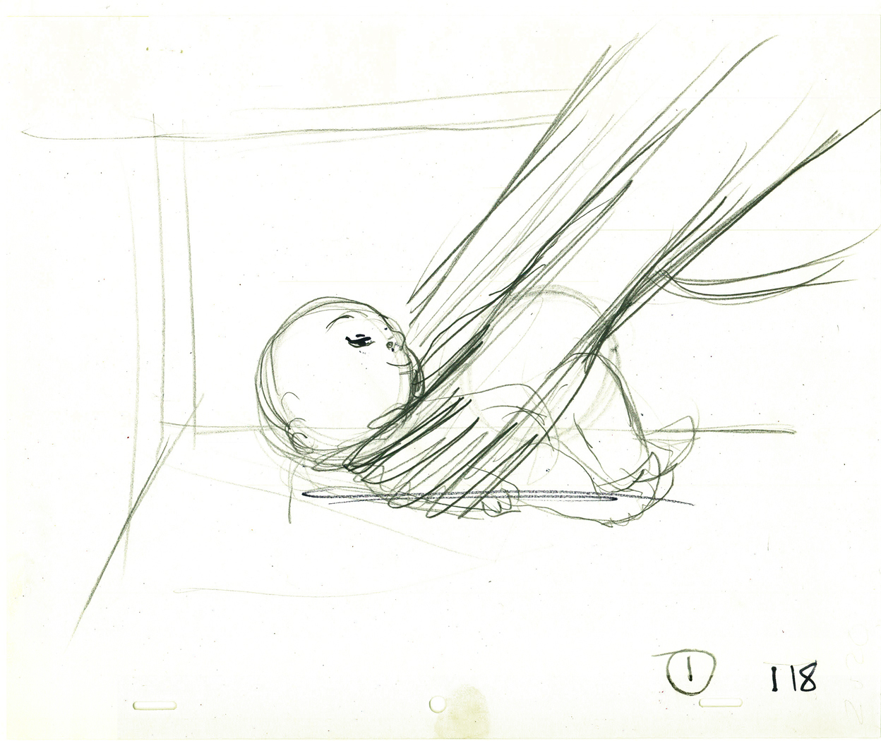
The final three drawings are from the sequence wherein the baby turns one year old and is being propped up to celebrate his first birthday cake.
These drawings were given to Tissa David to animated the sequence. They accompanied a long conversation over the soundtrack. Tissa returned with her first samplings of what the final babies would look like, and then they were altered in the I&P room. Soemtimes for the good.
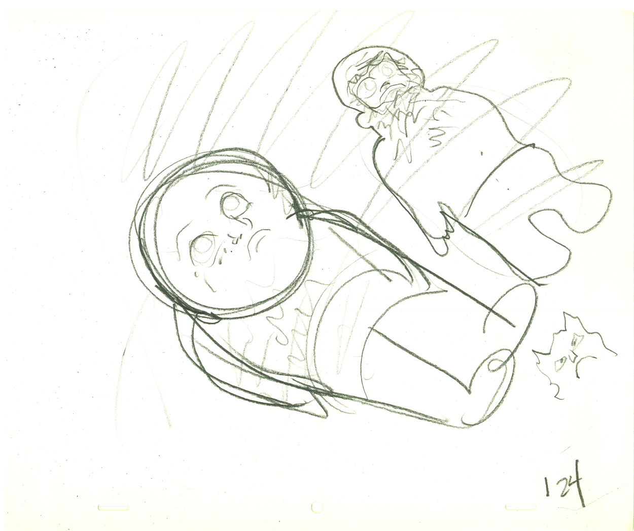
(Click any image to enlarge.)

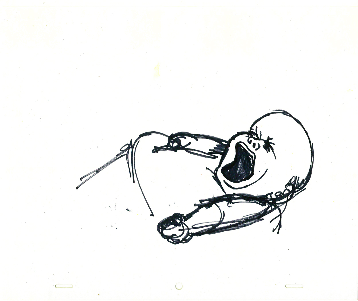
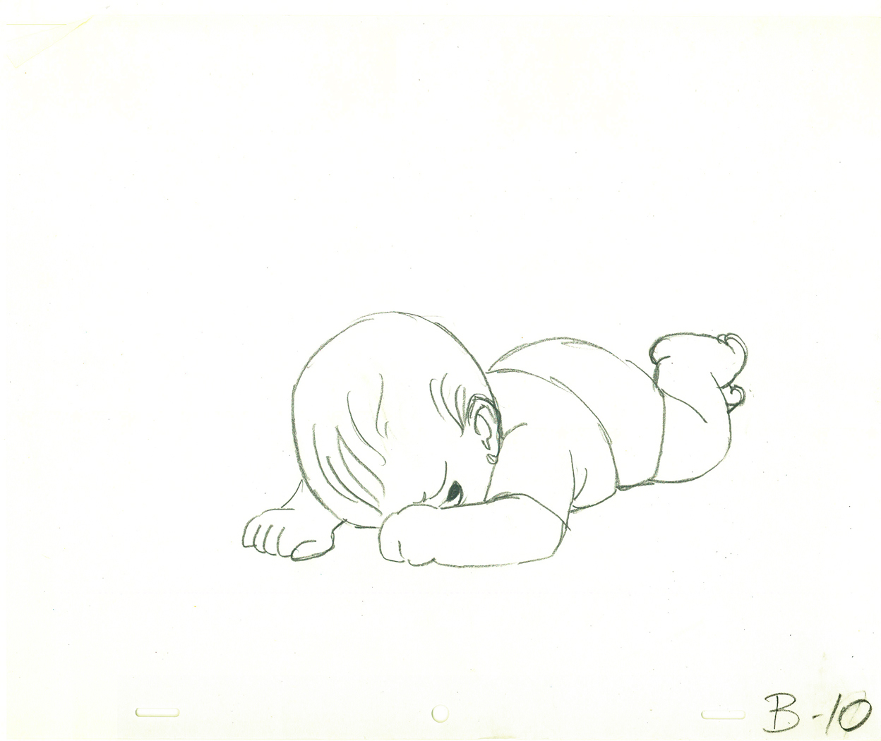
These three drawings with the birthday cake look as though they might
have been done by Tissa. The writing is hers.
Animation &Animation Artifacts &Hubley &Layout & Design 16 Dec 2008 09:00 am
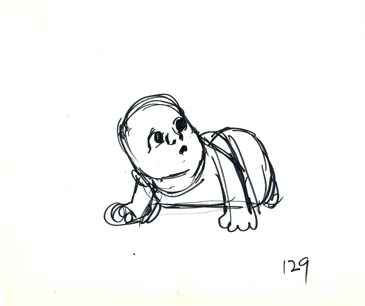
Hubley Babies
- John & Faith Hubley‘s feature film, Everybody Rides the Carousel was a great project to work on. The story was top notch, the art was flying left and right. (The entire production had a six month schedule and a budget of $450,000 when it was planned as three half-hour shows for CBS. Another month and $50,000 was added to extend it into a 90 min program.)
Great, talented people, as expected, worked on it.
Animators included: Tissa David, Barrie Nelson, Bill Littlejohn, Art Babbitt, Fred Burns, Adam Beckett, Lu Guarnier, Jack Schnerk, Don Patterson, Ruth Kissane, Phil Duncan and Earl James.
The excellent score was written by the rising classical/jazz composer, William Russo. (I was amazed at this in that I was addicted to his Three Pieces for Blues Band and Symphony Orchestra and hadn’t realized that the Hubleys knew his work.
The vocal talent included old reliables such as Lane Smith, Jack Gilford, Juanita moore, Dinah Manoff and Lou Jacobi and introduced new, young talent Meryl Streep and Jenny Lumet.
 For someone my age, it was a dream production. I coordinated the animation, assisted all of the animators who required help and animated some 85 scenes.
The film was an adaptation of the writings of psychoanalyst Erik Erikson, specifically his book Childhood and Society (1950). Eight Stages of Development were adapted into eight horses on a carousel, each representing a different stage in human development.
Today I’d like to post some of John Hubley’s drawings of the baby in the opening sequence. These were all animated by Tissa David, and I’ll post her drawings of the same poses tomorrow. They’re very different.
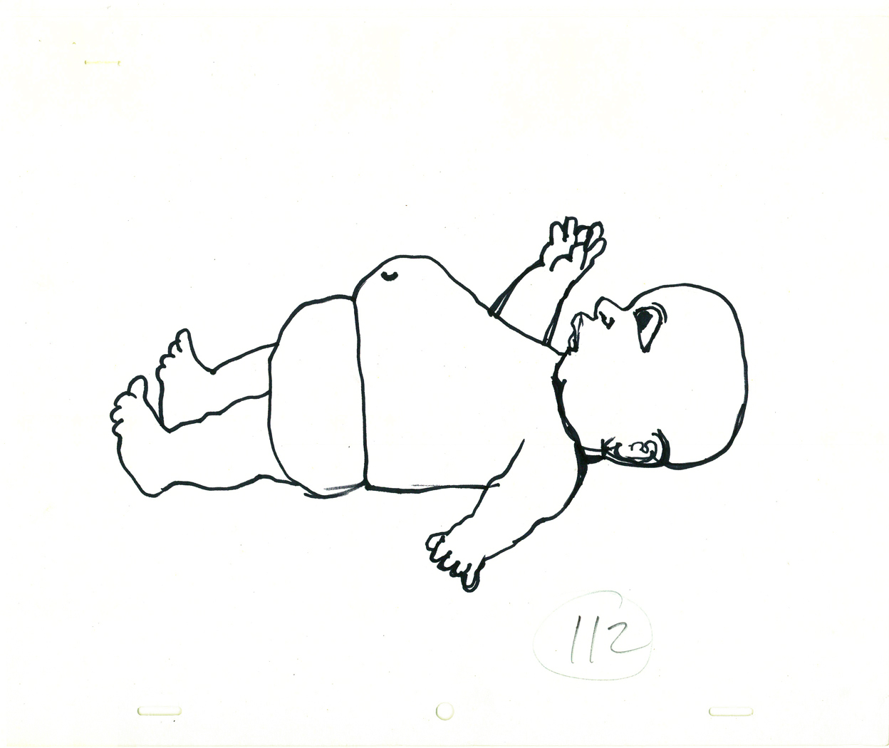
(Click any image to enlarge.)
All of John’s drawings were done with a Sharpie pen,
which was his weapon of choice, most of the time.
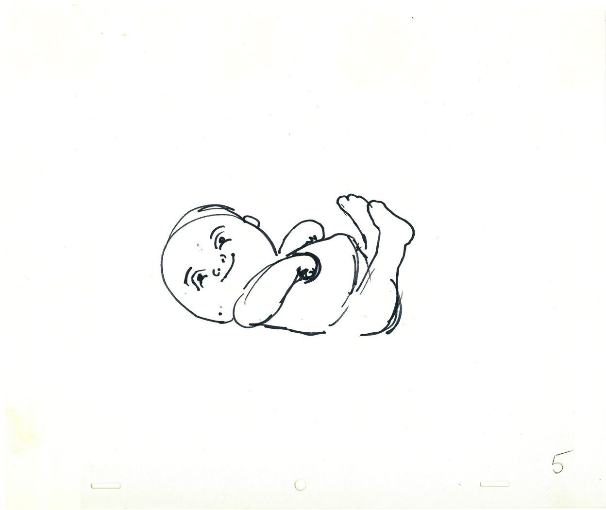
This last drawing (done in pencil) is Tissa David’s interpretation of
John Hubley’s last image. She did a bunch of these sketches and
worked with John in solidifing what the final look of the baby would be.
Tomorrow I’ll post Tissa’s drawings.
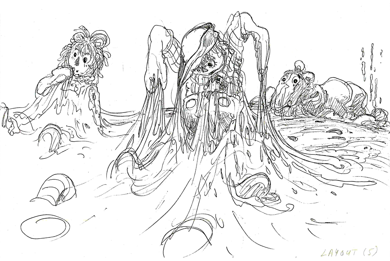
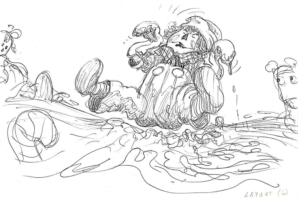
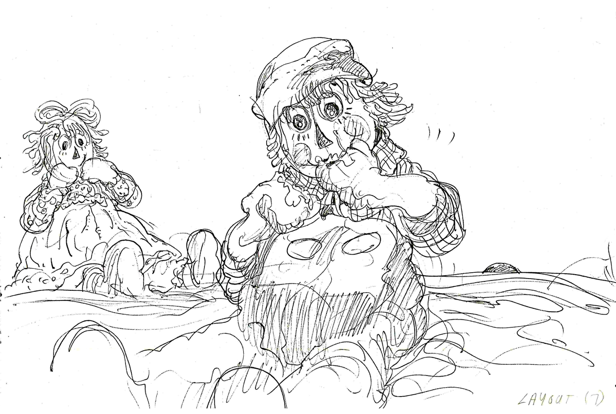
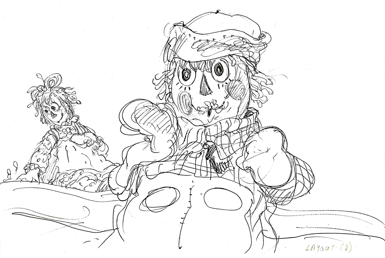
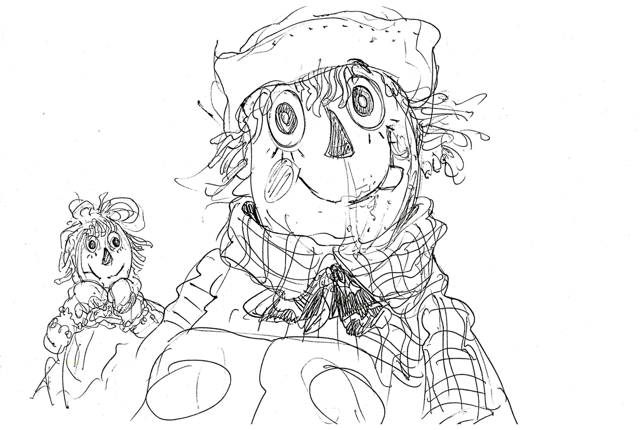
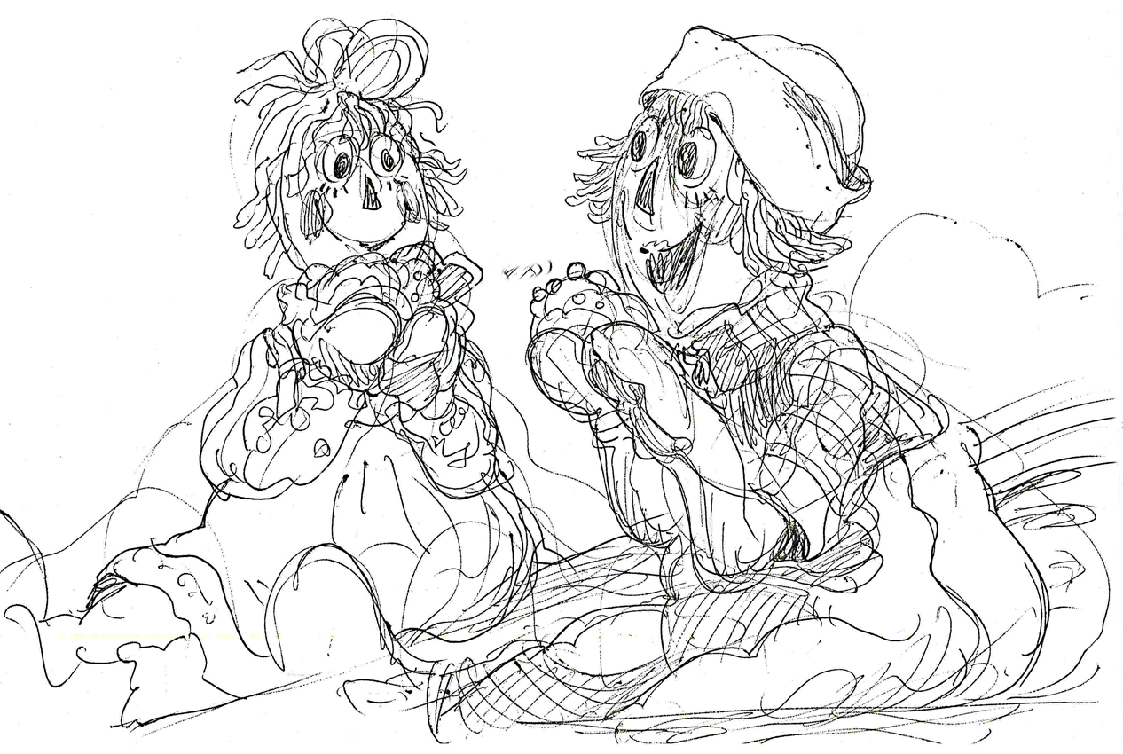
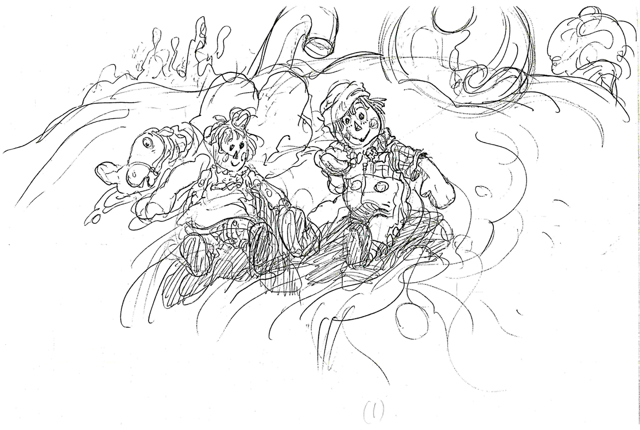
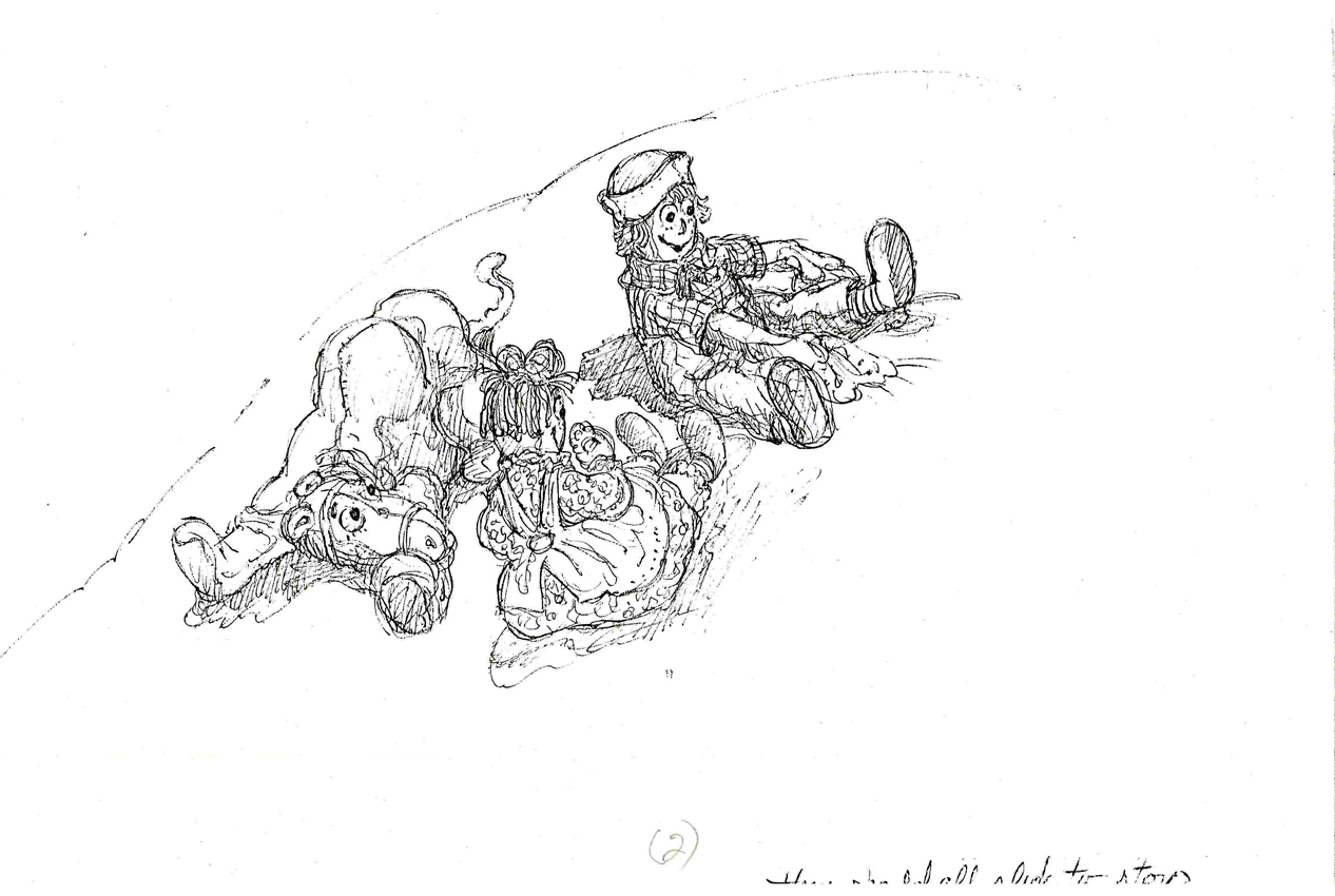
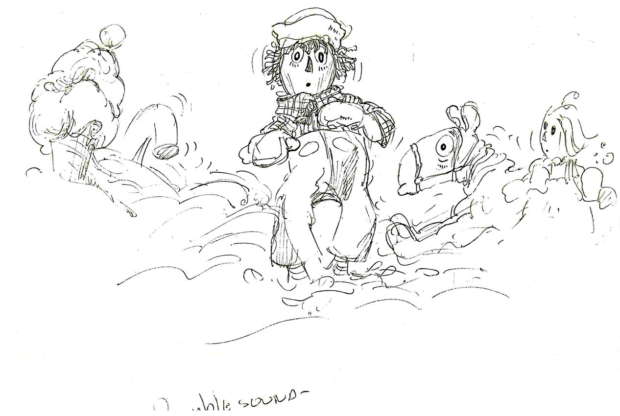
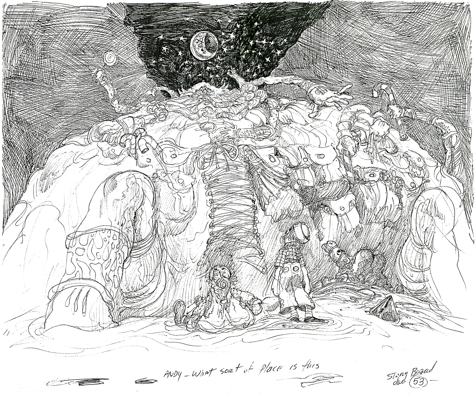
Animation &Layout & Design &Richard Williams &Story & Storyboards 11 Nov 2008 09:16 am
Corny Taffy
Corny Cole’s home was destroyed in a recent California fire. 90% of his artwork, saved from over his many years in animation was destroyed. This is a link to a PayPal site where you can donate some coin to help Corny and his wife who lost everything in the fire.
I have a feeling that many people don’t know of Corny’s incredible talent, so I’ve been trying to feature some of the material I have. It’s all stunning artwork, so it’s also a treat for me.
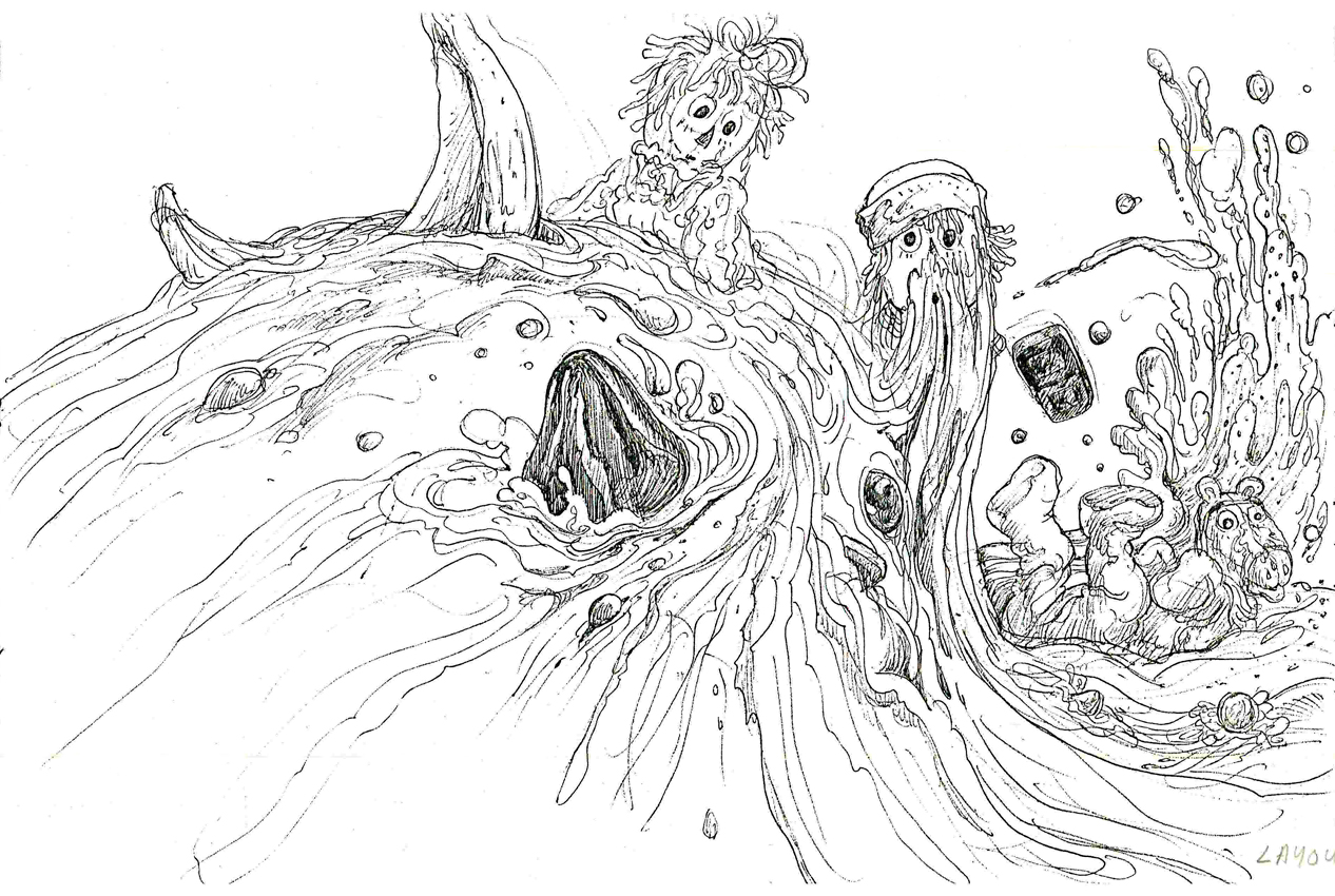
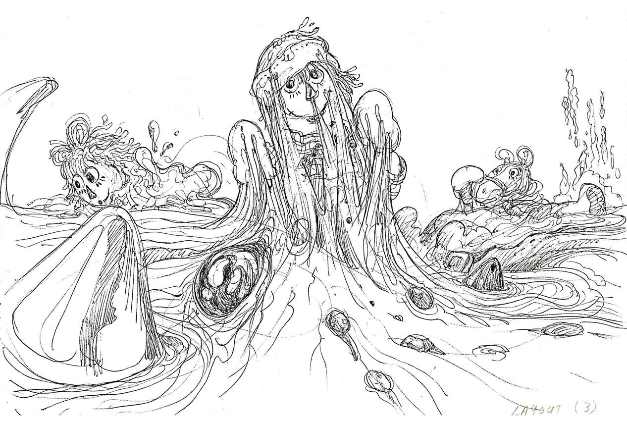
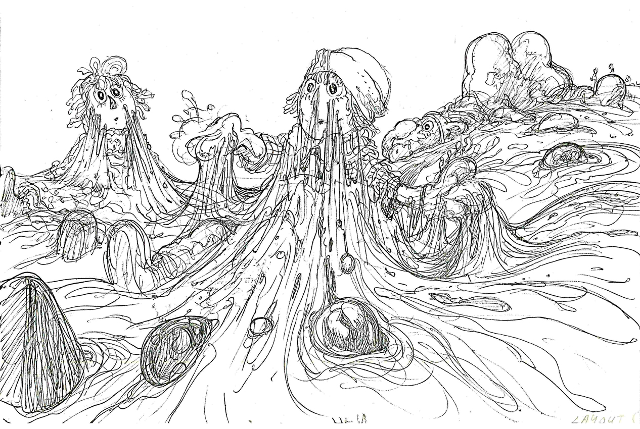
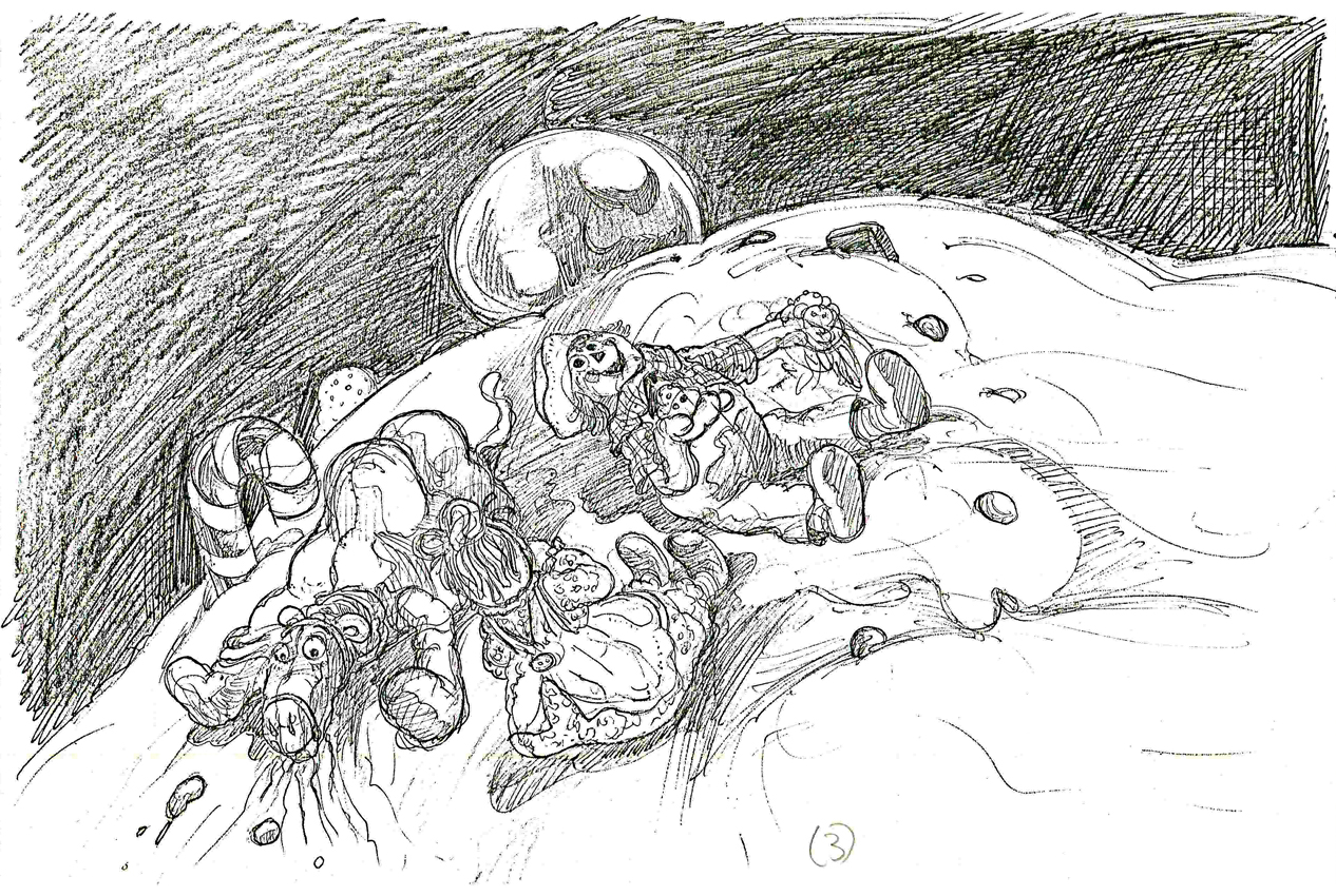
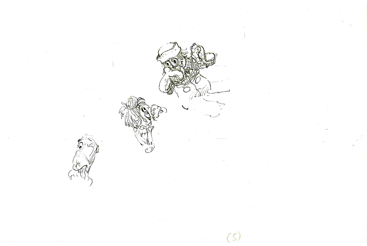
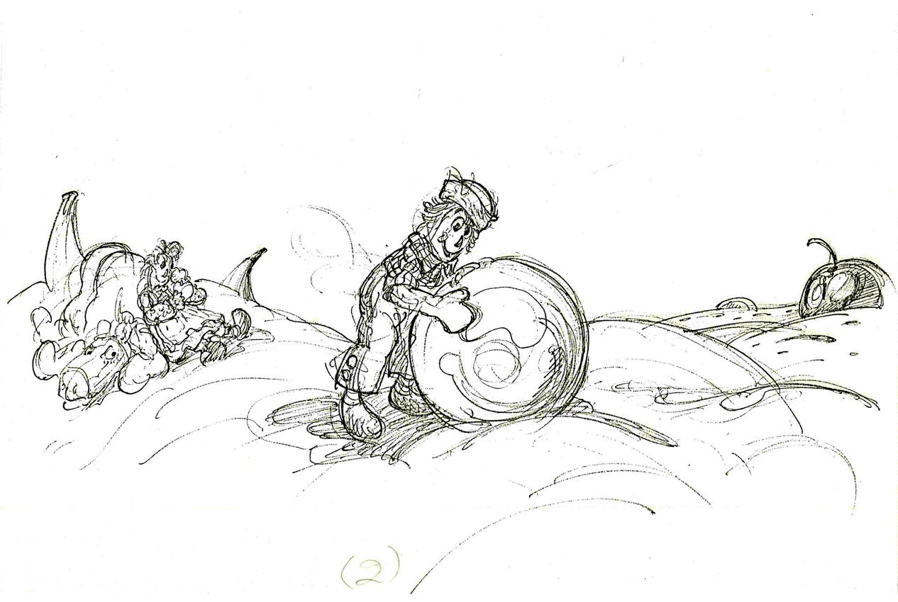
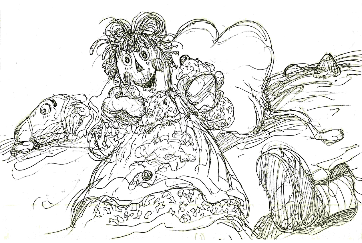
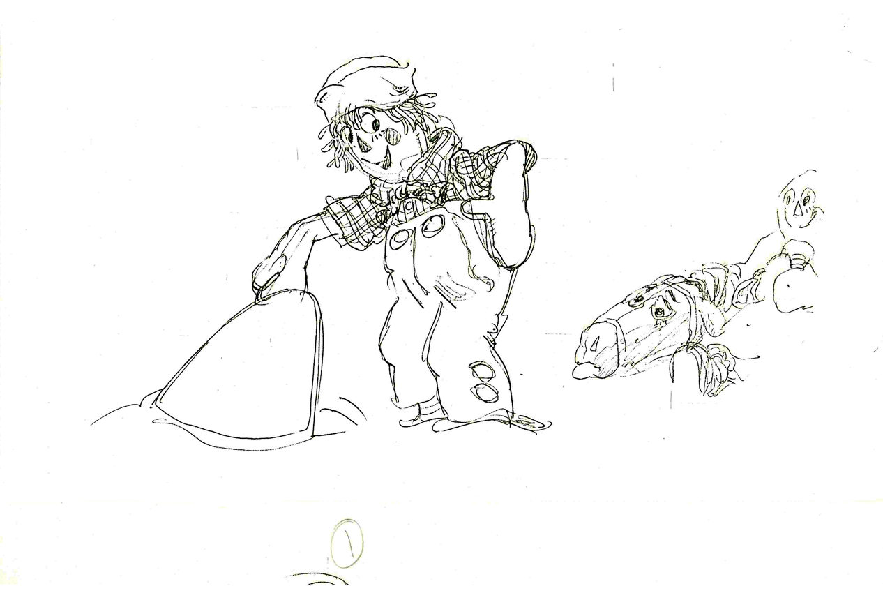
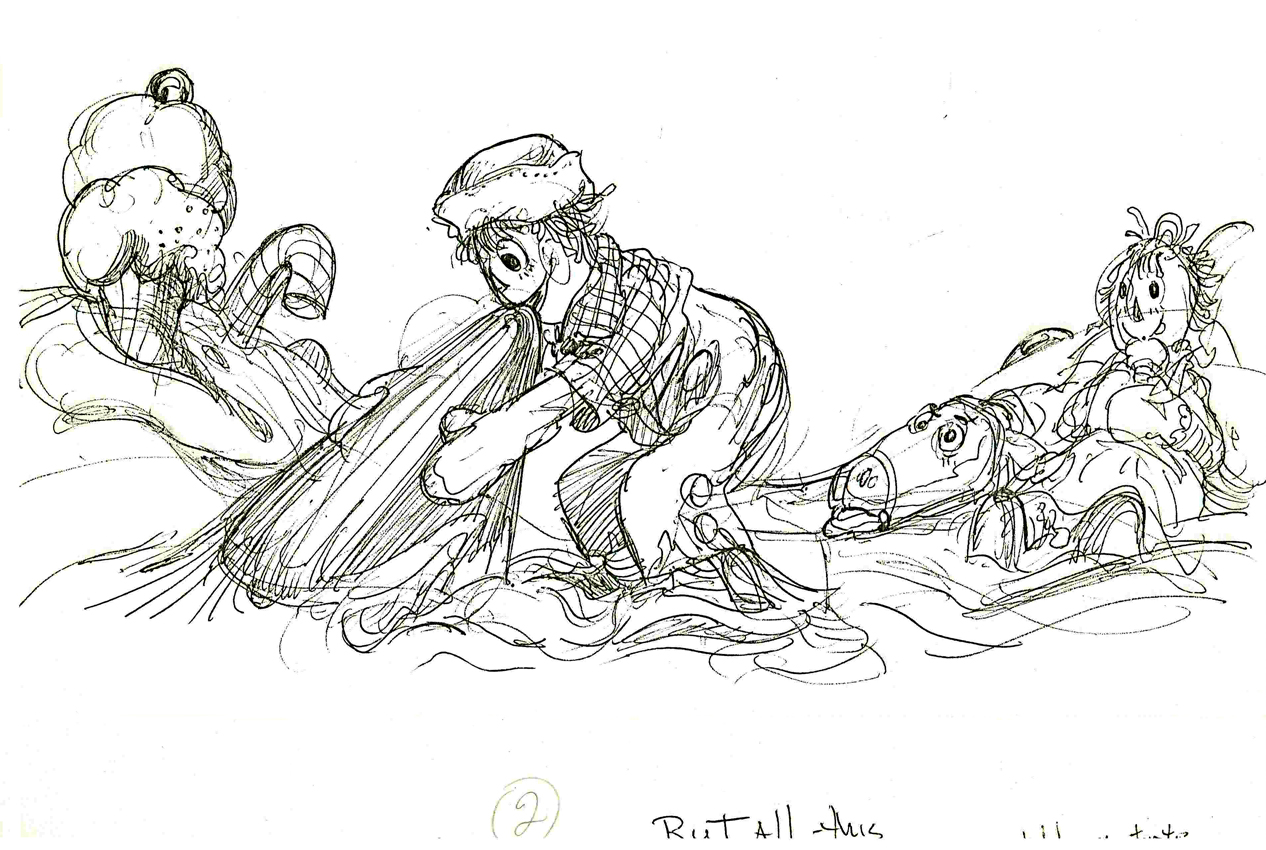
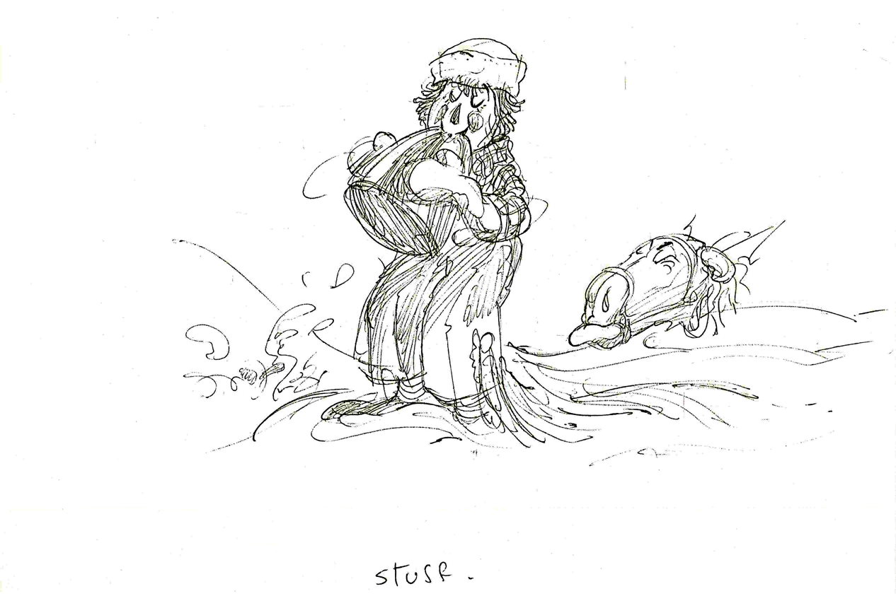
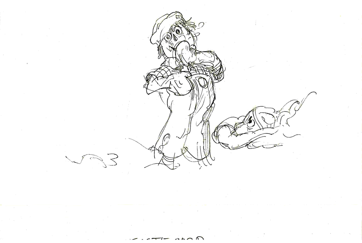
Here’s a sequence of layouts from Dick Williams’ Raggedy Ann featuring Ann, Andy and the Camel in the taffy pit. All drawings (and there are many hundreds more like this) were done by Corny.
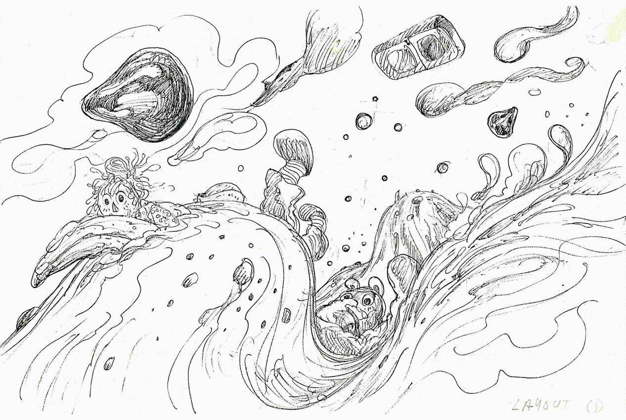 1
1(Click any image to enlarge.)
 2
2
 3
3
 4
4
 5
5
 6
6
 7
7
 8
8
 9
9
 10
10
 11
11
 12
12
 13
13
 14
14
 15
15
 16
16
 17
17
 18
18
 19
19
 20
20
 21
21
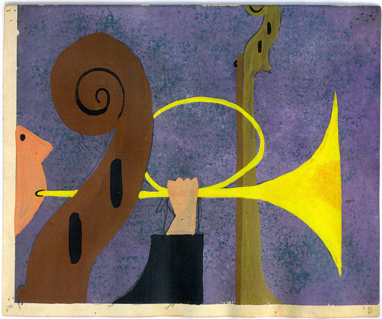
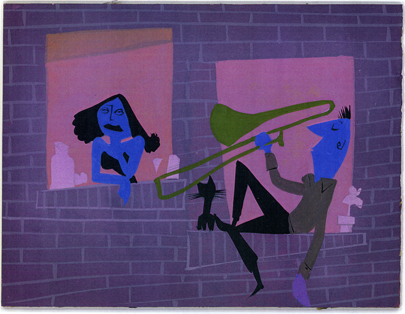
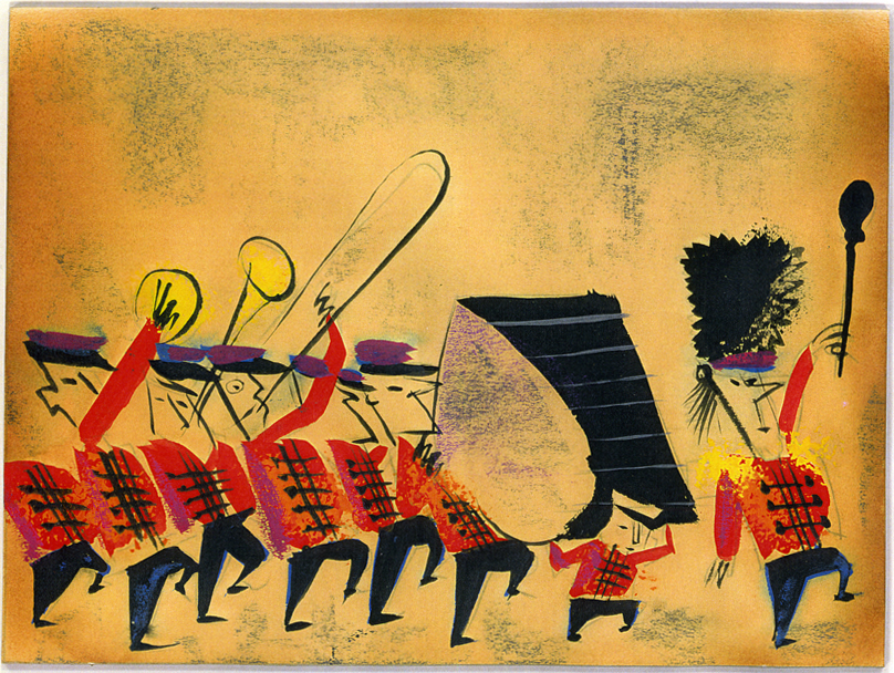
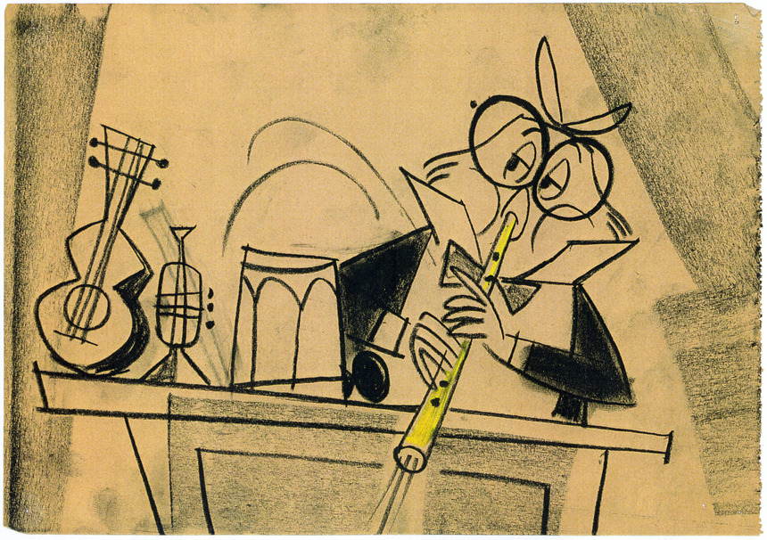
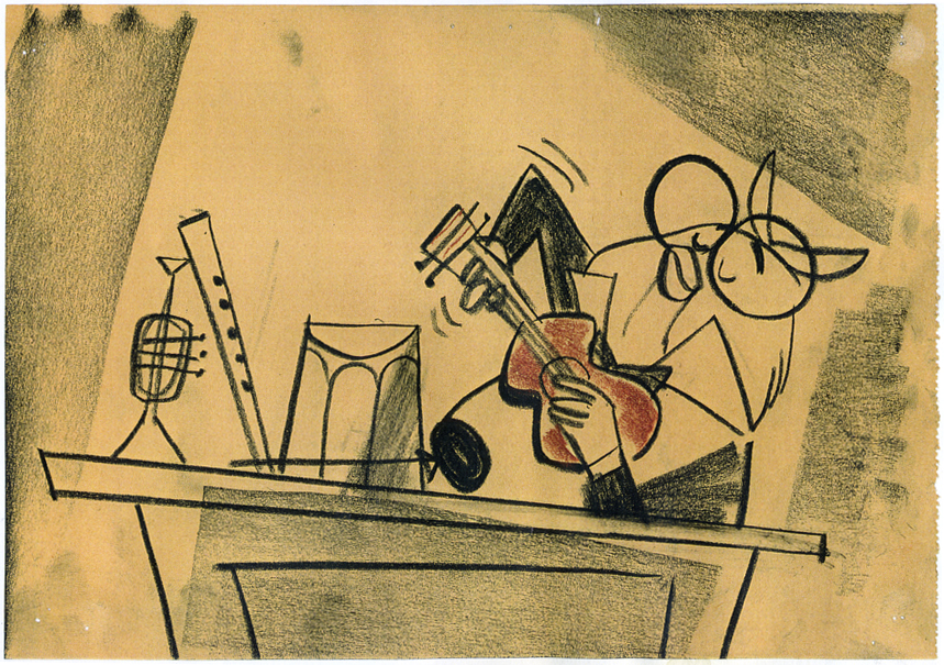
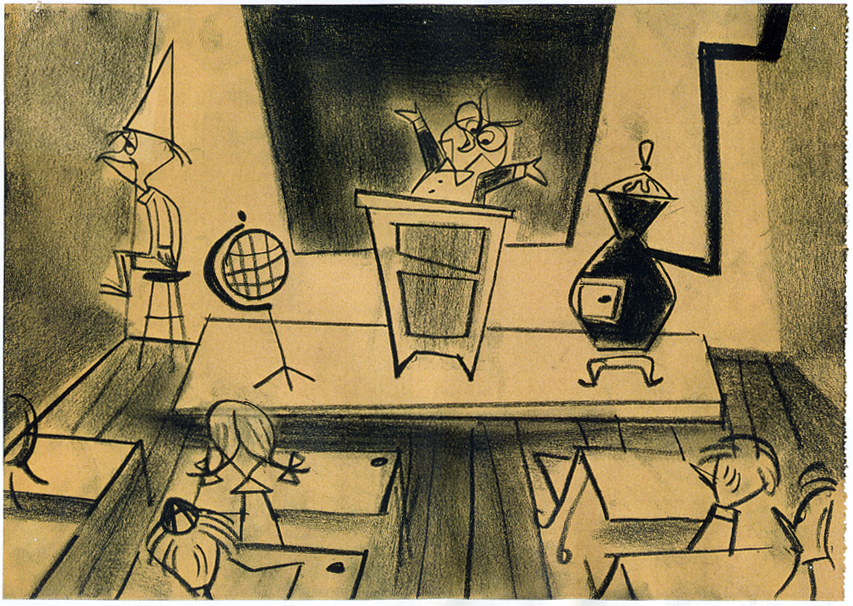
Animation Artifacts &Disney &Layout & Design &Story & Storyboards 06 Nov 2008 08:59 am
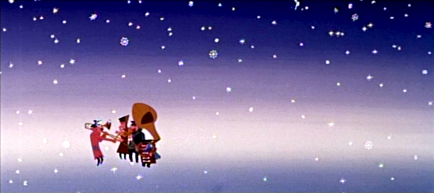
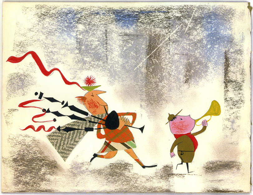
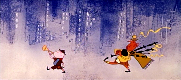
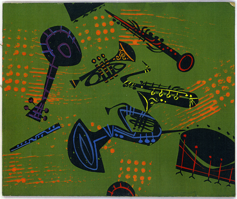
Toot Art – 2
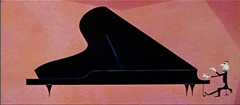 - Last week, I posted the first installment of this series of storyboard art from Toot Whistle Plunk & Boom. Here’s the second installment of these photostats loaned to me by John Canemaker.
I might also note that a number of these were posted by Amid Amidi on his site, Cartoon Modern back in Jan, 2007. Those are worth posting again, and others haven’t been posted before.
When some of the images are close, I’ve tried to give frame grabs that match. Ward Jenkins has many frame grabs from the entire film on his site.
 17
17(Click any image to enlarge.)
 18
18
 19
19
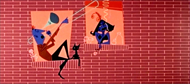
To me, this frame grab captures the spirit but loses some of the art.
 20
20
 21
21
 22
22
 23
23
 24
24
 25
25
This is a very interesting choice. The original is beautiful, and this is too.
 26
26
 27
27
 28
28
 29
29
 30
30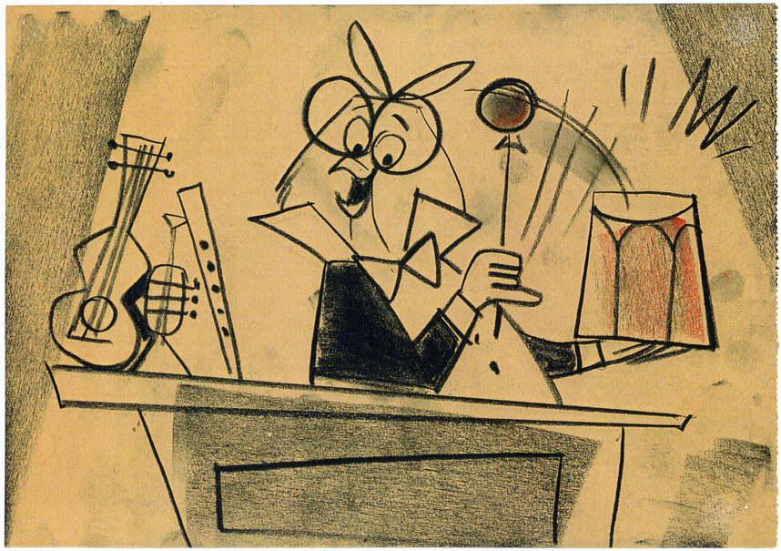 31
31
 32
32
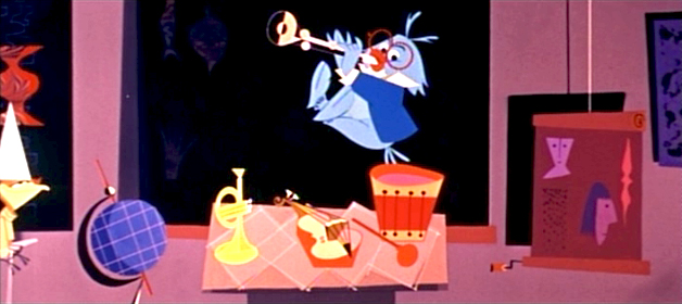
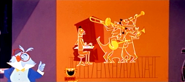
Owl plays all of the instruments at the film’s start.
This is a good representation.
