Category ArchiveLayout & Design
Bill Peckmann &Disney &Illustration &Layout & Design &Models 21 Jun 2010 07:30 am
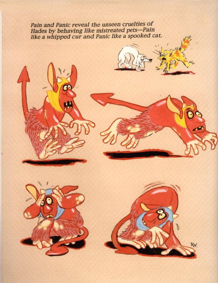
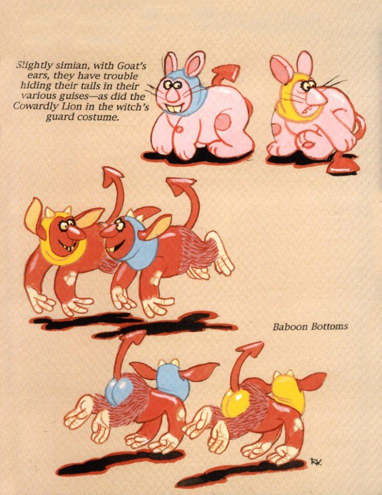
Rowland Wilson at Disney – 3
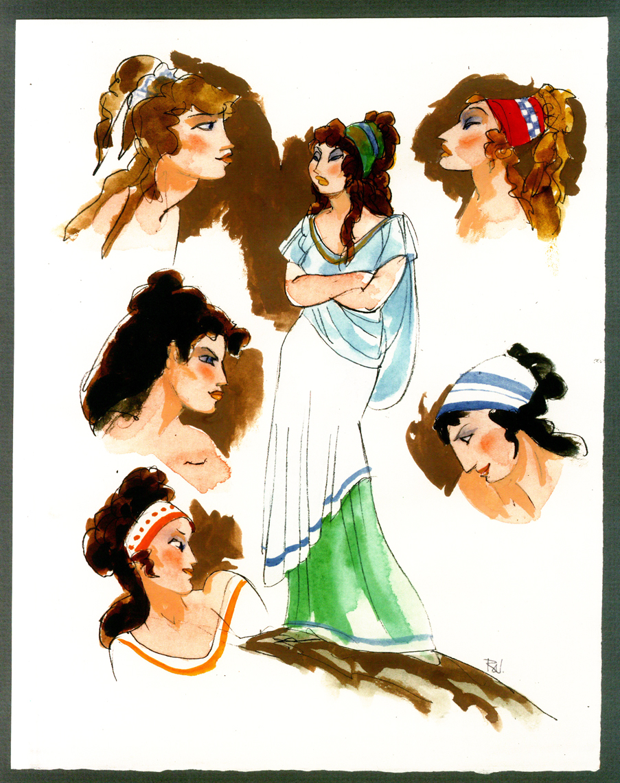
- Here’s Hercules. The last two weeks I posted some wonderful watercolor sketches, preliminary art for The Hunchback of Notre Dame from the great cartoonist, Rowland B. Wilson. (see: Part 1, Part 2)
Here for the first of two parts are some drawings by Rowland for Hercules. This entry includes character sketches for characters that developed into something completely different, or didn’t end up in the film at all.
Once again, I must express my debt of gratitude to the generosity of Bill Peckmann for lending me the art to post here. Thank you, Bill.
 1
1Megara
 2
2
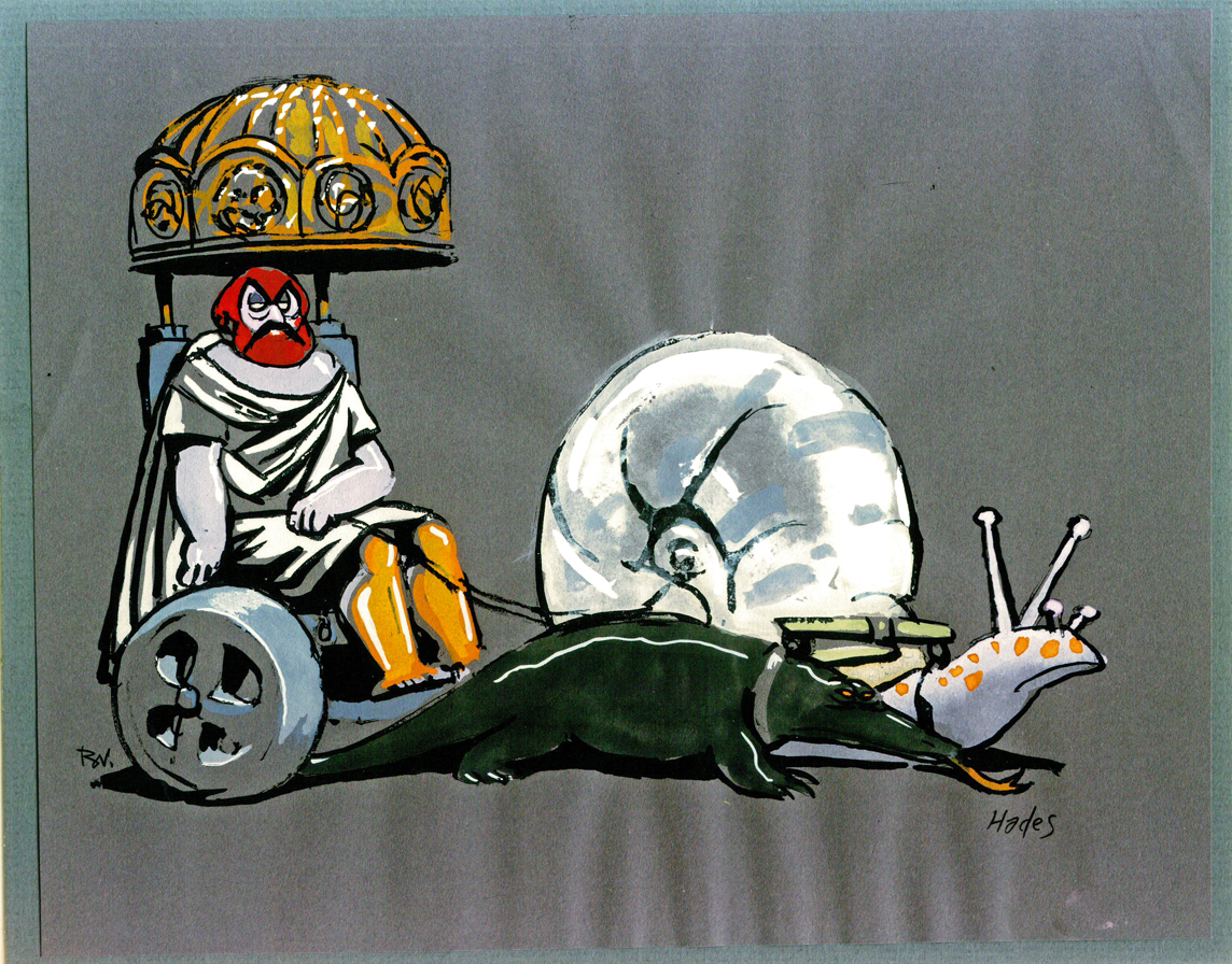
Hades – version 1
 3
3
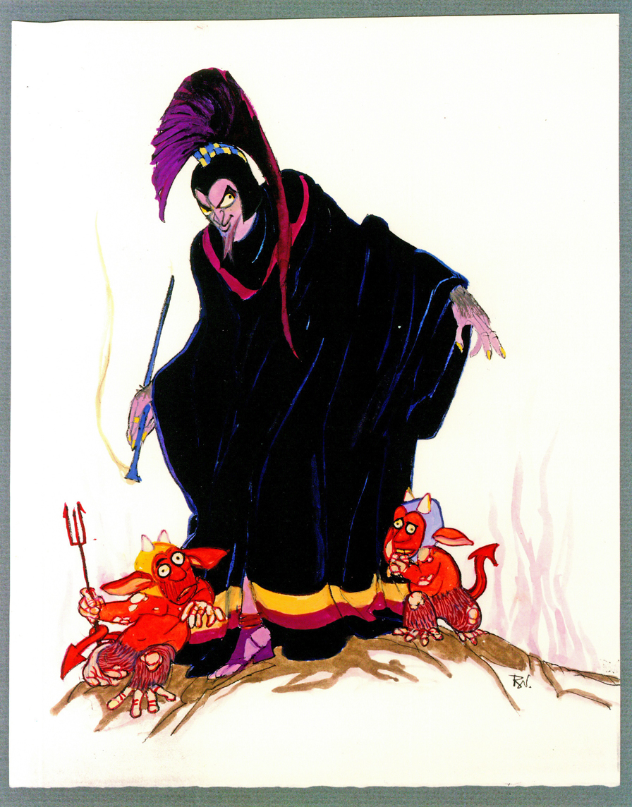
Hades – version 2
 4
4
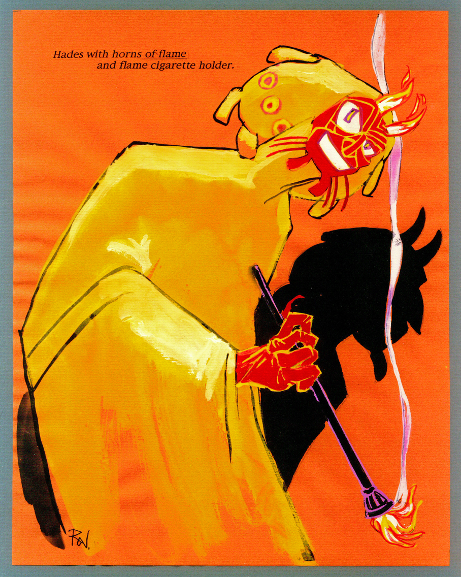
Hades – version 3
 5
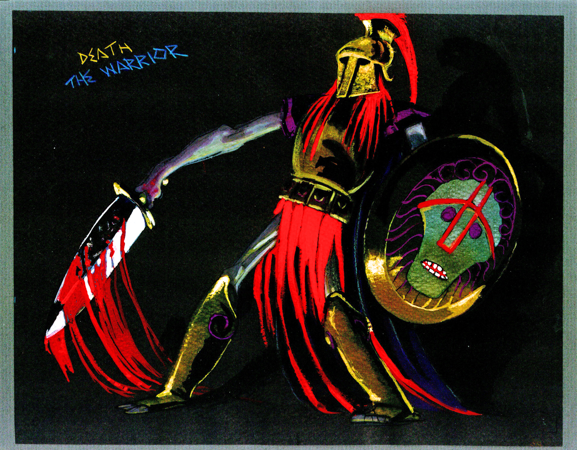
5
Death
 6
6
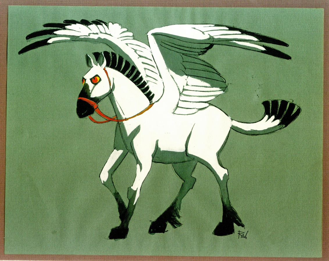
Pegasus
 7
7
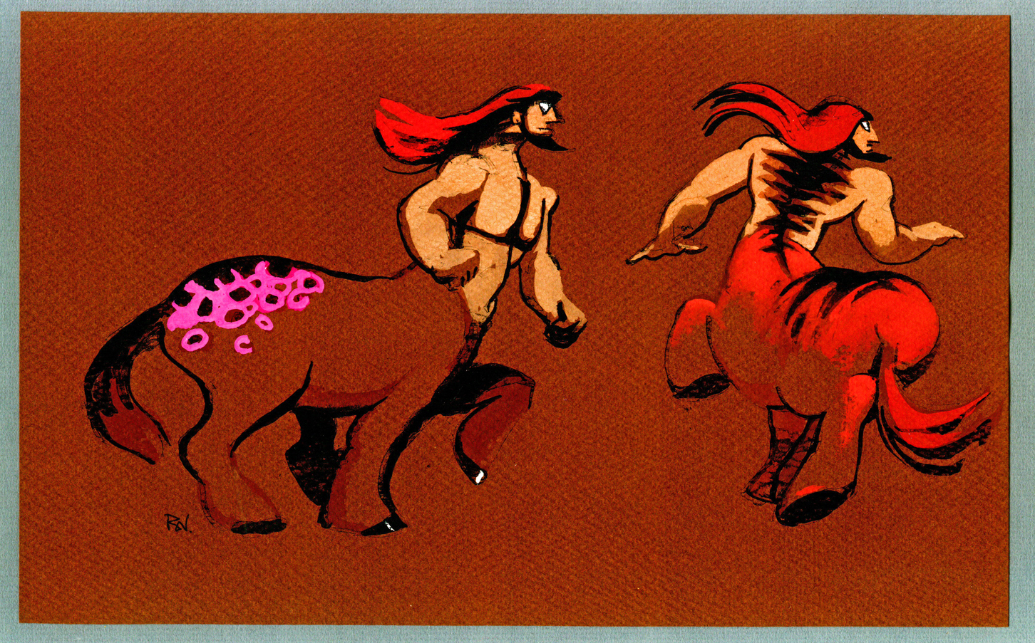
Centaurs 1
 8
8
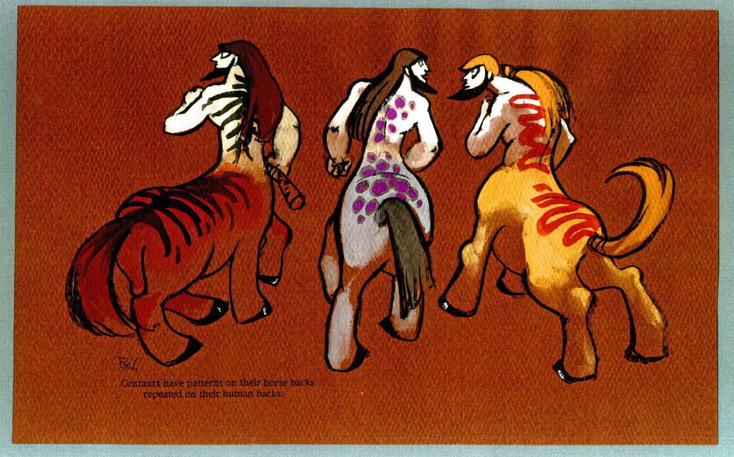
Centaurs 2
 9
9
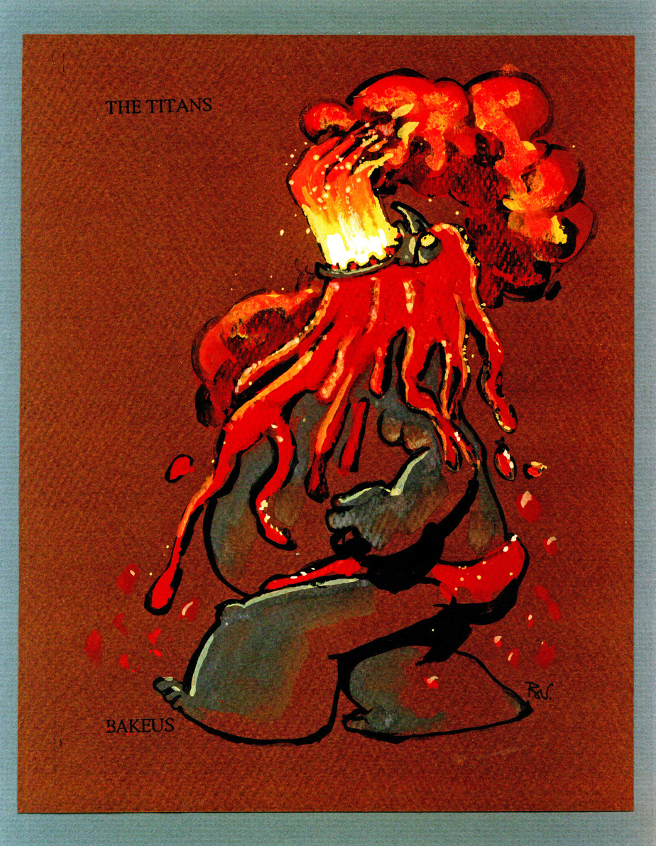
Titans 1
 10
10
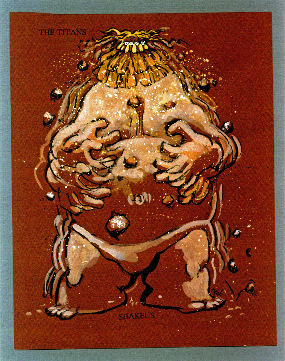
Titans 2
 11
11
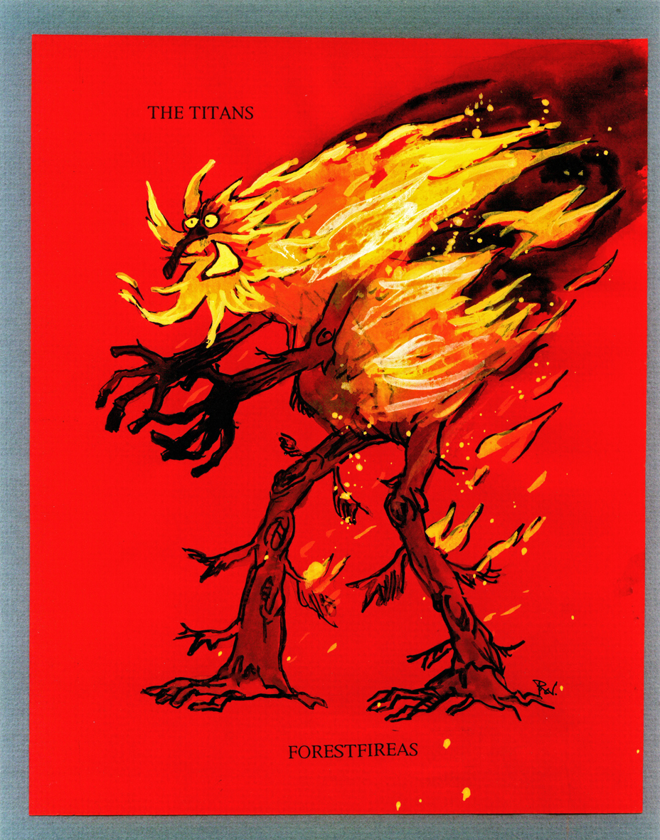
Titans 3
 12
12
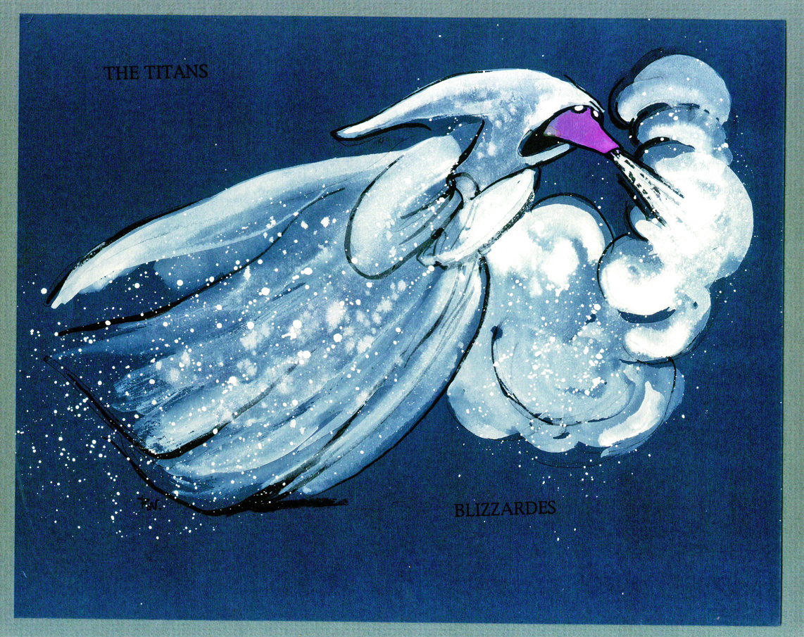
Titans 4
Next week, the last of these beautiful watercolor sketches.
Action Analysis &Animation Artifacts &Articles on Animation &Disney &Layout & Design 08 Jun 2010 08:40 am
recap – Phil Dike Lecture
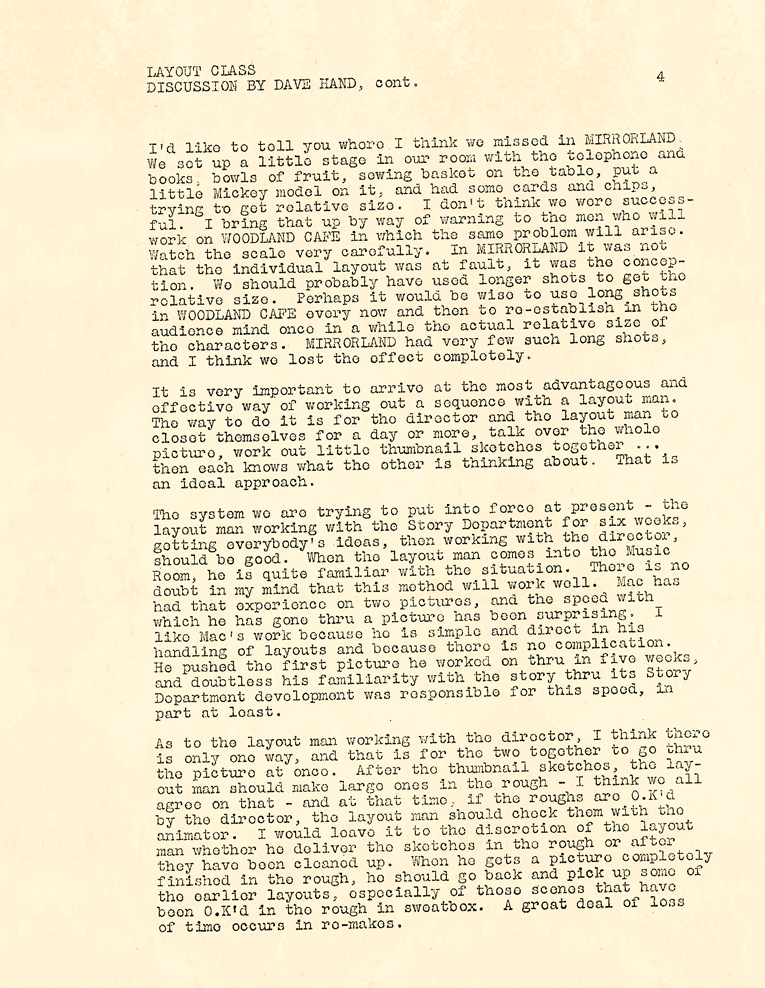
Hans Perk is posting a series of lectures on Layout. In August 2006 I posted the notes for the Disney afterhours lectures. To coincide with Hans, I’m recapping those notes.
- As noted yesterday, I am missing the notes to Lecture #2 of this Layout Course. - Hans Perk on his site, A Film LA, has posted the Ken Andersen LayOut Training Course from the Disney studio Nov, 1936.
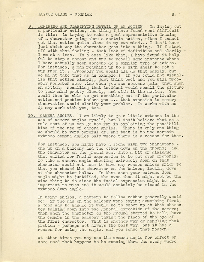
Here’s the a fourth lecture that Phil Dike gave on May, 1936; it was called a “General Discussion”. Unfortunately, two of its pages were copied off kilter, pgs. 8 & 9. The copies here come courtesy of Hans Perk.
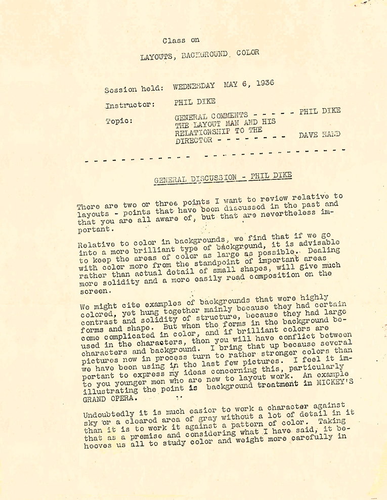 1
1 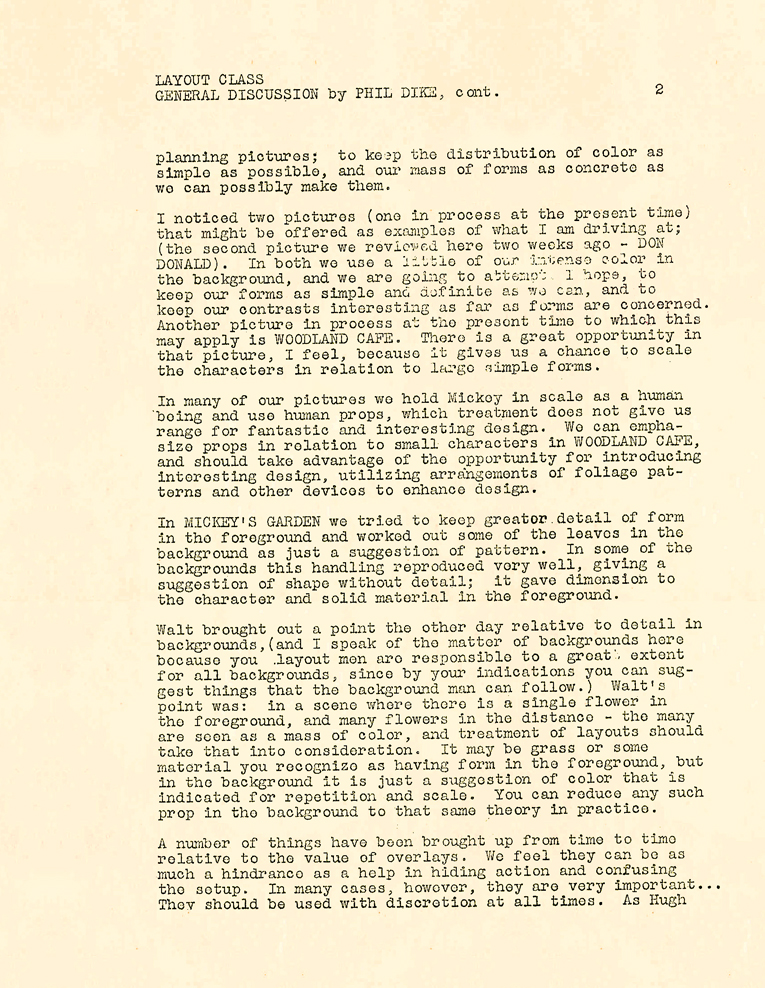 2
2 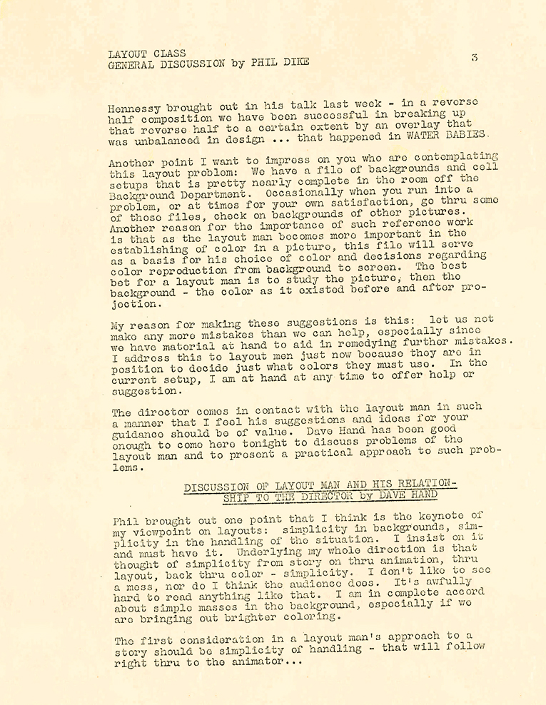 3
3
 4
4 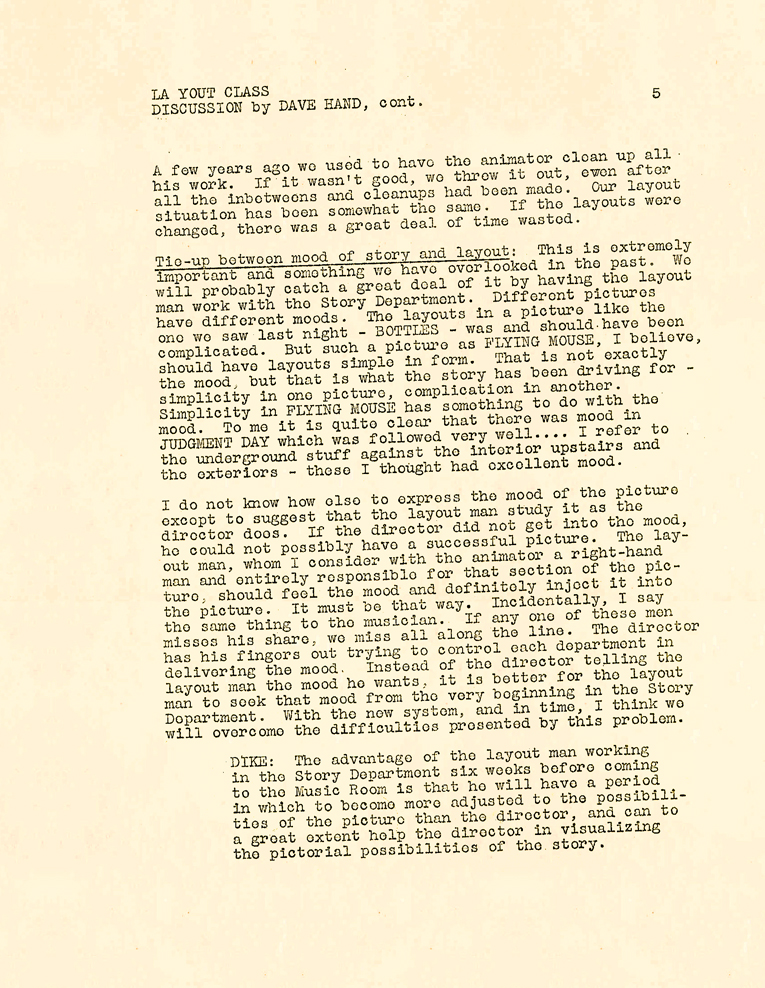 5
5 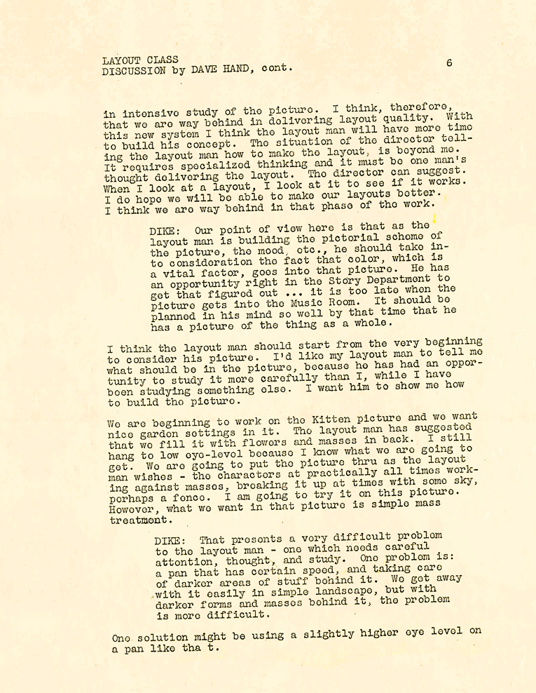 6
6
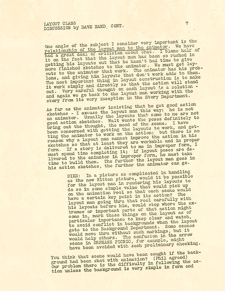 7
7 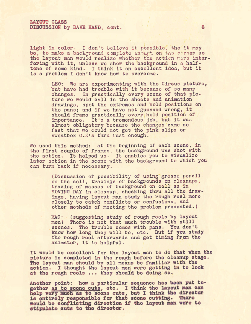 8
8 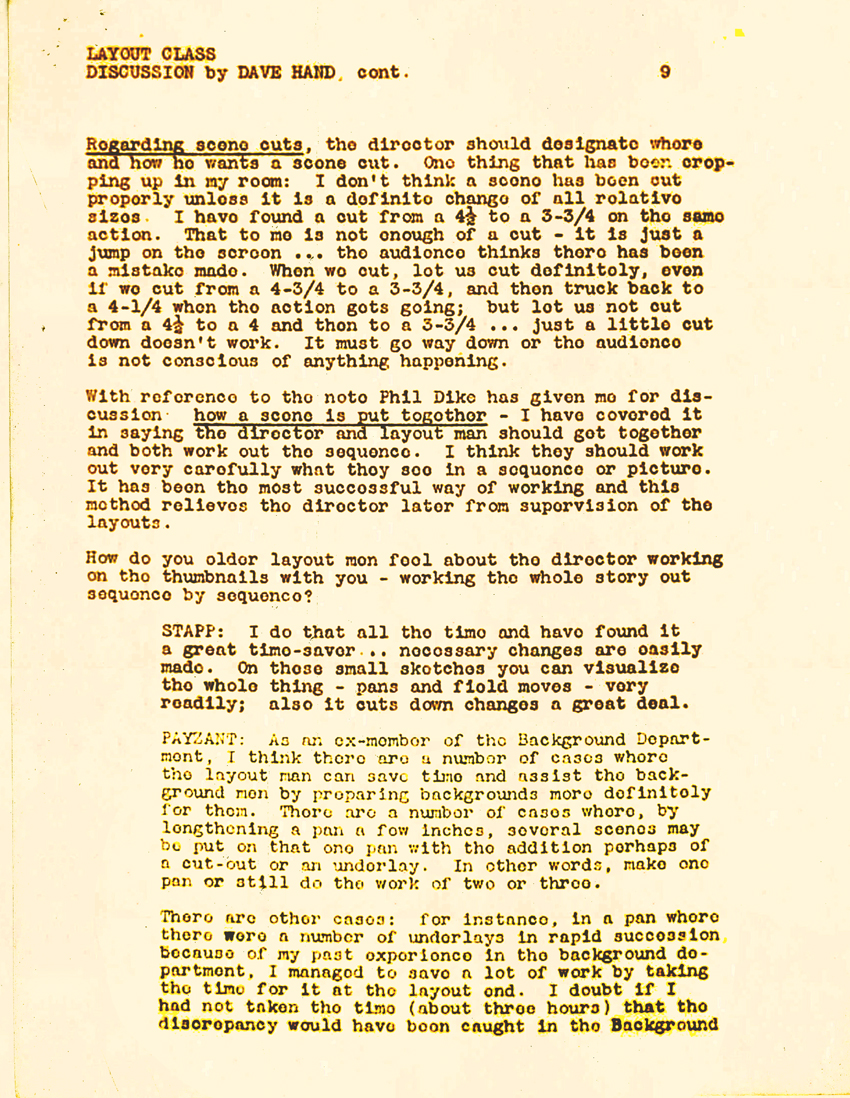 9
9
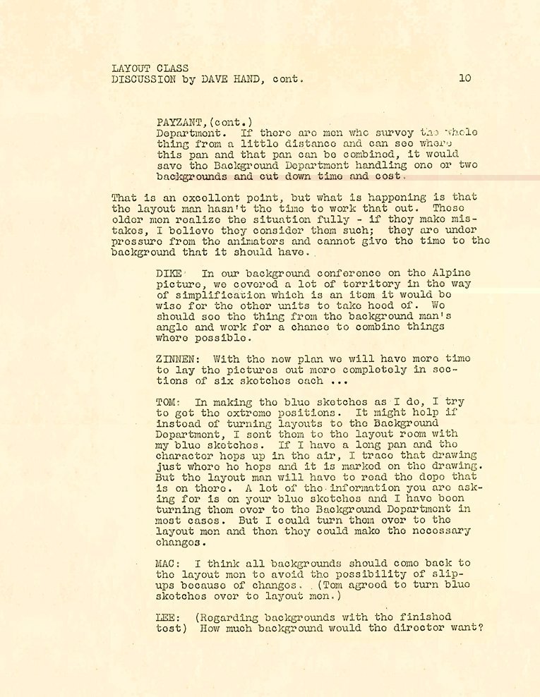 10
10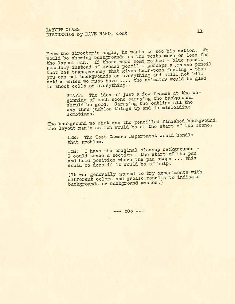 11
11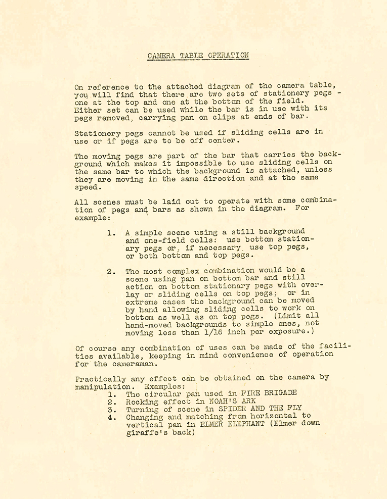 12
12
 13
13 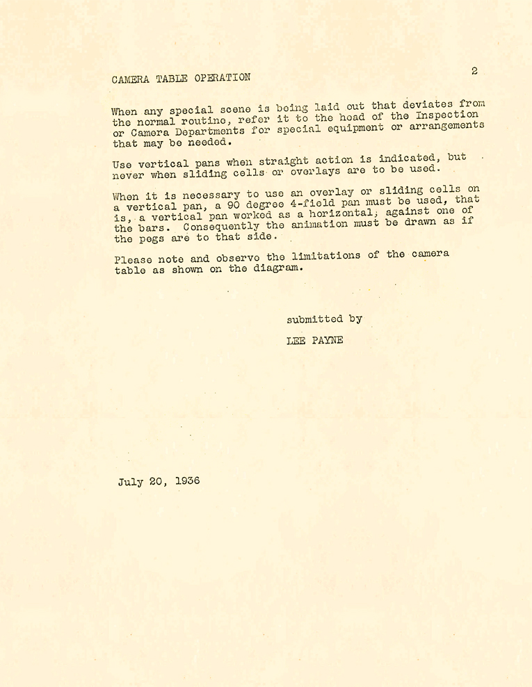 14
14
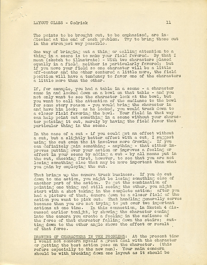
Action Analysis &Animation Artifacts &Articles on Animation &Disney &Layout & Design 05 Jun 2010 08:47 am
recap – Disney LO Course #3
Hans Perk is posting a series of lectures on Layout. In August 2006 I posted the notes for the Disney afterhours lectures. To coincide with Hans, I’m recapping those notes.
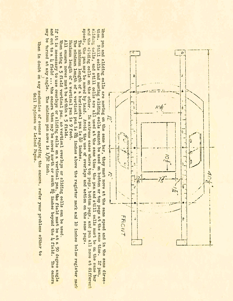
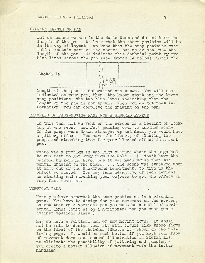
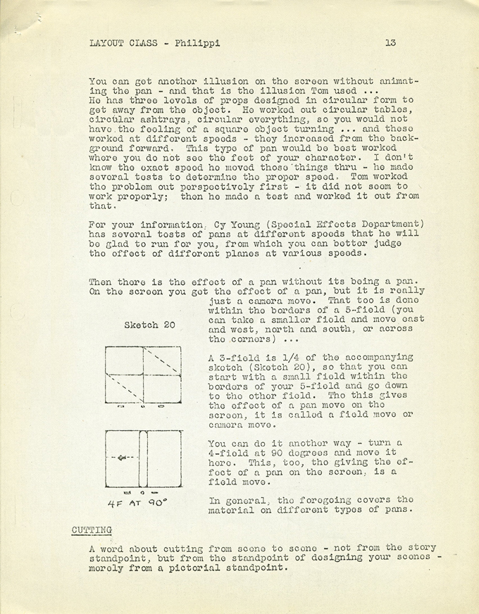
- The following is the Disney Layout Training Course’s 3rd meeting. Charles Philippi gave the lecture, and it’s a good one. It’s all about pans. (I posted the first lecture and don’t have the second. One is missing.)
There was a time when I was working for John Hubley on Everybody Rides The Carousel where he had asked me to design a background and setup for a package to be sent out, that day, to Bill Littlejohn for animation. Fortunately, I had just read these notes the day before, and I used what I’d learned. Hubley gave me a nice compliment, and I gave it all to Charles Philippi.
Littlejohn, by the way, did one of my favorite scenes of the entire time I was at that studio. I have the large number of drawings and will someday post some of them. Beautiful animation.
This Layout course is some 18 pages long. Since that’s a job to post all 18, I’m going to break it up into two days. Tomorrow the last half will be posted.
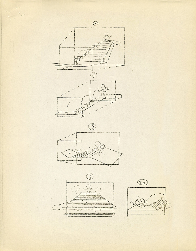
 01
01 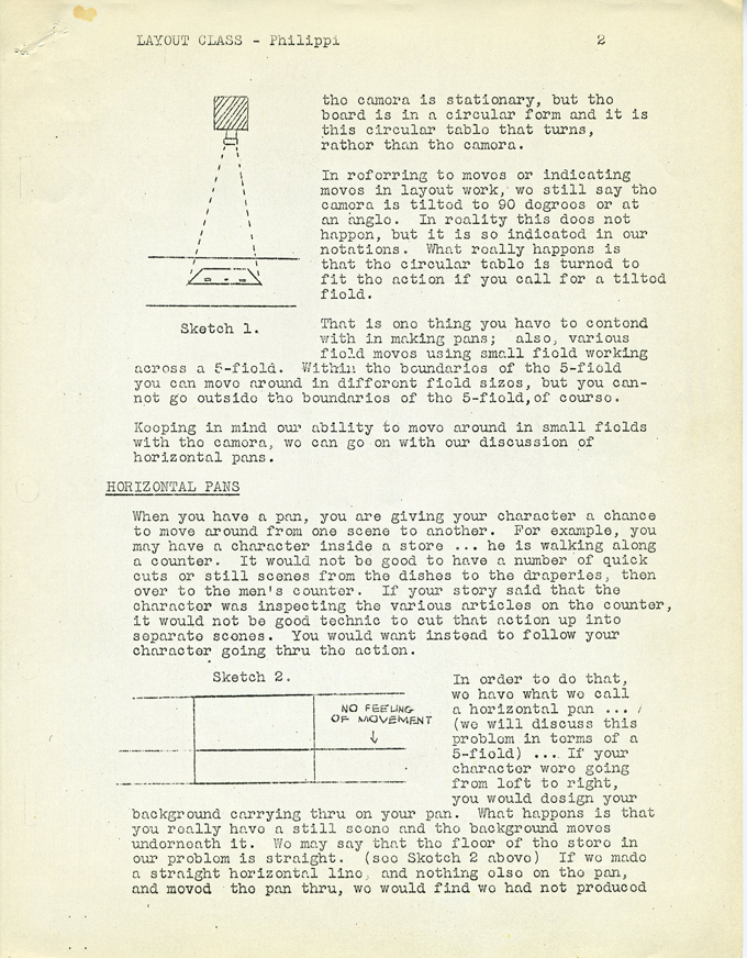 02
02 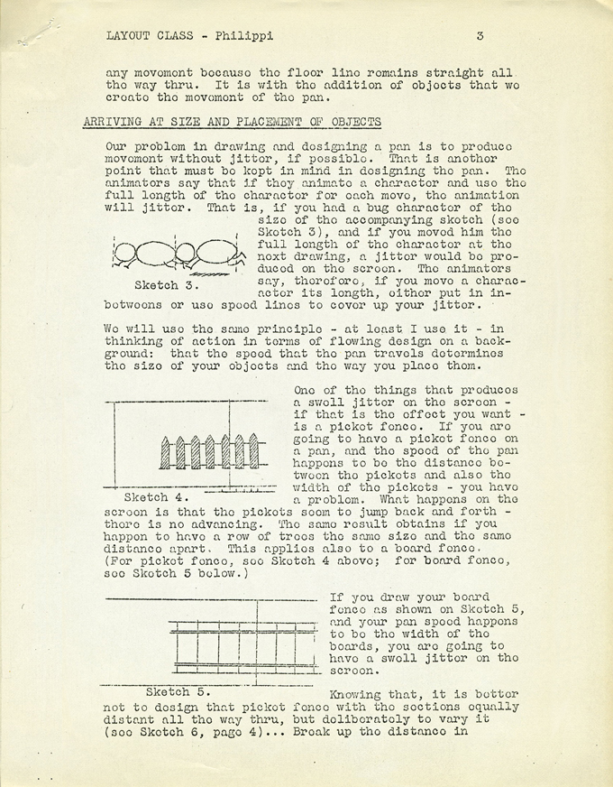 03
03
(click on any image to enlarge)
 04
04 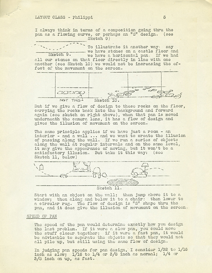 05
05 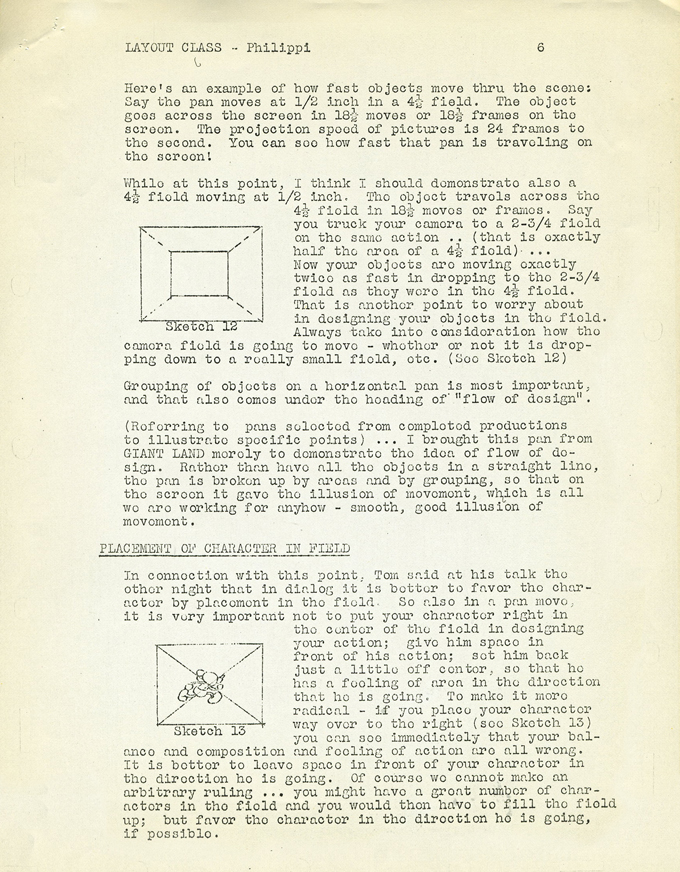
 07
07 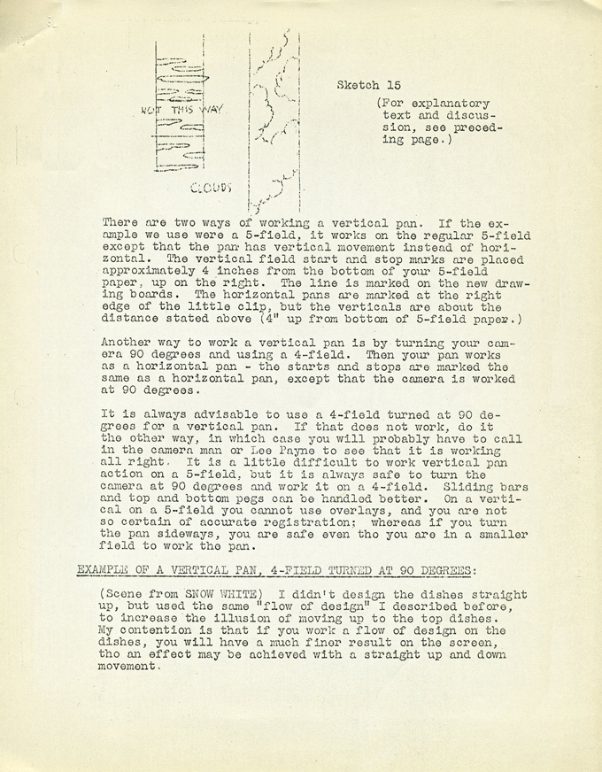 08
08 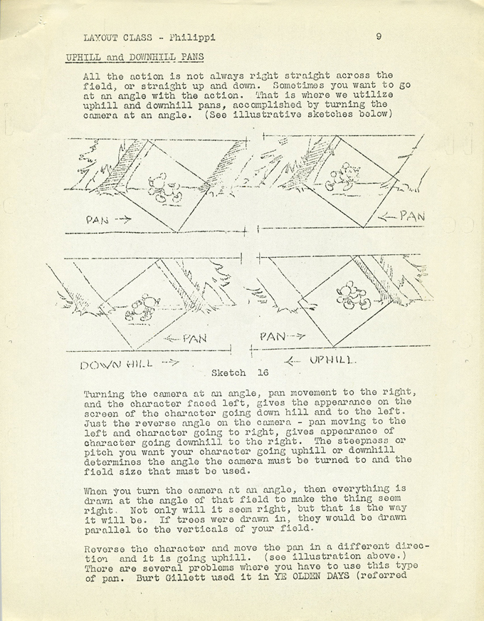 09
09
 10
10 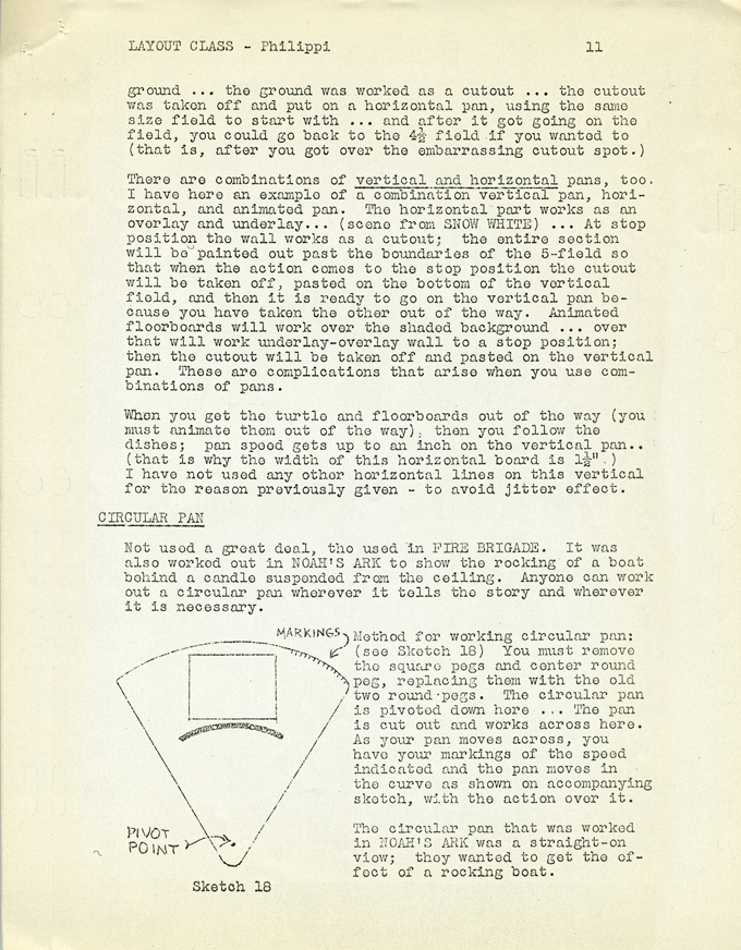 11
11 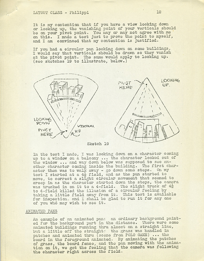 12
12
(Click on any image to enlarge.)
 13
13 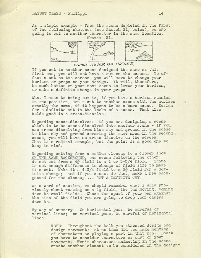 14
14 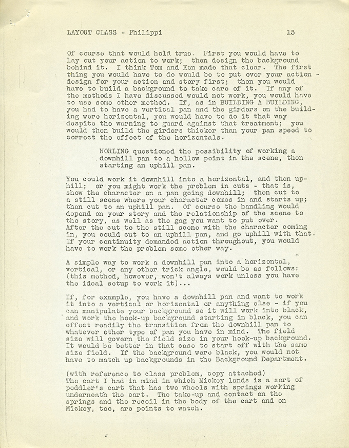 15
15
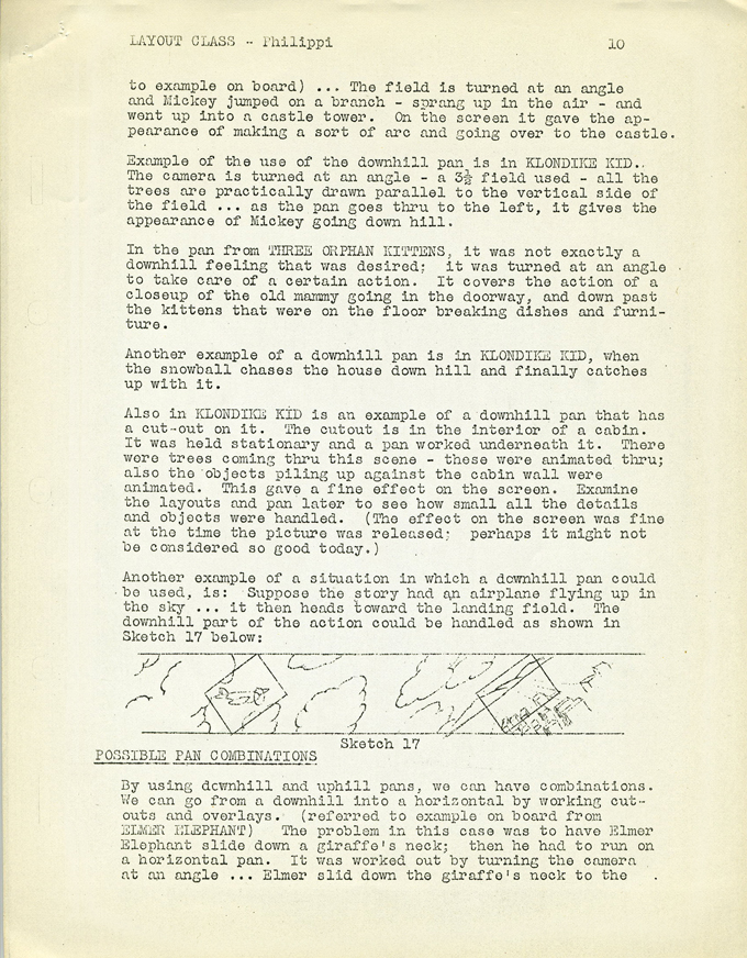
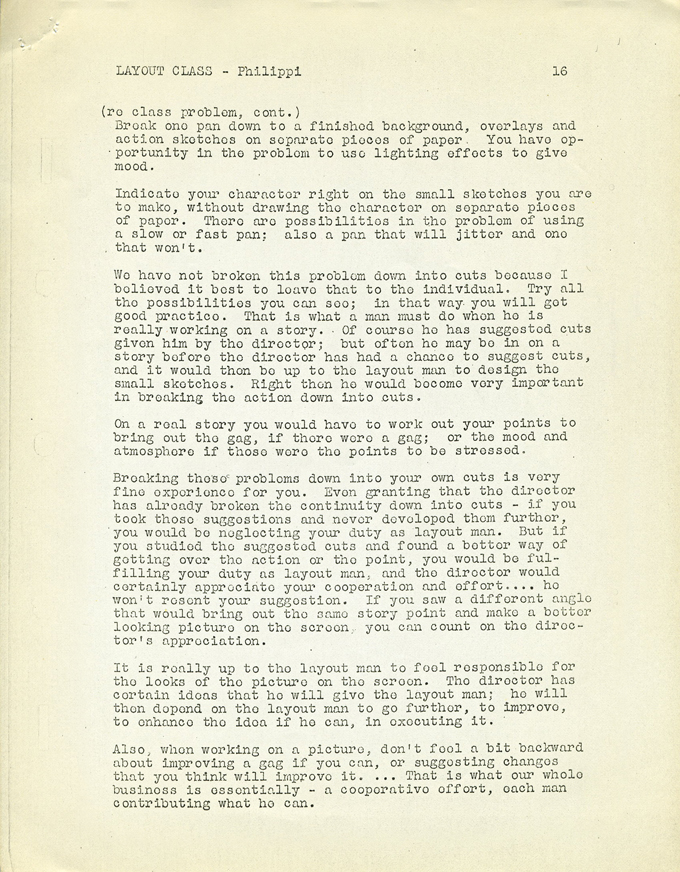 16
16 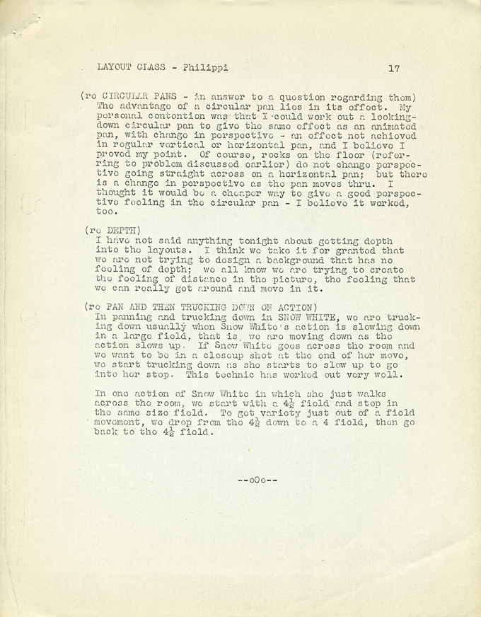 17
17 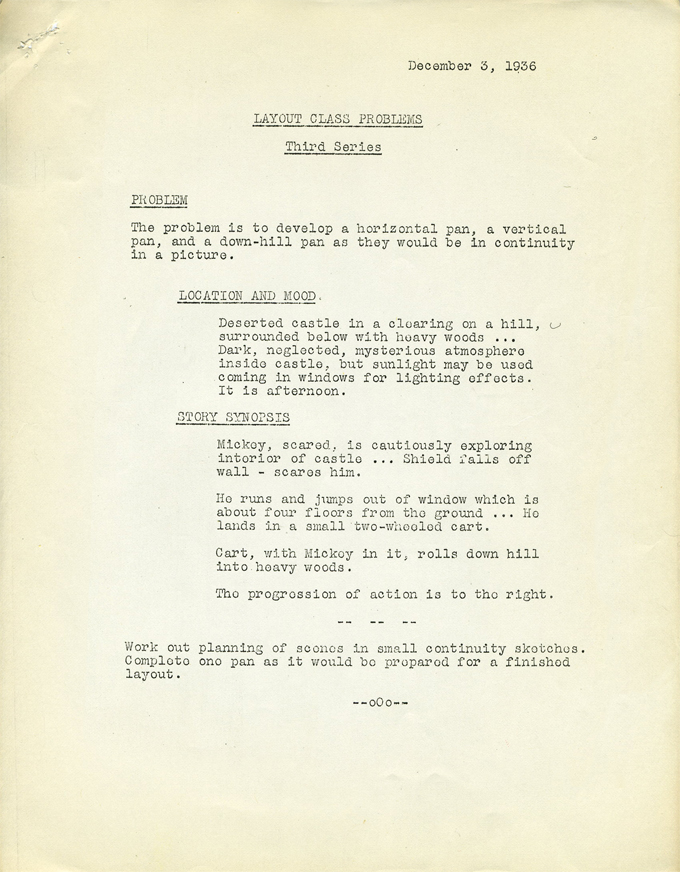 18
18
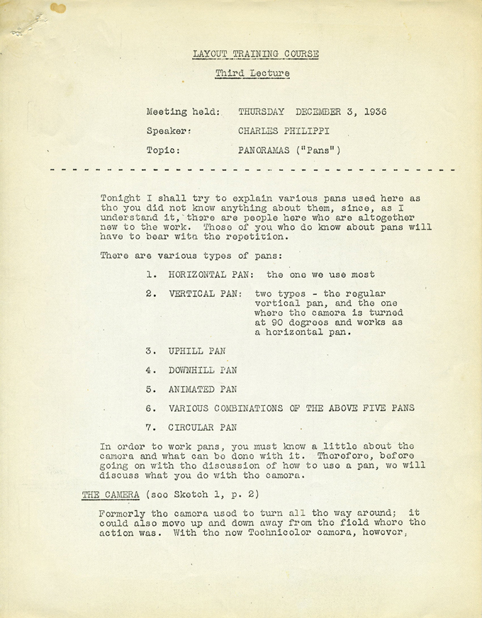
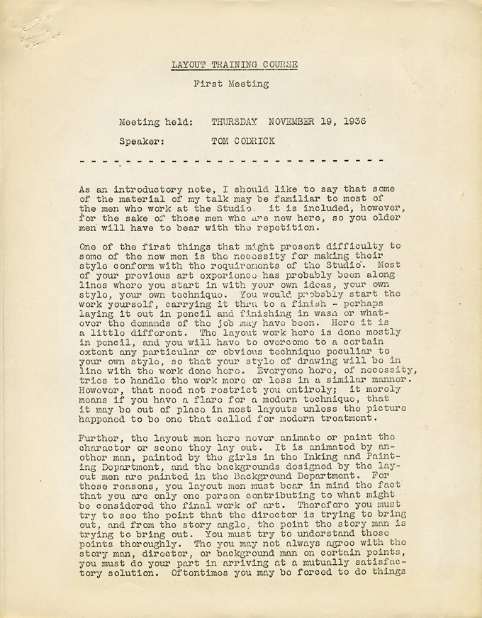
Action Analysis &Animation Artifacts &Articles on Animation &Disney &Layout & Design 03 Jun 2010 09:22 am
recap – Disney Layout Course – 1
Hans Perk is posting a series of rare lectures on Layout. In August 2006 I posted the notes for the Disney afterhours lectures. To coincide with Hans, I’m recapping those notes.
- Yhe Disney Layout Course was held after hours at the studio in 1936. The first lecture was given by Tom Codrick on May 6, 1936. I have the first lecture, the third lecture by Charles Philippi and an earlier one held by Phil Dike (though this last seems to be missing two pages.)
I hope it’ll be useful. I’ll post the next in a few days.
 1
1 2
2 3
3 4
4
(Click on images to enlarge.)
 5
5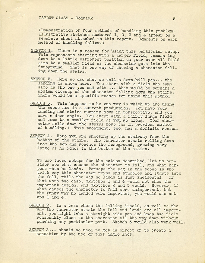 6
6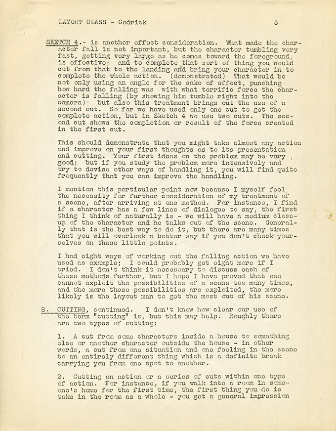 7
7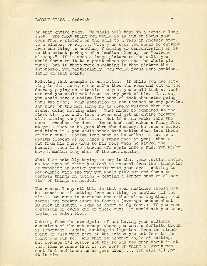 8
8
 09
09 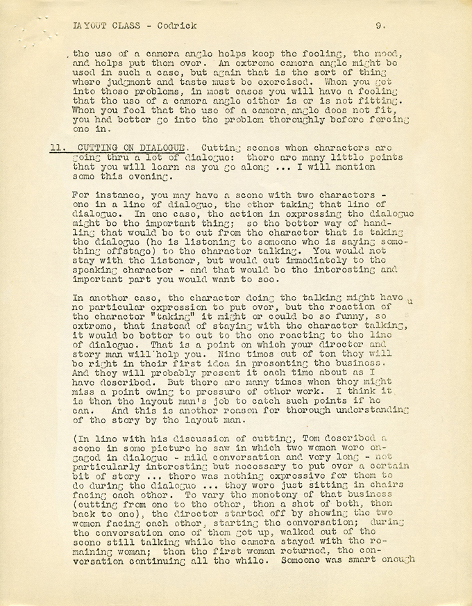 10
10 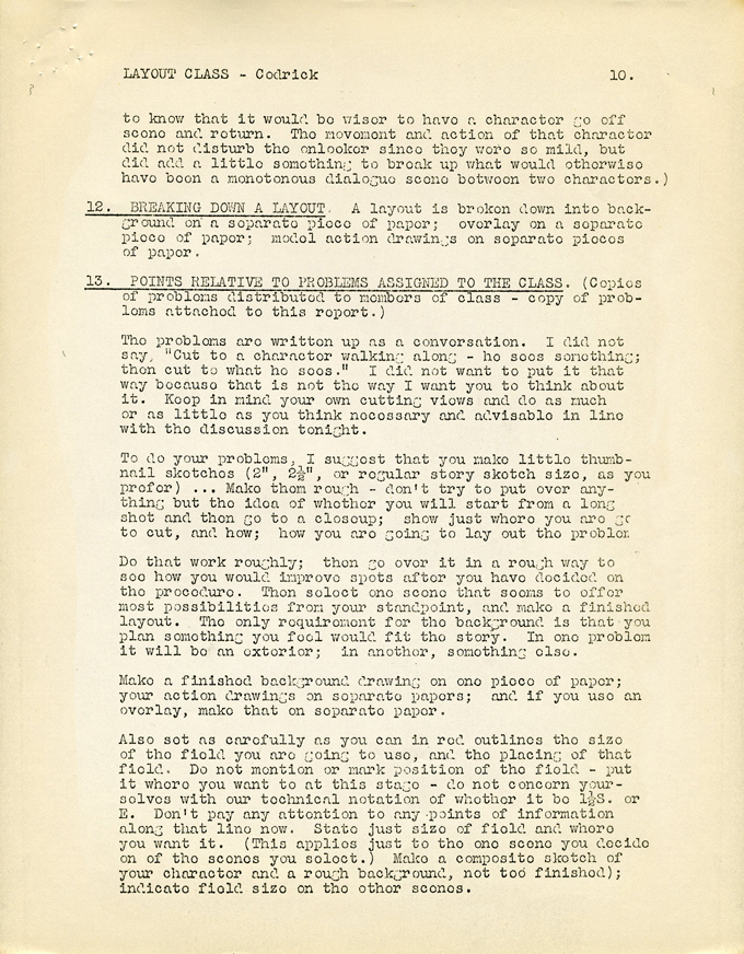 11
11
 12
12 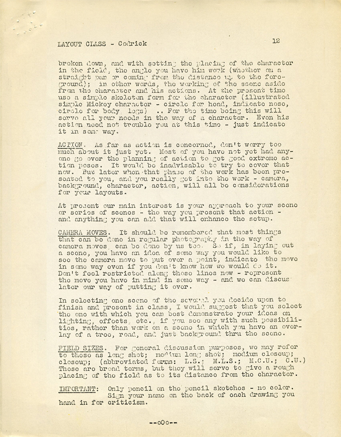 13
13 
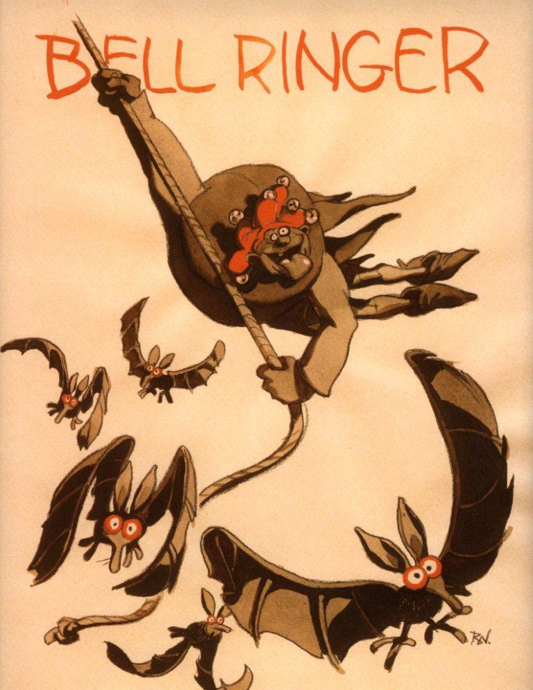
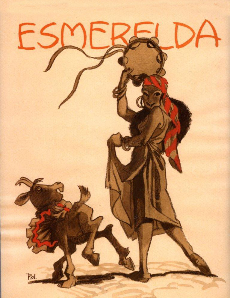
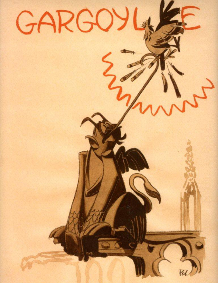
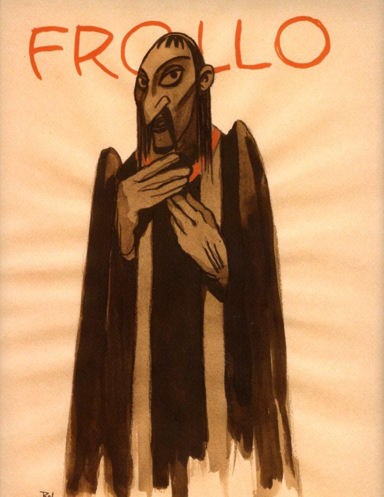
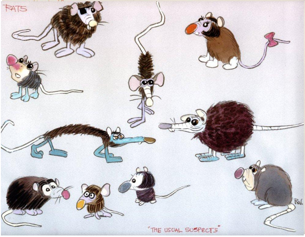
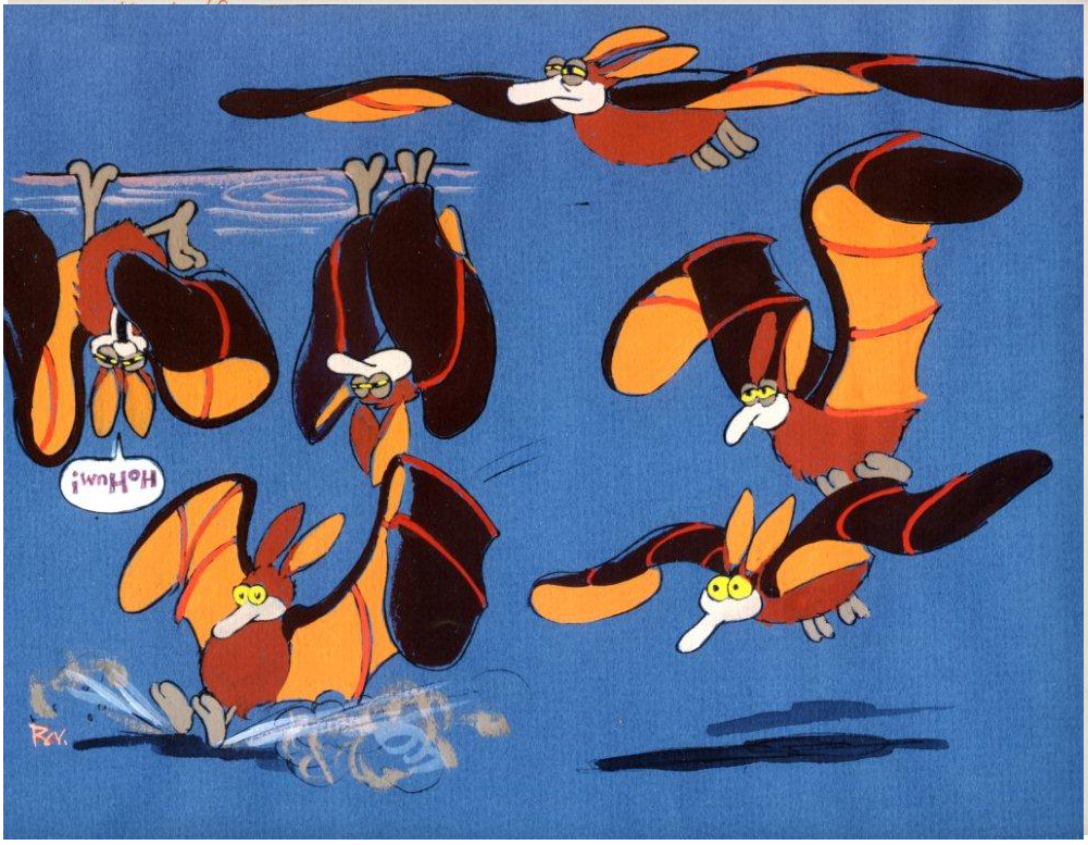
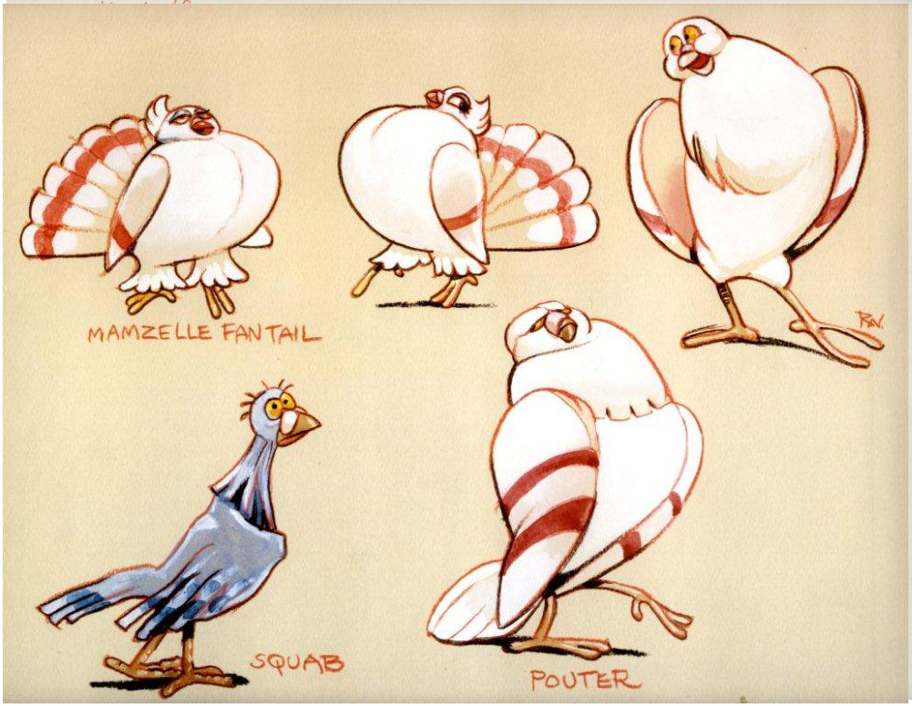
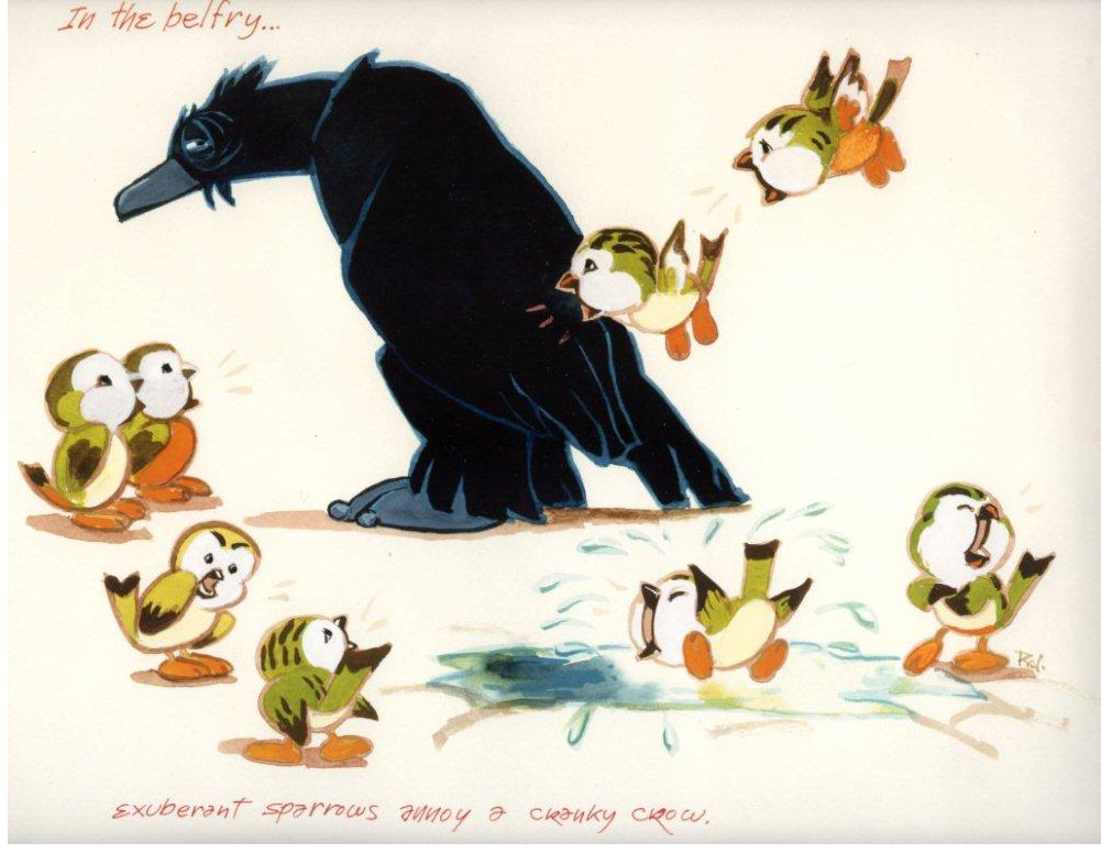
Bill Peckmann &Disney &Layout & Design &Models &Rowland B. Wilson 15 May 2010 08:53 am
Hunchback Art
- Thanks to Bill Peckmann, I’ve posted some of Rowland B. Wilson‘s art from his Disney years (mostly The Little Mermaid artwork). Now. Bill has sent me some work from The Hunchback of Notre Dame.
A second posting of this art will be forthcoming; it’s a larger size and will take more comlications in scaning.
 1
1(Click any image to enlarge.)
 2
2
 3
3
 4
4
 5
5
 6
6
 7
7
Does it get any better than this?
She could have stepped out of Gulliver’s Travels.
 8
8
The charm in these birds is also ineffably beautiful.
 9
9
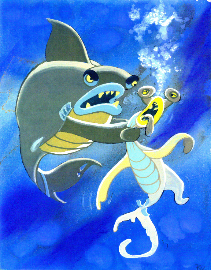
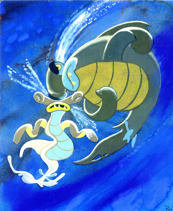
These two (above and below) seem to belong to Hercules.
 10
10
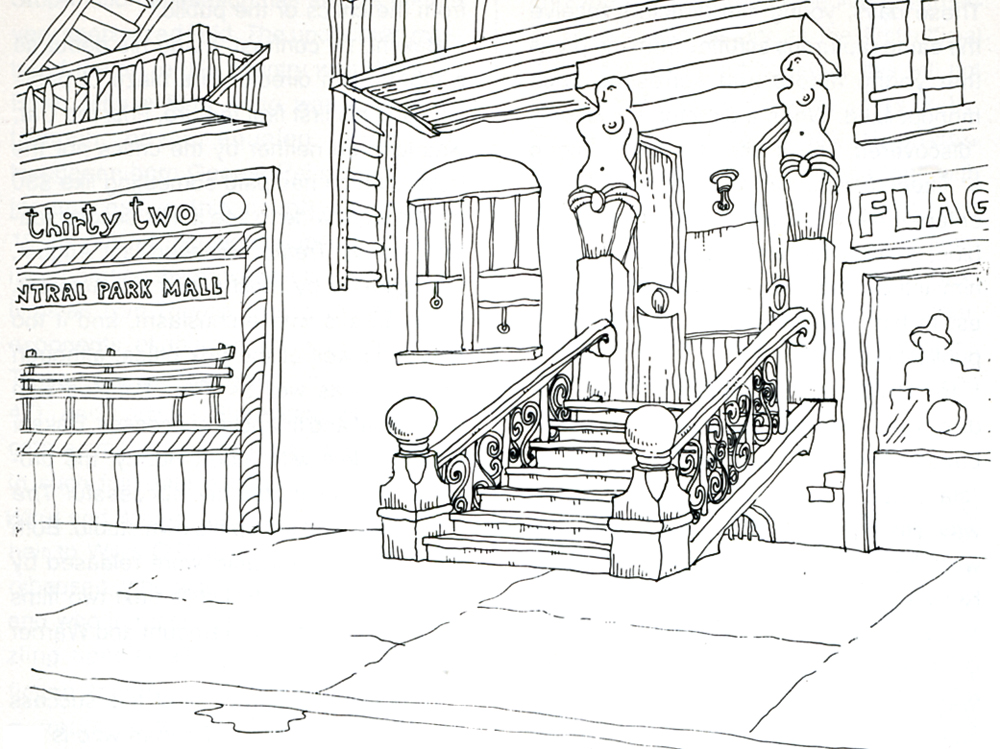
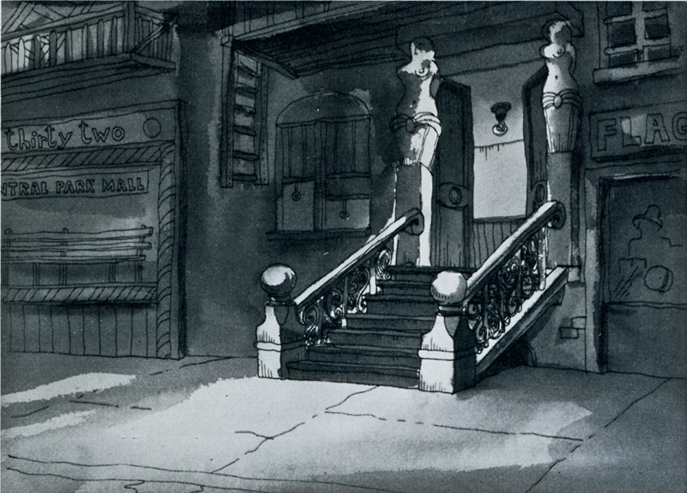
This final piece didn’t come from The Hunchback’s artwork, but was slipped into Bill’s Package from Rowland. I’ve seen it before, but it’s always fun to see it again.
Many thanks to Bill Peckmann for sharing.
Commentary &Layout & Design &Theater 13 Apr 2010 05:47 am
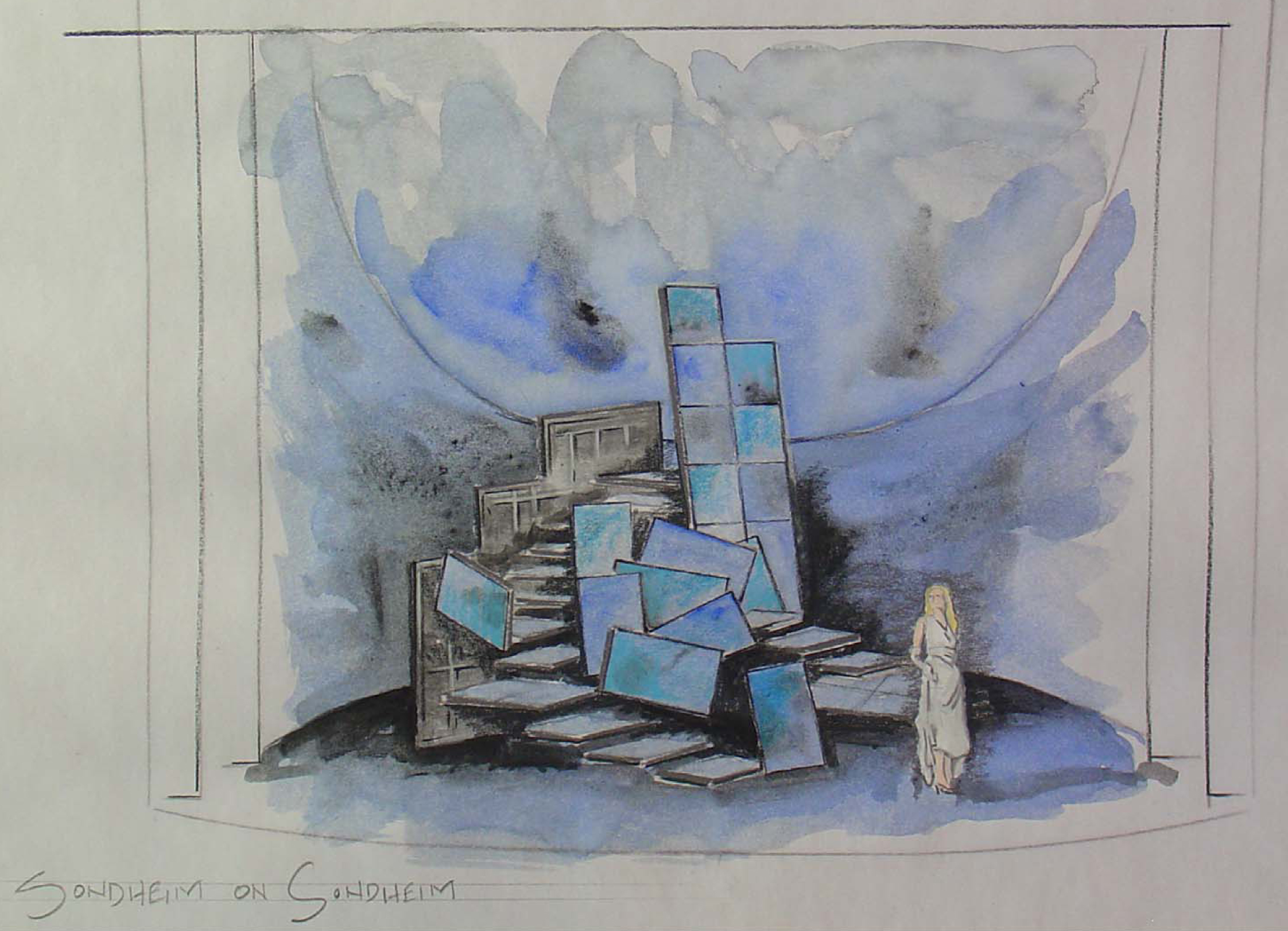
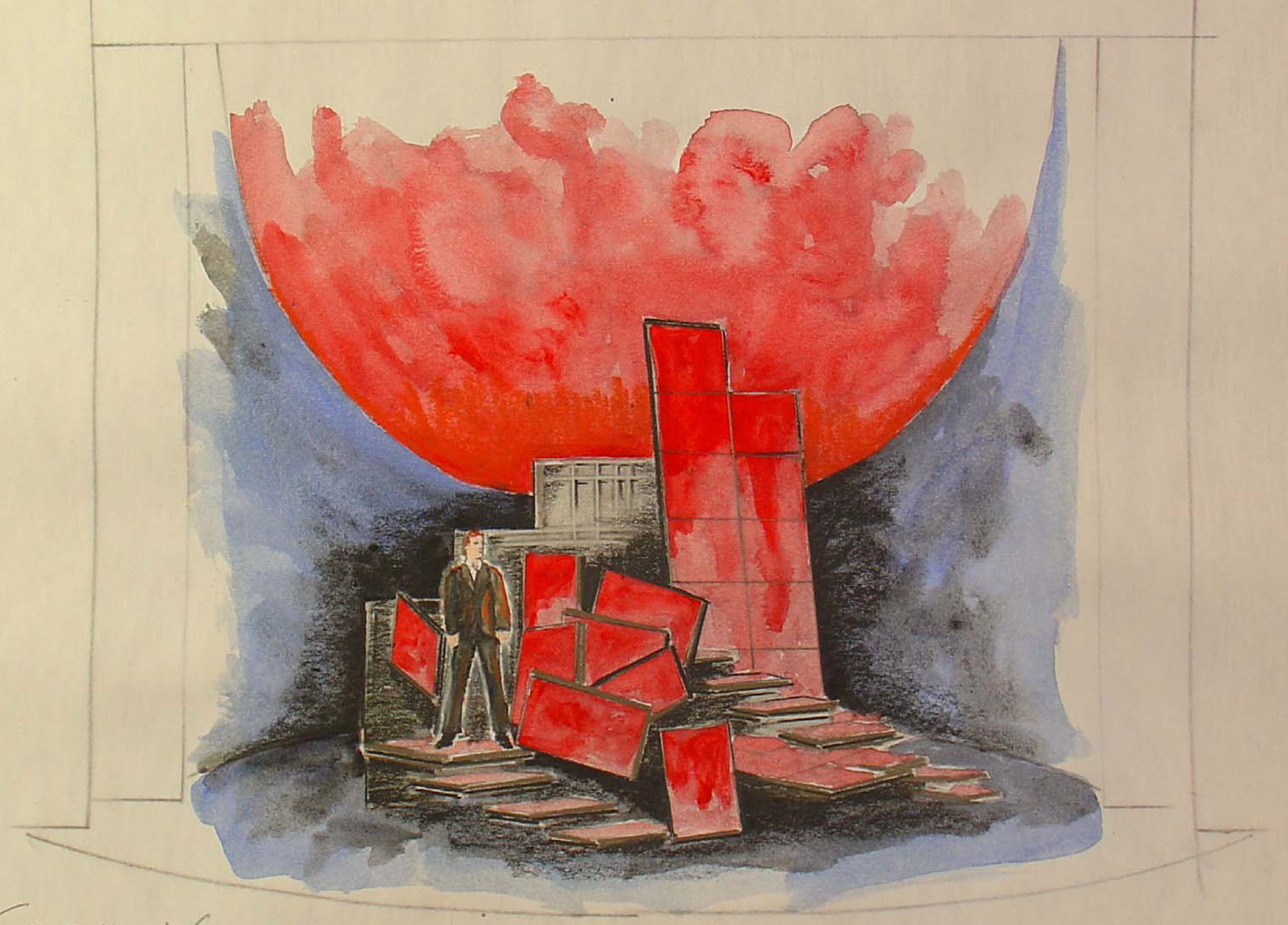
Sondheim on Sondheim
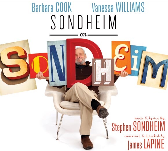 - This past weekend I saw a new Broadway show produced by The Roundabout Theater Company, playing at Studio 54. Sondheim on Sondheim is a show which revisits all of Stephen Sondheim’s lengthy and brilliant career in the theater.
Barbara Cook, Vanessa Williams and Tom Wopat lead a cast of eight who perform work from the Sondheim catalogue of songs, while cascading through the history of the man and, as a result, the history of modern theater – post Rodgers and Hammerstein.
The set for this is a modernist construction by designer Beowulf Borritt. If you ask me, this extraordinary design is a brilliant turn for theater. There’s a construction of 35 multiple screens that tie together or in parts projecting film, video, slides. Stephen Sondheim is a participant in the show in that he’s always there in some projection talking about the shows, his career, his cocreators and producers. The highlight of the show, for me, was the end where Sondheim plays “Anyone Can Whistle” on the piano, and the cast sings to this. Simple and very emotional.
Through a lot of searching I was able to locate some of his original watercolors on line and thought I’d show some of these. A couple came from a slide program on the NYTimes which spoke about the use of projections in theater designs. This has fascinated me since my work on Woman of the Year, projecting an animated character behind the actor onto a 43 foot screen. (The animation work on Sunday in the Park with George – also a Roundabout Production at Studio 54 – was a projection miracle, though the rest of that recent production left me a bit cold.)
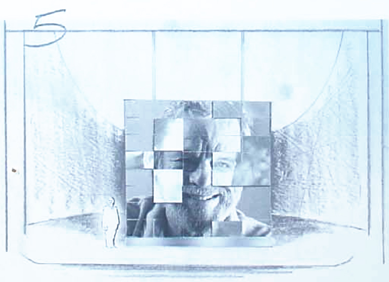
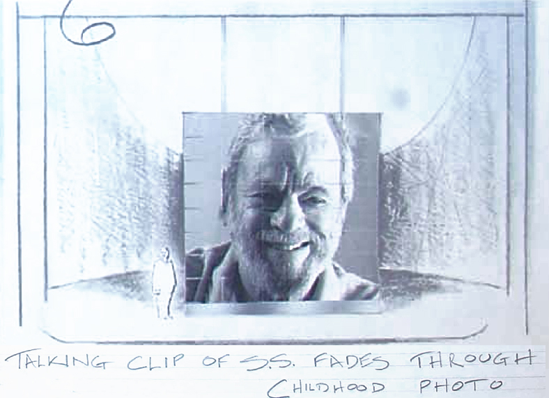
Let’s start with a short storyboard sequence which shows Sondheim aging.
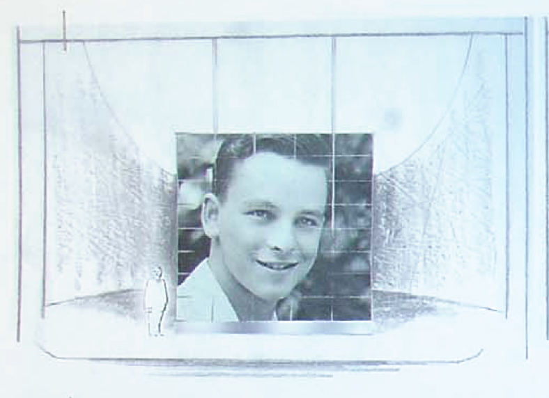 1
1The sequence begins with a young Stephen Sondheim.
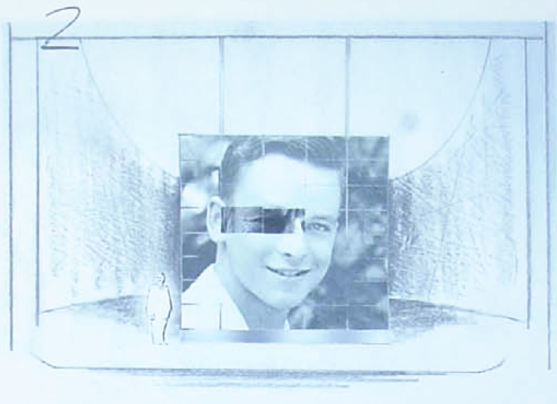 2
2
Slowly, and musically the image transforms . . .
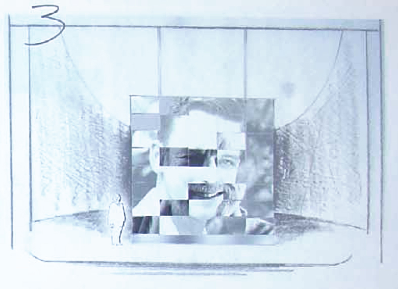 3
3
. . . through digital projections . . .
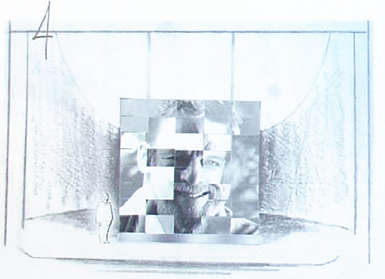 4
4
 5
5
. . . to an older face.
 6
6
Finally ending with the 80 year old Sondheim.
The set . . .
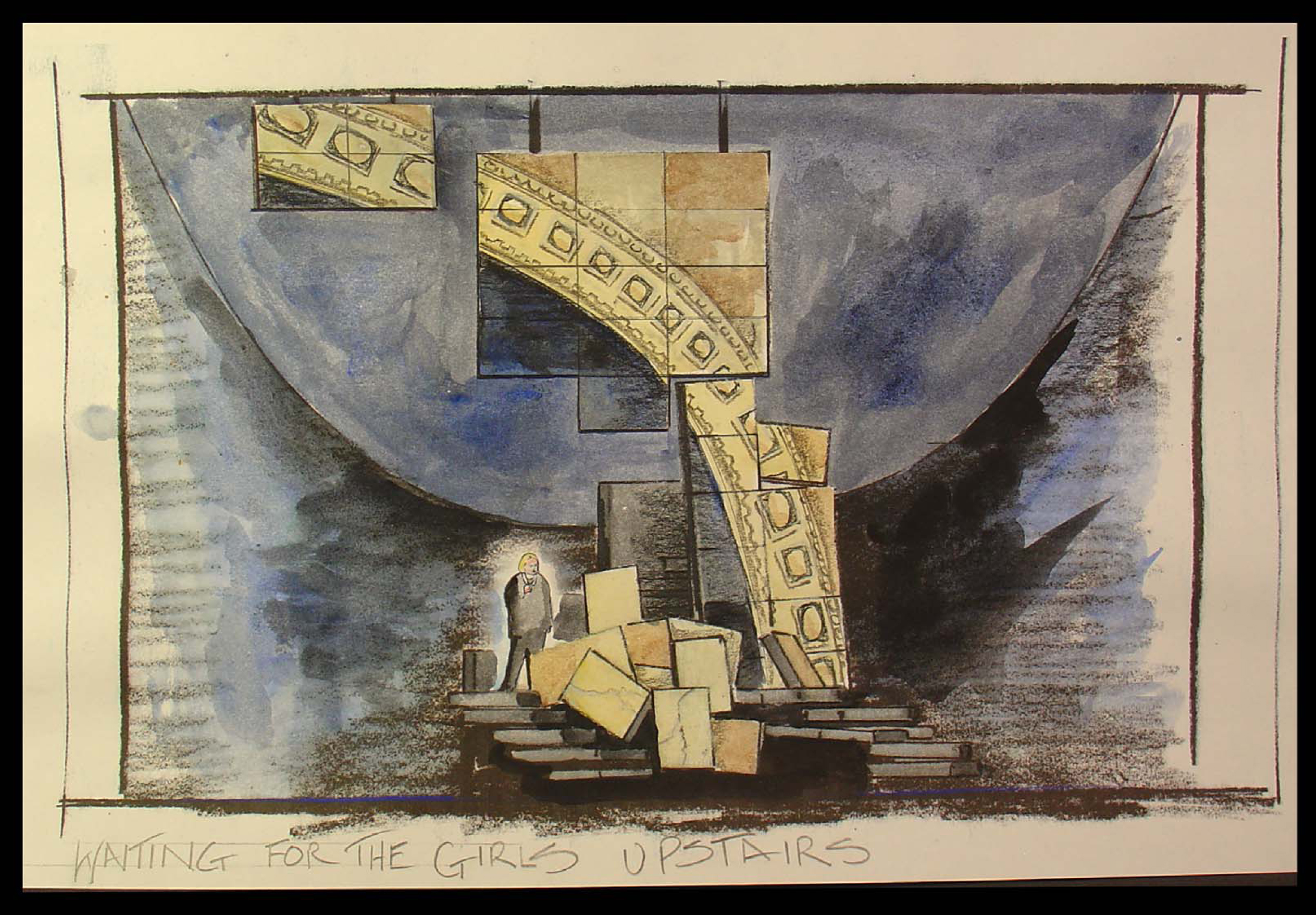
The set is a somewhat abstract construction that utilizes many
screens of digital projections both video and slide.
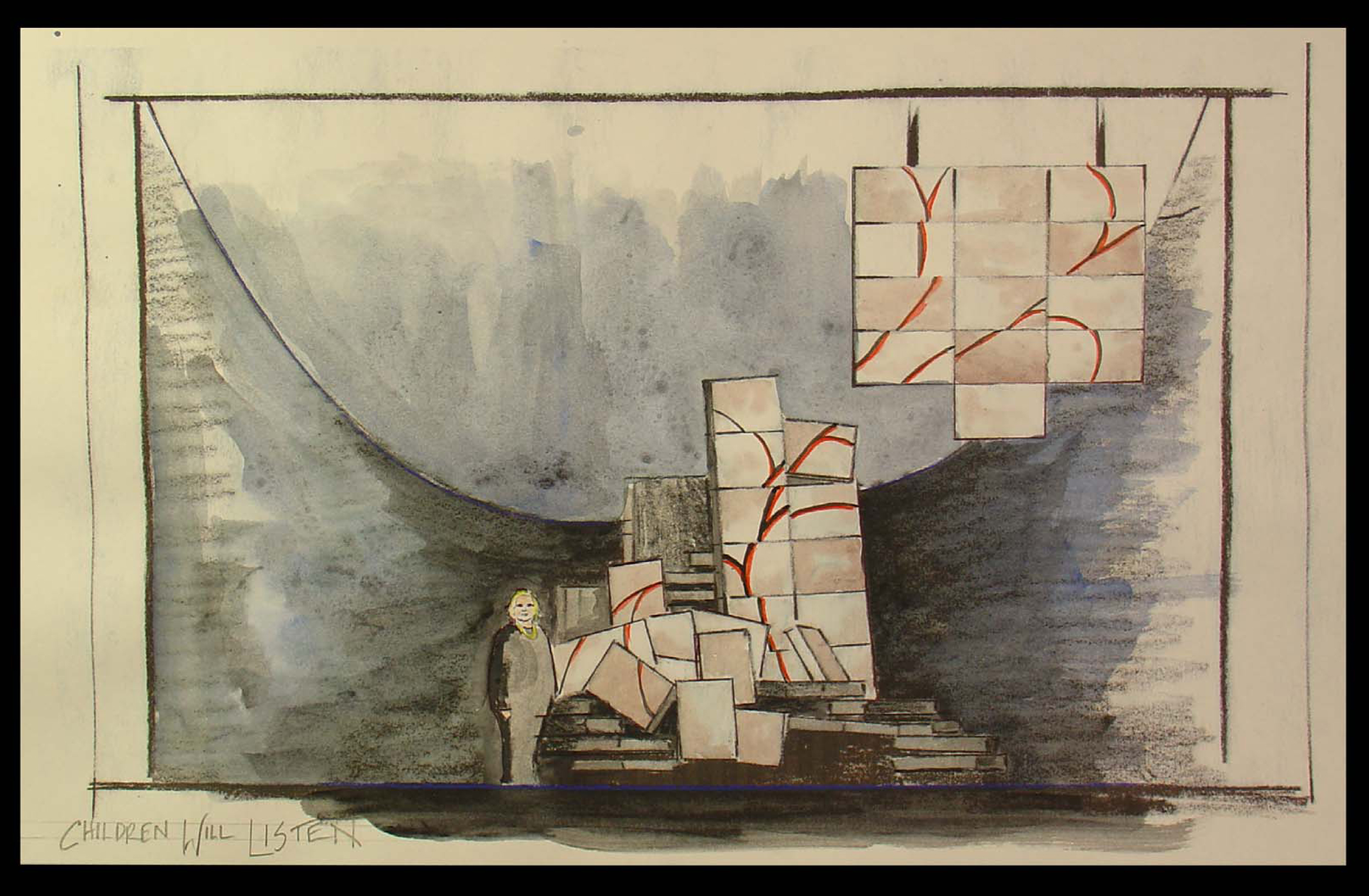
You can see how the parts shape shift even though
the projections continue on the parts.
Lighting by designer Ken Billington is also brilliantly part of this set.
All of the parts – lighting, set, projections – all act as one.
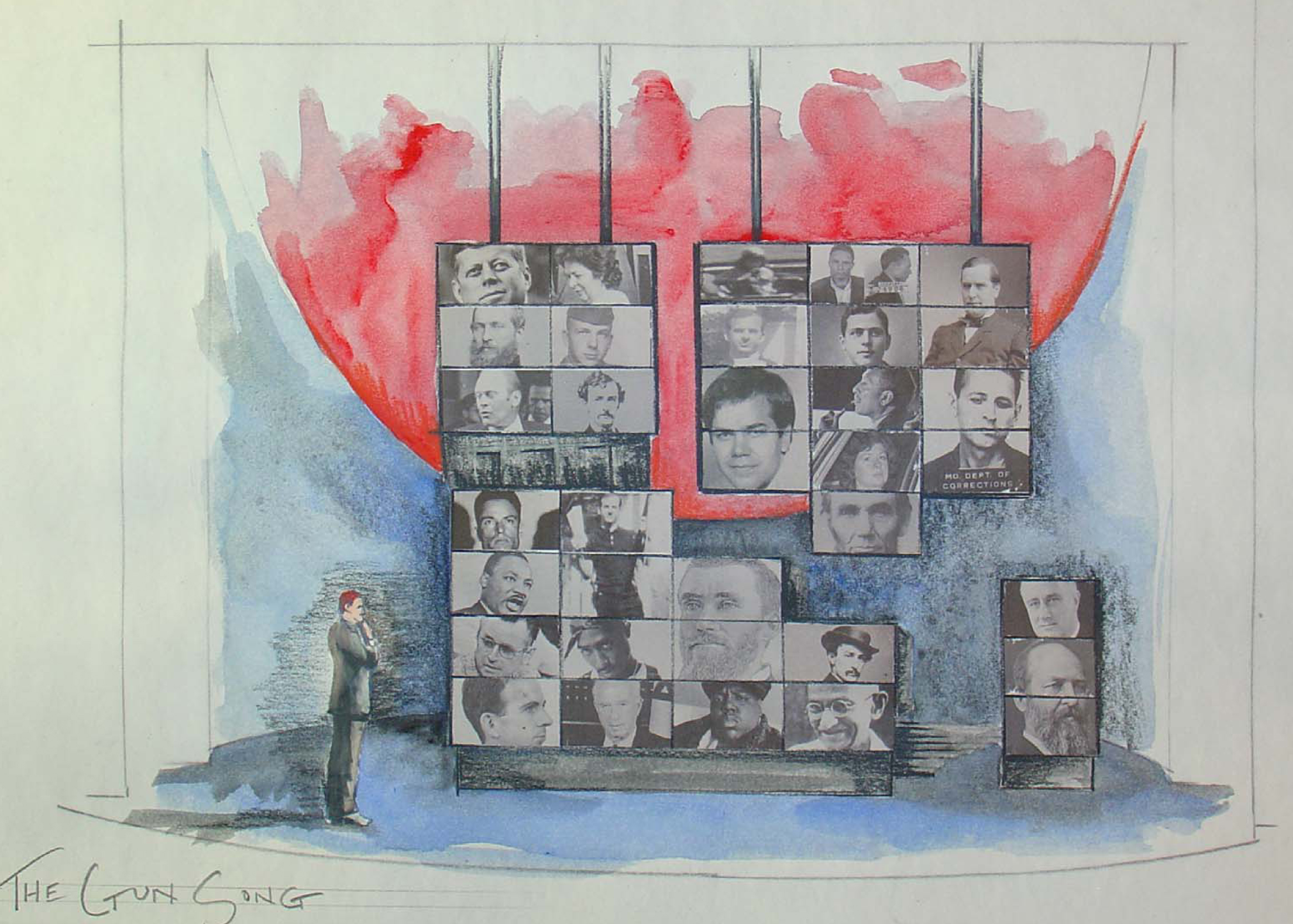
The history of the Presidency serves as a backdrop for the ASSASSINS number.
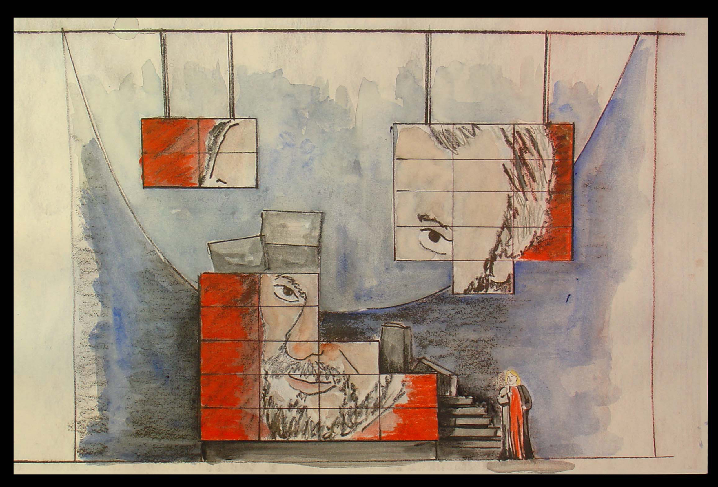
Ultimately, the portrait of Sondheim comes together.
All sketches © 2010 Beowulf Boritt
These drawings and watercolors give an indication of what the set looks like, but they can’t relay the brilliance of the device. It’s magnificently used, and the photos, video and animation on the screens is quite often brilliant. I can’t begin to capture the essence of it, but I can tell you it’s a highlight in theater for me this year.
The orchestrations for this show are by Michael Starobin, and they are just as wonderful as anything else he’s done. The miniscule orchestra never sounds it, and this should show others on Broadway how to do it. It was my pleasure to work with Michael on a number of films he scored for me. I always felt privileged to have him there and excited as any note of music came in for those many films (which included Lyle Lyle Crocodile, Ira Sleeps Over, and Poky Little Puppy’s First Christmas.)
This show is excellent, and it is even more superb if, like me, you’re a Sondheim devotee. You couldn’t ask for more from theater – except perhaps a return to some of those original productions as they sit and grow in my memory. Elaine Stritch singing Ladies Who Lunch, Glynis Johns singing Send in the Clowns, Mako and others singing Someone in a Tree, Mandy Patinkin singing Finishing the Hat – There are just too many others to keep mentioning.
However, I do have to say that in several cases, arrangements and production of some of the songs performed in this show are better than the original versions. The cast of eight sounds brilliant and easily outperforms the British cast that did Sunday in the Park recently at this same theater. Vanessa Williams is truly a star, you can’t take your eyes off of her, yet she sings with the ensemble.
If you have any affinity for Sondheim, go to see this show for a brilliant performance of many of his songs as well as a near-perfect cast and a magnificent set.
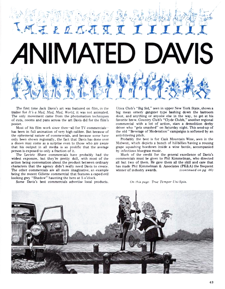
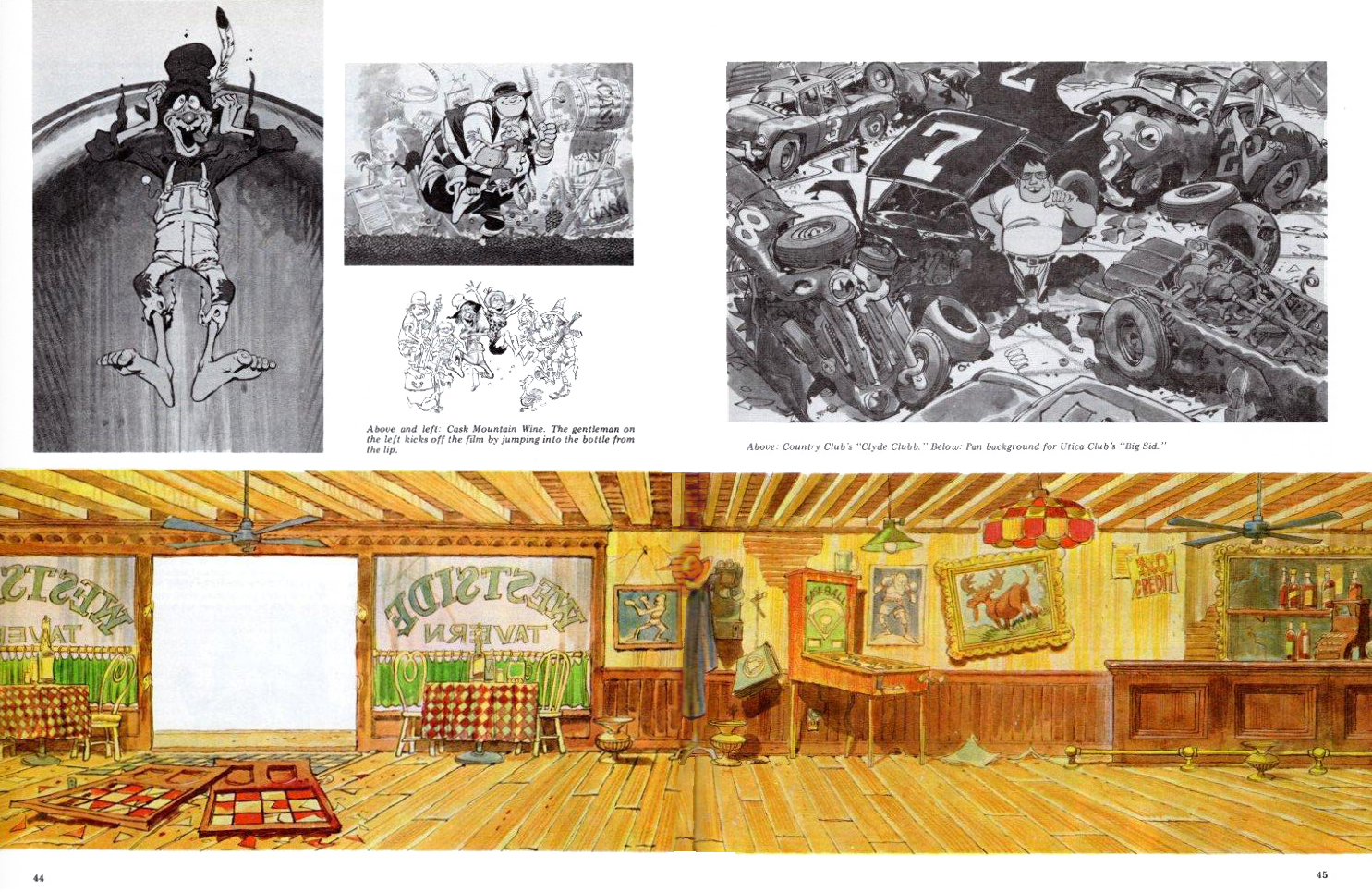
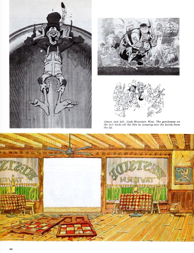
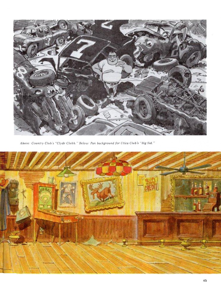
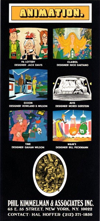
Articles on Animation &Bill Peckmann &Illustration &Layout & Design 09 Mar 2010 08:42 am
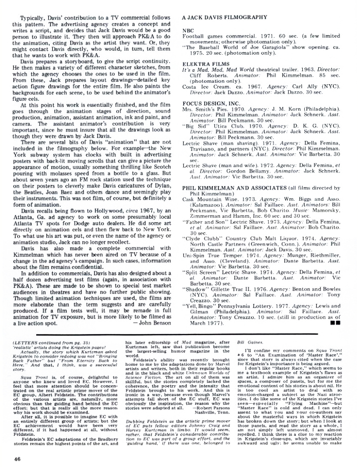
Jack Davis @ PKA
- The esteemed illustrator/cartoonist, Jack Davis, did some brilliant art and design work for animation when working for Phil Kimmelman and Ass. Bill Peckman sent me the following article from Squa Tront magazine, and he added a couple of illustrations Davis did for PK&A.
Here’s the article:
 1
1(click any image to enlarge.)
Pages 2 & 3 made a double page spread that looked like this.
I’ve split it apart so the images would be larger in thumbnails.
 2
2
 3
3
 4
4
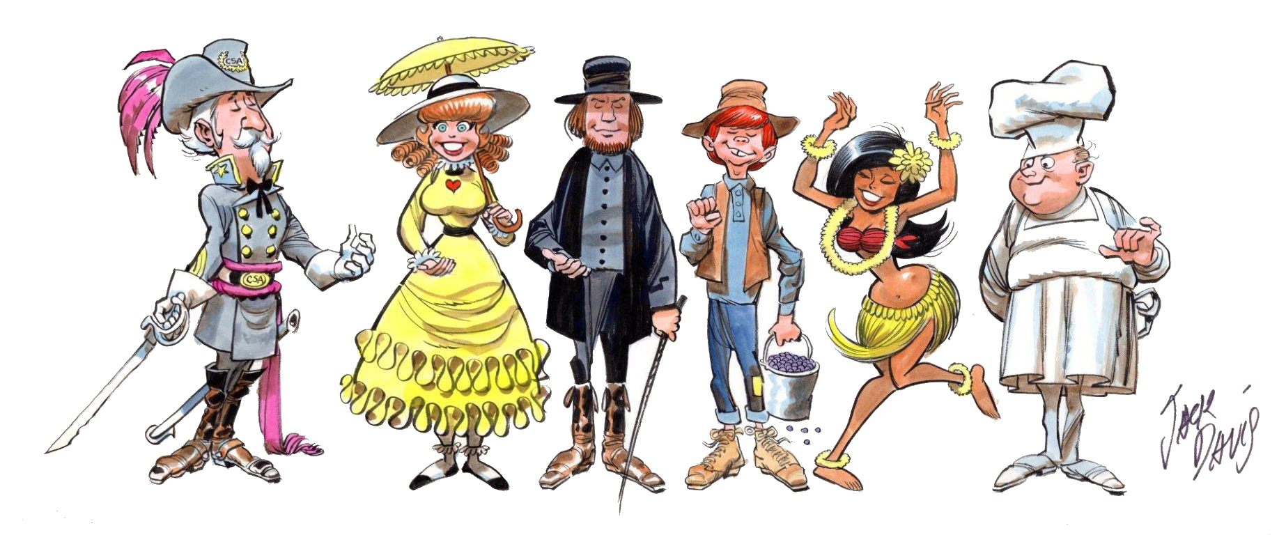
Some characters Davis did for a “Mrs. Smith Pies” ad.
All of the characters should be holding the product in hand.
A PK&A ad by Davis.
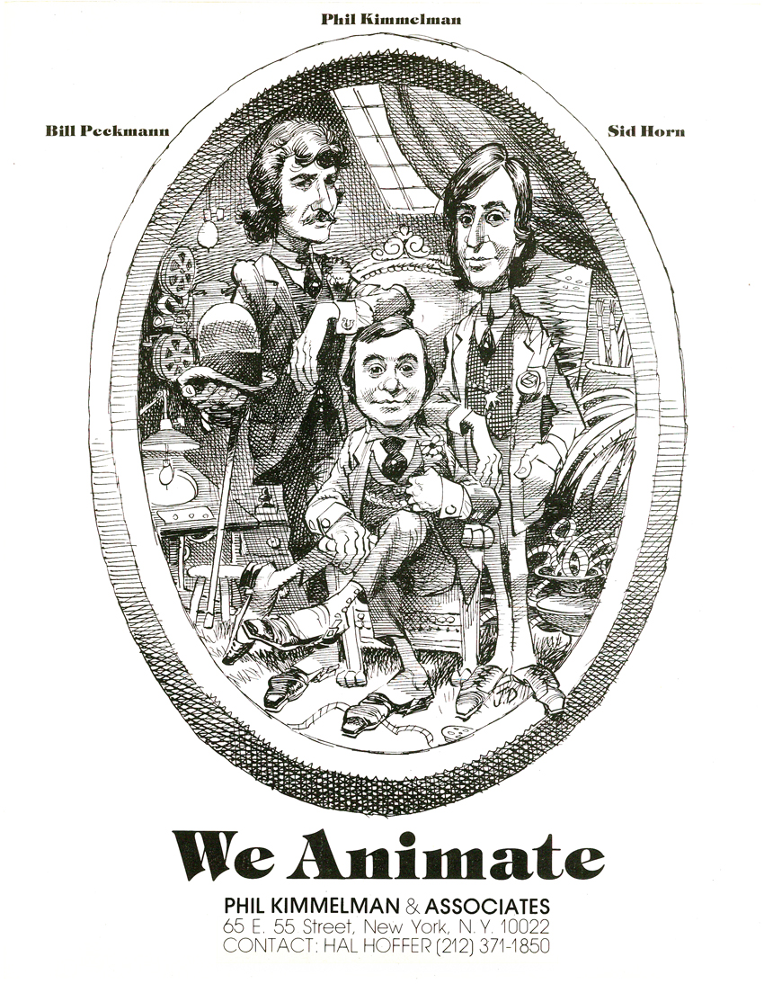
And, of course, the notable caricature by Davis of
Phil Kimmelman and his Associates for their print ad.
(As taken from the Funnyworld issue #18 – PK&A
regularly supported Mike Barrier’s magazine with their ads
Articles on Animation &Bill Peckmann &Layout & Design 04 Mar 2010 09:04 am
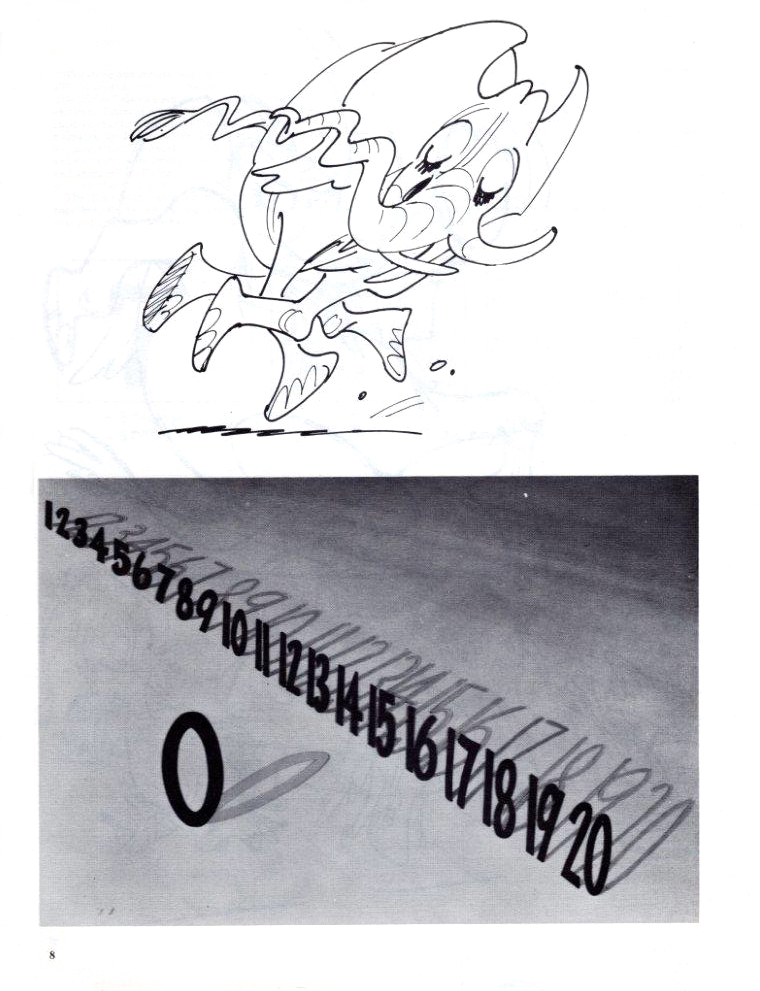
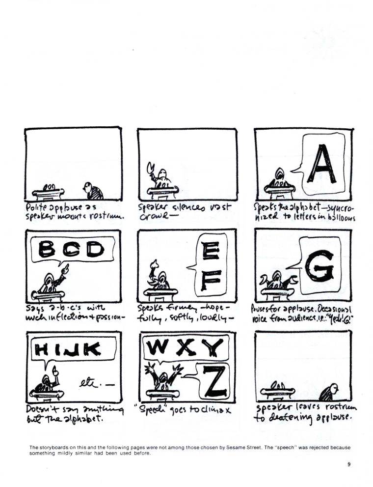
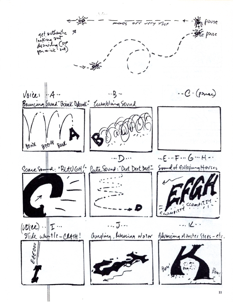
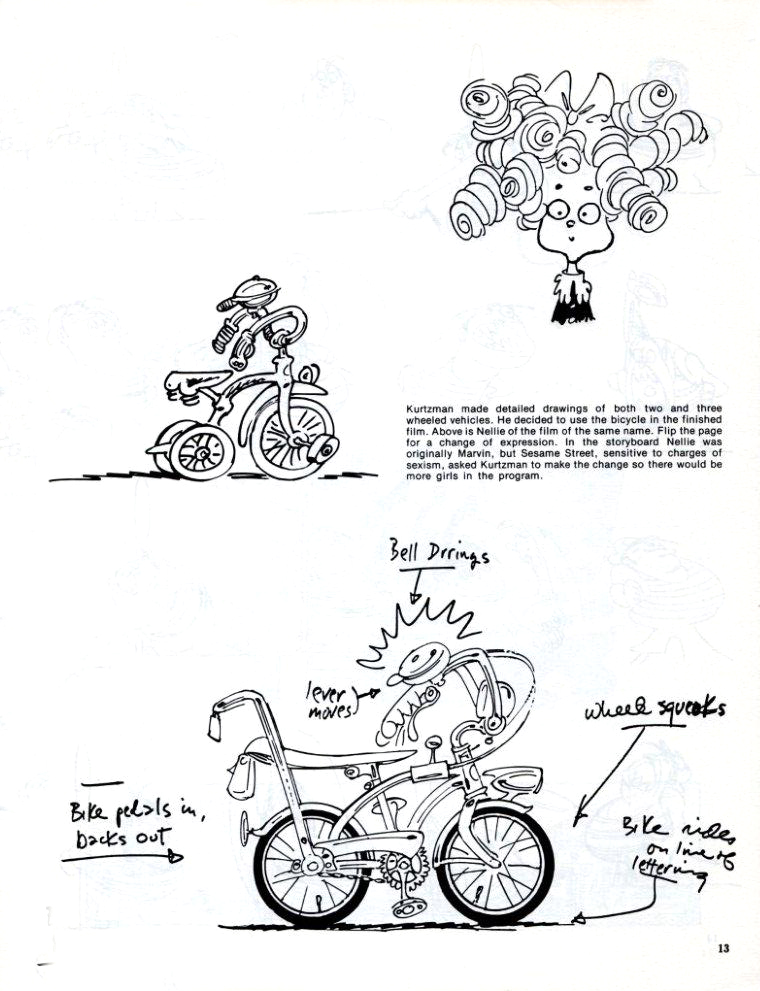
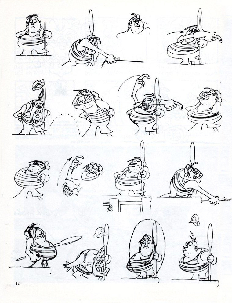
Kurtzman on Ses St
- In the old days, before Sesame Street stooped to working with softward developers to get low to free budget animation for their shows, there was an era of dignity on Sesame Corner. Animators were seen as artists and treated that way. Lots of Independent film makers were employed to create design and execute brilliant little animated pieces for the show. They created the hidden gems that made the show glow and helped support the excellent muppetwork of Jim Henson and gang.
The magazine Squa Tront, issue No. 5, features an article about 8 Sesame Street films that were designed and planned by Harvey Kurtzman for Phil Kimmelman and Associates. Thanks to Bill Peckmann, here’s that article.
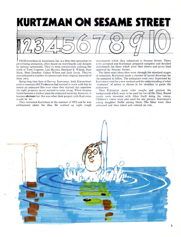 1
1(Click any image to enlarge.)
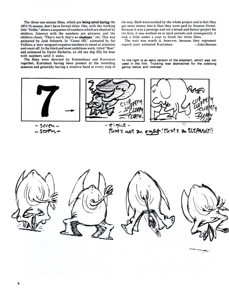 2
2 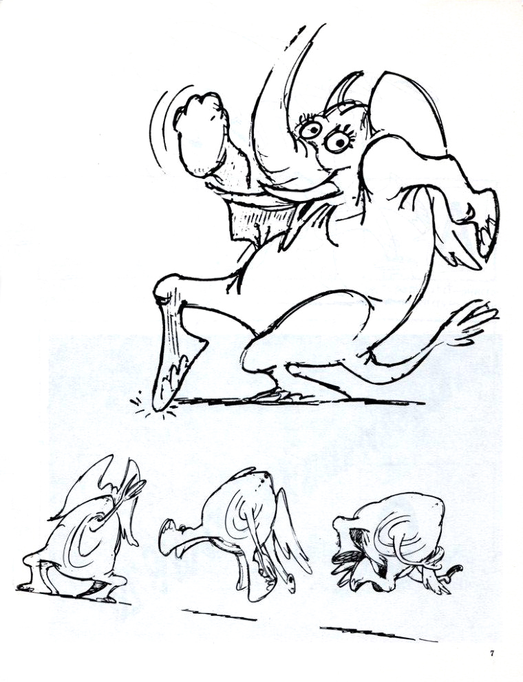 3
3
 4
4
 5
5 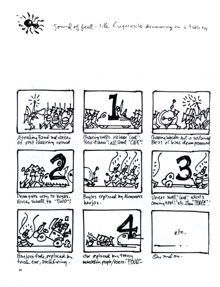 6
6
 7
7 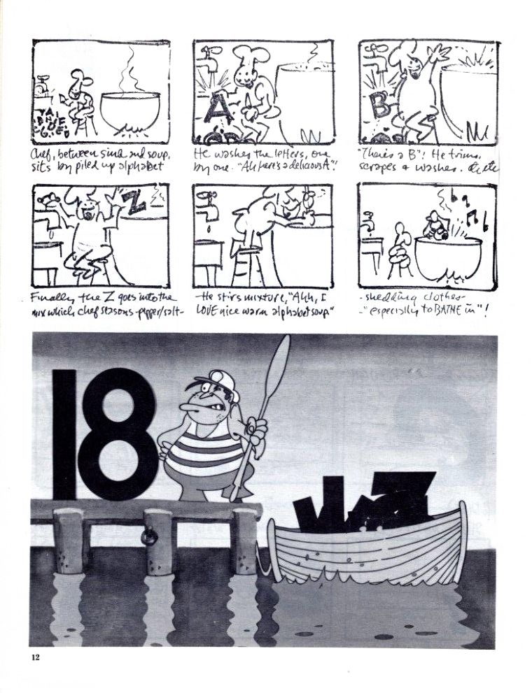 8
8
 9
9
 10
10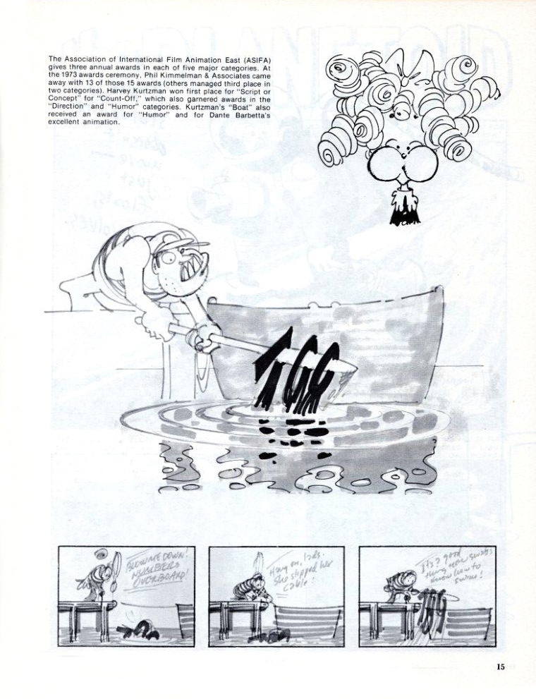 11
11
 12
12
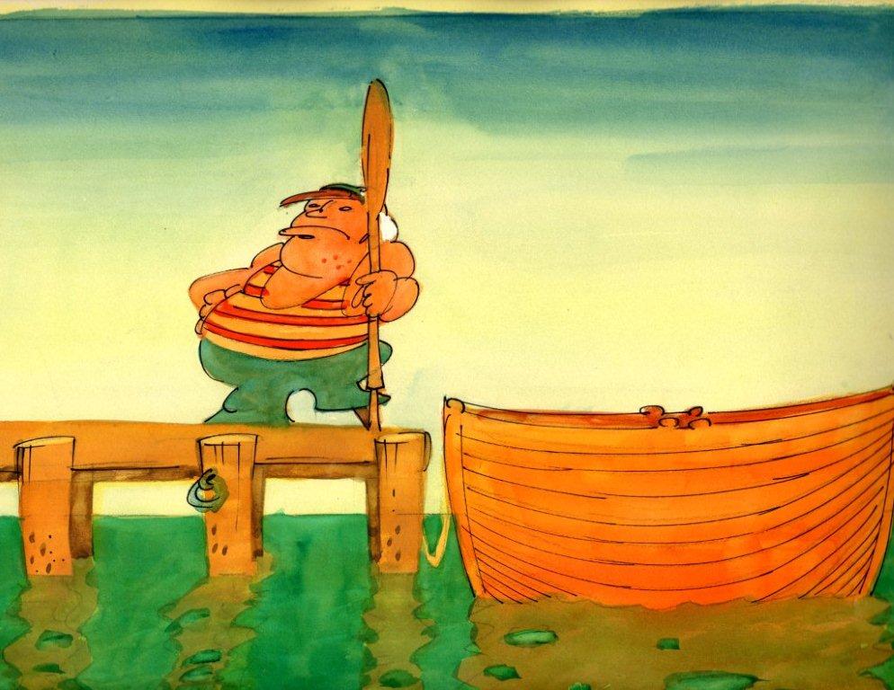
An image Harvey Kurtzman drew for his Sesame Street film, “Boat”.
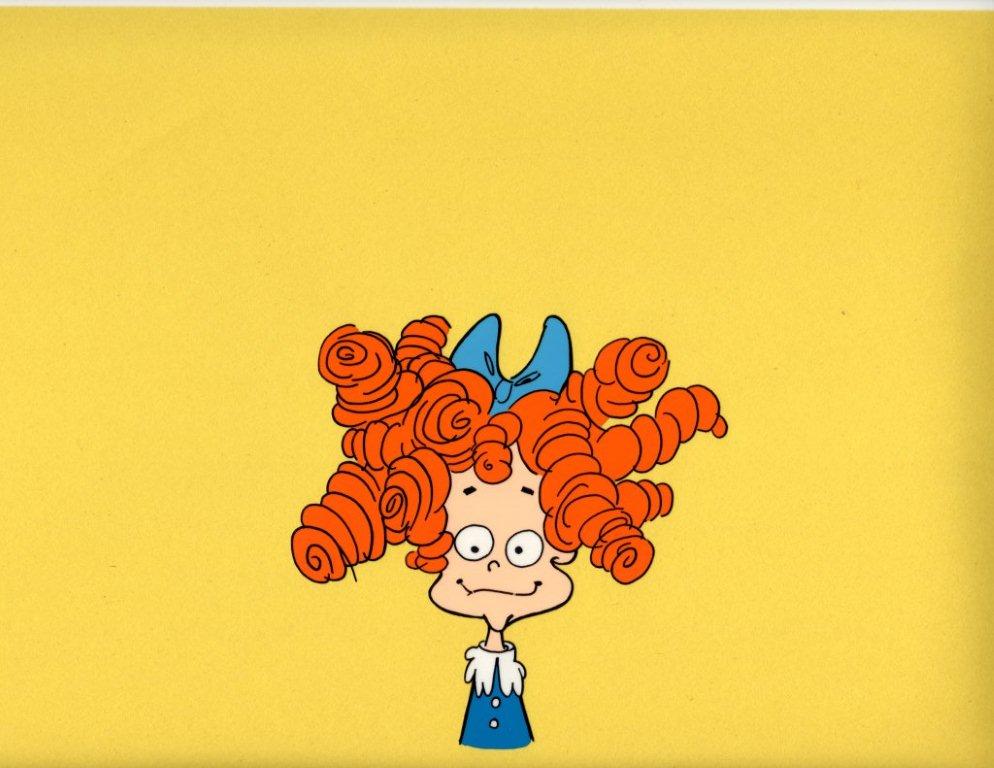
His drawing for the Sesame Street film, “Nelly”.
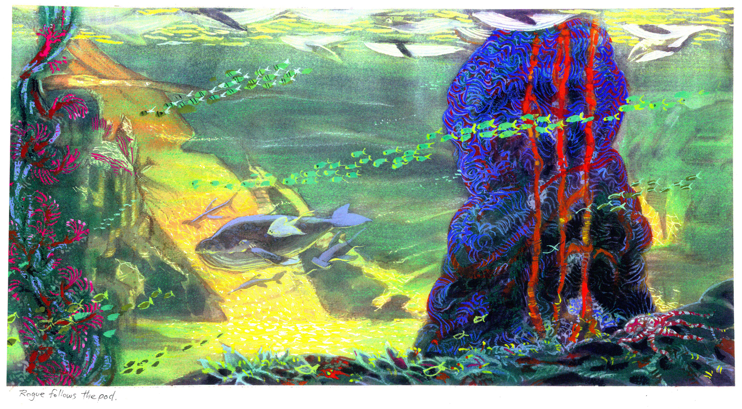
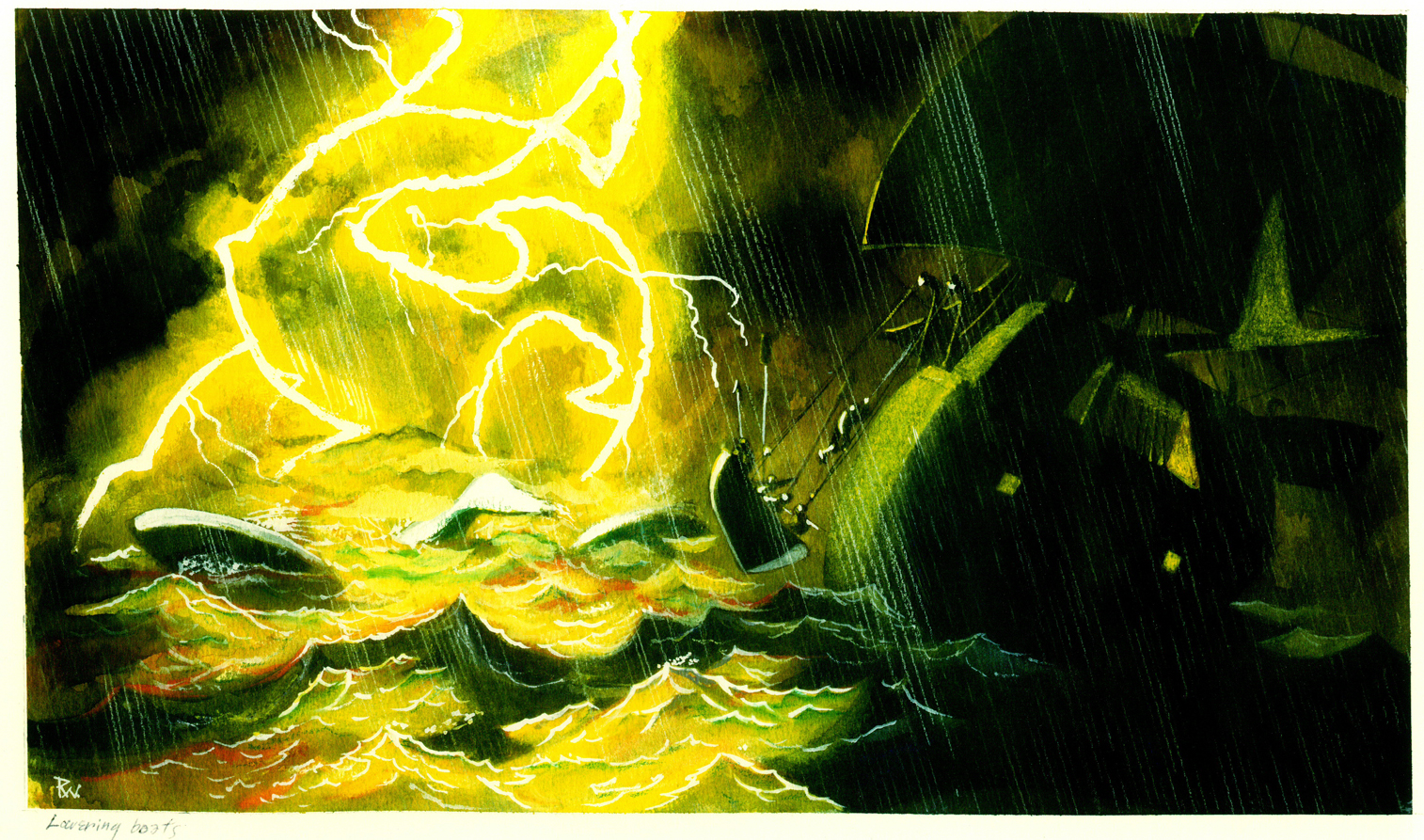
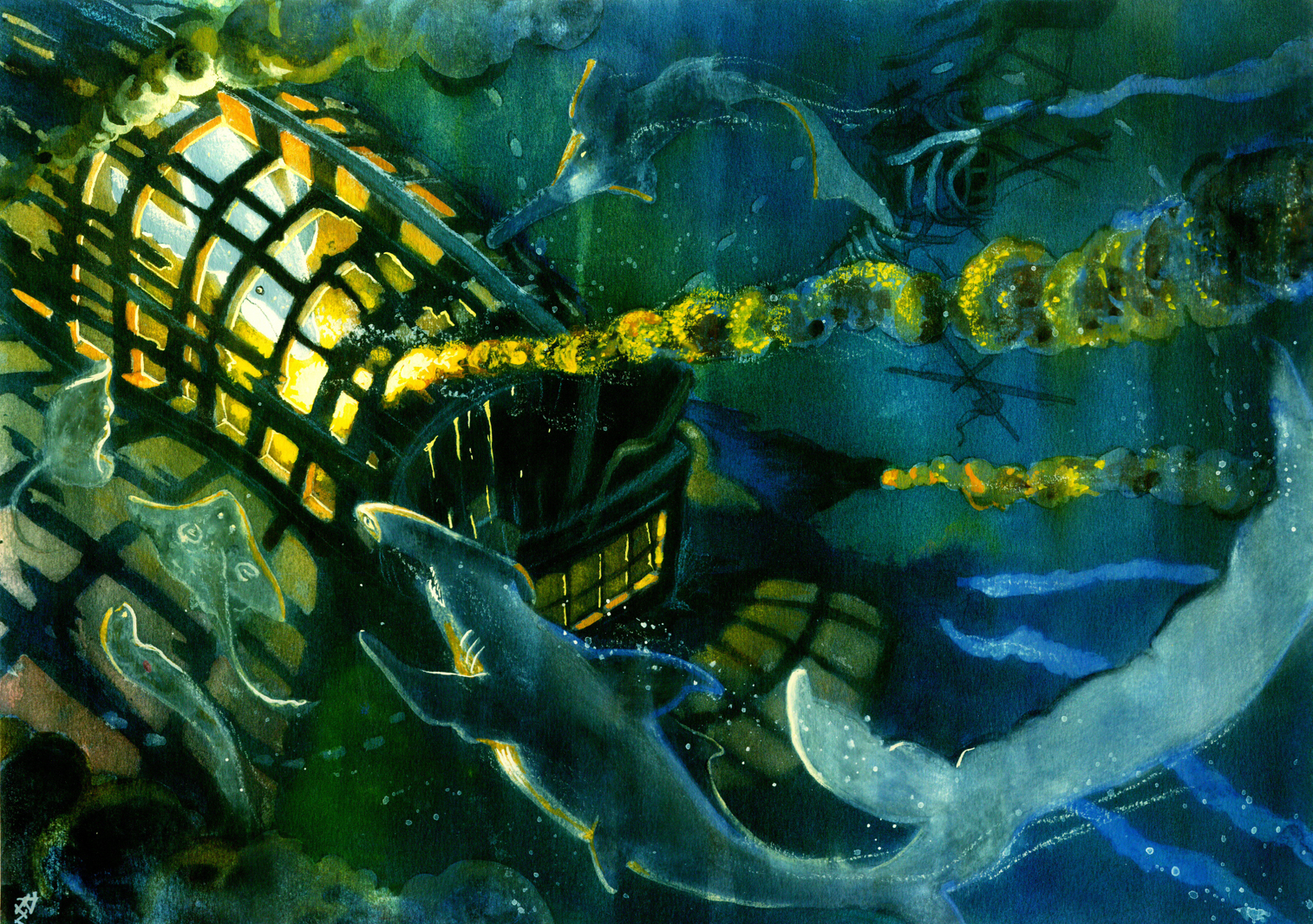
Bill Peckmann &Disney &Layout & Design &Rowland B. Wilson &Story & Storyboards 21 Dec 2009 09:02 am
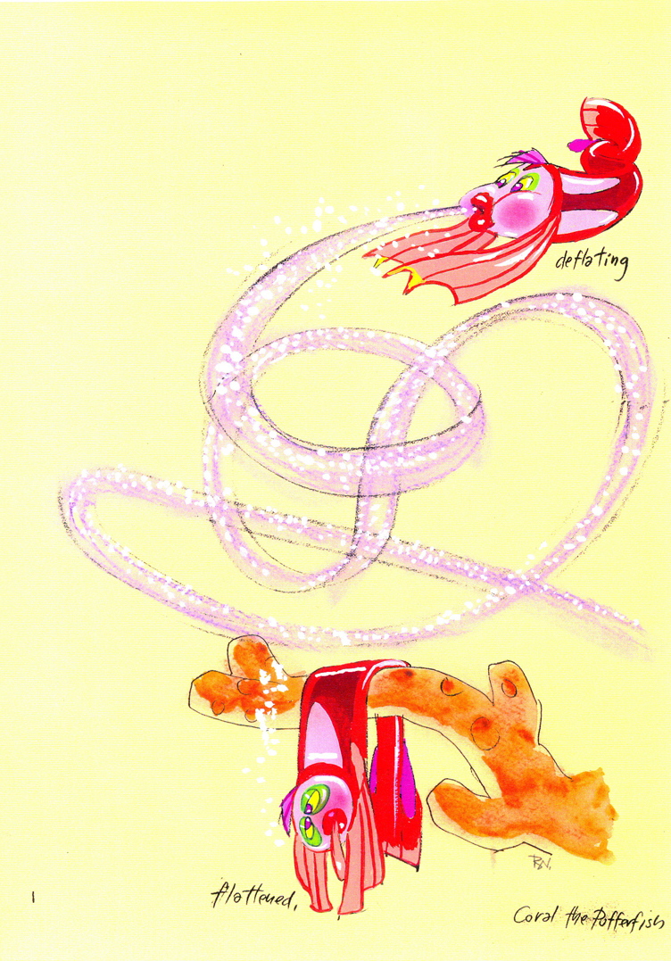
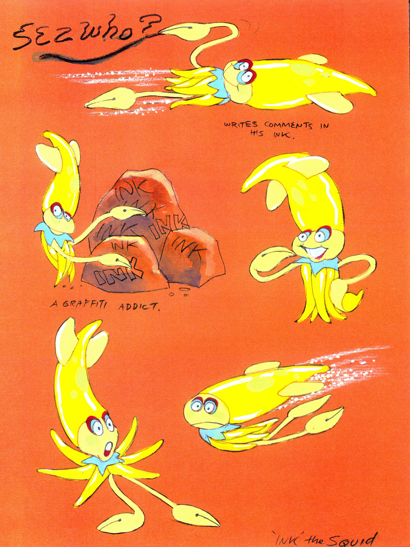
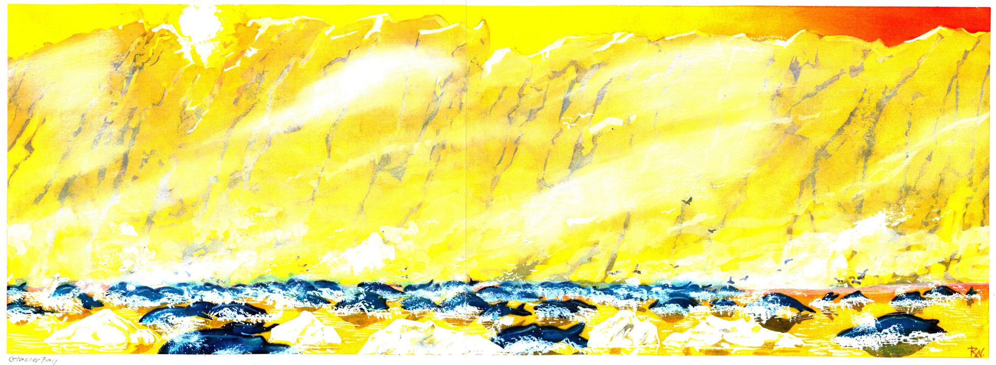
Rowland B. Wilson’s Li’l Mermaid
- The brilliantly talented Rowland B Wilson, certainly paid his dues at a number of animation studios. We’ve seen his work with Richard Williams’ Soho Square studio and with Don Bluth’s Ireland studio.
Today, I have some sketches and designs he did for Walt Disney studio while working on The Little Mermaid. Not all of this material made it to the film, but the incredible wealth it brought the directors had to have affected the overall production. This invaluable material comes courtesy of Bill Peckmann.
The first group to view are Production Designs that he did for various sequences throughout the film.
(Click any image to enlarge.)
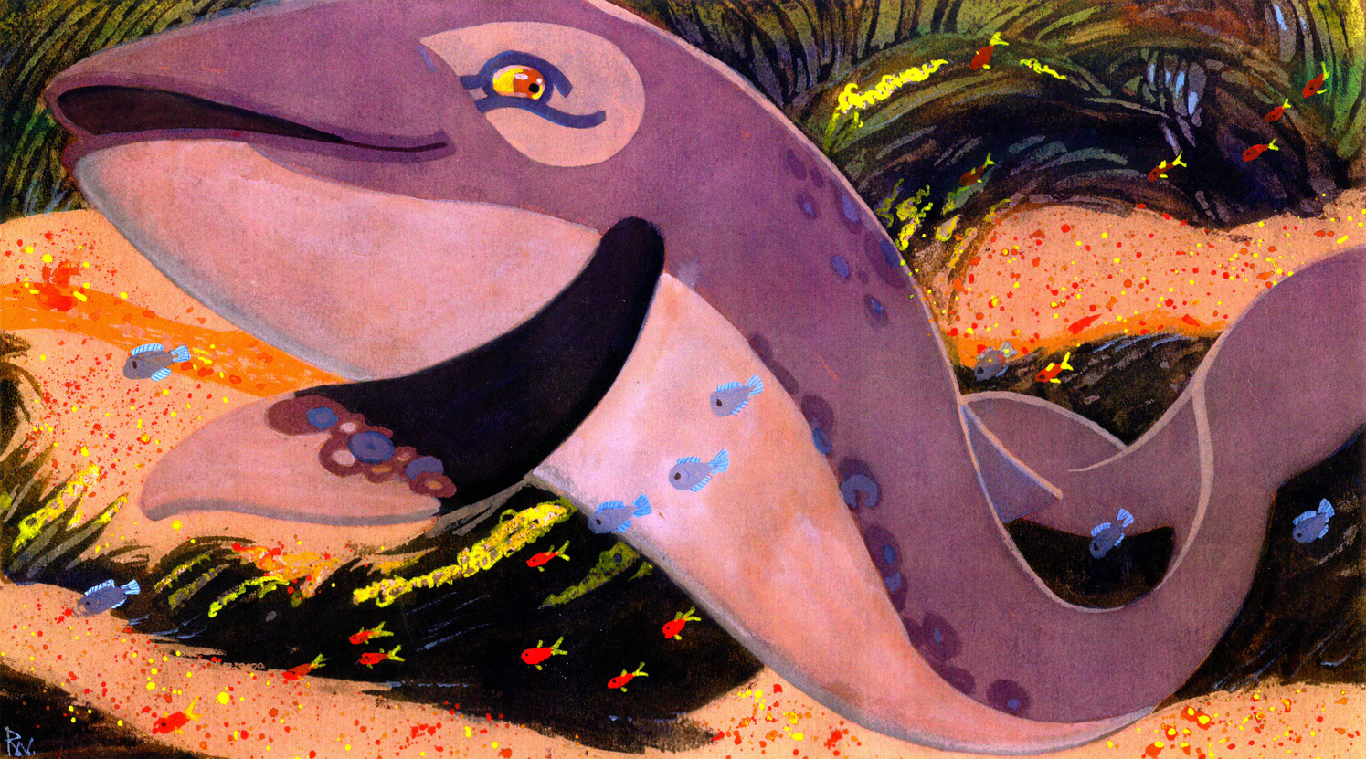
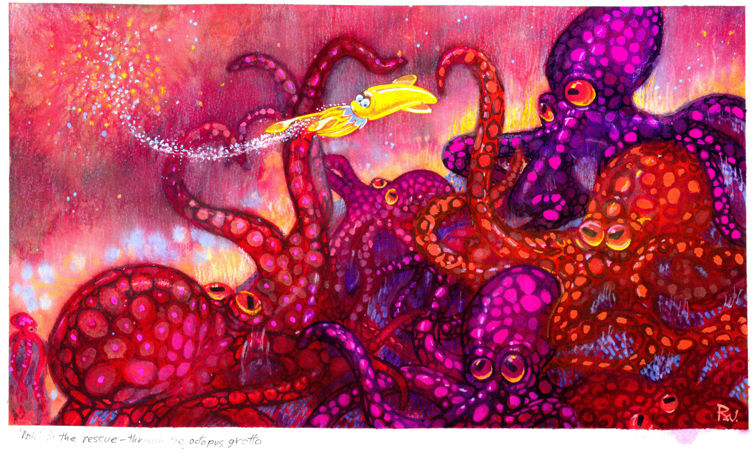
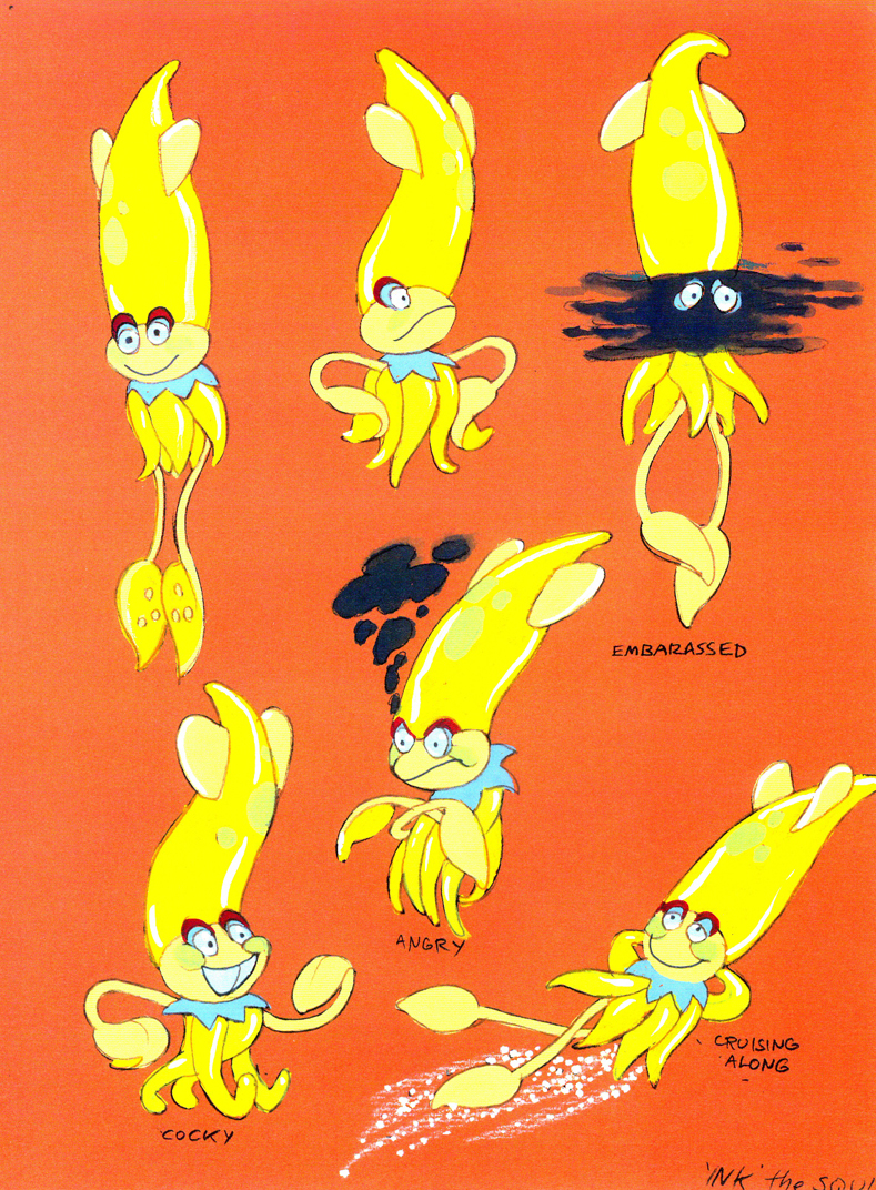
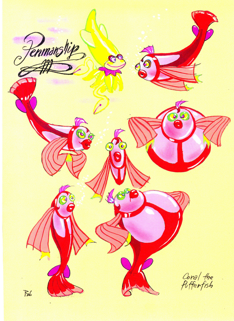
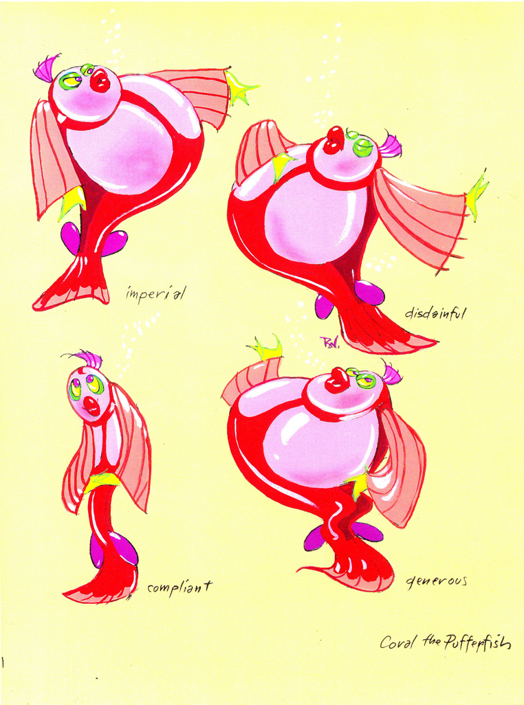
The following are character designs Wilson did for The Little Mermaid for a character that never made it into the movie. Though, I think “Ink the Squid” may have developed into “Sebastian the Crab”.
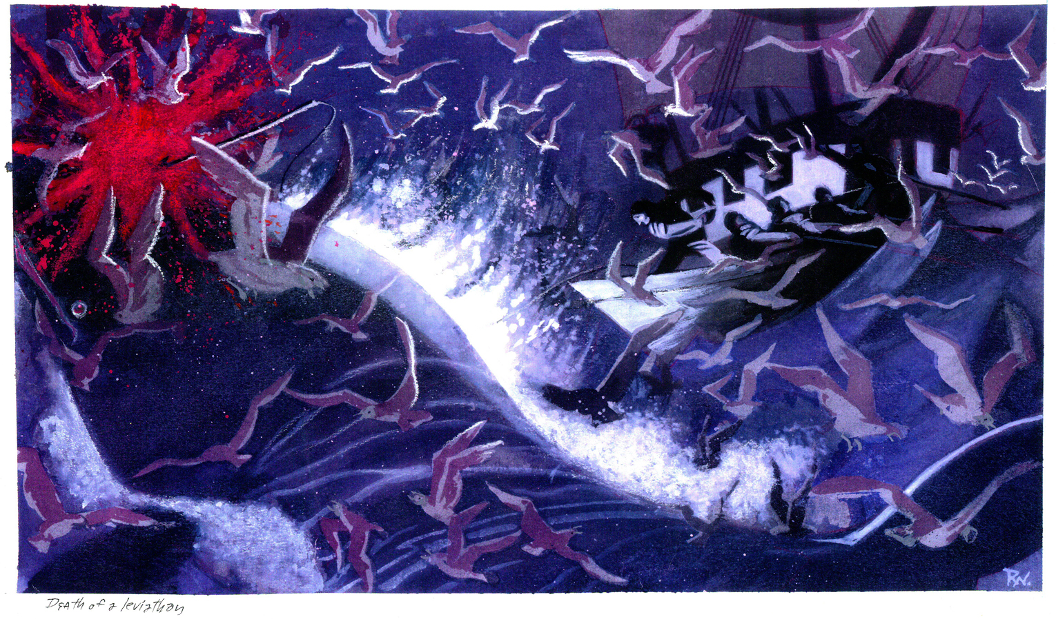
Then there are some of the creatures seen above land at the Glaciar Tray which apparently was designed to be part of the film.
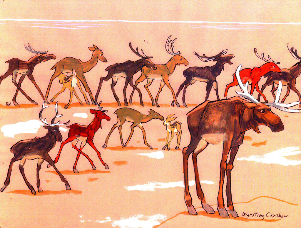
The migrating Caribou
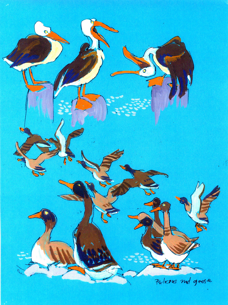
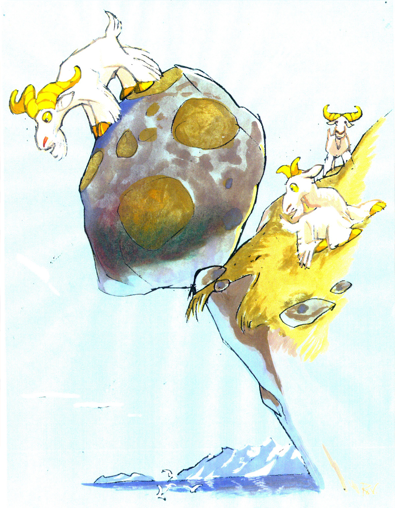
There are pelicans and geese as well as mountain goats.
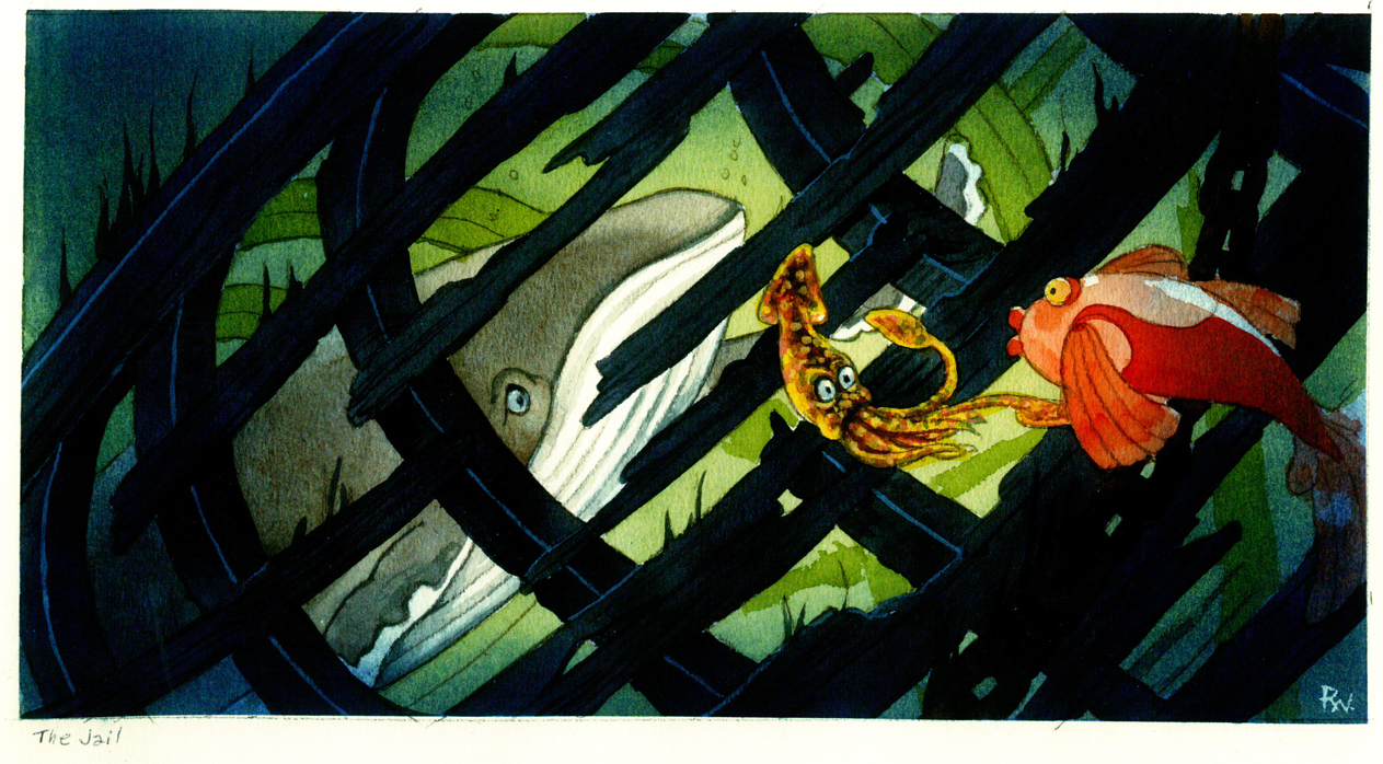
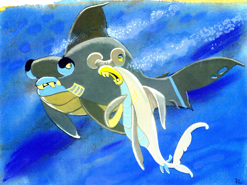
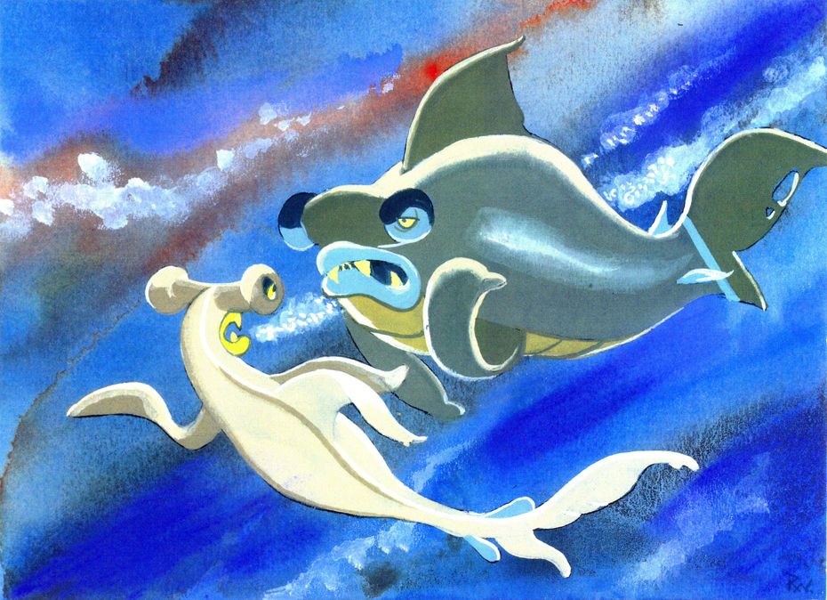
Then there is this short seqeunce of interaction between two fish:
All art displayed © Walt Disney Prods.
This material is a treasure. I want to thank Bill Peckmann for sharing it with us.
Rowland B. Wilson was an artist of the highest standard, and I can’t get enough of his work. True inspiration.
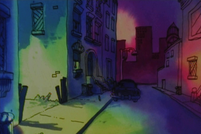
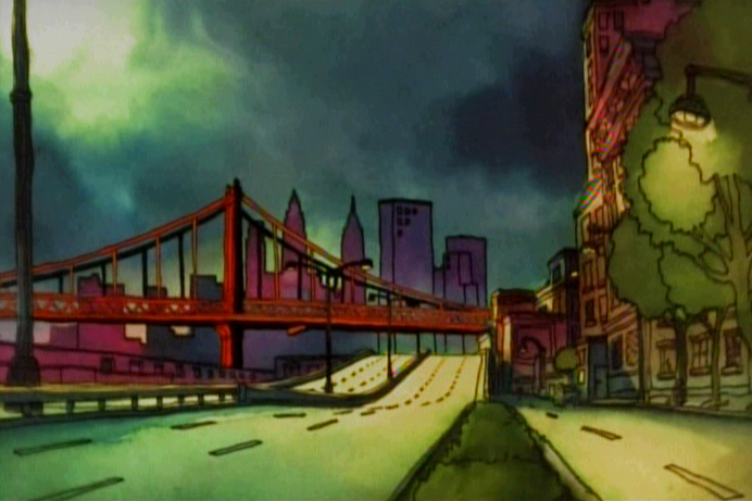
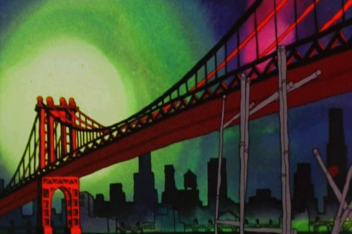
Frame Grabs &Layout & Design 26 Oct 2009 08:31 am
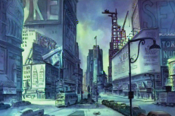
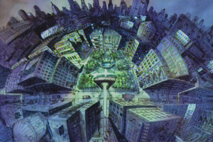
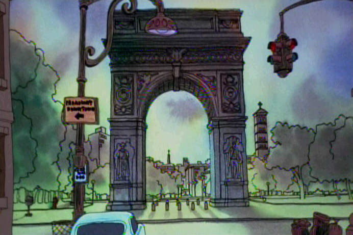
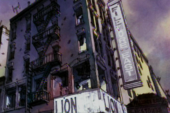
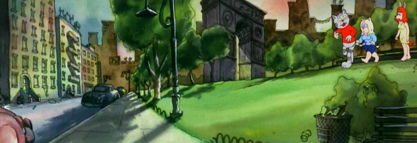
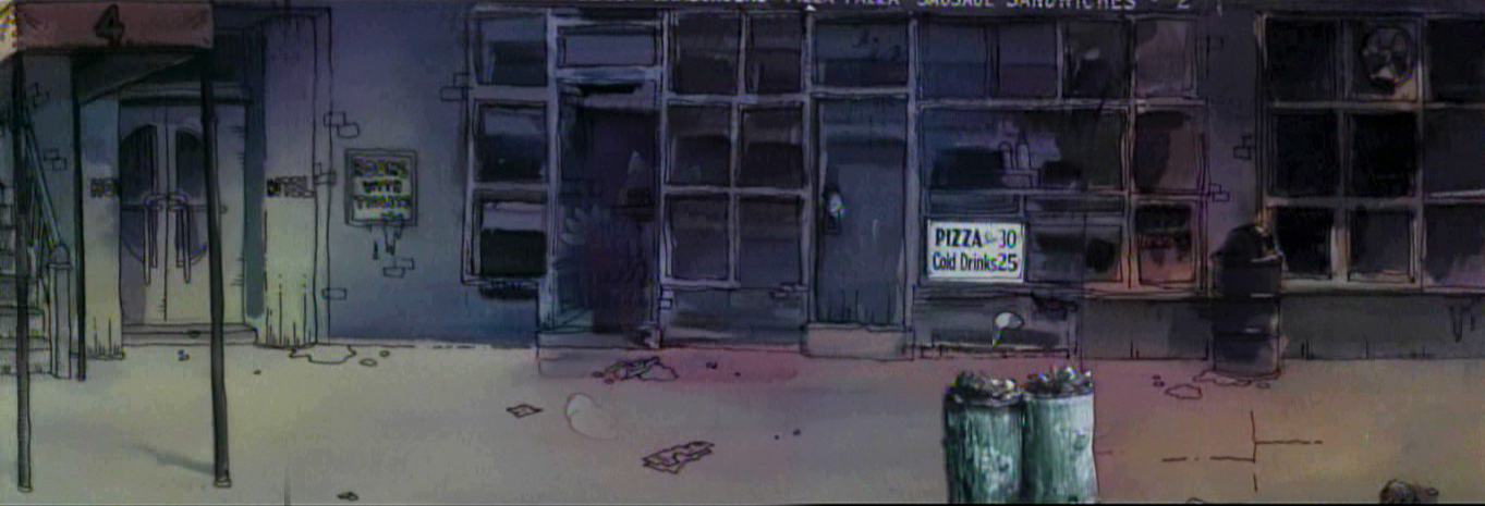
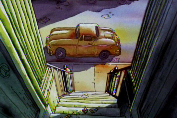
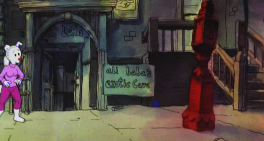
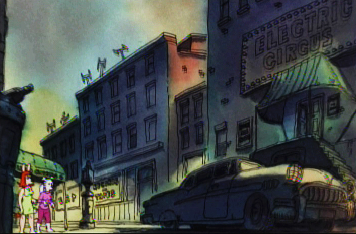
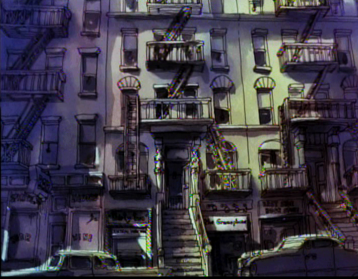
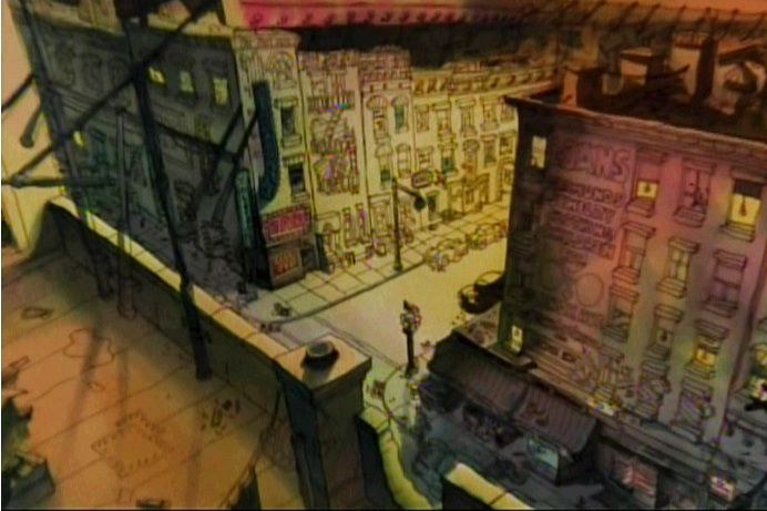
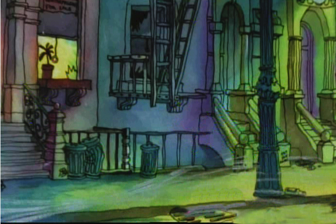
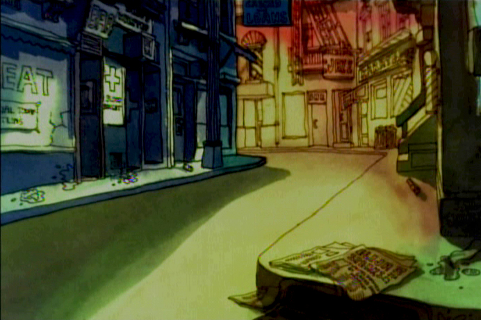
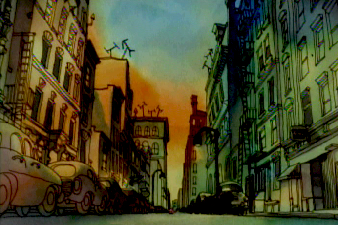
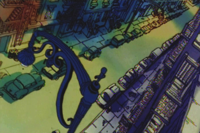
Johnny VIta’s Fritz the Cat
- Johnny Vita was a staple in the NY animation industry for some time. When Ralph Bakshi got Fritz the Cat as a feature, he brought Johnny Vita along as his Background designer and artist. This was arguably the best decision Bakshi made on the film.
Vita went out with the storyboard and photographed locations that actually existed. His camera was all over Greenwich Village and Harlem. Then he took these photos and did a linear tracing of the settings. Then he colored the images with Luma dyes under the lines that he had traced. These brilliant colors gave the gritty images a luminescent appearance. He manipulated the images and purposed them as the film’s backgrounds. This gave the film a reality that it otherwise didn’t have, and it made the bigger job easier for Bakshi to realize.
This drawing by Ira Turek was traced from a photograph and
Xeroxed onto a cel and background paper. The BG was painted
by Johnny Vita and the cel with lines was placed over the BG.
This is a similar process that was used in 101 Dalmatians.
These photos were taken from a 1974 Print Magazine article
about Ralph Bakshi, whose Heavy Traffic had just been released.
The extra treat for New Yorkers was in seeing locations that were familiar to them. Oddly, all these years later, it still seems to work.
I’ve put together a number of these exterior background reconstructions from the first third of the film and present them as a sample of what Johnny Vita contributed to the film.
 1
1(Click any image to enlarge.)
 2
2
 3
3
 4
4
 5
5
 6
6
 7
7
 8
8
 9
9
 10
10
 11
11
 12
12
 13
13
 14
14
 15
15
 16
16
 17
17
 18
18
 19
19
