Category ArchiveLayout & Design
Commentary &Layout & Design 13 Oct 2013 08:17 am
Just Give Me A Good Drawing
I want to write a couple of pieces about design and stylization in animation. This will start us off.
As animation left the Thirties, proudly moving into the Forties there was a lot to be proud of. In a short period, the animators had moved from stick figures to rubber hoses to fully rounded individuals acting through their pieces. The animation had gotten a bit sentimental (as were many live action pictures of the day), but they handled their tasks well.
The acting had grown full throated and offered more than just the surface performances.
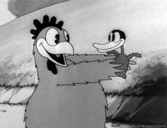
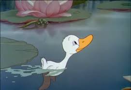
The early version of Disney’s Ugly Duckling and the Later one.
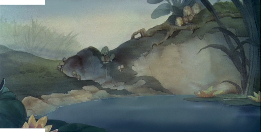
Hans Bacher’s beautiful reconstruction of the BG from the latter film.
Looking at a film like The Old Mill we see rich scenics animated, a film that played against The characterizations of the The Ugly Duckling or Ferdinand the Bull. Warner Bros were starting to slip into their Looney Tunes period as their characters grew smart and zany. This movement was led by Bob Clampett with Tex Avery showing him how to deal out wild paced timing and surrealistic movement to play for any joke they could get. Disney was straight as an arrow but went for the beauty thing and achieved it as peers competed with each other in the varied studios.
Even Terrytoons were stealing Hollywood’s gags and pulling them off in a somewhat retro manner.
After the Disney strike and the entrance into WWII design and stylization started to grow up. They saw what the Russians had been doing in their attempts to animated the state-run propaganda, ad the art left some inspired, though it was obvious that the animation was living up to their designs.
Some of the animators on the sidelines pushed themselves into the forefront of graphic evolution in animation. Leading the pack in America were the free lanced group working for UPA and the military. The use of strong graphics allowed the animators to get awa with a bit less animation while keeping the films strong. People like Hilberman and Zach Schwartz may have been on the wrong side of Disney’s politics, but they pulled out the stops with their pen and inks.
Films like Hell Bent for Election or A Few Quick Facts About Fear gave the artists the right to move daringly forward with their very strong artwork.
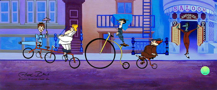
These led Chuck Jones to follow his designers like John McGrew to change the face of the animation. With The Dover Boys of Piemento University all of animation took notice and immediately tried to replicate the work going more and more daring with each film.
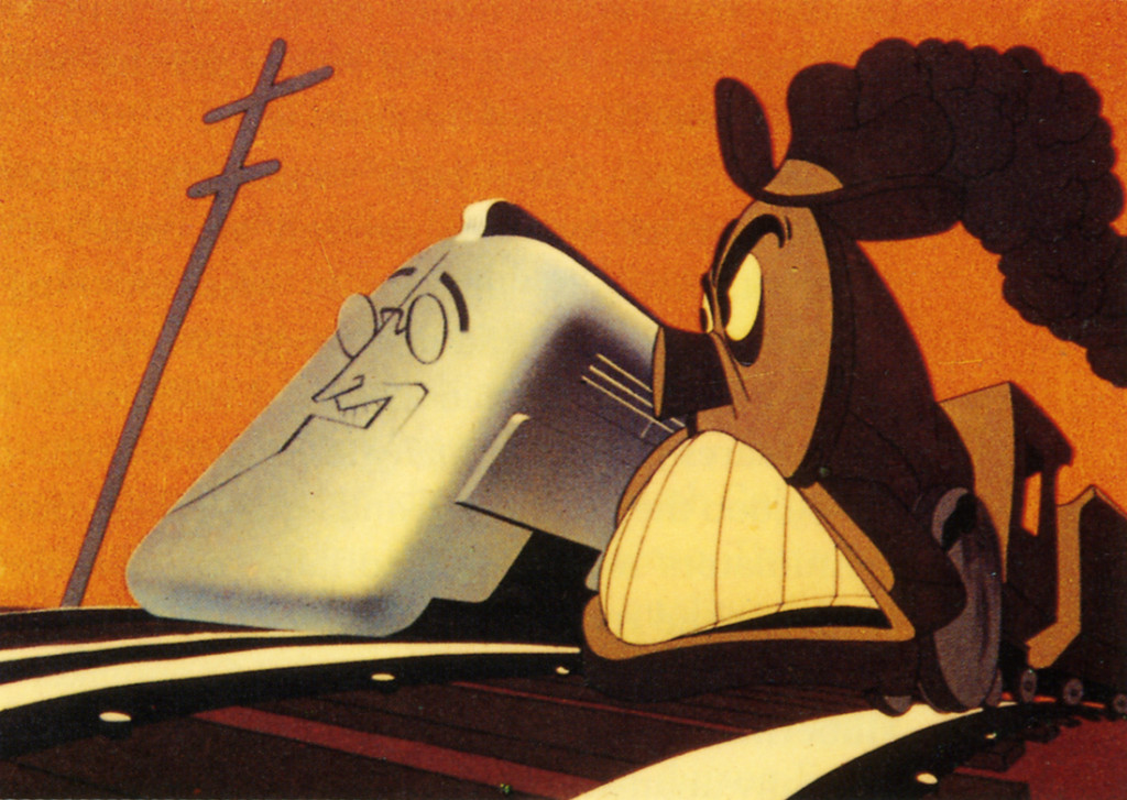
Hell Bent for Election
Immediately after the War, these new graphics returned with the troops as Disney made strong colored works dominated by the likes of Mary Blair and the story structure of Bill Peet. Warner Bros., mostly under the guidance of Chuck Jones brought their abstract art to the BGs with similarly strong painters like Paul Julian leading the way. Under John Hubley at UPA he had not only designed and painted films but also co directed the Oscar nominee The Tell Tale Heart.
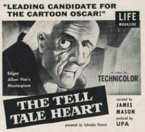
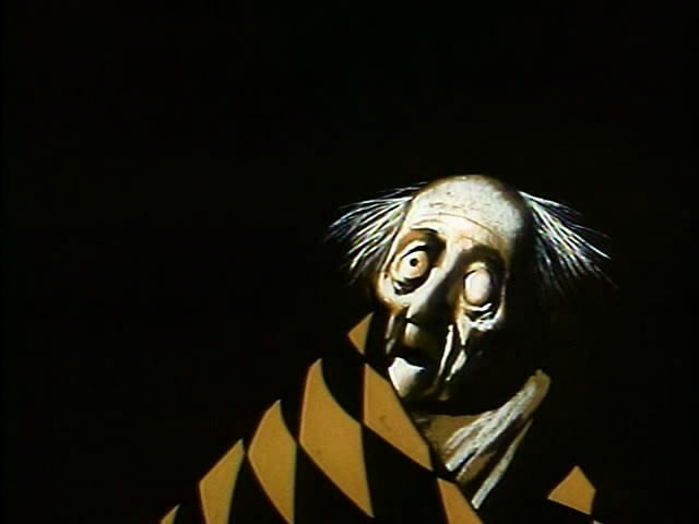
Poster and art for The Tell Tale Heart by Paul Julian at UPA.
Animation went such a distance in a short period of time. From the ball of uncontrolled mass called Oswald the Rabbit, to a rubber hose Mickey & Minnie Mouse to well defined circular characters. It led to more and more sophistication in the scripts and stories with the graphics trying to keep up.
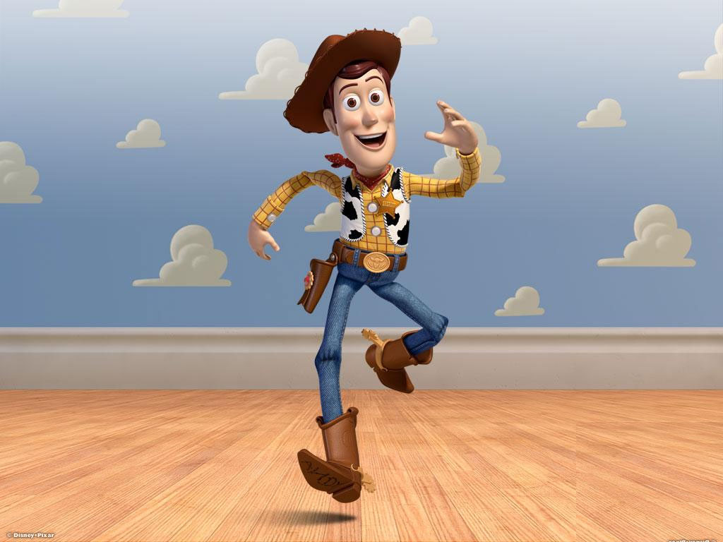 This all ended in 1995 as Toy Story burst onto the screen. The cgi graphics took time to grow up to the sophistication we have today with the likes of Brave or Despicable Me. Seeing the incomparable work in the 2012 Oscar winner, the even more precocious The Life of Pi, gives us pause for thought. We have no idea where animation is going, but for the moment it is definitely not graphically forward. It is difficult to sit by and watch when I have only my meager tools to work with – a pad and pencil. But I continue forward and hope what I do will be accepted.
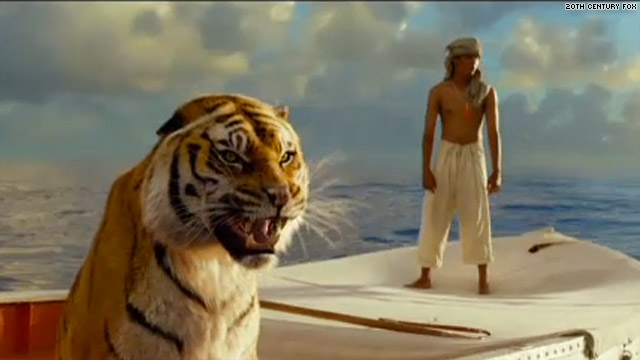
Give me a good drawing. That’s all I ask.
Books &Commentary &Layout & Design 27 Sep 2013 06:33 am
More Sketchbook Work
I’d like to continue here with more of the Animation Sketchbook drawings that appear in that beautiful Chronicle book, “Animation Sketchbooks.” I will just jump in with more illustrations done by these world-wide animators.illustrators.
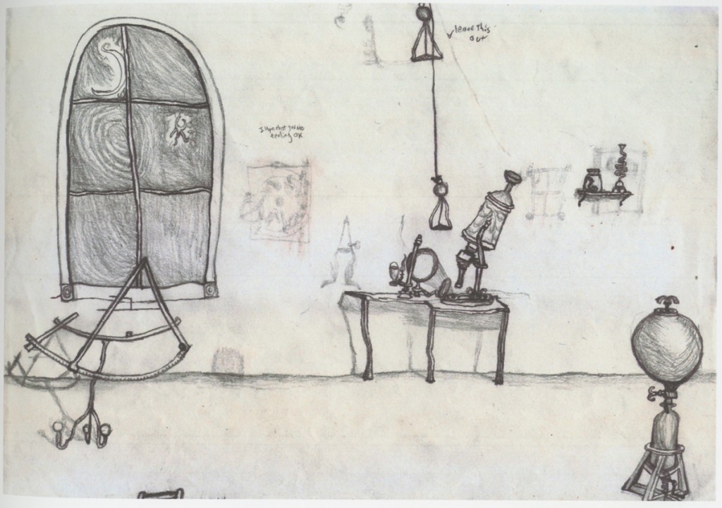
Brent Green Stybd for Chesternut
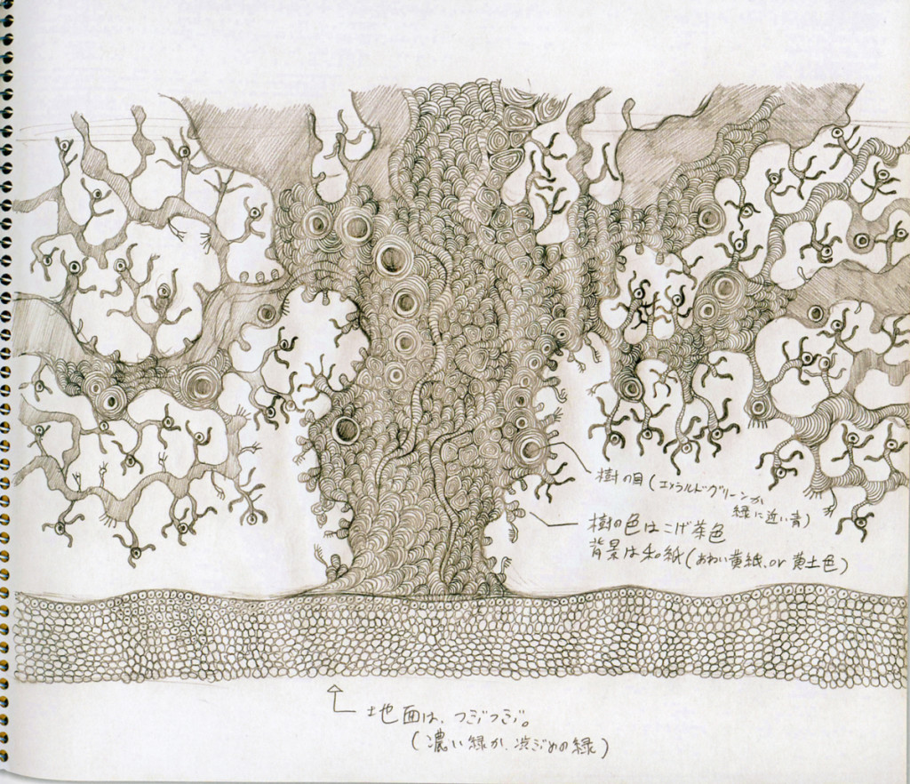
Miraj Majui Sketch for children’s TV WOWW.
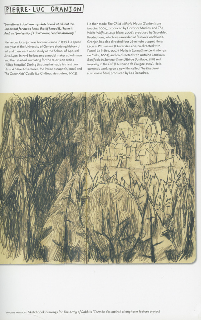
Pierre-Luv Granjon sketchbook dwng 2
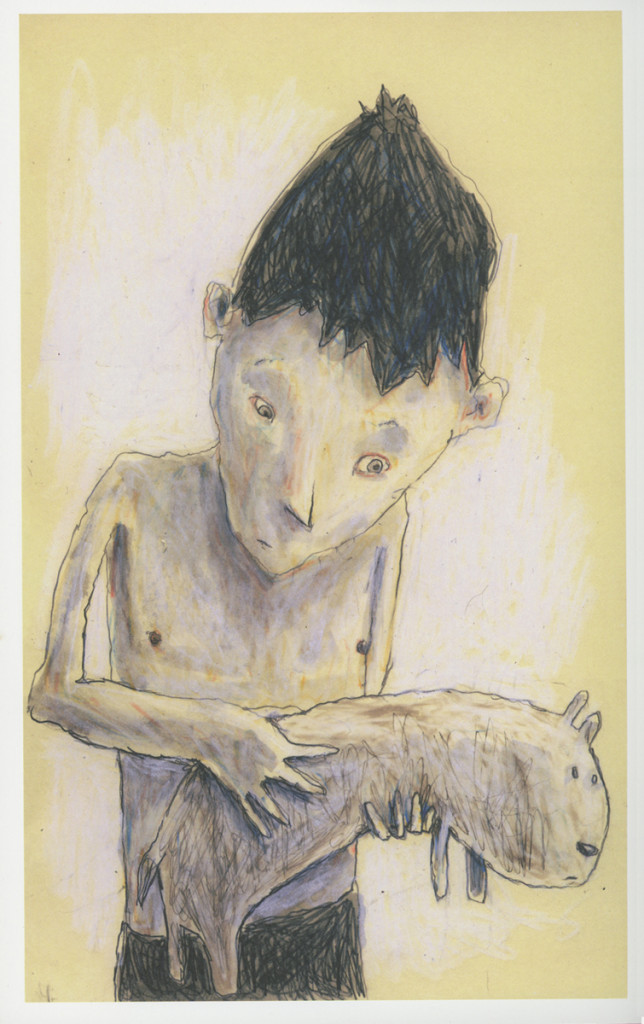
Pierre-Luv Granjon sketchbook dwng.
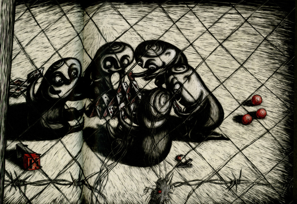
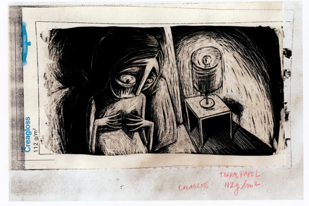
Regina Pessoa Kali the Little Vampire
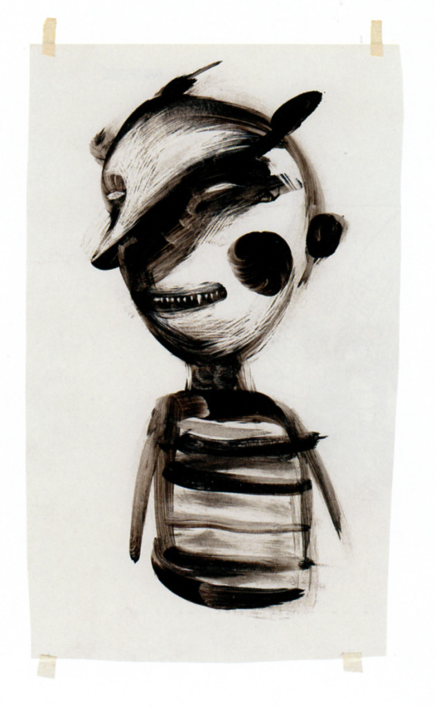
Regina Pessoa sketch Kali, little vampire
Books &Chuck Jones &Commentary &Illustration &Layout & Design &Models 26 Sep 2013 08:22 am
Rhapsody in Working for Suherland
Maurice Nobel worked several years at Warner Bros. under Chuck Jones for the most part, but in 1950 he moved to John Sutherland Productions where he worked on lesser known projects. He had a money war with Eddie Seltzer at WB and accepted the higher price from Sutherland with Selzer telling him that the door would remain open.
WB tried to turn everything to 3D and gave up after one cartoon, Lumberjack Bunny. It’s obvious that some of Maurice’s LOs were prepared for 3D and were switched at the last minute. WB was closed for a year when it was decided to stop production on the 3D films. Noble had taken the right course in working for Sutherland for the few years he was there.
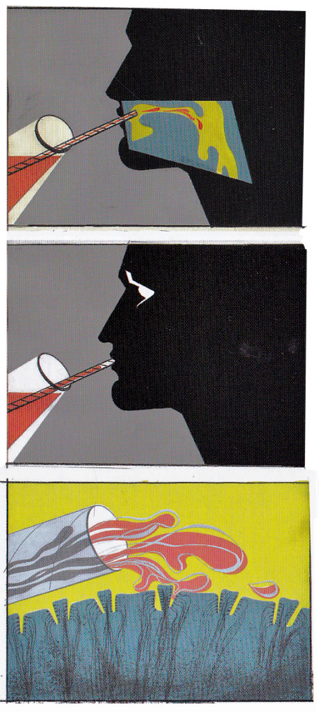
Color keys to the John Sutherland Prod
Gateways to the Mind
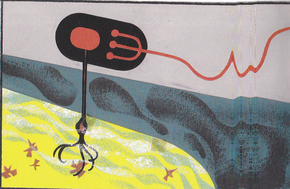
Rhapsody in Steel (below) was a high budget film for Sutherland with Eyvind Earle hired as Art Director. Ultimately he just painted the BGs that were designed by Maurice Noble. This beautiful film can be seen on YouTube, here.
Daily post &Festivals &Hubley &Layout & Design 09 Sep 2013 12:44 am
Ford, Noble and Art
I am a fan of the work of John Ford. If I’m caught catching a minute of one of his films, you’ll see me stay through to the end. Likewise I have almost as great a respect for the animation design work of Maurice Noble.
 It never fails. I get to the point where I’ve just about run out of hope for animation, and I feel like the greatest pessimist in the world. When I say “animation,” I mean 2D. Every frame is controlled by one person. The rest – cgi – is, to me a graphic effect, electronic puppetry. I’m certainly not talking about the overacted cg action you see in most films done today. Most animation to me, these days, is something that’s done in a computer by teams of people, and isn’t wholly designed as “personal.” There are, of course, the exceptions. When something like THE LIFE OF PI shows up, it feels like magic; the magic you expect of great animation.
There’s just too much of everything in most current animation; even the flash Mickey Mouse spots go too fast with their Zips, Pans, Takes; the simplest move seems to go over the edge. Gestures are bigger than they need be, actions are over the top, dialogue is too loud and frenzied unless it wants to be quiet – then, it really is dead. The animator became that big red button they have at “Staples.” You press it and the client can fix what he has to – his way. The poetry has vanished from the art form when this animation begins. Too bad there’s no personality in those big red buttons.
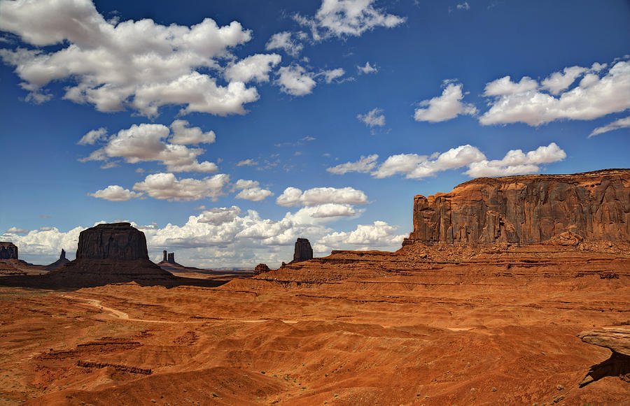
John Ford made some of the most beautiful movies we have on film. Many of these are Westerns, Westerns which notably featured some of the most extraordinary, natural land masses photographed. The incredible buttes and sights appear in the Arizona Desert, called “The Painted Desert”, and whether they were shot in the glorious golds, violets and other colors or even shot in B&W they add extraordinary sights to these films. If they weren’t already there, constructed and painted by some god, Ford would have had to have a mass of people construct these images.
Working to a better advantage is the art director Maurice Noble who created his original version of the “Painted Desert” mostly out of his own imagination. I suspect he and a couple of other artists were all it took to develop these animated scenics: far fewer people and a lot less time.
As I said, Noble’s desert was original, a recreation of the actual “Painted Dessert” but one that developed out of Noble’s imagination. These are almost as beautiful as the real thing, in that “design-y” way Noble’s art had.
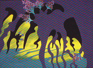
So here we have two film plans. Elaborate impersonal scenery that was designed by Mother Nature, vs the personal designs delicately designed by Maurice Noble. Both are very different but have similar effects on the films they inhabited. A personal world Ford shares with us and another that Noble constructs for the backdrops of the Coyote and Road Runner. Both set designs are larger than life and full of that very-same-life. It’s in gloriously wonderful color (even thoughmany of these sets were shot in B&W) it’s just the beginning of the strength of these films. We’ll look further to see what more has been offerred to us in their films.
Commentary &commercial animation &Illustration &Layout & Design 30 Aug 2013 12:49 am
Child Development care – on a tight shoestring
- Let me give some attention to a series of films we did for UNICEF back in the 90′s. There were four films which focussed on Child Development, trying to teach parents in the Third World how to take care of their children in the first eight years of development.
The animation proved crucial, but without a unique artistic style there’d be nothin but cute baby pictures. We were successful (or I wouldn’t be talking about them.)
These films were brought to me by one, Cassie Landers. A well trained educator and an employee of Unicef where she promoted child development training and was hoping to use film to get the message across to the Third World.
Primary to these films was to get the point across that females deserved as much attention, including education, as the boys did. This is a major problem throughout the world, and UNICEF has done an entire series specifically for India about it.
Our aim was to encourage good diet, good behavioral practices and, again, the importance of a good education. The four films were ultimately combined with some live action footage of T. Berry Brazelton talking with children and introducing each of the four segments.
Hillary Rodham Clinton, as First Lady, introduced the entire 1/2 hr. show.
Here are some frame grabs from about 2/3 the scenes of the first film, Off To A Good Start.
 1
1
 2
2
After the UNICEF logo, the film started with a montage of children’s faces.
 3
3
I’ve compiled about a third of the faces.
 4
4
The camera continually moves in on the faces while …
 5
5
… constantly dissolving to the next setup.
 6
6
This was the opening to all four of the films.
 7
7
It was accompanied by narration by Celeste Holme describing the films.
 8
8
The narration was written by UNICEF Producer/educator, Cassie Landers.
Sue Perotto drew all of the children’s faces for the opening.
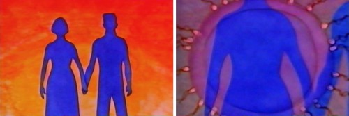 10
10
The first film started with prenatal care.
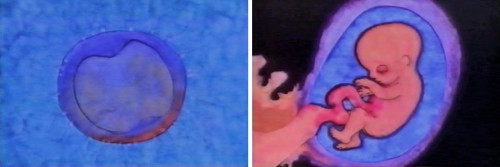 11
11
Giving a very short the child in the womb.
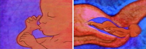 12
12
Right through to the actual birth.
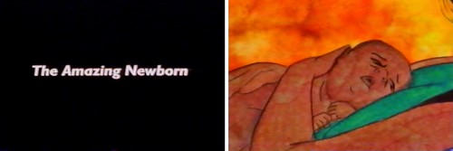 13
13
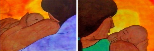
Then it jumps to the first year of development.
 14
14
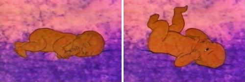
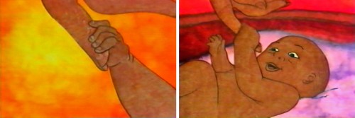
The art style was designed after Matisse’s Moroccan paintings.
 15
15
He had a very primitive set up colors with
earth-toned characters dominating their paintings.
 16
16
We tried to reproduce the feel of these paintings
allowing the texture of the paintings to run and bleed.
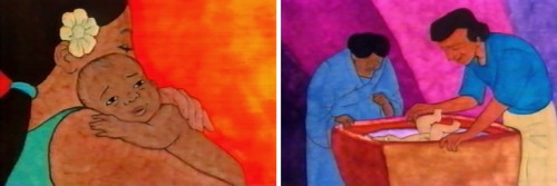 18
18
This was all done pre-computer days, so all art was
painted on paper, then cut out and pasted to cels.
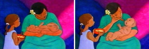 19
19
It was all shot on camera by Gary Becker at his FStop Studios.
 20
20
The first year continues with similar setup.
 21
21
After showing some advanced activity . . .
 22
22
. . . we show how the brain has started to . . .
 23
23
develop enormously in this first year.
 24
24
The child learns to get up and crawl.
 25
25
From here she learns to walk.
 27
27
Then he learns to play more sophisticated games . . .
 28
28
. . .utilizing tools that require more dexterity and thought.
Directed by Michael Sporn
Produced and Written by Cassie Landers EdD, MPH
Narrated by Celeste Holme
Music by David Evans
Production Coordinated by Masako Kanayama
Backgrounds by Jason McDonald
Edited by Ed Askinazi
Photography by FStop Studio – Gary Becker & Bob Bushell
Technical Consultant Marc Borstein Nat’l Inst of Health, Bethesda MD.
Office Manager Marilyn Rosado
Animation by Rodolfo Damaggio, Sue Perotto, Michael Sporn
Rendering by Christine O’Neill, Matt Sheridan, Stephen MacQuignon, Masako Kanayama
Special Thanks to Nigel Fisher, Deputy Regional Director,
UNICEF Regional Office for the Middle East and Africa
Bill Peckmann &Illustration &Independent Animation &Layout & Design 06 Jul 2013 06:55 am
Provenson Animals
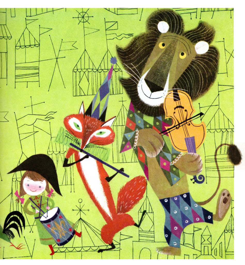
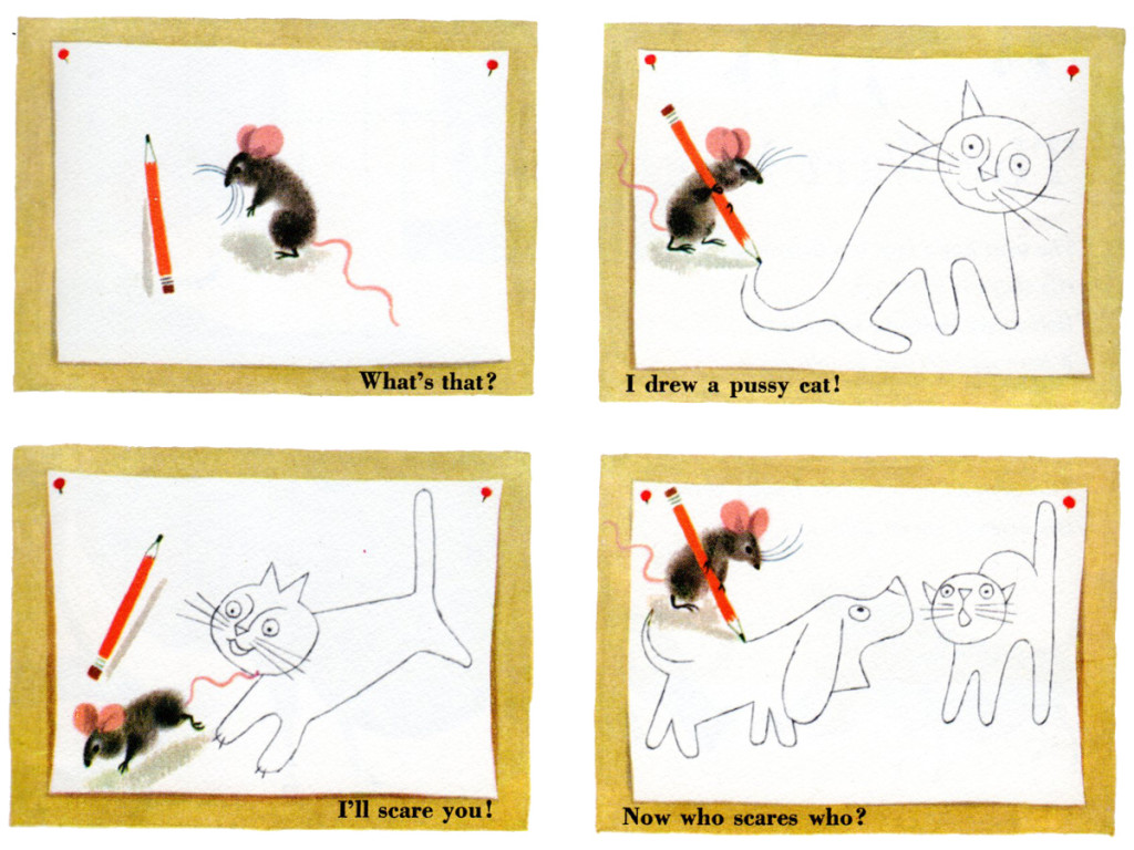
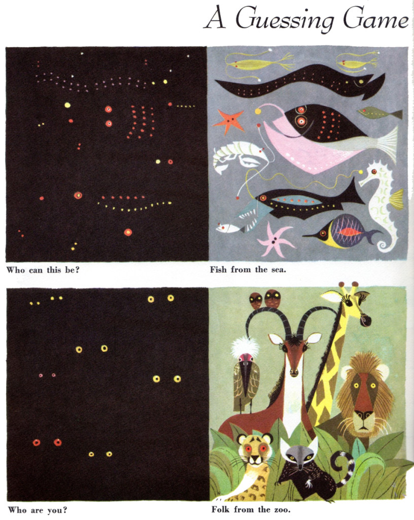
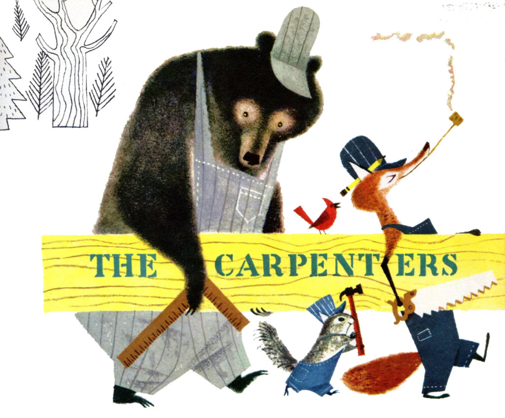
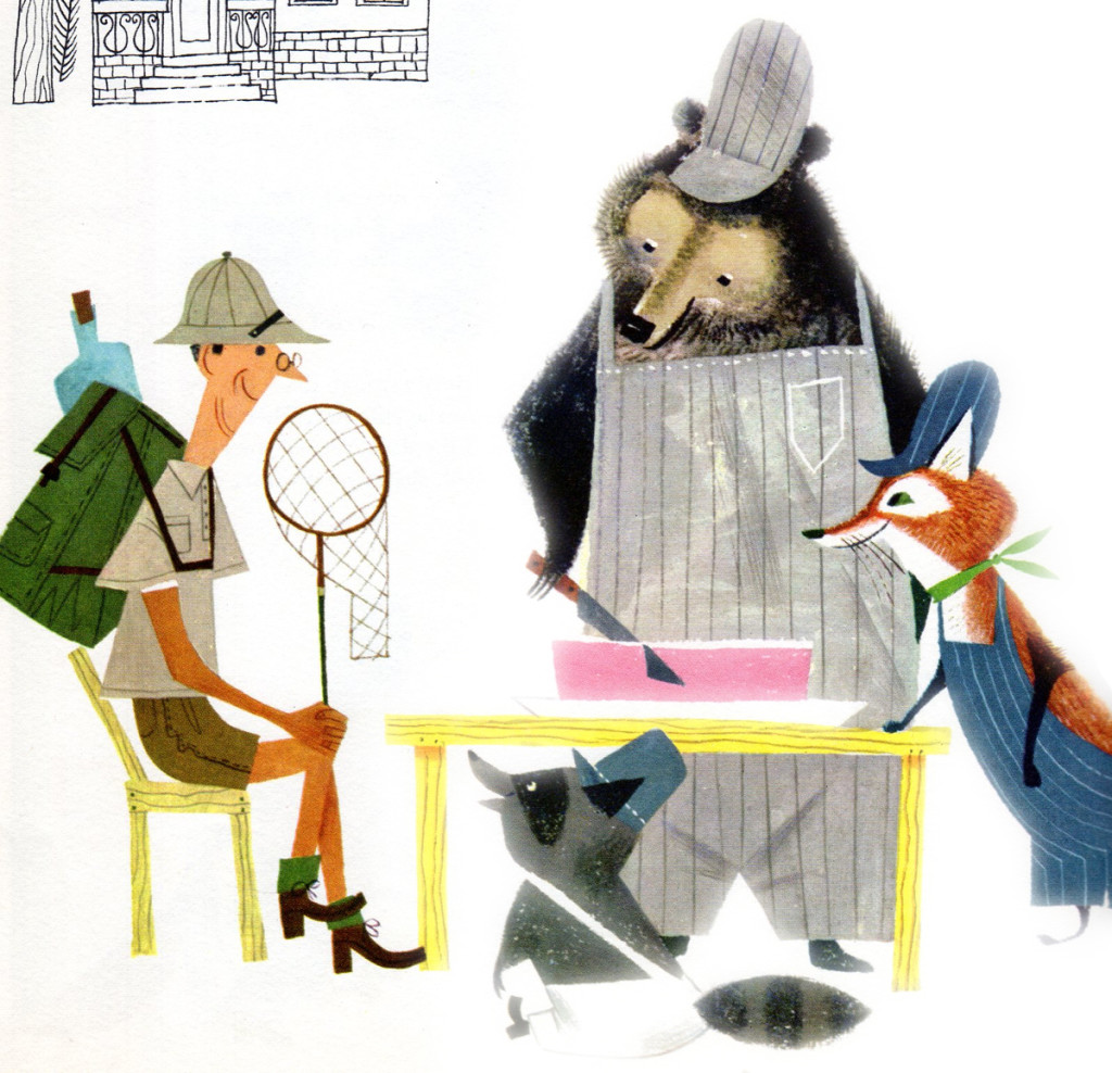
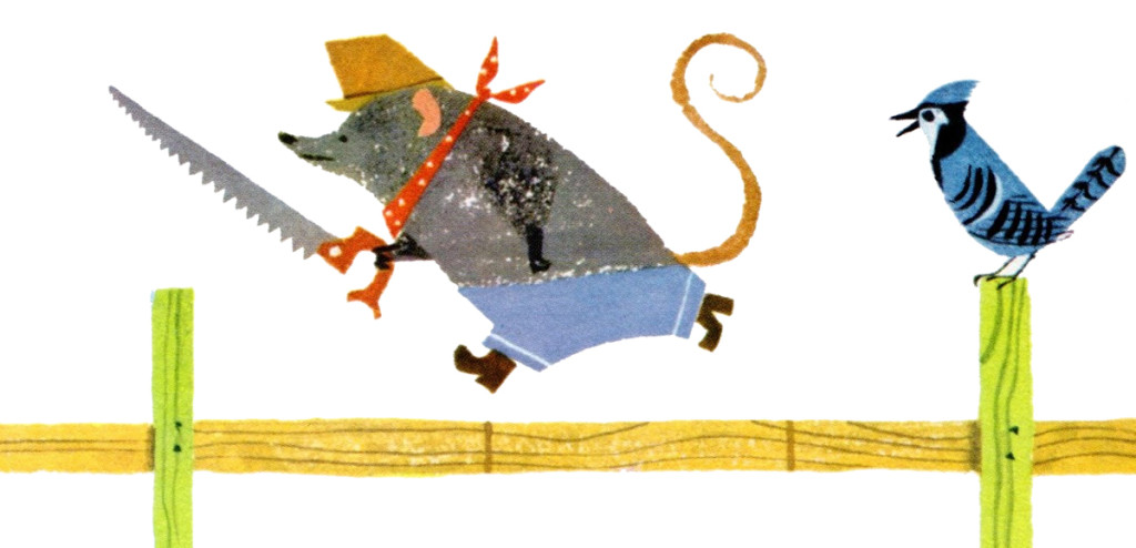
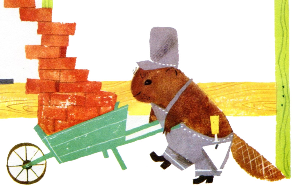
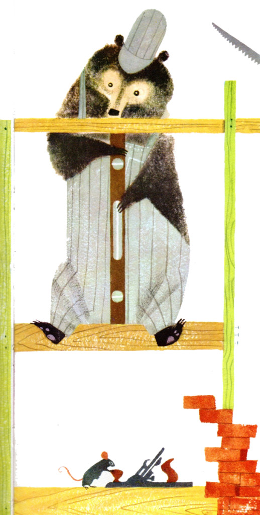
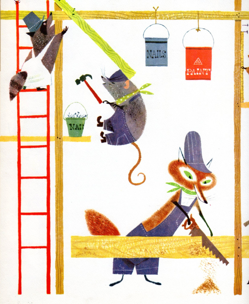
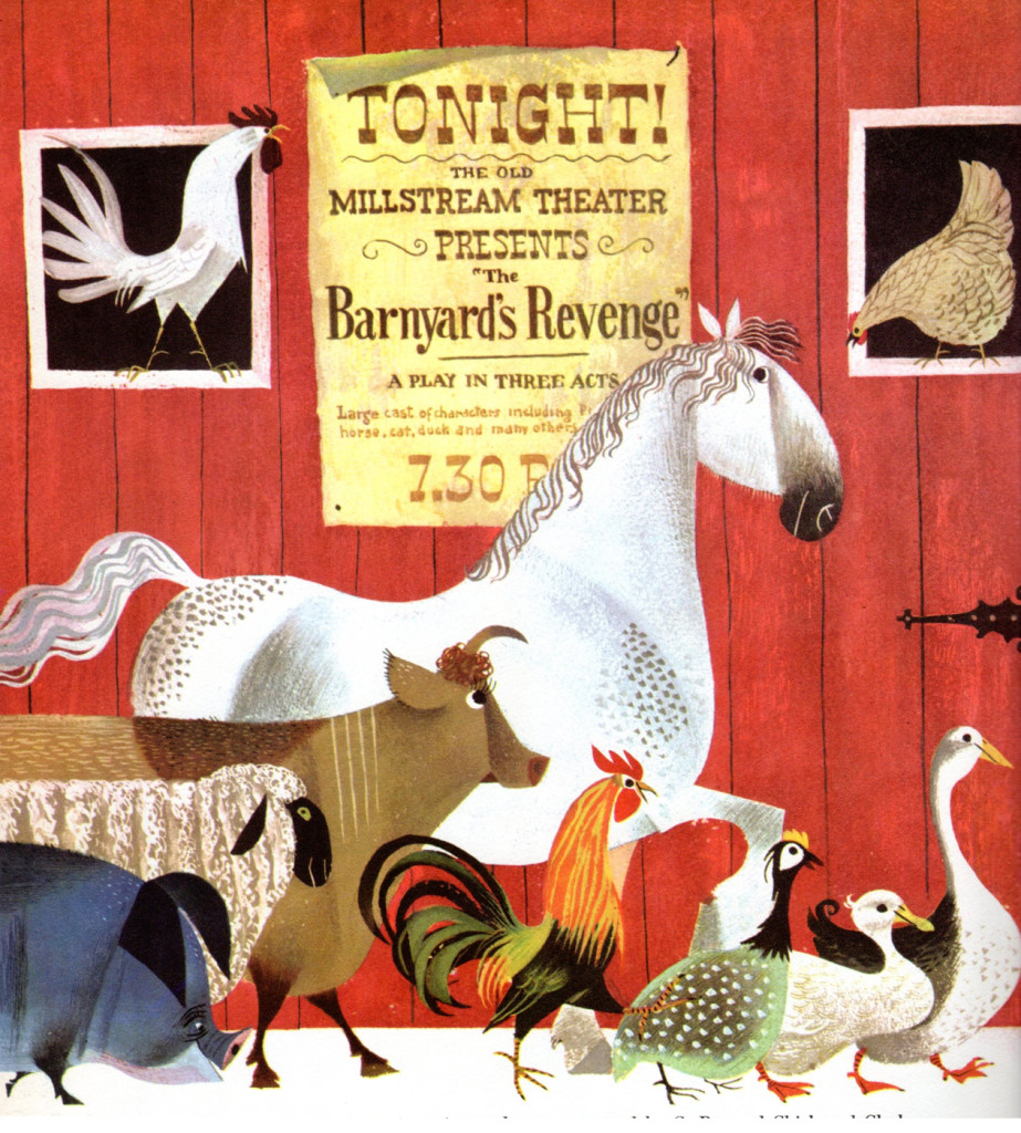
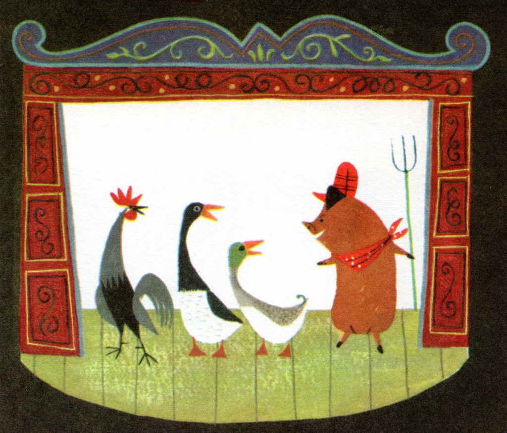
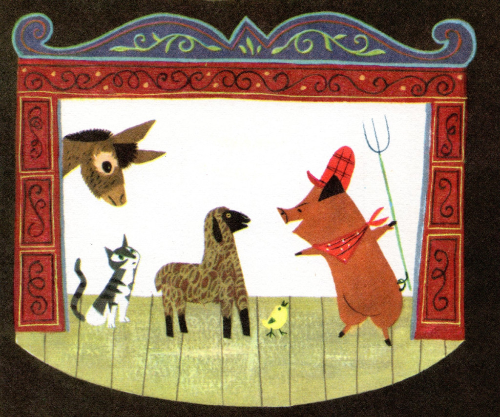
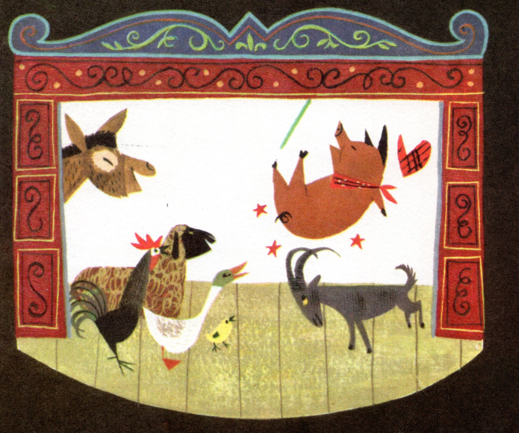
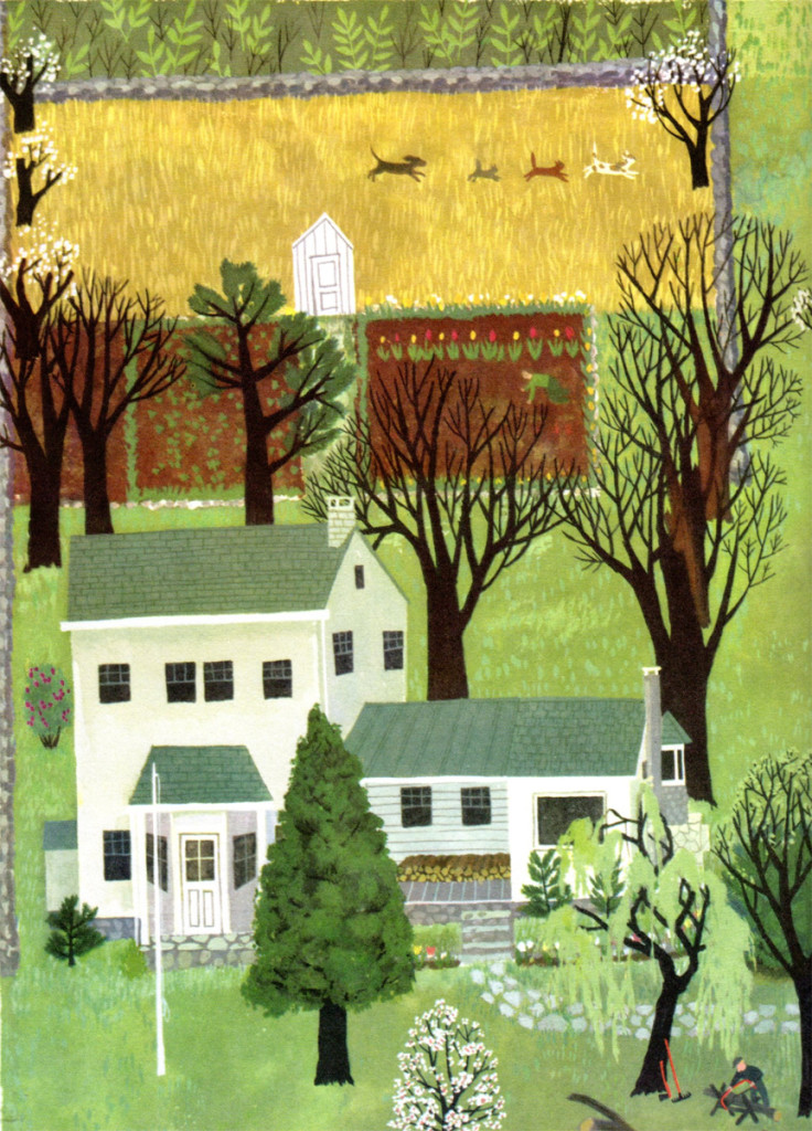
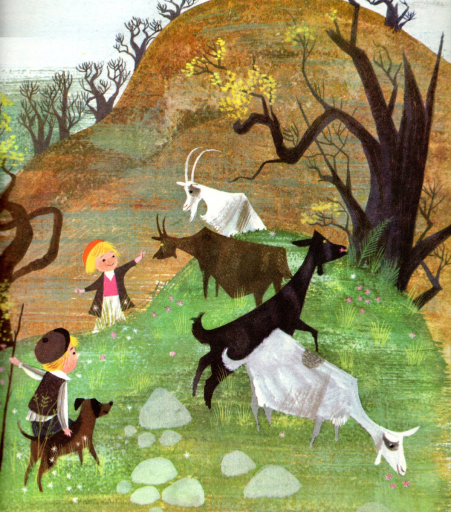
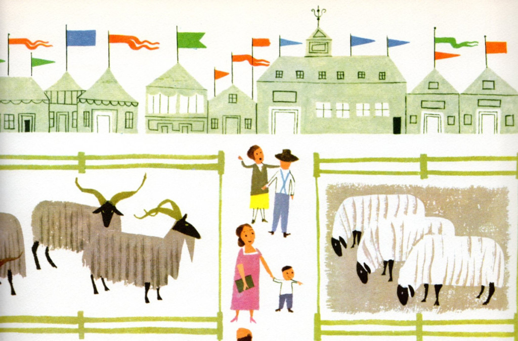
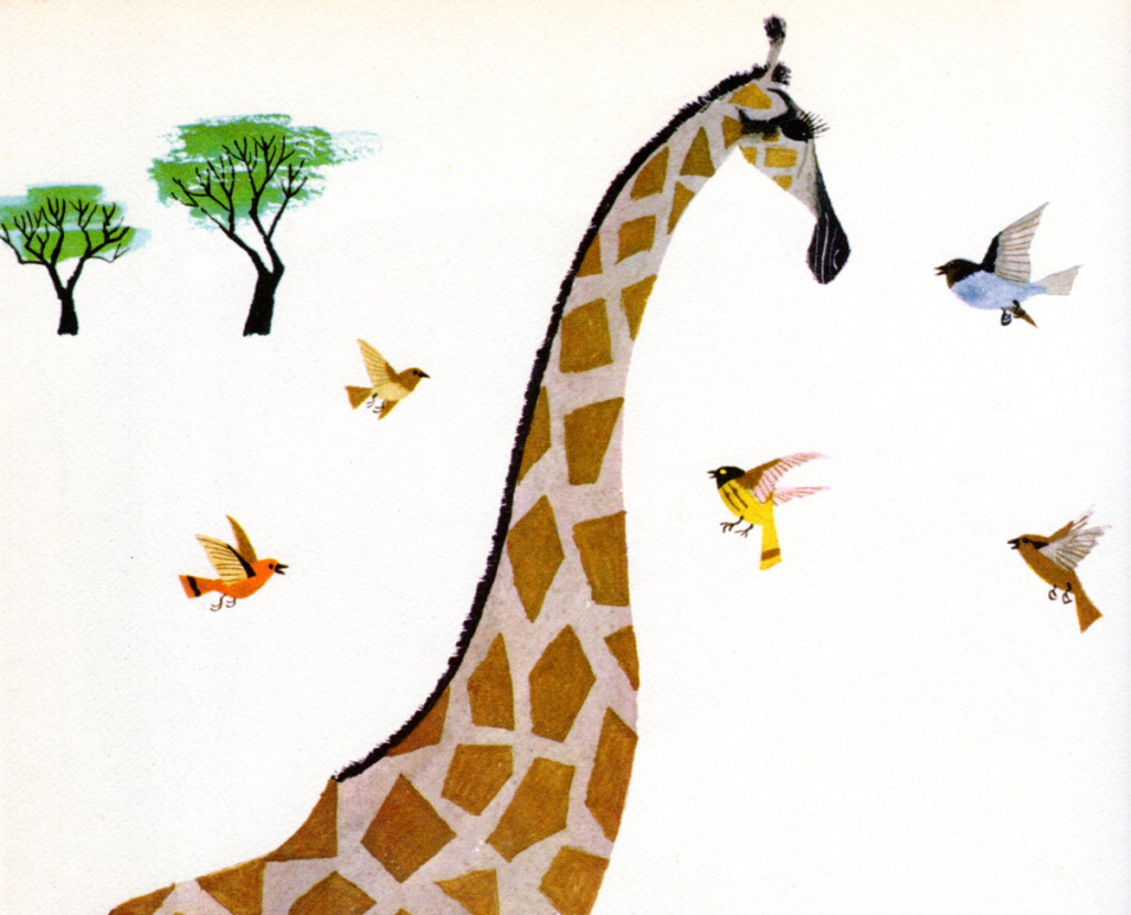
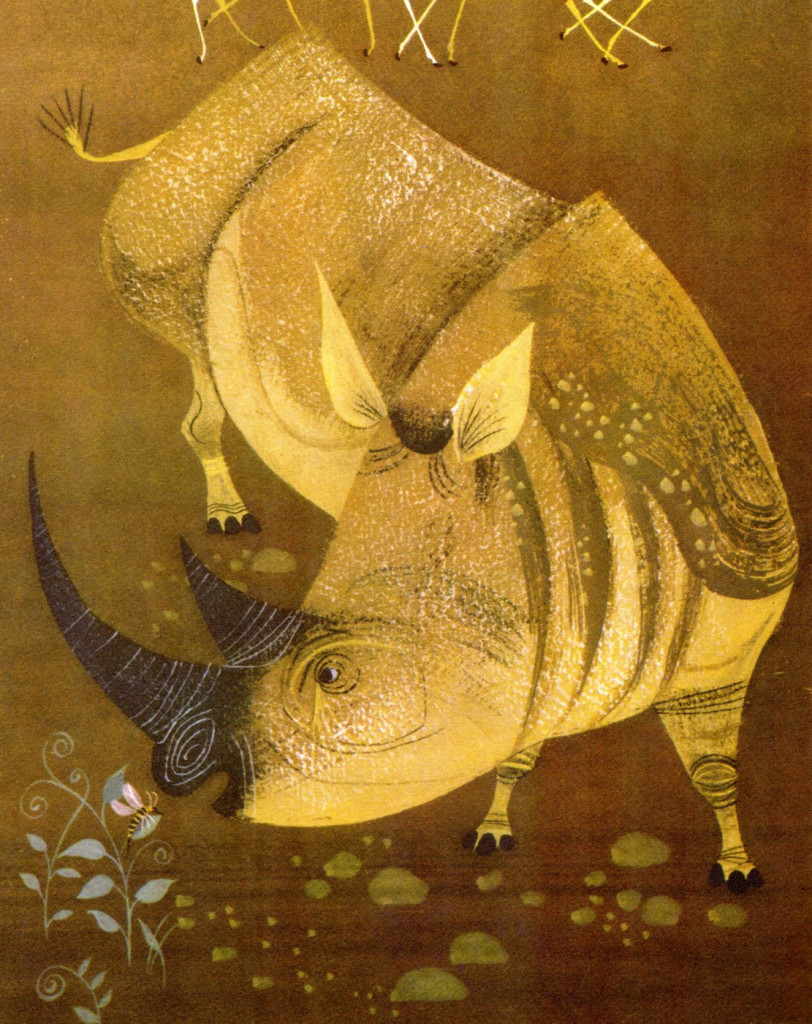
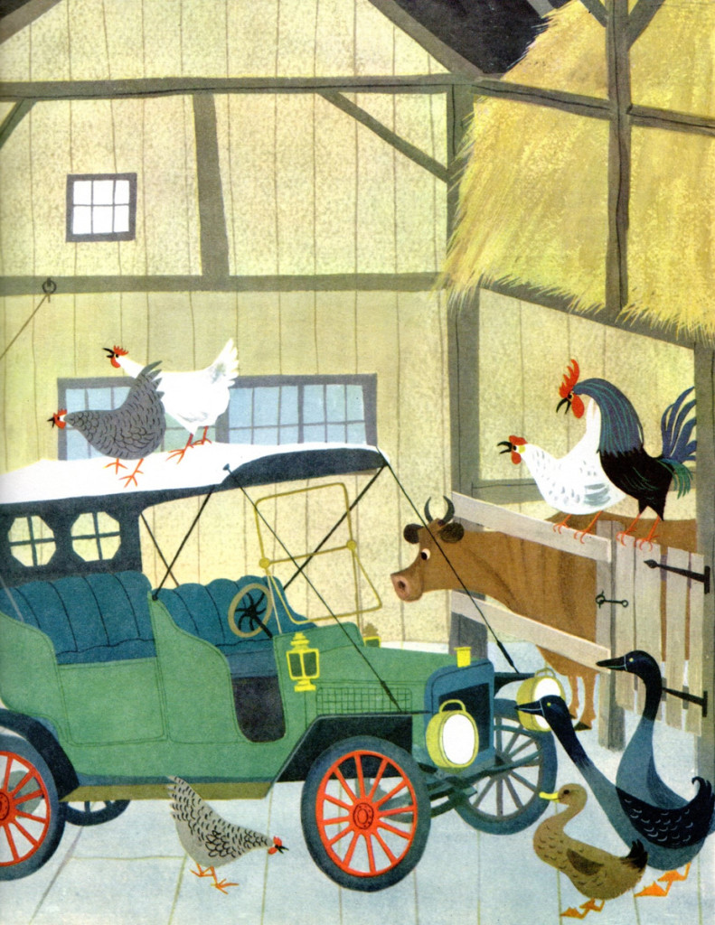
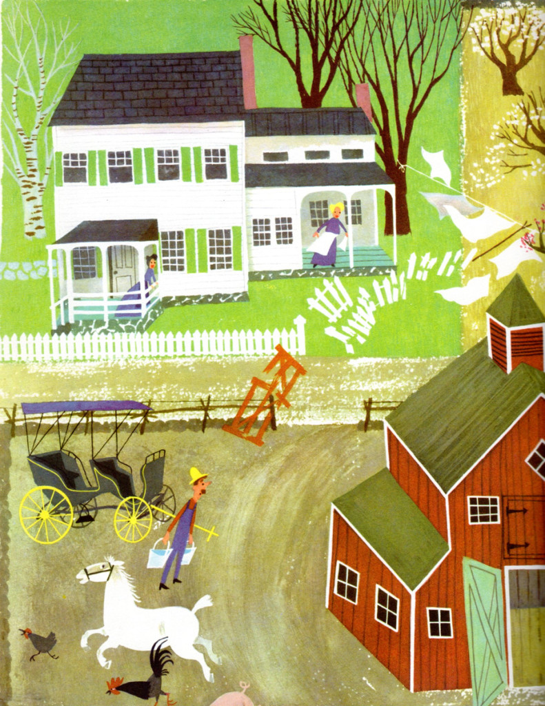
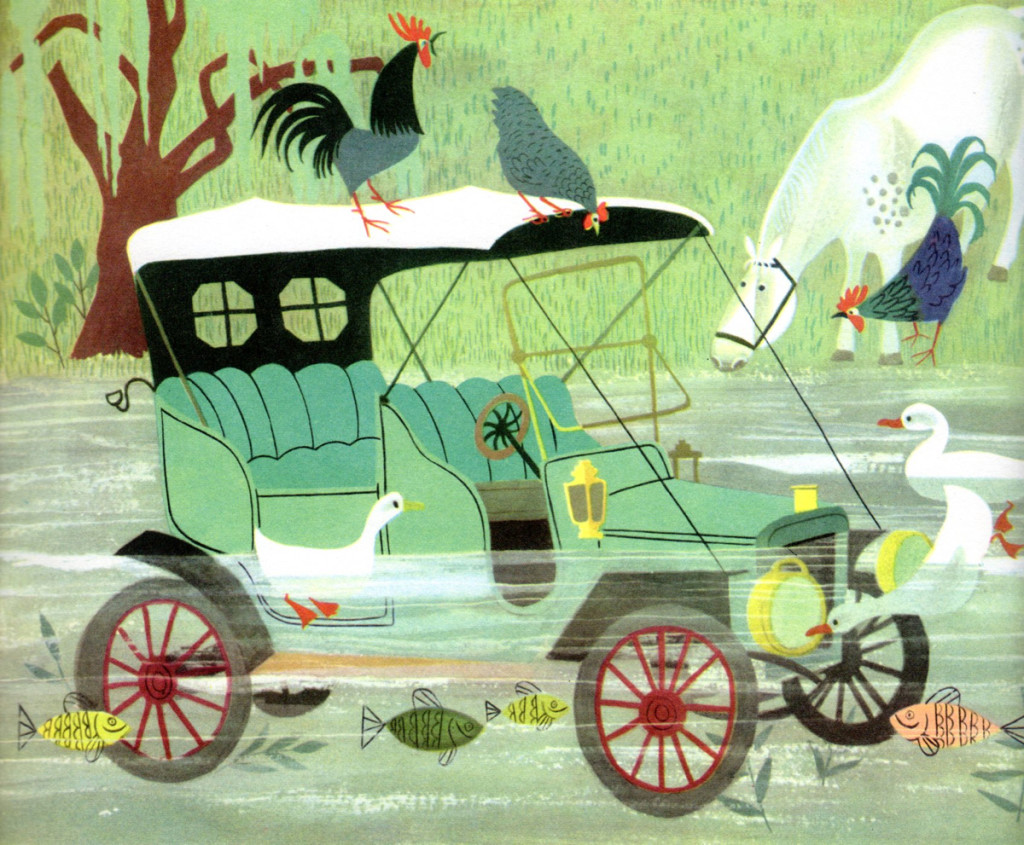
Bill Peckmann sent scans of this glorious and beautiful children’s book by Martin Provenson. There really, as far as I’m concerned, is no reason necessary. The illustrations are just beautiful, and I find myself staring at them for long periods of time. It’s a great book.
Bill writes the accompanying note:
- The reason I have this book is because when George Cannata Jr. was our Animation Design teacher at Visual Arts in 1960, he recommended that his students buy it because it was known as the “animation designers bible” in those days.
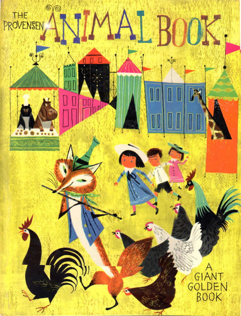
The oversized book cover
Art Art &Books &Commentary &Illustration &Layout & Design &Theater 02 Jul 2013 05:05 am
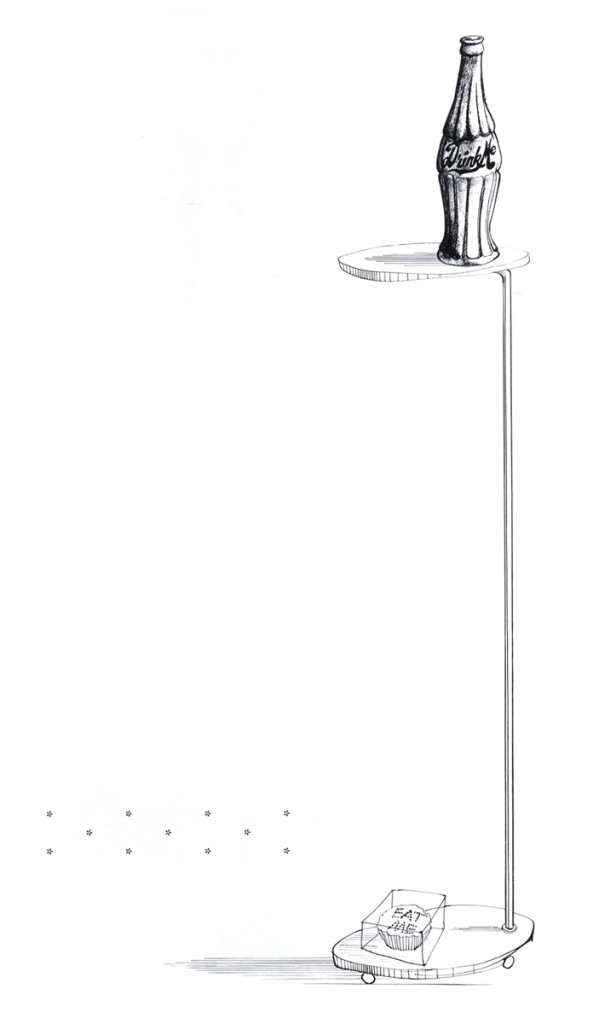
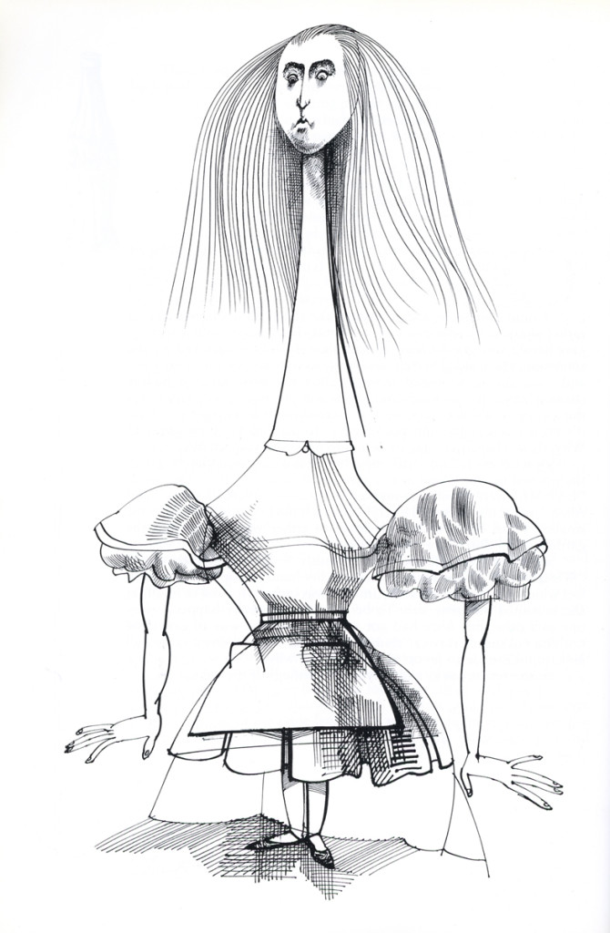
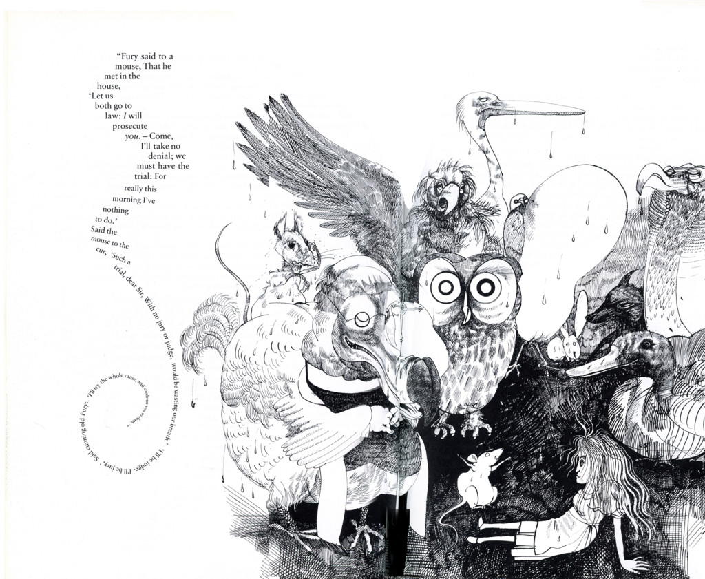
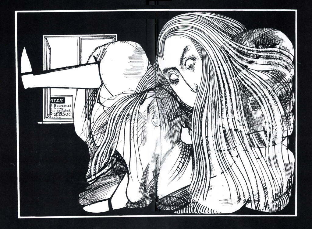
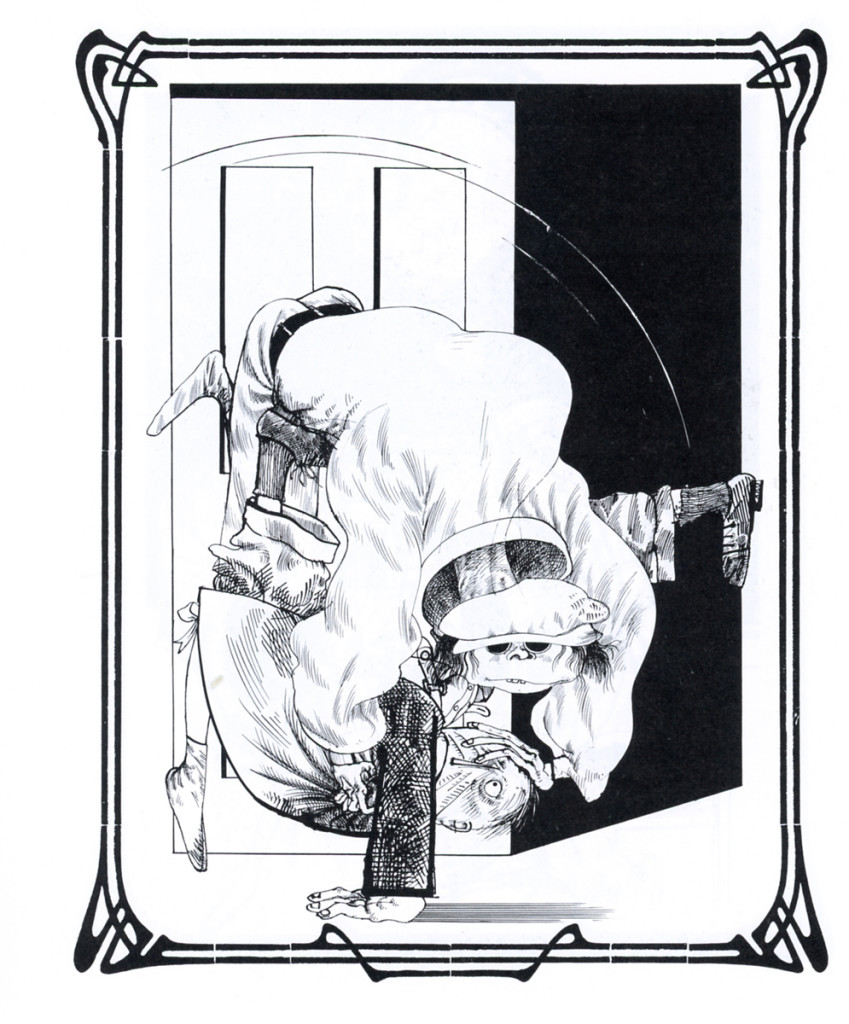
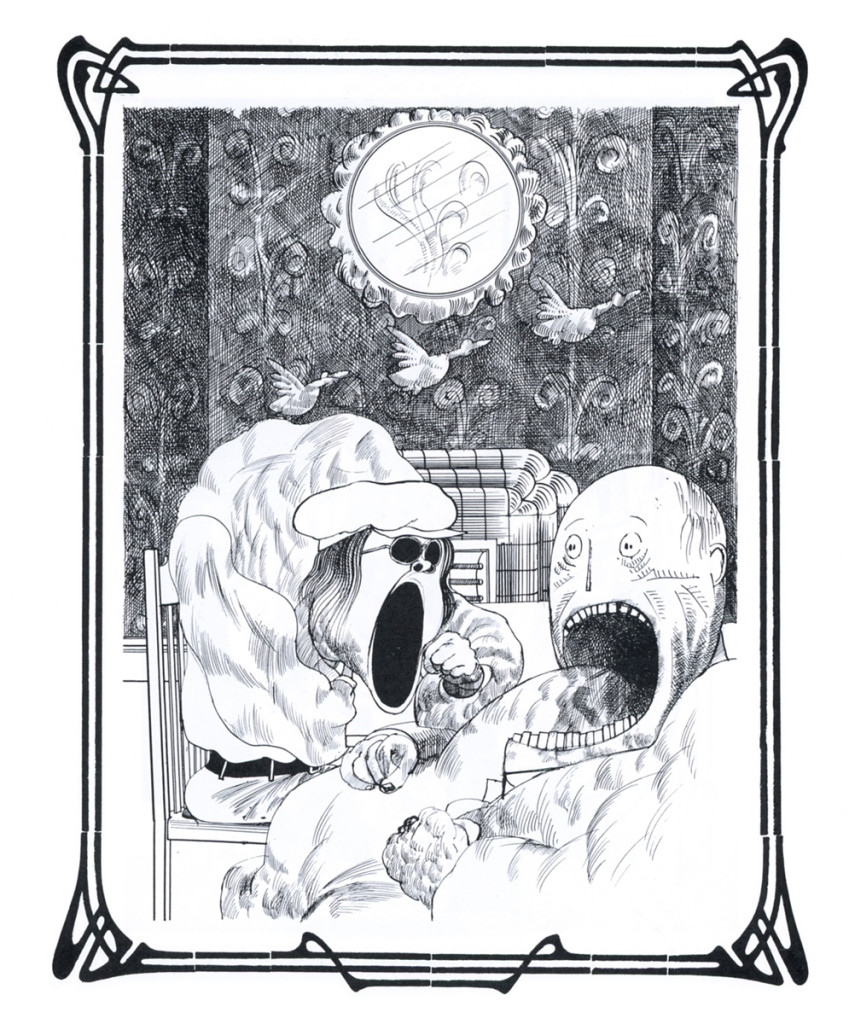
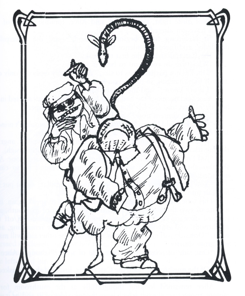
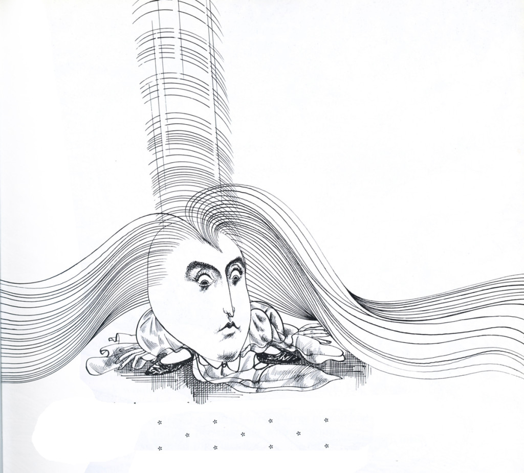
Alice via Steadman – 1
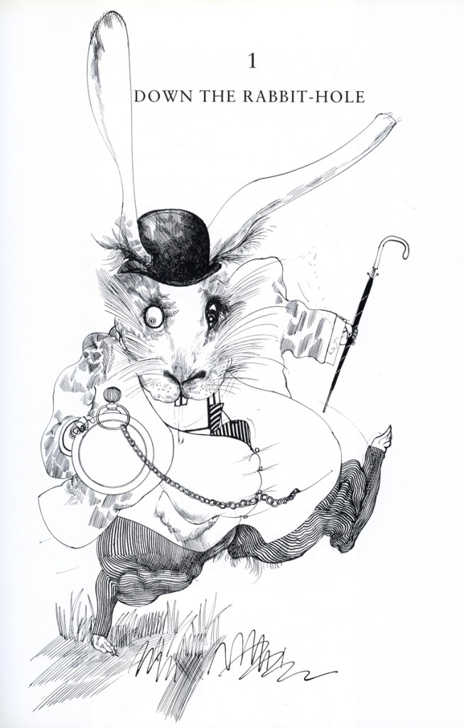
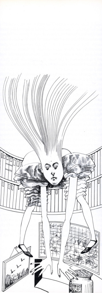
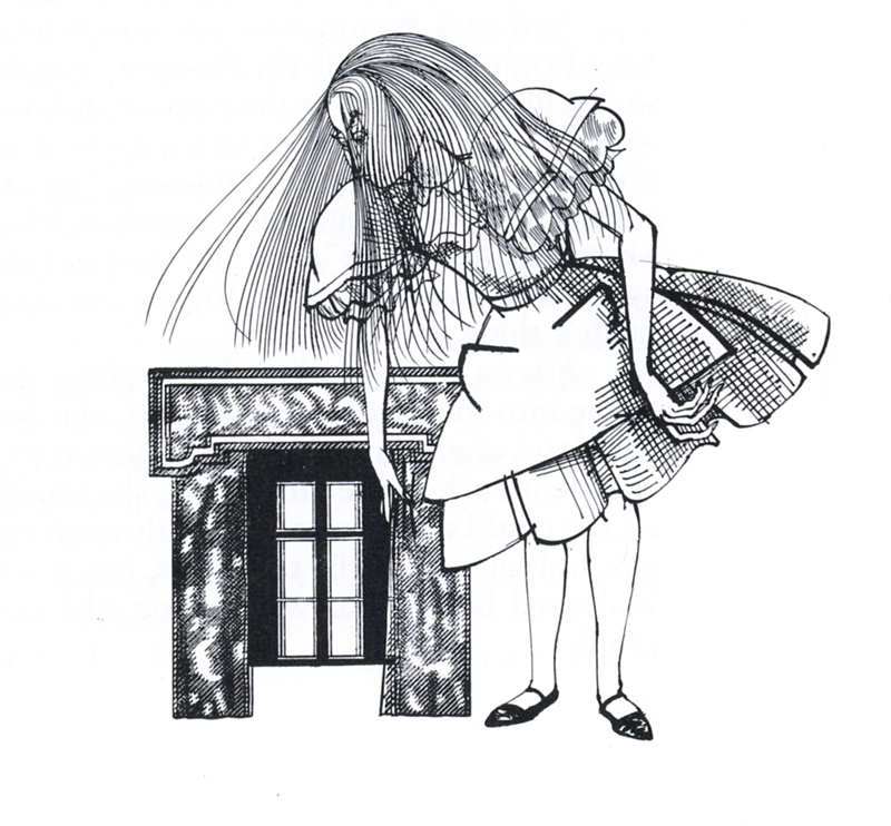
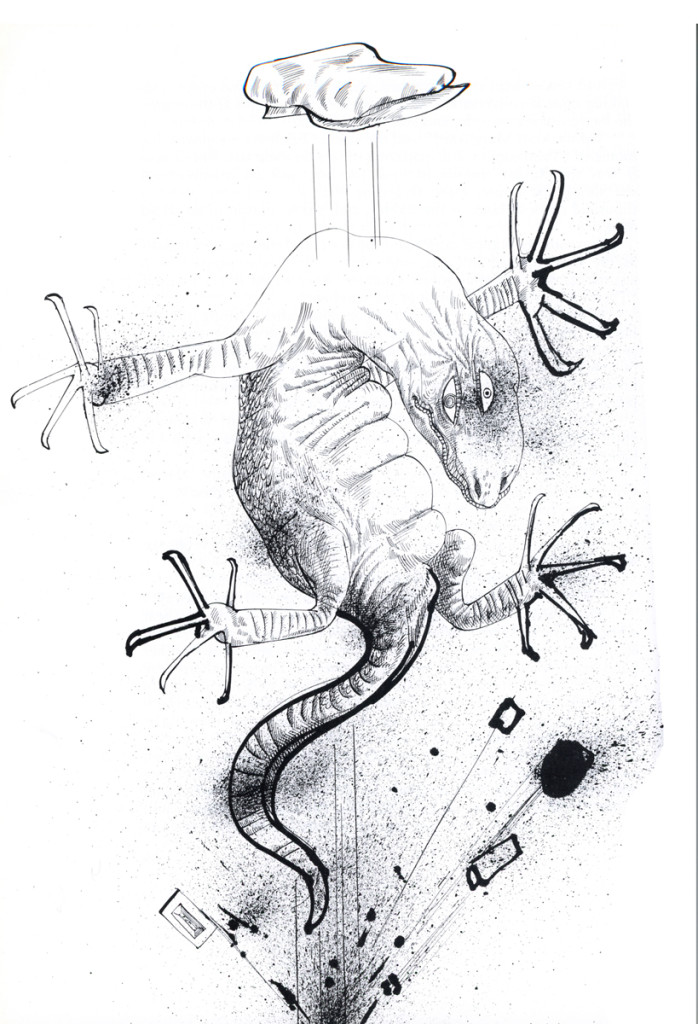
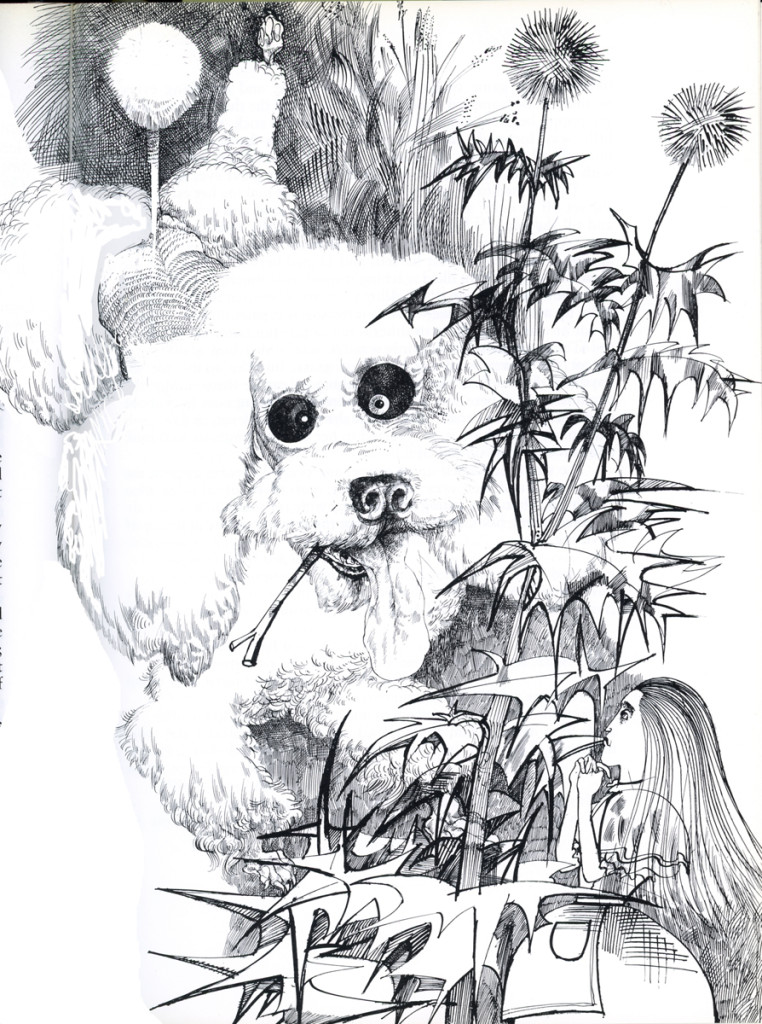
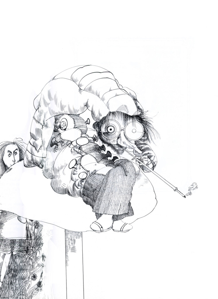
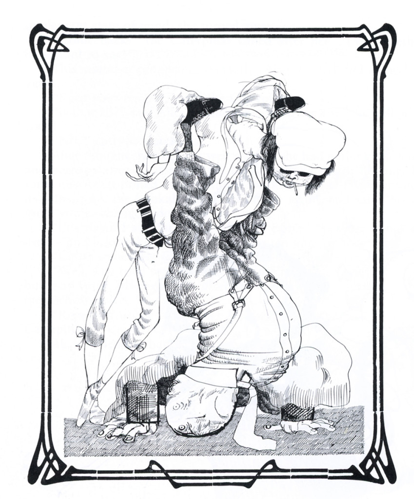
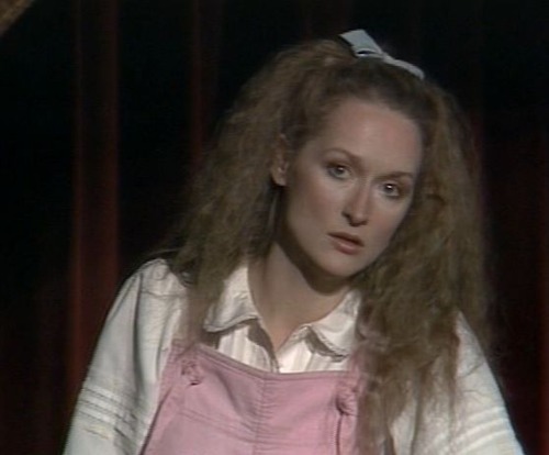 I am one of those insane people who is in love with Carroll’s Alice in Wonderland. I also am devoted to Ralph Steadman as probably my favorite illustrator. Steadman has published a glorious version of Alice, and I need no more than show some of the illustrations. Here’s the first in a series of posts of Alice by way of this original artist. Truly different from anyone else’s version.
The rumor was that Steadman had seen Meryl Streep performing as the lead on stage in New York, as part of the Joe Papp’s NY Shakespeare Festival, and he’d never been able to get that image out of his head.
I can quite understand since I also saw that very odd and interesting production and still remember it well.
I hope you enjoy this art as much I enjoyed working these images. There’s a lot more, and it will come in parts.
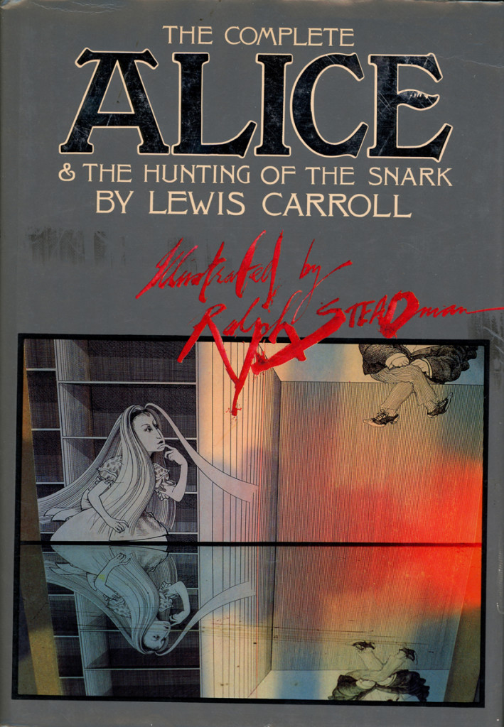
The book’s cover . . . .
Articles on Animation &Books &Commentary &Disney &Illustration &John Canemaker &Layout & Design &Story & Storyboards 01 Jul 2013 07:29 am
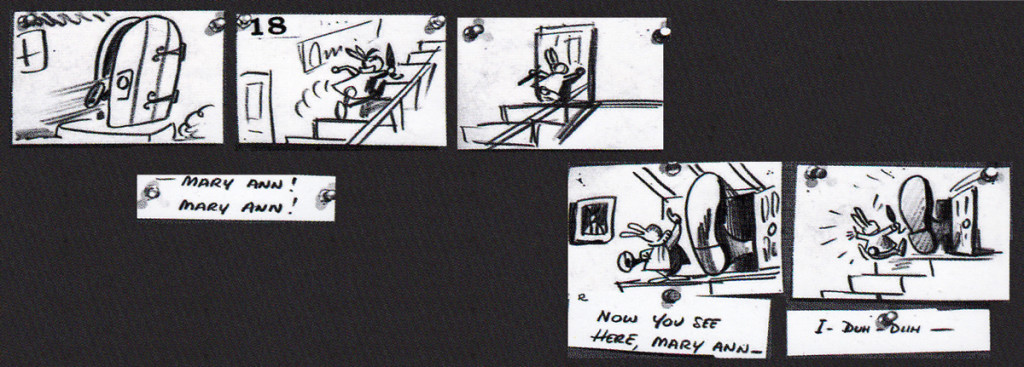
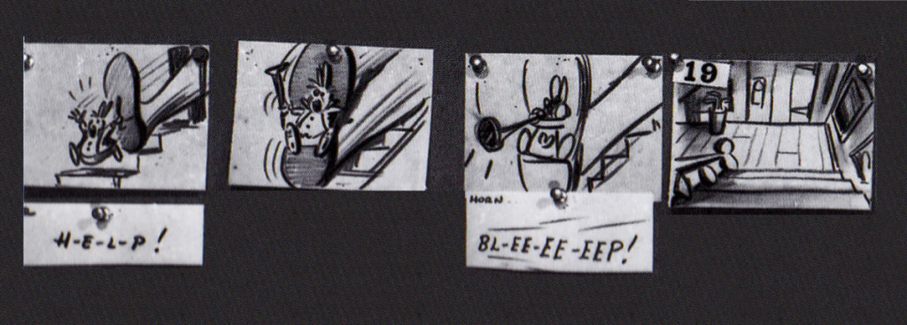
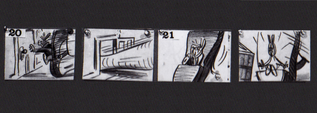
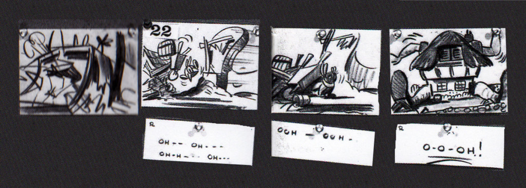
Alice Boards
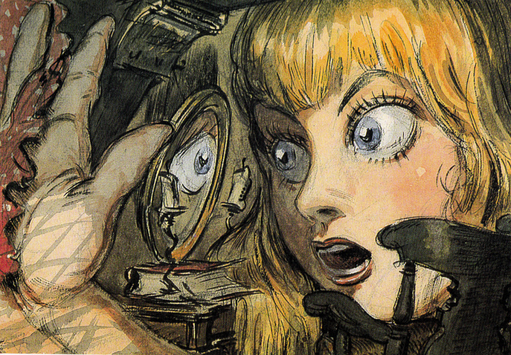
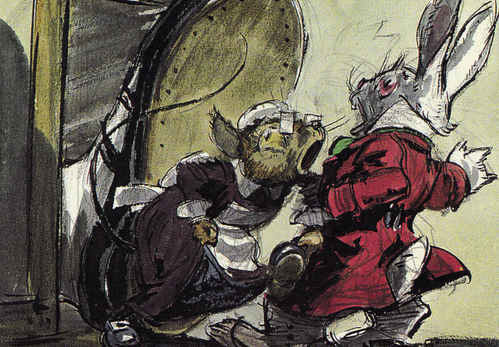
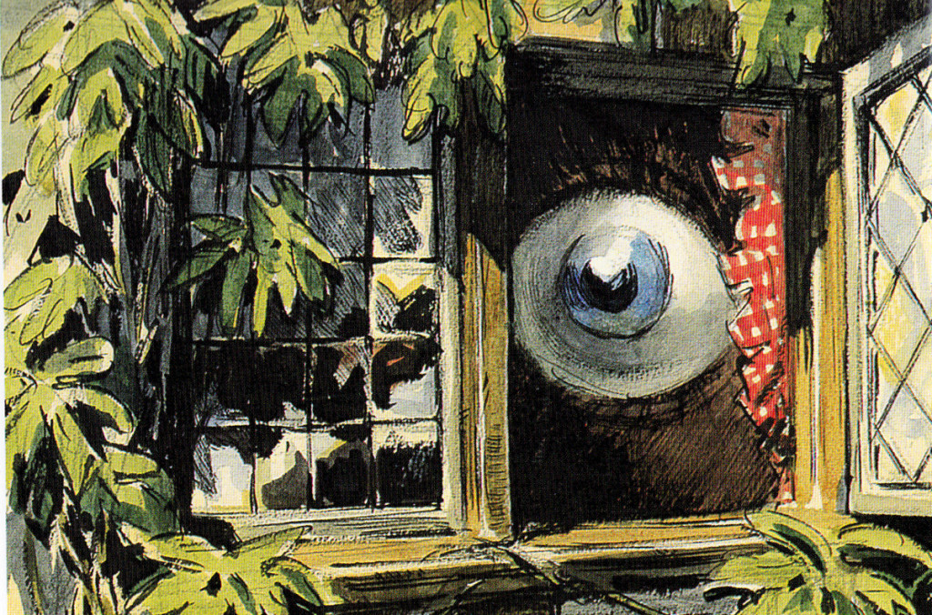
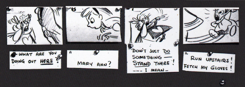
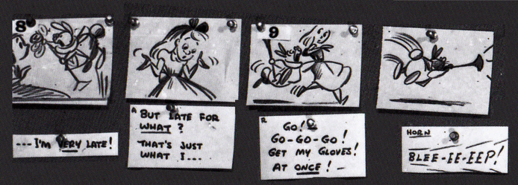
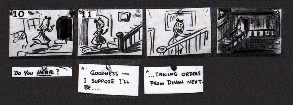
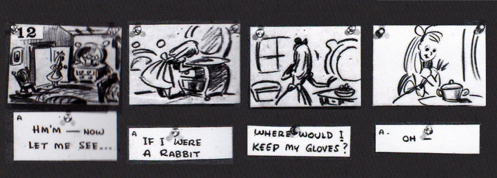
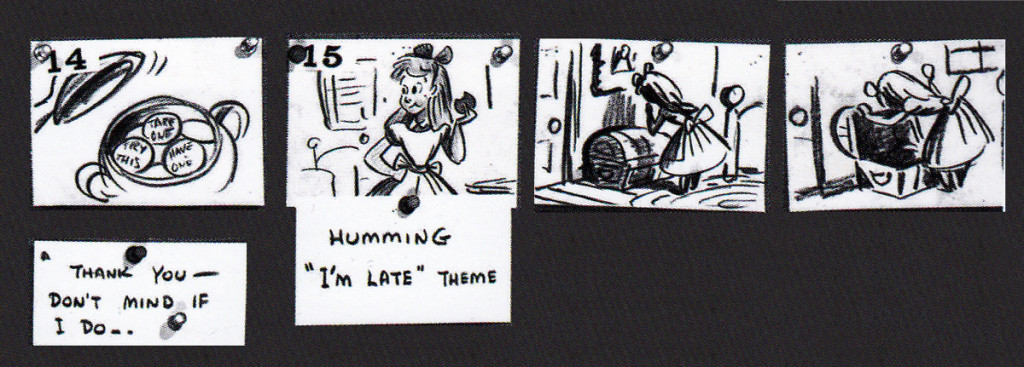
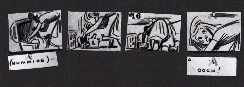
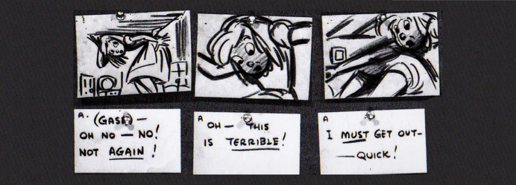
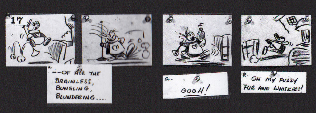
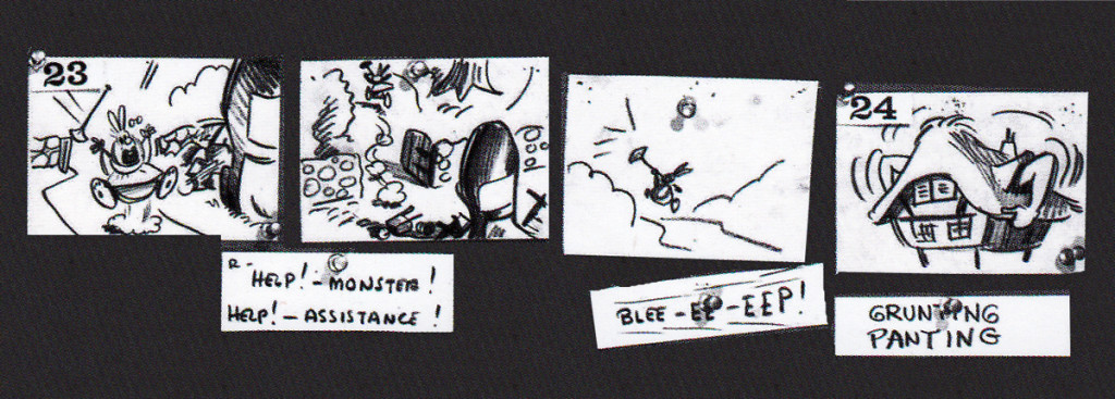
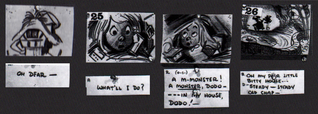
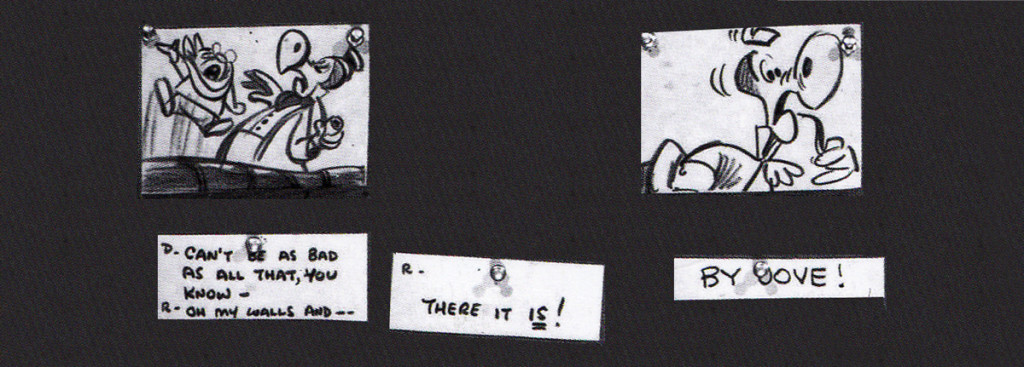
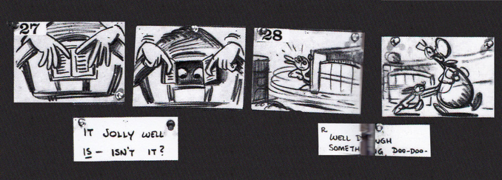
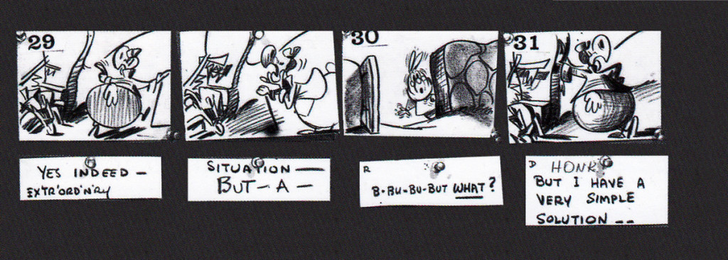
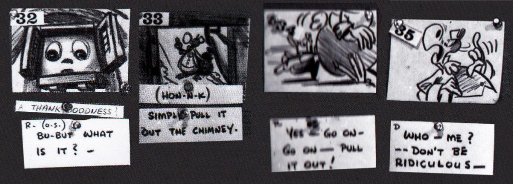
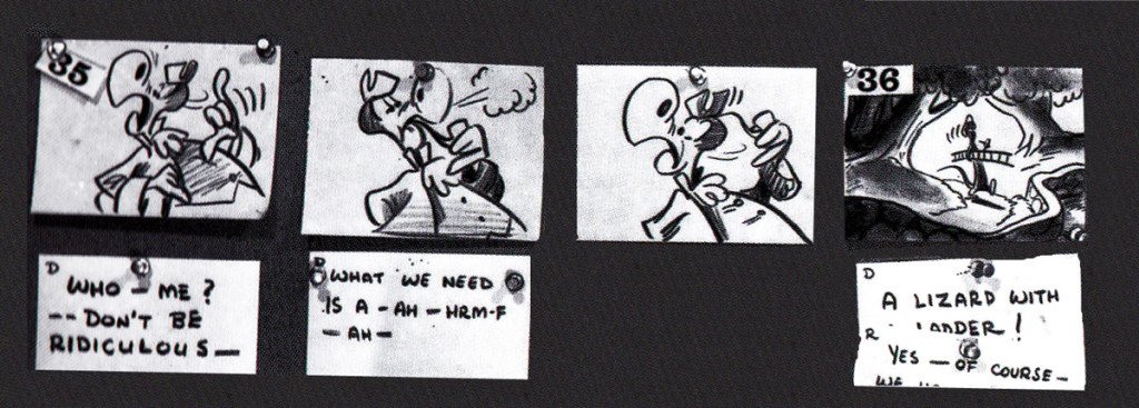
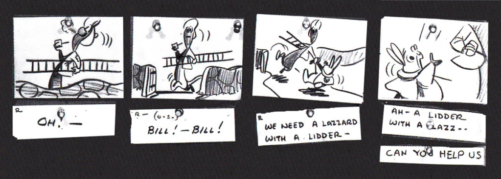
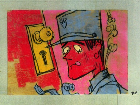
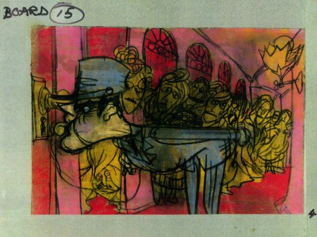
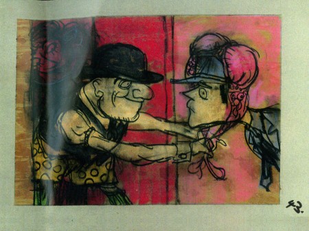
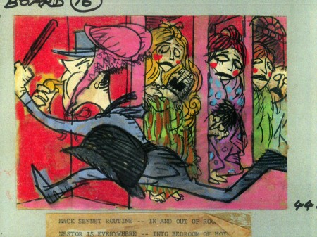
John Canemaker‘s book Paper Dreams: The Art & Artists of Disney Storyboards, is a brilliant work. As an example, take a look at this short piece for Alice In Wonderland.
The animated feature went through a long, slow birth.
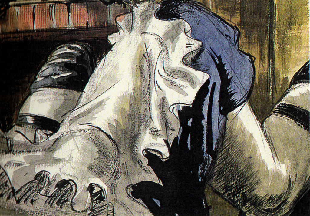
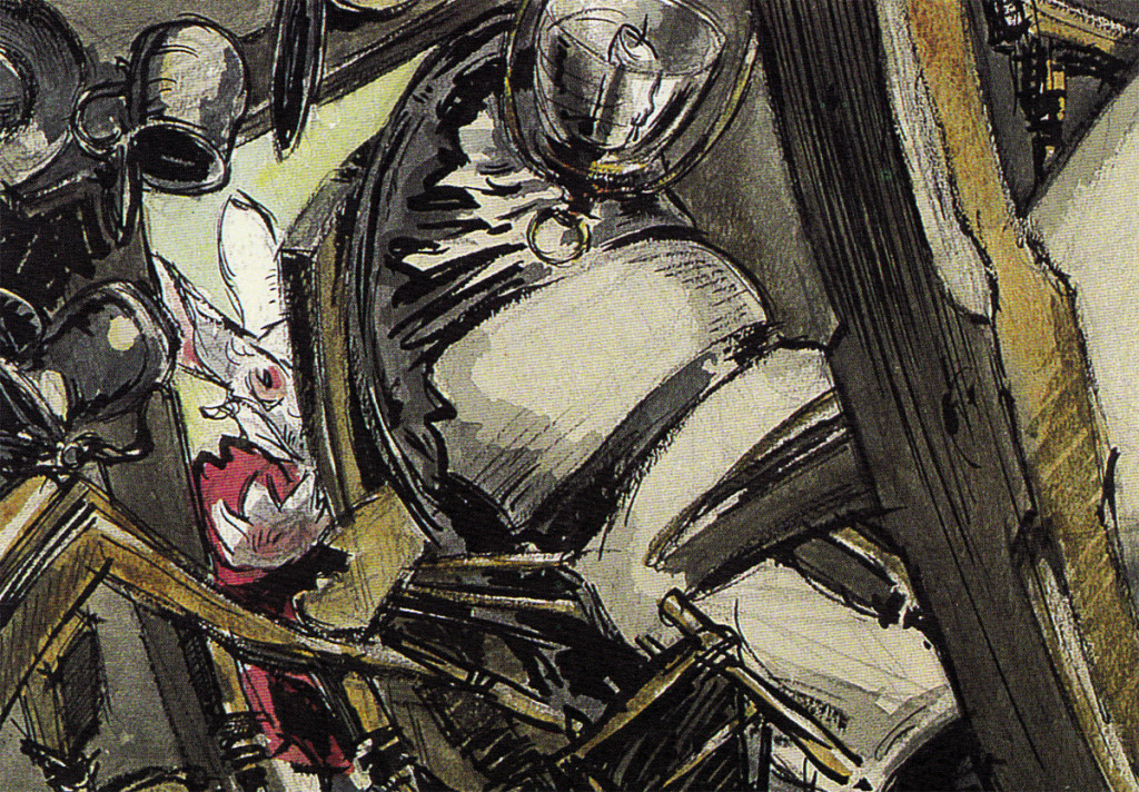
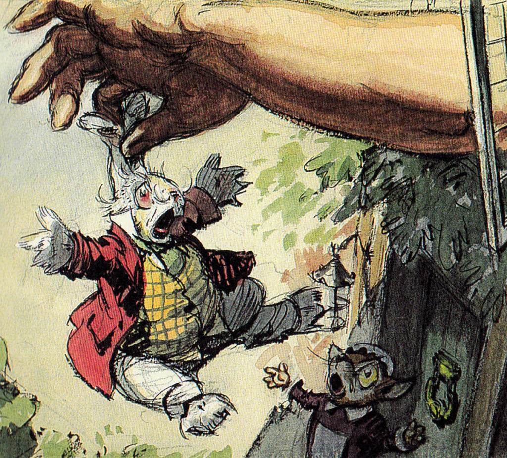
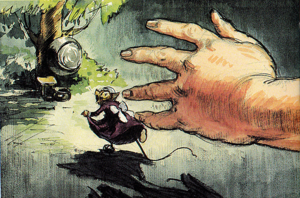
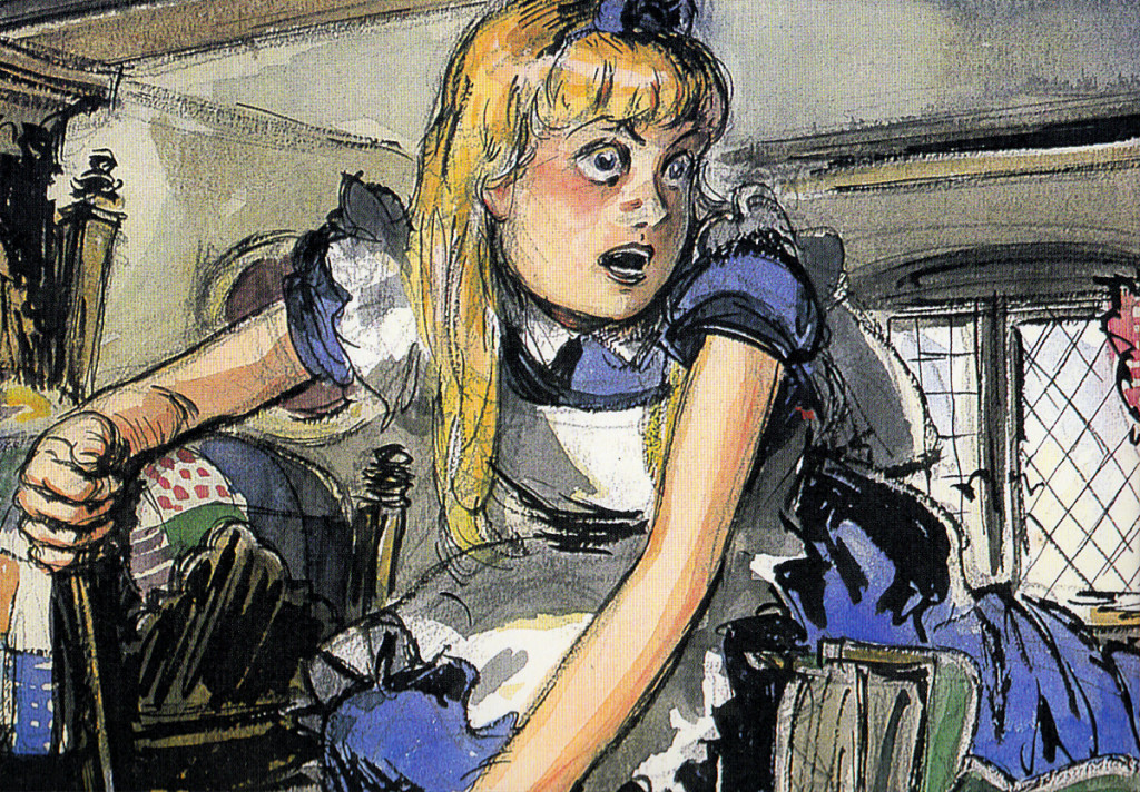
The first board, for this sequence, was by David Hall and was done in 1939, the late Thirties. Hall was originally a production artist for Cecil B. DeMille at Paramount Pictures; he worked as an illustrator who was called in to make many delicate watercolors. There was one sequence from the Carroll original which was kept for the final film. In it, Alice gets trapped within a house when, having bitten into a cracker, she suddenly starts getting larger and larger until she fills the white rabbit’s home with her head and overgrown body parts. Many a creature try to pull her from the house.
Here are some of the Hall watercolor images:
 1
1
Following his version, there was an attempt at a script by novelist Aldous Huxley. Done in 1945, this was ultimately abandoned when storyboard continuity artist, Joe RInaldi, came in to make some more cohesive and funny drawings in 1950.
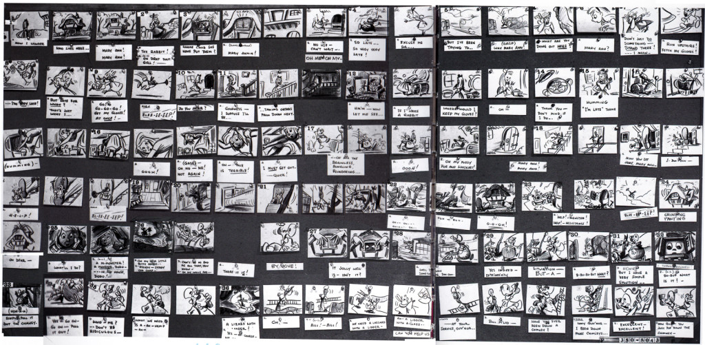
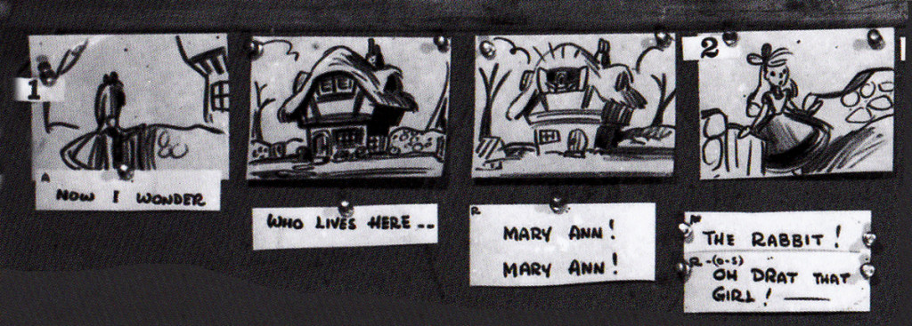
Here’s the full sequence, Rinaldi’s version.
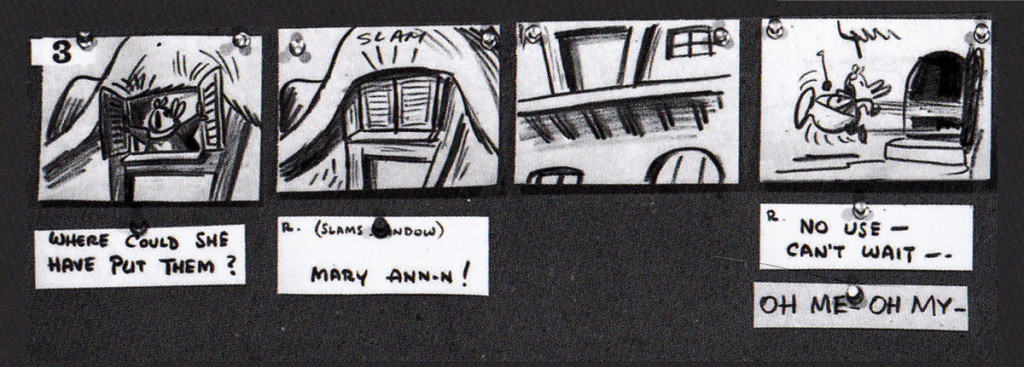
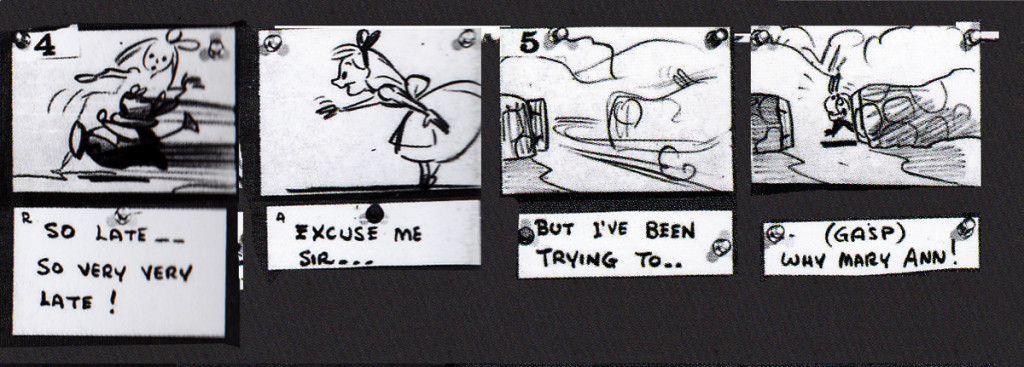
The following is Rinaldi‘s board enlarged for the sake of legibility:
 1
1
I have to give John Canemaker many thanks for allowing me to post these images. His book is a treasure. to those who appreciate the storyboard.
Animation &Animation Artifacts &Books &Comic Art &Layout & Design &SpornFilms &Story & Storyboards 28 Jun 2013 05:40 am
Jabberwock – repost
- To me, Lewis Carroll‘s nonsense poem, Jabberwocky, is one of the most brilliant pieces ever written. It’s always been important to me, and I’ve collected many versions of it in illustrated versions. Now that I mention it, let me confess that I’m a Lewis Carroll addict, and Jabberwocky is one of my favorites among his many poems.
In film, you have the one live action feature by Terry Gilliam; it’s a good film with a clunky monster in the end. In animation, professionally, I know of only two versions completed. One was by Jan Svankmajer done in 1974. I did a version of it in 1989. Mine, of course, sticks closer to the poem even though it is pretty “arty”.
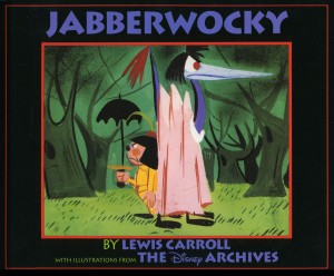 Apparently, there was also a version Disney was preparing as part of Alice In Wonderland. A book was published, credited to the “Disney Archives,” with illustrations from the preparatory drawings of this sequence. It’s obvious that the final versions of these drawings were done by one person, but there’s no record in the book of who did the finals. I’d read somewhere that Marc Davis had a lot to do with it, at one point. Though he obviously was most involved with Alice, herself.
I’m not in love with the images in the book. I like the technique used, but I find the images too cute. Though, it’s amazing how current they look.
(Click on any image to enlarge.)
I’m going to give you a number of the book’s pages today and, in comparison, will follow it up with images from my version tomorrow.
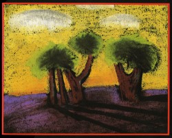
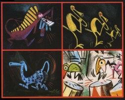
‘Twas brillig and the slithy toves
Did gyre and gimble in the wabe;
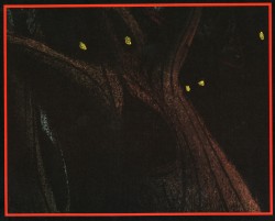
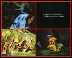
All mimsy were the borogoves,
And the mome raths outgrabe.
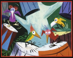
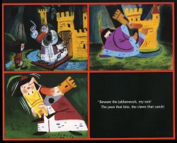
“Beware the Jabberwock, my son!
The jaws that bite, the claws that catch!”
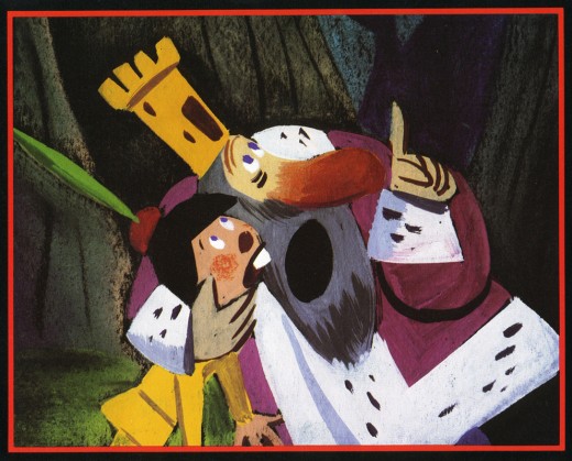
“Beware the Jubjub bird, and shun
The frumious Bandersnatch!”
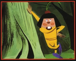
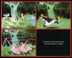
He took his vorpal sword in hand;
Long time the manxome foe he sought -
So rested he by the Tumtum tree
And stood awhile in thought.
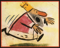
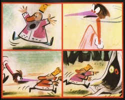
And as in uffish thought he stood,
The Jabberwock, with eyes of flame,
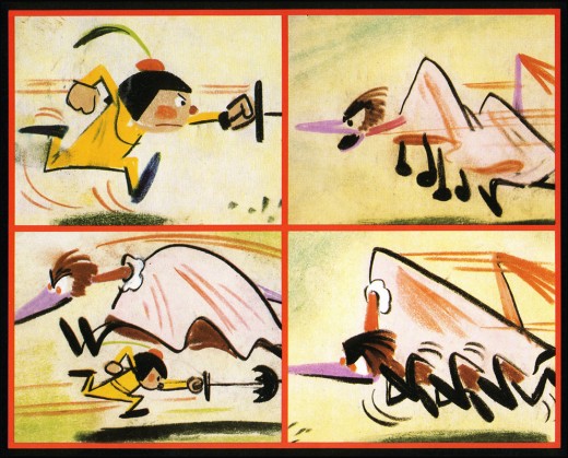
Came whiffling through the tulgey wood,
And burbled as it came!
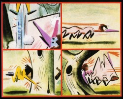
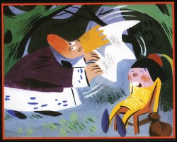
One, two! One, two! And through and through
The vorpal blade went snicker-snack!
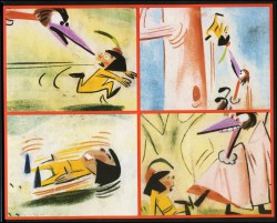
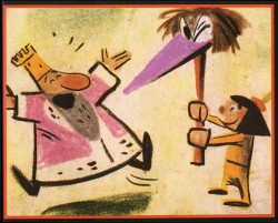
He left it dead, and with its head
He went galumphing back.
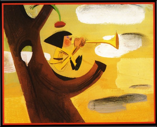
“And hast thou slain the Jabberwock?
Come to my arms, my beamish boy!
O frabjous day! Callooh! Callay!”
He chortled in his joy.
Jim Hill talks a bit about this book on his site in a letter response. here.
For amusement, you might check out this site for translations of this poem into 58 other languages, 23 parodies of the poem, and 10 explanations trying to define what Carroll meant by it.
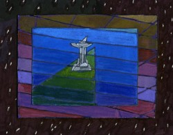
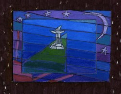
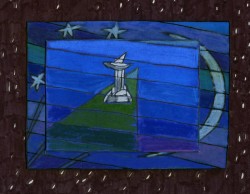
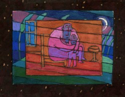
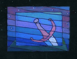
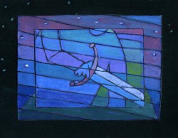
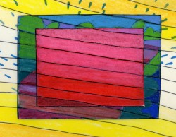
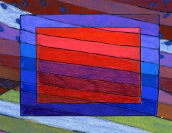
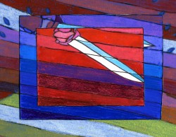
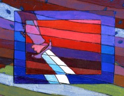
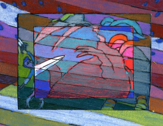
I’d like to post here a few of the images from my short adaptation of the Lewis Carroll poem, Jabberwocky. In doing the film, I tried to mimic a style I’d used in my oil paintings and felt it was a bit successful. I don’t think the filmed version is all it could be – it was rushed to complete a package which included the 19 min. film, The Hunting of the Snark, as well as an animated documentary done about Lewis Carroll’s nonsense poems. Of course, the video package wouldn’t have made sense without including Jabberwocky.
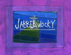
(click any image to enlarge.)
But I’ve scanned these images from the actual artwork and realize how well they’ve held up. I’d like to redo the film digitally someday and see where I can go with it.
Here are some of the images:
‘Twas brillig and the slithy toves,
Did gyre and gimble in the wabe;
All mimsy were the borogoves,
And the mome raths outgrabe.
“Beware the Jabberwock, my son!
The jaws that bite, the claws that catch!â€

“Beware the Jubjub bird, and shun
The frumious Bandersnatch!â€
He took his vorpal sword in hand;
Long time the manxome foe he sought -
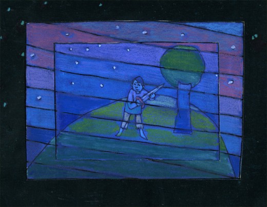
So rested he by the Tumtum tree
And stood awhile in thought.
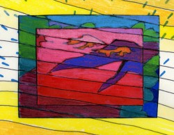
And as in uffish thought he stood,
The Jabberwock, with eyes of flame,
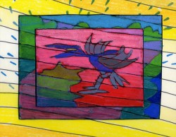
Came whiffling through the tulgey wood,
And burbled as it came!
One, two! One, two! And through and through
The vorpal blade went snicker-snack!
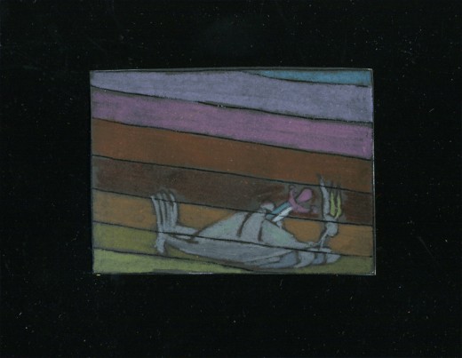
He left it dead, and with its head
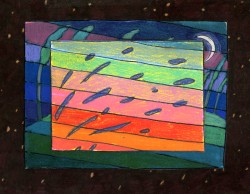
“And hast thou slain the Jabberwock?
Come to my arms, my beamish boy!
O frabjous day! Callooh! Callay!â€
He chortled in his joy.
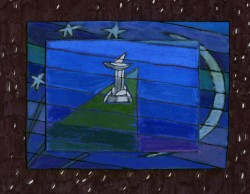
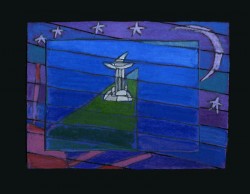
‘Twas brillig and the slithy toves
Did gyre and gimble in the wabe;
Animation &Animation Artifacts &Articles on Animation &Commentary &commercial animation &Independent Animation &Layout & Design 22 Jun 2013 05:13 am
John Wilson 1920 – 2013
A number of years ago I’d made a short trip to LA. During that visit, a man came up to introduce himself. It was John Wilson. He told me that he had just nominated me for an ASIFA Hollywood Award because he’d loved my work. I’d learned so much from watching Mr. Wilson’s films that it was wonderful to see that the mutual admiration society ran both ways.
John Wilson died yesterday. His son, Andrew, wrote to tell me of it. My feelings go out to the family and am enormously sorry that animation loses another one of its masters.
He was a director, designer and animator about whom I’d done a series of posts on his career. Out of respect for Mr. Wilson, I’d like to post all of those articles together (and hold them there for the entire weekend.)
Hope you’ll enjoy.
1.
Let me start by sharing some bio information about John Wilson and his company Fine Arts Films.
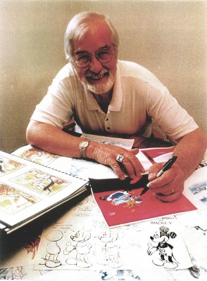 - John Wilson was born in Wimbledon in 1920. He attended the Royal College of Art and was working by age 18 as a commercial artist with Willings Press Service. In WWII he served with the London Rifle Brigade in African where he was seriously wounded. Recuperating in hospital, he drew many cartoons of which several were printed. Eventually he would recover and get work at Pinewood Studios in the art department where he worked on GREAT EXPECTATIONS and THE THIEF OF BAGHDAD, among other films.
- By the time he was 25, he was working in animation at Gaumont-British Animation, a newly formed division of J. Arthur Rank’s studio, working under the direction of David Hand on the “Animaland” series starring “Ginger Nut.”
- In 1950 he moved to the United States working in layout and animation at UPA. He found himself working with Bobe Cannon, Pete Burness, Jules Engel, and Paul Julian. Eventually he left for the Disney studio working in Les Clark’s ‘Tinkerbell’ unit on PETER PAN and with Ward Kimball on TOOT WHISTLE PLUNK & BOOM.
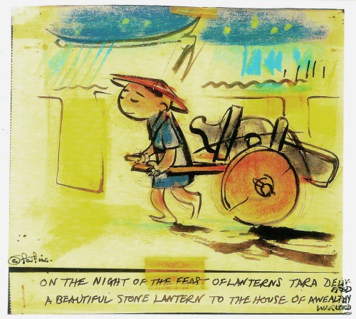
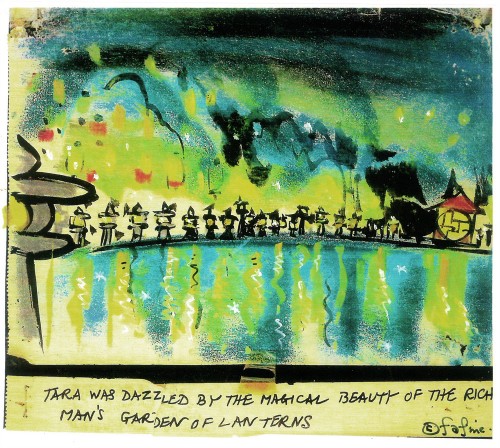
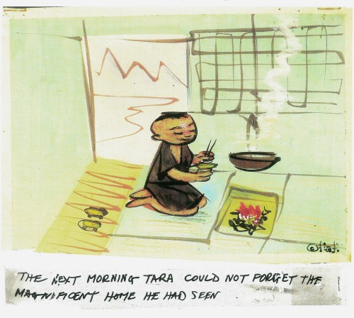
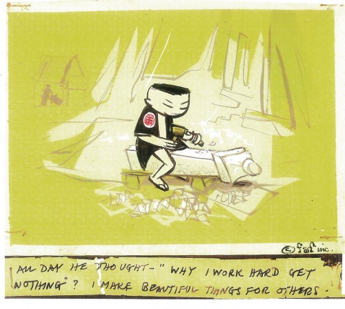
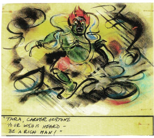
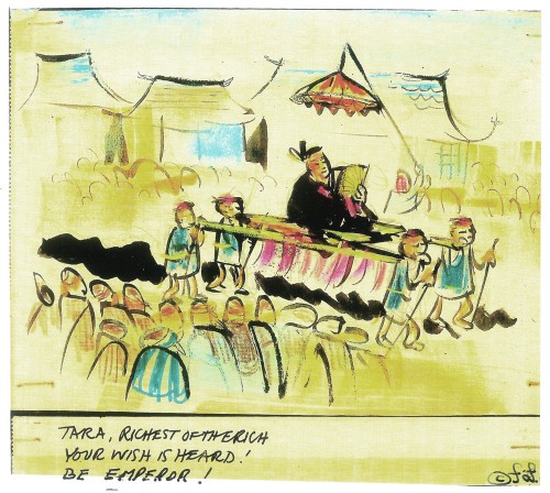
- He tried to sell Disney on the film Tara, the Stonecutter, but they weren’t interested. He completed it himself in 1955 using a Japanese style to tell the story. Wilson was impressed with the UPA style of modern art in animation, and that’s the route he took for his personal film. Thus his studio was born, called Fine Arts Films, in 1955. Tara had some success playing theatrically with the successful Japanese feature film, GATE OF HELL by Kinugasa (which had won the Oscar for Best Foreign Film.)
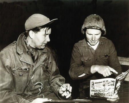
Wilson in Korea with the Bob Hope Tour to entertain the troops.
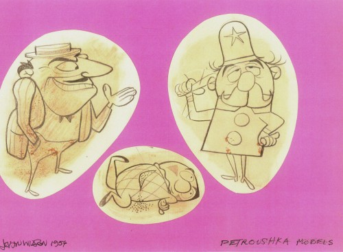
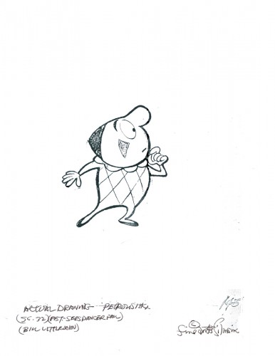
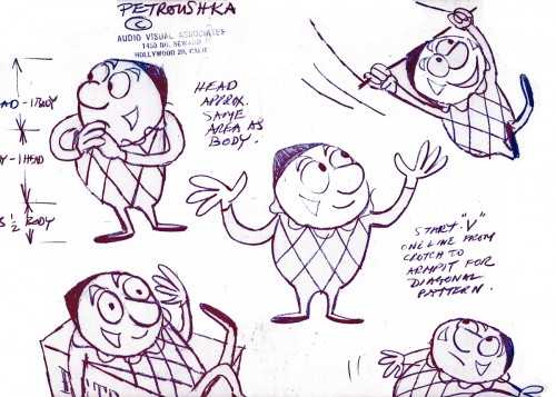
- This film led to his producing a verion of Stravinsky’s Petroushka for NBC which aired in 1956 as part of The Sol Hurok Music Hour. Notably, Stravinsky, himself, arranged and conducted the shortened version of the score suing the LA Philharmonic Orchestra. The film was designed by John Wilson and Dean Spille with anmation by Bill Littlejohn, Art Davis, and Phil Monroe. Chris Jenkyns, Dean Spille and Ed DeMattia designed the 16 minute show from Wilson’s storyboard.
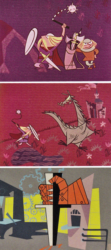
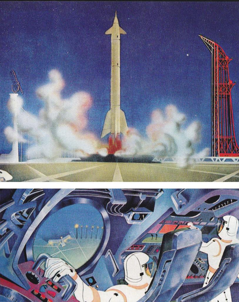
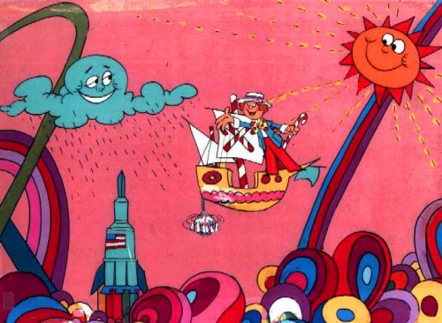
- Fine Arts Films had produced ‘Journey to the Stars’, a project for the 1961 World’s Fair, an animated voyage through space for NASA, which was seen in 70 mm Cinerama by ten million visitors to Seattle.
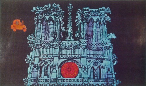
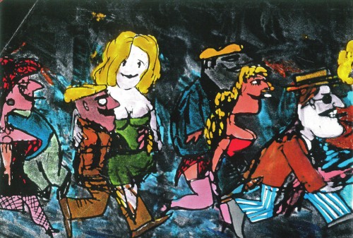
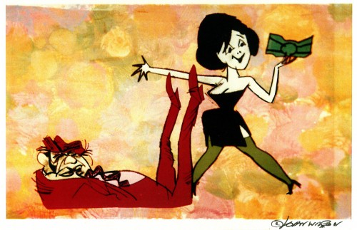
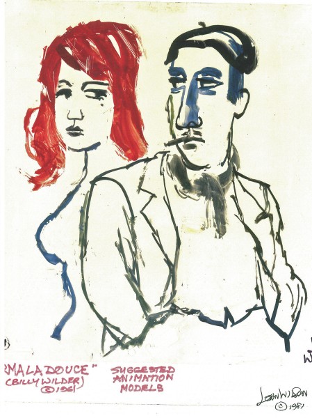
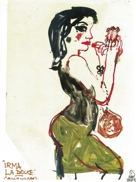
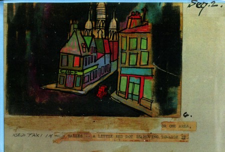
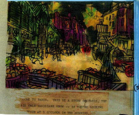
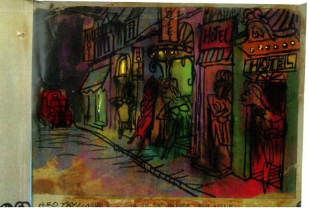
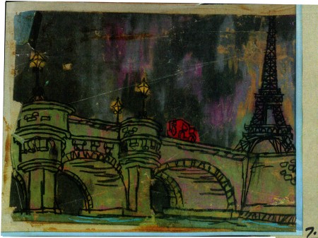
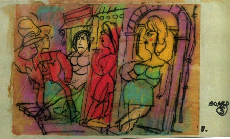
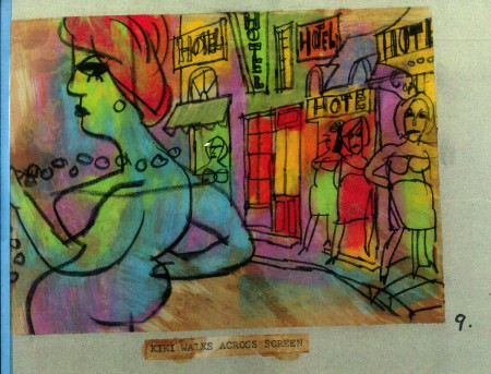
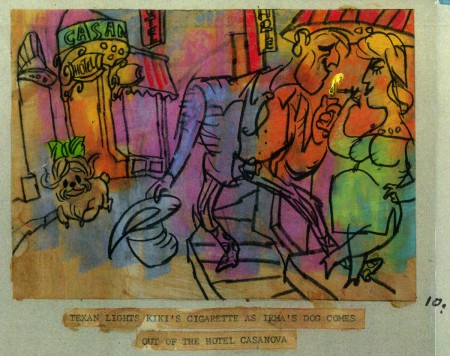
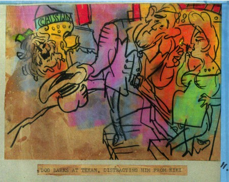
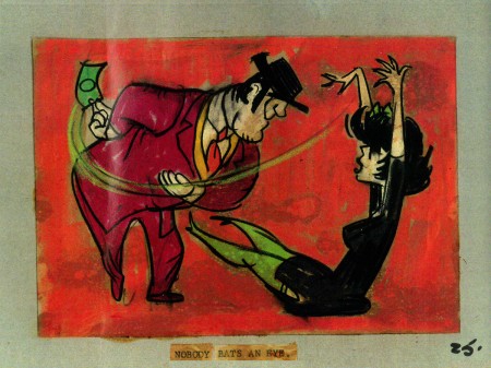
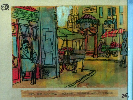
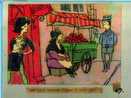
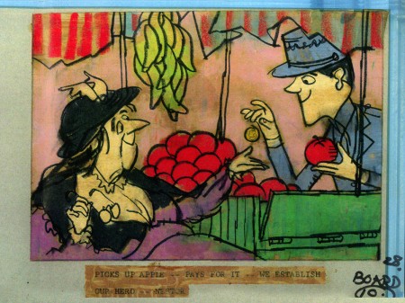
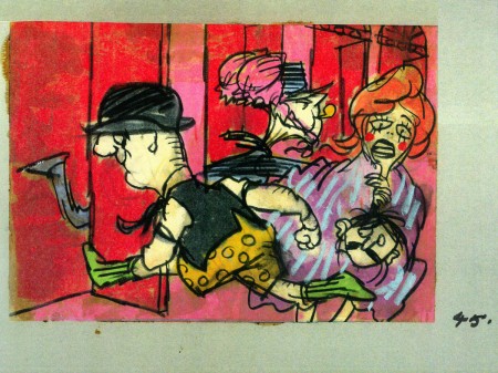
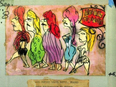
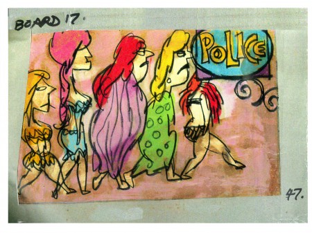
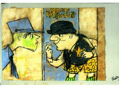
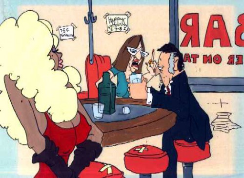
- Billy Wilder employed Wilson to do the titles for Irma La Douce after which they did a six-minute trailer for this Jack Lemmon, Shirley McLaine feature. It was all about Parisian prostitutes romping about in Montmartre, and animation could apparently make it acceptable. Artists Ron Maidenberg, Sam Weiss, Sam Cornell and Bob Curtis caught the vivid nightlife of Paris in a sexually charged animated short. It was a huge success in promoting the feature.
- In 1970 Wilson flew to Chicago to see Carol Channing and Eddie Bracken appearing in “archy and mehitabel in Shinbone Alleyâ€. On the basis of this theatrical musical, Wilson bought the screen rights to the book “archy and mehitabel” by George Herriman and began work on an animated feature which was released by Allied Artists in 1971.
- Fine Arts Films was also responsible for many animated commercials as well as weekly music video segments for the weekly CBS-TV series “The Sonny and Cher Show.†The songs included Joni Mitchell’s “Big Yellow Taxi†and Jim Croce’s “Leroy Brown.â€
Here are some storyboard sketches by John Wilson for his initial short film, Tara, the Stonecutter. This film started it all for Wilson.
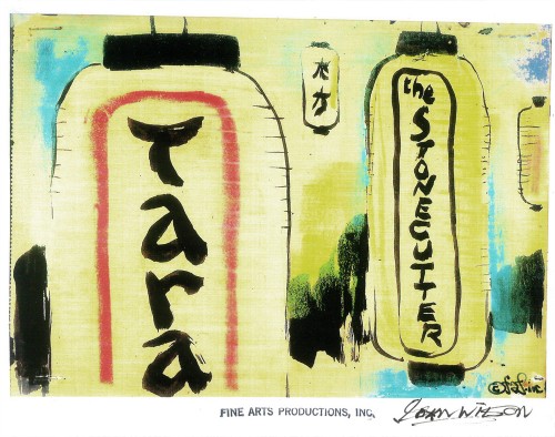 1
1
I haven’t seen the finished film, but I understand that Japanese decorative papers were used in the backgrounds and costumes of the characters.
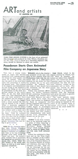
Here are two press clippings for this film from California papers.
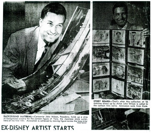
(Click any image to enlarge.)
2.
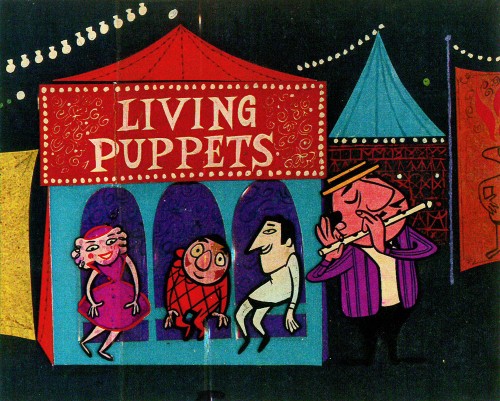
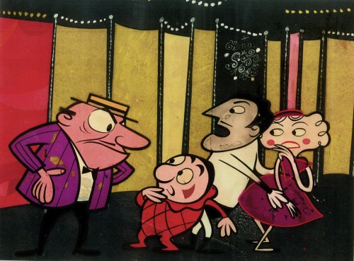
- After completing the film, Tara the Stone Cutter in 1955, John Wilson and his newly formed company,Fine Arts Films, was able to sell the idea of an animated version of Stravinsky’s Petroushka to NBC. They aired the 16 min. film in 1956 as part of The Sol Hurok Music Hour. Stravinsky, himself, arranged and conducted the shortened version of the score using the LA Philharmonic Orchestra.
The film was designed by John Wilson and Dean Spille; animation was done by Bill Littlejohn, Art Davis, and Phil Monroe. Chris Jenkyns, Dean Spille and Ed DeMattia designed the show from Wilson’s storyboard. This is considered the first animated Special ever to air on TV.
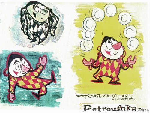
Here are some stills from that film and its artwork.
 1
1Petroushka – model 1
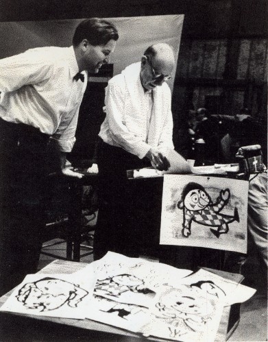 11
11
John Wilson and Igor Stravinsky preparing for recording of Petroushka
with the Los Angeles Philharmonic Orchestra (1955).
Here are copies of two reviews:
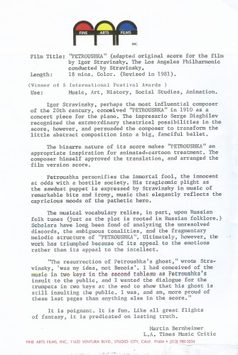
Los Angeles Time review (1956)
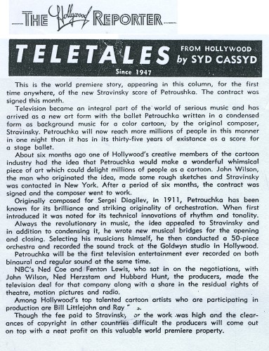
Hollywood Reporter review )1956)
(Click any image to enlarge.)
Petroushka was released on VHS tape combined with a number of the song pieces he did for the Sonny and Cher program. This tape, John Wilson’s Fantastic All Electric Music Movie, can still be found on Amazon but is pricey.
Thanks to Amid Amidi for the loan of this material.
3.
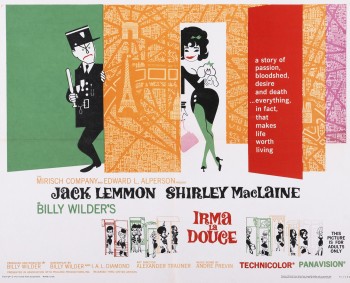 Irma La Douce was a racy film written and directed by Billy Wilder that starred Shirley MacLaine as a Parisian prostitute and Jack Lemmon as a French policeman who falls in love with Irma (Shirley MacLaine.) The film, for its time was daring, and came up with (heaven forbid) a “C” for Condemned rating from the Catholic church. This made it off limits for anyone under the age of 18. I was determined to go see the film, so I ignored the ban and went by myself. Naturally enough, no one tried to stop me. I wasn’t jaded by the movie anymore than I had been disturbed by the violence in all the Warner Bros. cartoons I’d seen. Looking back on Irma La Douce, it really is an innocent film, hardly risqué in any way shape or form.
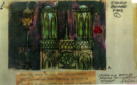
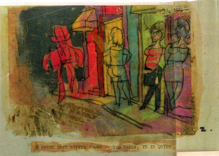
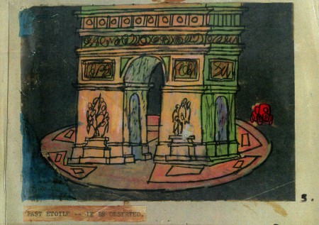
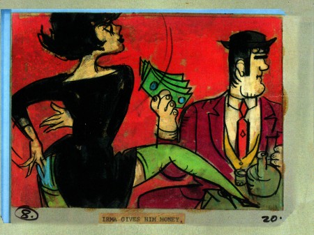
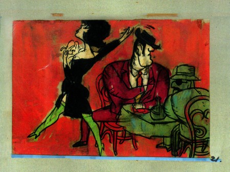
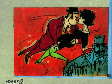
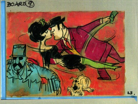
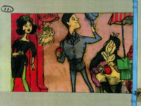
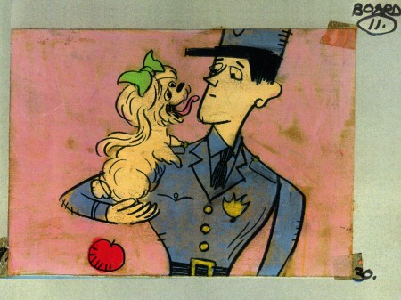
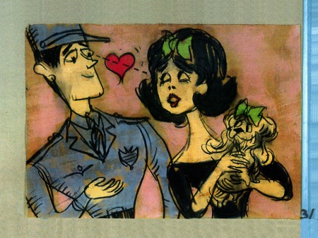
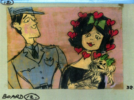
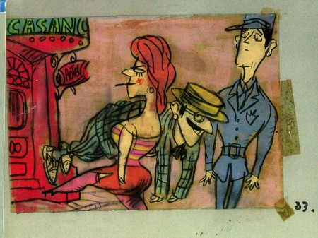
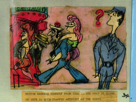
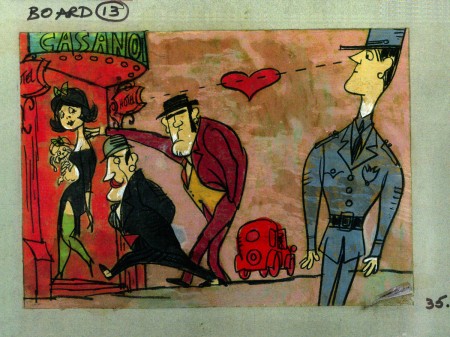
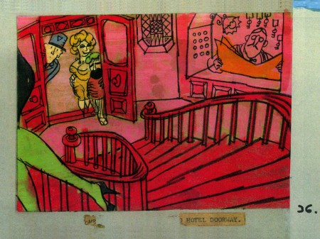
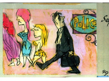
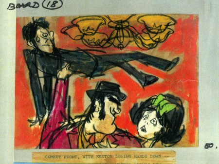
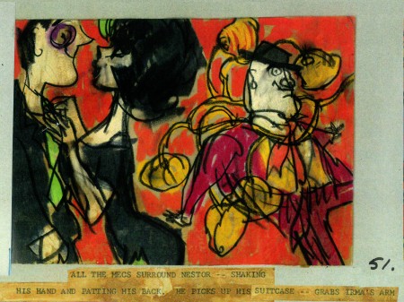
The film started with some nicely drawn animated credits which were done by John Wilson’s studio. Until recently I hadn’t known that Wilson also produced an animated short promoting the feature for the Mirisch Company. I have some preproduction art from that short as well as the color storyboard. The board is large enough that I’ve decided to break it into two parts. We’ll see part one today and the second part next week.
Each section of three images is long enough that unless I post one drawing at a time, it’ll be too tiny to see unless enlarged. I’d like to post each storyboard sketch a nice viewing size and still give you the option of enlarging it.
Let’s start with some production and post production stills so you can see what it looked like.
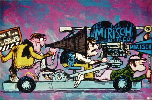 1
1
A couple of pre-production drawings:
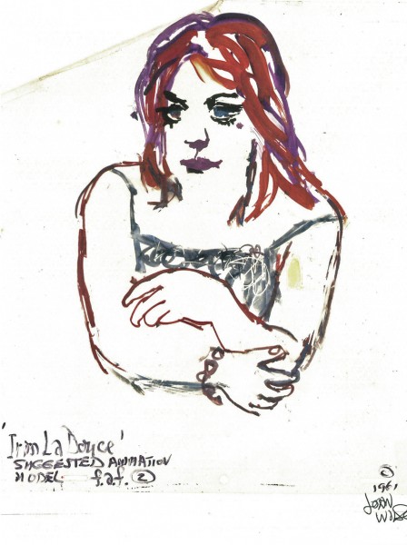 1
1
Then, there’s the storyboard. I’ll give an example of the three panel pull out and follow that with each individual image.

You can see why I’ve decided to enlarge the images.
4.
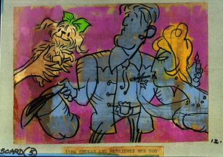
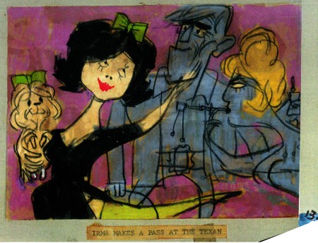
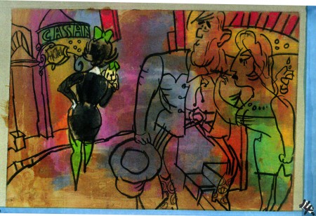
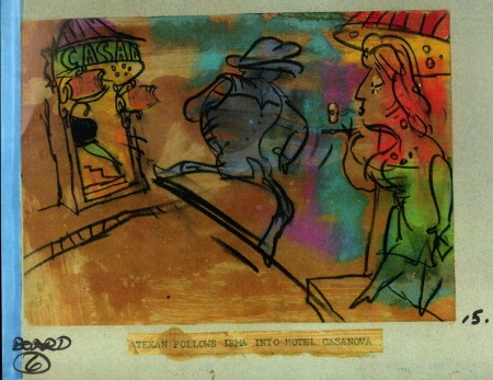
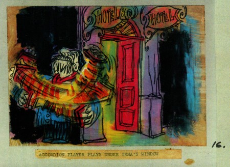
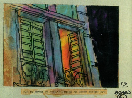
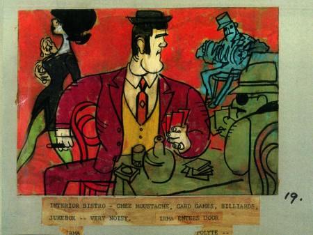
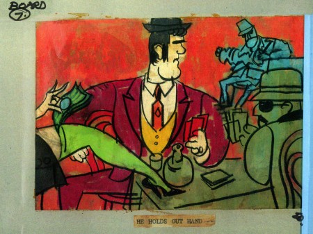
John Wilson created this storyboard for the Mirisch Corp. It was an animated trailer to promote Billy Wilder‘s coming film, Irma La Douce. The board comes in 18 pages of three storyboard drawings. Rather than post the sets of three images (and only being able to show them at a smallish size) I’ve taken each individual drawing and have blown them up to see them better on this blog.
Again, these were for a lengthy trailer for the film not the opening credits. The film’s credits do not use animation.
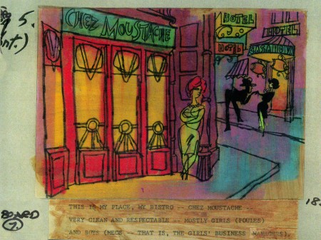 7a
___________________________
Here’s a YouTube version of the trailer. Not the brightest quality, but you can see it.
5.
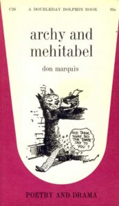 - Don Marquis‘ book, Archy and Mehitabel, garnered fame quickly and not least because of the extraordinary illustrations of George Herriman, the creator of Krazy Kat.
The first book was published in 1927 and others followed in 1933 and 1935. It wasn’t until the third book that Herriman took over the characters created by Marquis in his book of short stories, developed mostly, in poetry. An on-again off-again love affair, the story had two principal characters: a cat, Mehitabel, and Archy, cockroach. (You can read these poems on line here.)
In 1953, writer Joe Darion along with composer George Kleinsinger (the creator of Tubby the Tuba) wrote a musical theater piece. Tenor Jonathan Anderson played Archy and soprano Mignon Dunn was Mehitabel. At about the same time a recording of the showtunes was recorded with Carol Channing as Mehitabel and Eddie Bracken as Archy. The record was a success.
With the help of the young writer, Mel Brooks, they were able to get their show to Broadway in 1957, but it was now named Shinbone Alley. After 49 performances, the show closed, but the original cast album was recorded that same year. The songs stayed in the permanent repetoire of Carol Channing and Eartha Kitt.
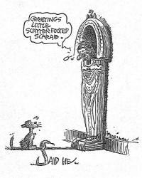 In 1971, John Wilson directed an animated feature starring the voices of Channing and Brackett and using the songs from the musical. The love affair between Archy and Mehitabel was penned by Archy, the cockroach; his poems tell their story.
The film suffers from its music. The songs are simple and sound as if they’re written for children, but the lyrics pull from the poems which are definitely designed for adults. It gets a bit confusing, as a result, and is a bit picaresque; the poems are short and illustrating them in animation would take more adaptation than seen here.
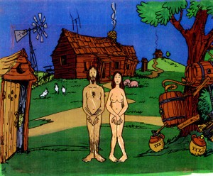 John Wilson had developed his studio, Fine Arts Films, on the back of the weekly, animated, music videos he did for The Sonny and Cher Show, an enormous hit in the early 70s.
These music videos were loose designs animated quickly and lively around the songs Sonny & Cher would schedule each week. There would always be one or two of these pieces, and they were highlights in the weekly one-hour musical/variety program.
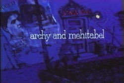 The graphics of Shinbone Alley aren’t too far from these Sonny & Cher videos. Loose design and animation with a design style not too far from the Fred Wolf’s made-for-ABC feature, The Point. This was the first feature made for television and featured the songs and story of Harry Nilsson, although Shinbone Alley featured a wilder color pallette.
Jules Engel, Corny Cole and Sam Cornell all worked in design on the film. The long list of 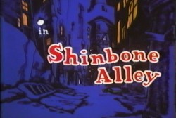 animators included Barrie Nelson, John Sparey, Spencer Peel, Eddie Rehberg and Jim Hiltz. Mark Kausler was an assistant on the show.
The film wasn’t an enormous success, but that was probably explained much by the limited distribution and the poor marketing of the film. I saw the film when it came out; I was living in Washington DC at the time (in the Navy). I was very disappointed. The animation is very limited and the style was a real let-down having known the George Herriman illustrations from the Don Marquis book. We’d already seen those limited animation Krazy Kat cartoons from King Features, so I knew the style could be done adequately – even on a budget. The style in this film just seemed a little too Hollywood cute, at the time, and it felt dated when it came out. I don’t feel too differently about it watching the VHS copy I own.
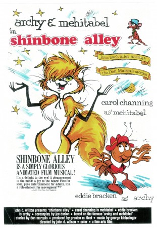
the film’s poster
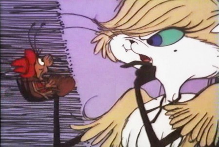
Here are some frame grabs from the first 1/4 of the film:
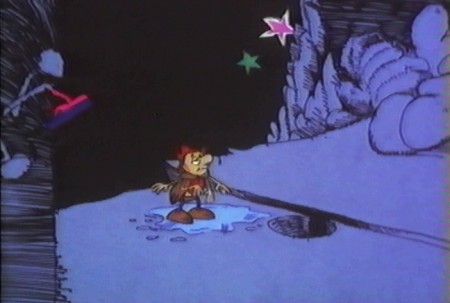
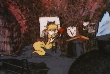
We’re introduced to Archy right off the bat as he
flies out of the river onto the dock. He realizes that he,
the poet, tried to kill himself and was sent back as a cockroach.
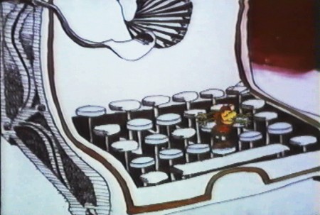
He soon finds a typewriter and goes straight back to work.
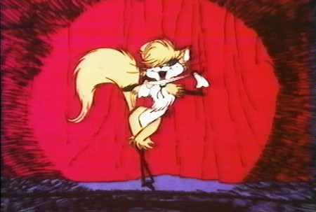
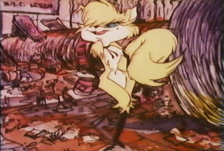
Mehitabel is a performer – with Carol Channing’s voice.
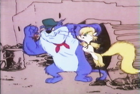
She has another boyfriend, voiced by Alan Reed,
who is also the voice of Fred Flintstone.
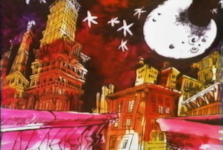
A song video takes us outside.
6.
- This final post featuring the work of John Wilson and his company, Fine Art Films, covers many varied film projects. Unfortunately, I found relatively few images available for posting especially considering the amount of film done.
The Sonny and Cher Show was a long running Variety program on television in the 70s. Most weeks featured an animated music video as done by John Wilson. Some examples of this include:
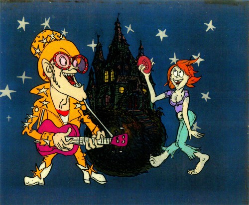
Helen Reddy’s song “Angie Baby”
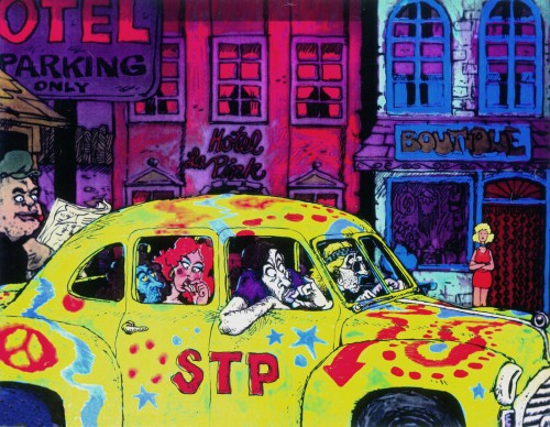
Joni Mitchell’s “Big Yellow Taxi”
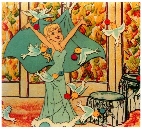
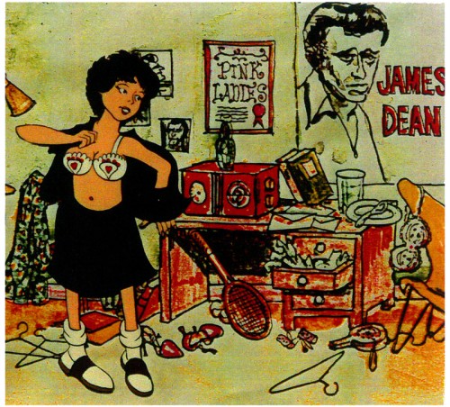
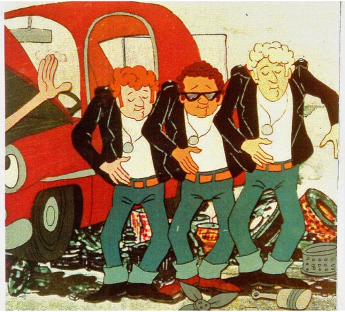
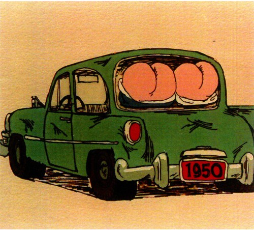
Fine Arts Films also did some movie titles and trailers. We saw, recently, the long theatrical trailer done for Irma La Douce. Here are a few stills done for the main title sequence for the 1978 musical, Grease.
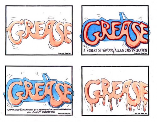
storyboard sketch for Grease.
Produced and Directed by John Wilson
Story and Layout by Chris Jenkyns
Music by Barry Gibb
John Wilson also directed a number of short films which appeared on television on the NBC program, “Exploring” between 1964-1966.
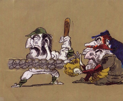
“Casey At the Bat”
Narrated by Paul Frees
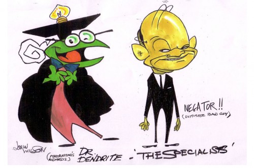
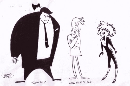
Finally, for MTV’s “Liquid Television” in 1992 John Wilson directed some of the 10 episodes of a series called “The Specialists.”
 1
1
Go here to see other episodes.
