Category ArchiveArticles on Animation
Action Analysis &Animation Artifacts &Articles on Animation &Disney &Layout & Design 08 Jun 2010 08:40 am
recap – Phil Dike Lecture
Hans Perk is posting a series of lectures on Layout. In August 2006 I posted the notes for the Disney afterhours lectures. To coincide with Hans, I’m recapping those notes.
- As noted yesterday, I am missing the notes to Lecture #2 of this Layout Course. - Hans Perk on his site, A Film LA, has posted the Ken Andersen LayOut Training Course from the Disney studio Nov, 1936.
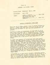
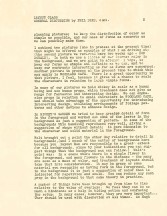
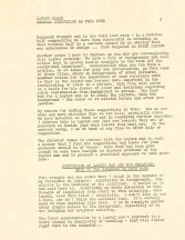
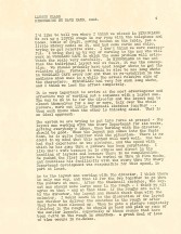
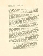
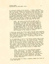
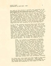
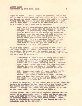
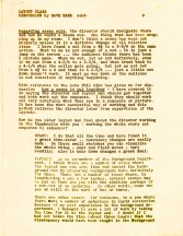
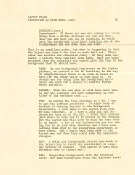
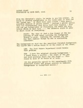
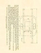
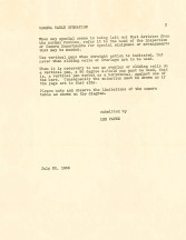
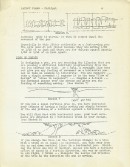
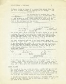
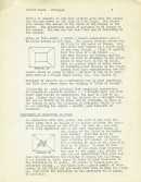
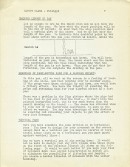
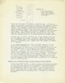
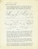
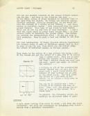
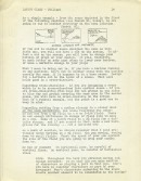
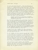
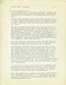
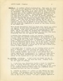
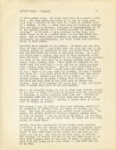
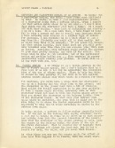
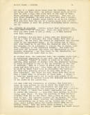
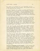
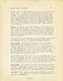
Here’s the a fourth lecture that Phil Dike gave on May, 1936; it was called a “General Discussion”. Unfortunately, two of its pages were copied off kilter, pgs. 8 & 9. The copies here come courtesy of Hans Perk.
Action Analysis &Animation Artifacts &Articles on Animation &Disney &Layout & Design 05 Jun 2010 08:47 am
recap – Disney LO Course #3
Hans Perk is posting a series of lectures on Layout. In August 2006 I posted the notes for the Disney afterhours lectures. To coincide with Hans, I’m recapping those notes.
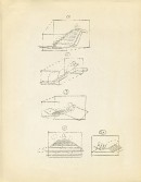
- The following is the Disney Layout Training Course’s 3rd meeting. Charles Philippi gave the lecture, and it’s a good one. It’s all about pans. (I posted the first lecture and don’t have the second. One is missing.)
There was a time when I was working for John Hubley on Everybody Rides The Carousel where he had asked me to design a background and setup for a package to be sent out, that day, to Bill Littlejohn for animation. Fortunately, I had just read these notes the day before, and I used what I’d learned. Hubley gave me a nice compliment, and I gave it all to Charles Philippi.
Littlejohn, by the way, did one of my favorite scenes of the entire time I was at that studio. I have the large number of drawings and will someday post some of them. Beautiful animation.
This Layout course is some 18 pages long. Since that’s a job to post all 18, I’m going to break it up into two days. Tomorrow the last half will be posted.
 01
01  02
02  03
03
(click on any image to enlarge)
 10
10 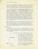 11
11 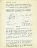 12
12
(Click on any image to enlarge.)
Action Analysis &Animation Artifacts &Articles on Animation &Disney &Layout & Design 03 Jun 2010 09:22 am
recap – Disney Layout Course – 1
Hans Perk is posting a series of rare lectures on Layout. In August 2006 I posted the notes for the Disney afterhours lectures. To coincide with Hans, I’m recapping those notes.
- Yhe Disney Layout Course was held after hours at the studio in 1936. The first lecture was given by Tom Codrick on May 6, 1936. I have the first lecture, the third lecture by Charles Philippi and an earlier one held by Phil Dike (though this last seems to be missing two pages.)
I hope it’ll be useful. I’ll post the next in a few days.
 1
1 2
2 3
3 4
4
(Click on images to enlarge.)
Animation &Articles on Animation &Books &Independent Animation 20 May 2010 09:35 am
Zagreb’s Start
- Recently, I’ve tried to put a bit of focus on some International world leaders in animated film and give some attention to the heroes of the past. Naturally, Zagreb Film would be a source of many important names. This was a Yugoslavian studio that had limited resources and budget and they did the most with what they had. When their film, Ersatz, won the Oscar in 1961, it put this small studio on the map. Dusan Vukotic, the director of that film, led the studio.
Here’s a couple of small excerpts from a book, Z is for Zagreb by Ronald Holloway, that gives a good overall view of the start of the studio and a bit about Vukotic’ biography.
In the early Fifties, the Yugoslav economy was getting off the ground and business advertisements began to appear in the newspapers. The possibility arose again of producing publicity films, as the Maar Brothers had done successfully before the war. Besides, a staff of trained Duga personnel was becoming bored with comic strips and illustrations for books and magazines, and itched to get back into animation. When an English book store opened in Zagreb and news poured across Kostelac’s desk of UPA and Bob Cannon’s Gerald McBoing Boing, the itch became a torture. How were these beautifully designed cartoons made? There were no clues, but everyone was sure it was something for them.
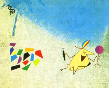
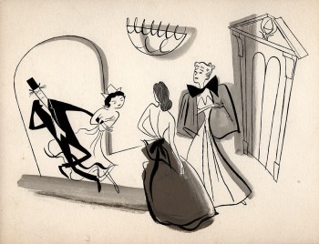 Another break came in the least expected fashion. American films were being bought for Yugoslav consumption, and among those screened for selection was Irving Reis’s The Four Poster (1952). The film itself was not so important, but the animation bridges between sequences were. A sparking, tongue-in-cheek design by John and Faith Hubley graced the antics of Rex Harrison and Lili Palmer in the two-role film: it was the first UPA “cartoon” to enter the country. The film was screened by an excited small audience over and over, and then sent back to the source from which it came—unbought! Harrison and Palmer were never to know how important they were to the growth of Zagreb animation.
With these innovations in mind a veteran group of cartoonists gathered around Kostelac and Vukotic to make advertising films on their own. Production manager was Kostelac, script and direction flowed from Vukotic, Marks (already an acknowledged graphic artist) did the designs, Jutrisa and Kostanjsek animated, and Bourek and Kolar painted the backgrounds. The money came out of their own pockets, but they were able to secure from Zagreb Film production and distribution help. Vukotic and Kostelac toured the country, and with the help of a fellow Montenegran Vukotic secured the necessary commissions from factories and business concerns. Then he and Kostelac retired to a hotel room with typewriter and drawing board to come up with a suitable idea. Thirteen advertising films, ranging in length from thirty seconds to one minute, were produced in the period 1954—55, eleven of them in colour.
Since material resources and particularly the availability of cels (transparent celluloids containing the drawings to be photographed) were limited, the process of “reduced animation” was discovered. Some films took an unbelievable eight cels to make, without losing any of the expressive movement a large number of eels usually required. Drawings were reduced to the barest minimum, and in many cases the visual effect was stronger than with twice the number of drawings. Marks and Bourek went out of their way to round up a number of artist friends to help solve complicated problems. Writers, architects, sculptors lent a creative hand whenever needed. The cartoons took on a daring, avant-garde surface, a strange character for a business enterprise. But not one of their commercial customers complained or rejected a film.
 The freed drawings brought about by “reduced animation” cannot be underestimated. These were the forerunners of modern experimental television commercials, and although they appear commonplace today they were highly revolutionary in the Fifties. For the young Zagreb cartoonists the process provided a school of freedom, originality and invention. Every phase of the cartoon was broken down to its basic parts and tested and retested: script, design, background, musical accompaniment, editing, factors of rhythm and timing. By limiting the drawings the characters were freed from realistic movement and given a characteristic life of their own, thereby increasing the film’s tempo and enriching scenes with new forms of expression. Shades of meaning entered into the cartoon’s movements, details began to determine the action, and the preciseness of an expression drew its force from duration of time minutely calculated. A cartoon done at Duga Film normally required 12,000 to 15,000 drawings; reduced, it came down to 4,000 to 5,000 drawings. Further experiments uncovered new ways to compose a scene, paint a background, add a sound effect, construct a bold graphic, build a proper atmosphere, and finally edit tensions into the action to reach a satisfying whole. The only phase left untouched from the Duga days was the general direction of movement; everything else had somehow changed. And, most important of all, the character was no longer an anthropomorphic imitation.
When they appeared in the cinemas, the fantastic, dynamic feeling inside these cartoons charmed the public. Former staff members couldn’t match the finished product with the number of cels used. More commissions began to roll in, and Zagreb Film took another look at the young innovators within the company. As the way opened for new production standards in 1956 (due to a new law separating Zagreb Film from its film distribution branch), it was decided to give story animation another try. The resourceful Kostelac pulled out of a sleeve a card file of former Duga employees, and rounded them up with a taxi and a knock on the door. Enough responded to begin work immediately on a story cartoon for the Pula Festival (another scheme of Fadil Hadzic to promote the growth of Yugoslav cinema), and they worked day and night on The Playful Robot. Script was by Andre Lusicic, direction by Vukotic, design by Marks and Kolar, animation by Jutrisa and Kostanjsek, backgrounds by Bourek—and mistakes by all. There was something basically Disneyish about this effort, and it was admittedly inferior to the high-powered antics of the characters in the ad films.
Nevertheless, Vukotic won a prize at Pula for pioneering Yugoslav animation, and Zagreb Film found itself with an animation studio.
Dusan Vukotic
(Born 1927 in Bileca).
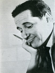 The most important name in Yugoslav animation. It was through his drive and determination that the cartoon won respectability at home and recognition abroad. He has won over fifty prizes and citations for his sixteen major cartoons. He studied architecture and worked as cartoonist on Fadil Hadzic’s Kerempuh, moving up to head of his own unit under Hadzic at Duga Film in 1951—52. As director, designer and animator he created the national figure of Kico, a little government official on inspection tours about the country. How Kico was Born (1951) and The Haunted Castle at Dudinci (1952) represent the best work done at Duga Film, and drew their inspiration from Trnka’s Czech cartoons instead of Disney. After the collapse of Duga Film, Vukotic and Kostelac produced on their own homemade advertising films, and with Marks, Kolar and Bourek he discovered the principles of “reduced animation” (sharply limiting the number of drawings for a short cartoon). He made eleven advertising films as scriptwriter and director, distributed through Zagreb Film, and one publicity film. The Magic Catalogue (1956), for Dragutin Vunak at Interpublic. When Zagreb Film turned to the feature cartoon, Vukotic created The Playful Robot (1956) with the combined talents of Marks, Kolar, Kostanjsek, Jutrisa and Bourek, and was given the Golden Arena at the Pula Festival for pioneering animation in Yugoslavia. He fostered the satire in animation, aiming Cowboy Jimmie (1957), Concerto for Sub-Machine Gun (1958) and The Great Fear (1958) at the American Western, the gangster film, and the horror film. In the beginning he preferred to work with another designer, employing Marks on The Playful Robot, Cowboy Jimmie, and Magic Sounds (1957), and Kolar on Abra Kadabra (1957). The Great Fear, Revenger (1958), Concerto for Sub-Machine Gun, and My Tail is My Ticket (1959), and Grgic on Cow on the Moon (1959). He was the first in the studio to direct, design and animate independently, winning a number of awards for Piccolo (1959) and establishing his characteristic theme of feuding neighbours. His next two
  independent cartoons were also highly awarded: Ersatz (1961), winning the first Academy Award for animation outside the United States, and Play (1962), voted the best short film of the year at Mannheim. Turning to the feature film, his The Seventh Continent for children in 1966 was not successful but it encouraged him in the cartoon to continue the mixture of live action and animation begun in Play. Stain on the Conscience (1968) employed animation drawing on documentary footage and proved him capable of directing actors ; in a psychological atmosphere. Opera Cordis (1968) restored his eminent position in animation with a salty commentary on Dr. Barnard’s heart transplants, and Ars Gratia Art/s (1 969) more than effectively spoofed the amateur who will do anything for the sake of art and applause. He also wrote the scripts for Vrbanic’s All the Drawings of the Town (1959) (with Vrbanic), Gospodnetic’s The Lion Tamer (1961), Dovnikovic’s The Doll (1961), Grgic’s A Visit from Space (1961), and Blazekovic’s Gorilla’s Dance (1968), and had a hand in supervising most of these films as well as Grgic’s The Devil’s Work (1965). His gifts as a leader are evident every step of the way, but particularly in the first phase of Zagreb Film (1956— 62) when his unit competed for honours with Mimica’s and Kristl’s. He is best in the cool domains of satire and caricature.
Images:
1. The Four Poster – from Amid Amidi‘s Cartoon Modern
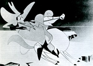
2. Cowboy Jimmie
3. Dusan Vukotic
4. Ersatz
Articles on Animation &Puppet Animation 09 May 2010 08:10 am
Close Up Magazine
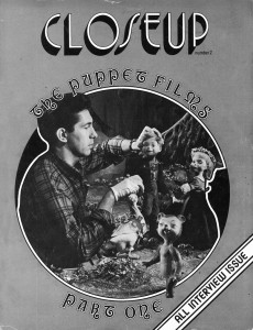
David Prestone published a magazine in the late 70′s called Closeup Magazine. This was a professionally produced magazine that featured articles on stop motion puppet animation and special effects. Sadly the magazine stopped production after the third issue.
I’d posted a number of pieces from the second issue of the magazine, which featured interviews from many of the animators who worked on the 50′s puppet film, Hansel and Gretel. see here and here.
David now tells me that he has a number of collector’s issues still in great condition and would like to sell them. To that end, I’m posting all the information he’s sent me about all three issues, and I strongly encourage you to buy them. They’re truly gems from the past about an often neglected subject – stop-motion animation.
 CLOSEUP ONE: Our premier issue, leads off with an exhaustive thirty five page filmbook treatment of “The Golden Voyage of Sinbad” including detailed examinations of the special effects, musical score,origins of the mythological creatures used, etc. A five page article on the making of “Flesh Gordon” follows (with complete plot synopsis), and a discussion of the first seventeen episodes of the “Land of the Lost” television series rounds out the magazine. In extremely short supply.
CLOSEUP TWO: All interview issue. Six stop-motion animators discuss the making of such filmlas “The Time Machine,” “The
Wonderful World of the Brothers Grimm,” “Dinosaurus,” “Tom Thumb,” “Alice in Wonderland” and many seldom seen animated
television commercials. Over 100 rare, behind-the-scenes photographs. Plus: Kathryn Grant, Kerwin Mathews, and scenes from Ray Harryhausen’s latest film, “Sinbad and the Eye of the Tiger.”
Here’s a flyer that David did for issue #3:
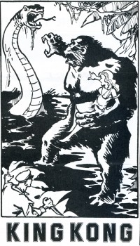 THE KING KONG LETTERS — The genesis of “The Making of King Kong” by Orville Goldner and George Turner-traced through quotes from correspondence with author Turner. Including interviews and comments from: Marcel Delgado, Ernest Schoedsack and Ruth Rose, Orville Goldner, Merian C. Cooper and other members of the cast and crew of this film classic. Illustrated with rare advertisements and campaign material from the super-scarce Kong 1933 and ’38 pressbooks.
KING KONG UNCENSORED – A look at Kong’s darker side . . . Kong the killer, storming through the native village indiscriminantly killing and maiming to regain his bride. Kong in Manhattan, chewing New Yorkers, dropping women out of windows, creating havoc and wanton destruction. All of the effects scenes that were shot and later deleted (and censored) from the film, fully described, with quotes from the original Kong shooting script and hard cover novelization. Illustrated with two never before published pre-production sketches by artist Mario Larrinaga, and some of the best fan art around.
KING KONG UNCHAINED – A retrospective look at the “Fight Heard ‘Round the World” . . . Kong’s stupendous battle in the grotto with the King of Dinosaurs: Tyrannosaurus Rex!
THE KING KONG YOU’LL NEVER SEE – The full story behind “The Legend of King Kong”: Universal Pictures’ stillborn Kong remake, which would have utilized the talents of stop-motion animator, JIM DANFORTH.
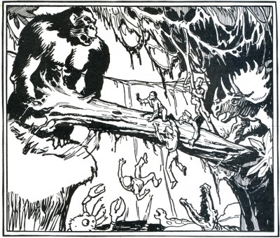
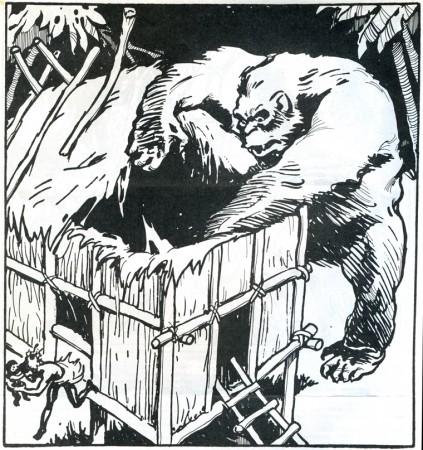
All King Kong artworkis by Glen Cravath
and was done in 1933 fpr inclusion in
the King Kong/RKO pressbook.
KING KONG DETHRONED – A talk with Rick Baker, Paramount Pictures’ Monkey Man. Things were not all mangoes and bananas for Rick on the set of the latest Dino de Laurentiis production. In an exclusive interview, this talented young man discusses his current feud 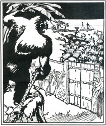 with the makers of the new King Kong film. Illustrated with exclusive behind-the-scenes photographs from the movie!
THE KING KONG CRITICS ROUNDTABLE – Several top animation fans’ opinions of the Paramount Pictures remake.
KING KONG IN PRINT and KING KONG ON ACETATE -Our regular review section, spotlighting this issue, books and records of recent vintage pertaining to the amazing anthropoid.
Features on Ray Harryhausen’s latest Dynarama effort SINBAD AND THE EYE OF THE TIGER, and the puppet filma of Rankin/Bass Productions.
CLOSEUP THREE: *Professionally printed and designed. *More pages, photos, and features than ever before. *A perfect addition to any special effects fan’s collection. *Printed on sturdy 80 Ib. gloss-coated paper in a strictly limited edition.
ALSO AVAILABLE: The Editors of CLOSEUP have obtained a limited amount of copies of a reprint booklet of a “new” King Kong novelization. This slim pamphlet, a reproduction of the English Boy’s Magazine for October 28th, 1933 has 8 fine illustrations, “How They Made King Kong,” and a full page advertisement for a Kong sequel “The Menace of the Monsters” (in which the prehistoric denizens of Skull Island are transported to England where they break loose and wreak havoc on an unsuspecting populace). Imported from England. Supply is extremely limited.
.
DAVID PRESTONE
46 -16 MARATHON PARKWAY
LITTLE NECK, NEW YORK 11362
(Checks and money orders must be made out to: DAVID PRESTONE.)
All orders have to be done through the mail.
These are all the original issues of the magazine – not reprints.
issue #1 – $50 postpaid
issue #2 – $25 postpaid
issue #3 – $25 postpaid
Animation &Articles on Animation &Commentary 06 May 2010 07:21 am
Dragons & Fanny
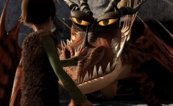 - For the past few weeks, Michael Barrier’s review of How to Train Your Dragon has been on my mind. Actually, not most of the review, just the last two paragraphs. Most of the review talks about the Dreamworks film, and, I must say, it doesn’t encourage me to see it (which I eventually will most certainly do – once they screen it in 2D in New York).
I haven’t yet seen it , but the film, from the ads I’ve seen, looks like the generic Dreamworks product. All of the characters are supposed to be Vikings living in the First Century, but they act and sound like generic animated characters in the 21st Century. It’s just about a given for such current product. The stock facial expressions, the overarching eyebrows, the attitude. In all of the ads and clips I’ve seen, America Ferrara screams every one of her lines. That’s what poses for acting today in most animated films – a direct influence of TV.
Perhaps I’m wrong, but I somehow doubt it. I’ll find out for myself when I do see it. (After all I put down Kung Fu Panda, and I now think pretty highly of that film.) Regardless, this isn’t the part of the commentary that Mike’s written that has my thoughts rambling about.
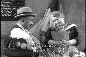 He jumps in his review to Marcel Pagnol’s Fanny Trilogy. Seeing these three films is perhaps one of my all time favorite movie experiences. They played in NY in the 70’s on three consecutive Mondays. I got so hooked into it, I looked forward enormously to those Monday showings. Mike describes them beautifully. All character development and a simple straightforward story that just about breaks your heart. It’s a wonderful film experience despite the fact that it’s a crusty old 1930’s film with lots of soft grays and soft focus. They’re obviously sets built around the Marseilles they’re pretending to create, but you buy it all. At least I did; it’s so wonderfully Romantic.
(Perhaps, that’s a generational thing. I talked an intern in my studio into watching Citizen Kane, and she couldn’t get through it. The B&W was too distracting for her, and she found the film boring. What can you say?)
Mike Barrier rightfully makes the leap to Snow White and the Seven Dwarfs, a natural link – animation wise – to Pagnol’s trilogy. The approach is very similar. Somehow I’d never have seen the link to these films, but it works. Despite the enormous difference in story, the dependence on character development and motivation are alike. A sweet, simple, direct story with very strong character personality holds you tightly throughout.
A lot of this approach stayed with the Disney features right through Sleeping Beauty. I love the first 10 or 15 minutes of all those films; nothing but character setup, and they’re all wonderful. Things started to change with 101 Dalmatians and had been just about abandoned by the time they got to The Aristocats. Character suddenly became reliant on celebrity voices. Thanks to the star turns such as Phil Harris’ Baloo the Bear in Jungle Book, it became easier for animators to pull their characters together. Let the voices do the heavywork, and in The Aristocrats, they ran with it to the film’s detriment.
Now we get unidentifiable celebrities, like America Ferrara, shouting their lines but adding nothing to the character’s personality. I’m not even sure if her name will help sell a DVD. Given these flat voices, the animators turn to their stock poses and facial expressions, and the end result is a sad lot.
I’d like to think that Chris Sanders and Dean DeBlois have surpassed the Dreamworks formula and taken their film to another level. I have been a big fan of Lilo and Stitch, although I think much of the story is hackneyed nonsense. (Whenever we have to see aliens fighting from their spaceship, it’s hard to reconcile that with the wonderful character traits between Lilo and Stitch, themselves.) The beautiful artwork choices help carry you through that film. Mike suggests that the end of Dragon may have as big a problem, and he offers to blame that on the executives above Sanders and DeBlois. Perhaps, but Lilo and Stitch had similar problems.
Mike Barrier suggests that that isn’t the entire case with How to Train Your Dragon, and I do hope he’s right. But nothing I’ve seen to date lets me expect it. I do want to be pleasantly surprised, and I’ll let you know if I am.
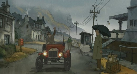
The film I’m really waiting to see is Sylvan Chomet’s The Illusionist. The story in Triplettes of Belleville fell apart, but the execution and development of the principal personalities was so fine, that the film offered me plenty – and plenty of hope. I do hope and almost expect to see that he has taken this approach to another level. What little I’ve seen leads me to believe I may not be disappointed.
Articles on Animation &Bill Peckmann &Comic Art &Disney 04 May 2010 07:42 am
Barks in Panels
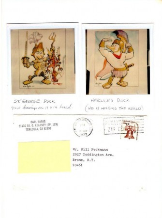
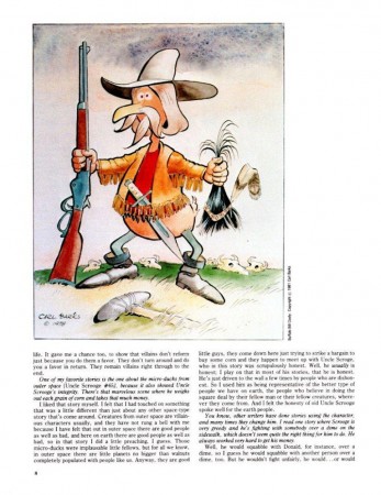
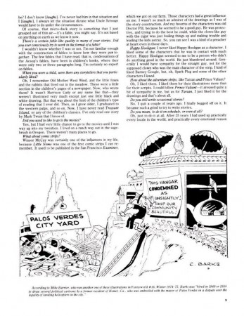
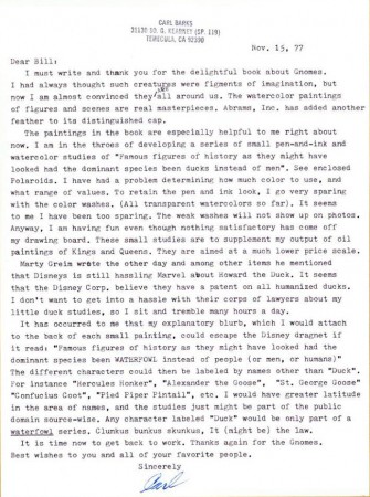
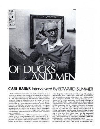
- Last week I posted Alex Toth‘s Jesse Marsh piece from the magazine Panels. Bill Peckmann who was the Associate Editor of the mag, answered my request and sent the article I noticed about Carl Barks. In fact, he sent me additional Barks material he’s saved.
These include a the following letter Carl Barks had sent him as well as a couple of images.
 1
1(Click any image to enlarge.)
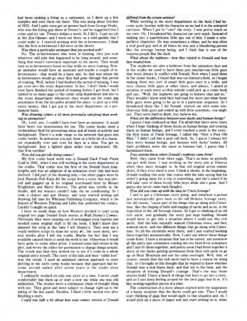
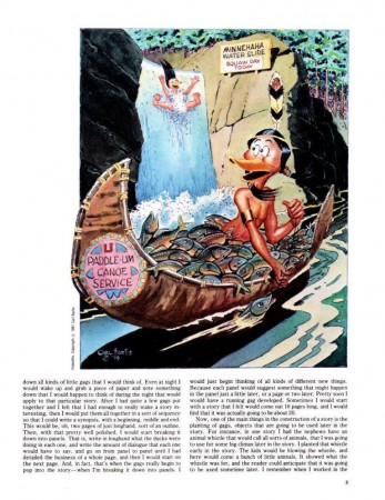
Here’s the article from Panels, an interview between Ed Summers and Carl Barks.
 1
1
As ever, many thanks to Bill Peckmann.
Articles on Animation &Independent Animation 28 Apr 2010 07:32 am
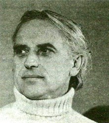
Raoul Servais
The following is an article by the animation artist Raoul Servais. He was a major force in the international scene when this article was published in Animafilm #1 back in 1979.
by Raoul Servais
 I have been asked to present my opinions on questions which determine the relationship between the author of an animated film and his profession, and the ensuing interdependences: I will,confine myself to outlining an opinion which is perhaps applicable only to artists working in more or less similar conditions. The relationship between the author of an animated film and his work differs so greatly in various countries, depending on socio-economic conditions, the organizational structure of production and, of course, individual talent, that it would be risky to proclaim a universal opinion applicable to all cases.
The first problem that was suggested to me as a subject for reflection is the relationship between the author of a film and the techniques used in that discipline of art. The “picture-by-picture” art is undoubtedly an artistic profession that pays an extremely high tribute to technology. After all, cinematography is, by its very nature, a phenomenon produced by mechanical optical instruments. But the scientific aspect of this assertion about an art discipline is not confined to mechanics and optics; it also includes electricity, chemistry, physics and electro-acoustics. Cinematography, which is going through a process of technological changes, now makes use of new means of expression offered by modern audio-visual techniques that have arisen as a result of the vigorous development of electronics.
Emphasis has been placed on two manifestations of man’s genius which at first glance seem to be poles apart and concern different interests. On the one hand we have artistic work with everything that can be provided by imagination, poetry, lyricism, spontaneity, subtlety and improvisation; on the etching needle, that is, people whose scientific knowledge is confined to Chinese white or cobalt blue, seems to be incompatible with what we expect of a film maker: profound knowledge of the technical possibilities of his profession. In spite of this, the overwhelming majority of animated film authors are students of the brush, the chisel or the etching needle, that is, people whose scientific knowledge is confined to Chinese white or cobalt blue.
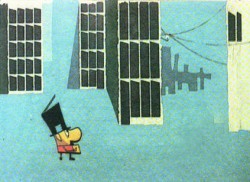 I am of course exaggerating for like everybody else I do not deny that some outstanding animated film masters are brilliant scientists; besides, it is a known fact that extremes meet; mathematics is said to end in poetry, a phenomenon I have not experienced myself so far. Nevertheless, it is a fact that the authors of animated films are mainly former painters, engravers, graphic artists, book illustrators or sculptors who have very little, if any, knowledge of technology. I know many animators who though
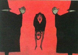 known for a long time have remained completely ignorant of technology, either because they do not take any interest in the subject or because they do not want to fritter away their energy. These artists do however turn to technology for help when they find this necessary or when this is indispensable for the implementation of their ambitious plans or useful in commercial production. I cannot, however, help thinking that they lack a certain dimension, for knowledge of one’s instrument can also be a source of creative inspiration. It is indispensable if one wants to experiment in the field of visual arts.
I do not think however that scientific talent is an absolute necessity to master technology. I may serve as an example to many artists in this respect. This allows me to speak of myself with less restraint and fewer scruples.
It is my firm conviction that youthful interest in technology is due to two different reasons. The first is pure scientific curiosity which forces us to master our tool by learning its anatomy and the way it works. A child that dismantles an alarm clock part by part in order to get acquainted with its mechanism could serve as an example here. The other reason – and this was my case – is the surprise an artist feels when he realizes the complexity of the instrument which allows him to put his artistic ambitions into effect. I was still a little boy (I was 5, if I remember correctly) when I fell under the spell of cinematography. I had been making drawings for a number of days and my grafitti combined to make a tale. I also liked to tell stories. One day my father, who had a Pathe-Baby projector, showed me the animated cartoon Felix the Cat. The film aroused my admiration and became a spark which helped me to realize my mission. Without my father’s knowledge I would unwind and analyse films in order to understand the mystery of motion, but I never took the trouble to see what a projector looked like inside. This instrument – and it was a holy thing for me – was like Pandora’s box which you could not open without running the risk of seeing the charm disappear. I still have a similar approach to the instrument which has produced the fruit of my reflections. I simply worshipped the old Debrie camera with which I made five or six films and I am still full of admiration for this sophisticated instrument. I have always been my own cameraman and I know the possibilities and limitations of the cameras I use; the invisible wave-like murmur of their mechanism tells me when a breakdown will occur. But once the camera goes out of order and the defect is of a mechanical or electric nature, I am completely at a loss and cannot understand what has happened.
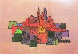 This personal story is to show to what extent and in what respect an artist may acquaint himself with a rather complicated instrument without being technically-minded. It is also meant as an introduction to the essence of my subject, an introduction that will allow me to pass on to what worries many animators; I have in mind their adaptation to new technical possiblities. Many film makers fear a confrontation with such sophisticated instruments as a computer or a video synthetizer. I am no exception here, having come across these fantastic machines on several occasions. I must have been impressed by their complexity or by the learned appearance of the programmers, for I cannot help thinking that my unscientific mind would not be able to exercise sufficient control over a computer. I might be able to overcome my fear if I could play with it for several weeks and had a book with basic information on how it works. I must admit that it would give me great pleasure to be able to shorten the production process of an animated film by the use of a computer. I think, however, that as things stand now the computer has very limited stylistic possibilities. Like John Halas I believe that computerized animated film will develop alongside the old kind without replacing it. It occurred to me when I was recently making a film combining actual photography with animated cartoons that the video-technique would considerably shorten the time of production. But here again I felt that I would not be able to exercise sufficient control over the picture. I am used to the solitary effort of a cottage worker. Production of a film in a laboratory with technicians paid by the hour would probably fail to spur my creative spirit. I may have been “spoiled” by years of work in conditions of uncertainty, which I experienced at the beginning of my drive to creative work.
And so I come to the next point in my reflections: the animated film as an independent art.
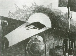 I think that two main aspects can be distinguished here: the aesthetic and the economic aspect of the problem. Let us have a look at the aesthetic aspect first of all. We must agree that it is extremely difficult to determine a priori the degree to which one art depends on another, especially in film art where such disciplines as music, comedy, photography, etc. are primary elements. In the case of animated films we must add other factors relating to visual arts (painting, sculpture, drawing, etc.). I do not think anybody has any doubts about the authenticity of film art. Other artistic disciplines which may become part of a film only play the role of ingredients and bear no responsibility for the nature of cinematographic art itself.
Similar is the case of the animated film. The elements of painting or drawing which go to make an animated film are not a value in themselves but elements meant to achieve a different form of artistic expression which lasts for a fixed period of time. But if this is so, you may ask, what is the place of kinetic painting? Is this also an art independent of painting as such since it also brings movement into the film? To such questions I would reply that enumeration of fine arts is an obsolete way of summing up man’s artistic abilities, for different kinds of art have more and more a tendency to penetrate one another or can be reduced to primary factors and become new disciplines. The definition of art less and less frequently allows us to strictly determine where art begins and where it ends. Consequently, how can we fix the borderlines between various disciplines of act and say to what extent one discipline of art depends on another?
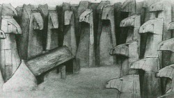 To dispute about the authenticity of animated films compared to other film genres is just as senseless as discussing the sex of angels. Some people will say that a film with actual photography perpetuates real action in order to present it in the desired context while an animated film is wholly a product of the imagination and a direct synthesis of this imagination. This is true, but on the other hand ths viewer, especially if he is an outsider, will experience the same physiological and psychological impressions when seeing both genres. In short, animation is only a different form of film art, a form that is subject to various influences or changes as a result of technological process, i.e., video-graphy, computers, holography and whatever may come. As far as the economic aspect is concerned, I think we can on the whole assume that the animated film is subject to the same laws as all the other film genres. If animated films are rather a marginal production, this is undoubtedly due to the fact that feature-length animated films capable of exercising an influence on the film industry are relatively few. I think however that it is just ar risky for a producer to produce a short animated film made by an artist as it is to make a short film with real-life photography. In any case it is obvious that it is becoming increasingly rare to see a short film in commercial cinemas. The fact that television can be a wonderful market for mass consumption but is a poor solution for films designed by individual artists has been known for a long time.
The third sector, known as the non-commercial sector, has at its disposal a large distributive potential and could make good the deficiencies of the other two distributive channels, especially with respect to animated films made by individual authors. But it is still bound by too many restrictions to be able to guarantee profitable production.
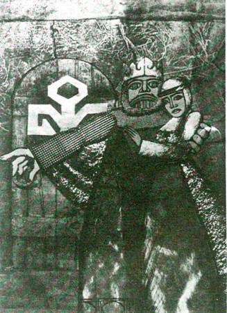 Since animated films are distributed by many companies, there is no planned policy of popularizing this medium in a better way. (This defect could of course be made good by ASIFA, which should not however replace distributors but supply information to distributors and all interested persons). But the market in question is insignificant at the moment, except for the United States, where in view of the large size of the country (especially as on the whole Canada is also part of that market) distribution can be conducted on a large scale. ‘This is not the case in Europe, where no country is large enough to make use of this sector. Moreover, customs regulations do not favour a free flow of films. Let us add that in North America institutions of great cultural utility (museums, libraries) have for long regarded the animated film as an artistic medium of no less importance than painting or literature.
Our European conservatives fully deserve to be called conservatives. The animated film is barred from their temples and most probably they do not realize that the animated film can have different forms, not only that of a cartoon shown on television. ASIFA is an organization which could organize a large-scale informative campaign to wake up academic circles from their sleep.
To conclude these reflections I would like to express my deep conviction that the animated film is undoubtedly one of the best means of fully expressing human emotions and that it will find more and more adherents as science succeeds in reducing, if not eliminating, the boring and cumbersome aspects of this discipline and as man feels himself more and more free in the full sense of the word.
Raoul Servais
.
Illustrations:
1. Raoul Servais
2. False Note 1964
3. Sirene 1968
4. Chromophobia 1966
5. Goldframe 1968
6. To Speak or Not To Speak 1970
7. Pegasus 1973
8. Halewyn’s Chant 1976
9. Harpy 1978
Animation &Articles on Animation &Independent Animation 20 Apr 2010 08:05 am
The Picture Book Animated
I just caught up with Cartoon Brew‘s posting of the Gene Deitch directed UPA short, Howdy Doody and His Magic Hat. I’ll have a lot to write about this film soon, however I wanted to add this piece by Mr. Deitch.
Gene Deitch wrote the following article which initially appeared in The HORN BOOK, in 1978; then was reprinted in Animafilm #5, 1980. I post it again for your benefit.
The Picture Book Animated
by Gene Deitch
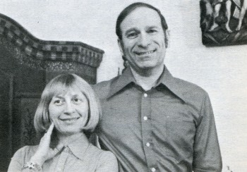 Living in Prague, an ancient town so full of its own stories, I am surrounded by an instructive ambience for my kind of work: making films from books. Building Prague took a long time; every period of European architecture is represented in the city. Each era adopted the building style which conformed to the artistic expression of that particular time – Romanesque, Gothic, Renaissance, baroque, rococco, art nouveau, cubist, prefab. Just seeing all this every day helps me to take the long view and to take my time. Right outside my window, a Gothic tower stands in the courtyard. In the sixteenth century an alchemist worked there trying to change lead into gold. Now I’m here trying to avoid doing the opposite, for I start with gold. Morton Schindel of Weston Woods always sends me the very best books he can get his hands on. My job is to shine them onto a movie screen, trying to keep the image bright and the focus sharp.
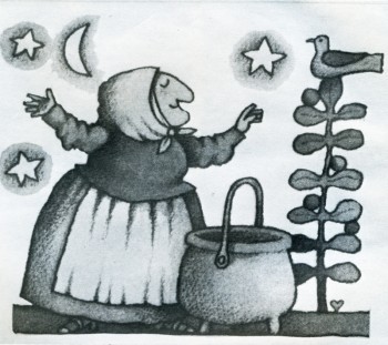
My films exist only in their relationship to the books from which they have been adapted. The goal of these films is to reinforce the child’s interest in the original book. I share Mort Schindel ‘s belief that books are still the best medium for storytelling and for the preservation of literature — a medium which is always at hand. Our aim is to illuminate each book so that a child will find his way back to it. Among my attempts to transmute gold into more gold, or at least into quicksilver, are film adaptations of “The Happy Owls” (Atheneum), “Rossie’s Walk” (Macmillan), “The Three Robbers” (Atheneum), “The Swineherd”, and “Strega Nona” (Prentice).
 Like the successive architects of Prague, I resort to a medium of expression of my own time – the motion picture. Ed and Barbara Emberley’s “Drummer Hoff” (Prentice) is an example of what I mean. Hidden among the bright colours of the outwardly lighthearted book are some interesting clues to its real depth. As the grandly uniformed soldiers strut along, intent on assembling their technological triumph – an elaborate cannon – they don’t seem to notice the flowers underfoot or their tiny observers, the birds, and the soldiers actually stepping on the flowers and shooing away the birds and thus to emphasize the meaning of the last page of the book – and of the final shot in the film – nature winning out over man and his destructive machines. Now, I don’t expect that children will absorb all of these ideas and details as such, but I do expect that when they pick up the book again (maybe because the film has now made it special for them), they will notice some things they might not have been aware of before. My hope is that they will love the book more for having seen the film.
Tomi Ungerer’s almost-over-the-edge book, “The Best of Monsieur Racine” (Farrar), is also loaded with lurking symbols, which might unnerve a children’s librarian. Tomi believes in there is much more to the book, and I tried to bring out something loving and charming that I found amidst the crazy tangle of startling images. What caught me was Monsieur Racine’s perfect serenity in his world of chaos. I felt he had just the kind of insulation which children have – carrying on and doing his own thing, immune to all of the crudity going on all around him. He has retained a childlike purity of concentration. His relationship with the beast, even when it was revealed to have been based on a gross deception, survives and continues, merely revised and adjusted to the new circumstances. This is marvellous, and I hope that the film will enrich the child’s comprehension of the book.
The greater the book, the greater our responsibility – and hazard. It may impress or dismay you that we worked on Maurice Sendak’s “Where the Wild Things Are” (Harper) “on and off and in and out” for five years before we had a film. “Wild Things” is the Mount Everest of picture books, and we had to film it simply because it was there. Once undertaken, there was no hedging. A film version would have to make specific what might be imagined in many different ways. This, incidentally, is the major risk a film-maker faces in adapting a work from another medium. There is never any one right way, but it is still necessary to have a conception and to follow it through. Maurice himself knew there was no point in making a film adaptation at all unless we could use the motion picture medium to extend some of the subtle implications of the book. He came to see me in Prague in 1969, and we had some long walks through old and dark corners of the town. We both wanted a magical film, and he left me some fascinating hints to work with: “In this story everything is Max… As for the music, think of “Deep Purple”.
Well, the old song “Deep Purple” stirred memories for me, too. Like Maurice, I was a child of the thirties. I began to see the roots of musical and sound devices which might suggest the distance between Max and his parents, who ware probably also children of the thirties. After all, why is Max “making mischief of his parents”. But where are they? Unseen in the book, I imagined they were probably in the next room having a party or (in today’s terms) watching TV. Anyway, they were not with Max. So I came to the notion of using that muffled, bland music of the 1930s, the sound of applause, the snatch of a TV comic’s joke (which just happens to be cogent), and so on. The music itself expressed the distance between Max and his parents, and with progressive distortion it could also express Max’s growing rage and journey into fantasy.
I wanted all of the sounds to be within Max’s home experience. So to create the “Wild Things” dance rhythm, I restricted myself to domestic sounds, specifically those which might express Max’s feeling of isolation: a gas oven lighting (Mother too busy for Max); a door slam (he was shut in or out); a car starting (Father going off to work); a baby crying (competition). All of these sounds repeated over and over on a tape loop, were used to heat up the music, which I made weird simply by spinning the record with my finger and letting the sound reverberate in my tape recorders.
Viewing any of our films should also indicate that we strive always fot the result of “the picture book projected”. We go to such great lengths to capture the graphic look of each book that viewers might assume they are seeing the actual book on the screen. In fact, though, we have never used any of the book illustrations. The technical processes of our medium require that we re-create every drawing and painting in terms of motion and film-frame composition, and a film’s wider scope often calls for scenes or additional artwork not found in the book at all. We must actually absorb the artists’ own styles in redeveloping the drawings and paintings specifically for film. In an effort to achieve absolute fidelity, we even asked Quentin Blake to send us the actual colored crayons he used for his illustrations for “Patrick” (Walck), and we used what was left of the same crayons to do our film backgrounds.
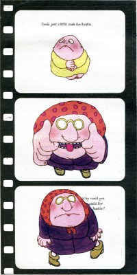 Some books are almost scenarios for films and need virtually no adaptation; Crockett Johnson’s “Harold” series (Harper) is the perfect example. The books are so masterfully constructed that one might easily dismiss their perfection as mere simplicity. As I undertook “A Picture for Harold’s Room” and “Harold’s Fairy Tale”, Johnson warned me, “Don’t be fool by the seemingly simple!” He was right. These films were devilishly difficult to make. “Harold’s Room”, for instance, is a fascinating lesson in size relationships and perspective. To make it work on the screen, Harold had to be exactly the same size in relation to the film frame as he was to the pages of the book. Consequently, we could allow ourselves no close-up cuts nor camera moves in or out. In effect, the entire film must appear to be one continuous scene – all from the same camera position and all on a plain, smooth background tone, where no mistakes could be hidden. Any mistake at all meant that we had to start shooting all over again “from the top”.
If you would take apart a copy of “A Picture for Harold’s Room” and paste the pages together, you would see that it is based on one large drawing, which Crockett Johnson obviously worked out in advance. Of course, we had to do exactly the same thing. We made a huge drawing of Harold’s landscape and manoeuvered it under our animation camera. For the pencil layout of this we had already prepared seventy-five hundred inked and painted drawings of Harold himself following the lines of the overall landscape. As we placed these drawings over the landscape one by in reverse order, we wiped away our background painting to match each position in his room and working our way relentlessly back to the little town. Thus, beneath our camera Harold undrew his scenery. When we finished shooting, the big drawing had been completely wiped out; and only when the film was projected forward did it reappear.
Most people realize that it takes hundreds, even thousands, of drawings, representing carefully calculated phases of each action, to give the effect of animation in even the shortest film. A glance at the illustrations of “Where the Wild Things Are” indicates the formidable task. As a matter of fact, “Wild Things” required a totally new of rendering characters onto our animation cels* and a totally new way of making them move. When Maurice Sendak said of the story, “Everything is Max”, he has hoping I could find a way to show that the Wild Things were actually a fantasy expression of Max’s own mind, a projection if his anger. Maurice further envisioned them as having “slow, heavy, dream-like movements” and as being “clumsy, dumb, sluggish, heacingcreatures… not horrible”.
To produce this effect on film, and to do it in a way that would make clear the “Wild Things” status as evanescent fragments of Max’s imagination, I devised a way of photographing the phased drawings in an interweaving series of dissolves. This device, in combination with the slowed-down, wavering music and special effects, was part of our attempt to fulfill Maurice’s extravagant wish for us to “go beyond the book”. (I was later thrilled with his equally extravagant praise of the sound track.) Going “beyond the book” refers simply to the nature of the film medium and not to extending the book’s content or meaning. We endeavour only to bring out what is there or what we feel is there. “The Horn Book” review of the film concisely stated what we attempt: “recasting of one aesthetic form into another.”
This is the problematic task with every book we film. Each book has set me off in a new direction, prodding me to find a new way, a specific solution to the problem of adapting that particular book to the motion picture medium. I have no formulas. My private conceit is that without my name on them, no one could tell that all these films came from the same director. For me, my Oscar-winning cartoon “Munro” was a success when people asked if it was made by Jules Feiffer himself.
I used the word problematic. Is our work valid? The question haunts me. Why should we try to make films of picture books? Why shouldn’t the books be left to communicate in their own way? Why don’t we concentrate on developing original film stories? we do this, too, of course. I made “The Giants”, my own films, a child sees that books do have life, that they have movement and sound. We try always to leave room for the child to participate with his own imagination.
For instance, the ending of “Leopold the See-Through Crumbpicker” leads directly to the idea that the children can draw and paint their own variations for decorating the invisible cookie-eater. In “Changes, Changes” I added a box of building blocks, not actually shown in the book, thus inciting children to carry one the story, stacking up their own changes. The film “Patrick” ends just as the colourful procession heads back toward the drab village seen at the start of the film. By this time the children know what will happen there when Patrick and his full-colour fiddle arrive; but they don’t see it, so they are allowed to imagine the ensuing scene for themselves.
Patrick’s fiddle, incidentally, plays virtuoso variations on Dvorak. In “A Picture for Harold’s Room” the purple crayon draws to the music of a classical string quartet. Unadulterated Janecek, in all its Slavic richness, precedes the musical frame for “Zlateh the Goat”. Our version of Andersen’s “The Ugly Duckling” introduces children to Carl Maria von Weber. For our original scores we have gone to many lengths to provide just the right music. We needed authentic Central African music for “A Story”. My Czech wife Zdenka, who is also the production manager for our films, found antique instruments in a half-hidden ethnographic museum here as well as a curator-musician who could instruct us. A curious interplay of cultures resulted in our recording ses-ion: genuine African instruments played by Czechs, along with a recording by an African story-teller reading from a book by an American woman – for a movie for Western children being made in an eastern European studio.
The existence of our film versions, I am told, have often helped a book stay in print and increase in sales. Films are powerful but transitory, seen and suddenly gone. The book can always be read and will be even more after a child has seen it on the screen. The permanence of the printed word, however, is now being challenged. Movies, audiovisual media, and especially TV are very powerful forces. But must they destroy book reading, or can they complement it? The flood cannot be dammed, but it might be directed. We are trying to provide a channel which flows toward books rather than away from them.
*In animation production, moving figures are usually rendered onto transparent “cels”, sheets of acetate film, so that the stationary background painting can be photographed simultaneously on each film frame.
GENE DEITCH – American director living and making films (in his own studio) in Prague. During thirty four years he has directed more than thousand films and commercials and received numerous awards including the Oscar for “MUNRO” in 1959. Specializing in the adaptation of children books.
1. Gene Deitch with his Wife
2. Strega Nona
3. Smile for Auntie
Animation &Articles on Animation &Independent Animation &Puppet Animation 14 Apr 2010 07:41 am
Teddy Shepard interview
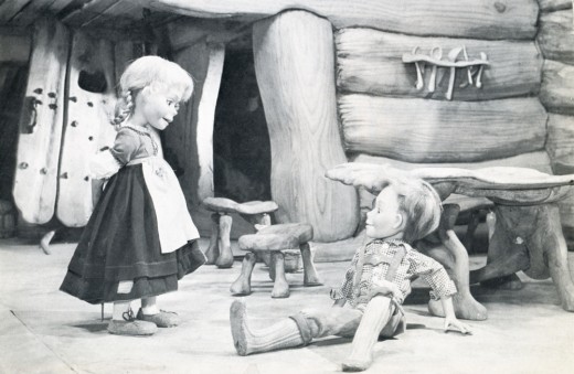
- Dipping back in the well of the Closeup Magazine from 1976. Edited by David Prestone, this magazine featured articles – mostly interviews – with 3D stop-motion animators. The focus of this particlar issue was Michael Myerberg‘s Hansel and Gretel, an animated puppet feature done in 1954.
Teddy Shepard
Born in New York, Ms. Shepard became a drama major in college, and appeared in several summer stock and off-Broadway productions. It was while making the rounds of theatrical agencies in search of work that she became aware of the interviews Michael Myerberg Productions was conducting for animators. After working on HANSEL AND GRETEL, she spent some time with the Suzari marionettes, graduating to the HOWDY DOODY television show (where she originated the character of Dilly-Dally, and was a stand-in for some time as the title puppet’s manipulator), and has, lastly, been associated with the Pickwick Puppet Theater for the past several years. It was as a member of this company that she confronted the world of rock and roll music eye-to-eye, when she appeared on Broadway at the Uris Theater with the British group. Mott the Hoople. (She manipulated a Sancho Panza puppet in the song “Marionette.”)
TS; Yes, I was elected to appear witn the one big head that had been built, on a couple of television shows (TV was all live at the time) shortly after the movie had opened. I was to demonstrate how the film had been made using the heads, but we had the fake computer setup there also, to give the impression that the head was electrically operated—when it was really worked manually. We still had to keep that a big secret!
CU: Being a novice to the stop-motion process, with only a three-week training period behind you didn’t you find this form of animation slow and tedious?
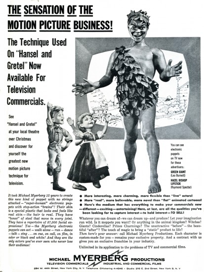
TS: No, I found the more involved I got and the more intricate the movements got, that it was anything but tedious. Some time after the film was completed I worked on a few commercials for cosmetics—Hazel Bishop lipstick, and I think Myerberg was involved with these, as we filmed them in the five-story building on East Second Street he had bought. I believe we utilized the GRETEL puppet in them . . .
Speaking of that three-week training period, I remember I was petrified when it was over—I didn’t think I was ready to go immediately to work on the film, but they said, “Go onl You’re ready!” I and another person being trained acted out little scenes with some of the puppets. Animating them walking, and doing various movements of the hands . . . The scenes would be filmed and then played back for us so we could spot our mistakes. Since money was low they only filmed a few tests for each person.
CU: How did the tests turn out?
TS: Believe it or not, they came out very well! Surprisingly so! The idea was not to be jerky, but to have smooth action, moving the puppets in small increments. When doing the actual animation for the film, we would all act out the various scenes first, in front of a mirror.
CU; Were any animators assigned to do a certain character and that character only, or did you all take turns with the various figures?
TS: Since we had two crews working, when you came in to work your next shift you would carry on from where the previous people left off, no matter which figures were in the scene. It turned out that generally I stayed with GRETEL, or the mother—I did her a great deal of the time, and I did the witch one day too. You know, we had these awful stereotypes in those days … the women puppeteers would animate the female figures and the men did the males, which is ridiculous!
CU: That’s sort of a “too many cooks spoiling the broth” situation, though. Each character should really have its own “personality ” – a way of walking and moving that is that one figure’s alone, and is given to that character by one animator alone. If you recall the feature YELLOW SUBMARINE, there’s a scene where the four eel-animated Beatles are walking down a long flight of stairs, and each Beatlo has been given a very distinctive walk that’s carried throughout the entire film. You can tell which Beatle is in a scene without seeing his face!
TS: Yes. As a matter of fact, HANSEL had a definite little personality, and he would have to be done by someone who was more familiar with that kind of boyish movement, i recall, having worked with GRETEL so much, that after a while she started getting “tacky” looking and they had to have another figure of her made. They were having difficulty making her look the same as the previous model.
One strange piece of animation I and a few others worked on was a “burst of light” effect we were trying to achieve. We had 6,000 jewels on the ground on a piece of black velvet, and each jewel had to be moved separately for an effect that lasted only a few seconds on the screen. We’d be down on our hands and knees moving the gems, and people would walk by and burst out laughing!
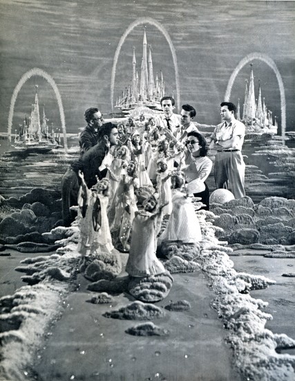
Animating the descent of the agels from their fairy kingdom.
Pictured are (clockwise) Danny Diamond, Kermit Love, Joe Horstman,
Sky Highchief, Teddy Shepard, and outside of circle (arms
crossed) Roger Caras.
CU: What’s your opinion of the final film? Do you think it would have turned out better if you had been given more time?
TS: Certainly. There was such a rush on towards the end, money was running out and we were working so hard to finish … we were all really learning the process, too. When I first saw the finished movie back in 1954, I was initially disappointed, but I think it’s held up quite well with the passage of time. And those figures were so beautiful . . . you could get so many intricate moves with them, more so than any other stop-motion models I’ve ever seen!
Other animated commercials produced by Michael Myerberg Productions during the early 1950′s (commercials whose profits were immediately used to forward production of the HANSEL AND GRETEL feature) were several for Ivory Soap Flakes (for which a mother and baby were constructed) and Ehler’s Coffee (a butler). Sometimes finished figures were built specifically to interest potential new customers. (A Kool Cigarette Penguin, and a Lil Abner model were examples of this policy.) When all plans for future stop-motion animation projects were finally abandoned, Myerberg returned to the role of theater producer for the Broadway stage.
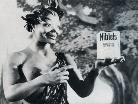
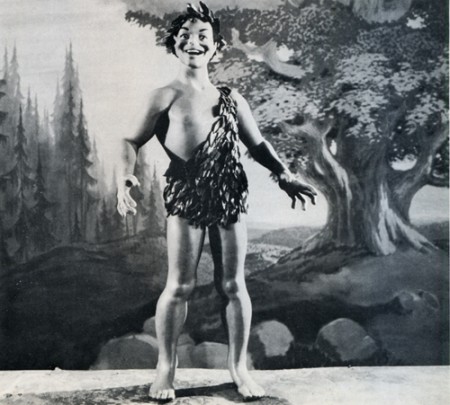
Michael Myerberg utilized the KINEMINS technique on television commercials
as well as feature films. ABOVE AND BELOW: A GREEN GIANT figure
sculpted by James Summers, circa 1953. A Speedy Alka-Seltzer model
was also sculpted, but never used. Monetary problems continually plagued
Myeiberg, forcing many of his innovative ideas to remain on the drawing board.
ARE ANY OF THE ORIGINAL KINEMINS STILL IN EXISTENCE?
Tragically, no! In late 1955, vandals broke into the East Second Street studio and wrecked havoc among the stop-motion models and scenery which were in storage there. Most of the figurines were smashed beyond repair, but, hoping that one or two models might have been carried away intact, Myerberg notified the local police station, telling them that the KINEMINS skin was highly toxic to human beings. Unfortunately, this story brought no results.
