Category ArchiveArticles on Animation
Articles on Animation &Richard Williams 26 Oct 2010 07:58 am
Goofy and Babbitt
 - The following article was printed in Sight and Sound, Spring 1974 issue. It begins with Art Babbitt‘s 1934 character analysis of Goofy and is followed up with Dick Williams’ 1974 analysis of Art Babbitt. Dick’s comments aren’t always on the money: Babbitt animated a good share of Rooty Toot Toot, but he didn’t animate most of the film. (As a matter of fact, Grim Natwick’s animation of Nellie Bly on the witness stand is, to me, the standout animation of the film.) Babbitt animated the bartender and the trial lawyer.
You can see the film on YouTube, here.
I previously posted the first half of this article with all the Goofy model sheets that it accompanied. You can see that here.
(The original, unfortunately, contains the “N” word instead of “coloured boy” as this edited version offers.)
.
Goofy and Babbitt
by Art Babbitt and Richard Williams
.
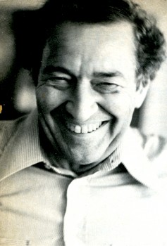
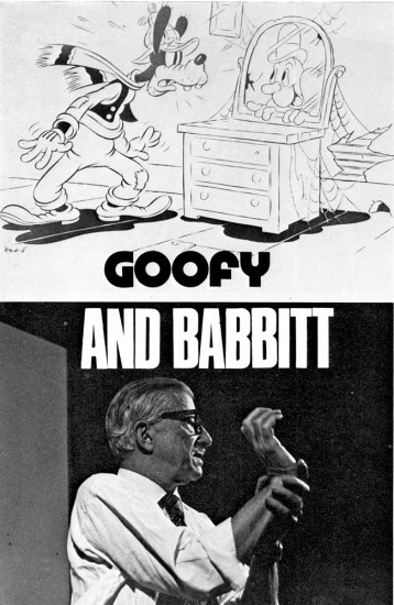 Two of the great artist-animators of the golden years of the Disney Studios, Art Babbitt and Grim Natwick, were working and teaching at the Richard Williams Studios in London last summer. To parallel Babbitt’s 1934 character analysis of Goofy, which has not previously been published, Richard Williams gives an impression of the animator himself.
CHARACTER ANALYSIS OF THE GOOF—JUNE 1934
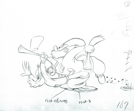
In my opinion the Goof, hitherto, has been a weak cartoon character because both his physical and mental make-up were indefinite and intangible. His figure was a distortion, not a caricature, and if he was supposed to have a mind or personality, he certainly was never given sufficient opportunity to display it. Just as any actor must thoroughly analyse the character he is interpreting, to know the special way that character would walk, wiggle his fingers, frown or break into a laugh, just so must the animator know the character he is putting through the paces. In the case of the Goof, the only characteristic which formerly identified itself with him was his voice. No effort was made to endow him with appropriate business to do, a set of mannerisms or a mental attitude.
It is difficult to classify the characteristics of the Goof into columns of the physical and mental, because they interweave, reflect and enhance one another. Therefore, it will probably be best to mention everything all at once.
Think of the Goof as a composite of an everlasting optimist, a gullible Good Samaritan, a half-wit, a shiftless, good-natured coloured boy and a hick. He is loose-jointed and gangly, but not rubbery. He can move fast if he has to, but would rather avoid any over-exertion, so he takes what seems the easiest way. He is a philosopher of the barber shop variety. No matter what happens, he accepts it finally as being for the best or at least amusing. He is willing to help anyone and offers his assistance even where he is not needed and just creates confusion. He very seldom, if ever, reaches his objective or completes what he has started. His brain being rather vapoury, it is difficult for him to concentrate on any one subject. Any little distraction can throw him off his train of thought and it is extremely difficult for the Goof to keep to his purpose.
Yet the Goof is not the type of half-wit that is to be pitied. He doesn’t dribble, drool or shriek. He is a good-natured, dumb bell what thinks he is pretty smart. He laughs at his own jokes because he can’t understand any others. If he is a victim of a catastrophe, he makes the best of it immediately and his chagrin or anger melts very quickly into a broad grin. If he does something particularly stupid he is ready to laugh at himself after it all finally dawns on him. He is very courteous and apologetic and his faux pas embarrass him, but he tries to laugh off his errors. He has music in his heart even though it be the same tune forever, and I see him humming to himself while working or thinking. He talks to himself because it is easier for him to know what he is thinking if he hears it first.
His posture is nil. His back arches the wrong way and his little stomach protrudes. His head, stomach and knees lead his body. His neck is quite long and scrawny. His knees sag and his feet are large and flat. He walks on his heels and his toes turn up. His shoulders are narrow and slope rapidly, giving the upper part of his body a thinness and making his arms seem long and heavy, though actually not drawn that way. His hands are very sensitive and expressive and though his gestures are broad, they should still reflect the gentleman. His shoes and feet are not the traditional cartoon dough feet. His arches collapsed long ago and his shoes should have a very definite character.
Never think of the Goof as a sausage with rubber hose attachments. Though he is very flexible and floppy, his body still has a solidity and weight. The looseness in his arms and legs should be achieved through a succession of breaks in the joints rather than through what seems like the waving of so much rope. He is not muscular and yet he has the strength and stamina of a very wiry person. His clothes are misfits, his trousers are baggy at the knees and the pant legs strive vainly to touch his shoe tops, but never do. His pants droop at the seat and stretch tightly across some distance below the crotch. His sweater fits him snugly except for the neck, and his vest is much too small. His hat is of a soft material and animates a little bit.
It is true that there is a vague similarity in the construction of the Goof’s head and Pluto’s. The use of the eyes, mouth and ears are entirely different. One is dog, the other human. The Goof’s head can be thought of in terms of a caricature of a person with a pointed dome—large, dreamy eyes, buck teeth and weak chin, a large mouth, a thick lower lip, a fat tongue and a
bulbous nose that grows larger on its way out and turns up. His eyes should remain partly closed to help give him a stupid, sloppy appearance, as though he were constantly straining to remain awake, but of course they can open wide for expressions or accents. He blinks quite a bit. His ears for the most part are just trailing appendages and are not used in the same way as Pluto’s ears except for rare expressions. His brow is heavy and breaks the circle that outlines his skull.
He is very bashful, yet when something very stupid has befallen him, he mugs the camera like an amateur actor with relatives in the audience, trying to cover up his embarrassment by making faces and signalling to them.
He is in close contact with sprites, goblins, fairies and other such fantasia. Each object or piece of mechanism which to us is lifeless, has a soul and personality in the mind of the Goof. The improbable becomes real where the Goof is concerned.
He has marvelous muscular control of his bottom. He can do numerous little flourishes with it and his bottom should be used whenever there is an opportunity to emphasise a funny position.
This little analysis has covered the Goof from top to toes, and having come to his end, I end.
ART BABBITT
.
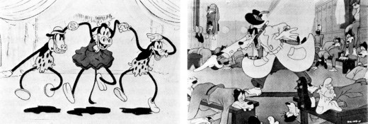
‘Orphans’ Benefit’ (1934). The Goof after Babbitt: ‘How to Play Football’ (1944)
.
CHARACTER ANALYSIS OF THE ANIMATOR—JANUARY 1974
.
He is a funny mixture. He has the bearing of a Marines sergeant (which he was during the war, after leaving Disney following the strike in which he was the principal figure); but he has the mind of a Viennese doctor—which is what he wanted to be. In his youth he always wanted to go to Vienna and study psychiatry; but he couldn’t because he was a poor boy from Iowa with relatives to support. So he went to New York and taught himself to be a commercial artist; and gradually got into animation—starting, I think, through Paul Terry.
Arriving at Disney, he was one of four animators on Three Little Pigs; and of course that was the great breakthrough in personality animation. Then he animated Goofy, and worked on shorts in preparation for Snow White. In the first Disney feature he animated the Queen where she was beautiful, up to the point where she is transformed into the hag. In Pinocchio he did most of the animation of Gepetto, and Gepetto almost looks like him. He had that sort of versatility, to characterise the horrid queen or the sentimental wood-carver. Then in Fantasia he did primarily the mushroom dance; but he was animation director on a lot of other material. On Dumbo he was a supervising animator.
The strike came in 1941. Babbitt had had a personal confrontation with Disney over the low payment of assistants; and Disney ill-advisedly fired him, giving as a reason his u-nion activities. This was directly in contravention of the Wagner Labor Relations Act, and the
U-nion took a strike vote. Babbitt fought Disney through all the courts; and they were obliged to reinstate him, for an uncomfortable period during which Disney would pass him in the corridor without speaking or even looking at him. He stood it for a year; then he quit.
After the war he and Natwick were with Hubley at UPA – Art did most of Rooty Toot Toot. Later he was with Hanna and Barbera. I had heard about him for years before I finally came to meet him. He had seen some of our work, and though he’d not exactly liked it (it was pretty slick) had decided that ‘here are some people trying to do an honest job, and that’s the first time I’ve seen that in ten years.’ He wasn’t all that impressed, but he went to the heart of it.
It turned out he was very interested in teaching people. He was thinking of writing a book to instruct people; and he’d done a course at U.S.C. of which we had copies of students’ notes. As it happened he had a fire at his house and all his own lecture notes were burned. So we were able to send him these student notes. He said they were all wrong; but it was something. Then finally I asked him straight out if he would come over and teach us, because we had gone as far as we could go on our own.
He is a great teacher. He has an astonishing lucidity. Most animators are completely incoherent; they are unable to tell you what they are doing. But Art doesn’t have any difficulty in showing you how a thing works. He just says: ‘Did you notice that that worked because such and such . . . and Hubley did this thing this way?’ And when Art says something is wrong, he’s invariably right—if you want it to work. He’ll say: ‘If you want the wheel to go round, this is the way to make it go round. This is the way to make a cypher for making it go round. And this is another way they used to give the impression of it going round. And your problem is that you are to do it with square wheels.’ He is completely eloquent. I’m sure that at Disney they created a language about what they were doing; and I’m equally certain that it was he who largely gave a verbal form to it, so that the others could understand it. He has a surgeon’s mind; which, I gather, Disney had also.
When he taught in our studio he insisted that people take the course. He started off by saying: ‘Please, in my lectures, do not be British. Be crude, be revolting; ask stupid questions. Please do not be polite; otherwise I’m wasting my time.’ He’s as tough as nails; yet it literally hurt him when someone couldn’t get a thing right, couldn’t understand it. Then when they got it right, he would dissolve in warmth. His patience was beautiful.
He knows so much about everything— about symphony construction, about the visual arts, about everything to do with the medium. He once decided he would teach himself to play the piano. He’s the one in the famous Disney story —when he was learning to play the piano, and Disney said, ‘What are you—some kind of fag or something ?’ He hated Disney for that, because he wanted to understand music to apply it to animation. He knew that Fantasia or something like it was inevitable.
On the course he told us: ‘An animator must possess a curiosity about everything that exists or moves . . . must be a student of everything that might or does exist. From the shiver of a blade of grass—affected by an invisible breeze—to the behaviour of a starving hobo eating the first steak he has had in years. From a baby, tentatively trying to walk for the first time—to an elephant doing the can-can.’
I just saw Fantasia again and the Dance of the Mushrooms; and he was doing things there—treating perspective as a subsidiary action—that no one else was doing at the time. And he does not do it by feel, as I might, but because he’s worked it all out and analysed it. On the course he would say: ‘This is the cliché. This is the formula. And this is how to break it.’ He would set up the rules and then make you bust them.
And as well as the analytical capacity and the intelligence is the ability to start from basics—to deal with the most minute detail. He knows how the labs process the material; the way celluloid is made, the way the pencil is made. People who know that kind of thing don’t usually have artistic ability into the bargain. The ability to discern basics extends to his gift for statements that seem entirely simple and yet reveal vital things one often has not recognized : ‘We must learn to create movements if necessary that are caricatures of reality— but done with such guile they are always convincing.’ ‘We must expand our sense of caricature—to realise that we are not simply exaggerating external appearances— but more important, the inner character, the mood, the situation. A caricature is a satirical essay, not just doubling the size of a bulbous nose.’
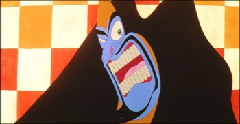
A Babbitt scene from Williams’ Cobbler and the Thief.
My portrait is idolatry, maybe; but how do you not idolize someone who after more than forty years work in his and your medium still can find it ‘wonderful, exciting, exacting … A medium that has barely been discovered, let alone explored. A medium that can be an art form that encompasses practically all other art forms. A medium that can gratify aesthetically, that is not earth-bound, that can be an invaluable aid in teaching everything from elementary chemistry to the Theory of Relativity.’
RICHARD WILLIAMS
Animation &Articles on Animation &Disney 22 Oct 2010 07:46 am
Oskar Fischinger at Disney
The following article appeared in the 1977 Anmation Issue of MILLIMETER MAGAZINE as edited by John Canemaker. (Some of those commercial magazines were just excellent back then, and we never seemed to notice or properly appreciate them.)
or, Oskar in the Mousetrap
by William Moritz
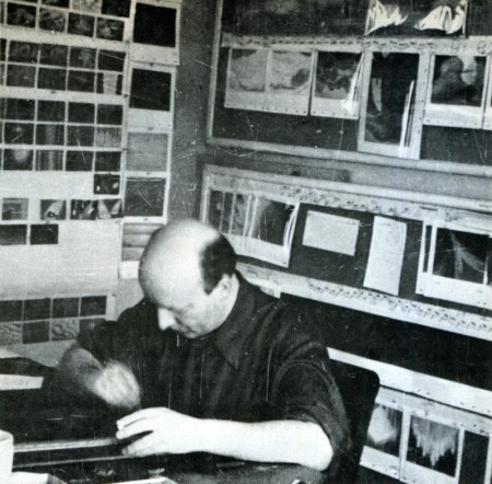
Oskar Fischinger at work at the Walt Disney Studio in 1939
Courtesy of Mrs. Elfriede Fischinger, all rights reserved
The official Disney account of the origin and making of FANTASIA has been told many times — from the early press releases, programs, and Feild’s wide-eyed, idolatrous book from 1942, THE ART OF WALT DISNEY (all united by the “official studio policy”/ mannerism of discussing primarily Walt Disney himself as if he had conceived and designed the films almost single-handedly), down to the more reasonable, carefully-researched materials published recently, such as the article by Disney archivist David R. Smith for MILLIMETER’S 1976 animation issue, and Bob Thomas’ new biography, WALT DISNEY, AN AMERICAN ORIGINAL.
I have already given an outline of another side to this story in my bio-filmo-graphy of Oskar Fischinger (FILM CULTURE 58-59-60-, 1974, pp. 61-65), but Fischinger’s tale bears re-telling since clearly a full understanding of the matter lies in discovering all that went on behind the scenes and in Fischinger’s heart-of-hearts.
Oskar Fischinger, who was a year older than Walt Disney, devoted his major energies throughout his life to abstract animation. In the early Twenties, while the Disney brothers assembled Ub Iwerks and a remarkable collection of talents to form an animation studio for production of Alice and Oswald cartoons, Fischinger, working on his own, struggled with radical experiments in non-objective imagery — from sliced wax to multiple-projector light shows. Even before sound film became available, Fischinger synchronized his abstract films to phonograph records and live musical accompaniments, because he found that the analogy with music (i.e., abstract noise well-developed and widely-accepted non-objective art form) helped audiences to grasp and accept the nature and meaning of his “universal”, absolute imagery. Oskar never meant to illustrate music, and often screened his “sound” films silently for already sympathetic audiences.
At the same time Iwerks/Disney’s Mickey Mouse and SILLY SYMPHONIES (and clever mass-marketing techniques) began to gain world-wide acclaim for the Disney Studios, Fischinger also enjoyed a moderate international renown as well, with his black-and-white STUDIES playing as novelty shorts with features from Uruguay to Japan. And while Disney began to win Academy Awards for his shorts, Fischinger also won grand prizes at film festivals in Brussels and Venice.
By 1935, Fischinger had made at least 35 abstract animated shorts, and stated as his New Year’s wish in the Berlin trade paper FILM KURIER that he wanted most to create an animated feature composed entirely of non-objective imagery and diverse music (he had used jazz, toyed with experimental electronic music and his own synthetic drawn soundtracks as well as classical music).
A scene from Walt Disney’s FANTASIA (1940)
Unfortunately for Fischinger, political events militated against him for much of his life, but he still produced a body of work that plays increasingly in theatres and museums as several full-evening programs.
The Nazi government had banned abstract art as degenerate, and was officially outraged that Fischinger’s COMPOSITION IN BLUE won festival prizes. Oskar in turn happily accepted a contract with Paramount and sailed for Hollywood in February, 1936, never to return to Germany. Unfortunately he spoke no English and encountered tremendous, frustrating difficulties in his early studio jobs. He assumed Paramount wanted him to pursue the style of his prize-winning COMPOSITION IN BLUE, but instead they wanted more representation and cuter work like his Muratti cigarette commercials. After he had completely painted and photographed a color abstract sequence (later called ALLEGRETTO), the director Mitchell Leisen insisted the piece be re-done in black-and-white with representational images of musical instruments and other pop trick effects overlayed. The resulting studio version disgusted Fischinger and he quit Paramount only half-a-year after he started there.
His second American film, AN OPTICAL POEM, made for MGM under William Dieterle’s aegis, proved one of Oskar’s finest works, and though not exactly a box-office sensation, played prestige bookings with first-run features, and was mentioned by one critic as a likely Oscar nominee (which caused Fischinger to quip, “Why bother giving me Oscar? I am Oskar!”).
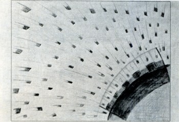
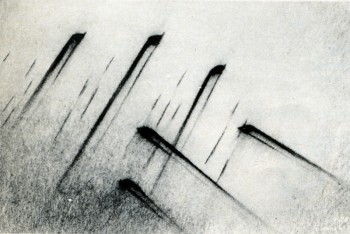
A Fischinger pencil sketch (with numerical
motion-phase breakdowns) for “Toccata and
Fugue” section of Disney’s FANTASIA.
After his MGM option was not picked up, Fischinger drove to Detroit and New York seeking backing for a feature-length animated film based on Dvorak’s “NEW WORLD” SYMPHONY, which he hoped to be able to present at the World’s Fair. Although this project never materialized, Oskar dallied in New York because he discovered a new ambiance there: unlike Hollywood, he was treated as a major artist in New York, invited to screen his films and exhibit paintings, dine with leading filmmakers, critics and painters, spend weekends at the country estate of Guggenheim Foundation curator Hilla Rebay. He returned to Hollywood only when his agent cabled that he had a job for him at Disney.
What a rude shock Fischinger received upon his return! Already in Berlin, Oskar had been attracted to Leopold Stokow-ski’s grand orchestral arrangements of Bach and had tried to get music rights to some of his pieces. When Fischinger found that Stokowski was his co-worker at Paramount, he once again proposed a series of shorts or an anthology feature. Stokowski was initially quite receptive and wrote Fischinger (October 9, 1936, on Paramount stationery), “I should be very happy if we could work together — you doing what is seen, I doing what is heard.” And he received from Fischinger such elaborate ideas as (November 15, 1936, in German):
“If you are here at Christmas, I’d like to make a full-length shot of you in such a way that the visual part of the film could begin with you conducting the first few bars of the music, and then the eyes of the viewer would glide with a movement of your hands off into endless space where the rest of the visuals would unfold. ”
Nevertheless, after several conferences, Stokowski decided that the project would be too expensive and complex for Oskar to animate alone, and suggested that they seek support from a major studio, perhaps Disney. Fischinger held little hope for satisfactory help from Hollywood, especially after his experiences, and furthermore he knew from gossip that Disney, despite his successes, was under severe strain, borrowed and mortgaged to the hilt. And Oskar’s worst fears were seemingly confirmed when he returned to Hollywood in November, 1938, to find that while Stokowski was being honored as Disney’s major collaborator on “The Concert Feature”, Fischinger was being hired for $60-per-week (Paramount had paid him $250) as a “Motion picture cartoon effects animator”.
Fischinger accepted the job since work was scarce and he had four children to support, but for him the Disney episode proved a nightmare which so angered him that he conspicuously avoided talking about it in later years. Only once did he write a note on his Disney adventure (in a letter to a friend), and it expressed well his chagrin:
“I worked on this film for nine months; then through some “behind the back” talks and intrigue (something very big at the Disney Studios) I was demoted to an entirely different department, and three months later I left Disney again, agreeing to call off the contract. The film “Toccata and Fugue by Bach” is really not my work, though my work may be present at some points; rather it is the most inartistic product of a factory. Many people worked on it, and whenever I put out an idea or suggestion for this film, it was immediately cut to pieces and killed, or often it took two, three or more months until a suggestion took hold in the minds of some people connected with it who had their say. One thing I definitely found out: that no true work of art can be made with that procedure used in the Disney Studio.”
At first, Fischinger threw himself whole-heartedly and good-naturedly into the project. He gave prints of his films to be screened weekly for the entire Disney staff, so his influence was pervasive (spilling over onto other films like DUMBO, the South American films, and PINOCCHIO, for which Oskar actually animated the magic wand of the Blue Fairy). In the mimeographed transcript of the story meeting for February 28, 1939, Walt Disney says (p. 1): “Everything that has been done in the past on this kind of stuff has been cubes, and different shapes moving around to the music. It has been fascinating. From the experience we have had here with our crowd — they went crazy about it. If we can go a little further here and get some clever designs, the thing will be a great hit. I would like to see it sort of near-abstract, as they call it — not pure. And new.”
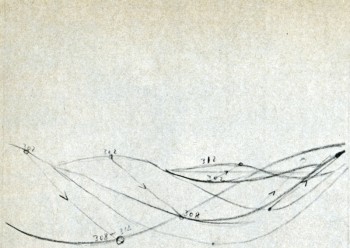
Fischinger’s numerical motion-phase breakdown
for “the Wave” scene in “Toccata and Fugue”
section of FANTASIA.
© Fischinger Trust, all rights reserved.
Perhaps because of the uneasy proximity of Fischinger, Walt exhibits a certain suspiciousness about abstraction, accompanied by a rather defensive attitude towards the prospective audience.
January 24, 1939, p. 2:
Walt Disney: You should give something that the audience will recognize. I don’t think the average audience will fully appreciate the abstract; but I may all be wrong —
Stokowski: Yes, they may be way ahead of us.
or, January 24, 1939, p. 7:
Walt Disney: What will Bach lovers think of this?
Stokowski: They will be against it, I think; but the public will love it.
Walt Disney: Well, the general idea here looks good to me. I only wonder if we’re going a little too gypsy in the color—
or, February 28, 1939, p. 5:
Walt Disney: If we can get a little connection behind this, the public will take to it. It would be better than some wild abstraction that you can’t get anything out of at all. Right there is where the music sounds most like an organ, so the public decides it represents an organ.
or, February 28, 1939, p. 8:
Walt Disney: Do you think we ought to have pictures in mind through this thing? Then we won’t get a conglomerate mess — an abstraction.
or, JuneS, 1939, p. 1:
Walt Disney: There’s a theory I go on that an audience is always thrilled with something new, but fire too many new things at them and they become restless.
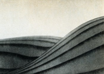
The “wave” scene as it appears in FANTASIA.
©Walt Disney Productions.
Fischinger’s assertions about the unhealthy competitive committee work at Disney would seem to be borne out by the conference notes in which we see during nine month’s of work on the “story” incredible floundering, dreary discussions and re-discussions of each scene, groping and pushing without any controlling factor besides making an entertaining film.
Because he knew little English, Fischinger never spoke up during these story conferences (neither did Kay Nielsen), and further became the butt of endless practical jokes on the part of his jealous co-workers. Some fun-loving boys of the Disney staff, unwilling to deal maturely with the plight of a refugee artist, pinned a swastika on Oskar’s office door September 1, 1939, the day the Nazi armies invaded Poland. Fischinger applied for a release from his contract and after two months of red tape, terminated his employment at Disney, October 31, 1939, Halloween.
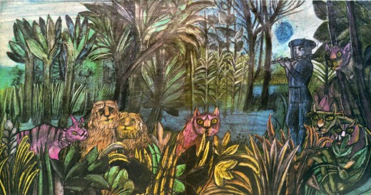
Fischinger kept about 100 of his sketches and drawings for the Bach “Fugue”, including some lovely pastels showing melting meanders and supple lozenges much as they appear in the final FANTASIA, as well as half-a-dozen beautiful images that were probably never realized on film. The most extensive unit involves twelve poster-color and 60 pencil drawings (with numerical motion-phase breakdowns) that detail the sequence in which alternating left-and-right-hand “waves” surge toward the viewer. While this turned out to be one of the more impressive moments in the Disney film, a comparison with Oskar’s original sketches shows how much more powerful, subtle and imaginative the sequence might have been if Fischinger’s intentions had been honored — with his choice of monochromatic turquoise and celadon hues for the (somewhat flatter) wave motion overlayed with scintillating geometric figures in browns, Chinese red, and graduated yellow/oranges, all of the elements flowing cogently and vigorously out of each other, as opposed to the simplified Disney image of fat, melon-ribbed waves slightly off-balance in shades of flagrant purple distractingly at constrast in “realism” to the (needlessly) clouded sky behind. All in all, the Disney version of the “Fugue” seems painfully close to the Paramount adulteration of ALLEGRETTO.
Much of Fischinger’s work seems entirely lost. After looking at some of Oskar’s sketches (August 21, 1939, p. 3), Walt Disney comments, “I think the contrast of black and white, and then a little color coming in, would stand out. ” but I don’t think such an effect reached the final version of FANTASIA. Evidently some of Fischinger’s own animation was filmed at least in the pencil test stage, since after viewing some material on a moviola Disney comments (August 21, 1939, p. 7) “Oskarhas a pulsing effect in his test.”
To me, Disney was actually the loser in the matter. Each year Fischinger’s genius and the sincere consistencly of his films becomes more widely acknowledged, while every year the moments of unbearable kitsch, lapses of taste, questionable values, and hodge-podge of stylistics that mar most of the Disney Studio product are becoming more obvious to everyone. For all its considerable virtues of self-parody, rich color and design, etc., FANTASIA falls easily victim to its own shortsightedness so that the burlesque of Bozetto’s ALLEGRO NON TROPPO carries devastating bite.
At least Fischinger had a few of the last laughs in the matter. After leaving the Disney Studios, he devised a set of seven superb collages, among his most charming and highly prized works, showing Mickey and Minnie Mouse (cut from comic books) “reacting” to reproductions of abstract paintings by Kandinsky and Bauer (cut from a 1938 Guggenheim Museum catalogue). And years later, when Disney made the documentary TOMORROW THE MOON, they inadvertantly honored Oskar by using a clip of his pioneer special effects of the rocket launching from Fritz Lang’s FRAU IM MOND, made a quarter of a century earlier.
Articles on Animation &Guest writer &Independent Animation 11 Sep 2010 07:56 am
Paul & Sandra & Tulip
MY DOG TULIP opened at New York’s Film Forum and will be followed by a limited national release. The NY reviews were excellent. The film did so well in its opening week that it’s been extended to Sept. 28th. You have even more of an opportunity to see it.
This interview/article was written by Karl Cohen for ASIFA-SF and he has given me his permission to post it.
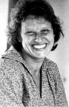
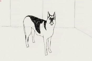 One of the impressive animated features coming out this fall is My Dog Tulip based on the book of the same name by J.R. Ackerley (1956). It’s a delightful comedy that I fell in love with at the SF Film Festival. Its directors, Paul and Sandra Fierlinger, have created over a hundred award winning films including Still Life With Animated Dog (2001) that won a Peabody Award and a Special Jury Award from Zagreb. A Room Nearby (2003) also won a Peabody and their Drawn From Life series (2000) has won a grand prize at the Ottawa
International Animation Festival. In 1980 Paul received an Oscar nomination for It’s So Nice To Have A Wolf Around The House.
Although the couple may not be well known by the public, they are highly respected among their peers, so when asked how Tulip came about as a project Paul explained that the film’s producers Norman Twain and Howard Kaminsky, “Just called us out of the blue. One of those calls you think never happens.†They asked right off if the Fierlingers wanted to make a feature film. They didn’t know the couple and their main concern was that the film had to be based on a famous book.
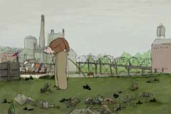 After some discussion about possible books to adapt they decided upon My Dog Tulip. It turned out Howard Kaminsky knew the book and controversy over it when the book was published, as he was president of Random House, the book-publishing firm, for twenty-five years and prior to that was president of Warner Books for seven years. The book and film have scatological references that were quite shocking to polite society in 1956. A contract was eventually agreed upon and it took about three years for Paul and Sandra to complete the project.
Paul says, “It was wonderful work. I could wake up every morning and know exactly what I was going to do and I loved the work. The whole process was very pleasant. There are no horror stories to tell. Nothing bad happened.†The Fierlingers had total artistic control and the budget was $1.3 million, enough for the couple to complete the production with famous voice actors (Christopher Plummer, Lynn Redgrave and Isabella Rossellini) and to be able to provide film festivals with 35mm prints with Dolby sound.
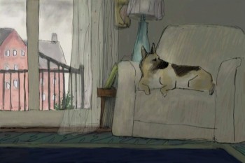
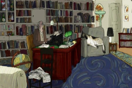 Adapting the book did present problems, as it is basically a series of humorous tales about incidents in the life of J.R. Ackerley as he raises the dog, an Alsatian (German Shepherd) and they become great friends. To flush out the film’s script Fierlinger added true elements not mentioned in the book, including having the author’s sister live with him for about a year. During that period she tried but failed to win over the dog’s affection.
To flush out the story Fierlinger’s producer hired Peter Parker, an excellent British writer who had written a biography of J.R. Ackerley. Paul says, “His prose is equal to Ackerley’s.†If you see the film I think you will assume, as I did, that every word came from the book.
An unusual element in Paul’s long format work (he has also done hundreds of TV commercials, short pieces for Sesame Street, etc.) is his use of different styles and techniques that separate segments of the story. He wasn’t sure what I was referring to when I brought up the subject so I pointed out that in his film And Then I’ll Stop (1989) he had five or six people talking about their lives and each person had a different style of art representing them and their world. Paul then explained that he feels long animated films using the same art styles and rendering techniques throughout the film get boring no matter how well they are done.
He remembers that the first animated feature he saw that he really liked to the very end was Yellow Submarine (1968) because it was done in so many different styles. In his work you know the same artist drew each style, but the variety keeps the work visually interesting.
When working on a story Paul says he gets into a special frame of mind. “In my mind I live the story,†so he draws what he imagines. “If it is a sloppy character then you draw a sloppy line. I did that in And Then I’ll Stop. And if it is the story of a very pristine accountant of a big company I draw him in almost Saul Steinberg type lines.â€
Paul has been around long enough to see sound recording technology change drastically. With new microphones and digital recorders he no longer needs to use a big studio with sound booths. Some of Tulip was recorded around a kitchen table, but to record Christopher Plummer the producers rented studio time.
Paul pointed out why it is important to record most soundtracks before animating characters. The character Plummer created in his reading of the script wasn’t the man that Paul had envisioned so he ended up drawing the main character somewhat differently than he had originally planned.
The film’s composer/sound engineer is John Avarese who has worked with Paul for many years. Paul says, “You can tell him the kind of music you want and he can just pull it out of his hat.†Most of John’s work has been for corporate and industrial clients.
 The animation was done using TVPaint, one of the oldest 2-D animation systems available. It was started in 1991 and was developed by an independent producer as a work of love. Paul became a beta tester in 1992 or ‘93 and helped develop the system’s capabilities.
His wife Sandra is the film’s co-director. Her background is in painting. She studied at the Boston Museum’s school and graduated from the Philadelphia Academy of Fine Arts. They work together quite well as Paul is a skilled draftsman, but he says, “I never learned to paint or work with color. Most of my films have had very little color in them.†She started working with him in 1989 as a painter when animation was hand painted on cels. She enjoyed the work and together they learned the TVPaint system. She also was involved in beta testing the software. As they learned the system they would ask the software developers to make certain adjustments. Thus the system became tailored to their needs. Eventually other accomplished 2D animators from all over the world joined the beta team to create a unique application specifically meeting the needs of independent artists.
One important part of Paul and Sandra’s good working relationship is her helping him to resolve drawing problems whenever he feels stuck trying to make a decision. He says that often happens, that he can “paint myself into a corner and nothing seems to work, so she looks at it with fresh eyes. We figure it out together. We do that all the time, even when I start writing a script, before I start drawing.†Paul feels all their films should simply say “A film by Paul and Sandra Fierlinger.â€
We closed our discussion with Paul’s advice for couples that want to work together on animated films. Based on having lived and worked with Sandra for almost 20 years he says, “The trick is not to have children. If you have children, that gets in the way. You have conflicts. If you don’t have children, you only have your work.†I’m not sure how popular his advice is with parents, but judging from their films that I’ve enjoyed over the years, the advice certainly works for this animating couple.
 Before I spoke with Paul I asked Norman Twain, one of the film’s producers, about their distribution plans for the film. He said, “The film will open at the prestigious art house, Film Forum, in New York City on September 1 and concurrently in similar calendar art houses in San Francisco,* Los Angeles, Dallas, Philadelphia, Chicago, Boston, and Toronto, as well as in other New York theaters. Hopefully, as the traction grows we will expand to other major calendar houses in the larger markets in the United States. We will promote the film in the best possible manner, directing promotion toward an Academy Award nomination. Pending the reception of the film in America, we will exploit the foreign market to the best extent we can. Cinemavault, a film sales group based in Toronto will handle foreign sales. After the US distribution has run its course, we will look for a VOD (video on demand) release, concurrently with a DVD release and after that, will try our best to get it on television (hopefully PBS or cable TV network – as it is much too nasty for a broadcast network to show).†*Tulip opens in SF and Berkeley Oct. 15 at Landmark’s Embarcadero and Shattuck cinemas.
I also asked if it was difficult financing the project. He replied, “Fortunately, most of the fund-raising took place prior to the crash, or should I say prior to the sudden scarcity of funds. It’s not an expensive film, under $1.3 million. I think, as all entertainment investments go, it’s risky, but will prove profitable. I am happy to have produced it and will be happy to see it in release.â€
I end this discussion with a disclosure. Both Paul and I are extremely fond of dogs. My wonderful yellow Labrador Retriever recently died after being my close friend for 14 years and Paul and Sandra Fierlinger have two rescue dogs at present, a Jack Russell, “probably from a puppy mill,†and a mutt that he says is a cross between a German Shepherd and a Corgi. It had been abandoned. It has a large Shepherd head and a strange body so a friend of Paul’s once remarked, “Oh, a Photoshop dog.†Paul tells me that he sometimes used her as a model when he was drawing Tulip.
Articles on Animation &Books &Commentary &Independent Animation 20 Jul 2010 07:50 am
Women Animators
- Back in the enlightened Eighties, Independent animation actually took note of gender in the making of animated films. In The Art of the Animated Image, An Anthology edited by Charles Solormon included an article about Women Animators in the medium. The article by Lauren Rabinovitz was part of a series published in conjunction with the Walter Lantz Conferences on Animation held June 12th thru 14th, 1987 at the American Film Institute in LA.
I reprint the article here, and I consider that, to my knowledge, it’s nice to know that all but one of these women mentioned are still making Independent films. I wonder if the record is as strong for the “Independent” male animators of the same period.
and
Women’s Experiences
BY LAUREN RABINOVITZ
Histories of American animation have most often located the form within the confines of the Hollywood cinema and television system. Over the seventy-five years or so of its existence, that system has seldom proven hospitable to women filmmakers, or animators, whether they were working in film or, later, in television.
Outside Hollywood, the medium of animation has flourished in the work-a-day world of education, industrial and advertising films, and in those arenas women animators have found opportunities not available in Hollywood (especially over the past twenty years). Of even greater significance, the growth of avant-garde film after World War II nurtured female, as well as male, animators, filmmakers dedicated to individual artistic expression and to the creation of new film syntaxes within an alternative economic support system.
As independent cinema became increasingly tied to college and museum institutional frameworks in the late 1960s, so too did the individual filmmakers. In that period and thereafter, they typically became identified with academic training and teaching positions, the aesthetic vocabularies of vanguard art movements, and the apparatus of an American avant-garde cinema. In the 1970s and 1980s, rising from those antecedents, feminist filmmakers and animators have participated in independent cinema networks.
However much independent cinema may be viewed as a “marginal” practice within the Hollywood hegemony, women filmmakers—and animation as a cinematic form—lie at the outskirts of those heterogeneous cinematic margins. As neither women filmmakers nor animators have extensive showcases, distribution outlets, and production monies available to them, their short works are known largely through a variety of exhibition practices: film festivals; distributors’ animation packages (often collected for and exhibited at schools and film societies); cable TV “fillers”; and individual (and often visiting) artist screenings at museums, colleges and media centers.
Within this somewhat limited and restricted production, distribution and exhibition network, women animators have created a broad spectrum of work, utilizing a range of animation techniques, styles, and subjects. Line animation, cut-outs, xerography, photos, computer-generated imagery, sand-on-glass, have all been used by woman animators. Some have chosen to explore formal and spatial relationships; others delve into the “serious” art of highly abstracted, non-representational animation. Some have relayed children’s stories and folktales, personal experiences and feelings; others have created humorous narratives and political satires. Many have chosen to construct animated tales that comment on the artistic process itself. There is no “women’s animation” any more than there is one unique form of women’s film or video.
Nonetheless, just as male filmmakers have frequently exposed intimate, often sexual experiences from a subjective point-of-view, women animators tend to explore women’s experiences from an equally subjective perspective. Such subject matter takes on a dual political dimension—in the increased visibility and expression of gender identities and experiences, and in the recognition of the systematic repression of women’s subjective experiences within the Hollywood cinema. A significant number of contemporary women animators rely on cartoon animation— figuration in short narratives—as a means of recasting their relationship to the ideology of representational cartoons.
There is a long list of recent films by women animators that address women’s experiences in this fashion. They run the gamut, from Tanya Weinberger‘s tiny naked woman who carouses on and then arouses a sleeping giant in Gulliver Comes to Lilliput (1983) to Suzan Pitt‘s Asparagus (1978), an elaborate eel-animated psychodrama that intertwines a woman artist’s creative process with metaphors of sexual activity.
Christine Panushka‘s The Sum of Them (1983), line portraits set against a familiar collage of sounds, depicts many women as an absorbing poem of humanity. In Another Great Day (1980), Jo Bonney and Rugh Peyser dramatize the important inter-relationships among popular cultural forms, fantasies, and women’s labor through a housewife who moves freely between the cartoonesque world of her chaotic household and the photographic world of television soap opera and romance photo-novels. Women have also collaborated to celebrate collectively their experiences as’ women who are not always “solitary” animators. Lisze Bechtold, Lesley Keen, and Candy Kugel, My Film, My Film, My Film (1983); Caroline Leaf and Veronica Soul, Interview (1979).
Some artists portray an autobiographical female subject notable for her physical metamorphoses, which approaches self-induced schizophrenia. In turn, this state of fluid change can often provide a positive catharsis. For example, Karen Aqua‘s Vis-a-Vis (1983) turns the artist/character into two connected halves of one person—the animator at her storyboard and the woman gazing out the window. When the halves split, the artist animates kaleidoscopic images while the woman passes through richly colored sea and mountains. When the woman returns to the artist, she empties radiant color into the drawings.
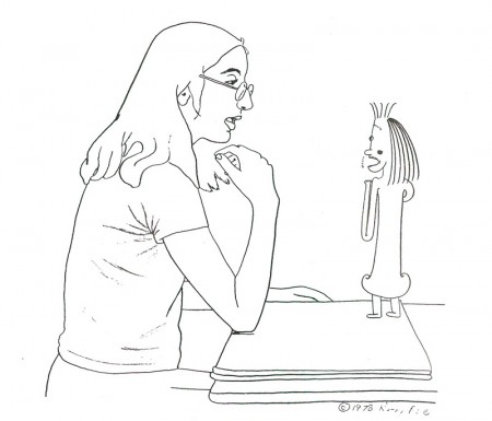
Kathy Rose’s Pencil Booklings (1978)
Kathy Rose also plays with the magical transformations of an animator character. Mirror People (1974) and The Doodlers (1975) both rely upon the protagonist’s constantly evolving physical shapes in an eerie, surrealistic world. In Pencil Booklings (1978), the artist/character (who resembles Rose) is represented more naturalistically through rotoscoping. Within the narrative she is pulled into the world of her imaginative creation and eventually back out of it, her identity assured by her exploration of the creative process itself.
Joanna Priestley‘s Voices (1985:) also relies upon the artist’s physical presence as well as her v ice to comment on her self-image. As a likeness of the filmmaker addresses an anthropomorphic (and smart-alecky) mirror, she describes first her bodily-related fears of aging, gaining weight, and wrinkles. As she succumbs to her preoccupation with fear itself, she gives vent to increasingly cataclysmic horrors that are visually portrayed— things that go bump in the night, monsters of the id, nuclear holocaust. The background prattle provides a counterpoint to the character’s self-absorbed fears creating a tongue-in-cheek commentary that suggests women’s fears about themselves are a culturally induced neurotic obsessiveness.
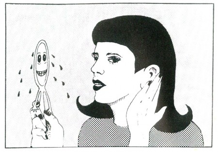
Joanna Priestly’s Voices (1985)
It is important to note that these artists depart from the traditional Hollywood use of sound, the acoustical enhancement of nature. Although the cartoon world may always be seen as inherently fantastic, the animation studio’s use of sound helped reinforce the notion of a spatial and physical world. These animators employ layers of sound effects and music to destabilize the spectator and to stress the fantastic itself.
Emily Hubley, the daughter of animators John and Faith Hubley, carries the metamo-phosing, autobiographic subject to new intensities. In Delivery Man (1982), she presents a simply drawn, ever-changing abstract self in an equally volatile, abstracted world. Less the object of whimsical artistic introspection than the subject of her fearful dreams relived, the constant visual metamorphosis supports a remembered vision of personal traumas. The woman’s personal narrative of five key dreams involving her birth, her mother’s surgery, and her father’s death during surgery visualize the crisis of familial relationships, development and sexual identity that comprise the subjects of many patients’ transactional analysis.
Kathy Rose has extended the woman animator’s autobiographic involvement to a redefinition of the medium itself. Her Primitive Movers (1982) is a 30-minute piece that combines animation and Rose’s dance performance in front of the moving images. The animation is a constantly moving, colorful backdrop of lifesized dancers who evoke series of art styles—from Egyptian to Cubist to Art Deco. Their relentlessly rhythmic, angular movements provide not so much a chorus line for Rose’s sharply expressive movements but a fluid commentary on changing spatial relations, perspective, and Rose’s intertwining of 2 and 3 dimensions, as well as her bodily interaction with them.
In this regard, several women animators connect their work to the history of art in ways that allow them to reconstitute woman’s place—no longer the object of male desire, but as the controlling subject. Maureen Selwood‘s Odalisque (1981) is, perhaps, the best example. In a humorous inversion of the history of western painting, Selwood portrays her odalisque as the subject who imagines and controls the flow of images. This female is no longer the prisoner of other artists.
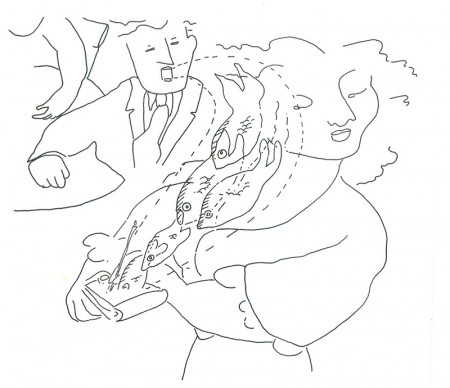
Maureen Selwood’s Odalisque (1981)
Selwood calls attention to a more naturalistic figuration as the basis for a realism regarding women in Western art. By juxtaposing two styles in a jarring fashion, she poises fluid, graceful motion associated with the feminine against the disintegration and evaporation of form associated with the cartoon world. Made with the aid of romance and adventure—as a cafe artist and an opera singer—in these dreams, she deflates as male fantasies the romantic conventions usually associated with these constructs. In each sequence, she escapes the conventional confines of the fantasy that would relegate Woman to passivity or death and flows back to her living room, her visually nurturant world.
Whether there is an inherently feminine language in these works as well as in women’s writing, visual arts, and other expressive arts has been a topic of much feminist discussion in the 1970s and 1980s. Some critics maintain that even acknowledging the existence of feminine language does not insure that such “inscriptions of women’s voices” will be necessarily heard by all audiences. Female filmmakers frequently rely upon existing codes and conventions no matter how much they are filtered through their own vocabulary. In addition, their audiences may choose to interpret the films within the confines of already established canons, an act sometimes amplified by the films’ marketing and critical reviews.
What is at stake here is not the discovery of a feminine or feminist aesthetic running through women’s animated films, but the ways in which contemporary animators collectively construct feminist experience. They rely upon devices usually associated with expressive animation—physical metamorphosis, strongly-defined character personalities, and dream-like fantasy logic. But they represent these processes by defining women as their subjects, presenting specifically female sexual and non-sexual fantasies, and imagining self-identity and fears through one’s physical changes and fluidity as well as through controlling the environment outside oneself.
Articles on Animation 01 Jul 2010 08:02 am
Commercials History
- Earlier this week, I’d posted an excellent piece by Mike Barrier on the work of the Hubleys. This article was taken from a 1977 Millimeter Magazine animation issue. In that same issue, is an article about the history of the TV commercial. There’s a lot of good information in the piece and the shortened history of a lot of important studios that many of you are unfamiliar with. Unfortunately, it also mentions a lot of ads you may not be familiar with. But there’s plenty there in the packed piece. So I thought it a good idea to put this info out there.
Here’s the piece by Arthur Ross.
A Retrospective View
by Arthur Ross
ANIMATE, according to the time-honored Webster’s definition, means “to give natural life to; to give spirit to; to stimulate; to rouse; to prompt; to impart an appearance of life, as to animate a cartoon.”
And that is exactly what animated TV commercials have been doing for the past 30 years. They have given life, spirit, and verve to the selling of thousands of products both in America and abroad.
Psychologically speaking, they work by expanding the fixed limits of reality, by creating new and exciting worlds of fun and fantasy, and by captivating the viewer with fresh perspectives that reinforce our basic drives and motivations for love, success, beauty, comfort, and self-esteem.
During the course of a single 60 second spot, we see 1,440 individual pictures, or frames, come to life! Often with the kind of humor, or whimsy, or charm that speaks to our unguarded and childlike selves, and in some instances, even to the deepest recesses of our unconscious.
That is precisely why they are so potent a sales tool for industry, an educational device for schools, and an entertainment vehicle unto themselves. They work by playfulness, destroying all logical opposition to the messages they may contain.
They dazzle our senses and charm us into belief. Or, at least, they help suspend our disbelief in the ideas they put forth. They are 20th century dreams — dreams that money can buy!
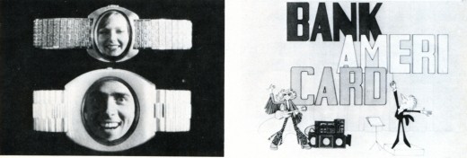
1. Object Animation: Speidel’s “Faces In The Watches”
created by John Gati of Action Pictures.
2. West Coast animation: Bank Americard (FilmFair) 1961-1976
While they operate on our most primative emotional level, animated commercials are highly sophisticated forms of art — employing words, graphics, color, motion, sound, music and symbols to activate the sale of goods and services.
Some of America’s foremost art talent has worked in the field at one time or another, including Saul Steinberg, John Hubley, William Steig, Saul Bass, to name a few.
The earliest animation in the forties was generally quite conventional — literally cartoon commercials of the straight Disney school of animation. It was essentially an extension of theatrical animation such as characterized the products of Warner Brothers, Paramount, MGM, and Disney at the time. Its novelty was successful and proved animated characters could sell products as well as live spokespeople. Everything was executed in glorious black and white, since color on TV was still years away. Commercial studios began to emerge in the late ’40s and early ’50s to supply the demand for animated spots — among them Academy Pictures, Shamus Culhane, Bill Sturm Studios, Film Graphics turning out such early “hall of famers” as the Ajax “Down the Drain” Bubbles and Mott’s “Singing Apples”.
In the early “50s a new trend entered TV commercials when UPA, creators of Gerald McBoing-Boing for theaters, introduced its unique avant-garde style of animation breaking away from the more conventional school of Disney design and execution.
We had the pleasure in the early ’50s of working personally1 with ex-UPA star John Hubley on some of the most successful of these avant-garde spots, including those for Speedway 79 gasoline, Altes Golden Lager Beer and Faygo Beverages (for the W.B. Doner agency in Detroit) as well as Chevrolet (for Campbell-Ewald, again in Detroit.) Other notable avant-garde entries during this period included the famous Saul Steinberg Jello “Busy Day” spot, as well as the classic Bert and Harry Piels spots (for Young and Rubicam).
Continuing through the mid ’50s, two trend-setting studios emerged when John Hubley formed Storyboard Inc. and Abe Liss joined forces with Sam Magdoff to start Elektra Films. Hubley continued his classic style with such winners as Heinz Worcestershire Sauce’s “Tongue-tied Spokesman”, Ford “It’s a Ford” series, and Maypo’s “I Want My Maypo” commercial. Elektra came forth with highly experimental works, creating new breakthroughs in photo-animation, multiple image and optical effects, and totally fresh avenues of design. During this time Elektra spawned such outstanding animation and graphics talents as Jack Goodford, Pable Ferro, Cliff Roberts, the Canattas, Lee Savage, Phil Kimmelman, and Hal Silvermintz, as well as Arnie Levin, Howard Beckerman, and Mordi Gerstein. Among the outstanding Elektra efforts of this era were the NBC Peacock, the legendary “Talking Stomachs” Alka Seltzer spot designed by R.O. Blechman, as well as award-winners for Chevron, Esso, Chevrolet, and Alcoa. One notable achievement, I fondly recall, was a 60-second spot done for the United States Army “Great Moments” series (which I had the pleasure of writing and producing) in which Elektra’s people (including the late Len Appleson) recreated the entire Louis-Schmelling Championship fight with stills quick-cut to the rapid beat of music and crowd cheers. It was a montage breakthrough that Sergei Eisenstein would have been proud of.
Following the success of Storyboard, Inc. and Elektra, more top studies and talent emerged in commercial animation. Pelican films emerged under the able leadership of Jack Zander and did notable work for American Motors, Volvo (designed by Mordi Gerstein) and Alka Seltzer (“The Blahs” designed by cartoonist Willilam Steig.)
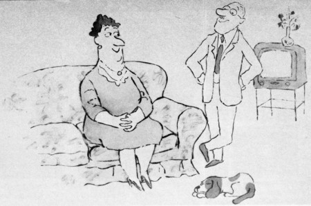
Use of famous cartoonists and illustrators in TV Commercials:
Still from a commercial made in the 60s by Elektra Productions,
utilizing cartoonist Bill Steig.
Other fine studios of the fifties were those begun by Lars Calonius, Transfilm, Kim-Gifford, Robert Lawrence and Ernest Pintoff — the latter going on to win an Academy Award for “The Critic” some years later. Arnold Stone was a heavy contributor in those years to the Pintoff output, which included excellent animated spots for Proctor-Silex appliances, Yoo-Hoo Chocolate Drink, and The Bell Telephone Company.
These proved to be the “golden years” for commercial animation with many studios maintaining large staffs to cover the growing need for their excellent product. At one point, there was even a shortage of talent available to handle the work load and one had to “wait on line” for delivery.
In the ’60s, the trend increased towards graphics and we saw a sharp decline in traditional animation. New techniques were perfected — like the super quick cuts of Elektra and Ferro, Mogubgub and Schwartz. The latter also held the industry in marvelous disbelief at its outrageously “insane comic inventions” such as the award-winning “Crazy Hat” commercial for County Fair Bread (which we had the pleasure of producing with them).
Continuing the trend to more limited animation, which UPA orginated as an economical move to cope with the high cost of full animation, studios in the ’60s experimented with photomatics, “squeeze”, semi-abstracts, paper sculpture, and technique of combining live photos with animated bodies (perfected by Paul Kim of Kim-Gifford in a prize winner for the National Safety Council on preventing highway accidents.) Tighter budgets, a declining economy, and a swing away from animation to greater use of realism created massive layoffs in the commercial animation field in the late ’60s and early ’70s — and many good, long-established shops passed from the scene. Smaller one and two-man companies emerged to take their place and this trend continues up to the present day.
It should be pointed out that throughout the ’50s and into the ’60s traditional animation continued as a popular communications tool for many agencies and companies. Outstanding among these was William Tytla Associates. The late Bill Tytla was one of the foremost Disney animators, contributing greatly to the success of such Disney immortals as FANTASIA, PINOCCHIO, SNOW WHITE and DUMBO. In the ’50s, Bill took his talents into the commercial arena and did some outstanding work in the more conventional animation forms. We had the pleasure of working with him in the animation development of the worldwide symbol for Esso, “Happy the Oil Drop,” a fantasy figure that Bill brought to wondrous “life” through his skills as an animation director.
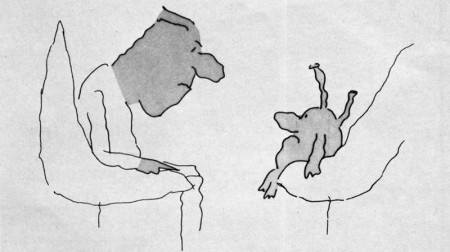
Simplicity of design in 50s & 60s; Still frame from the famous Blechman
“Talking Stomach” Alka Seltzer commercial produced by Elektra in the 60s.
In spite of downtrends in the economy, the late ’60s and early ’70s saw a brilliant new bursting forth of creative energy in animation influenced by Peter Max and the worldwide success of “The Yellow Submarine.”
Among the many fine companies that emerged were Focus Productions, which turned out such award-winners as Vote Toothpaste “Dragon Mouth,” designed by Rowland Wilson; Gillette’s “Moveable Features,” designed by Tomi Ungerer, and the Utica Club Beer series designed by Jack Davis and Mort Drucker. In 1972, Phil Kimmelman left Focus to open his own shop, Phil Kimmelman & Associates. Here, along with Bill Peckman, he has turned out some outstanding efforts including the Cheetos Mouse campaign, the Exxon Tiger, and the delicately sensuous Clairol Herbal Essence commercial.
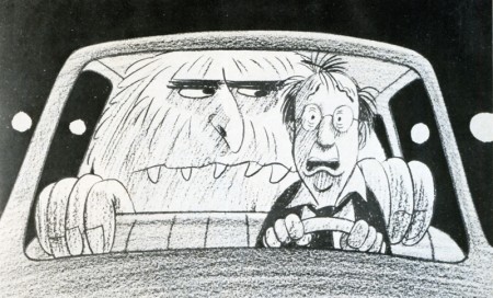
Horror Fantasy in TV commercial animation (1976): Avis Rent-A-Car;
Designer/Director: Mordi Gerstein; Producer Phil Kimmelman & Associates.
Other exciting breakthroughs in the ’70s include the highly graphic look of computer animation, perfected by such companies as Dolphin Productions for use as station and program attractions; rotoscope animation brought to brilliant maturity by Ovation Films in New York and Snazelle Films on the West Coast. The Levi campaign is an outstanding example of rotoscope animation, bringing a fresh new excitement to the field.
On the West Coast, throughout the ’50s and ’60s animation led by UP A, and Storyboard, Inc., continued to expand along with the fine efforts of such companies as TV Spots for Johnson’s Wax, Lucky Lager Beer and L&M Cigarettes; John Sutherland Productions (“A 1580 Atom”); Playhouse Pictures (Ford, Falstaff Beer, H.J. Heinz) Quartet Films (Western Airlines); Animation, Inc. for Oscar Mayer, Soho Boron Gasoline and Pabst Blue Ribbon Beer; and Five Star Productions whose animation department headed by Howard Swift (another ex-Disney man) created some of the earlier TV and cinema commercials for Ford, Pabst, F.T.D., Coca-Cola, as well as bringing Speedy Alka-Seltzer to “life” via the George Pal puppet-type stop motion use of a series of replaceable heads. Interestingly, after a decade of experimenting with other creative directions, Alka Seltzer has just reverted back to using “Speedy” again in its current advertising.
It is an outstanding example of how things come creatively full-circle and how each generation rediscovers the “great ideas” of the past.
Joop Geesink continued to perfect the puppet type animation throughout the fifties, working in Holland for American companies through Transfilm in the United States. His “Brewster, the Goebel Rooster” and Heinz Aristocrat Tomato were two fine creations in this genre.
The use of “stylized” animation-type settings in which live action unfolds was another outgrowth of animation in the late ’50s. S. Rollins Guild whom we had the pleasure of working with at McCann-Erickson in the ’60s contributed greatly to the perfection of this commercial art form for such companies as Nabisco and Coca-Cola. Both series were produced by Bill Sturm Productions in New York.
Black-Lite, while basically a live photographic technique, creates a unique “animation” look to commercials. We had the opportunity of creating and producing the first such black-lite commercial in 1955 for Flagg Brothers Shoes (“Dancing Shoes”) which won numerous Art Director Club Awards for originality and effectiveness. The producing company was Sundial Films, headed by the multi-talented Sam Datlowe. It marked the first commercial assignment for young and talented Jerry Hirshfeld, who later became the ace of the MPO Productions staff, before turning to feature films.
One of the continuing trends in animation today, largely aided by Elektra and Jack Zander in the ’50s, is the use of well-known cartoonists and illustrators from outside the industry. Among the best are Bill Steig, Frank Modell, Charles Saxon, Seymour Chwast, Milton Glaser, and Peter Max, all contributing greatly to the resurgence of animation in the “70s.
Other outstanding work in animated commercials was achieved on the West Coast by Ray Patin, whose chief animator (another Disney graduate) was Gus Jekel, now the head of Film Fair, Inc. They accomplished some fine efforts for Y&R on Jello in the early ’50s through Jack Sidebotham, one of the really great art directors in the advertising field. These include such classics as “Banana-ana,” and “Chinese Baby.” Ray Patin also turned out the NY AD gold medal Bardahl series, aping Dragnet, as well as noteworthy campaigns for National Bohemian Beer and Jax Beer.
In passing, one must not forget to include in the pantheon of animation producers such fine organizations as Cascade Productions, Playhouse Pictures, Quartet, Imagination, Inc. all of whom executed award-winning series in the ’50s and ’60s.
In the ’60s, Gus Jekel’s Film Fair did noteworthy series for BankAmericard and Bardahl which won the Cannes and Venice Awards. Today, Film Fair does exceptional work with continuing characters, such as Peter Pan (Peanut Butter). Charlie Tuna, Tony Tiger, and the Snap, Crackle and Pop trio for Kellogg’s Like Elektra in the East, Film Fair nurtured a great deal of the best West Coast talent including Art Babbitt, Bob Cannon, Dick Van Benthem, Ken Walker, Fred Wolf, Norm Gottfredson, Ken Champin, and Corny Cole. It is one of the reasons the West Coast continues to do such exciting creative work in the field along with its East Coast counterparts.
One of the long-standing successful animation partnerships in the East has been Paul Kim and Lew Gifford, doing fine work in the field since 1958. Among their top creative efforts are award-winners for Piels Brothers, and the Emily Tipp series. Their Modess a delicate subject with taste, simplicity, and artistry. And their famous Winston “Montage” introduced a 14 way split screen in constant movement to the Winston jingle — breaking exciting new ground in the use of matte work and animation design.
Another top West Coaster is veteran animator Herbert Klynn, President of Format Productions. Herb served 16 years as designer and then Executive Production Manager for UPA, before organizing his own animation company. His Format Productions is active in entertainment series such as the Alvin Shows, the Lone Ranger and Popeye programs, as well as creating titles for such TV shows as I Spy, Smothers Brothers, and The Mothers-In-Law. Among his fine animated TV commercials are those for Max Factor, Post Cereals, Wells Fargo Bank, and Dreyfus Investments. During his tenure with UPA, Herb worked on such classic film cartoon short subjects as “Madeline,” “Mister Magoo,” and “Gerald McBoing-Boing.” Our own particular favorite is his treatment of Poe’s “The Tell-Tale Heart” for UPA.
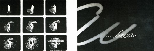
1. Graphic animation of a “strobe” like image of a golfer, made with 90 kodalith negatives
in registration. (World Series of Golf” Show opening by Goldsholl Associates.
2. The Unspoken Spoken Message: Modess “Because” (1962) Kim & Gifford Productions
Some fine animation has come out of the Midwest, too, in recent years. A key contributer from that area is Goldsholl Associates, an Illinois-based house that has brought fresh innovative graphics and experimental style to animated TV spots. In such commercials as 7-UP’s Sugar-Free “Carton Graphics” they infuse “life” into abstract dots to create a rich new imagery on screen. Colors, shapes, and textures all impart a “meaning” experi-entally to the message.
One of the more prolific of New York’s animators is Jack Zander. He began his career in 1946 at Willard Pictures doing an animated Chiclets commercial in which he animated Chiclets’ boxes like a choo-choo train to a music track taken off a 78 rpm radio transcription. In 1948, he started up the animation department at Transfilm, where he created the first animated Camel Cigarette commercials and helped develop the paper “cut-out” technique. In 1954 he and Joe Dunford opened Pelican Films and did successful commercials for over 16 years, along with Mordi Gerstein, Lars Colonius, Paul Harvey, Wayne Becher and Dino Kata-polis. During this period, Jack utilized the service of several wellknown cartoonists, including Charles Saxon for American Airlines, and later Bill Steig and George Price of “New Yorker” fame. It was also during this period that Jack did the famous Nichols and May “Jax Beer” animated series, as well as some of the early Bert and Harry Piels spots.
In 1970, Jack moved across the street and launched Zander’s Animation Parlor with his son Mark. He has created his share of “hits” in recent years, too, including the exceptionally fine Freakies campaign, beautifully animated by Preston Blair.
Another fine New York animation talent is Art Petricone who today heads up Ovation Films. In addition to his fine work for Eastern Airlines, his brilliant use of rotoscope can be seen in his work for Levi Strauss and Clairol Herbalessence.
In the area of object and figure animation and stop motion, John Gati, the Director of Special Effects, for Action Pictures in New York is unsurpassed. John has been working at his craft for 26 years and has won many awards for technique and innovation.
The art of Object and Figure Animation requires enormous craftsmanship. Basically, it resembles conventional (drawn) animation in that it follows the rule of “creating the movement” by the process of frame by frame photography. But as opposed to eel animation, which occurs on a two dimensional (acetate) surface, Object Animation is similar to live action photography taking place in a three-dimensional area.
John Gati’s creations succeed in making the product itself (the object) become the hero of the commercial, which is one of the basic tenets of good “sell” advertising. Complicated rigs and special dimensional lighting are required to make this form of animation truly work. It requires enormous intricacy to sustain the fantasy of “life” for these objects. John works with such materials as foams, wires, rubbers, vinyls, plastics, silks, clays and waxes to create the illusion of “reality.” Working in the tradition of the great artists and artisans of the past, John — like McLaren and Trnka and Geesink — has created a wondrous world of living and moving objects that reflect a “life all their own. Among his most recent successes are Fleischman’s “Egg Beaters” and Speidel’s “Faces In the Watch-bands. ”
In passing, we would also like to salute the following fine practioners of the art: Snazelle Films and Kurtz and Friends for their fine Levis efforts; Bill Melendez (Bill Melendez Productions); Hal Silvermintz (Perpetual Motion); Carlos Sanchez (IF Studios); William Littlejohn (William Littlejohn Productions); and Art Babbitt (Hanna-Barbera Commercials.)
The boundaries of animation are limitless. They defy time and space. They fuse reality with fantasy. They create new life out of old forms. Most animators believe the future will see the development of completely new and exciting techniques for the art. More use of famous illustrators and designers from the non-animation world. New developments in computer animation. More combinations of live action and animation within the same frame. More sophisticated “selling” within the framework of fantasy and humor. New breakthroughs in stop motion object animation. Fresh combinations of tape and film in animation. Unusual variations on dimensional and multi-plane animation effects.
For the most part animators strongly feel animation commercials can achieve greater results than live action, because “they can be funnier and they can be controlled absolutely” (Lee Savage); “You can get information across quicker” (Bob Godfrey);” ” “Animation makes an incredible statement real… In animation, sweeping moves are totally acceptable as opposed to the heaviness of human action (Mort Goldsholl).”
What is evident, too, is that small teams are creating the most significant new work in animation today. While the Disneys and Hanna-Barberas continue to produce a great volume of praise-worthy animation for film and TV, the breakthroughs are, for the most part, coming from the isolated artists and small creative teams working throughout the country.
And bridging the gap between these artists and the advertising agencies are producers like Harold Friedman of The Directors Circle, who fully understand the needs of both parties for creative expression, on the one hand, and sound selling messages, on the other. In the final analysis, an animated commercial to be successful must motivate the consumer to buy the product, or the service, or the idea put forth by the commercial. That is its major raison d’etre. It should be charming, to be sure, and filled with fun and fantasy — but it must ultimately sell its clients’ products in the marketplace to achieve its truest objectives.
Articles on Animation &Hubley &Independent Animation 29 Jun 2010 07:46 am
Traditional Animation Transformed
- Mike Barrier wrote an excellent article on the Hubleys for the 1977 Millimeter Magazine animation issue. Short and concise, it really put their careers and their work into fine focus. The magazine was released in February 1977, just prior to John’s death, February 27th of that year.
With Mike’s consent, and my grateful thanks, I’m posting it here. (I haven’t given enough attention to John and Faith lately.)
Traditional Animation
Transformed
by Mike Barrier
For more than 20 years, John and Faith Hubley have been hacking an idiosyncratic path through the jungle of post-war animation. Temperamentally — one might almost say ideologically — they are avant-garde, but they have little in common with the frauds and bores who have appropriated that label for themselves; you will not find their names in the index for the new book Experimental Animation. They have firmly and frequently turned their backs on the animation tradition rooted in Walt Disney’s cartoons — yet their films are linked to that tradition in various and subtle ways. The Hubleys have made films for television, but of all the people who have worked in that medium, they would seem the least likely to work on an animated special that was in any way conventional. However, they have now turned their hands to a TV special based on a comic strip.
Neither the comic strip nor the Hubley’s method of transferring it to the small screen are conventional, however. The comic strip is “Doonesbury,” and the Hubleys are making the special in close collaboration with Garry Trudeau, the strip’s artist-author. The storyboards are a mixture of Hubley and Trudeau drawings, and Hubley says that he, Faith and Trudeau cast votes of equal weight when decisions are made on the story. The special will be on NBC, probably in either the spring or early summer of 1977.
Trudeau and the Hubleys are not strangers; they met in 1968, when Trudeau was a student at Yale and the Hubleys were teaching their first classes in a course called “The Visualization of Abstract Concepts.” Animation courses are common now on U.S. campuses, but the Hubleys’ course is markedly different from most others. The students are not taught how to animate; instead, they are taught to think in certain ways. In effect, they are encouraged to devise animatable symbols for abstract ideas. The ideas generated in the course are converted into animated films later by the students as well as the Hubleys and their staff. Voyage to Next — in which nationalism is represented by boxes filled with people, floating aimlessly on the stream of history – went through the Yales class process as did Cockaboody and EVERYBODY RIDES THE CAROUSEL, a feature-length film, based on the writings of Erik Erikson, that was shown last fall on CBS.
Despite its origins in Yale’s rarefied atmosphere, the “Doonesbury” special will be aimed at a larger audience than the Hubleys have ever sought before (except in the TV commercials they used to make). It is, unavoidably, a highly commercial project, and so, filled with pitfalls for two filmmakers who have steadfastly turned their backs on mass taste.
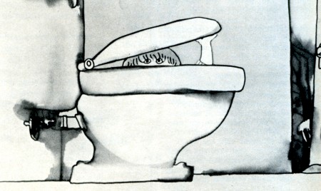
Cockaboody, a tender and sensitive commentary on childhood.
John Hubley ventured into the world of big money and high-powered entertainment in August 1975, when he became the director of an animated version of WATERSHIP DOWN. He was discharged from that job a year later, after sharp disagreements with the producer, Martin Rosen, over creative and production control of the film. Hubley had spent half of the 12 months he worked on the film in England, and half in the U.S., working with both American and British crews. (Bill Littlejohn and Phil Duncan were among his American animators.) Hubley’s comments about the break with Rosen are guarded, because he has filed a suit against Rosen for breach of contract; but it seems plain that Rosen wanted a more violent and emotional film than Hubley was prepared to give him.
Throughout their long collaboration, the Hubleys seem to have been happiest when they could work in an atmosphere entirely free of commercial considerations. Since they began working as a team in 1956, their work has fallen, roughly, in three categories: purely commercial films, like TV spots; sponsored films, which come equipped with fixed budgets but considerable creative leeway; and their purely personal work — Moonbird, Tender Game — which they financed with their earnings from the other kinds of films.
In all three types of films, the Hubleys have employed a dazzling variety of techniques, ranging from traditional line animation to the animation of blocks of color to the animation of cutouts. Two elements have been constant. All of their films reflect the influence of modern art — or, to be frank about it, modern art as it has been adapted and domesticated by commercial artists and designers. More important than the graphic style itself is the use to which the Hubleys have put it (and this is the second constant in their work): abolishing the traditional distinction between characters and backgrounds.
In a typical Hollywood cartoon of the ’30s or ’40s, the characters move against the backgrounds like actors working in front stage settings. The characters are composed of lines and flat, bright colors, against settings that are realistically modeled and painted in muted colors. The characters are treated as color accents; they “read” against settings that are designed to set them off.
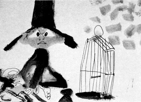
A still from Moonbird.
In most of the Hubleys’ films, no such boundary exists; characters and settings are cut from the same bolt. Movement alone sets them apart. This integration of characters and backgrounds — not any simple enthusiasm for modern art — was at the heart of the UPA studio’s rebellion against the Disney style in the middle ’40s. It was a layout man’s rebellion. The ultimate effect was to elevate design — the overall “look” of a film — at the expense of animation. Layout men, who had been subordinate to the animators at Disney’s, were now in the driver’s seat.
Two of UPA’s three original partners — Zack Schwartz and Dave Hilberman — had been Disney layout men, as John Hubley was. When Hilberman and Schwartz broke with Steve Bosustow (the third partner) in 1947, Hubley became a vice president of the studio, and its creative head. Hubley supervised the work of directors like Robert Cannon and Pete Burness, and directed a number of films himself, most notably Rooty Toot Toot (1952). The most distinctive UPA films thus bear Hubley’s stamp, more than that of any other man.
Hubley left UPA in the early ’50s; he was a victim, like many other UPA staffers, of the witch hunts by the House Committee on Un-American Activities. He formed his own TV-commercial studio, Storyboard, and then he married Faith Elliott, who had been hired as his assistant for an aborted production of Finian’s Rainbow. Faith — who had worked in live-action films before marrying John — has been his collaborator ever since; but their films are, in some ways, extensions of the work that John Hubley did at UPA, but reflect a less commercial, more personal approach. (Faith Hubley has completed two films of her own in the last two years: W.O.W. and Second Chance.)
UPA sold itself not only as an alternative to the Disney style, but as a repudiation of it. John Hubley still talks that way on occasion, and the Hubley films sometimes become pretentious and didactic. Films like The Hole (1963) and The Hat (1964) while nice to look at, suffer from windy, enervating dialogue tracks; the lessons they offer — about international boundaries and nuclear war — are too simple to bear repetition for even a few minutes. Of Men and Demons (1970), is also a “lesson” film — this time the Hubleys are concerned about the environment — but it is much better because the villains of the piece (demons representing fire, wind and rain), are ingratiating scoundrels; the characters are stronger than the ideas they are supposed to serve.
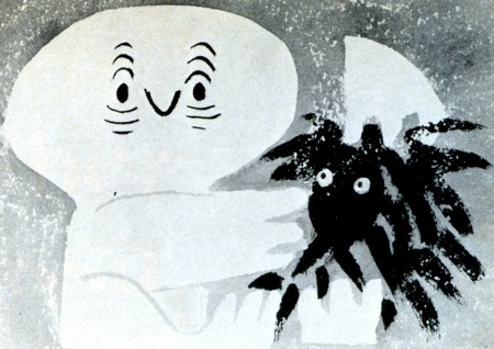
Adventures of an *.
Here we come to a paradox in the Hubley films. The best ones — the ones in which the Hubleys’ own feelings and experiences are to the fore — have a great deal in common with the Finest cartoons in the despised Disney tradition. Some of the very best Hubley films, such as Moonbird, Windy Day, Cockaboody and the opening sections of Everybody Rides the Carousel, are tender and sensitive commentaries on childhood. The graphic devices, the quicksilver metamorphoses — as children become what they imagine themselves to be, and beasts lunge from the mouths of howling babies — all serve, in the end, not to explicate ideas but to delineate character. In other words, these films are as much concerned with personality as are the best Disney films; they are very different from the Disney films to be sure, but they have sprung from the same seed, the urge to create new life.
The best Hubley films do not spit in the face of animation’s greatest tradition. Instead, they show how that tradition could be transformed and enriched, if it were still in the hands of people who cared as much about their work as the Hubleys care about theirs.
© 1977 Mike Barrier
Articles on Animation &Luzzati & Gianini &Puppet Animation 22 Jun 2010 07:08 am
Magic Flute
Issue #7 of ANIMAFILM included an article about the Gianini/Luzzati feature, The Magic Flute. To keep the names of these greats in the present, I’m posting the article here. Enjoy.
by Massimo Maisetti
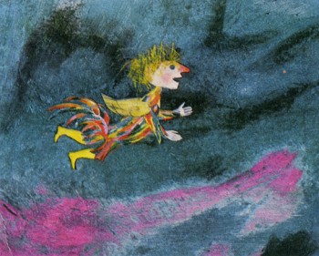 The “Magic Flute” was Mozart’s last opera, written not for the court theatre in the centre of Vienna, but for a theatre situated at the outskirts, whose manager was Schikaneder, author of the libretto. Giorgio Strehler said that it was one of the most complex and most universal works, which could be approached both from the position of the performer and the spectator. The libretto, inspired by oriental short stories, published in 1786, and by abbot Terrason’s novel, stirs up imagination, intelligence, feelings and the sense of ethics. Goethe wrote that one needed more culture to admit the values of the libretto than to deny their existence. This opinion should be thought over, as it deals with the performance staged at the outskirts in the period when to acknowledge values of a “folk” work was to oppose the accepted norms.
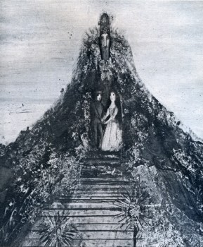 The opera, performed for the first time on September 30th, 1791, has many elements aimed at entertaining less sophisticated audience. Next to the drama of Tamino and Pamina, which is the embodiment of the eternal conflict between Right and Wrong, the Sun and Darkness, next to esoteric elements, connected with the doctrine of freemasons, which both Mozart and Schikaneder professed, there is a counterpoint – Papageno, a purely folk character from commedia dell’arte. The opera has many aspects, but the most visible ones are its fabulous and folk aspects, and next to them – metaphysical, symbolic and cosmic aspects with their Egyptian and Hellenistic associations, making one “gravitate towards one’s conscience”, according to Kirkegaard’s words. Thus to screen the “Magic Flute” was a very difficult task, as the authors of the film rejected the possibility of screening the theatre performance. It was also difficult because they had to use a chromatic and graphic language, animating drawings, where culture and experience should be combined with great sensitiveness and invention.
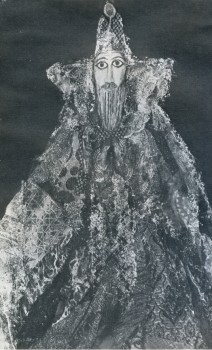 Giulio Gianini and Emanuele Luzzati are among the few film-makers in the world, who can perform such a task successfully. Gianini is an animator. He is an organizer, who is able to subordinate the technique to creative requirements. His characters move like puppets against the scenography. Its colour scheme is joy, music and charm. Those colours are the invention of the scenographer Luzzati, and Gianini, the master of photography (Nastro d’Argento for best colour photography in 1952), can reproduce them using his miraculous alchemic recipes. It was not a mere chance that many years ago at the Festival in Gildenbourgh he worked on Mo/art’s operas: “Don Juan”, “Abduction from Serai”, “Cos! fan Tutte” and “Magic Flute”. “I have always wanted to make such a film since the day I worked on that scenography”, says Luzzati. Twelve years of preparations, two years of work financed by the German and Austrian television, work done with patience, skill and imagination. At least three of Gianini’s and Luzzati’s films, first films of that kind, are characterized by a perfect relation between the music and the image: “La Gazza ladra”, “L’ltaliana in Algeri” and “Pulcinella”, where the charming music happily underlines the fancy, lyrical approach and ironical reserve.
All this was expressed with the help of images in an apologue, in a stylistically sophisticated way. The above mentioned films are among the most interesting effects of using the technique of “decoup-age” in the history of animated cartoons, especially animated fairy tales. Both Gianini and Luzzati turned out to be great artists in synchronizing movements with the music of the three operas and creating three symphonies of lines and colours. Kings, soldiers, Moors, dragons and birds from those beautiful stories, created by Luzzati’s imagination come alive thanks to Gianini’s technique and move in the rhythm, forced upon them by the music and often interpret the music with the help of ballet. In this sense Rossini’s operas helped in the realization of the “Magic Flute”.
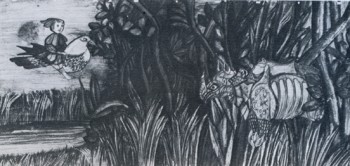 Mickey Rose, an English musicologist, made a fifty minute-long abbreviation of the opera, performed by Berlin Philharmonic, conducted by Karl Boehm, preserving its most vital elements. At the same time the graphics enriches fantastic and folk aspects with expression. It was done with charm, amazing clearness and respect for the music. When the artists use the technique of decoupage paper becomes gold, glass becomes diamond and colours become rich and luminous, like Mozart’s music. It reminds us of such great modern painters as Rouault, Chagall, Picasso, Kandinsky, as well as of oriental wall paintings, Byzantine mosaics, story, creating a naturally composed style, rich in different shades, -where a brilliant visual side interprets and completes Mozart’s wonderful music. Finally the fairy tale aspect predominates over the symbolic aspect, also due to the character of Papageno, who plays a double role: of a paper character and a live narrator (actor Marcello Bartoli). This character in multicoloured feathers reminds its famous classic ancestors. The grandson of Harlequin and Pulcinella becomes the hero of the story, determining its character. Thus the romantic story of Tamino and Pamina concentrates the philosophic sense, which is shown in the form of a fairy tale, and is meant for a demanding audience. But the simple first layer of the film pleases children, like the films “Turandot” and “L’Augellin Belverde”, screened by Gianini and Luzzati in a similar style and technique. About seventy thousand photograms with their immobile and mobile parts, three hundred drawings of the background, creative power and enthusiasm of the authors make a work of art, which is a credit to the Italian cartoon film and deserves emotions, enthusiasm and approval.
Articles on Animation &Books &Commentary 19 Jun 2010 09:05 am
Happy belated Birthday, Mike
 - This past Tuesday, Amid Amidi celebrated the birthday of Mike Barrier with a very respectful commentary on Cartoon Brew. This was followed quickly by more kind words and an acutely written article on Mark Mayerson’s excellent blog. Both were met with positive comments from the people following the two sites.
I was pleased to see both posts and thought of leaving my own comment on each of them. However, I have my own blog and have probably too much to say.
Mike and Phyllis Barrier are very dear friends to me. When they lived in Washington D.C. I took many weekend trips to see some art exhibit or special film event or just a visit to meet with them. We grew close, and even though now we’re half a continent away, I still feel there’s something dear and special about our friendship.
However, long before we became friends, I was a fan of Mike’s writing, criticism and commentaries about the world of animation. Those early issues of Funnyworld Magazine became seminal to my knowledge about the history of the medium. I also knew inherently that this was a widespread thing. Anyone who was anyone, student or professional, knew the magazine. I remember going to my first animation festival – Ottawa ’76. I witnessed no fewer than three conversations about Chuck Jones vs Bob Clampett, all precipitated by a couple of pieces in Funnyworld. No matter how ludicrous it all seems now, Mike had inadvertently reignited something of a feud in Hollywood between the two directors even though he wrote that Jones and Clampett were both brilliant.
The magazine made a large foothold among all animation-lovers. Eventually, it, like most small and independently published magazines, suffered financially until it had to be stopped. Back issues are still being sold for enormous amounts of money.
 Mike kept pushing ahead for years and years and years on his book, a history of Hollywood animation and it was always a treat for me to discuss it with him. Like many other people, I panted for the day when the book would finally make it to the stores. Once Hollywood Cartoons: American Animation in Its Golden Age was published, I immediately plowed through it, then started over and read it again. I’ve re-read the book every year since. It’s the pinnacle of animation history, in my opinion. There’s nothing as exacting or precise or historically accurate on the market.
I also remember a point when Mike was hired to write a history of Warner Brothers cartoons. During one visit to his home in Alexandria, he surprised me by handing me the manuscript and asking me to read it. That was one of the fastest reads I’ve gone through. Excellent, of course; I was properly overwhelmed. On another day, he opened a draw of large-sized chromes of WB artwork. BG’s and animation drawings photographed beautifully and sitting there for me to drool over. It was a treasure-filled weekend for me. The book was cancelled by Warners when they suddenly had a power shift, and a piece of brilliant historical writing was lost. I’ve always hoped Mike would somehow rework that manuscript so that the ultimate history of WB would be made public.
 The Animated Man: A Life of Walt Disney, is equally brilliant, even though it seemed to disappoint some animation people. The book follows the story of Walt Disney, the man – just as the title states. It took its subject seriously, and when Walt lost interest in animation, so did the book. We learned more about Fess Parker, Treasure Island and the theme parks than we ever expected from a book about Disney. And, realistically, that’s the way it should have been. Mike painted a portrait of a unique man, and it made him human. Something that hadn’t been attempted before – except by some detractors who tried to make their names by slandering Walt and finding the most negative stories they could concoct.
 Aside from these two books, Mike wrote Carl Barks and the Art of the Comic Book, a history of Barks and the amazing comic books he wrote and illustrated for Disney. Mike has also coauthored, with Martin Williams, The Smithsonian Book of Comic Book Comics, a complete history of the comic page characters that developed into long-running comic books. It’s a big book with lots of well-produced color comic pages. The comic pages are printed on the same newsprint that the originals were printed on.
Oh, yes, he also has a great website.
Now, Mike has turned 70 and seems to be in high form. I know he’s working on a couple of other books and I anxiously await getting them in my hands. Mike’s a friend, a good friend. Aside from that he’s a great and knowledgeable writer of animation. Even when I don’t agree with what he has to say, his writing makes me think about my medium and pushes me to think deeper. (A good example of this is his review of Get To Know Your Dragon which pointed out that we’ve lost something since the glorious Fanny trilogmade in the early thirties. It got me to think seriously about how to bring back that slower paced aura from the past, the one that allowed characters to develop – really develop. Not in the clichéd way of today’s animation but in the full and deep way of the films of the golden era.)
Many like to put down Mike’s writing for being too negative. I know it isn’t. I know that most other writing is too accepting, too forgiving. Has there been a serious review of Toy Story 3? I only see glowing reviews for an amazingly clever film that whisks us through a hurly-burly of confusion until the sappy moments at the end. No characters properly developed, or enlarged. Just whirlwind story – very cleverly done. We need better film critics, not just animation critics. Ironman II isn’t ok, nor is The A Team, nor is Shrek 4. They’re franchises not movies. MacDonald’s III. Yes, aspects of them all are fun, but that’s not enough. We need good movies that are better than clever, and we need more reviewers like Mike Barrier. Those whose historical accuracy is above and beyond most others and whose taste is shaped by a history of watching many many films as well as by a strong understanding of the medium. He knows what he’s writing about, is not afraid to say it, and I’ll follow him anywhere.
Happy Birthday, Mike Barrier, may you have many more.
Articles on Animation &Independent Animation 18 Jun 2010 07:42 am
Norman McLaren – WHO ?
- I was recently in a conversation with a young animation student. In the course of our chat, the student commented on a DVD on my desk; he didn’t recognize the filmmaker’s name. Norman McClaren. I gave him a small lecture about the master’s work and suggested the student start doing some research (even if only on YouTube.)
I came across this article by Gerald Buddner in “The Art of the Animated Image”, and anthology edited by Charles Solormon and published by AFI in 1987. I have to post it.
at Work
First Impressions of Norman McLaren
BY GERALD BUDNER
ver 40 years ago—the summer of 1946—while visiting a school friend who had a summer job at The National Film Board of Canada, I was invited to Miss Evelyn Lambart’s dinner party for Norman McLaren. Conversation was marvelous, dinner was delicious and helpings very ample. I remember it included the perfect fruit dessert—this was followed by another, a “shape.” This Victorian Triumph about 14″ high of molded Creme de Menthe was, sad to say, more than any of the guests could manage, which caused but a moment of disappointment. Suddenly Norman lifted Miss Lambart’s beautiful Georgian dessert trowel, and in about a minute flat, with a few deft strokes, was able to convert the quivering delight into a sculpted Jade Chinoiserie in a Brighton pavilion style—complete with grottoes and waterfall, bridge with fisherman catching giant carp, a pagoda above a lily pool complete with wading storks. The whole exercise was super speedy and enchanted the assembled company. From that moment, I knew I was privileged to be in the presence of a Genius.
The following morning at the Animation Department in the abandoned sawmill, I was invited to see the artists – at work.
Thinking I would witness leaping figures, etc. I was instead spellbound to hear a few absolutely clear and fresh phrases of Bach, drawn—that’s rightdrawn on the sound track. This was the beginning of a 40-year-long enchantment. The magic of the shy McLaren was at work.
From the beginning, the professional life of Norman McLaren was characterized by a creative spirit toward art and music, a finely honed perception for the importance of technical brilliance, a unique sense of humor and a deeply developed sympathy for the whole of mankind. Frugal by nature, he was accustomed to working with the scantiest of means. Inspired by movement, he was able to use characters and even props as puppets. He scratched sprightly images with needles and razors onto raw film stock with delightful and unexpected effects. One of the first animators to experiment with drawing, scratching and engraving both the picture and sound directly onto film, he is also acknowledged as being one of the pioneers of 3-D animation. The effects of his innovation grow more impressive with each successive viewing of the films. Meanwhile he drew and painted continually, offering his works to his admiring friends.
Born in Stirling, Scotland in 1914 to an artistic and cultivated family, he was encouraged to pursue music and art from a very early age. He began a five year course at the Glasgow School of Art, headed by John Rennie Macintosh, specializing in interior design which related to the family business. He was already intrigued with film, and at twenty years of age, he entered two films in a Scottish amateur film festival, where they won awards and attracted the attention of the adjudicator, John Grierson.
Impressed by the obvious talent of the young artist, he offered McLaren a position in London with the prestigious General Post Office film unit where he was taught the craft of film-making. After leaving the G.P.O., he worked as a cameraman during the civil war in Spain. Haunted by his nightmarish experiences, he came to New York in 1939 where he was encouraged by the founders of The Guggenheim Museum and other New York film people.
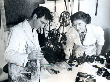
Begone Dull Care, 1949, McLaren at work with Evelyn Lambert.
At that time, the Canadian government created The National Film Board with John Grierson as the first Government Film Commissioner. The “Board” had a very significant mandate to fulfill, not the least part of which was to help, through the film medium, to unify a diverse, thinly populated and vast country. Grierson was quite up to this task, but was soon aware of the danger posed by the very serious and worthy, but nonetheless somewhat heavy-handed zeal of the young filmmakers. This heaviness, although well intentioned, could have been disastrous for a new and untried governmental film organization. By 1941, Grierson was able to convince McLaren to bring his inventive genius, his wacky humor and his artistic conscience to Ottawa, to add some leaven to the earnest mass of vital information being produced for a country at war.
The wisdom of this action was soon evident: the meteoric power of the amazing McLaren was launched. The National Film Board would never be the same! Canada would never be the same! The results would bring delight to Canadian filmgoers and to people around the world, fame to McLaren, and honor and prestige to his chosen country.
In the first years at the “Board,” McLaren was encouraged to establish an animation studio, which attracted other young talents who would contribute richly to the art of animated film in Canada. Evelyn Lambart, George Dunning, Jim McKay, Rene Jodoin, Colin Low, Grant Munro and many others soon joined him. The technical excellence and the level of artistic accomplishment achieved by McLaren’s studio soon attracted the attention of film people across Canada and in other countries. They scorned cheap commercial effects, which were a dangerous trap in this very exploitable medium. Their films were recognized as having something very special to say in a very special way. In Britain, France and The United States this plateau of achievement and artistic integrity was a cause for wonder; the choice of subjects, the graphic styles and the technical skills combined to lift animation to the plane of ART. McLaren produced many wonderful films in this early period.
In 1949, UNESCO invited McLaren to visit China and teach Chinese artists and educators audio-visual techniques. He found the experience was very rewarding on the humanitarian side, as the impoverished Chinese were at war and desperately anxious to use the simplest resources to educate their gigantic population.
This profound experience of war and revolution left an indelible mark on his sensitive and impressionable nature, as well as on his physical health.
On his return to Canada in 1950, he was invited to create films in 3 dimensions for the Festival of Britain. Around is Around and Now is the Time are the result, considered by many to be classics of this technique both for the impact of their fabulous imagery and their unprecedented and powerful sound tracks. Although rarely seen today, the films are regarded as precursors of most 3-D animated films.
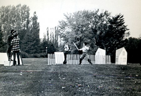
Neighbors, 1952.
It was not surprising that an anti-war film soon occupied him, and in 1952 Neighbors captured the imagination of the film world. The next year it won the Academy Award for best documentary short, as well as numerous other prestigious awards in Canada, the United States and Italy. The technique he employed animated both figures and props, which he christened PIXILLATION. The picture of escalating violent battles for possession of a single flower still sings out his sentiments on the subject of war.
Rhythmetic is a very engaging game-like film made with Evelyn Lambart. Quite surprisingly it enjoys an unexpected revival today, since young people equate it with the computer a surprising example of deja vu in a film made in 1956. Lines Vertical was also made with Evelyn Lambart, in I960. The lines were engraved on black film stock with a stylus. McLaren later told me that he was inspired to make his next film Lines Horizontal having observed the telegraph wires “animate” through the train window while travelling between Ottawa and Montreal. He used his earlier Lines Vertical to create a new film by turning the images 90 degrees! Very frugal indeed.
Mosaic (1965) combined the two Lines films by printing them together and featured a sound track he engraved himself. Pas de Deux. (1967) uses ballet dancers. The stroboscopic effect of slowed movement and controlled back lighting offers sculptral dimensions of magical proportions and depth. The sensual visual effect celebrate his passion for movement in a most elegant way—to me reminiscent of classical bas reliefs brought to life with amazing refinement. These themes were expanded in 1972 where the movement was further slowed down and the emotional impact expanded in Ballet Adagio.
All McLaren’s experiments in animated sound came together in Synchromy made in 1971. The visuals are actually identical with the sound, which was accomplished by photographing the sound cards he had made years earlier. These patterns comprise both the optically colored visuals and the sound track.
To celebrate the accomplishments of his two Parisian animator friends, American Claire Parker and Russian-born Alexandre Alexieff, McLaren made an erudite film Pin Screen in 1973. The velvety light and dark effects made with their sophisticated invention offer the effect of metamorphosing chiaroscuro, resembling stipple engravings of incredible softness and tenderness.
Following this, McLaren and his long-time associate Grant Munro created a series of films for educational use, which elucidate the basic principles of movement in a clear and easily comprehensible way. Animated Motion numbers one, two, three, four and five are very useful for students of animation, and should serve as a springboard for young artists.
Narcissus represents the peak of films that exploit optical effects. In his own words “During the first part of the film Narcissus no special effects were employed, but from the moment Narcissus sees his own image in the pool until the end of the film a whole variety of optical effects were used. Narcissus’ image when flipped left to right and upside down, was made to go in and out of step with itself by freeze-framing, double framing and skip framing. At times in the original shooting Narcissus had to perform two opposing roles which were later optically combined in the same frame. In one such sequence, various flicker effects were introduced, in another more extended sequence the movements (motives or actions) of each ‘Narcissus’ by a very complex optical technique are turned into flowing blurs.” Norman ’81.
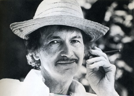
McLaren in retirement.
In the last film made with and about him in 1983 for a festival of animation films in Holland, he underlined how grateful he was for forty-two years of artistic freedom enjoyed at The National Film Board of Canada. All share gratitude for freedom, for we enjoy it too. I am confident that millions will continue to be grateful for a very long time to come. The number of his films long and short totals sixty. From the words of his life-long campanion Guy Glover, written as a foreword for a monograph published by The National Film Board “McLaren – 1980,” let me long and short totals sixty. From the words of his life-long campanion Guy Glover, written as a foreword for a monograph published by The National Film Board “McLaren – 1980,” let me quote:
“Far from the Talking Picture -That vast province of the Cinema that borders,
indeed overlaps, on the Realm of language -
There exists yet another province of the Cinema
where talk is limited and which touches on the frontiers
of Music and Dance. In a corner of that province is to be found
the little garden of Norman McLaren whose films talk only through image and movement.
A birds-eye view of McLaren his life and film work has been attempted,
without forgetting, of course,
that it is in the films themselves
that his creative character is most clearly expressed.”
Articles on Animation &Comic Art &Commentary 10 Jun 2010 08:19 am
Canemaker & Gross & Kimball and Mars
 - John Canemaker has a new article about Milt Gross for his monthly piece at Print Magazine‘s website. Essentially, it’s a loving piece reviewing the new collection of The Complete Milt Gross which was edited by Craig Yoe.
I’ve long loved Milt Gross’ work and have closely studied the MGM shorts he did. They don’t quite capture the zaniness of the comic strip work, but he was obviously an inspiration for so much of the animation that was done in Hollywood back then.
Wouldn’t it be interesting if some people found inspiration in his work today and applied it to their animation artwork. Something other than the endlessly angular characters that we’re force-fed these days!
- Speaking of John Canemaker, he’s just loaned me a Ward Kimball scene from Peter and the Wolf. It’s about 500 drawings long, and will take me forever, but I’m going to start posting it next week. The walk cycle of all walk cycles. Something to look forward to (endless scanning and downloading), a great piece of animation to study.
The image above is a good sample.
 Mars: SXSW will be playing tonight at the Brooklyn Academy of Music Cinemafest in NYC at 9:30 PM. There will be one show only. Filmmaker, Geoff Marslett will be there along with several cast and crew!
The film is a completely rotoscoped space adventure done by the guy who gave us Monkey vs. Robot and Bubblecraft.
For a trailer go here.
