Category ArchiveArticles on Animation
Articles on Animation 04 Dec 2008 08:48 am
Kurtz & Stott
- Last Saturday I featured a “Close Up” article from Millimeter Magazine circa 1976 which showcased two NY producers. To be fair, I’d like to post these two portraits of LA producers also featured in Millimeter.
BOB KURTZ
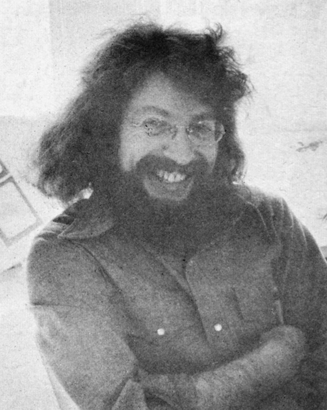
 Bob Kurtz, of L.A.’s Kurtz and Friends, is clearly one of the brightest stars in the animation firmament. Bob, a slim, beared fellow with an elfish face and flashing eyes, operates out of 18 compact rooms housed in two charming bungalows enclosed in a small, idyllic courtyard just seconds from the noise and commotion of Hollywood Boulevard. 1728 Whitley Court used to be a private residence, but Bob and his “Friends” have put the bungalows to excellent use: the shelves of the large kitchen cupboard are stocked with jars of cartoon color paint; the living room is now a most handsome reception area and the second-floor master bedroom has been magically transformed into a cozy, intimate projection/screening space.
It is here that Bob shows us his sample reel. “The sample reel is what enables—or denies—the animator the opportunity to get work; it’s his resume and must be continually updated and kept current.” Bob’s fertile imagination and liquid creativity are showcased vividly in spots for Levi Strauss, Chevron, Seven-Up, Log Cabin and Sunbeam. (The latter spot won a Clio in 1972 and was shown at the Los Angeles County Museum of Art as part of an “Art in Advertising” exhibition).
Bob’s art school background and his year as a trainee writer/director at the Walt Disney Studios are distinctly evident in the accomplished agility and precision of his work. A graduate of Los Angeles’ celebrated Chouinard Art Institute (now, sadly, defunct, but once considered – the “Cooper Union of the West”), Bob, in his sparkling, inventive brush strokes and consummate pencil drawing, displays the results of his long years of intense, dedicated art studies. After his stint with Disney, he returned to teach at his alma mater for two years before striking out on his own. He is still, however, very much involved with education: every year he hires a recent art school graduate for on-the-job training and “pencil testing,” as he jokingly calls it, at Kurtz and Friends.
 Bob and his wife, Glenna, (who is also his producer) feel very strongly that new blood and fresh ideas should be continually channeled into the company to keep the output brisk and vigorous. Also, they want to try to eliminate as many bureaucratic roadblocks and union restrictions as possible in order to provide an opportunity for young people to get started in the animation business. “I’m trying to create the kind of atmosphere for these kids that I know I would have wanted and needed when I was first starting out.”
Of course that means that the young trainees must be willing to work the same kind of endless, grueling hours that are regularly put in by Bob, Glenna, Bob Peluce (Kurtz and Friends’ designer) and the other eleven staff members. “What I’m really offering these trainees,” Bob explains with a mischievious grin, “is the chance to work their asses off . . . but, you know, that’s the best kind of training they can get.”
Kurtz and Friends has always worked exclusively in animation—does Bob foresee the possibility of any live-action shooting in the near future? “No, I really don’t think so,” he answers without hesitation. “In live-action there is just too much that is uncontrollable and time-wasting. Things like negotiating to get the talent, trying to make an animal “act,” ego trips by people involved—all of that can distract you from your real work: telling a short but memorable story. Animation, compared to live-action, is pure and clean. After all, in animation you’re only limited by your imagination.”
After a couple of hours with Bob at Kurtz and Friends we can assure you that ole Mr. Imagination is alive and kickin’ at 1728 Whitley Court, in the heart of Hollywood.
HERB STOTT
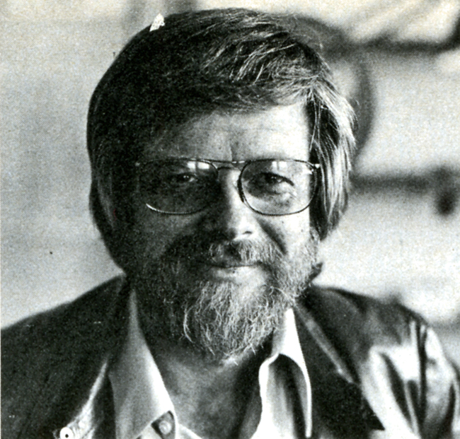 The offices of Herb Stott’s Spungbug-gy Works are located at perhaps the most glamorous spot in all Los Angeles, the corner of Sunset Boulevard and La Cienega, not more than a stone’s throw from Dino’s Lodge, for all you 77 Sunset Strip devotees and just a hop, skip and a jump from The Source, L.A.’s best organic restaurant, for all you health food nuts. Herb is a bearded, sandy-haired fellow of 42 who looks more like a trim, fit 32. He began his career at Disney Studios in the early Fifties; after a stint in the service he did some L.A. free-lancing before forming Spungbuggy in 1963. For the first ten years it was all animation for the company but within the last three years Herb has branched out into live-action. Now it’s 50-50: the Spungbuggy staff does animation under the capable leadership of Animation Directors Gary Katona and Randy Akers and Herb himself shoots the live-action spots. Despite this Herb still considers animation his metier and first love. He remembers his early, formative years at Disney with great affection: “Working there was like going to a small, rural liberal arts college. (Herb himself attended Ohio State.) There was a sports league comprised of members of the various departments that competed against each other in volleyball, tennis and softball. The employees used to have their lunch all together on the studio lawn, like one big picnic, executives and third assistant editors. There was this amazing camaraderie. Lots of genuine affection and respect, especially for Walt himself. Do you know that the studio has kept Walt’s office exactly as it was the day he died?”
While free-lancing Herb also put in time at Hanna-Barbera when they were in their infancy as animators. He loved it there—”Animators are a different breed, they’re far more affable, accessible and sincere than their counterparts in live-action. Perhaps it’s because we’re filled with an awful lot of whimsy. It might also be because ours is a one-on-one business, an animator really depends upon himself and his own imagination. Also there are no star trips or ego problems; animators create their own stars.”
Art school graduates are constantly coming to Spungbuggy seeking jobs, even if it’s only as a “gofer.” “Maybe one out of twenty-five has something special,” Herb reports. “If it’s something truly special I’ll find a spot for them, if not here than hopefully with another animator.” Herb stays in constant touch with his fellow L.A.-based animators and is, in fact, a close friend of Bob Kurtz, who was the subject of a February ’76 Close-Up. Herb is quick to praise and give credit to other practitioners of the art of animation; there seems to be none of the professional jealousy or rabid backbiting that is so commonly found among major Madison Avenue agencies. Perhaps it’s due to all that “whimsy” that Herb was talking about…
In looking at Herb’s reel one soon realizes that Spungbuggy’s client list reads like a veritable Who’s Who of television commercials. Among the clients represented are Levi-Strauss, Clairol, Raid, Nestle’s, Kellog’s, Mr. Clean and a series of spots for American Cyanimid of which Herb is particularly proud. Among our own personal favorites were a wickedly clever Tootsie Roll spot where a child’s tongue has an argument with his teeth about who gets first taste of the chocolate center, is it better to suck or chew?? And a wildly imaginative Illinois Bell spot extolling the virtues of touch-tone telephoning. This spot, not surprisingly, picked up a Clio in 1972. Perhaps the most visually impressive spot is for United Airlines: an outlandishly animated map of the U.S. complete with geographic landmark caricatures for each distinct section of the country. (Example: Marina Towers in Chicago doing a spirited version of a kind of “skyscraper Hustle.”) It is a vivacious and memorable one minute look at this diverse land of ours; yet it still succeeds most admirably in getting across United’s “friendly skies” message.
Herb’s future plans for Spungbuggy? “Nothing grandiose—I just want to continue the way we’re going. I look forward to another strong, successful year. I’m just grateful that we’re able to stay alive and healthy in such a competitive field.”
Spungbuggy is, indeed, alive and well and thriving in L.A.. Just stop by the corner of Sunset and La Cienega and see for yourself.
The Bob Kurtz article came from Millimeter Magazine, Feb/1976
The Herb Stott article came from Millimeter Magazine, Feb/1977
Articles on Animation &Rowland B. Wilson 02 Dec 2008 09:10 am
Rowland Wilson
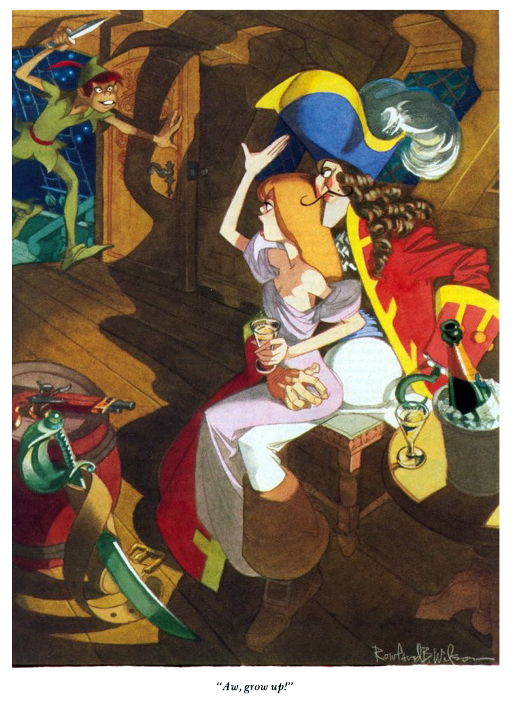
- Rowland Wilson was one of those artists/cartoonists who was loved by everyone.
Long before I saw his connection to animation, I knew his amazing cartoons in Playboy. They were full page color images that were gorgeous to look at, and it was irrelevant whether they were funny or not. They were beautiful.
 I met him only once on the School House Rock pieces he designed for Phil Kimmelman‘s PK&A back in 1973. I was an Asst. Animator there working on the spots that were animated by Jack Schnerk, Sal Faillace or Dante Barbetta. My meeting was little more than a hello.
I knew Rowland’s daughter, Amanda, who worked on Raggedy Ann, opaquing. We kept in touch for a short while after the film’s
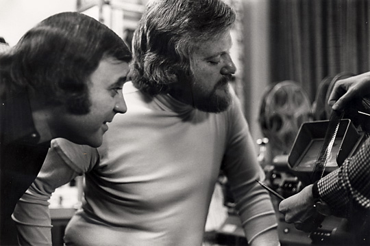
_..__ Phil Kimmelman and Rowland Wilson__________completion. She continued in the NY
__________________________.__________________animation community for a while, until work dried up. Unfortunately, I’ve lost track of her.
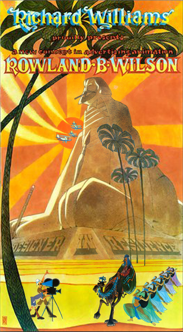
Of course, it would have been Richard Williams that put him to work seriously in animation. Together they created the stunning ads for Count Pushkin Vodka. This was the
high water mark of his and Williams’
ad films. I think this ad campaign was one of the high water marks for advertising, in general. The Wilson and Williams’ work is extraordinary.
He did design work on The Cobbler and the Thief after which he worked with Bluth for a short while in Ireland on Thumbelina and A Troll in Central Park. For Disney he did “Visual Development” and “Character Design” on The Little Mermaid, Treasure Planet, The Hunchback of Notre Dame, Hercules, Atlantis and Tarzan.
 Creative Talent Network has a nice page up for him here. They also offer an extensive resume here.
Mark Kennedy offers a number of Wilson’s handouts on color, light and shadow and composition.
AWN had a fine memorial piece to Wilson written by John Culhane. here
I’d like to post here some of Myrna Oliver‘s obit from the LA Times 7/11/05:
- Born Aug. 3, 1930, in Dallas, Rowland Bragg Wilson grew up drawing Disney characters at the kitchen table. He received a bachelor’s of fine arts from the University of Texas at Austin and then moved to New York City for graduate work at Columbia University.
To support himself, he began creating gag cartoons for the Saturday Evening Post, Collier’s, Look and True magazines. He was drafted into the Army, serving from 1954 to 1956, where he used his artistic talents to draw classified charts.
In 1957, Wilson joined the Young & Rubicam Inc. _____a poster done for Dick Williams
advertising agency where he spent seven years as
an art director, doing conceptual drawings for print ads.
At the same time he stepped up his freelancing of cartoons to magazines and became a regular with Esquire in 1958. In the late ’50s and early ’60s he also had cartoons published in the New Yorker.
 He established himself as a freelance advertising artist in 1964 but never gave up cartooning, which he described as “picture writing.†Forced by his lucrative advertising contracts to limit cartoon work to a single magazine, he focused on Playboy after Esquire abandoned its full-page cartoons.
In 1967, he also drew “Noon,†a short-lived comic strip for the New York News-Chicago Tribune Syndicate (Tribune Corp. now owns the Los Angeles Times).
As Wilson once described the strip, “The name of the main character was Noon Ringle, an unemployed cowboy in a dying small Texas town in sort of modern times.â€
Wilson illustrated two children’s books in the early ’70s, “Tubby and the Lantern†and “Tubby and the Poo-Bah.â€
It was advertising that moved him into ________a Rowland Wilson cartoon for Playboy
animation, and from 1973 to 1975 he worked in
London as a designer for the primarily commercial animation studio of Richard Williams. On his return to New York, he joined Phil Kimmelman and Associates, which concentrated mainly on advertising work.
In his cartoons, advertisements, designs for animated characters and illustrations, Wilson was known for three-dimensional drawings filled with historical detail.
“Ideas are easy to come by,†he often said, according to his daughter. “It is the drawing that takes a long time.â€
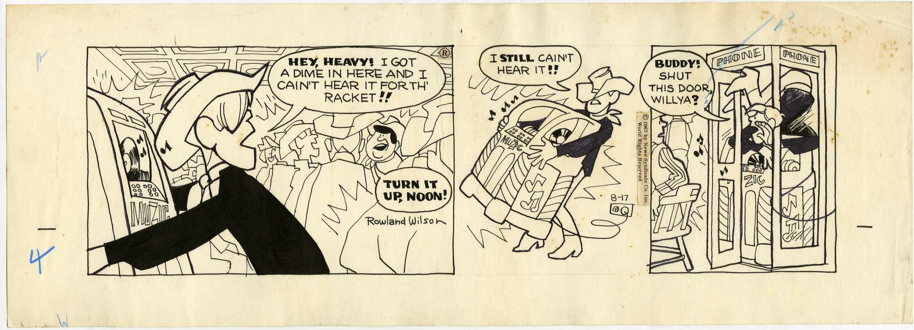
A sample of the strip “Noon”
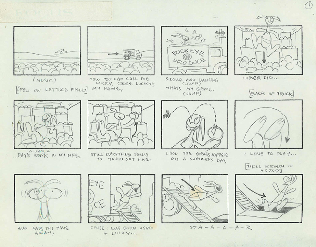
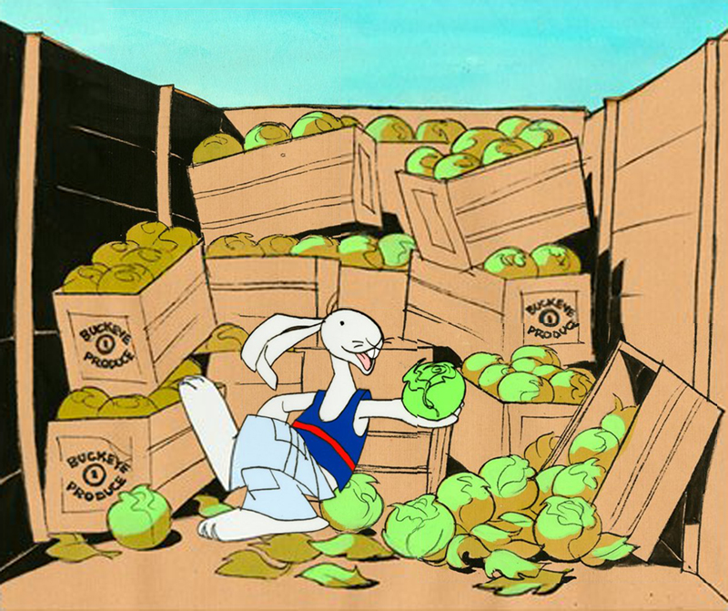
As an animator, Wilson won a daytime Emmy Award in 1980 for his work on ABC’s “HELP! Dr. Henry’s Emergency Lessons for People†and worked on educational animation, including the television series “Schoolhouse Rock.â€
In 1975, Wilson won awards at the Venice and Irish Animation festivals, and his animated commercial film “The Trans-Siberian Express†won first prize at the third International Animation Festival in New York. He also won a Clio.
He worked for Walt Disney Feature Animation as a visual developer and served as a layout designer for “The Little Mermaid†in 1989. He also contributed to “The Hunchback of Notre Dame†and “Tarzan†among others.
But Wilson’s greatest legacy may be on the printed page. His cartoons, widely published in magazines, were reprised in several anthologies, beginning with “Don’t Fire Until You See the Whites of Their Eyes,†a collection of his Esquire work published in 1963. He earned Playboy’s Cartoonist of the Year award in 1982 and his work was included in the 2004 anthology “Playboy – 50 Years: The Cartoons.â€
For all Wilson’s love of animation, “It was sketches for a new Playboy cartoon that were on his drawing board when he died,†said his daughter Megan Wilson.
Wilson also worked extensively in advertising and was particularly lauded for his 40 or so humorous works for New England Mutual Life Insurance Co. Each cartoon-type ad depicted a person in dire straits – such as an executive with his back to a high-rise office window as a wrecking ball swings toward him, proclaiming, “My life insurance company? New England Life, of course. Why?â€
Wilson’s first marriage to Elaine Libman ended in divorce. He is survived by his second wife, artist Suzanne Lemieux Wilson; four daughters, who are all commercial artists, Amanda Wilson of Piermont, N.Y., Reed Wilson of London, Kendra Wilson of Leicestershire, England, and Megan of New York City; and three grandchildren.
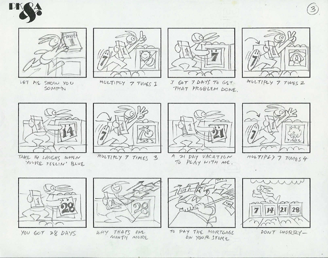
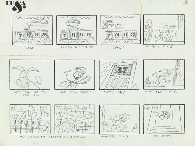
The storyboard by Rowland Wilson for “Lucky 7″ Schoolhouse Rock.
Thanks to The Deep Archives.
Art available on Amazon from Creative Talent Network.
.
Articles on Animation &Bill Peckmann &Rowland B. Wilson 29 Nov 2008 09:46 am
Producers of 1976
- Last Tuesday I featured the Young Independent animators of 1977. Today let me showcase a couple of commercial producers from the same period. This article came from the famous Raggedy Ann issue of Millimeter/1976, edited by John Canemaker. It was part of their regular column:
PHIL KIMMELMAN
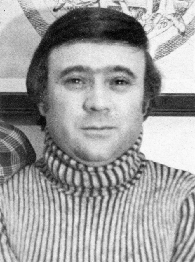 Phil Kimmelman is a New Yorker who stayed. “My love was always animation,” says the cherubic President and Director of Animation at Phil Kimmelman & Associates. At 17, he gave up a three-year scholarship to go to work for Paramount Famous. It was the 50′s; Hollywood was doing fine; budgets were big in the New York animation departments. “I’m delighted to have been a part of that. It really did a lot for me.”
After gaining some experience at Kim-Gifford and Chad Studios in New Jersey, Phil served a stint in the army as an illustrator. In 1961, he joined Elektra as an animator and animation director. “Elektra was into experimenting. We were really into exploring new areas. I think that’s where it all began for me.”
After five years, Phil left Elektra for Focus. Four years later (1971), he opened his own shop. “Fortunately, I wasn’t enough of a businessman at the time to realize how bad things were. We staffed up rather heavily at a time when everybody was resorting to freelance … we got into some problems, but now we’re busier than ever.”
“I consider myself part of a team, the other part being Bill Peckman, one of my associates. We’ve been together through Elektra and Focus. I think Bill’s one of the best talents in this business . . . and I’m glad he’s with me.”
Phil’s other associates are Bill Hegman, designer, and Sid Horn, production manager. Morty Gerstein, a former competitor, is now affiliated as a designer/director. Working madly in the next room is Roland Wilson, a Playboy cartoonist beloved by ad folks for his New England Life campaign.
These gentlemen are just the tip of the iceberg. PK & A is crawling with creative types, and the company has recently leased additional space. “One of the things that has made us successful is the versatility of our reel. We’re great admirers of a lot of cartoonists and designers from outside. If a job comes through that we feel requires a certain look—like a Gahan Wilson or a Jack Davis—we’ll put our own egos aside and go after them. I’ll give you one example: Harvey Kurtzman. Harvey is the creator of Little Annie Fanny for Playboy. He’s best known, I guess, for starting Mad Magazine (he’s no longer with them). We’ve always been fans of Harvey Kurtzman—I think the man’s an absolute genius. Bill Peckman and I chased after him, and he was very apprehensive about working in animation. He said he had a bad experience at one time. But we got him to look at our reel, and at the end of it, he applauded and said he’d be willing to chance it again. So we had Harvey design and write some scripts for Sesame Street, which we’ve sold and produced, and we’ve won a lot of awards with them. They’re beautiful spots—and they’re one example of the ‘Kimmelman look.’ ”
Yes, but how does he work with agency art directors and writers? “When an agency board comes in, I like the option of taking the board and recreating it to our way of thinking. Generally, that’s why they come to us—for our input. I think a lot of art directors and writers are not really geared, you know, to think animation. When he or she gets involved in animation, there’s a long time period where there’s very little to do. You know, it’s difficult for the people in agencies who are making the schedules to understand the time element. Where we used to have a good eight weeks to do an average 30-second commercial, we’re constantly being asked to do it in four or five weeks. It’s what I see happening more and more today that kind of upsets me. We’re working nights—around the clock—too often. That’s what it’s become. I guess we love it enough to keep doing it. I do have a line I won’t go over. If I really feel it can’t be done, we won’t do it. I’ve been in that situation many times.”
What about Ralph Bakshi and his controversial coonskins? “Fantastic. Whether you or I like his films, there’s no question that they’re breakthroughs. He’s gotten animation into the adult mind. For that reason alone, I’m delighted it’s happening.
“I think it’s sad. So much more should be happening in this industry. I think animation still hasn’t been scratched. It’s an extension beyond what live can do. There’s no limit. There are people who think it’s a dying art. I don’t think it will ever die. I’m very optimistic about that. I think, if anything, it can only go upward.”
JERRY LIEBERMAN
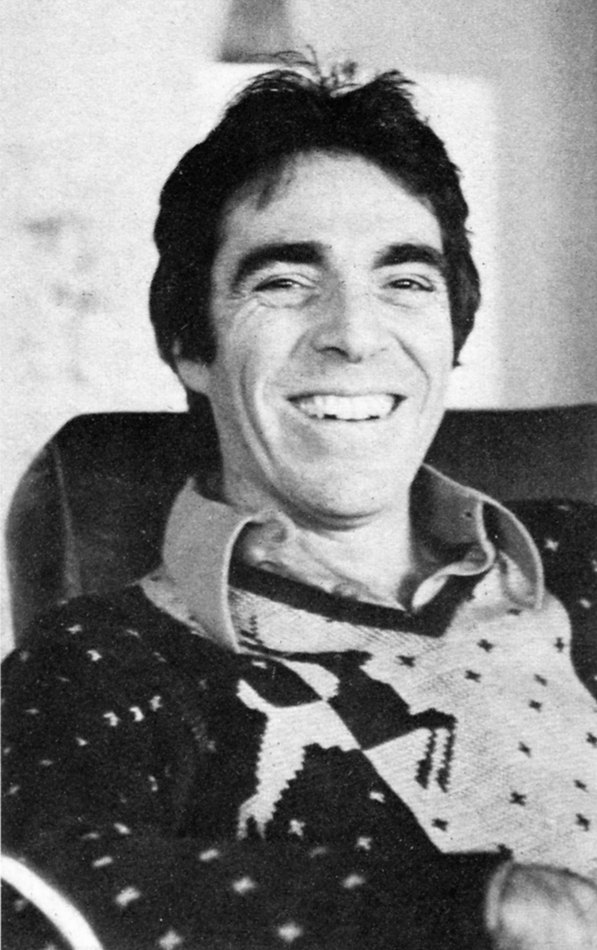 Jerry Lieberman says he originally “wanted to be a doctor,” and he endured two years of pre-med before allowing all the “fantasy, other-world head aspects involved in growing up in corny, carny, show-biz pizzaz-zy Atlantic City” to take over. As a kid he “always drew” and worked three summers as a caricaturist on Atlantic City’s Million Dollar Pier.
He admired John Hubley’s Moonbird (1960) and Saul Bass’ titles and he constructed his own make-shift 16mm camera stand to “experiment with stop-motion, and even some professional work for WCAU-TV in Philadelphia doing promos for a local kids’ show.”
After studying design and graphics on a scholarship to the Philadelphia Museum’s School of Art, and a brief stint in the Army, Jerry came to New York City in 1964. “My first year in New York,” says Jerry today, “I made a storyboard six feet by ten feet long with 200 panels. It was my portfolio and it used to knock people over when I unfolded it.”
He managed to get work right away doing animated films for NBC-TV’s Exploring, “but I learned success doesn’t come easy. There were times when I walked the pavements going from one local production house to another for six months before getting work. One time my portfolio was so severely criticized by one potential employer, I stopped seeing people and had a phobia about work and my talent.
“I worked very hard; I paid my dues; eventually I made a lot of money in a short time and went to Europe. I thought foreign influences might be good for my work.” In London, Jerry met George Dunning who told him “the best place to go for work is Italy.” In Rome, Jerry was hired by American Harry Hess, a former UFA animator, and he worked for a year doing storyboards, design and animation for Italian commercials both in Rome and Milan. He even acted in a few live-action beer commercials.
Jerry returned to America with an excellent reel and his next big break was to be hired by Jack Zander at Pelican Productions as a designer. “Because animation does include every form of art, I wrote to Lee Strasberg and asked to join the Actor’s Studio Directors Unit, and I was accepted and studied there for two years. After a year at Pelican, he freelanced on educational films and was, for a short hilarious time, Phyllis Diller’s painting instructor.
“In 1968, Art Petricone, Howard Basis and I got together and started Ovation Films, Inc.,” says Jerry. “Howard and Art met at Kim and Gifford, and I had worked with Howard on a job. We started our business during the decline of the ‘Golden Years’ of TV commercial production, but we didn’t know that at the time. We had our reputations, things built up slowly, and in March of ’76 we’ll have been in business for eight years.”
Ovation is one of the top commercial houses on the East Coast, a successful studio whose award-lined walls attest to their excellent work done for clients who include Eastern Airlines, Volkswagen, Levis, American Cancer Society, Clairol, and Children’s Television Workshop. At first, duties at Ovation were sharply defined, with Jerry doing designing, Howard handling the animation, and Art the super salesmanship, but today Jerry explains that “each of us get involved in producing and directing different commercials. Sometimes we work separately, sometimes we work together. We are now doing a little live-action work, and we are interested in doing a feature animated cartoon. Creativity, budgets keep getting tightened up, but we manage to maintain quality in our product.”
In 1973, Jerry enjoyed “a great personal success,” as La Cinematheque Quebe-coise directrice Louise Beaudet describes it, at the Annecy Animation Film Festival. “His films were so American and he looked so American when he took a bow that he was a big hit with the French,” says Madame Beaudet. Ovation’s Yes My Sweet took a prize at Annecy that year, as their Parrot and the Plumber had at Zagreb the year before.
“I admire live-action directors who are interested in the visual aspects of film,” says Jerry as he ticks off the names of favorites Warhol, Fellini, Russell, and Hitchcock. “But I love animation because you have to be so multi-talented and involved in so many fields. It’s very demanding, always a challenge, and very satisfying.”
- For a short period in 1973, I worked for Phil Kimmelman’s studio PK&A. I was an Asst. Animator alongside Larry Riley. We had a brilliant time for a period, until work got a bit shy. The studio was very tight, and the mood was one of searching for the highest quality. Rowland Wilson was a designer of many of the Schoolhouse Rock pieces I assisted on. Phil was a pleasant guy to have for a boss, and I certainly enjoyed the experience.
He retired a few years back, but he’s back producing more Schoolhouse Rock episodes for Disney. I’m glad to see it.
Jerry Lieberman was someone I came into contact with frequently. We never worked together. Somehow I think he always saw me as a rival – I don’t know if that’s a reality, but it’s my perception. The last couple of times I met him he was directing theater and loving it.
Articles on Animation &Independent Animation 25 Nov 2008 08:37 am
The New Animators of 1977
- Jenny Lerew reminded me, this past weekend, of Richard Protovin. Richard was an Independent animator and the head of NYU’s animation department from 1979-1988. In that position, he inspired quite a few people, and Jenny’s comment got me trying to remember where I saw an article about Richard.
I came up with this article by Thelma Schenkel from the animation issue of Millimeter Magazine in 1977. I got a kick out of revisiting this article and thought it definitely should be shared.
A new generation of American animators is coming into existence. Trained in art schools and college filmmaking programs, they are turning to animation on a scale unprecedented in independent American filmmaking of the past. Mainly in their 20′s and 30′s, they were brought up on comic and storytelling cartoons, but their films are rarely broadly comical, although they’re often very witty, nor are they illustrations for stories. They are staking out a new territory for animation, one that until recently was the province of the poet. Whether their films are erotic, whimsical, or abstract, they are all in some way exploring the inner landscape — feelings, the workings of the mind, the mechanisms of perception. Although the techniques they use vary widely, they all share in the poetic impulse — in the search for new expressions of personal visions.
Until fairly recently, only a few names came to mind when one thought of experimental poetic animation in America. Today, the ranks of talented young animation poets are growing. Despite the dearth of effective distribution channels and outlets, and the difficulties of finding time and mental space to make their “personal films,” while often supporting themselves by doing commercial projects, they are making some very exciting, extraordinary films. The following are only a few of the many talented young animation artists whose films merit being seen and re-seen, talked about, and written about:
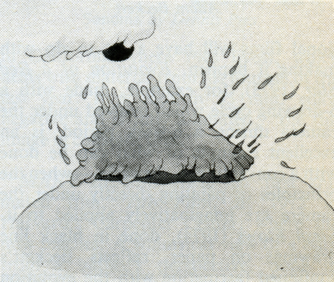
 ELIOT NOYES, JR. — Since Clay, made at Harvard’s Carpenter Center in 1964, Noyes has been dazzling audiences of all ages with his witty inventiveness, his bold handling of materials, and his humanism. In Clay, an 8-minute version of evolution, he spawns a universe out of a lump of clay with the playfulness of the ancient gods of creation. Noyes makes magic with the simplest materials: Alphabet (1966, Canadian Film Board) is drawn on milk-glass with felt-tipped pen; In a Box (1966), a tale of the barriers people and cities erect to keep out beauty and freedom, is drawn on paper; Sandman (1973) (Pictured below right) creates a dream world with an underlit handful of sand. His most ambitious film, The Dot (1975), combines live-action and animation in a half-hour allegory on the liberating
  power of the imagination — the animated dot becomes the catalyst that frees the “prisoners” from the confines of school and home. Constantly exploring new techniques, Noyes is currently completing Glove Story, using actors in combinations with video-animation, and Pitcher’s Feathered Bird, which experiments with chromakeying live actors into Noyes’ drawings. If his brilliant use of technique, his wit, and the humanism of his films of the last 14 years are any indication, we can look forward to an innovative, compassionate, and refreshing use of videotape when these tapes are released.
GEORGE GRIFFIN‘s self-referential films explore the tricky territory of animated illusion with marvelous wit and ingenuity. Paradoxical though it may seem, he often uses the most rudimentary of pre-cinematic toys — flip-books — to explore the most modern of ideas. Trikfilm No. 3 (1973), a complex orchestration of flip-pad metamorphoses alternating with the creation of the same sequences by the artist, combines live-action with animation, all the while delightfully fragmenting the illusion it is creating. The most elaborate of his “anti-cartoons,” as he calls them, is Head (1975), (pictured below left) an ingenious, witty essay on making filmed, photographed, drawn, painted, and Xeroxed images move.
 Reverberating between multi-media versions of the same events, playing with disjunctions between figure and ground, Head is “a trick-film meditation on portraiture; the animator, as actor, lives through his drawings, which in turn become actors who influence his own self-image.” An insider’s diary on the process of creation, Head is a brilliant encyclopedia exploration of the circular relationship between the animator and his creation, of the nature of animated illusion itself. L’Age Door (1975), a one-minute flip-book film about a man and a door, shows what a witty intelligence can do with just a memo pad and a pen. His most recent work, View-master (1976), drawn in parodied cartoon styles, is comprised of 8 circular drawings with 12 characters in a run cycle on each drawing. The characters, including a troupe of dancing headless waiters and a selfpropelled shoe, chase each other around until the full circle of characters is revealed at the end — a contemporary Zoopraxiscope, with Eadweard Muybridge’s running man at the center, Griffin’s tribute to one of the greats of pre-cinema. In his witty elaborations on the simple techniques of pre-cinema, Griffin is unique among young experimenters in animation today. Informed by the refreshing playfulness of film’s 19th century origins, his films are very much of the 20th and even 21st centuries, in their incisive and witty insights into the nature of time, perception, and what we call “reality.”
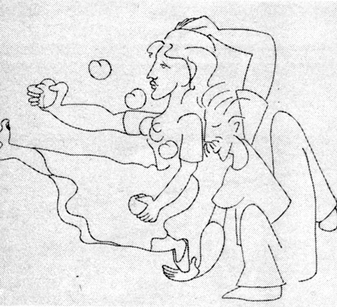
 KATHY ROSE‘s insignia is the remarkable cast of “characters” who people her films and who can be traced through The Mysterians (1973), The Moon Show (1974), Mirror People (1974), and The Doodlers (1975), all made at California Institute of the Arts. In The Mysterians, her silly-putty creatures, capable of any transformation imaginable, begin playing their surrealistic metamorphic games — which become more complex in Mirror People, as the figure-ground manipulations reveal space to be as much of an illusion as corporeality. To a sound-track of fun-house screams and cackles, Mirror People, a tribe of Halloween hallucinations, fuse into each other and get absorbed into their reflections and their environments in a universe where all is flux and nothing is stable,
  except for the constant delights of metamorphosis. The Doodlers (pictured Right) carries the game of illusion still further. Through Miss Nose and her clan of doodlers, whose curvilinear outlines and splashes of color come to life through a magic cat’s-tail brush, Rose makes some witty observations on the art of animation and on the symbiotic relationship between the artist and the characters. Although she was very excited by the films of Yoji Kuri, whose surrealistic pranks are echoed in her films, Rose’s characters have an indescribable uniqueness. It might have something to do with the way she draws them: all her characters are drawn upside-down. Yes. When she creates them, it is as if she wanted someone sitting on the other side of the table to be able to see them rightside-up, without having to turn the drawing around (of course, when they are filmed, they are rightside-up). She finds that it’s like “drawing with the eyes closed, you have one less level of consciousness.” But only the characters are drawn that way; the constant swirling changes of perspective, the simulated camera movements — all require tighter control and are drawn rightside-up. The battles and games between Rose’s characters are at some level intra-psychic encounters; she sees her characters as “parts of my unconscious” and is currently working on a film in which she and her characters confront each other. She feels that the new uses of animation have to be more than personal. They have to have an “inner truth about something real, a truth people can feel.” In their delightfully whimsical way, Rose’s films about the joys and struggles of creation succeed in conveying that truth.
AL JARNOW‘s films, which seem to be playing with the malleability of perspectival logic, with fluctuations between the subjective and objective viewpoints, have a marvelous sense of spatial humor. At times reminiscent of Escher’s disorienting figure-ground enigmas, his films often lead us through an architectural nightmare (he studied architecture at Dartmouth), but manage, through the integrity of their visual logic, to create a spatial universe which seems to make perfect sense. Rotating Cubic Grid (1975) and Four Quadrant Exercise (1975) are marvelously precise architectural games, but Auto Song (1976), his most elaborate “story” film, pushes the play between subject and object the furthest. Drawn on index cards, it narrates the journey of an invisible eye (Jarnow’s) from its (invisible) reflection in the mirror of a VW bug, across impossible highways and oceans, up stairs and through tunnels, ending in the black hole of space. Purposely starting with a recognizable image set in recognizable space, the film very soon goes off into its own space which, because we have been well teased from the beginning, we accept without question. Jarnow’s latest film, Shorelines, combines objects (shells, stones), live-action pixillation, drawings, and Xeroxes. Although it represents a move away from the draftsman’s precision of the earlier films, it continues to play with space and perspective in Jarnow’s inimitable way.
 DENNIS PIES‘ early films, Nebula and Merkaba (both made at California Institute of the Arts in 1973), which he calls “experimental graphics,” already manifest his preoccupation with cosmic, mystical imagery. In Aura Corona (1974), he improvises a dance of two vertabra-like creatures which develope auras, depicting the delicate evolution of animate forms in a haunting, suggestive way. Pursuing his exploration of organic abstraction, in Luma Nocturna (1974), the “dark twin of Aura Corona” exquisitely nuanced crystalline textures float and fuse in a kind of lyrical, ecstatic cosmic dance. All done without the use of the
  optical printer, the effects in Pies’ films are reminiscent of the work of Belson and Whitney, influences he readily acknowledges. He is currently working on Sonoma (pictured right) (an Indian word meaning “Valley of the Moon” — the general area in California where Pies lives), which deals with material from his journal of the last year. It is shot in 35 mm. color negative and is fully animated, “the full image in constant flux.”
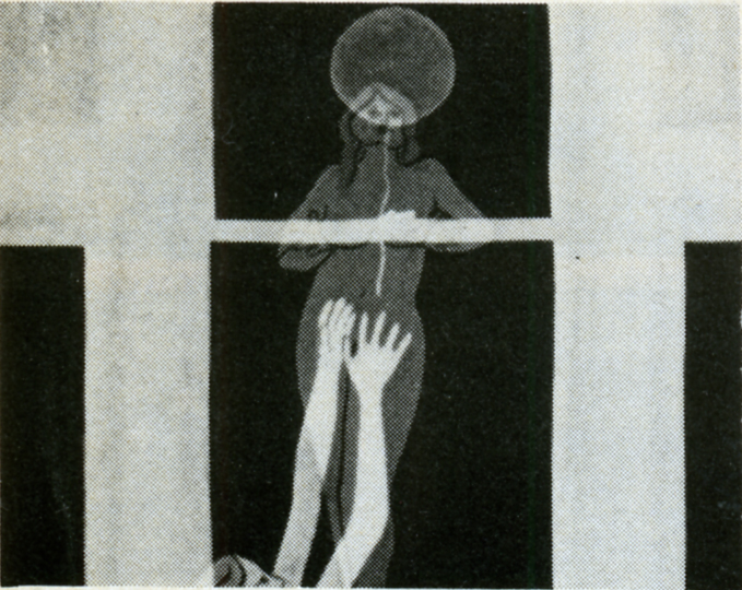
MARY BEAMS made her first animated film, Tub Film, in 1972 at Harvard’s Carpenter Center, where she now teaches. A whimsical view of a bath from a bather’s perspective, done in rough line drawings on paper, Tub Film ends with a slurp as the woman disappears down the drain, 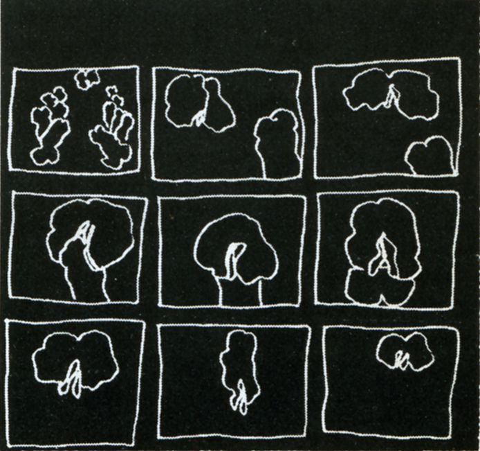 after the cat pulls the plug. Seed Reel (1975), a series of 3 sexual haikus, is done in the same rough outline style: in “Hungry Poem,” (pictured Left) (reverse printed with white lines on black), a penivorous flower devours its mate and swells into a pregnant belly; “Sniff and Lick” portrays the encounters of some very erotic flowers, and “12 Dancing Penises” dance to the tune of “Turkey in the Straw.” In Going Home Sketchbook (1975) and Paul Revere Is Here (1976), she experiments with rotoscoping and shows her deftness in handling a technique that, in other hands, can become tedious, but which for Beams becomes an exciting way of recapturing the spontaneity of the hand-drawn image.
 ADAM BECKETT, of California Institute of the Arts, feels that “we are at the beginning of a wonderful golden age of animation”; his innovative, unconven-tional films will have a lot to do with making it happen. Evolution of a Red Star (1973), for example, made with a 6-drawing cycle which evolved under the camera during a 6-week period, is an excellent example of what can be done with a convention — the cycle — when the principles of painting directly under the camera are imaginatively applied to it. Flesh Flows (pictured Right) (1974), done in black line drawings on paper, reflects Beckett’s continued fascination with the
 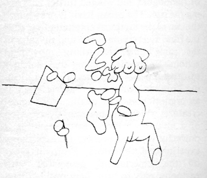 evolution of polymorphous matter. Animated male and female body parts flow into, around, and through each other, evolving into proliferating, multiform creatures in a surreal pulsating dance. Beckett is currently trying to combine work on Life in the Atom (which he has been working on for 7 years), a new version of Dear Janice, and Knotte Grosse with his commercial work.
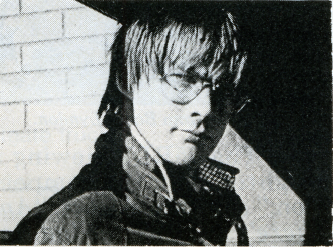
RICHARD PROTOVIN‘s films have a naive, story-book quality about them which is definitely not what they’re about. This soft, innocent front, the delicate lines and candy-colored pastels, is an intentional disguise to arouse expectation for a simple story, expectations which he astutely manipulates for very different ends — “to turn things around, to go on the other side of the mirror.” Flamingo Boogy (1974), drawn on paper, starts out in a drive-in movie and ends up in a flock of flamingoes and winged turtles embracing the sun. The ocean itself is drawn into the sun in the mythical epiphany that ends the film. Everything flows and pulsates at the same time, disturbing movement echoing “opposites coming together in a spiritual union.” Heyzeus (1975), reflecting Protovin’s interest in Tantric Yoga, is an orgiastic dance of phallic and vaginal creatures which culminates in the creation of a
Left – Richard Protoviin/self caricature Right – “Flamingo Boogy”
mysterious bird creature exuding a powerful mystical energy. Like so many experimental animators, Protovin plays on the expectations associated with cartoons, only to turn them upside-down in an unexpected haunting way.
 KATHLEEN LAUGHLIN‘s films explore a wide range of techniques: saturated color printing in A Round Feeling (1970), stop-motion single framing in Opening/Closing (1972) and Susan Trough Corn (1974). Her recent film Madsong (1976) (pictured Right) combines animation and live-action in a young woman’s personal everie on being female. With a polyphonic voice track (the woman’s inner voices echoed by the chorus of voices outside), it parallels the flow of her unconscious with the movement of the cycles of nature. In its artful use of live-action/animation overlap, which echoes the agitated flux of the voices of her mind from fantasy to reality, from “inside to outside, from backward to forward simultaneously,” Madsong is one of the few films about women today that succeeds in being intensely personal and univeral at the same time. Laughlin is currently working on a film about Meridel Le Seuer, a 76-year old midwestern poetess.
 MAUREEN SELWOOD — The delicate lyricism of Maureen Selwood’s style is already evident in her first film, The Box (1969), which combines live-action and animation in a lively fantasy of the Astor Place cube sculpture coming to” life. The Six Sillies (1971), made at New York University’s Institute for Film and Television, in 35 mm eel animation, is rich with the luscious color and delicate Matisse-like line that evolve in the public service and commercial projects she has done since then.
In her current project, Odalisque (pictured Left), she moves away from story-tellling into poetry; a series of mythical women undergo the most extraordinary transformations — the kinds of dreamlike metamorphosis that Selwood’s lyricism brings to life beautifully.
The short post script as to where are they now is not going to be written by me. I know that a couple of these people have died (Richard Protovin & Adam Beckett), several are still animating (Dennis Pies and Eli Noyes are both in California), others are animating and are connected with excellent schools (George Griffin teaches at Pratt, Maureen Selwood at CalArts). I believe Al Jarnow still lives in NY state, and the last I heard of Thelma Schenkel, she was teaching at Baruch College in NY. I’m not sure of the rest.
If any of you reading this know more, I urge you to let us know in the comments section or I’ll be glad to write a more extended piece in the future. I’m already thinking about some of the Independent animators from 1977 who were left out of this article.
Articles on Animation &Puppet Animation 15 Nov 2008 09:44 am
Harryhausen Interview
- It’s been a while since I’ve posted anything about stop-motion animation, and seeing an attractive poster for Coraline made me realize it was time. I’ve recently posted some articles from the Millimeter/1975 animation issue which was edited by John Canemaker. This is another excellent piece from the same magazine, and I think it a good one.
An Interview with the Master of Stop-Motion Animation
by Mark Carducci
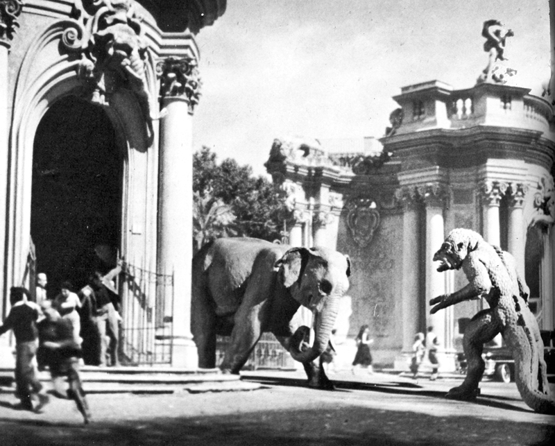
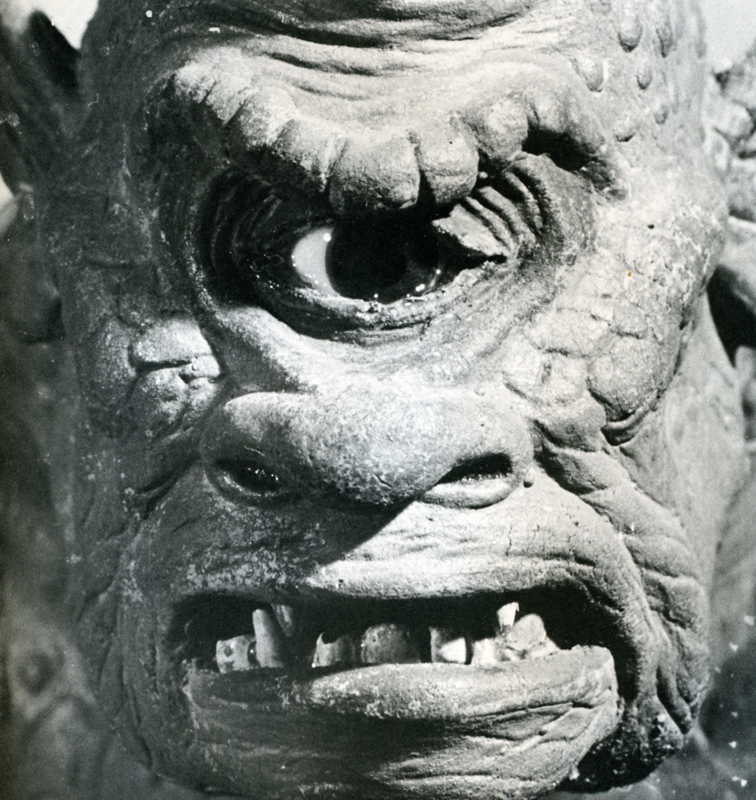
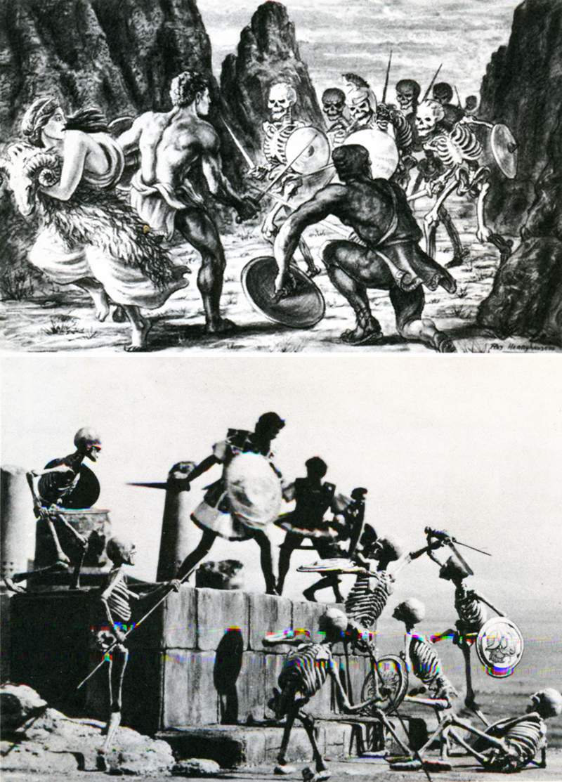
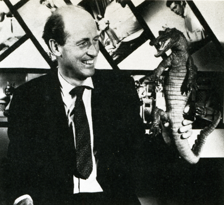 Film history records the earliest three-dimensional animator as George Melies, the showman-turned-filmmaker of A TRIP TO THE MOON fame. Melies, unlike many special-effects men of today, realized the value in using several different effects processes at the same time. Thus he would utilize stop-action, animation, miniature photography and mechanical effects all in the same frame. Melies was a pioneer in the field of effects animation in three dimensions, and he paved the roads other animators would one day travel. One such traveler was Willis H. O’Brien. O’Brien single-handedly elevated the techniques of three-dimensional model animation to a fine art, beginning in the silent era with short subjects and continuing through the 1925 classic THE LOST WORLD to KING KONG a mere eight years later. As Kong was king of Skull Island, so O’Brien was king of model manipulation, and tike Melies before him, O’Brien never missed an opportunity to add drama, atmosphere or pathos by mixing effects together. Witness the clash between Kong and a flying reptile atop Kong’s mountain lair: Kong and the pterodactyl are jointed foot-high foam rubber models; the mountain’s ledge is a plaster recreation; the sky background is a painting on glass; the flying reptiles in the sky are double-printed eel animation. It was this intelligent and intentional combining of effects that allowed O’Brien to achieve the marvelous sense of reality he did in KING KONG, a reality so intense as to make a thirteen-year-old named Raymond Harryhausen choose the field of special effects animation as his life’s work.
From the time he saw KING KONG in 1933, until the mid-40′s, the youthful Harryhausen animated in what might be called a highly animated fashion.
He even managed, on several occasions, to gain an audience with his future mentor. Though Ray’s fledgling efforts were crude, O’Brien saw in them a promise of future greatness, and he was quick to offer constructive advice to his precocious- protege whenever he was asked. In 1946, impressed by Ray’s solo efforts in producing a series of animated fairy tales; O’Brien offered him encouragement of a more concrete nature: a position as an animator on the Merian C. Cooper production MIGHTY JOE YOUNG. Of this opportunity-of-a-lifetime Harryhausen recalls: “It was, of course, the climax of a long-awaited dream come true. I had a magnificent two-year period of working with O’Brien, during the long pre-production and design stage, up to the end of animation photography. He was so involved in production problems that I ended up animating aboul 80% of the picture.”
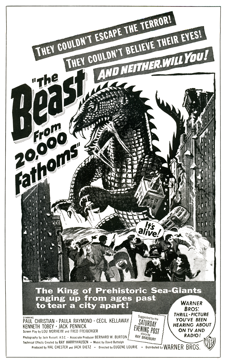 In 1952, as a result of his Oscar-winning work on MIGHTY JOE YOUNG (Best Special Effects of 1949) Ray was approached by Jack Dietz and asked to create the effects for THE BEAST FROM 20,000 FATHOMS. These he executed ably, employing an innovative front-projection system of his own design, as the preferable but more expensive rear-project ion equipment the work called for was outside the boundaries of Dietz’s budget. THE BEAST came in at $200,000, a remarkably low figure considering the expertise and high quality of Ray’s animation and effects. Audiences of 1952 flocked to the picture in droves, making it the unexpected sleeper of the year for Warner Brothers. Completing THE BEAST left Ray on the brink of a long, creatively satisfying and financially rewarding association with a then-youthful producer, Charles Schneer.
Schneer wished to produce a script about a giant octopus that terrorizes San Francisco, and after meeting hirn^ {Schneer, not the octopus) Ray agreed to work on the picture. The result was IT CAME FROM BENEATH THE SEA, the first of a series of ten feature films produced by Schneer with special visual effects by Ray Harryhausen. Along the way, Ray has freelanced twice: once in 1958 to animate the dinosaur sequences in Irwin Allen’s THE ANIMAL WORLD, and again in 1966 to handle effects on Hammer Film’s OWE MILLION YEARS B.C.
 A comparison of the work of Ray Harryhausen and Willis O’Brien yields some interesting observations. One of O’Briens trademarks throughout, his career was his use of glass paintings. The three-dimensional effect of the jungles of Skull Island was achieved through the painting, on glass, of dense trees and vines. By animating his models behind several layers of these realistic depictions of forest, O’Brien was able to achieve an illusion of depth that added tremendously to the dramatic impact of the entire film. O’Brien was a dramatic romantic, and a stickler for any detail •haqlbuld romanticize. Harryhausen, on •hefOtner hand, is a realist, and in his Jiifork there is a sense of reserve; of a wpjehful eye on the cost of each particular effect. No layers of intricate glass paintings for him—too expensive. For Ray’s purposes a simple but effective matte painting will suffice. The net result is always a little less atmospheric than O’Brien’s work and ultimately less powerful. To compensate for this Harryhausen outshines his master in the fluidity of his animation. His smoothness of movement of his foam rubber creatures is the most striking difference between his and O’Brien’s digital prestidigitation. In this area the pupil could have taught his teacher.
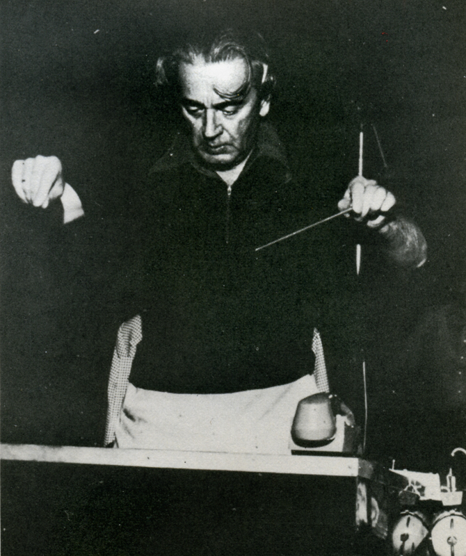
 The exact processes by which Harryhausen combines his animated models with live actors are ones he prefers to anyone with a basic of animation can grasp the*1 rudiments of what Schneer and Harryhausen have dubbed “Dynarama.” Let us take an example from Harry-hausen’s latest film, THE GOLDEN VOYAGE OF SINBAD. The script called for a battle between Sinbad and a giant one-eyed centaur. The first step in creating the illusion of a human dueling with a mythical monster was to film the actor, in this case John Philip Law, leaping to and fro fighting with an imaginary creature. The resulting footage is loaded onto a rear-screen projector which has been modified to move a frame at a time instead of at sound speed. In front of this rear screen, Harryhausen constructs a miniature set, which corresponds to the full-size one on the film in the projector. Placing his foot-and-a-half tall centaur into this miniature setting, Harryhausen animates it a frame at a time, being careful to similarly advance the rear-projected image of Sinbad. Re-photographing this entire set-up with a locked down animation camera produces the desired effect. This description can only serve to illustrate the bare bones of the Dynarama process. Many sequences have required much more complex techniques of Ray and his equipment. As a result the time element involved in the production of a Dynarama picture is staggering. Pre-production lasts six months to a year. Principal photography lasts several months and the animation photography consumes an incredible year or more! But the results, which speak for themselves, have always seemed to justify the commitment of two or three years of Ray Harryhausen’s life; at least in the past they have.
 At present Ray is involved in yet a third film about the adventures of the swashbuckling Sinbad, though he characteristically refuses to give details about the project. This is understandable, since at the time we spoke he didn’t even have a story-line. This, too, is characteristic; perhaps unfortunately so. For it is in this area, the script, that Ray’s films have shown their vulnerable underbellies. Starting as they do with Ray’s sketches of the fantastic monsters involved, most Dynarama films are built around a monster or monsters on the loose. Plot, dialogue and characterization have always played second fiddle to special effects in Harryhausen’s films, and this is nowhere as painfully obvious as in THE GOLDEN VOYAGE OF SINBAD. Although his cart-before-the-horse method of scripting has always netted Harryhausen films of a very satisfying financial nature, it has never netted him a film with the impact and scope of KING KONG, and never will. One can only hope that as he has more say in his productions than any effects animator on earth, (he is a co-producer) Harryhausen will one day put as much creative energy into his script, casting and choice of director, as he does into his visuals. Perhaps then the day may yet come when Dynarama films will have some saving graces beyond their impressive opticals. Be that as it may, for anyone at all interested in animation and effects cinematography, the words of the grandmaster of Dynarama paint a fascinating portrait of a seldom glimpsed phase of film production.
M.C.: Have you ever considered remaking the film which first inspired you, KING KONG?
R.H.: Yes, but KONG couldn’t be re-made today without spending vast amounts of money. The time and cost involved in doing all those glass paintings would be astronomical. You know O’Brien really developed the technique of glass painting single-handedly. In a way his use of them was a forerunner of Disney’s multi-plane camera. On KONG Obie had animation tables sandwiched between the glass paintings, and on these tables he’d place his models. He needed a tremendous amount of light for the camera to record through all those panes of glass. Often a light would blow in the middle of a scene, ruining a shot he had worked on for days. To remake KONG would be much too complex a thing to get into today.
M.C.: Some hold the opinion that your films have little merit aside from their impressive effects. I don’t mean to criticize, but I tend to agree with that, excepting MYSTERIOUS ISLAND, a Him I feel could stand alone if the footage of the monsters was cut.
R.H.: Really? I don’t think you would feel that way about MYSTERIOUS ISLAND if you actually did cut that footage. Pick up an 8mm version some time and try it. (Laughs) The original Jules Verne novel was really just a tale of survival on a desert island. The survivors in the story saw rather mundane things, so we modified their adventures a bit by adding Capt. Nemo and his giant creatures.
 M.C.: With newer and better emulsions now available in 16mm, have you considered working in that gauge?
R.H.: No, I have no reason to work in 16mm. With 16 you don’t have the options and accuracy of 35mm and the optical printer. Certain subjects might show up quite well on a blow-up from 16, but my work is much too complicated to further complicate it by working in a smaller gauge than 35mm.
M.C.: What about 70mm?
R.H.: We released FIRST MEN IN THE MOON in 70mm, but that was a blow-up from 35. Shooting on a 70mm negative is too costly a proposition, necessitating the use of too many specialized pieces of equipment.
M.C.: FIRST MEN was shot in Panavision. What effect did shooting wide screen have on your usual methods?
R.H.: I was forced to re-design many things, because certain techniques are impractical in Panavision. I relied more heavily on traveling matte work in FIRST MEN, whereas normally I might have used front or rear projection.
M.C.: you are quite active in other areas of production besides animation photography. Have you ever considered directing an entire film?
R.H.: Oh, yes, I would very much like to direct if I find the right subject. But it’s a big job just to keep track of the special effects. There’s a limit to how much one man can do.
M.C.: Didn’t you once remark that you were unhappy with the animation of the miniature horse in THE VALLEY OF GWANGI? If so, why?
R.H.: No, what I did say was that it was a sequence I ‘dreaded doing because the horse really didn’t have anything dynamic to do. It just had to sit there and look coy. It’s always difficult to decide what to have the creature do in scenes like that. An action sequence involving a giant animal is much more impressive. So I let that scene go until last.
M.C.: Box-office-wise your films have usually done quite well. How can you account for the relative failure of THE VALLEY OF GWANGI?
R.H.: It was released at a time when Warners was being sold and it received very poor distribution. There was no advertising to speak of and nobody knew what the picture was about.
M.C.: Alternately, THE GOLDEN VOYAGE OF SINBAD has really hit big with audiences here.
R.H.: You must remember the time when GWANGI was released. Everyone was on a sex binge then, and we only had sexy dinosaurs. Warners didn’t push the picture at all. Columbia, on the other hand, has put a great deal of effort into their campaign for GOLDEN VOYAGE. That and word-of-mouth really paid off.
M.C.: In the past you have utilized the talents of film composer Bernard Herrmann for your scores. Why was he not used on GOLDEN VOYAGE?
 R.H.: There were many reasons. Sometimes people are tied up, and sometimes the situation just isn’t conducive to getting the people you would prefer. I think the composer we did use, Miklos Rozsa [SPELLBOUND], writes a different kind of music than Herrmann, and that he did a very good job for us.
M.C.: Taking his past efforts into account, why was Gordon (THE OBLONG BOX) Messier chosen to direct GOLDEN VOYAGE?
R.H.: Again, there were many reasons, and I can’t go into them here. I think Hessler has a very good sense of direction. You must remember that the quality of each picture a director works on depends largely on how much money is in the budget. Some people think we have carte blanche to make a picture any way we please. Except for a David Lean or a Stanley Kubrick, this is not the case. We make a commercial product, and though there are many things we might like to do on a picture, it always comes down to whether or not the money is there.
M.C.: All told, how long were you at work on the effects for GOLDEN VOYAGE?
R.H.: About a year. All the work was done here in London at Gold Hock Studios.
M.C.: Did British Museum sculptor Arthur Hayward assist you in constructing the animation models, as he had on ONE MILLION YEARS B.C. and GWANGI?
R.H.: No, I had others assist me. Molding and casting are very time-consuming jobs, so I farm some of it out to certain individual. I can’t do all the models myself, because I don’t have the time.
 M.C.: Do you paint your own matte paintings?
R.H.: No, I don’t. In fact nowadays I try to avoid using them. There are very few people who can do them well enough so that you don’t have to cut away from them right away. Today it’s practically a lost art, unfortunately. Most of the ones in my other films were done by staff matte painters at Shepperton Studios.
M.C.: I found there was quite a bit of grain in GOLDEN VOYAGE. Why was this?
R.H.: We worked with dupes quite a lot. There are shots in the film where you’re looking at a third-generation dupe, so naturally there’s an increase in grain. Another reason you might have spotted some excess grain was because we printed several optical zones and dolly shots on the printer.
M.C.: What can you tell me about your next film project?
R.H.: It’s called SINBAD AT THE WORLD’S END, and that’s about all I can say. We have a formal company which releases information to the public, and at the moment I’m not at liberty to say anything more. Does that pacify you? (Laughs)
M.C.: Not really. Will John Philip Law again play Sinbad?
R.H.: That depends on his availability, and the characterization in the script, which we don’t even have yet. There have been several Sinbads—Douglas Fairbanks, Kerwin Mathews, Guy Williams. We would like to give him a different quality each time. The irony is that when you knock yourself out to make a picture different, the critics chastise you for not putting in the expected cliches. One reviewer said of GOLDEN VOYAGE that he missed the dancing girls. Now that is a typical Arabian Nights cliche that we avoided on purpose.
M.C.: I have one final question concerning THE SEVENTH VOYAGE OF SINBAD. There is a sequence in that film which depicts Sinbad’s crew walking up the beach loaded down with fruit. There is a black man in the crew, and he’s carrying a watermelon.
R.H.: Oh no…(torrents of laughter at this) only a member of today’s generation would notice something like that. I assure you it was all accidental as to who got what prop.
Thus satisfied that THE 7th VOYAGE OF SINBAD contained no racist undertones, I bid Mr. Harryhausen a fond farewell, leaving his Kensington High Street home for the bleak and foggy streets of London. As I ambled towards the nearest Underground I gave additional thought to the question of Mr. Harryhausen’s responsibility for the over-all quality of his films. Approached on an adult level they are rather silly entertainments. But for a child they create a vivid fantasy world where skeletons come to life and fire-breathing dragons battle with cyclops. I was a child once, and the marvels of Harryhausens monsters, both mythic and imaginary, overwhelmed me. There is a definite place in cinema for this type of film. The adult critical eye must squint a bit to watch THE GOLDEN VOYAGE OF SINBAD, but if that’s not enough, one can always leave the theatre to the little people, whose eyes Ray Harryhausen’s films are created for.
Articles on Animation 07 Nov 2008 09:05 am
John Oxberry
- An article chronicling the life of John Oxberry appeared in the April, 1975 issue of Animation Magazine. Oxberry was quite an interesting figure in the technical history of animation. He used some experiences in the Signal Corps to create a company around a series of animation cameras he developed and perfected. For so long, he was just a name built around the “Oxberry Camera” or “Oxberry pegs.” I think the articles worth reviving for your possible interest.
The man behind the machine
John Oxberry deserves more than the cursory glance afforded him
by the industry he served during a lifetime.
by Gary Comorau
Everyone in the film business has heard of an “Oxberry.” But other than the fact that it is bigger than a breadbox and that it has something to do with animation, much about this specialized equipment eludes the awareness of the average filmmaker. Even more shrouded in mystery remains the singular figure of the inventor and innovator who gave his name to an entire family of animation stands.
 John Oxberry deserves more than the cursory glance afforded him by the industry he served during a lifetime; this pitifully miniscule obituary appeared in Backstage, in November, 1974:
- “The well-known film inventor and developer, John Oxberry, passed away last week reportedly at the age of 58. His best-known achievements were in the animation field with the Oxberry stand, an industry standard.”
Millimeter Magazine was in the process of preparing an article on John Oxberry at the time of his untimely demise, which is why this interview ends so abruptly. Though we cannot hope to do justice to the memory of this pioneer in animation, nonetheless, by acquainting our readership with the life and work of this unassuming master-craftsman, we hope in some small measure to pay tribute to the man and the legacy he___John and June Oxberry, at
eft for future generations of filmmakers and movie-goers.____their wedding in Aug 1942.
It’s hard to say anything about John Oxberry without stumbling upon superlatives which to most listeners would sound exaggerated. He was unpretentious, yet incredibly knowledgeable; a pleasure to meet and a joy to talk to. Though considered by many to be a genius in his field, his wife describes him as “a simple, simple man.” He was a man who followed his heart, and he cheerfully invested his energies in animation, because of his fondness for this matchless medium and the people working in it. Thirty-five years in the business brought him many successes and failures, but he never sounded bitter about his setbacks. And after having opened many new vistas for exploration in his younger years, he embarked upon a personal quest to broaden the horizons for future animators by providing the possibility for sophisticated, but inexpensive Super-8 animation to anyone who wished to give flight to his imagination.
The scale of Oxberry’s business had changed in later years, but not his attitude towards it. At one time he built some of the most expensive and complicated animation equipment, and then, with the same enthusiasm, some of the least expensive. Producing quality equipment and having his name known throughout the industry did not make him rich and his modest ambition extended but to owning a boat, sailing and relaxing.
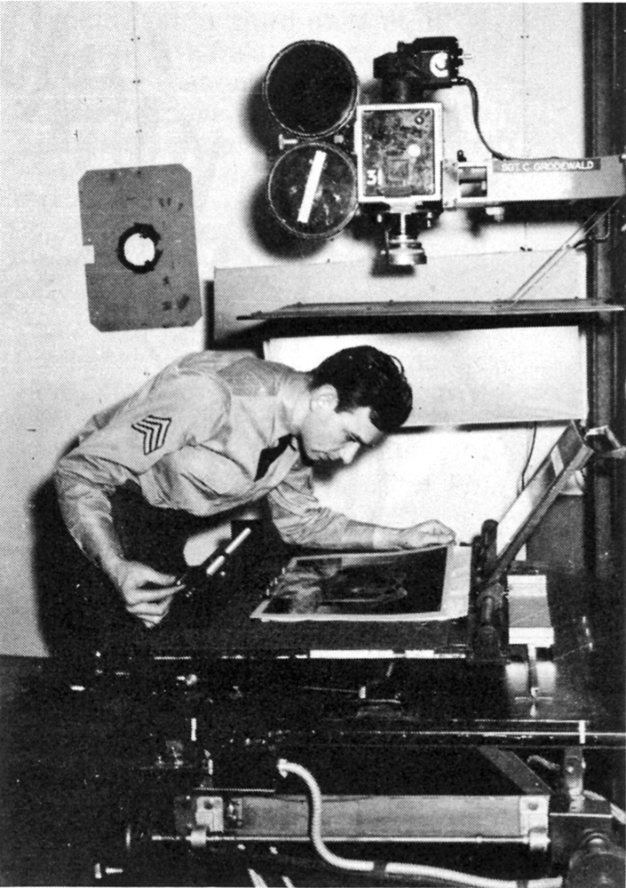 John Oxberry was born in 1918, in New Rochelle, N.Y. and spent most of his life in that area. His interest in film began at an early age, and when World War II broke out, he “got mixed up in the Signal Corps and worked on training films.” Eventually, the operation moved from Fort Monmouth to Astoria, New York, “…and we started doing animated films showing how to clean a rifle. It was your life…and we used to make these pictures for the Armed Service’s musicals once a month. Top talent would come in from studios and do that, and the medical stuff, like the sex pictures, which showed what one was supposed to do or not. We used to have to go see them every month…and then here we were making the damned things. So from that point on I wanted to get out of that mess, and thought it would be a good idea to make a piece of equipment that would top all that junk that we had had to work with. After WWII I decided to start a little
John Oxberry at Signal Corps______._company in New Rochelle.”
Photo Center, 1942.
Oxberry Products had been manufacturing top animation equipment since that time, under the ownership of John Oxberry, and during this time his name became synonymous with the best that the industry had to offer. Following a few bad business breaks, John sold the company to Berkey Photographic in 1970. He stayed with the company for awhile, but eventually decided that, “I didn’t want to stay there anymore…! didn’t like it. They gave me a contract, and money-wise it was very nice, but I didn’t like the work…I didn’t do anything, so I left. Then the company was sold to Richmark; they just bought it for the name. You know, I never did get paid for my name…Dick McCarthy over there says, “You know, you can’t use that.’ And I said, ‘Yeah, are you going to pay the rent? I have to sign John Oxberry every month. I’ll go along with you; you can call me Joe Schitz if you want, but you’ll have to pay for it.’ ”
From that time on John was on his own again, doing design work for friends and developing new products. One of these is the Supermation stand, a small unit selling for around $100, and now manufactured by Ox Products, in Ma-maroneck, N.Y. He hoped it would introduce animation to people who would have had little possibility otherwise to experience for themselves the joy and satisfaction it provides. “I decided to get back into things again. I think it will foster interest in an entirely new group of people who haven’t the slightest idea of what went into it originally. A hundred dollars is a joke. Just the lens to collect light for the operable burner cost four hundred. This whole damn stand would sell for $98.50.”
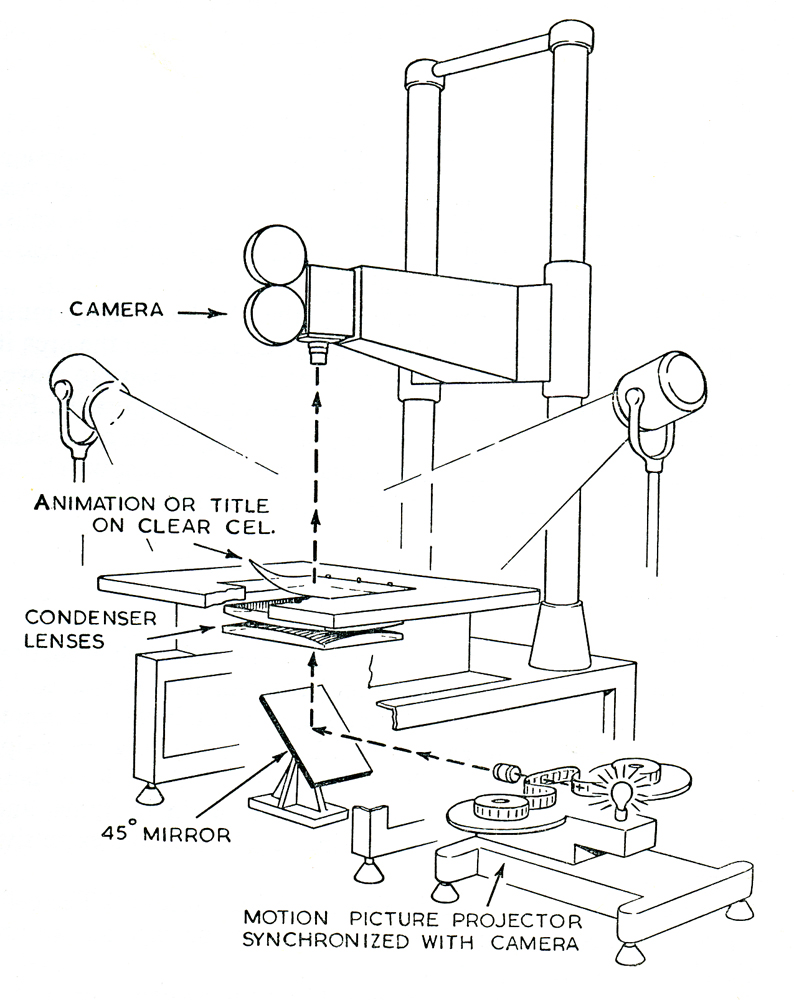 For this amount and with a Super-8 camera anyone could animate. It was not designed for professional work, but for families, schools and filmmakers who wanted a stand to play with. An animation kit was also being assembled to familiarize neophytes with the tricks of the trade. It would explain the rudiments of animation, how to work with cycles such as a person running, walking, etc., and other effects which could be achieved easily and economically.
John Oxberry was interested in animation as an art form, as a means of recreation and self-expression, not just as a business. His knowledge of film in general was amazing, and he continually worked toward furthering his understanding. He didn’t care much about becoming famous; he just wanted to work, to learn, and to enjoy whatever he was doing. His basic grasp of concepts and their relation to each other enabled him to keep things in perspective. “I always avoided getting involved on the subject of lights. Everybody has his own idea of how lights should be, and you can argue about them till the year one. It’s a peculiar thing…a lot of people don’t realize it, but when taking a picture in animation, it doesn’t make a difference whether your color temperature is right or wrong. But they think, ‘Gee, it’s got to be just right for the platinum glass.’ They call it an optical flap. An eight-by-ten piece of optical flap costs around $25,000, and they don’t even know what it is. If you put down a background, any background, nobody knows what color was originally chosen. They only see what’s on the screen. What are they going to compare it with? Now if we had a pretty girl with pink cheeks, and we could make a Turner girl out of her or something like that, we could see the difference; everybody would know. You could look at the face, the pink cheeks, and the little blonde hairs on the eyebrows, and you could compare with a memory. But in animation, you haven’t seen the original so there’s nothing you could compare it with. I would like to see the color temperature of a light that’s practical to use. But down at the hardware store, I could buy two showcase lamps, and the color temperature may be 2700, way down at the bottom. Things will look a little redder, perhaps, so I think a little bluer when I’m drawing. Now they last for one year, and cost a dollar and a half, so I think a little blue…that’s all.”
John Oxberry was a quiet almost solitary individual in the film industry. His name was never up in lights and some will say that his achievements have been sorely neglected. But if a man’s work is any measure of his greatness or importance, then John Oxberry’s prominence as an artist and craftsman is undoubtedly beyond question.
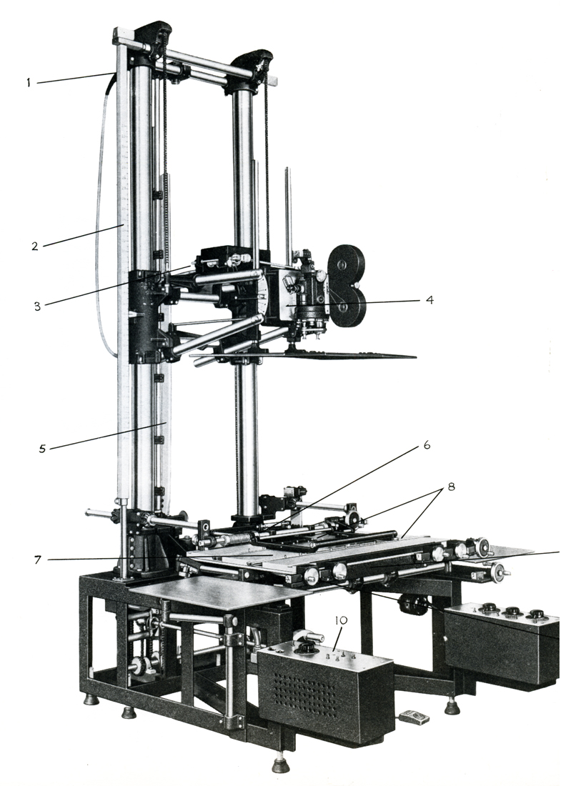
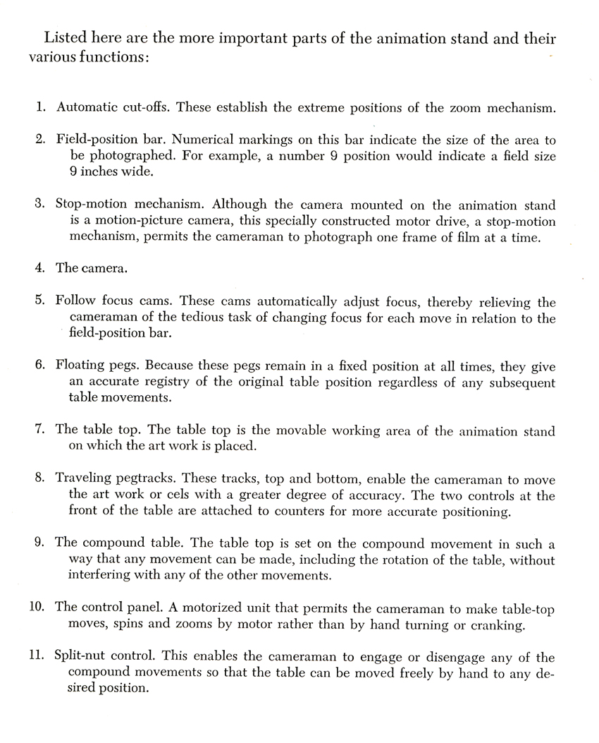
Details of an “Oxberry Animation Stand”
from Eli Levitan’s Animation Art in the Commercial Film
Articles on Animation 24 Oct 2008 08:22 am
Jim Simon – 1975
 - Earlier this week, I posted a piece from the 1975 animation issue of Millimeter Magazine which gave a bio for Tissa David. Within the same column there was another animator who’d made waves in NY back then.
Jim Simon had created Wantu Animation which gave a “black” presence on the animation scene. Jim would annually win a lot of ASIFA East awards with his short spots, and you’d be impressed with the well animated output. His design sense was original. However, he left the city’s animation scene for LA and got involved in Yogi’s Space Race, the Smurfs and X-Men. After that, I’ve completely lost track of his career. If anyone knows where he has ended up, please don’t hesitate to leave a comment.
Many of his short pieces for Sesame Street are up on YouTube, so you can get an idea of his studio’s output.
Here’s the bio that was printed in 1975:
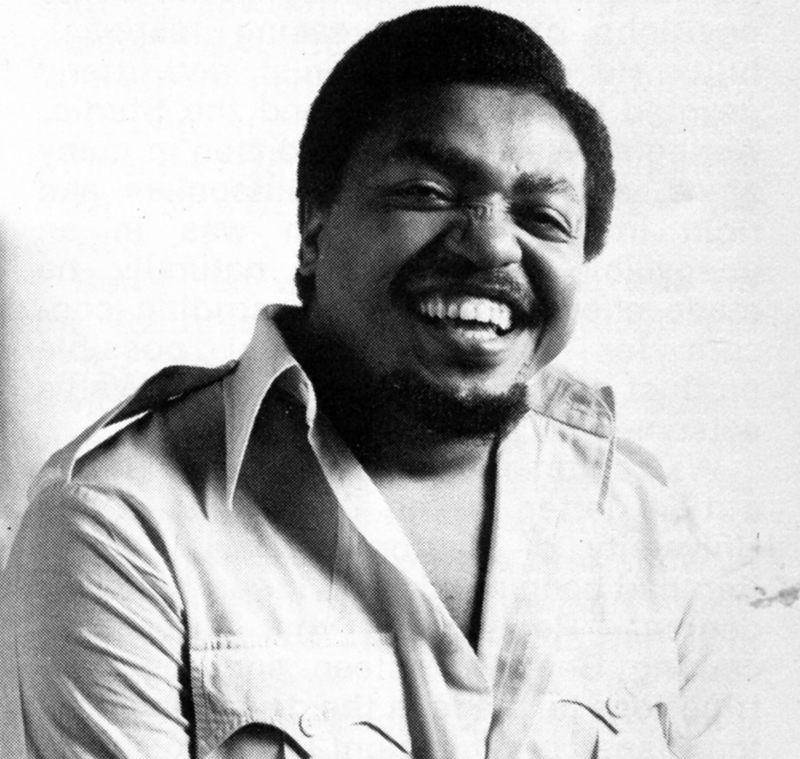 Wantu Animation is the hot new studio in New York, and Jim Simon is the young animator who is making a lot of people sit up and take notice. They notice the infectious brand of humor, the outrageous characters, the catchy music, the non-stop swirl of captivating motion inherent in all of Jim’s work. In fact, they noticed so much that he has been receiving awards for his animation right and left.
Such recognition is not entirely new to him, either; upon graduation from the High School of Art and Design, he received an award for excellence in animation, two scholarships from the Junior Epstein Memorial Foundation and a scholarship to the School of Visual Arts. There he majored in live-action TV production but became more and more drawn toward animation because of the personal satisfaction afforded him. Out of school, he landed a job at Paramount Motion Pictures cartoon studios as a background artist. Four months later the studios closed down, but by then Jim had managed to join the union. Having so little experience, he couldn’t get much work, until the director of’Paramount came back to New York with the Spiderman TV series. After a year and a half on that as assistant animator, Jim decided to freelance on his own. “I was turning out so much work, they had to promote me, because I was earning more money than some of the full-fledged animators. But it got to the point that I was just too excited about the things going on inside my own head, which I could not release while working for someone else. Also, I was young and wanted to gather a bit of knowledge about the different studios and different aspects of the business. After freelancing fora year, I realized that I wasn’t going to be allowed to animate this way either. I figured the only way I was going to become an animator was by making myself an animator.” When he inquired about doing work for Sesame Street, he was told he would need a reel and a company. “So I borrowed $250, hired a lawyer to set up a company, did a couple of story boards on my own but sticking with the Sesame Street vein of thinking, and marched back up there. And right off the bat, they bought four of the five boards that I had brought up.” That was the start of Wantu Animation. “Wantu” is Swahili for “beautiful” and the symbol used for the logo means “new birth.” That’s the theme of the company, the New Birth of Beautiful Animation, and Wantu hasn’t stopped growing since.
“There’s a new show coming out in September called Vegetable Soup. We were contracted to do the musical opening for it, plus 13 cooking spots for which Bette Midler did all the voice tracks, and also 48 thirty-second breaks. When you add it all up, it comes to about an hour’s production for our first year. We’ve won four awards for that particular show already, and two for Electric Company films. One particular film did not win all the awards, which goes to show that we’re a well-rounded studio.”
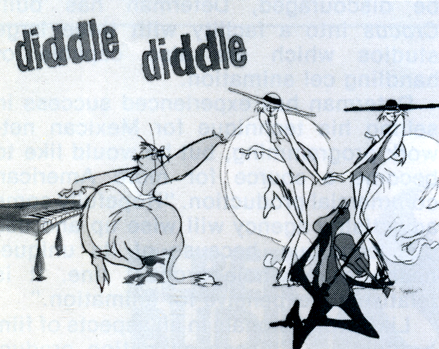 His unique style of drawing has earned Jim a few puzzled comments. “When I first did the boards for Hey, Diddle Diddle, people looked at them and said, ‘What are they? Some of them don’t even have eyes.’ They were cats, cool cats. No eyes on them, but you believe them when they’re moving. I’m basically a ham. I used to be very shy, but I lived through my characters. If I had another profession to choose, I would probably want to be an actor. When you see my characters moving around and doing crazy things, that’s me letting off steam.”
“There’s nothing coming out of agencies that we cannot do, and deliver on time,” states Jim. “We’ve turned approximately fifty films this year, about three, sometimes close to four minutes a week. Some of our freelance animators can hardly believe that they can see their finished work a few days after they do their part. We’ve gained about four years experience in this one year from the amount of things we’ve done, and the time we did them in. We’ve built up tremendous confidence in ourselves and our capabilities.”
Besides this confidence, Jim also harbors a special kind of optimism. “We’re working on a TV special; we developed the characters around Bette Midler, and she loves them to pieces. We also have concepts for features and other specials, but the hardest is always getting that first one across.”
Such personal flair is making Wantu Animation a studio to watch for, that is if you haven’t noticed it already.
You can watch “Hey Diddle Diddle” on YouTube. Go here.
Animation &Articles on Animation &Tissa David 21 Oct 2008 08:03 am
Tissa – 1975
- The 1975 issue of Millimeter Magazine is an animation issue. There are a number of enormously informative articles. I was rereading the copy of the magazine, this past weekend, when I came across the Close Up section, wherein a couple of bios appear.
I’d like to show one for Tissa David that was included. I assumed John Canemaker authored the piece; there is no byline. When I asked him, he responded thus: “I wrote the article on Tissa. The quotes are from my first formal interview with her.It was for Millimeter when I was the animation editor and put together special animation issues.”
Tissa looks so young in that photo.
-
“I am a frustrated comedienne, for sure,” Tissa David will tell you, only if you ask. “I am a clown. If I weren’t shy, I’d probably be on the stage.” Instead she is an animator, one of the world’s best and busiest, and one of the few women to have reached the top in the traditionally male-dominated animated cartoon field.
She joyfully toils in her East-Side New York apartment, a warm, plant-filled place that often smells of baked apples. Classical music swirls quietly from a radio and the glow cast from the light under her animation board gives her the look of a sorceress.
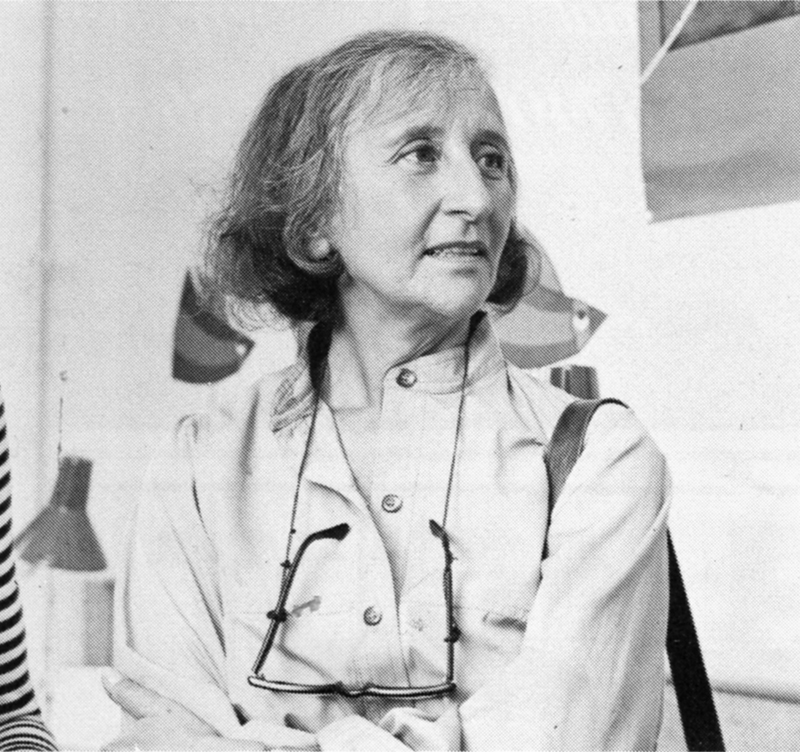 The lady has class—a fact one gathers upon first meeting, but a fact that is reaffirmed by catching a look at the creatures she is conjuring to life on her drawing board. The graphic line is strong and free, yet elegant (as is the artist); and when the drawings are flipped, the creatures move through their paces with a deliciously droll humor, a wit that is uniquely Tissa David’s.
As a child in her native Hungary, Tissa saw Disney’s SNOW WHITE and thought (as so many others have thought after experiencing that film masterpiece), “Now this is something I want to do.” After graduating from art school, she became an assistant animator at Magyar Film Iroda in Budapest; a little more than a year later, in 1945, she was a co-owner of the Studio Mackassy and Trsi supervising all phases of production including story and camera and was sole animator of the puppet and cartoon films.
She left Hungary in 1950 during the height of the Stalin regime, and finally landed in Paris.
Jean Image Productions hired her in September 1951 and for two years she read sound tracks, planned layouts, animated, and did the entire editing of the feature-length, BONJOUR PARIS (1953). That studio closed and Tissa animated at La Comete next, a studio that had been Paul Grimault’s.
“I had absolutely no relatives outside of Hungary except in the United States. So I asked for a visa in 1950. It took at that time five years to get a visa, that was still the quota system. So I came to New York…I loved the U.P.A. cartoons. I decided I wanted to work in that studio.” In 1956, the United Productions of America’s New York Studio was the last tenant in a brownstone on Fifth Avenue and 53rd Street slated to be torn down for the construction of the 666 Tishman Building. There was a French girl in the UPA studio and so she introduced me,” Tissa recalls. “I had no sample reel. I went in once to make a sort of tryout. I was scared; I didn’t speak English, so I was just waiting, waiting, and Grim came by…Grim Natwick is the history of animation and I can rave about him. He created Betty Boop and animated the character of Snow White all the way through. UPA had an awful lot of work and they needed an assistant to Grim.”
At that initial meeting, Natwick boomed, “Now, you know what animation is!” Tissa quietly answered, “Animation is—animation.” Natwick laughed, “You can’t argue with that!” and thus began a professional partnership that lasted twelve years. “Isn’t it strange,” says Tissa today, “that SNOW WHITE got me into animation and I really learned my animation from Grim. I know a great deal about animation, I know I know, because even today I don’t do one line without something in my brain Grim told me.”
After UPA closed in 1958, Tissa and Grim freelanced as a team on countless TV commercials, and since Grim’s retirement, Tissa has soloed successfully and most notably on several John Hubley projects, i.s.: Of Demons and Men (1970), Eggs (1970), Children’s Television Workshop segments Cool Pool Fool, True Blue Sue, Truth Ruth and others, and Cockaboody (1973). Her latest animations include three CTW Letterman episodes, a scene in Shamus Culhane’s Noah’s Ark production, and over 110 feet of Hubley’s Bicentennial film, People, People, People. She has just completed some experimental animation fora Dick Williams project and is now starting, also for Hubley, a TV special based on Erik Erikson’s writings.
A description of Tissa David’s style of animation is difficult; for while it is a distillation of the Disney influence in timing, the UPA sense of humor-through-graphic-design, and the strong, poetic John Hubley mode, it also contains a different character, unique to Tissa David, that she calls the “female difference…If the same scene is animated by a man and by me, there will be a great difference, not in quality but in interpretation. John Hubley told me I have a fine sense for detail, not in the drawing itself because I make very loose drawings, but in a scene, in expressing feelings. I am a very intuitive animator—I never know when I sit down to work what will happen.”
 For all her gentleness, Tissa also contains an inner core of strength exhibited in her single-minded devotion to her art. Her opinions about that art, herself and other topics, is disarmingly to-the-point: “I believe very strongly that one must know how to draw,” she will offer on the subject of how-to-animate. “Even if you just animate objects, you must have a knowledge of drawing.” As for her struggles securing her place in animation, Tissa will admit, “…its very hard. Women can find work in animation if they have enough will to follow through and really do it. Even today, I’m always saying if I keep busy long enough, I will become a good animator.”
At the time this piece was written, Tissa was completing work on a pilot for Dick Williams’ film, Raggedy Ann & Andy; this one minute piece got Dick the film over Joe Oriolo and Shamus Culhane. She would thereafter work on John Hubley’s Doonsebury Special (just as he died mid film); and she was to animate for R.O.Blechman’s Simple Gifts.
Articles on Animation &Puppet Animation &repeated posts &Trnka 17 Sep 2008 07:31 am
Trnka Graphis revisited
I love Jiri Trnka’s work, and in June 2006 I posted this. It’s worth revisiting.
- To continue with my interest in animators that leave fingerprints, I return to the father of all puppet animators, Jiri Trnka. I have this Graphis Magazine article from 1947. This was published before any of the great Trnka films: The Hand, Archangel Gabriel and Mother Goose, Midsummer’s Night Dream.
Regardless, there are still some beautiful images in his earlier work.
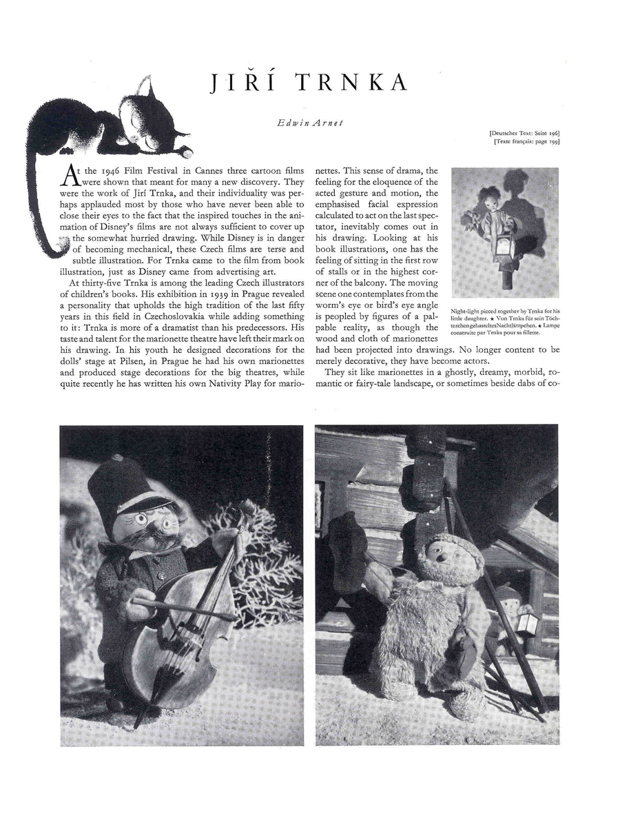
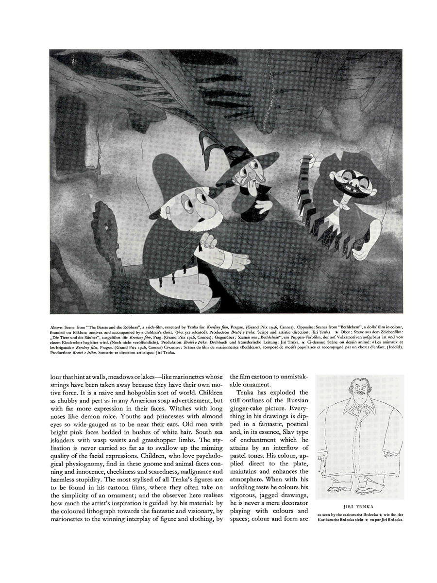
(Click on any image to enlarge.)
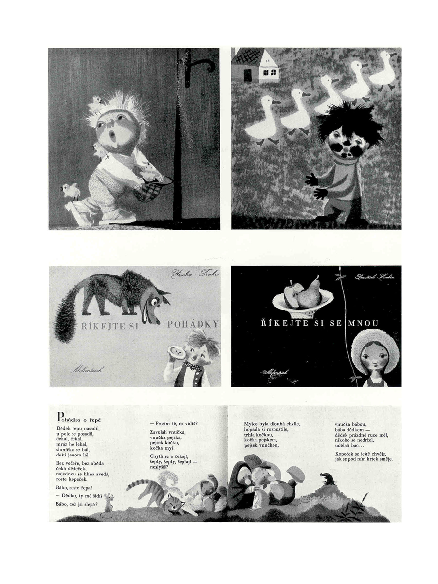
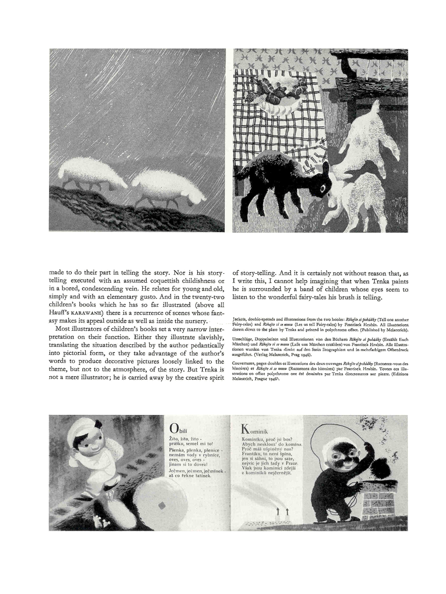
(Note: Graphis printed in three languages; all of the English is included.)
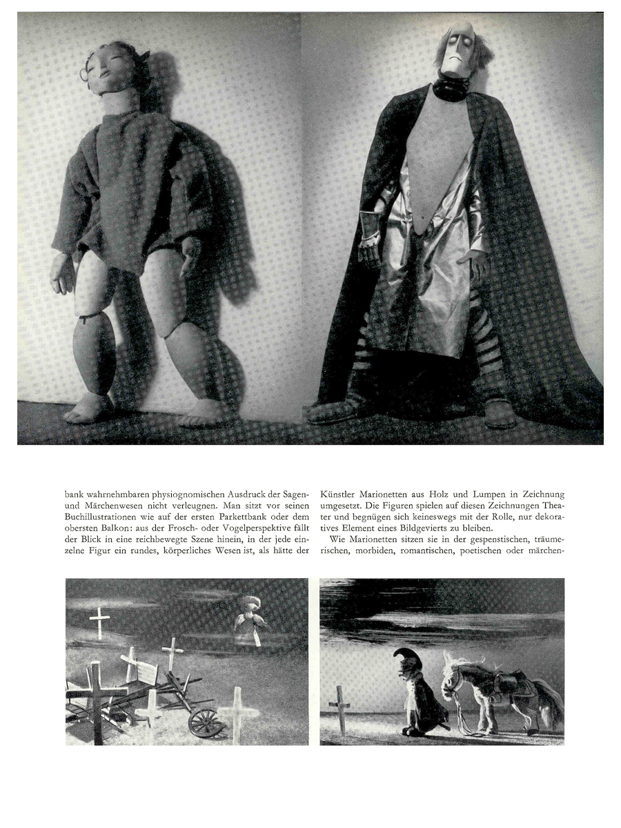
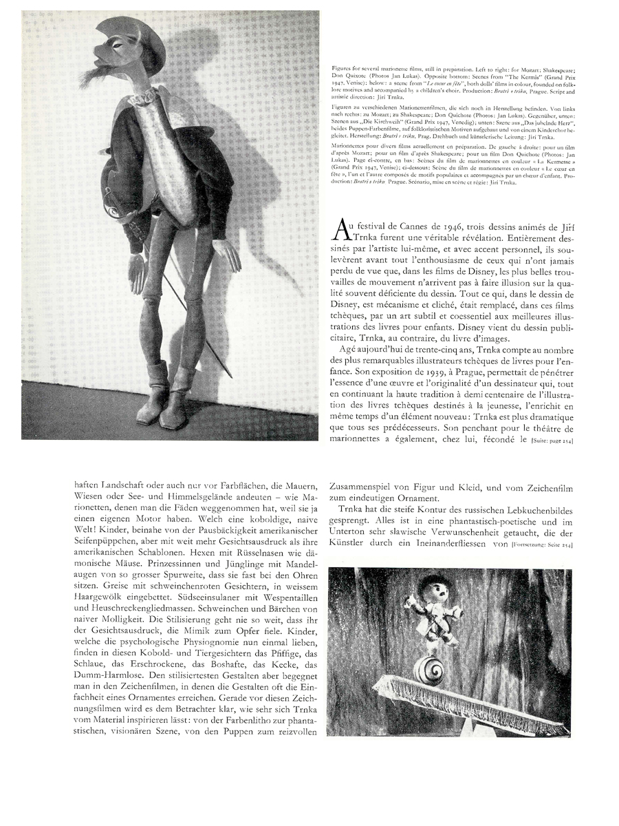
Articles on Animation &Festivals 16 Sep 2008 08:31 am
Off to Ottawa and UPA
 - Today I’m leaving for the Ottawa Animation Festival and I’m, of course, expecting to have a good time. I’ll probably be far from a computer so don’t expect to be posting new pieces until next Monday. However, I have chosen some golden oldies to post again and don’t think those who visit will be disappointed.
In Ottawa, I’m looking forward to the few programs of my studio’s work. They’re scheduled for Saturday, September 20th @ 1pm and Sunday, September 21st @ 11am.
There are also two programs at the National Arts Gallery for children. These are scheduled for Wednesday, September 17th @ 11am and 1pm.
Other than that, I look forward to the Richard Williams program on Saturday at 7pm, and I’ll see that again in its NY incarnation next Monday. I’ve also been told that the show will be different from the Ottawa program, and I have no doubt about that.
To add to the post, I’m grateful to Paul Spector for sharing this magazine piece (it may be missing its intro.) The magazine, as far as I can tell, is an old ASIFA publication.
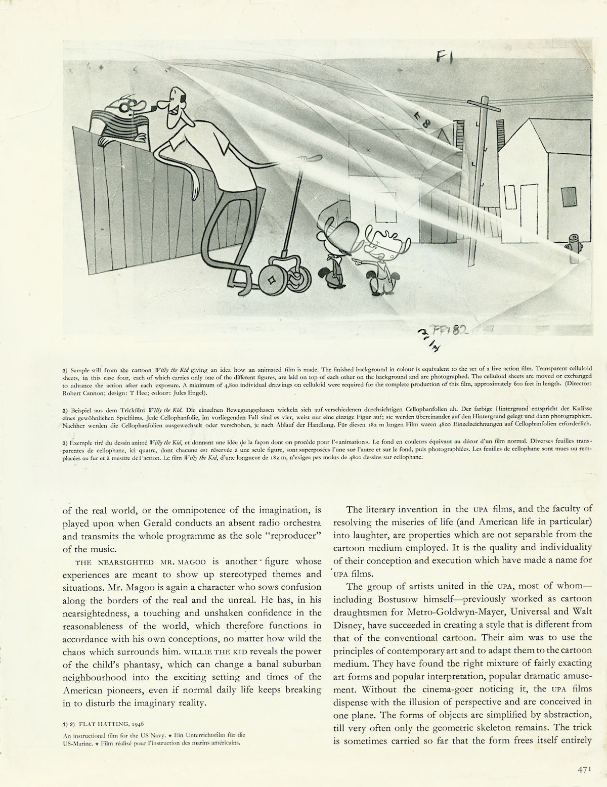
(Click any image to enlarge.)