Category ArchivePuppet Animation
Animation &Books &Commentary &Puppet Animation &Trnka 20 Aug 2013 02:32 pm
Trnka’s “Bayaya” repost
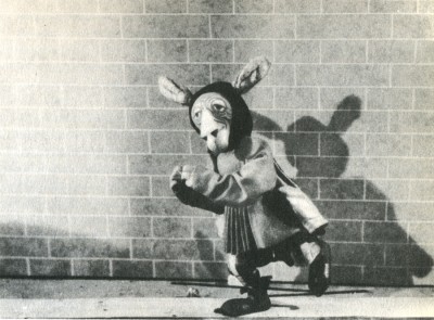
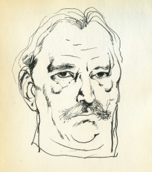 – Early in the history of this blog, I wrote quite a bit about Jiri Trnka. This man’s artwork has long been a source of great inspiration to me. His illustrations for the fairy tales of Grimm and Andersen are stunning and the two books are of inestimable value to me. His puppet films are so brilliantly strong and lyrically beautiful that I was overwhelmed when I first saw them, even though his reputation preceded them. I’d read enough about him and owned a magnificent biographical account of his work, that I was confident I would be a bit disappointed when I finally saw the films. I wasn’t.
The Hand was magnificent and remains one of my favorite films, to this day.
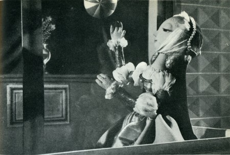
The Archangel Gabriel and Mother Goose is a beautiful animated puppet film about Venice during the late Middle Ages.
The Midsummer Night’s Dream is a feature-length masterwork that has to be seen for any lover of animation – nevermind puppet animation.
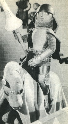 The film, Bayaya was a mystery to me for many years. It was not an easy film to view. Back in the 70s, there was no video, and seeing Trnka’s films meant trips to the NYPublic Library in NY to visit their collection of 16mm films. There you could watch any of the collection or borrow them to watch at home. These films were often littered with many bad splices where the films had broken. The quality of the colors deteriorated over the years. It made for tough viewing, but it also made it possible to see some of the Trnka canon.
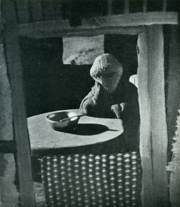
Bayaya was not part of this collection. In fact, I’ve only seen part of the film once. John Gati, a NY puppet animator who was a good friend, located a copy of a 20 min excerpt (in Czechoslovakian) for an ASIFA-East screening and showed it to a small audience in a classroom at NYU. The print was black and white, but since I’d only seen B&W illustrations, this made sense.
This film represented a strong change for Trnka. He had previously done a number of cel animated films. These shorts were remarkable in that they were a strong step away from the Disney mold. This was a bold step to take in the animation community in Europe circa 1947.
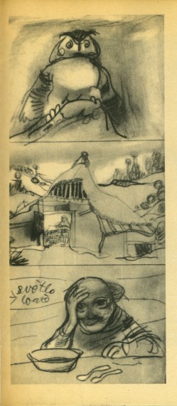
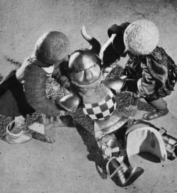
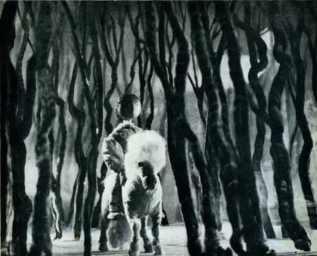
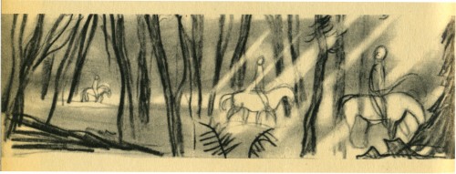
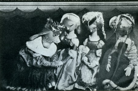
The film was purely lyrical, and the story accented the folk tales quality of these legends of Prince Bayaya and The Magic Sword. Consolidating the two, he named the film after the hero and made him the embodiment of courage, morality and honor.
Trnka considered Bayaya a turning point in his career. He realized that the puppet film had taken on new strength and he had to follow through with every film thereafter.
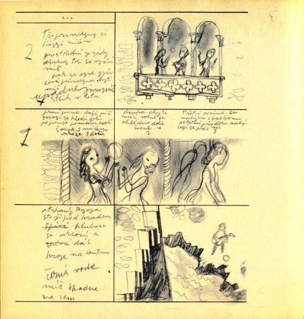
Here are a couple of scenes from the Trnka book I treasure, Jiri Trnka: Artist & Puppet Master.
There are two parts of a documentary on Trnka available via YouTube. They’re worth the watch. Part 1, Part 2.
Animation Artifacts &Articles on Animation &Commentary &Puppet Animation &repeated posts 08 May 2013 12:49 am
Ray Harryhausen (6/29/1920 – 5/7/2013)
- Greg Kelly, a good friend of this blog, wrote to tell me that Ray Harryhausen has died. You can read about it here, in Time Out or here in the NY Times or here at Jerry Beck‘s Animation Scoop.
Thanks, Greg, for the alert.
In honor of Mr. Harryhausen’s brilliant career, I’m re-posting this article about Jason and the Argonauts which I once posted. The piece features Jason and the Argonauts. There was a chapter from Mr. Harryhausen’s 1972 book, Film Fantasy Scrapbook, about that film. I’d like to show it again. The book is written in the first person singular and collects B&W images like a scrapbook.
Here it is:
Of the 13 fantasy features I have been connected with I think Jason and the Argonauts pleases me the most. It had certain faults, but they are not worth detailing.
Its subject matter formed a natural storyline for the Dynamation medium and like The Seventh Voyage of Sinbad strayed far from the conventional path of the “dinosaur exploitation film” with which this medium seemed to be identified.
Taking about two years to make, it unfortunately came out on the American market near the end of a cycle of Italian-made dubbed epics based loosely on the Greek-Roman legends, which seldom visualized mythology from the purely fantasy point of view. But the exhibitors and the public seem to form a premature judgment based on the title and on the vogue. Again, like Sinbad, the subject brewed in the back of my rnind for years before it reached the light of day through producer Charles Schneer. It turned out to be one of our most expensive productions to date and probably the most lavish. In Great Britain it was among the top ten big money makers of the year.
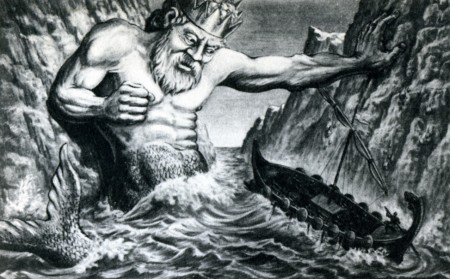
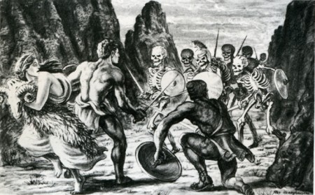
A preproduction drawing (above) compares favorably with a film still (below.)
The drawing is quite a bit more dynamic. (After all, it is Dynamation!)
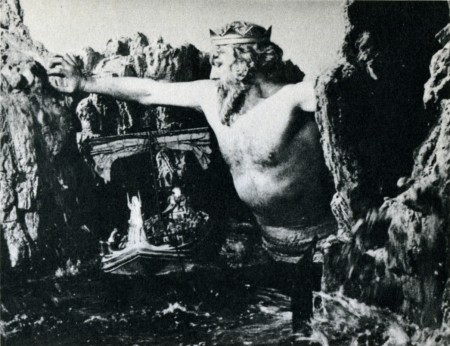
(Click any image to enlarge a bit.)
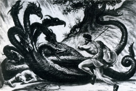
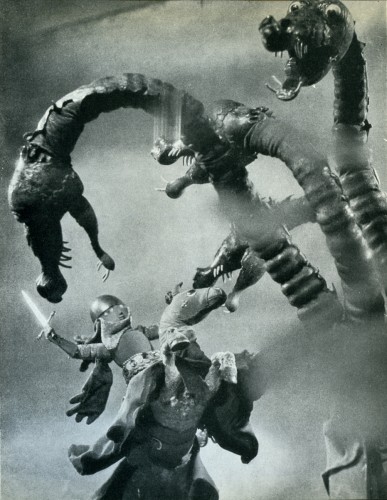
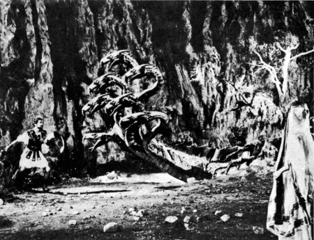
Likewise, a drawing of the hydra (above) film still (below.)
Some of the difference in basic composition between the pre-production sketches I made for Jason and the counterparts frames of the production is the direct result of compromising with available locations.
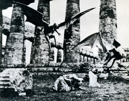
For example, the ancient temples in Paestum, southern Italy, finally served as the background for the “Harpy” sequence. Originally we were going to build the set when the production was scheduled for Yugoslavia. Wherever possible we try to use an actual location to add to the visual realism. To my mind, most overly designed sets one sees in some fantasy subjects can detract from, rather than add to the final presentation.
Again, it depends on the period in which it is made as well as on the basic subject matter. Korda’s The Thief of Bagdad was the most tastefully produced and designed production of any film of this nature but unfortunately the budget that was required would be prohibitive with today’s costs.
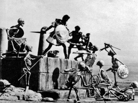
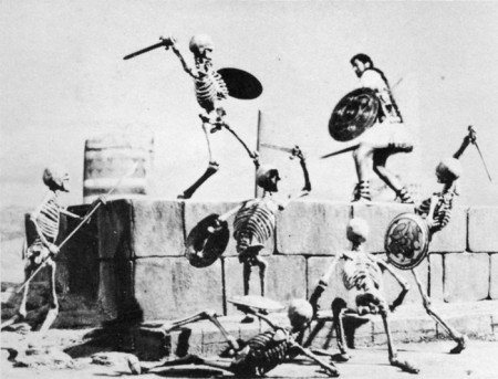
The Skeleton Sequence was the most talked-ahout part of Jason. Technically, it was unprecedented in the sphere of fantasy filming. When one pauses to think that there were seven skeletons fighting three men, with each skeleton having five appendages to move each frame of film, and keeping them all in synchronization with the three actors’ movements, one can readily see why it took four and a half months to record the sequence for the screen.
My one regret is that this section of the picture did not take place at night.
Its effect would have been doubled.
Certain other time-consuming technical “hocus-pocus” adjustments had to be done during shooting to create the illusion of the animated figures in actual contact with the live actors. Bernard Herrmann’s original and suitably fantastic music score wrapped the scenes in an aura of almost nightmarish imagination.
In the story, Jason’s only way of escaping the wild battling sword wielding “children of Hydra’s teeth” is to leap from a cliff into the sea. (Above left) A stuntman, portraying Jason for this shot, leaps from a 90-foot-high platform into the sea closely followed by seven plaster skeletons. It was a dangerous dive and required careful planning and great skill. It becomes an interesting speculation when dealing with skeletons in a film script. How many ways are there of killing off death?
(Above right) Another angle with the real Jason jumping off a wooden platform into a mattress a few feet below. The skeletons and the rocky cliff were put in afterwards while the mattress was blotted out by an overlay of sea.
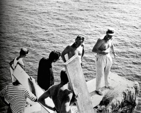
Director Don Chaffey and Ray Harryhausen discuss the leap
with Italian stunt director Fernando Poggi.
When transferring published material to the screen it is almost always necessary to take certain liberties in the work in order to present it in the most effective visual terms. Talos, the man of bronze, did exist in Jason legend, although not in the gigantic proportions that we portrayed him in the film. My pattern of thing in designing him on a very large scale stemmed from research on the Colossus of Rhodes.
The actor: his blocking the only entrance to the harbor stimulated many exciting possibilities. Then too, the idea of a gigantic metal statue coming to life has haunted me for years, but without story or situation to bring it to life. It was somewhat ironic when most of my career was spent in trying to perfect smooth and life-like action and in the Talos sequence, the longest animated sequence in the picture, it was necessary to make his movements deliberately stiff and mechanical.
Most of Jason and the Argonauts was shot in and around the little seaside village of Palinuro, just south Naples. The unusual rock formations, the wonderful white sandy beaches, and the natural harbor were within a few miles of each other, making the complete operation convenient and economical. Paestum, w its fine Greek temples, was just a short distance north. All interiors and special sets were photographed in a sm studio in Rome.
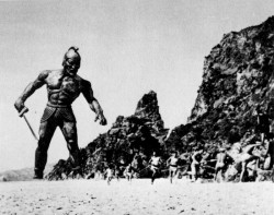
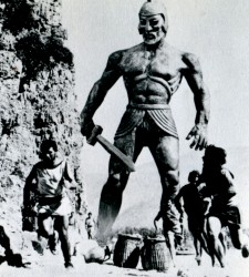
 (Above left) Talos, the statue of bronze, pursues Jason’s men.
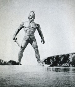
(Above right) Talos blocks the Argo
from the only exit of the bay.
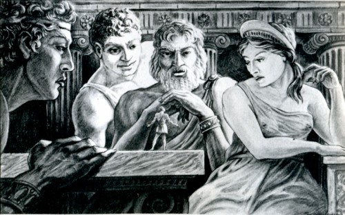
Pre-production drawing of Jason speaking to the Gods of Greece.
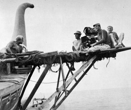
For the second unit operation a special platform had to be fitted to the Argo in order to achieve certain camera angles. Although it looks precarious it was far more convenient than using another boat for the shots.
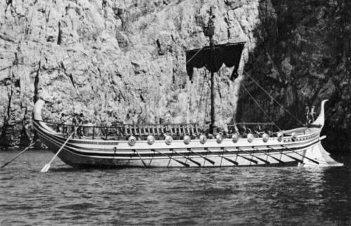
The Argo had to be, above all, practical in the sense that it must be seaworthy as well as impressive. It was specially constructed for the film over the existing framework of a fishing barge. There were twin engines for speed in maneuvering, which also made the ship easily manipulated into proper sunlight for each new set-up.
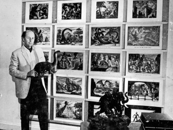
Harryhausen off the book’s back cover
to give an idea of scale of drawing sizes.
Models &Puppet Animation &repeated posts 02 May 2013 04:26 am
The Hand and Fingerprints
As you can tell, from some of my recent postings, I have always had a love affair with puppet animation. There’s something extraordinary about that medium that has drawn me in. I’ve always demanded a tactile approach to animation, including all of the 2D work I’ve done.
 I remember seeing Lady & The Tramp in 1955, on its first release (I was nine.) It was then that I consciously noted that one of the backgrounds in the “Bella Notte” sequence (I can now see that it was an Eyvind Earle BG) had texture in its paper. The board it was painted on came through the animation photography and reached out to me. The human hand became evident in the film.
Perhaps, this was what I loved so much about animation in the first place. Humans did it, and it was self-evident. Being reminded of it, in the subtlest ways – usually unintentional, added to my joy.
Perhaps this is what brought me to John Hubley’s films. Those films were so obviously painted: characters and BG were both used by the photographer to combine for us, and the unintentional was often caught on screen. (I immediately loved those highlighted rings double-exposed around the characters in Moonbird, the brush strokes of The Hole, the transparency of the characters’ paper in Of Stars and Men.) It added to the experience.
In a sense, I was brought out of the film but held in it and given the opportunity to love it even more.
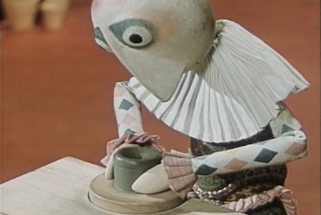
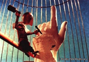 I’ve had this same sense with the best 3D animation. Though I was always there viewing it, I was also caught up in the emotions of the film. Trnka’s masterful film, The Hand, had my understanding those tears and sweat on the little potter were moistened ink that had been his painted eyes. But the anguish I felt the first time I saw the film and that effect has never left me. The perfections of the Human Hand in that film forced the imperfections of the puppet potter to be revealed until it destroyed him.
Perhaps this is also what keeps me from embracing cgi animation. Despite the faked textures of the computer, it’s so obvious that it is not real. At least not when the characters are cartoons.
A very small example of what I’m trying to communicate stands out for me in Cars. The paint job of newer cars has a flecking/speckling of glitter within the paint. In the right light, the main character, Lightning McQueen, had this paint job. Everytime I saw it, I was distracted and pulled out of the film. Like the real paint on a real car, that flecking was embedded within the paint, itself. It didn’t feel like the byproduct of a human hand; it felt like a computer trick.
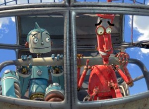 I am no more capable of coloring the computer skin of that computer hand than I am of painting a real car. It isn’t tactile for me, it’s just distracting.
It’s just something I never feel I can reach out and touch. This is something that has been overcome, for me, in a couple of films. The Incredibles gets very close often. Moments of Robots, such excellent design for the medium. Some of Toy Story.
(Click on any image to enlarge and enjoy the textures.)
Of course, I recognize that this is my problem. However, I recognize it’s a problem that other people probably have and wonder if there isn’t a solution. In The Iron Giant, the Giant is animated by a computer. I was told that the animation had to be rigged to be animated on “two’s” so that it wouldn’t separate from the rest of the hand-drawn animation. Oddly, it felt totally acceptable to me; I saw no problem and accepted that robot. There has to be, in there, a way to resolve it – I’m just thinking here and don’t expect anyone to try to follow what I’m saying. Perhaps if “human” problems, technical problems, were added to the animation. . . No this is even too stupid for me.
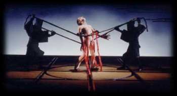 Barry Purves has made a number of absolutely beautiful films and has created in his own studio some masterfully realized pieces. His work has a discriminating taste, graceful and controlled movement with superb acting, and an intelligence that is rarely found in animation today.
He was nominated for the Academy Award for his film Screenplay, a virtuoso work which follows the rules of Kabuki theater and presents a double-layered story of a man watching and revealing a story from his past which eventually rips through the past and tears at the present. It’s a work of animated puppetry, displayed as theater and a stunning film that should have won its Oscar.
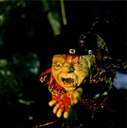 Rigoletto presents the opera in a condensed version that has been reduced for television. It’s a packed half-hour which places you into the full opera and allows you to follow it without any confusion. It has a majesty in its sweeping and dynamic camera moves which whisk you along in the luscious music; they carry you along through the depths of the complex story. It’s a wonderful film that certainly grows richer with each viewing.
Other works he’s done include a wonderful film about Gilbert & Sullivan: The Very Models gives us the pair as seen through the eyes of D’Oyle Carte. A rich and entertaining diary into the making of this film can be found on AWN and a short clip of the film is available there as well.
As a matter of fact, I found his diary there so entertaining, I’ve also followed the diary he keeps on his own website.
You can get a small glimpse of Barry Purves‘ craft by viewing the clip reel at Acme Filmworks. But you’re left without the full heft of his work until you’ve seen the complete storytelling ability he presents in the whole films.
Books &Commentary &Puppet Animation &repeated posts 27 Dec 2012 07:28 am
Jason Recapped
- I’ve thought about stop motion animation recently. Films like ParaNorman are beautifully made oversized spectacles that feel, to me, as if they were trying to mimic cg animation. The quality of the 3D animation has just about moved to the “slick” mode; the work has gotten so well done. This is the ultimate effect of mixing the computer with actual puppets, dolls that the computer creates that are then filmed. Isn’t that what happens with the hundreds of thousands of facial positions that are being created? I have a preference for Tim Burton’s puppet motion in films like Frankenweenie. You can feel the fingerprints on those dolls, unlike the excellent work done on ParaNorman.
I know, I’m complaining about the work being too well done. Too good to satisfy me. I just wonder what Ray Harryhausen would have done in this market. How would his films – rarely on ones, often clunky in its movement – have been accepted by modern audiences? Would audiences balk at that? Or would his extraordinary imagination take the bill and give us plenty to take in?
Last night I went to the movies and saw a lot of 3D action adventure trailers of films coming soon: Jack the Giant Slayer, Oz: The Great and Powerful, even the 3D version of Jurassic Park. There were more of them whose titles I’ve forgotten. They all seem the same – Loud and crushing with all those violent 3D moves. The same whooshing sound effect with every cut. It’s hard to get excited about any of them.
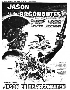
I once posted an article featuring Jason and the Argonauts. There was a chapter from Mr. Harryhausen’s 1972 book, Film Fantasy Scrapbook, about that film. I’d like to show it again. The book is written in the first person singular and collects B&W images like a scrapbook.
Here it is:
Of the 13 fantasy features I have been connected with I think Jason and the Argonauts pleases me the most. It had certain faults, but they are not worth detailing.
Its subject matter formed a natural storyline for the Dynamation medium and like The Seventh Voyage of Sinbad strayed far from the conventional path of the “dinosaur exploitation film” with which this medium seemed to be identified.
Taking about two years to make, it unfortunately came out on the American market near the end of a cycle of Italian-made dubbed epics based loosely on the Greek-Roman legends, which seldom visualized mythology from the purely fantasy point of view. But the exhibitors and the public seem to form a premature judgment based on the title and on the vogue. Again, like Sinbad, the subject brewed in the back of my rnind for years before it reached the light of day through producer Charles Schneer. It turned out to be one of our most expensive productions to date and probably the most lavish. In Great Britain it was among the top ten big money makers of the year.

A preproduction drawing (above) compares favorably with a film still (below.)
The drawing is quite a bit more dynamic. (After all, it is Dynamation!)

(Click any image to enlarge a bit.)

Likewise, a drawing of the hydra (above) film still (below.)
Some of the difference in basic composition between the pre-production sketches I made for Jason and the counterparts frames of the production is the direct result of compromising with available locations.
For example, the ancient temples in Paestum, southern Italy, finally served as the background for the “Harpy” sequence. Originally we were going to build the set when the production was scheduled for Yugoslavia. Wherever possible we try to use an actual location to add to the visual realism. To my mind, most overly designed sets one sees in some fantasy subjects can detract from, rather than add to the final presentation.
Again, it depends on the period in which it is made as well as on the basic subject matter. Korda’s The Thief of Bagdad was the most tastefully produced and designed production of any film of this nature but unfortunately the budget that was required would be prohibitive with today’s costs.

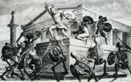
The Skeleton Sequence was the most talked-ahout part of Jason. Technically, it was unprecedented in the sphere of fantasy filming. When one pauses to think that there were seven skeletons fighting three men, with each skeleton having five appendages to move each frame of film, and keeping them all in synchronization with the three actors’ movements, one can readily see why it took four and a half months to record the sequence for the screen.
My one regret is that this section of the picture did not take place at night.
Its effect would have been doubled.

Certain other time-consuming technical “hocus-pocus” adjustments had to be done during shooting to create the illusion of the animated figures in actual contact with the live actors. Bernard Herrmann’s original and suitably fantastic music score wrapped the scenes in an aura of almost nightmarish imagination.


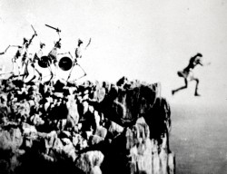
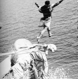
In the story, Jason’s only way of escaping the wild battling sword wielding “children of Hydra’s teeth” is to leap from a cliff into the sea. (Above left) A stuntman, portraying Jason for this shot, leaps from a 90-foot-high platform into the sea closely followed by seven plaster skeletons. It was a dangerous dive and required careful planning and great skill. It becomes an interesting speculation when dealing with skeletons in a film script. How many ways are there of killing off death?
(Above right) Another angle with the real Jason jumping off a wooden platform into a mattress a few feet below. The skeletons and the rocky cliff were put in afterwards while the mattress was blotted out by an overlay of sea.

Director Don Chaffey and Ray Harryhausen discuss the leap with Italian stunt director Fernando Poggi.
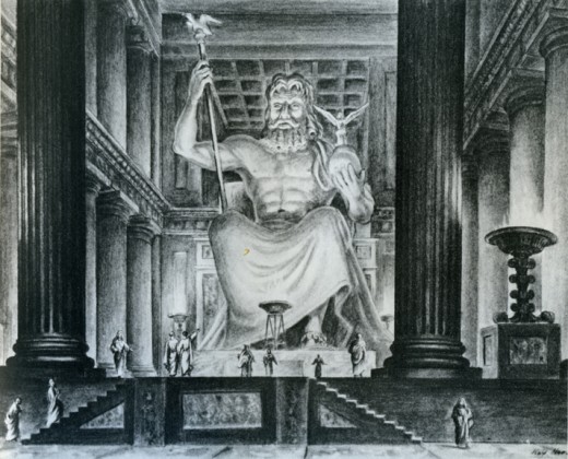
When transferring published material to the screen it is almost always necessary to take certain liberties in the work in order to present it in the most effective visual terms. Talos, the man of bronze, did exist in Jason legend, although not in the gigantic proportions that we portrayed him in the film. My pattern of thing in designing him on a very large scale stemmed from research on the Colossus of Rhodes.
The actior: his blocking the only entrance to the harbor stimulated many exciting possibilities. Then too, the idea of a gigantic metal statue coming to life has haunted me for years, but without story or situation to bring it to life. It was somewhat ironic when most of my career was spent in trying to perfect smooth and life-like action and in the Talos sequence, the longest animated sequence in the picture, it was necessary to make his movements deliberately stiff and mechanical.
Most of Jason and the Argonauts was shot in and around the little seaside village of Palinuro, just south Naples. The unusual rock formations, the wonderful white sandy beaches, and the natural harbor were within a few miles of each other, making the complete operation convenient and economical. Paestum, w its fine Greek temples, was just a short distance north. All interiors and special sets were photographed in a sm studio in Rome.

 (Above left) Talos, the statue of bronze, pursues Jason’s men.

(Above right) Talos blocks the Argo
from the only exit of the bay.

Pre-production drawing of Jason speaking to the Gods of Greece.
For the second unit operation a special platform had to be fitted to the Argo in order to achieve certain camera angles. Although it looks precarious it was far more convenient than using another boat for the shots.

The Argo had to be, above all, practical in the sense that it must be seaworthy as well as impressive. It was specially constructed for the film over the existing framework of a fishing barge. There were twin engines for speed in maneuvering, which also made the ship easily manipulated into proper sunlight for each new set-up.

Harryhausen off the book’s back cover
to give an idea of scale of drawing sizes.
Animation &Commentary &Puppet Animation 06 Sep 2012 06:30 am
Toys in the Attic – review
- This is my idea of heaven. This week in politics can only get better tonight. The Democratic convention is full of intelligent, smart speakers who are performing at their height. I spend my days waiting for the nights. Those speeches are just too delicious. How can my politics NOT slip over into this Splog!
.
.
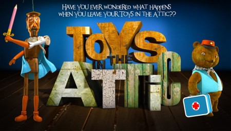
- The animated feature, Toys in the Attic, opens in theaters tomorrow, Sept. 7th.
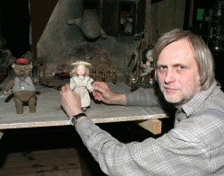 I’ve received a number of emails from the producers of this animated feature. It was done in the czech Republic and has been adapted for English Speaking audiences. The voices inlude Joan Cusack, Cary Elwes and Forest Whitaker in the English language version. The film was directed by Jiřà Bárta, who has done a number of other films which, like Toys in the Attic, are mixed media: 3D stop-motion mixes with 2D animation which mixes with pixillation and live action. It’s an attractive and exciting film which depends less on technology than on knowledge of the medium from filmmaking to animation.__________________Director, Jiřà Bárta
The stop-motion puppets are not of the Laica variety. There is no heavy financing behind them that they can create millions of facial movements that are replaceable so that any emotion can animate into another one. The animation is not quite as slick and, consequently, looks more hands-on.It’s very effectve, just the same. I think of Ray Harryhausen’s work which strobes and is awfully clunky in many parts, but it’s still grabbing in its emotional simplicity.
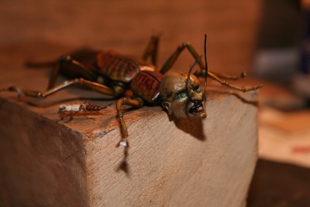
Weird bugs
The sets and costumes, the puppets and the mixed-in 2D animation all sing hand-made and very human. There’s an enormous attractiveness to this, and it’s all so creatively done. A character wals in front of a mirror; his reflection is a 2D version of himself. Trains pull in and out of stations and travel all across the attic. The smoke out of the train, the billowing steam from the engine. It’s all a linear 2D animation. Water floodsan area. The water is done using sheets of blue fabric moving forever forward animated as water even though it’s obviously made of cloth. Oh yes, 2D animated drops of water bounce around the cloth water. (It reminded me of Fellini’s Casanova (1976) when he went to the sea. The sea was made of large sheets of billowing black baggies. It’s obvious that it isn’t water, but somehow you bought the theatricality of it. Here, I bought the cloth running water, but I wonder if children will not be puzzled, or will their minds go with the flow of the director? I’d really like to know.)
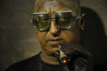 The story is a simple one:Buttercup , a little doll with a penchant for housekeeping, is kidnapped. Lots of mechanical insects do the job for a living breathing statue/bust the color of a dark patina (a greenish-gray which includes his live action teeth). The bust seems to move in live-action (though it also appears to be animated in some odd way); maybe just part of it is live action, the rest pixillated. Buttercup’s friends, led by a wooden Don Quixote marionette (without strings), a teddy bear, and a mouse doll set out to save her.
The film is like a Svankmajer film for children. It’s more Eastern-European than the Quay Brothers and almost as surreal. Oddly, you sit there with your eyes glued to the screen as oddity after oddity moves forward. Desie the celebrity voices, I didn’t recognize one of them. They all wheeze and grunt and have accents. All their lines are partial sentences and short bursts. It’s quite original. I have to say that I never got emotionally invested in any of the characters. Sweet Buttercup is an old-time children’s doll who keeps house for others.
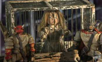 When she’s kidnapped, she’s thrown in a cell where she continues to sweep. Every once in a while, the captors pour ashes in on her from overhead. She’s covered with ashes and left in the pitch-black dark. Yet she continues to sweep. What else is there for her to do?
I probably felt more sympathy for the wooden Don Quixote. There seems to be a vulnerability in the old puppet event though the animation of the character isn’t overtly invested with any real character traits that I’d look for as an animator. It moves well but not with any
This film is certainly like nothing that would ever be made in Hollywood. William Joyce wants to do this but is too clean, airbrushed and slick; totally lacking in textured personality. The distributor calls Jiřà Bárta a Czech Tim Burton, but I can’t agree. Burton works in a style that pops out in your mind – you’d recognize the style that everyone tries to steal. Bárta’s style is much more surreal; it’s a play on reality not a stylization of it.
This is one curious movie that I enjoyed, but I’m not sure it’s for everyone’s taste. I wasn’t kidding when I dropped the Svankmajer name. There’s no doubt that Bárta has seen his work.
If you’ve seen the film please let me know what you thought.
I’d be curious to read your review.
Commentary &Puppet Animation 14 Aug 2012 03:48 am
ParaNorman Screening and Talkback
- This past Sunday at 10am there was an industry screening of ParaNorman at a theater two blocks away from my home. I’d planned to go. I was asked to moderate the talkback, a Q&A with the directors of the film: Chris Butler and Sam Fell. Naturally, I said yes.
 – Heidi and I arrived at 9:30; there was a bit of a line outside the theater. I was told to ask for Kia Muhammed of Focus Pictures. The doors to the theater were locked, so we had to wait until someone arrived to let me in and bring me to the Focus front desk. No other films were screening this early, so there weren’t many other places to go.
I wanted to be prepared to find out how long the talkback would be; would there be mikes for the three of us as well as for audience members who were going to ask questions. I learned that they’d planned for a smaller theater but were given the one we got. That meant they cut off the front section and planned to put three tall stools there for us to sit and for me to ask questions. Easy. I’d planned on getting a bit of background information from the two directors about the genesis of the film as well as their backgrounds. Then I’d open it up to the audience’s questions.
But first the film.
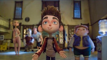
The Babcock Family
Grandma, Mom, Dad, Norman and Courtney
Laika, the producers of this 3D stop-motion film had first done Coraline under the direction of Henry Selick. Amusing that Coraline was on cable tv this morning just prior to the screening. I stopped and watched a couple of minutes. There’s some beautiful animation in that film, but in some ways it also felt limited in its animation.
I’m not sure if there was a bit of a projection problem, but we had no picture at first, just triumphant logo music. It then cut into a smaller screen mock-low-budget zombie flick. It didn’t take long to realize that Norman was watching it on tv with his grandmother – his dead grandmother. Apparently Norman could see dead people. We learn that he gives more attention to them on his walk to school than he does to the real people on the street who just stare at the strange child.
Norman, it turns out, is being bullied at school for being a bit strange, and he has only one friend. The fat kid, Neil. These characters are beautifully developed as are many of them in the film. I also liked the voices quite a bit. Just looking over the cast, I was surprised to see John Goodman’s voice on the list. He does a bit of acting this time out, so that’s a pleasure to hear his character. I recognized Jeff Garland’s great voice as Norman’s father, but I didn’t recognize Elaine Stritch as his grandmother. I’m not the biggest fan of her work. She normally chews the scenery in overacting everything she does, but I think she did a great job here.
Norman with the John Goodman character
The animation was superb. Everything seemed to be on ones and beautifully fluid. There were a lot of peculiar and erratic moves that seemed totally natural to the characters on screen. The directors told us there were a number of scenes, particularly crowd shots that had some cg characters added since it would make the FX work much easier.
The climax of the film involves a lot of FX as the witch’s curse is brought to a close so that the dead, seen by Norman, can go back to rest. Very arresting imagery here makes it strong visually.
My only problems with the film had to do with the story. I found it sagging quite a bit midway. The emotional wallop isn’t strong enough because everything for some time seems to be at an even pace. I would have liked to see it vary a bit more, heightening and lightening throughout. This is the hardest part of filmmaking; it’s something I have my own problems with, and I think it changes with experience.
I enjoyed this film more than Coraline, and I think they’re onto something with the stop-motion animation. There’s a tactile sense to the film that you never get with cg. I’d recommend it, and I think it’ll do well.
As the credits started to roll, I went outside to meet the two directors. I told them basically what I would be asking about and asked if there was anything they wanted to get across. From there we went inside to our appointed seats and microphones. The microphones, of course, turned on but didn’t work. We just spoke loudly, and I instructed the audience to do the same when they asked a question.
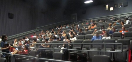
Half the audience in that kind of uncomfortable theater
They kept the lights on the audience down low, and the lights up front, where we were, a bit brighter, though I learned we were basically in the dark.
We got into it. Midway through the conversation the house lights went on, and I knew we’d soon hear our voices booming. Sure enough, the mics turned on, squealing across the theater. We just shut off the mics and resumed talking in our natural voices.
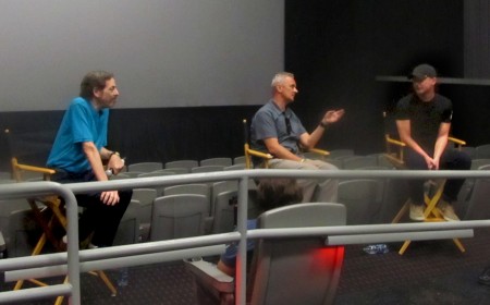
(L to R) me, Sam Fell, Chris Butler
Chris Butler was the sole credited writer, so I asked about the script. He, apparently, had started it while he was working in the story department on Coraline. He got the chance to show it to Travis Knight and sold the script as their next film. From his vantage point there was no break between the two features. Sam Fell, who’d started animating for Aardman got to direct Flushed Away and The Tale of Despereaux. From there he met with Chris Butler. The two hit it off, and they got to work together on ParaNorman.
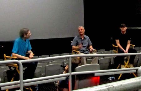
(L to R) me, Sam Fell, Chris Butler
I asked what differences had happened to stop-motion animation in the recent past since we’re no longer doing the clunky animation of Alice in Wonderland anymore. He talked about playback, photography, replacement faces (which are printed out from computers so that the animation is much smoother) and apparently, they do rehearsed versions of the scenes, whether on 2s or 10s, sort of an animatic rough of the scene, so that the director will know exactly where they’re going. Digital was the magic word to make the stop-motion animation better,.
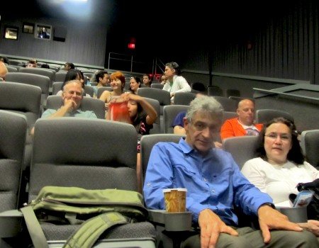
the other half of the audience
The questions from the audience typically ranged from good to dumb. Bill Plympton asked what it was like directing animation from Travis Knight, their boss. They said they didn’t have to be critical since he was a very talented animator who usually did his rehearsals on 2s. Someone else asked the budget, and they said they really had no knowledge of that aspect. (What else should they have said?) There were a number of questions about the replacement faces that were printed by computer, and other questions asked about the sets – how many and how large.
Basically, the directors were friendly, courteous and pleased to be able to talk about their work. I think they’ll have something of a hit on their hands.
Aside from all the other press material available on line, there’s a nice slide show on the NYTimes site as well as an article about the making of the film.
There were many others from our local talent at the screening. Admittedly I wasn’t paying much attention since I had the talkback on mind. Here are a few of those there that I can roll of the top of my head; they included Candy Kugel and husband, Chuck; John Dilworth and girlfriend, Marie; Bill Plympton and wife, Sandrine; Signe Baumane with a couple of her interns; and Jaime Ekkens.
Commentary &Puppet Animation 11 Aug 2012 06:16 am
Puppet Animation
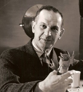
- When I was young I was into puppets. All kinds of puppets. I made puppets, all different type of puppet. Marionettes were made of wood and string or muslin and string. Hand puppets were made of muslin and other types of cloth. I never really went into sock puppets; they were too easy. But I did buy puppets. There was a whole line of marionettes made of a wood-like resin of the Disney characters I had the Tramp and Lady. I had Mickey Mouse and Donald. I had a puppet theater in the back yard, and the kids of the neighborhood would pay to see shows I put on with a couple of siblings. The candy counter made a lot more money for us.
Even more interested in animation, I spent most of my time trying to teach myself everything about film. Naturally, puppet animation was something I worked a lot. It’d take time to animate drawings and then more time to color them and shoot them. It was faster to animate puppets. Once you had the model, you could just keep going. I have all this 8mm film of different types of puppets animated. For some reason a “Twist-o-flex” Goofy running from a Lionel train chasing him down a track stands out. It was fun.
I was in love with Georg Pal‘s films and watched all that I could get my eyes on. I watched a lot of European animation on some of NY’s local channels. They’d infrequently have stop-motion Eastern European films. Once in a while some local channel wold run Lou Bunin‘s feature, Alice in Wonderland, or I remember watching Jiri Trnka‘s feature version of A Midsummer Night’s Dream. Richard Burton narrated it and did all the voices. That Sunday afternoon was heaven. I’m not sure if it was the film or the fact that I had some alone time in my house. (When you have a family of seven, you appreciate those quiet moments.) It didn’t take much for me to become a fan of Trnka’s work; his work sang to me. The more I looked into it, the greater he became.
This was just when Jim Henson was breaking on the scene. The muppets didn’t exist yet. I give this all as introduction to what this past week has meant to me. It was a week of puppet animation in New York.
Alice
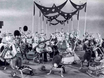 Monday night, the Museum of Modern Art had a screening of Lou Bunin‘s 1950 feature film, Alice in Wonderland. Heidi and I went to the screening that had about half of the seats filled. I’d forgotten that the film was shot in AnscoColor. This was post WWII, and England didn’t have access to the three strip Technicolor. The film was limited to red and green colors, so everything looked chartreuse or orange. In other words, ugly.
The brown mixture grew more and more annoying as the 90 minute feature progressed. The costumes were designed to exploit the two strip color hues, and this might have been a mistake. Alice was dressed in a chartreuse and orange dress, and she might have stood out more attractively had she been wearing white. In fact, the film looks much better when shown in B&W.
 The state of puppet animation wasn’t quite so sophisticated in 1950, at least as it would seem from this feature. Many clunky character moves revealed the budget constraints of the film. The magic and grace of the George Pal shorts felt missed on Lou Bunin’s film, but there, again, the disparity of the budgets had to have been noticed.
I briefly met and worked with Lou Bunin in the early days of my career. John Gati, a stop motion animator in New York hired me to work on a Care Free Sugarless Gum commercial. Care Free and Trident gums undressed and jumped onto a scale with Care Free weighing more for your money. It took a week to do the 20 secs. of animation in the spot. But just as we were completing animation, we learned that Trident had changed their packaging, and we had to redo the entire spot. At the end of the second week, and the second version of the spot, we learned that Care Free would update their packaging, as well, and we had to do the spot a third time. One week’s work stretched to three, but the work was getting redundant and irritating.
In the middle of that third week, Lou Bunin moved into a corner of the studio. I learned that he was doing a test spot. He was doing a version of the Lucky Charms elf as a puppet and animating it. The puppet was a beauty, and I convinced Lou to allow me to work for him (for free) to assist in the spot. I enjoyed myself for a few more days, and got to meet the man who’d made the only stop motion animated feature.
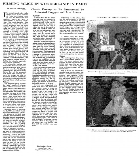
A news item during the making of Lou Bunin’s Alice.
Quay Brothers
- Just 12 hours later, at 10am on Tuesday, there was a Press showing of the Quay Brothers exhibit at MoMA. I was invited, and I took the opportunity to see the show with the fewest numbers of people who would gather around the smallish artwork. They told us where to go in the Museum (which had another hour before opening) and left us on our own. I went back in the evening to the opening party. Go here to read my review.
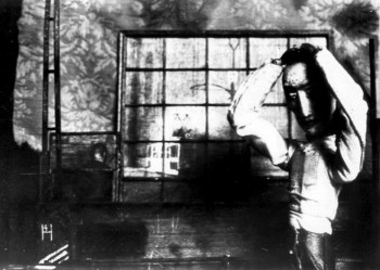 I reviewed this in detail this past Thursday. The show was exhilarating for me. Since getting the first taste of the Quay brothers back in 1980 when I saw their early film Nocturna Artificialia at the Ottawa Animation Festival. A good half of the audience didn’t know what to make of the movie and were impatient. The other half were completely taken by the film and knew it was one of the best of the films we’d seen. The jury at that festival deservedly gave top prize to Tale of Tales. That was the same year that Yurij Norshtein took the world with his masterwork of a film. Indeed, Tale of Tales was (and still is) a greater film than Nocturna Artificialia. (Interesting that Tale of Tales is a cut out animation film – essentially also stop motion.)
 Of course, the brothers Quay are more than stop-motion filmmakers. They’ve done live action as well as documentary films; they’ve designed theater sets and books and record albums. The Blood Sweat and Tears first album cover is theirs. They were asked to design the cover without heads on the musician’s bodies. According to the brothers, the record company didn’t trust them to do the heads correctly; so the producers pasted hi-contrast images on the heads of the bodies, and they didn’t match the graphics the brothers had done. (Actually, the story isn’t properly told on the museum’s wall note; they make it sound as if the brothers had decided to leave the musicians headless, and the record company had to correct the situation. At the very least, it’s ambiguous and led to someone questioning the brothers during the museum’s Q&A.)
ParaNorman
- Then there’s ParaNorman. This film is scheduled to open next week. It’s a stop-motion animated feature from Laika, the company that backed Henry Selick in the making of Coraline. They got rid of Mr. Selick, and made a follow-up feature about zombies called ParaNorman. I’m scheduled to see that film tomorrow morning in an industry screening. In fact, I’ve been asked to lead the talkback, a Q&A with the directors: Chris Butler and Sam Fell. Mr. Butler had been the storyboard supervisor on Coraline, and Mr. Fell had been a director of the cgi features, Flushed Away, the first non-puppet feature from Aardman, & The Tale of Despereaux.
I’ll report on the event and review that film on Tuesday.
By the way, when I last spoke to them yesterday, I was told there’d be some extra seats. So if you’d like to see ParaNorman on Sunday at a 10am show try going to this link: ParaNorman. Note that they say that RSVPing doesn’t necessarily guarantee a seat. At the moment, I know there are seats available; hopefully everyone will be able to get in.
RSVPs.
SUNDAY, AUGUST 12TH
10:00 AM
AMC Loews Kips Bay 15
570 Second Avenue (@ East 32nd Street)
The NYTimes today has an article about ParaNorman and puppet animation.
Some After Thoughts
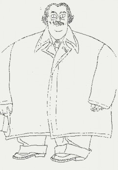 Gene Deitch‘s birthday was this week (he likes to point out that his birthday was 8/8 (August 8th when he turned 88.) He’s still keeping the blog up and he’s writing a new book. (If you haven’t read his book, How to Succeed in Animation, on AWN, go get it now – it’s free.
There are a couple of key things about puppet animation on his site, Roll the Credits. The information about his firendship with Jiri Trnka is worth the price of admission.It’s just great reading with lots of key photos.
Gene also has a video tour of the Kratky Puppet Studio, a walk-through with Bretislav Pojar. This is a handy llittle treasure of a video. Thanks to Gene from all of us who love puppet animation.
Art Art &Illustration &Layout & Design &Puppet Animation 09 Aug 2012 06:04 am
the brothers Quay
- This week marks the opening of the large show of art and films of the twin brothers, Stephen and Timothy Quay, at the Museum of Modern Art.
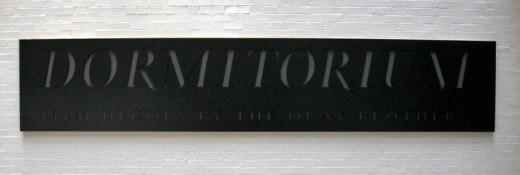
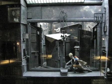 Part of the show is the display of the glass and reflective casings they’ve constructed called Dormitorium.
This was previously displayed in New York at the Parson’s School of Design in 2009, and it was well covered on this blog. Here.
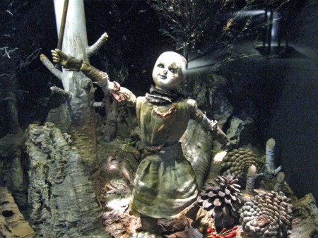
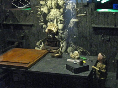
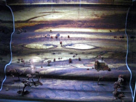
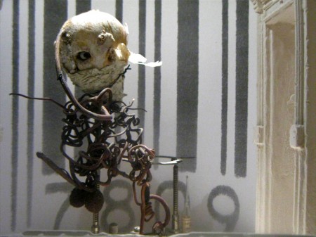
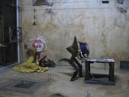
This part of the show is still exciting and interesting. Magnifying and distorted glasses 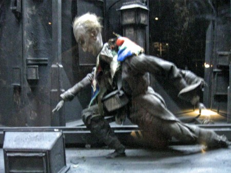 reveal portholes within boxes wherein struggling puppets exist within very tactile worlds. Harsh strokes of bark mix with feathers, muslin and strong textile designs. I’m not sure if anything is being stated within these boxes except a display of the world of isolation and dissonance Kafka has already introduced to us. However, it’s certainly hypnotic peering through these cracked glasses at the prepared tableau.
The displayed art fills the vestibule leading to the Titus 1 theater on the lowest level of the museum. It might take a good half hour to properly view all of these constructions. Yet, one is always in awe of the detailed work that has gone into construction of the enclosed world and the many hours of intense labor it took to produce. Patterns and studied period costumes meticulously constructed; props of foliage and raw wood blend with iron and other mixed metals. Then, light calligraphic type blends softly with all these course grains. There’s a lot to absorb in the tiny claustrophobic boxes. This world relates well with the similar animated stop-motion films of the brothers.
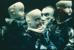 The principal part of the show sits upstairs on the second floor just around the corner from the main cafe. Small rooms have walls covered with delicate photographs, etchings, and drawings. Puppets encased in glass enclosures sit within these walls of flat art. It’s assembled chronologically, and at the very beginning we see separate pieces of art signed by the two brothers. Two landscapes, one by Stephen, one by Tim – both 8 years old. This is the only piece of art not attributed to the Quay Brothers – the pair of them. Very delicate drawings with the signature of both brothers. There are no exceptions within this show other than those two tiny landscape paintings. One easily understands the dual signature on films or even etchings where different responsibilities can be joined. This is difficult to understand two names attributed to an extremely delicate and detailed pencil drawing. However, this is the universe they’ve established, and it’s an original distinction. It fits into the world of the Quays, where everything feels man-made, done at the turn of the Century (19th to 20th Century). It’s a world wrought by the Industrial Revolution, an art that has nothing to do with digital anything. You can feel the hands that have molded these artworks.
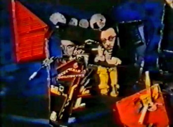 There are many rooms wherein films, the principal part of their art, play out on warm gray walls. A few black folding chairs sit in front of these screens in the tight spaces. Visitors can sit and watch for a minute or for the entire film. I stopped for all of the films but sat through only one, Igor, a film about Igor Stravinsky, Jean Cocteau and Vladimir Mayakovsky. This was the first of the animated biographies they did for Channel 4 out of their own studio in London, Atelier Koninck. It works through Constructivist art to move the three through Paris and their art world. The studio was founded in conjunction with Keith Griffiths, another student they met at the Royal College of Art who became a lifelong partner in producing their works of art.
The first film that the brothers made that grabbed my attention played at the 1980 Ottawa Animation Festival. Nocturna Artificialia confused half the audience of cartoon lovers and excited the other half. Art was alive at that Festival and it felt a small disappointment that the brothers (very new to the animation world – in fact, no one had heard of them back then) had not come to the Festival with their film. This is a case, though, where the film certainly did all the talking that it had to. Tale of Tales deservedly won the Grand award that year, but the Quay brothers were well introduced to American animators.
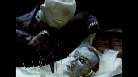
Street of Crocodiles
It was only a few short years later, 1986, that the film, Street of Crocodiles, would make its debut and make the brothers famous. This still remains one of their best known films, although the music video for Peter Gabriel’s Sledgehammer would be their best known work.
The MoMA exhibit continues through to the end of its space, packed to overflowing. Many works stand out from the rest though they all display a singular vision – that of the Quay Brothers.
I attended a Q&A with the brothers Quay led by Ron Magliozzi who organized the show as the Associate Curator of the Dept. of Film. At first, there was a brief conversation with the four, including Peter Reed, the Senior Deputy Director of Curatorial Affairsfor MoMA. This was eventually opened to the audience, which meant some not very interesting questions were asked. I’d recorded it with the idea of transcribing the session for this blog, but the questions were so mundane that the brothers were almost astonished, and I dismissed the notion of transcribing as pointless. One person asked if they’d had nightmares as children to be able to create such dreamworlds. The answer was no, they didn’t dream and the art is not a dream world. Another questioner asked if they felt they’d had a nutritional shortage as children which might have created such ideas as adults. Tim immediately answered, “Yes,” to that, and Stephen quickly responded, “Too much white bread and peanut butter.”
I went to the Press Preview in the morning to be able to view the show at length. The only two I saw there that I knew were Candy Kugel (of Buzzco) and Richard O’Connor (of Ace and Son.) I came back in the evening for the official opening party. Drinks and hors d’ oeuvres with a moderately crowded audience that covered the first floor of the museum and swelled out to the MoMA sculpture garden. It was a warm and humid evening, so it was nice outside, but air conditioned inside. Groups traveled upstairs and down to see the art, but to drink, eat and socialize many just stayed on the main floor. I met up with plenty of people I knew including Emily Hubley, John Canemaker, Candy Kugel, Jeremiah Dickey, Josh Siegel (of MoMA), George Griffin and Karen Cooper, among others. Though I’d only seen Stephen Quay at the opening, I was told that Tim was outside in the garden. It was an eventful day that felt filled with art and animation.
Animation Artifacts &Art Art &Independent Animation &Layout & Design &Photos &Puppet Animation 15 Jul 2012 05:43 am
Quay Dormitorium – repost
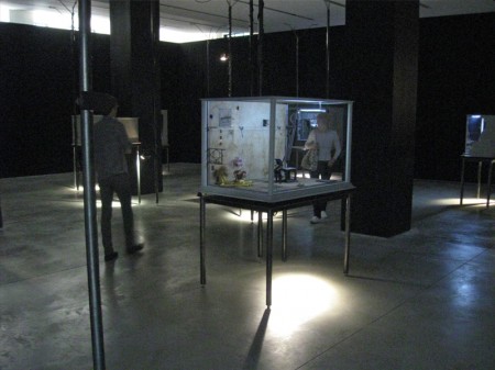
August 11th a big show and retrospective of the work of the Quay Brothers will open at the Museum of Modern Art. Part of the exhibit will be a small puppet world within glass casings that they created called “Dormitorium.” This was actually exhibited in New York several years ago, and I photographed that presentation. I thought this might be a good time to repost it, getting us all in the mood for the world of Quay.
The Brothers Quay have an exhibition on display at Parsons School of Design, 2 West 13th Street on the ground level. It’s on exhibit from now through October 4, 2009.
Stephen and Timothy Quay claim writers Franz Kafka and Robert Walser, animators Walerian Borowczyk and Jan Lenica, puppeteers Wladyslaw Starewicz and Richard Teschner, and composers Leoš Janácek, Zdenek Liška, and Leszek Jankowski among their influences. All of these artists can be felt with each of the constructions on display.
 1
1On entering you see a darkened room with boxes about
the size of your torso – maybe 3′ x 4′ – on display.
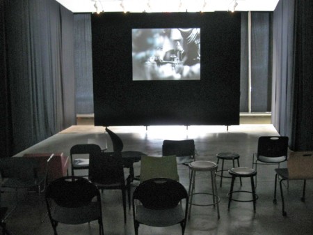
Of to the side there’s a theater with constantly running films
showing Quay brother works. One of every kind of chair.
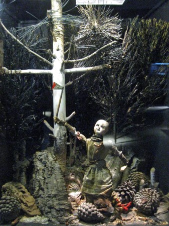
Within the boxes there are whole worlds.
Magnificent detail upon detail.
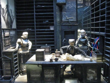
To the next box for a wholly different world.
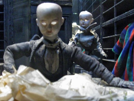
Again the amazing detail is brought to the enclosure.
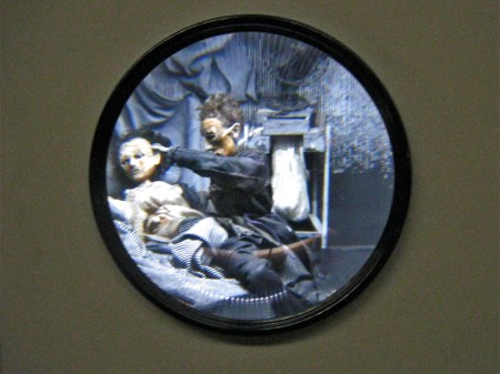
A couple of the boxes are seen through a prism.
The interior is magnified.
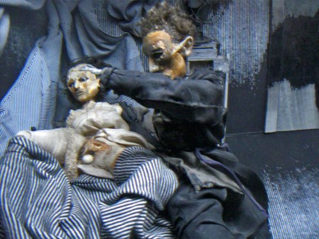
You have to get close to it to get real clarity.
You virtually enter these little rooms.
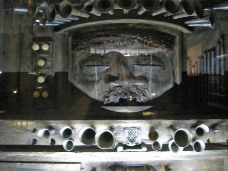
Some of these worlds seem enormous.
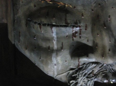
There are many closeups one could take given all there is to see.
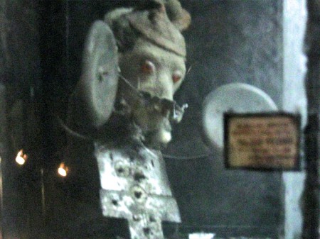
This little scene is in the upper left box of the full view above.

The central character on the main stage.
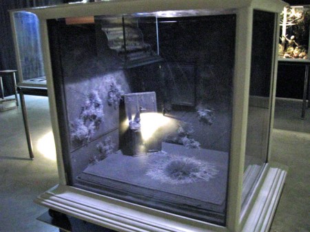
You can get an idea of the cases and the display.
All contain their own little worlds.
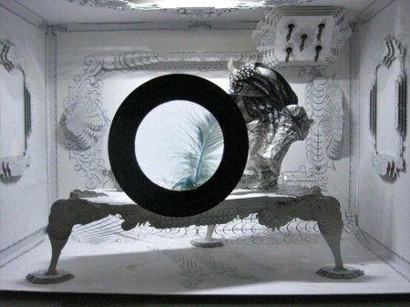
Another magnifying glass focuses on a feather.
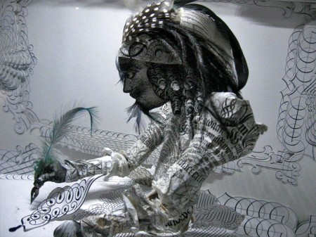
Just beyond the feathered quill there’s the writer.
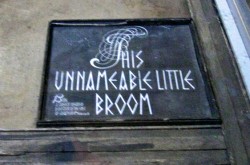
The last box near the exit has a label within.
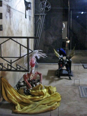
Many of the cases can be viewed
from three different perspectives.
Commentary &Puppet Animation 07 May 2011 07:01 am
Left Overs
- There should be plenty of 3D stop-motion films circling the globe ni a year or two. Recently there’s been a bit of news about a few of these animated features.
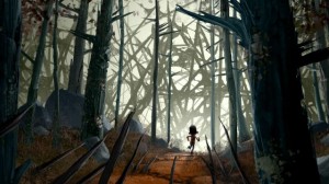 LAIKA, the company that produced Coraline, under the sturdy direction of Henry Selick, has announced a new two picture deal with Focus Features. Their first film, ParaNorman, will be released on August 17th, 2012. The second, yet-to-be-named, picture will be released nationwide in 2014. The first film is being directed by Sam Fell and Chris Butler, from his own original screenplay. Sam Fell was director of The Tale of Despereaux and Flushed Away. Chris Butler was storyboard supervisor on Coraline and storyboard artist on Tim Burton’s Corpse Bride. The voice cast includes Academy Award nominee Casey Affleck (The Assassination of Jesse James by the Coward Robert Ford), Tempestt Bledsoe (The Cosby Show), Jeff Garlin (Curb Your Enthusiasm), John Goodman (Monsters, Inc.), Anna Kendrick (Up in the Air), Leslie Mann (The 40-Year-Old Virgiin), and Tony and Emmy Award winner Elaine Stritch (30 Rock).
Meanwhile . . .
Aardman animation is producing two features in conjunction with Sony Pictures Animation. Arthur Christmas, is a 3D adventure that will hit theaters on November 23, 2011. The voice cast includes: James McAvoy, Hugh Laurie, Jim Broadbent, Bill Nighy, Imelda Staunton, and Ashley Jensen, which is currently in production. The film is being directed by Sarah Smith from a screenplay written by herself and Peter Baynham.
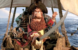 The second feature, The Pirates! In An Adventure with Scientists will be directed by Peter Lord and co-directed by Jeff Newitt. The screenplay is by Gideon Defoe, based upon his books. The vocal cast will include: Hugh Grant, David Tennant, Imelda Staunton, Jeremy Piven, Salma Hayek, Brian Blessed, and Brendan Gleeson.
And . . .
Henry Selick has recently signed to direct features for Disney/Pixar. He’ll be working out of Pixar’s Emeryville, Calif. campus and using their resources. The films he will make will be written and directed by him based on both original ideas and literary properties. This brings Selick back to many of the classmates with whom he graduated from CalArts.
- Last week the ASIFA East Festival was held and awards were presented to the chosen filmmakers. Cartoon Brew posted a note about the winners and included a snarky comment by Amid Amidi which takes a swipe at the board members for entering their films in this local festival. And I do mean local festival. Here’s Amid’s comment:
- ASIFA-East president David Levy also won two of the top awards: Best Educational Film and 1st Place for Independent Film. He’s a nice guy so let’s all look the other way and pretend that’s not a conflict of interest…
 The quality of the film is irrelevant. Doesn’t matter if it’s the best animated short since One Froggy Evening. If the ASIFA-East leadership or board is competing against its members, that’s a serious issue that affects the legitimacy of the awards.
Here’s a response from Adrian Urquidez:
- ASIFA-East board members have always been allowed to participate in the festival and always will because the volunteer board is comprised of active members in the animation community both in their professional and personal lives. In no way are any of the awards just “given to people in their circleâ€, they are voted on by the hundreds of members who participate in the well-publicized jury screenings. We’ve had 42 years of successful festivals, and while always looking to improve, I believe we have a lot to be proud of
If one wants to have a discussion on outreach, fine. But unnecessary slander gets you nowhere.
-Adrian Urquidez ASIFA-East website manager, board member and (horror of horrors) grateful award winner.
The way ASIFA East works is this. Filmmakers are asked to submit films; board members are not discouraged. There are several nights of viewing for any member who wants to attend. Those who attend are the voters for any awards.
Just as the Oscar voters are tied to some of those entering the awards and vote for their friends, those who attend the ASIFA screenings are probably friends of some of the filmmakers and will most likely vote for their friends. This is human nature, not corruption.
This doesn’t mean that it’s a small coterie of friends who always win the awards. However, when only a small number of films are entered, the quality will be lower than usual. If board members (all 9 of them) weren’t allowed to enter their films, there would be fewer board members since they do a lot of work for no pay, and if they weren’t allowed to enter the films in the festival there would be a reason for them not to volunteer to be on the board and do all the hard, necessary work.
This is very different from the awards given out of ASIFA Hollywood. ASIFA East is a small group in New York and should be reccognized as such. When The Lipsett Diaries won the award as the Best Canadian Film at the Ottawa Animation Festival, was that suspect? Somehow I, personally, didn’t see it that way. I did see a good film win a well-deserved award. Just as I saw David Levy’s film win a deserved award.
In the past 40 years or so of ASIFA East’s festivals, I can assure you I’ve won quite a few awards, despite the fact that I’ve been a board member. Certainly all my licking of stamps for the ASIFA mailers wasn’t enough to make my films succcessful with all the voters who didn’t know me. My films won the awards, and I was pleased to be able to share them with the audience – that’s truly the prize you get. (When you win a prize, your film is usually screened in the large New School auditorium.) The awards – a piece of paper – are worthless. Hearing a large audience (about 1000) makes the win worth while and something to remember.
