Category ArchiveStory & Storyboards
Books &Commentary &Disney &Story & Storyboards 02 Aug 2010 10:08 pm
Joe and Joe
- Today is the day that John Canemaker‘s book, Two Guys Named Joe: Master Animation Storytellers Joe Grant and Joe Ranft officially hits the stores. I urge you to take a look and go for it. The book is great.
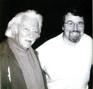 - It was about nine months ago that John Canemaker let me read the galleys of his new book, Two Guys Named Joe: Master Animation Storytellers Joe Grant and Joe Ranft. I’d been aware of the book for a couple of years now, and whenever I’d heard John talk about it I wondered how the two guys fit in together to make a book. When I was handed the galleys, I moved slowly ahead with some trepidition.
I basically knew who the two Joes were from my reading and my NY attempts to keep up with the Hollywood system. Joe Grant was an old timer who’d dominated the Disney modelling department (the only time there was a department exclusively for model sheets), and he’d come back to act as one of the wizened artists helping to shape the new “Renaissance” in the animation community. Joe Ranft was one of the key CalArts guys who’d gone through the Disney system on his way to Pixar where he helped to shape that studio. There’s no doubt he was key to Toy Story, A Bugs Life and Monsters Inc.
What connection would John Canemaker have for tying these two together? Would that connection be enough to fill a book?
Of course, all such conjecture was stupid on my part. The book, as it turned out, is one of John Canemaker‘s finest, and that’s saying a lot. John, after all, is one of the best of our animation historians. His material is well researched, his facts are accurate, and his information is always pertinent and absorbing. He is also a good writer. He tells a story and reveals his information as any good writer would. There’s a solid construction to all of his books, and he lets you into the book in a comfortably relaxed way so that you’re absorbing the story and facts all together, and you are pulled into the book. This is the greatness of Two Guys Named Joe.
As for the connection, John explains that well. Not only, of course, within the book, but he had this succinct statement to make in an interview with Amid Amidi: “I saw the possibility of an overview of the history of storytelling at Disney and Pixar through a very human story of two artists straddling the 20th and 21st centuries.” And that’s exactly what John uses the book to do. He wants to really upchuck the earth of the story departments of both Pixar and Disney, and he does a good job of it.
I’ve now read the book twice. Once in galley form, once in final book form. The book is a rich-looking item full of the finest artwork from storyboards, printed material and developmental art. It’s a gorgeous book.
However, the real gold is in some of the writing and treasured bits that John has dug up to support his material. Here, for example is a small piece about Alice In Wonderland’s story development:
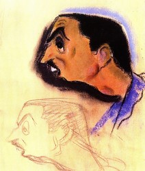 A March 15, 1939, story conference transcript reveals Walt’s frustration with the project:
WALT: (To Joe) Have you been through A//ce in Wonderland lately?
JOE: No. I’ve been through the script though. I think there are some pretty good situations in this.
WALT: Yes, and some, too, that are not so good.
JOE: I like the stuff on the disappearing cat—swell possibilities in that.
WALT: Yes. Let’s see. What are the good situations?
JOE: The tea party stuff is good.
WALT: Yes, the tea party is to me the best. . . You
know, I think we’re missing a hell of a lot in the stuff that is our medium. . . everything isn’t dialogue. Talk, dialogue business that depends on dialogue, hinges on dialogue.
Disney then tore into an unfortunate writer named Dana Coty.
WALT: I’m saying that to you because I think maybe
you’re the one that’s responsible for a lot of silly business that has no basis on anything funny.
DANA: Well, in the duchess’s house, I wrote that very loosely to begin with, Walt.
WALT: I don’t give a damn how you wrote it. It’s what we’re driving at. If it hasn’t got a basis for something funny, don’t write it! There’s no use writing the thing and then alibi-ing for it afterwards. It just throws us off the, track. Don’t just write anything to fill up some pages. We had the same criticism, the last time we were together.
John uses this anecdote to not only say something about Disney, himself, but the way he communicated with Grant and the hostility he might display for others. He did not mince words or waste time where he thought it was wasted. They were trying to solve the problms they saw in Alice In Wonderland, but we learn that Grant, Huemer and others felt that Disney was the problem. They felt he didn’t quite understand the Victorian humor of the original and tried to gag it all up. It’s just one wonderful excerpt dug deep in the book.
Another gem of a sequence involves Joe Ranft. It’s the point just when the Pixar artists are trying to sell Toy Story to the Execs at Disney. They’re doing everything in their power to make the film story good while placating the Disney people, and they’re having a hard time of it.
- Disney insisted the production move to Los Angeles so the studio could oversee things. “And give us more notes,” Ranft lamented.
Lasseter, whose “heart was broken,” begged for a two-week reprieve to turn things around. After obtaining Disney’s skeptical permission, Lasseter, Ranft, Docter, and Stanton resolved to “make the movie we want to make!”
. . .
The process included writing, gathering more material, constant meetings, weeding out, refocusing, and . . . more meetings. “Two or five heads are better than one,” Ranft believed. “If you can work together without killing each other, you an accomplish a lot.”
Going forward, Pixar gladly accepted notes from Disney and welcomed participating in brainstorming sessions with their artists. “But,” Ranft said, “we’d go away and really think about [the notes]. A lot of times we’d go, ‘No. Here’s the real problem!’ And it was even deeper than the notes. ‘And here’s how we’re going to fix it.’”
Regarding the creative process, Ranft once said, “It’s a challenge. The final product is the goal you’re searching for. [Your little sequence is] gonna get smashed, trashed. It’s gonna come apart for the good of the final film . . . it’s a paradox. You’ve got to put yourself into it, and then you’ve got to take yourself out of it. Be objective and not be hurt.”
And that’s the point of the two guys. They understood the value of the story and the center of the films they worked on and over. Nothing mattered, including personal insult, as long as the story came out right. They were film artists and knew how to get what they needed to complete their goals.
My personal preference is to want to know more about the old timer and to learn more about the golden age. However, it’s totally my bias, and the proof of this book’s success is that I was completely absorbed by all that was written about both men.
This is more than a good book. Anyone in love with animation should own a copy and read it carefully. There’s a lot there, and it’s all good. It’s stunningly designed with beautiful animation art treasures well displayed.
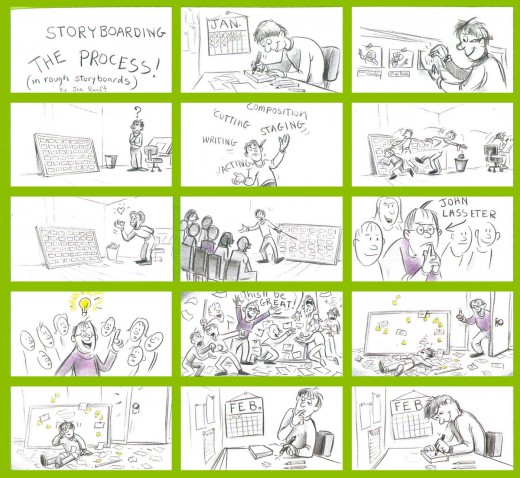
A telling board by Ranft.
________________
Amid Amidi offers an excellent interview with John Canemaker on the subjects of the book at his Cartoon Brew site. I recommend you all read it.
There’s also a video promo you can catch on YouTube if you’re more visually oriented.
Bill Peckmann &Illustration &Story & Storyboards 29 Jul 2010 05:40 am
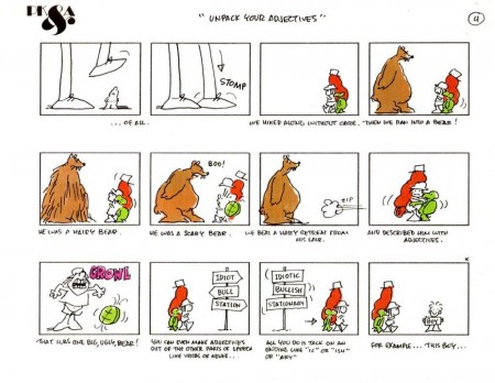
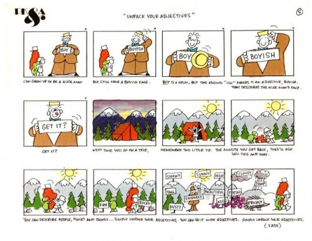
Schoolhouse Rock
- Schoolhouse Rock became a reality when advertising exec, David McCall, realized his son, who was doing poorly in school, had memorized the lyrics to many a rock song. He produced a record with a couple of quickly written songs.
Tom Yohe illustrated some of the songs and presented it to McCall. They decided to put together an animated version, and the rest became history.
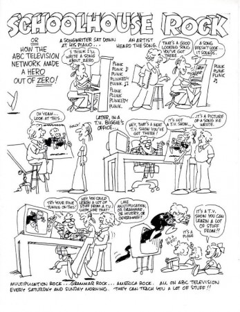
How it came about by Tom Yohe.
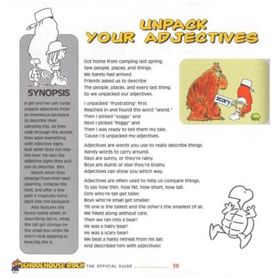
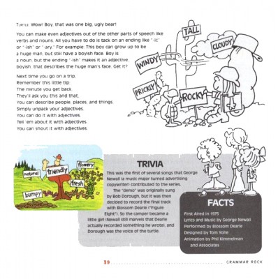
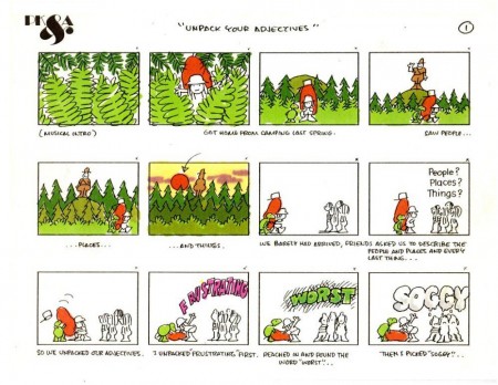
Here’s the storyboard and information, right out of the guide, on one particular episode of the show, Unpack Your Adjhectives.
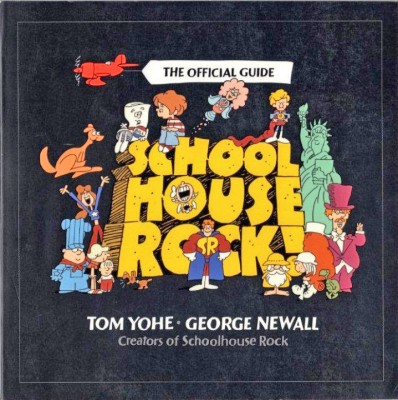 1
1(Click any image to enlarge.)
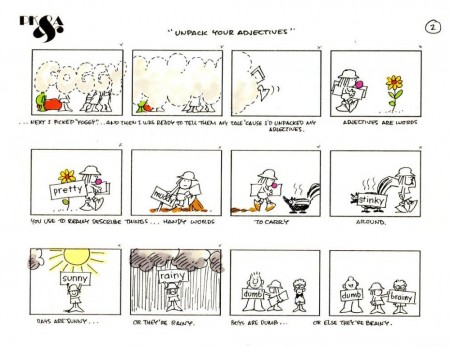
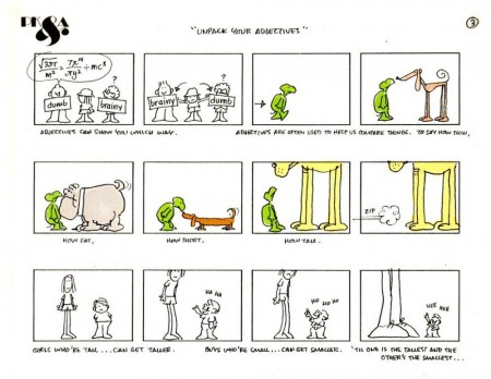
Here’s the storyboard from Phil Kimmelman & Associates.
 1
1
Here’s the YouTube version:
All this material came to me from the collection of Bill Peckmann, and I couldn’t be more thankful.
Animation &Disney &Story & Storyboards 31 May 2010 08:26 am
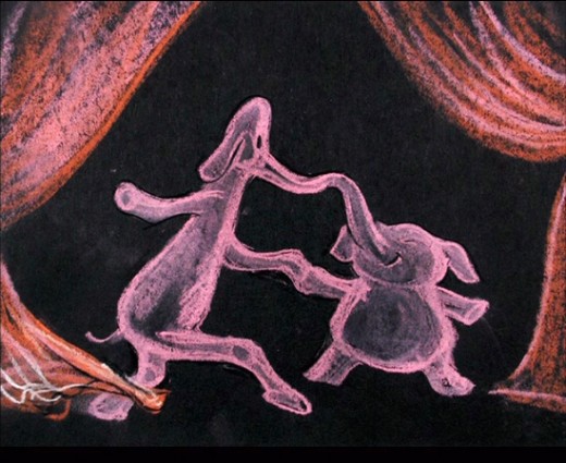
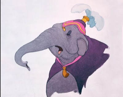
Pink Elephants
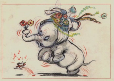
Hans Perk has posted the drafts for Dumbo, and this has led Mark Mayerson to post the brilliant Mosaics he creates for the film.
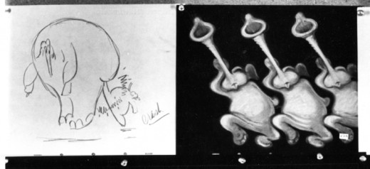
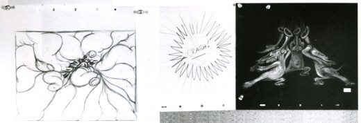
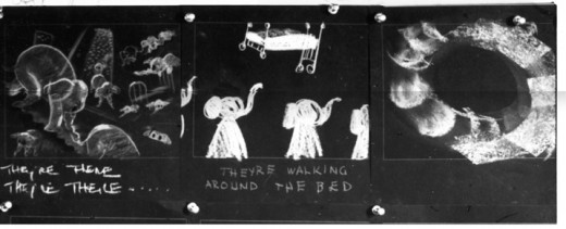
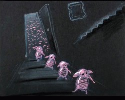
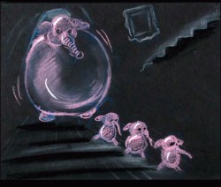
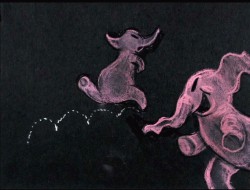
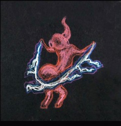
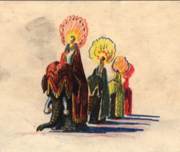
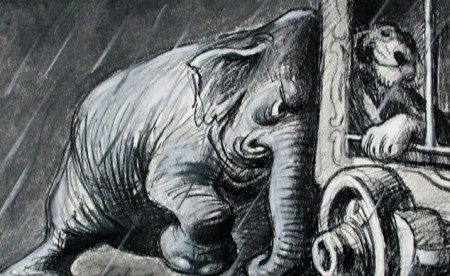
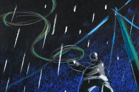
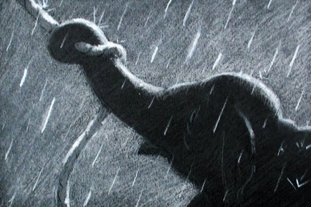
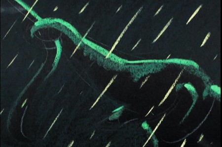
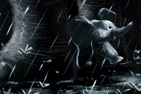
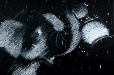
Here’s a recap of a post I did some time ago, to keep in the spirit of Dumbo. The Pink Elephant sequence.
.
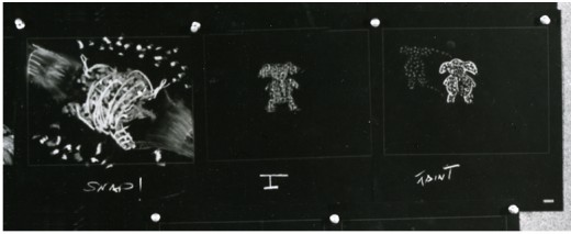
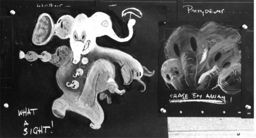
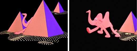
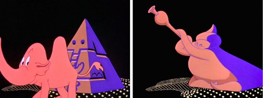
- Once again, thanks to John Canemaker, I have several photo images to display. Some frame grabs accompany the piece.
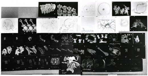
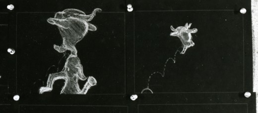
These are rather small images, so by cutting up the large boards and reassembling them I can post them at a higher resolution, making them better seen when clicking each image. It’ll take two days to post them all, so this will be continued later this week.
I’ve interspersed some frame grabs fromt the sequence to give an idea of the coloring.
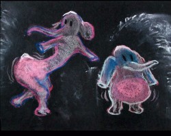
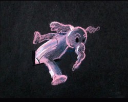
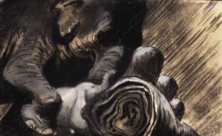
The following images were in the gallery part of the dvd. These are the color versions of some of the images above.
From Hans Perk’s A Film LA:
Seq. director Norm Ferguson, asst. dir. Larry Lansburgh, layout Ken O’Connor.
Howard Swift and Hicks Lokey animated it.
Animation Artifacts &Disney &Story & Storyboards 24 May 2010 09:00 am
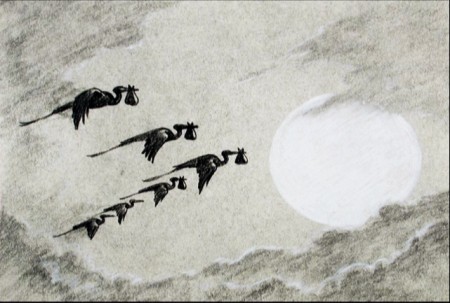
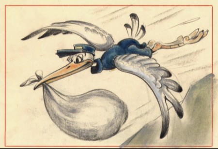
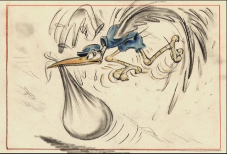
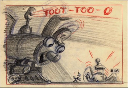
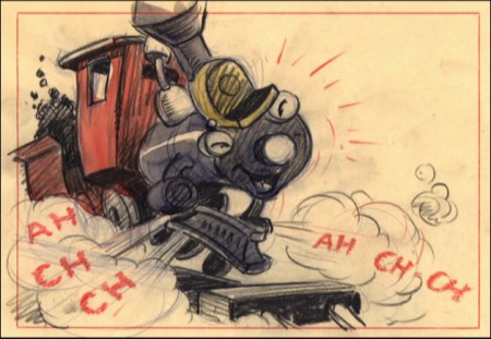
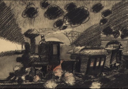
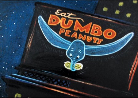
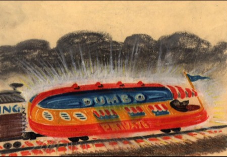
Dumbo random storyboard
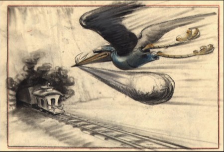
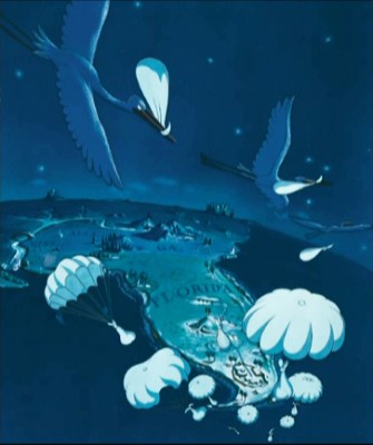
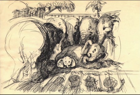
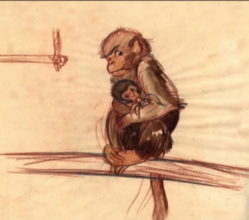
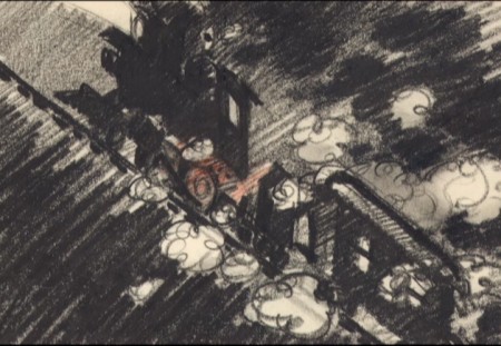
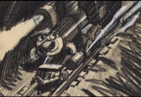
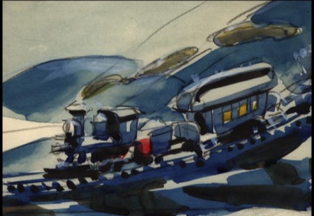
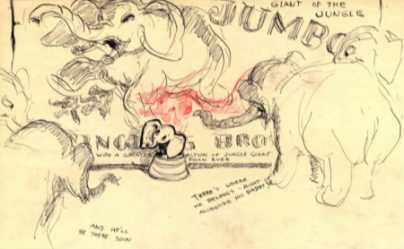
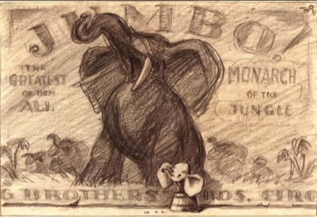
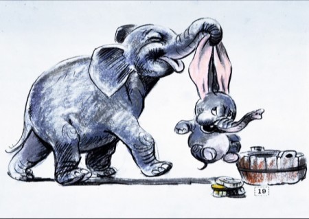
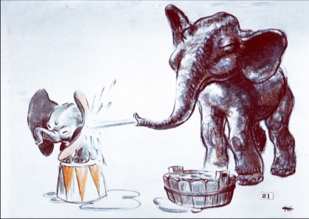
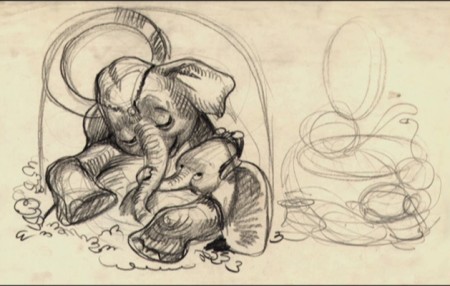
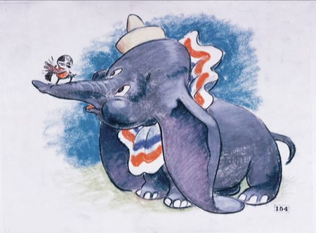
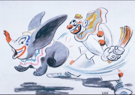
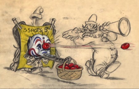
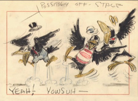
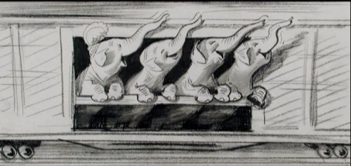
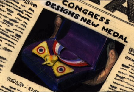
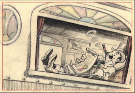
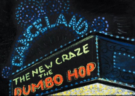
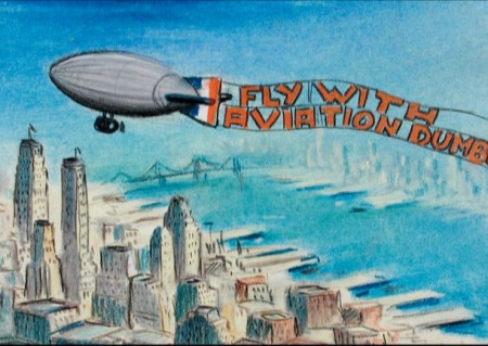
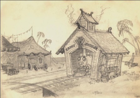
- Continuing with the Dumbo fest, I’ve culled a lot of storyboard drawings from various sources (many from the earliest DVD of the film) and present in somewhat chronological order.
 1
1
This, like my other Dumbo posts, is in support of Hans Perk‘s posting the drafts for Dumbo, and Mark Mayerson‘s posting the excellent Mosaics he creating for the film. See both other sites.
Animation Artifacts &Disney &Models &Story & Storyboards 17 May 2010 08:32 am
Roustabouts – 1
Hans Perk has been posting the drafts for Dumbo, and this has led Mark Mayerson to start posting the brilliant Mosaics he is creating for the film.
This leads me to join in the fun celebrating the excellence of Dumbo.
.
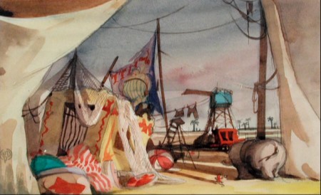
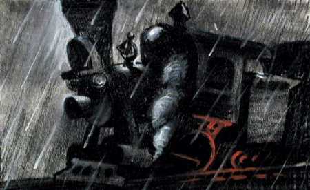
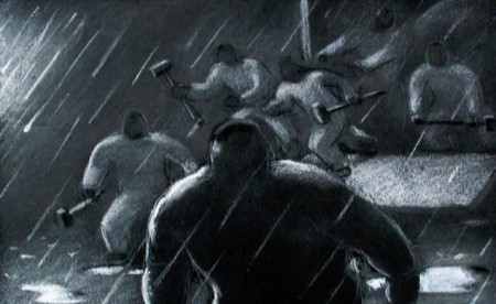
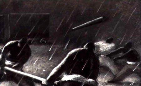
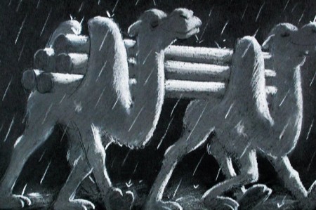
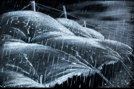
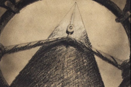
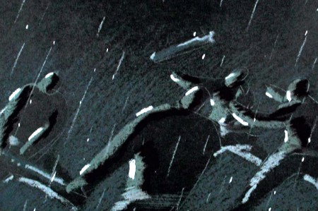
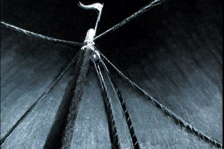
 - Among the brilliant scenes in Dumbo is one that usually is overlooked in all the animation books. Yet, to me it separates this film from other Disney films, except, perhaps, Pinocchio. The tent building scenes are a brilliant mix of solid animation, excellent (and quietly hidden) effects, strong music and perfect screen direction. The sequence works extremely well on its own, but it works even better as a significant part of the film as a whole.
I sincerely doubt that Walt could have been in the studio when the sequence was built. Certainly, this espouses the Socialist politiical views of many of the strikers and one wonders what Walt thought of it. Presumably, because it has been developed as such an integral part of the film, the underlying political current of the sequence could hardly be lost, but it’s hard to miss the overall feel of it. Perhaps I’m completely wrong, and the feel of the piece can just be chalked up to a product of the period.
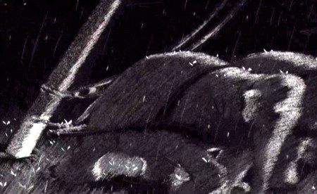
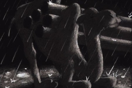
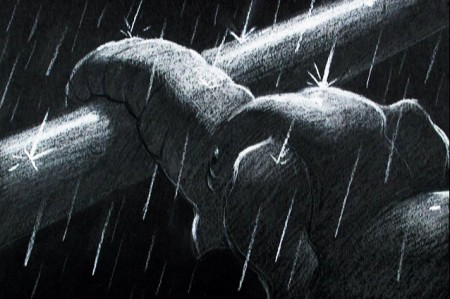
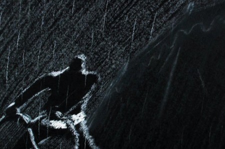
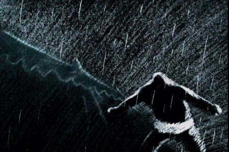
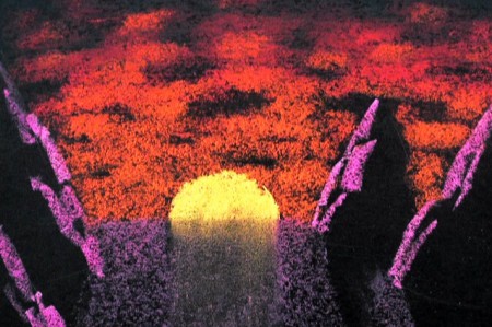
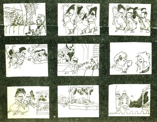
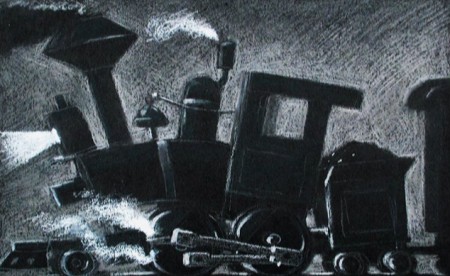
I’d originally posted frame grabs of the entire sequnce (which I’ll recap tomorrow), but I’ve found these preliminary drawings on an early Dumbo DVD, and have culled them together to post here.
 1
1(Click any image to enlarge.)
As stated above, tomorrow I’ll post frame grabs of the sequence so you can compare to the above chalk drawings.
Bill Peckmann &Disney &Layout & Design &Rowland B. Wilson &Story & Storyboards 21 Dec 2009 09:02 am
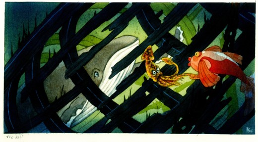
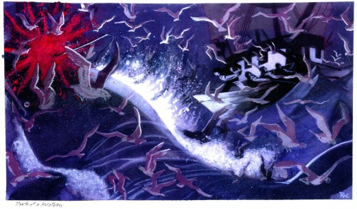
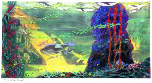
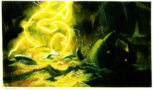
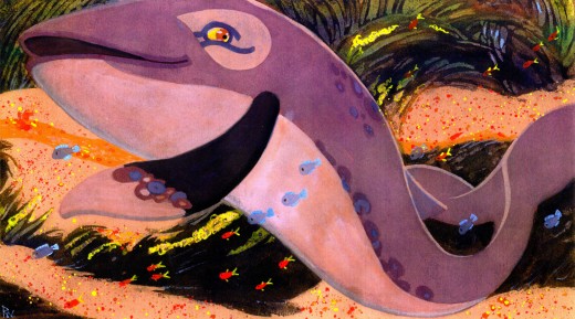
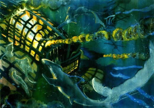
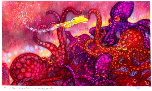
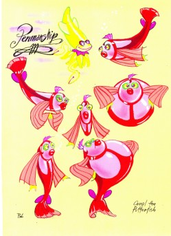
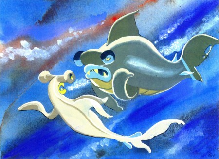
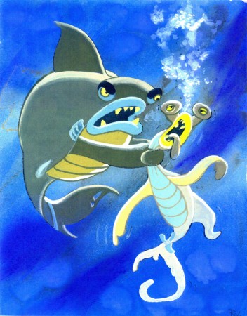
Rowland B. Wilson’s Li’l Mermaid
- The brilliantly talented Rowland B Wilson, certainly paid his dues at a number of animation studios. We’ve seen his work with Richard Williams’ Soho Square studio and with Don Bluth’s Ireland studio.
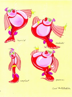
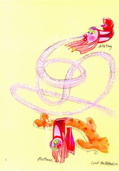
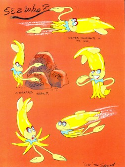
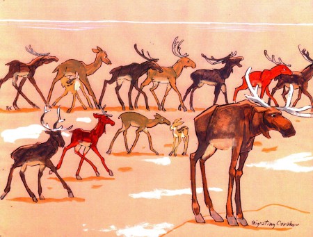
Today, I have some sketches and designs he did for Walt Disney studio while working on The Little Mermaid. Not all of this material made it to the film, but the incredible wealth it brought the directors had to have affected the overall production. This invaluable material comes courtesy of Bill Peckmann.
The first group to view are Production Designs that he did for various sequences throughout the film.
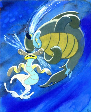
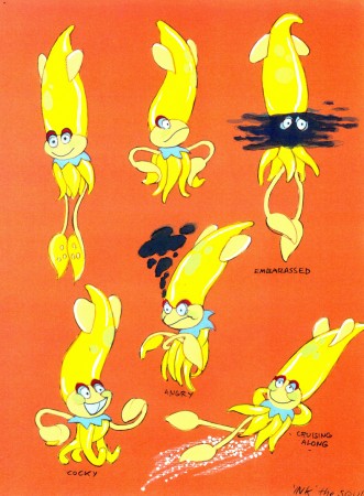
The following are character designs Wilson did for The Little Mermaid for a character that never made it into the movie. Though, I think “Ink the Squid” may have developed into “Sebastian the Crab”.
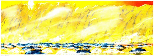
Then there are some of the creatures seen above land at the Glaciar Tray which apparently was designed to be part of the film.
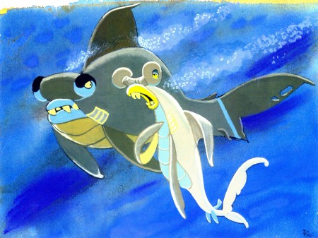
Then there is this short seqeunce of interaction between two fish:
All art displayed © Walt Disney Prods.
This material is a treasure. I want to thank Bill Peckmann for sharing it with us.
Rowland B. Wilson was an artist of the highest standard, and I can’t get enough of his work. True inspiration.
Animation Artifacts &Hubley &Story & Storyboards 09 Nov 2009 08:40 am
Doonesbury Start
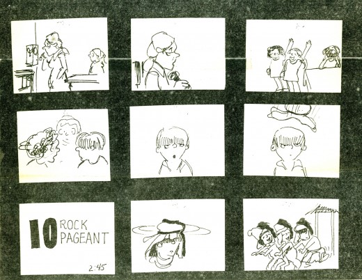
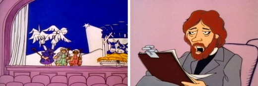
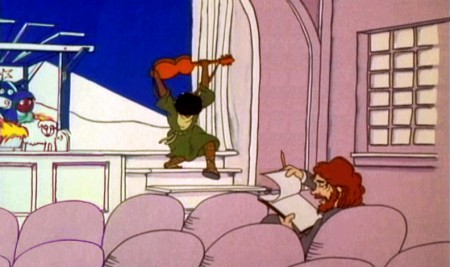
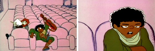
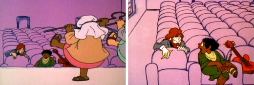
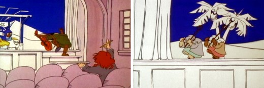
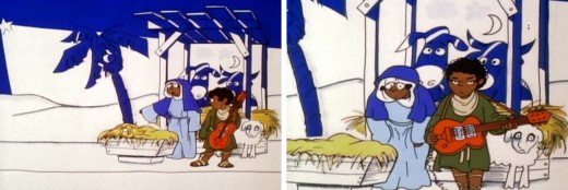
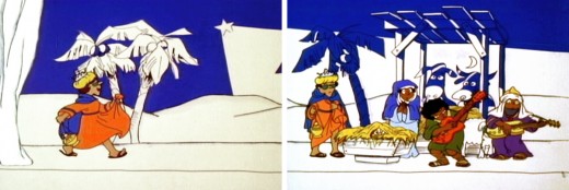
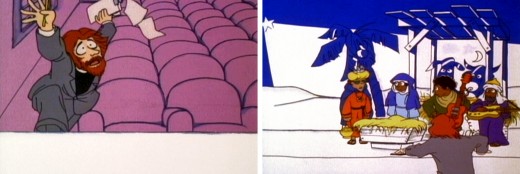
- Today it’s back to the Doonesbury well. Tissa David was brought on to do the sequence where the kids put on the Christmas pageant. Through these materials we can see how the sequence takes shape even before the animator/director gets to do any character posing.
She, of course, was given the script as well as the original voice track for the sequence. These are the pages for the sequence:
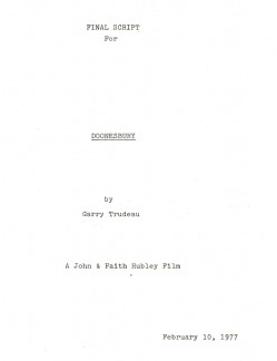 Cov
Cov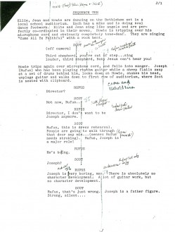 J1
J1(Click any image on this post to enlarge.)
.
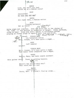 J2
J2 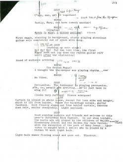 J3
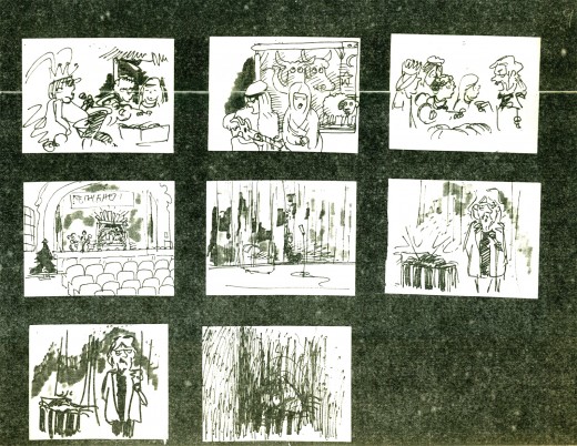
J3Tissa also had a copy of the storyboard that John Hubley and Garry Trudeau did for the film. (Note that there’s no dialogue indicated. This is the way John and Faith worked. They’d memorized the track by the time they did the board.)
Tissa then took a bunch of specific frames from the board and blew them up. With these she decorated her walls all around her drawing table.
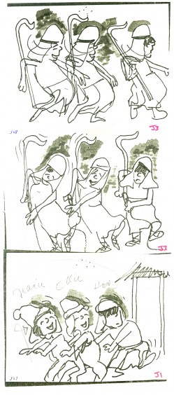
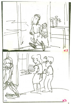
These drawings weren’t so much to act as models but as inspiration.
She plucked them from many different parts of the board even ones
that she did not work on.
.
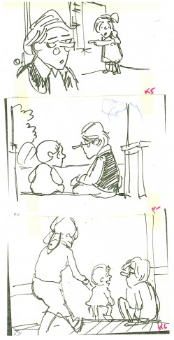
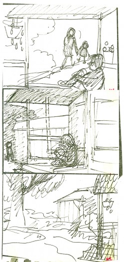
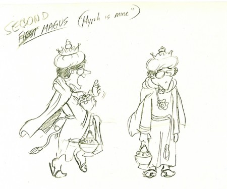
Here’s a drawing by Garry Trudeau that hung with the others.
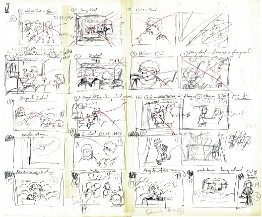
Then, Tissa did her own board. She modified the scene arrangement and cutting. She always did this with John’s boards. He trusted her implicitly and gave her free reign to alter.
I only once saw them disagree about a scene – it was more about how it should be drawn. John won. he was the director.
This rough board Tissa did was only for herself. The drawing was quick and rough, and the images were small.
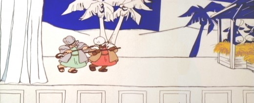
Finally, here are frame grabs from the actual sequence. Sorry, the colors are all over the place. The transfer is soft, and the colors never remain true.
 J1
J1
Animation &Animation Artifacts &Story & Storyboards 02 Nov 2009 08:25 am
Medical Dilemma
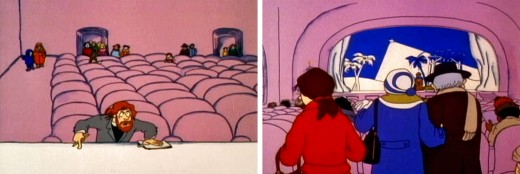
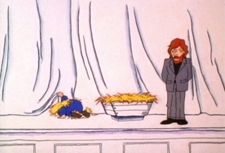
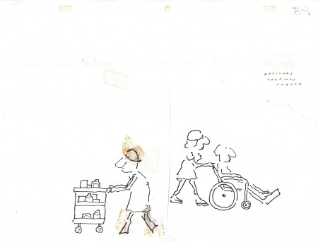
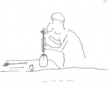
- One of the best, most intelligent films I worked on was a short film R.O.Blechman made for NBC television. The network was doing a three hour evening dedicated to the state of health care and hospitals in America. They wanted Bob to make a film about over-testing to find things to resolve a patient’s complaints.
Bob and I made numerous trips to Columbia Presbyterian Hospital to get information about procedures for testing the brain. This was back in 1977. CATscan tests were just then starting to come into their own. It wasn’t as frequently used as it is now. Other tests were demonstrated for us, and we spent several days watching these exams being done. Dyes being injected into the brain, machines that turned the patient upside-down, lots of big-named procedures
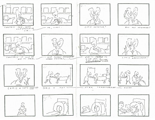
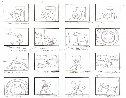
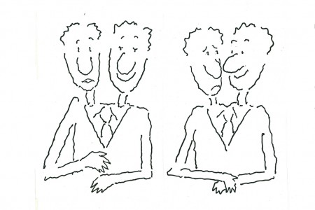
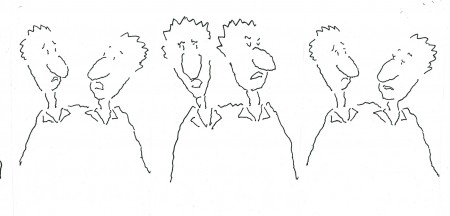
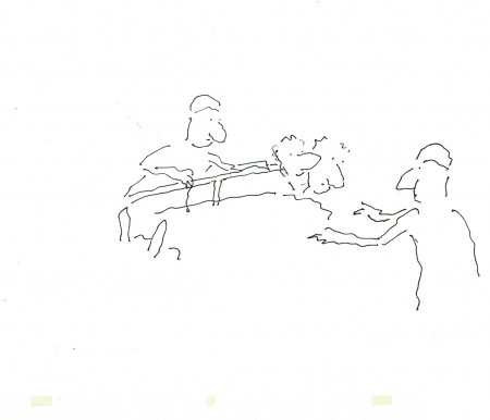
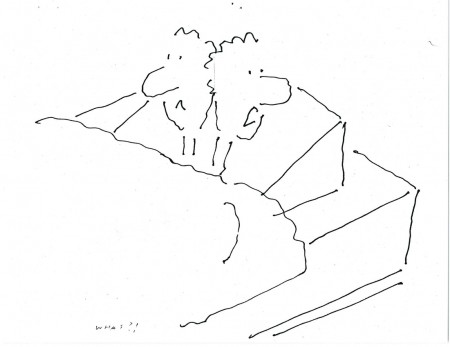
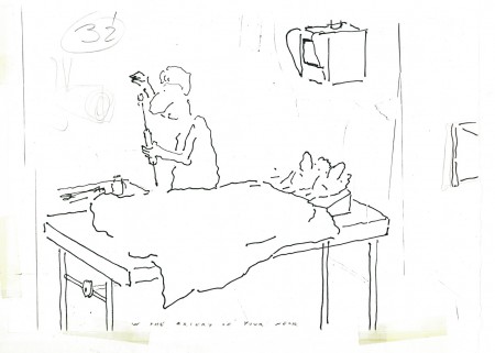
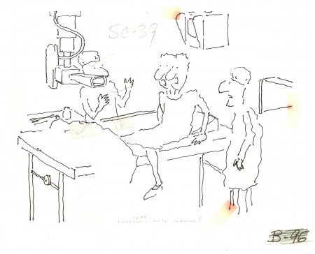
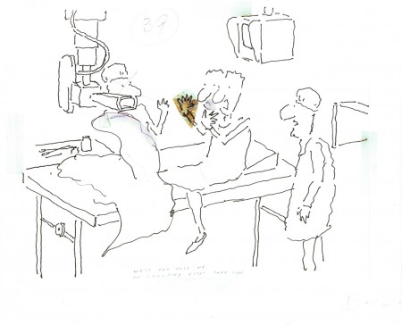
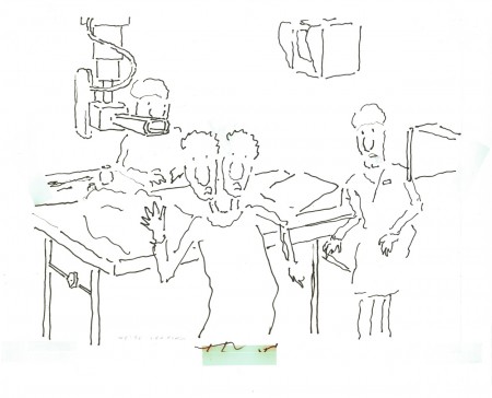
Bob wrote a piece about a set of siamese twins – a man with two heads. The two heads kept a running discussion about a headache one of them had. They went to a doctor who decided to do some basic tests. They discovered nothing. More tests – nothing. Finally, the doctor wants to try one more test. The twins see the needle and get off the table. They refuse this final test. The two heads join into one.
The doctor, in cu, starts to talk to himself, aloud. His head splits into four different opinions discussing the situation, and the film ends.
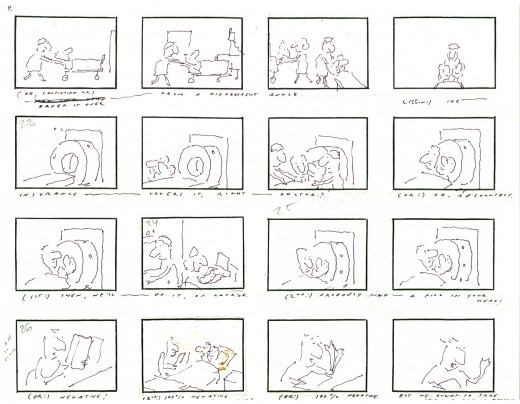
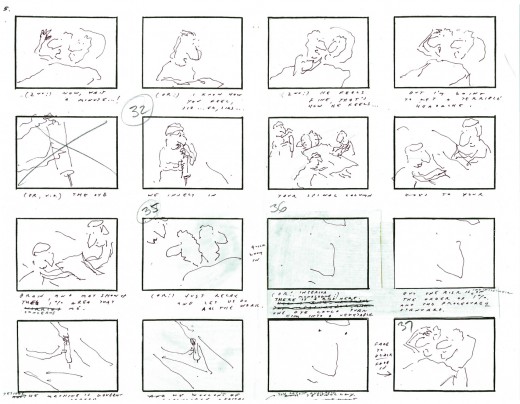
Here’s Bob Blechman’s storyboard for the film.
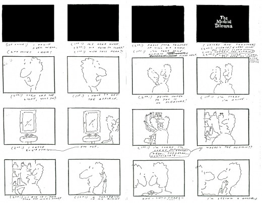 1
1(Click any image to enlarge.)
The whole film, about four minutes, had fewer than four months from beginning to end. The board went through lots of changes on the fly as the animators worked. Tissa David and Ed Smith were the primary animators on this film, although Ed did the scene I most think about within the film. The third and last animator on was Cosmo Anzilotti. I assisted all of them in whatever their needs – clean-up, inbetween or inking.
There was at least one scene of genius in this movie.
That final cu at the end of the board where you see the face of the doctor fill the screen – it animates in on him – all lines, just lines, that completely told that doctor’s thoughts and mindset. Lines on the screen that you completely bought as a face. A face with multiple voices and personalities arguing with itself. It was brilliant and remains one of my all time favorite bits of animation.
The voice of the twins was done brilliantly by the late, great Anthony Edwards. He was the perfect voice for the Blechman character, and he did quite a few of them over the years. This was one of his finest performances for Bob.
Here are some of Tissa’s drawings and layouts:
 1
1This collection of drawings stood over Tissa’s desk while she animated.
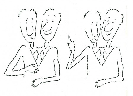 a
a
Here, I’ve broken that long piece into three smaller.
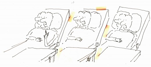 2
2
This is another drawing from above her desk.
The yellowing is the tape that held the drawings together.
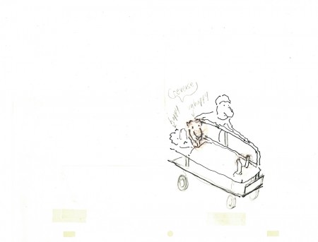 3
3
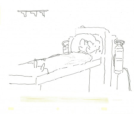
The twins being wheeled to their exam.
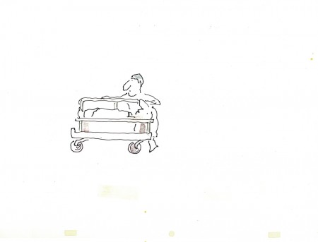 4
4
Passing gurneys in the hospital hall.
 6
6
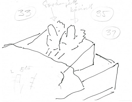
Here the twins are about to face a CATscan.
 8
8
The patients questioning the final test.
I don’t know how you’d get to see this film, but I hope it shows up sometime. I have a 16mm copy, but I haven’t transferred it. Maybe I’ll ask Bob for a copy of it.
Animation Artifacts &Bill Peckmann &Rowland B. Wilson &Story & Storyboards 02 Oct 2009 07:45 am
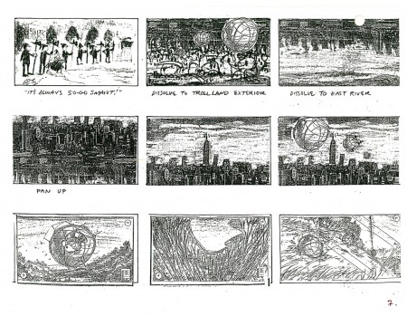
Troll bd 2
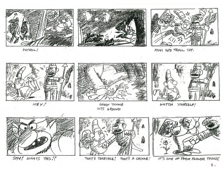
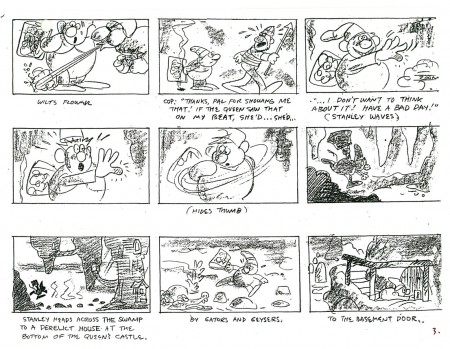
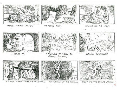
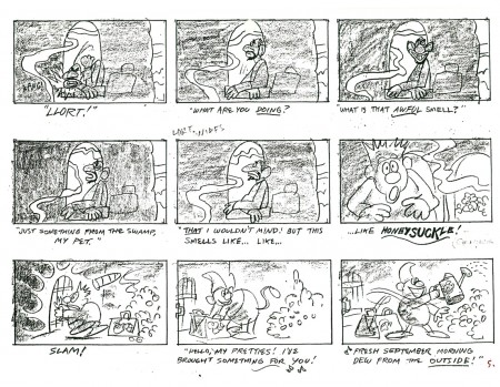
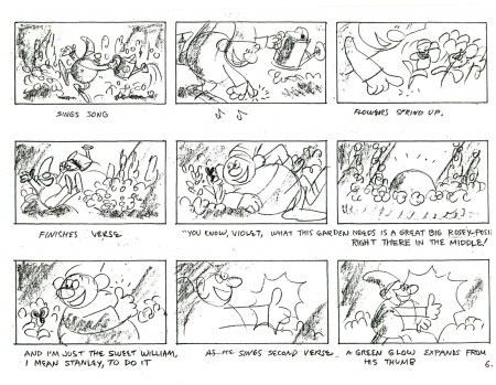
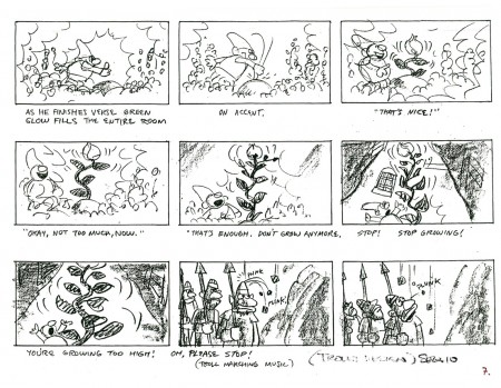
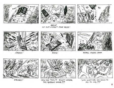
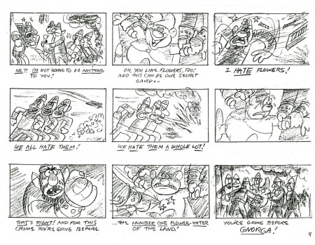
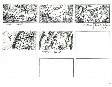
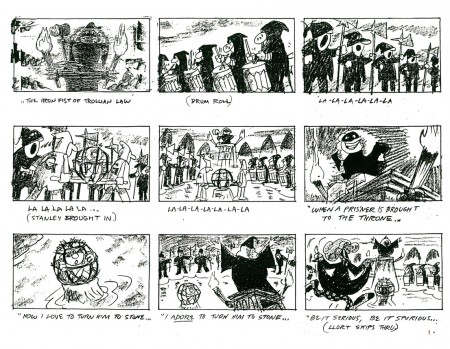
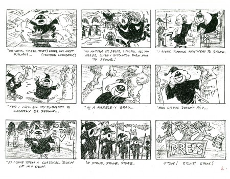
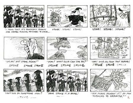
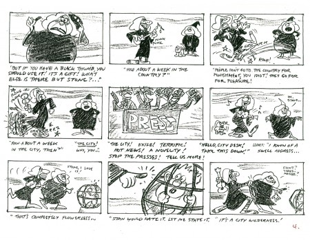
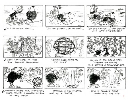
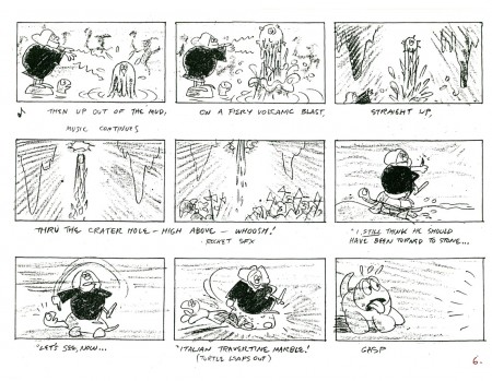
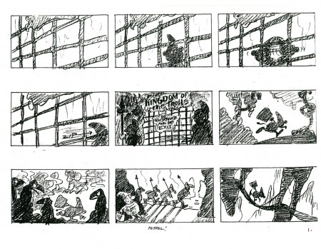
 - As promised last week, I’m here to offer another part of the storyboard for Don Bluth‘s film, A Troll in Central Park. As with the initial post, this board was drawn by the extraordinary artist, Rowland B. WIlson. Also as with part one, the material was graciously loaned to me by designer, Bill Peckmann.
I don’t have a copy of the film or I’d offer some frame grabs for comparison. Though perhaps we’re better off just accepting Rowland’s work for itself. This film was one of the last of the Sullivan-Bluth films out of the Irish studio. They subsequently moved to Arizona to do Anastasia for Fox.
Looking at these boards I began to wonder what Rowland would have done had he directed a film, himself. Perhaps the closest is the Trans-Siberian Express, Pushkin/Vodka commercial done at Richard Williams’ studio in the 1975. I wouldn’t mind owning a copy of that first spot they did.
 1
1(Click any image to enlarge.)
Next up, we’ll post a stash of Rowland’s models for this film.
Here are a couple of short clips from this film on the Bluth site: #1, #2
Sections of the film are also currently on YouTube. Here’s Part 1.
Animation &Bill Peckmann &Disney &Models &Story & Storyboards 28 Sep 2009 07:36 am
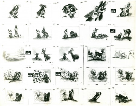
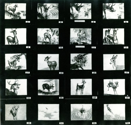
Bambi Board 2
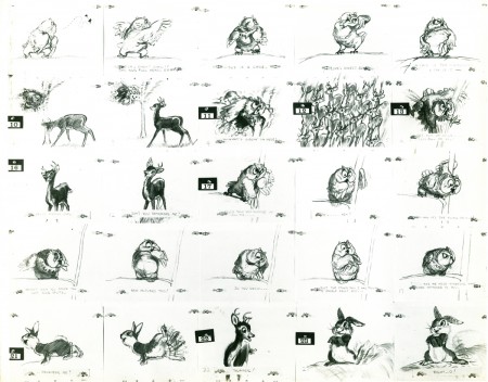
- The cache of stats that Bill Peckmann recently sent me on loan includes several photo pages of storyboard from the Bambi Twitterpated sequence. I’m not much of a fan of this sequence, but looking at these beautiful storyboard drawings makes me realize how charming it is in its original state. The cute/cartoony movements came from the animators and directors. Perhaps the film needed this funny, broad approach, but I have a feeling there are other ways it could have been tackled that might have let it feel more connected to the whole.
As with past board postings, I’ve cut them up into rows so that I can post them at a higher res for better viewing. First here are the three pages as they stand:
 1
1(Click any image to enlarge.)
Now here they are again broken into individual rows:
 1a
1a
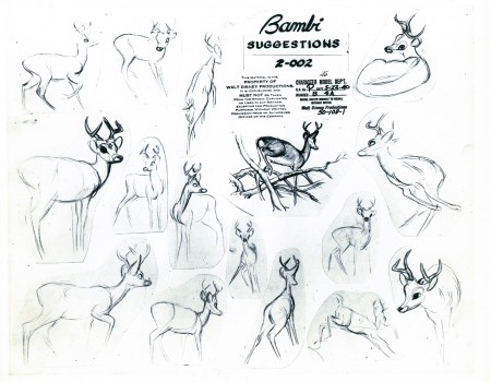
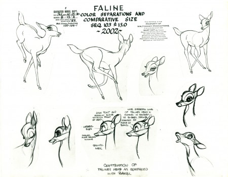
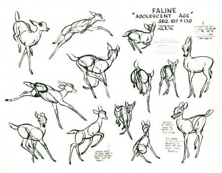
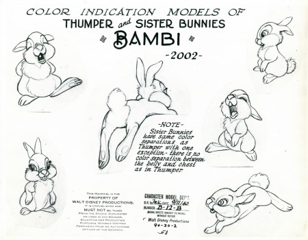
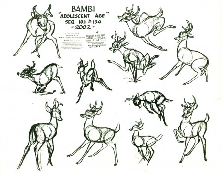
Here are some model sheets which relate to this sequence:
 1
1
Once again, many thanks to Bill Peckmann for the loan of this marvelous material. It’s truly appreciated, and it’s fun to share.
It’s amazing to think how Walt Disney pushed all this great art forward. This film actually moved the “Art” side of animation forward with the majestic backgrounds, realistically designed animation and bold storytelling approach. There’s no possibility that something as rich as this film could be done today.
