Category ArchiveStory & Storyboards
Animation Artifacts &Disney &Story & Storyboards 05 Dec 2011 07:18 am
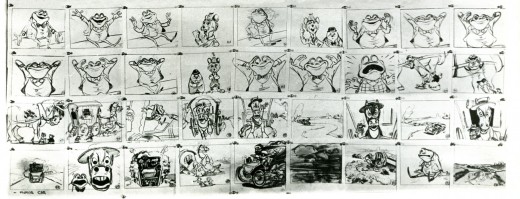
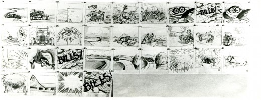
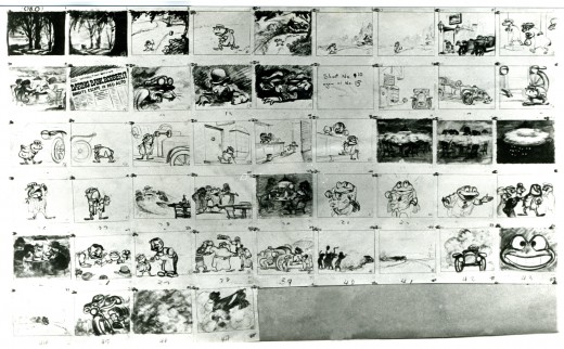
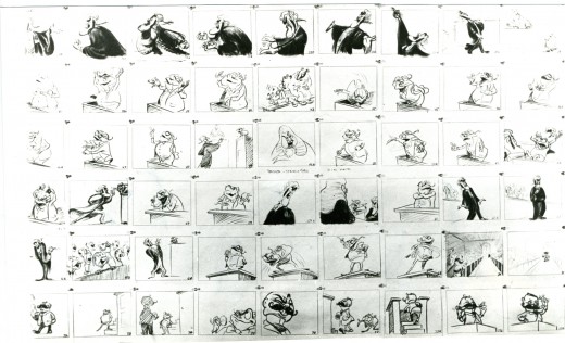
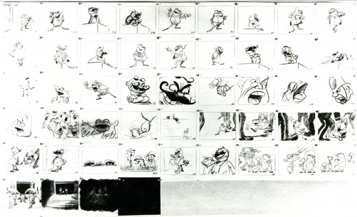
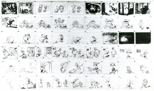
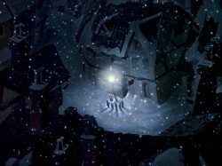
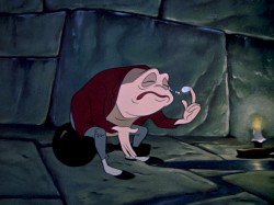
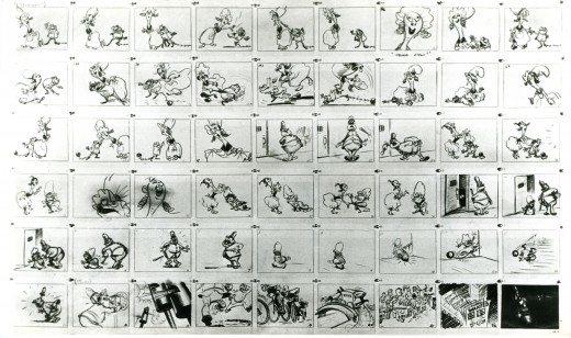
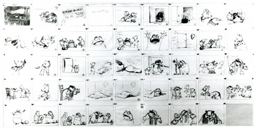
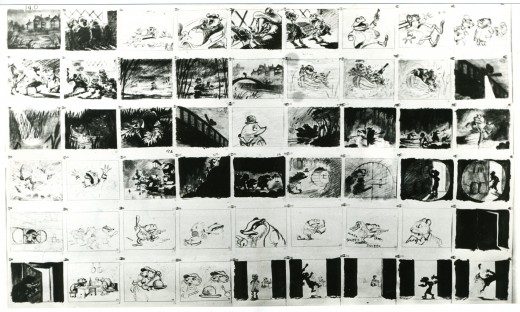
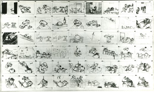
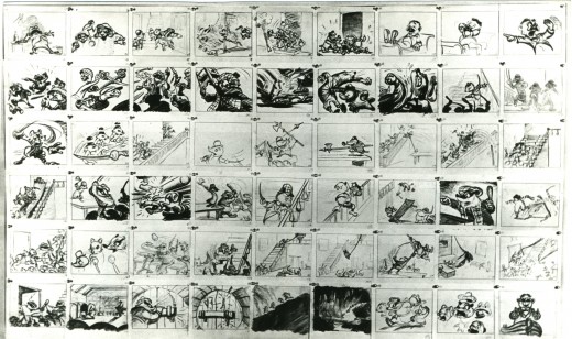
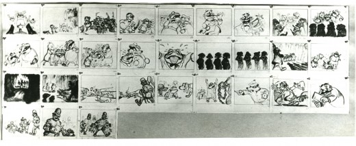
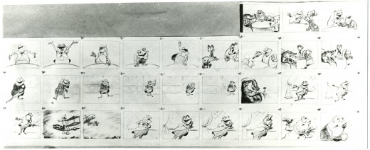
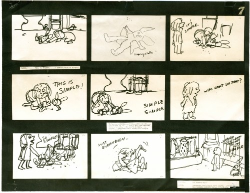
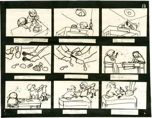
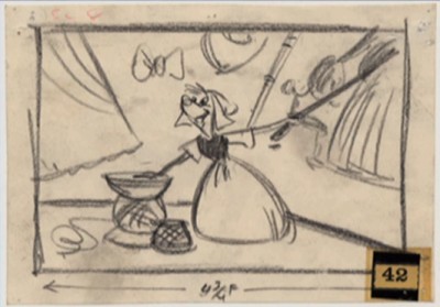
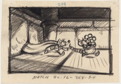
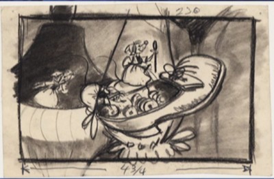
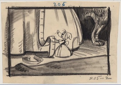
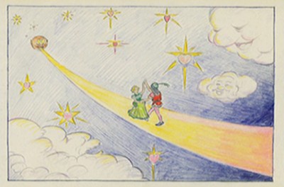
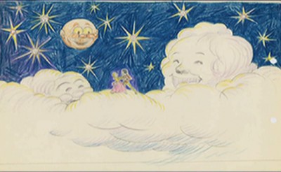
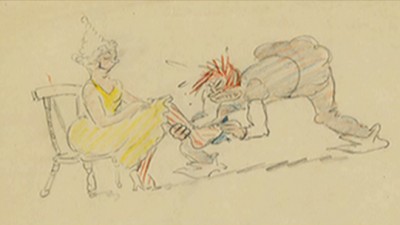
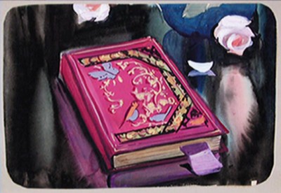
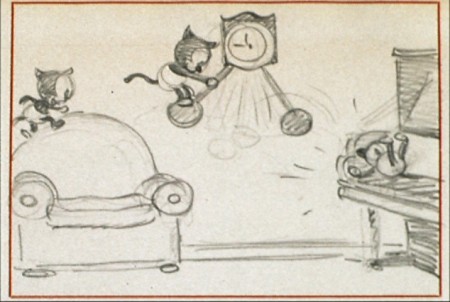
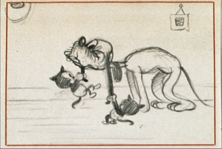
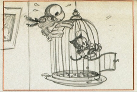
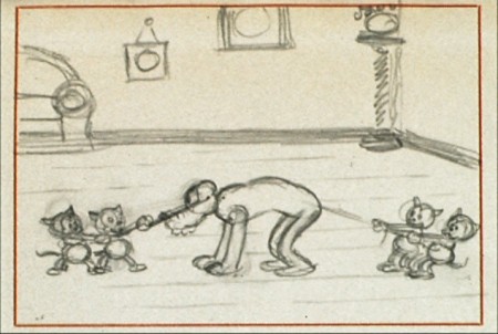
Mr. Toad storyboard
- As every other animation blog out there will remind you, today is the anniversary of Walt Disney‘s birth. The difference between us and others is that this is also the anniversary of this blog. It’s the sixth year that we’ve been posting animation information, artifacts and ephemera on a daily basis. It’s been a real treat to continue doing so; I’ve learned a lot in the process and really do enjoy it. I wouldn’t mind going another six years.
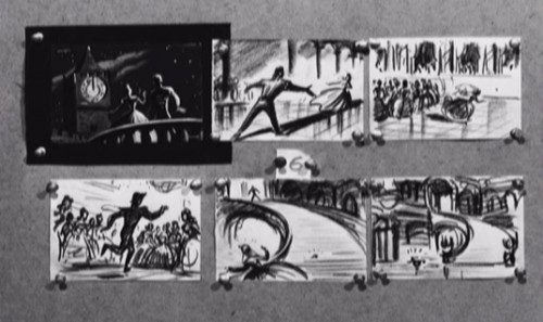
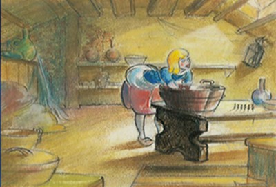
- Hans Perk has just started posting the draft to the featurette, The Fabulous Mr. Toad, on his blog A Film LA. I can’t think of a better time to repost the original storyboard for the film. I’ve combined the several parts of the past posts into one longer piece.
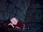
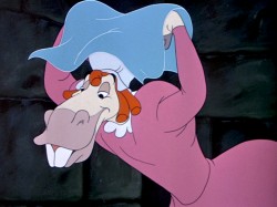
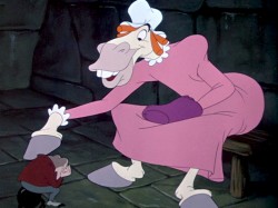
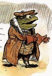 – Probably my favorite children’s book is The Wind In The Willows. There have been many animated adaptations of this book since it became a public domain item, but for years there was only one version, Disney’s Mr Toad half of The Adventures of Ichabod and Mr. Toad. The loudest most raucous parts of Kenneth Grahame’s delicate novel, blared their way onto this animated compilation feature.
We all know that the book was planned as a feature way back when Disney, in the late 30s, was buying up titles of famous children’s books to prevent other competing studios from turning them into animated features. Work began on adapting the book. 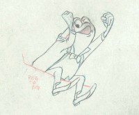 They never quite broke it as they hoped, and it ultimately became a featurette with its primary focus on the loose cannon, Mr. Toad.
. . . .The film, as it exists now, has some positive elements and some fun animation, but the story was always a bit too quiet and British to successfully survive a proper adaptation in the Disney canon.
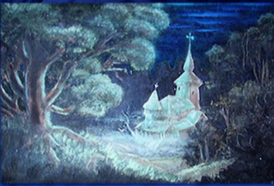
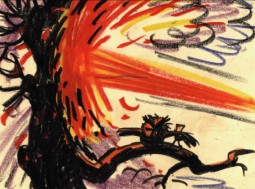
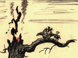
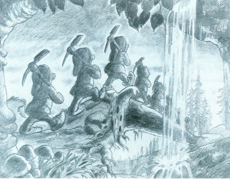
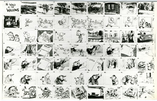
When John Canemaker loaned me his copy of the Pinocchio boards, he also brought The Wind In The Willows (not titled Mr. Toad). There are few captions here, but this obviously is designed for a full-out feature not an abbreviated featurette. The images on his original stats are small, so I’ve blown them up a bit and tried to marginally clean them up.
As suggested by Michael Barrier, this board was probably assembled to produce a preliminary Leika reel. The giveaway is the lack of dialogue and commentary underneath the drawings. The assembly was made to be photographed.
 1
1(Click any image to enlarge.)
Disney’s Mr. Toad first aired on the Disneyland television program on February 2, 1955. You can buy the dvd of Ichabod and Mr. Toad on Amazon among other places.
If you’re interested you can read the entire book of Kenneth Grahame’s work (minus the beautiful Shepherd illustrations) here.
You can buy the book here.
Dave Unwin‘s version is my favorite adaptation in that it retains some of the flavor of the original book and isn’t afraid of being quiet at times.
 7
7
Animation Artifacts &Disney &John Canemaker &Peet &repeated posts &Story & Storyboards 28 Nov 2011 07:45 am
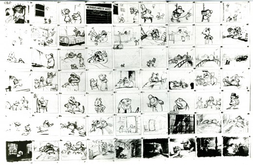
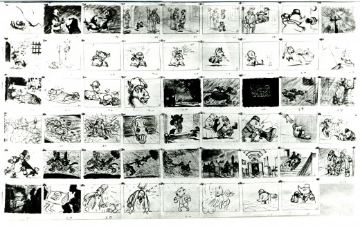
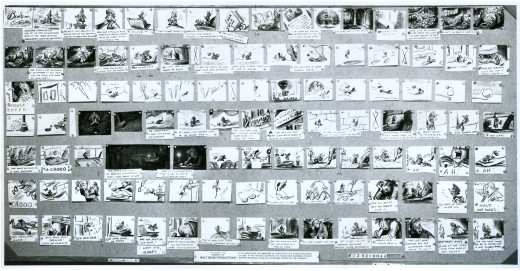
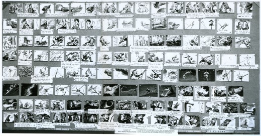
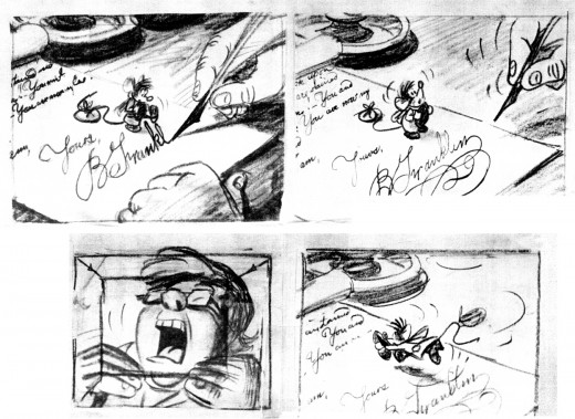
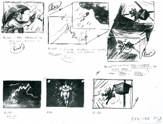
Ben and Me Board – repost
 - Bill Peet was one of the prime artists who shaped many of the Disney features. He has been an enormous influence on me and thanks to John Canemaker, who has loaned me the following storyboard, I’m pleased to post some of Mr. Peet’s excellent artwork.
Ben and Me was a 20 min short produced in 1953. It’s an oddity in the Disney canon. The story of a mouse who influences Benjamin Franklin through many of his most famous moments was originally a book by Robert Lawson and was adapted by Bill Peet for the studio.
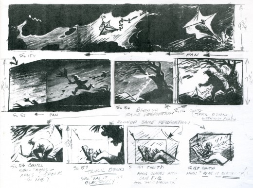
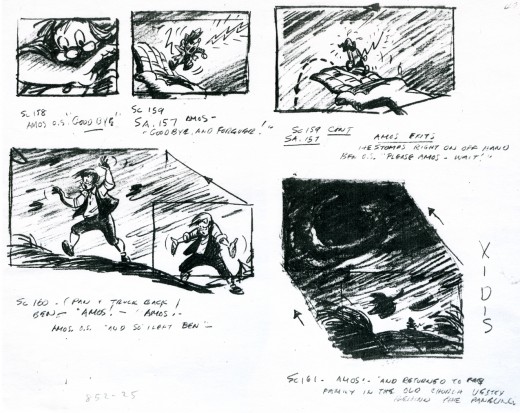
The photostats of the storyboard, like others I’ve posted, is extremely long. Hence, I’m posting them as large as I possibly can so that you’ll be able to read them once you’ve enlarged the images.
These three panels are followed by a couple more revisions. The revisions I only have as xeroxes – lesser quality.

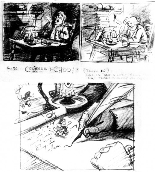
This image is a recreation of the extraordinary pan as seen in the first row of the storyboard posted above. It’ll enlarge to a size where you can properly see it. A couple of the objects were on secondary overlays creating a minimal multiplane effect.
Bill Peet offered great drawings in his storyboards, and I’m sure he brought a lot of inspiration to the animators.

This is an excedingly long pan (30 inches), and is almost invisible in this minimal thumbnail. Rather than break it up into shorter bits, I’m posting it as is and hope it won’t be too much of a problem for you to follow in its enlarged state. You have to click on it to see it.
The image below is a recreation of this pan from the final film done using multiple frame grabs.
There’s an excellent article about the making of Ben and Me by Wade Sampson at Jim Hill Media. It gives quite a bit of information about this odd short and is well worth reading as a companion to these boards.
Animation Artifacts &Disney &Story & Storyboards 26 Sep 2011 06:47 am
Cockaboody Board – recap
- On October 10th the Motion Picture Academy will present a program of films by John & Faith Hubley. John Canemaker and Emily Hubley have assembled the program and although it is composed mostly of films by John (I’m not sure he would have been happy about that), there will be a lot of his early films like Flathatting (for the Navy) and The Magic Fluke and Rooty Toot Toot (for UPA.) There will also be recently restored prints of Adventures of an * and Tender Game as well as the late film, Voyage To Next. The show will have plenty of surprises of very rarely seen and hard-to-find material.
To reserve a seat go to Oscars.org. Academy members – $3.00. General Public – $5.00. or you can pay by mail with a form you’d get on line. Don’t wait; it’s probably sold out by now.
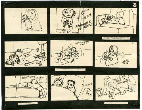
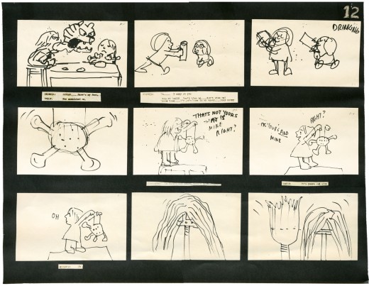
I will be posting as much of the Hubley art as I can in celebration of this show. To start with here’s the storyboard for Cockaboody.
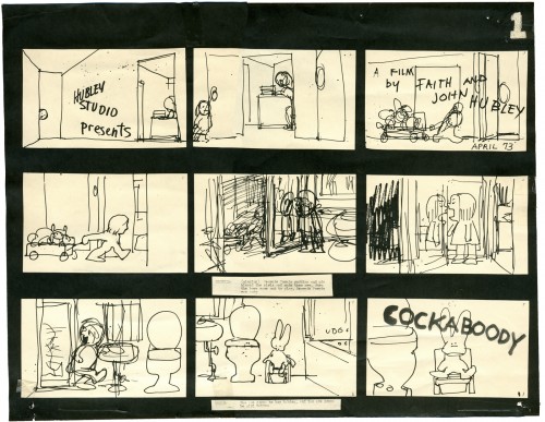
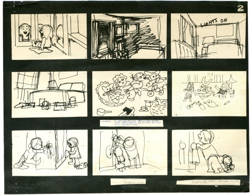
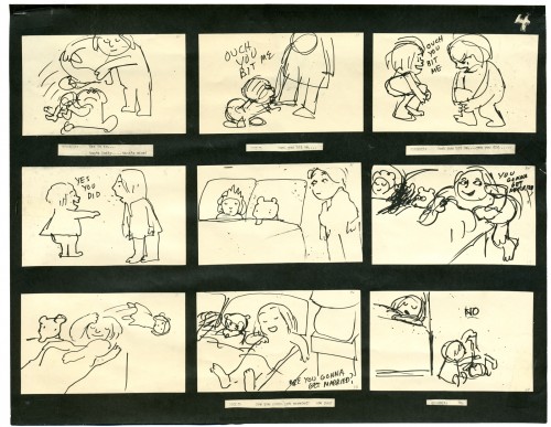
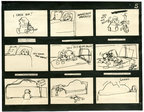
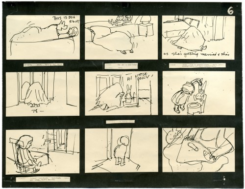
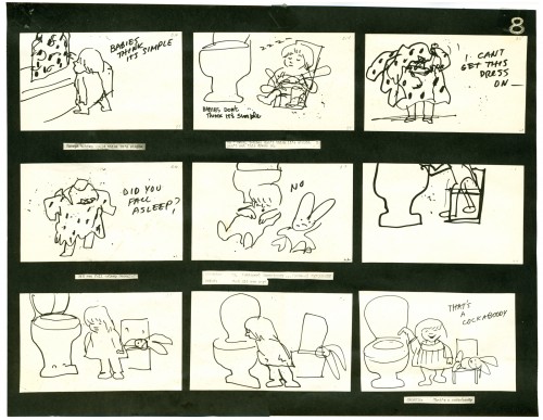
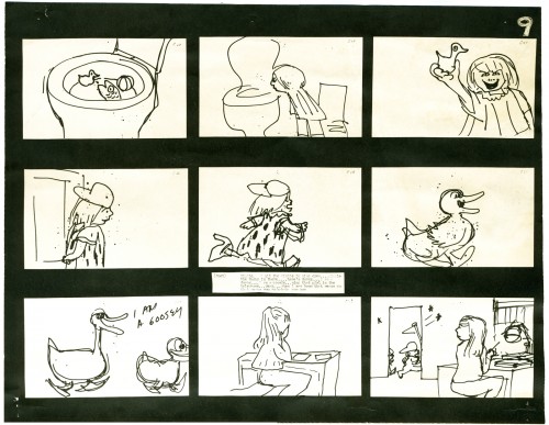
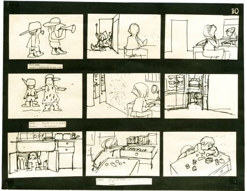
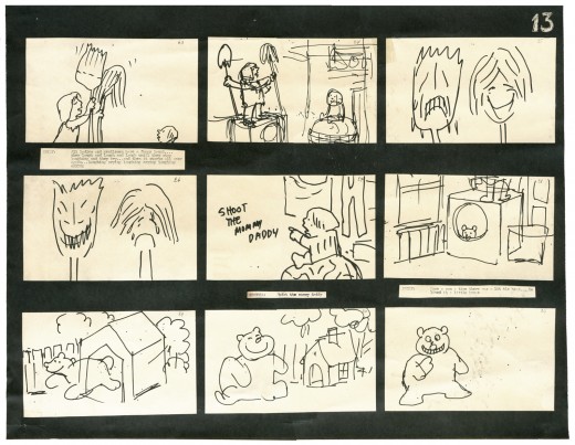
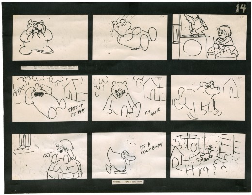
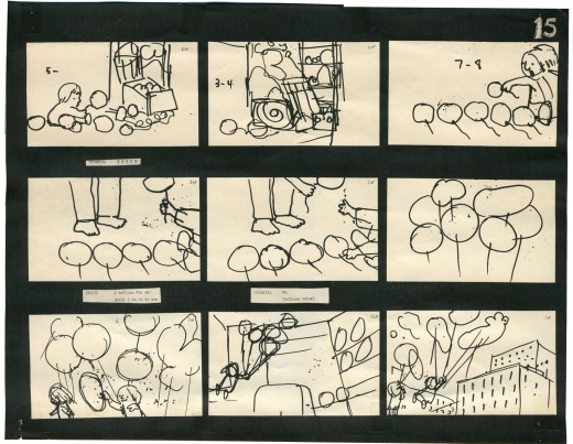
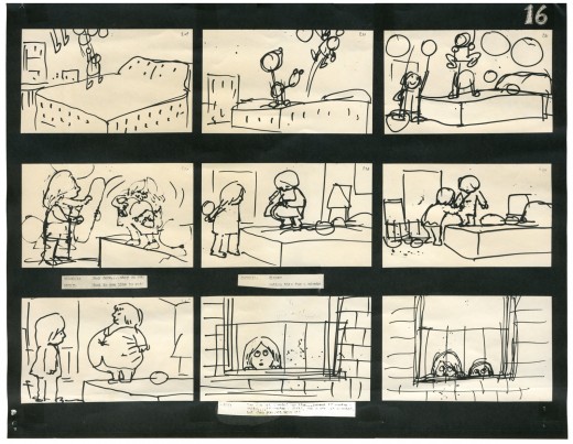
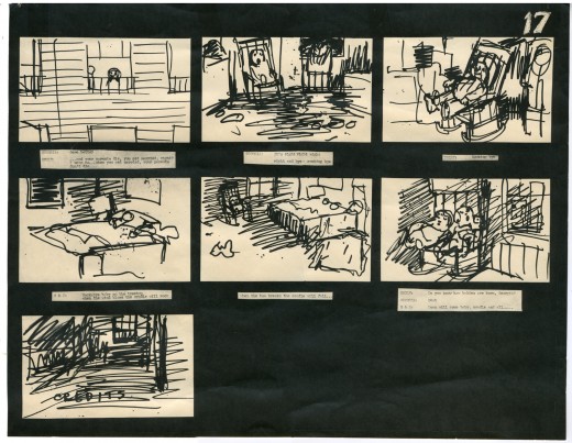
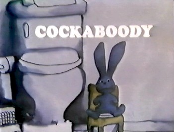 – I have a photostat copy of the storyboard to John and Faith Hubley‘s short film, Cockaboody. So I thought I’d post it to give a good demo of a storyboard from a master. The board was done in 1973.
I had worked at Hubley’s for four months on Letterman and was layed off when that work ran out. They started preliminary work on Cockaboody while I was working on the feature Tubby The Tuba.
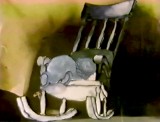
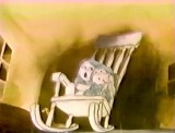
I left that project in time to get back to see the final scenes of Cockaboody colored, and I did a little animation of a rocking chair, with the two girls cradling it, at the film’s end. I didn’t do enough work on the film to receive credit, but I can still see my pencil lines on those two girls at the end of the film.
The film tells the story of two girls playing in a room next door to their babysitter. They laugh they cry they laugh they cry.
The audio track was improvised by Emily and Georgia Hubley in a recording studio years before they started the film. From the edited tracks a story was culled, and a storyboard formed. John did all of the drawings in storyboarding it.
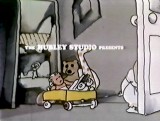
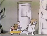
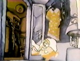
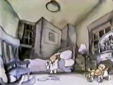
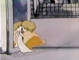
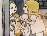
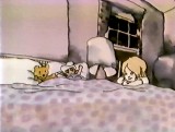
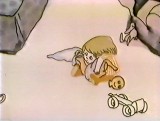
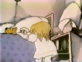
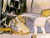
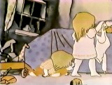
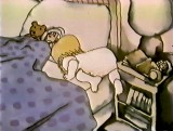
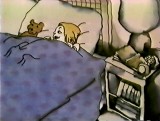
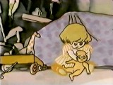
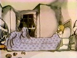
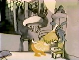
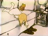
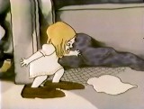
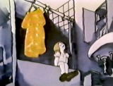
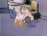
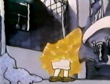
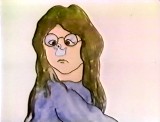
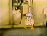
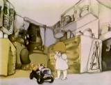
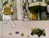
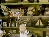
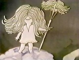
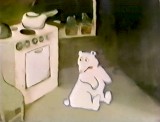
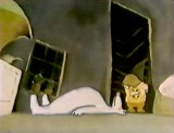
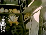
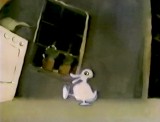
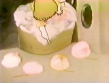
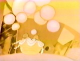
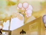
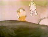
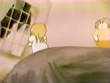
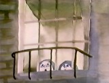
There are 17 pages of board in all. I’ve inserted frame grabs so you can see how the final turned out. Tissa David animated the entire film.
The storyboard, with all of the drawings done by John, was developed in conjunction with the Hubley’s class at Yale. The students actively discussed the board and offered their participation in the growth of the film’s origin. A documentary was also produced showing the production of the animated short.
You’ll notice that the action in the film varies from the setups in the storyboard. This undoubted had to do with Tissa’s involvement. She would often rework things with John and alter the filmmaking. John, and most of the directors Tissa works with, was open to this. She has a masterful sense of camera placement and uses it throughout this film.
The film was an outgrowth of an early recording John and Faith made of their two daughters, Emily and Georgia. While teaching at Yale the Hubleys worked with the students in their class to help develop this storyboard. One of the students, Kate Wodell, came to work in the studio and was a mainstay there for many years and continued for a while helping Faith on many of her shorts after John died.
__
__
 _
_ _
_
__
__
__
 _
_ _
_
_
__
__
 _
_ _
_
__
__
__
 _
_ _
_
__
__
__
 _
_ _
_
__
__
__
 _
_ _
_
Disney &Models &Story & Storyboards 25 May 2011 07:49 am
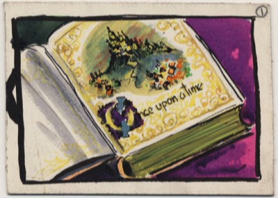
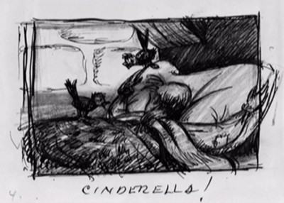
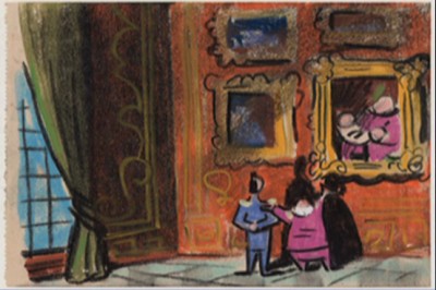
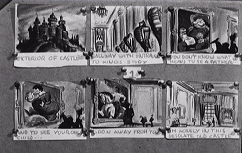
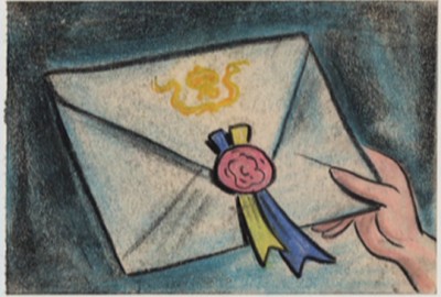
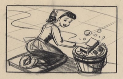
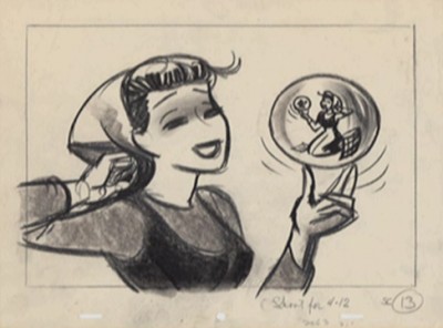
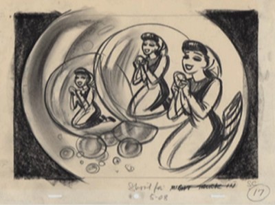
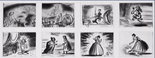
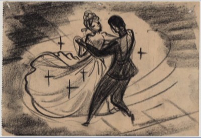
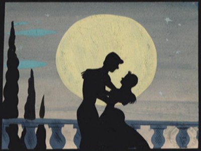
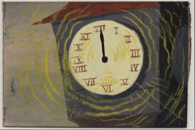
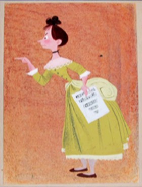
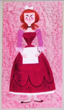
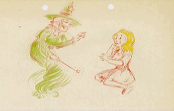
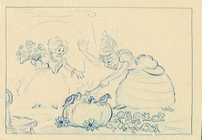
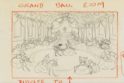
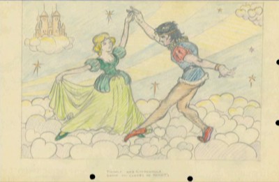
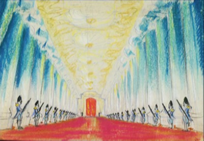
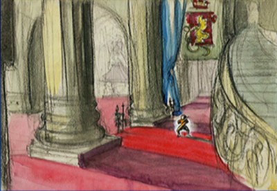
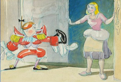
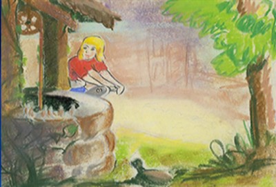
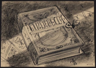
Cinderella Drawings – 5
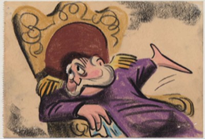
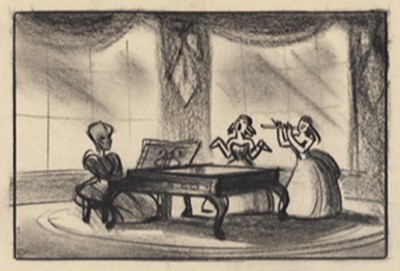
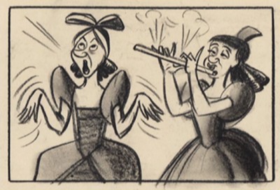
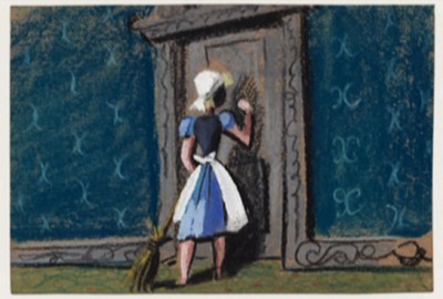
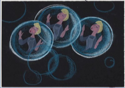
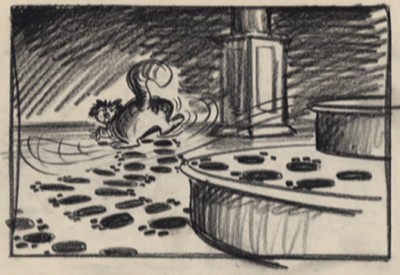
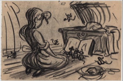
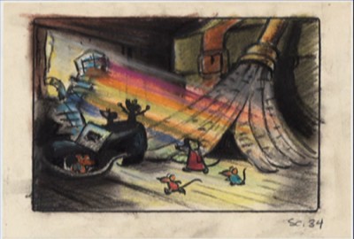
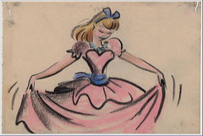
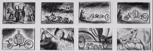
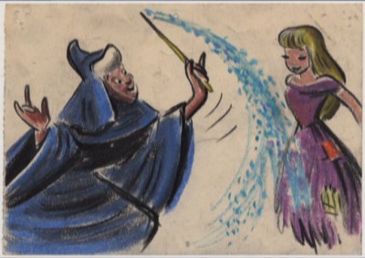
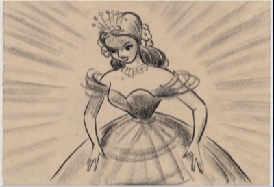
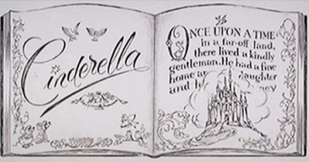
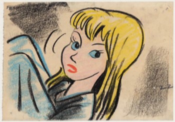
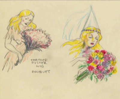
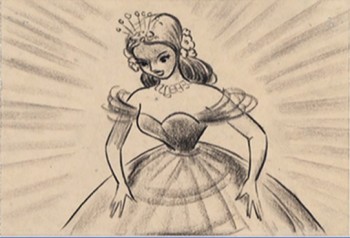
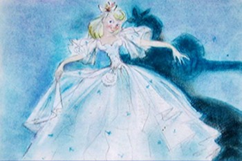
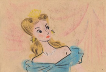
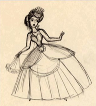
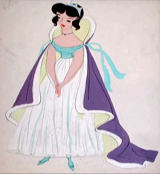
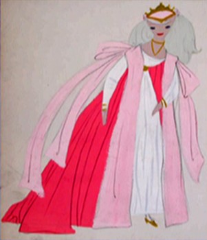
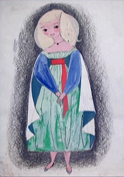
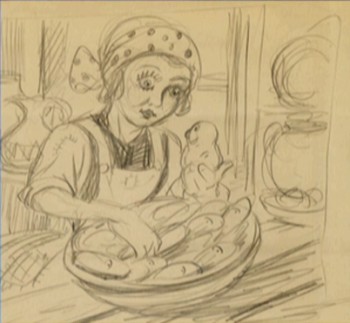
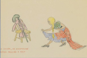
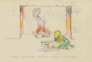
- Here are some storyboard drawings from Cinderella. A number of them are by Bill Peet (known as “William Peed” on this film
May I suggest that you check with Hans Perk‘s excellent site A Film LA to find the drafts for the film. You can use those to find out who animated what scenes.
 1
1
Animation Artifacts &Disney &Illustration &Layout & Design &Models &Story & Storyboards 19 May 2011 05:04 am
Cinderella Drawings – 3
- More images collected from Cinderella. But first, let me start with this email my sister, Pat, sent me. She’s always sending
me funny email jokes, and this one seemed to come at just the right time – in time for this post. It just reads:
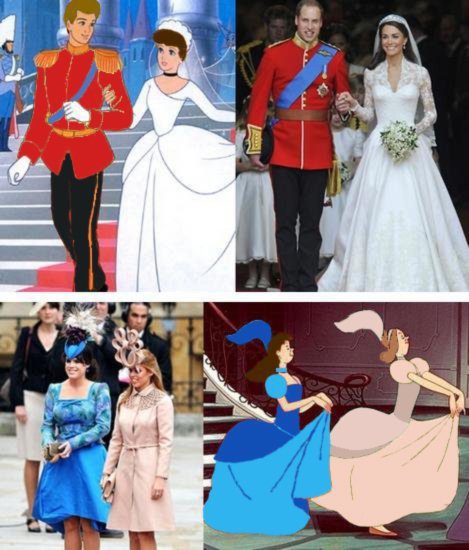
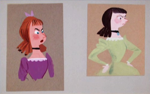
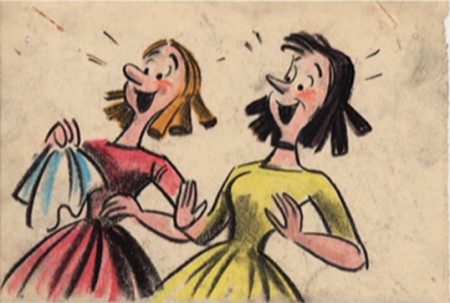
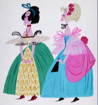
The Prince and Cinderella is one thing but the two sisters’ dresses. That’s where this comparison takes the cake.
Anyway, I thought you might enjoy it if you haven’t already seen this.
Now, onto more Cinderella art. This all started with Hans Perk‘s wonderful blog, A Film LA and the Cinderella drafts he’s posting. Take a look. They’re a treasure (as is everything Hans posts.)
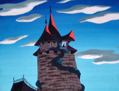
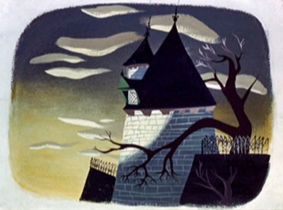
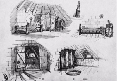
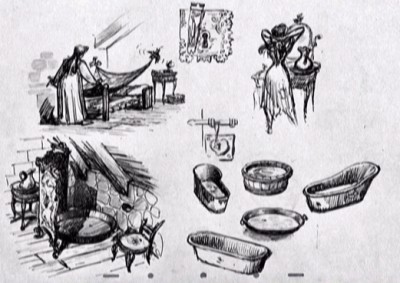
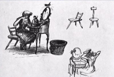
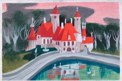
We start with a couple of finished BGs and move onto to models and designs for Cinderella’s room, house, and castle.
 1
1
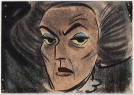
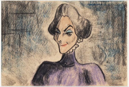
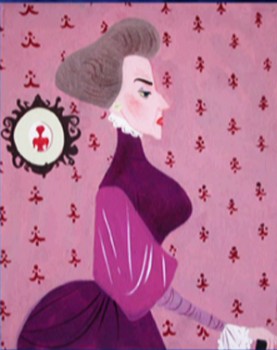
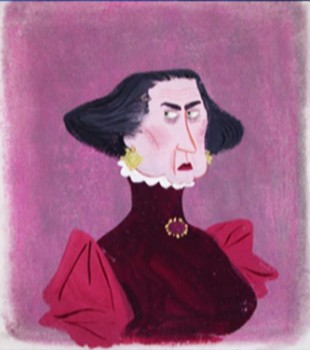
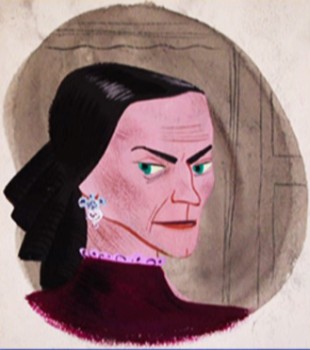
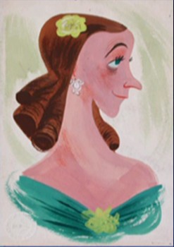
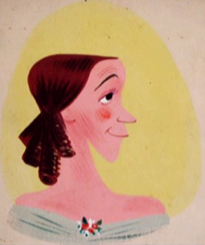
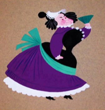
The Stepmother
The Stepsisters
Animation Artifacts &Disney &Illustration &Layout & Design &Story & Storyboards 16 May 2011 04:48 am
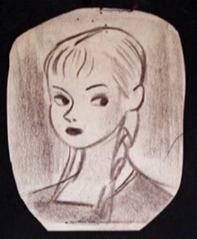
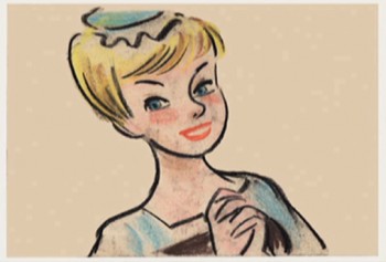
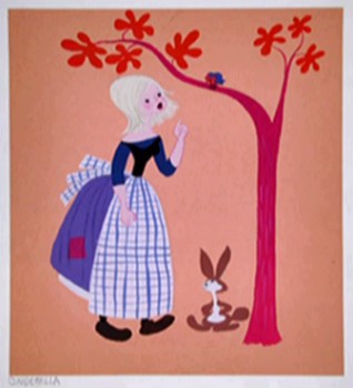
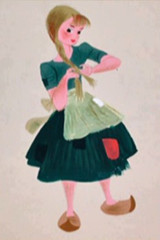
Cinderella Drawings – 1
- Cinderella art. I’ve taken a lot of drawings that I could find from an old DVD and from some books and have put them all together in a jamboree of images making up a couple of posts. The occasion for this, to me, is to celebrate the drafts recently posted by Hans Perk on his resourceful site, A Film LA. This is all leading up to something. I don’t want to do: a mosaic of the film. I am not that in love with the movie to do all that work, but perhaps I’ll do a variation of the form, created by Mark Mayerson.
The artists of these sketches are nameless. None of the art was identified, so I send it out that way. The Mary Blair images are obvous, and though there’s a preponderance of Blair artwork for this film, I”ve tried to limit her a bit. I did devote a lot of space to her artwork in past posts. You can find more of her Cinderella images here.
For now here are some images of the character, Cinderella.
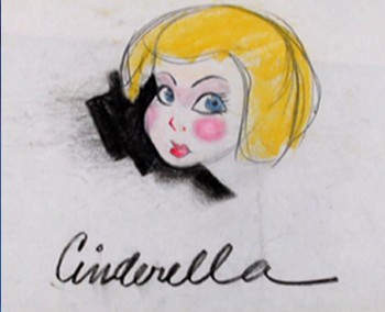 1
1
Animation Artifacts &Disney &Illustration &Story & Storyboards 10 Mar 2011 07:57 am
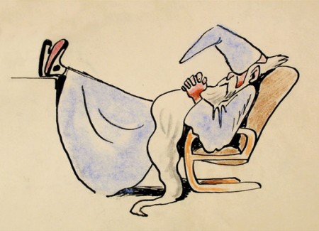
recap – Peet’s Wizard’s Duel
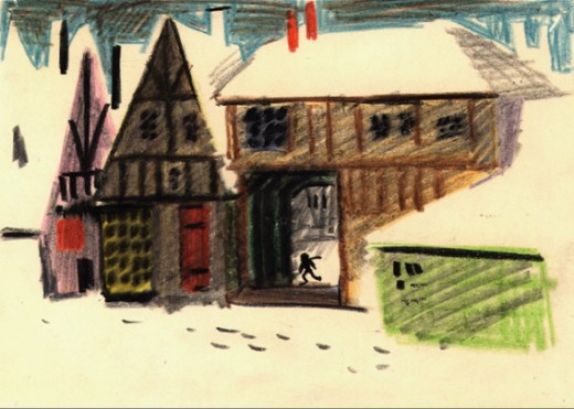
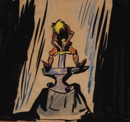
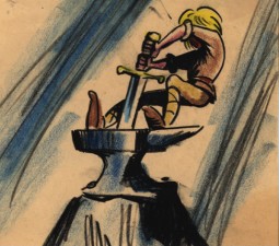
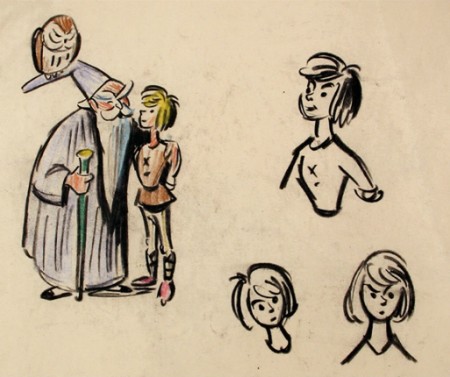
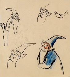
Now that I’m posting some of the illustrations from Bill Peet’s book, Capyboppy, I thought it might be a good time to recap his storyboard for the wizard’s duel in Sword and the Stone. It’s not bad to compare his storyboard drawings with his children’s book illustrations.
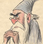 – Here is a preliminary storyboard done by Bill Peet of the Wizard’s Duel from Disney’s Sword In The Stone. It’s another gem on loan from John Canemaker, and is a companion to the piece I posted last Friday by Peet. The oddity of this board is that it’s dated April 1949. (The numbers at the bottom of the board clearly read “449.”) I didn’t have any clue that this film was in development that early. The book was published in 1938, so it’s quite feasible.
If that date is accurate, it’s amazing how close the characters stay to their final models. This could easily be explained with the heightened use of xerography in animation after 1958. Post 101 Dalmatians, this loose style was easy to translate into animation, and Ken Andersen was easily able to adapt to this style by Bill Peet that all of the animators in the studio loved.
 A
A
Click on any image to enlarge
 B
B
Note in row 2 how the spider turns into the tiger’s face; it’s a graphic turn. This never would have made it to the final in a Disney film, and it didn’t.
 C
C D
D
I love how extra drawings which have been pulled make it to the bottom of the second board.
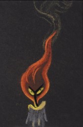 - I always thought Disney’s The Sword In The Stone a somewhat underrated film. The background art is sensational, and several sequences are brilliantly animated.
Bill Peet‘s adaptation from TH White‘s book, The Once and Future King, loses some of its poetry in the adaptation, but the book’s storyline features a lot of rambling making it hard to construct a screen story. I’ve watched this film quite a few times over the years, and somehow it always gives me a bit of a charge that comes with many of the older classics.
The extras on the dvd seems to consist predominantly of storyboard drawings by Bill Peet. So why not show them off? There’s no continuity to attend to, hence the images are gathered in small clusters. The sequence everyone jumps to analyze and discuss is the Wizard Duel between Merlin and Madame Mim (animated by Milt Kahl.) Consequently, a lot of the drawings on the dvd come from this sequence. I, personally, would have loved seeing some of the squirrel section. I found it quite moving and full of real character stuff. It would be nice to see how Peet developed this.
There’s no hint of a continuity on the dvd, but I’ve heard that the storyboard drawings in the vault are just placed in manilla envelopes with no suggestion of an order. It would make sense that they’ve just plopped these images on the dvd as they have with no order, details or related information.
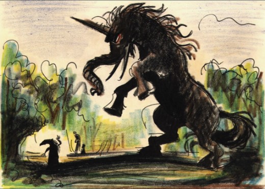
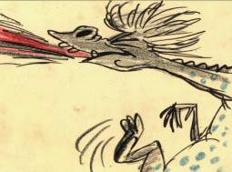
_______Here’s a creature that never made it to the battle of the wizards.
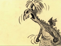 _
_
_________________________(Click any image to enlarge.)
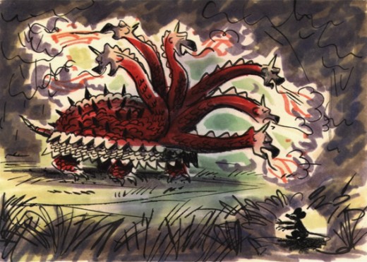
___________Another fantastic creature that didn’t make it into the film.
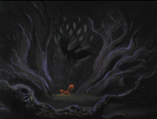
I’m not sure if this drawing is also from the duel. Or was it another sequence where Wart becomes an animal – cut out of the film?
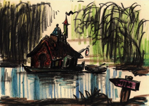
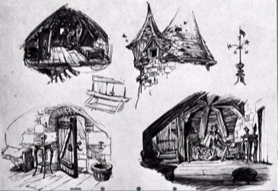
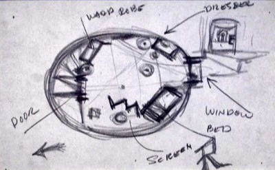
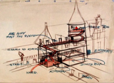
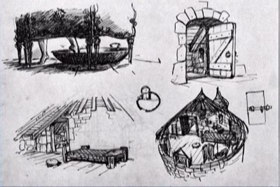
This looks like it may have been planned as a home for Madame Mim. Did it inspire anything for The Rescuers?
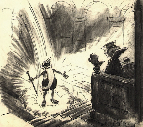
_____
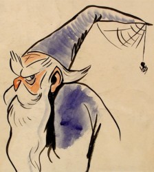
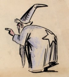
Here are a couple of models Peet obviously did –
_______________________probably more for himself than anything.
______ _
_
Animation &Disney &Story & Storyboards 07 Jan 2011 09:03 am
Snow White Story Meeting
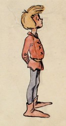
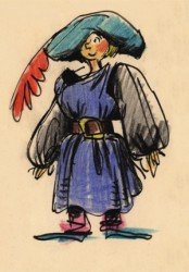
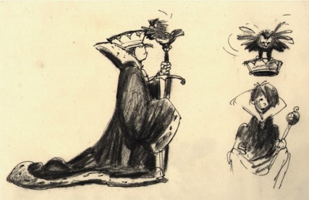
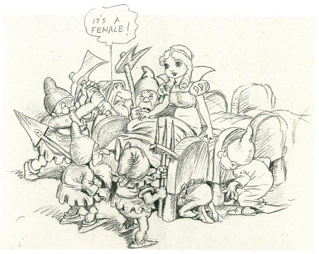
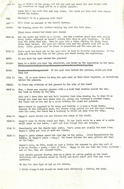
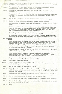
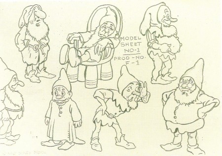
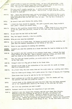
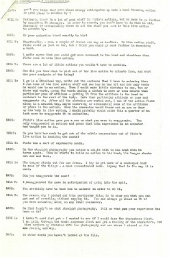
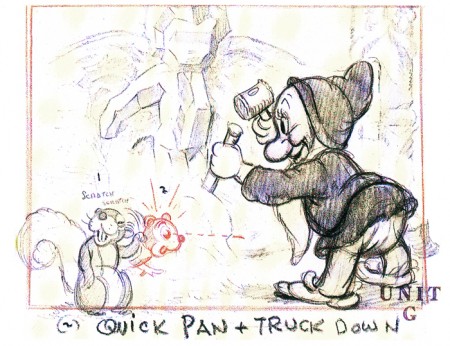
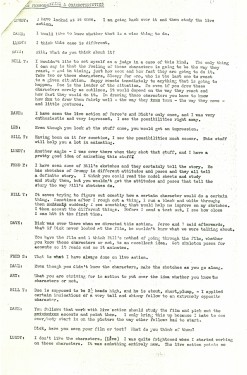
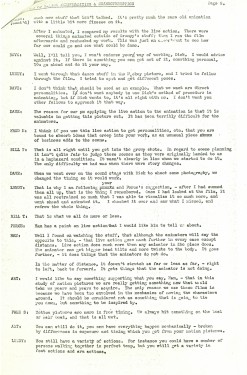
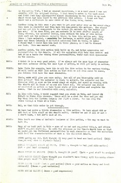
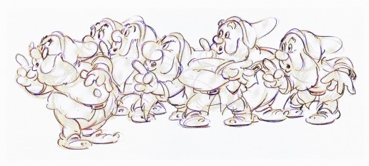
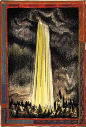
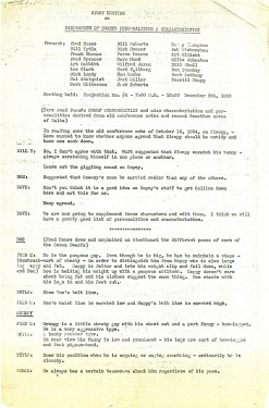
- Here are the steno notes of a story meeting on Snow White‘s dwarves. I’m sure this has been printed somewhere or posted on someone else’s blog, but I don’I kniow where. So I’ve decided to post it “again” (in case someone else has it out there). I’ve added some drawings of the dwarves to color the post.
 1
1 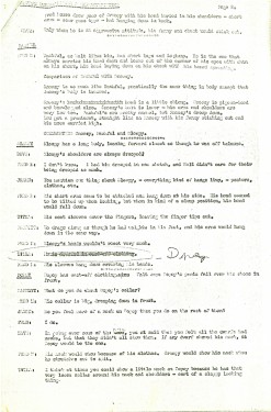 2
2
Animation Artifacts &Disney &Story & Storyboards 06 Dec 2010 08:19 am
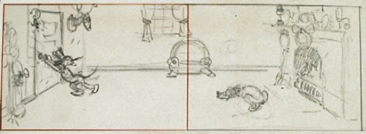
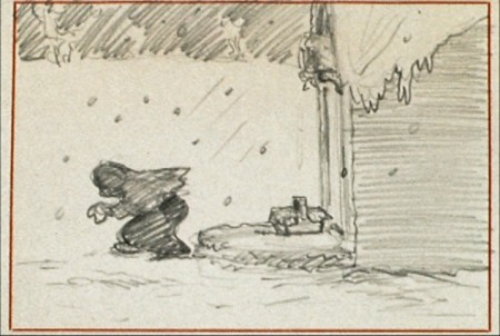
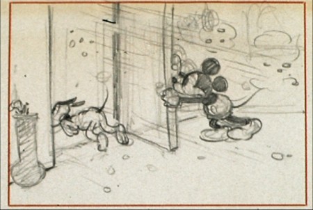
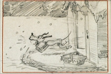
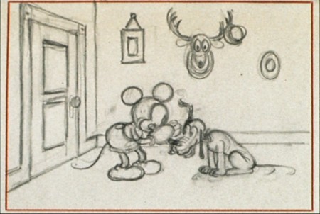
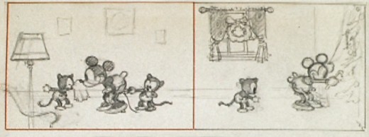
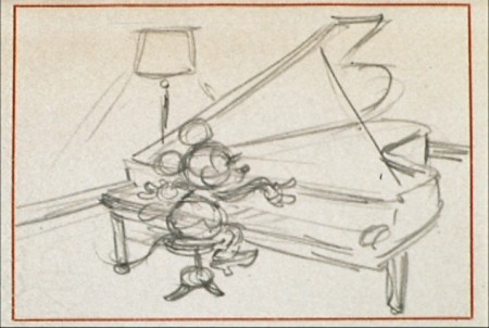
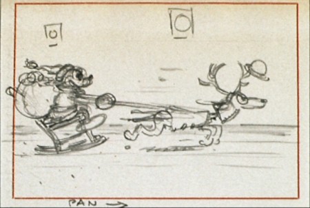
Mickey’s Orphans Story Sketches
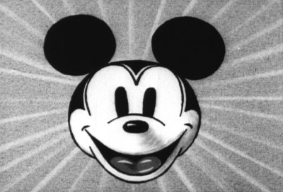
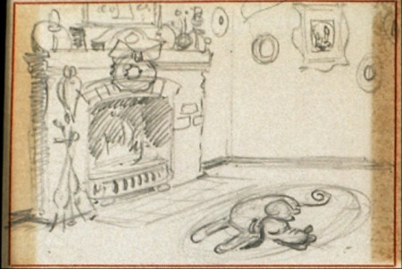
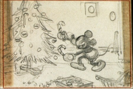
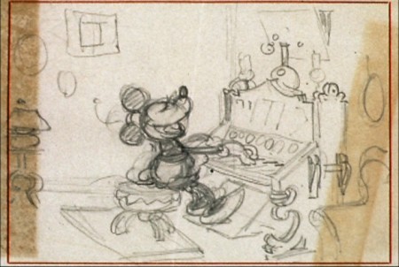
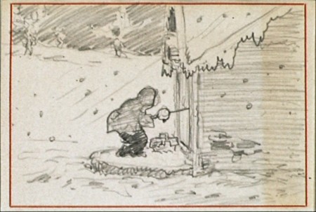
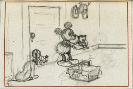
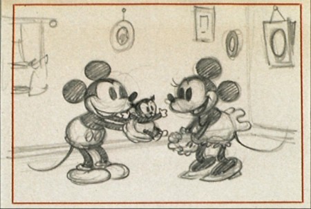
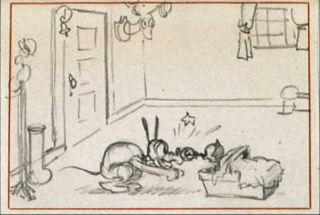
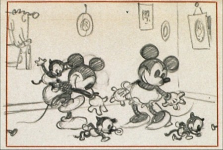
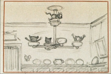
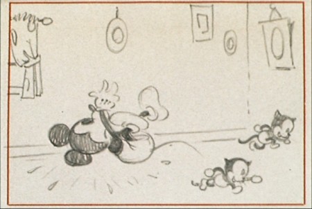
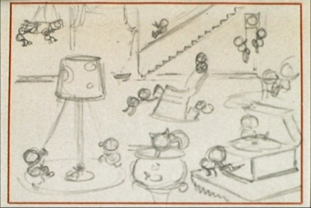
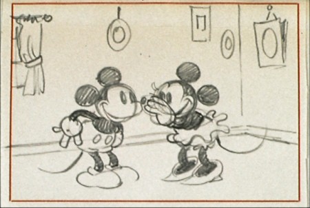
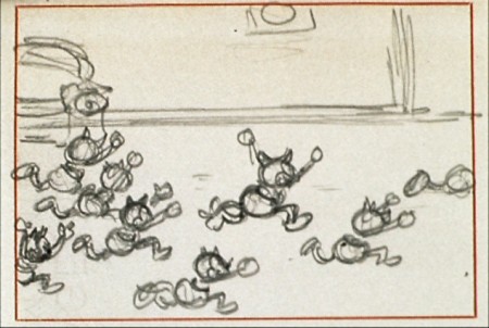
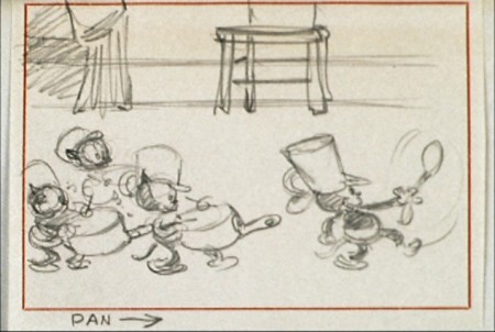
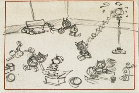
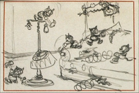
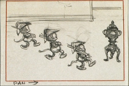
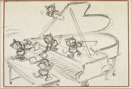
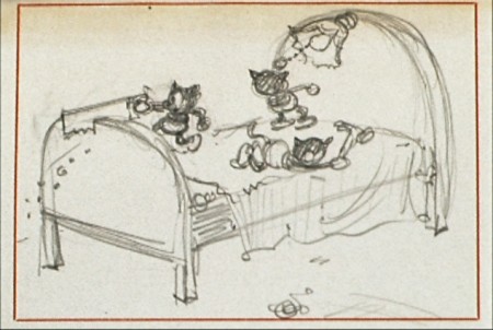
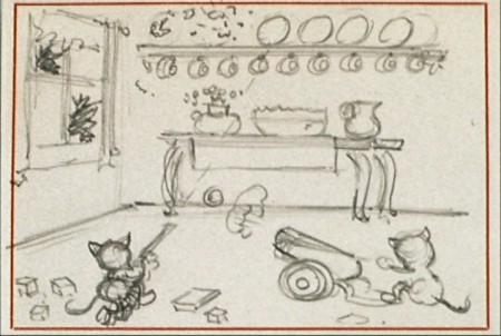
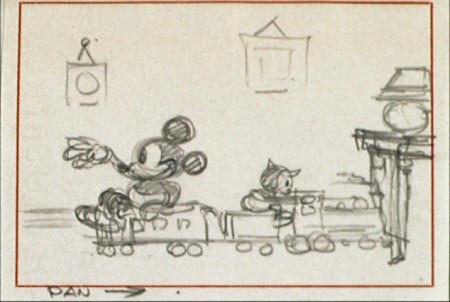
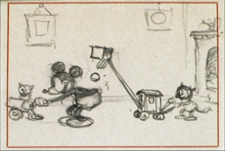
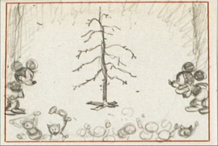
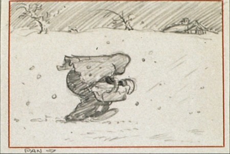
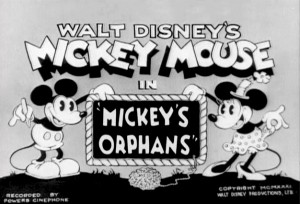 - Here from the Mickey in B&W Treasures DVD comes some story sketches from the great, early short, Mickey’s Orphans. It’s valuable to see how much action happens between these drawings, and one wonders if there are other story drawings missing, or did the animators get to play a bit with the action.
This film was done in 1931, and certainly a procedure was developing at the studio in the process of making these films.
Here are the story sketches for this film, and some of them are beauties.
 1
1
Hans Perk has posted the draft for this film on his blog, AFilmLA, and I’ll try to put together a visual breakdown of the film to match it.
By the way, what a resource AFilmLA is. Hans is currently posting the draft to Fantasia. What more could we want? Thank you, Hans.
Books &Models &Story & Storyboards 07 Oct 2010 07:41 am
Backing Forward
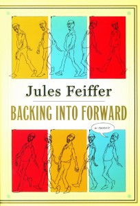 - I’m currently reading an excellent book; it’s Jules Feiffer‘s autobiography, Backing Into Forward. The book not only serves as Feiffer’s life story, it’s also a treatise on art, cartooning and illustration. The man’s led an extraordinary, artistic life from drawing his weekly strip in the Village Voice to writing plays and movies with the likes of Mike Nichols, Stephen Sondheim and other notables and actors.
I’ve had the pleasure of working with Mr. Feiffer on several occasions, and I can attest that he’s as distinguished and constant an artist as I’ve met. I’ve also had the chance to interview him publicly about the Oscar for Munro (which he didn’t receive – William Snyder did) as well as his long working relationship with Gene Deitch. Mr. Feiffer is an erudite man, and it comes across in this autobiography.
The post that appeared yesterday on the ASIFA Hollywood Archive blog made me think about this short section of the Feiffer book, three pages which call to mind his short history at Terrytoons. The story is interesting, one which I closely relate to. Here is that story in Feiffer’s own words:
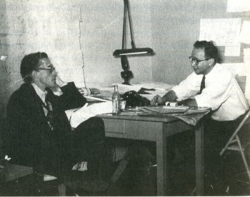
Eli Bauer (R) and Jules Feiffer (L) at Terrytoons.
- (R.O.) Blechman drew like no one else, in captivating minimalist squiggles that Deitch presented stunningly on a panoramic movie screen. A couple of days a week, Blechman and I found ourselves sitting next to each other on a wrong-way rush hour commute to New Rochelle. We would sound each other out on the business, whom we liked, whom we didn’t like, what we were going to be when we grew up. A modest man of considerable sweetness, it was surprising to find that Blechman was as dismissive as I was of the outdated but amiable hacks we had been shipped in to replace, a company of aging boys, midfifty to seventy, who were unembarrassed by and even took pleasure in their mediocrity. They could pushpin seventy-five to a hundred layouts on wall-length corkboard that showed cats and mice and ducks and pigs and elephants wreaking cartoon havoc on one another. Then, following the age-old tradition of storyboard conferences, they would mortifyingly act out in funny voices before sponsors, network honchos, and account executives what was plainly visible to anyone who could read.
A man of fifty had to bark like a dog, a man of sixty had to flap his hands and quack like a duck, a man on the verge of retirement had to jump up and down in mock excitement. All this to convey to clients what was assumed they couldn’t understand without the assistance of stand-up interpreters.
And as it must to all men with an attitude, one day it came to be my turn to humiliate myself. Gene Deitch had brought me into Terrytoons in part to design a three-minute animated story to run several mornings a week on Captain Kangaroo, CBS’s star morning children’s program. Deitch’s own creation for Captain Kangaroo, a popular series called Tom Terrific, was about to run its course. On the basis of my early Voice strips and Clifford, which Deitch remembered from the back page of the Spirit section, he thought I could design a sophisticated cartoon for lads in a UFA mode.
I went back to my Clifford roots and created a cartoon about a gang of street kids that I called Easy Winners. The title was derived from a Scott Joplin rag I happened to hear late one night on the radio. I put together a model sheet of characters and wrote and laid out a couple of episodes, one of which I pushpinned to the wall. The reaction was more than I could have hoped for. Everyone at Terrytoons loved it. The new guard loved it; the old guard claimed to love it, but it was hard to tell what they really thought, other than that they wished we would all go away.
Deitch was more enthusiastic than anyone, which was not a surprise. He was happiest working at fever pitch, his energy hyped into overdrive to convince the client, through sheer exuberance, that whatever doubts he might have about the work on the wall, it was potentially a classic. Gene loved my storyboard and he anticipated the excitement of the CBS executive (on his way at this very moment) who would shortly look at and decide the fate of Easy Winners. My role was to do no more than thousands of hacks before me: stand and perform the storyboard before Gene and a claque of animators and layout men, along with Bill Weiss, the president of Terrytoons.
The man from CBS arrived and my heart sank. He was a tall, silver-haired, mustachioed gentleman dressed in a three-piece pinstripe who, in dress and manner, made the rest of us in the room look inconsequential His name was Williamson, as English-sounding as his look. He outclassed us all, but Gene failed to notice. “You’re going to love this!” he squealed in his high-pitched salesman’s voice. One look at our distinguished visitor told me he was unlikely to love anything pushpinned to a wall in New Rochelle.
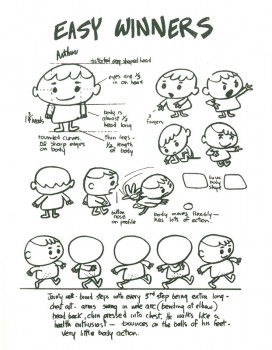 I had been through many of these storyboard sessions. I was upon the routine, but that didn’t mean I was up for the job. I was years away from public speaking, deep into shyness and self-effacement. Still, I did my best to sound like the quacking, barking, oinking animators I’d seen do this many times, pumping myself up to imitate a gang of five-year-olds from the Bronx. A minute and a half in, my humiliation was intense, and what was worse, it wasn’t getting me anywhere.
Behind me, Deitch and my claque had been laughing hystericalh until it became clear that the unsmiling Mr. Williamson was perhaps having himself a snooze. My approach shifted from manic to wistful. The claque’s laughter dwindled and died, leaving only my own strangled half laugh, half gasp.
Each time I turned from my storyboard, I noticed the room was a little emptier. My claque had decided that Mr. Williamson’s side was a better one to be on than mine. They had made the only sensible choice: I didn’t want to know me either.
By the time I limped to the end, only Bill Weiss, the president, and Gene, the head of the studio, remained, plus a goofily grinning threesome of loyal friends.
It was time for me to shut up and wait for Mr. Williamson’s decision on Easy Winners. His way of presenting it stays fresh in my mind fifty years later. After an uncomfortably long pause, he said, “Well, it’s a little New Yorker-ish.” Dead!
He had one final comment: “I mean, it’s closer to Dostoyevsky than it is to Peter Pan.”
As I headed home from New Rochelle that night, rage alternated with my sense of reawakened abandonment. Where had Deitch been when the time came to fight for me? I knew I had no call to be angry. Easy Winners was a loser. I gave them exactly what they wanted, but the they I gave it to was the wrong they.
I knew I was finished at Terrytoons, this studio where I had actually enjoyed a nine-to-five job for my one and only time since leaving the army. But it was no longer a place where my pride would allow me to work, a place where I could do quality work that also had commercial value. Seemingly, such a place did not exist.
In all the years I’ve presented storyboards, I’ve never done the song and dance required in animation studios. I’ve always trusted the material to out itself. This, perhaps, is a lesson I got while watching John Hubley pitch a storyboard, early on in my career. No quacking ducks, barking dogs or anything resembling the pitch meeting described here.
Thank you, Jules Feiffer, for leading the way and allowing me to feel less embarrassed about it.

