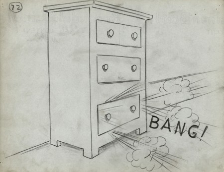
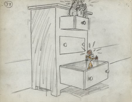
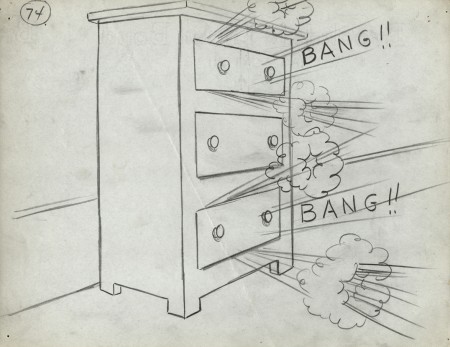
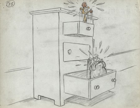
Category ArchiveStory & Storyboards
Animation Artifacts &Disney &Layout & Design &Story & Storyboards 05 Jul 2012 06:08 am
Daydreams – recap
How frequently, lately, they’re running Alice in Wonderland on tv. Unfortunately, nowadays, it’s the Tim Burton version. Horrible. I’m going to have to go back to the DVD to watch the cartoon again. Speaking of which, the MoMA is going to screen the Lou Binin version in late July. I’ll write about it on Saturday, and I’ll re-review it when it does. I’m definitely going. Here’s an oldie but goodie.
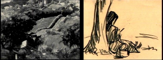
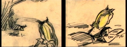
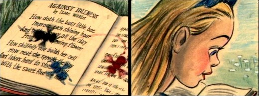
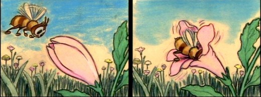
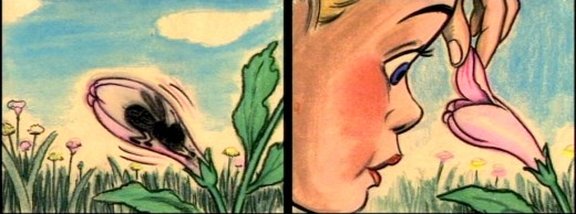
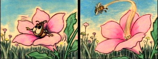
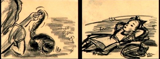
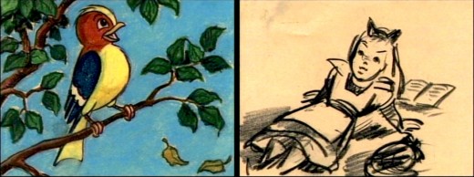
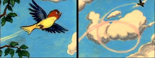
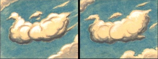
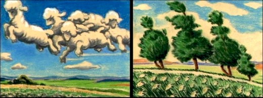
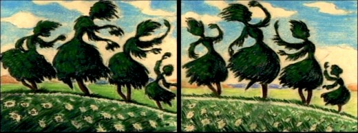
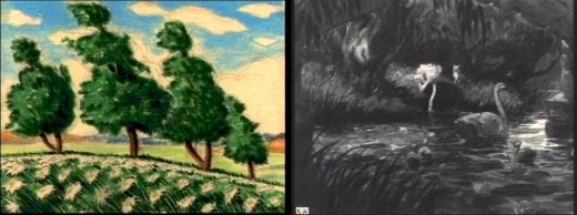
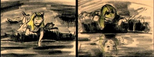
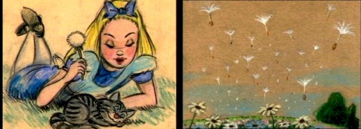
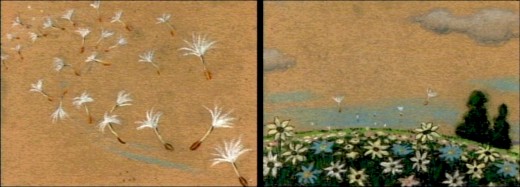
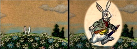
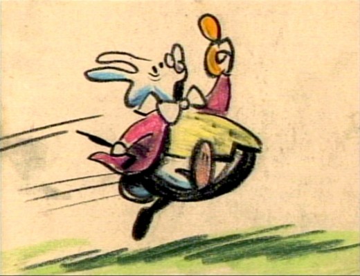
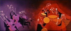
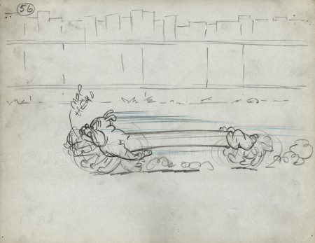
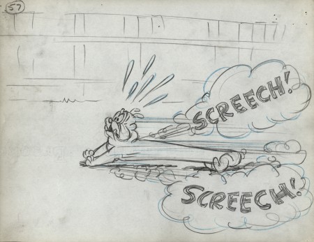
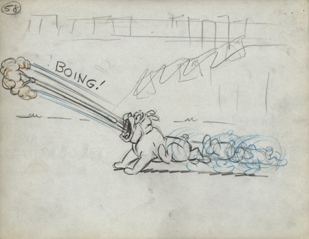
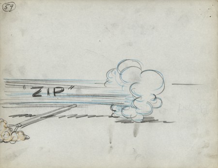
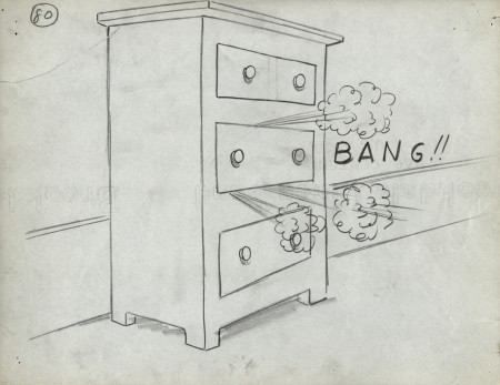
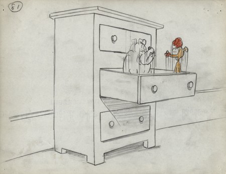
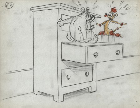
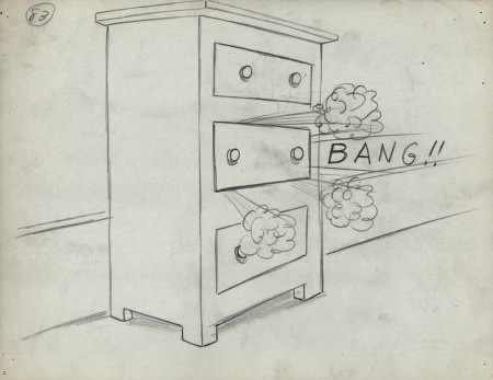
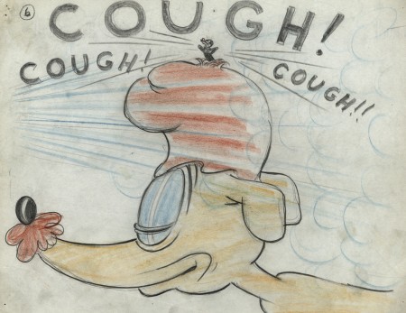
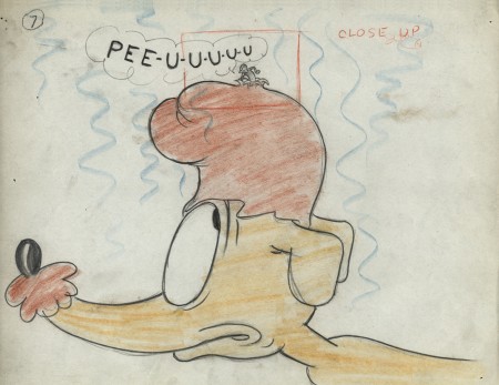
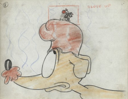
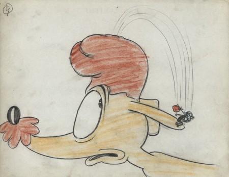
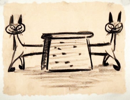
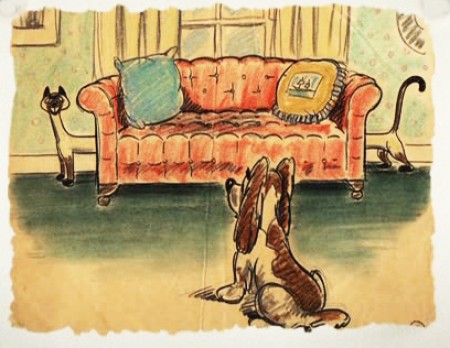
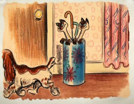
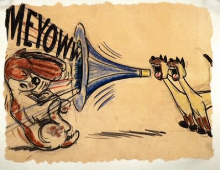
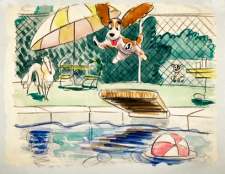
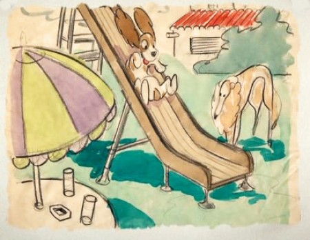
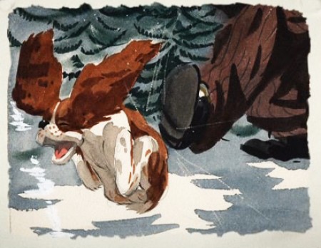
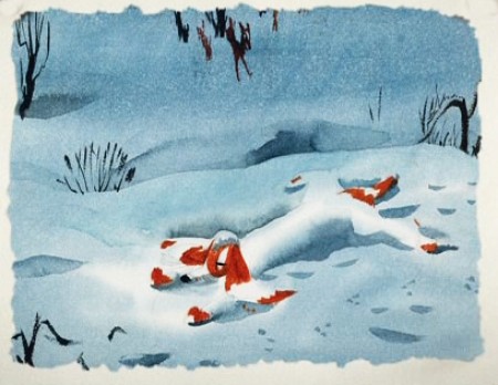
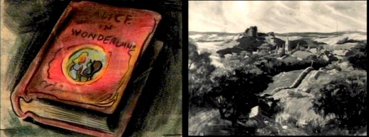
- The Alice In Wonderland dvd contains a storyboard sequence of Alice daydreaming in the park. This sequence didn’t make it to the film (for good reason), but they’ve re-assembled it for the dvd. I’ve taken some frame grabs to show off the drawings. They’re on screen for such a short time.
My favorite’s the last.
(Click any image to enlarge.)__________
Animation Artifacts &Disney &John Canemaker &Story & Storyboards 02 Jul 2012 04:43 am
Toot Bd – repost
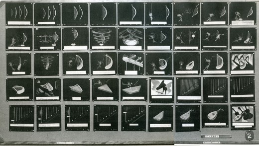
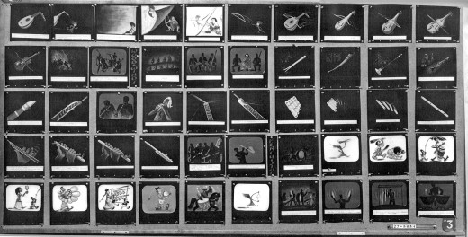
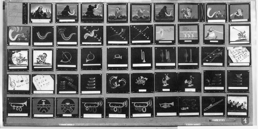
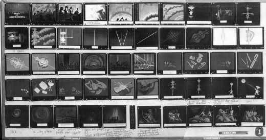
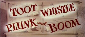 - Our Adventures in Music continue with the preliminary storyboard for what would ultimately become Toot Whistle Plunk & Boom. This is another board on loan from the archives of John Canemaker, and you can see the outgrowth from the prior film, Melody: Adventures in Music.
You can see how little of the magic was in this board, yet it obviously inspired others to keep it alive and make it work. Ward Kimball has to get most of the credit, though designs by Tom Oreb, Ken O’Connor, Eyvind Earle and Victor Haboush sure brought it to life.
The material I’m posting here is on large photostat copies. The problem is that the images are a bit fuzzy, and the text beneath the boards is illegible. In some cases, the appropriate text has been hand written on the copies themselves.
 1
1
These are breakdowns of each row of the boards so that the images can be made as large as possible. Each row of images is split in two and labelled accordingly. #31a means Board 3 row 1 part a.
 11a
11a
 31a
31a
Ward Jenkins has posted some beautiful frame grabs from the completed film. Go here.
See this short on YouTube here.
John Canemaker deserves all the kudos he gets for lending this material to me as well as plenty more that he’s loaned this blog.
Articles on Animation &Hubley &repeated posts &Story & Storyboards 17 Jun 2012 05:15 am
Hub Boards – repost
Yesterday, I posted some comments about a recent piece on Signe Baumane‘s blog. This made me think about this piece I wrote back in 2007. I think it’s worth a repeat.
- The conversation on storyboard use goes way back – before the internet. If you check out the 1969 book by John Halas, Techniques of Film Animation, there’s a Q&A session wherein a number of animation greats were asked several questions, and the answers are given by question.
Here’s one question about storyboards and the answers given:
To what extent to you think a storyboard should be developed prior to production?
- GENE DEITCH: I believe in complete scene and shot breakdown in story-board or a thumbnail board form before production begins. I use a thumbnail storyboard as a sort of bar-sheet, indicating all effects, dialogue and music cues, scene transitions, etc. Great savings in cost, and an overall perspective of the film in advance are to be gained.
JOY BATCHELOR : As fully as possible without detriment to the following phases of production.
STEHPEN BOSUSTOW: If time and money allow, the storyboard should include as many details as possible, particularly if it is to be assigned to a large production unit. However, if only a few people are to be working on the picture, the storyboard can be quite sketchy, with the details being developed during production by the key people who have an overall feeling for and knowledge of the story.
ADRIAN WOOLERY: The storyboard is the first step, after the idea. Every problem must be solved and the story completely resolved on the board prior to consideration of any production.
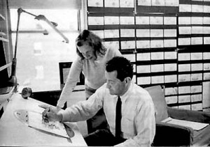 JOHN HUBLEY: It has been my experience that the more detailed a story-board and the more carefully it is designed to reflect the appearance of the finished production, the more successful the film.
GEOFFREY SUMNER: The storyboard, or breakdown of the film, has as many different forms as there are ways of putting actions in relation to one another.
The classic storyboard is the set of working drawings of the sequence of a film used in large studios on the Disney model where numbers of subsidiary workers must conform to a total pattern they can almost never see.
It is used in conjunction with model sheets. It could be called the “model sheet” of the sequence of the film.
It is strictly for use within a studio and should not be shown to dangerous people like sponsors.
An earlier stage is the treatment, which can be specifically directed at sponsors. If the basic idea of the film is simple, the treatment need be no more than half a dozen drawings and a brief synopsis to convey a ten minute film.
A storyboard must necessarily be constructed after the music has been done. The musician and the director can work together from a stage following the treatment. From the finished recorded track the storyboard is made.
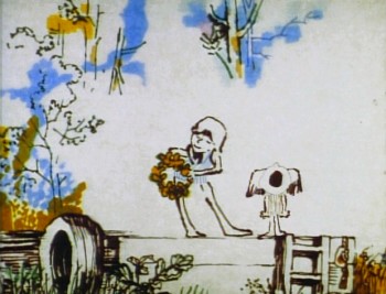 For years prior to even meeting Hubley, I had remembered his response to this question. It impressed me. His storyboard development was pretty intense. The scripts generally were done visually and tacked to the wall.
I don’t remember ever seeing text up there. John would present the board to key people, and he would give an indication of dialogue verbally. We all knew this would ultimately be ad-libbed by actors.
With the Carousel feature, sections were boarded but then developed in greater  length through improvised sessions. The boards then grew out of the edited tracks. The voices often came first, here.
I suspect this is probably also true of the films like Cockaboody, Windy Day and Moonbird which were dependent on the children’s verbal play at the microphone. Something like The Hole or Voyage To Next were boarded visually, then recorded improv sessions which were adapted in newer boards.
Of course it has to be remembered that the two features done within this studio, Everybody Rides The Carousel and Of Stars and Men, both started out as text. Both were heavy-duty books that were adapted for film. In the case of Of Stars and Men, the author, mathematician Harlow Shapely had major involvement in the film’s script and narrated it as well. The concepts for both films were fully worked out before anyone started boarding. So essentially a script – of sorts – existed. Since CBS financed Everybody Rides The Carousel, you know they had to approve a script.
I, of course, only remember the board.
Animation Artifacts &Fleischer &Story & Storyboards 23 May 2012 05:32 am
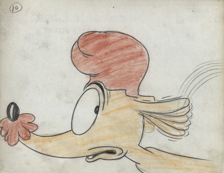
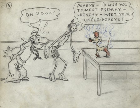
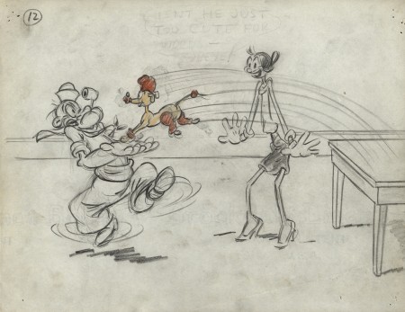
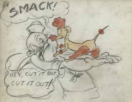
Popeye Storyboard – part 3
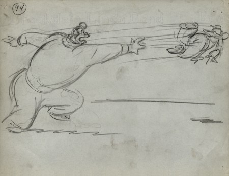
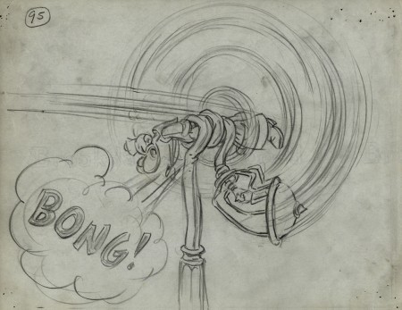
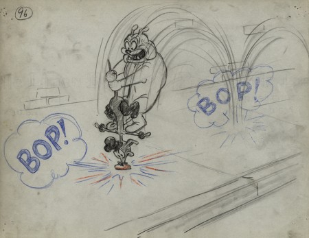
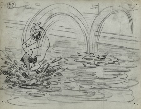
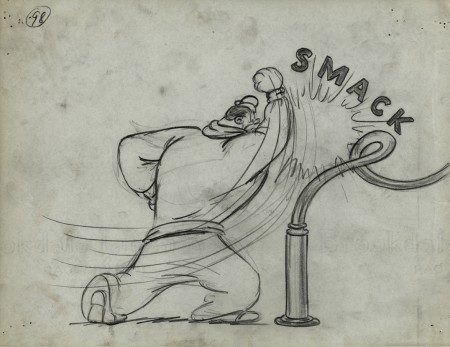
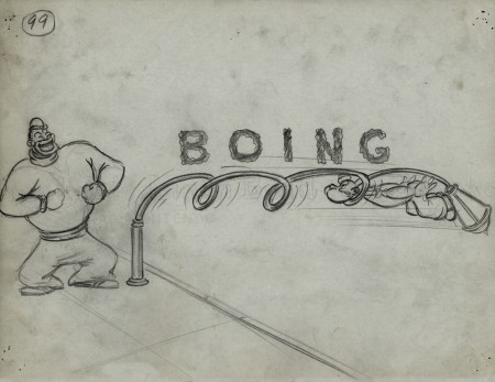
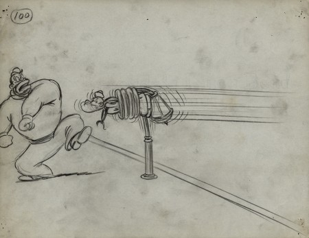
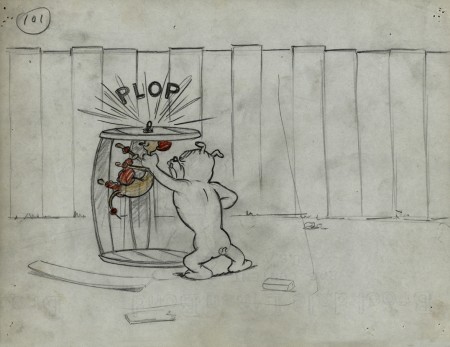
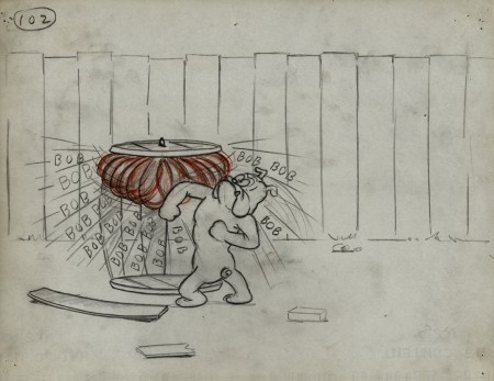
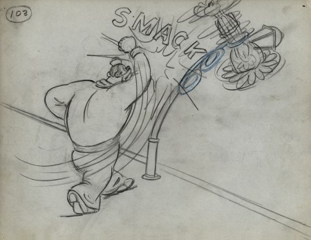
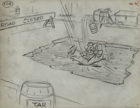
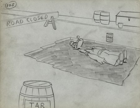
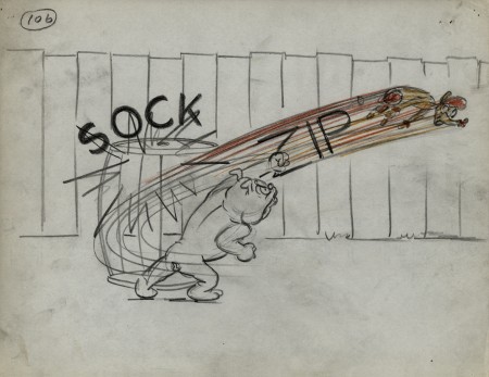
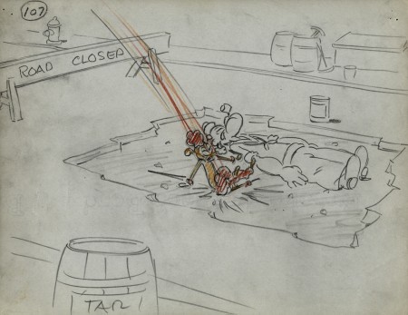
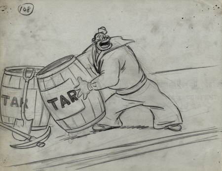
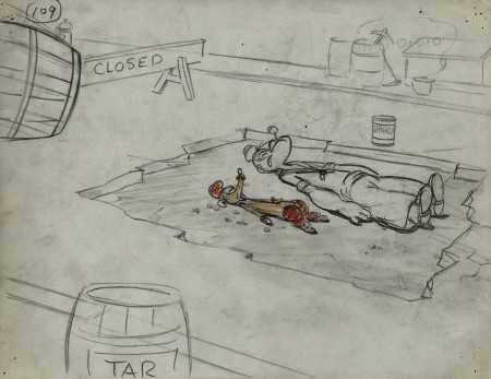
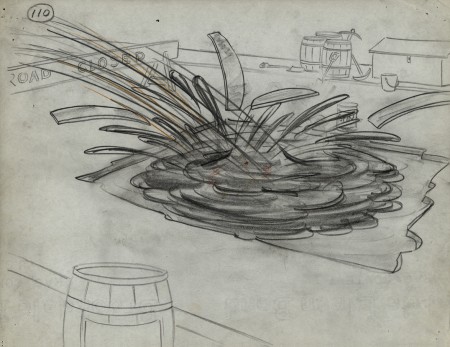
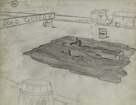
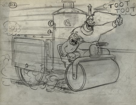
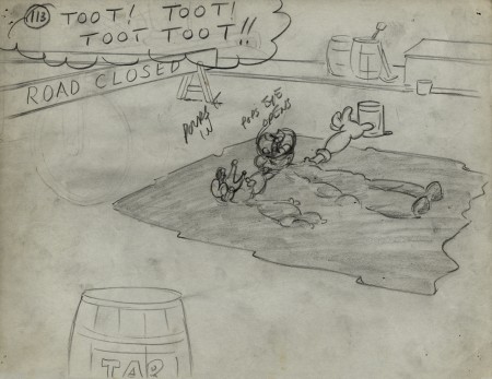
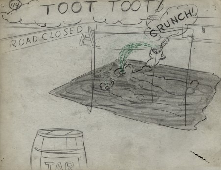
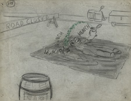
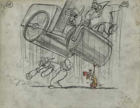
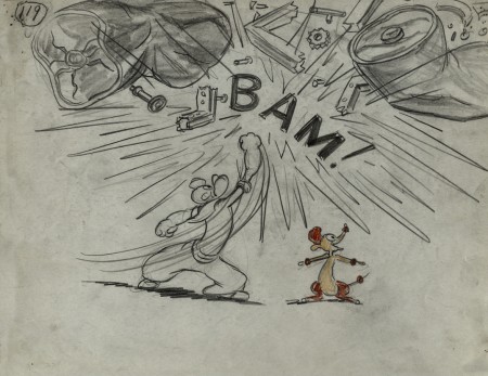
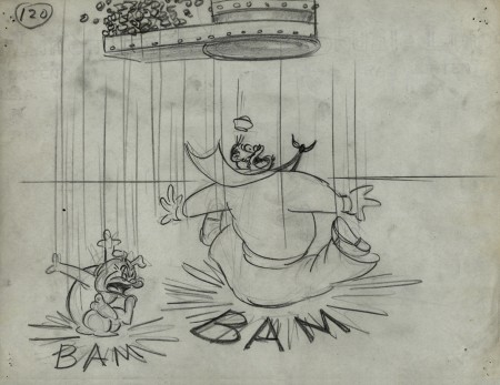
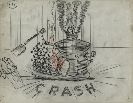
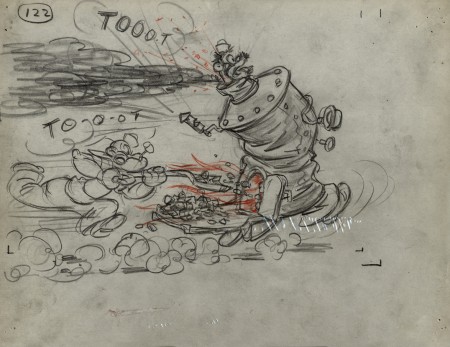
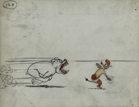
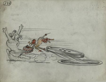
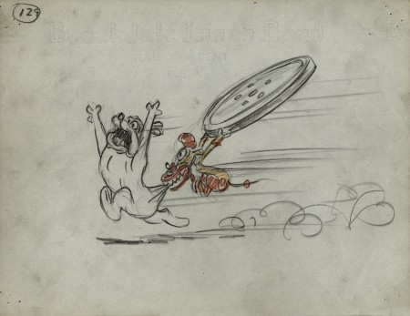
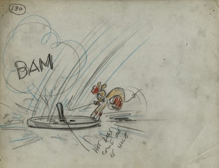
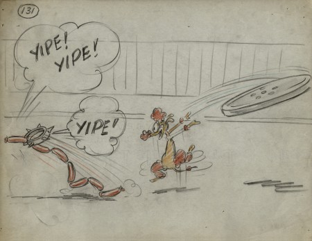
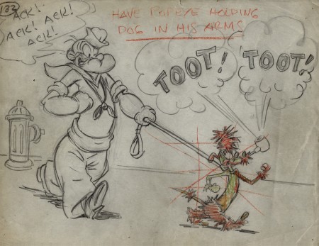
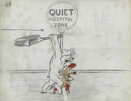
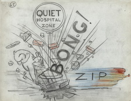
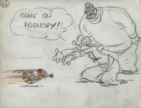
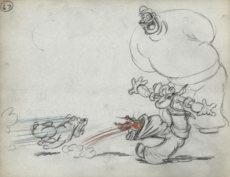
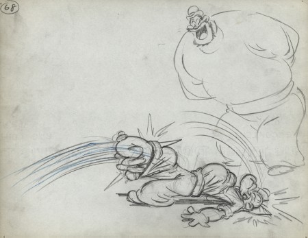
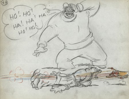
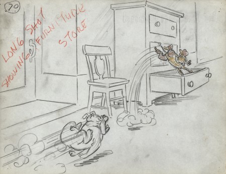
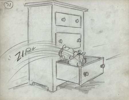
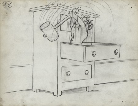
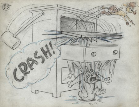
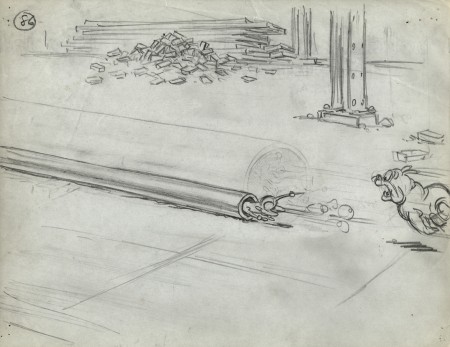
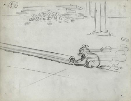
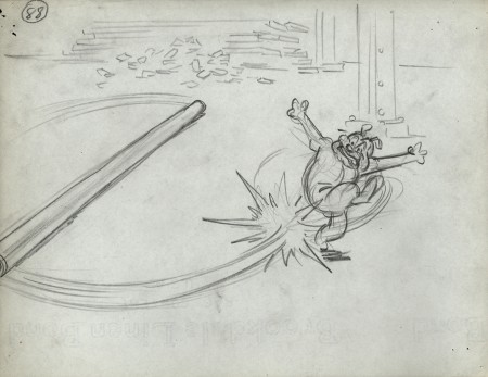
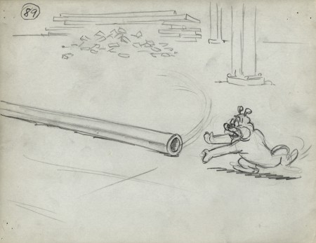
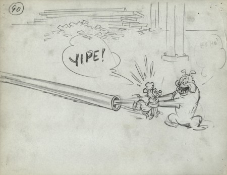
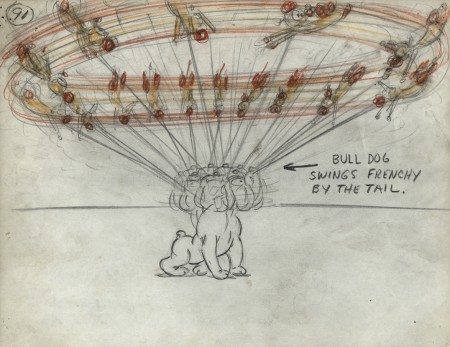
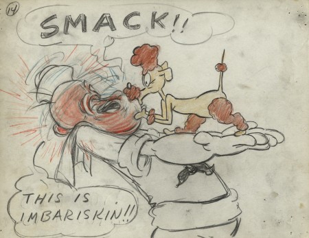
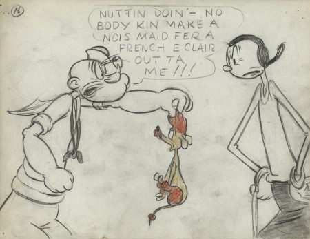
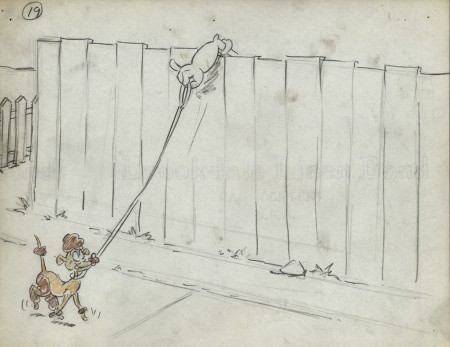
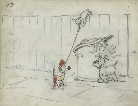
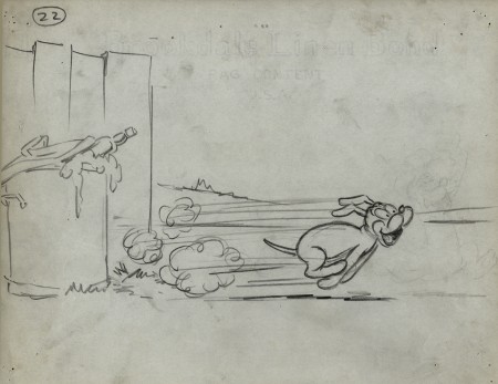
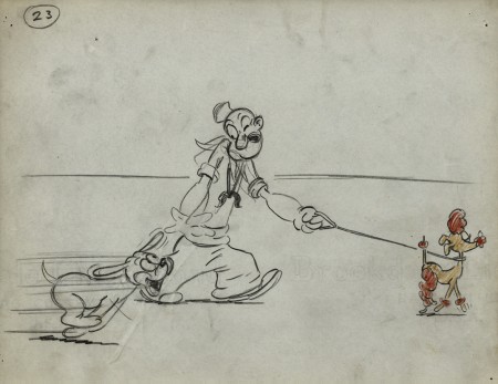
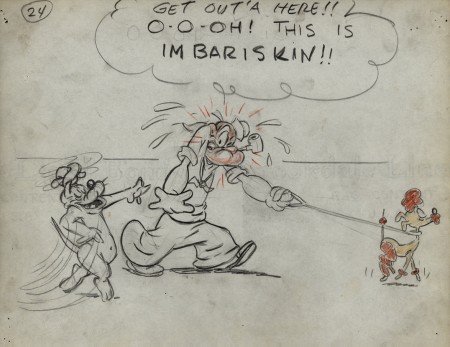
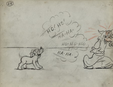
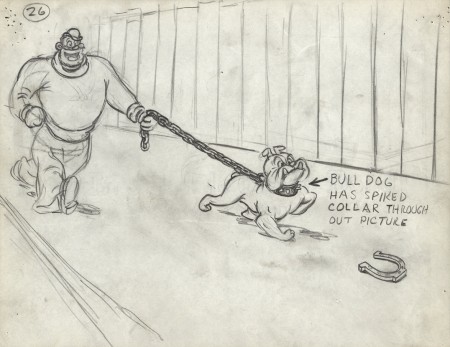
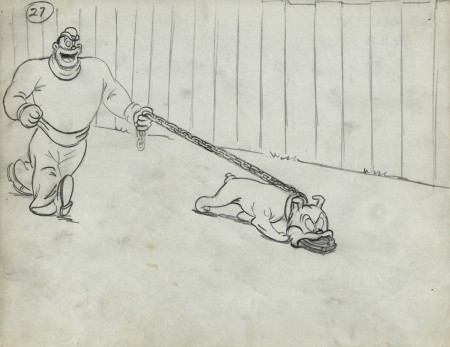
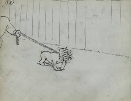
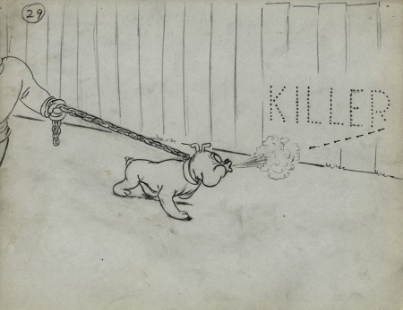
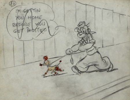
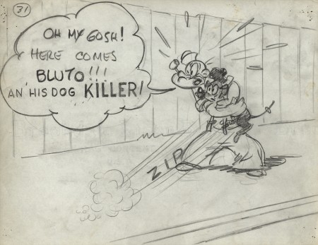
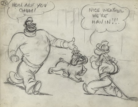
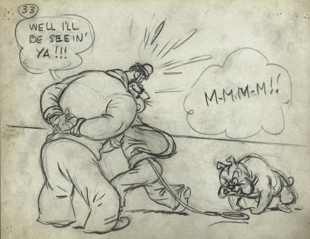
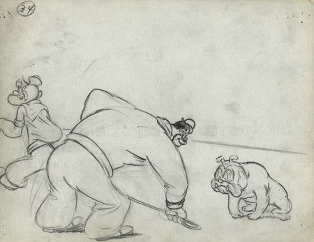
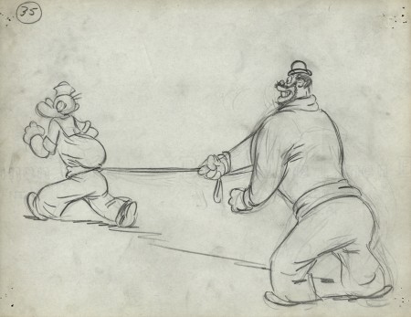
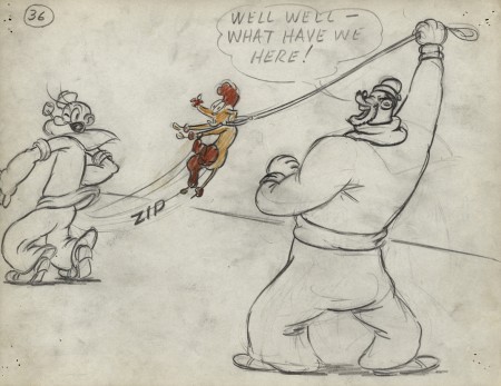
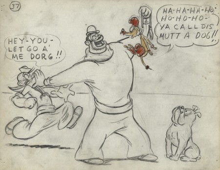
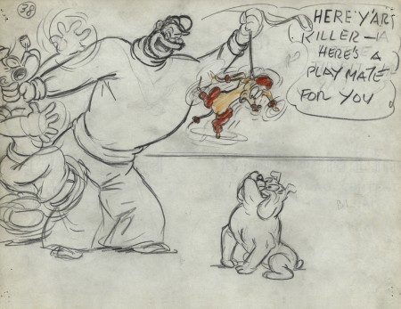
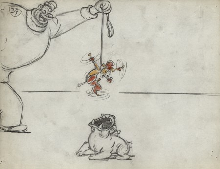
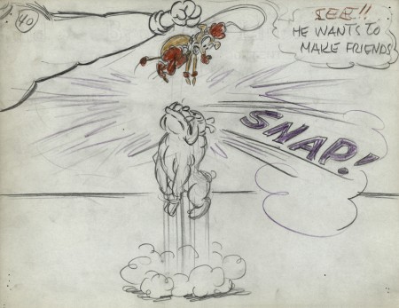
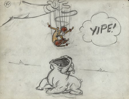
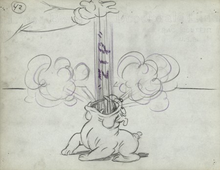
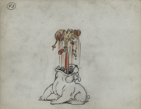
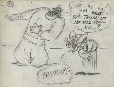
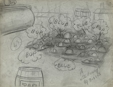
- We’ve come to the third and final part of the storyboard for the 1949 Paramount Popeye cartoon, “Barking Dogs Don’t Fite.” These storyboard drawings come from the late Vincent Cafarelli‘s collection of artwork he’d saved from the divers studios in which he worked.
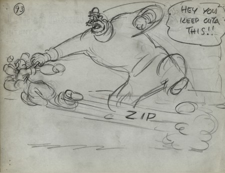
The storyboard was done by Jack Mercer and Carl Meyer. Their drawing styles are both expressive and markedly different. I suspect that one drew the human characters and the other the animals. The drawings of Bluto are just out of this world, ripped right out of the early 20th century comic book pages. I also suspect these were done by Jack Mercer, but I have nothing but a hunch to give me that guess. I believe he was working at the studio longer and might have had more of the early Fleischer grit in his drawings as opposed to the cartoon slickness that would’ve come from later employees’ work. Each drawing is done on inexpensive 8½ x 11 paper. As usual with these continuing posts, we pick up with the last drawing from last week’s entry.
 92
92
 116
116
Note that drawing #117 is missing.
.
___________________________
Here’s the full short as seen on YouTube.
I wish the look was a bit closer to the board, however
some of the layouts in the final film are significant
improvements over the planning in the storyboard.
.
Animation Artifacts &Models &Story & Storyboards 16 May 2012 05:53 am
Popeye Storyboard – part 2
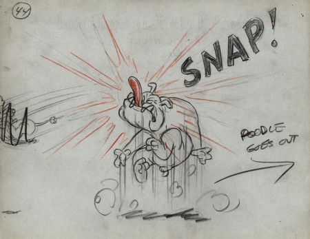
- I continue posting this storyboard from the 1949 Popeye cartoon, “Barking Dogs Don’t Fite.” This is part of the late Vince Cafarelli‘s collection of animation artwork. He’d saved it from the different studios he worked at.
The storyboard was by Jack Mercer and Carl Meyer, and I’m not sure as to who drew what. There are definitely two different styles in there especially in the way Popeye and Olive are drawn. Bluto also has an original look here, but he seems to stay constant.
Each drawing is done on inexpensive 8½ x 11 paper. One wonders if they even made an animatic of the film. None of the board has any registration.
We pick up with the last drawing from last week’s post.
 44
44
.
___________________________
Here’s the full short as seen on YouTube.
I still can’t get used to Popeye’s powder blue uniform.
I wish the look was a bit closer to the board, however some of
the layouts are improvements over the planning in the storyboard.
.
Animation Artifacts &Fleischer &Story & Storyboards 09 May 2012 06:00 am
Popeye Storyboard – part 1
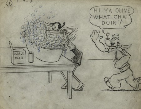
- Last week I introduced you to the late Vince Cafarelli‘s collection of animation artwork. This is a collection of artwork he had saved from the different studios he worked at. A solid part of the collection is this storyboard from the 1949 Popeye cartoon, “Barking Dogs Don’t Fite.”
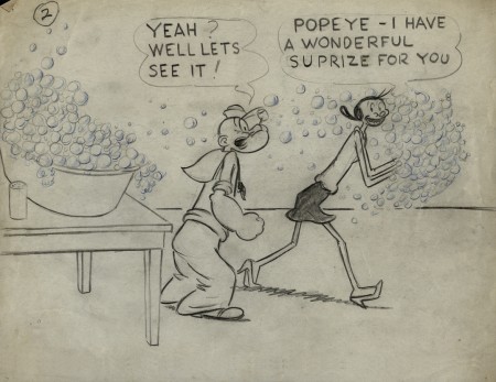
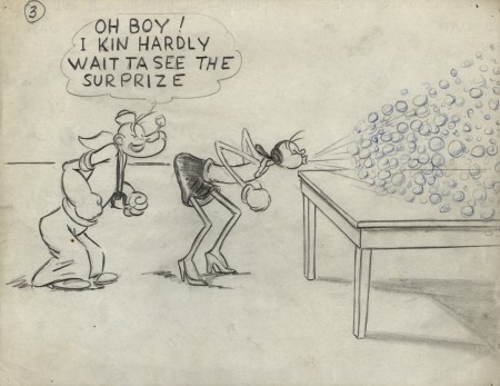
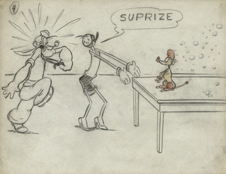
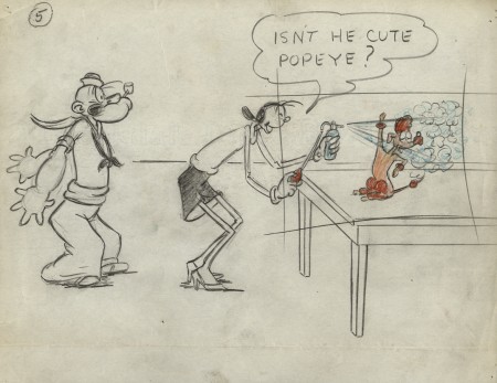
The story and storyboard was done by Jack Mercer and Carl Meyer. I’m sure you recognize Jack Mercer’s name as the voice of Popeye, but he was also the voice of Swat the Fly in Hoppity Goes To Town. Carl Meyer voiced his partner, Smack the Mosquito. I love the drawing style of one of them (I don’t know who did which); it’s reminiscent of some early twenties comic strip art. The two artists draw Olive very differently. One draws a circle for a head; the other gives her a bubble cheek, and this is the one I favor. I also love his Popeye. It’s too bad the film looks so mediocre in its final incarnation. For some reason, they’ve given Popeye a powder blue uniform. I don’t think the Navy actually had such a uniform.
There are a lot of drawings to this, so I’m forced to break it into three parts.
I’ve also posted the YouTube version of the short at the end of this post.
 1
1
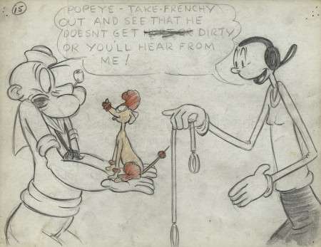 15
15
Olive gets breasts, at least, for one drawing.
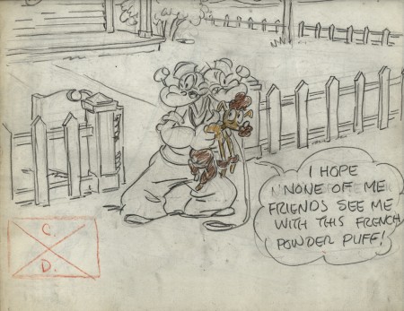 17
17
There is no number 18. 17 dissolves to 19.
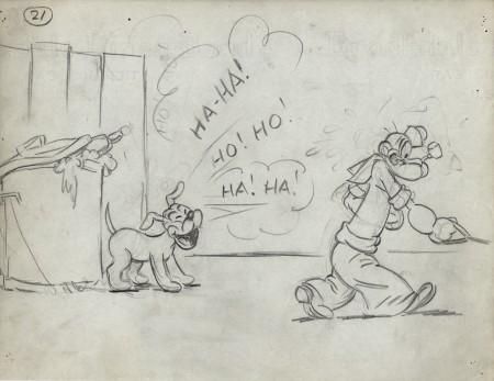 21
21
What an hilarious Popeye!
Right out of the Toonerville Trolley.
.
___________________________
.
Animation Artifacts &Disney &Models &Story & Storyboards 03 May 2012 06:45 am
More Lady Drawings
- Before we get to the subject at hand, I just wanted to place a reminder that we’re racing toward raising money for my animated feature, POE, which has been in preproduction for some time. Now with the help of INDIEGOGO, and your contributions, we’re looking to complete a film of completed animated footage which will properly showcase our film. You can find out more about it at Indiegogo or at Poestory.net or the Poe Project Facebook page. Whether you can contribute funds or not, I thank you, i advance, for any support you can give. Even telling a friend of a friend about it may help.
Thank you.
Lady Pictures
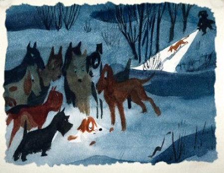
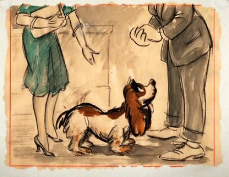
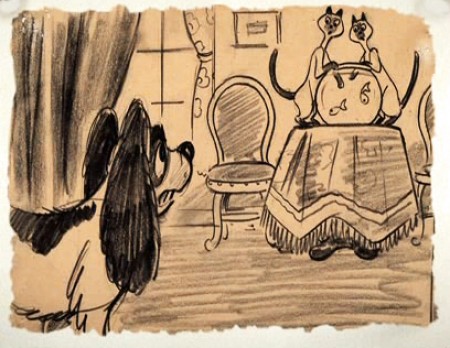
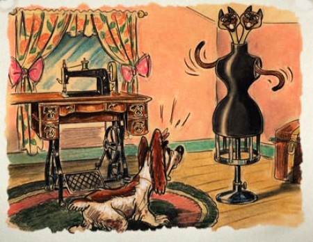
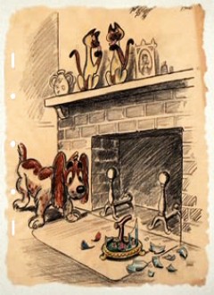
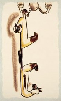
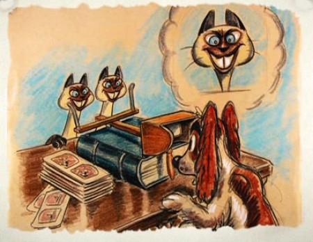
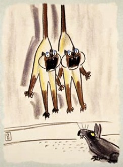
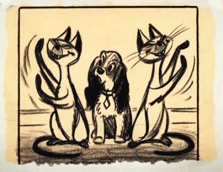
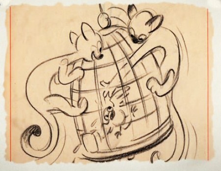
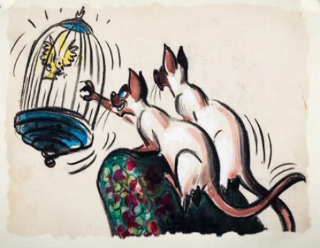
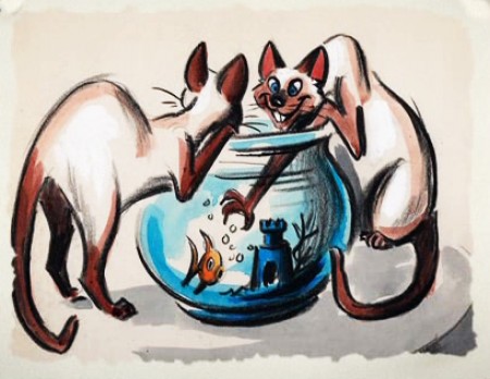
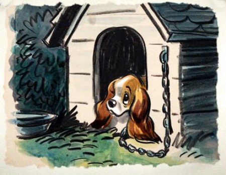
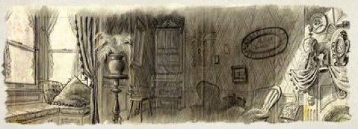
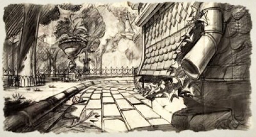
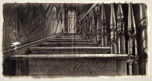
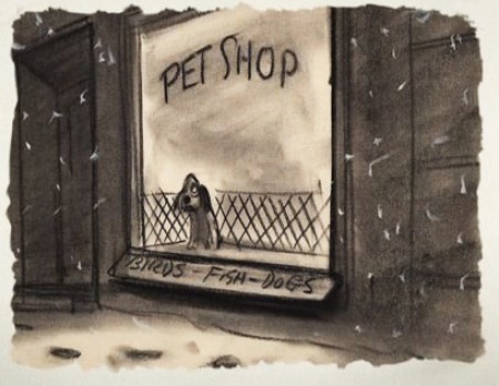
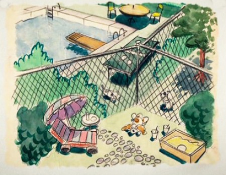
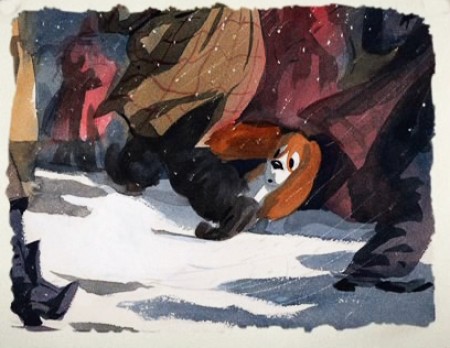
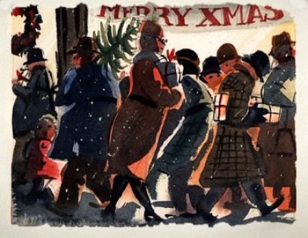
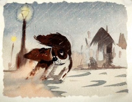
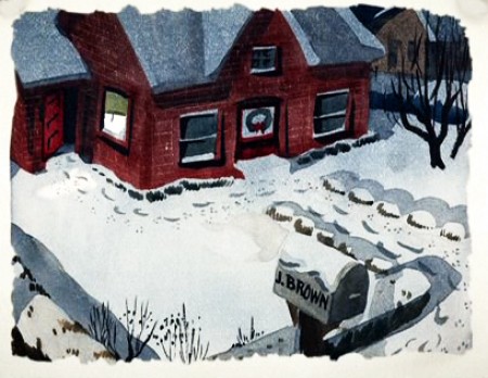
- Lately we’ve been looking at models and preproduction drawings. Here are more of the sketches done for Lady and the Tramp found on the DVD extras gallery (in a somewhat tiny screen size). These are preproduction pieces by a number of different artists over a number of different years. They all exhibit a life of their own that’s pleasant to visit. Very cartoon compared to the film they made.
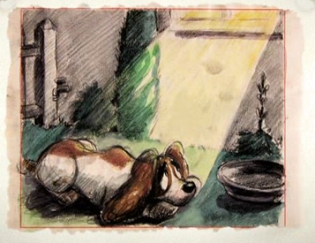
(Click any image to enlarge.)
One more post of these to go. On Friday.
.
Animation Artifacts &Disney &Frame Grabs &Models &repeated posts &Story & Storyboards 12 Apr 2012 06:22 am
Some Lady Drawings – recap
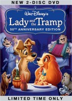 - The DVD of Lady and the Tramp includes some preliminary artwork for the film. I collected a bunch of it and am breaking it into a couple of posts. It’s easier to read off a blog than a tv screen, especially when the DVD tries hard to reduce them to the smallest size they can muster within an overworked border that is virtually pointless.
The illustrations – some are obviously BG layouts, others storyboard drawings – have a light and jaunty feel. They’re very cartoon in nature, and belie the actual feature they produced which, at times, is quite beautiful. Disney truly got the feel of “Main Street, USA” in this film.
I’m interested that most of the images don’t take in Cinemascope (since they were probably done before the decision to go Scope.) Most of them are also fast drawings that don’t feature the Tramp as we know him, and even Lady takes on a different form.
You get the feeling this film was pushed out relatively quickly. The results are excellent, regardless. Sonny Burke and Peggy Lee wrote an excellent pop-song score that doesn’t quite capture the turn-of-the-century, but it does capture the atmosphere of early 50s USA.
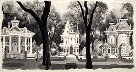
This drawing is in B&W on the DVD, but it appears in
Bob Thomas’ 1958 book, “The Art of Animation.”

Bg for The Princess and the Frog.
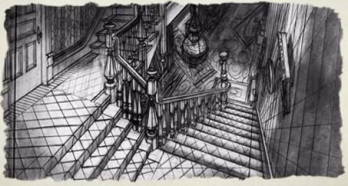
This looks not too different from a shot in Hitchcock’s Psycho.
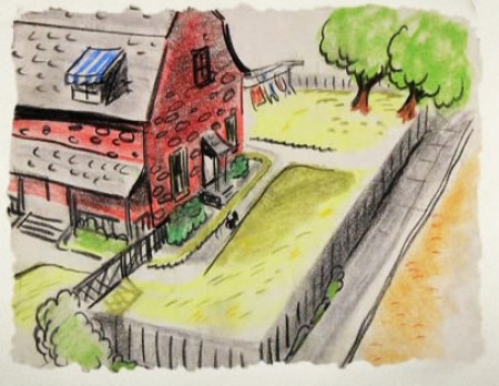
We seem to be in the Little Golden Book territory
with some of these images.
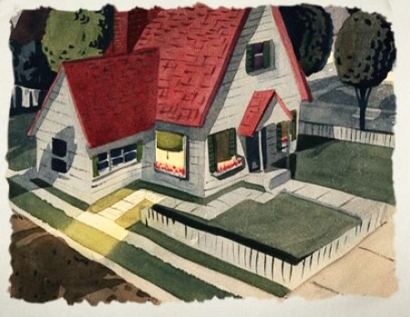
An earlier and different view.
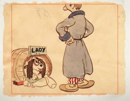
Or did I mean the New Yorker circa 1948?
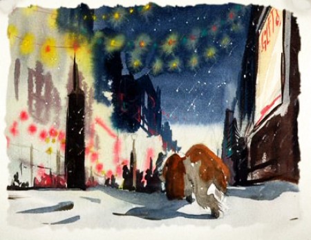
I love weather and would have applauded more of it in the film.
To be continued.
Animation Artifacts &commercial animation &Story & Storyboards &Title sequences 30 Jan 2012 05:49 am
John Wilson/Fine Art Films – part 4
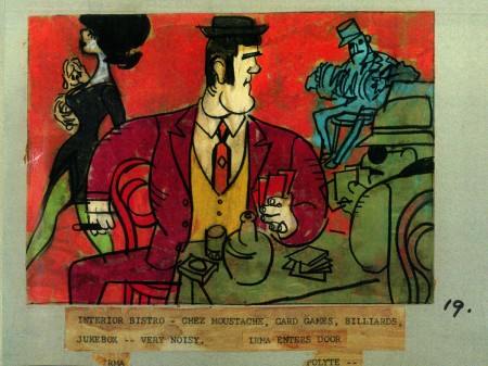
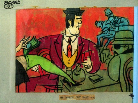
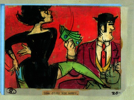
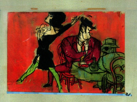
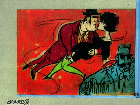
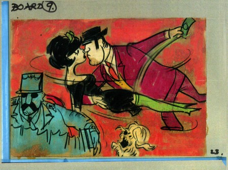
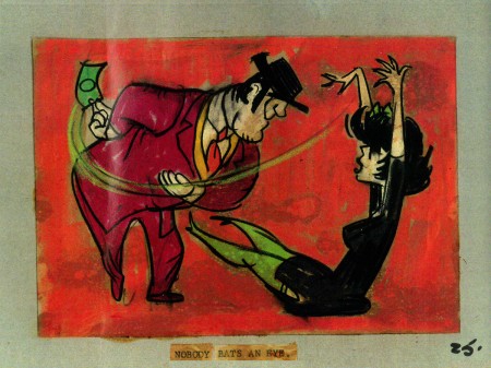
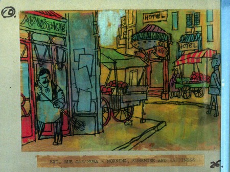
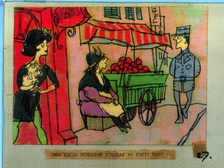
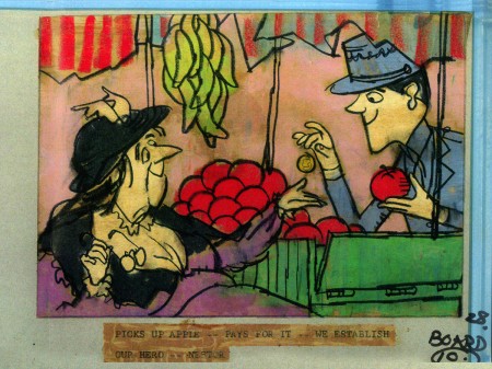
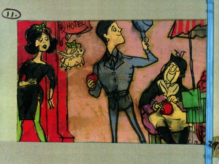
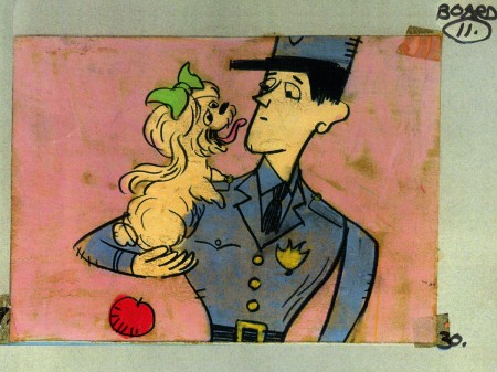
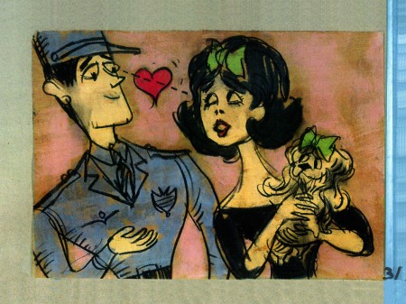
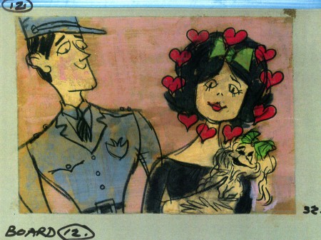
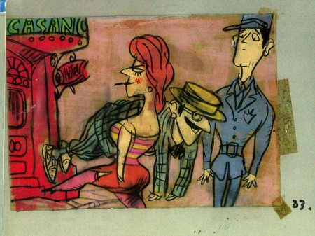
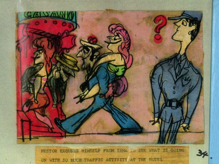
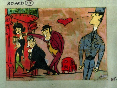
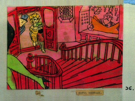
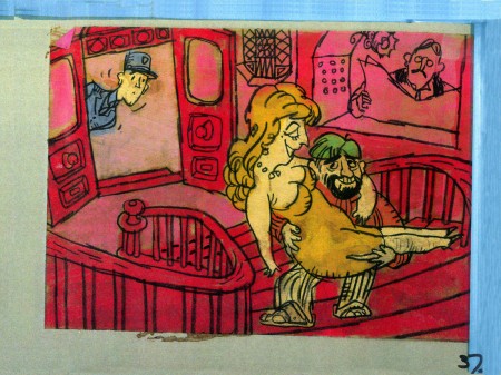
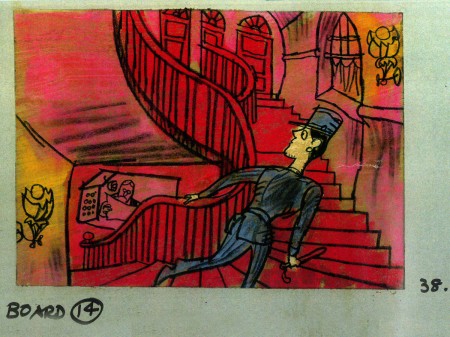
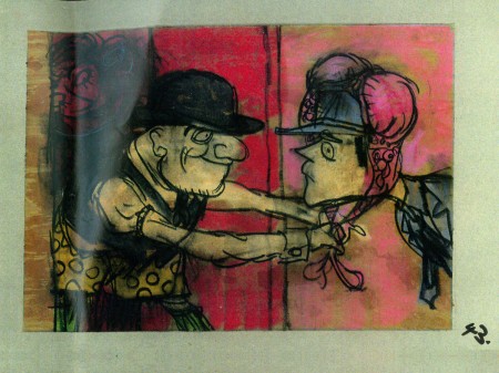
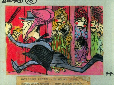
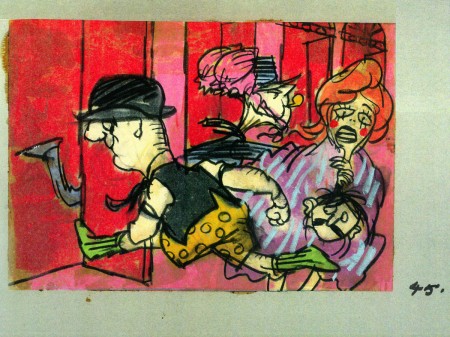
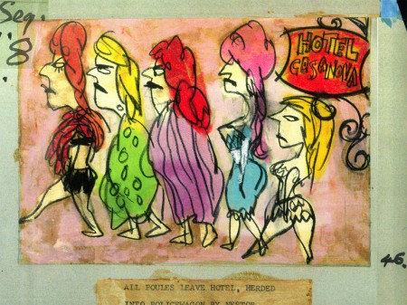
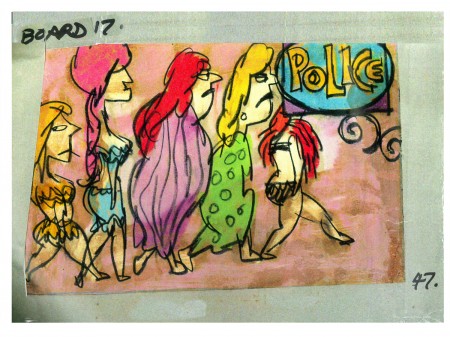
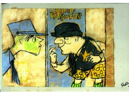
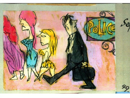
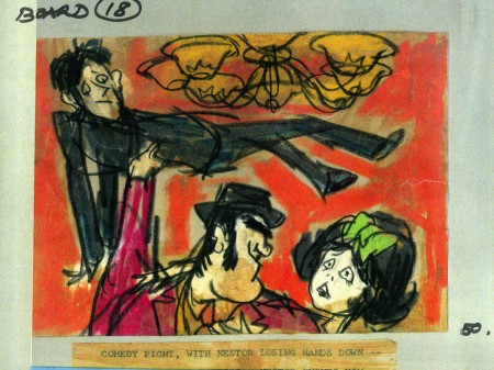
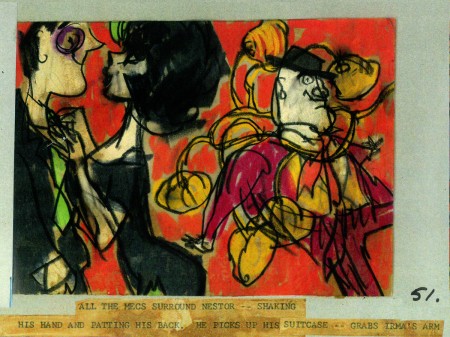
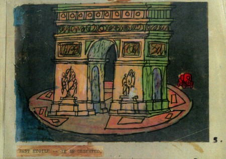
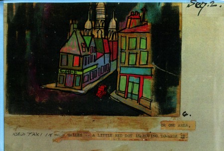
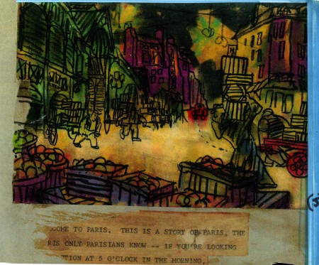
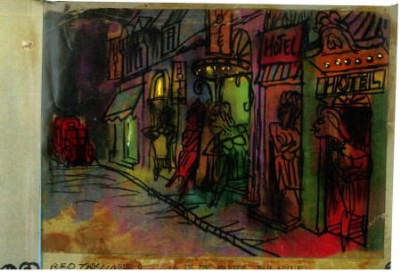
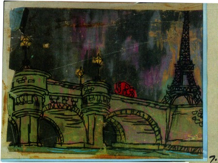
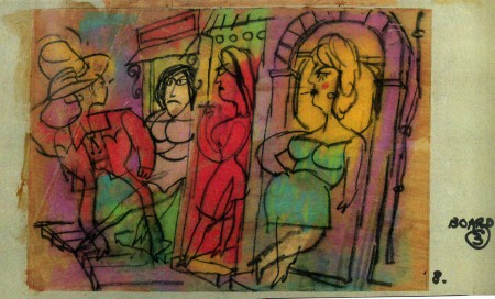
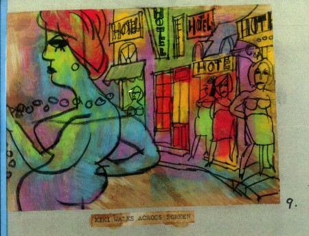
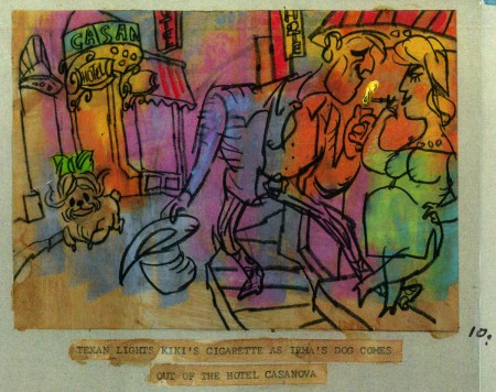
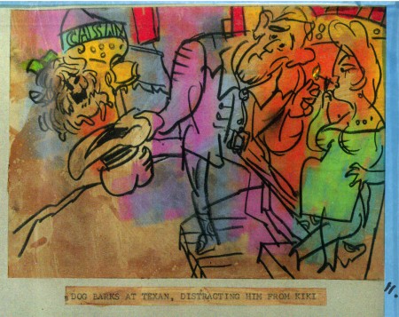
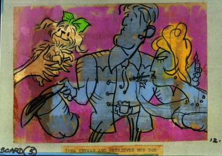
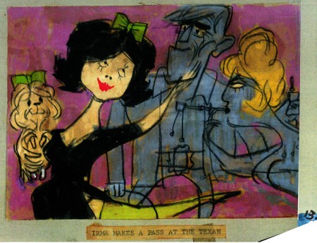
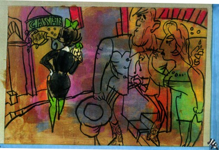
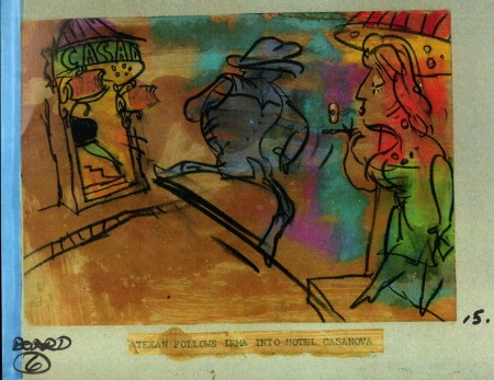
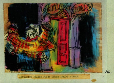
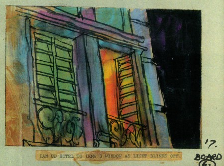
- This is the second half of the storyboard John Wilson created for the Mirisch Corp. A trailer to promote Billy WIlder‘s coming film, Irma La Douce. This was a film about a French prostitute, played by Shirley MacLaine, and a French gendarme, Jack Lemmon. Love blossoms.
As I wrote on part 3, the board comes in 18 pages of three storyboard drawings. Rather than post the sets of three images (and only being able to show them at a smallish size) I’ve taken each individual drawing and have blown them up to see them better on this blog.
Again, these were for a lengthy trailer for the film not the opening credits. The film’s credits do not use animation.
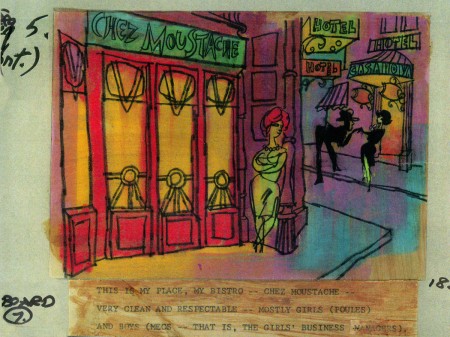 7a
___________________________
Here’s a YouTube version of the trailer. Not the brightest quality, but you can see it.
Animation Artifacts &commercial animation &Illustration &Independent Animation &Story & Storyboards 23 Jan 2012 05:33 am
John Wilson/Fine Art Films – part 3
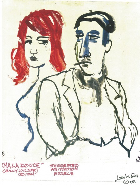
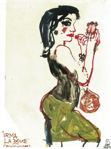
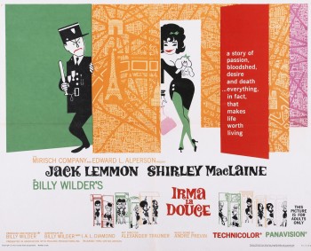 - This week in my focus on John Wilson‘s early work with his company, Fine Art Films, let’s take a look at Irma La Douce. This was a racy film written and directed by Billy Wilder that starred Shirley MacLaine as a Parisian prostitute and Jack Lemmon as a French policeman who falls in love with Irma (Shirley MacLaine.) The film, for its time was daring, and came up with (heaven forbid) a “C” for Condemned rating from the Catholic church. This made it off limits for anyone under the age of 18. I was determined to go see the film, so I ignored the ban and went by myself. Naturally enough, no one tried to stop me. I wasn’t jaded by the movie anymore than I had been disturbed by the violence in all the Warner Bros. cartoons I’d seen. Looking back on Irma La Douce, it really is an innocent film, hardly risqué in any way shape or form.
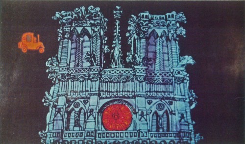
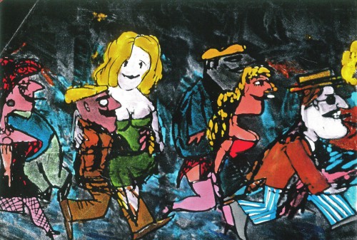
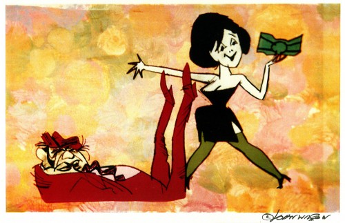
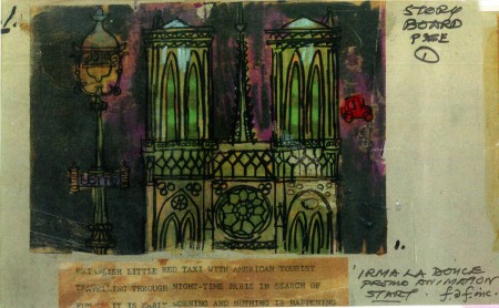
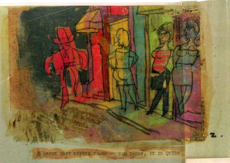
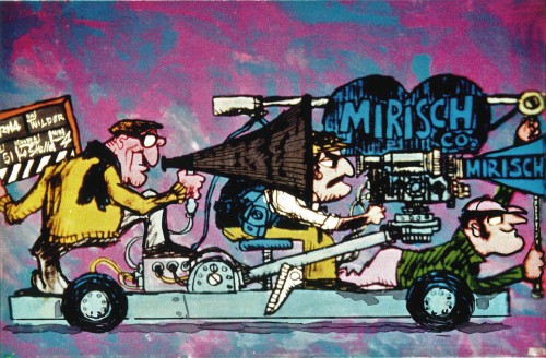
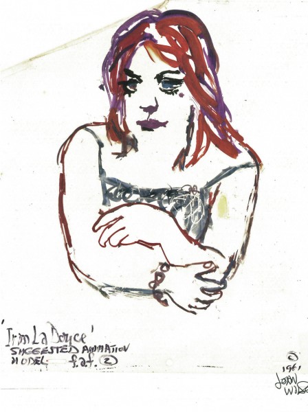
The film started with some nicely drawn animated credits which were done by John Wilson’s studio. Until recently I hadn’t known that Wilson also produced an animated short promoting the feature for the Mirisch Company. I have some preproduction art from that short as well as the color storyboard. The board is large enough that I’ve decided to break it into two parts. We’ll see part one today and the second part next week.
Each section of three images is long enough that unless I post one drawing at a time, it’ll be too tiny to see unless enlarged. I’d like to post each storyboard sketch a nice viewing size and still give you the option of enlarging it.
Let’s start with some production and post production stills so you can see what it looked like.
 1
1
A couple of pre-production drawings:
 1
1
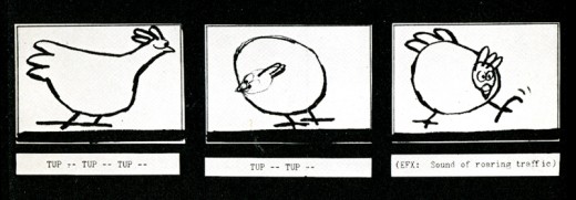
Then, there’s the storyboard. I’ll give an example of the three panel pull out and follow that with each individual image.

You can see why I’ve decided to enlarge the images.
The remainder of the storyboard will be posted next Monday.
