Category ArchiveStory & Storyboards
Illustration &SpornFilms &Story & Storyboards &T.Hachtman 06 Dec 2006 07:54 am
Gertrude’s Board I
-Back to Gertrude’s Follies, the film.
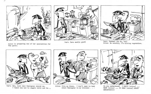
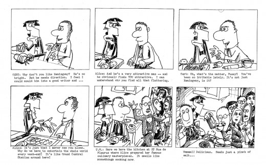
I talked last week about my excitement over the comic strip by Tom Hachtman, Gertrude’s Follies. We worked up a storyboard and script for a feature. It was a bit of a rush since I found the distributor of a low budget comedy film who asked for something similar in animation. I thought we could get him interested. I wanted to strike while the iron was hot. The guy didn’t get it, thought it wasn’t funny, didn’t even understand it. His company folded six months later. A one hit wonder.
We tried to stay close to many of the strips and found a direction.
Here are two weeklies from the strip.
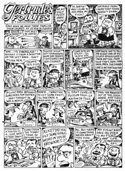
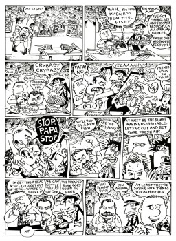
(Click on any image to enlarge.)
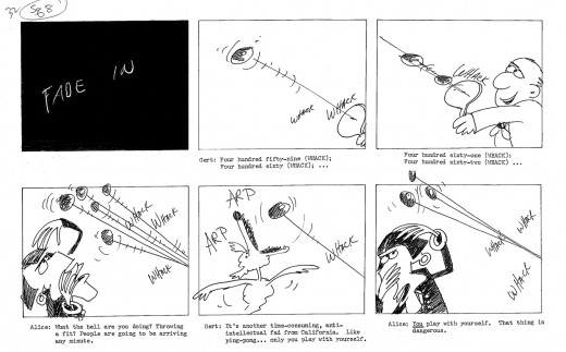
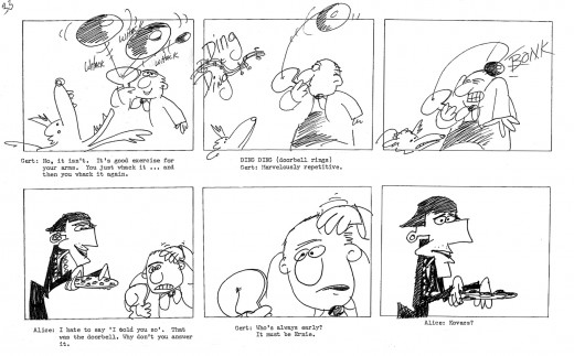
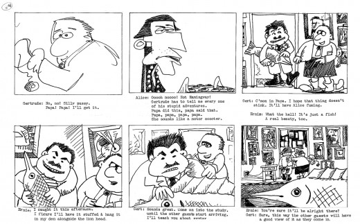
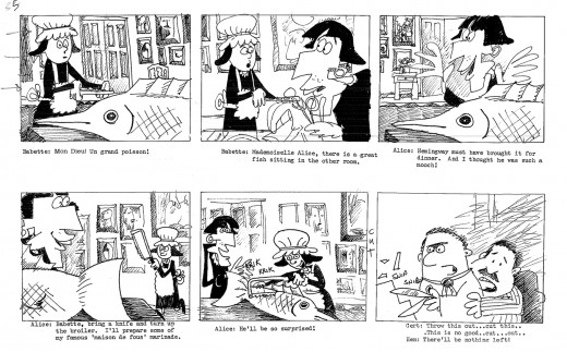
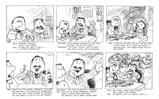
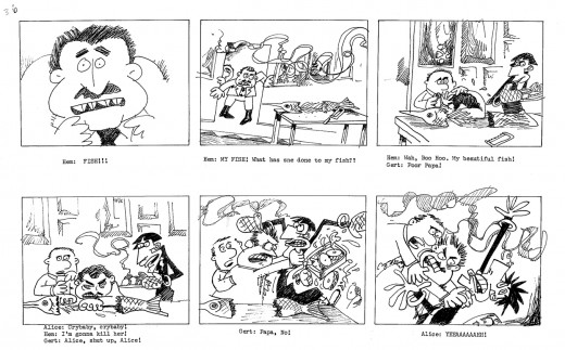
The equivalent part of the storyboard follows. To give a short syopsis of the story thus far:
Trying to be somewhat current, we built the story around an upcoming, all-encompassing exhibit Picasso was going to have at the Museum of Modern Art. At the same time, Gertrude had just sent off a big book to her agent in NY. A party was in order, and we join them in this section of the storyboard as they prepare for the party. There’s a guided tour going on at the house as they prepare, and Hemingway arrives early.
(This is about 20 mins into the film.)
Animation Artifacts &Story & Storyboards 07 Nov 2006 08:44 am
Jax Beer Spot
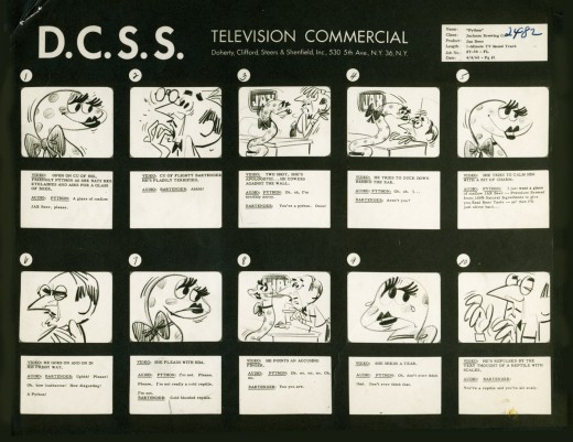
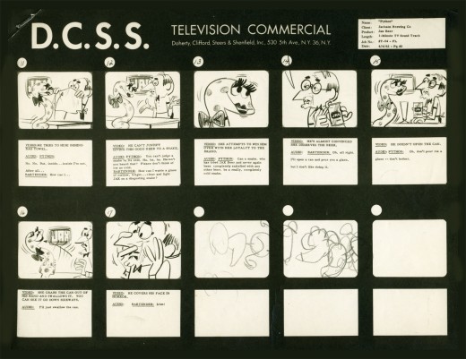
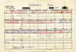
- Here’s the material for a Jax Beer commercial. It was done by a NY studio named Pelican in 1962. There were about 75 people on staff at Pelican back then.
This spot was directed by Mordi (Mordicai) Gerstein. He left animation to write & illustrate children’s books in th 70′s. (He won the Caldecott Medal for his book, The Man Who Walked Between The Towers. This was the book I adapted to animation last year.)
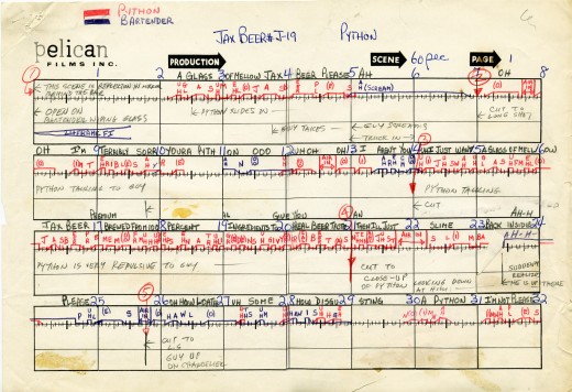
What follows is the storyboard and the director’s workbook. (It appears to be an agency board, though it’s drawn in a style that looks to be Mordi Gerstein’s. Perhaps boards from the agency were drawn by the studios back in 1964; I’m not sure. The layouts were drawn by the same artist.)
Tomorrow I’ll post some of those layouts.
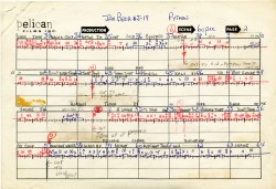
The workbook has several flaps on it that indicate changes in timings. There are also glue stains where I assume other flaps fell off. (See page one, last row, first column.) Each column represents 16 frames/one foot of film. Odd numbers are marked off.
Each row contains 8 feet of film/128 frames. Each page represents 32 feet/512 frames. It would have been smarter to keep to even numbers.
More modern exposure sheets generally have 80 frames/five feet per page. This also divides into two feet of 16mm film. (Handy.) The numbers add and divide smartly and easily. But then most people don’t use exposure sheets anymore.
Story & Storyboards 21 Jun 2006 07:52 am
Starting Off With A Punch
One of the most violent films I can think of is Raging Bull.
The show starts with an incredibly lyrical, slow-motion sequence in B&W with blood-red credits, in small type, (designed by Dan Perri). Over this very slow motion footage of a brutal fight an operatic aria plays on the soundtrack, and the live action cutting flows beautifully with the music.

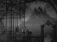
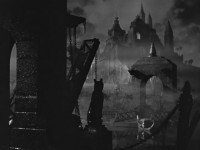
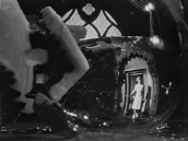
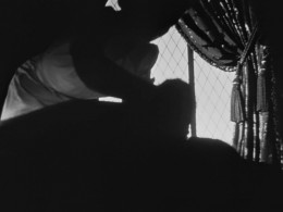
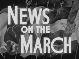
(All of these images from the opening of Citizen Kane – another brilliant opening sequence – can be enlarged by clicking them.)
We have been pulled into the story, we’re captured by the imagery – actually the images mixed with the beautiful vocal. Because of the slow moving images, we’re not thrown by the violence we see on the screen as Robert DeNiro gets beaten violently. It’s sublime poetry.
Finally the credits end, the last image hits us with a JOLT – normal speed and the loud smash – as DeNiro’s face gets brutally punched. We’re into it.
From this we cut to the story of Jake Lamotta, DeNiro’s character. We’re slowly drawn into the story of the fighter, and we’ve already adjusted to the violence we can expect to come. But it’s not going to be in slow motion anymore.
Martin Scorsese knows how to open his film. He slowly pulls us in, allows us to adjust to the incredible violence we’ll see, and then introduces his characters – slowly.
We haven’t been hurled into a violent film and been expected to sit patiently with an unlikeable character for two hours. It doesn’t work that way. We have to learn who these characters are, see their vulnerable spots and then be allowed to watch them be heels.
The topical sentence, the first sentence of a novel is probably the most important. The same is true for film; that opening sequence sets the tone for the whole movie. Crash! Boom! Bang! or lyricism.
Making films is a difficult proposition. Anyone can assemble images, but complex difficult storytelling is an art. Scorsese is one of our greatest artists.
Enough about Art Onto another subject: Money.
The grosses for Cars may not be as overwhelming as Disney had hoped, but it’s obvious that it will be a smash in merchandisiing. Per the Jim Hill article I linked to yesterday, Disney guessers had hoped for $300 million domestic from the Pixar film but have now lowered their sights to $200 million for the film that cost $125 million. But the real money will come from the merchandising per this Daily News article. They expect to wrangle $600 million this year. Should Michael Eisner be thanked now?
Hubley &Story & Storyboards &UPA 29 May 2006 08:59 am
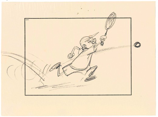
Magoo stybd
Animation Artifacts &Story & Storyboards &UPA 05 Feb 2006 08:21 am
Sightings
- Congratulations to Bill Plympton for having won the Annie Award for Best Animated Short with his film, The Fan and the Flower. To see a list of the other award winners, go to Animated-News. This is a good site for hard news about animation. It’s worth visiting daily.
- Also on that site is an obituary for Al Lewis. Lewis, known to many as “Grandpa” from the Munsters, was an everyday sight in the West Village. For years, he had an Italian restaurant called, appropriately, “Grandpa’s” on Bleecker Street, about a block from my studio. He ran for Governor on the Green Party in 1998.
I first knew Lewis from “Car 54, Where Are You?” He was probably my first celebrity sighting. As a teenager, I worked in a cafeteria in the Bronx Zoo. On a quiet and rainy day, he was a customer. I not only got to talk to him when I served him, but he invited me over to his table to talk during my coffee break. If only back them I knew I was to run into him many dozens of times later in my life. Always a nice hello. I’ll miss seeing him on the street.
(Click to enlarge.)
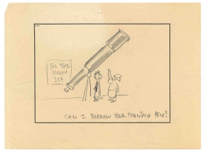
A John Hubley Magoo gag cut from “Fuddy Duddy Buddy”.
SpornFilms &Story & Storyboards 12 Jan 2006 09:04 am
Boards cont.
Storyboards continued:
Yesterday, I posted some storyboards from my film, The Man Who Walked Between The Towers. This film is an adaptation of a well recognized book by Mordicai Gerstein.
 An adaptation is an animal unto itself. I think most people believe that adaptations are easy to do, but I think that appearance is deceptive. Aside from having to exactly replicate the art of the book, you have to try to capture the essence of the book. A work like Goodnight Moon is a classic; it’s been in the hands of children for more than fifty years. Making an animated version that feels special to all those readers is harder than animating something I’ve developed on my own. Likewise, an award winning book like Mordicai Gerstein’s. If something works in a book, it doesn’t necessarily mean it’ll work in a film.
The key to me is to understand what the author was trying to do. Where is the key point in the book, where is the climax, where is the message being stated. How and why?
The storyboard I used to illustrate yesterday’s post is absolutely the heart and the height of that story. In the book, Mordicai Gerstein includes two fold out pages that extend the illustration beyond the length of the book to the width of four pages.

This is a positioning of the character and birds against the original BG.
In the storyboard I put together (see yesterday’s post below) I merely redrew the images as depicted in the book: Philippe steps out onto the tightrope and walks into perspective. But when we came to actually animating this, it was going to be different. More importance had to be placed on this scene than just regurgitating the book. This was the heart and soul of the film – that first step onto the rope. The animation, itself, became delicate, and Matt Clinton did a great job. Once the character movement was there, we worked and reworked the compositing of the scene together. I was particularly concerned about the depth of field. We both concentrated on how Philippe would feel. Using the multiplane effect of the computer, we kept shifting the focus of the scene. The tightrope, beyond Philippe, slowly comes into focus; the BG goes soft; the second tower comes into focus. Cut to CU of foot; he steps out.
See how the scene plays out in our CLIPS feature on our site. A lot of drawings, some excellent animation timing, tightly focused cutting by Paul Carrillo and excellent sound design make a successful scene seem easily done.
SpornFilms &Story & Storyboards 11 Jan 2006 07:59 am
Man Who Boards
Ramblings three:
The storyboard thoughts keep growing, so I’ll keep going on entertaining myself and boring you.

Essentially, in our studio, I think we have two basic types of storyboard:
- there’s the kind which are done for clients who aren’t quite so familiar with our work and probably don’t really trust us. Everything has to be drawn, indicated, and articulated in the board, and it has to be locked down for the client. Recently, we had a client who judged the drawings at the beginning and end of each scene and judged the animated scene on the basis of the approved storyboard drawings. They also wante a lot of text under the storyboard pictures telling exactly what would happen. It didn’t make for a fun task, nor did it make for the best film in the end, but it did satisfy the client who was paying the bill.
These are also the type of storyboards that are done for overeseas studios who are going to animate from the boards. Basically, animation studios don’t trust the outsource studio and try to control everything, just as my client did of me.

- Then there are the type of storyboards which are more comfortable to me. These are more alive and flexible. The closer they are to what will be the final film, the better it is for the film and the director. But it has to be expected that there will be changes even in the best board. I like to see layouts grow beyond the storyboard; animation grow beyond the layouts, and even the coloring/compositing add to the animation. It’s all about making a successful film you’ll be proud of.

Pictured are boards from The Man Who Walked Between The Towers. The clip for this section can be seen on our main site. The storyboard for this film just fell into place. The client is one I’ve worked with for years, and we trust each other well. I can be as loose or as tight as I want, and it will work. There will minimal changes to the board once it was done, though the film kept growing in ways we couldn’t detail on the storyboard.
