Category ArchiveStory & Storyboards
Commentary &Hubley &Illustration &Models &Story & Storyboards 26 Jul 2013 05:06 am
Telltale Hearts Anew
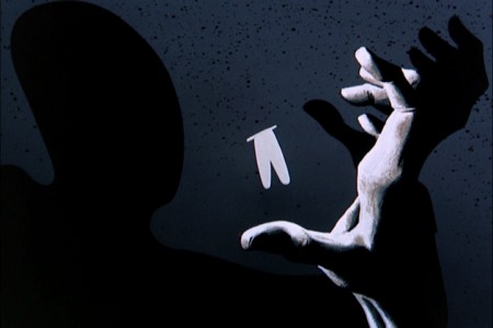
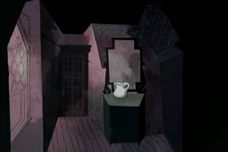
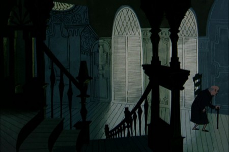
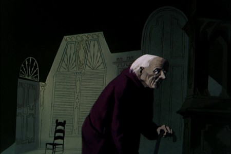
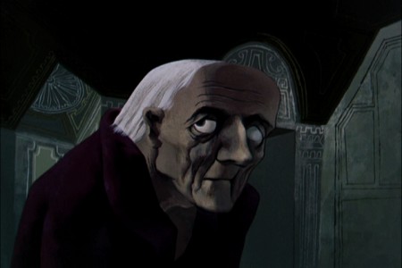
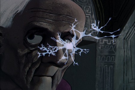
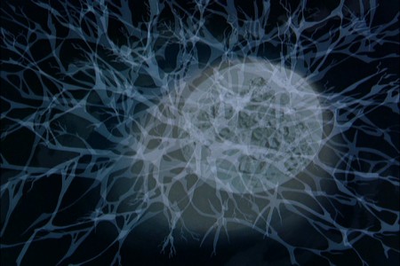
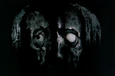
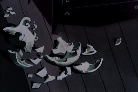
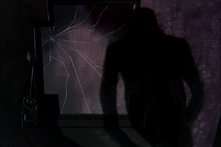
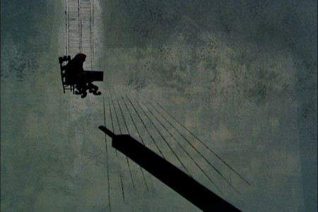
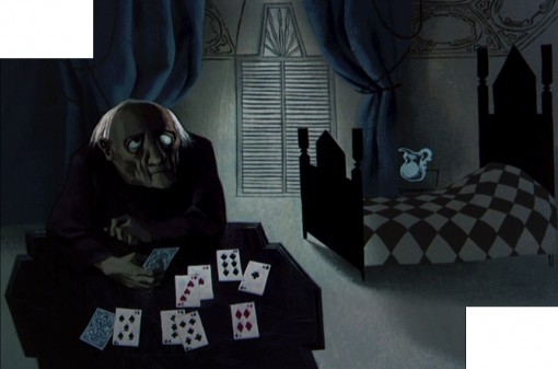
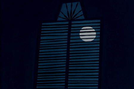
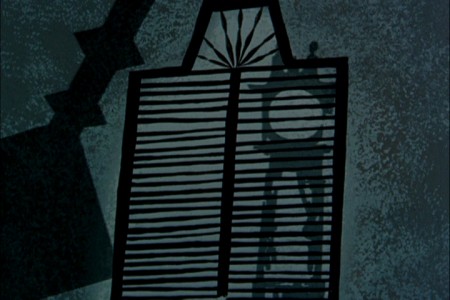
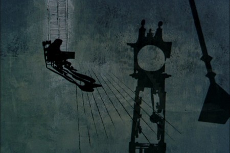
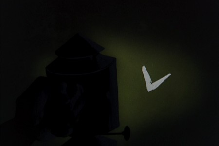
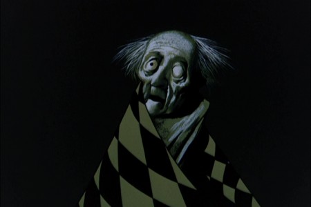
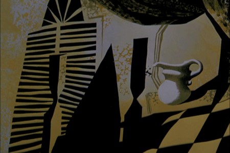
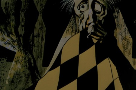
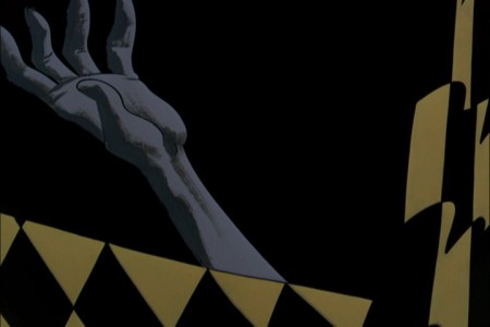
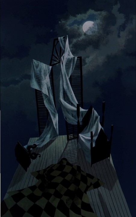
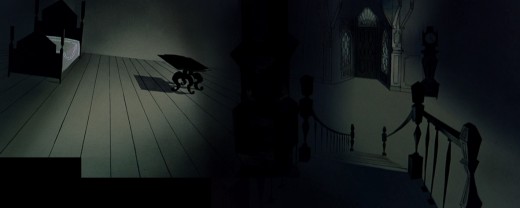
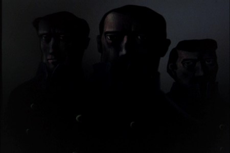
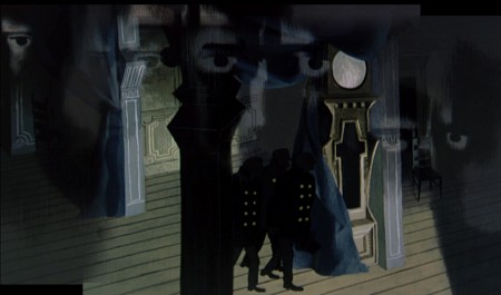
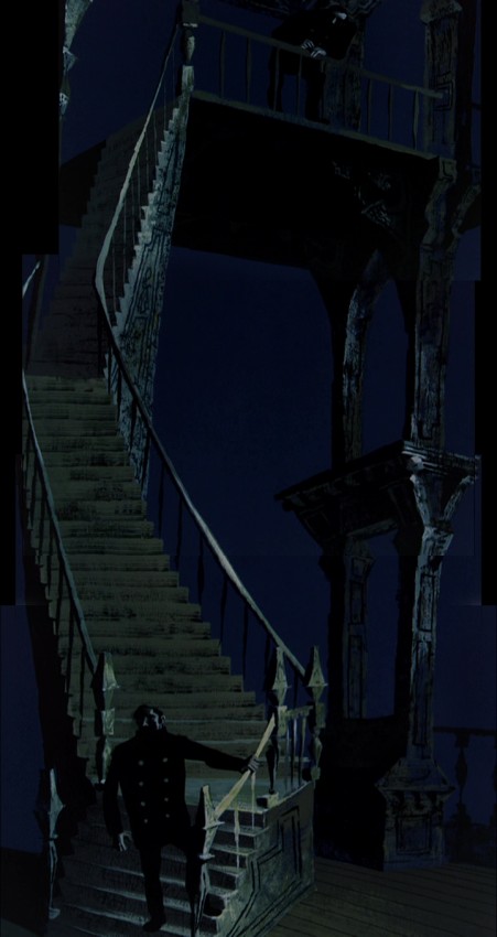
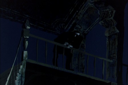
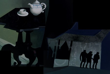
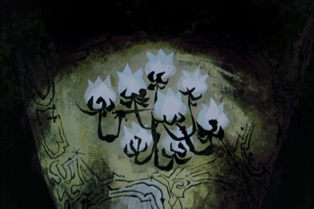
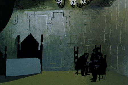
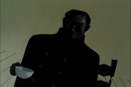
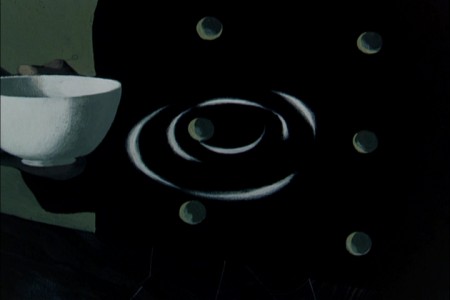
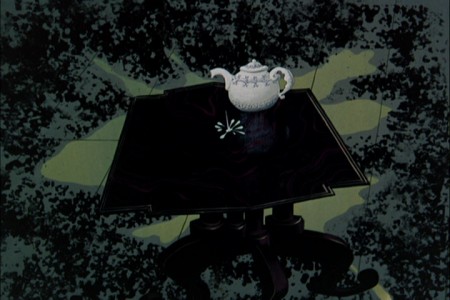
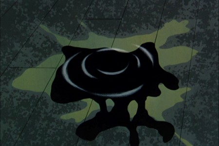
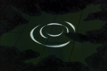
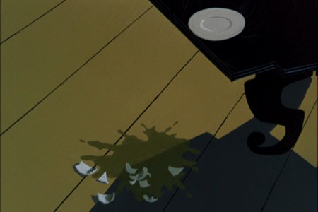
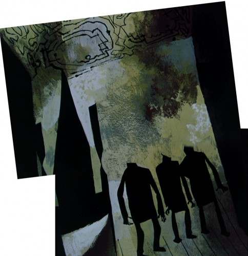
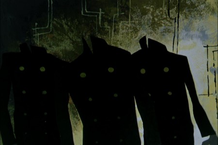
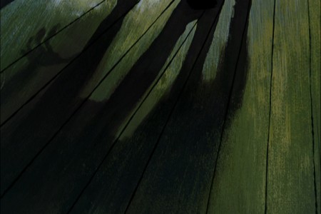
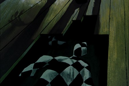
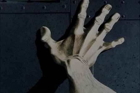
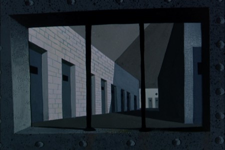
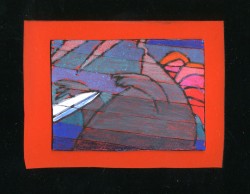
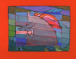
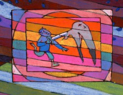
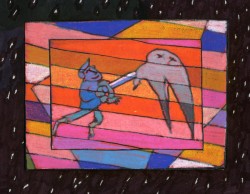
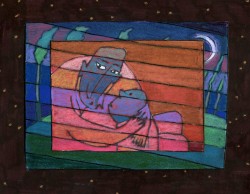
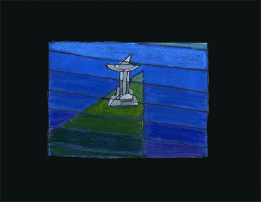
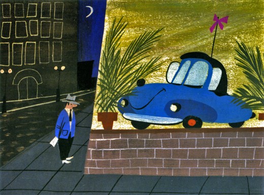
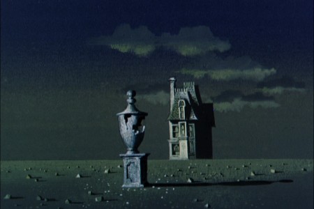
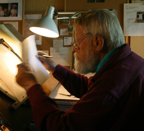 - In at least a half dozen posts I’ve written about Paul Julian‘s magnificent work. Of all of it, The Telltale Heart is probably the richest and most sophisticated of all of this artwork. Such a magnificent artist he was, bordering the realist with the surrealist. I love the man’s work and will continue to feature many of the pleasures he’s given me.
When the Jolly Frolics UPA DVDs were released, there were several films by Mr. Julian that I took great pleasure in analyzing, taking apart and studying anew. How appropriate that John Hubley, my all time favorite, brought the sophisticated Paul Julian into the studio to get him to paint with such elan.
This week, a surrealist one for me if ever there were one, between Verizon’s ample attacks on my phone and blog and the amazingly disturbing hernia operations thrown at me – just for the heck of it – by a brilliant surgeon from India who has worked well in New York City.
It was added b a delightful letter from Borge Ring, by way of his wife, Joanika. The letter prompts a good reason for my posting again the magnificent Julian artwork. I hope you enjoy it, but it’s posted more for my own amusement than yours. Don’t get me wrong, I really hope you enjoy it as much as I do.
Here, then, is the great anecdote b way of Borg:
- hi MICHAEL
Paul Julian’s “Telltale Heart” was shown at Annecy in the sixties. Some0ne asked
producer Les Goldman:
“How long did it take to make the film”?
“It took a year. A year for Paul to paint the film and a year for me to beg the
money together”
cheers
Borge
- Of all the pleasures I’ve gotten from the recently released UPA dvd Jolly Frolics the Backgrounds of Paul Julian are a particular enjoyment. His most famous and greatest achievement is, of course, the work he did on The Tell Tale Heart. This is his film. Ted Parmelee directed it, but I’m certain that he pretty much set the camera moves and timing, leaving all the design work for Julian.
The Tell Tale Heart is a tour de force of production design. It is probably one of the first non-war/propaganda animated films, since Baby Weems, to so feature this element of production over everything else – except story. Paul Julian‘s brilliant artwork oozes from the pores of every frame of this film. Together with James Mason‘s narration and Boris Kremenliev‘s strong musical score, the film evocatively tells the strong Edgar Allan Poe story. This tale has not been told on film any better since it was made in 1953. Ted Parmalee directed the film with authority.
 1
1
Books &repeated posts &Story & Storyboards 24 Jul 2013 08:54 am
N by NW – rerouted
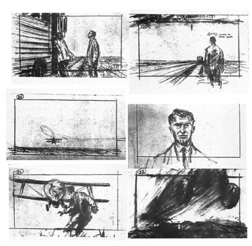
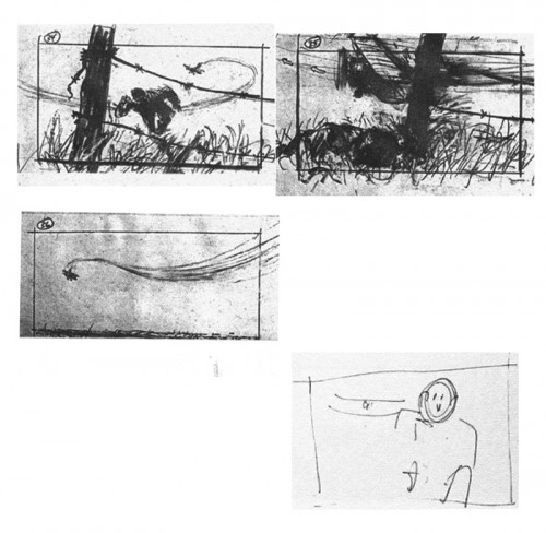
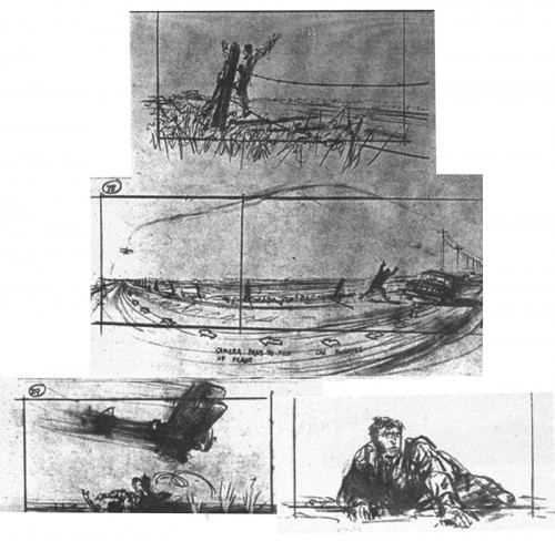
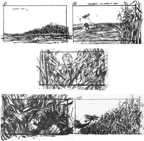
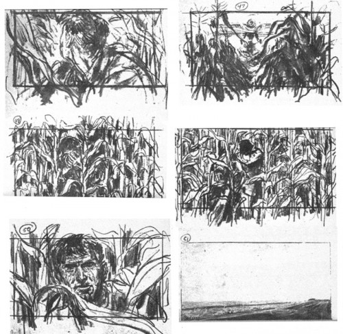
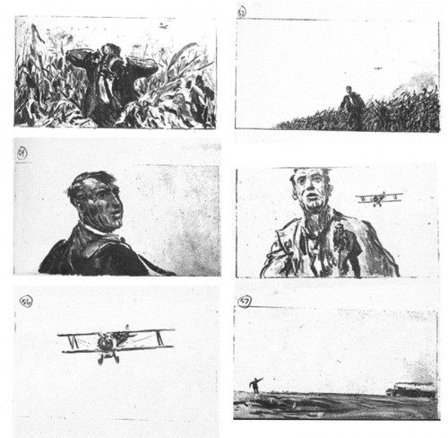
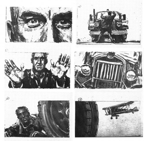
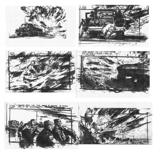
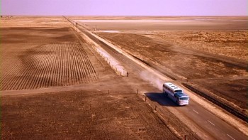 - Thanks to the site 1000 Frames of Hitchcock (and thanks to Mark Mayerson for leading us there) we can view a frame by frame analysis of Hitchcock’s works. This is essential for any film lover or storyboard designer. These films are the masterworks and our foundation.
North By Northwest features one of the most studied film sequences of all time. By going to the photo-site, you can truly look at how the scenes break down into their montage.
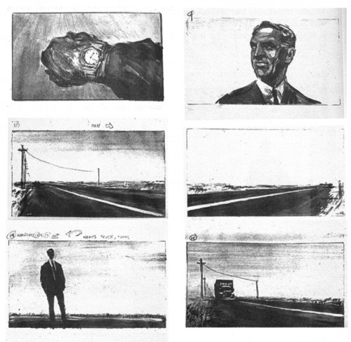
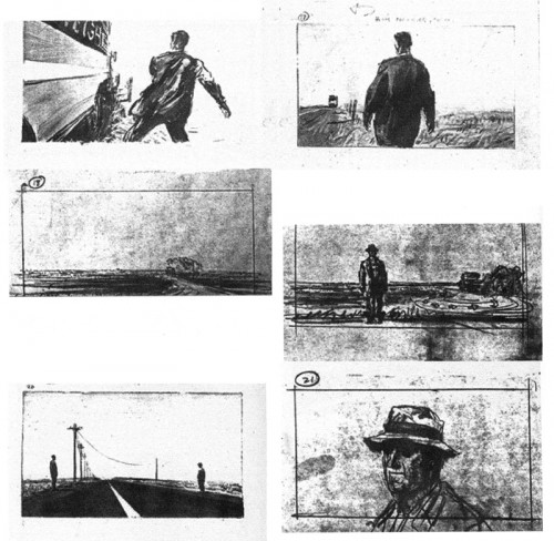
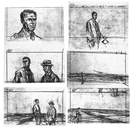
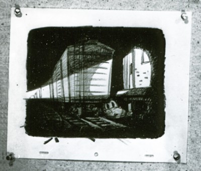
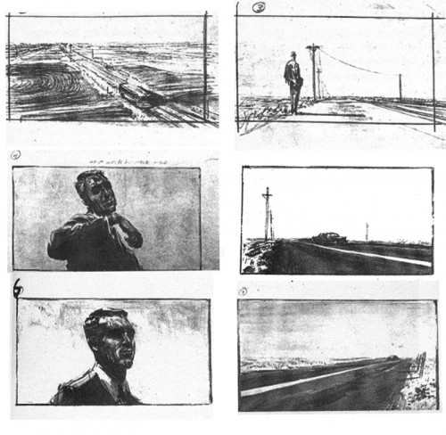
This encouraged me to put up the boards I have from a book entitled Hitchcock’s Notebooks by Dan Auiler. Auiler says that once Alfred Hitchcock completed the script with Ernest Lehman, they handed this sequence to storyboard artist Mentor Huebner and gave him free reign to do as he thought fit. If you study the photos from the film, on the new site, you’ll see that one doesn’t exactly duplicate the other. I caught a mispublication in that some of the drawings were printed out of order in the book. Regardless, certainly the mood of the sequence is here, and the cutting style is established.
This is Huebner’s board:
 1
1
____(Click any image to enlarge.)
Articles on Animation &Books &Commentary &Disney &Illustration &John Canemaker &Layout & Design &Story & Storyboards 01 Jul 2013 07:29 am
Alice Boards
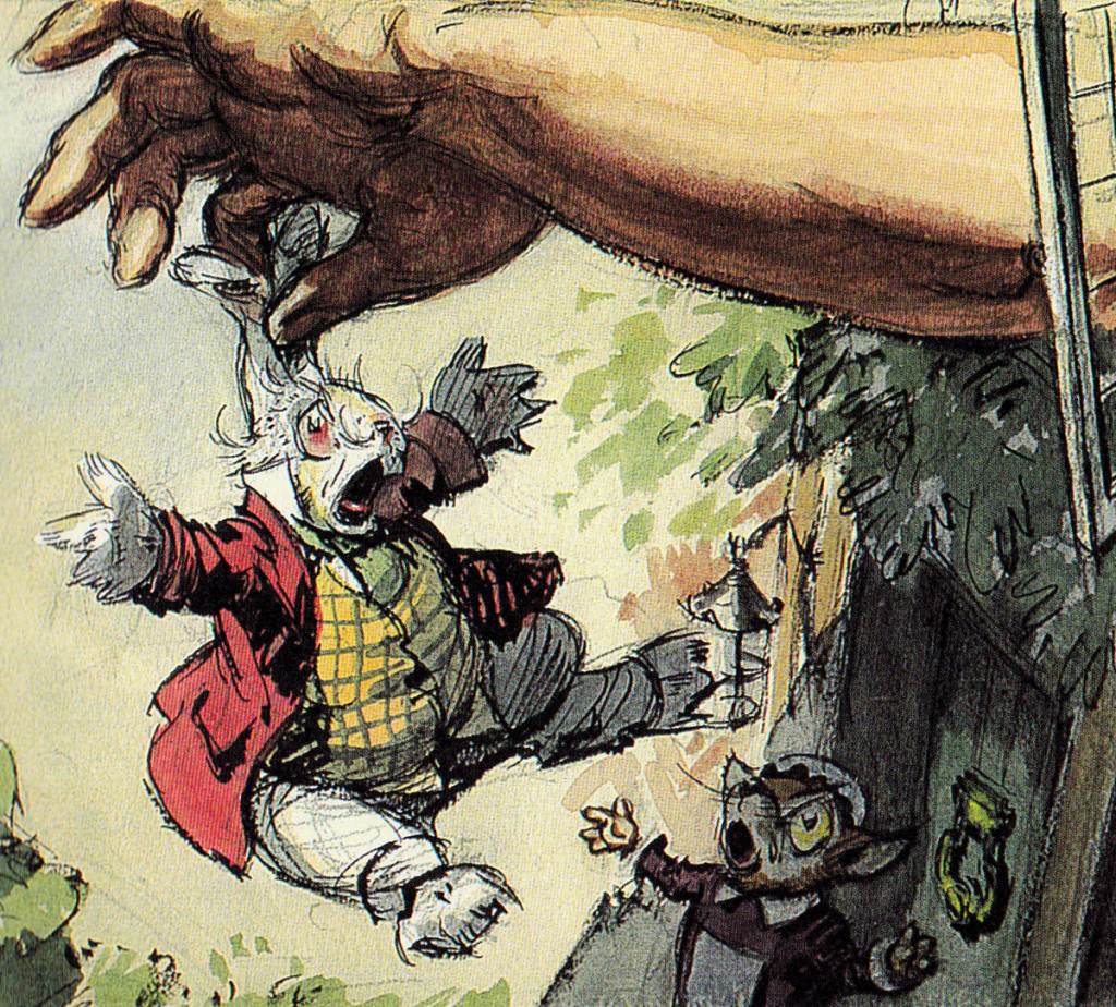
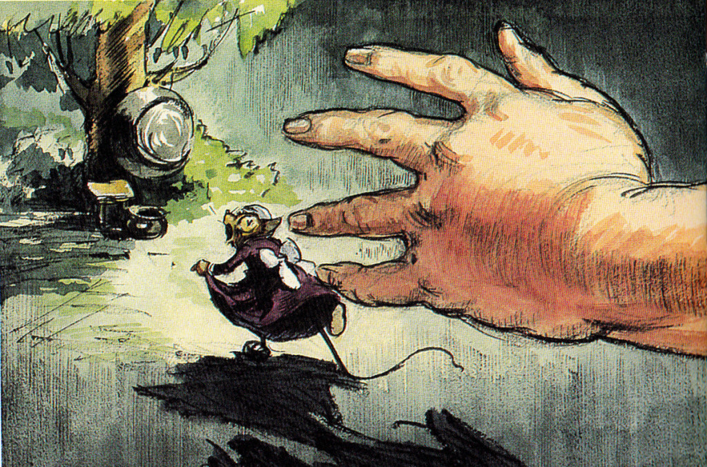
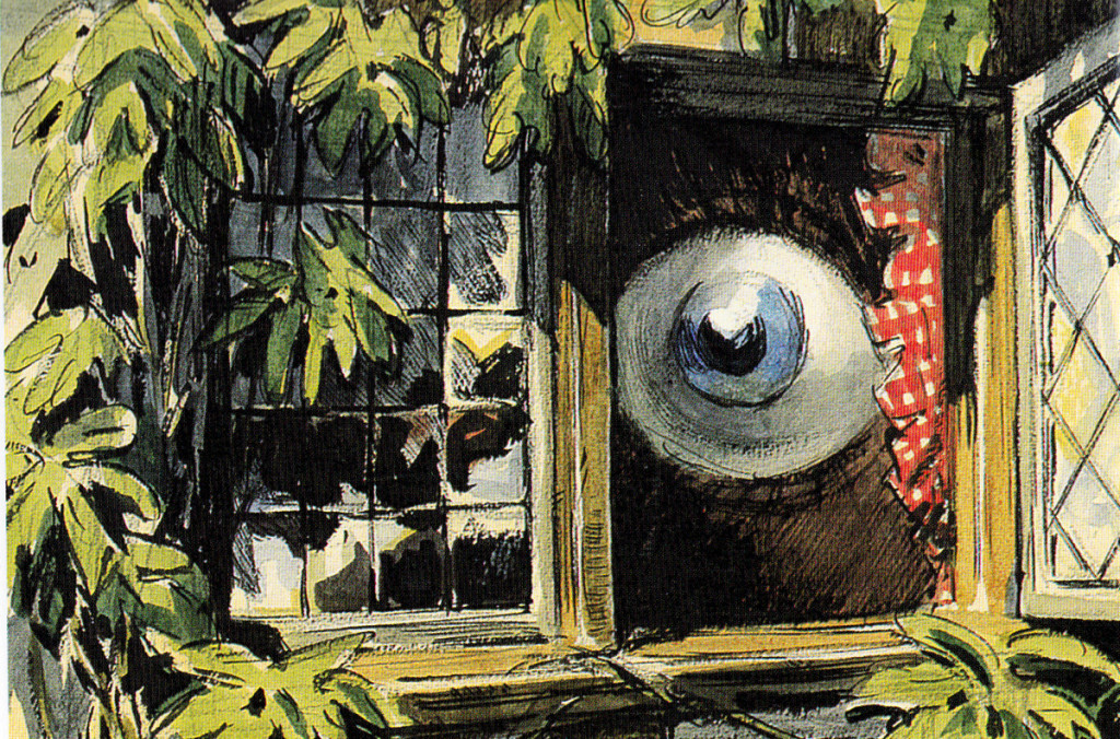
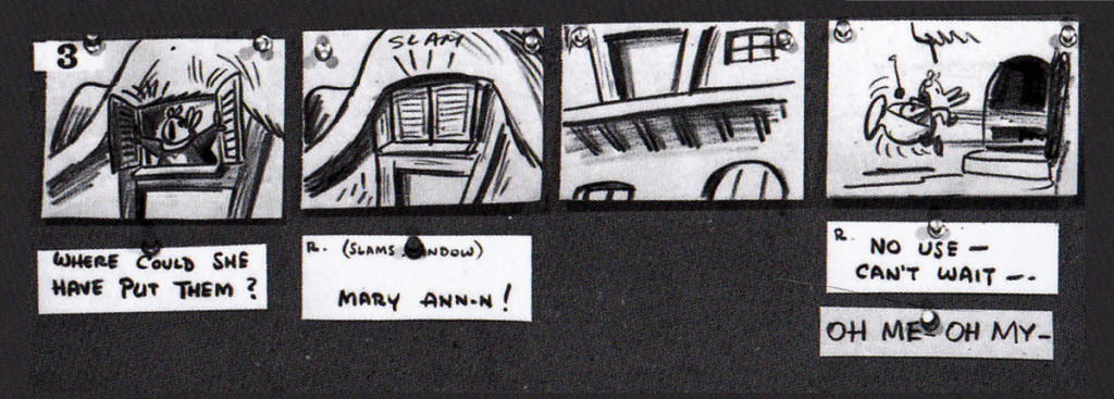
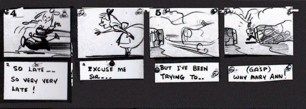
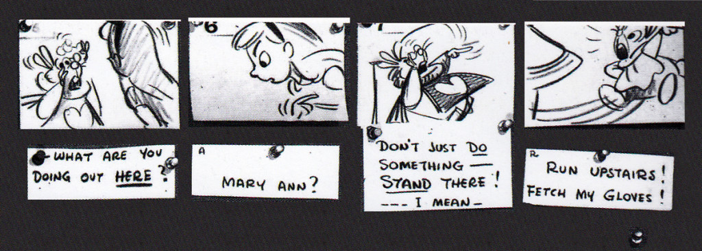
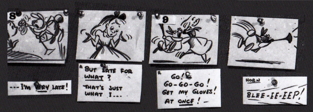
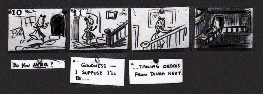
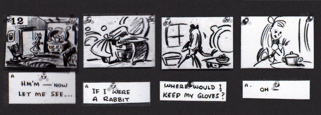
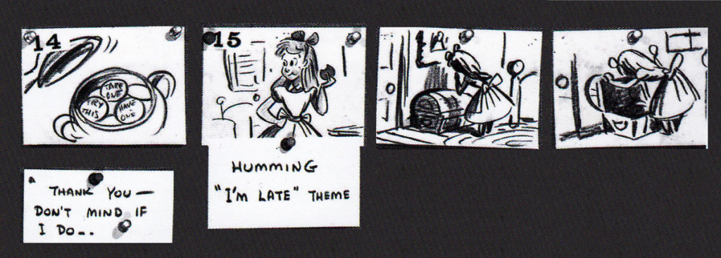
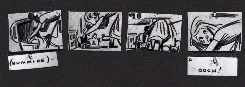
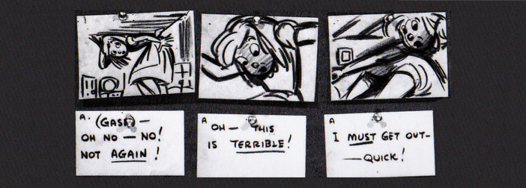
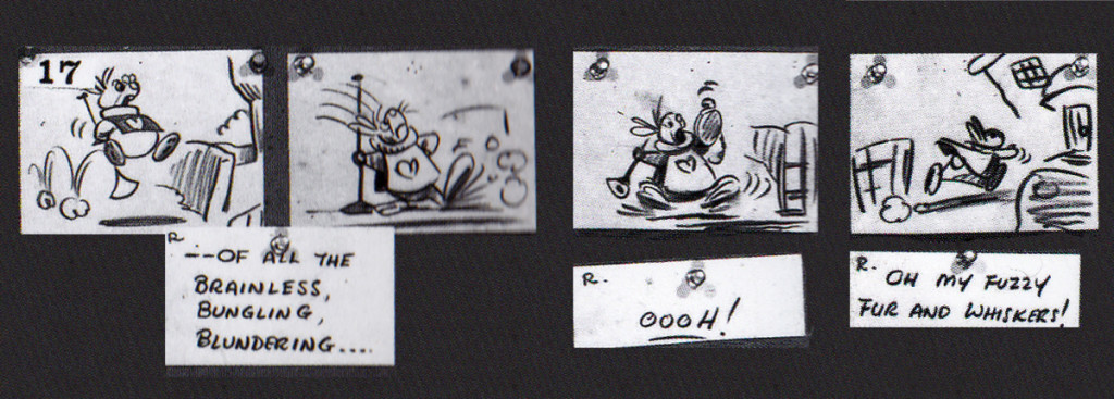
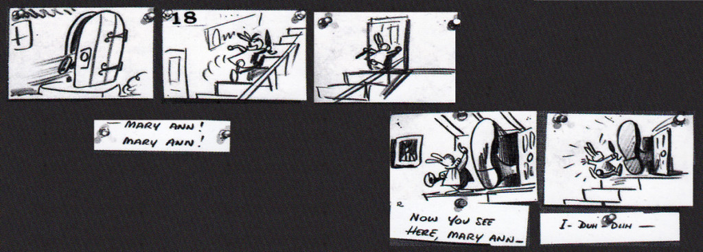
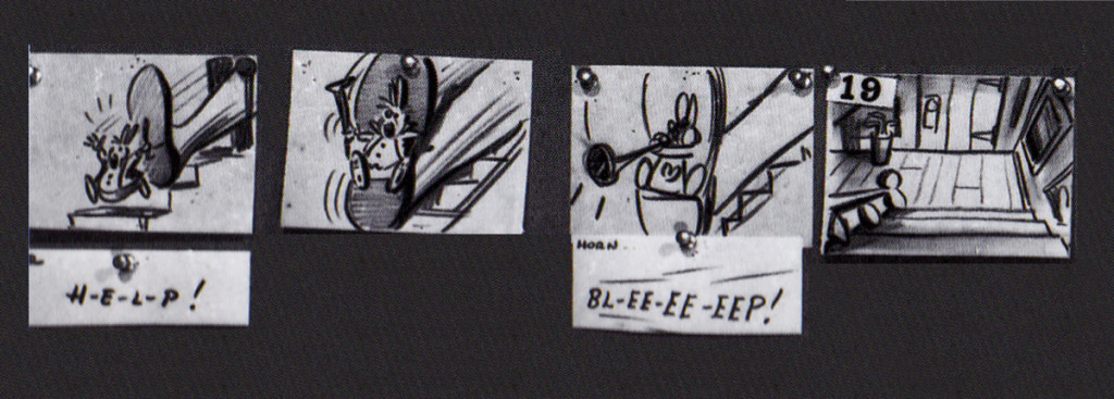
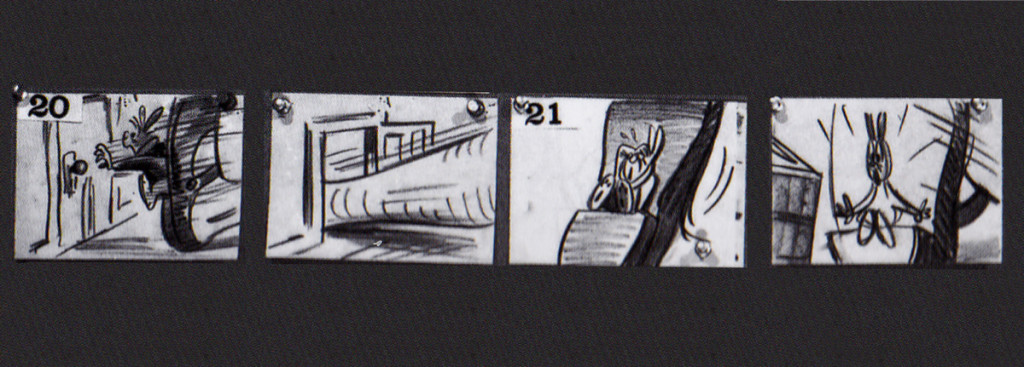
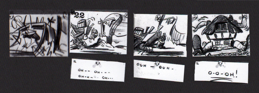
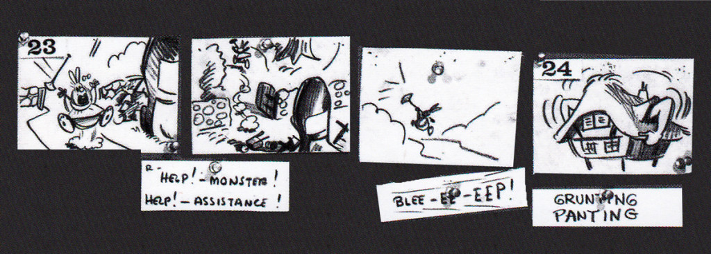
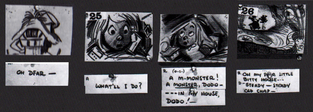
John Canemaker‘s book Paper Dreams: The Art & Artists of Disney Storyboards, is a brilliant work. As an example, take a look at this short piece for Alice In Wonderland.
The animated feature went through a long, slow birth.
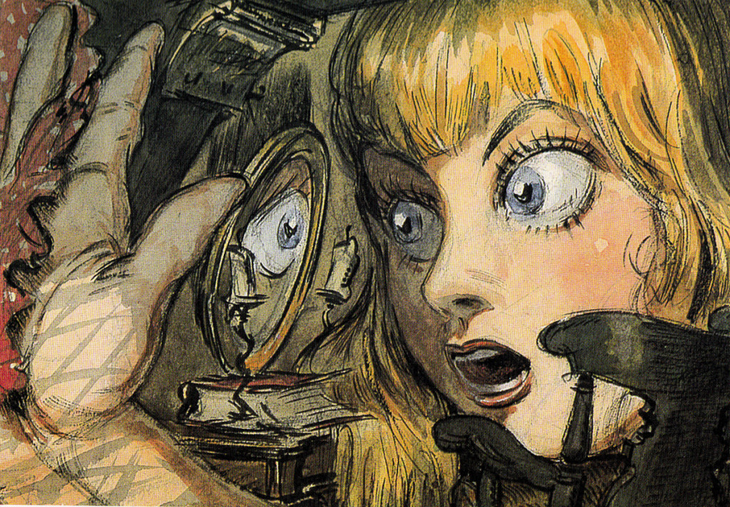
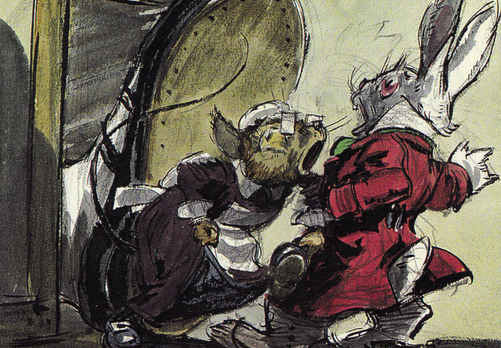
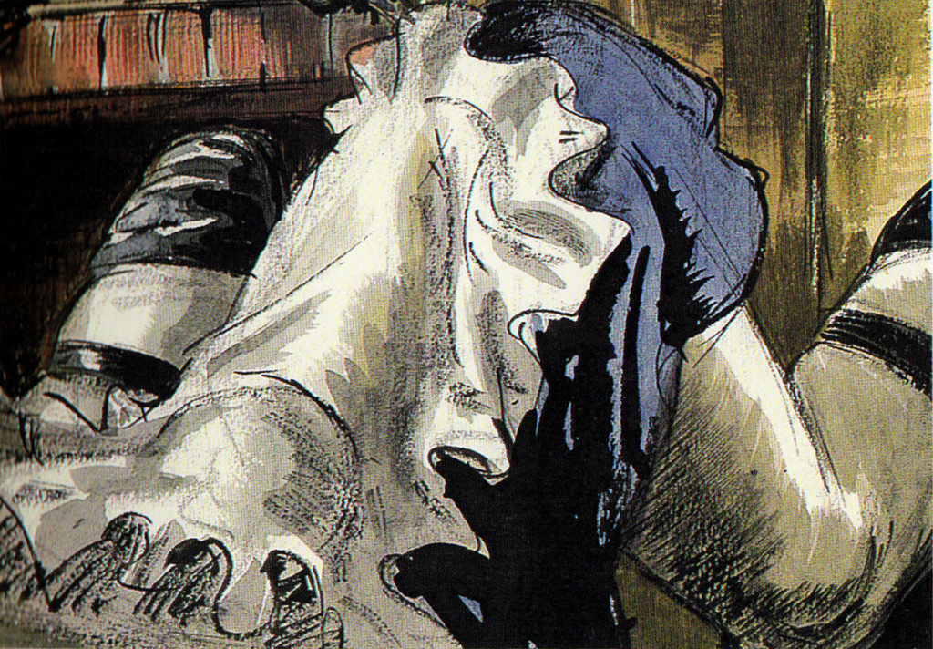
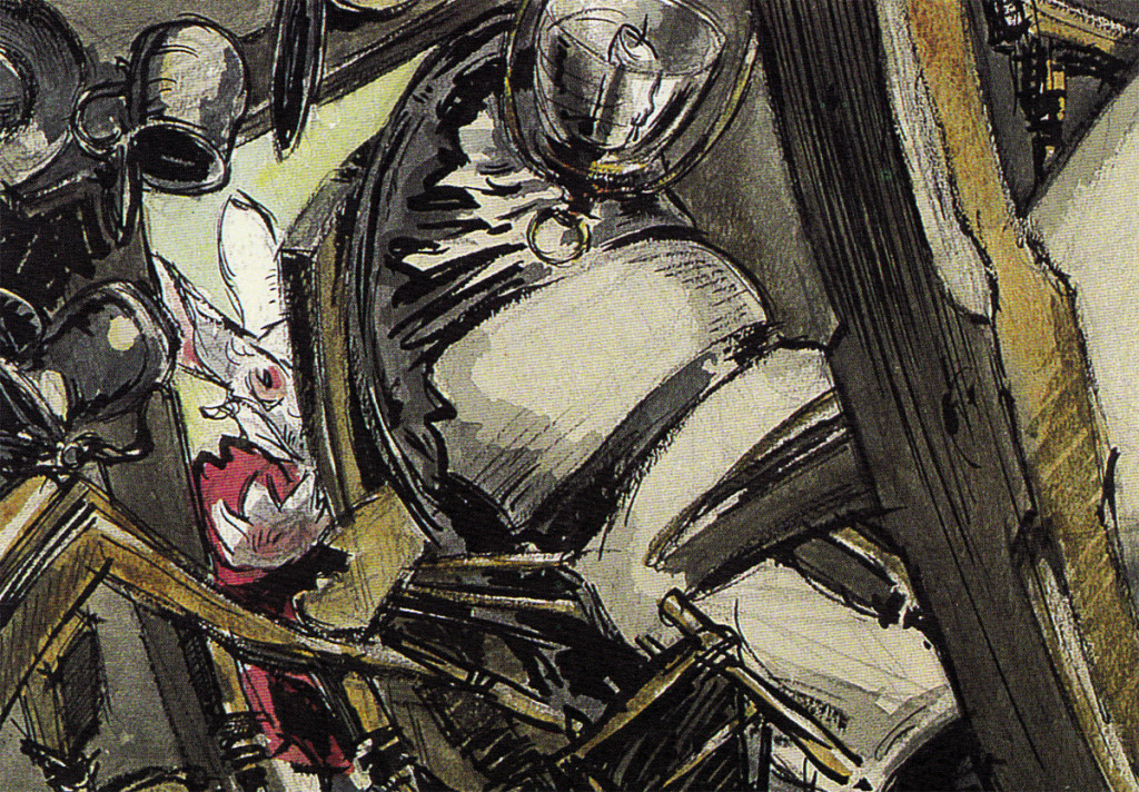
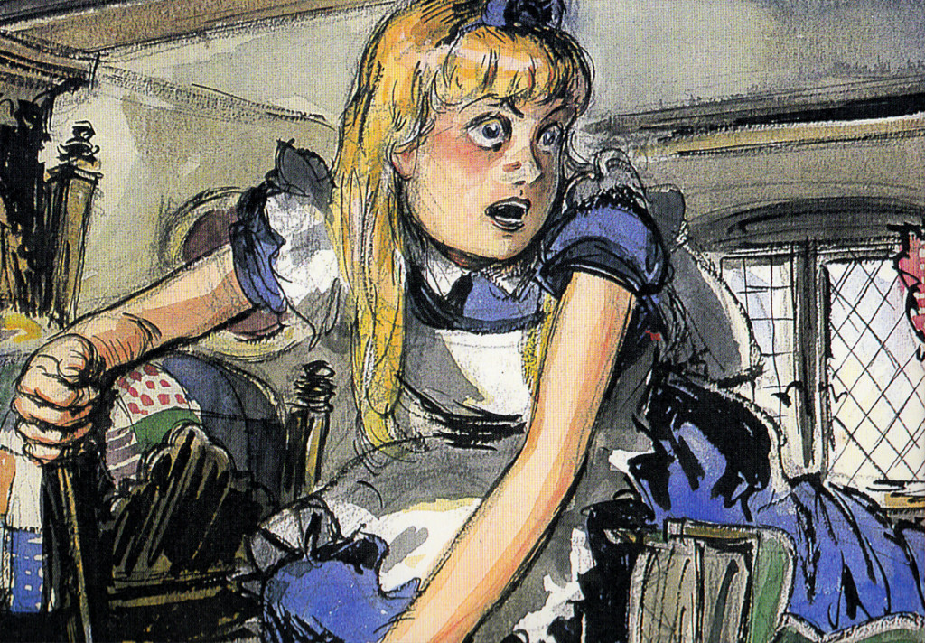
The first board, for this sequence, was by David Hall and was done in 1939, the late Thirties. Hall was originally a production artist for Cecil B. DeMille at Paramount Pictures; he worked as an illustrator who was called in to make many delicate watercolors. There was one sequence from the Carroll original which was kept for the final film. In it, Alice gets trapped within a house when, having bitten into a cracker, she suddenly starts getting larger and larger until she fills the white rabbit’s home with her head and overgrown body parts. Many a creature try to pull her from the house.
Here are some of the Hall watercolor images:
 1
1
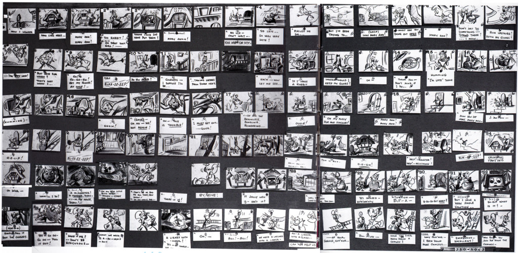
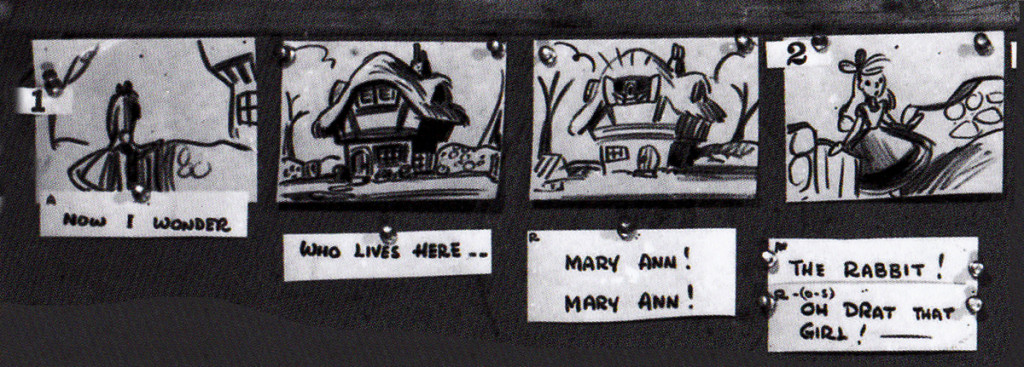
Following his version, there was an attempt at a script by novelist Aldous Huxley. Done in 1945, this was ultimately abandoned when storyboard continuity artist, Joe RInaldi, came in to make some more cohesive and funny drawings in 1950.
Here’s the full sequence, Rinaldi’s version.
The following is Rinaldi‘s board enlarged for the sake of legibility:
 1
1
I have to give John Canemaker many thanks for allowing me to post these images. His book is a treasure. to those who appreciate the storyboard.
Animation &Animation Artifacts &Books &Comic Art &Layout & Design &SpornFilms &Story & Storyboards 28 Jun 2013 05:40 am
Jabberwock – repost
- To me, Lewis Carroll‘s nonsense poem, Jabberwocky, is one of the most brilliant pieces ever written. It’s always been important to me, and I’ve collected many versions of it in illustrated versions. Now that I mention it, let me confess that I’m a Lewis Carroll addict, and Jabberwocky is one of my favorites among his many poems.
In film, you have the one live action feature by Terry Gilliam; it’s a good film with a clunky monster in the end. In animation, professionally, I know of only two versions completed. One was by Jan Svankmajer done in 1974. I did a version of it in 1989. Mine, of course, sticks closer to the poem even though it is pretty “arty”.
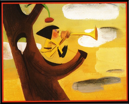
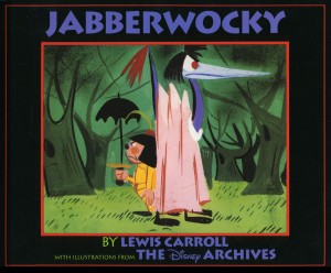 Apparently, there was also a version Disney was preparing as part of Alice In Wonderland. A book was published, credited to the “Disney Archives,” with illustrations from the preparatory drawings of this sequence. It’s obvious that the final versions of these drawings were done by one person, but there’s no record in the book of who did the finals. I’d read somewhere that Marc Davis had a lot to do with it, at one point. Though he obviously was most involved with Alice, herself.
I’m not in love with the images in the book. I like the technique used, but I find the images too cute. Though, it’s amazing how current they look.
(Click on any image to enlarge.)
I’m going to give you a number of the book’s pages today and, in comparison, will follow it up with images from my version tomorrow.
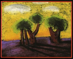
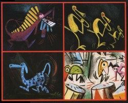
‘Twas brillig and the slithy toves
Did gyre and gimble in the wabe;
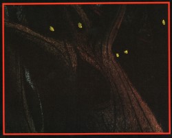
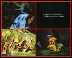
All mimsy were the borogoves,
And the mome raths outgrabe.
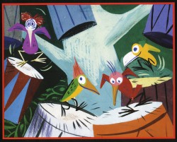
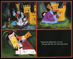
“Beware the Jabberwock, my son!
The jaws that bite, the claws that catch!”
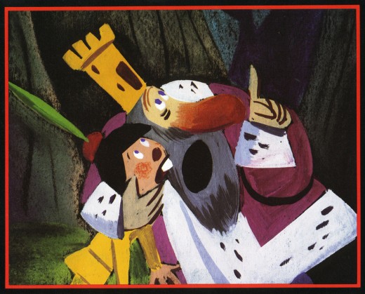
“Beware the Jubjub bird, and shun
The frumious Bandersnatch!”
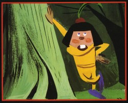
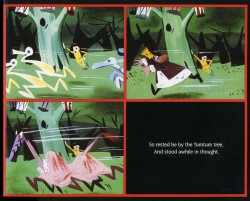
He took his vorpal sword in hand;
Long time the manxome foe he sought -
So rested he by the Tumtum tree
And stood awhile in thought.
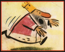
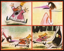
And as in uffish thought he stood,
The Jabberwock, with eyes of flame,
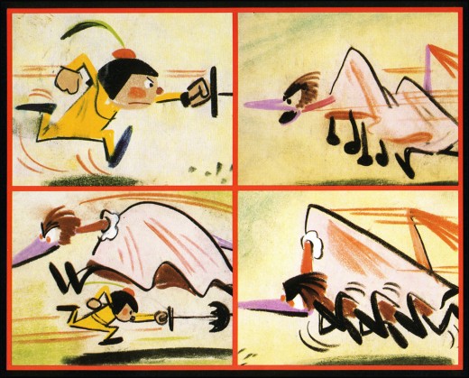
Came whiffling through the tulgey wood,
And burbled as it came!
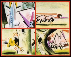
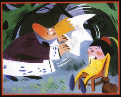
One, two! One, two! And through and through
The vorpal blade went snicker-snack!
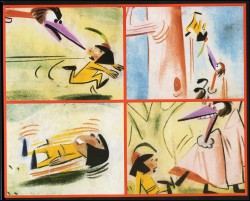
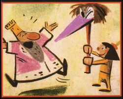
He left it dead, and with its head
He went galumphing back.
“And hast thou slain the Jabberwock?
Come to my arms, my beamish boy!
O frabjous day! Callooh! Callay!”
He chortled in his joy.
Jim Hill talks a bit about this book on his site in a letter response. here.
For amusement, you might check out this site for translations of this poem into 58 other languages, 23 parodies of the poem, and 10 explanations trying to define what Carroll meant by it.
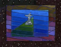
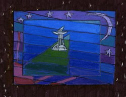
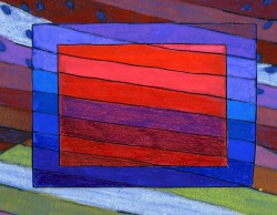
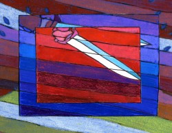
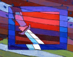
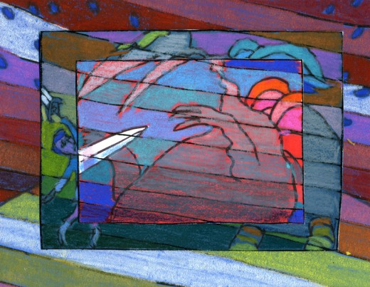
I’d like to post here a few of the images from my short adaptation of the Lewis Carroll poem, Jabberwocky. In doing the film, I tried to mimic a style I’d used in my oil paintings and felt it was a bit successful. I don’t think the filmed version is all it could be – it was rushed to complete a package which included the 19 min. film, The Hunting of the Snark, as well as an animated documentary done about Lewis Carroll’s nonsense poems. Of course, the video package wouldn’t have made sense without including Jabberwocky.
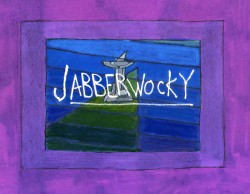
(click any image to enlarge.)
But I’ve scanned these images from the actual artwork and realize how well they’ve held up. I’d like to redo the film digitally someday and see where I can go with it.
Here are some of the images:
‘Twas brillig and the slithy toves,
Did gyre and gimble in the wabe;
All mimsy were the borogoves,
And the mome raths outgrabe.
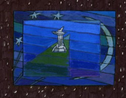
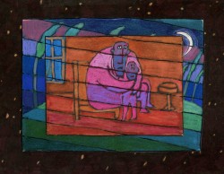
“Beware the Jabberwock, my son!
The jaws that bite, the claws that catch!â€

“Beware the Jubjub bird, and shun
The frumious Bandersnatch!â€
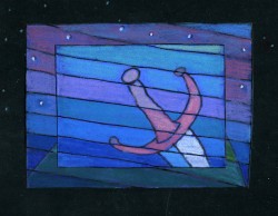
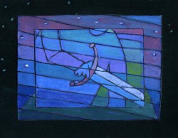
He took his vorpal sword in hand;
Long time the manxome foe he sought -
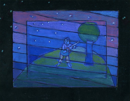
So rested he by the Tumtum tree
And stood awhile in thought.
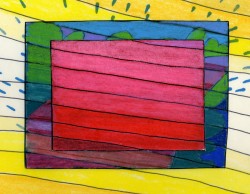
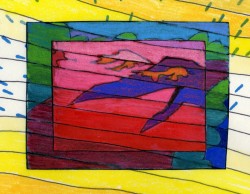
And as in uffish thought he stood,
The Jabberwock, with eyes of flame,
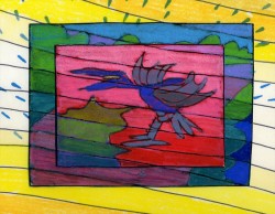
Came whiffling through the tulgey wood,
And burbled as it came!
One, two! One, two! And through and through
The vorpal blade went snicker-snack!
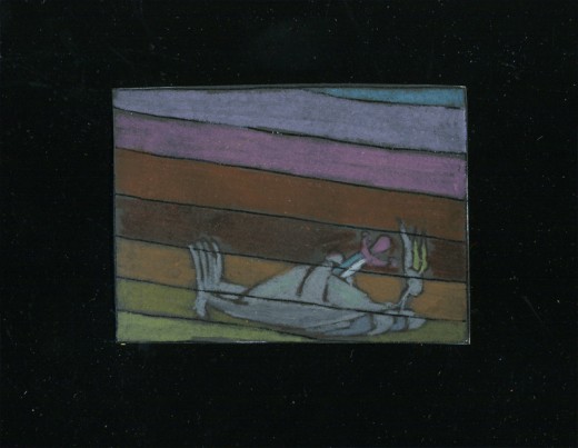
He left it dead, and with its head
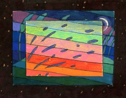
“And hast thou slain the Jabberwock?
Come to my arms, my beamish boy!
O frabjous day! Callooh! Callay!â€
He chortled in his joy.
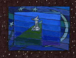
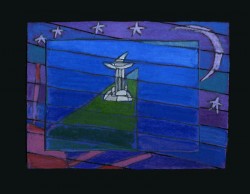
‘Twas brillig and the slithy toves
Did gyre and gimble in the wabe;
Action Analysis &Animation &Articles on Animation &Books &Commentary &Disney &Illustration &Richard Williams &Rowland B. Wilson &SpornFilms &Story & Storyboards &Tissa David 10 Jun 2013 03:31 am
Illusions – 3
I’ve written two posts about Frank Thomas and Ollie Johnston‘s book, The Illusion of Life the last couple of weeks. I came to the book only recently and realizing that I’d never really read the book, I thought it was time. So in doing so, I’ve found that I have a lot to write about. The book has come to be accepted almost as gospel, and I decided to give my thoughts.
There were two major complaints I’ve had with what I’ve read in their book so far, and I spent quite a bit of time reviewing those.
- First out of the box, I was stunned to read that these two of Disney’s “nine old men” said that they’d originally believed that each prime animator should control one, maybe two characters in the film. Then, later in life they decided that an animator should do an entire scene with all of the characters within it. This is not what I’d seen the two (or the nine) do in actual practice. post 1
Secondly, they argue for animating in a rough format, and they give solid reasons for this. As a matter of fact, it was Disney, himself, in the Thirties who demanded the animators work rough and solid assistants who could draw well back them up. Then much later in the book the two author/animators suggest that it’s better for an animator to work as clean as possible with assistants just doing touch-up. This helped out the Xerox process, but didn’t necessarily help for good animation. post 2
The book starts out sounding like it’s going to be a history of Disney animation, but then starts getting into the rules of animation (squash and stretch, overlapping action and anticipation and all those other goodies) exploiting Disney animation art in demonstration. Soon the book moved into storytelling and how to try to keep the material fresh and interesting. It all becomes a bit obvious, but you keep hoping that some great secret will be revealed by the two masterful oldsters.
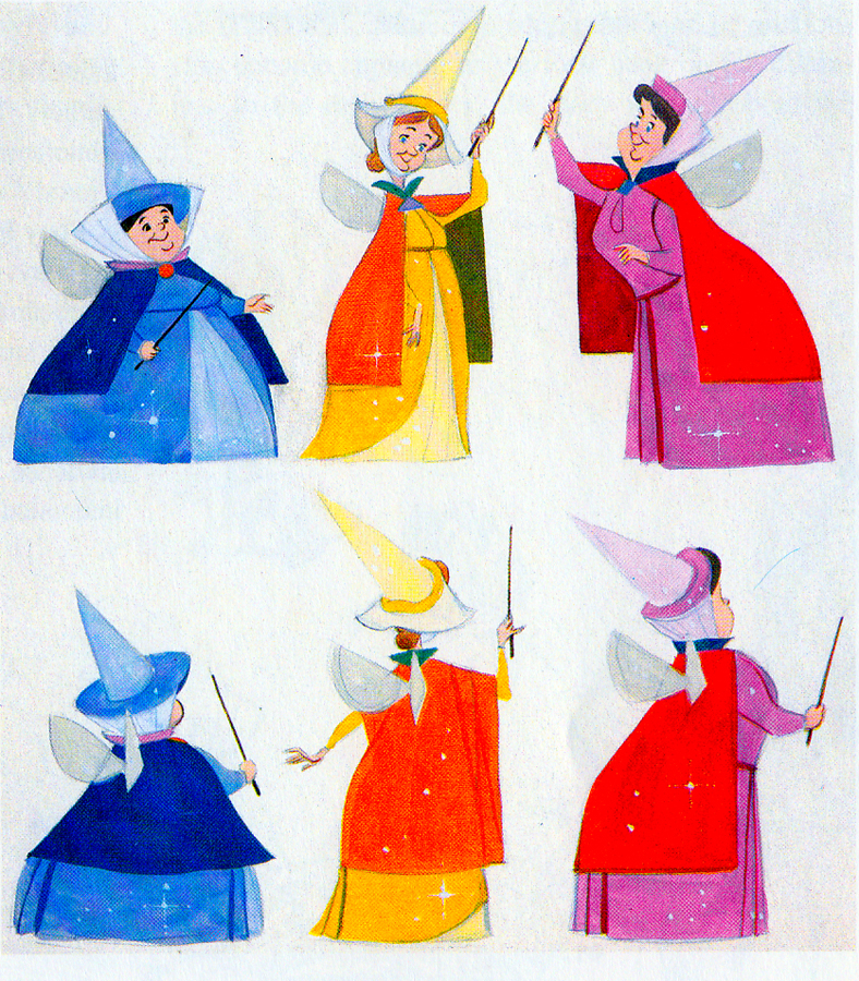 They do go into depth about how to develop characters when making animated films. They offer lots of examples from Orville, the albatross in The Rescuers to the three fairies in Sleeping Beauty, but their greatest attention goes to Baloo the Bear in The Jungle Book. They were having a hard time with this guy; they had been trying to do an Ed Wynn type character, until Walt Disney, himself, suggested Phil Harris. Once they auditioned Harris, they knew they were on the right track, and the character kept grabbing more screen time and grew ever larger. In the end, audiences just loved him.
Personally, I’ve always hated Phil Harris’ performance in this film. What was it doing in Rudyard Kipling’s book? When I was a kid, Harris and Louis Prima were the perfect examples of my father’s entertainers. He loved these guys and spent a lot of time in front of the family TV watching the Dinah Shore Show______Tom Oreb designs for Sleeping Beauty.
and other such entertaining Variety Shows with
lots of little 50′s big-band jazz-type acts. I hated it; this was my parent’s kind of music and humor and had nothing to do with me. I was the kid who paid his quarter to see the Walt Disney movies (that was the children’s price of admission in 1959.)
In their book they say they knew he was perfect because generations of kids later (who have no idea who Phil Harris was) still take joy from Baloo. What they forgot is what I knew all along. This was The Jungle Book. If they had been truly creative, they would have developed a character in line with Kipling’s material that would have been an original, not an impersonation of Doobey Doobey Doo, Phil Harris. The same is true of Louis Prima as a monkey. (There was a time when Disney said that they should never animate monkeys because monkeys are funny on their own, in real life. Animation wouldn’t make them funnier.) Sebastian Cabot, as Bagheera, works as does George Sanders as Shere Khan.
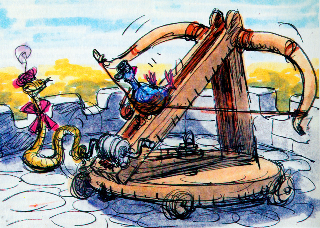
- Right: A discarded sequence from Robin Hood showed a messenger pigeon so fat and heavy he had to be shot into the air. This gave the animators the beginnings of The Albatross Air Lines in The Rescuers.
Phil Harris was so successful, they dragged him into Robin Hood as well. Robin Hood. The very same character from The Jungle Book is now Little John! All those cowboy voices in Robin Hood don’t work either, especially when you mix them up with Brits like Peter Ustinov and Brian Bedford. When these two thespians work against Pat Buttram, Andy Devine and George Lindsey, it’s one thing. Throw in a Phil Harris, and you have something else again. Where are we, the audience, supposed to be? Is it “Merry Ol’ England”? Or is it the lazy take on character development by a few senior animators who have taken license to jump away from the story writers for the sake of easy characters of the generation they’re familiar with. Robin Hood is a mess of a story – even though it’s a solid original they’re working from, and I find it hard to take written advice from these fine old animation pros who take an easy way out for the sake of their animation; shape shifting classic tales to fit their wrinkles.
At least, that’s how I see it – saw it. And perhaps that’s why it’s taken me so long to read this book. I felt (at the age of 14 when these films came out) that the Disney factory had turned into something other than the people who’d made Snow White and Bambi and Lady and the Tramp.
They had, in fact, become the nine old men.
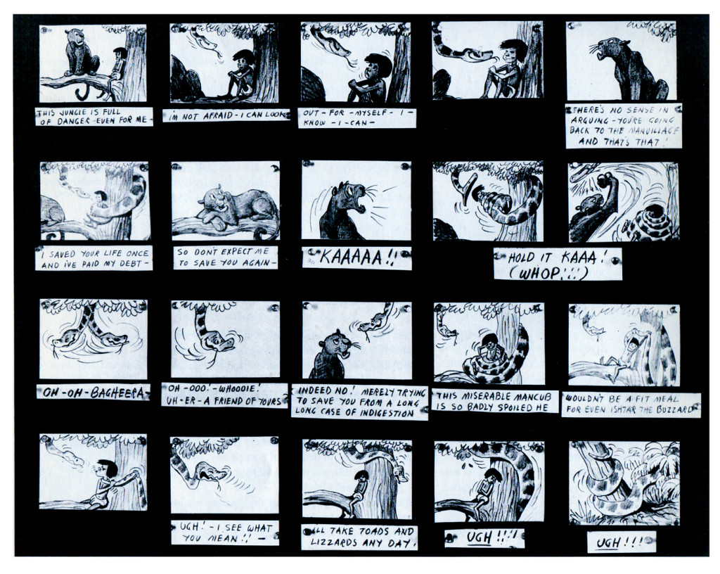
The Jungle Book was the last film Bill Peet worked on. He left
before the film was done. He’d had a long, contentious relationship
with Disney. He never felt he’d gotten the respect he deserved.
They were incredibly talented animators, and they certainly knew how to do their jobs. The animation, itself, was first rate (sometimes even brilliant as Shere Khan demonstrates), but try comparing the stories to earlier features. Even Peter Pan and Cinderella are marvelously developed. Artists like Bill Peet and Vance Gerry knew how to do their jobs, and they did them well. When Peet quit the studio, because he felt disrespected, Disney’s solid story development walked out the door.
The animators were taking the easy route rather than properly developing their stories. The stories had lost all dynamic tension and had become back-room yarns. Good enough, but not good.
Today was Nik Ranieri‘s last day at Disney’s studio. He’s definitive proof, in the eyes of Disney, that 2D animation is dead as an art form. This is the end result of some of the changes Thomas and Johnston suggest in their book. The medium took a hit back then; it just took this long for the suits to catch up. Good luck to Nik and the other Disney artists who no longer work steadily in what is still a vitally strong medium.
Animation Artifacts &Disney &Frame Grabs &Layout & Design &repeated posts &Story & Storyboards 03 Jun 2013 04:17 am
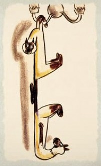
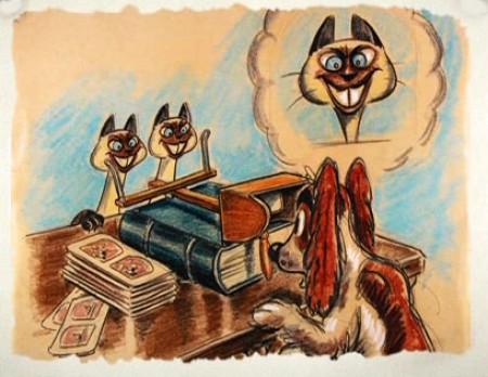
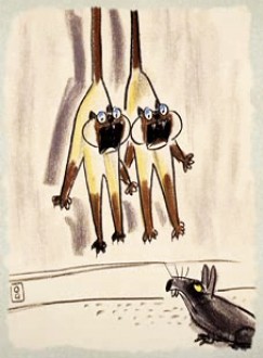
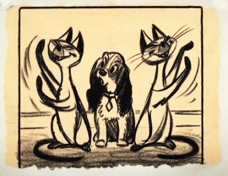
Lady Drawings – repost
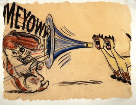
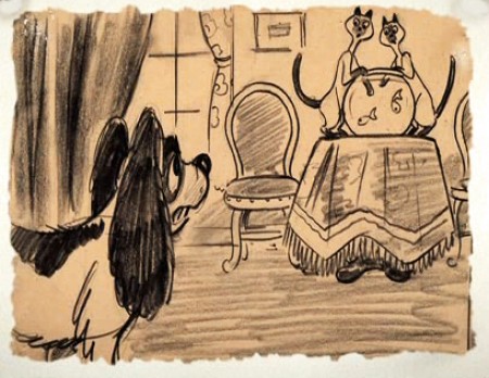
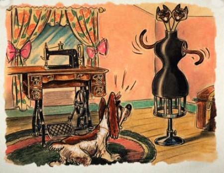
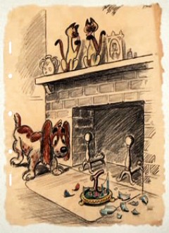
 - The recent posts by Hans Perk on his blog A Film LA of the animation drafts to Lady and the Tramp have led me to add to the mix by posting some of these older posts.
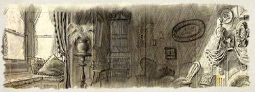
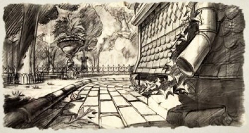
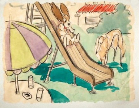
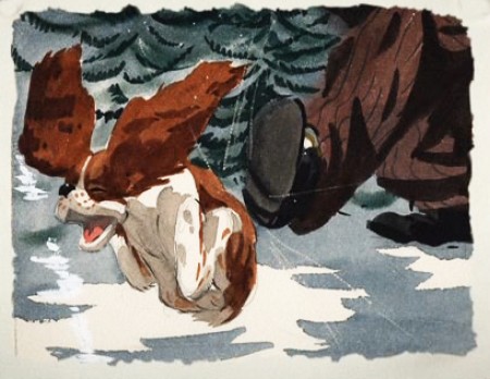
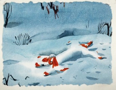
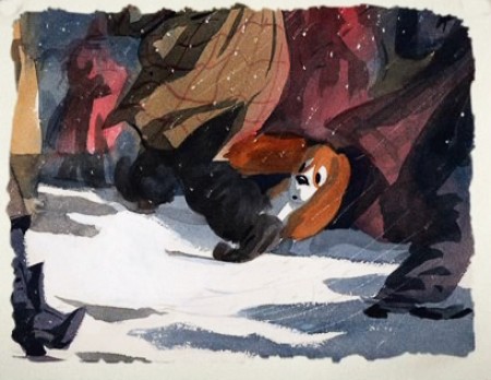
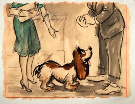
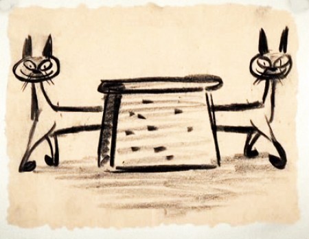
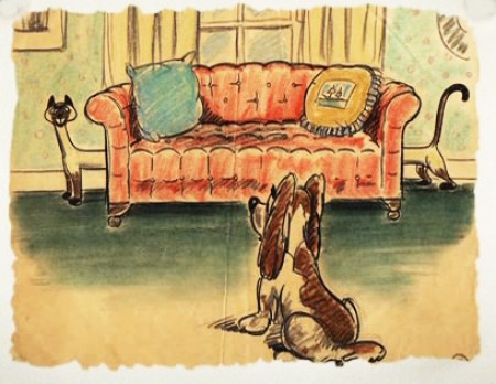
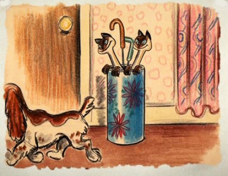
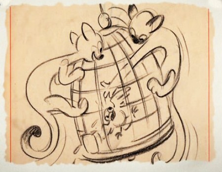
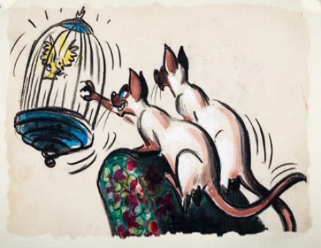
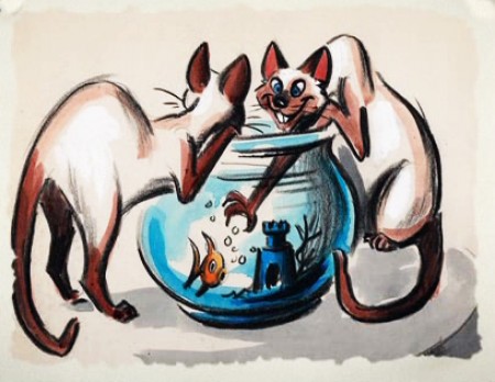
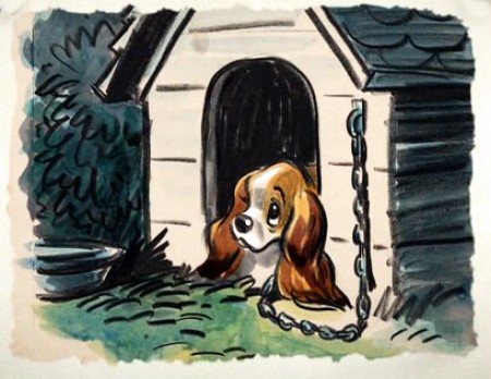
Here are a lot of drawings done predominantly by Joe Grant in the early forties in preparation for the movie.
The illustrations – some are obviously BG layouts, others storyboard drawings – have a light and jaunty feel. They’re very cartoon in nature, and belie the actual feature they produced which, at times, is quite beautiful. Disney truly got the feel of “Main Street, USA” in this film.
I’m interested that most of the images don’t take in Cinemascope (since they were obviously done before the decision to go Scope.Cnemascope didn’t come into being until 1953) Most of them are also fast drawings that don’t feature the Tramp as we know him, and even Lady takes on a different form.
You get the feeling this film was pushed out relatively quickly. The results are excellent, regardless. Sonny Burke and Peggy Lee wrote an excellent pop-song score that doesn’t quite capture the turn-of-the-century, but it does capture the atmosphere of early 50s USA.
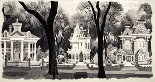
This drawing is in B&W on the DVD, but it appears in
Bob Thomas’ 1958 book, “The Art of Animation.”

Bg for The Princess and the Frog.
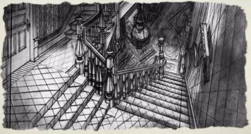
This looks not too different from a shot in Hitchcock’s Psycho.
You can find more Bgs from Lady and the Tramp on Hans Bacher‘s site, one1more2time3.
The following are Joe Grant development drawings.
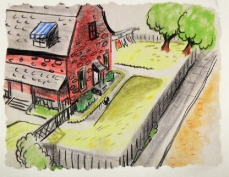
We seem to be in the Little Golden Book territory
with some of these images.
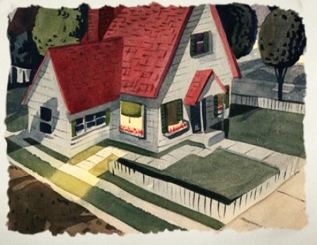
An earlier and different view.
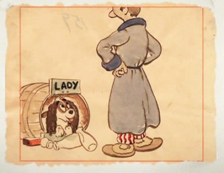
Or did I mean the New Yorker circa 1948?
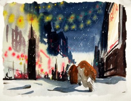
I love weather and would have applauded more of it in the film.
—-
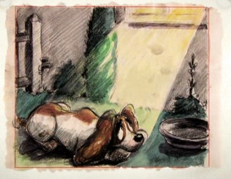
(Click any image to enlarge.)
One more post of these to go. On Friday.
.
Disney &Peet &Story & Storyboards 15 May 2013 05:54 am
Peet’s Susie Board
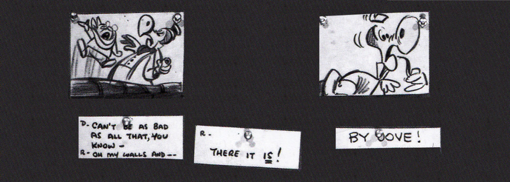
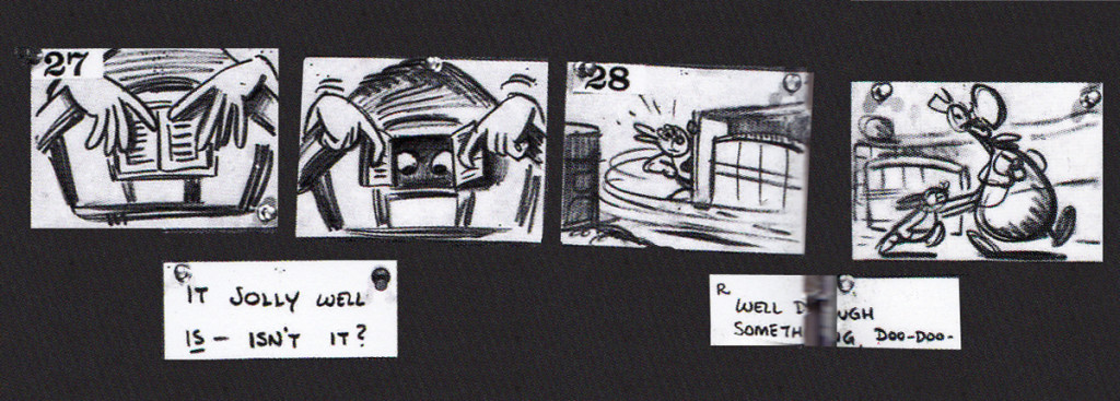
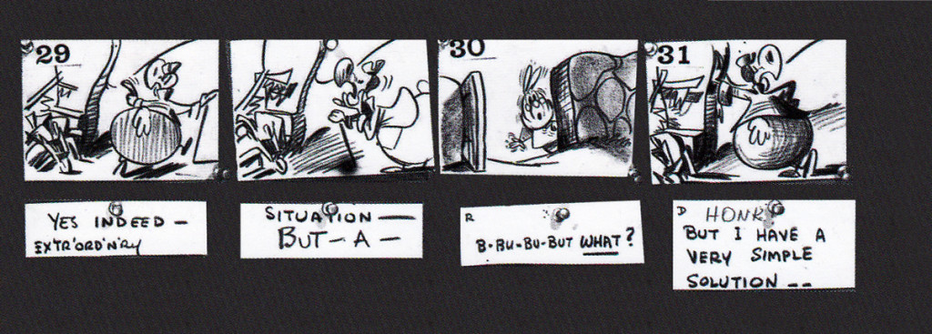
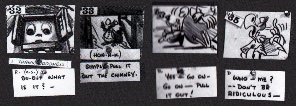
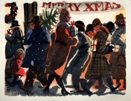
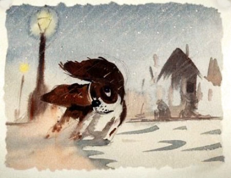
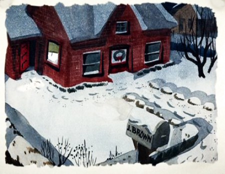
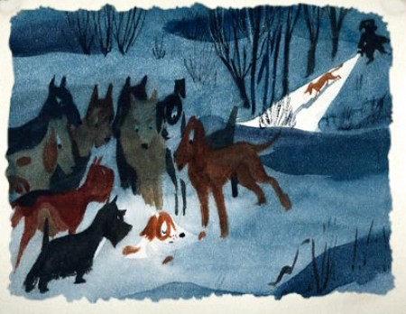
- In yesterday’s post, we saw artwork that Bill Peet had done. It was obviously art that was prepared for a book. Whether he was doing this for himself or the studio I can’t say. I do know for sure that it didn’t become a book, but I do know it did develop as a film completed in 1951.
That film was directed by Clyde Geronomi.
The Layout was by Don Griffith and Hugh Hennesy.
The animation was by Bob Carlson, Ollie Johnston, Hal King and Cliff Nordberg.
The backgrounds were by Ralph Hulett.
The music was composed by Paul Smith.
Thanks again to John Canemaker, I have the storyboard by Peet for this short Disney film.
As in the past I’ve broken the board down so that I could post it as large as possible so that you can read it when the images are enlarged. Enjoy.
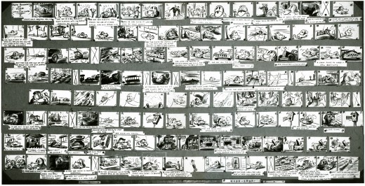
This is the complete board. I’ve broken up each individual row, they appear below.
The following seem to be LO drawings and don’t appear to be part of the storyboard. Perhaps it was prepared for a Leica reel? Regardless, the drawings are interesting, though I doubt Bill Peet did them all.
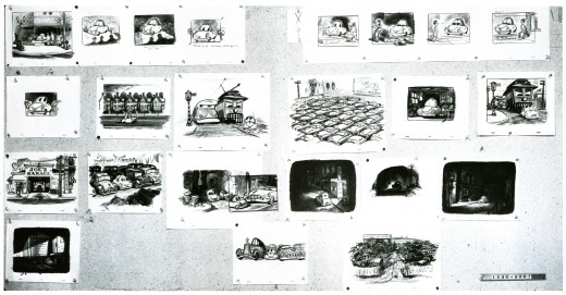
As with other recent posts of storyboard material, I’ve
broken it up and repositioned the images so that you can
enlarge them for better viewing. The above image represents
what the photo given me looks like.
Finally, I wanted to give an indication of the film’s color, so
I’ve gone back to John Canemaker’s book,
The Art and Flair of Mary Blair,
and have taken this color sketch she did in styling
to represent the film as a whole.
Animation &repeated posts &Story & Storyboards 30 Apr 2013 06:38 am
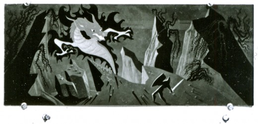
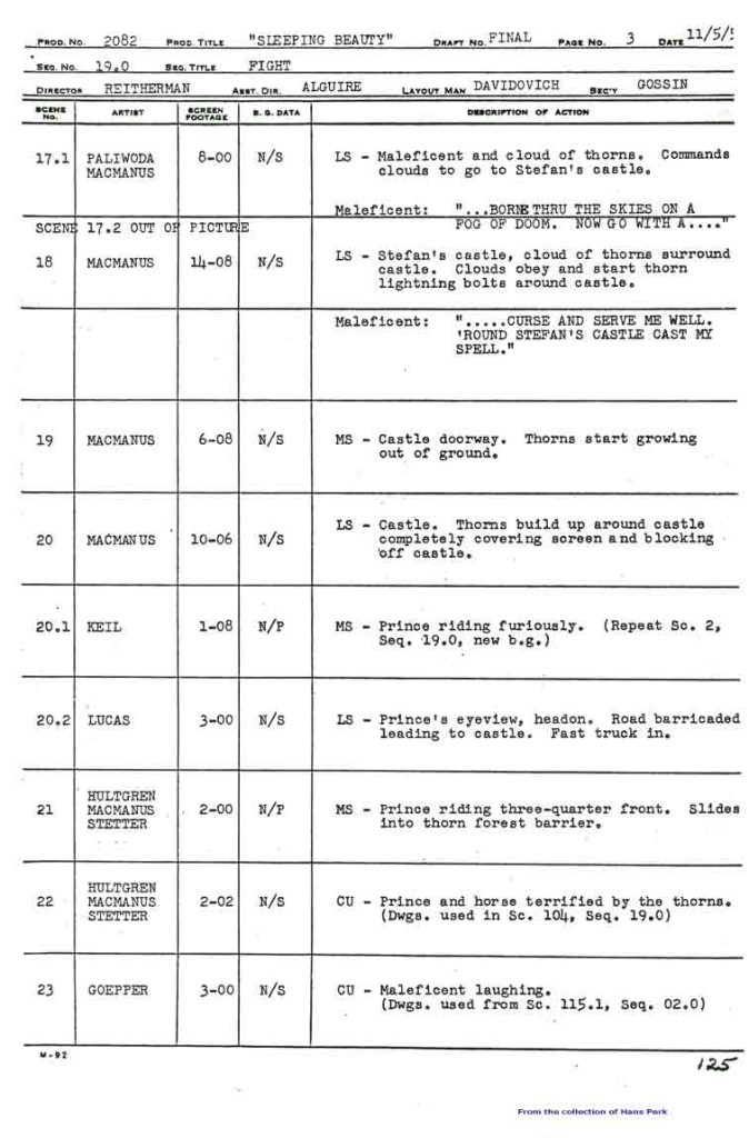
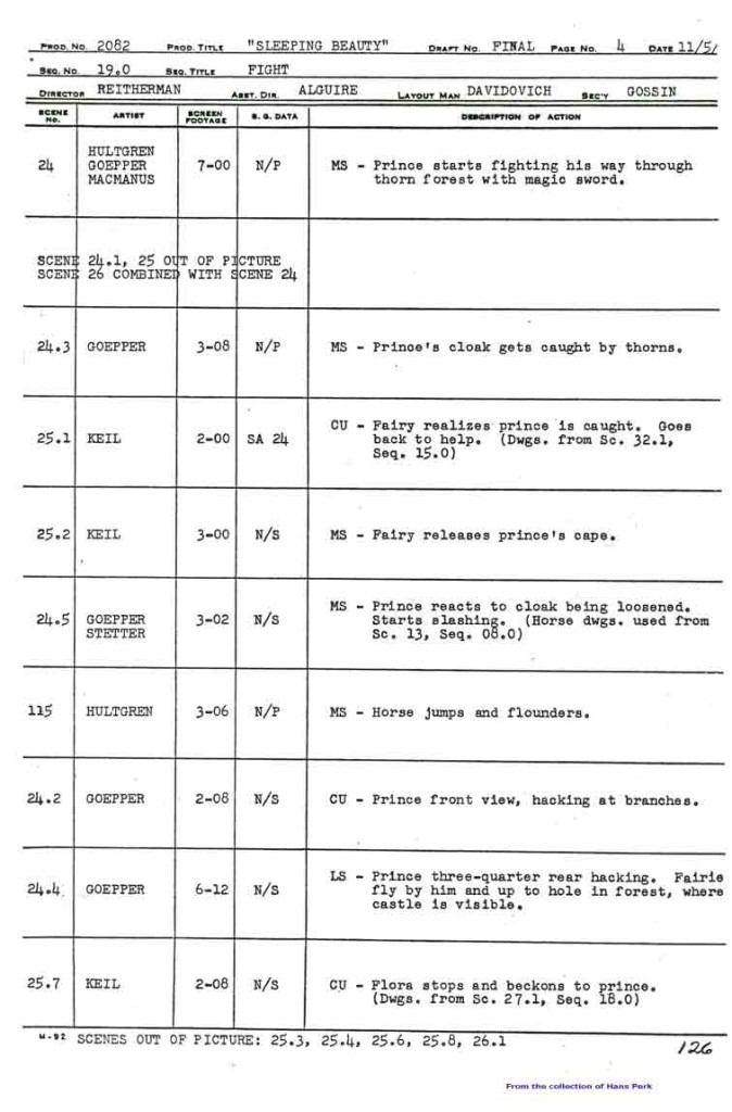
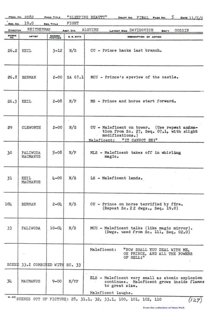
Dragon Fight – Seq 19 the end.
My apologies, I should have included this page among those from the Sleeping Beauty battle which I’d posted yesterday. This concludes the dragon fight.
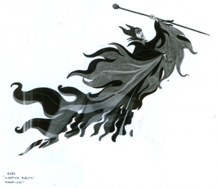
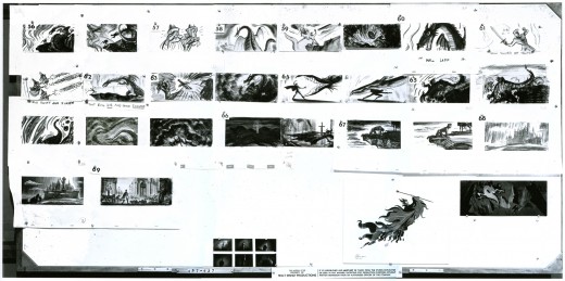
- This is the final photo/page of the Ken Anderson board for Sleeping Beauty. John Canemaker loaned me the series (which I’d posted in June of 2006) that includes Sequences 18 & 19 of the film. They’re the climax of the film – Prince Phillip’s battle with the thorns and the dragon, ultimately killing off Maleficent.
This is the whole photo as is:
(Click any image to enlarge.
Here, I’ve broken the photo into rows cutting the rows in half. This way I can post them as large as possible for viewing.
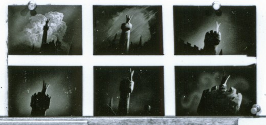
These last are tiny thumbnails at the base of the photo.
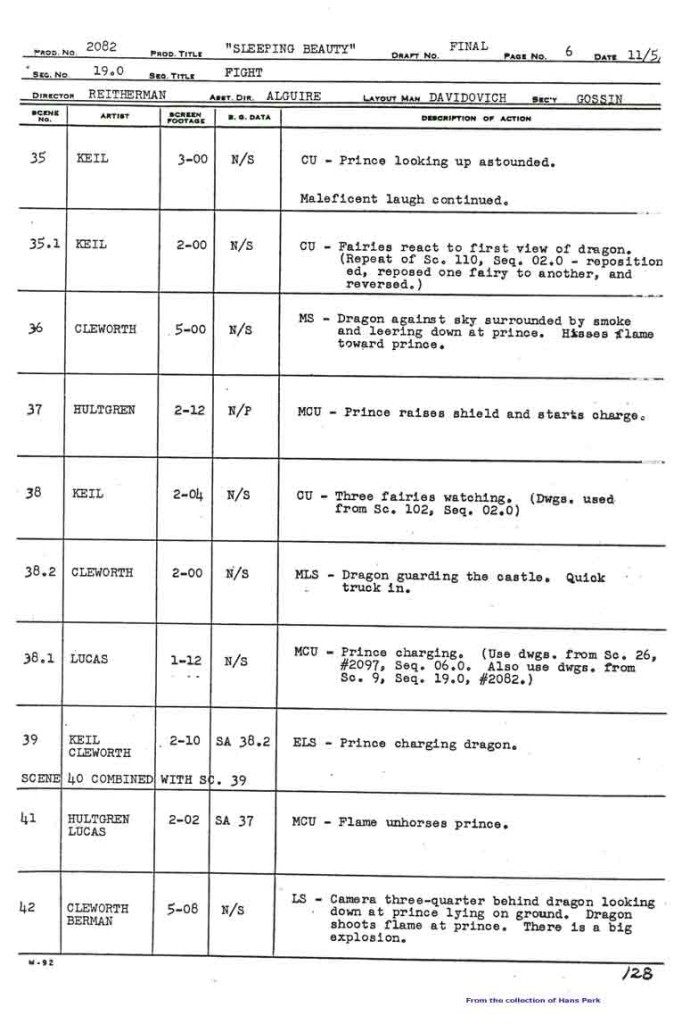
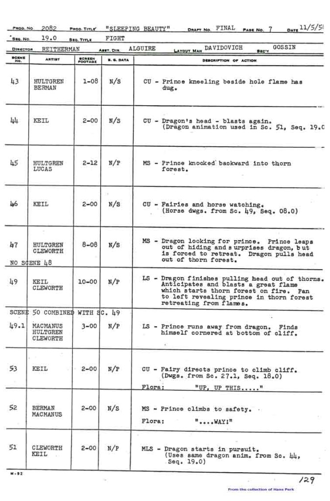
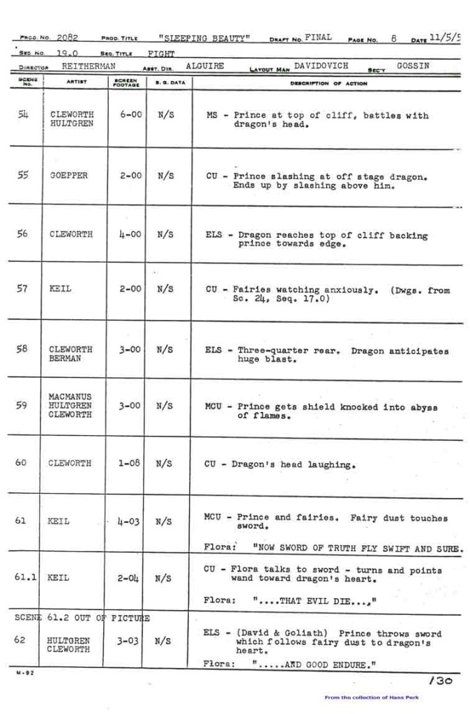
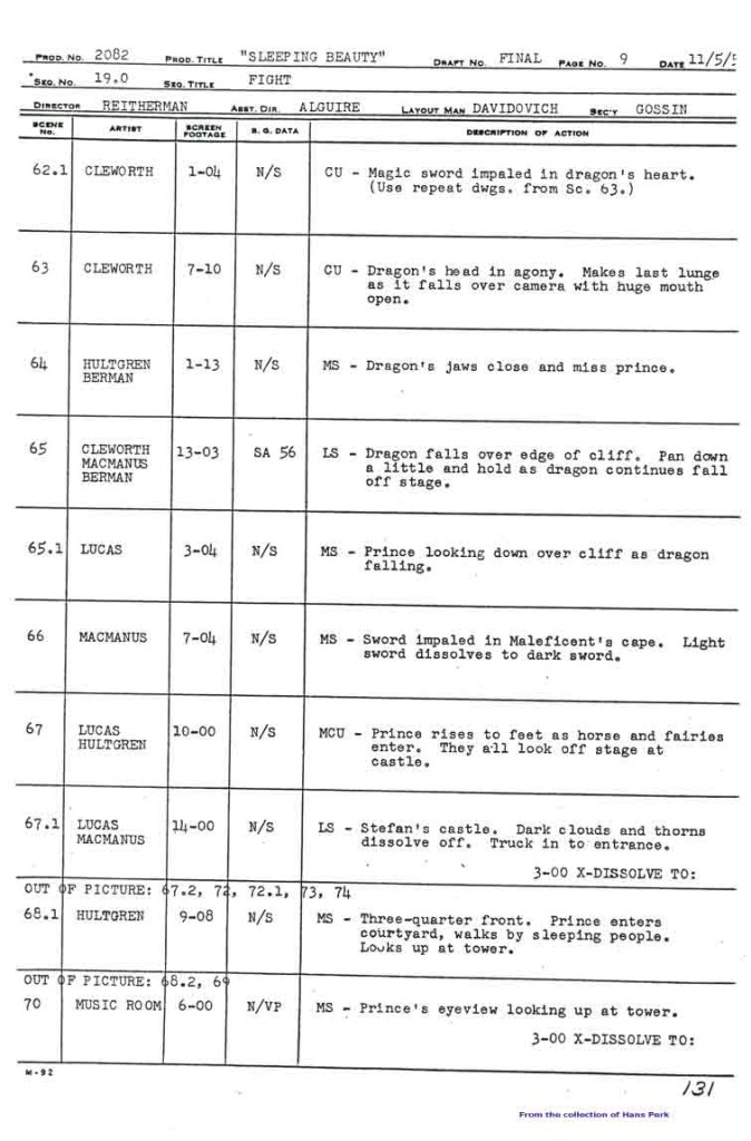
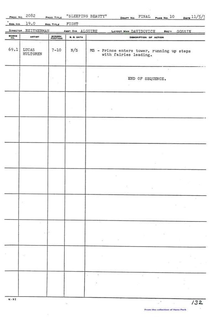
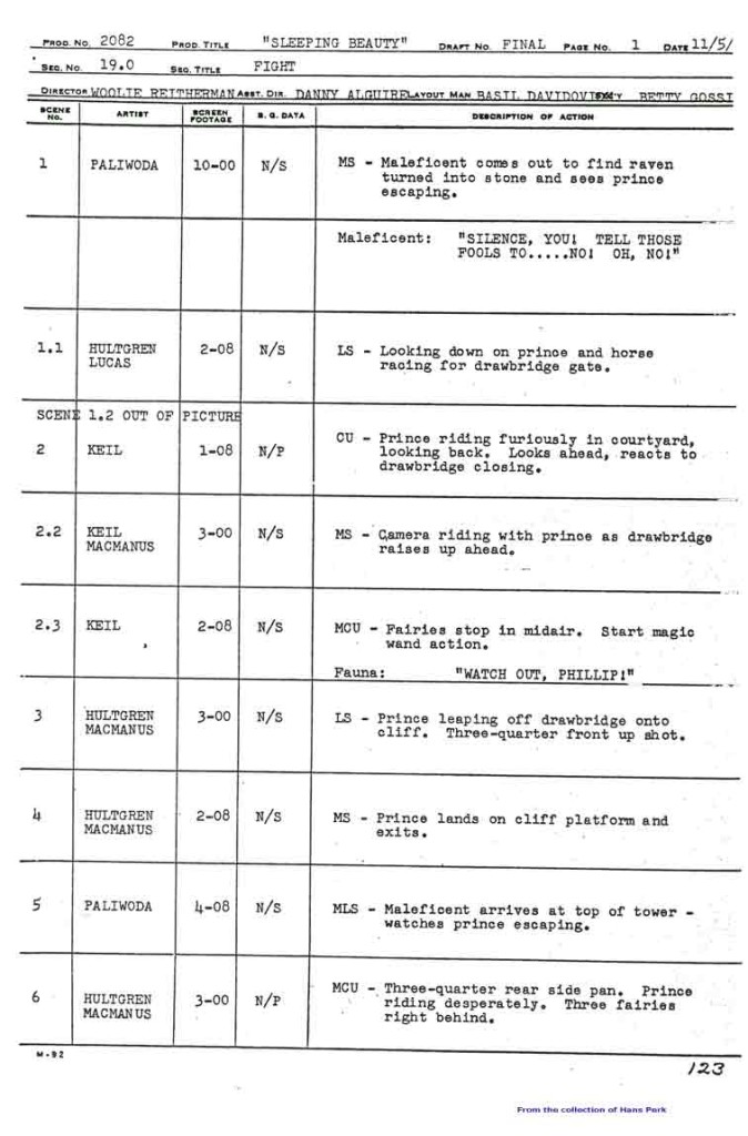
Here are the pages of the animator’s draft to inform you as to who animated the scenes of sequence 19:
 1
1 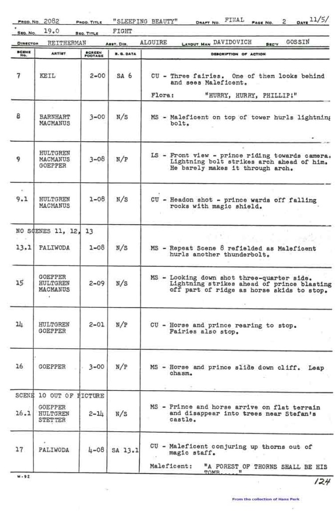 2
2
Many thanks also to Hans Perk who, on his blog A Film LA, has posted the animator drafts of this film (like so many others he’s shared with his readers). None of this work could have been done without that reference.
Animation Artifacts &Articles on Animation &Disney &Illustration &John Canemaker &Story & Storyboards 29 Apr 2013 06:19 am
Sleeping Beauty Storyboard – seq 19
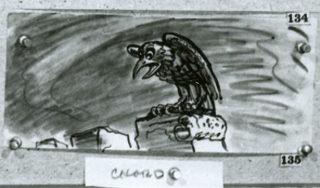
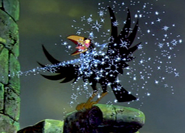 - John Canemaker had loaned me the final sequences of the storyboard to Sleeping Beauty, detailing the dragon fight and climax of the film. I originally posted this in three parts. I’ve combined them all here, making for one long post.
I’m not sure who did the artwork, but there’s a good chance it’s Ken Anderson‘s work.
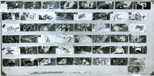
As with past boards, I’ll post the whole photograph as is, then take it apart row by row so that you can enlarge them as much as possible. Here’s the storyboard sequence #19 from Sleeping Beauty.
The full board follows below:
(Click any image to enlarge.)
The breakdown of that full board follows:
 1a
1a
Here’s the next full page of storyboard as is:
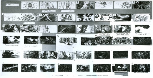
(Click any image on the page to enlarge.)
Again, I follow with the board broken up into segments, half a row at a time.
 1a
1a
This is this photo of the next page of the board as it came to me:
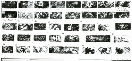
(Click any image to enlarge.)____________
Here are the rows of the board broken into two so that I can post them a bit larger.
 1a
1a
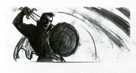
If only he knew what he was going to face next.
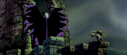
I’ve decided to get the frame grabs for the sequence and post them as well. I thought the comparison of board to actual film would be interesting.
__________
These images come from the “Special Edition” of the dvd, not the “Platinum Edition” now on the market. Using Hans Perk‘s posts of the drafts for these scenes, on his blog A Film LA, I was able to identify the animators’ names.

sc 82 (L) Milt Kahl – sc 82.1 (R) Frank Thomas

sc 82.2 (L) Kahl & Thomas – sc 82.3 (R) George Nicholas & Jerry Hathcock

sc 82.4 (L) Nicholas – sc 82.5 (R) Nicholas & Hathcock

Nicholas & Hathcock (L) sc 82.6

sc 84 (L) Ken Hultgren – sc 85 (R) Nicholas & Hathcock

sc 87 (L) Nicholas & Sibley – sc 88 (R) Nicholas & Hathcock

(L) Nicholas & Hathcock – sc 89.1 (R) Hultgren

sc 89 (L) Nicholas & Hathcock – sc 91 (R) Hathcock

sc 91 (L) Hathcock – sc 92 (R) SA sc 49 seq 8

sc 95 (L) Hathcock – sc 93 (R) Hathcock

sc 96 (L) Hathcock – sc 97 (R) Dan MacManus

(L) MacManus – sc 97.2 (R) Hathcock

sc 98 (L) Hathcock – sc 99 (R) Sibley

sc 100.1 (L) Hathcock – sc 101 (R) Les Clark & Fred Kopietz

sc 102 (L) Hultgren & Kopietz – sc 104 (R) Hathcock

sc 107 (L) Hathcock – sc 108 (R) Hultgren

(L) Hutlgren – sc 109 (R) Hathcock

sc 110 (L) Ollie Johnston & Blaine Gibson – sc 110.1 (R) Gibson

sc 110.2 (L) Johnston – sc 110.3 (R) Johnston & Gibson

sc 110.4 (L) Johnston – sc 111 (R) Johnston & Gibson
- Let’s end this post from Sleeping Beauty by posting a couple of drawings I have for the “Skumps” sequence. Again, Hans Perk on his blog A Film LA, posted the animator drafts for this sequence and I was able to I.D. the animators. (I have to say I guessed correctly in three out of four shots, so I’m pleased with myself.)
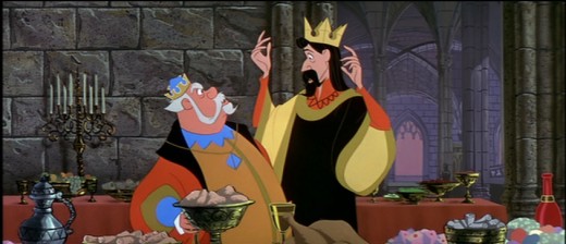
I’m posting closeups of the drawings. By clicking on any of them you’ll see the full sized animation paper. I’m also posting frame grabs beneath the drawings so you can see how they looked in the film.
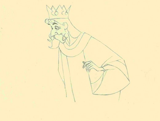
This is a Milt Kahl scene, seq 13 sc 8. This drawing is undoubtedly a clean up,
so it’s not one of Kahl’s drawings – just his pose. It’s an extreme.
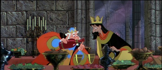
It is interesting that Kahl animated both characters.
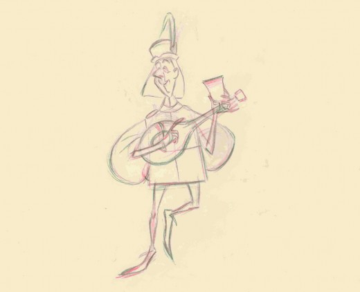
This is a John Sibley ruff. Seq 13 sc 17.
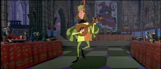
It’s a very odd, uncoordinated dance number by the drunk lackey.
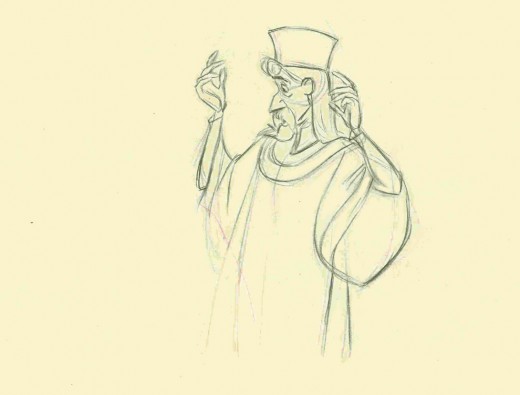
This is my favorite of these four. It’s a John Lounsbery ruff of King Stefan.
Another extreme from seq 13 sc 26.
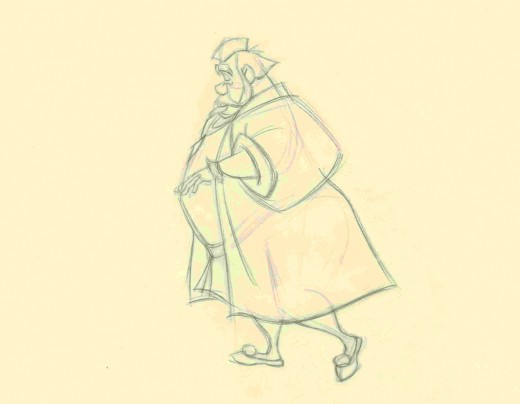
This is also another beautiful ruff by John Lounsbery. It’s King Hubert in the
very last scene of seq 13, sc 57.
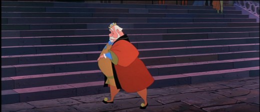
it comes just prior to Hubert’s turning and sitting on the palace steps.
Animation Artifacts &Disney &repeated posts &Story & Storyboards 22 Apr 2013 05:04 am
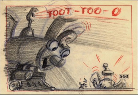
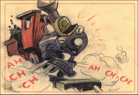
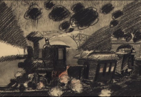
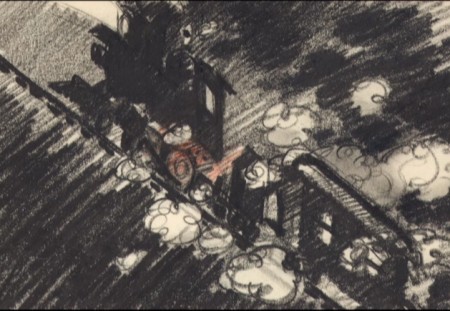
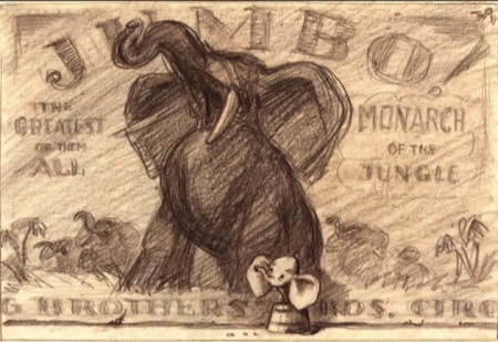
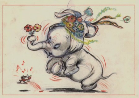
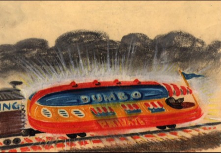
Dumbo Storyboard Sketches – recap
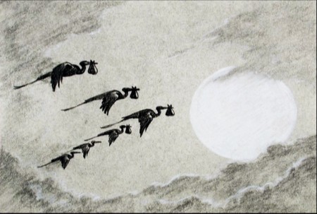
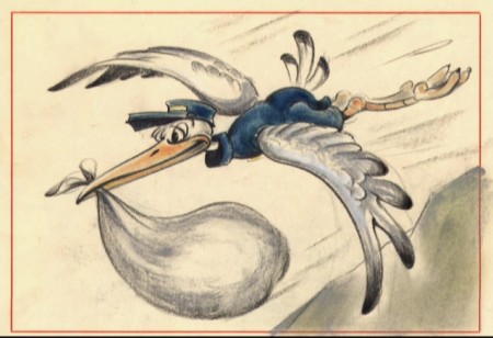
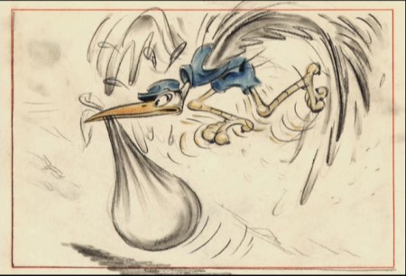
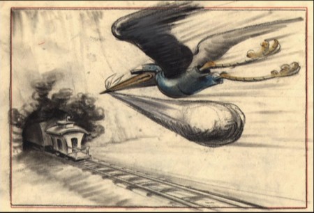
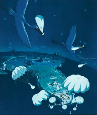
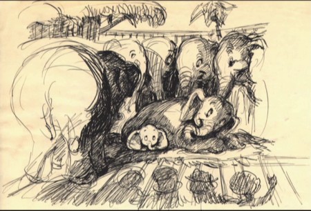
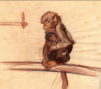
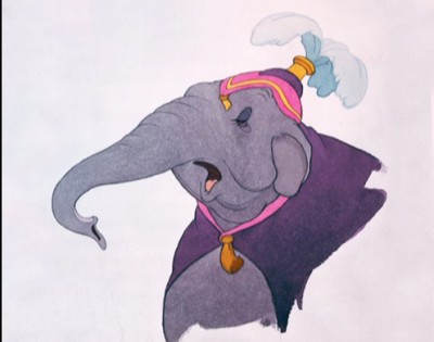
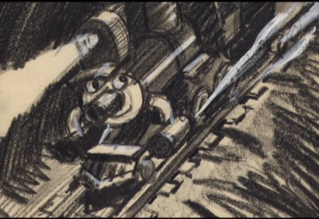
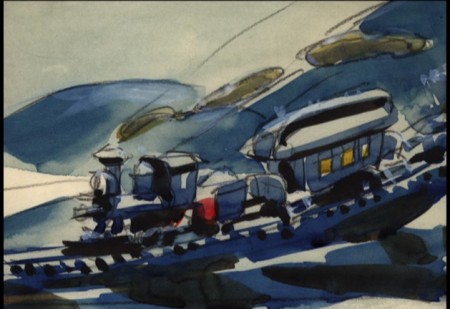
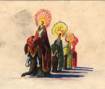
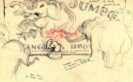
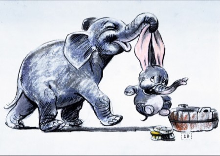
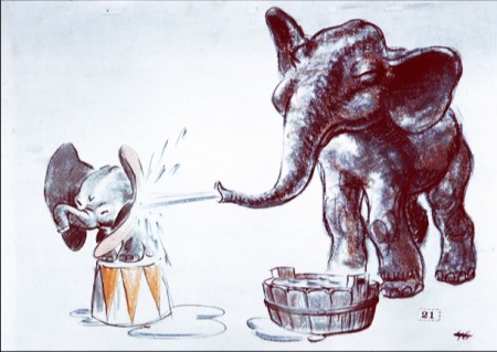
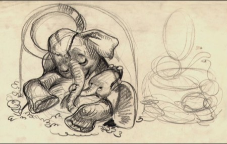
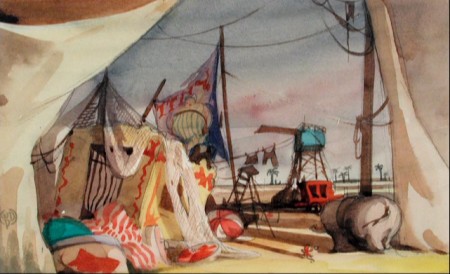
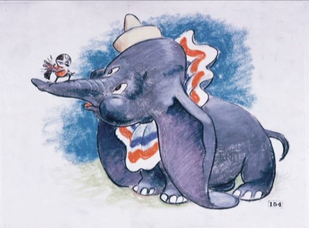
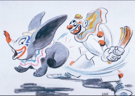
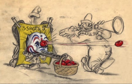
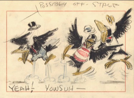
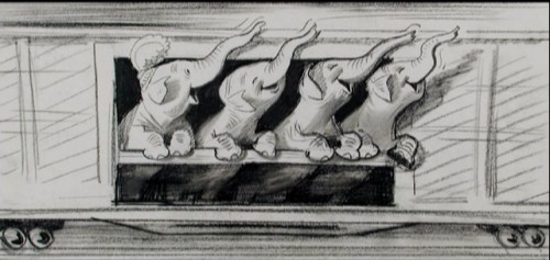
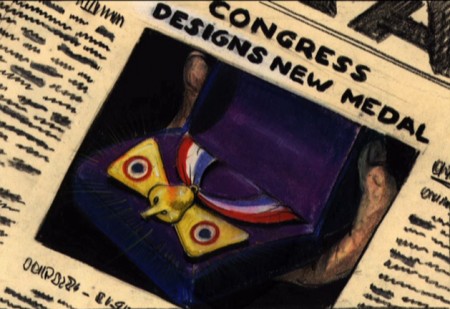
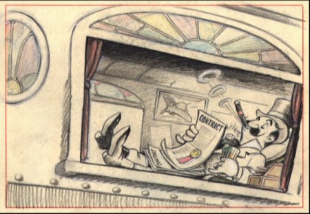
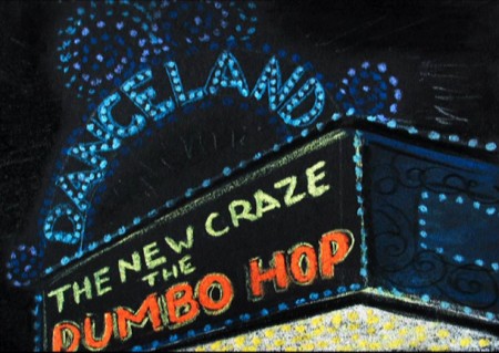
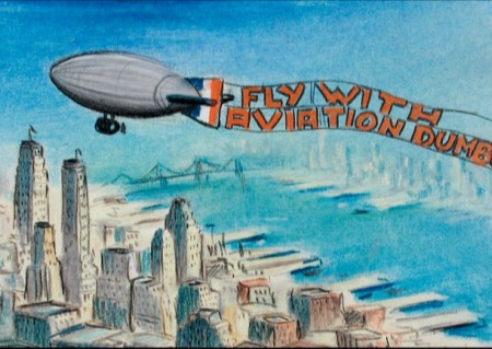
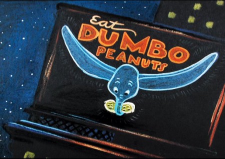
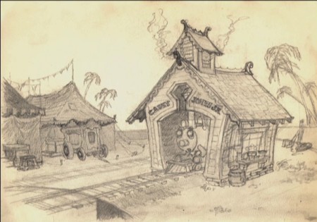
I’ve spent a lot of recent posts writing about the animation of some of the earlier features. I thought I’d give a little focus on the storyboard of Dumbo. The variety and styles of the images is impressive. I’ve culled a lot of storyboard drawings from various sources and present in somewhat chronological order.
This was the first feature Bill Peet worked on. You can see his entire “Dumbo washing” sequence storyboard here.
 1
1
