Category ArchiveTheater
Art Art &Books &Commentary &Illustration &Layout & Design &Theater 02 Jul 2013 05:05 am
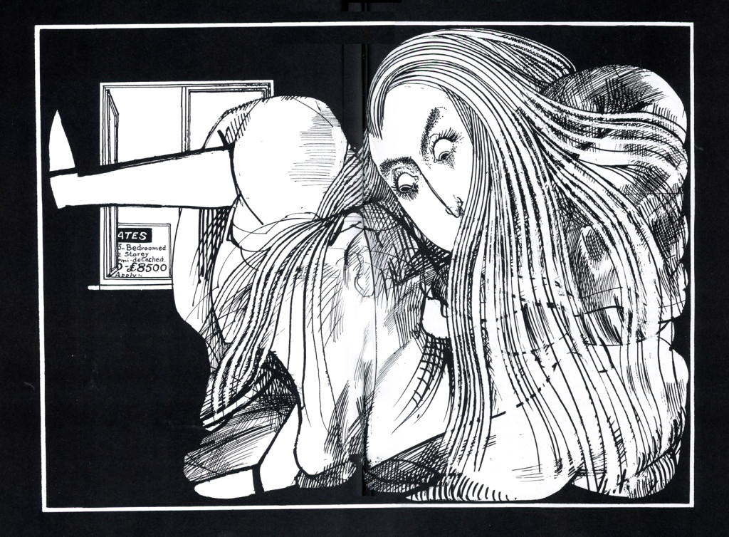
Alice via Steadman – 1
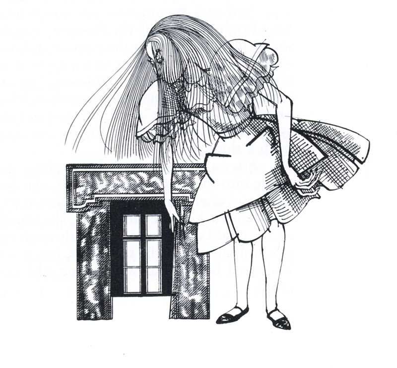
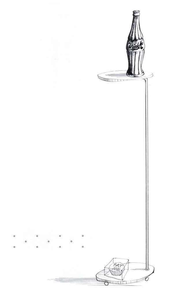
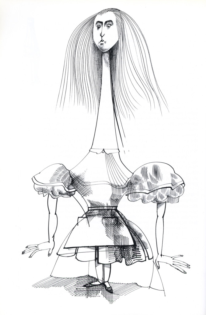
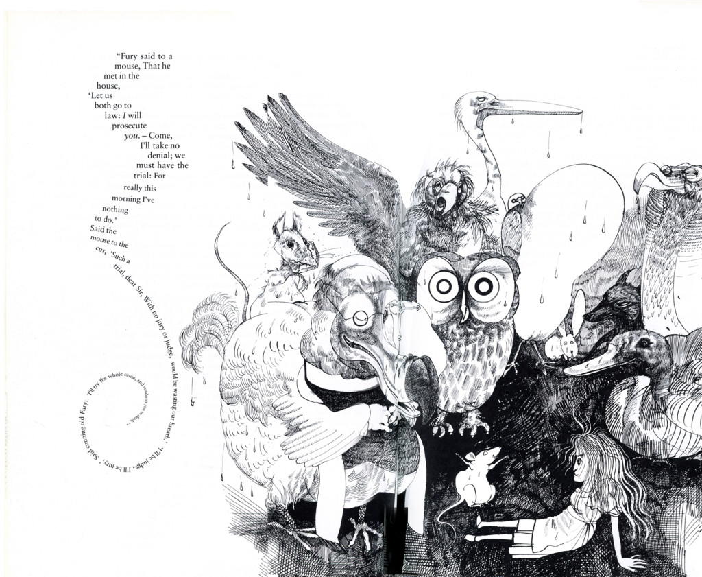
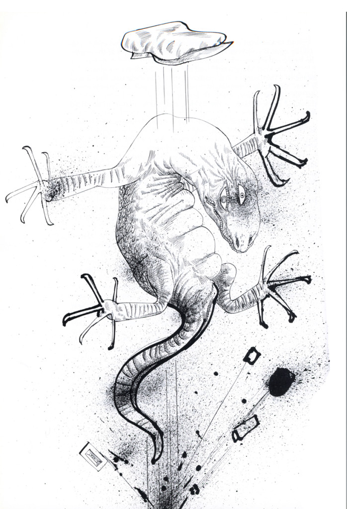
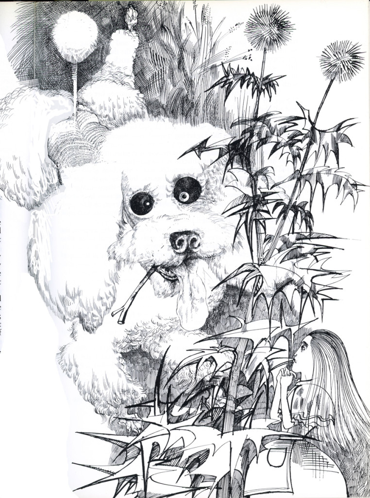
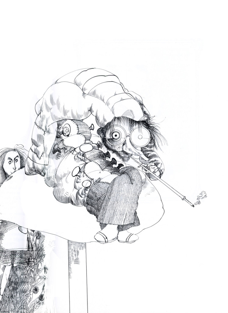
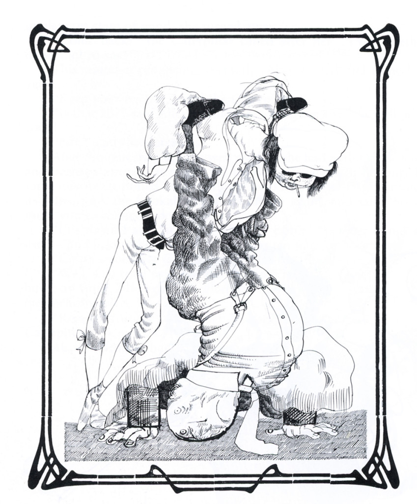
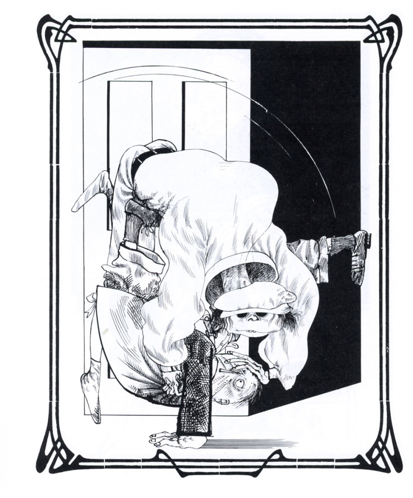
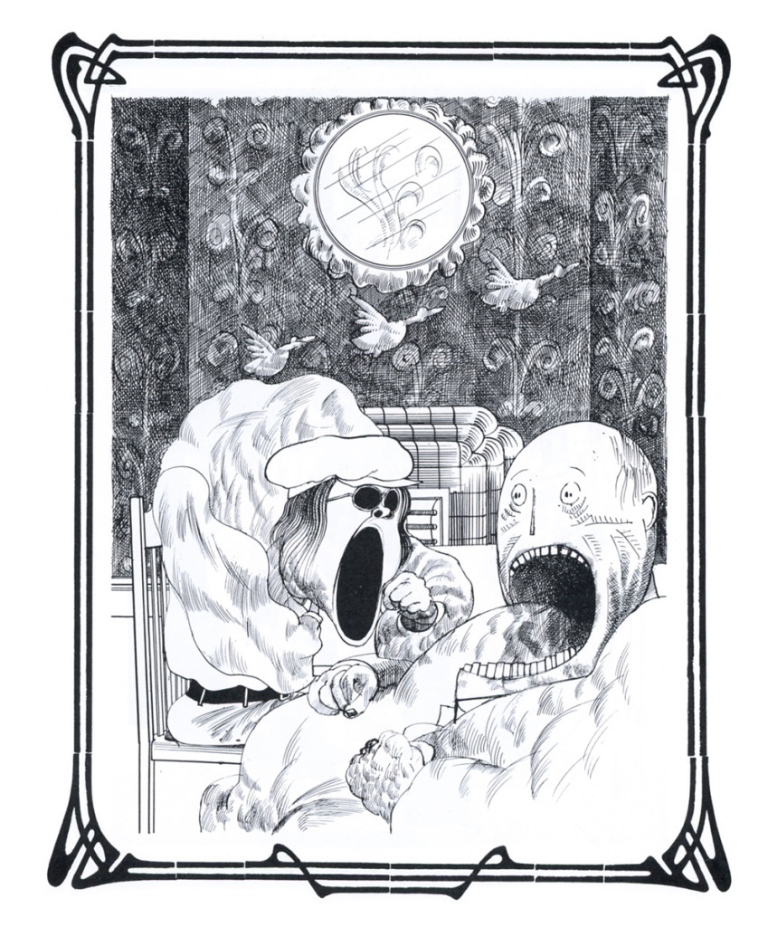
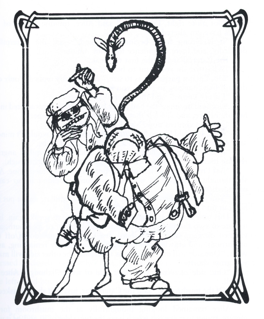
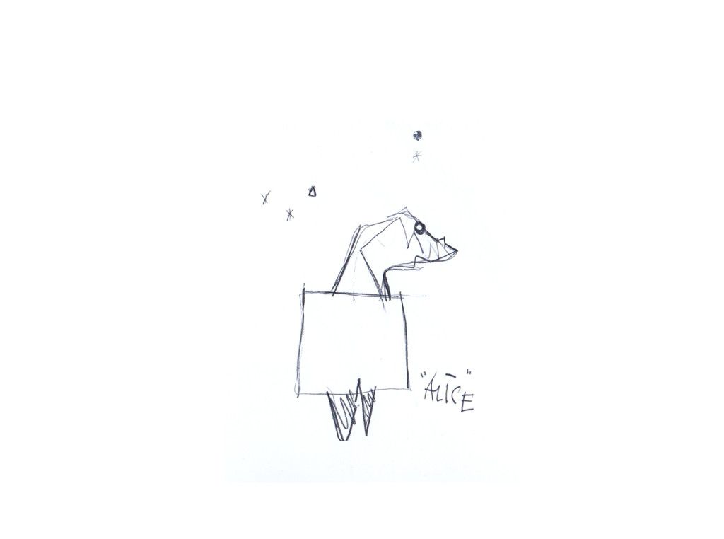
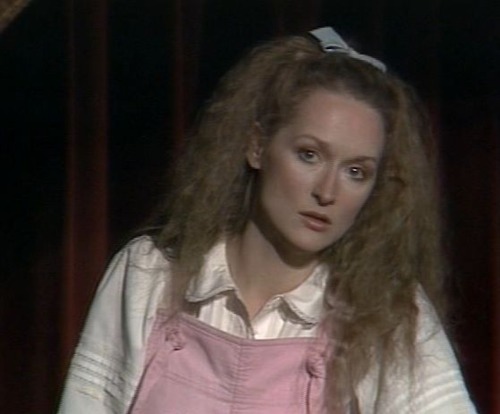 I am one of those insane people who is in love with Carroll’s Alice in Wonderland. I also am devoted to Ralph Steadman as probably my favorite illustrator. Steadman has published a glorious version of Alice, and I need no more than show some of the illustrations. Here’s the first in a series of posts of Alice by way of this original artist. Truly different from anyone else’s version.
The rumor was that Steadman had seen Meryl Streep performing as the lead on stage in New York, as part of the Joe Papp’s NY Shakespeare Festival, and he’d never been able to get that image out of his head.
I can quite understand since I also saw that very odd and interesting production and still remember it well.
I hope you enjoy this art as much I enjoyed working these images. There’s a lot more, and it will come in parts.
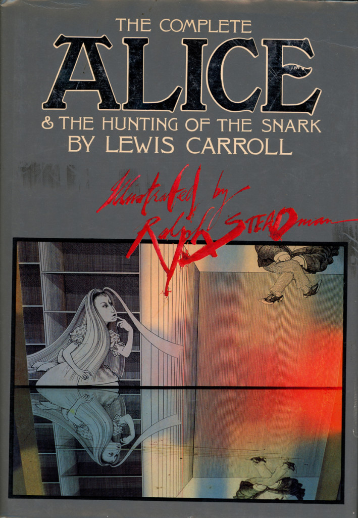
The book’s cover . . . .
Books &Illustration &Theater 12 Jun 2013 05:41 am
Into the Woods Book
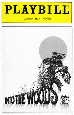 Into the Woods is one of the highlights from the number of musicals Stephen Sondheim has written. The show takes many famous fairy tales and plays them out through the first half of the show.
With the start of the second Act, we learn the fate of all these fairy tale characters. They’re all victims of their own cupidity. Jack, for example, stupidly sells his family cow for five “magic” beans. The beans are discarded by his angry mother, and Jack climbs into the heavens on that beanstalk.
Once there, Jack falls into his greatest vices, stealing a chicken that lays golden eggs and a magic golden harp. When the giant chases him to get his things back, he falls to earth and dies. Sondheim and cowriter, James Lapine, take the story more seriously and has all the evil of the characters pla itself out, with their suffering for their own irresponsibility.
The show was somewhat successful when it was written, and it was immediately designed to become a live action/animation mix m0vie. Rob Minkoff, one of the directors of The Lion King as well as Stuart Little, was set to direct the film. It eventually fell through, and it’s back in production again with a different director, Rob Marshall (Chicago). Needless to say, there’ll be no animation in the movie anymore. A lot of computer effects.
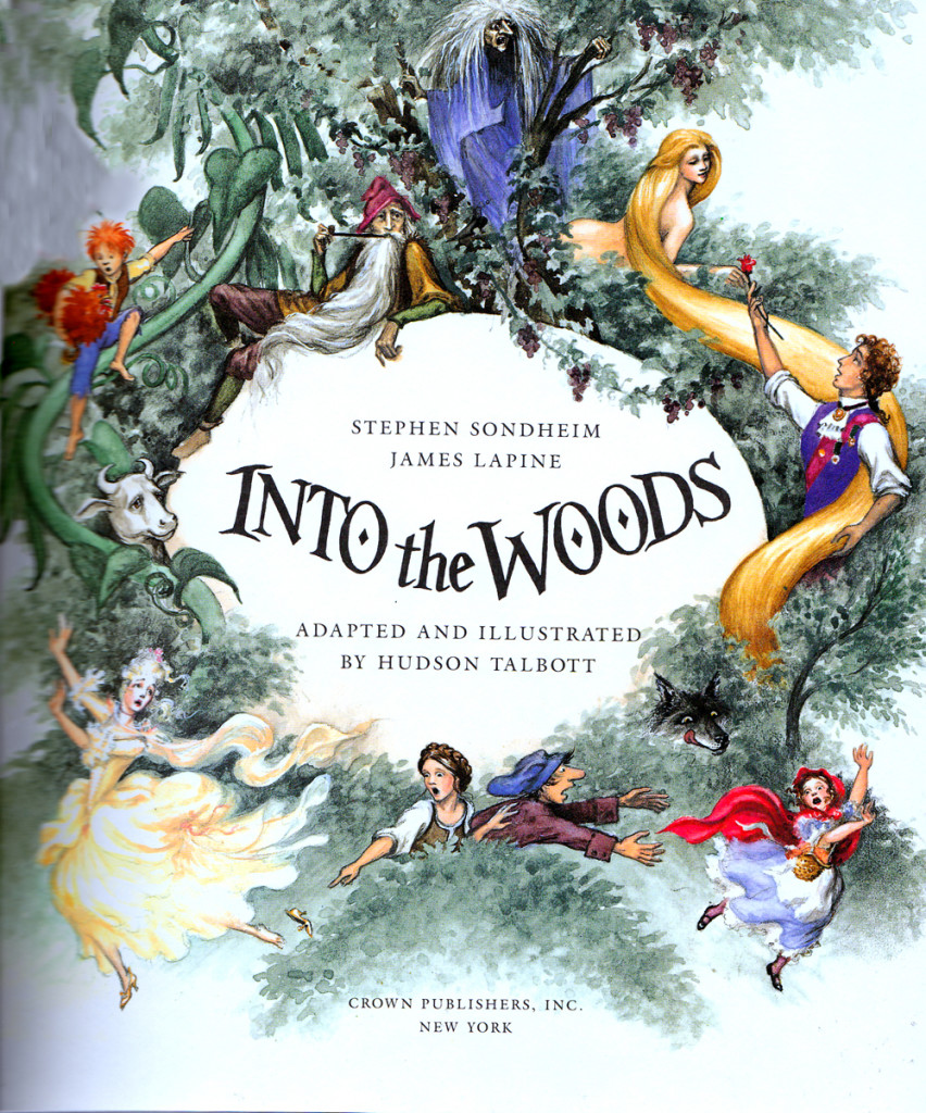
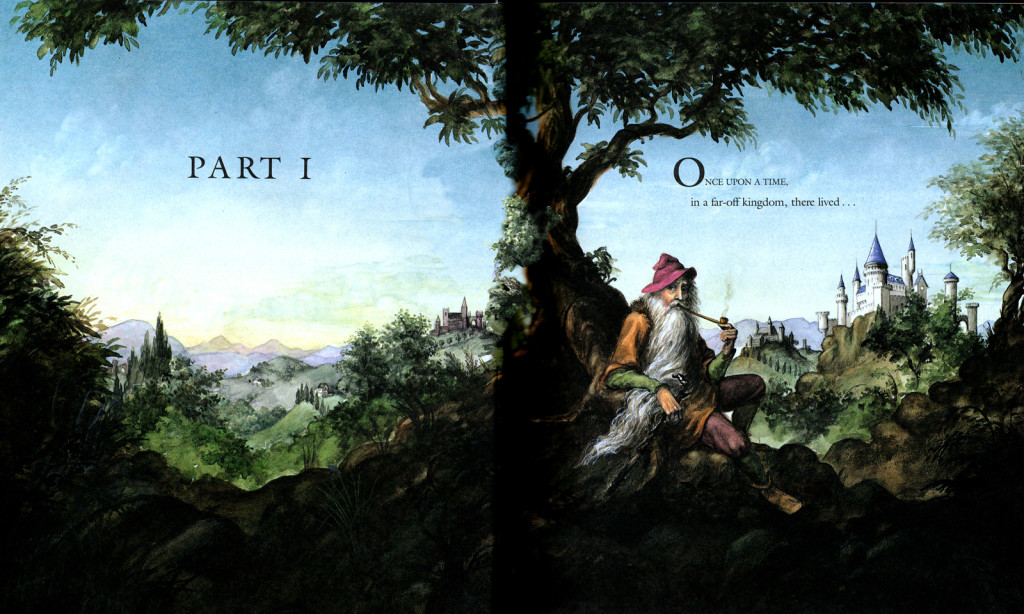
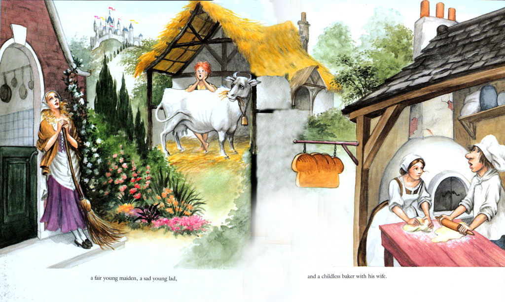
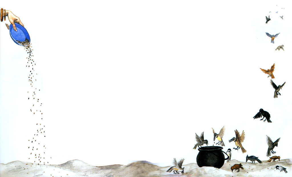
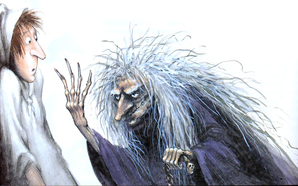
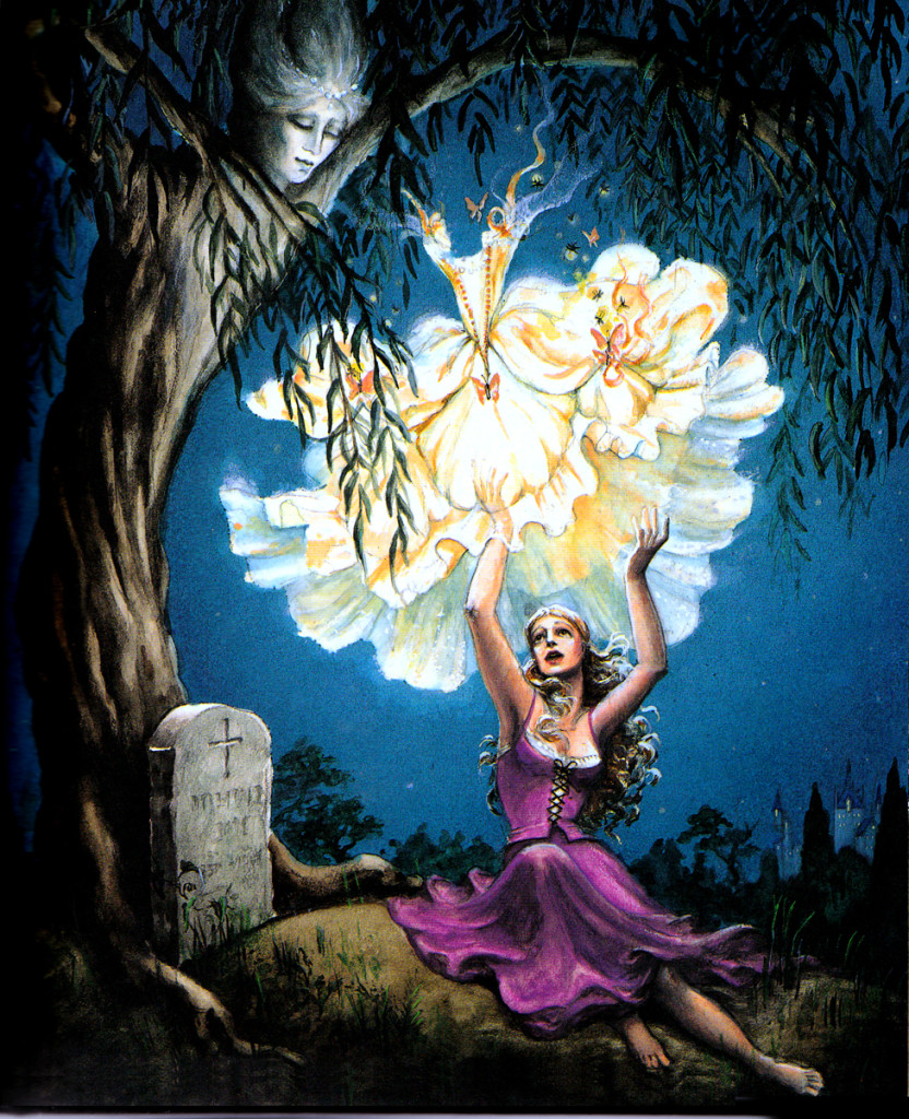
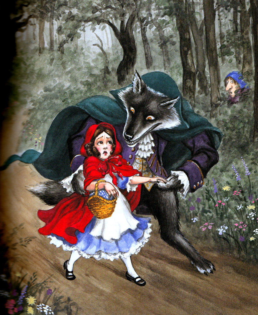
When it was just a NY theatrical musical, the piece was turned into a large children’s book. I thought it might be fun to post some of it here. So, as of today I’ll offer about two or three posts with a focus on the book’s writer/illustrator, Hudson Talbott.
Talbott was the original writer of “We’re Back! A Dinosur’s Story.” That was made into an animated feature for Steven Spielberg back in 1993. He’s also done many designs and illustrations for the Metropolitan Opera Guild and the Metropolitan Museum of Art.
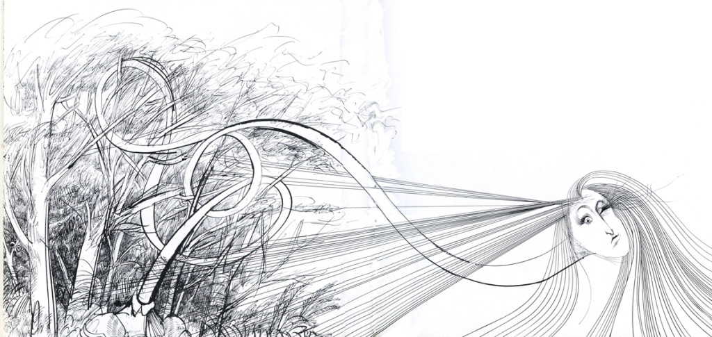
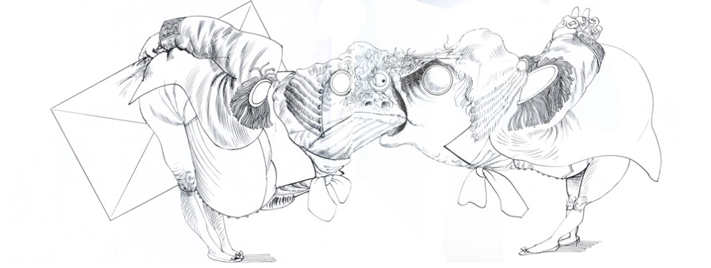
Here are some of the first pages of the book. Note that I’m only posting the illustrations.
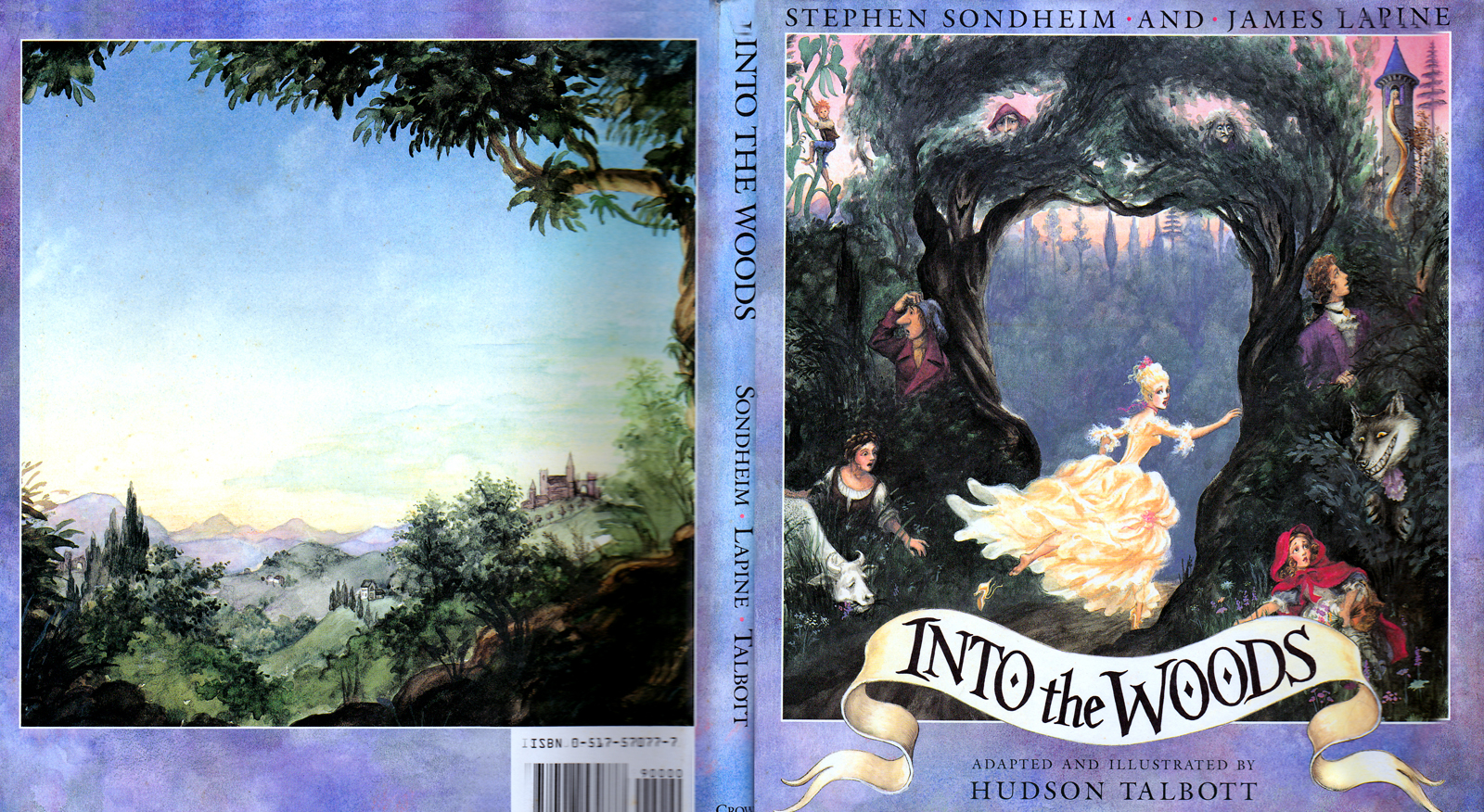
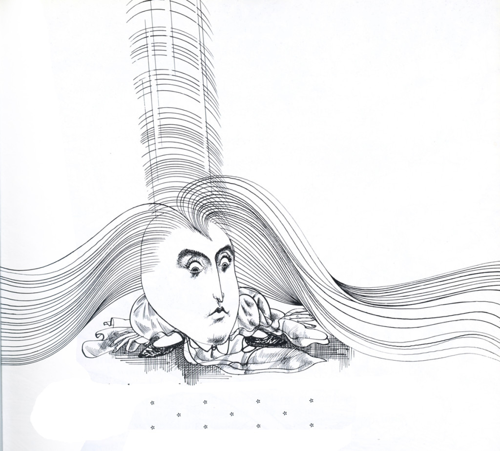
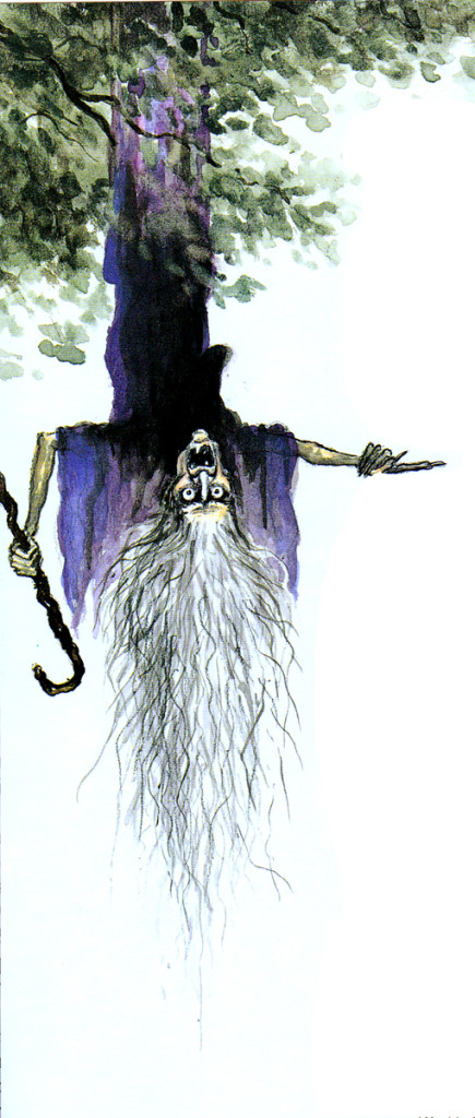
Dust Jacket Art
No, this is not upside down, except by design.
Art Art &Books &Theater 29 May 2013 07:12 am
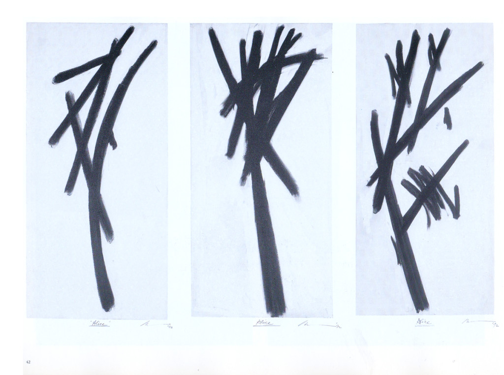
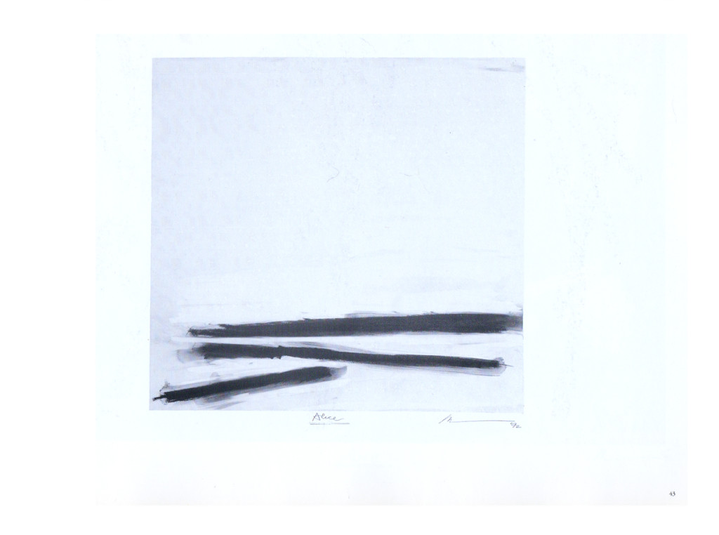
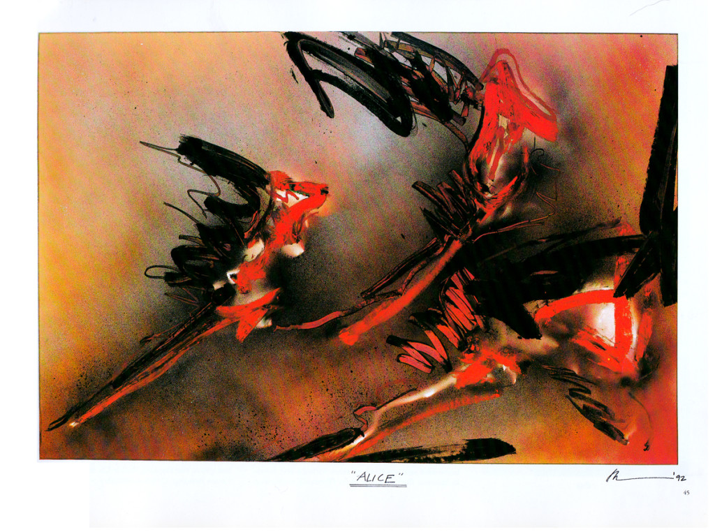
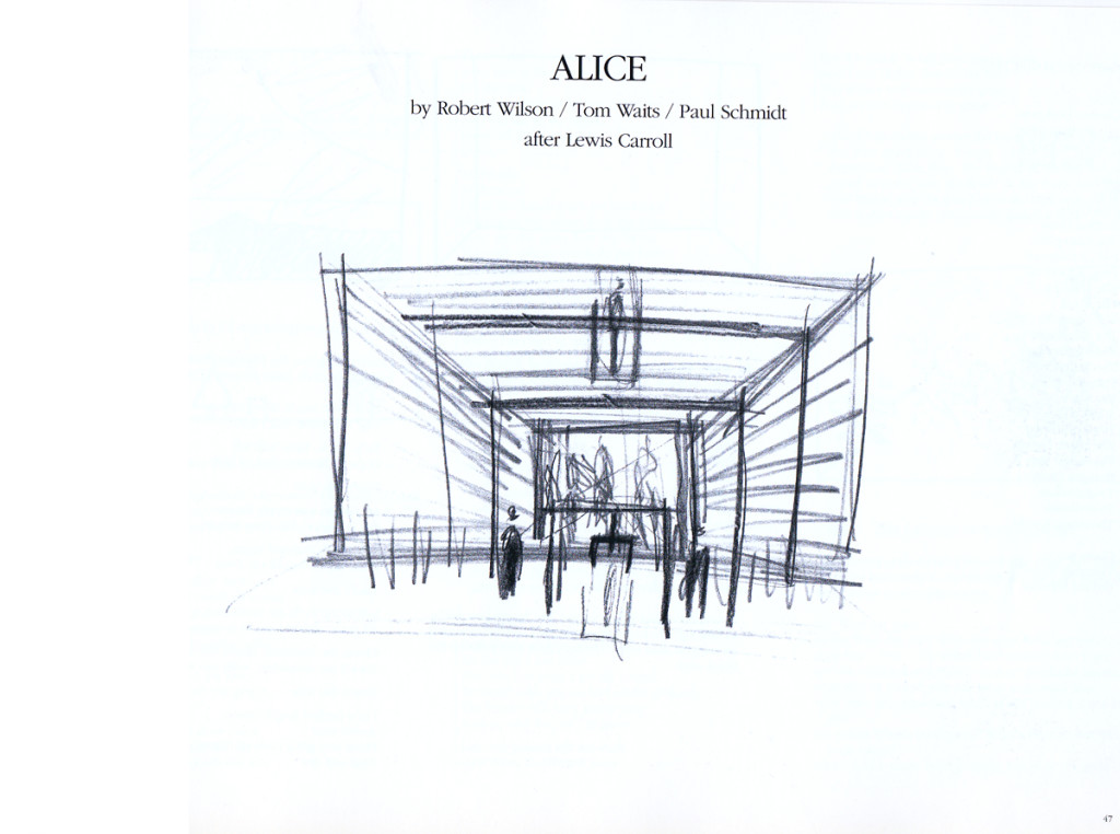
Robert Wilson’s Alice
I love Robert Wilson‘s work. He’s an artist who creates theater and theatrical events. His opera, Einstein on the Beach, composed by Phillip Glass, made the reputations for both of them. Wilson has worked with many of the key avant garde composers, everyone from David Byrne to Tom Waits. He’s done many pieces with Phillip Glass.
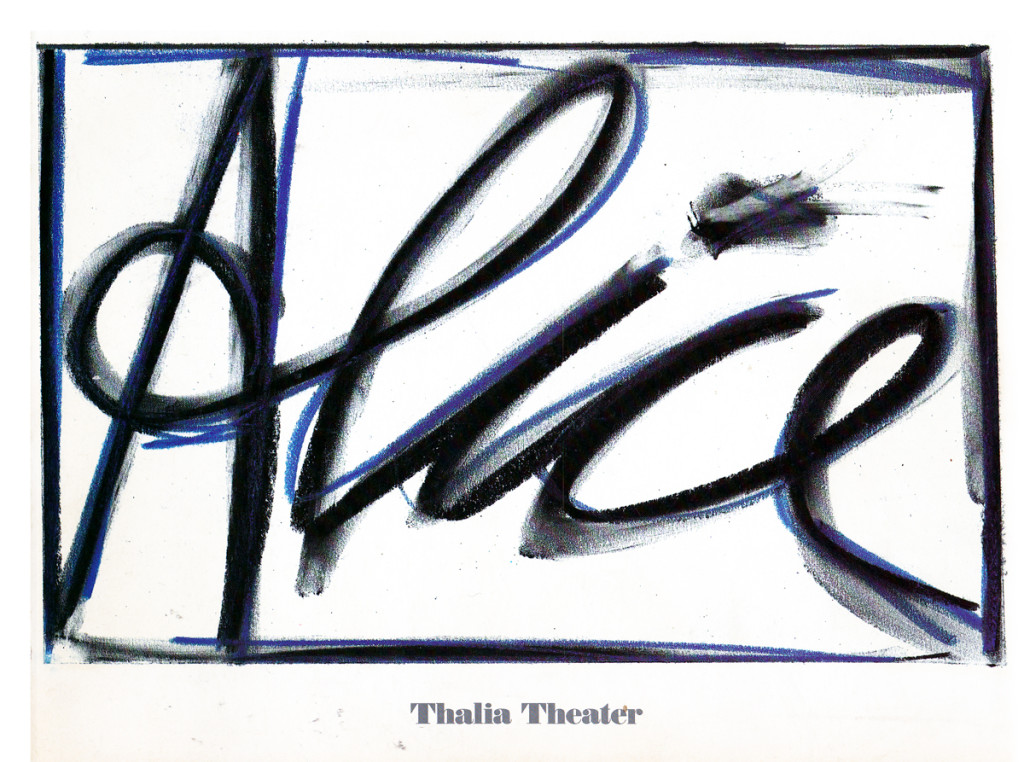
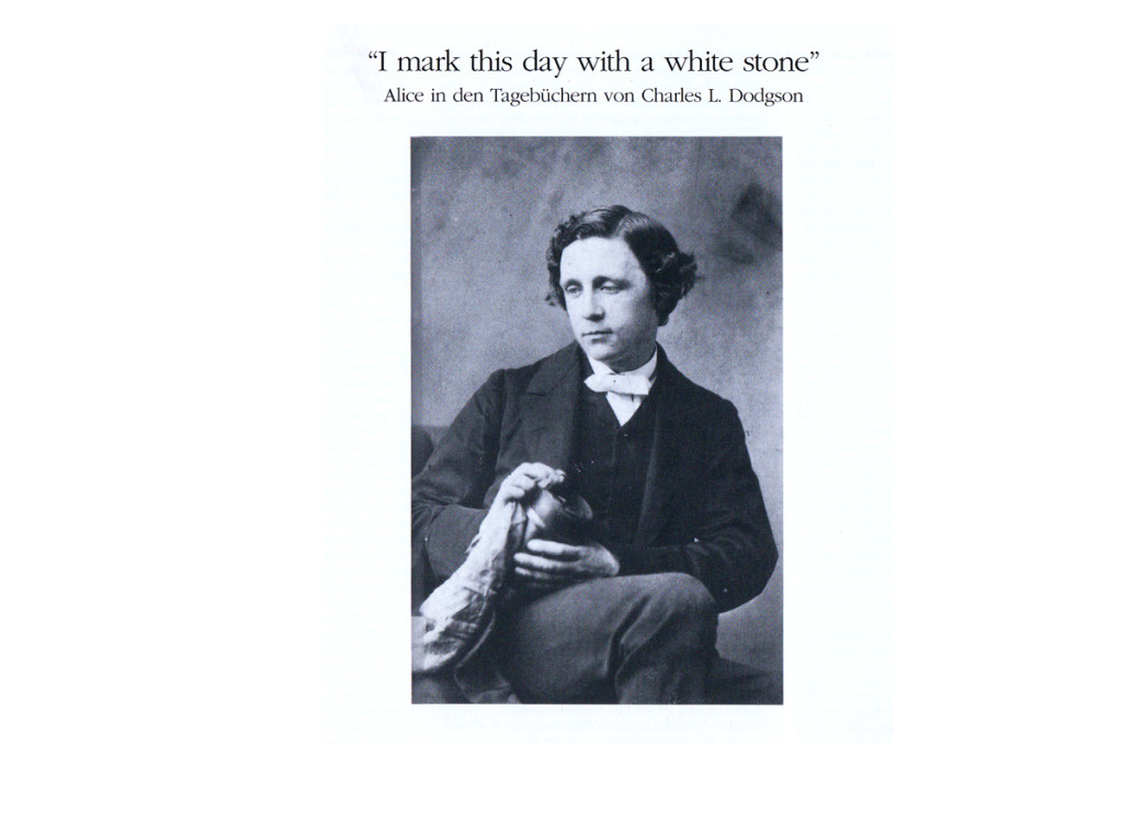
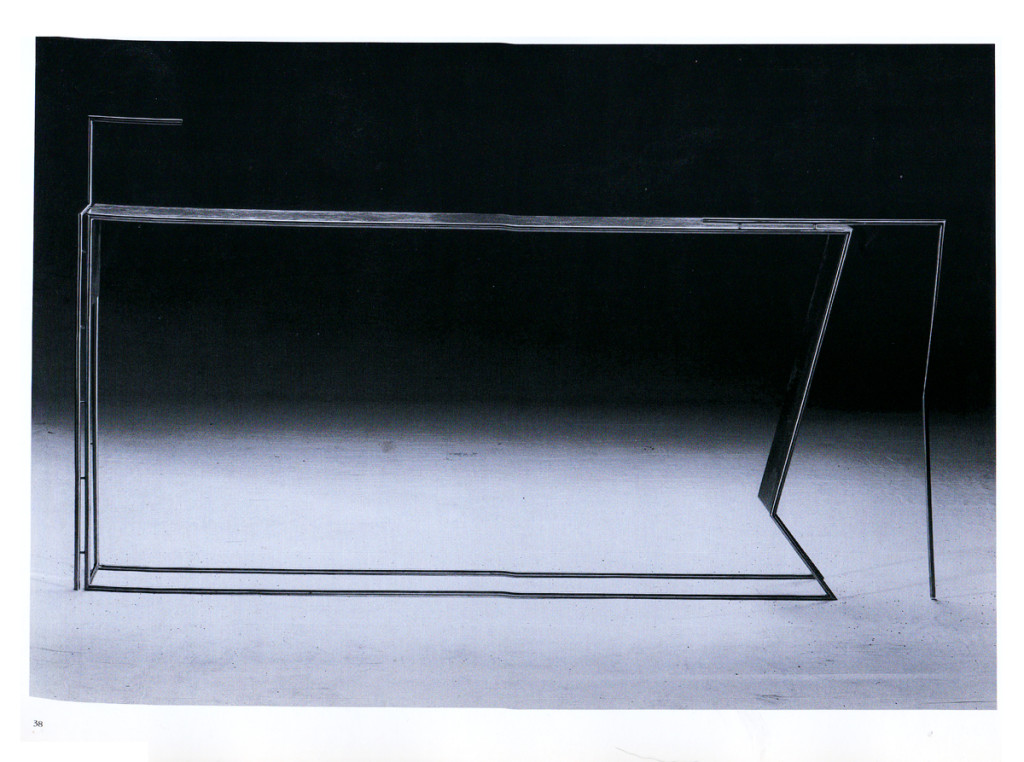
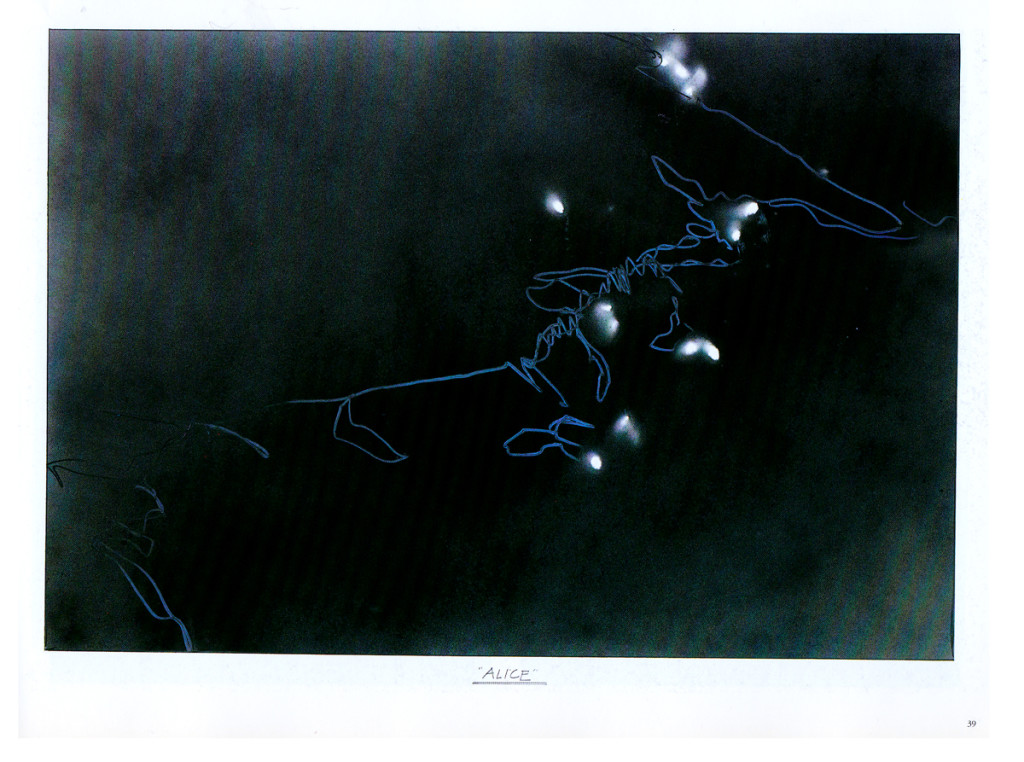
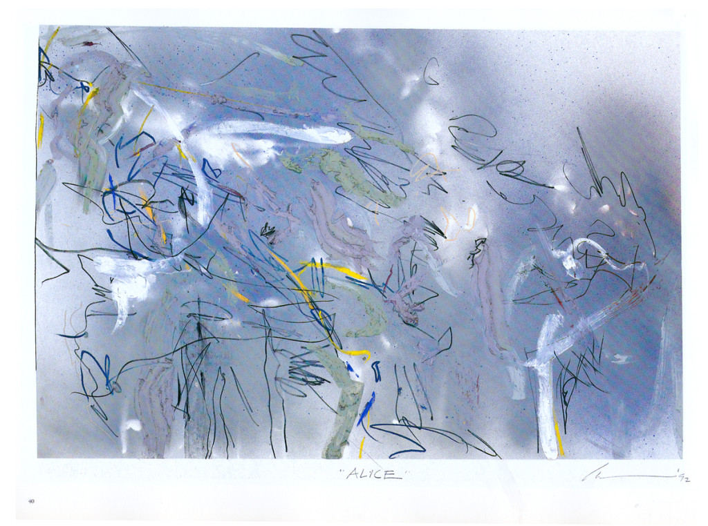
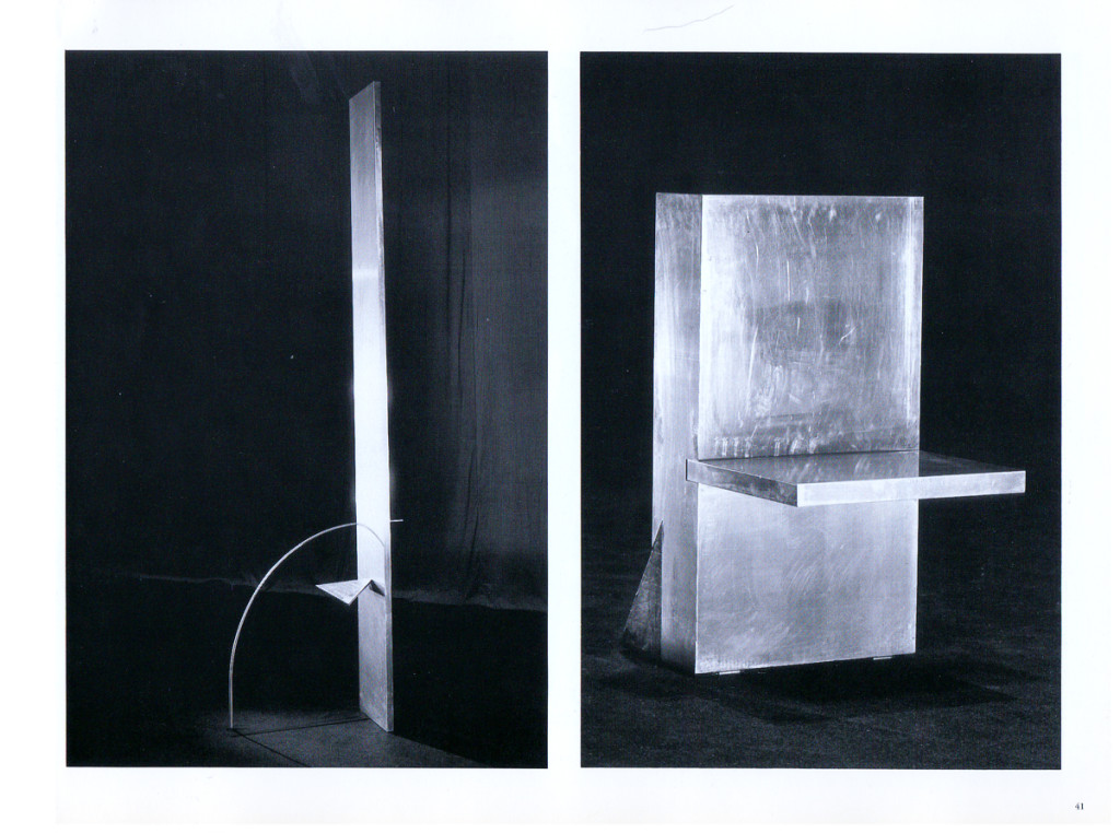
His work, Alice, premiered in 1992 at the Thalia Theater in Germany. The song score was written by Tom Waits and is an original. The story combines the story of Alice Liddell with Carroll’s invention.
I saw the show in 1993 when it played at the Brooklyn Academy of Music and was completely taken by it. This souvenir book was sold at BAM. The first half focuses on Alice Liddell’s life as well as Carroll’s writing. This part of the book is in German and is illustrated with a lot of drawings done by Carroll,
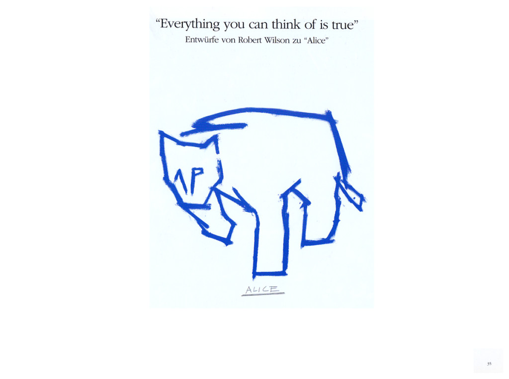
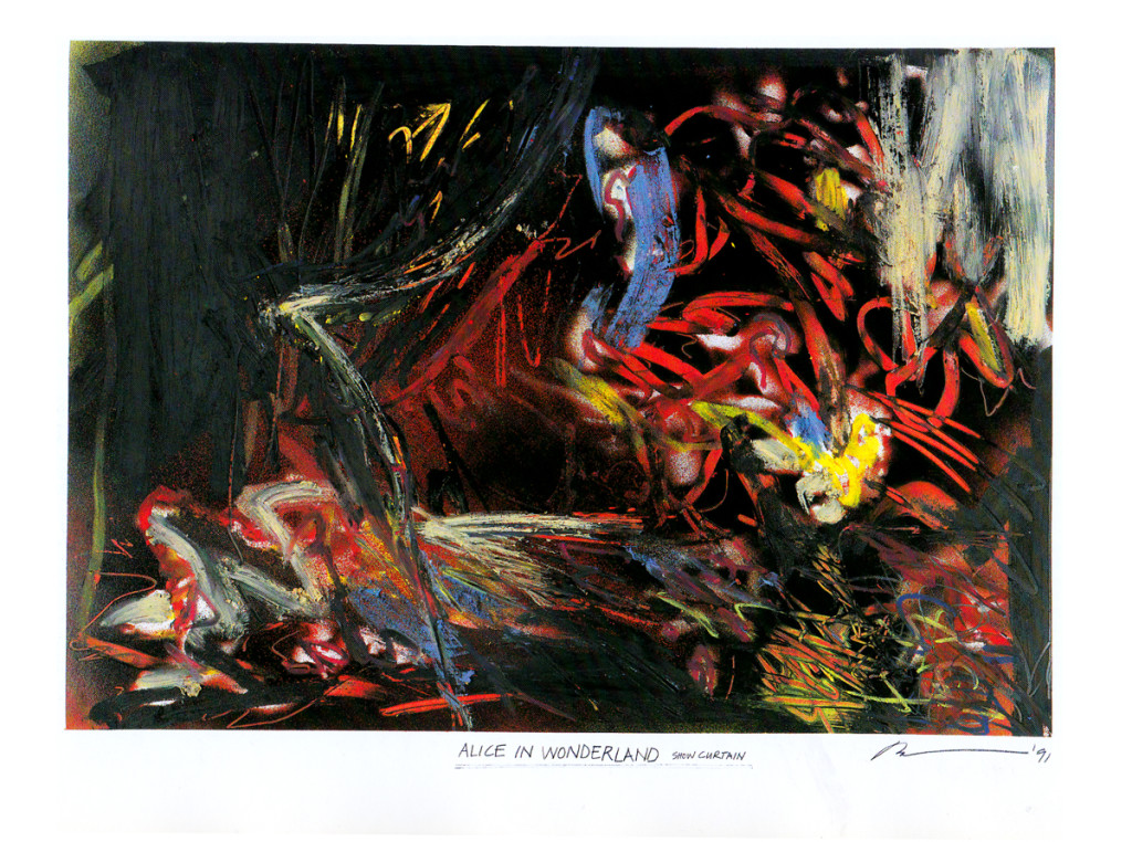
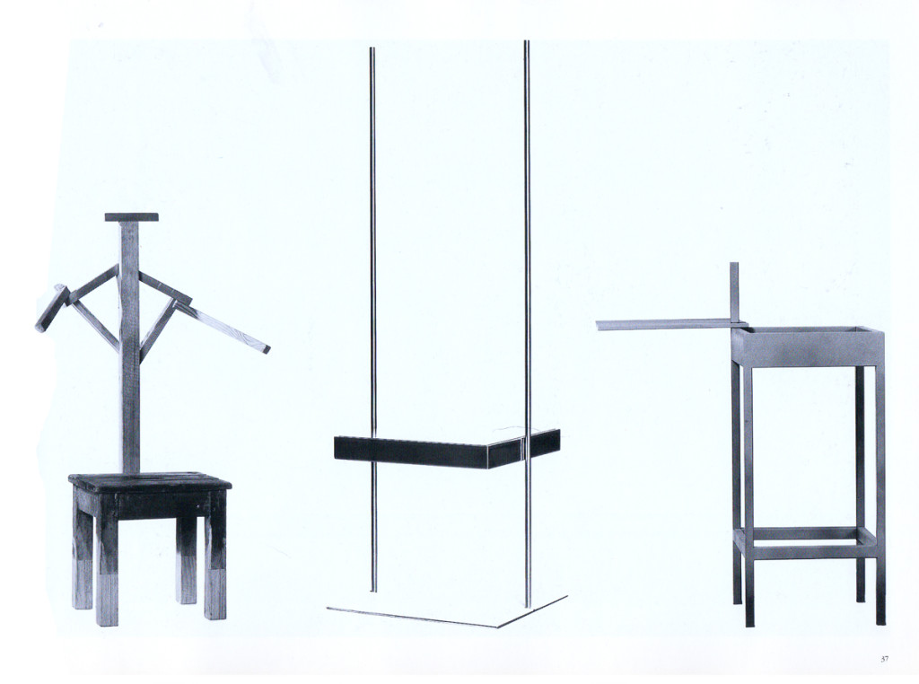
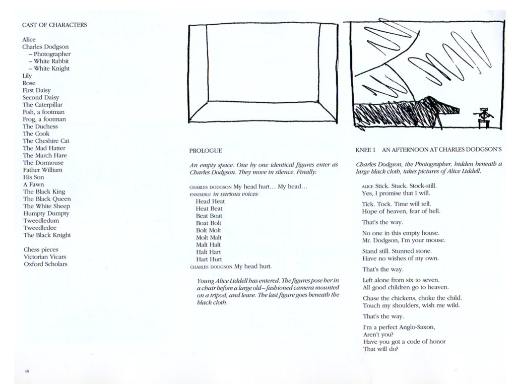
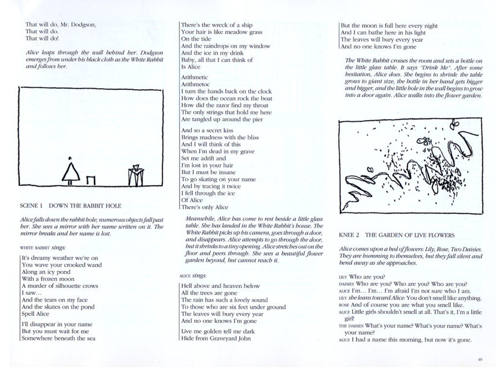
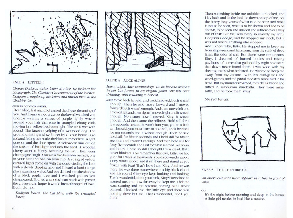
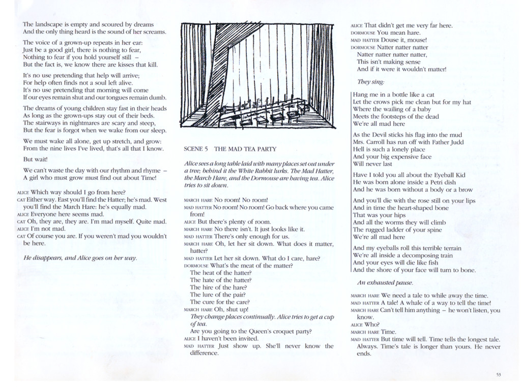
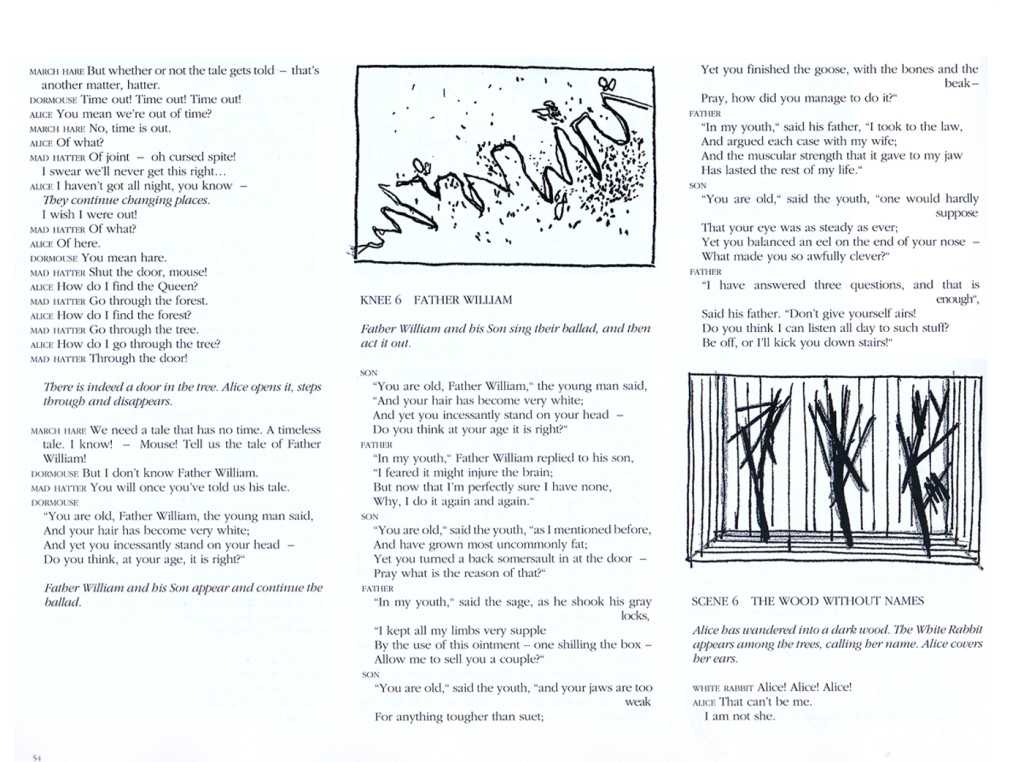
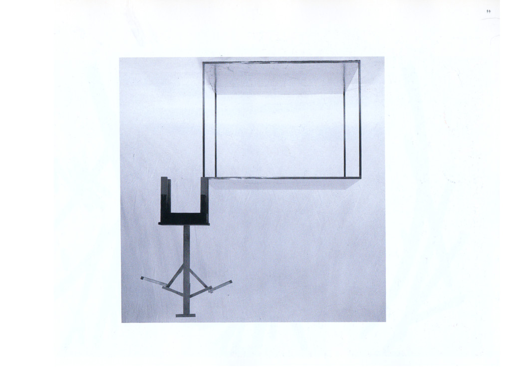
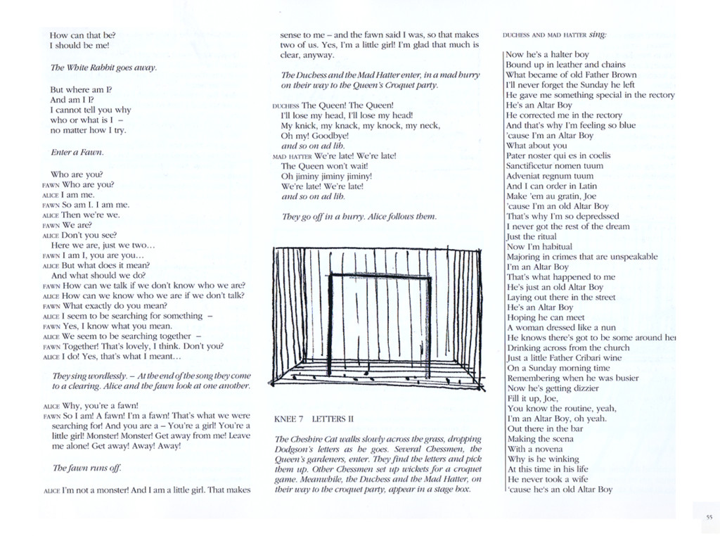
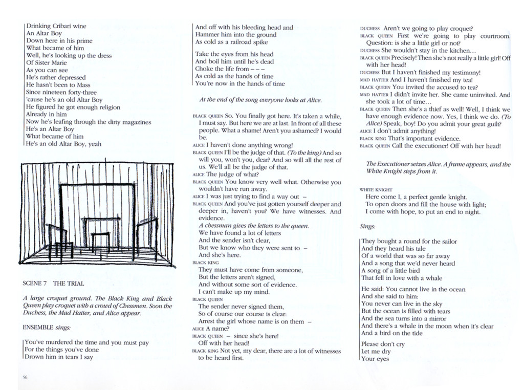
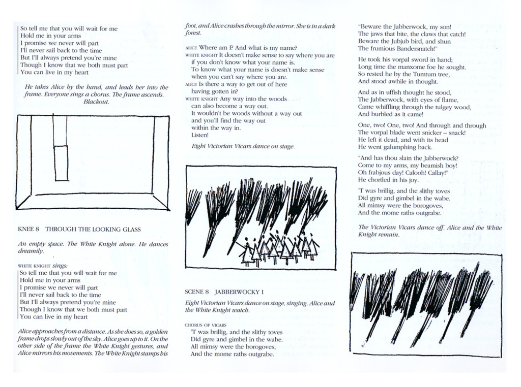
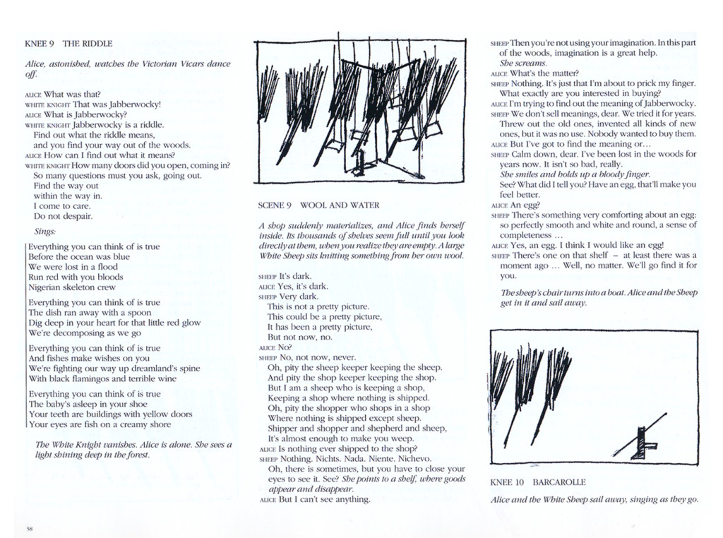
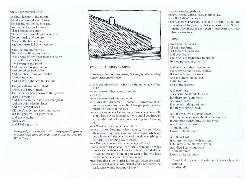
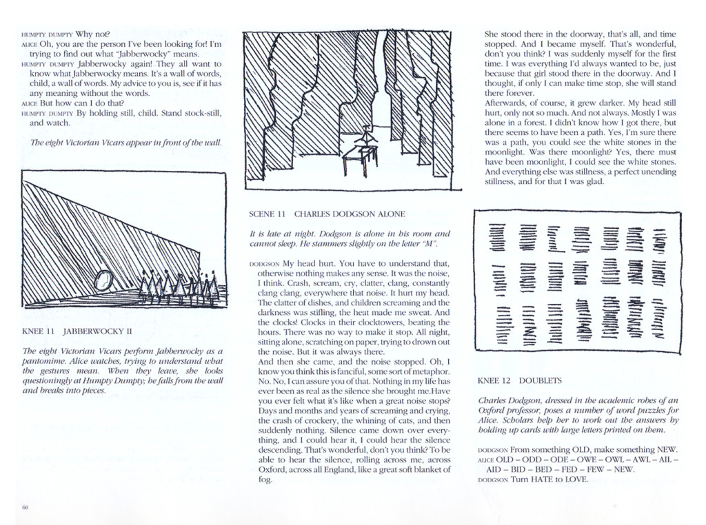
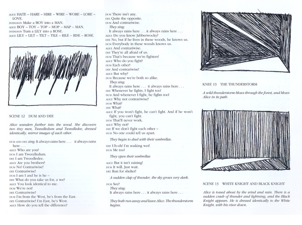
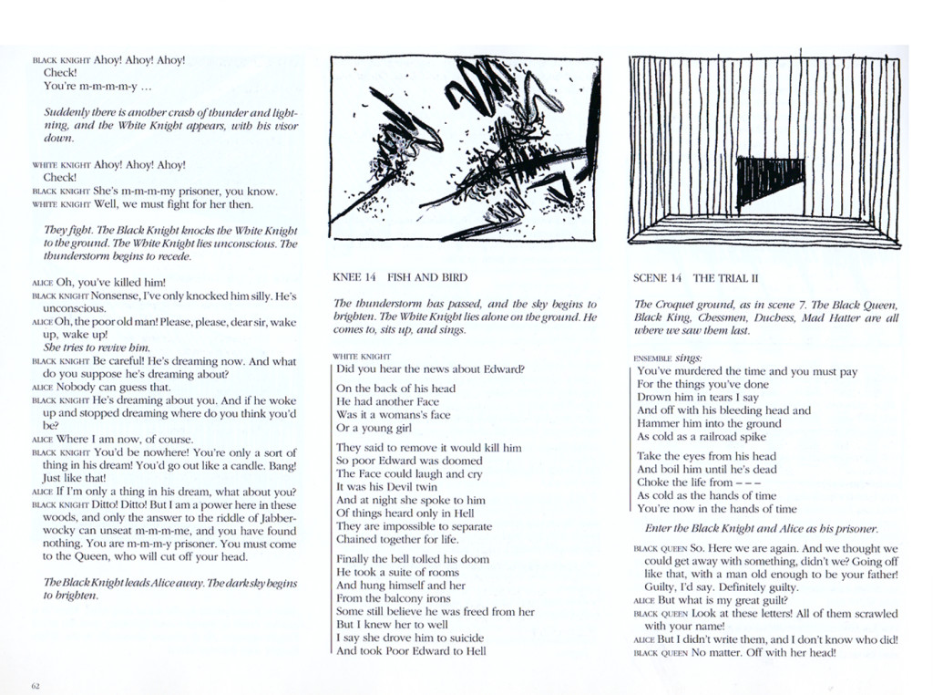
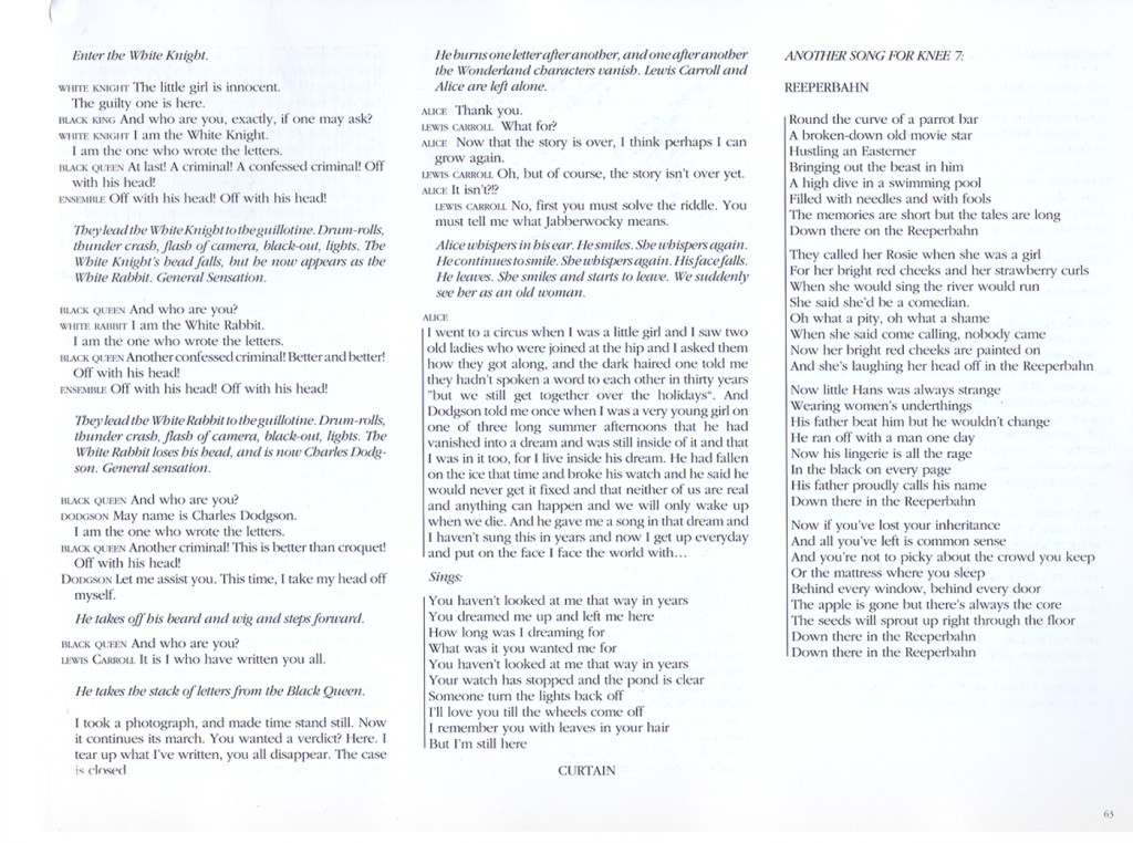
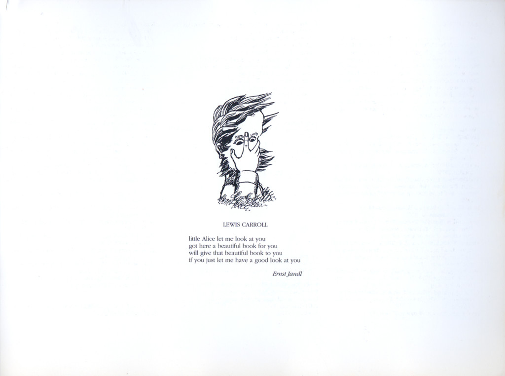
The second half begins with paintings and sculpture that Carroll did, inspired by the work. Then you get a copy of the play illustrated with quick sketches by Wilson.
Here are those two sections. (Click any image you want to enlarge to read.)
 1
1
Animation &Animation Artifacts &Commentary &SpornFilms &Theater 19 May 2013 06:09 am
WOTY – again
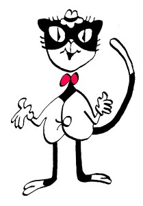 – I’ve posted a couple of pictures from Woman of the Year (called WOTY by those in the know) in the past but thought I go a touch deeper now.
Woman of the Year was a project that came to me in the very beginning of my studio’s life – 1981. Tony Walton, the enormously talented and fine designer, had gone to Richard Williams in search of a potential animator for WOTY (as we got to call the name of the show.) Dick recommended me. But before doing WOTY, there were some title segments needed for Prince of the City, a Sidney Lumet film. (I’ll discuss that film work some other day.)
Tony Walton designed the character, Katz, which would be the alter-ego of the show’s cartoonist hero, played by Harry Guardino. Through Katz, we’d learn about the problems of a relationship with a media star, played by Lauren Bacall. (All images enlarge by clicking.)
.
It turned out to be a very intense production. Three minutes of animation turned into twelve as each segment was more successful than the last. There was no time for pencil tests. I had to run to Boston, where the show was in try-outs, to project different segments weekly; 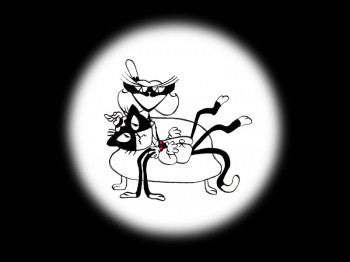 these went into the show that night – usually Wednesdays. I’d rush to the lab to get the dailies, speed to the editor, Sy Fried, to synch them up to a click track that was pre-recorded, then race to the airport to fly to the show for my first screening. Any animation blips would have to be corrected on Thursdays.
There was a small crew working out of a tiny east 32nd Street apartment. This was Dick Williams‘ apartment in NY after he;d finished Raggedy Ann. He was rarely there, and when he did stay in NY, he didn’t stay at the apartment. He asked me to use it as my studio and to make sure the rent was paid on time and the mail was collected. Since we had to work crazy hours, it was a surprise one Saturday morning to find that I’d awakened elderly Jazz great, Max Kaminsky, who Dick had also loaned the apartment for a night. Embarrassed, at the awkward confrontation, I ultimately moved to a larger studio – my own – shortly thereafter. Dick was convinced I was upset at him and the two of us didn’t talk for years afterward.
Here are a couple of photos of some of us working on WOTY:
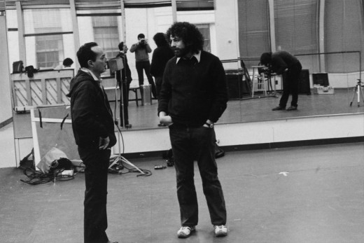
Tony Charmoli was the show’s choreographer. He worked with me in plotting out the big dance number – a duet between Harry Guardino and our cartoon character. I think this is the only time on Broadway that a cartoon character spoke and sang and danced with a live actor on stage. John Canemaker is taking this photograph and Phillip Schopper is setting up the 16mm camera.
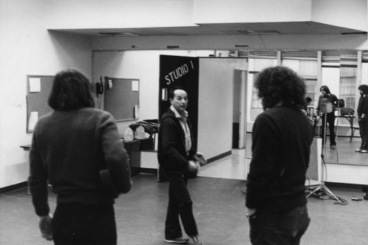
Here Tony Charmoli shows us how to do a dance step. Phillip Schopper, who is filming Tony, figures out how to set up his camera. We used Tony’s dancing as reference, sooting Tony’s dancing in 16mm, but our animation moves were too broad for anyone to have thought they might have been rotoscoped.
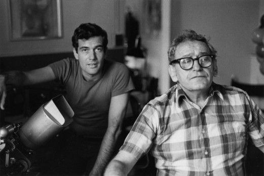
John Canemaker worked with Sy Fried, our editor. John did principal animation with me on this one big opening number. Here they’re working with the click track and the live footage of Tony Charmoli to plot out the moves.
At one point I asked John to have the character, Katz, flick his tale at Harry Guardino, tripping the live actor mid-dance. It got a laugh at every performance.
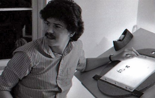
Steve Parton supervised the ink and paint. To get the sharpest lines, we inked on cels and didn’t color the drawings. It was B&W with a bright red bow-tie. A spotlight matte over the character, was bottom-lit on camera by Gary Becker. It was shot almost like a pencil test with high contraxt to get those very sharp lines.
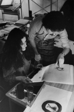 5
5 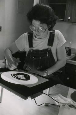 6
6
5. Steve Parton works with painter Barbara Samuels
6. Joey Epstein paints with fire in her eyes.
 8
8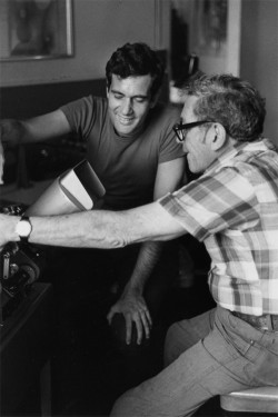 9
9
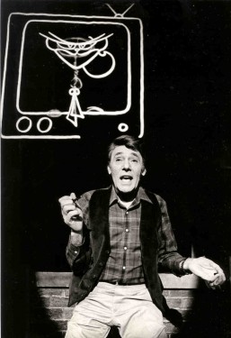
8. Harry Guardino on stage with the creation of “Tessie Kat” developing on screen behind him. This was Harry’s first big solo.
The filmed segment was shot backwards so the matte would develop as the song sang on.
The entire seqeunce took about 2½ minutes.
9. John Canemaker gets to see some of his animation with Sy Fried, editor.
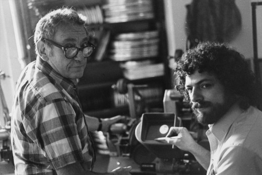
One of my quick stops from the lab on the way to Boston? No, I think this is a posed photo.
All together we had more than 12 minutes of animateion song duets between Harry Guardino and Katz. It was originally supposed to be three pieces totaling about five minutes. The animation was so successful in the tryouts in Boston that they kep adding more material. Finally the last song added – about 1½ minutes never made it to New York. Harry never properly learned it in Boston and he was too nervous for the Broadway opening to learn it for the big Opening. So the number was cut.
Lately there’s been more animation on Broadway and off-Broadway. Things are done with digital screens, and the technical aspect has gotten easier. One version of Sunday In the Park with George had painted backgrounds developing via animation as the characters sang their songs. Too bad the show didn’t offer the heart that was in the original Sondheim gem, when here wa no animation involved. Hopefully, eventually there will be something more. We did a show that was very successful (the show wasn’t successful; the animation was.) I’d love to try again. The only other try I had was to do musical scenics for the Overture to Meet Me In St. Louis on Broadway. The producers were irritants and didn’t help move things forward. I did get to meet the songwriter, Hugh Martin, before he passed away. That was my treat in that project.
Art Art &Theater 29 Jul 2012 08:20 am
Sue Coe in Nightcourt – revisit
- Just in the past couple of weeks, one of my favorite current artists, Sue Coe, had a show in NY at the Galerie St. Etienne. Ms. Coe is very much akin to my favorite current playwright, Caryl Churchill. They’re both so brilliantly political. Last night, I saw an excellent production of Ms. Churchill’s anti-Thatcher play, Serious Money. Despite the very low budget, off-Broadway production, the show was every bit as great as I’d hoped. I tried to find something that was marginally related for today’s Splog, and I’ve decided to recap this Sue Coe post. Especially because it links to others about Ms. Coe’s work, I thought it very appropriate.
I feel as though I need a larger dose from the Coes and Curchills of the world as Mitt Romney bounds about the airwaves these days.
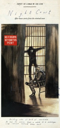
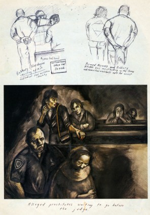
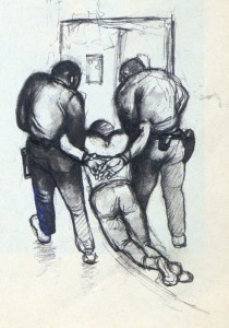 – Sue Coe is one of my favorite current artists. A wholly political artist, it seems to me that she is the extension of the German Expressionists, focusing on man’s inhumanity to man, or Goya‘s Caprichos or Ben Shahn‘s attention to political injustice. All of her work seems to fit into this form, and I am completely attracted to it.
She is represented by the Galerie St. Etienne, in New York. Years ago, I was there, arranged by HBO, to see some paintings by Grandma Moses. While they pulled out the paintings for me, I was able to see a stack of lithographs by Sue Coe, and it made for a memorable day for me.
I’ve posted a number of other pieces about her and will probably do it again. You can view a couple here and here.
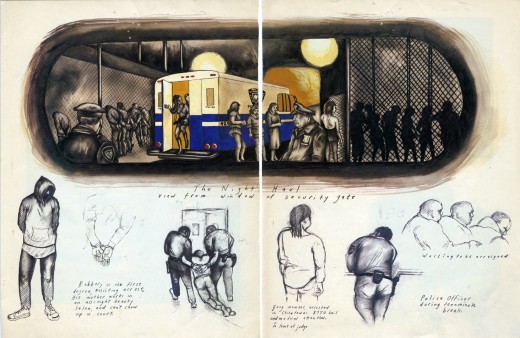
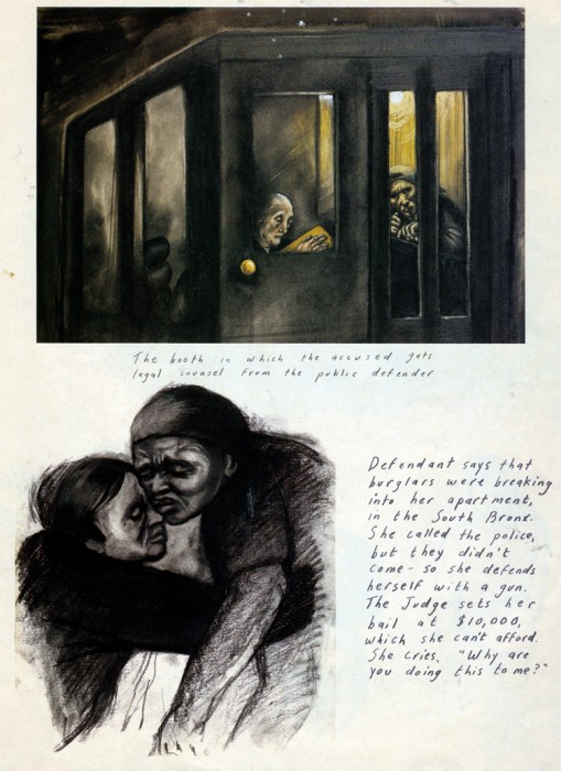
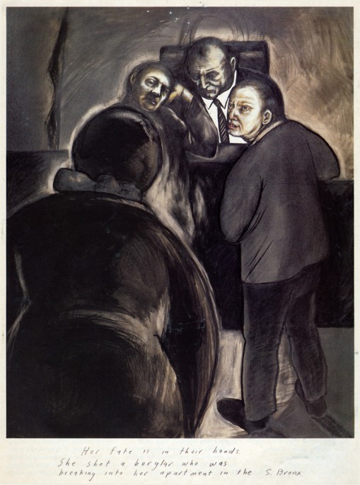
About 15 years ago, The New Yorker magazine, printed a number of pictoral essays by her, and I’ve saved several of them. Here’s her study of “Nightcourt” in the Bronx. I believe these images were represented by Galerie St. Etienne.
_ __
__
___(Click any image to enlarge.)
Independent Animation &John Canemaker &repeated posts &Richard Williams &SpornFilms &Theater 15 Jan 2012 06:02 am
Photo recap – Woman of the Year
Recently, I found myself talking about my work on this show. It made me go back in search of this post from January 2007, and I thought I’d recap today. Hope you don’t mind.
Woman of the Year was a project that came to me in the second year of my studio’s life – 1981. Tony Walton, the enormously talented and fine designer, had gone to Richard Williams in search of a potential animator for WOTY (as we got to call the name of the show.) Dick recommended me. But before doing WOTY, there were some title segments needed for Prince of the City, a Sidney Lumet film. (I’ll discuss that film work some other day.)
Tony Walton designed the character, Katz, which would be the alter-ego of the show’s cartoonist hero, played by Harry Guardino. Through Katz, we’d learn about the problems of a relationship with a media star, played by Lauren Bacall.
.
It turned out to be a very intense production. Three minutes of animation turned into twelve as each segment was more successful than the last. There was no time for pencil tests. I had to run to Boston, where the show was in try-outs, to project different segments weekly;  these went into the show that night – usually Wednesdays. I’d rush to the lab to get the dailies, speed to the editor, Sy Fried, to synch them up to a click track that was pre-recorded, then race to the airport to fly to the show for my first screening. Any animation blips would have to be corrected on Thursdays.
There was a small crew working out of a tiny east 32nd Street apartment. This was Dick Williams’
apartment in NY. He was rarely here, _______(All images enlarge by clicking.)
and when he did stay in NY, he didn’t
stay at the apartment. He asked me to use it as my studio and to make sure the rent was paid on time and the mail was collected. Since we had to work crazy hours, it was a surprise one Saturday morning to find that I’d awakened elderly Jazz great, Max Kaminsky, who Dick had also loaned the apartment. Embarrassed, I ultimately moved to a larger studio – my own – shortly thereafter.
Here are a couple of photos of some of us working:

Tony Charmoli was the show’s choreographer. He worked with me in plotting out the big dance number – a duet between Harry Guardino and our cartoon character. I think this is the only time on Broadway that a cartoon character spoke and sang with a live actor on stage. John Canemaker is taking this photograph and Phillip Schopper is setting up the 16mm camera.

Here Tony Charmoli shows us how to do a dance step. Phillip Schopper, who is filming Tony, figures out how to set up his camera. We used Tony’s dancing as reference, but our animation moves were too broad for anyone to have thought they might have been rotoscoped.

John Canemaker is working with Sy Fried, our editor. John did principal animation with me on the big number. Here they’re working with the click track and the live footage of Tony Charmoli to plot out the moves.

Steve Parton supervised the ink and paint. To get the sharpest lines, we inked on cels and didn’t color the drawings. It was B&W with a bright red bowtie. A spotlight matte over the character, bottom-lit on camera by Gary Becker.
 5
5  6
6
5. Steve Parton works with painter Barbara Samuels
6. Joey Epstein paints with fire in her eyes.
 8
8 9
9
8. Harry Guardino on stage with the creation of “Tessie Kat” developing on screen behind him. This was Harry’s first big solo.
9. John Canemaker gets to see some of his animation with Sy Fried, editor.

One of my quick stops from the lab on the way to Boston? No, I think this is a posed photo.
Books &Commentary &Layout & Design &Theater 05 Jun 2011 07:08 am
Boris Aronson & the Yiddish Theater
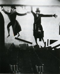 Back in 2007, Eddie Fitzgerald had an excellent piece on his site about the Yiddish Theater. This encouraged me, at the time, to write a post built on the back of some of the set designs of Boris Aronson, one of the greatest of all set designers for Broadway. I’ve added to it and recap it here.
Most people have forgotten the theatrical heritage that came out of the Yiddish Theater. The immigrants to America brought a theatrical treasure with them. In New York, Second Avenue housed dozens of theaters that entertained a very large audience with hundreds of plays. The shows, of course, were all performed in Yiddish. These shows were not only in Manhattan but in the outer boroughs as well.
Many performers stepped out of Yiddish Theater into stardom, but there were also many directors, writers, composers and designers that emerged as well to create the history of the mainstream theater.
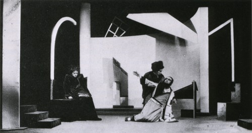
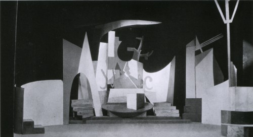
Boris Aronson, a Russian immigrant, designed for the Yiddish Unser Theater in the Bronx. He took his position as an opportunity to introduce Constructivist designs to audiences. New art was entering America at the popular level, and it was accepted.
Aronson did quite a number of set pieces and costume designs before moving over to the mainstream, English-speaking theater. He became the foremost designer on Broadway designing the original productions of many shows such as Cabin In The Sky, Bus Stop, The Crucible, and Awake and Sing. His later work included Cabaret, Fiddler On The Roof, Company, Follies and Zorba.
Here are a few examples of the work he did for the Yiddish Theater.
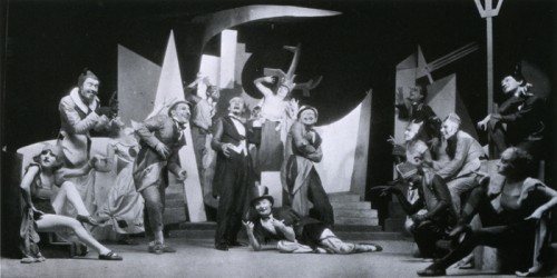
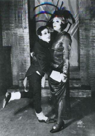
The above three images are from Aronson’s first production.
The Constructivist designs were for Ansky’s production of Day and Night (1924).
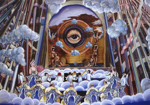
The allegorical plays of the Yiddish theater often featured Heaven and Hell.
Here, Aronson designed a “a concert hall in the skies of hell.”
The show was Maurice Schwartz’ production of “Angels on Earth”
for the Yiddish Theater in 1929.
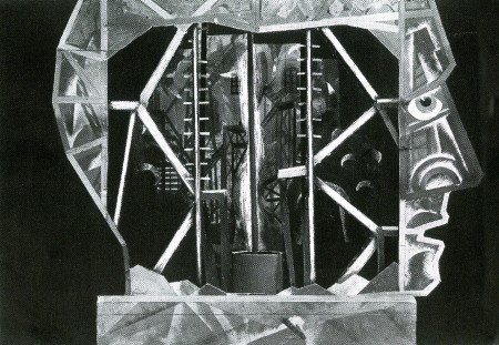
Here is his depiction of “Hell” in model form.
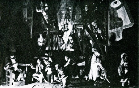
Here is the actual production of the “Hell” set.
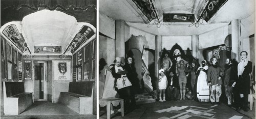
The show “The Bronx Express” required a subway car (left) with advertising cards.
A tired buttonmaker on his way home from work dreams that these ads come to life. (right)
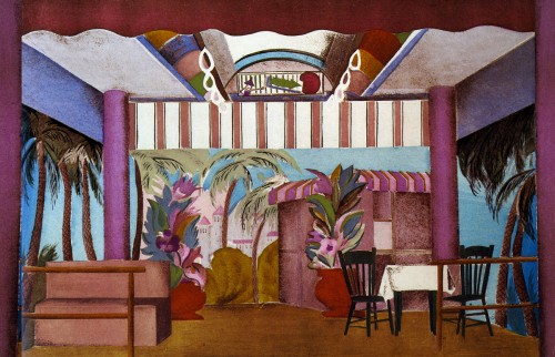
In the same show, the buttonmaker dreams of a beach resort boardwalk.
Aronson keeps the ceiling of the subway car intact for this set.
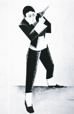
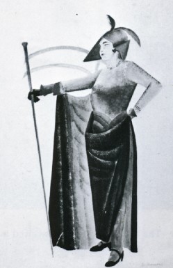
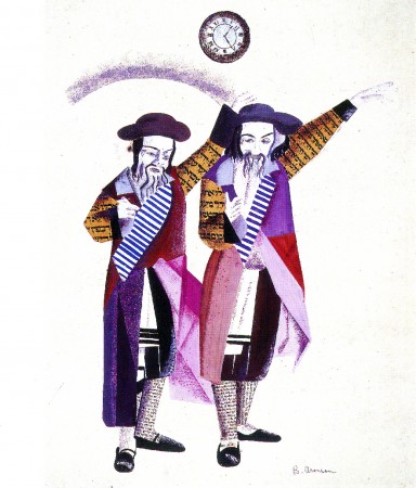
Designs for costumes for Joseph Buloff and Maurice Schwartz.
Commentary &Layout & Design &Theater 13 Apr 2010 05:47 am
Sondheim on Sondheim
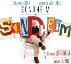 - This past weekend I saw a new Broadway show produced by The Roundabout Theater Company, playing at Studio 54. Sondheim on Sondheim is a show which revisits all of Stephen Sondheim’s lengthy and brilliant career in the theater.
Barbara Cook, Vanessa Williams and Tom Wopat lead a cast of eight who perform work from the Sondheim catalogue of songs, while cascading through the history of the man and, as a result, the history of modern theater – post Rodgers and Hammerstein.
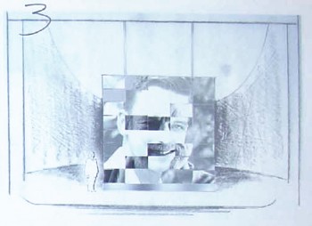
The set for this is a modernist construction by designer Beowulf Borritt. If you ask me, this extraordinary design is a brilliant turn for theater. There’s a construction of 35 multiple screens that tie together or in parts projecting film, video, slides. Stephen Sondheim is a participant in the show in that he’s always there in some projection talking about the shows, his career, his cocreators and producers. The highlight of the show, for me, was the end where Sondheim plays “Anyone Can Whistle” on the piano, and the cast sings to this. Simple and very emotional.
Through a lot of searching I was able to locate some of his original watercolors on line and thought I’d show some of these. A couple came from a slide program on the NYTimes which spoke about the use of projections in theater designs. This has fascinated me since my work on Woman of the Year, projecting an animated character behind the actor onto a 43 foot screen. (The animation work on Sunday in the Park with George – also a Roundabout Production at Studio 54 – was a projection miracle, though the rest of that recent production left me a bit cold.)
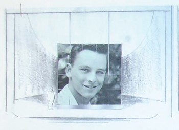
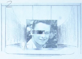
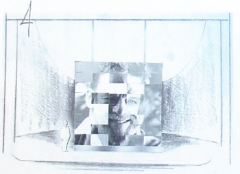
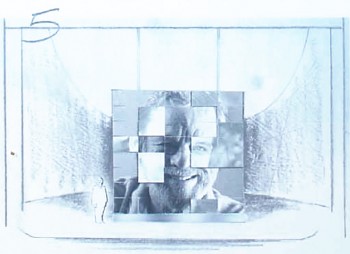
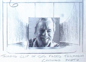
Let’s start with a short storyboard sequence which shows Sondheim aging.
 1
1The sequence begins with a young Stephen Sondheim.
 2
2
Slowly, and musically the image transforms . . .
The set . . .
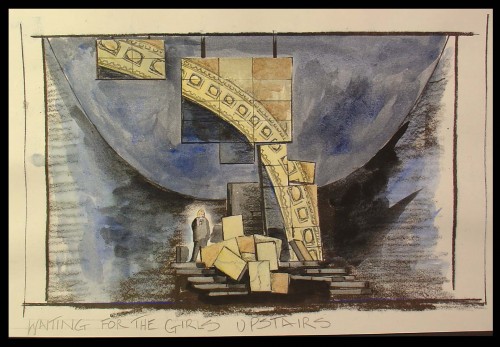
The set is a somewhat abstract construction that utilizes many
screens of digital projections both video and slide.
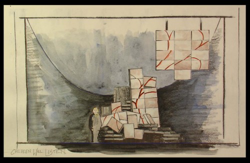
You can see how the parts shape shift even though
the projections continue on the parts.
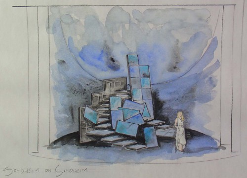
Lighting by designer Ken Billington is also brilliantly part of this set.
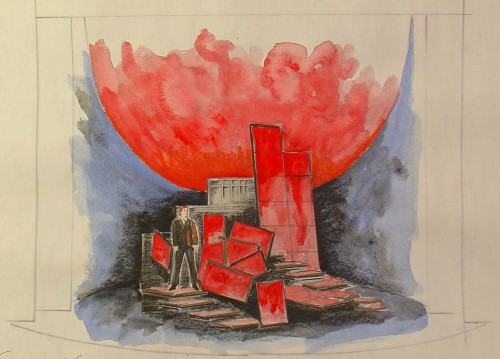
All of the parts – lighting, set, projections – all act as one.
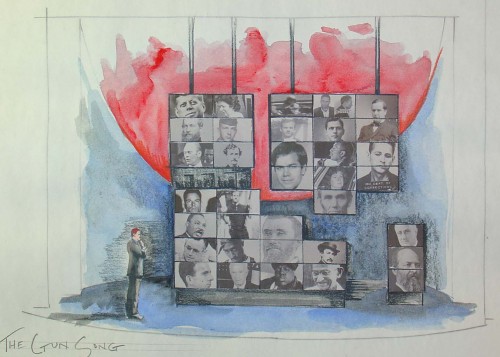
The history of the Presidency serves as a backdrop for the ASSASSINS number.
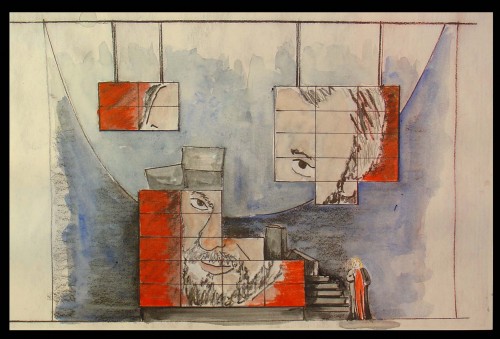
Ultimately, the portrait of Sondheim comes together.
All sketches © 2010 Beowulf Boritt
These drawings and watercolors give an indication of what the set looks like, but they can’t relay the brilliance of the device. It’s magnificently used, and the photos, video and animation on the screens is quite often brilliant. I can’t begin to capture the essence of it, but I can tell you it’s a highlight in theater for me this year.
The orchestrations for this show are by Michael Starobin, and they are just as wonderful as anything else he’s done. The miniscule orchestra never sounds it, and this should show others on Broadway how to do it. It was my pleasure to work with Michael on a number of films he scored for me. I always felt privileged to have him there and excited as any note of music came in for those many films (which included Lyle Lyle Crocodile, Ira Sleeps Over, and Poky Little Puppy’s First Christmas.)
This show is excellent, and it is even more superb if, like me, you’re a Sondheim devotee. You couldn’t ask for more from theater – except perhaps a return to some of those original productions as they sit and grow in my memory. Elaine Stritch singing Ladies Who Lunch, Glynis Johns singing Send in the Clowns, Mako and others singing Someone in a Tree, Mandy Patinkin singing Finishing the Hat – There are just too many others to keep mentioning.
However, I do have to say that in several cases, arrangements and production of some of the songs performed in this show are better than the original versions. The cast of eight sounds brilliant and easily outperforms the British cast that did Sunday in the Park recently at this same theater. Vanessa Williams is truly a star, you can’t take your eyes off of her, yet she sings with the ensemble.
If you have any affinity for Sondheim, go to see this show for a brilliant performance of many of his songs as well as a near-perfect cast and a magnificent set.
Animation Artifacts &Photos &SpornFilms &Theater 01 Jun 2008 08:59 am
PhotoSunday Recap – WOTY
- Back in Jan 2007, I posted these photos from the animation production of Woman of the Year. I think these are interesting enough that they’re worth revisiting. So here, again, is that post:
 – To recap:
Woman of the Year was a project that came to me in the very start of my studio’s life – 1981.
Tony Walton, the enormously talented and fine designer, had gone to Richard Williams in search of a potential animator for WOTY (as we got to call the name of the show.) Dick recommended me. But before doing WOTY, there were some title segments needed for Prince of the City, a Sidney Lumet film. (I’ll discuss that film work some other day.)
Tony Walton designed the character, Katz, which would be the alter-ego of the show’s cartoonist hero, played by Harry Guardino. Through Katz, we’d learn about the problems of a relationship with a media star, played by Lauren Bacall.
It turned out to be a very intense production. Three minutes of animation turned into twelve as each segment was more successful than the last. ___________(All images enlarge by clicking.)
There was no time for pencil tests. I had to run
to Boston weekly, where the show was in try-outs, to project different segments;  these went into the show that night – usually Wednesdays. I’d rush to the lab to get the dailies, speed to the editor, Sy Fried, to synch them up to a click track that was pre-recorded, then race to the airport to fly to the show for my first screening. Any animation blips would have to be corrected on Thursdays.
There was a small crew working out of a tiny east 32nd Street apartment. This was Dick Williams’ apartment in NY. He was rarely here, and when he did stay in NY, he didn’t stay at the apartment. He asked me to use it as my studio and to make sure the rent was paid on time and the mail was collected. Since we had to work crazy hours, it was a surprise one Saturday morning to find that I’d awakened elderly Jazz great, Max Kaminsky, who Dick had also loaned the apartment. Embarrassed, I ultimately moved to a larger studio – my own – shortly thereafter.
Here are a couple of photos of some of us working:

Tony Charmoli was the show’s choreographer. He worked with me in plotting out the big dance number – a duet between Harry Guardino and our cartoon character. I think this is the only time on Broadway that a cartoon character spoke and sang with a live actor on stage. John Canemaker is taking this photograph and Phillip Schopper is setting up the 16mm camera.

Here Tony Charmoli shows us how to do a dance step. Phillip Schopper, who is filming Tony, figures out how to set up his camera. We used Tony’s dancing as reference, but our animation moves were too broad for anyone to have thought they might have been rotoscoped.

John Canemaker is working with Sy Fried, our editor. John did principal animation with me on the big number. Here they’re working with the click track and the live footage of Tony Charmoli to plot out the moves.

Steve Parton supervised the ink and paint. To get the sharpest lines, we inked on cels and didn’t color the drawings. It was B&W with a bright red bowtie. A spotlight matte over the character, bottom-lit on camera by Gary Becker.
 5
5  6
6
5. Steve Parton works with painter Barbara Samuels
6. Joey Epstein paints with fire in her eyes.
 8
8 9
9
8. Harry Guardino on stage with the creation of “Tessie Kat” developing on screen behind him. This was Harry’s first big solo.
9. John Canemaker gets to see some of his animation with Sy Fried, editor.

One of my quick stops from the lab on the way to Boston? No, I think this is a posed photo.
The success of the animation (including good reviews) posed a small problem for me. The rest of the show was ripped over the coals. When I started using some quotes about me in industrial ads, the producers came down on me for gloating over the others who’d gotten negative reviews.
All the same, it was a real learning experience in a big Broadway kinda way.
Commentary &Theater 23 Feb 2008 09:19 am
Sunday
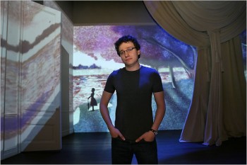 – As mentioned yesterday, last Wednesday, I saw the Roundabout Theater Company‘s production of Stephen Sondheim‘s glorious show, Sunday In The Park With George.
The reviews were universally glowing calling it everything from “Art” to a “Masterpiece.” In one sense, I’m glad of it, but in another I find this completely dispiriting.
_________________________________Sam Buntrock, the director, on the set.
The show is a restaging of ___________________
Sondheim’s musical, with book by James Lapine, of the magnificent production that premiered in 1985 and won the Pulitzer Prize.
The musical’s first half tells the story of Georges Seurat’s creation of the painting A Sunday Afternoon on the Island of La Grande Jatte. Georges is addicted to his painting and
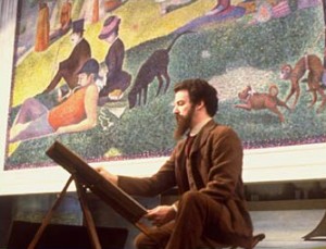 ignores his mistress, “Dot,” who moves away from him, to America, with her newly born child, Marie. George’s obsession with art, and this painting in particular, claims his life. He dies at age 31.
The second half of the show finds the elderly Marie at the Chicago Art Institute, where the painting is being celebrated on its 100th anniversary. Marie’s grandson, George, is an artist who is premiering his 7th Chromalume in celebration of his Great Grandfather’s work. After Marie dies, _____Mandy patinkin, the original Georges
he makes a pilgrimage to Paris to visit
the island of la Grand Jatte. He finds artistic inspiration from the ghost of “Dot,” his Great Grandmother.
In short the show is about Art, with a capital “A”.
In its original incarnation, I got it. I saw the show three times on Broadway back then, and I cried fiercely through the performances of Mandy Patinkin and Bernadette Peters.
The show felt perfect, and I was not only moved emotionally but artistically as well. (Actually the third time found Robert Westenberg in the role of Georges.) The show and its soundtrack was and has remained a great source of inspiration for me.
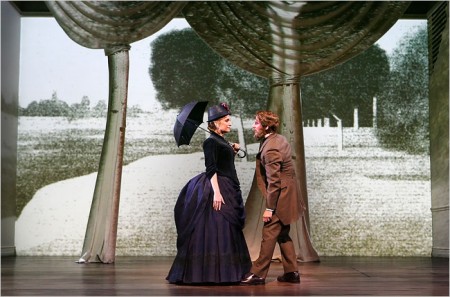
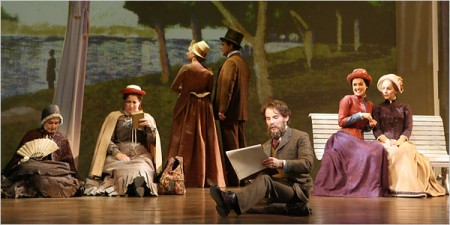
Animation works behind the actors as well as on top of these cut out trees.
The trees throw no shadow, and the animation on them doesn’t overlap
onto the background.
The current production has been imported from England where it was enormously successful. Apparently, judging by the reviews, it will be here as well.
The director is an ex animator who has moved into theatrical direction; this being his first real show. And it’s a big one. His conceit was to use animation for the painting and its creation as well as in other small sections.
This works wonderfully, at times, and horribly at other times. At the very beginning, Georges wallks out to a large, bare room painted white (though the lighting makes it look like a soft gray.) With Georges’ first big gesture a line draws completely across the entire set. Then it animates, on vocal cue, to a blurring of the chalk line. From this the chalk drawing of the painting fills the stage across the forced perspective of the room with its four doors. At this early point in the show, I thought that this might be interesting.
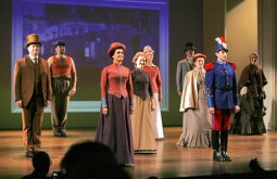 Every so often, on cue to the songs, a character drawn on the background animates. There’s a slight move and then a freeze … then another move … then a freeze. The movement generally is very lifelike, so one assumes it was motion capture and flattened to look like a chalk drawing or painted image. At one point, a soldier looks horribly done. It almost feels like a very early cgi character – plastic and hollow.
This became a problem for me. I began to look for the movement on the background and felt completely distracted from the show. A boat moves on the background. A man leans against a tree. A dog takes three steps and freezes. People wipe on or fade in and/or off. My eyes were often diverted. If wanted to watch the show – the actors and the complex story – I was distracted by irrelevant animation.
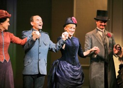 I was mostly impressed with the cast. Jenna Russell as “Dot” and “Marie” was excellent and seemed, at times, to be channeling Bernadette Peters from the original. Daniel Evans didn’t channel Mandy Patinkin, and I had more difficulty with him as “Georges” and found him more appropriate as “George.” I did have a problem with his being bald in the second half. At first I didn’t recognize this as the same actor, and I liked that. However, when he meets up with the ghost of “Dot” in Paris, I wondered how she so easily recognized him without the hair and beard. He no longer looked like her lover, Georges.
I was particularly bothered by the critical scene of Georges Seurat in his studio where he’s obsessed with “painting the hat.” He starts with a canvas (yes, it’s supposed to be a painting but the characters on it are animated, moving), but then he moves to a pad on which I guess he’s drawing the hat. All this movement keeps the eye moving and occupied, but it plays against the scene and its emotion. In the original, he stays at that canvas painting the hat and painting the hat and painting the hat. He only moves away from it to argue with “Dot.” This director isn’t clear in what he’s trying to say. I know he’s trying to “paint the hat” because the lyrics tell us that, but we don’t experience the difficulty of getting that “hat” just right. I understood it because I know the show, but I wonder what someone new to the musical would have gotten.
The projections are stunning in that they don’t seem to be on top of the actors, so I wasn’t sure how they were projected. There were no shadows of the actors thrown on the walls. Surely it couldn’t be rear-screen projection since you can see the walls, and when a door opens the projection moves with the door. Presumably it was multiple projection moving over so large a screen of a set. I didn’t notice any keystoning.
The primary animation stays on the back wall and is deceptive in giving you a false sense of perspective. At one point, when it represents the painting exhibited on the museum’s back wall, the painting and the wall move back in perspective as the room extends enormously. The extension, of course, is just an animated image, but it looks real as the actual room despite moving back. You can’t feel where the set and the movie separate, although you’re watching that rectangular screen of a wall.
These technically magnificent projections were designed and executed by by Timothy Bird and the Knifedge Creative Network.
I started off by saying, I’m glad it’ll be successful. It means that the technical achievement, which is a large leap and done extraordinarily well, would be utilized in other shows. However, I find it dispiriting in that it’s all too distracting. Essentially what’s happening is that a movie on the set is overwhelming the theatrical events in front of the screen. I came to the theater, not a movie. The animation should be absolutely and completely subservient to the show and not get in the way. I found it more moving in the original to view a flat, cut-out soldier than to see the gimmicky animation in this version. Yes, the painting and the corridor moves into the distance, but it’s immediately followed by another copy of the painting dropping close up to us. Why did it move away except, of course, for an effect? That’s the problem with this show, the effect is too big. When Georges is painting a painting, why are the characters he’s painting moving – however slightly? It’s a painting and the movement doesn’t mean anything to what’s going on. It’s just annoying.
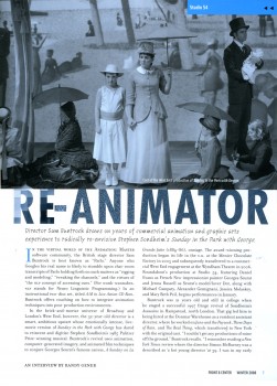
I wish Sam Buntrock would have limited what he was animating. Less is more in my book. One wonders what a more established directed would have asked for. An interview with this animator-turned-director appeared in the Roundabout’s membership magazine, Front & Center. I haven’t found this on line, so I post jpegs of it below.
The NYPost offers a video clip from the show giving a brief idea of the animation here. It also gives a clip of the song where Georges is drawing the “hat” when he should be painting the hat.




 1
1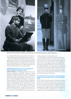 2
2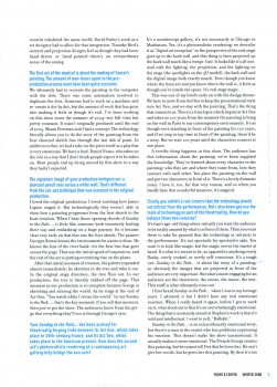 3
3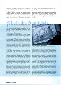 4
4