Category ArchiveBooks
Books &Theater 08 Sep 2007 08:44 am
Aronson & the Yiddish Theater
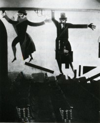 Eddie Fitzgerald had an excellent piece on his site this week about the Yiddish Theater. Most people have forgotten the theatrical heritage that came out of that form. The immigrants to America brought a theatrical treasure with them. In New York, Second Avenue housed dozens of theaters that entertained a very large audience with hundreds of plays. The shows, of course, were all performed in Yiddish. These shows were not only in Manhattan but in the outer boroughs as well.
Many performers stepped out of Yiddish Theater into stardom, but there were also many directors, writers, composers and designers that emerged as well to create the history of the mainstream theater.
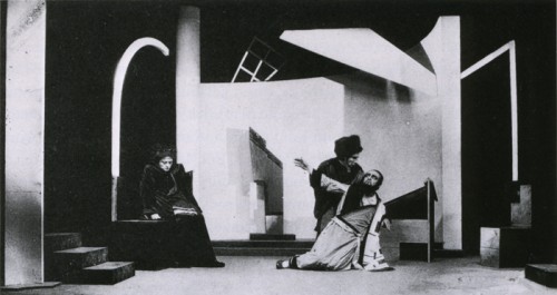
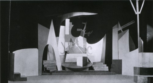
My favorite set designer, Boris Aronson, a Russian immigrant, designed for the Yiddish Unser Theater in the Bronx. He took his position as an opportunity to introduce Constructivist designs to audiences. New art was entering America at the popular level, and it was accepted.
Aronson did quite a number of set pieces and costume designs before moving over to the mainstream, English-speaking theater. He became the foremost designer on Broadway designing the original productions of many shows such as Cabin In The Sky, Bus Stop, The Crucible, and Awake and Sing. His later work included Cabaret, Fiddler On The Roof, Company, Follies and Zorba.
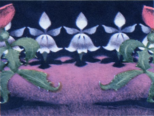
Here are a few examples of the work he did for the Yiddish Theater.
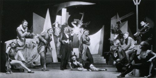
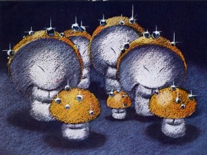
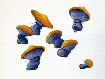
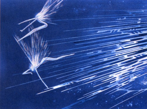
The above three images are from Aronson’s first production. The Constructivist designs were for Ansky’s production of Day and Night (1924).
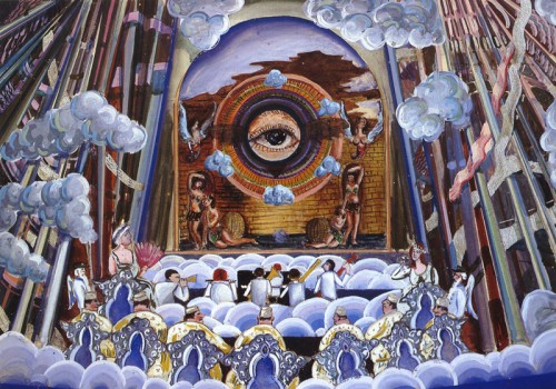
The allegorical plays of the Yiddish theater often featured Heaven and Hell. Here, Aronson designed a “a concert hall in the skies of hell.” The show was Maurice Schwartz’ production of “Angels on Earth” for the Yiddish Theater in 1929.
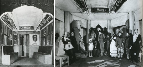
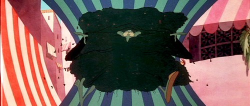
The show “The Bronx Express” required a subway car (pictured left) with advertising cards. A tired buttonmaker on his way home from work dreams that these ads come to life. (pictured right)
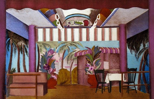
In the same show, the buttonmaker dreams of a beach resort boardwalk. Aronson keeps the ceiling of the subway car intact for this set.
Animation Artifacts &Books &Models 07 Sep 2007 08:35 am
Nutcracker Inspiration
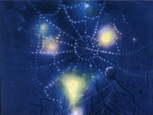
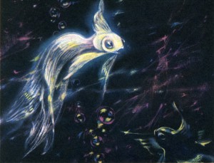
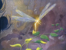
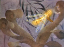
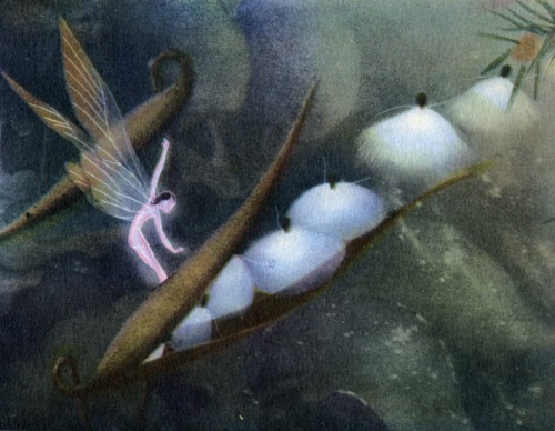
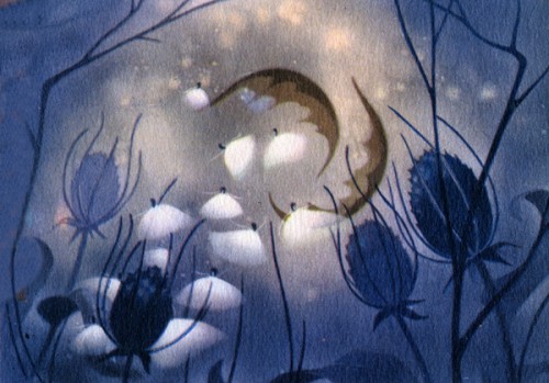
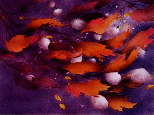
- Fantasia continues. Or at least my posts of art cribbed from the Simon & Schuster 1940 book by Deems Taylor, “Fantasia.”
Though I’m not the biggest Fantasia fan, I have to admit that I like looking at these pictures on my site.
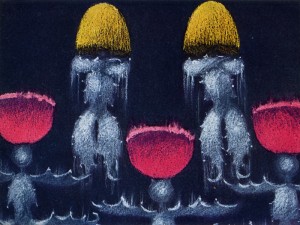
Today I’m putting up the images in the book from The Nutcracker Suite. Not all of them are inspired, but they’re all worth it for the one of the milkweeds falling among the autumn colored leaves.
Books &Errol Le Cain &Illustration 06 Sep 2007 08:05 am
Errol LeCain – Puffin
 – I need not tell you that I’m a fan of the work of Errol LeCain. I have a good collection of his illustrated books.
To remind you, he’s the artist who led the design and stylization of the BG’s for Dick Williams’ Cobbler and the Thief feature. He worked at Dick’s Soho Square studio until his death. Something in his style always held me captive. I suspect this is what initially drew me to Richard Williams‘ work.
I’ve gotten my hands on this 1976 “Puffin’s Pleasure” book. It’s sort of a sampler of piece by the artists and writers who’ve done many of Puffin’s books. (Puffin is the children’s book division of Penguin Books.)
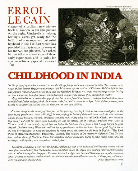
Within this book, Errol LeCain has a three page spread. The first image below covers the first page of his piece. This is all the text the article gives us.
_________
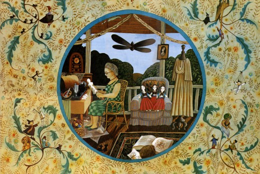
I’ve done a number of posts featuring LeCain’s art.
You can view them here:
____The Snow Queen_______________-____Aladdin
____Growltiger_________________________Thorn Rose
____Pied Piper of Hamelin_______________12 Dancing Princesses
____Have You Seen My Sister____________Hiawatha’s Childhood
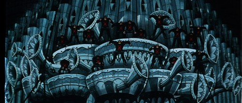
- Just for my own amusement here are a couple of setups from Dick Williams’ film,
The Cobbler and the Thief. Errol LeCain did the backgrounds.
Thanks to Garrett Gilchrist for these images.______
If you haven’t seen Jaime Weinman‘s article on Ed Benedict (actually Amid Amidi’s Animation Blast article with some stills added), check it out.
Books &Puppet Animation 05 Sep 2007 07:33 am
The New Gulliver
 – We all know that Snow White was the first Hollywood animated feature. Many of us also know that Lotte Reiniger directed the very first animated feature in 1926, Prince Achmed. (This film is occasionally shown on TCM, though it’s not scheduled within the next 3 months.)
Some others of us may also know that Alexander Ptushko directed the first animated puppet feature, The New Gulliver in Russia.
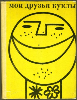
This 68 min. film is discussed in that history of Russian puppet animation book, My Puppet Friends, which I described and featured last week. It’s a film which isn’t very well known in the West, although its title has been a part of my liturgy of animation history since I was a child. Only once in my memory, can I recollect a public screening in NY, and I wasn’t able to attend it. Presumably, with dvd it’s going to be available soon – if not already.
By all accounts, this must be a somewhat difficult film to sit through. Even this book, My Puppet Friends, tells how they chose to change the Jonathan Swift story since, obviously, no one could relate to his political critique of the capitalist 18th Century England under King George III.
 Per all commentaries I’ve read, the Russian film makers chose, instead, to make it a polemic espousing the Marxist beliefs of their day. Since this poiint seems to show up in every criticism of the film, one can only assume they wield a heavy hand in their interpretation.
There is also, often, strong criticism of the puppetry in the film comparing it unfavorably to the work of Ladislas Starevich. That’s understandable given the amazing talents of that artist, who was working in France at the time of this film’s production, 1935.
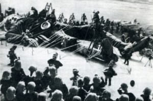
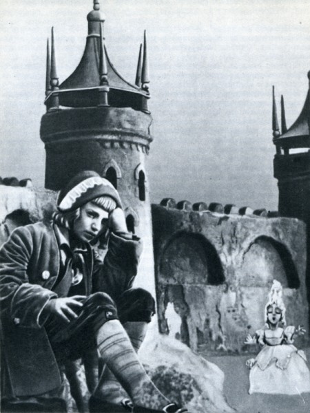
The New Gulliver was actually a combination of live action and puppet animation. Peter, a young boy, falls asleep and awakens to find himself bound to the ground by all his dolls. Thus he is thrown into a variation of Swift’s story.
Here are the rest of the illustrations for The New Gulliver which are included in this 1971 book, My Puppet Friends.
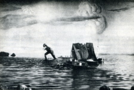
If anyone knows how to get a copy of this film, I’d appreciate hearing about it.
Animation Artifacts &Books &Models 31 Aug 2007 08:11 am
Nielsen Sketches
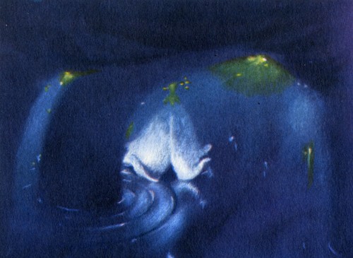
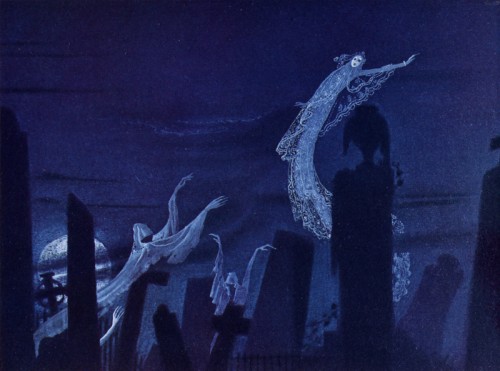
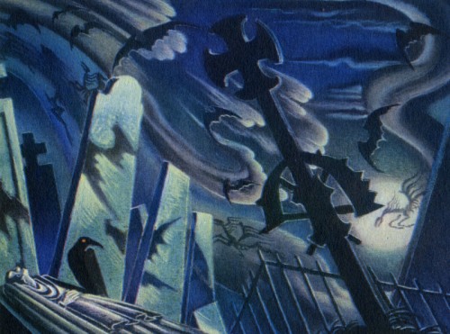
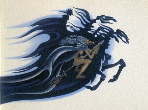
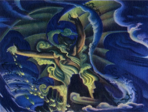
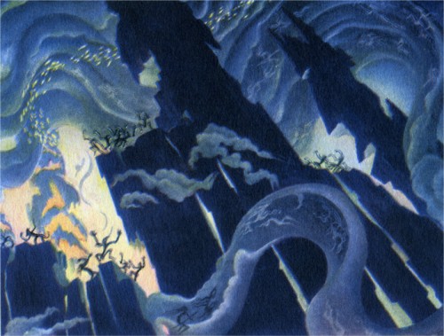
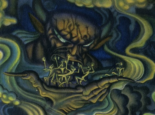
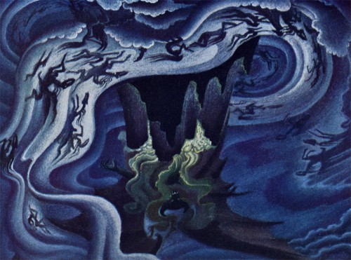
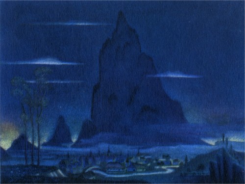
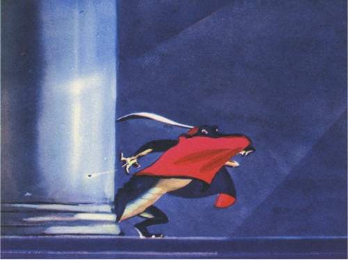
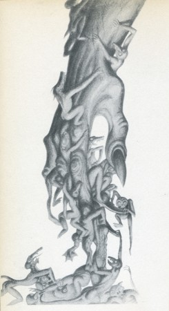 – Continuing to post some of the sketches from the Deems Taylor Fantasia book published by Simon & Schuster in 1940, I want to put the focus on the sketches from Night On Bald Mountain. It’s obvious that these are all paintings by Kay Nielsen. His style is uniquely distinctive.
The artwork is beautiful and powerful in its own oddly delicate way. The style became a bit more circular in the hands of Bill Tytla, but it never lost the power of its origins. It just became more emotional.
Hans Perk at A Film LA descibes the exhibit at the GL. Holtegaard museum near Copenhagen. Some of the Nielsen art for this sequence was displayed.
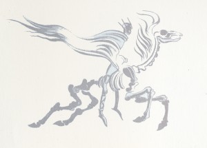
Here, then, are some of these images:
Animation Artifacts &Books &Models 29 Aug 2007 07:40 am
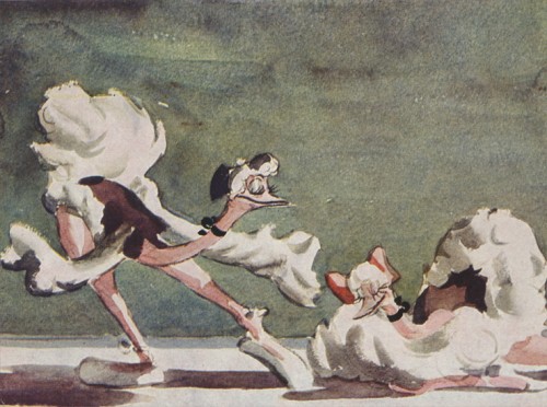
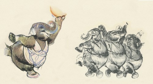
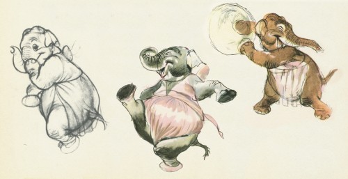
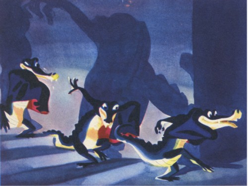
Fantasia sketches
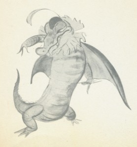 – I thought I’d scan some of the drawings from the Deems Taylor Fantasia book published in 1940.
This is basically a storybook of the film with a lot of beautiful illustrations from the artwork done for the film. The only other Disney feature that I can think of which has a similar type book, richly and beautifully produced, is a limited edition American Express edition of Snow White produced for the fiftieth anniversary.
I assume many of these illustrations were on the dvds as part of the extras, but I haven’t attempted to find out.
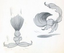
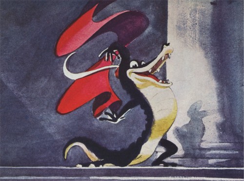
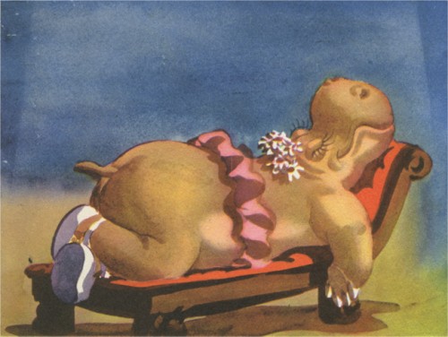
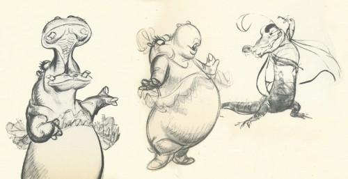
I’ve scanned the images illustrating The Dance of the Hours segment and have eliminated the text and illustrative borders to put a complete focus on the sketches. If anyone knows who did the art, please don’t hesitate to share the information.
Books &Trnka 28 Aug 2007 07:47 am
My Puppet Friends
 – I have a book I love even though I can’t read it. It’s a Russian history of 3D puppet animation. Of course, 90% of the book features Russian animators; however, even they weren’t able to avoid discussing Jiri Trnka‘s work.
The book, titled “My Puppet Friends,” was published in Moscow in 1971.
I’m able to pick out words here and there that I can translate, but for the most part I look at the pictures and try to translate the captions. (Basically, I’m saying I’m too lazy to really try to translate it with my kindergarten Russian knowledge. I may as well put it through Babelfish and get their gibberish-translations.)
Today I thought I’d post a couple of images which are in the book. The photos look like they were taken in the 30′s even though the book was published in the 70′s. I like seeing shots of animators really going at it working the puppets. Needless to say, none of the films are familiar to me. “Peter and the Wolf” is the only familiar title, though I don’t know this Russian version.
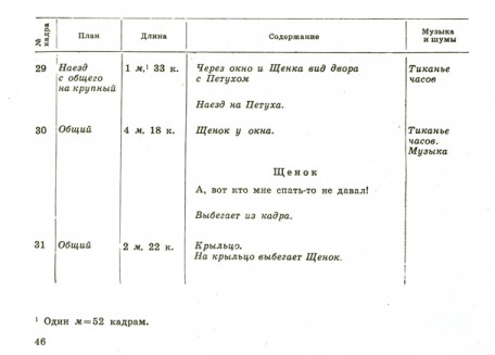
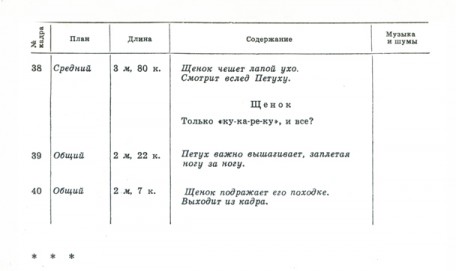
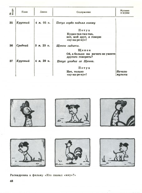
There’s a section which features a bit of storyboard and that same section from the director’s workbook. It’s interesting to see how they’re layed out. Let’s start with those images.
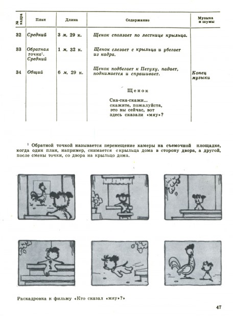
Obviously the storyboard sits on the bottom of these pages. The film’s title is “Who said ‘Mine’?” I haven’t heard of it or seen it.
The workbook section is broken into several columns reading:
____Number of the sequence / Plan / Length / Content / Music & Effx
Here are a couple of photographs I find interesting:
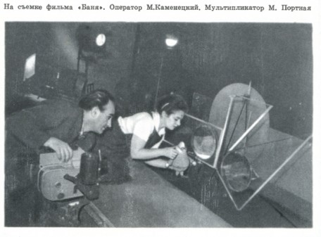
The caption under this photo reads:
On filming “Vanya”. Cameraman M.Kamenetskiy. Animator M. Portnaya.
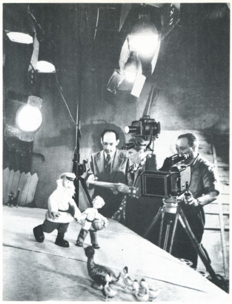
This picture is captioned: On filming “Peter and the Wolf”. Director A. Karanovich,
Animator P. Zhdanov, Cameraman T. Bunimovich.
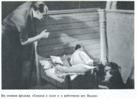
This caption reads: On filming the fairy tale of “The Priest and the Worker Baldes.”
Obviously, this is the famous tale we all know by heart.
The book goes into some detail on a couple of cut-out animators. In the near future
I’ll post some of those images. Enough fuzzy photos for now, though.
Books &Photos 23 Aug 2007 08:36 am
Puppets & Cups & Hilberman Pictures
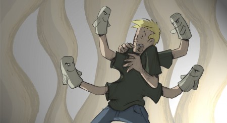
Pat Smith‘s film, Puppet, will have its TV premiere
tonight on Nicktoons, 10pm EST.
This is an interesting film which, I think, shows the fight between the artist and his creation. Somehow, I’ve never had this much difficulty with my creations, but I suppose others have.
Pat’s done an excellent job of producing this film; its score is lush and rich. I’m glad that Nickelodeon will be airing it.
In case you haven’t checked out Pat’s blog, you should have a look there, as well.
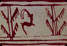 The Iranian animator, Nouroddin Zarrinkelk, is producing a documentary on a 5,000-year-old cup discovered in Iran’s Burnt City. The cup is believed to bear the world’s first animation.
The carving on the cup surface illustrates a goat moving toward a tree in five consecutive images, which is believed to be a primitive form of animation. Zarrinkelk’s documentary will be presented to the International Association of Animation Films, and the goat is to become the symbol for the Association of Iranian Animation Films (their chapter of ASIFA).
An now for more recent animation history:
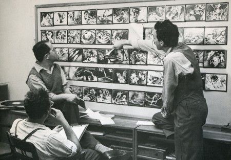
Dave Hilberman and Zach Schwartz present a storyboard to Steve Bosustow
Recently, Karl Cohen, of ASIFA San Francisco, sent me an excellent and extensive tribute to the late David Hilberman, one of the co-founders of UPA, a victim of the blacklist, and a leader in the Disney strike. Hilberman also founded one of the largest commercial studios in NYC, Tempo, and taught for years at San Freancisco State University.
Karl asked that I not publish his piece for a while, but his article inspired me to search for some stills of Hilberman’s work. I found a few that represented work from the studio that became UPA, Industrial Films and Poster Service. However these were tiny. The best images I found within a book were in Charles Solomon‘s The History of Animation.
I decided to post some cleaner, higher res scans of these pictures.
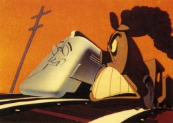
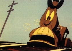
__________________ Two stills from Hell Bent For Election
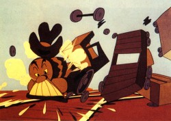
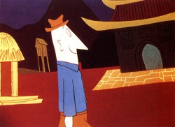
Left, a still from Hell Bent For Election____ right, a still from Brotherhood of Man
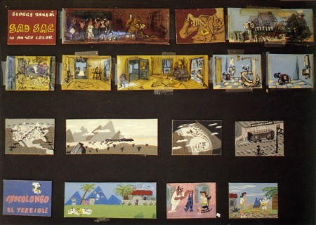
Part of a storyboard for an animated version of
George Baker’s comic strip Sad Sac(k)
Books &Illustration 13 Jul 2007 08:31 am
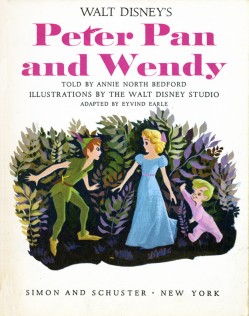
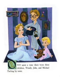
Eyvind Earle: Peter & Wendy II
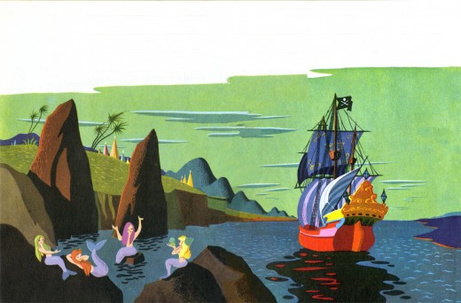
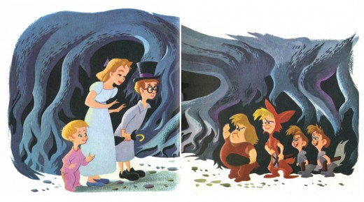
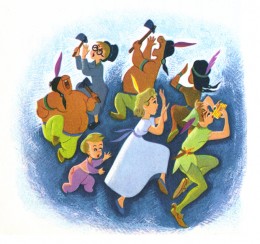
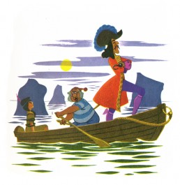
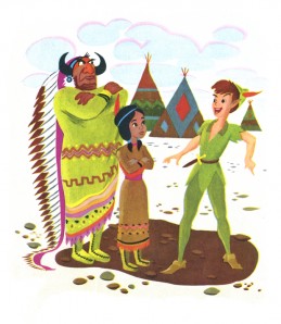
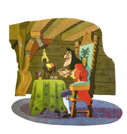
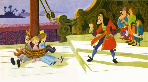
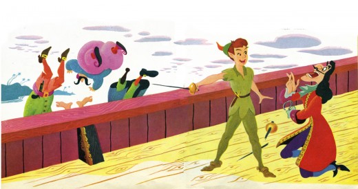
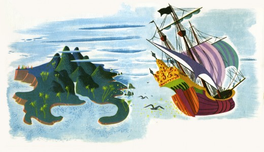
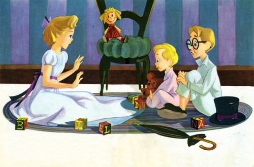
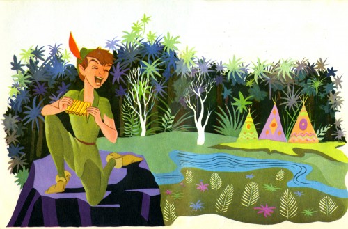
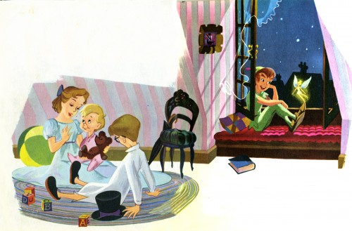
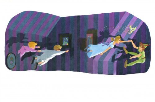
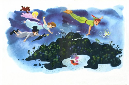
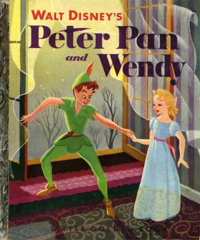 – Here, then, is the completion of Eyvind Earle’s Little Golden Book illustrations for Peter and Wendy, first published in 1952. I posted the first part on Tuesday. As I wrote then, the book seems a bit different in that there are a preponderance of double page spreads in the book. A very intereresting approach that almost works in making the book feel larger.
I doubt there was a large amount of play allowed the artists in creating these books. There was obviously a house style that was followed and a feel that the publisher sought. Earle seemed to be interested in experimentation and enjoyed pushing the envelope. This is something that didn’t endear him to the hearts of the old guard. (The animators at Disney
(Click any image to enlarge.)…………….. incessantly complained about his busy designs and
…….._______________________………..color schemes for Sleeping Beauty.)
Here is the remainder of the book:
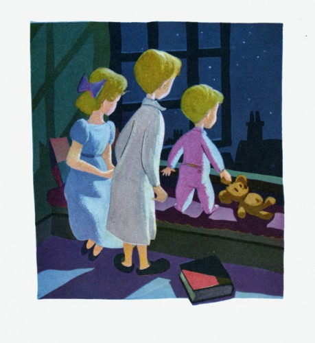
This last illustration is my favorite.
Books &Illustration 11 Jul 2007 08:08 am
Eyvind Earle: Peter & Wendy I
 – I’m an Eyvind Earle fan. I have been ever since getting my hands on Bob Thomas‘ original version of The Art of Animation (1959), which promoted Sleeping Beauty and its artwork, and then going up to Radio City Music Hall to see the first theatrical run of the film. After the Disney film, seeing Earle’s Nativity film on the Tennessee Ernie Ford show and watching Paul Bunyan and other Disney shorts of the period even closer, studying his work made me more of a fan.
I got to meet the man thanks to Michael Barrier. We had one of the craziest interviews ever when we drove upstate to his house and sat in a somewhat darkening room as the afternoon dimmed and Earle continued to quietly answer the questions.
(Click any image to enlarge.)
I loved that day, but I loved Earle’s work even more. After posting Retta Scott‘s Golden Book of Cinderella, I realized that I had this book, Peter and Wendy, which is Earle’s odd adaptation of Peter Pan. He’s obviously in love with Cinemascope in that most of the book’s illustrations are two-page spreads. Sort of wide screen proportions. This is unusual for a Little Golden Book.
The images look a bit like the backgrounds in Paul Bunyan, and the characters are not quite on model with the film. The printing, as with most of these books, is pretty dull. You know a lot has been lost in the transfer.
Again, because of the number of illustrations, I’ll break it into two postings.
Enjoy.
